Transcripts
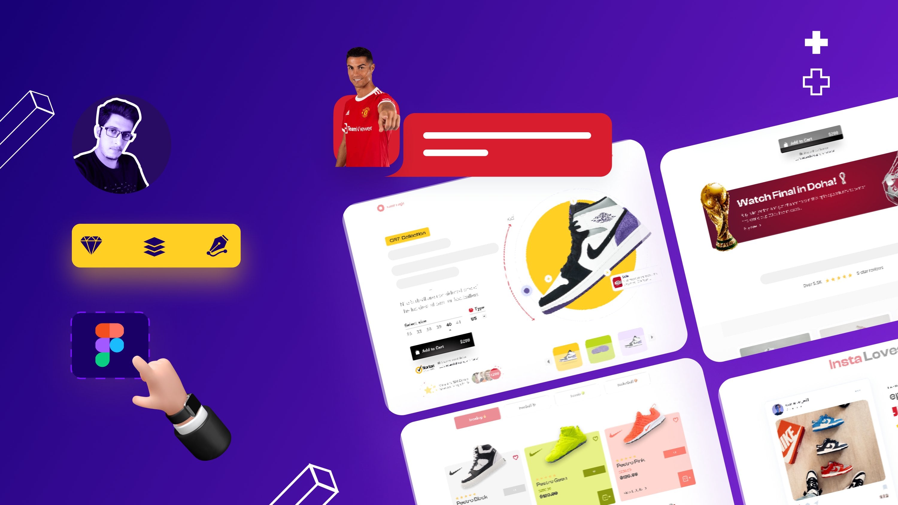
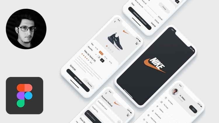
1. Introduction: Hello and welcome to your cells. The best place to learn UI
UX design and prototype. This course, we're going to
build a real-world website, which prototype in Figma with latest features and
design aesthetics. My name is, she has odd
and I am a UX designer. My co-instructor is show Hagar
and he is a UI designer. And we have more
than ten years of experience in the
design industry. Through this course,
we'll guide you on how to create a website from
scratch in Figma, the course is divided
into four sections. Intersection, Figma,
overview section, UI, UX section, and
prototype section. In the intro section, we'll see a little brief about this course and how can you lose the exercise files into Figma overview
section will see what is Figma and how to
use its features. And in the UI and UX section, we'll start creating and structuring of our
food delivery website. And at the end, we'll link
all the frames together. So it looks like a
real world website. And in the last, we'll
see how to share our website with other team
members or stakeholders. We have a lot to
show you without any further ado.
Let's get started.
2. Using the exercise files: In this video, we're
going to show you how you can start off
with the exercise files. The exercise files for this course are included
with this lecture. Defines that we have uploaded
contains Sigma assets file. It contains all the assets
used in the course. Please download this
file so we can continue our journey by creating a
real-world website in Figma. This exercise file does not
contain Figma file for dad. Just follow along with
us through this course. So you guys can
understand how you can create your
own Figma project. That's all for this video. See you guys in the next module.
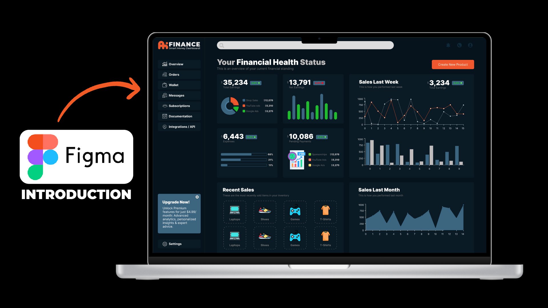
3. What is Figma?: Sigma is a browser-based UI
UX design application and primarily web-based
prototyping tool with additional offline
features enabled by desktop applications
for MacOS and Windows. It's currently the leading interface design tool
in the industry. Here the question is, there are many other tools like Adobe XD, sketch, marble, and many
others than why we use Figma? The answer is that
other softwares required license and
we have to buy them. Whereas sigma is
freely available. And you can just simply
go to the website, Sigma.com, sign up and start using
Figma anywhere, anytime. Because it's a
web-based application. Although it's dextro
version is also available. But it depends. You, either you want to
use it online or offline. Figma is very easy to learn. And if you try, you can learn
Figma in just two days. And within seven to ten days, you can master Figma. The best thing about sigma is
suppose you're traveling to some other country and you don't have your
laptop with you. You can easily access your
Figma files by signing in to the Figma web portal through some other laptop and access
all of your fights easily. Now I think you guys have
some knowledge about sigma. See you guys in the next
video where we're going to see how to create a
Figma account online.
4. Sign Up For Figma: To sign up for Figma, just go to figma.com and
click on Sign Up here. Just enter your email and password and hit Create Account. You can also sign up with
your Google account. After clicking on Sign Up, it is asking my name and
my work, enter some data. And if you want to join
the meeting list of Figma, you can check this checkbox. Right now I'm living it. Edit this and after that,
click Create Account. Now our Figma
account is created. It's time to add a
team to my Figma. I'm going to write
you exalts team. Remember, a team has many members so you can
easily collaborate with them. We'll discuss that later. Now just click next. You can also do it later. Right now, there are
two plans for Figma. Choose the plan that suits you. But if you are a beginner, I suggest you choose
the starter plan. And now our Figma account
is set up successfully. That's all for this video. See you guys in the next video.
5. Setting Up fonts in figma: In this video, we're going to enable local fonts in our Figma. Otherwise, if you're going
to work with existing fonts, you won't have a
large selection. And also if you import
things like sketch files, the text may not work
and may not look right. In Figma, when you
are on the website, you are already logged in. Go to the upper left corner
where the many ways, and go to settings. Down here, you can
see that we have some local fonts that are currently not
enabled by default. Click on Download installer
to enable the local fonts. That's going to download this depending on your
operating system. It's going to download
a small file. In what you're gonna
do is you're going to essentially open that
up and install it. I can see that I've got
the package right here. So let's install that. And you'll see now that
local fonts are enabled. I have now many fonts
available in my Figma. Otherwise, you'll be
working with fewer fonts. Now you can come back to recent
and see all the violence. The next step is we're going to understand the Figma workspace. So see you guys in
the next video.
6. Understanding the workspace: Welcome back. In this video, we're going to understand the
workspace or Figma. This is our homepage. By default. Figma gives
us three projects. You can keep it or delete it. It's totally based
upon your choice. Next, here on the top right, we have two options. This import option
is used to import different Figma projects
directly to Figma, you can also import
your sketch files by clicking this import icon. We have a plus icon. Just click this icon
to create a new file. Here on the top left
we have a toolbar. It contains different tools like rectangle, ellipsis, pen tool. You can draw different
shapes by using these tools. Underneath it is the layers tab. Here you can see
all of your layers. Next tab is the asset stamp. Here you can store all
of your assets that you're using throughout
the project and later on, share it with your team members. In the center, we
have our canvas where we can create and
work with our art boards. Remember, art boards are
now called frames in Figma. In the upcoming lessons
where I say frame, it means I'm talking
about art boards. After that, on the right side, we have our Properties panel. Here. You can change the properties
of different elements. Currently, it's not
doing anything. But when I draw a rectangle
here on the canvas, you'll see all the properties of that rectangle are now visible. Next on the top right, we have a Share button to share this project with other team
members or with clients. We also have a play button
to preview our design and zoom button to zoom in or
zoom out of the art board. And this brings us to
the end of this video. See you guys in the next video. We're going to see how to set
up our first file in Figma.
7. Setting up first file in figma: Welcome back. In this video, we're
going to set up our first file in
Figma to setup a file. Firstly create a new file. And here in the center top, renamed the first project
to your team project. After that, rename
this untitled file to BFF Town website.
By clicking on it. Sigma projects are
created in frames. So to create a frame, just press the F key
from your keyboard, or click here at the top
left and choose frame. After that. Here on the right side, we have a lot of
options for frames. We can create different
apps for phones, tablets, web, and social
media posts as well. But for this course, we're
going to work with web screen. So we need to choose
Web 1920 by 1080 frame. So just click on it.
And now our frame is created and that's how you
can set up a file in Figma. See you guys in the next
video where we're going to see how to start
creating our website.
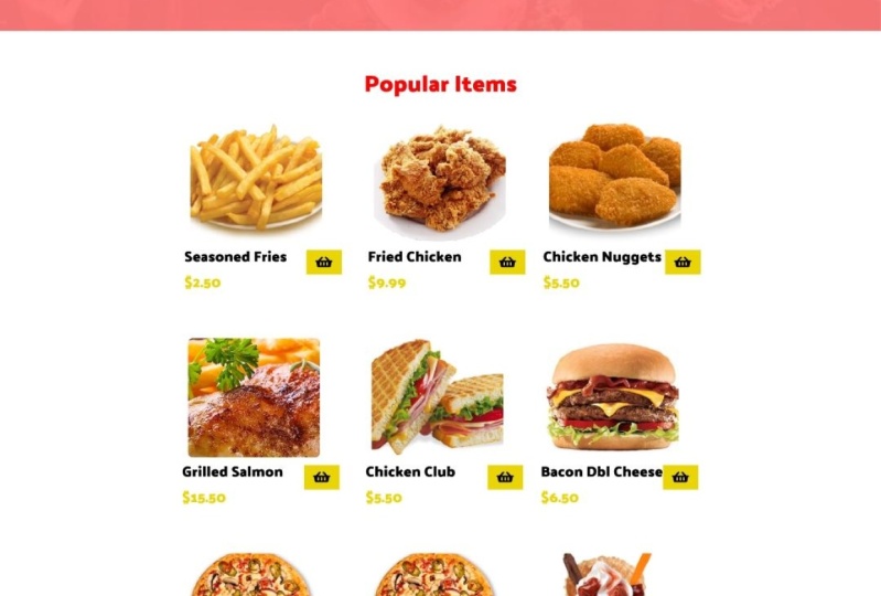
8. Homepage UI : Welcome back. In this video, we're
going to start creating the first
page of our website, which is the homepage. So first of all,
create a frame of 1920 by 1080 by pressing the
F key from your keyboard. Now we're going to set
up our website grid. Website grid is a
visual structure used to organize components
of a webpage design, such as topography, images, videos, and other elements. Traditionally, a grid
structure is used to evenly divide the design space into a series of
vertical columns. So to create a grid, just select the frame and
click the grid option. From here, change its
orientation to columns. And the count, right, 12th columns with a margin
of 375 from left and right. And the gutter of 30 pixels. Gutter is basically the
internal space between columns. After that, we're
going to add rulers. So just press Shift R from the keyboard and add two rulers, one in the left side
and one in the right. These rulers will help us in the structuring of our website. After that, add a rectangle
of around 120 pixels. Now I'm going to add
the logo and nav bar. So just copy the logo from Exercise Files and
paste it here. Change it to around 150, and place it here properly. Now press the T
key and write home about Menu and contact
in navigation bar. The font that we're using
in this project is open to place the text layer in center with an internal
spacing of 40 pixels. Now, add an underlying
of two pixels under this Home tab and change the text line color
to this red color. After that, add to
texts layers and rename the first two ordinal Act and the second 20800 triple one, triple to now add a rectangle
of around 40 by 40. Change water radius 28, and its color to our
team, yellow color. And place it here. Make a copy of it, and move it to the right with an internal spacing
of ten pixels. Now we're going to
add icons here. So just copy the basket icon and user icon from Exercise
Files and place them here. And here, change
the spacing between this first rectangle
and this texts to 30 pixels and align all
of this navbar properly. Now let's move down here. We're going to add
our website banner. So for that, draw a rectangle
of around 1920 by 830. Change the color to black and add radial blur of this
color over this rectangle. This radial blur will create
a nice spotlight effect. Now I'm going to add images
over this rectangle. So copy the images from Exercise Files and place
them here probably. After that, press the T key and write the best
burgers in town, which is the title text. Place it properly. Now we're going to add a
call to action button here. For that, draw a rectangle
around to 20 by 58. Change its corner radius to ten. Place it under the text. Now, grab the text
tool and write, read more and align it
with this button properly. Now let's move down here. Draw a rectangle of
around 1920 by 540. Change its color
to this red color. After that, add an image
over this rectangle. So grab the image from the exercise file and place
it over this rectangle. And then change its
opacity to around 10%. Now grab this above title text, move it down and change
the font to 50 pixels, and rename it again. Grab a copy of this text, move it down and change this text to
paragraph dummy text. With the top margin
of ten pixels. After that, on the right side, draw a rectangle of around
365 by 375 and place it here. Change its color to
our theme color. Now, just important image from exercise file and place
it here properly. Let's move down here. Just draw a rectangle
of around 1920 by 1287. Changes color to
this light color. After that, grab
this above text, move it down with a top
margin of 100 pixels. Rename it to popular items and change its color
to this red color. After that, draw a rectangle
of around 270 to 70. Change its border-radius to ten. And then press the T key
and right product name. Make a copy of it and move
it down with a top margin of five pixels and
rename it to price. Now just copy the current
item from the top bar. Move it down in the
front of this text and scale it down
to about 40 by 40. Align them properly. Now, make seven copies of it and arrange them accordingly. After that, import images from the exercise files and place them over these
rectangles accordingly. Now, just grab the
above heading text. Move it down with a
top margin of 150, and rename it to best deals. After that, import
the better image from the exercise files and place it here with the
top margin of 100 pixels. Now again, grab this item text, move it down and rename
it to customer reviews. After that, copy the
texture image from the exercise files and place this behind
customer reviews text. Here, just draw a circle
of around 155 by 155. After that, add a user image. You can use this extension
to import a user images. Now please this user image with a top margin of 50 pixels. Now just place this dummy
review text and did this user image and these
star ratings as well. Copy the stars from
the exercise files. Now let's move down to
our footer section. So draw a rectangle of
around 1920 by 360. Change its color to
our theme color. And then copy the
navigation links from the navbar and place them here. Now just import social
media icons from the exercise files
and place them here. Align them properly. And lastly, type
this copyright text. It's phones should
be 13, regular. And with that, our first
screen is completed.
9. About us Page: Welcome back. In this video, we're going
to create About Us page. So first of all, copy
the previous frame and move it to the right with an internal space of 200 pixels. And rename it to About Us. After that, delete this
burger image and this button, scale down this slider
to about 1920 by 250. After that, rename
this text to about us. It's font should be 50. Align center. Make a copy of this
text and move it down. Change its font to 18, and write breadcrumbs
for this website. After that, move this
second section up. Change the title
text to our story. And the paragraph texts
to some dummy text. Change this rectangle
height to 730. After that, replace
this image with this image from the
exercise files. Let's move down here. Draw a rectangle
around 1920 by 668. After that, add a title text and rename it to our services. Place it with a
top margin of 100. Now just draw three rectangles
of round 360 by 280. Change their body areas to ten. And copy the icon from the exercise files and place
them over these rectangles. After that, grab a text layer and place it over
this first rectangle. Change its font to 24, and rename it to quality food. Make two copies of this text and move them on to the
second third rectangle. Change the second text
to original recipes. And the third one,
too fast delivery. Now let's move
down here and draw a rectangle of
around 1920 by 729. Add a title of meet our team. Now just grab the
rectangle tool. Draw a rectangle of around 270 by 270 with
the border areas. With a border radius
of ten pixels. Press the T key and right username and
designation, please. These texts layers with the
top margin of 30 pixels. Now make three copies
of these texts, layers and rectangles, and move them to the right
with an equal spacing. Now, import chef images and rename their designations
and their names. So from here, I'm
speeding up the process. Lastly, move this foot or up, and our screen is
now complete it. See you guys in the next video.
10. Menu Page: Welcome back. In this video, we're going
to create menu screen. First of all, copy the
previous screen and move it to the right with internal
spacing of 200 pixels. And rename it to menu screen. And change h
breadcrumbs as well. Now just delete all
of this and draw a rectangle of around 1920 by 360 and change its color
to this gray color. And after that, add a circle of around one fifty, one fifty. Press the T key and write deals. Now, make seven copies of these and arrange them properly. After that, add images of menu
items over these circles. So copy the images from the exercise files and
please them here properly. After that, let's move down
here and add a better image. Copy the banner image
from the home screen, and place it here properly. After that, let's move down
and add a popular item menu. So copy that from
the home screen and place it here with a top
margin of 100 pixels. After that, we're going to reuse this popular item menu and
rename their name and images. It's a lengthy process. So I'm speeding up the video. Now. I have added
the whole menu. Now our screen is completed. We have added the
whole menu here. That's all for this video. See you guys in the next video.
11. Menu Page 1: Welcome back. In this video, we're going
to create a menu screen one. So first of all, copy
the previous frame and move it to the right with
internal spacing of 200. And rename it to
menu screen one. Now just draw a rectangle
around 1920 by 873 and copy the pizza image from the previous screen
and resize it to 530 by 530 with a top
margin of a 100 pixels. After that, add a title, user rating, stars, price, and description
about the product. Now copy the stars from the exercise files
and place them here. Now we're going to add
size and quantity. So press the T key
and right sides, S, M, L. So press the T key
and right size. Small, medium and large. Draw a circle of around 60 by 60 and place it
behind the small. Copy the circle, and also place them behind medium
and large text. Change this circle color
of large to yellow. Now we're going to add
quantity for that. Draw two rectangles. Two should be 47 by 511
should be 84 by 51. The left end, right rectangle
color should be gray, and the central rectangle
should be white. Now just add the counter
icons and quantity here. After that, grab the button from the homepage and place it here. Change its text size to 23
and its color to white. Now let's move down here. Draw a rectangle of
around 290 by 70. Change its top right and top
left corner radius to eight, and change its color to red. Now press the T key and right
product details over here. Align them properly. Grab a copy of this
button and move it to the right and replace
the text with reviews. It's color should be black. And delete this rectangle so that these tabs
are equally balanced. After that, draw a
line with a height of four pixels under
this red button, and change its color
to red as well. After that, draw a rectangle
of around 1920 by 1466. Change its color
to a light gray. Now add a dummy text with a top margin of 50
pixels over it. Lastly, copy the popular
items section from the homepage and place it here with a top
margin of 50 pixels. And renamed the heading too. You might also like. And now our screen is completed. See you guys in the next video.
12. Menu Page 2: Welcome back. In this video, we're going
to create menu screen too. So first of all, copy the previous frame and
move it to the right. Now just swept
this red rectangle here and change the reviews
text color to white. And this product
detailed color to black. After that, let's move down
and delete this details text. And now here we're going
to add user ratings. So copy the rating stars
from the exercise files and paste it here with a top
margin of 50 pixels. After that, press the T key and right customer name and date. Change the customer
name text to bold. And again, press the T key and write user reviewed dummy text. Now draw a gray line under this review with the top
margin of 20 pixels. And lastly, make a copy of
this review and move it down. And now the screen is completed. See you in the next video.
13. Add to cart screen: Welcome back. In this video, we're
going to create, Add to Cart screen. Firstly, copy the previous frame and move it to the right. And then draw a
black rectangle over the screen and change its opacity to
seventy-five percent. Notice draw a rectangle
around 682 by 553. After that, draw
another rectangle over it and change the corner radius
of first rectangle to 20. In the second rectangle, top right and top left to 20. After that, add a close icon
over this second rectangle. And now add a check mark icon. Copy the check mark icon
from the exercise file, and press the T key and
write this text here. The font size should be 23 bold, and it's color should be white. Now just add product details. Copy the details from the previous screen
and paste it here. And lastly, add two buttons. Copy the buttons from
the previous screen, and change this first button
text to continue shopping. The Next button to
proceed to checkout, and its color to red. And now our screen is completed. See you guys in the next video.
14. Product Details Screen: Welcome back. In this video, we're going to create Product Detail screen. So firstly, copy the menu screen and move it to the right. Delete this body section. After that, rename this menu
texts to shopping cart. And it's breadcrumbs to home. Login. Here in the navbar. Add a quantity circle
over this cart icon. Now let's just move down and
draw a rectangle of around 565 by 60 with the
border-radius of 50. Change its color to light gray. And now press the
T key and right, You have three items
in your shopping card. And after that, Let's just move down and add product detail. It's quantity with the slider. It's prize and a delete icon. Add an underlying of gray color with the top
margin of 20 pixels. Align all of them properly. Now just select all of them and duplicate them two times with an internal spacing
of 20 pixels. Change the second third
products details. Now press the T key and
write subtotal and shipping. After that at their values. And now just draw a line under it with the top
margin of 20 pixels. Now here, add a total cost. And lastly, add continue shopping and proceed
to checkout buttons. Copy these buttons from
the previous screen, and paste them here with the
top margin of 50 pixels. Now just move this photo up. That's all for this video. See you guys in the next video.
15. Login Screen: Welcome back. In this video, we're going to
create a login screen page. So first of all, copy the
previous frame and move it to the right and change its title
and breadcrumbs to login. And after that, delete
the body section. Now, move this login down with the top
margin of 90 pixels. Change its color to red and rename it to
log into your account. After that, press the T key
and write email address. Now just draw a rectangle
of around five to 69 by 55 with the border
radius of eight pixels. Copy this email address and
move it on to this rectangle. Rename it to placeholder text, and change its color as well. Now select this e-mail field
and make a copy of it. Move it down with the
top margin of 25 pixels. Rename this email
address to password, and this placeholder to stars. And again, make a copy of
this password text and move it down and rename it
to forgot your password. After that, draw
three rectangles. First should be 569 by 55. Second, third should
be 269 by 55. Change the border radius of these three rectangles to eight. Changed the first
rectangle color to red, to blue to this color. Now press the T key and write
login on the first button. Login with Facebook
on the second button. And login within Google
on the third button. Now add Facebook
and Google icons. So copy the icons from the exercise files and
place them here properly. Lastly, press the T key
and write register. Now text, its color
should be red. And now our screen is completed. See you guys in the next video.
16. Sign Up Screen: Welcome back. In this video, we're going to create a sign-up screen page. So first of all, copy
the previous menu and move it to the right
and change its title at breadcrumbs to sign up here this log into your account
to account registration. After that, grab these login
with Facebook and Google buttons and move them up and change their
color to light gray. Add firstName and lastName
titles over these fields. And they are
placeholders as well. After that, we have
an email field. And then change this password
field into two fields. First should be password, and seconds should be
re-enter password. And now draw two
rectangles of around 21 by 21 with the
border-radius of two pixels. Now press the T key and write, receive offers and terms
and conditions text in front of these boxes. Lastly, renamed the login
button to register now. And with that, our
screen is completed. See you guys in the next video.
17. Checkout screen: Welcome back. In this video, we're going to create checkout screen page. So first of all, copy the
previous frame and move it to the right and change its title and breadcrumbs
to check out. After that, make two copies of this account restriction
text and change the first text to billing address and
second to order summary. The third to payment method. Now under billing address, I'm going to add some fields. You can copy the fields from the previous screens
and place them here. Now I'm going to change
the field names. So from here I'm
speeding up the process. After that. Under audio summary, add product image, product
name, quantity, and price. Also add subtotal,
shipping and total cost. Now let's move down. Under this payment method, add radio buttons, credit slash, debit card details,
terms and conditions, checkmark, and Place Order
button with red color. Now align all of them properly and our
screen is completed. See you guys in the next video.
18. Order Confirm Screen: Welcome back. In this video, we're going to create auto confirmed
screen page. So first of all, copy the
previous frame and move it to the right and rename it
to order confirmation. Change each breadcrumbs as well. After that, delete all of these except this billing
address text, and rename it to your
order is placed. After that, add a
check mark icon. Align them both central and
change the color to green. After that, press
the T key and add a username and order
confirmation message. Now just draw two
rectangles of 440 by 170 with the
border-radius of ten. Align them center horizontally. Change the rectangle
colors to yellow. And now on the first rectangle, add order ID, order date. The second shipping address, add shipping address details. And now the screen is completed. See you guys in the next video.
19. Contact Us Screen: Welcome back. In this video, we're going
to create a Contact Us page. So first of all, copy the previous
frame and move it to the right and rename
it to contact us. Change the contact
navbar color to red. Now I'm going to add
a contact form here. So for that, copy the fields from the checkout
screens and paste them here and rename them as well. And on the right side, add phone number,
email, address. Copy the phone,
email and address. I can look from
the exercise files and place them here properly. Lastly, add a Send button here. Copy the burden from checker
screen and place it under this message text box and rename this place
order texts to send. Now this screen is completed. See you guys in
the next section. We're going to link
all the screens.
20. Prototype: Welcome back. This is the last
video of this course. In this video, we're
going to take a look at how we can link
the frames together. So it looks like a
real-world website and then share it with other team
members and stakeholders. Here at the top right, you see it is divided
into three wheels. Design View, prototype
view, and inspect view. This prototype view is used
to create connections between frames and to define the connections between
them through interaction. So just click this
prototype view. Zoom in and click
on the first frame. After that, connect this navigation bar
with relative pages. And the animation
should be smart. Animate. After that, connect this Read More
button with about a screen, and leave the animation
to smart animate. Now here under popular
items connected just to one product with
the details screen, with smart animation. And then connect the
footer navigation to all the screens as we have connected with the
top bar navigation. After that, let's move
to the next screen, which is the about our screen. We have already connected
It's navigation. So we don't need to
do anything else. Just leave the screen and
move to the next screen, which is menu screen. Here, connect these categories with each category on the page. This pizza item to detail page. And the animation should
be smart animate. Now let's move to next screen, which is menu screen one. Here connect this Add to Cart button to Add to Cart screen. And after that connect
this Reviews tab with the next screen with the
animation of smart animate. Similarly do the same
direction on the next screen, which is menu screen to here, connect this Add to Cart button with the add
to cart screen. And this product detailed
text width menu screen one. After that, let's move
to the next queen, which is Add to Cart screen. Here, connect the clothes icon
with the previous screen. And then connect this continue shopping button
width, menu screen. This Checkout button with the products shopping
card details screen. Now let's move to
the next screen, which is product shopping
cart detail screen. Here connect these buttons as we did on the
previous screen. But this time connect this, proceed to checkout
to our login screen. Now on our login screen, connect this login button
with the checkout screen. And this registered texts
to register screen. Similarly on our
register screen, connect this registry button with the checkout
screen as well. After that, on our
checkout screen, connect this Place Order button with the Place Order screen. And lastly, connect this contact as screen Send button
with the homepage. Finally, all of our
frames are linked. To check this linking, just press Control a. And here you see the
network of interactions. It's time to run our website. So just click this
preview button. And now you see that all of our screens are
linked together. And it's looking like
a real-world website. Now to share it with
the other team members, just click on this
Share button. Here. You can show it
for design review or to a developer and many
other options as well. I'm just going to choose
anyone with the link can edit. And lastly, click
on Copy link and just share this link with your team members
or stakeholders. You can also share this file
by entering their emails. And this brings us to
the end of this course. We hope you like this course. And if you have any queries
regarding this course, please feel free to contact us. See you guys in another
course of Figma.
 Shehar Yar, UI/Ux Designer