Transcripts
1. Enamel Pin Mockup Tutorial: Hello, my name is John Rahm of Crusoe Design Co.
And in this video, I'm going to be showing
you how to create your very own soft
enamel pin mockup. Over the years, I've
created tons of different pins, but
before I produce them, it's really helpful to
see what they're going to look like in a real world usage. So creating
photorealistic mockups is something that I
really love to do. It's a great way to show
off to your clients, post them on social media, use them for a product preorder, for basically any other
reason that you can think of. So in this video, I'm
going to be showing you how to do it
using smart objects. And the great thing
about smart objects is it allows you to bring in new artwork and everything
automatically updates. So you only have to
build the file one time. Then you can try all kinds of different pin artwork and see what you think is
going to look cool. And you can basically just copy and paste and
everything will auto update all the
different effects that I will show
you how to make. And if you're busy
and you don't have time to actually create
the file on your own, the good news is I will have it for sale for a very low price, and I will put the info
below for you to check out. And my version of
it will come with multiple different types
of metals, backdrops, photo filters, and some
great photography by Shire designs that are really going to make your pins pop. So without further ado, let's hop into the computer, and I'll show you how to
make this very cool mockup.
2. Let's Get Started: Okay, so as you can see here, I paraded my document already, and I'm going to go
backwards and break down exactly how I made this. This is going to be part
of the product that I'm actually going to be
selling in my version. I've got multiple
different metal colors, and I've got different
types of shadows and photo filters and
different backdrops and so on. I'm going to show
you the basic way to create this so that you
can make it yourself. And then the great thing
about Photoshop is you can manipulate and test
everything that you want to try. So let's go ahead and
build our new document. I'm going to drag this out of the way and show
you how to do it. Alright, so I'm going to go ahead and make mine in inches, and you can leave
it in RGB format. Going to make mine 15
by 10 " and 300 DPI. I just want it to be
really clean and clear. If I were going to print
it out up to 15 ", it would be crystal clear. And it'll be a nice and high resolution for on your screen. Okay, so now that we've
got our document, one of the first
things we want to do is add in a background. So put the link below to this, but I'm going to give
you some links to some free imagery that you
can get off of Unsplash. You can, of course, use
your own photography or you could even
try and use AI. When I can, I like
to use real photos. So thanks to Eric
McLean for this photo. So once we've got our
photo downloaded, we're just going to
drag it in here. Now I'm imagining that my pin is going to be
somewhere in here, and I want it to
be fairly large, so I'm going to make
this quite a bit larger. We're really gonna blow this up. It may be a little bit too
blown up for the quality, but I think it'll
be just fine for using on our screen. Like so. Once we've done that,
we can double click our background and just hit Delete and we don't
need that layer. And you could rename this to
background if you wanted to. From there, we're going to
go ahead and we're going to create two new layers. We're going to go over
here and hit plus plus. We're going to right click
on this first layer, and we're going to
convert to Smart Object, and we're going to right
click on the second layer, and we'll convert that to
Smart Object, as well. So we're going to call
this first one pin fill, as in the colors that
go within the pin. We'll call this second
one Pin Outline. So before we get too
far ahead of ourselves, I'm going to grab my
actual pin artwork from Adobe Illustrator. It's okay if you create
yours in Adobe Photoshop. You basically follow
the same principle, but I've got mine in
Illustrator already. So here's a bunch
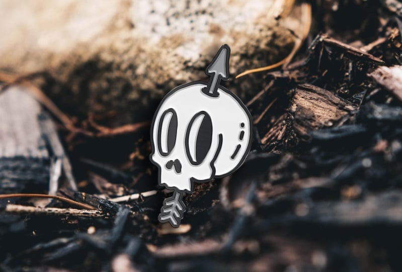
of pins I've made. I think I'm going to use this
one skull and the arrow. So all I've done here is taken that and I've added
a box behind it. -3 " by 3 ". So we're going to drag over here holding option to copy
it. It's Alt on a PC. And I'm going to hold Shift
and again Option or Alt on a PC and click and
drag it over here. So I have two copies
of the same pin. We want to make sure
that everything is outlines and merged. So if you need to go
to Object Expand. Do that a couple of times maybe. Might need to expand appearance. And then using the pathliner, we're going to click
Merge a couple times and then do the
same thing on this one. I already know mine's expanded, so I don't need to do that. So now we've got these two.
They should be identical. You could do that before
you copied and pasted. We're going to double click
to go within this layer and I'm going to use
my magic wand tool, which is Y on my keyboard. I'm going to select the black, and then I'm going
to hit Command X. That just deletes it and it copies it to the clipboard
at the same time. I'm going to hit Command A or Control A on a PC and
delete everything else. Lastly, I'm going to hit Command F, which
paste it in place. Again, that's Control F on a PC, and we can double click
to get out of here. Now over here, we want
to do similar thing. We're going to
come in here using our magic wand, Y
on our keyboard. We're going to select the black, and then we're just
going to hit Delete. We don't need it on this
version. Double click to exit. Now all we need to do is turn these red rectangles
into a no fill. So selecting them both, go
over here and click None. If any of the two
panels that I've shown here so far aren't
showing up for you, just hit Window and go down
to Path Miner and make that showing and click color to
make sure that's showing. So now we're ready to
jump back into Photoshop. So the first thing I want to
do is copy my outline here. So Command C, control C on PC, and go back to Photoshop. And in my Pin outline, it's important that we double click to go into a Smart Object, and I'm going to hit Command V, control V to paste. I want to select Smart Object just in case I need to
edit it in the future. Now the size here is going to be depending on how
you created it. I find that about
250% is pretty good. I wanted to take up
most of the artboard. You go a little more, a little less whatever you're
comfortable with. But make sure that you memorize
whatever you put in here because once we hit
Enter and save, which is Command S or Controls, we're going to pop
back into this file, and now we're going to
double click the pin. Here we have to go back
over to Adobe Illustrator, and we're going to
select that other box and the other part
of our artwork. Command C, which is
Control C on a PC. And we're going to go
Command V, Control V, and we do want to do
a Smart Object again, and we also importantly need
to make this 250% as well. Make sure that you've
got this click so that you maintain
your aspect ratio. Now we're going to
go ahead and hit Enter and then
Command S to save. We can close that. Now we
have got our artwork in here, and importantly, we have
it on two separate layers. Now in this video, I'm going to show you how to make one medal, and it's going to
be a black metal because that's what
I use the most, and that's what I think
looks the coolest. In my actual mockup file, if we bring that back
here for a second. You'll see that I put
my pin outline and my fill outline with
a fill of zero. And that's just so people
know to copy and paste their artwork into there
and they can hide all this. But it allows them to
come in here and I have duplicates where all of my
effects are actually applied. And then they can
change the metal. But we're going to simplify that for the sake of this tutorial. Okay, so we're going to
start with our fill. We're going to double click on this layer to open
up our layer styles, and please follow along with these settings to make sure
that yours looks very cool. I'll move it over
just a little bit so we can see what
we're doing over here. The first thing we want to do
is click Babylon and Boss, and you can see a lot of my
settings are pre poppino. So basically, you want to make
your settings match mine. And then, of course, you
can play around with them if you want to try and
do something different. I've got my style set
as an inner betal. My technique is smooth, and I have it at 450% depth.
The direction is down. We've got the size at 25
and the soften at zero. This is personal preference. You can see it here.
If we soften it up, it really makes that shadow kind of blend nicely
to the white. I found that really having a really sharp shadow looked a little more
realistic to me. For our shading, you
can have global light selected or not.
It's not important. And you want 60%, 25%. It's going to have the light
source coming from up here. For my contour, I just
have it set to linear, and my screen is at 75% white, and my shadow is
multiply, black, 25%. Pretty straightforward
for those settings. I do also have a satin
added on top of it. I've got that at
multiply black, 5%, 90 degrees, and we've
got the distance at 29 and the size at 50. Anti alias is on,
and invert is on, and again, the
contour is linear. Then we have a gradient
overlay. This is pretty subtle. I've gone ahead and I've
already made it a gradient, and I've just added a bunch
of grays, different shades. And again, it's really
subtle in this case. It can give it a little
bit of a metal look, and you could
brighten that up and make it a lot more obvious.
You can see there. I've got this really subtle,
probably unnecessary step. So you could skip this
if you wanted to. Okay, and from here, we're
going to go ahead and we're going to select
a drop shadow. This is something if
you come over here, you can click and drag to
move your shadow around, depending on your light
source and your photo. So it kind of looks like the light's coming from
the top right, so I bump the shadow
down to my bottom left. And once we click Okay, what
you also can do is come down here and hide it because
I'm going to show you a secondary way to
make a drop shadow.
3. Let's Finesse: So in this quick example, I'm going to make
a new background, and I'm going to
fill it with white. Now, if we cut up
here to our pin fill, I'm actually just
going to duplicate it. I'm going to drag
this underneath, and we're going to
call this shadow. And we're going to
double click because we actually do not
need these effects. What I do want is
this color overlay, and I want to turn it
all the way to black. Just like so. And then
you can click Okay. From there, we're
going to go Command which is Control Now we're going to
click and hold down Command and drag this out
over to the side, like so. You want a shadow that's really going to fall
down on the ground. I'll hit Enter, and we'll
pull this back up to here. If you think you want
it a little dramatic, you can maneuver that
around, like so. And then we can go
up to filter blur, down to Gaussian blur. And then you can click how much blur you
want to add to that. And then what I would do
is probably set it to multiply and it will show up
nicely on your background. You can edit that and of course, you can make it as light as you want and subtle as you want. Double click on that blur
that you just added, and then you can come in and add or subtract the amount of
blur that you've used. I'm going to bring
in a background that I got from Shire Designs. And it's going to show
a good example of why that shadow
works a lot better. Drag that down delete that. Now, as you can see, if we hide this shadow effect and we
simply turn on our drop shadow, it doesn't really it's just going from the
actual image itself. So it's not really
very realistic to what would be
happening in this photo. So if we hide that, when we put this type
of shadow on it, it makes it look like
it's propped up. And this, again,
you can play with. So Command T, okay. And then I'm holding
down Command, which is controlling your PC, and I'm dragging this
sort of top white square. And you can bring it all the way out here if you wanted to. You could drop it down this way if the shadow were
coming this way. And then you can make
it look like that. In my case, I think somewhere
around here is good. And again, you can play with
it as much to your liking, but it really just
makes it look like it's floating nicely and you've got a kickstand here
that's making it set off the background
very nicely. So that's an advanced shadow. Going to hide that
hide this for now. Put back on our
other one. I think this one will work fine. Go here and drag it
down just a little bit. And of course, play
with the opacity. When in doubt, a little more
subtle is always better. Now, here's another
optional step. I like to add a little
bit of texture. We zoom in here on the white. I've got a pin fill selected. We can go to filter
noise and add noise. It just gives a little
bit of texture, and at 4% on uniform, monochromatic, I
think that's okay. We can zoom out here. I just looks a little more
realistic to me. I like a little bit of texture. I like a little bit of noise. So we should be pretty good
for our pin fill there, so now it's time to look
at our pin outline. So we'll double click on
our pin outline here. And once again,
we're going to start off with a bevel and a boss. You know, this doesn't look
very good or realistic to me. So change your
settings as follows. We're going to put the
style to an outer bevel. We're going to make the
technique chisel hard. And then we're going to
make the depth about 170. We want the direction
to be down. We're going to make
our size five. We can do a soften of maybe
four would probably be okay. Angle. I'm going to
make it -50 and 20. But you can change this to match the lighting of the photo. So again, we decided our
light source is up here. So if we click in this
little circle and kind of drag it to the opposite corner, you'll notice now it
looks like the light is hitting here and casting
shadows down here. So that will look more
realistic for this photo. And if you bring in a
different backdrop, you can just move
around this to match that same light
source and make sure your fill and your outline basically both have the same
light source happening. So a screen, I'm going to
lighten this a little bit. I'll do 50%, and I'll make the opacity 60%
for the multiply. I think that makes it
kind of pop nicely. So the next thing I want
to do is add a contour. We want this one to
be fairly subtle. I think a 50% is good, and we're going to
keep our contour to linear, just like that. Then we're gonna
head down, and we're actually going to add a stroke. It's not showing here for me, so we'll just go to Effex here and come down
here and click Stroke, and it'll pop back
up, as you can see there. So this is right. I want my size 4%. I'm going to put my
position to outside. I want my blend
mode set to normal, and we'll go about 40%. Now we're going to turn
the color to white. I like that effect. It's kind of making that metal really pop. Now, I'm going to put a
color overlay on this, and the purpose of that is depending on when you
bring in your artwork, whatever your color
your fill is, you don't have to have
the fill as black. You can if you want to and do that in Illustrator
ahead of time. But this allows you to make your fill your
color can be black, and then your fill in Illustrator can be
any color you want, and it'll be
automatically done in black once you bring it in a Photoshop and it live updates. So this kind of just makes it easier to update your
artwork in the future. So in order to build this, you could come into basics and just select a simple
black and white like. And then you basically
just want to click and drag a bunch of
different pieces. So we're going to click
here. Double tap. You can just make that
white, for example. And then maybe click here, double tap, make it black. And then we're going
to play around the intensity of this
in just a moment. So let's just jump ahead
while I create this. So we can try something
like this, hit okay. And then you can bring
up your opacity. Then I actually need to go
back to my color overlay and turn it to color
from blend mode, and that will allow my gradient
to actually show through. And from here,
then we can really refine our gradient
that a little bit more. You can see the highlight
here and highlight here. So you can change the
angle to your choosing. I'll go something like that. And in my case, I want
it pretty subtle, but let's just crank it
up so you can really see. Let's hit Okay if
we zoom out here. You can see that gives
the metal a really shiny look shiny glossy type
pill. Just like so. And again, you can
play with this and get the angle that
you think looks right, or you can just have it
turned off completely. I'm gonna go with
a quite subtle, but not completely invisible, at least not on my screen.
So go ahead and click Okay. Once again, if we zoom in here, I like to add that
little bit of texture, so we're going to filter noise, and we're going to add noise. You go to whatever
you think looks good. I'm going to say ten
is pretty good for me. You can see it just adds
a little bit of noise. It's kind of like a nice
film grain on a photo. It kind of almost
makes it seem like it's extra high quality
when you zoom in. You can see that noise
just a little bit. And just like that, we've got a pretty darn photo
realistic looking mock up. In my version that
I have for sale, I've also created
additional options and additional textures to really
give you lots of variety. I've basically made a silver
version and a gold version, which you can do following similar steps to
what I've done here, and you can experiment,
of course, as you choose. Now, one of the great things
about creating this is we can simply hop back
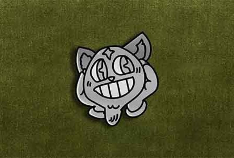
into Illustrator. And we can grab a new design. Let's say it's our bear here. And I've already gone ahead
and pre created these, so I'm just going to copy and paste by double clicking
on our pin outline, pasting it here as
a smart object. Going to go about 250% again. Sure I hide my other one, save. Then I'm going to repeat
the process over here. And you can see, even
while I'm talking, I'm moving relatively quickly, but not as fast as I'd go if I wasn't trying
to teach this. And just like that, we've
completely updated our pin. And of course, if you
find this too big, rather than manually coming
back in here and resizing it, you could simply select
these two layers. I would add your shadow, too. Select all three layers. Click Okay, and then you
can just resize as needed. Another little pro tip, I think is we'll move
this guy over here, ring him in just a little. My little pro tip is make them on an angle a
little bit, you know? Pins are never sitting
totally flat, are they? So something like that, I think, looks pretty darn cool. And if you were to export this, you're going to see you've got really good high
resolution graphics. And these shadows look great. And again, it's Photoshop. So if you want to
change anything or manipulate the
artwork in any way, you can do so on the fly. Alright, I hope you found that interesting and you
learn something. Please do let me know.
Please do leave a review. It really helps getting
these classes to trend. And also do check
out my penta class. That was the inspiration for this little tutorial is
making a penta class, the project was to
create your own pin. So now, if you've taken
that class or not, you can actually
make your pin look really realistic and it'll be way cooler looking in the
projects. So check that. Do head over to my profile and click Follow
somewhere on there. So you know whenever I put out a new class, and that's it. If you do want to download that digital file
that you purchase, it is actually available
directly through Skillshare. Put the link for
that below. Okay? Let me know if you
have any questions, and I hope you guys enjoy
it. See you next time.
4. Wait Wait!: Well, who, wait. Don't
leave. Not just yet. This class came about
because in my last class, the Pen Tool Master Class, the class project was actually
creating an enamel pin. You learn how to
use the Pen tool. You create your very
own enamel pin, which gave me the idea of
making it look more realistic. So I think that that
class is worth watching, especially if you want to
create your own enamel pins to use in this mockup. So I'm going to show
you the trailer from my Pentool master
class right here. And then when it's done, if
you want to check it out, you have to click the
link in my profile, or you'll see a
link somewhere down below and check out that class.
I Hope you check it out. And sorry for saying goodbye
and then coming back. It's confusing. But here's
that class trailer. Hi, I'm John Rahmat of Crusoe Design Co and welcome
to the Pentool Master Class. In this class, we'll be going
over the fundamentals and best practices of using the Pen tool in
Adobe Illustrator, arguably the most important
tool in the program. Once you master it, you'll have the power to create
just about anything. We'll also dive into
using the curvature tool, which will allow you
to make smooth curves no matter what your skill level, and we'll get into a
brand new tool that is very exciting called
the Quick Pen tool. It's probably going
to change the way you use Adobe
Illustrator from now on. This class is actually
a complete rebuild from the ground up on
my Pen tool course, which launched almost
ten years ago. In that time, it had
over 6,000 students, and they uploaded more than 140 amazing and inspiring
class projects. The reviews were incredible, but it was time for an update, and I've packed this class with even more tips and examples
for you to learn from. For this class project,
you're going to be creating your very own custom enamel pin. An enamel pin is a great way to put your newfound
knowledge of Pentool to use because
it's going to force you to create something that's
really precise and cool, get very small, with a
limited amount of detail, a limited amount of color, still have tons of creative potential. I'm also going to show a bonus behind the scenes footage of how a pin is actually produced straight from the
factory. Bit about me. I'm a graphic designer
and illustrator with over 17 years of
professional experience. I specialize in logo
design and branding, but I work on a wide
variety of design projects. I've worked with bands
like Plinkw too, brands like Hi, my name is Mark. Thoughts Based
Athletics, and I've even released my own merch with
companies like New Era, all working full time in the
sign and print industry. That means I always design with real world applications in mind, ensuring everything is done efficiently and professionally. I'm also a Skillshare
top teacher since the program
started in 2015. Nearly 100,000 students
have taken my classes, and they've watched over 2.6
million minutes of content. But enough about
me, keep watching and let's learn to master
the Penn tool together. Alright, so, as I said, in order to actually
watch that class, you have to click on my profile and you'll find
it, scroll around, or I'll put the link
somewhere below, and you can check
out that class. The PenTool Master
Class is one of my most successful
classes on Skillshare. It's got hugely well
received, awesome ratings, people talking about me changing their lives from real.
I really said that. I'll have to find the quote. Anyway, I hope you
guys checked it out, and I will say goodbye for
real unless, of course, you go watch that class, which
you should. Okay, bye bye.
 Jon Brommet, Crusoe Design Co.