Transcripts
1. Introduction: Are you working hard to
fix the inconsistency in your design and looking to unify your user experience
across all platform? You want to increase
your system scalability, then you are at the right place. In this course, we
will use the design token to bring the uniformity
in our entire project. At very first, we will say
goodbye to our TDS update. As with the design token, we will change one token and watch it ripple
across the designs. We will also stop reinventing
the whale as with the tokens we will promote to reuse and streamline
the workflow. Ideal for UIUX designers,
product designer, or individual who
want to improve efficiency and standardize their design process
with Figma tokens. No prior knowledge of
token is required, but a basic understanding
of Figma is helpful. A very lastly, we will also
bridge the gap between the design communication
by creating a common language for your
team. Let's get started.
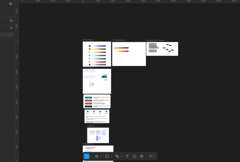
2. Your Class Project: As you progress
through the course, you will practice along by creating your own
design token in Figma. Please download for design
token fortuden dot Figma file. This file has a hands on approach allow you
to build skill in a real time and ensure you master each of the
concepts as it is taught. So once you open the file, this is how it looks like. You can read the file
name on the top, design tokens in
bracket for students, and if I zoom a little
bit on the File, you will experience that. I have intentionally make this one as gray so that you can create the token and apply it as we progress
through the course.
3. What is Design Tokens: What is design tokens? Design token is
all about managing the design properties and value of a different alignment
across the design systems. Looking at the card right now, it has some of the UI
element present on it. One is the card itself. The second one is the text. Third one is the button. Now, each of the UI lament has a property
associated with it. A card can be round, a text which has a color, size, and so on. A button also has a color, size, spacing, pading and so on. Each of these value is
to inside the token. This value can be represent
in a form of color, number, strain, or boolean. In general, we have
three type of tokens. One is primitive token, eeny token, and
component tokens. Let's see the primitive
tokens in detail.
4. Primitive Tokens: Color are one of the most commonly
used primitive tokens in any design system. It is also known as
the global tokens. Let's create some
primitive tokens. There are two ways
we can create it. One is manually, and the
second one is automatic layer. Hit anywhere on the
canvas and we will go on the right inside and click
on this one, ken variables. You can click anywhere
in this space. I will open the
same dial up box. You create it manually, click on the grade
variable, select the color. I will give you a
name has 500 here. It on this one. If we open this color pilot, we can just select
anyone of the color, lose this one and the
variable is now created. Now creating that topen in
this way is time consuming. Right click and let's
delete this thing. Instead, we will
do it in a smart. Go to the tool bar and select
this button call action. You can use a shortcut Control K or if you are on Macintosh, you can use Command K. Go
to the plug in and you can use this plugin called
Te uNCSS color Genetal. You can use any plugin as far as it allows you to
generate the variables. I have Ph color handy with you. Copy this first color.
Entered color guide and clear the variables.
This is the first one. Let's do this exercise for
the second color, Bightd, copy, faced, and created
variables. Now, what happens? When I go to click on
the local variable, we don't find anything. But if you click
on this drop down, it has a section
called colors and it automatically created all the variable that
we're looking for. These are all our
primitive tokens. Now I will rename this thing as primitive so it's
easy to understand. This one I will double
click say primary, and this one double
click secondary. We have created our
first primitive opens.
5. Create Variables: After running foundation
color generator plug in, you will see some subtle
changes on the interface. If I click anywhere
on the canvas, and if I go on the
right hand side, you can see in the color style, previously, this
section was blank. Now I have a blue style as well as the yellow style
which are coming up here. We don't want this hierarchy. So what I will do, I will
select both of them by pressing the Sift key and
click and drag it on the top. The moment I do this action, the foundation will get
automatically erased. The next step would be creating this style
to the variable. For that, I will use a plugin which is called
style to variable. I will go at the bottom
and click on the action. And here on the top, you will see style to variable. I want to take some time and
want to search for this one. Now, you will see multiple
plugin coming in, but the one which we
are using is this one. So I will show you the
details so that we are all on the same page and you will also get
the same experience. This is a very good plugin. I have already tried
it multiple time. So let me press Escape and I
will go back to my screen. Now, let run that plugin and let me open the variable on
the right handside. Now here is where
the magic happens. It will tell you which
collection you want to create as we don't have any
collection in our variables, so I will say we want to create a collection and I want to
give a name is primitive. The moment I click on Create,
this is what it happened. It automatically created
all the primitive tokens that are required for us
for our design system. However, it still
required some refinement, which we will do it in
just a few seconds. But you can imagine fine, one, two, and we will
create some more on that. Now let me X out of here and
let me also out of here.
6. Fine Tuning Tokens: To fine tune our token, let's go to the
variable section, click on that and figure it out. What all tokens do we have
right now? We have a blue. We have a yellow on the
left hand side as group, and within that, we
have the tokens. Now, blue is very generic. Let's rename it to primary. So this will add more
context, and the yellow one, I want to make it as a
secondary. Select the primary. I want to remove the
text blue dash hyphen. Either I do this thing
as manually or we can use a plug in to automate
this thing for our need. Let me X out of here. Let me go to the plug in
area, which is action, and I will go to the plug in and widget and I will use the plugin called
batch rename variable. To make sure you are
on the same page, I will show you the
detail of the plugin. This is the plugin I'm using in. Let me run this plugin. And let me go on
the right hand side and open the variable. Now I will keep the
thing side by side. For right hand side, I will copy this text which
I want to find, and I will click on
the preview changes. At the bottom, you can see, let me remove this thing so
you can see it more clearly. Is it exactly doing
what we need? It is removing Blue
dash, the right inside. Now to see it in process, I will just scroll down
and apply the changes. Let me keep both side by side. Let me scroll down
and apply the changes so you can see right
inside it remove Bj. Let's go on the secondary. Let me see be part of
it. Review the changes. Again, click on the
applied changes. Now we are in a position that
the tokens are something which I love to use anden we can scale it further as
we learn in the course.
7. Additional Primitive Tokens: We want to add additional primitive token
to our primitive collection. Now, what that means. Let me go on the right hand side
and open the variable. So we have a collection, which name is primitive. You can see on the
top left side, and within this collection, I want to add some more
primitive tokens to this one. Now I will X out of here and do the similar exercise that we have done a couple
of videos back. So I will go on the right
hand side and I will generate the styles that we want
required to create the token. But before that, you need
to do some sanity check, remove this yellow and blue here so we don't need that
stag to get regenerated. Go one by one. Let me
copy this first one. Go down, go to foundation
Color generator. And here I can generate. I will go to the material, right, this is
what we are using, use the same and I can just
click on Create Style. Number one, I will quickly do it for all the
things one by one. A let's go back and
double check it. Now we have all of them,
green, blue, fine. And I will just select
one, two, three, four by pressing
the Control key, select and make it on the top, so we don't need that hierarchy. Now, the trickiest part here is, I will go and run the same
plug in which we have run, which is style to variable, but this time, you need
to be a little cautious. Now, here it will ask in which collection
do we need to add? If I go to the right handside
and open the variable, you see we have a collection
called primitive, so I can select the primitive
from the drop down. And the second one is the mode. Now, this value is nothing but which is coming
here on the right hand side. I have not given any wing, so I will just say light, and I will use the same text here. Now I will create and
update it and you can see in a moment
all the four orange, blue, brown and green
are showing up here. Now I will quickly rename it how we have done this exercise
and complete it for you. I completed the changes, and this is how our
final output look like. We do have primary and the secondary in the past
videos that we have created and we have successfully added the additional
token like warning, info, success and error that to the way that
we want it to weigh.
8. Move Tokens Workaround: We want to create Sal
primitive tokens for our design system that will help us to support
the warning messages, info messages, success
messages, and lm messages. Now to do that, we will follow the same procedure,
but there is a catch. See in our local variables, currently all our
primitive tokens, we try to group it in
collection called primitive. Whatever the new
primitive tokens that we create also come inside
this particular collection. But if I X out of here and if I do this exercise
once again, copy, we'll do this tone
called action, select Tin CSS color generator, make a paste, and
create variables. Now variables are created, I will X out of here. If I go back Again, to local variable, I will not see those
tokens coming up here. Instead, it created an
additional collection group, which is name as
color on the top. Here where you can see all the variables that
we are looking for. At time of recording, there is no mechanism to move
a collection of variable or tokens from one group to another group or from one collection to
another collection. Now, to fix this thing, I'm using a workaround that
I would like to share. I will delete this thing first. Fine, I will rename Pim
til two colors because this is what the B
Deford collection folder is enertd by the tailwind CSS. If I out of here and
do the same exercise, which I have done make a paste and create
variables once again and it is done,
creation is done. Now if I go to local variables, you can see it comes inside the same collection
that we are looking for. I will repeat this exercise one by one for all
of this thing. I will double click
and say warning. And once this is done, I will rename this
back to primitive. By doing this, all of
the primitive token come inside one single collection and that is exactly what
we are looking for. I completed that exercise and I will rename this
collection back to primitive.
9. Move Any Tokens: With the latest delays of Wigma, now you should able to move a variable from
one collection to another collection or a token from one collection to
another collection. Previously, this
was not possible. However, this is not
that straightforward, but we can take a look on that. Go to the local
variable, click on that. I will create two collection
here. This is collection A. Fine. And I will create a variable here also,
which is a color. I will put a color A here. I will create one
more collection. Create collection and I
will say this one as B. Now, one of the
catch that I want to highlight here is
you can only copy and paste unless there is a token or a
variable inside in. Let's say, for example,
I have a collection A, I have a value here,
right li copy. If I go to collection B, here I don't have anything. I cannot make a right
click and make a paste. You have to have
at least one value inside this particular
collection. Fine. Now if I write
click and paste, it will allow me to paste the color A from
the collection A. This is not just
limited to color. You can use any
variable in this case. Let's say I go down and click on Create variable and this
time I create a number. I created this variable or token inside the collection
A. I can right click, copy it, go to the collection B and
make a paste same way. One of the drawback here is
that once you copy and paste, you need to delete that
value from collection A. During the recording,
we don't have a cut option in this
particular menu. No doubt in future,
they will might add it. It is evolving very fast. Okay.
10. Semantic Token: Synctic token
typically reference a primitive token and name based on the
context of their views. They are also referred as an abstract layer of the tokens. Let's learn with a
contact book analogy. Whenever you want to save a
number in your phone book, you generally give a name
to that particular number, it's easy for you to take
the action like phone call, messa or video call. This name is nothing but a
syntic token that we created. It has a context that for James, this is the number
and in future, if the number get changed, you don't change
the person name, you update the number
within that token. Start with will give a primary tokens or I say
primitive tokens CO element. I will select the element,
go to the fin section. Select primary hundred. We will do the same thing for the button and we will
apply a border here. In the stroke, I
will select 100. The primitive token itself
doesn't have any context. What do you mean by
primary hundred? We don't know where to use it. Hence, we will create
a semantic token. To do that, I will go
to the local variable. On the top, I will create a collections and give
a name as semanti. Within that, I will create
a variable, color variable, I will give surface primary
and I will give a value. Instead of typing it, I
will click on that one, select the library
and select hundredwd. Now this is indicating that
for this particular token, I am referencing to primary hundred is one of the variable. Let's do this thing
for the border. I will create one
more variable border and I will refer saying
to primary hundred. Now I will go back and
change this color. Here, instead of 100, I will use our semantic
token. I will scroll down. This is our semantic token, we created Surface
primary here also, I will select surface primary. This one, I will select
a border scroll down, and this one is border. As we have already applied
our semantic tokens, it's easy to manage it. Now I want to change the background color
of this two UIL Mn. One is the card, a second
one is the button, but I don't want to
change the border. Previously, it was not
possible because all of these three was connected
to primary 100 did. Because of semantic token, all I have to do is I
go here instead of 100, I will just say, I will
click on this one. Let's say I want to
change it to 400. That's it. It will change
everywhere in the system. You don't have to do it manually
and it's easy to manage.
11. Semantic Token Practice: Looking at this screen now, I want you to take
a pause and think, what are all the difference sematic token that
we can create? We have a text. We can
create a token for icons, a background,
roundness, and spacing. Whenever you create a semantic
token or an alias token, it must be associated
with a clear context. The token should be specific
enough to answer how, where or when it is
intended to be used. I created a token name as text, but this token is too
genetic and lack value. You don't know simply
where to use this text. Do you want to use
it as a primary? Do you want to use it as a secondary? It
doesn't make sense. When will you create
a semantic token, make sure you add
a context to it. I added value to
our semantic token, and this is how it looks like. So I on text that's primary, we know that this can be
used as a primary text. We also have a secondary
text like PM and SNI. This both goes in
the secondary text. So I have text not secondary. Apart from that, I
have a background so I can use surface under square primary to give
more context for icon, I can use the
weather that's icon that's SNI because in not app, if we want to
create, then I have a category of icons which is specifically used
for the weather. I have used the
nomenuclature, weather, as one of the group,
then the element and then what context it
is within that element. Let's try to create the
semantic tokens and apply it. I will go to my local
variable, click combat. We already created
two semantic token. Currently, I am in semantic
token collection group and we will try to
create three more. One is text primary. Cake, duplicate. We can make this secondary. One more duplicate, and
we will make this one as a weather dash, icon dash sunny. Let's link this one.
So for primary text and go to the library and go to the section where
we have gray color. Way this is easy to find. Let's mark this one as
950 for secondary text. Again, go with the gray
which we have and for that, I think 500 should be fine. For the weather, we can go to I think 500 in the warming
section should be fine. Yeah. Let's select this one. Go to fill color
section here is it? We can apply here
scroll at the bottom, we have surface primary, select this one, go down, surface primary for
this one, for this one, as well as this number, as well as this or of this four thing by
pressing the Control key, I can select one by one. Now we give it to text primary, PM, as well as Sunny. I want to make this
two as a secondary. Let me go here, text the
secondary. That's fine. W refer to this icon. I think I can go down, select it and give a color
which is where occur fine. Noun Here I think this
tool looks different. Fine. Let's copy this thing, right click, copy the property, select this one,
right click and make your paste property.
This looks fine. Instead of capital case, we need a sentence case. All you do is make
this one selected, go at the bottom
right here and make this one as a sty sunny and that looks fine,
and I think they are good.
12. Token Naming: As our design system
continues to grow over time, we need an improved
naming convention to manage it effectively. Naming design tokens
is essential for our design system as
it promotes clarity, consistency, maintainability, and effective collaboration. Clarity that allows
you to instantly communicate and its
purpose and the function. Consistency, you
should able to easily navigate within
the design system that increase your efficiency. You should allow yourself to easily maintain
the design system, making it easy to update
in the longer run. With respect to collaboration, it allows you to promote better communication
and collaboration. So whenever I want
to give a name to my tokens, this
is what I use. I start with the category, then concept, property
and modifier. Category and the
property provide a solid foundation to most of
the token name convention. For example, color primary, where the color is a category and primary is one
of the property. As we go ahead, we want to grow our collection of the token as our design system also grow. Hence, we need to divide
our tokens into subset. That is what we organize
in the concepts. And the modifier are the last level of our
token naming hierarchy. It can be used as independently or can be paired
with the category, concept, and property to give a purposeful meaning
to our tokens. Naming token can be challenging, but I follow a
systematic approach that you can refine
it to fit your needs. There is no single of size
that fits the format. It's totally up to you based on your need,
you can scale it. But as long as you establish a shared understanding amongst the cross functional team,
you are on the right track. I grouped category, concept, and property in a base, whereas role, variant state, scale, and mode as a modifier. To learn this thing, we
will play a small game. In this game, your task is to place the relevant chip
in a respective bucket. To do that, the first, I
will select the color, and I will place
it in the category because I have an elevation also as a category, so
I will put it there. So I have two categories now. For a surface, it's more
likely as a property, like a background, so
I will keep it here. Same, this one also goes here. This is acted like a role. So I will place it
in this location, and overlay can
also act as a role, so I will place it here. And o is a variant of a surface which
I'm about to create. There is no right and
wrong answer here. It's totally up to you
how you want to place it. But over a period of time, it will automatically
become self explanatory how to use
it in this fashion. In previous one, we have
not used the concept. We will take an
example with concept. I will go to this
particular place. Now here I have a color, so I will drag and put it
in the category of color. This I will put it in a
category of a concept, and these all things, I can drag and put it
under the property. My goal here is that I want to show a feedback
messages to my user. And because of that, I group it inside a
concept called feedback. We also have multiple
text in our screen. One text can be primary, however, other text
can be secondary. Hence, we need to have
two tokens for that. So here, again, the color can
be also applied over text, I will put this in
a color category. Within this, instead
of background, this time we are targeting the text, so I
will keep it here. The role would be primary and there would be one more
role which is secondary. Now our token looks
something like this. Previously, it was
surface primary. Now we can write it
down in this fashion. Color dash surface,
dash primary, lo.
13. Variant and Sizing: Variants hence the
design creativity, while at the same time, allowing flexibility
and scalability within our token system. Whenever you create a variant, it would be more likely
that it would be any one of this modifier,
repeating multiple time. We do have a variant
of our background. I generally call
background a surface, so I written as a surface
instead of background. It has a four different variant. One is the low,
which is by default, one is the lowest,
hi and the highest. Let's create this semantic
token in our system. I will click on the
local variables and start renaming this thing. Color, das surface,
dT is the lowest one. I can copy or duplicate this thing four time and
I will rename this thing. One is the lowest, low,
highest, and high. This is high, and
this is highest. For lowest, we will keep it 100. This gamma 200, this
I will give 300, for this one, I will more
likely to give us a 400. Let's X out of here and let's try to apply this
thing in our design. I will select the first one. The frame is selected. B, so I can apply
the lowest one here. Here, I can give a try to
enhance the creativity. I can scroll down and select. Instead of lowest,
we can use the low. Here also I can select the gray colors and I can
apply the same thing here. Likely highest, and this one we can make is one
of the most highest. This way, you can enhance your creativity by
using the variants. Let's understand the
sizing in detail. Here is a simple analogy. Imagine three coffee cups in front of you with
different sizes. Each label with how much
coffee they can hold it 250, 405 hundred ML. But if you ever need to change
the amount of the coffee, those printed labels won't work because they
are not scalable. Instead, if we label the
cup as a small, medium, and large, we can easily
change the amount of the coffee without worrying
about the fixed label. This makes things much easier to adjust and
manage over time. Same analogy apply to
our design system. You can apply small,
medium large, not just to font, even to any other element in
our design system. For example, we do have a font
size like 24, 28, and 32. But instead of giving a fixed size how we
have at the bottom, we can use our analogy
small, medium, and large. We can consider this the
first one as a category, this as a property, and this one as one of
the variant of that.
14. Typography Tokens : There are a couple of ways we can create our
typography tokens. One of the ways manual, whereas the second one is
a little bit automatic. You do it manually.
First of all, you have to select the one
that you want to create a typography for, I
have selected this one. And then after you go to the typography section and click on this icon
which says apply style. Click on the Plus button which will allow you
to create style. Here you can write
it here as display as it's written on
the top, slash Large. By putting a slash, it will automatically
create a hierarchy. Let me click on the create
style once it is done, if I click on this, you
will see that large as a style coming inside
the display section. You can do this exercise one by one to each
and everything, but that is a TBS process. Let's create the
style in a smart way. First of all, I will
delete the existing style by making a right click
and it's a delete style. Select all the styles, so I will click and drag
to make a selection. I will use a plugin for that, go down and click on this action button or press Control K if
you are on Windows. Go to the plug in call
Text Style Generator. Once you've done, it will create a destyle
automatically for you. Click anywhere on the canvas and our text styles are created. Open the variable dialog box. For that, go to the
local variable, click on it. We have
two collection. One is primitive,
second one is semantic. I will create one more
collection here by clicking on this three dot and click
on the Create collection. I will give a name
as typography. X out of here. Now we
will take an action. I will go to the action
button here, click on that, and I will run a plugin called variableiz X styles.
Click on that. I will select the
collection which we recently created,
which is typography, and I want that all the
parameters should get stored inside the token and I
will hit the Create button. All done. Let X out of here. Let's go back to the variable
and double check it. Here now in our collection, which is typography, we have all the value which get created. Let's X out of here. One, the most amazing
thing here is it doesn't just create the
typograph it tokens for us. Instead, it also apply to it. If I select this one, the text and go on the right handside, you can see it is not
coming from the style, it is directly apply
from the token itself. Really really amazing.
15. Spacing Tokens: Spacing in design refer to empty area between the
element like text, images, or UI component. It plays a critical role in
making a design aesthetic, pleasing, readable, and usable. Let's create our
global spacing token. I will go to the local variable. And here we have
three collection, primitive, semantic
and typographic. So I will go to the primitive. And within this, we want to create our primitive
spacing tokens, and we will add a subcategory to this collection
called spacing. Instead of doing manually, we will automate this thing. So let X out of here, go down to the action, click on that and search for the plugin called bulk
variable generator. We already have our collection, so I will select existing and
we will select primitive. And the variable name, you can see on the
right handside it's coming in very subtle way. But we want to create
a subcategory, so I will use spacing as
a name and make a slash. This slash is what allows Figma to create a subcategory
within the collection. We will start from the zero, and here we will make
change to four because we need more possibility here so that we can refine it
in our semantic token. Now, all things looks good. We want to do it till 128,
I think that is fine. And let's click on the generate. Once done, let's go
to local variable, once again, go to the primitive, and here we have spacing
as our subcategory. And all the value or all the tokens that we want
are just here in no time. I have added value here, which we recently created. Now I have not
added all of them, only those things that we
really concerned about. So here we want to give
sizing to our tokens. So let's say I want to
size something like this. I want to tell that the token, which is eight spacing, I want to tell this as a small. If it is less than that, I want to tell it
as an extra small, and for two, I will
tell extra extra small. Same way if I go on
the upper side of it, I will tell that, okay, for 16, I want to make this one as a
medium size spacing. 24 is a large, 32 as an extra large. And if I go a little
bit more further, and 64 is double Excel. Now, let's create
this semantic token. To do that, I will go down
to our local variable, click on that, go
to the semantic, and here we will try to create
a subcategory within it. Create variable. And this time, we will select number. We want to give this one color. Sorry, we want to
give here as spacing, so I will put spaces extra
extra small and hit Enter. You see on the left hand side, the category got created. Click on that. Right, click on this value and duplicate it. So you want to duplicate it
at least five to six times, so I will do this
exercise quickly. So here we have extra small. I will make it capital. Extra extra small, then
we have extra small, small, medium, double
click, large, extra large. And double extra large. This is sufficient
enough as of now. You can even add more as you go ahead in your
design journey. So on the right hand
side, we will go to this icon where we will
select our variable. So here in the list
for extra small, we want to make it two that we don't have right now,
so we will leave it. For extra small, we will
make this one as four. This becomes for small, we have a value as eight. For medium, we have
a value as 16. For large, we will
make this one as 24. 32, I think 32, let's
double check first. So for large, we have 24. Okay, go on the back. That is the reason we do this exercise. 24 so that we don't
miss anything. So 32 is extra large. So here is 32 that
becomes extra large. And for double Excel, we will make this one as 64. However, this one is remaining, so I will go on the
left hand side, go to the primitive token, go to the spacing, and I will
create one of this here. So I will go at the bottom, right click, create duplicate, and this one would be 002, and the number is also
here, I will put it as two. Go to the semantic token and
we will map that value here. So here, scroll
down and we should have 002 in the
list here we there. So that is how we create our semantic token
for our spacing. So let's X out of it and we
will apply it to our design. Select the alignment in which
you want to add spacing. So I will select this card. And within this
card, I will go to the left hand side and
select the content. On the auto layout, we do have some spacing here. Select this icon, which
says apply variable, click on that, scroll
down and select 16. Same way, we will
do this exercise. Make sure you don't select
it from the primitive. I will tell you in some time
how to manage this one, but scroll down and
select 16 here. And same way here in this one, you will see a drop down. Click on that. And then you will see a value
called Ople variable. So once you click
on Apply variable, scroll down and
select medium here. Now in future, if you want to change the definition of medium, let's say if I go
back, previously, this is what our medium was. Now I say we don't want to
say 16 pixel as our medium. We want to say 20 as a medium. In that case, all you have to do is let me zoom this one a little bit so you
can see it more clearly. Go to the local variable. I will put it slightly away from here so you can actually
see what happens. So if I go to medium, let me X out of you. And here we have value of 16. All I'm telling that
instead of 16 as a medium, consider 20 as a medium. And moment I do this
thing, this get change. Now imagine you have used this type of things
across the design system. That is where the tokens
becomes very powerful. You don't have to
manually change it. You just change the
definition of what the medium is based
on the cup analogy, and you can easily change
across the system. So I will go back to the
16 in this point in time. You can even apply it
to the button also. So here, in this case, let me go on the left and
side, select the button, and on the right hand
side, we can just say, Okay, here we have already
given it 16 pixel. That's fine. Here we can quickly go down and do the
same exercise quickly. And here it is eight, so I will scroll down and
select this eight.
16. Token Management: So in previous lecture, we have given our spacing, but we want to manage our
token more effectively. Let's see with real
world example. I will select the card,
go to the contained, and go on the right hand
side in the spacing. I will click at the end. You will see the
cursor is blinking. I will remove that token
value which I have given and I will give a
fixed value for time bean. Now when I click on
this apply variable, you can see I'm already
seeing primitive, as well as my sematic token. Now I want that my team member should only see this semantic
token because in the past, many times knowingly
or unknowingly, team have selected
one of the value from here and the
things we went on toss. Now, to prevent this thing, there is one of the great
feature inFigma called scoping. So let me click outside. Go to the local variable, go to the primitive,
our collection and where we have spacing. Now, here on the
right hand side, you can see when I hover over, I get an dismal setting icons, which is edit variable. When I click on this
one, I get a scope, and it will tell where you want this variable
to be visible. So let me X out of here. So I will select the
first one Scroll down, press the Shift key and
select the last one. And I will go here and
click on Edit variable. Now, currently, it is
showing everywhere, so I will uncheck
it and let's make sure that the scope is
the selected everywhere. So now if I go on the
top and double check, the scope, it should get
deselected, and that is fine. So what we have
just done is we are telling the Figma that don't show this value
whenever the drop down opens up when I
select my spacing. So let's see X out of here, go to this card and
select the content. Now if I try to apply here
on apply variable value, you see the only semantic
tokens are coming. There is no primitive token. So even accidentally, people
will not able to select it.
17. Radius Tokens: We might not need that many tokens that we have
used in our spacing. This is where we have
used the spacing token. We have one, two, three, four, five, six, and seven. For radius, I don't think
we need extra extra small, so I will remove this one and I don't think I will need this
one also, double Excel. I will remove this one.
For our radius token, I think this five value
should be sufficient enough, but you can always change it. There is no hard
road on this one. So I will go to my
local variable, and here I will go to
the semantic token. Bye, I will create. So let me scroll down. I will create a variable
this time again a number, but I will write it as
a radius extra small. Go on the left hand
side, click on that one. Now, right click
duplicate this WiFi time. We will do this thing quickly. Fine extra small, extra small, small, medium, large
and extra large. And we can map it the way
we have done the spacing. So here we will use the same primitive global
token that we have. So we will make
this one as four. This one is eight.
This one has 16. This may be on 24. This one as 32. Now, let's apply our
radius to our card. To do that, I will
select the card, go to the alument
called photo Landscape. On the right handside, I can see the roundness in the appearance and where I can click
on Apply variable. But this time, I can see the
space as well as the radius. To avoid the mistake, I want that space should not show up here.
Let's fix this. I will click outside
anywhere on the canvas, go on the top, click
on the local variable. This time I will go in
the semantic collection. This is where our space is. I will select all of them
by pressing the sift. The first one, go to the end, pressing the Shift Key, select the last one, and
click on the edit variable. And here I will
define the scope. So this is the second
one, click on that. And I want this value to only
come when there is a gap. So on this, there should
be spacing short shows up. Let me X out of
here. That's fine. And for radius, I will
do the same exercise. And here I want my radius to
show only on corner radius. I uncheck this one, show
all supported property, and I want this variable
to be only visible in corner radius list,
and that is done. Let's go to our card. Let's select the first one, photo landscape and
on the right inside, as I go to the appearance
and I click now, I will only see radius. Now the life looks easy. I will select here as a 16
pixel, that should be fine. Here on this card, I can even make this one
as 16 Pixel two. Let me select the
first card once again. I applied everywhere, 16 pixel, fine, which is not the case. I want that the radius
here should not be 16, so it's zero here also, it's zero so that we can
fix this roundness here. Let me out of here
and that looks fine. In the appearance now
corner radius is mixed. Let me open this thing by clicking on this icon
independent arrow. Here we put the hard code value. Instead of putting a hard code, we can pass the token here. For that, let me close this one and check that do we
have this token handy? I go to the radius, we
don't have a token as zero. Let's create one here. Click on number, I will
put it as Z as zero, and the value should be from our primitive one at this
is the first one size zero, zero, zero. That sounds good. Let X out of here. Select the photo landscape, go to the right inside, and go to the area appearance. Click on this icon, which
is independent corner and here I will
select value as zero. In future, if I want to make it round, I should
be able to do that. That will significantly increase the scalability of the design.
18. Component Design Tokens: What is component
specific tokens? A component specific token
explicitly store and represent a unique and specific
design decision associated with a
particular component. On the screen, we
have two components. One is the search, second
one is a dropdown. Now we can bifurcate what are the different components
specific token can be creative? A placeholder value within the component can be a
component specific token. A border, a icon, even a supporting text to that particular component
can be also a part of it. A search icon can also be a
component specific token. If you see on the right andside, we do have a very
similar structure where we have a
placeholder value, this can also be inside
a specific token, a border is there, as well
as an icon is also there. Now there are too many
component specific token exist. Let's streamline it in
our next few minutes. Previously, we have two
things in our list. One is the base and second
one is the modifier. As we are dealing with the
component specific token, I have added one more
value in the hierarchy, which is name as object. Within the object, we have
group, component, and element. Let's learn this thing
with a real world example. What should the token
name be that defines the border for a specific
component? Let's find it out. I will give a name start with the search so we are targeting
the search component. Within the search, we
are targeting a color, that to a border, and to a default state. The second one gain V, this is an element in a form
we are targeting a color, dead to a border,
and a default one. Now, out of these two, which one you think
is more meaningful, take a pause and figure it out. The answer is the second
one, and we will see why. The first one is very
specific to the search. Whereas the second one, it is not just specific
to the search, but it is targeting all the
component within the form. To deep dive into the detail, let me zoom out a bit and go
a little bit further here. Now, the first one
where we have a search, so this is a component. Within a component, I have
a category called color. I'm targeting a property border, and in a state of default. Whereas the second one,
I'm targeting a group, form, color, property
as border and default. Let's take another
example for it. Here, you can see I have
given in name form, input, color, and surface. Now here, there are two
images that we have. One is the search and
another is a drop down list. In the search, I am targeting that I want to give a specific
background to the search. I can also write this
thing in this way. Here I will type it as search. And for time being, I will hide this thing.
Now, what happens? If you do it in this way, you are explicitly targeting
only for the search, very specific token
to the search. But instead of
doing in that way, if we do, write it
down like a form, so it will target
not only the search, if there is an input field anywhere in this
particular form, it will target that area, too. So your token, strength, as well as the scalability
will get increase drastically. So I have done this exercise for all the respective property that we are targeting in this particular component
specific token. So let me click and put it a little bit down and you
can see on the screen. If I want to target a placeholder text
within a component, I'm using a name
convention like Fm. Within a form, if there is MI input control and which
contain placeholder text, then this is the
token name convention I have to use and so on. Now the question here is, what are the specific
component label token that you can create?
Here is an example. In a search, I
have an icon here. Now, this icon is explicitly
coming from the search only and I can have a token
specific to this icon. How I can do this thing here is. So instead of putting
under a group category, I will put this name under a component so it
will target a search. Within a search, I want to give a color and that
to an icon search. Same way, we do have an query cancel icon which
comes on the right hand side, which is very specific to
this particular search. I can target that
one with search, color, and icon cancel. So this token will
target this part of it. Whenever we have a multiple
design systems, at that time, this will make you much
life easier in future to change it and it will easily
change in all the system. This is how our fine component specific
tokens will look like. So first one, here is the
search, color, and icon. So if I remove this thing, it is targeting a component,
which is the search. Within the surge,
it is targeting a color and that too
an icon search color. This is also a very
component specific token. Within the components we
are targeting a color, and that, I can cancel one. However, the another one, they are a little bit more generic but still connected
with the component. They are targeting the group. So within the form, we are
targeting any element which has a color and I want to target a border and
the default state, and this is what it should be. This is targeting
the placeholder text for any of the component
within the form. This is more likely to
targeting the supporting text, which comes right below
this one, which is group. Within that, there is an
input alignment and I have a property that connect
with the supporting text. The last one is also
connected with the form. Within the form, I have
multiple component. If the component having
an input where I have to type in something,
in that case, there is a background
color which is in the back and that color is targeting
by this particular token. Now I want you to do this
exercise to this one.
19. Create Component Tokens: Create a component
specific token. We go on the right hand side and click our local variables. Here, we will add a collection by clicking on
Create a collection, and we will name this
thing as a component. Within that, we will start
creating our variables, which is nothing but the token. This time, we are
targeting the color, so I will select the first one. Within that, I will
write it down as a form, which is slash. Let me hide out this on the
left hand side, so it's easy. Double click once
again, color, slash. We have a form, find so we want inside that particular
groups form dash input, clase holder text. So we have inside the form, we have the first
one we created. And same way we will create
all the other three quickly. White click duplicate it. One more time duplicate it. And I think we
need four of them. So double click.
Second one is input, remove this thing,
supporting text. Third one is connected
with the input. There we have color, and then we have surface. And the last one is form
we do have a color, that's border, that's default. Let's create a variable, right click and duplicate. We want this one as
a search specific. Here we have search CH Sarge color icon cancel. This is first one, so it
goes inside the bucket. Within the form, there
is a subcategory search and ulicate this
thing once again. We need search color. All we need to change is the last board. Here
is the search icon. Now we will add the value
here on the right hside. We will start with
the search icon. For search icon, we have
a value of gray 600. Let's click on the color,
go to the library. I will type 600, scroll down, and
here is the value. For icon cancel, we have
selected a gray 800. Let me click here,
go to library, type 800 and let me
select that value. Now we can go on the form, and here we have value
from input text. Let's make it a little bit
big so it's easy to read out. Fine. We have placeholder text. For placeholder text,
we have grade 900. I will select the 900
here for supporting text, we have gray 700. I will select 700. There you go. Now
for color surface, we have primary 50. Here we go. Primary, we need 50. Then for border color, we have gray 500. Here we grow and
let's add 500 here. We will select the text field. Go on the right
hand side. We will see the selection color. Let's expand it out. Now I will replace this all value with
the tokens that we create. I will click here, scroll down. This would be our
input color surface. Gray 500, this
would be a border, so I will scroll down,
select the border here. 600 is more likely an icon, so I will click go on here, so we will select the
search icon, gray 700. Gray 700 is connected
with the supporting text. I will go with the
supporting text, gray 700, scroll down,
supporting text. For gray 800, we have
our cancer icon. Go down and select
the cancer icon. Here is him let's double
check with the gray 900. Gray 900 is for the placeholder. Let me go on the top
and here is a gray 900, we scroll down and select
input placeholder. Now we have updated
all the value of this particular component with the component specific
token variables.
20. Bulk Rename: In order to understand the
bulkery name of your token, I have purposefully created a token which doesn't match
to the context exactly. I go to the local variable and here if I go to the spacing, you will see here the size. Now, size generally tell
how small and big it is, not how far is it, or neither it is telling
how round it is. This is something
which is misleading in the context and we will
try to fix it in bulk. We will be using a plugin
called variable Renail. If you have a small
number of tokens, you can rename them directly. However, if there
are many tokens, you will need to
take extra steps. In that case, you can either use Google sets or Excel depending
on your preferences. Navigate to the action
area at the bottom, click on that and try to find a plugin called variable
rename. Click on that. Once it open, we will click on the button,
Export variable nine. It will show us all the tokens that we have inside
this Figma file. However, we are interested
only on the spacing, so we will copy only
the spacing part from here till here. Right click Copy, we will navigate to the
excel that we have, and here we will make a paste. Now, I want to make
this one little bit generic so that we
can use it in shape, size, as well as in the radius. I will use a short call control
F to find spacing size. So it will target this one, and I want to replace
this thing with SRS. This is the acronym that
I have used for spacing, R stands for radius, and the last S stands for size. So whenever I open this token, I can remember that
where it is going to get used and N stand for number. I will replace them
all and once done, I will right click on the top and insert one
column on the left. Let me go back to our Figma and copy this
section once again. Copy, and let's go back
again to the Excel Pi. I will make a paste. Now, on the left hand side, we have old value, and on the right indside
we have new value. The one final step
that we have to do is we have to export this
thing in CSV format. So file, export this in the CSV, and once it is downloaded, let's open this file. So this is the
file that we have. I will right click and try to open this
thing in a notepad. So once done, Control A, right click, make a copy, go to our Figma, on the right inside,
select all of this thing and make
it delt and paste it. So this is our old value, and this one is the new value. Now, click on the button
called rename variables. Okay, so once done, we don't have any error and all the things looks good.
Let's close this thing. Go to the local variable. If we scroll down,
we will see SRS has been created and all our token all soga
renamed correctly. However, I still see
there is a spacing here because while making this
selection, we miss this token. Let's add this thing manually. To do that, first of all, I will just check
in semantic token. If we are using this
thing anywhere, yes, we are using it
here in our space. Let's go back to the
primitive token. Go to the SRS, scroll down, and I will create a token, right click and
duplicate a variable. So I will say N zero, 02, and I will add a value two. Go back to the
sematic token and I will change the definition
for extra small. Instead of spacing, it should
come from n002 right here. Yeah. Now, everything should start with SRS and
that looks fine. Let's check on the radius, and this also looks fine. Let's go to the primitive token. Now we can confidently
delete this thing. Otherwise, it might
happen you delete it from here and token value still
remain inside as a broken.
21. Thank you: Thank you. Thank you so
much for giving your time. I truly appreciate your
dedication and hope the skill you have gained empower you to create amazing scalable design. Keep practicing and
I look forward to see your incredible
project that you build. If you have any query, feel free to start a conversation
in the discussion tab. I am happy to help you and
engage with your query. You can also ask a question
or share your project. Let's keep the learning going.
 Anand Padia, Design, Technology and Product