Transcripts
1. Class Trailer: If you are a designer,
or if you work in the creative field,
you need a portfolio. There are no excuses, yes, you can publish to social media, but having your work
on your own domain, on a website that you
have designed and built, will always be
more professional. But how do you create a website that's a
lot of work and time. I can't read a code. It's super expensive. And which platform should I use? Don't worry, we are doing
this together in this class. You're going to create
your own portfolio so you can share it with anyone, including companies, clients or family and friends if you want. And you won't have to write
a single line of code. Hi, my name is No Keto. I'm an experienced brillant
designer based in Barcelona. In order to find
clients and project, I've have to go over my
portfolio so many times. I know it can be a
daunting experience, but it doesn't have
to be, especially if you're using the right tools. And this is what we're
going to do here. We are going to use Figma and Framer to build our own website. We'll go over our
design on Figma. And don't worry if you
don't have a design. I've prepared one specially for this class that you can
use to follow along, and then we'll bring our
designs into Framer. Framer is a tool that
allows us to create fully functional website without writing a single line of code. Most importantly for this class, Framer is completely free. Once we have our
designs on Framer, we are going to build the interactions so we
can link our pages, create content
management systems so we can manage our
content dynamically, add animations and transitions, make sure our site looks
good on all devices. And finally, publish our
website to our own domain. The final result, a
website that you can share with anyone and start
looking for that dream job. But not only that, by
following this class, you'll gain the necessary
skills to build not only this but any
website. Let's get started.
2. Class Project: The project for this class
is quite self explanatory. You will build your own
portfolio using Framer. You have the
flexibility to follow this class using your own
designs that you build in Figma or to use the
ones that I'm providing on the resources tab.
The choice is yours. You can follow this class regardless of what
you choose to do, and these are the steps
that we will follow. First of all, we will
prepare our Figma files. If you choose to use
your own design, I'll provide valuable
tips on naming layers and organizing your design
for a smooth transition. The second step will be to
explore Framer to get familiar with the platform so you know the full potential
that it offers. The third step will be to install the plug in
between Figma and Framer. We'll learn how to
install it and use it. The first step will be to bring your designs from
Figma into framer. This is the magic moment that
with just a copy and paste, you bring all your
designs into framer. We'll adjust and change everything so it looked
exactly as you wanted before we had any animations and transitions or any
other layer of finesse. The final output of
this class will be a La URL that you will be
able to share with anyone. And most importantly,
you will be able to share it with
the rest of the class. Also, if you want,
feel free to share your Figma design so we can
see all your design process. Let's start this class
by looking into framer.
3. Introducing Framer: We've been talking
a lot about Framer. But what is framer? Framer is a free to use
no code website builder. And what this means is that you can create real websites with designs that you've built in a matter of hours
or even minutes. You don't need to code, you just need to take your designs, put it in there, publish it, and you will have a live
website you can start building, obviously without
a previous design. And do the work on
Framer directly as it has tons of components and templates that
you can start with. Even with a very simple design, you can add animations,
transitions, and if you feel like you want even a bit more bits of code
to make it more complex. Now, none of this is necessary
to build a simple website. As I've said, you also have loads of templates that
you can start with. There are some that are free, some others that are paid, but they are all great starting
points for your projects. It also has lots of
documentation, videos, tutorials, and even like a
fully fleshed course for you to get started
on the platform. We won't have time to cover
any of these on this class, but if you are interested,
I'm going to leave some resources below so
you can check it out. And also feel free to ask
any questions about it. But let's have a look
at the actual editor. If it's the first
time you open framer, you will have to sign up
before you can use it. I really suggest you
use it with Google so you don't have to
remember your logging, your password, et cetera. But feel free to continue
with your e mail if you want to keep it separate
from your Google account. Now, when we hit launch,
we are presented with our projects page
or our dashboard. If it's the first time
you land in here, this might be empty or it will
have like a demo project. But here at the top, there
are four ways to get started. You can start with an
interactive tutorial. You can start with a template. You can start from
pasting from Figma, or you can watch a tutorial
to level up your skills. On the left, you
will have your team. So in my case, I
have a playground, which is my space
to test designs. I have my portfolio team where I have different options
for my portfolio. And then I have two projects that I'm working on
with other people. But let's create a
new project so I can show you the actual editor. Now if you're familiar with
Figma or other editors, this will feel a lot like it. At the top, we have different
options to get started. We can start by inserting
a fully fleshed page, just a section, some navigation
options or some menus, as well as some CMS collections and other elements that might be interesting
for our page, like social media links or
interactive components. We can also start with
a layout like a frame, different rows, columns, or
grids that fit our design. We can add simple text. The option to start with
CMS, but don't worry, we'll have a lesson just focused on adding a
collection on framer. And then we have
different actions, which is like a quick menu
to do some specific actions. Each project obviously
will have different pages. For instance, we
have a home page, but we can add an about page, or we can add as many
pages as we want, then link them together
like a real website. When we add something
to our page, this gets shows under
the Layers menu. As it works on Figma
or other tools, we can select each
different element. For each one of them, we'll have different properties
like the position, the size effects, which are the animation and transitions that we can add to that element. But again, don't worry, we'll focus on this
on another lesson. Because this is a text element, we have so many textiles
that we can modify. Here at the top, we have the
different site settings. We have our profile, We have
the localization setting, so you can set the
default language options to change it to
another language. We also have the page settings
and the site settings. We have some SEO properties
that we can define here. We have the different domains. We have redirect, so we can
redirect from another page. We have staging and version, which is very useful if
you want to go back to a previous version that
is saved on framer. We have some analytics that are super useful when we publish our website and we have the
different plans to upgrade. We also have the SEO settings for each specific
page on our side. Now we will go through this in much more detail when we are
ready to publish our site. Don't worry if you don't get
what all of this is doing. Finally, we have here
the option to preview our side to make sure
we're happy with it and finally to publish it. Obviously, this is a super
quick overview of Framer. Don't worry. As we
progress on this class, I'll go in much more
detail into some of these areas such as the CMS, how to add animations, or how to create a responsive
version for mobile. Don't worry if this feels
fresh, we'll take our time. But for now, let's go ahead and install the
plugging that will allow us to bring our design
from Figma into Framer.
4. Installing the Figma to Framer Plugin: There are so many ways to
start the Framer project. We've seen in the previous
lesson that you can drag and drop already
built sections. You can start from a layout and add your
components to it. You can start from a template or you can start
from a Figma design. This is what we'll do For
that, we need a plug in. Let's go back to our
dashboard or projects page. At the top, we should
select Paste from Figma. If for some reason
you don't see it, go to Framer.com slash Figma. There we go. Clicking this link should take you
to the same page. It doesn't really matter
which option you choose. Click on Get the Figma Plug In, and this will open the Figma
page for that plug in. Now, in my case,
I'm not locked in. I'm going to quickly do it. If you haven't locked in
into Figma on the browser, I suggest you do it as well. Once you are locked
in into Figma, click on Try it out. This should open a new Figma
file with the plugin screen. Open. This screen gives us some information
about how to use it, how to name our layers, how to make sure that our
groups are fully preserved. And you also have a
link to a tutorial. Now this is an empty file. If we hit Run, nothing
will really happen. Like there's nothing
to copy on here. Let's quickly create a
design so we can test it. Now I'm going to create a frame
that is 120 or 50 pixels. I'm going to give it
some round corners and I'm going to
give it some color. I'll add the text. It worked. I'm going to select
the frame and it ought to lay out just to make sure that the
spacing is correct. Now that this is done, I'm going to select the
frame from here. You can select it from
the layer spanel as well. Go to our Figma menu, hit Plugins, and hit Figma
to HTML with Framer. And this should tell us that
something is getting copied. Now, you might get presented
with this pop up here. You just need to select
copy to clipboard. It says copy to layers
based in framer. Let's do that. We're
going to open Framer. I'm going to open the site
that we previously started. I'm going to go to the About
page and just hit command V. Here's our button. I'm going
to center it a bit more. This is the same thing that
we've designed on Figma. If you open here
the layer spanel, you will see that we have a
frame and we have some text. And the text, it's
actually editable. So we can delete it and replace it by
something else if we want. Not only it's so easy to copy our designs from
Figma into framer, but everything is
editable and everything will preserve whatever
you designed on Figma. Now, if this hasn't worked, if you haven't been able
to install the plug in and copy the design from
Figma into framer, I suggest you go through
the process again. You go on to Framer.com
slash Figma. Get the Figma plug in, make sure you are locked in into Figma when you hit try it out. And also make sure when you
open Figma that if you go to the plug ins menu Figma to Tema with framer shows
up on this list. If this is still not
working for you and you haven't been able
to install the plug in, let me know below and
I'll try my best to help you set it up so you can
continue this class correctly. However, if this
has worked for you, and now that pattern
is copied onto framer, you are ready for
the next lesson, which is bringing our designs from Figma into the platform.
5. Checking the Figma Designs: Before fully copying everything, let's have a look at the design that I've
prepared for you. Now remember, you can
use your own designs or you can use the ones that I'm living under their
resources tab. This technique will
work both ways. Here I have a very
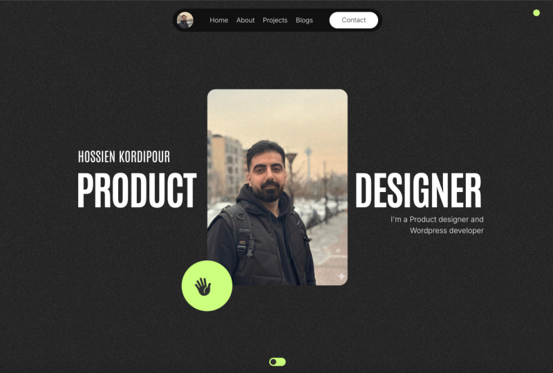
simple portfolio site. We have a home page, it has a navigation menu at
the top with three tabs. We have work, we have about, and we have a contact page. We have a bit of a header here at the top with my own name, my title, my location, and my current availability. Then we have some projects here. I haven't added any title, but notice how each one of them will have
the same layout. We have some CTA,
we get in touch, and then a footer with
social media links. I've also designed
the mobile version, and although we are not going to copy this version into framer, it's good because it
gives me an idea of how I want my design to look
on a mobile device. We have then the same thing
for the project page. We have the project here at the top, we have a main image, some bit of description, the role client, some
data about that project. Then we have some images, paragraphs, and the same
with a different layout. Then the same CTA
here at the bottom. Finally, we have an about
pit with a header with some information a bit
about my experience, how to get in touch
and that same CTA. This is a very basic design, but it has some elements that
as we work on it on framer, it will make our life easier. Things that we can reuse. Things that we can design once and just duplicate
as much as we want. We are going to try to build
this in an efficient way. Something to note as well
is that I've tried to name every layer and every group so that once we
copy into framer, it is much easier to
understand what's getting copied and what bit
we are editing. I suggest that if you're using your own designs,
you do the same. Make sure that each
section is grouped correctly and each layer
is named appropriately. If you want to use this
design instead of your own, go to the resources, stab and download it
from there again. If you have any issues with it, let me know and I will try
my best to help you with it.
6. Copying the Designs into Framer: You should be all set. If
you have watched until now, you should have an
account with framer. You have installed
the plug in to bring our Figma
designs into framer, and you are now ready to go. Remember, you can use
your own designs, but I'm going to use
the project that I've presented on the previous
lesson for this whole class. Let's go, in order
to simplify things, we're just going to copy
the desktop version. And we are going to start
with the home page. I'm going to go back
to Framer and go back to my dashboard so I can
create a new project. I'm going to hit new, and I should be presented
with a blank page. I'm going to go back to Figma. I'm going to be a bit brutal. I'm going to select
everything on my home page. It's all under a frame, but I'm going to select the different sections
of my home page. I'm going to go to the
Figma menu plug ins, and hit Figma to
HTML with Framer. Notice here at the
bottom how it's saying that it's
copying my layers. I'm going to say
copy to clipboard, and it's telling me
that it's copied 51 layers that I can
paste into Framer. I'm going back to Framer, selecting the desktop and I'm
just going to say command. You might be thinking, okay, everything is here copied, but I can't see anything. Well, the background color
is slightly different. I'm going to make sure that the background color
that I have on Figma, it's the same that I have
on Framer. There we go. Everything is copied now. But I can't see
beyond this point. This is because this desktop doesn't have the
appropriate height. Instead of saying 1,000 figs, I'm just going to
say fit content. And there we go,
that is perfect. But again, I'm running
into another problem. Now, the width that
I have on framer is slightly smaller than the
width that I have on Figma. There's two ways to solve this. Either we change the desktop with framer to match
the one on Figma, or we change the
different elements that are beyond this point to
fit in this new width. You can do whatever you want. In this case, it's
definitely up to you. But because I can see it's
just this element here, whereas the rest is
working correctly. I'm just going to fix this. Instead of saying that
the width is fixed, I'm going to say that
the width is on fill, the width is filling the container that
this element is with. We can do the same with
these other elements. This is our same design
we have on Figma, and now it's on Framer. The good thing here is that on Figma we've built everything
using auto layout, which means that it's preserving the different distances
between the elements. It's preserving the
different layouts. And something as quickly
as fix the width. And the height of an element
is very simple because it's built as a stack as
auto layout on Figma. Now if you're not familiar
with auto layout on Figma, I suggest you watch tutorials and you
get familiar with it because it's one of
the most useful tools that the platform offers. Because it's
something so common. Now, Framer, although it
has a different name, and it's calling it Stack, offers the same properties
that we have on Figma, so we can match our
design exactly. Now let's quickly do
our about page as well. We go to pages and we
create a new page, which we are going
to call about. Let's do the same. We
go to our Figma file. I go on the about page. I select the different
layers that I have here. Go into the Figma menu. Plug in Figma to HTML, make sure it's copying it. Copy to clipboard, go to framer, and hit command V. Now we are running with the same problem.
We know how to fix it. Now we are going to set
the high to fit content. This bit here, we are
going to say Feel. The only thing here
is that because this desktop version is a bit narrower than the
one we have on Figma, there isn't that
much space between these two elements on
the framer version. Now, we can leave it as is, or we can change it if we want. I'm going to say start, and I'm going to make
this image a bit smaller. It's about the same height
as the text element. There we go. We have our
about page all copied. Now I said earlier that
we can be efficient with the way that
we design things that look the same
and work the same in different pages can be turned
into reusable components. If we go back to our home page, we have this project link here and it's repeated a few times. Now each project is the same element with
the same information. It will have different titles, but it's the same data. We have a title, we have a
type, and we have a year. That then will link
to another page. We can turn this element
into a component. Now, what is a component? It is exactly the same
as what is on Figma. Components basically are
elements that you can reuse across your whole
project or your whole design, and we'll help you manage consistent designs
across different pages. We can go ahead
select the full link. So make sure that you are
selecting the project link. We're going to right click
and say Create Component. I'm going to call
it Project Link. This will create a separate page where we can edit that
master component. I'm going to remove all
of this if we want it, we can duplicate this one, have the same exact thing. But now if we want to
edit them all at once, we can just go here. I'm going to change
the phone side, going to say 64, I'm
going to say 24. When we go to our home page, it's changing all
of its instances. It's a very good way to work efficiently and
to make sure that all the elements that
look the same in your side are updated correctly. For now, we're going
to leave it like this. We've copied the designs
for our home page and for our About page from
Figma into framer. You might be thinking, okay, what about the project page? We have a project page here that we should be
copying as well, right? Okay. We are not going to
copy it right now because it requires you to know
about collections and CMS, which coincidentally
is the next lesson.
7. Understanding the CMS: Now we have the main
skeleton of our site. We have our home page, and
we have an about page. And now we need to
think of our projects, but before that, we need to talk about the CMS or collections. Let's imagine the following. Each project is a block. Each block has
different information, because two projects won't
have the same title. Maybe they have the same year, maybe they have the same client, but the fields will be the same. You have a title, you have a project type,
you have a year, you have a client, and maybe you have some
paragraphs and some images. Each page will basically
have different content, but we'll have the
same structure. We can think about
it dynamically. We create the page or
that component one, and we use it for each project
with different data in it. For that, we need collections. Now if you're not following it, let's see it in a practical way. We'll go to the CMS Stab and we'll hit here at the
top, the plus button. This is creating a
collection for us, and we are going to name
it Projects Perfect. Now, this doesn't
have an item here, it only has two fields here. We have title and we have Slug, which are the basic
data that we need. We are going to say
edit fields here. You can add whatever you want. We've already mentioned a few. Let's add plain text and let's say year because it
will be plain text. We are going to add client. We are also going
to add project type and we are going to add
role for now. That's it. See that you can add different
types of field for now. We're just going to keep it as plain text so we can
edit it quickly. But feel free to
explore all of this. Now we have all of these fields, but we don't have any content. Let's create a new
test item here, we can fill the
different fields that we've created for title. I'm going to say
Nike store website, which is an imaginary
project I've never done, but would be really good year. I'm going to say 2019
client, obviously. Nick project type. I'm going to say
website design, enroll. I'm going to say UX designer. I'm not going to add
any content for now. And I'm just going
to say safe, cool. That's added one
line into our CMS. I'm going to populate this
with a few fake projects, so we can explore
the CMS options. Okay, let's work with this five now we have this
information here. If we go back to our page, you'll see that we have the CMS here and we have our projects. But now we need to
pull this information from the CMS to
our actual design. Because although I've added
five projects into my CMS, these are not showing anywhere. How should I do that? Now there are two ways we can
use this information. We can use them as
collection list or we can use them
as specific pages. Now, collection lists are all the items from our
collection in one place. Imagine like a list of all the items that
we have on our CMS. Just put in one page, which is exactly what we
need for our home page. Pages are pages for
each item in our CMS, a page for each one
of our projects. Now, the way to insert this
is by going under Insert. And under the CMS section here we have the
collection list. And we can drag and drop
here all the projects, or we can drag and drop content fields into
our specific page. Now we have our CMS added with five projects and the
different fields that we need. We know that we need
all these projects as a list in our home page. And we know that we need
one specific page for each project where we pull
all this information. Because this requires
a bit more work and we need to
finish our design. Let's focus on this
on our next video, where we'll have
a project list on the home page and a project page for each one of our projects.
8. Creating a CMS Collection: Cool, so let's focus on
the home page first. First thing we need is
a list of our projects. I'm going to remove
all of this and just leave one instance of
our project component. Remember that we created a component for
this project title, and I'm going to leave it
like this. You'll see why. We're going to go to
insert under CMS section, we're going to say
collection list. I'm going to drag this here. This is the way our projects
are presented as a list. It's correct because it's
pulling all the information, but it looks nothing
like our designs. But luckily for us, there's a quick way to fix
it under layers. You can see, first of all, that we've added it on
the wrong side. It shouldn't be under CTA. This collection list should
be under the project section. First of all, let's change that. Now. I'm going to
remove the contents within this collection
list where it says Post, I'm going to remove it. This collection list is
basically connected to our CMS, and what it does is pull
the information from our CMS into whatever
content it has underneath. So we can take our
component and we can drag it inside
collection list. Now, it will create five
instances of the same thing, because we have five projects. But now we have two problems. First of all, our
design has changed. That is because the
collection list doesn't have the right width. So instead of saying fixed, I'm going to say, feel cool. First thing fixed. The
second thing is that it's not pulling the
data from each project, from our CMS. Why is that? Well, that has a very simple
answer. This is a component. The basic idea of a component is that whatever it says here, it will say here
unless we change it. But we only have
one element here and we can't edit this one here. How do we edit this one? It shows the information for
each one of our projects. What we need to do now
is create variables. Bear with me, This is not
as complex as it sounds. The only thing we
need to do is to make sure that these three fields change with
whatever information we are pulling from the CMS. There is a very easy
way to do that. Our project title here
under the text section, it says content on content, it says project title. If we change this, it will
change the text here. If we go back to our home page, it will change the text here for all of our instances.
Okay, cool. What we need to do is make
sure this is variable. Instead of writing
here what we want, we are going to
create a variable. We do that by hitting
this plus next to content and say create
variable and say plain text. We are going to call it the
same thing as we had it. And we're going to
say the default is project title and this way it changes back
to what we have. Cool, I'm going to go ahead and do the same
thing for the two. We go under text, we're going to say
content create variable, plain text, project type, and then we're
going to say year. And same thing. Content
create variable, plain text, year. There we go. Now it's connected. This text should be now dynamic because
we can't change it here, we're going to go back
to our home page. This hasn't changed,
but we are able to now pull information because we've created these
three variables. Here on the right side panel, we will say something
says Project Link, which is the name
of our component and the three variables
that we've defined. What we could do here
is change it manually. But again, it will
change for each project, and that's not what we want. Notice this plus button here. We can now connect it to variables that we
have from our CMS. We can say that project
title will be our title. The project type will be, the project type
will be the year. This is how you change
it dynamically. Now we have all the
information being pulled from our CMS into this project
list, and that is perfect. But now we need a page for
each one of these projects. We're going to go to
the Page tab under CMS. We're going to hit the P
projects and say detail page. This will create a tap here
that says project pages. 55 is the number of projects
that we have on our CMS. Here at the top, we can see all the different
projects that we have. The good thing about here is that you only need
to design it once. If we go ahead and design
this Apple campaign one, it will adapt for each
one of our project pages. First of all,
delete all of this. Then we're going to go back into our Figma design and do the same thing that we
did for our home page and for the about page, which is copying everything
with our plug in. Remember we go to
the Figma menu, Plug in Figma to
HTM with Framer. You know how it works.
It should be very quick. And we're going to select
this and heat paste. Perfect. We have our
page now. Looks good. We have some issues
here with an image, but we know how to
tweak it that we go. Remember that we are
now editing the apple, the Apple projects, same
thing we've done before. We can assign
different data from our CMS into different
fields, into our site. I select project type, which should actually set project title, sorry about that. But we select project title, we go to text Content set variable and say
title under year. We can do exactly the same. I'm going to change
this as well, just so you see how it changes for all the different pages. I'm not sure if I've
created one for role. Yes, I did. Perfect. I'm going to do that for project type. We have the project type. Okay. We are now on the
Apple campaign page, but if I go to the Lego One, it should update with all the information that
we have on our CMS. That is perfect. That's
exactly what we want. We've created it once, We've been efficient with it, and we don't need
to create a page for each one of our projects. What's more important is that if we now want to edit this, because we don't really
like our design on Figma, we want to change something,
whatever we want. Anything that we change
here in terms of layout, in terms of funds, in terms of anything it will
adapt for each page. They will all look
exactly the same. You've seen how easy it
is to work with the CMS. You add all the data here. And what's more is
that you could add more items here and edit the
fields however you want, and you can pull that
information into the designs. But what's good now is that we have now all the
pages of our site. We have our home page with all the projects here as a list. We have the about page. We have the project pages for
each one of our projects. Now we have set up the design, we've added the collection. So we're ready for
the next step, which is connecting
all of these pages together so you can navigate
to each one of them.
9. Linking the Pages: There are multiple
things that we need to connect on our side. We need to connect
the navigation to each individual
page on our side, we need to connect each project link to each project page. Finally, we need to
connect this get in touch to maybe an
e mail address. And these three
social media links to the social media platforms
or profiles that we want. First of all, let's start with the project ones because I think it's the most
important one. Now what we need to do is
go back into our component. Because remember
that whatever we want to edit on
this project list, we need to go to the
component just to make sure it applies
to each one of them. Double click to get into it. Now we are going to add a
link to the whole thing. What we can do is
just add link here. Instead of tagging a
specific page or URL here, we're going to
create a variable. We are able to edit
it on our home page, create the variable,
that's fine. Now we're going back
to the home page. Remember that we access
the variables from the section here under
component project link, because we don't
have anything on the CMS that's a link
or anything like that. We don't have that
plus pattern here. But if you click here on A, we will see project colon slack. What sluck means is the
actual page of the project, the specific link for each
project as defined on the CMS. Now if I hit Slc, there we go. It will link to the
appropriate project page. There is one way to test it, and for that we need
to preview our side, which is here at the top. We can click here. We
can scroll down to our project list and hit on
one of the projects perfect. And maybe say the leg
of one that's perfect. Amazing. Now the projects on our project list are linked to each
specific project page. The second thing we're going
to do is the navigation. Now we can be efficient with
the navigation because it's an element that will be repeated for all the
pages on our side. Why should we edit it on
each one of the pages? We should actually have
a component for this. This is what we're going to do. We're going to write,
click and say, create a component
navigation that's perfect, that will create a component for our navigation that
we can just copy and paste to all the pages of our
side and just edit it once. Before doing that, I'm going to link each one of these links. This should take you
to the home page, should also take you
to the home page because we don't have a
specific page for work, About should take you to
the about page contact. For now, we are
going to link it to an E mail address just because we don't have a
specific contact page. Let's go here. I'm going to select the icon. I'm going to go here
where it says link. I'm going to link
to the home page. There we go. Now it's linked. Now we're going to select
work. Do the same thing. Link to home page, the about page link. And we are going to
link to the about page. Notice here where it says link. It's because it's
pulling a default style that we can change if you want, we can change how it looks. By default, any link
is with this color. And I don't really like it, I just like my white color. But on Hover, we are
going to maybe change it darker blue. Let's test it. Remember, you can
preview anything. You can preview this
component here. Yeah, it's a bit harsh to see, but yeah, we're going
to leave it like this. Then the contact page, we are going to add a mail to, I'm going to say my e mail. And that will open your default mail app to
write an e mail. So we are going to leave it like that and not worry too much. Now we have our navigation link to the about page.
The work page. Let's go back to the home page. What we'll do is just
copy this navigation so you can command
or just say copy. We are going to go
to the about page. Hit desktop, say command V, drag it to the top, Perfect, and remove the navigation
that is not a component. Be careful which one you remove. This one is a component with
this diamond symbol here. This one is not. So we
are going to remove it. We are going to go to
our project pages. Remember that you only
need to do it once. And here I'm going to select
Desktop, say command V, drag it to the top, and remove the navigation
that is not a component. Here, we have a bit
of space at the top, and I'm going to make
sure it's at the top. There we go. Now we just need to check that it's working
for all of our pages. That's perfect. That's
exactly what we wanted. Now let's do the same
with our footer, which should be much easier because we already
know how to do it. Remember right click,
create a component, going to say footer and link it to each one of your
preferred social media. Cool, there we go. Now let's get out back
to our home page. I'm going to command
C to copy my foot. Go back to the about page. Copy the footer and make sure
it's in the right position. And remove this one. Make sure the width is filled just we
want to take the full space. Then we're going to go
to the project pages, Select Desktop and
remove the footer. That is not a
component. That's it. We have our footer connected, our navigation connected
the project links connected to each
specific project page. But because the navigation,
because the footer, because everything has to be connected not only on desktop, but also on mobile and
other breakpoints, we need to talk about
responsiveness. And this will be a big topic. Get ready for the next lesson.
10. Designing for Mobile: Home Page: I think it is pretty obvious
that in this day and age, all websites have to look
good on all devices. And we can assume that
everyone will be looking at our website from
our desired device, in this case, a laptop. Most people access
websites from their phone, and we need to cater for that. Actually, we've already done it. On our designs, you can see that we've designed for
desktop and we've also thought about the layout
that we want for mobile. That is fine, but how do we actually apply these
designs into Framer? Now, Framer, by default, when you open this
site on mobile, it will scale everything. Everything will look very small. And that's not what we want, we just want to make sure that it looks good and accessible. Now the good thing is that we've designed using auto
layout or stack, Adapting it to mobile
shouldn't take that long, although it requires
a bit of finessing. We're going to add
a breakpoint for mobile and you can see
that everything looks off. That is fine. We are
going to tweak that. The first thing is that we are going to adapt our navigation. We are not going to do
any fancy menu for now. I'm going to leave that for a bonus lesson that
you can watch later. But we are just going to
make sure that you can access each one of those links. We are going to create a variant here and I'm
going to give it a size. I'm going to say
that this variant is 390 because that is the size
that our device has here. I'm just going to copy that. Instead of having these three
links next to each other, I'm going to put them
as a vertical stack. And I'm going to leave
a bit more space. I'm going to say 35. And I'm just going to make sure everything is center aligned. We are going to go
with that here. Instead of having
this variant one, I'm going to say variant two and make sure
that it looks good. Perfect. Second
thing is the header. Now, first thing that I notice here is that my name is huge, and I don't want it that huge. Let's reduce the phone size. Cool. You will see that
everything has duplicated. So now we have layers for
desktop and layers for phone. You can quickly access each
element on our phone device. I'm going to say 42. We have this stack here as well that is sitting
next to each other. Instead of horizontal, I'm
going to say vertical. I'm going to say left a line. That's already working. But can you see? There's a lot of
padding around it. We don't need that much. I'm going to select the whole stack instead
of having here. We can leave the 200
for top and bottom, but we are going to
say 20 here, 20 here. That's already much better. I'm just going to give it a bit more space instead
of space between, I'm going to say start,
I don't need that much. I'm just going to add 15. That already looks much better. That's perfect. Let's go
ahead with these sections. We are going to need
to be clever here. First of all, for
this whole section, I'm going to change
the same padding that we had for the one above
instead of 80 right and left, I'm going to say left, and
that's already a bit better. I'm going to change the fund
here. I'm going to say 24. But now I need to go
into each component, the same thing that we've
done for our navigation, and change it here so it can adapt for each one
of our projects. Let's go inside our
project component. Again, same thing we've
done with the navigation. We're going to create a
variant that is 390 width. The first thing that
I'm noticing is that this project title is huge. Let's change that
font size as well. It's going to be 42. The project type will be
24, which is already good. 24 for the year,
which is perfect. Now on our phone design, we're going to
select the component and make sure it
says variant two. It looks okay in
terms of sizing, but it's doing weird
things because it extends beyond what
we needed to be. We're going to go back to the component and
this project title. We're going to make
sure it says fill. We're going to leave it as space between and under
the project details. We're going to say with fill, just to make sure this project
title takes as much space as possible without
going over the year one. When we go back
to our home page, this should be fixed. Now notice there
isn't much spacing between the title and the
year when the title is long. And we can fix this by saying, instead of space between, we can say start and
adding that gap of 50, which should fix this. Yeah, that's perfect. That's exactly how
we want it to look. Now let's go ahead and
tweak font sizes that look a bit too big for
my taste to say 38. And we're going to
fix this footer the same way that we've done
it with our navigation. We are going to create
another variant. We're going to give it a 319. We are making sure this
is a vertical stack. We're going to give it
not that much pudding. And let's center it. Now we select the footer, and we say variant
to that is perfect. That's exactly how we want
our mobile version to look. Everything will be
connected the same. It's just the layout
that we've changed just to match our designs. Which is perfect. Cool,
let's go ahead and tweak the project pages and
the about page as well.
11. Designing for Mobile: About & Project Pages: So we already know how to create a mobile responsive breakpoint as we've done for the home page. Let's do the same
for the about page and this should be
fairly quicker. We're going to
create a breakpoint for phone, first of all, we are going to select
the correct variant for the navigation
and for the footer. I'm going to change the phones because I already know the
phone size that they have. For this one as well, we need to tackle the
mid sections here. And it should be fairly
simple because again, we are using stack
and everything is already set up to be
responsive in a way. The first thing we're going
to do is tackle the header. We have a horizontal stack here that will change
to a vertical, and that's already solving this. We're going to change the
padding as well as we've done for the homepage that's
already sitting better. We are going to change
the phone size to say 64. To say, Phil, I'm going to change this text here
to fill the space. Cool, I think that's already solving a lot for
this image here. It's sitting a tat smaller
so it could fill the space. We're going to say, Phil, perfect, already solving a
lot. We have the header. Now let's tackle this
experience here. Again, should be fairly simple. First of all, we are
going to, again, change the padding, which
we already know how to do. The horizontal stacks here, we are going to
change to vertical. Then we have some stacks here
for each one of the roles. These are, again,
horizontal stack that we can change as verticals, They have a lot of
gap in between. Let's quickly change
that for each one, I'm going to say ten. Instead of having
the space between, I'm going to say start and I'm going to
give it a 50 space. Perfect, We can do
the same with this. Get in touch, we have
this description here that's sitting as a horizontal stack that
will change as a vertical. The space between,
we're going to change the start and give it
50 as the one above. We have the frames here and the contact details that are horizontal stack that
will change the vertical. This frame we are going to
say fill instead of fixed. Just to make sure that
it fits our space, let's make sure they all have
a nice spacing in between. Perfect, That's it. That's our about
page, ready to go. And the last thing we need to change is the project pages. Again, remember, you only need to do it for
one of the pages. It will adapt to the other
ones. Let's quickly do that. You should be fairly
quick with this. Now we've done it twice. But again, if you are
not understanding the process or if I'm going
too fast for your taste, let me know and we can do a lower tutorial on how to tackle the different
width and height options, what each one of them means, how to work with
layouts or stack or grid or auto layouts. If you are lost
with those terms, just let me know and
I'll make sure to explain it much lower.
We know how it goes. A bit of a change
here with this image here because I wanted
to be a bit taller. I'm going to give it a fixed de. I'm going to unlock this and make sure this is set as fill. It will take a bit more space, it's not that small then for this section here,
it's just the same. You've noticed it's not that difficult once
you've done it. Once you know what you look for. Basically you can
change the direction of the stock from
horizontal to vertical. You change the text. Instead of fixed, you
change it to Feel. And same with the titles. Make sure it looks good. Change the padding so it takes a bit more space for the images. You might have to be
a bit naughty and give it a fixed height
or a fixed width, and that is totally fine. It's your website, you have
to be comfortable with it. Just make sure that
everything is filling the container that it sits in. Once you've done it once, you know exactly
how to change it, because I know this
responsive thing. It's not easy for everyone. I'm going to leave some
guidelines that you can use. The first thing is to make sure that the text
is set as fill. So it's filling the
container that it sits in. Then for each container, or for each stack that you have, make sure that the padding
is set up correctly. It's not taking a lot of space from left and right,
from top and bottom. Also, make sure that
the stack that you have are set up as vertical
instead of horizontal. This way, instead of taking
the width of the page, it's taking more of
a hide and we have more space to read everything
correctly. There we go. Now we have all our pages designed for desktop
and for mobile. Before moving on, let's do a quick recap of
what we've done. First of all, we've
checked our Figma design. We've seen how everything is organized and how
everything is named. We've installed the
plug in to bring our designs from
Figma into framer. And we've actually run it. We've copied basically the
desktop version to framer, of our home page
and the about page. We've also created the
navigation and the footer as components so we can reuse
them for all of our pages. We've created a collection
list with all our projects, bringing data from our CMS. We've also created
individual project pages for each one of our projects. We've connected everything by linking each project
to each project page. The navigation to
each specific page, and the footer to the different
social media platforms. And finally, we've created
a responsive version. So our designs look
good on mobile. Before we continue, make
sure that everything looks good for you on desktop. On mobile, everything
is connected. The CMS is working. If at any of this
point you got stuck, let me know below so I can
help you and assist you. Because the next
thing we are doing is adding animations
and transitions. So you want to make
sure your designs look good before
moving on to that.
12. Adding Motion: Animated Transitions: The only thing left to
do right now is to add that extra layer of
finesse to our side. To do that, we're going to
add some movement nowadays. Having a static website
is very weird and they all include some level
of movement or animation. And this is what we're
going to do now. Now doing animation on framer
is extremely easy because there are a lot of presets that you can use
however you want. They are all under
the effect section here on the right side panel. And we can add
animation on a peer on hover on different
interactions that we do. We can define the speed. We can define transitions. We can define which
element we want to modify, like size, opacity, color,
anything that we want. On this lesson, we are going to tackle three
different types of animations on interaction that you can replicate very easily. Although we are just
doing this now, I suggest you experiment
with it and you go crazy. Because it's really cool to see what framer can do in this area. The three types of animation
that we are going to do is appear as an element,
appears on the page, on scroll, as we scroll
through this page and on when we hover on
that specific element. Let's start with the
header, animation. When we first line on the page, when that element
appears on the page, this is what we are
going to create. When the page load, we
have this element appear. With a fading transition, the only thing we need to
do is select the elements, make sure that the whole
header is selected. We are going to go to effects, select a peer, we are going
to use one of these presets. By default is using
the fading preset, which I already like
because it's very subtle and it's not
like a huge movement. We can also define how
that animation enters. By default, it has like
a spring transition. It goes 0-100 that
would be the animation. It's not scaling, the
scale is set as one. It's not rotating,
so it's set as zero. And there isn't any offset. We can hit on the
spring transition as well instead of spring, I'm going to say because
it's much subtle, and spring might be too much also because I've
already played with this, and I know that is what I like. But again, play with it
and experiment on time. I'm going to say no, 0.5 I'm going to
add a bit of delay, not much, just so it gives us
time to see the animation. Good, I think I'm happy with it. I'm going to try it out and I'm going to hit Preview.
And there we go. That's our animation.
It's very subtle. It doesn't need to
be that strong. Yeah, I'm happy with it.
Perfect. The second animation will be a scrolling animation. As we scroll, these
elements appear one by one. Because we are using a
collection list and a component, we only need to create it. Once again, we are going to make sure we're
selecting the project link. We're going to effect, we're going to say scroll animation. Now we want the trigger to
be when that layer is in view as we scroll and that
layer starts appearing, that animation kicks
in not before, otherwise we would miss it. We're going to start it at
the center of that layer. We're not going to add a replay. That means that when we
scroll, that element appears, that element stays there instead of going on and off as we
scroll along the page. But again, I suggest you try these animations
and then play around with them and see how it feels and see what
feels right for you. Because maybe you are a fan of a replay effect, I'm
going to say no. Instead of using fade in, I'm going to say
slide in bottom. You can define the enter again. I'm going to change again to ease the offset means
how much is moving. It's moving on the
y axis, 150 pixels. And maybe that's a bit too much, but okay, let's see
how that works. We have that initial animation, we have this one sliding in. I think it looks nice. And see as we scroll up, it's not replaying again. I'm going to tweak
this a bit more. I'm going to change it to 25. I'm. Yeah, leave it like that. See how it feels? Great. I
think that looks really nice. Perfect. Now, for the
third type of animation, we are going to do something
that looks very fancy, but it's very easy to replicate. We are going to do
this hover effect. When you hover on this element, it shows a different
type of information. Now in order to create this, we need to go inside the
project leaks component. We need to create a
component out of this one. Otherwise, because it's
sitting in a stack, we can move it freely. Just bear with me. Let's create
a component out of this. I'm going to say
project type is fine. We are going to
duplicate this one and move it down
outside of the frame. It needs to sit right outside. If this is the
frame, it needs to be positioned right outside
so we don't see it. I'm going to say
client and we are going to set up as
a client variable. Cool. Now we are going
to set a hover state. Which means that when we hover on this element, this happens. Let's create it. It
could be that maybe instead of moving or doing
something, this changes color. If this were the case, I'm going to change the
color on the hover state. Let's preview on hover.
It changes color. Okay? That's not what we want. But we can see that we
can define a hover state. Let's go back to
the original color. What we want is for this one
to move where this one is. I'm going to make sure this is centered and this one sits
right above. Let's preview. Perfect. They are both
moving, but okay, I don't want to see the
client on the first state, and I don't want
to see the project type on the second state. We need to define the
overflow as hidden. And let's preview Now that's
it, that's our effect. I'm not even touching
the transition because it's using spring. And I think that works. I like it, I'm going
to leave it as is. But know that you can also
change the transition preset or effect
on here as well. Let's go back to our main
component and preview it. I love it. I really
like how it looks. Let's make sure that we are connecting to the
correct variable. We are going to create variable here as we've done
multiple times. Let's go back to our home page. Here under client, we are
going to set this variable. We can see it now. But
when we preview this, we have our nice
transitions. And we hover. We have our client here. I think that looks perfect. That's exactly what we wanted. These are just three
types of animation or transitions that you
can add to framer. We've just done it on
the home page now. Feel free to add animation
on the project page, on the about page.
Go crazy with it. Experiment with funny
transitions and animations. But I would give you
a word of advice. One thing I've noticed
every time that I've designed something is
that less is more. And if we overdo it, the animations kind of
take space and people don't notice the content or
they even feel overwhelmed. So yeah, a little bit of
movement goes a long way. I think we're at that
point now where we are ready to publish
our website. We have all our content, we have some nice transitions. We have the phone
breakpoint ready to go. So yeah, I think it's time. And that's exactly what we will do on the following lesson.
13. Publishing our Website: So let's publish our website. And for obvious reasons, this will be the shortest video. Because publishing a website
on framer is so easy. Literally, we just need to
go here and hit Publish. Yeah, that it, your
website is now live. Cool. Okay, bye now.
Let's wait a second. I'm just getting, I'm
sure you don't want to present your professional
work and send your portfolio to clients as little home 9036
to a framer, right? Like you can do that, but that's not the
most professional way. First of all because
it's not that recognizable and no one will know that that
is your portfolio. Second, because
maybe you don't need them to know that
you've built this with framer and you
don't want to show that that's a Framer
app, you do you. But I would suggest you
add a custom domain. Now in order to connect
a custom domain that you own and hide
that framer side, you need to upgrade,
which means paying a monthly fee to framer and
adding a hosting service. But if you don't
want to do that now when you are still
not ready to pay, you can get a free
Framer subdomain. So for me it would be my name, Framer dot website for instance. Or we can add Framer. I'm going to leave
it like that and save that will be your
new custom domain. Once you are ready to add your own without that framer site, you can remove the domain and add your own.
It is that simple. It's very quick to change. I'm going to leave it like that just to show you how it works. But since we're here,
let's go over some of the settings to
improve your site. Now if you remember the
first video to this class, I went very quickly through
all of these settings, but now that our site is done, we can go a bit more
slowly and add all things to improve our SEO
and site in general. The first thing is that I'm
going to add site title. The language is English and know that you can
add multiple languages. Now that's really handy. I'm going to add my
description if you want. You can also add a fabcon, which is the little logo that
shows here on the browser. You can add a social image Every time you share your link, your website, on a
social media platform, that image will show up. I'm not that bothered now, and this is something
I can do later. I'm going to leave it like that. But feel free to
add anything that you want into this image. Just make sure that it's
something relevant to your site and that is quickly recognizable as something that you've made. Some other settings that
you can add if you upgrade. You can also have a password
protection just to add that level of security to your site even
without uploading. You can add your
Google Analytics ID in here to connect to the
Google Analytic site, which is very useful, although Framer has its own
analytics stab in here. Once you publish your website
and you start sharing it, you will be able to see some data on the visitors on
the paid view and what are the top sources that
people are coming from and the top pages
visited on your site. Finally, something that
I've mentioned is that you can select which
version is live. At this point the
staging is disabled, which means that the
latest version that you've created will be the one that
goes to all the domains. If you enable staging, you will be able to
select which one of the versions that you've created goes on the live version. Because we've done
this just today, there's only one version, but if you add changes
and if you add content, you can select which version is live and which one is the
one that you are working on. Finally, and you've seen
that it's not needed, You can upgrade to a
paying version of Framer. You can add more stuff. You can have unlimited pages. Many more other features. However, we've created this site completely for
free and you'll be able to publish it to a live
URL completely for free. As an advice, you can create
your site on a free version. And once you are ready to
publish to a custom domain and add more features to it,
you can start paying. But again, this is
just an advice, you do whatever you feel
more comfortable with. You are now, do you
have a portfolio now? And it is time to share it. Whether you've connected
your custom domain or you are just using the framer one,
which is completely fine. Or if you've used
your own design or the one that I've provided. Make sure you submit
your portfolio by sharing the link on
the project stab so that everyone can see it. If you have any questions whatsoever about any of the lessons that
we've done so far, let me know in the discussion
stop and I will answer. You also remember there
will be some extra lessons. The first one about
how to create a responsive navigation bar
with a nice hamburger menu. But this is totally
optional and you don't need it in order to
publish your site. Don't stress for now, make sure you submit
your portfolio because I can't wait to see what
you've created with Framer.
14. Conclusion: Congratulations on having
finished this class. Make sure before you
leave, you share your life website by adding
the URL on the project stap. And remember that this is
not the end of the road. A full world of
possibilities has opened now that you
know how to use Framer. And just for starters, here are a few
things that you can improve on the site
that you just made. First of all, you can add another breakpoint for a
tablet or another device, as we've done with the phone. Next, you can add
more fields into the CMS to manage
paragraphs of text, images, videos, or links. And then you can go crazy
by adding animations and transitions on the about and the project page as we've
done on the home page. Now these are just
sub suggestions, but feel free to explore the rest of features
that Famer offers. If you want something a
bit more challenging, remember there
will be some bonus lessons added to this class. The first one on how to create a responsive navigation
with the hamburger menu. Stay tuned. But for now, all I have to say
is congratulations again and thank you so much
for watching this class.
 Nuria Quero, Experience Designer