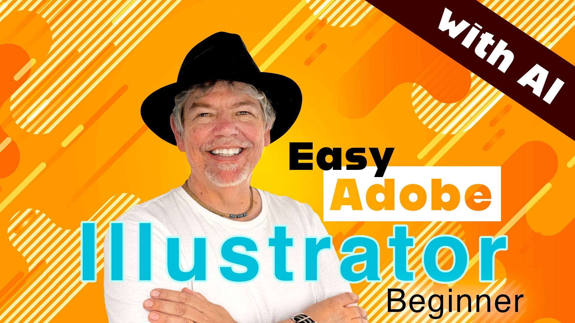
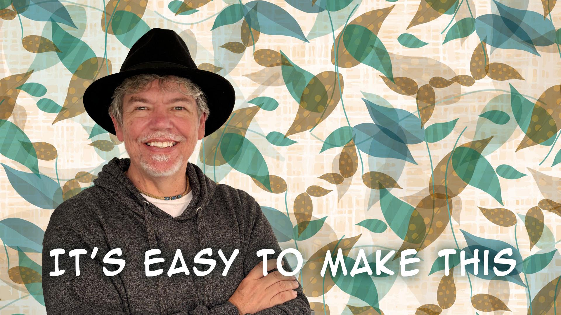
Design Bold Social Posts Using Patterns & Filters in Adobe Photoshop
 Tim Wilson, Adobe Certified Instructor and Expert
Watch this class and thousands more
Watch this class and thousands more
Lessons in This Class
-
-
1.
What We're Creating and Intro
0:35
-
2.
Make Your Pattern with Text
3:14
-
3.
Add the Instrument and Make a Groovy Background
3:42
-
4.
How to Warp the Text
1:35
-
5.
Using a Smart Filter to Add a Filter Gallery Effect
3:25
-
6.
More Text, Save it for Social Media & Outro
2:35
-
-
- --
- Beginner level
- Intermediate level
- Advanced level
- All levels
Community Generated
The level is determined by a majority opinion of students who have reviewed this class. The teacher's recommendation is shown until at least 5 student responses are collected.
22
Students
3
Projects
About This Class
What You’ll Learn
Welcome to Design Bold Social Posts Using Patterns & Filters in Adobe Photoshop! In this course, you'll discover how to create striking social media posts with ease, using the powerful Define Pattern feature, the Warp tool, and the Cutout filter from Photoshop's Filter Gallery. By mastering these techniques, you’ll be able to craft professional-quality designs that stand out and grab attention on social media. Whether you're designing vibrant backgrounds or creating eye-catching posters, this course will equip you with the skills to make your work truly pop!
Hi, I’m Tim!
I’m an Adobe Certified Instructor and Expert, and I work as a designer based in London. I’m excited to guide you through this course and help you unlock the creative potential of Adobe Photoshop. With years of experience in the design industry, I’ll provide you with clear, actionable lessons to help you create professional social media content, posters, and much more.
Throughout this short, fun class, I’ll walk you through everything you need to know step-by-step. With easy-to-follow instructions, this course is perfect for those with some basic Photoshop knowledge. However, even if you're a beginner, you’ll learn quickly and feel confident using Photoshop to create bold, eye-catching media for any occasion.
Who This Course Is For
This course is designed for beginners who have some familiarity with Photoshop and want to dive into the world of creating dynamic, social media-worthy designs. If you want to create vibrant, attention-grabbing posts, cards, or promotional banners, this class will teach you the exact techniques to bring your ideas to life. Whether you're a small business owner, content creator, or just someone looking to improve your design skills, you’ll walk away with valuable tools and creative strategies to enhance your work.
What We’ll Cover
In this course, we will cover the essential Photoshop tools and techniques you need to create professional social media designs.
You’ll learn how to:
- Use the Define Pattern feature
- Use the Warp tool
- Easily create 2 or more flat color backgrounds using selections
- Use the Cutout filter from the filter gallery
- Put Text into a pattern
- Work with Layers and some traditional Photoshop Filters
- Use a Smart Object
- Use Blend Modes
- Make and save your own custom patterns
- Export for social media
What You’ll Create
By the end of this course, you'll have the ability to create bold and dynamic social media posts that grab attention and stand out. You’ll learn how to craft your own custom patterns, apply filters, and incorporate text seamlessly into your designs. You’ll walk away with a final project that showcases your newly honed skills and the confidence to take on any design challenge.
What You’ll Need
To get started, you'll need a copy of Adobe Photoshop CC. If you’re new to Photoshop, don't worry! I’ll guide you through every step of the process, from setting up your workspace to creating your final design. Additionally, I’ll provide you with resource files and a final Photoshop template to help you follow along.
What's Next
Once you've completed the course, you’ll have the ability to design stunning social media content, posters, and banners that stand out online. With these new skills, you'll be ready to experiment with more advanced design techniques and take your projects to the next level. If you're interested in expanding your Photoshop skills even further, check out my Non-Scary Beginner Friendly Adobe Photoshop course, where we explore the latest powerful AI features!
Credit & Notes
- List of marks used: Adobe Photoshop and its logo are registered trademarks of Adobe in the United States and/or other countries.
- All course resources are provided for educational purposes, and I’ve included a final Photoshop file that you can explore for inspiration. Make sure to check out the class discussion for tips, feedback, and community support as you progress through the lessons.
And if you like this short class check out my other ones where you can create this paper cutout text ...

or a groovy text with a fruit!

Or a cut-out with a cool Sunray background

as well as Making this Color Trail:

Design a Vibrant Color Hoop Background with Dynamic Pixel Drag Effect in Adobe Photoshop

Or this Easily Make Amazing Repeatable Patterns in Adobe Photoshop
Don’t forget to share your work—I love seeing what you create!
Meet Your Teacher

Hands-on Class Project
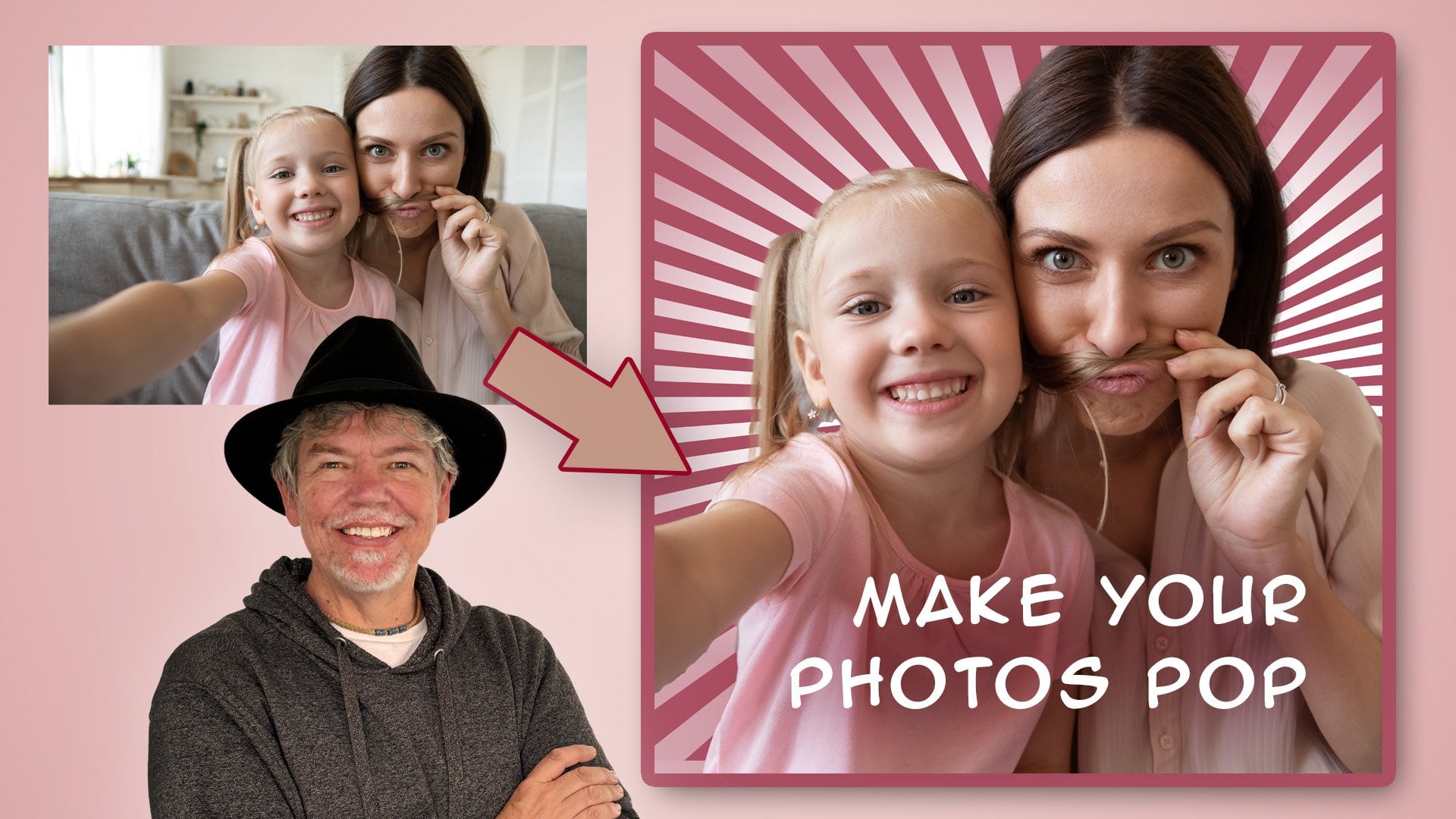
Make a Social Media Post with an Animal
For your project, I'd like you to create a social media post, similar to the music one we have just done. This time for the background, use the same technique that we did for the orange and yellow stripe but instead of using a rectangle, use a circle. For your cutout animal, watch your edges on the cutout and try to be as accurate as possible. If you wish to experiment with filters on the animal, do so, although I haven't done that on mine as I think it looks better without.
Have lots of fun with it and don't forget to post your work! I love to see them.
Here's my result - I've attached my layered file so you can see my workings:


Class Ratings
Why Join Skillshare?
Take award-winning Skillshare Original Classes
Each class has short lessons, hands-on projects
Your membership supports Skillshare teachers
Learn From Anywhere
Take classes on the go with the Skillshare app. Stream or download to watch on the plane, the subway, or wherever you learn best.