Design a Watercolorful Alphabet: Turn Hand-Painted ABCs Into Versatile Vectors
 Amarilys Henderson, Watercolor Illustrator, Design Thinker
Watch this class and thousands more
Watch this class and thousands more
Lessons in This Class
-
-
1.
Introduction
1:19
-
2.
Class Overview
0:25
-
3.
What You'll Need
0:38
-
4.
A-Z Text Template
1:43
-
5.
Thinking Ahead
0:35
-
6.
Basic Tracing Method
1:02
-
7.
Watercolor Painting Technique
0:57
-
8.
Lightbox Tracing and Painting
2:28
-
9.
Converting Watercolor to Vector
1:30
-
10.
Grouping Each Vector Letter
0:55
-
11.
Using Your Letters
1:30
-
12.
Go Create! Assignment
0:43
-
-
- --
- Beginner level
- Intermediate level
- Advanced level
- All levels
Community Generated
The level is determined by a majority opinion of students who have reviewed this class. The teacher's recommendation is shown until at least 5 student responses are collected.
3,950
Students
54
Projects
About This Class

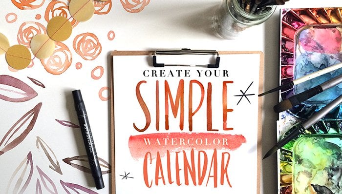
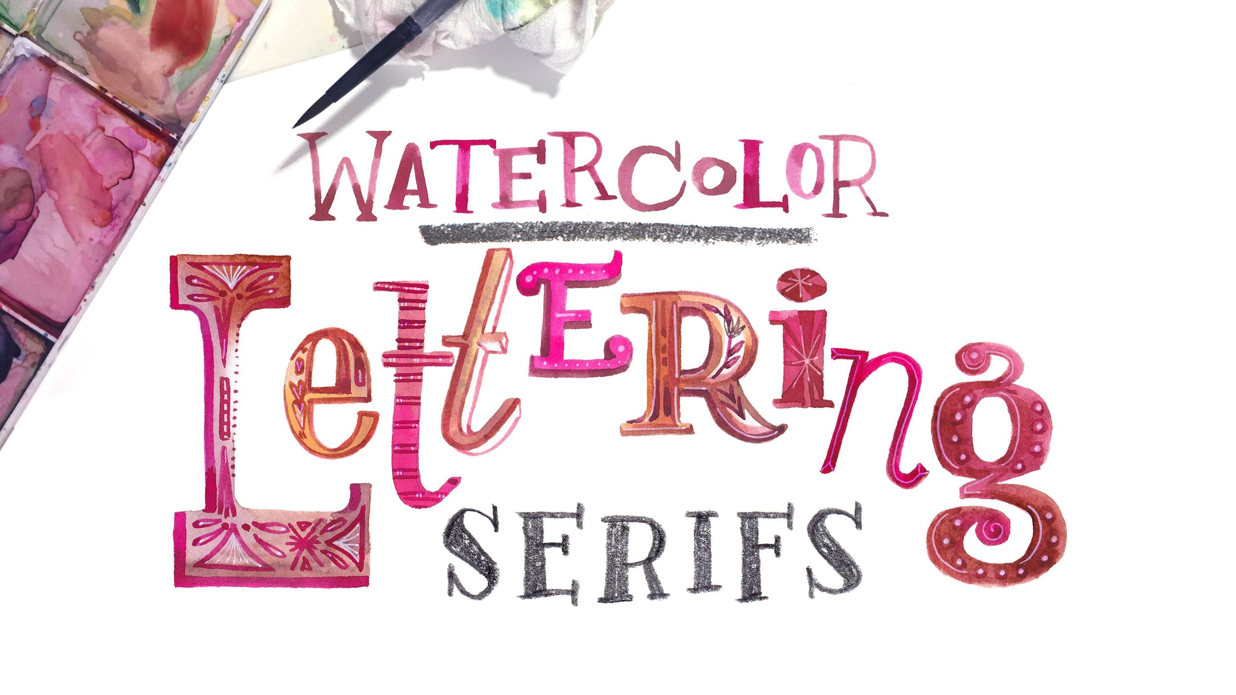
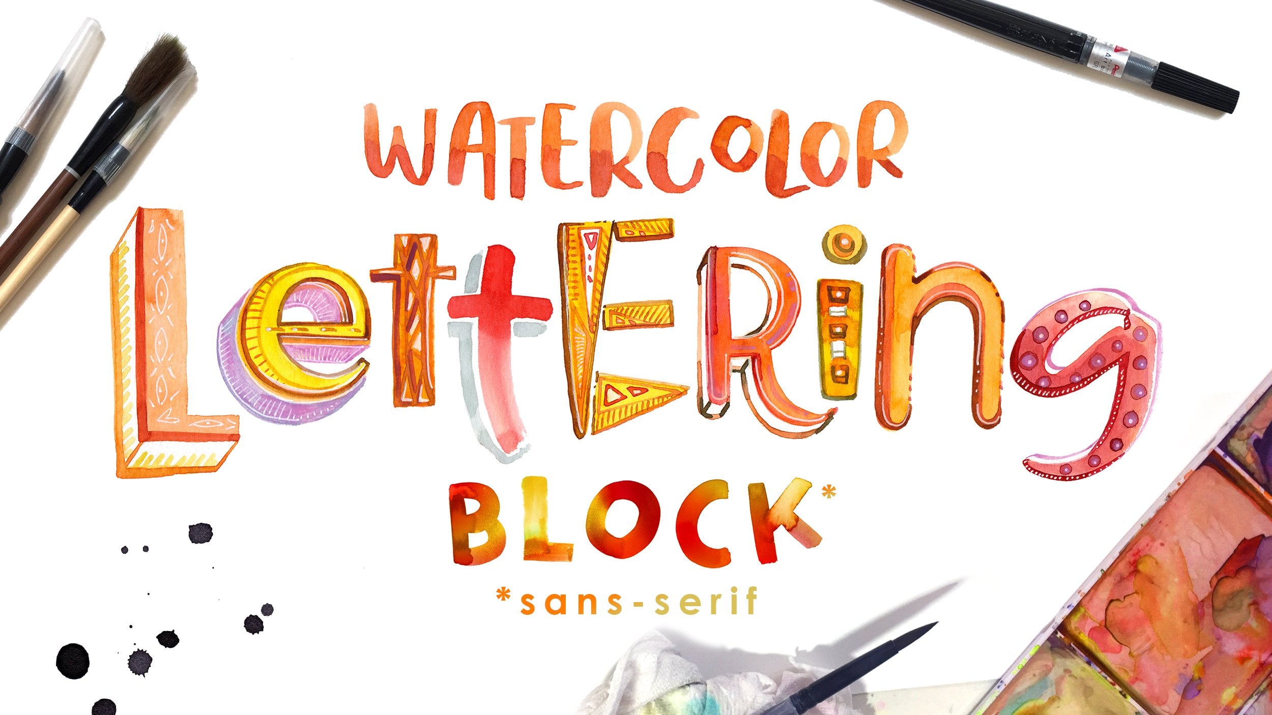
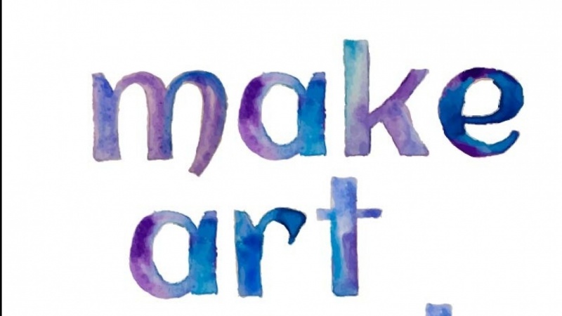
Play between the tension of clean typefaces and the dynamic punch that watercolor offers. Learn how to paint a font in watercolor and prepare it for digital use.
In this 14 minute class, you’ll learn from Amarilys Henderson, an illustrator with design experience whose first love is watercolor. You'll be guided through how to use existing fonts as a template to create a hand-painted alphabet that can be used as a watercolor font.
This class is perfect for designers who want to give their work a fresh look or hobbyists that have been intimidated by watercolor paints. No prior painting experience is required, but some basic Photoshop and Illustrator knowledge would be useful to maximize your new alphabet. You’ll walk away with an on-trend typeface that’s all your own.
Meet Your Teacher

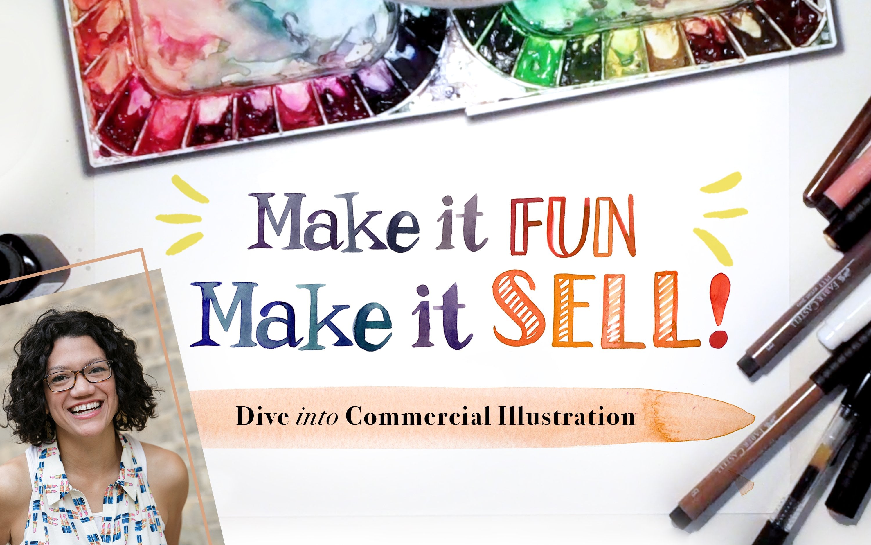
Hello! I'm Amarilys. I process on paper and I problem-solve with keystrokes.
As a commercial illustrator, I've had the pleasure of bringing the dynamic vibrance of colorful watercolor strokes to everyday products. My work is licensed for greeting and Christmas cards, art prints, drawing books, and home decor items. My design background influences much of my recent work, revolving around typography and florals.
While my professional work in illustration is driven by trend, my personal work springs from my faith. Follow along on Instagram
Learn a variety of fun and on-trend techniques to improve your work!
See full profileHands-on Class Project
Create a memorable quote with watercolorful letters
Create a quote with your alphabet!
Maybe it's a word--one that you love or hate... as I loathe the word synergy. Or maybe you have a life mantra that you'd like to see memorialized in watercolor. Write something meaningful to you and tell us why. We all love to hear (or read) stories, so let's hear it!
We want to see:
- Show us your letters painted, a-z
- Show a screen capture of your vector letters
- Show a sample use for your watercolorful alphabet
Project Details:
- Your letters must have been created using the techniques outlined in this class; they must have been handpainted in watercolor. Picking up both a brush and a mouse are required.
- Tell us a little bit about your approach! It's tempting to show your piece and let the chips (and jaws) fall, but please, let us in on why and how you chose to apply your new skill this way
- You may digitally alter the colors of your work. Maybe you painted with a color scheme that you are less than thrilled about or it maybe it doesn't suit your final design.
Post the three parts of your project as you create them, we want to follow your process and cheer you on! Community and feedback are a wonderful component of any class. Don't pass up a chance to foster that as you continue to learn via Skillshare.
And if you're on a roll, fell free to post more than one project!
Best to you!


Class Ratings
Why Join Skillshare?
Take award-winning Skillshare Original Classes
Each class has short lessons, hands-on projects
Your membership supports Skillshare teachers
Learn From Anywhere
Take classes on the go with the Skillshare app. Stream or download to watch on the plane, the subway, or wherever you learn best.


Related Classes