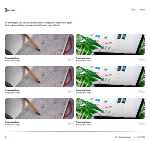
Transcripts
1. Welcome: Hey, I'm so glad
that you're here. I'm Viros and I'm a UX
designer working at Deloit. Have you ever wanted to design a portfolio website which
not only looks good, but take very less time? Well, if that is something
that you're looking for, then I guess this class is
a perfect match for you. In this class, we'll
go ahead and use Figma to design a two
page portfolio website. The design is going to
be very simple and I'm going to walk you through everything that you
need to design it. We will go into the
basics of FIGMa and we will move on to
design the different pages. We'll design a home page, and then we'll move on
and design about me page. The design is going
to be simple but yet very professional looking and it's going to take
you very less time. If that is something that you are ready for, I'll
see you in the class. Thank you so much.
2. Introduction to Figma: Hey, there. Hi, welcome to the class and I hope you
will like this class. So what we are going to learn, we are going to
learn how to make a very minimal and good
looking portfolio website. You might be someone who
is already a designer, looking to make a portfolio
website or someone who's just starting to get into
design or design things, any which way you will need
a good portfolio website. In this tutorial
or in this class, we are going to do exactly that. Who am I? Well,
my name is Perros and I am a senior UX designer. I work at Deloit in India, Bangalore, and I've been doing designing for more
than four years now. I started as a
graphic designer and I slowly moved to UX design. I really like working on
designs which are minimal, but at the same
time very usable. For this design class, there won't be a lot
of bells and whistles, but it's going to be a very
clean and minimal design. Let's get started. I'll get myself out of the way. Maybe I'll just make
myself a little bit smaller and put it here. So what you see on
the screen is FIGMA. So when you first
sign up for FIGMA, let me tell you what FIGMA is. FIGMA is a design
software specifically made for UX design
or not UX design, but UI design using
interface design. The people who work with interface designs are called
UI designer or UX designer. This is for someone
who is very new and don't know the terminology. For people who are already experienced, please
bear with me. So when you start FIGMa, you see something like this. The home button, when
you click on this, you might have this page fully blank if you're starting
infimA for the first time. I have a lot of
things going on here. But when you click
on this design, you will see you'll Figma kind make a new
design file here, and it's called Untitle. I've already started one file which did the name
portfolio website. If you want to change the name, you just double click and
you can give it any name. For now, I'm just going to undo. I am assuming that
you are new to Figma and I will just walk you through some very basic
Figma tools so that we are starting this class by
keeping everyone in mind. Even if you're new,
you can follow along. You see Figma has three,
four different paths. The top part is
where our files are. You can see the
current working file is this one, which is selecting. This is another file. You can open a lot of
different files here. Also if you want to go to
Home, just click on Home. On left hand side, you have a panm where you have inside file,
you have pages, so you can have multiple pages and you can design on multiple
pages within one file. So right now we are on page one, and within page, you can also have multiple
layers going on. So as we will start designing, you'll see these layers
start coming up. So on the right hand side, you have few tools. So this panel is
very dynamic and it basically changes based on whatever tool you
are using right now. And on the bottom, we have tool bar. Right now, what we have is
our move tool selected, and this is that pointing arrow and it is used to
move stuff here and there. We have two other tools inside. So wherever you see this
chevron or this arrow, it means that it has
hidden tools inside that, but we are going to keep this intro very short
and we will only look at the basic and the
most useful tools that we will be
using in designing. The first is, of course, our move tool, we will use this extensively to move
things here and there. Then we have the frame tool. Frame tool is like
a bounding box or a drawing board where you make a certain size frame
and within that frame, you are going to design. This is where different
screen sizes come in. You make a frame for desktop, you make a frame for mobile
design and basically, it's just a container
which continuo design. Then you have tape tool
and shape tool inside it, you have a lot of
different shapes, rectangle line, arrow, ellipse,
star, polygon, whatnot. Then you have this pen tool which you are not going
to be using a lot. If you're not going to be drawing by hand
vector graphics, I don't think you will use it. If you're not going to use pen, there is a very least chance
that you will use pencil. Let's not talk about this. The next tool that
we are going to use extensively is our text tool. User interface is
basically two things. We have different shapes
and then we have text. These two both merge
to make design. You can just this is very
basic.This not even correct, but it's very basic definition. If you look at any were design, you'll see there's a lot of
shapes, graphics and texts. It's basically not
the definition, but more or less, I'm just trying to
make things easy. Then you have common tool. Common tool is
basically comes in play when we are
working with someone else and they can put comments
on our design and then we can reply to that
comment. Pardon me. Basically, this is it. This is the basics of Figma. So let's just
demonstrate something. I will go to frame and
as I click the frame, you see the right hand
side just changed. You have different presets pre built and we are going
to go with dektop. As I click on Deck Stop, you see a frame appears, and now you can move it
using the move tool. Let's see what we can do now. Now that we have the frame, we can see a lot of
different options are here, which we will be covering
in the coming chapters. Then we have the fill. Fill is basically the color
of the frame. Very easy. Fill. What color
you want to fill. Easy, easy. So we have a white color
and then inside it, we can make a rectangle. Using our shape tool and you
can move this rectangle. If you want to make an
ellipse, you can make ellipse. When you started the ellipse, you see it was hops
not perfectly round. Is going everywhere.
It's free pop. But if you press the shift, now it's moving in proper ratio. So now it's fixed. I mean, it's not deforming. This is how you log
the Aspect ratio. Now if you click here, you see different shapes
or different things, we'll have different options
in the right hand pan. Now let's also put in some text. And you can make
this text bigger. So yeah, these are the
very basics of FIC MA. And you will see as we
go along and progress, you will start learning
all these options, all these tools, and
it's going to be fun. Trust me. So yeah, I will see you in the next chapter and
we will get started. Okay.
3. Designing the homepage Part 1: Hey, welcome again. So what we are going to do now is start with
the first page. So as I said, this
is going to be a very simple minimal
portfolio website. And let's assume, let's
make some assumption. So we'll start with here. So who we are making
this website for. So the name is, let's say, John Doe. This is a very common name, placeholder name that we use and what is the job
of this person? Let's say, uh, designer, should we take designer
or photographer. I think if how and what
this person do will shape how the
portfolio will look because if he is someone who
do a lot of photography, then the portfolio
is going to be very dominated by imagery. A lot of full size images, whereas if it's going to be, let's say, a UI designer, it's going to be in screens and design of
interfaces along with a lot of text explaining the process of designing.
What should we take? Let's take, for example, he's a UI designer. And also we will showcase
a few of the projects. For projects, we'll just use placeholder images from
maybe dribble or B hands. I'm not going to using my
own images because then few of them are copyrighted and some of them are under NDA. So I don't want to get
into any legal trouble. So yeah, I think that
would be enough. So let's just start now. First of all, what
we are going to do is also tell you
how to make pages. This is our first page.
If I double click, I can name it intro. So let's keep this page as it is and click on
this plus icon. What this will add is add another page, which is page two, and we can say design yeah, let's just give it
the name design. Let's go to our frame tool
and make our dex of frame. This is the first step
that is going to be there. And let's talk about website. So portfolio website, what we
are actually trying to do. We are trying to
convey who we are, what we do, and showcase
what we have already done. And the way we do it is using a very basic
setup of a website, which is our navigation bar, then the main hero or showcase
area, and then the footer. It's going to be very
basic, very simple. Any website, any good
small website you see, it actually follows
the same route. So we'll have the Navbar. So let's just start
blocking out the details. This is going to be,
let's say, Navbar. And if you just press R, it will change to rectangle. That's what I did right now. This is our NAB. Let's give this NAB
a different color. Then we have another which
is our basic hero intro, whatever you want to
call it, then you have this area where you are
showcasing a few things. Let's give it a darker color. What I did right now is just duplicated it and how you
do it quickly is you click, and then you press Alt. I am on a window machine, so Alt I forgot what is
the equivalent of Alt on a Mac or I think
it's not command, sorry, control is for command. I just forgot. Whatever is the substitute for
math, please use that. If I hold Alt and then
just click and drag, you can see double arrow means
it is getting duplicated, and this is going
to be a footer. Make it a footer. And this give it a
different color. We have the basic thought of, we have marked the basic
where things are going to be. Without disturbing this
and going to copy this. You can also use the
shortcuts, Control C, Control V, and it will just copy and paste and
make a duplicate copy. Now let's remove these blocks and let's start
putting some guide. You put a guide is come here
and click on layout guide. The moment you click, it will
give you a lot of grades, very small grid, but you
have to go to columns. And once you have columns, you can see you can use if you read familiar
with the grid system, you can use that 12 column,
whatever you want to use. But let's keep
things very simple. We'll go with one,
which is like full. Then we'll give some margin. What margin is is uh, the spaces, outside of where
you want to work, basically. You can look at Google, but I'm just trying to
keep it very simple. I'm not going to go
in absolute detail, what is the correct definition. You can just look at all
these things on Google. Just know what the focus of this class is to
get you to speed you actually start designing terms and definitions
you can always learn. But designing, there's no
substitute for designing, so you have to design
design design. So let's give it a 32 pixel. So in a lot of design, you will see people
using 32, 16, eight. So basically, to keep
things consistent, we use multiples of, you know, four,
four ones are four, four into 28, four into three, 12, four into 416. This is why we use that
16, 24, and whatnot. Gutter is the gap
between two columns. So right now it is not showing up because we
only have one column, and that's why we
don't have a gutter. But if you want to change this, it will show up gutter. Let's say we have two. Now you see we have a
20 pixel gutter and if we increase this,
that also increases. Now that we have our
screen laid out, let's start with
designing the nav bar. What comes in navigation bar, navigation bar is
idly your logo and any important links
that you want your user to navigate
to within the website. For a portfolio website, what this translates into the first thing that you
will have is your name. For your portfolio website, the identity is
basically your name. Then we can have links
about about you. Also we can have links
about where to contact you, if you have a linkedIn, blah, blah, blah, whatever you
want to add, you can start. Let's start with the logo. For here, I'm going to put
keep the logo very simple. It's it's going to
be very simple text, John Doe, let's hg it here. Now what we can do is
give it a different font. But right now I'm just going to go with I like this
font, actually. I actually like this font a lot, but you can also
start with Inter. Inter is a mean, it's a great font. I love it. And then you can also play with the weight the font weight. So let's give it
a little variety. Half of the name you can have in bold and then other
half we can have in. Let's say. Then we can also adjust the spacing. This is looking a lot good. If you want to
check the spacing, you just select the
item, press Alt and Just move your c from where you want to see the spacing and
it will show you it's 57. Let's make it 64 because multiples of four or eight, whatever
you want to do it. Yeah. John Doe, we have our logo or the first
thing from the map. Let's just do some links. A me or about, you
can just write about. Let's get this a
lighter treatment, and this is not going
to be this big. I guess 24 I guess 32 was. And also, let's keep
this at zero about me or maybe we can drop it a bit more down and
change it to regular A I think this looks good
because it's not very loud, but at the same time,
it's not getting hidden. All we are doing is to visually strike a balance
between everything. Then we will just
copy and paste this and give it contact. Now, let's check the
spacing, click here, press and then just hover on this and you can just move and you can see
different spacing. So basically now we
have the NabbA reading. You can play in the
prototype mount. You can just see how it looks. This is the option for
present and it'll open the presentation and basically show you how this
whole thing looks, what you have designed so far. This is looking good. I just think we need more
spacing from both sides. Let's just make this 48. Now, when we come back,
it's looking good. We can also try to
align it with this. So we have already positioned this and let's
see how it looks now. This looks good. So we can now move and get started with
designing the rest of the page.
4. Designing the homepage Part 2: So let's put some information
or intro about the person. Let's say hi. I am a UI Qx designer
working at Google. Google. I design
interfaces which are fun and delight to use and make people's life easier. So we have written a liter
intro about the person, let's just see how much
and this is how it looks. Not bad. It looks good. Now that we have used
the company name Google. Let's also just put Google logo. I mean, it's add a little touch. So, these small things will
make a lot of difference. Google SIG Logo. Pops something. Now we are here. Let's use this logo and just got a copy
and paste it here. Now, you can see, I mean, this is adding a little
touch of colour. Let's just align it. And if we can make
it bigger, perfect. Now this is a very
basic arrangement, but let's just play with it
and try to see how we can actually make this stick
in a place where it looks, I mean, it does not look odd. Right now, there's a lot
of things going on here. This logo and this logo,
it's very conflicting. So let's just try to remove this and make
some space here. How about we move everything down or up and make this a little
bit more smaller, and then put it here. Now, you would see
this looks quite good, and it's not looking
out of place. Mm. Perfect. So that looks good. Now, let's also. Yeah, this look better. UOI design is basically
about moving things until you feel that it makes
sense or it looks good. Basically, we as designers spend a lot of time just moving stuff here and there until
everything just makes sense. We go back and forth, seeing what we have
done and how it looks. It's fun. F. Let's just keep it in two
line and let's group this. What group is if
I just move this, you'll see these are
two different things. If I want to move
everything at once, I just drag and select
everything and press Control G. This will group these two
things inside one group. Now when I move this, everything. Let's move together. You see? 128 is fine. Let's just move myself
out of the way. This is good. Now let's move to making the portfolio pieces
and how are we going to make. First, let's start by
putting some blocks. Two blocks, we can
put two blocks, and we can select both and
we can make it full size. So now that we have put the blocks where we want the
portfolio pieces to go. Let's just get some designs
from Dibble or I don't know. Maybe we'll use let's just use, uh what you say, Unsplash. When we go to plug ins, you can see in plugins you
get Unsplash how you get this is you can go to manage plugins and
just add splash there. So let's just fire up splash and it comes and we will give it UI design. Let's see if it
gets us anything. It gives us quite
a lot of things. Let's just use this
because this is basically Figma and
we'll use this. So when I click, it just sort of applied that
image to this box. Now if I select the second box, let's give it another image, let's just use some really
good eye catching image. Mm. Which one will be using? Again, when I said that we spend a lot of time moving
things here and there, we also spend a lot of
time selecting images and we also spend a lot of time
just switching between forms just to see which
font will look good. I'm having a really
hard time selecting which image should cohere. But just to make things easy, let's pick this one because
this is a screen image. And now you see we
have two images and when I go to our
review, you see, now we have the Navba the
contact, the links, basically, a little intro and also
two of the images. But right now, these two
images don't give us any information whatsoever
what these images are. We need to add few more
details to these images. Let's see how we are
going to do that. First of all, if you want, you can just mail these the corners are very
sharp right now. Sharp corners are
basically okay. But the trend is for
rounded corners. Everything from Apples, iPhones to any of the interfaces
that you see on mobile. Everyone, everything
has rounded corners, let's just give it the corner a little bit
of roundness. Pardon me. The option that we're going
to use is corner radius, and this is the
place where we will put four and let's
see what these two. This has rounded up
corners by four pixel. Now when we go here,
we can see these looks rounded and
good, beautiful. Now let's start by adding some context to these image
blocks, what they are. If you want, you
can just make them. Let's just keep it
a little shorter. And the reason I'll tell you why is whenever someone is
coming to a website, if you have something
going down, uh, it's a hint for them
that there's more to the page and they should scroll
down to see more content. Otherwise, if there is a gap and that gap falls exactly
where that viewport ends, they will never know there's something down the page and
they will never scroll. Now let's add few things here. So the first thing
that we will add here is the name of the project. Um, let's say. So basically, I want
to give it a name where it immediately
tells what you have done. Um, designing Pigma
or designers. So basically, basically, it does not make any sense because this person
has worked at Google, but now I've used
something from Pigma, and I'm really sorry this
is not making any sense. So let's just change. Let's just change or maybe
we can because I mean, this person maybe let's say this person was working
at Sigma for Google. So yeah it makes sense.
Yeah, I was wrong. Yeah. For designers, let's give it a little
smaller and how does it look? Not bad, but we can further
do this something like this. Or we can drop it a little
more and just use this. 24. This is 16. Perfect. Designing
Figma for designers. Also, if you want,
you can also add a little bit more about
this whole project. How we shipping PGMs new design with depth mode for for Pig Mas event 2024. I mean, this is I
just made it up, but you get the point, right? So now we have that. I can go to two lines. So basically, it can
also have in one line. So basically, this is
just adding context. Let's just set
things up and we'll just move very quickly
and make these. All right. So we have added
a little bit of intron. Let's just check. And we need some things to
depict that this is a link and they can
click here and just go. Let's make a small button
with say, open or view. Let's just type view, and then we can also
give it up arrow. So let's start by
giving it a bottom. Let's just frame this. When we frame this, we
can just sort of control the stroke that we can give and we can also
control the size of this. You can see here. And basically,
Basically, what happened is this becomes a
layout when we give it a frame right now
this is free form. So this is not having any
padding or uh built in. What we're going to do is
change it to horizontal. Once we change it to horizontal, you can see that are few more options have
opened up. What are those? This is our horizontal padding and this is vertical padding. Basically, what it is
going to do is it will add the space inside
the container. So when I increase this, you see it is
adding space inside the container and also here. Now what we will do is basically we will
give it a round edge. Now, this looks a
lot like a button. And you can use anything
in place of view or just use any but there
are certain guidelines, certain best practices when it comes to UI writing
or UX writing. You can follow that, but I'm
not going to go in detail. Whatever you are going to use for your
website, just use it. Now you see let's give
it some time to refresh. Now it's looking
pretty. It's pretty. Now they know that this
has a link which is view now Figma has one thing, which is called autoayout. What it's going to do is it's put everything in
a layout kind thing. So it's easier for you
when you are spacing. For example, I've already
spaced this out at four pixel, uh, if I just click and select both of
them and press Shift A. It's going to add it into a frame and basically
the outer layout, and it will automatically detect what should
be the alignment. Right now, these two things
are stacked vertically. It will add vertically. Now let's see what will
happen if I select this and this and then hit shift A, which is a adolon, it automatically
dejected that now this whole chunk and this
button is horizontally stacked and now everything is just uh properly
aligned and also, if you see if I change the alignment, it will
change the alignment. Now what I can do is I can simply copy and paste
this or another. And let's say if I want
to decrease the spacing, you can see I can just use
this icon where there are horizontal gap and it will
give me let's keep it 48. But then let's just assume that we are
going with this design. So what will happen is if something has a
smaller headline, this button will not be aligned properly and in every tile, the placement will
be very different. So let's just keep it
the way it was before. So heading and that
subheading starts from the left end and the button is aligned to the right.
Let's keep it that way. So let's now just
expand this and now we can just copy paste
everything and duplicate. Basically, now we have four
ties, change the photos. I will again fire up
the unsplash plugin. And let's say I design, let's just give this. Let's just sir What should
I give it? As such. They've already used this one. We can't use that. N. We are not getting good images. I think it will take a
lot of time if I just go on searching in this way. So we'll just use some
random images for now, but make sure that you use absolutely the best images
for your portfolio. And I guess the one
we got in the good. Basically, now we have our
grid of portfolio pieces. Also, let's give it a
little context here, what exactly we are looking at selected works. So whenever you
have a longer text which you want to just shorten, just double click on this edge, and it will just shorten it to where that text exactly is. Let's also align it 32 is good. Let's see how it
looks. It looks fine. Let's see if we can
change it to medium. Yeah, I think this looks good. This works. Let's see what
we have spacing here. This is Okay. About 88. Okay. Now when we come here, we see that this is fine. We have the Navbar, or we can also do one thing. We can free up some space and we can push the navbar a little
bit to the top. Let's keep it 32. Now you see this a little bit of space I mean we
are not able to see. What I will do is push it
a little bit further more. Let's see, 64. And now you see some text is visible and we'll
just leave it there. Or if I can just
try to move it up. Let's see 96 96. Let's see one quick
little thing. For this view, we have given
it a ucular treatment, whereas for these links,
they are simple links. What we can do is we can make the links a little bit different
by color or by shape. And so basically, in this place, it's only going to be visible when someone hovers
on the button. So right now we are
not going in depth and doing different
states of the button. We're not designing the
different states on how, how it will look on
active, how it will look. So what I'm going to do is just give it a
little hint of color. So let's just use color which is basically something
which grabs your eye. Let's just use this. How about if we use the same color,
will it look good? I don't think maybe it will
look good. I don't know. It looks okay. It looks okay. You can also go
with this button. But now that we have done it, let's just see if we can go with a slightly
different color. Uh, let's just put this dark blue. Yeah. I think this will do
the work. This is fine. Now that we have
changed at one place, what we can do is
just simply control C and then just go here and
go to paste to replace. What this will do is, paste this replacing
the older button. Let me do this to the
other one as well. And now our page looks
something like this. It's a clear depiction
that this is a button, and also these are links
that the user can go to. So our page is mostly done. What needs to be done
next is the footer. The footer, it does not
have to be very elaborate. It can be very minimal. For this, we basically want to give a very basic footer, um, most probably the
name, not the name, maybe the contact details
where someone can quickly contact the mail
Iddress or the phone number.
5. Designing the homepage Part 3: So let's also. So let's just shrink this
down a little bit more and change the color to let's give it a horizontal divider so that
we are dividing everything. It is fine, how this looks. I think this looks good. It's just that we need
to decrease the size. Now it looks good. I think it just needs a
little bit more spacing, and I think this looks good. Let's just finish up the potter quick fast and our
page will be done. And with this, I think
we are back on track. Let's just give Hello at no.com. The phone needs to come
down to let's say 12, how it will look good.
It's looking good. We can also put the phone number plus 91 one, one, two, three,
four, five, six. If you go here,
we can see now we have the contact details, and we can play
with the placement. But basically for this, you can just use a very minimal or smaller
footprint for the footer. Let's just align it. Let's see now. I
think it looks good. You want you can add
a little bit more by using some icons
and how you add icon. Again, go to Plugin, and if you don't have
a plugin, you can go. I'll just show you
how to add plugin. Go to Home. And from home, you can see there is a tab
called Community. And when you go to Community, you can see you have plugins. And if you just search icon, you will get a lot of
different plugins. When you see there's a tab for plugin as I go and plug in, I can just open or just open in and get added to that plug in. I already have some
plugins for icon. I've been using Fs for icons quite a bit and
I really like them. Let's just pile it up. Now, Okay. Let's just see
what kind we want. We want regular male and we
have our male icon here. So whatever you want to use, I will just use this one. Also we have pow. For pawn also, we will use
ICA. Let's use this one. Right now, when I drag and drop, this has just drag and
drop but not inside this detpTFrame I will just remove it outside
and move it again. So now it's inside that desktop. Let's just scale it down. Right now it's 24 by 24
pixel and this also. What we will do is, we'll reduce it down to
16 by 16 pixel. And when you are walking with, uh, ratios fixed ratios, what you can do is just
click on this button. I will lock or unlock
the aspect ratio. Right now, since
we have an icon, this is already locked. Sometime you will
have this unlocked and when you increase one, the other one will not increase
because this is unlocked. What you need to
do is if you don't have this turned on,
just turn it on. Now when you change
the first one, the second one will get
automatically changed. Same thing with this. And what we will do is just, uh, select this and this
and Shift Control, press Shift A, which will add
these two in auto layout. Auto layout is just a
faster way of aligning things and giving space
between everything, so you don't have to just use your buttons to move
things uh, here and there, I will just press Shift
A and it will add it to auto layout and you can see the space
between is five, I will just reduce it to four
and everything is aligned. Same thing goes with this. Let's see how it will work. If I keep it up and then
select and press Auto yout, you'll see it will
align everything, but the space is still large. So I can just click here, press four and done. These two now I will
again press Shift A. Now you see it gets align. The spacing, 16,
let's put it there. Same thing with let's
just see this looks good. We'll check the spacing. Let's keep it 24 Pi
and also 24 here. Now we will remove the extra space and how you do it is just uh, right click. When you right click,
the frame gets selected and you see when I
come to the edge, the icon of the cursor changes
and then press control, and then just move it up. Now what you have, let it just refresh and now what you have is
this, I'll just move it. I'll move myself somewhere here. Now what you have is a very minimal footer,
which looks good. So you have your name and also
the email and the number. Very minimal, very easy. And this is how you make a very simple portfolio
website design front page. So in the next chapter. What we're going to
do is we will also be designing about page
and for contact, we can design a form or
we can just if you want, you can just add it or
link it to LinkedIn, which works quite
well, I believe. Let's also design another
page about page and then you will have a very
basic minimal website for your portfolio. I guess you are
having fun so far, because I'm having a lot
of fun in designing this. So it's very quick, very easy. And you can just start
adding your own, you know, different design tweaks and tweaks and different little little things and just
make it your own. So yeah, really looking forward.
6. Designing the About Page + Prototyping: Welcome back. And now that we have
done our homepage, let's just go ahead and make
another page A section. Yeah. So we'll start this
by just duplicating this textopT and what we do is it will just keep all the guides
and everything intact, and let's just remove these
things that we have here. We don't have to remove
the navigation bar and we also don't have
to remove the footer. So now that we have
removed everything. What good about me
page should be having? Basically your head shot and also write up
explaining who you are, and this is something that will be personal to each person. So if you are
working, let's say, as a photographer, the intro or the About me section text
will be different for you. Basically, you have to just
spend some time and just, you know, write so that
it reflects who you are. We'll start with
adding headshot. Let's just make a
rectangle here. And why I'm making a
rectangle is because I want to put an image
inside this rectangle. So let's just select it, go to plug ins, and again, we'll be
using splash plugin. Right headshot. Let's see, we get the
name is John Doe, so we will select something
which reflects John Doe. So let's find something
which looks good. How about Something
fun I'm looking for. Should we just use this? Maybe we can go we
can use this one. This has a great looking
bouquet at the back. Let's use this. Let's check the spacing. We'll move it to I
guess in the previous, we have the spacing at 96. We'll do 96 here also. Now, what we're going to
do is put a paragraph, telling you what this
John do is about. What we're going to
do is add some text, we'll press T or you
can just come here, click here on the And what we will do here is
click and drag. What it's going to do
is put a text box. So let's just put
a textbox here and I will just write
something Lam Epson. It gives something. Why I have written this is because
I wanted to use let's say, we'll use AI to rewrite this. Figma has now in built AI capability,
so you can use that. This feature is called rewrite this and I'm
just going to give it a little prompt intro paragraph for the about me page of John of UI UX designer
working at Google. His name is John Doe. Let's see if they
can rewrite it. And it will take some
time and it will give you quite it's good
enough, I believe. Let's just use this.
What I'm going to do is just increase the
spacing between the lines. Et's make it one 50%. We're just trying to fill
some of the space there. Let's give it some space. So now we have our page which
looks something like this. And you can see
it's looking good. It's looking good. It's
simple and goes and it goes with pretty much the front page
that we have designed. What we also can do is add
a little bit of, let's say, contact information,
you can write to me at John doe@gmail.com. Something something,
something like this. Very basic, uh, very minimal. You can also try to just make
this a little bit smaller so that it fills
that space and also add some more white space. So yeah, and any more links
that you need to add, you can just add it here. If you also want to showcase some personal things like some, some hobby pictures, you
can also put it here. But for now, I'm not
going to be doing that. But you can find a lot of different inspiration on the web of how people's website look. I'm just going to give it and we are pretty much done. So this class was not
about doing more, but just designing something which looks good and you
can do in very less time, but it will still look very
good and professionally done. One more thing that
we need to do is when you are already
on the about page, there is no clear
distinction between which link is active and
which link is default. So what we will do is we
will just add, let's say, rectangle to this so that people can know that they
are on this page. There are a lot of different
ways of doing this, but this is the easiest and
the quickest you can do. You can also try putting a
stroke just like what we did on this view button and just show the
active one like that. But for now, I'm just
going to go with this. And for contact, what I'm
thinking is instead of this, what we can do is we
can just change it to LinkedIn so that a lot of contact info is already
given on the website, but we just want
to make it easier for recruiter to go
to the LinkedIn. We have just named LinkedIn. We'll also do that here. We will name it LinkedIn. And here we have it. This is our homepage, and this is how it looks
very clean, very minimal. Let's just while
we are doing this, let's just do a little
bit of prototyping. What we will do is we will
come to prototype tab, and what we will do is so now you can see that
everywhere I hover, you will get this plus icon. Let's say on about, if you want to this is a group. This will be linked as a group. So if you want to
just go inside, just double click and you
will go to the A. I will just drag and you
will see an arrow coming out and I will just point it to
this text of three, which means that it is now linked about is now
linked to this page. We have some options
for interaction, how the interaction
will take place. Either it's going to be
click or delay or whatnot. For the simplest
thing, we will go with onclick and we will just keep everything
exactly like that. Now when you come back
to your presentation, see if you click on, you will see this
box appearing on A, which means that there is a active prototype
link going from A. When I click on About, you see the page changes. It's basically linking pages, how you do on a real website, and this is how you have. But we also need a way to
go back to the homepage. What we will do is on this logo, we will just point
it back to homepage. Now you have it. Now
when I click here, you I'm back here. Isn't it cool? If you are new to
FIGma it will take some time to get really comfortable with prototyping
or just using the tooth. I guess this is what we wanted
to cover in this class. I might make a longer class
with more advanced feature, but just know that this class
was meant for very basic, very quick, designing exercise that you can do and build
your portfolio website. If you have any questions, just, you can comment on Skillshare or you can
just write a query to me. Also, I highly urge you to
make your own project and post in the project section so that I can see what awesome things you
guys are making. If you need any help, I will be available to
provide feedback. Whatever you make, I will
provide feedback on it. So please do post your projects, and I will be looking
forward to seeing all of Thank you so much and
I hope you enjoyed this. If you are watching this class during the
New Year or Christmas, I wish you a very
merry Christmas and a very happy New Year. Thank you so much for
taking this class. Bye.
7. Thank you: So we have reached the end of the class and I hope you enjoyed learning and you are already working on your
portfolio website design. So if you have
designed something, I would like to see and if
you want help or feedback, I'll be glad to
provide that as well. So for the class project, I want you to upload
the design that you are working on or you
have already finished, and if you have any doubt, please feel free to ask me. I hope this New Year will be very joyful and
productive for you. So I really enjoy teaching you this class and I hope you
have enjoyed the same. Thank you so much
and have a nice day.
 Firoz Khan, UI / Design / Photo