Transcripts
1. Course Intro: [MUSIC] Digital planning has taken the Internet by storm. From printables, to bullet
journal style trackers, to full-blown digital agenda. Apps range from traditional Google Calendar
to the Kanban style Trello. But some of the
most popular apps include GoodNotes, ZoomNotes, and other PDF reader style apps because of their flexibility and the ability to customize your journals,
notebooks, and planners. People have truly taken to the style of organization
in such a fun, creative, and innovative way. It's an organizational format that I personally enjoy and use. This month I'm coming back with another digital planning
course that will help you create your own customized
digital planner right on your iPad. Hello everyone, if this is your first class
with me, welcome. If you are a returning
student, welcome back. I'm Jen and I will be guiding you through
this creative course. I'm a freelance graphic
designer, illustrator, and educator based out of the Midwest and I run Bella
and Sophia creative studio. If you want to learn
more about me, you can visit me online at
www.bellasophiacreative.com, and you can check out my YouTube channel, the freelance life. There, you'll get a behind the scenes view of the work that I do as a creative
freelancer and educator, as well as access to
a huge library of additional free tutorials
relating to art, design, and illustration. I'm a huge advocate for sharing knowledge in accessible ways. I've found that online
courses in places like YouTube are great
places for this. They help me to connect
to a diverse group of people who are looking
to learn and grow. Digital planning continues to be a popular organizational system. Absolute GoodNotes have
taken app stores by storm. This month, I wanted
to do an update to my previous digital
planning design courses. In the past, I walked
you through designing digital planners on the
affinity desktop apps. But this time around, I wanted to share
how you can create a linked digital
planner completely on your iPad using the Affinity Designer
app and the Keynote app. Often people get iPads in
order to digitally plan. I wanted to streamline the digital planning
process by keeping the design work
all on your iPad. In this class, I will
share some tips, my knowledge and help you
build a digital planner that you can customize
to your own needs. What is this class about? In this class, you will
learn how to create a link, digital planner in the
Affinity Designer app and the Keynote app
right on your iPad. I like using Affinity
Designer for creating digital
planners and principles because it's so easy to create multiple pages in one
file using art boards. You can also create
precise shapes, ad tech space items evenly add vector effects and export the
file really, really simply. While the Affinity
Designer app does not have the linking function as something like Affinity
Publisher might, you can link all of your pages in the
Keynote app and export that final file as a digital PDF for use in your
digital note-taking apps. For the ease of use, I'm going to walk
you through how to design an undated planner, but if you prefer, you can
always add your own dates in. This course is also
a fantastic class to really hone in on your layout design
skills and get more comfortable with the
Affinity Designer iPad app. This is because we're
basically going through the process of creating
in the program. Then you get a tangible product at the end that you can
use after you're done. When it comes to the skills
that you will learn, you will learn how to create your own digital planner in
the Affinity Designer app, right on your iPad and you
will learn how to link that file within the
Keynote app on your iPad. We will start with the basics of understanding the
toolbars and functions in the Affinity Designer
workspace and then we'll start to build out
our digital planner. You will learn how to design
basic layouts, create pages, customize those pages, and get an understanding of the layers
function in the program. We will also learn how to create tabs and how to animate them, and how to link those tabs to your pages within your
layout writing in Keynote. As we are creating our planner, we will also go over how to use some of the most
commonly used tools, including the shape
tools, align tool, and how to use the
movement align functions in Affinity Designer. You will get a
better understanding of the layer effects
tools and how to add things like embossing and shadows to make your
planner feel more 3D. We will also learn how to
create basic buttons and icons. Then we will go
over how to export a file keeping in mind
size limitations. Then we will get
your file loaded into and linked up in Keynote. Finally, we will go
over how to export your file for use in note-taking
apps like GoodNotes. I'll show you how to load it
into the GoodNotes app on your iPad and then you'll be ready to use your
digital planner. To make things a little easier, I'm going to be including
the class project as an Affinity Designer
template that you can edit and get acquainted with
before you start your own. I will also include a PDF of the planner that you can use. Please keep in mind that the
planner I design though, is for personal use only, but whatever you create in the class is yours to
use as you see fit, whether you want to
launch a shop and sell your product or give it away
or just use it for yourself. If you want to check out some of my other digital
planner products, make sure you check
out my shop on Etsy, Bella and Sophia creative. You could also find me over on creative market with
the same shop name. I'm also going to include some
links to Pinterest boards that I created with tons of
digital planner inspiration.
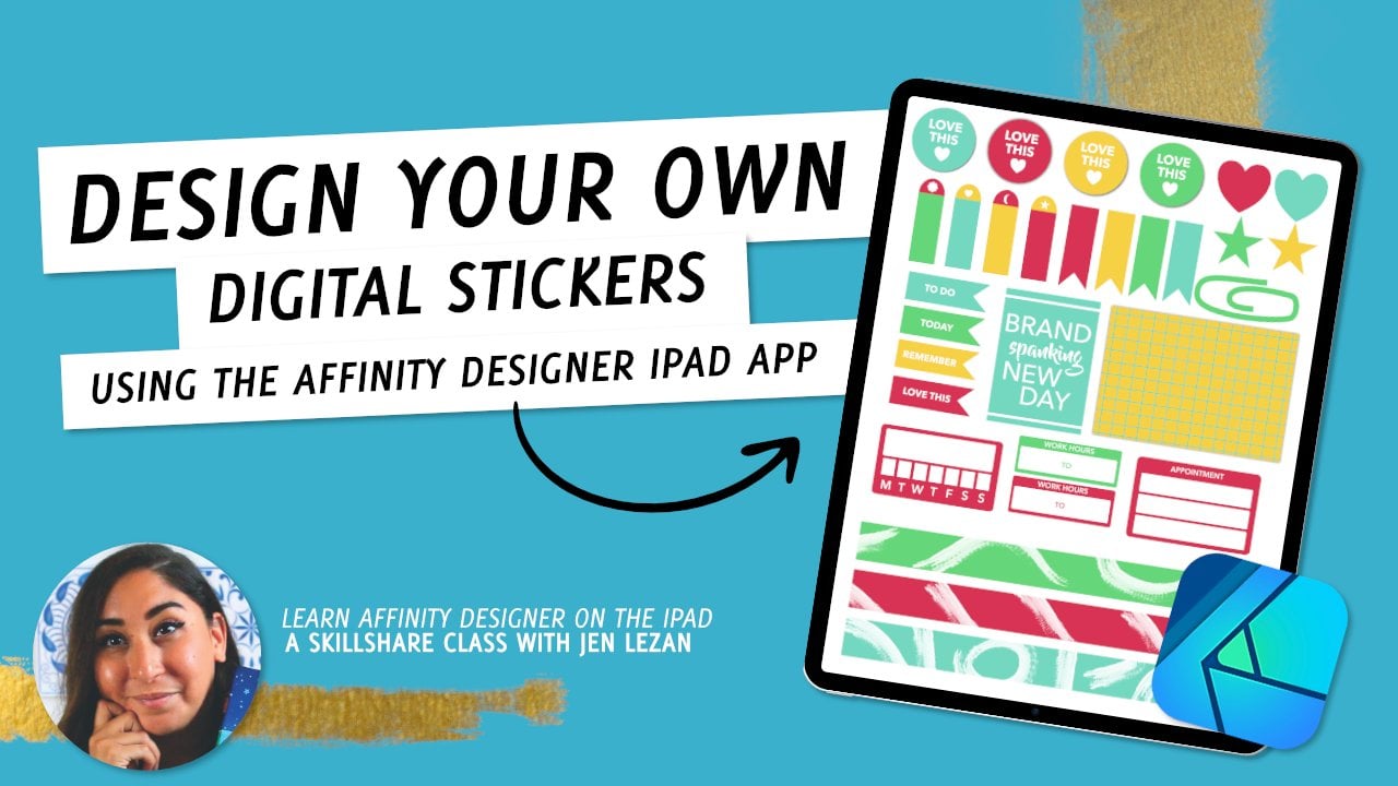
2. Tools + Project Overview: When it comes to tools
that you will need, all you need to take
this class is your iPad, the Affinity Designer
app, the Keynote app, and the GoodNotes
app, or any other note-taking app that you prefer. I'm going to be walking
you through how to use the file in GoodNotes, but you are welcome to
export that file and use it in whatever note-taking
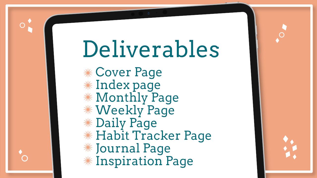
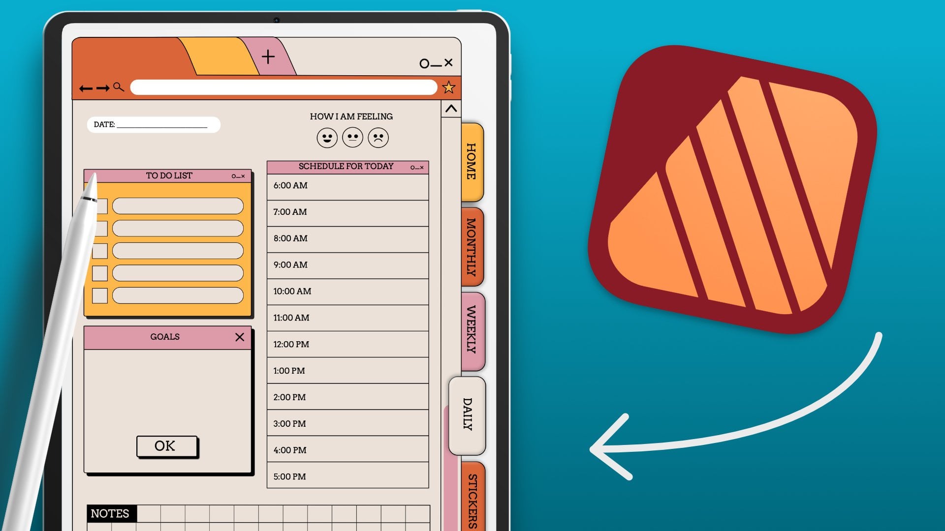
app that you choose. For your class project, we will be creating our
very own digital planner. We're going to create
an eighth spread layout featuring a cover
page an index page, a quick menu, a
journaling layout, a habit tracker page, a weekly spread,
a monthly spread, and a daily spread, and finally, we will be linking the file
using Keynote to prep it for export for use in a digital note-taking
app, like the notes. Make sure you share
your final planner with the class in the
class project gallery, if you so choose to, you can opt to share the
full digital planner file via a file sharing
app like Dropbox. Or you can just share JPEGs of your layout too in
the class gallery. So who is this class for? This class is geared
towards beginners. You don't need any
prior experience using the Affinity
Designer app or the Keynote app as I'm
going to be going over the basics to help you get
comfortable using the app. I'm looking forward
to seeing what you create. Let's get started.
3. Setting Up Your File: [MUSIC] Before we even begin
designing our layouts, and our cover, and all of
that jazz within our planner, I want to get you used to and acclimated to the interface in Affinity Designer
on your iPad. If you worked in
Affinity Designer on the desktop before,
it's similar, but there are some
quirks here in there so I just want to give
you a lay of the launch. Let's launch Affinity Designer. Then when we get to our main interface depending on if you've used
the app before, you may have projects or you
may have nothing in here. I have a ton of projects
in the gallery because I use this for my daily life, for work, and for
freelance projects. In the upper right-hand corner, we're going to select
little plus icon. Once we are in our new document setup
here what we want to do is update our measurements
from 0.2 inches, and then we're going to
update our dimensions. There's different
places you can find the GoodNotes
standardized sizing. I would suggest just check it up on the GoodNotes website. There's a GoodNote standard and then a GoodNotes landscape. We're going to go
with the GoodNotes standard because
we are going to be creating a vertical planner
that goes up and down. Basically, we'll be designing
each page by itself. What we'll do is
set up our file; the GoodNotes standard
dimensions which are 6.32 by 8.17 inches. We're going to update our
width and our height here. We'll select "Width" and
we're going to change that to 6.32 inches and hit "Okay," and then we're going to hit "Height" here
and we are going to update that to 8.17 inches
and then hit "Okay". We're going to keep
our DPI at 144. If you were to print this, you might want to
increase that to 300, but because we're
going to be using this strictly on GoodNotes or in a digital format it makes sense to just keep
it at a smaller size because that will help to cause less lagging to happen
within the app. We want to make sure our
orientation is portrait. We don't want to check mark
Transparent Background, but we do want check
mark Create Artboard because that's what's
going to allow us to add multiple pages into one
file versus having to create a file for each page
and then we can hit "Okay". What you'll see is we get this
nice portrait style page, and because we've created
artboard we're able to add additional artboards
into our layouts which allows us to keep
everything in one file. Before we jump into the tools, I'll show you how to do
that really quickly. In our upper
left-hand side here, we'll have these two icons. One looks like a sheet of paper that's dog-eared
with three dots on it, and if you click on
that and you scroll down you'll see something
that says Artboards. When you click on
that you'll see your artboard be highlighted
in blue with an outline, and then you'll see this
little pop-up at the bottom. You can adjust your presets. I'm just going to keep it
at my Document settings because that's what I want
all of my pages to be, and then I can
just click "Insert Artboard" to add
additional artboards.
4. The AD Interface - The Tools: What you'll see is
that we're able to add additional pages to the same file and
they're all going to be the same sizes of
our original layout. I would suggest adding
in eight total. Once I've added four, I'm just going to go to my
left-hand toolbar here, and I'm going to select that arrow tool and then
I'm going to just drag my Apple Pencil
over my options. Then I'm going to go back into my upper left-hand
menu here and I'm going to select that three dot menu and I'm going to
select "Duplicate". What this does is duplicate everything that I've
selected and then I can just take my Apple Pencil
and drag it down and I will have four additional
pages for my layouts. What I like to do is just
zoom in as I'm working. If you take your fingers and you place them on the
screen and you pinch in, you'll zoom out and
then if you pinch out, you will zoom in. When we're working on this
first page here just to get a feel for some of these tools
and the different studios. On the left-hand side
is your main toolbar, and on the right-hand
side are our studios. We'll be working with quite a few of these different tools so I just wanted to give
you an overview of what they are and then give you some ideas on how
the studio work over here on the
right-hand side. What's really nice those
at the very bottom in the lower right-hand corner, there's a little question mark. If you tap on that, it will give you
the name of all of the different tools and all
of the different studios, as well as your menus up top. You have your document menu, which is where we
were in originally, this menu allows you to
save, export your files. It'll allow you to place images and then what we did originally, it allows you to add
additional artboards. You can also add your grid
and select "Snapping". I like to have
snapping turned on. You could also
just turn it on in the lower left-hand corner here, there is a little magnetic icon and that allows you to
snap things in place. It just makes
layout much easier. Then right next to that
is there Edit menu. We'll be working with
some of these options, especially the geometry options, which allow it to add, subtract, and blend shapes together. Then of course, over copy paste functions
are here as well. Then next to that you'll
see these three icons. These icons are our persona's. We're currently in
the designer persona, which is the Affinity
Designer interface. But if we tap the
one in the middle, this is our pixel persona, which allows us to utilize
some of the tools that you might have access to an Affinity Photo,
which is fantastic. They are pixel-based tools. Then this third option here
is our export persona. This allows you to export all of your pages at once as slices. I use this a lot when I'm making stickers and if you are interested in
something like that, I'll include a link in the description box to some of my other digital
planning classes specifically one like how to
make digital stickers and things like that on your iPad
using Affinity Designer. But I use this a lot
when I'm working with multiple artboards and
files that I want to export really speedily in one go and this
allows me to do that. I'm going to select
my designer persona so that we're back in
the designer options. On the left-hand side, we're going to scroll
down to our shape tool. Right now, I have the
rectangle option, but if you hold that
shape tool down, you'll get a pop-up
and you'll see all the different options of shapes that you can create
that are like presets. Let's just select
the shape and then on the right-hand
side in our studio, we're going to select our
color studio and you'll be able to update your color fill, which is the inside
of the shape, and then the color stroke, which is the stroke
on the outside. You can choose to
not have a stroke by tapping on that stroke color and going down into your
quick colors here and selecting the white circle
with a blue line through it, it will remove a color from
your stroke or your fill. Then I'm going to click on my fill again and
I'm just going to update the color so it's
something that's easy to see. I'm going to take my Apple
Pencil and I'm just going to drag across my artboard here to make a shape and then
what's nice is if you add your finger to the screen, it'll help you create
a perfect shape so it's all in proportion. Then I'll resize this by just
pulling in the corners and then I can tap on it and move it by selecting my move tool, which is that white arrow there. I can just move it around. Then what's nice, I'm
going to zoom in. What you'll see is if we select this little node arrow
underneath our move tool, you'll be able to get
the options to adjust your nodes within your shape so it'll allow me to decrease or increase the angle
of the petals here. We'll also be utilizing
the pen tool a lot. The pen tool takes some
time to get used to. But once you get used to it, you can do a lot with it. I suggest we do is
update our color here. We're going to tap
out of this shape by just selecting our move tool, tapping on it, and then
tapping outside of it. Then what we'll do is we'll go into our color studio here
again and we're going to turn off the color in our fill by selecting the white circle with
the blue line through it and then we're going to tap on our stroke and we're going to select a color from
our color wheel, or you can just select our
most recent colors so that it matches what you already
have on your artboard. Then we're going to
select our pen tool. With the pen tool
you're working with a Bezier curves and
lines segments. If you tap on one point and
then you tap on another, it's going to create
a line for you. Then what you'll notice
is at the very bottom, you'll have these options
for different modes. Currently we have
it as a pen mode, but you can change it to line, to smart to polygon. I'm just going to keep it
at pen and then you can also adjust your width
so it's not so thick. Then you can select "Edit Mode" and it'll allow
you to edit the shape and then if we continue to
tap and add additional lines, we'll tap on our last
point and then add an additional line and
without lifting your pen, we can just drag and we can start creating some of
those Bezier curves. You'll notice that there's
these like-arms that shoot out of our curve here and we can select our node tool and adjust those arms and
adjust that curve. A good way to do that is just to play around
with it so you can get used to the placement of your curves and your
shapes over all. But it gives you a lot of ability especially if
you like to do artwork, and you like the
idea of vectorizing. Basically you'll utilize
your pen tool to vectorize any digital artwork that you might have created. You can utilize the node
tools to adjust those lines. Then you could also utilize some of these additional tools within the node tool
to smooth things out, and just like go in and be more detailed with what you're
doing and creating. But that's really like the
flexibility of the pen tool because I'm able to
go in and really fine tune things to get it exactly
the way I would want it. That is the pen tool. Next, I want to highlight
how we can add text, which is probably one of the main things that
we'll be utilizing within our layout is adding
text to these pages. If you go to the bottom on the left-hand side
in our tools here, you'll see our text tool. There are two types. There's the art text tool, which is what is popping
up for me first. And then there's also
the frame text tool. The art text tool just allows you to add text without
any parameters. If I kept typing, if I click on the area, I select that little a
and then hit my keyboard. I can just type and it will continue
typing until infinity. Unless I re-size this, and adjust it or we can
select our frame text tool. This basically allows
us to create a frame. Then whatever text we put in will be bound to the
size of that frame. I'm going to increase the
size of my font here. Then I'm just going to
type in here as well. What you see is that the text stays within this bounding box instead of
just going on for infinity. This is a really
helpful tool if you have a specific parameters that you want to
keep your text to. I always prefer using
the frame text tool, especially when I'm working
in layouts like this, just so that everything
has it's own little place. While we're working with texts, what's nice is that we
can also undo things. I'm going to highlight
something by taking my Apple pencil and
dragging across it. Then I can delete it, but say I wanted that back, I can just take two fingers tap, and it will undo it and bring
back what I was working on. But I'm just going to delete all of this because we
don't need all of it. I'll use my gibberish. What we're going to do
is re-size our frame as well so that it fits
around the word hello. Then I'm going to highlight
it by double tapping it. You could also triple
tap if you need to. This will allow me to
re-size if I need it to, and then also I can
adjust my colors. Once it's highlighted, I'm going to tap my keyboard
to move it out of the way. Then I'm going to go
to my color studio over here on the
right-hand side. Currently the color is black, but I'm going to turn it to that pink by just
clicking on my reset. But you can also utilize
your color wheel, and adjust it as you'd like to find a color
that you like, or you can tap where
it says color wheel. You can utilize
your sliders or we can go back into our color swatches all
the way at the bottom, you'll see it says
swatches. We click on that. We can select from the swatches that are
pre-loaded in the system. If you have pantone, I have the pantone
systems here as well, and we can select
from that as well. Basically, any of the Pantone colors
that I have in my coated or uncoated options, I'll have access to those
colors here as well. I'm going to select my
pantone coated because that is the color guide that I
have with me right now. I can find a color
in my guide here. Then I can go into my
color system here. Right now, I have it as
just the color grid, but if you tap on that little foursquare there
and it'll give you your Pantone color coats. It just makes things
really easy for color matching and
things like that, especially if you're
working on client work. You can also utilize
the pencil tool. This I use a lot when I'm
working on digital art. You can just select
the pencil tool, and you can draw with it. But what's nice is that
the pencil tool is basically a vector
tool and you're able to edit your nodes
just like what you were able to do
with the pencil tool, and it just makes things
really simple and easy. I like to use this again, if I add in artwork, I can trace over it,
and then revise. Then you could also select sculpt while you're
working with this, and this allows you to add additional segments to the work that you're already doing. I'm drawing something
and I stop, but I wanted to keep
adding to this piece. It doesn't create a
brand new line segment, it just adds to the segment that we're already
working within. Then we also have the
vector brush tool. Again, it's similar
to the pen tool and the vector tool because
you are creating with lines segments
in Bezier curves. But what's nice with
the vector brush tool is once you select it, and then you go to
the right-hand side and select our brush studio, we have tons of
options that give us a more traditional
fill to our brushes. If we select acrylics and
select dry basic acrylic, you'll get these acrylic shapes
and a fax with the brush. You can also re-size it
on the very bottom here. You can adjust the width, you can adjust the opacity. You can also add a controller, which basically is
like a stabilizer. Then if we tap where
it says acrylics, we have a pop-up that gives you all the other options
that we have here. You could select ink squashes, dry media, pens, pencils. We can select the
classic HB pencil, and it gives you that nice
grainy texture effect that you would get with
a traditional pencil. Only you're creating a
vector line that you can go in with your
node tool and edit.
5. The AD Interface - The Studios: [MUSIC] The next thing I want to highlight in our
studio over here on the right-hand side aside from
the brushes is our layers. We are going to be working
with layers a lot. Basically, when we
look at our artboard, each artboard almost
acts like a folder. If we look on the
right-hand side here, with Artboard one selected, you'll see there's a
little drop-down and basically everything that is on artboard one is housed
within the artboard one folder. This just keeps everything organized and
everything that you put on one artboard
will stay within that artboard and that will be helpful when we're exporting. What's nice is that
we can also select all of these elements
and group them. We can click on that
first curve and then drag our Apple pencil
to the right over the next one and the next one, all the way down until we have all of them selected here, or we can just go over with our move tool and select
everything on that artboard. If we go back into
our layers here, we'll see everything's all
selected and then if we select this little icon that
looks like a puzzle piece, it will group everything
together so that we can move and keep all
those elements together. We'll be working with
that a lot as we are finalizing our
placement of our layouts. We can also adjust
the layer settings, or layer options, if we select an element within
our artboard and we select that three dot menu in our studios here you will see these are
the layer options. We can adjust whether
or not it's visible, we can also adjust the opacity, we can make it
lighter or darker, more see-through
or more opaque by dragging left or right
on our opacity slider. We can also change
the layer effects, we can go in and select different options
like multiply, darken, all of this is really helpful
when you're working within digital art to add things like shadows and highlights
and stuff like that, but we'll utilize
it today to add some more 3D feel to the overall layout so it
doesn't feel so flat in 2D. Then if we tap that back arrow, it'll bring us back out
to our original layers. We can also add layers by selecting that
little plus icon, we can add a vector layer, pixel layer, a masking layer. Then of course we
can throw things away by hitting that
trash can if we don't want something on
our artboard or if we don't want a specific
artboard or layer, you can select the item, and then select the trash
can and it will delete it. But if you wanted to keep
that, just double-tap or just use two fingers
to tap to undo. I'm going to tap the layers
again to bring it in, and then we're also going
to check out our FX tools, by selecting the little fx icon. I like to utilize the FX tool to add things like
Gaussian blurs, shadows, overlays to give
things some dimension. I'm going to select
this scribble that I created
here and I'm going to go into my layer effects and I'm going to
select outer shadow. I'm going to tap on
it and you'll see the little icon turns blue
and moves to the right, that's how you know it's on. Once I've done that,
I'm going to actually tap where the word outer shadow is and at the bottom you'll see
these options pop up. What you're able to do
is adjust your opacity, your radius, your offset, and the intensity of the shadow. If I increase the opacity, it's going to darken it. I'm going to increase the
radius by going to the right. If you want to decrease, you just have to tap on
it and drag your pencil to the left and you'll see this bit of shadow starting to form and then
we'll select offset, the direction of it goes
off to the lower right. Then you can
increase or decrease your intensity so it gives it a little bit more
of a 3D effect, so it looks like it's
popping off of the page versus just being a flat 2D
element in the vector space. You can also adjust your angles. This really depends on where you're assuming light
is coming from, and you can adjust the blend mode if you
want it to be multiplied, darken, linear burn, lighten, I just multiply for
something like this. I may also like to
utilize bevel and emboss, I'm going to tap off of
that scribbled line, I must select this circle here. I'm going to go into my layers, make sure I select that circle, then go back into my FX
tools and I'm going to turn on my bevel and emboss options. Already you can
see it popping up. I like to use this, because sometimes how on
journals you have stitching and what I like
to do is if I add any type of stitching element I like to utilize the
bevel and emboss. I'm going to select bevel and emboss and I'm going to
make sure I click on the word and I'll get
the actual options at the bottom and you
can change the type. Let's zoom in a bit,
this is pillow, this is an inner emboss, outer emboss, a plane emboss. I'm going to do this pillow so it feels like
it's almost stamped, and then you can
adjust your radius again by dragging your
Apple pencil left or right, or you can just tap on it and
actually write a radius in. Then you can adjust the depth
if you want it inverted, or if you want it to be
more of a soft curve, and then you can tap that arrow to go back
out and then you can adjust your softness
or hardness. I like to soften it a bit so it's not so harsh on the eye, and you can adjust your azimuth so that it
has a little bit more of highlights and
then the elevation as well to make it
look deeper or taller. Then again, this just adds that nice 3D effect
to your overall view. Those are a few techniques
to utilize when you're working with the
layer FX options in this layer FX studio. Now we're down to the last two studios I want to
highlight first, let's select our
character studio. This will allow you to
revise and edit your text, I'm just going to double-click the hello that I've created. I'm going to zoom in a
bit and on this side, you'll get options to change
the style of your text. You can select bold options, you can add an underline, you can do strike throughs, You can adjust the
paragraph settings, whether it's left
aligned, centered, or right aligned, could also adjust your positioning
and your tracking, you can go in and revise
your typefaces as well, you can revise your leading
within your spacing, and then you can also select the different traits of the
font that you're using. If you want it to be italic, versus regular, versus bold
italic, things like that. You'll be able to edit and
revise your text here, but you're also able
to do that when you double-click and
highlight the text, you'll get your font options
at the very bottom as well. It's just you get
a lot more detail like kerning and leading and adjusting your baseline and positioning within
the studio here, but any of the basic stuff
will pop up at the bottom. Then finally, what
I want to highlight is the transform studio. We'll be using this a lot
because we'll be utilizing the order functions as well
as the alignment functions. You can resize your
dimensions here as well, you'll see if I increase
the size of this, my dimensions will update here in terms of the
width and the height of that specific word or shape
that I'm working with, and then we can also
duplicate this, I'm going to go up to
the Edit menu I'm going to select Duplicate and then I'm going to move the duplicated version
out of the way, then what I want
to do is perhaps have both of these aligned
to the left-hand side, what I'll do is take
my Apple pencil, drag across both of the hellos so that they're selected and if you
have trouble with that, you can just go into
your layers studio, and then just select
each one there, and then you'll go back to your transform studio and we'll go down to our alignment
options here and we're going to select a line
horizontally to the left and it will line everything
up to the left for me here. I like to use this a lot
with shapes and words to make sure everything is aligned and everything is
spaced nice and evenly. We can even space
them vertically, this stuff is really
helpful when we're working within layouts making sure
everything is lined up nicely. Again, one of the reasons
why I really enjoy working in affinity just because you get into the
nitty-gritty details, and for those of you who
really like the small details, like being able to line things up really
easily and simply, this is a great app for that. Now finally, I want to show you a couple more tips when it comes to working with
your line segment, I'm going to select my pen tool, and I'm going to change
my mode from pen to line and I'm going
to create some lines. What's nice is I have
my magnetics turned on, it will snap into place to create a
straight line for me, and then what we can do is
revise these lines as well. I'm going to bring
this over here. I'm just going to rotate it, and then I'm going to zoom in a bit and if you notice that the studios and your tools
went away, don't fret. If you select that little icon in the upper right-hand corner, it'll bring everything back. What we're going to do is select this line I'm going to click
on it with my move tool. I'm going to go into
my stroke studio. Basically it looks
like a paint stroke, it's right underneath
your color studio. You can edit and adjust the
size of your line here, the width of your line. You could also select
the type of lines, say you want a dash line, this is where you can do that. You can select the dash
option and then you can revise the size of
the dash in your gaps. Then if you click on Advance, you can even adjust the cap, your join options
and your align, if you want things to be like a butt cap so that
it's more square, you can do that or you can
keep the curve options, and this just gives you a
different style of line. Depending on what your needs
are you could also select Scale with Object so when
you make something bigger, the line is going
to get thicker. I like to keep it
turned off though so that it has the same
size and style, even if I'm making it longer, it really just depends
on your needs. Now, the last thing that
I want to highlight is how to place an image
within your layout. I'm going to move some of this around so that we
have some space. You can go into your
document menu here, and then we're going to
go down to place image. You can select from the Cloud, you can select from your photos. I'm just going to select a pattern I worked on and
then once you place it, it'll load it and
then what you do is you take your
Apple pencil and you drag wherever you want
that image placed, and it will place it for you. Then you can resize
it as needed, move it around, what's also neat, you can create masking
effects with this, say we wanted this pattern
to be in this shape, what I can do is go to
my right-hand side, select my layers, go to
where that layer is, I'm going to drag it so that
it is within the group that I've created by just dragging it on top of that layer group and now it'll
be in it and then what we want to do is take that
and drag it so that it is on top of
that shape that we want it to be masked into
and then we're going to take the photo and we're literally going to drop
it right onto that shape. You'll see a blue line that
goes across the layer, and then it will go
into that shape. I'm going to go into that curve, I'm going to remove my stroke, and then if we click on this, you'll see that pattern
is now within that shape. It's a nice fun way to play
around with clipping masks and adding special
touches here and there. Now that we're done with
getting used to and playing around with
some of the tools and studios in affinity designer, I'm going to clear this page by selecting everything and then,
6. Creating Your Cover: [MUSIC] The first thing I'm going
to do is get us started on designing our cover. I have some elements that I started working on that I think I want to utilize for this. I have these flowers. They're actually
quite simple to make. I'll show you how to make
them really quickly, and then we can bring
some of those elements into our original file. I'm going to select some of
this here and just delete them so I have some
space to draw. These are really simple. I just utilized
my pencil tool to create some
organic-looking shapes that are in the
shape of a flower. I'm going to select
my color studio here. I'm going to update my color, and I'm going to make
sure I have no stroke. I'm going to select the stroke, select that little
white circle with a blue line through it
to remove the stroke, and then select my fill, and update the color of my fill. I'm going to select my pencil, and then in the lower hand
area here you'll see a pop-up. Make sure you have use fill
selected and then you can tap on your fill and you
can select that yellow, and then you can begin to
work on creating your shape. I'm going to create just like groovy 60s inspired
floral shape. If you notice there's a
little white element here. We just want to make sure our shape is closed
so we can select that node tool and we can
revise where that shape ends, where that point ends and
connected so that it's closed. [NOISE] We can go in and select our no tools again and we can smooth things out if we want to. We can adjust line placement, delete, or any additional
points that are not necessary to make this
a little bit cleaner. You can adjust the
curves as well. Then it creates this fun 60s
inspired floral element. You can do the same
thing with the leaves, again select your pencil tool, and then you can
update your fill color to green if you wanted to. Tap out of your original shape, and then zoom in, and then select your pencil
tool will update the color. Then you can just
create a leaf shape. Just make sure that your
final nodes connect. You can just adjust them. You can zoom in,
and adjust them, and connect any final points. You can also utilize your pen tool to create
these shapes as well, or add details to the shapes. I'm going to make some veins
on this little guy here. I'm going to tap
outside of them, and then I'm going
to update my color green to something a
little bit darker. Then I'm going to
take my pen tool, and I'm going to
create a curved shape that goes across the
length of this leaf. Then I'm going to use my
arms to adjust the curves. Then I'm going to make sure that the stroke
is selected and I have that green that
I want it to be, so it's a little bit darker. Then I can adjust the
width of this as well. Then if I select my
node tool again, I can readjust the placement to give it some
interest and texture, and then we can go in and add additional pieces if you wanted. But I'm just going to keep
it really basic flat. Then I'm going to select
both of these pieces, and I'm going to go
into my Layer studio. I'm going to go into my Layers and I'm going
to select that group icon, and it'll group it together so that I can move it altogether. Then if you select your element, you'll notice you have
this arm out here that allows you
to rotate things. You can rotate it. Move it. If you don't want it on top
and you want it behind, you can just select
that item and then drag it so that it is
underneath the yellow flower. Select the layer and
then drag it all the way down so that it's
underneath that element. You can also resize it
to make it a little smaller so it doesn't
feel so out of place. If you want to add something
like a center here, I can just go to my shape tool, hold down on it, and then change it
to the ellipse tool. Then I can create a circle. If I hold my finger down, it'll give me a perfect circle. Then I can go in and adjust
the colors by just going into my color studio,
removing my stroke, selecting my color, and then just adjusting
it so that it's a darker color or darker version of the yellow
that I'm working with. Then I can just go in and
continue to revise as needed. That's just a simple way
to make flower shapes. You can also just create these organic shapes
with your pen tool. Creating those curves, I'm going to select
Use Fill so that I can just create some shapes. Then I can go in, select my node tool and
revise as needed. Then just select
those and you can duplicate them using
your Edit menu, or you can select your
pen tool as well, and just create little
line segments too. We can select line in
our mode options here, and then I'm going to adjust
the width of my stroke. I'm going to give this a stroke, and make sure the stroke
is the color I wanted. I'm going to select
that orangey color, make sure there's no fill by
selecting the fill and then tapping that white circle with a blue line through
it in my quick colors, and then creating my shape. Then I'm going to adjust
the width here in the lower options by just dragging my pen left to decrease and dragging
my pen right to increase. Then I can just resize this. Then I can duplicate those
little elements as well, and use my move tool
to move them around. If you find that it's hard
to move things around to the smallest increment, just turn off your magnetics and then you'll be able to move things around very precisely. Then you can utilize
elements like this to create a fun design on our cover which is what
we're going to be doing. I'm going to actually
use these because I like this lighter palate versus
the super bright one. I'm just going to
select these elements, I'm going to go into
my three dot menu, I'm going to select "Copy", then I'm going to
select this back arrow in the upper
left-hand corner, and I'm going to go
back into my file here. I'm going to select this
little hamburger menu and I'm going to rename it planner 2022. I'm just going to drag my
pencil across to highlight it, select my little keyboard option here and then update the
name to planner or 2022. Then hit "Return", and you'll
see that it's renamed. I'm going to click
on it to open it, and then I'm going to go into my edit menu and I'm
going to select "Paste". It will have pasted my elements
in to my art board here. What I'm going to do is create a fun little pattern
within this. I'm going to update
the background though, I think I want to have
a darker background and these lighter flower
elements on top, I'm going to select
that art board and I'm going to go into my color studio and I'm just
going to update my fill. I'm going to select
the color fill and then I'm just going
to update the background. I'm just going to
play around with my color wheel here and see what looks best in terms of
the color harmony here. I think I like how this looks. It's not too dark, but it still gives me that
effect that I'm going for. Then I think I can
duplicate some of the color themes from this
into our layouts as well. Once I'm done with that, I can start to select
these elements, and group them together. For example, all of these little curves are each
their own individual layer, I'm going to select these
little dots and dashes here, and I'm going to select them all by clicking
on the first one, dragging right on the next until all of them are selected, and then I'm going to
group them just so that I have them all
grouped together and then we can also rename these to keep
ourselves organized. In our layers, we've just
grouped these dashes. I'm going to select that group and I'm going to go into my
three dot menu here, my layer options,
and I'm going to select where it says group, and it will allow me to rename. You'll see this pop-up, I'm
just going to change this to green dashes so that
I know what these are and what this group is. Hit "Return", and then I can go back out and I could
do the same thing. Start grouping these
flowers together. Once I've renamed
all the layers, I'm going to go back into my
layers and actually select that art board and I'm going to rename that art
board Cover page. With it selected, I'm going
to select my three dot menu, tap where it says Artboard 1, and then change the
name to Cover page. Again, this all just
keeps things organized and I know it seems a bit
tedious, but this again, it's a standard way of doing
things to keep your files organized and to
make things a little easier for yourself,
and then in the future, if you were ever
to work with, say, a big company to
print things and they needed elements grouped in layers and name and
stuff like that, you are already in the
habit of doing that. Now what I want to do is play around with the placement of these flowers and then add
the title to our cover. I think what I'm going
to do is make these a little bit smaller
and then play around with placing
them throughout this page and I can copy and
duplicate them as needed. I'm going to select all of them, and then just hold
my finger down and resize so that it stays
within proportion. Then I think this is
a nice size for this. Then what I can do is
just duplicate these. These are all already selected, so I'm just going to
hit "Duplicate" and I'm going to bring that out and then duplicate it again
and then bring it out, and then we can start playing around with
placement what's nice to use because we're working
in a vector file. We can just bring these
elements out to the side off of our art board and just pick
and choose as we need. I'm going to duplicate that just so that we have
a few out here and then we can just go back into our art board and work
on the placement. What I like to do is rotate, play around with giving elements that are the
same some breathing room, and then also adding things
in between them that are in different colors. When I'm playing around with creating a pattern
of fact like this, I think about it the
way I think about creating patterns that
are seamless and repeats. I just rotate elements, I think about the
size of things where I like to put bigger pieces
next to smaller pieces just to give visual interest and also to help separate
pieces from each other. It's almost like you're
working on a puzzle, then once you get a
placement that you like, you can just copy that
whole thing as well, then just reuse that
and piece it together. I think I want this to be
an all over print and then we'll do a nameplate
at the top here. Or I'm going to take the
flower from out here and just pull it into this. Then I'm going to select all of these elements and get
rid of any actions that I don't want to have South and
then I'm going to select my move tool and just select
all of these elements here, go into my layer
studio select "Group". Then I'm going to select
that group and I'm just going to duplicate
that group and then I'm going to move that
whole entire duplicated group using my move tool and see where I can place it throughout my art board to create the
effect of a seamless pattern. This isn't how you create
a seamless pattern, but it is a cheap way to create the effect of a seamless pattern
on your page here. You can rotate things as well. If you are interested in learning how to create
a seamless pattern, I have quite a few
classes on that here. You just have to check out the links in the
description box below, and I'll have a list of some surface pattern
repeat courses as well as my surface pattern
and intensive course that I think will be helpful
if you like this thing. I'm going to finish piecing this together and then we'll
jump back in just a moment. Okay, now that I'm done
piecing everything together, I've created my
little pattern here. What I'm going to do is go
into my layers and select all of these elements and
group them altogether. I can just drag
across if I want to. Or we can go into our layers, select the groups individually, and then just group
them altogether so that they are one element. Then I'm going to actually
select those groups. Then I'm going to go into
my layers options at three dot menu and I'm going
to select "Lock" that way. Nothing on this page will move. I can add things and it won't
move anything out of place, so it's locked in
place and safe. Now, what we're
going to do next is add like our little title. Then if you want,
I'm going to add some stitching around
the outside of my planner here to add some additional
elements on top of adding the little
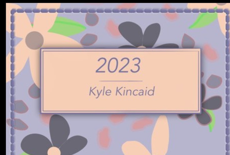
lake nameplate area. Let's do the nameplate first. You can add a year and your name, you can
do whatever you like. I'm just going to do the year. Then my name. I'm going to select
the Rectangle tool. I'm going to update
my color for this to be like an off-white. Then I'm going to make
sure I don't have a stroke that I do have that fill which is
that off-white color. Then I'm just going to drag across and create a rectangle. Then I'm just going
to align this. I'm going to pull
all of my menus off to the side here just so
I can see what I'm doing. Then I'm going to turn
on "Magnetics" so that it helps me with the placement
of my nameplate here. I'm going to pull all of
my menus in and then I'm going to place this so that
it's at the center and you'll see like a
green line pop-up. Then I want this not
all the way at the top, but not smack dab in the center. Once I've added that, then I am going to just do
some design elements here. I'm going to add, I'm
going to duplicate that square by selecting it, going into my menu,
selecting "Duplicate". Then I'm going to remove
my fill by clicking on my quick colors and
selecting "Remove fill". Then I'm going to select
that blue for a stroke. Then I'm going to go into my
stroke menu and I'm going to select my normal stroke. Then I'm going to resize this so that it's
a smaller stroke. Then I'm going to bring this rectangle in a bit
to create a border. I'll bring my corners
in and then resize it. If you need to turn off
"Magnetics" to resize this, you can as well. It might make it
a little easier. All right, so once
I've done that, I'm going to select
those elements. Then I'm going to go into
my layers and I'm going to go in and group them together. Now I'm going to go
down to my type tool. I'm going to select
my frame text tool. I'm going to create
a frame inside of this little nameplate here. Then I'm going to get
this pop-up at the bottom so that I can edit and
revise my font options. On the lower left-hand side, you'll see it says
Arial or whatever your default font is. If we click on the down arrow to give you all the options of what you have installed on
your iPad you can utilize. I think I'm going to select
this Arvo. I like this. I've been liking
this like virtually, thin style for the font. They have a bit of
personality to them. I'm going to select this Arvo. Then I'm going to select my keyboard here at the
top so that I can type. Then I'm just going to
type in the year 2022. Then I'm going to
select that because it's in this funky purple
that I don't want. Then I'm going to select my
fill and my color studio. I'm going to go to my
recent colors and I'm going to select that blue that I used for the
background here. Then I'm just going to resize my frame so that everything
fits in one line. I'm just going to bring
it over to the center of my nameplate and I'm going to turn on "Magnetics"
to just double-check. That's in the center
of my art-board. Then I'm going to
use my pen tool. I'm going to change my
mode from pen to line. I'm just going to create
a line to separate the top from my
name at the bottom. I'm going to go in and adjust the size of this as
well, too small. I think I'm going to do
1.2 so that it matches the size of the frame
within this section here. Then I'm just going to
adjust the placement. Then I'm going to
select the 2022. I'm going to go into
my "Edit menu". I'm going to select "Duplicate", and then I'm going
to drag that down. Then I'm going to
highlight the text in here by just double-clicking. Then I'm going to decrease
the size of the font. Then I'm going to adjust
the traits to italic. Then I'm going to
tap on my keyboard and I'm just going
to put my name. If you notice that your name doesn't fit
within the frame, just adjust the frame by pulling it out and then we
can just center everything. I'm going to select
all those elements and then I'm going to go
into my Layers panel. I'm going to group that as well. Then I'm going to make
sure that everything is just in the center of this. Our cover is almost done. Now I'm going to add
a bit of shadow to this white box here just
to add a bit of interests. I'm going to make sure I select the white rectangle and
then I'm going to go into my effects studio on the right-hand side
and I'm going to turn on outer shadow. Then I'm going to tap where
it says outer shadow. I'll get the option
pop-up at the bottom. I'm going to adjust my opacity. I'm going to increase
it just a bit and I'm going to
increase my radius. I'm going to drag my
pencil to the right. I'm going to keep my offset
at zero and then I'm going to adjust my intensity
just a little bit. I think this is good. If we zoom out, this is what it looks like. If we zoom in, we get just the
slightest hint of a shadow to give it that
visual interests in a bit of that 3D effect
that I like here. Then when we're done, we
can just tap out of this. I'm going to select
my move tool. I'm going to create
some stitching to go all the way
around the notebook. What I'll do is
I'm just going to select my rectangle tool and I'm going to make sure
that I have stroke turned on. I'm going to select that
off-white color for my stroke. Then I'm going to make sure that that stroke is not
the normal stroke. I'm going to click on my
"Stroke Studio" and I'm going to select the
dashed pattern. I'm going to keep the dash
at one and the gap at two. Then I'm just going to create
the outline of this effect. Then I'm actually going
to increase the width of the stroke so that it's
a little easier to see. Then with that stroke
still selected, I'm going to go into my layer effects studio and I'm going to select
"Bevel" and "Emboss". What you'll notice is
that it automatically gives it like this
depth almost as if the stitching is
sewn into the book. But I don't want it
to be this obvious, so I'm going to adjust
the settings a bit. I'm going to select
"Bevel" and "Emboss". Then I'm going to
keep the type pillow. I'm going to adjust my radius
so that it's not so deep. Then I'm going to
adjust the depth. Then I'm going to
soften this just a bit. Then I'm going to adjust
the elevation just a bit. I'm going to decrease it
by pulling it to the left. I'm going to adjust
my *** myth by decreasing it and pulling
that to the left as well. Then I'm just going to make
sure my radius is at 1.5. I like this kind of final
feel of the embossing of it. Then what we'll do is we'll go back into our Stroke Studio. I'm actually going to adjust
the stroke size to be 1.5 and see what
difference that makes. All right, so I've added that in the stroke to be at 1.5. It's just, it's not as
huge as that three. Then I can resize and readjust the placement of this as well. I think I liked this placement. Then what I'll do is I'm
going to lock that as well, that element so that
it doesn't move. I'm going to select
that layer and the layer studio go into my layers options
and select lock. That way nothing moves
and we're all set, so I'll do that with the other elements as
well, like the nameplate. I'm going to select the text
on it and the background. I'm going to group
them together. Then I'm going to go into
my layers options and I'm going to lock it so
that it can't be moved. You can always go
back if you want to revise and edit and
things like that. But for now I think this is good placement and I'm
going to keep it as is. We're done with our cover. Now, let's jump into creating
the first of our layouts.
7. Creating Your Tabs - Part 1: [MUSIC] Now that we're
done with our cover, let's jump into designing
our index page. On our index page, we're
going to want to have access to our tabs, as well as to our tabs on the left-hand side
for our months in any of our quick
tabs at the top. I'm just going to have some
quick menu items that you can access from this layout. The first thing I
want to do is get our page layout setup with the paper and then the tabs
on the side and the top. What we'll do is select our
rectangle tool and I'm going to make sure that I don't have a stroke
and that I have a fill. I'm going to use the
off-white, I think. Actually, no, I think I'm
going use a pure white. What I'm going to
do with that is add a bit of a shadow so that I can see where the paper ends and
the tabs are going to begin. With that element
still selected, I'm going to go to
my Effects menu, and I'm going to
select Outer shadow. I'm going to increase
the opacity, adjust the radius, so
that it goes out as well. I'm going to offset
it just slightly, so that the focus is
more on this side. Adjust the intensity and adjust my radius and
my opacity just a bit, bringing it down a bit
so it's not as intense. Once I'm done with that, I'm going to select
my Move Arrow and I'm going to adjust
the size of this. Now we have our page setup
here and we can start to build out the actual tabs. I'm going to zoom in so
that it's easy to see. You can see it fills, the page is lifted up
from the background. Then we're going to go back
to that Rectangle tool. We're going to start to create our little tabs that
go down the side. I'm going to select
the Rectangle tool. I want to make sure though, that in this option for my Rectangle tool that I'm going to have a rounded corner. I'm going to go into
my color studio and I'm going to make sure
my fill is that white because I want this first
one to be the first tab. I'm going to make sure that
follows that same color. I'm going to create a
rectangle that lines up exactly at the top with
this so it's flush. I'm going to make sure
that my corner type for this is rounded. What I can do is zoom in
and select my Node tool and adjust the roundness of this by pulling on
that little red dot. I'll zoom in so it's a
little easier to see. You can adjust that. That will give me
this first tab. It's hard to see
because I haven't added a shadow quite yet. What we do is we're
going to select this tab and this
rectangle here. I'm going to actually
group these so that it actually becomes one. But before I do that, what I want to do is
take that rectangle and duplicate it though and
pull it off to the side. I have this off to the side so I can access it when I need it. But what I'm going
to do is select the new tab and this rectangle. I'm going to go into my edit menu and I'm
going to select Add. What this does is add that shape to the current
shape that I have, and then what you'll see is
you get this nice tab design. But the rest of
these tabs will be separate because we
want to make sure that we can add different
colors and then we have to add additional
effects like shadows so that it
all lines up and that it looks like it
is a different tab, one on top of the other. Once we've done
that, I'm going to take that tab that I copied and I'm going to
bring it over here and align it with this one. I'm going to update the
color and I'm going to pull in some of the colors
from my cover here. I'm actually going to
select my Eyedropper tool. It is the an eyedropper towards the bottom on
the left-hand side. When you click on something, it will pull up that color
in your color swatches. I'm going to add
those to my swatches. I'm going to select
my swatches here. I'm going to go to
this Hamburger menu in the upper right-hand
corner and I'm going to select Add Current
Fill to Palette. I'm going to just
pick up some of these additional colors
and repeat that process. I'll tap on the next color. Select this little
Hamburger menu, Add Current Fill to Palette and then continue with the
rest of the colors. Once I've done that, I'm going to go in and duplicate
these additional tabs. What we're going
to need is 12 tabs for each month of the year. Of course, the tab at
the top is the index. I'm going to select that
first one and then I'm going to duplicate it 11 times. It's okay if you need to
resize things as well. Once I've duplicated
it a few times, I can select all
of those and then duplicate that group
just to make it easier. If you notice that all
of them don't fit, you can just select them all, delete them and
then just resize. I like to re-color as I
duplicate them as well. I'm just going to
duplicate it and then select the new color. I'm going to select all
of those and duplicate that set and then duplicate
that set once more. We can go in and zoom in and
adjust placement as needed. Once you duplicated
everything that you can select all of those, and then what we'll do is go
into our Transform Studio, On the right-hand side, it's that little square with
a quarter cut out of it. What we'll want to do is go to our alignment options
and we're going to align everything
horizontally to the left. We want to make sure
that those are then aligned with the edge
of this page and it looks like they're
all good to go if you're noticing that anything looks at a place like perhaps you want a specific tab to be
on top of another. For this one, I want this to be on top of both the
pink and the white. I'll go into my layers here. I'm just going to tap to
figure out where that is. I'm going to select
that rectangle and then just drag it above it. Make sure everything
is lined up properly. Same thing with this pink going to drag that so
that it's on top of this one and realign it to the
same thing with the green. What we'll do is select all of these and then
what we want to do is add our layer effects. You can add layer effects
to multiple elements. I'm going to group them first and then I'm going to go into my layer effects and I'm
going to select Outer Shadow. I'm going to click where
it says Outer Shadow. I'm going to adjust
my options here. I'm going to adjust my
opacity, adjust my radius. Now once we've added
our shadow of fact, I kept it at 46 opacity
or radius of 12, an offset of 22, and an
angle of about 90 degrees. What I'm going to
do is just go in and make sure that I'm able to see the shadow from each of the tabs above it and then I can move it
underneath the paper. I'm going to go in and
direct select each of these layers and move them to the top as needed so
I can select that. I can go to my Layer Studio and just move it so that it's at
the top of the layer group. We can just
double-check and see if that shadow is coming through. If you're having an issue, you can just edit each rectangle on its own
and select outer shadow, click on it, and then adjust
your angle to be 90 degrees. Then increase your
radius and your offset so that it gives you that slight shadow
at the bottom. You don't want it to be too big, but I think three
should be good enough. You can just go one
by one and make sure that each of the tabs is
under the one above it, but above the one below it. In this case, the pink
needs to be under the blue. I'm going to drag it up so
that it stays under the blue, but it's above this green. I like to make it to
the order of my tabs on the page is the order in my layers and it just makes
life a little easier. I'll go back to this and
look at my Effects options. I'm just going to
keep that in mind and basically copy those and apply them to the next
tab underneath it. I'm going to go
into the pink one. Select FX, turn on
my Outer Shadow, click on it where it
says Outer Shadow. I'm going to keep my
opacity at 50 percent, change my radius to 1.4, change my offset to
three, hit Okay. Change my angle from 45 to 90, and then everything
else can stay the same. You start to see the effect happening as we add these
little shadows to the tabs. I'm going to do the same
thing for the green. I'm going to go in
and adjust my shadow, update all of my settings, and then just
repeat this process for the rest of these
items on this page.
8. Creating Your Tabs - Part 2: [MUSIC] Once you've applied your effect to one of the tabs, you can actually really
easily apply it to the others by copying the
effect and just pasting it. I'm going to go into my
Layers and I'm going to select this tab here that I already added
that shadow to with you. I'm going to go in and
I'm going to select the Edit menu in the
upper left-hand side. I'm going to select Copy. Then I'm going to go
to the next tab down, and then I'm going to go
to that same Edit menu and I'm going to
select Paste FX. This is going to
paste just the effect that I applied to
that previous tab. I'm going to do that again, go to the next tab in my series. Select the three-dot menu, my Edit menu in the
upper left-hand side, and then select Paste FX. I can select all of
the final layers here and apply that effect to all of them all
at the same time. I'm going to select
that first one and then I'm going
to swipe right across the rest of them so
that they're all selected. Then I'm going to
go to my Edit menu, my three-dot menu over here, and I'm going to select
Paste FX and it'll apply those effects to all
of these additional tabs. I didn't have to go
one by one doing so. Now what I want to do is
take all of these tabs and bring them so that they
are underneath the paper. I'm going to go into
my Layer studio on the right-hand side. I'm going to take that group because we grouped them
earlier and I'm just going to drag that group
underneath my paper curve. Then you'll see that it
drags it underneath. You get a bit of the
shadow from the paper and it lines up with
a tab at the top. Now what we can do is
just go in and add some texts for each
of the months. To do this, to make it
a little bit easier, I'm going to want to
rotate my screen. I'm going to go back out into my main area of my
Affinity Designer app. I'm going to go to
the little sprocket in the upper right-hand corner, that is our settings. What I want to do is allow
for my screen to rotate. I'm going to go down to my Tools option and then
I'm just going to turn on Allow Canvas rotation in all tools and then hit "Done." Then I'll go back into
my planner file and then I should be able to
rotate my screen. This just makes it
easier. I'm going to turn this off after I do this. Just because I find that
I'll accidentally rotate the screen when I'm working
if I don't have it off. For this instance, I'm going to turn it on because
I want to be able to add my text horizontally
on the tabs here. What we're going to do
is I want to make sure that my fonts and all of my
colors are all consistent. I'm just going to utilize
the same font that I had used for my cover here. I used the oval font. I'm just going to
use that same font for the copy that I'm going
to be creating inside. I'm going to make sure I'm
on the correct artboard, so I'm going to make
sure I'm on artboard 2, I'm going to select
my text frame tool. I'm going to zoom in so that
I can see what I'm doing. Making sure I don't
move anything. To make things a little easier, you can also go in
and just select the paper by clicking on it in your Layers studio
and then drag right over your tabs and then
group them together. Then we can go into
our layers options, that little three-dot menu in the Layers studio and then just block it so
that nothing moves. Then what we'll do is we'll add a new layer with that
text frame tool. I'm just going to drag
across and I want to make sure that it is going
in the right direction. I'm just going to type in
it at the bottom here. I'm going to resize everything because right now
it's really big. I'm going to bring it down to about nine and then
I'm going to actually change my paragraph settings
from left align to centered. Then I'm going to
just start typing in shortened abbreviated
versions of the month. I'm going to tap on
my keyboard and then I'm going to double-tap
my Shift key so that I have all caps
and I'm going to type in Jan for January and I'm actually going to change
the color of these, from the blue to a white so that they pop out a little bit better against the dark
colors of the tabs. Once I've typed that in, I've updated the color, I can just drag it
so that it goes right on top of my tab. Then I'm just going to duplicate
this 11 more times and drag each of the text boxes
over the additional tabs. I'm going to do that
again. Just go back into that three-dot menu, duplicate. Then I can move it
to the next tab. Then what I'm going to do
is go in and update all of the words so that they
are the correct months. I just double tap inside of the text box and then drag
over to update the text. Then I'll go to my keyboard. Then I will select my Shift
key and just double-click it and the line underneath the Shift will indicate
that it's in all caps. Then I'm going to update
each of these monthly tabs. Now that I've updated
all of the months, then what I'm going to
do is select all of these and I'm going
to align them. I'm just going to
take my move tool and I'm going to drag my
Apple pencil across all of those months and
you'll see they're all selected because they're
outlined in blue. Then what I want to do is
utilize my Transform tool. I'm going to go to
the right-hand side, select my Transform studio, and then I'm going to go
into my alignment options. What I'm going to do is select a line horizontally
to the right. Basically that's going to align everything to
this edge up top. Then I'm going to go
into my Layers studio and then I'm going to group
all of these together. Then I'm going to make sure
everything is where I'd like it in terms of
placement on the tabs. Then I'm going to group
all of this together. I'm going to take
the text as well as the paper and the tabs and I'm going to select them all so that they're all selected. Then I'm going to go into
my Layers studio and I'm going to group all
those together so that it's all in one piece. Now I'm going to rotate
my screen back to normal and I'm going to
go back out of my file, go back into my settings, and then I'm going
to go to my tools and then I'm going to turn off Allow canvas
rotation in all tools. Then I'm going to
hit "Done," and then I'll go back into my file. That way, I don't accidentally
move things around. We have our monthly
tabs created, now we have to create my little quick links up
top on my index page. I'm actually just going to take some of these
pieces that I've already made and then just copy them and that's
the beauty of this, is that when you're working
in this type of software, you don't have to remake
everything by scratch. If you make something,
it works really well, then you can take
that same thing and use it in other
places as needed. I'm going to take the tabs
that I created on the side here and I'm going to go
into my Layers studio, I'm going to go into the group, and then I'm just going
to tap that group and then I'm just going
to select five of these, these first five by
just dragging across. I'll tap the first one and then drag right across the second, the third, the fourth,
and the fifth. I'm going to go into
my three-dot edit menu and I'm going to select Copy. Then I'm going to close
this and then I'm going to just tap outside of that,
tapping the artboard. Then I'm going to go back
into the three-dot menu, I'm going to select Paste. It's going to paste
copies of this for me. Then the nice part is that I can just rotate things around it. If I keep my finger
down while I rotate, it'll rotate in 15
degree increments, which will give me a
nice 90 degree angle. Then we're going to
use these up top. The only thing we're
going to have to change is the direction of the shadows. I'm going to keep
these all selected. I'm going to go
into my FX tools. I'm going to tap where
it says Outer Shadow. I'm going to adjust the
angle of the shadow. Then I'm going to change
it from 90 to 0 for now. Then I'm going to increase my
radius just a bit so that I don't have just the
shadow on the edges here, but towards the top
as well so we can see that it comes
up off the page. Once I've done that, I can go to my Layers studio, I can group these and I can
take this group and pull them underneath the paper curve so that it looks like
it's tabs up top. I can arrange the
placement as needed. I want it further into
the corner here so it lines up with the tabs
on the right side. Again, what you
can do is turn on your magnetics in the lower
left-hand side to make this a little bit easier and it should automatically line up
with these pieces here. Once I'm done with that, I'm going to actually
go in and copy the text and update
the words up top here. I'm going to go
into the group of all the text and then I'm just going to select
the first five. I'm going to tap on the
first one, drag right, tap on the next one, drag right, for the third, fourth,
and the fifth. Then I'm just going
to select those. I'm going to go into my
three-dot edit menu, select Copy, and
then select Paste. Then I'm going to
drag those out. I'm going to rotate them. Once I've done that, I can bring these up so that
they're right on top of the upper tabs here. Then all we have to do is update the text to whatever
words we want this to be. [MUSIC] Because I moved them around
they moved out of alignment. I'm going to select all of
those in my layers by clicking on the first and then dragging right over the rest of them. Then I'm going to go into
my Transform studio, select Alignment options, and then I'm going
to make sure I align these vertically up top. I think that looks good. Once I've done that, I can
close my group with the tabs, close my group with the text, and then select the text
group and the tab group. Then group those together, selecting that puzzle icon. We have the base
layer for all of our tabs on that we will
apply to all of these pages. What I like to do is basically take everything on
this main page, so the paper, the tabs up top, and the tabs on the side. Select all of that and then
copy it and then paste them onto the additional pages
just to make life easier. I'm going to select this group layer
and I'm actually going to go into
my Layers options, I'm going to unlock it. Then I'm going to select my Edit menu and I'm
going to select Copy. Then I'm going to go
back into that Layer, go back into my
Layer options and lock it again so that
it doesn't move. Then I'm going to go
to my next artboard, I'm going to tap on it. Then I'm going to go into my Edit menu and
I'm going to select Paste and it'll paste
it right in place. Then I'm going to
repeat that process for the rest of my artboards. I'm going to select
my next artboard, go into that three-dot menu
and then select Paste. Then if we go into our Layers, here we'll see that
all of the artboards have that layout
pasted onto them. Then basically, what
we'll be able to do is once we are in GoodNotes, we'll be able to tap
on these little icons. Then it'll take us
to the specific page that we want to go to or
that we're working on.
9. Creating the Index Page: This is basically the skeleton, the bones of everything, and now what we can do
is go back and finish up our index page and then jump into the rest of the layouts. I'm going to go into these
Artboards now and just rename each of these layers just to keep myself organized. I'm going to select Artboard, this art board that I'm on now, which is Artboard 2, and I'm going to rearrange the layout inside of my layers. I'm going to drag it
so that it is right above the cover page, just so that I'm going
in the same order as my planner and then I'm going to select
that three dot menu, my layers options here, and then I'm going to tap
where it says Artboard 2, and I'm going to
rename it to index. Then I'm going to go to the
next art board, Artboard 3. I'll go into my layers, I'll find it and
then I'm going to drag it so that it is above the index by clicking on it and dragging
it and my layers, and then I'm going to select the three dot menu,
my layers options. I'm going to tap where
it says Artboard 3 and I'm going to rename this. Then I'm going to repeat
this process for the rest of the layouts in this file. You can update the names to be whatever you'd
like them to be, but I'm just naming
them based on what layout is going to be
on that specific Artboard. Now that we have all
of our layers and our Artboards renamed to
keep things organized, I'm going to tap on my
index page and I'm going to start finalizing
my index layout. This is my quick menu, my index, I can tap months on the page
itself or on the tabs. It's just a way I like
to organize things. You could do things differently
based on your needs, but just to make it easy, I'm going to add
this index page. I'd like to give myself
some space for quotes, and then a little to-do list that is just something that I can clear off weekly or monthly. I'm going to use
my rectangle tool. I'm going to update the color, so it's that nice blue. Then I'm just going to create a rectangle down the
left side of this page, and then I'm going to create a to-do list at the bottom here, and since this is supposed
to be like a monthly to-do, I'm going to add more
than I normally would, so I'm going to do about eight, I'm going to select
this yellow here. Then I'm just going to
create another rectangle right towards the bottom, and then I'm going to
make a copy of that one. Then I'm going to go into my edit menu and I'm going
to select Duplicate, and then I'm going
to drag that down, and then I'm going to
duplicate it again and again, and it's going to do
that power duplicate because I dragged it, and it's just
basically repeating the process that
I did before it. I'm just going to duplicate
till I have eight total. Then I'm going to
take my move tool. I'm going to take
my Apple Pencil and drag over those squares. I'm going to go into
my transform tool, and I'm going to go into
my alignment options, and then I'm going
to align these horizontally to the left, and then I also want to
align them vertically with the centers so that they're
all evenly spaced out. Then I'm going to go back
into my layer studio and I'm going to select
the little puzzle icon and group these altogether. Then using the same fonts they use for all the titles
and things like that, I'm going to select
my Text Frame Tool. I'm going to create
a frame that goes right above those squares. I'm going to select my keyboard and then I'm going
to just type to-do list. Then I'm going to
select that making sure it's the regular font, I'm going to change it to
the Italic version of this, and then I'm going to go
into my color options, and I'm going to select
that yellow color. I'm going to put these
right in the center here, and then I'm going to select that text box
that I just created. I'm going to go into
my three dot menu. I'm going to select
Duplicate and then I'm going to drag it up to the top here, and then just for
some inspiration, I'm going to add an
area for great quotes. I'm going to select the text by just dragging my
Apple pencil across it, and then I'm going to increase
the size just a bit to 11. Then I'm going to reposition this so that it's in the
center, and if you need to, you can turn on that
magnetics option, and it will make sure
that it's aligned to the center of the
shape that it's in. Now I'm going to add my
index for my calendar, so I'm going to increase
the size of this to 14. I'm going to use my text
frame tool to create a frame, and then I'm going
to type in index. Then I want to make
sure that that is in a color that is easy to read. I think I'm just going
to do a dark slate gray. Then I'm going to duplicate
that, drag it under, and then I'm going to increase
the size of this so that I can change the font and
then add in 2022 calendar. Then I'm going to adjust the placement of the
text, paragraph style. I'm not going to have
it centered anymore. I'm going to make sure
I tap left aligned. I'm going to update
the font to Oswald, and then I'm going to change
the size from 14 to 11, and then I'm going to
keep the traits regular. Then I'm going to update
this to say 2022 calendars, so I'm going to take
my Apple Pencil, drag across it to highlight it, tap on the Pen icon, select my keyboard
and then update it to say 2022 calendar. I'm going to utilize line work here to help
delineate between spaces. I'm going to select my pen tool, in the lower bottom, I'm going to update it to change the mode from pen to line, and then I'm going to create a straight
line underneath here. I'm going to keep my
finger down, tap one end, and then tap the other side to create a nice straight line. Then I'm going to go into my color wheel in
my color studio. I am going to update it so
that there is a stroke and I'm going to select that slate gray that we've been using, and then I'm going
to go into my stroke options because it's still the dotted line from before. I'm going to go into
the stroke options and then I'm just going to change
it to a straight line and then I'm going to update
the width from that 1.5 to a 0.6. Then I'm going to take my texts and start lining everything up with that line. Now I'm going to take the index, I'm going to tap on it. I'm going to go into
my three dot menu. I'm going to
duplicate it and I'm going to drag this down, and then I'm just
going to re-size this. Select the text by double-clicking or
just dragging across. Then makes sure that the
paragraph is left aligned, and then I'm going to
tap on my keyboard and I'm going to change this
to save monthly spreads. Then I can just adjust the
frame so that it all fits, and I'm actually going to highlight this and
I'm going to bring it down from 13 to 11. I'm going to select
this. I'm going to go into my Edit menu, select Duplicate, and then
I'm going to drag this down. Then I'm going to
resize the frame, and then I'm going to take the 2022 calendar and I'm
going to duplicate that, bring it down and then
I'm just going to type out the month names. Once I've done one, I'm just going to duplicate that 11 more times so that
we have 12 total months. Once I've duplicated
it four times, I can just highlight those
four with my Apple Pencil. Go into my Edit menu, select duplicate again and
duplicate all four of those, versus having to do
them one by one. Then I can go in and
adjust placement, and then update the text. Then what I like to do
is just select all of them and start aligning them as well so I'll
select the first row, go into my transform studio, go into my alignment options, align those to the left. Now I can just go into
each of these double-click and then update all of
the names of the month. Once I've placed all of them, then I can play around with placement until I'm happy
with the way things look. Then I can select all of them by dragging my Apple
Pencil across all of them. Then I can go into my
layer studio and I can select Group and
I can group them. Then I'm going to
select this line, I'm going to go into
my three-dot menu, I'm going to duplicate that as well so that I can separate this from the monthly
calendar to the templates, and then I'm just going to
bump up my template title here and then I'm going to add in the additional
templates underneath. I'm going to go into
my rectangle tool here and hold down so that I get the additional shapes to pop up. I'm going to select triangle, and I'm going to add triangles
next to these titles so that I know that these elements will take me somewhere so
if I tap on them, it'll take me to that
month just so that I can visually remind myself
as a call to action. I'm going to go into
my color studio. I'm going to make sure
there's no stroke tap on the fill and update the
color to be that gray so that it matches and then I'm going to hold my finger
down and I'm going to rotate this triangle 90-degrees so that it's facing the right. Then I'm just going
to bump this over just a bit and then I'm going
to resize it just a bit, and then I'm going to go
into my three-dot menu, I'm going to select Duplicate
and I'm going to bring it down so that it's right next
to the templates as well. I'm going to take the tax that I created the months with
and I'm just going to tap on one of the
months and then I'm going to go
into my Edit menu, select Duplicate, and
then drag it down. I'm going to update this to say, weekly pages and
then I'm going to add in the additional templates that I have to weekly pages, daily pages, habit trackers, and my journal page. I'm going to increase the
size of the rectangle frame, I'm going to double-click
inside of it so that it highlights the text and then I'm going to go into a keyboard here and I'm
going to update the text. Once I've done that,
I'm just going to duplicate this three more times, so I have four total. Then I'm going to update
these two daily pages, habit tracker and journal pages. Once I've added all
of these to my page, I'm just going to drag over
them with my Apple Pencil. I'm going to go into
my layer studio. I'm going to group
them all together. Then I'm just going to
move everything just a bit to the left so I have
more space on the right here. Then I'm going to
bring it down just a bit as well on that, I'm going to select the index and I'm going to duplicate
that and bring that over to the area right above
where it says great quotes. I'm going to resize
this and I'm going to change this to say 2022 planner. Once I'm done retyping, I can resize my frame, and then I can adjust
the placement so that it's right above where
it says great quotes. Then what I wanted to do
is leave some space under here for any kinds of notes. I'm going to add a little
sticky note area right here. I'm going to go back
to my shape tool, I'm going to update it from that triangle to
another rectangle. Then I'm just going to
create the rectangle towards the bottom and then
I'm going to go into my color swatches in my color studio and
I'm going to update it to be that yellow that
we were using again, just trying to keep
everything color coordinated. We could also use that peach, but I think that
might be too much so I'm going to keep the yellow. Then I'm going to take
the 2022 planner texts. I'm going to duplicate that and then I'm going
to drag it so that it is right above this
little sticky note area. I'm going to change this
to say notes and ideas. That is it for our index page. I'll zoom in a bit
so that we can see, I'm going to pull
all of our studios into the side so we
have a better view. These is our top tabs, these are our
right-hand side tabs. We have a quick index
so that you can tap on any of the months and
get to that calendar. We can tap on any of these templates and
get to that page. Then we have an area for notes, a simple to-do list, and then a space to add
quotes and then just some titling here and there
to make things easier. Then I do want to
add one more thing, which is a little Home button, essentially this page is our homepage just so that
whenever we tap on it, we get back to this
index if we need to. Instead of writing home, I just wanted to create
a cute little icon. We're going to use our
shape builder to do that. I'm going to go into the
left-hand toolbar here, I'm going to select
my rectangle tool, and then I'm going to
update the color so that it is that gray and
it's easy to see. I'm just going to
create a square shape. I'm going to go
back into the shape tool and then I'm
going to select a triangle and then
I'm going to create a triangle shape that
goes right above it. Then I'm just going to
re-size everything and create a house shape. I think that looks nice. I'm going to select it all, resize it just a bit and then I'm going to go into
my layer studio I'm going to group this. I'm going to go back into
my shape tool and I'm going to add another shape on top of it and a
contrasting color. Think I'll just use
the heart shape here and then I'm going to
go into my color studio, update it so that it is
white like the paper. Then I'm going to drag and
create a heart shape here and just revise it and then kind of play
around with the placement. Then select everything. Then I'm going to go into my layer studio and I'm going to group those elements together. And then it kind of
just want to place this in the center of this area so that
we know whenever we tap on the Home tab, it'll take us back
to this main page. We'll want to make sure we take that little Home tab and copy it and apply it to all
of the other pages. I'm going to select it, go to my three-dot
menu, select Copy, and then go to my other
pages and just go into that three-dot menu
and then select Paste. It'll paste it right in the exact same place
on that new artboard. You'll tap on your artboard and then you'll go to
your three-dot menu, you Edit menu, and
then select Paste. It'll paste it exactly
in that key spot. I'm just going to do
that for the rest of these and then we'll get into our next layout design.
10. Creating the Quote Page: All right, so before we
add in our monthly layout, I want to add a really
simple quote page here with an inspiring
quote to inspire me as I look through the
planner throughout the year. There's this quote
by Les Brown that I like a lot and it
goes ''Your goals are the roadmaps that guide you and show you what is possible
for your life.'' That is the quote that I
want to add to this page. I'm just going to do something
similar to what we did on this first page
like a border. I'm going to add that
here really simple, but something simple
like this can also be really impactful. I'm going to select my rectangle tool and then I'm
going to create a rectangle that goes down
the center of my page. Then I'm going to
go into my color studio and I'm going to make sure that I have my
filter turned off. Then I'm going to tap on
my stroke and I'm going to update it so that
it has a stroke. I'm going to utilize the blue from my design here
for my stroke. I'm just going to select
my color picker tool and then tap on the blue
within my tabs. Then I'm going to go
into my stroke tool, I'm going to go into
my stroke studio and then I'm going to
adjust the size of this. I'm just going to increase
it just a bit to about 2.1 so it's a nice
thicker stroke. Then I'm going and select
my Text Frame Tool, and I'm going to create a
frame inside of this frame. This is where we're going
to write that quote. I'm going to increase
the size just a bit. I'm going to keep that oval, and I think I'm going to
keep it the italic style. I'm going to bump this up
to about 40 and then see what it looks like at that size and if we need
to adjust, we can adjust. I'm going to change the
text now to center aligned. Then I'm just going to type with my keyboard and
type in this quote. I think this is the
perfect size for this. Then I'm going to use my pen
tool to create a line to divide the quote from the credit that I'm going
to add at the bottom. I'm going to zoom in and I'm
going to tap my pen tool. I'm going to hold my
finger down on the screen, so that I can create
a straight line. I'm going to tap one
point and then tap across for the other
point and then I'm going to decrease the size of this
so that it's a bit smaller. I think about 0.9
should work nicely. Then I'm going to change
the color from the blue to that dark gray so that
it matches the text. Then I'm going to utilize the font that we use
here, the Oswald. I'm just going to double
tap on this 2022 calendar, go into my edit tool, select "Copy," tap out of that and then go into my quote page. Then tap onto the page and then select the
three dot menu, your edit menu, and
then select paste. Then I'm going to
bring that towards the bottom and I'm
going to change it from 2022 calendar to Les Brown. Then I'm going to
resize my frame around the text and then I'm going to make sure everything
is centered in here. I'm going to turn on my
magnetics tool here. Then I'm going to
center everything with the text here and then I might adjust my frame just a bit so
that I have breathing room. I think this is a nice
simple design element to inspire you as
you work through your goals and your plans
throughout the months and year. All right, so now
that that's done, let's jump into creating
our monthly layout.
11. Creating the Monthly Page: [MUSIC] We're just going to
do a really simple monthly layout design, we're going to have the
full calendar on one page. We're just going to create
a simple six by seven grid and then we'll add
our numbers and then leave some empty spaces for any additional blocks that
may need to be in there. To create our table, there isn't an
actual insert table app you would have in
Affinity Designer desktop. The easiest way I've found
to create these is just to utilize your shape
tools and your pen tool. What we'll start off with
is a simple rectangle. I'm going to go into our shape tool on
the left-hand side, I'm going to select
the rectangle. Then I'm going to go to the
right-hand side right away. I'm going to tap on
our color studio. I'm going to turn off our fill
and I'm going to make sure we have a color for our stroke. I'm going to use that dark, charcoal gray that we've been
using as a neutral color. Then I'm going to adjust
the width of our stroke. I'm going to keep it at 0.9. Then I'm just going to
create a rectangle that goes all the way
across our page here making sure to give
a nice amount of room for the outside edges, making sure everything
looks centered, but still has some
breathing room. Then I'm going to
utilize my pen tool to add lines that will
divide up this rectangle. We're going to have
seven lines across and then we're going
to do six rows. We're going to have seven
columns and six rows. I'm going to start on one side, I'm going to tap on one end, I'm going hold shift so that
my lines stay straight, and then I'm going to
tap on the other end. Once I've done that and I've
created that first line, I can just tap on that line, go into my edit menu, select "Duplicate", and
then I can move it. I have magnetic's turned on, so you'll see the
red line that pops up showing me that everything is still in line with the top. Once I've moved it then I can do that power duplicate
and basically, it's just going to duplicate
it and move it for me the same amount of space that
I've moved that first one. I'm going to go into my edit
menu, select "Duplicate." It'll move it for
me, duplicate again, again, and then one more time so that I have seven columns. Then if you need to
adjust placement you can go in and do this
by hand as well. Or you can select
them by holding your finger down
on the screen and then tapping on your next one and it'll select all of
the additional lines. Then what we can do is go into our align tool in our
transform studio, select our align options, make sure that they're
all lined up top, and then we want to go into our align horizontally
options and select the center so that everything is basically spread
apart evenly. Then we can tap out
of this and then adjust as we need here. Once we have that done then I'll go into my
layers and I will just select all those curves along with the rectangle and then just group
them together. That way they're all
together and we can move everything around
easily together. Now we can add in our horizontal
lines, create the rows. I'm going to do the same thing. I'm going to select my pen tool. I'm going to make sure line
is selected for our mode. I'm going to zoom in, tap on one edge, hold my finger down. If you notice, your line is off. All you have to do is select
your "No tool" and you can adjust the placement of it so that you get a
nice straight line. Then once you've done
that you can select your move tool and then you can just
tap on that and then you can go into
your edit menu, select "Duplicate", and
then just drag it down. Now we can do that
power duplicate once more because we've already
duplicated it and moved it, and it's going to basically move the next line down the exact
same amount from our first. Go into edit, duplicate, edit, duplicate until
you have six rows. Edit, duplicate, 1, 2, 3, 4, 5. Let me do it one more
time, add a duplicate. Now I can just go in and revise
how high up I want these. Once I've moved these all
around what I'm going to do is go into my layer studio. I'm going to select
the "Curves." Then just click on my first one, drag right across the next, and repeat that until I have all of the lines that are making
up these rows selected. Then I'm going to go
into my transform studio and then I want to align vertically among my centers so that everything is
spread out evenly. Once I've done that I can
go back into my layers, I can group these. Then I'm going to
select that group, and then select the group of the columns as well as the
outside part of the square, and then I'm going
to group all of that together so it's one piece. Now, I want to make sure
I give myself some space for the month as well as space
to add days of the week. What I'm going to do is just
take this and I'm going to drag this down to resize it and I'm
going to have it aligned with where the
tabs are starting. I'm going to add the space for
the month here at the top. I'm going to go into
my text frame tool and I'm going to create
a frame at the top here. Then I'm going to resize this
down from 40 to about 20. Then I'm going to add the
first month which is January. I'm going to do this in all caps and then I'll add
the year as well. You don't have to do this
if you don't want to. I think it'll look
nice and it's just nice to remind you of the year because I have a tendency
for months to write 2021 or the prior year
after the new year. Once I've done that I'm
going to resize my frame. Then I'm going to center this text in the
center of my page. I'm going to bump it up a bit because I'm going
to add the days of the week right at
the top underneath it, so I want to make sure
we have some space. What we're going to do is
create another rectangle. This time I want
to make sure that rectangle isn't a stroke,
but it has a fill, so I'm going to
remove the stroke, and I'm going to turn on the
fill to be that gray color. Then I'm going to
create the shape so that it goes all
the way across and matches up edge to edge with the grid that we've
created for the calendar. I'm going to resize this
just a bit and then I will add the days of the
week right above this. I'm going to zoom in
really close just to make sure my edges are all lined up. Then once I've done that, I'm going to select that shape, hold my finger on the screen, and then tap the grouped lines. Then I'm going to go
into my layer studio and I'm going to group
those together as well, and now we can go in and
add the days of the week. I'm just going to
select the January. I'm going to duplicate
it and I'm going to select it and resize it down so that it will fit in here and right
above the calendar. Then I'm going to adjust the
color so that it's white, so it will stand out from
the gray background. Then I'm going to bring this
right above the first grid. I'm going to go in
and I'm going to delete any text
that I don't need, and then I'm going to update
it to the days of the week. I'm going to start this on Sunday like the
traditional calendar, but if you want,
you can start it on Monday so that your weekends
are next to each other. Once I've written the word, I'm going to zoom out, see if it's too
big or too small. I'm going to highlight
it and increase the size just a bit to eight. Once I've done that, I'm going to select it by
tapping on it with Move tool, and then I'm going to
go into my Edit menu. I'm going to select "Copy" and then I'm going to paste it. Then move these over
to the next grid here. I'm going to duplicate this
and then move it and use that power duplicate so that it just moves it exactly
where I want it. Once I've moved it,
I'm going to go into my Edit menu
and then select "Duplicate" and then do that for the rest of
the days of the week. Once I'm done adding
all the days, I can update the days. I'm going to change
this one to Monday, and then so on and so forth. Once I've updated
all of the days of the week then I'm
just going to go in and select them all, and then I'm going to go into my transform studio on
the right-hand side. Then I'm going to go into my alignment options
and then I want to make sure that they're
aligned up top. Then I'm going to then group these with the rest of
the calendar layout. I'm just going to
take my Apple pencil, drag across
everything and select all of it including the grid, and then I'm going to go into my layer studio and I'm going
to select the group icon. Now all of these elements have
been grouped together and that is the basis of the layout
of our monthly calendar. You can opt to add numbers in. I like to leave things blank
just to make things easier. I'll show how I add in
the numbers very easily. Just like what we did with
the days of the week, I'm just going to
select one of them by double tapping
with my Move tool, and then I'm going to
go into my Edit menu. I'm going to select "Copy," and then I'm going
to tap out of it, select my Edit menu again, select "Paste" and I'm going to drag this down and
then I'm going to update the color by double-clicking inside
of the text-box, go into my color studio, selecting that charcoal
gray that I was using. Then I'm just going to
type in the number, then I can resize this. I'm going to keep this centered, and then you can opt
to put the numbers in the upper-right,
upper-left, lower-right. I'm going to put them
in the upper-left just like a traditional
calendar would. January 1st was on a Saturday, so I'm going to drag
this all the way over to this Saturday and then I'm
just going to copy this. I'm going to go into
my three dot menu, select "Copy" and then paste
and then drag this next one over and then select "Duplicate" and then drag
it over to the next one. Once I've duplicated
this whole, entire wall, what I can do now is just select all of these and do
the same process, but with multiples at once. I've selected all of these, and what I'm going to do
is go into my Edit menu, select "Duplicate" and then
I'm going to drag them down. Then I'm going to go back
into my Edit menu and then select "Duplicate" and it's just going to fill the rest for me. Then all we have
to do is go in and update the numbers here. [MUSIC] Once you've finished updating all the numbers, you can just go back
through and get rid of anything that
you didn't need. I have all these
additional numbers here, I can just select them
and delete them by selecting them and
then selecting that little trash bin in
the lower left-hand corner, and then you can just
use the rest of this as areas for notes. You can block it
off with colors. I'm going to use
the rectangle tool and just block it off, and then I'm going to
duplicate this one. I'm going to drag it
down and I'm going to actually update
the color as well. That is our monthly layout. What I'm going to do now is I'm going to take
this monthly layout, this specific art board, and then I'm just going to
duplicate that art board 11 more times so that
I have 12 total, and then you can go
in and update each one for the additional
months of the year. I'm going to take this monthly and then I'm going to go in, I'm going to select
the entire art board by tapping where
it says monthly, and then I'm going to go into my three dot menu and
I'm going to select "Copy." Then I'm going to just tap out into the gray
area of my workspace, and then I'm going to go
into that three dot menu and select "Paste." It's going to paste
it right on top so I can just drag it down. Once I've done that, I'm
going to tap on the new one, and I'm going to select my Edit menu and I'm going
to select "Copy and Paste." Then I'm just going
to drag it over, and I'm going to do this
until I have 12 months total. Once we're done with creating
those four additional, what we'll do is just
select all of them using your Apple pencil
by dragging across. Then we'll go into our
three dot menu and select "Duplicate," and
then just drag those down. Then select "Duplicate"
again and drag those down, and you should have
12 total here. We can just get
rid of one of them because we already
made our January. You'll select the one that
you want to get rid of. We'll just tap it. Then we'll select the trash can in the lower left-hand side, it's going to ask
you if you want to delete or keep objects, you want to delete your objects. Now we have additional
duplicated spreads for each of the months
and then we can go in and update the text for
each of the months and then you can update
your numbers as well.
12. Creating the Weekly Page: [MUSIC] Now that we have our monthly layouts
all completed and updated, let's jump into creating
our weekly spread. For the weekly
spread I'm going to keep this relatively simple. I just want to give myself an area for the days of the week and then an area for
any appointments. I'm thinking I'm going to just keep in mind the
overall style of the shapes that I've
been using in all of these other spreads and
apply that to this. We're going to be utilizing
the rectangle tool. Once again, I'm going to go into my color wheel here,
my color studio, I'm going to select
that target where we've been working with and just start placing
elements on my page. Making sure my rectangle
tool is selected, I'm not going to have any type of rounded corner for this. I'm just going to have my corner type at the
bottom being none. Then I'm going to drag and
create my first rectangle. I want to do six rectangles
four the days of the week, my weekend I'm going
to split in half. But I want to make sure that I'm creating this not with
a fill but with a stroke. I'm going to go back
into my color studio and I'm going to
turn off my fill, select my stroke, and
then turn on that stroke. I'm going to keep
my stroke width 0.9 so that it matches all of the other
elements I have been creating. Once I've done that I can eyeball and see if
it'll fit enough. I'm going to do three
total so I'm just going to resize this a bit and
then I'm going to go into my upper left-hand menu, select "Duplicate",
and then I can just pull that to the side and then
duplicate that once more. Then I'm going to select all of these elements on the page and I'm going to go down into
my transform studio. Then I just want to go into my align options and make sure
that everything is aligned up top and that we have even spacing within our centers here. Then I can tap out
of that and then I can move things around together and then I can go into
my layer studio here and I can group those by selecting that
little puzzle icon. Then I can go back into my edit menu again and
select "Duplicate", and then just drag those down. If it's easier you can
turn on Magnetics and it'll help you snap
everything into place. Then I think this will
work nicely from Monday, Tuesday, Wednesday, Thursday,
Friday and then my weekend. I'm going to apply the same concept to this
layout here as well. I'm just going to take
my rectangle tool, this time I'm going to make
sure that the stroke is turned off and my
fill is turned on. Then I'm going to
create a rectangle that will go at the top of this making sure everything
matches up with my edges. Then I can take that rectangle
and I can duplicate it. I can apply these to the rest of the rectangles
in this layout. I'm going to make sure
that rectangle is selected because you'll not select it because it's
outlined in blue. Then I'm going to
go to my edit menu, I'm going to select "Duplicate" and then I'm going
to move that to the next rectangle
and then repeat that process for
the rest of these. [MUSIC] Once I've added all of these I want
to make sure I can group them all together. I'm going to go in and go
into my layers studio, select the layers with
the rectangles and then select my group with all of the tall versions
of the rectangles. Then I'm going to
select that puzzle icon and it'll group
everything together. Now, I want to split
my weekend in half, so I'm just going to
utilize my pen tool. I'm going to select the Pen
tool and I'm going to make sure that my mode is
changed from pen to line. You can do that in that
little popup towards the bottom here and
I'm just going to zoom in and start my point here
at one end of my rectangle. I'm going to split
this rectangle diagonally and then I'm going to go down to
the other point. Then I want to go into my color studio and make
sure my stroke is turned on. I'm going to tap my stroke
and then select the dark gray and then we can zoom out and see
what this looks like. I can tap outside
of the work board and this looks exactly
the way I wanted. Now what we can do is
just add titles for the days of the week in
the little header area. I'm just going to go back
into my monthly layout, I'm going to select
my move tool, I'm going to double-tap
on the day of the week. Then I'm going to go
into my edit menu, I'm going to select "Copy". I'm going to tap out of that layout and then
I'm going to go into my weekly layout and
then I'm going to select my edit menu and I'm going
to click on "Paste". Then I can resize this. I'm going to triple-click inside of the text box
and then I'm going to get my edit options towards the bottom and I'm
just going to increase the size of the
text to 11 points. Then I'm going to
click on my Move tool, tap on that text and then just resize the bounding box
so that it all fits. Then I'm just going
to play around with placement and
then I'm going to select that updated text and then I'm going
to duplicate that. Then I'm just going to
place those in the rest of my weekly boxes here. Then I can go back in and update and fix these so that they have the proper
days of the week. I'm going to go in and
revise all of these. I'm going to start this off on Monday and then just
revise these all as I go. [MUSIC] Then I'm going to
update this one to say weekend. I have my weekly
layout almost done. I want to add an area
for appointments though, so I could use this
for notes during the week or any like
reminders or deadlines. Then I want an area below
it just for appointments. I'm going to take one of these rectangles
that I've created, just double-click,
triple-click until you get it isolated to
just the rectangle. Then I'm going to go
into my edit menu, I'm going to select "Copy". Then I'm going to
tap out of that and then I'm going to
select ''Paste''. Then I'm just going to drag
this down and then resize it. I want to just give myself a little area right underneath and then
I'm going to split this up into a long
style calendar with the days of
the week at the top and this will be just
for appointments, so I'm going to give myself
a little title as well. I'm just going to
select the month here, and then I'm going to
go into my edit menu, I'm going to select "Copy", tap out of it, and then I'm going to go back to my weekly layout and then
I'm going to select "Paste". I'm going to drag this
down and I'm going to update this to say appointments. I'm going to resize my frame
and then I'm actually going to resize the font as well so I'm just
going to triple-click. Then I'm going to go into my lower preferences here and I'm just going to decrease
this to about 15 points. Then I'll just resize my frame and then I'm going
to duplicate that and then I'm going to pull
that to the top and I'm going to resize this to about nine
points and I'm going to change the
text to say week off. That way you can
add your dates in. I'm going to use my pen tool to add a line for
you to write on. I'll tap out of it and
then I'm going to select my pen tool and then I'm going to make sure my
mode is set to line. Then I'm going to tap
right next to week of, put my finger down so that
I get a straight line. Then I'm going to go into my stroke studio and I'm going to revise
this from 0.9-0.5, so that it's just
a little smaller. Then I'm going to take
this entire days of the week outline here and just bump it down just slightly. I'm also going to select all of the elements in this top area. Just taking my Apple pencil
and dragging over it to make sure everything is
all grouped together. Then I'm going to go
into my layer studio and I'm going to select my puzzle icon and that
should group everything. Then that'll give me some space between this little
header for week of and then the days
of the week here. Then it still gives
us some space between that and the
appointment section. Now what we're going to
do, we're going to follow the same style as
we did with these. I'm just going to select
one of the gray rectangles in our weekly layout top. I'm going to go into my layers, make sure the rectangle
is selected and then I'm going to go
into my Edit menu, select ''Copy'',
tap out of that, then go down towards
the bottom area, go into my Edit menu,
select "Paste". Then I'm just going to resize
this so it fits across. I'm going to split
this into seven days. I'm going to select my pen tool, zoom in and then I'm going
to create a straight line. I'm going to tap on one end where I want my line to start
keeping my finger down so that it is straight and
then tap at the end. If you notice it's a little
crooked, that's fine. I'm just going to
select my move tool, rotate it so that it is exactly 90 degrees and then
I'm going to make sure that my stroke width is 0.9 so that it matches the rest of
the line work in this layout. I'm going to hit
"Okay" and then I'm just going to play around
with the placement of this. I'm going to select that
line by tapping on it, and then I'm going to
go into my Edit menu, I'm going to select "Duplicate", and then I'm going
to move it over. Then I'm going to do
that power duplicate so that it just moves it over automatically for
me and I'm going to do this so that I get
seven segments. Then I'll just go in and revise placement so that
everything is even. I'm going to go back in and
take my Apple pencil and select all of these
line segments and then I'm going to go into
my Transform Studio and I'm going to go into my alignment options and then I'm going to
select that align horizontally within the center so that everything
is spaced evenly. Then once I'm done I'm
going to tap out of that and just look over, double-check, make
sure everything looks okay. I think this looks good. Now I'm just going to take my Apple pencil and drag across the entire layout here and I'm going to go into
my layer studio and I'm going to select that
little puzzle icon to group everything. Now all I have to do is add
the days of the week here. I'm going to go in and select the days from my monthly layout because I think they're
small enough to fit that. I'm just going to double, triple-click until
I get it isolated. Then go into my Edit
menu, select "Copy", tap out of this, go back into my weekly layout, tap into it and then select
my Edit menu and hit "Paste" and then just bring that so that it
goes right on top. If you're noticing that
you can't see your text, you just want to go
into your layers and then make sure
that that text is above the grouped elements
within that layout. I just went in and I tapped on it and then I just
dragged it so that it was above the appointments group. Once I've done that I
can just copy this and duplicate it and then
revise the text. I'm going to go into my Edit
menu, select "Duplicate". I'm going to drag it over to the right and then I'm going to hit "Duplicate" and
it's going to do that power duplicate for me. Now all we have to do is go in and edit the days of the week. I'm going to zoom in here. I'm going to select my frame text tool and I'm just going to
double-click so that I highlight the text and I'm
going to update this the same Monday and then do the same
for the rest of these. If it doesn't all fit in one
line you can just select your move tool and
resize your text frame. I've revised all the
days of the week, I've added all my elements
for my weekly layout. This is what the final
piece looks like. Now we can jump into
creating our daily layout.
13. Creating the Daily Page: [MUSIC] Now that we're done with
creating our weekly spread, let's jump into designing
our daily spread. I'm going go to
my next art board that I've labeled daily, and I'm going to create
essentially an area for a schedule and then
some areas for focuses and top goals for the day and then
any specific tasks, and then an area for notes. Just like what we did
with this layout, we're just going to be
utilizing the shape tools and our type tools to
create this layout. I'm going to start with
the Rectangle tool, I'm going go to my
left-hand side toolbar, select the Rectangle tool, and then I'm just
going to go into my layer studio really quick
and just make sure that everything on this
page currently is locked and this ensures
that nothing gets moved. With that art board selected, I'm going to select
the group with the paper and the
little home icon, I'm going to go to my three
dot menu, my layer options, and I'm just going to select the lock icon and that will
keep everything locked. Now that everything is locked, I'm going to select my
Rectangle tool and I'm going to start placing the
elements on my page. I'm going to zoom out so
that you can see I want this rectangle to go
all the way down, and basically I'm
going to break it up into hours for the day, starting at 6:00 AM and
ending at 10:00 PM, and I'm going to
make sure that I go into my color studio
and I'm going to turn off my fill by selecting it and then selecting that white circle with
a blue line through it, and then making sure I
have a fill and my stroke, I'm going to keep using
that charcoal gray that I've been utilizing. Then I'm going to go into my stroke panel and just make
sure that my width is 0.9. Then I'm going to create my
first item in this layout, which will be this schedule, and then I'm going to utilize
lines to break this apart. I'm going to zoom in so you
can see what I'm doing here, I'm going to select my Pen tool, I'm going to make sure
that my mode is line, make sure that my color is the same color to that
I'm currently using, and then I'm going
to tap on one side, hold my finger down to
create a straight line, then tap on the other side. If it goes off center,
it's not straight, that's fine, we can just go
and select our Node tool, zoom in and adjust placement of that line
so that it's straight, and if we need to go in and adjust the width so it
doesn't overlap anything, we can just select our Move
tool and then drag that in, and then I'm just going
to zoom out and make sure that it's the size
I want it to be, and I'm actually going to
bring this in a bit because I want to have the
hours on this side, so I'm going to create
another line that is the same length as the
actual full rectangle. I'm going to tap
outside of this, and then I'm going to
select my Pen tool, I'm going to tap at the top, hold my finger down, so I get a straight
line, tap at the bottom, and I think this is good. I'm going to zoom
in, I'm going to just select my Move tool, I'm going to move
this over just a bit, and I'm just going
to zoom in to make sure that there's no
overlap and if there is, I'm just going to adjust
and bring that line in, and then I'm going to take this line that I've
created that goes across and adjust it. Basically, I want to copy this line so that it goes across towards the bottom, and I want to give
myself enough space to write here and here, and basically have
the time here. I'm going to take this line, I'm going to select it, resize it as needed, and then I'm going to go into my edit menu and I'm going
to select duplicate, and then I'm going to drag
it down, and if you want, you can turn on
magnetics to help ensure everything
is lined up nicely, and then what I'm going to do is elongate this side of
the line so that it creates an area for the time and then two
areas for writing. I might adjust this just a bit. I think that works nicely. Basically, I'll put
text right here, that says at 6.00 AM, 7:00 AM, 8.00 AM. But for now let's just
get the skeleton done. I'm going to select
these two lines here, then I'm going to go into my
edit menu and I'm going to select ''Copy,'' and then I'm
going to select ''Paste'', and I'm going to drag them down, and I think I'm going to
utilize that power duplicate, I'm going to select
these elements and I'm going to hit
''Duplicate'' and then I'm going to keep
duplicating this. Once I hit ''Duplicate'' again, it'll duplicate all
the way down for me until I finish
filling up this area. I really like the
power duplicate, it makes things a lot easier, especially if we're just
doing a simple movement like where you're just
dragging something down and even them out, it's easier than having
to do it by hand. Once I've done that
and I've created this little schedule area here, I'm going to select everything by selecting
my Move tool, highlighting it all by dragging my Apple pencil across
the whole group, go into my layers menu, and then select the
little puzzle icon so that groups
everything together, and then I'm going to go back to my monthly layout and I'm just going to
select my Move tool, double-tap my numbers, and
I'm going to select ''Copy''. I'm going to tap out of this, and then I'm going to go
back to my daily layout, I'm going to select ''Paste'', and then I'm going to
update this to say 6:00 AM, double-tap inside of here, click on the little a
tap on my keyboard and then just update the
information in this. If you need to resize
this so everything fits, just pull out the edges of your text frame using
your Move tool. Then I'm just going
to center this. Once I've updated the text, I'm going to go into my edit
menu and I'm going to select ''Duplicate'' and then
I'm going to drag it down to where I want it
and the next square, and then I'm just
going to utilize that power duplicates by hitting duplicate again and it will just automatically move
it down for me. Once I've done that to fill
all of my timestamps and I can go back in and revise
them and update them. Basically I'm just
going to update them to each of the new hours. So 6:00 AM to 7:00, 8:00, 9:00, so on and so
forth until 10:00 PM. If you have to revise
your size so that everything fits into your
frame, that's fine as well, just double-click on the
number and then go down to the bottom area where
you have all of your font options and
then just tap on it. You can either tap up to increase or tap
down to decrease, or you can just go in and type in the size
that you'd like. Now that I'm done with this, I can add some labels
up top here as well, and then I just
want to make sure everything is all
grouped together including the numbers
here as well as the line. I'm going to select
my white arrow tool, my Move tool, I'm going to drag across
all of those elements, go into my Layers menu, select the Pencil icon to group everything and now I can
move everything together, group it, and adjust
it as needed. I'm going to select the
6.00 AM here and I'm going to double-tap it until I
have it direct selected, and then I'm going to
go into my Edit menu, I'm going to select ''Copy,''
I'm going to tap out of it and then I'm going to
go back into the Edit menu, hit ''Paste,'' drag it up, and then I'm going to
resize the frame here, and then I'm going to
add the word schedule. Then I'm going to copy that, and I'm going paste it, and then I'm going to move it up and then I'm going to give myself an area to
write today's date, since this is going to
be the daily layout. We're going to just change
this to say today's date. When I'm done with
that, I can just resize my frame so everything
fits on one line, and I'm going to move
this to the top here, and then I'm going to use
my Pen tool to give me a nice line so that you
can write on that area. I'm going to tap next to today's date,
hold my finger down, and then tap across to create a straight
line, and again, if it's lopsided like mine is, you can just select
your Node tool and then adjust it so that
it is a straight line. Then I'm going to tap on
it with my Move tool, go into my Stroke menu, I'm just going to
resize this just a bit so it's a little thinner, and then I'm going to
pull it so that it is closer to the date, and then you'll be able to just add a date to the top here, so you know what day
you're working with, and now we can go in and add the additional elements
for this layout. I also want to have
a main focus area, I'm going to select
''Schedule'' and I'm going to actually add the headers first, and then add the areas
for the textboxes. I'm going to select
''Schedule,'' I'm going to go into
my three dot menu, my Edit menu and select
''Copy,'' and then I'm going to hit ''Paste'' and I'm going to drag it over to the right here, and I want to do is give myself key
headers for each area. I know I'm going to
have an area here, and then I'm going to need add three additional
headers as well. I'm going to copy this one and then I'm going to go
into my Edit menu, select ''Paste,'' I'm
going to drag this down a bit and then I'm going
to paste it again, and I'm going to drag
it down a bit again. Because I have magnetics on, you'll see that this
green line pops up, it's because it's aligning
it with the text above it, and then I'm going to copy
this once more and paste it. Now I want to go in and revise this texts so I'm going to zoom in so you can see
I'm going to double-tap, and I'm going to change
this to today's focus. Then this one I'll
change to top three. This next one I'm going
to change to tasks. This last one I'm going
to change to notes. right that I have the
headers for all of my areas, what I want to do now is
add the areas to the right. I'm just going to create a box, but filled rather than just outline like we
had been doing before. I'm going to select
my rectangle tool. I'm going to go into
my color studio. I'm going to select my
fill and then I'm going to select a lighter or maybe I'll select the yellow
that we had been using in our original layout. I'm going to remove the stroke, select my fill, and
then I'm going to tap on that yellow color. Then I'm just going
to create a box that goes underneath today's focus. Then I'm going to give
myself some room between that box and then
the text underneath, which will be the top three. What I'm going to do
with that one is just select that today's focus box. I'm going to copy it and
paste it, bring it down. Then what I want to do is
make sure there's no fill. I'm going to use a stroke again. I'm going to show you
my stroke, select that dark charcoal gray. Make sure I have my
stroke width set to 0.9 so that it matches
everything else. Then I'm going to create three
of these wider rectangles. I'm going to copy that one, I'm going to paste it,
drag it underneath, and then do that once more
so I have an area for just three key tasks
that I want to work on. I'm going to select these boxes by dragging over
them with my Apple pencil. Then I'm going to go into my transform studio on
the right-hand side. I'm going to go into
my alignment options and I'm going to make
sure they're all aligned horizontally
to the left. Then I'm going to select
"Align Vertically" among the center so that
they're evenly spaced. Then I can go into
my Layers menu and I can select "Group". Then I'm going to add
circles to these just for design element and
label them 1, 2, and 3. I'm going to select
my "Shape" tool. I'm going to select
the "Ellipse" tool. I'm going to zoom in so you guys can see
what I'm doing here. I'm going to select
a fill color in my color studio and
select that yellow again. Then I'm going to make sure
my Ellipse tool is selected. I'm going to create an ellipse
and then I'm going to put my finger down and it'll create
a perfect circle for me. Then I make sure
there is no stroke. Then I'm just going to pull
this over to the side here. Then I'm going to select
my text from top three. I'm just going to copy
that and paste it. Bring it down and I'm going to change it so that
it just says one. Then I'm going to
resize my frame. Then I'm going to go into
my layers and I'm going to make sure that layer is
above this circle layer. I'm going to select
that layer in my layers studio and then drag
it so that it goes above. Then I'm going to drag this
over on top of that circle, resize it, and then see what this
looks like when I zoom out. You want this smaller, so I'm going to select
this circle first. I'm going to resize
it just a bit. I'm going to resize
the number as well. Then place it again and
resize my circle once more. I don't want it to fill
up too much space. I'm going to select
both of them by dragging my Apple pencil across. Then I'm going to go
into my Layers menu, I'm going to select
the puzzle piece and then I'm going
to group them. Then I'm going to
place this right on the left side edge
in the center. Then I'm just going to go in
and I'm going to copy this. Then I'm going to
paste it twice. Then just drag them down so that they're in the
other boxes here. Then I can just update
the numbers to say 1, 2, and 3. So that is our top
three task area. [NOISE] Then what we'll do is
zoom down to the next one. I'm going to make
sure that my text is aligned and that I have some
space between the sections. Basically what I'm going to
do is just add lines and check-boxes for the tasks that you might want to
do throughout the day. To do that, what I'm going to do is utilize my Shape tool. I'm going to select
my rectangle tool. I'm going to create squares
for the check-boxes. I'm going to make sure that I have an outline and
no fill for my color. I'm going to go into
my color studio, select my fill, turn that
off, select my outlines, select that gray that
we've been working with, go into my rectangle tool and then just create
my first square. Then again, if I hold my finger down as I'm
creating that square, it will give me a perfect
in proportion square. I want to have a square
size that I like. I'm actually going to adjust the width of my stroke by
going into my stroke studio. I'm going to bring it down to, I think 0.5 should be
a nice width for this, so it doesn't fill too
overwhelming to look at. Then I'm going to
resize it just a bit, align it to the left side
with the word tasks, and then I'm going to
select "Duplicate", and then I'm going
to drag it down. Then I'm going to do
that power duplicate by making sure that stays
selected after I drag it down. Then I can just duplicate
a bunch of times until I have the number
of squares that I'd like. Once I've done that, I can go in and add lines in between each of these squares. I'm going to go in and
select my pen tool, I'm going to make sure my
stroke width is at 0.5. I'm going to go into
my color studio, make sure I don't have a
fill and just a stroke, make sure my pen
tool is selected. Then I'm going to
tap on one edge, hold my finger down to
put a straight line and then tap on the other. Then if I need to select my
node tool so I can adjust the angle if I feel like I've made it wonky or
anything like that. Once I've done that, I can just resize it
as well by selecting my "Move" tool and then just
resizing it so that it fills to the right-hand
area of this design. Once I've created my line, I can now go into my
Edit menu and select "Duplicate" and then drag
it down to the next area. Then I'll use that
power duplicate to basically copy it and
drag it automatically. I'm going to go into my Edit
menu, select "Duplicate", we want to make sure
that line is still selected in order for the
power duplicate to work. Then you can keep duplicating until all of your
lines are filled. Once I'm done with that, I can take my Apple Pencil, select all of the elements
within that area. If you notice you accidentally select something that
you don't want to, have selected, just put
your finger down and tap on it and it'll deselect it. Then you can go into
your layer studio and you can select the
puzzle icon to group it. Now we can add our little
section for notes as well. I'm going to do the
same thing I did up here with that today's focus. I'm just going to
select "Duplicate". Then I'm going to drag it down and just increase the size of this just a bit so we have a little bit more
space to write. Then if I need to, I can
adjust the placement of the tasks and adjust
where it says notes. I'm going to take
my Apple Pencil and with my "Move"
tool selected, I'm just going to select
all of these elements here. Then I'm going to go into
my layer studio once more. I'm going to group them by
hitting that puzzle icon. Then I'm just going to play around with the
placement of this to make sure I have it exactly
where I want it on my layout. That is the daily layout. We have our schedule
on the left-hand side, we have our focus, our goals, and our tasks, and an area for notes. Then also you have an area
to write the date up top. Now let's jump into creating
our journaling area.
14. Creating the Habit Tracker Page: For this layout, we're just going to work
on a habit tracker. I like habit trackers to
keep track of working out or anything specific that I have to do multiple times
throughout the month. The habit tracker is
a really great way to keep track of all
of that information. I'm going to keep
this really simple. We're going to have a grid
layout on the left-hand side. We're going to have a key
on the right-hand side, an area for notes,
and the month. You can just fill these
in, color them in. We're going to keep
it really simple. Because I'm going to
create a long grid. I'm going to utilize some of these lines that
I've already created to make my life a little easier. I'm going to take
my schedule here, I'm going to tap on it, and then I'm going
into my edit menu. I'm going to copy it, and then I'm going to go into my habit tracker layout here, and then I'm going
to paste it in, and then I'm going
to just revise it. I'm just going to get rid of
all of the texts in here, so I already have those
in my layers grouped. What I can do is select all of the elements within that
group so in that case, I'll select all the numbers. I'm going to tap on
the first one and then drag right over the next and continue doing that until I've selected all of the timestamps, and then I'll just hit
the little garbage can in my layer studio here and
it'll delete that for me. I'll delete all of the
elements that I don't need and then I'll duplicate all
the actions that I do. These middle lines
that are shorter, I'm going to select those
and just throw them away. I'm going to double-tap
until their direct selected, then go to the lower left-hand
side of my interface, tap that garbage can and it'll delete it off of my spread. That's the beauty
of digital design. You don't have to
remake everything by scratching your layouts. You can reuse and then revise those elements as you're
pulling them into different layouts
and it just makes the work much easier
and more convenient. What I'm going to do is create a grid that is 31 days by 12. This way you can
track an entire year. What we'll do is we'll revise the separation between
each of these lines. Will just edit and then drag individually or we can adjust
the first one and then we can delete the rest
and copy them and do that super duplicate. I want to make this
a little bit bigger. I'm going to select the outline here and then just make sure the outline itself is selected
and isolated and then I can just select the key
areas that I want to edit. In this case, this outside
part give me some more space, and then I can adjust
the placement. Once I've done that, I can go in and remove
the additional lines, you can just go in and use my pen tool and just
create a new line. I'm going to select
my line tool. You could also do this with
your pen tool as well. You can tap on one end. Hold your finger down to
create a straight line, tap on the other. Then again, if your
line is a little off, you can just go into your node
tool and adjust as needed. Once I've created that line, I want to make sure
that the width is the same as the rest of my layout. I'm going to change this to 0.9 after I adjust the
placement I'll have enough space for 31 sections and then also so that I have
enough space for 12 columns. I'm going to select it
by tapping on it with my move tool and then I'm
going to go into my edit menu. I'm going to select duplicate, and then I'm going
to drag it down. Once I've pulled it down, select duplicate and it'll do the power duplicate and
then move it for me. I'll do that until I
fill the entire space. I'll just go in and double-check
the numbers I have. Once I've duplicated everything, I can select all of
the elements here. Then I'm just going
to hold my finger and de-select the items I don't want selected like the
column line right now, and then I'll go into
my transform studio, and then I'm going to go
into my alignment options, and then I'm going to
align it horizontally to the left so that everything's
aligned to the left. Then I'm going to
select that column now, and I'm going to
select duplicate, and then I'm going to
drag it to the right. Then making sure
it's still selected. I'm going to hit duplicate
again until I fill up the rest of this
to create the grid. Then I'm going to go into my layer studio and I'm going to select all of the
column lines here. Then what I want to do is go
into my transform studio. I want to make
sure that they are all aligned vertically
up top and then I want to make sure that they're
all aligned horizontally within the centers so that
they're all evenly spaced. Then I'm just going to adjust the placement by hand a bit. Once I've done that, I can tap back into
my layer studio, zoom out a bit so you guys
can see what I'm doing. I'm going to select
my move tool. I'm going to drag
my apple pencil across the whole entire grid. Then I'm going to go
into my layer studio and I'm going to group this. Now I just want to
add numbers up top and then numbers
going down the side. I'm going to actually go into
my daily schedule again, I'm going to double-tap
the time blocks here, and I'm going to go into
my edit menu, select copy, tap out of that, go back into my habit tracker, tap into that artboard
and then select paste, and then I'm going to revise this so that
it's just a number. Then I'm going to
place these up top. I'm going to copy it. I'm going to duplicate it, and then I'm going to drag it so that it goes
over the next square. Then making sure that duplicated number
is still selected. I'm just going to
power duplicate and it will move these over
and copy them for me. Then I can go in and
update the numbers. I'll just double-tap inside
of the numbers and update them and do that for all of the rest of
these in the column, and then I'll add these numbers to the left-hand side as well. If you find that you
have too many columns, all you have to do is delete those additional elements
that you don't need, and then just revising the
outside bounding box here, by pulling it in. Then selecting all of these rows here by going
into your layers studio, finding the first line, and then dragging right over the additional lines until
all of them are selected. Once all of those
lines are selected, you can just tap on your
move tool and you can revise the width of the lines. Then we'll have this nice grid and then I just
want to make sure everything is all grouped
together with this grid. I'm going to take my apple
pencil drag across it, and then I'm going to go
into my layer studio and I'm going to select the puzzle
icons so I can group it, and then I'm going to
take these numbers though and just
select those as well. They'll go into my layer studio. Click on the first one, drag right over the next, and do that until all of
the numbers are selected, and then I'm going to
go into my edit menu. I'm going to select copy, go back into edit
menu, select paste. I'm going to pull them
out to the side and then I'm going to add
them into this first row. I'm going to select all of these numbers and
then I'm going to go into my transform studio. I'm going to make sure
they're all aligned horizontally to the left. Then I can revise
placement as needed. Then I'll just fill
out the rest of the numbers by just
copying all of these and then I'm going
to go into my edit menu and then I'm going to copy that and I'm going to paste it, and then drag that down, and then update the
numbers as needed. Once I'm done with that, now I can add in my month habit key and then
just an area for notes. I'm just going to create a
rectangle using my shape tool, making sure I have stroke
turned on and fill turned off, and then I'm just going to
create a rectangle here for my months and make sure it aligns with this grid
that I've created. Then I'm going to duplicate
that and drag it down, and then I'm going to
create a habit key here. I want to make
sure this box is a little bit taller than
the one above it, and then I'm going to
copy this once more. Then drag it down
and resize so that I have an area for notes. I'm just going to create another rectangle to give
myself a header here. I'm going to remove my stroke and then I'm going
to add a fill. Then I'll create a
rectangle that goes across the width of this
area for my months. Then I'm going to
select my numbers here. I'll double-tap so I can
get a direct selection. Select My move tool,
go into my edit menu, select Copy, and then paste. Drag it over, and then increase the
width of the text box, and then I'm going to
change it to say month. Then I'll update the color so that it's not gray,
but it's white. Then I'll drag that on top
of this rectangle here. I have to go into my layer
studio just to make sure though that it is above
that rectangle box. I'll just tap on it in my layers and drag it so that it's right above that rectangle
for my header, and then I'll resize it a bit. Then I'm just going to
divide this up so that we have the 12 months
in shorthand here. Now that we've added our header, I'm just going to
select My move tool. I'm going to drag
my Apple Pencil over the gray box and the text. I'm going to go into
my layers menu, I'm going to select Group. Then I'm going to go
into my three dot menu and I'm going to select Copy, and then I'm going
to select Paste. I'm going to drag that
down to the second box, and then I'm going
to paste it again and drag that down to
the third box here, and then we can update
this to say habit/key. I'm going to double-click
inside where it says month in my second box, and update it to say habit/key. Then I'll resize the text
frame so it all fits. Then I'll update this
bottom area to say notes. Now I just want to make
sure everything aligns up and that it's all
grouped together. Once I've added those, I'll just select everything
with my Apple Pencil and then go to my Layers
menu and select Group, and do that for all three boxes, just to make sure
everything is selected. Then I'll just add in
some additional lines to create the grid here for my
month and for my habit/key. I'll take my Pen tool, make sure that my fill is turned off and that I have a stroke, and that that stroke is at 0.9. Then I'll just start
creating the lines to separate and create 12
boxes for the 12 months. Then I'm just going to
duplicate that line by selecting it with my move tool going
into my edit menu, selecting Duplicate, and
then dragging it out. Then I'm just going to select
all three of these lines, go into my transform
studio and then make sure that they are aligned up top. Then I'll adjust them
on the layout here, and then I'll go into my
layer studio and group them. Then I'll go back into my Pen tool and then I'll
create a line that goes across. Then if it's lopsided, just go into my node tool
and adjust the placement. Then I can adjust where
this is in the grid, and then I'll copy it, and then I'll paste it, drag it down so that
I get three sections. Then I'm going to
select everything here by dragging over it with my Apple Pencil and
then going into my layer studio and selecting the puzzle
icon to group it. Now I can add the months abbreviated in these
little sections. I'm just going to select the
word month, and then edit. Select copy, and then
paste, drag that out, double-click inside of it, update the color from
white to this gray, and then actually
resize it down to 5.9 or actually seven
points should work fine, and then I'm going to
update it and then copy it. I'm going to change
this to December. Then I'll resize the frame, and then I'll drag this
into this first box. Then I'm going to copy it, paste it, drag it over, and then I'm going to
duplicate that next one, drag it and then do the power duplicate
to fill in the rest. I'm going to select
all of them by tapping the first option, holding my finger down and
then tapping the next ones, and it'll select all
of them at once. I'm going to go into my edit
menu, select duplicate, drag them down, and then
I'm going to hit duplicate again and it'll drag it to
fill in the last section here. Then I'll just go in and revise everything and make sure that
everything is filled in, and then I can go
in and revise and edit and update the words. Once you've updated, added your months, now we can go down and
update the habit/key area. I'm just going to have
numbers on one side and then space to write the habit and then like
an area to checkmark. Again, we're just
going to be utilizing our Pen tool to create lines, to create the divisions. I'll select the Pen tool,
go into my color studio. I'm going to tap into
the color studio, make sure we have
our fill turned off and our stroke turned on, and then we can start to create the dividing
lines in this area. Tapping on it with my move tool, going into my edit menu, selecting Copy, and then paste, and then I'm going
to drag it over to the end because this is going to create our checkmark box. Then I'm going to select those
lines to make sure they're aligned at the same height by clicking on that first one,
holding my finger down, clicking on the second one,
so they're both selected, going into my transform studio and aligning vertically up top. Then I'll zoom in just
to double-check and make sure that there's
no lines overlapping, and then I can just select My move tool and
adjust as needed. Then I'm going to copy
this horizontal line and paste it so that I have
12 divisions total here. Once I've duplicated it, I'm going to go into
my Edit menu and just hit Duplicate again to do that power duplicate
because it'll move and duplicate
the line for me. It just makes things easier. Once I've done that, I've filled in my lines, I can take my Apple Pencil, select My move tool, drag the Apple Pencil across the whole entire set of lines, and then go into my layer studio and select groups so that everything is all
grouped together. Then I'm going to go
in and add my numbers. I'm just going to go into my
layer studio, select them. Select the numbers in my layers by tapping on the first one and then dragging across
right on the next ones. I'm going to select all 12, and then I'm going to
go into my edit menu, I'm going to select Duplicate. Then I'm just going to move
them over and to the side. Then I'll just drag them from the top where
I move them in place in my habit tracker key. I'm going to select the one, drag it in place. Again, you can turn on your magnetics just to make things easier so that
everything is align. Then I'll continue
this process with the rest of the numbers. Then if you have any actions, you can just delete them by clicking on them
and then selecting the little trash icon in
the lower left-hand side. Then once I've placed
all those numbers, I'm going to highlight
everything once more with my Apple Pencil and drag across the whole entire
thing, including the numbers. Then go into my layer studio and select the puzzle icon to
group it all together. That is it for our
habit tracker section. We have space to keep
track of everything, you can color coordinate, and then you can create
a key on this side, explain what the habit is, color in your box. Then you can keep track
of everything here.
15. Creating the Journal Page: Now that we're done
with our daily layout, let's jump into our next layout, which will be our
journaling layout. I'm going to basically utilize this area for some
future self journaling. Gratitude, journaling, a
place to track water intake, overall feelings, and some
affirmations. Very simple. Just a space to write and
get your thoughts out. I know it can be a pain
having to go through multiple planners
or multiple books, so it's just nice to have a
template in there that you can always copy and reuse
over and over again. What we're going to
do is first create some space for affirmation. I'm going to do what I did with this daily layout and utilize some colored boxes and then some outlines
and things like that. I'm going to take the
today's focus box. I'm going to tap on it and keep tapping it until I isolate it. Then I'm going to go into
my Edit menu, select Copy, tap out of it, go into
my journal layout, and then select my
Edit menu and hit Paste, drag it over, and then just give
myself this area to write any affirmations
that I have for that day. I'm going to select the text that I have over there as well
in my daily layout. I'm going to select Copy, tap out of that artboard and then go back into
my journaling artboard, tap into that, and
then I'm going to go into my Edit menu
and select Paste. Then drag the text
right above it and change it to
say Affirmations. Then just make sure everything
is lined up where I'd like it to be by just
selecting my move tool, tapping on that element, and moving it around the page. Right right to it, I'm going to have some
space for my water intake, I think and to track my
feelings or just how I feel. I'm going to create a
rectangle right next to this. I'm going to select
the rectangle tool. Then I'm just going to create a rectangle with an outline. You can go into your
colors too just make sure you have your stroke turned on. I'm using that gray again just to keep everything cohesive. I have it at a 0.5 for
the width of my stroke, but I think I'm
going to up it to 0.9 so that it matches
the other pages. Once I've created
this, I'm going to duplicate it and
then drag it down. Then I want to make
sure that it's pretty similar in size to
the affirmation box. Once I've done that, I'm just going to copy
the text I have here. I'm going to tap on
it with my move tool. Go into my Edit
menu, select Copy, go back into that Edit menu, select Paste, and
then drag it over. I'm going to update
this to say water. Then I'll resize the text
box and then I'll drag it into this little
rectangle here. Then I'm going to copy
that and then paste it. Then drag that to the
second one and then update the text to say feeling. Then what I'm going to do is utilize the shape tool
to create water drops. This way you can track how much water you're
drinking throughout the day. That's something that
I have trouble with and I want to try to
pay attention to. I'm going to select
my shape tool and then I'm going to go
down to the teardrop. Then I'm just going
to create a teardrop making sure that
there's no fill and just that stroke
so that you could fill it in and color it
in your digital planner. Once I've created
that first one, I'm going to align it
in the rectangle here. Then I'm going to go into my
Edit menu, select Duplicate, and then I'm going to drag
it over to the right, and then I'm going to do
that power duplicate, make sure that the element
is still selected. Then you can just
hit Duplicate and it will duplicate it
and move it for you. Now I'm going to do this until I fill the rest of this rectangle. Once I've done that, I'm going to select all of these little teardrops by dragging my Apple
Pencil over them. Then I'm going to go into
my transform studio. I'm going to select my alignment options and
then I'm going to make sure I select a
line vertically up top so that they're all
aligned to the top. Then I'm going to select a line horizontally within the centers so that they're
all evenly spaced. Then I'm going to go into my
layer studio, select Group. Then I'm actually going to
group everything within this first rectangle and go into my layer studio
and select Group. Now for feelings,
what I'm going to do is just give myself a bunch of circles and then add faces to
them, just basic emoticons. Then I can fill in the one
that I'm feeling for that day. I'm going to select my
shape tool and I'm going to go to my Ellipse Tool and then I'm just going to
create a perfect circle. Then I'm going to duplicate
that circle a few more times. I'm going to select
my Edit menu. I'm going to select Duplicate, move it to the right, and then I'm going to do
the power duplicate by just making sure that
circle is still selected and then just hitting
Duplicate again and it'll just duplicate it and
then move it for me. I think that's enough. I'm going to select all
of these circles now and then I'm going to go
into my transform studio. Then I'm going to go down
to my alignment options. Then I want to make
sure that these are aligned vertically up top. Then I want to make
sure they're aligned horizontally among the center so they're all evenly spaced. Then I'm going to go back into
my layers studio and then I'm going to select
my Pencil icon to group everything together. Then I'm going to tap back
into the layer studio. It goes back in and
then I'm just going to adjust the placement of these. Now I can go in and add
the little smiley faces. What's nice is we can utilize
the shape tools really easily as well as the
pen tools to make these. I'm going to go in and I'm going to select my Ellipse tool first. I go into my color studio. I'm going to make sure that
my stroke is turned off and I have a fill turned on I'm just going to match the
color of the stroke, which is that dark gray. I'm going to tap back into my color studio,
so it pulls it in. I'm going to zoom
in and I'm going to create two smaller circles. Put my finger down to
create a perfect circle. Once I've created one, I can move it where I want it and then I can just
go into my Edit menu. I can copy it and
I can paste it. I can then play around
with the placement. I think this is good. I'm
going to select this. Then I'm going to go
into my Layers menu. I'm going to group it, and then I'm going to copy
it and then I'm going to paste it and drag it
over into the next one. Then in order for them
all to steal aligned, I'm going to use the
Transform tool again. I'm just going to kind of keep
pasting these to get them into the shapes and then we
can align them afterwards. Once I've pasted them all, I'm going to select all of them by dragging my Apple
pencil across. Then I'm going to go into my transform studio and then I'm going to go into
alignment options. I'm going to align them
vertically up top. That should align
them so that they're all in the same place
within the circle, and now we can go in and add the bottom
portions of the face. I'm going to use my
shape tool again. I'm going to tap
onto it and then we have a crescent shape
that we can use. We can also utilize
the pie shape. I'm going to use the
pie shape and what's nice is you want to make sure
that you have a colorful. Then what's nice is that
with this pie shape, we can create a shape. Hold your finger down
and it'll give you a perfect shape and say I want a half-circle smile. You can zoom in and you
should see three red dots, tap in to edit those and
then we can just click on those dots and adjust the placement of them so that it gives you the shape
you're going for. I'll keep adjusting this line
until I have half a circle. Once I'm done with that, then I can nudge it up and
it'll give me a smiley face. Then I can go back and go
back into my shape tool, select the crescent and then
create the crescent shape. Again, put my finger down, and it'll create the perfect
shape that I'm going for. Then I can utilize the move
tool and these handles to adjust the placement of the crescent as
well as the angle. You can also adjust how
deep the crescent shape is. Then I'll just
duplicate this crescent to give me variety within the smile and then
the last three will be more like neutral, not too happy faces. Once I've done that, I'm going to go
into Copy and then select Paste, drag this over. I'm going to bring the
crescent down even more and then adjust
the placement. Then for this middle one, I'm going to make
just a straight line, so I'm going to
select my pen tool. Make sure I have
stroke turned on, make sure I have my color fill actually
turned off for this one. My stroke fill turned on and then I'm going to tap one end, hold my finger down, tap the other to create more
of a straight line. If it looks lopsided, just go in with your node tool and adjust the placement of it. Then what I think
I'm going to do is adjust the width just a bit. Then I'm going to take these crescent
shapes that I created. I'm just going to tap on
them with my move tool. Select the Edit
menu, select Copy, and then select Paste, and then drag it over. Then I'm just going to
rotate it by rotating the handle on the shape frame. Then I'm going to rotate it
so that it goes upside down, create more of a sad face. Then I'm going to select
that big smiley face. I'm going to click on
it with my move tool. Then I'm going to go
into my Edit menu, select Copy, select Paste. Drag it over to my final one. Then I can just rotate it so
that it is facing downwards. What I want to do is
align everything so that it's centered
within the circle. I'm going to turn on
my magnetics tool in the lower left-hand side and
I'm going to start adjusting the placement of the mouth portions of the face
so that they line up with the eyes and what
you'll see is when I have the magnetics turned on, you'll get these
red and green lines that show where everything is relative to the additional
elements within that. Then once I have everything
where I want it, then I'm going to select
both the circle and the faces within this rectangle and group everything together. Once I've created all the
faces the way I like them, then I can select everything with my Apple
Pencil by dragging across and it'll select all of the group elements
already plus the faces. Then I can go into
my layer studio and I can select Group. I have my mood tracker, I have my water intake tracker, and now I want to
create space for affirmations and future
self journaling. I'm going to select the
affirmations texts by just tapping on it with my move tool and then I'm going to
go into my Edit menu. I'm going to select Copy, and then I'm going
to select Paste and I'm going to drag it down. Then I'm going to update this to say future self journaling. Then I'm just going to
increase the width of the text frame and then I'm going to
adjust the placement, and then I'm just going
to add a bunch of lines to this section here. I'm going to take some of the lines from my schedule here. I'm going to select
my move tool, just double-tap until I isolate the line and you'll know the line is selected because you'll see it outlined in blue. Then what I want to do is
just go into the Edit menu, select Copy, tap out of that. I'm going to close any
additional studios I have open. I'm going to move over to my
journaling area, tap in it, select the three-dot
menu, my Edit menu, and then select Paste
and just drag this down. Then I'm just going
to increase the size of this line so that it goes across the entire page because I want to give
myself enough room to write. Then I want to make sure that the stroke is 0.9 and it is. Then if I need to
adjust the placement, I can if it looks like it's lopsided at all
by just selecting the node tool and then tapping on the line
and adjust it again. Once I have one that
I'm happy with, I'm going to select it. I'm going to go
into my Edit menu, select Duplicate, and then I'm going to use that
power duplicate. I'm going to go into
my Edit menu and then I'm going to hit
Duplicate and then continue to do this until
I have the number of lines that I want
for this section. Once I've done that, I'm going to select
all of those by dragging across them
with my Apple Pencil, going into my layer
studio selecting group. Then I'm going to select both the future self
journaling title and then the lines themselves. Then I'm going to go into my layer studio again
and then select Group. Then I'm going to go
into my Edit menu, select Copy, and then
Paste and then drag down. This will be the space
for my gratitude journal. I'm just going to change this text by just double-clicking inside of it to
highlight everything. Then I'm going to select my keyboard and
just change it to, I am grateful for. Then you can adjust
placement as needed. The idea is just use
these as prompts. That is going to be our
journaling place to write. You don't have to add lines
if you prefer not to. I just have a tendency to write. I have a tendency to write
at an angle if I don't have space to write
in a straight line. But you could also
leave this blank or use an outlined rectangle to give yourself guidance of where that area you
would write in would be. But I think this
works well for me. That is our general layout.
16. Animating the Tabs: Now that we're done with
all of our layouts, what we'll want to
do really quickly is prepare our tabs to be animated. Essentially whatever
layout we are on, we want that tab to come to the front so that
it lays on top of the paper so that it looks
as if you're flipping through your planner
on that tab. So, that tab should be right
at the top of your layout. What we'll want to
do is go to each of these specific pages and we'll revise our layout so that that specific tab
is brought to the front. In this case we're
on the index page, so we'll want to update our
index to come to the front. We'll go into our layers
panel on the right-hand side. We'll scroll to that page. This is my index page. I'm going to select it. I'm going to select the
little drop-down arrow here, and I'm going to
scroll down until I get to my grouped layers. I'm going to keep selecting the drop-down menus until I get to the area that
I want to select. In this case, I want
to select this index, so it's this top
group right here. I'm going to take my move
tool and I'm just going to go into the specific
layers area. I'm going to select
the index text. I'm going to select
that blue background by tapping on it and swiping right so they're both
selected together. I'm going to select my group
icon and I'm going to take this grouped layer so that
it goes above the paper. What we'll see is that
we're on that index page. We'll basically
repeat this process for all of these
additional layouts. Let's go to January
1st over here. We'll go to the January
monthly layout. What we'll do is go
into our layers studio. Again, you can close down all of the other group upwards. I'm going to tap the down arrow. Then what I want to do is go to the background spread and I'm going to tap the down arrow. I'm going to go to my side tabs. I'm also going to go to
the side tabs as well, and I'm going to select January, and go to those side tabs, drag right so that
they're both selected. You'll see that
they're both selected because they're
outlined in blue. I'm going to group these
and then I'm going to move these so that they go
on top of the paper layout. It'll go right to the top. I'll repeat this process
for all the rest of the months and the
rest of the top tabs.
17. Exporting the File: [MUSIC] This is our final set of designs for this
digital planner. Now what we need to do
is export this file and prep it for
use in GoodNotes. Now that we're done adjusting
all of our tabs what we can do is export all of
our final artboards. What we want to do is
export these all at once. The quickest way that I suggest we do this is
utilizing the Slices function. You can utilize the
Export persona for this. In the upper left-hand corner, we're going to select
the Export persona. Then what we want to
do is basically all of these pages can be exported
individually at once. If you don't see your
pages highlighted. What we can do is select
our Slice selection tool, which is the arrow tool
we're going to drag over all of our layouts. What we want to do is go into our layer studio on
the right-hand side, then you'll see that
all of the elements are all selected,
every single artboard. Then what we'll want to do
is select Create Slice. But before you do that, I always suggest
looking through and making sure that
everything looks okay. The whole reason
why we're working in artboard is so that all of the design elements that we've created all stay
within our artboard. But if you're noticing
if an element is individually off to itself, you're going to have that
in the layers panel here. It's going to be a
Slice of its own. If you see anything
that looks like it's sticking out and
doesn't make sense you want to go back in and just group everything within
that artboard to make sure that it's all
housed in the one artboard. Once you've selected everything, you can go into your
layers studio here, we can select "Create Slice." Then you'll see this little
blue bar at the top. Then what we want to do is
go into our Slices studio. It's like a box cutter and it's right above
your layer studio. You'll see all of your artboards
and all of your Slices, outline, and select it here. You could also
double-check here as well to make sure nothing is
out of the ordinary. Once we've done that, what
we want to do is select every single element within this layer or you can
just select export all. But I like to just make sure everything is selected
so I can go through and double-check everything by
clicking on an element in my layers and dragging right
to click additional ones. Everything that I want to
have exported is all here. But before I export them, I want to just double-check
my export settings. To the left of
export all what you want to do is tap on
that three-dot menu, which is basically
your Slice options. You will want to update your file type to
whatever makes sense for you. Obviously want to keep in mind the size parameter
is the bigger file, the slower it might be to load in something like GoodNotes. But if you want to
print it one day, you want to have a
higher-quality image so that it prints nicely. I find that if I'm working with
something that needs transparency, I utilized PNG. But for this, because these
are all just plain pages, what we'll want to
do is select JPEG. You can do JPEG best quality, high-quality, medium
quality, low quality. That'll determine your DPI
and will also determine the overall quality of
the viewing experience as well as how fast it'll load. I always try to go
somewhere in the middle, medium-quality or
high-quality works well. Then you can select
either standard, retina, or three-axis this is all going to increase the overall size of your files. I like to just pick
the middle one because we're looking
at this digitally. But like I said, if you want
to print this one day people like to print their planers
at the end of the year. If they're digital planning, you might want to go
with a higher-quality file setting so that you
get a higher-quality print. Once you've done that, we'll go back out of
our Slice options and then we can select Export All. Basically, anything that's checkmark or highlighted
will be exported. Once you select export all, you'll either get a pop-up that allows you to select
a folder or it will export to just a general
folder in your file system. I like to select a
specific folder. I'm going to go into this little three-line
hamburger menu. I'm going to select,
"Choose Export folder" and then I'm
going to export it into Affinity Designer and then into my class project
and hit "Done." Once you're done with
that, then you'll want to hit Export All and it'll export all of your files
to your chosen folder. Once I've exported, I'm going to exit out of my file here. I'm going to double-check
my file system and then I'm going to go into my
class project and I'll see all of my layouts
within this file project. Then what we'll want to do is
load these up into Keynote.
18. Linking the File in Keynote: Now that we've designed
all of our layouts, we've exported them. Let's launch Keynote. Once we are in the
Keynote interface, what we're going to do is select the plus icon in the
upper right-hand corner. Once we've hit that plus icon, we are just going to
select, choose a theme, doesn't matter which theme
just go with the most basic, theme that they have because
we are going to revise it. When we're in this theme, we're going to select our three dot menu in the
upper right-hand corner. We're going to select
document setup. At the very bottom
you'll see two options, themes and slide size, we're going to select slide size and then we're going
to hit "Custom." We're going to update
our measurement to match the measurements of our
GoodNotes Standard file, so it's going to be
455 for the width, by 588 for the height, and then we're going
to hit "Done." Once I'm done revising
this slide layout, the slide size, I
can hit "Done". Then what we want
to do is empty and delete everything off
of this first page. I'm going to go into
my actual slide here, I'm going to tap on it
on the left-hand side and I'm going to select
edit slide layout. Then I'm just going to
use my fingers to select slides and then I'll
get a pop-up and I can just hit "Delete"
to remove any of the elements that I don't want and then I can hit "Done." Once we've resized,
what we'll want to do is add in additional pages so that we can place all of our images that we export it from Affinity Designer
into this layout. I'm going to go
into my file system just so that I can double-check
and see how many we have. In my design we have
about 20 pages here. I'm just going to go back
into my Keynote presentation, and I'm going to tap the little plus icon on
the lower left-hand side. I'm just going to add
the same title slide. I'm going to do this until
I have 20 pages total. Then once I have 20 pages, we can begin to add our
layout design on top of this. I'm going go to Page 1, and then I'm going to go to the upper right-hand
corner of Keynote, I'm going to select
that plus icon and I'm going to
get this pop-up. What I want to select
is insert from, and then what we'll be able to do is see recents or
you can go into browse. In this case, I want
to go on my iPad, select Affinity Designer,
click on my class project, and then I can go in and find the pages that I
have in this layout. I'm going to select
my cover page, and then I'm going to repeat this process for the
rest of these files. I'm going to go to Page 2, hit "Plus" select insert from, and then find my index page and just place these in order. I'm going to keep repeating
this process until I add all of my pages in the
order that I want. The next one I'm going
to tap on Slide 3, hit the "Plus" icon,
select insert from, and then find my quote page. Then I'm going to go to Slide 4, hit "Plus" insert from, and then I'm going to
select my daily layout. Then I'm going to
go on to Slide 5, hit the "Plus" icon insert from, and then I'm going
to select my weekly. Then I'm going to continue
to do this until all of my layout to have been
added into my slides. Once I place all of the images, you'll see on the
left-hand side, everything is all set and what we will want
to do is basically begin to add our
links to our dailies, weeklies and then all of
our monthly and of course, the little home button
for our index page. We'll add our first
set of links here. What we'll want to do, we'll
go to this first page, our quote page, there's no quick link to
this basically when you're in your file in GoodNotes, you can just swipe
to get to this page, but all of these little
tabs will link you. You'll be able to click on
them and go directly to that page when you're in
your note-taking app. In order to create a link, what we need to first do is
add a shape to our layout. I'm going to hit
this "Plus" icon, I'm going to select
our shape options. I'm going to go into our basic
shapes and then I'm going to select the shape
that I think best matches the shape that
I currently have, so I'm going to select
this rounded rectangle and then I'm just
going to re-size it. I'm going to zoom into my layout here by
just using my fingers to zoom in by pushing my fingers out and then to zoom out
by putting my fingers in. I'm just going to
resize this so that it is approximately the
size that I needed to be. It doesn't matter what
color it is right now, we're just going to resize
it so that it matches the overall size of the
tabs that we've created. Right over the tab that
I wanted to cover. Once I've created
that first one, what I can do is then go
into my formatting option, that little paintbrush,
and then I want it so that I have no fill. I'm going to select style and I'm going to
tap where it says "Fill" and I'm going
to select no fill. Then I'll go back
out of this and it will have no fill now
that way it'll be blank, and then what we want
to do is tap on that. Then we'll tap on it
again and you'll see this little pop-up come up and you'll want to select link. Then what we'll
want to do is link this to a specific slide, so we're going to select slide and then we'll
want to link it to the third slide because that's the slide
of our index page. Then will hit "Back, " and then what I
want to do now is copy this and then paste it so that we can add them to all the rest of
these and then we can just update the
links one-by-one. Once we've done that, I'm
going to tap on it once again, and I'm going to select copy, and then I'm going to tap again and I'm going to select paste, and then I'm just
going to drag this over to where I need it to be. If you're noticing you're
having any type of issues utilizing your Apple
Pencil in Keynote, what you can do is you can go into your
three dot menu and scroll down to Apple Pencil
and what you'll want to do is select and scroll, and this will allow
you to select and use your Apple Pencil. Scroll and tap on things and
move things around versus writing and using
the scribble effect. Once we've done that,
we'll tap out of this. We can go back to
adding our links. You'll want to make
sure that your links are sized appropriately. I'm going to select
this new one. I'm going to click on "Copy," tap on my screen, select paste, and I'm going to continue
to do that until I have 15 of these link shapes created. Once I've added all
the links to the top, I'm going to rotate. I'm going to re-size this
new one so that it's more of a vertical option
because I'm going to be adding the links
to the sides now. What's nice is that you
only have to do this once and then you
can copy all of these links and paste them
onto the rest of your pages. Once I've added all of these you'll see the
little blue arrows popping up and now what we'll
want to do is go in and update where
these links take us. We'll click on our
daily and we'll click on the link pop-up
here and then we're going to select link to
slide and then we'll want to select Slide 4 and then we'll go to the
next link for a weekly. I'll tap on that wait
for the pop-up select Link and then link
to Slide 5 and then tap out of that click
on the next one which is our habit tracker select Link
and then link to Slide 6 and then tap out
of that click on our journal tab select Link
and then link to Slide 7. Then our monthly
start on Slide 8 so we'll go back to that page
and then select January. We'll update the
link here again, link to Slide 8 and then repeat that process for the
rest of the months linking it to the
appropriate slide. Once I've added all my
links I'm realizing I have one extra month here so
I'm going to select, Slide 20 I'm just
going to delete it. I'm going to delete
it by holding my finger down on
the slide you'll get the slide options that will
pop up and we're just going to select "Delete" and
it'll delete that slide. All right so now we have all
of our links for our tabs created what I want to do now
is take our Apple pencil. We're going to select all of
these links here so that we can copy them and paste them
onto the additional pages. We're going to click on
our screen here and in the pop-up we are going to click on "Select Objects" and then, what we'll want to do is select multiple objects so
all we have to do is drag across those objects. We want to make sure that just the links are selected
and not the actual page. I'm going to tap the actual page to deselect it and
then I'm going to select done and then
what I'm going to do is tap on "Copy" in this pop-up. Then we'll go to our
next page we'll tap on the slide and then we're
going to select "Paste", and it should paste all of those links right
where we need them. Don't worry, you're
not going to see these blue arrows when
you're using the file in something like GoodNotes copy and we'll just paste these into the additional layouts
as we move forward now so I'm going to select
page 4 which is our daily. I'm going to tap into the layout here and
then I'm going to select "Paste" and it'll paste everything in
place where we need it. Go to the next page
same thing tap on the actual spread select Paste and it'll paste
it where you need it. Then you'll just want to
repeat this process for the rest of the pages
in your layouts. Once we've paste all of the side tabs and the top tabs what we
want to do is go into our index page and
we are going to add our quick links here as well. We have these monthly
links to the calendars and then our weekly daily
habit tracker journal pages. What we'll do is
the same process we are going to select
this plus icon, we are going to select a shape. If you are not on
the basic shapes you can just scroll across the top and select "Basic" and then I'm going to
select a rectangle. I'm just going to
resize that rectangle, so that it will go over my months here and
then I'm going to go into my format options a
little paintbrush and I'm going to tap where
it says "Fill" and I'm going to
select "No Fill". Then I'm going to tap out of
that and I'm going to tap on the actual outline here of that squared that has no fill and
I'm going to select "Link". Then I want to link
to a slide and we know January
starts on Page 8. Then I'm going to tap
out of this and then I'm going to click on
this and then I'm going to copy it and then I'm going to tap out of
it and I'm going to select "Paste" again and
then I'm going to move it to February and I'll
resize as needed. Then I'll continue
pasting until I have, all the additional blank
links that I need. I'll pull the rectangle over the month and then
I'll just pull those corners in
or the sides in, in order to resize it so
that it fits just around the actual word versus having it be much bigger
than it needs to be. I'll continue this process
for the templates as well. Once I've pasted all
the links then I can go in and
manually update it. I'm going to select January, I'm going to click on "Link" I'm going to make sure
I link to a slide and that'll be Slide
8 I'll tap out of this click on February
select "Link", link to a slide and
that'll be Slide 9. Go to March click on
it select "Link", links like to Slide 10
or link to Slide 10, click out of it and then continue that
process to link all of the months and the same
thing with the templates. Now that we're done
we have all of our pages linked you'll see our links pop-up on all of
these additional pages. The last link I
want to add that we forgot too is this homepage, and this homepage is
essentially going to take us, right to this little quote page. I'm going to select
the plus icon. I'm going to select a square for my shape and then I'm
going to resize this, so that it's approximately
the same size as that little house
icon that we've created. I'm going to go into
my format options here I'm going to tap on "Fill" and I'm
going to select "No Fill" and then I'm going
to tap out of this. Then I'm going to click on that rectangle I'm
going to select "Link" and then I'm going to link it to a slide and I'm going
to link it to Slide 2. Then I'm going to select
that by tapping on it. Then in this pop-up
I'm going to select "Copy" and then I'm just
going to paste this on the rest of the
pages in my planner. Once I've added all my
links now what we can do is export this so that we
can use it in GoodNotes. To export our final file what
we'll want to do is go to our three dot menu or options menu and we're
going to select "Export". What we want to export
this is as a PDF. What we'll want to
export our layout as is just a print
backgrounds so it's just that whatever is on the
image and what's on the layers and then we're
going to select "Export". We're going to save it to our files or you can
directly open in GoodNotes. But I like to save it in my files and then
I'm going to go to my Affinity Designer file I'm going to slap
my class project. I'm also going to tap where
it says presentation 5 and rename it, My Digital Planner. Then I'm going to make sure I select
the folder I wanted in and then I'm going
to click on "Save". Then we can jump
into GoodNotes and look at how we can utilize
this planner in the app.
19. Working with the File in Goodnotes: Now that we're done designing our
entire layout in Affinity Designer and we've loaded and linked
everything up in Keynote, what we want to do now is utilize our planner
in GoodNotes. I'm going to launch
my GoodNotes app, it's going to take me to
this main screen here. This is our documents
menu within GoodNotes. It's going to have any
document that you've created, a new folder or file that you've added and loaded into
GoodNotes, it'll be here. If you've never used
the app before, you won't have anything in
this documents gallery. To add a file, you'll want to select
this little plus icon in the upper left-hand corner and what you'll want to
do is select Import. We're going to import
the file that we exported from Keynote,
that PDF file. I have my file in my
digital planner folder. Then you'll just want to
find that final file with your digital planner that you exported as a
PDF from Keynote. This is the final version, so I'm going to tap on that. It'll load it up and
it'll be on our screen. What you'll see is
that at the very top, it's your planner name, you can tap down on this
and you can tap where it says Presentation 5 or the planner name and
you can rename this. I'm going to rename
this my digital planner and then once you type it in, you can hit Done, and
then you can tap out of it and it'll save
that name for you. The big thing you'll
want to know is basically how to navigate
through your planner. If you swipe to the left, you'll be able to go
through your pages. Swipe right, you'll go back to the pages that you
were at before. You can select any
of these icons at the top and their specific uses. This four-square icon
is your gallery view. You can tap on it and see
all of your thumbnails, and you can move around
pages within your layout. You can reorganize the pages within your layout,
you can move, say you want page 2 to be
before page 1 and vice versa. You can move things around. If you tap on the little arrows below your page thumbnails, you can add pages
before or after, you could duplicate
that actual page. You can also export just one specific page
from your layout. I would like to
duplicate certain pages. For example, we've only
created one weekly, one daily, and one journal page. What you can do is select that daily page and duplicate
it and you could have multiple dailies and you can organize them after
a specific month. Maybe you want to
take this daily and move it after January. You can do that and your
link won't get broken because the links are already pre-created within
these layouts. It's not going to take you to the same page every single time, but it'll take you to the
first in that series. If you want to delete a page, you can just tap that
little down arrow and select Move to Trash and
it'll move it to the trash. You can also close
this to take it away. You can search for things
within your planner. If you wrote something
specific or type something in and you're looking
for that entry, you can search for that entry. You can bookmark specific pages, you can export this
entire planner, you can share a link to it, you can export specific pages. You can also export everything within the whole entire
planner and you can print it. These little arrows up in
the right-hand corner, the left-facing arrow, the right-facing arrow,
those are undo and redo. You can select this plus and
you can create a template, you can add additional pages based off of the
template that you're on. In this case, if I
selected add a page, you can select to add a page before this page or after
this page and then you can select the current
template or you can add pages based on the preload of templates that GoodNotes has. You can also add images and add items from
your photo roll. The big thing you'll want
to keep in mind when you're working in GoodNotes is that
in order to use your tabs, you have to have your
pen icon turned on. You'll see in the upper
right-hand corner, right next to that little
three dot option menu, there is something
that looks like a pen with a strike through it. Then if you tap on it, it'll be like a pan with
a circle around it. You want to make sure that you have this function turned on. You want to tap it so that
there's a circle around the pen that will allow
you to utilize your tabs. You'll be able to use
your Apple pencil to tap on a tab and it'll
take you to that page. Tap on a tab, it'll
take you to that page, tap on a month, it'll take you to that page, tap on your Home button, it'll take you to that page. That's one of the biggest issues people often will run into when they're first utilizing GoodNotes is that they'll say, oh, my tabs aren't working
where my tabs working, when in reality you
need to make sure that the function is
turned on for you to be able to use your
Apple pencil as a selection option versus if it's turned off with
the strike through it, you'll get all of these
options for your pen mark up. That's how you know that you'll
be able to use the tabs. If you have your
pen mark up showing that menu with all
of your pen eraser, highlight, shape menus, things like that, you won't be able to
utilize your tabs. It won't work because
it's going to think that you want
to write on the page. Whereas if you turn it on, you'll be able to use your
Apple pencil to tap on your tabs and it'll allow you
to use your linked pages. The next thing I want
to show you is how to utilize some of these
markup options. What I find is most helpful
when I'm trying to write is selecting a pen that
works best for me. We're going to turn
on our pen option so that we get all of
these markup items. I'm going to select a pen. If I tap on that pen icon, you can change the
type of pen you use, there's fountain pen,
ballpoint pen, brush pen. I'm going to use a fountain
pen and then you can increase or decrease
the sharpness, the pressure sensitivity,
things like that. I'm going to keep my
sharpness at 25 percent. You could also go to the
right-hand side here and you can tap on your color options
and update the colors. Then you can also tap
on your thickness, there's a thin option, a medium option,
and a thick option. But even if you pick
a medium option, you can still adjust the
thickness of that option. Then what I find is easiest
is zooming into right. Then if you don't like
the way something looks, you can just hit undo, that little left arrow, or you can utilize the eraser tool and
you can erase as well. If you don't like how
your writing looks, you can also utilize
the text box option, which is this little t.
If you tap on the t, you'll get the different options for the type of fonts that
you might want to use. I'm going to select this Arial since that's what I was
using for the design. Then I'm going to
adjust the size down to 12 and then I'm going tap on the color and I'm going
to update the color. Then I'll create a text
box here by tapping, and then I'm going to update the color from the
orange to black, and then I can write using a text box
versus my actual writing. Then I can highlight by taking my Apple pencil and double-clicking
and triple-clicking, and then I can increase
the size if I need to. Then when I'm done, I can tap my keyboard so that it goes in. Once I'm done writing, I'll be able to move
this by just tapping on the box and moving it around. I can also resize things as needed by pulling my edges out. Some people prefer
this versus using something like the pen
to write notes with. It just depends on what you like and what
you're going for. We can also add images
to our layouts as well. If we tap that
little picture icon, you can add images from
your picture roll. Once you've tapped on that
picture icon to the right, you'll see a little
camera and then you'll see your picture roll. You can just tap on something
and it'll add it to your layout here and you can resize by pulling
your edges out. This is a good way
to add stickers or any visuals that you might
want or have in there. If you don't want the image, there should be a little
red circle with an x in it, you can just click on
that and it'll delete it. You can also create shapes. If you select your shape tool, you can draw a shape and then it will automatically create
that shape for you. Say you want to
create a triangle. It'll create that
triangle for you. You can also utilize the
erase tool to erase that. You can do circles as well. We can erase that. Another thing that
people like to utilize in these planners are
digital stickers. We didn't go into how to create
digital stickers because I have quite a few classes
on how to do this already. But I do want to show
you how you can utilize your digital stickers as well. I'm going to X out of
this planner by hitting that little X button in the upper left-hand
corner and it's going to take me back
to my main menu. I am going to go into a
sticker book I already have, which is just like a
functional sticker book. What's really nice is
that I already have these pre-loaded in my file system. But you can also utilize
your side-by-side view to pull in any stickers from, say, a different file
that you may have. But if you have them
pre-loaded in your GoodNotes, what you can do is turn on your pen options and
you'll want to select your Lasso tools and
you can zoom in and select a sticker of your choice. Hold your finger down,
you'll get a pop-up. What you'll want to do is select "Copy" and then you can go
back into your planner. Let's go into our daily again and then hold your finger
down on the screen. You'll get another pop-up. You can click and you can add any specific stickers
that you'd like. This one is like a
meeting details sticker, so I can add that here. I can go back into
that sticker layout or that sticker design and select any other elements that I
want using that Lasso tool. I'll select the option, hold my finger down over it. Select "Copy", go
back into my planner, hold my finger down on the page that I want to paste it on, get this pop-up, select "Paste." Then I can add my little reminder buttons and things like
that here as well. You can also rotate and resize by pulling
out your corners. Then if you're done
with that sticker book, you can X out of it. Another way you can
do this is turning your iPad long ways and
using the side-by-side view. I'm going to pull
up from my doc. Then I'm going to go into
my file system here. I'm going to tap
on my file system and then I'm going to drag it so that I can place it
right next to GoodNotes. I'll have this
side-by-side view. Then I'm going to go into
some sticker files I have here in my file system. I can do a side-by-side
view here. Anything that I have
that is a JPEG or a PNG. Typically, you'll have
pre-packaged sticker files. You can open those up on your side view in
your file system and then you can just drag them over onto your GoodNotes app and then resize
things as needed. Then in order to
move them around, you just tap on them. You'll see that they
are outlined in blue. You can resize as
needed, rotate, and then move them to the place of your choice in your layout. Then if you don't
want the item there, you can just tap on it and then select the X button
and it'll delete it. The last thing that I want to highlight is the
use of elements. This is something that's
newer within GoodNotes. They already have some
pre-designed elements in here, like everyday stickers, text
stamps that are really fun. If you tap on that little, it looks like a bubble
with a star in it. You can tap on the
everyday sticker options and then you'll get
these options here. We can click on this like
the thanks a lot image. Then you can add
them to your layout. You can also select these
back to school options. Basically, these are just fun little widgets and
stickers that you can add to your
overall layout design. Then if we tap on
that again and we scroll to everyday stickers, these are just things
that are everyday items, food-related, stuff like that. You can create your own
collections as well. There's also a mind map
shapes if you prefer to utilize something
like mind-mapping for your brainstorming. They also have a bunch of predesigned sticky
notes that you can utilize within
your layouts as well, which can be really helpful. The final thing that
I want to share with you is how to
add additional pages. Like I said, we have each
month of the year outlined, but we only have one index page, one daily page, one weekly page, one habit page and
one journal page. I'm going to turn off my pen options so that
I can utilize my tabs. Say I want four weekly
pages after January. What I could do is go into
my weekly page layout. I can go into my
thumbnail gallery view. I already have the page
that I want selected, which is that weekly. I'm going to select that
little drop-down arrow and I'm going to select
duplicate this page. I'm going to duplicate
it four times. I have four of them. It'll be five total because they have
the original because I don't want to get rid of
that one or move that one. While I'm in that gallery view, I want to move those
four weekly pages behind my January page. I'm going to take
that first one that I copied and I'm going to drag it after January. Take that second one, drag it after that one that we just placed and then do
this for all four of the layouts so that I have four weekly pages after my
January page and that'll allow me to have
all of the weeks for that month after
that monthly layout. This is a great way
to make duplicates, add elements without
messing up your tabs. Then I can hit "Close." Then you'll see if we go to our January month
and we swipe left, you'll get your four weeklies. Then you can do the same thing. You can add dailies
after as well. This just helps to make sure
that the file isn't too big. When I'm loading it in onto
something like GoodNotes, I can just make one
version of each of my spreads and then
duplicate those spreads in GoodNotes because it'll be more optimized to the
app versus having 500 pages that I'm loading
into GoodNotes from a PDF. This is just an easier way
that I've found that allows me to keep my files
not as large. If we tap on our daily, we still have our regular daily. We tap on our weekly.
It's the first weekly in that layout
that we already created. We tap on our habit page. It'll take us through
a habit page. We can do the same thing. We can duplicate those and add
them wherever we want them within our planner and
our tabs will still work. But the thing is,
you will want to tap on your monthly page. In order to get to those new weekly ones that we've created, you will have to swipe through, but then all the other
months will work just fine. Then what you'll notice is
that our tabs are animated. You see them popping
up as we tap on them and that's because of
the design elements that we created when we
were working in Affinity Designer as we
were laying out the page. Now, if you want to get
back to your edit options, just tap on that arrow icon in the upper left-hand quarter. It'll give you all of
your options at the top of your GoodNotes interface. Then you'll be
able to go back to utilizing all of your pen
options once you turn them on. You can write on
your quote page, you can add your to-do list. You can draw pictures. You could do whatever
you want on top of this without necessarily
ruining the design underneath, because the design underneath is basically going to stay the same every single time
because it is a PDF. Then you're just adding on
top of it with the images, the stickers, and
your pen functions and things like
that. That is it. That is the design for
our digital planner. I hope you found this
helpful and I hope you are able to create the
planner of your dreams.
20. Course Outro: [MUSIC] Thank you so much for watching and I hope you found this course interesting
and helpful. I really hope that you're more comfortable creating
digital planners with the Affinity Designer and
Keynote apps on your iPad. My hope is that you
can begin creating a planner that will
bring you planner peace. Remember to load some
screenshots or a link to the full version of
your final planner to our class project gallery. I would love to
see what you made. Remember, if you want to learn
more about me and my work, you can visit me online at
www.bellasophiacreative.com. If you want to shop any of my
digital planning products, you can do so on Etsy at Bella Sophia Creative
or on Creative Market. I'll be sure to leave some links in the class description box. Finally, if you want to get a behind the scenes view
of the work that I do as a creative freelancer and what goes into making
these classes, make sure you follow along on YouTube at The Freelance Life. Thank you so much for
learning with me today. I'll see you in
the next one. Bye.
 Jenny Veguilla-Lezan, Latinx Designer & Illustrator