Transcripts
1. Introduction: Digital Notebooks and planners are great for getting
organized and are very popular things to apps like good notes
and notability. One of the fun features that these notebooks can have is
that they're interactive. So there is a
section of tabs down the side or somewhere
else that you can tap on, and that will flip you through the notebook to
different sections, sort of like you
would with a physical notebook for a long time. These products, these
digital notebooks have been a challenge to design, and you've acquired
multiple pieces of software in order
to create them. But thankfully, Canva has some new features that
allows us to build these linked digital notebooks completely within the
Canva app for free. In this class, we
are going to create a linked digital notebook that
includes planner sections, some workbook
sections, as well as the typical blank lined pages. Using what you'll learn
in these lessons, you can create your own unique and interesting
digital notebooks and planners that you
can use yourself or even sell them on a
platform like Etsy. In terms of materials
for this class, all you're going to need
is a free Canva account. You may also want to have an
ipad with the good notes or similar app so that
you can actually test out your notebook
and try it yourself. This is a really fun
little project that might seem a little bit
complicated at first, but it's a lot of just small
repetitive tasks really. Once you understand
it, I promise it's going to be fairly
straightforward. My name is Rebecca. I will be your instructor
for this class. I am an artist and
a graphic designer, and I teach a lot of classes
about how to use Canva. I love helping my students to
make really cool projects. So if that sounds good to you, then let's head into the
first lesson together.
2. Build Your Notebook Cover: We are going to dive right into this project by
working in Canva. And I have Canva open here. I am, logged into my account. I do have a Pro account, but none of the Pro features are necessary to
do this project, so don't feel like
you have to have one. The only thing the Pro
account gets you is some extra exporting options that we don't need
for this project. But also access to the Canva
Graphic Asset library. So if you wanted to
add extra graphics or something that were
from the pro library, you could do that. But beyond that, there's no need to have a pro account
for this project. I'm going to start by
creating a new design, and we're going to create it
in the specific measurements that fit an ipad screen, or that is ideal for
a digital notepad. So I'm going to go up to create a design and then go
down to custom size. And I'm going to
do this in pixels, just to be very
precise, the amount that we want is
actually right here. So I'm just going to
type that in again. But it is 15, 36 pixels wide by 1960 pixels high, the height. This is going to create
a vertical note pad, like a sheet of paper. If you wanted to do a
horizontal note pad, just invert those numbers. We're going to be
designing something that is vertical because I think that is probably
the most common way to be using the ipad. But I will show you an
example at the end of the class of some horizontal
ones you could create. And of course, you can
choose whatever you like. So when it click
Create New Design. And this will open
up our notepad for us to start designing. In the white space
that we have right here is basically going to be the background of our notepad, so you can always change
this to a color if you like. It's going to be very
minimally visible around the corners
and behind the tabs. Some people like to make
it look like a desktop. You could use like a wood
grain or marble countertop, but I'm just going to leave it white for simplicity's sake. But by all means, you can pick something different if you like. The first thing that we're
going to do is be creating our title page or the top
cover of our notebook. In subsequent lessons,
we will do the side tab and the sort of heading
pages in between. We're just going to start
with the very first one. For now, what I'm going to basically create is a
simple notebook cover. And I'm going to leave some room on the side for our tabs. So what I'm going to do is
tap R on the keyboard for rectangle and it gives me this peach colored
rectangle shape. I'm going to change the color to whatever color I want our
notebook cover to be. I think I like this lime green, but I'm going to make it
maybe a little darker. Sure. This looks good. Right now, this is what we
have, just a simple rectangle. The first thing
I'm going to do is I'm going to round the corners. This is just a style
preference that I like, and I think a lot
of notebooks just look a little nicer
with rounded corners. I'm going to go into
border style right here and just slide this
corner rounding slider. And it's going to,
as you can see, make the corners really
round on the rectangle. I'm just going to
do it about 30. I think that's
just a nice ratio. Now we're going to
drag this up to the top corner and make it
the size of the notebook. That's going to be the
full size of the cover. And I'm going to
leave a gap that big, a little bigger on the
side for the tabs. Now, you could also
leave some space around here if you want more of the
background to be visible. But I'm going to make it the
full size as you can see. If I zoom in, there's just a little bit of
that white corner visible there and in the background of where
the tabs is going to be. Now since this is our cover, you can really decorate
it however you like. Also keep in mind that once
you are using it in the app, you can add additional stickers or text you can handwrite on it. Sometimes what I
like to do is make just a nameplate type label. I'm going to add
another rectangle by tapping R. I'm going to
make this one white. I'm going to round the
corners to 30 as well, just for uniformity.
There we go. Now I'm going to drag this to be a label on a
notebook. Thank you. Probably can see what
I'm going for here. I'm going to add some text next, just by tapping on the
keyboard for a textbox. I'm just going to
write notebook. Because I'm just making
something simple. I'm going to put it in all caps and space out the letters a bit. This is the spacing
tab, right up here. I'm just going to drag the
spacing maybe about 300 or so. We're going to put
it right here. As you can see, when I'm
moving things around, that pink line shows up to show me where the middle
of the graphic is. If I go right here and
it goes to a solid line, that's the middle of
the entire design, which is not what I'm designing. I'm designing to the middle of the green square that's looking for that dash line
which is showing up right now. I'm going to change
the font of this. This is totally your
creative vision. You can change it to
whatever you like. I'm just doing a
really simple version. I'm using League Spartan. I just like that's
a really bold font. Keep in mind when
you're using fonts, they are both free and pro font. If they have a little
crown, it's a pro font. I'm going to make this
a little bit bigger, I think I'm going to
make it the same color as the background cute. Now I'm just going
to add a couple of lines below it for writing on. And then that's going
to be it for my cover. I'm going to tap L on
the keyboard for line, go into line style and I'm going to make it size,
line weight two. And I will bring it up here. I'm going to decide where I want it to keep this in
a straight line. I'm just going to hold shift on the keyboard while
I move this node, and that will keep it parallel. I'm sure we'll add it there. I'm going to change
that also to green, and I will duplicate
it maybe twice. We have three lines total. I'm going to hold shift again. Click on all three. Dry them
up a little. There you go. Hopefully I didn't
go too fast on that. This is really simple design. You don't have to do
anything complicated, but it's basically
two rectangles, three lines, and a
little bit of text. Again, feel free to be as creative as you want
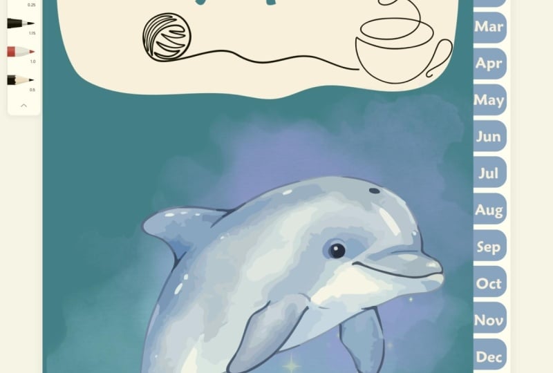
with your cover. This cover is relevant, not because you're going to
be seeing it all the time when you're using the
journal or the notebook, but because it's going
to be the thumbnail for the notebook on the
good notes app, I'm assuming you're
using good notes as it's most popular and
that's what I use. But there are other apps that
you can use these as well. That's just what
I'm referencing. This notebook cover is, again, going to be
your thumbnail. When you're looking at all your different
notebooks in your app, take some time with this, have
fun with it, make it cute. And then in the next lesson, we will add additional
title pages for subsequent sections.
3. Building Section Headers: Next step we're going
to be doing is creating title pages for all the different sections
within our notebook. I'm going to start
by duplicating this page that we just created. Before we go on, I'm going
to start by naming these. The first one is going
to be title page. The second one is going
to be notebook one. I'm going to create
several different sections in this demonstration
project that we're making. I'm going to create three
different notebook sections, so those are just regular
pages for writing in. I'm going to create
12 monthly tabs. I'm going to create a one
year planning tab and then also a reading
tracker so that we can experiment with
some different types of pages we can design. That means that we're
going to need a total of 17 title pages in order to
move on to the next step. We're going to work off
of this as our base, but I'm going to start changing the colors to differentiate
the different sections. I'm going to make
three notebooks, just going to duplicate these. Renaming the pages is really important
because it's going to help you stay clear as you
add the tabs in later. I've got notebook two
and notebook three. I'm going to start by changing
the color a little bit. I'm going to make each one a little lighter than the last. By doing that, click
on Notebook one, Click on the Color, we're going to go to Add
a new color here. This is going to show us the ingredient where we are going to slide this a little bit lighter,
doesn't have to be much. Going to go to the
next one, make it that color that
we just created. And then make that
one a little lighter. And repeat it with
the third one, lightest color, and
make it even lighter. Now we have four pages total. If you want to see all of
your notebook pages at once, click on the grid view in
the bottom right corner, and we can see all of
our notebook pages here. I want to make these a little bit different than
the title page. I'm just going to go
figure out how to do that. For my sake, I think
I'm just going to erase the text and add
one extra line in. There we go. I'm just
going to select, going to make this
box slightly smaller. Select all these lines, make sure they are
centered in that box. I'm going to select all these four and also this white box. Put it in a group.
And I'm going to copy it with command
C on my keyboard. Then I'll go to each other one. I'm just going to delete
these boxes with these lines. Just paste command
V. There we go. That new style is there. Same thing here,
command V. Now we have the title page
of the notebook and three front pages that are
a little bit different, just to tell that there
are a different section. Now we need to create
124 monthly tabs. I'm going to duplicate
this last one with command D. We're going to go into it and
call it January. Now because these monthly pages are going to be a
different section, I'm going to make
them a different color rather than green. I think I'm going
to go for a yellow. I want something that matches
with the green color, maybe make it a little
bit lighter there. Now, my notebook pages
are going to be green. This is going to be yellow.
You can do whatever you like. You can make them all the
same color if you want. I think it'll just help
with visual clarity for this class if the different sections
are different colors. Now I'm going to do a different title card for the months. I'm going to click
on this and ungroup and I'm going to
remove the lines. I'm going to make
this little smaller. And all I'm going to
do is basically just put the name of the
month on the front. I will go and borrow
the text box from the top page because I liked
the styling copied that. Bring it down to this page
and paste. And there we go. So I'm going to make
it a little bigger and I'm going to make
it the same yellow, and I'm going to write
January, easy as that. I'm just going to duplicate
this page and make one for each month
of the year. Okay. Now, as you can see, I
have 12 of these pages, 1 for each month, along with our three note pads
and our title page. I said that I was going to
add two other sections, One is a year planning tab
and then a reading tracker. And I'm probably
going to make those green again as well just to sort book end the color
choice for this series. So I'm going to go
into that last page. I'm going to duplicate it again. This is going to be
our yearly planner. I'm going to change the
color to maybe this green. I'll change the text
to be the same color. I'll say Yearly planner I will duplicate this
and put reading tracker. Let's make this the
lightest green. A little hard to see. It's not so bad when there's not text. Like you can use a
light color like that when there's no
text on the page, but when there is text it's
a little harder to see. Okay, so that's probably enough title pages
for our project. We have 18 in total. So again, title page
at the beginning. Three notebook tabs,
we have 12 months each labeled by the month yearly planner and
reading tracker. So that's it for making
our like heading pages. The next lesson we
will add tabs in order to be able to navigate
through these sections.
4. Creating Linked Tabs: We are now ready to add
tabs to our notebooks. Now that we have all of
the covers designed, let's head into the
title page to make them, and then we will just copy and paste them to every
subsequent page. The reason that we do
the title pages first is because those are the pages
we are quick linking to. We need to create them
before we can add the tabs. I hope that makes sense.
It's pretty straightforward. We're going to add
our tabs in here and we're going to be using the same shape that we have
this whole time, which is a square
with rounded corners. I'm going to tap R on
my keyboard again. For another rectangle, I'm going to round the corners out, as I did before to about 30. We're going to be making
these a little bit shorter because they are basically
going to go right up in here. We're going to be making
them the same color and pushing them
behind the graphic. I think for Notepad one
we will put it there. These don't have
to be that long. That's what the tab looks like. And then if I go to
position right here on the keyboard or the tool menu, and to back it puts
it behind there. If I make this tab
the same color, that's the cover,
You'll see that it looks like a proper tab. You can put it on the top there. Now it looks like a binder tab, or a binder divider, as you would find in
a stationary store. Typically in these products, we actually don't create a
tab for the front cover. It's just something
you can swipe to when you're going
through your file. So this first tab is
actually going to link to this notebook,
one title page. So we actually
want it to be this second green color that we used. So I'm just going
to change the color to the second green. I believe that's the one. If you ever mix it up and can't remember which
color you're using, click on the one you want. You can go to add new color. And then just copy
this code right here, Command C on the keyboard. Then you can go
back to this one, make sure that it's that right color command V to paste it. It was correct, but
just so you know, in case you have
colors that are very similar to each other like
this and you get confused, that's a good way to do
it. That's the first tab. I'm going to just add
one right below it. I have these auto locking
tools that Canva comes with, that is really helpful to
make sure everything is snug and we're going to
have one below it as well. These are the ones for
the three notebooks at the front of the book. Put them all in the back and just change the
color to match each one. There we go. There's
three tabs we're going to link them after we're just
designing them first. Next we want to add
12 different tabs for each month of the year. I'm going to create smaller tabs because we have to
fit them all in. I'm going to leave a small gap here just to indicate that it is a different section and
make these a little shorter. And I'm just going to play around with
this to make sure that I can fit all 12 in, but I will change the yellow. There we go. We have
the smaller tab. We're just going to try and
snug together. 12 of these. Okay, I think that's
1212, 3467, 8910, 1112. Okay, perfect. So that is 12. Now, just to make sure that
they are all spaced evenly, this is just a little bit of
a shortcut in case you want to add gaps in between them,
which you totally can do. I'm just going to select all of them and you're going
to go to position. And you can use these
space evenly tools here if I use tidy
up or vertically, it's just going
to make sure that the gap in between each one is even if I wanted them to be a little bit like a little
space in between each one, I could drag the
bottom one down. If I do tidy up, it'll tidy between the
top and bottom one. When I select them
like that, tidy up. Now they all have
a very small gap in between them.
That's another option. If you want to space
things differently, because these are
all the same color, I think I will leave
those little extra gaps. I'm going to select them
all and push them to the back of the design so
they're behind the cover. Then we're going
to add two more at the back for the other sections. And I'm just going to
copy these two tabs here, paste them and drag them down to the very bottom
of the notebook. Now the gap here and the
gap here are different. So I'm just going to reposition the yellow tabs in the middle. Perfect. I believe the colors of these
need to be reversed. I'm just going to
look at the grid. Yeah, the darkest one is last. I'm just going to change
the colors. There we go. At this point, you can
start linking your tabs to the different
sections in the project, but you may also
want to label them. This is totally optional. It's just a style choice. For example, for
each of the months, I'm going to put the first
letter of the month just to be able to quickly identify
which one each one is. I'm going to duplicate
this text box. I'm going to change
it to a white color. I'm just going to do J for January and put it right
on the center of this tab. Now like you're seeing, I'm struggling here with
it auto locking on things. You can always put it there and then use the arrow keys on your keyboard like so. To carefully move the
letter around to make sure it's the center depends on the letter
of the alphabet, Some of them and the font
you're using that will vary. I'm going to duplicate that. January we want for
February. Duplicate it. Those guides are
popping up to help me make sure the
letters are lined up with each other for March, and I'm just going to fill
in the rest really quick. Okay. There we have January, February, March, April, May, June, July, August, September, October, November, December. I just read them out
for my own sake, make sure I didn't mix them up. You can leave it like this. You can also, I'm not
going to include this, but let's say I want to put
notebook and make it really small and then
rotate 90 degrees. You could put text there, actually, that's way too small, but I'm not going
to add them there. But you see what I mean. You can add labels to these
if you so choose. In fact, this last one is
going to be a book one, so I'm going to grab a
little icon I think. Let's do a book in the Canva Elements Library
going to graphics. As you can see,
some of them have the little pro crown if you
want to filter those out. If you're in a free
account, just go to the filters here
and click on free. So you only see
free. Close that, and now everything
here is free to use. Let's try this very
simple little book icon going to make it really small, fit it on this tab, and I'm going to make it white to match everything else there. A little picture graph to
show us what that tab is for. As I said, you could
name these by the year, by notebook 123. You
could label them. Just label them like 123.
That could be interesting. But anyway, this is
our basic tab set up. Now we are going to link them. The way that we do
this is very simple, and this is the step that in other software or previously was very time consuming
and frustrating. Because if you moved
any of your pages, it would mess up your links in, can vat, that doesn't happen. If I'm going to link
this to this page, I could move this
page anywhere in the notebook and it's still
going to link to that page. That's a speaking as someone who designed
these using the old way. This is a good feature.
Let's create some links. Again, we're just creating this the first time
and then we're going to paste it into
all the subsequent ones. First tab, we're
going to go up to the three dots for
more and go to Link. You can also use command
K as a shortcut. It's going to offer a couple of recent Canva documents
that you've done. You can ignore those because we want pages in this document. This is why we've labeled
everything very accurately. The first green tab is
going to notebook one, then we had done, and that's it. Second one, we go to
link notebook two. Done, it's that easy. Notebook three. When you
get down to these ones, just be aware if you're clicking on the letter or the box. I go for the box, for the link again, we're going to go to January. Then I'll fast forward through this so
you don't have to watch me do this every time. But that's all we're doing
to create the links here. Okay, I have finished
linking all of these tabs as you see
if I click on them. This one goes to
the yearly planner, this one goes the reading
tracker, et cetera. I'm just going to create
a group with all of these in it just so that
they don't slide around. When you group, sometimes it does pull things
to the front. I'll just took that
in the back again. Then we are going
to copy this group. Just copy command C and we're going to scroll
down to the next page, command V to paste it. Send it to the back. Next page, paste. Send it to the back. You'll see that the colors of the tabs are lining up here. That one is clearly number two. Number one, paste in the back, et cetera, and then we
get into the months. All of the month tabs
are the same color, which is why they are labeled. Helpfully, if you
wanted to do each month a different color or
a different gradient, you can completely can do that. It would add higher
contrast for the tabs. Personally I don't, but
that's just style choice. Okay, now all of our pages,
we'll do the grid view. And you can see every
notebook section looks like the others. That's how you basically
do the link tabs. The great thing like I said
about Canada is now I can add pages in between and it's not going to mess up
any of that link. That's really key because
if you were doing this, I believe there's like
a Powerpoint method for creating these notebooks. When I tried that, I think
the links get slit around. I'm not sure if
it still happens, but this is easy
and it looks great. So in the next lesson, we're going to start adding individual pages
to each section. So we'll go through those one by one and just give
you some ideas, teach us some design methods, and you can start creating the
content for your notebook. One last little note before
we close this lesson. If you want to test
these tabs to make sure everything is working
well, you can export it. You don't have to put it
onto good notes right away. At the very least
here on my computer, I can just open it as a
PDF and click on the tabs. So we'll just do
that really quickly. I'm just going to go
to Share download. And we're going to download
it as a PDF standard. Don't flatten it,
we're just going to get all pages and download. Okay, here it is. You can see most of it in
the window here. This is it in just the
previewer on my computer. And as we can tap
through these tabs, check that they all open up the right section and the yearly planner and
the reading tracker. As you see, it's cycled through all those different ones
as we've tapped on them. Yeah, the link tabs
are working just fine, but that's how you can double check in case you're wondering, making sure things
work all right. On to the next lesson.
5. Designing 4 Notebook Pages: The next thing that
we're going to tackle is creating the sections
for the notebook pages. We're going to be designing four different pages that are two variations of two types. And we're going to make the
same ones for each notebook. When you're creating
a product like this, you only have to put each
design in once because when you are in the Good Notes
app or another similar app, rather than having to add, for example, 30 notebook pages. At this stage, you can just duplicate pages once
you're in that app. Therefore your users, or you can go in and create as
many multiples as you like. We're going to create
them in notebook one, and then we're just
going to duplicate them and change the colors of the backgrounds to suit Notebook 2.3 We'll go start there. I'm going to start by
duplicating notebook one. We're going to leave
the tabs as is. They don't need to
change the tabs, just go to the title
pages of each section. We're going to rename
this as narrow lines one. This is going to be
a narrow lines page, and this is for notebook one. That is how my labeling
convention is working. In order to create this
page, I'm going to delete this little box and
all its things. We're going to create a
white canvas to work on. This is going to be the
background color of our page. Make it whatever color
you like. You could have a light green page to
match the background. You can have black
pages if you want to work on something
darker. Totally up to you. But I'm just going
to create the size so there's a little
bit of border. And I'll just move this, it locks in the center. This is our background
that we're working off of. Just to keep everything
from moving around, I'm going to lock
these two layers. We're going to select them and then click on this
little lock right here. That just means that I'm not
going to able to move them around when we're
designing on top of them. It's just a little easier. I want this to be a narrow
lines page that's just going to be like lined paper and
it's going to be narrow. And I'll do a second
one with wider spacing. After we're going to start just L on the
keyboard for a line. I think it'll start
maybe up there. I like to give a little
bit of header room going to hold down shift
and pull this over. I think that's
probably wide enough. Again, I'm looking for that
dotted line in the middle. As our center guide, I will change the line weight
of this to one. I like really thin,
narrow lines. That's just my preference. But by all means, do
whatever color you like. If you're going to do black, you can do a black line.
That's totally fine. If you may go something
in the gray family, I would go for this medium gray here because it's not so
light that it's hard to see. It's easy to ignore when
you're working on it. You could also do a green
to match the background, but I'm just going to go with
gray. I've got one line. I'm going to add duplicate and look for the spacing I want. Maybe like that. Hopefully, if we just click
Duplicate a bunch of times, it will automatically space them out the same way
I say hopefully. Because if you click out
and then click on it again, it's not going to
remember that spacing. If you do that, you
may just have to manually line it
up another time. I'm going to add these all
the way down the page. There we go. Now I'm going
to select all those lines. Sometimes they can
get shuffled around and you may find them like
sloping down or something. If you have any
problems with it, just go to position and you can use these spacing and
tidy up features. These aren't featured because they are perfectly
lined up right now, but you could use
horizontal would shuffle them to all line up or
vertical, or tidy up. Those are the tools you
can use to help you here. Our lines are lining,
I'm going to group them. You can add other
features to this page. You could add a date here. It could say like the
word date with two dots. Then you could use it more
like a journal entry, put a picture in the background. What I mean by that is, let's say just
using these books, you can put it down here and then change
the transparency. Then it's like an interesting illustrated page to work on. That's also fun if this was a themed book or a
themed notebook, we're just going to
delete that and leave these really simple for now. But even within a
plan page like this, you can have some creativity.
That is narrow lines. Next we are going to
duplicate this page. We are going to create lines. I'm going to just
change the name of it. Wide lines one to
create wide lines. It's actually easy.
So we're just going to click in this group, and I'm just going to delete
a couple of these lines. Maybe 34, let's say five. Now I still have
this all selected. We can go to position. You have to ungroup
them in order to use the aligning tools. Here, we're just going to
go back to vertical and it has rearranged them
in a different spacing. You can decide what is
wide enough for you. I think that looks fine. I will leave that as our
wide lines page. Next, I want to do grids, so I'm going to duplicate this. I'm going to erase
all of these lines. We're just going to start fresh. So we're going to
do small dot grid. In order to create a dot grid, we're going to end up
using an element for that. I'm just searching for dot grid. There's lots of
moving things here. Don't use any moving graphics, but we do have this option
right here now we can resize this like that to make the
dot grid bigger or smaller. We're just going to
duplicate and fill this page with this
particular graphic. We can change the color and I'll use the same light grid
that we've been using. But feel free to go even
lighter because dots can, sometimes you want them to
be quite in the background. We'll just go with
this lighter one. I'm going to shrink this
down, duplicate it. Then just visually
try and line up so that the grid looks
seamless In the middle, I'm going to use the arrow
keys on my keyboard just to push it over a
tiny bit there. I think that looks
fairly seamless. I'm going to select
these two together, make sure they fit on
the page, duplicate. This is just a little bit
of fussy duplication work. All right? I'm going to
select all of them by holding down Shift on my
keyboard and clicking, Make them a bit
smaller so they fit. There's a little bit
of room on the side. So I'm going to add
another row and crop them. See it's automatically
locking onto the size that I did
the spacing for. I think actually I just need
that one row on the end. I'm just going to crop each of these by clicking
on that design. Click Crop. Pull that over. There we go. Now
it's just one line. I will do that for all of them. Now I just want to select all of those grid boxes and just be able to reposition
them a little bit to make sure they look
centered on the page. Just using my keys again, there that looks
pretty centered to me. You can keep doing this and make a much smaller dock grid. What small is relative? I guess we're going to make a bigger one as
well. That's this page. Duplicate little,
large doc grid. I'm going to erase
those small ones. These two bottom ones. I select these boxes, I'm just going to
position that a little. Make that reach
down to the bottom. And then I need to crop
these four right here. Okay, Now that these
are all cropped again, I'm just going to make sure that they are perfectly
centered in that white box, using my arrow keys to just
maneuver them a little bit. There we go. And there we
have a large doc grid. Now we have four pages to
use within our notebooks. I'm going to select
them all here, just holding down shift again,
I've selected all four. Do Command D for duplicate
and it's copied those four. I'm going to drag them
after notebook two, title page, and do
the same thing, duplicate, and put them
after notebook three. Now we have these three sets. I'm going to just change
the names on those two so that I know which
notebook they're all from. Now the only step that
I'm going to do to make these more cohesive
is I'm going to go into each of these
note pages and change the background box color to match the tab section
that they're in. We're going to go
into section two, which is this color right here. I'm going to select that
background box, which is locked, so we will have
to unlock it now. We're just going to pick
that slightly lighter color. I'll do that for all
four of these pages. There we go. And now
we're in notebook three. We're going to do
the same thing, unlock, change the
color to the lightest. There we go. That is how to
do the simple notebook pages. If you were doing
a notebook that was just this not
the plan er part, then that's basically
it for you. As I said, when you're
using the notebook, you just duplicate each of
these pages within the app. And then you don't
have to add in 30 of each design to make
each section full. Of course, you don't have
to include all of them. You can all just do
the narrow lines if you just like that page. All right, in the next section, we are going to create some
content for our months. We will move on to that next.
6. Designing Calendar Pages: Now that we've
created some content to fill out our notebooks, we are moving on to
our monthly planners. And I'm going to
start by designing a page that overviews the month, basically like a calendar page. We're going to
start with January, and then we're just going to duplicate it for
each of the months, Change the month name on it, and then we're going to go, I'm going to go to January here, and I'm going to
duplicate this page. We're going to call
this January calendar. That's how I'll name all of
these particular designs. I'm going to do the same thing that we did in the last design, which was make this box the
size of the page below it. And then just make
sure it's centered. So this is where we're
going to be working. I'm going to select
these two and I'm going to lock them so
they don't slide around. Now, in terms of how you sort of design this page,
it really is up to you. But we're going to
basically just do a bunch of boxes,
like a calendar. I'm going to leave them blank
because I don't want to make this specific to
a particular year. I want it to just be able
to be used any time. So you can fill in the numbers of which day of
the week is which. Whenever we'll put
January right at the top. You can stylize this
however you like, but let's build a box Now, I didn't find any grid boxes in the Canva library that kind of suits what
I'm looking for. So I'm going to build one, but maybe you can
find one you like. I'm just going to
build it from scratch. So we're going to type
R on the keyboard for rectangle and we're going
to select no fill color. If we go to the color section
here, there's a no color. I'm going to click on
that. We're going to go to border style and we're
going to do a solid line. I'm going to choose border
weight one just because I like the really
thin, sleek look. But you can do
whatever you like and choose the border color. I'm going to pick maybe a
medium gray just to design in. It's a little hard to see for this product, I would
make it like that. I'm going to make it
darker and thicker so that for this lesson you can
see it more clearly. But I would typically make my boxes a little bit narrower. So we'll just do border
weight four and there it's a little bit clearer
visually for you guys. We will start by creating this exterior box
for our calendar. I'm going to use
up the whole page. You could also use it partway and add like a note section, whatever you like
for how you want your calendar page to
look. Show that centered. We're going to start
adding some lines just using the line tool. Now the first one I want is a skinny line here that is going to divide for headings
for days of the week. I'm just going to put
it here and these lines will snap to connect to the box. So that is a little bit helpful. Going to hold down
shift, grab that node, drag it right
across. Here we go. If you zoom in, you can double check that
those lines are touching. I have to change the color of that to this gray. There we go. We have this header section. Now we just need to add
some lines for the weeks. Typically, most months
have about five weeks. Occasionally, you get
a year where there's a six week where the first is on a Sunday or something and
the last is on a Monday. I don't know, Sometimes
you get a six week, but five is generally
what I design. If you want to make this
particular to a specific year, you are very welcome to do that. I'm going to grab this line and I need to add four of them because I'm going to do
five weeks, 2341234. We have now we have to try and evenly space them
as best you can, but I'm going to use
the tidy up tool. I'm going to do a little
bit of a little hack here just for getting
these boxes even. I'm going to add one
extra one and I'm going to put it right on
the line at the bottom. You can't really see
it, but it is there. I'm going to select, I've
got that one selected. I'm going to select this one. This one, this one in the bottom of our
little guide there. Go to position and
go to tidy up. And now we have these
evenly spaced boxes. You can delete that
last one if you want, but it's not really
visible. So it's fine. Basically do the same
thing, but we want seven boxes, we need six lines. The other direction I will duplicate and rotate 90 degrees. I'm just going to put
it to the top shift, rid the node to the
bottom duplicate, 123-412-3456 We need another
then like I did before, I'm going to put the
extra one on this end, an extra one on the other end, just so that it has a guide for when we're
spacing them out. I selected all these lines, but it also selected the outside box just holding a shaft. I'm going to click
on the top line and it unselected the box. Now we can see we have purple, purple on the sides, but not the top and bottom. Now if we go to
horizontally, there we go. It should evenly space it out. And now we have a month grid. It's not too hard, it
just takes a little bit of finesse to get those
lines in the right place. I'm going to zoom in,
I'm just going to write the days of
the week up here. I'm going to use the same font, I'm going to use that text box. But I am going to change the spacing just because
we don't have as much spacing in these
we'll do for Monday. Just remember that I actually
like putting Sunday first. Depends on what part of
the world you're in. Some places they put Monday
is the first day of the week. I like Sunday is the first. Okay, There we have all of the days of the
week. There we go. And like I said,
I would probably do all this grid like
a different color, but I'll just leave it as is for the sake of the tutorial. You could also add a little
box in the corner of each one if you
wanted to have like a space to write the number, but I just leave it plain. We're going to go to the
grid view and we're just going to duplicate this and put one in between each
of these months. There we go. Now I'm going to stay in the
grid view just to rename each of these just to make sure that I'm
staying on track. Then I will go into each file, change the heading,
and that's it. Okay. Now they're all names, we just have to go into each one. If you forget which
month you're on, it just says right
there as you can see, like I mentioned in
the beginning of the video, this isn't that hard. It's just a little bit tedious, but it does come together like once you
figure out how it actually works and you don't
mind a little bit of repetitive tasks,
it's not bad. It's also a lot easier than the old method where you had to do each
page individually. Do the tabs on each
page individually. Oops, that was
already said July. All right. There. Now we
look at our overview, and every month has a
calendar that goes with it. Now we're going to also add in a day planner page that
will go in each section. And it's going to just be one single template We can put in each one and you can duplicate every time you
need a new day planner. Let's go create that
in the next lesson.
7. Designing a Daily Planner: In this lesson, we are going
to create a day planner that can go in each month
section of our planner. So much like our last one, we're just going to
start with January, and then we're going
to duplicate it and put it into each of the months. We're going to go into
the January calendar page as our starting point. And I'm going to duplicate this, and I'm just going to
change the name of it to Daily Planner. I'm not specifying the month
because I'm going to be just making a default one
that can work anytime. And I'm going to
start by just getting rid of basically everything that we've put on
this page so far. Give us a bit of a
blank canvas now. Day planners are
really flexible. You can design these 1
million different ways. You can put in all sorts
of different sections that cater to your
unique kind of schedule, what you do during the day, what you do for work, whatever. So there's no one
right way to do this. I'm going to create a very
sort of straightforward, simple one, but by all
means, brainstorm. Do some research on
other types of planners, go on pentrast to
get inspiration if you need more ideas on how to set up an interesting to do list page or like a
Daily Planner page. So I'm just going to start
with some text at the top. I like the font style
we've been going with, so I'm just going
to keep with this, I'm going to call
it today's plan. I'm going to divide this
page into three sections. Basically, I'm going
to do two columns at the top and one big one
at the bottom for notes. Let's start with a rectangle. We're going to do
R for rectangle. Same thing as we've
done before, no color. We're going to increase
the border weight. I'm going to just
do it up to four, just for the sake of the
tutorial so you can see it. And I'll make that a lighter
gray for these templates, you don't have to
round the corners. I think I'm going to leave them sharp just because
it's inner content, not the shape of the notebook, but you can round
them if you like. I'm just going to
put it down there. Basically make myself a
box that I'm going to fill with lines as
our notes section. As usual, we'll
add a line again. I'm going to change the color. I'm going to put this
at line weight two, holding down shift
to move the nodes along trans center that. Then we will just add a
couple of lines here, great. And at the top, I'm just
going to add some text. We'll say nodes, make it smaller and just put it at the
top of that section. Cute. Okay, now we have the top. I think I'm going to
do like a to do list and then maybe some structured
planning P sections. First I'm going to just copy this rectangle so we don't have to be remaking it every time. Put it above, this
is going to snap to, that is the midway
point on this template. I'm going to move it
just a tiny bit over, just so that there's a gap in the middle between the
two columns I create. This will be to Do List, we will add that text at the top. To Do List, I'm going
to just duplicate the line and we'll use that as our base point
holding down shift. Here we go. I will add some little check boxes to the beginning
of these as well. In a moment, a lot
of this is just making lines. Okay, there we go. Now I'm going to add like a little circle
at the beginning, just as like a check mark, which is very
satisfying to fill. You could do a square or circle, but I'll do a circle
to be different. See on the keyboard, same processes with
the rectangle, no fill border weight. I'm going to do two just to
match the lines here, gray. And then I'm going
to hold down shift and make it I will zoom in line that up. So I'm just going
to try to put it halfway between the two
lines all the way down. I'm just going to move
all of this up or down a little bit rather to
give us some more room. So I'm going to lock this box, so I don't accidentally move it. Select all of that, and
just drag it down a bit. Okay, perfect. Now I
will unlock this box, duplicate it, and bring
it right over here. Now, this gap here and this
gap are different sizes. You can always adjust
these boxes a little bit. They don't have to
be symmetrical, or you can play with the
margins as you like. I think I'm going to
make two boxes here. Again, it really
depends on what you want to be able to plan
and manage for your day. Because for me, it's
going to be like appointments and meal planning. A meal plan is another great full page template you could do. Let's do appointments
right here. Then we will do a meal plan. For a meal plan,
we'll do three lines, breakfast, lunch, and dinner. But you could add in like,
extra lines for snacks. I'm going to just steal
some lines from over here holding down shift, copy, paste, and I'll give myself
more room with these lines. Let's just rearrange them there. I'm going to just
add some letters to indicate which
part is for which. Let's do for breakfast
right there. I will do L for
lunch, D for dinner. Okay. So there is a very
basic daily planner. Like I said, you can add
whatever you need to it. If you want to do like
an hourly schedule, you could do that. You just sort of want to maybe make these lines connect to the edge of the box and then put the times for the different
sections of the day. You can also do things
like gratitude journaling. You can add a section for affirmations or any sort
of mental health tracker. You can do habit trackers. Again, I would sort
of just use like a checkbox or a
tick box like this. Maybe like change this
word to like drink water and then add a bunch of these little boxes along here. But this is what I
would personally use in terms of setting
up a day planner. Now, we want every one of
our months to have that. It's not very complicated
because we're just going to be putting it
the same one everywhere. It's called Daily Planner. So we will duplicate that, add it after the
February calendar. Do the same after
the March calendar, and so on and so forth
until every month has one. That's going to be pretty
much all that we're doing for the calendar, monthly sections. You can add in other
things if you like. You can do monthly goal setting, you can do different trackers. Like I said, a habit tracker for each month would be
an interesting idea. You could do fitness trackers or anything that if
you're trying to achieve any particular goals, you can set that up in there. Or you could create a separate
section like instead of the reading tracker for
whatever it is you're up to. Okay, so now we're
at 54 total pages. Every one of our calendars has both a monthly spread and
then a daily planner. You could also make
like a weekly, a lot of variety here. But hopefully those two pages that we design together give you the design tools that you can apply to whatever other
page you want to create. To summarize, we
have our title page. We have one notebook, two notebook, three notebook. We have all 12 months, and each one has two pages. Next we have our yearly planner, where I'm going to design
a couple of just sort of one off templates and again, just give you some inspiration through designing them together. So let's do that next.
8. Designing Yearly Planner Pages: Now We have created a lot of cool different templates
for pages so far. And we're going to move on now to the yearly planner section. The yearly planner is a space that you don't necessarily
have to include. This is just more like what
I would prefer to include in a comprehensive planner
like we're designing. But this would be a
space where you can do yearly goal setting, organizing, any bigger scale
project planning than beyond Monthly,
I'm going to show you, we'll just do a
couple of different page designs and then I can throw out a couple of ideas that you
could also include. We're going to
start, and this is the tab right down
here at the bottom. I'm going to start by just
duplicating this and we're going to make the white
background to work off of. I'll delete that for now. We're just going to make
that big right rectangle to get started, okay? And I'm going to
lock those as usual. Lots of ideas of things
you could put in a yearly planner for me. I plan my business
around quarters. I'm going to do like a
four quarter plan goals for each quarter page. I'm just going to grab
the text box again. Quarterly goals. I'm going to reduce
the spacing on that. Put it at the top. All right. Now I'm
just gonna create four equal size rectangles. Label them one to four, and that'll be
sort of this page. All right, so that's
about the size of the rectangle I will do, we'll make four of them, maybe a little higher up. Okay? And then I'll just let these and make sure
they're centered. I'm going to add a
little text box, it just says C1c1. Maybe I'll add it
to each corner. I think that would be cute. And I'll reduce the text size
a little bit, be about 35. Okay. So now we have
like a quarterly goals page. Pretty easy. Another page could just
be like this year. I want to and then we can just add a bunch of
lines with check boxes. We could add the lines
or I could just go and copy them off of one of the
pages that we already did. I am all about
expeditious designing, let's use the wide lines. Just going to copy
this group and we'll head back to
our other page. The more pages you
have, the slower can Va gets, unfortunately. But that's okay.
We can be patient. There we go. There
are some lines. We're just going to
delete that top one. Then we can go in and just add some checkboxes
to each of these. I'm going to copy the checkbox,
these ones right here. I'm going to just hold down
shift and select them all. They won't be the
perfect spacing, but that's okay.
We'll figure it out. Maybe I'll delete
that top line again. I think that's
maybe, there we go. I could do that. Okay, there we've just tidied
these up a little bit. So that's our big goals
page for this year. So just some other ideas for things that you could
create for this section. I'm just going to leave
it at these two pages, but you can create tons more depending on what exactly
it is you're planning. You could add in section for contact information or for medical appointment schedules or any kind of record keeping. Personally, I like
to keep a note every time I go to a
doctor's appointment, I fill in a form in my
journal that is like what I did at the appointment
with the advice I got. Follow up, et cetera. Any kind of personal records
could be useful here. You can do card maintenance, keeping track of
like home insurance or subscriptions that
you're paying for. You can add financial stuff in. Maybe that's not so much in
the yearly planner section, but sort of a general, I don't know what you
would call it, like an administration
section of your journal. You can have this more
resources oriented section if you wanted to pivot
your yearly planner That way it's just like bigger overview
management rather than just like monthly planning. And you can also add in
more like mental health, things like wellness check ins, anxiety trackers, mood trackers, any kind of tracking
thing you want to do. If you need more
inspiration for this, I do find that if you go
into Pin Trust and you look up journal ideas or
types of journals, there are lots of
these posts that are just lists of types of things
you could put in a journal. I think they're
mainly aimed at like the bullet journaling community, but it's very useful
for inspiration for when you're designing
digital products like this. So the last section I'm going to design is going to be
for our reading tracker, just to show you what
you could do with like a more hobby based outline. But that'll be our last main design section before we look at some other journal
examples and also talk about uploading it,
exporting it, et cetera,
9. Designing Book Review Pages: In this lesson, we're
going to design two different pages to
go in a reading tracker, partially because this is
a popular type of thing to add to a digital
notebook like this. But also just as an example of a section that
is hobby based, our reading tracker
is our last tab with a little book icon there. We're going to start just
duplicating the page and then creating the white blank one
that we usually work off of. I'm going to create
two different pages for the reading tracker. The first one is going to be more of a place where you can list book titles and then
check off if you've read them. The second page is going to be about reviewing specific books. We'll build that first one. I'm going to grab that
text box, books to read. Maybe I'll make that a
little bit less spaced out. We'll put it at the top. Now this is going
to look a little bit like the goal setting page. I'm going to actually just
take that formatting. What I actually want to
have here is a check mark, a place to put the
title, and then I want a separate section
of date finished. Like if you did finish
reading the book, I'm going to add in some
little tiny headings. Let's just say book title. And I'm going to zoom in so we can see what
we're doing here. Let's put that here is, then we will put date
finished over here. In order to divide these lines. Like you could go through
and shorten this one, add a new line or whatever, you can completely do that. Or you could just put
a white box over, which is what I'm going to do. So we're just going
to add, actually we could just do a
really thick line, so I'm going to do L. I'm going to rotate
that 90 degrees. Stick that line. Yeah,
I think right there. Hold on, shift to move
the node to the bottom. Then we're going to
increase the line weight significantly to whatever
you want that gap to be. Let's do 40 then. We're going to make that
line weight easy as that. Now when we zoom in, you can see that there is
a break in each of those. We can adjust this to make
sure it's centered over that little section.
Yeah, there we go. Looks good. There is
a books to read list. The other page I
wanted to create is going to be more
of a review section. We will duplicate this
title, this book review. But I'm going to make
the text smaller just so that it's not as dominating. Here we go. In terms
of a layout for this, I'm thinking a rectangle
where you can paste the book cover like
a graphic of it, a place for the basic
information about it. And then we can do a text
box for review space. You could also, I think we'll
do like a star ranking, so they can color in
the number of stars. You could do a pros
and cons list. You could do a favorite quote, you could do a ton of things. But I'm going to keep
it on the simpler side for my preference, I'm going to add in the
rectangle to start. Same method as we usually do. I'm going to do line
weight two for this one. We'll start here, That's book cover shaped. I
think we'll go with that. I'm going to add
a couple of lines over here with
prompts for the text, and I'll just line
those up. There we go. I'm going to zoom in on
this section and just put in some little prompts here. Let's duplicate that. I'm
going to do like two lines, I think that's cute. Book title, release date. There we go. There's
some basic information that they can fill
in about the book. Let's zoom out a little bit and then I'm going to
do stars along the bottom. Let's look for a star graphic. I want something
that is like this, Perfect. It is white. Let's actually make it the
green of the background. I think that's cute. We'll do 12345. I'll put that right at
the center of the bottom because I think that's
just cute down there. Also, it makes it quick. If you're flipping
through your reviews, you can find out which are
the five star rankings. I'm going to add a
little line right above that just for decoration. Then we're going to add
another box down here that is just lines
for the review. I realize as I drew that, that all these sections are
not really in the center. Let's just move that
over. There we go. And then I'm just going to write review and then give lots of
space for actually writing. Okay, that looks like a great
book review page to me. As I said, if you're doing a review or a book
section specifically, you can add in all
sorts of things like a reading habit tracker or like a daily log where you write what you read and
how much of it. But you can also do all sorts
of other hobbies in here. This could be common ones
or like meal planning, exercise, or workout tracks. You can do a gratitude
or mindfulness section. You can do a section
all about chores and errands and things you
need to keep track of. You could add sketchbook pages
if you want to have like an art section or
a doodle section. The sky is really the limit. You can create anything that you like for your planner here. Now that we're
done this section, we can just sort of look at our overview and this is
basically the finished product. In the last lesson, I'm
going to put this onto good notes and just show
you it interacting with it. But these are all our pages. So we have a total of 58. And again, when you're using it, you can duplicate
any of the pages as many times as you want. The next lesson,
I'm just going to show you some
variations that you could do for a horizontal
orientation notepad, which is also kind of
a popular premise. So we'll look at that, but
then in our final lesson, we will do the
exporting and have a look at this in our ipad.
10. Pointers for Vertical Notebooks: In this lesson, we're just
going to look very briefly at how you could set up
a horizontal notepad. I'm not going to
walk you through the entire tutorial because a lot of it is basically
just what we covered. But I'm going to just
show you this set up and the overall premise
of how you can design the horizontal notepad. I'm in Canva, and we're just going to reverse
these numbers here. 1960 wide and 15, 36 high. This is the same ratio that
we were working in before. It's entirely possible. And you're welcome
to go ahead and just create one in the same
method that we talked about. But just put your tabs
along the top or along the bottom instead of along the side. That's
completely fine. Another option that
I see more often in this layout is to
present it almost like an open book with two
pages and then like fake binder rings or
binding in the middle. We're going to try and just mock something like that
up And then again, you can apply the linking and all the design pages premises that we did in the
other lessons To this, I'm going to put room
for tabs on both sides. Now this is also
something you could do in a vertical orientation, is have tabs along the
top and along the side. You don't have to just be
restricted to one side. If you need more room, you want to create a really big notebook. By all means, use
the top as well. Often what you're going to see is like an intersection
two intersections. So I'm going to add some
additional rectangles. Okay. So now it's like we have two pages and sometimes they even put like a
binding in the middle. When these are
designed, I say they, I just mean people who designed
these types of templates. I don't have any one
specific in mind, but I went into graphics and
I searched for binder ring. I'm just going to go to see all under graphics and there are a lot of ones that are
only for premium here. I wonder if there's
any free ones. Okay, so we have one,
we have two options, so there's like this
gold bar looking one. And then there's also
this which is much more, well, it's more like a
single sided one actually. This probably could work, I
think two rather than one. Then pull this one in
so it looks like it's going through it there. Okay. That looks pretty decent. Can you tell? These are not the way that
I designed them normally. This is just how I've
seen them popular. I like a vertical design
personally, but this is fun. This is basically
a two page spread. You can put whatever
you like in them. In terms of tab, we can
add some tabs in here, you can choose to
put, you can treat this orange box as like
the outside binding. So you can stick
it under here and then go backwards like that. And just have a bunch of
tabs in this orientation. Let's put those in
the back like that. And then that would click through your different subjects. And you could do more
along this side, you could put them back further, But it's just really up to you. But this is the basic premise
of how I would design a horizontal one that gives you like two
pages you can work on. That's nice if you have
really small handwriting and you want to zoom in
a lot when you write. And you want to put more
stuff on one visual spread. If you're more of
an illustrator, like if you have
illustration skills or like an ipad with procreate, I could even see you doing like instead of using
this rectangle, you could illustrate
like inside of a journal texture like
with stitching and maybe like a fake leather
texture or something if you want to make it more
like fake real book. Also, if you do have
a Canva pro count, there are obviously a ton of binding options for
that middle coil, but that one's pretty cute.
I think it looks nice. This is just a quick little
overview of how to set up this kind of notebook
just as an option. But basically all of the pages we've designed today
you could just plunk into this format
if you prefer it.
11. Exporting and Using in Goodnotes: So now that we're
all then designing, we are going to put
this into good notes on my ipad and just give you a little test run to
show you how it works. So I have all my pages here. We are going to go to Share in the top right corner.
Go to download. And we are just going to
download this as a PDF. Pdf standard is great because it's going to be a
digital product. Don't flatten or
include any notes, sort of like I
mentioned earlier when we did a demo and then
just hit download. You can also go onto Canvas on the app on your ipad and
download it directly there. You can click on
Opening, Good Notes. Once you download it there,
or if you do it this way, pop it in your Google
Drive and whatever, to get it from your
computer to your ipad. So I'm just going to open
up my ipad and show you. And we'll just play with
it and then we'll be done. Okay. I have good
notes open on my ipad, and I apologize for
the intense lighting. It is golden hour here. It's a little bit lovely in person. Our notebook is right here. I've already imported it, and I did that just by
clicking on New Then. And I just found the file
on my ipad very easy. When we open it up, you can see that we are on
our title page here. Now I'm using Good Note six, which is the newest version. I actually, I'm
doing a trial of it because I've been using
good notes five for years. I was apprehensive of
getting the new one, but it seemed pretty slick. That's no particular opinion
in terms of a review. That's what I'm using at the
present is good note six. When you use good notes, if
you're not familiar with it, you have this mode
where you can scroll around on it or you could
tap this button here. And it goes into
like writing modes. So I can write hello there on our front page in order to scroll
through these tabs. Like the tabs won't work when
you're using this pen mode, but we can turn that off and then we can sip
through the book. We'll go to section one here. That's our first notebook. Second notebook, third notebook. If you go over, you'll see
that here's the line page. Wide lines, small
dots, big dots. Then we can go into
our calendar sections, which have January, here's our calendar. Here's
today's plan. We can go down to our
yearly planner and here's our quarterly goals
and this here I want to as well as our reading tracker books
to read a book review. If I was using this
I would be like, let's go into pen mode title. I'm really messy writing
with the pencil. Then we could do a
check mark home, Don. It's fun to use as an example if you want
to create more pages. Let's say I've filled this out and I want to make another one. It is very simple because
all you do is tap on new page right there
and current template. There you go, another
page exactly the same. You can go on the grid view over here to see all your pages. But you can see here that's the original books to read page and there's the new one it
made it all bumped it along. And of course it does not
mess up the navigation. We can still just navigate
as normal. Yeah, that's it. That's how you use
it in good notes. As you can see, the size that we created filled up the
shape pretty well. If you have a
different size ipad, you may want to create a slightly different
notebook size. But I found that this size
works fairly universally. I think it's pretty cool and I love making these and using
them. I hope you do too. I hope that this course has inspired you and
given you an idea of all the different types
of products that you can make using this
sort of method. You can make anything from
planners to journals, to workbooks, A lot of interactive things that
people would really enjoy. And like I said, you
can sell these on Ets and probably other digital
marketplaces as well. There's definitely a
market for it out there. It's not something that
I've personally sold, but it does seem like it's valuable when I did a little
bit of research about it. So if you're interested in that, I do have lots of other classes on running a digital
product store on Etsy, so you may want to
look at that in complement with the skill set to figure out if you are
looking at making this like a side hostel or something
along those lines. Now, I would love to see your
work as a class project, so not going to make
it super complicated. I would love for
you to just follow some of the steps
that we did today, either exactly as I did it
or do your own variation. And then take a screenshot
of the Canva pages in the grid view just so we can see an overview of what your
journal is looking like. That screenshot
would be great if you could upload
that to the class. And I'd love to
take a look at it and just see what
you came up with. It's very inspirational and also a good way if you were
looking for more ideas, check out what your
classmates have made and see if there's anything in there
that inspires you. If it's a little bit daunting, honestly just do the
lined page version. Make a couple of tabs,
different sections of line pages and
you'd be great. That's a great first to try and a first digital
notebook to make. If you have any questions about anything we
covered in this class, I will do my very
best to answer them. Please do leave them
in the discussion and we'll chat down there. If you have any feedback for me, if you liked this
class and want to leave a review, that
would mean a lot. Reviews are very important
to me as an online teacher. They make a big difference
in helping students decide whether they
take my classes or not. So your feedback will be
very much appreciated. I read every single
one of them and if you like learning with me or just
hanging out and chatting, I have lots of other classes
on entrepreneurship, digital products,
graphic design, book design, et cetera. And I also have a
Youtube channel where I post about
my art business. It's a bit more entrepreneurial, but also like logs
and art tutorials. So any of that sounds
interesting to you. I'll put links here on
the screen with me. But yeah, you can
check those out. I hope you learned
something new today. I hope you found this useful and create something
really cool. I was very excited when I realized that I could start
making these notebooks in Canva rather than having to use a combination of other
software to make it happen. So I hope you found
it exciting as well. Good luck with your
creative projects and I'll catch you later. Bye.
 Rebecca Wilson, Artist