Transcripts
1. Getting Started: Hi. I'm Courtney Eliseo. I'm a brand strategists, designer and educator who spent the last 15 years helping small businesses bring their brands to life. I've worked with entrepreneurs across a variety of fields, like education, tech, beauty, hospitality, and retail. Using a unique approach to branding that both leverages structured systems and flows with intuition. This process provides a framework for the creation of a brand identity that evolves organically from one step to the next, and results in a look and feel that is both practical and evocative. This class will highlight one small piece of my typical brand identity design process, creating color palettes. I developed these series of lessons with designers in mind, but the material is accessible enough for anyone with an interest in the topic to dive right in. Even if you don't have any design experience at all. Here's what you'll learn. How color palette is structured. The three main categories of color and how they're used. How to use a mood board to create a color story. How to translate a color story into a color palette, and how to narrow down on multiple palette options into one signature color palette. When you're finished, you'll leave class with and understanding of the entirety of my color palette creation process, and understanding of how creating pallets fits into the larger, overarching brand identity process, and a unique and purposeful color palette for your own client project. You'll need a couple of things to get started. First, you'll need a client or project that you intend to develop a color palette for. Then you'll also need a mood board that accurately represents the visual direction for the project. You'll also need a design program where you can do a couple of things. One, draw boxes for color swatches, and two, sample colors from your mood board. Ideally, you'll be able to do both of those things right within the same app, so it's a quick and easy process. I'll personally be demonstrating with Illustrator, which I use for almost every step of the design process. But you could use Photoshop or any other app that you prefer. For your project, you'll start with a mood board, just as I do with my own clients and follow a few simple steps to translate your board into a functional color palette for a client or for yourself. Don't worry if you don't have a real client to work with. For the purposes of this class, you can choose to work with a pretend or dream client to go through the lessons. You'll also be able to access the sample I've provided for the class which I'll use to demo the process throughout the course lessons. Using that to do your work is an option as well. I've also provided a template file that will give you additional guidance throughout the process and I'll share how it's used as we go. Just a couple of other things that I want you to keep in mind before we get started. First, this is not a color theory class. Well, I know color theory and it informs this work to a certain extent, I don't consciously consider color psychology as I work through this process. I won't be going through things like the significance of certain colors or talking you through how the color wheel works. Instead, the lessons will break down my personal color palette development process, which includes a few simple steps based on the initial work I put into a brand strategy. For this class, we're going to skip over some of the initial strategy work and go straight to the mood board. The premise we'll work from is that because you've already put a lot of strategic effort and care into your mood board, it's the only tool you need to pull together a unique and purposeful color palette that suits your brand. You can get a little more of a sense of the big picture. Here's a very simple graphic showing how the pieces of my process work together. I break up a project into three main phases: strategy, design, and production. Then there are multiple steps and processes within each one. You'll notice that the mood board comes into play at the end of the strategy phase and color at the beginning of the design phase, so they're pretty directly connected. That's where our focus will be for this class. Next up, we'll kick things off by diving right into color palette structure. This next lesson, we'll provide you with the basic foundation that you need in order to make choices that are intentional, purposeful, and align with your brand. I hope you'll join me.
2. Color Palette Structure: Hello and welcome to Lesson 2, color palette structure. In this lesson, I'm going to give you all of the foundational knowledge to do the work that will come over the next few lessons. Because before you can follow my process to build a color palette for yourself, you need to understand the structure I have in mind when creating them. One important facet of that structure is a concept that each individual color should have a purpose. It's important to choose colors that don't just complement each other, but there are also attached to a specific role that play within the brand identity you're creating. The colors need to work together visually as a baseline, but they also need to work within a system that can be used to create a consistent and cohesive presence for your brand. Having this in mind will not only provide your palette with some structure, but will also help to give your processing structure, which will make decision-making much easier and more seamless as you move forward. With that in mind, let's talk through structure in more detail. There are three categories of color that I'm looking for in every brand palette. They include primary, secondary, and neutral. Let's break each one down. Starting with primary colors. The primary color is a brands signature or main color. It's the one color you associate with the brand most. Think green for Starbucks, red for Netflix, or blue for JetBlue. There are a few characteristics that signify a color falls into this category. First, it's the most recognizable. The main goal of your primary color should be to create a strong color association for the brand. You will use that color over and over again in all sorts of situations. Overtime, your customers will begin to reflexively associate that particular color with your brand. Also, a primary color is often one color. Because these are significant goals of a brand's primary color, more often than not, that means that the primary color category includes only a single color. But that doesn't necessarily have to be the case. There are some instances where a brand employs two primary colors as part of their palate. A good example would be yellow and red for McDonald's. You rarely see one without the other and the pairing has a very strong association with McDonald's as a brand. Another thing to keep in mind is that your primary color doesn't necessarily need to be extremely unique. It could be black, for example, or another neutral color. Nike is a really good example of a brand that does this. I know this point might be a little bit confusing because we're actually going to talk about neutral colors as an important part of your palette in a minute. But the main thing you want to keep in mind is that your primary color is your most important color. It doesn't have to be allowed color and it doesn't need to be something that you've never seen anywhere else. Above all else, what you need to focus on with any color in your palette is choosing a color that's right for your brands. As I just mentioned, your primary color should be your most used color. This doesn't mean you need to plaster it all over everything you put out into the world. But you do want to use it in places where you want to create a significant impact. Where exactly this is or what this consist of is always going to depend on the context. This will often show up an important brand elements like logos and dominate the color palette and marketing materials. If you have more than one primary color, the goal should be to use them in the same way and to use them equally. Let's move on to neutral colors. By definition, neutral colors are those without color. They are colors that are not depicted on the color wheel, like grays, whites, and creams. I don't love this definition because it feels a little bit limiting. Under the right circumstances, neutrals can have a lot of personality and a lot of color within them. But understanding the basic definition will help you see how we use them in the context of your overarching color palette. Neutral colors have a few roles in your palette. First, if used intentionally, your neutral colors will help to create a sense of balance within the palette. They help to bridge the gap between your more dominant, primary, and secondary colors so the end result is a palette that's in harmony. Neutrals will also give you the ability to layer elements or to allow content to sit back or stand out when needed and providing you with more possibilities for creating depth within a design. Neutrals will play a significant role in your palette because more often than not, a brand will require the use of a neutral to get their messages out into the world. From showcasing content, to grounding primary colors, to providing a backdrop for significant messaging, it would be tough to create a functional brand palette without a neutral color because brands need to rely on them for so many things. Let's get a little bit more specific with the dark and light neutrals. Black is probably what comes to mind first when you think of a dark neutral. But there are so many great options for dark neutrals that aren't black. Cool and warm grays, dark taupes, browns, even really dark shades of blue, green, or red could be considered neutral in the right context. These colors are great to use for type and backgrounds behind light type or images. Just as there are many options for dark neutrals, there are many for light, including creams, light grays, and even pastels. Light neutrals are great for backgrounds and type when used on top of dark colors and images. In many instances, a brand will need to use more than one neutral to do what they need to do. As a simple example, they may need a dark neutral for all their text, but also need a light neutral for image backgrounds. There are a million different ways this could play out in practice. But this is while often choose to include one dark neutral and one light neutral in a brand palette and then use those to explain the palette even further by using tense of each color. Since they most often play different roles, it can be helpful to have one of each to work with, but it's not a 100 percent necessary if that doesn't work for your project. Lastly, let's talk about secondary colors. The secondary color or colors in your palette are secondary and important to your primary color. Here's how a color fits into this category. Secondary colors are important, but not the most important colors in the palette. The secondary color should be recognizable to your brand, but it should still allow the primary color to stand out the most. They are complimentary to the primary color. You'll often see the primary and secondary colors used together. These colors should work well together, both on their own and when seen within the larger context of a broader palette. The secondary color is sometimes called the highlight color. I use those two terms interchangeably because the secondary color is often used to highlight information or call attention to various things. This could include things like buttons on a web page or your name on a business card, or the title on a printed brochure. What that looks like will vary widely depending on the ins and outs of your brand and the specific context of the project that you're working on. This category is where there's the most freedom. While a primary color is used to create a strong brand association, and the neutral is used to ground your whole palette, the specific role of your secondary color or colors will play within your brand can change pretty drastically depending on the project. You usually want to have at least one highlight color in your palette. But you can have as many as are needed for your brand. There is no hard and fast rule about where to cap the number of colors as long as there is a specific purpose for each one. One example of this goes back to using secondary colors to highlight and categorize information. For example, maybe you are working with a line of beauty products that has five product categories in the line and your client wants to use color to identify each product. In that case, you might want to build your palette around that purpose and create a palette that includes five highlight colors. That's just one example of how it could work. If you're not working with a super specific situation like the one I just mentioned, the goal should just be to start with one. Now that you understand the three color categories we'll use to build our palettes, let's review and go through a few things I want you to keep in mind as we move forward. First, you want to give each color a purpose. When it comes to color, it can be easy to lose sight of your end goal by getting carried away in the process of creating something that's just aesthetically pleasing. You want to always have in mind that you are building this palette to be used as one of the brands essential distinguishing features. In order to do that well, each color within the palette has to have its own individual purpose. Your palette should have a hierarchy. The clearest path to a color palette that will work well for a client's purposes and for your own as you're designing pieces for them, is to ensure that the overall palette has a distinctly defined hierarchy. In order to create brand recognition, all colors should not be equal. You also want to make sure you use all three categories. In order to create a well-rounded functional palette, you should always have at least one color in each category unless there's a specific reason not to. It can also help to just start small. If you're not used to working with color in this way, start with just a few. Using lots of colors can quickly become cumbersome and too many colors can end up working against you and feeling just like noise. That covers the ins and outs of how my color palettes are structured and the thinking that drives the process. Next up, I'll take you through the palette building process that I use step-by-step.
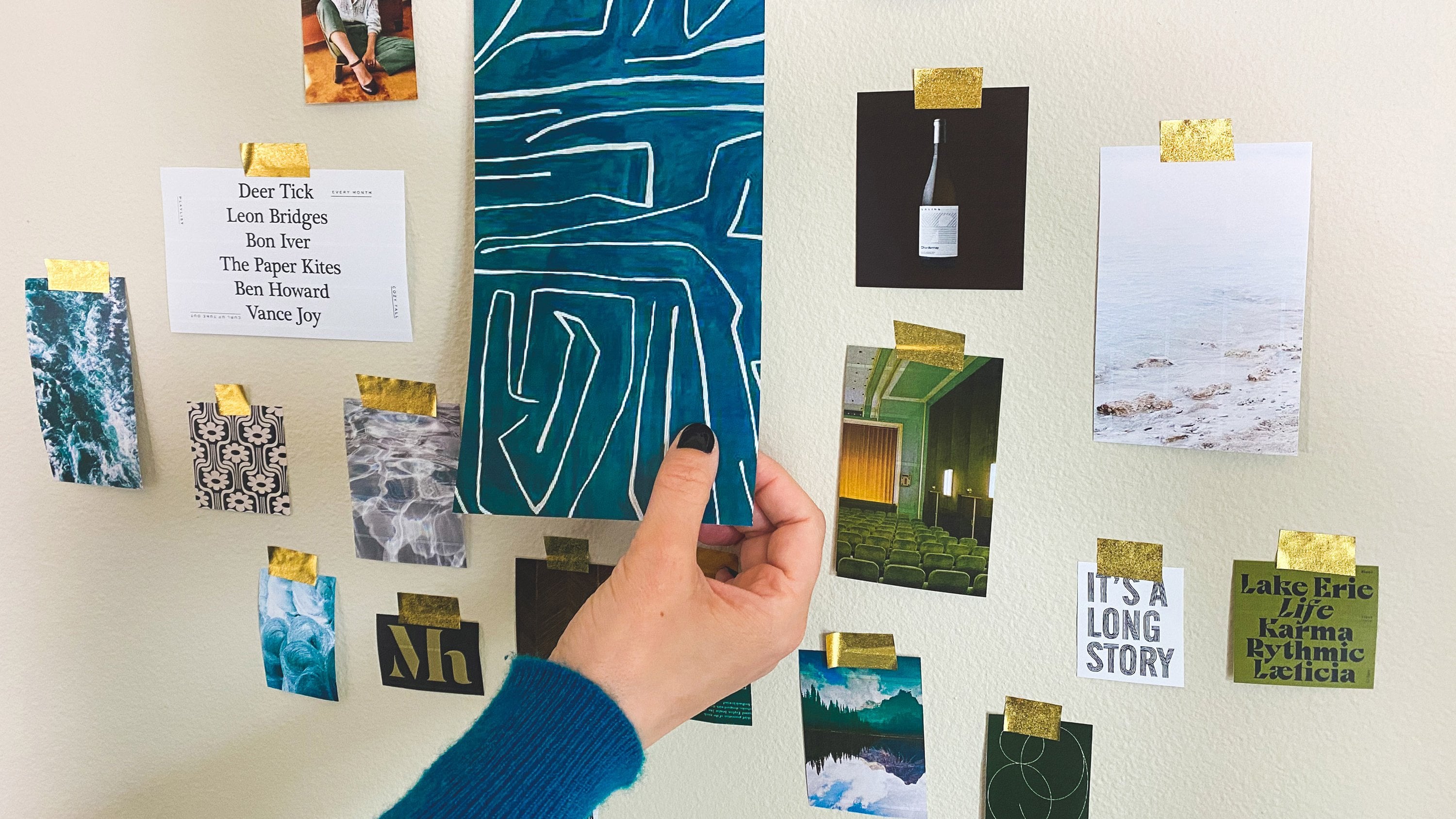
3. Create Your Color Story: Hello, and welcome to Lesson 3; Create Your Color Story. Over the next four lessons, I'm going to take you through four simple steps to build your color palette. They are: step 1, create your color story, step 2, cull and categorize your color swatches, step 3, build your color palette options and step 4, refine and finalize your color palette. In this lesson, we're going to focus on the first step; creating your color story. Let's dive right in and take a look at what we need to get started. We're going to jump into Illustrator in this lesson as I take you through the process of building a color palette. Again, if you don't want to use Illustrator, that's totally fine. It's what I'll use to take you through the steps, but you can use whatever app you're comfortable with that does what we need. If you are using Illustrator to do the work as we go, go ahead and download the template file from your resources if you haven't already and open it up. I'll take you through it in a minute. No matter what app you're using, the first thing you want to do is get your mood board into your file. It will be necessary to have that accessible for all of the next steps. To take you through the steps one by one, I'm going to use a version of the template I've provided along with the mood board I've created for a made-up client, and I'll talk you through my process as I go. But before we begin, let me explain what I mean by color story in this context. Essentially, a color story is a quick translation of the visual world you've created with your mood board into a set of color swatches which will eventually be used to build your color palette. It's a set of swatches that represents the entire mood board without any set structure or hierarchy. Let me show you what I mean. Here's an example of a mood board I created for a past client of mine, CBN.com. Here's the color story that I created from that board. Let's take a look at them side-by-side. Now you can see how the two relate. Without analyzing the color story in detail, when you see it next to the mood board, it's clear that the colors align. This is the end result that you'll get from this lesson. Jumping back into Illustrator again, let's take a look at the template file and get started. For this lesson, we're going to focus on two of the artboards in this doc. First, you'll see this artboard where I've placed my mood board into the file. Yours will be blank for now until you place your mood board inside. Right next to that is an artboard with a bunch of empty squares that we're going to use for your color swatches. This is where you going to build your color story. What we're going to do in this step is sample colors from all over the board until we have a comprehensive representation of all of the colors in your mood board. Now that doesn't mean you literally need to sample every single color that you see, but we want to extract enough examples of color that when you look at the mood board and color story next to each other, they feel similar and complete. You want to make sure that nothing feels like it's missing or over-represented. By the way, if the number of swatches I've created doesn't work for you, feel free to add more or subtract some. In my experience, I've found this amount to be a good balance between too much and not enough, but that just might not work for you, so that's totally fine. In order to make the color story, what I'll do is shift back and forth from the Eyedropper to the direct selection tool and just start to fill in all of the swatches with colors. I'll highlight a square, click over to the Eyedropper over here, or you can use Eye for the shortcut and then sample colors from all over the board. Then I'll just hit ''A'' to get to the direct selection tool, hover over the next swatch, click on that swatch, and then go back to the Eyedropper, and I'll just move around the board so that I'm getting a good representation of all the colors. I'll do this really quickly at first just to get everything out there and then we'll see where we're at the end. One thing to note is that sometimes I'll be trying to sample a specific color like this, blue, for example, and it's coming out as a totally different color than what I'm seeing on screen. Because I'm clicking a tiny pixel that's just not representative of the cumulative color that I'm seeing, I'll just try to click into a bunch of different spots until I get something that's more representative of what I was looking for, which is this color, and then I'll just keep going. This board in particular has a lot of color to it, so I'm going to try and from the beginning not to repeat too many colors because we only have a certain number of swatches and I don't really want to have a color story with a million swatches on it, it'll just make things more difficult in the end. As an example, there are a lot of colors in this marble image, lots of different neutrals and tons of different shades of neutral. On my first pass, I'll try to get a good representation of all of the different colors that are in here, and then that's something that I might come back to refine. Same with all of these images that are black and white and shades of gray. You just want to keep repeating this process until the whole sheet is filled. Again, you don't need to be super careful about what colors you're selecting at this stage. Now once you have all your swatches filled in, the next step is to take a step back and evaluate how well the color story represents the mood board. As I mentioned earlier, you don't want to feel anything is missing or over-represented. First, let's take a look at whether or not my story includes any repeated colors. It's pretty rare that you won't have any instances of this after your first pass, but if you don't, no need to worry about this step. If you do, simply identify where you see the repeats coming up so that you can try to replace them with other colors you might have missed. As I'm checking my own work, I can see that this is generally pretty accurate, but it does feel there's maybe too much of an emphasis on the neutrals because the colors do stand out so much more in my mood board. Looking at all these warm grays and beiges, they are pretty similar to one another. The next thing I'm going to do is highlight the colors that look like they're a little too similar. At this point, I'm going to highlight them so that they stand out a little bit more from the palette because we're going to work on swapping them out next. You can do this anyway you want, but I like to just change the color of the outline to highlight the specific colors that I need to work with. All I do is highlight the colors that I want to work on a little bit more, and then change the outline color. I'll just use a magenta so that it stands out, but you can use any color you want that stands out from your story. Then we also have three blacks that are similar, so I'm going to change the outline of those also. Also one thing to keep in mind, at this step, is that you can have similar colors in your story. A lot of this work, this is just open to interpretation. You really just need to make sure that there is enough difference between similar colors that when you look at the two next to each other, you can tell the difference. Once you've highlighted all of the colors you need to swap out, you want to identify potential colors to replace them with. Are there any colors missing or is the balance of colors off at all? Looking at my story, I'm needing to swap out some of the neutral colors. I want to replace them with some of the brighter colors on the board. If I look at the board itself, I think there's a decent amount of bright red represented and also light blue and bright green. Those are colors that I can take a closer look at and try to bring into the story more. Let's just start with the blacks. We definitely don't need all of these. I think we keep just one. Since the board includes a lot of true solid black, I'm going to keep this one right here because it looks to me most like a true deep black color. This one almost looks like a repeat of the solid black, and this one looks a little bit more muted and grayer. I'm going to remove the highlight color from this one because we're going to keep it, and then I'm going to swap out these two. Let's find a red for a replacement. I don't think I've got any red from up here and this is more like a true cherry red, so I'm going to try to find something that's a little bit deeper than the one next to it. Sometimes you just have to click around to different pixels to get something that feels right. Let's go with this one. Still pretty close to the swatch that it's next to, but it's a little bit different and I think that warrants keeping it. We have one more black to swap out, so I'll look around and see what other reds we have to work with. This one seems good because it's a bit more of an orangey red. It's similar to this one, but it's a little bit lighter and it has a little bit less yellow in it, so that works. Now that we have our blacks taking care of, we're going to work with these warm grays. This one feels like it's a little bit different color story than these, so I think I'm going to keep this swatch. These also feel there is some difference between them. I think these two are the closest together, but let's test that by overlapping them and seeing what they look like when they're right on top of each other. You can see that there's a little bit of a difference here. If I put it over here, there's a decent amount of contrast as well. What that tells me is that I should just remove the middle swatch because the swatches to the left and to the right have enough contrast between them that I wouldn't consider them repeats. I'm going to remove the highlights on those two, and then I'm going to swap this one out. In terms of what I want to add here, I think light blue and green are pretty well represented on the mood board and not necessarily accurately represented in the story, so I'm going to start by trying to find a green that will fill in the gap. I don't think we've sampled this green, so let's try that to start. Great. That looks a little bit different than everything else and I think it works pretty well. With that addition, I feel like my story is pretty well-rounded and representative of the mood board. A couple of things to note before we finish up. First, I want to point out that I do have this cream color that looks very close to my white background. I think that it's worth keeping as part of the color palette because it's still a bit different from pure white, and when we get into the next step, I definitely might want to have some neutral options that aren't gray and aren't full bright, but it still isn't showing up all that well. What I'll do when I have a light color like this to work with, is just add a little bit of a black outline to it just so it doesn't get lost in the color storyboard. I'll make that a bit thinner so that it's less noticeable. I know it might be a little bit annoying that this has an outline and nothing else does, so if it bothers you, I will just put an outline around all of the swatches, but I'd personally rather have it there than have it look as though there's a missing swatch in the board. I also want to address the fact again, that you might run into a couple of issues with a number of swatches I've given you. You might notice the color is missing from your story, but there isn't anything you want to remove from your story, so again, just add more swatches if you need them. Then the last step is just to finalize everything. After you've gone through all the steps we just went over, and you feel you have nothing left to add or subtract, you can call your color story complete. You now have the beginnings of a brand color palette that will continue to evolve over the next few lessons. If you'd like to share your work as you go, go ahead and post your mood board and color story so that we can see your process and provide you with feedback if you want it. I'm really looking forward to seeing what you come up with. Then next up, we'll take a look at how to cull and categorize your swatches. See you in Lesson 4.
4. Cull and Categorize Your Swatches: Hello, and welcome to Lesson 4: Categorize Your Swatches. In this lesson, I'll take you through the process of categorizing the swatches that you created as part of your color story, which will get you one step closer to translating your mood board into a finished color palette. Our main goal in this step is going to be to take all of your swatches and group them into the three categories we went over it in Lesson 2: primary, secondary, and neutral. The process of organizing your colors will allow you to see the options you have more clearly before you start pairing colors together into actual palettes. Let's jump back into our palette to see what we'll be focusing on and using for this step. First, you'll see that I have my mood board in front of me, as well as my completed color story, and then below you'll see there are three new boards that are labeled by color category. These are the boards we'll be focused on in this lesson. Let's get started. To start, we're going to take a look at our color story. What we want to do is move every swatch from the story into one of the categorized artboards, so that we have an organized pool of potential primary colors, potential secondary colors, and potential neutral colors to pull from when we go to create palettes. I've probably given you more swatches than you need, but that just gives you a little bit of room to play around with if you need it. Let's try to work on that with my example. You move the swatches around in whatever way you like, but in my mind, there are two really simple ways to do it. You can either drag colors on top of the empty swatches or you can use the same color sampling process that we just did with our color story. You just select the empty swatch you want to move a color to, go up to your color story, [inaudible] for the eyedropper, and then click to get that color in the swatch. Dragging is potentially a little bit faster and also less precise than using the eyedropper tool, so it just depends on your preference. Either way, you don't need to worry about keeping this step clean. Your swatches can be messy and they don't need to stay in neat rows and columns unless you want them to be. The main goal at this stage is just to get everything in the right place. This aspect of things is really simple. What can be tricky is how you make the decisions about what to go where. The challenge is categorizing colors at the stage when you haven't yet assigned any meaning to them, and because of that you're always going to have colors that could belong in more than one category. To start, you just want to use your best judgment and get the colors where you feel like they belong most. Don't worry too much about getting this 100 percent right at this stage. You can always move around colors later when you're turning the swatches into actual palettes. Let's take a look at my example so I can take you through how I do it. I'm going to start with neutral colors because they're usually pretty easy to pull out, so the sorting can be done really quickly. I'll just go through each row of the story and sample colors that feel like they align with the neutral category. Right now I'm choosing colors that align with the definition of neutral we talked about earlier, but I'm still keeping in mind that some of these could shift into the primary spot in the next stage. Categorizing secondary and primary colors will most likely be a little bit more difficult because the difference between the two at this stage is harder to discern. There are no hard and fast rules about what should count as a primary color and what should count as a secondary color. When I work on the step, there are usually at least a couple of colors that stand out to me as being front runners and belonging in a certain place. But don't worry if you're not in the same boat. It's unlikely that you can completely visualize where you want to take your brand in the end right now. At this point, you just need to trust your instinct about what goes where and allow the process to evolve. Don't overthink it. Then also keep in mind, doing your preliminary categorization now will only make your specific palette choices a little bit more clear in the next step. If we go back to my example specifically, one place I like to start is to think about what colors are really standing out to me from the mood board. Those are the colors I would gravitate towards for primary colors, and then the rest I would relegate to secondary colors. Things might get moved around a bit, but I find that's a really good way to start, especially if you're a little bit unsure about the difference between primary and secondaries within your mood board's context. As I mentioned in the last session, the colors that stand out to me as being a little bit more prominent are red, green, and light blue to some of the medium blue tones. In my case, the neutrals on this board are also pretty prominent as well, especially black. I would actually put black in here as a primary option. But in order to actually start categorizing, I'm just going to follow the same steps that I did it with the neutrals and go through each row to pull out what colors I think belong on the primary board. I'm going to stick with what I just mentioned for my primary colors: red, greens, and blues. Even though this blue is pretty light, I'm still going to include it here because it is so prominent on the mood board. Like I said, I'm also going to include black, even though it's technically a neutral color. These all feel secondary to me. Then I'm also going to use this medium blue, and I'm also going to use this orangey red, and then this green, and I've got one more green here. I'll also use this orangey red. This green is not quite what I'm looking for, same with the blue. I'm going to stop there with the primary colors so the rest of these colors are going to go into the secondary category. As a final step, you just want to weed out any colors that you know you don't want to use in your final palettes. You already went through the process of cleaning up any swatches that felt like repeats, but once you start isolating colors more in this step, you might find that there are additional swatches that are just unnecessary. For example, you might find you prefer one grade to another or you might identify one color as falling into the primary category but know that it won't exactly be right for your brand. At this point, you can remove any colors that you know aren't going to be helpful in forming your final palettes. I personally didn't end up with any swatches that needed to be eliminated from my project, but that might not be the case for you. So take a few minutes to review everything you've put in place and make sure you want all of those options with you when you're working on your pallets in the next lesson. Also, you're probably going to end up with some empty swatches unless you've already started to duplicate primary and secondary colors between boards, or if you have, for example, an aggressive amount of neutrals as part of your palette and it amounted to more swatches than what I gave you. If you have empty swatches, don't worry about those for now, and if you need more, just as with our color stories, simply copy and paste more empty swatches onto the board. As soon as you've moved all of your swatches from your color story into the different categories and you don't have any swatches that are unnecessary or don't belong, you can consider this step complete. Feel free to add screenshots of your color categorization to your project so that we can see your progress. I'll see you in the next lesson.
5. Build Your Color Palette Options: Hello and welcome to Lesson 5, build your color palette options. In this lesson, we're going to focus on Step 3 of our process, build your color palette options, and move into making actual color palettes out of the work you've done so far. Going through this step will help you to start more accurately visualizing how this essential building block of your brand is going to come together. It'll allow you to fully see all of the color palette possibilities that can evolve from your mood board. In the end, you'll have a handful of distinct palettes for you to work from. The exact number you end up with will depend entirely on your starting point, if you prefer to work with more or less options, and how easily your board lends itself to different palettes. For example, if your board is pretty monochromatic, you might only end up with one direction that feels right. But if you've got a really colorful board as your starting point, you might end up with several options. Either way, you'll be fully set up to define your brand's final signature palette in the next step. Let's jump back into Illustrator and take a look at how the template will guide us in this step. We've got our mood board, finished color story, and then our categorize boards. I'm just going to go ahead and remove the empty swatches here. Feel free to do that if you want. Just makes the board feel a little less cluttered. Now you can also see that below your categorized art boards, I've set up a couple of new boards with swatches organized into clearly defined palettes. Each set of empty swatches includes one space for a color from each category as a baseline, but you can easily add swatches as needed. I've left enough room for you to do that right on the same art board. Overall, the process we're going to follow for this step consists simply of moving swatches from your categorized art boards into specific palettes. As we've done in the last couple of steps, you can do that either by dragging the swatches on top of the template or using the eyedropper tool to sample color. You'll just start filling in the swatches using either method until you have a complete palette that you're happy with. It's as simple as that. Then you'll just repeat that process until you're satisfied with the color palette options. At this point, you might be wondering how to decide what actually makes it into a color palette. When I get this far into the process, I tend to already have a few ideas in mind, so I'll usually start with those and play around with them to see what happens. But there are also a couple of other things that I'm always keeping in mind. One is the purpose of each color. I've already mentioned this a couple of times, but it's worth repeating. You don't want to choose colors just for color sake, you want to give each color a job. Make sure that as you pull your palettes together, you have a sense of what role each will play in your brand. Doesn't have to be explicitly delineated yet, but you should have a general idea of where you're headed. Another thing I'm always keeping an eye on as I work is contrast. This is decidedly subjective, but you always want to make sure that there is an adequate amount of contrast between the colors in your palette, especially between categories. The degree of this is going to vary widely depending on your specific project. But you just want to make sure that there's enough contrast between your colors, that it will be relatively easy to use each of the colors for their purposes, and that each color category and color itself will be easily identifiable. Overall, I also just want to reiterate that as long as you've started this process from a mood board that's aligned with your brand, and you consider things as you go like structure and purpose and contrast, you really can't go wrong. You can trust that you've set yourself up well enough in the previous steps of this process that whatever comes out of this will work. That's the beauty of working in this way. Let's just go back to my example and take a look at that. I'm just going to start moving things around and see how it shapes up. One One I know is I do actually want to try one palette where black is my primary color, since there is so much black in my mood board. This is going to be a situation where my primary color and my neutral color is going to be the same. I'm going to start there. Then I'm also going to add another neutral color to give us some more depth. I'm going to try this light cream color. As you can see, I jump around a little bit with the way I'm placing colors. You don't need to go on a specific order, choose your primary, then your secondary, then your neutral, you can work fluidly and just see how things take shape. For this palette's secondary colors, I'm actually going to try using a bunch of different options with a larger secondary palette. When I get to this step, I'm still working from the idea that primary and secondary can be a little bit interchangeable, so I'll often pull from both categories to fill things out, especially if I have an idea in my head that I want to bring to life. You can already see with my color category. The primaries are much stronger where as the secondary ones are a little bit more laid back. I'm going to experiment with some different configurations for my palettes. For this first one, I'm just going to pull some different options and then see where we end up. One thing I definitely want to make sure of is that I'm getting some of the primary colors in the secondary role, since I've chosen black as my primary, especially because the blue, green, and red are very clearly prominent on the mood board. I'm going to start there. I'm going to choose one red, one blue, and one green. I'm going to choose one red, one blue, and one green. Then I'm going to just add to swatches here. Just like that. We can recenter this later. I'll add a couple of other colors from the secondary category. I'm going to choose this citron color here, and then I'm also going to choose this light magenta color. I'm feeling pretty good about this. I'm just now going to group these together and then center them on the art board. You can do that at the end. You don't have to do it as you go if you don't want to. Then let's try another palette with red as the primary color. I definitely like the idea of that. Let's start with a darker red instead of what I just used. Then for the neutrals, I'm going to use black because there is so much black in the mood board again. Even though I'm not using it as a primary color, I want to make sure black is represented. This is a situation where we would do our type in black and maybe use it for backgrounds in certain situations. For a lighter neutral, I am not going to repeat the cream again. Let's do a lighter warm gray for this one. For secondary, I'm going to try pulling just from the secondary palette to see what that looks like. Let's try a green. Then maybe the citron color again. Then I liked the idea of this light salmon pink. This is definitely a weird palette but it could work. I just go through the same process and repeat it over and over again until I get to a point where I have a few options that I'm excited about working with, or where I can see that something's not right and that I need to re-evaluate, or where some of the options are maybe going in a good direction but I just need to do some tweaking, and then I'll just go back and continue tweaking them until everything feels good. Let's just do one more palette before I stop. I'm going to actually try this blue as my primary color here. Then I'm going to do a mix of primary and secondary polls for the secondary palette in this one, because I want to try just doing a palette with blue, green, and red as the prominent color pairing. I'm going to choose this cherry red again. Then let's just use this darker green. Then I'm actually going to stop there and just have two secondary colors. Then I'll stick with black for the dark neutral. Then let's try this lighter base color for the light neutral. Then that's going to be my stopping point. But you really could do this endlessly. I could create 10 more palettes or 20 more because there are so many colors and so many combinations to choose from and experiment with. How do you decide how to stop? This really is up to you and it goes back to what I've mentioned before. It depends on things like what you've agreed upon with your client and how well your board lends itself to multiple options. Keep working through these steps until you have at least one color palette that you're really happy with. Just start by getting one right first and go from there. Don't feel like you need to come up with three or five or 10, this first time especially. Don't move on to palette Number 2, if Number 1 doesn't feel quite right. One is really all you need, so get that one right and then move on from there. For me personally, I like to create a few options to start with, but I don't set specific limits for myself. It doesn't go the same way every time. Sometimes I'll end up with more than I need. But I still see that through to the end. If I can see five distinct palettes, that could all work really well. I'll finalize them so that I can take a look at them all alongside of each other and narrow down my options that way when I'm working from a full pool of options. Other times, one palette will be super clear to me as the right direction, so I won't even try coming up with multiple options after that if they don't come naturally. If you get to this point and you build three options and you really feel like one is standing out and it's perfect and it doesn't need any tweaking, just stop, don't force yourself to go through a million different rounds of revisions for no reason. If you're a little more unsure, I think three palettes is a good goal to work with it. It will give you some options to compare for yourself, which can be helpful. Even if you're only going to show your client one color palette and one design option and you don't technically need other options, I think it can always be helpful to have a couple of more in your back pocket. Then if you're doing this for the first time and you just want to get practice, I think it can be really helpful to do it over and over and over again as many times as you want, just for the design exercise. I found that if you're not putting pressure on yourselves to do things a really specific way or limiting your options, you might end up with some palettes and combinations of colors that aren't exactly what you would have expected to come up with, which could be a really good thing. Once you get to this point, to three options or to a point where you feel comfortable with the options you have, you're ready to stop and move on to the next step, which will be finalizing your palette in the next lesson. Make sure to add what you came up with in this step to your project so that we can all see how the project is evolving for you. I'll see you in the next lesson.
6. Refine and Finalize Your Color Palette: Hello, and welcome to Lesson 6, refine and finalize your color palette. In this lesson, we're going to take all of the work that you've done so far and translate it into your final color palette. How this final step goes will depend on a few things for you individually. How many palettes you want to show your client as part of the brand identity you're working on, and how many palettes you ended up with at the end of Lesson 5. Let's get started. To pick up where we left off with our demo project, here's everything we finished so far. We've got our mood board, our color story, our three category boards, and our three palette options. Below that, you'll see two boards that we're going to be working with in this step. You may only need this next board that you'll see here, which contains a set of empty swatches where you'll place your final color palette. But as you can see, there's another board here that includes some brand elements for the demo project I've been working with throughout this course. More on that in a minute. For now, all you need to know is that these are the two boards we'll be working with for our last step. Now that you've familiarized yourself with the boards we're going to be working with, let's get into a bit more detail about what you'll be doing in this step. Your main goal is going to be to finalize the palette or palettes you're going to be working with. The first thing you want to do is take a minute to revisit what your end goal is. Do you want to have three palettes to show your client or are you trying to narrow your work down to one, for example? Within that context, take a look at where you landed after our last lesson. Did you already narrow your color palettes down to one? Did you end up with five or even more than that? Your answers to these couple of questions will drive how much time and effort you need to put into this piece of the project. With that in mind, just take a bit of time to evaluate where you're at. You may be in a place where you can see a clear winner, or you may be able to see that you need to experiment a little bit more or maybe that you just need to tweak some things as part of your palette. For example, if you want to show your client three color palette options, but you landed on five in our last lesson, then you have a little more work to do. But if you only wanted to end up with one palette and you're already landed on when that you're really confident in, then you're already good to go. You don't have to do any more work in this step unless you want to check your work a little bit more to confirm that your choices are ones that you're confident in. Whichever situation you're in, your primary task is going to be to use this board right here to transfer your final color palette swatches. I've included just a few placeholder swatches for you. So if you're using more colors, you'll just need to duplicate the squares as you did in the last lesson. If you find that the work you've done already matches up to what you need for your client, then that's all you need to do. Transfer your swatches over and you're done. If you're not quite there yet, I have one more tool that might help you. But first let's revisit where I landed after the last lesson. Here are the three palettes I ended up with. I do want to narrow these options down to one. Overall, I'm feeling like the first palette I built is the most complete and on track with what I'm working towards. I think the black is a primary with a bunch of secondary colors will be really fun to work with, and I really like how all of the secondary colors are working together. This would also be the time to do some final last-minute tweaking to the individual colors within your palette. There might be a tone you need to shift, maybe something needs to get a little bit lighter or have a little bit more black in it to feel more harmonious. Just play around with all those details at this point until you're completely happy with the result. Then comes to my palette, technically, the right is a little bit brighter than the rest of the secondary colors, but I'm okay with that. I don't think it's standing out so much that it feels out of place. I'm going to make the decision to work with this palette as it is, and I'll finalize that step by copying the swatches onto my final palette board. Now if you're not quite ready to make a final decision or if you're still struggling to narrow down your final palette options, this is where that other board I've been alluding to comes in. Let's take a closer look and I'll take you through what you're seeing. This is basically a handful of design elements that I've pulled together as part of this imaginary brand I'm working with. The mood board I used for this whole class was created with this little magic shop in mind. You're seeing a logo, some bits of type, a pattern, a bunch of different design elements that might make up this brand. The purpose of including this board is to give you some design elements to play with so that you can start experimenting with how your palette would actually work in practice. It'll give you the opportunity to experiment with different configurations of how the colors are applied so that you can actually start to see them in a logo or some type snippets as opposed to just some abstract color swatches. Even though it probably has nothing to do with the project you're working on, it will help to clarify what's working and what's not working. You can duplicate these boards as many times as you want to compare and contrast the different options or just have some more space to play around. Feel free to instead place your own design elements into the template so that you can test your colors on design elements that will more directly translate into your project. Either way, this exercise should help you to narrow down which option or options feel right for your brand. If you're struggling at all with making any decisions about your palette, this should really help you to get over that hump. Let me show you how this is organized. You can start to put your own colors into the board. All of the elements are on separate layers grouped by color. You'll see everything is labeled pretty clearly. We have a primary color layer, and then 1, 2, 3, 4, 5, 6 secondary color layers, and then a dark neutral layer, and a light neutral layer. I included a bunch of different secondary color layers so that you have a bit more flexibility, but chances are the layers won't perfectly align with the number of colors in your palette. You might need to mess around with that a little bit to figure out what colors you do want to apply to what layer. All we'll do to test things out is sample different colors from our palette onto each of these layers, just as we have throughout the lesson so far. In order to select everything on a layer, you just click this little circle over here on the right-hand side, that just selected everything on the primary layer. Then you can sample whatever color from your palette applies. Let's use my work as an example. I'm going to go ahead and sample this black color here with the eyedropper, and then that will fill all of the elements labeled as primary with that color. Obviously, it didn't really change my board that much since I'm already using black for my primary color, but that's how you should start. Then I would just keep going down the list, doing that same thing until I got through my whole palette. For the purposes of this demonstration, I'm just going to go in order of the secondary colors I have set up here, but you can be more intentional about what you want to go where. Just click on the layer to see what elements I've assigned to each color category. Let's just try putting everything in order and we'll see where that takes us. For secondary A, we're going to start with the red, and then secondary B, we'll use this blue. For C, we'll use the green. For D, we'll go with the citron, and then we'll use the pink color for E. That covers all of our secondary colors, but we still have one layer left. We're going to hold off on doing anything with that for a minute. Let's take care of the neutrals. For dark neutral, we're going with black again and for our light neutral, we'll use the cream. One little note to keep in mind if you are in a similar color situation is that when you sample the cream color, it's obviously going to pick up the outline, so you just want to make sure to go ahead and remove that color. That leaves us with everything filled in except for secondary F because we don't have a color in our palette for that. If we take a look at what's grouped on that layer, it just highlights a few elements. It is the bottom of this little exclamation mark up here and it's a few of the elements in the pattern down here. What I'm going to do for the purposes of this experiment is just use one of the secondary colors again. Since I want red to be a bit more prominent, and it already is according to what design elements include the red so far, I'm just going to go with more red and see what happens. Now, I don't 100 percent love the repetition in the pattern that happens with more red, but it doesn't entirely matter because the pattern is something I can remake later. At this point, I'm just trying to determine whether the colors feel like they are in the right place, that I have enough colors, and that the colors are working well together. This is just an experiment. If I were going to show this board to a client, I'd probably be changing a few things around. The pattern configuration, I'd probably add some of the secondary color, so these exclamation marks, just so that the color is more evenly distributed in an already colorful brand, but that really doesn't have anything to do with the color itself. Don't get too caught up in the design elements themselves at this point. The idea is to just focus on using them to reinforce your color palette choices and to make any changes that you need to make more apparent. Once you start to see the swatches come to life in real design elements, even though this isn't your brand and it has nothing to do with your brand, it will provide you with another level of guidance to help you decide when you've gotten it right. Once you've taken this last step, you'll have a finished color palette that evolved directly from your mood board, which is ready to present and ready to go. As I've been saying throughout the whole course, following this buildable process where every next step builds off of what you created in the previous step, ensures that you'll end up with a result that works because you've been intentional and strategic every step of the way. It also makes it easy to connect the client back to where you started and advocate for the work that you've done. Next up, we're going to look at a few more examples so you can see how mood boards I've created have translated into color palettes, and then into individual brand elements. This will be helpful if you're looking for a little bit more inspiration. I'll see you in the next lesson.
7. More Examples & Next Steps: Hello, and welcome to Lesson 7, more examples and next steps. In this lesson, I just want to take you through a few more finished projects so that you can see some more examples of how this part of my process evolves from start to finish. I'll quickly take you through a few client projects and share the mood board, color story, color palette, and a few brand elements from each. Let's dive in. First, I'll start with Grove and Kane, which is a spa here in the Seattle area. This is the mood board that I came up with for them. It's fresh and light, but still includes some darker, grounded elements. This then translated into their color story. Lots of natural colors, blues, greens, and browns, which in the end was narrowed down to this color palette, and then I used the color palette to create these design elements. You can see that their primary color is the green, and then we have a light blue secondary color, and we used this creamy color as a neutral to support some of the darker graphics. Let's take a look at all of that together so that you can see the progression. The next project I want to take you through is for Rain Market, which is a boutique skincare line. Their mood board also includes a lot of natural elements, but the tone is much different, it's brighter and bolder. This is what their color story looked like. Lots of blues and greens, with some more neutral blacks and grays, and a couple of warm tones. We experimented with this one a lot, but in the end, this is the palette we ended up with. We pulled out the brighter tones for their secondary colors and grounded them with their primary blue, which is a little bit more muted. It's still a bold color, but not quite as strong as the secondary colors. Here are a few design elements from their brand so that you can see how the color is applied. You can see how the blue is used the most prominently, which prevents the bright pops of color from the secondary palette to overwhelm any of the design, and then this is what the whole evolution looks like altogether. Moving on to the next example. Let's take a look at Gypset and Pearl, which is a lifestyle boutique located in Florida. The mood board is definitely fitting for a beauty boutique. It's bright and airy and feminine, and pulls a lot of tones from ocean colors. This is the color story that evolved from their mood board. Lots of saturated pastels and colors you might associate with sea glass, shells, and sand. We turned that into this palette. We ended up with two primary colors. There are two shades of coral for this brand, and then a secondary set of colors in a similar family, shades of blue and green, which are used interchangeably throughout the brand, and then here's how it translated into their brand elements. Here's how all of that looks altogether. Next is CB and Co, which we looked at a little bit before, which was a modern kosher restaurant in New York City that I worked on several years ago. Here's their mood board, and this is what their color story looked like. From there, here's where we landed for their color palette. This brand also ended up with two primary colors, but in this case, we only had one secondary color and a couple of neutrals. Here's an overview of their brand elements. You can see that the two primary colors are used most often and in the most important elements like the logos, and then the other colors are all sprinkled throughout. The orange-red is used to highlight different things and the neutrals are used as supporting colors. This board shows a couple of examples of this in the pattern background in the top-right and the supportive logo text. Lastly, let's take a look at Chime On, a podcast player app that I worked on last year. Here's the mood board we started with. It's a bit dark and gray, but there's also a lot of really bright and bold colors. That turned into this color story. You can see that the mood board feels a lot darker than this color story, but it contained a lot of black, and rather than repeat black over and over again, I chose to pull lots of colors from the details of the board. In this case, if you look at the two next to each other, at first glance, they might not feel like they are 100 percent in line, but the color story actually gave me a lot more to work with than it would have if I kept the ratio of colors more exact. In the end, we narrowed that down to this color palette. It actually uses black as a primary color, similar to how my demo project shaped up throughout this course, and then it pulls out all of the really bright tones from the story to perform this palette. Here's a look at how the brand elements evolved. You see mostly black, white, and purple with hints of all of the secondary colors throughout. Black is used as both background color for the secondary palate and to color the most important elements like the logos. Now if we take a look at all of these things together, here is how each step evolves. That's all of the examples I had for you. I hope that seeing this in practice has reinforced all of the things we talked about so far, by giving you more concrete examples of how everything fits together. With that, we've covered all of the steps to create a functional color palette from a mood board, and you're ready to take this process into your own work and make it your own. If you haven't finalized your palette just yet, now is the time to do so. Let's just recap the steps really quickly. First you want to create your color story, then you want to cull and categorize your color swatches. From there, you want to build your color palette options, and then finally, you want to refine and finalize your color palette. Please do update your project and share with us so we can see where you ended up and provide feedback if you need it. I can't wait to see what you came up with. Thank you so much for joining me in class. I hope to see you again soon.
 Courtney Eliseo, Brand Clarity & Design