Transcripts
1. Introduction: You've probably heard the hype surrounding data science, the conferences, the talks, the grand 10-year visions and promises of a glamorous decade. This class is different. It's concrete, it's immediate. I want to show you how data can help you today, tomorrow, next week, how you can tell stories with data. Hey, I'm Allan. I'm a data scientist at small startup and a Computer Science PhD Student at UC Berkeley. On-campus, I've taught over 5,000 students, and off-campus, I've received over 50 five-star reviews for teaching people how to code for Airbnb. In this class, I'll teach you the essentials of data analysis, in particular, show you how to leverage data in a specific way. How to tell a story with the right visualization. If you're a business professional looking for data-based skills or an aspiring data scientist, this class is for you. If you're a beginner to code, note this class does expect some coding familiarity. You can pick these up in just an hour by taking my Coding 101 and SQL 101 classes. After this class, you'll be able to make data-driven business decisions. We'll do this in three steps. First, designing data collection, second, preprocessing data, and third, analyzing data. Each of these phases will evolve around a fictitious case study centering on an app called Potato time. I'm excited to give you a smidgen of data science thinking, a taste test for the different steps in data analysis. In the next lesson, we'll discuss your case study for the course and you'll be playing with data in no time.
2. Project: A/B Webpage Test: Your goal is to tell a story with data to support a business decision. In particular, make a decision between two versions of a company landing page. However, the decision isn't as black and white as you might think. The website in question is called Potato Time. Whereas the app is real, the case study is not. The challenge is twofold. One, educate the audience on why a counter synchronizer is useful. Two, increase the number of sign ups. Your project is to make sense of large volumes of data, then produce a series of visualizations that illustrate your reasoning for a final data-driven business recommendation. This project utilizes a synthetic dataset. However, it will force you to realize why knee-jerk reactions can lead to faulty conclusions, why a surface level analysis simply won't do. This project will highlight the importance of picking the right visualizations. We'll talk about data analysis in three steps: one, design data collection, two, preprocess data, and three, analyze data. All you'll need is a Google account with access to Google Colab. If you have a work Gmail account you can use, that's perfect. Otherwise, a personal Gmail looks just just fine. Here are three tips. Tip number one, to earn the side of caution, always copy the exact code I have. Code will be made available at this URL. Tip number two, pause the video when needed. I'll explain each line of code I write. But if you need time to type and try code yourself, don't hesitate to pause the video. Tip number three, you'll learn best by doing. I suggest setting up yourself for success by placing your Skillshare and Google Colab windows side-by-side as shown here. One final note. The most important takeaway is the steps that we go through and the concept we touch on. The function names are things that you can always Google later. I wouldn't worry about those. Now, let's get started and dive right into the code.
3. Python Refresher: In this lesson, you'll work through a quick Python refresher. This refresher will cover Python syntax for several concepts. Here are the concepts we'll be reviewing. Don't worry if you don't remember what all these terms mean, they should simply look familiar. If at any point you get stuck, make sure to refer back to the original Coding 101 course or ask a question in the discussion section. Go ahead and navigate to colab.research.google.com. You should then be greeted with a screen like this one. Go ahead and click on "New Notebook" in the bottom right. Before we begin, let me explain what this interface is. This type of execution environment is called a notebook. A notebook contains different cells like the one I've clicked into right here. We're using a notebook because it's simpler to see visualizations like plots. There are three data types we will need for this course. The first data type is a number. The second data type you'll need is a string. A string, if you recall, is a piece of text. You'll always need quotes to denote a piece of text. The third data type is called a boolean. A boolean is just a true or false value. There are several ways to operate on these data types. Here is one such expression. You have two numbers and addition operation. As you might expect, once Python evaluates this expression, the expression will have the value 7. Here's another expression. As you might expect, once Python evaluates this expression, the expression will become true. Let's discuss variables. Here, we assign the variable x to the value five. Remember from before, we wrote 5 plus 2. We know Python will evaluate this expression to obtain seven. This time, say x is equal to 5, we can then replace five with x. Just like before, this expression will evaluate to seven. Let's go ahead and write some code. First up is data types. Here is a number, type in five. Once you hit Command Enter or Control Enter on a Windows, Python reads, evaluates, and returns the result of this expression. Let's go ahead and do the same thing for a string. Remember your quotes, type in whatever text you'd like and hit Command Enter or Control Enter. Finally, let's type in a boolean. Run the cell, and there's your output. Second, let's write an operation. Go ahead and type in 5 plus 2. The spaces are optional. Once you hit Command Enter or Control Enter, Python again, reads, evaluates, and returns the result of this expression. In this case, this expression is evaluated to become seven, as you might expect. Now, let's type in 5 greater than 2. This, as you may expect, returns the boolean true. Third, let's go ahead and define a variable x is equal to 5. Again, the spaces are optional. Run the cell and you can see that there is no output. However, we can output the contents of the variable x by typing in x, Command Enter. Let's go ahead and use this variable. Type in x plus 2, and this, as we might expect, gives us 7. As a refresher, one of two collections that we introduced in Coding 101 was a list. We always use square brackets, one to start the list and one to end the list. We also use commas to separate each item in the list. In this case, our items are numbers. As a refresher, a dictionary, the second collection that we covered in Coding 101, maps keys to values. Think of it like your dictionary at home which maps words to definitions. We always use curly braces, one to start the dictionary and one to end the dictionary. We also use a colon to separate the key from the value. Here, the key is a string denoted using purple. Here, the value is a number denoted using pink. The dictionary maps the key "jane" to the value three. We use commas to separate entries in the dictionary. We can also assign a variable to this dictionary. In this case, the variable name is name to cookies. Next, here's how to get data from a dictionary. All we need is the key that we're interested in. In this case, we want jane's number of cookies, so we would need the key "jane". We use square brackets and the key to get the item. This code will return the number that jane corresponds to, which is three. Notice the square bracket notation here, where the square brackets are denoted in black. Back inside of your notebook, the first thing we're going to do is define a list of numbers. Again, we need square brackets, and the numbers or the contents of the list, and commas to separate every single item. Go ahead and run the cell. Let's go ahead and do the same thing for a dictionary. We're going to use curly braces to denote start and end of a dictionary. Then our keys are going to be a string and our values are going to be numbers, add a comma to separate every entry in the dictionary. Now, let's go ahead and define a variable that is equal to this dictionary. Here we'll have name to cookies is equal to "jane" of three and "john" of two. Run the cell once more. Again, because we have defined a variable, there is no output. Let's go ahead and now output the contents of this variable. Run the cell and there are the contents of the variable. Let's go ahead and access the value for the key "jane". So name to cookies of "jane". We will review functions and methods. We will cover both of these concepts before running more code. Think of the functions you learned in math class from grade school. Functions accept some input value and return some value. For example, consider the absolute function, take in a number, and return the positive version of that number. How do I use a function? Consider the absolute value function again. In Python, the function's name is just abs. Use parentheses to call the function. Calling the function means we execute the function. In between the parentheses, add any inputs that the function needs. This absolute value function takes in one input. We also refer to the input as an input argument or just the argument. Each of the data types we've talked about so far: numbers, strings, functions, these are all types of objects. A method is a function that belongs to an object. In this example, we're going to split a string into a number of smaller strings. First, you need an object. Here we have a string object. Next, add a dot. This dot means we're about to access a method for the string object. Add the method name. In this case, the name is split. The method split will separate the string into many strings, and the rest of these slides will look very much like calling a function. To call this method, just like you would call functions, add parentheses. In between your parentheses, add an input argument. Here are all the parts annotated. From left to right, we need the object, a period, the method name, and the input arguments. Let's try using functions and methods now. Here, type in abs, parentheses, and type in five. Go ahead and run the cell, and you'll find that we compute the absolute value of five. Go ahead and repeat the same thing, but now for negative five, run the cell and we get positive five as expected. We can also run functions that require two input arguments. Here we can type in max and pass in 2 comma 5, and that will return the maximum of the two numbers. In this case, we'd expect five. We can also call the split method as we covered in the slides. Go ahead and type in a list of letters and type in.split paretheses, and then we'll pass in another string, which is what to split the string by. In this case, we want to split at every single comma. Go ahead and run the cell, and you can see now that we've split the string successfully into a number of different parts. Back to the slides for the last segment of this review. The last topic in this refresher is how to define a function. As we mentioned before, think of functions from your math class. In particular, consider the square function. Take in a number x, multiply x with itself, and return the squared number. Here, we start off with def. This is how you define a function. Then we follow it with the function name. In this case, it'll be square. Then we add parentheses followed by a colon. In between the parentheses, we add our input argument. In this case, our function square only takes in one argument, which we will call x. Then add two spaces, these two spaces are extremely important. These spaces are how Python knows you are now adding code to the function. Since this function is simple, the first and only line of our function is a return statement. The return statement stops the function and returns whatever expression comes next. In this case, the expression is x times itself. Here are all the parts annotated once more. Note that all the parts in black are needed to define any function and you always need def, parentheses, and a colon to denote the function is starting. You also need the return statement to return values to the programmer calling your function. The function name, inputs, and expressions can all change. Back inside of your notebook, go ahead and type in def square parentheses x colon. Once you hit Enter, Colab will automatically add two spaces for you, so go ahead and keep these spaces in and type in return x times x. Run your cell, now call the function, square of five, run the cell, and we can try this for a different number as well, square of two. These are the concepts that we've covered in this lesson. If you'd like to access and download these slides, visit this URL, aaalv.in/data101. That concludes our Python refresher. In the next lesson, you'll design the experiment and determine what data to collect.
4. Privacy-First Experimental Design: In this lesson, we'll discuss data collection, the principles behind designing an experiment. By the end of the lesson, we'll have a set of hypotheses and the data we'll need to collect. Here's the order of topics for this lesson; philosophy, principles, case study, hypotheses, and data. We first start with the philosophy of an experimental design and how that guides the data we collect. The underlying idea is privacy first. The first consequence is that you should collect what is minimally needed. Here's principle number one, collect only what you need. Don't collect data just because you can, collect only what is needed to test the hypothesis. For example, say your hypothesis is that slower pages result in fewer clicks, then as you may expect, we only need to collect page load time and click information. Other information you could ask for like location is not needed. Principle number two, report in aggregate. Statistics should be reported as part of a crowd. Furthermore, and possible, you can randomize individual rows of data so the individual identities are protected while aggregate statistics remain the same. These principles govern how and when you collect data. Let's look at our specific case study. We will study an actual app called PotatoTime. This app synchronizes Google calendars so that busy time on one calendar is shown as busy on all calendars. In this class, we will consider two variants of the landing page. We will also have two hypotheses which will help us pick between the two landing pages. This is step one. We formulate the hypothesis. Hypothesis number one is that users don't see the utility in our calendar synchronizer, in particular, users don't know why a calendar synchronizer is useful, so your guided walk-through video on the homepage will boost sign-ups for web page A. Hypothesis number two is that users need to be educated for pricing, so clear pricing tiers will boost sign-ups, this is web page B. We can now consider data needed to test each hypothesis. This is step number two, designing how we're going to collect data. We can first consider web page A, the video, what are some pieces of information we need? We need watch duration, page load time, click information, and when the video was watched. The next is for web page B, what information do we need? We need scroll information, so how long the user spent looking at each part of the page, click information, and also when the page was accessed. Notice that no personal information is needed to conduct either of these studies, whereas information like age group or location may uncover unique hidden insights. We haven't formulated a hypothesis or a reason why any of these would play a factor. For the purposes of this class, we only analyze the above accessed information. These are the concepts we covered in this lesson. For a recap, our experimental design involves collecting minimal amounts of information. Sounds great philosophically, what about in practice? Well, in practice, collecting or accessing just what you need is definitely helpful, you risk information overload otherwise, and decision paralysis. If you'd like to access and download these slides, visit this URL. In the next lesson, we'll write some code that reads and cleans data, how to set up a web page, how web page is accessed, and how we store information about that web page access is beyond the scope of this class, we'll instead focus on data analysis in later sections.
5. Preprocessing Data in Pandas: In this step, you'll load data into Python using a library called Pandas. Recall, a library is just a collection of code someone else has written, that we can use. Since Pandas makes loading data easy, we'll focus on working with the loaded data. Here are the concepts we'll cover: we'll discuss what a Pandas' library data frame is, what statistics we can obtain from a data frame, and finally, how to clean your data. Start by accessing aaalv.in/data101/notebook. Using the linked notebook, you will load a data set that contains some synthetic web traffic data for us to use. Once you access that URL, you should then be greeted with a page like this one. Go ahead and click on ''File'' and then save a copy in Drive, this will create a copy that you can now modify. On this page, I'm going to click on this ''X'' right here to close the navigation bar. Go ahead and scroll down, and first download a file containing the dataset. To do that, run this first cell containing URL retrieve, select the cell and hit ''Command Enter'' or if you're on Windows hit ''Control Enter.'' You can also click on the play button here. Once this file has downloaded, you'll see this output right here, views.pkl, and this other nonsense. This means the file has been downloaded successfully. Next, just like encoding 101, import code that others have written that we can use. Go ahead and type in import Pandas as pd. This library has a function called read pickle, let's go ahead and use that now to read the dataset, type in pd.read pickle. As we saw above, the name of the file is views.pkl. This function reads the pickle file and returns the data set as a data frame. A data frame is how Pandas represents a table of data. Think of a data frame like an Excel spreadsheet or database table. Let's assign the return data frame to a variable called df. This variable is common for coding using dataframes. Let's now see what this data frame looks like, type in df and run the cell. Look to see the structure of the data, the number of rows, number of columns, notice the first column is bolded, this is called our index. For a few reasons the index or the created at column is very efficient to sort or group by, we'll leverage this later on. The second column, Page Load MS, this is the number of milliseconds the Webpage took to load. Videos watched S, is the number of seconds the video that the user watched. Product S, is the number of seconds the users spent on the product section of the webpage. Pricing S, is the number of seconds the user spent on the pricing section of the page. Has clicked is a Boolean, true, if the user clicked on the sign-up button. The last column, webpage, is either A or B, indicating which landing page the user saw. Dataframes offer a few methods to compute aggregate statistics. For example, we can compute the average for each column, go ahead and type in df.mean, add parentheses to call the method. Most of the average values here look reasonable, however, notice that has clicked has a value of 0.34, this seems weird because above Has clicked is a column of true or false values. How do true or false values become a number? In short, Pandas considered each true to be a one and each false to be a zero, then it took the average, as a result, 0.34 means that 34 percent of values are true. Let's now go ahead and compute the minimum value per column. Type in df.min again with parentheses, run the cell and here you can see the minimum values. Now that we've covered a few basic statistics that data frames offer, let's now see what data frames offer for cleaning data. There are three commonplace steps to take in cleaning your data. First, you'll want to remove all duplicates, call the method drop duplicates on your dataframe, type in df.drop underscore duplicates and add parentheses to call the function. Go ahead and run the cell. A small tip, you don't have to memorize this method per se, you can always google Pandas data frame drop duplicates. What's more important is that you remember the steps in data cleansing. Now, in the next cell, we're going to fill in missing values, these missing values are represented as NaN or N-A-N, this stands for not a number. NaNs or missing values can possibly occur due to bugs in the data collection code. Here, we can fill in missing values with the average value in each column. Remember from above df.mean again, you should now type this inside of your cell, type in df.mean with parentheses, this computes the mean of each column. Here is a new method called fill NA that fills all NaN values with the provided values, type in df.fillna and then go ahead and pass in df.mean as the argument. FillNA does not modify the dataframe, it simply creates a new dataframe with the inputted values. As a result, we need to assign the variable df to the result, type in df equals. Finally, run the cell. Third, we sanity check the data. In this case, we know that the video is only 60 seconds long so let's look at the maximum amount of time a user spent watching the video, making sure it's only 60 seconds. To access a column of data in a dataframe, treat a dataframe like a dictionary, key on the column name. In this case, our column name is Video Watched S, like we see here, but let's go ahead and key on the column name by typing in df square bracket video watched s and this fetches us a column of data. However, we want to get the maximum value so go ahead and use the method max so type in dot max. Go ahead and run the cell and a number much bigger than 60 seconds, it seems to be a bug in our data collection code so let's clip all durations greater than 60 seconds. In a dataframe, just like with dictionaries, we can assign values. Go ahead and type in df and square bracket then the name of our new column, which will be Video Watched S trunc for truncated. This creates a new column called video watched S trunc once you assign it to a value. We will now compute the new column's values. First, get the old column, which is df Video Watched S, just like we did in the previous cell. Now call dot clip or the clip method to clip all values. The first argument is the lowest possible value so in this case zero, we don't want any number of seconds watched to be less than zero. We also don't want any number of seconds of watched to be greater than 60. This ensures that there are no values less than zero or values greater than 60. Go ahead and hit ''Enter'' to create a new line and type in df. This will now output the Dataframe. Go ahead and run the cell. Notice the column on the far right includes our brand new column of clipped watch durations and voila, that concludes our initial data pre-processing in Pandas. These are concepts we have covered in this course. The takeaways are how to clean your data. Typical steps including filling in NaNs, de-duplicating rows,and sanity checking against your understanding of the data. For example, check that averages, maximum and minimum values agree with your understanding. If you'd like to access and download these slides, visit this URL. Make sure to save your notebook by hitting File Save. Next time we'll perform some initial data analysis.
6. Analyzing Data in Pandas: In this lesson, we'll analyze the synthetic dataset. Here are the concepts we'll cover. We'll start with some summary statistics like totals per day. Then we'll compute correlations between different pieces of data to understand where to look for patterns, and to develop some intuition. Finally, in this step, we'll draw some initial conclusions. If you've lost your notebook or if you're just starting the class from this lesson, access the starter notebook for lesson 6 from aaalv.in/data101/notebook6. Once you access that URL, you should see a page like this one. Go ahead and click on file, and save a copy in Drive. I'm going to click on X in the top left to close that navigation bar. Once you're on this page, on the very top, click on runtime and select run all, wait for all the cells to run. You can tell once you've seen the output of all the cells. Go ahead and from this cell, start by computing several summary statistics. For example, compute how many days the dataset spans. To access the dates in the data frame, use df.index. Go ahead and type in.max to get the last date, then subtract the first date using.min. Run the cell, and here we get a time data object of a 100 days. The second summary statistic is the number of page views per day. For this, we'll need to define a function. The function will count the number of events that occurred on each day. Start by defining the function name, events per day. This function will accept one argument called df. Add parentheses, type in df, and make sure to add a colon at the very end of that line. Go ahead and hit Enter. Once again, Colab automatically adds two spaces for us. First, type in datetimes equals the df.index. This is the data frame, df. Df.index retrieves the date times for each view. Next, define a new variable. Days is equal to datetimes and use.floor, add your parentheses to call the function and then pass in a string of lowercase d,.floor converts datetimes to dates. Type events per day is equal to days.value_counts. Value_counts counts the number of times that each date appears. In other words, we count the number of views per day. Call return events_per_day.sort_index. This will sort the counts by the day. Don't worry, this function seemed like a lot. The most important takeaway is not to memorize the code. This code is perfectly Googleable. Most important is that A, you can read the code and roughly understand what it's doing. Then B, that you know what to Google for in the future. In this case, to count the number of views per day, we counted the number of rows per day in the data frame. Let's see what our function returns. Define a new variable, views_per_day, set this variable to the return value of our above function. Remember, this function takes in one argument, which is the data frame of data. Output the variable's contents. Run the cell, and here we get counts of views per day. Next, define another function that filters the data frame to contain only rows that resulted in a click. Start by defining the function name, get_click_events. This function will accept one argument called df or the data frame. Again, don't forget your colon at the end of the line. Hit Enter, Colab adds two spaces for you and now type in, selector equals to df, square bracket, and the name of the column that contains the click information. Here, clicks is equal to df and type in selector. Now, go ahead and return the new variable that you've defined, which is clicks. This returns a data frame with only the rows that have true in the selector, and the rows that have true in this selector are the ones that resulted in a click. As a result, this function returns a data frame with only the rows that resulted in a click. Go ahead and run the cell. Now, use this function to get only the rows with clicks. To find clicks equals to get_ click_events and pass in your data frame. Define a variable, clicks_per_ day equals to, and just like before, we're going to count the number of events per day. Finally, output the variable's contents, and run the cell. Here we can see number of clicks per day. To see just the values, use the attribute.values. Unlike with methods, you don't need parentheses to access an attribute. Type in clicks_per_day.values. Again, no parentheses are needed to access this attribute,.values. Go ahead and run the cell, and here we get all the values. Now, we need a sanity check. Here, we want to check that the number of clicks per day is less than or equal to the number of views per day. Let's go in and check that now by typing in clicks_per_day.values is less than or equal to views_per_day.values. Go ahead and run this cell. Now you can see that all of these are true. Looks like the sanity check passed. Nice work. Next, let's compute the correlation between the features in our dataset. If you recall from your statistics or probability class, correlation tells you how one feature changes when another feature changes. Say you have two features, page load time and video watched duration. As page load time increases, you expect less people to watch the video. In order to check and compute correlation, go ahead and type in df.corr. Add your parentheses to call the function, and run the cell. This corr method will compute correlations between all pairs of features. For a sanity check, ensure that correlation coefficients below reflect our intuition. We expect that as page load time increases, the probability of clicking decreases. We can see that in the first column, second-to-last row, sanity check has passed. Another interesting thing to note is that time spent looking at the pricing section of the web page is very, very weakly correlated with clicking. You can see that the correlation between pricing and clicking is 0.10. On the other hand, video watching is, relatively speaking, highly correlated with clicking, with about three times the value. By examining the correlations alone, it appears that webpage A, with the video, is more effective. Finally, let's compute the click-through rate or CTR for each landing page. This tells us the ratio of clicks to views. Our ultimate goal is to recommend a landing page that will maximize the click-through rate for potato time. Start by computing a selector. Before, we used has_clicked, which is a column that already contains true or false for each row, so we can write the following to check if a row is for webpage A or not. Df, square bracket, and select the webpage column. Now we want to check if this column is equal to A. If I run the cell, you'll see that the entire column is full of trues and falses. Perfect. We can now use this to select rows in the data frame. Now, we can use this selector. Go ahead and copy that and down below in the next cell, type in a new variable viewsA is equal to df, square bracket, and then paste in the selector. This will select all rows such that the column webpage is equal to A. Next, repeat this for webpage B. We want to obtain all views for B. Set this equal to data frame, and again, with the same selector except for the webpage B. Type in viewsA "has_ clicked".mean. Recall from previous lessons that we can call print to actually output this value. We're going to do the same thing, but now for viewsB "has clicked".mean. Go ahead and run the cell, and this appears to give us the opposite conclusion. Remember from before, looking at the correlation values, webpage A looked better. However, this shows the click through rate of webpage A 0.28 or 28 percent is much lower than webpage B's, which is around 40 percent. The click-through rate suggests that webpage B is better. These two initial conclusions appear to contradict each other, meaning we'll need to dig deeper to figure out why. These are the concepts that we've covered in this lesson, and here's a tip that we've mentioned several times in this lesson, sanity check often. Common mistakes include improper filtering, typos in your column names, or even unclear column names. Sanity checks help you identify, isolate, and address these mistakes quickly. In some, here are our initial conclusions. We first examined the correlations and found that video watching and clicking are highly correlated. We also found that pricing reading and clicking seem weakly correlated. This adjusts that the video or webpage A is more effective. However, we computed click-through rate and found that webpage B has a higher click-through rate. We sanity checked all of our calculations so far. So why the discrepancy? This sounds like a contradiction we'll need to resolve. If you'd like to access and download the slides, visit this URL. Make sure to save your notebook by hitting file, save. Next time, we'll code some visualizations, resolve this mystery and prepare figures for your final pitch.
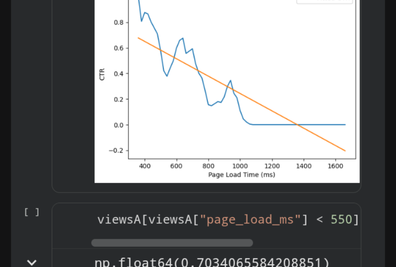
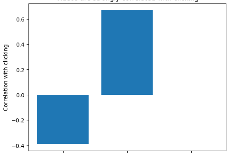
7. Visualizing Data in Matplotlib: In this step, you'll visualize a synthetic web traffic dataset we saw in previous lessons. Here are the concepts we'll cover. We'll use a library called matplotlib for plotting utilities. We then make a few plots to explore trends over time, will also then tell stories using properly constructed plots. The choice of plot will be intentional to highlight a takeaway we wish to convey. If you've lost your last notebook or if you're starting the class from this lesson, access a starter notebook for lesson 7 from aalv.in/data101/notebook7. Alternatively, you can use your own notebook from the last lesson. Once you access that URL, you should see a page like this one. Go ahead and click on the File and Save a Copy and Drive. This will then create a new copy of the notebook. On this page, I'm going to click on X on top-left to closing navigation bar. Then, regardless of whether you open the new notebook or if you're using your existing notebook, click on Runtime and Run all. Go ahead and then scroll down to the very very bottom. Here we're going to start by outputting the correlations we saw before. Go ahead and type in df.corr with two rs, add your parentheses and run the cell. Notice two things, video watching appears to be correlated with clicking. We have video watching and clicking right here at 0.32. Pricing also appears to be weakly correlated with clicking here we have 0.10. However, the video can only be watched on webpage A and the pricing section can only be read on webpage B. As a result, it makes more sense to compute correlations for each webpage separately. Go ahead and type in viewsA.corr. Here are the correlations for webpage A only, notice the correlation between videos and clicking is much higher at 0.67 than we thought. Next, go ahead and compute the correlations for only webpage B typing viewsB.corr, and now run the cell. Here are the correlations for webpage B. Notice that the correlation between pricing section and clicking is very very low. It is much lower than we thought. In fact, we can say that they're not correlated at all. This is close enough to zero. Our first argument for webpage A then is that videos are highly indicative of whether or not the user will register and reading the pricing section is not. A correlation of 0.67 does not make sense on its own however, is this high? Is this slow? Is this reasonable? However, a correlation of 0.67 is definitely much higher than a correlation of 0.0004. As a result, we can use a bar plot to emphasize the difference between the two. Start by importing the matplotlib plotting utility, type in import matplotlib.pyplot as plt. Now, the first thing we're going to do is call the method title to give your plot a title, type in plt.title and you can use whatever text you would like in-between these quotes. However, I am going to type in a title of videos are strongly correlated with clicking. I highly suggest adding the main takeaway of your plot in the plot title. Now we are going to call plt.bar. This will create a bar plot. The first argument for bar is a list of strings, the names of each bar. Here we're going to create a list and the string is going to be the title. So we'll say page load, will say video watching, and the very last bar is going to be correlation with the reading the pricing section. Bar also takes in a second list. We're going to pass in the numbers from our correlation table above. Above our correlation table gives a correlation of negative 0.39 for page load and clicking. It's also a correlation of 0.67 for video watching and clicking. Finally, we have a correlation of 0.0004 between reading the pricing section and clicking. Finally, we need a label for our y-axis. So we're going to say y label and correlation with clicking. That's it. This is argument number 1, that videos are highly correlated with sign-ups. Go ahead and run yourself to create your first plot. This is now your bar plot. For our next point, we will need to explore the daily statistics like the click-through rate over time. To do so, we will need to write a new function to compute daily statistics. Start by defining the function name, get daily stats. So def get_daily_stats, and we're going to accept one argument df and as usual, don't forget your colon. This function will accept that one argument called df or the DataFrame. First thing we're going to group by day. To do this, we're going to define a grouper, and this is a new variable that is equal to pd.grouper, where the frequency is equal to a day. Here, uppercase D means day. Pd.grouper is a generic panel utility that helps us group rows in a DataFrame according to some frequency. In this case, our frequency is daily. Next, we're going to define a new variable groups is equal to and then we're going to call the DataFrame.groupby, grouper. This is how we can calculate groups of days. Finally, we're going to compute statistics for each group. To do that, we'll type in daily is equal to groups.mean, for each group, take the average of each column. Finally, return the daily statistics. Once you're done with your function, go ahead and run your function. Now we're going to use this function to obtain daily statistics. Go ahead and type in daily views A is equal to get daily statistics, and type in or pass in all the views for webpage A. Go ahead and repeat the same thing for the second webpage B. Type in get_daily_stats and views of B. To give you an idea of what daily views A contains, we're going to output daily views A. As you may expect, if you run the cell, you'll get a DataFrame where you now have one row for every single day and the daily statistics for that day. Like the average number of video seconds watched, the average page load time, and percentage of viewers that clicked. Now, we will explore a different plot, a line plot. Go ahead and type in plt.title to give your new plot a title. In this case, our plot title is going to be click-through rates over time. Fortunately, matplotlib integrates fairly well with pandas. All we need to do is tell matplotlib which column we want to plot. Go ahead and type in plt.plot and pass in one of the columns from daily views A, in this case, the column is going to be has clicked. Now, we can normally stop here. However, we want to label each of the lines in our line plot. In this case, go ahead and add a comma and type in label equal to A. This syntax, label equal to A is not something you've seen before. This is known as a keyword argument. We'll skip over the details of a keyword argument for now, what's important is that this is how you label lines in a line plot. Let's go ahead and now repeat the same thing for webpage B. Type in plt.plot daily_viewsB, and select the column has clicked. Finally, comma and label equals to B, and this labels are second line as B. Next, let's add our legend to the plot. Type in plt.plot legend call the function, and that's it. We're now going to add two more lines to label our axes. Type in plt.xlabel and the x-axis is going to be the dates, and the y-axis is going to be the click-through rate. So go ahead and run the cell and that's crazy. Look at how much click-through rate for webpage A, the blue line drops over time. Wonder what happened? Let's examine some other statistics. We're going to redo the same code, but this time for page load times, we're going to copy and paste the contents of this cell and then replace parts of it that will need to see page load times. Go ahead and copy and paste. We're now going to replace this title with webpage page load times. Then below, we're going to replace the has_clicked column with the page load column for both of these. Next, this changes our y-axis, so instead of click through rate on our y-axis, we now have page load times. In parentheses, I'm going to add the units for this axis. Go ahead and run the cell and whoa, look at that. Webpage time, for webpage A in blue shoots up like mad. So our second argument for webpage A is that abnormally slow page load times appear to unintentionally damage its click through rate, suggesting that there's untold potential for webpage A. To quantify how flawed webpage A's overall click through rate is, we can quantify the page load times damage on click through rate. To do this, we first plot the relationship between click through rates and paid load times. Here, go ahead and type in views of A page_load_ds. We're going to create a brand new column which will contain the page load times and their click through rates for every 20 milliseconds. Go ahead and now type in views of A page_load_ms. We're going to floor divide by 20. So a floor divide means that if you have a fraction, you round down to the next integer. Once you've got that, let's go ahead and multiply by 20 again, and what this basically means is that all of your values are in increments of 20. So before, you might have had a value of 34, but now 34 floor divided by 20 will give you 1, and then multiply it by 20 will give you 20. Any value between 20 and 39 will be equal to 20. Any value between 40 up to 59 will become 40, and so on and so forth. This effectively bins all of our page load times into groups of 20 milliseconds. Now, let's go ahead and type in page load is equal to viewsA.set_index. So this one now changed the index. In other words, it'll change the column that we can easily sort or group by. Go ahead and type in page_load_ds, which is our new column. Then we're going to calculate groups for each binned page load time. Type in page load is equal to viewsA.groupby page_load_ds. Make sure to have these square brackets right here. That's actually really important for this function. This will calculate the groups for each binned page load time. Now for each group, we're going to compute the average statistics. So go ahead and type in page load equals to page_load.mean, and that will compute the average statistics for each group. Finally, we want to sort all the data by the binned page load time by calling dot sort index. This DataFrame now tells you the average click through rate for each page load time. Again, if we're overwhelmed by this function or by the cell, that's completely okay. All you need to remember is the general concept of what we've done here. What we did is we first binned all of the values into groups of 20 milliseconds. Then we computed statistics for each of these groups. These two things are perfectly googleable. So now, let's see what this DataFrame looks like. Type in page load and run the cell. Here, we can now see the statistics for every single one of these 20-millisecond buckets. You can now make a line plot like before bypassing into DataFrame column. In this case, we care about the click through rate. So go ahead and type in plt.plot and page load has_clicked, and this will plot the page load times impact on the click through rate. Go ahead and hit "Run". Now, the x-axis is the page load time in milliseconds, the y-axis is the click through rate. As you might expect, click through rate drops as page load time increases. Next, let's fit a line to this to get an approximate number for how quickly click through rate decreases as page load times increase. Go ahead and import another library called NumPy. This library has a line-fitting algorithm that we can use. Go ahead and type in m, b. In other words, the slope and the bias of your line is equal to a NumPy function that will actually fit a line for us to a bunch of points, call np.polyfit and pass in the x-values, which is all of the page load times. So here you have page_load.index, and the second argument is the click through rate, which is page load and then has_clicked. The last argument is the degree of a polynomial. In this case, we want straight lines. The polynomial of degree 1 is all we need. Now, we can finally summarize the fitted line. Take the slope. Recall that the slope is rise over run or alternatively, the change in y over the change in x. Here, y is the click through rate and x is the page load time. So the slope is the change in click through rate per change in page load time. We can multiply by 100 to get the change in click through rate per 100 milliseconds of page load time. Type in m times 100 and go ahead and run the cell. Here, we get negative 0.068. This means that every 100 milliseconds slower of page load costs seven percent traffic. We're making some pretty sweeping oversimplifications here, but this conveys the point that slower page load times are significantly hurting the click through rate for webpage A. I would accompany any presentation that cites a number like this one with a plot to explain. Let's make a plot so that viewers can judge for themselves how well this line fits the data. In the next cell, we'll start off with a title, plt.title. In this case, our title is going to be every 100 milliseconds of page load time costs seven percent click through rate. Plot the line from before in the previous cell one more time. Here, page load has_clicked and the label is the click through rate. Then plot the fitted line. Here we call page_load.index and remember, the equation for a line is m times x plus b. So here we'll have the m times the x values, just page_load.index plus b. We're also going to add a label here. The label is going to be the fitted click through rate. Go ahead and now add a label for your x-axis. This is going to be the page load time in milliseconds and we're also going to label the y-axis. Here's click through rate. Finally, add your legend and run your cell. This concludes our second argument. We can now see that the click-through rate is dropping a lot due to increased page load time. Next, we want to understand for our third argument, what if webpage A hadn't been impacted by a slower page load time, what do we think webpage A's click-through rate would have been? Observing the graph above, further up, right here, we notice that webpage A's page load times all appear to fall within 400-550 milliseconds before it appears to jump. As a result, we'll compute the click-through rate for webpage A using only that data, so we're going to select all views with page load times less than 550 milliseconds. Go ahead and type in views A and we're going to select all of these columns, all of the page load times that are less than 550. This will give us only the rows that have page load time less than 550 milliseconds. Now, let's go ahead and select whether or not that row was clicked on, and then compute the average click-through rate. Go ahead and run the cell. That's a whole 70 percent click-through rate, pretty incredible. For comparison, let's compute the click-through rate for webpage B. Select the click column and again compute the mean. Run the cell, and that gets us just 40 percent click-through rate. In short, webpage A would have outstripped webpage B by a large margin, by 40 percent. However, to really convey this idea, we'll need a line plot again. In this cell, we'll use the functions we defined earlier. To A, get all the click information for each webpage, then B, we'll compute the number of clicks per day for each webpage. Go ahead and define a new variable, clicksA is equal to and then get only the click events from all of the views for webpage A. This only considers clicks for webpage A. Next, we're going to compute daily statistics. So ClicksAdaily is equal to and then events_per_day and pass in the variable that we just defined, this computes the number of clicks per day for webpage A. Go ahead and do the same for webpage B. ClicksB is equal to all the click events for webpage B and then compute the number of clicks per day for webpage B. Here, clicksBdaily is equal to the events_per_day of clicksB. In order to see what clicksAdaily looks like, go ahead and type that variable name one more time and run the cell. Here we get for every single day, the number of clicks. Now, our final piece of code in this last cell. We're going to actually plot this data, type in plt.title to give this plot a title, "Webpage A Could Have Boosted CTR by 30 percent." Go ahead and now plot the data that we just computed, the number of clicks per day. Just like before, we're going to label this line A. Repeat the same for B, so clicksBdaily and label equals to B. Next, our third line for this plot is going to be the projected number of clicks for our webpage A. We're going to multiply the views per day by 0.7, and then we're going to multiply by 0.5 because each webpage actually only got half the traffic. Then we're going to type in label equals to A projected, so estimated. This concludes our line. Let's now go ahead and label the axis, just like we always do. We're going to label the date, and then we're going to label the clicks, and then add the legend. Finally, that concludes our final plot, go ahead and run it. We can see here in the green line that our projected clicks per day for webpage A would have been insane, it would have been much higher than webpage B's. In conclusion, let's go back to the slides. We covered several topics in this lesson: matplotlib, plot, and how to tell a story. In sum, here are our final conclusions. Our initial conclusions had suggested webpage B was better, fortunately, we have now corrected that mistake. In summary, we have produced three quality figures that support our data-driven business decision. In sum, we recommend picking webpage A with the informational video, there are three reasons. Watching informational video is strongly correlated with cooking the sign up. By contrast, reading the pricing section has near zero bearing on whether or not the user clicks to sign up. Starting with the top left, we then showed that webpage A's click-through rate dropped precipitously. In the bottom left, we showed that webpage A's dropped click-through rate happened at the same time webpage A's page load times increased suddenly. On the right, we then show that webpage A's increased page load time resulted in drastic drops in click-through rate. This suggests that webpage A's overall click-through rate cannot be trusted. Finally, we project what webpage A's click-through rate would have been throughout the experiment had page load times not shot up two months into the experiment. We can see that webpage A would have consistently sustained a 30 percent higher click-through rate than webpage B, justifying our final recommendation of webpage A. That concludes the data-driven business recommendation. Our final tip, know your plot types, the right plot can tell a story. You should know for any point that you want to emphasize, which plot is best suited to emphasize that point. Feel free to add additional annotations, change colors, or title the plot appropriately to help. If you'd like to access and download these slides, visit this URL. Try plotting your own data to see if there are hidden insights. If you're looking for the perfect plot type, see Matplotlib examples. The goal is not to click them all, but your goal is to know what plots will help you tell the right story. Sometimes browsing that page can give you just enough inspiration. Congratulations, this concludes your first case study of an AB test for two webpages. Next, we'll discuss next steps for you to continue learning more.
8. Conclusion: Congratulations on completing your first few steps into data analysis. We covered a number of topics; reading, cleaning, analyzing, and presenting data. You also covered a number of different libraries for data analysis, including Matplotlib to plot data, and Pandas to actually hold data. That's a diverse toolset under your belt today. This is the punchline, coding with data is a skill that when done the right way, can tell compelling stories. What's more? You now have the start of this skill. What's more? You now have the fundamentals for telling compelling stories, a toolset for communicating complex data. If you've got a better way to visualize this dataset or a dataset of your own to visualize, make sure to upload your figures in the projects and resources tab. Make sure to include both the figure and a caption describing what the figure is trying to tell us. If you'd like to access the slides or the completed code, make sure to visit this URL. If you'd like to learn more about data science or machine learning, make sure to check out my Skillshare profile with 101s and other topics like computer vision. Thanks and congratulations once more on telling your very first story with data. Until next time.
 Alvin Wan, Research Scientist