Transcripts
1. Introduction: I became a web developer in 1996. So I've kind of grown up with CSS. I'm Rachel Andrew. I'm a web developer, writer, and speaker and I live in Bristol in the UK. CSS Grid is a two dimensional layout method. It can lay things out in rows and columns at the same time, and that's the first time we've had anything like that in CSS. When I first saw the specification that became CSS Grid, I knew this was something that we needed. My experience told me that unless someone was a bit of a cheerleader for it, it might go away. So I decided that I would be that cheerleader and I would start writing and speaking about something that wasn't really something that anyone could use yet in the hope of getting all the people excited about it as I was. In this class, I'll walk you through how to get started with CSS Grid and show you some of the main features of the specification by a way of a small project. It's a basic block layout that allows me to show you some of the features of grid within a realistic kind of framework. This class will be valuable to anyone working on the web. Whether you mainly you do front end development and I want you to learn about CSS Grid, or even if you mainly do back-end development. It'll be useful if you already know a little bit about CSS. You know how to apply CSS to a page and you understand things like selectors and so on. I'm really excited that you joined the class. So let's get started.
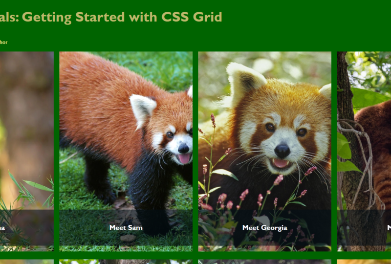
2. Introducing CSS Grid: The main way to do layout before CSS Grid was really to use floats. Now to float any floating element, it will move up. I'm sure you can float one thing and then you can float another thing next to it, and you can create system that looks like a grid. To do that, you need to get everything a width. Each of your items, you give it a width and then you float them up next to each other, and so what you end up with looks like a grid. There's no real grid on the page, what you've got there is just a bunch of items all pushed around to look like a grid. As we moved on from that, we then got Flex books which a lot of people hailed as a great way to create grids on the Web, but it also isn't a good framework. It allows you to create grids more easily than float's do, but you're still giving things a width and pushing them around. So, that's what we would do in to do layout until we got CSS Grid. CSS Grid is a two dimensional layout method for the web. Two dimensional means that we can lay things out in columns but also in rows at the same time, and it's the first time we've really had anything like that for the web. CSS Grid is now available in all modern browsers. It's got very very good browser support. If you're learning to be a web developer today or even if you're just starting a new project today, there really are many reasons not to be using Grid. So, this a thing to be looking at to be understanding how to use, because it very much is how things are going to be done in the future. So this environment is CodePen, it's a code sharing site, you can sign it for a free account. The nice thing about CodePen is if you find something on that you'd like the look of and you'd like to experiment with, you can create your own copy code fork, and that allows you to play around and edit it and do things to use as a starting point for your own work. So the way we're going to work is I've created a starting point. To get to this example, just use the link at the bottom of the screen and you'll also find that URL in the cross description. So this is the site that we're going to be working on, but I've removed all of the layout. So we've got some CSS here but we don't have the CSS that creates layout. Now, if we scroll down, you can see that we've got all the images and all of the content. This is laid out in block layout, which is things laying out won't blow the other, which is the default way that things will lay out in CSS if you don't create any layout. So while we're in CodePen, we can have a little look around how CodePen works. Now, when you first go to the example, you're going to see something like this, and if you click on the Fork button at the top, that will create your own copy. So, now, you can work on that copy that you saved in your CodePen account, so you can come back to it later, and it means you can make changes and follow along with all of the lessons without changing the actual default starting point. If things get all messed up and you want to try again or you want to try something completely different with the example, you can just create another Fork and start all over again. But have look at the different panels here at the top. This is the HTML of the document. So you can see all of the HTML used to mark up the content. Here's the post at the bottom and there's that side bar. Then the bottom here, we've got the CSS. This is where we're going to spend most of our time in this lesson. We'll be going through the CSS and adding things to the selectors we've already got here and making changes to that. If you start editing the code of the original example, then CodePen will essentially create a Fork for you because you can't change the code of somebody else's example without their say. So, you don't need to worry about ever messing up somebody else's code on CodePen. You're always going to create your own version of the document. But it could be quite handy if you just create folks of your own stuff, because then you can have multiple copies as you work through things and then roll back to the old version if you want to when you have a problem. CodePen tries to automatically save your work. In fact sometimes as you're working, you may see a little message at the top saying that it is auto saving or asking that I save. If you want to make sure that you've saved the point you're at, you can always click the Save button at the top, and that'll make sure the work that you've been doing has been saved. If when you come to CodePen for the first time, the JavaScript panel here is open. We're not going to be writing any JavaScript today, you could always just get that out of the way by minimizing it and it will go away. Likewise, if when you're really working on CSS, if you want to make a bit more space, you could even minimize the HTML panel if you want to, and just take that out of the way if you're going to get a small screen to work on,so as to maximize the space you've got to work. Of course, you can obviously drag these panels around to make a bit more space for yourself. I'm going to switch into presentation mode in CodePen because that's going to allow me to show you the text and the CSS a little bit larger which will be easier for you to say. Otherwise, everything works in just the same way. So, before we get started on actually learning about the CSS, I'm just going to show you a little bit around our documents and how things work. So, at the top here, we've got the HTML of the document. Now the way the CodePen works is that you don't include the body tags, and here're the parts of an HTML document that you might be familiar with. So we actually just start with what is inside the body of the document. So, we've got here our header which includes our navigation. You can see the navigation here. So for instance, we've got articles, and here's articles in the HTML. Then we've got the title which is an H1, that's blog post, and this is where we start the main document. So, we've got an image of class wrapper, and that has noted less the class of featured, and that's our feature Dyson. So, here they are. These are going to be the sort of blog posts with an image and a link to click through. So that in here, that actually marked up as a list, because what this UL is, that's unordered list, and then we've got list items, seasonal items. You can see that we've got images in there with the image tag img. So you can keep looking through those, and scrolling down, and here we have our article with a class of post, and that's the article which is down here. So that's the main content of our design. The bottom panel here is our CSS. So you can see our CSS selectors such as HTML. Here we're setting a font for all of the CSS's is going to have the same font, Open Sans. We work down, we've got lots of things in menu. We've got things like background colors and so on, things that are part of the layout but are adding a little bit of style to these documents so that we don't have to write absolutely everything in these lessons. So this is our CSS and mainly, we're going to be working in this panel, making changes or adding new selectors and new rules for our selectors there. The reason I chose a blog post is I thought this is a good thing, that a lot of people have got a personal site and if you're just learning how to develop for the web, creating a personal site like this, it's a really good way to actually play around and learn new skills. In fact, it's often where I start with anything new. I'll start on my personal site, I'll play around with something new and see how it works before maybe I might use it on a production site for a client. You can feel free to take this and use it by just replacing the images and making a few changes if you want to use out on your own site, or just use little parts of it as a jumping off point for things that you want to add into your own designs. So back in your view on CodePen, if you want to take the work that you've done and then actually apply it to your website, there's a little export link here, and so, you can export that as it, and that will let you download all of the HTML and CSS, so that it could be uploaded to a server somewhere. I often use CodePen as a way to do little experiments, that I'm then going to take, I actually use probably somewhere else. So you can always do that, you can always grab a zip of the of the work you've been doing. Now that you know a bit about CodePen and the environment that we're going to be working in, let's move on to the next lesson where I'm going to show you how to define your Grid.
3. Defining Your Grid: When we start any of these examples, there'll be a ul on screen, which is the point at which the demo is now so where I'm. So, for this example, we're starting right at the beginning with the code that I showed you in the last lesson. Now, if you want, you can just use this code and work right through all of the lessons using this one document, or if you like, you can pick up with a new example, which is my starting point for each document, and we'll show you that ul on the screen with each lesson. In this lesson, I'm going to show you how to define a grid. Because to start using GridLayout, we need to tell the browser that we want to use CSS grid. So, I'll show you how to define a grid and use columns and rows to set up the grid that you'll be working with on the page. So, we're going to start creating a grid on this page. We are have two different grids on the page. There's going to be the grid that contains the featured items at the top of the page, and then there's going to be a second grid to deal with the layout of our article down the bottom. So, let's get started. So, the first thing I want to do is to work with those featured items. So, if we scroll down in the CSS, you'll find.featured. Now, that's the class that supplied to the ul here, we've got ul class featured, that's going to target those featured items. Now, at the moment, what I've done is I've removed the default styling that you get on a list. I've remove the bullet and the margin and padding. I've also added a background color, and we'll see why as we start to create our grid. So, to start using grid, we just tell the browser that we want to use grid, and we do that with display grid. That means that now we are using GridLayout, although nothing is going to have changed in the layout, because what we've actually created now is we've created a single column grid, and so that hasn't really changed the layout. So, to change the layout when you start adding some rows or columns. If you see the autosave pop up on CodePen, that means that CodePen has started saving your document for you as you're working. You can always click Save at the top if you want to make sure that your work is saved. So, we now we are going to create some columns on the grid. Now, we do that with a property called grid-template-columns. The value that grid-template-columns takes is called a track listing. So that's a listing of track sizes. Now, I'm going to stop by doing this in pixels because I want to show you the difference between the different ways of sizing our columns. So, let's create some tracks, and we'll create them at 300 pixels. As you see now, the CodePen has updated our layout. This is the nice, think about using CodePen. We don't have to reload browser to save changes, it does it for us. You can see that we've got something that looks a bit like a grid. What we've got, are four tracks each shift 300 pixels, and we're to start to lay out our content into those tracks, and after we've got four items, here displayed across a row, which just creates a second row and put this item at the bottom of it. So, with just two lines of CSS we're able to create something that looks like a grid. Something else you might like to do here is to add a gap. I've got that background color on the area because that's going to mean I can let that shine through by having a gap. So, if I say, Grid-pap, in this case, I'm just going to make a one pixel gap. So, it looks like we've got a line between our items. However, you can use any length unit here. If you wanted a big gap, you could say, use 10 pixels, and that spaces the items out. So, that's the great gap property. In this case, let's put it down to one pixel. So it looks like we cut off the border between the items. Because CodePen automatically updates the layout for us, you can actually see how grid is creating column tracks, essentially as we type. So, for our purposes we want to have these four tracks. But you could obviously have as many tracks as you wanted in your grid. As we go, CodePen is just going to update that, and change the layout as you go along. So, you've got a grid on your page, but you can actually really see the grid, there's no way in GridLayout to show yourself all the borders of the grid. However, I'm working in Firefox here, and if you're going to use GridLayout, I'd really recommend downloading a copy of the Firefox web browser, because Firefox has got excellent developer tools which will make it much easier for you to work with grid. Of course you can work with CSS grid, and not use Firefox. Chrome has got some simpler developer tools for GridLayout, but I find it really useful to work with the Firefox tools when I'm using grid. You'll find that different browsers have focused on different things for their developer tools. So, chrome is really great for checking performance of your pages, and the've built a lot of performance tools. Firefox is concentrating on layout and tools for designers. So, having multiple browsers, isn't just helpful for browser testing, it can actually be helpful for development too. We'll open up these developer tools throughout the course, because it's a very useful way for you to see what's going on in the browser as you work with GridLayout. So, we can have a look at those. I've right clicked on an area of my grid and I'm going to say, Inspect Element. That opens up this panel at the bottom of the browser. Now, this is the Firefox developer tools panel, and you can see here the html of the document, and over on the other side, we've got CSS. So, if we go to layout, then we go to grid section here, and this is the ul.featured, so that's our featured area. If I click that, Firefox displays the grid lines for us. So, this is really useful because we can see all of the different parts of our grid and we got a little representation of you grid, still you can hover over any part of the grid. So, it's worth at this point you go through some of the terminology that we have in GridLayout. Each of these areas is a Grid Cell, and you can think of that is a bit like a table cell really. It's the smallest area you can have on the grid between the lines. Then, we've got Grid Lines, and lines are numbered. We can actually turn on in Firefox the line numbers. So, you can see here how our lines are known. We've got four tracks on our grid, and so we start with line 1 on the left, and we move across, so line 5, is the end line. The tracks are any area on the grid or any row of columns. An Individual row or an individual column is called a track. So, we've got a column track here between lines 1 and 2, and then we've got a row track here, between these lines 1 and 2. So, when I talk about tracks, that's what I'm talking about. I'm talking about any individual column or row on the grid between two lines. So, let's move on to create the other grid on our page. I'll close these tools for now. So, the other grid is going to deal with the layout of our article. If we scroll down through the html, we can see that the article is inside staying with a class of content. So, that's what we're going to be adding CSS rules to. Now, I've not got content in the CSS tool. So, we can add that to another selected.content. So, we're going to create a grid, and just do some layout on this. So first, I'm going to push it down a little with a top margin. So, I'm just adding a margin-top for 40 pixels which would move that down a little way. Then again, we're going to create a grid. I'm going to create a grid pap again. This time I going to use percentages. So, let's creates a grid gap of five percent. Then to actually see anything happen on our grid, we again need to use grid-template-columns, and we're going to use percentages. So, I'm going to create a larger column track of 70 percent, and then a smaller column track of 25 percent. This puts our sidebar up next to our content. That's as far as we're going to get with that in this lesson. We'll have a look in the next lesson, at how we can improve this layout by using some things that are part of grid. Before we move on from this example, I'm just going to explain a few things about how things are laying out at this point. So, at the moment, what we've got is we've got to grids that are defining these outer constraints of these layouts, but we haven't yet started to change what's happening inside the Grid Cells themselves. So, the images we've got here are a set of balloon photographs, I've taken,` I come from Bristol, and we have a big balloon fiesta every year, which gives me a large library of balloon photos to use. But you can obviously swap in your own images, you can upload assets into CodePen, or you can link to any image out there on the web that you're wanting to use to replace these ones. That's just a link to an image here. If you were wanting to upload assets in CodePen, I'll just hop over to this view which is more like the view that you're seeing. If you click assets, you get an assets panel which has got various design assets that exist actually in CodePen that you can choose to use. You can also upload your own, you can drag and drop files, and then you've got a bunch of files that you can choose from that you've added, which makes it easier. If you've got a bunch of things that you want to use in examples, you can just grab them, and save them here. But you can also use the things that CodePen have provided too. It's now the end of the basics of defining a grid. We can move on to the next lesson where we can really start to refine this layout by understanding track sizing.
4. Defining Track Sizing: You can start this lesson using the example you were working on in the last lesson if you're following these one up to the other, or you can use the URL on screen to pick up exactly where I am now. In the last lesson, we created a grid using familiar sort of length units, so pixels and percentages. In this lesson, we're going to refine the grid and use a method of sizing tracks has been created for grid-layout that actually makes things a lot easier. So, if you look at our layout that we've created now, because we've got these four tracks which are 300 pixels, we've kind of got this gap at the end. Now, if we want you to create a layout that were to reflect, the way that we would do that in full grid is you tend to use percentages as well if you use at to the bottom here. So, you can see that because we've used percentages, these tracks grow and shrink. The problem with percentages is that you have to work them out for yourself. You have to figure out how many percentage track needs and then kind of up them up and then make sure you don't get more than 100 percent. If you get more than 100 percent, you probably get a scroll bar. So, GridLayout has introduced a new track sizing. That's using something called the FR unit, and that's what we're going to start taking a look at. The FR unit is a flex unit, it defines a flexible length and deals with distributing space in the grid container. In most cases, if you're using GridLayout, and you're thinking you might want to use percentages, then the FR unit will give you a more consistent results and will save you having to calculate everything. For example, if you want to add an additional track, that's easy with the FR unit. With percentages, you have to recalculate everything. So, in most cases, I would choose to use the FR unit. The only time where I would recommend using percentages is where you're using GridLayout alongside other layout methods that have to use percentages. For example, you've got a floating bootstrap layout and you want to put a GridLayout component into the middle of it, you might then choose to use percentages to match the rest of your layout. But most, the rest of the time, I'd go for the FR unit. It will save you a lot of time. It was really hard in previous layout methods to mix fix size things and flexible things when we were using percentages and that's something that the FR unit does really well for us. So, for example, you might have a small icon that you always want to be 50 pixels wide, well that's fine because you can make the rest of the content one FR and it will absorb all of the available space leaving the fix sized thing fixed without then causing a scroll bar. So, if we first have a look at our featured items here. If we find those in the CSS and here is our track sizing of 300 pixels. Now, I'm going to change these tracks to use this new unit, the FR unit, and I'm going to create four one FR tracks. You can see the layout start to change, so that should fill the browser window. The reason that's happening, is that the FR unit distributes available space. So, grid has taken all of the available space in our grid container, which stretches right across the page. Because we've got four tracks, all of one FR, it's given one part to each of the tracks. If you stretch and shrink your browser window, you can see how that's nice and responsive, it grows and shrinks according to the available space that we've got. If your tracks are sized in pixels, then they're essentially fixed. So, if we end it with too little space, well, it's just going to overflow. As you can see, that's creating a scroll bar and it's also poking out of the layout which is what would happen if you've got fixed tracks. Just this kind of situation, that the FR unit solve, they just allow us to share out the spaces available, whether it's a large amount of space or a small amount of space. So, that's the top part of the layout, now it uses a lot of the available space and the tracks are nice and flexible. So, let's have a look at our percentage area, so this is the content down here, which we've used percentages for. Now, you could change that to use FR units too. So, I'm going to change this to three FR, one FR. Now, what this does, is it says that take all of the space in the container and give three parts of the space to the first track, which is our track which is larger, and one part to the second track. So, you can play around with this if you had two parts for that first track and one part for the second track. What's happening here is all of the space is being divided into three and two parts gives us the first track, and one part, the second track. So, I think three FR, one FR gives me the kind of layout that I want. So, the answer is worth knowing, here we've got a great gap of five percent, you could leave that or you could decide to have a fixed size gap. What happens here is the grid looks at that gap, and it says, "Well, all of our space is available, we need to take away 40 pixels because that's needed to fill the gap." Then whatever's left is distributed according to these FR units. You can actually mix fixed size tracks and FR tracks. So, if we always wanted our sidebar to be 300 pixels, we could have a one FR track and a 300 pixel track. Then as we have less space, you can see that 300 pixel track always stays within the pixels, and it's the rest of the space that's given to the other track. So, these FR units are really useful and help us to make layouts which grow and shrink with the space you have got available without you needing to do the math. So, which was the case when you were working with percentages. The FR unit is absolutely essential to take advantage of CSS grid. We didn't have a need for saying this in previous layout methods because it really wouldn't have worked. We didn't have the space to distribute. So, now we've got that for grid, do use it and take advantage of the power that it gives you. Now you know about the FR unit. So, the next lesson, we're going to start actually placing items on the grid, and nesting one grid inside another.
5. Nesting Grids and Placing Items: If you are following along, you can continue with the example you've been working on, or you can use the URL on screen to find an example of exactly where I am now. In the last lesson, you learned about track sizing, and we started to make our grid flexible. In this lesson, we are going to very start to refine the layout, and work on some of the internal parts of the layout by nesting grids and by positioning items. So, we're now going to take a look at the internals of these boxes. We've created a grid on the [inaudible] of this area, and the grid is laying out the items inside it. But, it doesn't quite look like we want yet. We'd like to get this caption overlaying the image, and we also want to get the images, so they all line up and all look about the same size. That's what we're going to be working on here. So, what we're going to do is, we're actually going to the nest one grid inside another. This is something that is absolutely fine to do. You can have as many grids nested inside each other as you want. Now, let us create more complex layouts. So, our main grid is on featured, and so our next grid is going to be on the li that's inside featured. So, just as before, we're going to use display grid. Then, we're going to start creating this time, some row tracks on the grid. We do that with grid template rows, which is just like grid template columns. I'm going to create two rows. So, we've got a row which is one fr, and then we've got a row which is 5em. You can see that something is starting to happen without grid that encode panel starting to resize the tracks. If you've not come across the em unit before, this is just another length unit in CSS. It corresponds to the size of the text, which is quite useful. Because it means if we make our text bigger, the actual track will increase in size. It's quite a useful sizing, and we're going to be playing around. As you can see, this track here is looking a little bit short and cut off, but we'll be playing around with how we create that sizing as we go through building this layout. So, we've now got a two row track grid inside each of these items size. So, let's have a look in the good inspect element, because that's a good way to see actually how that's working. So, you can see that is our main grid, which is the one on featured. But, you've also got these individual grids inside the items. So, we can turn on one of those, and you can see on that item, we've got that two-track grid. Here's one track, and here's the second row track. So, that's what we're going to work with what you are going to position the items using those grid lines. So, going to work with the image, which is here. We've got a div for the class of image. What we want to do is stretch that over the two rows. So, we're going to use grid-row, and so, we start at row-line one, and we end at row-line three, and that's going to go into a grid column. So, I want to talk about that a little bit fast. So, grid row is a shorthand for grid-row start and grid-row end. So, one is line one. We're starting at line one, and we're ending at line three. If we put Firefox, back here, and do that, we're starting at line one, and we're ending at line three. So, what grid has done, because we haven't positioned this caption, it actually pushed it, has created a new row-track on the grid, and it's pushed that caption down there, which is what will happen by default. Grid won't overlap things, unless you ask it to. It will always create a new track and put the item in this leftover. You actually have to ask grid to do any overlapping at all, so you won't end up with things stacked up. That's pretty much the way with CSS. We try not to stack up your content or hide things behind other things, unless you've asked for that. Now, we only need to say started line one for columns, because we only want to span one track, and that's the default. Think span one track by default. So, if we say start at column line one, it'll start at column line one, and it will end at column line two, so we don't actually to put the explicit end line. We also want the image to cover the whole area rather than have this white space underneath. Now, we're going to use, not part of grid, this is a different part of CSS, but there's a way of making an image stretch and cover a whole area. That's using a property called object fit. So, if we target the actual image itself, and I'm going say object fit, cover, and set it to the width and height of 100 percent, you can see now that our image is scaled up and going into the shape of the box, and it will then basically crop itself. Because otherwise, you'd end up with the image stretched out of place, is not what you want. Now, we carry on styling this up. You'll see how this works. So, we've set that to object-fit cover. So, now we can deal with the caption, which we wanted to pull up and have overlaying our image. So, if we go to our caption, and I'm going to put this into grid-row two. You see grid now needs to be put into another column track, because it doesn't want to overlay it. So, if you want to overlay it, we also need to set the column to one. Now, we've got our caption laying on top of the image, and I've used these RGBA colors here, and RGBA means that we can set the alpha channel of all backgrounds. I've set to 0.6, which makes it semi transparent, allows the images there to shine through. I'm going to do one final thing to tidy this up and give us images and nice sort of fixed tight which will help keep them in proportion to each other. So, if we go back to our original grid, so this is featured, which is the main grid here, which has got the items. I'm going to find some rows. By default, all rows are auto-sized, and you can think of auto-size, meaning that things will grow to fit the content that's inside them. You might want to change that, and so in this case, I'm going to set some rows, and I'm going to make them 250 pixels tall. That then, starts to give us the layout that we want. We've got these nice tidy images. We've got set row heights, and we've got the captions overlaying the images themselves. Just to finish up this section, I want to show you another little feature of grid-layout. So, you can see on this caption, we've got some extra text here, which is getting very close to the bottom. Because we've set these to be 5em, which is an absolute length. It's not going to get bigger than that. It's not like the fr unit, or something which would respond to the text size. What I would really like is to have something which will go to of fixed height. But if I put more text in, I'd like it to expand and to cope with that text. Because, that's the reality of working on the web, is that sometimes more text, get see. We can see what happens if I just add some more content. It's not ideal on the web to have content that is a fixed height generally, because we don't tend to know how big text is going to be, or how much text is going to end up in. You can carefully plan your design, and then it gets into the content management system, and so it puts in far more text than you expected. So, grid gives us a way to deal with that. To produce a good template rows, you've got these 5em value. Now, what I'd like is that, to become a minimum, I would like those tracks to be at least 5em tall, even if we've not got enough content. For instance, this second track here, which just got one line. But I'd like, if I get too much text in there, I'd like it to expand, and that's exactly what the minmax function does. So, what's happening here is, when you use minmax for your track sizing, you can pass in a min, a minimum which in our case is 5em, and then use a comma, and then you pass in the maximum. So, for the maximum here, I'm using auto, and auto means really the size of the content in this context. So, that means that if we have more text in there, the track will grow. If there's not enough text, it would be 5em. What this also highlights is that, our internal grid doesn't have any relationship to the next internal grid. What you can do at the moment you say, "Well I'd like everything to line up with the tallest item, because all nested grids are independent of the outside grid." If you make the amount of space in a track small, you can see that how that caption is actually getting taller to cope with the wrapping text. So, this is a little function which really does reflect the way things are on the web. The fact that if you've got something which has a certain amount of content, there might be more content sometimes. So, to wrap up this section, we've now styled the internal boxes in the top featured section, and we've done that by nesting a grid inside the grid that we already had. By positioning the items, you start to use line based positioning, which we'll talk a little bit more about later to position the items and to pull the caption over the image that we've already placed. So, in a video, a few CSS properties, you've learned an awful lot about CSS grid, and the different things that you can do with it.
6. Combining Manual and Auto Placement: You can continue to follow along with the example that you are working on, or you can use the URL on screen to pick up exactly where I am now. In this lesson, we're going to start to look a bit more about when you might want to use auto placement and grid when you might want to position your items and how you can mix the two lay out methods. You can see auto placement happening in our latch already. So, when we defined our grids on the featured items, we've not positioned each of those items, they just lay out one in each cell of the grid. We started to do some placement when we laid out the internals of those items. Because on nested grid, we defined a grid, and then we use line based positioning to place items onto that grid in order that we can pull that caption over the image below. So, we look at how we might want to actually use positioned lay out that you're placing items in the grid when we lay out our content here. So, you can see at the moment that content is pushed up right against the edge of the viewport. It is running right out to the edges and that's probably not something that you'd want. So, perhaps you'd like to change this track listing. So, go to template columns and add a little bit of a gap either side. So, perhaps we just had a gap of 10 pixels, and you can see what happens. Auto placement is trying to stuff all of our content down into that little track, and it's overflowing because it doesn't fit into a 10 pixel track and looks a bit of a mess. That's obviously not something that we want. So, we're going to have to position the content that doesn't end up in that little track. I'm also going to add some rows here. Because once you start placing your items, then you might actually want to start adding rows rather than just letting rows be created in the grid so that you can position items into them. So, I'm going to add a row at the top, and then an auto row underneath. So, we've now created a bit more of a specific grid, and we can start to place our items onto it. So, now we've set up our grid and made it a bit more specific. Let's position the content onto that grid. The content is right down the bottom of our HTML and it's inside an article in the class of post. So, we can target post, and then we're going to use grid column, and we want to start after column line two. So, that will avoid that little skinny track that we created. We only needed to span one track, so we can just say grid column two. I'm actually going to set it up to span two rows, recreated to row tracks. So, let's have it spanned from row line one to row line three. Now, because we've positioned that by row and column, what happened to the auto placement is that, great reposition of the item that you've placed, and then it takes the next item that it finds, and things are where is the first empty cell? Well, the first empty cell in this case is in that little skinny track, where we don't want things to go, and that's why the sidebar is then going and jumped into that track. So, we also need to position the sidebar. So, this has a class of side one. We're going to one side want to go after great column line three. I'd actually like it to appear part way down the content, which means we can put it into a grid row two, which then moves it down the content. It's this kind of thing that was really hard to do without grid layout. Actually, creating white space above items was very, very hard, and so this just shows you one of those little things that you can do with grid layout that used to be very difficult and can now be used in more creative ways. Because we've got our four units defining our tracks and say that this row now grows and shrinks really nicely with the available space. So, the top section of this page, we're going to use auto pace. We want as many items as you've got to come in and lay themselves out. However, what we'd like is, to make the first item a big feature, so make it larger and actually span more cells of the grid. So, we can do that by targeting the first item in that list. So, that's the first child of that list. So, that would be the swarm of the balloons and airships heading. The first child selector will select basing the first child of the container. So, here we are saying, I want the first list item inside of featured which will get as our first item here, and that's the item we want to stretch over more cells. I want this item to start at column line one and in column line three, and start at row line one and end of row line three. That would just place that, made that a large image, and then the other items continue to use auto placement. So, grids will first lay out all of our item and make it take up all of the cells it needs to take up, then it will just drop the items in next to it. This is a very good example of how you can mix auto placing of items with positioning items. If you've got something that you want to have in a specific place of a page, you can position it, and then just let grid place all of the other items for you. So, you can imagine that if you're trying to highlight a specific image or a large section of content, this is something that you can do to create those halo blocks at the top of a page, where you're highlighting something specific in the design by making it span most of the tracks of the grid. You can see how, we've always got four tracks on the grid at this point. So, if we make our windows smaller, it just takes up as much space as it has for those two tracks, and we can make it larger. So, it's naturally flexible across the grid. If we have less space or if we have more space, because we are using those FR units, the space is just shared out in proportion. So, a large image always takes up two tracks of the grid even if those trucks are smaller or larger, making it naturally flexible. So, the very small amount of CSS, we've not written a huge amount of CSS. You've got the basic lay out here for your blog. We've combined grades by nesting them, we've used positioning, and we've also used auto placement. We've learned about different ways to size tracks using the FR units and also by using lead units, and things that the minmax motions, you know how to create something which starts at a fixed size but grows to contain content. What we've got here really is your desktop layout for your blog. I'll lay it out. It's flexible, it's not quite responsive yet. And so, in the next lesson we'll have a look at how to take this layout and make it really well at very small screen sizes.
7. Incorporating Responsiveness: You can follow along with the example that we've been working on. If you want to start with the point that I'm at now, then use the URL that's on screen. In the last lesson, we covered manu placement versus auto placement, and we showed how we had this flexible layout, but it wasn't quite responsive yet. So, in this lesson, we're going to look at creating a responsive layout that will help us create a version that worked really, really well on small screens. A responsive design will respond to whatever device you are using. On the Web today, people are using tiny phones with very small screens, they're using tablets, they're using desktop computers with huge screens. So, we creating a responsive design means that it will work equally well on each of those screens at different layouts, so we can change the layout to take advantage of the screen size that we've got. I'm going to show you how to take off flexible blog post, and turn it into a responsive design with a small screen layout. The layout we've created is flexible. So, as we have less space or more space, the spaces distribution between our tracks because of the use of the FR unit. However, once we get to very small, it becomes a little bit hard to read. You wouldn't really want to read something like this on a mobile phone, it's not ideal. So, now we're going to look at how to make this into a responsive layout, to create different layout for these small screen devices. So, you can do a couple of things with grid layout. You can redefine your grid, and you can redefine where things actually sits on that grid once you've made changes to it. So, let's have a look. What I'm going to do is I'm going to add a media query. What I'm saying here is I'm going to use a minwidth so, when things get to a minimum width, a 50 em, that's where I'm going to add a breakpoint. Now, when you are adding these breakpoints, don't think too much about certain devices, don't think well, how big is an iPad? Or how big is a phone? Worry about when your design kind of breaks, worry about when the lines become too short or become too long, and that's really where you should be adding these breakpoints. So, don't worry too much about the size of devices because really there are so many different devices. It's not too much worth worrying about that. Just think about your design, when does it become too narrow or too wide. In this case, I'm going to go for 50 em, and this is where because we're saying minimum width, this is what we want actually a wider layout, a desktop layout which is what we've already created, we want that to kick in. So, we're dealing with that featured panel at the top. What I'm going to do is I'm just going to grab the columns and rows and put those down here. Now, what this means is that I can now redefine the grid above for our smaller screens. What I want to do for small screens is I'm going to only have two column tracks. So, I will move two column tracks, and I'm going to change grid template rows and I'm going to use a different property, one we haven't seen before, and that's grid auto rows. We're going to use minmax here, and say, grid auto rows 250 pixels, auto. Now, what grid auto rows does is when we get rows in our grid that are automatically created to put content in, it will create them at this size. There will be a minimum of 250 pixels tall and a maximum of auto. Now, nothing's changed yet, but let's go smaller, and you can see the layout change. Once we get to that 50 em, once we get below 50 em, we go to our smallest screen layout for this panel because we've only got two tracks, grids places our large item at the top, and the smaller items below. This is a bit of a nicer layout for our smaller devices, and then as we get bigger, we get to the 50 ems, and we snap back to our original layout for the featured panel. So, what we're doing here is sometimes called immobile first layout that basically sets up what you have for your small screen, and then you redefine it for the larger screens. So, we've got two columns for a small screen, and then we say when we get to a minimum width of 50 em, we then going to have four columns. By using the grid template columns property again, we overwrite the previous instruction once we get wide enough to have four columns, and that's how CSS works. Things that come later in the stylesheet will overwrite things that come earlier. So, you have your mobile stuff first, and then you overwrite it with your immediate query and go to a full column layout. So, right now, we are using our two column layout and you can see that because our large item which spans two tracks is spanning two tracks at the top and the other items come below. When we get to 50 em, you can see they jump back to our desktop layout. So, we can do the same sort of thing with the bottom of the layout. As we go very small, we end up with not a lot of room for the sidebar to sit down here, and it all gets a bit narrow. So, we can make changes again to how that layout works. So, once again, we're going to add our media query. I'm going to use the same breakpoint. This time we're going to do the same sort of thing with content. I'm going to grab my columns and my rows and pop them inside the media query, and then we can redefine the grid above. So, what I want to do essentially is just have a large central column, and we don't need to worry about the rows here, we can just add that in. Then, what I also need to do is take the positioning and pop that up inside the media queries too so that it makes sense once we've got a wider layout with the tracks that we want. So, now you can see that the small screens, this has gone back to trying to stuff our content inside that skinny track. So, what we need to do is make both our side bone or content start after that skinny track. So, they end up with a class of post and that of side one which represents the actual main body of our article and the sidebar, now both start after grid column line two. So, that's the line after ask any sidebar there. You can see if we scroll down, this is the sidebar. You can always put a background color on that or do something to differentiate it if you wanted to. This is really what you tend to do with mobile layouts, you have to stack things up in a useful order, and that's when the grid makes it pretty easy. Then if we go wider, once we hit that 50 em, you see the sidebar pops into place because once again, we've overwritten the instructions to be just after grid column line two and add it in a row, and then the grid column line three for the sidebar. So, we're setting it up for mobile and then below, inside the medium queries, we set it up for desktop. So, we've now created a simple responsive layout. So, you can see here how, as we go smaller, we now get a nice mobile layout, and we can scroll down and that's all perfectly readable. Then as we stretch out, we go back to our desktop view. The thing is with grid really you need very little CSS to achieve this, and we've just added in one breakpoint. Now, in a complex design, you might want to add several breakpoints. You might want to create a layout which takes advantage of very large screens, and add it another breakpoint or you might want to create say this very linear, very tiny phones. Because you don't need a lot of CSS to do that and it's not very difficult to do, it's a lot easier to really tailor your design to all the different kinds of devices that are out there. So, we're pretty much done with using grid to layout our page, and you can see how from a very few lines of code, we've had to go from something we've just had all of our content laid out one thing below the other to a layout that you could put online for a blog post, and we've also made that responsive. So, you've got a layout that works for different devices. So, we'll move on in the next lesson just to think a little bit about how grid works alongside other layout methods.
8. Combining Layouts: We want the final part of our layout and you can follow along with the layer you've been building so far, or you can use the URL on screen now to pick up exactly where I am. In this final lesson, I'm going to talk about a place where you might not want to use Grid at all and how we can use Flexbox in order to style on navigation. My navigation, I'd like to lay out in one row, which makes it a good candidate for a Flexbox layout. So, let's take a look. So, in the HTML, we can see the navigation in an ordered list, as we've got Articles, Events, Resources and Contact me. Adding the CSS. That's the unordered list here, the one inside header. Once agai, n I've taken off the margin and padding and the list styling that you'd get by default on a list. Now, to make this into a Flex layout, all I need to do, is say, "display: flex." Immediately, they all jump into one line and that's because the default display for Flexbox, list box value is to have flex direction of rows, so the things all lined up in a row. That's really all we need to do. By comparison, if you were to make that into a Grid layout, you'd have to start making a lot more decisions about the layout. So, we'd say "display: Grid" then, well nothing would happen, and we'd have to think of setting up our columns. So perhaps, we could have four columns. Now, this might work nicely if you did know you always have four items in your navigation. You wanted them to be spaced out evenly or perhaps that you might have a multilevel navigation. You've got two rows of content. Well in that case, using Grid would be a good choice. But in our case, we just want those items to line up next to each other. So, it's much more simple just to say, "display: flex" and that gives me the layout that I really want. So, you would choose Flexbox if you just want to lay things out in one dimension, so that's as a row or as a column. In this case, we wanted them as a row, and so Flexbox is a good choice. With our blog post featured item, this is two dimensional because we want to lay things out in rows and in columns. We want them to line up in their columns as well as in their rows. That's a two dimensional layout. So, that's why I've chosen Grid. So, that's pretty much the reason you would choose one or the other. With Grid, you get to define the whole Grid on the parent and then items just fit into it, which is quite a nice way to work. So, that's really another way to choose Grid, is when you want to do that kind of big setup, form the parent elements, and then just let things drop in with auto placement. Flexbox is very much just about taking a bunch of things and spreading them out. So, that's really all the steps you need to create a blog listing page. Don't be afraid to use this as a starting point and get creative and make changes and see how Grid behaves. The best way to learn CSS is to play with CSS, absolutely. Remember, if you've made a lot of changes and you want to export it and use on your own site, in your view in CodePen, you've got this little export button. If you click that, you can export a zip and that will give you everything. It will give you the CSS and the HTML. So, you can then use it somewhere else or open it in a code editor on your desktop and play around with it there. So, I hope this has been really useful to learn how to create a blog post. You've learned a lot about CSS Grid along the way.
9. Final Thoughts: So, in this class, you've gone from not knowing anything about CSS grid to being able to use several of the properties of CSS grid to layout natural Web page. You could use this stuff on a real Web page in production right now. You've learned how to define a grid, how to set up column and road tracks and use the FO unit and things like minmax, so you can specify a minimum size and a maximum size. We've looked at nesting grids and also creating a simple responsive design. We've also seen why you might want to use grid over other layout methods. So, you really are set to start using this stuff in the real world. I'd love to see your blog listing pages or whatever else you do is the jumping off from this project. So, please upload those to project gallery, so we can all take a look. I hope we enjoy this class. There's so many different directions that you can take this stuff whether it's in a creative way, or just in a streamline the way that you create things you've already need to do. I really look forward to seeing what you do with it.
10. Explore More Classes on Skillshare:
 Rachel Andrew, Web Developer, Speaker and Author