Transcripts
1. Welcome!: If you've ever wanted to create your own cross-stitch patterns, either for yourself or to sell, you might be surprised
by how easily you can do it and more with
Adobe Illustrator. My name is Khara
Plicanic and I've been a professional photographer,
graphic designer, and Adobe software instructor
for nearly 20 years. As someone who crochets, embroidery, does
cross-stitch and more, I love being able to use my software skills to explore
new design possibility. In this class, I'll teach you everything you need
to know to create your own cross-stitch design
from scratch in Illustrator. Even if you're a total beginner, you'll learn how to set
up a new document and use a small handful of Illustrator's most
simple and basic tools. Then once your
design is finished, I'll show you how to match your Illustrator
color swatches to actual thread numbers and create a color key complete
with symbols. As a bonus, I'm including some custom markups I created specifically
for this course. I'll show you how to
use them so you can display and promote your
finished design like a pro. For the class project, you'll use Illustrator to create your own two-by-three
mini cross-stitch pattern featuring anything
that inspires you. It could be a quote,
a snarky meme, someone's name, a
pictograph, whatever. One of my favorite
things about being able to design my own
cross-stitch patterns is being able to whip up small personalized
gifts in a flash. Once you stitch up your
new mini masterpiece, you'll find that it
fits perfectly in these cute and
inexpensive little frames you can find at pretty
much any craft store, and you'll find a direct link
to them in the class notes. If you're ready to dip your
toes into Illustrator, create your own cross-stitch
pattern and take your hobby or side hustle
to the next level, download the class resources and if you don't already
have Illustrator, go grab a free 30-day trial from adobe.com and meet me in
the next video [MUSIC]
2. Project Overview: Before we dig in and start
building from scratch, I just wanted to give you a
bit of an overview so you can see where we are headed
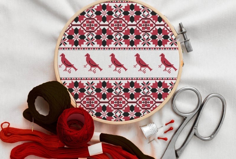
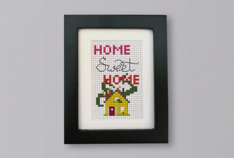
with this whole thing. This is what the
finished design piece is going to look like, the one we'll build
together anyway. I just wanted to show you
how it comes together. So we have a little
pictograph down here, we have a little house
and then we have some block letters and we also have some back
stitched lettering. So I'm going to show you
how we do all of that. These, what I call
square stitches, are made up of just
individual squares that we can move around
the canvas like this. We can easily
change their color, duplicate them, group them, etc. So that's one way to work. Then for example, the little
house down here is grouped, so this will move and
operate as one unit. So I'm going to show you
how we do all those things. I'm also going to show you how to add symbols to your designs. So here we can see that all the different colors
have been assigned a symbol. Then you can output this chart with the
color and the symbols, or obviously just the
color or just the symbols. However, it is that you like to work or your customers
like to work, Illustrator makes
it pretty simple. So all of this is accomplished
by using the grid here, the grid you see on
the screen right now, this is the Illustrator
document grid, so it does not print, but it's super great
for letting us work. That's what allows us to just, I'm just using the
arrow keys to move these little stitches around and they just snap
right into place. It's wonderful, but
it doesn't print. So we'll use another
simple tool to create this grid
that will print, so we can customize this and how it looks
and all of that as well. Lastly, I will show
you how to create a key so that your future self, when you sit down to stitch
this or your customers, if you plan to sell it. So they know what
color you intended to go with which
symbol. That's it. Pretty straightforward
and simple. We manage all the different bits over with different layers. That's really all
there is to it. So join me in the next video
and we'll get started.
3. Document Setup: I'm going to go ahead
and close this file. This is Illustrator's
home screen. Creating a new document is as simple as coming over here
and clicking "New File." If for some reason your screen
doesn't look like this, that is just fine. You also have the
option of coming up here and choosing File, New. However you get there,
that's where we're going. You can choose from
several different presets. But for our little
mini cross stitch, we're going to enter
our own values here. I'm working in inches, so I'm going to choose
a width of two. You can select
different options here, but we'll go with inches
and a height of three. I thought a mini cross stitch
was a great place to start. We only need one artboard, so no worries there. None of this is going
to be relevant. I've got mine set to
RGB color, but again, it's not terribly
relevant unless you plan to send this off to a
commercial printer for press. Most actual at-home printers and certainly anything viewed on a screen is going to be
great in RGB color mode. We're not going to be
applying raster effects, so this doesn't matter
terribly either, but we can go ahead and leave that set to 300 pixels per inch, and we'll click "Create." The next thing we're
going to do is set up the document grid. That can be found under
Illustrator's preferences. If you are on a PC, you'll find it under
the Edit menu, somewhere down here, it'll say preferences, so Edit, Preferences. On a Mac, it lives under this menu here,
Illustrator, Preferences. Either way, when you get to it, you're going to choose
Guides and Grid. We can leave the guides
set per the default. We want to draw our attention
down here to the Grid. We can customize the
color of our grid. Remember that this
grid does not print, it's just on-screen
for our benefit and for aligning things and
snapping things in place. I find that the default of this gray color
works really well. But if by chance
you are designing something that's got a lot of gray and it's hard
to see your grid, you can click right
on this swatch and pick a different
color if you need to. For Style, our choices
are Lines or Dots, and I'm going to leave
that set to Lines. We want to have a
gridline every inch. Because I'm planning to
work on 14 count fabric, I'm going to put a 14 in here for the number
of subdivisions. If you were working on a
higher or lower count fabric, then you might want
to change that. Then we just click "Okay" and you'll notice nothing happens. The grid is there, but we have to
turn it on because sometimes it's handy to
turn it off and hide it. We can hide it or show
it from the View menu. We'll come up here to View, and if we scroll
down to the bottom, here it is, Show Grid. Because my grid is off, I have the option here
to choose Show Grid. If my grid was on, this would say Hide Grid. You'll also notice that the keyboard shortcut
is right here, so on a Mac, that's Command'. On a PC, it would be Control'. You can toggle it on and
off that way if you like. Here's what it looks like. That's great, but our
stitches are only going to snap to the grid if we turn
on the snap to grid feature, which is also found
under the View menu. So View, and here it
is, Snap to Grid. There are times when we
might want to turn this off, but most of the time we're
going to want it on. Because there's not
a check mark there, that means I do not
have it active. I'm going to click to
enable snap to grid. Now our grid is set, it is visible, and it is snappy.
That's excellent. The next thing I want to point
out is the color swatches. My swatches panel
lives over here. You can move these
around, by the way, if you click and drag
on the little tab. You can reorder these, you can close some if
you don't care for them. You can dock them and nest them by just
dragging them back. You can see I have this
little blue outline of where it wants to
go and when I let go, it drops in place. These are the default swatches,
more or less I think. Maybe yours look different,
but that's okay. You can work with
these swatches, you can make up
your own swatches. There's a million ways to
get new colors in here. But if you want to load the color swatches that are included with the course files, then what you're
going to want to do is come down here where we see this little Library button. It says, Swatch Libraries menu. It looks like books on a shelf. If we click on that, you'll see there's a ton of additional color libraries that are already here
that you can load. But right now, I'm going
to come all the way down here to Other Library. When I click on that, once this window opens, you just navigate to wherever
you saved that file. Here it is, DMC-Swatches.ase. Now, I did not create
these swatches, I found them on a website, which I have a link to in the course notes,
in the downloads. That particular
swatch set was for some reason only
working in Photoshop. I converted it to Adobe
Swatch Exchange file. Now you should be
able to load it into not only Illustrator but
any Adobe application. It's a.ase. You just select
it and then click "Open." Here, we see it opens in its
own little swatch panel. You have the choice of
just leaving it here and having two swatch panels if you want or you could drag it
up in here if you prefer. Another thing you can do is
select all of these swatches. I'm going to click
this first swatch, Shift-click down here
to select them all. Then if I go to the Panel menu, which is right here in
the top-right corner and I say Add to Swatches, it is going to put them all
here in the swatches panel. Personally, I like to
keep them in a group, so I'm going to re-select them. I'm Shift-clicking all of them, and then I'm going
to click right here, this little folder, to make them a new color
group and we'll call them DMC Swatches, and click "Okay." Now they're grouped together
in a folder right here. That just creates a little separation
because I like to have some empty area up here where we can drag some new swatches we're going to be making later. Yeah, that's it. You'll
notice that if you hover your cursor
over any of these, it will pop up with the name
and the DMC thread number. This is very convenient. We definitely want
to give a shout-out to the place where
this came from. I'm linking to
that in the notes. What a great thing to
give to the world. Excellent. So we've
got our swatches, we have our document
and our grid. The last thing we should
do is save this puppy so that we are ready to do our
work and save it as we go. I'm just going to come
up here and choose File, Save As, and I'm going to call this my Mini-Cross-Stitch
work in progress. For the format, we'll
just leave it set to Adobe Illustrator
and click "Save." We can rock with
the defaults here, and click "Okay." All
right, that's it. Our document is set up and we are ready to start building. I will see you in
the next video, where we will do exactly that.
4. Building a Pictograph: The first way to
create a stitch that I'm going to show you is to make what I'm calling
a block stitch. It's just a little square. It's very simple to do. We just need one little
tool, this guy right here. This is the rectangle tool. The keyboard shortcut is M, as in marquee or
make a rectangle. You can press the letter
M on your keyboard or you can come and find
the tool right here. You'll notice if I just click
and drag with it right now, it is filled with a very dark charcoal
color and it actually has a black
stroke around the edge, which is hard to see. Let me turn the grid
off for a moment. If I zoom in on this, I'm pressing "Command" or
"Control" and the "Plus sign", or "Command" or "Control
minus" to scoot out. Here we can see that it has this dark charcoal fill
and it has a black stroke. By default in Illustrator, if I select the shape
and I press "D", I'm going to get the defaults, which is a white fill
with a black stroke. A stroke meaning outline. There's actually
[LAUGHTER] three places where we can change
these colors. One is over here in the toolbar. This right here shows
us our fill color, which is currently active. We know that because
it's in front. Then we have back here
this stroke color, which is black and
is not active, because I can see that
it's in the back here. If I wanted to change the stroke color and
let's say get rid of it, I need to first activate the
stroke color to bring it to the front so that now
if I change the color, it will change the stroke. This is one place where
we can mess with that. We also have this
option up here, as long as the
shape is selected, you select it with
this tool right here; this is called the
selection tool. The keyboard shortcut is V, see if it'll pop up for you. Which I think is a throwback to Photoshop where this
is the move tool. The selection tool is the same
as Photoshop's move tool. With that selected, we also
have the options up here in the control panel to change
the fill and the stroke. If we click these
little carrots, we will see our swatches
panel pop up here, or this would be the same
thing for the stroke. We also can go over to
our swatches panel, which if you don't see it, you can come to the
Window menu and choose "Swatches",
that will open it up. You can click around in here. This is another
place where you can designate if you want to
change the stroke or the fill. If I want to get
rid of the stroke, I'll make sure it's
the one in the front, and then this very
first swatch with a red line through
it means none. If I click on that, we see the stroke disappears. Now if I want to
change the fill color, I click to bring the
fill color to the front. Then I could come down here and fill it with
whatever I want. That's basically
all there is to it. Let me turn our grid
back on so we can see. Let's build a little house here. I'm going to come over
and choose a fill color, maybe something like this. You can choose
from any of these. You do not have to use
the little DMC swatches. You can mix up your
own if you want by just double-clicking on
the swatch right here. Then you can enter a hex code, RGB values, CMYK values, HSB values, or you
could just click on and drag around here to
select a hue and a shade. There's a number of
ways you can do this. But for simplicity sake, why not just go with
this a DMC swatch. Here, I've got one. Then what I'm going to do is
grab that rectangle tool, which remember the
keyboard shortcut is M, like make a rectangle. I'm just going to click and drag to make a little
square. That's it. Then I'm going to
switch away from the rectangle tool and I'm
going to grab that move tool, so I'll press V on my keyboard. Here's where things get
cool and super fast, is we can just build by
using our arrow keys. If I use the arrow
keys by themselves, you see that this little
stitch just moves around. Each time I press the arrow key, it moves over one
spot on the grid. Now if I hold down Alt or Option and I press
the arrow key, let's say five times, so we'll go 1, 2, 3, 4, 5, then we have duplicated that square and moved it
all those times. If I wanted to keep
building my house, I'm just going to
hold down Alt or Option and I'll move over and up to start building
the roof over and up, over and up, over and up. Then work my way
down the other side, and we'll go across the bottom. Super. Then we could fill
this in a number of ways. It is really quite fast to
just keep holding Alt or Option and go around
like this if you want. But we could also, for example, select this whole
row of stitches. I'm doing that with
the selection tool, the move tool, and I'm just
clicking and dragging. This is called a
marquee selection. That will select all of them. Now if I hold Alt or Option
and press the down arrow, I move the whole
line down in a copy. Same thing right over here. I could select these
guys and Option or Alt Up arrow key and
fill them like that. However, you want to work. I'm just holding this down and filling in
all those spots now. We may want to move some
of these later, who knows. I'm just winging it here, but that looks more
or less like a house. Let's try putting a
roof on this house. I'm going to grab one
of these swatches. I'll hold down Alt or
Option and let's see. We'll start at maybe here. I'm going to change the color. Let me find a nice gray. I'll hold Alt or Option, and that makes a copy. Then I let go of Alt or Option and I press my arrow
to move it over. Now I'm going to hold
Alt or Option again, press the up arrow, let go of Alt or Option, because I don't
need another copy, I just went to move the
one that's selected, so I'll press the arrow key. It's really that simple. It almost feels wrong
because it's so simple. Then let's put a chimney
here. Let's see where. If you were a chimney
where would you be? Here. There we go. This is looking pretty super. I think we just need a door. We already have these
stitches right here, so I'm just going
to click and drag to select them all and who doesn't love a nice yellow door? That looks great. Then if we
want to put in some windows, we can actually just delete
the ones that are here. Or you can fill them
with white if you actually want them
to be stitched. But I'm going to
leave them empty. I don't even want white here, because that will show
up when we export this. I'm going to select
some stitches here. This guy, and if I want
to select another one, I'm just going to hold Shift. As I click, I'm
selecting different. We might need to zoom in because this is a
pretty small document. Illustrator has a
hard time sometimes, clicking on tiny
things from far away. Now I've got all
of those selected. Then to delete them, I just hit "Delete." Look at that, we have a house. This is currently made of just
individual little bricks, really, little stitches. But now if I want to
move this around, because it's not in position where I want it in
my composition, it would be helpful to group it. That is as simple
as clicking and dragging across the whole
thing to select it. Then I'm going to press
Command or Control on a PC and the
letter G for group. It doesn't look a whole lot
like something happened, but we know that it's
grouped because if we look in this top-left
corner of Illustrator, it tells us that
this is a group. That's great. Now
we can just move it around all in one piece. I don't know where
it's going to end up, but this looks good for now. I'll also point out that once
you've put it in a group, you may find times
where you need to get in the group and maybe
you want to like, let's say we don't want the
windows to be this tall. Maybe we want to take these two little squares
down here and move them up. I can't just grab those
squares now because this whole thing is
behaving as one unit. We don't have to ungroup it. That's one way to do it,
but we don't have to. Because if we ungroup it, we're going to want
to regroup it later. Instead, what we can do, let me zoom in so you can see; that's again Control Plus or Minus or Command Plus and
Minus to zoom in or out. What we can do to actually
crack open the group just temporarily is we
double-click on it. If I just use my selection tool here
and I just double-click, then we have entered what's
called isolation mode. In isolation mode, this
behaves as if it's ungrouped. We know that we're
in isolation mode because right here
this little gray bar appears and it tells us
that we're working on Layer 1 and that we're
inside of a group. Let's say that I want
to shorten our windows, so I might select
these two stitches and Alt or Option Up arrow to
bring them up like that. I don't know. Do we
like this better? I'm clicking on one and Shift-clicking the
other to get them both and Alt or Option. That's cute. That works too.
Then to get out of isolation mode and return
this back to the group, we can either press the Escape key or we
can come up here in this little status bar and we can click this
little arrow that says, let's go back, "Exit
isolation mode." When I click on that, here we are back
in regular mode. Now if I click on this, you see that, as is
showing over here, it is still a group. We just created our
first little pictograph. Join me in the next video and we're going to
build some type.
5. Adding Block Lettering: Our composition is
coming together. We have our cute little house and now we're ready
to draw some letters. I'm going to write out the
words, home, sweet home. I'm going to pick
this color here. [LAUGHTER] It's 352 coral light. I'm going to grab
my rectangle tool by pressing M for marquee. I'm just going to start
drawing out some letters and I can tell you that in my
earlier days of doing this. I was really tempted
instead of drawing one little stitch and
then duplicating it, I was tempted to just
do this, and you can, but I find that it's a lot more of a pain to edit it
later because for example, sometimes I like to
do fun things with letters where crossbars
change colors and things and you can't just grab one stitch here and
change the color because this whole
thing is one block. I have found in my experience, even though it seems
like it's faster to just draw out a bar like this, I think it's
actually simpler for editing to just do everything
with these little squares. You'll have to decide
what works for you, but that's what you're
going to see me doing here. I've drawn my little square
with the rectangle tool. I've switched to my move
tool or selection tool. I'm going to hold
down Alt or Option and let's make some letters. What is this? Five
stitches tall. Now that this is here and
these are individual stitches, I can just marquee select
those and then hold down Alt or Option and
right arrow makes a copy. I'll let go of Alt or Option and hit right arrow one more time. Now I've got my other side of my H. To put the little
dot in the center, I can just click
any one of these, an option or Alt arrow over. Look at that, we
have an H already. Maybe, let's see
if we draw an O, we're going to need room for it to come
down and we'll leave one row or one column of empty stitches and we'll
put the top of the O here. I'm going to switch to my
move tool by pressing that V key move and again, Alt Option. Let's see, there's a lot of different kind of
Os we could make. We could have just as easily
made a whole blocky O, so it's totally up to
you, whatever you want. We'll come over here and try
an M so I hold this down. That looks good. We could go all the way up
here with the M or we could sort fake a curve by doing one over and coming
down like this, one up. There we go. Let's see. We'll move over here. I love when it's easy like this. There we go. We have
our first word home. Obviously, it's not centered, so definitely not centered. What I'm going to do now
that it's all done out, I'm going to click
and drag to select the whole thing and I'll use my arrow keys to nudge it over. Let's see what we've got here. 1, 2, 3, 4, 5 stitches and 1, 2, 3, 4, 5, 6. We'll just have to pick a
spot because obviously, it can't be in-between. The normal things
that you would do in Illustrator like center this doesn't necessarily help us in cross-stitch where things
have to fit inside the grid. That's what's nice about this, is it's really easy
to just count. If we want to, we
could group this. Again, that would be Command or Control and
the letter G for group. Now you can see over here
it tells us it's a group. What did it say before? It said rectangle. [LAUGHTER] It's a bunch of
little rectangles or squares. But once we group it, now it'll tell us
that this is in fact a group and it will
behave as such. I want to point out that as I'm trying to drag
this with the mouse, it has a hard time snapping to the grid sometimes because
it gets a little confused. Here you can see that
it's snapping to the intersection
of the grid bits. I have found that if you
get it off like that, the easiest way to nudge it back is to just use those arrow keys and that will put it so that
it lines up in the grid. Here we have one word for home, but I wanted to make
another so if we say home, sweet home, we
need a second one. I'm going to hold down Alt or option and with this
whole thing selected, I can just drag the whole
thing down like that. If you hold, just to point out another cool trick,
if I'm dragging, so I'm holding Alt
or Option to make a copy, I'm dragging down. If I also hold
Shift, it will snap. You see that now it's off, but if I hold shift, it snaps into alignment. That's another
great little trick. Now we can change the color. I have all these selected, I can come to my toolbar and
grab my eyedropper tool. If I click on that and hover over the yellow
stitches and click, it'll suck up that same yellow and it will apply it to
the stitches right here. We've built our little house, we've put in some
block lettering. In the next video, I'm
going to show you how to create back-stitched letters.
6. Creating a Backstitched Script: We made the stitches with the rectangle tool.
That is great. When we use those stitches, we apply a fill
color, not a stroke. But now in the case of drawing out the lettering
here that we're going to use, we are going to use
a different tool. This one is called the Pen tool, and it's right over here on your keyboard or
on your toolbar. If there's a lot of things that are related to the Pen tool
or look like the Pen tool, so if you're not sure, you can just press
P on your keyboard, that's the shortcut
for the Pen tool. Now if you've ever
messed around in illustrator and
maybe you've dabbled with the Pen tool and felt
like it took some practice. It can take practice when
you're drawing curves. But luckily for us, we're not drawing any curves. This is going to be super simple and so don't let
it psych you out if you've tried it before and
found it a bit challenging. With the rectangle tool, we drew a closed shape. It's a square, it's closed
and it had a fill color. In this case, we're going
to be drawing a path, not a closed shape. We don't want a fill color, we want a stroke. In the Swatches panel over here, my fill color is active and I know that
because it's in front. I'm going to get rid of it by clicking the none
option right here. Then, I'm going to bring the stroke color to the
front by clicking on it, and now, I just want
a black stroke, so I'll click Black. Now we're ready to start
with the Pen tool. We're just going
to pick a spot and keep in mind that as we do this, we are only drawing
straight lines. Just simple clicking,
not dragging. It will be entirely editable
when we are finished. I've obviously designed
this ahead of time. What you're not going to
see is my trial and error. You're going to see what looks
like a polished process. But I want to stress
that when you're really just doing this from
scratch for the first time, it is a lot of trial and
error. Just know that. With the Pen tool, I'm going to position it right here
to get it started, and you can see that on the bottom-right
corner of my cursor, there's a little
asterisk and that is telling us that we are
about to start a new line. I'm going to click with it. That's it. I just clicked. I'm not holding my mouse down. You'll notice that
as I mouse around, it connects the original
point to wherever I am with a thread or a line. I always think of this as like Spiderman's web
tool or something. [LAUGHTER] But I've clicked
to start it here and now I'm going to come up one block and click to set another point, then I'll move over, click to set another point, come down to this
diagonal, click. We're writing out
the word sweet, and I'm just putting clicks. We're going to run out of
space here. That's okay. I'm just going to keep
going for the moment and we'll move this
around in a minute. Obviously, we're not
going to leave it on top of these letters. I'm just moving around and I
could click straight across here to get to the W.
Maybe I'll do that. You could click at every
little cross point if you want, or in this case, I'm going to just make one long line and another
long line here for the W, will come up here, and will come across 4, 1, 2, 3. If you're the kind of
person that it helps you to draw this out on paper first, you can totally do that. I tend to do my sketching and experimentation
just right here. Here is where we're
going to actually end this because what I
want to do is draw the T, but I'm going to pick up my
pen in order to do that. To end this long line
that we've made, I need to press the Escape key. You'll notice that
as I move my cursor around, it's still stretching. It's ready to make the
next line segment, and I want to just end it. I'm going to press Escape, and you'll see that now I'm
free of the whole thing. Then, I'm going to
bring my pen up here and make this stem of the t. I'll click right here and come down
to about here, and come over and up like that. Now again, I want to disconnect, so I'll press Escape. Now we're going to
make the crossbar of the T. We'll come over here, click here, and we'll come across about here and
then go up like this. Then again, I want
to disconnect, so I'll press Escape. Let's see how that looks. We need to move
some things around and make some more space
for all this lettering. I'll press V to grab my move
tool or my selection tool, and I'm going to select
this whole thing and nudge it up with my arrow keys. I didn't group
this today. I did. Good. That's why it's nice
to group because otherwise, if you drag across like this, you're also going to
pick this stuff up. Maybe our house needs to
move down a little bit, and this needs to be moved down. Maybe not quite so far. This about here, that's
looking pretty good. Yeah. I think that
just about nails it, but let me show you
what happens when you're doing this for the
first time and you don't know exactly where you
want everything to go. How do you edit it
after the fact? This is made up of
three line segments. We have this one, which went all the way to here. Then we made the
vertical line of the t, and then we ended that and we
made this cross right here. If we wanted to get in here, and let's say we decide
that we want this S, for example, to reach
up a little bit higher, so it's in line with
the top of the t, we can't grab it with this
selection tool or with this move tool
because it's going to take the whole segment. If we want to adjust
individual points, then we need this other
selection tool over here. This guys, is the
selection tool for the whole object and this
is for individual points. This is called the
direct selection tool. The keyboard shortcut
for it, if it'll pop up, the keyboard shortcut
is the letter A, and I like to think of that
as if it stood for adjust. With the A selection
tool active, I can click now on
any of these points. Let me zoom in here. You can see whichever
point I click on, becomes selected and
I can see that it's selected because it
gets a blue fill. All the other points
are emptying. I can move one point at a time. I could do this, we could drag this this way, you can move this all around. Or I could move multiple
points at once. Maybe I want to move all
four of these points. I could click and
shift click them all, or I can marquee
select them like this, and maybe now I'll use my
arrow keys to nudge it up. But I don't care
for how that looks. I'm going to nudge it back down, but that's how you
would do all of this. The other thing that I
want to point out is that this looks angry right
now, doesn't it? Because look at these sharp
corners right here and this sharp turn and
these hard edges. That is having to do with how our stroke
settings are right now, remember that the Pen tool
that we used just now, we drew just an open path. It's just a line. It's not an enclosed shape
like these squares. It uses a stroke and not a fill. The stroke, it turns out we can actually change it quite a bit. I'm going to use my regular
selection tool here, and I'm just going
to marquee select this whole thing and I'm
going to group it while I've got that going
on by pressing again Command or
Control G to group. To ungroup, by the way, it's a more convoluted
keyboard shortcut, but both of them can be
found here under object. We have group, which is grayed out right now because it's
already grouped. Command or Control
G. Ungroup is Shift, Command or Control G.
We've got this grouped and now I just want to tweak the settings for
how the stroke works. With this selected, we can come up here
in the Control panel and we can change the
weight of the stroke. Right now it's set to 1.5. Make it bigger, it's
going to get fatter, or I can make it smaller
all the way down to 0.25. It might just depend
what you're doing, or how how delicate you
want your stitches to look. For example, if
you wanted to put like little crossbars and the windows maybe
those would be really delicate and have a
small stroke weight. That's just up to you. I'm going to go ahead and
set this back to one, I guess so it's easy to see. But the other things
that we can do, are we can round off these really sharp, angry
looking edges. We do that by clicking the
word right here, stroke. That's going to pull up
our Stroke panel and here. We can again change the weight, or we can come right
here where it says cap, and I would like a round cap. When I click on that, we see that these edges now, right here, right here, the endpoints I should say, are nice and round,
and right here. It did not round this sharp dagger over here nor this one or any
of the other corners. I'm going to click this
again and we'll go back to that Stroke panel. This time down here for corner, we're going to choose
the rounded option. That just looks a little
friendlier, doesn't it? Now it's just not quite
so angry looking. That is a look at
how you can create back-stitch lettering
in a script style. Join me in the next video
to learn how to apply symbols to the different colors
in your finished design.
7. Working with Symbols: In this next part, I'm going to show you how
to create the symbols that you can place here for a printable version of your design that doesn't
include the color, instead it will
include the symbols. First thing we're going to
do is in our Layers panel, if you don't have your
Layers panel open, you can find it from the Window
menu by choosing Window, Layers, and right now you can see we put
everything on Layer 1. We can rename Layer 1
by double-clicking and typing "Design" and pressing "Enter" or whatever it
is you want to call it. We're going to use a
separate layer to separate the symbols from the actual
color blocks themselves. We'll make a new blank
layer by clicking the little "Plus" button
down here at the bottom of the Layers panel to create
a new layer and by default, Illustrator calls it layer 2. We're going to
double-click and we'll call it Symbols
and press "Enter". There's a number of ways that we can create or make the symbols
that we want to use here. If you're familiar
with Illustrator, you can use whatever shape
drawing tools you want. You can draw your own
shapes. It's wonderful. It works great in this case because there's
only a few colors, so it's very easy to make a
few different simple shapes. But one of the perhaps
easiest ways to do this, especially if you
have a lot of colors, is to use Dingbats. What does that mean? First of all, I'm going to hide the Design layer
temporarily by clicking on this little eyeball next to the Design layer to hide
it so it's not gone, it's just hidden for a minute. We can see what
we're doing here on this empty Symbols layer. We're going to use Dingbats and Dingbats can be found in
a lot of different fonts. One popular font that is accessible and probably
already on your computer, of course, is Wingdings. How do we turn Wingdings
into symbols here? We're going to grab
the Type tool. The keyboard shortcut
is T for type and I'm going to set
my color to black. I'm going to just click
with my Type tool to enter my cursor somewhere
and start a line of type. Don't worry about what the font is or any of these
settings up here. Just click with the Type tool
to get an active cursor. What we are going to
do is look through the available Dingbats in the Wingdings fonts by opening Illustrator's
Glyphs panel. That's found under
the Type menu, Type and then Glyphs. If you're not familiar, glyphs are just what we call all the different symbols
or shapes and letters, punctuation, whatever
is included in a font. Here, for example, I'm
looking at Myriad Pro and we can scroll through all the different
glyphs for Myriad Pro. But we want to use Wingdings, so to get there, I'm going to click to put my cursor in this
spot right here, and I'll just start typing Wingdings and then
I'll press "Enter". Now, we're looking at all the different
symbols in Wingdings. You can see there's all
these great little arrows. You see those things a lot
in cross stitch charts. We've got stars, sunburst, these fun
little symbols. I love this guy, the circle
with the star inside of it, here's the Mac command symbol, there's a little skull
and cross bones, there's just so many things. This is what I thought
might be the easiest way to find a bunch of
symbols quickly and easily and we don't have
to actually draw them. At least in my design, I have four colors, so I'm going to
type out or select four Wingdings to
represent those colors. I might do one that is
this circle with a dot. All I need to do is double-click and you can
see it pops out here. Just like texts, this
is basically texts, but instead of getting a letter, we're getting a dingbat. There's one symbol. What else might be fun? I like this guy, this little diamond shape thing. I love the circle
with the star in it. I'm trying to pick ones
that are very different from each other so they're easy to recognize when you're
stitching. Maybe this guy. These four little symbols and you just choose
whatever you want. When we're happy with how this looks and you want
maybe instead of that, I'll do this diamond or a star. We have two stars, a star-like type thing
and this circle. When we're happy with
this, we can close the Glyphs panel by just clicking the little "X"
here to get rid of it. Right now, like I
said, this is type, but we don't want to use this as texts because we are
ultimately going to create a swatch for each of
these symbols and then we'll be putting them into the chart or the key
for the chart later. What we're going
to do is convert these glyphs from
text as they are, so for example, with
my cursor in here, if I press the "Spacebar", it behaves like text. If I highlight it and I
change the font size, it behaves as if it's text. What we want to do is
convert it from text to vector shapes that
we can manipulate and move around just like
our little stitch squares. To do that, I need to get rid of my flashing cursor by pressing the "Escape" key. Now, I'm going to
convert these to what Illustrator calls outlines. It's very simple. We're just going to
go to the Type menu and choose Create Outlines. Once we do that, we see that now we just have
shapes and as we notice, if we look up here
in the top left, Illustrator has
grouped them because, oh my goodness,
Illustrator loves groups. But we're going to
need to ungroup them, so I'm going to press "Shift
Command" or "Control G", and now you'll see that it says compound path and
that is perfect. Compound path just means that Illustrator sees this shape as a single object and
the fact that it's got a circle on the outside
and a circle on the inside and it's formed
into a compound path, that just means
Illustrator thinks of it as one thing,
so that's perfect. Now, we are ready to turn
these little symbols into something that we can
just apply to our stitches. I'm going to turn
my grid back on by pressing "Command" or "Control Apostrophe" so we can see the grid and I'm going to
start with this shape here. I'm selecting it with the selection tool and I need
to make it fit in the box. I'm going to select it and if I nudge over
with my arrow key, we can see that I've got this one corner aligned
so that's a great start. Now, I'm going to hold down the Shift key while
I drag inwards from this corner and that will
keep it proportional while it snaps into this
very little square. Perfect. Let's do the
same thing with this guy. Nudge it over with my Arrow key, Shift, drag from the corner. Bingo. Now, we get this guy, nudge it over, Shift, drag down. Very good. Now, you might be wondering
why these things when we click on them are red
and the other stuff of our design when we clicked
on it was blue and that's because we're working on a separate layer now
and in InDesign, the layers are all color-coded. Did I say InDesign?
I meant Illustrator. This is a way for Illustrator to convey to us visually what
layer these things are on. Star, so we'll nudge
this somewhere, get a corner somewhere lined up and again, Shift, drag till it snaps to a square. You could work with the symbols the same
size as a full stitch. If for some reason
it works better for you to make them
slightly smaller, then we have to do
a couple of things. One is, we'll need to turn
off the Snap To Grid because otherwise we're going
to have a hard time dragging it away
from the grid lines. We'll turn that off by
going back to View and finding where it
says Snap To Grid and removing that check-mark. Now, let me zoom back in here and I'm going to
select this again, and I'm going to scale from both sides this time by holding Alt or Option and I'll hold
Shift to keep it square. Shift keeps it square and Alt or Option scales all sides equally, so it's nice and centered. Let's do that to all of them. Again, I'm holding
Alt or Option to scale all four sides at once and Shift to keep
it proportional. It might just be nice
to not have it be huge. That's going to be up to you but I think I want mine
a little smaller like that. Now, here's the catch
because we scaled them, they will no longer snap to
grid in the center like this. If we go back and we
turn on Snap to Grid, right here, now, you'll notice if I use my Arrow keys and I
just try and nudge it, it snaps over but you see how
it's not centered anymore, and if I use the next Arrow key, it's just out of alignment uncentered
on the other side. What we need to do
before we try moving them around is we're going to draw an invisible
box around them, and that way, even
though they are smaller than the actual
little frame here, the cell, if you will, of our grid, they're are
actually a little bit smaller, but this empty invisible box is going to basically
fill the space. Here's how we'll do that.
We'll switch back to our Marquee Tool and we don't
want a fill or a stroke. Right now I've got
this black fill, so I'll click the
little "None" option so I have no stroke, no fill. Now, I'll just click and
draw a box around that guy, a box around this one, this one, and this one. Now, we need to group these items so I'll switch
to my Selection Tool, drag over to Highlight
and select the star, the little glyph, and the box and I'll group them by pressing
"Command" or "Control G". Marquee, select
those two things, "Command" or "Control G". These two things "G" and
these two things "G". Again, this is not necessary
but if you want it to be slightly smaller than
your stitch itself, then we had to turn off Snap To Grid then we scaled it down by dragging
from the outer edge, holding Shift to keep it
proportional and Alt or Option to scale
towards the center, and then we drew the marquee around them and grouped
the whole thing and then I turned Snap
To Grid, back on. Snap To Grid is back on. Now all we have to do, oops, I have a
runaway swatch here. Now, all we have to
do to turn these into swatches is drag each one
to the Swatches panel. You can see the little green
plus and when I let go, we have a new swatch, and I can drop this guy, drop him in, new swatch. This one, drag and
drop him, new swatch. This guy, drag and drop him. That is looking really good. I'm just going to select all our little symbols and
get them out of the way. We'll move them onto the
Pasteboard over here, just so they're out
of the way and yeah, nice work on the symbols. In the next video, I'm going to show you how we can apply these symbols
to the design.
8. Applying Symbols to Your Chart: We have created our symbols. We made them a little bit
smaller than each grid cell. Using a empty invisible box and grouped them so that even though the symbol
itself is smaller, the whole thing with that invisible box
will fill out a cell. That just makes things
a little bit easier. Now what we need to do is turn
our Design layer back on. I'm going to select this first. This is one object that happens
to be all the same color. Don't panic if you
had a bunch of different colors all
over your chart. I'll show you how easy it is to select all of them
with a single click. No worries, you'll see that when we get down
here to the house. But for right now I've
got this selected. What I want to do is copy this from [LAUGHTER]
the Design layer onto the Symbols layer. It's very simple to do. We've got this selected. You can see it's blue on the outline because it's
on the Design layer. Way over here in the corner, it is so hard to see, but there's a little blue dot, that indicates the
selected object. If I want to make a copy of this object and move it up here, all I do is hold
down Alt or Option, and then drag that little
dot up here and let go. You'll notice that it's red because this layer is
color-coded for red. Now, the bounding box and all the anchor points
and everything here is showing red because
it's on this layer. It is still a copy
on this layer. If I hide the Symbols layer, we still see this version
which is on the Design layer. But what we want to do is
take the symbols version. I want to make sure I've
selected the one with red up here on the
Symbols layer. Now, all we have
to do if we want to apply these symbols to it, is click on whichever symbol we want applied. Look at that. A boom. Because it's in his own layer. We could leave it like this. I know some people like having a color chart with symbols. That's one way to do it. Or we could just hide the design and have the symbols
by themselves. Next, we're going to select everything that is
yellow in our document. That would include
this word home. Obviously, that
one's easy to select because we grouped it and
it's all just one thing. But we also have this door down here and it's
in part of a group. Here is how we would select everything
that is this color. Even if we only had
one little block here, we can click on it. Then up in the control
panel up here, this little button, it says
select similar objects. If I click on that, it's going to select
all the other objects, which are these stitches
with the same fill color. You see that? Even though this
house is grouped, it still saw the yellow
and selected it. That is how if you've got a really detailed floral
field or something. You can just select
one single stitch in the color you need and then click that little button to select similar objects and boom. Now, we can take
this selection and drag it up to the
Symbols layer by again Alt or Option dragging
the little circle here, up here and let go. Now there is a copy of the word home and the door
on the Symbols layer. If I hide the design, this is what we see, but we haven't applied a
symbol yet. Let's do that. Let's give it this little
star shape. There we are. Now we have one-color symbols, and the next color
symbols down here. All that we have left
are two more colors. These ones happened
to be in that group. If you recall how we crack open the group
without having to actually ungroup it is we just double-click with
that selection tool. Then let's do this gray first. I'll click on just one of those. Then I'll come back up and
this button moves around. Just do what depends like
what you've got selected. Sometimes it's over here, sometimes it's way over here. You have to look, but
here it's way over here. Now when I click it, it's going to select all the
different little stitches or squares with that same color. Now we need to copy this to the other layer for the symbols. But you'll notice that when
we're in isolation mode, we cannot access
the other layers. If we exit out of
isolation mode, we will lose our selection. This time what we're
going to do is copy this by pressing Command or Control C. Then we'll get
out of isolation mode. We'll click back back. Sometimes you have to hit it twice to get all the way out. Then we're going to target the Symbols layer
to make it active. Now we're going to choose Edit, Paste in Place, and that will paste it in the same position
on the other layer. Now we can apply
our next symbol. Let's say this guy, looks good. All that's left is
the blue down here. Let's go back to
the Design layer. We'll select our house again, it's grouped so we need to crack it open by
double-clicking. Click to select one
of these blue bricks. I don't know, I feel like
I should call them bricks. Then again, come find that
runaway button right here. It's the little arrow and it's selecting too similar
objects. We'll click on that. We've got all the blue. Again, because we're
in isolation mode, we can't just do the little Alt Option
Drag that we did before. We can't just back out of it because we'll lose
our selection. We have to copy it first
Command or Control C. Then we can hit "Escape"
to get out of there. Now we'll target
the Symbols layer that we want to paste it to. We'll choose Edit, not just
regular pace because that'll just center it on the screen or it's not going to put
it in the same spot. We want to specifically
choose Paste in Place. Now we have that on the
Symbols layer and we can apply our last symbol, the star. Just like that, we have
our Symbols layer on top of our Design layer
and we can export them together or individually, depending on what you mean. Now that we have created
and applied our symbols, join me in the next video where
I'm going to show you how we create the key
for those symbols.
9. Color Key & Thread Conversion: To create our symbol key, we're going to start by
making another new layer. I'm going to
double-click on this and type key and press "Enter". Let's hide these other layers right here so we can just
see what we're doing, and we're going to make
this just the size of the stitches here initially, but then you can export this and scale it to whatever
size you need it. I'm going to use
my marquee tool, so I press "M", my rectangle tool, excuse me. If we imagine that
we're drawing a table, that's what we're
essentially going to do. Don't mind the fill, we'll
fix that in a minute. But since we have four
symbols for four colors, I want to make this
thing four rows down and then however wide we think we need it to be to be able to write the words in it. The field is not
need to be stars, it needs to be empty. We'll do that and let's
give it a black stroke. I'll click the stroke
to activate it, bring it to the front, and
then we'll click black. This looks good, but
it's just one rectangle. We need to have lines and
everything in-between. So we can actually
tell Illustrator to break this down
by going to Object, Path, Split into Grid. We'll click on that
and it's going to ask us how many rows we want. We know we want four, we want two columns. We can click "Preview" here. That shows us what it's
going to look like, and we'll do some more
editing here in a minute. But for now, all we
care is that we've got the four rows
and two columns. We'll click "Okay". What
has Illustrator done? Let's grab our selection
tool so we can see. If I click away to deselect it, what it's really done
is just broken apart that rectangle that we
drew into little pieces. Pretty simple. Now
what we can do if we want to narrow
this side down, I'm just going to
highlight this whole edge and maybe we bring
it in like that. This is where we'll
put the symbols, and then I'll select these guys and drag
them over like this. This is where we'll
write the names of the colors or put the
code number or whatever. So if we're looking
at this and if I hide my document grid, you can see what just happened. The stroke on here is very
thin and this one is so heavy. That's just a
setting that I have, yours may or may
not have done that. But either way, if and when
that ever happens to you, it's super easy to fix and
I'm just going to marquee select all of those things and remember that the stroke can
be changed right up here. Normally it would say
the stroke weight, but because I've got two
different stroke weights, it doesn't know what to put. I can select this and I can say I want both of
them to be a half point. That's it. That is
all there is to it. Then if I turn my grid
back on so we can see, again that's under View, Grid, hide grid or show grid. What I'm going to do is grab my marquee tool and I'm going to drag a
little box right here. We'll put our first
symbol in there, but we don't want to
put it on the stroke. What I did just now
is I clicked to apply it and then it doesn't
look like it showed up. But that's because
if I look over here, I applied it to the stroke. That's not what we want.
We want a black stroke. You to need to click the fill color and then click
right here to apply it. Then I'll switch to my move tool and I'll again press Alt or
Option and the down arrow, and then we can
change this one to the little diamond type star
Alt or Option down arrow, this one Alt or Option
down arrow, and this one. That's looking pretty good. Now to type some text in here, it's a little bit easier if
we lock this whole object. For right now, I'm just going to highlight all of it and choose Object, Lock, Selection. Now we can't accidentally
drag it and whatever. I'll press T for the type
tool and click right here. What color was it
that we had for blue? I don't know, let's look. We'll go back, turn
on our design layer. Which one? What is this? This was our pink color, my bad. Let's click on the pink and let's see in the swatches here, if I hover over the one
that's highlighted, it's 352 coral light. Let me go back to my key layer, get rid of this background
and get my type tool, and I'm just going
to click and type 352 coral light and
look what's happening. I'm typing in Wingdings. I'll select all of that by pressing Command or Control A, just like you would
in any other program, even Microsoft Word, and we'll come up here
and change it from Wingdings to Montserrat
or whatever. It doesn't matter.
Something clean and simple, and I'm going to
scale that size down. Now we'll scale this all
backup when we're done. We don't want it
really the small, but this just helps
us get in place. Now, here we're
having that issue where it's snapping to the grid, which means I can't
position it in the middle. Now I need to turn
that back off, View, turn off Snap to Grid. You can see how usually
it's pretty helpful, but then sometimes no. We'll put this in here. Excellent. Now I'm
going to hold down Alt or Option and Shift. Alt or Option makes the copy and Shift keeps it in alignment. I'm just going to do that two more times till I've got
all of these in place, and then let's go back to our design layer and see our
next color is this yellow. If we click on that, it's highlighted over here
and it is 444 lemon dark. I'll come in here, press
T to get my type tool. I have to be on the
appropriate layer. You see this cursor right here, that's telling me I'm
on the wrong layer. I got to go back
to the key layer, and now I can type
444 lemon dark. Maybe what we should do,
when we're all done, is we can stretch this
out a little bit or we could make all of this
text one point smaller, but that seems really, maybe we'll do 2.5 font size. That is biddy, but I'll show you how we scale this all up when we're done. I just like using the grid
to make it initially. Then we have our star. Let's go back to
our design layer, and the star was the roof. We'll target, crack open that group by double-clicking
so we can see this one, and this is called
169 pewter light. Escape out of there, go back to the key
layer, 169 pewter light. Very good. Back to
our design layer. Crack open this one more time. This is the problem
of when you have so many swatches or hurt, you don't stop to
write this down first. This one was 598
turquoise light. Nudge this over. Excellent. What do you do
if you have used a color in your document and you don't know what the nearest
thread color is? We can try and match
it using a web tool. Let's say, for example, we've got this gray right
here and we want to know what is the closest
match for this gray. I can select the gray and
double-click right up here, and that will open
the color picker. This is where we can
find the color codes, all the different ways of expressing this
color numerically. Here we see RGB
values, for example, CMYK values, hue saturation
and brightness values, or here is the hex code, and this is the easiest
one because then we don't have to copy and paste three-digit
different numbers. We can just do this guy. I'm going to copy it to my
clipboard, click "Okay", and then I'm going
to go over here to this website that I linked
to in the course materials. There's a lot of different sites where you can try
and do this stuff, but what I like about this
one is that you can see the conversions not only in DMC but other threads as well. If we knew the color
of thread we wanted, we could see over here would be the hex code for that color. But we want the reverse, we're starting actually
with the RGB hex codes. We'll click on that. Now it's telling us to
enter the RGB values, which is a misnomer because we're not
entering RGB values, we're entering the hex code. I'll type that in and then
we'll say find DMC color. So if you recall, I think this is probably
the best match right here. It's showing us what it
considers to be a close match. I think one of these two
is pretty much right on. These look way wrong to me. Here we can see the DMC
color code anchor, etc, and it also shows us the exact
hex code for that shade. So if we wanted to update
our document, we could. Let's say we just decide I really loved this color instead and we want to take
this color and now put it into Illustrator, then we can copy this
code right here. Again, they're calling it RGB, but it's a hex code
that translates to RGB. We'll copy this,
Command or Control C. We can go back
to Illustrator, and then if we want
to change a color, we can double-click to
bring up the color picker. We can paste in this new color. If I hit Tab, you'll notice the
old color shows down here and the new color is here. Then if I click "Okay", we now have that as
our active swatch. But in order to add
it to our swatches, in other words, if I change colors, I'm
going to lose this. So to keep it and save it here with that new color active, we just click the little
New Swatch button. Then we could name it with whatever it was called,
I forgot already. Let me look. Antique
violet light 3042. We could type 3042
Antique Violet Light and we'll leave global color
checked and click "Okay", and now you see that
swatch gets added here. That's how you can do
the colors both ways. Now that we have our
little color key, we can scale it up
so it's not quite so small by just selecting
the whole thing. We have to unlock it
first. You see that? When I select it, we're
just getting the texts, but we need to unlock
all these objects. We do that by going back
to Object, Unlock All. Now everything is selectable, so select this whole thing. Maybe we'll group it,
Command or Control G, just make life a
little bit easier. Then to scale it, we can hold down Shift
and drag like that. It's going to scale
proportionally. When we let go, then we know we have it at whatever size it
is that we need it to be. This is something that
you would then export as a graphic and just plop
it in wherever you need it. Now that we have our
symbols and our color key, we are ready to add
the printable grid. So join me in the next video
and I'll show you how.
10. Adding a Printable Grid: I'm going to turn
off my cue layer, turn on the design, and we'll hide our
document grid in a minute. That way we can
just see for sure that the printable grid
is going to match. So there is a tool for
that specifically, and it's buried right here
underneath this tool. This is the line segment tool. If you click and hold on it, you'll see a bunch
of other tools, one of which is the
rectangular grid tool. So I'm going to release
my mouse on there. Then we need to actually tell Illustrator what
settings we want to use. The way we do that is by
double-clicking on the tool. That's going to bring
up the options. Here we're going to tell it that we want it to
fit our documents. This is going to be a width of two inches and a
height of three. Down here, it's asking us how many horizontal
dividers we want. That means how many
horizontal lines do we want? We need 14 for each of
these three inches. So if we take three
times 14, we get 42. But we actually need to subtract 1 because the extra line
would create 43 spaces. So we're going to
subtract one. We got 41. The number of vertical dividers is again 14 running up
and down for each inch. So 2 times 14 is 28, again, minus 1 is 27. Then we're going to click, Use outside rectangle as
frame and we'll click "Okay". Now, that doesn't make the grid, all we did was
select the tool and then set the options
by double-clicking it. We're going to make a
new layer for our grids. So we'll click that
new layer button from the bottom of
the Layers panel. I'm going to
double-click and call it printable grid. Press Enter. Now, all we do with this tool is come up here
to the top left corner. Click, drag down to the bottom right
and you see that it fits perfectly. Look at that. This is our printable grid. It will show up if
we export this. We can turn it off and
export without it. But if you are planning to
print this and work from it, or you just want to be able
to see your grid marks, even if you use it on
your iPad or something, you're going to
want to see this. Now I'm going to turn
off the document grid by pressing that keyboard
shortcut command or control apostrophe. Now we're just seeing
this printable grid. I think it looks really good. It's a bit heavy for my taste. So I'm going to select it with that selection tool by
just clicking on it. Then because the
grid is stroked, we can change the thickness
of that stroke by coming up here in the control
panel next to stroke. This is 0.5 points. It depends what works for you, but I think I'm going to
drop it down to 0.25. Then it's just a little
less overwhelming. You could also try
choosing a lighter shade of gray maybe instead of black if you wanted
thicker lines, but I think this is perfect. Now we're ready to export. Join me in the next video
and I will show you how
11. Exporting Your Finished Chart: We are ready to export this. First, we want to
save our file to make sure we've got the
most recent version. Because we've saved
it once already, we just need to
update it by pressing Command or Control S. That will just update the
most recent version on disk so that it
looks just like this. Now, I'm going to show you how to export this a
couple of different ways. We can do it, first, as a PDF. Let's say we just want a
version that looks like this, maybe not with the grid because I'm going
to show you how to make a mockup of this
when we're finished. Let's export a version
to use for the mockup. I don't want the grid, I don't need the key, I'm just going to
do it like this. Then we would come over
here and choose "File", "Save As", and we would just choose "Adobe PDF",
click "Save". We're going to get
some options here. You can go through and change
anything if you need to, but I think I'm good
with just the defaults. There are presets up here. For example, if I was
going to make this for someone to be inside a PDF or inside a [NOISE] pattern booklet
or something like that, then I might choose
High Quality Print. Press Quality is for like
if you are having it professionally printed on
a offset for color press. I would just stick with
High Quality Print. If you think you
might print it at home, that's plenty good. Then we'll go ahead
and click "Save PDF". It's going to launch it
for me here in Acrobat. Here's what the finished
PDF would look like. Now, let me show
you how you could export this as a graphic. Maybe you work with
InDesign and you want to be able to drop this into
an InDesign layout. Maybe you're building
your pattern tutorial booklet or
something like that. Then you can obviously also just place this as
an Illustrator file, InDesign can do that. But let me show you how to
make it a graphic as well. In that case, we
would choose "File", "Export", "Export As". Here, we can choose all
kinds of different options. JPEG is fine, but JPEG
cannot have transparency. If you are needing transparency for whatever
your end-use is going to be, then you're going to
want to go with PNG. I'm going to choose PNG. I want to tell it to
use the art boards. Otherwise, if I have any art
just out in the edges of just tidbits that I saved
for later or scraps, it's going to include those,
and I don't want it to, so I'm going to tell it
stick to the art board. We only have one, and then I'll hit "Export". Here, it's going to ask me
what resolution I want. Now, because this is vector, we can enter any resolution
that we want here. It will give it to
us and it will be crisp and lovely and perfect. We could go with a
high resolution. For the particular
mockup that I made, I think 200 was almost spot on. I'm just going to do that, but you can do whatever you want. I do want the transparency, so I will leave that
set to transparent, and we'll click "Okay". Now, if you wanted to also
export the key write here, then we could turn
off everything else., and you would repeat that process for either a
PDF or if you want to make this into a PNG or
a JPEG, you can. Basically, this is a separate
file, but it's related, so we just have it in the same document
on its own layer, so that it lives here along
with everything else. If you wanted to make that
printable chart version maybe with symbols and the design
and the printable grid, we would turn all
that stuff on and repeat the process, File, Export, Export As, and we'd probably
still keep it a PNG. Again, stick to the art boards so that none of these
little guys get in there. We'll click "Export", but let me rename this
like printable grid. We can have it be transparent, that's fine. We'll click "Okay". Here's the one that we exported
with the printable grid. It's a little bit hard to see in the preview, but it's there. Here is the one without it, and that's the PDF, I think. Yeah. This is a PDF, and this is the
Illustrator file. Join me in the next video, and I'm going to show you how
you can drop this exported PNG into one of the mockup
files that I have included.
12. Mocking Up Your Design: To show you how cool
these mockups are, I've opened up a couple
of them in Photoshop. This one looks very plain, but what's great
is that it's very flexible and I'll show you
what I mean in a minute. This is another example where
it's not quite as flexible, but it has some cool
props and stuff. There's a number of
different examples but this one has a few more
bells and whistles, so I thought I would just
demonstrate with this one. Here is our image. We're going to copy it by
pressing "Command" or "Control A" to select the whole thing. You can see the matching
ends around the edges. Now we're going to
copy it by pressing "Command" or "Control C". Now I'll bounce back
over here to this image, and you'll notice that there's a few things
going on here. You'll notice right here
this says Your Design Here, and what this is
is a smart object. The work here has already
been done for you. Even if you don't know
much about Photoshop, all you have to do is
double-click this layer and then paste in Command or Control
V to paste in your design. If we want to scale this down we can press "Command"
or "Control T", and then we Alt or
Option-drag from a corner to scale
it maybe like this. It's pretty good I think. I'm centering it wherever it is we feel like it looks good, and then we just save it. We don't even have
to pick a place. This is a smart object, so it's actually saved
within the mockup file. We're just going to save it, press "Command" or "Control S", "Command" or "Control W" to close it and then look
at that like magic. It appears in place
at the right size, and it's in a blend mode that makes it look
like stitches. Now I didn't go crazy because
I didn't want to make everyone install a
bunch of patterns, or actions, or anything. It's not meant to really
look like a stitch, but I think you get the idea. If you want to take it a little bit further and make
it a little bit more sticky without
having to do a bunch of other things, here's
what you can do. You just double-click to get
back into that smart object. Here we are, and
you'll notice that I've got some layer styles here. They are already set and
they're not visible right now, but you can change that
by just clicking right here to apply those effects. What that does if we zoom in, it adds a little
bevel and emboss and it adds this pattern overlay
which is this texture. You can see that, and then it added a very
subtle drop shadow. If you want to
tweak any of this, if it's too much; now I'm looking at that texture going,. What was I thinking?
That is huge. Then the texture is part
of the pattern here. We could just double-click
on those words, and these are the settings. We could scale it down
if maybe the scale is part of the problem,
maybe we scale it down. I just wanted it to look
like threads a little bit, and then we could adjust the opacity or play
with the blend mode, and when we're happy
with it we click "Okay". When we're happy with
how this all looks, we save it by pressing
"Command" or "Control S". How do we close it by pressing
"Command" or "Control W"? Now look at that. It looks even a little bit more stitchy. Just a little, but
you know what? That's perfect for
an Etsy listing or something so that you
can make these designs, but you don't necessarily
have to stitch up each and every one or each and
every version in order to just communicate what the finished design
would look like. Let me show you what else
is going on in here. This is the frame itself, so if you for some reason wanted to move it
we would need to select the design
layer and Shift-click the frame and then you
can move them separately. This is a layered PSD
which is very nice. There's a drop shadow
applied to the frame. If you want to tweak the shadow, change the direction,
whatever, you can do that. I've also got some
background elements here. If you want to do anything [LAUGHTER]
with this gray background, so if I zoom in you can see that I've applied a stucco texture so that it looks like a wall. That's this pattern overlay, you could mess with that if you know what you're
doing in Photoshop. If you wanted to change the color I've made
it very easy too, you can just enable this hue saturation
adjustment layer by clicking the little
eyeball right here. I've currently got
it set to pink, but you don't have [LAUGHTER]
to live with that. You can change it by just double-clicking this
little thumbnail. If we double-click
it's going to bring up the hue saturation properties, and you could just take
this hue slider and drag it anywhere to change the hue. I wanted to make this
as simple as possible. I know not everyone is a total
Photoshop nerd like I'm, so I try to really
simplify this. Hopefully I struck
a balance between actually something
that provides value, but isn't complicated
to use if you are possibly totally
new to Photoshop. Then this layer right
up here just adds some lighting to give it a little bit more of
a realistic look. This is the plane mockup
with no numbering, and then mockup 1 is
pretty much the same. You would just double-click
right here, plop your design. You can just put
it in like this, and we'll save it. Here we see it now
in place right here. I hope you enjoy all
this stuff and you can post your work with
these on Etsy, or your blog, or
Instagram, or whatever, and then tag me so I
can check it out and cheer on all of your work. These little frames by the way are those just little
Michaels' frames. I just photographed them to create these little
mockups for you. I hope that you
find them useful.
13. You Did It! What's Next?: [MUSIC] That's it, folks. You survived, you did it. Thank you so much for
joining me today. I can't wait to see
your finished projects. Post it down below so we can all cheer you on and I
hope to see you again soon in one of my other
design and craft classes here on Skillshare.
 Khara Plicanic, Photographer, Designer, Adobe Educator