Transcripts
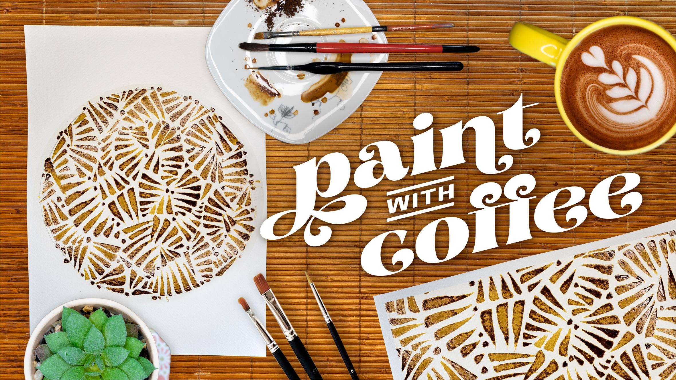
1. Lets Go!: Hey, you look like you could use some coffee. Me too. Luckily for you in this class, that's our main ingredient. I'm unashamed to admit that I am a coffee addict. But now as an artist, I'm finding that one of my favorite daily drinks can be the medium for a quick, creative, low cost art project. Maybe you're not a professional watercolor artist, maybe you don't want to learn about painting a bowl of fruit, maybe it's Sunday morning and you're just sitting around in your jam jams looking for something fun to do using what's in your kitchen cupboard. Hey there, I'm Adam Palmeter and as a professional artist who travels full-time, I have to take my art studio with me. That means finding art supplies on the road and sometimes improvising. I began exploring painting with instant coffee instead of watercolors a few years ago and it's always been an easy-to-find and delicious art supply. I've always been a big fan of watercolors and some of my closest artists' friends are amazing at them. But proper watercolors can get quite expensive. Even if you're not a serious watercolor artist, but you are looking to apply the same techniques and principles in a fun, multi-sensory art project without having a full set of watercolor, then this class is for you. Coffee has been around for billions of years and grows almost everywhere on earth. Luckily, you can find instant coffee just about anywhere in the world. Tastes like art. In this class, you're going to learn a series of techniques and skills to create fun artwork using an accessible art supply that can also make you more awake, a bit more focused, anxious, jittery, too awake. What's unique about this class is, we're dealing with one color, good old brown. But for our class project, you're going to be using different shades of brown. This is a very different book. This class is a great way to improve your artist arsenal by adding these new skills; mixing, brush control, attention to contrast, composition, shapes, and perhaps some nontraditional canvas you might just have lying around your house that you can re-purpose into something cool for your home or office. Are you ready for a fun and easy art project that anyone can do? Then grab a mug, a few supplies, and let's meet for coffee.
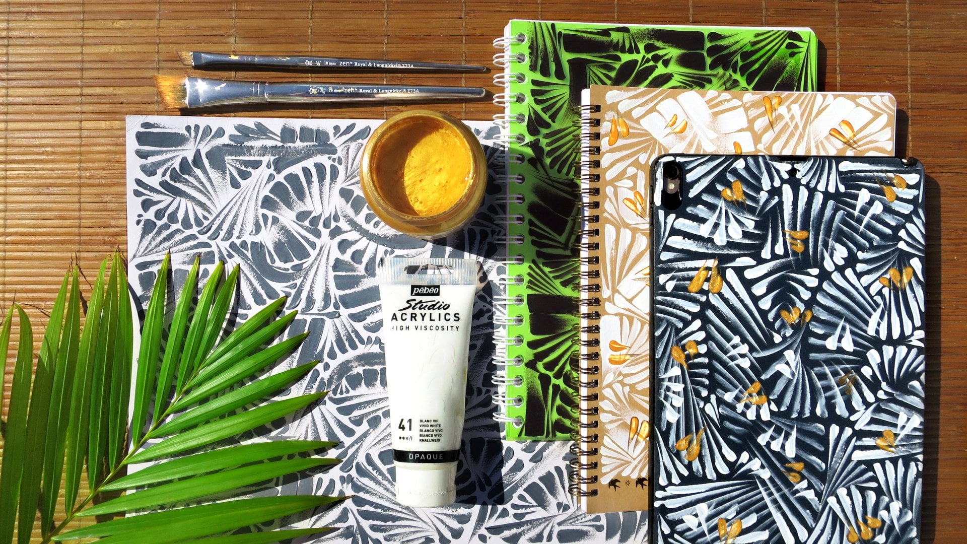
2. Supplies: All right, class, let's settle down and have a quick run-through of the supplies we're going to be using today. First things first, our paint medium. Today I'm going to be painting with my first love, Nescafe. I'm here in sunny Mexico where they have some amazing coffee, but I will still have a cup of this every once in a while. However, you don't need to use Nescafe specifically, any instant coffee will do. I've found that most of the instant coffees out there have that same freeze-dried texture and mix and react with water all in the same way. If you have any good instant coffee recommendations for painting or tasting, please feel free to let me know in the discussions below. Next up, brushes. Since this is basically a watercolor class, we're going to be using traditional watercolor brushes. Now, the best part about watercolor brushes is that any brush can be a watercolor brush if you try hard enough. I've had enough coffee this morning to believe in you. But for real, a good watercolor brush has soft bristles and can hold a lot of water. If you don't have a watercolor brush per se, you can still use an acrylic brush, an oil brush, a paintbrush or even a toothbrush. This class is about having fun with the unique medium, not about perfection, so you use what you got. Next up paper. I'll be using some thick textured watercolor paper for this class, and I recommend you do too. Now for this project, any paper will do, but I do recommend a good watercolor paper because it's really thirsty and it's going to soak up that instant coffee real well. I have used a lower quality paper before and you do notice that it doesn't have that absorbency that this watercolor paper has, so it can bend and crinkle a bit and take a little bit longer to dry, but it still works for what we're doing with this project. Watercolor paper if you have it, if not, any paper should work. You'll see later in this class, I'm going to be painting on a book. That paper is much thinner and not exactly watercolor paper. But to show you that really anything can work. Next up, a water dish. I'll be using this coffee mug, which is a lovely mustard yellow and nothing goes better with mustard yellow than a deep bitter, black-like coffee. In this class I'll be using the water in my mug and my dish to mix the coffee. Real quick let's talk about water temperature. Some people use hot water, some people use cold water. I say add a little hot water and a little cold water and let them fight it out in the dish. Usually, they join forces and I'm left with a cup of warm water. Isn't nature amazing? But for real warmer water will help dissolve your coffee a bit more thoroughly and help speed the project along. It's also not as dangerous as using boiling hot water to paint with. I would not recommend using boiling hot water for any art project, especially not since the accident. Next stuff, our plate. This plate over here is my palette. If you don't have an official watercolor dish, don't worry. Clearly, I don't either. This plate can be used to mix up the coffee and water and play around to get some different hues for our painting. Pencils and erasers. I love a mechanical pencil because it's always sharp and ready to sketch. This is a softer lead, which means it's very easy to erase. Speaking of erase, get those erasers ready as well. I'm using a clicker eraser, which works best for me because it helps improve the accuracy of what I'm erasing in some really small areas. I think it tastes the best. But for this project, you don't need a great-tasting eraser, any eraser will do. Last but certainly not least, a cup of coffee. Because why not? This class can be a multi-sensory experience. The look of the instant coffee dissolving in the water, the smell of the grounds and the jar. Why not make a cup of your favorite Java, have a sip, and enjoy all the benefits of this amazing drink? That's odd. Looks like we're all set. I hope you got your cup of Joe ready to go. Now let's set the cafe flow you, I'm not saying.
3. Color Mixing: First things first, let's get in the flow with a little bit of color mixing. Right here, I have my brushes, my mixing palette, my instant coffee, and my water dish. Let's dive right in. I'm going to start by pouring a little bit of these coffee crumbles out here onto my dish. Then I'm going to put a little bit of water on the side of my dish here. Make a little puddle pool. Now I'm going to start adding coffee into the water. Let that dissolve and start realizing just how much coffee you will need to get a desired hue. Now this is pretty light, so let's bring some more in, and make what I like to call a "Dark Roast." Now by adding these coffee grounds, you see it gets a little darker, a little thicker, a little more syrupy consistency. I want to be careful not to add too much because then it just becomes a sloppy goop. If it goes too far and a little too syrupy, no problem, you can always just add some more water, but I like a nice Dark Roast here. I'm going to have two different sections of my palette. This will be the Dark Roast side, a little more syrupy, and then a lighter side. I'm going to add some more water. This is my Light Roast side, so we have some water here. I'll add just a little bit coffee. Play around with it. Remember that the main focus here is to make sure the coffee grounds are all dissolved in the water. You can see in this little puddle pool here, they're all nicely dissolved into this light brownish blonde, and over here they are all dissolved into this much darker, more coffee-looking puddle. Now that we've played around with our palette and mixing colors and seeing what hues we can develop, let's go ahead onto practicing our brushstrokes for our project.
4. Practice Brushstrokes: All right. Now let's go ahead and do some practice brushstrokes. If you've taken any of my Skillshare classes before, you know I'm a big fan of simple, meditative, repetitive brushstrokes. Let me show you how with our first practice strokes by going up and down. I'm going to start from top to bottom; 1, 2, 3, 4, 5. As you can see, these five brushstrokes are very similar, very close to the same. I'm using a chisel tip brush, which is creating this flat top here, and the point here at the end, but nice and easy, 1, 2, 3, 4, 5. You can see that the spacing between the brushstrokes is relatively the same. As I make these brushstrokes from top to bottom, I let the tip of my brushstroke come right off the page. That's what gives me this nice little points here at the end. Go ahead and practice that a few more times. 1, 2, 3, 4, 5, 1, 2, 3, 4, 5. Now, we've gone from top to bottom. Let's reverse that and go bottom to top. Filling your brush with coffee, 1, 2, 3, 4, 5. I plant my hand against the paper, and the only real movement is coming from my fingers. Just like these brushstrokes, they have roughly the same spacing, the same shape, and same direction. Let's keep on trying that again, 1, 2, 3, 4, 5. Even if you don't have the same brush that I'm using, you should be able to see consistency in the shapes that your brush is producing. A lot of my artwork are the groupings of these shapes. Top to bottom, bottom to top. Now, let's try side-to-side. Left to right. For these brushstrokes, I don't plant my hand the way we did for the top to bottom, or bottom to top. In fact, I turn my hand, hover it above the paper, and make these strokes; left to right. Practicing these strokes is really the process of this project. We can mix up a little bit more dark roast right into my light roast. If you go too dark, you can always just add more water, or if you go too light, you can add more coffee. Just as we did the opposites here, we're going to do the opposite here. I'm going to go from right to left. As you can see, the left to right produces this diagonal angle, and you're going to see the same thing from the right to left. Again with my point here, 1, 2, 3, 4, 5, 1, 2, 3, 4, 5. As you can see, I'm just moving my brush along, making sure the tip comes up off the page, and these are our brushstrokes.
5. Circle Set Up: Let's jump into our class project. I want to keep things simple yet a little modern. I love to make circles, either filling them in or painting around them with a few different colors. I've always had a good time exploring this shape. However, for this class, we're going to be using one color, the color of coffee. We're going to be keeping things nice and simple. Let's grab our supplies. First and foremost, paper and your pencil. Now, I'm actually going to be using this bowl to trace around to create a perfect circle. You don't have to make a circle, but that's what I'm going to be doing. If you want to follow along with a heart shape, or a square, or a diamond, do whatever you'd like. First step, I'm going to place this bowl right in the middle of my page. Now using my pencil, I'm going to trace around this bowl very lightly, dark enough to see, but let enough to erase. Life is all about balance and good coffee.
6. Multidirectional Brushstrokes: Now, I like to think of these compositions as an unfinished puzzle. It's got the shape, we just have to create the puzzle pieces to make it all fit and you get to design them. We're going to use the brushstrokes we just learned to fill in our circle. Now we went over four different types of brushstrokes and I like to use multi-directional brushstrokes throughout the whole composition. That sounds confusing and it's much easier if I just show you. Let's get started with our primary brushstrokes. We've got our watercolor brush here. I'll load it up with some dark roast. Let's begin. Now, I did the initial brushstroke of the top to bottom. While these strokes are still wet, you can see it looks a little more like light roast. How do we darken this up? What I'm going to do is take a bit more of this dark roast coffee here, and while these brushstrokes are still wet, I'm going to dab them. This adds more coffee to the brushstroke without breaking the lines of the brushstroke, so it contains more coffee. As you can see, it starts to raise up, get a bit more textured in a way, but look at how much darker those brushstrokes are now. This only works on strokes that are wet. I keep a smaller, sharper brush on hand. If these dry out, you literally have to paint over them and it becomes an art project within an art project. What I would recommend is after your first strokes, double up the color by adding more coffee. Watch that color change. When you make these brushstrokes darker, it's going to add a lot more contrast between the dark coffee and the white paper. As you can see, these brushstrokes are pointing down, these are pointing up. That's the multi-directionality that I was speaking of before. By the time we're finished with this circle, you'll really see an interesting contrast in the composition just by the directions these brushstrokes are pointing. One way way get those multi-directional angles from these brushstrokes is to actually move your paper. If you haven't taped it down, very carefully shift your circle to the other side then using those same brushstrokes, you can get easy access to different angles. As you can see now these are all pointing in different directions and this is the effect that we want. If they're all going the same way, try to mix it up a little bit. Play with the side to side, with the up and down different brushstrokes. Try to play around with all the brushstrokes we went over and you're going to really get some nice diversity in your composition. Just adding a little more water here to my coffee, we can get a bit more of this dark roast moving. Now back to our project. This really can be a very multi-sensory project. I can smell the coffee, makes me feel all happy and awake and creative. Now, once again, I'm going to turn my circle to get access to a few more different angles here. I'm coming right up on the edge of my pencil markings, try and careful not to go over them. For this project and in a perfect world, I would not go over the pencil marks because they can be a little more difficult to erase once it's all dried. However, I've gone over the pencil marks. As you can see, our composition is starting to get a little more full. This is where you can see the multi-directionality of the brushstrokes that starting to come into play. These ones are going up, down, side, side, left, right. Now, when I spoke about this being like a jigsaw puzzle, you can see I'm building these pieces as I go along. I'm finding spaces that fit just perfectly and I'm letting my brush fly off the page. With practice, you'll be able to see that you become pretty accurate with your brushstrokes. Our composition is really coming together nicely. As you can see, these spaces are getting smaller and smaller, so what I'm going to ask you to do is start painting smaller and smaller.
7. Filling In The Gaps: Utilizing those same brushstrokes, we're going to do a miniature version of what we've been doing. So find one of these small areas, let's see what will work. All right. Here we go. I got one right here. This is where we took in these teeny tiny brush strokes. They don't have to be perfect, try your best not to overlap, so we get that nice, deep, and rich contrast between these strokes. Again, if you need to turn your page, turn your page around. Find the best angles that work for you. If your brushstrokes overlap, don't worry, you will still get an A plus in this class. As we get towards the end here, you might only have enough room for one or two brushstrokes and that is okay. This is where I like to practice my accuracy. All right. Our brushstrokes are all pretty much finished here. Now, as you see, we have all these little tiny areas where I can't exactly fit a brushstroke. One thing I like to do that really ties together the composition is add dots. Now, because I'm using this chisel tip brush, I have a point, but even a flat tip brush will have two points on it. So using one of the points, I find an area that could use just a dot, and you do exactly that. You put a dot. So let's go ahead. Found one already. Right here. It's a simple dot. Then just like the brushstrokes where you add more of the coffee to it to increase the hue, do the same thing, little dots. This will really help tie together your picture. Pay attention to the edge where your pencil had outlined your shape. Usually, I'll add a few along the line just to really pull it in together a bit, and give a little bit more of that contrasts for the shape that we chose to paint. Just add in a few more of these dots, and check that out. It's really tied it all together a bit more. I think that micro contrast between the dots and the white paper really push this project over the edge. These dots are by far the easiest of the puzzle pieces you're making for your project. This is really all just about finding balance in your composition. So you know, when you look at it, it's evenly spread between brushstrokes and dots, but it has a very modern look to it. All right. I think I've done all my dots. It's always good to leave it at a place where you think it looks complete. You can always paint more, but you can't paint less. So I like where this is. Let's leave it at that. Now you can see, my composition is still wet and drying. I'm going to go ahead and let this dry for a bit. The thing about coffee though that is different from watercolors is that, when it dries, it's going to have this nice hard candy looking sheen to it. It will be nice and shiny and it's also going to be a little bit sticky. So try to keep your hands off of it, other papers off of it, cats, dogs, not a good look. Just keep that in mind that as it dries and then after it dries, it will be a bit sticky. But when you're finished with your project, let's just put it aside and let nature take its course.
8. Gradient Dots Set Up: All right. Great. Now that we've finished our circle project, it's time to jump into our second project of the class. What's that going to be? Great question. It's going to be playing with dot gradients using our coffee. Here are the supplies you're going to need for this project. First off, fresh piece of paper. I'm using another piece of this Strathmore watercolor paper. I am also going to be using a mug to trace a half circle. I've got my paint brush here, my pencil, my backup paintbrush in case of emergency, my cup of water for mixing, and of course, the star of the show, instant coffee. Now, for this project, you can do any shape you want. For me, I'm going to be doing this teardrop shape. But you can follow along with the star, a square, a circle, dinosaur, it's up to you. But for now, I'm going to show you how I draw the perfect teardrop. Start with my mug. Now, before I made a circle, this time, I'm only going to make a half circle. Taking my mug here and my trusty mechanical pencil, I'm going to once again trace my mug. Remember, we're only drawing a half circle, not a full circle, so as you can see, I've got this beautiful little smiley face without the eyes or nose, so it's just a smile, but this is going to be the bottom half of our teardrop. Now, let's find the middle of our half circle. Right about here, I'm using my pencil even. You can make a straight line up to where we should put our center dot at the top of our half circle. Right about here. Again, doesn't have to be perfect, but voila. You can see a small dot right here that just about lines up with the middle of our half circle. So now come to the easy part, just drawing lines to connect this dot to the sides of our teardrop here. Now, you can either do this freestyle with your hand or you can use a straight edge, maybe a book or a ruler you have, line around. But really, any straight edge or free hand will do. I'm actually going to take my paintbrush right here, line up these edges and connect them. Now of course, this isn't perfect. If you'd like to free hand using your pencil, you can smooth out these edges to get the desired shape that you'd like for this project. Now, I'm quickly just going to erase my initial lines, just so it's nice and neat, and you can see everything I'm doing for this project. All right. Now that we have our beautiful teardrop sitting here, ready to go, let's go on to our next video when we start with our first dots.
9. Gradient Dots Filling In: Now that we have our shape all set and ready to go, let's start mixing up some coffee and begin these gradient dots. I'm going to start by pooling water here on the side. We're going to begin with dark roast, and that's going to fade into light roast. I'm going to start by adding a good amount of coffee here, and we're going to really saturate this puddle with the coffee, get it just a little syrupy almost. As you can see, it's going to start to thicken up. There we go. That looks pretty dark and bitter and perfect for what we're about to do. Starting with the dark roast here, right up here at the top just below our dot is going to be our first coffee dot. I'm not going to go on top of the pencil. I made these pencil marks pretty dark so you can see them. Starting with our first dot right there. Perfect little black dot. Expand this by adding more coffee to it. That's what you want to do. You just want to dab the dot. There we go. Perfect little black dot. Now the way this gradient is going to go, it's going to go from darkest all the way down here to lightest. I'm going to make a few rows of these dots. I usually like to space them out. We start with one. Let's go ahead and put two underneath it. Really just drawing coffee from the same puddle. Then as you can see, they're evenly spaced. Now the next row, I have one, we have two, you guessed it, three. One thing you want to make sure and be careful of is not to hit your paper. I have one hand here holding down the paper. You could also easily tape it down to your table. For this exercise, I like to hold it down. Moving on to our next row. I'm going to continue this pattern, these evenly spaced coffee dots, and just try to make sure they don't end up bleeding into each other. I think I'm going to do one more row. It's always best if you're doing this kind of gradient starting in the middle to line up your central dots to make sure that your layout of all these dots doesn't get away from you, you start skewing left or right, and a good way to do that is to measure them out from the center, just as I'm doing here. There we go. Here's our first layer of dark roast coffee dots. Now starting into the next part of our gradient, we have this dark coffee. We're going to make this coffee a bit lighter. I'm going to go back to my water and just add a little bit more water. That's going to break up the coffee to a little lighter roast and present us with our next color. Following along the same path, we're going to start our dots from the center. Check that out. This coffee, few shades lighter, not as concentrated, and a bit more watered down. We're going to do a few rows of this. Feel free to adjust your water levels. Make it a bit more dark or make it a bit more light. I really do find this to be a bit meditative because you're really just controlling one little bit at a time. Now I'm being pretty consistent with the size of these dots. But if you'd like to, you can also make a gradient of size and not just hue. Feel free to increase or decrease the size of your dots as you paint them. You want to go for that effect. Now, I'm going to go a bit lighter simply by adding more water. The trick is to add a bit more water to your coffee to get your colors slightly lighter. Now, as we started with this dark coffee, what we're working with now is a bit more of a tea color. This also applies to people who drink light roast coffee. Now we're getting towards the bottom. As you can see, the shape is tapering in. We're going to have less and less dot on our page, but we're going to finish out with the same pattern. A bit lighter. It's not even coffee now. Coming into our final rows. I'm going to make sure that this now is really just, let's say water with just a little bit of coffee in it. Try to get it super thin. Slightly less than clear drops on the end of your page. Then as we get to our last row, I'm really going to throw a bit more water in this dish. Let's get these final dots in. I like this a lot. We're finished with our gradient. As you can see, it started with this really nice thick black moving into decent colored coffee, and to tea, I'd say, and then into a slightly tainted water with just a touch of coffee in it. Altogether looks really good. We've learned a bit about our medium, where if you add a little more coffee to the water, it gets darker. If you add a little more water to the coffee, it gets lighter. The main takeaway is that you learned how to create value within the coffee medium. We've also learned how to use our brush effectively and several different techniques to actually achieve this goal. I got one more fun project coming up for you guys next. Grab that coffee, let's get in.
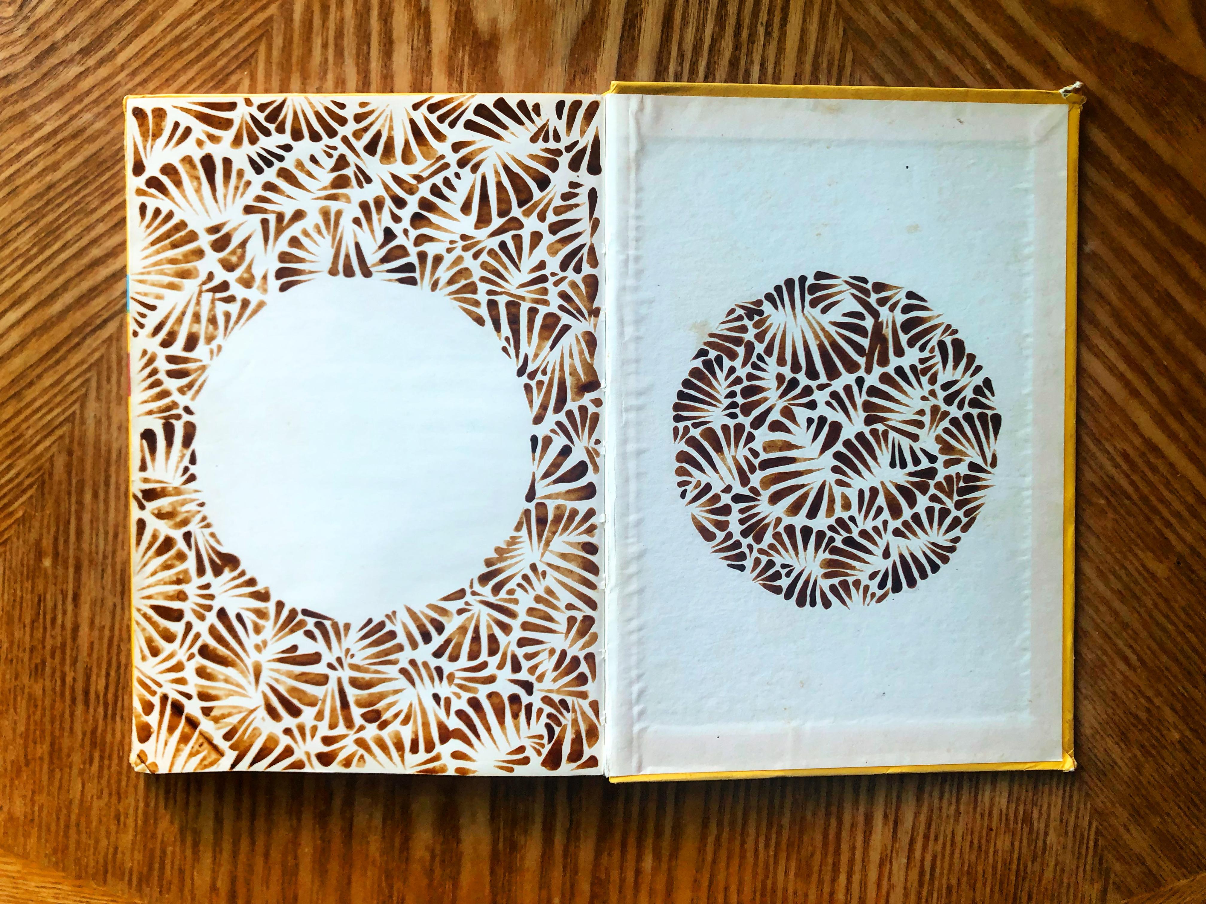
10. Book Decoration: For our third and final project, for our creative caffeine class, we are going to be painting books. That's right, they're not just for reading anymore. You can ruin the inside of your book for the sake of art. I like to find unconventional canvases. That can mean anything: books, paper, walls, bathrooms, and I'm a big believer in reusing things for art projects. I came across these old books. They are French, they're from the late '50s and the inside covers are plain white, aka, the perfect canvas for me to create art. Maybe you don't have fancy watercolor paper at home, maybe you have some old books, go ahead and repurpose those. I'm going to walk you through step-by-step on how to create art in your books just like these. Step 1, find a book. Here are the attributes to a book that I find the most helpful for this project. One, hardcover book. It's pretty tough to paint on a softcover book. It also doesn't have that structure to it to keep it from bending and waving once you start adding the watercolor, or paint, or coffee to it. Two, the inside covers are blank or reasonably close to it. I like a plain white canvas, so these were perfect. Now that we have our book ready to go and it fits all of our requirements, let's move on to Step 2, which is tracing out the shape. Now, for this book, I've chosen to draw a Monstera leaf. You certainly don't have to do anything this complicated. In fact, if you just want to do a circle, go right ahead. After I have my shape all sketched out, I use my eraser to refine that sketch. Next, it's time to mix up our coffee. I prefer to paint in a nice medium rose blend and also doubling up on some of those brush strokes to create dark roast brushstrokes. As you found through today's project, using a medium roast is a bit more liquidy and easier to work with. Just like the circle, I'm going to begin my painting with the same multi-directional strokes around the outside of my shape. Now as someone who is right-handed, I'll usually begin a composition starting from the left. That way, there's less of a chance of my hand dipping into something I just painted. Now for book compositions, I like to consider negative space and positive space, and that can be a really cool idea to play with, with your coffee illustrations. For example, on the left page, I'll be filling in the background around the leaf and on the right page, I'll be filling in the inside of the leaf. Once I've finished all of my brushstrokes, then I move on to the dots to really tie the whole composition together. By adding dots to the composition, it really brings a bit more structure, and contrast, and fullness to the shape we're painting. This makes it much easier to see that my shape is a leaf because I filled in those dots and created a bit more of a hard line around the edge of the shape. A couple quick tips. I finished these books a couple of days ago. They're totally dry, a touch sticky, so you don't want to close the book directly on it. Because the paint is still sticky, when it's dry, it might be a good idea to put a piece of parchment paper or even tin foil between the pages so they don't stick together. However, my books usually remain open because these become a displayed piece of artwork. In fact, these can make really great little accent pieces for your home or office or wherever you'd like. We've had a lot of fun exploring these three really cool projects using coffee and before you go, I've got a few more final thoughts for you, so let's just jump into the next video.
11. Final Thoughts: All right guys, at this point you should have three beautiful class projects completed. I just want to take a moment to thank you for joining my class and helping me explore all the wonderful things of good old coffee. I can't wait to see what you're creating at home. Please take a photo of your work and share it in the class projects gallery. That way, I can like and comment on anything that you share. If you want to share on Instagram, please tag me, @adampalmeter, as well as Skillshare, @skillshare, so we can also see what you've created. The creativity doesn't have to stop here. I have plenty of other Skillshare classes that help teach you fun artistic skills. One class I think you would enjoy is called draw vibrant rainbow art. Easy tips to create abstract masterpieces using Neon highlighters. It's a really quick class and probably a breath of fresh air because you've been staring at brown this whole time. Now you can jump into the whole gambit of rainbowy colors. Also, don't forget to follow me on Skillshare by clicking the "Follow" button up top. I frequently send out newsletters to all of my students, featuring artists I love, upcoming classes. Occasionally, I'll give away a free year of Skillshare premium to one of my lucky followers. If you want to see where I'm painting in the world or doing stand-up comedy, go ahead and follow me on Instagram, @adampalmeter. All right, guys. Well, it's time for me to sign off and struggle to get to sleep because I've had too much coffee. I'm Adam Palmeter and I'm wide awake. Peace out.
 Adam Palmeter, Artist / Comedian / Teacher / Author