Transcripts
1. Introduction: Pencils can create some really colorful vibrant and
detailed drawings. But sometimes when you're
trying to draw a full picture, it's kind of hard to
know where to start. I want to show you
today that actually, if you break a drawing
down into sections, it's not as tricky as
you might think to create some really
colorful pictures. My name is Jemma Chambers, and I've been making online
art tutorial since 2020. I've helped tens of thousands of people improve their art. But today, I want to be a
little bit more specific. I want to show you how you
can create a really bright, vibrant drawing on a really
bright and vibrant paper, and specifically how to make it easier by cutting it
down into bite size pieces. I'll talk you through all of the materials
that you'll need, and then we can start working our way step by step through the process of creating this pretty fruit drawing.
Let's get started.
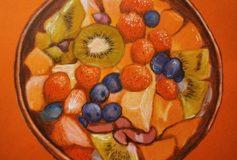
2. Class Project - Drawing a Bowl of Fruit: Class project, we will be
drawing this bowl of fruit. Now, I will talk you through everything you need
to know to do this, including how to
build up this sketch. Remember, if you do want to use my sketch rather than
creating your own, it is in the class resources. I've also included in
the class resources, all of the colors that
you'll need to create this drawing if you want to use exactly the same colors as me. Now, please do upload your drawings into
the class projects. I would love to see
what you've done. Let's think about the materials that you'll need to create this.
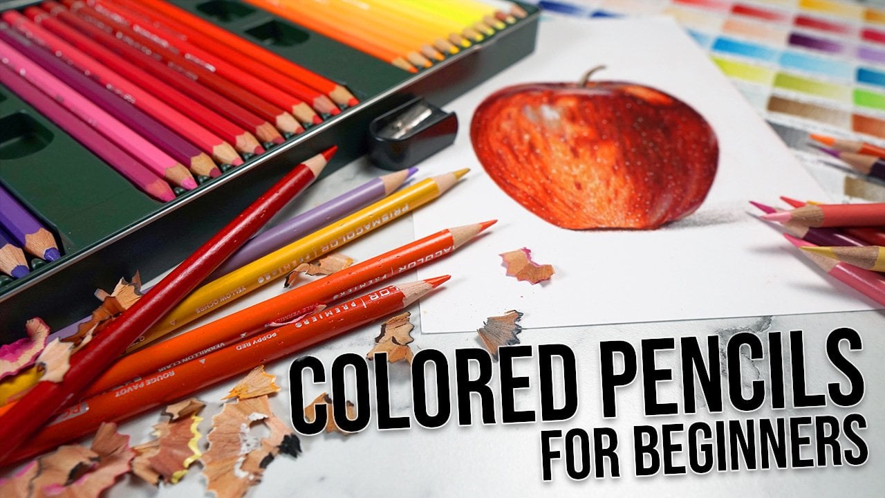
3. Materials For Coloured Pencil Drawing: Thinking about the
materials that you'll need to
create this drawing, the most obvious
thing that you'll need is a set of
colored pencils. Now, for my drawing, I am using a set of prisma
color pencils. I'm using the set of 72. I think that they
work particularly well on colored paper. Just because they're
quite a nice waxy pencil, and it creates quite
a opaque color. You don't need to use
exactly these pencils. But a slightly higher
quality pencil, I think will work better, particularly because we're
drawing on the colored paper, they tend to have a bit
more pigment in them. Now, the next thing
that you'll need is some colored paper. Now, I'm using the
Canson color line paper. This is a really
nice quality paper. But you can, of course, test out some colored
papers of your own, see how the colored
pencils show up on them. Color line paper comes in
loads of different shades. I'm using this quite
vibrant orange. Next up, you'll need
a pencil sharpener. Now, I use a hand crank
pencil sharpener. I particularly like it because I can change the blades
when they wear out. That said you don't need a
pencil sharpener this fancy. Any pencil sharpener
that creates a really good point
is all you need. Next up to create the sketch, you'll need a ruler
pencil and an eraser. And I'll show you
in the next section how we'll use these. From here, this is a little
bit of an optional material. I'm going to be using
a jelly roll pen. Now, this is a white gel
pen that's really good for building up a bright white over the top
of colored pencils. Now you're not going to
absolutely need this. If you don't have one, it's
not completely necessary, but it is good for adding
in those highlights of Next thing you'll need is
not something you can buy. Is something you're
going to need to make. This is color swatches. Now, I like to swatch
out all of my colors, so I can see what the colors actually look like on the paper, rather than relying
on the lead or the barrel of the pencil because that doesn't tend
to be very accurate. So I for every color in my set, go from as light as I can to as dark as I can,
and then I label it. Actually doing this
on white paper, even though in this
specific tutorial, I'll be drawing on orange paper. It's so much easier to just
get it marked out on a white because then I can use it for any drawing rather than
just this drawing. I say all the time,
Swatches isn't something that I
repeatedly make. I have this set of swatches, which I made about
four years ago, and I haven't needed to read Last thing you'll
need is some way of looking at the
reference photo. So B I'm focusing on
drawing realistically, I always like to work
from a reference photo. And what I like to do is put the reference photo
onto my iPad. I particularly like that I can zoom in to see all
of the details. That said you don't
have to do this. You could print out
the reference photo. So you will need
a set of pencils, some colored paper,
a pencil sharpener, a graphite pencil
ruler and a erasor, a jelly roll pen,
some color swatches, and some way of looking
at the reference photo. Next up, we want to start
creating the drawing, and that starts with a sketch.
4. Sketching the Outlines: Let's create the sketch
for this drawing. I like to do this with something
called the grid method. This is where you put a grid on your drawing paper and a grid
on your reference photo, and we're going to draw just what's in each
individual square. So I can start here
by working out how many squares I need
on my drawing paper. I'm actually going
to draw this out on just some white paper so you can see a little bit clearer. But I would usually
be doing this directly onto the colored paper. I can start out by
drawing my grid. Now, I've worked out that I need squares that are 2
centimeters wide. Also not going to draw the grid over the whole piece of paper. I've worked out just the section that I need for the fruit bowl. Once I've got my grid, I want to start working through here one
square at a time. Generally speaking,
I like to start in the top left and work
towards the bottom right. I want to start here by
working out which square I'm starting in so I can
count down the squares. So I'm going to start
on this square here. What I want to do is
look at particularly where the key points are
crossing the lines of the grid. For example, looking at this line here and the
outside edge of the bowl. This section here is
crossing the line not far from the very
corner of the box. Maybe a bit under a
sixth of the way across, and this line here
is crossing the box, maybe about just over a
third of the way along here. Down the bottom, this line here is just beyond
the edge of the box, and this line here is maybe
a quarter of the way. I can mark in where those
lines are going to cross these lines by estimating the
distance along the square. And then what I want to
do is join those lines. Here we're looking at the
outside of the fruit bowl. The lines are slightly curved. I want to slightly curve them, but join the dots here. Now I want to look at anything else that's within this square. So there's this piece of mango. Here, the mango is crossing
maybe about a third, a little bit over a third
of the way along here. This point on here is about halfway down the box and
nearly touching this line, but not quite at the top, the point of the mango is
slightly into the next box, and it's probably about a
fifth of the way along. So I can mark those points
on the outside of the box. And then once again join them together to draw out
that piece of mango. So once I'm happy that I've got everything marked in
in this first box, what I now need to do is work my way around every
box in the drawing. So let's do this for a
couple more boxes for now. So looking at the
box above this one, here the line around the edge of the bowl is about
halfway along the box. Sign here is just under, I would say, a quarter of
the way from the edge. So all I need to do
is once again mark those points on the edge of the box and join
the lines together. So you can see this is quite
a time consuming process, but it is very, very accurate. Let's mark in the piece
of fruit along the top. So once again, I am marking in where this piece of fruit
is crossing the edge, which I can see from
my reference photo is about just over
halfway up the box. And then this part of the fruit here is almost touching
the corner of the mango. As I say, I want to go round and do this for every single box. Now, one of the really
good things about using the grid method
is that it forces you to look at the objects
as shape rather than thinking about drawing a
bowl of fruit, for example. You want to focus on looking at the shapes that are actually here rather than looking at the shapes that
I think are here. I'm generally working
down in strips, one box at a time, and I do think it gets easier as I work my
way through here. As I say, it is a little bit
of a time consuming process, but it is well worth it to
get an accurate sketch. So once I've gone around and marked out what's in every box. What I then want to do is
erase all of the grid lines. So you can just take any eraser. I'm using a ***** eraser because that's what
I have to hand, but take any eraser, and you just want to remove
all of those gridlines. It doesn't matter if you erase a little bit of
the sketch as you go here, you can always add it
back in if you need to. Do you remember that you
want to be doing all of this step as
lightly as possible? I'm pressing much
firmer than I would usually so that you can see
it clearly on the camera, but you want to do
it so very lightly so that when you do erase
the lines at the end, you don't have the
pencil left showing. Let's look at the
reference photo.
5. Studying the Reference Photo: Before I start any drawing, I always like to have a really good look at
the reference photo. I find it's very helpful to
really truly see what's here. Let's take a look together. Now, this is a reference that I think looks very complicated. But if we break it down, I think it's much simpler
than it looks at first glass. Now, there are some areas that are really highly detailed, and particularly thinking
about all of the kiwi, all of the raspberries, and all of the blueberries. But for the rest of
the fruit bowl is actually all extremely simple. There's a lot of wedges of, I guess this is mango and a
lot of wedges of maybe melon. And these are actually
just solid block colors. They've got the odd little
light shine to them. On the most part, they are
solid blocked in color, whereas on the
Kiwi, for example, we've got all of
these little seeds that we're going to
need to draw in. On the raspberry, there's all of this kind of raspberry
bumpy texture, and the blueberries have
a lot of light patches, but on the rest of
them, as I said, it's just really simple when they're kind of backing colors. Of the kind of colors
that are in here, I actually think it's all,
again, reasonably simple. The kiwi is made up of a variety
of different greens from some lighter greens like towards the middle and then much darker greens like around the edge. And that's pretty much the
same with all of the fruit. On the raspberries, we've
got some very light pinks, and then we've got
some much darker, deeper reds, and even browns, the shadow here
looks like a brown. Think I just need
to work through this one type of
fruit at a time. Now, something that
I think really helps the fruit pop is the
dark areas of the bowl. There's a very light
line around the edge, a very light shine on this bottom quarter and
on this top quarter. But the rest of the bowl, particularly around
closer to the fruit, is really quite dark,
and I think that's going to help make
that fruit pop I'm going to focus on just
drawing the bowl of the fruit. I'm not going to
be drawing any of the fruit around the edge. It doesn't look very clear. I don't really like the
look of it around the edge. I'm only focusing on the bowl. They're the main things
I'm seeing to start with. Now that we've got our
sketch down and we've had a really good look
at the reference. Let's start building up
some of the colored pencil.
6. Build up the Lightest Colours: I said, I kind of want
to go about this in a slightly different way to normal building
up the colors. That said, I am
still, as always, going to start with
the lighter colors and gradually work my way
towards the darker colors. So in this chapter, let's just focus on filling
in those lightest values. Now, usually, I draw
on white paper. So all of the absolute
lightest white areas are already white. But we're not in
that situation here. We're working on a
reasonably dark orange. So I want to start
off by filling in all of the absolute lightest
and white areas. And I am doing this
with the white pencil. So, I'm starting off around
the edge of the bowl here. And I'm noticing that there is a really bright white
line around the edge. So look at this light line here. This is what I want to
draw in to start with, get something marked here. And then I can start
working my way around the bowl looking for
those very light areas. So I'm thinking of,
particularly this piece of, I assume melon here, the center of the kiwi here. And then look how
light this area here, for example, is this area
here and around here. I want to fill in all of
these lightest areas. Now, this is all
made a lot easier because I have already
got my sketch down. Just want to try
and make to begin with around the edge
a curved line that is pretty consistent gap between the light area and the edge. I want to go maybe a little bit further than you
would imagine because our background is so
it's midtone, I guess. I need to go maybe a little
bit further than you'd think. Then what I'm generally
going to do is work from the left hand side
towards the right hand side. Starting off looking at these little patches of
mango, I think they are. I'm just looking at all of these little light marks on here. All of these white dots. Let's get those marked
in because, as I say, the paper is so dark, we need to fill in
all of these areas. Then I can fill in the light
edge of this blueberry. And then start blocking in that piece of melon I
mentioned a second ago, this very bright
light piece of melon. So I'm being very careful
to stick to the main shape. It's important to
remember at this point. We're not necessarily thinking
about adding in details. I just want to get the main
shapes marked in so we have something to be working with as we
work our way through. Want to be putting
this down reasonably lightly and as
smoothly as possible. This whole area is a
very smooth section. So I want to be working in
little circular motions. And I'd say applying kind
of a medium pressure with the pencil because I do want the area to look
so bright white. So let's work our way round. So here I'm looking at a
very light area of the kiwi. So this area here, this isn't so much
a bright white, but it is a very light area. So I can mark it in
with the white and we can always adjust
the color a bit later. There's also this
strip along here. And then, as I said, this shape around the middle
of the kiwi here. So where I'm filling
in a patch of light, I can fade out
towards the edges, so I don't have any really
brisk blocks of color. So you can see I've
marked that in, but I haven't got
really sharp edges. And then I can move
onto these parts of I think it's
mango again here. I think it's a little bit tricky to see what I'm working on where because we
haven't got the context right now of the
rest of the colors, but I am literally marking in any area that's
particularly light, and I'm using my sketch to get my bearings on
where these need to be. So, for example, here, I'm drawing in, I think, is it a strawberry? This piece of fruit here, I'm not sure if it's a
strawberry or a raspberry. I also want to put a little bit of light patches on
the blueberries, where there's these really light patches on the blueberries. Let's get those marked
in in the right place. Now, you'll see that it's
looking quite peculiar. We're not expecting it to
look amazing at this point. As I say, I just want to get these lightest white
areas marked in. In many ways, this is like
working with something like maybe past or pencil where
we've started with a mid tone, the orange is, the mid tone, we need to add in
the lightest colors. We can then add in
the darkest colors, and it just helps see what needs to go
where a bit better. Looking at the raspberries now. I'm not going to add
in all of the detail, but on some areas
of the raspberry, there is some pretty
prominent kind of curved sections like
here, for example. So I can get that marked in, and then I also want
to get marked in. This is a particularly
large light area of melon. And on this, it's important
to note the shape. So because this is
a wedge of melon, you can see it's got a light
line along here down here, and there's a light
line going along here. And even though the fruit
is generally very light, I really need to
build up a lot of the light areas in these strips. The rest of the fruit, there's
a big white patch here, a big light patch on this mango and a big
light patch here. Then it's generally light towards here and here
on the kiwi and here. Then I also need to
draw in a light line around the edge of the bowl on the top right hand side as well. So there are a lot
of other white areas that we will be building
up a bit later. Maybe if I build in a color
and it looks too dark, I can add white over the top
to brighten everything up. But I just want to get in those really obvious
light patches to start. Once I put some of the other
colors over the top here, some of the sort of
greens for the kiwi, the yellows for the
mango, et cetera. It's going to get
much, much easier to see where this white
pencil needs to go. Just right now I'm only using
a sketch as the guidance. So, you can see me
starting to fill in this line around the edge
of the bowl, once again, looking at where the line is for my sketch
and trying to get this line to be a
pretty consistent width away from that edge. Once I'm happy that
I've got something down on all of the
brightest white areas. What I then want to do is, as I usually would, think about filling in the
lightest color in each area. Actually, there is quite a lot of colors because we've got quite a lot of fruits
within the bowl, there are quite a lot of colors that I am going
to need to fill in. So let's start off
with the cream pencil. This is my absolute
lightest yellow. And actually, when
I put it down on specifically this paper,
I don't think it looks hugely dissimilar to the white. So I want to be putting
this anywhere that has a little bit
of a yellow hint. So I'm starting off
on the melon here. This is, I would say, a
particularly obvious area that is more of a yellow, but a very, very light yellow. And what I'm doing is
pressing reasonably firmly. I want to block in
this whole area. I also want to get the pencil down really nice and smooth. So you can see that I'm
working in some small kind of circular or oval motions to try and get this down in a
smooth and consistent way. I would say that I'm
pressing reasonably firmly because I do want to
block in this whole area. That said, I'm not
pressing full force, and I will be able to put more pencil down here towards
the end if I need to. So I want to be
thinking about anywhere else where I want to
be using this color. I'm particularly thinking
about building it up on not only some of
the mango areas. So this area I'm
working on here, it is going to turn into a very bright yellow in
this top corner. But generally speaking, it's a much lighter
underlying yellow. So I can block in this
whole mango shape here, once again, working in
those circular motions to try and get it as smooth And then I'm going to work
my way around, as I say, filling in any areas that need
to be a very light yellow. So this area at the top here, this is some more of the melon. We pretty much want to go
over all of the melon areas. They are generally very light. A lot of them do have
slight shadows to them, which is what's
giving them shape. But I'm not going to worry
about that right now because I just want to be focusing on blocking in these
very light colors. And then I work around some of these melon areas
towards the middle. Before focusing quite a lot on this big piece of melon here. As I said, around
the edge of the where the edges of
the wedge is cut. There's some very light areas. We've got some very light lines. But all of the melon here
is very, very light. So I do want to fill
in the whole area, really, except for the I'm going to call
it the front face. This area here, which when you really look at it is
quite a bit darker. And once again, using
circular motions blocking this whole
wedge of melon. You can see it is subtlely
a different color. I think it would be too much to shade in that whole
thing with the white, and we wouldn't have the
nice edges, the nice lines. Then I'm going to
work my way round, so I'm moving on to
this is the kiwi. I'm actually going to fill
in the lighter areas on the kiwi as well with
the light yellow here. As I said, I think it looks so close actually to the white, but more with that yellowy hint. I think because this
is a green area, the yellow and the green are
reasonably similar colors, and it's just kind of
a less harsh light I can fill in this area
here, for example, on the kiwi, which
is very light. I filled in around
here particularly. Then I can think of any other
areas that I think would benefit from just being a
little bit more lightened. So I'm looking at the center of this kind of the main kiwi here. Just lightly go over this, help fill in some of those lighter or the patches
from the paper. And I can also fill in the light patch on this
piece of mango here. I'm generally happy with all
of these really light areas. What I want to start
doing is filling in the main light color
on each of the fruit. So let's carry on
looking at the yellow. And as I said before, most of the mango pieces are
pretty much just blocked in yellow patches with the
odd light patch added in. So I want to pick on
my color swatches, the closest yellow to
this kind of yellow. It's pretty much the
same yellow throughout. Want to use quite
a vibrant yellow. This is the canary yellow, and I'm literally going to block the yellow in each
of these areas. Now, I don't really want to
go over the white patches. On this piece of mango,
here, for example, those light patches are
odd little glnts of white. I want to make sure that I'm
keeping them bright white. What I do want to be doing
is once again working in circular motions to try and get this as smooth as possible. Don't expect it to look perfect, but I do want to try and get a reasonably solid block
and something that I can be building upon with maybe some darker
colors as we go here. So you can see me
working in those circle or val motions, just
filling this in. And I'm literally
going to do this on every piece of mango. Now, once again, I am using
my sketch very much here to get a bearing on where
each piece of fruit is. Once again, work from the
left towards the right. On this piece of fruit up here, as I mentioned, it's
generally very light, but it has a very
bright yellow area, particularly towards
the top corner. I can add the yellow over the top of all of that white
and cream we've added, and then I can keep working my way around and
filling in the yellow. Now, I'm particularly
noticing that In some ways, the yellow looks more vibrant than
it would otherwise, and in some ways it
looks less vibrant. In that, it looks brighter going over the top
of the orange paper. But it's not a
completely opaque color. So some of that orange is slightly showing
through the yellow. And maybe the pencils
playing slightly differently than what it would on white paper, which is fine. It's just kind of something
to notice and bear in mind. And this is literally all there is to this little section, just going over all of
these mango pieces as smoothly as possible and really trying to
mark in the shape And quite quickly, I
think it's going to be much easier to work
out our bearings. So from here, now
that I've marked in all of the yellow areas, and I'm happy that I've got something down for
all of that mango. Let's do the same for all of
the other types of fruit. So I'm looking now at the kiwi. And I want to be
picking a green that is as close as possible to the
main underlying green colors. So the green on the
kiwi, I would say, isn't particularly dark, but it's also a slightly
kind of yellowy green. So I'm going to pick this green. I think of it as a slightly
cartoony looking green, but also does have a little
bit of a earthy look to it. Now, I would say that putting particularly this green down, it looks brighter than maybe it looks on
the color swatches, brighter than I would expect. Which is fine. What we're
going to do is block in all of the kiwi areas anywhere where there is some
of this green, and then we can go over it in a little while with the white, and that will make
the green that we've got here
look much lighter. So I want to fill
in all around here. I'm not worrying about adding in the darker areas right now, so how around here, this is a much darker green
in comparison to here. I'm literally blocking
in the whole area, adding in green
anywhere I can see it. So I can avoid this area
towards the middle because I've already marked that in
with the white and the cream. But everywhere
else, I want to be adding a base of this
quite vibrant green. Avoiding this, for example,
I think this is a nut can work around this shape
and the same here work around this shape and fill
in the rest of the kiwi with these
circular motions. And you can see I'm slightly overlapping where the
white is where I built up the white before
so that I don't have a really sharp line. And I'm going to
work my way around. So on this piece of kiwi down here, for
example, actually, there are quite a
lot of light areas, and I haven't really put any
of the white down here yet. So I'm just going to lightly put some of the green in this area, but I will need to build up quite a lot more
of the white here. You see how light this is around here around here and the
strip towards the middle. I can work around
these pieces of kiwi on the right hand side. So once I've got all
of that marked in, let's lightly go over the lightest areas
with the white pencil. And you can see lightly
putting this over the top is just
changing that green. It's making it a much
more vibrant green. We are still keeping
the green tone, but it is just lightening it up. I feel like adding
white over the top of these pencils is
working so much better. It's just showing up
so much better on this colored paper to what
it would usually on white. Can work my way around
this center piece of kiwi. I just want to
more than anything smooth out this central color. You can see there's a bit of
a orange outline around it, and then I can really
build in a lot of the white on this piece
of kiwi down the bottom. As I mentioned, I think probably we should
have added in some white down here where we originally were marking
in all of the white. Can use, again, using
circular motions, build up the lighter
areas down here. It is worth mentioning
that you will need to sharpen your pencil
reasonably often. I do find that it wears
down reasonably quickly. It does anyway
with prisma color, but I think even more so
on this type of paper. So I am frequently sharpening my pencil
so that I'm working with a sharp pencil rather than a more blunt pencil like
I have at the moment. Do the same on these
last few bits of kiwi around the edge just lightening
up a few of the areas. And then now I'm happy for
now with the green sections. Let's put something down
on the raspberries. So I want to be looking for the lightest color I can
see within the raspberries. I wouldn't say it's actually
a red like you'd imagine. Particularly around here
on the light patches, you can see that this
is much more of a pink. What I can do is just add
a solid block of I've picked the blush pink as the closest pink on all
of the raspberries, just to put something down. Now, I do want to be
working reasonably lightly. I am going to be building up a lot of color on
these raspberries, and I want to be
able to do that. I once again want to
be building this up in as smooth a way as possible by working in circular motions. Can see how quickly
we can really start to get our bearings
on what needs to go where. Now, when I was working over the raspberries
just above here, where we've got those odd
little semicircles of white, I have not gone where possible over those areas to try and
keep that bright white. And then we got something
down that we can certainly build upon both
later in this section, but also in future
areas, future sections. Do exactly the same now
for the blueberries, and the lightest color
I would say within the blueberries is a light blue. I'm looking at this kind
of color around here. Now, I don't have that
kind of blue in my set. What I do have is I would
say a similar blue, but is much darker. I can do the same as
I did with the green. Start off by blocking
in all of the blue. This is quite a light blue. I can work my way around
each of the blueberries. Once again, working in
these circular motions, you can really see here all of these circles and how that's building up a smoother color. Once I've got all of those shapes marked out
in the right place, I can once again go
over it with the white, and it will lighten up
a lot of those blues. So let's do the same
with the purple, and then we can do the lighter
areas at the same time. So here I'm looking at
all of those walnuts. I assume that they're walnuts. Whatever they are, you can
really see the light colors. I would say that
on a lot of these, the lightest areas, do you
have a hint of purple to them? You wouldn't expect it.
But it really does have a light hint of kind of lilac. Let's use the lilac pencil to
map in all of these areas, and then we can use
the white on both. Although it looks
a bit peculiar, adding in the purple here, once we fill in the
darkest values, it's all going to make
a lot more sense. Let's now use the
white pencil to go over both the highlights from the blueberries that
I've already marked in, but also any other areas
that need lightening up. You can see that it just
turns it into a much more, I would say,
accurate blue color. Can fill in all of the lighter patches anywhere that needs to be a lighter blue. I'm just carefully
working my way around here you can see a
nice and sharp pencil. That's really giving us
something that we can work with as we move on
to the next chapter. I'm also filling in some of the lighter spots on
the purple areas. So, for example, here, just I need to lighten
a few areas slightly. I can once again work
in circular motions, just lightly brightening
up some of the areas. Then I'm generally happy
with these lightest colors. I think the last thing I
want to do is just get a slightly more accurate color
down on the raspberries. Still thinking about
a very light color, but I want to get the shapes mapped in a little bit better. What I want to do is use
a reasonably light red. This is the poppy red. I'm once again going to
use circular motions to block in pretty much
all of the raspberries, except for the very
lightest areas. This raspberry, for example, has a shine along here. This raspberry has
a shine along here. Generally, they've all got
shines towards the top, and a raspberry, it
might be a strawberry, has a light shine through here. I want to make this
bottom area and around the edge more of the
poppy red color. Work over these one at a
time using circular motions. It absolutely does not
need to be perfect. You can see it looks
a little bit kind of scratchy at this point,
but that's okay. We can smooth all of this out as we work through some
of the other chapters. So by the end of
this first section, what you should have is actually something that does
resemble a bowl of fruit. Although I do think it looks
quite kind of cartoon. Next chapter, rather than
like I usually would, working from the lighter colors towards the darker colors. Now that we've got in these
lightest and some mid tone colors because the back
is pretty much a mid tone. Let's add in the darker areas, and then I think it will be much easier to see what needs
adding from where. We will then have
something that hopefully resembles a bowl of fruit
that we can build upon. But that is it for
this first section.
7. Build up the Darkest Colours: This section, I want to put
in all of the darkest values, really get something mapped
in all over the drawing. So I'm going to start out
with not the darkest color, but a slightly lighter
reddish brown. So there's a few areas
around the bowl, which are quite dark, but not a really dark brown. So here, for example, this is a very dark brown. But here, you can see that
there is a lighter patch, which is kind of a reflection
from the yellow here. Can see this kind of
color in a few places. So for example, around the
bottom round here, again, there's that reflection
from the mango coming all the way around here and a little bit
around here as well. So let's mark in where these
strips are going to go. Now, to do this, as I said, I'm not using an
extremely dark brown. What I want to use is
a more reddish brown. So I have compared the
reference photo to my swatches, and I think the closest
match is the sienna brown. This is a kind of reddish brown, which isn't too dark. See, I'm drawing out
the shape first, really taking my time looking at the shape on the
reference photo. I can map in where
I want this to go, and then I can start shading in nice and lightly the
center of the shape. Now, as always, I don't want
to be pressing hard here. I will want to build up other colors over
the top of this, probably adding in some
yellow into this reflection. I don't want to
press really hard, but I would say that the
main underlying color is this Ciena brown. So I do want to start
by mapping that in. Once again, drawing the
outline of the shape, and then I can shade
in from that point. Let's do the same on
the left hand side. Then I want to have
a look at if there's any other areas where I
can see this of color. I'm going to put a little bit of this color lightly
around the top. The strip around the
edge, as I mentioned, there's a strip that
is very bright white, but where it's not bright white, it is a slightly lighter brown. This strip around here. Let's mark it in with
the Ciena brown. Couple of areas
around the center. So in between the fruit. In this patch here, this is very dark, but maybe not as dark
as some other patches, so I can map this little
patch here between the raspberries and
the blueberries with the sienna brown. I probably will go over that with the darker
brown as well. It's just add a little something to the edge of the kiwi here. And then around the edges of the raspberries and
blueberry here. As I said, it's just a
few areas that I think maybe aren't quite as dark as the rest of between
the fruit and around the edges
of the bowl is a very dark brown we're
going to need to add in. But I do want to
add something in. Looking at this shape here, I think maybe this is a nut. It has all of these brown
shapes around the edge and coming in here and then around the edge
here around here. Again, I will need to
add a darker brown here, but I can also see a little
bit of that sienna brown. Let's keep working around here. Just filling in the
odd lighter patch. Once I'm happy with all
of those lighter patches, you can see I really
haven't put a lot in. Let's move on to a darker brown. This is the darkest
brown I have in my set. This is dark umber. This
is a very dark brown, but not obviously
as dark as black. I think the black can
look a little bit harsh. What I'm going to do is fill in all the dark areas starting from the left and working
towards the right. I'm starting off going
around the edge. I want to go nice and close to that white line very carefully, and then shade to the line
on the edge of my sketch. So drawing the line
along the edge. Drawing the line by the white line and then
shading in the middle here. And I'm pretty much, as I say, going to work from the
left to the right, so I want to be going all around the edge of
the fruit shapes. Careful to not go over the sienna brown areas
that I added a minute ago. Just I'm beginning going
around the edge here. So go around the edge of
the fruit and then shade up to that white line
avoiding the Sienna brown. I do want to be pressing
nice and lightly for this. I don't want to be
pressing firmly right now. And I want to be trying to make this as smooth as possible, so I also want to be working in circular motions
when I am shading. You can see, I'm very carefully going around the
edges of the shapes. Will notice that as I
build up the color, it is looking quite
patchy and quite spotty. I don't expect it to look
perfectly smooth at this point. We can build up more of
the color as we go here, and I can go all the way
to the top filling in, particularly around the
edge to begin with. So let's also use this
dark brown to fill in some of the
spots of the kiwi. There's all of these seeds
on here on any kiwi. Let's start on
this section here, and I'm really looking at
the direction of the seeds. Clearly here is the
center of the kiwi, and they're coming
out from this point. I do want to try
where possible to match the dots of the kiwi. So I can look at the placement of all of the dots and as I say, the direction that
they're pointing. This is really going to help
me get my bearings as I need to add more green onto the shading of the
kiwi, for example. Then fill in some of the dark
patches on this nut here. So this nut, I think it's a nut. Here. You'll notice isn't just one solid blocked in color. It's generally darker
around the left here. It's got some pretty
defined outlines. And then there's all of
these kind of circles here. They want to work around and generally get this
curved shape marked in. I think it really is a
case of just looking at the shapes that we can see here and building
up those shapes. It doesn't need to be perfect, but I do want to try and where possible replicate what
I see on the reference. Can once again fill in the
seeds on this kiwi, as well. Now, as I say, I'm working
from the left to the right, so I'm happy with these areas on the very left of the drawing. Let's fill in this part here. Again, I'm not really
sure what these are, but all I need to do is copy the shapes copy where the lights and
darks are going to go, and then it will match,
and it will look right. So on this shape here, you can see that there's
this light patch towards the center left, and then it's dark all around here all up here
and all along here So using the pencil, I can mark in those
shapes, again, marking around the edge
first and then shading using circular motions towards
the center of the shape. Now, I say it a lot,
but do remember that you want to have a
really nice and sharp pencil that's going to help the
pencil go down in not only a more smooth
and consistent way. But it will also just give you that extra control
over the pencil. Can really take my time.
Again, mapping out all of the seeds
around the kiwi here. Now, remember, it doesn't have
to be absolutely perfect. No one's going to notice if you get one seed in slightly
the wrong place. That I said, I am trying
where possible to match this. I think because the seeds are all randomly placed
around the kiwi, it's quite hard to be that
random without using a guide. So I can use this as a way to help make these
seeds look more random. Happy with the seas, let's carry on working our way round. So working around the top, you can see me shading in towards the edge of
these patches here. You also want to
add some shading around the edges
of the blueberry, as well as the edge
of the raspberry. So this blueberry does have
some pretty dark shadows, particularly around
the left hand side and generally around the bottom. I'm going to keep
working my way around avoiding that burnt sienna
area that we filled in. So I can start working
through here a little bit faster now
because as I say, it is literally a case
of following where the dark patches are on the reference photo and
trying to replicate these. So using my sketch to go
around the edge again, and also filling in
all of those darker patches on the
blueberries, for example, You can see how dark it is around the edges of
some of these blueberries. There's a very deep shadow
around the top here, all around this edge. And here there's a shadow
created from the raspberry. Then all around the edges here, but the dots from where the stem attaches
to the blueberry. They're quite dark as well. I want to be working
all around here. It's very much where I
can still see orange. And then I want to be adding
dark lines where we put that sienna brown a
second ago on this. Can do exactly the same for the blueberries towards the top, and we're working our way gradually towards that
bottom right hand corner. I can fill in some
of the seeds for the kiwi around here as well. Now, do you remember some areas need to be made a
little bit darker, but maybe don't need to be
as dark as this dark umber. So, particularly
thinking about some of the shadows on the mango. It doesn't need to be this dark, putting a shadow, this
dark on the bright yellow. I think we'll just lead
it to looking washed out. I'm happy with all
of the dark umber. The last thing that I want to
do in this section is just add some sort of texture
onto the raspberries. You'll see at the
moment the raspberries are very nice and smooth. But as you'll see, they're
not on the reference photo. They've got a lot
more texture to them. So let's work through this
one raspberry at a time. Actually, I don't
want to use a pencil that's too much darker than
what we've already got here. The darkest color
that I've used so far on the raspberries
has been the poppy red. What I'm going to do is
use the carmine red. It's just a slightly darker
red to mark in the patches. Now, I am trying to copy the shape of the patches
from the reference photo, but I'm not going
to be able to get it exactly perfectly the same. And what I don't
want to do is go in with a really dark color when not only is it not using that
color on the lighter areas, but I want to have some
sort of margin for error. I want to be able to mark in
the patches as best I can, but if it doesn't
look quite right, then it's still
quite a light color, and I can always go over
it with the darker color. I am pretty much looking
at the reference photo and trying my best to copy
the patches I can see. I want to work around some of those light sort of horseshoe shapes that
I added in before. When I added in the white, I added in a few sort of curvy
shapes on the raspberries. I want to work around that. Just really see if there
are any shapes in. Now, once again, I
don't need to worry about looking too
peculiar at this point. It should look pretty patchy
like this. That looks fine. On some of the raspberries, I think it has more o shapes, more obvious texture
than others. I'm particularly thinking
about this raspberry here. This has some very obvious
lines running through it, including sort of nearly
a cross shape here or y. Whereas, this one
is a bit more just kind of made up
of bobbly shapes. So I to be really
looking at the shapes made up on the raspberry and
trying to replicate those. By the end of this chapter, you should have some
raspberries that still, I wouldn't say are looking particularly realistic
at this point. But at least they're not
looking perfectly smooth. So we do have something
that can be built upon. Now, I would say
that right now it's still not looking like a
hugely realistic drawing. But we've only added in the lightest colors and
the darkest colors. What we want to be doing
in the next chapter is the mid tones, and I think it's that sort of area that's all
going to come together. But that is it for this chapter.
8. Refine the Kiwi and Mango: Section, I want to start
refining some of the shapes, and right now I want
to particularly focus to begin with on the kiwis. So let's try and
get these looking a little bit more realistic, and then we can move
on to the next fruit. I think it's easiest here to
work one fruit at a time, just because we can
stick to all one color. So the main thing right
now to begin with, that's really standing
out to me about the kiwi is that it's all
very solidly one tone. Right now, all we've
really put down is reasonably light
green and also white. We need to get a lot
more contrast in here. So I'm going to move on
to a much darker green. This is the olive green, and I want to be putting
this anywhere that is a little bit darker
within the kiwi. So, for example, you can see a dark line all around
the edge around here. And then there is a
lighter strip along here, and then it's darker again here. There's also lines coming down through where the seeds
are coming down here. So I can mark those lines in. You also want to add a darker green up the top up
here. All around here. You can see there's kind
of a dark line here, and then this is much darker, as well as up here, and it's also pretty dark
around the edge of this kiwi. Also noticing how much
darker is around here. When you look at how dark this patch here is, for example, this is one of the green areas, I would say in the
darkest shade. Look at what a
different color this is to this green
here, for example. We want to really
build up a lot of this dark green all
around here and in strips and stripes
around these seeds as well. One of the main things
that I think is particularly standing out
not only about the kiwi, but of the whole drawing is that a lot of the paper
is showing through. Because the paper is
such a vibrant orange, it's really looking
quite peculiar. It's making all of
the colors look a lot more muted than they should be. So I am focusing right now on building up these
darker colors. But what I will want to do
is get to the point that I can't see any of the
paper through here. So I need to be building
up a lot of the pencil, so it covers up that orange. See me working my way around, I've gone over
those two sections of keyway towards the top. Let's move on to
this area, which, as I mentioned, is
particularly deeply shadowed. But I do want to
leave that strip between this piece of
keywa and the keywa above. As I mentioned, that
is a lot lighter. Now, do you still
notice that I am working in circular motions? Just like we have been before, I still want to try and get
this as smooth as possible. So I can work in those circle or over motions to try and
make this nice and smooth. I would say I'm using
im mediate pressure. I'm not pressing really lightly, but I'm also not
pressing full force. Add those strips going
up towards the seeds. Let's just helping give this a little bit of extra texture, and I am following what I can see on the reference photo
whilst I'm doing this. You see, it's really not making a huge difference at this point, particularly to seeing
that orange paper through, but we will fix that as
we work through here. Then let's look at the
keyway towards the middle. Once again, this is made up of a series of lighter and
darker stripes, I guess. You can see all of
these light lines coming from the center out. So you've got some
lighter lines, some lighter lines here and
some darker lines coming out. I'm working my way around
the keyway from the center, working my way out, and it's already building up a
lot more texture here. It's looking a lot
more interesting. Also add a little bit of extra
shading around the edge. It has got quite
a dark crisp line around the edge of the kiwi. And then I want to look for
any other areas of kiwi. So I can move on to
this area down here. Once again, I want
to add those kind of stripes around
the seeds here. On the most part,
I only need to add this green to this
central section. Both the left and the right of this piece of kiwi is
really very light, and then I can move on to the kiwi on the right hand side. Here again, you can see some of these lines going
towards the center, I guess, the center of
the kiwi is around here. Not sure, but I
can see some lines around here and
coming around here. And it's also much darker here. Same on this piece of kiwi, it's much darker
around the edge here, and there are some
more subtle lines, I would say, on this section. This general piece of kiwi is
much lighter than the rest. Once I'm happy with these
darker colors on the kiwi. What I now want to
do is really try and cover up a lot
of this orange. It is the main thing
that I think is not looking right about
the kiwi at the moment. So I'm actually going to go
back to that same green, that same, quite light
green that we used before. This is still the
underlying color. And I want to be pressing
much harder now. What I want to do is cover up all of that
orange, as I say. So you can see I'm
pressing much firmer. I am still using
circular motions. But pressing much, much firmer
is not stopping me from being able to see all of that dark green that we
added in a second ago. It's kind of smoothing
it out a little bit. One thing that you might
notice it is doing, though, is making the seeds
look a lot more muted. Where we're blending firmly over the top of all
of those seeds, they just don't look as dark brown as they
did, but that's okay. We can go back over
them in a second. So just firmly going over all of the kiwi with these
circular motions, and you can see what huge
difference that makes. We can't really see any of the orange spots coming
through anymore, and we're just left with
a much more solid base. Now, this is filling up a lot of the
tooth of the paper. And you might think that it
would mean that we won't be able to put more color
down on top of this, but we will still be
able to add more, and we will in a second be able to put some of those
highlights back in, make them a bit more prominent. So you can see how
much more muted, I think the seeds are looking on some of the pieces of
kiwi we've done now. Let's carry on working
our way around going over the same pieces as
we did a second ago. Then now that we've
got a smoother base and we can't see that paper, as I said, we want to be adding all of the
highlights back in. Let's go back to
the white pencil, and I'm going to work
on these once again, one piece of kiwi at a time. So I can start off
by going back over the light patch that
I added before. Before going over of between
where I added the dark color. I want to also be
adding little strips, little lines with
the light color. I think it's quite subtle, but I think it really shows
if you don't add them in. I can go around this lighter
patch around here around the edge and then go back over the light patch on
this piece of kiwi. It not only helps smooth one area of the light area
of kiwi into the rest, but also fills in any white
spots that maybe we can still see on the lighter areas. On this nut, let's go over
the lighter areas here because there's just a
lot of orange on the nut, and we can go over
the darker values on this nut in a second. Then once again, add some of those lines going
out from the center, similar to what we were
doing with the dark color, but with this lighter color
on the opposite areas, and it's just really helping to build up that texture
a little bit better. You can see how firmly
I'm pressing here. D't want to be doing
this really gently, I really want to be building up a decent amount of the white and really lightening
what's here. So's work around
this piece of kiwi. And I think this is the
easiest to see what I'm doing, where I'm working around those darker lines that
we added a second ago. I also think that it just really shows the effect
that it's creating. Whilst we're looking
at this piece, you can also see how you
can still see some of the orange spots towards the center of the kiwi,
particularly on this piece. So we will need to be
going over these spots. I don't want to have lots of orange showing in
the center here. So it's use circular
motions to really build up a lot more of the
white in this center. So then let's move on to
the next piece of kiwi. On this piece of kiwi, there's a lot of light areas, particularly on both the
left and right side. And then I can go over
some of the strips around that darker color
again to really add in that extra detail down here. I think it's so much easier working through one
fruit at a time. You can see that
if we were working from the left to the right, but going over all of the fruit, we would just be swapping
between so many colors. It's just so much easier to just get all of one type
of fruit done, and then we'll
move on and do all of another type of fruit. It's just going to be a more
methodical way to work. Let's go over this nut as well, I don't have anything on a lot of the lighter
areas on this nut. It's literally just orange. Let's build up something. And then, as I say, we can add the darker colors
in in a second. And then let's move on
to that darker color. So this is the dark umber. Once again, that's that
very, very dark brown. And I now want to
very carefully go back over all of the seeds. So a lot of them, as I
said, have been lost, they just look so so muted, which shows even more when I'm putting this
color over the top. And this is what's
going to really help make this look
much more realistic. So I've already mapped out where I would like all
of these seeds to go. Now is a really good
time that I can maybe slightly adjust
the shapes if I need to. Or I don't necessarily want to put this over every single seed. Note that some of the seeds here are darker like this one. Some of the seeds
are much lighter. So I don't necessarily want
to build up the same amount of that dark number on all
different types of the seeds. If I can get a little bit of
a variation in the color, it's going to look a
lot more realistic. So take note of the
shapes of the seeds. This, for example, is almost like a pointy triangle shape. And generally speaking,
most of them are that triangle shape pointing
towards the middle. So I can start
using my pencil to begin making that shape. Let's work over all of the seeds on all of the slices of kiwi. And let's also go over the darker areas on
the nuts as well. Most of the nuts, I do
think are pretty much made up of purple, white and black. Or very dark brown. I try not to use black too much, because I think it
can be quite harsh. Let's look at the
shapes within the nut. This is the same as what
we were doing before. And once I'm happy with the nut, it doesn't need to look perfect. I can go over these Ss, once again, really
refining the shape. You can see me turning these
into more of a triangular or just a pip like shape because that's what I
can see on the reference. Go over this nut here as well. I have now filled in
those lightest areas. So I want to go back over the darker areas and really refine the shapes
that I can see here, and I am literally
just looking at this, like it is a series of shapes. And then I can go over
some of the seeds here. Now, generally speaking, I am pretty happy
with the kiwi now. I think particularly
the larger one towards the middle is looking pretty nice and
accurately like kiwi. There's still something that
I think isn't quite right. I think particularly
around here, for example. There's more than just
the green colors. There's a kind of undertone
of a maybe reddish brown. So I'm going to use the burnt
sienna very, very lightly, which is my reddish brown to just add a little bit of
depth to some of the shadows. You can see, it's not
making a huge difference, and it's also not making
the area not look green. I just want to add a little
bit to add a bit more depth, a little bit more
warmth to the shadows. I don't want to use too much, so I'm using it around
the shadowed areas of this piece of kiwi here
as well as along this Now, add a very tiny amount
to this kiwi up here, just on some of the lines around the center and a little
bit around on this kiwi. But honestly, it's
the tiniest bit, just anywhere where I can see a little hint of this color, but as I say, it's really not a huge amount
I want to add in. And you can see them being quite quick about how I put it down. Just to put up a very
small amount of the color. Add a little bit on this
piece of kiwi here. And you'll see, as I say, I'm adding it particularly more towards the more shadowed areas. And then, whilst
I've got this color, it seems like a good
opportunity to move on to the next piece of fruit. So I'm generally happy
with the kiwi now. Let's focus particularly
on the mango. And actually, this same
color is going to be really good for building up
a lot of the shadows here. Generally speaking,
the mango is, I would say, really made
up of about three colors. There is the bright yellow. There's some lighter
yellow or white areas, and then there's some
shadows like here. So this is a kind
of reddish brown, and you can see this color in a few different
areas on the mango. So here, for example, this is really, very dark. It's turning into that
very deep shadow. There's also a darker
brown around here, around here and around this line here and
all around here. L et's work through the
mango one piece at a time, building up any
shadows that I can see with this darker brown. So we kind of want to
go through this in the same way as we
did for the kiwi. I can start off by
putting in the shadows, making anything darker
that needs to be. And then what I want to do is
brighten up the whole area, make the fruit stop any orange patches
from showing through. Though this mango needs to
be quite a bright yellow. It just looks orange
to me right now, and I think that's
because so much of the paper is showing through. It's actually a very bright yellow that we've
used on these areas. Let's also add a little bit of the brown at the top up here. This is more like the melon. But it does have a hint of
this reddish brown to it, so let's add that in
into the shadows. You can see that kind
of reddish brown here. So I only really want to add
it into this top section, maybe a little bit
around some of the shadows to the left. And then I can carry on working
my way around the mango. Once again, remember
that you want to have a really nice and
sharp pencil and you want to be working
in circular motions. I still want to make this
as smooth as possible. You can see it's helping to
separate the pieces of mango. They're not looking so much
like one piece anymore. They're starting to look
like separate pieces. Once I work my way around adding in shadows with
all of the mango, I then particularly
want to brighten it up. Similar to what we did on the Kiwi with that
lighter green, I want to use the
yellow that I used before to brighten up all
of those base colors. So I can go over the fruit
with this very bright yellow. I want to go over not only the lighter and brighter
areas of the fruit, but also want to
go over where we just added the darker color
pressing nice and firmly. And you can see that that is smoothing everything
out much better. Now, I do think
that this is making it look a lot yellower, but I think it will look even brighter when we add
in some of the white. I'm using quite a
firm pressure here so that it does smooth
everything out and so that hopefully we can stop seeing all of those
orange patches. And that's all I need
to do at this point is press nice and firmly using circular motions to really smooth out and brighten
up what we've got here. And once I've gone over all
of the pieces of mango now, let's use the white
pencil to really brighten up the yellow sections and
brighten up the highlight. And I think that that is
making a much lighter and more vibrant yellow that hopefully will
look more realistic. Go over this strip
of light here, and then also any areas around the edge that needs
to be a little bit brighter. You can see how much lighter
this is making that yellow. Looks much more vibrant. I'm also going to go
over this piece here. This piece is mostly white. But let's just try
and brighten this up and hide some of that
paper showing through. Or moving around to the top. So generally
speaking, once again, I want to start on the left and work my way
towards the right, gradually building this up. And this is what's
going to help start making the picture look
a little bit lighter. It just all looks very
dark to me at the moment. Whilst we've got this
white, let's just go over some of these lines
on this piece of, I think it's melon here, just adding more pressure and building up more of this white, hopefully making it
much more vibrant. Want to work on some of the
shadows on the middle here. So I want to add to
particularly this shadow here. But there's a similar color all around some of these
bits of melon. I think it is around
here as well. So the closest color I would say that I have to the shadows on these areas is
the 50% French gray. It's a kind of a particularly
warm or cool gray. And I just want to put this on the darkest areas of
these bits of melon. So there isn't a huge amount actually that I need
to be doing here. Generally speaking, all
of the melon is very, very light and white. I'm just looking again
at one piece of fruit at a time to build up
the darkest areas, and don't worry if it's
looking a little bit too dark because we can always add more white over the top
to lighten it up. Let's go over this whole
front section here, which is going to
help make this area not only look darker, but cover up a lot of that
orange that we can see here. Once I'm happy that I've
added in all of the gray, not only around these
areas at the bottom, but a couple of areas
around the top as well. I'm going to go back
to the white pencil and just smooth all of this out. So by the end of this section, you should have the kiwi
looking much more realistic, and also the mango and the
melon looking much better. In the next chapter, we can
do exactly the same for some of the other fruits and start making them look
a bit more solid, which is really going to start bringing this whole
drawing together. But that is it for this section.
9. Refine the Final Fruits: Let's keep working our way through the different
types of fruit, really brightening them up and removing the graininess
of the paper, removing all of that orange. Let's focus for now
on the blueberries. Actually, on the blueberries, I'm not going to use
a blue right now. What I'm going to do is fill in, particularly the darkest
shadowed areas with this pencil, which is a cool gray. When you actually look
at the blueberries, what we really want
to do is look at the actual colors that are here. Al though I think there is a slight blue element to some of particularly
the light patches. Really, on the most
part, these blueberries are cool or gray. You can really see
quite a deep gray in the shadowed areas like here. If you look at this blueberry, it's again, a gray
on the mid tones. And then, as I say, the
lights are also, still, I would say, a cool gray, but a slightly bluey
undertone to it. So what I want to do is work through these blueberries
one at a time, really looking at the shapes
and the shading where the lights and darks
are on each of them and filling
in what I can see. Can see on this
blueberry, for example, I am firstly going particularly around the edge
where it is darker. Pressing, I would say
with medium pressure. I really want to make
sure that I am filling up all of that graininess
of the orange paper. And then I want to
make sure that I am blending it into
the lighter center. I can then move on to
the next blueberry. And again, I want to be really looking at the
blueberry and looking for where the darker
areas particularly are. For example, on this
blueberry, it's lighter here, much darker around the bottom, but it's generally quite dark
all around this section. There's a light patch here, but then this end of the
blueberry is also very dark. And I have already
marked in this shape. Looking at this blueberry, go lighter patch here is again, dark around the edges, particularly dark I would
say around the bottom, and then it's got this
little dark spot for where the blueberry was
meeting the stem, I guess. And then it's very
similar with this one. Light patches at the top. Dark around the edge. Actually a bit darker over this side, I would say, and then there's
also this dark spot here. I say, I want to work through these blueberries one at a time, just putting this dark
gray on the darkest areas. I do think it's making
a huge difference to these blueberries
quite quick. Up until now, we've
only really built up a decent amount of pencil
on the lighter spots. The darker spots have had just a very small amount of pencil. It is starting to give these blueberries
some sort of shape. Now, I can't stress enough. You don't expect it to look
good as we're doing this. But it will all come
together as we go here. In a similar way to what we
did on the other freeze. I'm starting off here by
filling in the darkest areas, but then we want to start also finishing up and
polishing some of the lighter areas on the
blueberries as well. So let's use a
slightly lighter gray. This is still a cool gray. This is the 50% cool gray. And I want to use this
just to smooth out, particularly between
the darkest areas and some of the lightest areas. Some of these mid
tones, they just look a little bit kind of rough. I can still see a
bit too much of the grainy paper in these areas. Let's go over pretty much all of the mid tone areas with
this midtone gray. And as always, I
generally speaking, like to start from the left and work my way
towards the right. I find that the easiest
way of working. Let's focus on some of
the lightest areas. As before, the lightest areas, I do think have a bit more
of a blue tinge to them. I'm going to use exactly the
same blue as we used before to just very lightly go back
over these lightest areas. I don't want to go just straight away straight in with the
white because I think it'll end up looking
like a patch of white rather than having a
little bit more colored to it. I'm happy with that
tinge of blue. I can take the white, and I just once again want to go over these lightest areas. I said I'm pressing a bit
firmer than maybe I was before, but I am by no means
pressing hard, going over these patches, building up some of this color. And that's really helping smooth the blueberries a bit
better into the gray area. I think it's making them
all look a bit lighter. Now, I do still think that they look a little bit
peculiar at this point. They still look a
little bit patchy. But it will come
together as we fill in, particularly the
raspberries and some of the dark background colors, which we'll be doing a
little bit later on here. I' m happy with the blueberries, so let's move on and really
focus on the raspberries. And I'm going to start here
with the Ciena brown pencil. This is the reddish brown
that I've used quite a bit. Now, if I take a minute to have a look at the raspberries. Starting off by looking
at these ones at the top, they actually have some
areas of pretty deep shadow, and particularly
looking on this one, for example, in the
bottom left hand corner, down here is just a
really deep brown shadow. And there looks like there's some deeper brown odd patches in and amongst all the texture. Some even deeper
brown, I would say, on this raspberry, particularly
towards the bottom. And then higher up,
you can see, again, in all of that texture, there is a little bit of brown to it. And you'll see that on
all of the raspberries. So again, around the
bottom left here, around here, it's that
little bit darker, like on this raspberry. You can see some of
the reddish brown, particularly around here. So what I want to do
is build up some of this extra texture
with a darker pencil. Now, we have previously built up a little bit of texture
with it was a dark red. I think that that red
is not dark enough. But what I can do is go over, particularly more
towards the bottom left, not so much in the top
right hand corner. Go over all of that texture, build it up a little bit more with this
sienna brown pencil. And that's just going to give the raspberry a bit of a richer So you see me going
over these patches, marking in exactly the
same way as we did before. And being reasonably quick,
I would say about this. I want to build up that texture. And as I said, I want it to
look a little bit darker. But you'll see that I'm
focusing much more towards the bottom left and kind of
the center of the raspberry. And I'm putting much less of the color towards the top right. And that's helping build up that shadowed area where I do want more towards
that bottom left. Just go over each
raspberry building up this texture and building
up those shadows. As I say, this is a
reasonably quick process. Simply because I have already
been through and done this same thing with
the darker red. As I get to these berries
towards the bottom, I actually think this
is a strawberry. I want to be building up
a dark line along here. You can see that this is
that kind of reddish brown. You also want to put some
dots all around here, and I want to fill in the
texture around this berry here. I think the raspberries are
looking much much better. Before I move on from here, I am happy with the texture. What I'm going to do is use the same brown to just lightly go over particularly the
bottom left of each raspberry, using those circular motions, to really try and smooth this
out a little bit more and just build up a bit more of the depth in this bottom corner. Whilst I've got this pencil, I'm also going to
use it to fill in a bit more color on these
strips around the edge. You'll remember that
we filled these in the slightly lighter
patches on the bowl. So this strip here, for example, this does have a reddish
brown tinge to it. But it's also reflecting
a lot of the yellow. So now that I've built up some of the brown on these areas, let's take this
bright yellow and just use this to smooth
these areas out. Now, before filling in
all of the background, that's the main area now
that I think is really going to improve this drawing. Just focus on some of these,
I think they're nuts. And on the most part,
what I want to be doing is using light brown. This is the light umber to just smooth out around the
edges of these patches. So particularly this patch here, you can see how much of the paper is still
showing through. I haven't really built
up a huge amount. When you look at these,
these are, I would say, a mixture of they definitely
have that purple undertone. On top of that, I just
see a lot of brown, some lighter brown like
through here around here, and some much, much darker brown like along here and
around the edges. Let's build up a lot of extra color with
this light umber. I want to not only put this
on the nut at the bottom, but also this nut
here, where again, there is still a lot of orange showing particularly
around the edges. And then let's take
that purple and really smooth out these
areas a little bit more. Still pressing
nicely and firmly, and then I can use the
white to lighten up any areas that I now think
looks a little bit too dark. Just a little area where we just needed to smooth out
and brighten it up. Now, whilst I'm
thinking of the purple, I want to think about if there's any other areas I
think would benefit. So looking at the
edge of the bowl, around here on the
darker area of the bowl, there's an ever
so slight hint of purple here as
well, I would say. It's much whiter around both the top right
and bottom left. Here really does have
that hint of purple. So let's use that
same lilac pencil that we have used on
all of those nuts. And just put it over the white that
I've already put down, particularly around the
top left and bottom right. So you can see me just
filling in this area. It's still pretty much orange at the moment. I
haven't really got any color in this area or
in the bottom area. So slightly put this over the top and also around
the bottom around here. Then what I want to do is really brighten up
the white areas. So I really want to
refine what's here. So let's take a nice
sharp white pencil and go around the edge around all of these light areas like here. Just slightly fading into
where the purple is. You can see how much
that's brightening it up. I would say I'm using a
medium pressure to do this. And now I've added
in this white. I think it makes
the purple areas look a little bit too bright. So let's use that 70% cool gray to just go over
these purple areas. You can still see the purple, but it is toning it
down a little bit. And now I would say I'm generally happy with
most of the drawing, except for the very dark areas. So let's move on
to the dark umber. This is that very,
very dark brown. I want to be pressing
reasonably firmly and going over everywhere
that I put this before. And you can see that
what this is doing is building up a really
good solid color. And this is really going to be the thing that brings the
whole piece together. Now, once again, I
want to be starting in the top left and working my
way towards the bottom right, and I want to not only fill in particularly around the edge. I also want to go over any areas that I think just should be
made a little bit darker, so, for example, some
of the nuts on here. I also want to make sure
that I'm going around these lighter patches
that we filled in a second ago with the
yellow around the edge. I don't want to
go over these and block in all of the dark color. I can think about building up a little bit of this
dark color on some of the raspberries like around
here where I do think it needs to be darker
than it is at the moment. I really want to focus on
getting the contrast right at this point so I can
make the blueberry a little bit darker
around the edge. As with all the
blueberries, they are generally darker
around the edge, and this is what's
really going to help make them pop a bit better. Going to keep working my
way around the bottom left. I want to gradually get
towards the middle here. You can see that I am using that really nice
and firm pressure. And I would say I'm working
in circular motions again to try and make this
as smooth as possible. Now, I don't want to forget to put this very dark color in between berries if it is very
dark between the berries. This is really what's going
to help set them off. So, for example, around
the blueberries, you can see that I
have already put down some of the pencil in this area to mark in where
this needs to go, but I just want to make it
a little bit more obvious. I want to make it much
darker, and as I said, it will really help
these blueberries to pop Though I would say that this is a little bit of a time consuming process. This is really where it's
all coming together. We will need to still do
some final adjustments after filling in all
these darkest areas. But pretty much
the whole drawing will be done once we've got a much darker
and more solid base. So here is another
example of where we've got these dark areas in
between the berries, and I want to really be building up a lot more contrast here. Well as around this nut here. As I've mentioned a few times, there is some very dark
brown surrounding this nut, and I really need to build
up a lot more of it. Now, generally speaking,
I would say that the fruit itself is
looking pretty good. I just want to focus on this
area around the edge here. As I've said, this is a reasonably time
consuming process, but it really is
just a case of doing the same steps
that we've already done and building up this fruit. Now, I'm happy that I've got all of the
background marked in. The main thing now that's
standing out to me about the drawing is some
of the lighter areas aren't looking as light as they should actually
going to do is use something called
a jelly roll pen to mark in those
lightest values. I'm pretty much
once again going to start from the left and work
my way towards the right. And this is a very,
very good tool, particularly because we're
not working on white paper. It's really going to give us those absolute lightest values to brighten everything up. Now, I think the
important thing is that I don't want to
over use the pen. I want to build in a
reasonable amount, but if I use too much of it, it's going to end up washing
out the whole drawing. Particularly want to
use it on a lot of the light little
shines on the fruit. All of these little
white dots and lines. There are these lines over
all of the raspberries. Adding those in, I
think is really going to help brighten up the fruit. There's the odd, very light line on the kiwi,
not a huge amount. There's the odd dots on here. And then there's all of
these light patches on the mango like here and here. Now, I do want to
be very careful that I am working
left to right here, particularly because it would be very easy to smudge the pen. So I want to make sure
that I'm not putting my hand over the area until
it's completely dried. Can see I'm just working my way through, particularly
the raspberries, I think they are the main area that really could
use brightening up. As well as along some of the lighter areas on this
piece of fruit here, I think that that just will benefit from an extra lightning. As I say, the odd bit of
mango around the edge. And once I've done this, I actually think it
looks a little bit too bright What I can do is wait for the pen
to completely dry, and then I can go over the top of these areas with
a couple of pencils. So firstly, adding
the white pencil over the top of the white pen, actually, I find
softens it quite a bit. A nice sharp pencil, and it just smoothes
it out a little bit, makes it a little
bit less harsh. Can go over most of the lighter areas of fruit
with the white pencil. I'm also going to use a different color
for the raspberries. So to really help tone down these light patches
on the raspberries, I'm actually going to
use this pink pencil. This is the same pink that we
used at the very beginning. Just to lightly go over
these white areas, and you can see you can
still see the white, but it does tone it
down a fair amount. Let's finally, just tone down a few other areas of the
white with the 50% cool gray. Just the odd area where I think the white is looking too
bright, and that is it. I hope you've enjoyed
this tutorial, and I look forward to
seeing you in the next one.
10. Summary: That is it. I hope you
found this course helpful. And hopefully, it takes
the mystery out of how to break down the
drawing intersections and gradually build it up. So I always want to start
by drawing out my sketch. I want to have a really
nice and light guide that I can build all
of the color on. I then want to take the
time to really look at the reference photo and
see what's actually there. From there, I can start
building up the colors. Because we're working on
a brightly colored paper, I want to start off by putting
in the lightest values, the lightest values
in each area. To begin with the white pencil, but also the lightest color
in each section of fruit. I can then move on to the darkest values
and add those in, which really helps me to get my bearings and work out a bit clearer what
needs to go where. From then, I can start
building up the color really building up the pencil so I
can't see the paper through anymore and adding in
all of the details. Once I've built up a good
amount of the pencil and it's all looking
much more solid, I can then think about
using the Jelly roll pen to add in those absolute
lightest areas. Now, please do upload your drawings to
the class projects. I would love to see
what you've done. And please do review this
course if you've enjoyed it. Happy drawing guys, and I'll
see you in the next course.
 Gemma Chambers, Pencil Artist