Transcripts
1. Introduction Trailer: Hi and welcome to
this extensive look at Lighting inside of
Unreal Engine five. My name is Tilman Milder, and I'm currently a lighting
and art director with EA. And I have worked
on titles such as the Star Wars
Battlefront series, Battlefield, Ellen Wake two, as well as the just recently announced Dune game by Fancom. Even though Unreal four is still an exceptional engine,
in this course, we will focus on working
with Unreal five to see how far we can push Lumen and other great new features. For this course, we have some amazing content
sponsors like Real Biomes and Decogon who have shared their assets with
us to use in this course. Next to this, we have also used various marketplace
assets and mega scans. Unfortunately, there will be no source files included
in this course, as we do not own the
rights to these assets. However, we have
created a list in a description linking to the assets that we
used in this course. But not to worry. The
techniques we teach in this course can be applied
to any asset or environment. So what can you expect
from this course? First off, we will be looking at some fundamentals of
lighting, camera, and exposure theory and generally just working
with different sets of values and show how to effectively utilize different
types of lights and why. Next, we will be looking
at how to create state of the art portfolio renders of pretty much any type of
asset you can imagine. We will make sure you have
solid skills in presenting your artwork and a competitive and great
looking portfolio of exceptional quality. This section will cover props, nature assets,
different vehicles, as well as a character
presentation in both more traditional and
more photographic ways. Last but not least, we will work with a large and
open environment that has interior spaces as well
and we learn how the sun and sky can work together
greatly and how we can use exposure to make
transitioning through different parts of the scene
as smooth as possible. Adding onto that, we will build a few different setups
to learn how easy it is to get different
lighting conditions to work once we have
established a solid base. With over 15 hours
of video content, I feel confident that at
the end of this course, you have a very strong
foundation and understanding of lighting in general and how to create amazing
lighting setups. So that's about it, and
I hope you will have as much fun learning from this
course as I had making it.
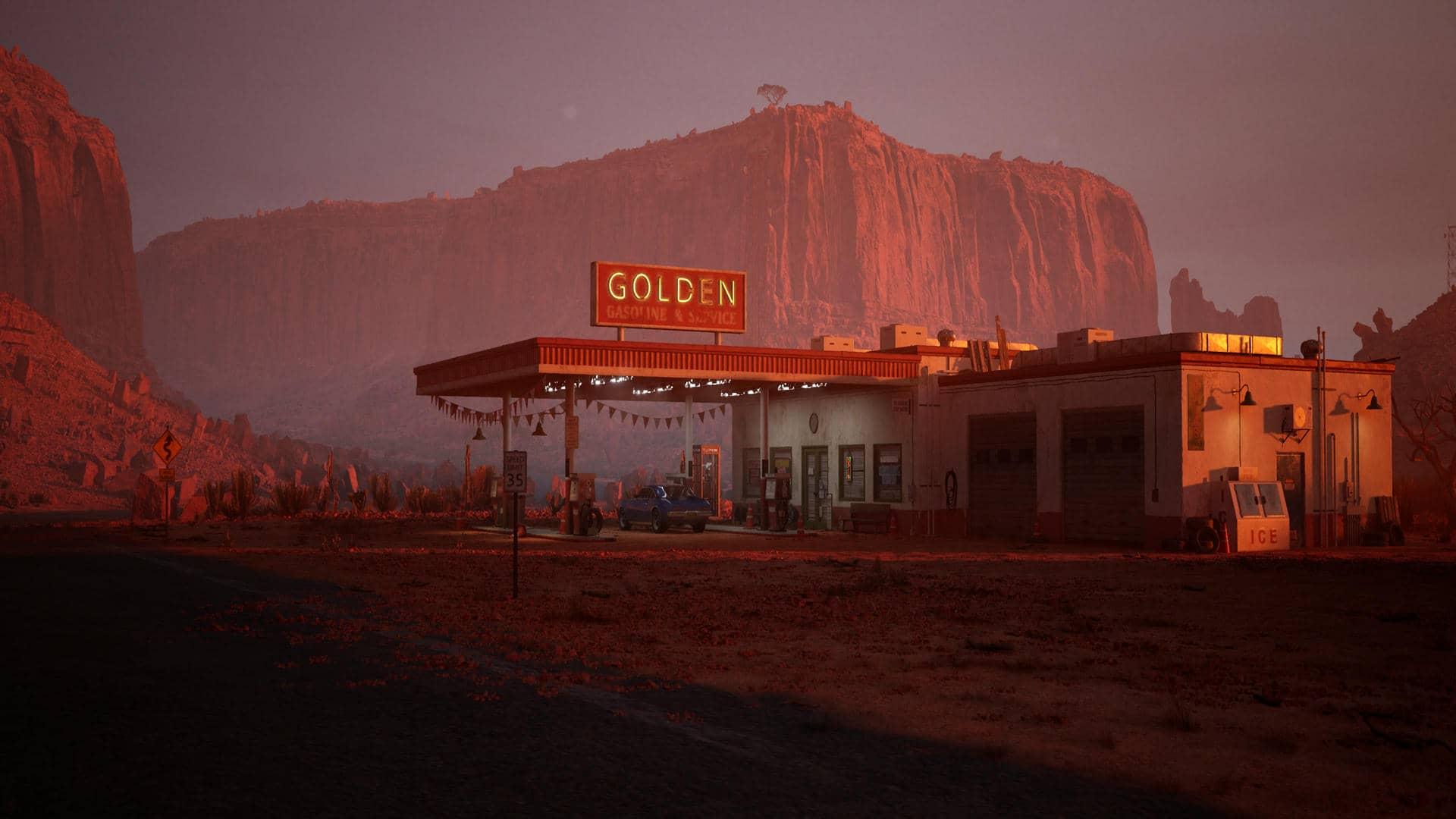
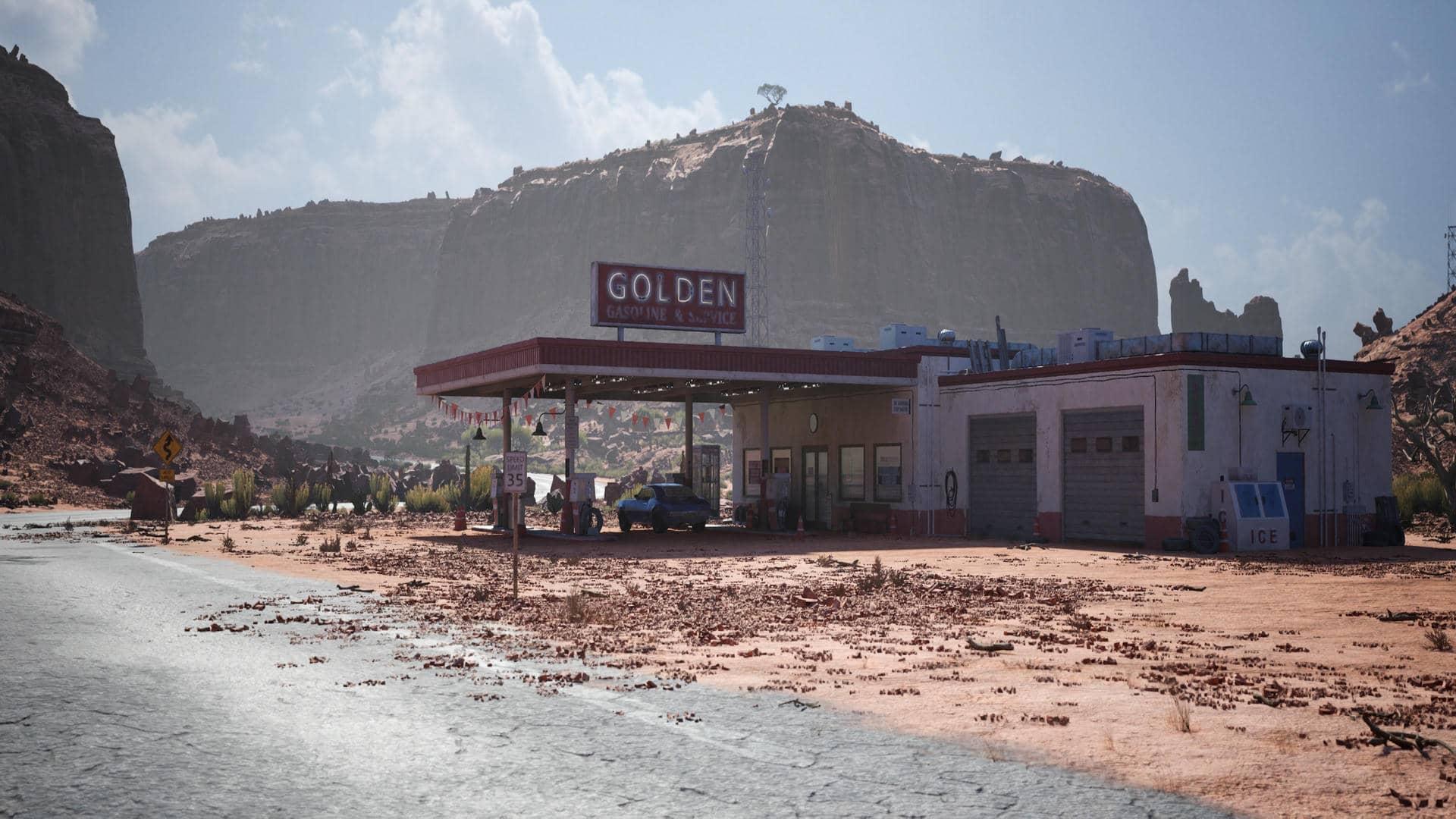
2. Overview: Hey, everyone. Before we get
the tutorial course started, I just wanted to
mention to you where I got the assets for
the environment. These assets will
not be included in the source files
due to copyright, but you can find all of them
on the Unreal marketplace. Let's get started with
a desert environment. Real Biomes was kind enough
to sponsor this environment. You can find it by
searching for real Biomes, desert cliffs on the
Unreal marketplace. Next to this, we
also want to thank Decogon for sponsoring
their diner environment. You can find this one by
searching for Reno's diner. Finally, we use two
more asset packs. The exterior for the diner is from the Pack Rosie's diner, and the gas station is the desert gas station
by Joachim Stikon. And that's pretty
much it. Of course we're using UnwilEngine five, so you can use the built
in Quixolmega scans if you want to get
any assets for free. And also, you can find a lot of free assets in
entire environments, even on the Unreal marketplace
if you're on a budget. So now let's get started
with the course. Hello, everybody.
Welcome. And thank you for watching Fast
Track Tutorials. My name is Tilman Milder. Some might know me as Dereos 51 from the
Lighting Academy, and I will be your instructor for this little
lighting journey. If you're interested, what
I've done over the past years, feel free to check
out my art station. Right now, I'm a lighting
and art director at Electronic Arts. I'm more in, like, a global
tech position right now, working on internal projects. And I worked at Dice before
doing Star Wars, battlefield. I live in Finland now
since I worked for a year about for remedy working on Alan Week two and
some other things. And I've been quite around a
bit in the industry so far. Like, I started around 2010 by doing a school
for video game art, and I got a first
job at a studio in Berlin as an
environment art intern, then started developing
different skill sets there, going into tech art, doing a lot of
vegetation related stuff and terrain stuff and sky stuff. And ultimately, really, like, my biggest passion is making beautiful pixels and also making the way to get
there smooth and easy, which is why I like to work
a lot with the tech teams. So for me, lighting
art was kind of always like the thing I
wanted to go towards too. And I like it always
sounds a bit pretentious, but what we're going to do in these lessons or in this
course is we're going to, like, tackle lighting from
quite a holistic perspective. That's how I like
to think about it. I won't talk too
much about it now, but it will become more clear, and I will mention it
throughout the course itself. And to give you guys
a quick overview, the first thing
are we going to do is we're going to just do a very simple you can
already see it here. Super simple scene,
which is going to go through some real basics of how lighting actually works in games and the different components that we can use to
create lighting. Also, I will draw some very, very bad looking things in paint because it helps me to illustrate some
of the concepts. So please get mentally ready
for bad drawing skills. We will be doing
this in Unreal five. I thought a lot about this
before because, like, Unreal four is actually still
more stable in many ways, and the techniques there
are like battle proven. But then again, yeah,
Lumen is very, very, very exciting, and it
works really good already. There are still a few
issues here and there, and we may actually run
into a few of these. So please just bear
that in mind that like some things they can be
a bit wonky or broken, and that is just the
nature of Unreal itself being very new like
UnreelFive at that. There's a lot of stuff that is really polished
already that also came kind of like straight
over from Unreel four. But I think it's
exciting to look at all these things in a new
framework like UnreelFV and also obviously
take advantage of all the new bells and whistles that the
technology comes with. So yeah, in the next lesson, we'll do like this
first introduction to all the different tool
sets that we can use and also how lighting
actually works. Then we will in the
future lessons, we'll do some prop lighting. I guess, it's quite interesting for people as
well that just want to, you know, up their skills of, like, how to actually
present their work. I think it is very,
very important. We will also and I will
talk about this a lot. We will try to teach
our brain and our eyes. We will learn how to see things because especially in
portfolio work as well, it's really important
that you can be very self reflective and that you can really see where
problems are in your own work, and that you can also look at real reference, for example, and you can just understand why something looks
the way it does, which is ultimately
incredibly valuable tool for us to replicate things. So very important
for portfolio work. So we're going to do
some prop lighting. We're going to look into some character lighting and really important also here
to understand with these topics is that a
lot of these things, you know, this is
my way of doing it. It is not the ultimate best way. It's not the only way everybody has their own
way of doing things. This is just like how I like to work and
approach my work. And also, like, for example, with the character
light setup, you know, you can go so many
different ways that are also very dependent on
the content that you use. You can have, like, a
very poppy presentation. If you have stylized
characters, you can do, like, some really cool,
like, you know, like blizzard character
stuff where, you know, the character is presented in different poses with
weapons and, like, cool backgrounds or you can
choose a more muted approach, be more like a
photography approach or like a portrait
picture approach, even. So there's many, many
different ways of doing this, and this is by no means
the way to rule them all. But I think what will be really important for
everybody that is watching these courses is that it's
about the techniques a lot. It's about how we
approach things, and that can be mapped to anything that you want
in the end, actually. So, you know, just
take it as this. And when we've
gone through that, we will finally tackle a really big environment
where we have outdoor area, large outdoor open world
ish kind of thing. We do have some interior. We do have some characters in there, because, like, for me, it was really important to not, like, teach you like, This
is how I like an interior. This is how I like an exterior, because I know that there's, like, a huge difference
between doing portfolio work and doing
actual video games. But I think what people quite
often struggle the most with is the connection of
bringing things together. So this again, feeds into the holistic kind of
approach that I really like. Is like I don't really like to build things too
much in isolation, because at the end of the day, we're not necessarily just making beauty shots
for rtstation. We're probably
going to end up in a video game studio working
on an actual product. And you will see that a lot of the approaches that I have come from
production experience. And I am absolutely not against doing certain things that are
basically only vital for, like, portfolio purposes,
but you will just, like, recognize in how I
approach things that it is a bit more of like this
production driven approach where I'm kind of I'm
seeing the bigger picture. I'm not just looking
at, like, you know, the perfect little
corner because I kind of want all them
corners to be perfect. And I'll show you smart ways
where we can also achieve very high quality across
a very big set of content without having to
feel like we're dying because there's too much
like little polish or small things or
stuff like that. So yeah, with that
out of the way, that will be the sort of, like, way we will
handle this course. And well, I guess we should start with the
first little real thing. So thank you so much
for watching this and see you in the
next lesson. Cheers.
3. Fundamentals Part1: All right. Here we are now
with the first lesson, where we're going to have a
look at the absolute basics. But please really take this in because I know it
always sounds so boring, but these fundamentals will elevate your work
because it is really about understanding a lot of these core concepts to
a high level, right? So you can actually really
understand what's going on. So even if it may
seem boring at first, give this stuff a shot. It's good information. But before we jump
into anything, there is a bunch of things
that we need to set. Usually when you
start Unreal five, it should automatically already
run in direct X 12 mode, and lumen should be the
default lighting solution. So we can just go into the project settings under
the rendering tab and we can just make sure that everything is there
in a correct way. So we can see here our dynamic global illumination
method is set to lumen, perfect, reflection
set to lumen perfect. I don't have
hardware ray tracing turned on for Lumen because it was completely busting
my performance hardcore in the outdoor levels. So we'll see how
we go with that. I do keep the software ray
tracing in detail tracing. So what that means is, and I'll show these
things also later on is that Lumen uses simplified objects to trace the lighting
calculation against. They're called distance
field measures, basically. Every object has
a representation of that simplified thing and that one then basically logs down into
a world representation. The world representation is a lot more loss than the
object representation. And when you switch
this to global tracing, it will basically use
the lows version, and when you have that
on detail tracing, it will do way more accurate
calculations, so to speak. And for now, we're going
to leave it at this. So it may actually
be that per default, the shadow map is
the shadow map. But what we're going to
do is we're going to use the virtual shadow maps, and I will explain what
all that stuff is. So no worries here. I do have support hardware
tracing turned on, and that means that
I can decide per object or light source if I actually want to use any
ate tracing features. And this will come in
handy at some point, which is why I
have it turned on. And these ones here, they're all turned off because those are the settings that I kind of want to tweak if I want them to. I don't want this to just
generally be there. All right? So one important thing
when we go down here, we have some default settings for our host process volume. And here this value, the auto exposure bias. We're going to set this to zero. And that is all going to make a lot more sense later
on, but trust me on this. We set it to zero, and
then so here's the thing. Unreal uses a sort of like
a camera exposure system. And one important thing
to understand about lighting is that potential basically saying everything
is kind of relative so the values of the lights that we use
inside our viewport, they are relative based on
what the camera exposure is. So we can basically have a
light that has an intensity of five and we can make
it look a certain way, and then we can
have a light that has the intensity of 5,000, and we can make it
look exactly the same as the light that has
the intensity of five, not next to each other, but
like exclusively basically, because all these values are
relative to one another. So per default unreal basically uses,
arbitrary values, right? And you may have seen a
lot of videos where, like, someone sets the
exposure to, like, one and one and locks it in and then just does
the lighting like that. And that is one way of doing it. However, I'm a very huge fan of using something that is
called physical values. And physical values
means that we can actually feed in values to our light sources that are based on what we can
measure in the real world. So, if I'm just going to
move this away here and I'm going to go to my
light menu and I'm going to feed in a
directional light, and this one is kind
of like the sun. So now we can see that we
clearly see something, right? But this light has an
intensity of ten lacks. Ten lacks is pretty much
like nighttime lighting. On a very sunny day, the sun actually has an intensity 85100-20
thousand lacks. So the problem is
that per default, the exposure system and unreal does not really work
well with these values. So what we need to do is
here in the search tab, we type um nins and I've
already checked this, so you find this thing here, it's called extend
default luminance range in auto exposure settings. And again, I will explain this further down the
line, but, like, you know, just hit this box, and then
we're actually good to go. Cool. So as you can see, we have our little scene here, and it is absolutely
completely dark. We can go to unlit and then we see that we actually
have something here. So let's give this
a first look here. So, first off, we
have a point light. And as you can see, it is a light that emits into
all different directions. And we obviously do have
some shadow casting here. And actually, let me quickly
bring up the options again because we'll need them so I can show you
something down the line. So point lights are something
that is quite often used. However, one thing that
everybody has to understand, and that is, again, this comes from a production point of view. If you have a shadow
on your point light, it's actually going to
be very, very expensive. Because the shadow that is
being cast is a texture, and it needs textures
all around the light. So if I have a point light
here and we're going to add, whoops, we're going to
add a spotlight here. So you can see that the
spotlight clearly has, like, a direction that
it points towards. Point lights are also
sometimes called omnidirectional lights
in other tools. So you can see here now, this is very focused. So like, we have our shadow
here from the spotlight, and the shadow is just like
cast in this direction. So, however, now, please, yeah, forgive me for
my drawing skills. So the reason why point
lights with shadows are actually so expensive is because what happens is a point
light shadow gets calculated as if there is a cube
around the point light. So we have our
beautiful cube here. And the point light is
kind of like inside here. And now imagine that on each side of the cube,
we have a spotlight. So one spotlight faces
in this direction, one spotlight faces in
the front direction, one spotlight goes down,
one goes over here. And so basically we have six spotlights that go
in all these directions, and that is how the shadows for a point light are actually
being calculated. So point light shadows are as expensive as having
six spotlights that also cast a shadow. Now this is very important
to understand because in most games or other, like, work, you
will actually see point lights being used
without the shadows. So you have to be very
smart how you use them. And quite often, what is being done is that point lights are being faked by, like, you know, let's say you have
a wall lamp and you want this wall lamp
to cast shadows. So what quite often happens is that people basically
take a point light, rotate it downwards, then they take the
point light again, and I'm duplicating this by holding Alt and dragging
it so I get a second one. And then they just
point that one upwards and then they put
them kind of like together. And when you have these both
lights selected, you know, they choose like a rather
big angle kind of like this. And that is quite often how
you see point light sort of behavior being faked because
it is still a lot cheaper. But in any case, so we have
point lights that we can use. We have spotlights
that we can use. I will refer to these
type of lights as also local lights because these are lights that we place
in the environment, right, that we use,
like, you know, as a lamp fixture
or stuff like that. So these are local lights. We also have another
type of light, which is the rectangular light. And this one is very interesting because when you look
at the point light, and if you see me
just like putting it down here and actually, let's open up this material, and I just have it here, and we convert this
into a perimeter. This is my roughness, because right now we don't really
see the reflection of this. So if I save this and I'll adjust the
roughness of screen, you will see that we start
getting a reflection here. So the thing is in reality, there are no point lights
really because there is no infinitely small light
source that just emits light. So in reality, these lights, they always come from
a certain shape. And we do use point
lights a lot for, let's say, for example, a light bulb or something
like that, right? But even a light bulb
actually has a physical size. So the thing is
evaluating lighting from a point is very
efficient and very fast, and it also is more efficient
for shadow casting. But as soon as we
ping this guy in, this is actually an area light, which is something very
common, like, for example, if you have a neon
sign or your TV, that is where light is
emitted from an area. So you can see that when
we increase this area, the same way our reflection
increases, right? So now let's have a look at something if I
doesn't like that. So I'm just going
to turn these off. So usually, when the bigger
a light source gets, the more soft the shadows get. So you can sort of see
something like this here, but you can also see that it's
like glitching out a bit. And the reason for that is that soft shadows are,
again, very expensive. And in Unreal four, we don't have the
virtual shadow map. We have only the shadow map. And as you can see, that this is the shadow
that we usually get. So no matter how big that
light source actually is, you can see that the
shadow always stays sharp. And that is not very realistic. So what Unreal five now has is this beautiful thing
called virtual shadow map. And a virtual shadow map, it can sort of simulate that effect
of the softening from, like, a bigger light source. So it kind of, like, can do that, but it has limits, so you can see that it
feels glitchy here. This effect is what we actually call and refer to as Penumbra. So that is the penumbra
of the shadow. And it just, like, makes stuff look more realistic. But again, it has limits, so you can see when I decrease the size of the light source, it actually becomes
more accurate. And this whole thing is where tracing actually starts
to become a good thing. So if I go into
these settings here, cast ray traced shadows
and I set this to enabled, now you can see that we get
fully traced soft shadows. Now if I take this light, and I just make this
like super big. You know, this is like a super
big softbox lighting now. Like, look at this. So this is like this is super accurate
now how this shadow looks, but we cannot really do this with techniques that are based on texture maps
for the shadows, which the virtual
shadow map still is. But it does come in very, very handy to use the
Virtual shadow map as long as we don't go too nuts
with the size of lights, and the virtual shadow
map is actually really good for outdoor
lighting as well. So another interesting
thing with these, like, local lights is is that we can actually tell these two lights here also to be sort
of like an area light. So if I turn this one
off and I go back in here and I do affect world, I'm going to turn on
the shadows for now just because we can see
it better that way. So the cool thing is
that we have here, we have a source radius, let's ignore the
soft source radius for now because that one is basically something to
fake certain things. And we have a source length. So the source radius basically just turns
this point light, and let's have a look
at the reflection too. It basically turns the point
light into like a ball. So it's like a glowy ball now. And you can see how the shadows actually soften the bigger
the light source gets, which is, again,
very, very accurate. So if we would like to
do a neon tube light, what we would have to do is we would have to give
this ball some size. And let's make a super big tube. And if we then basically
crank the source length, I don't know why per default
is rotated like that. It just kind seems like
a little bit like, I don't know, I think you
would want it like this. So you can see now that
if I give this, like, a thickness of maybe five
and just crank this. So now we have a really
nice neon tube light. And the same thing can
be done for this one. And the good thing
is we also have a source length here
because remember, when I said that point
lights are really expensive, especially when
they cast shadows. So if you want to have a
ceiling lamp where you have where you have a
ceiling light tube light, we can actually take this
one and it can have shadows. And then we can just really Oh, I was tweaking the
soft source radius. Good me. Sometimes these
settings are a bit confusing. So we can do this, and
then we can do this. So now we can basically
get our neon tube light, but we only cast
shadows downwards, which makes this like we get the nice specula
that looks proper. We get a good distribution
for the lighting, and we still get rather
efficient shadows. So these are the basic light
types that we can use. And one important thing
to know is up here, we have this mobility thing, and we can do static,
stationary and movable. So since we're going to be using lumen for all of the stuff
that we're going to do now, only movable works, actually. I mean, the light still kind of works when it's not movable, but when we do shadow casting, we potentially get some text in the shadows
that says preview. So the thing is this, Movable
lights are fully dynamic, and lumen is a fully
dynamic lighting solution. So it makes sense to use
the lights as movable. Stationary estatic is used when you want to
bake your lighting, which is then basically
a static lighting that cannot change at runtime. And if I would
bake this lighting now and I would move the cube, the shadow of the cube
would just stay there because it's baked into a
texture that is on the object. And we're not really concerned with these
two light types. And again, it's a
little bit interesting that when you drag the
lights in per default, they're always on stationary. But it's really important
that you make sure that you just switch them all to movable because that is just what
we're going to be using. So before we look at
the other light types, one of the key concepts about lighting that is
very important to understand is actually
the difference between direct lighting
and indirect lighting. And for this, I am going to use my advanced
drawing skills again. So when we have a ground
thing here, for example. And we do have a little ball
here, very beautiful ball. So what we refer to as direct lighting in a video
game engine is basically, let's say, I have my
light source here. It's a spotlight, okay? So it's kind of like
pointed like this. So the direct lighting is what we mean by
the ray of light. That is the first ray
of light that is shot, and there's many
of these, right, because there's going to
be a lot of these rays. But every ray that is the one that comes from the light source and
then hits the surface, that is the first ray of light, and that one is
the direct light. And this one is the
cheapest to compute. So that one is actually the
reason that if I'm going to do let's get some things going in here so I can
illustrate this better. I'm going to take a post
process volume here just now. And down here where we have the global
illumination method, I'm just going to
set none for now. And what I'm also
going to do is, I'm going to go to
my content browser, and in the settings, you can say, show
engine content, and then you get
this folder here. And then when you
just type in sphere, we can get the
editor sphere here. So let's just take this guy, and then we're going to get
the material from the cube, and we're just going to throw
it onto the sphere as well. So now let's illustrate this quickly because I think it just makes it a lot
easier to understand. So I'm just going
to revert all this. I'm going to put my light here. I'm going to do it like this. Also, I will bump the roughness back up to one.
It's a bit easier to see. So when I hit this, you can see that there
is basically no, like, lighting, basically,
everything that is hit by the first ray
receives lighting, but everything else is
page black, so to speak. And that is because we don't actually have indirect lighting, and indirect lighting is what happens when light
bounces off the surface. It's basically the secondary
ray that bounces off from the surface and hits
this surface and then bounces back to
the surface again, and it just basically
creates all these bounces into many different
directions, right? That is what gives
indirect color to objects. Let's say, for example,
if this floor would be red once the light
hits the floor, then the bound lighting or the indirect lighting
would become red, and it would put red
onto the sphere. So this is what we call
indirect lighting, and it is one of the most
expensive things to calculate. And thank God we
have Unreal five now because here we
actually have lumen, and it actually didn't
really switch anything, which is absolutely fantastic because I was trying
to prove a point, and I was already seeing that
there's some values here. So, we can actually see that there already is bound sliding, but it would basically
be completely pitch black. I thought
we could do that. Well, it is what it is. It doesn't really switch. So, if I would go in now and take this material
that I have here, and let's say we just, like, duplicate it and call it, red, and we go in here,
we delete this guy, right click or let's just we hold the three and
click this so we get a color. And then we right
click it and we say convert to parameter and
we just call it color. And the reason why I'm making a parameter is so I
don't have to, like, recompile the shader
all the time, but I can just tweak the color and it just
automatically updates. So I'm going to
browse this material. Too many windows. And I'll just direct this onto the floor. And now, what I'm going to do is it's going to be off
screen, so sorry for that. I'm just going to make
this like super red. And now you can see how the lighting actually
bounces off to the sphere. So that is the
indirect lighting. And luckily we have now
technique called lumen, which basically calculates
this indirect lighting for us, which is very, very nice because things look just so
much better and more alive. We'll go later into this,
but at the same time, this very accurate bound
sliding simulation is also very important
because we need to choose our colors
wisely for the objects because it can be there's
unrealistic values. Things can be too dark or
too bright or too saturated. So that is something
to keep in mind. So now, this is all for, like, localized lighting, right? So when we have, let's say, a sunlight, things change a bit. So this is the
directional light here. And now you can see
it basically it comes just from one direction,
but it doesn't have, like, the things that, like, the spotlight has with the cone and also the shadow doesn't
feather the same way. And the reason for that is the sunlight is
something that we call, like a parallel light. And that means that the rays from the sunlight are
not emitted like this, for example, from a spotlight. But the rays from the sunlight, they are actually
emitted parallel. So they all come parallel. And the reason for that is even though we have
the source as the sun, it is just so far away that we don't get this
feathering effect anymore. So we call it a parallel
light and it just, like, works when we drag it in and it just
hits everything like this. It doesn't have a distance or anything like
that. It's just here. So when we look at this, we can see that, like, Hey, we do actually
get a little bit of, like, red bound sliding. But the thing is
that is usually not enough when we just look at
what happens in reality. And there's a lot more lighting. Like, stuff is not like this dark in real life on
where the sun doesn't hit it. And that is because we have one of the most
important light sources, which will also be one of the most important
light sources for our work here in unreal in, like, video games or,
like, lighting in general. And that is the sky. And the sky is absolutely fantastic because what the sky does is, let's do this again. So here we have
our little sphere, and the sky is what we call a hemispherical light because
it's basically simplified. We have the sky around us. So what happens is
that the sky shoots rays from all these
directions so it is a super, super huge diffuse light. And by diffuse, I mean, is that the shadows
that the light creates are very,
very, very soft. So, if you go out
on a cloudy day, you have no sunlight, you'll see that all the objects, they do get like,
you know, this, like, very subtle shadowing underneath them because the
skylight doesn't hit there, but everything is kind
of like lit evenly. Which is why people
that do a lot of photo scanning for assets
and stuff like that. They tell you, go
out on a cloudy day when you want to
photo scan rocks or trees or stuff like that, because the lighting
is going to be very, very soft and what we
call non directional, because it comes from
all these signs. Now, the thing is also
that when you look at the exterior, if you're not, like in the middle of New York and you just look
at another house, the sky is also one
of the things that is almost always kind of
50% of what you see. Or I mean, like,
you know, if you're very depressed and you
just look down all day, then you may not see the sky. But generally speaking,
right, when you look at, like, forward, the horizon
line when you walk, like the sky is always there. It's very prominent. And the sky has a huge dynamic range of
lighting intensities, and it creates
just crazy colors. So like, sky is pretty much the most important
light source in our world. So what we can do
is we can go to the light step and we can
actually add a skylight. And the great thing is
that nothing has happened. So why is that? Why
has nothing happened? So the skylight can do
two different things. First of all, I'm going
to set this to movable, and I'm actually going to
set this to movable, too. So even I forget
this all the time, because it's just
kind of weird that it is stationary, yeah. So the skylight can do
two different things. It can either
capture the sky that is around the level and use that as a light
source for the scene. Sending rays exactly as
described in this picture here, or you can actually feed in a cube map that is going to
be projected on a sphere, like we don't see the sphere, but it's basically the cube
map is like spherically projected around the whole world and then used as lighting. So what we're going to
do is we need to first create ourselves a sky dome
that the skylight can sample. We will look at this one here, which is the specified cube
map where we can feed in the cube map here when we
do the prop rendering. But generally speaking, I use the captured scene because
I'm mostly working with, like, proper
environments where I actually do want to have
a sky as a backdrop. So what we're going to do
is we're going to take this beautiful sphere here.
We're going to duplicate it. And now we're going
to search for shadow, and you can turn off like this, but I'm a little bit paranoid. I'll turn these ones off
first and then this. And the reason is, I'm not sure if it's still a
problem in On roll five, but he is some weird
issues in OnRul four, where I was turning
off the main switch, and these were still
on and I still got some glitchy stuff with
some shadows being cast. So what we're going to do is I have my neat little
lighting folder here. So we're going to create
ourselves a Skydome material. So we're just going to
do M underscore sky. Let's call it master as well, because we may actually create instances and flip stuff around. So we open this guy
and on the root. So if you don't see the root, you just click empty space
or you click the root. We have a bunch of settings. And the first thing
that we're going to do is we set this to unlit. The next thing that
we do is we're going to set this to two sided because we actually will
end up inside this sphere. And if we don't set it to two sided, it will be invisible. So the next important thing is, and this is one of
the best tips I can give to anybody regarding
lighting stuff. You always want the
biggest collection that the world has to offer when
it comes to sky textures. Like, seriously, this
is just a fraction, but, like, I have so
many of these, like, images laying around
because they're really important and they're
fun and they're good, and you want them
because they make things look good and they're
awesome to work with. So you can honestly never
have enough HDR images. One important thing here, usually when you
download HDR images, they're mostly in
the actual format, which is dot HDR. Those ones are being
considered as cube map, and they can be used for the skylight to be fed into
the specified cube map thing. And when you put them
inside a shader, you need some projection math to make it appear correctly, and you need some more math to be able to rotate
the sky texture. I really dislike that workflow. So I figured out at some
point when you do just open the texture in Photoshop and
you save it again as an EXR, once you drag this in, it actually is a
proper texture sample. And the reason why I'm using
the editor sphere is it has the perfect UV layout where that texture just
maps onto perfectly. I'm going to hold M and click, which creates this
sweet little multiply. I'm going to connect this
into emissive color. I actually going to right click the texture sample and say
convert to parameter as well, so we can change
this sky text, sure. Now I'm going to hold S, which creates a scalar
parameter for me and I'm going to call
this brightness. Bloop. And we're going to feed this in
and we're going to set the brightness to one. And now you can see we perfectly have matched
our sky dome onto this. Gonna hit Save and browse
so we have it ready, and then we hit the sphere, and we just put
that guy on there. So now, interesting thing, the skylight has
this thing here, which is called sky
distance threshold. And this value has
caused confusion to many people I know
because basically, what happens is, let's assume that we have our
skylight here, okay? And the skylight is
going to look into all of these directions and then capture the image to create the lighting that will then be used on the dome, right? So let's imagine that we have
some mountains back here, and then it goes like this
and some more mountains, and then some trees, very beautiful trees here. I'm not going to make
them green for you. And we obviously
have our sphere. So what happens is that the
skylight sees the tree, it sees the mountain,
it sees the sphere. So it captures a lot of stuff in there that we may not
actually want to have there. This becomes even
more important when we actually going to
use a procedural sky, which we're not doing right now. We'll get to that when we
do the outdoor lighting. So what the distance threshold
is, it basically says, ignore everything in a radius of 150,000 units and just
capture everything behind it. So what that means is
that you either need to have this sphere bigger
than this threshold, or you need to lower
the threshold. Otherwise, the skylight won't actually see what is
happening on your sky. So what I usually do, I'm going to hit
the lock on scale, and I'll just type
15,000, and there it is. And now if I go to my directional light
and I do effect world, so we can see nothing
has really happened. And the reason for that is
because the skylight does not automatically capture
and update every frame. You can do that if you choose
the real time capture, but the real time
capture does not consistently work with
a static sky like this. It works when we use the
sky atmosphere system, which is a simulation of
an actual atmosphere. So what we need to do is
we need to either change a value on the sky so it
kind of like recaptures. We can hit effect
world and on off, and now you can see
something happened. We can scroll down and hit
recapture or we can go to build and we can say Build reflection captures that just does the same thing. So one thing that I also like to do for my
skylight is I like to increase the resolution to at least 512 because
then it sees more details of all
these little things because if the
resolution is too low, this cloud might
just be one pixel, but you can see that the cloud here is darker than it is here. And that is actually what
I meant when I said before that skies are so beautiful because they have all
these different values. So if your resolution
is too small, this whole thing may
just be one pixel, and then you don't actually get the difference between
the brightness. And you could also
see that the lighting has changed like if I go back to 128 and you can see it
let's make it really bad. Well, this is actually great. We're not really seeing that
much difference. Good stuff. But I guess that's also because
of lumen because lumen is real time and Lumen is not as
precise as static lighting. So if you would do some
static light baking, this resolution has actually quite a big impact on the
quality. There you go. Now you can see the bump. I just got more accurate. So this is our skylighting,
and as you can see, really what I said before
is happening, right, where the lighting comes from the top and from the sides and the object just slightly
occludes, right? So if I would just duplicate
this and make it gray again. So you can see how we, like, get this occluded here. So this is now
occluded from the sky. And we basically get the super soft indirect shadows
from the skylight here. And then in combination, we can bring back our sun and now we have the
best of both worlds. So we can see like stuff
is still occluded. But we also do get
the bounces here. We do get the bounces on the
ceiling as you can see here, where like, the light just
bounces off onto this stuff. So there's a lot of nice
stuff happening here. And now you can see
stuff gets bright, and this is all the
exposure related things. So that is something that we'll look at in
the next session. But for now, these
are pretty much the absolute basics about the light types that we have
and what they're doing. All of this would have
been a little bit more painful to go through if we
wouldn't have had lumen. So it's actually really nice to finally have some dynamic GI because all the
indirect lighting before had to be
static and baked, and it, like, could be really cumbersome
and there's a lot of stuff to take
into account to get some nice light bounces and some proper quality and
all these kind of things. So I think that all of you that just jump into
this using Unreal five, you can be so happy because you don't have to go
through the hoops and all the bad stuff that was a very big
thing in the past. However, this is what you
have to be really mindful of. If you decide to become
a lighting artist or work with these things
and you end up going, working in a game studio, or maybe you even are working
in a game studio already. Let me tell you that this is definitely not what most people are using right
now to make games. Like, it is coming slowly. But again, even though Epics
OnRelFV is production ready, I don't think it is if you don't have
an engineering team. So if you have people that can fix things like
programmers and stuff, so if you are working
in the industry, most people still actually
work with solutions where the indirect lighting gets
baked in many different ways. There's many technologies
that do this. But like real time GI, even though it's kind of here, it is not most likely not what you're going
to end up using at a studio. So sorry for destroying
your dreams there. But anyways, very
fascinating technology pretty smooth to work with. And yeah, I've been
brabbling for long enough. So thanks for watching this. I hope it was still interesting for you guys and for everyone, like, even though it was, like, you know,
very, very basic. But we're just going to keep
scaling it up from here. There's going to be some
more things that we will have to look at regarding
whole sky stuff and exposure. But again, I'm not going to
do dry breakdowns of these. I will explain these things in a better way when we actually going to work
on some real content. So with that said, see you in the next
lesson. Cheers.
4. Fundamentals Part2 Exposure 01: Hello and welcome, everyone
to our next lesson. So last time, one of the
things that I explained is that the sky is one of the most important light
sources that we can use, and it has a very, very big impact on what we get and how
our scene will look like. So this time around, I want
to go into another topic that I would say is actually even more important
than the skylight, because it's something
that is incredibly fundamental to how we render images and how we
perceive the world, not only as people in real life, but also as gamers
or digital artists. And what I would like
to talk about now is actually cameras and
exposure in that sense, because rem remember that
earlier in the first lesson, I said that some of the relationships that we
work with digital lighting, they are actually sort
of like arbitrary. So they are relative
in many ways where we can like the example
that I gave was we can values that are vastly
different from one another, but we could actually
make them look the same. And that is a very interesting and super important
concept to understand. I also think that even though it's a little bit more on the
technical side of things, it is actually
something that will make your work stand out if you understand
these concepts. In the beginning, it might
be a little bit more hard to follow through with these ideas or to constantly think about
what might be right. But at some point, it will become very natural and
you will just sort of like feel what's right
to a certain degree because based on
all the experience that you have accumulated. That is actually something how it works for me these days. So, I have a lot of
the numbers kind of, like, in my brain already. I do know a lot of
the relationships, and I've worked extensively
with these systems. So for me, it's way
more creative now. And when I started learning it, it was a bit more technical. But when you have the
technical aspects down, it actually becomes something that is incredibly creative. So let's jump right
in with that. And the first thing that I would like to show you
and that is very important to understand is something
that I actually found here is a pretty good
illustration here. And if I just zoom in a bit, so one of the big problems that exists within the
realm of lighting and digital artwork is basically
the difference of how the human eye sees light and
how a camera sees light. And these things are
fundamentally different because the camera is
basically just raw data. And that is also
how our eyes work. Like our eyes sample data. The big problem, though, is that we have a brain, and our brain does something
with that information. And that is also
fairly interesting because when you
take photos with, like, a normal camera,
like, you know, like a DSLR or
just like another, digital camera, like
a small camera or even a camera that
uses old school film, it looks vastly different
than what you, for example, can see on an iPhone
because iPhone actually has some smart software in the back that does something. So iPhone actually alters
the images when you take them because what they want is that when you take a
picture with an iPhone, they want that the picture looks sort of like what you saw. And so it matches the memory that you have of
when you took the picture, I was like, Oh, this
sunset it looked so good. And that is actually
because, again, there is smart tech behind it, so it's sort of like a
brain in a certain way. And the thing is that human eyes have a higher dynamic
range than a camera does. So like, you can see here,
like a compact camera is 5-7 stops of dynamic range. DSLRs can be higher and
then we have the human eye, which is 10-14 stops. However, we have
the brain aspect. So here you can see
the image on the left. It's like if you would focus your eyes on the horizon
line in the sky, that is kind of like
what you would get. And if you would, like,
focus on the foreground, and by the way, these also match what you would get with
photography, right? So, you either expose the image so that the sky has nice colors
and nice values, and you usually end
up with something dark here in a sunset. Or you expose for
the foreground, and then the back will
just blow out completely. So the thing is now our eyes constantly adjust for
the different values, and then our brain actually creates the
image on the right, which is sort of like very
balanced and very natural. And the problem is that
cameras just don't do that. So like, when you work
in a cinematic way, then you have to
make a decision if you want to work really more
like how a camera does work, or if you want to work more with how the eye
perceives things. And we can use these light units that I
mentioned in the video before. Where we can use actual
physicalized units. And then if we use, like, proper camera exposure
settings and stuff like that, we actually run
into these issues. And so some games
decide to narrow the range and all these kinds of things to bring
it more together. Like for example, when you
have a competitive shooter, and you kind of want to be inside and see the
outside properly or you want to be outside and you want to see the inside properly, so you can shoot people
quickly and make decisions because you
have good visibility. So these games usually
work with, like, a compressed or condensed range. And to sort of, like, illustrate what that means, I'm going to draw
something beautiful again. So imagine like over
here, we have, like, super pitch black,
and then over here, we have, like, the brightest
thing that you can imagine. And that does not even have
to be like the sunlight. This can be like I don't know, like some weird
like star exploding in space and just creating the brightest flare
that you've ever seen. So, now the thing is, is that our human eyes then basically like see let's
make it like this. Let's say, on the left there
is like, pure black, right? So let's say like somewhere over here is maybe
like a candle. So candle light is very dark. It's not super bright. And then let's say, over here, we have
bright sunlight. So our eyes now, they can sort of, like, see this range really well. And a camera can sort of, like, only see like this
range really well. And then what that means
is that because we can move our camera
exposure on this scale, if we're in this range, so we see the candle nie, it means that everything that is outside here in this
basically part, it will blow out
and become white. The other way around
is if we would expose for this side here so we can see
the sunlight nicely, everything that is
like, for example, inside a building over here, where the candle is, it
will be almost pitch black. Like we will not see
it with the camera. But since the eyes
constantly adjust and then the brain
computes a final image, the human eye does not necessarily
run into this problem. This is very, very
important to understand. And again, depending on what
type of content you make, you can shrink these ranges. So you can basically
say, like, Well, I will only make the sun so
bright that it's over here. So then these both fit
into the same range. And of course, you will create an image that
is a bit more flat. So there is nothing really that you can do
against that if you do that, but it's like a
conscious decision when you work with
camera exposure. And one of the things that I also want to say
before we move on with this is that nailing your
exposure and your value balance is probably one of the most important
things when working with lighting, like at all. Like, it's usually
when I look at, like, student work, for example, or other people's work where
they're less experienced, oftentimes I see of course, for example, problems like colors being all over the place. That's also a very
common problem. But the biggest
problem that I usually see is that the values
don't feel right, that they feel imbalanced, and they, in turn, don't create a super
pleasing image because it's not
always about realism. Often it's just really,
like what feels good. Luckily, though, there
are a bunch of helpers that can actually help us to nail these things
down because like, first of all, a lot
of this stuff with the photography elements is replicated in game
engines as well. So that means that because we look into the virtual
world with a camera, there's a lot of knowledge that is around there in the
world regarding how cameras work and how
people have been taking photographs for years, and we can leverage
that knowledge. And that is actually very fun
to do. It's very exciting. And also, it helps us to create something more like
pleasing in that sense. So here, I have a scene which is
completely dark right now. And if you want to
work with this too, right now, I chose
one of the samples. So you can just go in here
samples and scroll down. And it is the arquis
interior that I chose. There are a few tiny little
modifications that I made. So the project runs on RTX, so I turned these things off. I removed all the lights that
were in the scene as well. So that is something, you know, just so to be aware of that I did a little
bit of cleanup here. And now the first
thing that I want to do is I want to
start with my sky. And the way that I do my sky is, if I'm using a static sky, I always go to the
engine content folder, and in case you don't see that, you can go to the
settings and you can go to show engine content. And then in the search,
I just type sphere. And somewhere here is
the editor sphere. And we did that in the
last session as well. I used this one because it has the perfect UVs for what I need. So this is a good thing. And then I have my sky
material, again, like this. This is just like the setup
that I chose for now. So before we actually
apply that quickly, let's make sure, excuse me, that we have all the
shadows turned off here. Okay, great. And
then we apply a one, and suddenly everything
goes boom, obviously. So we have our huge light
source in here now. This is one of the great
things with lumen. It samples emissive
materials completely. So like, you do get a
lot of lighting from it. And I really like this here where you can actually see how these little pockets of light go through it and also go into, like, the reflections here, giving you some nice soft reflections from
the trees and stuff. Really, really beautiful.
I like this a lot. So, nevertheless,
though, we need to blow this thing up because it's
going to be our sky dome. So I'm going to do 15,000
with the scale locked, and now we actually have this. And now you can see that kind of not really a lot is
happening besides this just blowing out
completely, right? So now one of the things that we need to do is we need to sort of find a balance
for this, right? And there's a bunch of
ways that we can do this. So if we look at the texture, so I would argue, and we can apply some
exposure bias here. So I would argue that
this is somewhat a well, maybe like 3:00 or something. Like, it's definitely afternoon. Like, it's not like midday
because you can also, if we see the shadows,
they're not super long, but then again, they're also
not like 12:00 shadows. So this is potentially
like maybe 3:00. So we know, okay, this is
like early afternoon here. So let's keep that in mind. And now, if I just find my window again here
with the Exposure stuff. So here is a very interesting
thing that you can find if you search for orders
of magnitude luminance. And this is very very interesting because
what this basically is is someone went out into nature and measured
the brightness, which is here like candela per square meter or what is this? Like, I don't actually know if it's like a
kilo or whatever. But so basically, these
are the candela values. So this is like 10,000 and
here we have the small values. So this is the luminance
for a night sky, for example, which is,
like, incredibly dark. And here you can
already see what I described before
that the ranges between certain things are
incredibly huge, right? So here, for example, we can see that a white
illuminated cloud in, like, full daytime, basically, is
10,000 candela/square meter. Sometimes you will see
a value called KITs, and KnITs is sort of like the new value or how
it's named today, like a lot of displays
and stuff like that. It used to be candela
per square meter, but now they call it KITs, but the actual value
is they're the same. Like if you calibrate
your display to, like, 120 candela, it's the
same as 120 knits. So sometimes you just see
these different names, but candela per square meter
and nITs is the same thing. So now we basically have
a number here, right? And one interesting thing as well is that I told
you guys, for example, that the sunlight in
super strong daytime, it can be like 120,000 locks. It can also be like 85 or 50,000 depending
on cloud coverage, like how the atmosphere is. There's a lot of
factors to this, right? So the idea here is that we create a pleasing
balance between our sky and our sun for a setting that kind of
fits this time of day. And there's a bunch of
different ways of doing this. So the first way is to basically start with
balancing the sky. And for that, I'm
going to just fly out, and we can see that our auto
exposure is adjusting right now because if we go
to the post volume, we actually have
nothing set here. So what you can see
here per default, we're in auto exposure, and some people
really dislike it, but I'm going to show
you how we can tame this and actually have
it do what we want because I honestly
believe that most people that really struggle
with auto exposure, they don't really know
the right tools on how to actually balance it out in
a way that it really works. And I'm also going
to explain to you why auto exposure is actually a great thing if you can
control it correctly. So for now, I'm
keeping it like this. And also, you can see that
the sky is right now, like the emissive value
is so bright that, of course, everything
becomes really black, but also we don't really
have working lighting. So let's consider that, too. But for now, so what we want
to do is we kind of want to look at these clouds here
and then find a spot where, and this is what we also,
like I have to mention, there's some artistic
freedom in this because, like, we can't actually because, like, this is a photo, right? Like, we don't know what the brightness actually
was of these clouds, but we can sort of, like, derive something and be like, smart about it.
So let's do that. The first thing
that we're going to do is we're going to go to show, and then we go to visualize, and then we're
going to go to HDR. And this thing here,
it might be confusing, but it's super cool and very important because it
helps us a lot with, like, sort of controlling our exposure and measuring
different values. And I'm not going to give you guys a breakdown
of this right now. However, what I will say is
we will look into all of this on the fly and we will learn
how to use and interpret it. So right away that
you can see here, I have this little square, and these numbers below here, they actually measure just
what's inside that square. Sadly, I don't know any way to make the
square any bigger. So, I don't know if that
is like a possibility somehow to increase the area
where things get measured. So we'll have to work with this because if
you can increase this, you can get a bigger average of something that you measure. But then again, so here
we can see the knits, which is the same as the
candela per squameters. Here we can see
the lux, which is a totally different way
of calculating this. And then we can also see
what E V 100 this is, and we're also going
to get more into this. So if we remember
that when we look at our data here is that, okay, white illuminated cloud. So that is like 10,000. And then we also have around 7,000 for the average clear sky. So the thing is, this is not an
average clear sky, even though there
is some clear sky, but we will probably not
really reach that necessarily. So one thing that I also
think is important is that this varies a lot
between here and here. So you can see, this is like
an average white cloud, and we can read here
that is like 18,000. And we can also read over
here where we're on 7,000. So why is that, even though they're both white? So the thing is this one
here, here's the sun disk. So this one is incredibly
close to the sun, right? So the values are
super, super high. And if I would just apply some exposure compensation here, you can see that the
values read the same. So the data is always
the same, right? We're just exposing
the image differently. So you can see that
this is still, even though I made the
whole image darker, this is still way
brighter than this one. So here we have to
make a smart decision of where are we
actually going to pick our like 10,000, right? And I would argue
that it's not here. Like, I think, this is
the wrong value here. I think that this is actually a more like,
working value here. And we can see we're
like on 8,000 7,900, which means that over here, we're like on 11
12 on this part. So now what I'm going to say is, actually, I think
that this is good. I think that's great, because the 10,000 is also for
more like a midday. So in the afternoon, it
does get slightly darker, which means that even though we have a white cloud over here, you can see that we are
more like on 45000. And that means that we will
not reach this, super, super high daytime
intensity because that's not what it is
anymore. It is an afternoon. So we will not have the same intensities as we
would have on a midday. And that will also reflect in how much power we will
give to the sunlight. If we would like to change this, however, if we would say, like, Okay, let's make
this midday, right? So we would probably go to somewhere like here
where we can see, like, Okay, white cloud, perfect, but we're
only on 4,000. And the way to change this is to actually open
our sky material, and then we just
crank the intensity. And some people might look
at this value and say, like, Oh, that is a huge number. That feels very unintuitive. And initially, I would say, like, Yeah, I agree. But this is one of the
important things to understand when you work with
more physicalized values, the values can be very large because that's really
how it is in real life, too. So don't be afraid
of large values. It's going to be
completely fine. There's going to be
no problem with this. So let's assume we want to
hit something different here. So I'm just going
to go with 5,000, and we can see we're on 6,000, so maybe let's go like, nuts. Let's do 12,000. And that was way too much. So let's go with 8,000. And now we are on
Is that 10,000? Is that a zero?
Yeah, that's a zero. Okay, so now we're on 10,900, so let's go with 7,500. Okay. So now we have
the sky balanced out, and you can see it looks
exactly the same as before. And that is because
our auto exposure is constantly trying to adjust to an overall pleasing
value for this image. So now it gets brighter because I'm looking at a dark tree, and now it gets darker because I'm looking
at the bright sun. So, the auto exposure is
constantly following along, and the actual value
that I'm choosing here right now doesn't
really matter. So this would be what you could choose if you would then want to go for a stronger contrast
between the sun and the sky. But I'm going to go
back to my 2,500 here, and you can see it got darker, of course, and now the
exposure adjusts again. So I'm going to say, Hey, I'm actually quite happy with being around here
with these values. So here we have the 11,000
in this area, 10,000. Here we have like 5,000
because, again, midday. So I'm kind of happy
with this, right? So now what we can do is like,
let's do the first thing. Actually, let's go
to our skylight and actually capture this data because right now you can see we don't really
have any lighting. So I'm just going to go to visualize for now,
turn this off. And the skylight, even
though it is set to movable, it doesn't automatically
capture these texture changes. And if we turn on
real time capture, it does not work
with the sky like this because real
time capture is built for the atmospheric system for constantly
updating the skylight. So what we need to
do when we alter these values to actually see
what has been happening, we need to old school go
down here and hit recapture. And now you can see
we have something. And what you can also see
is it kind of some of these colors start matching
up with what we see here. So if we look at the shadow side here and we look at
this shadowed side, we're actually starting
to get some values that seem rather close, which is a really nice thing. And now you can see the thing
that I was saying before, like the inside is
completely dark. But however, since I have
auto exposure turned on, what happens if we go in here? So now it actually starts
exposing for this, and we'll get some
really nice stuff, and this might be a
little bit crazy, which is why, again, we need to sort of tell the
auto exposure what to do, as well, because right now, it might be overdoing it. And we also get this
one quick thing that I'm going to
do is because I actually changed
the bloom settings. So let's revert this
and it is very intense. So we can either change the intensity or what we
actually should do is we should change the
threshold because the threshold is not meant
for values this high. The threshold here is actually set for non physical values. So what we need to do is you see even eight
doesn't do it. So what happens if I do 5,000? So now we can see, since
we're using physical values, we need to tell it to
not bloom like crazy with this incredibly high value that we have from
the sky right now. And per default, again, these values are tweaked
for non physical values. So I'm just going to try and find something that works here, and I think we could actually
do maybe like 20,000 ops. So we get a little
bit of bloom still. Now, let's do 18. But yeah, that's
secondary for now. So you can see now
we have this kind of working and there's
some lighting inside, but again, it is
not yet beautiful. So this is the first step of
getting something to work, and I think this is kind of like a really nice way
of setting it up. So we're going to close
off with this lesson here, and in the next lesson, we're
going to bring in the sun. We're going to start actually
adjusting the exposure, and I'm going to show
you a few tricks of how to balance
these things out. So thank you so much for watching and see you
in the next lesson.
5. Fundamentals Part3 Exposure 02: Hello, and welcome
to this next lesson where we continue to
look at exposure, camera values, and how to set up an actually pleasing
relationship for our image. So you remember last
time we set this up. And one thing that I would
really like to illustrate before we actually, like, jump into things is Remember when I said that we can make things look the same, even though we have
different values. So to quickly illustrate, I'm going to go out here and we can see that our
exposure now adjusts. And so if we go to turn
on Mint and Max EV, you may have watched some
YouTube tutorials or videos where basically
someone said, like, you know, I
want full control. I'm going to set
this to one and one. All right? And now the
exposure is locked, and it kind of looks
pretty bad, obviously. So now what I can
do is I can go in here and I can set my
default value to one, and we have this, right? And this basically looks exactly the same as
what we had before. So even though my
intensity is now one, and I would need to recapture
my skylight as well to basically get the same
intensity of the lighting, but we're just looking at
the background right now. So now my intensity
is set to one, and my exposure
is locked at one. But this thing is basically, that is not a realistic exposure value for a
setting like this. So this would be more like an EV value that you would
use for a nighttime. But we can, like, make it work. And this is one of
the things that takes a little time
to get used to, but it illustrates how
the values are, like, really only depending on the relationship that they
have with one another. And one of the most
important things here, again, is that in real life, the differences between
the values is very large, so it makes sense to actually do that when we do our
lighting as well. So we actually do get
these proper differences between the different
settings and, like, interior versus exterior. We get the right contrast
between sun and shadow. So that is very important. So if I just change this again, and put this back to I'm doing
this off screen right now, but I'm just
resetting the value, and we just wait for the
exposure to kick in. Now, how would you know
what is this number now? Because it can go between
minus ten and 20? And the easiest way to find
out what number we are actually sort of locked in
right now is to do this. And this looks like we are on probably like 11 or
something like that. Yeah. So if I would, like, take this and do, like, yeah, like, we're more
here where the blue one is. So we would need to do, like, Yeah, sort of like this. And you can see now
we're locked in, and it is the same as
if we would set this to 11 and just reduce
our sky intensity. And that is what I meant with these values are
sort of arbitrary. However, this will become
a lot more important. So now the question is, how do we actually get our sun in here and
have it work properly? First thing that I also
want to do quickly is, I just want to look at
my room here again, and I want to rotate my sky. And I need to turn off the exposure debug view
because otherwise, I cannot really use the gizmos. And I kind of want that the
sun comes from over here. Kind of like this,
maybe. All right. So how do we actually
get this relationship? So now there's a few
different ways of doing it, and I'm going to walk you
through these quickly. If I take my directional
light, which is off, I'm going to turn it on and you can see nothing has happened. The reason for that
is because right now, my directional light is
actually set to ten lux, and ten lux is literally invisible because of
our exposure being 12. We need to crank this quite
a lot to make it visible. So let's first of all, go into our skylight quickly
and just make sure that we have the latest
and greatest in our settings because
see, we changed this. So, the shadow
didn't match at all because now we're going to have the light coming from here. So now this looks more correct. And then we go into our
directional light And now, how do we know what
value to choose? We don't really. And
also, if you do this, you slide it, like 150 locks. That is completely not physical. So what
are we going to do? Well, we overwrite manually. And we just try stuff. So we can do, like, maybe 5,000. And we're like, Wow.
Nice. Here we go. So now something
really interesting. L, it actually feels like this is not really bright enough if we look at the
surroundings, for example. So one interesting thing here is that this building back here, it doesn't really look white
to me. It looks more gray. And this is probably, like, reflecting the sunlight. So the actual color is most likely something like
what we see over here. And this sphere, this
cube, excuse me. This cube has 50% gray value. So this is like
perfectly medium gray. So now, first, let's
see, does actually. If we look, here's the
sun, here's the shadow. So this looks lined up
pretty well, so that's good. So again, is this
the correct value or is this the correct value?
We don't really know. However, what we do know is that we do need some
sort of contrast. So having a value that is too low is probably not
really going to cut it. It's probably not going
to be super good. And we can see here we
have something happening. A, we have some nice GI
that we started getting. So this seems kind of cool. However, we're still
also locked at 12 and 12 is a pretty good
exterior exposure. So now there's a bunch of really interesting things
that we can kind of use to, like, figure this out. The first thing is we
can use our gut feeling, and we can say, like, how strong do I want this
highlight to be? So because if I go like, 35,000, for example, this starts
hitting really good. And if I look here,
that is probably white. So, of course, we don't want this middle gray to look
like the white here, which is also hit by the sun. So what we're doing right now is we're basically just
looking at what we have and we're trying to find reference points in our sky HDR, which does have some
really good values. And honestly, like,
looking at this, to me, and that is, like,
my gut feeling again and also my experience,
this looks too bright. Like, I don't think that
the stuff back there, which is kind of like grayish, like, I don't think it
blows out that much. So maybe 25,000. So this is something
where we can again, decide based on gut feeling, and we can say, like,
Hey, I kind of like this. I think this is like
a good balance. And again, looks
like this inside. I think the bounce that we're
getting kind of nice works. We're also starting to get
some more filled bounds here. This is one of the
things why lumen is so great, because in the past, we just had to, like, test
bake this all the time, and we did not really know, like, was it good? Was it bad? We don't know until we bake it. Now we pretty much know right away, which
is a great thing. So in any case. So this is one way of doing it. However, if we remember
what I said before, there's a lot of ways to do this that are actually derived from
photography that help us. And one interesting thing like
people do in photography, they sometimes use something which is called a light meter. And with a light meter, they actually measure
the luminosity of something that they
want to take a picture of, and then they get values, and these values
tell them how to set their camera and how
to expose the image. And there's one very, very simple rule that I really like using
for me to, like, get me the balance that I want is it's basically like midday. Sunny side of an object is four stops brighter than
the shadow side. In the afternoon, it's
like three stops. In the evening, it's two stops. And at some point, the
sun is, like, very, very dim and only adds, like, a tiny bit of color, but not much sunlight
anymore, right? So this is actually
something that we can use here for our setup. So what we can do is we can
go back into visualize. We can go into our HDR value. And now we just basically
look at the shadow side here, and now we can see it measures
an EV of 10.12 or 13. So that means that
if we say, like, Okay, so this is like
a medium afternoon, it might be that the sun is like three to 3.5 stops
brighter than this, which means we should have
around like 1,013.5 over here. So let's measure.
What do we have? We actually have 13.5, which now this is
the thing, right? I told you, I go to
go by my gut feeling, but since I did this so much, I kind of have a feeling for how these things
should look like. So I kind of get it more right, like, just because I
am that experience. And this is, like, the values
is lining up perfectly. And now what you can
do is you can say, like, Well, I yeah, cool story, but I want to
artistically tweak this, and let's just say we
go with like 15,000. So now we're on 12.9, which is still now it's like proper like three
stops, more or less. And if I go back to
25,000, it's 3.5 stops. This is completely up to you. However, this is like this
contrast that we can see here. Actually, let's
choose the median between these two
and go with 20,000. So this is what photographer found to be the perfect ratio of shadow and light for
a setting like this. And that is one way
to do it, right? So if we would, like, now, and this is the beauty of this, and this is why I love this
approach so much, like, if I say, Okay, let's do something
completely different, okay? Let's Let me just open the
sky here quickly on the side. Let's say we're going
to do this thing. So here's a problem. If we look at the sky, the sun is actually not
really there anymore, but we'll just assume for the sake of argument
that the sun would be right here
at the horizon, okay? So the first thing
is, like, Okay, this was just about
the relationship and not the actual values. So what do we have
to do? We're going to go in here into
our page here, and something has just
messed with the colors. Okay. So if we go down here, this is like, typical
photographic scene at sunset. Let's say 25
candela/square meter. That is actually really, really low because that's not
like 2,500 or whatever, that's like 25, right? So let's just play this through, and I'll show you how easy it is to actually make
sense of this. So the first thing
that I'm going to do, I'm going to check this shader, and these are, oh, no,
that's the wrong shader. Sorry. This one, and we're
going to turn this into like a parameter, sky texture. Going to save this. And in here, we just going to create
a material instance, call it sky sunset And now, obviously, the good
thing if we just, like, open this, we can just, like, overwrite
our texture here. No need to mess with anything
that we built before. What is this saying?
Okay, great. So this is a perfect example. So here you can see
that for this texture, it says texture, right? And for this texture,
it says texture cube. Now, why is this happening? So per default, when you
download a sky like this, it usually comes as an HDR file. And when you import an
HDR file into unreal, it actually gets
imported as a cube map. So it's basically like a three dimensional
texture, so to speak. And if you have a
shader like this, a normal texture sample
doesn't take a cube map. So when you put a cube map
into shader like this, you actually need some
math going into the UVs so you can project it properly and also be able to rotate it. I personally don't
like that workflow a lot because it's just a
little bit cumbersome. So what I usually do is
I resave the texture as an EXR and EXR is still
internally an HDR file, but I can just drop
it in and then when I rotate the
sky dome geometry, the texture just
rotates with it, which does not happen
when you use a cube map. So what we can
actually do now is, let's see, do I have
a version here? That is already changed, and I don't, which
is absolutely fine. So what I'm going to do is
I'm just going to open this, and it will not tell me like, Hey, photoshop.
Okay, let's do this. I'll just drag this in. So now the only thing that we're
going to do actually is we're just going to go
and save a copy. We're in the same
folder. That's fine. I'm not going to call it copy. I'm actually just
going to call it EXR. And here, we just changed
this to open EXR. And again, it stays as
an HDR file internally. No compression. I'm
going to hit Okay. So now that this is saved, just going to drag this in here. And I will explain
why this one is actually still
useful, the cube map. So I'm going to open this
and you can see it has the VT. That stands
for virtual texture. We don't want this to be
a virtual texture at all, so we're just going to search here in the texture settings, and it's just turn this off and it does a little
magic, and then we're good. I'm going to save this. And then I'm going to browse for
this, so it's selected. I go back to my
shader and I'm just going to hit this and
now the arrow is gone. A All right. Beautiful. It is still doing
something, though? Okay, now we're back working. Cool. So with that said, I'm going to apply this
shader now to my ditispere. You can see kind of looks the same. We have
all these ranges. So but this is clearly wrong now because this
is way too bright, and we don't have this exposure
for such a low setting. Because we can see that there's lights in the inside
of the houses, right? But these local lights actually have a
very low intensity. They might be using
1,500 to 2000 lumen. And if I would put a light
in here with that value, you actually wouldn't be able
to see it because again, because of the huge range
that these things have. So if I'm going to take
a point light here, And I'm going to
change the values. Down here, you can
change the units. I'm going to use lumens
because lumens is what you can find on the actual packaging of light bulbs that you buy. So you can basically
say, like, Oh, cool, I have this light bulb
in my living room, and it has, like,
that intensity. So you can then just feed in the value here and you
get the same thing. So let's say we go
with like 2000. So did you see, I actually did get
something, but, like, you know, not
really, like, a lot. So if I'm, like, go up here, so we can the light is clearly
doing something, right? But you can see
if I go out here, this by no means looks like what we can see over
here with the lit interiors. And that, again, is
because, like, right now, the sky is actually
having the brightness of a daytime sky and not
of this actual setting. So I'm going to actually
keep this light in here. So that's going to be
interesting to see. And now what I'm going
to do is I'm going to turn back on my HDR
visualization thing. And if we remember our sky, like 25 candelas/square meter. So now, again, we get
into this field of, like, artistic liberty to
a certain degree, right? So if I like measure,
you can see, this is like 2,100, there's, like, 4,000 even on
the brighter cloud. There's probably
a lot more here, but we can rarely see it
and also super trick. Like when the values are so bright in the image and
you want to measure them, and you can't see
the numbers anymore because Epic doesn't have a
dark outline for the text. What you can cheat is you basically look
at it and it was like, Oh, no, I can't read the number. So you just go into the
exposure compensation and you basically just
compensate it down, and you see the value is
still what it actually reads. So it is the value that you measure is not influenced
by this at all, but now at least you
can read it again. So that's my little
hotfix when I use Again, now, so where do we
actually measure? And what I decide for myself in this case
is, you know what? I'm just going to measure in the center of the
top of the sky dome. And that is, like,
again, artistic liberty. Like, there is no rule
for this. There is no. But, if I consider this to
be an average, right, like, where the sun is, the
sky is going to be the brightest and opposite to the sun is going
to be the darkest. So my brain just
tells me, like, Hey, it seems logical to measure right straight
up into the center. So that's what we're
going to do. I'm going to open my instance here again. And let me just slide this over. Can I like dp this over
here? Yeah, that's better. So, now what we're going
to do is we're just going to slide this down until we can read like
25 minutes here. So let's do 200. Okay, so we're
still at 2:46 here. So let's actually do 50, still too bright.
What was it 25? So let's actually go with 15. Ooh, now we're too
dark. Let's go with 25. Okay, we're 30. I think 30 is fine for now. We don't have to match
it, like, super exactly. So now you can see that this is a completely different story
than what we had before. And now what we need to
do is we need to adjust our actual exposure to
compensate for this. So what are we going to do? Well, we're going to go into
our post process volume, we ignore this, and
now we're going to set something that sort
of looks good for us, and I'm going to eyeball this. I'm going to say it's probably
going to be around seven. And, yeah, that's pretty good. Also, we can see that this
looks completely broken, and that is because, of course, we haven't recaptured
our skylighting. So we're just going to do that. And now this is
completely different. But also we have our
problem that it still looks wrong because of
the sun, obviously. So first thing for
now, just go to, like, turn off this light here because we want to make sure that the stuff
that we have is clean. So like, now, also like our
song very, very bad thing. I think we can let's rotate the sky a little bit
so we can actually maintain our sun rotation here, even though it's like, let's
do something like this. Again, I have to recapture
because it changed slightly. Now our sunlight
is completely off. Of course, it is. We have
way too much brightness. We are also not flat
enough because, if we have a scenario like this, we would have some really
you know, very long shadows, even though, again, I know we don't have
shadows right now, but we just assumed that there would be a
little bit of sun. So one thing, if you click your sun and your Gizmos weird, that's probably because
it's in local space. So you can click
this one up here, and it cycles between
local and world, so we can just direct this
out so we can see this. And so what we need now is we actually need to rotate
this to be a lot more flat. So that's the first thing
that we're going to do. Now I'm going to
switch it actually back to local because now you can see I get the
axes a lot better. First, I'm going
to fix this a bit. And now what we want to
do is like we kind of want to go like this. So it's not super accurate, but it is going
to be a lot lower here with the sun
coming in like this, And then what we also
need to do is we need to actually fix our colors
and our intensities. So the first thing
that I'm going to do is I'm going to
put this to zero. I will turn on, again, my visualized HDRI eduction. So here we have like 3.6, right? So if we say that we just
go like one stop brighter, that would be like 4.6. And you can see we
basically already have that because the thing is we don't actually
have a sun here, and the brightness that
comes from this is basically already the
brightest spot here, and we already have this
almost one stop difference, but we can see there's
a little bit left. So here we are 3.6,
here we like 4.3. So we can add 0.3
ish with our sun. So let's do 1020. All right. So now you can see we added a tiny
little bit of sun. So there's here our
shadow. You can see it. So I remember this
number 20 looks, and 20 k is actually pretty accurate for something that
is very late in the evening. So I'm going to do 200
so I can see it more. And now what I'm going to do is I'm actually going
to match the colors. And one thing that I
really like to do and that I highly
recommend to any of you use temperature because
don't go in and do, like, Yeah, sunlight
is like this. Don't do it unless you
do something that is A, highly stylized or B, it's something that is, like, I don't know, you know, like a weird planet
or something where, for some reason, the sun is blue or whatever, or you have, you want to emphasize on, like, a swamp feeling for, like, an isolated area, and you
can, like, maybe, like, you know, nudge it towards something
greenish or something. So of course, there is
some artistic freedom. But if you talk about,
like, regular stuff, don't ever touch this. Keep it on white. Hit the color, and you can
see it already got a bit warmer because per default,
it's 6,500 kelvin. And 6,500 Kelvin is the
white point, basically. So we're going to check this. And since this is
very late in the day, we can actually go
down quite a bit. We can go to like 1,600. And you can see now this
kind of matches the feel, however it is way too strong. So what we need to do, again, is we just go back here
and we're going to do 20. And now you can see it
does add a bit more, which is not
perfectly realistic, but you can see the
colors really look nice. And if we go back in here, we can suddenly see that, okay, this kind of
seems more balanced. And then if we go to
our point light here, actually, let's do like 1,200. That is what they usually are. Again, I'm actually going
to turn on used temperature because most of the
interior lights work with temperature as well, and a lot of the interior lights are actually very, very warm. That is something that most people don't
really know because, like, our eyes also adjust
for things differently. But especially when you do, photography, you'll notice that, a lot of the lights that
we have inside our houses, our apartments, they're
actually very, very warm, and they usually are
2700-3600 Kelvin. So I'm going to go
with 3,000 right now. And let's turn it on. And I need to get rid of this. So now you would say, like, Okay, that's still not
super bright, right? And that is usually
not what you, like, sort of get. And that is correct. So let's just make it a bit brighter by having more lights, which is also a
very common thing because when stuff is dark, we add more lights because that's what we also do in
our homes when it's dark. So I'm just going to put
this in And we ignore, all the shadow casting stuff
and, like, all that for now. So this is what we have here. And now the fun thing is obviously that
when you look from the outside, let
me turn this off. We do have something that matches a lot better
when we look at this. I think actually these
lights are even warmer, so that's like a difference, but we can see
that our interiors are starting to do
something as well. So now the thing is
this kind of, like, still looks very, very
dark and that's correct. And that is because right now the exposure that we have is something that is more pleasing
for what we see outside. And again, what
we need for this, and this is what games do is
we need dynamic exposure. So if we just go in here and we reduce this to maybe 5.5 now we're starting
to get somewhere. And, of course, we get this becoming brighter
because that is very, very natural to happen. I'm just, like,
getting really annoyed with these really
hard shadows here. That's not very beautiful, not very natural in that sense. But for now, that's okay.
We can change that. But it's also not necessarily super important for what I'm
trying to show right now. So here you can see that
now we have this setup, and we could maybe
even go to like five. So now this matches really well. And if we look at
something so bright, it will actually go back to something a little
bit different. But again, it will not actually go up
to the seven because the default auto exposure
always tries to aim for a medium gray average
of the image. So if you would like
to have this look darker than it did like
it did when I did this, but you still want
to be able to have the five here for when
you go into something, there's two ways of doing that, and we will look at these
ways in the next lesson. So this is going to
be it for this time. Thank you so much for watching and see you in the next lesson.
6. Fundamentals Part4 Exposure 03: Hello, and welcome to the last part in our little
fundamental series regarding exposure and how to
set up something pleasing in terms of just overall values and the
tools we can use for this. So the last thing I want to
talk about here for now is that you may remember that I have the exposure tweaked like this and that if I go outside, it does adjust a little bit, but it never really
goes back to this. There's two ways that
we can fix this. I'm going to show you one
way now and the other way, I will show this in the last project that we're
going to do in this course. It is a little bit
more involved. It's a little bit more advanced. So for now, we're going
to use the simple way. I have my post process
volume selected, and what I'm going to do is I'm actually going
to scale it down. However, there's a
little bit of a problem, and it is that we kind
of have troubles, seeing how big it actually is. And if I do remember correctly, I have to see because Unreal has restructured the
menus a little bit. There is a way to, here, drop brush pulleys. So if we go to the settings and down to previewing
drop rush pulleys, now you can see that it's
kind of like shaded. So that means that
when I go down, here you can see the
intersection, like, really well. And this helps us
to scale this a lot better with the size that we
kind of, like, need here. And this can be a bit of a
pain to do this properly. But I think, I'm
just gonna make it. Why is it always
deselecting this? Okay. Tiny, tiny, tiny, little bit more. Let's do 0.6. And oh, wow, this is okay. Let's do 0.55. So
this should work. And then we're going
to scale this one down to 0.3. Oops. Oh, no. Oh, yes, I ha Excuse me. I had this locked, which is obviously not
very smart in this case. So let's do 0.3. Now I can
basically see this better. So we can also just,
like, actually, I have no idea which one it
is. That is the wrong one. Here. So here we can
scale this better. 0.4. Let's something like this, and then like this. That looks about right. So now we have this scaled. And what we want to do is
we want to go down here in our post processing volume, and we want to uncheck infinite extent
because what this does is it applies it to,
like, everywhere, right? So we want to uncheck this, and now you can see something
has happened because now I'm not being affected
by this volume anymore. So we're going to do
blend weight one. Actually, let's play it safe.
We do blend weight two. We're going to have
our volume selected, and what we're going to
do is we're going to lock this at five and five, which is, like, reasons. So the next thing that I'm
going to do is I'll actually hold Alt and I drag it
and I create another one. And now I'm just going to, like, scale this a lot. You can scale this a
lot, or you can use the infinite extends again.
It doesn't really matter. Also, I'm going to turn
off the draw brush poles. And now what I'm going
to do is I'm just going to do 77 here. So now we have this, right? And then if I select this
one again, the first one, there is the priority of this one is one. So the small one will
override the big one, and then we have a
blend radius, which is, and this one is zero, which is the distance of where
it kind of blends. So now if I take this
and I fly in here, you can see this is happening. So now we have exposure five, and if I fly out again, I have exposure seven. So, of course, this
was just very rough and dirty in terms
of balancing this. However, that is one of
the quickest way to get control over your
interior spaces is by adding these
post process volume. And like I said, there is
a more advanced version, which will actually use the
exposure compensation curves. However, we're going to
look at this when we do the big exterior project where
we also have the interior, and I'm going to
really dive into the Ndy and gritty with all
of you to make this work. So one last thing that I would
like to tackle and to talk about is how what
is EV 100 actually, and how does it relate
to, like, actual cameras? And that is something very, very important because
you may remember, I said that for setting
up your lighting, there's a lot of helpful
tools that come from, like, photographers
and things like that. So one of the other tools that photographers have is
called the Sonny 16 rule. And it's a little bit like this, but there's also a lot
more charts and things. You can get so deep
and dive into charts. Like, it's madness,
but it's also fun. So anyways, what this is is
when you're out in the field, you need to set something
in your camera, right? You need to set an ISO, which is the sensitivity
of your sensor. You need to set a shutter speed, which is how long
is the lens open, so how much light
hits the sensor, and then you have your aperture, which is the size of the hole that it
creates when it opens. And that also increases the amount of light
that comes in. It's like your iris
from your eye, right? Adjusting the size.
So all these three are basically what we call
the exposure triangle. And there's the
same thing again, you can have like a different aperture and then have like depending on how you balance
these settings out, you can have the
same looking image, but with completely
different values. But that's super
irrelevant for now. But it is a little bit like how we balanced these
things out before. So what this shows
us here is like, Okay, so this is like a
sunset setting, right? And this means our aperture, if this was like a photo
camera should be four, right? So but what about the other values? And
this is the thing. So Sonny 16 usually gets
specified the following way. ISO of your sensor is 100. Shutter speed is
125th of a second. And then if you use F four, that is going to let enough light through
the camera to give you a pleasing image. So how about we try that? I'm going to uncheck this, and I'm going to switch the
metering mode here, and I'm going to use manual. And I will actually
turn off the Okay, sorry, I will turn this post
process volume off for now. Where is it? Okay. And so we will work on this
one, okay? The outside. All right, so I'm going
to turn this off, and I will set the
metering mode to manual. And now, how do we know
what settings it uses? Well, it's very simple. We go down here to the camera tab. And now you can say, we
have a shutter speed of 60. We have ISO 100, and we do have F four. So that's pretty cool already. So if we do 125th, it will actually get darker. And ISO is 100, aperture is F four. So now you can see that this
is actually very, very dark. And this is another
interesting thing because what we did, remember, was that we just
took this average of the 25 candela up here from, like, the Wikipedia, right? However, the dynamic range
of the sky always changes. So we don't actually know is this sunset
because there is no sun. It might actually be
after sunset already, right, because yeah,
there is no sun anymore. So this may actually not
qualify for what we saw here. So this value is probably something where the
sun is still visible, but it's a nice sunset with, you know, the red dot
there being the sun. So what we can safely assume
is we can basically balance our lighting around this value
too. We can do that, too. And then it will
obviously change a little bit, because, again, we don't necessarily know
what is specified here, but we do also have
this beautiful picture here that has the
sun still visible. And if the sun would be here, this would be a lot brighter. The sky would not be that dark. So what we can do is we can go in here and
we can set maybe 50, 150 yeah, I think
something like this, to make it look the
same as before, we probably have to go, let's do 250, something like this. Now we pretty much have something
very similar to before. Again, this is not wrong at all. It is just the values are
changing so much that again, artistic freedom, you
have to decide a bit. So we may want to bump the
sun a little bit here. Because this is kind
of like more what we would get during a
time of day like this. And then we recapture. All right. So now this
matches a lot better. And of course, this color here does not match
with this here, and that is, of
course, because I bumped the sun and all
that kind of stuff. So it wouldn't be like we're decoupling this again because
of their not being a sun. However, so now we've
used this, right? So we have used this to
make this setting work. Now we have a very
big problem though. If I go back to my
post process volume, now I have proper
actual camera settings, which is, of course,
really cool. However, if like, this would
be a cut scene camera, and then I would switch from a cut scene camera to gameplay. And in gameplay, I
would actually use the EV values because I'm using auto exposure
and you can't do auto exposure with
the camera values. You would need to,
like, manually, you need to switch,
and you can see, like, no, this doesn't match. So you need to lock this, and now you need to figure out, soo is this like ten? Like, Okay, ten. Now I switch to manual? No, does not look the same. So you would need to figure out, like what is actually happening
here. How does it work? And this is because EV 100 follows a very
specific rule set. So you can see it actually here. So this is like the Wikipedia
for exposure value. And exposure value, again, goes with, like, this
is the EV scale, and it translates to these aperture numbers
these shutter speeds here at ISO 100
intensity for the film. So what I can do
now is like, Okay, I have my shutter speed at 1:25, my ISO is 100, aperture is four. Cool. So I can look into this. So here we have the line
for aperture is four. I have 125th, and that
means my EV is actually 11. So now if I go in here, and I switched this
to auto exposure, and I switch this to 11. And now I switch back and forth. You can see they're
exactly the same. And this is the importance to understand that like EV 100, even though these
are these numbers that seem similar to FSTOps, they are not F Stops. And you can basically create these settings first
and translate them to EV 100. Or you can say, I actually want to create
the EV 100 setting first, and then you can do some math to convert it into
something over here. And now the question is like, Okay, but this all seems
random and arbitrary. Like, how do you cite where
to go with these values? And here, again, is where the photography becomes
incredibly useful. So the shutter speed
at the ISO don't matter as much in the
video game realms. But what is really
important is the aperture, because the aperture is what creates depth of field, right? So if you have a
lower aperture of, let's say, 1.8, you get a
lot more depth of field. So let's say you don't want
that much depth of field. So how do you like, basically get these values
with a different aperture? So of course, you can go in here and you can
look at this line, and you can say, like,
Okay, I need EV 11, but I need an image that
is super crisp, right? So, I basically need
like, let's say, F 16, because when
you have F 16, your image is going to
be very, very sharp. And that will translate
to actually one fourth of a second in terms of,
like, shutter speed. So what we can do
is we can do this. This. And we're actually, sorry, that was the
wrong way around. Let me quickly let me quickly
check this here again. I'm going to do one like Because, like, these are always kind of, like, actually, I have
something really fun, which is Where is it? Just 1 second, because the
screen is messing with Okay. Okay. So here we can always
basically put these in. So we can say, whatever we kind of
want to have here. So we can calculate all
these nice values of, like, Okay, let's see. So I have one 40th of a second, I have F 16 and my ISO is 100. Let's go in here, and
I can compute this. So that means that my EV
is actually like 13.33. And so here you can just
use all these things, and it can get
really convoluted. But for example, one
reason why this is really cool is let me quickly
open this on the side. So when quite often when
I work with lighting, I actually use, like, reference from flicker
because flicker is really amazing because it shows you the camera values of what
something was shot with. So you can, like, replicate it. And that is incredibly powerful. So let's try something. Let's try, like,
sunset street goops. Let's try to find
something that does not look super photoshopped. So here you can also see the limitations
of camera, right? You can clearly see this is exposed for this
and this blows out. So let's see. Okay, so
here we have this, right? So this is the data, okay? So we have F four. Wh Why does it always move
my stuff around here? Okay, so we have F four, like here, and we have
1640 of a second. So this and we have ISO 320. Okay. So now we have an
EV 100 that is 11.67. So if you would basically say, I want to create a photographic scene that looks like this. And now it's not broken
again here anymore. Okay, so this is
weird. Yeah, sometimes because the monitor
I have on the left, where I sometimes, move
the windows between, it's an HDR monitor. And sometimes the
visualization of the browser kind of breaks when I move it from
the HDR screen. So it's actually
not that blown out. And I thought it
looked a bit, like, intense, but I thought, maybe that's just how the
picture was taken. But anyways, so
now we know, like, this shot was taken
with EV 11.67. So what we can do
is we can just, like, put this to this one. And we can do, like, 11.67. And also, I mean,
obviously, we were already, like, pretty good here 0.67. And now what we
can do potentially is we can basically now
adjust the lighting in our scene to match this reference based on the EV values
that we extracted, and we know that these are the settings that we can
set on the manual camera. So that is a way of working and exposing your
images correctly. So you can work
with the reference. And we can clearly see
that looking at this here, we can actually make
our sky a bit brighter. So this is definitely
very close, but still we can make this
brighter a little bit. And then we'll also get more
lighting here on our stuff. Because if we look
at this stuff here, that is very close to the
streets that we saw before. So it should definitely be more around here
in terms of exposure. And not exposure, excuse
me, in terms of intensity. So I raised it 250-709, and that is a lot better. And we can go here
into our skylight and recapture this. So yeah. And then obviously for
something inside here, we would need to completely modify our values
again to have this, like, nicely visible
and not be so dark. But again, this is very classic the differences
between all the values. So I hope this was
really insightful. I know these things
are a bit convoluted, but understanding
camera exposure and the relative values
that come with it, so to speak, it is so important, and it's going to make your
work look really balanced. So I really, really highly recommend
try these things out, try the different
techniques, try to, like, get some free content from
the epic marketplace, like some city streets. And, you know, like, even just looking at
this one again here, like, oh, take the free
city sample from Epic, the one from the Matrix demo. Take it. Create a sky like this. These sky domes
that I have here, they're all from Poly
haven. They're all free. There's many, many
online resources to get, like, good sky HDR textures. So like, use that and then take these settings and try to
make it look the same, so you can just learn. And you'll also see like here, for example, this is very
good. There's a neon sign. And this neon sign is not
completely blown out. And of course, it is not because the neon sign is actually
not super intensely bright, and we still have
a lot of light. However, if you go to, like, Japanese oops, Japanese street, can I write Street night, you will see a lot of pictures where the neon signs
are way more blown out. The whole lighting is
a lot more blown out. And that is, of course, because the exposure is raised even further because the environmental
lighting is so low. And once the lighting
from the sign starts to actually become visible because of the
exposure that we have, the sign itself will
start to really blow out, like we can see in
these examples here. All these concepts are very
important to understand. And again, we'll
tackle them again when we work with the big
outdoor environment. But this is it for now with the fundamentals of
what I consider to be really the important things to understand when it
comes to lighting. I hope it was really interesting and also a bit fun to watch. And with the next lessons, we're going to start doing
some proper content work, and we will look at
how to render out props and take beauty shots
of your assets or works. And we can look at
characters, too. So that's going to be
what's up for the next one. I hope you had fun.
Have a great time, and thank you so
much for watching.
7. Rendering Prop Assets Part1: Hey, hello and welcome to our next session
in this course. And which one we will
look at some proper well, good stuff this time around, which in this case, means that we will actually work with some
asset presentations. So this is a topic that
is interesting for, like, pretty much everyone, be it like students or
professionals, because, like, when you're a student,
you want to attract some potential employers with
the quality of your work. And even though as
a professional, you kind of want to some degree, do the same thing, but
also you just want to show off your work
in a good frame. So we're going to look at this
over the next few lessons here and some of the
content that we will be using will be this
FPS assault pack. It used to be free. So, I have just like a bunch of
these in my library, and this is actually something that I would
recommend to everyone. Like go into these, like, monthly free collections
and stuff like that, and just try to get your hands on as much free
content as you can, because it's always really nice to have it at your hands
in case you might need it. Especially for me, since
I'm a lighting artist, I don't actually build
a lot of my own assets. I mean, sometimes I do. But quite often, for me, it's also just interesting to get some stuff for free
from the marketplace. Sometimes I buy stuff too, and just use that
to create, like, good moods, lighting,
test out things like all these kind
of different ideas. So we'll be using
the weapons here. We'll also be using this
vehicle, which was free. And then we will also be using some mega scans and some of the cars from the city sample. That was the matrix stuff. So, yeah, that's the content that we're
going to be working with. Again, I don't think
that the weapons and the tank vehicle
thing is still free. But, you know, maybe you
happen to have it as well. Otherwise, there's,
like, other free, like, weapons and vehicle
assets that we can get. So it's not really
that big of a problem. So with this out of the way, let's jump right into Unreal. And I think that what
we're going to do is fairly interesting
because I think that a lot of people usually
do all sorts of presentations also in,
for example, Marmoset. And so there's
absolutely nothing wrong with doing
it in Marmo set. I do want to give
everyone though, like, a little thing to think
about, which is, like, when you want to be
hired as a game artist, it is very important for a potential employer
that they can see your skills with the tool set that you potentially
end up working, right? And of course, not all
studios work with unreal. However, a lot of
the techniques that we use to create these
images that we're going to do they're like
similar ish in different internal technologies
or, like, even in unity. Like the workflow
might be different, but the concept that's
behind it is very similar. And one thing that I personally dislike might
be too strong of a word, but one thing that I think is more interesting
for me when I review stuff in a position
where I'm looking for people to hire is when I see someone do
something in Marmoset I don't necessarily know how good is their technical
skill with a game engine, actually, because the
problem with Marmoset is, yes, it is sort of like
a real time renderer, but they have introduced
so many more tools that actually increase the quality tremendously that are not
fully real time anymore. So that's one important thing. So when you do the proper
render out screens thing, it upscales a lot
of the effects. It even modifies the effects. So, for example, for
reflection tracing, it uses a lot more rays when it renders out the beauty shot
than it does in the viewport. So it's not only that it
renders a higher resolution, it's also that it renders way higher sampling that would not actually run in
real time anymore. So that's one thing.
But the other thing is, it is not crazy hard to make good looking
materials on Marmoset. And if someone makes some
really sophisticated, cool looking shaders
and unreal and also understands the components and how to combine
them in a certain way, to me, as a potential employer, it tells me more about
the actual skill set of the person on how to make something look really good
inside of a game engine. And that is the
only reason why I personally prefer seeing like portfolio work and all that, like rendered out
from a game engine and not from Marmoset. Also, in the past, when I was a bit more active in
the Unreal forums, a lot of people did
actually struggle with achieving the quality that they achieved in
Marmoset instead of Unreal. So they were like, you know, asking like, is this even possible to get this
to look that good? And I'm here to say to you like, Yes, of course, it is
absolutely possible. So well, let's jump right in. One thing that you notice
over here in my top left, we have this texture
streaming pool budget issue. That is not a super big problem. It is, like, for some reason, Like, the budgets
of things have been increasing over the years a lot. Like even like epic content uses a lot more like bigger
textures, more textures. But for some reason, they
never actually updated the confic files internally to reflect the changes
of generation. So these values are still the
same pool size values from like eight years ago
or something when like Unreal four became
publicly available. That might Is it eight years?
I think it's eight years. Who, time flies. Anyway, so what we
can do is we can go down here into the
console and we can type dot streaming
the pool size, and now we see it marked here. And the good thing is, if we just hit this,
nothing really happened, but we can look at
the output log, and then we see this is
1 gigabyte right now, and that is definitely not enough for modern
production things. So with the output log open, we can click the C and D again, and then if you
press the arrow up, we actually get the same
command again that we had. So one really valuable tip is anytime you want to
put in these commands, if you just put in
the command without any number or setting and you
look into the output log, you'll actually see
what is it right now? And then you can either
take a mental note or you can write it down. Probably that's better,
at least for me because I'm sometimes all over the place with my thoughts, and then I don't remember,
and I've already changed it. So that's one thing. Also, if you just
change it here and you forgot you want to
have the old value back, you can just restart unreal because these overwrites
they're only per session. They're not like now the
new default forever. So what we're going to do
is we're just going to go in and type 3,000. And now you can see
that we have this and For some reason, we're actually not really
getting an update here. That is rather hilarious
because this is all good. Well, we'll see if
this continues, and if we get any issues, it might actually
also be just like a bug that can happen sometimes, especially since well, we are
above 5.0 in the version, but, like, you know, anytime you fix something, you break something, that
is usually how it goes. So looking at these
portfolio renders, there are obviously many, many, many, many different
styles in doing these, right? It comes down to something
like your tastes, your artistry, many, many
different reasons, right? So let me just, like, Google something on the side. So if, for example, lets you know, we're going
to start with the weapon. So, if we look at this,
right, first thing, like, there's stuff that I personally would consider
to be less tasteful. So I would say, like, Hey, that looks cool as you know, like for working with it, for example, this one here
when we have this weapon. So this is something where I
would use this to work like this in substance painter or Quixel or whatever when I
actually texture the thing. But I would never use
this to present a weapon in like a portfolio shot because it's sort of
like it's too random. We could look at
this one here where we also have the weapon
floating in space. However, this one, and again, my opinion might taste, this one is a lot better because this one does not
have a blurry background, so the focus point is
completely on the weapon. And obviously, we have
some very meticulous, sort of, like, lighting, highlighting all the shapes
of the weapon because weapons have obviously a lot of geometry that goes into them, a lot of little things
sticking out here and there. And then, most importantly, weapon they live and die by
their surface definition. It is not easy to be
a good weapon artist. It's a very, very hard
job to make weapons look really believable and sell the different types
of materials. So this is actually quite good. I also really like
is a different kind of presentation, which
is, first of all, it is on a surface, on a material, this one. And then, second of
all, which, personally, I'm a huge fan of that is to actually have a
little a few add ons, like, you know, like this,
I don't know what it is, like a magazine
extension thing or like, Oh, probably, it
is the magazine. I'm disclaimer. I'm
not a weapons guy. Like, I have I may
say something stupid and anybody listening will
be how does he not know? I'm like, I am not a weapon guy. So I'm all about sexy materials
and these kind of things. And I've looked at a lot of weapons and
surface definitions, but I don't know technical
things of weapons at all. So now you know. Anyways, I really like Oops. I really like stuff
like this where the weapon is sort of grounded. Here, this is nice because
we get some focus. We get a little bit
of depth of field. I do not necessarily like the texture of
this, for example. I kind of like this more, also with, like,
the logo and stuff. So think about these things. There can be, like,
a lot that goes into the presentation of a
weapon prop or something. Stuff like this, I kind of feel a little bit conflicted
about it, as well, because one thing is, like, yes, it sells the surface
definition and all that. Like, you can see, like, this looks really like metal
and this, like, plastic. I just think the perspective
is a little bit unfortunate. Also, it's kind of like
it's not really like what the weapon would look
like in first person. It's it's similar age, but still it's a bit, like, off. So like, these are a lot
of things to consider. This is actually quite
beautiful, I think. It doesn't like it still has, like, a background
that is sort of like, you know, like, there
are some shapes, but it's by no means
as busy as this one. So it doesn't really take
away anything from it. And it just schmoozes around
the weapon very beautifully. It's a very clean presentation, and you have a logo here. So that is the first thing
to know that these are all kind of different in
many, many, many ways. And what we're
going to start with is we're going to start
with a floor because what we also will be doing
is we're going to sort of build a multipurpose
scene as well, so we can use the scene
not just for weapons but potentially for the vehicle
for other things as well. So what we're going to do
is we're going to go to our engine content and we
type templates or well, something close to this and let's filter here
for static mesh. And we're going to work just with the template for for now. So I'm going to drag this in,
and this is where we are. Let's for convenience
reasons, zero this guy out. And now that we have that,
the first thing that we need is we need a
proper material for this. And what we're going to do is we're going to
build sort of like a multipurpose material that we can use for multiple
different things. So here we have a material
that is called floor. And as you can see, there's not a lot of purpose
with this one. So we only have a color here, which is very dark. We do have some roughness. So the first thing that I
want to do is I want to introduce some
switch parameters. There we go. And we call
this base texture enabled. And per default, it's
going to be false. And we're going to
put that in here. And we don't worry about
the arrow right now. And then we're going to
do the same thing here, and we just call it
roughness texture enabled. And again, falls, falls. So now, here's an
interesting thing. Like, I usually don't add
normals to my floors. You can. You can even go further
as when you render, like, organic assets,
like rocks and stuff. You can actually,
instead of a floor, use like a terrain
and then still use, like a flat color
for your terrain. So it looks like a proper, like acid presentation floor. And then when you drop a rock
there, you actually add, like a paintable terrain layer with some really nice blending, that is, for example,
some pebbles. Then around the rock, you
paint a terrain shader with the pebbles that bleeds into
the presentation floor. There's a lot of different
things you can do. And for pebbles, you would
probably want some normals. I believe that for
stuff like this, you don't really need normals. Like, the most important texture for me with stuff like
this is the roughness. And what a lot of people or what I usually
tell my students and what really helps them
to understand and make materials more
readable is that I tell my students roughness and normals is actually
the same thing, but on a different
level of scale. And once you start thinking
about it like that, you realize that you can actually get away with
a lot of surfaces that look really good without
actually using normals, because you don't always need
that very deep information. Like if I take ascending
paper and I put it on, like, a very smooth surface
and I start sending it, like, that is something
that you would replicate with a
roughness texture. However, if you scale
the sanded area up like, you know, if you
could virtually just, like, take it and scale it up, or if you would zoom in
with, like, a microscope, you would see, well, yeah, that kind of looks like
someone took, like, needle and actually really put
crevices into the surface, which you would
then reflect with a normal map as soon as
they get big enough because that's when the normal
map kicks in when you see these shading differences. But it's on a much
smaller scale, which is what we
call microfacets, but it is geometrical detail
that changes the surface. So it really helps
you to think about surface variation and
stuff like that to make materials interesting
like roughness enormous exactly the same thing just
on a different level of scale when speaking
in physical terms. Anyways, little course here. So what we're going
to do is we going to introduce some textures here, and I don't think that I have something cool
in here just like randomly. Let's see. We never know because there was actually
some test level thing that came with the master
level of the vehicle. So I hope I didn't cut
out there, but, like, the computer was
just hanging a bit while it was trying to
load all these textures. So what I'm looking for Yeah. Okay, this seems a
little bit troublesome. So what I'm looking
for is actually some tiling texture content. So let's just start here. There's just too many, high
resolution things in here. So it kind of, like, starts fetching it from the
external hard drive, and I think it just
starts lacking. So sorry for that. Nothing
much I can do about this. Yeah. So there's not really some
super good stuff in here. So what we're going to
do, and this is actually perfect for illustrating what
I want to do here as well. So we're just going to get
it straight from Quickle. One thing that really annoys me. I'm not sure if other people have that problem,
but I guess they do. I have to sign in every time into Quixel Bridge when
I open it with Unreal, even though I say remember me, so I don't have to do that. For some reason, it just
never remembers me. So one really cool thing is this here, the
imperfections collection. I love this thing.
It is so good. And there are so many, like, really cool like roughness
variations it is just, like, super awesome, really, really awesome to use. And I don't even know
what to pick now. There's so much to choose from. I think, let's maybe go with
the scratched metal first. And I think highest quality is going to be eight
K. Let's not do that. We're going to go with high
quality. Just go to hit this. This is really interesting. It didn't actually add it. Okay. Oh, yeah, okay.
This is interesting. So I do have to have
the filter still on. So now this was added
as a virtual texture, and we want to turn that off. We don't need that. Okay. Let's just save this. Okay. Okay, beautiful. So we can do what we do now is, we're going to just add
this to both of them. So it doesn't really
matter too much. The most important thing is that we actually have
something in here. So I'm going to turn
this into, like, a parameter, call it,
base color hoops. So like this. And we got shoes. Actually, let's do
this differently. Let's do, like, a component mask parameter. So this is important because we don't necessarily want to filter out
any of these colors, but we also don't
want this texture to be green per default. So this one is great
because we can then just, like, set here
which one we want. And, of course, we need
to switch this first as well because we may not
actually want it base texture, mask enabled, goes into true and fos goes into here. And now we can
decide what we want. And since we probably
turn it off per default, we're going to be using
the color anyways. But now we just have all the
options that we could want. So then I'm going to copy this. And we're going to go in
here with the green channel. And one important
thing that we need to do is when we apply
a texture like this, and you remember, so this is what the green
channel looks like. So we may want to
have more contrast or more control over
all over the values. So what I like to
do is I like to use a larp which is this one. I'm going to feed
this into the Alpha. Then I'm going to put a
saturate in the output, which is like a clamp, but just use saturate a better. Then what we want is the A value is the dark value and the B
value is the bright value. So what we can do
is we can just call this lows and copy it
and call this highs. And the interesting thing, at least it used to work. Let's see if it still works. So if we put this to
zero and this to one, the texture is going to
look exactly as it was. So if we want to
increase the contrast, we can actually go into, like, minus values in the lows and like values above
one into the highs. And that way, we can sort of,
like, remake the texture. So let's try and
see if that works. But first, also, we'll have to apply this to our
beautiful ground. And now you can see now
we have a material here. Our auto exposure
starts kicking in, and this is rather interesting
because it is trying to make our really
dark base color into something rather bright. So before we continue with this, let's just add in
under visual effects. Oh, not a sky atmosphere, but a post process volume. So we have it here. Let's just drag it down a
bit so it's not in the way. And then also, what
we're going to do is we're going to make
it infinite extent. And for now, what
we're going to do is the thing that I told
you before that I don't do, but this is a little bit of a special case
because we're just like slowly getting
the scene setup done. Also, I do work a little
bit differently when I do these portfolio
renders versus, well, actual like environments with more complex interaction. So here now, we're going
to lock the exposure to one and we don't really see much, but
that's fine for now. The next thing that we're
going to do is we're going to really and I mean, really scale this thing up to, like, maybe, oh, sorry, not the post process volume. Go back to what you were. I mean, the floor.
Excuse me for that. So we're going to make
the floor rather big, and we need to see we might
need to increase it further, but it depends a little bit. We'll also give it a
little bit more thickness just so leaking reasons
and stuff like that. And, of course, we also
gonna save our stuff here. Now, we don't have any
light source here, so we don't really see what
is actually happening. Also, you can see that unreal has this kind of
like mode where it's like, it shows the stuff here, even though there's,
like, no light. So the soon as we put a light
in, this should change. So let's go with, like,
a rectangular light. And this is something
that to me right now looks a bit like a bug. It is very interesting
because usually, it used to be like this in
UnreelFord and when you had no lights whatsoever
in your scene, that when you put objects in, that you basically get this, almost like this unlit
kind of view thing. So it was kind of like
having like a fake light. But the moment you actually
put in a light source, it basically everything became pitch black and
only the area with the light source became
affected by this. But it is beautiful that we're actually having
this problem right now because then we will
find out how we can actually fix it in case something like
this happens to you. So we're just going to make sure that we're not in
some weird view mode, which it seems that we are not. Let's try something more by bringing in a directional light, which is also
completely invisible. So this is definitely
something that is buggy. At least I haven't
really had that before. Let's see if we have any
wonky settings down here. So this is all good. So let's try something. Sometimes it helps to open a different map and then go
back into the other one. So we can clearly see that this stuff here
seems to be working. And if I go over to my
content browser again, and I'm just going to search for a cube and to so we can clearly
see that we have some light and some shadows. So that is very interesting. So don't save this and
let's go back in here. All right. This is probably the weirdest thing I have seen in a
very, very long time. So now, how would we
actually fix this? Since I don't exactly know what has happened, I
don't really know. However, I can tell
you what I did. What I did was I added
a new level here, just named it, and opened it. So let's try something else. Let's try the new
level and then go with Let's go with
the basic one. So we see all of this working. And now what we're going to
do is we just delete all of this and we delete
this guy, too. And we'll bring in, again,
the template floor. Put it to zero. And we're going to add our light.
And now it works. So this is really, really weird. You know, I have no idea what has caused this,
but it sometimes, I vaguely remember
I've had it happen in the past at least once, and it was kind of like it
didn't really know what the map was that I added
via the content browser. So, you know, I just remembered that this may
have been the issue. So what I'm going
to do is I'm going to delete the level that I have here in the
content browser. And I'm gonna save
my current level as. And then we're just going
to do render scene again. So, in case that
ever happens to you, this is sort of like how you
as a workaround, fix it. And that is unfortunate, but at least we still have a scene that we
can now work with. So we're going to
pause this for now and then we're going to come
back in the next lesson and we actually start applying our things and throwing
something cool together. So thanks everyone for watching and see you
in the next lesson.
8. Rendering Prop Assets Part2: Hello, and welcome
to the next lesson. We are exactly
where we left off. So let's take our stuff and get it back in
shape as we were trying or planning to do before we had that really weird bugging
out with the level file. So again, I'm going to
take my floor here. I'm going to put this to 20 25. I will also add my
post process volume, move it down, so
it's out of the way. And then all the same
again, infinite extent. Let's set this to zero. And here we go with one, one, So now we can see we
have our light source here. It is not very
bright, especially since we're now back in the
realm of physical values. Even though I locked it to 11, we still have the EB 100 setting applied in the project
that I was talking about. So eight candela that's like, well, eight candle lights. That's not very bright. I will go down to Advanced. I'm going to change
this to lumens. And that is really like
a personal preference. 25 lumens, that is not a lot. So let's go at least
with, like, maybe 500. So we'll get something
proper here. And now let me find my material. There we go. So we'll
put that onto the floor. And for now, you can see nothing
really super fancy here. And, of course, you know, let's do let's make
an instance first. We can always extend the functionality of
the shader later, but for now, which
is going to do, like, a material instance
for not having to, like, fiddle around with the shader tree all the time when we want to tweak something. So this is applied. And if we look at this, you can see, we have a
very high roughness. We don't have any
of these enabled. It is very, very dark color too. It's pretty much black. I like to start off this way because I don't yet know what
I'm going to have anyways. So usually I just bring in all the elements and
then I go from there. And again, it's super
easy for us to yeah, tweak this and have, like, different
things happen here. So for now, we're just
going to stay like this. I will remove this
light here again. And so you will see while
I do all these things, it will always like, come back to these
aspects in some form of, like, from a theoretical
point of view. Like, less is more. That is the way that
I learned to do almost everything in
my life regarding to, like, visuals and things. Like before I entered
the video game industry, I was studying graphic design. And even there, it was
always like Less is more. The first thing is Less is more usually looks better because
it's not over engineered. It's not too busy, which is something that I see
a lot with student work or just people that have less
experience that they add, too much of stuff. Like, if you just look
at this here again, it is just so simple
and so pleasing. It just really, really works. And the second reason
for doing Less is Me is it is always
more manageable. So I know that a
lot of people like to spam a lot of lights for their portfolio scenes and like character light, like, a rib here
and a thing there, and this needs to be blue,
and this needs to be yellow. I don't work like that. I'm
really not a fan of that. What I usually start with, I dares, like, always, there are some exceptions, but in 99% of the cases, I always start
with the skylight. Now you may be thinking,
Okay, why skylight? Well, the reason because I choose the skylight is
because the skylight, at the same time is also just the light that
allows me to use an HDR. And you may remember
that I was saying before that I usually import my
HDR textures as an EXR, and then I put them
on the sky dome. And I do that because I
don't need extra math on projecting an HDR cube
map file when I do that. But this means that I was
using the SLS captured scene. So for portfolio asset
presentation work, I don't really use the SLS captured scene unless I'm
doing something very specific. What I always use is the specified cube
map because I want to have control over the lighting
of my object that is well, actually, disconnected from what I can see in the background. So I don't want the
skylight to capture the background and project that as lighting onto my object. So I'm going to use SLS
specified cube map, and then what I can
feed in here in this cube map slot is
actually not an EXR file, but it is an HDR file. So this slot needs a cube map, and the HDRs they
get imported as cube maps per default,
so that is what we want. So now, I'm going to be
very honest here with you. I don't remember anymore
where I got all of these. However, it is super important that you have a huge collection of HDR images when
you want to do that. And there's obviously
many different ones. So you can have, for example, something like this. I'm just
going to save this here. So you can have something
like this if you want that the object
gets lit with all these, like, intricacies of
it being in this room. You can also go with, for example,
something like this. And these HDRs I actually do
know where I got them from. I got them from Ple Haven. And it's really good to try
these out and work with them. However, the ones that I
collected also over years, are some very specific ones. Ooh. Okay. This is a first Alright, I might need to restart
the editor quickly, and then we'll be
right back here. Okay, I think we're back now. I do believe that now
that I restarted, the message has also gone up here with the
texture pool stuff. And I think when I was trying
to load in this folder, it was trying to generate
the previews and stuff. So it just kind of,
like, got really borked. So we're back in action. And so these are very, very specific HDRs that are made for asset presentation
and things like that. So these are very, very special. You can see they look weird, but they're basically
not designed to create a realistic back
plate or anything, but they are purely designed to create interesting
highlights, shadings and reflection and gradient on objects for
presentation purpose. So that is very different than well using the
stuff that we see here. I'm actually curious why
the preview is so dark. But what we're
going to do now is we just going to take
the studio here. And now the thing is here we go, and you can see that we
started seeing something, but not really that much. And that is because
now we have to control the intensity via the actual
skylight ho ho, intensity. So you can see that we need
to now do this thing here. Because before
that, when we were sampling from the
captured scene, we were controlling
the brightness basically via the emissive from the texture that
we were capturing. This time around, we
just feed in that HDR, and now we need to use this
one for the intensity. Now you actually see something
really interesting here, which is this grid pattern. This grid pattern
annoyed me so much, and I googled around so much to figure out
what was going on. And it is a problem
that Daniel Wright, the guy who works
on Lumen at Epic, he hasn't yet
replied in the forum to the people claiming that
that was a problem or just, like, you know, documenting that stuff in the forum threat where we talk about
lumen problems and issues and quality and
all these kinds of things. He hasn't replied to the
posts mentioning this yet. However, there is a
way to kind of fix it. And I don't think that this is the proper way to fix it
because it should be, fixed, like in the back of how things are
actually working. But there is this
command which is called lumen dot Screen Probe
Gather radiance cache zero. So this means that
these artifacts are caused by the
radiance cache. And if we turn off
the radiance cache, you can see the
artifacts are gone. This is not a very
elegant fix, again, because the radiance cache
sort of is important, especially for
performance reasons. However, it doesn't really
matter in a scene like this. So in a scene like this, we can totally turn off
the radiance cache. But speaking long term, this is definitely something
that should be fixed. So now this does not
look good at all, and it doesn't really
matter right now. So what we're going to do is we just going to
throw things in, make the scene work, and then we start tweaking
the values as we need to. So now let's look
into this thing here, and I think there should be some stuff in
here, for example. So if we do this, we can clearly see that we have something here. And we can clearly see
that we are getting some lighting that
comes from our HDR. So the thing is we don't really see which part of the
HDR is where right now, but we do know that if
we open this again, we do know that we have at least these three very
bright windows here. And we have some over here. So since it turns
around, like, you know, wraps around a sphere, we know that this one is
probably going to end up on opposite of these ones. So we do get one here. This could be the
small one, and we do get something way
more intense here. This could be the big ones. And then we can obviously rotate our object or we can just, like, rotate the cube map. Alright. So this is usually the first thing that
I do before I do anything with, like,
actual lights. And what I also do is, I think of, like, how will
I present this, right? So let's move this kind
of like a little bit more to where the center of
this whole thing is. So let's say we take this weapon and we'll
rotate it 90 degrees. And I'm going to turn off
the grid snapping here. And we can see that there will be some problems here with some of the stuff,
basically, like, sticking into the floor
because as you can see here, we do have this issue of it kind of looks nice here
with the ambient occlusion, but you can also see that it doesn't really, like, hit here. So what we potentially should do is we should
think about a way. How can we make this look a
little bit more like organic? And one thing that I want to try is I want to kind of rotate it a little bit,
kind of like this. So now you can see it feels a bit we still have
a clipping issue here, which I am just very elegantly
going to ignore right now because this is a
lighting tutorial or course in that sense. And I do like this a bit more when it sort
of sits like this. Now what I'm going to
do is I will duplicate this and then I'm going to
turn on the snapping again. And we're going to try to do this. I'm just going to put them
next to each other like this. Why is my camera so fast? So this is something
that we can adjust here. And then when we have
these speed levels, you can also use the
mouse wheel to sort of, like, increase or decrease
inside of that speed level. So now I'm at the lowest
with the mouse wheel, and this is basically the
lowest that three can go. And for this work, we
should probably go to two, so now we can see
it's super slope, but then I can go up
with the mouse wheel if I need to navigate faster. So this is kind of like the
best of both worlds here. Yep. Kind of like this, I think. It seems that I've, somewhat messed the axes up
quite a bit here. But that's fine. Again. So, and now you can see this
is actually starting to, like, not look super bad. And now one of the before
we continue tweaking this, one of the most important
things that I can tell anyone is don't use the viewport camera when
you do these things. Like, now we have
an initial setup. This is fine. So viewport
camera, no problem. However, never, ever, ever render things out with
the viewport camera. Never tweak the lighting
and your shot with the viewport camera because it looks bad and unprofessional, because the FOV is like bork and you don't really
have proper controls. So always always use
the Cena camera actor. Like, just always use that one. So what we're going
to do is we're going to unhide this body here. We right click to say, pilot the camera actor. And now you can see
that everything is kind of like a little
bit different and, like, it feels a bit
like wonky and stuff. So the first thing
that we kind of, like, need to decide is, what is the actual
camera lens that we want to look at this with? So per default, there's a bunch of settings that we kind
of, like, need to look at. And here, again, I
have teased it before. It is actually really beneficial and important that you do know a little bit about cameras. So the first thing is, like, I'm not going to
use digital film because that's not how
you take pictures. Well, you film, but
I'm going to use DSLR. So this gives me
the sensor size. And then for the lens settings, I am not going to
use universal Zoo and what I recommend
to all of you again, personal experience
and preference is only use the prime lenses
and don't go below 50 for, like, stuff where you
want to close up, like, show your objects. Because when we do these
kind of lenses and we go in, do you see how it kind of
feels like really skewed? Like how the object feels
like super weird and skewed? Because now we have
a 12 millimeter. So if we do like
a 50 millimeter, it already looks like more how should we say like
perspectively correct? So I would, like, say, let's choose like an 85 for now. And then we just, like, I need to make this slower
and slower and slower. And then what I'm going to do is now I'm going
to go out of this. And while I have it selected, I will make sure now you can see that my gizmo is
completely off here. I'm going to switch
this to local space. I'm going to hit the rotate, and then I will
actually rotate this like this. All right. And now I need to see how
I want to move it further. I'm constantly switching
back and forth here between the
different modes. Okay. Now I will
go back into this. And everything is
obviously very blurry. So what we need to
do now is we need to refocus our camera. There's a bunch of
ways to do this. You can just choose the picture here basically to sample something
that you click on. It doesn't always
work super well. You can also track an
object here that you enter, which is probably one of
the simplest ways to do it. If you want even more control, you can enable the
debug focus plane, and now it's so far away that it is probably
behind the floor. So what you can do is you
can just drag, drag, drag. And there it is. So now
this is the focus plane, and it's in front
of the weapons. And if we push it back, you can see, now it starts
colliding with them. So now it means that this here
where the intersection is, is the point of
the highest focus. Since we use a 85
millimeter lens, though, and we're on our current
aperture of 2.8, we don't get too
much depth of field, but we do get a
little bit back here. So if I turn this off,
you can see there is a little bit of depth
of field that has a smooth transition from basically where everything here is sharp and it transitions. So we can get more
depth of field by going down with the
aperture to 1.8, as you can see,
it just got more. If you don't want
any depth of field, like if we go with
five, for example, you see no depth
of field at all. I do like depth of
field quite a bit, as I may have mentioned. So we can do this,
and we can just, like, really nail in where we
want the focus point to be. Let's say we want
it at the tip here. You can see now there's a lot more of this that is blurry. I think we should push it
kind of like this, maybe. And I'm also not entirely sure. I may want Not yet entirely satisfied
with the With the shot. So now we can do something pretty cool here.
Let's try to do this. And let's try to get
the most crisp details here where we have
the interactions. So now we see that we get this. And it does get
rather blurry here. But also, it's kind of like something that I would
say looks pretty good. So now, let's just
adjust this one here, and you can see that this
is a lot more pleasing now. I would also quickly. Look at. Was it the rotation? Yeah, I was this one.
Let's make it like this. So now we're starting to get something that does
not look like too bad. And now would be
the time to look into what do we actually
want on the asset itself? Like, how do we want
this to look like? And this is where it also gets, like, fun and interesting now. So first of all, we can start
by rotating the skylight. And you can see how it does completely change
the mood all the time. So actually, let's do
something like this. So I just reset this to one. Let's see what happens
if we put two. So that's going to be fun now. So now what we can do is
we can basically sculpt what we kind of want in
terms of how this feels. And we can decide, you know, which is the way we want
to massage this in here. So I think this
looks quite good. And now it gets really cool. So what I'm going to do
is I'm going to open another viewport
on my side here. And in the viewport, I will choose the camera actor. And the reason why I do
that is because I want to, like, navigate outside of this
view. So here's the thing. Like, if you go out of
the camera and like, you click it, and now it doesn't actually do
this anymore. This is great. Because usually it
shows you, like, a little viewport down here, and then you can pin it. Because the thing is, you want to see what you do when you navigate around
here and add stuff. So let's try to do it like this. So here you can see
the cool stuff. So let's put this here. And now, as you can see, remember when I
said Less is more, this already looks really, really good and quite high
quality and all that. And we haven't even
done that much yet. So this is really all
about just, like, tweaking the setting properly, setting up a camera that
frames the shot well. This is like,
absolutely no magic. This is just pure, let's say, good planning
and foundation work here. So now what we do is now we're going to actually
add a rectangular light here. And now you can see, like I just throw this in
in, like, the most, like, stupid way ever, and it's still kind of like, Oh, it's kind of nice. So you see here these
issues that we're getting. And this is because what
is it called again? The shadow I'm so bad with remembering these
names. Let's see. I'm like, scrolling
down here settings, project settings. Rendering. So I have the yes,
virtual shadow. So like I have the virtual
shadow map turned on, and this is really good
for exterior stuff. It can also work decently
enough for interior stuff. But the thing is
like the softening of the shadows that
you get from it, it definitely has
very hard limitations as seen in the earlier lessons. So I have the support for
hardware retracing on here, and what we should do is
we should potentially, like you can see here, that
this looks like quite borked. What we should do is we
should most likely take that light and turn on traced shadows because this is the proper
quality that we want. So from use project setting, we go to enabled, and now you can see how it instantly turned
into some really, really good looking shadows. So if I get close here, you can see how we have this, like, proper effects here. And even if I make this smaller, we can totally see how we
get a proper penumbra. So this is kind of cool, but it also looks like someone took a picture
with his phone. So it's kind of like
the flashlight look, which is actually not that bad. I mean, I've seen people do
that in their portfolios that they render everything with this kind of
flashlight look, and you'll see, this is the
flashlight look, sort of. It gets even more
flashlight look if we do take the light here. It's just a bit hard to see. So the proper flashlight look, obviously, is that the light
comes from the camera. So if we just, like, rotate this and I hate doing this stuff when
we're in a weird space. Yeah, so just, like, rotate
this and then move over. So, if we pull this
to the camera here, and we just say like, Okay, so this is like our
camera flashlight now. So this is kind of like
the flashlight look because you always get
the shadow in the back. And also, one thing
very important, the flashlight is not that big, so we get way too soft shadows. So what we would need to do is we would actually
need to make this, like, a really
tiny light source. So we get this, like,
super strong hard shadow. So there we go. There you have the
flashlight look, and it can be fun, but that's
not what we're doing today. No flashlight look right now. So what I wanted to do
was I wanted to see if we can do something else
that is a bit cool here. So, again, you can see, depending on what types
of shadows you want, you need to adjust your
light size, right? Like the shape of how big
is the light actually. Because without it, like, when it's this small, you
always get these harsh shadows. Maybe you want that, right? It's like nothing
wrong with that. But it all comes down to how
do you want to present this? And you can see that this is starting to actually look really realistic because of the values that we have here and
how it's all exposed. So now would probably be a really good time to think about what
our floor looks like. I'm just going to move
this away quickly. And let's go over to our
floor instance here. And this now might go horribly
wrong. Like, I don't know. Let's see. So let's do
this. And there you go. And obviously, I totally
forgot to hook up some tiling parameters because I was elsewhere
with my thoughts. So let's just do that here. I'm going to do
these separately. So I'm going to do this. I'm going to take this here. All right. And then what we will also do is we will just add another scaler here
for metalness. So let's save this. What did I Base color
tiny roughness tiny. Okay, how does well, whatever, not super
important now. Let's go in here and
increase this to five. If you bring this
back in, we can see that does not look too bad. Now that we have this and you can see this is
only the roughness. I did not adjust anything in terms of base color or whatever. Now what we're going
to do is we're going to add another thing in here because once we have
something that we like, we just might want to
bring it up or down. Or actually, I'm sorry, sometimes I think I
should do it one way, but then I think, like, nope,
let's do it another way. So let's try and
basically get this to be more reflective so we get actually some reflection
from the weapon here. So the first thing
that we need to do is we need to drop the highs. There we go. And now you can
see we gained reflection, but we lost some contrast. And what we will need to do is there
we slowly go back. So now I'm going to try to massage it against each other to create more contrast with the scratches and still remain some of the
reflectivity here. So now we have a problem here because our base color is way too dark for
it being metal. So now you can see when we turn this into
metal and we have this, we actually get some really nice contact reflection
and some other stuff. Although I think we
should be a bit darker, so we get a bit more like
separation here in terms of, like, weapon versus the floor. Like, the floor is almost, like, too busy looking. So I do think that something
like this works quite well. So as you can see, this could already be a
nice way of doing this. And it is rather simple here. Like, again, this is
nothing too fancy. And what I would like
to do is because there might still be
a bit of artifacting. What I want to do is I want to go into the post
process volume, and now we're just
like cranking some of the settings so we can make sure that we're
actually getting, like the best quality of
what we're doing here. So Lubin global illumination, I'm going to just set the
scene quality to four. It should not make
a huge difference, but the reflection tweaks probably will at
least a little bit. Let's keep an eye open. Sent tail will also help
us with smaller shapes. Final gather will make
everything cleaner, but there's not much
happening here. So all good. This is more
prep work for later. And then lumen reflections, this one here is
definitely going to have the biggest impact, which it doesn't do now. Here we can see it just
fills in a bit more of the actual with the
screen space reflections. Now it's kind of like, you know, it just really depends. We can try and set this
one but it doesn't really, like, change much. That's right. I think it's kind of,
like, good enough. So here you can see, like, this is the first kind of way we can light
this. We can do this. And, I mean, we can and this is, like, super simple again, right? Like, now we just only have
like this one skylight. And additionally, we have a rather small but intense
rectangular light trying to, like, click this here. So yeah, this is the first
step to make this work. In the next video, we will look at
how we just, like, tweak this a bit, adjust it, and how we can make
some nice variations or play around a little
bit more creatively. So thanks for watching and
see you in the next lesson.
9. Rendering Prop Assets Part3: Hello, and welcome to
the next session where we we'll improve this
a little bit more, tweak some settings, and then also make a little
variation for this one. So one thing that I just
wanted to note here, when we look at this,
there is obviously a bit of a problem with
the lumen reflections. And one way that
we can fix this, which is totally valid
for portfolio purpose, obviously, is by just switching this here to
standalone rate tracing. And you can see now
This slaps quite good, I would say, especially when we decide to,
like, render this out. So for now, let's
just say we do that. But then I want
to look at a few, like, more basic settings. One thing that I
really, really hate A. Is the unreal integrated
lens flare feature. I guess. Yeah, it's
not bright enough to give us any, but I really, really urge anyone to, like, please don't use it
because it actually makes your stuff look cheap because it is just a very ******
looking lens flare. If you want to do lens flares, like build custom
lens flares with particle systems and things
like that, that looks good. But don't really use this stuff. There can be a way
to make it not look super bad and we'll potentially go into that when
we do the exterior. But just, you know,
don't do that. It makes your stuff look cheap. However, what is actually quite cool is here in the
bloom settings, and this is the standard bloom and right now we may not
see a lot from this, but I will show you
just instances where it will make quite a
bit of a difference. So what we should always do here is change to convolution. You saw a little bit of the
whole image just changed. Like, that's fine. If I go to my rectangular light here and let's just say
our default is like 75. Let's try something extreme. I'm just trying to
illustrate a point here. Try to get some
highlight somewhere. But it doesn't really
want to do it. Well, I guess we need to do that in a later part because when we switch
the bloom to convolution, we actually get a proper
shape for our bloom. If we would get a
highlight here, it would not be just
this blurry blob, but it would actually be something that looks more like this here, which adds really, really
nice, like, highlights. I do that when I have,
emissive limes, for example, I crank them, so it
triggers the bloom and you get like this
nice little thing. It does look a lot more
professional and cinematic. But this is, like, even
without using this, the bloom like this is just more more pleasing to the eye. So if you can always use
the convolution bloom, then our exposure
is okay for now. So I know many people don't like post processing
effects all that much. I I do like them when
there is a purpose of, like, simulating a camera. Like, if you say, like, Okay, I need the most sterile
and super crisp render, like ever, fine,
like you do you. That's, of course,
like, you know, everybody has, like, their
own perception of things. But I personally,
I do like adding in these things in a
very, very subtle way. It's very funny because
I do make, like, music in my free time, and I always describe it like in a
similar way because, like, sometimes you can do an
effect on your music, and you push it really hard, and then it's like overbearing, and that's not how you
want the effect to be. But then, you basically reduce the effect so you
don't notice it anymore. Then you bring it back up until you notice
it a tiny little bit, and from that point
on, you just, like, reduce it a super
small little thing. And that is actually
the sweet spot of where the effect works the best. I kind of feel in
a very similar way about things like chromatic aberration and stuff like that, because I really do like it, but the problem is,
I believe it has a very bad reputation because
it's done the wrong way. And that is kind of like, for example, a lot of people don't like motion
blur in video games. And the actual problem in
my like I love motion blur, and I think it's very important
for, like, cinematics. But what I think
with the problem is, there's a difference between camera motion blur and
per object motion blur. Per object motion
blurr is like when the camera stays static and
something moves quickly, it gets a bit of motion blur. I strongly believe that people wouldn't care
about that at all, and they only care about it because there's also
camera motion blur, which means that
the camera moves and stuff gets blurry
from camera movement. So they say, like, it makes them sick when they look at it. I don't believe that
people would have the same problem if there was only per object motion blur. They might not even
notice that it was there, but what they do notice
is the camera blur, which is, well, not that great. So anyways, like, if we do this, so this was obviously
quite a strong tweak here. So we can see it here in
the back of the weapon. We can clearly see how
it starts happening. And what we need
to do is we need to make sure that our image, like here, we can also
see it quite well. And actually, it does add to the believability because it is something that
happens with cameras. But people also go like, it
makes the image so blurry. So we need to find a way now to have this without
it being overdone. And I do believe that if I would show you
this picture like this, you wouldn't even notice that there was
chromatic aberration. However, it adds to the flavor. Then dirt mask I
usually don't really do but I am a big
fan of vineyard, and to be honest, I almost always use the
same vigard which is 0.6. I just, like, I don't know. I just, like, always
kind of go with 0.6. It works for me. Now
something very interesting. If we go down here to the
color grading section, we have the filmic section, and this is the tone mapper. This is what does the conversion from the HDR rendering
that happens in the background to
the SDR view space we have here on our screen. I would recommend highly for the uninitiated to not really
touch these values, like, read up a bit on
what tone mapping does, how it works, and, like,
fiddle around with it. Feel free to do so. But
generally speaking, you don't really need to
touch these unless you know exactly what you're doing
and why you're doing it. I've seen it a lot from, like, less experienced people,
is they just, like, randomly go in and they
tweak, like all these things, and they go like, Oh, no,
I just, like, worked this. Let's do something very
important on our camera. And let's just go to transform
and lock actor movement. So it stays like this. So, like, a lot of
people, they just, like, randomly tweak things here
because are looking for, like, this one thing that
makes it just somewhat better. I'm a very strong, like, opponent of that. I don't think you
should do that. I mean, you can try out things. Obviously, you need
to, like, learn. But, if you don't know
why it looks bad, like, touching these things here doesn't really help you to
make it look any better. However, now we're
just adding flavor. And flavor is a different thing. And one of the things
that I do like the most is this thing down
here in the filmic section. And this is basically
clamping the highlights. And together with the
chromatic aberration and some very subtle
and tasteful grain, it adds this last like ten to 5% to an image that
makes it just feel like this could have been taken with,
like, a real camera. And what I do is I just crank it up to one and pretty
much everything that I do. And now you can see that so this is going
to be very hard to see, and I hope that the compression
will do this justice. So look at this reflection here. So now this reflection
is actually pure white. And look at this point
here when I turn this off. On off. It's also very visible here. Like, now it's off on off on. So it sort of, like, takes the brightest values and
clips them to full white. And this is something that
happens with cameras. So to me, it's you know, it's about like we do many, many super tiny little things. And when they come together, they create an image that
is so much more believable. But I think that a lot of people have this experience of, like, over tweaking all of these
things, like, you know, too much chromatic aberration, too much blur here,
too much stuff there. But it it's the sum of the parts that makes
it a greater thing. And sadly, there's not really
a switch I can flip to turn this on and
off to basically show the global changes of what we did right now
without turning off, like all the other
things here, too. But, well, we could separate it into a different
post process volume. But for now, it is really like it's about these subtleties
coming together, and again, less is more. So we don't want to overdo this. One thing that I personally
constantly end up overdoing, and that is because
I just really love it so much is film grain. I'm a huge sucker
for film grain. However, film grain can be
a bit of a beast to tame. Luckily, very, very, luckily, they really made an incredible
new film grain function here for On Reel five. It's just beautiful to
have all these tweaks. So what I usually do is, I over tweak it in the Viewport, and then I start
taking screenshots, and then I look how it
looks on the screenshots. Because the thing is, the
film grain is moving. So when we actually
render out screenshots, it looks different than what it looked on the editor when, you know, moving as like,
it was a game or something. So tweaking the film
grain is a bit tricky. Because it also not
only depends, like, there's a difference
between, like, the rendered out image because of the film grain basically
freezing in that moment. But also, I'm not sure if
unreal or Epic has fixed that. But when we do a high
resolution screenshot, there's actually a there's
a multiplier being applied, and it used to be
the case that the multiplier was not
applied to the grain. So basically, when you set
the grain size a certain way, and then you have
a multiplier of two for the high
resolution screenshot, your grain looked actually
like two times smaller. So you had to make it two times larger to end up in the screenshot the way
you wanted it to be. I haven't debugged
this yet with OnRelF, so I'm not sure if it
still works like that. However, what we want to do
is we just want to, like, crank this for now, and
hopefully you can see it. And what we want is
this really nice, subtle stuff back there. So I'm going to make it a bit more intense so we can see it
better right now. So very intense. That's obviously
not what we want. So one thing that I like is I do like my film grain a
tiny little bit bigger. And then we're
going to soften it. And what I really also do like is when the film
grain is stronger in, like, darker areas
and less strong in, like, highlights
and medium areas. So what we can do
here is control the intensities
for the mid tones. So first of all,
we can excuse me, remove it from the highlights. And now you can see,
I'm basically removing it from all the mid values, which is not what we want,
but we want it to be quite strong here in these
darker values. And by the way, this
jiggling stuff here, that's just like traced
reflection noise. So let's not confuse
that with film grain. So this looks kind of
weird because we do have quite some strong noise here
and like none over here. So what we need to
do now is we need to very carefully
bring this back in. And now that we have this, Now that we have this, we
should do a test shot. So the way I render out
stuff is always with the high resolution screenshot
if it's not a cinematic. And I usually do two
times multiplier. That is usually enough for me. So let's do that. And let's have a look
here, and here we go. So now you can see that the grain is indeed
way too strong. However, what we
can do is we can, debug the grain better
because we see it this way. So I do like this quite a lot, and honestly, this
does look like a proper picture
taken with a camera. So this does look
really believable. Like, this does not necessarily look like an unreal render. So this is actually
one of the goals that I usually set
myself for doing stuff. Like, I just don't I don't want my stuff to look
like an unreal render. However, you may say that
this is just too much, and there is absolutely
nothing wrong with that. So what we're going to
do is, which is going to go in here and say one, and we're going to
capture another one. And we'll have a look here. So now we're actually
starting to get into the realm of This
is really pleasing. So, honestly, personally, I
think this looks fantastic. I think this looks
really, really good. Now imagine we put some logo stuff on here,
like, some other things. Like, I mean, this is this looks pretty much photo real
in a very pleasing way. And if you would want
to, like, you know, get some different stuff with the depth of field and
all these things, like, again, it's just
about repositioning the camera, tweaking things. So like, absolutely
no magic here. And this was, like,
all super simple. Like, again, this was, like, not really super
hard to do this. And what we actually, I'm going to take
another light now. And what we can do
super easily is, of course, for example, bring in another
light source here. And this time, we're going
to make this super soft. So we're going to keep
this size for now. I'm going to turn
this around here. And as you can see,
we are, of course, getting some of the
reflections here. And we can light this in
so many different ways. So I will do
something like this. And, it doesn't really matter where that
thing is in the world. It only matters what
happens in the shot. And now you could, for
example, just like, play around with some stuff, like crazy colors. And what would be really
interesting now would be to lift this so we can sort of, like, remove the
reflection a little bit. But if I make this larger, like, you'll see how we're
adding flavor to this. Like, you'll see how it's
still there doing stuff. And this is like a super
cool way to, like, give, like, mood to these kind
of kind of things here. Just by adding cool
little things like this. And if we move it
far enough away, we should be able to
really get rid of the reflection like this. But if I make it bright enough, we still start to get some
cool, like, highlights here. So if you see that again, there are some really cool
little highlights now. And it's all about just, like, placing it properly and
making the shot work. And this is, like,
really the simplest way of doing something
really cool here. And it's not It's
not magic at all. And also, we're still using
the funky little house thing. So this is just,
like, out of the box. And just rotation and
some good tweaking here. I think we should maybe turn on the rate raised shadows for this one, too,
just to make sure. So if we just going to take our high resolution
screenshot and just, like, take this and we capture there's some
really cool stuff that we can do here, definitely. I mean, we could
probably just flip this over and have
this come from the back because it would align more with
this overall brightness. So this is also
something to just, like, consider,
generally speaking, that when you have a certain direction of something that is
kind of like working, it might make sense to work with that and
try to enhance it. So I'm just trying to do Oh, it is a bit tricky
because of the way that it's just, like, so bright. But something like this. And now I need to I'm rotating it here, and I'm just looking at it off screen because I
didn't want to, like, resize the viewport again because I kind of like wanted it to stay the same size for now. So we have the screenshots that we do at the same sort of like I think this is quite
interesting, for example. So if we look at this.
So there's a lot of really cool stuff
that we can do to make this just look super neat. And then of course, the next
thing that can be done is to take the camera unlock it. And with Adrag, just copy it. This one gets instantly locked again so we
don't mess it up. I will clear out the rotation here and then pilot this thing. There's such cool stuff
that we can do with this. I mean, like, even just, like, like reframing, like,
just like that. It's kind of, like, so cool. And then we'll just use
this guy again here. There's just so much we can do once we have this
setup in place, and it's like the
sky is your limit, can move it around so much,
change the lighting setup. We can completely
swap the cube map. It doesn't really matter.
So yeah, that is, like, one of the easiest ways
to then just, like, work with the setup that you
have and just enhance it. And of course, we haven't
even done any color grading because it's also not always
necessary to do that. But of course, you can go into
some of these values and, you know, move it
a bit like this. Gives you totally different
flare, instantly. So there's a lot of opportunity and option to
do really cool things. And, of course, it all
depends on how you just, like, make this work, set
this up. This looks so good. But this is, like,
classic, like, now that I offset the color
grading a bit towards, like, the green teals like the classic Hollywood look
that they all go for. But even when you have
something like this, you know, do some cool close up shots of the thing that
you're actually, trying to show here. Like, this is nice. Like, this is a really
nice close up shot because we're catching
these highlights here. Like, I need to render this out. This is like, even for
me, it's like, exciting. It's so much fun to do
these things because, like, you always, like, find something new
and interesting to look at, and then
you think, like, Dim, This is some
really good stuff here. So like, this is this
is a really good shot. Like, you can put this
in your portfolio. And honestly, the best thing
about this is these assets, they don't like,
they're not banned, but they're not even
that spectacular. So imagine if you're a really good weapon artist and you can put
stuff out like this. This is just like this will
get you hired, definitely. So yeah, that's it
with this session. See you in the next lesson with some different
things to light, but still sort of like
similar purpose and approach. I hope you all had fun. Thanks for watching and see
you in the next lesson.
10. Rendering Prop Assets Part4: Hello and welcome to
the next session in our little presentation
scene setup. So one thing that I also
wanted to cover is just really how flexible
a scene setup like this is for all kinds
of different purposes. And I know that some people
also would like to have these presentations
in a bit more like a neutral way, so to speak. So this is actually very easily achievable when let's
say we just take this. And by just doing a
few little tweaks, we can completely change this
into something different. So let's just remove the offset here that
gets the green stuff. Then let's also turn
off our orange light. So now we have a lot more
neutral than before. And now what we're going
to do is actually, we're just going to go in here
and we change the colors, the metal ness, and all
these kind of things. So if we do this, and then this we basically
have a flat white background, and we can even if we make
the highest and the lowest, like just the same color, like, let's do 0.6 and 0.6. We completely remove
the scratches and we still do get a
little bit of a highlight. So now, looking at this, we can see that we've completely
altered how this feels. We can of course, I'm going to remove
this over here. We can, of course, also just
go in and that was the wrong one and frame it differently to our liking that maybe fits better with
just this arrangement here. We'll add another one of this and we are going to pilot it. And where are we? There we go. So one
thing that we can do here is just make sure that we really
have, like this. And then we just
position this nicely, make sure that we are
completely straight here. And for the sake of this little project,
I'm just going to, like, hide this one,
go back to my camera. And just dial this in here. I I'm going to go back in and I'll work on my focus settings here to
make sure that we're like, really good like this. So now we have a pretty flat
presentation like this. But what if you say, like, Hey, I don't want this harsh shadow or I don't want the
shadow like this at all. And that is absolutely
no problem. I mean, first, if we wanted to solve the shadow itself here, we are here on, which is good. So we can just, like, change
the size of the light to, like, really feather out this shadow in a way that we like, like
this, for example. So that is one way to do it. However, a completely different
way of making this, like, a lot more versatile and you may notice that I have the little grid
pattern here again. I did not apply the
console command right now because when we're actually here when it's like
direct lit as well, not just skylight,
it disappears. So I just don't really
bother too much right now. But one thing that we can do that I really like, actually, is we can use the exponential height fog as a tool to create almost like, let's say, a fake atmosphere. So you can see now I just
brought it in and I just, like, set the color to white. And we can then just, like, really crank the
density like this. And you can already
see that not only are we creating this kind
of background here, But we're also, like,
blending the distance. So we kind of, like, make
the transition between the floor and what was
the black background. We're like, blurring
it, sort of. So one thing, let's
try if that still works is we can actually crank the brightness of this by
adding to the value above one. Yeah. So if we do two, we are now in an HDR
value that is larger. So now what we can do
is we can just, like, grab our weapon here, bring it. Actually, let's do it as a copy. So we can just, like,
bring this guy up here, and then we're going to
clear out the rotations. And which is going to,
like, drag it up even further, kind of like this. And now what we have
here is completely just the skylight
HDR that we had. And let's bring
this guy up here. Let's do something where we have it a bit more
from this perspective. So first, we got to, of course, refocus here. And I would say that the
important part is sort of this, but we also don't want the
others to be too blurry. So let's go with 3.6 here, and it just gets, like,
a bit less blurry. So now we can see that the highlights are
not really that nice. So because every move that we make here with the
lighting has two reasons. Reason number one,
it should look cool. Reason number two,
even more important is every decision we
make here to light this should help
put an emphasis on either the material definition or the shape of the object. And right now, it is not doing
a very good job at this. Like, right now, we don't actually get like the
sexy surface definition. And this is really interesting because
when I look at, like, renderings like
this that are not that great yet or haven't
reached their full potential. And it basically makes
the object look dull. What I later find
out it's not really the object that looks bad
or like the textures. It's really just
it is not lit in the most beneficial way that enhances all the stuff
that's already there. So the first thing that we
can do is when you see it, and start slowly rotating. And Wow. Now we're going to start getting all this detail here,
because now, like, we have a light that sort of
hits in a diagonal angle. So if I, um if I just go into my snipping tool
here and if I snip this. So the light is basically coming here from the side
and hits this like this. So what this means it creates what we call
a grazing angle. And it's the same as
imagine you're outside. It is late afternoon sun, and when you look
away from the sun, nothing catches
specular highlights and it looks quite
boring and dull. But when you turn around and
you look towards the sun, then what happens is that, like, this is the ground,
and you're like, looking into this direction, and like the sun is, like, sort of hitting like this, and then it creates all
the nice interaction here. And we have the
same with the gun because, like, if
this is our gun, then we basically have the
light hitting from, like, an angle like this, and it creates all the nice
specular highlights here. So we're really always sort
of trying to do exactly that, like, trying to find the
best here boom. There we go. And now it goes away,
and that's fine. So there's different
settings that can work. So now, for example,
you can see, we have a lot of volume, so to speak, on the handle here. But we do have less up here. And here this is where like, where two things come into play. So either we basically say, like, Hey, we want
to do it like this, and then we're going
to actually add a manual light that
fixes the other issue. So we start again,
lighting this properly. However, we could
also potentially use a way better HDR image. And this is the
moment where we're going to start trying some of the more crazy HDRs that I
have collected over the years, which are like these
kind of things here. And so these can make a
super crazy difference. So if we just put this in here, and we can already see, I'm going to
exaggerate this now. But you'll be able
to see that there's, like, a lot of
different highlights and colors cycling
over the objects. So let's just see what
cool stuff we can bring in here and
what we are getting I want to quickly turn
off the fog here. So this actually
makes it crisper. And you can see how this, starts reading really well. And we can really, like, just go in and sculpt this look. I do like it quite a
bit with the top light, but maybe we have some more
with a strong top light here. Let's try this one. Yeah, so you can see here, we have a super
strong top light. Here we get, like,
the sides again. I think I kind of prefer this. And this is, again, this
is just, like, taste. So you can clearly see, like this super easily
makes it possible to have, like, a more neutral
render like this. And there's all sorts
of things we can do. And based on our
camera perspective, like, it doesn't
really matter where, like, the surfaces here are. Even if we wanted to
do, like so, like, as soon as long as we're up
here, we obviously get, like, the white background,
but if you want to do, something like this, that is actually not
a problem at all, because what we can do is, like, be super cheesy and just, like, duplicate the floor
somewhere over here. And oh, yeah, this
is the one that has the problem where we need to, like, actually flip it by 180. And we can also see So now what we would need to do to make this work properly while we're inside of the
cinematic camera actor here, you can obviously see that
this is not really like having the color that we
want for obvious reasons. So there's multiple
solutions to this, and they're all rather
simple which is, like, the first thing that we can
do is we can just, like, take this shader and decouple it sort of from the
lighting and make it, like, unlit and, like,
emissive of one. So it doesn't
actually cast, like, a lot of light, but it's
just, like, sort of visible. Or we can do the same thing with a sky sphere in the
background, that is, like, really big and just has, like, a white background, so to speak. So there's a lot of
different solutions to this, and they're all rather
straightforward. We can also obviously
just bring back the fog, and it is solved in
a different way. And then we can, like, see here how we would like to have this. So, again, I might not be the best gun rendering
guy around here. But this is, this is more about, all the concepts of
how you can do things. And I think this
looks really nice. So you can get some really clean and just good
looking images here with all these
different types of cube maps in one
way or another. So this is kind of cool
too. Let me get some color. And this would probably be cooler without the
fog and the floor. I have a bunch of these with, like, a little bit of color. I'm not getting much here. But, like, still, you
can see that also, like, just on full black. This just, like, does
look quite sexy here. So there's sort of like
infinite possibilities to tweak this in a way that you like or looks good
or feels good. And yeah, again, just like always go for
material definition. I feel that's the best
thing you can do. And one fun thing to know is, if you want some gradients
in the background, what can actually do is you can start
cutting off the fog. So I'm not sure. Does
this actually go more? No. No more than two. However, we can bring it down physically in the world because
it's a height fog. So now you can see
we're moving it down. So we're creating a sort of like gradient here in the background. Which can be cool depending
on what you want to do. This weapon is just so long. So, if you take
this, for example, and then just reframe
this fix this. And let's see if we can find
a bit of a better hit here. Yeah. So if we take this. Yeah, I think that
works pretty well. So yeah, this is how we do it. And in the next lesson, we go to do exactly the same, but a bit different because
we're going to do a vehicle. So I hope we had some fun and thanks for watching. See you
in the next lesson.
11. Rendering Vehicle Assets: Hello and welcome to the
next session in our series for prop lighting and just generally, like,
presentation scenes. So, as we've been
going through a lot of topics already,
like, step by step, I want to introduce a
few more little things that can be helpful or that I just feel like
they're important to know. They don't like, always
absolutely need to be used. So always carefully consider if you actually need something, if it makes a big difference. So far, we have been really good with the way that
we've been doing things. But again, step by step, I just want to introduce
everyone to also a little bit more
flexibility and options that we actually have. And before I'm going to use the vehicle that we
will be lighting, let's have a look at
this chrome ball. And also, if you look
at my scene setup here, it's basically the same scene as when we started
with the weapon, but I just removed
almost everything else. It's the same basic material
on the floor again. I removed a bunch of the
more custom tweaks here, so no vineyard, no grain, no, like, color grading. So we're basically back to
the default that we had. So now, one interesting thing when we look at
the skylight here, When it comes to
skylight reflections, the first thing to note is that when we go to the
post process volume, I'm going to zoom in
here a little bit. In the post process volume, we do actually have a lot
of control over what type of techniques we want to use in terms of
rendering techniques. And right now, we can see that our project default is lumen
for global illumination, and it's also lumen
for reflections. So here's a thing
though. There can be instances where it makes sense to switch
these like we did, for example, with the
rate raised reflections, but also in global illumination, there can be scenarios where
you maybe want to have a lot more control over
certain things and you actually don't necessarily
want to use lumen. So it is always important to sort of figure
out the needs that you have, and then sometimes it can
be better to switch these. And one important thing that
I just want to show is, if we look at these
reflections here, this is the reflection
from our cube map. But also, it actually
does look really, really clean and
high resolution. If I switch this to non, you can see that
there's a lot of more pixelation going on here, and that comes from the skylights resolution,
which we have here. Even though my texture itself
is an eight K texture, that is not automatically
what the skylight uses. And depending on the types of materials that you
have in your scene, you may want to increase the cube map resolution to
get a more detailed result. It does have its limits, as far as I know or can tell, it doesn't really go above one K. So that is something
to keep in mind. So if you look at these pixels here that we can see
or here this edge, if I go and set 1024, you can see it does look softer. Like, it does look more, well, let's call
it interpolated. But what you can
also see is, like, it doesn't really go fully away. And something that I found to be quite fascinating is that
if you look at this, of course, there's still, something that we could
call, like artifacts. But if we switch to the reflection method
lumen, look what happens. Like, now this becomes
so much more crisp. It's almost like we would use, like, maybe not like an eight K, but like a four K image. So Lumen already
does something in the background that increases the quality of these
reflections from the texture. I honestly don't know
the technical aspects of this because, like, I am very experienced
with Unreal, but then again,
we always have to remember Unreal five
is still fairly new. Lumen is still
heavily in progress. There are a lot of
things that we don't yet fully know how
exactly they work. They haven't been
fully explored. And also there haven't been, full well, let's say, technical breakdowns on how some of these features are
actually implemented. And if we look at
this edge here, and I go back to 128, I got a little bit more
like zig zagy same as here, but you can see the jump 128-1024 is by no means
as big as it was before. So what this means is that we can really go with this,
like, lower resolution, and it doesn't really mean a lot to us because,
like, compared to, like, not using Lumen, this is
already so much better. A second thing that you
might notice is, like, we're not actually getting the reflection from
the ground here, but we're getting instead
this black stuff. And now we do get some screen space reflection
from, like, our floor. But, again, generally speaking, this thing here is black. So you may be
wondering why this is, I did not bother
too much before. And the reason because
I didn't bother too much was we had our
weapon on the floor, and I had traced reflections on, which means that a
lot of the stuff that was like we called this
the bottom hemisphere, and this is the top hemisphere. If you divide the sphere in
like two sides up and down. On the bottom hemisphere, a lot of it was filled in very accurately with
traced reflections. It would have been something
that we could have looked at when we did the weapon that was like
floating in mid air. But generally speaking,
it was quite good for we needed it to be however, the more we advance with
what we're going to do, we may want to receive
that information, which is the bottom
here, for example, to actually be represented
not only in the reflections, but also in the lighting, because imagine if we would
have an asset that would be this chair and we wanted to look like it was
placed in this room, we kind of do not only want
to get the reflection, but we want to get the global illumination brown bounce light from the bottom to make it feel like it's really
part of that scene. And per default, the skylighting kills everything
that is in the bottom hemisphere because it
is designed to mimic skylighting and the
localized lighting and reflection comes in from what we see in the
environment itself. However, we don't
really do that because we're having this very isolated
presentation scene here. So in that instance, it becomes something entirely different for what
we want to do. And to fix that, we need to
select our skylight here, open the Advanced tab, and then you can see that lower hemisphere is solid color. And this is quite cool,
but by default, like, the color is
obviously just black. The cool thing is we can change this to kind of, like,
whatever we want. And we're going to, like, get some stuff here. However, it is not
really needed here, but what we actually want is
we want to turn this off. And now something
very interesting is happening that I myself
had not yet discovered, and it might be
because of Lumen. So let's have a quick
look. I think it's really fascinating to discover
these things because, again, with Lumen, a
lot of it has changed. So here you can see that if I switch the
reflections from Lumen, now we actually get
the full bottom. So if we go back
into our skylight, and we turn it back on. You can see here is
the lower hemisphere. And again, we can change the colors to
something, whatever. This has been used a lot in
Unreal four for creating, like, fake bounce light when
using dynamic lighting. So like, you basically when
you have an exterior scene, and let's say it's like
a desert or something, and then the upper part
captures the actual sky, and then the lower
part usually is black, which is not what should happen because you have the
desert floor or ground. And then you can
just kind of, like, you know, go with, like, a desert sort of color to fake the bounce
from the bottom. That has been a very
common technique, and this is what you would want to use
when you just, like, place your object as is into, like, an environment
scene like this. This is also what you get when you use Marmoset, for example, you just really get the full
effects of the cube map. And to be really honest, I don't know why it doesn't do that anymore when
you turn on lumen. Like, I really don't know why it just kills it off and
makes it completely black. That is very interesting. And I don't think. Oh, wow, it actually
does the same when we do the ray tracing, as well. So this is something
to just keep in mind. And this is also
something where I think in the beginning of
the video series here, I mentioned that there will be things that may not
work as expected because of the nature of a lot of things just being
still work in progress, not yet fully done, all
these types of things. So it is really important
that whatever you do, you kind of want to choose the thing that works the best
for what you want to do. And it may be like a completely
different combination here with all these
different settings. So one of the best, like, tips I can
give to everyone, just like going on their
way with this is like, you know, try things out. Try how these settings
work for you, how they combine, depending
on what you want to do. I think this is always going
to be like fine in the end. It's going to be
like something nice. So, you know, mix
and match how you feel because especially in these isolated
scenarios like this, it's not as important that
all these things make, like, physical or
scientific sense. The only thing that
actually really matters is, like, does it look
kick *** or not? Because that's kind
of what you want. That is, like, you want the best possible
presentation that you can get and it is kind of like irrelevant what you do
with these things here. Like, you can see
screen space is kind of like working rather
well in this case, because now we
just have nothing. So yeah, with that
out of the way, let's delete this chrome spear. And let's have a
look for my vehicle. So what I did with the vehicle
is I created a blueprint for myself that just has the static mesh in
there because I did not need all the functionality
and all that kind of stuff. And one thing that I did was I added a bunch of lights here. So you can see that there is
point lights and spotlights. Now, you may think, like, Okay, so why
is there both? And the thing is that
if we look here, we can clearly see that this is like a light here
from the headlights. So but this part of the
material or the shader, it does not really
support emissive. So if I have, like, a spotlight that goes like this. What will happen is
it will look a bit weird because I will get the
obvious light distribution. However, if I turn this
off, you can see, like, I will create light
towards the front, but it doesn't
actually really look like this thing is glowing. And I did not have any control
over that because, again, I don't have a shade or mask here where I can say,
like, this is a missive. So I just added, like, tiny
little point lights here, which is not super accurate, but just for the
sake of what I like, it sort of gets the job done. I did the same over here. And one important
thing that I also did, and I won't explain
too much about this. Now, we'll actually
look at this when we go into the environment
scene because, like, you see this, like,
huge yellow thing here, and you may be wondering,
like, Oh, what is this? So what I'm doing here is
I'm using an IES profile. And an IES profile is basically, if you
look at this here, you can see this looks kind of like someone took a picture of, like, a lamp or something
that is illuminating a wall. So every light bulb that is available for buying
in one way or another, like, you know, it can be going to the store and
buying a light bulb. It can also just be going
for industrial purposes, you know, like ordering
a replacement thing for car headlights, whatever. They all have a sort of flavor of how the lamp actually spreads the light
across space or, like, you know, how it, sort of like a pattern of
spread, how the light behaves. And this can be mapped
out into, like, a graph representing the
distribution of the light. And that file basically is
what we call an IES profile, and it describes how
the light spreads. So this is very common. And like a lot of manufacturers, they actually give you their
IES profiles of their lamps, so you can emulate it. And it is very common in architectural rendering
and just stuff like that. And the more you want to go like realistic
with your lighting, it is highly recommended to sort of like
use IES profiles. So here you can see what
these kind of look like. So I guess you have seen
this. Like, some of them have these really interesting shapes
of how the light behaves. And, for example, if you look at this one here,
the one on the right, you can see that here
in the center part, it almost looks a little
bit like when you have a flashlight and
you point it at a wall. You can also see
this like shape. So when it hits
the wall sideways, this is kind of like a
shape that it creates. And these profiles, they are very often used for
architecture, as you can see. And even if it sometimes doesn't necessarily look like it
because it can be very faint, almost every light has
something like that. So it just makes it feel a
little bit more realistic. And I chose to use an IAS profile here,
which is this one. So that is just something
so you know what this is. But again, we will use this
more when we work with the other environment where
we actually going to well, use them on our light sources. So let me just close
this down here. So let's drag this in. So here you can see this is our vehicle standing
on the ground nicely. And here you can see that this is the way our headlights
hit right now. We do have our lights
back here, too. So now we can see that this is just out of the box
how this feels like, how this renders with the
same thing as we had before. We do get some nice, like, contact shadowing here. It's all pretty pretty good. However, I'm not fully
convinced that this is the perfect HDR for
rendering this object. Because if you remember, what I think is the
most important is that we really make the material
parameters like pop. And, of course, like, we can again, right? We can just decide to, like, rotate this, see what happens. But then again, one thing that I kind of
like don't want to do with this one
here right now is, like, this is way too
too warm for my taste. So I think I want something that has some proper highlights in it so we can get the
material to read, but I also want it rather
well, let's say neutral. So if I go into my lighting folder here and
drag this out of the way, I'm like, opening the HDR
files that I have here. They're rather large,
so it can take a little bit of time sometimes so that you get loaded well. So here we have
these two studios, and they are the same studio, but, like, differently lit. And I think I would
like to have this one. It just has more general light. And this one just has,
like, these, like, hot spots, but, like,
it's rather dark. So let's see. Let's
start with this one. And let's put it
into the skylight. Also, I'm going to put
this back to one for now. And again, before I go into
tweaking this like crazy, I want to bring in all the elements that I
feel like I need for this. I want to decide on, like an angle that I like, and
then I want to, like, work around the setup, sort of. So the next thing that
I'm going to bring in is my camera. And I'm gonna pilot it, see where am I? Here I am. Cool. So now, what I'm going to do again
is I'm going to go to DSLR. I will go with a 50
millimeter at this time. Don't want it to be too flat. Kind of like this. Then what I also want for this camera is I don't want depth of
field that much. So I'm going to go with a 5.6. But still, I will also make
sure that I am kind of, like, focused more or
less on my object here. So I think this is
pretty good. All right. And now, what I also want to do is now I want to
really lean in with, like, the atmosphere
to get a proper space. And I also want that
my light sources here. I really want to get that sort
of like volumetric effect. I think that would
be really cool. So we're going to go into our exponential height fog
here, bring this guy in. And let's just hit
volumetric fog. So now we can already see
that we got something here. So we're going to get some
scattering and all that. But we still don't really
have anything that blends the foreground
and the background. So for that to happen, we do need to sort of increase
this guy here, right? We do need to create more
density. So let's do 0.1. And to 0.5. So now this is obviously,
completely bonkers. And we can also see it
affects the volumetric too. So now we need to sort of
carefully balance that out. And the first thing that
we can do is we can start looking if it
actually helps us to get this back and it doesn't really do much
because we crank this, like so much now that we're getting it will affect
our volumetrics here a lot. So let's do this. And let's go with our
scattering color first. So this is always important
to understand because like, all these things,
some of them they work in tandem and some
of them work isolated. So if we have a black
in scattering color, we obviously need a lot of fog density to actually
reach something. But if we increase
this density up here, it will have a very strong
effect on the volumetric fog, even though the volumetric
fogs density is theoretically defined by
the extinction scale. So it is a little bit, tricky sometimes to
balance these out, but it can still work
quite well here. So now what we can
do with the floor is let's see if we
make it bigger, it might actually start, like, bleeding into where
we want it to be. Still not that much. Let's start without
the volumetric fog, and let's try to just
get something that we really like here. We don't need this. So this is sort of
like starting to, like, be what we kind
of, like, want to have. However, we need to make this,
like, a lot more subtle. So let's do this. And now we're going to
do kind of like this. And it seems that we can shift it a bit towards
blue, so like this. So now we kind of, like, created this soft transition, okay? And we can actually
let's try like this. I brought it back a
little so we actually have a softer transition
into the background. And now let's see how much it blows
around when we do this. So this is very interesting
now because now what we do we basically will fix this
via the extinction scale. So if we do this, we
can see that we get, like, a lot more
control over this. So we do have a very thick
fog to, like, blend this. We push it back so we don't
actually over fog this area, and then we decouple the volumetric effect from the overall density
that we have up here. And now we get a lot more like cleanness and crispness in our image while still
getting the scattering. And if you were to reduce this even more,
like, let's say, 0.01, or let's do 0.02. So if you say, like, I really like this look, but now my lights, they just don't scatter
as much anymore. That is something
that is super easy to fix by just going
in our blueprint. And if we look at this and Oops, did I press the correct one? Why can I not so it's
this one and this one. Alright. So if we look
in our settings here, we have a vollometric
scattering intensity, which set to 1.5 now. So if I just try to move this to the
side a little bit here, So if you say, this
is the look I want, you just go into your volumetric scattering
intensity and say, let's do five, for
example, or let's do ten. So now you kind of have
the best of both worlds. So you do have the more muted, less vollometric
background, but you still get
this really nice, m from the volumetric
effect here. The same kind of
goes for the bag where we can just go
in and take this guy. And this guy here, and you can see I already have a lot of volumetric scattering
intensity when I go here. Excuse me, I had it
on the other screen. So just take the
back lights here. You can see I already
crank this a lot. And the reason for that is because these are actually
not super bright. So if we look at
those ones instead, you can see there's a different story here because these are the bright ones and they don't have a lot of
scattering intensity. So if I just pull
this over here, and do like ten. You can see now it creates this, like, nice little thing here. So if we look at this, this already looks like really
cool and really, really nice. So now we have a setup, but we don't actually have anything done with
our skylight here. So we may want to
just really go in here and find a spot
where we feel like, Oh, yeah, this is
like hitting well. And, again, we always
want to kind of, like, have some good
material definition here. Now, what I can see is that I'm not fully happy with what I'm getting from
this setup here. So what I'm going to do is I'm going to try the
studio that is a bit darker and see where I can
get something with this one. This is not too bad. But again, let's be a bit, like, you know, it's always
about experimenting. There's never really,
like this one way of, like, Yep, this is it. Never need to touch it again. It's always worth to
check a few and just really really see what
you kind of like. So we don't know
yet what we like. Yeah, this is almost
too soft for me. Wow. And this is very, very bright. Okay. So let's just say
this is what we like. Now we need to enhance it. We can't just get away
with just the HDR. So we will need to place
a bunch of lights here. And if you remember, always, less is
more in my opinion. So we should try to not like, overdo it too much. I will go out of the camera, and I do have it like here. So let's just make this small, put it kind of like here. And I really like to usually use just area
lights for this stuff. Kind of, like, in my
opinion, works the best. And if you remember it as well, it's always like
the grazing angles that produce the best
sort of highlights. So if we just, like, take this. I always start a little bit more extreme than I maybe should. So let's just crank this
because it's easy to dial it back once you have sort of the effect
that you would want. So just like looking at this. And so this it's
important that you also make this large enough
here so you can sort of, like, see what you're doing. I will also turn on my ray trace shadows just so it's softer because
on the bottom here, I don't want this super insanely
visible shadow casting. This is something that I
think is very important. But again, I want it to be
in a way where I can say that the materials read well. So let's say maybe
something like this. And now I'm going to
actually duplicate this. I'm gonna reset these. And now what I kind
of want to do is make sure that we catch a bit more like highlights
also from the back here. But I need to move this
a bit out of the way. And then I need to increase
the radius. There we go. So now we start getting this readability of what the
object kind of looks like. And I'm lifting it a bit more
so it's not too much here. This is always the fine,
delicate act of balancing, so you don't have too
much light influence everywhere because
you don't want that the floor looks
like super splotchy, but it's just about, like, enhancing the readability
on these objects. And again, like, just creating,
like, better highlights. So if we jump into
our camera here, So now we actually have some
really nice readability of all the materials here. So I think this is starting
to look really, really good. We can, position
this a bit better. So maybe like this, so we cut off a bit more here. And now you can see this
looks quite pleasing, and we have this, in a way that sells the object. And again, if we just say, like, we need another one, and then we can go
in and try to find some really nice spots where we want to show
something like highlighted, can pick something here, where it just really shows off some of the material
definitions that we have obviously reteaking
our settings here. And for this, it
could actually be nice to, like, choose, like, a different aperture and
then, like, make it, like, focus really well on
something in the foreground, just like to, you
know, get this, like nicer blur and depth of field going
and maybe even switch to the lens so we
get something like this. So we can do these really nice, close up shots or something. So you can see these
read quite well here. Acid holds up quality
wise quite well, too. So you can do these nice close up shots for
stuff like this. And of course, here
you could also do the same thing that we
did with the weapons. Like if you say
that, for example, you want a certain look or feel. You could just,
like, I don't know, for example, let's say
you just want to do this. And then we go out of
this and we pin it. So now we can pin it because I don't have it on
the other screen. And now you can say, like, Hey, I really want to add a
certain highlight for this. That kind of, like, doesn't really make
a lot of sense, but I just wanted to
look a certain way. Then that's totally fine, too. And you may want to have it
only in this specific shot. Widening this, turning on
the ray trace shadows here. And then, you know, maybe, like, play with
the colors a bit. Can do something cooler. Let's do the classic
Hollywood lighting. You can't have this come
in from the back here. And again, like,
maybe not, like, the most beautiful thing, but generally speaking, it's more about the techniques here. You know, make it look
like a bit warmer. So you can have,
this stuff and then, sculpt it the way
you want it to feel. So absolutely nothing
wrong with that. And you can see if
we go into this. It may not even be so bad. Like if we look at this here. So this is our light. Maybe you kind of want that. We can increase it a little bit. Actually, it doesn't
look too bad to have this little highlight
here if I increase this. You can see that obviously
it starts affecting a lot, but if we just tastefully
tweak it, and look at this. So you can add all
these kind of, like, things where it doesn't
really affect much else here. It just gives a
little bit of, like, a hint of color to the object. So you can do all
these sorts of things. But as you see, generally speaking, it is
rather straightforward. To build a scene like this. And then, like, you know,
just copy the cameras, jump around, try
different setups with it. And yeah, you'll get something
really, really nice. And yeah, we haven't
done any postwk so far. That is also something
that we can just bring in. Like, let's imagine we want
to do this thing again, but maybe we want it to
be more towards the blue. We can bring back our Oops. Our vignette to, like, frame it. And you can see there's a bunch of good things
that we can bring back in. Of course, we can also
do our film grain here. So all in all, it is rather straightforward, but again, also just be
creative, try things out. And the techniques are
often very much the same. You just need to adapt based on the context
of your subject. So if we look at this, actually rendering
out this one here, but I want to render
out this guy. So now we got this here. Oh, okay. This is new. Usually, it bypasses the icons. So here we go. Like, you know, maybe a bit too much
noise here in that sense. So we could dial down
on the noise a bit. But overall, really
simple setup yet again, because if we add too
many of these lights, then we get too much
highlight points, we get too much like shadows
that, like, you know, go overlapping and
it becomes really hard to tame it if you
want to make changes. And what you can
also do, of course, is you can like all these
extra lights if you have them based on certain shots
or something like that. You know, just like take them like these
two, for example, and then group them
into a folder and then name it the same names
as you name the cameras. To keep your work also clean. So, you know, like when
I'm in this camera, those are the lights
that I want on. When I'm in that camera,
those are the lights. Because one thing that
is very important to understand also is
not all the lights set up will always work for every perspective that you
have for your given object. So it does make sense to alter the lighting based on the
camera angle and the shot. Like, even, you know, if you have skylight,
like, you know, it can have even
different rotations of your cube map based on which angle of your
camera you have, and then you can easily
duplicate the skylights and just turn them on and off by hiding the folder contents
and stuff like that. So yeah, this is how we
can light a vehicle. I hope you found it interesting. And in the next session,
we're going to look at some more outdoorsy things. So looking forward to that. Thanks for watching and see
you in the next lesson.
12. Rendering Natural Assets: Hello, and welcome to
the next session here. So this time, we're going to do something a little bit more different than
what we had before. As you can see,
we're still again, starting with the same
scene because, you know, there's a bunch of
things already here, so that is a nice thing. You can also, say something
like this as a template. There's you know, many
different ways of doing this, but it can be nice
to have something in place where you have a post
volume that is like tweet, you have your skylight,
stuff like that. So before we jump into this, what we did in the past was usually looking at
man made things. And I do like have these sort of studio environment setup
things for man made objects. But when we look at nature, I don't necessarily
like it as much. I think it's a little
bit, like, too sterile. What I like to do is
something that is a mix between a studio environment and something that is a
little bit more realistic. So first, I'm just going to move over here so we don't interfere with the
skylight all the time. So this time, I
don't really have, like, trees or stuff like
lying around right now. You can do this with any type of asset. It doesn't
really matter. But for the sake of
illustrating this, I just downloaded three rock
assemblies from mega scan. I chose to use the
Nanite version just because we can and, you know, what's bad with having more geometry to
work with without it really increasing our cost. So the first thing that
we're going to do is we're just going to build
our little assembly. And let's say, you're
an environment artist and you've been outside on a
little scanning trip, right? You're like you build your
beautifully scanned assets. Now you want to present
them in a pleasing way. And the first thing that I
like to do is not just like, you know, just like, add a rock here in the center and then, pull some lights
and call it done. Now, what I like to do and what I also think
is something that, for example, recruiters or other like, industry
professionals, what they really appreciate
is that when we build things, and that includes, like assets, textures, you name it. A lot of it comes down to, like, context in a certain way
because when you build a game, there's never going to be like an empty room with one rock and you just, like,
walk around the rock. I like, Oh, my God, this
rock, it looks so good. Like, that's not what's going to happen unless you
maybe build, like, a gallery, a museum space, and then there's, like,
a rock being presented. But jokes aside,
usually you look at all the assets and
textures in context. So it helps to build a sort of, like, a little bit of, like, an assembly, if we may call it that because it
feels more natural. So let's take this thing
here, for example. So let's say that this is the rock that you
have scanned, okay? Let's go into our buffer
visionization and base color. So this is the rock
that you made, and you want to show this rock off in the
best possible way. It is great when you have these extended parts
of the geometry, especially for, like, terrain blending and
stuff like that. But if we just look at this, sort of like it's not
really like that great. So first thing that
I'm going to do, I will actually scale this up by two I will also turn off
the snapping for scale. Now what I'm going to
do is I'm going to pull this guy down slightly. You can see the main
object is here. There's a bunch of
other stuff here. Here we're still hitting, here we're already cutting
it off a little bit. But this is okay. If we look at this,
it looks cool, but it also looks
a little bit lost. Or the next thing that I want
to do is I want to bring in some more of these assemblies that I have here of different
little rocks to create a bit more variation and blend this a little
bit, so to speak. Let's just see how much
curvature we have here, but this is right. This one, I will probably just scale
it down a little bit. And I'm going to rotate
it kind of like this. And then I will actually rotate it without snapping
tiny little bit like this. And I'm going to move it
in so we can sort of, like, break up this edge that
we have here a little bit. So it's not as uniform. And you can already see
it starts to create more interesting
silhouette and shape. And we're going to basically
show this acid from this angle or from this angle because this is where the
most interesting shapes are. We're not going to worry too
much about this backside. It's the least interesting. So what we're going to do
is we're going to, like, worry about this
space here the most. And this is also one of
the reasons why I chose nanite because due to
it being nanite now, we have the most geometry. So we get these, like, little
cutouts that are almost like there some small little
stones that have been, like, scattered around here. I'm going to take
this other assembly that I have here as well. And let's just see how
I like it the most. So I don't want too
much of the sand. Just kind of want to get this
into something like this. And I'm going to duplicate
this, bring it over here. Rotate it this way around. I'm gonna scale it
up a little bit, and then just see
what I like here. If I break this up or if
it is too much, we'll see. So I think this works okay, I let's see if we can
do some more here. Just like, you know, rotate the stuff around a little bit. I do like this more really want some
small pebbles here. Let's scale this down and just for a little
bit more breakup. Something like this.
And we take this here and just do something like this. Okay. Now we obviously
have a problem, and the problem is that these
colors don't really match. So the first thing
is for this one, it has pretty much
the same color, but it is also too light. Luckily, there's a
pretty simple fix that we can do because
we do have these, like, texture adjustments here. And so one thing, when you create consistency, it's obviously really
important when you work with your textures that you do
most of it beforehand, right? Like, you don't
want to go in and tweak all these
things in engine. But this is actually a good tip for when
you, for example, work with marketplace content and you need to,
like, align things. It can help to use these. But when you're
actually creating your own environment artwork, you kind of, don't want
to touch these too much. You want to, like, pre balance
all that stuff and like Photoshop or your tool
of choice beforehand. However, let's do this here. Sorry, I think this one
works the inverted way, as far as I remember, higher
values created more dark. And I can see now it
fits in really well with the other texture.
So let's save this. Got to take a bit because
an eight K texture, they export eight K textures
when you use nanite obviously because you want as high of a resolution as you can. So let's close this guy. And here, we're going to do something different
first because first, we're going to lower
the saturation to 0.5. And now you can see this
probably will fit a lot better, but we do need a lot more
to darken it in that sense. So let's use the
brightness curve again. And now I'm going to combine it with this overall
brightness thing because the brightness
curve can be tricky a bit. It also creates a
bit more contrast. I think for now, this is
actually good enough. This does not really stick out. And that is also
the reason why I switched to base color mode, so I really see this, right? I'm going to save this one too. All right. We're done. Now if we go back to it, we do get some sweet
like ambienocltion, stuff like that, but it's
not really super there yet. So if I quickly and by the way, unlit and buffer
visualization base color, they don't look
exactly the same, which is why I'm
using the base color. The first thing that
I'm going to do is going to go into my
floor instance here. And I will make it
a bit brighter. So maybe like 0.1,
something like this. Or maybe actually let's
go with 0.075, like this. So now that I have this, so what did I mean when I said, initially, I want this to be more organic and more
like fitting for nature? So for something like this,
I personally would use, like, some kind of
like sky system. So the first thing that I'm
going to do is I'm going to add a sky atmosphere. And when I do that, like, pretty much nothing happens
because the sky atmosphere is a simulation that needs a
sunlight to actually work. Otherwise, it is not going to do anything because
the sky atmosphere, it only reacts to the sun like it would
happen in real life, too, that if we wouldn't have a sun, then it would just be like
pitch black all the time, like what you have with,
like, a nighttime sky. So it needs the sun
to scatter through the atmosphere to actually create the look that we're
used to during daytime. So let's do that. Go to lights, and let's drag an a directional
light. And there we go. So now the first
thing has happened. We have our sun, which I think per default is set to be an
atmospherical light too, so we can double
check that somewhere. Here, atmosphere sunlight. So we know this light source is triggering our
atmosphere actor here. Zone. Now, what we also need is, of course, a camera. So we're going to go here, take our camera actor. We pilot this guy. And we'll take a look here. You can see just by adding the camera actor and
doing all these things, we already see something that starts looking
more or less nice. So if you want to do these
asset presentations, I really urge you to do stuff
like this because it just helps to make your work
look good and present well. And the thing is, I
did not necessarily add the sky actor so we
can actually see it. I mostly add the sky actor
because what we will do is, we will take our skylight here and we will switch it
to captured scene. And now you saw that the lighting here
changed completely. And that is because now we get blue fill light from
the actual sky here, like basically like
illuminating this. So we're not using this kind
of fake cube map anymore, but now we're actually
using the sky. And one thing that we can
also see here is that our sun most likely
is a bit too dark. So the first thing
that we should do now before we continue any further is we should
kind of decide like, what do we actually
want with our sun here? I'm just trying to get the sun
to be here in front of me. And now we need to
figure out what is like the sort of sun rotation that shows the
asset the best way. And we can, of course, like, go in here and change, like, the angle and
stuff like that. And then, you know,
the sky also does like update really well. So if you would like to
have this moody thing, you could totally do
something like this. And obviously in the
post process volume, we would also need to
look at our exposure now because it is very dark. And for simplicity reason, I don't touch these at all. Just go in here, and you can see we get something
quite nice like this. So if you'd say, like, Hey, I want this really nice coast, like, look to it, that might actually be
a nice way of having your shadows kind of like
this if you would want to. So let's say we roll with this. One thing that we
also need to do is on our camera actor here. Again, we need to of course, choose how do we want to
look into the world here? So again, I'm going
to change my sensor. I think I'm going to go with
the 50 millimeter again. I don't want too much
depth of field for this, so I'm going to go with 5.6. But still, got to bring
this guy back here and say, like, this is where
we need it, Chris. So now we obviously
have a problem here, and that is that our ground mesh basically doesn't really
go into the horizon. And you may have guessed it, but the way to fix this is, of course, getting our
exponential height fog in here. And one important thing here is, I don't really use vlometric
stuff for this kind of setting because
we don't really have large scale shadow
casters that would potentially create interesting good rays
or something like this. So here, we're just going
to completely ignore that. And we just, like,
crank our fog again. We're going to change this to
make this, like, brighter. Let's see where we
go with the colors. And of course, we can do
all sorts of things here. Like, now it feels more
like a proper sky. We may need to adjust
also to bloom. There's a lot of
things that we can do. And again, I'm creating
this blend here. And now I just
need to soften it. And the important thing here is what you kind of want to do is you kind of want
to make sure that you also match the colors. So here again, we want to, like, open our material for the floor, and we kind of want to make
sure that we fit this nicely. So if we look at
this, we just create this really nice mood that
shows the asset in a very, very good way, very pleasing. And it's still sort of like an isolated setup
when we look at this. But at the same
time, it feels very natural because we do
have natural light. We do have some sort of
sky simulation going on. And imagine if you would
have even more assets. You could just build
a bigger assembly or you could even put some
grass blades in here, which will really make
this look very, very nice. So if I just at the same
time here and on the side, let's let's just do this. So I'm just going to
search for something here. Do we have some shrubs? Do we have some cool shrubs? Well, actually, I think that maybe some grass would
fit better here. So one of my favorites is
always the wild grass. It is really, really nice. So it just like, let's
download this guy here. And this is really, again, this is just very, very
simple and natural looking. So not really too much that
you really need to do here, but it just, like, glues it together
nicely, I think. You could do, like, a
way darker scene, too. But I think,
especially for acids like rocks and trees
and other, like, outdoor stuff, I feel personally that it
looks the best when you do have a sunlight
and a proper sky. Also, one of the things
that when you do plant, subsurface from the shader, it usually really looks
the best with sunlight. It does look kind
of okay with just, you know, like placing,
like, point lines and stuff. But it's a bit different when it gets hit
by proper sunlight because sunlight
distributes a little bit differently than
the local lights do. So that was rather quick. I'm actually not sure
if it's already added. Let's see. Yeah, this
looks fine. So here we go. So I'm just going to randomly
drag some of those in here, and I have no idea if
it's going to look good. The first thing that I will
be doing is I will switch my external view port
to this thing here. I'll bring it in. Like this, and I'm going to jump
out of this here. And just for sake of even if you would do a
perspective like this, it still is kind of like nice. You can build a
proper assembly here. So you don't even have
to be that close up. But I guess it also depends a bit on what you
feel like, what you want. And this is obviously
super small now because we
scaled all this up. So let's see if we do this. I think we could go
even a bit taller. So now we can just, like, put this nicely here,
drag some of these in. I think I would like
this to be more here. I have like some small ones. And you can see, just
generally trying to make this feel a bit more alive because that
is the thing, right? Like, these are like,
nature objects. So you kind of just
want to make sure that the stuff sort of feels alive. And that is the
problem when we have a studio setup like
what we did before. It does not really feel
alive in that sense. So I think it really helps
to do something like this. And let's just, like, have
a look at this again. So, yeah, you can
see how this, like, really, well, like,
comes together. I mean, like, we
could place some more grass here and there. It's like, kind of whatever
we kind of want it to be. Like, create some depth here. Yeah. So like this, for example, this is something
that I would consider a really beautiful
presentation for your artwork. So when I see this,
I see that, Okay, that person understands how
to create a good object. But the person also at the
same time understands how you can present some of that
work in a way that really, like, sells the object, which I think is often very important,
too, because, like, yeah, there's a there's
always a quick and dirty way, but there's also a way that just makes things look
like really nice. And personally, I think this
should always sort of, like, go into these things as well for how you present
it really, really well. Kind of need to
look through here again to see is that too much. No, this is actually a nice
edition here with the flower. So looking at this, this is a really nice and
professional presentation for something that would
be done like this. And then, of course, it is super easy to also just change the sun position
again, for sure. We can come in here, duplicate this camera
and pilot this guy, and then do something
entirely different, like, create some
cool stuff here. And again, like I said
before, be creative. Now I'm going to choose a
different aperture here. So I will get some
nice depth of field. So looking at this,
for example, right? There's a lot of ways
on showing this. And then this is something that you would also want
to do because you want to really show that asset
that you created, right? You want us as the consumer to see the geometry and the
detail that went into this. So these kind of, like, close
up shots of some stuff, they can be really, really nice. Creating some almost
macro like shots here. But I think this
is a very good way of presenting stuff like
this that feels pleasing to the eye and really is respectful of the work and skill that went into
creating the content. So this is how I would go about doing this
for objects like this. And as you can see, like, this could be anything. You know, This could
really be anything. But again, also one
of these like what I call pro tips is create these
little assemblies, right? Like, even if you I don't know, like, go for, like, if we go with nature here, and we go with, like,
tree stuff, right? Like, use a tree lock like this and then take a
few of these, like, fallen branches, scatter
them around there, scatter some leaves, and
put them all in here. I think it's going to be stuff that looks really, really nice. And talking about plants, if we actually,
let's do this here. If you look at these
things, for example, that they have here,
like, even, like, small little
assemblies, of course, it's kind of like what
they do here, right? Like, if you look at
this, for example, like, of course, this is
not the same thing here. But, if you look at
this, imagine this with, like, this sort of,
like, lighting setup. It just looks really nice. Let's try this quickly
and see what we get. And this is also
especially important, I think that nature is wild and beautiful and you kind of want to get that into
your presentation. But at the same time, and
that is, for example, the reason why I chose
these kind of, like, bright colors for the background and all
that kind of stuff. At the same time, you want it to be somewhat
controlled, as well. You you want that it has the
beauty of something wild, but you also want
that it's readable. And if it gets too noisy, especially with, like,
the backgrounds, for example, then it's not
that readable anymore. So we do have our ferns here. So let's just like drag them in. So there's one thing,
I don't really know. Yeah, this does not
look that great. So here's a big problem that vegetation rendering in general with lumen is not yet that good. There are a few issues that
we can clearly see here, and there's some really wonky
shadow casting right now. So there's a bunch
of problems with lumen and vegetation rendering. That will probably
be fixed with 5.1, and not with, like, right
now, we're on 5.03. So like, more of that stuff is going
to be fixed with 5.1. And we can already see that
there's a bunch of issues. So if we actually go
into show, visualize, and then mesh distance fields, we can see that there are some really wonky distance
fields here for the plants. So that is not good at all. And I'm not sure.
But back in the day, it was always said
that for vegetation, you should do double
sided distance fields. But that was for Unreal four. I'm not sure if that holds
still true for real five and the new way of
distance fields working, but we can try this. So if you open up an object and you go into the
built settings, you can scroll down,
and here it can change the distance field resolution scales to give it
just more resolution. But also, you can
do this one here, two sided distance
field generation, and then we hit Applied changes, and nothing has happened. And I assumed so because the way that distance fields are
generated has drastically changed in Unreal five compared to what it
was in Unreal four. We get way better resolution
on the distance field, which is a very beautiful thing. However, it is not
yet fully clear how actual vegetation will work out. So we could try just doing this. Again, now I'm
just trying stuff. So, this actually
did do something. Where is our other grass? Let's try this one, too. And let's try five here, apply. So okay, so the thing is, like, it doesn't
really look great. However, it is not
a blob anymore, because this grass
here, you can see, now this is like, just some weird, frozen fluid simulation. But this one is actually
like a huge block, and we definitely don't want
the huge block to happen. So this can potentially
help from what it seems. But again, vegetation is not really supposed to look super good now anyways in Unreal five. And you can see here the distance field
memory, it's neglectable. It's not like super insane. But we still do
have some kind of, like, bucked out shadows here. By yeah, one thing
you can always do is, if you have it selected, you can go and type effect. And then you can just effect
distance field lighting. And now you can see that it will not cast these
ugly shadows anymore, so we can just turn
that off here. And that is something that
you can do to sort of, like, temporarily make
these things work. But I'm actually,
really, really curious how this is going to play out
because, like, right now, what Lumen basically does not
support is mask materials, and also two sided materials
are very tricky with lumen. So yeah, this is one
way of doing it, one way that I personally
like quite a lot. And then, of course, you can do everything you want
also with these materials. So in case you feel
like the gray stuff, does it really work for you? We can always go in and I'm holding three to click and
I get a vector of three. I will convert this to
a parameter and call it base color new because I
have the other one here, but it doesn't really
matter so much. I just hook this up. And we can, for example, give this a color that
potentially matches more with, let's say, the bluish background or whatever we kind
of want, right? So now it's just like pure gray. We can make it even brighter to go way more towards white, something like
this, if you like. We can also just move
into a little blue. We can move into,
like, a little little like this kind of color
to just give this more, like, a ground kind
of kind of feel. So there's so many
different ways and flavors of how you can tweak this depending on what
you personally like. So, yeah, this is a quick setup for some
nice outdoor props. I hope you enjoyed
it and had some fun. This is it for now.
Thank you so much for watching and see you
in the next lesson.
13. Rendering Shiny Assets: Hello and welcome to yet
another lesson where we look at beautiful
portfolio renderings. So this time around, we have something that I have to admit. I haven't done a lot myself, so I am not really a pro
when it comes to this. So let's keep that in mind. However, I think it's
pretty safe to say that a lot of the principles that
we have covered before are, you know, things that are always reoccurring, coming back. And I also have just research
the topic a little bit, so I kind of like
know how it's done. But I think this is going to be a fun little exercise to
try something cool here. So this time we're
going to do a car, and cars are interesting because they are very,
very reflective. So the topics that I mentioned before when I said
that we need to sculpt the lighting
of our object to highlight the interesting shapes that we've created
for the models. Like, there is
nothing where that is truer than for car
rendering because cars like when you think about advertisements and
all that kind of stuff, like the car companies,
they really, really want to sell you on the shape
language of their car. Obviously, because
they put a lot of effort into it in
designing the car and making the shapes feel a certain way, transporting
certain emotion. So car rendering is sort of like the pinnacle of trying to
highlight shapes with lighting. If we look at some
examples that I have here, you can clearly see that a lot of this stuff is
just really like here, for example, if we just
look at this light here, it kind of just
follows along the car, makes it readable, like, really puts emphasis
on the shape. It's very similar to the
small picture here as well, which is like a concept
art, obviously. But still, it is sort
of like meant to really highlight the shape language of the car and make
it very readable. So there are a bunch of
different approaches to doing car rendering or photography or whatever you kind
of want to call it, because it also depends
a little bit on the sort of realism
you want to achieve. Like, you can do something
more studio lighting. You can do something
more realistic. Like, for example, down here, these two images that
we can see they are clearly having a
proper back plate. There is an add on for Unreal that you can
use like a plugin, where you can load in an
HDRI and it gives you sort of like turns it into
a ground plate as well. It is a bit blurry
and not super great. So I'm not going to use it. I'm not a huge fan of this. And when you look at really
good examples of this, they actually really build
like the background. So if we look at this here, and we go into the samples. You can see, for example, there's the car configurator, and the car configurator is pretty cool because this is like an actual three D environment that has all the stuff in here. And as you can see, it provides,
some good reflections. It has the scene
rather grounded. So if you want to do
something like this, then I really suggest just getting these scenes
and throwing a car in there. This is not really
what we're going to do today here because
this is basically there is no real lighting setup in the sense of we need to
really sculpt the lighting. This is very natural. For this, you
basically just need a proper sky and need
a proper environment, and that is where the
reflection comes from. This stuff here is almost more like what we're
going to do at the end of the course where we do
the big environment and you could potentially then drop
a car in there and do this. So there is this kind of stuff. I think there there are
actually more, as well. Like, if we go to
the marketplace, and then the appingGame content. There's a bunch of really,
really good samples in here for many
different use cases. So like I've said a few times, like, always go through
samples and all that stuff. So here's the
automotive salt flats, which is from the
car configurator, there should be
another one as well. Like, here's, for example,
the winter scene. This is quite interesting, too. So you get an environment
like this where you can put your car and just put it on the street and
then, render it out. There's a few
different parameters and setups here that
are pretty cool. So that one is slice,
and I think there is, like, another one as well. Yeah, it's like a bridge thing. So you can see this
is pretty cool here. You can see the curbs, they're really, like, modeled properly. So you get some nice little
variation in detail. I love this here
in the background with the mountain
vanishing into the clouds. It's actually pretty cool here. I haven't opened up
the scene myself, but here you can
clearly see that, like, the bridge is floating, and this is like an HDR
background. But that is fine. And you can do stuff like
this with it, as you can see. So really, really
cool stuff here. So this is one thing
that you can do. But what we're
going to look at is more something like
what we see here. Because, obviously,
we're going to reuse the little scene that
we've already built. And for these things here, it is very important
that quite often, you see that the shadows
are really diffuse, which means that
there's either a very, very large area light that
sort of blurs the shadows, or it is really lighting
coming from an HDR background. So if I just open this
and I do like cnder HDRI, and then we look at this,
you can see that again, well, it's not many
examples here, but, you know, there's these very interesting
kind of textures here, like these kind of
things that are basically just designed
to give really, really great
highlights on the car. So these are not about creating a realistic studio or
anything like that. These are really just
purely to emphasize shapes. In case you're interested,
there's a really cool program. This one here is called
HDR Light Studio. And what you do is basically
you put the car in here, and then you have these
lamp shapes down here, and you just drag
them in and put them into space to
highlight these things, and it basically
creates this thing. So I think I haven't
used this tool myself. Here you can see that
this is how it works, and then it creates
this very abstract HDRI for you and you can sculpt
the reflection precisely. So we can't really
do that in this way. So what we will do is we will actually just use some of the HDRIs that we've
already looked at. So you can see here
is my skylight. From last time, I
also still have the same simple lighting
B cube map applied here. So if I just turn this on, you can see that this is kind of like something
that I'm getting. And you can already see that it is sort of like
highlighting some of the shapes a little bit depending on from where I
look or how I rotate this. And if you're wondering,
what is this car. So this is really just from
the city sample vehicles. That's the one from
the Matrix demo. There's like a separate
set with the cars. And I just chose the sports car. So one of the most
important things, like I mentioned in
the other sessions as well is that for car rendering, all the settings for which HDRI you use
and how it's rotated, they have to be specific
per camera shot. Like if you can do
multiple shots with exactly the same settings for the HDR and all
that kind of stuff, then you're very, very lucky. But it is probably not going to work
because you're going to want to sculpt it
really precisely to the type of shot
that we are doing. So I would say we're going to start with
something like this. And now one interesting
thing is also, like, since I haven't done a lot
of car stuff, I'm like, Hey, so what are actually the
most common settings that people that do car rendering
or car photography use? When they do that
on their camera. And I found this quite
interesting thing here. They're a bunch more
articles about the topic. So they talk about how to
in the first installment. I haven't read that,
but they just talk about how you should place
your car, for example. But this relates a lot more
to, like, a real environment. So, if you would have
a three D environment, it could be very valuable, and it's about how to
place the car so you get wanted reflections and not a lot of unwanted
reflections. I mean, it could be
that, for example, there would be the
sun reflecting super strongly on the window and
you may not want that, so you need to keep
these things in mind. However, here, what I find
a lot more interesting is this breakdown of the lenses being used and how it makes stuff
feel and look like. So this first photo is
taken at 24 millimeters. And since the background
is not super blurry, we also know that it's taken at quite a high
aperture value here. So at least, I would say
something above 5.6. So it maintains a sort
of crispness here. But still, this is a tiny little bit out of focus, but
really not a lot. It's just, like, so it's not like equally as
sharp as the front. But we can see we get a lot
of distortion on the car, and this kind of looks cool. So this could be something
that you would really want. And then if we go down
here, we can see. So from the top one, we change to this one with 38 millimeters, 48, 70 92, 135, and 200. You can really see how the
image becomes a lot more flat. And to be very honest, I do think that this
one down here at 200, it kind of looks weird a bit. It's almost like autographic. Like when you switch
to autographic camera and you rotate it, it kind of makes it feel weird. So, personally, I think, so if this is 38, 48, and this is 70, I think for me, like 70 feels kind of
like the sweet spot. These are still a
bit too distorted, and they almost feel like that, they don't know what
they want to do. So this one is
really aggressive. I prefer that if you want
to have such an angle. But then again, that's
just me speaking here. I'm no car photographer, and this is really just
my personal taste. Like, this one
here, specifically, it feels almost a
little bit undecided, if it wants to be a
bit more flat and neutral or if it still
wants to be distorted. I think this one here
at 70 millimeters, to me, seems like the
best of both worlds. So however, looking
at this here, this seems to be a rather flat like perspective
in a certain way. Like this one here, for example, if we look at this, this does quite have a
bit of distortion. This one, not so much. So I don't actually really know, but I think we
should try something that is probably along
the 48 to 70 millimeters. And again, this is
really just trying. So I'm going to move
this out of the way, but on my second screen
so I can see it. And then we're going
to add our camera. And now, one really important
thing also is they were completely not talking about
the sensor size stuff. So this is really something
that we kind of have to eyeball because
we really don't know So I'm just looking at the
image to the left here. And one thing that is
rather interesting. So if we look at this here, so we can see that we do get a lot more perspective
squishing here. Like, this is a lot
more like parallel. So this kind of suggests
that we should look at our focal length a bit and see that we probably
have something smaller. But, first of all, I'm
going to go to this. And now this has
already changed. So now we're already
having something that is a bit more squished here. And I'm going to try a few
different things here. So the first thing
that I'm going to try is let's do this. And it does squish quite a bit. Now, let's try something
more conservative here and see I think this might be closer. Again, it is a bit
tricky for me to, like, frame it
exactly the same way. But something like
this feels quite okay. Let's try one more here. This kind of starts
to feel like it might actually be more
close to what that was. So now let's see if we just
do this, it doesn't work. So let's do this, and then we go to
under and wait Custom. Why does it not allow
me to go custom? Okay, so now that
I entered this, it allows me to go to custom, and then we can just go
in here and do like 150. And this might actually be for
now the sweet spot for me. It is a bit hard to navigate
this camera because we're quite far away
because of the long lens, so it is a bit fiddly, but it's going to be fine. So now what we're going
to do is we just, like, focus this thing. There we go. I'm going to do
it like this sort of like at the midway
through the car. And then what I'm going to do is I'm just going to put this to eight to make it that we're
really, really crisp here. So now you can see
that the HDR does not really do the perfect
highlighting, right? So a solution could be to just rotate this around
and see what happens. And now you can see here
we're getting this nice line. But still, it is a bit not exactly how we
potentially want this. So this is going to
be a little bit, like, of a fiddly thing,
and that is right. So one thing that I'm going
to do now is I'm going to lock the camera. I'm going to go out here. And I want to quickly talk about something that I
recently just noticed, and it was quite
interesting for me. I didn't really know
a lot was happening. I wanted to share this with you. I don't necessarily
have a super full, workaround for this,
but it's more like, I just want to raise awareness
that this is something that is happening and that you kind of have to keep
in mind a little bit. So, since this is
like Lumen right now, there are quite a bunch of things that sort of have changed compared to how things used to work in OnRilFour
because, like, Unreal four didn't really
have that sort of, like, accurate environment
in terms of, like, that all the entities in the scene contribute
to the lighting equally. So it was a little bit easier
to fake certain things. Now these things have
become a lot more complicated to fake because
Lumen is more accurate. So what do I mean by that? You guys may remember when I had the scene with the
Chrome ball, right? And I actually had a little
bit of troubles of, like, fully making sense of this, but it came to me and Oops. I started to make more
sense of these things. So I'm going to put
this one in here. Let's make this a bit smaller. This is very large. So we have this guy, and obviously we can
see here there's, like, some nice plltion happening,
all the good stuff, right? So, this is what I mean with, like, the courtesy here. It is quite cool to have that the little drop
shadow good stuff. However, if we go in
here in my content, I'm just searching for
chrome right now and I'm applying this chrome material
to the additosphere. So you can see, this is
what we have here, right? So we can see a bit of the car, and you can see this is
really ugly because of the lumen reflections not being the most
precise reflections. And as you may remember, we had this thing where
I was like, damn, why is our bottom
half black here? And I found out that this is something that is caused
by the lumen reflections. If you go to tracing, it actually traces this
one here properly. And if I go to lumen,
it kind of, like, does this weird thing where
it sort of has a bit of it, but also, it's a bit borky. And if I go to screen space, it suddenly shows the bottom
half of the actual HDR. And at first, I
thought it was, like, lower hemisphere solid
color because, like, now you can see I have the lower hemisphere as solid color. But I had that turned off here. And when I switch back in my post process volume to
screen space reflections, now I get only the HDR and
the screen space reflections. And this is how it was
sort of in On reel four. And with Lumen,
things have changed. And it's just a bit,
like, interesting. I don't fully yet understand
why this is happening. I mean, we could potentially, I guess, look at the
lumen scene here. But you see, it's like, you know, there
is no black floor here in the lumen scene. So it takes this and
it kind of, like, doesn't really do anything
with the other stuff. So this is one thing. So let's try something really
interesting because let's say that we want our car to
cast shadows onto the ground. But let's say we don't
actually want the ground to contribute to the
overall lighting in here. Let's see if we can actually do that because
sometimes unreal has, like, a lot of
these hacky things. So let's see if I go in here and do effect distance
field lighting, do you see what happens? So now every it still
receives shadows, but it's not part of the
equation anymore here. So now we basically just
fixed this and also, interestingly
enough, hitting this made it so it's not
fully black anymore. So now this actually
looks proper. So this is very,
very interesting. And this is what I mean with, like, you know, there's
also lumen and stuff. There are still inconsistencies. So it is just a bit
important to know that there is all these little tweaks that you can touch to do things. And that is also why it's quite helpful to have
something like this. Now that I moved it, it actually became black again.
So let's do this. And now it's
actually bord again, which is pretty
hilarious if you ask me. I don't really know
why this is happening. Let's have a look here. So this is really interesting. Let's do this and then go into our skylight and just trying
to recapture this here. So this here now it's
not working anymore, and no one really knows why. So this is quite
hilarious, if you ask me. One thing that we
can try further, even though we turned off
the distance field lighting or effect distance
field lighting, we can go into our object here, and then in the build settings. So if you want to
have something also removed from lumen or
distance field lighting, the same works in
unveil four as well. So if you want to make sure that when you have distance
field AO turned on, but you don't want an
object to contribute, you can actually go into the distance field
resolution scale. And set this to zero
and then apply changes. And this will basically completely eliminate
the distance field, and now this has
actually worked. So this is interesting. This may be that there
was a cached result, and the lumen seen
cache did actually not update properly when we turned off effect
distance field lighting. Let's see if this is
true by moving this, and now we see it does not snap back into the
black thing because now we have literally turned off the distance
field for the floor. So now this is quite a
little bit different. This can be helpful as well because if you
like, for example, let's say you have a sunlight and it bounces onto your object, and you don't want that
because you want to really fake things a bit more, then you can just completely remove it from the
distance field equation. So with that in our minds, we may also look at
this here and see that our aluminum reflections
are a little bit, like, you know, not
the greatest here. And potentially speaking,
this should improve things. But for some reason, I don't really see a lot
of improvements here. And if you may remember, if we go to the project settings, and to rendering, you can see that I have
support hardware tracing on but potentially,
oh, I have this off. Let's see. Ha. There we go. So here, okay? So sorry for this. So if we do this
and we have this, you can see that there are some changes with
the reflections, which are quite interesting. So this way, we get a lot
more accurate reflections from Lumen itself. And this can be a
valuable thing to do, especially for car rendering. So I hope this was
not too confusing, but there's a bunch of these
things that have an impact. And also, you can see that
I had the quality at four. Like, if I would lower
that, it would just be, excuse me, a lot more
blobby and even worse. So I run a little bit of, like, some higher settings
here just to make sure that all this
stuff is really clean. So now before we continue, one thing that I really don't like is the color of this car. I think it is really, really boring. And
here is this thing. I'm not really sure if
this works properly. So let's just do this. Yeah, kind of does.
So we can do this. There's a bit of metallicness
to this It's kind of cool. I don't think we have
proper flakes and stuff, but let's just set the color to silver and see what
we can do with this. It's kind of cool. Zo, let's go to our cinematic
camera actor here. Let's pilot this guy. So we can clearly see that
we do get a lot less well, shadowing here with our
Lumen scene calculation. So we may need to see if we actually want
to fake this with, like, an area light
or something. So let's see about
that. But first of all, I do think that we may actually want this
to be more squished. Let's do this. And it's always like, you know, sometimes you're
not really happy. It's a constant back and
forth of certain things. So let's just see. I think
I do like this a bit more. Alright. I'm gonna
lock this guy again. So now, looking at this, this does not look like a
great car rendering thing for me because we have a lot
of light from the bottom. And I don't think
that's what we want. So I'm going to just go into my folder here where I have
a bunch of these guys. And what I'm going to do is
I'm basically just gonna switch through some of these and just really see what happens. And I'm going to rotate this around and you can see that there are a bunch of little issues here
with the precision. And that is most
likely because of this using normal maps and not just geometry
or something. So this really also depends on just how you have
modeled your car. I'm going to do 1024 here, so we can see that there's
like a sharper reflection now. So, if you look at it, if I go 128, you can
see it's rather blurry. I go 1024. We want this to be really highs again,
because car rendering. We're just trying to find
something nice here, which this is not yet. So this, for example,
is quite cool. Like, as you can see, it does highlight some
of the shapes nicely, but I still think this is
also not really yet perfect. So let's see. Oh,
this is quite cool. Ah, this is quite cool. So see if I just
pull this over here. We can get some really,
like, nice shapes. And also, we get a lot
of shadow back here. So it always just depends
on how we rotate this guy. So I actually do really
like this one here, which gives us this long line. It highlights these little
things here as well. So this is quite cool. Yeah, I do like this. Looks
great on the lights as well. So now we have this. And honestly, I
don't necessarily know how to fix these little
firefly issues down here. It's probably, again, some
lumen quality settings. Like, I don't know.
Let's just bump this. See, there we go. Final gather to six. And again, because this
does not have to run. This is just really for working and trying to get
as high detail as possible. I do like see here
this little haloing, which I'm also not a big fan of. I don't know how much we
can bump these things to make these go away
because, again, a lot of this is
still I wouldn't call it experimental,
but still there is, you know, I think six
might be the maximum here. I don't really see a difference. This seems unrelated. So we have this now. So this is pretty damn cool. Now I'm going to go out of this. Go to click the guy here. I'm going to hit this
so we can see it. And now, what I want to
do is I want to see if I can actually do something with an area light
in a cool way. So let's just get
this guy out here. I want to see this shape. And the first thing that I will do is going to
drag this up here, turn on my snapping,
and I'll rotate it 90, and we're going to
move it over here. So now you can see that,
so here's the thing. This is not about the
lighting right now. Right now, this is
purely about the shape. So how much light this
actually makes onto the car is something that is
sort of irrelevant for me. But what I want is I want to figure out if
I can use this to shape the reflections
further, right? And I'm just moving this
so I can see what it does. So we can see it starts
coming in down here as well. And now we can see that
it's also moving away here. So it's probably
not bright enough. So I'm just going to crank this. And now you can see what
I'm starting to get here. And this is really interesting. So one thing that we
can instantly notice, based on the positioning
here, right? So you can see that I'm
getting this stuff down here, which is, if we look at
this, it's very similar, but you can see that
we here also have this stuff and you can then
recognize when I pull this, we're actually just
getting that stuff here. So what this tells me
is that this is sort of like a combined effort
here of different things. So I'm going to pull it
kind of like this maybe. I'm trying to be careful
not to get too much of, like, chado here, and now
I'm going to copy this. And I'm just like, again, I'm by no means like a pro, so I'm just going
to copy this over. And I'm trying to find something here that'll help me Woops. Alright. So here we kind of go So this is kind of like this. So now we can see
that this is way too bright compared
to the other one. So what we're going to do
is just going to drag this down and make this
kind of feel the same. And now, if we look at this,
this looks pretty dope. This looks really
cool. Then, of course, we do get a little bit of
some weird reflections here. Again, the car is maybe not the best example because
of so here we go, like you can see, I can try
to change this a little bit. So there will be a little
bit of artifacts depending on the precision of the model. I think this looks really,
really cool already. I'm just going to save this in case my stuff here crashes, which we hope is not
going to happen. Um, so now what we
can do here is, let's go into our
surfaces for mega scans. And now I just want, like, some concrete stuff here. Let's see. Like, something cool
and industrial looking. This is a bit too crazy. Mm. This is not really
smooth concrete, but cooled. I do kind of like
this, so I just will I want something
that has nice variation, but it's not like
too crazily noisy, because you can already see here that, these are repeating. So here's the loop so got to be careful
with these things. But obviously, you
could also, like, I'm just going to
use this for now. But you could always combine
together and mask them by, like, a noise mask to sort
of get rid of the tiing, which is something that I've
done a lot in the past. There's just a little
tip here on the side. So if you have
something like this, just take one that
is like simula and then break them up by
lurping against each other with a noise pattern that usually gets the
job done very well. So I got this guy over here. I'm going to put this on here. So there we go.
Fantastic tiling. And I will just change this here. Yeah, we can do more. And again, like,
here you can see now the repetition
coming in, right? So that's, like, one
thing that we may want to be really careful of so
this looks kind of nice. Again, the scale here might
be a little off because, of course, there's a bit
of a low detail thing. So the perfect way
would obviously be to take two different kind of surfaces and larp them
against each other. But again, this is lighting series here and not like a
material creation series. But I think you all get
what I mean by this. I will darken this a bit, I feel like, just to help
stick it out a bit more. Oh, yeah, this is kind of cool. And now, maybe just maybe. Tiny little bit,
super tiny little nudge here. Yeah,
kind of like this. So I think this
looks pretty cool. So here we have something nice. It also helped with the halo stuff here to
darken the ground material, because now the contrast is
just overall a lot better. So this worked
really, really well. So let's see what we
get. Oh, I'm saving. Yeah, so let's see what we get when we do a high resolution screenshot that has a good multiplier because
in an ideal world, it will minimize these artifacts as well from the
resolution scaling. So let's just try
that. Let's go with two capture this. There we go. So you can see it's
still a bit there. But there's one really
important thing that I feel is very valuable. When you do this,
this also shows people like that you have
been using a real time tool. You render this an unreal five. You say, like, I rendered
this an unreal five, and there are the artifacts that just come from
rendering in Unreal five. And I think it's
nothing really to be ashamed of because it shows people you can do some
really, really good stuff. However, you're not immune to the rendering artifacts that
Unreal just comes with. So for this now, I
would actually go in and go into my
postpcess volume here. I'm going to move
this to the side. I'm going to just make
sure of a bunch of things. So like I do have
my vineyard here, This time, I would actually go down with the
vineyard a little bit. And most importantly, I will reduce the film
rain here quite a bit because this is supposed
to be really high def. So like, some of the settings
that I gave you before, they don't always make
sense because this is like this needs to be crisp. And you can, of course, be even more crazy with this. So I'm just like, I'm
going to try this, and I hope that my video cap
is not gonna crash on me, and it even warns me here. Alright, this worked. So this is pretty cool here. Yeah. So this is nice. And one of the things that you should do when you do
this high multiplier is, like, you're not going
to use it like this. So what are you going
to do is you're going to open this in Photoshop, and then you actually
size it down by, like, you know, like
you just make it, let's say, 1920 by 1080, and you use bicubic, and it will basically act almost like the image
has been super sampled. So it will create a sort of sharpening effect and make
everything look super crisp, which then creates really
good looking shots. This is basically how
you can do car lighting. Of course, there's a lot
of ways to alter this. Let's try something
funny very quickly, but I don't want to make
this video too long. We're already at
some good time here. But let's say, I'm just
going to go out of this. How does it even look from a different perspective with
the tweaks that we did? Because we can see
here you can see, this does not work with
the lights that we have. So let's do a little fun
exercise very quickly. So remember when
we looked at this, I did like the what was it? 24 millimeters? So let's just quickly do this. I'm going to add a new
cinematic camera actor. I'm going to go in here
and pilot this guy. All right. So then let's go to this. We don't really have 24 here. So what we're gonna
do is 24 and 24. And now this is set. So let's do this sort of kind
of aggressive angle here. Something like this. I
will turn off this guy. I will also turn off this guy. Then let's do eight here and focus on our
beautiful car here like this. Let's do this just to make
sure that we're really crisp. Could have done this on
the other shot, too. Like, sometimes there is
still a tiny little bit of depth of field
there, so that happens. So let's look at
our skylight here. Yeah, this may not
be the best choice. Let's try something utter cool. There's a bunch of these here. Uh, it's kind of too
noisy for my taste. If I remember correctly, there's also a setting in
the project setting to use super high precision
normal thingi. This may actually
improve the rendering of the reflections on the car. This is very busy. I don't like it. So there might be some more settings that I have not really used yet to actually improve
some of these things. This kind of weird. It just
like wobbles around in a very busy and noisy So here
we have something again, that gives more silhouette. But you can see it is rather tricky for certain angles
to find something good. So this is kind of like not
super bad if we do this. But what we can see is we totally lack something
in the bag, right? And also, what we would
need to do here is we would need to do our
fog thing again, right? So I've turned the fog off here. So we would need to do
something like this, and we can take this and
make it like black, right? And then we need to figure out here. This is interesting.
Why are we not moving closer to our
camera with the ****? So, okay, we had the
volumetric overridden here. So just a super
quick tweak here. Obviously, not that fantastic, but it gets the
job done for now. So I'm going to lock
this guy, as well. Go out of this, pin it, and then we would
need to, of course, go in again and do something here in a way that helps us
to highlight the shape again. So really, it's not
about casting light. It is about creating
shape here on this car. So you can see just like
adding little highlights here, trying to connect
this a little bit. We'll see when we crank this So you can see we just
slowly start sculpting this. And we also get a little
highlight back here. This is by no means perfect, but we're just trying to make the car
shape more readable. Here's a bit of an issue
with how they blend. So this is something
that could be, like, tweaked a bit
further, maybe like this. But again, you know, there's so many, many
ways of doing this. And of course, you can also
add like crazy colors, right? Like, no one says you
can't do crazy colors. So I don't know. Like, can do all sorts of things here depending
on what you want to do. I'm not saying
this is beautiful, I'm just doing something random. So, if you want, you can totally do
things like this, right? And then we can also look into this here and see if we may want to do some more things. So again, you can do all sorts of cool things here and just, you know, whatever
you feel like, do some funky colors here, reposition the light a bit. Like if I go out of this
again and click the camera and pin it and go to this
one here, like, you know, Get some really fucky stuff. You could use this for,
like, I don't know, like for like a
flyer or something, do something crazy with it. Yeah, whatever. Now I'm just, like, doing stupid stuff,
fooling around a bit. But you get the idea. So many options to do this. So I hope this was helpful. Thank you so much for watching and see you in the next lesson. Oh
14. Rendering portrait Characters: Hello, and welcome
to the next session. This time around,
we're going to tackle one of the most well, I wouldn't say
controversial topics, but definitely one
of the topics where you'll find no real
consensus on how to do it. And that is character lighting. So there are a huge amount
of ways to do this. So like I've been stressing
throughout this course, many times already, like,
this is how I like to do it. This is how I approach my work, which does by no means, suggest that this
is the way to do it or that other ways are
not the correct way. It is really, like a lot of these things
just come down to, like, personal taste and
what you would like to do. So for example, I really like a photographic approach
to character rendering. However, I can totally understand that depending
on the subject, you may want to do something
entirely different. So for example, when I think about
character presentation, I really quite often think
about portrait photography. And, of course, you can also look for
different photography. You can look for, like,
fashion photography, like all these kinds
of things, right? I just really do like
portrait photography, so that is kind of
like the way how I'm going to show this first part. And I think when
you do this, like, there's a bunch of really
interesting things that can potentially be helpful. Part one is that when
you look at all these, they obviously have a
certain setup, right? So it can be beneficial to read about
portrait photography, like, see how are studio setups for these kinds
of things actually done? How does it work? And
that is a really, really interesting topic that I can't really go into detail
much because it is very, very complex, and there's
so much to learn and read, and it's about
different light sources and all these kind
of crazy things. So this is really,
like I tried to tackle this a bit more from
like a natural point of view, which is, like,
look at something, we tried to figure it out, and then we tried to build
something from it. So that is the way that
we're going to do it. But then there's also
another way which, like, let's say, I'm just, like, googling this now, and let's see what we
can come up with. So there's, as you can see, lots and lots of different ways. Let's do Like, you know, when you just look at these, there's different
ways like these are presented on, like, pure white. So stuff like this, for this, you kind of like you just
light the character, and then you render out a mask, and then you comp
it in Photoshop. Like, you don't
really render it like this inside of
unreal, for example. I was thinking of something more these are
actually quite boring. I'm a little bit
disappointed now. But I thought like, some cool, like, you know, background gradient and stuff
like this is kind of cool. These clay renders. And they're very similar to what we did before with
the prop rendering. So not really much
new stuff here. Yeah, so there's, like,
stuff like this, right? These are all rather
straightforward. So there's a lot of
different ways on doing these things
and doing your work. Personally, again, I do like the more realistic approach over the two stylized approach, but I do agree it also really
depends on the content. And something interesting to know is when we look at something
like this, for example, this is most likely using
almost purely an HDR lighting, and then it may have one very
soft and large key light. So a lighting setup like this
is really rather simple. I do prefer that a lot over the let's see
if we can find it. So, I mean, this stuff
looks cool, right? So I'm not saying it doesn't
look cool whatsoever. It is more like I'm not a super huge fan
personally of this, like crazy Hollywood
lighting with, like, you know, rim light
here and there and stuff. Like, I do like it
a bit more natural. So with all of this Z, there's a bunch of other
things that are of importance, and again, you can
go in so deep. So one is, of course, you want to decide for a
setting for your presentation. So this can be a studio
setting like we have here, very nice and simple. However, this can also be
like an outdoor setting. So I really do like
something like this here. It's very nice and
soft lighting. And it doesn't have this
huge rim light thing. So this one here is interesting because this one feels
very natural, too, but we can also see that we have this bright line back here and something
catching from the hair. And also, we can see it on the
cheek here and on the jaw. So this is a lot more
of an elaborate, like, light setup than this one
here is, for example. And what we're going to
do is we're going to try to analyze and see why something
looks the way it does, and we try to replicate it. This is also quite nice. And I will try to help you find ways
that when you look at reference like this to understand how can you actually
do something like this? There's a few ways of
figuring these things out, and it's going to be, I feel
like rather interesting. And then of course, you
can also do stuff that is more natural outdoor
kind of stuff. And with outdoor photography, it's really important that you just have the perfect
kind of conditions. I was I was like, outside with my
girlfriend at some point, and it was, like,
rather late in the day. And the sky was so incredible. Like, I looked at
her and I was like, Can you, like, just, like, stop walking and, like,
turn around a bit? We're, like having a
little walk by the beach. And like I was like, Yeah,
turn, turn a bit, turn a bit. And then, like, the
skylight and everything, it was just hitting in
the most perfect way. I did not have my
camera with me, so didn't take any
pictures then. I tried, like, another
day when there was also, some beautiful weather
but late in the day, and the lighting was
just not the same. It just didn't look the same. So for outdoor
portrait photography, you need to get really lucky. It is really just like up to nature if you're going
to get good pictures or not because you don't have
a lot of control over it if you basically take pictures only
with natural light. I love that a lot, like, really just only
use natural light, but then again, you're
at the mercy of nature. Something like what
we see here is probably using some
fake lighting, too. So like, you know,
they have, like, a huge screen, like a white screen with a light behind and they flash her, make a super soft light on her. So this is orchestrated. This is not natural light here. So this is also something
to keep in mind. So I'm going to
pull these aside. And what I have here is the
mega scan not mega scan, sorry, the meta human
sample project. And I have no lights in here. This is the girl that we
all know and have seen, and we don't really see
her now, but that's fine. So this is what we have here. And so portrait photography, what you want to do
is you want to have a camera setting that makes the character or the person look as
natural as possible. And the most important
thing there is your lens, because as we've seen
with the car rendering, that when you have a
very short focal length, you will skew the
features of the face. So let's just do something
super quickly here. Just go to add a
rectangular light source, which is going to be
like wherever here. Oops. So I got my
character here. I go to do something like this
so we can sort of see it. So now, if I drag
in a camera here, So I'm going to focus this here. Like, I'm going to do this and try to get this a little bit into or focus here. All right. So right now, I have
a focal length of 35. And if we do 24, you can
see, if I get close, like the face becomes
really, like, skewed, right? And if I do, on the other side, let's do like 150. Now you can see that
the face you know, let's do focus tracking quickly. Um, let's do tracking. And let's pick this. So now it constantly refocus. So now you can see
that the face looks rather like flat in comparison. And what has been found out over the years over time is that the sweet spot for
portrait photography is somewhere 70-135 millimeters. And many people say that the absolute sweet spot
is 85 millimeters. It has the best sort of preservation of
features for a phase. And what's also important is
what kind of depth of field you want to have because when you look at
portrait photography, if we just look
at this one here, you can see that the lady
here is in total focus. However, it already, starts here with her hand being a
little bit out of focus, and then the
background is really blurry, and you
kind of want that. You want the background
to be blurry, so your subject is
in full focus here. But you can see that here, the part of the arm is actually already slightly out of focus, which means we have a very
shallow depth of field. All these things need to be considered
theoretically speaking, but since we're in
the digital realm, it does work a little
bit different for us. We have a bit more leeway regarding the field and all these different
settings because, of course, this is
not a real camera. So that is one thing
to keep in mind here. So what I want to do is, I want to change this one
here to full frame the SLR. Because usually, this is what you have when you do your photography,
sort of, right? So let's say we have
a full frame DSLR. Now you can see that this
one here is an exception, but when we look at these, they're all more like they're
not in a white format, but they're like, you know, like when you twist your
camera by 90 degrees. So it's more
something like this. And there's two
ways of doing that. Number one is to, like,
literally, rotate your camera. Or what I like to do is I actually just flip
the sensor width. So I do 24 and 36. So now you see we have a
sensor that is like this, which is sort of the same as we would have
flipped the camera, and now we do get something
more in these lines here. Okay? So this is usually the first
thing that I like to do. Now, what I also want to
do is I want to go into our lens settings here and
I'm going to set this to 85. So this is what we
will be using here. And now, the important thing that we need to do
is we need to find a way of how we want
to present our shot. And I'm going to choose a
mixture between this and this. And the thing is, like, I don't really want to pose
this character now. You can see, even when somebody looks straight at the camera, it is actually quite nice when their body is slightly rotated. So there's always a little
bit of rotation going on. And here you can see that the head is facing a
little bit towards us. It's not perfectly, rotated
like this example here, if I would go even
more sideways. But then the eyes is what's
really doing the thing here. So I could do all
this, but I won't. So, this is a bit more of an
interesting rotation here, kind of like this, because this will allow us to get
some depth of field here. And I'm going to
reset this to manual. And now the interesting
part will come because we're at
aperture 12 here, right? So now we can decide, so what do we want to be in focus? So this is
the first thing. So I think what we want
to be in focus is, like, sort of this area. We definitely want
to have the eye in focus and the nose and
the mouth sort of here. So maybe just move it a tiny
little bit, maybe like this. Oops. Let's do. This. So now, with this setup, if I start reducing my aperture, we will start blurring what's
in front and in the back. So if I do like 2.8, we can see that we now have gotten some softening
here on the shoulder, which is actually pretty nice, but we still have some nice
high risk detail here. So this is something that
we can absolutely do. And we also need to decide if we want the eye here to
be blurred as well. So, if we look at this,
let's try to make this. Large by open the image
in a new tab here. So here we can see that we do actually have focus on
these parts here as well. But the hair behind the head and the shoulder do
get quite blurry. So that means that we either
have a different lens and more distance with a
more shell depth of field or we do have an even, like, less aperture of, like, for example, 1.8. And then we would
probably have to move, see how it starts getting
blurry too quickly here. So if I want to do this, and I want that
strong up the field, we probably need
to switch here to, let's say, 105 and
then we of course, need to reconfigure this here. So there's going to be a
little back and forth here, right on how to get this done. So we can see that we
have some nice blur, but also this eye here is
not exactly how we want it. So I assume now, let's try this. And then refocus So here you can see, we do have more crispness now, and we still have the
shallow depth of field. But I was actually quite okay
with what we had before. So I'm going to reset this. I keep the 2.8 for now, but now I just want to,
like, reframe this again. And I do like this. And I really like
the very soft depth of field that we're
getting here. So let's say that
this is kind of like what we really like, okay? So, obviously, the lighting
is not that great yet. So what can we learn? So how do we know how this
is lit, right? And this is where it
gets interesting. So if we look at this,
one thing that we can see here is we do see a rather large highlight
in the eyes here. Okay. We also see that there is a little bit of
shadow here from the nose. So you can clearly
see a tiny shadow. However, we can see that all
the shadowing is super soft. And what this tells us with
the combination that there is no light here in the back is
that there is most likely, most likely, only one
or two light sources. And the noise here in the
reflection of the eye, it basically comes
from the eyelashes. There might be a
second light source that is doing the highlight on top of her head for the hair. However, we see that like
it could there's definitely one light source coming
from this side here at that is putting on
this tiny little shadow. So it's almost in front of her, but a
little bit to the right, and maybe there's another one on top that creates
the softing here. So there's not more
lights than that. If we look at this, however, there is definitely a light
to the right side here, and there's definitely
a rather large light to the left which makes the most
reflection in the eye here. And here, we can also see the reflection of the
strong light from here, and then there's a little bit of something in the eye here, but mostly there's a light
sort of in the back. And this is the way that we can think about how we actually
place our lights in space. So I'm going to take
this camera here. I'm going to lock this. I'm going to go out of
it. I'm going to pin it. And you can see I have
this background here. I think this is even the
meta human background. I don't know what is this
stuff. Don't need it. So this is just really
the default setup here. And let's see what
are we using here? So it looks like we're
actually using this one. So one thing here,
this project does not have the correct value
set that I used before. So that is one thing
to keep in mind here. Like, it doesn't really use
any of the EV 100 settings, which is right now
not super important because we don't actually
need all these values. We could do it, but it
doesn't really matter at all. So I'm just going to
because, remember, when I did it the first
time around where I said the values are
they can look the same, no matter which type
of values you choose. So what I'm going
to do now is I'm just going to take a post
process volume here. I will make it unbound. I will go to the exposure. I'm going to just put
this to zero and put these to one. One. So now here's a bunch of different things that
we could do, right? Like, you may remember
that in the last projects, we also had this
kind of stuff here. So we could potentially
say, like, Hey, why don't we start using this environment lighting
for the character. So I'm going to take
a skylight here. Go to switch this to movable. I'm going to switch to
specified cube map. Going to go into
the advanced tab, turn this one off, and now I'm just going to add my photo studio here, right? So now we can see that we are lighting our
character with this, like, photo studio environment. Going to crank this up a bit here, and then we can obviously, rotate this to get some
more stuff going here. And you can see, yeah, well we get some rim lighting
here, we get something. But the thing is
like it is never really super precise, right? But it also does not
look like super bad, but then you can see
it doesn't really trigger nice effects on our skin and all
that kind of stuff. So it is not necessarily
that great tier, if we look at this, right? So I don't really recommend for a photographic
setup to do this. What I recommend is to
really go in and think like you're building
your own studio but with your own lights, okay? That is usually how I
would approach this. So what I'm going to do
is I'm going to delete this I will go out
of the camera actor. Gonna pin it again. And now I will just
turn on this guy again. So looking at our girl here, where is my girl here. So looking at this, so we
kind of know that we have a rather large and
soft light source here that comes slightly
from the off angle. So let's try to build this. And remember, since
our character does not face the same way, does it do the same
thing with the eyes, there will be
obviously differences. So let's just keep that in mind. And one very important thing that we also
have to keep in mind, all the shadows here
look really bad. And the reason for
that is, like, I'm not using the the
virtual shadow map. And for character lighting, I would definitely
urge everybody to use trace shadows because it
just looks so much better. If you can't do traced shadows, I'm just going to rotate this a bit and drag
this here over. So you'll see how we
don't really get, like, proper shadows because
we do get shadow here, but on the nose, like, there's a lot of
missing stuff here. So one thing you can try and I'm not sure
if it's going to work properly, but
here's this feature. It's called contact shadows. And this is like a shadow
that is done in screen space. So it's like the screen space reflections or
something like that, and it helps to
ground and fill gaps. So if I do this, here, you can see now we're
actually getting some more correct
shadowing here, right? And you can see it makes already
a huge, huge difference. But then again, you can see
how the shadow disappears here because it can only render shadow from
things that are visible. So if you don't have
rate racing and you really can only use
the normal shadow map, you should definitely use these. However, I will just turn on tracing because I
need soft lighting. As we have seen here, we want to have
really soft lighting, and normal shadow maps don't
do the soft lighting thing. So let's go here and to enabled. And now you can see we get
this little nudge here. And this is a very nice and
soft traced shadow here. And as you remember, here we have the little notch. So now what we need to do is we need to make sure
that the position of our little notch and our
specular highlights is simular. So the way we do that is we
try to get this here. Done. So what I will do
is I will need to open a separate viewport
because I need to sort of, like, see it really up close. Like, you know, I need to
really see all the detail here. And it does. It's a bit bad here
with the LODs. So let's quickly try something. Let's do cinematic. Did that fix it? So we have a bit of, like,
a LOD flickering here, which is not that great. Let's see if we can Yeah, this, like, flickering
is really annoying. I don't Honestly,
what is the lot sink? Uh huh, for slot zero.
Yeah, there we go. Okay, great. This,
this fixed it. Okay, wow. Now, so
this looks beautiful. Alright? So now
when we see this, this really helps us to understand what is
actually happening here. So I'm going to
just put this here. So I can see stuff, and I
will unpin this because it will just eat
performance to have too many viewports and the
rate racing and stuff. So now what we need to do is
we need to sort of, like, try and find the right way that this could
actually be here. So you see the further we move away, things change, right? So, now the light
is really harsh, and we get very
strong light here, we get very strong reflection. So this could actually be something that you
would want, right? Like, you maybe would want to
do the lighting like this. And as you can see, this already looks really,
really nice, right? So there's absolutely nothing
wrong with doing this. You could go a bit higher
here. More like this. You could go into the
local light mode and just rotate this downwards
a bit. Like, look at this. Actually This is already
something quite nice, right? So there's absolutely nothing here that prevents you from saying, This is
really what I want. So it always comes down
to your taste as well. I'm rotating this again a bit. You can see how it affects
the character, right? You can see what these
changes do here. And it is a bit intense here. So there's two
things you can do. You can move the light further
away, kind of like this, or you can keep it close
and then just like, maybe lower the intensity,
something like this. So one thing and I'm freestyling
right now on purpose, I'm not really in
this mode right now because when you do this and you feel like,
Hey, I like this. So one thing that is
really important, when you look at this
just as a reference, like, there is no
rim light here, but we still see things. And what this means
is that there is actually another light
coming from the left. However, this light is very, very soft and low intensity. So this means it's
very big and it's very soft and like I said,
very low intensity. So what this should look like, most likely, is something
like this here. I'm just going to put
this in and, like, put it over here and I'm
going to rotate this a bit. Well, let's just
bring this over here. You can see how the specular
highlights on the character behave depending on
how we position this. So make this movable. And I'm going to do ray
trace shadows as well. Alright? So now you can see we obviously cast like a
proper shadow from this, and this is not
necessarily what we want. So the way to fix this is really by going into the
size and just making this really large because this is going to be like
a super large file. And you can see how the shadow, it doesn't necessarily
disappear, but it becomes very,
very soft, right? And this is a very
big soft box here, so that is not usually
how it happens. So usually they are
smaller and further away. But you can do this. If
you have a white screen, for example, you can
get stuff like this. So you can see how we're
just filling in a little bit here to make sure that this
is not fully black here. And again, there is probably quite a bunch
of ways of doing this. And it really depends on what kind of shape you
also want to give here. And now you can see we do have a lot more definition here, even though we're not really having this obvious
kind of light, right? And the thing is, I mean,
if you would want to, you could always get that really obvious kind of light here in
the back as well. So that is totally something that you can do if
you would want to. And it all depends on
our positioning here. So you could do something
more like this. I need to be careful here what
happens with our shadows. So this is stuff
that I don't like, but obviously can do it. You can also, of
course, go like, full on, like Hollywood mode, you know, do
something like this. It doesn't really look bad. It's just that I don't
really like it too much. So usually what I would
then suggest here is, like, really tone it down, and I mean, like, a lot,
right? Like, have it. So it's not like super in
your face that it's there. Like, very, very subtle, right? This just like it gives volume and, like,
something to the hair. So this is something
where I think, like you see what it does. So this really helps. And now imagine she would
actually look at us. It would be quite
nice in this way. So this is definitely a
good way of you know, trying to do
something like this, where you get some really
nice portrait lighting, something really
good look in here. You can, of course, do a few other things as well. So if I take this
and I unlock this, and I'll copy this. And let's pile it here. And let's flip this again to, like, 36 and 24. I really need to slow
down this movement here. Well, let's really
focus on the eyes here. So this way, we have a total
focus on the face, right? And I think that something
like this would work better with a different
focal length. So let's do this. So I think that this
works a lot better. So this is kind of
neat. And then you can obviously do so many
different things here. And if we just turn all these off and we add our viewport, and I think this is
the correct one, but, of course, I
don't see anything. Where's my my girl here. There we go. So you can do some really, really cool stuff here. So, for example, oops, that was not what I wanted. I should look this. So let's just keep this. Which was, like, sort of
more like a lucky accident. And then do our
trace shadows here. And like, just doing something
like this, you know, like it kind of
looks so awkward, but it also has some
really cool interest. It could be like something
proper from, like, a movie or something,
and I haven't even, like, changed anything here. Get this more Chris. I
actually did like it this way. And then, you know, like, whatever So we could do something like this. Like, even something like
this. Like, look at this. This is like, sort of like if
the floor would be lit by, like some lit panels. So this is actually quite cool. So you can do a lot
of interesting things here for lighting a character
in a more cinematic way. Let's add I want to
really add some, like, red or orange to this. So again, I'm just gonna
duplicate this again. L rotate this and bring it into the bag. Something like this. Which always works because
this is so cold here, so this is the classic
Hollywood contrast. And, you know, fooling around with these things
is a lot of fun. So we can just, like,
make this a bit smaller here and create some sharpness. And depending on
where we move this, of course, we'll have
different effects here. But, yeah, I think this looks
pretty cool, obviously. So we could do a really fun exercise here and just go into our
post process volume, go in here and crank
this up and go into this guy and boost this and then go
into our film grain. Go here. And then, of course, like, apply similar things as
what we did before. Or I tweak this quite a bit and give this like
a more cinematic look. So there's so many things that are really fun to
try out with this. But, you know, the
world is your oyster, and this could be really fun
to do something like this. And then when you have
that, you can also, then as another thing, do a simullighting setup for
the full character, right? So there's all these
different ways when I said this could be some
panels on the floor. You can just build a floor mesh with some illuminating panels, put the lights there
and make it feel like the character is in some
kind of setup like this. So you can do so
many things here. And sometimes it's
also really good to keep the shadows
dark because it, like, looks more cinematic. But again, you can totally do it the other way
around as we did before. Just turn all these off. And this one, too. And instead, just do what we had here with the sliding setup
and the other camera. So again, a lot of choices here to make
something that you really like. And of course, you
can also always just, play around with these colors and try to do something cool. See what happens when you
tone this down quite a lot. See what happens when you just give some color
to this, like, so or again, make
it a lot darker. You can see now this just
has a more mysterious mood, just a bit of a
different flavor. I think this is
important to also try out what you like the most,
how you feel it's great. It doesn't always need to
be super high gloss stuff. But then again, if you want
that, that is also great. There's no way to hold you
back from doing these things. This is usually how I would approach some nice
character lighting. And I'll see you in the next lesson where we do one more thing
regarding characters, that's a bit more freaky. So I hope you all enjoyed
this and had a good time. Thanks for watching. See
you in the next lesson.
15. Rendering Abstract Characters: Hello, and welcome
to the next lesson. I will call this a
little bit of bonus and fun episode regarding
the character lighting because I thought, Hey, let's do just something where I'm just also
just going to freestyle a little bit and trying to
get something cool that is not as photographic in that
sense as what we did before, but more like you know, let's be a little bit
creative and try something cool and I'll bring you
along on the journey, if that makes sense. So what I will be using here is the Paragon Shinbi
character, which is free. So, there's no no limits here. Everybody can get
it. That's cool. I will go with the emote piece, I think. This is pretty cool. When you have these characters,
you can just drag in the animation sequence
and then of course, this does not really
look like piece. The trick here is to go into the initial position and
you can slide through the animation here and
see what you like. And so let's do this. I know that we don't have these clothes here physicalized, which is a bit, you know, it is what it is. But I think it's
still kind of cool. So let's do something fun with this because this
fits a lot more to what I was talking
before when we looked at different character
renderings with different styles and
all that kind of stuff. So let's see what we can
build here with this. And I will first of all, delete the sky atmosphere. I will delete the skylight. I will delete the sky
sphere and the clouds. And I will keep
the floor for now, and I have absolutely no idea
what I'm going to do here. So I think the first thing that I will do is
I will start with a camera and just try to sort of frame this lady in a cool way
that I kind of like. So let's see what
we can get here. So I do think that I
probably want a flip format. So again, I'm going to
go to full frame DSLR. I'm going to do 24 and
36, kind of like this. And I just need to see
what I kind of like here. So I will be opening this
up in a second view port. And you know, actually, I will bring back
the skylight here. And I will put something in there just so I don't have all these black
shadows and stuff. So I'm going to go with
you all know the one. It's this one here. And it adds a nice little,
like, highlight stuff. And it also completely
borks the hair shader, which is always great. Anyhow, so like, now
I'm going to try to find something that
I kind of do like. And it's always fun to well, first of all, let's
look at our lens here. I no, actually, let's go
with something really low. Let's go with a 30 millimeter. And let's see what
happens when we do something like z. So now I'm going to do
something really blasphemous. I will probably do this. So I get something,
and I might, like, crop it later, depending
on what I feel like. So This is kind of cool. However, let's No. Did like this more. Let's go in here and bring our
focus to this lady's face. Kind of like this. So now let's see. Well, first of all, I'm
just going to First of all, I'm gonna lock the camera, so I don't get any problems here. And there's a square here. So this is, like, the
perfect Instagram format. Where is my sunlight? There we go. Alright, let's bring
this down here so we can sort of access
it inside of our shot. I'm not really sure
if I really want to go with the sunlight,
but we'll see. So this is all up
for debate here. There's no clear thing just yet. But I'm just figuring
out certain things. So sometimes it can actually work to use the
sunlight as well. So there's no real
issue in that. But we can see that we
have a precision issue, which is not that great. So let's try something.
And by precision issue, I mean, that the shadows
are working out. So let's do retrace shadows. And now we can see
that we get, like, a lot clearer stuff here. So I am actually gonna turn this off for now. And what I will be doing
is I will be bringing in my little friend here. I'm going to go out
of this. What I want to try is I want to try and see what happens when I give her some really cool
back light there. But look at these sweet
ray trace shadows here or not ray trace, but that's the lumen
contact thing here. That looks really, really
sweet, I have to say. Anyhow, let's go in here to my favorite friend,
the rectangular light. So this is where it's at, right? So now we can actually
turn off the skylight too because I kind of want to sculpt out
something nice here. I just want to see. So this is going to be the
key light here for this, like, really nice highlight. I'm going to do like this. And then I will bring
this over here. And you may think,
like, what the hell. But that's okay. You're free to think that. So I'm going to soften
this out quite a bit. And I will be bringing this down. All right. And I'm not really worried
about colors just yet. So right now I'm just, like, trying to find some good ways here for how the
character can be lit. So I don't really care about what color any
of these lights have. So I'm getting some nice
highlights on the materials. So what I don't really
get here right now is any proper
reflections on the face, but we'll get there. So I'm going to just
go out of this again, bring this back in here. And now what I will be doing is Oops I'm
going to copy this. And now the idea is to
see if we can actually get a bit of a sporty rim
somewhere here on her. And to see what I'm
doing, I will actually, add another color now
because I need to sort of, like, really see the
effect of what I'm doing. And if it's all the
same light color, it's a bit hard to
judge sometimes. And I do have a bit of a problem here
with the hair and the ring. So that is not necessarily
working in my favor here. So this is doing something
quite nice, though. So now we do actually get this really nice rim light here. So we can't really do much
about the hair shader. That's sadly the way it is. Also, I'm not entirely sure if we do have some lot controls here. Let's have a quick look. Yeah, so this seems
forced here anyways. Let's make sure that we're on
cinematic, so that's great. So now here's what
I would like to do. I want to create a very
reflective floor for her. So I'm just going
to do this in here. Okay. Let's just go in
here and do this, convert to perimeter, color, all God, put that in. At the roughness. And I think that's kind of it. We don't really need more, but I will obviously adjust this. So I'm just going to
put this on the floor, and I will turn this off, and now we can see we do
get some reflections here. However, let's actually add our post process volume because right now we don't have any control here over anything, which is obviously
not that great. Move that out of the way.
So let's apply this. Let's go into our exposure. And let's just use
this here to sort of make this happen
the way we want to. And now, what I think
we should also do is switch to tracing because this will help us here with the contact
reflections, right? And I will definitely try to choose a different color
here for the floor. So let's see how we're going
to be doing with this. Now I want to add a
exponential height fog. And this is going to be
a fun little test here. I'm going to turn on
the olometricFog. And then I want I'm just
going to try something now. So this is like I
have no idea if this is going to do what I want. So put this slide in here and go to Vollometric scattering
intensity and set this to 50. And absolutely nothing is happening This is just bloom. Why is nothing happening? Oh, shoot. So this.
What did I turn on? Huh. Anyways. So
the idea here is to actually have very low
scattering on the fog. But a lot on this one here. And first thing I want to
do is I want to increase the source radius so you can see the reflection
down here, right? So you can see this. I
can soften this as well. So let's just keep
this as it is for now. And I kind of don't want her to be really hit much by the light. So let's
see about this. And then we can sort of start creating
something here where, you know, we kind of, like,
create this nice gradient. And if I don't want the floor to be affected so
much by the specular, what I can do is in
the advanced tab, there is the specular scale. I can just kind of move
it down, as you can see. And what I can also do
is I can make this light have not a lot of effect
here like this and then just crank the scattering even more so I get the
scattering sort of back. But I don't really have a lot of effect from the light itself. So this way, I can sort of orchestrate an effect like this. All right. So now looking at my
light source here, let's see if I actually
want to change this. All right. So we got this one. Let's see how we feel
about this one over here. All right. And now
what we're going to do now I am gonna add
another light here. And I will choose a
rectangular light. That's fine. And this one's going to be
an interesting one. This one is going to be our
highlight light, so to speak. And now this is going
to get really, like, tricky almost because we need to be very careful
how we place it. And you'll see in a second
what I'm trying to do here. So first of all, I'm
going to make this really small let's see. So I can focus the barn doors here so you can see what
happens when I do that, right? So we haven't used the barn doors before because
we didn't care too much. So the thing is, like, this way, the light basically emits
in like 180 degree angle. But with the barn doors, I can start focusing it. And the thing is, I
don't want this to be like everywhere, right? I want this to be
rather specific. And also, I don't want this
to do any volumetrics. So I'm going to
put this to zero. And now I'm going
to put this to one. And so now an
important thing here, I will need to make
this a lot bigger. And so what I'm trying to
do here is so I want to catch some highlight on
her eyes with this light. And and I might need to make this bigger so
I can properly see this. So I will need to quickly
switch here to off screen and changing my camera because I need to basically what I need
to do is I'll show you. So, I need to get in here, like, really, like,
rather close. And you can see that I will get some reflection
from the other one. But let's uh change
this a bit here. I need to sort of find a way to make this other
light show up here. Let's make this a bit bigger. Oops. And it's really hard actually to get it to show up. This is
very interesting. This is good. Let me try something quickly. This is a bit interesting
why I'm not getting any proper reflection at all from this slide. Okay. So here, now I'm starting to get something, if
you can see this. So here's the reflection
of the light. But this is rather interesting because
basically what I'm trying to do to
give you some context, I want to have the eyes
be a bit more like alive by having some kind
of reflection in there. Hello. Show me reflection, girl. This is really fascinating here. And we do see we have a
little bit over here. So it's not that,
these reflections are completely invisible. But I have, honestly, I don't really know why it's not working the way
it's supposed to. But one thing, and I
don't like saying this, but I did have issues before with the Paragon characters behaving weird in some ways when I tried doing some things. So I don't know if
that is the case here, but it is a little bit fishy that I'm perfectly
on the hight here, and I'm not really getting anything in terms of specular
response on the eyes, even though, as you can see, I'm obviously fully
there But no, ****. Did I copy the other light? Okay. 1 second. Did I copy the other light? No, because here
we got the spec. I thought like, Oh my God, if I copied the other
light with no spec, that would have been
a complete failure. But then again, that
also was a point line. This is really unfortunate
because you can see here, this one definitely
has specular response. If I go into this, you can see that this
definitely does show up. But, well, it is what it is. So it's not too bad. So, yeah, I mean, you know, I was just trying to do, like, this fun little exercise here. Let's, uh, look at this, and so what I want to do here is basically,
if you look at this. So this is what it looks like, but it makes her skin also
look a little bit dead. So I'm trying to just
softly, you see this, slide this in and just
give her a little bit more of a skin tone, a proper skin tone. So I think this
works quite well. I'm not sure if I should make this brighter.
Yeah, maybe like this. I think that works. So I'm going to look again at
the color of the floor, and I'm just thinking,
should we go darker here? I think we should
do this because we want the character to
stand out and we also want to create this sort
of gradient here, right? So, we got this. Let's see
if I move a bit closer here. So we can see that, like, now she gets, like,
really fogged. We don't really want that. So we want her to
be rather clear. But I also want this to
be kind of like this. So I want this to be behind
her, sort of like this. And I think this is
actually quite cool. So again, this is just really
a huge freestyle here. But this is something where
you can do a bit more of a cooler character
presentation this way. Again, the hair
here is not ideal. It is a bit problematic. But there's not really
much that we can do. The hair in general is a bit like but I do think
this adds nicely. And then to also
strengthen the effect, of course, I mean, I just always switch
to convolution, make stuff better anyways. And we always can add a bunch of things if
we would want to. So definitely go and
play with the vignette to increase the focus
on the character here. We could also go into the
camera quickly and maybe just try to very carefully
do something like this, like to have, more of the reflection visible and have her fill out the
space a bit more. So there's definitely a
few things that can be done maybe not go as crazy
here, something like this. So, you know, this is just
like a little fun thing to do. So it's really straightforward. So when you do stuff like this, the way I approach it is you always want to have,
like, a key light. You want to have a slight
fill that just gives, like, you know, so
stuff is not too dark. And then you can add, like an accent highlight. But I would also
be very careful to not have a lot of
lights because, again, it just becomes
hard to manage, and it doesn't always
work super well. So I think also here, keeping it simple
is sort of like key and I don't
actually know if like, even like this, you
know, it works. So we can do stuff like this. I'm just gonna see
do I have them? Then we're gone. Where is it? Where are my, there we go. So if we look at this, something simple
that we can do here. And there's probably a
bunch of other ways of, like, going in. So we could also reframe
this a little bit, right? And again, this is just like the hair is it's
really annoying, I have to say, but
it is what it is. Not much we can do about that. And if you look at
stuff like this, you would obviously want to, like, change some of
the lighting here. I mean, it could also be a
cool thing to try when let's do something here. Oh. You know, we could
just rotate her. So if you're doing a shot
like from this side, and let's focus on her eye here. But you see, we get a lot
of issues with the hair, but I think it's kind of
it's kind of cool, though. And actually, it does look
kind of cool here, too. So these eyes, though, I think something is weird
with the eye material. But again, like, there's
a lot of cool stuff. So I actually want to okay, so let me fix this. I take the girl and let's
rotate her back like this. Like this. I just want to
quickly take a shot here. Boom. And then Oops, wrong one. So this looks kind of cool, too. So So, yeah, you know, this is just sort of having fun, trying cool things and abusing volumetric fog for
some gradients and some lighting and stuff. So this is definitely more like the stylized lighting that you would see in a presentation for, like, Hey, I made an overwatch character
or stuff like that. But one thing that is
really interesting as well is so what you can do is
you can do this here, include buffer
visualization targets, and then click this
to write them in HDR. And what you're going to
get is you're going to get the depth
buffer, for example. And you can use the
depth buffer to mask out the character and put them on a different background
and stuff like that in Photoshop, like
if you would want to. So there's a bunch of cool
things if you want to create a unique scene composition
that is not inside of Unreal. But, yeah, this was the little character
bonus session here. I hope everybody enjoyed it. Thank you so much for watching. And then, of course, see you in the next lesson.
16. Lighting Large Environments Part1 - Exterior: Hello and welcome
to the next lesson in our little series here. So today is the time where we actually start digging really into some
good stuff here. So before we go to do that, I just want to give
a huge shout out to our sponsors because wanting
to work on these things, it is really important to
have proper environments, proper content to actually do all the things that
we would like to do. So our first sponsor
is Real biomes, and it's this one here. So this is the exterior that
we will be working with. Then we have Reno's Diner
from Dicogon Studios, which is used for the
interior space that we have. We have Rosie's restaurants
Diner from solo mode, which is the exterior that we
use for the diner building. And then we also have the Desert gas station
by Joachim Dixon. So huge shoutout big thanks to sponsoring this
content for us to work with. And this is the scene here. So we have a really nice
and big open environment to do as we please with, and we do have the two
buildings down here. So we have the gas
station with the car. And we do have the diner
with the interior here. And right now, this is a little bit, like
all over the place, which is to be expected
because I did go in and just, like, delete a bunch
of things as well, mostly in terms of the lighting. So what we need to do is
we need to just, like, step by step, start sort of rebuilding what we
actually want here. But before we really worry about any of these interior
spaces and all that, the first thing that we kind of need to do is we
just really need to do what I call like
an analysis pass. So this is usually, one of
the most important things, and it will help you
down the line to make sure that everything works
in a consistent way. So one of the biggest
tips in that sense that I can give to anybody is, like, if you work
with bought content, like marketplace content or
even with your own content, I think it's always really, really important
before you start the actual lighting
work to do, like, a quick sanity check on
everything, you know, like, make sure that everything is a clean base to
start building on. And one thing that is
really important in here, and we haven't
really talked about this much before because we did, like, the portfolio rendering stuff and all these
kinds of things. However, working with a
proper environment now, all these things become
a lot more important. So what am I talking about here? So this has been
really important with static baked
lighting as well. It was not as important with
dynamic lighting before in Unreal because Unreal did not really have real time
global illumination. However, now that we
have it with Lumen, it changes the things
quite drastically. And what I'm talking
about here is diffuse color or base
color balancing. Because we have to understand that based on the
color an object has, the way it reflects
the lighting, it varies a lot. And not only do we need to make sure that our materials
are physically plausible, but we also need to
make sure that we have enough range in our colors, so we can sculpt the lighting
nicely and we also have some room for some potential
color grading on top. And there is a bunch of things that are
quite interesting. For example, there are from a physically based
rendering point of view, values that are just impossible. Like we call them
physically impossible, and that is pure
black and pure white. There is really nothing. And let's not start a discussion
about antablack here. But there is there's no real materials that are
pure black or pure white. Like, even if you expose it correctly
and if you measure it, like, even snow is
not pure white. So snow is actually one of the whitest materials
that we know. One of the darkest is charcoal, and both of them are neither
full black nor full white. So that is one
important thing to know because every material
that we have in our life, it does reflect
and bounce light. So if you make something in your game engine or wherever
and you make it full black, it means that it bounces
absolutely no light, and that is just not possible. And the same goes for white, which means it bounces
like everything 100%, which also doesn't really
happen. So that's one thing. But another thing,
and then we can use the buffer visualization
here and go into base color. Another thing is
that you kind of want values to be really, like, balanced and mostly rather flat because you want the lighting to add the variation and
the spice and all that. And here, for example,
this is quite great because we can
see that overall, everything is rather
low contrast, but we do have a little bit of, like, the reds here.
They pop quite well. But it is not super extreme. And if we look at
this stuff here, we can also see that this is
everything is rather flat. And if we look at this
texture information, it is rather flat. And to be honest, this is
exactly what you want. Like here, you don't want 1 million of detail in
your base color textures. Kind of just want
this to come from all the different
texture maps that work together to create
something good. Now, you may say, like, Oh, but there's quite some
dark spots up here. And if I do remember correctly, this is actually wetness here. So I think there is some sort of, like,
Yeah, we can see it. I think it's a
little bit unfitting here to have this wetness. But the funny thing is not
sure if you have seen it, but there is the Australia
content in the marketplace. Just going to pick
this up here quickly. So it's this one. And this one is actually from a good friend of mine, Andrew. He used to be my art
director on Star Wars, and he has these cliffs
here like these cliffs. And he uses these wetness masks because there is a river and it fits the environment
and all that kind of stuff. And the funny thing
is, like, this guy, he is really, really
good at what he does. And this content pack is
one of the best examples, and it's free, so that's great. It's one of the best examples how to balance your textures, how to set up content
and all that, because this guy he really
knows how to do it. And it is a lot of these
concepts that are in here is how we did things
on Star Wars, as well. And the funny thing is
that I went through this environment
and the way that some of these
objects are set up, the way that the
textures are balanced, it is exactly how the rural Australia
content has been built, which is not a bad thing. It's a good thing because that is sort of like
how you should do it. It was just a little
bit funny to me to see this because it's the same kind of wetness effect that Andrew had
used in his stuff, too, and I was like,
when I saw it, I was like, okay, I know this. I know this. So coming
back to the colors here, when you have
something that is wet, the diffuse usually
gets darkened. So that is why you have this more contrast
here. And that is fine. But again, overall,
everything is rather flat, and that is what you want to because when Epic did the
valley of the ancient stuff, they had a little production
breakdown from it as well. And they said that some
of the megascan textures, for example, they were not balanced as well as
they could have been. So they actually had, like, issues where the
GI, for example, was too weak or it wasn't
like saturated enough. So they had to revisit
their content with the new technology
available to make sure that it actually works and
looks the way it does, so they had to fix it
via texture balancing. And that is something
that is just really important to know. When you work with
your lighting setups, you really want
to make sure that your textures are
all well balanced. Everything is working
the way it should, so that it works well. And just looking
at this quickly, again, I think this is
great. This works well. There are some values that
are on the darker side, but then again,
they're also, like, rather dark materials. And one really good tip that I can give to everybody is, like, if you don't know just basically take your
textures, do a quick, snip here, and
then put them into Photoshop and use the
histogram analysis to just see where you are. So in like this case here, for example, you know, just like, take
the snipping tool, snip it, copy it, and then just go Photoshop. Paste this in. And now, if you go here to the histogram, you just go to luminosity
and you can see that we have a mean of 212 median of 214. And that is rather
bright, which this is. So this is something
where we say, like, Yep, that's fine. So for darker stuff
or medium stuff, you kind of want
to be around 100. This is not scientifically
proven or anything. This is just something that
based on my experience, I have isolated as
a decent value. So let's just have a look here. This is probably a bit
on the darker side. But let's see what we get here. So this is 120,
and this is great. This is absolutely great
because you have to see, 128 is sort of like medium gray. And personally, I
balance a lot of my materials that are more on the darker side around
like 100 to 110. So this is absolutely perfect because it will give
us a lot of bound sliding. We have some decent
saturation going on here. And the problem is that if
you would download a material like this from mega
scans, for example, like, a lot of the
times, not always, but a lot of the
times you kind of get something more like this. And you can see that
we're like on 75. 75 is really dark. It means that there
will not be a lot of bounds from it and all
those kind of things. So this is just something
where I do my sanity checks. And again, there will be
a lot of materials that are potentially around 85 or 95. But I think around 100 is
usually the sweet spot for me, even though if a material
seems rather dark. And I think this is quite
interesting looking at this because it does not look like super bright
here either, right? So it feels dark in
comparison to a lot of these, but it is not too dark, like, by no means, and we have
a good overall value. This one, probably
different story. I would assume that it's
more like around 80 or 70. So let's just see. But then again, these materials,
like, it's just, like, roof thing that
they have to, like, Like I think it has, like, tar in it or something as well. And they use, like, a burner to put it onto the
roofs, I think. Are we? In this. Yeah. So
here we like 97, so still very, very good. And for comparison on Star Wars, the texture balancing for Darth Vader was
53 in the median. So if I put this
here, you can see, now we're at 60, and I'm just going to put
this down a bit more. So this is basically
the full black of dothwer it doesn't look
full black in the texture, but we need to have some sort of information to have it
represent properly. And then we also had some decent tone mapping
on top of it, so that is why he looks
really nice and black. But overall, we can say this is some working
texture balancing here. Same goes for this, none of
this is really too dark here. So that's right. I want to quickly
check this value here just so I can be sure in what
kind of range we are here. And and maybe we
will look at it, alter it a bit. We'll see. So here again, so this
is 110. This is great. So it really sometimes
our brain gets fooled by, in this case, the fact that
everything else is so bright. So it's not necessarily
that this is so dark, but all this stuff
is just really bright. And that's okay. So we just need to double check because, again, like I said, our brains, they can
get fooled by this, and then we just
don't really know. So always good to double check. Now, with that sort
of out of the way, what I would like to do is, I would like to just really
do a clean slate for this. So I'm going to clean
this up and say, Y I have really nothing in here, so I can do whatever I
want to make this work. So let's go and check
and first of all, I will completely delete
the post process volume. If it. Cool. So going to get rid of
the post process volume here to make sure that
there are no, like, settings that I
don't like or like, basically saying
this is quicker than going through the post
process volume and just, like, turning
everything off that has been set before or, like,
something like that. Because, I don't know. So let's make sure that this
works the way it should. Then let's see what type
of fog we have in here. So we do have an
atmospheric fog. We have an exponential
height fog. And for now, I'm just
making sure that the atmospheric fog uses
default settings here, and I will turn it off and you can see how it has quite an effect, not only on the
clarity of our skybox, but also just like everything sort of it
affects the colors. So we can see here, if we turn it off, for
example, right, like, our sky becomes
a lot more blue, and the same happens
to our GI as well. And when we do this,
it fades it a bit. So it does also have quite a significant effect
here on our lighting. So I'm going to turn this off. I have the exponential
height fog here. We're using volumetric fog. Not a lot is
happening. And we're just going to turn
this off as well. And we can actually see
that. It is tweaked in a way here where there's
not a lot happening. So again, just making sure
we have a clean slate here. We go into our directional
light. We are movable. We are on nine Lux because this project has not been set
up to use physical values. However, I did set it to
the EV 100 stuff already, like the extended
luminosity luminance range in the project settings. So it is set up in a way that we can start
using physical values, which we will be doing. I'm going to delete this though. And just start all over. Then we have our sky here. And this is interesting. I'm going to delete this. Here we have our skylight, set to movable, capture scene. There's like some
color set up here. Now, it has recaptured
with a black sky, so that is what is
happening here. It's a bit interesting why
we still have this glow. A. Very interesting.
Oh, I think it was. Well, in any case, it will
be fixed rather soon. So this is just like stuff where I sometimes
don't know what is happening because this was not something that
happened in Unreal four. In Unreal four, because
there seems to be like some still cached lighting
from Lumen or something. So like, you can see
when I turn it off, it just really goes away. And when I turn it back on,
it kind of, like, comes back. So looking at this, let's see how we do this. So I have a material here, which is my sky master material. I will create an instance
of screen for this. And then classic move, as always, I will go
into the engine content. I will type sphere. I will grab my
editor sphere here. And then let's turn off
all the shadow casting. I'm going to apply my
sky material here, and we can see beautiful
emissive light source. And it's scaled us to 15,000. And now we can see that we
have this sort of thing here. And now what I need to do is I need to recapture
my skylight. So we have something where the exposure starts
matching because we had our bottom information was almost black and
we had the bright sky. So that is something
to remember. So now we have this. And
like I mentioned before, I really do like to just
always start with my sky. And here we have a sun in here. So sometimes I actually put
this into Photoshop and I edit the sun disc out because this is a very
strong light source as well. So there is definitely a sort of directionality from the light that is quite strong
when we do this. So it can help to
edit it out and then, use the atmospheric fog to basically render a
sun disk on top of this. But again, there's
many ways to do this. I will just put this up here. And here we can see that we have this lower
hemisphere color set. And I will make this black so we don't
have any interference. And this does not really matter because what this does
is that basically, none of this stuff from here, because if I would turn it off, we would get this stuff as
lighting information as well. I don't want anything to leak, and locally speaking,
everything will get replaced with the local bounds anyways because we have lumen. Before we had lumen, we could use this to fake bounce lighting
and stuff like that. But we don't need to do that. So I just want that all the lighting information
from the bottom is sort of like erased to
not cause any problems. So now I haven't really decided how I want to rotate the sky. And this depends a little bit, because as you can see,
we do have a sun here. So the idea now would
be to just bring in a sunlight because what we
need to do is we need to sort of make it aligned with the
actual sun position here. We can have it, like, a
little bit lower potentially, just a tiny little bit, but we still need to see
from where it should come, and then we will rotate the sky accordingly
to match it up. So let's get
ourselves a sun here. Beautiful. And what I'm doing right now is
I'm just seeing where the sun also
would hit the interior. And I'm kind of curious
about this glass here. Because it kind of seems almost like the
sun is not really going into the building here, which could be something with the material setup
or with the angle. So let's just see
what happens here. Like, I would love something
that looks great outside, but also it would be kind of neat to get a little
bit of lighting to, like, hit inside here. So we have something
here, but, like, it's probably the angle still that is not
yet fully there. So let's see here. Yeah. So it was still
just shadow casting. But again, we can't
really make it too low because our sun
is not that low, so we need to sort of find, like, a bit of a
compromise here. But I think I do
kind of like this where we have a
bit of it exposed. It's not all in shadow. And we are actually automatically pretty
aligned with this. I think we would need to rotate it just a slight a
tiny little bit to the left, like a very tiny little bit. So what I'm using
here now is I'm using the arrow from the sun actor
to see how aligned it is. And we can see if I basically
center myself in a way where like this overlaps
perfectly here, we can see that we are still
a tiny little bit off here. So something more like this. I think this works. Looks good. So this is the
first thing that we do, right? Just throw these in. And now, what I want to do is I kind of want to balance
this out really, really well. So you can see here that
my brightness is one, which is obviously not the physically plausible values
that we usually go with. So what I'm going
to do now is I'm going to go for this
sphere again here. Drag the editorsphere in. And then let's see if I can find something for
quick debugging. Yeah, let's use this one. It should be fine. All right. So now we have the gray
material here, okay? And what I'm going to do is
I'm going to drag this out of it because I don't want
to get too much like, bound slide from the
ground or something. I want this to be, like,
yeah, rather neutral. So now let's start this with the physical values quickly and just make a super
basic setup for this. So this sun is even though
my shadows are not 12:00, like, this is I don't know, maybe like 130 or
something like that. It's a bit hard to say. But
let's say it's like 130. So and this is a desert
environment, right? So we have a very strong sun here in a scenario like this. So if I go in here, actually
set this to movable, and now with this secu
movable, let's go down here. And let's say that we
are at 100,000 locks. Now, this happens, right? And we obviously get a lot
of issues here. So before we continue, let's just quickly add a post process volume and just super quickly
lock something in so it doesn't completely
fall apart here. So do it infinite extent, go to exposure, have this set. And then, like, I don't know, like 14 or something. Now, what we're going
to do is we're going to show the visualized
HDRI adaption, and now we're going
to do the thing where we balance the stops. So we can see here we have
15 pretty much clean. And here we have like nine. And remember, when
we looked at this, I said that you want
to have four to one ratio sort of of sun versus sky with a
scenario like this. So that means that we need
to sort of go to 11 here. And to do that, I will bring out the instance. Oops. Now I'm just putting in something so
I can see stuff here. You can see this obviously
still looks rather dark. What we need to do now is
I'm using this one here. It should be build
reflection captures. I think it actually
did rebuild the sky, but let's continue here. So you can see now how
the skylight has updated, and we're on 11.4. So we have 11.4, and we have 15.2 here. So I say that this is probably rather good in terms of balance. What's the wrong
one. Here. So let's go in here, turn that off. So now we have our first,
like, balance set. However, I think we can
still pump this a bit here. So what I would like to do is I would go into my
post process volume. And instead of changing these
to 13, I'll just do this. And now we also get this
hot feeling back, right? So we do have some
really pleasing values, and we have a good
ratio overall as well. So let's quickly look here. Oops. All right. I just want to make
sure that we have the virtual shadow
map turned on. Yes, good stuff. So now what we can do is we can actually if you want the shadows to
feather a bit more, we can do that via
the source angle. So if we look at this here, you can see how the
shadows get a bit softer. So kind of like this,
I think this is nice. Yep. This works well. So now we kind of
have our first basic, really super basic
setup here then. And now what we can do is
I did not delete this. I will let's just bring in
a basic height fog here. And now you can see that we
get this darkening again. And this is, of course, because our fog itself
is way too dark. So, the height fog is
not physically accurate. It's like an additive
color that is being added to the scene and all that. So this color is
just no matter what you said it to even if I
said it to white, like, you don't really see it because
it's kind of like like, this is like the brightness 0-1, but we are in a
brightness that is way, way, way higher, like hundreds or something because of
the physical values. So what we need to do is, like, let's say we want the fog
to be like this color, and now we need to do
like maybe 200 here. You see it just got brighter. Let's do 1,000. So there we go. So here we start
getting something. It sadly resets when
we touch these. So it's a bit annoying. And this is obviously
why did it. Okay, I have to hit Enter first before it kind
of respects it. So not saying this
is beautiful at all. We need to change this a bit. So now we can use the sliders here to actually affect this, and the brightness stays
mostly the same here. So we can set up something
here that works rather well. Maybe like this, gives it a
bit of this dusty feeling. Let's not oversaturate it. That makes it look really weird. Just like a tiny little bit. And oh like this. And this way, we have our
first way of setting this up. And this is just really the
initial basic thing here. And from that on, we
can then continue. And you can also see
that with these values, it is very dark in here. And this is completely expected. This is totally normal
because we will need to define
exposure zones for, like, these things where we have interior exterior
lighting mixed. So we're going to start ironing out these
kings over time. So that's it for the basic
initial setup in this session. Thank you so much for watching. And let's continue this with the next session
and do a bit more polish on this and also start having a look at the interior and
different values there. So, see you in the next lesson.
17. Lighting Large Environments Part2 - Exterior: Hello and welcome to
the next session of our nice exterior desert
environment here. So last time we did a really
straightforward basic setup, and we can look at this, and, you know,
it's kind of like, okay, ish, but still it's a
bit simple and all of that. So one of the first
things that I want to do now is I want to work a little bit more with the
actual atmosphere here. Last time we added
the height fog, which emulates a little bit
this kind of dustiness. But again, it is not really what gives us
the proper atmosphere. And I guess you may have
noticed that I so far did not use the sky atmosphere
because the sky atmosphere, it is used together with the volumetric clouds
and all that kind of stuff. And while it is really cool, especially if you
want to have time of day or stuff like that, I do sometimes really prefer
having the control with, like, a static image. Like, it gives me a
lot more control and also a lot more realistic look with the cloud scapes and
all these kinds of things. So what I want to do
next is I want to actually turn off our
exponential height fog here. For now at least. So
we turned this off. And also what you just saw here, I can't stress it enough, but it is rather
important, which is, like, sometimes you think that your stuff is not
readable enough, and then you might
make it too bright, and then you add
the fog and like the fog just increases the
layering and the readability. So it is not always
maybe the ideal way to combat these things with just like adding more
lighting per se. So yeah, generally speaking, it can just really help a lot to work with
proper fog here. Let's turn this one off. Now we have our
atmospheric fog here, which at the moment
is turned off. Generally speaking,
the atmospheric fog is not designed necessarily to work with a static sky sphere because if we just look at this, of course, there is some
background stuff here. But here you can see
we do like this, what we see in the texture is basically the atmospheric
scattering over distance. So we get like
particles in the air, occluding the clouds here and
all these kind of things. And this is stuff that the
atmospheric fog does as well. So we need to be a bit careful when we try to
blend them together. So I can turn this on and
you can instantly see how it does affect everything
and how it also sort of, like, almost, like, takes
a bit away from the sky. So we definitely lose some
intensity here in our values. However, we do gain some way better layering when looking at the distance and how we just get the mountains
in the back blending in. I am a little bit
surprised, I have to say, because I don't use the
atmospheric fog a lot, but I do think this is a very interesting shift here in color intensity,
nevertheless. So what we also
need to make sure is that when we look at
our directional light, we definitely want that it's set to being an atmosphere sunlight because if we don't have that, it's like the fog is basically
not really doing anything. So even if we look in
the back over here, it's like when I turn this off, it is like the fog is
basically invisible. So we definitely
want this to be on. And then with these
settings here. So these are rather interesting. So first of all, a lot of
these settings are very, let's say, scientific
in a certain way. So it is not really that smart to go completely
haywire with them. I mean, you can use
them if you want to emulate the atmosphere of mars, let's say, and you
can change settings. You can change the planetary radius,
a lot of these things. But you know, like, it's not always what
you kind of want to do. So we got to be a bit
careful with these settings. So I have mentioned it already, but I have to admit I'm not a super huge pro with the
atmospheric fog because again, like I said, I usually
don't use it much. I have used it in
the past, many, many years ago, when,
like, these days, I don't work with Unreal
anymore for professional work, but I used to work in Unreal
for professional work, and I used it back then. So I am a little bit rusty, but I think it's also fun to, like, explore these
things together. So first of all, I think that we can actually
use this potentially to see if we can limit our
effect here where you can see how we cover the sky and we still see it
back in the mountains there. So our default value here is 60. So let's try 25. We're still having a lot of sky. Let's try ten, still
a lot of sky, five. Nice getting better, three,
better, two, better. So now we actually
restored some of the sky while we still have our nice, like distance rendering there. And this is something that I like doing because
it will give me back some of my sky values
because we just lowered the thickness of the atmosphere so you can see when I
turn it on and off. The change is not as
drastic anymore as before, but we still do get the nice distance bluning desaturation effect,
so to speak. So that is definitely
something that we can do and use
to our advantage. So something else
that we can actually try here we have
a ground albedo, which is set to gray,
and that might not actually be the best
way to set this. So what we can try is we can go into our buffer re visualization here and let's go in here and let's just color pick something
like this here. So now we have this value. And it does not have a
super huge impact here. My can Io. Okay.
Sometimes this is weird. It doesn't work the same, like you can't redo
some of the things. But again, it's not a big
change that we got here, but I just like to set it. Alright. So let's tweak
this a bit further. This is not of importance
to us right now. Here are a bunch of really
interesting settings. We can just fool
around with them. I wouldn't really
change the color of the leigh scattering
because this is, as we can see what gives
the atmosphere the color. But as you see, we can thicken this the
more scattering we have, the more almost post apocalyptic that starts feeling and also
one interesting thing is, since we have set our
sunlight to effect this, we can actually see that our sunlight is
changing color as well. So it is basically they work together because we have so much scattering inside
the atmosphere now. So this is kind of
like what you can potentially do when you want to get a sandstorm or something. And let's actually try if the color here is
affected by this. So what we're going to
do is we're going to copy this value and we're
going to change this, and we can see it did
change a little bit here. So if I paste that back in, we can definitely see how this affects the scattering
inside the atmosphere. And this is very interesting because when people
want to do things like sandstorms or some really dusty environment
and things like that, they quite often, like, for example, go really
mental in the height fog, but that is actually
the wrong way to do because the
height fog, per se, is a completely fake technique that is sort of like additive
on top of the scene. But then there's, of
course, the vollometric, but the vollometric is just
like a more how can I say it, a more up close representation
of some of these effects. But when the wind really blows and it blows up all the
dust into the atmosphere, this is what you actually get. It makes a lot of sense. Oh, this is fun. Sorry. Yes. I actually makes a lot
of sense to reset this. God damn it. It makes a lot of sense to fool around with these values and see what you can
actually get here. I need to look if I want
to put this to two. Yeah, I do want to do that. So again, it absolutely fine
to experiment with these. Then we have the me
scattering here. And if we increase this,
we get this sort of really strong scattering
from the sun direction, and we can also see that it does thicken the atmosphere a bit. If I do this really strongly, we get overcast, and it's
beautiful here as well, because you can see how this completely kills the
shadows and everything. So we just basically generated overcast by having loads and loads of particles here
inside our atmosphere. And if I remember correctly, me scattering is water droplets, while leigh scattering is more like dust particles
and stuff like that. So we can clearly see that
this looks a lot more like water droplets or
something like that. And the cool thing
is that we can, of course, I'm just going to turn the fog back
on quickly here. So, you know, we can
emphasize this effect, and then we can turn
on the volumetric fog. And for the volumetric fog, now we can see that we kind of have not really a
lot up close here. So we could potentially go into our volumetric fog and start really cranking
some of this. So you can see how we
get a lot more here now, and it is a little
bit blue because it still scatters
some from the sky. So we can do
something like this, which starts to become really
eerie and pretty cool. We do have a bit of
the wrong sky texture for stuff like this, though, but just saying that if we would now add some
cool light here, we would need to crank this
light a lot because we have this daytime setting right
now with a very so basically, our exposure and everything does not match this
environment right now. We would need to have
a lot lower exposure to actually make
this work properly. So I'm going to go
with lumens right now, and I'm just going to set
something like 15,000, 50,000 or 500,000 fine. So you can see that but we get some really nice,
like scattering here. So if we just, like, put
this somewhere here. And again, I'm just quickly
fooling around here. This is not really representative
of where this is going. So we could just,
like, scale this up a bit and then make this warm. And then we can go into our
volumetric scattering as well and just like So, like, you know, you could do some pretty cool stuff like this where it can
quickly establish a mood. So let's get rid of this. Let's go into our
atmospheric fog or first, actually, let's reset
this, turn this off. So here we had army scattering. Then, of course, for
artistic purposes, you can do all sorts of
things. But this one is funny. So this here is actually
not a color picker. Well, it is
technically speaking, but you can see
that these colors do not represent the
look that we're getting. And the reason for
that is that this is like some wavelength stuff here. So it doesn't actually
mean that these are the color values that are being scattered
in that sense. So it is a bit like you know, these values are
more interpreted in a scientific way and less
of an artist kind of way. So let's go back here. We also have absorption scale, which usually is
not that useful. I mean, maybe it is
if you want to make some kind of horror game where some mythical power sucks the light out of
everything or something. I don't know. But usually,
absorption scale, not that intensely
useful, I would say. Actually, I assume that if we do this and then
we touch this one, it is probably going to
be the same thing again. It's like the colors work
similar to the scattering, where it's more
like a scientific way of interpreting these. I haven't really Oh, yeah. This is kind of like
where the sun comes from. So it's like you can see
it scatters more in. So you can tweak that here. Atmosphere, absorption scale. Honestly, no idea
what that one does. And I don't even see,
a lot of differences, but that could also
be because we already tweaked our atmosphere
height here. So and then we have some odd
direction parameters here. So we can change some
of the sky colors here. We don't see a lot
of this right now. We see it maybe a
bit in the back here because this is really
the atmosphere. So now we're blocking it because of the sky sphere
that we're having here. So if I go here and I
turn that off, right? Like, this is the atmosphere that we're rendering right now. So you can see, there's a lot of
lack of blue here, and that is because I
dropped the height so much. So if I would put the height back up, there would
be a lot more. So here you can sort of like art direct the sky and give it, like, different
colors and stuff. Here, we can sort of, like, increase or decrease a
little bit of the fogginess. So again, these also are
not physically accurate. These are more like
artist tweak parameters. Uh, which one is the
good one? This one? And I'm obviously tweaking
these now with our sky visible because I
want to make sure that we get something
that blends well. I don't really care
too much about how it works with
the proper sky, with the proper physical sky. That is actually not so much
a concern for me right now. So we can look at this here, and I kind of do like a value
that is maybe like two, just like a tiny little
bit of fill here. No idea. Yeah. Okay. Okay, so we can remove it
a bit from the foreground, which will make our
sky more visible, but we still maintain it
in the background here. I think something like
this works quite well. So if we do this now, we can see This does
a decent job here. Now the question is, of course, do we still want to touch
some of these values here? For example, do we want to touch a bit of the
leigh scattering? But it's almost like really
touching the colors too much. I don't want to do this.
This is not like Mars. So maybe we just
want to do this. I did that made
almost no difference. It's just a tiny, tiny little bit here. Then, of course, we're going
to bring back this guy. And now we have made this incredibly washed out and dusty, and that could be absolutely something that we
would like to do. So that is one way. And let's look at our
post volume here and see if we also may want to adjust
the exposure here slightly. This is not too bad. And let's go to our fog again. So now I want to look
at this one again here. And I want to turn it a little
bit more towards the red. And let's see if I saturate
this tiny little bit more. So now we still
have the density, but it's a little
bit less washed out. So I actually do like
this quite a bit. So now, one important thing that we kind of
lost a bit because, if I'm going to go in
here and turn this off, Oh, this is actually nice. Now since we remove the
thickness of the atmosphere, we actually do maintain a
little bit of the colors here. But one thing that I'm
not particularly sure about when I look at
this in lighting only, we can see that our shadows
are actually quite blue, obviously, because
here it's a bit different because we quite get a lot of bound
sliding and so on. Here we can also again see there's a lot of
warm bound sliding. But in here, the
shadows are quite cool, which is pretty great. Okay. We don't see too much of it. So one thing that we
could do now is we could go into our skylight in here. And what we can do is we can decide if we want to do
some artist tweaks now, because this is basically a good general
setup that we have. But we can also decide, like, Hey, you know, I kind of feel like I want to do some more artistic tweaks
on some of the things here. So let's see if we
like that more. So that is always something that I feel like it
is not necessary, but you can always
try and see if you do like something a little
bit more because again, this is not the real world. It's like we want
to get close to it, but sometimes it
just makes sense to emphasize some things
because it helps the brain a bit in a way of it's sort of like seen from that perspective,
if that makes sense. So I am just adding a bit of
blue here to my skylight. And if we look at
this, for example, I'm going to copy this quickly. So here we have it,
like, really warm. And he made it a bit cooler. And I think it sometimes
can help to do that. Nice. And sometimes it can also help, if you want that to flatten
the contrast a little bit. So because I don't want to make the sky brighter because I
love that it's like so blue. So you can sometimes increase this a little bit,
but I would always say, really don't do much more than two because
you don't want to decouple the indirect lighting from the sky
brightness too much. That is one of the reasons why I use this capture
method where I capture the actual sky dome here because I just
think that way, they are well connected
and balanced, and it makes a lot of sense. But sometimes I also
feel like, Yeah, maybe I would like to have
just a little bit more. And then this can really help. So now one thing that
we can see here, and that is something that
I feel like a lot of people often forget or they just, like, potentially don't like, think about it in that way. And this is kind of like,
so when I look at this, I think that something
looks really off. Now you may ask yourself, well, what is that? And that is something
where for me, at least, I say that teaching
your brain how to see is very, very important. And one thing that I see is there's quite a lot
of clouds in my sky. So what happens when there
is a sun and there's clouds? Well, you end up
with cloud shadows. And we can clearly see that we don't really have
any cloud shadows here. So everything is kind of
like naked and empty. What we can also see, I think, that is at least from
my point of view, this one still doesn't
blend in too well. So we'll have to
give this a look. But for now, let's do
some cloud shadows. And the way to do this
is you can either use the sky atmosphere system and volumetric
clouds and then use that or we can use a feature that we haven't
looked at at all so far, but I think it's one of the
coolest features inside of unreal and it is supported for pretty
much all light types, but it behaves differently based on what type
of light it is. So if you have a point light, it works different than
when you have a spotlight, a rectangular light, or
a directional light. It is not supported
for skylights, but it doesn't make any sense to do so and you'll understand
in a second why. So the feature that
I'm talking about can be found down here and
it's called a light function. And the light
function is basically a material that has a
black and white texture that imagine you cut out a paper and you
put it in front of a flashlight and then it
casts a shadow in that shape. So that is basically what
a light function does. So what we can do is just trying to find
my lighting folder here. What we can do is
we can just create a new material and cloud shadows or one so we gonna open this? Here we have it.
And then, luckily, the content that this seen here, it comes with a bunch
of utility textures. So we can see there's
a bunch of, like, generic noises and
stuff like that. So I'm just going to use these. Like this stuff,
you can make this yourself in Photoshop
using the clouds filter at different sizes and adding and multiplying them together
and just stuff like that. And then, like, you know, doing a bunch of level
adjustments or whatever. So it's not really like
black magic or anything. It's pretty straightforward.
But for now, I'm just going to use
what I have here. So let's build some very
simple cloud shadows. So first of all, we're going to go into the material
domain here, and if you don't have that, you may have selected something. Well, I don't have
anything here. So if you select the root or click the background,
you get this. So here, we're going to
go to light function, and that makes it like this. So we have emissive color as the only input for
now, which is great. So what I'm going to do is I'm going to take
this texture here. And then what I'm also going to do is I'm going
to take this texture here, and I will basically modulate
them against each other. And one important
thing is, like, you can make these cloud shadows so that they're
like animated and they move I don't want to
do it this time around, right now, I just
want to orchestrate it more in a way where I'm like, Yeah, this is what I want. So I don't want these
to change all the time, move around, but it's no
problem to do any of that. So we need some
texta coordinates. Then we go to add
some multiplies. And then we have
Cloud one scale. Let's just put this to one. And I'm going to call
this texture cloud so I understand it better. And the other texture, I'm actually going to
call it just noise. And now while I'm thinking, I actually think, let's
do this differently. Let's do world position, and then we take
a component mask. We mask RG, which means
red and green channel, which is the same as U
and V in that sense, and then we actually
use the divide. It's like for like big stuff, this is a little bit
better, in my opinion. Let's do it like
this. Who. So we're going to put this in
here and this in here. So let's start like previewing slash debugging
this a little bit. So first of all,
let's just go to plug this number one thing in here. And this looks pretty bork. And this is because
it's like, super small. But that does not
concern us right now. So just going to add this here. O All right. And now we can see it
only made it darker. And the reason for
that is because it's so small, there it is. So it's basically just like
leaving no real room here. It's basically just
like it was gray. But it doesn't really matter
because we just can go in here and just, like, increase the scale, right? So now, I'm just increasing
the scale of screen here. And this is kind of cool. Like this is, like, really, really kind of cool to
create these pockets and it blends well with the
shadows and everything. So this is actually really, really cool as a general thing. So now we kind of have this, and it's a little bit like
kind of still too generic and repeating and also it's almost like the pockets are too small, it almost seems like it
would need to be inverted. One thing that we can do is we can use one minus and we can
actually just invert it. That's one thing that we can do. We use this and I'm going to move this away now
if I hit save, we should get a
shadow here. Exactly. So now we kind of have this, and it does already, like, look more like what we had here. So now I'm thinking, though, should we maybe change
this a little bit, kind of like this so I
think this is not too bad. However, we can still
see that it's like, yeah, maybe like here up
close, this is kind of cool. But it does not look too great when we
look at the distance here. So what we can do is we can see if we can actually do something cool with this texture here. So let's just add a ad node. Let's add them together, and to be honest, I have no idea what's going to happen, but that's half of the fun. So nothing really
has happened because our scale of the second
texture is enormously small. I'm going to try
and increase this, and now we can see what is actually
happening here, right? So one thing that we could
do now is I'm going to try and remove the one minus so we get more coverage
again, like this. So this is kind of cool here. And now, what I'm going to do is on the noise
scale, let's see. So we can actually brighten a bunch of these things here
with the noise that we have. So we can see it
is not as dense. Which is pretty cool if
you look at it like this. So one thing that we
probably should do here is we should probably
add a saturate, which is sort of like a
better version of clamp here. We don't want to
completely bork this. However, let's add
in a multiply here four our noise so we can actually make the
noise more intense. We should definitely start
with at least a one. Let's save this. Now when I slide the
noise intensity here, you can see that we actually start breaking this
up quite a bit. However, I think we may want to do something
larger kind of like this. So now we have created
something that looks a lot more natural and has a
lot more variation here. So this is actually cool. One thing that you
may wonder now is, Okay, cool. I like this. But now I have this big hole here and
maybe I want a different. So how can I do that? Like, how can I
move this texture? That is very easy. We can
just add an ad note here. And another add node here. So these are a vector
two values here, right? So what we can do is we just
take the vector three right now and we add a
component mask here, so there's no weird value
hiccups in that sense. We're going to
connect this to add. We're going to turn
this into a parameter, and we just call
it cloud offset. And now the cool
thing is that if we move the R and G values, it gets added and it will
offset these textures. If I put this over here, you can see that it
did I not save this? So here, yeah, there we go. So here we can see now, right? I said this quite a lot. So if I just start sliding
this a little bit, we can now orchestrate how
we kind of want this to be and we can move
these into sort of, like, interesting areas here. So I kind of like having this here where we have
this little light pocket. I think this is
actually quite neat. So this is a really good way of just figuring out a bunch of really cool cloud things here. And also, one thing
that you can do, you can add a power in here. And I'm holding S for the
parameter again and then call it Cloud power. And the default
for power is one, then it doesn't do anything. But. And values higher than one increase sort
of the power contrast. It's a bit different
than contrast, and values lower than one
will make it brighter. So if I lower this, we can see that the
clouds disappear, and if I power this up, we'll get something
more like this. And something like
this is quite cool because you can see how
it creates this, like, nice variety here with these, like, really cool light pockets. And I just want to move
the clouds a bit more. So let's see if we
kind of like this. I think that could
be kind of cool. I want something
where definitely I want this to be in the
light like the gas station, but I also want to have
something where I can really see something nice here. Yeah, maybe this is not too bad. Yeah. So this is the thing, right? It's always the balance
of how do you want to do it. Yeah. So let's go with this for now. So we can see that this
is actually, like, a really nice way of
adding something. So this feels a lot
more believable than like you can see Oh, this does not work anymore. Interesting. So this adds a lot more
realism to this whole area. And it's a quick way to make things look
a lot more natural. And this is also something
that, for example, on Star Wars, on Battlefield, we've done it so much. It's just really a very good way of adding believability and
realism to your environment. So now I just want to
fix this color back here because it starts really
to, like, annoy me. And the quickest way to do this is to make this
one here brighter. So let's try 4,000. So maybe like this and then pull this a tiny little bit
because I don't want to I don't want to have
a sandstorm back there, so this is kind of good. Alright. Actually, I'm just missing this because we do have
the in scattering here, and I think that this
one here is actually also the in scattering. No. Oh, it only works with
the texture, I guess. Yeah. They changed a
bunch of things here. I remember. Okay. Yeah. So we can still use this
if we want to. So like these values
when they're black, it is made so that it works
with the sky atmosphere. So since we don't have
the sky atmosphere, Let's do something like
this. That's quite cool. So yeah. And now we can, as always, just, like, add a little camera actor here to do something cool where we can just see a little bit better what
we actually have here. So it is still like
it is quite foggy. So, of course, we can slide
that back down again. More like this, maybe. So now what I'm going
to do is so here we can see the aspect ratio,
and a lot of, like, film stuff has 2.3, like for, like, cinema, stuff. So, you know, we can get, like, these really nice white
angled shots now. Which is pretty cool. And we probably want
to go to cinematic. So everything is
kind of like there. So, yeah, we can start to get some really nice
stuff like this. And this is starting to
look quite good here. Okay. One thing that I think
is quite important. When we work, I would never recommend to use
cinematic because it, it's like it overrides lot
settings and stuff like that. I can become quite expensive. But for nice screenshots
and these type of things, you want this all
to be rendered out properly without any weirdness. So this is definitely
a way to do it here. I kind of want to
do my thing here, and we can see it on the
clouds when I slide this. It just, like, adds
this little oomph. I want to, of course, add just a tiny little
bit of vineyard here. And then we kind of, like, expose it more like this. To look at the bloom stuff later on in one of the next lessons. Then, of course, where is it? My favorite here. We got to add a bit of grain and we're going to start with a horrible amount of grain, so we can tweak it like this. And then you know me. I'll reduce it a little
bit in the mid values. I will reduce it a little
bit in the high and then I will scale down the whole thing to
something like this. This looks good to me. And we go to our
cinematic camera actor, and we actually go like this. Place the shot nicely. And then we make sure that
we track or well track that we just focus on our car
here like this. Beautiful. And then we're going to render out a high
risk screenshot. And we can look at this
and say, beautiful. This is a very good step in the right direction
for our setup here. So with this one done, thank you so much for watching and see you in the next lesson.
18. Lighting Large Environments Part3 - Exterior: Hello and welcome
to the next session with our nice
exterior environment. So I was thinking a bit, and before we continue to further dig into all the cool stuff
that we can do here, I just wanted to show
a few things and explain some of the settings and things we can do inside
of Unreal a bit more. So in case that anyone would like to do a
certain workflow or so, they can and they understand
how these things work. So one really important
thing to note is that this scene was not
built for UnreelFV. So it was actually
built for Unreel four, and UnreelFour had obviously a bunch of features are not there compared
to Unreal five. And some features are also rather expensive,
like, for example, doing tesselation on the terrain is really expensive and
can be quite taxing. It can also introduce
visual artifacts when you tesselate the terrain
quite a bit up close and then over distance, it sort of like tries to log back into the normal
terrain grid structure, so to speak, and it can have little breaks
and stuff like that. And one really interesting thing is my buddy Andrew again. He came up with a
really cool technique. So there is a feature
inside Unreal that is called
pixel depth offset. And what he basically did was he used the pixel depth offset together with
the height map, and he displaces the pixels based on the height
map in screen space, and then he uses the screen contact shadow
feature that Unreal has to cast virtual
shadows from the geometry. You can see here
that the bark has all these small tiny
little shadows that make it seem like the object has a lot higher geometry
than it actually does. We can see it here, for
example, here on the bark. We can see all these
things are here, like all the leaves and
all that kind of stuff. It casts these shadows, which makes it seem like there's three
dimensional geometry when there actually isn't. Here, this is a very
beautiful example as well with this
little wooden pole. And that is a technique that
is not super well known. I think I wouldn't say that he was the
first one to do it, but maybe he actually was. So, a lot of people have
been studying this content, and they were like, Oh, wow, this is actually really cool and it adds a lot of
detail to the surfaces. He was doing this on the
terrain as well and with that, he got shadows from all
the little details. One of the things that we have is when we don't
actually have geometry, things can feel rather flat because they are normal
map so they are shaded correctly in terms of just where the light hits and where
it doesn't it doesn't mean that the normal
map features actually cast shadows onto other
areas of the texture, which obviously makes
things look flat. So this scene here was built
with the same techniques. So almost everything
in here uses pixel depth offset and has
the height maps hooked up and uses the contact
shadows in unreal here to mimic that sort
of depth behavior. So why is that important? Well, one of the most
important things is that Nant is not supported right
now because this is 5.03. This is not like 5.1 or something
because that's not out. It's not like a custom
built from Github. So, these features, they
have been improved, but this is the normal version. So right now there is no
support for masked materials. Foliage is a little bit broken. There is no support for
pixel depth offset or vertex animation or vertex world
position offset in that sense. With nanite. And that means that if I go into the nanite
visualization here, you can see that some of the mesh scattering that
is here is using nanite. There is a few parts of the cliffs because a
lot of the cliffs are actually splines and splines also don't support nanite
like spline meshes right now. So you can see here
that the exterior, for example, for the diner, also hasn't set nanite to work because there is a part of the mesh
that is the glass, which uses a
translucent material, so again, not supported. But if we go inside, we can see that nanite is turned on for
a bunch of these meshes. However, looking back
at the outside here, what this also means is that our geometry here
is not as detailed as you would potentially
like to have it with the nanite meshes and
all that kind of stuff. So to basically still
get a lot of detail, this screen space
shadowing technique with the height
maps was utilized. And right now, I'm using
the Virtual shadow map, and I actually found out
something really interesting. So what I'm going to
do is I'm going to switch this back to the
normal shadow map here. And now, if we
just go down here, we can see that
all of this looks basically exactly as we
expect this to look, right? So there's not really any
shadows from anything. Like we do get some nice screen space GI
bounces here on this little. So this is like all the
mesh scatter, right? All these little stones being scattered around here and
some twigs and stuff. And we can see the twig is actually getting a little
bit of the shadow map. But then again, the shadow map is using cascaded shadows here. And it's just not enough resolution detail to
pick up on the small stuff. And then, again, we
also have nothing that really makes
the texture itself. So let's go here because
here is no mesh scatter, as you can see, there's
the mesh scatter. This is just a flat
texture, right? And this is kind of
interesting that we have a lot of this stuff here under the terrain.
Very interesting. Not sure how that happened, but we'll just accept this. So when we look at this here, again, this is very flat. So what was done here was
to basically say, like, Okay, we use this pixel depth
offset to cast shadows. And again, if you want to
understand how this works, because we can't share this content since it was sponsored. But if you want to understand
how any of this works, you can get the free
rural Australia content and you'll see how the shaders are being set up,
how it's all done. It's pretty straightforward, so it's not like
Voodoo or anything. So now inside my
directional light, I can search for contact
or just like this. And we can see
here is this thing which says contact
shadow length. And so this is not like it doesn't have a
flip or anything. So what we need to do
is we just need to say how long they're supposed to
be, and then they happen. So for one thing, this feature was not necessarily designed for this in particular. But what this was designed
for is kind of like, let's have a quick look here. So if I'm going to take
a point light here, and I'll make it
like a lot brighter. Let's do, I don't know. Something like this, right? So here we can
obviously see that we do actually get a
lot of shadow casting. But this is also very
high as shadow map. But you can see that
here, for example, we do get a little issue where the shadow is
not really connecting. So if I would go in here
and add the contact shadow, it closes the gap. So it's just like it's
not a shadow that casts a large amount of shadow, and actually here it's even
introducing some artifacting. I would interesting. So now it just got better. So, this just basically
closes the gaps, and it's kind of like
really neat here, but now we can see
that it's actually longer than our actual shadow. So if you just remove this. So it can also cause
issues, right? So you don't want to make
this so long as that it starts overriding the
actual shadow map. So this is a feature that has to be tweaked very, very carefully. You just want a little bit
like 0.02 here, for example, and that already helps with
the contact information, which is why these are called contact shadows because
they're supposed to fill the gap between the
filtered shadow because the filtered shadow
has a little bit of, like, a bias and
stuff like that. So it can sometimes
create this effect where it feels that
something is not grounded. So if I, for example, take this guy here that is probably not supposed to be in the ground like
this, but whatever. So if I'll take this and
just move it over here, are we? Holy ****. Where did I move it to? Okay. Actually, we don't
even need this guy. I just notice we have
our shield here. So sometimes we can get
this effect where we can see here clearly
that the sign here, it is inside the ground, right? But we can see that
there's almost like a gap here in the
shadow casting. And that is because
these shadows, they have a certain resolution. So sometimes they cannot
represent certain small details. And we do have simular issues
most likely elsewhere. But for now, let's look at this. So if I'm going to take
my directional light and I'm going to
start adding these, this will start connecting. So that is what the feature
initially was designed for. However, now that we have
this technique here, you will see that as soon as I turn on the
contact shadows, we'll actually start
seeing something here. So I'm just going to do 0.04, and now look what happens. So now we suddenly got shadows here from
these little stones, and they will react to the
rotation of my light source. Or we got a shadow here. Again, this is not geometry, you can see how the
shadow actually starts fading away when I go
to the screen edge. If you look here in the right
side, bottom of the screen, you can see how the
shadow fades in and out because it is screen space. However, it does add a lot of perceptive perceived
depth to the material. So again, if we just do this, we can see now it feels almost like this was being
tessellated or something, which it is clearly not. And also, if we look over here, we can see that now our shadow actually
starts connecting. And one other cool thing is that here we have all
this mesh scattering, and this mesh scattering
doesn't cast shadows either because of
the same reason that we don't get the
contact information here. So with these screen
space shadows in place, we can see how all this geometry suddenly casts a nice shadow. So obviously, this
looks a lot better, and it really helps to sell
all these little details. There is a little bit
of bugginess sometimes, so you can see here, it's like they're
not always perfect, especially in combination with vegetation and overhangs
and stuff like that. But for example, when you have some really dense grass using the Caltech shadows on grass, it just makes the grass feel so much more three
dimensional because usually your shadow
resolution is not good enough for grass from
the directional light. And this technique
is something that was heavily used in
Ghost of Sushima, for example, to
get grass shadows. So if you play ghost of Sushima, have a look at it and
do this thing where you rotate the camera and then you can see on the screen edge, how the shadows of the grass are disappearing when the grass itself basically starts
being out of the screen. So now a really interesting
thing that I noticed because now since we have
the virtual shadow map, things actually change a bit, and I was really surprised
to see that because, again, I did not know. So if I turn off, let's go to a proper
spot here where we have so here we can see here we have the texture
with the shadows. And here we have
the mesh scatter. So we have both, right? So
if I turn this back off, again, no shadows at all. So now, look what happens when I turn on the
virtual shadow map. So suddenly, with the
virtual shadow map, we actually do get the same height map shadows
as we got before without, if I do this, without
the screen space nature. So this seems like the
virtual shadow map, even though you can see that it does a little bit
of a wonky thing, like now the shadows are disappearing, now
they are appearing. So there is something with the pixel depth offset that does feed into
the virtual shadow. Again, I did not know that. So this is actually a cool
discovery in that sense, that we still get these sort
of things happening here. And I think that this that it changes is probably based on how the pixel depth
offset gets computed and some other stuff of how the shadow map
traces against this. Like, to be honest,
I'm not entirely sure. But again, if I switch
this back we can clearly see that we do get a lot more definition from
the Virtual shadow map. So now, one thing
that you noticed is like, Okay, so cool. We have the Virtual shadow map. Also, the Virtual shadow map
has a lot of resolution, which means we do get
these really nice, hard contact shadows
here that then becomes soft like it happens in reality, like nice soft shadows here. So, however, we don't really get any shadows from these small little like pebbles and
all the mesh scatter here, like even looking at the twigs, like, no more twig shadows. So what is going on here? Why did it work when we
do said this, right? And the reason for that is the screen space
contact shadows. They don't know about content specific
settings because they run in screen space. So that means they get actually calculated based on
the buffer targets. And the buffer targets
is this stuff here. So this is basically like, if you want to understand
physical based rendering, I'm not going to go into this. I mean, it's not necessarily purely physically
based rendering, per se, but it's just like deferred rendering versus
forward rendering. These are the most
common technologies, techniques used for rendering. And unreal uses a
deferred renderer. And if you really want to understand what is
happening here, you would want to read up on how a deferred
renderer works, and it works by basically creating these what we
call buffer targets, so like base color, specular subsurface,
normal, all these types. And the calculations that
are done in screen space are done on these buffers and
other calculations, too. But anyhow. So one thing to know is
that the contact shadows, they work on everything
in the image. So if I have an
object, so let's say, I don't actually know
if this is like, we can just select this. So if I go in here and
I turn off cast shadow, we see that we still get this thing here from the
screen space shadow. So let's go in here. And so here you can see how we still get the screen
space shadow growing in. So the screen space shadows, they ignore the
settings of the object itself because they have no information
about that object. So what that tells us is that since all these little pebbles
don't cast any shadow, they probably have their
shadows turned off. So if we don't want to use the screen space
contact shadows, but we want to fully rely
on the virtual shadow map, and we do want all this
stuff to cast shadows, we probably need to fix
some settings here. So let's just go over here
where we have a lot of this. So now, how is this done? So if I click this,
nothing really happens despite that we
select the landscape. And this is different
from selecting, let's say, this bush here. Because here you
can see this is all part of a instance
foliage actor. So what is this a part
of, you might wonder. And this stuff is
distributed using the landscape grass feature. So what we need to do
is we actually need to look at the grass types and figure out how
they're set up. So for that, you can see it goes away when it says
building grass maps, and that is an indicator that all this stuff is scattered
using the grass system, which is fine because
the grass system is not necessarily only for grass. It is basically just scattering meshes across the terrain. So we need to go to the
master, all very clean here. So here we have our grasses. And we can just start with
the first one so we can open this and we can
see inside of this. So this UI is really annoying, sort of, because there's
a lot of stuff here. So what we're going
to do is we basically search for shadow whoops. And now we just basically
turn them all on here. So you can see these ones
are probably bigger meshes. So we're just going to turn
them all on and hit save. And then we're going to
go into the next one, which is the cacti. We're going to
search for shadow. And again, like I have no
idea what's all in here, but we're just going
to turn all these on. And again, if all this
stuff would be like, nanite and whatever, we wouldn't even
have to worry about, like, the screen space,
shadowing stuff and all that. And most likely we would not even turn some of
these things off. We would just, like, roll with sort of the
default settings. But I just kind of wanted
to explain quickly how this has probably been made and how it's
probably working. So I think it's important that everyone also
has options, right? So there is no right
or wrong here. There's just really preference. But I think that if you work
in a way how, for example, the Valley of the ancient
was done or stuff like that, you may not, do this, but if you want
to work that way, you at least know it's a
thing, so you can do it. And again, it is never really about what
is right or wrong. It is just about what
are the options? What is it that you want to do? What seems the most beneficial to what
you're trying to do. And personally, I feel
that that is always the way to go then
because what is this? Oh, okay. Because, you know, like, no one is judging here. It doesn't really matter at all. So let's just go this way. And we're working so
fast that the grass map rebuild doesn't really follow quickly enough, but that's fine. We just set this all and then we let it think for a while
and we should be good. And this should be the last one. And now we can see how all that stuff is actually
casting proper shadows. So now we basically
have the same as with the screen space
shadows and also we get the shadow from
the height map here. So all in all, this
is pretty cool. I mean, there's
still stuff where it just seems a bit
flat and all that. Like, this would probably be better if it would be
a little bit more like, yeah, wobbly in general. But again, nothing much
that we can do here. But now everything,
all the twigs, all that kind of stuff,
this just works well here. So definitely an
improvement. Nice. So now that we have
looked at this, one thing that I also
wanted to do was look at the bloom settings
in our post process volume. So I think I've
mentioned it a few times already, but
personally speaking, I'm a very big fan of like, one of the biggest problems
with CG stuff in general, and that is not only,
like, games, right? It's that things quite
often look a little bit too clean or too pristine. And I don't remember
who said it, but I just love the saying. And the saying was basically imperfection is the digital
artist's perfection. And I love it
because per default, everything that we build
is more or less perfect, but that is not how
the real world looks, which then makes things
look like sterile or fake. So like, our job
and not only, like, as three D artists or, like, whatever type
of artist you are, our job is to introduce very tiny layers of
imperfection into our work, so it actually does
feel more believable. And since this is
a lighting course, a lot of the things
that we can do are obviously related to
lighting and to cameras. And we've talked a little
bit about it in some of the earlier sessions
where I said, like, Hey, let's add some grain. Let's do some very
tasteful tweaking of chromatic aberration. And one of the things that is actually one of the most
important things I feel like is the bloom
because so first of all, quickly, we only have limited ways of simulating
stuff here because we have to work a bit with the features that
we just get from unreal. And you can do a lot of, like, fake lens effects using
particle systems. However, that is not really what's going to
happen in this course, because this is almost like
a course of its own on how to emulate lense effects using particle systems and
all that kind of stuff. It needs some very
specific texture creation. It has some quite involved math. But it is absolutely doable
to do these kind of things. But what we're going to
use is we're going to use the features that
we have at hand. And so if we're going
to go into the bloom, this is basically what
bloom simulates is sort of like what happens inside of a lens when really strong
light hits the lens, and then there are
interactions that happen between the different lens
elements inside of a lens that can cause
something to bloom or to leak and it creates
certain effects, right? And now what we have
here is we just have our standard
bloom settings, right? So we have the method,
which is set to standard. We have an intensity,
we have a threshold. This stuff does not matter
until we change this up here. And so the threshold
to minus one, as far as I know,
means that here, minus one, all pixels
affect bloom equally. So it is like, it
is basically like, so if we want to
limit the bloom to happen in only certain
parts of the image, we can exclude it
from other parts that are not bright enough
in that sense, right? So the first thing that we can do is to just
illustrate this here, we can crank this, right? And this is like, this
is oblivion here. Elders Gross oblivion, I mean. It's this like maybe some
of you remember, like, back in the day when before, because in the early
days, there was no bloom. And then, suddenly,
like, video games discovered the bloom feature. So every game just had, like, so much bloom and
it looked awful. And this is sort of like a bad Taylor novela or something. But so the thing is,
you kind of really want bloom when something is hit by, like, a very, very,
very strong light. Like, this does not
look accurate either. Like back here, so
let's reset this. And if I just
increase this a bit, you can see how this
just starts tiny, little bit like glowing. And also, back in
the day when there was no vlometric simulations, people also used bloom to create this more
dense atmosphere. But again, it creates
this really dreamy look. And one thing that we can do is when we have let's say
we want this, right? But like, we want to
control this because like, right now, the threshold
is set to this, so it's affecting
everything equally. So let's first
start with a zero. And now we can see that this is basically doing
kind of what we want because now what
we're getting is where the light hits at grazing angles or really
hot, like, look at this. So it is basically still
hitting a lot of the stuff, but it's kind of like where
the sun hits the most, it really blooms,
because without this, it kind of, like,
blooms everywhere. And if we set this, we can see, like, Ah, now it blooms here where it's like,
hitting really hard, right? So we can see how this is actually changing things
up in a cool way up here. So this may look a lot more filmic in that sense because we're having
this effect now. And then we can obviously tweak
this even further, right? So we can see now we sort
of compare this to zero. We've removed a
lot of the parts, and then it depends on how
strong the sunlight would hit. We would actually still
get bloom back in. So here we do get
a lot of bloom. You can see that
next to the car. So if I would do this, there's even more bloom. So we can sort of say, how strong does
something need to be hit by light to bloom. And then when it blooms, we're gonna kick in at, like, super high intensity because before that, we
obviously had this. So it kind of, like, looks the same
as we would like, increase this value, but
this is just really how strong the parts
bloom that bloom. And this is kind of like, where do the parts that
bloom end up being, okay? So this is really important
to tweak this properly, and doing quite high intensity, but at the same time,
keeping the threshold in check can actually be really beneficial to create
some good looking stuff. So this can be really nice. However, now let's get
to the important part. Oh, sorry. Also, one thing before we go to
the important part. Down here, you can tweak
the bloom as well. And I'm not sure
if all this, okay, it seems to work because in OnRalFour some of these were,
like, completely broken. So, for example, I'm not sure if this actually does
work. Let's see. Uh, that's one. Okay, here we can see
now this is purple. So this is fantastic
because in Unreal four, this was completely broken, and it was really
annoying because, like, using this stuff
here, this is, like, so much fun because
you can really like, change a lot of the behavior. Actually, I'm wrong. Sorry, I might need to
correct myself because I'm not entirely sure if this one was broken
in UnreelFour, but what was broken was the lens flares and
these ones here. So these ones did
not really work in UnreelFour because
you can use these to, like, move the
elements and all that. So we're going to look
at that in a bit. I'm sorry for mixing these up. I think the normal
bloom used to work. So no, but what I
wanted to talk about is lenses have very
specific behavior. And what that means is
that, like, for example, the way that they flare, so bloom is not a word that exists
necessarily in photography. It's more flaring. That
is what it's called. And if we look at some of these elements here. So obviously, we all have the beloved JJ Abrams stuff that everybody loves to hate and
all these kind of things. But basically, what usually
happens is this, right? So we have a very bright light, and then it scatters
throughout the lens, and it usually
creates this one is called a star flare
or a star burst. And then the lens flare is actually these
little elements. And the way that they come into existence is that
when you have a lens, so let's say this is the lens, right, beautiful lens here. So inside the lens
are obviously, like a tons of lenses and they all have different,
like, things, how they're like, built, and they're like, shaped
differently and Yara Yara. And here we have the sensor, and the light kind
of, like, goes through this and then
stuff happens, right? So when you see stuff
like this here, like these traditional
flares or like this, for example, very
beautiful here. This is what I consider to
be a beautiful lens flare. If I would make lens flares, I would want to have
something like this. These shapes that we see is light refraction going through
these different lenses. Then when you move the camera, they also parallax
in different ways. This, for example,
is something that I consider to be not a very
beautiful lens flare. It just depends on also the
aperture and stuff like that. But I really like
stuff like this. This looks rather fake to me. That's probably
made in Photoshop. But there are some
really, really beautiful lens flare effects. And you can see this one is
probably a mobile phone lens. So these effects with
these dots and things, they often happen with
mobile phones because their lenses are built in
a very, very specific way. And here again, we have
a beautiful star burst. So when an image, when something blooms, usually things like this
happen with the lens. It's not that it just looks
like this here, right? So, if I would go in
and let's say 20. So here you can see this is
just like an equal effect. So it just basically
blurs this and, like, it just glows
around, right? And again, this is not
necessarily what would happen. What happened is something
a lot more like this here. And to simulate this, there is another version
of bloom inside of unreal, which is called the
convolution bloom. And now we could see
that a little bit of something happened
to the brightness here. And one thing that
is really important to know the convolution bloom is that the convolution
bloom per default, it has a bunch of
settings down here. So like, not all of the settings work
for the convolution, so you can see the
intensity, it does. But, for example, the
threshold does not. Then we have this thing here, which I actually
haven't used Okay, this would be an
interesting thing to try. Okay. Yeah, no,
let's not do that. So the convolution bloom
has the settings down here. So what does the
convolution bloom do? The convolution bloom uses a kernel texture and scatters
it around the screen, and then it uses these parts
where it should bloom, and it modulates
them by the texture. And per default, even
though this says none, there is actually a
texture that is being used, and it's this one here. And if we open this texture,
this is what it looks like. We can see this is actually a really nice star burst
bloom like effect. The most important thing is this texture is an HDR texture. You can see when I
expose it differently, there's so much more information
that is visible here. One thing that I
really dislike is I really dislike this
green and red color. It's quite often these become visible when people
use these textures in unreal and you can
instantly tell it's the default texture because it has these colors
and stuff like that. But there's nothing
wrong with this. Like, these textures
to make them, it is rather difficult because you need the height
dynamic range, right? It needs to be an HDR
image that has all this. And so how these are
usually created is you take a camera and then you point a flashlight straight at the center of the camera
lens in a pitch black room, and then you take pictures
with different exposures, and then you merge them
into an HDR image. And that is how this
is usually created. You can also render
this with some stuff, but it is quite
nice when you have a good camera and a good lens to shoot this based
on your lens. Anyways, now that we
have this specified, what we need to do is
these settings down here, they are not tweaked
for physical values. So we don't necessarily
get what we want up here, but you can see that
there is something sort of affecting things already. So that was mostly
the intensity here. So how do we tweak this? Let's try something nice here. I'm going to see if I can
just place a light in here where we have our metals. And now I'm going
to just make this, like, way too bright. And now we can see here
is the bloom hitting. So here you can see
how this is kind of like having the star
shaped kind of thing. And if I switch back
here, it looks like this. And this is not very
photorealistic. However, this is a lot
more photorealistic. So this is kind of like
a good way to tweak it. It also kind of
seems like they have improved the default
settings a bit more. So it kind of seems to work with these physical
values quite well. Because I remember
in On Real four, it did not really work out
the same way. So let's see. Yeah, this is just shrinking it. I think I used to
tweak this value here. But it actually
seems kind of like, Okay, for now, so maybe we don't really need
to touch it much. But one thing that
I want to try, since I told you that I don't really like these colors a lot, I thought, Hey, is there any way to make this feel better? And what I did was, I kind of did this here. So per default, I actually added in more variation here
so you can see that, I just wanted this to be a bit more complex,
kind of like this. We may actually tweak
this a little bit more. To something like this, I think. So I was just trying to see, Hey, how does this feel if
I make it more complex? And then I changed also
the colors a little bit. So when I expose
it like up here, you can see that it is
not as green as before. And I just wanted to try
that and see how it feels. So we can just save as here. Let me see where to put this. We need to do safe copy. And I think I should
EXR should be fine, I think. All right. Mm hmm. Didn't seem like
it has saved it. 1 second. Picts. Okay, now it has done. Okay, cool. So we have this. We're going to open up
our content browser. I go into my lighting folder. I'm just going to add my
bloom kernel texture. So now I have it here
so we can see it. Let's see what happens
when we apply this. And this is very interesting. So there could be a bunch
of reasons for this. So the first thing is, I'm
going to open this one here. And then I open mine. And now what we need to
do is we need to make sure that we have the
same settings here. So probably go with
no mid maps here. Text, la. All good. Uh is there anything else? I think this should actually
be it, but let's see. I've never done this before, so, you know, this is actually
quite interesting. I'm kind of curious
why this is happening. It could potentially be the changes that I
did to the color. So I'm just going to turn off the color changes. And save it again. Because it shouldn't really
cause any major problems. Yeah, so it probably was the
color changes that I did. And the cool thing
is like this stuff, it can actually look like pretty pretty cool when you have, for example, a little light
bulbs and stuff like that. So I'm just going for my good
friend, the Editor sphere. And I'm just going to
scale this down Oops. Like Cero 0.0 0.1. So we have this here.
Obviously, still a bit too big, but that's fine. And I'm going to do this
really, really quick and dirty. I'm just going to
take my sky material here and I'm just going
to crank the brightness. There we go. So we'll basically turn this into
a little glowing ball. And here you can
already see how we have these because there's
varying brightness, obviously, we have
these different kind of glow bursts happening. Let's do 0.05, 0.01, 0.025. Let's do this. All right. So now I'm just going to crank the brightness more and more, and now we can see how
we're starting to get this, like a lot more interesting
blur shape here. So you can see we're having
something like this. And this does look a lot
more natural than this, right? So we can use this. We can also just,
like, go back to the old kernel,
which is like this. So, you know, I was just really playing
around with this here, trying to do something and
this is definitely what I recommend to be used for the bloom and all
these kind of things. So we will get a lot
more natural behavior, generally speaking, when
we have bright stuff. Which could also, like, become important for this
stuff here when we're like, inside, and we'll have, like, a different exposure, which, okay, still not bright enough. But, you know, we'll get there. It'll all come together nicely. But overall, it is just what I feel like
should be said in general. So this took quite a bit
of time to do all this. But I hope it was interesting
and you learned a bunch of cool things to try regarding
the bloom texture. So what I did here was I used the channel mixer
to change the color, and that was the thing that
made it go all bunkers. So now, you know, don't do that. Don't use the channel mixer. I think that hue and
saturation is usually fine, but it can introduce
some artifacting. So this one here is
just a rotated version set to lighten so
that is no problem. So basically, this change
did not really make any difference. So
you know that, too. It's not really a problem. But if you want to
do stuff like that, don't use the channel mixer. And so, yeah, we've now
looked at all these things. And in the next session, we will continue to go through the elements that are not necessarily the
natural lighting. So we're going to
just make sure that all these values work
here because ultimately, what we're going
to do is we work towards a setup where we can do different times of day and different
light settings, and all the things they
will just work in tandem. So right now we done
the exterior setup. We looked at a bunch
of other things, but we need to get
the local stuff done, like the emissive values, the lighting, all these kinds
of things for insights. And then we can do a bunch of variations with
different exposures, and we'll always get
working lighting that looks cinematic and is just very
well, pleasing to look at. So yeah, thanks for watching and see
you in the next session.
19. Lighting Large Environments Part1 - Interior: Hello and welcome
to the next part. Where are we going
to look at some of the more localized settings here to make sure that we have some good values that
are properly working for any time of day that
we're going to choose for this going forward. So one of the things that
I would like to do is, I would like to add
some new levels here and we actually do have a bunch of
things already in here. So we will reuse some of these. And First of all, what we need to do
is we need to move all the stuff that we
have right now into the correct layer or level here because I want
to turn some of these off. So let's see how
we go with this. I will not change the post
process volume for now, but what I will do is I
will take the fogs here. So let's double click
this. So it's highlighted. Now we see it's highlighted. And then we can select these. Actually, we can
also rename them. So let's do this
atmospheric fog Sonny, exponential fog Sony,
we select these, and then we right click and say move selected
actors to level. So now they're in here. Then
we go with the skylight. We're gonna call this
Sonny. It's selected. We're gonna move it here. Is that already in here? Yeah. Okay, cool. So this one is already in here. Perfect. And then we have
our directional light, and we can see here that this
is in a different level. So we just move it over here. I'm going to save this. I All right. Now the last thing that we need is our edited sphere here. Let's just call it
sky dome Sonny. And let's move that
one in here too. Not really sure why this is taking so long
now. There you go. Okay, perfect. So now, when I click the
little eye icon, I'm going to move this
off screen, we get this. And it may seem a bit
counterintuitive, but this is actually perfect. So because here's the thing, an interior like this, it is not lit to, like, look great when there's a lot of light from
the outside coming in. An interior like this, it's usually lit in a way, so it works to
look nice and cozy during darker times because that's what we use lights for. Also, there's just
way less influence from exterior lighting
in many cases, and so this is kind of
like done in a way, so it looks nice and cozy
and welcoming, right? So what we will do
is we will hide all the exterior lighting
so we can actually work with the proper
influences here. But one thing that
we need to sort of do is we need to also figure out what are the type of lights that we
actually have in here. And exposure for something like this is usually very different than what
we have outside. So this is our outside exposure. I'm just going to set
this to five quickly. So now we can see, like, Yep, there's lots of light coming
in now from the exterior. But we also just want to see, so what do we have
to work with here? So we do have these
ceiling lamps here. We do have these lamps here, and these ones are interesting
because the ceiling lamps, we will most likely end up
using spotlights for these because they just pace
in one direction. These ones are a little
bit more interesting because they have this glow or sort of like
so they will emit light in almost all
the directions. So we need to see
how we do these. And this is pretty much all the light
sources that I can see. What is this? Okay, it's a
vent cover. Alright, great. So this is basically all
the stuff that we have. And here's one thing that
everybody should know about me. I really like to do
practical lighting. So that means that I
really like to light my scenes based on the actual light sources
that are in the scene. So I'm not a big fan of, like, fill lights or fake
lights or movie lights, whatever you want to call them. They can be necessary. But what I really
like is, for example, when you look at movies
that are practically lit, what they do is, like, if they have something that
needs to be lit properly, they actually just really put a real light source
there, so it works. They don't do, like, a
fake light that suggests that something is readable
while it's actually not. So usually what I like to do is I like to start by just using all the light sources
that are there and utilize them properly. And when I see it
doesn't do the job, I think about, well, can I put new light sources somewhere so it makes sense or, like, how would I like
to do this, right? So let's start by
doing just that. So usually lights that we have inside have certain brightnesses that are common, let's say that. And you can see these
when you go to, like, websites of
lamp manufacturers. Just looking here.
Hold on a second. So for example, let's say you have Phillips
light bulbs, right? So you can actually go
here and you can see, Okay, I want to choose by cap, I want to choose by shape. What do I want, right? So
let's go simple first. Let's say, okay, just looking
for a normal bulb here. So now, this is all the stuff that you can
just buy at the store, right? And most lambs that
we have inside, they're also what
we call warm white. So this is a rather
bright one here. So let's just go
and look at this. Now, this does not
really tell us much. So what we need to do is we need to see all
the specifications. And here we can see a lot of things that are
quite good for us, right? So we can see that the
color temperature is 2,700 Kelvin and that the light intensity
is 1055 lumens. That is a very
standard light bulb. So a lot of the light
bulbs are between 800 and let's say
2,400 ish lumens. While, like 2,400 is actually
really on the bright side. Like, most light bulbs are
around like this or 1,500. And this is what you have
in your living room. So a lot of the light
bulbs that are used for stuff like this
here is a bit more, let's say, moody, like, they're not as bright. Usually, it can be
different as well. So this is sort of like the ballpark that we
will end up with, right? So the first thing that we can do is we can just start here, and for now, we're going
to use spotlights. We're not really use
anything else for now. We'll switch this to movable, and then down here in
the advanced section, we go down here and we
switch this to lumens. And then what we
also going to do is we're going to hit
this used temperature. And here, I don't remember if I already said
it, but I probably did. I would always use temperature
when we work with, like, normal light sources. Like, there's other stuff like lights that like, you know, the sodium, yada, yada, light, thingies, and lights that have specific colors
and wavelengths. We don't use
temperature for those. Like we can for the warm
ones, but there's, like, cold ones that almost go
towards some greenish stuff. So it is better to just Google and pick the
RGB values for those. But for, like, normal
light sources, they're pretty much always
on the temperature spectrum. So we will keep the
color here at white. And instead, we will
use the temperature, and I'm just going to
set 2,700 Kelvin now. So that's just what we do. And this is going to be this is a rather warm color, right? So now for our intensity, let's just go with
the value like this. It is going to put it somewhere
close to this thing here. And again, I'm not
trying to make this super accurate
or beautiful. What we're doing
right now is we're actually more interested
in value balancing. Okay? So we're going
to do this here, and now we can see that we don't really see a lot of this, which is also kind of expected since this
is still daytime, and even though we just
adjusted our exposure, it's not going to
make the light super visible because that's
just not how it works. So I'm going to turn
this off and I just realized that I put this in the same layer because I
had this one turned on. So it placed it
automatically in that layer. I'm going to switch here and say move selected
actor to level. So now we're good. And
now when I turn this off, we have this. All right? And now, what I want to do is I want to go
into our exposure, and now we need to
make this look proper. And there's a bunch
of ways to do so. So for now, I'm going to
rename this here and call it post process volume sunny. I will put this back to one. And then I'm going
to go down here. And this is all good. Now I'm going to add another
post process volume. Right here. And for now, I will just call this post
process volume interior. I will make this unbound now, but we will change that later. This is just really
like for now. And then I'm going
to do priority. I'm just going to do
five. It could be one. Doesn't really matter. And now, when I go in here, I should
be able to overwrite this, which I am right now. So now comes in, like, a lot of knowledge of stuff that I already have or
did in the past. So now we can see now I'm
choosing an EV of three. EV of three to five is more what you would have
for an interior like this. And now you can see something really interesting
happening because, like, first of all, yep, you do see this one here. At the same time, you
see a lot from this. And this is purely
emissive lighting that happens from the sign here. And this may actually
end up causing us some problems because this one here will have an
emissive as well. And here's a problem with lumen. You can't really say that emissive does not
contribute to the lighting. So as soon as you use
emissive surfaces, you'll always end up
getting emissive lighting. And then if you
want to use and so we call the placed light here, we call these analytical lights, you kind of end up getting twice the lighting
to a certain degree. But still you'll get obviously more accurate
shadow casting and more accurate specula from using analytical light
versus doing emissive. But it is still kind of cool that we have this
because if I turn this off, you can see, like, there is some nice indirect shadow
casting from this. So this is still
pretty cool here. But we can also
see it's like way, way, way, way, way too bright. So before we continue with
our local light here, we may as well go
into our sign here, and I don't know, I'm just doing something
like do this like 200. So like I just
lowered the intensity 5000-200, something
more like this. And we can already see that it is doing a lot better job here. But let's ignore this for
now, and let's look at this. So now the question is, Okay, so we have this at 1055 lumen. So do we want this
to be the look? Like, do we want this to
look this bright or hot? I'm not entirely
sure if I want that. So what we can do is we can just raise this a bit
more and maybe do this. Because what we
need to understand is we will distribute
this anyways, so there will be a lot more. But again, it's still
kind of hard to tell. So how do we fix this properly? And here's something that I
like doing is, first of all, I'd just like to get
a rough ballpark, which I did just now. And then we have this BP here, which is actually
great because what we can do is we can just go into the blueprint which
is over here. And we can take our light here and just copy it into
this thing here. And in the viewport, we
now have this beauty, which is actually quite interesting that it
rotates it this way. So let's just see this
should be okay, -90. So we just put this in here, and the one that I have
selected here, we delete it. Oh, actually, this is funny. Okay, so the blueprint
is actually rotated. So we're going to
go with 90 again. This is the right way. So now we have this. And if we go into
our lighting only, we can see that we're
getting some GI from this. It's not too bad. It's also interesting that this one seems to
be a different one. And honestly, I just
wonder why. I don't know. So here's a sad thing. In Onwel four, you could
right click and then select, and then you could
select the same type. This context menu
seems to be gone, which is very unfortunate because it's a
really cool feature. Let's have a look here
quickly if there's actually shortcuts for this. Control shift and that
might be the one. And that's a bit unfortunate. Okay, let's try this Control, Shift A. There we go. So this is the other one. And so what we can do
is we can take this guy here and browse it. So we have it here. And then we click
these ones, do this, and then we should
be able to replace selected actors with
this one. Boom. Alright. So I recommend
this highly to just use blueprint light sources because
it just is so much easier to get everything set up in a quick way rather than go in here and spam all
the lights manually. Also very important
is that all this is, like, slightly off the grid. So, if you would just like to
move these along this line, it is not necessarily working right out of the
box the way it should. So that is just something
to keep in mind. So now we can see a
bunch of things here. So first of all, we get
some really harsh shadows, and that is because we don't have any source
radio set on our light. And we also get this
kind of thing here, which is not really
what is happening. Like, it's basically like
our angle is too narrow. We don't really want that. So
we're going to go in here. And first of all, I'm just
going to drag this down a little bit more like this. And it's a bit hard to see here. So we're going to
increase our angle a bit maybe to
something like this. Maybe we pull this one down, so we actually have it
here as well. All right. And then what we
can do is we can change our source radius here a bit because
here's the thing, if we look at this, of course, there's one light bulb in here, but the actual light
source is going to be this illuminated
piece of glass. This is sort of like what
starts distributing the light. So the light is not really being emitted
from the center here, but it's emitted from
out here, right? So it's a bit more
like an area light. And what we can do is we can
tweak our source radius. Until we start seeing it
is lagging a bit here. I'm not exactly sure why. So now we can see this is
our source radius, right? And we don't want our source
radius to look like this. We want it to sort of
reflect this shape. So let's do maybe 15, 12 and 12 seems kind
of like good enough. And now what has happened,
you can see here, we're actually getting
more soft shadows, and this is because of the virtual shadow map
that is doing this. So this looks a bit
more realistic, then I'm going to
reset it back to zero. Like, this looks bad, right? So 12, definitely not the same
fidelity as trace shadows, but still so much better. So now we have this. And when we look here, there's already a lot happening here. And we're also
getting this issue, and that is because
of the way that our light source is colliding
here with the thing. And this is pretty cool here because we're actually having a subsurface material
from what I can tell. So it means that when we have
a light source behind it, it actually starts
making it glow. And here we also get our
nice star like shape. So let's have a look on our material. Okay. No, it's not subsurface. So this is basically
just a bug from the source radius clipping through the object, as it seems. That is something
that can happen. So what we can do is we can just take the light and
we can move it out. The thing like this, All right. And then we
can obviously go into our emissive material here
and we can change this a bit. So this is a bit,
sad, so to speak, because here we
can't really choose the color temperature
the same way. So we don't really know the exact value for
our 2,700 Kelvin, although there's
online converters. So that's also a thing
that you can do. And now we kind of
just want to up this, and we can see it
starts glowing here, but it doesn't really glow here, and that is because of the value not being HDR
enough most likely. So I'm just going to
try something intense here and it is not doing it. Beautiful. Oh, it's that one. Great. It was just derived from another instance,
from another instance. So this is what happens
when you're not focused. So I put this in. And one thing that
is also really important to understand
is sometimes these like the light source itself can feel
incredibly bright, but the actual lighting
from it is not. So what I mean by
that is if you take a picture with your camera of a light bulb in
your living room, and let's say it's a
free hanging light bulb, the light bulb will always be
super bright on your photo. While the actual environment lighting from the bulb
may not be as bright. That is something that is important to
understand because, like, these things,
they just glow so much. That is something very natural. That they blow out this much while the light
itself is not as extreme. So now what I would like to
do is I actually feel like this is a bit too
much light here. So again, we can say, we stick with this and we're
going to use this exposure. We can also say, like we
changed the exposure. So to something more like this, and this actually does
feel quite good to me. However, what I
would also say is probably this would be better, and the light itself is
probably 1055 lumen. I think that for a
light source like this, especially if they have so many, they would probably go
with a lower lumen value. I'm going to try
something like 800, 600. It kind of feels like it would be better to
have it a bit more moody. And there's a lot of
different light bulbs that do a lot less lighting, especially in stuff like this where you
kind of want it to be more on the moody
side of things. We're getting quite a bunch
of interesting issues here. So and looking at this, we should tone down the
emissive also a little bit. So probably something like
this feels quite good to me. And now looking at
this guy here again, we should definitely
have a look at these colors and the
brightness values. And it's always really good to also look at reference
while doing this to kind of, like, choose your battles
here with these colors. So we got this I just want to change this here. Make this look really nice, red. So something like this
feels kind of good to me. And I think here we were
on something like this. Alright, this is not too bad. Now, this one's going
to be a bit tricky. So I'm just going to
choose a point light here. And we need to see how that's going to mess up
because this is always a bit tricky when you do these
kind of things to make sure that it kind
of, like, works. But now we need to see. I'm going to use the
temperature again, 2,700 here. This is kind of okay. Switch this here
to Lumens as well. And now we can see that even
400 lumens is quite bright. And here's an interesting thing. So point lights always look
brighter than spotlights, even though with
the same settings. So that is just something
to be aware of. That's a thing. We also want to change this to
something like this, and now we're starting
to get problems here. So we may be able to fix these problems by
making these emissive. Again, so let's see about that. And we want to really do
some moody lighting here. I'm just going to see how
much we're getting here. I'm not trying to make
this super accurate. This is just sort of
like exploration here. So this is the first step
of starting to do this, just like figuring
out a bit of things. And then, of course, we should also add this to the
blueprint instead, which will help a lot. So just like pasting this
onto the scene root. There we go. And then
we move it down. Like, so So now we just need to do the
same thing again here, where we select the
control shift A, O or not. Let's just select these and replace them with this one. And now that we have this, there's a few things that
we can now think about. So first, we can think about
how we do the distribution. But there's also more
where we can say, like, Okay, do we want these ones
to be exactly the same? Do we want to change the
colors around a bit? So there's a bunch of, like, really interesting things
to figure out now. So let's stop with
this here for now, and then we come back
in the next session, and we're going to make this
look a bit more interesting. We're going to place
this out a bit more where it makes sense. And then we're going
to just figure out something that is nice
and that we really like. So thank you so much for watching and see you
in the next session.
20. Lighting Large Environments Part2 - Interior: Hello, and welcome
to the next session. And we're going to continue to make sense of this interior here and try to tweak
it really well. And one of the things
that I need to really stress is that all the stuff that
we're doing here, it's really a lot of it is
kind of like guesswork to a certain degree
because we can never really know the exact
values of a lot of things. And it's important to
also be really clear on, like, sort of, like, the style
that you want to achieve. So when I Googled for
American Diner interior, I found a lot of
different things, right? So there is, for example, stuff like this, this one is actually an unreal
scene, as well. I know this one. So maybe this is not like the
most perfect example. However, there is
obviously still a bunch. And one thing, they are
really flat, usually. So it's not that
exciting to look at. They're flat, they're kind of
boring to a certain degree. So we need to be really smart
about how we want to do it. And just a style that
we want to go for. I think that this
is kind of boring. And we can really,
again, see, like, all these lights
are pretty, like, blown out here and it's like, very bright and flat. I don't think that's
super much fun. So I think we should either
go for something like this, which, again, is also
very flat still. Or I would actually really prefer to go for
something like this. And this is quite interesting
if we look at this because what we can see here at the edge of the image is we do have
these little lamps here. We can clearly see
that the waitress is getting hit by
some warm light. But looking here at the couch, we can also see it is
not really super bright. So we can see these values here. We can try to make sense of
the balancing that they have. So here we can see these
lamps are clearly off. So most of the lighting actually comes from all the neon stuff. So it's really interesting. Here again, we have these
little ceiling lamps, and we can see how much
light they actually do. We can see how much
light comes from this. So what we need to do is
we need to sort of figure out a hierarchy of lighting. This one is quite good. Again, here we can see
that we have these lights, and they actually
they don't really they're not the
ones that provide the lighting to the room, but they're the ones
that just make it so these people can actually read the menu properly
when sitting on a table. But most of the lighting
comes from the neon stuff. I do like that look. So for now, let's just say we're going to do
something more like this. So this is what I will be balancing most of
my stuff against. And if we now I've turned
these lights off here, right? So I'm just going to take this. I'm going to edit
it, and I'm going to turn on my point light here. And so the first thing that I'm going to
do is I'm going to fix all the placements here
because as you can see, they want these lights
where there is people. So all this stuff, it kind of does not
make any sense. So let's fix it. We're going to move
this over here. Are we going to move
this over here. And there's another cool
thing that this brings with it because now that
we're more in a corner, we actually do get
more bounds from it because it's closer to
any of the walls here. So we can actually use
that to our advantage. So let's just continue here. I will delete these And I
just have to say it but Oh, my God, I love real time GI. Just looking at
this, it's so nice. This is a really, really
great thing to have. So we're just gonna
continue here. We just make this proper. All right. All right. I think this is a good position, so I'm just going to delete
all these ones here. And we're just going
to do the same thing. Also, I wanted to quickly mention one thing
because you may have noticed I'm using point lights here and I have the
shadows turned on. So here's one important thing. First of all, like I told you
in the past that you never, ever, ever want to use
point lights with shadows. And here's the thing. Traditionally speaking,
that is very true. There are, however, exceptions. And there's basically
two exceptions for this. Or let's say there's three. So if you have a specific
scene, for example, someone's holding a torch and there's not much else going on and you want the torch
to cast shadows, you can do that because this is something different than
what I'm doing here for now, for example, where there's, like, a lot of point lights
with shadows, right? So the torch situation,
totally fine. Then the next thing is that unreal has a technology that
is called shadow caching. What is shadow caching? The reason why shadows
are so expensive to cast is because they will basically
be updated every frame. And as you may remember, one point light has six times the cost of
a spot like shadow. So it basically also has
six times the cost of updating when things
move or whatever. And case shadows is a
really cool thing because what cast shadows basically does is imagine you cast a shadow, and then you just hit
the freeze button, and then the shadow does
not update anymore. It just stays the way. So it basically
gets computed once, and then it never gets
recomputed again. And the only thing
that it costs is the memory that it takes
to store the shadow map. So basically, let's say, if your shadow map is
512 by 512 pixels, that is, like, I don't know, 1 megabyte of texture memory. So you don't pay for
updating the shadows. You only pay for the memory
that the shadow costs. And that is pretty cool because as long as
no object that is inside the radius of the light source actually
moves or updates, nothing's going to happen,
nothing's going to cost. And that is really, really cool and very
beneficial to do. So with shadow caching, you can afford point
light shadows, speaking of traditional
shadow maps here, if you don't have the
lights updated per frame, and stuff moves because
imagine I would now, animate all these tables and benches and they
would move around, then I would pay the update
cost for all these lights, but right now I
don't that is a way where you can still use point light shadows if
your stuff doesn't update. The next reason why I
can actually afford the point shadows here in a pretty good way is because I'm using the
Virtual shadow map. And the Virtual
shadow map, honestly, I cannot completely explain
to you how exactly it works. There is some articles
or documentation for it. You can read into that
in case you're curious. There's a bunch of things there, and if I understood correctly, the Virtual shadow map is one big shadow map
for the whole screen, basically, and every light
just renders into it. And there is never
a new shadow map. It's basically an atlas shadow, and all the lights
just render into it. So theoretically speaking, it doesn't really
matter because it's sort of like tweaked
in a way that the texture is updated anyways, and it's a rather large texture. So the amount of lights
that render into it, as far as I understood, don't matter as much. I might be wrong about that. I may have misunderstood, but that is what I got from it. So, you know, take that
with a grain of salt. Okay. So now we have this
and I do quite like it. So how do we continue from here? So first of all,
I think, for me, it is often really
difficult to judge the brightness of the
light sources with, like, the difference
between spotlights and point lights having different values and
all that kind of stuff. So what I usually
do is I work with the point lights
because I feel that they're more accurate
because with a spotlight, there's a thing where
like the intensity of lumen changes based on the surface that is
hit by the lumen. So candela is a value that is independent from the
angle of distribution, but we don't really get the candela values
for the lights. So it is also not always
optimal to use candela however, what I'm trying to
say here is that if I have the spotlight and let's
say it has 2000 lumens, and the angle is really big, it might not look as bright. But if I make the angle smaller, it's going to look way more bright because it's going
to focus the energy of the 2000 lumen on a smaller
area of, like, surface. So it is a little
bit hard to judge the brightness of these
with, like, spotlights. So that's why it can make sense to use the point lights instead. With that set, again, I don't think that
these lights are as bright as the ones that we
have in our living rooms. I think that these
are more mood lights. They are a bit more doing
jobs like this stuff here. So what I will do
now is I will decide purely on my gut
feeling that I will do 600 lumen on these, okay? I'm going to do it like this. And here's the thing, right? Like, even me, I have done
these things a while, it takes me a while to nail exactly the value relationships
that I want to have. So it's not something
where I just enter it and then
boom, call it done. Everything is great. I'm happy. Let's leave. So that is
usually not how it works. It is a little bit of
trial and error because it's a lot about the feel
that you're trying to get. But then again, it is important to check again
with the reference because one thing that
we can also see in these examples here
is at the neon stuff, it blows out quite a bit. So we can see that it's
like white in the core. Like this is so overblown that we can't
actually see what the sign is reading because
it probably has some more detail on top of
here, but it's so bright. And in comparison
to the exposure, we can't really see what's
on here. And that is normal. So to make this look
as cool as we can, we need to also reflect these
things because I've seen a lot that people are
afraid to lose something, so they would make the
sign way too dark. But then it kind of looks wrong. It just doesn't look believable. So let's wait for the
saving to be done. All right, there we go. So now we're going to just go back to our
exposure here again. And let's see how we can
nail this in a proper way. I also want to do
another thing quickly, which is rather
interesting here. So what I'm going to do
is I'm going to take the point light and I copy
it and I go out here. And this is actually
kind of cool that we get this nice lighting effect here. Okay, it doesn't
like doing that. Let's see if I can copy
paste it this way. Nope, I can't let's
do it quickly here. I put in the point light. Got to switch it to lumen. I'm gonna do 600. Alright. So this is the value
that we have here, right? And one important thing
to note is that you can see we have this is
our light source, and we have a very,
very huge radius, but our light actually
doesn't travel that far. One important thing
to also figure out, and this is again, it's for performance reasons, really important to do that. Per default, all the lights have an attenuation radius of 1,000. So now I just halved
it and I didn't really get a perceivable change because it seems like we're
still not hitting it. If I would do this, you
can see we would actually cut off the radius of the
light based on the intensity. So this attenuation radius, this is a value that doesn't exist in reality
because in reality, a light travels as far as it can given the amount of
energy that it emits. This is purely a thing that is meant for video
game optimization. But one of the tips that
I would like to give you is you always want to have this radius as small as you can compared to the
intensity of your light. So having a 1,000 doesn't
change anything. 500. There was a tiny
little bit here, 600. So I think 550, this is probably the perfect
radius for this light without actually causing
any light cutoff, and while still making sure that from a performance
point of view, we are in check here. So I'm going to delete this. And this was just for me trying to test because it's a bit hard to see in here when
we have all these lights. So I'm going to go
to my point light, which is on the other screen here and I'm going to go 550. And so something changed. So let's look at what
actually changed here. So this is really interesting
because sometimes you may actually have
another thing with the radius that is not so cool. So I'm not sure. I'm going to do it
again and you see if you recognize what is
actually changing. So what has happened here is that our specular highlights
kind of got cut off. And this is the second
important thing to keep in check when you
do your light radius, that is that specular of the light cannot render
outside of the radius. So if I do 200, you see how the specular from these lights back there is
just completely cut off. Even though the lighting
of these lights does not reach until
let's say here, if I put in the 1,000 again, you can see that the specular
reaches a lot further. So that is actually
another thing that you can be mindful of. So we just lost a
bit I put it to 800. I'm sorry, it's just so
much stuff on the screen, then it's better sometimes
to tweak it on this side. I could actually try to do this like this. So You want to always be very considerate
of all these things. And we can also see
here how the specular cuts off in the front. And obviously, there's some lighting that's going missing. So since this is a portfolio
piece and not a game, we're going to leave it at 1,000 because it's going
to look better. But if you have
ever asked yourself the question on why you know, you look at something
on art station. You're like, Oh, boy, this looks so good. Like, Unreal can do this. Why do games not look this good? Stuff like this is exactly why. Because when you make a game, you just can't afford this. You may have to
actually do this, and then you lose
some light here, you lose a bunch
of other things. There's just a lot of
it that comes with it. So keep that in mind
when you see stuff here, this is also the
specula coming from the light sources back
here on these metal beams. Again, when I put it on 500, you can see it
completely disappears, all the readability disappears. So I'm actually curious
what happens if I put 1,500 here versus 1,000. So you can see there's a lot
of stuff that happens here, and this is purely specular because this is like
all metal stuff. I think at least it should
be because if you do this, you can see, now I'm in the base diffuse
lighting, you know? So when I do this, 1,000 again, it actually does
travel quite a bit. So here we have a point
for making the radius even bigger because it is more realistic this way because
light would travel that far. Again, this is a
portfolio piece, so we can do it. I think that we are still a
little bit too bright here. So I will lower all
these lights to 400. I will go into this and I will just see how
it looks on six, but it's probably too dark. Yeah, well, I actually
don't dislike this. Okay, so let's do this. So let's assume that this
is our baseline now. And one important thing here, as long as we are not
higher than six or seven, we are still in a good range
for interior lighting. That is very important. So this is right. We're not dangerously high
or something like that. So this is going to
work out quite well. And then also when
we use spotlights, we need to consider
that we need to have a lot higher values than this because of the
nature of spotlights working a little bit
differently, so to speak. So now we have this. So let's look at our neon stuff here because I think this
is going to be interesting. And I actually realized something when I did
this stuff here. I didn't really use the
stuff that I was putting in here because I was
using these ones. These are from, like, a
parameter collection. So we can totally
see like we have different base color here
and the emissive color. So this is actually now kicking
in the proper way here. So before that,
it was quite off. So what I'm going to do now is, I'm just going to
go with something that is a lot more poppy here. So I'm going to really go
with some full on blue stuff. Oops, of course, with
blue and up with green. So I'm going to go
with full on blue. Same goes for this. All right. So now that we got
this, one thing, we need to look here again, and then we can see, Okay, so this needs to blow out properly. So we need to get it to
look like this, right? And for that to happen, which it is absolutely not, we need to crank
our emissive value. So if we look here, let's
do like 1,000, not there, 2000, not fully there, but slowly getting there, 5,000. Now we're starting to
look a lot more like what we see here because we have the bright core and we have a nice blooming effect
on the outside. We could potentially even
do a little bit more. So let's just see. Let's do 7,000 et's do this for now. We can always adjust.
So this was the blue. Now let's take the red here. Same thing goes for the red. We were using this color, so it got all borked and
here we're going to do this. So we take full on red, and we take full on red. And we're going to do this. So now we can see we have something that
really starts kicking. And since we have blue and red, we actually start getting
this nice purple light here. So looking at these because I started reusing
the same material here, I think I want to
go back to 5,000. Yes, this is a little
bit more pleasing. So we're going to
go back to 5,000. All right. And with my red one selected, I'll put it into, I click the browse button,
so it's selected. And now what I'm going to
do is I'm going to change it on all these
meshes here, right? So if I go in here, I'll just drop this on. And we can start seeing this becoming pretty,
pretty cool here. So let's do the same
thing with the others. And I'm just going to
browse for the blue one. Now I have the selected
and I can apply this. And again, this is the
beauty of Lumen because if this would be the old
way of doing things, we would have to test bake this all the damn time to figure out if it's
actually working, if the values are bright enough. There would be so
much trial and error. Now the trial and
error is rather quick because we just
set a bunch of values, and then we balance them
out and we just call it a day that did not like, this is not how it was. Back in the day or let's
say when I started. Now we have this and it's starting to look actually
quite cool here. So this is pretty neat. Now, what I did was because
when I looked at this, I was realizing like, Okay, there is a lot of these neon lights
and things like that. So again, here is what I
said when we started this. Sometimes you need to
make a decision to change the content because
you need more light. So here you can see that I actually have the same
elements that I put here. Am I actually Oh, yeah, these are flipped. I need to flip them. So, I just copy and pasted
this here quickly. But we'll fix that in a second. I will apply all the
colors first before I Before I fix the
rotation of the object. So Okay, now, it
should be this one. Oh, sorry. This one
is actually correct. It is this one that
needs flipping. Now, which one was it? This one is the wrong one. Yes. Okay. Uh this one. So we have this. Now, one really important
thing is that you can see here how some of the lighting is kind of
like screen space only. And that is that, like, small
emissive stuff and so on, it can be rather
tricky with lumen. So okay. Yep, that's going to
be a bit annoying, but we're just going to
select all of these. And there is something
that I'll show you now that helps with the stability of smaller emissive
light sources. By stability, I mean, it doesn't do wonky
stuff when things get out of the view or
something like that, right? I'm just going to
select all these carefully here. All right. So if we search
for emissive here, we can see emissive
light source. And when we turn this on, it'll help Lumen to sort of understand
better what this is. And we can still see that we have issues with
the reflections, but the lighting itself, you can see it stays
really stable. I'm honestly not sure why
we're having that much of a problem with the reflections. But there's a thing like lumen
is still very, very new. There's a lot of stuff
that is not yet, let's say, fully
figured out with lumen. So you know, I don't I don't know necessarily
what's going on here. I will see if I can
actually fit this in here. Well, kind of, it's not perfect, but it is okay. Good enough. Do this. Yo. Yeah. That is sort of good enough
for me for now. I'm gonna bring this over here. And I just saw something funny while I was colliding the
roof there for a second. Seems like there already was
something like this up here, which is a bit hilarious. But it is what it is. Alright. Cool. So we have this Now, one thing that would probably
make sense as well is to have even more of
this stuff over here. I would assume just by looking at some of
the reference, right? So it would probably
make sense to kind of, like, have stuff like
this here as well. Also for consistency reasons. I'm not trying to win a
beauty prize with this here. I'm just more or less
trying to Oh. Oh, no. This is unfortunate. So we have a little
off rotation here. Let's see if we can get this fixed a
little bit manually here. Probably like this or something. Let's see what happens
when I do this. And again, I'm not trying
to win a beauty prize here or trying to compete with my
fellow environment artists. I'm just really trying to make this a bit
more consistent here, which we can see I already kind of work
this a little bit. So I think it would
make sense to, you know, adjust these a
little bit very slowly. But, you know,
this is like, this is the imperfection
I was talking about. No, just kidding.
But it's alright. It is right. We'll live Oops. Slowed down a bit. All right. So I think this does look
pretty cool, actually. So I'm just gonna do
this nice round here. And then we should all feel
really happy with what we have. Let's see. All right. This seems
pretty well alive now. And again, I'm just
repeating myself, but this is the stuff where
when things don't look right, add more lighting
like I'm doing here, like, make it work properly.
So it's all consist. I'm going to add a
copy here as well. But, yeah, this is just
I'm going to actually take one of these for
the other side here. But this is just
one of these things where if you want to get consistency for your environment
and stuff like that, these are the things that
you kind of have to do. So it just works properly. And also, when you
do stuff like this, like, otherwise, I
would need to, like, go in here and add, like, weird kind of, like, fake lights or stuff like that, which again, I'm
not a big fan of. I don't really like doing it. I don't think it
looks good, either. So doing something like this is definitely the preferred
workflow here. So we are slowly getting here. Actually, let's close this
gap back here as well, at least from a logical
point of view here. Let's just do like this. So it's going to be
fine. All right. So one thing that
I feel like we're losing these meshes
here over distance. And I am, honestly, I think it might be because
they're nanite actually. So let's have a
look here quickly and see if they are nanite. Yes, they are. So
here's the thing. Nant does automatic culling and all that kind
of stuff, right? So this stuff that
you see back there, it's actually Nanite trying
to maintain the small stuff. So what I can do here
is I can just select all these and let's
see if that works. I hope it does. Otherwise,
I've been saying weird stuff. But let's disable Nanite. And it didn't actually help. No, because I know
it has helped in the past with small
triangles to stay visible. Hmm. Yeah, well,
tough luck, I guess. Again, it's still, like, it's
just very thin geometry. It might be the screen
percentage as well. If you said this 2100, boom. Yeah, there we go. So it actually was caused by
the screen percentage. So the screen percentage,
not sure if you know, but it basically
calculates things at a lower resolution and
then scales it up. It can help to make stuff
run better in the editor. But then again, when
you have these very thin thingies and you have not such a great resolution,
this is what happens. So now looking at this
and then looking at this, we can already see that we are getting fairly close with a lot of the things
that we're doing here. So that's actually really cool. And I think it's nice
to see this also for yourself when
you work on content, and you do have a
proper reference like this that
you're working from. Like, it's so nice to actually see it and see
how it comes together, how the colors start happening and all
that kind of stuff. So that is really beautiful, and it's a lot of fun, too. So of the big joys of not
only being a lighting artist, being an artist in general, is just when you see
these things coming into fruition and the values matching up and all
that kind of stuff. We can really see how the light colors here
match really well. Also like our warm light
and all that kind of stuff. It makes sense,
so it feels good. And one thing that
does not feel good, and this is the last thing that we're going to do
in this session, one thing that completely
does not feel good, and it will actually get worse, I assume if we add
the lights back here. So let's do that quickly. I'll just, like, take this guy, and we're going to copy it over. And we're going to
rotate it by 180. So let's put this here. Okay. Looks good. Enough. I'm just gonna
move this in here. Again, no one cares about the perfect environment
art right now here. And honestly, I just need to say this quickly because
this is so much fun. But, I have been
dreaming for this. Like when I started
doing these things, like, none of the
technology was this far. So like I have been dreaming
of sitting on my computer, copy pasting emissive
light shapes and getting the lighting from them to actually do something. Like, this has
this is just like, to me, it's just like, Wow. Like this is amazing. Absolutely love it. So again, there's this weird thing when
we look here where we can, like, why is there so
much light here, right? Like, where is the proper
shadow from these things? And why is it so
bright inside here? And one of the things that
we can do is we can go into lumen scene and oh. Oh. We just suddenly see that the whole thing
is not really there. So what is happening
here, right? And let's try to find out
what is happening here. Which one are we going to? Let's start with this one here. So if I open it, what
is the culprit here? And I start with this one first, usually, and it's this one. So we can see distance field resolution scale
was set to zero, and as we've learned in the render scene for portfolio
purposes with the floor, this is how we can actually
disable an object to be seen by Lumens
lighting calculations or distance field
lighting in general. So now that I did this and said, apply, this is what
we're getting. So I assume we should do the same thing with
the rest here too. I'm going to do this
quickly off screen here. Apply. And are they all
separate? Let's see. All right, that did
a little bit here. Well, let's look what
we have over here. So that looks good. And now we do have a lot
more occlusion here. So we still get
this, and it kind of makes sense to a
certain degree because, like, the light going like this, so it's still going to hit it. But, for example, I think I'm not super happy
with this guy here. So what I'm going to do is, I'm just going to bump
the resolution to two. And we're starting
to get somewhere. I go to bump it to three. All right. I like
this a lot more. So what's with this table here? I'm going to bump this
one to three as well. And this is also just
a good thing to do in general is when you have all
these objects, just like, do a little bit of a sanity
check on the resolutions to make sure that they're properly reflected in
the lumen calculations. Now we got this good stuff here. We could potentially
increase design as well just to make sure that it has better
data to work with. So I'm just going to do three
as well here in resolution. Is more accurate, good stuff. And then we can also see that there's a lot of the
small stuff here that is not really represented
like this stuff here. And there can be a lot
of reasons for that. It could be that it's
the size of the object. So if you look here, it
is not visible anywhere. It's not visible in
the Lumen scene, the reflection view,
the surface cache. It is just not there. And again, this might be due to some of the settings that
we actually have in here. So if I go into Lumen Overview, can see that we can increase the detail for the lumen sine and now the small
stuff started appearing, you can see how it really just starts having more of the
objects reflected properly, and we can also increase
the final gather, which in theory should
make it less flickering, but you never know. Sometimes it does,
sometimes it doesn't. Also, one thing is
now my performance is actually quite a bit worse because also of me switching
the screen percentage. For now, I'm going to
do this and overall, like, we'll see how
we go with this. So now we do have stuff here that looks a lot
better than it did before, and we're getting
somewhere really nice with this interior. So let's call it done for now. Let's make one last thing. So we have something nice to
look at before we call it off because it's just
always so much fun. I mean, we can already
imagine how we could do some cool stuff if this
was glowing nicer. Let's go somewhere where there's actually something on the table. Um, So, you know, nothing too fancy, but, like, you'll see, we can do some pretty pretty cool
stuff already here. So, again, I think we did
quite well with this so far. So thanks everyone for watching and see you
in the next session.
21. Lighting Large Environments Part3 - Interior: Hello and welcome to
the next session. Let's continue setting up our
stuff here so we have the interior pretty much Well, let's say as perfect
as we can go for now. One thing that I want to do here is I want to fix this guy. I think I will get rid of
all the lights in here. At least I will just
turn them off for now. O And then I will have a look
at this material here because you can see that we actually do have
some emissives here. Let's just assume this is
most likely to brighten us. So let's just see what we get when we start
cranking this up, and this is perfect.
This is what we want. And again, this jukebox is
probably glowing a lot more. So we kind of need to see here how much
we want to push it. I kind of think this is
probably good enough. I don't want it to be too
bright, too blown out. And one of the beautiful
things here again is that we go to lighting only. We do actually get
some light from this. Now, we may want more. We're not yet
entirely sure here. So what I'm going to do is
I'm going to select this. I'm going to search
for emissive. I'll make this an emissive light source and just make sure. So it's, like, as
stable as possible. Now what I will be doing is I will turn some of
these lights back on here because I kind of want to know what
is actually happening. What are they doing?
Because, the one in here might actually
be needed in a good way. So I think the ones that
we will not turn on are the ones on the outside here because this is something that we're going
to get from this. So let's have this back on. And I definitely don't like
the shadow casting in here. I will Oops. Yeah, that's because
of the screen resolution of my
left screen here, but I will increase
the radius a bit, so now we can see it's at
least getting softer here. What does this look like? I think that's gonna be right. So judging by all these values here, et's just see. Honestly, with this
exposure, like, probably something like this
makes a lot more sense. Let's reduce it a little bit. I think this is sort of like
a bit more in the ballpark. Going to reduce it
slightly because this is. And then I'm going to take
this rectangular light here. And this one is just like a nice little floor
highlight like this. And this needs a little
bit like time to get used to to work like this with these values blowing
out this much and stuff. It's something that
feels at first, a little bit counterintuitive, but you can see how it really starts tying all the
things together. So it is something that makes it feel too
much out of place. But again, it can totally also
be tweaked based on taste. So I just think like this, it's kind of like a
little bit lacking. But we can for now
keep it like this. Will be interesting though
to just quickly check. If we can find some cool
references for this. Just to get an idea of how bright are they usually
and how does it feel? Because here you can see this is what it looks
like during day. So there we get the colors. So during night, we
can not during night, but during artificial lighting, we can see that, okay, this is not very bright here. So it is actually not that blown out based on
what I can see here. So let's be mindful about that. Cool. So we have this now. Then I just really feel like here should be
more something like this. I just think it
just looks better. Again, this is just
purely based on my feel. I do think that here we have
obviously the bar lights. So I think that I'm going to
just move this over a bit. So there's gonna be like a
sort of a door light here. I'm just going to clean
these up a little bit here. I think that is a good position. So what I kind of want to try
is if it's possible for me to remove one here and then just space
them out a bit better. Maybe like this. So now the cool thing is we
also hit her better now. So this is kind of, like, helping us as well. However, here I am a bit conflicted because if
I look at the reference, there's a lot of, like,
more specialit lights here in the sort of
like the counter area. And I'm just thinking if there's anything that we could
sort of do with this Yeah, and we do not really
have any other measures. So what I would like to try
is something different. Let's take this guy here. Let's duplicate it and
just call it small. Now, let's have a look
at this thing here. The first thing that
I'm going to do is I'm going to hit Browse, and then I'm going to replace this with the small version, which doesn't really do
anything, but it's fine. So I'm going to do is I'm
going to delete these here. All right. And in case anyone is wondering, with all the noise and
all that kind of stuff. So I have to say that there are a lot of these
type of issues with Lumen, where, if I go in here, you can see, like I have
the quality pretty high. I'm not using the rate tracing again because it just, like, really killed my
performance in the scene, which is not using
Nanite that much. So I have the quality
quite high here. I do have the quality
quite high here. This is just like
this is what it is. Like, there might be a bunch
of console commands and, like, stuff like that. But it's just it makes it a
lot more expensive as well. So this is what we have
to deal with right now. And some of the solutions here would just
basically be like change the roughness values of the material to be less noisy. So you can see that it's
better here in the ceiling and there might just be a tiny little difference
in the roughness. So I actually know, to be honest, but
could be this one. So if we look here at the
roughness multiplier, I have no idea
which way it goes. Okay, so 1.5. Two. So, now it's like it's
definitely a lot cleaner, but it also looks like
significantly different. Well, of course, So this
is just a trade off here. And again, this can be
done based on taste. So let's look at
this light here. One thing that I want to do is, I want to scale this down. Maybe 20.25. So this could be cool. Okay. Then let's go in here and try to be slow because
now that we get so close, this all changes here. So here we get our spotlight. And so there's one
reason also why I moved the spotlight down
because first of all, you can see how the polls
are only one sided. So if I move the
light behind this, it will not really create
shadow casting issues because the light will
basically just shine through it. So why
did I move it? The reason for
that is over here, we can see that there's a bit of volumetric cone and
the volumetric cone, if I move the light here, it's going to look
really awkward because what's basically
going to happen is if I just take a snip here
or not 1 second. So if I take a snip here, right? So if the light is here, then the angle of the light
will kind of be like this, and this is what the
volumetrics will look like. And it's kind of weird because the light is actually here. So if I move the light up here, then the angle will
hit more like this, and that way, the
volumetrics are connecting to the
actual emissive shape. So that is one of
the reasons why I moved it a little bit behind. And now we obviously
have scaled this, so we need to change
this a bit here. L's just wait for the autosave. Oki doke. So let's take this and make it
so we see it here. I'm going to move this.
And you'll see that now the cone for the volumetric is
connecting differently. For this now, it's actually quite fine to just
leave it like this. However, what's not fine is our source radius
is way too big. Wrong thing. So let's
scale this down, put it more in line
with what we have here. Now we have this thing here. What I want to do is I want
to have a lot more of these. I also feel like, let's try
and make this not as warm. What I'm going to do is
I'm actually going to go with maybe 4,500. And now you can see it
is actually not cool. It is still in the warm
range for the color, but it feels totally like it's a lot cooler because it's the contrast to
all the other colors. So now let's kind
of move this here, and then I'm going to
turn on the snapping, and I have no idea
what's going to happen. So let's just try. Hey, and this is actually beautiful.
So let's do this. Oops. Let's just give some light to this stuff here. I think this is kind
of like enough. I can see we're getting some really nice bloom
here from this. I'm going to select all these. Well, not this. And what I'm going
to do is I'm just gonna copy them once more. And let's see what happens if
we copy them one more time. And this is actually
not super bad. So one cool thing
that we can do now. So let's leave this for now. We can always delete this, and we will also tweak
the settings here. But one thing that we can do is, I have a sequence here,
which is this one. So I'm just going to open this, and this will make
the characters snap into position here. And now we've actually lost
quite a bit of that lighting, and it does look really awkward. So what I will do is I will take this. And I will probably just, like, move her slightly. So Just, let's see here. And then we'll just
move this guy away. So this will just help us a
lot here, because, again, when we have stuff like
this, we just need to make sure that we put the characters
properly into the scene. So now our performance has
started tanking as well. And that is because
all these lights, they do a lot of stuff here. So the first thing
that we're going to do is we're going to try and
limit this a bit here. So let's go here
and do like 200. And it hasn't really
changed so much down here, but we're basically just really limiting now the
radius of these. So you can see that this way, like, not much is
happening here, which is kind of
like what we want. But what we'll do is we're
going to start expanding this into something that I
will call the sweet spot here. Which is probably going
to be around here. And we are too low
here. Let's see. Okay, so definitely
want to hit these. So but now what I'm
actually thinking is, I think I want to delete this row just to save
some performance as well. And this is looking weird. So we will move these a bit. And this is also
like a thing, right, where it's always a little bit like something you have to figure out how you
want to do it properly. So we could actually, let's do something
way different. Let's do one of the most done things
in the game industry. Well, copy this. Why do we not see the light here? Because usually
you see the light and you can just turn it off
here. This is interesting. Anyways, I'm just going to
create another duplicate. I'm lazy, so I just create
a duplicate so I can have the sizes and all that in place like of and I will replace this one
with the ceiling light off. Then I open the
ceiling light off, and I will turn this one off. So now what I'm doing is
I'm basically just having a basically a mesh version here that doesn't actually
have the light. Oops. And it also doesn't have
the volumetric, of course. However, we do get quite
some good density here. So I would argue that there's not necessarily
a real problem here. So if you look at it like this, it doesn't really feel like
something's missing at all. So what I'm going to do now is I'm going to
select my mesh here. I'm going to browse
for the emissive. I'm duplicating it here. Just call it like swap lamp. Oh. All right. And I'm going to make
this more like this. So this is probably
more like the 4,500 Kelvin that we had. Let's apply this here. So now you can see that we also just have something
that looks a bit like different in
the way it glows. Let's save all this. H All right. So boosted this a little bit. And I'm actually thinking about also making the spotlight
a little bit brighter. So I increased it 400-800. Because the reason
why I'm doing this is that you can see
how these lights here, they're adding soft ambience. But also here, this is kind of like this
is the counter, right? So here you want
that it stands out. It's like she can be seen as
someone who's there for you. So these areas are usually a lot more well lit and a
lot more neutral. And also, a really
important thing is they're making the
food here, right? So there's a lot that has to happen here where you kind of want to
see what you're doing. So that is usually
how this works. I will reduce the volumetrics a little bit on this one here. You can see I cranked it a lot. And the reason for
that is because I wanted to have overall, I didn't want to alter
the vlometric fog globally as to have this really, really smoky or thick in here. I just wanted to touch this more on how I want this
to feel like base. So this is a good way of
doing it, as is just, like, altering the volumetric
scattering in here. So you don't have to basically make this super
foggy because you can see, like, here, I'm running
the default extinction. So if I would put this to
like ten, like, Yeah, cool. We get all this, right? But it's kind of like not
really what we want. It kind of looks
like cheap as well. So this is one of the things that I feel like is
really important, generally speaking, is
when you do your things, like be subtle about
the stuff that you use, don't do, like, too much. This is like something
that I see so many times, and it's sort of like a classic beginner mistake
is that stuff is done too much and not when it
actually really hits with, like, the proper feel. So I just opened this one here
as well, the hanging one, and I'm going to
adjust the volumetric scattering a little bit here as well to just give it a bit more. So let's see. So we can see it just adds
a little bit in here. It's not like super
in your face. So I really kind of start liking this et's see how does our dude look over here? So he looks well lit
and he blends in. So one thing that
is a little bit off here for me, and
that is just, like, the reflection fidelity with Lumen is not always the best, especially when it comes to
mirror like reflections. And you can see he
does have a little bit of a thing in his eye, but we can also see, like, it is not as cinematic as it could be even though I mean,
this looks good. Like, this does not look wrong
or misplaced or anything. But if we would want this to be just a tiny little
bit more cinematic, we would actually need
to fake light it. There is no way around it. This would be perfectly
fine for gameplay. For gameplay, this
dude looks good. But for a cinematic, you would definitely
like do more, right? And that could be like
whatever light source you want to have here. So it could just be like
something where you go in, I need to get rid of this. So now you can see how he already has the better
highlights on his eyes, and of course, this
looks like really bad. So that's not what
you're going to do. So what we're going to do
is we to create a sort of, like, more soft version
of this, right, where we're trying to figure out how to properly light the man in a way that
does not look too offensive. And then, of course, we
have the thing where, like, this looks already
so much better, and we have some more
specular interaction here. Probably need to
move this a bit. Then one of the
most crucial things is we need to match the color, too, because otherwise it's
going to just look so fake. So I think we were 2,700. So now, we have this, of course, it's doing quite something, but it also doesn't really
feel out of place, right? It just doesn't feel too bad. And this way, our character, she gets, like a lot
more interaction here that kind of works. So if I were to, I don't know, just take this thing
and go in here, sorry. This, of course. Just like trying
to frame the man. H. So this could actually work. Again, we don't have anything
from the outside right now, so that's totally lacking. But also one
important thing here, a lot of these
character shots are often done with completely
different lenses. So probably more like
something like this. And you can see how that actually kind of
works pretty well, especially with, like,
a nice dove like this. So we could, like, you know, could be arguing
here with someone. And this does look
really nice, right? We could also now go into
our rectangular light. And now that we're
off the thing, we could also be more creative potentially with our
aerial light here, right? So we could do something
more like this or we could actually
change the color here. So this is totally
something now. The skin is a little
bit more natural. And this is what they
do in movies, right? They do light shots like this. And if you would go out of the camera, you would see this, and you would see that it does not really match
the scene anymore, but this is just what they
do for movies, right? So there's absolutely nothing wrong with doing something like this, and you can see that, of course, we are getting
something rather nice, like nice soft shadows, like everything just
looks kind of good here. So I'd say that this is a
great shot, to be honest. And because it is, we
will just keep it. All right. So let's just take the
light here and turn it off. So one thing that we
need to do as well, so we have these values
all done here, right? So now what we need to do
is we need to also look at our exteriors here
because we can see that, yeah, this is not
really flying yet. I'm curious. Are these the same? They kind of seem like it. So I'm just going to this is
probably just gonna be red. So we're just going to do that. Just go to go red one
and zero and zero. And based on the other one, we had 5,000 emissive. And here we are definitely having some issues
with the downscaling. But this is good. And while we're at it, we actually going to go and do the same thing to our
beautiful gas station. So you may ask now why does this kick in quite
a bit more than this? And that is because
the bright colors, they do sort of, like, hit more. Like when a color
is more saturated, like red and blue and stuff, it actually becomes like perceptively darker or
not only perceptively, but it just like it sort
of has a darkening effect. So we probably don't need to have the same exact
intensities as the other one. So let's do sorry, I'm just doing this
off screen right now, but I'm just setting
like 4,000 here, and Let's see how much we want. I think 3,000 is
probably nice whoops. And then we do it
for the other one, which is the flickering version. So save this. So we got this. Then we also have this
beautiful neon sign here. Which also we need to see
that is the green one. Okay. So let's see
how much we do here. 4,000 on that one. 4,000 on that one. That actually does
look pretty good. And we can again see the
beauty of lumen here. So this is completely just the lumen emissive
lighting, hitting it off. We're getting some pretty
good indirect shadows here. This is just insane. I wish we would have had stuff
like this back in the day. Then let's look
at this guy here. So why is the ceiling light off? Is there one that is on?
Let's have a look here. So there is an on material, but they're all not using this. Let's do this quickly. Let's go into the light here. And then I have the on material, which is also too
dark, but that's fine. So let's open this one. Let's give this some power here. Which is actually quite
insane because you can see how this is already kind
of doing some stuff here. So I don't want this
to be warm at all. I want this to be
on the cool side of things. Sort of like this. And then what we will do is we will go into the
blueprint here again. And we're going to
add a rect light. There we go. And I'm going to This is interesting. Is unitless. This is because I just saw
this value of 5,000. I was like, that
is very uncommon. So you can see here
that apparently, when I add it via the blueprint,
and I didn't know that, but I just noticed
you need to switch it because it spawns as
a unitless light. So I'm going to make this
rather bright for now. And then I think this is
the right rotation here. So now what I kind of want is I want this to resemble
this shape, right? So I'm going to move this
down here so I see something. And then we're going to go
and move this down like this. And then we make it long. Ah. Sorry, the cat was clawing into my leg here for
a second for some reason. So let's do this. I'm just gonna put it like this. So now what we got to
do is we got to also, like, reflect that with our light color to a
certain degree here. Hello. Yeah, sometimes it's just thinking about something,
and I have these, like, little hiccups slash AGS here, but I think it should be
should be fine in a second. Or not. Alright, here, back after
the crash, I just had to, like, fix this again, and I am making these
lights here really, really bright
because if we assume that this would be night and we would expose
this properly, this is kind of like
what we would get. So if you look at, like,
because the gas station lights, they are actually
really bright because obviously the gas station needs to have proper lighting during the night so people
see what they're doing. So if we look at this here, we can see depending
on the exposure, we get a lot of bloom
from these lights here. Stuff like this is so
cool. I really like this. But you can see that
there is a lot of course, there are small gas
stations like this too. Again, here you see it also depending on the
camera exposure, you see how the light
source is super bright, but then the actual lighting
is not always super bright. But you see that to make these
things look really good, they need to be
really blown out. So that's kind of
what we have here, but I think we can make the
rectangular lights a bit less intense because we do
have the problem here again. So this is like a thing that
is a little bit unfortunate since we do have lighting coming from
the emissive as well, we basically get double the
lighting to a certain degree. So if I would let's say
I turn the emissive off, it does remove quite a bit. So it is a bit unfortunate. Sometimes we don't
see it that much now, but it is a bit unfortunate. So I will do let's see. So this is all emissive
lighting, right? So we just want to
compliment this a bit. So now I'm running 2,500 lumen. But since these are
rectangular lights, this is actually a lot
brighter than 2,500 lumen. And we can't really do much against this
because it's just the way that lumens are calculated with the
rectangular lights. So there's sadly not so
much that we can do here. Uh, this looks like the
deculcator is broken. But yeah, not our
concern right now. So this is kind of like
what we have here. This is, like, pretty
cool, our diner. And obviously, what I
also kind of want to do is I want to add some
volumetric scattering here. But maybe not this much. Maybe this much. So the thing is, none of this right
now really matters much because this is not really the scenario
that we're having. So we're going to fix that. But first, sorry. First, we're going
to just quickly add lights to this thing. Um, so I just want to make sure that I
have everything safe. I think it did crash
before because I had many, many of these windows open here. And every window here is
sort of like a view port. It eats up rendering resources. So make sure that you always
clean up the windows. A dog streaming dog pool size. I'm just going to set
this here. All right. And now I'm just going
to quickly add it on the here. Add a spotlight. Oops. Get down here compile this. And let's set this to lumen. Let's set this to
something warm again. Maybe let's do 3,500. Let's see how we like that. And in our intensity, I'm just going to set
it to this for now. There we go. And we need a bit more spread here. I'm going to move this
over so I can see better. I think this is kind of right. And then there's this
other lamp here, which is probably this one. Let's just add this here. I'm just going to again, move this well, wrong axis. This is where we got to go. So for now, we'll have this. And I do think I'm
going to make it a little bit less intense. Were like this. So let's save all this. And then we're going to end
this session with this one. And we're going to look
at how we're going to utilize this setup with all the other stuff
that we've done. So thank you so
much for watching and see you in the
next session. I
22. Lighting Large Environments - Polish: Hello, and welcome to
the next session here. So now that we've
done the lighting for this and for the diner, I just realized that I forgot this beautiful
phone booth here. So how about we going to quickly do the phone
booth as well, so we're actually really ready to get it going with
the cool stuff. So I have no idea what any
of these lights do here. So I would assume
that looking at this, that this is a fill
light and there is some fake light shaft
thing here as well. I'm just going to delete this. So this is a fill light. I would assume this one
is a fill for this one, and then we actually have the proper light which
has an IES profile. So we haven't looked
at these yet. But maybe we will with this. I don't know yet. Let's see. So what we're going to
do is we're going to start by taking this one, turning it off, taking
this one, turning it off. And then we're going
to take this one and this one is actually
the first one that will do anything with it. So we're going to look
at our phone booth here. I will turn this off so we can actually see
something proper here. So now that I have this, I do think this should be
rather cold lighting here. So let's have a look. Let's set this to Lumen. And let's do, like, 800. Why is it not
affecting this thing? Because I can see it
doing something here. Okay, so here you can see
that the light is actually exposed and it is
overwritten the intensity. So I just set it back here. So now we can see that we're
actually getting this thing. So let's see how much
up we can push this. And this is not
really in the center. So, let's make it so. Let's go with 1,000 and let's see what we get
from the attenuation radius. Here you see switching it 500-600 didn't
really do anything, so we'll just keep it at this. I do feel like I want to change the angle a bit
though here so you can see it starts hitting more
up here because this is the thing that is done with
the fill light, usually. So when I when I select
this, and I turn it on. Like, you can see how it just, like, starts filling in here. I don't really like
that stuff too much. Like, this one seems to be
specifically used here for, like, a beauty
shot or something. But to be honest, I do think this looks a lot better when we just
keep it like this. Selecting the spot like here, we do have quite a
bit of source radius. So let's try something
because it gets rather blurry with the virtual
shadow map here. Let's try and see what happens when we turn on the
contact shadows additionally. It does introduce
a little bit of artifacting, but it also. Let's not use them. I think
it looks cleaner this way. This is fairly decent. I don't really think that we need all these
other lights here. I think this is pretty
much fine the way it is. What I do want though is I
do want more scattering. Honestly, I think this is cool. But again, we will see maybe we'll change it down
the line. I don't know yet. It's a bit strong, but again, I do like it, but it
is always the same, a lot of these things
come down to taste. So do how you please just because I do this doesn't mean
that this is the way. Let's go with 3,000 here. 2000 And it's kind of funny
because this is rather warm. I will change this and
make it cold like this. So now they match. And
I do like these looks. All right. So now let's not forget to save this and close these windows
here on the side. So now we have this set, right? And again, this is not really how our scene is
going to look like. So what we're going to do
is we're going to bring back the sunny lighting, and obviously, like,
this is going to happen. So one thing that we
need to be aware of is that in our post
process volume, we do have two volumes here. So we have the outdoor
one and the indoor one. Sadly, it seems like they don't usually they showed you here that the value
was overwritten. So, when I open this, you can see here the values
are overwritten. It used to be in a
way where it really, like, showed you because, like, now when it's closed, I don't know which values
have I touched, right? So, obviously, the one
solution is to go back here. So now you can see how all these kind of tied
together, and you can see, like, with an exterior exposure, this thing would
not glow as much. This is sort of like expected. And again, this is also
a little bit dark. So like, we would maybe stop this up a bit and
do it more like this, right? And then this feels really good because this is
how it would look like. This is how these
would look like. So if we have the exposure
kind of like this, all these things, they kind of feel correct the way they are. The same goes with this one. Same goes with the
diner stuff here now, so we can see like, yeah, this is definitely glowing, but it is also not too
much because this is sort of the exposure
that we would use. And then we now have a
lighting that is actually mixed between all of these
that we kind of have here. So now we would start raising our interior exposure
and then suddenly, like, all these things, they start meshing together
a lot better here. And in a way that all
kind of makes sense now. So this one also, if you
remember the shots before with, like, the daylight stuff, how it was like glowing. So there's all these things
now making a lot more sense here because we have this proper setup for
all these things. And that is the
reason why I wanted to do this because now
they all going to, like, basically play and tandem. But I also see that we would potentially want more on
some of these lights here. So looking at this guy, So this emissive is actually
not super bright here. It's on 200 right now. It should probably
be more like this. And on the small ones, And we would also
probably raise this, even more here to probably
something like this. And now this really works. Now we have this exterior being blown out exactly the way
it kind of should be. We get these really nice
and strong reflections on all the materials that kind of do exactly what
they're supposed to do. And this is how we get
this to work really well. So now one really
big problem is that obviously we do have
these two volumes, right? So what we can do is we can basically just return
with this one, we can turn this guy on, which right now is
locked to six here, which is too bright. But then again, this is
also not nighttime anymore, so we do have a lot of, like, outside stuff going on, and eight is actually a really common interior
exposure EV eight for, like, architectural photography
and stuff like that. So this is really,
really good value. So what should we do now? So what we can do is we could potentially
just go out here, make this not
unbound, but instead, we'll just like shape
it up properly, and we can again go
into the settings here, and we can use the
previewing brush poles. And this way, we'll
have a little bit of a better understanding here. And we would probably need
to do the same thing here, like for the little
entrance area, of course. Oops. So this is sort of like
one thing that we can do to get this to work. And there's one big downside
with this approach, and that is that you may have seen it actually
quite a bit in games, is when you get to the
edges and stuff like that, then things start
happening, right? So maybe some the colors changes because there's a different color grading
or something like that. This is a very, very common thing that happens when you have these volume based techniques
that it's just like, by design, a bit
tricky to get them to, like, really accurately work. So now if I do this really
slow moving thing here, we can see how this
starts happening, right? So here's the transition. So first of all, we can
make this like this. And one thing that I
don't really know, at least I have never
really seen it. But I don't know if
there's a way to say the time because I think
it's a spatial effect. It's not a time based
effect, the blend. So basically, like the position of where you are in the
blend radius matters. So now, so now it's
basically staying, right, and blending the values. So there is no real influence
here where you can sort of, like, alter this
effect in terms of, like, having it more
time based or something. So now we basically
have this, right? So we have our little more
interactive way of doing this. And one thing that
we can also do, of course, is if we say,
like, this is, like, quite a lot of bloom, we can just go in here and we can
say, like, you know what? Like, I want, like, this much bloom for
my scenario here. I want to alter
the bloom as well. And now when we just, like, go through here, And
here's the thing, right? This is the problem
with the blend radius that I was saying. So this is definitely an issue, and the only thing that
we can do to fix this is to basically scale
down the volume here. And then if you would walk
here with your character, it would do a little bit, but now it's kind of like doing it. Okay? So that is one
way of doing it. Another way is to use the
auto exposure that we have. And this one is kind of like the most
interesting way of doing it. So if I take this volume here and I say, let's
get rid of this. So I'm not going to
enable this guy. So let's say I have the
exterior volume here, right? So now what I can do
is obviously here, I have it basically
locked to 14. And the thing is, I locked it to 14 because I do like that look. And here's something
very important to understand about
the auto exposure. The auto exposure takes the average scene
luminosity and it tries to move it towards
something that creates an average value
that is medium gray. And medium gray is sort of like it's a value that
is often used also, like in cameras and
stuff like that, but it's not necessarily maybe the most good
looking value. So what happens if I do this? And let's say, I'm gonna
put this to eight, so we can potentially
go to eight, right, if we go inside. So you can see how it is
already brightening the image. So by basically doing this, I gained more range when
I'm in, like, darker areas. So you can see that
if I go in here now, it is constantly adjusting this, which we can see based on
all this happening, right? So, but this is also
like a lot here. Like, do we want that? I don't think we
want that. But it will help us if we go over here. So now, it will
start brightening all this to a pleasing value. And if I would go
lower than eight, it would probably even make
it brighter. Let's see. Yeah. I'm already locking
it here at eight, which is, you can see it would like to go
even brighter than this. One thing that we
can really do here is we can use a feature called the
exposure compensation curve. One important thing that I just quickly want to mention
because you remember how we set up our lighting
with the ratio of the sun being four stops
brighter than the shadows. Overall speaking, this
does look quite good. Sometimes you just
don't really want that. So for example, don't want
that this blows out this much. Even though this is realistic, so you can absolutely go in here after you have
made a setup like this, and you see we're
on 100,000 locks. So you can totally go
down and say, like, Well, maybe not 50, sorry. But maybe go with 50,000 locks. And it will decrease the
dynamic range for sure, and it will be less harsh
in some instances, right? So I just wanted to say, if you want to do that, you can. All right, so let's
start here with a little exposure lesson. If we go to visualize and we
turn on the HDR I adaption. So there's a lot of information that we
can take from this. Let's select our post
process volume here. Which is our outside
one. All right. So if we go to exposure here, we can see, and I've added
this little curve here, which doesn't do
anything right now. So we can see that our
exposure is eight to 13. And this is this
green field here. This goes 13-8. Sadly, I don't really know if there's a way to get
more numbers here, basically every stop or
something, it is a little bit, let's say it can be a little
bit opaque in that sense. Now, the important thing here to understand
how this works is, again, this is the overall range that we have specified here, but it does not mean that there is not different ranges in the image to see that
we have this number, just trying to here
dark background. So to see that we have
the average scene EV 100 is at 13.6, and that is the blue line. You can clearly see that
we limit it to 13 maximum, but it actually
wants to go up to 13.6 because that
is what it says, this is the luminance
of the scene and it wants to adjust towards it. The thing is, it
may not always be the most visually
pleasing thing to go to the recommended exposure level here because we're all artists, so we want to have
control over it. And there's, for
example, a lot of, like, movies and other media where they underexpose the
image to have it really dark and it looks quite cool and a
little bit, like mysterious. For example, the Batman
movie is a very dark movie. Where there's a lot of
underexposed shots. Also, the solo movie is a movie that uses a lot of
shots that are underexposed, and they do that because
it's a stylistic choice. So if I would uncheck this here, you can see how the white
needle moves towards the blue. So the white needle is the actual scene
exposure that we have because now you can see here our
range is eight to 20. Same again here, if I
just turn this off, it defaults to 20. So we're limiting where
the white needle can go, and the white needle always tries to follow the blue needle. I measures the average
scene exposure, and then the white needle will go towards the blue needle. So if I go in here, you'll see that the blue one goes down and the
white one follows until the white one
overlaps with the blue one. You can see it reads 10.33 it should actually go down a bit, but,
like, that's fine. And here, average
seen EV, we see 10.3. So again, the white needle
always follows the blue one. So if I want this to
not be at EV ten, but I want it to be like a bit higher so it's not as bright. What I can do is I can use the exposure compensation and
compensate this, let's say, for one stop, and now you can see how it actually
gets brighter. Sorry, I did it the
wrong way around, but for the sake of
element here, this one, basically, the
higher this value, the lower the actual
exposure will be. They're inverted in that sense. Now you can see if I put
this to zero, it is 10.3. If I put this to one,
it will go to 9.3, and it splits the white
one and the purple one and the purple one will basically move
towards the average, and the actual
scene exposure will be moved away by this amount. If I put in a minus one, it will move the opposite way. So the purple one
will go to here and the offset will go towards
one stop over here. And that is how you
control the compensation. So and you can see here that it also goes out
of the specified range. So if my max is 13 and
I want this to be 14, I can do one stop
and I'll get 14. But as soon as I put 14 in here, you can see that it
actually allows to move even further than the 14. So if I look into here, you can see it
actually allows it to move even beyond the
scene average here, so it just doesn't move
there. But that's fine. So this is kind of like how you can work with this
compensation value. And now we have this asset here, which is the exposure
compensation curve. So that is not a
specific asset type. I just made one here,
and you do that by right clicking and then
Miscellaneous, and then curve. And then you just
use a float curve. That's the only
thing that we need. Okay? And then we get
something like this. And the way this works is that you can see here
we have zero, zero. So from left to right, it uses the average scene EV, and from top to bottom, it basically
animates the slider. So to illustrate that, let's say we stay
inside this 13, eight to 13 range, okay? So let's look at
something where we say, Let's do look like this. So now you can see
here that we have an average scene EV of 10.1, and we are also perfectly here on this 10.1 almost like 10.08. Our exposure is that as well. So if I just go in here
and I add a point, let's say I go 10.1. Now it has moved over here
and there it is. All right. And now, what I want is that
I don't want to be at ten. I think I want to be at 12. So what I need to do is I
need to go to minus two. The second value
will be minus two. And then we need to
turn this one on, and now you'll see it's
going to offset it to minus two when we have an
average scene EV of 10.2. One problem now is that
if I zoom out here, you can see that the
line is now constant, which means that we're
basically always at minus two. So no matter where we go, you can see that these two
always move the same way. And that is, like,
totally not what we want. So what we need to
do is we need to add a few points and then start
actually making a curve. So what we want is that
when we are at 13, we want to keep it at 13. So I'm going to
add another point. You can, right click at Key, or you can just use
Middle Mouse button here. So I'm going to set this
to 13 because at EV 13, I want zero compensation. So now you can already
see that we're back to the default look of
what we had before. This is how it always
has been looking. And then if we go to
this value of CN EV, we actually get this
minus two here. So let's see, because we
will balance these out. I can see how they move
apart from one another, and it actually does get like exposed so that we are actually, so the white one is
where we actually are. We are actually at 12, and that is exactly
what we want. And that is exactly the same
as if I would turn this off, lock this to 13, and then here to one, and you can see now
we move down 13-12. And this is the look
that I kind of wanted. I wanted this to be a
little bit brighter, but I didn't want it to be like this because then
it will go down to ten. Again, it is a
little bit hard to understand in the
beginning, boom. So now we end up exactly
one stop below it. We could also say we
want a little bit less. So what we can do is we can just select this and say,
instead of two, I want -1.5, and then we'll end up a
little bit brighter even. So we'll end up at
11.7 something here. This might actually
be a nice sweet spot of not too bright
and not too dark. And then, again, we go out here, we stay with zero
compensation at our 13. So now let's continue
here and see. Okay, so what happens
when we go in here? And you can already see
it's starting to move them away from each other because
we are on 10.7 average here. And now you can see that
it wants to go way down. We are on 7.35 here. And the maximum that it allows
us at 7.53 is still -1.5 because that is what we set across everything that is
below this average of ten. So now we know we
want more here, we add another point
and then we go like, let's do just seven. And then we want a
lot more compensation here than just this. So let's do maybe -2.5. Look, sorry. That was
not what I wanted. I actually wanted to
make it brighter. So let's add zero because now it means
that we will basically go back to the eight
that we chose. So if we put this to zero, we'll allow it to not
be offset at all, and then this is the lowest that we can
go the eight here. So if we want this to be more, there is plenty of things
that we can do, right? We can either lower this value or we can allow
it to move it even further, like so, and then it will offset it and be a lot brighter
because we gave it more room. And here, we have to just make a decision of so what is
it that we actually like? And I think that
this is not too bad. So now we have our
compensation levels set. And the thing is, we might actually want something
even more different, but we don't really so we
have something here, right? This is our corner value. And we would need to go down to, like, what is it here, L four. But we're actually
completely off here, so we can't really, go there, and it's like below
our range as well. So if the average
CN EV is at four, let's just add this if
it ever reaches four, maybe let's do one, two, something like this. So you can see if it really gets that dark, it will still work. And here we are perfect. So now this is like dark again. But if we actually
end up doing this, we could really get to
these even brighter values. Now it really lifts it further. And this is how you
stabilize these things. And how to make it work
across this really, really, really big
dynamic range. Then one thing that you
can do if you want, you can keep it like this, or you can also do the interpolations here where you do
something like this, then you just try
to set them nicely. So it kind fades
in a better way. So they're not as rigid the
transitions themselves. So now we have something
really nice and stable, and it always does exactly
what we wanted to do. We go in here, we adapt. And again, this is
just the speed here. Like, you can make
it adapt quicker, you can make it slower. It's really up to you. And then we look out
here, we can see it instantly does what
it's supposed to do. We go back in here, we'll
reach a nice value. And this is the key to tweaking auto exposure in a way that it is actually useful
because a lot of people, they like, saying they're scared of
auto exposure is wrong, but a lot of people say, like, Yeah, this sucks. This is not a cool feature.
Like, turn it off. Don't use it. Do,
like, one, one, or you know, 13, 13, like, whatever
is what you need. But a lot of people say, like, don't really use auto exposure because it's going to make
your stuff look weird. That is because a lot
of people are just not really aware of how you
control it correctly. And this curf acid is the best thing to happen
in unreal when it comes to exposure because it just
gives you exact amounts of control over how these things are supposed to look
at given levels. So that is just
really, really nice. And I love it. I think it's such a
great feature to have. So this is how we do it. And again, everything else
here just looks great. And we go in this
just works so well. And of course, if you add
your own cameras and stuff, you can always do,
like, a custom shot. So that is all up to you. But this is something
that you would set up for gameplay, right? So that you actually have a
proper working auto exposure. And so, yeah, this is it. This how you do it. I hope everyone enjoyed this and
finds this a useful feature. So thank you so much for watching and see you
in the next episode.
23. Lighting Large Environments - Evening Time: Hello and welcome to
the next session. So now that we've
established a bunch of these things and looked
at the exposure, made sure that all
this stuff works well. Our curves are set
up in a good way. Let's look at how easy it is to generate also just different lighting scenarios
from all this. The first thing that I
want to do here is I just want to do a little
bit of cleanup because what is really valuable to do is to have a base post
process volume where you just have your
master settings and then like tie these to the
actual light settings. So what I'm going to do is I'm going to just duplicate this. Take the first one and I'm
going to call it PPV whoops, PPV base, and this is going to be my
base post process volume. Here are the settings, for example, like bloom
and this kind of stuff. I will turn off all these features here because they are
specific, so to speak. Usually I have
this stuff on here so we can just see
if we want more. We have all this stuff. We have this stuff here. We also have the lumen
settings, film grain. This is all good stuff. Now we're going to
take this one here. What we want to do here is we basically want
to turn off all these. And here we really have time of day or setting
specific things in here. For example, the
exposure settings. I'm going to turn
of the vignette because all I'm doing is I'm just making sure
that everything is normal, good stuff here. I'm going to turn of this as well because we have it already. I'm pretty sure I did not touch any of these,
so that's also good. I will make sure that all
these are reset as well. Gonna set this here. Call this PPV. Sonny. And then with this one selected, I'll just move the
PPB sunny onto here. So now when I hide this stuff, we can see that we always
have our base PPV here with all the settings that are giving us, like, the look that we want. And additionally,
we just turn on the setting specific
settings over here. So that's pretty good. So now, here's the thing. Like, this level came with a
bunch of settings already. And what I want to do is I want to reuse some of that data. So, I'm going to use, for example, the same sky here. But we're going
to completely get rid of all the stuff that's there and we're
going to do our own. So you'll see again how
simple it actually is once we have all these things in place to set up
something really cool. So let's turn this off. And now we obviously see that everything that we
did not do here is going away one thing that I just realized
turn this back on, we do have our fox stuff here. And let's just make
sure we are clean. Yeah, this one is probably
from the other one. Yeah. So we don't really need this one
because we use this one. That's the one that I set. Yep. So we just take this. We move it to this layer here. And it's always good
to clean up a bit. We've also touched
this one a bit. It actually already is here. Cool. Yeah, we'll just do this because we
might want to change these settings for
something else. All right, so I'm
going to close this. I'm going to turn this one on. Now what we need to do is
we need to just go through here and just get rid
of all this stuff. We don't want any of this. So we want to get
rid of this one, two, because we're going
to do, again, our own. Why do I have two
measures like this? I don't need this. Gonna remove the
skylight here as well, just to do my own thing. And we have a directional light gonna just kill all of these. So nothing here anymore. Good stuff. Now it gets fun. So here we just have our
sunset sky texture and the sky dome is
pretty much set up the way we've had
it before as well. So there's not really much stuff that is of significance or any different than
what we did before. One of the things
that we just need to figure out when we do that is how do we want our sky to be rotated and
all these kind of things. So we can just do that. I think, this one
works like this. Maybe we want to
do it like this. We actually have
it like this here, and I want to just move
this a little bit here. It's actually rather small sky. Because we can really see the
parallax from moving this, which is not something
that usually should happen because you
have your sky so big. Yeah, that's interesting.
Let's try and scale that up. Didn't change to look much, but now when I do
this, it is like, because otherwise we get
a lot of parallax that we don't really want
from our sky like this. And now let's see. No, I kind of like want this to be
like the sunny pocket here. I think that's pretty cool.
So now the first thing, while we have our
lighting sunset layer selected here, we're
going to save this. Make sure this is Uh huh. Okay. So we save this, and then we're going to add
our and skylight in here. I was about to say,
please don't crash. We switch this to movable. We have all these
settings. That's right. I'm going to just add
more resolution to this. It should have
captured this by now, but we'll just get
to all these things. Now the next thing that we're going to do is we're going to add our post process volume. I'm going to turn off the
draw brush pulleys for now and I will get rid of
the HDR visualization here. So what we want to do now is we want to
go down here and say, infinite extent, and
we want priority five because we want to add our modified
settings to the base. And the most important thing
that we're going to do here again is our exposure. So if we remember from
how we did things before, there's a multitude of ways
that we can start this. So one thing that
we can do is we can potentially just measure this considering how
it should be done for, like, a sunset sky. And I need to go to my
Wikipedia for this. So if we look at
this here again, typical photographic
scene at sunrise or sunset is 25
candela/square meter. So I would say, let's go just a
little bit brighter. And get a feel from there. So again, we just go in
here, visualize HDR thing. I'm going to open
this material here, and I obviously have my
brightness slider to the right. I'm just going to
look at this here, and we can see this is
really, really, really dark. This is like minus EV, right. So what we want is
definitely a lot more here. So I keep on sliding.
I keep on sliding. You can see how the exposure is trying to catch up down here. So now we are on one knit, and our goal is to
be more like 2025. I'm going to just
do something now. I'm just going to
go with 50, 49 50. All right. And we can see that our average
exposure is at 7.6. So now what we need to do is
we need to get our skylight. And we need to
recapture the scene. I want to turn this off. And this is rather
interesting now. Because it doesn't seem to be
catching our sky dome here. And this is stuff that can
happen when you when you use, content that you have
not built yourself. This can always happen. And this, for example, is
actually quite bad here. You would never want to have
shadows on this stuff on. So let's have a look at this. Here is the material instance. We have the sky master material, which is by no means
anything special here. It's just a few
more controls here, but that's nothing
of significance. And here we have this
mesh being used. So let's try something quickly. I'm going to delete this. And this is usually when
stuff doesn't really work, that's always kind of the way to go is to try and delete
it and re add it. So there is a sky
sphere here anyways. Okay. So beautiful. So let's see this and then there we go. So I have no idea why it
didn't work in the beginning, but now we have this. And what we can do now is
we cannot rotate this. And that is something
with the UV math here. So let's see if we
can fix this quickly. That is I have no idea if this is gonna work because I haven't
actually done this in, like, years, so I'm
very, very sorry. It might actually be the
rotate about Axis thing. Yeah, it seems to have
screwed it completely. This is good stuff. When
you try to do these things, and in the end, you have no idea why stuff is
or isn't working. And again, I don't usually
work with skies like this. I usually work with, like,
very different skis. Let's try the Yeah. I don't really remember how
to do this, to be honest. So what I'm going to do
is, I'm just going to use a different texture because
that is usually how I do it. So let's see what we have here. So I'll be using a very
different sky HTR. You guys probably
know it already from from of the other
sessions that we did. So I will just take my
editor sphere here. There we go. And because
here's the thing. Again, I used to do a
lot of shader stuff, but when you don't
do it all the time, you kind of forget
how some things work. And what I don't
like is when you can only rotate the
texture via math. So I like to have
control over it by using the sphere itself. And that is sadly something that does not fully work
with this approach. So I'm going to duplicate
this and call it sky sunset. Then we're going to
use this one for now. Oh, it's the texture
cube. Let's see here. Because some of these I
imported as cube maps for the other tutorial sessions and some I exported like this. Let's see what do we have here? Hey, this might
not be super bad. We don't have as much
epic clouds or something, but we could look at it
and see what we like. I'm going to browse
this and I'm going to put it onto my sphere. I will make this 15,000 and then we obviously
need to crank it. And this is pretty much the rotation that
I wanted anyways. I wanted it to be
over there, sort of. So basically that if we
move this over here, I wanted this to be
the down point here. Like this. Now we have
to again go in here to visualize HDR and then we just go up and we are quite low. Let's pump this to 50. Turn of this guy, take our skylight, recapture and now we can
already see that it has quite a bit of a
different flavor here. One thing that we want
to do as well as we really would love to get some proper exposure
going here and also get maybe a little
bit of sunlighting even though it may not
really have a sun here. So we're going to do is we're
going to go to this one. And now we're going to set something that we
actually like here. So you may have remembered when it was showing
us the stuff, it was being around seven. So now that I lock this in, there's not much difference. And I think we should
actually go down a bit. I would love to go down a bit. I'm going to change this again. And this is just
something that you have to iron out a little bit, so I'm going to go down here. So I will actually go to 25. And there's a reason why these values are measured
and why they work. So now we have this locked here. Let's go to maybe eight,
something like this. And we can see how this is
already working quite well with all the values that
we've chosen in here. And this one is obviously
a bit too dark. But again, this is a sunset. This is a lot like night. So this is more expected
to look like this. And then we can bring in
our econal light here. And the first thing going
to make this movable, and then I need to just crank
this so we see something. And it's switch the
orientation here. And I kind of want it
to come from here. Then I'll do this. And we really want to have
something very long here. And looking at these colors, we do need a very, very different color here. So we really need
something more like this. And now you guys can
already see how this is starting to blend
in a lot better. Okay. I'm not entirely sure right now regarding
the intensity, because the light
is really, really, really low intensity when
we have these things, especially when it's
so far back there. But I think we can do
a bit more than 50. Let's do like maybe
80 or like 100. And this way, we still do get nice highlights and
we get these very, very long shadows here. And one thing when we have very long shadows is we
also get very soft shadows. So looking at this here, we can see that our shadows
are not super soft, so we can actually crank the source angle here to create some very,
very soft shadows. And now this works a
lot better already. And as you can see, it was really rather simple to do this. Like it was super quick despite our little odysse with the sky, but that is not something
that is super important. So we can just, like, do our things and see how much we kind
of, like, want this. So now that we have
this in place, we can do a bunch of
cool things here. So the first thing that we're
going to do is we going to add our Uh, where's our fog thing? Well, let's start with the
exponential height fog. Just throw that guy in here. Where's the old one? Oh, that is really interesting. So it only allows me to
place a sky atmosphere now and not the actual
atmospheric fog component. Now I'm kind of curious because I didn't really
look at it before. But if I save this,
and I'll hide this, and I'll bring back this guy, So here we have actually
the atmospheric fog. This is interesting
because it doesn't allow us to place the
old fog here anymore. So what I'm going to do is
I'm going to duplicate this. Because there's a
bunch of things where they want to change
certain things. I have not used
the sky atmosphere if I'm not using the sky system, which is why this year
uses the atmospheric fog. It's the predecessor of
the atmospheric sky, and I think we just reused
the one that was there. Sometimes you can't really play some of the
old actors anymore, but they are still really good. There's probably somewhere
where you can find it still, and I have it here because it's obviously legacy
content right now. We just duplicate this. We go to select this guy. And then we're
just going to move this over and then we're
going to hide this one again. In theory, the sky atmosphere should be doing pretty much the same thing as
the atmospheric fog. So that is something
to remember. If I do this, we can see that there are some
things happening with the Is this with the height fog. Let's try to make
this really clean and make some sense of this. First of all, we're going to hide the exponential height fog, and then we do a moss. Now we have these
two, turn this off. Now if I turn on
the atmospheric fog or let's say if I turn it off. This is the look
that I'm getting. That's very similar but also
a little bit different. Now, I want to test something here together with you so we can all understand some of
these things better. First of all, we need to make our directional light
atmosphere sunlight. Okay. That's great. So if you just revert
all these things. So this is rather interesting because this
is supposed to be blue. It might be due to no, we hit we hit the sky. Dome. So this is really interesting. So it's clearly rendering
the atmosphere, which is why we have
the light here. But at the same time,
it is also not really rendering anything here. Okay. I might actually be
that we're having this problem just because
of our sun brightness, because if we have a
sun that is so low, it may not actually
scatter enough, and then we just
have this really, really, really dark
behavior here. So in theory, if I go in
here and crank my sun a lot, we are actually starting to get something a lot more here. Like this. So again, this is just like when you have this is because it's
so physically based. When you have these low
values, it kind of, like, starts losing
a bunch of things, which is nothing really
that concerns us because we have this thing. I was just at first, a bit
confused, but the thing is, we don't have all the values in place in a way that is tweaked
for the sky atmosphere. So all we want from
this is sort of like the distance
rendering stuff here. So we just get a bit. Let's do this. And one funny thing
that we can try is, you guys have seen that there was sort of like a sun disk, and the thing is
the sky atmosphere renders at a very,
very big distance. So the sky dome right
now is actually occluding the sun disk
from the atmosphere. So we can try is, we can try scaling this up 100,000. And at some point, we
will reach a size that is so big that the sun disk
will start popping in. But I don't remember
actually which size it was. And also, I have not done
this with the sky atmosphere, so maybe that actually
does not work. It used to work with
the atmospheric fog. Oh, wow. Now we're getting to some
really extreme values here. I'm just going to continue right now just to try and see
if it actually works, but it seems like it's
not working anymore, no matter how much we
actually put here. Let's do this. So this is interesting. It doesn't really
seem to work anymore, which is a bit sad. And I'm also still
curious how we could get the old actor back Yeah, well, it doesn't really seem to be here
in this way anymore, which is a bit unfortunate, but it's also not really
anything to get stressed over. So we're just going to use the exponential
height fog then here. Now we have the simular
problem as we used to have that even though our
exposure is way lower, we still have that issue with the brightness and
the in scattering colors. What we want to do is we just want to crank this right now to something like this and
when I hit Enter here. And now we just want
to go in here and start sliding these
values around a bit, so we'll actually get something like this. And now, of course, what
we need to do is we need to dial this back down because we
don't need this much, maybe 80 that feels quite good to me.
Yeah, this looks nice. So what we can do here
then is we can go into the directional
in scattering as well and start lifting that up. So we get kind of like
this effect here. And what we can do
is we can really put an emphasis on the warmth
coming from the sun here. So if we just look at this, we replace it from the sun's direction with something that is
really nice and warm. Also, one thing quickly, if we have the edit
sphere here selected, and we want to really
place our sun properly, if you turn this off, you can see the sun is
over here, right? So we can just go in here and just really
put this down here, maybe hide it slightly
kind like this. And we can go back
to our diosphere. So one thing that
happens when you have the atmospheric setup is that when you lower
the angle of the sun, it actually does adjust
the intensity slightly. So you may want to bring
it back a bit because it messes with the values because it's trying to
physically emulate this a bit. So getting somewhere where this looks actually
quite nice here. Whoops. And of course, you can do crazy
stuff like this, which was totally
not intended by me. I was just hitting
this way too strong. But, like, you can see how you can create something a lot more striking
in case you want to. Personally, I'm just, like, more a fan of, like, this more laid back
look like this. So this is something that
I actually quite like. And since we have our fog here, Why do we have the
second one again? Oh, I think that
was the one that I potentially
placed before that. So we can turn on the
volumetrics again here. It will change a little
bit, as you can see, because what it's doing is it's basically replacing
the fake fog over here with some actual in
scattering from the sun. So one thing that
is definitely worth trying here is going back
to the directional light. Then what we can do is we can go into our volumetric
scattering intensity and we can try to
crank this a bit. I will blend in a
bit more with this and we make sure that
we see something here. And let's just try some
stuff here, there we go. You can see this is
obviously way too extreme. But now you can
see how the sun is really hitting into this. So where we are in the sun, we get a lot of this scattering going and out here, not so much. But this is obviously
way too much, so we have to tweak
this tastefully. Maybe something like
this is not so bad. If you want this
pronounced effect of the sun hitting through here, there's one thing
that you can do, and it's basically down here on the I'll start this up on
the directional light, we have this really cool
thing called light shafts and light shafts are faking this volumetric scattering
effect to a certain degree. As you can see here where basically the volumetrics are
being hit by the sun here. So behind inside the shadow so to speak, they're occluded. There's this feature called
light shafts occlusion. Light shaft occlusion,
as you can see, it's basically doing this. It's an occlusion effect
that we're getting here. So this is one thing, and then there's also the
light shaft bloom, which is this thing here, which is something
that people know as this screen space like
bloom effect here. It is quite cool, especially when you combine all
these things together, you can get some really
cool looking stuff. Again, here, this is
really just about tweaking it tastefully and not going completely ham and we can obviously change
the color of the bloom, make this really
nice and orange. If we go away with
this and then 0.1, and then we bring
in this guy and we do like 0.25, 0.01. So we can see that there's a lot of bloom happening here and then we
have this occlusion, which really just
occludes all this stuff. And we want to make sure Okay, so it works actually
this way around. We don't have it too strong. So we want a little bit, but
we don't want it too strong. And this one here is
quite intense as well, so we go with 0.05. And now we have a
nice combination, and that will also sort of like trying to get slower here. This will also work
here quite well. As you can see, we get these
cool effects on the trees. And again, all of
this is meant to be, like, tasteful and
not like, too insane. So we have a nice combination
of all these things. Yeah, this is actually
pretty good looking here. We have some really,
really nice contrast here. I would say, let's
do as we always do, grab ourselves a nice camera that is supposed to
be somewhere here. So I think there is some
overrides here in the exposure. Lens exposure, boom. I mean, we can
create some pretty, pretty cool shots with this. So I kind of want to
kind of want to do this. I do like this. So for here, what I'm going to do is going to go to the
scalability settings. I just put this to
cinematic, so we have, like, the most detail ever. So let's do one like this. And let's jump out
of this guy here. Performance is a bit
tanky, but again, this is to be
expected when we do the cinematic
scalability option. Let's see how we
want to push this. That's always a bit,
like, a tricky to find, like, a nice spot here. And let's try something for
this one. Just go in here. And, uh have it pop a little bit more. All right. I'm going to do one for this as well, but before I do that, I will just go into all level sequence. I'm
going to open this. So the lady back in the bar is actually doing
something proper here. Yeah, let's do this. So yeah, now we do have some
cool little shots here. And overall, it took us about
40 minutes to get here, and then we had a
bunch of sky struggles and so on, which
is not a biggie. This can be done
really, really quickly, and we're going to do more of these with the next
session just to show you how much
variety you can bring to all these things
with a few simple steps. And we will also look
at how we can make the exposure work well
because right now, if we go in here, we may want to have this a bit brighter than what
we have right now. So obviously, we can set up another exposure
curve for this as well and then just
have this look like, really, really nice. So thank you so much for watching and see
you on the next lesson.
24. Lighting Large Environments - Night Time: Hello, and welcome
to the next session. One thing that I
would like to do now is just reiterate a
little bit of how easy it is to create different scenarios
and variations once we have the
settings in place. Before we do that, though, I would really like to
add a light source here. For the diner to
make sure that we actually have some
more brightness here. And also, one really
important thing is that now we would
kind of need to again add an exposure
curve in here because it is definitely
not bright enough. So I would say, let's do the curve
first and also name this so we could have that here. Then in our folder, we just go miscellaneous, curve, float, select, and then do this. And of course, we need
to turn it on here. And we're going to start
outside because this one we like so let's turn this on. And right now we are
locked at eight. And we do have 6.4 here. So let's Okay, let's do this. And then we actually
need to go to 7.5 here. No looks the same. Okay, so 6.4. There you go, 6.4. Okay. And we want it to be 7.5. So that's 1.1. And now, this has
obviously changed a bit, which is fine because we need to add the final exposure
here, so to speak. So what do we want to be the min value here? Okay. I think something like
this is kind of fine. So now this is kind
of locked here. So, 4.8. Why is this 4.6? A zero. So let's see how this works. If we go out now. We are Oh, no, sorry, yeah, I mixed that up. That wasn't in fact, like
six point let's say 6.5. Obviously, not on this one. On this one. So now we
are going down to this. I'm adding a bit more minus now, minus two. And then -1.1. -0.8. So now we are under
7.5 when we're out here, which is what we
wanted, looking good. And then when we go in here, we are going down To. This. So this is better. Yo, works well. Now we can turn
the HDR off again. No. Perfect. And I would kind of like
to have something over here because it's a little bit doesn't make much sense for
the entrance to be this dark. And these ones are kind
of not bright enough. So I'm going to what I'm
going to do is I'm going to create a copy of this again. I call it entrance. I'm gonna put it here. So, let's grab this. So this whole scene does have
a bit of an off rotation, but it's fine. We'll live. So now what I want to do
is I want to edit this. And I kind of want to
abuse this a little bit. So what do I mean by that? So the first thing is I'm
going to delete the spotlight. I'm going to this guy here. I'm going to unlock this.
And now what I want to do is I kind of want to scale
it in a weird way. Kind of want to make
it rather large. Kind of like this, maybe. And it's going to make
sense in a second. I'm going to move this in, and I'm just going to do
it like this for now. Let's compie and save this. And now that we have a
rather large light source, what I want to add is a
rectangular light source. And I'm just going
to make this like super bright so I see what I'm actually doing in which way
is rotated and all that. We are not seeing anything, though. Why is that? What happened to my
light source here? Okay, this is very
interesting. Where did it go? Did I accidentally delete this guy? There we go. So we have this and I kind of want it to be colder as well. I think that's quite nice. And what I also want is I want to really crank
the scattering. So I'm trying like 20 or 50. Yeah. So I get some
really nice from this. Because I kind of want to
see it a bit from here. Like, kind of like this. Similar to what I have
here with the gas station. Maybe a little bit less. I'm going to do like 35 now. So This is so weird. So I hit compile and it
basically disappears. That is the weirdest thing I have seen in a very long time. And I can't even delete it. It's just gone. It's called light ceiling. Yeah, it basically just kills
itself for whatever reason, until I drag it in again. Well, I won't give up
now that it's compiled, I think we may be
able to keep it. Okay. So we kind
of have this now. Does the job. All right. Let's play it safe
and save this. All right. So what
I wanted to do next was do a nice
nighttime scenario. So for this, I will be abusing the overcast
lighting layer here. Also, I noticed something, and I am actually
rather ashamed. I just noticed why this light
disappears here all the time because I had the
overcast layer double clicked. I'm probably going to have
three of these now when I turn this off and turn
this one on, there we go. So that was very,
very smart of me. I didn't notice that I had
the other one selected. So let's delete these. And this one, we move
it into the main level, which is where it belongs. Sorry for that. That
was a bit confusing. So now let's abuse the overcast layer
to do our nighttime. Nighttime is often considered to be quite difficult to do, for me, it's usually I don't
think it's that difficult. I just think the
most important thing is really what do
you actually want? Because if you look at
photography, for example, and you look at some
proper nighttime, nighttime actually looks not the way it does when
you go to the cinema. There's this thing that we always think that night is blue, and that is actually wrong. Moonlight is actually
more reddish. Because it still is
reflecting the sun. So the blue thing is a
certain optical phenomenon. And for us, it
kind of feels more natural because we're so
used to it also from, like, the movies and
stuff like that. So if you want to make
a very realistic night, then you actually don't
really make it that blue. You make it a bit more neutral. And real night is also super
dark, like super dark. Which is when you see photos, for example, like this here, you can see that everything
is just pitch black, and this is the only
stuff that's visible. That is how dark night is. The only thing that does make night a bit brighter
is moonlight, and stuff like this is
not even proper night. And it's also color
graded to be this blue. This is a lot more realistic, but you can see this
is after sunset and it still is incredibly
dark in certain ways. Proper night looks like this. What you have to do when you do night is first you have to decide where will you actually be from a
stylistic point of view. For this, we're going to
do something more I would argue a bit more of
a cinematic night and not a super pitch black one. Because looking at this, we have it already here. This is already a pretty pitch black night if we take this. Now what we could do, if we look at this here,
how the lights behave, and then we look at this, very, very similar, not
a huge thing here. What we could do, for example, just making sure the right
layer selected here, we could just add our
exponential height fog. And we can just, like, add some vollometrics
here to this whole thing. So everything feels a bit more mystical or something
like that, right? But again, you wouldn't
really see anything. And then you could
choose any kind of cube map if you would
want and just add, a little bit to it. So for example, you
could just go in here, light, skylight, bring that
in, set it to movable. And then you could say, like, we use a specified
cube map for this. And if I go into
my HDR collection, that could be anything now. I'm just going to do I'm
just going to use this now, and I'm going to make it
very, very, very dark. Actually, I can't use this one because it's
not a texture cube, I have imported it differently. So, honestly, I'm just
going to use this one now, just for the sake of it, because this is an example. So I'm going to put this
in so it's working. Boom. One thing that is
important now to know, here I have this PPB night
and the only thing that I did was I locked the EV to four. Now you can see that
due to the skylight, we just have this very, very faint thing where
we can see something. So it is not fully
black anymore. It is rather red, and that is, of course, because the texture that we're using is rather red. We could obviously
tint or offset that, make it a bit more neutral, it gets darker
because we do that, so we could add some brightness. And now slowly, we're getting
a faint thing of something. Working through this and applying some more
fog and stuff, that would be the more
realistic route to take. However, we're not going
to do it this way. So I'm just going to
keep my skylight here. I will go to my engine
folder and search for the beautiful sphere
here, my additive sphere. Going to search for shadow, turn all of this off. Then I want to mention
one thing that I forgot to mention in
all the sessions before. But if you want to play this and you use the
additive sphere, you may not be
able to spawn into your world because the Aditi
sphere does have collision. So what you can and should do is in the collision
preset default, you should set it
to no collision. And then when you spawn into the world as
an actual player, there won't be any
problems with this. So sorry for mentioning
this so late, but usually I built only
stuff to look at with this, so I forgot to mention. Now for the HDR, it is really,
really difficult to find good night sky HDRs. I'm going to use this
one, and there's one really big problem
that we can see in here, and that is that there's
a little black dot because sometimes these are a bit weird when there's
the free ones, but we're not going to
get bothered by this now. But there is a lot of
light pollution here. And since we are in the desert, there wouldn't really
be light pollution. But the problem is also
that, for example, this texture here, there
we have a lot of trees. So we would actually see
the trees in the distance. Finding the right HDRs can
be a very big undertaking, and I would also recommend that you should
probably buy some because the free ones they always have trees
or stuff in them, so I wouldn't necessarily
recommend them a lot. But so you're aware of this. It is rather tricky to
find good night sky HDRs. And for this session, I'm just going to use
what we have here. So I'm going to take this one, and you can see that it's just
the default settings here, brightness set to
one, using this one. And so now we're going
to scale this up to 15,000 as always. And you can see there's this weird little
issue that we had. Let's just ignore this for now. Now what we going to do
is we just got to decide again where we want our
light to come from. Since we do have the lighting
here from the gas station, I would not have the light
come from over here for the moon because I think it will eat away too much
of what we have here. So I actually think that
we should kind of keep the moon sort of where it
is maybe kind of like here. So now I want the exposure
to stay like this because I think this is a
good nighttime exposure that we have here already. I think all these things
they work rather well. We could even this
is too bright now, obviously, but it makes sense because this is so
much more well lit. So we're not
exposing for inside, we are exposing for the outside. And you can see that
there's all this artifacting going on
from lumen as well, and that is just
something that we have to live with right
now because here, for example, these
glowing rocks and then some weird
stuff just happens. I think some of it might
be related to the skylight like having these
lower values in here, like this stuff, for
example, but then again, there may also be other issues
by just lumen being lumen. So this is not really something that we can do
much about right now, but we could
potentially try to edit some of it in Photoshop
and make it go away. So now what we need to
do is we need to sort of decide how bright
this is going to be. And since we said it is going to be more of like a filmic night instead of a super
realistic night. I think something like this
could work quite well. We just want to recapture
this to make sure. But you can see this is
still very, very dark. So there is not really a
lot coming from this guy. So this is the moment
where you basically have to manually go
in and do things. Can see a little bit, but it's not really
much. So let's just see. So if I put this to five, you can obviously see
we're getting a lot. And now we have
quite a disconnect because we're not getting
as much color as we should. We also have the bottom in here and like the edges where it's just way
too much warm color. So now you can do two
different things. You can either, like, make this more blue or
tint the light color. So let's try both
approaches here. And the first is going
to be tinting the HDR. So we're just going to do this, and then this, convert to
parameter, go it color. And per default, we want
this to just be white. So there's nothing
really happening. So now, with this here, we could go in and start
tinting this really blue. So let's do this and then build Yep so now we can clearly see how all of
this has gotten more blue. We still do have
some weird stuff happening here from umen, which is a bit unfortunate. But now we can see
that we clearly have something that is a lot
more nighttime ish. It does look a little bit
disconnected, though, so we do need to work with
our fog here quite a bit. And the first thing that we need to touch here is
our end scattering, and we want this to be
nice and blue as well. And we do want to
tweak this tastefully. So this is already
helping us here. So now what we definitely need
to do is we need to start adding in the things that
are important here as well, so we have a complete picture. So we need to do our sunlight here because since
we have a moon, we need to add this, and I
will bring this over here. And we need to make sure that we are
kind of, like, here. And then we are way too steep. So we need to flatten
this quite a bit. And now it gets interesting. So the first thing is
that we really need to balance these
out quite properly. So what I like to do is, I like to go to the skylight. And I'll turn it off. And now the only
thing that we have here is our moonlight, right. And moonlight, generally
speaking, is very dark. So with exposures
and stuff like that, you have to be
very, very careful. And also, moonlight
is usually more on the white to
reddish spectrum. However, since we're going to
go with a movie night here, what we need to do is we need to make this basically bluish. That is usually the way that you fake moonlight in a good way. And now we need to justmooz
in the brightness. And here's the
thing we need to be careful because when
we go to this blue, since all the rocks are
red, we're creating purple. So we need to be very careful here what type of
color schmooze in. And we go back to our skylight.
We turn this back on. And now we see that
it's way too bright. Let's go maybe back to one, two, because we just want to get this subtle fill here so
we can see things, right? So this is already a lot better. And this is way more,
as I mentioned, obviously, this kind of, like, movie night thing, right? It is really about the
careful balance here because you just don't want
any of these to be too much, but you want to have that visibility that
we're getting here. You want to be able to
see the stars nicely. Then there's also this
argument where you could say, Hey, in films, there's this thing that
is called day to night, which usually involves
color grading. They film it in day and then they grade it to
look like night. You could say, why
don't we do that? Well, we really could
if we would want to B in this sense,
is that the old? Yeah. We could do that.
But the thing is, it gives a very
specific look, a very, very specific look, and it always depends on if
you want that or not. So now I would just work
here a little bit with the exposure compensation to really nail in the
look that we want. And I would go back to the fog, and I think we could, like 0.05 thicken this a
little bit, kind of like this. So now we're starting
to get somewhere. So these are a little bit
over tweaked now here. Yeah. We could just, like, bring
them down a little bit. Something like this. So this is actually starting
to be quite nice here. So if we do this, we actually do have a
pretty good shot here and some really
good readability. Curious if we just
go in here and do a little bit more Yep. So I think this looks pretty good. So let's just save this. I'm curious now what this
is going to save here. I'm just gonna do this. No one knows what's
gonna happen. But as you see, it's actually really quick and
straightforward to create different scenarios and have some nice values and stuff once you actually have
nailed in the fundamentals. So you can then just go in and play with the exposure
ranges and all that. Personally, I like when stuff is dark but not fully black. So you can see here
the road sign, it's very dark, but
we can still read it. So it is not really like
broken in a sense that it's, like, unreadable or
something like that. So I think this works
really, really well here. Still waiting for this to
save. Alright, there you go. I think in this one, actually, I overrode the exposure. So we can actually do
quite some cool stuff here with the phone booth. Let's Let's try that. That is pretty cool. So
now what we obviously can do here is we can actually adjust some of the things
to our liking here. So if we go into
the color grading, there's obviously
the simplest one, which is the temperature here. And this is always something
you can make it more warm or more cold. Actually, here, I think, N I do prefer more cold. But one thing that I think is really important is when you do the color grading,
a lot of people, they go into the global and global is fine when you do stuff like saturation
or contrast, but I wouldn't do it, excuse me, for color adjustments too much. Then some people go
into the shadows. The problem with the shadows, I feel like is if
I go into here, let's say I'm going to
make some of it green, I'm creating this really weird, obviously, this is
too much, right? But I'm creating this kind
of split toning effect, and I just don't really think it looks good most of the times. So what I usually grade is I actually grade the mid
tones a tiny little bit. So this is also
again, it's too much. So I grate them a
tiny little bit. And then if I feel like I
just want a little bit more, I will grate the shadows
very, very slightly. But the thing is, if you
have too big of a separation between the color and the
shadows and the mid tones, you get the split toning effect, and it's not really
what you want. So you can see it's just very subtle this one now here feels a bit more purplish
in the background, and when I offset it here, we're going to get
a cooler feeling. And the same, we can see it
here on the light as well. So this is totally
something we could do. So I'm just going
to capture this. And I want to capture this one as well. All right. Yeah, this is a way to
do something like this. One thing that I
just want to super quickly do because I think
it's really a lot of fun. I thought for the nighttime, it would also be interesting
to play with the atmosphere. If we add that in
And we make this. Yeah, we don't see as much from it as we had when we
did the daytime thing. So let's do this. And
go into the fog here. No, that is way too much. Something like this. So this is completely
not working, which is fine because
what I wanted to do was to go into this
really misty scenario, but we do need a lot more
basic light because now I'm just cranking up all the
settings and the thing is, it is basically way too
dark here to do that. Actually, absolutely
no problem here. H so what we could
do is we could do, as always, just reset
this and go with an overcast sky and then create like a thick
fog or something. But overall, this is, again, the way how you can really quickly adjust all these things, get a good setup going, and it took us maybe
20 minutes to do this. It sometimes takes a bit longer, obviously, because
you're kind of, like, trying to figure
out, for example, which texture works the best and all these
kind of things. So it's always a little bit
a trial and error process, even for me because I never know exactly
what I'm going to get. Here, for example,
it is quite dark, you may want to change
that here and say, I want to do something where I look at this
tree in the night, so you would potentially
then place a camera here, and even though your
settings are actually good, you would most likely go in
and try to adjust it a bit. But then again, you never really should do it too bright
unless gameplay reasons. So that's also something
important to keep in mind, because for gameplay,
that is one of the things unless you're
doing a survival game. For gameplay reasons, night should always be a little bit more on
the brighter side. So there is some
good visibility. So, yeah, that's how we do nighttime. Thank you so much for
25. Final Lighting Polish: Hello, and welcome
to the next session. So all the times before, we've looked at static sky
boxes using HDR images. And for me personally, this still gives the
most control and potentially also the
highest quality since you have more control
over the cube map, what the sky actually does. So the sky lighting can be a little bit
more sophisticated. But obviously, that's not
the only way to do it. I do like this a lot when
I have a fixed scenario. So I would most of the
time always prefer a HDR sky workflow
over something else. However, now that we have
Lumen and we actually do have some proper well, dynamic global illumination
and lighting in general. Obviously, one of the
things that we can do is have a fully
dynamic sky system. But I want to just quickly change my pool size here again because it's
probably going to complain. So we do have a fully dynamic sky system
that we can use now. For this reason, I created
a dynamic sky layer. We still have our post
process volume base, and all of this basically starts with a few
basic components. So we can add a
directional light. We can add a sky atmosphere, and we can add a skylight here. So these are the
basic components. Now, one thing that we want to do is we want
to change this to movable and we also want to change this to
real time capture, so it actually updates all our changes that
we do per frame. So am I actually getting
some decent lighting here? Yo, so now one important
thing to understand here is you may remember how I've talked about these differences of, like, how the sky is balanced
out against the sun. So the important
thing is when you use the sky atmosphere
simulation, it's more or less like you don't necessarily have
the full control over these things because the way that it works is it
is just a lot more simulated. So the intensity of your sky is defined by the
intensity of your sun. So if I say, this is like
a super hot day, right? So let's do like our
100,000 x again. So you can see it
just levels it out, and it's kind of like
the same again here. So there's not really a lot
of difference in that sense. So it just tries to
make it work anyways. And you can't really control how bright the sky is compared
to how bright is the sun. So one thing that is
important, though, is when you have your sun here, and I'm just going to
dig this up a bit. One thing that is important
is when you lower your sun like this, it will actually
get slowly darker. That's one thing. I will lose intensity and you
don't see it here, it will also tint its color. So it will become more red, based on the colour temperature
that would be accurate. So this all is great. However, it really means that
the only controls that you have are like your
exposure in that sense. So like, right now, for example, I feel like my exposure
is way too bright, so I could go in and get my
post process volume here, call it PPB dynamic sky. Then just to do it
quick and dirty, I could just offset
it here and we won't see it because I haven't
checked unbound. So, I could just then control the sort of intensity of the
values kind of like this. So I think that this, for example, looks a
bit more pleasing. So that is obviously a very, very nice thing to do. Now this still looks
a little bit empty, and that is because
we don't really have any fog here that is not
like the atmospheric fog. So we only have or
basically nothing. So we need to add our
exponential height fog. One thing that I mentioned
before is you can see that these colors here
are set to black, and that is because when you go into your
project settings, you can do this hight. So here, it just
search for hit fog. You get support sky atmosphere
affecting height fog. And that is really
important because if these colors are not black and the setting
is not turned on, you can see how the height
fog is now basically like orange or almost
almost purple, right? And the more I like
roll around here, you can see how the
height fog changes the colors based on what the
sky actually looks like. And this is actually
really, really nice. So here we can see,
Yeah, this is beautiful. So without this setting, the height fog would completely be disconnected all the time. And you may remember
when I had to change the colors on the height
fog to be super strong, like way above one. And that was because the
height fog was basically disconnected from all
the other values. Now I don't have to
overwrite these colors, even though I am
using physical units, which is this very
bright sun of 100,000. However, since it gets the values from the
sky atmosphere, it will all be in sync. And now we get these, really, really nice values here, right? So this is all pretty beautiful. And then, of course, we can control more like density
and things like that. But this is the basic
of the dynamic sky and I just want to quickly go in here and adjust
this a little bit. Make it a little bit brighter. Maybe a bit more. Whoops,
-0.2 was the intention. So now you can see that
we get something really, really nice here, and we
get good readability. We get nice blue shadows
here. We get the bounds. So this all works just as before and actually
all quite simple here. And we do have our
auto exposure on. So we still do get
the adjustment, but I'm just offsetting
it a little bit, so it doesn't get
so overly bright. So that's one thing here. Now, the next thing that we can also do is right now we
don't have any clouds. So having clouds with this used to be a lot more difficult. Now, however, we can just
I think it is in here. Yeah, we can just add the
volumetric Cloud actor, and what we get is some really, really bad looking clouds. So one thing that I
would like to tell anyone is Please don't
use these clouds. Like, so often I see like
portfolio stuff where, like, someone just,
like, throws this in and goes like, Yeah,
volumetric clouds. Whoo. And then I see this and the actual
portfolio seed looks like super good, right? Like this environment,
for example. Like if I go I don't
know, like back here. And we just like, Look at this. This is like, beautiful, but these clouds just
completely destroy the illusion of that this might
actually be something super realistic because
no clouds look like this. And that is something that
makes me a little bit sad because before the
volumetric clouds, there was another
default gido from Epic, and it just saddens me
that Epic always provides the worst looking
default thing they can even though they release, like, demo content that has
way better looking stuff. Like, for example,
the sky that comes with the valley of the
ancient looks so much better. And then I see so many people just dropping
the defaults guy dome, like the old Unreal four
defaults Guidom, for example, or this thing into this scene, and it just looks really bad. I'm very sorry. This just
does not look natural. So how can we fix this? So I hope it's going to
work now, because, like, I've had some issues
getting this to work, to be honest, it doesn't
work consistently. However, if you go into your plugins folder here
and you search for volume, you get this volumetric, and this is a library of
stuff and blueprints and textures and all
these kind of things that or have to do
with volumetric. And there's a bunch of really
helpful stuff in here. So in the content browser, you could go to engine, plugins. And then here we have
the volumetrics content. And here we do have a
bunch of materials. So I think this is the stuff that
we can use here. Let's see if it's working. Doesn't do anything. So
we might need to trial an error a little bit here
because some of them, I got them to work when I tried this the last time
because the paint clouds, they don't I was just there. I don't get it. So this is the
thing that I had with this where it just appeared for a
super short amount of time, and then it just went away. So how I changed this.
Nothing happens. So this is really Sorry, what's the red thing here? Never seen this one before. It might be the wind force. That is possible. Anyways, so let's try and
see if we can actually find one that works because, again, they are not very,
very nice otherwise. And some have the paint
in it, and the paint, it means that you
need to turn on the cloud painting plug
in for this to work, and then you need to,
like, paint the clouds in, and you need to set
up a render target and all these kinds of things. And that goes a
little bit beyond the scope for what
we're doing here. So I'm really just trying
to find a shader that hopefully quick and
dirty does the job. Oh, actually, I
realized that this one, too, has a render target. I think what we could do is just replace
the render target with white because I think all the ones that use
the render target are the ones that
need to be painted. And this one needs
to be painted, too. I'm just like, I'm sorry. So let's try this. Let's go in here. We go here. And let's try to fix this. Taktra sample here, here. And these you can see, these
are the volumetric textures, and here is the render targets. And I'm just going
to apply this. I have no idea what's
going to happen, but this is half the fun. Just like trying to find
brows this one again. They all have that
no target thing. Uh, which is a bit frustrating. See, this is why it's so
difficult to get, like, proper clouds because you
can't just use one of these. But I think I should sort of be able
to set some of these. So they're all
based on this one, and we have sky texture
scale in kilometers. Is this not based
on the same fader? It is. Here. Let's try if we can actually
change something here. Well, this is looking
very bad. Great stuff. I think this is the
bad one. It is. God, I hate it so much. These are all the others. I guess we just for now
have to live with this. I feel very bad because
usually I build my own. I've been digging
quite a bit into this, but not the way the
epic materials are done with all the render
targets and that kind of stuff. So can't really talk
much about that. But here's a few things that is pretty cool
with the clouds. So right now you can see that the sun is
behind the clouds, but not really
much is happening. So what we can do is we can I always forget
in which one it is, but it might actually be
in the directional light. So in the directional
light, here. We can do cast shadows on clouds and that can quite often not make
a huge difference. It's always depends
a little bit. Cast shadows on atmosphere
is pretty cool, but then cast cloud
shadows is this here. And the cool thing
with this is that now the clouds are actually casting
shadow onto the terrain. So now they're just so huge that everything is
kind of in shadow, which is a little bit
unfortunate because we just don't really have that kind of, like, good looking
clouds right now. And there's a bunch
of, like, a lot of parameters that we can do here. But this basically replaces the light function to
cast shadow from the sun. And you can see that if I
move the sun over here, you can see that like right now, we do have sun here, and we do have
shadow back there. So this is kind of, like, really, really nice. And when you have the shadow on atmosphere
and stuff like that, that means that if you have
a very thick atmosphere, you will get basically
God rays coming through the clouds from the atmosphere. So let's see if I just
kind of wasn't this one. I think it was this
one that made it more like So I haven't done
these quite in a long time, but we should in theory,
based on atmosphere, thickness, get more Gdrays. And it is pretty hard, again, because these clouds
don't have a lot of room here to do good stuff. But you can see how we get a really nice sky
simulation going. And one thing that I wanted
to look at with this as well if we go to our post
process volume base, you may remember
that I said that the lens flares look
really, really bad. And I also said, please don't ever use this because
this is basically the thing that I see
when there's a game on the market and there's
an unreal game, and I just look at this, and I just it very, very, very bad. So you usually don't want that. However, real cameras
have profiles for this, and I found this really cool
website on Pentax forums. You can see it up here, where there are a bunch of
nerds, like real nerds. They do like
scientific stuff here. It's like these guys. And they started basically sampling these camera profiles, and you can see this
is the lens profile here or like they call
it what do they call it? So I mean it is the bouquet, but there's a PSF, I think, circular PSF.
That's what they call it. And here you have these
kind of textures. And this stuff is kind
of what you want to a certain degree when you
work with these elements. So I'm just going
to download one of these into my textures folder. And you kind of, like,
please don't use these. So you kind of want to have
a decent texture here, and I'm just gonna go in to
my lighting folder here. And then I'm just gonna
drag this in and of course, this has probably a weird
size now at 896 by 862. You kind of want to give
this some treatment, make it proper like 512
by 512 or something. But for now, we're going
to roll like this. So the first thing
we want to do is that you do this thing, and you can see it still
kind of looks really ******. So we may need to look at
our texture settings here. So we do have no MIP maps
that is good already. This all looks good. Does this make any difference? I don't think it should
so this might actually be a limitation
for unreal itself, how they have changed
it potentially because this did not always
be this pixelated, and I think the
texture we can all see here is pretty good here. I'm going to try.
Sometimes using the texture group can help Is this making any difference? That is very, very unfortunate. I'm going to try one more
thing because there used to be the vector displacement. Not here anymore. So this is all good
here because you don't want this to be
streamed and all that. You want this to be the
highest fidelity possible. But as we can see, it
doesn't really work. So one thing that
I don't like is the coloring and also like the way some of
these are distributed. So I think that this
here is the position. Here you can see that we can
offset it with the Alpha, so we can create opposite
artifacts here as well. It's behind the sun, right? That is one really cool thing, and then we can also dig in here and we can
change the color. Honestly, it makes me a
little bit furious that the resolution is so
low because unreal, the resolution unreal four, that is the resolution
was not that low. This already looks a bit better. And then we can just slowly go in and tweak
all these elements. So this one is here, and we kind of want to
have it more orange, I presume, so this is just
how you go through these. One thing that I
also like to do is I usually like to scale
them up quite a bit, and now for some reason, they got a lot softer, which is more how I
remember as being. So you can at least try to do
something a little bit with these so to make them not look as generic as they used to. So I'm just going to do this, and I make this like purple, and then I'm going to take the next one and bring
it way closer. Kind of like this.
So now it's flipped, but it still gives me
kind of like what I want. And then we take this guy. And then we take this guy. And this one, we make
it purple again. And then we take this guy. And where's the last one? Let's have a look at this one. So I think we want to move these all in
a little bit more. So this guy will go
here and this guy. Okay. I really want these. I think the problem is that I moved this the other way around. So I want them to be
a little bit closer. So it's by no means
perfect, right? However, I think that
it still gives a bit more a bit more like something that works a bit nicer and then just
move them all back. Yeah. So we got
this guy. I'm done. So it just kind of want to space them out in a proper way. And obviously, it is a bit
too intense right now, which is completely fine. Because, like, what we'll
do is we'll kind of, like, tone them down
eventually a little bit. So our intensity is
going to be a lot lower. So it's not in our face. But again, this is not the
most beautiful lens flare, but at least this looks so much better than the
stock lens flare. And again, you can
tweak the distances and all these kind of things
like quite a lot. So that is definitely one way to do things
and just improve it. And then let's see because the screen dirt feature was kind of broken a
little bit in reel four. And when the lens flare hits and you have
some screen dirt, the elements actually combine. And the screen dirt here is
this thing, the dirt mask. And there used to be something, yeah, like this thing. And it basically gets
triggered when light hits it. And again, I don't know
if it still works. It kind of used to work. I think I'm seeing
something here. This one is probably
the screen dirt. Yeah, yeah, yeah, we'll get it. So here you can see
the screen dirt now, and it gets triggered more when the lens flare
also hits it a bit. So you can get some
nice combined shapes here with the lens flare. And these things, like, obviously, this is just the
cheapest texture that I got. But these things, they
can work really well in tandem to make it just look a little bit
better than it usually does. But it needs, again, it
needs some careful tweaking. And the careful tweaking
can take quite some time, this might be a
bit too much here. But then also if
I take my camera here and I'll just
duplicate this. Like, you know, you can start. This is obviously
very bright now here. But you can get some stuff
that does not look Well, super ******. Let's
call it that. So you can get something a
lot more natural this way. And I think this
works quite well. So how about we take this and then we go out of my camera. We pin this and then take our directional light I'd bring it over. And now it would be kind of beautiful to not have
the clouds here. So now we have something
pretty cool here. But now, one thing that
I would like to quickly try and then I think we're
pretty much done here. We've covered a lot
of content so far. We've covered a lot of tricks. So I would like to see if I can do something cool
with this cloud material, even though it is
not that great. So let's go into
the clouds here. Let's open this up. Okay. Wow. Okay. That is very sensitive. So what I'm trying to do here is I'm trying to figure
out, yeah, yeah. Kind of trying to
get more coverage. Nope, that's less. What is beer powder? Why do clouds have beer powder? Yeah, well, I think this one here might be my
best bet to get something. Or not. There we go. This is a lot more overcast. Okay. So let's do this. So
overcast is one of the most tricky things to
do because with overcast, as you can see here, we
don't really have a sun. And the only light
source that we have is pretty much the sky. And then usually it is also the case that the sky
is incredibly white, so like this more so we have a very strong top
light is what I call it. Additionally, quite often, there is a little bit
of moisture in the air, so stuff looks a
bit wet and we get this very strong top shem. And it is not very,
very easy to do. And of course, things
look very flat, which is the reason
that when you go out for three D scanning, you really kind of
want to use overcast. So everything looks
kind of unlit almost. So it's the best conditions
to sort of, like, do this. Now, I want, though, that this looks a lot more
locked in in terms of, I want this to
really shine here. So I think we should
start at maybe eight. And then of course, what we need to do is we need to tweak our directional
light because remember, now the whole atmosphere is lit by the intensity of
the directional light. So if this is overcast, maybe something
like 5,000 will do. It's still very bright. So we don't really have a lot of sun here available right now. So we can clearly see this. And then in our fog or actually in our
sky atmosphere, we probably want
some more of this. So we're already getting
a lot more fog here, and this is starting
to look pretty cool. And the lights are quite still nice brightness
and all that. One thing that really
annoys me is the way that the emissive surfaces
render over distance. So this is not really
something that I can do much. I would need to research
this a bit better. It can be nanite related, but then on the
other hand, also, one thing that has a difference here is the screen percentage. So it just becomes cleaner with higher
resolution, obviously. So this is a little bit
one might say unfortunate. So now going in here, turning on the
volumetrics and then cranking this fog density
ever so slightly. And I think we need a lot more. Also one thing that
we can do here, you can see how the
volumetric is leaking out. So we can just take this,
open the blueprint. And on the rectangular light
here, if we scroll down, we can say cast
Volmetric shadow. And now you can see that it sort of respects the geometry more, so it doesn't leak as much, so it actually creates
a shadow here from it. So it looks a lot less leaky. So one thing now that I can see here is that I'm sort of feeling that this is a little bit
not foggy enough just yet. So what I'm going to do
is I'm going to start to increase the extinction
here a little bit. Let's say two. And now what we can also do is we can
go into our skylight here, and the skylight has a
volumetric scattering intensity. So we can this seems to be Oh, this one
actually doesn't work. That is very interesting. So this used to work
quite a bit here. For some reason, it
doesn't seem to do so. So the only way here
for us now is to really work with the fog itself. So, for example,
something like this. And we can obviously, see that the rectangular light has
way too much scattering. It's started to annoy
me a little bit. So we're just going
to lower this. So this is pretty cool, but I'm not really getting exactly the feeling that
I would want from this. So how would we go about this? So now I think that this is a cool time to play around
with a bunch of things here. So we can first darken our skylight a little
bit, kind of like this. And now what we can do
in our PPB dynamic, now we can actually try and move this into the
direction that we want via some color grading. And again, the importance
with the color grading is to be very, how should I put it? You overdo it rather quickly. So the first thing that
we can do is we can just touch this one a little bit
here and make it cooler. You can see we can go
quite a lot with this, and this would be
something where I'd say, this is a bit too much. So we kind of want just
a little bit here. And now in Global, I would probably do a tiny, little bit of
desaturation on this. Then we can go with a tiny, little bit more contrast, we're just slowly getting there. And then I would go into the mid tones and I usually
use the gain setting because you don't want to
go into the saturation and do weird stuff to the colors because it
just goes haywire. Gamma is also a little
bit I don't know, it's not as intuitive,
I feel like. It can work quite well, but I usually use the gain. But also, one thing
I have to say is I move them around a bit and
see what works best for me. And this one I kind of like
it because when you do this, you actually get
this little offset here with the lights where, of course, this is too bright. We would need to
fix the exposure, but they become like a
different tint through that, and it's something that is
very common when you look at, for example, like movie grading that the fires are not reddish, but they're instead,
more yellow. So now that we have this, We can start here. I do some quite
interesting stuff. Now, one thing that
I'm noticing is we are using a lot of
saturation here. What I'm doing right now off
screen is I'm just actually saturating the golden
glow a little bit more. And maybe I want to give
them a little bit more here, just made these lamps
a bit brighter. Then again, it's
always a little bit tricky when the fog conditions
change all the time, so you kind of want to
tweak the volumetric scattering for when you have a really strong thing
going like a strong fog, and I think this
looks a lot better. And, you know, we're almost
getting a little bit of Simon Stalinhog vibes here. So I kind of want to bring
this down a little bit. And, of course, like this stuff is kind of like similar to the gamma sliders
and these things. But you can really, like, crank in some cinematic contrast
here doing these things. So now we have a pretty nice
shot here, I would say. I'm pretty cool and foggy, and it just kind of, like, feels yeah, like, very
cinematic, I would argue. So let's do another high
resolution screenshot of this. All right. Gonna move out here. Gonna duplicate this. Here's the thing that's
very interesting. So here you can see
that there's quite some leaking and there might
be two reasons for this. Reason number one is we're not
casting volumetric shadow. Reason number two
could be that it is too thin of a geometry. So what we can do here is, need to move in, get the lamp. It the blueprint, go to the point light
here, and then again, also do castometric shadow, which is probably going to completely destroy
the performance. But hey, so much better now. It's a bit hard right now for me to find a really nice angle because the sun is completely
busting through my window. And, of course, this is
a rather dark scene. Yeah. I think this
works quite well. Now, looking at what
we've done here. I think we had a few really good shots
here that we could do. Been working on this. We started with some really
nice daytime stuff, got the interior to work well, made a bunch of different
scenarios here. So overall, I think all this worked really, really
well together. And this is going to be the
end of this course now. I hope everybody found it, like, interesting, had fun following
along with the things. Most importantly, also,
we're able to take away a few good things for working
with lighting and unreal. I just want to stress again
that a lot of these tools right now are still
heavily work in progress. On real five, even
though it looks super slick on the surface, there's still quite
a lot of things that just are not yet as stable as On real four is. So that is just always
something to keep in mind, like the stuff that I showed when flying around here as well, that some things just kind
of don't work or that there's some weird leaking
from the skylight coming in, like, all these kind of things. I can see right now here some artifacting from the fog
when I move my camera. There's just always going to be a few little things that are not potentially
as far ahead. So please keep that in mind. I've been trying
here also my best to work with this very,
very new technology, and it's just normal
that there can be little issues or
that things don't always exactly work
the way they should. So with that out of the way, again, thank you so much for watching and have a good time.
26. Bonus Lighting The Scene In Your Source Files: Hey. Hello and welcome
to another round of Lighting tutorials with
Fast Track tutorials and me, Tillman Milda. So this is a little bit of
a special one here today. And the reason why
we're getting this is we've gotten a
lot of feedback on that it's not always optimal to not provide source material for the stuff that
we've been doing. And as explained, we
couldn't really with the other tutorial series because we don't
own the content. So Emil and me, we
had a bit of a chat, and we thought it would be
really cool to still give you something that it's not the same thing as
the course itself, but at least you will get some files that you
can, like, dig through. You can see how things are
done in a certain way. I said, like, Yeah, let's do it. Give me something that I
can just, like, relight. Do my thing and that you are willing to share
with the community. So he decided that I could use his Roman Empire
environment thing here. And so this is the thing
that was released. It's a tutorial on
how to create this, and you can buy it on all the channels where
this is being sold. So I got a simular
scene to this. It is a little bit different
because there are still some assets in here that
we're not allowed to share. Like, there are a
bunch of megascin statues in here and all
that kind of stuff. And I did not fully know that. And I'm going to tell you all
this now because I did also add some of my own modifications
to the scene that I got. However, they are not really necessary for the lighting to stand out or
anything like that. It was more like, for me, I needed something that it feels a bit more like,
thorough and complete. So this is the scene from
the course that you can get. Then here is the
scene that I got. And you can see, obviously, it does look a
little bit different so we have three
camera shots in here. So that's the first
one I'm looking at. This is the second one. This is the third one. And if I just uncheck this here or eject from here,
let's call it that. So you can see
this is the scene. And this is a really quick and dirty conversion to Unreal five. Not really, like using
Nanite and stuff. And there were a
bunch of problems here with some shaders, like ending up
being fully black. And you can see this scene
is pretty straightforward. So this is not really meant to be like an explorable environment
or anything like that. It's more about, like, how to
build like structures like this and those kind of things. So what I did is, I went through the
scene and well, edit a lot of stuff for myself, just so I get more towards the thing that I feel like I want to
do with this scene. But I also did remove
a bunch of things, changed a bunch of
things here and there, just to get it to feel more complete for my brain and
for I wanted to do with it. So again, this is
the original scene. And if I go out
here of Game view, we can see, there's a
bunch of things here. So, for example,
there's also like these floating
lights here that do, like, a bunch of things. So you can see here that it does have a
little bit of an effect here. And to me, that is sort
of like, you know, that's more like movie
set kind of stuff, like adding a bit of, like,
fake bounds here and there. It sort of like emphasizes
on the color of the sand, making this work more So there's
a bunch of these things. And if you remember, from
the last tutorial session, I said that I personally, I'm not a very big fan
of these movie lights. I do think they are absolutely justified for many
different kinds of work, but, like, usually, like, for just like environmental work, I don't really, like, do a lot of these things
where you can see, you know, just like
adding some, like, highlight here because remember that I said that I
really appreciate this, like, holistic
approach to lighting. So I always try to
build something that does provide
certain interest anyways that provide
certain cool things that I would like to look at. So that is definitely something that I was thinking about
when I was approaching this. And I just basically made
a copy of this scene, and then I went
through it, and, like, changed things
based on how I felt it would work and all
that kind of stuff. And usually what I do is when
I get a scene, right, like, the first thing that I do is I usually go in here
into the buffer, and after I've been
checking for, like, floating lights and
things like that, I do have a look
at the base color. And this is by no means intended to discredit Emil here because he did
a great job with this. But this is also something that comes from my own experience as a lighting artist for
pretty much like ten years, working on many, many
big titles, many, many extensive titles
with a lot of content, where we also, like, to
manage all these things. And when I look at this, there is one thing that I
immediately see that is not really let's call it
not working well for me. And I think that we can agree
on when we look at this, this is by no means bad at all. But I would argue it
is not very striking. Like, this is a very cool
shot here for the camera. It's a great perspective. It's very dynamic, but I don't think that this
image is striking. So what I did, and I actually forgot to open this beforehand, so I'm just going
to do it again. So just bear with me here
on the other screen. Uh so what I did was, I obviously, like,
Googled around for, like, reference and
stuff like that. And this is a Roman
temple, right? So when we look at these materials that
they are built from, this one is very
interesting here. I like these ones a
lot. And the thing is that these temples and the material that they're made from is, like, super bright. It's incredibly bright. And that is the
reason why you do get a lot of sexy bound sliding,
like you can see here. We do get a lot of really
nice bonds here, too. Like, that is more
weathered and all that. And of course, you have,
like, stuff like this. But also, like these things,
you know, it's always like, colour temperature and, like, how the photos are tweaked
and stuff like that. But overall, speaking,
they had the materials, well, yeah, the materials
are very bright. And this stuff here is, in my humble opinion, too dark. So I like, if I
want to do, like, something really
striking, so let's let's, let's go like, um, uh, I always like, sometimes I just
add the word epic, and then you get, like,
the cool stuff here. So, if you want to really
have these cool things with, like, a lot of
range and contrast, you can't really get
this because, like, when your colors are
saturated and dark already, you cannot really work
with the lighting that well, excuse me. There's also, like, other
stuff that's interesting, if you look at uh If
you look at paintings, for example, that can be like, very, very interesting,
you know, to get, like, a look like this, for example, where it's just, like, it's really, really nice
and well balanced, right? And things like that, depending on what you're
shooting for, but, like, nevertheless, they always need the flexibility when it
comes to your base colors. So usually we end up making base colors too dark
or too saturated. It is incredibly common
that this happens. So again, you're not
like trying to call out Emil or so it's more
like for everybody, you need to keep that in mind. And it's one of the things that I even have seasoned artists at Die still sometimes not
saying they do it wrong, but they may not choose the, like, the really good
value for something. So that is one thing that you always want
to look at first. So that is definitely
something that I needed to touch here. Then one thing that I also
like to do is I like to do always some research just
on the subject itself, which in this case, is a Roman Empire. And one thing that did rub
me a bit the wrong way, if I might say so is the
choice to use the color blue. And the reason for
that is because the Roman Empire colors
are red and gold. There's a lot of
evidence for that. When you look at reference, they had, like, red roofs. They had, like, red paint
and gold ornaments. So if you look at the flag, if you look at Roman empire, plaque or something like that. You know, it's red and gold. So these are the colors
of the Roman Empire. So what I thought
was, like, to me, this actually doesn't really
sell as Roman Empire. What this sells to me is Greek. But it also doesn't
really sell, like, Greek stuff either because
it's different from, like, you know, like the
architecture is not Greek. So this is Roman architecture, which is similar to Greek
architecture, though. But with, like, colors that are more what was
common in Greece. I mean, in Greece,
they had, like, the red terra cotta
roofs and stuff. But they used a lot
more blue with their, like, when they painted stuff. So that was something
that I wanted to sort of work through as well. Then here right now, we are using the fully
dynamic sky system with the volumetric clouds. And as I have mentioned before, I do not personally use this because I don't
think it looks good. And now you may think,
like, Well, like, are you ever using, like, proper like, dynamic
sky stuff and all that? I'm like, Yes, I do. But the thing is, like, I have built my own cloud
shaders in the past, and it is a pain in the
butt. It's a lot of work. It's incredibly time consuming. It mostly looks very bad
for a very long time. And unless you really
know what you're doing, you're not going to get
the clouds that you want. So I did that, and I had, like, clouds that I was
kind of happy with, but then still,
sometimes you want more flexibility and all
these other kinds of things. And I I will advertise this now, and I hope Emil is
okay with that. But the one thing that I can recommend to anybody
who is really into this is the is it called ultra ultra dynamic
sky, Ultra dynamic Sky. That is usually what
I use when I use the volumetric clouds and dynamic time of day
stuff and all that, because, like, I bought
Ultraynamic Sky years ago. Literally years ago when there were no volumetric
clouds and nothing. I bought it for like
20 bucks or something. And the guy who makes it like Everett Gunther or
something is his name. Like he has been
continuously updating that sky with the latest
rendering features of Unreal, and he doesn't charge for it. So like, I got a sky like
six years ago for 20 bucks, and they have all the updates for Unreal five with
the volumetric clouds. It looks absolutely amazing. And the thing is, it
is very easy to use. It has a lot of features. So usually I go like, why do I need to reinvent the
so when I use that stuff, I use like that plug in
or that content pack. And I will not use
it here because, again, it is paid content, so I cannot share it with you. So what we're going
to do is we going to use Sky HDR as always. And that is the way that
we are going to do this. So well, again, this is
what I started with. And now let's have a look
at what I ended up with. So if we just go over here, I have a second
version of Unreal. So this is what I ended up with. And please please ignore
my ****** flags here. I just thought it was funny. I wanted to try out something. I wanted to have the
scene more alive. At first, I used the
cloth simulation, but it didn't really work. And then this is
actually hand vertex animated in the Shader. So it does not look
as great as it could, but I do think it adds a
bit of flavor to this. So now you can see there's obviously a lot of things here
that I kind of did, right? So I added some, like, rocks and rubble
and stuff here in the foreground to make the
foreground more interesting. I chose a cinematic
camera actor instead of the normal one because it does come with more options for, like, proper camera tweaks. Then I downloaded the
new mega scan trees that we will also not be able
to share with you, sadly. But then again, you can
just download them for free anyways and add them if you want. So no problem there. I added a bunch of these trees here to make it feel more alive, make it feel more
like an actual space. These are some of the
mega Scan garden plants. And this one is a funny one. This one is the first tree that I have ever
built in my life, and it's not even done. I built it like a few years ago to illustrate something
to a student, and I was like, No, no,
no, no, let's do this. I'm just going to do this thing, and I'm going to show you an approach of
how you can do this. And you can see this
thing is, like, so undone that, you know, like, there's a you can see that
here it's just filled with, like, solid green color. And I just spawned these
blades here with some, like, textures on top, and there's, like, a little, you know,
it's just really bad. So these are really just to get the look across
in that sense, right? So, but all these things
are not really essential. So and then I basically, before I added all these things, I did a texture balancing pass. So if we're going to look at the buffer visualization
here again, it's got to be very bright. And that is because reasons. So let's turn the
fog off here or not. Why Okay, let's do the fog, and then there should
be particle sprites. So this is the way to go. So you can see that when we
look at these colors here, you know, I didn't really
do much to the mega scans. I think I made them
a bit brighter. But like, overall,
you can see if we compare these colors
here to the other ones. You can see that like, they're quite dark
in a lot of spaces, places, and these ones
are a lot brighter. And what then allows me to do is to have a lot more
cinematic contrast where the things that are in
the sun actually catch some proper highlights and the shadows are still readable. Because if we go back here, this one, it just becomes
really hard to create, like, something that is readable here and
then there's like, the balance of light to shadow becomes really hard to manage. And that is the
reason why I did that to just give you more
leeway and more room. Then I also chose to change the roof colors to
be red because, again, Roman empire here. I did not change the
color of the paint here because that is actually
a texture based paint. So I did not change that. Then you see some
weird stuff in here, and there was a thing like, I think I just broke a
shader at some point. So I will send this over to
Emil, and he will, like, fix some things,
and he will wrap this up and make it
available for download. But like these
things, they were not really a huge concern
to me because, like, it doesn't matter too much from my
point of view here. So I did all the
texture balancing. I added some of the elements
that I really liked. And then the next
thing was to decide, so where am I actually
going to put this range in? So if we go to go to our post process volume and you look at exposure, we can see that we are
actually at six here, and this one is very interesting because what I did here is
I worked completely by eye, and I started with something that was a bit more
like a sunset kind of mood, and I did not like it at all. I thought it just didn't
look the way I wanted. So this is why this
is locked at EV five, and then with minus one,
we end up at EV six. But if we look at this and the direction of the shadows and the length of the shadows and
all that kind of stuff, we could clearly argue
the point that this is definitely not a scenario that should have an
exposure that low. So this would probably
need something around, like eight to 12. Yeah. But, you know, sometimes these things happen. So it does look great. Everything is balanced well, but these values are
not as physically plausible as they
used to be with, like, how I did stuff in the
main tutorial, for example. So what we could do, obviously, is we could just, like, change that, right? So if I go into my
directional light here, and I look at this, and we can see this is like 2000 locks. So that is not really gonna fly. So let's just try this and try to match it up
again the way it was. So if I go to my
cinematic camera here, and I'm just going
to go into here. And let's see. I
hope I don't have any local overrides here. Yeah, that looks good. So that can be dangerous when you start overwriting things here
and then you're actually tweaking in the post
and like nothing works. So, let's say we want this
to be more realistic. And this is like shortly
after lunchtime, right? So first thing we might
want to do is do this. It's very, very bright
now, obviously. And also, one important thing, I'm going
to put this back. I'm going to go
with Snipping tool. And what I'm going to do
is I'm going to just take a quick snip of this because
believe it or not, usually, we're really bad with
remembering things the way they're supposed to be like, like, you know, we think
we know something, but our brains are really bad at remembering what it actually
kind of, like, was. So we look at it, and, you know, we just do it wrong by comparing it to our
memory of something. So take a snip of that to make sure that we kind
of, like, nail it better. So we go like this, and then we go like
this and like this. And now we have this very
beautiful black image. So the first thing
that we should kind of do is we should get
our sky brightness back. Or, let's actually do the directional light first and try to get this somewhere. So I have no idea what
this is going to be, but let's start with 75,000. So if I look at that, we can see that we are
slowly getting somewhere. We're getting some
nice bounds here, but we can clearly see that we're not at the
same intensity yet. So it may actually be more like 100,000 And now we're starting to get some more like whiteness here, some
more fill here. But of course, there's a
huge thing that's missing, which is our skylight
contribution. So what we now should do is we should just basically
go in here. Take our sky texture
and then just raise it to something that looks similar in terms of brightness
to what we had before. And I will just need
to look at this here. And we can already see that all the values are starting
to fall in place again. So this is definitely
not the same yet. I'm at 4,800, so
let's go to 5,000. That was almost no difference. Let's go 6,000. So now we
got some difference here. I'm just going to bring this up. And if I look at this, we are getting very close, but this one is still brighter. So let's go 7,000. Now we are starting
to hit closer here. I think we are
still a tat writer. Let's go. Oops. Let's go. 8,000. I compare
this again here. And now it looks like
we are too bright, so I'm going to go with 7,500 emissive multiplier like this. And now the most important
thing, obviously, this does not look
like what we had. So let's go in here, hit the skylight,
and hit recapture. All right. So now we are
fairly close, fairly close. So looking at this, the sun still hits hotter, so we gonna have to go to
our directional light again, and we'll actually have to
hit it up to 120,000 boom. Yeah. So now we're really in a very good
ballpark here, right? So now we have fixed that, and we do have pretty much
the same range as before. So obviously, this
does look a bit weird, and that is because
I have turned off a lot of things here like this. So now we're back into this
and we have fixed that thing. So this whole thing, though, is a little bit more interesting
than what we did before. So if I, for example, look at the skylight, right? And if I just quickly
go out of this. So we do have a really
nice and blue sky here from this HDR image, and I ignore that stuff because
we don't see it anyways. So we have this
really nice blue sky, but we do have so much red and
brown in this environment. I started becoming a bit like
heart for me, so to speak. So I did actually shift the skylight cue a tiny
little bit towards something more blue because I think it really
just helps the shot. And there is, however, a lot of magic going on in
the post process volume. But before we look at
the post process volume, let's look at some of the
environmental effects that we have here because they are incredibly important for what we're actually seeing when we're in this camera here. And as you can see, we do have particle
sprites here. So these are particle sprites, and then we have the fog. And this is actually a two component thing that I did here. So let's start with
the fog first. So what we can see here is not the standard
volumetric fog. Well, I mean, it is, but it is, as you can see, there's, like, some interesting
things happening here. So first of all, you
can see it looks like the volmetric
fog is moving, and then it seems to also
have varying density. And the way this was achieved is rather simple but
still pretty cool. So here we have a cube. It's the regular editor cube. However, it has collision
set to no collision, and it also has all the
lighting effects turned off. And what that cube has, it has this material on it here, which is called VM fog volume,
volumetric fog volume. And this material
is super simple. It is basically our
albedo color for the fog. It has walt position
coordinates. It has a wind
direction, basically. And it uses these three
D noise textures. These three D noise textures, you can get them if you turn on the volumetric plug
in, this guy here. And everybody has that. So you just turn that one on, and then you go into
the engine folder, plugin and you scroll down and somewhere here,
Volmetric content. There's a lot pretty
useful stuff. We looked at some of
it for the sky stuff. But if you go to content, you can get these,
like, noises here, and they're really
cool for doing, volumetric smoke and fog and all these kind
of things, right? So I used these two texts, it's the same texture, but
one samples the red channel, one samples the blue channel, and they have
different values for, like, contrast and all that. And they basically move
throughout the world. I can show you what that looks
like if we just do this. And then we go
surface and opaque. So this is what this looks like. And you can now see here how we have like
this noise that, like, you know, just
like pants across. And this is not even that great. Like, usually, I would spend a little bit more time on
making this actually in a way where the noise really shifts and changes its form and
all that kind of stuff. But so that is
basically what I feed into the extinction to make the fog not look as uniform because
that's kind of boring. So I use that one I just
duplicate it up there, so there's, like, a second one. And that is basically
what I did for that one. So there is one
problem with that, and that is that the
volumetric fog by nature is rather low resolution. So there's not always a lot of detail that you can get with it. And to fix that, I combine it with
particle based, well, fog, sort of. And the thing is, so here we have a back, right? So, like, now we got
this. And the thing is, in the original scene, we do have these, like, fox sheets here. And I have to tell you I am
not a big fan of fox sheets. And the reason for
that is because, like, first of all, no
matter what you do, like, they cut weird,
and you can see them, like, rotate because there's
not much volume to them. And then, like, you know,
you go through them. And it's kind of
like it's not bad. But I think that,
like, fox sheets for me is something for, like, super far away to put, like, a cloud into the mountain exactly where I want
it or something. So for, like, up close stuff, personally, I don't really
use fox sheets much. What I do use, though,
is fog particles. So first of all, you could do the
one that I'm like, so this is volumetric fog via material applied to,
like, a volume, right? And then we have
these guys here. And these guys are a
Niagara particle system. And you could also make these particles with
volumetric material as well. I chose not to because what I actually wanted was here you
can see it a bit better. I actually wanted
this kind of, like, texture effect that has a lot more resolution that
mixes well, like here. They do look bad
when you get, like, you know, when you look at them wrong and when you do them wrong, like,
they can look bad. But again, I made them super intense over here because it's
not an area that we go to, and I just wanted to
have the separation. So these add more texture and movement to the
volumetric fog, and I can't click
them right now, but let me see. So if I go back here, translucent selection.
So there you go. And they are just like
these super simple, particle systems right here. You can see like I have a fast graphics card,
so I didn't really care. I just spawned, like
way too many particles. So you can see that stuff here. And it adds this, like, nice dustiness layer here. And it's a lot more like
it has more depth to it when you move through it
compared to the fog sheets. So this is really simple. Like, this is just like a
niagara particle thing. It, like, well, it
does spawn it in a different area here,
a bunch of settings. And I think the most
interesting one is actually just this material, which is no black magic either. So we do have this texture here, which is the smoke
tile as diffuse. We have the opacity mask, which is this flip book. And then in the particle itself, I just run the
flipbook animation. So it just, like, you know, it wobbles around a bit
and it changes a bit. And I think it adds,
like, some nice texture to the whole fog in itself. So if I go in here and
turn that back on, I think both of these,
they just, like, add really well together because you can see if I
remove one or the other, it's not going to be that nice. So if I remove
these, you can see, like, not too bad, but something is still
kind of missing. So add these back in, and now you're like, Yep,
this is properly dusty. So proper dusty. So this is nice, and I would always try to use these things
together and not in isolation because
volumetric effects alone are usually
to los and just, like, like old school
particle effects, they well, they like
the volumetric nature. So you kind of always want to combine these in a smart way. So and looking at this, like I kind of like, really liked this whole thing. And when we go into
the camera here again, a very similar angle as to the other one
that we had before. But you can also see that the lighting is a
bit different on, like, some of the elements. And that is purely like, you know, tweaking the
rotation very carefully. So you can see,
like, I'm hitting the pillars more because this is something like the
pillars are super epic and they kind
of get lost here. And what we do see
is these pillars, but these pillars kind
of don't matter because this stuff is like
it's a co star, but this is the main actor here. We want to see that guy. So
it is really important that we sort of point the eye towards the parts
of interest, right? And I just feel like
this works a lot better. So, like, I rotated that while trying to still get
the light hit here because I thought
that was actually really nice because we can see some of the carvings
here on the pillar and, like, all these kind of things. So that is the main thing
that has happened here. Now let's look at the post because there's a bunch of
interesting things here. Let's just go from
top to bottom. Like, of course, I always have my convolution
bloom turned on. Exposure, which is fixed it
looks the same as before. All good. So there might
actually be one thing. Let me quickly
check that because maybe I actually used
still some fill lights. Yes. So I actually did
use. So here's the thing. And I can't see any of this. And they are already you can see, they're like super bright. So I'm just going to add
like two more zeros. Bam. Okay. So here, this is really like Again, I said, I usually don't do this, but this is a very
staged environment. But the main thing for
me is I don't want to use fake lights here
in the main area. I really don't like that. So where I'm using the
fake lights here is to add a bit of variety in the
background for just, you know, having stuff that gets too dark for,
like, whatever reason. You know, just like adding
a bit of a highlight here. And now that may be too much. So, let's just remove 10. Okay, now it's gone. So,
let's add the zero back in. And maybe remove the three
and add a one instead. So now we can see, Okay, it still gives us something. It just helps getting
some material definition. I think over here to the right, there
must be another one. So this is this one.
What's this one doing? So, because I need to
crank these lights so much now because of the exposure
change, right? So, okay. So here you could
see it popping. It pops over here on the roof. Just like adds a
little bit more from the side comment like some
fake skylight a little bit. I just choose white color,
nothing fancy here. And I think this one should
be over to the right, yep, so we can see
that over here. I'm just going to add two zeros. Boom. So now this is way
too strong, obviously. Let's take that back,
turn it on and off. Like, because, like, you can see how this looks a bit dead. And what I'm doing here, just like I'm actually, like, reviving it, making
it look less dead. I'm going to add this one back in, and then again, same thing. Gonna change the
three for a one. And now this is
still a bit strong. So I'm going to make this
a five and get rid of 10. And this, I think, is okay. We don't want to make this
too strong because we don't want to have it
fight for attention. So again, it's okay to use, like, some fill lights, but it also gets
more tricky when you have multiple shots and
different things because then you can potentially add something to a shot where
it doesn't really belong, and then stuff starts
getting weird and so on. But for this one
here, I actually decided to just stick
with this shot. I didn't do the other shots. I didn't change anything. I just decided like,
this is the one. So let's go back to
the post volume here. Then, of course, I added a little bit of
chromatic aberration. I did not choose the dirt mask. I did not do anything here. However, I did use
the local exposure. And this thing is interesting. So what this is maybe
some of you know it. So like, usually exposure
is a global thing, right? So, if I lift the exposure, it will make the
shadows brighter, but it will also, like, make
the highlights brighter. It will start blowing out
things. It's very natural. But that is not something that, for example, the old masters
did when they were painting. When they were painting,
they were painting things more in a way that the
human eye sees things. And the human eye has a hugely different perception of light intensities than
a camera sensor does. So our eyes don't clip the same way as
a camera, basically. And what a lot of
photographers do is when they take pictures, is they expose their pictures for the highlights to look nice, which means that the dark parts, they actually turn
out to be too dark. And then what they do is
in Photoshop light room, you have the slider, which is called shadows. And when you slide that, it starts lifting the shadows, but what it is actually
doing in the background, and that is really
fascinating, I think. Where is my snipping?
There it is. So what it actually does is, so, basically, like, how does it know where the shadows
are and stuff? So it basically
analyzes the image, it looks for the dark values. And I'm going to ignore
the background now, okay? Because I don't want
to do this, like, super detailed painting
with my mouse here. But what it basically does, it looks in the picture for, like, light values, mid
values, and dark values. And then it creates
a mask like this. And then when you say
shadows plus ten, it applies basically a
brighter exposure here, but it masks it. So all this in the center,
it stays the same, and the only thing
that is affected by the exposure change
is this stuff here. And like photographers love that they use it all the
time. I use it all the time. And it's really
nice because again, you expose for the highlight, and then you lift the shadows because you take
pictures and raw, so you have a lot of
data still available. So it's not like that you're just introducing bad
quality by raising this. No, you have the data. And same goes for the renderer. You have that data, too. And if you look at this here, you can see that when I do that, that the bright values of the scene are not
getting altered. They do get altered
a little bit, and that is because
I was messing down here with the
middle gray bias. But, basically what you
can do here is you can lift the shadows and
you can make it, so the rest of the image
is not as touched by it, and it's the same thing, and it actually creates
a dynamic mask. So when you do this too strong, you can actually see
haloing from it. And this is a
rather new feature. I actually don't remember
when it came into the engine, but has been highly requested. I think the first
video game that used a feature like that
was the first well, I mean, God of War four. So God of War 2018 the first one of the
nodicGd of war games, they used localized exposure
to tame dark spots. So this is how it
should look originally. Without any tweaks, this one doesn't do anything
until I touch this. And then I just
brought this down a notch to give it a
little bit more of a feel. And I really like
that subtle effect. Again, you should not do
it too much because you will destroy the relationship
of exposure, right? Now, you ask me, like,
why do you not do it via exposure or making
the sky brighter? Is because then the sky
would blow out more, I would lose more of the blue, and I did like the blue. So everything I did here is
a conscious choice of, like, This is the look that
I want because I am mimicking a little bit
more how you would see it with your eye
or how a master, an old master would
paint it potentially. And not necessarily how
the camera lens sees it. We do have some chromatic
aberration, though, but that is really
just very, very, very subtle, almost
not noticeable. And I actually did
not use film grain. Like, people that know
me, they know, like, like, I think grain is not a
choice. It's an obligation. But let's put that aside. But like, grain is super
awesome and super important, but it is only needed
where it is needed, and here it is not. And now you see me, the man that puts
grain on everything, not using grain
because I think this serves the subject way better. Before we move forward, I did do something
really stupid, though, that kind of makes no sense if you think about
what I just said, I added lens distortion. So you can see that
this thing here is actually a tiny little bit
round. So you can see here. I'm actually adding, this would be the
perfect thing here. Like, now it's perfectly
fine as default. And then I add this
lens distortion. And now you're
saying, like, Dude, did you not just
say you went with, like, a look like the eye has? And I'm like, Yes, I did go with the look of
what the eye sees. But let's be honest, our
eyesight is distorted, too. So I was just like, I just really like that, right? It doesn't make any sense, but I really like it, and here is the most
important thing. It doesn't break it in a
way that is in your face. I think that is
really important for people to understand because sometimes they think like, Yeah, but you just made a
completely random choice, and I'm like, No, I did
not make a random choice. I made a very deliberate choice. Yeah, but it goes against
 FastTrackTutorials, Premium 3D Art Education