Transcripts
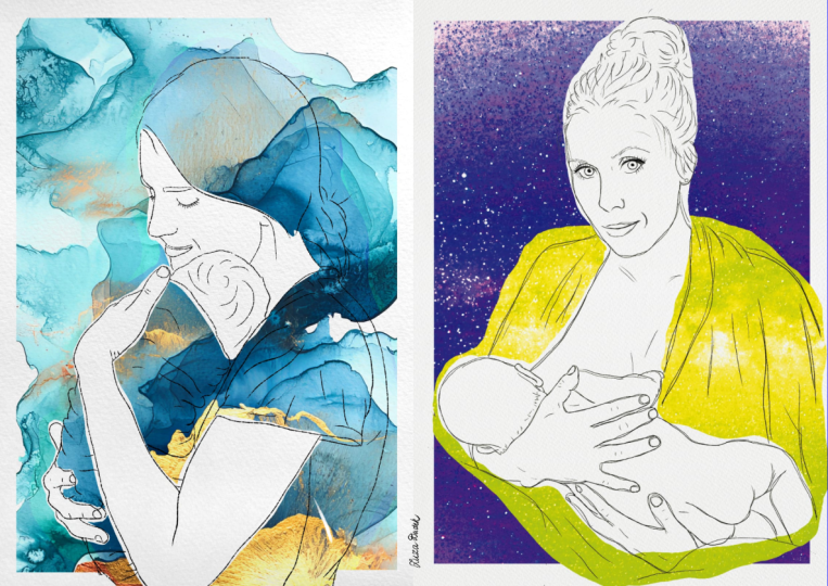
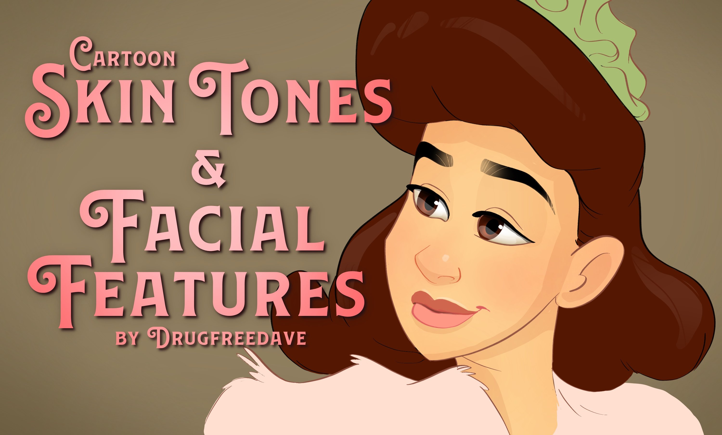
1. The Elephant in the Room: Thank you so much for your interest in this course. My name is Dave Reed. I live in Brooklyn, New York with my fiancee and our cat. One of my most favorite things to do is teach everything that I know about art so I can make your art better. I've been an artist for over 30 years, I've done children's books, character design. If you see my Instagram, then you know what I'm about. Let me just address the elephant in the room. Tracing. It's very controversial. Is it art? Is not art? A 100 percent, yes. Tracing is and will always be an integral part of art and design. For me, I'm an illustrator. If I make a sketch, I'm going to trace over it as one step in the complete illustration. If you bring a photo in and you want to make a minimalist portrait and you trace the lines, that's just more of a design. It's not any more or less art than any other type of art. Some people want to paint a portrait, some people want to draw it, some people want to draw cartoons, some people want to sculpt. It's all art, it's all good. Don't let anyone make you think that your art is less than anyone else's. Just be true to yourself, true to the art that you want to do, have fun with it, and I'm going to show you how to make it the best it can be. I've been seeing a lot of minimalist designed portraits with flat color, but a lot of people just don't know how to handle the line works. They're not sure where add lines, what to trace, what not to. I'm going to go into how you make a stylized design portrait. I'll do some colors at the end, just so you can see how to color it if you want to. It's going to be fun and you're portraits are going to look great. Let's get into it.
2. Getting Started: Okay, first things first. So we're going to open procreate and we're going to open a new canvas. So we're going to hit this little plus over here on the top right. And I used 3 thousand by 3 thousand pixels at 300 DPI. I use that for pretty much everything. So I already have it saved as client square because I've been do client work with it. So we're going to open 3 thousand by 3 thousand pixels at 300 DPI and it's essentially a square. The next thing that I always do, just because I prefer it, is I'm gonna change the background to a beige color. I'm gonna start with this photo as the, as the photography trace. And then also save this. I'm going to insert another photo of little grow Gu. So both of these images are contained in this class. They should be in the class description. You can download them from Dropbox. That way we can do the whole class together. If you're using procreate, you can download my brush back. It's free. It's called faves. You can download it in the class resources. I posted a Dropbox link. And also in that Dropbox folder is the photograph that we're going to use for this tutorial, which is myself and my fiance, mostly because I don't have to worry about getting anyone else's permission. So you're stuck with looking at our faces. Some sorry about that.
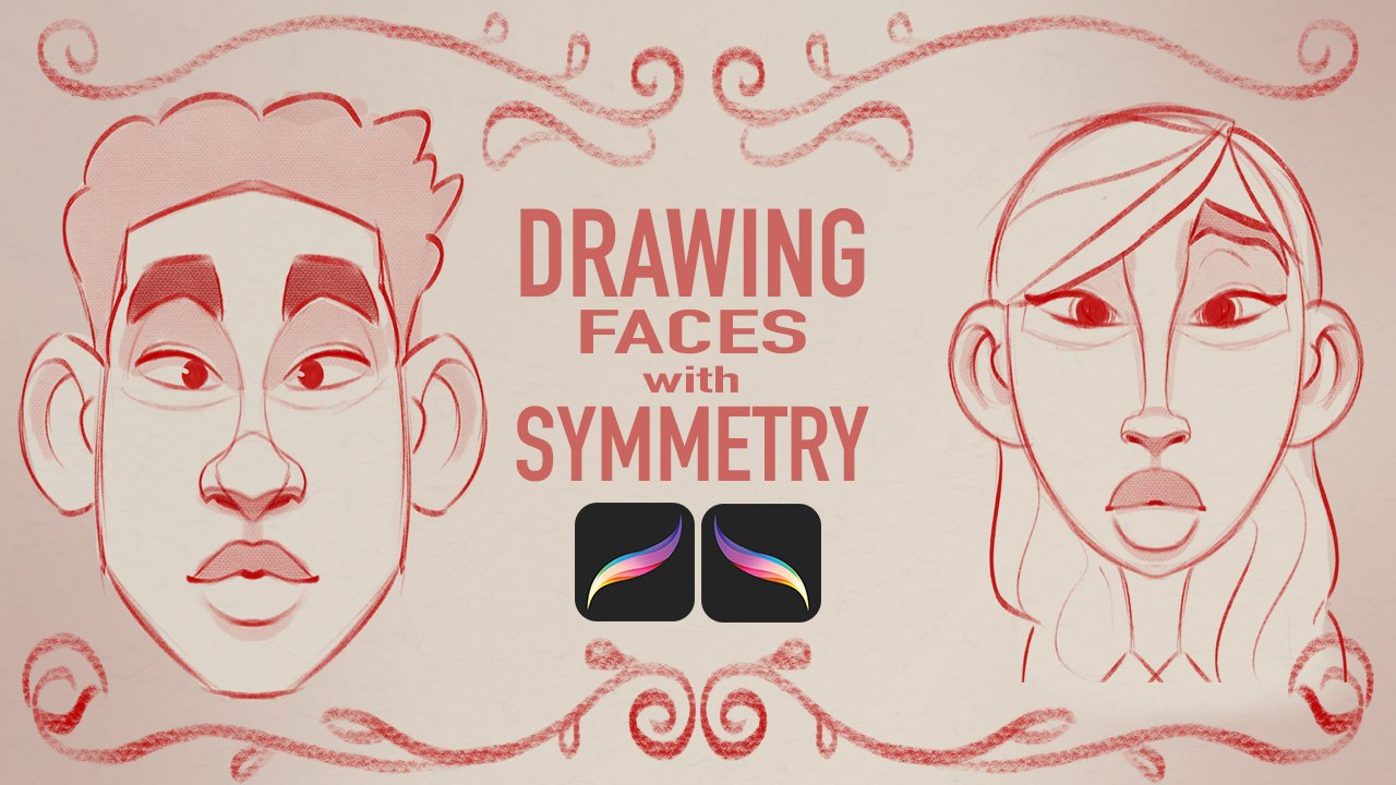
3. Line Weight, Taper, and Opacity: Okay, one of the most important things that I see that people don't apply to their line work is the line weight. So I'm gonna use my brushes. These of course, are also available in the description. These are procreate brushes. So I'm going to use the brush Incan. All in. All of my brushes are pretty much talk brushes that I've just tweaked. So they worked best for me. So I'm gonna use this brush Incan and what line weight is? I'm gonna make the brush a 100%. So it's the biggest it can be. So the more pressure I have, the thicker the line will be. If I apply less pressure, the line is going to be really, really light. So I mean, that's pretty much it for line Wakeman. Sometimes you want to be have a thicker line and then you make the line thinner. So that's line weight. That's basically just how heavy Your line is. So the next thing is taper. In tapers sort of bleeds into line weight because if I'm making a line and I sketch like that, this is the line tapering. So it's just coming off to a point. And that's just a lot different than if you don't have a taper. And let's make this brush a little thicker. If you don't have a taper, then it's going to be like this. It'll be similar size on both ends of the brush. So again, I'm just going to use the brush Incan, and that's the brush will use for this class or this any brush that is pressure sensitive that you can put a taper on the end by applying less pressure, sort of like, you know, just a traditional brushstroke. Let's make a nice taper here. Okay? Okay, so next is opacity. Opacity. I'll show you an example of a brush that I use often to do my sketches. I'll make it as big as I can. And this is my sketch master brush. And as you can see here, it sort of has a taper and it also is opaque towards the end, meaning you can see, you can start to see through it. So the difference is, is if I do another line, you can still see the line behind it. And it just keeps on going on like that because the opacity is changed towards the end. When I use Incan, when I, when I use line work, I don't want the opacity. So if I do lines, I don't want to be able to see through them. So that's all opacity is. So I'll use my sketch master brush and we'll do a circle and opaque circle. And this will be a solid, a solid brush. Okay, so those are the three most important aspects of line work when it comes to, to tracing and doing line art. The next video is going to be drawing IID, this the speed in which you draw and also the streamline. All streamline is, is line smoothing. So if you're using a different application, it might be lined smoothing. But the speed of your drawing also affects the lines. It affects the way that the lines move and things like that. So next up is going to be drawing speed and streamline. And then after that, we'll start to get into the drawing.
4. Drawing Speed & Streamline: Okay, so the drawing speed, if I want to do, if I want to do a large line, then it, it helps to go a little bit faster. Because if I tried to do that line slow, there's going to be little artifacts in the way that my hand moves and also sometimes the weight won't distribute evenly. If you're gonna do along line, it's easier to use a little speed behind it. Just make it, make it smoother. Ok, so all stream line is, is that just assist in giving you a streamlined line, giving you a smoother line. So you can use that with any brush, but we're gonna use Incan. So you just tap the brush. And then on stroke path you have streamline here. So we have stream, streamline all the way up. And so that's all the way up. And it just makes all the lines really smooth. And let's see if we turn it all the way down. If there's any difference. Okay, so this is all the way down. So you can see all the jitters, the jittering in my, in my line. See every little minute movement I make. The Apple pencil will pick up on it. So that's all streamlined is. So since I used this for all my inking work, I'm going to turn that all the way up and I'll get rid of these. So now when I want to draw a lines, there'll be nice and smooth. Now you still do have to have, you still do have to train your hands and your fingers to be able to draw lines. Because if you, if you, if you're still trying to do detail, you can get some, you know, some different line pressures and things like that. So you just have to, that's just one thing that you have to practice. And the better you get, the better be able to, you'll be able to use streamline to give you nice, clean, streamlined lines. It's a tongue twister. Ok, so let's get to some drawing. So next up is going to be details that matter.
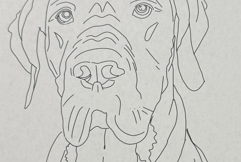
5. Details that Matter: Okay. Which details that you put in in which don't you? I don't think I said that correctly. So we have our image. The first thing we wanna do is turn the opacity down. So we're just gonna go to our photo image and we're going to hit the n. And we'll bring it down to bringing down to about 65%. I normally do it a little lower, but I'll do it 65 just so you can see all of the details and things that I'm picking out. So I'm then going to lock this layer so I don't accidentally draw on it. And always do everything on a layer above. Okay, so we're going to use the brush Incan, and we'll do about ten. We'll do a little more and we'll do we'll do 15. I usually start with the nose first and I have a pretty big nose. So let's, let's jump right in. So this dark line here, the darker lines is where I put the line. I don't trace the whole knows because a lot of light and shadow. So you want to stick to the darker bits. All right, and that's pretty much all I'll do for the nose. So for the i, obviously you have a dark line here. And for this line it's a little I mean, it's a, it's a dark line, but it's also very dark here. So this is where you get into line weights and things like that. And you don't want to do I mean, I am getting old, but you don't always have to put all of these little details for lines. So don't try to match it line to line. Just do the important ones. So first off, a big thick line here and at the end, as you can see, like I start off a little light and then I press harder and I go like that. So that's pretty much how I did this line because you want this line to be thick. You can even go back over it and make it a little thicker. All right, so my eyes are 20, so I can't really see this line down here, but I see from my eye. So you just kinda make a best guess. And you just try to match whatever you're the best guess of what you can see. And you just make it smooth. Try to do everything in one stroke like that. You definitely want to do the line above the I, the, the eyelid. So we'll start here and I'll do fairly light in fairly quick. And then I'll just get I'll just make it thicker towards the end. I'm not gonna do all of this because that's just a little too much detail. So these two are pretty good. I'm not gonna do all my lines, but I will do this one because this is the, this one is the darkest. So I'm going to pay attention to that one. And I'm a little off, so I'm just gonna make sure I stay in the lines there. Okay. Let's not too bad. It's a little dark here. So I usually make it a little thicker. At the end of the, at the end of the, I can probably do the same thing here just a little bit. And then sort of curve that down and sort of accentuate those kinda line. I type things that I have. Ok, so I'll do the same thing for this one will start sort of here. And we'll make a thick line. And then we'll sort of taper it out at the end. I'll go back over it just to make that line a little thicker. And here, again, you can kinda see, kinda see there. And I can't see at the end. So I'm just gonna make that up. But you also have your other ride. It's sort of just match this sort of shape that it makes. And then you have your line, your eyelid line. So I'll do lie and then I'll get thicker here. And there's another little line that kinda comes off there. I guess I can match that on the other one. That's another little detail. I'll leave it out for this mosaic of the kind of decisions you have to make along the way, you still have to make artistic decisions with what, with which lines you want to make. So I'm going to stick to this dark line. Okay? I'm not going to make myself tool. I'm not going to add all my, all my wrinkles. Alright, so from my lips starts out pretty thick and thick at the end. Alright? And as you can see, I'm not really trying to match everything completely perfect because again, there's no hard lines like on our face. Like it's all skin that sort of has shadows that sort of fold into each other. So you just kinda go in the middle. You don't always have to try to figure out where there's a hard line it because sometimes it won't be there. Alright, so our lower lip is light and I'm going to add some pressure. I might have made it made the too big there. See if I can salvage it. So little big but it's a little lopsided. So what I'm gonna do is I'm just gonna do the line again. And if also you noticed that I turned my canvas because drawing a line like this is easier to me than drawing a line. I mean, I can do it that way, but it's easier for me. I have more control. I start from here. Make it a little thicker and come up here. I just feel like I have more control when I do it that way. You can also make this a little thicker down here because I have a fat lip. I will leave it off. Yeah. Always always continue to make decisions on what looks right and what doesn't. And it just takes trial and error. So I'm not going to make this line to dark. My lumpy lips aren't bad. I'm not sure if I want to do the teeth yet. I guess. I guess we'll do them since they're here. I'm not gonna do my little tiny chip. I'll just pretend that it doesn't exist. Which is another talent. If you're drawing these for people, you do have to decide on what which small things you want to include or you don't want to include. Because a lot of people, they really want to look like how they feel they look. Sometimes it doesn't match up with what they look like to other people. Alright. So can pretty good. So the eyebrow again, just look at the general shape and just match the general shape. You don't have to go crazy with it trying to get it right. And just, just match the general shape. Ok, so we're going to match this other eyebrow. Basic shape. I actually liked it better than anyone, but we'll leave it for now. It's not too bad. That's pretty much enough detail for, for the, for the face. So we'll do do this line here. But I'm not gonna go all. I want to include the IRR in there. So I'll do some of these mines. And it kinda goes like that. The rest I'll just make straight because we have the hood there. I'm not going to trace this all the way through because I want to include this ear. So I'm going to start halfway through. And I'm just going to finish out the bottom of my jaw and I try to do it and one, the least amount of strokes as possible. So here I'm going to try to we'll try to get up to this point. Sometimes I have to stop because my Apple Pencil we'll get in my way. And I'll use the points where like hair comes to my head. I'll use those points to kind of pause when I can continue with my head. Bring it all the way down to my ear. So ends can be kind of tricky, but you just want to just stick to the, stick to the shapes. And as you can see, it's not too dark. These lines aren't too dark. So you don't have to go with a really super thick line maybe like in here. And for this line, because it's very dark under here. So we'll start out with the fingertip. If the one going there. And there's like a little break, make it a little thick here. And then we'll just do the line there. So I'm skipping all of these because the only information we need to know is that there's a, there's this round part here for the hand. There's another round party here. So we'll just finish with this finger. Turn it so I can get a better view. So I don't want my hand to block where I'm drawing. So a little bit. You see this little, this little flick there that kinda just helps show that the fingers are in the proper order. So another little one there. And we'll start from, start from this knuckle. This line is okay, but I think I can do it better. So we'll start here. Start at that knuckle, and then we'll just do this as a shape back here. Now, this finger is up a little bit more so it's really not that big of an issue, but as line work, it probably just looks thick. So what I'm gonna do is I'm going to just, I'm sure we're gonna sort of cheat and do sort of the same thing. And I'm sort of gonna cheat this. And I'm gonna do a little bit, a little bit of detail just to show that that finger is there. Because you can't have all these fingers and then have a really, really thick sausage fingers finger. And then we'll just do a straight line for this. And you notice I did it all the way to the, to the shirt, even though there's sort of a shadow there. Alright, so holding the back of my hood. So I'm gonna make one line there. And then I'm going to draw the rest of my hand in to the sleeve. And notice how I bring this lineup and just bring it around enough to give it that curve. Same thing down here. Just enough to give it that curve. And I'll do the same thing here, bringing this over. And I'm not going to trace all alone, are not gonna trace that line. In some, in some cases I could put a faint line like this. But I don't really need it because since I have these curves going out and then I'm going to continue behind it. It's sort of it gives it that you can tell that this has a shape to it. So I don't need to put that detail there. So I'll just finish with this sleeve. And this is an actual break in the and the fabric. So that's a good spot for me to add a little bit of texture. And for all of this fabric, you can see that I just do the outline like this for these dips and just do a simple fall off with a taper. And that sort of implies that there's that the the clothes is the close have shape to it. My fiance and talking to the cat while I'm trying to teach the nerve. Anyway, let's call this an intermission. Gets you, get yourself something to drink, stretch, and we'll get back to more line work in the next video.
6. Hush: Sorry about that. That was my fiance talking to the cat. And here's another break in the fabric. So I'm going to use that because that gives it a nice, some nice texture to the line work. And I'll just use very thin lines. Alright, fabric can be kind of tricky, but it doesn't have to be perfect. So what I'm gonna do here is since, since her ears here, I'm just going to actually draw the outline over here. That way I just have something to work from. So here this line is kinda thick. Line is kinda thick. So I'm just choosing some of these to to show the fold. But it doesn't have to be or not to spend too much time on like the fabric necessarily down here. Just keep it, just keep it simple. All right. That's pretty good. And I'll get to the rest of these once I once I draw her her head, then I might put a little more of this detail and that's me so far. Let's finish out with this with this hood. So you can definitely see a line there. And then this line here. And this is where the taper again comes into it. So you just want to like kind of taper off these lines and even something small like that. I personally like to get rid of it because when I'm even when I'm doing line work, you sort of get in the zone and just take care of things now that he might want to take care of later. A lot of times it's easier just to fix things in the moment. So for these I tried to do line's a little quicker because it's covering a wide area. Now you have these lovely curves that close have. So I'm just going to choose some of them. Like for this curve here is going to choose this and make those lovely little circles sort of like what I did with my nose. And here we'll make this like that. And another one there. And we'll make we'll make one there to make it a little smaller. I don't know. 3s is one there, but it just, you know, it's okay to just make stuff it that feels right. Okay, so for this fold, let's see, I'll bring it up. And then I'll just say I'm not gonna do the whole shape, I'll just do a little bit. These are kinda light, so I'm not going to not going to really worry about those right now. I'd be a little something here. Okay. It looks pretty good. And the rest, you know, for these closing of the seam. So I'm going to make sure that I do the double line because it's sort of shows that there's a seam there. And then I'm going to trace the outline. But I can see that since my arm is foreshortened, I know that all of this all of these are going to be in front of the folds. So I'm going to make them all like this. See how I have the. So instead of, instead of going like this and the habit behind, it's not gonna make sense because this fold is in front of that. Sort of like this fold is behind this fold. So I'm gonna continue it on like that. And this one actually has a nice little swoop. And then we have our same again. So I'll do the same. And all of these are in the same order. So I'm just going to just do my little taper. And we have the prominent seem in the clothing. So I don't really know how it goes, but I see that it's down at the bottom. So I'm just gonna guess. Whoops, See to me that's a little imperfection. It's not really, that's sort of this is as well, but I'm going to leave that. Otherwise is tutorial will take forever. So I have some nice curves here. So I'll just choose a couple of them. We have this nice, nice curve there and we have a thick line here. And it gets lie and then it's sort of thickens out here. And then we have another one here. All right, those are pretty good folds. I have another one here. So we'll do that. All right. I always think of this as will do this little folder here. Actually, I don't like that. I always think of this as sort of Grand Theft Auto style because that's how the art worked. Always looked to me. Alright, so we have our same here. And we have this nice curve. Okay? So all our lines are pretty much spaced out. Nothing is too close to each other. We don't have all the details, but we have a decent amount of details in there. Bring this down. And we have this line is light here and it gets darker. And we have a nice little do the same thing with smaller here. And then we have another one where it's light. And then it gets kinda dark when it comes in there. And we have light again. Okay, so I can do the rest of these details, but they're all going to fall into her face in glasses. So the best thing to do is to actually do her face as well. So with her, we can start with the nose or the glasses because they're just where I like to start. So I'll start with the nose here. Alright, so I did a little more detail in her nose. I don't have to do this to do that, but it's kinda there enough of it's there. So we'll do our little nostril and will make it very light and try to use a very light line weight. Also her little nose ring can make it very light. And now for the glasses, and the glasses are very, very light, clear. Shall we use all light line work? Alright, so the glass and sort of go here. And you just want to take it slow and you just wanna, you just wanna make sure that you have the nice shapes that make up the frame. For glasses and things. It's nice to get the little the little details because these glasses are designed so meticulously not to say that faces aren't, but the glass has, the glasses are like a, like a prominent prop in the artwork. So you can get a lot of personality at, out of just the original design of them. You wanna take advantage of the original design of the glasses. Alright, so a little bit of a mistake there. So what I'm gonna do is just see if I can make that cleaner. And you notice when I, when I when I fix a line, I sort of start back here. And then I slowly I don't just try to fix the area. Since I have a taper. I have to do a little bit and then it'll get into the full size of them expense. I don't want to if I have to if I have to connect two lines, I don't want to connect them like that. You pretty much start from one of them. That way you can carry through the whole line. So that's how I make edits with the lines. So we're not going to do, we're not gonna do any too much of this glare in the color color in terms of the shadows and lights and stuff that are happening inside the frame. We just wanna get that clean look of just the frames. And I'm constantly turning my canvas just to get a better and better angle. It's sort of tough sometimes I try not to do too many brushstrokes. Now here it's sort of blends into her face. So you just have to kind of use your judgment and just try to match the width here and then it gets a little thicker here. But since it gets a little thicker, What I'm gonna do is I'm gonna make the line up. And then I'm going to do that. So just so you can tell that it's, uh, that the frame is coming out for the nose because if I don't put these lines here just looks like the frame is getting oddly thick there. So that's why that's why, that's when these little tapered edges are a good idea. Okay, so let me quickly put in her eyebrows. So we're just going to stick to the nice regular shape. I like to use kind of more straight lines with the eye rounds. I don't know why, but I do. Ok. We'll do the same thing with the eyes like I did on mine. So we have the curve coming up and then it's the eyelash makes the eye very dark. So this darkness kind of represents that eyelash. Make it really thick. That's why I like Disney characters. They always have a thick upper laid on their eye. All right. Make this really light. Oops. All right, we'll do the same thing here. We'll keep it light and then we'll just thicken it up. And it will just match. And you don't always want to go. You don't have to do the I here yet. You just wanna do that whole the skin underneath. And then we'll do the same thing here. Nice and light. And the outline of the face is pretty straightforward. Oops. Can move a little faster. Since you're covering a wide area. Here, I don't necessarily want to go all the way to the jaw line. I'm just going to leave an opening. So it's implied. And I'll go down with the neck here. And here. I could do this sort of like scalloped. But it depends on how much detail you want to put in. I'm just gonna do a regular line across. But if you wanted to, you could add that extra texture in there. Here. I'm kinda doing the same things like I did with my sleeve. Just to kind of show that there's a little bit of a lip on top. And again, with the jacket, it's in front of the sweater. Oops, a little off the grid there. So that line goes over, meaning that this is inside, this part is inside of this. And the same thing here. Bring this down. A little bit of same here. Pretty simple, straightforward, and we have the bag. Nothing too difficult about these lines. Everything is pretty straight forward. So that's why I'm working a little quicker. And we have a little bit of a seam here. So I'll just do a little bit of that. And we have another scene here with a little inside of that very Lightner. And then we have another CME in here. So we'll do the inside of that very light. Okay, I'm gonna do the same thing like I did over here. Just to show that there's I can't really see your sweater too much. But just to show that there's something there that will do the inside of the jacket, make this line a little darker and will actually bleed that into my sweatshirt. Okay, so now we have this little seam. So this is a good example of where line work really makes a big difference. And I'll just use this as an example. This isn't really that important because it's very small and it's sort of behind her, but it's actually a good thing to know. So we have the same here. And this part comes off and it curves like that. And now we have this part here. You have the little seam, so there's a seam here. So far, so good. So you can tell that it's kinda curving backwards. And this bit comes out from the bottom. Get that bit in there first, and then we'll go back. Ok. So since this is curving back, this part is already behind, so we'll make the line there. We use that one and see how I, I curve this line, stop that one. And now you have the look that this is curving back and coming up at the same time. Alright, so we have this little button pocket here, whatever that's called, some seams. And we'll just finish this jacket really quick. Seems right there. And you have another scene here. So first you have the line for the head. And we're just gonna do a thin line there. Maybe a little thicker line. And then I'm going to follow her hair line down like this. And the line for the glasses that sort of disappear into the hair. So essentially I'm just following the contours of the way the hairs growing. So really light here. And I'll just sort of just sort of follow those contours. I mean, are the contours of the ear. And again, this one's inside. So and again, we don't have to do all these little details, but just sort of, just sort of space them out. You don't want to have too many lines where they're really close to each other like this. So just kinda space out the lines. And again, it's doesn't really, it doesn't really matter if you have them. All of this little detail. But the more, the more that you do it, the more you'll kind of figure out your own style, even though it's still tracing over a photo, there's still decisions to be made. And just do a little more of these to kind of show the direction of the hair. And we'll do a little bit like that. And then we'll just round it off. Rounded off here will make it so they hear sort of goes off in that other direction. So again, I mean, there's no hard line where the hair actually starts. So I might wind up having to go back in and change that and maybe pushing this line up a little bit. But for now it's good you do have to make those decisions. Later on. You just want to make sure everything looks everything looks good. Okay, so what else do I need? So I need this part of my sweatshirt. So this is pretty dark here, so and then my sweatshirt is actually through her glasses. And that seam line. And we'll do this line here, this line here. And then we'll do something like that. And my arm is up so you can so the closer sort of stretching. So I just wanna make sure I get a little bit, get some lines back here. It'll be from my clothes stretching. I actually don't want to run into this line because I want it to look spaced out. So I don't wanna, I don't wanna start running into other too many lines. Even this much. I mean, it's not too bad, but you don't want to do too much of I'm running into other lines. You kinda want to either having it and have it going perpendicular. This can look a little bit muddy, but it looks okay for now. Ok hand looks good. I'll do a little bit of a just to show that there's a kinda turtleneck sweater thing going on there. So it looks like we have all the lines. So actually we need to do her mouth. I need to do her mouth. Twist my Canvas to make it a little easier. And do this little. I don't really like the end of that. I'll go ahead and fix that. Sometimes my Sometimes my hand can get in the way of what I'm drawing. And it might not. Might not match up. Alright, here's much more symmetrical lips than I do. My lips. Her always off-kilter. Fortunately, he's nice teeth too. So for T, T definitely wanna do a line, a lighter line weight. And you don't have to do all the all the fine details just sort of because going to line up the tips ten times, you do have to kind of make it up because the photos, photos aren't high resolution enough to really get the details that you need light to see down there. So I want to do the will do the gums, will try to we'll try the gums out and we'll just see how that looks for, looks bad, then we'll just erase it. You know, sometimes it really depends on what you actually want to do with the with the artwork. You know, if you want to color it in, then it's, it's different if you want to just make it a flat minimalist than you might not, you might not even need the teeth or need those details. Okay, so that looks pretty good. So you can clearly see our expressions. Alright, so let's add some eyes. So one thing that I notice is you'll see like with my eyes sometimes in photos like this, highs a little pointed a little bit more. And in the opposite direction. I'll do it on a layer above, just so I can sort of show you the difference. So if we were to trace my eye, looks like it's about There. Is one looks like it's about here. Let's see how that looks. It's not too bad. But one thing that I would do is I would cheat this i over closer to the middle because it sort of doesn't really look right just as line work. So I'll show you what I mean by that. Let me clear. Actually, I'll just do it on a layer above so I can show you both. So I'll turn this back on. And what I'm gonna do is this I wanna make about here. And then this side, I'm going to make, it's gonna cheat it closer to the middle, even though it doesn't match my regular eye. It should. It just looks a lot better in the line work as opposed to this. And anytime I draw characters, you want to draw the eyes. Favoring the inside of the eyes like towards the nose. Not completely because then they'll just look cross-eyed. But normally if someone is looking straight, then the i's are going to be a little bit closer to the nose as opposed to in the very middle of the eyeball. Okay. So let me get rid of this one we didn't want. And I will put the other set of eyes in. Let's get our photo, Beck. And sometimes I go through my layers a little quickly. So feel free to pause on doing was, was I have the photo layer here, I have my line work layer here. And then I on a layer above is where I have the I. So I'm just putting the eyes on a layer above. So if I want to change them or if I want to if I want to put them in a different place, I can just clear them and I don't have to worry about the other lines because if I'm working on the same lines, the same layer is my other lines. I mean, I can undo, but sometimes I disliked to do it on another layer just makes me feel a little bit more comfortable. Not that not that it's a big deal, but, you know, we all have our little i habits that we do. That just makes us feel a little, a little more comfortable. And other thing that I do often is export my work to my computer because I'm always worried my iPad is gonna crash. To kind of a good practice to have. So there's another thing. So these eyes actually, these I's, I's also have the white part and then they have the little pink inside part. So you can add that if you want. It's a detail. But you don't really have to add it. Her eyes is it makes sense with her I because her eye is looking far enough over to where you would have to see that. So I'll leave it there. But that's it. My eyes are a little too squint T, So I'm not going to add any extra detail because my eyes are already so small. All right, so let's take a look at our line work. Hey, it looks pretty good and we have a missing issue here. And I think that might be the only the only issue that they might need to be some more lines down there. Let's see what we can do. Because it's, you want to kind of keep it balanced and see if there's anything on my head to my head's looking a little bare. Now. I'm pretty bald. Okay. There's something really more honest on my sweater on his sweater. Like it's not me. Okay. I'm pretty happy with this so far. Alright, so the next thing I'm gonna do is just as a little extra. Now once I fix this line and this is an extra, i'm going to show you how I would color this. I'm gonna do like a minimalistic color blocking job. So I'm going to use maybe three, maybe four colors. And I'm just gonna color us in and just make it really graphic designing, really nice, bold colors. Maybe I'll change the background. So I'm just going to show you how to really polish this off and make it look like a finished artwork, like something that you'd be able to frame and put on a wall. So that'll be in the next one.
7. Line Crispness & Reference Layers: Okay, so we have our nice clean artwork. So one thing you never wanna do is you don't want to rotate. You don't ever want to select. And try not to shrink it or make it bigger yet, which is keep it big. Right now, of course we are on our 3 thousand by 3 thousand canvas. You wanna keep this this size. You don't want to turn it. You don't want to shrink it because it will lose some of the crisp, crispiness of the lines. Sometimes my iPad spells it out. So you don't want to rotate it and you don't want to you don't want to shrink it. So I usually don't use reference layers that much, but I'm going to use reference layer for this because it is a little bit easier. So first off, I'm gonna go to my line work layer. And I'm gonna use the same brush. And I'm going to close off this black. That'll make it easier. So what I'm gonna do is we're gonna take the black. I'm gonna go to the end of the screen. And the reason I'm doing that is because in the, in a later step, we're going to crop it. But I want to have all of these black lines closed because in order to use a reference layer, all of this, all of these gaps need to be closed. So what I'm doing is I'm just I know the sweater sweater is going to be a different color than the jacket. So I'm just closing off all of these lines. So when I do crop it, it's going to be above, it's going to be above these lines. Ok? So essentially what I mean by cropping it is, let's say for example, it's gonna be, it's gonna be about about there. And then it's going to be on the side is gonna be about there. So it's going to be cropped, so you're not going to see that. So right now I just all I have done is closed off these openings. So I added a new layer. It's underneath the line work. And above, above this. If I need that layer, I'm going to label it color. Ok, so that's a really quick way to color in your work. As you click on the layer reference and you see the little word reference below it. And then you can go below it. And I'm not sure which colours I want to use just yet. We'll use a use a nice burnt sienna type color. Ok, so so all I did was I dragged this color down to the sweatshirt hoping that it would just call it the sweatshirt, but it bled into her face. So that's okay. So what we're gonna do is we're going to tap here, we're going to drag it. And then we're going to keep, going to keep our Apple pencil on the screen. And you'll see right here the threshold will get less. See that threshold is high, threshold is less. So this looks pretty good. You also want to zoom in and just make sure that a lot of these details are colored in. So I'm just gonna use a thicker brush. Just a regular thicker brush to discover this end because the other one is a little bit thin and it would just take me longer to color in the gaps. And some gaps I'll just color in manually. I could I could probably just drop. Sometimes I do make a little bit more work for myself. Let's see if this part will drop fine. And if it does drop fine, I'm going to move the threshold up just to kinda save me these little gaps. Rotate that back down. Yeah, there we go. Here. This n. Okay? So they're all the green is one color. So now we're gonna do is I'm actually going to put another layer below. We'll name that color. Ok, so now we have this layer above. I have a new layer below that. And let's see what's a good color to go opposite. Something like that for now. And we might change these colors later, but for now, we'll see how this, we'll see how this looks in nicely. See if I can speed it up a little bit by increasing the threshold. A little too much. Excuse my sometimes I speak with a little too much boom. Apparently. Color this in manually. Okay. So the jacket is all colored in. Now. Oh, I forgot my I forgot to fix this line, so let me just fix that really quick. So I'm just gonna go back to my back to my ink and brush. Go back to black, go back to my line work layer. Turn this back on. Make sure I'm on the right layer because a lot of times I go to the wrong layer and I'll just draw that in like so. And while I'm here, I'll put in extra Let's put in some extra little little details there. Okay. So let me turn this off. Lines are good. So I'm gonna go back to this color. So I'm just going to press my finger on it for a second or two. Make sure I'm on the right layer. And then I'm going to finish coloring in my sleeve loops it daisies. And I'm going to lower the threshold. And I'm going to color this in manually. This little line may change brushes to paintbrush One Irregular, thick, thicker brush. Easier to paint. Larger, larger areas with color to, Okay, so we're gonna do some secondary colors below. So how about, let's see, let's pick a, let's pick a different color for our background. So what I'm gonna do is I'm gonna go to layer. I'm gonna tap on background. And I'm just going to actually drag this around. See if anything what jumps out at me. Think that looks really nice, actually. Ok, so I'll set that as that color and then I will click on my sweatshirt. Hue saturation. I can hear the cat. So let me pause because I know that you don't want to hear my cat, so give me 1 second.
8. Experimenting with Color: Alright, I think we're in the clear. Sorry about that. Okay, so now let's get to let's do this. Let's do the color of our skin. Actually, no, I wanted to change the color of the sweatshirt. So I'm just using regular hue and saturation. I kinda like it with these different blues. It's kinda nice. Alright, so I'm going to choose this blue. And I'm just going to actually, let's see. I'm going to choose this blue and I'm just going to choose a little bit of a darker version. And I'm going to color the sweatshirt and the, and the backpack and maybe the glasses. So I'm gonna make a new layer. Underneath this. The reference layer for line work is still on. So it's still going to apply. Actually, you know what, I'm going to make the hair. The hair might look nice to see how the glass is look. Ok, so we'll make the glasses that color, and then we'll make the hair the same color as this. So I have some open lines here. So let's see if we can get this reference layer to even work. Whether we go, how does the lower the threshold? And again, you wanna make sure you go in and color in these little gaps. You know, always check for these little, these little gaps. Because you want it to be technically perfect when you can. Okay, so that looks pretty good. So for my skin tone, let's see. We could do regular skin tones, but you don't always have to. Let's try. Let's try this blue. Let's see how that looks. So I'm gonna make a layer underneath my sweatshirt layer. I'm just gonna drop this on my face. And let me just get a thicker. I use graffiti brush that's thicker. Just a color everything in. And let's get another. And the best thing is, since we do it on a different layer, you can always change it. If we want to go with a more natural. Skin tone or something like that. You can always switch it up. But I think for us, I think are going to leave it for now. But we do need a color for skin. So and they enter, our skins can't be the same, the same color. So what I'm gonna do is I'm gonna make my sweatshirt that same color. So I'm going to alpha lock it and then we're gonna fill. And then my skin will go with I'll go with a blue for now. So I'm going to alpha lock that and just fill. So that's just an easier way to fill to fill in the space. So I'm going to match this color with her jacket and see how that looks. In an easy way to color. Since this is in sections, I'm just going to select some on the jacket layer, but the hair is also selected. So I take the little ribbon and just draw around that and make sure I'm on the color I want. Make sure I have the brush that I want. Alpha lock the layer. And then you can just you can just paint on it. Okay. It's not bad. So for her skin tone, I'm going to use that color, but I'm gonna make it a little lighter. So let's see how that looks so mad, a new layer. And it's going to color that in. And I'm gonna take my thicker brush and just color that in. Make it a little quicker. Use the color drop a little bit in by hand. And I could probably do it on the bottom. I can do a below the below the glasses. That way. I can literally just just color over it like this. Okay, so let's see. So the beautiful thing about this is you have endless colors to kind of play around with. And you might be better at choosing colors than I am. I'm not that great at it. But it's still pretty fun to sort of mess with the colors. Make her completely white. But another thing you can do. Another little trick that I do a lot of times is I'll just make a new layer above my colors. Choose a random, any random color. Oops. Let me take the line off of a reference. Line, work off a reference. And I met for the layer to be above all of the line work and everything. So I just fill it. And you can just cycle through the different some are going to work obviously. But you can cycle through these and see if there's anything interesting. It's kinda nice. Actually. Always bring the line work above. It looks pretty cool. And another trick. Another trick you can do is you can block the line work. So we'll just click on that layer, alpha lock. And you can knit fill layer. That doesn't look good. So we'll go with our trusty hue saturation. And you can mess with the colors of the lines. Lines need to be a bit darker and change the saturation. Make it a bit darker. So you can change up the colors to really anything you want. You know, there's so many, there's so many options. You know, it's a really fun, really fun way to do that. Let's see, maybe I just like regular black the best and will do a little bit. I kind of like a dark and dark gray color. And black is fine. But she looks a bit like jokers so much change that. So basically what I did is I just went to the layer, that's her face and touch the magic wand hue saturation. And now I'm just, let's make this a little darker, more saturated. And now we can sort of get it to where we like it. I just get it to where it's interesting. It's kinda nice if you like, the hair doesn't really fit. So let's change the hair. So I'm gonna go to delay that the hair is on. And we're gonna take a little ribbon tool. Select just the hair. And I'm gonna take the magic wand hue saturation. And it's kinda interesting. So that's kinda nice. Okay, so I kinda like this. I think this looks really cool. Of course, you can continue to play around and you can change the colors of the lips, eyes. But if you really want it minimalist and just tick to like 34 colors, even like two colors. And then you just use a darker version of those colors. Also looks quite nice.
9. Finishing Touches: Okay, so the next thing you wanna do is you wanna get, your gonna get this framed nicely. So I think the best option here is to save this. We'll just save it as a JPEG save. So now we have this flat image. So I'm going to, I'm going to put all these in a group. I'll put all these in a group. And then I'll just get rid of that. Just hide the layer, hide the group. And then I'm going to insert that, add, insert photo and I'll insert what we just worked on. Another way to do it would be to flatten. But I actually don't mind a green background. I think it actually looks pretty nice. I'm, I like it more actually. Okay, so we have our two layers now you want to get the framing right. I'm going to make a new layer above the group. And I'm just going to fill it in with white. Okay, so now we have this white layer, so I'm going to minimize that for now. I'm going to go back to my inserted image or my, my copy. I'm going to choose the ribbon tool and then I'm going to choose a rectangle. So what I'm gonna do now is I'm going to start off the canvas. I'm going to start my square. And I'm gonna make sure that I'm going to make sure that the bottom line cuts off right above all that extras, that extra space that we made it right above the bottom. Ok. And what I'm gonna do is invert, which is a little button here. And then the three swipes down. I'm going to cut I'm going to do the same exact thing with I need to cut off this part of the arm because remember, I I hadn't I didn't edit this part of the arm out, like I just added the extra bits so I could color it in. So we're just going to cut that off now. Ribbon tool and just bring it in a little ways. Three sweeps down, cut. All right, this looks pretty good. I'm going to do the same thing for, for this pink layer. So what I'm gonna do is I'm going to select, what I did was I selected this. I'm gonna hide that. Open this. And I'm gonna do the same thing. I'm gonna long press on the ribbon because right now if you can see that squares still selected. So hopefully this isn't getting too confusing. But I selected the box that we previously did. I'm gonna long press the ribbon to bring up the options. I'm gonna do invert again, three swipes down in cut. So now both of these are the same. So I'm just going to bring them up over the white layer. So now we have r. So now we have our frame here. If I break the rules a little bit and actually make this a little bigger than might look a little nicer. I'm, I look nice. And then let's change this to black. Yeah, I would say I'm pretty happy with that. I think I like the green even more. That looks really cool. Definitely play around with it. Try out different colors, try out different things. And just be okay with happy accidents. You know, just be creative and play around with as many colors as you want to play around with coloring different things in different ways that you can do it too much for me to go into because I can wind up just spending all night with you guys, just kind of drawing and coming up with colors and make it look even better and even better. So just take your time with it, spent time with it, experiment. And you'll be able to get some really great looking portrait style designs. So hopefully you guys found it interesting and helpful. I know that it's difficult to trace facial features, but just continue to work at it. Just pick out little things, the details that really, really matter. And just work at it and just work with your line weight and making your lines look nice and crisp and clean. And you will get some great results. So thank you guys again, I'm going to post this finished artwork in the resources as well. And please post to the group. If you do these images, you can do other images. Please post to the group. I love to see them. You can reach out on social media or anything like that. I would love to see your work. So once again, I really appreciate you guys and thanks so much for taking the class and listening to me and my fiance and the cat, which I apologize for. It happens and happens. Alright, thanks guys. So I just wanted to hop on and say another thank you in person. I really appreciate you. Please let me know if you have any issues, any questions, if you're confused, feel free to reach out. I'm on Facebook. It Dave Reed, I'm on Instagram and drug free, Dave. I'm on YouTube and show free days. And also you can reach out on skills here, at least I can I think you can reach out on skill share. Please let me know. Let me know what you liked, what you didn't like that way I can make the videos better for next time. So as always, keep drawing and I'll see you in the next video.
 Dave Reed, 2D & 3D Illustrator - Brooklyn, NY