Transcripts
1. Gold Class Promo: Have you ever wondered how people added the gold effect to objects and to text? Well, we're gonna find out how to do that in this class. We're gonna first dive in the photo shop and learn about how to apply the school defect to typography There. We're gonna apply to objects like call the actions and brushes, and we're finally gonna be able to create ingredients and then even take objects from logos and create a gold effect as well. So I hope you get a lot out of this class, and I hope you enjoy.
2. Gold Typography! : welcome. So today we're gonna tackle gold. Um, everything that glitters is gold. Everybody is obsessed with gold right now. So I'm gonna teach you kind of how to have that in your design in multiple ways. And we're gonna first start out with doing that in texts and typography. We're gonna go ahead and type out kind of a simple headline. I'm gonna type out glitter. It's a simple headline. I don't know why my font so small you hold down shift and make that bigger. There's a couple of cool fonts that you can use that could look really good with this effect. Let me spell it correctly. Um, let me see what would look really good. So it's going double click this. There's a couple of fonts I had in mind on this one. Dandy lion would look probably pretty cool and gold. Let's go ahead and do a 2nd 1 So it's kind of do a couple of different times for practice. Let's try. Let's try this one. It's called Black Sword. I found both of these on a website called dot font dot com. De a fon t dot coms were confined. A lot of the response to use. Just make sure before you use them that you have the rights to use them if you're gonna be printing it on a T shirt or reselling it, so the next thing you do is you need to find a really good gold texture. You could find the sun Google. We could purchase it so that you have the rights to use it so you can purchase it on a stock photography Web site. I went to Peck Sal's P E E x e l s dot com. They have free stock photography and textures. They just happen to have a really awesome gold texture, high resolution, which is important that I can use. So I could be able to use this since it's high resolution on a lot of different things without it looking blurry. So what I'm gonna do is I'm gonna simply drag my gold texture into here and what I'm gonna do, I'm gonna make it a smallest possible. And so it still covers the lettering on it is bottom one first, So let's go ahead. It's good. Move us out of the way. So that doesn't get that doesn't bother us. we're trying to do this. So when a drag this layer down and my layer there it iss I just dragged it down so that my my text is on top, just the top layer. I'm getting my magic selection tool, a magic wand tool, and I'm just gonna click anywhere outside of the lettering. This is gonna select everything outside of the lettering. I'm gonna do a little trick induced, select in verse. And so now it's gonna be selecting my text. And if you zoom in a little bit here, zoom into about 50% you'll notice a little bit inside of this e is not selected. So let me make sure I select that too. Okay, so now what I'm gonna do is I'm gonna go back to my gold texture layer. I'm gonna highlight it. I'm gonna copy the selection, and then I'm going to do something special and paste in place. So paste in place is gonna place it exactly where I cut it out. Okay, so now I don't need this gold texture anymore. I'm going to just slide it off to the side. Um, I noticed a little bit was not cut out because it was hiding in between these text, so that's not a problem at all. I'm gonna go ahead and click on my text layer, get my magic selection tool when you select this box, I'm gonna go back and select my texture and it's delete. No, sorry. Not that one need to go back to the texture just created, which is right here with sleep. Here we go. Announce, get rid of our typography here. Let's go ahead and just hide that. And now we're left over with just the lettering museum out just a little bit. Now we have just the lettering left over for our texture, So that's pretty cool. So I'm gonna go ahead and make this a little bit bigger, and that's a little too vibrant of a gold. I kind of want a more muted modern gold. So that's no problem. I'm actually gonna select my layer. I'm gonna de saturated a little bit. Sometimes when you de saturate a gold that that's this bright, you'll get a little bit more of a modern gold. That's which is more muted. So I'm gonna go to image adjustments and going to go to Hue and saturation and let me just de saturate this a little bit and you notice it's really kind of getting the kind of gold I like right there. Perfect. I'm just double clicking my layer. I'm just gonna add a little bit of a drop shadow, depending on what program you use. You're gonna be doing this a little bit differently, but this is Photoshopped. Don't want too much of a blur on it. There were just enough to make it look like it's popping off the page a little bit. There's our gold glitter headline. Zoom out just a little bit so I can see our entire document and there is typography.
3. Gold Typography Cont.: right. So let's keep going with typography. We're gonna do another sample. So you kind of go through the all those motions one more time. So I have a different kind of font. This is actually go bold. So let me just kind of play around with the spacing a little bit on this when we actually do all lower case and let me add a little bit of spacing between lettering, which is called letting. There we go. I like that. So let's go and get rid of our top one, so that doesn't distract us. Okay, so they did the same thing. We have our main text selected or text layer. We're gonna get the magic selection tool looking click anywhere outside of the text. So let's click up here. Okay? And let's see. Has a little bit on the O and the d that's not selected. It's got a hold down shift. We're gonna select that and hold down shift and select that. So now we have everything outside of the typography selected. So let's go toe select. And this is the trick selected in verse. And now it's gonna select all the text instead. That's great. So now we're gonna go to our, um, texture layer, and we're gonna copy, and then let's go ahead and paste. Now, let's get rid of things that we don't need. We don't need this anymore. And we don't need this anymore. They're it iss there she is, beautiful and gold. So let's go. Um, go down here and let's, uh, zoom out a tiny bit. Let's see if we can kind of tone that down like we did the last time and go to Hue and saturation. I was gonna dial it down a little bit, Kind of not. Make it so shiny. And the more of a dull gold just kind of popular. What's that? A tiny bit of drop shadow to it and what I like to do a drop shadow is I like the sample, um, one of these colors in here, and then I just go down and make it a little darker instead of just doing a black shadow. Doesn't quite jive as much. I would like to kind of keep it in the same family, so I'm actually doing a dark brown drop shadow. And there you go, so you can have kind of your sub line right here, but much smaller. Hold down shift and make this tinier. You could start building your ad, which we're gonna do good to do in the next video. So hopefully enjoyed that.
4. Gold Objects and Call To Actions!: All right, So now, but we have our attention grabbing gold headline. Let's see if we could do a call to action. That's also gold. So I went ahead and just typed in kind of a generic sub line. That would go right here in this area s Let's go ahead and get started with some kind of call to action. We're just gonna go right here. So you want to kind of do a gold box? We could just do kind of a simple rectangle, and he can fill it in with any color and just good to a new layer in the paint bucket tool . Fill it in with black. So I'm gonna take our gold texture. Let's see where I hit that. There it is right here. Go ahead and drag that over and I'm gonna go ahead and select. Go back to my layer here. It's always good to names, so call to action. I'm gonna go ahead and select the box. And, um, I don't need this anymore, so I'm gonna go ahead and hide it. I only needed it to make the square selection, and I'm gonna go back to my texture and get a copy and pace there is. We don't need this gold texture, name, world slide that out of the way and there's are called Action Gold Box. So let's also kind of de saturate this a little bit. I'm gonna go to Hue saturation, and I am gonna de saturate it just a little bit. Give it a little bit of a subtle gold and so there's were called Action Box. I could go ahead and just copy this player, see if I could find a nice, bold lot that would work really well here. So let's find sometimes railway, since I'm using railway railways A really great far because it's got a lot of different weights. So if you go up here railway, it's got light, then metallic medium, bold and black Scheduled on a lot of nice options. Let's go Railway the last. See what that looks like to call to action and I don't quite need this box to be as tall, so I'm just gonna select a little bit. And disk elite can also do this in Adobe Illustrator. What's great about doing this? An illustrator. It will stay in vector. We're mad At least all your text. I would like to do things and illustrator of I'm just doing it in a photo shop today cause I think more people have Photoshopped feel good about illustrator. There's kind of a simple called action. I wonder what it would look like if I did white that look a little better. That might look a little better. I wonder if we did a little bit of a drop shadow to, Ah, the box. I could pop out a little more, actually. Kind of like it black. Maybe because the black plays off of the black in this text, but not all the way black. Maybe just a dark gray. A little dark in that right there. Perfect. So let's say I want to dio something more than just a box. I'm very happy with that, but I want a little more character. So let's try something else. I went ahead and I downloaded brushes from But see, there it is. It's from Beck Trees E uh, victories. He can't even say it right, but it's a great website to, uh, find different free vectors graphics. So when ahead, downloaded this path. It's a water color pack and it's actually a vector pack, so I opened it up. Adobe Illustrator, You can also just open this up as a PDF and photo shop and then just kind of select and cut it out to use it as a sample. So I'm just gonna grab when I think I like, um, one that has some kind of character and variety to it. Let's pick this one right here. We're actually make this a gold. Do a gold effect. Do it here. Let's go back and drag it in. It is with times holding down ships. I can make it bigger, and I'm gonna drag this below are called action text here. It ISS Go ahead. Make this the right size that you want Bester format. Okay, so we're gonna bring back in our gold texture. So here's that layer bringing back over where do exactly what we've been doing with the box . We go back over this layer, which is the one we just brought in, and we're gonna do the magic selection tool. We could select outside of it. This, like everything outside of it. Select inverse announced Gonna select this entire watercolor. So now I'm gonna go back and grab our texture layer right here. And I'm gonna copy that gold, and then I'm gonna paste it. Now, we don't need this anymore, and we don't need this anymore. But what we're left with is kind of a cool water color gold effect. Let's go ahead and dole that a little bit. I go into adjustments and de saturated. There we go. Beautiful, but looks great. Now we have kind of a watercolor course. We could do that with different ones. Uh, let me kind of see what we have here already. Put this one together. Actually, that one is so that's kind of our straight box. That's kind of using a little bit of a watercolor brush. Of course, we can use different ones, different shapes, how many shape you could bring in, and you could cut out and put that gold texture of the topic and really do it with anything . And it can even create your own watercolor brushes. You could take a water color class and learn how to kind of do your watercolor. Bring that into photo shop, cut it out, and then you can apply the gold texture to it. You can really do whatever you want. So with this gold, So hopefully you've enjoyed that
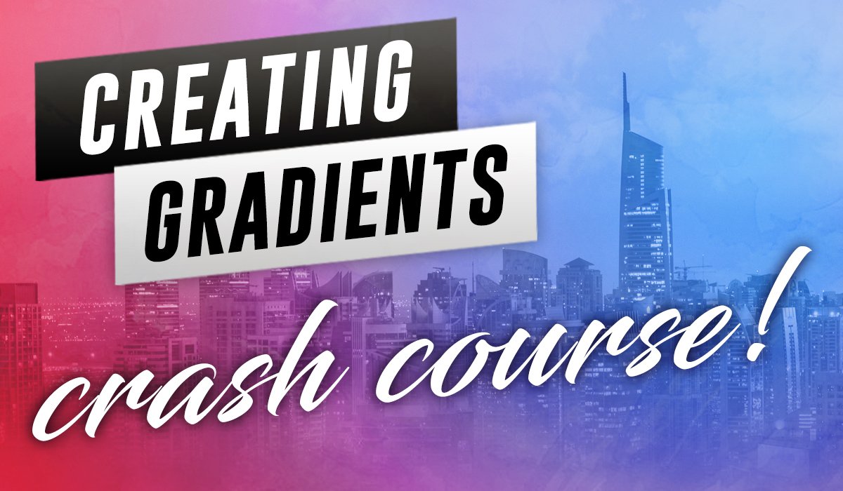
5. Gold Gradients: Okay, so we're gonna do a little bit more work with text. I kind of just typed in a generic text box here. And Photoshopped, it's go bold. It's the thought that I'm using. It's type in gold package. Um, just if you're doing certain packages or you're promoting something, just kind of doing some sample text. So what I did is this actually a custom radiant that I created from the default radiant. So if you want Teoh, let me actually take that away. Seem kind of sea plain white. So we want to add a little bit of gold like you just saw. So how we do that's gonna go into our layers and we're gonna go to Grady. It's And this is not using a texture, the section just using radiance, which is actually better, because with a texture, textures can be limiting sometimes in terms of resolution, coffee rites and everything. But if you use a Grady in, it's a little bit more flexible. So I went ahead. Let's go ahead and select. Um went to load the default radiant. So if you wanna load your default of metal radiance, you go to this little settings tab and you're going toe load. Uh, it's called metals, and this comes default with most Photoshopped packages, so you should have this click. OK? And this is thes air. The default radiance that come with, um, Photoshopped Illustrator has a little bit better metal ones that you could work with. Um, so this one's pretty ugly, but we're gonna show you have translate that something beautiful. So it's go ahead and select this default that you're gonna have in your photo shop settings . All they did was double click this Grady int, and you're gonna be able to edit the different colors and also have a radiant course if you want to take that kind of brush up on Grady in. So I'm gonna go ahead and double click this color what we're gonna do or change all these colors, the colors that we like, the kind of gold that we like. So when had what we want to do is is very yellow. Yellow gold is very cheesy. It's from the eighties. Let's create a very modern gold, which is going to be more subtle, like the gold that we were that we were messing with in the previous videos was gonna be more of a tan, more of a brown. So we're gonna take away a little bit of that yellow. We're gonna slide it down a little bit more into the reds, kind of get more of a brown, and we're gonna click around and have a little more muted. You don't want to be orange. That's worse than yellow. So you want to be kind of a muted and this is gonna be your selection. So I think think that works so I click. OK, now, what I'm gonna do is I'm gonna click on this and cook next to it. It's gonna sample the same color, but create another section. So I'm just gonna delete these yellow ones and replace it with our brown or tan. I guess you could call it. And I don't like a lot of contrast in my gold. I like settle gold. So I don't wanna have a dark color in a light color than a dark color. I want to make these more muted. What I'm gonna do is I'm gonna sample this color and get rid of those whites. So at this point, all I have is the same color. Not much of a Grady int, but we're gonna do is gonna lighten these two colors. I was kind of pick a light Color me to do that click that do a lighter color. And there's a much better gold than what the default came with. We just pretty much swapped out the colors a little bit better of a gold color and another out of the fact that's going to a nice drop shadow on this. That pop a little bit. Okay, so now that text pops out a little better and to add a little bit more of a nice gold. Look, I'm actually gonna add a stroke around lettering. So you just gonna click on stroke and you can actually add a Grady into your stroke? I'm gonna go and add in. Let's see, I'm gonna go here. Fill type. There would go, ingredient. Now I'm gonna add in our default. Grady, I can go in and do the same changes that I did where I can save the Grady int from here. And I could say that we're just gonna go back and use the default for now. So here's my stroke. We just edit this a little bit, make a little more muted or more red. Immediate, real quick doom. One more time, and I'm actually leave the highlights in here. Since it's a stroke, you really want the highlights to stand out because it's going to really add when you zoom in 100%. So that highlights a really good add something nice to the stroke. That's how I made a cold text effect. Use ingredients.
6. Applying Gold to Any Layer: All right, So we're back and we have our nice Grady int that we created not long ago. And I'm gonna show you how you can save this preset that we all these settings and radiance that we just did all that work. We could save that and apply it to a lot of different layers. Let's go ahead and double click. And here's all the different things we just did. We added the stroke. We did a Grady in overlay that we customized, and we did like a nice drop shadow so we can actually save all these settings. And to do that, you click on new style. Oh, and click on new style. You could click on new style in any any options that you're on new styles gonna be an option to go and click it and we're gonna do gold effect. And this is gonna go ahead and click on. You don't really need layer blending effects unless there's some blending options you want to save. But we're just gonna do layer effects and add to my library. Then click. OK, now it's saved to our library. Let's say I want to do a nice skinny line underneath. Let's do a nice skinny line underneath what we're gonna do. We're gonna get kind of ah, generic layer Here, do our paint buckets, and I would apply the same gold effect. So instead of having to do that all over again, I get a double click are layer and I am going to apply that style. We're gonna go to styles of at the very top and you'll see your gold layer that we just save Go and click on that and that's going to apply the same gold layer and stroked everything. So it's so nice when you want to create different I'm graphics with same gold effect. So let me go down. I'm gonna actually change a few things. Maybe change the angle of the Grady INTs a little wider, up and down, changing a few things with the stroke size. They got like it. I like how it waas see now could make it bigger. Well, this is doing new layers. Do a new layer. Let's do a circle. Let's go and get rid of this. We don't need this anymore. Let's do a circle. Let's do a nice gold circle do in the paint bucket tool Doing any color doesn't really matter. Put it in the middle Double click, go to styles and load in our new Grady int like that one. I'm gonna make the drop shed a little more dramatic with circle, and now we can add Have a text back in and I put this on two lines and we're gonna get rid of the gold effect on this and just have it be white. Or maybe I can sample this black, and that's cool, too. So let's reduce. I'm just changing a few little things here. Get that. I wonder if white text would look better. The will drop shadow like that. We can always go in, even though it's a pre setting that we save. You could still go in and change the settings, and it won't affect your saved setting. Uh, sometimes reverse. If you click on reverse, you might get a better effect that you like, you know, just kind of play around. I usually like to add texture on top of this, um, so I wonder, a little bit of texture. Let's bring in. Let's bring in a texture here. Let's see, where is the texture we will come with before their it ISS. Let's bring this in real quick silicon at a little texture to it. Yeah, it's gonna do what we did in the previous videos. Get her magic selection tool good or circle like their circle. Go back to her layer. Copy and paste. We don't need this anymore. Let's get rid of that. Here it is. We want to scale this back. We'll give you the capacity. We're skill that back just a little bit. Pope's selected the wrong way, and he disliked the gold texture layer just a little bit. Just add a little texture to it. And I think this really needs to be black. We get a sample, this black right here. Take where the drop shadow. There we go and we're done.
7. Creating Gold Objects From Logos: All right. So we're gonna play a little bit more with objects and the gold effect, Um, in photo shop and illustrator today, So I'm actually gonna open up. Illustrator, I have this from my local design class. My design a seal logo. I want to make a cool little monogram. I'm gonna try to start extending the brand of this kind of made up company, and I want to take this little intersection right here and make how kind of a little gold seal or something for some advertisements. So I'm gonna go ahead and get rid of or at least put this to the side, some of the text. And I'm just gonna grab kind of these symbols here. It's gonna drag it in. You could do this with any object. You could bring it right into photo shop. If you have something in vector illustration can bring it in to do the same effect. I would have it right here in the center. This is a cool gold texture I found as well. So this is a little bit different texture. So I wanted to kind of use something different than what I did before. So I'm gonna do the same steps that I've done before. You go ahead and get my magic selection tool. I just like the layer I just dragged in because select around it, Then I'm going to select in verse you can, actually, with this, since it's solid colors. Um, instead of doing select in verse, I would just like this. It would just like the cow. So that's why I like to select the outside. It will select it all. And then you select the inverse move. You got it all. You don't have to sit there and hand select everything. So that's why I do the select inverse trick. Okay, so let's go ahead and go highlight our gold layer. It's copy and paste. We don't need this big layer anymore. So let's hide that. And we don't need this anymore for right now. Let's drag it over to the side. So we kind of have a cool, um, little emblem here. I don't really like the coloring of this, So let's kind of modify that a little bit. What? I'm gonna do so little to Warren G for me. So what I'm gonna do as I'm gonna go to adjustments, and we're gonna de saturate just a little bit. Get a hue and saturation de saturate just tad. And you might need to just kind of do some small edits, its little to warm tens, and we add some cool tones to it. This is really up to you. What kind of gold you're looking for? Um, Goto exposure Ugo, any any way you can edit a photo, you can edit this texture, so that kind of really brightened it up, increasing the exposure. See you doing that helps. That looks really nice. So I'm just really messing around with the exposure options, which you can get there by going image adjustments and exposure. That really gives me the kind of gold I like, but it's still a little bit too much gold. How doe I, um, dole that down a little bit more? What I'm gonna do is I'm actually to duplicate. I don't need this anymore. I'm just gonna hide that for later. I'm gonna select the Slayer. I'm gonna duplicate it, layer duplicate layer. So now I have two of the same layers when we go ahead and name this gold and then gold too . So I'm gonna take the very top player. I'm gonna double click it. You do a color overlay. I'm gonna pick kind of a gold that I like kind of one solid base gold color, which is gonna be kind of more of your tan, uh, brown color. That's a really nice is overall, one color gold. I'm gonna drag this below the other layer And here's what I'm gonna do We gonna take this top layer and I'm gonna screen it back and reduce the transparency or the opacity a little bit. So it's not so strong You don't see all those little speckles in there. It's not so overwhelming. And what's gonna happen is gonna show this layer underneath and thes two layers are gonna work together to blend well, going to take this top layer and reduce the opacity just a little bit. I kind of get the right blend. I want to have a little texture, but I don't want the texture to be a strong as it is all the way like that. You may like that and you may want to keep it there. I'm just gonna to scale it back just a little bit There's my object. Go ahead and lock this background layer so I don't accidentally move it. Here's this. I have my little text you have here Can leave that a solid color. I can sample me double click I could actually do like a gray to kind of counter the gold, which looks really nice. I can actually put my Grady and effect that I applied earlier on there, uh, which may or may not work. I may have to do some adjustments on that to get that to work. I think I actually really like it like that because there's a nice contrast. There's not too much gold. You never wanna have too much gold. And your overall project isn't It takes away, uh, from this little middle symbol. So that's this kind of a quick little overview of a different object kind of doing something different from text to show you how to apply gold effects and voter shop
 Lindsay Marsh, Over 600,000 Design Students & Counting!