Transcripts
1. Creating Colors Intro: Atlanta Johnson owner and artists of Come Alive Studio. I have been a professional artist for about eight years since graduating college. With my fine arts degree in painting, I create my own body of work as well as teach art classes from anywhere from majors of three years old to retired and a really passionate about helping people create the artwork that they envision in their head and that they struggle to maybe get on a piece of paper or canvas or whatever your medium is. But I really believe that colors are the gateway to create the artwork that you want to create, whether it's painting, drawing, ceramics, anything. This color theory can be applied to all areas of our work, and I really designed this class so that it would be simple enough for a kid to do it, but that it would be rich enough and content that adults could learn from it as well and hopefully take away in the intimidation that they may feel about learning a new subjects. Sometimes people use vocabulary words, and you're like, I don't know what the heck you're saying, so my hope is to teach you those things along the way and into the class. We will have created ah color will that you can use for all of your future artwork. And it's your creation. My hope is that you won't want to use any color straight out of the tube, Um, after taking this class because you realized how easy it is to mix your own colors, so let's get started.
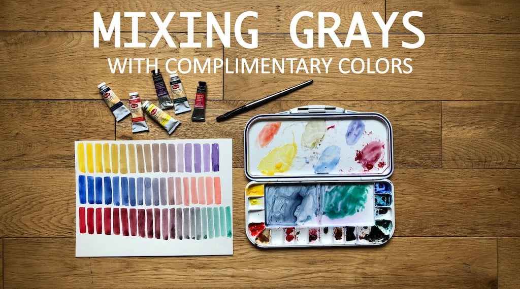
2. Supplies: Okay, so let's talk about supplies on the first thing. We're gonna start with IHS paper. So today I'm just using a nine inch by 12 inch piece of paper. Whenever you go to the store to buy watercolor paper, it's pretty overwhelming. Um, so the two main differences between paper is going to be hot breast and cold press, so hot pressed paper is going to be a lot smoother, where school press is gonna have a little bit more texture. You can kind of see a little bit of the grooves here. It's where water will pool and create the texture on the paper. Um, for most projects, cold press is a great option. It's also a little less expensive than hot pressed. So today I'm using cold press paper, um, paint. So I prefer to use paint out of tubes. You'll hear people say there's to paint and pan sets. A pansa is basically gonna be whenever you have a palette that has the paints in squares already in there for you. Personally, I prefer tubes because, um, e used one color more than others and said, then you have to replace one color at a time in the pan set. So I just prefer tomb so I can use them at my pace. So today and we're gonna be using the primary colors with your red, blue and yellow, And you wanna have very basic like a true yellow true Red and Drew per Lou to do what we're doing today. So I'm using CAD yellow lights as an option for my yellow. I'm using a bright red and then an ultra Marine blue again. You can use whatever watercolor or paint you already have, and I'm using watercolor today because it drives pretty quick and it's easy to work with. And it could be pretty affordable if you have, ah, dime budget and you just have a little watercolor set. That's your kids that will work to so paint brushes. Um, there's three main types of paintbrushes here. Um, so we have a flat brush, so this is a brush. If you look at it, the is very flat on the end. I don't often to use flat brushes. They just aren't my preference. But you may love a flat fresh, and there is a filbert brush, which is also kind of flat but rounded at the tip. So it's like an oval, and this is a round brush round tent brush, and this is what I'm gonna be using today. And it's honestly what I use most of the time because you can get a lot of variety. With this one brush, you can get very fine line with the tip. Small. It is up here, or if you press down, you can get a decline. So today I'm just using one round brush. I'm also have a one paper towel that I folded over twice to get any excess water off of my brush, and you need some type of cup or glass were your water. I personally am using this one. I used all the time. It's also good for travel because it collapses, so it takes up less space. If you're you know, you have limited space or your slight going to the park to paint or something also has these ridges so that you can rest your paintbrush on top. A lot of times when you put your brush on the table, it just rolls right off, and it could be very frustrating. So I love this about this guy But again, you can use any cop that you already have. Um, palettes. So there's a lot of pain talents out there, and really, honestly, any of them will work. I use this pallets again because it's easy to take place is so I can It didn't come with any paints in it. So I used my to paint, and I just squirt my pain in there and it dry. So right now all this pain here is dry. Um, yes. So I squirt my pain in there. I have this mixing surface. This clear piece also comes out. So have another mixing surface as well as this one. So this one pallet comes with three mixing sexes. And I love that because I love diversity in one single product. So those the supplies that we need for today and I will have a link in the notes for the class, Um, an Amazon link that you can go and purchase any of these exact products. If you want Teoh or if you just kind of want to browse, that would be a great area for you to go get some stuff online. All right, let's get started with the class
3. Watercolor Basics: Okay, let's talk a little bit just about using watercolors in general. So one of the things that I tell my younger students is it's called water color because there's more water than color. So the word water comes first, so you always want to think about having more water than color. Um, so I have my free color squirted out my primary red, blue and yellow. So, um, these colors are dry, but what you don't want to do is have kind of a dry brush and then get it in here. And, um, the paint is just gets really thick and sticky, and that's not the point of watercolors. So if you see you can see in my brush, brush doesn't look that what? And then when I paint, I get these, like brought dry brush strokes. So the difference is if you take your brush and just add some more water, then you get a more fluent color, and it can still be very saturated. Um, without having those brats dry breasts tricks because in watercolor, that's not really the look that you're going for. So you can see in the difference between those Teoh that I'm just painted right there. So always think you want more water and then color. The next thing is how to treat your paintbrushes. So I had an elementary teacher. Um, I remember in the fourth grade she taught us how not to treat our brushes. And she said to think about your paintbrush as being someone's head. So if this was somebody's face, this is their top of their head. So this is their hair. And she said, Would you want somebody to take you? And I'm not going to use this fresh cause I don't wanna miss that. We'll use this one. Would you want someone to take your head and do like this in the watercolor in the water? And of course, nobody wants that because this is what ends up happening to your brush. It gets frayed. It's just not good for your brush. So whenever here, cleaning your brush out or painting with your brush, think about it s somebody's head and just be very, very gentle with it. So, like this, how would you want someone to treat your head basically very simple? Um, principles of watercolor also always just have a scrap piece of paper near me When you're mixing colors, you want to see what the color actually looks like before you put it on your painting? Um, so, yeah, I just always have a scrap piece of paper near me. Teoh mixed my color in the night brushing on here and see Is that the color I want? Do I want to add more blue? I don't want to add more red, so yeah, those were just three easy basic things of watercolor before we get started.
4. Primary Colors: Okay, We're ready to start creating our color will. So I have a nine inch by 12 inch piece of paper cold cross paper like we talked about in supplies. And I'm just gonna simply at the top, right color. Will. You don't have to do this if you don't want to. You I'm not doing mine. Very structured, because it doesn't have to be. It's not a class assignment. So, um, I'm gonna start at the top and just dio I'm gonna say, OK, this is about the middle of my paper. I'm just gonna make a little tiny dot and then your yellow, your other primaries, they're going to go away from that center. So you're basically going to make a triangle. So I'm just going to say I'll do my next one here, So I have a dot here, don't here and then I'm gonna go across and do up dot here again. We're not trying to make a perfect circle. This is just for your personal reference. So I am going to start with red, so I get my brush wet. I want to get off most of the excess water. I'm just gonna dab it a little my paper towel and I'm gonna take this red, Mix it around. I'm gonna test it out on my piece of paper to see if I liked the saturation in saturation is just how deep the color is. Um, the less water you use, the more saturated your color will be. So we are gonna do pretty saturated colors, and I like how that iss So I'm gonna take that. I'm gonna go to my first dot up here, and I'm just gonna pay in a little circle again. Doesn't have to be perfect. You don't want to do it too small because we are gonna write notes on this, so just and you don't even have to circle, you could do a square. If you want Teoh whatever you want, I'm gonna get a little bit more red. Put it in there. Just like that. Okay, So another thing you wanted Teoh. Each time you use your brush, you want to clean it out and you want to clean it up pretty good because you don't want to have any contamination between the colors. And it's really easy. Do that just be like, Oh, it's no big deal. Let me put it in there real quick. But you really wouldn't want to do that because you won't even notice it. But your colors will start to get a little money. And then you're like, Why? Why are things cloudy? Why did they all seem a little brown? A little gray, And it's cause you contain major colors. So every time after you get a color, you want to rinse it off. So now I'm taking that blue just pure blue. And I'm gonna put it on this dot Over here again. I'm just gonna draw a circle my brushes a little drive. So I'm gonna get some more water and I'm some more color. Okay, so I've got my blue looks a little smarter than I read, so I'm gonna make it a little bit bigger again. We're not trying to make this purpose. This is just a personal reference for you. So I'm gonna clean my brush out very well. Davila dry. And then I'm gonna get my yellow, get a little bit more water in there. Perfect. And then I'm gonna go to make their dot and you my yellow circle. Okay, so I have about three primary colors on my color will and these air called Primary colors because you can't create these colors. All other colors can be mixed between these three colors to get that color. But you can't mix any two colors to get a read. You can't makes any two colors to get blue, and they can't makes any two colors singing yellow. So that is why these air called the primary colors. So now I'm gonna label these three colors this primary. Be careful, cause they might still be what? So you just want to watch where you place your hands? So just off to the side, I'm gonna write primary for each of these colors, and here are a few notes about the primary colors.
5. Secondary Colors: Okay, so next we are going to dio the secondary colors, so secondary color is whenever two primary colors are mixed together evenly. So I'm gonna start with mixing Are red and our blue to get of violence, some starting a new mixed pile right here between the two. So I'm getting my red and then I'm gonna really clean off my brush before I get my blue, some to get my blue and then mixed together. So this is what it's really helpful to have your sheet of paper next to you. So I'm gonna take this and I'm gonna do a little sample color right here. And I feel like this is a pretty true violent color. So you wanted toe not lean toward red and not lean toward blue. So if it was a perfect mixture of them to you, that's what you're going for. So I'm gonna take that and I'm going Teoh put it right here in between my blue and my red right in the middle. And you want to make sure to leave enough space on either side of the violet color to add another color in between the violet in the primary Okay, so I have my violin. I'm gonna clean my brush. Really well, and then I'm gonna get a green, so I'm gonna get my blue start a new pile right here. Let's get a little bit more clean my breasts. Well, because you don't want to get any of that blue mixed into the yellow. And then I would take some yellow mix it in. All right? Now, when the test out this green, that's a pretty true green as well. So if it were leaning a little bit more blue, I would add yellow. And if it were a little yellow, I would add blue. So take that green again. Put it right in between my two primary colors that I mixed to get the green from there. Yeah, clean my breast really well, And then I'm gonna get readiness. So now I'm working on my orange, which is red and yellow mixed together. So red is a pretty powerful color. Um, So you gotta sometimes work like it might be a little bit more yellow than a red or maybe a little bit more blue than red. Um, but you want it to Not when you look at the color you want to say. Oh, that's definitely orange. It's not orange that looks a little red or orange That looks a little yellow. So you're gonna take this color again. Pain it right in between the two in a circular motion. Okay. And now those are your secondary colors. So a secondary color is when you mix two primary colors together. So now I'm going to write secondary under each of the new colors are mixed. Okay? And that is your secondary colors. And who here are a few notes on secondary?
6. Tertiary Colors: Okay, now that we've learned our secondary, we're gonna move on to tertiary. Yes, it is kind of a confusing where to say it's tertiary. So a tertiary color is whenever he mix a secondary color with a primary color. So it's still gonna be a violent tone, but it's gonna have a little bit more of a red hue or a blue hue, depending on which primary color a mix it with. So we're gonna start with our violet rent or are red violet. So I'm gonna use the violent that I already have mixed here, and I'm just gonna take some red and added, Teoh, that color that's already there. And then I'm gonna test. I call her over here. Yeah, so it's got a violent Hugh, but it's kind of leaning maybe a little bit more toward Maroon because it has more of a red tone to it. So I'm gonna take this and you see me turning my paper. It's because I don't want to run my hand over these other colors that might still be a little wet, so I always just rotate my paper toe where my hand is resting, but not all in a color that's already there. So I'm gonna take our red violet and put it right in between these two colors just like that. So when MacLean rest really? Well, now I'm gonna take this color, and I'm gonna bring it back toward blue. So I'm gonna take him this blue and add it to the same pile. Okay, so now I'm back toward a violet color. It is so little bit more violent than I would like it to be for this color will. So I'm gonna clean my breast, dab it off a little and grab a little bit more blue. So now you can see that this is a violent Hugh, but definitely has blue tone to it, and that's what we're going for. So I'm gonna take this blue violet and put it right in between my violence and my blue. So you can see there is a very gradual switch from your red to your blue. And between here in here, you could get hundreds of combinations of the use colors just with mixing these two. So we're just doing that very basic of the color will. But you could have endless options of colors in between blue and red. So now I'm gonna take this green and I'm gonna add some blue to it to get our, um, blue green here and it's gonna be like a really nice teal color, you know, at a little bit more paint to this. So I'm going to get more yellow, clean my brash and then come back with the blue. It's me, just that out. This is still a little green. It definitely has some blue in it, but I want to pull it a little bit more toward the blue, so I'm gonna get even more and add to it. Yeah, that's more of the color that we're going for right in between that ultra marine blue and the green. Okay, so God are blue green. Next we're gonna dio are green, yellow. So again, lips, We're gonna use this same palette right here, the same color, and we're just gonna add yellow to it. M pullets word the yellow green. So just that easily, I hold it back toward a green, but I think it needs a little more yellow. So notice every single time I'm cleaning off my fresh. This is very important I'm gonna come back, get some yellow. Yeah. So now we're getting more and more of, like a lime green. Or like a sharp truths color. It's definitely got some more yellow tone. So I'm gonna take that on painted between my green and my yellow. Okay, Yeah, Next one is gonna be a yellow orange. So using this orange pile, I'm gonna grab yellow. That's not orange again. Runs a very strong color. So you do have to use a pretty good bit of yellow to pull it back toward yellow. That's a pretty good yellowy orange. And now that I've painted on here, I think maybe it's a little too yellow. So I'm just gonna real quick grab a touch of red, bring it back here and then come out and just that really quick piece of red brings it a little back toward orange in the last tertiary color is a red orange. So I'm gonna take some of this red and mix it in there, get a really deep, bright orange. Red is such a powerful color. Okay, so now we have our territories. And so when you look at this wheel, you can really start here and gradually see how each color transitions to the next to where it just keeps going and a full circle. So those air are in tertiary colors and tertiary. Zahr were weird word, so we're gonna label it and it's spelled t. Here are it's here I A our Why, - Okay , said as your basic color will some other basics of colors eerie are warm and cool colors, So warm colors are gonna be all your colors toward this side of the wheel that if you associate the colors of a fire, so reds, oranges, yellows or the colors of the son, those are going to warm colors and then colors that lend more toward blues. Over here, think of ice or water. They're cool colors, so they're cooler. So think blue for water is cold and yellow for the sun is warm, and that's how you can differentiate warm colors vs cool colors. Now there are some colors that kind of Congar both ways. So if our to take these two colors here, I might say that both of these are cool colors, but this one definitely has a lot more red in it, so it's a warmer color than this one, so there are variations within the warm and cool colors, but basically you want to remember anything that is a warm color. Think fire and sun and anything that's a cool color. Think ice and water so blues. So that's your basics of color theory, and here are some notes.
7. Wrap Up: back. Includes are creating colors so easy a kid could do it class, and I really hope that you now feel equipped to mix your own colors on that. You never want to use colors out of the tube again because you want to create your own. And now you have a color wheel that you can use for the rest of your artwork as a reference just to go back to you. It's always good to go back to the basics and remember that you can get any color that you want with the three primary colors, so I hope you enjoy this class and that you learned a lot.
 Lana Johnson, Life in Color