Transcripts
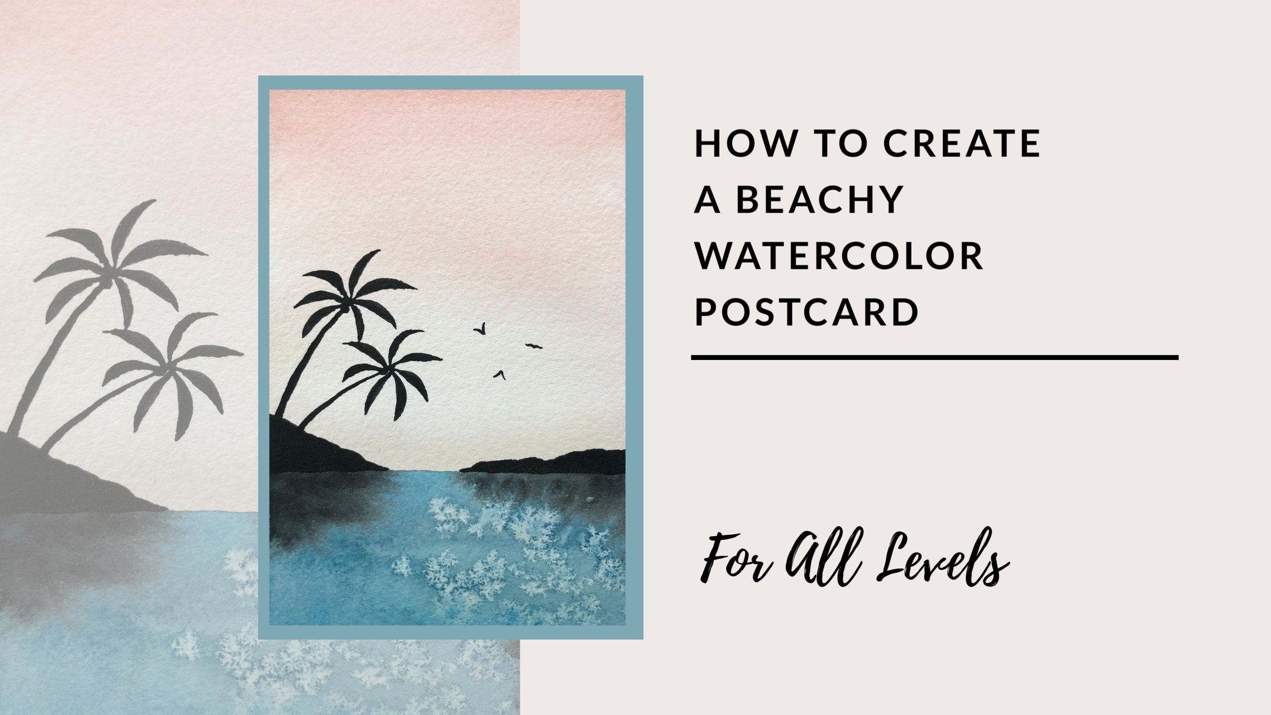
1. Intro And Materials: Everyone, thanks for joining for my very first skill share video. My name's Leah, and today I'll be guiding you through how to create a layered mountain painting. So this is the finished product, is something that I really like to paint. I think it's relaxing and it's also quite accessible. So if you're newer, took watercolor, I hope that this video will leave you with some helpful tips and tricks, as well as some skills to bring forward into your future paintings. For today, what we'll need is something to mix our pain time. So I have this palette here. You can also use a plate because watercolor actually washes off any surface that it's on. Try to pick something that's white. This will help you to see the exact color that you're mixing in an accurate way. You'll also need some paper towel. I like to use just a rag. It's a little bit more environmentally friendly, but of course, paper towel is fine as well, and that's just to soak up any excess water. It can also be very useful. If you make a mistake on your painting. You can wipe it up pretty quick and hopefully be able to rectify whatever happens. You'll also need some paint. I have two of my favorite palettes here. So the colors will be working with are mainly pink and blue as well as purple. And then we'll use black. So I always have an extra tube of block because they find they go through it a lot faster than some of my other colors will need some painters tape. This is not totally necessary, but it helps to give you more control. If you take down your paper before you start working. And then we have paintbrushes we'll be using to today. So a larger round brush, this one is a size 14. I find it really helpful for the larger portions of the painting. And then a smaller 16 also around brush. Great for detail work. If you don't have those exact sizes, that's totally fine. Something close will do just fine. The final thing that we need as watercolor paper, silent to use Arches watercolour paper. I definitely think that this is the best paper that I've used. It's a little bit more expensive, but your painting will thank you in the end because it helps to blend the watercolor together and also hold the water in a consistent way. So it's a little bit more predictable when you're working with it. So go ahead and gather your things. And Buddha started.
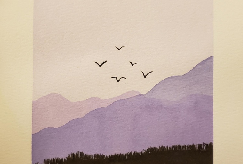
2. Skills You’ll Learn!: So the skills that I would like you to leave this class with today are learning how to create a wash with watercolor. Wash is just a transparent layer of color. In this particular lesson, we'll be learning how to fade and more pigment add color to later color as you work down our page to represent the sky. The second thing that I'd really like to communicate is how we can make certain things in our painting look like they're further away. And how we can also bring detail into the forefront of our painting, giving a lot of depth. Mention. The final piece that I think is really helpful is learning how to paint birds on the horizon. So having the skill to create those silhouettes is something you can add into any landscape piece and it acts as a focal point. And I find that it looks really good. It's something I'll usually added at the end of all of my landscapes. So let's get started and see what we can create together.
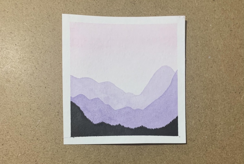
3. It’s A Wash: All right, so we'll start by taking down our paper. I leave about a quarter of an inch on the side. I like to press down the painter's tape with my finger to ensure that when we're done, we get a crisp white border around our painting, so it really pops. I've pre-mixed my colors. I have a pink here. So you can mix this pink, make it fairly water down so that it is a light color, will be using it for the wash of the sky. Now a washes just any translucent color for this particular wash. We'll be making it a little bit darker and more saturated at the top and faded down near the bottom so that it looks realistic. I have a bluish purple color for my mountains, and then I also have black. I always have an extra tube of white and black. I find that I go through it a lot faster than a lot of my other colors. So wet your brush, you can use a pretty large brush for this stage of your painting. I have a 14 round brash and just making sure that saturated here, I'm actually going to add a little bit more pink. And then paint that across the top of your paper. And once you have that dip your brush and water and we'll do the next stripes. So what happens is this water will actually pull down the colour. And every time I do a stripe, I'm dipping my brush once more into some water. So the effect that we actually get is fading down as we move down our paper. And it's always good to err on the side of more light because we can actually add another coat if we want. But it's really difficult with watercolor to lift any color up afterwards. And so once you get to the bottom, it should be pretty much clear. And then I like to just go back and forth using my brush. All the way back up to the top, just smooth out any lines that I have. And sometimes I just do that a couple of times because we really want to have it evenly blended from top to bottom. Perfect. Now we wait for this to dry.
4. Distant Mountains: Great, so our Wash layers dry and we have this beautiful wash here, feeding from pink to a lighter color to represent the sky. Now if you look at your watch and you feel like it's not quite dark enough, you're welcome to just do the exact same step again and get that more pigment add color will be moving on to our most distant mountain representation here. So I'm using my big brush and I just have this bluish purple color. I'm going to make sure that I water it down quite substantially because to represent that more distant of our landscape, lighter colors do really great job of doing that. And so make sure you take your time to make that color that you really enjoy. It's definitely worth it because colours are a great way to evoke emotions when we're looking at a painting. Now if you'd like to plan a bit more, you're welcome to lightly draw in the mountain shape with a pencil. But I find that because watercolor is so light, you can usually see the pencil through. So I forgo with that step most of the time unless I'm working on something that is new to me or it's a little bit more complicated. Okay, so I'll pull this color over here. Get it nice and light. I'm going to start about a third of the way I put my paper. That's a great way to divide your paper. And just go ahead and draw a line that's J guids. And move your brush up and down to create those peaks. When we're trying to make something look more organic, it's good to really vary the shape. Once you have a line that you're happy with, go ahead and fill that color and all the way to the bottom of your paper. But we can always alter the line a little bit afterwards, so don't worry about it too much. But it's important to gather color filled in while it's still quite wet. And then making sure there's no weight spaces here. And the colors distributed makes them even. Now I'm actually going to move over a little bit here. And there's play with that line until I'm happy with it. Beautiful. So that layers completes. And now we want to wait for it to dry completely before we go onto the closer layer of mountains.
5. Getting Closer: We're ready to get started on our next layer. So we'll be doing some mountains that are a little bit closer to our view here. Grab your large paintbrush and then create this bluish purple color. This time we'll have it a little bit more pigment. It will still be doing one more layer in the forefront. So keep that in mind when you're mixing at if you vary the hue a little bit, it does contrasts nicely, so don't worry about getting it to be the exact same color. I have mine. A little bit more blue here. And then very similar to last time, we'll be drawing in the line first and keeping it quiet, organic, moving up and down in those mountains shapes. And then I find it looks really good if you just really make it higher on one side to create that nice variance. And then just like before, fill back all the way into the bottom, making sure that you have even coverage with this color. Once you're done, take a step back, look at it and make sure that you're happy with the organization of your peaks because you can always alter it a little bit. I'm pretty happy with how this one's looking so far. And then we'll go ahead and let this layer dry.
6. The Birds: Alright, so I have my second layer of mountains completely dry and will be creating the birds now. So find a low area of your more distant layer of mountains. And we'll just Nestle the birds into that region. So we'll be painting over top of the sky layer of our picture. And go ahead and create that nice consistency for your block. We want to make sure that the block is quite opaque, meaning that it's very pigmented and we can't see anything through it so that it creates a really solid contrast and silhouette for our birds. Make sure you dab off any excess paints before you get started. Just because the last paint you have on your brush, the more control you actually have. We'll begin with a downward swoop. The wings. And this bird will just be shaped as a V. And then we'll create one up here. So this one is going to be erased, say not the, but a very similar shape for the wings so that curved line, the tapers at the end. It's a really important piece when we're creating birds to have that more delicate and realistic look. We will create one over here, so similar, but this one will have both of the wings swooping two the rate err on the side of thinner because we can always make it thicker afterwards. But of course we can't take the pain away. So we'll do two more will be doing five today. And this one will be angled a little bit over to the left just to create that realistic look. Then the last one is a bit of a different shape. I like to think of it as kind of a moustache shapes. So I'll start with the body of the bird, just represented by a dot. And then the tip of the wing swoops upwards. And then I'm going to go down and then up again. And then just mirror that on the other side, keeping the line nascent. And there we have our birds.
7. Tree Silhouettes: We're ready to create our final layer. So now we'll be adding in that tree portion again using Black, pretty pigment and black. And so we'll just be starting quite high on the left side, but below the closer, more dark layer of mountains, the brush whoops, will go downwards. So we'll have those downwards scoops of the brush so that the top is pointing like the tips of a mountain. As you draw in these treetops, makes sure that you're going up and down just similar to how the Mountain Height would vary because this is supposed to represent mountains covered in trees. And I'm gonna go up a little bit here. And and remember, you can always make it higher, so don't worry about it too much. We're just filling in that initial line. And if it looks good to bring it quite high on the sides. So i'll be doing that. And just to give that nice variance. And then once you have that line sketched in, fill in the rest of your painting from that line down with the black, making sure that it's not transparent at all. So if you need to add more block, he can do so. And then once you've done that, take a step back and see if you're happy with that final line. This is really the anchor to our painting. And so it's important that we're happy with the shape that it creates. And I'm going to fill my name here. And then feel free to take it a little bit higher if you think that that would look better in the composition of your painting. I'm happy with mine, so I'm gonna go ahead and let that layer dry, and then we are done.
8. Wait! I Didn’t Sign Up For Ironing!: Alright, so we've made it to the final stage. We've taken our tape off of our paper, So we have that nice white border around our art. But now you'll find that the paper is all rippled. So that's something that always happens when you work with watercolor, no mouth better how advanced you are with your art skills. So I find that it's really important to iron it when you're done so that it looks a little bit more polished. And I know you didn't sign up for ironing today, but I promise you it's squirt that super easy. It just takes a few minutes. You can find your ironing board and just take a piece of paper and just have a piece of scrap paper that I came to the one. Place that on your ironing board and then put your painting face down, spritz the back with your iron. I have it set to a cotton setting. And then he can go ahead and iron it. Some people do like it really flat well place it under books for a few hours or overnight. So if you'd like that perfect look at the end, you're welcome to do that, but I often find that it's already a flat enough for me when I earn it. So there you have it. Thank you for joining me today to create this landscape for my very first skill share video. Please go ahead and share what you created below. I can't wait to see. And if you have any comments or questions, don't hesitate to post those as well in the common section of this class.
 Leah G, Watercolour Artist