Transcripts
1. Preview the final project: Hi, I'm Chris Converse, and in this course we're going to create a responsive HTML email design featuring a rather complex layout that will adapt to varying screen sizes. Now, considering the older email clients requires to use table based layouts, I'll show you strategies for making a table based layout that's responsive. And this technique will render acceptably in over 30 of today's most popular Web based and native application based email clients. And another feature of the design that we're gonna build is its ability to gracefully degrade in older email. Clients will design this with background graphics around the corners and shadows, but will apply these elements in such a way that they don't sacrifice the designs integrity if they're not supported in certain email clients. So I hope this course sounds interesting to you, and if so, let's get started
2. About the exercise files: Now, when you download the exercise bios, there's gonna be four holders inside of there inside a folder. One is a starter. Html file. This is a well formatted HTML document, and I have this in here just to make sure we're all starting from the same starting point Inside apart templates are the source Photoshopped files. So if you want to follow along creating the graphics and the Photoshopped chapter, you can use these files. You can also use these to modify the design of your project as you go through the course inside a Folder three is a series of snippets. We're gonna be hand coating everything that is core to the course, but anything extraneous such as extra layout, features or content. We're gonna cut in, pay some of the content from inside a folder three inside a Folder four is a video file with a video poster frame. We're gonna be using these later on in the course toe. Look at how we can incorporate multimedia into our emails. So now that we're familiar with the exercise files, let's get started building our email
3. Setting expectations about HTML email: Now, before we get started in this course, I want to set some expectations. I want to set expectations for you and this particular course and give you some information that you can share with your clients on setting their expectations. With HTML email, there's some good news and bad news. Now the bad news is that HTML emails are not Web pages. This is because the amount of HTML and CSS supported in each email client varies, and in some cases, that responsive design techniques were gonna be adding to our project will have a negative effect on some Web based email clients. Now there is some just okay news. Right now, most email distribution companies will recommend that your email remain extremely simple. A lot of times these suggestions will be that you keep your email toe one column. You just simply float or a line images to the right and the left and allow the content to flow. And while this strategy will make your email work in the largest number of clients, it's gonna be a hard sell for your design. Clients who want to have an email that's much more interesting. And now for the good news. I'm gonna walk you through a step by step process for creating a much more complex email layout, an email designed. This got a strategy for gracefully degrading and older email clients while incorporating responsive design techniques so that it can adapt for smaller screen sizes. And by the end of the course will have a responsive email that will work on small screen devices. Ah, whole Siris of desktop email applications and even Web based email clients, and will even see how the design will gracefully degrade, where we'll lose things like background graphics or rounded corners but will still be able to maintain the integrity of the design. Even when some email clients don't support all of the design features, it's now with our expectations set. Let's start building out our project.
4. Beginning the project: have to begin our project. Let's credit folder on the desktop. I'll name this my email. Let's open this up. I'm gonna resize this. Move it over to the right hand side of my screen so you can see the files billed as we progress to the project. Now inside of that folder, let's cut another folder called Images. Once that's created, let's come over to the exercise files. Let's go inside a folder one starter file. Let's copy the email that html file to the My email project folder we created on the desktop Not to follow along. In this course, you'll need to be able to edit the HTML code on the screen. Here I have a series of text editors that you can download for both Macintosh and Windows. Some of these air free and some are commercial. You can also use a graphical editor like Dreamweaver or something similar as long as you have access to the HTML code. And once you have your software ready, let's open email that html up in your chosen text editor. Now, with this HTML file opened up in our text editor, I want to bring your attention to the dock type at the top. Now there's a few different recommendations from a few different sites now. Some email clients and HTML email services will recommend you don't use any doc type, and you simply start to document with HTML. Others will recommend you used the X html one Dato Transitional, in which case T. HTML needs an attribute for the XML name space, and then others will recommend that you use html four point. Oh, since some HTML email clients will actually strip whatever doc type you have and put this in, I prefer to use the HTML 4.0 specifications, since I'm also not self closing my HTML tags. Now, as you're following along in this course, you can certainly change this to match any doc type that your email client or your email service recommends. It's not gonna have any effect on the HTML that we structure inside of the body area or the heading area for our responsive email. And now, with our project files in place, next will start creating our graphics from photo shop
5. Creating the banner and background graphics: Now the first graphics we're going to create are gonna be for the banner and the ghosted background content. So let's go into exercise files. Let's open up folder, too. Let's open up banner images, not PSD up in Photoshop. Now inside the layers panel, you can see how it is broken into three different folders. Banner Small, better medium banner large. If we open up one of these, you can see I have a clip area up colored this red so we can see it in the layers panel and I have a photo that's clipped into this. These photos are also set up a smart objects. Now the smart objects have been duplicated into the other sizes. So if I open up small and medium, you can see that these are all duplicates of the same smart object. What happens here is we get an instance of the original smart object, so making a change to one of these will reflect on all of them. So let's explore that first, to modify smart object, we double click on it that will bring up the original file inside a photo shop that's part of the embedded smart object Zoom out here. So to quickly demonstrate this, I'll come up to the image menu, come down to adjustments, and I'll just invert the image. Next, I'll choose file, save saving. The smart object will then update all of the instances in the background. So now we can see that all of the background graphics have now been modified. Based on this smart object change, I'll come back here. I'll undo that close and save my document. Now you also see that I duplicated each smart object twice within each size. This way we could get one ghosted image that's gonna go behind the content now. This feature isn't supported in every HTML email client, but it's going to be supported in a good number of them, and it gives us the ability to have our design gracefully degrade. So here I can see the ghosted photo. If I select this, select my move tool, I could move this around, let me undo that, or I can come up in select the main photo and move this around, but notice there in moving together. If I hold the command or control key, select both the smart objects inside of banner large I can now move both of these together . So this gives you a really quick and efficient way to modify the artwork in all of these banners and even a quick way to change the perceived crop between the banner and the ghosted area inside of the content. Now, to get access to the slices, let's come over and click and hold on the crop tool, come down and select a slice stole. All of these slices have been created already holding commander Control and double clicking on one of these will bring up the slice options. So, for example, banner large is named banner underscore large, and if I come down here in double Click, we can see this is named Banner Large Ghost. We're gonna follow the same pattern banner, medium banner, medium Ghost so that we haven't consistent naming pattern. When we start creating our CSS Now to save all these, let's go up to the file menu. Let's come down and choose safer Web. I've also already set the file tape and compression, so selecting this top one, for example, will give us an image quality of 70% as a JPEG file. Same thing for the ghosted area for medium. I brought this down to about 60 and then for small screens that brought it down to 40. Next, let's to save under slices. Let's come down and choose all user slices. Let's choose to my email directory on the desktop images directory. Then it's safe. So in the background will see that we now have a banner, small banner, small ghost, medium, medium ghost, large and large ghost. Let's come back to photo shop and saving Close. Now they have all of the banner graphics and the content go stings that match the crop for the ban. A graphic next will create the graphics for the content.
6. Creating the content graphics: next, we're gonna create the graphics for the content of the email. So back in the exercise files, let's go to the folder to our templates. Let's open up content images that PSD they're here. We can see multiple sizes of our banner across the top. We can see multiple sizes of the promo graphics that are gonna be after the main body of the HTML Down at the bottom, we can see the icons for the call out and the signature we're gonna have after the main content. Now, to see these slice properties, let's come down and choose to slice selection tool and let's double click on the 1st 1 For example, we can see we're calling this logo large next one's logo medium and then logo small, and you'll also see that we have a large version of the promo graphics and medium version and a small version. Now, if we look back to the response of designs were gonna be creating in the large screen, we have large graphics for the promo stagnant columns. We have the individual icons for the call outs above the content. In the medium size, we still have our promo graphics and columns, but they're much smaller and the call outs are now shaped inside of a grid. And then, for the smallest screen, our promo, they're gonna have a small square on the left hand side of the content, and we're gonna do something similar for all of the call outs. Now, to save these graphics out, let's come back to photo shop inside of the Layers panel. Let's come down and turn off the f p l layer thes graphics down here, Signature and the icons we wanna have transparent. So we'll want to make sure we have no artwork turned on behind those next up to choose file save for Web. Now, if you click on these, we can see that I've already set the file types for the logos. I chose a gift file format for all of the photos I've chosen J. Peg. And then if we come down and look at the icons, I chose a gift file format, and I chose a matte color here of the dark purple. What this is going to do is put a dark purple edge, since we can't have semi transparent pixels on a gift so that these icons will match nicely into that purple background. And likewise, if I scroll over and select the signature slice, you could see the matte color is set to the same color as the background of the content area. Next has come down to safe for slices. Make sure we have all user slices selected. Choose the My email folder on the desktop, then the Images directory, and then it save now in the images. Director of our project. We can see all of the graphics that have been generated from our content. A PSD file. Let's come back to our Photoshopped file, saving close and now, with all of our graphics created next, we can start working on the HTML for email.
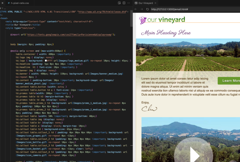
7. Setting up the base layout structure: now back in our code editor with our email that html file open, we're going to start building our layout. Since most email clients don't support a full range of HTML and CSS, we need to use tables, which is an older layout structure, in order to get our content of work right and all the different clients. Now, this does pose an interesting challenge for responsive design as well. When designing responsive design inside of a browser using straight HTML, we have the ability to take containers such as DIV tags and other elements. And when we resize the browser, we can move those individual elements now, in a table size changes, all of the TDs will get smaller, but we can actually change the relationship of the individual TDs. They're locked inside of that table structure so we can take one TD, for example, and move it independent of all of the other ones. So to get around this limitation, what we're going to do is put individual content into full tables that have a single cell inside of them, and then when the with changes, we're gonna move the entire tables around, so back in our text editor. The first thing we're gonna do is set the background color. Let's come down here inside of the body tag. Some email clients will support setting a color on the body tag so inside of the body element type E G color set that equal to pound sign E f E one B zero. Now the background color added, Let's come inside of the body area. Let's come in here and delete the HTML content goes here comment, and we're gonna add a table cell that's going to be full whip. So weaken center our email. We're also gonna ply the background color to that as well. In case the email client doesn't support the body tech. Let's start with a table tag. Let's had a width of 100%. What's that? A border equal to zero. Sell spacing. Let's set that to zero. Next, we'll set cell padding. Set that to zero and again we'll repeat the background color so BG color equals pound Sign E f e one B zero. Next, Let's at a table row inside. There, a TD for ourselves, let's and the TV next line. Let's end the TR and then in the table. Now, with the outer table in place, we're gonna create another table inside, which is gonna be our main container again. If we go back to our design, what we're gonna be doing is taking this large screen, which is going to be our base design. And we're gonna be splitting this up into Individual Rose. So we're gonna have a specific T d Oro for the logo. One for the headline, the banner, the content, Primeau's call outs and then the footer. So inside of our HTML, let's get our cursor inside of this TD tag, and we're gonna put the main email container inside of here. So let's start with the table. Let's set a class equal to container. What set a width of 640. Let's set in the line of center next set of border of Zero, sell padding equal to zero and then sell spacing of zero. Next, let's at our first row and then a TD for a cell inside of that row. That's gonna be the very 1st 1 for the logo and the TV and the TR, and then we're gonna repeat this pattern until we have seven rows I'm going to speed up the video here so you don't to watch me typing all of these and you can certainly copy and paste the first t r and TD set to get your rose. And once I have my table with my seven rose, I'm gonna tab this in just so I can visually see the structure that this particular table is inside of that parent table. And now they have our main table container in place with our seven rose. Next, we'll work on styling the road for the logo.
8. Styling the table row for the logo: now to add some style to the logo row. Let's come down inside of the first TR. Let's find the TD. Let's set a space. Let's start adding some attributes in here so we'll start with via line. Said that the top. Next, we're going to set a class of logo, then BG Color. What's that? That toe white So pound sign in six efs. Next, we'll set an in line style. First Property's gonna be patting Were you shorthand style here. So 10 pixels on the top space 20 pixels on the right, zero on the bottom, 30 on the left. Next is going to be border left shorthand style for this is gonna be size of one pixel style of solid color is DBC 064 Then we're gonna set border right one pixel solid DBC 064 and then border top one pixel solid and the same colors the other two. Once that's in place, let's come inside of the TV Let's and an image inside of here, which is gonna be the large logo. So let's start with an image tag. Source equals images slash logo underscore large dot gift. Next Let's Haddon all tag lt equals our vineyard. Next is gonna be with such a 5 85 which matches the photo shops, life size and a height of 45 and then, lastly, a border of zero. Now we want to make sure that the logo was clickable to our website. Let's get the cursor before the beginning. Image tag, let's and an anchor tag so beginning tag a trough equals will put a pound sign here, which is a self link, and the tag. Then get the cursor after the image tag, Let's end the anchor tech. And since we have a border set to zero here, even though the images hyperlinked, we won't get an anchor link border around the image. So at this point, we have something that we can see in a browser. So let's save your work. Come back out to the operating system. Let's open up email that html up in a browser. So in the browser we can see that we have our yellow background. We can see that we have a logo in the very first table cell, and if we resize the browser, we can see that the content stay centered inside of that larger container. And now that we have the logo row set next, we'll work on the headline row
9. Styling the table row for the headline: now to work on the Headline Row. We're gonna go into our snippets and get the TD values. We've typed him in the last movie, so we're not gonna type them every time. When your text editor choose file open, we're gonna go into the exercise files into the snippets and open up a desk headline desk road that HTML. Instead of this file, you'll see a TD tag. Let's come down here and select the entire TD tag copied to the clipboard. Switch back to email that HTML Let's come down here and find the second table row. Let's find the first TD and let's paste in our content we just copied from the snippet. Next, let's get our cursor inside of the TV. Let's tap this in and let's type in an H one tag. So let's start with an H one tag and then we'll type main heading here and then end the H one tag. Now you may notice in this TD tag here I have font sizes and font family set up. So if we specify the particular in line styles in this TD, every set of text inside appear will get those properties unless we wrap them inside of another object. So the H one here is a separate object from this TV. So we're gonna add an in line style to the H one, so weaken style that separately. So to do that, we're gonna get our cursor inside of the H one tag into space. Let's at an in line style, so style equals. Let's set a margin of zero on the top zero on the right, 15 on the bottom and zero on the left. Let's set a font wait to normal font size. We're gonna set to 32 pixels and then for the color we're gonna set pound sign 7 to 3 C seven f. Now, any time you have a specific block inside of a TD, we're gonna have to come in here and add our font sizes and different properties. So from here out, the only element we're gonna put inside of here is gonna be an H one, and then the rest of the copy will pick up the style we put on the TV appear. So that's that's what we have so far. Let's open up email that html up in our browser. So we should see this now. This is looking good. So far, however, I do want the logo to sort of hang over to the left hand side. Here. Let's close our browser. Let's come back to our code. Let's come up here in the logo Row inside of image. Let's hit a space. Let's have a style Attribute onto the image. Let's set a margin. Dash left. We're gonna set that to negative 15 pixels. That's gonna hang the logo a little bit to the left so it optically aligns with the heading . What's it save? Come back out to the browser. Let's hit! Reload! And now we can see. We got that negative. 15 pixels on the left, margin for the logo. And now with the headline Road complete next, we're gonna work on the banner and content Rose
10. Styling the table row for the banner and content: Now we're gonna work on the banner row. Let's scroll down here a little bit. I set up a TD tag in our snippets for this as well. So let's go into our exercise files inside of Folder three Snippets. Let's open up Banner Road that HTML Let's come up here and copy that TD tag copied to the clipboard. Close my other snippets. Let's go back to email that HTML Let's come down after the headline row. Let's find the third row. Select the first TD. Let's pace in that content. What's that? A return. So in here, we'll add an image tag. Source equals images. Slash banner underscore. Large dot j Peg set a width of 638 pixels. We'll set a height of 180 pixels. Then we'll set some all text and we'll type photo of our vineyard. Next. We want to get the TD for the content row. Scroll down here a little bit. Go to our exercise files. Let's open up. See content. Road that HTML at the top and come up here and grab the TD tag. Copy that to the clipboard. Come back to email that html Let's find the fourth row selected replaced the TD tag. I'm going to return Tabin. Let's go back to our snippet for content row. Let's come in here and grab the placeholder text all the way down to the image tag, which has the signature. Let's copy that to the clipboard. Close that vile. Come back to email that html and inside of the T D. Let's based all of that content. I'm gonna format this little bit at this point. Save your work. Let's come back out and testes in a browser. Now we see we have all of this in place. Now we don't have a background graphic showing behind here for browsers that support backgrounds inside of a TD. So to add that we're gonna add an in line style to the TD we just put in place. Let's close our browser. Let's come back. Let's find the TD tag with the class of content. Let's come down here inside of the in line style. Let's get a space. Let's add in the background property, several type background. We're gonna do shorthand style here, so the first parameters gonna be background color, so start with a pound sign f five f to be five. Next is u R l We're gonna set the u R l two images slash banner underscore large underscore ghost dot j Peg, We're gonna set new repeat zero pixels on the X and zero pixels on the white property. Let's choose file Save will come back out to the browser, reload this. And now we'll see the background graphic in place. Now that we've got the content, Roe in place next will work on the road for the pro most.
11. Styling the table row for the promos: Now we're gonna work on the roads. That holdup Romo's So it's come down here and let's find the next row the next TV. Let's open up our snippets. Let's find D Dash promo Death Row that HTML inside of here at the top were gonna come up here and copy the TD. Let's copy that to the clipboard. Let's switch back to email that HTML Let's select and replace the first TD with what we just copied. Hit a line return. Now what we're gonna do inside of here is add an additional table as we talked about earlier in responsive design with tables we can't manipulate or move TDs around without having them be in relationship to the rest of the table. Now, in order to have our pro most, Jayne's position, we're gonna need to put the individual promotes in their own table as we talked about earlier. The response of nature using tables means we have to wrap each of our elements in a single cell table in order to manipulate them. So what we're gonna be doing in three different cases here is we're gonna be taking an individual table and using that to create our call to Action Button, which will do a little bit later. We're gonna use it to create to individual tables right now for the pro most. And we're also gonna use the same technique to create four individual tables for other call outs. This way, as our screen size changes, we can manipulate and move these tables either to stack on top of each other or to get smaller and still online, right and left. So back in our HTML file, let's start by adding our first table. So we're gonna start by typing a table tag. Next, we'll add a class of primal underscore one. We're gonna hard kota width here of 270 and then we're gonna set the align property toe left Next line. We're going to set a TR for table row. Next line. We're gonna start our TD next line. We're gonna end the TD than and the table row and then in the overall table. And then let's come up here and format that a little bit now inside of this TD inside of the table with a class of promo one, let's come back to our snippets. Let's come down to primal Want content? Let's copy all of this to the clipboard. Let's go back to email that html and let's pace that content inside of this TD. And again, I'll just format this little bit Now That's everything we need for one complete promo inside of our promo zero. Not to create our second promo. Let's come up here and copy this entire table instead of return. Let's paste the second copy of the table. You're gonna format this little bit now on the 2nd 1 Let's change promo one to promo to Let's come Down and change promo image one to promo Image two on the all text. Let's change the file to promote too large. And lastly, let's come up here and change a line left to align. Right now with these in place, let's have file save. Let's come back out. Test this in a browser. Now we can see our to promote tables. One a line left and one align right now with these in place next, we'll work on the call outs row
12. Styling the table row for the callouts: next we'll work on the road for the call outs. Let's scroll down. Let's find the second to last row here the first TD. Let's open up from our snippets folder, The E Dash Call out desk profile at the top. Let's come up in Select the TD tag. Let's copy that. Go back to our email that HTML Let's replace the first TD in the second to last row with that TV set of Return into Space. Let's come back to our E Call it road that html file inside. Here we have the markup for one of the pro most. So just like in the last movie, we're gonna take each individual call out and make them separate tables. Let's copy that entire Call that one to the clipboard. Switch back to our email that HTML Let's pace that inside of the TV. I'm gonna come up here and format that a little bit. It's not that in place. We need to add three additional call outs. Let's come back to our exercise files. Let's open up F dash call outs that HTML inside. Here I have the call outs for numbers 23 and four. Let's come in here and copy all three of those tables. Switch back to email that html and after the table class, call out one. What's that? A return? Let's pace in our remaining tables. I'll come in here and format this little bit now. At this point, we have all of our call. It's in place now. If we examine these a little closer, you'll see that each table has a width of 1 35 We also having a line property of left inside. We have an image that's linking to one of the individual icons we created. We have some text that's being controlled by the TD Font properties to break tags for the space and then a simple anchor link. And again, all four of these have the same properties, except we're changing the individual graphics and some of the text. So at this point, it saved Come back out. Look at these new browser and in the browser will see these four tables with the line left property are now stacking, making four columns Now, later on, in the course, we are gonna be floating some of these tables for browsers that have more advanced CSS support. And so what we're gonna need to do is add a break tag so that we can clear some of the floats. Let's close our browser. Let's come back into our code after the fourth table call out, Let's get a few returns and what we're gonna do here said it. Break tags. We can clear the floats, so start by taping a BR tag. We'll add style, clear colon, both semi colon and the properties than in the tack. So now this break tag in place with its clear float CSS definitions when we float the tables later on in the course, this will ensure that the outermost container, which is the Purple Row of pro most, will extend high enough to encompass all of the tables inside. And with this in place next, we'll work on the road for the footer
13. Styling the table row for the footer: not to work on the footer. Let's go down. Let's find our last table row here. Let's go into the exercise files. Let's open up G Dash foot or Death Row at the top of this snippet. Let's come in here and copied the TD tag. Switch back to email that HTML replaced the first TD with this instead of return. Let's Tabin at content Inside of the TV. Let's come back to the foot a row snippet. Let's come down here and copy all of the content so we have a copyright and maybe some sample text you might have inside of your message. We also have some links to privacy and unsubscribe with in line styles coloring those black . Let's copy this. So the clipboard switch back to email that html Let's hit Paste me format this little bit. It's not this in place. Let's that file save. Come back out. Look at this in a browser, and if we scroll down to the bottom, we can see the photo content in place. It's now inside of the foot a row. We have Tedy set to the same background color as the table that centers our entire email which is also the same color that we put into the body background. Now that the entire structure for our emails in place next we're gonna go back in style. Some of our anchor links toe look like buttons.
14. Styling anchor links as buttons: So now what we're gonna do is take these, learn more links inside of our pro Mose and style them so that they look more like buttons . How to do this? Let's come back to our email that html file inside of our text editor. Let's grow up and find are two pro, most so inside of our promo SRO. Here we could see Promo one and promo to inside a promo. One. Let's come inside of the anchor tag. Let's get a space. Let's add some in line styling here. Let's start by ending a style attributes. First thing we're gonna do is set a background color. It's a background as color. The values gonna be pound sign 71 a 412 Next, we're going to set a border dash radius to five pixels. We're gonna set color, which is the type color to white. Next, we're gonna set padding five pixels on the top, 10 pixels on the right, five on the bottom and 10 pickles on the left. Next we'll set text decoration to none. This will remove the underlying next. We'll set text chateau Well said zero pixels on the X offset two pixels on the Y upset two pixels of Blur and then a color of pound sign. Three A 5606 Not that in place. Let's hit, save. Let's come out and reload this in a browser. Now we can see our learn. More button is styled here. We've got some rounded corners, We've got a drop shadow and we've got our underlined removed and the type is white. Let's come back to our HTML file. Let's come inside of the anchor tag and let's select an entire style attributes. Let's come down inside of promo to find the anchor link inside of there into space based. Come back to our browser, and now we'll see that we have both anchor links now being styled like buttons. Now, some email clients won't be able to render the border radius, so instead of rounded corner buttons, you'll have square buttons and in other cases, some email clients can't render a background color. So depending on the email clients you want to support, we may need to make some changes here, and we'll talk more about that in the troubleshooting section of this course, and now they have our promo links looking like buttons. Next, we're gonna create a call to action button that we can align right and have content flow around to the left.
15. Creating a call-to-action button: Now we're gonna create that call to action button that goes inside of the content and aligns over to the right hand side as we talked about before. This is going to also be set inside of a table, and we're gonna online that overall table to the right so the content can fool around the left hand side. So back in her HTML file, let's go up to the top. Let's find our road that holds the content. So here's our TD of class content. Let's come in here. Let's add a few returns. We're gonna need to add this call to Action button before our content here. Since we're gonna align that to the right, we want to have the top of this content be as high as the top of the button. Start with the table tag so it's come in here and at a table. Let's set a width of 160. Align equals right class. His button with that in line style margin, zero in the top, zero on the right, 10 pixels on the bottom and 30 pixels on the left and the tag. Let's start a new table row, then a new TV inside of the TD lets out an end line style textile line we're going to set to center background color. We're gonna set this £2 sign 71 a 412 Next, we'll set the padding 10 pixels on the top, 15 on the right. That will also set 10 on the bottom and 15 on the left and the next will set border dash radius to five pixels and the TD and the table row and then in the table. Now, with that in place, I'll just format this. Next we'll get our cursor inside of the TV and we'll add an anchor link. So start with a tag eight. Ref equals it has been in a pound sign in line style. We're gonna set color to white. We're gonna set font size of 18 pixels. We're gonna set letter spacing to one pixel text decoration to none. Text to shadow 20 on the X offset. Two pixels on the Y offset two pixels of blur and then pound sign three A 5606 for the color. Next will set font family to aerial combat Helvetica comma san serif than the actual text that's linked. So we'll take, learn more and then end the anchor tag. So here we have an anchor tag that setting its color toe white and setting. It's fun properties. We have a TD that's acting as the parent to that anchor tag where we're assigning our border radius in our background color. And then we have an outermost table within a line right that's acting as the main parent for our call to action. So at this point, let's hit, save. Let's come back out to our browser, reload again, and then we'll see our learn more button showing up here on the right, while the content is a lot to wrap over on the left inside. Now, if we scroll through, we can see that we have all of the land in place for our email. There's one last thing we want to do, and that's changed the linking colors inside of the call outs. So to take care of that, let's come back to our email that html file in our text editor, let's go down and find our call outs row. Let's come in here and find our first call out. Let's find the ankle tag. Well, said a space. Let's add an in line style element here, so we'll type style. They will come in here and set color £2 sign e f B one B zero. Now, with that in place, let's come in and copy that style. Attribute. It's going to call out to Let's get a space and paste that style on that anchor tag find. Call out three paste the style. Attribute. Then lastly, let's base it on. Call out for as well had filed. Save switch back to our browser lets it reload. Now we have the light yellow color for the individual call outs. And now, with all of this market for styling and layout in place, you have a traditional email that will work in dust up clients and Web based browsers. And if you don't want to add responsive techniques, you can certainly skip ahead to the troubleshooting. For those who want to make the design responsive and the next chapter, we're gonna work on adding some in line CSS styling and arranging the layout and elements based on screen size
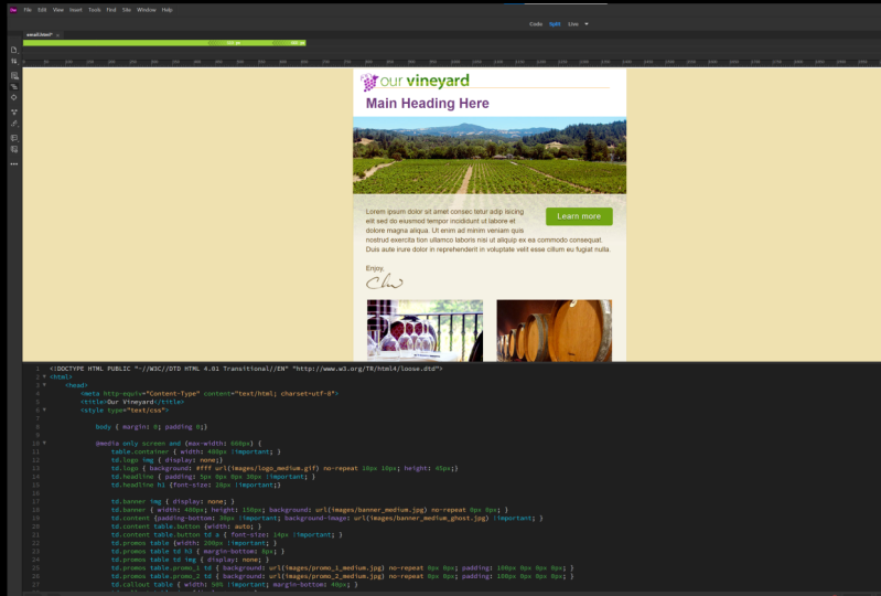
16. Adding CSS media queries to your HTML email: Now we're gonna add some CSS into our HTML email, So let's go up to the top now in the document we're all starting from. We have a style element up in the heading area. What's a few returns? Let's first at our CSS three media queries. So let's start with at Media Onley, screen and and M parentheses. We're gonna put Max Dash with call in sick 60 pixels beginning and ending bracket That's gonna be our medium screen and the next let's add media Onley screen and and then we're gonna set max width of 5 10 inside the parentheses and then our beginning and ending bracket. Now, since we're not adding a min with any rules that we assign inside of 6 60 will also be triggered inside of 5 10 And all of the elements and in line styles on the HTML in general will be applied to all three of these as well. So for these media queries, we're gonna be overriding only what needs to be changed or medium screens at 6 60 small screens at 5 10 Now, the first rule we're gonna create is going to be inside of the max width of 6 60 So let's come in here and we're gonna create a rule that's going to target the table element with the class of container. What we're gonna do here is we're gonna type with 480 pixels, and then we're gonna add the important flag. So what this flag does is override the width attribute that we placed on the table tag itself. Now, normally, elements and styles that are placed on an individual element will override remote CSS rules . So again, this important tag will override the width of 6 40 send it back to 4 80 And considering we need to use a lot of in line styles and element properties for older HTML email clients were gonna be making use of the important tag to override some of these properties for the responsive nature of our project. So now, with the size being changed for our medium screens, let's get our cursor inside of these small screen area. Let's come in here and had two more rules to override this sizing for small screens. So start with table that container. Once we get under 510 pixels, we're going to set the with 2 100% add the important tag and the next we're gonna target the TD inside of the table container ever going to remove the border. So we're going to table dot container space TD and then border colon none. And then the important flag. So once we get under 5 10 we're gonna have the design stretch to full width, and we want to get rid of that border that we see for our large and medium screens. Now, with our media queries in place for the outermost container, let's come back to the 6 60 size. Now we're gonna target the image inside of the logo row. Let's do t d dot logo space image. That's the large graphic. What we're gonna do is set a display on that to none. Then we're gonna target the TD itself. So tv dot logo, we're gonna set the background color toe white. Then we're going to set the u R l two images slash logo underscore medium DOT gift said no repeat sent 10 pixels on the X and 10 pixels on the why, and then set a height of 45 pixels. So what? This is going to do is hide the logo graphic and then replace the background graphic of the TV with the medium sized logo. Now, with that in place, let's bring our cursor down and inside of the small screen area. We don't need to turn the logo off, because again, we are compounding these since we have no minimum with so the td dot logo space images, they're going to be turned off. So what we're gonna do now is target the TD with a low class we're gonna read to find the background again. So we're gonna say, background we're gonna pick white for you are l. We're going to images slash local underscore. Small No repeat. We're gonna center the logo and 10 pixels on the why, and they were going to set the height to 32 pixels. Now, with these media queries in place, let's it save. Let's come back out and test this in a browser. Now, when we re size our browser and we get under the 660 threshold, we can see that the logo changes and if we go down even further, we can see that we get to the small screen size. Now you'll notice that the outermost container isn't changing at all. We still need to make additional changes to other graphics, such as the promo tables and the banner graphic. And now that we can see that our media queries are working properly on the logo row next we're going to target the heading row and the banner row.
17. Styling the headline and banner for smaller screens: Now we're gonna target the headline row in the banner row inside of the medium screen size . So inside of the media query for max width of 6 60 Let's come in here and add some more rules. So we're gonna start by targeting the TD with a headline class, so td dot headline at our brackets, we're gonna set padding of top of five pixels. Zero on the right is zero on the bottom 30 on the left and then set the important flag. Since these air set on the individual TD element Next, we're gonna do td dot headline space H one. We're going to set the font size to 28 pixels. Said the important flag on that as well. Next, we're going to set td dot banner space image. We're gonna turn that off is well, just like we did with the logo. So display colon None. Next we're gonna do td dot banner target TTD. We're gonna set a with the 480 pixels. We're going to set a height of 150 pixels. Then we're going to set a background. No color. You are Well, we're going to set two images slash banner underscore medium dot JPEG said no repeat zero pixels on the X and zero pixels on the Why. So just like the logo row, we're gonna turn off that graphic for the banner and then we're gonna apply the medium size banner into the T D. Now again, these properties are going to be picked up for the small screen. Let's bring our cursor down. Let's get a line return and let's add some more small screen rules. Scroll up here a little bit. Let's come in here and let's target the H one. So we're gonna do TD Doctor Headline Space H one. We're gonna set the font size to 24 pixels and then set the important flag and then we're gonna set the text the line to center next. We're going to target the td DOT banner. We don't need to turn the image off because we did it on the medium size. We're gonna set a height of 115 pixels. Background, no color. We're gonna set your l two images slash banner underscore Small that J peg No repeat, we're gonna align to the right on the X and zero pixels. on the why, and we don't need to set the image inside of the TD to display None. Since we already set that in the medium size, it's now with these in place, Let's hit, save. Let's come back out to our browser. What's it? Reload. And now, when we load this in a browser and re size, when we get to our medium screen size, we could see the banner changes. The headline gets a little bit smaller, and you can tell that the graphics actually changing since the ghosted image is not being switched to the medium size so we can actually see that the alignment doesn't match here. And then if we get down to the smallest size, we can see that we do switch to our 100% view. So the entire design becomes liquid and we have the banner aligned to the right and the headlines centered. We can see those effects taking place as well. So now we have the 1st 3 rows completely responsive. Next, we're gonna work on the content in the footer area.
18. Styling the content and footer for smaller screens: It's not for the medium size screens. We're gonna modify the content row. Let's get our cursor inside of the max with 600 Media Query. Let's come in here and target the content row so td dot content space We're gonna set patting bottom of 30 pixels then said the important flag they were gonna do background image. We're gonna specify images slash banner on the score medium underscore ghost dot j pay, then the important flag. Now we did specify that background image on that element inside oven in line style to specify the banner Large ghost. So we do need to override that with an important tag. Next, we're gonna target the call to Action Button. So we're going to TV dot content space. Table that button. We're gonna set the width to auto and then td dot content space Table that button space TD space A. We're going to set the font size to that anchor link to 14 pixels and then set the important tag on that as well. Now, if those in place, let's come down inside of the small screen rules that said a return. Let's come in here and target the content row tv dot content. We're gonna set a line height of 20 pixels. Said the important flag. Next, we're gonna set patting bottom to 10 pixels. Said the important flag for that as well. Next, we're gonna set background. We're going to set a color here, so pound sign F five f to e five, then the u R l images slash banner underscore small underscore ghost dot jpeg We're gonna set No repeat. We're gonna align the ghosting to the right as well zero pixels on the Y axis and then the important flag. And then lastly, we're gonna target the footer td dot footer. We're gonna set padding of 20 for top and bottom and 30 for right and left. Then the important flag this way, when we switch the design to be fully fluid or 100% with, we won't have the text in the footer touching the right or left side of a small screen. It's not what these rules in place. Let's hit, save. Let's come out and test this again in a browser. I reload sighs this down. We'll see the medium sized background graphic showing up inside of the content on the medium size screen, which matches the medium size banner and then for small screens will see that this matches as well. And both the ghosting and the image appear are lined right. So we'll get a dynamic crop on the left hand side, and both the ghosting and the image will match. Now, if we scroll down to the border, we'll see that we have some padding on the right and left. If I open this up, once we get up to the medium size, you'll see that the text flushes toe the left side of its TD so that it matches the purple area here. But when we get down to the small screen, size will actually snapped this in a little bit, so that on small screens the text won't actually touch the sides. And now, with the content row and foot A row, media queries in place next will target the road that's got the promo is in it
19. Styling the promos for smaller screens: Now we're gonna set some rules to target the promo zero. Let's scroll up into our media queries inside of the medium screen size. Let's come in here and add some new rules. First, we're gonna target the table inside of the TV Pro most. So start with Tedy Doubt Primeau's space table. Let's set a width of 200 pixels and then the important flag next, target the headings inside so td dot Primeau's space table space TD space H three. We're gonna set a margin bottom of eight pixels. Next target the images td dot Primeau's space table space TD space image we're gonna set displayed in none. Next, we're going to target the TD inside of promo one. So teed up. Ramos space table dot promo underscore one space TD. Let's set a background property no color. Your l is gonna be images slash promo underscore one underscored medium dot J peg, No repeat, zero pixels on the X zero pixels on the why and padding. We're gonna set to 100 pixels on the top, zero on the right, zero on the bottom and zero on the left. Next, we're going to target the TD and promo to so t d dot Primeau's space table that promo underscore to space TD background No color. You are always gonna be images slash promo Underscore to underscore medium dot J Peg No repeat. Zero on the X zero on the why and then for padding. We're going to set 100 pixels on the top zero on the right, Sarah on the bottom end, zero on the left. Now what? Those in place? Let's add the rules for the small screen. So inside of the small screen area, Let's target promo one so t d dot Primeau's space table dot promo underscore one. Lets reset the width 2 100% then used the important tag. Next, we're gonna add a border to the top. So border top one pixel solid color is pound sign 71 a 412 Next, let's target to TD inside a problem one so tv dot Primeau's space table that promo underscore one space TD. We're gonna set the background no color. Your l is gonna be images slash promo underscore one. Underscore small dot jpeg No repeat zero pixels on the X 40 pixels on the why, Then we'll set padding 20 pixels on the top, zero on the right, 40 on the bottom, and 110 pixels on the left. Next TD. Stop! Ramos Space tabled up promo underscore to We're gonna set the width of this to 100% as well . Had the important tag Next, we're going to target the TV. So TD doubt Primeau's space table dot promo underscore to space TD background no color. You are else gonna be images slash promo underscored to underscore small dot JPEG said no Repeat, zero on the X 20 on the Why padding We're gonna set zero on the top zero on the right is zero on the bottom and 100 and 10 pixels on the left. And then lastly, we'll set a clear left this way. For some reason, one of the tables isn't resized 100%. We can be assured that Table two will have a clear left so it will align on the left hand side with the table above it. It's not what these rules in place. Let's hit save. Let's come back out to our browser. Let's reload. Gonna resize. This is the large Greenview. When we get to medium. We can see that the images have a display of none, and now we have the medium size graphics assigned into the background, and we have a padding here that's pushing all the content down so we can see the background graphics. And then when we get to the smallest screen, we can see that we change the background graphics again, aligned them to the left, and we see that the twos tables will now stacked vertically instead of being in columns. So this is small, medium and large. So now, with our CSS rules in place for the promo SRO, next will work on the call out row.
20. Rearranging the callouts for medium screens: Now we're gonna create this CSS rules for the medium sized call outs. What we're gonna do is we're gonna take the four columns and now arrange these in a grid. So to do this, let's get inside of the media queries for the medium screen. Let's add some more rules. So we're gonna start by targeting the table inside of the call outs. Certain type t d dot call out space table. We're gonna set the width to 50% that we're gonna set the important flag. Next, we're gonna set margin bottom of 40 pixels. Next, we're gonna hide the images inside of the call outs. So we're gonna do t d dot call out space table space image set displayed and none. Next. Let's target those break tags. We're going to remove the space between the paragraph in the link, so td dot call out space table space br we're gonna set this plane and none. Then we're gonna target the anchor links td dot Call out space table space A. We're gonna set the display type to block. This will put it on its own line and then margin top of 10 pixels than the TD itself so tv dot call out space table space TD. We're gonna set that background size of the images to 65 pixels. Now, since we turned off the images inside of each one of the tables, we're gonna need to reassign the background graphics. So it's had a return. Let's come in here and target each individual call out. So let's start with Tedy Duck. Call out Space table dot Call out underscore one space TD. Here, we're gonna set the padding to zero on the top 30 on the right is zero on the bottom and 60 on the left. Add the important flag. Then we're going to set a background no color. Your l It's gonna be images slash icon underscore crepes dot gift. We're gonna set no repeat zero on the X axis and negative 13 pixels on the Why next TD call out space table dot Call out underscore to space TD here. We're going to set the padding to zero on the top 20 on the right, zero on the bottom and 60 on the left set the important flag. Next, we'll set background. We're going to set the URL two images slash icon underscore bottle dot gif No repeat. 10 pixels on the X and negative three on the why next td dot call out space table dot Call out underscore three space TD Here, we're going to set padding of zero on the top 30 on the right is zero on the bottom 60 on the left set. The important flag background your L we're gonna set to images slash icon underscore basket dot gift. No repeat zero on the X and negative 13 on the why and then lastly for call up for t d dot call out space table dot call out underscore for space TD patting zero on the top 20 on the right is zero on the bottom and 60 on the left. Said the important flag than for this one. We're gonna set background. You are l images slash icon underscore camera dot gif Then set no repeat 10 pixels on the X and negative 23 on the Why now, with all of these rules in place for medium screen sizes, lets it save testes in a browser. It's now in the browser we can scroll down and large screen. We see that the tables lined up next to each other, creating four columns. But then when we come down and go to our medium size, we can see that we've rearranged this to now show up in a grid. Now there's a few rules that we change that make this possible. Now one is that we change the padding inside of the content. So we pushed a content from the left hand side to give us room for the icon. We turned off the graphics, resized the background graphics with the background size and then assigned individual graphics into each one of these. And we also turned off the brake tags. So we had a break tag right after the original image which would have pushed this content down. And we had a double break inside of here, which would have made the learned mawr pushed further away from the content than we see here. Now there is one more property we're gonna add into table three down here, and that's going to be a clear left. Now, we're gonna do that in case we have too little content inside of call out to that would allow table three to wrap up next to table one. So in order to alleviate that potential problem, let's come back to our HTML file. Let's come inside of the CSS world that targets. Call out three and let's add it clear left and then it's safe. And now that we have the media queries in place for the culottes for medium screens, next we'll work on that call outs for small screens.
21. Stacking the callouts for small screens: Now we're gonna just the layout for the call. It's on small screens, so inside of our CSS inside of the media query for 510 are small screen. Let's add a return. Let's come in here and target that call outs. So let's start with TV dot call out space. We're gonna set padding 20 pixels on the top 30 on the right is zero on the bottom and 30 on the left and set the important flag. Next, we'll target two tables inside t d dot call out space table. We're gonna set a width of 100% and the important flag. Then we're going to set margin bottom 2 20 pixels. Next, we're going to do TT Don't call out space table space TD. We're gonna set padding of zero on the top zero on the right, 10 pixels on the bottom and 50 pixels on the left. Said an important flag on that, we're gonna set up background size. We're gonna size the out kinds a little bit smaller. We're going to 50 pixels on the X and 50 pixels on the why said an important flag there, Then we're going to set a minimum height of 60 pixels. Next, we're gonna do td dot call out space table space A. We're going to set the display Type two in line. We don't want those to show up as a block anymore. Now what? Those rules in place, we're gonna position the icons that are being assigned into the background properties for each one of the call outs. So the target the first call out t d dot call out space table. Don't call out. Underscore one space TD. Let's come in here and set the background position zero on the X and negative six on the Why. Let's target call out to td dot call out space table dot Colin underscore to space TV. We're gonna set background position here. 24 pixels on the X and negative two on the why next TD call out space table. Don't call out underscore three space TD background position. We're gonna set this 20 on the X and negative seven on the why and then td dot call out space table. Don't call it underscore. Four space TD. We're gonna set background position 24 pixels on the X and negative 17 on the Why now? With these in place, let's come back out. Reload this in a browser scroll down resize from large two medium. We see our quadrants and then for medium, down to small. We see all of these start to stack up. Now, one thing you'll notice is that our anchor links aren't showing up under the content. Now we turned off the brake tag display and since the anchor tag has a display of in line, it wraps up next to the content. So to alleviate this problem, we're gonna come back to our HTML file. We're going to scroll down and find the call outs, and we're gonna added class to the second break tech that we're using to space at our content inside of the call outs. So let's scroll down. Let's find our very first call out to call that one. We have to break tags here. Let's come into the second break tag. Let's add a class of spacer, then let's come in here and let's copy that inside a call out to let's have a class of space or to the second break tag and call out to same thing and call out three and then again, same thing and call out for So now we have a class on the second break tag in each one of our call outs. Let's go up to the top of our document. Let's go inside of our media queries for small screens. Let's set a return. Let's come in here and target those break tags. So TD thought Call out space table space br dot spacer Let's that a display to in line Now it's it file save. Let's come back to our browser. Let's hit Reload And now we'll see that the second break tag is now being reassigned to be display in line. So the very first break tag from the large screen and the first break take after the content are being hidden. But the third break tag, which has a display type of in line because it has a class of spacer, is now being honored, pushing the actor links to the next line. Now there's one final detail we have left, and that is to get rid of this extra space on the right and left hand side. Some email clients will honor the CSS apply to the body tag So let's come back to our HTML file. Let's scroll up to the top before our first meeting query instead of return. Let's come in here and create a rule that targets the body element. We're gonna come in here and set margin of zero and patting of zero. Save your HTML. Come back out to the browser hit. Reload! Now you'll see the design on small screens will go edge the edge in the browser.
22. Adding inbox preview text: Now, if your email client support showing you preview text in the in box, you'll notice that the text that we see is the heading goes here and then the content that we put inside of the content area. So what the preview text does is look for the first set of text inside of the HTML. So what we're gonna do is hide some text so that the preview text sees our hidden text before it sees the Texas inside. This will give us the ability to customize what we see inside of the preview area. Now inside of the email that html let's scroll down right after the body tag before the table. That creates our background for browsers that don't support the body tag. And let's come in here and let's start by adding a diff tag. So type tive in line style. First property's gonna be font size. We're gonna set this to one pixel. We're gonna set the color to the same the background. So pound sign e f e one b zero. Next, we're gonna set a display to none and then end the diff tech. Now that in place, I'll get the cursor inside of here. Let's split the diff open. And then inside this did We're just gonna put the preview text that we want to have show inside of the preview area. I'm going to speed up the video here, and I'm just gonna put in something that says, place your preview text here. And I also want to add some additional content so that we have enough to fill up whatever settings the user has for their email client. So if they have a preview set for 34 or five lines of text, we have enough content in here to show inside of that preview area. If there is room left over than the preview area will go and look for the first set of HTML text like we saw earlier. And now with this in place, when our emails in our inbox and our preview Texas showing, we'll see this tax to show up inside of that preview area
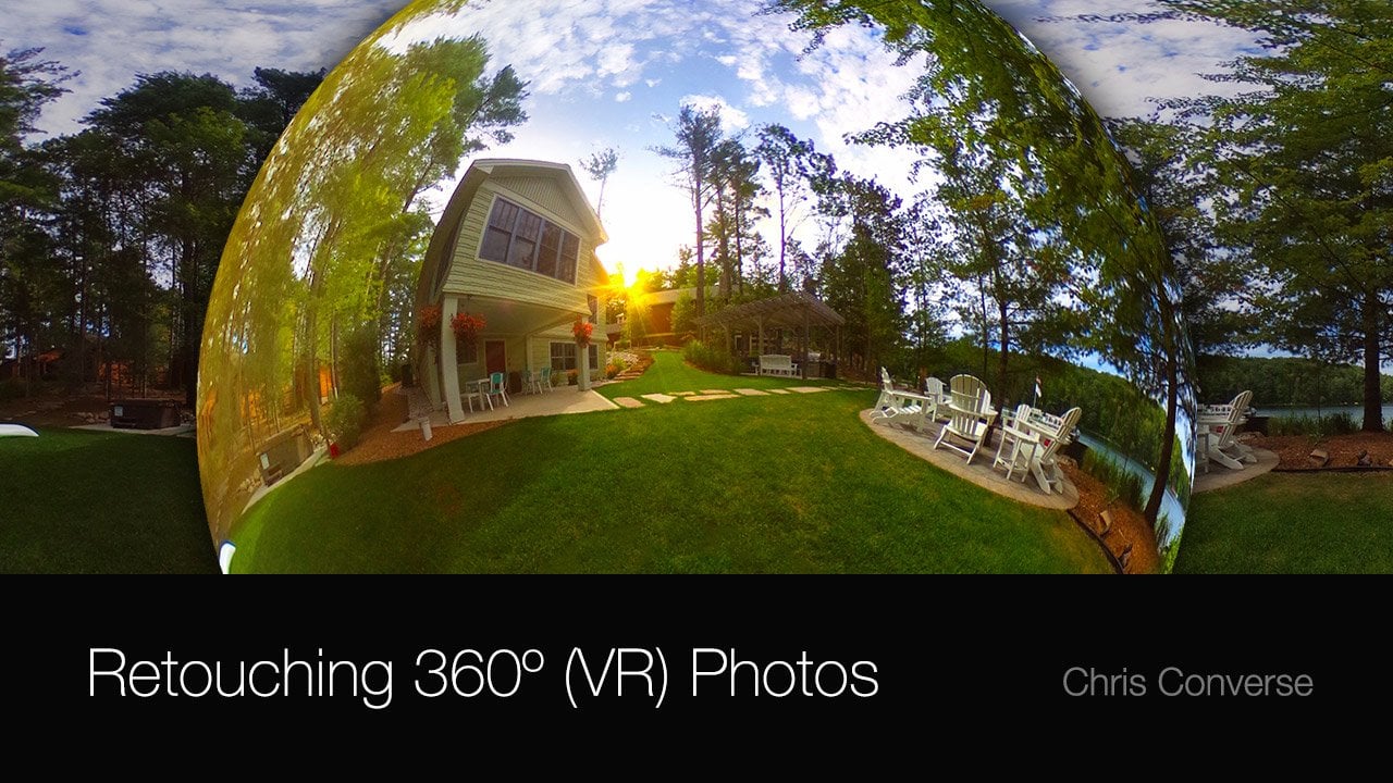
23. Adding animation to your HTML email: Now, if you want to get some animation into HTML email, there's a lot of email clients that support animated GIF, so to explore this option, let's come down into the email that html file. Let's come down and find our logo. So I put together an animated GIF of the logo, so I'm gonna put in underscore animated dot give for the logo. Now there's a few things you want to keep in mind when you're creating an animated GIF for an email. Since not all email client support this, you want to make sure that the first frame in the last frame of your animated GIF have the full graphic in place. So if you're using this for something like a banner ad, you want to make sure that all of the text and the logo again is on the first frame and the last frame. If the animation is supported, then we can see all of the animated frames in between, so their strategy is a little bit different than the way you might build a banner at where you might actually build the message in the banner at starting from a blank screen and then building those frames up. Not to see this working in an email. I'm gonna bring up my mobile device. Now. With this email, you can see the animation in place. Basically, I have the little stem on the grapes animating over. I have a highlight that's running across the our Vineyard, and we have a little shine and meeting over top of the grapes. Now, instead of the logo, we could certainly animate other graphics on the stage. We could animate some of the promo graphics, or maybe even the icons down in the call outs. Now, another thing you might want to avoid is setting up an animation that's going to be used as a background graphic. We're using the logos and the promo graphics as background graphics. So if you want to incorporate an animated GIF into your email, I recommend having it be a graphic that you re size with CSS. Rather than assigning to background images, we can see a few different email client supporting this, and we can see what happens when some email clients don't support this. The Lotus Notes eight, for example, will show us a static first frame. Same thing for Outlook 2007. Now in a well, we do see the animation, and on this still shot here, we can see that the animated GIF is actually playing. Now. We also get the animated version on Gmail and also on outlook dot com. So this could be a good technique for adding a little bit of animation into your email as long as the animation is not critical to the graphic itself.
24. Using web fonts with your HTML email: now, another thing you might want to use inside of your HTML email is custom phones now. It's not recommended that you use fonts that require JavaScript to be loaded, but there are some pond services out there that will supply fonts through a CSS tag. So for this demonstration, let's go over to Google fonts. Google fonts are free, and they offer a CSS solution to adding funds. And you could find this acquittal dot com slash bonds. So on this main screen, I'm gonna come over here to all categories. Let's click this, and I'm gonna turn off all of the options except for handwriting, one sort of a script he font to match the curls on the stem of the grapes. So I come down here and let's choose Parisienne next to the name. I'm gonna click on the quick use on this page. Let's scroll down down here. We can see some tapped panels that show us a standard, and at Import and JavaScript option, we want the at import option here. Let's come down here and copy this line of code. Let's go back to her age to my email, not to use an ad important. We need to put this inside of the CSS area. And this does have to be the first line inside of the CSS, whether it's an in line CSS in the heading area like we're doing here, or even if it's its own separate CSS file. So at the top of the CSS, let's paste in that import. What's it save? Let's go back to Google Fonts. Let's go down even further down under integrating your phones so we need to set this name. Let's come in here and copy the name. Let's come down here and select the font name copied to the clipboard. Let's switch back to our HTML email. Let's scroll down. Let's find that H one tag and we put an in line style on the H one tag. Here, have a font. Wait, font size. Let's come in here before font size. We're gonna have fun family, colon space. Let's paste in the font name. Let's Atacama and then put an aerial than a semi colon. So for some reason, this particular fought can't be loaded online where the email client doesn't support it, we're gonna fall back to the aerial fund and now with this in place after I tested this. This works in all versions of Apple Mail desktop and all mobile devices. This works in Lotus Notes eight. Outlook 2000 and 2011 Thunderbird and an Android four. So while this isn't working in too many email clients as of yet, this still remains a viable design option for coding your HTML emails.
25. Adding HTML5 video into HTML email: Now we're gonna take a look at how we can incorporate HTML five video into an email. So let's go back to the exercise files and back into the folder on the desktop called My Email. Inside of our project, let's create a brand a folder called Video, and then let's go back to the exercise files inside of Folder four. Let's grab a copy of the JPEG and the impact. For now, I'm gonna option drag a copy of these into the my email folder. You can also use cut and Paste. Once these air in place. Let's switch back to our email that html file in a text editor. Now inside our email, the first thing we're gonna do is get rid of the pro moves and replace that with the video . Let's scroll down here and let's find the TD that's holding both of the Primeau's so we can see her promo wanted promo to Let's come in here and delete promo one. Then we'll delete promo to, and once those are removed, we're gonna add an HTML five video tech. So first we'll start by adding a video tag than the space we're gonna set the width to 570 pixels. Then we're gonna set the height to 428 pixels. Then we're gonna point to our poster frame. So that's poster equals we're gonna point to that JPEG file. So that's gonna be video forward slash our vineyard dot j peg. Next, we'll set a controls, attributes We'll set that equal to controls, and then we'll come down and end the video tag now inside of the video tag, we want to add a source tag that's gonna point to the video file. So I'm gonna start with a source tag, then a space then SRC equals we want to point to the MPEG four file. So it's gonna be video forward, slash our vineyard dot mpeg four, and then we're gonna set a type attributes equal to video slash m pick for, then had to return. And now we're gonna put some HTML content inside of here that will be seen by email clients that don't understand the video tag. So at a standard anchor link, So a Space H ref bring a set that equal to and what you want to do here is put the your L to your Web site specifically to an HTML file that's using the same video that were pointing to above and then in the anchor tag. So next let's get our cursor inside of the anchor tags. What we're gonna do here is put an image of that same poster frame inside of this anchor tag. So for users who don't see the video in their email client, they'll have the same poster frame that will be linked to your website that has the same video. So started an image tag space source equals. Let's point to the same J Peg file that we used us the poster frame inside of the video tech. It's a video slash our vineyard dot jpeg. Now what? That added. I'm gonna come in here and just format this little bit. Now this email is responsive, so we're gonna need to add some CSS rules to make sure that this video object is responsive as well. Let's scroll up in our HTML file at the very top where we have all over media queries. Let's first come inside of the media queries that specify a maximum width of 660 pixels. Let's come down here if he returns, we're gonna do is start with a rule targeting the video. So, video, we're gonna set the width to 416 pixels and we're gonna set the important flag on that. Then we're going to set the height to 312 pixels and again put the important tag on there. And then just for good measure, we're gonna target the image inside of the video. Even though we shouldn't see this for clients that support video, we're gonna set the height and width of the image to be the same as the video. So 416 for the width and 312 for the heights and at important tax to both of those gonna format that and then now inside of the maximum with 510 pixels, let's go down after a footer. Let's come in here had the same two tags and let's change the width and height properties a video with we're going to set that to 300 pixels with the important flag, we're gonna set the height to 255 pixels at the important tag on that as well. And then let's target the image inside of the video, we're gonna set the width to 300 pixels to match the size of the video. Then we're gonna set the height to 255 again to match the size of the video. Then once we're done, adding that I'm gonna format this in once you've made these changes, save your work. Let's switch back to our browser. Let's come up and hit. Reload. Now inside of our browser will see that the promoters are gone. And now we have this video object showing here. So in my browser to test this, let's come down and hit the play button. And now is the video plays. We can see some animation and we can hear a little bit of audio. So once we see this working properly in our browser will go test this in our email testing environment. So when are testing This worked really well in IOS and OS 10 Male. Now this includes the built in mail program on the Macintosh. It includes iPad, iPhone and iPod touch as well, and this also worked in outlook dot com when we used chrome, firefox and Safari, and we also had success with Outlook running on the Macintosh version 2011 and for additional mobile platforms. We had success on Andrew 2.3 and four dato and on Windows phone 7.5. Now, in all of the email clients where this didn't work, we did end up with an image with an anchor link around it. So with clients such as Lotus Notes, Yahoo, Gmail a well and outlook for Windows, we can still see the poster frame, which will in turn link over to the website where they can watch this video. Now. I also want to demonstrate some of the user experience differences between the desktop clients and mobile devices. So here I have a mobile device, and if I come up here and launch my email, gonna go into the our Vineyard, email me scroll up here, we can see the video was working here. However, when I come in here and tap the video, it's going to switch over to its built in mobile player and play this in full screen. Once the video is done, this will come back to our email. Now, in some tablet devices, we can play the video in line just like we can in some desktop clients. So to demonstrate this, let's look at this email on a tablet device again. I'll scroll up, see the video, and what's gonna happen here is when I tap on the video here is going to bring up the controls. We'll see the video player right in line again, very much like what we would see inside of a desktop client. Now, considering the email clients that don't support video will give you a linked image. I think html five video was a very viable media type for your HTML emails.
26. Encoding and embedding Base64 images: now another way that we can specify graphics and embed them into HTML is to you are I and code are images. This basically means we're going to specify the graphics as asking code now to explain what I mean by this. Typically, we have Web graphics. What's our actual binary files on our computer? Like a gift for a J peg. But we can also specify the same graphics using asking code. So if I were to zoom up on this a little bit, we can see a little bit of what the code might look like. It's this pattern of text, which is encoded in a base 64 format, which can then be turned back into a graphic in our page, not typically with graphics. We specify these in an HTML tag. We have an image tag with a source equaling the actual file name to make use of base 64 code. We will still use an image tag, but the source here is gonna equal data Colon. Then we're gonna give it a name logo, large gift, specified, based 64 then have all of the code that's representing that graphic now in order to create based 64 images, we can use a series of online tools or some text editors might have built in plug ins. To find a tool online. You can search in a search engine and search for something like converting images to base 64. There's one here at the top that I like by Web coder tools dot com. I'm gonna open that in a new tab. Now, in this page at the bottom, I can see the option for uploading a graphic Gonna come down here and click Choose file from the desktop. Let's go into my email images directory and let's choose the logo large dot gif. And once I hit upload that graphic will be uploaded to the server and they will take all of that binary data and convert it into asking data. And down here in this form fields. They've created an image tag for us, which we can scroll through and copy all of this content. And they've even given us a background image, and in both cases you'll see that it starts with data. Colon image specifies, is a gift, and again you could put in a file name here if you want based 64 then all of this code. So again, down here in the CSS, we'll see exactly the same structure. Now, one thing to keep in mind is that representing binary data as asking is going to be a little bit larger and file size. It comes out to roughly 30% larger. However, the upside is, there's not a second call to the server. All this data is gonna be inside of the HTML. So to follow along with this method, you're gonna want to take every one of the graphics in your email and convert them to a base 64 image. Then we're gonna places into our HTML. Now back over in our code editor. Some code editors have plug ins that will convert graphics into base 64 images right inside of your text editor. The one that I'm using here for this course happens to have that feature. So first I'm going to scroll down in our HTML. I'm gonna find the image reference to that particular graphic. So here we are. Image largo large dot Give showing up right here can open up my side panel here. Now what we need to do with a lot of these plug ins as we need to specify this graphic from the root of the hard drive. I'm gonna come over here and choose copy path. Let's come over here and replace that string with this. All this is really doing is specifying the exact position of logo large from my computer's hard drive. So volumes the name of the hard drive the user, my user account desktop, my email, which is the project folder on our desktop images and then local large. Doug, if once these air in place I'm going to select this entire path, come up the plug ins and choose based 64 encode image. Now, the result here is gonna be exactly the same as what we got from our online tool. Again, the efficiency might be a little faster if your text editor has a plug in, and if I scroll down here, we can see all of that extra code now showing up in side of the page. So once you've completed this, every single graphic reference both in your CSS and in the HTML is gonna be replaced to embed your graphics as asking inside of your email, and once you've converted all of your images, you can then test your email. So when I tested this, I found that this worked great inside of IOS and OS 10. This includes iPhone, iPad, iPod Touch and Apple mail, and this also worked in the latest version of Thunderbird. Now, in cases where this didn't work, which was all the remaining email clients, instead of seeing any kind of a graphic, we get a broken link. We do see the alternate text that we specified, but again, we're not going to see any of the graphic specifying in those other email clients. So while I really do like the ability to embed images inside of our HTML content, the fact that we see a series of broken images inside of most of the email clients steers me away from using this for email. Right now, however, there's some additional uses you might want to use. This technique, for this is supported in all of the most modern Web browsers. You can also use this approach to in bed graphics into CSS files and then reuse those classes as spreadsheets. You can use this as a form at the store images inside of databases, and you can even use this technique to explore supplying one HTML file for Web advertisements.
27. Using High Definition (Retina®) graphics in your HTML Email: in this lesson, we're gonna talk about supporting high definition or retina enabled screens with your graphics inside of your email. So I first want to talk about what we need to do to a graphic to make it high density or retina enabled. Now, Before we had high definition or retina enabled screens, we had standard density or low density, which was somewhere around 120 pixels per inch. Since then, manufacturers have been able to fit more and more pixels on a screen. When we have about 240 pixels per inch, we move into the high definition or high density displays, and this is the first version of high density. At the time of this recording, manufacturers have been able to create displays that support 34 and five K, which is 34 and five times the number of pixels that standard density display supported. So what this means for graphics is if we create a graphics at this size, they're going to be displayed on the device. A standard definition device will show the graphics with all of the fidelity that we have in the original graphic. However, if we take that same graphic and display them on high density devices. Those devices have more pixels than are represented in the image. So this will result in images looking blurry or fuzzy because the device has to duplicate the number of pixels, since that extra data is not in the image file itself. So what we need to do for high definition screens is used double the number of pixels in the original image, so that when they're displayed across these high density devices, there are pixels in the image that could be represented across all of the pixels on the high definition display. Now, if you've been following along in this course with creating our graphics and Photoshopped, we have a really quick way that we can create high definition graphics inside a photo shop . So back in the exercise files, I'm gonna come in here and open up banner images that PSD now inside of here We have a series of smart objects. We talked about this earlier in the course I come in here and select this person. Smart object hit Commander Control T to transform. I can see appear that this image is being scaled 39.8% on the width and 40% on the height. This tells me that the original smart object inside is more than double that size. So that means we can double our canvas size photo shop will in turn double all of the sizes of the slices. And then we can simply say about a high definition set of graphics. So I'm gonna hit the escape key, gonna come down to the image menu, come down to image size. Let's come in here, make sure the width and height are linked. Let's change 700 to 1400. That will automatically change the height as well. Gonna click OK, photo shop will increase the canvas. It will increase the size of all of the slices. It will scale the transformations of the smart objects and give us our brand new set of graphics. Like to see Key for my slice tool double click. The first slice we can see. This is now 12 76 by 3 60 It's up to banner large. Let's come in here and change this to underscore two X click. OK, then I go into each one of the remaining slices and change that so that we can save this out to the same directory and all of our high definition graphics will have an underscore to exit the end. Now, I'm gonna do one more thing here just so I contest this remotely. Since I'll be using an online service to test this, I won't have any way to know if the resulting images I'm seeing through my Web browser are showing me the retina graphics or not. So what I'm gonna do temporarily is come in here and add an adjustment layer called invert . And I'm going to invert all of these individual graphics this way. When I looked at the testing on my remote server, I can see if the retina graphics are being enabled. If they are being used properly, then I can come in here and take away this adjustment layer. So again, I'm just doing this for testing. So now, with all of my graphic sizes doubled and my adjustment layer in place, I'm gonna come down to the file menu and choose save as then in my art templates folder. We're gonna call this banner images underscore two X. Now I have two sets of banner images. I have my standard definition, and my high definition now will also do the same process for all of the content graphics. So we'll double the size. I'll put a layer adjustment for invert at the top, and then we'll have a whole series of high definition graphics. When you have both of your Photoshopped files modified, come down to the file menu. Choose safer Web. All of your optimization is will be remembered. We'll come down and choose save then from the desktop will choose my email pick the images directory, all user slices, and then we'll hit. Save Now back in our project file, Let's open up the images directory. And since I've saved out all of my banner graphics, I can see I now have banner large underscored two X, the ghosted image. Same for medium, same for small. And then once you've done the same thing with your content images, Photoshopped file will have a whole series of additional two X graphics for all of the content images. So inside of here, I can see this signature all of the individual icons, the logos and the promo graphics. Now, once you have all of your double sized graphics created. Let's close our Images directory. Let's close our Photoshopped file. Let's go back to the exercise files and there's a new file in the folder three snippets called Pixel ratio dot CSS. Let's come in here and open this up in our text editor now, just like the media queries were created earlier for the individual screen sizes. Here we have some media queries where we have two sets of properties. We have Onley screen, and here's our maximum with for the medium screen than an end. And then we have a whole series of pixel ratio. CSS media queries. So the 1st 1 we're defining here's for Web kit, so pixel device ratio is, too. And just for note, if you're targeting an iPhone six, the pixel ratio here would be in number three, and then we have a comma. Then we have another statement, which repeats the size, and then we target the Moselle a browser than opera. Then we used the standard device pixel ratio, and then we picked to screen resolutions as well. So this media query here sets up the medium screen, plus all of these different device settings and then that ends down here and inside of here . What we've done is redefine the background images. So for the logo we have background image. And then we point to the underscore two x version of that gift file, and then we also need to set the background size. This sets the scaling size of that background image. Otherwise, the image would come in at twice the size, which we don't want to have happen. We want to get the advantage of scaling a larger graphic down to the smaller display size, and as we come down here and go through the rest of the rules, we can see our banner better medium, the Tedy content in here. We actually specify a background image earlier, so we need the important flight care to override that. And then we have all over Individual Promo SA's Well, then, if we scroll down, we have the exact same construct. However, the with this being said to 510 which matches are small size, we still have all of the same browser flags over here on our resolution settings, and then down here we've done the same thing again. We've said it background image for logo pointed this to underscore two X said that background size and have done all of the same properties here as well. So this looks like a lot of CSS. But what we're really doing is redefining any background image for small and any background for medium. And then we have the media queries which are matching the size and the individual browser flags. So what we're gonna do here simply come down to the edit menu? We're gonna choose, select all. Then we're gonna choose copy. So let's go back to our HTML email. What I'm gonna do is just put these after our existing media queries, so I'll just scroll down to after the small before the ending style tag. Let's see if you returns and let's paste in all of those rules. Now, at this point, you have a choice with what you can do with the image tags inside of our large screen display. So we have all of our default image tags inside of our HTML email. So down here we have the logo large, for example, now in CSS, we can't change the value of the source attributes of an image tag So what this means is we have to make the decision on whether we're going to use the large graphics in the image tags here or not. One argument against putting in the large graphics inside of the image tags is that people who are looking at the large version of your email are probably on a desktop computer, which doesn't have high definition display. Or they might be using one of the Web clients, which also don't support some of the media queries. So in either case, we'd be sending a lot of extra data for people who are not on high definition display. However, if you do want to use the high resolution images in the image tags, we can simply come in here and change local large to underscore two X, for example, and we'll get the scaling effect because the width and height have already been set. So again, this is completely up to what you want to support inside of your large screen. Now I'm deciding against using the high definition graphics and the large version, and I'm going to test these small and medium screens so that I can see if the media queries are kicking in. So at this point, I'll come up to the file menu will choose save Now before I run this through any testing software. I first just want to make sure that the media queries air working properly. So I put this email up on our local Web server. I hit this with my iPhone in portrait mode. I can see the small screen version in landscape mode. I can see the medium screen version, and I can see all of the inverted graphics here, which tells me that the CSS media queries are properly detecting the resolution of this screen and switching out the high definition graphics. And so now, with that working, let's run this on an online testing tool. So I'm using litmus here in the mobile clients. Quick view. I can see all of the individual graphics that are inverted, letting me know that all of these devices are properly being detected Now, in addition to just what's available on the litmus, a website. You can also run your own test like I did before I went toe litmus and check it in other devices as well, and you'll see that this will work on desktop systems with high definition displays and any tablet devices with high definition displays as well. And I think it's also worth noting that you can use those same media queries in your responsive Web designs. Those media queries are not just for email. Now. Creating high definition graphics will result in much larger graphic sizes, so I do want to talk about some alternatives now. Typically, we have a display size, which is represented here, and what most people will do is take a graphic in double the overall size. So in this case, are large. Banner graphic is now 12 76 by 3 60 compressed down at 75% jp quality. This results in a file that's 282 kilobytes now. One technique that I try to see if I can get a much smaller graphic with all of the fidelity that I need as I'll take that high definition graphic and I'll reduce it to about 75% of the original size. So in this case, I'll get a 9 57 by 270 pixel image. I'll also increase the J pay compression, so I'll set the quality to 45%. This will result in an 82.2 kilobytes file size, and this will result in a much smaller file just a little over 30% of the original file size. And then, when this graphic is also scaled to the original target size will still get the added benefit of having extra pixels in that image to display across this area. And while this technique will always look better than a standard definition graphic in many cases, this technique will look comparable to the high definition version with a much smaller file size. So combining high definition graphics with pixel device ratio CSS media queries allows you to start using high definition graphics in your HTML email.
28. Validating your HTML code: that before we send out our HTML email and before we load this into 1/3 party content management system that will deploy the emails will want to validate our coaches to make sure it's as clean as possible not to do this. I recommend using a free tool by the W three c called the Market Validation Service. You can find that at validator dot w three dot org on this main site here we have a few options we can paste in the U R L If we have the email available on a Web server, we can upload in HTML file where we can use the direct input. I'm gonna choose direct input. What we can do here is copy and paste our entire HTML document inside of here. So let's come back to our email that html Let's do a select all Let's copy the entire email to the clipboard. We'll switch back to the validation service, come in here and simply paste all of the code. Once that's in place, let's come down here and click check. Now, After completing this course, you can see we have four errors and you can also see that this is checking against in HTML for Bono Transitional document. If you've chosen to use X html or no declaration type, the validation service will mark up against those document types not to see what these hours are. If we scroll down, we can see that these all relate to an all tag not being specified on our icons inside of our call outs. Now, since this is an HTML email, we don't have to specify all tags on images. But if for some reason somebody's email client doesn't load the images, they'll say the all text instead. So if this is something you want to fix, we can come back to the email dot html. We can scroll down and find that call outs. Find one of the images. I'll find the icon grapes that give file here, and we can add in all text in here of grapes. And then you can add in all text to the remaining three. And once you have all of your market validated next, we're ready to move into a testing environment and tested in different email clients.
29. Testing your email in 30+ HTML email clients: now, if you currently use an email system to deploy out your emails, you probably have a way to test for different email clients to see if your HTML email is rendering properly. If you don't have an email service, there are plenty of services out there that will not only deploy your email messages but also test them across a bunch of different devices. So online there's quite a few popular services. There's active campaign campaign monitor email on acid, litmus mail, chimp and constant contact. For this particular course, I'm gonna focus on litmus all of these air paid services. But as I've mentioned before, if you're using a service like constant contact or campaign monitor, for example, they have built in testing services as well. So litmus has the ability to show screenshots from 34 of the most popular email clients, and we get a live representation on the Web site of how are emails rendering through all of these individual email clients. This will also give us the ability to make sure that are responsive. Design is working as we can see on the left, which is a screenshot from IOS and Android, and we could even see some rendering problems where some email clients don't support the proper padding inside of the content area. They use small CSS screen rules, even though the size of the window is clearly the large size and even cases where some graphics air getting clipped because they're not supporting the background size. After Pete, we put in now inside of the litmus environment, we can see that we have our email clients grouped into three categories. Desktop email clients and we can see Apple Mail Outlook. Lotus Notes Thunderbird Scroll down a little further weaken, See Mobile email clients. Android 2.3 and four BlackBerry iPad outlook dot com, which is a Web based client running on mobile devices. Symbian and Windows 75 And then down here we can see Web based clients, including a well Gmail outlook dot com and Yahoo. So in order to see some of these Weaken simply come down and click on one of the emails, and this will bring up a screenshot from a computer that's running a well mail in Firefox and show us exactly what that email renders like in that particular client. Now, one of the things we talked about in the introduction was the fact that we're gonna have a design that will gracefully degrade. So if we're looking at a screen shot from Outlook 2007 for example, in here we can see some examples of some of the features that we put into place not being supported so we don't get the rounded corners on the learn more button. We don't get the drop shadow, and we don't get the ghost of background behind the content area here. And if we scroll down, we can see that the padding is not supported on the anchor tags, either. But again, we designed this in such a way that if certain design elements fell away or degraded, the continuity of the overall design still remains intact Now. Another problem area for this particular email is Lotus Notes, 6.57 and 8.5. Lotus notes. Eight Renders perfectly, but there's something about 657 and 8.5 that's not supporting the padding on these individual elements here and later on in the course, I'll give you some suggestions in case you need to support these email clients. Another interesting quirk is on Windows 7.5. It doesn't support the responsive design techniques, but what it does do is scale the entire Vieux port. So while we don't get the benefits of the response of design rearranging the screen, we do see the entire composition scale down inside of the view port. Now, if we look at our design inside of Gmail, the layout works perfectly. However, Gmail does not support responsive design. So if we load our email through Gmail on a mobile device, Gmail will not honor the responsive design rules. So we'll still get horizontal scrolling even though we're on a device that, if it were using its native email application, would support the response of design techniques. Now a Web based email client that will give us some problems with responsive design is Yahoo Mail. As you can see, the window size here is much larger than 510 pixels. However, Yahoo Mail is referencing the smallest screen size in our media query that set for 510. So as I scroll down, you can see that all of the design styles that we put in the smallest screen size media query is now showing as the large screen inside of Yahoo Mail. Now it did set the media query for the smallest screen to be as low as 100 pixels, just to see if there was a minimum threshold on the size here that was making Yahoo used the small screen size and even setting the smallest screen to 100 pixels gave me the same results here. So while all the other email clients either just had problems rendering the HTML email in general, none of them had a problem with responsive design rules like Yahoo Mail does. So If Yahoo Mail is one of the clients that you have to support, I would recommend not putting in some of the responsive rules. So you can use the same exact layout that we've been working on in this course and just don't apply there Responsive rules. And we'll talk more about that later in the course with suggestions for Yahoo mail in the last problem area. Want to take a look at his BlackBerry five. We can see here. This has a full graphical email client inside of it, but you'll notice that the TD tags on all of the individual rose aren't expanding to be the width of the full table there inside of now. This is not typical behavior for TD tags. And later on in the course, I'll offer suggestions for what you can do to modify the code to work in BlackBerry five. And with the exception of just a few HTML email clients, you can see that this design, with its complex designed in nested tables, is rendering properly and most of the common email clients that are being used today and now for the remainder of the course, I'll talk about some suggestions that you might want to consider for Yahoo Mail, BlackBerry five and Lotus notes.
30. Suggestion for Yahoo! Mail incompatibilities: now the issue we have with Yahoo Mail is that Yahoo Mail does not support the media query statements. So the medium screen rules and the small screen rules are all being seen by Yahoo. The media query that specifying the individual sizes is not being supported. So one work around that we have is we can convert our class based selectors to attribute based selectors. So we would do this by converting table dot container into table and then inside of square brackets. Class equals container. Right now, this is not being supported by Yahoo, but it is supported by all of the other email clients. And if it some point Yahoo does begin to support the attributes electors but not the media queries. My second suggestion would be to make your small graphics wide enough to encompass the wide window inside of Yahoo Mail. So the small screen banner and small screen background graphic need to be wide enough somewhere around 640 pixels so that it doesn't look like a mistake when the small screen rules render inside of the larger screen. And the second thing you want to do is create another set of icons for the call outs, since the background size property in our CSS is not being supported inside of Yahoo Mail, so you'll have two sets of icons, the original size and another set set to 50 by 50. And then you can reference those inside of the rules for small screen.
31. Suggestions for Blackberry 5 layout correction: if you need your designed to work in BlackBerry five. BlackBerry five is not supporting the media queries. But as we mentioned before, the TD tags inside of the table rose air. Not extending their full with what BlackBerry OS needs is a with setting on all of the individual TDs. And you would need to set this on the logo road, the headline Roe content and every road that needs to be 6 40 Now, the implication for this on the response of design aspect is this is another property that we're gonna need to set with our media queries. So, as you can see here following this approach inside of the medium screen, we're gonna need to set another property on the TV dot logo headline content and all of the other roads that you're gonna put the with property on. And you have to do the same thing for the small screens as well. So this approach is gonna result in many more, with properties being assigned to your responsive rules toe override all of the with properties that are gonna be on the T D tags. So if you need to support blackberry five, you'll have a few more with properties to manage inside of your HTML and CSS rules
32. Suggestion for supporting Lotus Notes 6.5, 7, and 8.5: Now if you need to support Lotus Notes sixth out, 57 or 8.5. The first suggestion I would have is to not use the background properties on the anchor tags. I wouldn't attempt to convert the anchor tags inside of the pro most into buttons. Those aren't being supported, so you can remove the in line background color and maybe change the color of the links to green or a different color. And the other thing I would consider doing is putting a single cell table inside of each one of the table rose. You'll notice here that the padding is not being supported on the TD tags, so all of the content inside of the TDs is touching the edges. So if we put a table inside of each table, road that contains content and set the width to about 615 pixels and set the alignment to center will give us the inset spacing amount we're looking for on the outermost TDs. And if you're gonna follow this approach, you also want to make sure to remove the panning on all of the other TDs. Since all of the other email clients are supporting it and used the width of the nest, the table to control how much spacing you have on the right and left of your email. Now, it's also worth noting that this approach will result in the promo tables and the koala tables being three tables deep. We have an outermost table, which is centering our entire content, the main content container and then the tables for the promotes and the call outs. So once you have that in place, you'll want to test it in all of the email clients that you want to support.
33. Planning alternate layouts: So now that we've completed building this particular layout, the next thing I'm sure you'll want to do is start building some of your own layouts. So I want to take a few minutes here and explain why I put some of these things together the way I did first, When we have multiple tables inside of the promo SRO, one of the things you'll probably want to do is add more tables inside of this area. Now. The reason I put two tables inside of each row is because some older browsers won't support a clearing tag. So if you're two, tables are not the same height. So, for example, if this second table here is a little bit smaller because there's less text or a smaller graphic, what that's going to do in older email clients like Outlook is allowed the third table to float up next to the first table, sort of underneath the second table, and then that will allow the fourth table to move to the left position. So this is not the desired layout. So if you want to add more tables inside of that row, I recommend adding a whole separate row and putting your additional tables inside of there because the older email clients will support the new table row before they'll support the clearing tag. Now, if you remember the four tables we had in the call outs row, we don't have this problem because we don't start rearranging the layout until we go to the media queries. This means that only newer email clients will even see those particular rules in those particular email clients will support the clearing tags. And now, if you start looking at alternate layout ideas, I want to give you some recommendations on how you might handle some of these alternate layouts. First, if you have a layout like this where you have a sidebar, that's gonna be the entire height of the content and a top header and a footer broken into a couple of different groups. My recommendation here is to break this into multiple tables. This is because merging multiple table cells with different measurements in the same parent table can have layout problems. So again I would recommend break miss into multiple tables. And also, if you'd like a sidebar where the sidebar height is the same height as the content area. You'll need a table with two columns inside of there. But also remember here that for mobile you'll still have that table data on the side. So you either need to make your content really small or perhaps hide content inside of that table data. Now, if you want to do something like this, where the header and footer area have merged table cells, but they have the same measurements. You can do this inside of a single table, and this will render pretty accurately across all of the different browsers. Now, if you want to design something similar to this, where you're heading area and content area are the same with and you have a column structure inside of the content. You can create an outermost table and then but nested tables inside so that you can get images next to your text. And this is similar to the techniques we used for the layout in this particular course as well. And lastly, as you're designing alternate layouts for your HTML email, keep in mind that the more simple your design is, the more success you'll have been translating your design across all of the different HTML email clients
34. Where to go from here: Now that you've completed creating a responsive HTML email, it's important to let your clients know what some of the limitations are around. HTML emails. Let them know that the design will not be pixel perfect across all of the different email clients and in some cases, based on the layout and what's supported an email clients, you may need to make some design concessions. You should also get your design client to prioritize the HTML email clients that they need to support. This will help you prioritize the HTML and CSS and layout concessions you need to make based on what supported across the different email clients. And with their new design skills, try out different combinations of HTML and CSS to create new layouts. This is what I did to achieve the design for this particular course, and then test and refine your coat to support all of the email clients that are in your list. And you'll also want to read articles and block posts online. Campaign Monitor has a free guide that most of the email vendors I listed earlier in this course point to as a design resource for responsive email tips. And with that that concludes creating responsive HTML email. And I really appreciate you watching my course
 Chris Converse, Designer & Developer