Transcripts
1. Introduction Trailer: Welcome to part
two of our highly anticipated AA game
character creation course. I MotsTimals, a
professional freelance three D character artist and your instructor for this course. In part one, which is
available on our store, we showed you how to
create the high poly of a AA character from
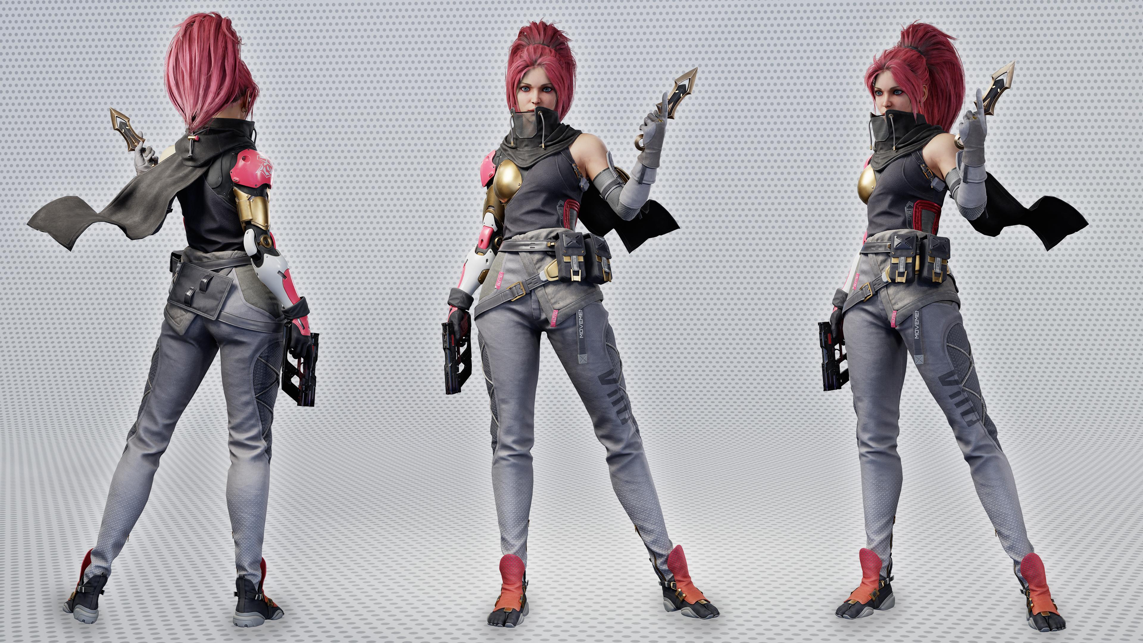
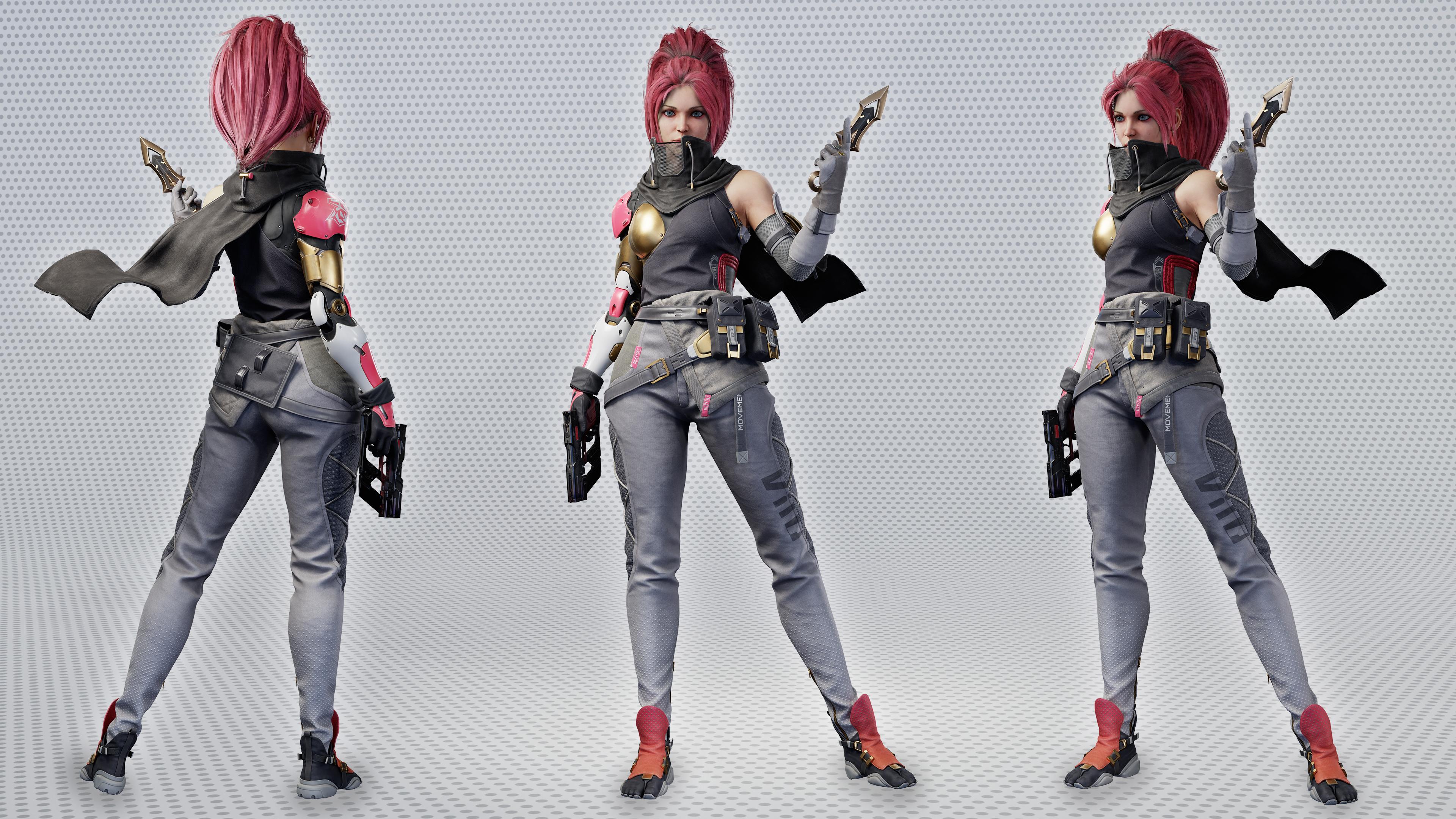
start to finish. In part two, we'll be taking that character and
turning it into a clean, low poly model, rigging it, texturing it, adding hair, and creating a final presentation that
will leave you with an amazing AA game character
exactly like you see here. To start, we'll be covering
full red topology, teaching you how to create
clean and optimized topology that's perfect for both
animated and game characters. We'll then move on
to creating UV maps, all of which will be
done in three SMAX. Once that's complete, we'll
move on to Mama zip tool Bag, where we'll make our
final texture maps. From there, we'll give our character a rig
using something called Acurig which will
automatically rig our character. We'll then move on to Blender to pose our character
since Blender is a little bit
easier when it comes to posing and hair creation. Next up, we'll dive into
texturing our character. This will be a lengthy
and fascinating chapter where we'll cover everything from the
large base materials to the small details that
make your character pop. Finally, we'll use blender
to create our hair cards and place them and then render everything inside of
MamastTolbag four. With over 90 hours
of video content, this course is a comprehensive and extensive tutorial series. While it may seem daunting, I'm confident that by
the end of this course, you'll have the knowledge
and the skills necessary to create high quality
game ready characters. We've struck a nice
balance between time lapses and
real time chapters, and all important topics
are narrated and real time. We've also included the
Time lapse chapters in real time as a
special add on. This course is aimed at
intermediate artists who already have a
basic understanding of the programs mentioned. Course also comes with auto generated subtitles in English, Chinese, and Spanish. I hope you'll enjoy this course, and I'm excited to see the positive impact it will
have on your life.
2. 01 Exporting The Highpoly: Okay, let's start
by exporting all of our high polymshes
to three dS Max. And also, before we do that, we need to make sure they
aren't too high poly to where MAX will be
really slow or just crash, or the re topology tools in
Max will be really slow. So I'm just going to firstly do this quickly
by selecting these folders. And just merging
the entire folders, decimating them and
exporting them. Now, we could do this by just
merging the entire mesh, the entire project
and decimating it, but I think that
would be a bit too heavy for Zbrush to handle all at once, so
we're doing it in parts. And also, if you're spending 20 minutes to
decimate something, and after 20 minutes, it fails or something
goes wrong, then you've lost 20 minutes. If you just spend 5 minutes
doing something and it fails, it's not so much time lost. So I think it's better to do these things in
parts when you can. So let's set all
of our subtols to high and merge the folder. Okay, let's take a look
at our merged mesh. And I think I see a little bit of a problem
issue here with these. They don't look like they're on the highest subdivision level, even though I set
everything to all high, so let me check them here, and you can see they
do look different. These do look higher poly. And this is something you
might run into as well, and it took me a couple of
minutes to figure out as well. This is actually because we have some dynamic
subdivisions here, and they don't play
very well with getting merged into other objects
or even decimated. You might run into problems
decimating if you have meshes with dynamic
subdivisions. So what you want to do is apply. And then we can
merge these meshes. So let's get rid of
this one we did before. And let's merge the whole folder and see if
that's fixed it. Okay. Nothing looks wrong, so we can go ahead
and start decimating. So for decimation,
we'll be using the decimation master over here. You can find in the Z plugins tab and drag it
off to the right. Pre process. And
this takes a while. So I'm going to skip
through it for you guys. Takes about 5 minutes
for this part. Okay, the decimation
just finished. It took 3 minutes. You can see up
there. Now let's try actually decimating
our preprocessed mesh. This is pretty good and
it's an improvement, but it's still really high. Instead of 20%, let's go
all the way down to one. And something like this is kind of what we want. All
the volumes are there. We can see lines of stitching and
stuff in case we want to align our UV
islands with that, you know, or polygon edges, so we can put UVs
along stitch lines. And it's quite low in points, so it will not be
slow in three max. So I'm going to keep doing this for all the different folders, and this part will
probably be sped up. So as you can see, we ran into the same dynamic subdivision
issue as before. Quick way to check
all of your measures for dynamic
subdivisions is to just go to the right area in the menu and then
just use the arrow keys up and down to navigate
through all of your subtols. So let's do that. Okay, looks like there's another
part with dynamic sud these zips, supply them. And another part, the
little zipper part. And what's this? Same thing on the other side. And it looks like that's
everything for these pants. So now that we've
got them sorted out, we can definitely safely
merge this whole folder. So now I'm just taking
a look at the result, seeing if everything looks like, if everything's on what looks like the highest
subdivision level. And I've just preprocessed
and decimated it. Now I'm moving on
to the pouches. I'm just checking
if everything is in the pouch folder that
belongs to the pouches. So I found that these little
buckle ends here aren't, and they're in another subtol.
I'm just splitting them. And I'm moving them in
into the pouch folder. Also making sure that they're on the highest
subdivision level. I'm checking by turning the pouch folder's
visibility on and off, seeing what's left
or what's missing. Now I'm just going through the whole list of
tools checking for dynamic subdivision and it all looks clean and I've
merged the pouches. Now I'm just pre
processing them and decimating just
like you've seen me do with the pants and the boots. Now I'm moving on to the arm. Like you saw before, I'm
going through everything and I'm checking if everything's
in the correct folder. As you can see, there's
a few bits missing and I'm just dragging them
back into the arms folder. This part is connected to another subtol so I'm
just splitting it off and moving this one
into the folder as well. And it looks like I've
got everything now. And I'm going
through the list of all the subtols and checking for dynamic subdivision again. And it looks like I've got
everything cleared up. So I'm pre processing
and decimating again. So I ran into a few issues
with decimation here, so I went through a bit
of troubleshooting. First thing I did was
set the percentage of decimation higher and
that seemed to work. So I set it lower again and
this time it failed again. So then I changed it to 5%, and that one seemed
to work fine. This was an acceptable
poly count, low enough to work
with in three DSMX, so I just decided to
leave it at that. Now, if you really
want to get it lower, you can just preprocess the
mesh again and decimate. Next up, I'm taking
care of the belts. So the belts aren't
in any folder, so I'm just moving them
all into one folder. I'm just looking at which parts look like they make sense being as one folder or one object because when
they input into MAX, all of these folders are
going to be separate meshes. So you just want something
that's going to make sense in the three dS Max outliner
and when you're working. So you don't have to
spend a lot of time splitting off parts to different meshes in three dS Max so I'm just going
through everything, turning the folder off and on again to make sure I've
got everything that I need or if there are things that are in the folder
that I don't need. And now that's done,
I've merged it all, and I'm preprocessing it. Okay, so I'm applying
the decimation here. And moving on to the cloth. This is the same thing
you've seen before. So just checking that everything I need is in
that correct folder, and then merging it, seeing if everything
merged correctly, checking for dynamic
subdivisions and applying them
if they're there, decimating and giving
everything a once over again. Just check that it's not
too dense, not too sparse, all your details showing up that you're going to need when
you're doing the retopo. I think that's
about all there is to say when it comes to this. So I will keep
quiet for a minute. An now I'm moving on to the mechanical arm. Now, most of the arm was
done in three dS Max. So we'll probably be
importing the messages from there into our re
topology file because we might be using a lot of topology from them
for our final retopo. But I'm going to
export everything from Zebra just to make sure that our scale
is correct in the final file and
that nothing's, you know, slightly
misplaced, slightly offset. And, you know, this only takes 5 minutes, so
why not do this? A. Okay. Looks like
it decimated nicely. All our details still there. But like I said, we're probably
going to be bringing in the hi poly subdivided mesh
from the DS Max as well, because we'll probably
be able to use a lot of the topology
there for our log poly. And also, we'll
probably be able to do that with a lot of the meshes here in the
hypolyZbush file too. But we'll just go back to this Z project and be taking a look at those
parts individually once we get to re
topologizing them. For now, going through the whole list of
subtols and looking at each one individually
and trying to think ahead if that topology
is going to be good or not. Um I think that's
a bit of a waste of time because you're not going to be able to
think ahead that far. You're not going to know
what you're going to be going with in terms of retpper. So I think it's better to just quickly decimate everything, bring it into the SMAX, start retopping and then look at what you're
going to do from there. So all of this just took
me about half an hour. So it's not too
much time wasted, even if, you know, we don't need some
of these parts eventually when it
comes to the retopper. So I think it's
something worth doing. Next up the head. Normally, I just knock some subdivisions
down on the head. Because usually when
you're using a base mesh, it has pretty efficient topology already and you don't lose
too much volume like this. There's no real
reason to decimate. Now here, I'm just going
to tie up the last sense, see any meshes that I've missed, and I'm probably
not going to bother decimating them
because they're all really tiny meshes and they're not that high
poly either way. At this point, it doesn't
make that much difference. I might drop the
subdivision level down a couple. On them. But overall, this isn't
really important. These are small
parts. They're not going to make a huge impact. I'm also going to export the
hair. This is just for fun. It's purely optional. We're not going to be
using this for retopo, but I thought, why not? Just so we get a whole
picture of the character. Okay, so we've got
everything I've decimated or set to a
lower subdivision level. So now what we can do is
just merge everything, merge visible, I mean, and take a look at our
merged character. Now it's only 3.9
million points, which is pretty good. And if we look at our
polygroups we have a polygroup for each merged
group of objects we did. And I think when we
import into three MAX, these will all be
separate measures, which will be pretty convenient. So now let's export let's take a look at
it in three GS Max. Okay, let's find our
file and open it up. So it's about 7
million polygons. That's doable threes Max we don't want to import
as a single meth. So hopefully all those
polygroups we saw will be separate and everything will be a bit easier to sort through. Oh Okay, here's our mesh. As you can see, the
viewport is still pretty snappy, even
with 7 million. So that won't be
a problem for us. We can turn on
viewport statistics. Okay. So now that you've
got your mesh in three Max, you're ready to start the
actual retper process, and we can move on
to the next chapter.
3. 02 Retopologising The Head Part1: Welcome to Chapter
two. And this chapter will be starting the
actual Rtpology. I think many of you will
be somewhat familiar with retopo since this isn't a
complete beginners course, but I will go over the
basics and reasoning before moving on to more
advanced workflows and tricks. The reason we
retopo is so models run well in real time
and to form properly. Other thing we
should keep in mind, which less experienced
artists often forget is to keep unwrapping and baking in mind when
making your topology. I will be giving advice
and hints on that. This video will be
sped up in places with repetitive tasks
I've already shown once, so don't be alarmed by that. I don't actually move that fast. Without further ado,
let's get started. Okay, to start with, I like to set up a material that shows the form of the mesh a little bit better
than a default one. So you'll probably
have something like this when you import. So what I'll do is get a
new physical material. Make the color slightly
darker and put the roughness up to something like
0.6 or 0.6 0.5. And now you can see we get some nice highlights that are a bit larger and there's a little
bit more contrast with the base material. I think we're going to
start with the head. So we're just going to
hide parts that are in the way we don't need. This will do. Maybe get rid
of these earrings as well. Let's attach all
of these parts of the head so you can see since they didn't
decimate the head, all the polygroups have ended
up being separate objects. Let's see what we're missing
a bit around the eyes. Okay, that's everything.
Now we can start. I'm going to make a new layer. Which I'm going to keep
all of the re top od meshes in. Just go
to make a plane. That's just gonna be an
empty object to keep our me topologized mesh. We don't actually
need this geometry. I'm going to add a
symmetry, as well. Set it to X and flip it and
make sure the mirror is at zero on the X axis and
turn on show cage, as well. Now, this will probably be
set to grid by default. You'll want to set to draw on surface and select the mess
you're going to draw on. And I like to use
three Max to retopo. I use other software like Topo
gun, that's retpospecific. But here, especially
for demonstration, I mean, once you understand the principles, you
can do it anywhere. Topo gun is a really stripped
down simple software that just that only
lets you retopo. And it's really good
and efficient for that. But I also like to have a full modeling toolkit
when I'm retpoing, especially when it comes
to things like this. I find the extra tours
in Max come in handy. And it's not that much slower, especially if you
take into account, you know, jumping back and
forth between software. I find Max can do
everything I needed to do. So we're just going to start
by building out a plane. And shifting it in
the rough position. Now, when it comes
to re topoing faces, the way you do it is you
build out loops around areas, you'll build a main loop around the eyes and then a loop
around the nose and the mouth. I'm not forgetting anything. We're going to start
with the eye loop. That's probably the
most important one and basically making
some goggles. Now I'm being really quick
just to get the full loop in. And later we'll need
to do some maps, do some counting to make sure that we have the correct amount of the correct amount of polygons here,
correct amount of quads. So we're leaving some space around the eye because
we'll be having another loop around
the actual eyeball. And the way you want to do
retopo for objects like this is keep it at essentially a lower
subdivision level than your final result because it's pointless or not pointless, but it's going to be
a way more work to be retpologizing in a really
high subdivision level, basically, when you could
just do it at a lower poly and then subdivide
it for the same result. So essentially, what
we're keeping in mind is probably in the end result, we're probably going to be
subdividing everything, so everything will be
double what we see here. So in this case, what we also want is to make sure
that this is an even number, so we don't end up with too many polygons
later at the bottom, and then you would have to add a triangle to link these up, which would be really annoying. But it's not super
important because you can always add and remove when
you get to that part. So here I think I'm
going to aim for, you know, add a couple more. Something like this, maybe.
Maybe this is a bit much. We'll see. I think some extra
ones to fill out the snows. And let's conform
everything down here. Now, normally, I don't really do face three toppers
manually anymore because I have enough
base messes that I've made that I can just take one
of those and conform them. In this case, I want to show you basically the basics of using
the retopo tools in max, the way I go about thinking. And a head is actually really easy thing to
show that off on. It might seem counterintuitive. I might seem like a head is
actually really complicated, but you only really for a head, have to follow a
basic set of rules, and there's a pretty
good convention that exists already on how to retopfaces that you
need to follow. So there's a lot less thinking you have to do
compared to something that's like an oddly
shaped, hard surface thing. You're trying to retop
and so now we're going to do the loop around the
mouth. So same process. Around this area, we're going to keep it with the same number of quads as the eye loop. And we're going to bring it
down. What's happened here? How weird. I'm being super rough here and
not really counting. Right now, I'm just
getting the loop in, and then we'll just use
the insert loop tool to get to get
everything precise. So I'm going around and through
the bottom of the chin. Okay, that's that loop. Obviously, we're going
to have to figure out the exact number of edges
we need here later. Now we can do the
around the eyes. That's basically going to be I'm basically just gonna
inset this whole part. Now, it's places like this
where maybe top a gun would need me to move
so mini vets manually. But this only takes a second. And we're moving up everything
up up to the eyelid. So this loop is basically the inner orbit or rather
the orbits of the skull. If you can imagine the skull, this would be like
the big hollow part you see around the eye, and then the eyelids
will be another loop. Or Okay. I think that's fine. Now we can do the loop
around the mouth. Now, I didn't really leave
enough space for it here. So let's move this
out a little bit. Again, I'm being super rough and just doing
a random number, and we'll even out the
numbers of edges later on. And honestly, I'm a little
bit rusty on doing face three tacos mainly
because like I said, it's not something you'll be doing later on,
especially in studio. Usually, they'll already
have a base mesh and you'll just be
conforming it to a head. I might even show
you how that's done. But for now, you know, I'm just showing off the
tools in three years Max and showing off the basic workflow on a nice smooth object
that is the head. So the last essential loop
is the one around the nose. So we can start doing that one. This one can get a little bit confusing, but, you know, just
keep everything low and remember you'll
be adding more loops later and not worry
about everything, you know, there's out number of loops being
precise right now. You know, it's getting a
little bit hard to see. So what I can do is turn
this to transparent. Looks like I had a
symmetry set up wrong. We want to flip that. Now, this might let us see a
bit more clearly. Now, I'm getting a
bit confused, yeah. But I think I can figure it out. Okay, that's starting
to look correct. I think I've got it right. So here's our basic
really rough loops, which we're now going
to refine and make sure they sort of add up so we can link them up without
ending up with a bunch of, you know, extra loops
that we're going to have to add a
triangle to connect to. So here's where we need to
start counting and making sure that we can bridge
everything correctly. So we can start by
bridging this part. And moving everything
a little bit closer in the eye, especially here. Now, of course, there's a lot of tweaking that goes into this, and, you know,
once we subdivide, we'll probably give everything a nice little pass
and double check it. Thank, let's make
this way smaller. We don't need it that big. Now, it's all a bunch
of back and forth. I'll probably once I get
all of the main loops in, just do a time lapse of me
adjusting every single point, just so this doesn't take
up a huge amount of time. Now I'm just gonna do this. Okay, let's connect
the nose to this part. Now, here we can see
we need an extra loop. And we probably want
some more polygons here to sort of
define that nostril. Now, this part should probably start going like this because it's going to be descending
into this nasalbial loop. And we're probably going to need some extra loops here so
it can actually connect. Something like this, maybe. Now, this is starting
to look like something. So let's keep going and just
connecting everything up. Now, the last area to fill in is here and
the lips, of course. We'll get to the lips
a little bit later, as well as the eye sockets. So here, Wo I'm going to add a loop here. And we're just going to bridge these and we're going to add a couple of loops here
so they can all connect. And that's basically
we're halfway done here. Now, of course, our loops
pretty uneven for now. We're going to
have to go through a whole level of
smoothing everything out. But the basic structure is here. And we can move on to
these eye sockets. So I think I'm going to
make this solid again. Because here we're
gonna want to see the actual mesh more
than no retpper mesh. And will do the same again
to get the inner eyelid. Now, it's really important. This is probably one of the most important parts
of a character. Not a character, but of the
head is getting this nice thick eyelid down that
really helps sell the eyes. So we're definitely
going to be coming back here and making sure this
is right and reads well. For now, we're going to
move on to the lips, and that's just going to
basically be the same thing. Mm. I'm going to work a bit blind here because
I will be adding another loop to the inside. This corner of the
lips can get messy. It's kind of a trouble area. And let's just add this loop. Okay. That's basically the
hardest part of the work done. The parts that's most important is getting
these basic loops in that follow the structure that not only do they follow the curves
of the face properly, but also they nice and neat. There aren't any
poles or angons. I mean, there's a few
poles here and there, but they're not in
important areas. And everything loops nicely. I'll be easy to rig and it'll
animate and deform well. So from here, we're just
going to be adjusting, building up the
back of the head, which isn't that important because the skull
doesn't deform. It's just a face that deforms. So this is the hardest part of retpoing the face done already. I'm going to move into time
lapse here because I've shown off and explain the more
complicated parts in real time. And from here on, it's
just going to be a lot of adjusting and fiddling. And I won't be
introducing any new tools or there won't be much
to explain either. The next chapter is going to
be pretty time lapse heavy. There's going to be
some commentary, but most of it is just going
to be sped up footage. I'm also going to include the real time footage
without any commentary, which will be named
Chapter three Real Time. Thanks for watching and
see you in Chapter three.
4. 03 Retopologising The Head Part2: Welcome to Chapter
three. Most of this chapter will
be time lapsed. The untime lapsed video will be titled Chapter three Real Time. Feel free to take a look at that if this one
is going too fast, but I feel like this
one is still easy enough to follow along
with the time lapses. There will be some occasional
commentary in this chapter. The real time chapter
will have no audio, only this video will
have commentary. So you'll want to
watch this one thirst. Please enjoy the chapter. Here I've noticed
something not quite right with the loops
under the nose, so I'm going back and
adjusting it slightly. So I'm just deleting
a few faces, and I'm going to be redirecting
a polyloop to curve nicely under the nose instead
of just going straight. M. Oh Okay, we've got most of
our topology in. Now, of course, this is
all really irregular. You know, the loops
are going wherever. This isn't very
well smoothed out. But once we have everything in, especially on areas like
this where there aren't any details that you really need to make sure your
loops are following, you know, you're not having to worry that your
loops are going around the nostrils correctly
and stuff like that here. So you can just use the relax tool pretty
freely in places like this. So I don't put as much work into adjusting everything
as I go along. I just, you know, rush ahead into getting
all the loops in, and then I just use these tools
to smooth everything out. Now, I might want another loop at the back of the head here, so I'm going to but I'm going to leave it
until after I've done the ears to see if to see what I'm
going to do about that. So now we're gonna
move on to the ears, and we'll almost be done. So I'm gonna drag out slightly bigger
space around the ears. And also, I'm gonna
want to have this visible because there's lots of details of the inner ear
that I'm going to have to, you know, Well, basically, it's more important that
I see the base mesh than the other mesh right now. Now, on a part like the ear, topo gun would be nice to use, but I'm just going to
finish up in three D Max. So let's move the back
parts closer in to the ear. Move this part in. Now, the ears are a
pretty tricky part. And actually, there's
a lot less convention on how you should do
them because, you know, a lot of the times,
not much attention will be thrown the way of the ears because
they're less important. They're not going to deform. And, you know,
sometimes they'll do a really messy dt
job with a bunch of triangles just to,
you know, be efficient. Other times, you know,
It really depends. So here, I'm going to
try and go for something that maybe is a
little more detailed, at least hopefully, you know, not just a bunch
of triangles and, you know, flat plane. I've deleted the end
gone in the middle that was left over from
capping off that area, and now we're going to
move into a time lapse. Everything from here on is
pretty straightforward. We're just using same
tools, same techniques, and just playing around, figuring out what's
the right topology. Now, it's nice to have
a nice clean loop that goes all the
way around that ear, especially when it comes to UVs because you'll be
able to just select this poly loop and split that whole ear off as
its own UV island. Otherwise, you end up having
to have a jagged UV seam, which is kind of ugly. U a Don't. Don't Around the back
of the head here, behind the ear, I
was a little bit confused trying to
figure out where to put that extra poly loop from the ear until I just realized I could add an extra
loop to the back of the head because it
probably needed one anyway. So yeah, that was
just a little bit of a lapse in fort, I guess. Um, right before finishing, I'll return to
these loops around the eye and even them
out a little bit more. Now, let's just do the mouth. And now let's just
close up the mouth, because we're not
going to be doing the mouth bag in this tutorial. I don't usually do a mouth bag for a portfolio piece.
It's a lot of work. It's a hassle to bake, and it's a bit much to
cover in this tutorial. It's not actually
that complicated. Um, but I don't think it's
really something that's expected to see in
a portfolio piece, because, uh, Generally, a studio will use the same
mouth for every character. And it's not really a huge task that a lot of
artists are going to be doing. It's probably going
to be, you know, one person that makes the mouth. Well, in short, it's
pretty neat skill. It's not super
essential to the job. I don't think it's
going to be it's not a portfolio deal breaker. And, um, it's generally I don't think it's
something worth doing unless you
really want to have your character in a pose with their mouth
open or something. And if you were going
to have a mouth bag, you would sculpt your model with its mouth open
because otherwise, baking is basically impossible
with a closed mouth. So we're just going
to go with this. And we're done for the
sort of low low poly. Of course, we are going
to subdivide everything because something like this sort of been acceptable
maybe ten years ago. I might still fly for, like, a background
character these days. And, of course, for
a lower LOD as well. LODs are levels of details. So, you know, the further
away something is, the game engine will swap it out for something lower resolution, but that's not really important
here in this tutorial. So what we're just going to
do is subdivide everything, and then I think one subdivision will be
enough to get it to a nice, you know, current gen standard. Right now, this is at Oh, let me turn on statistics. 2000. Um, so when we double it, it'll look something like this. We could go One
higher. Let's see. This is a bit over
the top, I think. Um, this is fine for
a portfolio piece. Let's just make sure that
symmetry is working well. Here, I'm just
fixing a few issues with the symmetry modifier. You'll get these issues if your vertices don't quite reach the mirror or if they go past
it unevenly or diagonally, if you have an edge crossing
the mirror diagonally, you'll get a stray vertex
in the middle of the edge. Now, later on, I fix that
with turn to polymodifier, and I'll talk about that later. Here I wasted a bit of time
doing it all manually. I could have done this
faster if I just selected all of the edges and move them across a bit and
then conform them. Or you can mess a bit with the freshold settings in
the symmetry modifier. But it's important not to
make sure your weld doesn't go too far and start welding together vertices
in places you don't want. A So I'm just using a turn to polymodifier, and taking remove mid edge
vertices to get rid of any stray verts that are leftover from the
symmetry modifier. Okay, let's take a look
at our repologized head. Well, it looks pretty
good, I think. We've got nice loops. Especially around the face
part where it counts. I think this is
important for animators and people that rig faces. And it's also going
to help us unwrap. So we've got loops in
all the important areas. And the rest of the
head is pretty even. Smooth enough where we can't
see any pointed parts, even from close up. We're capturing all
the detail we need. So this is fine. And that's
how you we topologize ahead. So I think I've shown you all the basic re topper
tools in three DSMAx here. Next up, we're going to be probably moving on to the shoes or
something like that. I haven't decided yet, but I'll start introducing
some of the more of the tricks I use to
speed things along. And I also might cover how
to wrap the topology of a preexisting head to this head in the
next chapter really quickly because this isn't know, I don't read topo heads
manually myself very often anymore, because, you know, I think it's
something that's good to do a couple of times just to learn what a good topology is and so you can make
your own base mesh to use. But once you have that, once you've done it a couple
of times, or, you know, do it once every
couple, you know, once you learn something, challenge yourself, do it again. But once you've done it before, you know what you're doing, you know what God
Topo looks like, I just wrap or use
a base mesh with Good Topo you have your UVs done. And it saves
a bit of time. And that's what
people in studios do as well when they're working. You won't catch a guy re tapoing every single head manually
because basically, every single face can
use the same topology. And that's actually a
good thing to have if you want to have, for example, texture maps that can
be swapped between characters or, um rigging. I'm pretty sure it
can be transferred if the topology is, you know, it's easier to transfer face
rigging and stuff like that, or wrinkle maps, blend shapes, all those sorts of things. So, um, thanks for watching, and I'll see you
in Chapter three.
5. 04 Retopologising The Shoes Part1: Welcome to Chapter four.
In the last chapter we tackled Rtopowing the head. In this chapter, we're
going to do the boots. Now, since the boots
are symmetrical, we're only going to
need to do one of them. The first thing we're
going to do is hop into our Z brush file and check out which parts we can bring in to help us with the re topology. Check out which parts
have a good enough topper where we
might be able to use some parts in the low poly. We're going to turn
on polyframe mode to see the topology, and we're also going to
set all of our subtols to low And when you're zooming in, it's zooming in off center. All you need to do is click
somewhere on your mesh, and it will start zooming in onto the part
you've clicked on. These parts look
a little soft in the low subdivision
level for some reason. Let me see why that is. No, it's because of
dynamic subdiv Now, these look pretty good. We're going to be able
to use these in the low poly. Same with these. Okay. A lot of this might be salvageable as
well. And same here. These parts, not so much. You could go in and start deleting a bunch of these loops, but we've got stuff like
this going on here. So I'm just going to
be taking these parts. So to do that, let's just hide everything and make
these parts visible. Let me check these as well. Yeah, we can bring
these along, too. And we can just export
these visible parts. So we're going to use
the FBX exporter. Because the OBJ
exporter doesn't have the options to export
only the visible parts. And you can find the
options down here. Now, we don't need
stuff like this. I don't think there's any
options we need to check here. Just make sure
visible is checked. If you've got it set to ASCE, sometimes you'll run into
issues with importing, so I just said to Ben. Normals don't
really matter here. We're just using
these measures for re topology that we're
not using them to render or anything
when I export. And import them into our Maxine. Now we want to import into
this layer so make sure that layer is selected, or we can make a new layer specifically for imports.
How about we do that? And I'll rename this one
to re topper, as well. So make sure that's
clicked and we can import. I got the input
scale wrong here. I just left this
bit in so you can see where you need to go
to change your input scale and get it right. That's better. Now, 'cause it's symmetrical, we don't need half of these. I'm gonna attach all of
these parts together and delete all of the
parts on the left side, which we're not going to be used because we're gonna
be using symmetry. A Okay. I'm going to start with the sole and then do all the fabric
parts and do the belts last. Well, we might do the belts
and fabric parts together because I think we're going
to make them the same mesh. I'm just going to check if
there's a part missing here. Now, it looks like that's
what it's going to be like. I'm going to apply that dark beds and material to all of
these that I showed you in Chapter two, I think. And we're going to start just looking this part by itself and getting rid of the parts
we obviously don't need. So like the interior is
definitely not something we need. O. Now, this part was manually done
in three S MAX, which is why it has
or top of uneven, which is why it has
pretty good topology. Sometimes a ZR mesh will also give you topology
that's a good start, but not always because it
likes to make spiral meshes. So we're pretty
lucky in this case. And this is a pretty
common workflow with more hard surface assets. It's quite common to just go through and delete all of
the extra supporting loops. That you're not gonna
need on the low poly. And of course, you add
a few extra loops. Not even loops, but just extra geometry where you need it. Like in this area, we're
going to add some stuff. Definitely don't need
all these, let's see. Let's see how that
affected the silhouette. That's one thing you're going to be the main thing
we're looking for when we're doing retop is maintaining the silhouette while also keeping the topology low enough. So in this case, silhouette is basically unchanged
when we do this. We can collapse a lot of these down here, but I'm
going to do that later. I'm going back and forth
a bit just to see if, you know, I got didn't change
the silhouette too much. Now, along these curved parts, we're obviously gonna
need more geometry than what we have right now. Don't be afraid of deleting too much because we can always
add that back in later. Okay, I think we need
the original mesh now. I'm going to add asymmetry. Can use the letter keys to
sort through this list. As for symmetry, E for ddiPoly Make sure this mirror
is zero on the X. Okay. Actually I might make this stal. Let's also hide everything. It's not the boots for now. Control E to invert selection. Okay, it looks like there's
a bunch of these details. Now I'm going to have
to decide whether we need them in topology or
we can just bake them flat. Now, stuff that's on
the bottom of the boot. That's a pretty
unimportant area. So you need to decide if
you're going to spend like half an hour making all these bubbles or if you're going to bake them down
onto a flat plane, and I think I'm going to bake
them down because they will look fine on a flat plane. But, you know, once we
get to the baking stage, if I feel like it looks
wrong on the bake, then I might go back
and add them back in. But for now, I don't think I'm going
to spend time on that. And let me just see which
one's the actual sole. You can see we definitely
need more geometry on the toes and over here. We probably don't need all of this stuff and maybe
some of these. Okay. After all, the boots are the
least important part basically of a character. It's probably going
to be furthest from the camera and not the first thing a person is
gonna look like on a character the first thing a person is going to
look at on a character. This edge flow. I'm not sure if I'd like
that on a low poly. So I'm going to start fixing it. Sure. A way I work with holes like
this is I cap them off. Now, you can't see
the cap because it's hidden in another
in the high poly, but if I isolate,
then you can see it. And once you've got the cap in, you can just use
the cut tool to cut your desired topology in instead of having to
use all of these tools. And then you just conform
it to the high poly. So here, I'd prefer for it
to just go straight down. So we can better capture
this sort of bulge here. I think I'm going to
remove a few more. And to delete a straight edge, you just hit black
space, nothing else. And you can see the
plane is still here. So I'm just gonna
use the cut tool, or actually, maybe I should move some of these around
to where I want them. Now, I think there might be a few more loops I want
to get rid of here still. I still looks pretty heavy. We don't need all of these
at the back or in here. You can actually start
getting rid of them. What I'll do is select the first one, not even the plast one. You can select this
one if it's easier. Maybe I'll leave one down the middle and
we'll grow a loop. Around to here,
because we still want to keep these at the back to get that curvature at the back. But over here, there
is no curvature. I'm going to leave
this one just in case there's some deformation. And so it's not so hard
to reduce these down. Having an extra loop here
for nicer poly flow is okay. I'm just thinking
how to approach this corner,
something like this. I'm not sure we need
this edge either. Since we can just move
this one up a bit. Now, to do stuff like that, you can use the edge
constraints over here instead of relying on
these free form tools. Just move this up a bit. And this is why I like
to use three DSMx. I don't think in topo gun, you can import measures you've already done, just
adjust them like this. This is the benefit of using a full modeling toolkit
for retopo Okay. So the main reason I went into
this is to better capture this sort of curve here
with les topology. So what I want to do is
go down along the curve, whereas before it went
sort of diagonally, that's fine for
sculpting, you know, but it's not the
most efficient way, which, you know, it isn't
an issue in Zbrush, but I'm just going to start bringing these across. I might want to move this
whole loop down, actually, closer to the edge because
this is where we want more topology where you've
got stuff like this, curves. And then the straight part, we don't really need that much. So of course you run
into that these here. So you just got to pay
attention for stuff like that. And yeah, retopo it's a bit of it's not a
lot of manual work. That's the only way
to get something to, you know, look nice. There's no automated
solution for retopo yet. There is, you know,
ZiriMsha, all those things. They're nice in some cases, but on a character, you
know, characters are, like, a major expensive
part of a game. So there's no sense
in, you know, cheaping out on Retopo and then having something
that looks janky on screen. So basically all
character retopo is done manually. Mm hmm. No one's gonna cheap out
on something like this. So it's just something you've
got to put up with and, you know, do, even if it
is a little bit boring. Now, hopefully this one
doesn't take too long. But yeah, it's a
fair amount of work. Now, we do need more topo here, even though here we
don't need that much, we're gonna have to add something else to fill
in this nice curve. Now, actually thinking about it. We might just bake this
down into a flat line. Let me have a little
bit of think here. Yeah, we're just going
to bake this down. We don't need the actual
geometry for that. We're gonna maybe
have a little bit of geometry down here
where it flares out, but up the top, we're not I so yeah, I'm going to leave a bit of
geometry here for this part. So early on, once you
have all your quads in, which in this case,
we've just borrowed them from the zebra sculpt. But in other cases, you'll be
drawing them out manually. First, keep everything simple, and then you're going
to be going in and adding your extra cuts for
detail like I'm doing here. Move this part
closer to the edge. And you want the most geometry
in part where it curves. So, this corner here. I'll move that loop
even closer in, so we have a little bit of extra curvature right up to the edge where curvature
starts kicking in, and then we can move this
part up a bit higher. Going to need to do
some work there? I think it's spark
lycran as well. We need more geometry here. You know what? We can just do this. It's gonna add an extra point here for
us as well. What we need? And, yeah, this is
just takes some time. So I might move into time
laps a bit later on as well, but for now, I'm gonna
do this in real time. I sort of running out of
things to talk about here, but maybe I'll come
up with something. We'll see. So for now just hold on and watch we work on this. M. You can see maybe in a close up, you might get this extra
little indent detail here from this angle with the help of this topology and also
to help the bake a bit. Now, let's just, uh, get rid of this
extra geometry here. We can just triangulate it away. Now, triangles don't
matter on the low poly. Especially in areas like this. Now, you want to have your
triangles reasonable and not super thin because they
might bake poorly. And, you know, this is an
area with less deformation. There might be a bit of
bending on the heel still, but it's not extreme and
it's not like on the face, which is an area you're
really focusing on. And the face actually has a lot of deformation
around the arm eyes, and it's sort of like
has to be spot on. Here, this is just going to be a little bit of
bending on the heel at most. So this is a super
important part. So here we can have a few more triangles for
the sake of efficiency. And again, always be checking your silhouette just by
moving the camera along. Okay, so I'm slightly
speeding up the footage now. This isn't going to be a
very time lapse heavy video. I'm still going to be doing lots of commentary on this one. But this part is a
little bit boring, and, you know, I can just
speed through this a bit. I'm just adding extra
edges where I need them. Because these are around parts, they do need a few
more extra edges than, say, a more flat part. So especially because
the heel of this boot is round and it's got round
details on top of that. So some of these places need, quite a few verts to
look round so yeah, just using the
loop cut tools and the basic cut tool
to cut those in, shift them around
where they need to be. And also making sure
I don't go too dense. Now, a nice trick if you
want to add loop cuts and you don't want them
to propagate across your whole mesh is to
just delete those faces, and then the loop cut won't
be able to propagate. You can just add in the
cuts you need and then quickly put those faces back when you're
done with that part. Right now, I just left those parts empty and
didn't add a face. So here I want to delete some edges from the
bottom of the hood. So I'm just going to
select every edge, the start of every edge loop that I want to
select and then use the grow loop command to sort of grow
that selection out downwards and then delete. Now I'm going to bridge cross between these
two parts of the sole. And I'm going to be re topoing these straps into the
surface of the low poly. I'm not going to
have them separate partly because this is a pretty low priority area at
the bottom of the shoe. So we kind of want
a safe topology instead of modeling a
whole separate strap. It's better to have
it modeled into the shoe because it's not
really hugely visible. Uh, you know, it's
not really up in your face where
sometimes you might model a strap separately if it really is in an area
that's up in your face, like, you know, something would be visible
in portrait shots. Here, it's literally the
bottom of the shoe, the part. So carrying on work
with the sole, you can see why I've
sped this part up. I think these are
all pretty self explanatory things
that I'm doing here. I'm just using the bridge tool, selecting the edges I
want to bridge across, adding swift loops
where I need them. So I think this is all the stuff I've shown you how to do before. So no reason to waste your time watching me
do it slowly again. Now, when it comes to
deciding whether you want to model something into the surface of your object or
have it separate, like the strap, for example, which I'm modeling into the
surface of the low poly, it depends on a lot of things. One of the main
ones is poly count. If you're trying
to save polygons, if you have a budget
you need to hit or if it's an area
that's low priority, then you can model
it into the surface, and that'll save
you some polygons. If you have polygons to spare,
you can do it separately. Other things you might
want to consider is how easy it will be to rig. If you have your
straps separate, they'll be harder to rig, and that'll need more attention, and no one wants to spend more time on the bottom
of the foot with rigging and making sure
this strap doesn't clip into the foot when you, you know, bend it. So those are basically the
main things I consider when I decide on whether to
have a strap separately or not or other
things, you know, like belt buckles or
off the top of my head, I can't think of any things that are kind of like a strap, but you get the idea. Now, I'm just going to bridge
across from here to here. So I'll just use the extend tool and make a couple of loops. We'll add in the rest later. Control Shift W is the hot key
for the target World tool. And when you're
using this hot key, it's also important
to remember that it is dependent on
which selection mode you're in because the
target World tool behaves differently in edge
and Vertex mode. So if you want to weld
vertices to be in Vertex mode when you
use this shortcut. Now I'm just bridging across the toes using the extend tool. And just getting
those main loops in which I'm then going
to use to connect up to the tips of the toes. And if you have
geometry that's stuck underneath the surface of your hi poly and
it's hard to reach, and the conform
tool isn't really working because
the conform tool, it doesn't work when
the distances are too big or if there's several
layers of geometry in the way. But the drag tool seems
to always be reliable. So that's why I usually switch to the
drag tool if I'm having trouble with getting
some vertices to pull through to the surface
and snap to the surface. Now, I'm just going to get
rid of these clips because they're going to get in
the way of the topology. So I'm just detaching
them from the hi poly. And hiding them. And right here, I'm
adding another Edit poly, which is a good way of sort of keeping a snapshot
of your progress on the mesh without having
to make a copy of the mesh or save a
copy of the file. You just add an edit poly and everything that you've
got up until there will stay in that in the lower
Edit poly and all of your new changes
will be added to the new Edit poly
that you've added. And you can just disable
that if you want to go back, or you
can delete it. The only thing you can't
do is go back and edit the lower edit poly
levels without deleting your higher ones
because it will mess them up. But what you can have on top of added poly is
procedural modifiers, so like symmetry and
mirror and turbomove, all sorts of things like
that you can have on top of an added poly
because they're procedural. They'll just apply
the same operation regardless of the
underlying topology, but Edit poly isn't procedural. It's manual, so that's
why you can't edit a lower edit poly and then
go back to higher ddt poly. You sort of have to work in the higher
one if you do that. But it's still
useful to have the snapshots if you
want to go back. So that's why I keep adding
added poles as I work along. So I've got these main loops in, and from here on, it's just a matter of
connecting them up. So you can see here
sometimes isolating my view, so I can just see the low poly because for bridging
pots together, it's not really important to see the high poly and it can be
a little bit more clear. So remember, you can
use that isolate button at the bottom of the screen too, or its just isolate the
thing you have selected, if that makes things a
little bit easier to see. Now, what I'm going to
do here is inset around this little piece of fabric that's on top of the
whole sort of sock part. And a good thing you can learn here is sort
of think about what polygons you can
select in order to make your selections faster
with the grow button. So here you can see I
only need to select the two middle polygons
and click Grow once in order to select
everything I need. Instead of going
in and selecting like ten faces individually,
you can just select two. So that's a neat trick to know. So you can see, I tried
to use the conform tool there for a second, and
it didn't really work. And this is why I prefer
three Max to Maya because the drag tool in three Max is always reliable.
It'll always work. And I've had trouble
in Maya with getting vertices to snap to the topmost face when there's
several layers of faces. And, you know, that also happens with some of Max's RtpoTols
like the conform ones, but the drag tool is always reliable and it
always works for me. So that's why I like to
stick to three S Max. So I like three Max, but the software
really doesn't matter. Like, once you learn one, then the others come
really quickly. Like, I found my way around
blender within a week. Just once you know how to think, then it's really quick
to learn a new software. Now, what I do like about
MAX is all the UI buttons. I don't have to memorize
all the hot keys, which can get
tricky when you use a bunch of different software. So moving on to the toes, I use the connect
tool here instead of the swift loop tool
because that's an endgon and the
Swift loop tool doesn't work on endgons. I'm just bridging stuff up here and removing that
polyloop that goes around the sort of edge of this rubber part because
if I leave it in, then I'll have to work with
twice as many vertices. And if I do need it later, it's just a matter of
adding in a loop cut. But now, while I'm re topping
and doing this basic work, I don't want to move around
twice as many vertices. I'm not sure if I'll add
it back in at the end. We'll see if it's necessary. But for now, I'm getting
rid of it just so I don't have to mess around
with all those extra verts. I'm adding in an extra
loop for each toe just so we can have a little
indent between each toe, like on the high poly and just sort of wiggling things
around into position, adding extra loops where needed. Yeah, something like this. Okay, now let's see what
we're dealing with. One thing you might like to
do instead of spending time modeling everything is
to take a screenshot. Or, you know, use a
Snip and Sketch tool. And then here we can sort of sketch out what we're going
to do with our topology. I don't use this
personally very often, but it can be helpful
because it's quicker to, you know, sketch stuff
than it is to model it. So I'm going to start, you know, just by doing these main ones. You know, definitely
have a loop around here, and we're probably
going to continue this because we do need
the extra curvature here. Let's see. I think this
has a functioning eraser. Yeah, it does. We could
do something like this. This might be a
valid way to do it. We'll see about that. Then we'll figure something
out there later. We're definitely going to
need an extra loop here. So that's no brainer. These we can just do like this. Now, I might put up there's guides you can find on
how to reduce polygons. So I'll put one of
those up on screen now, and you can also
find them yourself. So Polycount has a lot of
good resources on this. And a bunch of these guides
on reducing polygons. So you can follow
these guides and all those others on ways
to reduce polygons. But the thing is, you're always
when you're reducing is, Odd step amounts
result in a triangle. So you're only ever
going to be able to reduce four to two or, you know, six to three. You're not going to be
able to reduce two to one without not two to one, three to two without
resulting in a triangle. So that's something
to keep in mind. But on a mesh like this, triangle isn't worst
thing in the world. You can even have
triangles on the head. Lots of games do it. It's just important to know where you're
putting those triangles, and if they're going to
mess up deformation, a lot of time triangles can improve deformation
when animating. And on hard surface
assets, it doesn't matter. The only thing you're
modeling for is silhouette there and also making sure
you get a really nice bake, because getting a nice bake
on a hard surface asset is a little bit trickier than on an organic soft
thing like this. So, let me see what
I planned out here. It looks like we do
have that extra edge. So instead of connecting
this to here, we can just go straight and then do something
with this later. I'm just going to put
this on my other screen. A Just go to cap these and delete
these extra edges. When I loose the cut to. There it is. Her. I'm gonna move this up because we are gonna have
an extra loop cut. Or, actually, maybe this, uh, we'll see once we get there. We're gonna add those
extra loop cuts. We only need two here. And relax it up a bit. The toes, you know, deform quite a lot
when they curl up. So we do need a bit
of extra tomolotry here. And this looks fine. Let's see how many
polys this is. This is 3,000 for both, so that's definitely okay. Of course, it's probably
going to be closer to maybe 6,000 once we're done. Uh let's see. I'm going to do these? Now, I didn't explicitly go over these. I mentioned that you
can hover over to see the shortcuts in
the last chapter with all the time lapses, but in case you missed that, yeah, all of these tools
have different functions. Step build, I only
really use to, you know, build out the
first few polygons. And then from there,
I use extend. And I think for all of these, control shift and LT is
drag vertexes around. Then with optimize, the only
thing I really use it for is shift to world
vertices to each other. It's just a faster way of
using Target World tool and then extend mainly I use shift to drag out extra polygons or control shift to drag
out two of them. And that's pretty much
most tools I use here. This one is a relax conform, so it relaxes while
conforming to the surface. Sometimes it's not perfect, and you need to go over
with another conform. If it's, like, a more
regular surface, and this is move conform. And I don't really
use the other ones. I have used them occasionally, but they're not as common. I'm not really sure
about this part, but we'll see later on. This is a bit annoying
how it hof us up. And, you know, what
I think we might do is re top of this part
that sticks up separately. So for now, I'm going to
detach it and call it something memorable
like toe square. Now, moving on to the toes here, standing a few extra loops, also making sure that it'll be the right number
to be able to weld them into the
bottom of the toes. And just adding a
loop here to support the curvature of
that rubber piece on the bottom of
the toe as well. And, you know, just making sure every single vert is
in the right place. Sometimes you do have to go in and move every single
vert around manually. And because this is a tight
area with lots of curves, I do end up needing to add quite a few edge
loops into this area. But it is important to maintain a perspective on
how small that area is and how important it is. So sort of step back and make sure you're not
adding too much density. Here, I do feel like I get a little bit bogged
down on this area. And spend a little bit
too much time on it, but it's not the
end of the world. Here I'm trying to support
the curb that it goes from a horizontal curve across the foot up into that
sort of vertical direction. I want to add an edge
loop that follows that and that'll help the silhouette and it'll
look a little bit nicer, but I also want to
make sure that I don't overdo it and add
too many edge loops. What I did here is
just adding one, which will make capping off that empty hole in the tip of the toe a
little bit easier as well. And I think that's a pretty
good solution for this area. And all that's left
is to shift around every single vertex
and make sure it's in the perfect position
and I decide to add an extra loop across
the middle of each toe. For this, I use the connect tool instead of the swift loop
one because that one would go all the way across the bottom of the foot and
that would be annoying. It's fine to just
leave ons laying around, like I'm doing here, because we can
always use selection and go into plane mode
and select by sides. Then, you know, select more than four and
you'll see them. And you'll just be able to go through the whole mesh and
clean them all up at once. I Now, these days, you can go pretty
high with polycunts. But also, there's a
bit of a trade off where if you have your
polycount too high, it's so much work,
so much extra work to retop something to, like, 200,000 tries instead of, you know, 100,000 unless you are just doing a retopp and
then subdividing on top. But if it's for a
portfolio piece, that sort of just makes you look like you don't really
know what you're doing. En games use more
polygons these days, um, in a portfolio, they kind of still want
readable topology, and if it's super
dense, then it's harder to read in screenshots. If you're going to be including screenshots of your wireframes. Which is usually a good idea. Employers will want to
see wire frames so they can see that you know what you're doing when
it comes to topology. It's going to do
this and figure out the rest from here. Now,
this is what I said. It's actually easier
to retop over a head than just odd stuff
like this because with a head, you know, there's some
really basic rules. You basically need
to know to make three loops and make
sure that you've got the number of
polygons right so they connect up evenly without
too many triangles. Here, you know,
there's no rules for re topoing something
like there are rules, of course, you know,
even topology, not stuff that's crazy and make it deform
nicely, but there's not, like, you know,
something that says, put a loop around here,
put a loop around there. You have to figure it out
yourself, which is why, um, which is why I think
this is actually trickier. But I don't think it's
really that hard to learn. I think you sort of get a pretty good understanding of where your loops are
meant to go pretty fast. It's probably actually slightly easier now that we have higher poly counts
we can work with. So your deformation isn't so dependent on your exact
precise topology. Back when you could
only do like 1015000, it's super important to get your loops in the perfect
place and set up, you know, collapsing edge loops
on the insides of joints. Now we don't really
need to do that. And if you have enough
topology in the area, then you can sort of fix
things with the weight paints. And these days, you know, they have morph targets and
everything for animation. But still you want
your portfolio to look good and you want
your Y frames and your portfolio to look good. Pay attention and make sure
your loops make sense. Like I said, it's
not super hard. You get a feel for it. Try
until you get it right. Now, this stuff can
be really frustrating to work on because it's so tiny and it's really out of the way, but you kind of need to do this if you
want it to look good. Even if it's not
super visible from far away, it's
gonna be annoying. Even just knowing that
you skipped over. And if you look at feet on
characters in video games, they're usually really rough 'cause no one wants to go
in spending time on this. Yeah, you can kind of skip
through this and rush it. But, well, I'm teaching
you how to do things, so I'm not allowed
to do that, I guess. I have to do things properly. And Now, luckily, when you switch
between selection modes, it keeps your
previous selection. If you want to convert one of your selections
to a different one, you hold Control while
clicking the button and you can see it converted
the edges to polygons. It just selected, you know, the polygons that have those
edges as a part of them. I can also, you know, select
a bunch of polygons and hold Control and have all their edges selected or control again and
have all the edge selected. That's a good thing to know. Um So now I'm just trying to figure out how to fill in this gap
between the toes, bridging across where it's
this parts fairly obvious. It gets a little bit more
confusing here where we have to blend parts in, but just bridging across
and capping this area, I think this is a really
neat looking solution. So that actually
turned out to be pretty easy, in this case. Nice thing about this
optimized thing is it always works the same regardless of your
selection mode. So if you're going
to try and target weld while you're in edge mode, what you're going
to end up with is it wants to weld
edges to each other, which isn't the same
behavior as in vertex mode. So if you just click Optimize, it always behaves the same. So Shift and drag is always
going to weld vertices, which is why I'll often
click Optimize instead of, you know, clicking two to go into edge mode and
then Target World. And then, you know, the
shortcut to Target World. That's like two whole hot keys instead of just clicking
something on the screen. It's a little bit
faster, I think. So moving on to the gap
between these two toes. Now, this is going to be a little bit trickier
than what we did for the last two toes because
we have more edges on the right than we
do on the sorry, more edges on the left
than we do on the right. So we're going to have
to figure out a way to reduce those edges down
that looks kind of neat. So here I just do the obvious, which is bridge those
two planes because we do definitely want a
polyloop going around each around the
outside of each toe. So I do the parts
that I know first, and then what I like
to do is cap in the remaining hole and just start cutting up that
resulting end go with the cut tool and seeing
what I can do with that, just playing around
with the topology and seeing where I
can go from there. So the two cuts I did
here are not ideal. This isn't quite neat
enough for me yet. I end up playing with
it a little bit more, and, you know, welding
the vertex to one side, welding it to the other, and
just seeing how it works, how I can make it turn out. And sometimes you
need to sort of weld vertices further away
from your exact problem area. Sometimes that can help to sort of work from
a bigger distance, but, you know, you
just have to play around and see what
you can get to work. This is good, actually. I'm spending too much
time thinking about it when it's really
gonna be tiny. You know, we will do that because it's not
changing the silhouette. So we'll do it like
this. That's good. I spent way too much time
over thinking, you know, sometimes you'll
be really zoomed in working on this tiny piece, and then you zoom
out and you realize, wait, it doesn't even matter. You shouldn't have spent
that much time on it, which is, you know, exactly
what I just did here. So it's time to wrap
this chapter up. It's gotten a little
bit too long. The next chapter is
just going to pick up right where I'm
leaving off here. And hopefully, this has given you a pretty good idea on how to start approaching more odd
shaped objects like this. So see you in the next chapter.
That's all for this one.
6. 05 Retopologising The Shoes Part2: Welcome to Chapter five. Now, just like Chapter three, most of this chapter does
have sped up footage, and you can find the
real time footage named Chapter five real time,
just like Chapter three. And just to explain the way
I edit these is most of it is live commentary recorded
as I'm doing this retopo. What I do is I just cut
out the dead air and also I add in some extra
commentary where it's relevant, where I see something on screen that maybe I didn't
explain in the moment. So I hope that clears things
up a bit, and, you know, it's not confusing why sometimes I'm talking as
if I'm doing it live, and then sometimes
it sounds like I'm doing pre
recorded commentary. That's why it's just
sort of to make sure I'm getting across the
maximum amount of useful relevant information. And, you know, I can speed
up the footage this way and I can keep live
commentary and I can also add extra commentary. I feel like this is the best
of both worlds for you guys. But also, if you want to
see me work in real time, that option is available. You just won't get
any commentary because it's hard to
make commentary for, you know, 8 hours of footage as opposed to just
a couple hours. So I hope that helps. So here you can see
me just checking if the cut tool cut correctly across the
faces that I wanted to. Sometimes the cut
tool can be a bit finicky because it's
a screen space, so it basically cuts
across what it can see. And if you're cutting across something that's
obscured or something, it can mess up and cut across
completely the wrong faces. So after you do a cut, sometimes it's a good
idea to check if it came out right the
way you wanted to, and it didn't go off to the side somewhere where you
didn't expect it to. So I'm not gonna be having the toes string as
a separate object. I'm going to be merging it
into the whole low poly, having it be part
of the same mesh and not a separate mesh. Toes and fingers, the
bits between the fingers. They're always a
bit of a headache if you're having to
do them manually. And this is why it's
good to not always use a base mesh because you
can't use base mesh with, you know, the toes and
fingers done already. But then you come to something
like this where you're not going to be able to conform
a base mesh onto the shoe. You're gonna have
to do it manually, and if you've never done
a hand before or a toe, then, you know,
you're gonna be more confused than if you have
done it before yourself. So that's why, you know, it's good to use base
meshes when you know what you're doing and you're
just being efficient. But, um, Uh, if you're doing
it for the first time, you probably don't
know what you're doing. Let's be realistic. Here I just extrude upwards. So remember, you can use
the full modeling toolkit. When you're doing Retopo, don't just limit yourself
to the conform tools. If it's more convenient to
use an extrude instead of the extend tool in the
free form tools panel, then just, you know,
use an extrude. And similarly, if you need
to get a vertex in position and the drag tool is snapping incorrectly and
not where you want it, you can just move that vertex
where you want it manually. Don't forget that's
always an option. And, you know, if the snapping
tools are being annoying, then just don't use them
and do it freehand. Working between the
toes or fingers or areas like that where it's sort of hard to see
what you're doing. It's hard to move stuff around. It's a really tight spot. Those parts are always going
to be a little bit annoying. So, you know, there's not
really a way around it. You just sort of have
to deal with it. Also, remember to turn off edge constraints if you're
using a conform tool. You can see my conform
tool is going crazy there, and it's because it's
trying to conform to the edges while conforming. So make sure to turn off constraints if
you're going to use. Another quick hint is to not move your camera around
too much while you're actually cutting with the
cut tool because it can mess up and cut a completely different face
to the one you want to. Now, in this case,
it works fine. I couldn't show a case it going wrong in this exact instance. Another thing to remember is sometimes undo doesn't
properly undo your cuts, so you need to undo and watch the facets of the
face that you cut to make sure they've gone
back to normal to know that you've undone enough
times to get it working. I'm thinking about whether to model this completely
separate and just sticking out from there or if to just model across and
bake over this gap. And I'm trying to
think. Now, this is quite a significant gap, maybe like a couple of years ago when models were
lower resolution, you would bake this in and
not model this separately. But I think now this might cast an interesting shadow it might be worth
modeling separately. So I think that's
what I'm gonna do. So here you can see me going
through the little to square mesh that was imported at its lowest subdivision
level from Zbrush, and I'm just going through and cleaning it up
and getting rid of all the extra loops that I don't need in the
actual low poly. Same thing we did with
the soles of the shoe. So control backspace to
get rid of edges I don't need or welding them
where I don't need them. And I get rid of the cap that's clipping into the rest of
the shoe like this end part. And I also get rid of the
bevel on the bottom side of this mesh because it's not going to be visible
from underneath. That part's completely
obscured by the actual shoe, so
we don't need that. So yeah, always make sure
you're getting rid of detail in areas that are completely not going
to be visible. Here I'm just cleaning
up some engons. Now, engons are just faces
with more than four sides, and they're really not that much of an issue. You
can leave them in. The only problem
they might make is that they can triangulate oddly. Now, sometimes you'll even want to triangulate stuff manually on a quad face if it's triangulating in a direction
that doesn't look right. This is not really a good
place for an example here. But let me see if
there is actually. Now, this is something
you would do more with lower polymodels where this
is a lot more visible. Here, this isn't really visible, but if you have a polygon that's
triangulating really badly, and you can see this in
faceted mode more easily, but you'll see it
in other modes too. There is a ton
triangulation button that will flip the way
each polygon triangulates. Now, I don't go through and
triangulate everything. This is just purely
for where you have a really big problem area.
That looks really wrong. Here there weren't any.
I was just showing it as an example. So you can do that. Okay. I'm going to add another edit poly before
moving on just in case. And let's just save as well. We're just going
to be putting in these big loops again and then connecting them up and
refining them just like you saw me do with the head and
with the start of the boot. Right here, I just
took a look at the straps just to see what
I'm going to do with them and how I'm going to align my topology to accommodate
for those straps. The conform tool doesn't do a great job within
two sided meshes, and one way you can deal
with that is to select those vertices and pull them above the
surface of that mesh, and then conforming
down works a little bit better than if those vertices
are stuck below that mesh. Another thing you can do is use the drag tool for
individual vertices, and that one always seems to snap to the
surface correctly. Another thing to note is that none of the conform tools work well if your vertices aren't
close to the high poly, and this is dependent
on camera angles. So what needs to happen is your vertices need to appear in front of the
high poly visually. So what you can do is either move them into
position manually with the transform tools or move your camera so those vertices appear in front
of the high poly. What we might do for here where we have thickness is
I'm going to split this top part off to
a separate object and apply a shell modifier, so we don't have to do
this part manually. What you can do is select
along a path if you hold Shift and drag and then left
click again to confirm it. So this can be a little bit
tricky to get the hang on. But you press Shift, then you click and drag. And then you click again. Because if you
don't click again, then the selection
will disappear. So shift, drag, and click. Now, I think the move tool does go through to the
other side of objects. Maybe having backface culling on helps with that.
Yeah, it does. But, you know, you will still
grab stuff through here. Actually, no, I don't think
optional culling does help. It's just that, if I
go into isolate mode, I was grabbing these like this, I won't the move tool doesn't move through
the whole object. It only moves in a radius around what your
curse is touching. Yeah. So don't worry about that. That's just me being silly. If you do feel like you've pressed and pulled
with the move tool, but nothing has happened, probably just want to quickly undo because chances are you've grabbed
something over here. So that's just something to get used to because otherwise, you'll be doing a bunch of work, and suddenly you look around and everything here is ruined. And after you do
that a few times, you get a feel for noticing when you've clicked and
nothing's happened, and that probably means you've clicked on something
you can't see. And as soon as I feel
like I've done that, I undo just in case I drag out these extra
little squares just so when I press control and
shift to drag a whole loop, it doesn't bring this whole loop because I don't need
the whole loop anymore. And now looking at this, sometimes you retopo belts like this separately
and even use, like, a tiling UV
texture on them. In this case, I'm not
going to be doing that because I mean, they're not they don't drift
off from the surface a lot, apart from this one bit, which will be fine
to do separately. And there's not enough of them here to justify tying texture. And we'll probably
want a lot not a lot because the texturing
for this model will be clean. We're not going to do
a really dirty model, but when you use a tiling texture and you
split something off, then when you're texturing, it's harder to make things
blend in and look cohesive. So here we're gonna be, you know, merging this into
the surface of the low poly. But on some of the
shoulder belts, once I get to those, I'll have a think and they
might be separate. I'm gonna see if, see how the pants
fit into this to see exactly how we're gonna
handle this inner part. So let me find the pants. Okay, so it looks like we do
need to do this hole loop, and we might have to
get creative with that hole there since
things don't quite line up. Now, this happens all the
time when I'm modeling, too. You're not gonna think
everything ahead. And you're gonna end up with
a little gap like this. It's something to keep in mind when you're
doing your high poly. But also sometimes
you're gonna forget. And in this case, you could
go back to Zbrush and fix it. But also, I could
just cap this hole because it's basically
never going to be this so I'm just going
to cap that off there. And when I'm texturing, just set it to a dark material and give it some ambient
occlusion, as well. And it'll it'll look fine. So here I just detach that top flap part of the
shoe so we can shed it later. And I put it into translucent mode so
we can still sort of see where it is
while we continue working on modeling the
lower part of the boot. Now I'm just thinking about if this shoit looks good
on this tiny tab. It's quite a small piece. But I think I might add
an extra polygon here, a little loop to make it a sort of hexagon, if that makes sense. Just because it sticks out so much that its silhouet
is really obvious. And that's one of
the main things. We're looking to make nice
when it comes to the low poly. A Let's see how this looks. Now you can see, instead
of just looking like a weird sharp square this reads as kind
of round from here. So B. B. So moving on to topologizing these buckles. Now, I'm not going to merge these into the
surface of the boot. Firstly, because
they're hard surface, and hard surface things tend to look a little bit
better when they're separate. And then, secondly, because there's at least four of
them that are identical, two pairs, you know, for each boot, it makes sense to copy them over so we don't have to do the
UVs for them each time. And also we might even be
able to share UVs for them. So they all just use the same exactly UV texture
for all four of them, and that would save
texture space. I'm not sure on that yet,
because it can be nice to have more color variation
and dust variation, but on a more cleanly
textured model like this, that might not be necessary, but we'll think about that
once we get to UV wrapping. Right now, I'm going to
retpper one of these and then we'll copy it over to
where the other one is. So we're going to be adding a chamfer to all
of these corners. So now I'm just moving
the corners into the right position
for the chamfer. Since the shafA basically
cuts that corner off, the corners sort of
need to extend beyond where the high poly ends in order to get the
desired result. So now I'm just selecting
all of these edges. And once they're selected, I'll apply a hamper, which you can find in
the Edit edges panel. And click that little
expand button to get the full menu and turn
segments down to zero, so we don't have any extra
segments to deal with. Now, of course, there are
a few triangles leftover, that's not a big deal. I want to bring these
inner corners in, and you can find loop tools
under that drop down menu to pull different loops in towards each other slightly
or push them outwards. And it's a pretty hidden panel, but it can be really
useful when you're working with hampers or just edges
that are close to each other. So this is a pretty
typical workflow for re topologizing objects that have been modeled in a
subdivision workflow, which is when you model the lowest subdivision
level and then apply a subdivision modifier to achieve your final high poly. And you can do this workflow in pretty much every three
software from three SMAX to, you know, Maya blender
or Zebra even. And all we're really doing is removing supporting loops which were used for the low
poly that we don't need that aren't
altering the silhouette. And we're adding in extra geometry where we do
need it for the silhouette. So, you know, it's just a bunch of control backspace
to get rid of loops and target welding to get weld up edges
we don't need, and then a bunch of cut
tool to cut in extra edges. Or like what I did for the corners, a bunch
of chamfering. Mm. I So you may have noticed that the shading on these models has gotten kind of messed up as I'm
working on them. And that sometimes happens when you're working
in Edit Poly. I'm not entirely sure why, but it's something
to be aware of. It doesn't really mean that there's anything wrong
with your model. Now, sometimes you get
shading issues when you have two vertices really close to each other and you just
need to weld them. But in this case, that
wasn't the issue, and the fix for that is to apply an edit normals modifier
and click the Unify button. And before you
click that button, you need to select
all of the normals. So drag select across all
of the lines sticking out from the mesh
when you turn on that it normals modifier
and click Unify. And that should fix everything. I don't think I've ever had issues where it hasn't worked. Sometimes another thing
that fixes that issue is if you add an edit polymodifier
and collapse to it, but that one doesn't
always work. But the edit normals modifier, definitely will fix your issue. So we're coming to the
end of this chapter, and like I said, at the start, you can find the non
sped up footage of this one named Chapter five real time or
something like that. You can also, if
you're using VLC, I'm pretty sure you can slow
down the playback speed. So most of the footage here
is at three times speed. So I'm sure if you play
it back at half speed, then should be able to
follow along easily. That's all for Chapter five. See you in the next one. Okay.
7. 06 Retopo The Shoes Part3 (Aligning Instanced Low Polies): Welcome to Chapter six. Now we are going to continue
along with the retopo. A lot of this is going to be the same stuff you already saw. But one new thing I am going to walk you through
is how to align your newly retpoed part to other duplicates
of the same part that you imported
as a high poly, which is a little bit tricky. There's no one click
solution for this. I turned on selecting plates. That's on the top tool
bar towards the left. And what that does, it aligns the pivot z axis to the surface of the mesh you're dragging the
pivot point on. This isn't essential,
but it can be useful for aligning pivot points
or objects to faces. Then I turn select and place off and I turn on
vertex snapping, so I can align that aligned
pivot point to a vertex. You'll need to do some manual adjustment just to
get it perfect. So what I'm aiming
for is the Z axis to be coming off
perpendicular to the surface, and then aligning the other axes to edges that intersect
with that vertex. So here I'm aligning
the Y axis to that short edge and the
X axis to the long edge. We've got our pivot
point in position. What we can do is go ahead
with duplicating and getting this low polly in the right place on
the other side. So first thing we're
going to do is make an instance
of the low poly, not a copy, which is
what I did by accident, but I'll show you
how to fix that. And now we're mirroring it. Make sure you get it
mirrored on the right axis. Flick through all the options till you see which one's right. And we select in place to get
it into the right position. And all I'm thinking about now is getting that corner
in the right spot. I'm not worrying about
rotation or anything else. All I want to do
is make sure that the corner on the low poly and the high poly is
perfectly aligned. And from then on, we can
rotate the other axes, and it's actually
fairly simple to get it aligned in all the
other directions once you have that single
point in the right place. So you can see it takes me maybe a minute or so to get this
in the right position. You need to, you know,
rotate it a few times and maybe transform it
in general a little bit. So this is a bit annoying to do. But as far as I know, there's no better way to
do this when you don't have an
individual pivot point for each high poly object, which is what happens when
you import from Zbrush. What I'm going to
quickly show you now is a workflow I found that works when
you want to place dozens or hundreds
of the same object, and you want to have
both the low poly and the high poly
of those objects. So what I do is I make the high poly and the
low poly and then I attach the low poly to the high poly so
they're one object. And then we can
take this combined low poly and high poly and make instances of it and you place those instances
where you need to. In this case, I'm just
putting them all in a line, but, you know, you'd put
them where you need them. And then you make a copy
of these instances, not an instance of the
instances, but a copy. And those copies will be a separate set of instances
from the original instance. And that's so you can
later split them off. So you can delete
the low poly on one set of instances and the high poly on the
other set of instances, and then you'll have separate
low polys and high polys. Another thing you
can do is select either the high or low poly
and click High selected. If you just want to see, for example, the high
poly or the low poly, you don't want the
low poly clipping through the high poly, and that will propagate
across all of the instances. So that's another handy thing. And, you know, that's the
great thing about instances. What you do on one of them will copy across to all of them. And this is something I've used in projects
where I need to place like hundreds of
the same objects like scale mail and
stuff like that. So now I'm just really
double checking and making some really fine adjustments to the positioning
of the low poly. And another thing you'll
want to make sure is to have your transform mode set to
local and not viewport. That's up on it's
a little drop down menu up on the top tool bar
just under graph editors. Now, moving on to these clips, it's going to be the
exact same process, so I don't think I'll be
commenting on it that much. And I just decided to leave that crash message in there just to let
you guys know that, you know, TS Max likes
to crash randomly. All of these softwares
do. I don't think there's a single three E package that is really so stable that
you'll never see it crash outright when you're doing something
even really basic. So, if you do
occasionally get a crash, just know that it's
probably nothing you did. Sometimes it is something
you're doing like if your file is way too big or you've got something
weird going on in the file. But most of the time,
it's just random. So yeah, don't worry
about stuff like that. So, yeah, you can see I'm
following the exact same thing I did on the first
little buckle thing. Just put the pivot
on the corner, align that corner, and then align everything
else from there. Not much more to say on that, so I'll just let this part
play through for you guys. No. At this point, I realized that I made
copies instead of instances. So here's how you
fix that. All you need to do is make an instance, mirror it, and then align it to the copy you
made by accident. So it's really just as simple as doing two
things, mirroring it. Oh, you only need to mirror if your copies are
mirrored, of course. If they're not, then you
don't need to mirror. But if they are mirrored,
then you just mirror it, and then you use
the align tool and align transforms and rotations, and you align to pivot point. And that's all you
need to do for that. Now we've got our buckles
done and duplicated, and that whole hassle is over, and we can just move back to the regular old topology
work we were doing before. So this is all the same stuff
moving around vertices and adding more geometry where you need it. Pretty straightforward. I think I went through this
in the last two episodes, so you should be pretty
familiar with this part. Nice little trick here is you can clone parts
of your mesh that are really similar in two places like this
little end of this strap. There's one that's basically
the same on the other side. So using Control Shift and drag, you can clone that
part of the mesh, and then because it's
mirrored on the other side, I used mirror and just move
it into the rough position, and then you can finish
up with the drag tool, or if it's different shape, you can use the conform tool. So here I'm just welding
it into position. And there's a few other things I need to adjust
before I do that, just to get the topology the same as it was
on the other side. But this saves you, you know, a couple of minutes of work that you would otherwise
have to do twice. So just control shift to
drag off an element to, you know, duplicate an element. And then if you need
to, you can mirror it. Sometimes mirroring will
mess up the vertex normals. So you might need to apply
and edit normals to fix those later or select those
faces and click flip. On the top tool bar. So I've got all the
topo in place now, and it's just a matter of welding the points
into the right place, using edge welding
instead of tx welding. You can vertex weld, as well, of course.
It doesn't matter. Edge welding can save some time because he weld two vertices at once instead of each
vertex individually. And I'm just using the
drag tool to put all of the vertexes into the right
place because, you know, it's well, firstly, we didn't
get it in exactly I didn't get it in the exact
position it's meant to be because I
just did it freehand. And also, this mesh is slightly different shape to the one on the
other side, anyway. So while you might have
to do some I mean, it depends on the use case, what mesh you're working on. But, you know, sometimes
this won't save you from having to conform everything and align
all the vertices, but it will save you the
headache of, you know, figuring out where to put the topology and stuff like that and cutting in all the edge
loops and all that stuff. So I didn't have to
do any of that. I did have to align the vertices, but that's a lot easier, and it's a lot less
thinking than having to extrude and cut and all
of those sorts of things. So, yeah, this is all stuff
you've seen before adding loop cuts and whatnot,
wherever you need. And then, using edge
constraints if you need to move an edge along
ano edge, stuff like that. Doing a quick little extrusion
here to get that shape. And when you extrude, you need to remember to delete those extra
faces you don't need. And to quickly fill in holes, you can use the CAP function as long as you are in
hole selection mode, or I'm not exactly sure what that selection
mode is called, but it's the one
after edge selection, and the shortcut
for it is three. And, you know, just dragging
stuff into position, adding cuts, cleaning the
topo up all the same stuff. So this is, you know, that's what re topo is. It's a fairly monotonous task, and a lot of it is pretty semi, but it's something
that has to be done. Here I'm just detaching
the left side of the high poly because
it keeps getting in the way of my view when I'm working on the left
side of this shoe. You know, I just
gets in your face. So I just attached
it and hid it. At this point, I
realized that I had the tongue of the shoe
detached on the high poly, and that's why things were
snapping wrong for me. So I just went back to the
high poly and attached it. Now, I'm pretty
sure that part is called the tongue on a shoe. I'm not sure if that's
commonly known, like, word or part of a shoe, but you end up learning a lot of these kind of esoteric names for things when you're
working on three D, just to be able to
name a specific part of the objects you're working
on or to find references. So these belts are modeled
into the low poly, just like all the other
ones on the shoe. So it just takes a
couple extra cuts to be able to sort
of conform this on. And I have to weld
these edges together. Now, you can see that
the weld tool doesn't automatically update in the viewport every time
you weld something. That doesn't mean
it hasn't welded. It just means you
have to, you know, exit the weld tool or do a different operation to get it to update
in the viewport. And here you can see,
I've sort of if you want to have a part that's modeled
in kind of look detached, if you add in that little bit of an undercut underneath it, it tends to look pretty
convincing when it's detached. And also, remember, there's a buckle around this whole part. So, this part isn't really
even going to be that visible. So there's no reason
to worry about modeling the inner part of the loop or modeling underneath this loop where it's sort of still kind of above the
surface of the shoe. No reason to worry
about that too much because there's going to be a buckle obscuring all of that. And I basically
do the same thing on the right side of
the shoe as well, so there's not really
much to explain here. Here I'm filling
out that hole and sort of slotting out
this awkward space that's around where that tongue is starting to leave the surface of the shoe and also there's a
buckle in there. So yeah, you'll always have these sort
of slightly awkward spaces where you're not sure how far
in to model something or, you know, how to sort
of fill in that area. And it's sort of you need to know that you
don't need to follow the surface super
closely because normal maps sort of bake down fairly well
areas like this. And another thing to keep in mind is that you'll
always be able to go back and slightly adjust these areas once you do a test bake
and you see how it goes. Of course, before we
get to test baking, we'll also need to UV unwrap. But I think once you do
areas like this a few times, you sort of get a feel for
what you can get away with. But until you get
that sort of feel, just go through this process a few times and do
a few test bakes, and I think it comes
quite quickly. Of course, also, you know, you can sort of follow my lead. What I'm doing here is basically what you want to do, as well. So I'm just doing the same thing I did on the right side
over here, basically. And the next few minutes of this chapter is basically
all of this kind of stuff. So I think it's fairly
self explanatory. I'm just, if there's something really out of
place, I'll move it. But right now I'm going
through and sort of closing up some holes and adding in a few extra cuts
where I need them. Do so right now I am detaching the tongue of
the boot again because we're going to work on the
tongue low poly, and I want to be able to
snap to it and sort of reach some areas that are obscured by the other
parts of the high poly. To do the inner side
of this tongue, I'm just using the
shell modifier and making sure I'm shelling internally and getting the shell in approximately the
right thickness. I want it a little bit thicker so that the conformed
to, you know, I don't have I can see where all the vertices are when
I want to conform them, so they're not stuck
underneath the surface. So yeah, make it like a tiny bit thicker than
you actually need it. And here along the
rounded edges, obviously, you need a few
more extra cuts and all that. And a way to do
that is, you know, to just just add in those little triangles
around the corners or the edge and not actually put loops through the whole mesh because that would be wasteful. So now I'm getting
around to the inner side of the tongue and, you know, a quick conform just to get it roughly on
top of the surface. And also, what I'm
going to do is I'm going to weld some
of these verts up because we don't need as much topology on the inner side as we
do the outer side, because it's obviously
a lot less visible. But we can't get rid
of too much either because it might start clipping through
to the other side, which is something we want to avoid because this is
quite a thin mesh. So if we really lower the topology on the
inner side way too much, then we'll have
issues with clipping. You saw there, I use the conforming drag
tool for a second, and ended up dragging
the front side as well. So with these fin meshes, you need to avoid
that kind of stuff. And about this much, you know, this much of a reduction is pretty much all
you can really do without starting
to clip on a thin. And I just made sure to delete the bottom side of the
tongue right there, so I can weld it to the rest
of the low poly right now, I'm trying to extend
the bottom of the tongue mesh I have here just so I can fill in that
little gap and to do that and stop the whole loop
from extending downwards. I extended two
individual polygons on either side of the tongue, and that's a little trick
on how to stop, like, things that apply to an entire polyloop from
applying to the entire polylop. You add in, like, an extra face to stop
that from happening. So right now I'm extending
around and, you know, trying to fill out the remaining empty spaces on the high poly that I need to,
you know, still retop of. And these areas can
be pretty tricky, especially when you have an
object that is, you know, it's going from a separate
sort of free hanging object into something that
you're trying to combine into one object
on the low poly. And these areas can be
a little bit tricky. It's hard to decide, like how far down
to go to where you want to merge them
at which point. And, you know, how
close you need to be. I thought here was a pretty good point where
it sort of bends forward. That little area seems
like the ideal point to, you know, have tongue
B three hanging. Now I've attached
the tongue mesh that was separate back to the rest of the low poly and I'm just welding
everything together. So this part is straightforward. And you can use Target Weld, and in places where
you have three verts really close
to each other, you can just weld them with the regular weld button
that welds by distance. And, um yeah, that's all
there is to it in this area. So here I'm going to do
the rim of the shoe, and that can be basically impossible to do with the
extend and the conform tools. So what you can
do is just select that edge and scale inwards
while holding Shift, and that'll extrude inwards. And, you know, you
can scale it in both directions to get
it as close as you need and then do the final pass with the drag tool or whichever
tool you want to use. So I'm going to spend, you know, a few minutes cleaning
up this edge and, you know, maybe adding in a
cut here where I need one. And once I'm satisfied that the edge is in more or
less the right place, I'll go ahead and cap
that whole area off. And then bevel it downwards. Now I'm using bevel
instead of extrude, just so I can scale it inwards and avoid having
to pull these vertices in through the exterior
of the mesh because this hole sort of gets narrower as it goes down, and
that would be annoying. So, you know, you can use
bevel instead of that. And Bevel does the exact
same thing as extrude. So if you don't apply
any values to it, you know, you can just use
it instead of extrude. There's really no reason for those two tools
to be separate. Now, I'm just trying to figure out how deep I need to make this hole because we won't be modeling the entire
interior of the shoe, just about as low
down as we need to for it to no
longer be visible. And then we'll just,
you know, leave a cap. And I'm also reducing
the number of vertices I have going on here because
the lower down we go, the less visible they are
and the less we need them. But again, same thing as
with the tongue on the shoe, you can't get rid of too many because you might start getting
some clipping is shoes. I'm just also shifting stuff around to make it a
little bit more even because, of course, this edge
is very uneven. The back goes up really high, so the edges around
the back need to go down a little bit lower
than the ones in the front. In fact, I'm going to add this little extra section just so we can bring the back of this hole down a
little bit deeper. And that should be good enough. And then from here,
I think I can just collapse the verts
inwards on this part. You'll notice here that I
had some trouble selecting those vertices on my inset, and that's because
they were hidden using the panel in the top
tool bar on the right, you know, the hide selected hide unselected that tool panel. So you need to if
for some reason, your vertices aren't appearing, then it's probably
because they're hidden. So you just need to, you know, click Unhide all, and
they should reappear. Now I'm going to go
about doing this loop. And the way I decide to do
it is to take the low poly I imported from Zbrush and just detach the
part that I need, which is only this
little loop at the top here and, you know, add in a few quick loop cuts
where I needed them and use the free form tools to align it exactly to my actual
high poly and then, you know, attaching
it and bridging it into the rest of the
low poly topology. So it's pretty straightforward. And yeah, remember to always make sure to keep an
eye out for parts you can use either from your low subdivision
level from the high poly or whatever it is that can
save you some time doing work. So because this whole, sort of, what would you call this scrap or yeah, I guess it's a strap, because it's very
close to the surface, I'm just modeling it in and just with a simple
extrude operation. A Now, over here, I'm adding in some cuts
close to the actual loop. And these are mainly so I
can get rid of that gon, where the loop connects here. And if I was to connect to the closest loop that was already there before I
added those extra cuts, it would have been a
really long and thin, tiny triangle,
which isn't ideal. You usually want your triangles
to not be super thin. So that's why I added
that extra cut there. So we're coming towards
the end of this chapter. All I'm doing here is adding extra geometry to support
these curves around the heel. Now, you could just as
easily bake these sort of indents down into the surface. You don't need to model them in when you're doing a low poly. And you wouldn't be
modeling them in on a lower polymodel. But because this is AA and I'm aiming for a
high fidelity here. That's why I'm modeling them in. I won't make a huge impact, but it will have a slight effect where the sort of indent the
edges of it will overlap, and there will be a
small visual impact and also maybe shadows might
be a little bit cooler, especially if you're
doing it traced. Now, I mean, it depends on
how close up you're going. But yeah, if you're doing
high fidelity A stuff, this is the kind of stuff
you sort of need to do sometimes, but not always. So it depends on your case. And right here,
that's another trick. I mean, it's the same as I
did for the scrap earlier. If there's a part you
already re topoed and it's good, just shift control, duplicate it, and move it roughly into the
place it needs to be, and then you don't
have to think about doing that topology
all over again. You just have to move the
vertices into the right spots. Okay, so that's it
for Chapter six. As always, you can find the real time version
of this video. I'll be named Chapter
six realtime. Chapter seven is
just going to be refining and finishing
up the shoes, and they'll be completely done by the end
of Chapter seven, and we'll be able to move
on to something else. Thanks for watching.
8. 07 Retopologising The Shoes: Welcome to Chapter seven. We're going to continue
working on the boot. We're actually just going
to be finishing it up now. So all of the major
work is done. It's just a few more tweaks
left to do, you know, make sure everything is finalized
and perfectly in place, and this is going to be the last episode covering the shoe. So we're finally going
to have it done. So once again, I'm copy pasting
a part I've already done, so I don't have to rethink
all of the topology. I just have to make sure
it's in the right position. I don't have to
make the decisions on where to put the
loops and stuff. So what's going on on screen
is pretty straightforward. So instead, I'll just give you a little bit of general information that I
think is helpful. Really common question is poly coount and
how many polygons to make your character model. Probably one of the most
common questions you get. And the usual answer
you get is, it depends. And while it's true, it's
not really helpful, is it? And also often you'll get really lowball numbers
like 30,000, 50,000. And yeah, that's what
the numbers were like, you know, ten years
ago, or even more. So sometimes info you can find online isn't great
on this subject. What I say is just
find a game of which, you know, the fidelity is
something you want to match, and just copy that. You can find info on the
polygons of characters in games. It can be a little
bit tricky to find, but it's definitely out there. If you search for, you know, the game title and then
character Polycount, you can probably find
some information. Another thing you can do
is look for model Rips. So if you type in the game character's
name plus model RIP, there's a lot of them on
Deviant Art for some reason. I guess there's some sort of community of model
rippers on there. But yeah, you can
find that info, and that's a good starting point where you don't really
have to think about stuff. You can take a
look at, you know, the final polycon on those
characters and just copy that. And also take a look at what
polygon density looks like, and, you know, that gives you
a good idea of what to do. And really, it's
the polygon density that is the important part
because the final number, you know, if it's a
more complex character, it'll have a bigger number
of triangles used on it. If it's one wearing
a simple outfit, then it won't have
a lot of triangles. Of course, keep in mind that all ripped models will have
triangulated polygons, so it will be tricky
to see the poly flow. But yeah, that's a
good source on, like, how to find out how many polygons do you
use on your characters. But since you already
have this tutorial here, you can just follow my
lead and, you know, look at what I'm doing
instead of having to go and search around
for info online. So again, I'm just selecting and duplicating a part
of the mesh so I can mirror it and apply
it to the other side. And I'm doing a lot in this area because it's almost
completely symmetrical mesh. It's a little bit off, it's squished to one direction. So it's not completely
symmetrical, so, you know, using symmetry on this part
isn't really going to work, but taking pieces of it and
mirroring them works fine. And it's actually really
tricky, at least for me. Maybe other people
are better at it to mirror topology in your head, copy it to the other
side identically. I don't know, it can get
confusing trying to, you know, uh, mirror what you did
on one side manually. I mean, of course, it's easy to just click
the mirror button. But if you're trying
to, like, you know, flip everything over
in your head and apply those same cuts and same topology
to the other side, that can be kind of tricky, and there's no reason to do it. Just take that part,
shift control, drag it, and, you know, I've been
through this like five times, I think, but it's a neat trick. Here, you can see me flash the Snip and Sketch tool
up on screen, as well. That's another useful
thing you can do. You can take a little screenshot of an area you want
and, you know, then use it to sort of compare or as a guide if you want to, you know, if you want to have a little reference
up on screen of, like, what you did
in an earlier area. And also, I think,
like I showed before, you can also sketch over it and draw plan out your
topology if you want to. Something else you can see
going on on screen here is the vertex nulls
are really messed up. There's like black chunks
of the mesh going on here, and that is a result of me mirroring those parts of the topology when I
copied them over. And yeah, that's
something that happens. The vertex nulls become
inverted if you mirror them. And it's an easy fix. You can either, select
those faces and flip them or use the
Edit normals tool, the Edit normals modifier and unify all the normals
and that'll fix it, too. But here, because I'm working with the wireframe
or the cage view, those faces aren't
really visible to me, so I don't really care. And instead of, you know, stopping everything
to fix those faces, I'm just continuing work. And I'll fix them later on. So, you know, bear with the fact that the mesh
is kind of ugly for now, but I find it easier to focus on one
task at a time instead of, you know, switching
back and forth. So, you know, I just
leave them like that until I go back and
fix everything at once. The next few minutes are just
a little bit of, you know, cleaning up the vertices and shifting stuff
around a tiny bit. Honestly, I don't really have anything much to say on that. So I think this will
just be a little bit of a time lapse until I see something worth
commenting on again. I'm zooming out now
and taking a look at the low poly in
its entirety just to see if anything jumps out at me that I feel like is wrong. I'm also doing a quick fix
on the smoothing groups. So just going down to the smoothing groups panel
and clicking Autos move. You can also adjust the angle at which
Autos move applies, like a different smoothing group with that little
spinner on the bottom. This is just a quick fix
for smoothing groups. These won't be our final ones. We'll do that once we get
around to UV unwrapping, because smoothing groups are
dependent on the UV seams. You kind of want to put
the smoothing groups where the UV seams are. This is just to make the model a little bit easier to look at, just so you can see
what's going on without seeing a bunch of
facets and also without seeing a bunch of normals that are kind of messed up from
everything being too smooth. So this is just a
quick fix to make it look close to
the final result. A So The Mm I'm going to start working
on these folds now, and this is a nice
little introduction to folds before we get
into the bulk of it, which is going to
be on the body, where there's going
to be a bunch of fold retpper we're going
to have to be doing. So the basic logic behind how I retper folds is once I have
that initial grid that, you know, flat grid
laid in over that area, the way I handle folds is I just cut and add
to the topology. And as long as you're only
adding to the topology, that won't really affect
the way that mesh deforms. If you start welding and
subtracting from it, then that affects deformation
a little bit more. So what I do is I
cut in the crest of the fold and the valley of
the fold and conform those. And then from there, you
know, you might need, like, some extra edges around the crest to make it not look so sharp and stuff like that. But it's pretty
straightforward, really. The thing you should
sort of keep in mind is that it is going to look
a little bit messier than, you know, just the flat grid. And you don't really need to worry about making
it look really neat if you're going to be removing a bunch of
vertices to achieve that. Because once you start
removing vertices, then you might
start messing with deformation and it might
not deform as well. So, you know, even if it looks a little bit messier
than a flat area, it's kind of okay
because folds are messy, so it's not something
to worry about. Now you can see I've
moved on to this sort of flap area where we've
got that overlapping, you know, tongue and the
underlying part of the boot. But it's not overlapping
very closely, so there's a little
bit of a gap, and we need to represent
that in the low polyly. And it's a question of how
far underneath do you go? Because you don't want
to go all the way underneath because that's
never going to be visible. So you sort of
have to, you know, move your camera around
and see how far is the most commonly viewed angle because the bake it will bake
that area down quite well. You do have a little bit of
leeway in areas like this. You don't have to
worry about pulling in super close to the surface. So you just sort of have to push inwards enough to make it
look like an overhang, and so it's not blatantly visible that it doesn't
go all the way through. You can see here I
add an extra sort of edge to square up
that pointy part, and that's kind of what
you want to do because really pointy sections
on these folds do become quite visible and kind of jarring, in my opinion. So generally, most
of the time on, like, any bigger fold, I will have the crest of
it be flat, you know, have two edges going over the crest instead of
just one pointy edge. And I find that works a lot better than having
like a single point. I, I like that So So you can see I'm adding quite a few vertical loops across the boot, and we don't actually
need that many. The issue is, we need a few
extra on the belt at the top, and we also need some on the curvature of that
rim of the heel. And it doesn't really
make sense to weld that loop down just for
the body where there's two vertices because then you have a triangular on
top and on bottom and it's a little bit unnecessary to do
that extra welding just to save two triangles. So that's why I've
left in all of these loops that go vertically across the
body of the boot. They're a little bit excessive. We don't need that
many, but also welding them down is
unnecessary just because of, you know, how few polygons
you're actually going to save. Like, what's the point
of really doing that? And then, you know, you have
this messy looking topology. I'd rather keep things neater,
even though they're, like, a tiny bit more wasteful in
terms of triangle count. You know, in this case, it didn't really make
sense to me to weld those edges down just for those two vertices
in the middle. So when it comes to these belts going vertically, you know, along in this area, you can see they start off
really close to the surface, which is why I decided to model them into this slow polly. But then they sort of move
off above the surface, and there's a little
bit of a gap. And it's not such a big gap that I would want to
model this separately, but the gap is there, and it's quite visible unless we move some of those the
vertices underneath the belt. So that's a little
trick for areas like this is, you know, move them in a little bit, just like you can see here, where it'll only be visible
if you're looking at it, you know, head on
from that side. And even in that case, because it'll probably
be in shadow in basically all lighting
conditions and also we have a lot of ambient
occlusion in that area. And we'll probably have the base color also be quite dark in that area
where it's in shadow. It basically won't look wrong. I'll look fine in basically
every camera angle. So don't worry about
that, just leave that sort of, you know, overhang, and that should look fine for those
sorts of areas. And you can see me use this in several areas
where there's, like, a sort of overhang, but it's not so much that you would want to model the
whole thing through. So we're coming up to the
end of topo for this boot. I think it's been a
pretty good showcase of all the different
techniques that we're going to be using a lot more of for the rest
of the character. There was a little bit
of hard surface stuff. There's, like, toes, which
are quite similar to fingers. There's fabric and, you know, layered fabric and all sorts of, like, parts that
are hanging off, but, you know, you have to
make a decision of whether to have them in the same mesh or as a separate mesh or all
sorts of stuff like that. So I think this is a good primer on all the other stuff
we're going to do. Now, re topo is kind of a
bit of a monotonous task. So hopefully this
hasn't been too boring. I've tried my best to include as much
commentary as I can. Now the tools here are
quite straightforward. It's just like the CAD tool
and the conform tools. It's pretty basic and there's
not too much to say there. What matters more
when it comes to retopo is the four process and the decisions you make where to put your topology
and stuff like that. Hopefully, that's
come across quite well both in my comentary
and in the video. So we are pretty much
done with the boot here. We might come back
to it a little bit once we do unwrapping and baking if something is not quite
working out in those areas. So remember that your
low poly isn't done until you've basically baked
or even textured sometimes, you might there's always a chance that you'll
be coming back to it. So, you know, don't fret over
it too much in that regard. Okay, that's the end
of Chapter seven. In Chapter eight, we will
be working on the pants. Remember, you can always
check out the real time non sped up video if something was going too fast for you here. Uh, so that's all for this
one. See you in Chapter eight.
9. 08 Retopologising The Legs: Welcome to Chapter eight. Now that we're done
with the shoe, in this chapter, we'll
be working on the pants. So let's unhide our high poly. And first things
first, I'd like to think about wherever
I'm going to merge this down into the same mesh as pants or leave it separate. I'm going to take a
look at the whole hi poly, so I can decide. Now, if this part, this square of fabric was free hanging and it
could flap around, then maybe I would
retopo it separately. But here, it's most of
the time it's covered. It wouldn't you wouldn't be
having any cloth physics or, you know, animating it
apart from down here. So yeah, does sort of
leave a bit of a question on whether it's worth re topoing this part
separately or not. Now, if you ever notice
that your top toolbar is empty and you're wondering why none of those tools show up, that's because they're only available in Edit
polymode not Edit mesh. So I'm just hiding
the other parts, so I can take a look at
this from both sides. Now, I'm really not sure, but we still need to get all the base loops in first before we even
think about this part. What I'm going to do is detach it just so it's a little bit easier to
get those base loops in. And then once we
get to this part, then we'll think
about it some more. Let me name it correctly
so I know how to find it. And retopping the pants is going to go quite a lot
like retpping a head. It's not as open to interpretation as we
did for those boots. We need to there are some essential loops we need
to get around this area. So we're going to
be able to work at a lower subdivision
level and then subdivide it for
our final topology, which should make
this go a little bit faster than what we had
to do for the boots. So what we basically
want to have is a loop going vertically here, then another one this way, and we sort of need to because these loops
sort of you know, figure out a way to go across from vertical
to horizontal. So that involves a couple
poles in this area, so we can spread those
extra loops out. And then it's really
simple cylinder. Now, knees before when we had
to work with less polygons, knees would be a
lot more complex. But these days, in most games, if you look at rip models or rip models
yourself from games, you'll see that for knees, they just go straight
down because there's enough resolution
in the topology now that You don't really need to think about collapsing
the inside of the knee. Especially in this case, when
we've got a bunch of folds, you can't really do that anyway. That part's going to
be a lot simpler. So I'm going to
stop talking about general stuff and
actually start working. Now, instead of making a plane, you can actually go
down here and create a new object and it'll make an empty object
with nothing in it. And let me hide all
of these meshes. I'll move this into
the retper folder and get rid of my empty layers. And I'll move this over into
my retoper folder as well. Just gonna do a little bit of cleanup here with the names. Okay, let's add that
symmetry modifier. Okay, now we put in the first vertical loop
that goes down this way. And sort of what I'm doing is I'm keeping
in mind that this is about a quarter of the end density of quads
I'm going to have. So I'm going to be
subdividing twice. So I'm just keeping it really low poly while I
get the poly flow in. I'm going to detach half of this leg so it stops
getting in the way. And we want there to be the same number of loops on this side as there
are in the front. No, I can get Bessie
here where everything sort of, you know, there's not a lot
of space down here, but you kind of do
need the density here because this is probably one of the areas on the body
with the most stretching. And we have another
loop going like this, y I'm just going to
move this down a bit. So we have space
for the third loop. We'll probably have to
move this up in a bit, but right now I want space. Now, the problem with the
step build tool is that, yeah, it can be tough to get it to build in
the direction you want. Sometimes you sort of have
to go off to the side. This isn't quite in the correct place. I'm going to move it
up in a little bit. But we sort of want to have a diagonal loop to help
us transition from, like, this vertical direction down to this horizontal one. Okay. Now, these are basically
the main loops we need. So let's figure out how
to connect them up. We don't really need the
high poly for this part. Let's move this in a bit. Just to get the mirror to
connect these parts up. Like so. I'm just going to move this
part a bit like that, just so we have more clarity. And now we can start
bridging these together to get our
final polyflow. And then all we'll need
to do is subdivide. So I'm going to quickly
bridge everything together. A And then here, we just um pull this out vertically, and we get a pretty nice base. Now, of course, the
exact placement of these loops isn't
very good for now. We're going to move
things around a bit. But this is basically a
pretty good leg topology. You've got more creases
around where the leg bends, and this is usually what I do. We might add in more loops. But, well, there's no point in talking about it until we
get to that part. So let's pull down to
the end of the leg here. And let's get rid of our shoes. I try and make it a
little bit more even. I Okay, this will do for now. And we can just add
the extra loops in. Keeping it super low poly now, 'cause there's no point in, you know, making extra
work for yourself, having to manually place more
points than you need to. You know, something
like this is probably what maybe a Playstation two
character would look like. I'm going to move these two
loops closer to the knee because that's where
we want more topology. And then on the flat parts,
we don't need as much. So maybe I did a
few too many here. Okay, I think this looks
fine for this stage. We're going to
tweak the placement of these a little bit more. So I'm going to make
this one more narrow. And move this one up. Turn off symmetry for a minute. And we basically want
this to go straight. Although we also want to
follow that seam on the cloth so to make unwrapping
easier and texturing. This sort of needs
to go up a lot. I I'm gonna move this down so it goes a
little bit more straight. Uh, I just noticed I think
I have my alphabet wrong, and my shortcuts may have looked a bit funny
there down in the right, but I think they're
still legible. Um, Okay, I think this is as far as
I'm going to take it before. Actually, let's
move these across. Because it looks a
little bit uneven here. Okay, I'm just going
to subdivide now once and add another Edit
poly conform everything. Now, I'm looking at this,
and this might actually be enough for our
final topology. Let me just compare
with the shoes. And let me try adding another subdivision level
just to see how that looks. This looks a little
bit too dense to me for such a flat area. So what I think
we're going to do is work a little bit more at a
few more loops to this spot. Until this is dense enough because we
want it to be about, you know, a little bit dense, so it sort of matches this, but not as dense as
two subdivisions were. So we're just going to add
a couple more loops to the low poly until it
starts looking right. So I'll add one
down the side here. Let's bring our high poly back. And we want one
across the top here. A and we want one loop to add a bit here. But we don't want it
going down through here because that'll
be too dense. So what we're going to do
is have a pole over here. A pole, I'm not
sure if I explained before it's just a vertex. That has let me just see. It's a vertex that
looks like this, so it's one with, you know, at least three edges
coming out of it. Whereas regular
one would be four. Yeah. I'm not sure if this one is in
the right place. We might move one down, although I might just add a loop to the in
side here instead. Of course, it's hard to
tell with that extra, you know, folds in the way. But because we're going to have to retop over those folds, what I'll do is I'm going
to move it down by one. So we're going to
put it here instead. Like this. And we also want one going along. Yeah. Um I think what I'll
do is cut like this. And then we can have some
extra loops that go here? So you get some more topper
to fill this curve out? A little bit more on the legs
as well, going downwards. Now, it's okay to
have these polygons are not square but
rectangular because there's a lot more curvature in this direction than
there is vertically. A I'm not worrying about these details because you sort of want to
build these details into a nice regular topology. You don't want to build your main base topology
around a bunch of details. It's much better to
just have them cut into a cleaner topology than it is to build your
whole topology around, you know, some little
weird details. Just checking if this looks
dense enough already. I think that's
looking a lot better. Also checking how
this topper looks. It looks a little
wongy in some places. Namely here. It
looks like we ended up with an end on somehow. I don't think we connect
it this way, did we? That looks a little bit better. Now we left the
triangle down here. Let me just, uh, figure out. Oh, yeah. We were going to
do this, I think. Although I don't think
that's the right placement. I think we want to do that here. You want some extra
topo down here under the butt to get
this sort of curve. But I think this
is dense enough. And also not just
for that curve, but also because the bend is going to go right along here. So you want to support
that extra deformation. Like that. Now, I'm
not entirely sure. We need this on the backside. Let's see, but we
do need you know, we need an extra loop. Although, yeah, let's do that what we did at the front
on the back side as well. Let me think about
this for a second. I think we will see if we need more once we get
the subdivision in I think this one we need
to move over to the side. Yeah, that's much better. Okay. Uh, let me just sort of
even this bottom part out. Relax tool doesn't really work well on parts that are so round. So this is gonna be a
bit of manual work. This is why you
always want to work lower instead of having to move, you know, twice as many points. Just, you know, make
sure it's all even and you don't have a bunch of edges bunched
up in one point. Don't worry about
seams too much yet, because once we subdivide, then we'll have more things
more topology to play. So, yeah, we're getting
pretty good here. These all seem quite regularly
spaced apart from here. This picks a little
bit messed up. We're definitely gonna need, uh, these two loops in order to
spot all these crazy faults. Um Okay, let me take a
look at it by itself. I think these needs
to move inwards hole. I kind of do need more
top up down here. But I'll leave that to the
total smoothed version. Um, This needs to go up more. Should be in a sort
of cleaner arc. I like that. I think
this is, uh, yeah. Let's move on. Let
me just double. Okay. Let's bring
back our high poly. Some parts will be too dense, other parts won't
be dense enough, so we'll always just
be adding, you know, a loop or two or getting rid of them in places
that don't need them. So up here, I think we need
to spread them out a bit. And let's have a loop that
follows this waistband. This will be nice and easy
to texture and unwrap. If we get it to
follow the waistband, then every other same. Yeah, at this point, it might be good to bring up the concept. You can check which parts are
different pieces of fabric. I'm going to bring
this up and you can find the concept artist
for this piece over there. You can see that um This pocket is a different
color of fabric, and then this intersection is also a different
color of fabric. So we probably want UV seams
that go along these pockets. So we'll be cutting
these into the mesh. If it was the same kind of
fabric, I wouldn't do that. In a place like this
because it doesn't really follow the
flow of topology. Now, of course, you
can texture without making UV cuts to the islands. But what's nice to be able
to do is have tiny textures. So I'm working along here, and I'm thinking we
need an extra loop. The front doesn't
have that problem because we did this whole deal. So I'm thinking I'm going to have to do that for
the back side as well. I'll clean up the inner side
of this leg first before I reattach the other
side of the hi poly here because we are going to
need it to finish up this The finish up the growing area. You see we're getting
really dense over here, but we do need that density to be able to cause this
part of stretch is way out. So that is, that is fine.
That's what we need. Okay, I'm going to reattach the left side of the high poly. Like that. And we're going
to keep working here. Oops, I attach the
low poly as well. Okay, we sort of have
our square topology in. I'm gonna cut this detail in. So get this along the seam. So we can have a nice
UV cut across here. I'm gonna start cutting
this detail out. Like that. Now, we could use an extra
loop going upwards you. So I will just continue this up. I think I can do this instead. Like that looks pretty good. And we can just bring
this bit up a bit. Well, actually, let's
just go down there. Okay, we're almost at
the end of this chapter. We have the sort of base mesh or the rough retpper work on all of the pants
done, basically. We have all the
polyloops in place. All that's left is to, you know, add in all the extra folds for the cuts and the sort
of paneling detail, all sorts of stuff like that. Which is a time
consuming process, and it's quite monotonous. So those videos will
be time lapsed. Right now I'm just checking the symmetry just to see
if there's going to be a lot that we're
going to have to reconform in order to get it
working on the other side. Okay, I'm signing off on
this chapter, Chapter eight, and in the next chapter, we're going to continue working right where
I'm leaving off here.
10. 09 Retopologising The Legs Part2: Welcome to Chapter nine. In this chapter, we will be continuing to
work on the pants. We're going to be
adding in all of the folds and the details you see on the pants
in this chapter. So there's going to be
a lot of, you know, fold work and stuff like that, which, you know, it's
quite repetitive. That's why this
chapter is sped up. The tools being used are also, pretty basic, mainly just the cut tool and drag
tool, stuff like that. So um, nothing much
really to see, but I think it is useful to see how I handle cut
folds and stuff. If it's something you haven't
done before, you know, there can be quite
a few questions on, like, what do I do for folds? So, there will be a
lot of that here. Right now I'm just cleaning
up this top fold over here. And when it comes to
these rope parts, you can model them in or have
them as a separate object. I'm not sure which
I'm going to do yet. So I'm going to leave that
when I get to that part. Now, I do want an
edge running along this entire cutout or
cut in or whatever you would call this sort
of detailing on the fire where it's like a separate piece
of fabric sewn in. And there's a few reasons. One of them is just because
there's that slight edge, and I'm thinking I probably
want to model that in. And another one and
the bigger reason is because of how I'm going to texture it's a lot easier to texture if you have these things on
separate UV islands. And another thing you can do is use micro tiling textures. So like a tiling
normal for, you know, just the thread and the
structure of the fabric. And you can also do like a tiny AO and a tiny base
color for that as well. And you can only really do that by applying a separate
material to that area. Otherwise, it's quite
expensive to do resource wise by, you know, blending together materials,
and it's a huge hassle, and you need, like, a separate
mask texture for that. So usually the way games do it is to have a
separate material applied to each different panel that receives a micro
tiling texture. So I do want the
whole outline of this thing to have an
edge running along. And I want generally to have an edge running along
every seam in the fabric, and that is basically how you
always re top of fabrics. You always want edges running
along where you have seams. I mean, there's probably
exceptions to this rule, but that's the
general gist of it. You want to have an edge
running along seams. I'm also putting another loop around that seam I
just added there around the panel because there's double stitching that goes around all the way
around this panel, and it is quite visible in the
silhouette in some places. I just swapping out
the material here, and you can see the vertex
little points or ticks, they're called are
still visible, even in object mode when I've
got everything turned off. The way to fix that is to
right click on the object, go to object properties, and turn off vertex ticks. Now, you will want to cut this pocket into the
surface as well, but I'm actually going
to move downwards and work on the folds around
the ankles for now. So this is going to be
very similar to what I did for the front of the
shoe, just a lot more of it. Right now I'm going along and aligning these that's to
that seam over there. And the same thing
with the zipper. Now, what I tried to
do here is to hide the left side of
the hi poly with the hide tool or
the hide function. But that doesn't work
because you can still snap the hidden vertices or
faces if you do that. So what you have to do
is detach those faces. And, yeah, if you're having trouble working on something because your hi
poly is in the way, always remember to detach it and don't struggle
that kind of stuff. Just detach it. And then when you need it again, then you can reattach it. Don't know, mess
around with trying to work your way around
those sort of obstacles. What I'm doing here
is I'm just aligning the vertices to places
where it's quite obvious, you know, and putting
in the first, sort of most basic
cuts along the crests. Usually, I'll do the crest
first and then do the valleys. Because if you do
the crest first, then that sort of raises
those sort of planes up out of under the low poly and it gives you a really clear view on where to cut your valleys. Now, when it comes to folds, especially when there's a lot of these creases and all
sorts of fabric folds, it can get a little bit
confusing on how far to go and, you know, how many edges to add in and how concerned
should I be about, following every
last little curve? Now, I think the
best way to sort of figure this out is to take a look at, you know, once again, take a look at
models from games, ribbed models or anywhere
else where you can see the actual topology and sort
of see what they've done. Or in this case, since you have, you know, my workflow to look at, then, you know, just
look at what I'm doing. So, you know, it
is a fine balance, and it is pretty subjective on, you know, how dense
you should go. How many of these curves, how small does a curve need to be until you just ignore it and don't add individual cuts for when it comes to fairly
intense curves like this, you pretty much do need to do
something for all of them. And that's just what
comes with, you know, aiming for more AA or, you know, higher fidelity, real time character, right? But this will look quite
nice when it's done, right? Because all those folds
will look quite smooth and definitely look real and solid instead of
just like a normal. So another thing to look
out for is, you know, take a look at your low
poly by itself and see if any curves are looking
really pointy and jagged, because that's really easy to happen when you're doing
adding these cuts. Like, it'll look fine when you have the
high poly underneath. But as soon as you
hide the hi poly, you'll see a bunch of jagged,
really messed up edges. So yeah, keep an
eye out for that. And we'll probably see some of that later on in the studio. So this is a lot of
the same stuff, right? I'm just cutting in more
edges where I need them. I'm trying to sort of maintain that same original grid
pattern that was there, but it's not the most
important thing in the world. And I'm also trying to make
sure that I don't leave the peaks as just
one edge thick. It's always, you
know, two edges along the peaks to make sure that they're not really razor sharp. So they look, you know, round
as opposed to triangular. So I think I'm just going to let the recording play through a little bit and
have a little bit of a time laps
section here because there's not too much new
stuff going on here, and all that really matters
is what's going on on screen. Like, you can see
what I'm doing. There's not too much that
I can explain over this. So I'll leave this and
have a little bit of a time lapse segment until
we come up to something new. So I want an edge running down either side of the zipper here, so I'm just going to
move all the vertices to be around the zipper. Now, sometimes artists will have a trim sheet and have tiling textures for
things like zippers, but in this case,
because we already have the high poly
of the zipper there, it would sort of be a shame not to use that
and bake it down. So I'm going to just bake
the zipper down here. Now another little thing I'd
like to mention regarding Polycount is when it comes
to portfolio pieces, if saving a few
triangles is going to even slightly compromise the
look of your final model, I feel like it's better to put those
triangles in because, you know, you're
not making this for an actual product
that's going to ship. You're making this
for a portfolio, and it has to look
as good as possible. Now, that doesn't mean
you can be inefficient. You have to be efficient
and put all of your triangles where
they make sense. And they need to look right. All of your decision making
needs to make sense, but, you know, you don't have to work to the actual
limitations of a game. Now, these days, those
limitations are really high, so it's not really
something to worry about. But if you're ever
asking yourself, should I add in this, you know, extra card to make
this look nicer or should I save? Don't save. Make your portfolio pieces look nice and smooth and not jagged, but be efficient about it. B you know, effective
with the topology. So even if you're using more, make sure it's not in a
wasteful way, make sure. So we are pretty much
done with the ankle here, and now we can move
on to the knee. I'm going to push all of these vertices out
above the surface using the push pull brush and
then conform it back down. That seems to help the conform tool when you
have a thin, two sided mesh. If you push the vertices out above the surface and
then conform down, it does a much better job of
snapping to the front side. So there's only really, like, a few more finishing
touches left to do here. There's just a few folds I
haven't really got into yet, and a bit of
tweaking left to do. So I think I'll go back to just having a time
lapse for this part. A h do. So So now we're working on the knee. This is all going
to be basically the same as what we did
for the ankle or, I guess, the end
of the trousers, that's not quite the ankle. The only thing to keep in
mind is that horizontally, it needs to be a little bit more dense because the knee
is an area that has, you know, so much defamation. So you need to have it be
a little bit more dense. Um now, of course, there's a bunch of
folds in this area, so we're going to have
to be that's already forcing me to make the topology
more dense in this area. So, you know, really, I don't have to think twice
about adding more loops, but if you have, like,
a straight pant leg, even if it is straight
and you don't need those loops for the
silhouette or the form, you still need to add
them in because of, you know, how much flexing
there is in that area. Now, before, what you
would do is you would have the edges collapse on the
inner side of the knee. That's with lower
polycunt characters. But these days, that's not
really what we do anymore. It's just straight
horizontal loops, just because we have enough
topology to play with that the weight painting
can carry all of the sort of
deformation you need, and you don't need
to have specific topology for that area. Again, I'm making sure that these creases don't end
in just one sharp edge. You don't want the angle to be more than 45 degrees because that ends up looking quite sharp in the silhouette. You want two, maybe three, if it's a very large curve. Loops to sort of define that. Now, you can see that the quads here are taller
than they are wide, whereas the general advice for them to be square,
but in this case, it's okay because we have a lot more curvature
going around horizontally because it's
essentially a circle, the horizontal cross section
than we do vertically, where it's quite flat until
we get to the creases. So, you know, in cases
like that, of course, you're going to have
more geometry going along horizontally than
you are vertically, just because that's
where you need more detail in order for
the leg not to look, you know, really like
a hexagon, right? There's a few more
folds to go here. Just go to move these alerts
into closer to that fold, adding a little cut
for this valley here, and another one for the little
indent up there as well. And, yeah, sort of shift, shift verts close to
the edges of, you know, close to either valleys
or peaks when you can. But when it's too far, that's when it's time to
add an extra cut. In a couple seconds, you'll see, I messed up a little bit with the recording and I didn't
record a couple minutes, but I went back and I still recorded a little demo for you guys just to show
you what I did there. So I moved over these loops
to the right a little bit. And the way I did that is by
turning on edge constraints and just shifting them over
with the transform tool. And the way I selected
those sections of edges is with point
to point selection. So you hold down Shift,
click your first point. And then while still
holding Shift, you click another point and that there's a point
to point selection, and then you can just move it along on the X axis with
constraints turned on. And that's an easy way to shift over edge
loops that are in the wrong place
without having to use the conform move tool
or the drag tools. Now, remember to turn off edge constraints whenever you use the conform tool because that'll mess up your
topology a little bit when it's trying to conform to edges while also
conform to the mesh. Mm Hmm. Okay, we're coming up to the
end of Chapter nine here. We've made some pretty good
progress in this chapter. We're almost done with a
knees, and next chapter, we're going to work on the
butt a little bit more and that fi detail and
the pocket up at the top. And also, we're going
to go through and refine everything a
little bit more still. It's going to be a lot
of the same detailing, just adding more
geometry in places and making sure it
conforms nicely to the high poly and there's no jagged iges when you
spin the camera around. So thanks for watching
Chapter nine, and I'll see you in Chapter ten.
11. 10 Retopologising The Legs Part3: Hi, guys. Welcome
to Chapter ten. We're continuing work on
the legs in this chapter. Right now, I'm really doing a thorough pass over
all of these folds, like almost a final
pass, really. I mean, I might come back
to them another time, but, you know, getting really close to the
final result here. So it's a lot of
thincky, you know, just moving stuff around
and adding a few, you know, more loops to places. Again, I will mention not to worry too much
about the original, you know, straight loops
being readable anymore. Um, when you've got
complex folds like this, it's basically not
possible to make you know, it's not possible to really
get those folds in and keep the topology
easily readable. So it's not really a huge
deal if you're, you know, adding a bunch of loops, and it's not really
looking as tidy anymore. I think any professional
would be fairly understanding why you've
done those things if you've put the loops
in the right place, which, like I said before, I'm trying not to leave
the peaks as a sharp edge. And the same applies
to a lesser extent to the valleys because
the valleys aren't really contributing to
the silhouette as much. So you typically don't need as much topology
in the valleys. But on the parts that
really stick out, that's where it's
really important. But it also depends on how many polygons
you have to work with. If you have less, then, you know, obviously, your mesh is going to look
a little bit more pointy. But there are things
you can do to alleviate that even if you are
working with less polygons. Like you can slightly you can make your folds slightly less pronounced
on the low poly, and they'll still bak down fine from the high poly,
even in that case. And you can sort of re top
you can generalize more and not stick to the
high poly as much in the low poly and sort of let
the normal map carry more. But in this case, you know, I do have the polygons
to work with. I do have, like, a
high enough budget to model all of these in in
a quite detailed way. So I'm not really having to worry about those
sorts of things. I'm just, you know, making
sure everything looks smooth. Here I'm working on this
rope detailing in this area. Now, I actually, later on, I do go back and redo
this part slightly. So if you are following
along with these videos, then I will mention sort of what not to do if
you are following along. Right now I'm cutting in
alongside every rope. And what I do end
up doing right now is I end up modeling
the rope into the legs. So what I'll do in a minute, once I cut all of these, cut around each rope is I'll bell them outwards
and use that to form, you know, the raised
parts of the rope. And later on, I do end up going back and deleting
the raised part and only leaving the indents of the rope and then
having a separate mesh for the ropes that uses
tiling, UVs and texture. So this part you
can still follow along all of the
parts involving, you know, the indents
where the rope is pressing into the pants here. This part remains, and I do
end up keeping this because, you know, it's still
part of the pants, and it's still part of the
whole effect of the rope. So right now, you're
free to follow along. You know, I'm just
cutting in alongside these ropes and making
sure it's aligned to the surface, and you know, adding a reasonable
amount of detail here, but not too much because this is it's still going to be pressed in and hidden under
these ropes more or less. It's just sort of
to avoid too much clipping and to make
sure, you know, the surface is below the rope that ends up
getting placed here. So, yeah, just moving the
verts to make sure they're in the right place either
side of these ropes and, you know, merging vertices that are really
close to each other. 'Cause after you
do your first sort of rough tracing
with the cut tool, you will end up
with, like, triplets of vertices next to each other, where you've cut right next to a corner and stuff like that. So that's, like, really
easy to weld and clean up. That's, you know, that doesn't really leave that many questions when you're working
on these parts. Um, there are some parts
where you have to, like, think for a second, whether it's a good
idea to, you know, merge some of these herds, like in the corners where two ropes intersect
and stuff like that. Generally, you know, you sort of have
to eyeball it and see. Sometimes you'll try something and you'll see that it
doesn't quite look right and, you know, go back and fix it. Right now, I'm just,
you know, cleaning up all the engons that were left over from the whole process of
cutting stuff in, and now I'm beveling stuff. And this is the part
I would suggest you don't follow along with, because I do end up
undoing all of this in about 5 minutes in
this sped up recording. So in real life, you know,
this took me, you know, this mistake cost me
about 15 minutes, so all in all, it's not really a huge deal. I decided to leave
it in just firstly, in case anyone's curious to see how I would have
modeled the rope into the pants because that's still a valid option when you're
doing low poly meshes. Sometimes you'll decide to model ropes or details like
this into the surface. Instead of having them
as a separate object. So if I already have all
of this recorded footage, I may as well keep
it in for you guys. And then also, you
know, I'll show you I guess it shows
you that it's okay to change your mind while
you're doing retopo if you because sometimes you can only tell after
you've done something, right? So I did this. I took a look at it, and
I thought, actually, this is going to be a
pain to texture later on, and I'm going to want to have a low poly separate
for the ropes. So I went back and
I redid this part. So that's why I'm keeping
it in the footage. If you don't want to
see me mess around with these bells and modeling in
these ropes to the low poly, then skip ahead to about 11
minutes into the recording, so that will be four
more minutes from now. A do. The So here's where I'm correcting that
little misstep I did with deciding to bell
these parts outwards. So I'm just quickly welding
everything down a little bit. And, um this is, if I did have enough
undoes to, you know, go back to before
where I beveled out, then I would have just
undone a bunch of times. But depending on how you have
your preferences set up, you have, you know, I think I have mind set to 100 undoes. If you have too many
more than that, then it can start to use up
a little bit too much Ram. I think I've just left it
at default, really, though, because I really need
to undo that much. But it would have been
useful in this case. Another thing you can do is put an edit poly down right before you do something that, you know, something like I did
here with that bevel, something you think you might
want to go back to later, or you can just make a duplicate of the whole mesh if you
really feel like it. But in this case, I hadn't
done either of those things. So I have to spend a
couple minutes undoing, you know, welding
things together. And now I'm actually I think I was done with
that by this point, and now I'm actually moving stuff around to how I want
the topology to look for, you know, keeping in mind the fact that the ropes are
going to be a separate part. So I made the sort of indents a little bit
wider on the low poly. And I used a little bit
less topology inside the indens so just one edge running down
the middle, I think. Because that part's
going to be underneath underneath the rope so it's not really
going to be visible. And now I'm adding
in that little sort of bevel that results
in, you know, the paneling of the cloth being sewn on top of this
panel that's underneath. And I thought it might
be a good idea to model this in because it is
actually quite a high bevel. So it is going to be
visible in closer shots. Or in really high
resolution shots. If we add in this
extra little bevel, it will make a
nice little detail where if you're looking at it from a sort
of frontage angle, it will sort of occlude the
part behind it, a tiny bit. And it's just sort of when we're working
with this poly count, that's the sort of detail
you might want to include. So bebles like this. You know, in this case, it's
still sort of optional. Like, you can easily get
away with not modeling this sin, but, you know, I decided that I did
want to model this sin because even if it
is a tiny impact, I felt like it would add
to the final renders. So yeah, doing a little
bit more cleanup here in the middle parts,
underneath the ropes. And also, there's a few creases in these sort of puffier parts. So I'll address those as well. But right now I'm
mainly focusing on these big indents
left by the ropes. And these sort of
middle parts where the ropes crossover is where
it's a little bit confusing. Because there's a lot of
different edges coming all to one point
and you want to be efficient and you don't
want it to look too messy. And these points
are also kind of a little bit confusing,
not confusing, but it's just a little
bit of a puzzle figuring out how much are
you going to weld up? How much are you going
to leave in there? Because you have two
grooves going into one spot and sort of
becoming one groove. So it's not immediately
clear if you should just weld everything
up or if you should let those edges go. And in this case, I didn't
really weld everything up. I left a few extra
edges in there. I think that's the better
solution in this case. And yeah, just wiggling
things around with a jag tool just to make sure they're nice and
evenly spaced out. And, you know, this part definitely needed an extra
cut just because of, you know, how round
it is and puffy. And a little bit lower
down. You can see this. I'm obviously going
to have to add a bunch more topo down there as well just because not
only do we have these puffs, but also it's starting to get creased there
from the knee. So that place is going to take
a little bit of work, too. But, you know, it's all
stuff you've seen before, just the cut tool and the conform tools
and stuff like that. So I think from here on,
I'm going to cut out the commentary for a bit and just leave you with a
little bit of time lapse. Now, when it comes
to these folds, you can put a little bit
less work into refining them because they're not actually that visible
in the silhouette. That area, you know,
it's kind of obscured. It doesn't really pop
out on the silhouettes. So if you have you can put slightly less
edges into, you know, making sure it's not pointy
and stuff like that, because it's all quite occluded and it doesn't
really stick out from, like, a side view
or a front view. So I'm just really,
most of this, I'm quite lucky because
these falls go diagonal to the polygon flow. So I can just cut from one corner of a
polygon to the next. Which, you know, basically isn't really affecting
the topology at all, because if you
consider the fact that everything gets
triangulated when it goes into game engine, all I'm really doing
is telling, you know, defining which angle
to triangulate, which direction to
triangulate in. Now, of course, in some cases, I am actually cutting
across a polygon. Where, you know, the fold isn't exactly matching the diagonal
angle between polygons. And, you know, that's fine, too. We've been doing that a lot
for the knees and stuff. But, you know, just like
a thing to keep in mind, if you are cutting diagonally across polygons just from
one corner to the next, that's literally not affecting the actual topology at all. All it's doing is defining which direction that
polygon is going to get triangulated in once it goes into game engine once
it gets sported. So that's sort of like
a handy thing to know. Like, if you've gone through
an area and basically triangulated all of
it, so, you know, it better suits the
folds in that area, you really don't have to worry about cleanup or anything
at all because you basically haven't
actually changed the topology in any
significant way. You've just defined
the triangulation. Now I'm working on
this pocket area, or maybe this is just a panel. I'm not sure, but I'll call
it a pocket just to be clear. And I do want this edge cut into the surface because there
is that slight bevel there. And also, I want that
edge there so I can apply different material
to that area and have its own micro
tiling texture. And for that, you
know, we need to be able to select polygons. Otherwise, we would need
a mask, and that's, you know, extra extra work,
extra processing power. So in these cases,
you want to cut that area out with
topology instead. So once again, where I can, I'm moving edges
that are close to that seam or detail into
position and where I can't, I'm just cutting
in extra topology. And first I do a rough pass
and then I'm going to go back and add in extra topology for the round corners
that need it. Right now I'm pulling
up a little diagram I made or a sketch you
could call it up on screen. And I did this on
my second screen, which is a display tablet, and I didn't think to record it. And, you know, I do these things on the
display tablet because it's a little bit easier
to draw and stuff on that. Let me just quickly
explain how I made this. So I took two screenshots of
the low poly I'm working on, one of the current low poly, and then another one with
a few edit polymodifiers turned off back to an earlier stage where the
topology was more clear. I took those screenshots without changing
the camera angle. I pasted those into Photoshop. I put the older screenshot, the screenshot of the low poly from earlier with the edited
polymodifiers turned off. I put that on a layer on top and then I'm pretty sure
I did a color selection and I selected that
orange wire frame that lets me If you
invert that selection, you can quickly delete
the background. And then you can
also do a huge shift on the wireframe that's
left and, you know, use a few other like a contrast or a vibrant adjustment layer to make it brighter
if you need to. And I just overlaid
that on top with maybe, you know, not 100% opacity. So, you know, you can see
both of the wireframes, you can compare
them to each other to what you have and what you want to change back,
stuff like that. And the software I'm
using to have this up on screen is called PureRef. I'm not sure if I
mentioned it before, but it's really great
piece of software. It's completely free, and I
highly recommend you get it. It's great for having
your references up on screen right
next to your model. You can recize that
window however you want. You can paste as many images
as you want in there. You can just use it
as a reference board for storing images together. You can add in
extra little notes. It's a really great piece
of software for this stuff, and I use it a lot. I'm not sure if I
mentioned it before, but I think it's pretty
essential and it's free, so there's no reason
not to get it. So go ahead and get
yourself PureRef and look at the hockey list or
the help section and that'll show you all
of the shortcuts and how to use it and how to
have it up on screen. That's PureRef PURE REF. And, yeah, I highly
recommend you get that. It's a great piece of software. So I'm finishing up
this pocket area. And if we take a look at
the low poly by itself, you can see our highlights are kind of jagged looking
and not very nice. And this is a result
of the vertex normals. They can't really account for this much curvature
with that little bevel and also the fact
that it's cutting across diagonally a
bunch of polygons. And this is a good
reason why we turn up the gloss on our material so
we can see issues like this. Now while you probably can bake a normal map from a
low poly like this, it can present some
issues and like, it'll probably look
fine 90% of the time, but it's good practice
to sort of not have stuff like this
going on in the low poly. I will go into detail more about normal maps and explain
areas like this when we get to baking
because it helps to pull up a normal
map and show you guys. But for now, keep
in mind that we probably don't want jagged, looking shading on our low poly. Even if we are going to
apply a normal map to this, we don't want stuff
like this going on. Now, there's a few
ways to fix this. You could probably fix it by
adding in a smoothing group. But we don't want to
put smoothing groups on organic objects
because they'll show up as seams on the normal map. Another thing you
can do is add in an extra extra vertices to better carry that transition
in normal direction. And if we add in
that extra edge, that'll basically get rid of this sort of ugly triangulation. Now, I'm just drawing out
the original topology with the Snip and
Sketch tool just so, you know, once I add in
a bunch of topology, I can compare and see
that I haven't know, messed up the original too bad. So by adding in this
extra edge loop around the outside
of this pocket, we're going to have more
vertices in that area, and the transition in vertex normal direction
will be more gradual, and we won't have that
crazy zig zagging shading on the low poly. So that's what we're doing here. And, you know, it
also accounts for that little bevel or that
little seam around the pocket. And you can see that looks
much nicer on the outside. We still have the same issue
on the inside of the pocket, but we'll just do the same
thing in that area as well. But you can already see
this looks much better. So now I'm just going to go ahead and do the same
thing on the inside of the pocket and that'll be pretty much everything done for the low poly
of the pants here. And just welding up the
excess of disease here, doing a little bit of a cleanup. But yeah, if you are getting really crazy zigzaggy
shading in your low poly, you probably want to
add an extra edge. And you can see that looks
pretty much perfect now. There's no more of that
weird shading going on. So that's exactly
what we want to see. And I will explain this more when we get
to baking because it helps to have a
visual example of what's going on on the normal
map with areas like this. And I don't have that example right now because I haven't done a
bake on this mesh. So yeah, make sure you pay attention to
the baking chapters. There's going to
be a lot going on there, a lot of explanation. Okay, we're pretty much
done with Chapter ten here. We've got the right side of the leg almost
completely done here. And the left side, it's not a complete mirror
image, but it's very similar. We are going to have
to go in and adjust it to get it perfect
a little bit later. Right now, I'm
going to move on to the torso because I want to have all of the parts
done to 75% at least. Before I go in and do a
final pass on the topology. It's probably not a good idea to completely finalize a piece before moving on
to the next one. It's good to have your whole
model re topologized to, like, you know, 75, 85% of the way there, and then do a final pass
on everything instead of, you know, finishing
each part individually. And then, you know, you get
to the end of it and you realize it's not everything sei homogeneous and
stuff like that. So that's why we're moving on to the torso in the next chapter. So that's all for Chapter ten, and I'll see you
in the next one.
12. 11 Torso Retopo And Adjusting The High Poly: Welcome to Chapter 11. In this chapter, we're
working on the torso. We're also doing some
repositioning on the hi poly. So if you're rewatching this chapter or you just
want to see that part, then skip ahead to 10 minutes. Right now I'm just doing
a little bit of cleanup so that I only have my
torso visible right now. I'm getting rid
of all the parts. That I don't want, I got rid of the hood because
while we are going to retpoxze into
this neck covering, for now, when I'm getting
the basic loops in, it'll be a lot easier without
that hood in the way. We just want the
basic torso shape and maybe a bit of the arm so we have something
to form the shoulder around. So now that we've hidden
everything we don't need and cleaned up our
scene a little bit, we can start work
on the retopper just making a new object with that drop down in the poldraw panel and
setting up symmetry. And drawing out our
first little face with the step build tool. Now, actually, I'm
going to put this on the shoulder because that's the part I'm going to do first. The shoulder is basically
the most important part when it comes to
topologizing the torso. Everything else is
really straightforward. The torso is just a
cylinder, really. And the neck is also
quite straightforward. Now, it can be a little bit more complicated if you
have clavicles and, you know, if you have a belly button visible
and stuff like that. But with just close like this, it's really
straightforward, and the sort of base is
really straightforward, and then you have
to go into adding folds and the details of
the closes into that base. So the first most important loop is a vertical one
around the shoulder. And then off that loop, you do another one
horizontally across. And these are basically the
two most important loops. And the reason why we
do this instead of just extruding out a cylinder
from the shoulder straight down is so we can have a few more extra loops or some extra geometry in
the actual shoulder area. Because if you just
extended straight down, you would really have
stretch out topology on the outer side of
the arm and then it would be really compressed
in the armpit part. So this helps us get the
best of both worlds. Now I'm just bridging
across to the torso to make a loop for the torso,
really straightforward. And I'll do the
same for the back. Now, you probably want to have a few extra edge loops running around the front than the back because even
on a male torso, the torso extends and and is round on the front
side than it is the back. Now I'll do the
neck. So the neck is pretty similar to what I did for the lower down on the torso. I'll just bridge an
extra loop across here. Now, this is slightly
different to how you would do it if this area was wearing
skin tight clothing. But because we have that sort of cloth neck piece,
I'm doing this. Istill shifting things around a little bit so it
makes more sense. And adding the extra
edge loops that I need. Again, keep things really low poly at this stage.
Don't overdo it. The less polygons you
have to work with here and, you know, have enough polygons so you can make sense of
what you're doing, because if you do even less than it'll
sort of be confusing. I won't really represent the shapes you're
trying to achieve. So, you know, that
also adds confusion. But don't have so
many that you're spending a lot of time dragging
edges around and stuff. So something like this is fine. And here's how we form
that shoulder area. You can see that gives us a
pretty nice even topology, and it's not too complicated. I find this is what I use
usually for my personal work. And from there on, it's
just extending downwards. So the arm is really
straightforward. I don't do anything
special for elbows. It's just straight edge loops. And the body is the same way. When it comes to
cloth, if you're doing like an unclothed body, then, you know, you need to
do a little bit more work in order to get
musculat come across. But when it's cloves, then I just drag out
loops straight down, and then you have to add the cloth detail and all
the wrinkles and stuff. So Yeah, just dragging
straight down to the bottom. Make sure you are not re topoing
parts that are obscured. Right here, I'm re
topping only down to where the pants
start kicking in, not to the bottom of this
whole high poly mesh, because that would be a
waste of effort because that part's not going to
ever be visible. So remember to make
sure that you're not retping parts,
you don't need to. And this is the basic body. This is pretty much all you need to do for the start
of the torso. Now, of course, we are going
to have to add topology to this to make it fit the clothes. There's a lot of
clothing detail we're going to have to add
into this low poly. I'm going to do as much of
it as I can symmetrically. So all the collar and that sort of stuff
I'll do in symmetry, and then I will, you know, work on top of
the symmetry modifier, no longer in symmetry. So in this case, I did the low poly
topology from scratch, and it is something
I do quite often if the body I'm working on doesn't quite fit any
base meshes that I have, but a lot of the time I
will use a base mesh. Or the same base mesh that I
sculpted the base body on. What I will do is I'll take
the low subdivision of that and conform it to the final hi poly over the
clothes and over everything, and that gives you
a good starting point for your e topology. I didn't do that in this
case because the shoulder topology of that base
mesh that Mario used for the base body I
don't quite like it. It's not very good for
real time defamation. It's really good for sculpting, but it's not good for
real time defamation. And there is different. For sculpting, you just want the topology to be
as even as possible. Nothing else really matters. So that's why I didn't
use that base mesh. And also, this is, you know, a tutorial. So it's good to show you guys
how to do it from scratch, because there are going
to be probably a lot of the time characters where no
base mace mesh quite fits. Maybe it's got three
arms or something, or maybe it's just not
really human shaped. It's like an alien or
something or stuff like that. But anytime you have
a shoulder like this, you can sort of apply
those principles to that. And doing it from scratch, it only takes like
ten extra minutes. So, you know, Basmath it is a
little bit of a time saver, but it's not a massive impact, especially when you're doing high fidelity AA style
stuff where you want to get a lot of defaults
modeled into the low poly. And that's the most
time consuming part, not like this initial
layout of the topology. So here I'm working on
the collar a bit because it's quite a large sort of
cloth covering over the neck. We are deviating
a little bit from the standard topology you would have the neck
area just because this is so prominent and
it covers up the sort of what would be the
natural shape of the neck. So I want to have a nice loop running around the
edge of this collar. So I'm welding stuff and cutting new topology in to
sort of match that. I'm trying to
integrate that into the other topology
as well as possible. So I basically want
the collar to be all nice loops
running, you know, concentric loops, running all
the way to the top and not have to fuss with any extra
stuff inside those loops. I might add a few more edges to the actual exterior
part because, you know, it's where the most
curvature is and where it sticks out of the silhouette
but aside from that, I just want it to be even quads running concentrically
along the top. Just basically a cylinder that gets squashed a little bit for where it goes
in for the neck. And, you know, I'm
trying to integrate this as well as possible into
the rest of the topology. So, you know, because this is slightly different from
what I had for the start, where I just did a neck, sort of more or less typically
how you would do a neck, but it didn't quite match that outer rim area
of this neck piece. And now I'm trying to figure
out how to integrate that. And, you know, it's pretty straightforward at
the end of the day. Not everything has to be super, you know, clean quads with
no triangles and stuff. Especially when it's
higher poly like this, you know, we have bigger
budgets to work with. You can get away with
a lot of triangles, and triangles can
help defamation a lot of the time if
it's what's required. So, you know, sometimes it is a little bit
of trial and error. I'll try something and
then see how it looks visually and decide I don't
like it, and I'll go back. So that's what you see me
doing a little bit here. I'm just trying to
figure out, you know, what do I do with this loop? Do I you know,
where do I put it? It's kind of hard to explain or really even define where, like, triangles are appropriate
and what is good topo, because it's really so case dependent and there's
no rules to it. So what I would say,
when you're starting out and you don't really
know what you're doing, just follow someone else's lead, like me doing with
tutorial, just, you know, sort of follow roughly along
with what I'm doing here. Then as you get more experience, you'll understand
better for yourself, what's good and what's bad topo. Once you rig a few things, I think that understanding
really comes across. And when I say rig, I don't mean a
professional character. A rig for a game, that's
a whole job of its own, and, you know, it requires its
own training and learning. And that's not something
I know how to do. But, you know, just rigging
for posing your own models, like sort of more basic rigs. Even though they're
a bit rougher, they really give you a
good understanding of, you know, what is good topo. And, you know, some
character artists don't really rig
their models at all. They just pose them
using, you know, the modeling tools and stuff
or pose them in Zbrush. And that's definitely something you can do to skip rigging, and, you know, sometimes
it saves time. It depends on the model, really. And it's perfectly valid. But I think trying to
rig something yourself gives you a slightly
better understanding of how topology works. And it's really useful for that. I will be showing how
to make a basic rig, like I typically do for
posing a character. And, you know, it's
kind of fun to be able to pose a character
in a couple of different shots really
quickly and easily. You can get, you know, it makes making renders
easier, you know, different renders
in different poses, and it's nice to be able to, you know, have a
little bit of fun with your model after you
put so much work and time into making
it instead of just making one render
and being done with it. So, you know, that's another
reason why I like to do a little bit of a rig on my models when
I'm done with them. I'm working on the
shoulder here, and I'm noticing that it's a little bit tight
under the armpit. It would be better
if the high poly arm was stretched outwards
a little bit more. This is still serviceable. I can just about
work under here, but I will be showing
you guys how to adjust the hi poly
pretty easily. And this is no fault to the
person that made the hi poly. This happens to me all the time, and it's a fairly normal
part of the process. So it's kind of good to get
out of the mindset that, you know, this is
a linear process where you just do the high poly, and then you do the low poly, and then you unwrap and
then you bake, you know, in a linear fashion, and
you never go back to an earlier stage to work on
it more or just something. That's not how it
works in reality. There's always going
to be times when you need to go back and
adjust the high poly. Sometimes you do your full re top and bake and
you just realize that maybe a certain part just won't bake that way at all, and you need to change it or even scrap something entirely if you realize that it's
not achievable in low poly. That happens all the
time. Now, of course, that's different
to this situation. But this happens to
me every so often, too, where, you know,
I sculpt something, and then I realize the tolerance isn't there for me to
re topo and bake it, and I have to go and adjust it. So it's pretty good
that we ran into this issue because this
is another, you know, really useful thing
to learn, you know, how to reposition your hi poly if you run into
an issue like this. So that will be happening
in a few minutes. I'm still working on
this shoulder here. It's, you know, just doing
some general cleanup. And I think we can just
I'll just let this play out until we get to the
hi poly adjustments. So you can see me checking the space I
have underneath the arm just to see if I
really do need to go in and reposition
the hi poly. And I actually did this for the other arm as well,
the mechanical one. There's actually even
less space on that one. And that's how I came
to the conclusion that I do need to
do this whole part. All this work of repositioning. And this is actually fairly straightforward and
a quick process, so it's really no big deal. So in our Z brush file, what we're going to be
using to reposition the arms is the Z plug
in transpose master. Now, what this does is it takes all of these subtols and puts them to their lowest
subdivision level and combines them together. And that's the model we can use for posing and
repositioning things. And then once you're done, you can extract all of
the subtols back out of that merged object and apply all of those changes
back to the hypolemshes. So right now, I'm
going through and hiding everything we don't need, everything that I'm not
going to move at all, or I don't need to see as a reference for how
far I'm moving things. So it's just going to be
the torso and the arms. That I'm going to leave visible because that's all we
need to transpose. And the transpose master
will only merge together and apply to objects
that are visible at the time that you apply
the transpose master. So this is useful if there's only one
thing you need to move, and it's kind of obscured by other parts or other
parts can get in the way. So it's useful to go through and hide everything
you don't need. So I'm just going to spend a couple of minutes doing that. And you really want to make sure you have all
the parts you need, like those little bolts
on the mechanical arm, make sure, you know, you have those there
and, you know, every little bit of
string or whatever because that'll come back in the future and be really annoying if you've
got everything done, and then there's one tiny
part you missed that you have to manually figure out how to move or
something like that. I'm deleting the
layers so I can store a morph target on
the right shoulder, which might come in
handy if we have to adjust the sculpt after we move that shoulder or that
arm because it's a human arm, once we move it, it might look if it looks unnatural at all or if it
slightly breaks the anatomy, the morph target might be
helpful if we have to do some slight adjustments to the sculpt to sort of
make it look good again. The mechanical arm, I might
want to use parts from the original three dS Max file that was modeled in
for the topology. But in order to do that,
those parts will have to be in the same position
as this high poly. Since we're moving
this high poly, those parts from
the original three S Max file won't
match up anymore. So to do this, I'm
adding a cube, which is going to basically act as an exportable pivot point. Because we're going to snap
the pivot point to one of the corners of this cube and then export the cube
with this whole arm, and then we'll be able to snap to the pivot point
in three max for this same arm and
essentially repeat the exact transformation in three y max that
we did in Zbrush. I found that this is
pretty much Well, this is the only way that I know of exporting a pivot
point because, of course, when
you export meshes, it always puts the pivot point to zero on the coordinates. It doesn't export pivot points. Now, I'm going to subdivide
this cube a few times because transpose master doesn't really work well with really
low poly meshes. It tends to mess them
up and destroy them. So if you add a few subdivisions first with smoothing turned off, you can essentially avoid
that sort of error. And now we can click Tipose
and the mesh is, you know, your whole tool is tipos, and all of the subtols are
merged into one object, and they're all set to their
lowest subdivision level. Now I'm masking off the parts of the arm that
we're going to move. So basically everything from
the shoulder downwards. And because for every
single hard surface part, you want to select the
entire object and have the entire thing masked because if you don't have
the entire thing masked, then it's going to
deform, and that's not what hard
surface objects do. Now, the only parts that are
going to deform when we move them are this upper arm part
and the shoulder parts. I'm going to isolate
them. And I want to make sure not to mask any of this edge that
connects to the torso, because if that part moves, then we'll have a gap between
our arm and the torso. So the way you want to
position the mask across the shoulder is to
basically have it going diagonally
through shoulder. And you can click on your
mask a few times to blow it, but make sure
you're not blurring in the direction of the seam so it's better to invert
your mask and blow it, you know, in the opposite
direction than to blur in such a way that it
will blur into that edge. And I also went
over that edge with control Alt to make sure
it's definitely unmasked. Now to snap your pivot point, it's just an Alt click
on the vertex you want. So just Alt click on the bottom right
corner of this cube, and we're going to
do the same thing in three S Max if we need to. And that's how we're going to replicate this whole
transformation. And now we just invert
the whole mask, and I've got snapping turned on, so I know by how many degrees
I have moved this arm. So there was one snap,
which is five degrees. And you can see this gives us enough room for
topology and baking. Now, the more you move
an object in this way, the more you're going to mess up the whole sculpt and all the modeling work that's
gone into it because, you know, you'll have to correct more and more things
the more you move it. So I'm just going to move
it the smallest possible amount that lets me continue
working on the low poly, which is five degrees,
just one snap with the the move to the
transform Gizmo. And you can already see
there's a few things we need to fix, even from a small
transformation like this. So I'm just going across the
whole part that we've moved here and fixing everything that's been messed
up by this move. So just pulling this outwards, so it's sort of in the
same relative position as it was before with the
move topological tool. The move topological tool is
really great because it will only work on a single
polygroup or a single, you know, element
of your subtol. So that's what you want
to use for changes like this where you only want to work on one part at a time. So I'm just slowly going through and adjusting everything. So it looks like the
way it did before, just moved upwards
by five degrees. So just really subtle,
you know, little fixes, just to make sure
nothing's being, you know, put out of
its correct position. And to avoid, like, ugly
clipping like this. We want nice, clean lines and
not weird clipped in lines. So this looks like the last little part we're
going to have to adjust. And that should be good. We can move on to
the other arm now. Just a few more
little adjustments I noticed I need to do here, just to make that seem
a little bit clean. Let's move on to this arm now. Now, you need to be a little bit more careful
when you're doing human anatomy because it's very easy to tell when
something is off. If you move it too much, you're
going to have to do a lot more re sculpting to get
it to look right again. Again, we're placing the mask diagonally through the shoulder like we did on the other side. And that's roughly
the right placement. And now we can blur
this mask out. But we don't want
to we don't want it to blur too far down into the torso because
you don't want to be pulling out the torso
when you're moving the arm. Now, for the placement
of the pivot point, just feel around for where
your shoulder joint is on your body and it'll be slightly lower than that
because that's where the center of the joint is. It's, you know, slightly lower than where you will
be able to feel it. And that should be enough, and we can click TPos and have everything
transferred to our hi Poly. I skipped that whole
loading process there. Now, if you have two messages on your screen, you
probably know this, but you just hit
Control N to get rid of that one that's in the way. And what I'm going to do now is take a good look
at the high poly of this and to see
if it looks right, if we haven't really messed
up the anatomy by doing this. And so far, it looks good. There's just a little
bit of clipping we're going to have
to sort out here. So, as always, you probably want to work in the
lowest subdivision level. Whenever you're making
large changes like this, always go to the lowest
subdivision level. And here I'm using that morph brush from the
morph target we stored right before we did all these changes with
the transpose master. And in this case, it
didn't really work. So, you know, because it only takes a couple seconds
to store a morph target, it's something
that's worth doing. In this case, it
wasn't giving me the result I wanted
because it was just pulling linearly back to where the topology
originally was, and it wasn't giving me the
right result, basically. It looked wrong. It was
messing up the topology. So instead, I'm
using just a move topological to fix
this sort of issue. And it looks like we haven't really
messed anything up by making this adjustment. So we should be good to go here. So now I'm just
going to go through the process of exporting
these two arms out. And you want to make
sure you save this file separately from your
other high Polyfils. This is going to be the
file we use for baking, so we want to make sure we keep all of these meshes in their highest polygon
count non decimated, so we can use them for baking. But we also need to export
these meshes for retopo. So I'm doing exactly what we did at the first time we exported these
meshes to three S Max, which is merging that folder and using decimation master on. And I'm exporting all of the
visible subtols or actually, I just exported that on the regular way with
the OBJ export. And now I'm exporting
the shoulder, I'm not bothering with
decimation muster now since we can just knock down a few subdivisions and these measures look
fine if you do that. It doesn't affect the volume or the surface too
much when you're working with messures
that subdivide nicely. This doesn't work so
well on hard surface that's where there's
support loops that are doing a lot
of the heavy lifting. We want to make sure we export that cube as well so we
can place our pivot point. So I'm just merging
all the visible parts, so I can use decimation
master on this, and I'm splitting off the
cube so it doesn't get decimated because we want to be able to snap to that
precise vertex, and if we decimate, then that vertex will
get moved around. Now, the decimation didn't
go right because there were either subdivision levels or layers on some of
these hi poly objects. So I'm going to have to
go back and fix that. So I'm just checking through all of the subtols that
make up this arm for dynamic subtib and
I found one there, just to make sure it
will decimate nicely. And once that's all cleared up, I can go ahead and merge
these objects again, do the same thing I did
before by detaching the cube. You know, I'm masking it off
so I can detach it properly. It's a bit annoying that it
has a polygroup on each face, so I can't do that with one
click, but that's fine. And once the cubes detached, I can apply decimation, and it all looks good this time, so I can go ahead
and export this. I'm using FPS export
here because there are two subtols I want to export
once that cube and the arm. Yeah. All that's left to do is to import this adjusted mesh back
into our re topology file. And this is where
I'm going to end this chapter because I don't want to muddle up too many
subjects into one chapter. So that's it for Chapter 11. I'll see you in the next one.
13. 12 Continuing Torso Retopolgy: Welcome to Chapter 12. Now that we fixed the hi poly, we can finally get
to doing the detail pass on the topology
for the torso. Right now, I'm just importing the arms we adjusted in Zbrush. And make sure you sort of organize them in
your seam properly, so either name them correctly
or put them in a layer. I'm just putting
them in a layer just for these parts
because, you know, I'm a little bit lazy
when it comes to naming, so I don't individually
name all my things, but I at least like to put them into layers that I
can easily identify. Now I can get rid
of the old arms. It's a good idea to
get rid of, like, heavy objects you don't need
because your sn can start to slow down a little bit if you've got millions and
millions of polygons, especially in three Max. So if you've got heavier objects that
are completely useless, then it's a good idea
to get rid of them because even a small
amount of lag or slow down when you're working can really add up over
the hours and it just becomes frustrating like every
single action you perform, if it takes a little bit
longer for it to load, eventually adds up and it's not just the extra
time it takes, but also just sort
of the frustration from having to wait
those extra seconds. So yeah, keep your scenes
clean and as fast as you can. That also depends on
your PC, of course. Here I'm working on
the shoulder area, and I'm trying to copy what
I did on the other side, but it's kind of tricky to flip things over in your head
and do it manually. So instead of that, I'm just going to select the other side, control shift to duplicate it, delete the parts I
don't really need. And then I can mirror it, roughly get it into
position and weld it into place instead of doing this thing
manually, right? So I'm deleting the parts on the original left side
that I don't need, and I can go ahead with welding. Now I'm doing edge
to edge welding, which is a tiny bit faster because you only have to
weld half as many points, but it can be a lot more confusing when you're welding edges
to each other because, if you weld in the
wrong order, then, you know, you end up with a mess and you have to figure
it out and undo. But if it's like a pretty
clear case like this, then edge to edge welding
can be a little bit faster. And you do that just by being edge mode with the
weld tool selected. Now it's just a matter
of aligning these tices to the correct parts
on this right side, because, of course, these sides are slightly different
to each other. Now, while it's not
essential that I copy the topology from one side to
the other, it's, you know, it's generally good practice
to keep certain conventions on your model and not
have every single part be doing something
completely different, right? It's better to have some
sort of standardization. So that's why I try to make sure I'm following
the same sort of principles of
topology on both sides, because there's a lot of ways you can re topologize
a shoulder, and you could re topologize shoulder differently
if you really wanted to. But it generally makes a lot more sense to do
both in the same way, even if they are slightly different like they
are in this case, I'd prefer if they were if they followed the same
sort of edge low. And you can see, I am going to have to do something
different on this side just because of how different it is to
the other side. You've got multiple layers
of cloth on the right side, and here it's a mechanical
plate thing over the boob. So it's going to have to I won't be able to match that
same topology, of course. But, you know, just try and keep things
generally standardized. You don't have to go overboard
with it, but, you know, keep in mind that things should be similar
across the whole model. I'm adjusting what
I did in this area because it doesn't quite make sense to me now that
I'm looking at it. And this looks a lot more
sensible to me right now. I'm not sure why I
didn't do that at first. You know, sometimes it takes a while to notice
these things, right? I I'm adjusting the edge flow a little bit on this edge loop I added just to make it fit into the other topology
a little bit better. You can see that sort
of follows the flow of the high polymsh
a little bit more. All of these details here. There's going to be
less cuts I have to add to sort of follow
those details now. And what I am going
to start doing now is adding in the cuts or moving stuff around to better fit the different panel lines or layers of fabric that
there are around this model. That's the first thing I
want to approach right now, not the folds and all
the creasing detail, but instead the sort of very hard and specific
panel lines or different, you know, sections
of cloth there are. Because it'll be really confusing to cut those in
once I have all my folds in. It'll be, you know, the topology gets more confusing
once you model in the folds because you
have all sorts of crazy cuts going diagonally and in all sorts of
directions there. So I find it's better
to put in sort of hard, really definite details in first and then follow up
with the folds after that. So I'm starting by cutting in this I'm not sure
what to call it. I guess this is a sleeve
hole or something like that. But yeah, I'm cutting in the
edge of this piece of shirt. And, you know, as usual, if the edge is really close
to existing edge loops, then I'll just
move those closer. But if it's not, then
I'll just cut across. And now I'm doing the same for this hard surface panel on the mechanical part of the body. And, you know, I'm shifting
stuff around as I go along and seeing what
works, you know, I felt like that edge was moved
a little bit too high up, so I moved it back to
where it normally would have been and just
added an extra edge. So, you know, keep an
eye out for stuff like that and see what works. And we pretty much want to cut
in all of the panel lines. Now, if it's a panel where it's basically the same height. There's no height
difference between them, and it's not a super deep line, then you don't really need to
model that in unless you're really planning on having two tiling materials
over each panel. Now, when you're texturing, you generally want an entire
panel to be one UV island. So when you're doing
your low poly, you also need to keep
that in mind and to put edges in such a way
that you can make sure you can make a UV island out of every panel
without having to cut across it at some point in order
to get a good unwrap. Um, or, you know, don't leave polygons
that crossover between two UV islands you're
going to have, right? I think this will be more clear once we get to actually
doing the UVs. And when you're doing UVs, you'll always you'll
probably want to go back and change some of the topology if you
notice something that's, you know, you didn't
think ahead far enough when you were doing
the low poly, right? I'm basically just
reiterating here that, you know, it's not an
entirely linear process. You are going to cycle back
and adjust some things you notice in later stages
as you're working along. So, you know, keep that in mind. It doesn't have to be
perfect first time round. Now, of course, as you
get more experienced, you will get more perfect
first time round. But, you know, you're probably
never going to get things right the first time
round because there's always new information that comes up as you're
working on something. So yeah, don't really focus on getting this low poly
perfect first time around. Sort of, you know, get it,
you know, pretty good. Don't be lazy when you're
doing your low poly. You know, basically follow along with what I'm doing here. And then I think things
will really click into place once you're doing the unwrapping
and the baking. And I think if some of these things that
I'm saying don't really, you know, click right now, I think they'll definitely make sense once you do the unwrap and the baking and you'll see what I mean when I say stuff about, you know, how to
do your folds or, you know, stuff about UV seems. It can seem kind of abstract and not really make a lot of sense when I'm saying them right now. So you can see here,
I'm actually modeling the torso and the
shirt as one object. And the reason I decided to
do this is because they're two objects that are basically
on top of each other. There's not really
a gap between them apart from in a few places. And for those places, I can sort of model
in a little pocket that makes it look like
they're two separate objects. So that's why I decided
to model them as one. But that's not the
only way to do this. You can also model things like
this as separate objects. And this is actually
something that bugged me a lot when
I was starting out. I didn't know when to attach
objects to each other, when to, you know, model them as one
continuous object or just clip them
into each other. And stuff like
that. Now, towards the end of red topology, I actually end up changing my mind and splitting the
shut off as its own object. And that's also a
valid way to do it. Now, the upsides of modeling these two
things as one object, it's a little bit
simpler. It's less work. You don't have to
model, you know, underneath two objects
and you don't have to check for gaps between
objects this way. The downside is it can look a little bit junky if
the gaps are bigger, and by the time I got to
the end of re topology, I decided that, yeah, it will look a little bit better if I model these as
separate objects. But both are valid methods. It's a good thing that
I decided to change my mind and you guys get to
see me do both approaches, modeling them as one and modeling them as
two separate objects. So to maybe sort of expand upon when you might want to make separate objects or
when you might want to model things
together as one object. Again, it really depends
on circumstances. It depends on what you want
to do with that model. Like, if you want
to swap parts out, then you'll probably want
them to be separate objects. So if it's like an RBG
with different armor sets, you'll probably have
separate objects for, you know, whatever
you're wearing on your torso and the pants
and stuff like that. None of those will
be modeled together. Generally, I find it's
a little bit easier to model things together as one. And it's a little bit
easier to rig them then because you don't
really have to worry about clipping and
stuff like that. But if you have bigger gaps
between those two objects, it can become a real
hassle to model the inside of that gap so it looks good
and it bakes well. And at that point, you might want to
consider modeling them as separate objects
like I did here. So yeah, a lot of different things you
might want to weigh up. But in general, modeling them as separate objects might be a tiny bit more work,
because, you know, you have to sort of make sure your edges are aligned in each
object so they don't clip, and you have to model underneath each surface a
tiny bit, as well. So you don't have
holes in your meshes. So you don't see the areas that you've capped off
under those meshes. If you decide to cap those
areas off instead of just leaving empty
holes, you know, you still need to make sure that those caps aren't really visible and intrusive when you
look at your model. So yeah, there's a lot of
things to weigh up there, but, you know, it's something you have
to weigh up and decide. In this case, I would say,
you know, now follow my lead, and then once you make a
few models of your own, you can decide and it's always, you know, like I said, probably three or four
times before now. You do your retpper,
you do a test bake. You see if that looks good. A really important thing
to do is to set up, like, a test scene in your rendering in whatever software you're
going to be rendering, whether that's Unreal
Engine or Mama zit. In this case, we're
using Mama zit. So it's important to set
up a test scene as soon as possible and be looking at your model
in that test scene. As you're texturing, as
you're baking, you know, always be looking at your model in the final software that it's going to
be rendered in. Because that's something I did a few times when
I was starting out. You know, I did all my
texturing in substance painter. And then, you know, once I was completely
finished with texturing, then I put it into Mama's and then you start
seeing a bunch of flaws. Like, you start seeing
a gaps that were maybe not as visible
while you were texturing because you just never really
looked at those angles. But then when you get your model posed and your camera setups in, you see that there's
a gap visible blatantly in camera that
you never noticed before. Or like a seam or, you know, even materials are handled differently in every
single software. So you can make it look
perfect in substance painter, but it will look slightly
off in marmosete. So yeah, always have
a test scene setup. Right now we can't
really do a test scene because we don't
have a low poly yet, but as soon as the
low poly is done, and we start unwrapping, then I will be showing you guys how to do that test scene and, you know, how to work along with keeping that
test scene in mind. So yeah, while I do end
up changing some of this in terms of splitting off
the vest from the torso, it's not actually a lot
of work to, you know, do that conversion because
all of the edge work I still need to do regardless
of which method I choose, I still need the edges to look smooth and not jag
it on the silhouette. So all I end up doing
really is detaching those parts and then modeling the inner
surface a tiny bit. So if you follow along
exactly with what I'm doing right now on screen, you're not going to be, like, wasting really any time. So you can feel free to do that. Or if you kind of know what I'm talking about, then, you know, feel free to model them
as separate objects as well if you sort of have
an idea of what that is. But really, there's
no difference. And, um, you know, even if you plan on having these as separate
objects later on, it can be just
worthwhile to model them together while you're
at this early stage, just so you don't have
to switch between two separate objects while you're doing this re
topology work, right? So there's really no time lost in doing what I'm
doing right now, so feel free to go
ahead with that. And I've got most of the cloth details and the
mechanical details in now. So what I'm moving
on to is just all of this cloth stuff
and all the folds, which is the same as what
we did on the pants, and nothing's really
changing here. So what I'm actually going
to do is just, you know, put some music on and
leave this as a bit of a time lapse from here on until we get to something
interesting again. So we are about
halfway done here. I think there's going
to be one more video on the torso after this one. So just a few more details left. Little holes like this, you probably want to include because they'll
cast a nice shadow. If your budget was only
like 40,000 triangles, then that's something
you would break down. But in this case, I think it'll look cool
if we model that in. I think I want more
topology on the upper chest because you can see that it looks it definitely
is visibly angular. So we are going to want to add, you know, at least a couple
more loops up there. That's generally what you
want to avoid if you're going for what would be considered
modern AAA assets, right? Which is no visible
jagged itches, basically. Of course, if you
zoom in enough, you are going to see facets
sooner or later, right? So sort of, you know, keep in mind that
viewing distance. I look more or zoom in to a distance that your screenshots are probably
going to be at, right? And that's how you decide
if something is faceted or not because if you zoom in to check if something
looks jagged or not, then of course, it will
eventually look jagged. Another thing you can
do is once you set up your test scene and set
up some some cameras, some shots from which you are going to do
your final renders. There you can take a look and see if you can see
shaggy ditches. And, of course, you probably want to do this before rigging. So, you know, you just put
your character in there. Tipos for this test
render or test setup. But even from a tipos, you can sort of see and guess if you need to
add some more topology. It's pretty easy to
add more topology. Even after you've unwrapped, you probably do want to
rebake if you add topology, because it will probably skew up your UV maps a little bit. But it's usually a quick fix. If you make some minor
changes to your model. It's very easy to fix your
UVs after you do that. So, you know, you
don't have to worry about getting it right
immediately here. It's always a bit
of back and forth. Now, over here, you
can see there is a panel line going straight
through the chest there, and I ended up deciding not to include
that in the low poly. I have included seams for all the fabric
and stuff like that, but I didn't do it
for that panel line because I'm not going to
use a tiling texture there, and it's all going to be
the same material probably. And I don't feel that panel line was deep enough to justify that. I'm talking the left
side of the chest there. What's going on on screen is unrelated by the time I
stopped talking about that. So here I'm adding another loop around the
edge of the chest here. And part of that is
to, you know, well, it's mainly, so if you remember, we had the same
issue on the pants. When we cut the pockets in, we had those messed up vertex
normals in areas where the topology goes a little bit more
diagonally and it's near this edge where it curves. And this is the same thing. I'm trying to fix that issue
with the vertex normals. It just looks a little
bit better if you add these extra loops
in around the edges. You can go without, but I find it's always
best to add them, not always, but, you know, take a look at your blow poly. If it looks like they could
be improved in that way, then add these extra loops. And this part, I
know before I said that towards the end I decide
to split some parts off. This part stays together, because like I said, these are really close to each other. They're basically there's no
gap between these two parts, so there's no reason to
split them off at all. And they're both
made of fabrics. So again, another reason not
to bother spitting them off. So yeah, this is just
a lot of cleanup. A lot of looking around the
model and seeing if I can see facets or jagged edges
that need to be improved, and when I do see them, I add topology in
that area basically. When it comes to, you know, the actual polyloops and
deformation, you know, getting topology
that will deform well for the actual torso, as long as it even quads
all the way through, it doesn't really matter
because the torso never does, like, super crazy stuff. Unless you are animating musculature and stuff like that, it doesn't really matter. There I just did a
little sketch with the snipping tool of what
the topology would look like without all the
extra cloth folds I did just to compare and to see if I haven't if it all still makes sense what
I'm doing here and it does, so not too much change there. You can see the density is higher in the upper chest
because there's so much more curvature going on there that
you need more polygons to support that curvature
without it being jagged. So I'm going through the whole model and welding
stuff up that I don't need. That vertex there
was unnecessary. Like this one. And you want to make sure that you
have edges running down all of the seams on your
fabric so you can set up tiling textures later. And when I say tiling
textures, I mean, you know, both adding tiling fabric
textures in substance painter, because it helps a lot to have it helps a lot to have
your basically the UVs for fabric parts to be
basically the same as the panels you would actually sew the fabric from because then you
can arrange them, and it's really quick to texture fabric this way
because you just slap a tiling material on it and you don't have seams in
awkward places because all the seams are where they are where they would
be in real life. So the seams look logical. The UV seems and the texture seams look
logical on the model. I might not be great
at explaining that, but it'll be really obvious
once we get to texturing. So don't worry
about that for now. Just make sure you
have edges running down all of the
seams on the fabric. Yeah, detaching all the
arms and stuff that will get in the way of doing
more of this retpper work. Make sure you're not forcing yourself to struggle
through, you know, hard to see areas by, you know, not detaching stuff
that you can easily detach and then reattach
if you need it later. And, yeah, just really
making sure you get all of the visible folds modeled
in. Don't go crazy with it. Don't add in thousands and
thousands of polygons. But just enough to make them
look nice on the lower poly. I detached the upper arm
there because it was also getting in the way and we can always reattach
that easily later. But I think I actually
end up keeping that as a separate object because the sleeves actually quite loose around the
arm in that area. So it makes more
sense to keep it as a separate object eventually. And yeah, you can see as soon
as we detach those objects, it's so much easier
to work in this area. You don't have to wiggle your camera around
all those obstacles. And just adding that extra cut for that
concave area there. And taking a look at
the low poly by itself, just looking at the
outline a silhouette, seeing if anything
stands out there mainly. Now, really harsh areas like
this with 90 degree angles, you usually want a
chamfa around them. Firstly, so they
bake nicer because 90 degree angles don't bake
very well, and secondly, it will also look
nicer on the model because Even if the normal
map does make it look right, once you get up close, you do end up seeing that it's like really
harsh angle, anyway. So just a little chamf like this can make areas like this
look a little bit better. And we do have the budget
for stuff like this. So even if it looks like it's, like, Whoa, why are you bothering
with these tiny details? This one makes sense. Like, you do want chamfs on these really hardages like this. It'll make baking easier
and it'll look better. But, you have to sort out your endons when
you do stuff like this, make sure you don't
have any leftover. Yeah, starting some
topology here to make sure this part actually looks round and doesn't have any fasting. You know, this is a
really round area and it's really visible if you have fasting on
this boob plate, right? And, um, yeah, I welded up those extra
edges on that Shana because, they weren't that necessary. And I'm just moving
stuff around here. I probably what I'm
going to do is I'm going to put in an extra
loop going up here. I ran that through the whole
body because it looked like those other areas could use a little bit more
topology as well. Since the sides of the
torso are quite round, what tends to happen is
the sides of the torso get a little bit more topology than the front and the back. And I'm adding a
much needed loop to the front there as well. And I play around
a bit with adding that seam across the
panel line here. I mentioned that a
little bit earlier. So yeah, I mess around a bit with a couple
of different setups, but I end up deciding to not
add it in just, you know, keep these quads nice and even, and I decided, you know, I'm not going to split this
part up in the UV islands. A narrow like a thin panel line like this will break down fine, so there's no reason
to model it in. And I'm not going to be
applying different textures to either half or
different materials, I mean, to either
half of this object. So there's really
no reason to add in that extra edge along
that panel line. Even though it does
seem very tempting, it does seem like you would want to have an edge along
that panel line. And, you know, it wouldn't be bad if you didn't
add in that edge, but I decided I don't really need it, so
I'm not gonna bother. We're at the 45 minute mark, so it's time to
end this chapter, and the next chapter
picks up right from here. So see you in Chapter 13.
14. 13 Finishing The Torso Retopology: Hi, and welcome to Chapter 13. In this chapter, we're going
to finish up the torso. Since we have all of the main parts in already
and a lot of the folds done, this chapter is just
going to be a bunch of cleanup and a lot
of fiddling around, moving verts around and doing small changes to the mesh while, you know, looking around and
checking for jagged itches. So there's not really too
much for me to comment on, but if I see something that
is worth elaborating on, I'll definitely tune in
and let you guys know. But otherwise, I'm just going to let this
play through for now. And, you know, as a forward, I'll just, you know, some brief advice would be, you know, when you're at this stage, go
through everything, check for jagged edges, make your topology more
or less even and neat. But, you know, that also means in areas where there's more
curvature and more detail, you know, add more topology. You know, it's a balance
of making things look smooth and not jagged and making sure things are even
and not too high poly. There's no really hard rules. It ends up boiling down to
make it look good, basically. Because there's no real
hard rules to this, I can't definitively tell
you guys when to do what, when to add more edges or when to add an extra poly
loop or weld stuff together, because, you know, it's
all vague and it's up to the specific
circumstances. So, you know, all I
can say really is, follow along with
what I'm doing here. Try and apply that to
whatever you're working on. If it's this exact
character that you're working on for
your own project, remember that you don't have
to copy my topology exactly. Just try to apply the
sort of principles and logic that I'm using
for my character here. Okay, that'll be it for now, and I'll chime in with some words if I see something
worth talking about. I'm working on these little
hard surface details here. And while things
like this do break down really well
to a flat plane, I think it's nice when they are three D
and they stick out or they go inwards and it adds that tiny little bit
of extra detail that, you know, it's something
you sort of expect from AAA assets, right? So I do think it's nice to
model things like this in. Now, this is pretty
straightforward. I'm using bells for
parts that stick out and also parts
that go inwards, because that gives
you some control over the width of the
extruded part, right? So you don't end up with
vertices stuck inside the mesh, and you can more or less get them accurately where
you need them to, right? Now, stuff like this, don't worry about it fitting into the rest of the
topology too much, right? Don't worry about
maintaining the grid here because like I said before, as long as you're
adding extra vertices, they're not going to affect
deformation too much, right? And this isn't a heavily
deforming area, either. Now if you are adding
details like this to the very elbow or a
part or the knee, a part that stretches a lot, then you would have to
think about a little bit, either when it comes to skinning or when it
comes to topology, you might want to have a ring around these parts to isolate them to stop them from stretching out because
small details like this, it can be really obvious and visible when they
stretch out really far. And a way to prevent that is if you have a loop around it, sort of isolating that part, then you can apply an even
weight to that entire area. And sort of prevent
stretching like this. But in general, it's not something to
worry about too much. I think things like this don't cause too much too many
issues when skinning. So, if you want to put
in that little bit of extra effort and actually model these parts
into the low poly, then go for it, right? But maybe if you're
short on time or if it's in not a
very visible area, then feel free to make it just a flat plane as
well and bake it down. It really depends
on circumstances and what you're going for
in your model, right? Here. So right here, I'm modeling in this
little it's a panel line, but it also steps upwards here. So that's why I want
to model it in. If there's a thin panel
line without much of a gap, and the height
difference between the panels is really
small or non existent, then there's no real
reason to model it in. You might want an edge along
the panel line if you plan on applying different materials to those different panels. Or to help unwrapping
a little bit. But otherwise,
it's not essential to model in every
single panel line. Like, I didn't do the panel
line across the middle of the boob because I don't plan on applying different
materials to either side. So there's no real reason
to model that one in. Right here, you can see there's a panel line and it has a gap, and this one I am
going to model in because while I can
make that gap down, it would look cool
if it was three D. It would cast
a little shadow, the front panel might occlude
the back panel a little bit if you're looking at it
from a slight side angle. I'll highlight all
of these things once we get to baking and
set up the test scene. I'll go through the test scene
and I'll point out all of these areas where, you know, I model in these extra details, and I'll sort of highlight how what sort of
effect they achieve. And then from that,
you can sort of decide if it's something worth
modeling or not, right? Because right now,
it's hard to tell. I'm just modeling here, and
you guys probably, I mean, if you're less experienced, you can't really
tell what the end result is going to
look like, right? So, yeah, I'll make sure to go through the test render setup, which we're going to
do later and point all of these areas out once
we get the bake done. So again, this is kind
of a tricky area. It's hard to figure spots out like this
without making a mess. In general, try to avoid
really thin triangles, long and thin triangles. Those will usually
cause issues in bakes. Even if it's perfectly
flat surface. Well, maybe a perfectly flat
surface won't cause issues, but if there's a tiny
bit of curvature, it starts to show up on the bake regardless of
what you end up doing. There's something about thin
triangles you want to avoid. Um, otherwise, little
triangles like this aren't really a big
deal in areas like this. It's not like you need
all quads over here. Try not to overdo
it with density because it's kind of wasteful. It looks unprofessional
in a portfolio piece, and it's unnecessary, really. Even though polygon
budgets are really high, you want to be efficient. So never be wasteful
with your polygons. Always try and just use as
many as you need and no more. And how many you need is defined by what you want to achieve in the
final model, right? If you're making a film asset, then that's millions and
millions of polygons, right? But for game assets, right now, I'm aiming for 100,000
for the base body, and then hair and
extra stuff like that will be added to the budget. But I'm going for
roughly 100,000 plus minus maybe ten, 20%, so, you know, 120,000 tops, probably, something like that. That's my goal, and I'm going to try and stay
within that boundary. Again, modeling out this
little part that sticks out. And this panel line over here, because the elevation is the same on both sides
of the panel line, I'm not going to
bother modeling it in. Even though there's a
slightly wider gap, that will show up on the
normal map just fine. There's no reason to
really model it in. But this lower panel,
which I'm working on now, you can see it does
have quite a big lip, and it's also a curved lip. So I might want to add
even more topology here. Aside from that, this is all pretty
straightforward, right? Um, This is close to
the finished result. You can see from the silhouette, I'm not really picking up on any jagged edges too much now. But you do want to
make sure you rotate your model a couple of times and take a really
good look at it. Just, you know, see if there are any parts
that are sticking out. A really, like, parts where the topology looks ugly to
you and stuff like that. You know, don't just blindly rush ahead
with modeling stuff. And here, I'm once again
adding that extra loop around this area where the shirt transitions to the body
because as you saw before, we had that ugly
triangulation and adding this extra loop sort
of helps even out the vertex normals
and get rid of that, zigzaggy shadowing or
shading on the low poly. That's about all I
have to say right now. You know, this is all
stuff you've seen before. I've told you how to use the cut tool and most of
these shortcuts, right? So not much more to add here, you know, watch the video and sort of follow along what
I'm doing here, I guess. A D. D. D. D the So that's going to be
it for this chapter. I've pretty much got all
of the torso done here. So, you know, when I come back to this another day and take another look at it, I might see things
that I want to change because that's
always how it is. When you take a fresh
look at things, you notice some things that
maybe you do differently or, you know, you'll just end up noticing things that you
may have overlooked before. But generally, there
aren't going to be any major changes
to this torso part, aside from me, splitting off the fabric parts from
the mechanical parts. So from here on, I'm going to
move on to this neck piece, which is a little bit of work in itself because
of that hood part. So I'll see you
guys in Chapter 14.
15. 14 Retopologising The Hood: Hi, guys. Welcome to Chapter 14. In this chapter, I'm working on this neck piece
type hoodie thing that's going on up here. Now, this is actually a
pretty tricky part to do. In fact, I'd say it's one of the trickier parts on this
character for me because it's got a lot of sort of areas where you're not quite sure what you should
do with them, right? So it sits on the
body just above the body where there
is a small gap, and it's not a huge gap, but also it's not
so small that you could easily model
it into the body. So it kind of leaves
a question as to whether you should model it separately or
model it together. And at this point in the
recording, I wasn't sure yet. So even though this part was
split off from the body, I still had in mind
that I was maybe going to weld it to
the rest of the torso. I was just keeping it separate to make it easier to
work with for now. Another tricky thing about this part is the
actual hoodie part. Now, again, that part's hidden. It's detached from the
hi poly and I'm not working on it here right now just to keep
things simple for me. It helps to approach
tasks one at a time. So first I'm doing
the neck piece, and then I'm going to approach the hoodie and then figure
out a way to combine them. Now, when it comes
to the hoodie, I was pretty sure
that I was going to combine it with the neck
piece and not have it separate because it doesn't really make sense to
have it separate. If I was to make it
a separate part, which would maybe be a
little bit easier. To model. But you then run into the
issue where the point at which the hoodie clips into the neckpiece is in a
pretty exposed area, it's going to be quite visible. So it's going to be
really hard to hide that seam and make it
look natural, right? So I decided that it would be better to have both of
these objects as well. They're not really
even separate objects in the high poly, right? The hoodie is the hood is
stitched into this neck piece. And one of the hardest
parts for me to figure out when I was
learning red topology is when to make something separate and when to weld
it into another object, especially on a character. It's pretty tricky to figure out what's right and what's
wrong in these cases. And there aren't
too many resources out there, especially
free resources. And I think the best way
to learn this sort of thing is to watch someone
else's full character process, which luckily, you're
doing right now. That's how I learnt and
figured out how to do it, along with dissecting
models from actual games, whether it's just
looking at them really closely in the actual
game or finding model rips online or
ripping the models yourself just to see how
all the parts are attached. And from that, you can guess
why they made those choices. And, of course,
for this tutorial, I'll do my best to
explain why I'm making the choices
that I do, right? Hopefully, I've been doing a pretty good job of
that so far as well. Right now I'm
modeling in the folds for the neck piece right here. These are really simple folds, so it's nice and easy to do this, not too
much to think about. There's this little lip that forms from the stitching where the bottom neck piece comes up to the top at the front here, so I decided to model
that in as well. But yeah, this
part's pretty basic cut in the extremities
of the folds. The top part and
the bottom part, cut them in, use the drag tool to wiggle things into the right place and
you're pretty much set. This is pretty much the right density for
this part as well, so there's really not
too much to think about. Now, in this case, I don't need to worry about the back part so much because there's a
hood going over that area, so it's all going
to be covered up. But yeah, pretty
straightforward. Just adding in
these cuts I need. And as always, you
need to take a look around, rotate
your model around, rotate your camera around
to make sure that there aren't any really jagged
edges that pop out. Now, I'm moving on to
the other side because, of course, this isn't
really symmetrical part. So I need to do both
sides separately, and it's the exact same
process as on the other side. Just using mainly the cut
tool here and, of course, the world tool whenever there's two verts that really
close to each other. Not really too much
going on here. As I've said before, retopo
is kind of repetitive, right? And I'm not quite sure
how I'm going to handle the bottom edge right now if I'm going to weld
it to the body or not. So I'm leaving it and focusing on the top
surface for now, right? So always just do
one task at a time. Don't stress yourself out by trying to figure out
three things at once. So if I can just focus
on the top part for now, then that's what I'll do. It's a lot easier to break your tasks down into separate
parts like this instead of jumping back and forth
between that bottom edge of this covering and
then the top folds. Yeah, get the general shape in, get the folds in the worry about other parts that come up. Keep things simple for yourself. And again, just using the cut tool and welding
where I need to, there's basically nothing else going on here right now, right? Not too many crazy
tools or anything like that for an area like this. Make sure when you're working, you're not grabbing vertices through from the other
side of the mesh. As always, if you see a
little vert popping out in from seemingly in
the middle of the face, that probably means you
pulled something from the other side of the
mesh and should go check either undo or look at the other side of
your low poly and see if there is a vertex that's been pulled through to the
opposite side of the mesh. Again, these are
those tricky folds that don't really follow
the flow of polygons, but it's not really too
much to figuring them out. You just cut along the edges
of the fold, and that's it. I'm not really sure what else there is to say about
stuff like that, right? Now I'm working on
the top edge because obviously this is a quite
thick piece of cloth, so you need to model in both sides of it to achieve
that thickness, right? Sort of a weird thing is that middle section is
actually a single face, so it doesn't have
any thickness to it. So I'll have to see how
I'm going to handle that. I might just go back
to the high poly and shell it in order to
give it a thickness because keeping it as a single plane would
mean that I would have to make the
material two sided, which is kind of a waste. It would be a waste to make
this whole object two sided, and it would also be a waste to just make this single
part two sided because it's a tiny part and
then I have to give it its own material in
order to make it two sided. I think the best option will be eventually to shell that
little piece on the high poly. But I'll get to that much later. I'm just rambling
about it right now because there's not too much going on on screen
for me to comment on. Again, to give
thickness to this part. What you could do is
use a shell modifier, but in this case, I thought it would be quicker to just select the top loop, scale inwards a little bit, and then extrude it
downwards instead of doing the whole process of detaching and shelling
and all of that. So I've got most of the
neck piece done here. Still a few more things
to work out there, but I can move on to
the hood for a bit and figure out at least the basic parts of
the hood for now. I'm going to keep it
a separate object just to make it
easier to work with. So we don't have to deal with the underlying low poly that I've already
done for the neck. It's always easier to keep
things separate if you can. To a certain extent, of course, if you have to switch between two objects back and
forth constantly, then that's another hassle. And you can just
reattach those objects. So always remember to
detach or reattach things whenever things become inconvenient for you
to work with, right? Don't be stubborn about keeping things separate altogether. And modeling out the hood,
again, pretty straightforward, but this time we're
not following any guides for the loops
because, of course, this is really nonstandard part, so I can't give you any rules
for this aside from keep the polygons flowing along
the shape of the object. Keep the quads nice and regular, not too dense, not too small and generally the same size
across the whole object. There are exceptions
to this, of course. If you have an area that's
obscured and never visible, then you either use you either collapse
it down to nothing, or you use less polygons
depending on if, you know, maybe that area is sometimes visible at
some extreme odd angles, then you want to
use a few polygons. You probably don't want to leave a hole there or a
collapsed down thing. Like the underside of the hood might be visible from
some low angles. So I'm not going to completely reduce it
down to nothing, right? So I just dragged out
a couple strips of polygons along both sides
of the hood there you saw. And then I added a few loops
for the major landmarks. So that part that comes
up from the inside, then the rim of the hood, and then the bottom of the hood and another loop
down the middle. And once I've got
this rough base down, I can apply a turbo smooth just to bring the polygon up
roughly to what all of the other parts are
because we do want to have a unified polygon density
going through the whole model. It doesn't have to be precise, more detailed areas are
going to be denser and flatter areas are not
as dense, of course. But, yeah, we want to roughly keep things
coherent, right? Now, I'm not worrying
about the inner sides or the underside of
the hood too much now. I am going to have to do
something about those parts, of course, because they
are kind of visible still, even though they are, you know, the underside of the hood, you're not going to
see a lot of it, but it is still something
you need to take care of. So I'm keeping it in
the back of my head, but like I said, approach one task at a time, and then I'll figure
out that part later. I'm going to have
to see about how it's going to weld to the
rest of the neck piece. It's a bit of a complex part. Right now, what I'm doing
is I'm aligning all of the extra edge loops
that were added by tabs moving this
whole part, right? And I'm seeing some
cuts I can add that go along the shape
of the hi poly here. That crease along the rim
of the hood, for example, which I'm doing now, definitely makes sense to actually
cut into the topology. Because this is such a a
sort of a funny shape. It's not exactly uniform. You're not going to
exactly be able to keep a really consistent
edge flow here, right? So I wouldn't say that's something you have
to worry about too much. This hood is not going
to deform all that much, so the edge flow isn't
super important. Like, it's not going to be the end of the world if this
part's kind of messed up. But we do want to keep
things professional and looking nice in the
Y frame view, anyway. So yeah, try and keep
things pretty even here. From here on, I'm just
going to be adding topology and cutting those folds
in where I need to. So I think I'm just going to let this part play through and get back to you guys when
there's something new happening that
is worth explaining. So I've got most of the straightforward
stuff out the way here. All of the edges and some of
the basic forwards are done. Now I'm going to tackle some of the trickier
and more problem areas. Folds like this
where the creases go deeper inwards are
nice to model in and they sort of help get
across that sense that it's a modern A character. If you look at characters
from older generations, they basically won't ever
have these folds that really go over in on
themselves and leave that little gap
that's still visible. You know, almost always things will be modeled
to not result in parts like that because
they use a bunch of extra topology and they don't really affect the
silhouette and stuff that much. So, you know, when you're
really saving polygons, you don't want to
do stuff like that. But now when we have
bigger budgets, it really contributes
to the realism if you do folds like that that are
really realistic instead of, you know, folds that are kind of flat and just
normal mapped in. So, things like
that really add to the impression that
it's a AA asset, at least when it comes
to cloth, in my opinion. Because when you're
modeling the high poly, you can sort of avoid all of these deeper little pockets
and issues like that by just going into your high poly
and squashing those areas down to make sure that every time you have a sort of
gap and thing like that, that it's so close
to the surface of the other part of
the cloth that you can, you know, not worry
about modeling a pocket. And that's what they
would have done in the PS three and Xbox 360 era is whenever there's
gaps like that, you just squash the high poly together so you can model
those two objects as one. But that does take away
from the realism because everything ends up
clumped together and that's not how
things are in real life. Now that we have the
budgets for those things, it's nice to leave them out. Even if they do give you a little bit more of a
headache when you're doing the retopo I feel like it adds a certain
amount of realism, just like all the crumpling we have at the back of
the hoodie here as well, where it folds in on itself. So you will notice
that this part is probably a little bit more dense than the rest of the body. And that's because
it's so close to the face that it's
going to show up in all of the renders all of the close up shots of
the head that I do, or, you know, sometimes
you'll do close up shots of the upper body only. And you don't really
want any jagged edges showing up in closer
up shots, right? And this is something you'll
find in games, too, right, because you'll have
little dialogue scenes where characters are
talking to each other. And generally, the detail goes like a gradient from top
to bottom, right? The head is the most detailed, and then the boots are
the least detailed. And if you look at the
soles of the shoes, they'll even in modern games, they might still
be bixeltd, right? Because that's, like,
completely unimportant. So you can keep that in mind. But when you're making nds, don't limit yourself to
game ready textures. There's no reason to
make your renders look pixelated and low res, just to apply an
arbitrary game ready, sort of limitation on
your renders because as long as your UVs look nice and your
wireframes are good, anyone looking at
portfolio piece or something like that will understand you
know what you're doing, even if you're
using absurdly high resolution textures for
your final renders. You want them to look nice. Why would you put all this
work into a character model only to use low resolution
textures for the renders? Even if it would be what your
character uses in a game, it's still nicer to have the textures as
crisp as possible. Of course, I'm jumping ahead
a little bit here since we are quite a ways off
from texturing right now. Still a little bit to go. We still have to
finish the retper, do the UVs, do the baking, and then we get to texture, which I think is going
to be really fun, especially with this concept. It looks like a nice and easy but really cool result
than we're going to get. So moving on to the
inside of the hod, I'm not going to go super
detailed on the folds in here just 'cause this
part is kind of obscured. It's going to be
underneath the hair, the whole pony
tail and all that. And also, it's behind
the rim of the hod, so it's not in a
hugely visible area, but I am going to try and get the general shape of
most of the folds in, but let the normal map do a lot of the heavy
lifting compared to some of the exterior folds that I've done before
on this model, right? Because, um, you know, I don't feel like putting
a huge amount of work into an area that isn't going
to be very visible. So I want to get
the general shapes in for all of these just
so it bakes nicely. But I'm not that worried about silhouette here because it's not really going to
affect the silhouette because it's hidden
behind other objects. So, you know, I'm not
going to go super low, but I'm not going to spend
a huge amount of time on the inside of the
hood either just because it's a low
priority area. Your time's much better spent doing the outside of
the hood instead. But for areas like that where you have a
bunch of crumpled fabric, all the same general
principles apply. It's just a little
bit more confusing, and it's a little bit more
time consuming getting all those wiki folds
in over there. So I've moved back to
the outside of the hood here just to clean
up this major fold, and because it's got very sharp. Well, the corners aren't
actually sharp here. They're quite
rounded, but they're really tight rounded corners. So you do need some
extra polygons to make that look to make that come across in the low poly without adding jagged edges
into your low poly, right? Another thing to make
sure to do is that your edge loops are
even all the way along, so you don't have the
zig zagging up and down. Make sure why I say even. I've said that before
in other areas. But in this case, I
mean, specifically along edges like this. You don't want the edges zig zagging and getting thinner
and wider in areas like this, especially because that'll sort of it will show up
in the normal map, too, if that happens, and it'll show up in the
silhouette a tiny bit as well. But on the normal map, it
will especially show up. But that's kind of hard to explain without
demonstrating it. Again, more cleanup
on the folds. This is a really prominent one, so I want to do it well, and it's also got a
bunch of stuff going on, like twisting in
different directions. So I do need to add some
more geometry here. And again, the same
general workflow applies. You cut the peaks in and
you cut the concave part in and then you work from there adding and subtracting
what you need. You're always basically relying on the cut tool for this stuff. So, yeah, a little bit
more cleanup to go here. We're almost there. Just got to, you know, take another look at
all of these folds. I'm sure I left some
of these half done, so I have to go through
and finish them up. Like this one right here. Just adding that second
edge loop to make sure the edge isn't
harsh on the silhouette. It's actually surprising what just one extra edge loop adds
to the silhouette, right? Um, it's, uh, you know, two edges instead
of one really can actually make something look round as opposed to
just a pointy triangle. So like I've said, probably a dozen times now, rotate your model around, take a look at the silhouette, and make sure it's not
excessively pointy. Of course, we're making
polygonal models here, not working with CAD, so there are going to be points and facets
on your models, but make sure they're not huge and really
apparent, right? Adding an extra edge here because this part looked
a little bit stiff to me, and that sort of fold bends upwards there
right in that corner. So I figured an extra
edge wouldn't hurt here. And an extra edge right at
that tip there as well, just to make that
roundness really come across. Same thing up here. I think that was left
unfinished from before. And I follow those
edges right through to the top because that
part's also kind of curvy. So it makes it doesn't make sense to reduce
it down right before that edge where you
can really seal the silhouette So this is all
looking pretty good by now. But there still are a few
things I need to fix, right, before we can move on. And of course, I've left the underside unfinished for
now because I'm not sure how I'm going to
connect that into the rest of this neck
covering right now. I'm not sure, you know, that's something I'll
have to approach once I connect the
hood to the neck. For now, I'm just focusing on the exterior really
visible parts, and I'm going to have to figure out how it's going to connect to the rest
of the neck later on. Best not to, you know, try and do too many
things at once, like I've already said before. And yeah, trying to get all of these little divots
and creases in. I mean, you don't have
to get all of them in. The normal map is, you know, it can carry a lot, but I'm just trying
to be diligent here and get as much detail
across as I can. I added a little
cut there because it seems like the fabric
sort of folds that way. So that kind of makes sense
in terms of the silhouette. Even though it's really subtle. Something like that probably
isn't essential, honestly, maybe even a little bit
excessive in hindsight, but it's also not the end of the world if you do
add something like that. These cuts I'm adding now are probably I'd strongly
suggest adding stuff like this. Like I said before, it makes a huge difference when you
have two cuts instead of one going across these very peaks
of folds because it really makes them look
round compared to how harsh they would be if
you didn't add that cut. But as always, the important
thing is to take a look at all of this from the side and see if
it's really necessary. Again, I'm using all
the same techniques I've been using up until now. So there's not too much
for me to talk about here. I feel like I have been rambling a little bit these
past few minutes, and I can't really come up with any more tips
to say right now. So I'm going to keep
quiet for a bit again. So working on the interior
of the hood here again, and all this jumbled
up fabric can be pretty confusing to re topo. It's not really that
different to re topologizing all the
other parts I've done. But one thing to look
out for is, you know, where you have these
deeper pockets of fabric, how far down into those
pockets are you going to go? Because this is already an area which is kind of
covered by other parts, it doesn't make sense to really model out all the way to the bottom
of those holes. So I'm just going to, you know, basically make them a lot more
shallow than they actually would be
on the high poly. Of course, on the high poly, they're not really even holes. I just folds where the fabric
folds over in on itself. But it would be
impractical to model that in on the low poly and also it wouldn't
actually bake very well. Another thing you
have to consider when modeling areas like this on your low poly or should I say retapologizing areas like this
is if you make parts with small tight holes that close in over themselves
or overlap each other. They aren't going to bake very well because you're
going to have issues with the cage
clipping into other meshes, and you'll have little bits of the surfaces above those areas showing up on your normal map, sort of clipping into it. So even if you do have folds
going crazy like that, you sort of have to generalize
them and smooth them out a bit and hope
the normal map will get them across instead of trying to really model it in because you'll have
a bunch of baking errors you'll need to work
through otherwise, right? And if it's an area that's not essential and really not going to be up in your
face and visible, it's better not to waste your time trying to fix
all those baking areas and instead sort of simplify those parts a
little bit in the low poly, which is kind of
what I've done here. I haven't modeled
every last bit in, but the main volumes are there, and a normal map is going
to carry the rest for, you know, whatever is
going to be visible. I mean, this area isn't going to be very visible
most of the time. So these sort of generalized more simple folds will work fine in this area. And a normal map will do
the rest of the work here. And of course, if something doesn't quite work in this area, I can always go back and adjust
it once I do a test bake. So right now I'm just pulling
these extra faces down, and this is going to be as low
as this part goes for now, and I'll worry
about the backside, the underside of this hood, which really isn't
visible at all later on. For now, I'm just
going to leave it like this and move on
to the next part. And this will actually be
the end of this chapter. We've pretty much
finished up the hood and the next piece and the
neck piece, sorry. And we can move on to
another part of the model. I like to jump around a bit and not complete every
single part to 100%. Like I said, I think before, leave everything done to 80% and then do a final polish pass
on everything together, which is what I will do once we have every single
part roughly blocked in. Okay, so that'll be
the end of Chapter 14, and I'll see you guys
in the next one. I can't really remember
what comes next after this, so it'll be a surprise
for both of us. I
16. 15 Retoplogising The Arm And Glove: Welcome to Chapter 15. In this chapter, I'm doing
the right arm and the gloves. Now, the th thing
I need to do here is adjust the low poly
of the shoulder that I already did to the newly repositioned high poly arms because
if you remember, we spread them out
a bit upwards. And I did that low polyp
before we did that, so it's slightly
out of position. The way I'll do this is to make a soft selection of the
bottom part of the shoulder. So I'm going to select
the bottom edge loop. And then in the soft
selection drop down, I'm going to adjust the
fall off to where it's just touching the start
of the armpit, basically. And then I'm going to
use a working pivot, so you click the
edit pivot button to put your pivot
where you want it, and then the use working
pivot in order to activate that pivot point and have all your transformations be
aligned to that pivot point. And I put the working
pivot roughly where I rotated those arms from. Now, this isn't perfect. Of course, there's a little
bit of cleanup to do here because I was pretty
rough with the sub selection, and you're never
really going to match the exact transformation I
did in Zbrush without having your pivot point placed
precisely and having all of your masks
in the same place, which is, you know, really not possible to do
in three guess max. So a little bit of cleanup
like this is okay. This is only going to take
a couple of minutes to get all the vertices back into
the right place here. And what am I
looking out for here is to make sure that
the loops that go underneath the armpit
are nice and straight and not all messed up
like they were before I, you know, went through and
cleaned this up, right? So just going through that and making sure these
lines are more or less straight and parallel to each other and not all
zigzaggy and rough. So you can see this is only a couple of minutes of cleanup, and it's a fairly good way to reposition arms if you
have to, you know, just making a soft selection, putting a working pivot
point on the joint, and then rotating as you need. That's probably the
best way to go about it without having a
rig in three S Max. So now that that's done, I can move ahead with
the rest of the arm. So the th thing to do is to detach and hide all the things I'm not going to be working on. So this pocket thing
on the upper arm, I don't want to touch
that right now. I want to keep things want to keep things simple and only
work on the arm for now. And I'm also detaching the
glove for the same reason. Just want to do the straight
part of the arm for now and then worry about
the other things next. So detaching and hiding
all of these parts. And of course, when you detach, make sure you name
things correctly. I don't always do
that. Sorry, but I'm a bit lazy
about those things, but you shouldn't be, okay? Do better than me
in that respect. Um, the way I'm doing the retopo for the arm is just using the extend tool
and dragging downwards. For arms and elbows, what I use myself and
what I've seen for a lot of games and real
time assets in terms of topology is just using a straight cylinder and adding a few extra loops
around the elbow area. That's pretty common,
and not everyone does a bunch of extra topology for the elbow part
anymore, I don't think. So just a straight cylinder with extra loops to account for the defamation around the
elbow is perfectly fine. If you have a really
pointy elbow bone, then maybe you will want to add some extra topology
in that area. But in this case,
it's not necessary. And what I usually do these
days when I'm doing re topology is just exactly
what I'm showing here. Just straight loops and no extra complicated geometry
for the actual elbow. No collapsed loops, no
extra, you know, uh, inset regions, just straight loops all the way through. I think that's fine. When you have more topology, it can, you know, the weight paints are easier
to make for areas like this, so you don't really
need to worry about specific topology
for areas like this. And it's much the same
with the knees as well. Less and less you're seeing specific topology for the knees, but it will depend
on what the person working on the asset
likes and what conventions the studio
working on assets comes to. As always, these things depend. I'm just showing you what I usually use and what
I've seen a lot of. Like everything I'm
showing you here, I'm basing off my
experience and what I've seen lots of other
people or studios do. Right here, I'm just
aligning that edge to that sleeve here, the
seam on the sleeve. And that's usually
what you want to do. You want to align edges to seams on your fabrics so you can unwrap along those seams. That's the best way
to unwrap fabrics. And I'm just generally evening out all the edge
loops on this sleeve because when you extend down from really long distance along a slightly
irregular shape, it squashes and moves
edges around a lot. And you need to spend a few
minutes spreading things out again and making sure that everything's
in the right place. You see some of these
edges are a little too close to each other and others are a little too spread out. Here I'm just cloning this arm, and I'm going to mirror it, so I can use it as a bit of a template for when I'm doing that mechanical arm later on. And I decided to clone it right now because I'm
going to be adding a bunch of details
to the side that are specific to the arm on the right side that I'm
going to be helpful when I'm retepologizing
the arm on the left. So, you know, just cloning
it and mirroring it at this early stage
instead of having to go through and delete
extra unnecessary details. Another thing I could
have done was just add an extra eddit poly
onto this arm, but, you know, it doesn't really make a difference which
one you decide to do. Right now I'm adding a few
extra loops to the elbow area. You can see I've made it
a little bit more dense. Like I said earlier,
you want more loops around the elbow to support
all that extra deformation. So something like this amount
of density is about right. Now I'm taking a look at
this pocket thing and deciding whether I
want to model it into the rest of the arm or have
it as a separate object. And for now, I'm thinking
it's going to be a separate object, but
we'll get back to that. So I'm going to move
on to the gloves next. Right before I do that, I'll
just fix the shading on the arm by applying one smoothing group
to the whole thing. And I'm going to hide
everything I don't need now and clean up the high
poly for the glove, like I usually do, just get rid of all the parts
you're not going to need for retopo and
loose hanging loops and stuff that'll
get in the way. Now, what I'm going to
be using for Rtopo here is a base mesh and manually
aligning it in three Max. If you want to see a more
efficient way to do this, go and look at the
bonus chapter called bonus Chapter ZAP Demo. I think that's what I named it, and that'll show
you how to use ZAP, which is a really
great way of aligning base meshes to your
high polymshes. It's like a really great
plug in for ZBrush, and I highly recommend it, so please take a look
at that chapter. So now I'll input a
base mesh for the hand. And this is one from
a recent project. I've just taken a chunk of
the low poly from there. And I will be
providing this file. So you can follow
along like that. And the intent here is
to subdivide this mesh. For the final poly count
we're going to have, and you can see the
fingers are quite dense, but you do actually end up
needing this much in order to not have angles
on your fingers. Now, you can see I haven't done anything
for the knuckles here. If this was a bare hand, what I would usually do is inset the knuckles a little bit because usually
they bulge out, and you want that show up. So if this wasn't a gloved hand, I'd have this on every knuckle. But in this case,
because it's a glove, I'm not really going to do that because there's a
bunch of other stuff. There's like these panels, which I'm going to
have to highlight, and the knuckles
aren't that visible. And the high polycunt will be enough to support
good deformation. But, you know, if you're
doing a bare hand, just keep in mind that you may want to insert the knuckles just so you can have a little
bit of extra curvature. Or, you know, you have
more topology to make that knuckle look more,
you know, less pointy. So I'm going to scale this hand approximately into position. So quite similar to how
we started with ZAP. The only we're basically just going to do what
ZAP does by hand. So we're going to shift stuff around roughly into
the right position, and then we're going to
use the conform tool to get everything perfect. So this is probably about as
close as this hand can get. Now we let me get rid
of this tubs move. And I'll start using the
shift tool to get things. Also, not just the shift tool. I'll use the soft
selection actually for now because it'll be a little more at least for this
sleeve or wrist area, I think it is better
suited for the shift tool. I'm going to scale things. I'll also turn on local
local coordinates so that the scaling will basically follow that
selected edge loop. And we can sort of get this
roughly into position. Of course, we'll have to rely
on the shift tool a lot. Now, basically, we're
just going to have to try and not mangle the topology too much while we get everything
roughly moved into position to where the conforms tools
will start working for us. So, you know, try and
take your time and not um not sort of
mash everything up. Now, we probably
should have moved this all down before we started. I think probably the best way
to approach this is to have these what do you call
them? I don't know. Armpits, the fingers. These parts roughly in place, and then align
everything from there. This part is fine.
It's better to have it outside of the bounds of
the high poly than inside. So for, like, huge things that I'm moving
around, like entire digits, I will use the soft selection and I'll also turn
on edge distance so that we don't so the selection doesn't bleed
across into other fingers. We want it to only follow edges, and I'll turn the fall
off to a good number, and we'll just move
things into position. And this way, we
don't mess up all of the vertices too much. Uh So we just want to get things
into a position where we can start
using these tools. Because if we start
using them here, you know, everything's going to get messed up
when we conform. But we can start using the conform tool on this
thumb, for example, already. And you can see that
works quite well. But if we try this on
one of these things, well, that's
terrible, obviously. So that's what
we're trying to do. What we did for that film
is probably good enough. See, this is I would only do
this if I didn't have Z RP, and I'm showing you in case
you don't you do have ZAP, feel free to skip
this part and watch, if you know how to use Z Rp, then you don't even need to
watch the Z Rap tutorial. But if you don't there will be a chapter
specifically for Z RAP. Again, this takes, you know, a little bit longer
than what XRP would do, but you can't get
the same result. It it's a little bit
more manual work. Okay. Okay. We're getting pretty
close now, I think. I think this might
almost be workable now. We start getting it to go. I'll add a tubs move on top of this mainly so I can
turn the cage on, but also we are
going to be using we are going to be
subdividing all this for our final topology. Okay, so we've basically
conformed everything, but you can see some of these
are getting pretty mangled. So that's where the
relax tool comes in, and I can basically fix anything that we've messed up
without too much hassle. You kind of want to be
careful on these parts here, the vertices specifically
being crimped inwards to form a nice topology for
the inside of the knuckle, where you have a lot of bending. So if we just move over that,
then we'll lose all that. But sometimes, you know, if the vertices are
messed up in these areas, then you will just have to move and put them back
into place later. Okay, so here's our
rough pass done. Now we can start sort of
getting things better aligned. Now, we don't need this
because this is for, like, a wrist, the sort of bone that pops out on
the side of the wrist. But we don't have that bone
popping out because this is a kind of thick
collar of the glove. So I'm just going to delete
these and cut straight ahead. And I'm going to
think about what edge is going to be
aligned to this seam. Because we do want
to make sure that we have seams we can cut
along in the UV map, so we can apply
different materials. So we can tile
different materials across because the
important thing is, when you're working on
these AA tier models, you want to be able to apply tiling fabrics in
substance painter. And you want to be able to align it reaction and everything. So that the fabric grain is
making sense, basically. And if you don't have a
separate UE island for this, then it's a real hassle to do with, like,
masks and stuff. So it's always better
to have that option. Now, I'm looking at
these and I'm not sure if I can align any one of these because they're sort
of going across over. So I'm going to leave that
for when I subdivide. And for now, I'm just
going to get everything into onto the
surface, basically. And kind of everything that relates to
deformation interposition, and then we'll
figure out the seams on the final subdivision. So I'm going to get these
knuckles into place. I'm going to make sure
the fingers aren't twisted because that's
what you can get. Sometimes it's your fingers, the topology will be
twisting around the finger if your base mesh is in a very different pose
to your high poly. And I'll get the inside of the fingers into
position as well. These parts can
be a real hassle, so it's a good idea to get them looking
nice on the low poly. So it looks like this needs to be a lot close to the corner. Now, let's make sure
these knuckle paths. We have three edge
loops for each knuckle. Let's make sure they're
in the right positions. So I'm going to turn
on edge constraints and just slide them along
to where they belong. This one seems like it's
in the right position. And, yeah, basically, now we're at the
point where you would be after doing the
Z rap in brush. So let's see that took
about 10 minutes. What would have taken, you know, maybe 2 minutes in rap. So all in all, you know, considering that you
still have to work on these measures a
little bit afterwards, regardless of whether
you're using ZAP or not, you know, this isn't terrible,
but I prefer to skip it. So yeah, do consider ZAP. This knuckle should be a
little bit lower, I think. I can't exactly see on the
high poly. Oh, no, I can't. And I'll move this
loop along downwards. Some dies just won't cooperate
when you're trying to move them along because they're
in a different orientation, so they slide up in a
different direction. So you'll just have to
deal with those manually. Okay, I think we're basically done for this subdivision level. Let's see. You need my need to tweak
um a little bit? Okay. Okay. This seems like it's not rotated in the same
direction as the actual thumb. In seed, this loop is going in a different direction
to the hi polys. I'm going to rotate
this whole thumb and we'll redo it slightly. So that seems like it'll
be a little bit better. And all of these
sort of need moving over along with that, like this. That seems to be a lot better. Though we've got this here. Okay. So yeah, that's more an alignment
to the actual thumb. Now let's check the rest of the finger This one seems fine. This one is a little bit off. But I think we'll
just be able to fix that by moving
around the vertices. And the little finger is
twisted the wrong way. Basically, I'm
just aligning this to the seam on the glove. So this white ring is always
aligned to the viewport. So if you move the viewport,
so it's looking head on, then you can rotate without
messing too many things up. I want to shift these
along a little bit. U Okay. We've got all of
our things done. We'll do this hot later. Now I'm going to turbo
smooth everything and add an edit poly on top
so we can keep working. And this will be our final
poly coount for the hand. Okay. I'm just going to conform
everything again. Okay. Let's see how
many polygons this is. 4,000. Okay. I think
that's a good number. Now, this does look
a little bit dense, but if you go up
to the fingertip, you'll see that you need this much density to
not have it be angled. You can see angles, even with this much density. Of course, if you
zoom out, you won't. But oftentimes if you have
some pose with a portrait and your hand up there for one of your renders and then you have a jagged hand, that's
really annoying. I prefer to have the hands
a little bit higher Poly. Um, 'cause I really hate
seeing pointy fingers. So now I'm gonna
line these up with some seams on the high poly. I don't really want to
fall into that little gap, so that's okay. From here on it's going
to be quite a bit of work just manually moving
all these into position. We might move into
a time lapse here. So I'm just carrying on, and putting this edge
loop along that seam. I'm going to make
the hypolyopaqe just so I can see
that seam better. Now, it can get tricky when
you're doing the very, you know, inner corners
of the fingers. So that's why it's a good idea to have your fingers
spread out a little bit, not just straight and completely neutral, just a tiny bit, not too much so that, you know, they look weird when they get rigged and posed
in a neutral position. But just, you know, there's a large enough
gap between fingers here to where I can work. So yeah, this is going to
take a couple of minutes. This is going to take a
couple of minutes to get all these ts along that line. Looks like we pulled
through the mesh. Okay. Try and use the move tool where
you can get away with it, where it's not blocking, you know, where it's
not going to be affecting other
fingers and stuff. You can also check under
transform conform options. You can turn on and ignore back facing. That's
probably a good idea. Although I haven't found it to really do that
much. I'm not sure. But just to be safe, you can mess with those settings and
see if they help you. For some reason, the tool isn't working as well as
you think it should, but I haven't found
much difference. So when you're super
zoomed in, you know, you can sort of overthink
these little parts, but you zoom out and
you realize they're really not that noticeable,
not a big deal. Remember to sort of keep that in mind when you're working that, you know, keep scale in mind. Don't overwork areas
that are really tiny and not
particularly visible. It looks like these
parts might be under the surface of the mesh. I'm gonna try and push them out. Mm. That push tool doesn't really seem to be
working very well, so I'm just gonna use
the shift tool instead. 'cause this is such a tiny
object when it comes to, you know, the scale
of everything. Looks like, I've
got an error here. Hopefully, everything
still works. Uh, I Yeah, it does. I don't know what
that was about, but, um, I guess it fixed itself. So I'm tending to move
these loops upwards. Although, hang on. Maybe I'll take that back we probably just want to
continue this one. Yeah. Now we're gonna
move this one instead, not, uh that way. So you can see here,
these vertices are snapping to the
backside of the glove. So to fix this issue, I'm going to go into Zbrush
and delete the back faces. Now what we can do is use that dynamesh trick
I showed you when I was demonstrating ZAP. I'll go over that again, or we can just delete the
back facing polygroups. So let me hop into ZBrush. Okay, I've opened
up the Zbrush file. This is remember the one where we've
repositioned the arms. So don't go and do this
with the wrong file. Unless, of course, um, you never had to reposition
the arms in your file, then that won't be an issue. So here's our glove. And, um, all we're gonna do is
delete the back faces. By Poly group Island. Now we have subdivision levels. What you can do is you can freeze your subdivision levels. But I'm not going to because sometimes it does give you errors
when you unfreeze, if you've done these major
changes to the topology, and it takes, you know, a little while to clean those
up just with a smooth tool. You know, I'll just
occasionally give you a bunch of faces that are all
scrunched up and messed up. So I don't want to
deal with that, so I'm just going to delete
a few subdivision levels. And, you know, this is enough
for me to work on retper. I don't need, you know, the highest subdivision level. But if freezing
subdivision levels works better for your
scene, then do that. There's nothing wrong
with it. It's just, it can be occasionally. It doesn't always do that. And it's not particularly major. Although the issue with
having too many polygons when you delete islands is sometimes it does leave straight
faces around. So I might have to go
back and do that anyway. I'm going to see if I can
reconstruct subdiv Oh. Okay. I'm gonna have to, um. Hang on. Okay. I'll
free subdivlops. And delete them. So yeah, like you saw if you're using Z model and
your polygon is too high when you're
trying to delete stuff or even, you know, just do operations with a
large amount of polygons, you'll get those errors where leave straight
faces or if you're doing a different thing like inserting polyloops and it'll
mess up the loop. So you need to
watch out for that. Um, it's probably just like a rounding error or
something. I'm not sure. But yeah, Zola doesn't like it when you have
too many polygons. That was probably
400,000 points. So almost 1 million
triangles probably. So try and stay under that
if you're using Zmula. I think I got everything. If you want to see the
back faces of your faces, you can just go to display
properties and turn on double. But it helps me to see behind
without double turned on. I'm going to leave these edges. Because they won't really
get in the way that much of snapping,
so I'll leave them. And now I'm just going
to export this tool. Actually, I just remembered
before exporting, I left the frozen
subdivision levels. We want to, um,
bring those back. So just click on free subdivision levels again to bring your
subdiv levels back. It takes a second to do that. Like so. I don't think
it's messed anything up. So we were lucky in that sense, I guess. Yeah. So what I'll do is just
decimate this a little bit. And then I'll export it. And now I'll import that
glove without back faces, into three D smacks. I must have imported it twice. So where we left that edge, it's still kind of snapping
to the back faces, but that's okay, you know, because we do have to basically clean up the whole
edge manually anyway. So it's not a huge deal. And deleting all those
edges would have taken forever would have
been really annoying. So I don't really mind. Just go to set up our opacities
the correct way. Not sure what's going
on here. Maybe there are still back faces. I? Let me try and hide
the faces and see. No. Looks like it's one
sided, so that's weird. I guess that just means that I have to do a little
bit more manual cleanup. And. Okay, now let's
continue moving these over dele a little
bit up to the top. And we're almost done.
Three fingers out of five. So just a little bit more left. And you can see now
that we deleted the back faces were
snapping over. To the front. This thinker kind of is getting in a way, but I'm not going to go
through and hide stuff because there's only a few vets I have to move until I'm done. Yeah, take a good look from
all angles because from here it looks like we got
it right in the seam, but you look at it from the other direction and
it's not quite there. You have to make sure you take a look at all these things from, you know, spin your camera
around to take a look. Make sure it works
from all angles. Let's do this part now. Is can get messy. I just have to do it
by individual vertex. Okay. I don't want this vertex
to go all the way down that little indent
where the seam is. I want to a little
bit by the side. We can move it over with edge snaps to be right
down the middle, but this is small enough to
where it won't really matter. I'm not too worried about that. I just want it to be even and straight and
very close to the seam, it doesn't have to be spot
on at this scale, you know. Okay, that's probably
all the hard parts done. It's gonna be a lot easier
working with this part. Now we're sort of running into the topology is
sort of crossing over, and it's not following
our seams anymore, so we're going to
have to cut across. Because if we keep doing this, then we'll have to move this
loop all the way down there, and that's obviously
not going to work. So um I'm going to start having a cut. Now, it might be a good idea to have this a little
bit higher up, not right on the knuckles. We've got a knuckle
here and knuckle here. Let's try and make that
transition somewhere around here in between those
two, if we can. Then we'll need to make
another one somewhere here. Well, let's try and
smooth things out a bit. So see, it's a little bit messy, but it's going to help us texture if we have V seams here. It's also going to
help us unwrap. So, you know, it's a little
bit of a compromise. And, you know, just
because we're adding cuts, that's really not
affecting the defamation, because you can add cuts, and that doesn't really
change anything. It's just like, you know,
if you're subtracting, then that's, you know,
going to have an effect. But adding more,
I'm sure you can add in such a way that
it will harm defamation. But what I did here is
not one of those ways. Um, so that's fine. Don't worry about
that. I'll move this over so we can
get this seam in here. And you see a tiny
little gap in here, I don't think you should worry
about something like that. It'll bake out fine. I'll just fill it with black
when we're texturing it. Let's move these edges
over on the fum as well. Okay. We'll actually let's see. Yeah, we'll move
all these upwards. Or maybe not that many. Um So we don't want to shift this around too much and have it twisting
around all over the place. So it is better to
just cut these in. Because if I was
to shift this one, actually, now that
I'm looking at it, maybe that would
be a better idea. Yeah, it's a good idea to follow a loop down and see
where it ends up. See, this one ends up in quite a good location
for us, actually. So I think I might try moving it up and
see how that looks. And if not, then I'll just undo. I'll just relax everything
that got bunched up here. And same on the bottom side. Let's see how that looks. We're not too worried
about the inner side of the hand being slightly lower
poly than the outer side. It's actually a good thing because the outer
side is more visible. We can get rid of
these cuts I made. M I think this actually turned out a little bit better
without any cuts. This seems okay if I
smooth things out a little bit more and
move them over. So they're a bit more even. And do the same up top. M Yeah, I tend to quibble. Okay. And that's it for the fingers, at least. I want to do a little
bit more alignment when it comes to these seams. So maybe we can push downwards a little bit to get
this one around the thumb. Now, it won't go
all the way around, but part of the way will help. You can probably do
something like this. I'll keep that one up there. We'll add some cuts in
to capture these folds. Let's see. We can't
really do this one. Let me move these over a bit. But I think that's pretty much, I'll probably delete a few of the loops on the fingers
because there's a bit too many and we'll revisit the inner sides of
the joints as well. Although, actually
these look quite good. There might be some
minor touch up. But I think what I'll do is
I'll move into time laps now. Because I've explained
all the fiery stuff. And if anything comes up
in time lapse, as usual, there will be speaking segments
in the time laps as well. It's not just sped up footage. I do come in and
explain some stuff. I think there's something worth explaining in the time laps, but most of it is, you know, more of the same, just moving stuff around or adding cuts, same like you saw me do on the boots and the
pants and everything. So yeah, see you there. That's all for this chapter.
17. 16 Retopologising The Gloves Part2: Hey, everyone. Welcome
to Chapter 16. In this chapter, we're working on R topo for all the
details on the glove. So a lot of
repetitive work here. Most of this is going
to be just time lapse, and I will butt in with some comments if I see
something worth commenting on. But most of this is just
going to be time lapsed. As always, you can find the real time versions of
time lapsed videos titled, Whatever number the
Chapter and Real Time. So enjoy this one and check out the real time one if there's anything that looks confusing. And also, if I see
something confusing, I'll try and comment on
it in the voiceover. Right now, the main thing
I'm doing is making sure that there is an
edge running along all of the panel lines on the glove and generally
just making sure the polygons are
evenly spaced and all snapped correctly to the
surface of the high poly. Oh. I Right now, I'm adding in these
knuckle pads. So all I really did was
align the outer edge around the knuckle pad and did a quick extrude to get that
height of the knuckle pad. Typically, if this
was ungloved hand, I would inset a little loop
around the knuckles, as well. But because this
is a gloved hand and the knuckles
aren't that visible, it's not so important, so I'm not doing that because The loops around
the knuckle area will carry the
deformation well enough. So I'm just going to
repeat what I did there for all of the
different knuckles. Just align the loops to the
outer edge of this pad, select all the interfaces
and extrude it. And this part's pretty
straightforward, I think. A an The no Now I'm doing the retop for the extra sleeve part that
pops out of the glove. So this bit is pretty simple. It's the same way you would
retop any other part. I just dragged off a copy
of the top of the sleeve and conformed it to this
extra secondary sleeve. And I'm adding in the extra
loops to support the shape, and then I'm going to cut in all of the folds
and stuff like that. The only sort of more
confusing thing about this part is how I'm going to fit it into the other sleeve. How am I going to connect
these two things? I'd say welding them together
is a pretty bad idea. It'd be really tricky to
get into that little gap, and I don't think there
would be any point to that. Instead, what I'm going to do
is I'm going to cap both of these parts off and just
clip them into each other. And that'll look fine. You won't be able to see
that deeply down in there. And even if you
welded them together, well, what would you
achieve by that nothing? So that's my current plan for this part is to just
extend it downwards a bit, cap the end off, and cap
the end off the inside of the other sleeve end and just
clip them into each other. And that should work fine. And that's usually
how I attach gloves. I never weld them through
the wrist or anything. I just cap the end
off and plug it, clip it into the arm because there's not
really much reason to weld those two
parts together. And, in fact, when you have different materials
applied to those objects, that gives you even
less of a reason to weld them together and
keep them as one object. So I don't have too much more to say about this
sleeve part for now. I'm going to carry on cutting in all of these fords and generally getting it up to the
final topology I want. And I will get back to this
part once we actually cap the ends off and finish
this whole area off. So now I'm detaching the top
part of the lower glove, and that's so I can shell this part and get the
thickness for it done. Before I do that, I'm going to do a little bit of cleanup here with a part that I didn't quite manage
to select properly. Now I applied the
shell modifier, and you want to make
sure you're shelling in the right direction and shell a tiny bit
more than you need, just so all the vertices are above the surface
of the object. I'm going to go
through everything and align it a
little bit better. G to get rid of some
of these extra cuts I added because they're
unnecessary on the inner side. We're not going to be
seeing it that much, so we don't need that much
geometry in this area. Once again, I can't
actually reduce it that much because then it will start clipping through the
surface of the outer side. But I can get rid of a few of the unnecessary
edges down here. So that's what I'm going to
do for now for a little bit. Just get rid of all
the excessive loops that aren't necessary
in this area. Do a little bit of a
cleanup of the topology. Now that I've got it cleaned up, I'm going back to
the upper edge here. I'm adding an extra edge
loop along the top, just so it's not a
rectangular edge, right? By adding this extra edge, I'm making it look a lot more round instead of just
a square ending. It's quite subtle, but the hands are kind
of a focus point. And I do like the hands to
have quite nice topology. I'm also adding in these
little cuts or not cuts, but these little
corners that result in, you know, the fabric sort
of splitting apart here. And I think they'll look
quite nice in terms of the silhouette
if you actually include this little
corner instead of trying to bake over it or getting rid of it in the
high poly, right? It adds that tiny little bit of extra detail that makes it feel more believable
and not just like it's a polygon object if you include
little details like this. So I was a little bit confused here for a minute as to why I couldn't use any
of the conform tools on the inner side of the glove. And eventually, I realized
that that's because I'm using the glove where I deleted
the backfaces as the target. So what I'm doing now is
swapping the target out for the one where I didn't
delete the backfaces. And that's why it's
a good idea to keep all of these extra
meshes in your scenes. So, if you ever realize that actually you do need the backfaces
for something, you can always go back to it. So here I just swapped
out those targets. And I made backface the backface version of
the high polyvisible here, so I could better
see what I'm doing. And what I want to do
now is add a bunch of extra edges to the
very rim of the glove. We don't need all of
these extra vertices along most of the glove, only the part where it's the very edge because that really shows up in
the silhouette. And because this is
such a round object, you can definitely see all of the faceting on that very rim, you know, it's really
quite a tight circle. And you can if you don't add these extra
edges, it will look pointy. You'll see the polygons. And that's kind of what we
want to avoid when we're working on AA level acids. We don't want to see
individual polygons anymore. We want to give the
impression that everything is actually
round, it's actually smooth. It's not made of polygons.
It's real, right? So that's why I'm adding I think I ended up adding an extra
edge every two edges. So that's I think 50% more edges just for the very edge
because everywhere else, it's not that important
to the silhouette. Down apart from the very rim, you can get away
with less polygons. And this is a pretty
common technique is only having the very edge of a round object
be higher poly, and then the rest of the
cylinder can be lower poly. So I'll go through
the entire rim here and add an extra edge every couple of edges or an extra da not sure
which one applies here, but I'm cutting in an
extra little edge, every other edge. And that'll really make this
look round and you won't be able to see the faceting
unless you get really close. And I'm also making sure to
space them all out nicely just to make the most of these polygons and to make sure that they're not
bunched up with each other. Now that I've got the
edge taken care of, I can go ahead and cap the
inner part of the glove off. So I'm just selecting the hole
there in hole select mode. And I'm capping, but
before I do that, I need to delete the
backside of the faces there. And once I cap the hole, I do an inset and collapse. And collapsing the
vertices down is perfectly fine in areas that aren't going to be
very visible at all. In extremely visible areas, then collapsing can be a bit of a issue because you get a lot of thin triangles and they
can bake quite poorly. But for this little hole, sleeve hole, whatever
you want to call it, what I'm going to be
doing really is applying a dark albedo map to
that area and a dark AO. So it'll basically be
pitch black down there. Now I'm just welding
the top part of the glove back
to the bottom part. If you remember, I had
the top part detached, so I could work on it by itself without all of the
other glove getting in the way and just welding up the extra little stray vets
that were left over. And now I'm going to do the
top part of the sleeve. So just like the bottom part, I'm using a shell modifier
to give thickness. And I'm going to go ahead
and clean up the edges. Using the drag tool to align every single word to
see where I want it. Now, there's a
little bit of a hole in the higher poly there where I tried to delete the backfaces
in three DS Max itself, and that didn't quite work out. And then I forgot to undo
and it was just left there. I didn't want to bother
reimporting the object. So I left it like that. Don't really worry
about that hole there. Um Everything else is the same as what I did
for the lower glove, lower sleeve, whatever
you want to call it. It gets confusing
trying to name things that I don't think
have a name, do they? I don't think it's
very typical to see double sleeved gloves
in the real world, but this is all cool sci fi stuff we're
dealing with here, so we don't have to
worry about that. I'm doing the exact same thing
I did on the lower sleeve, like I said before,
getting rid of the extra edges,
conforming it nicely. Might be a good idea to actually give it a bit
more room on the inside. I mean, make it a little bit
thicker than it actually is, just so the inner vert sees
are from the outer ones. But in this case,
I didn't do that. I just conformed it straight
down to the surface. There is a little offset
spinner right below the surface button on the top tool panel in
the free fon panel. You can increase your offset
a little bit if you want to conform things but have them still be offset
from the surface. That's probably
what I should have done for this area,
but at the time, I wasn't thinking about it and it's not really going to affect the final results, so it's fine. Now that I have it
all cleaned up, I'm trying to figure out how to marry it to the
rest of the glove. So for now, I decide to cap
the in a haul off as well, just like I did for the
lowest sleeve of the glove. Same exact way,
selecting the outer rim, pressing cap, then insetting it and collapsing
those vertices. Now, I will end up
changing this in a minute. But for now, you know, it's good to try one thing, see how it works, and
then try something else later on when you have a better idea instead
of just sitting there, staring at your screen and
just thinking about it. Usually, what I would
say is just try it, see if it works, and if
it doesn't try again. What I'm also doing
here is I'm dragging the outer side of the sleeve, the upper sleeve and
clipping it down into the cap of
the lower sleeve. But I do end up working on these areas a little bit more
and changing a few things. So keep your eyes
peeled for that. Right here, I'm just
fixing the vertex normals really quickly with the
Edit normals modifier. So you just add an Edit
normals modifier and click Unify with all of the normals
selected at that point. Right now I'm doing a
little bit of cleanup here. I'm trying to align
the edge loops of the outer sleeve and
the inner sleeve, just to make sure
there's no clipping going on when the wrist bends. It helps to have all of the edges aligned of the
inner and the outer parts. I'm not going
overboard with this. I'm trying to be roughly
as close as possible, but it can be a
little bit tricky, especially because there's
a little bit of gap between them depending
on your camera angle. I can look like you've got
them spot on from one angle, and then you turn the
camera a bit upwards, and you realize that
they're actually still kind of off
from each other. But either way, what I've done is I've turned on
edge constraints, and that lets me
drag edge vertices up and down freely without
messing up the she too much. And I'm trying to align the vertices on the
outer layer and the inner layer so that they're in the same
spot to see each other. And that way, when
the wrist bends, there shouldn't be too much
clipping between either mesh, the inner or the outer mesh, and that's what
you want to avoid. You don't want your inner meshes clipping through the outer ones. And that's how you do this. That's how you would
do like a jacket going over a shirt and all sorts
of stuff like that, as well. Luckily, we only have to
do this for a tiny patch. In games where a character can take off or put on
clothes like a jacket, then sometimes you have
to do stuff like this or in RPGs or anything that
has layered pieces of cloth, then you have to make sure
that all of the seats between meshes are aligned
more or less to each other. I'm revisiting the bottom of
the upper sleeve here a bit. I feel like I can
improve this somewhat. I'm pulling all of the bottom open edge
down a little bit. So it clips further
through that cap there. And so it's more even.
It's straighter, and it's aligned to an edge
loop on the lower glove. So what I also want to do
instead of having two caps, which doesn't entirely make a lot of sense now
that I think about it is I want to have both of these edges just clipping through that cap at
the bottom there. So what I'll do is I'll
turn on vertex snapping. And snap all of the inner
vertices to the outer ones. So just going through
the entire edge loop now and snapping them all downwards to the lower to
their outer counterpart. And once I've done that, which will take a
couple minutes. Just going to wait
until it finishes here. Now that's done, what I can do is I can select the
inner edge loop. Just go to edge mode
and double click on that inner edge loop and I can scale it down
a bit, a tiny bit. That gives me the
exact result I want. I want both of these edges
just clipping through there, but I do want to
maintain that thickness. This is probably the fastest way I could think of
doing this part. And I feel like it was pretty efficient and
it gave a good result. I feel like that might be a
pretty neat trick to know. That about covers all of the more interesting
things in this video. I don't think I have too much
more to add with voiceover. From here on it's just going to be a little bit of cleanup, maybe aligning some vertices, maybe checking if some
vertices are clipping through a surface or doing a little bit more retopper
work on a fold or something, but not really anything
you haven't seen before. I'm pretty much
checking out here. I don't think there's
gonna be any more that I'll be adding in
terms of voiceover. I I I So that's going to be all for this chapter. I've pretty much finished
up the gloves here. There's going to
be a little bit of adjustment I'll have
to do for the glove on the left hand side because it's slightly different,
but it's not too bad. So that's all for Chapter 16. See you in the next one. H.
18. 17 Retopologising The Mecha Arm: Hi, everyone. Welcome
to Chapter 17. In this chapter, I'm working
on the mechanical arm. Now, hard surface
object re topology is a little bit different
to soft deforming objects. We don't have to follow
all the rules on clean edge flow for
nice deformation, since these objects don't
deform, they're hard. So the entire object is
weighted to one bone 100%. So there's no flexing,
so we don't really need that clean edge
flow for defamation. Instead, what we're
looking for is nice crisp edges to
make it look like it's hard surface and a
really nice clean bake, especially if you're making something very
glossy and metallic, then a super clean normal map is really
important for that. Now I'm going through
my Zbrush file, so I can export out the
low subdivision level, which is typically
what you would use as a starting point for the topology of a
hard surface object. You take the low subdivision
level and you optimize it, remove supporting loops that aren't necessary for
the actual low poly, and then add maybe some
chamfers or other details that aren't there in the
low subdivision level, but are present
in the high poly. So yeah, generally,
for hard sulfa topo, your starting point
is the lowest subdivision level
of the high poly, but it depends on the
exact workflow you used. In this case, this
workflow works fine. So I am unhiding all of the
parts of the arm right now, just going through the list
of subtols and unhiding them. And I'm setting them or low that button there on the
right side of the screen. And you might want to see the wire frame of all of
your subtols at once, and there's no real way
to do this in Zbrush. You can only see the polyframe
of your selected object. What you can do is render, but that disappears as soon
as you rotate your camera. Instead, what you
can do is apply a frame mat cap
to your you know, turn on the frame MTCAp and that sort of slightly shows
the wireframe for you. It's not perfect,
but it does give you an impression of how
dense some objects are. And, you know, you might
want to do this if you want to export if you want to mess with the
subdivision levels to make sure everything is
around the same density. But I didn't do
that. I just decided to export everything as it was. So now I'm using the FBX export
in order to export all of the visible subtols and
I'll import them into my now I'm taking all of these imported meshes and I'm putting them in
their own folder. And that's usually how I like to organize things like
this where, you know, if I went through
all of these objects and name them individually, that wouldn't really help
me that much because there's no real good way
to name these parts. I mean, you could name the
forearm and the upper arm, but then there's all these
extra bolts and stuff where, you know, it's going
to be bolt one bolt two. That's not very helpful. So I find that just putting
everything in its own layer, gives me, you know, I might take me a couple seconds to flick through a few
different objects, but I end up finding
everything I need really fast if I just put
it into a layer. Now, I'm going through
all of the meshes and seeing if they're
usable or not. Some of these, even at their
lowest subdivision level from Zbrush aren't that low
and aren't that usable. Others are better and more okay. So I'm just sorting
through everything I just imported and taking a look
at what's good and what is. So for example, this upper arm sort of metal
or whatever it is, it kind of looks like
a piece of armor that goes over the mechanical arm. This part's quite good.
It's it's a bit of a lower subdivision level or
lower density than I need, but that's okay because then I can just add in the extra loops. I find that it's a
little bit easier to add topology than
it is to subtract. And for all of these parts
where we have curves, you end up adding in way more topology
than anywhere else. And a good way I find of doing these curves is just
cutting them in and just using the normal
transform Gizmo to move them into
position as opposed to the conform tools
like you saw there, because the conform tools
sort of scrunch them up. Whereas if you get it really close into position
with the transform Gizmo then I find it works
a little bit better. So while we do want to maintain a similar polygon density to the other body
parts we've done, since hard surface parts
are a little bit different, they work a little bit
differently to deforming parts. Don't be too worried if the
parts around the very edges, the curves are a
little bit denser than everything else you have. And also, likewise,
the flat parts, you can make a lot less dense since they're
not deforming. If you want to, you
can just collapse everything down in
perfectly flat areas. Sometimes I like to add
in a few extra edges to those areas just to
avert baking errors. But that's also something you can play with once
you're actually doing test bakes and seeing
how the bake works out. So again, to reiterate, I like to just add
in cuts and then use the transform gizmo to move
these edges into position. I find that's the best way
to approach these parts. And for now, I just
want to clean up this low poly object by itself. I'm not too I'm not
really thinking about how this is going to
plug into the other parts. This part's, you know,
more or less separate, but I am going to have
to figure out a way to weld it down to all
the other parts because I don't want to have, you know, 20 different
objects in the arm area. That seems like a
little bit much. It would be a nightmare
to rig, I think, and all those little gaps in the low poly end up looking kind of bad if you
have all these little gaps, and all the tolerances
are slightly different just because
of how, you know, polygons end up looking a bit jagged in those cases unless you use a ridiculous
amount of vertices. So a lot of these parts, I am going to weld together. But some are going to be
separate, like the upper arm, the forearm, and probably
the round part in the elbow. That's what I have in mind
to be separate right now. But yeah, for now, I'm just cleaning up
this forearm plate or whatever you want to call it. And I'm not too concerned
about all of the other pieces. So for the next few minutes, I'm just going to go around this entire object
and add extra cuts to these edges and
then move them into position with the
transform gizmo, just so all of these
round parts actually look round and smooth and not
pointy and polygonal. And in some places where
there's really tight curves, I might end up having to add
in quite a lot of topology, but that's acceptable
because it really matters to actually have
your low poly conform closely to the high poly in
curved areas when it comes to hard surface objects because that stuff really
shows up on bakes. So while you do roughly
want to maintain the same polygon density
as the rest of your body, keep in mind that this is
a hard surface object, and the round parts
do need a little bit more than you otherwise would have on soft
surface objects. So I'll just keep doing
this for a little while, and then I'll chime in when there's something new going on. I think I'm pretty much
done with this part. Ready to move on to the
next one and that's going to be this
cylindrical detail around the back above the elbow and it has the opposite problem of the first armor piece
in that this one is too dense and there's a bunch of edge loops I
need to get rid of. That's really quick and
simple and just double click and control backspace
to get rid of them. I'm leaving a few edge loops in the middle because this
isn't perfectly straight. It curves and bends inwards a little bit
in the middle section. I've left a couple
loops to cover that. I'm getting rid of every
other edge loop here as well. And something like this seems like about the right density. It does have to
be quite dense in the horizontal direction just because this is a
cylindrical detail. It's very round and
round things always need more topology to
end up looking right. Now, I'm moving on to
the bottom part of this detail thing and just
deleting the interfaces, which aren't ever
going to be visible, so I don't need them. That's another thing you
have to do when you are adapting low subdivision models
to act as your low poly. Of course, when you're
modeling stuff, you tend to model more
than is actually visible, just as good, just because it's more convenient
to model that way. You're not going to
be getting rid of all every single backface
as you model along. So, yeah, deleting backfaces is another thing you
have to do when you are doing this workflow. So, I probably could have not worked on
the bottom edge of that first armor
panel since I had to go ahead and do the same
thing for this piece as well. But, you know,
hindsight is 2020. What I'm doing now is welding that top piece down
to this bottom one. And I tried to do that
just with one click with the bridge command and selecting both edge loops, both edges, but that didn't quite work
because it's, you know, there's a different number
of edges on both sides, so it ends up welding diagonally and messing
all of that up. So, and I had to go in
and do it individually, which, you know, it
can seem annoying, but when you really
think about it, it takes like a
minute to do this. So, you know, while
sometimes you do feel like there's a smarter
way to do something, sometimes it's
just quicker to do it the dumb way and
get it done with instead of play around with the edges and trying to
bridge them all at once. So I guess don't be afraid to do things a dumb way if you really feel
like you have to. Don't spend hours messing with all the tools just to get them
to work the way you want. Next up, I moved on to
this little panel here, just because it looked nice and easy and a quick thing to do. Quite similar to what I did for that little cylindrical
detail around the back. Of course, deleting
the backfaces here and all the extra edges. Because this is a kind
of irregular shape. You have to be a little bit careful and think
about you're doing. When it comes to cylinders, it's like you don't
even have to think. You can just select every other
edge and be done with it. When it comes to
regular details, you have to pick and choose what you're getting
rid of, really. So I'm only getting rid
of the internal edges and leaving all of the external ones that actually affect
the silhouette, because I do actually
need to keep those, but when it comes to
internal geometry that has a lesser effect
on the silhouette, you can easily get rid of it, and it'll look exactly
the same on the low poly. So something like this
seems to be working, I'll spend a few more minutes cleaning up the
edges of this part, and I won't be insetting
or doing anything for those two bolt holes or details you see there at
the front of this piece. Since they're inset
downwards into the surface, they're not affecting
the silhouette, and a normal map will display
these perfectly fine. There's no need
to model them in. The process for this part is
going to be much the same. I'm just basically
going to be adding in a few extra loops for these
curved parts that for now, they're quite polygonal and jagged and deleting
the back face. The only difference
with this part is that there are those two sort of protruding little
bolts or details here, and I will be modeling those
in because it would be quite nice to have them
showing up on the silhouette. I think it's a really
nice detail and it'd be a shame to just
bake it down flat. So what I'm going to do is
sort out all of the edges first and then model those in. And there is a little trick to doing round
details like this, so stay tuned for that. A Right here I'm just detaching the high poly of this little panel so I
can isolate it and work on the little part
that's protruding and underneath the cylindrical
detail above the elbow. I couldn't quite
reach it without detaching this part
from the high poly. So, you know, this makes
it a lot easier to work on this part if it's out
in the open and isolated, so I can work on it alone. Now I'm going to do
these two round bolts, and this technique will work for any round
detail you have. So the first step
is to cut around it with the cut tool,
just a rough circle. You don't have to
be very precise or really try hard to actually make it round here because
we're going to use a tool to quickly make it
perfectly round. So roughly get those vertices in around your detail and
delete any internal edges. So it's just an endgon.
Select that face and click Geo Pool. And Geopol will immediately make it a perfectly round angon, but it only works if there are no internal edges in your shape. So if there were any
edges inside the shape, even if I did have all
the faces that made up that circle selected,
Geopoly wouldn't work. That's why I had to delete that edge that was running
through the middle of them. I'm just going to use a few cuts to get rid
of the engons around this shape I cut in and then use bevel to actually build
out the three D detail. And roughly shift it around
and insert it again, just so I can get that extra
second little bump in. I think it'll look quite cool if I manage to get
that in the low poly. So, yeah, that's how you
do circular details. Geopol is really good
for stuff like that. So I'm going to do the same
thing on this little bolt. Now, it's a good idea
to settle on a bit of a convention on
how many sides you use for details like
this on your model. So, you know, for a
certain size of detail, you might choose to always
use 12 or 16 sides. In this case, I
kind of forgot to count and didn't pay attention. So all of them have
a random number. It's not actually
going to affect really how it looks in the end, but I feel like
it's good practice to sort of standardize things and use one
number for all of them, but it won't actually
really affect anything. I feel like it's just
good housekeeping to do. Again, same thing, cutting things in when you use
Geopoly, of course, it will circularize
your selected faces, but they might shift to
the side a little bit because it will average to the average position
of all vertices. So you might have to
use the transform gizmo to move it back into
place or rotate it a bit. So it lines up better with the surrounding
topology for you to triangulate it and get rid of all the
endons around it. Now I'm just using bevel like
I did on the other side, and I'll bevel it once, insert it and bevel it again for that second little detail
that's popping out there. Yeah, this is how I handle secular little
details like this. So now I'm going
to try and attach the cylindrical detail to
the larger part over here. And the first step of that is cutting around the whole detail. And that'll give me points
to weld two pretty easily. So once I've cut the silhouette out onto this larger part, what I'm going to do is
delete all of these faces. And now I can weld. Now, this is a bit messy and the way these parts fit
together isn't ideal. There's a bit of a gap here, and also the gaps
kind of uneven, so I'm sort of not super
sure about this part. I think I would suggest going
back and editing your high poly a bit if you run
into an issue like this in order to make the gap even
or get rid of it entirely. So you don't have
questions like this. And also, you'll
see that there's some pretty troublesome areas
where it's hard to reach, and well, you'll see. So yeah, just trying to weld this into the
existing topology. Of course, I moved I'm going to have to go
through and conform these parts down a little bit because I moved some
stuff around while welding. But yeah, the gist of, you know, welding parts to each other
in cases like this is you want to cut out the silhouette on the object you're welding to, and then that lets you delete
the faces and gives you a good position to start
welding from this edge, up at the top, it's
kind of confusing point where they clip into each other. Kind of tricky to
figure this out. But, you know, I just accept that it's going to be a little
bit messy in this area. And I just sort of
let it be like that. Now, I did leave the backface
of this cylinder detail because it is quite far from
the surface of the arm, and it definitely
will be visible, or it is possible to be
visible from certain angles. Now, if you're really set on a certain if you already know how you're going
to render your thing, and you know, it's definitely
not going to be visible. You can go ahead and
delete faces like this. But obviously, that won't really be game
ready now, will it? I'll just sort of be
a real time render. I'm going to try and
make this game ready. So basically, I'm
doing everything here as I would if I
was working on a game, not just for a render. So in that case, I need to make sure my model looks
good from all angles. So even if this part
wouldn't be visible if I was just making a
render for my portfolio, it would be visible at
some point in a game because your character does all sorts of crazy
stuff in a game, so it is quite
tricky to figure out how to integrate these
parts into each other. You know, especially
with gaps like this, I'm going to have to cut in an extra little loop to
support that gap there. That starts towards the top. Over on all the other side is actually quite
straightforward. But, yeah, when you're
doing a hi poly, try and think ahead and avoid
parts like this if you can. In this case, I just
decided to go with it. I really couldn't be bothered to go in and edit the hi poly. And this didn't take me
too long in the end, but it's something to know and think about when you're
doing your hypolymdels. So you can see I am modeling in that little gap that
results over here. And there's nothing
really complicated to it. It's just adding in cuts and topology to support
these kinds of things. I'm going to have to spend a
few more minutes trying to figure out these little
corners and gaps here. It's just a lot of
cutting and using the rank tool to try and get the vertices into a place
where it makes sense. Try and avoid, like I always
say long thin triangles and try and avoid putting too much topology in that area to the point where it doesn't
really make sense. You don't want to
be putting hundreds of vertices or polygons
into a corner like this. So try and keep things like
this efficient and you know, make as much sense out of the
nonsense as you can, right? Now, again, here behind this
whole cylindrical detail, I have another sort
of problem area. Now, I don't think unless you actually go ahead and
change the design entirely, something like this
isn't exactly avoidable. If you have overlapping
details, well, you know, three D artists
often don't really like stuff like this because
it's a real pain to model. So you could change the
design in such a way that this sort of cylindrical detail looks more like a
separate component, and it just clips
onto the surface. That would make this
a little bit easier. But if this detail, you know, by design has to be
attached to this, upper arm part like
it is here, and, you know, that's how
it is in the concept, and that's how you're
meant to do it. Then there's not really
any other way around it. You just sort of have to
struggle with the camera and try your best to
weld stuff up here. Now, the good thing is, is that since this
isn't very visible, even if you do a terrible
job in an area like this, it's not really going to no one's really going
to see it, right? But all of the same
rules apply here. You know, try and keep your
quads even and um you know, the main issue with
areas like this is fighting with the
camera and visibility. And when you rotate your view, it's very easy to get
confused in areas like this and end up not knowing what you're even
looking at anymore. Um. Again, this
little corner here, I have to cut in and wells too. I mean, I wish I had some insightful commentary on how to handle areas like this, but there's really
nothing to it aside from just going ahead
and modeling it in. That's all I can say, really. It is tricky because it's
behind another object, and it's hard to see
and reach in there. But, you just got to do
what you got to do, right? So I'll be spending a while
trying to sort this area out and make it make sense. Now I'm moving on
to the arm piece that is underneath all of
these extra armor parts. So I'm deleting all of
the faces except for the top edge because all of those faces are underneath
the armor parts, so they're pretty
much useless to me, but this upper edge is
a good starting point. What I try to do here is I turn on vertex ticks on the part that I already did
and that will make the vertex ticks show
up all the time, even when I'm working
on a different object. The reason I did this is I
thought it would be a bit simpler if I aligned and extended out all of these edges with this part
being separate and not attaching it to the
outer armor plates or whatever you
want to call those. I thought it would be a
little bit simpler to work this way without
attaching everything, but eventually I decided
that's not worth it and I can actually just attach these parts and work
on them this way. I turned vertex ticks off again because I find them a little bit annoying
when I don't need them. And this is the same
regular old workflow, just dragging stuff around
and bridging this big gap, which is actually
pretty quick and easy. Just edge to edge bridges, wherever it makes sense. You can see that the outer
edge that I took from the lowest subdivision model I imported is coming
in pretty handy. It's really quick to bridge to it and I didn't
have to go through all the effort of manually
modeling all of that stuff. Now, there's a little bit of
cleanup I have to do here. Which takes a few seconds. You can see because these parts are right on top of each other, it doesn't make sense to have them as a separate
object, does it? Because, it would be
a waste of polygons, it would be a waste of
texture space and all that. That's why I decided to merge all of these
objects into one. Now, areas like this, it can be a little bit tricky
to merge because you've got this stepping going
on and it's hard to decide whether to
model that in or not. I would say it's not in
a super visible area, so you don't really
have to model that step or that gap in, the normal map will
handle that just fine. Since it's not in a
super visible area, I don't think it's
worth spending a huge amount of time on. Sometimes the cut to can be uncooperative. That's
just how it is. It's a tiny bit buggy as all
things are in three S Max, but that's something you'll find with all three D
software I found. I'm always running into
tools that aren't very responsive in Blender
and Maya and Zbrush. All of these software have these issues just because
they're so big and they're doing so many things
and three D is complex. It's just something
you learn to live with it all these unexpected
behaviors, I guess. Of course, that's not to say
some are better than others. So aren't better than others. There's definitely a good reason for having different preferences
to different software. I like three Max. Some people don't is what it is. It depends on what you
learn first sometimes, but it's pretty easy to switch softwares if you really
need to or you want to. I could switch to blender in just under a week
really if I wanted to. So just clearing up
these engons here. I do want to cut this panel line in
because it's quite deep. It probably does it would be
nice to have that cut in. But before I get to
that, I'm going to clean up this little area up here. Cutting in this panel
line is pretty simple. As you can see, I'm just
cutting out the outline for now and making sure everything is aligned
with that outline. Once I've done that, I can just cut straight
down the middle. Or if I don't want to cut
all the way down the middle, I can use Alt one and do a quick loop cut
and slide as well. That works too. You can see that's how you quickly
cut in a panel line. This top part of this arm is cleaning
up quite nicely now. So it's going to be a
lot of this same process of bridging parts
and welding them. And if there's
another panel line, I'll be cutting that in too. But I think that little spot there gives you the gist of what I'm going to be
doing for this whole area. That's all the commentary
I have for now. So I've got most of the
work done on the upper arm. There's still a little bit of cleanup I'm going to have to do, get rid of a few engons and I have to fix the
vertex normals, as well. But that's going to be
all for Chapter 17. And in the next chapter, I'm going to carry on a
19. 18 Retopologising The Mech Arm Part2: Guys, welcome to Chapter 18. In this chapter,
I'll be carrying on with work on the
mechanical arm. First thing I'm
going to do is fix the vertex normals with
the edit normals modifier, just so I can tell if I've got some duplicate vertices or
unwelded points on my mesh, and just so I can
see what it looks like really instead of
seeing a bunch of errors. And I'll cut these
little or rather model in these little bolts
that are sticking out the same way I
showed you guys in the last video using the
Geopoly tool or button. And then beveling them out
and beveling them again for that little second
extrusion you see here. So a lot of this
video is going to be the exact same stuff you
all saw in the last video. So right now, what I'm going to be doing is going
around this mesh and doing all of the bolts
that I haven't done already. And for each one, it's going to be the
exact same process. Now, one oversight, which I actually mentioned in
the last video as well that I made here is I didn't
really pay attention to how many edges I gave
each of these bolts or, you know, rounded details,
whatever they are. So they all have
not all of them, but some of them have a different
number of sides, which, while it's not actually going to affect really the visuals or the quality of the
final model, you know, no one's going to
be able to tell if this little detail has 16 or 12 or how many faces
really but it's just, like, you know, slightly
unprofessional. Now, maybe I shouldn't
admit to this when I'm giving you
guys a tutorial, but it's just a word of advice. If you are making
details like this, you probably should stick to the same number for a huge detail that's
identical in size, at least. But again, it's
not actually going to affect really how
it looks at all. It's just it's good
practice is all it is. So yeah, count in your head
when you're making the cuts. 16 actually, maybe
16 is a bit much. It doesn't really matter,
but usually you want a multiple of two
for round things. And in general, people
prefer multiples of two pretty much all the
time when you're modeling. Unless it's something
symmetrical, then you go for an odd number so you can cut it straight
down the middle. So yeah, that's all I have to say in terms of these
bolts and these details. Now I'm working on the shoulder, and what I'm going to be using for this is if you remember, I cloned and mirrored the right low poly arm
when I was working on it, and that will be
what I'm using as a base for this shoulder. I make a quick clone of that arm just in case I want to go back or
use it for something else. And now I'm using the
push and pull tool to push all of these vertices above the surface
of the high poly, and that will make the
conform tool work a lot better because if you use the conform tool on an object
that has a thickness to it. So it has two faces, one facing outward and
one facing inward. It's pretty common
for your vertices to snap to the interfaces instead, and that's not useful at all. So by pushing all the vertices above the surface
of the hi poly, the conform tool works
a lot better and just conforms downwards
to the outer surface. Now I'm just doing a
little bit of cleanup. I'm splitting apart some
of these high polypts. As you can see, they're all attached to each other for now. So I'm going to go through and detach them from each
other a little bit. And that will give
me more freedom in terms of what I want to see. I'll be able to hide parts
that I don't want to see or unhide them as needed. You can see it's quite useful
to be able to see this arm without all of the armor
panels getting in the way. Another thing I'm going to
do is I'm going to turn on vertex ticks on the low poly of the torso that
I've already made, and that will let me
line up the vertices on the shoulder to the
vertices on the torso. To turn on vertex ticks, right click on on Object. Go to object properties, and you'll see a tick
box for vertex ticks. Don't worry about
that button for now. Click Okay, and you can see
your vertex ticks show up, and they're visible no matter
which object you select. And that's useful for
lining up the vertices of one object to another without having to
attach them together. You could press F three to
turn on your wireframe. But the problem with that is the wireframe for the
high poly also shows up and you won't be able to
really see anything that you're doing through
that wireframe because it's so dense. Now, all the vertices for the shoulder and
the torso should line up because they do line up on the other side
when I made them, and I have tried to maintain the same topology for
the torso on both sides. You know, aside from little
details like that little pop up bump detail on
the torso there, of course, those won't line up. I'll have to model
those in a bit later, but all of the main edge
loops should line up. And that's why it's a good idea to maintain continuity
through your model. Because even though both sides of the torso are
quite different. One side is, you know,
mechanical and there's a bunch of extra hard surface
details going on there. It's a good idea to maintain
the same edge lefts, because then it's a lot
easier to work on the arm or other details that
you might be carrying over from the other side
and stuff like that. It's just a good
idea to maintain some sort of cohesion and continuity through
your whole model. And really, it's mostly it's a mark of
professionalism, right? If you've got if everything's
cohesive and you're following sort of a convention on how you're approaching
things on your model. Now I'm deleting the lower arm because I won't be
using that at all. I'll be using the lowest
subdivision level that I imported from Z Rush. Now moving on to the armpit. I want to hide this little armor piece that
goes over the top, just because it'll
make it easier for me to see what's
going on with the armpit. And I'm going to go ahead with moving all of the topology into the right place on
this armpit area. So again, lining up the vertices with the
ones on the torso. And just getting everything
even and into place. Now, of course, this arm is quite different in
shape to the other one, but because this is a sort of, you know, topology can
be quite flexible. There's nothing special we
need to do for this arm. Everything I did on the right arm will work
fine for this one. It's just a matter
of moving things around and evening them out. So I'm just spending some time moving all of these edges
into the right place. As you can see, they lined up perfectly with the
ones on the torso. So it's like the same exact
number of edges and loops, it's just a matter of getting
them in the right place. And I'm only using the
shoulder area for this, and I will be welding it into the top part of that
arm that I already did. I just want to get
all of these loops right for the armpit
area right now. And then I'll see
how I'm going to be attaching this to the parts
that I've already done. And as always, it's a
good idea to compare the different sides
of your model to see if you're doing the same
things on either side. It's always great to
have that reference. So I'm not sure if I already told you guys about
this software Pure ref. It's great for having your
references up on screen. I'm not going to go through
all of the shortcuts because I don't actually
know a lot of them. If I ever need to do something
and I don't know it, you can just right click and
go to the settings menu, and you'll find all
the key bindings there for everything
you might need. It's got a bunch of, you know, options for manipulating
your reference images. You can mirror them, flip them, spin them around, scale them. And there's also a bunch of visibility options for the actual pure ref
window to have it always stay up on
screen on top of your active window like
I'm doing right now. There's a little bit more
cleanup to go on the shoulder. I'm going to move
some of these loops upwards a bit because you can see they're
slooping downwards, which isn't ideal right now. And I'm going to go over and smooth things out a little bit. Just a little bit of adjustment to make things make more sense. Since I'm pretty much done with the cleanup of the topo for
the upper shoulder part, now I'm going to start welding
these parts to each other. I already went ahead and
lined up the vertices of the shoulder and the lower arm while I was cleaning up the
topology on the shoulder. So I don't have to do that now, but I do still have to delete some of the topology
that is overlapping. You can see some of this shoulder topo is
unnecessary since I already have those areas
covered by the retopo I did for the lower
arm armor part. So I got to delete
those polygons, move a few of these
vertices around to line them up and also cut in a few extra edges in the armpit area to have something to weld
and to be able to, you know, match these parts up. So pretty straightforward, just as always using the cut tool and
deleting some stuff. So nothing really
to talk about here. I so I've pretty much figured out how
I'm going to weld the shoulder to the
upper arm piece. But something I sort of
forgot to check along the way is how this
matches up to the torso. So what I'm doing
here is hiding all of the parts I don't need with
the hide selected button. All I really want to see is
the loop around the arm hole. So what I was focusing
on was matching up the shoulder to
this lower arm piece, but I didn't think how the
torso works into that. So I've done a little bit
of unnecessary work here. But, you know, these
things happen. It's never going to be a
perfectly efficient process. So you can see here there's a little bit of
clipping going on here, so that means these faces
aren't entirely necessary. So I'm going to get rid of
them and sort of think a bit more how I'm going to attach these two
pieces together. Now, you can see we have a little bit more density in the polygons
on the arm piece, and that's largely because,
like I've said before, it's a hard surface part. So if you have hard
for hard surface, you kind of need a
little bit more topology around edges to make
them actually read as smooth metal pieces
compared to organic stuff, you can get away
with less polygons actually when compared
to hard surface stuff. So now that I've got, you know, I can see all
three parts at once, I can get a better idea of what I should be
doing in this area. I can see how the
shoulder connects to the torso and how
the torso interacts with this upper
arm area and what the sort of tolerances are
and what's overlapping what. So you want to make sure that you have all the information you need while you're working in order to be able to make these
sort of decisions, right? Don't Yeah, it's probably a bad idea
to do a lot of work with a bunch of parts hidden and to then later realize
that actually, this doesn't really work
with some of the parts that you had hidden and weren't
paying attention to. Like you can see here some
of this armpit topology. I kind of made needlessly because it's all hidden under these parts that
I've already done, and it all clips into the torso, so there's no reason
to keep it around. But again, these things happen. So, you know, if you end up, like, wasting a bit of
time doing this stuff, don't feel too bad or don't get frustrated about it because that's not helping
anyone anyway. So I'm moving this extra loop
down a bit because we do want a few extra loops in the armpit area to have
some better deformation. And again, this is stuff
you've seen before, just moving stuff around
with the transform Gizmo to stop it from clipping through the torso and that'll make it easier to see and figure out what I
should do from here. And this is a kind
of tricky area. And areas like this,
it's always hard to decide what to do
here in areas like this where you've
got a lot going on and a lot of stuff clipping
through each other. How far should you model stuff in or should you
generalize an area and sort of just weld things together
and not bother capturing every single little
overhang and overlap and instead let the normal
map take care of that, right? So you can see here as well. The actual shoulder is lower poly than these
hard surface parts. So you can see here, the
hard surface parts have ended up a lot higher poly than the organic
shoulder piece we used. And that's normal
because organic parts don't really have all of these
sharp panel lines on them, like a hard surface
part p. And in order to get that nice curve
on this panel line, I've had to add all
that extra topology, and there's no overway about it. So, you know, this
is kind of what it means to be efficient
with your topology. While there are while it
is a good idea to keep your polygon density consistent across your model, of course, there's going to be
areas where you need to increase that
density because there's more detail or there's
the types of shapes in that area where you need more topology in order to
get them to look good. So, yeah, it's a
good idea to have your model be a consistent
polygon density, but it's also a good idea to up the density
when you need it. Be smart with your
topology in that way. As for how to connect this lower polygon area with
this higher polygon area, I'm just adding triangles in
that area at that border, and it'll look fine. So I've more or less figured
out that upper arm area, but I'm getting a little bit bored of messing around with it, so I'm moving on to the
next part of this arm. So I'm going through this object and detaching the parts that I'm going to
want to work on. So I'm going to spend a few
minutes looking through these objects and seeing what they look like and
what I can work with. I So this is the part I'm going to
be working on now. It's got pretty good
topology I can work with. All I have to do is go
through it and delete all of the edges that
aren't contributing significantly to the silhouette. So it's just double clicking on an edge loop and pressing controlled Macpas to delete it without deleting the faces. So it's going through the whole model and
seeing what I can get rid of without changing the
silhouette too much. And I'll go ahead and
detach this piece from the high poly so I can use it as a target
for the conform tools. And that's so I can clean up
this little panel line here. So I want to get rid of a lot of these vertical edge loops because there's just
too many of them. I don't need this many, but I do want to keep them
near the bottom where those round cylindrical
details are. So the fastest way I've
found for selecting partial edge loops
for deleting them is to just delete the edges right next to the area where you
want to keep them, and that will stop the
edge loop selection from propagating to those
remaining edges. So you can see I'm breaking the edge loops there where
I want to keep them, and then I can quickly select the remaining edge
loop and delete it. So that's a fuss little way I've found of selecting
and deleting these things. Delete the edge near the
area where you want to keep to stop that edge loop from propagating into that area, and then you can quickly make your selections
without having to worry about selecting areas
that you want to keep. A no I I D. D. D. D. D. D the Now, cylinders are really easy to re top if you've
made them correctly. And what I mean by that is
having an even number of sides because then every other
loop selection will work. If it's an odd number,
then it won't work. But if it's even, you can see right under that
ring selection button, there's an every other
loop selection button, and that's really good for quickly cutting
your polycw in half. I'm going to keep the number of polygons here kind
of high because this is a round detail
and it's quite prominent. So people are going
to be looking at it. It's like a key feature
of this design. So I definitely don't want
any fasting to be visible. So this is about as low as
I'm going to go with it, but there's still
a bunch of loops I can get rid of in here. So like inside these chamfers, I don't need all of
those extra polygons. Another nice thing about
working with cylinders is local transformation
mode works really well. If you set your transform Gizmo to local and select
an edge loop, the Z direction will always
be aligned to that loop, and you can move
it freely up and down or scale it on
the X and Y axis. No problem. So that makes
it really easy to clean up these details because you can see when you delete
every other loop, sometimes you lose some
of these hard edges. You can see some of these edges are a little bit too small, and I need to scale
them up a bit or select one that's a little bit further away and
bring it downwards. In order to not lose
some of the volume in the shape to keep
those straight edges. Like you can see right here, I moved that I kept that polygon from a little
bit lower down so I could move it upwards and get
that hard edge with a perfectly consistent
straight side because the ones
closer to that edge, the slightly too small. And you can also just try
and manually scale them things to the right side
to the right size, I mean. So going through, I can delete
a bunch of these loops, um because they're actually not contributing to the
silhouette as much and also the circle is getting
a little bit smaller here, so I don't need that much
topology in this area. So what I'm also going to do is reduce the edge count of the
internal cylinder by half. But before I get to that, let me mirror what I did on the top side of this
cylinder to the bottom side. So getting rid of all of
these extra edge loops that make up the sort of
internal part of this cylinder. And I'm making sure that
I'm copying what I did on the bottom side for what I did on the top
side for the bottom. Now, what I'm going to do to
reduce the inner cylinder by half is I'm going to do a ring select of
every other edge. And then I'm going to do
a grow loop selection to grow that selection up by one extra edge and then control
backspace to delete them. Now I need to fix all of the resulting engons from
deleting all those extra edges. So I add a turn to polymodifier with limit
polygon size to four. And you can see,
that's not quite triangulating in the
direction I would want it to. I could go through and cut each one in the
direction I wanted to, but that seems like a
bit of waste of time. So instead, what I try to do is rotate a little bit to hopefully get it to triangle
a little bit more evenly. But you can see it's decided to triangulate in the opposite
direction that I wanted to. So the next thing I'm
going to do is try and change the triangulation
for all these polygons. So I go ahead and select the inner ring and then grow that selection out a little bit. And then, instead of
using the turn button, I click the retry button, and that just automatically flips the triangulation
of your entire selection. And you can see, now it's triangulating in the
direction that I wanted to, and I can slightly adjust it just so every
single you can see, it's looking really
even and nice now. It's all basically just even
triangles in that area. And that's a really nice result. So there's a few extra
loops that are unnecessary here which I can delete
and shift around. Since this area isn't really contributing to the silhouette because it's kind
of like a bowl, so it's never really going to
be visible as a silhouette. I can actually reduce
this part quite a bit. So a lot of these edges are unnecessary,
and I'm getting rid of them. So I'm coming up to
done with this part, and I think this is where I'm
going to end this chapter. We've got a lot done, all of
the upper arm, pretty much. So this is a good time
to stop this chapter. In the next chapter, I'll be continuing with
the same thing, finishing up the lower arm. So that's all for this one. See you in Chapter 19.
20. 19 Retopologising The Mech Arm Part3 Timelapse: Welcome to Chapter 19. Everything in this chapter has pretty much been covered in the last month since we're doing the same sort of thing,
hard surface retopo. So all the principles
will be the same here, and this episode
will be sped up. I a n. I D. D. D. D. D. The Mm. Hey. I like that. That's all for this one.
In the next chapter, I'll be doing all of the
belts and accessories, so I'll see you guys
in Chapter 20. And
21. 20 Pouch Retopo (Narration At Start And End): Come to Chapter
20, and this one, I'm going to be starting on the last part that I
haven't touched at all, which is all the
accessories and belts. And for this one, specifically, it's going to be the two pouches on the belts. So I'm making a new layer for all the stuff relating to
these pouches to be put into. I like to compartmentalize
my scenes like this. So what I'm going
to do now is head into Zbrush to see if
there's anything I can take from the zebush scene that I can use as a starting
point for the low poly. So just hit all low. And with the
polyframe turned on, I'm hitting BPR render to render out the wireframes of all of the lowest
subdivisions, so I can take a quick look and see if there's anything
worth taking here. And I don't actually
end up seeing anything really usable here. The top and the
bottom part aren't regular or low poly enough to
even be worth considering. And the few parts
that do seem usable, they're just too small to
be worth the hassle of exporting and importing and
setting up in three DS Max. So I decided to skip the whole Zbrush import
part completely. Now, back in three DS Max, I'm going to detach
one of these pouches because I only want
to retop one of them. Uh, they're both quite similar. There's a little bit of
difference in shape. One of them has been squashed
and moved around a bit, but they're close
enough to where retping them both separately
is a waste of work. It's doing the same thing twice. So instead, I'm only going
to retop one of them, and then once I'm done, I'll duplicate it, move the low poly into position
over the other one, and conform it, move it around into place to
match that one, as well. So because this is
such a simple shape, there's not really too many
tricks to doing this one. It's just going to
be a really quick and simple regular old topo. So using the step build
to get my first polygon in and lining it up with those
little seams on the sides. And just extending
around the whole shape. You could, you know, make a box and use
that as a base, but step build and extend
is also really quick. And now I'm going to detach the top part because it's
kind of getting in the way. And I do want to keep
it as a separate piece. Theoretically, you could
have it rigged to be like an openable pocket
if you were to have some more detailed
animations like that. I won't be doing
stuff like that, but I still want to keep
that part separate. And I'm not really sure
whether these paths should belong to the top part or if they should be
attached to the body. I end up deciding to keep
them attached to the body or, you know, the main
part of this pouch, because that's what
made sense to me. But if you were
working for a team, you would probably ask the
concept artist about this. Of course, when you're
working on portfolio pieces, it's very rare that
you would actually get to talk to the original
concept artist. So when you're
working for yourself, just either pick what makes sense or what would be
easier for you to make. Tried to use the
bridge functionality within the extend tool, and it just didn't want
to work on this object for these edges at that
time. I have no idea why. The short cut for is
definitely control Alt and drag between
the two edges, but it just didn't want to work. Instead, I just used the regular bridge tool
to do this part. Now, bugs like this occasionally happen and you
just got to deal with them. So these two pouches are actually really straightforward
shapes to topo. There's really not that
much going on with them, at least for the main sort
of part of the pouch, this rectangular, you know, body of the pouch
is super basic. So all I really need to
do is add these sort of chamf type shapes
around the edges because they sort of have a diagonal angle to
them around the edges. And then add a few edges
around the corners where you see that curved bottom
of this pouch and then it sort of crimps
inwards towards the top. But other than that,
there's not really too much to think about when I'm
approaching this part. In fact, the one
thing that might actually make it tricky
is the fact that it's such a straightforward
simple shape that it doesn't really
need a lot of topology, and it sort of leaves you
wondering, should I add more, even though you've
achieved the silhouette, and, you know, it
looks perfectly fine. It ends up looking You know, the final topology is
actually a lot lower Poly than a lot of the other
parts on the character. So that sort of left
me thinking for a little while should I be adding more
topology to this shape? And the answer to that is no, of course, because
it's unnecessary. You don't need to add
topo just for the sake of other parts have
more topo than this, then I should add
more topo here. That doesn't make any
sense, of course. So make sure you guys don't fall into the
trap of just adding more topology to
make parts look more consistent because although your model should be consistent, this should also
make sense, right? But I'll get to that more once I'm closer to being
finished with this part. And you can see the
final topology. But this is pretty close
to how many polygons I'm going to be using on this
specific part of the pouches. So next up is the
lid of the pouch or, you know, the top, whatever
you want to call it. And it's really also very
similar to the bottom half and really to anything else I've done throughout the
whole retopo process. So to start with, I'm just drawing out a plane with
the step build tool. And then I'll just extend it out to cover the whole
top of the flap. And once I'm done with that, I'll use a shell modifier
to give it a little bit of thickness and then work on the remaining details
on the outer side. Again, it's a
really simple part. There's not too much
topology to even add here. There's a few more folds than there are on the
body of the pouch, and there's a little loop and the little plasticy hard
surface panel on the front, but I think it's all stuff
I've shown how to make before. So, feel free to watch through the footage
and see what I'm doing. But otherwise, there's not too much new commentary I can provide on these parts.
I'll have a few words. Towards the end of this video, I once I'm done
making this pouch on, a few little details about what to look
out for when you're duplicating identical parts
or not identical parts, but parts are really
similar but slightly different and need
some adjustment, and you want to duplicate them, but you don't want to do
stuff like unwrapping twice. So it'll just be a little bit about instances and
stuff like that. So if you're not interested in seeing
this whole time lapse, you can skip through to 5 minutes before the
end of the video, and that's about where I kick in with some extra little
bit of commentary. A The The Mm. I I So for the interior
of the pouch, I'm just going to
extrude downwards. I don't want to should
the thing or do the entire interior of the pouch just because no
one's going to see it. It's annoying to texture. It's a little bit
annoying to bake, and most of the times
games skip like the entire interior of pouches and bags and
stuff that opens. What you'll usually see
is a shallow sort of little hole which
is usually obscure. And that's what I do too, just because it's a little bit of time on a part that no
one's ever going to see. So that's why I don't bother bothering the
full depth of the pouch. And I don't really see any
reason why you would want to. Now, this part is
basically done completely, I can go ahead and position
it over the other pouch. The th thing I'm
going to do is select the pouch lid piece
and drag it onto the main pouch body in the outliner and do the same for the little
plastic clip piece. So drag that little piece onto the main pouch
body in the outliner. And what that does is it parents these objects to the object they dragged onto
in the outliner, and that lets me move them all together as
one when I've got the main pouch body
selected because they're all parented
to that main object, and they receive all of the
transforms from that object. So now I'm going
to make a copy of this and move it into position
over the second pouch. And what I'll be doing for
that is the same thing I did for those little clips on the boots, if you guys remember. So I'm taking the pivot
point and putting it in one corner of the object, and then it'll be quite easy to align that
single corner with your target object
and sort of rotate it and transform it into
the right final position. And I only need to do this for the main pouch body
because all of the other parts are parented to it and they'll follow along. Now I'm making an instance
of all of these parts, and the instances will keep the parenting from the object they're
being duplicated from. And it's very important I make instances because
I don't want to do the UV unwrapping twice. If you make an instance, they'll basically always be
identical to each other. So any changes you
do on one instance will be the same on
the other object. So any UV unwrapping I apply to one instance will
show up on the other. Now, a little thing to remember for these parts,
they're not identical. Both pouches has been slightly adjusted and squashed
around a bit, so they look more
different to each other, so they're not two
identical copies next to each other because
that would look quite strange. So this positioning isn't
going to be a perfect match. And this will have to do for now as a sort of placeholder
or a preview. I'm not going to be
adjusting this second pouch now until I do the
UV unwrapping, because I want to do
all of the adjustments after I get the UV maps
done because like I said, I don't want to do
the UV maps twice, and I can't do any
adjustments on this instance without messing up the other instance
I have on the left. So I need to leave this one
unadjusted and not quite conformed to the final topology yet until I do the UV mapping. And once I've got
the UV mapping done, then I'll be able
to come back to this piece and finalize it. So yeah, there are
a few things I have to leave until the
UV maps are done. So that's going to be all I can do for the pouches for now, and now I'll be moving
on to the actual belts. So see you guys in Chapter 21.
22. 21 Retopo The Belts: This is Chapter 21,
and in this chapter, I'll be doing all the belts. So the th thing I'm
going to do is head into Zbrush and check all of the low subdivision levels for stuff that might be a good starting point
for the low poly. And right before I do that, I'm going to quickly hide all the other stuff
that's in the way, so I can just focus
on these belts. I just cut all of the recording of me going through
the subtol list and hiding everything I don't need just to save a
little time for you guys. And you can actually
see that these are all really good starting
points for the low poly. They're all nice even quads
and they're not too dense, so there's not too much I'm
going to have to remove. All it is going to be is a
little bit of cleanup and a little bit of
moving edges around to make sure they're perfect. So I'm going to export all of these visible subtols
and import them. I made a layer separately for all these
things I'm going to be importing and working on. And accidentally imported
the boots as well because I didn't notice that
they were visible in the export screen,
but that's okay. And from here on, I'm
going to be working on all of these imported meshes and just getting
rid of a bunch of edge loops that I don't need and adding them where
I do need them. So straightaway,
I can see that I can get rid of a
bunch of these loops, especially the ones that run
horizontally along the belt. Most of these aren't
really doing much, but there are a few
I do need to keep. Just because if you take a look at the
belt from the side, you can see it
does have a little bit of a silhouette going on. There's an indent along
the top and the bottom, and it sort of bulges
out in the middle. The top belt is
basically the same, so I'm going to do the same
thing for the top belt. The inside of the belt doesn't really need
any loops at all, so I can get rid
of all of those. The buckle area is a
little bit tricky. I could re topple this
entire area quite drastically and turn it
into a sort of solid, um, cube or rectangular mesh instead of maintaining the actual structure
of the belt. I'm not sure what
I'm going to do yet. It's important to
take a good look at your model and see how dense
these belts need to be. I feel like they're a
little bit too dense, compared to everything
else and just compared to, you know, how much detail
they actually need. So I'm going to go through and get rid of a
bunch of these loops. Now, selecting them individually would take a little
bit too long. It's just a waste of
time to be selecting them individually
and adjusting them. So what I'll do is I'm just going to use the ring
select and select every other ring with
every other ring button to quickly get rid of
half of them and then add them back in
where I need them. That's going to be a
little bit quicker than just going through the whole belt and selecting
which ones you don't need. You know, getting rid of half of them is a
little bit too much. Keeping them all is
also too many polygons. They're, you know,
around the sides. I need more polygons because they're it's more rounded
around the sides. And in general, I need
something between, you know, the full amount of
polygons and half of them. I need a little
bit more than half and a little bit less
than all of them. So with edge
constraints turned on, I'm just adding in extra
edge loops and then shifting them around a little
bit to even things out. And this will give
me a good result. Because this is really
straightforward, just adding edge loops and shifting them around with
edge constraints turned on, I'm going to skip ahead in the video to where I've done
this part for the top Belt. If you do want to watch the full footage
of me doing this, check out the real
time video file. Everything is in
there. There's no cuts or anything like
that in those files. Okay, so that's
the top belt done. Now moving on to the bottom one. I'm messing around
with the buccal area a little bit here, but
it's nothing final. I decided to move
on to another area. I only really get rid
of one loop here. But this part's
definitely not done. I will be coming back to this once I've got
more parts done. Looking at the bottom
belt more broadly, you can actually
see that it's got a very similar polygon
density to the top belt, and I haven't really
touched the bottom one, and that's only because
the bottom one was made in zebush with a lower polygon density
in the first place. So it's actually really close to the ballpark of the kind of density I want with those belts. So it's not really too much adjusting I need
to do for the bottom one. I might come back to it later once I've got more parts done, but for now, I'm just
leaving it as it is. Moving on to these
little belt loops. So again, really easy to clean up just because of
the way these are modeled. And because they're
quite simple parts, there's, you know, you can't really mess them
up by removing edge loops. So I'm just going through and
deleting a bunch of loops, and then for the remaining ones, I'm moving them into position now a good little
hint here is if you plan on deleting an
edge loop and then moving a different
edge loop a little bit closer to the deleted one to sort of replace it or
maintain the silhouette, what you should do is move edge loops first
and then delete them later that maintains
the silhouette better because when you're
moving those edge loops with edge constraints turned on, they're still moving towards the original edge loop that
you end up deleting later. So that's a good thing
to keep in mind. Move edge loops around first and then delete
the ones you don't want. Instead of deleting edge loops and then moving the
remaining ones, um, you end up changing the silhouette
a little bit more than if you were to
do that in the reverse. So that's all I'm really
going to do for this part. I can't really
reduce it anymore. Now, of course, there's
a bunch of duplicates of the same part
along the belts. And what I could
go do now is take my finished low poly for this little clip and align it
to all of these high polys. But when I looked at them, I noticed that there
are a little bit of clipping issues
with some of them. They're not all placed ideally. They're probably just
quickly placed in zebrush and that's fine, because what I actually
ended up deciding to do is not bother with replacing this low poly object on
every single one of these. What I'll do is
once I've finished unwrapping and baking
this one single part, then I'll just duplicate it around for each one
of these pieces. And for that, I don't really need the high poly
anymore really. I mean, it gives me
a good indication of where I should
place the low poles. But otherwise, I'm not going
to be using them for baking, so I have no reason to really align the slow poly
piece to them right now. I'll do that. Once I finish this low poly
piece, I have it baked. I have it UV mapped and baked
and maybe even textured. I might even share
textures for all of them. So moving on to these pads
that go over the belt, it's also going to be a very similar process to what I did for the actual belt
because they're made in a very similar way. So really all I have to
do is go through double click to select
entire edge loops and control bag space
to delete them, and just getting rid
of any edge loops that aren't contributing anything significant to the silhouette. And that's, you know, most of them really because this was made with Z model,
I'm pretty sure. Z model is pretty inefficient. It's a hassle to fiddle around
with every single edge. So you end up with a
bunch of excess edges that but they're easy to
get rid of, so no big deal. Now, I want to align all
of these edge loops with the underlying belt because
that'll help deformation, and it will also make the
gap a little bit more even if you align the
edges on both layers. That's what you should
always do when you have two layers of clothing or any surface really it'll stop
clipping from happening, and it will make the gap or the edge between
them a lot more even than if you have the edges differently
spaced on both surfaces. So make sure you do that
for things like this. And the only other thing
I really have to do for this piece is clean up
the corners a little bit. And what I mean by that
is reduce a lot of the polygons that are on the top surface
over here and add a few extra loops for the
actual very corner piece, just to make them a
little bit more round. I feel like one extra
loop would make these parts perfect for
what I'm looking for. So I'm going to go
through and do that. Add an edge loop there,
remove that one. And looking at the low poly, I can see that I don't need
that edge loop at all. And making sure they're
spaced in such a way that I'm maximizing both how well it sticks to the silhouette
and just in general, how it captures
that curve as well. And then I can go ahead and weld up all of these
vertices along the top, because they're not really doing anything if I have all
those extra edges, so I can easily go through
and collapse them all down into just these
triangles, really. So there's a little
bit more work that needs to be done
on these corners. But I'm going to take a look at the backside of this pad right
before I finish those up. So these edges aren't
really doing anything, and they're also never
going to be visible, so I can select and
get rid of them, leaving just one vertical edge for each edge loop running down this belt around the back. Now for these corners, I'm going to move them in closer to the actual corner part because
that will make them look, you know, essentially
by compressing the topology into
a tighter area, it makes it look
more rounded, right? Because the further
I spread them apart, the more angular
that corner sort of looks with those polygons because the angles between them change a little
bit, they get bigger. So by bringing all of these edges closer into
the actual corner pieces, I am making them look a
little bit more smooth. So that's what I'm
going to go ahead and do for all of the corners
on this little pad. Another thing I'm going
to do is go ahead and weld up some more
of the vertices up top. These two don't really
seem to be doing anything, so I can easily
get rid of those. So for moving these
edges around, the edge constraints option
is quite good because it lets you just
make edge selections and move them up
or down as needed, and then you can just quickly
use a conform tool on moved parts to make
them conform back to the top surface because
edge constraints sort of slightly deviate
from the surface of the high poly when you move stuff around
with them, right? So this side is basically done, and I'm going to
copy everything I did on this side
to the other side, but I'm going to cut that
part from the video because I'm just doing the
same thing I did on this side to the other side, so no reason to show it twice. So that's the lower
pad finished. Now moving on to the upper
pad that goes above it. Also, basically
the same process. Need to get rid of a few loops that aren't doing anything. Anything that's really
on the flat areas isn't really doing much. So I can immediately
just get rid of those. And there's also
quite a few loops on the back side that
aren't doing anything, so I can get rid of those too. But I do need to add a
few more for the ends because they're a lot rounder
than for the lower pad. So it's going to need to be a little bit more
topology in those areas just because you
want them to look round and not pointy
like they do right now. So the lower pad is
getting in the way for me for this re topo, obviously. So I'm going to detach that from the low poly and also I'm
going to head over to the high poly and detach
this pad from the high poly, so I can also isolate it and work with these two parts by themselves and not have
anything else get in the way. So that's much better
to work with now. I'm going to be adding
a bunch of edges to either end of this part just to make it look
round and smooth. And I'm going to
be skipping ahead in the recording until after I've done that because it's pretty boring and there's
nothing really to see there. So all of the extra edges I added to the
ends of this part, using either the loop
cut and slide tool. The shortcut for
that is Alt one or just the cut tool and cutting or adding loops wherever I
feel like it looks jagged and not perfectly
even on the low poly. And once I've got all
of those edges in, I can go ahead and start
welding them up to get rid of all the engons or
just get rid of excess edges that aren't
really doing much. So basically, those
across the flat part. Now, it's still kind of
curved in that area, so I can't get rid
of all of them. But I can weld some of them up and save a few
polygons that way. I'm trying to keep
it symmetrical on both the top and bottom side, mainly just for neatness. They won't really change anything if they
are unsymmetrical, but it won't look very
nice on the wire frame. I'm trying to keep it
symmetrical on top and bottom, just to have it look nice
on the wireframe mainly. And also trying to avoid really long thin triangles
when welding stuff up. So if you weld two things up and you end up with a really
long and thin triangle, maybe just undo and
don't weld those parts or move the topology around in such a way that you don't have
such a long thin triangle because they are something
you want to avoid. They tend to not
bake very correctly. So copying what I did on the right side to the
left really quickly, and this edge, I'm going to
have to go and clean up. Just to make sure
that the edges are aligned nicely to the high poly. But right now, I'm
going to address all of the edges
on the back side. Now I can really get rid
of a lot of these on the back because there's
way too many over here. So really just roflessly welding
everything up back here. Now, of course, I do
need to maintain them, make sure that they
more or less do line up with the
front half to avoid, like I said before, clipping issues and all of
that kind of stuff. But I can get rid of a lot
of the stuff back here. Like those two edges and all of the edges
around the ends, I can also weld up just leaving as few
polygons as I need. So I'm going to copy what I did on this side
to the other side. Just a bunch of quick welds and that's all there
is to it, really. Not going to skip ahead or do any cuts in the video
because I don't want to make a bunch of annoying
short skips forwards. This only takes 20
seconds, so uh, yeah, all that's left is to
get rid of that one endgon, so just a quick cut, and
we're done with the back. Now moving on to this edge, what I want to do is make sure I have one edge conformed to the bottom of that
little curve around the edge of the high
poly and one to the top. So just have these edges tightly around that edge
on the high poly. And I want two edges and
not just one along because it'll look a little
bit better in the silhouette and it'll
capture light better. I'll look a little bit nicer than just having
a straight edge. There's no really
faster way to do this aside from doing each vertex
with a drag tool because, like, using edge constraints or, the loop tools to adjust these. I'm still going to have
to go ahead and adjust every single vertex with the drag tool afterwards. They're not going to be perfect. So I may as well just do them all individually with the
drag tool in the first place. It's not really going to be
real time saving if I use those tools and have to go back and adjust every
single vertex again. So, that's this part done. I'm going to give it
a good once over. Just look at it, rotate it around a bit, just to see if there's
anything I missed, but it looks good to me, so I can move on to these little plasticy detail
things, whatever they are. So little parts like this can be a little bit
fiddly to retopo. Now, I'm going to do
exactly what I did with the belt loops for these parts, which is I'm only going
to make one of them, and I'm not going to
bother aligning it to the other side because I'm only going to
bake one of them. And once it's done, you know, UV wrapped and baked and
pretty much finished, then I will go back to the low poly and make a copy
of it and place it there. I won't be baking two of them
or bothering to position it or really align it
accurately to the high poly. I'll just place the
low poly there by eye. No need to bother getting it right exactly pinpoint in the right
position of the high poly. I can just eyeball it
when it's all done later. So I'm deleting all of the internal parts
of this little clip because if I only keep the
top side and the bottom side, I can bridge across
between them and basically skip figuring out
all of the internal parts, but keeping the sort of shape and saving a tiny
bit of time that way. You'll see what I mean here. So, like I said, I'm going to be bridging
from the front to the back side or the middle
part that I left there. And this part, you know, is pretty much done now. Just a few edges I
have to get rid of. Or world up like this. But yeah, this is basically what I want this part to look
like when it's done. Now I need to pay attention I'm not putting too much work into this or making
it too detailed, considering how small it is, really, it's just a really rough silhouette I'm
looking for here. This part isn't going
to be very visible, and anything that is visible, the normal map will also
help add any sort of detail that someone paying closer
attention is going to see. So yeah. Basically, I have to
make sure that I'm not wasting too much time on
something really small and, you know, that no one's
really going to be seeing. I can get rid of all of the extra topology
around the back because that part's not visible. It's hidden under another piece. And I can get rid of a few loops around
the front just because of how small
this piece is. I'm detaching the high poly from the rest of the belt hi poly
just so I can isolate it and have a better look at what I'm doing here
with the low poly. And once I've got
those sorted out, I can go ahead and
finish this piece up. So I'm moving out the edges at the back because I'm going
to be welding them up. Not going to be leaving any of those chamfers that you
see at the front for the back just because
this part isn't going to be visible
at all, like I said. It's pretty much all I need is a box for the back section. And then at the front, I'll have a little bit more detail for that part that's sticking out. But yeah, I want
to be as cheap as I can with this part
because it's tiny, and you can sort of
lose focus of that when you're really zoomed in on a piece when you're
working on it. You can put way too much
work into something, and if you're not
paying attention to the actual scale of it and how tiny it might be on
the actual final model. So, yeah, don't fall
into that pitfall. Make sure you keep stuff
like this pretty quick, but, you know, put a little bit of effort
into them anyways. And that about does it for
this piece of the belts. So the process for these is
going to be much the same as what I did for all of
the other belts, really. Yeah, it's pretty much
just a process of selecting and
deleting edge loops. So nothing fancy
about it at all. What I'm doing here
is I'm welding up these edges of this
little fabric piece. And right before I weld, I bring them together a little
bit with the loop tools, the adjust loop tools panel, and then hitting them with clicking weld down there in
that bottom panel to weld those every single
vertex that is really close to each other or within the weld threshold
gets welded to each other. And functionally, that just collapses those two
loops into one loop. And you can do this, or you can add in
a swift loop in between those two loops and just delete the loop either
side afterwards. I'm not sure really
why I did this, but it doesn't really make a difference which one you pick. Over here, just getting rid of all the loops that are in flat areas that
aren't doing anything. And I'm going to use
every other ring select here to get rid of half of the edge loops
on this belt buckle. And moving on to this little
plastic detail on the strap. This is like a brand logo or something like
that, I'm guessing. Again, I can get rid of
pretty much everything. I am leaving the
chamfers on the corners because if I just leave
harsh 90 degree corners, that's probably
doesn't look great, so it's always nice to
leave a little bit of chamfer if the object is big or noticeable enough
where that will help. I deleted the
bottom side of this because the bottom side is obviously never
going to be visible, and I'll just be able to clip
this part into the strap. So just drag the
bottom edge down, so it goes through the
surface of the strap. And that way, I don't
have to bother welding it and integrating it into the rest of the
topology of the strap. But that wouldn't
be too difficult to do if I did have to do that. So yeah, no big deal live away. You see, there's some
edges that got left over. Probably what happened was when I did the every
other ring select, they messed up here
for some reason. It might be because there's that bar going across
the middle of the buckle that messes with the consistency of the edge loops a little bit. And that's probably what
messed up the selection, and I wasn't paying
enough attention, and I didn't notice that the selection was kind of messed up, and that leaves me with a
little bit of cleanup work. So yeah, when you're doing, especially every
other loop selection, it has a tendency to mess up the selections if there's anything weird going on. No weird going on
with the topology, but if it's not completely
regular edge loops, it will mess up and give you a selection
that's probably not ideal. Every time you do use every other ring selection and the every other
loop selection, they're basically the same thing just in different directions. Yeah, when you use them, make sure you're paying attention to your actual selection so you don't have to clean
things up afterwards. This area is a tiny bit tricky. It's not actually
tricky to model. The only thing that's tricky
here is what I want to do is just be able to select loops and control
backspace, delete them. And when I have something
that interrupts those loops, it makes loop selections
a bit harder, so I have to go in and
manually select edges. Moving on to this little piece, this is part of a bigger detail. It's just like the
bottom half of it. Again, really easy just getting rid of every
loop that I don't really feel is contributing
to the set here. Also, I just quickly selected a loop and did every
other ring select, and that's all I'm really going to do for
these bits of string. I'm not going to spend
any more time on them because I think this
will come across just fine. I will look quite good. So yeah, these parts are really
quick to re topo. There's not too much
thinking I have to do here. And the hide and un hide selection tools are pretty
useful in areas like this. Now, when it comes to areas
with these little knots, maybe selecting every other
loop would be too much. I'm just going in and
selecting individual loops I want to get rid of that I don't feel are really
contributing to the shape. Now for this little key
ring here, same thing, every other ring select is a pretty good lifesaver
in this situation, right? It would take me so long to make all of these
selections manually. So it's a great one to have, and it's also a very good
reason why you want to use even numbers when you're modeling because if you
used an odd number, then you wouldn't be so lucky every other ring
select wouldn't work. Now, I'm not sure if other softwares actually have
a betsol if it's smarter, and it can actually
select every other edge, even if you do have
an odd number. So I'm not 100% sure of that, maybe there's plugins
for three SMAx that make it even
more effective. But I'm not aware of that, so I wouldn't know exactly. I like three S Max, and it's generally a good idea to use even numbers when
you're modeling, apart from when you're making
something symmetrical, which I think I'm pretty
sure I've mentioned before. So just going through and getting rid of all the
excess loops as always. You have to be in vertex
mode if you want to use the world button.
Don't forget that. And when it comes to this sexconship there's a
bunch more I can get rid of, but I'll get back to it later. Now, I'm going to skip ahead
with this belt buckle a fair bit because
you already saw me do practically
identical one before. So I'm going to cut forwards
to where it's mostly done. So one part that the other
buckle didn't have is this center pin or I'm not sure what the
technical term is, but what I'm going to
do is call it the pin. So when you're making these, it's important to take a look
at the rest of the buckle, including the strap
that goes through it, or actually the pin
goes through the strap, because that's a mistake that I made when I was doing my
first couple of buckles is forgetting to take the
actual belt part into consideration and then spending too much time modeling the
internals of the buckle, which aren't ever
going to be visible because they're stuck
underneath a belt. So yeah, don't get
caught in that trap. Now, I am going to
keep the center pin. I'm not going to delete it entirely just because it's mostly hidden
because if you saw, I am going to be keeping
all of those belt, you know, the way the belt loops over in on
itself over there. I'm going to keep that.
And the inside of the belt is a tiny bit visible from some
very obscure angles. So instead of deleting
this pin entirely, I will just make
it a very simple box and really reduce it down. So that it still takes up space. It's not going to
leave an empty hole that it would leave
if I just deleted it. So this sort of thing that
takes up space is still there. So if you look at the belt from an odd angle,
you won't see, like, a big hole in that area,
and there will be, like, a sort of box to
fill that thing up. But I'm not spending too
much topology or time on it, because it's not very visible. Now, back to this hexagon, so all these center
parts, like I said, I think I've mentioned this, but when you're making
your selections, consider that you can use the grow button to make
your selections faster. So only select center
vertices and then click Grow to expand your selection very quickly and avoid having
to click 1 million times. Now, here I only really need
edges around the corners. So I've gotten rid of most
of the ones I don't need, but there's still a
little bit more work to be done when it comes
to this hexagon thing. You can see there are
some supporting loops. Now, I do want
chamfers on the edges, but I don't want
them to be that big. They were too big
to be even useful. I only really want
the chamfer on the top edge because
that's the one that's going to be most visible. The other ones I don't
care too much about because they're not really
in the way as much. And round the back, I don't need any shamps either, and I can collapse all
of this stuff down. So, just, yeah, we delete it. I'm adding a few
edges to each of these corners because they do look a little
bit jagged to me. And I don't need that many edges when it comes to the middle hexagon because
it's slightly smaller. And also, it doesn't really have that much of an impact as a silhouette because it's
on top of another object, so it never sticks out
in space that much. And also, it's quite significantly smaller
than the outer hexagons. So because it's smaller, you need less topology to
make it look right as well. So I'm welding down the
internal vertices and only leaving all
those extra edges for the external part
of the hexagon. And now for the
middle, while, yes, you can all just collapse all of these vertices down
into a central point, that does give you some
baking issues when you bake. So for really areas that are
going to be very visible, I prefer to just cut them up manually and have a
slightly nicer topology than just 1 million
thin triangles. Thin rectangles seem to work
a lot better with baking. They rarely seem
to cause issues, but even after you unwrap, it's always quite easy to go
back and adjust things like topology in terms of the way
you slice up a flat plane. Other things, more major changes will mess up your UV map, but really basic stuff, just like reordering the
direction you've cut something, rarely it doesn't really
affect normal mats, not normal mats, UE mats. It does actually
affect normal mats. If you change the triangulation, it will break your
normal map in that area. So yeah, make sure you have your topology locked in before you bake. But it doesn't have
to be locked in before you do your UVs. You can't always adjust
your topology when you're doing your UVs. So for this whole part, I just decided to
extrude upwards from the little base panel
that I did before. On the high poly, there
are two separate parts, but there's no reason
for me to make them two separate
parts on the low poly. That would just be a waste. So instead, I just
extrude it outwards, and I'm going to make
it all one piece. And this gives me, you know, this is going to speed up the whole process of making
this part quite quickly. Just added an edge loop
there and scaled outwards. And now I can form it down. It's mostly in the right place, but I do need some adjustment to get it right on
the edge there. And I'm going to clean up
that edge before I add any more edge loops because if I add another edge loop
that I need there, then that's also going to be
wonky because the swift loop tool sort of follows
the surrounding loops. So your edge loops need
to be perfect before. Well, they don't
need to be perfect, but it saves time if you have your edge loops done
right for the first one, then the other one will
come out a lot more straight, like you see here. For this one, I don't really
have to go in and adjust it manually at all because I got the bottom one
in the right place. So, yeah, pay a little
bit of attention to the order in which you
perform your operations, right? Because if I added in that extra loop cut before I straightened
out the bottom one, then I'd have the
extra work of cleaning up both of them instead of just cleaning
up the bottom one. So, just cleaning
up these corners, spacing out those edges a
bit just so they're evenly spaced and making the most
use of that topology. Because if you bunch stuff up and then leave other
stuff too far away, then it's not really
being effective. Is it you're wasting topology that way if it still doesn't look even
with all these loops. This is more or less good to go. A little bit of
adjustment to go. And then there's those four bumps sticking out
from the front. I think I want to model
them in because it will look quite cool
if they stick out. They will pop up on the
silhouette definitely, and it'll be a nice
little detail to have. Again, don't be afraid to
just use transform Gizmo. Don't always stick
with the conform tools if the transform gizmo is going to give
you a fast result. Luckily, the topology that
I already had for these is quite good for adding
these extra details. I can just add one
or two extra cuts and then move these
around the little bumps, I'm pretty much done here. All I'll have to do is
bevel them outwards, and that's all I'll have to
do for these little details. And, um, yeah, I don't think there'll be anything else I'll have to
do for this piece. Now all that's left is to
bevel these little bits out and make sure they're
aligned as well as I can. And this is going to be about
where I end this chapter. I've covered pretty
much everything that I can in this one, and there's a little
bit more footage left of me working on these belts. There's a few more parts to go. But it's all pretty much the same stuff that
I've talked about here, just a little bit more tweaking, a couple straps to go. So I think that's just
going to be a time lapse without any commentary
in Chapter 22. So I think I'll let this part finish before I
end this chapter. So all that's left here
is to cap that top face off and get rid of
the resulting engons. Just cutting between all
of these parts to make sure all of the remaining
faces are just quads. And I think I've done enough
rambling for this chapter, so this is going to
be where I ended. Thanks for watching, guys.
23. 22 Finishing The Belts Timelapse: Hi, welcome to Chapter 22. There's not going to be any commentary for
this chapter because all the things I'm
working on here are the same as the ones I covered
in the last chapter. It's just a few more straps or belt buckle
details to go here. If you've got any questions
about that stuff, check the last chapter. This is just going to be a
time lapse and please enjoy. No. So that's all of the belts and
accessories finished now, and that's going to be all for Chapter 22. See you
in the next one.
24. 23 Loose Cloth Detail Retopo: Hi, welcome to Chapter 23. In this chapter, I'll be doing this square of fabric that
goes over the pants here. Now, this is actually
quite a tricky part. There's a lot to consider here when doing the retpper on how to handle the retppo because for quite a
lot of this square, it's very close to the surface of the pants
in such a way that you would want to model it into the pants and not have
it as a separate object. But then towards the
bottom, it hangs freely, and there's an overhang, and it would be a
nightmare to retppo. It would be a real
hassle to bake. As well, and even
texturing would be tricky because it would be
hard to see that area. So that's something to think about when
you're doing re topo, especially with parts like this that are sort
of re hanging, but not quite to the extent where you would
think it was worth it to model the thing as a separate object and have
two layers of clothes. So in this case, I'm quite lucky that there's a belt
going across this part. Bell goes across around about the area where the cloth
transitions to being something close
to the surface of the pants to three hanging
above the surface. That gives me a good
opportunity to hide a seam between the free hanging part and the part that's directly
on the surface of the pants. What I'm going to do is model the top half that's above
the belt into the pants. And then have the bottom half as a separate object
completely detached from the pants and hide that
separation underneath the belt, which will give me the
best of both worlds, and it will make it quite
easy to model and bake. The third thing I'm
going to do is turn on vertex ticks for the part of the pants that
I've already done, and that will let me
line up any new topology with the parts that
I've already retpoed, which will make it easier
further down the line. And I'm just going
to jump in and do a really quick
retopo of this part. I'm not really thinking
ahead too much because I find sometimes
it's easier to just go ahead and
get something down really quickly and then see what you can work
with from there, then try and plan out
everything in your head. So I'm just going to get draw some quads over this whole part. And then I'll take a
look at how that works with the belts and what
I need to do from there, what I need to change
to the topology to get it to work nicely with
what I have in mind. So I'm just dragging out
some quads over this seam that runs along the
edge of the fabric here with the extends tool, and then I can extend outwards along the
square of fabric. And just, you know, being quick with it, not
making it too dense, because I can always add in
the extra edge loops with the loop cut and slide tool
or the quick slice tool. I forgot what it.
The swift loop tool. I can always add
in the extra loops with the swift loop tool once I've got these basic loops in. As you can see here,
shortcuts l one. And just quickly lining up the injured visual vertices
with the drag tool, and again, trying
to line them up with the existing topology. Now, again, you can see, I turned on the
wireframe with F four. You can do that, too, instead of just using the vertex ticks, which I was doing at the start. The only issue is, if you have a high polymesh in the frame, then it's wireframe will be really dense and it
might make it hard to see. But in this case, the hi poly didn't get in the way too much. It's not super
dense and luckily, the colors sort of
contrast on these meshes. So it's a little
bit easier to see. And, you know, this
is the basic topo, just following the flow
of the cloth here. But I'm not sure if I will want to keep it
that way, eventually, because sometimes
it's better to follow the flow of the
underlying topology instead of follow the flow
of the fabric if you're making two pieces that
are close to each other. So I need to take
that into account. But that's easier
to figure out once you have something down and something you can compare two. So now I'm taking a good look at the gaps here and what
I can do with them. And you see that's
quite a deep cap. It would be really
annoying to retpper. And actually, it might
be quite nice to have some maybe cloth physics on that part if this
was in game engines. So I feel like it makes sense
to make the bottom part of this cloth triangle or cloth
square, its own thing. I sure will make everything
from rigging to baking a little bit easier if
it's a separate piece that you can work
on in isolation. Now I'm going to model
the inside of it, using the scale tool to scale
the top edge loop inwards, and then the drag tool
to align these vertices. And I'll add another
edge loop to the top just because it needs a little
bit more curvature. But I'm not going to
bother modeling in any of the folds right
now because that's something I'll do after
I have figured out the whole edge flow and how this is going to work with the belts and the
free hanging part. The folds will come last
because if I work on them now, then it's going to make
everything else so much harder to figure
out if I can't really clearly see
the edge flow and do quick loop selects to get rid of edge loops that I don't need or
something like that. So yeah. But this part at the top is pretty safe to work with
because it's not really going to change no
matter what I do the top edge is probably
going to stay like that. So there's still a little
bit of cleanup I need to do. I want to line up all
of the edge loops on this cloth piece
that I'm working on here with the edge
loops on the pants. So I'm going to go through
and move some stuff around here and also take a good look
at what I've done so far. See if anything else
jumps out at me. Now, this front loop, I
don't really want to shift around too much
because it's lined up with that detail
on the fabric, but these other ones
I can move around. I want every edge loop
on this fabric crease to be lined up with the ones
on the pants below it. And if that means, you know, that also means I need to have the same number of edge loops
on the top and the bottom. So where I need to,
I will add them. But it looks like it was
just one short there. So that's fine for now. And now that it's
nicely lined up, it'll be easier to rig. It will deform better. There'll
be less clipping issues. When it comes to rigging
parts like this, what you usually do is you copy weights from the parts below it, or you use a proxy mesh to rig everything at once and not have to deal with all these details. But we'll get to rigging later. I'll try to figure out something really quick
and largely automated. Now, you can see that it's
kind of tricky to snap to the top surface here because the bottom surface of this cloth piece is
getting in the way. So what I'm going to do now
is head into Zbrush and go to the high poly and delete
the backside of this mesh. To make it easier to use. Now, if I was just re top
owing the square by itself, this wouldn't be a huge issue. I could just use the push tool to push all the
vertices above the surface, and then just conform them
down, and that would be fine. But the problem is, I'm
going to be working with all those belts and trying to integrate it into
the surfaces the pants. And the more complicated
these things get, the more annoying it is
going to be to fight, you know, the snapping of the
tool to the wrong surface. So I'm going to get this
out of the way now. Just delete all
of the stuff that I don't need and
don't want it to snap to and do that with three
subdivision levels turned on. And then once I'm done, I turn free subdivision levels off. And I'm just going to export this at the lowest
subdivision level. I'm not going to bother doing the decimation because this
is quite a small part, and it looks quite good in
the low subdivision level, so I'm not too
worried about that. Just going to import it into that layer I've made
for these parts, and this is going to be a
lot easier to work with now. The snapping will be perfect. So I'm going to go through and quickly conform everything to the top surface now and clean up the edges a
little bit on this cloth. And what I'll try now is, I'm just going to see
how big the gap is between the body and
this piece of cloth, just to see if maybe I do actually want to model
these parts as one. So I'm going to go around and extend this edge
down and snap it to the surface of the body and see how that looks and see
if that's actually workable. Because I haven't had
I haven't made my mind up exactly on how I'm
going to handle this yet. So I want to try
everything I can and see how it works
just really quickly. So I'm just using
the extend tool to extend entire edge loops, and then the drag tool
with my target snapped to the retapologized pants
just to see how that works. You know, how big is this gap? And is it something
I can just model in or do I really need to
figure out something else? And it looks like
the gap is yeah, it would be a
nightmare to actually model this in and figure out that overlap and the overhang
and that kind of stuff. But on these top areas, it's not such a big deal. It seems it's quite
flush with the surface, and that part will be easy. So now I'm moving this edge up back to the
surface of the cloth. And it's just going
to become like the edge of the cloth now. And for the areas where it's close to the
surface of the pants, I'll just leave them there because that's
how I'm going to model them in and attach
them to the pants up there. The whole thing I
said at the start about modeling the top half
of the cloth into the pants, it's going to become
really apparent soon. I'll get to that, you know, in a few minutes, and you'll
see what I mean by that. I think it's kind of hard
to explain in words. Maybe I'm not the best at
explaining things in words, but you'll see soon enough. And I think it's a
pretty good trick. It's it's something
that does get used, but maybe it's not
the most common thing you will see around, and it's maybe something
you wouldn't pick up on when you're just looking at pieces of work
on art stations. So I think it's a good thing to have in
this tutorial series. It's because there's
always a bunch of different solutions
you can have for how you actually attach all
of the pieces together in your models, especially
with characters. I can get confusing and tricky. So that's what you're going
to see here right now. The last thing I'm
going to do is move the loops into the
right position, sort of line them up with the belt and the
underlying topology for the top half and figure out
the same for the bottom half. The top half is the part I'm going to merge into the pants, and the bottom half is the part that's going
to be detached. It'll be clear in a second. So yeah, moving these
loops down to line them up with the pants or
the loops on the pants. And I can just use the conform move tool for that to make it
a little bit faster, but, you know, this takes a little bit of time to
tweak it and get it right. This is getting closer
to what I have in mind. You can see that the
loops on the pink part are basically in line with the loops on the left
side of the pants there, and that's what I want. Now I'm comparing it and looking at where the
belts intersect, and I'm going to figure out the belts and how they
work with these parts. Since the belts are diagonal, I am going to have to cut
across somewhere to get this to work and move some loops around too to get
it to work better. But that's okay. It's not a huge deal, really. Yeah with Altex, I can make it transparent and line it up with the underlying
topology even more easily. It's probably something I should have been
doing from the start, but sometimes you forget And this is more important
for the top half since it's going to since I'm
going to just try and, you know, merge it into the
same mesh as the pants, so I want to keep that same
flow to have it deform well. And to make it easier to skin because when
you're skinning, if your parts are more
or less symmetrical, it's easier to use symmetry and you don't have to do
things twice as much. But it's not always perfect. Skinning is its own subject, and it's its whole own job. You don't really have to
be an expert at that, but I always think it's fun to skin and rig and pose or
animate your own models, even if it's a slightly
more amateurish extent compared to a pro that does
it, you know, full time. Now I'm selecting
the bottom half of the cloth so I can detach it. This is going to be
the part that is a separate mesh and it's going
to be completely freed and free hanging that
will let me give it some either cloth
physics or rig it up with some bones so it
can flap around freely, which might be cool. The top half I'll just
weld that into the pants. But in order to do that, first, I need to finish up the
topology on the pants. Since this is just mirrored, both halves of the
pencil just mirror it, and the left side is slightly different
from the right side. So I do have to go in and
clean up the left side now. So that's where I'm ending this chapter because
I don't want to mix multiple subjects
into the same chapter. The chapters for the leg are probably going to
be all time lapses because it's the
same exact stuff that I did for the
right side of the leg. I'm just going to be
slightly adapting the left leg for
the specific folds that are found on the left side. So that's all for Chapter
23. See you in the next one.
25. 24 Finishing The Left Leg Retopo Timelapse: Welcome to Chapter 24. So in this chapter, I'm going to be
working on fixing up the topology
for the left leg. Right now, it's just a mirror of the right leg, and of course, I have to adapt
all of the topper to the specific folds that
are on the left leg because, of course, the folds aren't
symmetrical on either side. They're slightly
different on the left, although the main structure
is basically the same. So in some places, it's just going to be
a matter of moving the vertices into the
exact specific spot, like the area around the pocket. There's no real major
folds going on there. It's just slightly out
of position because, you know, the simulation isn't perfectly symmetrical
on either side. So that's just a tiny
bit of adjustment. In areas where there are more heavy folds that
are more different, it's more a matter of
redoing those parts. Um, so basically
the whole process is going to be the same
kind of stuff that I did in Chapters nine through 11 where I originally did the
right side of the leg. It's all going to
be the same stuff just mirrored for the left side. So yeah, enjoy the
time laps here. If you want to see
commentary on this stuff, uh, you know, go back
to Chapters nine to 11. That's where I covered all
of this stuff in detail. And this is just going
to be a time lapse, you know, showing you
guys the whole process. Y. Do. The The Mm. So my Do I Okay, that's going to
be all for this one. As you can see, there's a little bit more
cleanup to go on this leg, so there will be one
more time that's Chapter of me finishing
up this left leg. So that's all for Chapter
24. See you in the next one.
26. 25 Finishing The Leg Retopo Timelapse: Hi, welcome to Chapter 25. So this chapter is the same as the last one time lapse of me
finishing up the left leg. If you get the gist of
what I'm doing here, then feel free to skip
ahead to the next chapter. That's where I start
doing something new. But if you're still interested,
enjoy the time lapse. A I D. D. D. D The I like that No. Now that both legs are
completely finished, I can go ahead with welding in that cloth square from a
couple of chapters ago. And that's what I'm
going to be doing in the next chapter. So that's going to
be all for this one. I hope you enjoyed this one, and I'll see you all in
the next chapter. Okay.
27. 26 Finishing The Cloth Part1: Hi, welcome to Chapter 26. Now that the pants
are finally done, I can get to work on integrating
this fabric square into the top half of the
pants and finishing up the bottom half of
this fabric square. So the first thing I need
to do is go ahead and cut the outline of this piece of fabric into the
rest of the pants. Because I'm just going to be deleting all the
faces underneath it and welding it into
the surface of the pants, at least for the top half here. So I'm just cutting
along the edge, and I'm trying to place
vertices along the edge of the fabric as well just to
make welding a little bit easier and have a little
bit less cleanup later on. So yeah, just going along
with the cut tool and cutting along the outline
wherever I need to. And if there's a point
that's quite close, then I'll just use
the track tool to move it into a position. And that should be all. So now I can go ahead
and just select all the parts that
are underneath the cloth and delete them because I won't be
kating them anymore. And now I can go ahead and attach the top
half of the cloth. And what's left to do
now is to weld it in. So I'm just going to go
along that edge with the target weld tool and weld downwards towards
the surface of the pants. Now, if I was to
weld upwards from the surface of the pants
to the piece of cloth, what would happen is
I'd have to go back later with the conform tool or something like that
and line them up again. This just makes a
little bit more sense, but I'm probably
going to have to go along and adjust this
whole edge anyways. So it doesn't really make a huge difference
what you owes to what the grand scheme of
things, I guess, really. So, yeah, in some points, it can be kind of tricky
to make these cuts, especially if there's a face in front of the plane
you're trying to cut, or if a face gets in the way of the plane you're trying
to cut towards the end, like the top half of the face
you want to cut is visible, but then the bottom half isn't the cut tool won't really work, and you either have to change your camera angle or
move a vertice in order to make sure there's nothing in the way of your camera to
the plane you want to cut. For the bottom edge, I'm
just going to bridge it up. I'm not going to be
welding it down. Because I want to
keep that offset, that thickness of the cloth. I don't want to weld it
downwards because then it would sort of mess up the
silhouette a little bit. So I do need that extra
edge on the bottom. Yeah. So for now, just trying to close up
all the gaps and make sure it's completely welded
into the surface. I'm attaching the
hi polys together. So that's the high
poly of the pants and the hi poly of that square
fabric that goes over the pants just so I can have them set as the conform target both
at the same time. When they're separate,
then I have to switch back and forth whenever I want to conform to the pants
or to the piece of fabric. So at this point, now that
the piece of fabric and the pants are attached to
each other on the low poly, it makes sense to attach those two parts together
on the high poly. So yeah, just carrying on with bridging up this
gap at the bottom. It gets a little bit
messy in places here, but I am going to be going
back to this and doing a whole clean up pass over this whole area
a bit later on. And also, I do generally
need to rework the topo of the whole top half
of the cloth as well because if you can see, it's not quite matching what I originally intended
for the hip area. If you remember the sort of
very early chapters where I laid out these sort
of guidelines or, you know, those first initial
base loops for the legs. So that's like, you know, a diagonal loop going
across the hips and then a vertical
and a horizontal one. This new piece of cloth
doesn't follow that at all, so it's probably not going
to be ideal for defamation, and it's, you know, it doesn't follow the
typical rules you would want for animation ready
leg and hip topology. So I'm going to
have to rework that basically closer to what it was before I added
this square in. Because this doesn't quite
work. It's pretty close. I mean, this could
probably work, but just to be neat and to
have a nice wire frame, I am going to rework it. But first, I am going to clean up this bottom
half a little bit. Now, I think, anyone watching, I think you can start to make sense of what
I'm doing here. If it wasn't clear before
why I was splitting these two halves apart, I think it's going to start
getting more clear now. I just deleted those
outer edges or faces so I could use the shoal modifier to give
this path thickness instead. So you can see this bottom
half will have thickness, and the top half
doesn't have thickness. And, you know, that's
because the top half is under a bunch of belts. It's very close to the
surface of the pants. So at no point can you sort of see under it if you look
at it from the side. And that's not how it is with
the bottom half, of course, because the bottom half sort
of, you know, hangs freely. It's not under
pressure of any belts. And that's why, to me, it makes sense to have the
bottom half fully modeled in. Like, it has thickness to it. It has both sides and the top half to not have
it fully modeled in. What can get tricky if you have a mesh that transitions
to fully modeled with thickness to a mesh that's just modeled over the top of the surface
of another mesh, and that transition point, it can get really tricky
to bake because you have a sort of very tight
area where it pinches together and transitions to free hanging to attach
to another surface. So it can be really
hard to bake. It can be really hard to weight
paint an area like that. And generally, it's
just a nightmare when you have places like that. So in this case, by
having it split off as a separate mesh
that's not actually attached to the
topology of the pants, that sort of solves
all of those issues, and it's going to make
my life a little bit easier when it comes
to doing that part because I'll be able
to bake it separately, and the belt hides
that seam entirely. So if you saw there when
I had everything visible, you couldn't really
tell that these were two separate parts or when I had the belt visible
on top of them. So that's why I'm doing this. So I'm going to
start cleaning up the top half of the cloth now, getting it closer to
the final topology. So I'm adding a swift loop
here just to make this edge detailing look puffy and rounded like it is
on the high poly. Maybe not essential, but I do
have the polygons to spare, so I'm not really worried about saving too
much in that area. And I'm also going to model
that little lip in as well. And I'm going to go ahead and adjust some of the edges in the area where the
cloth meets the pants. It's kind of bugging me here how the flow sort
of gets disrupted and it doesn't really seem very cohesive here,
very continuous. So I am going to cut in one extra edge just to make this wire frame
look a little bit better. Again, maybe not
super essential. That particular part of the hips and the legs doesn't
really form that much, but it's nice to have a
nice wireframe either way. And yeah, so just
going to go around and do a little bit of cleanup
on some of these details. And I will do the same thing that I did for the front back
here at the bank, getting rid of those
polygons so I can easily add swift loops without, you know, having them
propagate across the whole model because
that's really annoying. And yeah, the quick way I
use to avoid that is to just delete a polygon at the point where I want to
stop that loop from going, you know, across
the whole model. Just delete that
polygon, and then I can add it in back later. So moving on to redoing the topology flow of the
top half of the cloth here. So this thing I'm
going to do is turn off a bunch of the
died poly modifiers, so I can get back to
an earlier state of the pants here just so I
can take a screenshot for reference because
this is the type of topology flow I want to
have on the current part. So turning off all
the modifiers, getting back to this state, taking a screenshot,
I'm pasting that into pure f just to save it
and have it up on screen. And now I'm turning back, turning all the
modifiers back on, so I can take
another screenshot. And what I'll do is
I'll draw over this in the nip and step sketch
tool with the pen tool. I do that off screen because my drawing tablet isn't being
recorded in the recordings, but, you know,
it's just drawing, so it's not exactly something
that needs to be seen. So what I did there was I used the screenshot
I took earlier as reference and just compared that to the topology of the
current screenshot, the screenshot of the
more recent topology. And I used that to draw out the topology how I
wanted it to be. And now I can use that as a
reference for cleaning up. It's going to make things
a little bit easier. I wouldn't have to think so much in my head about how
I need to clean this up. I can just look at
the reference photo I have up here using PURf and another thing
that's nice about that little reference I drew up is that it shows
the current topology, as well as the topology
I want at once. So that lets me
compare, you know, what I have to what I
need in the same spot, and it gets rid of all
of the mental work, all the thinking about
what I need to do, when I can just see
it right there. So first thing I realized I
need to do after I, you know, made that little
diagram for myself is I need to move a bunch
of these loops over to the left and
then add a few in for the ones that sort of
got lost along the way when I was doing all of these
changes to the topology. So just moving a bunch of edge
loops over to the left and then cutting a few in where I can see that they're
missing from the, you know, underlying
edge flow on the pants. So I'm going to carry on doing this for the back
half right now. Again, fairly straightforward. I think it's a really good idea to draw out those
little diagrams. If you're struggling
with your topology, it's much faster to try
stuff by drawing them on a little screenshot
than to actually go in and model them and then see that maybe it
doesn't quite work. And also speeds up the actual modeling process as well if you have that
little diagram to follow. Um, so now I'm just moving stuff along
according to that diagram. I moved it off onto
my second monitor to, uh, you know, give myself a little bit more
space on screen, and, um, I highly recommend you have two monitors if
you're doing three D work, or I guess that applies for any extensive work
on a computer anyway. Um, having two monitors is really helpful and it's a real struggle
if you only have one. Um if you want any sort of reference off
screen and stuff like that, then it's a struggle if
you only have one monitor. And you can get one for really cheap if you
don't have one. Like, you don't need
really good color accuracy on both of your monitors. It helps, of course,
but, you know, you can sort of cheap out on one of your monitors if the
other one is quite good. So, yeah, I'm just looking
at the flow of the topology, sort of comparing it to
what I have leading up to that part and seeing if
there's any edge loops disappearing when they hit
this cloth piece detail. And if I do see that, then I just add them in with
the cut tool or, you know, just act accordingly, see how I can fix that. So yeah, I'm just
making sure that all of the loops on the top flow nicely right down into
everything below them. I just want a nice even flow, and I sort of wanted to follow the original topology that these pants had before I
added in this cloth piece. Ah, so you can see that
there's sort of a loop that goes horizontally across
the lower butt here, and I'm sort of cutting
that back in since it kind of got lost in all
of these vertical loops. So those two cuts there, you can see they sort of
follow that roundness. I'm just yeah, making sure to restore that sort
of flow that was there before before I added
this whole cloth piece. And I'm going to spend a few
more minutes doing this. And once that's done, I can move on to
adding in the folds. Because like all
the other parts, I do need to model
in a little bit of the fold details in order
to get them to read nicely and be more than just a normal map applied
to a flat plane, right? We want to have a little bit of three Dness to
all of the folds, um, just to get that
AA look, right? Uh, folds just being
a normal map on a flat plane is fine if you are working
to a lower budget, but I feel like to get it to read nicely is a sort
of AA character, you do kind of need to pay a little bit of attention
to how the folds look, especially in a
sort of silhouette. It's nicer if the folds sort of overlap over
themselves instead of just being a flat, normal map. That's my opinion, at least. Uh, some people handle folds
a little bit more simply. They just adjust the
triangulation to match the direction
of the fold roughly, and that does get you like
90% of the way there. It does actually
read quite nicely, and it does look pretty three D, with a normal map glide, it can look really good. But I like to spend a little bit of extra
time modeling them in. I think that makes
them look just that tiny little extra
bit better and, you know, sometimes
it can take a while, sometimes it doesn't
take that long. It depends, you know, how fast I'm working and how
confusing the folds are or, you know, how
scrunched up they are. So yeah, but before
I get to that, I need to finish up
adjusting the front side, just basically doing
the same thing I did at the back to the front. So right now, I'm
halfway to the front, just cleaning up the area above the hip, you know,
taking my time, just moving the
points individually, just because I don't
want to be grabbing other stuff with the
move conform brush, and there's not too many points here to move around manually
with just the drag tool. So you can see how many extra loops I was sort
of missing there, you know, how much
extra topology I'm having to make up for. So it's a good thing I
chose to step back and sort of redo the edge flow for
these parts because yeah, they're looking a
lot better now, with the way it sort
of fits in with the flow of the rest
of the topology of the pants and the additional
topology around the top. You know, making it look
more round is probably going to fit into the
torso much better as well. So stepping back and
redoing a little bit of this part was definitely
the right move, I think. So yeah, almost done. I can almost move on
to the faults here. But, yeah, you also always
have to be careful not to crab vertices from the
opposite side of the mesh. That's always a little bit of
a hassle when that happens. It's easy to fix, so
you sort of just, you know, find out where that point came from
and move it back. But it's annoying when
it happens, definitely. A little bit of loading
for the cut tool. Sometimes it's like that. Sometimes it's really
quick and there's no loading or wait time. Sometimes it takes
a couple of seconds to load. I'm not
sure why that is. Or maybe the file was just auto saving when
I clicked the cut tool, that could also be why you saw that couple seconds of
loading time there. So, yeah, pretty much done here. What I'll do is I will start going over everything
and adding in the folds, once I do a little
bit more cleanup. I think there's one more edge I want to add to the top here. And I think that finishes
up the topology, basically, or the flow
of the edge loops. And the next thing I need to go ahead and do is
add the folds in. Okay, so for modeling in
all of the fold details, it's really no different to all of the other folds
I've done before on this project to
the point where I don't really think there's any commentary I can
provide on that. Like, it's all stuff I've covered for hours before
in this tutorial. It's basically the same stuff
as I did for the torso. Probably more similar to the
stuff I did for the torso than for the legs because
it's kind of a similar shape. It's basically part
of the torso anyways. So yeah, if you want
additional guidance and commentary on that, then head back to the chapters
where I do the torso. Otherwise, I mean, I really think a time lapse of this is going to be
self explanatory. There's nothing
complicated that's going to be going on here. I'm just going to be adding
in cuts with the cut tool, just like you see
me doing right now, just for this whole panel, and I'll do the same for
the bottom part of this. And then, you know, I'll just line up the bottom part to the
top part a little bit, and that'll be all for
this fabric piece. So yeah, I think
this is where I'm going to end this
commentated video. Check out the time
laps for sure, just so you see what I'm doing there and you see
the final result. But otherwise, yeah, that's going to be the
end of this chapter.
28. 27 Finishing The Cloth Part2 Timelapse: Welcome to Chapter 27. This is just going to
be a time lapse of me finishing up the sort of cloth square detail that's dangling from
the top of the pants. So I'm just going to be modeling
in a few folds here and doing a little bit
more modeling work on the bottom half
of this cloth piece, but it's all self explanatory. Same stuff I've been doing before and I've
explained before, mainly using the cut tool
really in this episode. So please enjoy. I I that h I Oh. D So the cloth detail thing
is finished now, and that's going to be
the end of this chapter. Hope you enjoyed it, and I'll
see you in the next one.
29. 28 Pauldron Retopo: Hi. This is Chapter 28. So in this chapter, I'm doing this
Pauldron armor thing on the mechanical arm. I just noticed that I forgot to do it when I
was doing the whole arm. So I'm going to do it now. Now, the low poly I imported from Zbrush wasn't
really usable for this. So I'm just re topoing
this part from scratch. I don't really have anything to use as a base for the retopo. So it's just a good old
extend tool and, you know, manually doing this part from scratch. Fairly
straightforward. For now, just dragging
out the general shape and getting the main loops in. Of course, I need a few
extra loops around that little cut out there
at the bottom, because it's quite round, and that goes for
every single part on this that is more rounded. And once I have these two loops, I've seen in position,
I can extend upwards. And you can see I'm not extending this loop
very far because again, this is where the
pulgron sort of curves around from vertical
to horizontal. It's quite a tight curve. So this part also needs quite a bit more
density in terms of topology. And, of course, there's
those two holes for the bolts that sort of
get in the way too. It's important to re top around them or to just take them into consideration while
I'm doing this topology. It's nothing too tricky, really. Quite a straightforward piece, but it still needs
to be done, right? So the basic shape of this
is more or less done here. Just a few more polygons
left to add before I can start really refining
it and doing the details. An extra loop added down
here with Swift loop tool. And probably one more
for good measure. Since this whole part is sort of curvy around its there's not really a single part
of this part that is flat, although some parts are
flatter than others. So yeah, it does need quite a few polygons in
order to get it looking nice just because of how it curves in all
sorts of directions, lots of compound curves. Well, not really compound. Just, uh I don't know what a not compound
curve is called, but it's got lots of, yeah, it's curvy all around, so it needs quite
a bit of topology. It's not like a
straight flat piece. So yeah, don't Don't be too much of a scrooge
when it comes to topology for parts
that are rounded. Now I'm sort of
laying the groundwork for the two bolt holes that
I'm going to have to make. You can see I've
modeled around them, so it's nice sort
of the topology feeds around them quite well. So it's going to be easy to sort of add those
holes in later. I'm moving back here to clean
up some of these corners. Just adding in some triangular
cuts at the bottom, wherever it gets more curved. That's generally the way you approach curved edges where you don't need as much topology
across the whole object, but you do need a little
bit more around the bottom. So just adding in a few triangle cuts right
near the bottom. To get that roundness in. And because this
is the shoulder, you know, I might be
doing close up shots of, like, a bust, so
head and shoulders, a little bit of the chest. So, you know, this is highly
likely to be in screenshots, so I want this part looking
extra good, basically. You know, I can't
go crazy with it. I can't have the topology be twice as dense
as other parts. But generally, you want the
top of the character to be a little bit more refined than the very
bottom of the character. I think I've said this before, but it's a good rule of thumb, like, stuff that's going to
be close up to the face, even like if you were
working in studio, the same thing would apply because in cut scenes, you know, it's always going to be usually the character's upper body that's going to be in cut
scenes or something like that. So yeah, or, like, in
a third person game, when you aim or
something like that, it zooms in a little bit on the upper half of
your body, again. So yeah, generally, the top half of a character will be a
little bit more detailed. It's not drastic, but yeah, feel free to use a few more polygons on the
top half of the character because chances are
you are going to be doing more of a close up on the top half of the character when
you're making renders. It depends on the
character, of course. Maybe maybe there's some sort of
character where you would, don't have renders
of the top off, I don't know. You know. So yeah, adding a little
bit of extra topology wherever it seems like it
gets a little bit too sparse. Now, this part isn't
really going to deform. I think, um, you know, I might parent it
to a separate bone that's just attached to
the shoulder or something to get a little bit more
control over it for posing. But generally, shoulder pads, they don't really
have to deform if it's a separate shoulder pad. So yeah, in fury, you could just, like, decimate this or have, like,
a really rough, you know, not bother with
a nice topology flow if, um, it's not a deforming part. But generally, you know, it's easier to work with nice topology either way
when you're modeling. So even as I'm doing
the slow poly, I could probably save
a few polygons if I went in and triangulated everything and went
crazy trying to optimize it and disregarded
the edge flow, but at the end of the day, it would take more time
for me to do that. And the result wouldn't be significantly
different. That's all. So yeah, while you can,
for hard surface part, sort of disregard nice
clean flowing edge loops, a lot of the time, it's
just easier to make it with nice clean edge loops. It's a little bit
different for, like, extremely hard
surface stuff like a gun and stuff like that, where it's mostly like boxes
with hathas and maybe, like, only a few rounded parts. In those cases, yeah, you tend to it tends to not be worth having a nice clean flowing edge
loops in your low poly, that is, on the high poly, it's, you know, still
kind of necessary. But in this case, it's
quite a rounded part. It's just easier for
me to retop this way. So that's the main surface
more or less done. I think I might need to add an extra edge here
because it's quite round and it looks like there's not enough topology
for that roundness up there. And I need to
figure out a way to make these triangles look
a little bit better too. You can see that quite
thin and narrow. So I'm going to try and yeah, another good solution
is to just sort of have a ring of polygons around the
outside of objects like this. So around the entire outer edge, you have a sort of
ring of polygons, and then you fill
out the inside. That's another way you can
retop parts like this. In general, it doesn't
really matter all that much. You can see that
little indent there. It's sort of like a
bolt hole or something. This part, I'm not going to use any topology for
in the low poly, just because it goes
into the surface, so it's not really affecting
the silvertte that much, and it's quite small, so the normal map will
handle it just fine. The bigger bolt
holes, of course, do need to be modeled in because they're quite large.
They're quite significant. So it would look pretty bad if you just sake
that down, right? Um, welding up some of those extra vertices that don't really seem
that necessary here. And I'll move the other
stuff up a little bit to compensate for the
verts that I got rid of. Here I'm just spending a couple
seconds to figure out how to turn that part into quads. Not essential, but I just like having a slightly
prettier wireframe, although I'm not sure if this turned out to look any
better in the end, really. So, yeah, just
playing around with those vertices for
a few minutes here. You could just skip
this part, really, and the way it was before
was pretty tolerable. But, you know, when you're
working on something for lots of hours, you know, sometimes you tend to
waste a bit of time when you sort of get set on
figuring something out and, you know, it gets frustrating if you don't go
ahead and figure it out. Like here, I'm trying
to figure out how to make the front side
match the back side. And it took me a
couple of minutes to get that part to work. Now, moving on to the both
holes, this is pretty easy. So I can't exactly use Geoplyhe just because it's
not a perfect circle, is it? Um I'm adding a few edges
around the hole because it helps to have edges around an
area where you're going to have a significant
change in vertex normal. So like here, you know,
it would be like, a pretty steep corner. So it's better to have edges
closer to that loop to sort of improve the gradient
of the vertex normals. What I mean by that is, if you've got one vertex normal that's pointing
straight upwards, and then the next one is at
90 degree angle to that, the gradient of vertex normal between those two is
going to be quite severe compared to if it was 45 degrees instead
of 90 degrees, right? And, um, that sort of affects normal maps a
little bit when you're baking. Again, it's not
usually significant, but I'm sort of, you know, a little bit of a perfectionist, and I want to teach the
absolute best practices here. So I mean, you know, if you're watching this tutorial and you cut a few corners, that's fine because some of these things I'm sort of overdoing and
overthinking slightly. But when it comes to
portfolio pieces, sometimes you do have to push
that little bit more right? It's maybe slightly counter
intuitive to think, but often you're
cutting more corners when you're doing work for an actual studio than when
you are for your own projects because when you're working
for an actual studio, you know, there's
time constraints, and there's budget constraints, and all those things pile up to the point where you
might be rushing some things. But when it's a
personal project, uh, you know, usually, when I'm working on
puzzles and stuff, it's because I want to
improve my portfolio, and I really want to sell
myself as three D artist. So I always try and make
things as good as I can and not really
cut any corners. That being said, if
you try too hard, I've had nightmare
projects before where I'm trying so hard
to make it perfect. Or, you know, what
can happen is you're trying to make something better than you can actually make it. You know, Your skill
level isn't quite there, and you're just trying
to force yourself to make something better than
you can realistically make, and you end up stuck working on a project for months and months. And not finishing
it when instead, you could have made two
projects in that time, and maybe the second one would actually be of the
quality that you want because of all the things you learned on the
first one instead of, you know, banging your
head against the wall on one project for
twice as long. And especially when you spend a really long time trying to
perfect the same project, what can happen
is things you did at the very start of the
project in terms of the sculpt. Maybe you don't like them anymore by the time
you're done with it. Like, you've gotten better, and you can see that your
sculpt isn't perfect, but it's too late to
go back and change it. You know, it would mess up your low poly or your bakes if you're done with texturing. So yeah, at some point, you have to stop
being a perfectionist and just go for it and
finish your projects. That's definitely something
I had to learn to do. And I'm not trying to humble
Brag here and say that, Oh, I'm, I'm just so good that I tried to
make everything perfect. That's that's not what I'm
trying to say at all, right? Just I guess the
gist of it would be it's better to finish projects than it
is to struggle and struggle on a project and
be dissatisfied with it, you know, it's quality over quantity most
of the time, right? But at some point, you do actually have to
produce that quantity. Um, because if you're
going for quality, but you never make
a single piece of work because of that, because of how high
you've set your bar, then that's also no good. Yeah, sorry. A little
bit off topic, but there wasn't there's not really too much going
on on screen here. I'm just slightly reducing down the inner faces of this fortune. I want to keep them
there because, you know, it's not
always clipping into the surface completely, and I don't want to weld it down into
the actual shoulder, because that seems like
too much of a hassle. Especially pauldrons
are tricky to rig. The shoulder is a
nightmare area for professional rigging artists struggle with it all the time. It's like, you know, one of the hardest areas
on a character to rig, especially with
how interconnected it is with everything else, the clavicles, the
shoulder blades and all the muscles there. So it's a nightmare area to rig, and if you're doing any
sort of shoulder piece, it's better to just keep it
separate for your own sanity, because you know, unless it's something that
sort of deforms a lot. That's not a hard surface piece, then you can sort of
attach it to the shoulder. But if you can keep
it a separate piece, and that sort of
makes rigging easier. And posing it easier, if it's a separate
piece, you know, I can just move it around and put it exactly where I want. Instead of hanging it
integrated into the shoulder, then that's a lot trickier. And because it's
a separate piece, that's why I need to
make the backside of it, really, because, you know, who knows at what angle it
might be slightly visible. And the thing is,
especially in game engines, unless you apply
two sided material, which you can do for renders. Of course, that's fine. But unless you apply
a two sided material, the backside of these messages is going to be transparent. So if you catch an odd
angle of this piece, where you can see
the backside and you haven't modeled in
the back faces, you can sort of have a
gap in your character where the environment shines
through the backside of it. And, you know, that's definitely not what you
want to have on a render. So that's why I decided to quickly model in
those bank faces. You know, all I did was shell and then weld some faces
on the backup that were, you know, unnecessary, really. So modeling in these bolt holes, all I did was inset
and move them into the right position because
it's kind of a shallow, sort of scooped in hole that seemed to work with the
topology quite well, or not with the topology, but with the shape of
the mesh quite well. And so I don't need
to do this twice. What I'm going to do is clone this part and mirror it and then fit it to the
other bolt hole. But before I do that, I want to get this part nicely
cleaned up and finalized, so I, you know, don't
have to do this twice. So there's just a little
bit more tweaking to go when it comes to this part. I want to make the round part around where the bolt goes
a little bit rounder. There's a little bit of an edge that I'm not quite getting here. So I'm adding a few
extra vertices. You can see there's a few sort of transition plane
transitions there. And while you can sort of generalize them in the low poly, not
really model them in. But in this case, I'm
a little bit worried about stuff clipping
into the actual bolt, which might look a
little bit ugly, if for some reason it
pops up in a close up. So that's why I added that
extra little edge just in case there's some
sort of clipping, maybe not entirely
necessary, but, you know, it'll save me a little
bit of work later if there were to
be more clipping. I'm adding a few vertices
around the outside, too, just so this really does look round and
there's no jagged edges. And I think this is
good enough to go now, so I'm going to select this entire region just using the grow tool to
speed that up a little bit, so I don't have to select
every single phase and then Control Shift drag to copy that as an element and then mirroring it in
the direction I need. And I can move it
above the hole, and you can see it's
a pretty close match. There's not too much tweaking I'm going to
have to do from here. Of course, the shape is probably slightly
different on either side. This isn't a symmetrical
part, I don't think. So yeah, there's a little bit of
tweaking that needs to be done, but it's not a really big deal. And it's a lot faster
than having to model this part over
from the start again. So yeah, just going to use
the conform tool to conform that area down as well and add the same cuts in that I did on the other side so
I can weld it all up. And quickly going along
with the target world. If you actually get your
vertices in the right position, you could try and just use
the regular weld by distance. And, you know, if your vertices are close
enough to each other, you could do this in one click. But sometimes, you know, if
you have other vertices that are closer to each other
that you don't want to weld, then, you know,
it'll mess those up. So it's something to be a
little bit careful with. Sometimes it's just
quicker to go through and target weld
everything because it doesn't take that long really to go over 20 vertices
and target weldm. So I'm just going to spend a few more seconds
lining everything up, making sure it's nice and even with the track tool and
maybe some relax tool. And yeah, that's this
part pretty much done. Of course, there's these two
bulges down on either side. So these, I'm just going to cut around them
and bevel them outwards and move
as much topology as I can around to fit them, and then just cut around them. Nothing fancy here. And I'm not going to end up
duplicating these parts like I did for those bolt holds because they're a
little bit more simple. It only takes a few
minutes to make them, and it would be more of a hassle to get the clone
into the right position, then it would be just
to do it over again. I'm going to select
the faces that make up that area and
then just belve them roughly into the right
height and width of this top part and then just use drag tool to get them in the exact
right position. I'm not going to model in the little dimple in the
middle of this protrusion. Um, I did add an extra edge
loop because, you know, sort of curves inwards. That's probably unnecessary. Now that I think about it, now that I'm looking
at the footage, maybe that's too much, but it doesn't really
make a difference. You know, when it
comes to AA stuff, you can't afford to be
a tiny bit wasteful, and nothing's ever
going to be perfect. In hindsight, you
know, you know, watching these recordings, yeah, you are always going to find little things that
maybe you would have done differently in hindsight when you finish a project
or in this case, when I'm reviewing the footage. In this case, I don't really
think that's a mistake. It's just maybe unnecessary,
not really a huge deal. So that's how I'm going to
handle the other one, too, same exact process,
cut around it, and then bevel it. In fact, I'll just
skip ahead because it's the exact same thing
I did on the other side, so no need to make you
guys watch it twice. If you do want to
watch it twice, it will be in the real time video version of this chapter. So I'm just going to throw on that default material
that I always use. And lastly, I'm
going to go around and chamfer around
the outer edge just so it's not so sharp when you see the when
the exact corner is visible. And because there is a little bit of bevel on these edges, it's
slightly rounded. It's not exactly a bevel, but the corners rounded. And if you have a
90 degree angle, that can start to sort of
show up in the normal map. So it's generally nice to have a little champ around
edges that are very sharp. So once I shampor it, I go over everything with the conformol just to make sure it conforms
a little bit better. And that's it for this
part, pretty much. I'll sort out the
smoothing groups. Just very temporary solution, set it all to one
smoothing group. Later on, I will have to go and redo all the
smoothing groups. Not redo them all, but
adjust them according to how I do the unwrap because when it comes
to hard surface parts, it's quite important to adjust the smoothing groups to get
a really nice clean bake. But it's dependent
on your UV islands. So it's best something to leave until after you or not
after you've done your UVs, but while you're doing your UVs. Um, but, you know,
in the meantime, it can be really
annoying to look at a model that's really ugly. So, I like to just
do a quick fix, either apply one smoothing
group or, you know, auto smooth it to a
certain threshold where it looks a
little bit nicer, because if your smoothing
groups are all messed up and you can't really
see your part properly, then, you know, one, it's annoying to look at
in viewpotF me, at least. I bugs me when something's
sort of broken in the viewpot even if I do know that there's
nothing wrong with it. And also it gives you a
better idea of what you're seeing and what you've
made in your low poly. Here, I noticed that
there's a little bump that's visible in the high
poly of the shoulder, and it's not on the low poly, so I'm just going to model
that in really quickly. Really just cutting
around it and then adding a few vet
sees in order to get it to visibly bulge outwards on the low poly really
quick, really simple. And that's going to be
all for this chapter. The next chapter, I'll be doing the scarf
that's on the back, and I don't want to mix
things up like that. So I'm going to leave this
chapter a little bit short. And the next chapter will
also be short, but, you know, I think it's a
little bit better to have just one topic
per chapter because then it'll be easier to find stuff if you're ever
backtracking or, you know, want to find
a specific episode. So yeah, that's all
for Chapter 28. See you in the next one. Mm.
30. 29 Cape Scarf Retopo: Hi, this is Chapter 29. In this chapter, I'll be
working on the scarf here. It's going to be a
really quick chapter just because this didn't
take very long at all. It's just going
to be 15 minutes. Now, when it comes to thin pieces of fabric like
this that are free hanging, so you can see both
sides of the fabric. There's a few
questions that come up when you're doing
retopo for them, and the biggest one is, should you make it solid, double sided with
thickness to it, or just have it as a
single sided plane, and both are viable. And, you know, both
are used very often. These days, having fully
modeled three D cloth, you know, with thickness
is getting more common, or it's fairly common now. You know, back on the earlier generations
of consoles and stuff, it would be pretty uncommon
unless it's, like, a really thick piece
of cabric like that padded piece of cloth on the
pants there, I did earlier. That you pretty much have
to model with thickness because you can't get away with making it a
single sided plane. It's obviously a thick
padded piece of fabric. So, you know, it's got a really
significant thickness to it, so you can't really make
it a single sided plane. But when it comes
to a scarf like this, that's really thin, it could easily pass quite well even as a single
sided plane, right? So you sort of have to decide what you're
going to do here. I'm going to model
this with thickness. So double sided, you know, basically, like, a
really thin cube. That's the easiest
way to put it, right? I'm just going to model one side and then
shell the whole thing. And the reason why is it isn't a completely thin piece
of cloth, right? It does. You know, it's kind of thick. I guess, I'm not sure how to describe the
kind of fabric here. It's all sci fi stuff. I don't think there's,
like, a specific kind of fabric here that's in mind, but you can tell it's
meant to be quite thick. You know, the thickness
of some kind of synthetic lever or
something like that. Uh, if it was just, like, a thin piece of clotton then, you know, you probably
wouldn't model the thickness just because
of how thin it would be. Another case where you don't
want to model thickness is if it's a torn
piece of cloth, right? So if the end is torn or if
there's a lot of holes in it, you can't really model
something like that with thickness because, you know, it would take a
huge amount of work and polygons to model
out every single, you know, torn end of the cloth and all the holes in the cloth. And in that case, it's much easier to make it a
single sided plane and apply a two
sided material to it with an Alpha texture, masking out all of the tears and all the holes in the cloth. And, you know, that can be troublesome,
too, because sometimes, you know, you want to have
a torn piece of cloth, but you want to make
it look very heavy. And thick. And if
you just make it a single sided plane to get
all of the tears in, then, it can be a struggle to
make that thick cloth look thick without
having it to be double sided because
what happens is when you look at a single sided
plane piece of cloth, from a certain angle
from the very side, it disappears in
the camera, right? Because you're basically
looking at something with no thickness from the side, so it's practically invisible. And that's the main
issue with having a single sided cloth geometry is that at certain angles,
it basically disappears. And that's why I've chosen to
model this with thickness. There are a few
things you can do to alleviate the issue of cloth disappearing
from a side angle, and that is to, you know, make sure it's not
completely flat and sort of curve the
ends around a bit. So you want to sort of make sure the ends have a little
bit of a curve to them so that very minimal amount of
cloth very minimal amount of the mesh turns invisible from that angle because as
soon as it curves, it becomes visible again, right? It's only invisible
when it's, you know, head on towards the
edge of the polygon. So, yeah, that's I know
I've been talking more about single sided cloth than
double sided cloth here, which is, you know, I'm making
double sided cloth here, so yeah, talking about something that
I'm not doing on screen, maybe not exactly useful, but, um, you know, I think it's a good idea
to tell you guys about the different options
and also all the issues that come with the other option, because if you're making
small bits of cloth or, you know, something
that is very thin, you probably are
going to make it as a single sided plane. So I think that's useful
knowledge to have. In case of a double
sided plane or cloth, it's really no different
to making it single sided. The only difference
is afterwards, you will shell it basically
to give it that thickness. So just using the shell
modifier here and tweaking the inner amount to how
thick this cloth is, it's better to leave
it a little bit thicker as usual because that makes conforming it back down to the cloth surface
a little bit easier. Now, depending on your folds, you might not even need to
adjust anything at all, and just shelling it is enough. I'm pretty sure
there is a trick. You can try to only have
to bake a single side and then shell it
afterwards and have it share UVs from both sides. But it's not
something I've tried. It's just something I've
fought about a lot. So if you're up
for experimenting, you know, that's
something you can try. Um, so right now, I'm just going through and
conforming all of the edges. The conform brush won't
really work here because I want them in very
specific place. I'm also adding an extra
edge around the outside just because this is a quite soft curve
around the outside. And I do want to represent
this in the low poly. I think, you know, it might show up and
it might be nice to have it actually be curved and look like a sort of thick
piece of some kind of synthetic level folded over
on itself and sewn sewn over. So that's why I'm
adding that extra edge just to give you that roundness. If it was just a
square, firstly, just leaving the edge square without this extra edge
would kind of make retopo a little bit
harder because then I would I'd rather lose some of the size of
this cloth because, you know, when you're conforming
around a rounded object, I can either choose
to conform, you know, put the vertices a
little bit further away from the actual
rounded part. And that way, I
preserve the thickness, or if I move them in closer to the very edge
of the rounded part, then I lose
thickness, but I keep some of the volume a
little bit better. Or alternatively, manually
move them in just with a gizmo without any conforming
into the right place. So that would take a little bit longer than just
going through and adding that extra edge loop and actually modeling
in the roundness. But I guess it would save you
an extra edge loop, right? But you will miss out on
the roundness either way. And I feel like that's kind of maybe not something
of huge importance, but it is a sort of aspect of this cloth I do want to keep. In the low poly. Now,
here I am modeling in the parts of the cloth that are sewn
over onto themselves. And I end up going back
on this and undoing it all just because I didn't realize that this is
the inner side of the cloth. So this is the part that's
facing towards the character, and it's basically barely
ever going to be visible. And I didn't realize
this because I was working with it isolated. And, you know, rotating
the camera around, I just, you know, lost my bearings and forgot that this was on the inner
side of the character. And so all of this work
is kind of unnecessary. You can if you don't
want to see this, you can skip a few
minutes ahead. But I guess, you know, if you're doing a if this cloth
was the other way around, maybe you would want
to model this in. So I've just kept
this footage here, just going around and using the drag tool to get all the
vertices in the right place around this sort
of seam So yeah, but I do end up deleting this because it's on the inner
side and not really visible from pretty much all of the normal camera
angles you would have. It does take me quite a while to realize that I messed
up in this way. So, yeah, I only end up deleting these extra edge loops
right before the end. But, yeah, for now, you know, if you're following along
exactly with this tutorial, like, doing everything
that I'm doing, then you can sort of
ignore this part. If you're doing your
own thing, then, well, yeah, that's self
explanatory, then. Um, so I'm just cleaning
up the other side of the scarf here because of the way I added the edge loops to accommodate this
little detail here. They carried on through to the other front
side of the mesh. So what I'm doing now
is just getting rid of all those excess edge
loops that were on the front by just
selecting the edge loops. But, you know, deleting one edge before they
reach the inner side and then selecting the edge loop that's still left on the
outer side to delete it. I'm lining up a few
of these edge loops with a few details on the scarf. Now the reason I'm using
the track tool is because the conform brushes can be a little bit finicky when
the meshes is thin, right? But, you know, they're
just temperamental. You know, sometimes they won't
work. Sometimes they will. Now I'm adding just
a few extra cuts right near the bottom just to add that extra resolution
needed for the curvy, you know, bottom
edge of the cloth. And yeah, that's generally what you will see on capes
and all sorts of things. You don't need that much
geometry higher up. Although if you are
going to be using, like, a lot of cloth
physics, if, you know, you're using Unreal engine
four or something, sometimes, yeah, loose hanging
fabric that is that has cloth physics supplied
will be a little bit more dense just so the cloth
physics looks nicer. But, you know, that
will, you know, that's something to experiment with if you're
actually using cloth, there's set up a few test scenes and see how it works,
how it looks there. In this case, you know, I'm
probably not going to be doing any of that for
this Mum's Z render. But you do need to add more
edge loops, not edge loops, more edges towards the bottom
of your cloth in order to not have it be showing up as jagged in the silhouette This part is, you know,
really important. So, you know, just doing
a few triangle cuts and adding them to near
the edge of your cloth. So it really does read as
a round piece of cloth, and you can't see all
of the jagged polygons. Now you can see towards the top, I've sort of reduced the
amount of detail and the amount of polygons because
that part is under a hood. It's really not visible
under any condition. So that's why you know, a lot of the edge loops are
reduced towards the top, and all of the detail
isn't really modeled in. Now I'm just deleting those
extra edge loops I made for that seam detail
around the inner side. You saw that was just quick
deleting three loops. And I, you know, problem solved. So, yeah, that's
now this cloth is, you know, the way
I want it without that unnecessary
internal detail. And this is pretty much good to go now. Just
a little bit of cleanup. We're going to delete
the top edge because, again, like I said, it's
never going to be visible. It sort of tucks under the hood and into the sort of neck covering
thing over there. So the top half really
is never visible, only the bottom half is. And this is basically
the finished mesh. Now, you can see that the bottom silhouette is still
a little bit jagged here. Especially if I
zoom in a little, you can definitely
still see the polygons. So I'm going back to fix that. And that's why it's important to take a look at your low poly by itself and zoom out and zoom in a little
bit just to see, you know, how it looks. If you can see if
it's jagged or not, from a distance and, you
know, from up close. And when you're zooming
out to look at your thing, sort of think about the distance the model would be
from the camera in your screenshots, right? And that's how far
you want to zoom out, relative to the whole screen
and everything, you know, that's what you want to keep in mind when you're zooming out, because, you know, up close, you're always going
to see polygons if you zoom in close enough. So you want to look at it from a distance that
your renders will be. Okay, so that's the
scarf cape thing done, and that'll be all for
this short little chapter. Thanks for watching.
31. 30 Left Glove Retopo: Hello. This is Chapter 30. So in this chapter, I'm
working on the left glove. So most of it is already
done because it's very similar to the right
glove, which I've already done. And this is just the glove
mirrored to the left side. So there's a little bit
of cleanup I need to do. There's some surface details that are different
on this glove. For example, these
little knuckle pads aren't present on
the left glove. And also, there's a
little bit of a cuff that goes over the top of the left
glove, which is different. You know, it's rolled over here, so I also have to model that in. But the bulk of the topology is in the right place already. So most of it is just going to be going through and lining up the seams with edges and then using a conform tool to sort of conform
everything into place. So I'm using the push pull, brush to sort of push all
of these vertices above the surface to make the conform tool work a
little bit better. I don't want to go into Z rush
and delete all of the bank faces just for this because it seems like a bit of a hassle. So that's why I'm using the
push pull brush instead here. So I'm just going to
gradually go over the whole glove with
mainly conform tool, and then where necessary, I'll use the drag tool to move individual vertices
into the right place. Most of this stuff is the
same as the other glove. So most of the main folds
are in the right place. There's been some
minor changes added, and that cuff has
been changed a lot. I can keep the
innerside of the cuff here from the low poly
from the right glove. I'll just scale it inwards a bit and conform it over
again because, you know, this part mostly
fits, so I can keep that. But I do need to get rid of the top half of the
cuff here because, you know, that's
going to have to fall down and over on itself. So I'll have to make all
of that from scratch here. And getting rid of all of these cuts that have been
added for the folds because, you know, they're
different on the site, and also I won't be
having any stuff like that at all on this part of the glove because
this will be hidden over the clove that's
folded in on itself. So, this part won't
really be visible at all, apart from when you're looking at it from a certain angle, and in that case, you know, the folds aren't
that important in this area. Another thing I have to do is
line all of these edges up for all of the panel lines
because they're slightly off. So yeah, I have to go through
and line them up again. Just using the drag tool
here, really basic. Yeah, just going around and making sure
stuff is lined up. Again, in some places, it can be tricky to decide. So I just tend to leave them and maybe focus
on another area. That sometimes helps
you figure out how to line stuff up because, you know, everything's
really connected. So once you fix one area, that sometimes gives you a better idea of how to
fix a different area. Don't linger on
one spot too long. But everyone's different
in the way they sort of approach these things
maybe, you know, I like to hop around sometimes and figure out different
problems if I'm, you know, if I feel like something is going
to be tricky or annoying. But in other cases,
maybe for some people, it's better to just sit and think about
something. I don't know. Yeah, so again, just getting rid of that top
loop because it was all had a few extra cuts there that weren't really useful to this side of the glove. So I can just get rid of those. And now for the
outside of the cuff, I just selected the
whole wrist area and control shift
to duplicate it, and then I've
scaled it outwards. So that was control
shift while scaling. And then I decided to
delete the extra two loops, just because conforming three times as many loops would
sort of be a waste of time. I can conform one loop down and then stretch it out
over the whole thing and just extend it instead of having to do the same
for three loops. So sometimes it's
more of a time saving to conform only one
part of topology. If it's like a cylinder, which is easy to
extend and extrude, then there's no sense
in trying to conform down three whole edge
loops when I could just do one And here I'm approaching the inside
as well a little bit. And you can see this is a pretty quick solution
to this cuff, taking another part
that's already done and duplicating it
and scaling it. Another advantage of this is I have the exact number
of edge loops I need, so I don't have to count or add any later when
I'm welding stuff up. This will match perfectly
to the existing topology. All I have to do now is line it up and then extend
the bottom downwards a and you can see
this is quite dense, but that's because
this is a round part. It's on the hand, so it's
kind of a focus point. And I want the bottom edge to, you know, look nice and round. There, if you have the
same number of sides on two objects that you're bridging together
with the bridge tool, then you can just select those two edge loops
that you're bridging, and it will figure out all of the stuff in between
for bridging by itself. You don't have to
go in and bridge each edge individually there. So that's a nice thing
about this when I know I have exactly the
same number of edges. If you don't have the
same number of edges, it will sort of, you know, get shifted along,
and, you know, the bridge tool
might still work, but it tends to mess up which edge has been
bridged to which edge, and it ends up getting offset
and kind of messed up. So yeah, that's why it's
good to have, you know, the exact same
number of edges on these two objects and not
having to do any guesswork. So you can see a very quick single extend
gives me, you know, basically all of the topper
I need for this upper cuff, and now I can just add
extra edge loops as needed. So that's a really
quick solution. And then, you know, you can
use edge constraints also. When it comes to cylindrically
shaped objects like this, it's very easy to do the retppo because all this
stuff sort of works, you know, edge constraints
and all that kind of thing. It's easy to extrude
and extend things. So, yeah, I think I only
need about three edge loops around on this cuff
of this glove. So that should be enough. Now cleaning up the
inside a little bit. I don't need so much topology on the inside because most of this isn't ever
going to be visible. But I do want it
roughly lined up to the seams and stuff like that. It still has to be nice. I can't leave it all, you
know, a wonky like this. So I'm going to spend a few
minutes straightening out the inside of the glove here. With the drag tool,
I don't want to use the conform brush
just in case it starts picking up some of the vertices from the
other side of the glove. That's the problem with areas
like this on a character. You'll start, you know, areas where there's
multiple layers of mesh folding in over on themselves.
They are a nightmare. And, you know, if you're working on your own
concept, um, Again, for a beginner, that's a lot of people will not advise
working on your own concepts, because that can be a whole
world of trouble in itself. But, I feel like a lot of people still want
to do that sometimes, because it's a lot of fun, too. And, you know, it's a lot of people want to make
their own ideas in three D, not just the concepts. So yeah, but if you are
working on your own concepts, um, you know, you can try and sort of
avoid stuff like that. Even though it is tricky to avoid because they look great. You know, cuffs like this and all sorts of details like that, they look really good. And that's why a lot of
concepts and designs have them. So they are kind of unavoidable, and they're really annoying
to do when it comes to retopper. That's
all there is to it. You know, you just
sort of have to struggle and fiddle
around with these areas. Yeah, just cutting in some
of the folds on the cuff here because they're
somewhat visible. So, you know, if I was just to leave this
as a straight cylinder, I don't think it
would look great. It would sort of be
pretty apparent in the silhouette of the renders that this part is
just a cylinder with a normal map applied. So I feel like I do
need to cut some of these folds in just like I did for the other
glove, you know? Another thing is
maintaining consistency. I can't be, you know, doing something on one glove and then not doing
it on the other. It just looks Uh, it just brings up questions
on the wireframe, like, why did you do
that and not this? So yeah, got to get
these folds in. Again, really simple,
same stuff I've done a bunch of times before
during this tutorial, cutting around the folds. One for the high tallest part of the fold, and then, you know, a cut for each side
of the fold where it gets the lowest and trying to maintain the original edge flow and just adding more to it instead of welding and changing the original
edge flow completely. It doesn't take too long, you know, fairly quick cleanup. But you can see there are
quite a lot of bulges and stuff going on here that is probably a good
idea to add tooth low poly. Because otherwise,
yeah, this part would be very straight
and smooth looking, which probably isn't ideal. So yeah, do take your time
with all of these parts. You don't want
anything looking like, you know, just a plastic
cylinder or something like that, completely smooth
with no dinks and little bulges in the
silhouette for the low poly. Even though a normal map can do a lot of work in making
something look like it's crumpled up piece of
fabric when you have the polygon budget to add those things to
the actual silhouette, it does help a little bit. So now I'm going to try and
do the inside of the cuff. And to do that, I need
to be able to detach the folded over part of the cuff so I can access
the inside of the cuff, the inner, you know, part of the glove and actually see it. So what I'm doing
here is I'm lining up my viewpoint with
the cuff so I can use the lasso select to select the top edge of the
cuff here and detach it. And what that lets me
do now is just select the entire outer
part of the cuff because it's no longer connected to the
rest of the glove. So I can just do an
element selection on the outer part of the cuff and select it and detach it all
in one go like that. Otherwise, it would be
really tricky to just select that part if it was still connected to the
rest of the glove. So that's why I detached
that top part there, and I can go ahead
and reattach it once I've detached the
outer part of the cuff. So now I'm doing the same
for the low poly as well. And now I can see what I
need to see down here, the inner part of the cuff, and I can line stuff up
and finish this part up. So I'm going to go
in with the jag tow, and I'm not going to go all
the way to the very end. You know, I'm not gonna
model it up right to the tip of where the cuff folds over because I don't really need all that
depth on the low poly. It's unlikely that the
camera is going to be at such a head on angle
where I can see that part. And also, even if it is, you won't be able to
tell if the cuff is slightly more shallow on the
inside than it should be. Like, it's not a detail
that you can really tell is being changed, really. So to save myself
the hassle and to save some polygons and some clipping issues
later down the line, because every time
you have polygons that are layered
over on themselves, you always run the risk of clipping when you rig
and skin your character, and it makes skinning
a little bit harder. I mean, it's not too bad
if you use a proxy mesh and just copy the weights over from the proxy mesh
to these parts. That's pretty much
the only way to rig more complex stuff like this
is to use a proxy mesh. But that's not really
something I want to get into. And, you know, rigging is it's a whole job of its own and
its own topic, and, you know, there's professionals
in rigging that would better be able
to explain that stuff, you know, best to stick
to one job at a time, I think, when it
comes to this stuff. Okay. So I've just sidetracked
a little bit here, and I'm cutting in the polygons for these little rubber pad
details on the gloves. Just so I can extrude
them outwards. And I'm just going to clean up the topology a little bit on
the inside there as well. And I'll select all of the
interfaces and just bevel them outwards to
roughly the shape that they are on the
hi poly and then I'll conform them down with the dragtle dragging each
verte see where it should be. And something like
that, looks quite good. And now I'll do the same
for the other side. I've just skipped forward in
the footage to save you the, you know, odd minute of me doing the exact same thing
just on the other side. But you can see what I did with the topology quite clearly here. It's the exact same thing that I did for the same detail
on the other side, just cutting around it, doing a little bit of cleanup on whatever messed up
engons or triangles there are after I've done
the cutting and then beveling it outwards and
aligning all the vertices. And now I'm going to cut around this little fabric panel because it does kind of have a
little bit of a lip. So I think I want to include
that on the low poly. Again, it does depend what
exactly you're going for, you know, whether
you want to include details like this on
the low poly or not. I felt like at the time that I did want this detail
in the low poly, but this one is really sort of I guess the word for it would be maybe
borderline or I'm not sure. But you could go either way with a detail like this definitely. Either option would be okay. For a first person character, this is definitely
something you would model in for, like, a current, you know, AA first
person glove model, you'd probably have even
more detail, to be honest. For a third person character, you know, maybe yes, maybe, no, it depends on the exact
spects of the game. That's why I say
it's a good idea if you're making your own
models to just look at a game, especially if you
have a studio in mind, look at their models. If you can get your
hands on the wireframes, like maybe they're uploaded to art station in an art dump, sometimes artists include
wireframes, but not always. It's actually kind of uncommon. I think partly that might
be because it is a bit tricky to render wire frames because triangulated wire frames kind of don't look
great in a portfolio. But by the time a
model is finished, all of your wire frames will
be triangulated because, you know, a rigged model
is, you know, bakes. You need to triangulate
before baking, and also the final rigged model is also usually triangulated. So I understand why there aren't quad wireframes or wireframes
in general in dumps. And sometimes the wireframes
are a bit of a trade secret. Um at least that's what I've been told
from a few artists. So studios don't
want to show off their wireframes
too much because, you know, they have
specific plugins. But that's more of a I think, an environment asset thing, or maybe it's nonsense. Who knows? You hear a bunch of things when
it comes to this kind of stuff. So who knows? Yeah. So again, just
using a push pull tool to push vertices above the
surface of the low poly. You can see this is
almost an exact match, but there are a few
little differences like it's, you know, probably been smoohed around slightly with a move
brush or something. So it doesn't take long
to fix this up, really. Just to push the votes above the surface and then
conform them back down, and then take a look at the panel lines and line
stuff up that isn't lined up. So yeah, I'll spend a
few minutes doing this. The inner side of the hand
maybe isn't as important as the outer side because the inner side of the hand
is always towards the body. It's never as visible. But even as I say that, you do need to make all
of the parts look good, because, you know, if you
decide that, you know, maybe there are some really low priority areas on the character, but if you make them
look really bad ivory in your topology or your
texturing or your sculpting, then they will stand out, and there'll be a
lot more apparent than all of the pots that
you've done really well. So even when I say, this area isn't as important as other areas and
stuff like that, that doesn't mean you can
put zero effort into it. It still has to look good, because if you make it look bad, then it will become more important than your good areas because
everyone will see it, and everyone, you know, why
does that look like that? Why does it look
so bad? So yeah, even low priority areas, they do need attention and
they do need to look good. Um, so I'm going to spend a bit more time
cleaning all this stuff up. You know, it does take a while to fix all of this stuff that's been
shifted around slightly, and, you know, just
lining up this edge. Again, these are
pretty important because when I'm going
to be doing UVs, I'm going to be splitting
the seams along these seams on the
fabric on the high poly. Which is going to
make texturing a lot easier and baking a lot easier if seams are along seams that are actually
on the high poly because then they're basically
not going to be visible or functionally
not visible because, you know, that's where a
seam would be in real life. So you don't really
have to hide the seam. You don't have to work against the seam to make it not look like a seam because
it is a seam, and you do want it to show
up on the textures and the low poly and
everything. So, yeah. Um, you know, these little
bits in between the fingers, I've already said,
are quite tricky. So I'm going to have to
spend some time on those. Moving on back to
this cuff area. The first thing I need to do is probably to shell the stop part, because I do need that
thickness for it. There's a few polygons that
I missed in my selection, so I'm going to
have to fix those. But I'm going to shell it first and probably do those later. So just taking a
look before I add the shell modifier and setting the inner amount to
something that looks right, and then adding an
edit poly so I can get to work on fixing this up and lining it up
to the high poly. And, of course, you need to make sure that
you're targeting the right high poly
mesh when you're doing your all of your, you know, conforming
and stuff like that. It's easy to have the
wrong thing selected. Especially if you have a couple
variants of the hi poly, maybe you have one where the back faces are deleted
and one where they aren't think that's an issue I ran into in a few
earlier chapters, and then you're getting
confused as to why you can't snap to some of
the faces, and, you know, it might turn out that
those faces don't even exist on the hi
poly you're targeting, and you might have a
different hi poly visible to the one you're targeting
with the freeform tools. So that's something to sort of remember to check for if you're ever having
trouble with conforming. That's one of the issues that
you might be running into. You might simply
just be targeting the wrong high poly mesh. So right now I'm just
doing a bit of cleanup on the shelled mesh, deleting the top faces
that I don't need because I'll be welding those
to the rest of the glove. And that's all I'm going
to do for cleanup. Right now, I'm
going to just head right into welding it to the
other parts of the mesh. I don't want to be cleaning up parts that aren't
completely visible. So now I'm just
selecting an edge loop, a polyloop and growing the selection so I
can hide these faces. And that so I can get to work on the inner side of
the shelled part, and also so I can figure out the part where it welds
to the rest of the glove. So you can see
there's a little bit of cleanup that needs
to be done here. And when it comes to
these selections, the grow tool is really
useful because otherwise, it would be extremely tricky
to select stuff like this. And just growing out
your selections is a great way to select
a whole object. So right now I'm just trying
to figure out what I want to see so I can get to work on
attaching these two parts. It's easy to get confused, especially sometimes you
can't tell which faces are front facing and
which are back facing, what part you want
to weld to wear. So yeah, be kind of careful
and take your time. Also, it's quite annoying that some tools won't
work on backfaces. Um, you know, like the
knife tool doesn't work, and it's hard to select edges. I don't think back facing
edges are selectable. Although this might
be because I had ignore back faces
turned on by accident. I'm not entirely
sure at this point, but it is a little bit tricky to work
with faces that are, you know, where the
normal direction is facing away from you, so
you're seeing the back of it. That's what a back face is. It's basically, you know, it's facing the
opposite direction. So I'm just going to
bridge this hole up. I'm doing these faces
individually instead of bridging the two edge loops because I did a little
bit of welding, and I'm not sure if there really are the same amount of
edges on either side. And if there's, you know, more edges on one side than
there are on the other, then it tends to not work. So the last thing
left to do is to just do a weld by distance
on these top edges, if you remember where I detached the top part of the clf
from the rest of the glove, so I could shell it, and then
I've attached it back in. So the point where I detached it is, you
know, left separate. And, you know, the
way to re weld it back to the main part of the glove is just to weld
by distance with a really, really low distance,
like, you know, 0.0 001, something like that. And that way, you make
sure you're not welding any vertices that are close
to each other by accident. So this is the glove
pretty much done. And this is basically
the end of the chapter. I'm doing a little bit
of minor cleanup here. But, yeah, that's the whole
process for this glove done. So yeah, the only really main thing
I've been showing here is how to do that little cuff
that's folded over on itself. If you don't do those
tricks of detaching stuff and shelling
it, then, you know, it would be a nightmare to
retop of this as one object, which I'm sure some beginners have fallen into
the trap of doing. And, um, yeah, there's probably a little bit of conforming left to do there
on fingers, as you saw. I could take another
pass at this glove, but this is all I'm gonna be doing in this
chapter for now. So let me get rid of the original mirrored
glove there from earlier. And I'm just noticing something that looks a little
bit strange in this area. So I'm just going to
fix it really quickly. Just going to cut across from these and weld those
two edges together. That looks a little bit better. Okay, that's all
for this chapter, and that's all for the
right or left glove. Not sure which one it
is. Thanks to watching.
32. 31 Arm Pouch Retopo: Welcome to Chapter 31. In this chapter, I'm
going to be working on a few of the smaller details
that are still leftover. Like, there's a couple
bits of string and, you know, tiny stuff like that. That's going to be
quick to clean up. And then I'm also
going to be making a start on the pouch
that's on the right arm. That's the last larger detail that I haven't
touched at all yet. And, you know, once that's done, pretty much everything has had a first pass on it in terms
of retopo and all that we'll be left to do is
refine it a little bit and bring it all together
and finish the retppo. But first, I'm going
to handle all of these little details like this jaw string on
the back of the hood. So this is a cylinder, and I've already said before that cylinders are nice
and easy to retpper. So I'm going to go
ahead and select all of the edge loops
that I don't need. So the horizontal ones, well, in this case, the cylinders on its side, so
they're vertical. You know, I can get rid of
practically all of them. But for the ones running across the
height of the cylinder, I have to make sure
that I'm not messing up that hole in the
middle of this thing. When I'm deleting them.
So I need to make sure I'm not deleting the
edges and make up the sides of that hole. So when I select
every other loop, I have to go through and deselect the ones
that make up the edges. So that's something
important to look out for. And the ring select tools don't work ideally when you have breaks in the
topology like this. You can see that they're kind of messing up the selection. I'm heading into Zebras to take a look at all of these
little details to see if there's anything good I can take from the
lowest subdivision level. Because a lot of these are like strings or cylinders,
stuff like that, that often the lowest
subdivision level of messures like that can practically be
used as the low poly. I'm taking another look at this drawstring just
to see if maybe there's a low subdivision
level I missed and I could use instead,
but there isn't. So I'm going to move
on from that one, and I'm going to be looking at these bits of
string you can see, these are quite usable. So I'm going to be
exporting those for sure. Same with these on the front. So pretty much all
of these parts, I can use as a base
in my low poly or, you know, almost
just use them as a base without really doing
many adjustments at all. So these rope detailings
on the pants, I covered this earlier when
I was doing the pants. At first, I thought I was going to model them into the low poly, but then I decided
that, actually, it would be better if I kept
them as separate ropes. It'd be easier to
texture them with a tiling texture and
easier to bake, as well. So that's why I'm
deciding to keep them. And I'm just going to go through the whole
list of subtols and see if there's
anything I've missed, anything I can use
that will save me a little bit of
time with modeling because as you can imagine, re topoing a length of string can be a little
bit of a hassle, especially if you want the
loops to be nice and even. So it's much better if I
can export these low polys, which is what I'm doing now. And I'm going to go ahead and import them into my RDS Maxine and get to work on refining them a little bit and having them ready to
be used as a low poly. So I'm just going to
go ahead and make a new layer for this
object that I'm going to import and name it appropriately and go
ahead and import it. Okay. And you can see they're a little bit high
still for a low poly. The low subdivision
level wasn't that low. But, you know, like I said, cylinders are easy to fix. So I'm getting rid of the caps because the caps at the top aren't ever
going to be visible. And then I'm selecting
every other loop. And you can see, I redid
my selection because you can select one set of loops or the other
set of loops when you're selecting every
other loop, right? And sometimes depending on, you know, sometimes one can
be better than the other. If you've got a loop
on the end that is maintaining the silhouette quite a lot for the end part, then it can be better to select the other
loops that, you know, don't take that
end into account, or you can just deselect the end loops and
do them manually. That's an option. Now, for these little rope,
not detail things, I could go ahead
and re top them, you know, properly as, you know, separate, you know,
go over and not have two intersecting rings
here like they are now. You know, but that would
take a bit of time. You know, I would
save, you know, a handful of polygons. I take a little bit of time. It would make me maybe
bake slightly better, but it's not really something
I wanted to waste time on. It's basically not going to be visible in the final product. So that's why I only
did a very quick just deleting every other loop
for those two little, you know, knots on the
end of the string. I'll see how they
turn out when I bake. Like, if they bake horribly, then I will go back and
retop them properly. But if they bake well, then, you know,
that's time saved, and, you know, you're not just saving
time, you're saving energy. Like, if you're gonna spend time retpoing every
tiny little thing, then you'll get tired and, you know, Uh, if it's an
insignificant thing like that, then, you know, don't
waste time on it. But, you know, if
I do the baking and I see that it's not
working out in the bake, then I will go back
and do it properly. So I'm cleaning up these
little ropes here, just deleting the ends that are clipped so far into the
pants so they're not visible. For now, and moving
them a little bit further in if they're
close to being visible. You know, if they're
almost at the surface, I want to make sure
that they really are deep in there and that
they weren't turn visible. Now, because this rope detailing is sort of on the upper thigh, this area doesn't
deform too much. The bits near the bottom of the knee might deform
a little bit more, so they might present some
trouble with rigging. But, you know, I can't really say right now how much
of an issue they might be. I'm deleting every
other edge loop here, apart from the ones
near the middle, where the ropes twist
over each other, and they bend because, you know, you've got
a smaller bend there, and if I left that lower poly, then you would be able to tell that parts
slow poly, right? I need a few extra
Blyton polygons in the bend area here to make
it look nice and round. So that's why I'm deselecting those and not deleting them. But all the others, I'm just selecting every
other loop and deleting them because these are basically straight
pieces of rope. Now, there's not going to be anything really to bake
on these pieces of rope, actually, because the hi poly is just a flat piece
of rope, as well. So there's not too much you
would gain from baking these, basically, or nothing
at all, really. So all the work on those is going to be done
in the texturing and adding a normal map
in substance painter, as opposed to baking them down. And that can
actually be said for a lot of all of
these rope details, basically, because, you know, you can't there's
nothing to bake on them. If it's a smooth cylinder, um, you know, there's
nothing to bake onto it. If it was if there was, like, some sort of height map applied to the hi
poly or if there was sculpting work done onto this cylinder, then I
would have to bake it. But in this case, I don't
think I'll have to bake it, but, you know, we'll see once
I get to the actual baking. So I'm going ahead and reducing the cap parts of
these little ropes. So cleaning up these
little plasticky details, getting rid of all of the
horizontal edge loops and every other vertical
edge loop, as well as usual. This should be low poly enough. Again, this is right
next to the face, so I don't want it to look
too angular, although, you know, maybe one or two edge loops here I could get rid of, but, you know, it wouldn't
make a significant difference. When it comes to
the end part here, um, I kind of want to leave
a little bit of a bevel. So what I'm doing
is I'm merging or welding together the
two end edge loops or, you know, the bevelled edge
loop at the top there. And that leaves the top part still has an extra edge loop, so it kind of stays a
little bit rounded. It doesn't just end flat, which is maybe a
little bit nicer. Than if I just got
rid of both of them and had it ending
at a 90 degree angle. But, you know, ever
option would be okay. This is quite a small piece, so I'm not sure that makes
a significant impact. But, you know, the
choice is there. If you want it to look a little bit more rounded
in the low poly, you can leave that
extra edge loop, and a good way to
do that is if you have two loops close
to each other, you can just weld
them by distance, but you have to sit
your distances right. And it won't work
if they're closer to each other horizontally
than they are across. So it's something
to keep in mind. What you could do
in that case is add an edge loop between
them and then delete the two side edge loops. So now back in the Zbrush file, I'm taking a look at
the side pouch here to see what I can take
from the high poly, checking all of the lowest
subdivision levels. So I can probably
take that little hard surface metal part. And also some of the other pieces seem like
they might be usable. So I'm just going to
go through the list and check what I can
use and what I can't. Other than that, all
of the little details, I think, I've done already. So all of the other bits of
string should be ready to go. There might be something
I've missed, you know. It's always easy to
miss little details, but you end up finding them as you work along and
get closer to, you know, retopp or baking. You know, generally,
before I do my UVs, I will go through
every single subtol on the high poly and
check and see if I've included them in
the low poly as well. So I'm working my way
through the list of subtols hiding everything except for the parts that
make up the armband. So that part seems like
it's usable as a low poly, and so do these little straps. This one maybe not so much, but the others did
seem quite usable. And now I'm exporting all visible subtols
with the FBX exporter. And I'll import those
into the three Maxine. And that'll be a
good little start on some of the parts
for the armband. The main part, unfortunately, wasn't as usable, so I'm going to have to do
all of that from scratch. And I think this is the last major piece that
is left on the low poly. And so everything
once this is done, it'll just be a little bit of refining and matching stuff up. Oh, I guess the neck piece
also isn't quite done yet. Moving back to these
little details, I guess I forgot these earrings. Same deal as everything else, really, deleting
every average loop. Because they're quite small. I think this even though this looks quite angular,
this should be okay. Again, it's something I
can double check once I get to baking and setting
up my scene in marmosett. That's really when
little details like this can be figured out. Because until you
have your cameras set up in your render scene, and you can really look at stuff exactly how it is
going to be in your renders. That's when you can tell if
something looks like it's too low poly or otherwise. So it's good to keep in mind that this isn't a
linear process, right? You will be going back and editing things you did earlier, even when you're at later
stages in the project. So, you know, once
I've done my bake, there's still a chance
that I will have to go back to the retpper
and edit things because there's just no way
to check them until you have your bakes done and your cameras set up in the scene so you can see what's going on. Or, you know, especially in a more
production environment, not working on your own pieces. When it comes to rigging, there's often a lot of
revisions to topology, just because, you know, the guys that do the rigging and the character
artists, you know, they're separate people
and they're separate jobs, and they don't you know, it's hard to get it
right the first time. It's a process of, you know, a little bit of trial and error, a little bit of testing something
and seeing if it works. So yeah, it's not a linear
process, so keep that in mind. Don't be afraid to just try something just to see if it'll work and then go back
and fix it accordingly, according to the
results you get. Now time to mirror this to the other side since
the earring is done. Now, I'm not sure why I
didn't just use symmetry or mirror this part
for the other side. I must have thought that
the rotation was slightly different for the
earrings on either side, and that's why I decided
to do it manually. So yeah, probably just
got a little bit confused here and check that these parts were
actually symmetrical, and I could have just done
this in one click instead of having to tweak
it into position. But again, remember that both of these low poly
earrings should be instances of each other because I don't want to
do the unwrapping twice. But for a part like the earring, it's not hugely
important because you can place the low
poly fairly easily, and it doesn't have
to be super accurate. It's an earring. They should be offset from each other and
not completely symmetrical. Nothing to worry about
there. Now, moving on to the armband, finally. I can start doing the
retail po for it. So I've got my folder with all of the armbnd parts separate, so that makes me organize
things a little bit easier. And again, this is the same process when it comes
to this cylindrical tube, just deleting edge
loops I don't need. And then there's this
little bolt detail here that it's small and flat enough to
where it will bake down just fine because it doesn't protrude
from the surface much. I didn't model it in at all. I'm just going to bake it
down to that flat plane. So yeah, I'm going through and deleting every
other edge loop. In some places, this does look severe and a
little bit jagged, but this is a very sorry. This is a very small part when you look at the
whole character. Again, if I do notice that some of these parts
are kind of jagged, once I set up my
scene in marmoset, like a little test scene to preview how the character
looks once it's baked, then I will go and, you know, add a few extra
edge loops to the low poly. It's not a big deal. Edge
loops, especially if, you know, edge loops
like this, they don't really affect
the UVs at all. So, you know, sometimes you
can add an edge loop and not even have to rebake
if it's a subtle one. If it's something more extreme, then you kind of
do have to because it affects your
normals a little bit, and you can end up with a
slightly bent, they call it, sometimes, normals,
where you just get a slight gradient of
a shadow in an area, and, you know, it doesn't
look terrible, but it's noticeable that
you have some sort of weird shadowing going on
in an area if you've, you know, slightly changed
the angles of your low poly to what it was originally, and your normals don't
really match up anymore. So yeah, going through and
quickly getting rid of all of the excess
topology on these parts, I got rid of the
holes that go through them because they're
not really visible. So I'm just going to leave those as normal
details on the low poly, so there'll be a little imprint
of a hole on the normals, but there won't be anything going through
the object because you can't see because there is
that little metal tube or, you know, metal piece going through the holes, so
you can't see the holes. No reason to keep them there and waste that extra topology. I do want to keep the
ends quite round, though, so I can't go lower than that, although this is already
quite low poly for them. So that part's done,
basically, no. And I can just get rid of these few extra edge
loops on these parts. Because it sort of all the ends sort of
end in right angles, there's really not a lot of topology you need for
a part like this. Now moving on to these caps. I can weld up, you know, every other vertice here. Again, on a tiny little
detail like this, although you should
definitely reduce it down, we're at the point where a
few extra polygons do not make an impact on
performance really at all. So uh, if you have a lot
of parts like these, sometimes they will be skipped, even in a professional
production environment. But for your portfolio, you should be trying to
do the best job possible, avoid skipping too
many parts like that. I don't have to do
the same thing twice. I'm going to mirror it, and these parts aren't
exactly mirrored. It's not an exact 180 mirror. Along the Y axis. So, you know, this isn't going to give
me a perfect result, but it's going to get me
some of the way there. And, you know, I'll just tweak
it whatever's left to do. And that'll be close enough. I think I've said before, when it comes to baking, like, it helps to be, you know, you do need to get
really close to, you know, the original position, but it's not, you know,
pinpoint accuracy. You can get away with a
little bit of eyeballing, I guess, as long as
everything is lined up, basically, you know, So yeah, doing that trick where I put the pivot point on one corner
and then adjust from there. That's the easiest way I've
found to align things. If you have it in
the middle, then every time you rotate things, you know, both of the ends move. So it's a lot harder to get stuff in the exact
position you want, as opposed to just
rotating one end. It's a lot easier to
get your bearings. And this is getting there. It's pretty close
to what I need. Now, alternatively,
I could just bake only one of these and then skip, then I wouldn't have to be as precise when I'm
placing the second one, if I only bake one of
them and then duplicate it after it's baked. Of course, when you duplicate
things after they're baked, one thing you have to do
is on all your bakes, you need to basically manually, either you have them
using the same part of the UV sheet or you manually duplicate
that part of the bake, which is not ideal. Uh, you can sort of, you know, run into a few discrepancies when
you're doing that. You have to be quite careful and you have to do it
a bunch of times. It's a bit of a hassle. So when I can, I prefer to
just duplicate the piece and bake it twice instead of uh, trying to duplicate
it on the UV map. That might not make
a lot of sense now, but it's one of those things
that's tough to explain. When I say duplicate it
on the UV map, I mean, you bake it once
and then you have your normal map that got
baked out and so you would have to copy
paste the part you baked in the normal map to a different spot and then position the UVs for
that part onto that new spot. That's how you get unique bakes without having
to bake the same part twice. Um, generally, you want to avoid manually adjusting
your bakes in Photoshop. It's it's better
if you can just, if you don't adjust your, you know, sometimes
you have to do it. Sometimes it's just
quicker to fix bake in Photoshop than it is to get a perfect one straight
out of the baker. It's just something that's not advisable because you
can iterate a lot faster if your bakes come out perfect straight
from the baker, right? And you don't have
to manually adjust them in Photoshop because then every single other thing
you adjust on the bakes, you will have to go and fix
that in Photoshop every time you make a new bake or
some sort of adjustment. So, but that's a
little bit off topic. Let me get back to what's
going on on screen here. So you saw that I tried to just retopo this
area from scratch. But then I realized that
it would be better if this was lined up with the
existing topology of the arm. So what I've done is I've
selected the entire area that the arm band covers on the arm, and I've duplicated it. And that's what I'm going to use as the base for this retopo. And that way, the topologies
will basically be aligned. I'll have the same
number of edge loops, and the edge loops
will roughly be in the same place on the arm
band as they are on the arm. Now, at this point
in the process, I haven't decided whether
I'm going to merge the arm band into the arm topology or keep
it as a separate object. But that's a decision
I'll have to make soon. Now, you can do both. But I would say keeping it as a separate object is
probably a better idea, especially when it comes to skin because skin
has its own shader, so it's going to be
its own material, and it's just
easier if you split up objects that are different
materials to each other. You can have two materials
on the same object. That's not a problem, but it's generally a
little bit easier. It'll be easier for baking, too. An issue you might
run into if you have these objects merged to each other when you're
baking is that, um, it will sort of, you know, bake across, you know, it'll kind of look like it's
fused into the skin, right? You'll have normals that go across from the arm
onto this armband, unless you really add if you're really careful
with modeling in the areas around the skin, then you can make it read
as a separate object. But generally, if you bake
these objects together, they will kind of look fused together and that's
not what you want, especially on a AA asset, right? So that's why I end up going with these as
separate objects. But, you know, there
are cases where you don't have them as separate
objects where you do combine skin and accessories into the same object and just apply a separate
material to them. Both things happen, but I
prefer to keep them separate. At least in this case, it's
definitely preferable. And quite often also, it is. So that's what I would advise
as a general rule of thumb, keep your skin as a separate
object to any other mesh. So I'm roughly aligning
some of the topology there to the features
on this armband, because that's still
something I need to do. Even though I want
these edge loops roughly aligned with
what I have on the body, they also need to be aligned with the features
on the armband, and that's more important
than the original topology of the body because this
is quite a thick mesh. So the chance of
clipping is not extreme, especially this area doesn't
have too much defamation, so it's not something really
I need to worry about. Uh, it's nice to
have the same sort of flow of egg lobs as
the rest of the body, but it's not super important. It's more important
when you have two larry thin meshes on top of each other like layers of
cloves and stuff like that. Generally, layering clothing is somewhat avoided entirely. You just completely remove
clothes underneath each other. Unless it's something
thicker like a coat that might flap around
or something like that. But still, it's nicer to follow the underlying
topology than to do something random that doesn't follow the
meshes underneath it at all. It's still something
better to do than something
completely random. So, yeah, I'm trimming the
edges around a bit as well, you know, all of the excess
topology that I selected, but didn't really need for this. And I just added an
extra loop there that follows the topology
of the arm there. And this is more or less
the base of this armband, pretty much done, right? It's a fairly simple shape, but it does have a few
complicated areas in it, like the whole pocket
assembly thing that can be a pretty tricky thing to figure out or
decide how to do. But for now, I'm going around the edge and lining stuff up. Again, the edge
is also a kind of tricky area because you
can see it's basically two layers of thick fabric
stacked on top of each other, and it can be hard to decide
how to retple that if you're going to add extra edge loops for the second layer or not, or if you're just going to sort of hope that the normal map gets out across well enough
in the bay So yeah, this is kind of a tricky
match, to be honest. It's not like a nice flat, simple piece of
fabric, unfortunately. There's a few things
going on with it that make it a little
bit trickier to do. Stuff like, those
layers pieces of fabric that are very close to each
other but not quite lined up, it can be a bit of a headache
figuring out what to do with them because not quite different enough where you would want to
add an edge loop to define and sort of model those areas
out on the low poly. But also there is
still that sort of variation in the
surface to where you're not sure if just
having that area flat will look
great in the bake. Now, I mean, it will look fine in the bake regardless of which
way you choose. Normal maps are great, and it's really
impressive sometimes how much extra shadowing
detail you can carry with just a normal map
to where it looks, you know, completely
natural and three D. But, you know, you want to include as much as you can in
the silhouette these days. And, you know, that's the thing. Having a bigger polygon budget, it's a blessing and
a curse because it, you know, there's so
much more you can model in to your low poly without having to rely
on a normal map to do it. And at the same time, many more decisions you have
to make over what you're going to model in and
what you're going to leave. If this was a 40,000 or
30,000 polygon budget, there would be no questions. I would just do it as one piece, and that would be
fine and just bake everything down into
really simple shapes. But now that I do have a
budget that's, you know, over 100,000 for this character, that's what I've set aside.
Basically, 100,000 up. I have to decide, you know, am I going to spend more time on extra details
like that or not. Okay, so I'm roughly getting the shape of this
sort of pocket in here. I've added edge loops for
the sides of the pocket. So the sort of the main
volumes in here already. And what I'm going to have to do is add more loops to define those shapes where it
goes inwards in on itself and the sort of edges
of the lid and all that. And, um, Yeah, that's something
I'm going to have to start working on soon. But before that, I want to
line everything up with the most external
edges and then work on the sort of internal folds and little pockets and holes and whatever I have going
on with this pocket. And that's a good way to
approach these things, model the most extreme
external points and then work on the
internal points more. Because once you have
the main volume in, then it's easier to cut the
internal shapes into it. So, you know, you
just saw me line up the sort of upper edge of this lid in and now I'm cutting in the bottom edge of the lid around
that upper edge. And, you know, that
more or less gets the whole shape of
the lid done for me. Now I still the top corners I'm going to have to
do a little bit later. Like this and then another loop to define that little pointy part where
it sticks upwards. Then there is a little
bit of an overhang here, so I need another loop
to define that overhang. I want to include the overhangs
because I think they will provide a nice shadow that a normal app wouldn't
be able to provide. And I think that is what the Mario had intended when he was making
the hi poly as well, because, you know, if you
intend to bake something down, you generally want to
avoid gaps like this. If you're just going
to bake it down to a more simple plain shape. In this case, when
there are bigger gaps, that's a good indication that the intent was to
model these shapes in deeper on the low poly because otherwise it would be something that I
would avoid and, you know, all three D artists would avoid when they're
making the hi poly. Although sometimes, you know, it can just be an oversight when you're doing the high
poly and you get to low poly, you realize that this
area might be trip to retop to a lower
topology level. It's definitely something
I've experienced, especially when I was learning. I'd put a lot of hard work into making these shapes
on the high poly, and then you get to low
poly and you realize, you know, it's not
ideal for baking. It looks cool on the
high poly to have all these details and
these little recesses and bit sticking inwards, but it's not ideal for baking. So again, that's
something you have to sort of keep in mind. I think a lot of
beginners can forget that all of these parts of
the process are intertwined. It's not just do the high poly, then do the re topo,
then do the baking. It's, you know, you do the high poly with
the low poly in mind. You do the low poly with
unwrapping and baking in mind, and you can always go
back and forth between these things as you discover more things about the model
as you're working on it. So now I'm working on this little trouble
area where the pocket, you can see there's that
sort of little cavity there, and I need to model it
inwards a little bit to sort of get that effect
of it looking like a real, you know, pockets that's
being folded in on itself. Um, so it's kind of a
tricky area because it is obscured by the camera
and by other topology, it's hard to peek in there. It's hard to work on
topology in that area, but it's something that will
look quite nice once it's done to have that extra
depth and cavity. So this is the blockout for the armband pocket thing,
more or less done. You can see the main shape here and the main loops
that are going to be on this pocket. So all that's left is
detailing and adding in these extra concave parts and all these cavities,
which, you know, it does take a
while to do these, especially when you have
complex concave parts like the top part of the pocket where you have all these
parts coming together, but they don't all come together cleanly as
one thing, right? They're all staggered and sort
of offset from each other. So you have a bunch
of detail there that, and it's all in a little cavity, so it's hard to reach with all the modeling
tools and the gizmos. So it does take a while
to model areas like that in places like this, you can see a lot of triangles
converging on one spot, and it's a convex spot. So this part would typically
not bake very well. I'm figuring out a
way where I think, you know, a way that I
think will bake better. So that is not having
so many triangles converge on one spot
that's so narrow. So something like this should
work a little bit better. Again, it's hard to predict every time what's
going to bake perfectly. That's why usually you want to come back and adjust your meshes a little
bit after baking. But sometimes you get it
right the first time around, and I'm hoping this
will work quite well, but we'll see once
I get to baking. So that's going to be
it for this chapter. As I said, the blockout
is more or less done, and I've started moving
on to details in this chapter for one
side of this pocket. The next chapters
will just be me finishing up this whole armband. So that's all for this one. Thanks for watching.
33. 32 Finishing The Arm Pouch: Welcome to Chapter 32. So I'll be finishing up the armband pouch
in this chapter. All of the base shapes
are in already. It's all that's left is to do all of the sort
of detailing into the low poly capturing more of the complex little nooks and crannies I have
going on here. Like this little part where the pocket folds in on itself. Got to remember to have the surface target
set properly here. So yeah, the drag tool is pretty much the only way you're
going to be lining these up. You know, no brush is
going to get it into the pinpoint precision you need for little edges like that. But it doesn't take too long. I mean, after all, this
is just a low polyly. So at most, you know, there's a dozen or so edges
that you have to do. Now, this is one
of those corners, like I said, that are tricky. You have a couple parts
overlapping each other. And, you know, you can sort of generalize
that area and just leave it as a couple
planes or you can go ahead and model
in that little corner. And in this case,
I decided to model it And I'm going ahead and cleaning
up all of the edges. And, you know, once in a while, I will flick back to
the other side that I've already done
just to compare. Now, unfortunately, this part
isn't symmetrical enough to do any kind of symmetry or mirroring or copy
pasting of parts. So I'm going to have to do, you know, all of these
parts separately. Even though, you know, I'm basically doing the
same thing on both sides, it's just everything's out
of position just enough to where it would be difficult to figure out if I copy
pasted it, I feel like. And this isn't too
big of a part to where a lot of time
would be saved by copy pasting anyways. Um, so I do want to model
in the depth of, you know, that concave area
because I feel like that will look quite nice
on the finish model. But this is the
tricky area, right, where it all comes to
a point at the top, and you'd see it's a cavity up there as well that
goes all the way through, and that's definitely
not something I want to model or bake because, you know, that'd
be way too hard. I'm putting it off for
now just because I know it's going to be a little
bit tricky to figure out. So I'm doing this area here. I'm trying to avoid long thin triangles and
I'm trying to avoid quads that sort of cross over two
planes, if that makes sense. Sort if you can imagine a quad that's twisting
over on itself. Um and especially if it's been triangulated
in the wrong direction. That's something
I want to avoid, at the very least,
you know, cut it. So the triangulation is defined in the direction
I do want it to be in. But ideally, you know, add extra geometry in that
area to avoid a case like that altogether because stuff like that tends to read very
poorly in the silhouette, especially if the
triangulation is wrong. If it's a quad that see, one end is flat and then
the other end is vertical. That sort of twisted quad, or if it's more than
a 90 degree flip between the ends of a quad, that can generally
it's not ideal, and it's something
you want to avoid. But it all depends on
circumstances as well. You know, a quad like that
isn't breaking anything. It just might look bad. If it doesn't look bad,
then it's fine. That's generally all
there is to the low poly just make sure
stuff doesn't look. Well, there's more
stuff to the low poly. Of course, you need
animation ready topology. So yeah, there is actually
quite a lot to a low poly. I shouldn't have said that. That's all there
is to a high poly. Of course, everything just needs to look good for a high poly. And the way you do it doesn't
really matter that much. So I'm approaching
this top area now. First thing I'm going to do
is just connect everything to the endpoint and then see what I need to do from
there, because either way, all these points are going
to need to lead up to the endpoint in some way, and I need to figure out what
extra geometry I need to add to sort of make that work better
than it already does. So I'm adding this extra
loop so that I can have this part actually
conform to the suet and not be diagonal and
sort of floating midair. You can see there's a little
bit of an overhang between the lid of the pocket and
the surface of the pocket, so this helps model that in. And you can see there's
this quite nasty thing going on with this polygon here, and I need to add an extra cut or just delete the polygon and then fill that hole in
with the whole fill tool, you know, or the cap button
is what I meant to say there. And that's more or
less fixed that issue. There's still a few
engons in that area, but engons sort of a
very easy thing to fix after you've figured
out your main topology. You just go into
the selection panel up at the top and select by side number and that
shows you all of your engons and you
can go through and correct all of
them in one swoop. No need to sort of
like if an endgon isn't really disrupting
your topology while you're working, you know, if it's not making
it difficult for you to make sense of the model
while you're working, then I tend to leave it
unless it's a very quick fix, just a single cut with the cuttle then I'll
go ahead and fix it. But if it's something a
little bit more than that, then I'll usually skip
it and just leave it for the end to clean up all
the engons at once. Okay, now the bottom
of the pocket also needs an extra
loop by it in order to capture that little step that forms from the
layering of the fabrics. Um, I need to add another cut there because you see the
stepping is sort of uneven and there's that
extra little shelf that forms. And in order to capture that, you just need more topology. Yeah. Sometimes, you know, that's one of the advantages
with the high poly counts. Now you can be less smart and just
brute force things with topology if you need to. But generally, it's
appreciated if you are more elegant in
your solutions and you sort of figure out a
clever way to keep the silhouette and also
keep the topology low. Even now with budgets
that are quite high. I think in a portfolio,
that's very appreciated. But sometimes you
just can't do that, or sometimes it would take
too long to figure it out. I would suggest looking into, like, low poly models. Um, what I mean by that is not low pool in sense
in the technical sense, but, you know, low
poly style stuff. If you go to the Polycount form, they have, like, a
whole thread or board. I'm not sure what
that would be called, but on low poly
art, which is like, you know, three D art style as if it was made for
older generation stuff. Or, you know, low pool
in the sense that it's really low budgets, so not AA, but, like, you know, just a couple hundred
polygons for an acid. And you can see some, you know, really creative ways to
sort of optimize models. Like, it's not all
applicable to AA stuff, but you can see, like,
interesting ways you can use topology. And also, it's kind of fun. To try some low poly
stuff sometimes, but that's not what this
tutorial is about, is it? So I'll get back to
what's on topic. So I'm just adding a few more loops because this little fold
sort of bulges upwards. And I thought it might
be nice to include that in the silhouette instead of just sort of having it smoothly transition into
that larger crease. You know, that little bit of variation in the silhouette
might help a tiny bit. Now, the main shape is holding up quite
well here already. Just a few more
details to go really, and this part will
more or less be done. Of course, I still have
to give it thickness and give throughout the whole
backside and the strap, but those parts are
not fairly easy. I'm not going to be welding this part to the rest
of the arm at all. It's going to be
completely separate. Which, you know, I've detailed the reasons for that before, and I think I'll touch on them again once I get to
baking and unwrapping. So just going through
and looking for anything that catches my eye as something I could
tweak a little bit. You see me messing with the placement of a few
of these vertices, maybe not hugely important. They were more or less in
the right place already, but it doesn't hurt to tweak things a little
bit when you see them. I'm adding a two extra
loops to this pocket just because I thought it was a
bit light on loops before. It's quite a wide
part, and it does have a little bit of surface
radiation to it, so it was looking a tiny
bit too flat before. Again, there is leeway on this, and it really depends on the whole what you're going
for in your character. You could do this Civ away. That's the thing with retopo
there are no hard rules. I mean, there's
really no hard rules to any of the VD stuff. Um you know, it's it's
not brain surgery. There's nothing really at risk if you mess
something up here. So there's a lot of different
ways you can do something. But, you know, try and keep it cohesive with the
rest of your model. So, you know, I added a few extra loops to that
pocket because the rest of this arm band is around the similar density
as well, you know. So yeah, try and just make everything look like it makes sense in your
models, really. So modeling in that pocket. Again, you can see me rotate the camera to see how it
looks in the silhouette. And yeah, I'm aiming for
quite a high amount of precision in the silhouette
compared to the high poly. So I do want most of the
silhouette to come across, whereas if you were on
a lower polygon budget, you would get away
with only keeping the larger forms and not
working on every single pocket, which would still hold up
fine with normal maps. Um you know, normal maps can
make a flat surface look quite varied and really add
folds to a lot of things. But yeah, I'm aiming
for that little bit of extra quality and
surface variation in my low poly as well. Just to keep to the
modern standards, which are always getting
higher and higher. It's always, you know, it's more and more work to make what is considered a AA
character now, right? Whereas before, you know, for like a game, you would have, you know, sometimes just one guy making
all of the characters. Now, it is a team effort to make one character in a
lot of projects. It's, you know, some studios
really compartmentalize. The character work though, I know from Ubisoft, I've
definitely heard that, you know, a character is pretty much split up
into individual parts, and there are separate artists
working on all of them. It's more of like an
assembly line setup, right, where you've got a
lot of people working on different parts
at the same time, which is, you know, helpful when you're working
on a big project. Instead of, you
know, waiting months for one character,
which is, you know, that's how long
you can expect to take on a A character project. Don't be afraid to, you
know, at the very least, it is going to be a
month unless, you know, you have a good base that
you're working from. Like, maybe you
can reuse a bunch of stuff from older
characters or maybe your base meshes
really suit what you're trying to make very well, and there's not a lot of modification you have
to do on top of that. Maybe you have a good base
mesh for your low poly, all sorts of stuff like that can make things take less time. You know, some pros,
if there's, like, a pipeline already
set up in a studio or some people, you know, really just like one style or type of character,
and, you know, they just make lots of
assets in that style, so it's something
they're already used to, and they sort of have a pipeline
for that kind of stuff. They can produce
stuff a lot faster. But whenever you're
making a character from scratch and maybe it's not a subject matter
you've done before, it does take a while, and it's nothing you
should really worry about, especially
when you're learning. Don't worry about
taking too much time. Instead, I think the
quality of result matters a little bit more in that case, when you're
still starting out. So once you can reach the
sort of quality you want, then you can go for
trying to get faster. But you probably will
be pretty fast by then without having to
separately, you know, try and figure out how to speed up your workflow
just because of, you know, all the time
you've spent figuring out how to make a nice
looking character. So yeah, I suggest not worrying about
those things too much. Just take your time and
try and get a good result. I'm trying to figure out
what to do with this edge. You can see it sort of doesn't quite meet the
surface of the pocket there. And I'm trying to
decide whether it's worth modeling that
little gap in or just letting it
bake over this sort of leave it slightly
distorted on the low poly. You can see, um, I end up settling for
modeling in that gap. Not all the way through,
because further down, it gets closer to the
surface of the pocket, and it's also covered up by
that little hanging piece. But yeah, those areas are tricky when you
have something that is quite close to the
surface but not quite on it, and you have to decide what you're going
to do with the gap. Because a lot of the time,
you can bake the gap down, but sometimes it will
look a little bit hanky if it's too far or
if it's quite visible. So I'm giving this
part thickness now, and the way I did that is I selected the entire open edge. You know, that's the
third selection mode. It's bound to the number
three. I think it's called hole selection or I don't know. But it selects open edges. So whether it's a
hole or, you know, the exterior of a
single sided mesh, that's what it will select, and it will select all of
the open edges on a mesh. In this case, that's the
exterior edge of this mesh, and then just control shift
drag to extrude it downwards. Oh, well, these are
basic SNAX commands. So I'm guessing everyone
already knows this by now. I've used it a lot of times. And the reason I'm
doing this instead of using shell is, of course, because I modeled in a bunch of pocket and all sorts of
details up at the top. And if I shell that, then I would have to
delete all of those. So it's faster for me to just extrude and model
out the backside instead of shelling
it and then deleting a bunch of excessive topology. I'm adding an extra
loop around the top, not really an extra loop,
just an extra edge around this top area where all
of the parts converge, just so I can use that spot to sort of weld some
of those points together, so I don't have so many triangles
merging into one point. And so I can sort of have a little bit of a
straight edge there. Instead of just
converging triangles in this sort of really sharp and it ends up
being quite jagged because if you think all of these points are
converging to one point. So on the other end, you know, if those points
are out of alignment, you end up not
with a flat plane, but with a sort
of zigzaggy plane on the other side
of those triangles. Which is something you
definitely want to avoid. So that's why it
helps to, you know, add an extra edge
and reduce them down a little bit before they
come to that point. Now I'm working
on the back side, so just cutting across from either side to
link up those vertices, and I can be pretty rough here because it's on the back
side, it won't be visible. Um, I'll add two more
vertical edge loops, and that'll make it a little bit easier to model
the ends because, you know, at the ends, it will transition
from, you know, those multiple
edge loops to make that curve round to
just a few, three. So I need to, you know, have that little transition
in the amount of edges, and I would like to keep
the very edges still looking quite round and
nice on my base because, you know, that part will
actually be visible. The rest of the middle of
the shoulder band will not I'm going to keep the horizontal density
of the edge loops just to, you know, follow the topology
of the arm underneath it and the topology that
is above it, more or less. That's generally good
practice on parts that are kind of thin like
this in terms of, you know, avoiding parts clipping through each other
when they're deforming. This part probably
isn't going to deform much at all because it's
on the middle of the arm. And generally, when you
rig pouches and stuff, you tend to weight them more rigidly and not have
too much flexing because, uh you know, generally wouldn't flex in the real world either that much. Even if it is a fabric part, it's not on a part of the
body that bends too much, so it's probably not going to really bend when
you rig it either. I could reduce the amount of polygons on the back
side a little bit more. But again, fortunately, as
you'll often find that, you know, they do get a
little bit lazy in reducing polygons just because it's
not super important anymore. A couple hundred polygons
does not make a difference on modern hardware or
modern game engine. So now moving on
to the arm band. Same thing you've seen me do before deleting a bunch of
unnecessary edge loops. And the only thing I'm
really worried about is the very edges of this armband. So because the internal
parts are just flat. I added an edge
loop in the middle, just following the topology
of the arm below it, because there's an edge loop
right there in the middle on the arm underneath
this arm band as well. And now I'm deleting the
vertical edge loops. I'm doing this manually
and lining them up to the edge loops
on the arm because that way I will
avoid any sort of jaggedness on, you know, there's if edge loops
are differently spaced on a part that is lying
above another part, it will sort of look
the very line where those parts meet will end
up being kind of jagged. So it's best to align the edge loops of two
different parts that are above each other. So
that's what I'm doing. And, you know, it's not
exactly an automatic way to do that because these were
modeled separately. They have a different
number of edge loops. So I'm going to
have to go through control McSpace to delete
edge loops that unnecessary. And the ones that
are close enough to the arms edge loops, I will use edge constraints to shift into the
exact position I need. And now I'm lining up this internal edge loop with the second strap
that goes above this one, I'm just going to
extrude outwards to get that second strap. I'm not going to
model it separately. It's just going to meet an extrusion on the
surface of this one. Uh, so lining all
of these letses up. And, luckily, they were already quite close to
where they need to be. Here I accidentally used the conform brush while
edge constraints were on, so I messed up my
edges a little bit, and I'm not sure if
I realized that, you know, if I would
have realized, then I would have
undone, turned off edge constraints and used
the conform brush again. But in this case,
probably didn't realize, and I just fixed
it with a tractor. Now, here I'm adding some edge loops where
that little strap ends. You can see that it
doubles back on itself and then goes above
the surface again. So although I did say
that I was going to model this top strap into the surface of the bottom one, for now, I am going to use the imported
low subdivision level as a base instead of just
extruding outwards because I noticed that there's those
little loops at the ends that I want to keep and also
this part where it, you know, doubles
back on itself, where there's two
layers of this strap. I realized that I could
make this part a little bit easier if I, you know, just used that base and welded these two sections
together instead of, you know, starting from scratch and extruding and modeling
everything from there. So, yeah, I want to keep the
little loops on the ends, and I want to merge this
middle butt together. And once I've done that, I
will delete the backside and weld it into the surface
of the strap below it. So I'm going to do a point to point
selection of these edges. So that's with the shift
key clicking down and then clicking a second point and then releasing
the shift key, if I remember correctly, and then just
welding by distance. I'm leaving the last vertices
not welded together, so I so I can manually position that last vertex
because, you know, you want it precisely
positioned in a spot where it, you know, you don't want it
obvious that these straps have been merged together
in this middle section. And to do that,
that last vertice needs to be positioned
a little bit inwards, a little bit further in to where the strap
suckles together. So the sort of change in angle is a little
bit more gradual. But again, this is
really close up, so it's not really
something you should be fretting over too much. It's barely visible. And
that's a good thing. You don't want this
transition to be very visible because
it's very small, so No one's really going to be, that's the idea
that no one notices that these two straps get merged into one at some point down
the length of this strap. Now filling in this last hole. That was left over. Parts
like this are tricky. You sort of have to do it blind, sort of remember what kind of topology was
going on in there. Now I'm lining up
the edge loops of this top strap to the bottom one because
like I said before, I'm going to be merging
these down to one object. And that's going to be
a lot easier if all of the edge loops are
aligned before I attach these objects to
each other because then welding the vertices to
each other will be trivial. So, yep, just turning
on edge constraints and control backspace to delete the edge loops that
I don't need anymore. And I can reduce the edge loops around the holes a little bit, because it's a very tight curve, it still needs to be a little bit more dense
than the other parts. And in some cases, you know, instead of
deleting every other loop, what you can do is delete
one loop and then move some edges around to make it look a little bit more round than it would be if you just deleted
those edge loops. It can help to move
edge loops a little bit closer in to that part
where it really gets round. Like you can see I'm doing here. Again, this isn't hugely
important because this is a very tiny area that
isn't hugely visible. So don't waste a lot of
time making sure that the ends of those loops are
looking perfect because, you know, this is only apparent
in such a close up angle. In renders it won't
be very apparent. Now I want to do weld
these parts up as well, and do that, I'm
hiding the selection. So I can delete these backfaces. Again, a little bit
of a tricky area. Because I have the
showcage turned on, I still have my wireframe, even though I hid the faces. So I can use that wireframe to weld these points
to each other. But I've unhidden
everything now, so that doesn't really matter. I'm going to spend some time cleaning up the
individual vertices here, moving them around a little
bit to better suit the shape. Make some really
minor adjustments. I'll go through and weld up a few of these
excessive points. I definitely don't need so many across the ends
of the strap here. Again, you can see that there's a little bit of a vertex
normal issue going on there. I'm leaving it for now. I'll fix it with an add normals
modifier once I'm done. These things just
happen when you're, you know, welding
a lot of stuff up. The normals get messed up if you're making a lot
of changes to the surface. Uh, although I will say that in this project,
I've been having, you know, these vertex normal
issues have been popping up a lot more than on
previous projects. I'm not really sure
what's going on there. Maybe it's something to
do with three Max 2022. Um, I've recently
upgraded to this version, so I'm not sure if that's
a bug or something. But vertex normals aren't really something that you should
worry about unless, you know, for some reason, the edit normals modified
doesn't fix them. In that case, um, you know, that hasn't
really ever happened to me, but you can try exporting
and importing the files and a few other things if you have stuff like
that happening, but I don't think it should. Okay, back to the topic at hand. I'm welding the strap to
the main armband now. And you can see since I lined
up all of the edge loops, this is going really quickly. Of course, before I attach
these objects to each other, I made sure to delete both
the backside of the strap and the front edge loop
of the underlying strap. So I'm going to carry on
working my way around all of these vertices
and welding them up. I'm probably going to have
to revisit these verts a little bit later
because one thing that is happening is
the bottom verts of the top strap aren't lined up with the surface
of the bottom strap. So, when I'm welding, I'm sort of moving the
faces that represent the surface of the bottom strap upwards a little bit,
if that makes sense. Because I'm welding upwards to the top half of the gap between the top strap
and the bottom strap, and I'm probably
going to want to move those vertices down back to the surface of the bottom strap. I feel like that
will bake better. Now welding up the backside of the little loops on the end. You know, this part isn't as
matched up as the others. I'm having to add
a few extra cuts to accommodate all of the
extra tess in this area. But, you know, it's
not that much. Just one or two cuts
here and there. Not really bothering to
add a full loop through the whole belt, and
that's unnecessary. I just need to cut in a triangle to add that extra verts
wherever I need it. So now I'm going back and adjusting all
of these vertices. You can see this is sort of
giving a better impression of the thickness of the top strap when I go through and adjust
these a little bit, because before some of the volume was sort
of getting lost. I could go through and use
the conform brush as well, but I want these vertices
to really be on, you know, precisely
on the edge between the top strap and the bottom strap in order
to get a nice, good bake. And that's, you know, the best way to do that is to manually line up
every single vertex. Again, there aren't
that many years, so it only takes a couple of
minutes to go through and, you know, do a good job of this. And you can see there are places where the gap gets bigger. In those spots,
I'm going to move the vertices down a little
bit into the overhang, and that's going to give
the impression that this strap is above the surface, that it's not, you know, directly touching
the other strap. You know, it will
give the impression of the gap without me having to model everything in there and actually make it a cavity. So that's a good work
around for these areas, and I've used it
a few other times before in this tutorial series. So that's this strap
pretty much done. And now I can move on
to whatever's left. And I think the thing I'm going to approach
next is there's a few loose hanging straps that I need to
take care of here. Like this one that is coming out of the bottom of the pouch. So a lot of it is clipping into the inside of
the pouch, and obviously, those edges I'm just
going to delete, because they're
completely unnecessary. And I can get rid of a few
of the ones from the sides. And all of the vertical
ones, pretty much. I mean, of course, I do need to keep a few, and I do want to keep a bit
of roundness around the edge. So what I did there
was I selected the two edge loops
that run around the side and did a
distance world on them to turn them
into one point. I deleted the entire end because I'm going to have
to remodel that part. It would be more work to use the existing vertices there than to make them from scratch. So I just deleted that end part, and I'm just keeping
this section. Rotating the edge
loops a little bit, so they make more sense, and they're a little bit more even. So I'm going to clean up these edge
loops a little bit more. And for the bottom
part that I deleted, I'm just going to extrude downwards and model
it as one chunk. I'm not going to
bother, you know, modeling the strap actually
curving on around itself. That's just going
to be baked down detail into the texture as opposed to actually being modeled in because, you
know, it's excessive. It's not necessary, especially
for a part that's small. If it was like a strap in a very visible area and
it was slightly larger, maybe belt sized, then I
would consider this or like, um up on the arm where the armband has
those little bits of metal that go
through the loops on the ends of the strap there because those holes
are a little bit wider, in that case, you know, I wanted to model those in. In this case, you know,
there's no real gap there, so this can break
down perfectly fine. So I really just need
to cut in a few edges to let me have that little step where
it gets thicker from, you know, getting bent or, you know, from where
that second layer is. And that should be perfect for the low
poly of this object. And that more or less does
it for this little strap. Just maybe going to add an extra loop because it
does sort of you know, it sort of curves inwards
a little bit there. And I'll isolate
a little vertice that I can bring
inwards here as well. Although this is maybe
a little bit excessive, maybe I got a bit carried
away from being zoomed in on this tiny
part here too long. You could probably just
leave it how it was a little bit earlier without this section that goes inwards, and it would also be fine. Now for the end cap, I just cap to the end
with the cap button, and then I added that little
loop that goes through it. And, you know, adding those extra corners so the corners can curve outwards
as well, and this should Now, there's always a
little bit of tweaking you can do for individual
vertices, you know, just with the rag
tool and, you know, moving stuff around a
little bit to make it fit the form of the object
a tiny bit better. So you can always spend a little bit of time
tweaking things like that. For the strap on the pocket, I'm just modeling it straight into the surface of the pocket. Now, because this little thing, it's little you know,
hanging, it's not a strap. It's really called
something else, but I can't think
of the name right now because it's so close to the surface of the
pocket, this works fine. But in hindsight, I would say that I probably should have kept it consistent with the
other straps I've done and molded it separately. Which is, you know, maybe something I'll do
once I get to baking. I'll bake this piece, and
I'll see how it looks. If it looks fine and basically like a separate piece once
I've got it baked down, then I'll keep it the way it is. But if it looks like it might be better
as a separate strap, then I'll go ahead and just
really quickly model it in later after I've
done the test bakes. So the last thing
I'm going to do in this chapter is these two
straps that go on the glove. So I'm disconnecting the
ends of this little strap here so that every
other ring select tool works a little bit better. When you have topology that
is a little bit more complex, it tends to not work, and it will either loop around and select
every single edge, or it will really mess up the edge selections towards the ends where the topology is less where the topology is more complicated than just even
loops going around, right? Now, in this case,
it was a little bit unnecessary because as you'll
see on the other strap, it works fine without having
to disconnect the ends. So in this case, it wasn't necessary, but, you know, on other models, it can definitely be, you know, impossible to use every other
ring select tool otherwise. So it's a good little
trick to remember. You know, if one part
is giving you trouble when you use every
other ring select tool, you can just disconnect
that part from your mesh, make your selections, and
then reattach it later. So that's all for Chapter 32, and the little shoulder
pouch is done now. So on the next chapter, I'm going to be moving
on to a new part, and we're actually
getting really close to finishing up the low poly,
as you can see here. Thanks for watching. That's all.
34. 33 Finishing The Mech Arm Part1: Welcome to Chapter 33. In this chapter,
I'll be finishing up the mechanical arm parts. If you remember, they weren't quite finished
when I left off. There's a little bit of
detailing work to go, and I have to connect all of the parts of the
mechanical arm up. So that's all that's
really left to do. The main structure is there, and most of the details
have a start on them, but maybe there is, you know, a little bit of edge work that's
not quite right, and some vertices need to be aligned along
the edges still. But, you know, the bulk
of the work is done. This is going to be a
lot of cleanup mostly. So I cleaned up my scene
a little bit there so I could sort through all of my objects a
little bit easier. And now I'm going to go ahead and sort of look at
what I need to do here. I'm going around a bit here
and lining up vertices to the sort of things
they should be lined up with on the high poly. And you can see the sort of top edge of this forearm
part isn't quite done. A lot of the topology towards
the ends of these parts, especially where the peaks,
poke out isn't quite right, and I need a little
bit more resolution around these curved
areas as well. So that's what I'm going
to start handling now. I'm lining up all
the vertices with that second little like, sort of hard line. You know, there's a
little bit of an indent along the top of the edge here, which adds a little
bit more complexity, which means I need to add
second edge loop to sort of capture that volume because it's sort of rounded shape
around the edge. Of course, there's
that part where it sort of goes inwards. It's quite a harsh grease
on the hi poly as well, but I'm not going to
be modeling that in. I'm just going to
be baking that down because that's too
small of a detail, and I think the normal map
will make it look fine. So I'm going to go ahead and
line all of these vertices up across the forearm here. I'll spend a few
minutes doing this. Now, down here, I
feel like I could use an edge going across
from those two indents, and that would make the
topology look a little bit more even and
maybe help with the sort of curvature
you have there on the forearm in that area
because it was looking like, you know, it was a
little bit sparse compared to other areas. And also, I've got this curve
in the panel lines here, and that definitely needs some extra geometry in order
to look properly rounded. So I'm going to add a few
cuts in there to really, you know, make it look
smooth and not jagged. And from this distance, that looks reasonably
round to me. So that'll be enough. It looks like I need another
one here as well. So I'm going to add that in. And I'm also making
sure to align all of the vertices pretty precisely on the edge of that sort of, um, you know, the edge
of the panel lines. You generally want to
keep things even here. So you sort of need to get an eye for where
exactly on the edge. You put your vertices, especially when you've got a
slightly more rounded edge. Like here, there's no, like, sort of pinpoint area. You can put your vertices, so you have to
sort of eyeball it and try and make it
as even as you can. Sort of guestimate
where on that sort of curved edge your
vertices should be and keep that even across
the whole edge. Now, up here, I'm also adding a few edges to make this
part look more curved, as opposed to being all jagged. And I'm also trying to line up the vertices with the surface
of the underlying mesh. Now for these two, I am
going to be welding them together because these two parts are so close together, you know, it's only a tiny little
seam between them, and that will look better if I just bake it into one
mesh as opposed to, you know, having two separate objects really close
to each other. And then, you know, you'd have to cap the ends
off and stuff like that. So these parts are going
to be merged into one, which is, you know, quite similar to what I've been doing for a lot of this model. All of the parts
that are sort of, lumped in really close to each other or
attached to each other. I weld down into one
object on the low poly. So I'm going in, adding in the extra
vertices I need in order to weld this
up with the top part. A pretty straightforward
process. Not really anything
to say here, really. So you can see around
the front here, the gap between the bottom of the forearm and the top
gets a little bit bigger. There's also that little
panel down there. So that area is quite complex, and I'm going to leave it
for a little bit later. I don't want to try and
figure that part out yet, go to move on to
more simple areas. Um, so this area, you know, it's quite
straightforward. I can pretty much just weld vertices straight
to each other here. Around this corner, it's a
little bit more complex. The issue here is, you can see the edge flow isn't
quite perfect. You know, according to
the shape of this object, the edge loops are sort of moving in a
different direction. And you can see along the back edge of this forearm
piece, they're, you know, getting really spread out, and they're also flowing diagonally, compared to the surface
of this actual object. So that's definitely
something I'm going to have to adjust. And sort of re route them to make them a little
bit more even and to make them follow the surface of this object a
little bit better. So what I'm going to do is I'm going to have an edge
loop running sort of along the outline of
the bottom forearm piece, at least for the
edge around here. And that's generally, you know, a good idea if you're stuck on how to do topology in
an area like this. Generally, if you have, like, a sort of boundary
between two parts, it can be a good
idea to sort of have another edge loop outlining that boundary between two parts. That's definitely
a good start to figure out the
topology of an area. And this second loop, I'm going to route
sort of to this side where there is a real lack of
edges, in my opinion here. And you can see this
sort of following the shape of this part
a lot better as well. And this is more or less how I'm going to fix the
topology in that area. You can see that
definitely looks a little bit better
than what I had going on there before with all those edges
stretching downwards. Now, I'm also going to
add a few edges to sort of outline the outer
edge of this part. So in general, like, a good point for topology is, do you have edge
loops to outline harsh boundaries or the
outer edges of your parts. And, you know, once you
have those outlines in, it's a lot easier
to figure out all of the topology that
goes on in between them, you can sort of just link those two outlines up
or something like that. But yeah, in general,
it's a good idea to have an outline of an outlining
edge loop around, like harsh transitions or
boundaries or edges or, you know, the ends of an
object, stuff like that. So that's kind of
what I'm doing here. I'm going around and editing the flow of
the topology a little bit so that in most places I sort of have an outlining
edge loop around this, um area where the bottom part of the forearm joins
this top section. Now, you know, it doesn't go all the way around
in some places, I sort of break this little outlining
edge loop, you know, where it's not as
important in, like, a more flat area,
or if, you know, that area doesn't
seem like, you know, the existing topology
seems good enough and that outlining edge loop doesn't
seem all that necessary. Then, you know, I might
skip it in those areas. You know, it's not a hard rule that you need that
sort of edge loop. I just find that it's
in a lot of places, it can really help fix any sort of topology
issues you have. But, you know, it's not
something that's mandatory, it's something that
you need to do. So there's places where
I sort of break it off or where it's sort
of just, you know, goes away for one
reason or another, like you know, the flow
of the topology changes, but it's still good
enough to where I don't need that
outlining edge loop. Now, looking at
this pocket area, you can see that yeah, this is going to be a
little bit troublesome, especially with how
tight of a space it is. So what I'm going to
do first is go ahead and add a few extra edges to this rounded
part on the bottom. You can see that it
definitely needs a few more to actually
look rounded. So I'm just adding a few
triangular cuts near the edge of this object just to add some more geometry to the very
edge of the rounded part. And I'm going to start
bridging across to the top part of
the forearm here. So just bridging across
to where it makes sense. And once I bridge across, then I will be able
to tackle the sort of cavity that goes downwards
there, if you remember. Now, it is a little
bit hard to see here because I've got all
the wire frames turned on. So I'm going to hide the
high poly because I don't really need it to bridge
between two objects. I only really need to see
the low poly for this part, so this makes it a lot easier
to see what I'm doing. And right now I'm
mainly concerned with, ah, bridging in this hole
and making it make sense. So I'm welding up some vertices that aren't
really contributing all that much and adding in
cuts for places where, you know, I need the
extra geometry to weld to the other part or
where I need a little bit more roundness on
my low poly as well. In this case, you know, luckily, both of those things are pretty much in the
same spot, right? I've got this curve that I
need to make look rounder, and I also need a little bit
more extra geometry to weld into this little detail
panel down here. Now for the little cavity
that goes downwards, I'm just going to
move these vertices downwards into that hole a little bit and you can see that the hole actually
closes up down there. So that makes this one
pretty easy to figure out. It's, you know, that's pretty much how deep I will make this little cavity. So, it didn't turn out to be
all that tricky after all. And details like this, I actually like making them. They are, you know, a little bit more work
when it comes to Retopo, but it is always nice
to have some sort of layering going
on in characters, I feel, at least, and it's something I
end up doing a lot. When it comes to my
own personal projects, it's nice to have that sort of layering of objects where you have one object going in
or underneath another one. That always looks cool on
models, in my opinion. But yeah, it is a little
bit of extra work when it comes to doing the retopo and
figuring out the topology. So keep that in mind when
you're picking your concepts. I'm welding up a little bit of the unnecessary
extrageometry that's here. You can see this is
quite a flat part, so it definitely doesn't need
all of these edge loops. Of course, the two corners of this little piece
do curve around, so they kind of do need
that extrageometry, but the middle part definitely didn't Now what I'm going to do is cap off
the top of this mesh, and that's because I don't
want any holes showing up. If I have my character
posed and maybe it's at some odd angle
where suddenly a hole appears and you can see right through this armor mesh into the background
or the environment. That would be really annoying. The best way to ensure
that doesn't happen is to just cap off all of your meshes wherever there's a chance that that
part might be visible. And then that way you definitely won't have any holes showing up in your renders by accident. And the way I did this
is I just, you know, used the cap button
for that entire hole, and now I'm just
cutting some edges across to sort of make that end gone make
a little bit more sense. As soon as you add a few more
edges, it will, you know, get more defined and behave more the way you
would expect it. Whereas when you
first, cap off, like, a really oddly shaped hole like this with a bunch
of sides, you know, the resulting end goon will be doing all sorts of wacky things, but as soon as you subdivide it up into a few sections
like you saw there, it starts making
a lot more sense. And in that area, the topology isn't super important because, you know, well, in
the first place, this is a non deforming part. And also the area
that I'm capping off, it's basically not really
meant to be visible. It just, you know,
there might be some very thin segments
that might end up visible if this arm is posed
or something like that. Really, that cap
is just there to, you know, ensure holes
like that don't show up. That part I don't really
intend to make visible. So I'm not too worried about
the topology in there. You know, I'm probably just
going to paint it black in the ambient occlusion
and give it a dark albedo to
just make it look like a shadow later on. Now I'm noticing that some of these details are a
little bit unfinished. I need to add a few more
edges around this little um, little detail here and sort of integrate it better into
the rest of the topology. There's also a few more
edges I need to add around this panel line area thing just to make it look more round. A, for this whole arm, you know, it's going to require a similar layer
level of detail pass for the rest of this arm because I left it in this
semi finished state. And yeah, hard
surface stuff does need a little bit of attention in order
to look quite nice. Especially if it's
something very shiny or metallic or
mirror like in surface. In that case, you need to have a very even flow of topology in order to not
affect your reflections. Even if it's a
completely flat surface, if you have a lot of edges
converging on one point, a lot of thin triangles all
converging on one point, that will affect the reflection, even if it's a perfectly
flat surface sometimes, um, because reflections
are really, you know, reflections and
glossy highlights are really sensitive
to even, like, extremely tiny variations
in surface normals, and it will sort of skew any sort of highlight or
reflection you have going on. So that's something to
keep in mind if you're working on a very shiny surface, whereas a lot of time
you can be quite aggressive in
optimizing flat areas on hard surface models. You can't really do that
with a reflective surface, and it's definitely a big issue
if you're trying to model something like a car or a
vehicle that has glossy paint. It's something to keep in mind. I guess to sort of sum up what you should
have in mind if you're modeling something very glossy or something that's meant
to be very shiny as a low poly model is
it's somewhat similar to re topologizing
deforming objects in that you need very
even edge loops. But of course, you don't
need edge loops in areas that are completely
flat and straight, whereas you would need them in a deforming model if
that area deforms, even if it is perfectly flat, if it deforms, you
still need edge loops to support
the deformation. On a hard surface,
shiny objects, you sort of need to follow the same principles
of edge flow, but in flat areas, you don't need extra edge loops because they're not deforming. But if it's some sort of like sci fi metallic
thing that does deform, then, you know, you basically re topologize it like you would an organic, soft surface object. So I'm optimizing
this little panel down here a little bit. I'm going to keep those three internal edge loops
because you can see that this little
panel does sort of curve around a little bit. It follows the whole curvature
of the general forearm. Of course, this entire object
is somewhat cylindrical. So I do need to keep
up a regular amount of edge loops going vertically along this model just
to support that. So that, of course, limits the amount of vertical edge loops I can get rid of. And the same
vertically because it bulges outwards to the top and then goes inwards
towards the bottom. If this was a flat
straight cylinder, I could get rid of a
lot more topology. But in this case,
I do still have to keep things pretty dense
because this entire object is, you know, made up of compound curves and bulges
and all sorts of stuff. So it's actually looking
quite similar to how I would re topologize
a soft surface object, just because of all of the
shapes that are in this. If it was, like, made up of
flat pieces of, you know, metal or flat parts, like a gun or something, then, you know, it would
look slightly differently. But some of the stuff that
I'm doing around these sort of panel lines is, you know, the same kind of stuff
I would be doing on a more conventional, flat hard surface object
where I'm adding a bunch of topology near curved areas
to support those curves. So now I'm cleaning up this
little hole down here. Like I've said before,
areas like this are kind of tricky because you can't really see
what you're doing, and you sort of have
to reach in there. It's almost funny how you end up with quite
similar limitations to how you would be if you were working on something like
this in real life, you know, struggling to work
inside a tiny little hole. Of course, in three D,
we have the advantage of being able to hide messages
or turn them transparent. So that makes things a little bit easier
than real life, right? So the way I like to handle
figuring out how to close up the holes on places like this is to first cap
the entire hole off, and that lets me just play
around with the cut tool and figure out what I need to do with the hole from there on. It's a lot easier than trying
to bridge things and think ahead about how you're going to handle
closing up that hole. Instead, yeah, I prefer
to just close it with an endgon and then
look at how I'm going to subdivide that endgon
into cleaner topology. So right here, you can see, I'm trying to get the
topology to sort of match that direction
of the surface. You can see sort of tapers
a little bit there, and I want to have a few
loops following that. If you remember previously
in a different area, the topology was
actually going slightly diagonally according to that
sort of taper in the mesh, which is what I want to fix
with the topology here. Down in this area, I'm just
reducing the amount of polygons there because I
don't need all of them. There isn't that much
curvature in that area. So in some places,
I am reducing it. But there is a
limit to how much I can functionally reduce because I have curves at both the top and the bottom
of this little piece. So it doesn't make
a huge amount of sense to reduce all of the polygons down in this tiny gap between the
bottom and the top curves. So that's why I'm keeping this part a little bit more
dense than maybe it would be if those top curves and the bottom ones
were further apart, because you can see there's only one or two edge
loops between them. So, you know, if I reduce all of these vertical edge
loops down in the middle, and then I have to, you know, expand upon them again, when I get to these
top curves where the forum connects
to that cylinder, you know, it doesn't really
make a lot of sense. All I'm saving is maybe
a couple hundred, maybe even less than a
couple hundred triangles. It's a bunch of extra work, and it's not ideal for
really the topology. So that's why I'm just keeping most of these loops straight
there in the middle. And that's why that area
is ending up looking a little bit more dense
than perhaps other places. But you can see here, there's only two loops
going horizontally. While, yes, I can reduce
them down a little bit. There's only so
much space between that bottom curved part and
the top one to where it, it doesn't make a huge impact. But yeah, I am getting rid of every other unnecessary
edge loop here. And again, if maybe the distance between these
two curves was larger, I could optimize it
a little bit more. But, yeah, I'm going to add a horizontal edge running
between those two parts here because all those triangles between these two parts looked
a little bit messy to me, and this will probably make this part a little bit smoother
and a little bit tidier. Again, there's a
vertex dense curves at the bottom and the top
of this little piece. So there's only so
much optimization I can do between
those two parts. I'm going to go ahead
and hide some of these high poly and
low poly meshes of the elbow so I can see what I'm doing at the
top of this piece here. And now that I've cleaned
up my scene a little bit, I can go ahead and finish
up these very corners. Now, I want to strike a
balance between making them too dense and making
them too angular. It's easy to get bogged
down and too zoomed in and make things way too dense compared to other
parts of the mesh. I'm straightening out some of these edges because these sort of edges that are going
diagonal compared to the surface of the model
aren't very productive. You want to straighten
stuff like that out so that they're running perpendicular
to the edge or that they're coming off. And I want these
nice crisp curves at the top of the elbow. Generally, just trying to keep
things evenly spaced here. And I'm getting rid of the few edge loops that are a little bit
excessive in these areas. Again, another thing you
can do is just, you know, get rid of an edge loop quickly and see what
the result looks like. And if it looks like there's maybe too much optimization,
you can always undo. So yeah, just try
things. Don't worry. You know, there's no use
trying to figure out if it will work in your head when you can just
quickly try it, and then if it doesn't
work, you can always undo. And, you know, that's
how you're going to learn these things
the fastest, as well. Just do them, try them. And if they don't quite work, then, you know, just try again. So I'm going ahead and optimizing
this area a little bit. Because this is quite a smooth and not too much of
a curved surface, I can get rid of a lot
of these extra hedges. And those triangles aren't
really a big deal in this area because it's firstly, they're very elongated, so they're not really going
to be an issue at all. And also, this is
a deforming part. Normally on an arm, especially
this close to the elbow, you wouldn't really want
triangles like that, but because this is hard
surface and non deforming, I don't have to worry about
stuff like that at all. I'm adding a few vertices to this rounded corner just to make it look a little
bit more round. It definitely needs,
you know, two more, at least to definitely not
look jagged from a distance. Something like this should do. And I'm making sure to
space them appropriately to sort of maximize the
usage of that geometry. If you crowd them
together too much, then you're also sort of
wasting geometry because, you know, they're not covering as much distance as they could. And if you space
them out too far, you're also just making
them jag it again. I routed one of those
additional edge loops through to that sort of vertical
edge loop that runs upwards. If you look closely, you can see that
there's a sort of plane change in the surface
of the high poly there. So if you rotate your object around or
your camera around, you can see that
there's a sort of very definite line where
the highlight stops. And generally in
areas like that, it's good to have maybe
an extra, you know, at the very least have
an edge loop following that plane transition line to sort of reinforce
it on the low poly. Now, if it's very
subtle, then of course, it can be baked down
into the normal map, and the normal map should sort of get
it across just fine. But since I do have the polygon budget here
and also, you know, my polyge sort of following
that plane change already, there's no reason not
to add to it, I find. But yeah, this is another
reason why having your material setup in three DS Max in
order to let you see the highlights properly
is really useful. That's why you
shouldn't really use, like a matte material when you're doing stuff like
retopo or even modeling. You really want to
get those highlights, and it's better if
the highlights are also slightly soft
because if you have like a very glossy
material with harsh highlights, then you're also not
having as much of that surface detail shown when you're looking at your
objects in the viewport. So it's definitely
a good idea to have a good viewpoint material
setup that, you know, it shows off highlights, and it's also soft enough
where you can very subtly see what's going on with those highlights and the
shape of the geometry. So I'm editing this topology
to sort of better fit with the surface of this
object a little bit. You can see these two edges are really quite diagonal
compared to the surface. So I'm going to try and
edit them so or, you know, redo them so they're
running more perpendicularly across the
surface of the object. That's slightly better
than what I had before. And I'm really just
jumping around and just fixing whatever
jumps out as an issue to me. So over here, the topology is also somewhat
diagonal compared to the surface or at least lacking a little bit in that sense. So I'm, you know, adding a few more
horizontal edge loops and then getting rid of some of the unnecessary vertical
ones because it's a little bit too dense in
the vertical direction. And I'm going to clean up this little mess
down here of just, you know, a few vertices that
are misplaced, basically. It seems like I've
accidentally cut across this area with the
cut tool at some point. These things happen,
and, you know, it's probably
happened so long ago that I can't just
go and undo it, so I have to go through and
clean up that topology. Over here as well, I'm
sort of moving that edge along to make it a little bit more perpendicular
to that actual curve. Yeah, that's generally
what you want to avoid is sort of polygons that are going sort of diagonally
compared to the surface. You basically want
the polygons to go vertically and horizontally
across the surface. Of course, when you have
a lot of compound curves, there is no true
horizontal and vertical. That's, you know, you sort
of have to interpolate what the flow of the surface
of the object really is. But the general rule
of thumb is basically you want your edges to be going vertically
and horizontally, and diagonal stuff
is less desirable, but sometimes you do
need to do you know, there are no hard
rules, and, you know, every situation when it comes to topology is a bit
of a compromise. So I'm going around and
adjusting a lot of these edges that have sort of
ended up a little bit diagonal compared to the
surface that they're on. And also generally just optimizing things here
and there a little bit. You can see there
are excess edges in a lot of these places. So I'm looking at this corner, and I'm trying to make sure whether I need those two
extra edges around the sides. So I got rid of them,
and I'm spinning the camera around
to take a look, and, you know, I decided that
maybe I should keep them. You know, if I get rid of
those two extra edges next to that main edge, you know, it sort of messes up the surrounding
topology a little bit, so I'm going to keep those. Rounding off this corner
a little bit more. That's definitely too
pointy as it is now, so adding a few extra edges. This edge looked a
little bit uneven to me, so, you know, I touch up a
few vertices here and there, but I'm definitely going
to have to come back and finish this sort of loop of edges that go around the top of the bottom half
of the forearm a bit later. Moving on to this little detail that I noticed was unfinished. Now, when it comes to, like, a detail or an inset
part that's in the middle of a bunch of other
topology, and it's like, off center and diagonal to
everything else around it, you know, there's really no good way to really integrate it into
the surrounding topology. Now, you could make
the surrounding topology flow around it. That's true. But there's
really no reason to do that. I mean, again, if I do a test
bake and for some reason, it comes out really poorly, like the normals are
all messed up, then, you know, I'll
probably have to go back and figure something
out in that area. But generally, it is
okay to just sort of cut a bunch of
triangles around, like some sort of off center off kilter detail that's stuck in
the middle of a flat area. That's a pretty normal way
to do those sorts of things, and it's generally okay. If it's a really shiny object, then you might have to
be a little bit more careful about making the
flow around that object. But in this case,
this whole forearm isn't going to be too
glossy or metallic. Finishing up the topology around these little
bolts as well. That also wasn't left finished. This is also easy just
sort of triangulating to all of the nearby points, cutting in a bunch of triangles just to get rid of the angons. And I'm also taking this
opportunity to clean up the curved part of
this panel line. You can see it definitely didn't have enough
topology here before. It was quite jagged looking. So going through and
cleaning that up. Just, you know, cutting in a few extra edges to
make it look round. And yeah, when it
comes to the bolts, just the same as I did for
that little inset detail up at the top, just, you know, cutting
triangles to all of the nearest points in the surrounding
topology, pretty much. In some cases, I'm just
cutting right through up to that curved panel line
because I need to add geometry to that curved
panel line as well. So in that case, you know,
it's two birds 1 stone. I can just cut
straight upwards to that and add the edges
I need there as well. Now, I noticed that some of these bolts have a different number of
sides to the others. And generally, that's a
little bit inconsistent. It's, you know, Well, it just leads to the
question too as, you know, why does
this belt have more sites than the other ones? What's special
about it? And, you know, there's no
good answer for it. The answer is, I wasn't counting when I made these details. So, you know, that's kind of like something you might
want to avoid on your model. Generally, try and keep
identical details like this, having a consistent
amount of edges. So I'm going ahead
and, you know, first I checked how many
sites all of these have, and then I'm going ahead and
making them more the same. Unfortunately,
there's no real way to adjust the ones
that are already done, so I pretty much have to
just redo these details. Especially this one on
the top right corner. Definitely had too few sides. So I've gone and redone it with an extra side like the
other ones on the bottom. And you can see it doesn't
take too long to redo stuff. So never be afraid to, you know, quickly redo a little
detail like that if you find that it's
a little bit off. Adding another edge
to this curve. Now, the curve here
is quite subtle, but the reason why I'm adding so many is because you
can get this sort of wavy pattern on the
normal map when you're baking curves or, you know, curved edges, just because
the cage is, like, an inconsistent length away an inconsistent
distance away from the hi poly when it goes
around curved edges because cage is made up
of straight lines and your hi poly,
of course, isn't. And, you know, that's why baking rounded objects is a whole
issue in and of itself. I will do a little
demo of, you know, normal map issues
and what causes them probably in
the baking chapter. But for now, you know, that's just a little
heads up on why I'm adding so many
edges to the curves. I'm adding a bit
of a shamfa around the edge of this
inset detail as well. It'll make the loplet
look a little bit nice you won't have
that sort of harsh, weird looking edge
when you look at it. And it also make baking a
little bit easier because yeah, the thing is when you bake down a curved thing to
a sharp corner, the normal map can actually make that look
fairly convincing, but up close, it sort of
falls apart a little bit, because, you know, the normal
maps aren't all powerful. So because I can
afford it because, you know, this is modern AA, so you can easily have 100,000
polygons for a character, it's nice to have these sorts of chamfs on details like this. And, you know, especially
if you look at, first person weapon models,
you will find, you know, basically chamfers on
every single piece there. You know, apart from
very small ones, maybe, generally, like a 90
degree angle is avoided. Here, sometimes, you know, I do have 90 degree angles on, maybe parts that are less
important or whatever. But in noticeable
areas like this, I am trying to add a
little bit of a shamfa. Now, when I say ShamfA here, I am using the hamper
modifier for the corners. Although I could just as easily just make a little
cut there, as well. But when I say Sham f, you know, I don't have the Sham f
tool or modifier in mind. What I just mean is, you know, having a sort of a
second step as an edge. Instead of, like,
a 90 degree angle, it's two edges, and
they're both, you know, 45 degrees to the planes that go off of them,
if that makes sense. You know, the uh, you know, I just have chamfer in
mind as the, you know, physical definition of chamfer and not the specific tool here. That's why I'm using the edge, the Swift flip tool to
add the chamfers in. You know, I'm not actually using the Shamfa tool for the hampers. So sorry if that is a
confusing way to define it. When I mean when I say hamper, I generally just
mean, like, you know, shaving the corner of and that's all for this
bottom forearm. And in the next chapter, I will be moving on to
the top half of the arm. There might be more
time lapse footage and a little bit
less commentary for the later chapters of
this little fixing up of the arm meshes, because, you know, I've gone through a lot of the stuff here. It's fairly basic. It's just really cleanup of all the
stuff I had done before. Just a lot of cutting and a
lot of target welding mainly. So that's all for Chapter 33, and thanks for watching. Bye.
35. 34 Finishing The Mech Arm Retopo Part2 Timelapse: Welcome to Chapter 34. So in this chapter, I will be finishing all of the cleanup left on
the mechanical arm, basically continuing on from where I left off in
the last chapter. Now, in the last chapter, I already covered basically all the same stuff that I'm
going to be doing here. Uh, I mean, this is going to be the exact same process
just on the other arm. So I'm not really going
to be introducing any new concepts or,
you know, methods here. And honestly, I didn't really introduce much new in the
last chapter, either. I mean, this is much of the same topology workflow that I've been using
throughout the whole tutorial. So yeah, I don't
think there's too much to comment on
for this chapter. So this is just going to
be a time lapse chapter. And I might have a few words
at the end of this chapter, maybe going over really briefly over a few things that I've done
throughout this chapter. But other than that,
it's just going to be a time lapse,
so please enjoy. H a no so I'm almost done with the retopo
for the mechanical arm, and that means it's almost the end of
this chapter as well. So I'll just say a few
things to keep in mind when you're doing retopo for objects that are hard
surface like this. I guess the first one
I'll mention is when you have repetitive details like
these little bolts and, you know, other
details that are, you know, can be seen as a
sort of separate object. You just place
around on your mesh, so like bolts or
little panels or whatever sort of repetitive detail like that you might have. Make sure that you're
using instances and not unique copies
of those meshes, because if you use instances, you'll only have to
unwrap them once. If you make them unique, then you'll have to unwrap
each one uniquely. So yeah, definitely make
sure you're using instances for any kind of mesh that might be repeating
itself throughout the model. I guess, another thing
to keep in mind, when you're working on
hard surface assets, you can optimize them aggressively in
areas that are flat. Along curved
surfaces, of course, you need to have
as much topology as you need to
define those curves. But on flat surfaces,
you can, you know, triangulate and merge things down almost as much as you need, but you should still avoid
very thin, long triangles. When you're optimizing,
always optimized for the sort of smallest length
of triangle you can. You roughly want all the
sides to be the same length. Of course, they can be a little bit more
elongated than that, but definitely avoid
triangles that almost look like a line and
stuff like that. I guess the most important
thing to keep an eye out for with hard surface
assets is the edges. You definitely want
those to be nice, crisp, and smooth
and quite even. If your edges are uneven, a very common issue with hard surface baking
is to get a sort of wavy pattern along curved
edges that are baked down. And that's why you want to
take extra care and always add a little bit of extra
geometry to make curved surfaces or curved
edges extra round, just to avoid that
sort of baking issue. And I guess when it
comes to merging, your hard surface
objects together, you don't really need to
merge everything down. You definitely shouldn't
be merging together parts that move independently
of each other. So, you know, keep any sort of moving components separate. As for other stuff, you
know, if it's easy, if it's just like a thin
scene between things, then obviously merge them down. That'll make things
easier later on. If maybe you've got a lot of hollow parts or there's a
large gap between them, then it's a little bit tricky, and you have to decide case by case what you're going to do. But that applies generally
to all sorts of, you know, topology,
not just hard surface. And it's something I've covered quite a bit in other parts
of the tutorial as well, like that fabric
square down there. The same principle I used for the loose hanging fabric square can be applied to
hard surface acids, as well as long as the
seam is covered up. If the seam isn't covered up, it gets very tricky
to hide that. And so that's only something you can do if there's something
covering seams like that. Okay, I think that's about
all I want to say here, and that'll be the
end of Chapter 34. So thanks for watching.
36. 35 Finishing The Neck Retopo: Welcome to Chapter 35. So in this chapter,
I'm going to be finishing up the neck
piece hood thing. I have the base topology already done in previous chapters
and same for the hood. But what I need to do is figure out how I'm
going to connect it to the torso and also how I'm going to
connect it to the hood. Because, you know, there's a little gap between the
neck piece and the torso. I mean, the gap is
not even that little. It's quite significant, so I have to decide whether I'm going to weld it to the rest
of the torso and then, you know, have to model in a little pocket between
this hood and the torso, especially in areas where it's sitting further
above the surface. Or if I'm going to keep this neck piece as
a separate mesh, and then I'll have to model a little bit of the
underside of it, at least, and a little bit more
of the torso as well, so there's no holes between
the neck and the torso. Both of these options work fine. It is somewhat a matter of the exact application
of your character. If it's a modular character, then you might you'll probably want to
have them separate. Uh, if it's a one off character, maybe you will want to
weld them together. If the materials between two
parts are very different, you'll probably want to have
them separate, and so on. There's a lot of reasons I
haven't quite decided yet. As for combining the
hood and the neck piece, I think this is a little
bit more straightforward. Of course, the hood is stitched to the rest of this
neck piece, so already, that means that I'm going to have to connect
it to the rest of the neck piece by default. The bigger question
is, you know, how do I handle all of the bunched up parts of
the hood on the inside, and, you know, where do I
choose to connect it up? Because I sort of
have to you know, not treat it as a
piece of fabric, but sort of treat it more
like a lump and only really capture the details
and not model in the actual shape
of the cloth, how it's twisting
around because firstly, that would be really
hard to do in the topo. And secondly, you know, there's no real
reason to do that. So what I'm doing now is cutting the outline of
where the hood gets really close to the neck piece into the surface
of the neck piece, and, you know, that's more or less where I'm going
to be welding it to the neckpiece Where the hood gets further away from
the whole neck thing, that's where it gets a
little bit trickier. I'm having to move
down a bit here to where these hood pieces
are closer to the neck. Um, I'm not going to be deleting any
faces there just yet. I still want to take
a look and clean up some things before I actually tackle attaching these
parts to each other. I'm going to get some of these parts out of the way so I can see what
I'm doing better. I also need to not
forget that there's that little scarf that goes in between the hood
and the neck here. So there are a few things
I have to juggle here, especially if you
see the part of the neck piece that
goes under the hood, I have to sort of
decide, you know, how I'm going to connect it
to the torso and also how I'm going to connect
the hood to the neck. So where I left for
the hood piece is, you know, I just left an open
edge on the bottom here. So I'm extending that open edge outwards a little bit here. I also need to get rid of these shoes because they're
getting in the way. So extending the bottom edge of the hood piece down a little bit here,
and then from there, I'm probably going
to want to bridge across from the hood piece across to the neck or
the collar, I guess. It's a collar, I think. So, you know, that whole hole
or cavity that's in there, I'm probably just going
to bridge across it. Directly into the
hood. Of course, I'm going to have to go
inward a little bit, follow at least the
start of that shape, where there's this sort
of little hole or cavity. But I'm not going to model
the full depth of it or all of the folds
that go on inside it, because that's not
really a visible area. There's also going
to be a scarf in the way blocking my
view of that area. So there's no reason to go into detail modeling that part. I just need to, you know, get a little hole going that, you know, will look
right from most angles. And, you know, as soon as what I'm modeling is sort of outside the
normal viewing range, I'll just bridge
across to the hood. And so you can see
how I'm, you know, having to decide not to follow the exact shape of the high
poly here and instead, you know, figure out a sort of more suitable shape
for the low poly. Like, these deep cavities
that are formed from the cloth simulation of the hood definitely aren't
necessary in the low poly. So I'm choosing to sort of
make them more shallow, and, you know, this
makes it easier, firstly for me to
retopo and UV and bake and it saves
texture space and, you know, work in
general and polygons. It's just a good practice
not to have, like, big, useless holes that
reach inwards, especially, you
know, they can cause clipping issues and
all sorts of problems. So yeah, if you have
areas like that underneath the hood,
where, you know, you have this sort
of big deep hole, but no one's ever
going to see into it, it's basically not visible. You do need to, you know, either avoid them from the get go when you're doing
the high poly or, you know, sort of
get rid of them in your low poly when
you're doing your topology. So now I'm getting around to deleting the underlying
faces underneath the hood. You can see that I guess a little bit of my work
earlier when doing the re topo is wasted here
because I'm deleting these faces that I re
topologized earlier. They're not going to be used really because they're
underneath the hood and I'm welding the
hood to the collar. So make sure you think about those sorts
of things before you, you know, don't spend
a lot of effort doing a full blown topo on parts that you might
have to delete later. Always take that into account. Now, in this case, I did a pretty quick job on the back of the hood
because I did know that this part was going
to be underneath the hood, and it might get
deleted or it might just not be visible in
the final product anyway. So now I can start bridging across to the hood between
these two objects. I've attached them
to each other. And the reason I'm bridging
is because there is a little gap between the
hood and the collar and, you know, I do need to sort of represent that a little
bit in the low poly. Otherwise, it will be really apparent that these parts
are sort of merged to each other and a little bit more blob like and not look as clean
and separate to each other. I do need to model in
this sharp little gap between the hood
and the collar in order to get these
parts to really look separate, even
though they aren't. I need to hide the area where
they attach to each other. That means putting it a
little bit deeper down in this small gap between
the hood and the collar. For now, I'm just bridging
across and later on I will have to go in
and move the vertices around a little bit
between these two parts. So you can see there's a lot of complex shapes going on here. Luckily, there is not a tremendous amount of
deformation in this area. It doesn't cover the shoulders, which is good because
if it covered the shoulders and that
would be pretty complex and I'd have to put more fort into litpology
and the neck area, you know, while there is
some twisting of the neck, it's generally not very extreme. It's quite um you know,
it's a little bit uniform, more uniform as opposed to something like
an elbow or a knee, where you just basically got a part pivoting up to
90 degrees or more. In those cases, you know,
defamation is very extreme around the neck.
It's not too bad. So you can see the
tology is a little bit crazy where the hood
is because I've got all these folds and this
fabric jumbling onto itself. But it's not really
going to be a problem. Because it's not going to have a huge amount of
defamation in that area. But I do still need to have
a good topology in order to, you know, have the
silhouette read nicely, because that's another
thing topology affects. You know, if you have mad topo, you know, your silhouette will
be a little bit messed up. So I still have to follow a
lot of the general rules, even if this area isn't
particularly deforming. You can see that I'm adding extra edge loops to the
hood wherever I need them in order to have
the same amount of edge loops on the
collar and the hood, just to make it easier to
attach these parts together. And have a neater
flow of the topology. And here where it gets a
little bit deeper down, it's, you know, the
topology is less even, and it's a little bit harder
to achieve that, you know, continuous edge though
from the hood up to the collar without just adding in a few
triangles down here. And this isn't a visible area, so that's not too much
of an issue down here. I can easily just use triangles in that area
without too much bother. Now, coming back to the
underside of the hood here, I'm going to start by ridging
up this gap somewhat. And also, because I previously deleted the back side
of the hood here, I'm going to bring a few
of those edges back, and that will help me
know where to bridge to. So now I just have to fill
in what's left of this hole, and once the hole is filled in, I can go ahead and, you know, add a few more edges to sort of define that shape
a little bit more. But since I've roughly
got that part done, I'm going to move over
and try and finish a few of the other areas that are still lacking a
lot of attention. So the bottom side of the
hood still needs welding in. And also the tips of the
hood aren't quite finished, either, so I'm going to have
to approach those as well. This is quite similar to what I did on the top
side of the hood, so just bridging across
this little gap here, and that's about
all I need to do. Now, where there
is less of a gap, I might start welding directly and not
using bridge anymore. So it's dependent on what the high poly
really looks like. Again, I don't want to add too many edges and
make things too dense. I do want to keep this
somewhat consistent with everything I've
done for the rest of the character after all. And that's what makes this
area a little bit tricky. Just so many different pieces
and angles coming together and having to figure
out sort of how to generalize it all instead of, you know, following
the actual forms of these cloth folds. I'm having to sort of turn them into a blob
that correctly captures their shape and sort of in some places crossover from between
different layers of cloth. So that makes a
little bit tricky. But yeah, this is pretty much how you approach big
bundles of cloth. So, stuff like a bunched up
hood or, you know, maybe, like, a big thick
wrapping of cloth around an arm or
something like bandages. You typically won't go in and model all of the layers of
bandage into your low poly. You'll sort of
generalize that area. And stuff like that. Also makes using tiling textures in those areas a
little bit easier. So if you're doing details that you can't really, you know, you have to sort of generalize when you're doing your
retpper and you can't have a nice sort of tiling a nice UV tailored for
tiling, like here. The reason why I say these
EVs won't really work well for timing is because
there's a lot of parts. You know, it's not following the low poly isn't
following the surface of the high poly continuously. Essentially. That will make more sense
when I get to the UVs. I'll definitely explain this. But right now while I'm
doing the re topper, I want to sort of add that if
you are working on an area and you know that it won't be possible to re topologize in a way that will allow
for tiling textures. I mean this in particular
for fabrics where tiing textures are quite
important these days. You want to be able to have
a sort of tiling texture for the actual cloth weave or pattern for at
least a normal map, and, you know,
sometimes the albedo. So if you are working
on a part that won't allow for tiling
textures because of, you know, how it's
crumpled up or shaped, you might want to
consider applying a height map to it in your high poly so you can
bake down all of that, cloth texture detail, you know, cloth weave detail
right into the normal, normal map, the regular
base normal map instead of relying on a
tiling texture to do it. Or relying on tiling textures
in substance paint to do it because they simply
won't apply very well. Of course, sometimes you
can use tiling textures, even in cases like that. It's just sort of a
little bit of trickery. Like, from a distance,
it will look okay. It's just when you zoom in
that you'll notice that the tiling texture
of the weave of the cloth isn't quite actually following the folds
of the cloth. When you zoom in, you'll
see that, you know, that pattern is sort of
crossing over from one layer of fabric to the other in a way that it wouldn't
in real life. But from a distance,
it still looks fine. So tilings extras are still
used even in cases like this. You know, it's sort of
a bit of a compromise. And, you know, it's still
perfectly fine to use them. You just have to be aware
of that that, you know, it might not hold up
so well up close. And if you maybe want it to
hold up very well up close, you have the option
of baking that detail into your just
regular normal map, your base normal map instead
of using a tiling texture. And the way you would
do that is you put that detail into your high
poly, so it bakes down. Now, with these corners as well, because they're quite
rounded and quite small, and you've got a little bit of extra detail that
you've got like the top or the
internal section of the herd coming in with
the tip of the herd. It's a little bit more
of a complex area. So I'm just adding more
triangles to integrate it into the more flat and, you know, uniform collar area which needs less topology in order to, you know, get its
surface across. So as usual, on the low poly, just using triangles like this is pretty much fine
in an area like this. So nothing to worry about here. It's not really too complicated
of an area to figure out. Really, it just
depends on adding a little bit of extra geometry
to support that little, you know, curve and
that other detail that's coming in here. And I need to make sure that, you know, everything is
in the right place here. I've got my edge loops aligned to the right landmarks
on the geometry. So like, you know, I don't have edge
loops that sort of go diagonally across at, like, end of the
hood, for example. It's better if edge
loops just follow that across the hallway. So, you know, if at the
start of this hood piece, you see that in the corner, the edge loop is placed
on the bottom third of that sort of rounded
seam of the hood, then it should stay
there throughout the whole rest of the hood, on the bottom third
of that detail. It's not ideal to have edge lips spiraling across that sort
of feature on the high poly. So yeah, try and keep
edge lips sort of consistent across
a detail and not traveling diagonally across it because that can sort of look bad on the
low poly sometimes. Of course, the
higher poly you go, the more these problems are
sort of alleviated just by the sheer brute force
extra topology you have. But it's still definitely, good to practice these, like, you know, good standards
in your modeling. It doesn't really take
any extra time to do it properly if you know
what you're doing. And, you know, it still does look a little
bit better in the low poly, even if it's more
subtle now than if you were limited to
only like 30,000 polygons. In which case, you
know, everything you do is more severe
and noticeable. Now on a higher polymodel, you can get away with
a little bit more. But if you're constantly
getting away with stuff, then, you know, in
a portfolio piece, that makes you look
unprofessional and, like, you don't know what
you're doing, because chances are if you are, you know, doing stuff like that, not lining up your edge flow with details and sort of having them travel inconsistently
across a detail, then, you know, chances are maybe you don't
know what you're doing. At least that's how
it will look to, you know, recruiters or whoever you've sent
your portfolio to. So yeah, try and keep
these things consistent. Now I'm adding a
little bit more detail to the front section of the sod, adding a few extra
vertices around the corners here because
if you look closely, they are a little bit rounded and if I just left them harsh, then they wouldn't big
down very well at all, and there's a little fold going
across the front as well. But in general, that
area is quite flat, so I don't need a huge
amount of topology. I'm adding in the
indentation or I mean, I guess it's more like a fabric seam that goes
around the front here. As well, I mean, this part is maybe not as
essential to the form, but because that's a
little step there, if you remember from especially when I was re topoing the torso, I sort of said it
is good to have an outlining loop of
edges around any sort of steep step in geometry to sort of have better
vertex normals, which will improve your
normal maps slightly. So that's, you know, it's a sort of two
and one reason why I added that edge loop
around the front there. Maybe if that indentation
was just there by itself, I probably wouldn't add that
extra edge loop around it, but combined with the
fact that it will improve the way that
area bakes by, you know, having more gradual
vertex normals, that sort of warrants gives me a good enough reason to add that loop that goes
around the front. You know, the little seam that goes around this
little front panel. Now, that little front panel
in itself is a little bit of an issue just because
on the high poly, it's not exactly visible
now, but on the high poly, it is just a single sided
mesh, and, you know, I have to decide whether
I'm going to make this part single sided as well, or if I'm going to add a
little bit of thickness to it. Now, I probably will
add thickness to it. And the reason being is if I want to have
it single sided, then I'll have to apply
a different material with a two sided shader on it. And making a whole material just for this tiny section
doesn't really make sense. So it would be a
lot smarter if I just gave a little bit of
volume to this section. Even though it isn't
know, entirely necessary, this is such a thin
piece of fabric that I don't really
need to give it volume. But just to avoid having to
assign a separate material to it or having to assign a double sided material
to this entire mesh, it makes sense to give it
a little bit of thickness. And I'm probably going to have to go in and shell
the hi poly as well, in that case, in order to get
it to bake down properly. Now, there is a little
trick you can do. You can just
duplicate those faces and then invert their normals, and that's a way to sort of achieve two sided faces
through geometry. But in this case, I think
adding that even tiny bit of thickness might
actually look nice, especially because it's
right up close to the face. So, you know, it might help in renders a little
bit to have that tiny bit of thickness instead of just an impossibly fin
plane in that area. There's a little indent here
as well on the hi poly, so I'm adding an extra loop to add that indent into
the silhouette. Again, little details like that, being modeled into
low poly is really just more of a
recent luxury that, you know, higher
polycunts have allowed. But if you can, you should definitely include
little stuff like that. But you still do, you know, you always need to be
maintaining that balance of not adding, you know, not making things way too dense and really deciding which, you know, subtle forms need to be added into the low
poly and which don't. It is a balancing
act, and, you know, I don't think there's an
easy guide I can give you on exactly when you should
decide to add, you know, something into loboli
and when you shouldn't, you know, it's somewhat
subjective and also every situation
is just so different. Like even these sort of very
subtle folds, you know, probably not essential to
add into the low poly, um, the ones I just did before, this one is a little
bit more significant. So I definitely want to add
this one in where you can see the sort of collar
crimps and on itself, that definitely needed
those extra few loops. This area as well, sort of bunch it
up a little bit, so I want to add those. And that's the thing.
These would look fine if you just left them
flat and didn't model them in, but they look a tiny bit better if you do go ahead and
add them to the low poly. I don't think it
would be considered a mistake if you sort of
skipped modeling them in, but it definitely adds a little extra bit
of A flare, I think. And again, you need to remember that this part is quite
close to the face. So I'm going to be doing at least a few
close operandis of this area because you always want to do some close
operandis of the face. You know, unless it's, you know, a character specifically
for something like a top down game or something like that where
maybe they're still quite low detail and there's never any real
focus on the face. Um, you know, like a
game like Elden ring. Although from software,
the developers, they are somewhat
behind or, you know, the graphical quality
of their games isn't really quite up
there with other AA games. But they don't put any focus
on their faces at all. Even though the actual character models do look really great. They often just use an
game character editor, the same one you
use when you start the game for most
of their NBC faces. So, if you were working
on something like that, you wouldn't be doing
close operandis of the face, in that case, because there's very
little emphasis on the faces in those games. And so if you have a personal
project that sort of maybe, you know, has that in mind, maybe you're making some
sort of diablo fan project. Or another similar game where maybe there's not
so much emphasis on the player model's face, you would avoid making
renders like that. But in this case, I definitely do want to make
renders off the face. So I also want to make this
part hold up when compared, you know, when it's right
up close to the camera. So that's why I'm adding this extra attention
to edges like this. And again, adding that
additional edge hoop that goes around this one just to have slightly smoother
vertex normals. Like I've mentioned several times now, if you
can't afford it, it's nice to have sort
of supporting loop that goes near any very harsh
edge on the low poly. It helps a little bit
with normal maps, especially in areas where
you aren't splitting or putting a hard
edge between islands, and you typically
don't put hard edges anywhere on more organic
and softer objects. Now I do move this
loop down a tiny bit just because especially
around the back, that sort of seam disappears and the hypoly
becomes a lot less prominent. And I feel like that loop
could be doing more work. I I moved it a little bit down to sort of
assist with getting the curvature of the back across because if
I left it up high, you know, it's just
in a flat area. It's not doing too
much around the front. You know, it's maybe a little bit closer to the top is better because there is that
little detail up there. Now returning to this little
corner of the hoodie, I'm just taking a look at it and seeing if there's anything really wrong with
the triangulation or the way I've modeled this in, if anything looks
strange and isn't quite following the
underlying shapes. Now, I want to move the sort of vertice that is
at the point where, you know, the collar joins the hood down a little bit,
like I said earlier, to make these objects
really look like they're separate from each other
and not like they're, you know, merged together. And, you know, if you hide the point where
these objects join together in that little gap between the hood and the neck, then, you know, the viewer really can't tell that they're
connected to each other, which is exactly what I want. Now, I'm going to go
ahead and move some of these vertices up to the
bottom of the collar piece. I'm still not 100%
sure if I'm going to merge this with the
rest of the torso or not. Right now, I'm just focusing on finishing the
whole neck piece in general, and then I'll think about
the actual collar piece. You can see how especially
from this angle, the sort of overhang of geometry there really makes the hood
look like a separate piece. So that's working as
intended. That's quite nice. Right here, I just
noticed a little edge missing on the low
poly of the torso. So I just went ahead and decided to fix
that before I forgot. So, yeah, side tracking
a tiny bit here. But, you know, I
thought it might be a good idea to fix that issue before I
forget about it and, you know, forget to
fix it entirely. So what I end up doing
here next is I attach the whole neck piece and that whole part to the
rest of the torso. And this is one of the
ways you can do this, you know, and it might be something that works
better on other characters. But after I did this,
I ended up deciding that it would be better to
have these parts separate. Now, again, I will reiterate
that a lot of the time, merging two parts
is absolutely fine. You know, it really depends
on the circumstances and the exact character
and the exact type of part, where
what works better. In this case, although it looked okay, it was
pretty possible, I decided that it might
be better to have those parts separate
in the end because, well, firstly, I want
to show you guys, the absolute best way
to make this character. And while you know, merging these two parts
may be acceptable, and if I was making a
portfolio piece for myself, I probably would have left
it that way, if I am honest. But, you know, here, I want to show you what
the best exact approach, in my opinion, would have been. So, you know, later on, I do go back and detach these parts and
make them separate. So in order to not
waste your time, if you don't want to
watch me attaching these two parts together,
which, you know, all that work eventually
gets discarded and it isn't a part of the final
asset or character, you know, I'm going
to separate all of this stuff of me attaching these two parts into
their own chapter, and it's going to
be a time lapse. So if you are interested on how to attach two parts
together like this, you know, for a
character or an asset, you can go ahead and check
out that time lapse chapter. But if you don't want to spend the odd half hour watching that, which, you know, it will not be used in
the final character. You can just go and skip
ahead to Chapter 37. So just quickly make
that clear again. If you want to watch me merge
these two parts together, which won't be used in
the final character, carry on to Chapter 36. If you just want to carry on with work on the
character and skip that, go to Chapter 37. And that will be all
for this chapter, then. And, yeah, I will see you
guys in the next one, whether it's 36 or 37,
you guys can decide.
37. 36 Merging The Neck And The Torso (Optional) Timelapse: Come to Chapter 36. Now, this is an
optional chapter. Like I explained in the
end of the last chapter, everything I end up doing in
this chapter gets scrapped. I reconsider and redo
this whole part. What I do in this chapter is I merge the neck piece and
the rest of the torso. And the reason why I'm
leaving this in as a bonus chapter is because this isn't a
wrong way to do this. This is a perfectly valid way to connect parts together, and, you know, you can
freely do this on, you know, even this character
or other characters. This isn't really
wrong or anything. I just thought that it might be better if these
parts are separate. So it's really dependent on
your specific situation, the specific character you have, the types of shapes, the types
of gaps between parts you have on whether this
method works or not. In this case, it does work, but I felt like having them separate would work
a little bit better. So that's one reason
why I kept this in. The other reason is just to maintain continuity
between chapters. Um, you know, I didn't
want to cut this, and then some of
you guys would be confused as to why,
for some reason, all of these parts are merged together when I
didn't show why I did that and why I'm later
on disconnecting them and redoing stuff that I didn't even
show that I did. So yeah, the other
reason why this is here is just so you can
see the whole process and so there's no weird
stuff going on where suddenly a bunch of work has been done and
you haven't seen it. That said, you can freely
decide to skip this part. None of the stuff in
this chapter will be used in the final assets, feel free to skip ahead to the next one if this
doesn't interest you. If you are interested in seeing me merge these parts
together, feel free to watch. There's nothing really
new introduced here. So there's nothing
for me to comment on. I'm literally just welding
these two elements together, basically, and filling
in a few gaps like this. So I don't think this chapter
is all that interesting. Uh, I just told you
why I've kept it in, and that'll be all for
this introduction. There won't be any
commentary in this chapter. It'll just be a time lapse. And if you don't find
this interesting, head on over to Chapter
37 and skip this one. That'll be all that
I have to say here. You know, if you
do want to watch this chapter, please enjoy.
38. 37 Finishing The Retopo: Welcome to Chapter 37. We are coming up to the last
few chapters of topology, and we are very, very close to being done now. So there's just a little
bit more polishing in terms of actual re
topo work left to do. All of the parts are
basically finished. There's just, you know, maybe a few more edges to add or a few vertices to move
around in that sense. And then the other
thing I need to do is go ahead and make sure everything fits
together nicely. There's a few areas
where I still need to sort of bring
some parts together. And I also need to
check, you know, if there are no gaps between
parts and in general, you know, look at how these separate
parts are going to fit together on the final model. So that's going to be the
main topic of these chapters, just really going ahead and
finalizing the low polynw. So like I said, in
Chapter 35 and 36, I didn't like how the neckpiece merged with
the torso ended up looking. I thought it wasn't the best way to approach
this whole thing, and it would be better to
have these parts separate. So the first thing I
start with, you know, once I've taken a
good look at how it looks when I've
merged the hood and the torso together and, you know, evaluated
if maybe it might be better if these parts are separate, I gave
it a good thing. And, you know, once I
decided that, yeah, I should probably
try and separate them and see if
that's any better, I'm going ahead and selecting
all of the bordering edges, you know, all of the edges that make up the edge of the
original hood piece. And now I'm selecting
the rest of them, so I can go ahead and detach the entire hood from
the torso again. So I'm going ahead and
making my selection, just using the Lasso tool
to select everything upwards from the initial
pass that I selected. Another maybe quicker way to do this would have
been possibly to detach the initial loop of
bordering faces I selected, and then I could select the top part of the hood
as an element and then reattach that little
bordering loop of faces with the hood. Now you've noticed that
all my selected faces, sometimes I have them as just
the edge is highlighted. Other times the whole face
gets highlighted red. I believe the shortcut to toggle between the different
highlighting modes is F two. It should have been shown to you guys in the
bottom left corner. So I'm back to where I was before with these
two parts detached. So what I need to do
if I'm going to have all these parts as separate pieces is I need to build up the
torso a little bit, so all of the missing
parts, basically. And I can go ahead
and make this a little bit more low poly and not really worry about
all the panel lines and internal details too much because this is going to be basically
hidden all the time. I really just want
this to, you know, as a volume to fill up any gaps when I'm
looking at the model. And the same goes for
the bottom of the hood. It's just going to
be really simple, really reduced in poly count. And, you know, it's just there
to be a volume and sort of block any gaps so the environment doesn't poke through your character
when you're looking at. So that's basically
what I'm doing here. I'm sort of making a start on extending the torso upwards. Now, this lower area
where, you know, the torso and the hood just meets up is
still quite visible. These parts definitely might be, you know, poking through,
depending on, you know, how far away the hood
is from these parts, you know, along the character, you know, the gap
varies in distance. And also in general, you know, these parts might be visible. So here I am paying a
little bit more attention, similar to the
rest of the torso. It's just going to be higher up where I start to lower
the polycunt and ignore maybe some of the
surface details and by ignore, I mean, ignore them as
in not modeling them into the low poly and just leaving them to bake
down into the normal map. So it's just the lower part of, you know, this area
where I'm going to pay more attention for modeling. So I'm just using
the extend tool to extend all of my
existing loops upwards. That's a pretty sensible
way to do this, I think, because I already have all my
polyloop density I need. I can just extend
upwards, and, you know, there's nothing
really complicated I do I have to do for
this torso topology, especially because it
is going to be hidden. So you can see that
I am still lining up my edge loops with a lot of the larger features on the body. Part of that is out of habit. And another reason is I do have to put these edge
loops somewhere. I can't just, you know, I still need to roughly
model the volume in. And for that, I need to
have these edge loops. And, you know, if I'm going
to put them somewhere, I may as well put them roughly where they make
sense on the body. And, you know, another thing
it's just out of habit. This is the typical place where you would put
these d troops, and, you know, that's where I automatically
decide to put them. So, um, Yeah, because this part isn't
going to be visible, it won't be visible
in your renders. It won't be visible
in your wireframes. You can really do
whatever you like here. Unless you intend to show it, maybe you want to do a render without the
scarf on for some reason. Like, you could try and
make this character modular if you wanted to. I'm
not going to be doing that. But, um, yeah. Four areas that aren't
completely invisible. I mean, it might not be like the most professional
thing in the world. But if a part is
never going to be visible in a single one
of your screenshots, and you know that for sure, you can afford to be a little bit lazy and rush things
a little bit in those areas because no
one will ever know. So, yeah, I guess
you don't have to be as neat as me in this
upper torso area, this part is definitely
going to be under the scarf. So you can afford to
be a little bit rough. That is, you know, as long as these areas
won't be visible to anyone in renders or, you know, anything else. And taking shortcuts like
that is absolutely fine, because, you know, we all only have a finite amount of time, and if you are going to
be spending your time on parts that no one is going
to see ever know about, then, well, unless you are practicing and learning
things, then it's worth it. But if it's something you already know by
heart or if it's, you know, you're not
really learning anything by doing it, then, you know, feel free to take
a little bit of a shortcut and, you know, make an area a little bit more rough compared
to everything else if you know for sure that it's not
going to be visible. So, yeah, I'm spending a
few minutes getting this, you know, top of the torso done. I'm looking around to see
how much of the top of the torso I actually
need to model in um, because I don't need
all of it, right? I could, although you could
easily just, you know, carry on modeling and cap
the whole top of the torso, that wouldn't be an
issue, and that's pretty often what is done, you know, especially
in the studio, sometimes you don't always know what some of the accessories are
going to end up like, or if it's a modul character or even on a personal project, maybe you don't know, and
you feel like you might make some adjustments to the
shape of this neck piece. And if you already think
you're pretty much finished with the torso and you're not going
to change it anymore, you may as well just model
in the whole top of it, and that way you won't have to go back and change
anything if there are any other changes
to any parts that, you know, are meant to
cover up that area. So, you know, feel free to go in and cap off the
entire top of thero. In this case, I am going to
skip that a little bit and only try and create a low poly for the areas
that will be visible, along with a little bit
of extra thrown on to just be doubly sure that
those parts aren't visible. So basically, I will
do a little bit around the shoulders and
go a little bit above where the neck
piece typically ends, and that'll be enough. So more or less
to wear that sort of hard surface part that
goes around the neck area, you can see ends. This is how much I'm going
to retper and that should be enough to sort of work and
hide everything that or, you know, fill in any
gaps that show up. Now, as it gets higher up on the torso here and these areas
are less visible, I can reduce the polycw quite significantly because I don't have to worry about, you know, the polygons being
visible or, you know, visible jaggedness
from a lower polycunt. And, you know, that's
because at best, if you do end up
seeing that area, it's just going to be
a tiny saliver and no polygon edges will
actually be identifiable, so I can go ahead and reduce the polygon quite
a lot up there. You can see I've already
done that in one area. I've merged a lot of these vertices together
and essentially halved the polycunt
in that one area, and I will do this a little bit more as I finish a few of
these other areas as well. So I'm just going to carry on
doing the re topo up here. Again, you know, sort of be reasonable
with what you're doing. You don't have to really try
and reduce the polycon in these hidden areas too
much because these days, I've said before a
few times as well. We do have fairly
large polygon budgets, and saving, you know, 100 triangles really doesn't mean much on the scale
of a whole character. That is, it can be well
over 100,000 triangles. So, you know, there's
no reason to spend a lot of time trying to
reduce a parts significantly. Be efficient, you
know, be reasonable. Don't spend 10,000 polygons in an area that isn't visible, but also don't spend, you know, hours on an area trying to save, you know, 100 or 50
polygons as well. I do want to make sure that
any of this new topology I'm making lines up with the edge loops of the
arms and shoulders, because if the
topology lines up, generally, you know,
when it deforms, you won't get any sort of edges that are sort of moving through each
other, if that makes sense. What I mean is, if your vertices are sort of not very aligned
between two separate parts, then even if the skinning
matches quite well, those vertices are still sort of in slightly
different positions, and they will sort of
slide against each other. And what can happen is little borders start to
noticeably move around. That's something that's not
very desirable, of course. So, you know, whenever you have two parts lining
up with each other, you always want to try and align all of the vertices
to each other. Now, in other places, it
can be less important. And it can be less of an issue, but around this shoulder area, especially, it's
quite a complex area. And yeah, the best practice
here would be to have, you know, where there's a vertice for the
end of the shoulder, there should be also a vertice. You know, there is
similar location on the torso where it links up. You definitely want
these two parts to be more or less lined up. Here I have extruded or
extended a loop over the shoulder because
you can see there's obviously a pretty
significant gap here, and it definitely
needs to be filled in, and I'm going to
have to add that topology to the shoulder. And I just decided to do it here on the torso while I
could, and then later on, I can detach those faces and attach them to the
shoulder as needed. But you can only
see that there is a gap that's going
to need filling in over there, definitely. So yeah, I'm
detaching those faces I made and attaching
them to the arm. I could have just gone into the arm object and extruded them from the arm
as well just as easily. It's just, you know, sometimes you end up doing things
the other way around. Now, back to the torso. I'm going to line up all of these vertices with
the actual thickness of the torso cloth. So I'm just going
to go ahead with the drag tool and line them up. I want the, you know, make sure that these edges aren't going diagonally across
the edge of the surface. You generally want
them perpendicular. So, you know, don't make them sort of
diagonal if you can. It doesn't have to
be super precise. You can just eyeball
it, but, yeah, there should be as
straight as possible along the height of whatever
cloth object you have. Now what I'm going to do
is fill in the whole of this whole sleeve or
shoulder area on the torso. So the way I'm going to do
that is bridge across the top. And what that will let me do is fill in the remaining hole
just using the capital. Under the whole selection mode. And what I could
do now is just use the cut tool to cut
in the exact polygon, the exact quads I want
inside this area. But instead, I'm going
to use the inset tool, and that gives me
the exact sort of topology I need in
order to, you know, use the drag tool
to align a lot of these vertices to the
inside of the sleeve, and that gives me sort
of a little bit of depth and thickness of
this whole cloth setup. And it sort of makes it look like a three
D piece of cloth. If I have this little
edge here where it's, you know, standing up
above the surface. And I need this because
there is a little bit of a gap between the
arm and the sleeve. Just like with all cloth,
it's not always, you know, going to be skin tight, sort
of hangs above the skin, and it only really touches
the skin in, you know, contact points where the
weight is resting on the body. So it is nice to have
this sort of thickness, and you can see here that it really makes it look
like this cloth is, you know, a piece of
cloth with thickness, not just some weird
capped off hole. So I'm going to
continue lining up all these vertices on the inner side of
this piece of cloth. It is a little bit
troublesome in some areas because you just can't see
some of them with the camera, or the drag tool doesn't have
a line of sight to an area, because the drag
tool sort of depends on the camera direction to
the surface a little bit. So, for example, I can't use it to snap to the
backside of a face. I have to be looking at a face in order to be able to snap to
it with the drag tool. So once I have that
deloup set up, I can pretty safely just collapse all of the
internal faces down, and that will be how
I feel in this hole. In some cases where you have
a sort of cap like this that is more visible and
you can see more of it, you might want to instead of collapsing everything
down to one point, bridge across and sort of have more quads in the
way you collapse things down because sometimes
very triangulated method like this can sort of have a
few visual artifacts to it. In this case, only the very
outer edge is visible, and this is typically the
area with the least issues, so I'm not going to bother
doing anything else. Of course, if an issue
does come up once I bake it and take a look in our
render scene in marmoset, then I will go back
and have to fix this. But in an area like this, collapsing everything down to a single point definitely
shouldn't be an issue. Now, I'm doing the same for the top part of
the cloth as well, because this area is a little bit visible
underneath the neckpiece. It does poke out a tiny bit. So I do need to model
some of this area in to make sure that I don't have a gap
above the shoulder. So there are sort of two layers in the high poly in this area, so I need to spend
a little bit of time sort of modeling in
the transition area where that second sort of hard surface piece sits
on this cloth piece. You can see that this cloth
piece is sort of sandwiched between an underlying layer
and then a layer on top. So I do have to spend a little bit of time figuring
out how to model that into the low poly
areas like this where there are two parts coming together at
a sort of angle. At a gradual angle or parts sandwiched between
each other are always, you know, something you have to think about when you're
doing the low poly, especially if you want it
to look nice and neat and organized or if it's in an area where you don't want to spend
a whole lot of topology, a whole lot of
triangles because it's less important area
like this area, which is underneath, you know, the shoulder, and it's
also quite deep in there. Definitely not very visible. So I don't want to have a lot
of triangles in this area, but I also do need to
make sure that it bakes well and is more fairly presentable and not completely phoned in because it
still might be visible, especially if maybe I have the arms up or in
some sort of pose. I could definitely show up. I definitely don't
want it to look very janky. It's not too complex. Again, it's just something
you have to make sure you do properly and don't make
it stand out, you know. The main thing with
these areas is you don't want them to really stand out because if someone sees that there's something
wrong going on there, then, you know,
you've messed up. I don't really feel
the need to model in the sort of panel line or the seam
between these two parts. Maybe if this was
on the front of the torso in a really
visible area, then I would, but because this isn't basically it's at the very
least going to be under, like, a pretty deep shadow, and it's definitely
not very visible. So I don't feel the need to
model in that panel line sort of between those two parts
that get sandwiched together. So what I'm going to do next is finish up the underside
of this neck piece. And the reason why I'm
doing that now is because I need to check for gaps between the torso
and the neck piece. So, you know, in order to
be able to check for gaps, I need to sort of fill in
the big hole underneath the neckpiece because
otherwise, you know, I won't be able to tell what is, you know, getting covered up or not if this part isn't finished. So the first thing I
want to do is clean up the bottom edge here,
because, you know, I need to do that before I start filling in
the hole underside, because, you know, if I fill
in the hole underneath, then it's going to be a little
bit more work to fix up this edge just because they don't have to be
using the cut tool and, you know, cutting between
all the to sees underneath. Whereas instead,
if I do this now, I can just fill in the
entire hole underneath and just use an inset
pretty much to clean it up, and it won't be too
much manual work. Also, I've got a few
lingering faces here that are leftover from when it was still attached to the
torso, and, you know, I have selected too many faces or there's just some that
are leftover that are unnecessary once this neck piece is separate and not attached
to the torso, right? Because some extra faces were added to sort
of bridge the gap between the neck or
the collar and torso. So I need to go
ahead and clean up the bottom edge of
this whole piece. Just using the drag
tool because I have to make sure that every single
vertice is in the exact spot. And once I've done
that, I can just fill in the whole area
with the cap tool, and then inset, or in this case, I use bevel because I want to go downwards a little bit of
Well, doesn't really matter. Either way, I'm going to have
to manually clean this up. But yeah, cap the area off, and then I can inset to get that nice ring of faces
around the inner side. And then from there, I will be able to decide
how I'm going to, you know, split this whole in gone into more useful quads. Now I can go ahead and reduce the vertices a little bit on the inner side because I don't need
that many there. Although, you know,
around the shoulder, be careful not to make it too sparse in terms of polygons. You don't want it
to be too jagged on the inner shoulder area. But, because this is really
not going to be very visible, I can go ahead and get rid of a lot of vertices
along this inner edge, pretty much every other one. So I'm just going to quickly
go ahead and do that. Using the target
world tool and then dragging the vertices
back into position. So that's a good start
for the underside. Now, all I have to do is sort of roughly divide this underside up into quads or just a sort of topology that makes a
little bit more sense. You probably could just collapse all of these down into
one point in the middle. And you probably won't
have any issues with that. But I think generally, slightly better practice
is to divide it up into at least some quads that
more or less follow the topology of the
rest of the body. Now, it doesn't have
to be very exact. You know, don't bother
trying to copy all of the flow and the
edges of the body, more or less, you know, some going horizontally
across the torso and then a few vertically. So, you know, just to definitely avoid any sort of clipping that might occur if, you know, you raise a shoulder. And while there's
plenty of geometry on the top of the neck piece to
sort of support that bend, but if, you know, there wasn't any sort of geometry like that
on the bottom side, it could potentially
clip through. This case, it's unlikely, just because of the
shape of the neck piece. But maybe on a different part
on a different character, something like
that could happen. So it's generally a good idea to sort of divide areas like that into rough quads
that kind of makes sense. Doesn't have to be super pretty, but it helps a little bit. It's, you know, the slightly more professional
thing to do, I think. Now going to make these little holes where the raw string comes
into the neck. I'm just going to model them
directly onto the surface. I'm not going to have this as a separate little
piece like a button because having on the surface of this object and not
as a separate piece will make it a lot
easier to texture, and it will look more integrated with the rest of the hood. If this part was made separate, like a bolt on the
mechanical arm, it would look a
little bit rough. It wouldn't sort of look as attached to the
surface, I feel like. This way, I'll have a nice
bit of ambient occlusion, and I'll be able to
sort of texture it accordingly together with
the rest of this part. Going to add a few edge loops to make it look really
round and not pointy. And the way I added
those edge loops is with a shamfa I could have just used the Swift
loop tool as well, but a Shamfa also
does the same thing. And then I just used
the conform tool to sort of conform the resulting shamp
edges to the surface. The reason why I used
the chamfer tool instead of just adding swift
loops is just because, you know, there was a
single edge loop running down the middle of this
little metal detail. And what I wanted was instead of that one running
down the middle was two edge loops running
either side to sort of give it a rounder shape instead of something
very pointy. And the great way to, you know, replace a single edge
loop with two edge loops, either side is to just use
a chamfer on that edge. Another thing you could do is do a swift loop either side of that edge and then
delete the middle one. But the other nice
thing with the champ tool is it lets you sort of spin the dial up and down and sort of check what
kind of width you want. So, you know, sometimes I like to use the
hampor tool for that. Just making swift loops is
also fine. I use either. It's really just a
matter of preference or sometimes you just decide to do things
one way or the other. But yeah, it's
good to know that, you know, you can use these tools for all
sorts of things. You know, it's not just for making shampers when
you need a shampa. Sometimes it's useful for maybe, you know, just adding edge loops in some area or
something like that. There's also a bunch of options that come
with the SHAFATol. You can make more than
two edges pop up. You can make any
number that you need, and there's a few options on how it interpolates between
those edges as well. But that's more relating to modeling than it
is to retpology. I only occasionally use SHAMFA in cases like this when
it comes to retper. So I'm sort of
trying to integrate this little ring better into
the surrounding topology. But again, when it comes
to details like this, it's pretty much just a matter
of cutting in a bunch of triangles and linking them up to whatever
vertice is closest. As always trying to avoid
long thin triangles, better to make it
wider than thinner. That's pretty much always
the case when it comes to areas like this. The next thing I want to do is fixed up the edge
of this neck piece. You can see that
on the high poly, it's quite round, whereas here I've just got a
flat rectangle end. It's a 90 degree angle
between the sides, which, you know, does
not give the impression at all that this part
is around in any way. So what I need to do is
add an extra edge loop to make this look like it's sort of bulging
outwards and rounded. Now, you can also
see that there's sort of two layers
to the neck piece, and I could go ahead and
model that into the low poly, but it doesn't seem like that
sort of seam is deep enough or significant
enough to where it wouldn't really
bake down properly. So, you know, at
this point in time, when I'm doing the low poly, definitely looks like it
will be okay if I, you know, I don't do any sort of special
topology to account for that little layering
or that sort of seam between the bottom and the
top part of this neck. Now, again, this is something to test out when
you do your bakes. If I do my bakes and
I see that, you know, maybe that seam
doesn't look great when it's just baked
down onto a flat plane, maybe I should add some
topology to account for it, then I will go back and do that. So, yeah, you sort of
have to get used to the idea that you can't always predict how something
is going to look baked. And, you know, a
lot of the time, the issue isn't that it's going to look bad
when it's baked. It might look fine. You just might decide that you want
it to look even better. That's the issue a lot of
the time is, you know, this area will look
fine regardless if I add extra topology
to account for that little seam in
the middle or if I don't the only
question really is, how much better will it look if I add that extra geometry
for that little scene? Because it could be negligible
or not better at all. It might not really
affect anything at all. It could be
significant enough to where I want to
go back and edit. To, you know, add in
that little seam. And really, you know,
unless, you know, maybe with decades
of experience, that might be something you
can judge out of the gate. But, you know, especially if you're someone
that's still learning, I would say, just, you know, try one option, do your bags, and see how it looks. And then it doesn't
take too long to do small edits like
these afterwards. It's just not a linear process. You're always going
back and forth. That's not to say that you
should rush things and do such a shoddy job or your first time around that once you get to your test bakes, you realize that you
need to redo everything. That's definitely not how
you should be working. What I have in mind is
just smaller details like these, where, you know, you can really get stuck racking your head about whether you should do it one
way or the other. For example, what
I'm doing right here with that little seam
that goes on the neck piece. You know, myself, I'm really not sure how
this will look baked. Well, I know it will
definitely look fine. I just don't know
whether I will want that additional detail of having that scene
modeled in or not. And the only time I
will know is once I see it when it is
baked and, you know, I can set up the camera
in Mama's et toolbg and do a test render
to see, you know, what it will look like once
I make my final renders and, you know, once I see that, then I can judge whether or not, you know, I should go
back and add that. And, um you know, I feel like that's definitely a good way to approach
these things. So you can see in
a few paces here, the swift loop stops just
because maybe I have some triangles going along the whole loop that goes around
the front of this piece. So I do have to sort
of do this in parts. You can see triangle
right there as well because the swift loop tool stops as soon as it
reaches the triangle. It only loops along edge loops, and an edge loop is, you know, basically
a loop of quads, not anything
involving a triangle. So, you know, I'm just going to quickly
finish up that area with the cut tool instead of the edge tool instead
of the swift loop, doesn't really make
a difference again. And yeah, I need to
carry on tidying up and making this part look round with that additional edge. There's also a few other areas I need to clean up slightly. And in general, whenever I spot something that maybe
I don't quite like, I go ahead and fix it while
I have the opportunity here. Um, hopefully, that's not too annoying to
watch in the video. That's just sort of, you
know, how I approach things. I tend to jump
around a little bit. Sometimes, you
know, when I notice something that definitely needs
fixing because otherwise, it's very easy to
forget and just, you know, never
end up fixing it. I'm practically done with
the hood here by now. Going to do a few little
touch ups here and there. I don't think that the area
where the hood, you know, links up with the neck here at the front is quite as good as what I did
on the other side. I'm going to, you know, deepen in this little
overhang a little bit. You do have to be a little bit careful with
areas like this. They can be troublesome to
bake because, you know, you'll have areas above and below clipping into
each other in the baker. So you sort of have to adjust your cage in Mum's for areas like it is very important to keep baking in mind when you're
making your low poly. You don't want to have
to spend ages, you know, adjusting your
bakes or adjusting your baked maps in photoshop
after you've done a bake. So you definitely
want to make your low poly that facilitates
baking quite well. It's super important. So now that the neck
piece was done, and it was separated
off as its own part, as well as the torso. With these two pieces
being separate, you know, I took another
look at my model, and I was looking at this area where the
cloth sort of meets the rest of the underlying torso and how those parts
merge together. And, you know, looking at it, I thought maybe it
would be best if I did the exact same thing
that I did for the neck to all of these parts
underneath because that seem where the cloth parts merged up with these mechanical
hard surface parts, um it will look fine, but it might not look perfect. And I thought, You know what? Maybe I should separate them
off as a separate part. It won't take too long, and it might make these parts
look a little bit better. It will definitely add
to the feel that these are separate and not
sort of merged together, and, you know,
it's not trickery, it's, you know, definitely
two separate parts that aren't attached
to each other in any way because
you can see here, although this will
break down fine and it will look perfectly acceptable. I feel like the final result would be slightly
better if these parts were completely separate. Then, you know, in areas where these two parts are
further from each other, where there's a
slightly bigger gap, you can see that
around the back, there's this little panel that sort of sticks out more for the shoulder blade and there's a resulting little gap forms. If I separate these parts
out into separate measures, you know, gaps like that
will look a lot better. And this won't take too long. It's really nothing
too complicated. All I have to do is, you know, model the inside of
the cloth a tiny bit and then do the
same for the torso, pretty much extend everything
out by one small edge loop. And in that case, those two parts
will be separate. Baking will be a lot easier because I'll be able to bake
these parts separately. Texturing will be a little bit easier because I'll be
able to isolate them in substance painter and treat them as the separate
objects that they are. I won't have to worry about the ID maps
and sort of making sure that the edge between these two parts isn't blurry
in all of the textures. And in the bakes
and the materials, I don't have any sort
of bleeding across, when you're making masks, they're not always perfect, and you can sort of have sort
of bit of a jagged edge, and it's sort of something you have to look out
for in your texture, so you have to make sure that these parts look separate if
they are merged together. And if I just detach
them from each other, all those things
won't be an issue. So I decided to, you know what, I'm going to do a little bit of extra work, and I'm going to
make these parts truly separate like they are on the high poly and it'll just give an overall better result. So that's what I'm doing now. First thing I did was
clean up the edge, so sort of line up
all the vertices with the inner edge
of this cloth. Then I'm just going
to extrude it all downwards a little bit
and scale it inwards in order to get a little bit of that internal cloth modeled in and once I've extruded and sort of scaled it
down a little bit, so it's, you know, roughly in the place I
needed to be as close as I can, without, you know, using any
modeling tools, I can go ahead and use the
drag tool to line it up. Basically, I'm lining them up with the same vertice that is on the opposite
side of this cloth. Now, luckily, when
I was modeling it, I made sort of outlining edge loop around the
entire edge of this cloth, and that gives me a very good spot to line things up with. And, you know, that is a pretty good topology
for this sort of area. And this is pretty much all that needs to be done for this part. And now I need to go ahead and do the same
for the body underneath. So I'm adding an Edit
Poly to make sure that, you know, I can always go
back if I do anything wrong. And, um, going to go ahead and just start
extruding bit by bit, an extra edge loop that just sort of goes
inwards a little bit. Now, in this area, I have to extrude outwards a little bit more because the gap between the cloth and the body
is a little bit bigger. But the plus side is that those gaps will sort of
read a little bit better in the final object because
you'll sort of instead of, you know, before when they
were merged to each other, it was just a really
shallow pocket. Now it'll definitely look like cloth sort of hanging
above the body, I feel like it'll definitely be an improvement
in these areas. And again, just like what
I did with the cloth, I am sort of trying to line up this new geometry with
the underlying geometry, and that is to avoid clipping. If the vertices are in a similar place
underneath each other, then basically when
they're skinned, they will have basically
the same vertex weights, and they will be deformed in
the same way as each other. So basically, that eliminates any sort of clipping when
you're moving parts. If they weren't lined up, the potential for clipping
is definitely a lot bigger, and you can have issues
with geometry poking through when you do maybe
a more extreme movement. And that's especially important when the distance between these
two layers is very small. This is just a thin
piece of cloth, so I definitely need
to pay attention. Now, lower down, I'm not actually extruding
any new geometry. I'm just pulling the
existing edge loops down because I already have a bunch of edge
loops in that area. So there's no reason to pull off a new quad in those areas. Around the front, I didn't want to pull the geometry
out because that would make those quads kind
of stretched out compared to all of the
other existing geometry. So all I'm doing is just trying to maintain consistency
with the other parts. Now that I am zoomed in
quite close to this area, I'm sort of noticing
that I might want to tweak a little bit of the existing geometry on the torso to maybe get a
slightly better result. Just some really minor
tweaks over here, moving a few vertices around
39. 38 Retopology Final Chapter: To Chapter 38. This
is going to be the last chapter when
it comes to re topo. And what I'm going
to be doing in this chapter is really
finalizing everything, bringing it together,
making sure there are no gaps between pieces
and stuff like that. Thest thing I need to
do with this torso is make sure I turn
on backface culling. This will basically
make the back faces of all the faces invisible. And this is how
objects are rendered in game engines and in
MamozeteTol bag, as well, unless you turn on
two sided meshes, but that sort of doubles the rendering cost
of all objects, which is why it's not done. And this will let me
effectively check for gaps because the
backfaces aren't visible. So, you know, anytime
that I can see backfaces, those wouldn't be present
in any sort of engine, which is why I need to set it up the same way in three MAX. The next thing I'm
going to do is set up some contrasting colors, so I can really
tell when backfaces are visible because
right now the background is gray and the object is gray, so that doesn't really help
me see now it does it. So what I'm going to do is
give this a nice bright color. Something like a
bright yellow that will really contrast and stand
out from the background. And once I've done this, what I'm going to
go ahead and do is change the color of
the background as well, so it contrasts with the yellow because shadows are still
kind of gray and black, even when I've got the
object color set to yellow, so I want the background
to not be grayscale. I want it to be color so I can distinguish it even better. So first thing I'm going
to do when it comes to the background is change it to a solid color
and not a gradient. So I'm going to go
up to the top of the viewport and click on default shading and just go into the drop down
menu and select solid color. Next up, I'm going to change the actual color
of the background. So going up to
customized viewport, scroll down in the top little
scroll window to viewport background and just change the color and click Apply Color. And that changes your color. Now, don't set it
to something too bright because that'll
sort of strain your eyes. You don't want to get tired
just looking at the screen. Something a little bit more
desaturated works fine. And this is a great
setup for being able to identify gaps
in your geometry, like you can see one
right here on the back, and this is going
to help me really quickly get rid of any
gaps that are left, which is all that's left
to do on this character. So when it comes to
filling in the gaps, there's basically two ways to do it without merging
the parts together. Now, of course,
you could actually weld these parts together. But if I do weld them together, that will sort of make it
harder for me to bake them, because ideally, I
want to be able to bake the cloth parts and all of the torso parts separately. That's one of the reasons why I'm making these parts separate. So I won't be welding
these parts together. The other issue with welding
them together is it will be a little bit more work to match up all the topology
between these two parts. And there's really no
reason to actually do it. You know, there's no benefit to welding these two
parts together. Once they've been
sort of split up in this way and I'm modeling
the underlying parts. What I had done previously
when these parts were merged together, that's, you know, much better than if I were to weld up what I've done
with the topology now, which is, you know, extend
it inwards a little bit. Once you've done
something like this, what I'm doing here, you know, there's really no reason to
weld these parts together. It's better to keep
them separate. So even when you do
have them separate, there's still two ways you
can kind of handle it. Now, they're not really
all that different. The only thing is, you know, one way you can guaranteedly
hide gaps is to basically clip either parts of the geometry into each other. So what you do is you take the planes from the shirt and
the planes from the torso, and you make them intersect
ever so slightly, and that guarantees you
don't have any holes. The other thing you
can do is simply, you know, just extend
them down a little bit. And if you extend
them down far enough, even if they don't clip
into each other, often, what you'll have is it's basically impossible to
position the camera in a way such that you can
actually see the gap because the gap will
always be obstructed by, you know, other parts
of the geometry. So basically, it
becomes impossible to find a camera angle from
which you can see that gap. Both of these options work fine. Clipping all of the planes into each other is a
little bit more work, and it's not always necessary, especially in areas where
the gaps are, you know, smaller or, you know, the two surfaces are very
close to each other. And in those cases, I don't
really find it necessary to really go ahead and clip all of the
planes into each other. And I just tend to
leave them as is, as long as I don't see the gap. In other cases, where the
holes are a little bit larger, I will go ahead and just
clip the planes into each other because extending
the topology outwards, it would just be too
much extra topology, and it would sort of
be a bit wasteful. So I will extend the
topology outwards a little bit and then go ahead and clip the planes
into each other just to, you know, save that little
bit of geometry and space. So yeah, those are the two
ways I'm going to handle this. You can see right
here this little area where sort of body has a little bit of a gap
because there's a sort of thicker panel above
and below this section. So the cloth sort of hangs in the air over the gap
between those two sections, and there's a little
bit of a gap. I find areas like this
pretty cool on a character. It sort of really grounds
the character in that sense. Because this is exactly what you would see on
a real character. You know, cloth
hangs from the body. Now with on older console
generations and in general, older Gama from maybe
a couple of years ago, five or more, stuff like
this would be avoided. Essentially, you would either just not have things like
this in the high poly. And, you know, just make
those plates a little bit thinner or just stuff
something in that gap, or you would sort of
fudge it and make that hole really shallow and just put an ambient occlusion, really dark ambient occlusion in that area and just have
a shadow hide that hole. Now that the budgets are there, I actually like areas
like this because they really sort of
ground the character, and it feels pretty real when
you have gaps like this. Now, I know this concept isn't
exactly super realistic. This is a bit more of
a stylized character, even though I'm going
to be texturing it in a fairly realistic way. You know, maybe realism
isn't super important here, but I still think it's a cool detail that
I like to include, and, you know, I just think
I like stuff like this. I like characters with a lot
of layering of clothing, and I like it when those layers actually look like they're separate layers, and
they're distinct. So that's one of the reasons why I like
doing stuff like this, even though it can be
a little bit tedious. If you want to avoid
that tedium, yeah, you should definitely
sort of go for maybe concepts that don't
have this much stuff. There have been cases
where, you know, I've been been off more
than I can chew and, like, picked a character concept
with a bunch of layers to it, and then had nightmare doing the actual topo to the point where I didn't really want to do that
character anymore. So, you know, um sort of
decide how patient you are and how much of this sort
of stuff you want to put up with when you're
picking your concepts. There's nothing
wrong with picking something with
maybe less sort of cavities and layers like this if you don't feel like
doing stuff like this. I think there's
definitely cool designs that don't need
this kind of stuff. But I kind of like it when
they're a little You know, I just feel like
it really grounds characters when you
have stuff like that. Like when you make the cloth, really look like it is just
hanging over the character, and it's not just part of the actual model is
what I'm trying to say. So I'm going around and
extending the bottom edge downwards along
most of this cloth, just to, you know, especially in areas where
the gaps between the cloth and the body are a
little bit bigger for the reasons that
I explained earlier. And you can see any sort of
gaps really stand out when the background is blue and the body is yellow. I
can see them instantly. So it's actually at least
when I was learning, I found it very hard to find resources on this
specific subject, right? Like, how do you connect up all of these separate
elements of your character? I understood read
topology fairly well. I knew about sculpting and texturing and UV
mapping, all that stuff. And there was a lot
of material online. I could easily find
it. But the thing I really couldn't find
much info about was, you know, how do I work with different
layers of clothing? Like, how do I handle that
sort of topology or, you know, how do I handle where the
arm goes into the sleeve? What do I do into
that little hole? Do I cap that area off? Do I model the inside of the sleeve? What
do I do there, right? And I really struggled to
find a lot of material there. The best places
for these kinds of resources that I found were just full character tutorials that taught you the entire
process of a character. Creation, just like this one. And even those could sometimes
be flawed because a lot of the time when
you're doing portfolio pieces or personal work, you know, even
professional artists, they don't want to bother with the tedium of these
little, like, technical things that
are really mainly applicable to game
engine stuff, right? When you're actually in
a production and working on real game assets that are going to be used in a
game for personal work, you don't really need to
bother with this stuff. Like if it's not going to be visible in most of your renders, or sometimes even if you do
have gaps in your renders, it's very easy to just go into Photoshop and tweak
your final renders, just fill in those little holes. Um, so, you know, in some tutorials that I found, which we still great tutorials
for all the other content, sometimes that stuff
would just be skipped or not a huge amount of detail was put into
those kinds of things. And even in this tutorial, even though I'm doing my best to explain a lot of this stuff, it's all still
mostly going to be applicable to only
this character. And if you're working on your
own character, you know, just seeing me do this
once and explain it once for this specific character might not
be enough for you. And really the best resource for this kind of stuff is looking up models from actual games. So, you know, in some games, maybe you have a free camera. And you can really look around the model
from all directions, and you can try and figure
out what's going on there. Or some games have
a photo mode where, you know, you can put the
camera wherever you want. So you can really
take a look at maybe areas where different
parts of the body link up. That's one of the
ways, and that's maybe the easiest way to do it if you have a game
like that on hand, and you sort of
want to make models that are similar
to that in style. The other thing you can do is
find ripped models online, and that is going to
be your best resource. You know, I really think that's one of the best ways
to learn stuff. You can find images
a lot of the time, but it's, you know, images of wireframes
and stuff like that on hard station
and on other sites. Those don't really
usually go into the details of the different
elements of a model. So your best bet is going to
be actually finding models. You can rip them yourself
from some games. I'm not an expert on the topic. I'm not very good at it. The
tools for that are usually, you know, not GUI based, so it's a little bit tricky.
I'm not great at it. But I have tried it for games that I'm interested on how they actually
made the models. The other thing you
can do is, you know, find the models online if you just search for Model
Rip plus the game title. I think I've said this before. But I want to emphasize this
for this specific topic, if you're struggling
on the question on how to fit the pieces of
your character together, how are you going to fit
the hands into the sleeves? How are you going to fit
the arms onto the torso if, you know, the character's
got a vesta like this on, how is the torso
going to fit into the pants if, you know, the belly is visible
or even if it's a shirt fitting into the
pants, how is that done? Are all of these parts
merged together into one, or are they separate elements that are just clipped
into each other? And it's different
in every game. It's different with every style. Every studio has
their own pipeline. There's no right way to do it. There's lots of
wrong ways to do it. I'm showing you one of the right ways to do
it for this character. I showed you another
way to do it kind of accidentally because I changed my mind while I was making
this character, right? So, you know, you can
see how I would have done it if I was to merge
all these parts together. But the way I decided
that would be best for this character
is if they were separate. So, yeah. But if you want to see examples that are
maybe more specific to a project you're working on
and maybe you have a game in mind for a portfolio piece that you're doing or a personal project
that you're doing, like maybe you're
making some sort of resineval fan or a character
like that, go online, look up model rips
from that game, and, you know, take a look at how all the
elements fit together. Now, for Resident
Evil, at least, what I have seen is very similar to what's
being done here. So, you know, the characters are fairly realistic. They're
wearing jackets. The jackets are unzipped, so you can see their shirt under the jacket,
stuff like that. And, you know, I was curious on how they
fit those parts together. The game came out a couple
of years ago, and, you know, I was still trying to learn and brush up on my
skills back then, and I was curious how they
fit those parts together. And yeah, they're
very similar to this, which is basically
separate elements, and they just sort of model in fairly deep behind other topology that is
in front of those parts. So they model in a section of the shirt that is
underneath the jacket. But once they go
far enough to where the camera will never
reach, they just, you know, end the
topology right there, and everything else is
just, you know, left empty. And that's how
they did it there. And that's sort of, you know, somewhat what this is, I guess, inspired
by, or, you know, that's one of the places
where I sort of picked up this way of joining things
up together from so, you know, I feel like
this definitely works. Studios definitely
do it this way. It's definitely a common
way to approach things, and so is the other option
I showed you earlier. When you're working on
modular characters, things can be also
different once again. So right here, I am welding the arm to the
rest of the torso. Now, I didn't do this
for the other arm. And the reason why is
that arm is made of skin. So it's going to have a
completely different material, and also it's got
that shirt over it. And that shirt has sort of a little bit of a gap between the shirt and the body. So I felt like there's no real reason to connect
those parts together. Better do leave them separate. On this side, there is not as much sleeve on the mechanical
side of the body. Right? So there's not really a seam
between these two parts. So I'm just going to connect this mechanical arm to the rest of the torso because
it's the same material. There's nothing obscuring it, and it sort of makes more sense. In this case, there's no, like, really big difference
between these materials or a significant gap between these two parts
of the body, either. So for this side of the body, I'm going to be merging
everything together. So this is really
straightforward, just sort of bridging in order
to form that little step, that little gap between
these two parts, and this should work
out fairly well. Now, this is a little
bit of a tricky area. You can see that I'm getting some kind of
diagonal quads here. So I need to make sure to
add some cuts to make sure they're triangulating in the right direction
because as you can see, the bottom quad was
sort of triangulating in sort of very bad way opposite to what the actual
shape of the surface is. So whenever you see a
quad that's like that, make sure to at the
very least, you know, cut it in the direction that
it should be triangulating. Or maybe take a look at the surrounding topology and see if maybe something
needs to be changed. Now, the bottom of the arm
is going to be a little bit tricky to weld up just because there's several elements coming
together in the armpit area. And firstly, the
visibility is not great, although it's quite good that I'm able to see this
from the backside. That's very
convenient. But, yeah, I sort of have to be careful. Now, you'll notice that I'm
using the Connect tool to add the extra edges I need to be
able to weld these parts up. Now the reason I'm
using the Connect tool and not the cut tool that I usually use is because I
can't cut on back faces. It just doesn't work if
you're cutting from behind. And if I was to cut
from the front, I can't cut because the top edge of these faces is
hidden behind the arm. So, you know, I would have to sort of jump
through hoops and maybe hide some
geometry if I wanted to add these cuts in or
flip those faces, which isn't something
I really wanted to do. So instead, what I
can do is select the top and the bottom
edge of these faces, and you see connect to add some edges connecting between those top and bottom
edges instead. So that's a little bit
of a workaround and maybe a trick you can use if you also end up in a tricky
situation like that. Now, of course, the arm needs a little bit more
topology because it's a lot rounder and
smaller than the torso. So I'm reducing a lot
of these polygons down as soon as they
reach the torso, because I just don't need them there because the
torso is so much bigger and the amount of
roundness there isn't as much as
there is on this arm. Now, here I was looking at this little panel
line or indent that I see here that I modeled
into the low poly and noticed it's super shallow and not doing anything for the
silhouette, really. So I chose to get rid
of it and weld it down. And I'm looking at it
with the camera and it seems to get deeper a
little bit further in. So what I'm going to
do is maybe leave it where it is lower down and
significantly deeper here, but maybe just get rid of it at the very top
where it sort of fizzles out. That looks like it might
be a good compromise. But I also need to make
sure that I'm not really messing up the
surrounding topology while I'm doing this merger. And this is one of those little tricky
areas that I mentioned. I've got this little
plate that sort of sticks outwards
in the armpit area, and I have to sort of
figure out how to weld it into the rest of the torso
while maintaining that shape. Another thing you can
do to check for holes, sometimes you can't
really see them. Just grab C and move it around. And that way, you'll
be able to spot any maybe very narrow gaps or maybe just edges that aren't
connected to each other. That's the arm done now, and I can move on
to the next part. Which is connecting to the bottom of the tossa
or the legs and the hips. So typically, how this is
done and is just to have a cap on the bottom on the bottom of the torso
and the top of the legs. That way, you know, there's not going to
be any holes there. This is usually how
you would do it on a modular character as well. Sometimes it's just an
empty space as well. I oroption is used. Um, but usually if major
parts of clothing like this, it's quite uncommon for them to actually be merged
together into one, like the pants
merged to the torso, unless maybe it's a slightly
lower fidelity character or something stylized
or something like that. It's pretty common for these two parts to
just be left separate. I've noticed that I didn't really include
this little detail in the low poly of the pants when I did it.
I must have forgotten. So I'm going to go ahead and extrude this out
just so it's there. And this is pretty
common to happen. There's so much stuff to re
topper that I find myself at least occasionally forgetting little
details like this. And it's not a big deal to just add them back in later
whenever you notice. So that's what I'm doing here. Cutting around ahead of
time to make sure it's well integrated into the
surrounding geometry. Something like this
should do fine, and I can start to
extrude it outwards. So just a simple extrude
and then lining up the resulting edges
with the top of this little tab or whatever
this detail is meant to be. I'd have to check the
concept just to make sure, which is, what I'll be doing when I get
around to texturing. You need to make sure
that you're referencing the concept and seeing
what parts are what. Of course, some
concepts are kind of vague on details like this, and in that case, it's up
to your own interpretation, just do whatever is cool. Maybe if you're a beginner, pick a concept that
is more rendered out, more fleshed out, so you have to think a little bit less
about questions like this. But this concept
I have is really nicely rendered and doesn't
really leave any questions. Once you know what
you're doing, it can be fun to pick one of the more loose
sketches and figure out things for yourself and interpret them the way you like. In industry, it's pretty common to have pretty rough concept
sketches just because, you know, Well, in
the first place, you have the concept artist
at hand most of the time, and you can ask them
for specific questions. Also, a lot of the time,
on big projects, you know, there's already sort
of established styles, so you can reasonably
interpret what's going on. You also have like a lead or some sort of art director telling
you what's going on. And, you know, a lot of the time it's just something
that happens due to, you know, shortages of
time and stuff like that. So, um, but in general, if you're a pro, you
should be able to interpret a more rough concept. As a beginner, I
would suggest maybe picking more specific
ones where they're rendered out more
fully and that sort of makes it easier on
yourself because you don't have to think about a concept while you're modeling things. So, re topoing in the
top of this fabric part. Sort of neglected
the whole top of the pants a little
bit when I was doing the re topo of the pants. I'm having to go back and finish this area
up a little bit. You can see the folds
at the top haven't had any work put
into them really. And Sari is still quite visible. So I definitely need to give it a good go and make these
folds read quite well. Especially in areas where things intersect
with other objects, this part is going
to be quite visible, and it's sil wet. It's going to show up against the body because this will be a different color and
a different material to whatever fabric
is on the torso. So it'll be very visible. So it's important to not neglect this area and
make it quite well. So to not have any jaggedness These parts where the sort of
cloth square bends over and tucks into the pants
are a little bit tricky. But I've done quite a few similar areas on
this model before. So I think there's a lot
of examples on how to handle that kind of area
in this tutorial already. Um, you know, it's hard. You can't really
follow the existing flow of the topology here, but you can roughly figure it out without
making it too messy. Sometimes you do have to get a little bit messy
and just, you know, put a bunch of triangles
in an area just to get it to work if it's sort of very odd shape like the way the cloth
talks over there. Now I'm going to extrude
downwards a little just to give this a little bit of depth going downwards before capping it off, and that's to make
the pants look like they're separate part and not just clipped into the torso. It's better if I give it a
little bit of a gap instead of just capping it off here because I don't want the
cap to be visible at all. I'd much rather there be a little gap between the
pants and torso instead of some weird shadowy
cap, showing up. But these are really
sort of nit picky, really insignificant
things, you know, when it comes to the whole
totality of the character, stuff like this isn't really
going to show up in renders. So, you know, I don't let
it bother you too much. I'm really just being
quite nit picky here and, you know, maybe even
overthinking things slightly. But yeah, this is more or
less the way I would do. Uh, instead of just
capping it immediately, sinking it down a little
bit to hopefully increase, the impression that
it's a separate part, which it is, but I think
you know what I mean. I can also easily just reduce the amount of
polygons down here because, like I said, this area
isn't very visible. I don't need all that many here. So now I can collapse
all of the faces down into this flat cap here, and this is going to be how I attach the body to the pants. Now you can see that
there is a little bit of clipping between the body
and the pants there. So that's something I need
to clean up on the low poly. It could be that well, I'm guessing the main issue
here is that I did not line up the edge loops on the pants
with the ones on it also. Because I did forget
to count and have the same number of edge loops
on the pants and the torso. So that's a little
bit of an issue, and I definitely
should have done that. It's not the end of the world, and it can definitely be, you
know, fixed fairly easily. I just have to do
a little bit of adjustment on the
low poly now and it's not just that some of
it is just clipping because the vertices are placed in
slightly the wrong area. The tolerrant here between
these two parts is very slim because, you know, it's such a narrow part that
even if I'm a tiny bit off, I will get a little
bit of clipping. So I'm going to have to spend a few minutes fixing this area up and
making it work well. Adding a few extra polygons around the edge
where I need them. Maybe as a heads up, I will say that ideally, you might want to have
the same number of edge loops in your pants
as you do in your torso. It's not entirely essential, but it might be a
slightly better practice than what I ended up doing here. It might help avoid this
issue a little bit. Um it's situationally
dependent, of course. Sometimes you don't need
that many in the pants, but near the top where your
lining lose two parts up, it definitely helps to avoid
any of that jaggedness. Now, briefly, moving
back up to the top, I did remember that
I need to cap in the bottom of this part where the neck comes in
because otherwise, there will be a massive
gap here visible. I'm going to go ahead
and do that now. But right before I do that, there was a messed
up courtesy here, so I'm having to fix it
and back to this now. The first thing I'm going
to do is slightly even out the edge loop running down here before I extend
it downwards. So moving all of
these edges up to a consistent width of
this loop of polygons. Or I should rather say that I'm moving them up
to where they are on the outer side so that the inner sides and the outer
sides topology matches. I'm just eyeballing it roughly. I'm not being super
precise here. If I wanted to be super precise, I would have to use, you know, an orthographic perspective
and look from one of the sides instead of from
a diagonal view because, of course, things
are going to line up exactly if I'm looking at
these things diagonally, but this is more
than close enough. It doesn't have to
be super precise for it to be good enough. And yeah, I'm going to keep
the density fairly high up for the area that is still going to
be clearly visible, and then a little
bit lower down, I can start to lower the
amount of polygons I'm using. Right now, I'm just
going to check if I'm missing any
mesh that connects the head to the torso here because there is a little
bit of a gap between them, and I want to make
sure that I didn't forget any sort of mesh
that is connecting them. Now, it's perfectly fine
to not model in areas, especially in the high poly
that aren't ever visible. So the gap between the torso and the head in the
hi poly is completely fine. This is okay because this is
an area that is not meant to be visible and it's meant to be hidden by this hood piece. So there's no issue with
having it like that. I was just double
checking to make sure that I haven't lost
something or forgotten it. And, you know,
once I knew that I didn't go back and hide the
head and get back to work. Now that I know
there is nothing in between the torso and the head, I know that I need to definitely
cap off the bottom of this hoodie neck piece,
because, you know, if there was
something connecting the neck to the
rest of the torso, what I could have
done is, you know, left that in or modeled that
into the low poly and had that visible in the rendans the whole parts that are
underneath the hood. And then I would have sort of made the hood
like a doughnut, kind of like how it actually is meant to be in the high poly. But because there is nothing
in between those parts, what I'm going to do is just
cap it off at the bottom, and then I will give it a very dark ambient
occlusion and make it pitch black and it'll just
render out like a big shadow. And that is how you hide sort of holes and gaps like
this fairly well. Now, of course, this
doesn't work if, you know, the hole is pretty
shallow and then the viewer can clearly see that you've just put a
black hole in that area. But when it's a little
bit deeper like this, the shadow from the
ambient occlusion map and the dark diffuse color becomes
a lot more plausible and, you know, doesn't catch
your eye that much. And it's a very good way
of hiding areas like this, putting in a very dark
ambient occlusion and then also toning down the base color significantly to make it
quite dark down there. Um, it's a little bit of
a cheaty way to do this. But a lot of what goes into making games is cheating and tricks to achieve
the graphical effects. It's not all based on
physical simulation, it's all tricks and
smoke and mirrors to get the results
that are needed. Because you could never simulate things like this in
real time, right? You never model everything
in perfectly in real time. Everything is sort of just
an approximation, a trick, and this is one
of those ways you can sort of trick your way
out of a situation like this. So now with this front part, I think I said before
there's a little bit of an issue with it in
the fact that it is a two D plane
with no back face, and I'm going to have to
do something about it, but I think I might
leave that to, you know, when I'm baking. For now, I'm going
to sort of have the whole neckpiece as a
separate model and then clip this front plane
thing in at the front. Now, I am approaching
this a little bit as if it was a game model. In Mama Zip Tolbag, of course, when you're
making renders, you don't have to worry about
two sided faces because, you know, realistically, it's
not going to be an issue. You're not too worried
about performance in Mama Zip Tolbag or when you're making character
renders because, you know, you will be able to run a single character pretty much regardless
of what you do to it on your computer and
make renders, right? Yeah. I'm not making something
for a playable game here, but I do want to teach you guys good industry practices
here and not just, you know, teach you
the bare minimum of what it takes to make
up portfolio piece. Everything I'm seeing here
is sort of more geared towards industry advice,
maybe a little bit. That being said, you can take shortcuts when you're
making portfolio pieces. So stuff like that little
plane at the front, little fabric piece
at the front, being a single sided plane. If you wanted to, you know, go ahead and make it two sided, two sided material,
and, you know, you can skip giving it thickness and all
that in your renders. It's really not an issue, and it's not going to make this piece look
worse in a portfolio. Definitely, you
know, it won't stand out to anyone looking as, you know, something
detrimental to the piece. So you can, if you want to use a two sided
material for that part. Okay, pretty much
finally done here. I'm going to put the
colors back to normal. I'm leaving one of those
pouches as red just so I know which one I
need to edit later on. And that's all for the
topology, pretty much. And we can finally
move into UV mapping. So thanks for watching. That's all for this chapter. Please head on over to the section that contains
all of the UV mapping. Those chapters will be
numbered separately just to make it a little bit easier to sort
through everything, so, you know, you
don't have to sort through dozens and dozens of chapter to find
what you want. Things are going to be broken down into smaller
segments like that. So yeah, thanks for watching. I hope you've managed
to bear through the long process of
Rtopo just fine. And yeah, let's move
on to UV mapping.
40. Bonus Zwarp Demonstration: Hi, guys. This is a
little bonus chapter demonstrating ZAP. Now, I'm not going to be using ZAP for the whole
rest of the tutorial. This is just a demonstration for those that might
want to use it. And if you do decide to use it, it will still be easy to follow along with the
rest of the tutorial. All ZAP does is speed up
the very first part of retpology which is laying
down the main edge flow. And then from there on all the detailing
stuff and figuring out the folds and the details specific to the high
polymodal you retapologize. You're still going to be able to follow along
with that part. And Z RAP is really simple. So I think it's worth
showing here for those that decide they do want
to get ZAP and use it. So I've got a little demo scene of the glove prepped here, so I can show you how I use ZAP. Now, ZAP is a plug
in for Zbrush. It's also a standalone software, but I think for character
artists purposes, unless you're in a more
technical role or I'm not sure, really, but I
prefer the plug in. I haven't really used
standalone version, so if you do plan on getting it, I'd say go for the plug in. So this is going to be
a quick demonstration where I show you
how I use Z RAP. It's a great time saver, and I'd highly recommend it. And then after this, I'll also be showing you
how I do in three y MAX. It's a little bit slower. It's not an efficient
of a workflow, but I will show you how to do it in three
DS Max just in case, you know, some of you
won't have access to ZRP. So this is just going to
be a quick demonstration. I don't think I'll be using the results from this Z Rap further along in the tutorial. This is just to show you
how to use ZAP, basically. And we'll be doing most of
the stuff in three S MAX. So if you really don't want
to, you can skip this part, but I recommend taking a look
at how ZAP works in case, you know, you want to
get it or something. So the way ZAP works is it takes the first two subtols
in your subtol list. And if I remember correctly, the first one is your high poly and the second
one is your low poly. So make sure in that order, we'll see once I
start ZAP, actually. Yeah. And another issue with ZAP is if your subtol has
separate meshes in it, it's composed of several parts, then it won't really
work as well, and I'll try and wrap each
of them individually. So it's much better to try and merge all of your objects into one
when you're using ZAP. Now, a way you can do
this is with Dynamesh. If you set it to quite a high
resolution and dynamesh, that can work to sort of
merge everything together, but it can also give you some issues on thin
walled meshes like this. I'm going to set
this quite high. But if you set it too high, then ZAP won't work
so well either. So it's a bit of a balance. But that's a quick
solution to that problem. I think my mesh was a little
bit too high, poly there. I think what I'll do is I'll dynamesh it at a
high resolution and then just so we don't have any holes
in the mesh or at least a few
holes as possible. A, don't worry about getting a mesh to be perfect with ZAP, because after ZAP, then you
can use all of the Actually, before I do this,
I should duplicate this original hand
so I can show you. But after you use ZAP to
do, like, the rough work, what you'll use projection to sort of get it more perfect. So it's okay to sort of, you know, if you have to
dynamesh your object, it's okay to sort of
deform it a little bit, compared to the final
result like I'm doing here, I use inflate to get rid of
those holes just in case. Now, to sort of get it to a lower polycomt to where
it will work in ZAP, I'm going to decimate it. And I'll just check if it's all one mesh by
clicking Auto groups. Auto groups will
assign a polygroup to each separate mesh
in the subtol. So if you hit Auto groups
and it's just one polygroup, that means you're good to go. And 24,000 is I've had success with up
to 80,000 polygons. So maybe more. I can't remember exactly. So that should be fine. So
now we can launch Camp again. Okay. So you can see, it's no
loading for some reason. That can be an issue
with the mesh. Sometimes you just need
to restart Z brush. But in this case, what's
happened is I got confused. So let me just correct myself. The low poly goes on top and the high poly
goes underneath. So make sure you do that.
And now if I do that, there won't be any issues, and it loads instantly. So this is what Z
wrap looks like. And what we'll do is put
points on both meshes in the same place and that will
sort of help the plug in, align these meshes and wrap the low poly
over the high poly. So what I do for hands is first things first
is tip of each finger. And of course, they're numbered. You need to make sure
that you do things in the correct order when you're working because if
you mix things up, those points, you know, each number will go to
its corresponding point. If you mix them up, then you'll have things going
to the wrong place. Now, you can swap sides
when you're working. You can do this side first, then that side, it
doesn't matter. But, you need to make sure you do things
in the correct order. Now I'm going to do
one for each knuckle. I like to do the inner part
of the finger as well, between the knuckles to make
sure they get in there. And I'll do the same
for the backside. Fingers. And I'll think I'll skip doing the
insides of the knuckles. But the more you do, the
more accurate you'll get. But if you put too
many points in, you'll start to stretch
between those points. So, I mean, don't obsess
over doing too many points. It'll probably be
faster to adjust the few tiny issues
that are left over once you're done by hand, instead of trying to get it to wrap perfectly
straight in ZAP. Now, what you want to do
before you go any further is make sure to save
both of the points. So for the low poly, click Save, and name it something like ZAP. He, you want to make sure that you know which one's the low poly and which
ones the high poly. All those files do is store the position of
every single point. So if you want to do this again, if you finish your ZAP and you think there's something
that isn't quite right, you just load these files and it'll put the points
back where they were. So now we can click
wrapping and first, we can match scale. So it will match scale according to the distance between
each point, roughly, based on averages, I'm guessing, and then rigid alignment
to get it into place as close to
each point as it can. And then we can click
Start wrapping. Now I feel like this didn't
quite do a good job. So I'm going to go
back to select points and I'll add points for this rim because I ended up clipping
through the whole mesh. So rushing a bit here, you would probably want to
take your time a bit more, but this is just
a demonstration. So it's done, but you can
see there's a few issues, and those are because this is basically a two sided
mesh with the Apian wall. Same issue we had when we
were doing Rtopoth DS Max. When you have that inner wall, it makes issues with snapping. So you can see some
of these going to the outer side the glove and some of these are
going to the inner side. So we'll click Done. I'm going
to undo the ZAP on this. So when you do ZAP, it will just end up
in your undo history, so you can just click back. And I'm going to slightly
adjust our high poly so that it so it works
in Z Z rap a bit better. So I'm going to initialize a cylinder and move
it into position. And what I'm going
to do is I'm just going to cap the end
of the glove off. That should do. And I'll merge down. And we'll hit Dynamesh. And this dynamo should have
gotten rid of the inner side of that glove dynamos tries
to make a solid object. It doesn't really care about
vertices on the inside. So now we can
decimate this again. And we can try ZAP again. Now we'll load our points from those files
we saved before. So the low goes to the low one and the high goes
to the high one. Now, it looks like
on the high one, these haven't really
aligned properly. And that happens if you change the topology or
the mesh too much. So what we did was we dynamised and we decimated and that's changed
everything quite a bit. So I'm just going to
reset the ones on the high poly and try to
manually put them back. So zero was on the thumb. And then the next points
were on the knuckles. Now, if you have
hundreds of points, it can just be easier to redo them all on both
sides because you'll spend so much time trying to figure out which
points go where. But for this glove, it's not too many points. I can find my way
around pretty well. Now, to remove a point, you just Control click, and you can also click on
a point to drag it around. So I'm looking for the
20th point somewhere. I can't seem to find
it. Here it is. And 21 is over here. 23. Then we also added a few points around here last time to get it to
work better before we save. Okay, I'll save these new
points over the same file. And we can try wrapping again. Now, it's going super
fast now because I've decimated the hi poly quite low. It will take a little
bit longer on your end. Looks like these
knuckles are sort of getting shifted around
a bit unevenly. But you can see it's aligning
to the hi poly quite well. We just need to move these
knuckles around a bit. Okay, let's try again. So this one looks
a bit better now. So one's still quite wonky. Now, usually I get a
bit of a better result. I might just be
because of, you know, these particular maybe I've rushed a bit with the
placement of the points, but this is a decent result. Also, this sort of
demonstrates isn't quite as dramatic because my low poly
kind of looks like a glove, and this high poly
is also a glove. So it doesn't look like
it's doing that much. What I think I'll do is
I'll demonstrate a head, as well, and that'll show off Z rapid a
little bit better. But even this is
quite a good start. Now, what we can do to quickly clean it up a little bit in Z rush is smooth it over with
a slightly lower intensity. We can also use the move tool to move things
around a bit better. And then we can project all. So that's how I adjust
measures after Zap. I do the first part in zer, and then I sort of
move things around, smooth them out a bit,
and reproject them. So you don't get, of course, the fine control you do in
a modeling software like three years Max or blender or anything in Zbrush
when it comes to, you know, precise
placement of vertices. So, you know, I get rid of
the worst parts in Zbrush. But to get the
precise final finish, I always end up moving into
three years Max Anyway. But this is like 90%
of the work done. So you can see with those
few little adjustments. It looks pretty good. For a low poly. I also use this one sculpting if I have a dynameshed mesh, and I want to have a nice
clean topology for sculpting, especially for
things like heads. Instead of using Zi mesher, I'll bring in a base mesh,
Z wrap it to the head. And then what I'll do in order
to get all of the detail back from my dynameshed sculpt, I will subdivide it a few
times and reproject it. Now, in this case,
it's projecting slightly to the opposite side of the mesh or it's not in range, we can try projecting
a lower subdivision level or inflating parts of this mesh to go outside
of the high polyly. So, with a bit of cleanup, pushing these around and
reprojecting them again. You can see I have a
nice clean topology to sculpt on with
subdivision levels. So that's a trick I
use for sculpting. I'm going to bring in a head and the base mesh and show you how I would do this
for a head really quickly, maybe with a little
bit less commentary because I went over
everything with a glove. I just want to show you how much of a time saver it can be. Also I think I did
say that I would show you how to Xrap a head when we did the head retpper I'll try and keep that promise. Okay, so I inputed our character's head and I decimated it just to prove that, you know, this isn't because
our character already had good topology because you worked on a base mesh
of good topology. But say if you didn't
have good topology, you were working on
a dynamic sculpt or a Z remeshed sculpt and you wanted perfect topology ready for animation, or you have good topology,
but you want a different one. You know, so this is
just to prove that, you know, this has bad top and we're going to
fix it with ZRp? I've inported a base mesh. Let's get rid of that glove. So this is a base smash that comes with high
resolution skin textures. And what this is also
good for is, you know, you get to keep all of
your UVs and everything, so you can do your
rough secondary sculpt and then use a base mesh. So you don't have to
do pause because if your base mesh comes with a high resolution
displacement map, you can skip sculpting
pores and all that stuff, and you'll have
good UVs, as well. So here's our low poly. And here's our high poly. I think the low
poly goes on top. If I haven't forgotten that
already, I'll start ZAP. Let's just we don't really
need that texture file. Now, when we're working
on symmetrical measures, turn on symmetry, so you don't have to do anything twice with both
sides of the face. And I guess I'll give you some pointers on where
the best parts are to put points for the face. Now, I think it's fairly
self explanatory. It's all the areas where you really want stuff to be spot on. Since our hi poly is
not very detailed, this might not be that easy. Now, one issue I
have found with ZAP is you won't be able to zoom out if your object is all the way zoomed if
it's covering the screen. Because if it's all
the way zoomed in, Alt clicking and
dragging one Work can find a little corner of
your screen and drag there. I think what you can
also do is hit F, if that happens to fit to view. Now, make sure when
you're working with symmetry that you
don't accidentally swap sides and then go back to the other side
and not repeat that. It's very easy to get confused. Especially when you're
working down the middle, maybe you put two
points here and then put two points there
and then on the other side, you'll forget to do that
and you'll just do this and that'll be a mess when you
actually start to wrap it. Now, this mesh has a
mouth bag, I think, so we might have
some funny issues with that when it Z wraps. You should probably delete, if you're sculpting
something without a mouth bag or in general, delete the mouth bag
before you start Z wrap or detach it and then reattach it if you're
going to use it. But I think this will be
fine for demonstration. Now, if you have a face with
really pronounced creases, then you'll want to follow
them and put your points along that crease and do the same on your low poly to make sure you, you know, align your
topology to those creases. But on a sort of
smoother face like this, it's not too much of an issue. So around this many points
usually works fine for me. I'll just save over
these old ones. But if you're doing
several different parts, and obviously, don't do that, save separate ones for each
part you're Z wrapping. I can head on to wrapping. Yeah. So you can see this one's taking more time because our high
poly is higher poly. So if you have a really
high poly high poly, you'll want to decimate it probably just so this process
doesn't take so long. But I think here I have
around 100 k points, and it's still working
fast enough for me. You can see the mouth bag
is freaking out here. So, yeah, you want to remember
to delete mouth bags. But I forgot, it'll be okay. You'll still get
the idea, I think. I'm going to skip
ahead to when this is done and we can take
a look at the result. Okay, just finished. As you can see, the
muff baad mag is bad because there were no points there and there is no uf Bag, but hopefully everything
else will be okay. Now you see around the eyelids, we got some rough
stuff going on. That's because we
didn't really have proper eyelids because
of the decimation. But I think I still showed
you where the points go. Okay, let's fix this mess. Let me turn off the
texture for now. It looks like we don't
have poly groups. I guess I'll show you how to
get rid of the mouth bag. I'm using Zimoa to do this. And there we go. Um,
so you get the idea. I delete a little bit
too much for the mouth, but you can see that it's
done a pretty good job of aligning our low poly
to that decimated mesh. And we can go through and smooth out the areas
where it's sort of pinched or dragged the
topology out too much. Um, like that. You can see it did a
really good job with the ear and like
I showed before, you can just reproject some details that
you smoothed out. Now, of course, our hypolyn't
have proper eyelids because it was decimated
and really low resolution. This is just demonstration. But I think you get the
idea on how to do it for a head with your own base mesh, if that's something
you need to do. And that's sort of a
demonstration of Z wrap. So I use it for re topo. If I have a good base mesh that I can wrap to my high poly, I use it while I'm
sculpting as well, so I can move out of dynamesh. And, you know, of course, you can always just
use ZR mesher. But sometimes Z mash doesn't
give you the best result, or maybe you just want you just want to sculpt on
your final topology because I can just
subdivide this, do all the sculpting on it, and then I can actually
bake in Zbrush from the highest subdivision
level to the lowest. And I don't need to use an
external baking software. And it's also sort of like one of the best ways
to bake, if you can. This doesn't work for
every single type of mesh because it's only really
for the head or hands where you can subdivide
your low poly and get a good sculpting
topology out of it. You know, if a hard
surf is stuff, your low poly is not
going to be like that. That's not going
to be even quads for a game resolution low poly. Then somewhere under render, I think you can render
your normal maps out, cavity and AO map out. And what it'll do,
it'll bake from the highest subdivision
level to the lowest. Let me just see where that is. Right, it's probably
here, I think. Let me just look it
up so I can quickly. So to big maps, you use the multimap exporter, and, you can get a displacement, a vector displacement,
a normal map. You can export your
polyponts as textures, amine inclusion, all of these, pick a resolution.
It's all really easy. And you'll never have
issues with the BC like issues with the cage and stuff like that
because it bags from the highest subdivision
to the lowest. So that's really good for faces, or where you can use it. But you can't always. So it's usually just the head or the hands that are applicable. So yeah, I highly
recommend Z RAP. I think they have a
demo. I'm not sure. So get it if you can. It's really with the amount of time it saves, I think
it's worth the money. I can't remember how
much it costs right now. It's been ages since I got it. So yeah, check out ZAP. And also, I'll be
showing all of this, how to do all of
this straight in three DS MAX if you
don't have Z RAP. So yeah, it's a
little bit slower, but you can also do this in three DSMx if you
don't want ZRAP. Okay, that's all I
have for this demo. I hope it's been helpful for anyone that wants
to try Z RAP. And
41. 01 Low Poly Material Setup: Hi, everyone, and welcome to Chapter one of UV
mapping and baking. So the UV mapping and baking chapters are
going to be numbered separately to the
Rtpology chapters and to the texturing chapters that are
going to come next. The reason why I've split
things up like this is just so it's a little bit
easier to find everything. Everything's in smaller chunks that you can sort
through more easily. Now, UV mapping is lumped in with baking because there
is a little bit of back and forth between baking
and maybe adjusting your UV map slightly according to what comes out of the bake. Now, you don't always
have to do this. Sometimes you get it
right the first time, but it's pretty common to go back and adjust your UV maps. You know, it's not
entirely a linear process. Sometimes you just have to see what the results
are of the bake and maybe adjust your UV map a little bit or your
smoothing groups. It's all just part
of the process. So I'm going to
start this chap off with a little bit
of an overview of the low poly we have done
already. So here it is. You'll notice that there
is no hair because the reason why is hair is
usually something I do last, and firstly, because you kind of want to get your
textures in roughly so you can match up your hair
a little bit with them. That's not essential.
Maybe that's just my personal preference. But the main reason is you really need to set up your rendering scene
when you're doing hair because you're going to
be going back and forth between your three D
program and whatever you're rendering in because
your three D program will not be displaying the
hair cards correctly at all. It's hair cards and hair
is very shade dependent. And the only way you're going to have an accurate view of what your final hair looks like is in whatever engine
you're rendering in. So basically, you need to have your scene pretty much
roughly set up or at least somewhat of a
decent lighting setup done just so you can preview what your
hair will look like. So that's why it's typically
something I do last. The other reason is you need to make textures
for your hair cards, and well, you only place your hair once you've already rendered and
made textures for it. So it's really something
that comes last, at least in my workflow. I like to do it last, and
I'm going to be using, you know, the mesh hair, the sculpted hair from
Zbrush as a placeholder, so I can sort of still see what the character
will look like with hair without having to make
all of the haircuts just yet. The other thing you'll
notice is no eyeballs. We didn't do any retopo
for the eyeballs. Now, we are going to
have to do a little bit of topology work
for the eyeballs. We are going to have to
make a low poly of them. It won't really be
much lower poly than the actual ones we got
from Zbrush, really. But the reason why
I haven't done anything for the
eyeballs as well is because there's a
very specific setup you need to have
your eyes look nice. You need to set up lines, meshes for the tear lines, and a little bit of a mesh for ambient occlusion over the eye. And that's something you can
only really tell is working properly once you have at least
a rough skin shade setup. So what I'm going to do is use the original eyes from Z rush
as a bit of a placeholder while I get the bakes done and at least a rough
texture pass on the face done. And then I'm going
to handle everything relating to the
eyes all in one go. So it's going to be
modeling, UV mapping, and the texturing of the
eyes are going to be in their own little segment because all of those things
are very much related. I feel like if I show
you the modeling of the eyes separately in
the re topology chapter, and then, a dozen
chapters later, I show you how it's textured. You won't really get the
connection between why we made those meshes and how
we're texturing them. Because there's a few measures that maybe if you're not
familiar with making eyes that won't really
make sense to you unless I show you the accompanying textures and
shaders that go with them, like the tear line that sort of goes around the boundary
between the eyeball and the eyelid and the
ambient occlusion sort of plane that will sort of help add a little bit of
a shadow to the eyeball. If I just show you
the models of those, it might just be really
confusing why I'm doing that. So all of the eyeball stuff
is going to be lumped in in one chunk together,
but in the meantime, I will be using the
placeholder for zebush just so I can see the actual eyes with
the shape and everything. So that's going to
come once I have at least a rough texture
pass on the face. Next up, make sure you've done
the retopo for everything. Make sure you don't collapse down any of the instanced
messes you have. So the way you can
tell something is an instance is this little
thing will be highlighted. If it's not an instance, it won't be highlighted at all. And you can click this button
to make something unique. Also, instances will stop being instances if you attach them
to anything, of course. So make sure you don't
accidentally attach things to each other that are
meant to be instances. That means, you know, this pouch needs to stay an instance, and I need to make sure not to attach it to anything else. And all these bolts, I need to make
sure not to touch. Take a good look
at your topology. It has to be more or less done. You can make minor
adjustments to your topology after
you've done your UVs. It will affect the UVs. It might break
them a little bit. So after you've changed
something in your topology, you might have to go back into the UV modifier and
make some adjustments. Maybe some vertices will be stuck to each other
in the UVU map. Maybe something will be in the wrong place after you've made a change
to the topology, but usually minor changes to topology only cause minor
changes in the UI map, and it's easy enough to just use a relax tool to fix
them most of the time. Uh, so you don't have to be
100% sure on your topology, but it does have to basically be finished in your
opinion at the time. If at a later point you decide that maybe
it's not finished, then you can go back and
change it, but it's not ideal. Ideally, everything
is finished now, and, you know, you're pretty confident that all
these messes are good. But, do remember that you can change things
if you really need to. So you've got all
your meshes retopped. You've got your instances
that you're making sure not to make unique or, you know, make sure you're keeping your
instances instances. And, you know, that's about it. So the first thing I'm
going to start UV mapping the UV mapping process
with is splitting my model up into
different material sets. So to quickly explain
why we need to split this model up into different materials
and what that does, I'll open up a
different project of mine where I've got a few
different materials set up and a little scene in
substance painter to sort of show you how that's going to affect
the workflow later on. So you can see this
texture set list. Basically, every
different material you have on your
mesh when you export it and import it into substance painter or marmoset will become a
different texture set. So here I have a texture
set for the cloth, and for the curas, it takes a moment to load in and a bunch of other
different things. So already, that's one
of the reasons why we split up objects into
different materials. And that is, so we don't
have to have all of our UVs in one giant UV set. This makes it a little
bit easier to work. For example, in substance
painter, at least, I can isolate things and, you know, see what I'm working
on a little bit easier. And it means that you don't need such a large texture for
every single object. For example, for a whole
character, these days, you would probably
need a four k texture to get all of the
detail you need in. Whereas if you split it
up into smaller chunks, you can more efficiently
utilize that texture space. So that's another reason. But the main reason
is so you can have different properties applied to different parts of your mesh. And material properties
basically stuff like subsurface scattering for skin and use. Maybe some fronel for cloth and stuff like that,
metalness, translucency. Basically, you can
pretty much only apply these effects to an
entire material, and you can mask the
effect in and out. For example, with translucency, you can use a mask to mask in some translucency
and mask some out. But some of these features or material properties are just incompatible
with each other. For example, most of
the time you can't have subsurface scattering
with translucency or metallic. It depends on the engine
you're working in, of course. Each one will have a different
way of handling shaders. But typically, you can't just have all of the
different materials you want, all the different
materials you want in one giant texture set and then mask in what
you don't and do want. That's just not how it works. You pretty much just
have to split up similar materials or
similar surfaces into separate materials and then
apply those properties to those materials
separately instead of having everything
in one big chunk. So that's basically
how we need to split up our object into
different materials. So I'll probably want a material for the
parts at our skin, and I'll probably want
a material that is for parts at our cloth, and then a material for all
these mechanical parts. And then maybe a
separate material for these accessories
and stuff like that. That's probably at
the very least. I might split off the boots into their own material or maybe the boots and the gloves
into their own material. It really can depend. One thing I have to make
sure is that I have enough resolution for
every single material set. So basically, you
generally want to have the same text or density
across your whole model. I will be showing how to
set up a material that can easily illustrate textil
density for you really soon. But in short, textil density
is pixels per square area. Often it's measured in square
meters on a character, maybe square meters
is a bit big. But basically, And what I mean by pixels is
pixels on the texture sheet. But in short, it basically
means you don't want areas to look low res
compared to other areas. So if I give this glove
a four K texture, and the rest of the clothes
only a 2048 texture, the rest of the clothes
are going to be noticeably lower resolution than these really high
resolution four K gloves. So generally, you just want
to make sure that everything looks to be a similar resolution
across your character. Of course, for the
face, sometimes you give it a little bit
of a higher resolution just because it's a focal point and a blurry face
looks really bad. A blurry face looks
much worse than a blurry shirt or
something like that. There are little exceptions
like that, but in general, we want everything to be the
same resolution visibly, that's another thing to look out for when I'm splitting up objects into texture
sets or materials. If I have a material with a lot of surface area
in the UVs, for example, if I put all of the cloth
stuff into one material, then it will have a
lot more surface area than just these
mechanical parts. Now, I can eva give
the cloth parts, the cloth material set twice
as large of a resolution. So I can use maybe a four K texture for
all of the cloth stuff, and then a 2048 texture
for the mechanical stuff. Like these parts, and maybe that will help even
out the textil density, or I can try splitting up
all of the cloth stuff into two different parts
and maybe that will help even out the
textil density. That's pretty case dependent. Sometimes you want to
have more materials. Sometimes it's okay to just
use a higher resolution. On a personal project, it doesn't really matter
all that much because, um the performance
isn't super important. Either way, you're going
to be able to render one character on screen or not working on an
actual video game, but it is something
to keep in mind. So I'm going to start
setting these materials up. Now, we already have three
here or rather four, so we can just use these. But, if maybe you only used one material
for the whole time, the way to make a new
material is just to click on or drag a physical
material out, and these are the ones
I'm going to be using. You can probably
use the other ones. It doesn't really
matter. The only thing that matters is applying
a different material, and that's enough to tell the software that's a
separate material on import. Whether it's substance
painter or marmosett. I'm going to shrink these down a bit so they
don't take up as much space. There is a different
material editor. The default material editor. I think this can be a little bit confusing for
beginners even myself. I just haven't gotten
used to using it, so I use the slate
material editor. Even though for these purposes, it's a little bit overkill. This is more for building out a more complex node
based material. I just find this one easy to understand and easy
to see everything. And I think especially beginners are going
to find this easiest. Um, so, yeah, that's how
you add an extra material. Now, when I was starting out, I was taught to plug all of my different materials into
a multi sub object material. And maybe this is something
you've heard of as well. Essentially, it just
you can apply this. Let me use maybe the
pants as an example here. So instead of applying these
materials individually, I have applied the multi
sub object material. You can see that
nothing's changed, but that's because I haven't assigned any material IDs to it. If you go down to the
polygon material IDs tab, you can change the set ID, and you can see the material is changed on the selected polygon. So you can use this as well. Um I only use this when I need to make some sub object
material changes. In general, I don't really like the multi sub object
material thing because it sort of doesn't really work
with undos I found. If I apply a material
and then undo, it just I guess it just isn't held in the undo cache at
all or something like that. So I really find it
annoying to work with. Sover I can, I just like to plug in the
materials I want out. And if I don't need to use
sub object materials at all, then I just avoid using them entirely because I do find
them a little bit annoying. And on export, it doesn't actually make
any difference, really. So it's best to color
code your materials in such a way to make it easy to understand what
you're looking at. So I'm going to make
the one for skin pink. And I'm going to name
it appropriately. This name that you
see here is what your material or texture set will be named when you
import into substance painter. So for now, the
parts I want to be skin are already select. I already have that
material applied, just because all I did was change the color
of an existing material, and that was the one
that was applied. Next up, I will make one for cloth or just rename one
of my materials for cloth. And, you know, it's
just dragon drop onto your selection and then use the assigned to
selection option. I seem to have two
parts for the collar. Right. Another thing I
should do before we continue is to clean up my scene and get rid of all the
high poly objects. This is something
I forgot to do, but it's basically
probably a good idea to save a copy of your scene. So leave all of your
retpofils as they are. Um probably name your
Rtpofle something that you'll be
able to understand because I like to
save iterations, so I'll have retopo
one, Retopo two, just so I can go back and forth in case I've messed
something up, or maybe I remember that maybe I did something better earlier
and then changed it later. I like to keep a couple of
iterations as I'm working, and then probably name the last one something
you can identify easily. So you know that this is
the final good result. And then you'll probably want
to save a copy when you're starting your UVs so you don't
mess up your topo or that, you know, you can always go back to your original Rtopo file. So I'm going to name
this one UV unwrap. Now, when I was recording this, I did say to delete all of the hi poly meshes because you wouldn't be
needing them anymore. And then exactly like
a few hours later, I ended up reimporting them
because you do need to have the high polymshes there
so you can reference a few things when you're
marking your UV seams. Stuff like where the seams
are on pieces of fabric. You generally want your
UV seams to follow that. And while you do have edge loops following those
seams on the fabric, once you get rid
of the high poly, you can't really tell which
edge loop is meant to be the one that goes along the
seams on the high poly. So while I do suggest you definitely
go through and clean up your file and get
rid of anything you don't need and get rid of any
duplicate hi poly objects. Don't do what I'm doing here, which is deleting all of
your hi poly objects. You do need to keep at least the ones
for the cloth parts. But in general, I would
suggest keeping them, just getting rid of
any duplicates and cleaning up your file
a little bit just so all the hypolyobjects
are in one layer or in one place so you can easily hide them or go back to
them if you need them. So do a little bit of
cleanup on your file, but don't get rid of all
of your hipoolobjects, like I did here because
you do end up needing them a little bit later just so you can mark
out your UV seams. Okay, so that's my
file cleaned up a bit. I can go back to
applying my materials. So let me set up the or material or I'll call it hard surface. And I'll make it gray or metal. And I will make it
metallic in the viewport. These aren't really
PBR materials in the three dS Max viewport, so they don't actually
represent very correctly. The metalness value
doesn't do a whole lot. But still, it's
better than nothing. So I'm going to
apply this to all of the sort of mechanical
parts that I have. And this is probably everything,
as far as I can see. Another thing is I have
two of these cloth pieces, and I'm pretty sure this is the old one
because it doesn't have these eyelps so I
can get rid of it. Now, if you're wondering why the wireframes are different
on some of these objects, the wireframe color
is a separate option. If you click on the
object and go over here, you can change
your object color, which will change the
color of its wireframe. So you can use that to
sort of better split up your different
objects and make them easier to see
in wireframe view, even though they have the
same material applied. I don't really need
to use this much in this case because I sort of
know what's going on here. So these gloves
definitely shouldn't have a skin material
applied to them. Um, Although, like I said, the way I'm probably going
to want to split this up, and this is good practice
is to not have if you can, if you have a lot of cloth
parts or in general, lots of surfaces that don't have any metallic parts in them. You know, you can try and have a texture set with
no metalness map. So in that case, you know, you save one texture
sheet from that material. And that's typically a good idea when it comes to game assets, is if you can save one
extra texture sheet, that's quite a good saving
because textures are actually the heaviest part of a model
in terms of storage space, in terms of video ram usage. A large texture is
way bigger than even 100,000 triangle model. And that's because
if you imagine every single pixel of a
texture is an RG and B value. And every single
vertex of a model is, you know, also similarly some
sort of coordinate value. Of course, there's a single vertice weighs
a little bit more than a pixel on a texture
or significantly more because it's not
just an XYZ coordinate. When it comes to characters, it's also storing skin data. So it's storing data on which bones have influence over
that specific vertex. It's also storing
a vertex normal. Uh, usually, and usually there's some other
information in there as well, maybe vertex color, maybe something else
completely different. Sometimes there's like a
proprietary thing that's attached to a
vertice specific to whatever engine or game
the studio is working on. But even if you consider
that a vertice way more is using up way more
bytes than a individual pixel, if you do some quick
maps on how many pixels there are in
a single texture, so if you have a 1024
by 1024 texture, that's 2024 times 2000
or 11024 times 1024. That's a big number. I can't I don't know it
off the top of my head. Let me check. So that's over 1 million pixels
in a 1024 texture. 1024 is pretty small. You're not going to be using just 102-04-1024 texture
on a AA character. It's closer to, you know, up to maybe a four k if you add up all of the
different texture sets. And that's what I'm
talking about in engine. When you're doing your
own personal renders, every single texture can pretty much be a four K texture because you definitely don't
want to be seeing any pixels in your renders. So when you're working
on personal projects, just sort of cheat. Don't try and do things
game resolution. Just use the highest
resolution texture you have. When you're texturing
in substance painter, also make all of your textures a higher
resolution than you need, and then you can
always downscale them. That's how studios work as well. That's why you can have a remaster after a few years
because usually the studio will still have the source
files which are offered at a higher resolution. Just because, you know, then you can always downscale
something as needed. You can't upscale it if you realize that maybe something needs to be a high resolution. So always work at the
highest resolution possible. And when you're making
personal renders for something that's
not an actual game, make them as high resolution as you can just
so it looks good. So, yeah, this is why
saving a single texture, even if it's a single
grayscale texture can be pretty good. So if you can avoid needing a metalness mask or a metalness map in one
of your materials, that's quite a good saving. So if I lump all of the cloth
parts that definitely don't have any metallic details in
them into one texture set, that means I can save an entire metalness
map from the model. So if we take a look at
some of our cloth details, you can see that
these accessories, they have some metallic
components to them. Now I could go ahead
and split off all of these tiny metallic
components off into their own material entirely, which in this case, might work because I've modeled them
as separate objects. But in some cases, you might not have them model as
a separate objects. So if they're merged with
the surface of the object, you'll want to take
that entire object and put it in its
own texture set. For example, these little eye
rings for the hoodie here, they are modeled
into the surface, so I can't realistically take them and put them in
their own material. I have to take this
entire object. So what I might do
to split up all of these cloth details because
this is quite a large area, even a four k texture might start to show a little bit
of pixelation up close. And exporting out an
eight K texture from substance painter is a
really big hassle on, you know, just most people's
regular old PCs, right? I'll take a little bit too
long to be fun to work with. So four K is basically
the upper limit. I guess if you have a
really new graphics card, exporting eight K textures
won't really be a big deal. But in short, I'm
going to be splitting off all of the cloth things
into two separate textures. I'm going to try and
keep one of them without any metalness or
any metallic pots, so I can avoid having a
metalness map for that chunk. And then the other
parts will have a metal ness map with them for any metallic details
that might be in there. So that's how I'm going
to split up my cloth. So in that case, I will need
another cloth material. Or maybe I'll just
call it accessories. And maybe I will make
the cloth kind of blue. And the accessories, maybe just a lighter blue
colour, something like that. And I'll put them on top of each other so
they're easy to see. So let me start selecting
my accessory objects. And earrings and all
the other little metal parts I'm going to have
as accessories as well, as well as these pouches. Basically, anything
that's not on the main body is going
to be an accessory and also anything that has a
metallic component to it. I will put in the accessories, as well as this belt because we already have a lot
of belts in here. Oops. And these strings on the pants I'll put
in there as well. And I'll put this in with
the rest of the glove. This is a rough base of what my different
textures are going to be. Again, this doesn't
have to be final. I can't really be sure that this is going
to be the final way these materials
are split up until I see how the UVs turn out, what the texal density
turns out to be, because I might have
to split them up or do something about
them in terms of, you know, getting the
texal density to match. Now that I'm looking at it, this part may be troublesome to bake if
it's in the same material, but we'll cross that
bridge when we get there. For now, this will do,
and I want to move on to making a quick test UV map, basically doing a
very quick UV map, very quickly applying seams
to our model and then doing an autopack and not really trying to straighten out
any of the UVs properly. So just something really quick
so that I can get it into Mam set Tool Bank and just click Bake and see
what it looks like, and then finally
see this model in real time in our
rendering engine. So it looks like I
missed a few things here when applying my materials. Okay. I'm going to end
this chapter here. So all I've done in this chapter really is cleaned up
the file a little bit and split up the low poly
into separate materials. And in the next chapter, what I'll be doing is
a quick Rf UV map, just so I can get the model into Mama set Tolbag and
do a quick test pick. So that's all for this
one. Thanks for watching.
42. 02 Base Unwrapping Part1: Hi, everyone. Welcome to
Chapter two of the UV Mapping. In this chapter,
we will actually be doing some UV
mapping finally. So let's get right into it. So before we start,
I will suggest to install a plug in for UV
mapping called text tools. It's a really popular
TDS Max plugin when it comes to UE mapping, especially among artists
that do real time assets. Now, I find it's
a little bit more useful when it comes to
the hard surface stuff. I tend to use The DS
Max as native tools for all of the more organic
parts of the body. I just like the way seam marking works for those areas
with TDS Max's tool, but there are a few hard surface
parts on this character, so this is definitely
still going to come in handy,
and in general, it's a nice tool to
have a nice plug in, and it's completely free, so basically no reason
not to download it. So just scroll down
to the bottom of the script site script
spot page for this. You can find it easily
look up three Text tools, three Max in Google, and you'll definitely find it. And once you've
downloaded the file, just find it in wherever you download it to and drag
it into your viewpot. And that will show you
a little installer. Quick install will work
fine for our purposes. Don't need to do anything
more advanced there. And as soon as you install it, you'll see the text tool, little window show
up with all of these buttons right there. So you may have
accidentally or on purpose closed the little window that opens up when you
install text tools, and now you're wondering
how to get it back. So a good idea to have is to set up a little GUI
button like one of these so that you can
always click it and bring back the text Tools tab
whenever you want it. So to do that, you want to go to customize and customize
user interface. And when you open
that by default, it will probably be set. It will probably be in the Mouse tab or something like that, and you'll want to go
through tool bars, and the category will
be set to all commands. The group you want is main UI. And under category, you want to scroll down all the way
till you find text tools. Now for some other plugins, I've found that in
the category tab, they are named differently to the actual name
of the plugin. Often the author likes to have their name in the
categories tab because that lets them group all
of their plugins under one category in
your plugins list. So you do need to check
the documentation for what it's going to be called
in the categories tab. But for textals it's nice and simple and it's just
called textals. And what I'll do
is I'll just drag this button to
somewhere on the UI. Now, sometimes it won't let you place it
where you want it. Like, for example,
here, for some reason, it doesn't want me
to put it here. Who knows why? But you can usually put it
somewhere like here. Now, if you now you can see I press that button
and my window pops back up. If you don't want
this button anymore, you can just right click on
it and hit Delete button. So moving on to
the actual unwrap. What I like to do is attach all of the objects in
one material to each other because that way they will all show up together
in the UVW modifier. You can apply a modifier to several objects at once without attaching
them to each other. But let me just show that
happening right here. You can see that the
UVW modifier has been applied to all of
these objects at once, and if I open it up, you can see that
they are all here. Even though these are
still separate objects, you can see the UV
unwrapped modifier has been applied to all of them, but they are still
separate objects. And that's why this modifier is incursive because it is sort of attached across
multiple objects. But I tend not to do this because it kind of messes up your modifier
stack a little bit. Even though this is applied to multiple objects, you know, I can't edit the
editable poly below it because that will break the unwrap UVW
modifier above it. And in general, there's
no real benefit to attaching it to multiple
objects when instead, you could just attach those
objects to each other. So I'm going to undo and just attach all of these
objects to each other. And what you can do is attach even across
different materials, so I could attach all of the objects of the low
poly to each other. But, you know, that
makes a lot of clutter and it makes you have to sort through more things than
you really need to. I will tend to do
that last once I've done all of my UV maps
for the separate parts. Now, in the UV editor, you can isolate your
different UV groups or your different materials. So you can look at one material at a time in the UV editor. But again, I don't find
that really necessary. I'll just work on one
material at a time, and then at the end, I can attach all the things
together all in one go. There's no need to do it now. So I'll just be attaching all of the materials of
the body right now, and this is what I'm
going to be working on. Now, you can add your Unwrap UVW modifier
through the modifier list, or you can just click this button in the
text towards plugin, and that will do the same thing. But if you are using
the text tool shortcut, keep in mind that select by planar angle will be
turned on by default. So if I try to select
one face right now, you can see it's actually
selecting a bunch of them. It's basically selecting
all of the faces within 20 degrees of that face. When you click on a Face, and that's not really useful
on a model like this. So I'm going to turn that off. Normally, I have my UV editor
on a different screen, so I would move it off screen
onto my other monitor. But in this case, I need to show you guys
everything I'm doing. So it's going to be maybe slightly more
messy than I would typically have my
menus and UIs set up. So the first thing to
do is probably get all these UVs scaled
down so that I can actually see how
they fit into an island, and it's a little bit
more convenient that way. So that's what you usually arrange elements
little tab for, and just click Pack custom
with all of the UV selected, and it will pack them
all into one UV island. For real time use, you generally want all of your
UVs packed into one island. You can have them outside
the island if you have tiling textures
or, you know, for convenience,
you can sometimes leave things outside
of the main island, but usually it's best
to keep it all in one. So these islands actually tile infinitely in
all directions. So if, for example, you
had one part over here, and if you imported
it into an engine, this part would
still be textured with whatever texture is in this location because you just tile over and over
in most game engines. At least that's how it is
in Unreal and marmoset. I don't know too much
about the other ones. I know it's the same
in unity as well. But in general, we want everything to be
in one UV island. So what I'm going to be doing
now is a very quick unwrap. I won't be doing more
advanced stuff like straightening out the UVs and
making it perfect and also, manually packing the UVs
to ensure that space is utilized as well as possible and also set up
well for timing textures. All I'm going to be doing
is putting in some seams, doing some quick peels, and just throwing together a quick UVW unwrap so I can put everything into Mam
set tool bag and do a quick test bake and see how the model looks in
Mam set Tolbag. So let's get right
ahead with that. Now, I already did a little
bit of testing on this part, and I did place one UVsum here. So just to restore
this part to default, I will just do a
quick planar map on. Just to make it closer
to what you would see if you just apply this modifier yourself
without any other changes. So what planar mapping does is just projects from whichever
view you have selected. I don't use this too
much on organic acids, but it definitely has its uses. So basically,
planar mapping just squashes everything
down into one view. You can select an
axis to a line along, and you will actually
see the plane it's being aligned to right here. And you can also do a view
align so it aligns to your camera and there's
a few other options. And there's also a few
different other mapping modes. Still in cylindrical mapping is quite good on tubes and
pipes and stuff like that, but this isn't all that
useful for a character. I'm just doing this
to set the UVs to something like what
they would be by default. If you just opened this up. Oops If you just apply the unwrapped UVW
modify in the first place. So the way I like
to unwrap cloth is mainly using the peel
tools and the seams tools. And I'm just going to
be really quick here. And later on, I will
be going more in depth on how to sort of perfect these UVs and make
them really good. But for now, we're
just going to be doing a quick peel mostly. And marking out the main
seams of this low poly. So using the point
to point seems tool, I can just mark out seam
from point to point. And essentially the tool will path the shortest distance between the next point
you have selected, so you need to watch
that orange line and make sure it's going
where you want it. And I'm going to be
marking these seams along the seams of the
cloth, basically. And this is why it was
important to place seams along the seams
in the high poly. To make sure that I had
an edge loop going down those seams in the
low poly as well, like I have one here. So to make a point
to point selection, you just click once with
the left bow button and then click again to select your next point and right
click to exit that mode, and then right click again
to exit the tool entirely. If you make some seams
accidentally in the wrong spot, you can use the
Edit SEMs tool and Alt drag to sort of unmark
all of those seams. And you can also use this tool to make selections one by one. Also, you can just use the default edge selection tools and then convert edge
selection to SEMs. And those are the basic
seam marking tools. There's nothing more
advanced there. You need to make sure your
seams go all the way around, otherwise you will
sort of you know, it won't unwrap
the way you expect because if there's a
part linking, you know, the unwrapper or the peel tool won't be able to sort of split your model apart properly if, you know, some parts
are still connected. So I've marked out
this one seam. And this should now
let's see how it looks once it's peeled
with a quick peel. So this button expands your selection to
all of the seams. So if you have an area
enclosed by seams, then it will only expand
to that enclosed area. In this case, I only have one seam running down the model. So all the parts are still connected of this
low poly object. So if I expand the
polygon selection, it will actually select
the whole object. Now I'm going to
click Quick Peel. And you can see it's
peeled this part, and it's actually done
a pretty good job. This is more or less straight, and it's pretty much
what I want to see. Now, I probably
would want to have another seam running down where this seam
on the cloves is. But for now, I'm going
to leave it as is, and we'll go through and refine this a
little bit more later. This is pretty adequate
for getting a decent bake, but it's not very professional. On a more professional bake. You want basically these
external edge loops or edges of your islands to
be pretty much straight, and you also want different
parts to be split off so that in
substance painter, you can apply tying
textures quite easily to those areas and do
the same in engine. So generally, you want to split your UV islands up by
material if you can. That's for modern assets. But this is perfectly
good for a test BC. Next up, another easy area to handle is probably
going to be this staff. So the shortcuts for selection modes are a little bit different in UV unwrap mode. In Edit Poly, there's obviously five different selection
modes from vertex, edge, then there's
whole selection, and then there's face selection, and there's element
selection, I believe. In this case, there's
only three, so the shortcuts have also changed. You might be clicking
four bunch of times to get into polygon
selection mode and realize it's
not doing anything. That's because in Edit Poly, the shortcut for that is three. So I'm going to go into
Edge selection mode and just select this
entire edge loop. That runs down the
outside of the scarf. Now, I could put the seam
on this central edge, but I feel like if I put it on one of the more
internal ones, it will be a tiny
bit less visible, and that might be
slightly better. So now that I've
made the selection, I can just convert edge
selection to seams. And now going to face mode
with the three button. And if I use expand polygon
selection to seams, you can see it's only expanded to the area marked off by Seams. And now I can quick
peel and here's my peeled out part and do
the same for the exterior. Okay. And you can just leave these stacked
up on each other. And if you want to
reorganize them, you can just click
PAC Custom again. And if you tick
the rotate button, it will rotate
them around to fit them in as best as it can, but this tool isn't that smart. So it usually won't do
a great job by itself. You will have to go
in and sort of help it and pretty much
do this manually. Now, the pants have a
lot of seams on them. So we're going to have
to spend some more time. And also, there is this part that's sort of
getting in the way. Unfortunately, in
Unwrap UVW mode, you don't have access
to the ability to hide parts easily. So, you know, that's a
little bit annoying. You know, you don't
have that option that you would have had
in Edit polymode. So that's a little
bit unfortunate. So we're going to have
to just do without. I know there is a
seam that runs along the interior of this sort
of cutting in the pants, so I can mark this
one out. No problem. So let me just go
around and mark it out. And I do need to pay attention
to my point to point selection tool pathing correctly because it will always path
the shortest distance, and sometimes the
shortest distance is a little bit unexpected and, you know, I might not go
exactly where you want it. So I can just select this area
as well and quick peel it. And I'm just moving these off to the side so I can better
see what's going on. You can just leave them to
stack up on top of each other. It doesn't make a difference. Next up, another selection, doing the exact same
thing on the other side. And let me peel
this one as well. Now I'll peel this object. Again, I will put the
seam on the underside, just so it's even less visible
than it would be normally. And I'm going to have to
use lt egg to see better. Now, if it's getting to a point where maybe
some part is obscured so much that even going into this transparent mode doesn't really help you see
what you need to do. You can freely just detach
parts and then reattach them. Make sure that you
detach them after you collapse or unwrap UVW modifier or add an
edit poly on top. And also make sure you
do those things after you've peeled or, you know, basically made use of all of your seam selections
because every time you collapse or remove
the Unwrap UVW modifier, any seam selections, which means any blue selections
will disappear. They're only stored in the
unwrapped UVW modifier. So if you lose the unwrapped UVW modifier
for whatever reason, they will be gone, all
of these blue seams. The green map seams, which are basically
the seam selections that are now converted
into map seams, which basically means
the UV islands have been cut across those areas, they will stay, even if you collapse unwrapped
UVW modifier. So you need to make sure
that before you, you know, collapse the unwrap
UVW modifier or add an edit poly on top
and detach apart, you need to make
sure that you have made use of all of
your seam selections, so you've peeled or you know, converted those to
actual map seams if you don't want
them to disappear. In this case, I can still
see what I'm doing. So I'm just going to
carry on doing this. I don't really need
to detach this part. It's just going to
be a little bit annoying to see
what I need to do. Again, I'm trying to go
for the internal edge, which will be a lot less
visible than the external one. And that should do unless
I've missed something. And yeah, it looks
like that worked, so I can just peel
this and then select the internal one and
peel it as well. And now moving on to the pants. Sometimes it can be easier
to make your selections on the two D view
than the three D one. In this case, when the
model is like this still, it's probably not easier
to do it that way. But once you have them
flattened out like this, then maybe it is easier to
do it in the two D view. You can use these
tools in either view. So for this part, there is no visible seam on the
cloth going upwards because this sort of fabric
square gets in the way. So I'm just going to
mark the seam along the bottom of the fabric, and then that sort of ends
up going down straight into the front zipper of the pants. And I can just carry on marking the seam all the
way through to the back. Now, as I'm putting
these seams down, I am seeing a lot of little places in the
model where I can perhaps somewhat improve the
way where seams line up. Maybe I can add an edge to make the seams flow
a little bit better. You may have spotted that
around the zipper area. There's something going on
that's maybe not quite ideal. So, you know, while I'm
doing all of this stuff, I am sort of noticing things that I'm going to
have to go and tweak. And, you know, this is why I say that it's not a linear process. There's going to
be a lot of things that you're going to want to slightly tweak on your low poly when
you're doing your UVs. You're going to notice maybe some edge floats that
aren't quite ideal. And you should sort of go back and tweak those
things definitely. So I can actually go ahead and detach
this middle section. So I'm going to go into
vertex selection mode and select the middle vertex and then Control three
or actually Control click on the polygon
selection mode. Control clicking doesn't work or control and using the
shortcut doesn't work. You have to click on the icon
to convert your selections. I'm also going to grow by one to select this entire
cap for the body, and I'm just going
to quick peel. And now for the body, it looks like I haven't made the selection
all the way through here. For some reason, my peel
seems turned green, so I had to take and untick these parts to get them to turn back to the color
they're supposed to be. I'm sure that's just
a visual little bug. So I'm just going to make sure
my selection links up with the rest of the pants. You can see that it's
definitely quite hard to see. This may be a case where it would be easier
to select on the model, but it's not until I at
least peel this part. Um, sorry, but it is a little bit tricky for me to see
what's going on. But this should be fine now. Let's try it. Again,
it hasn't worked. Maybe somewhere around the back, I haven't made my selection
all the way through. And maybe it looks like
it might be the case. So, yeah, areas like this you sort of have to pay a
little bit of attention to. But sometimes it can
be a struggle to find out where exactly
you're going wrong. And in that case, just
peel whatever you have. On a larger part, it will
take a little bit longer, and you'll get something that looks probably
a bit like this. And now you can determine where exactly your
selection was wrong. In this case, it looks like actually my model was split
apart into two parts. And for some reason, this tool was just selecting everything for no good reason. It might be related to an end goon or
something like that. Those sort of trip this
tool up a little bit. That's why it's a good idea. If you're struggling
to find out where the selection is sort of leaking through
your marked themes, you don't know where you have a gap in your marked themes, just go ahead and peel it, and then you can
refine it a little bit later once you
know what's going on. So once you have your appeals, even this can be
hard to make sense of and sort of tell
what's going on here, like which parts are what? So a way you can sort of understand which parts of
your model are on the UV map, you can just make
some small selections and see where things are. So in this case,
you can see that everything's been shrunk
to a really tiny hole, and that's because this
is like a big tube, and there hasn't been there's nowhere for it to split along. So we have to sort of do a
side seam now for these parts. Now, I know from memory that
sine seam goes up here, but you probably will want to
have your high poly handy. I mentioned this earlier
that I accidentally deleted all of my high poly objects and then had to re
import them later. So this is why you might
want to keep your high poly around just so you can reference it and see where the
seams on the fabric are. So, for example, here, I know
that there's a seam here on the high poly.
Because I can see it. But if I didn't have
the high poly on hand, it would be hard
to tell just from the low poly that this
is where the seam is. So I'm going to go
ahead and mark it now. And I need to do the
same going upwards. And this seam sort of ends here. So I'm going to
follow along with the pocket because the pocket is also a different
kind of fabric, so it's kind of like
a seam as well. And then I have
this little detail here that I need to go around. And up here, this is probably one of those things
I'm going to have to tweak. It doesn't really make sense that the seam is
ending here for me. Let me see how it looks
on the high poly. So I'm quite lucky this area
is more or less hidden. But okay, I'm now realizing
what's going on here. Sort of waist band
comes in here. So it's a seam that goes
this way along the model. Because I still need
to break this model up into chunks on the U Map, I'm just going to
cut across here, although I think there
is a defined seam on the high polly of
where the waistband ends. So it's just going
to be something I'm going to have to check once
I'm refining the model. I accidentally used the
peel mapping button here or the pelt mapping button. Pelt mapping is
useful and it's good, but it's not what I
wanted to do now. I'm just going to do
quick peels for now. So here's the result
from that peel. You can see Oh, one thing I forgot
to mention is, even though you
can see the seams or the islands in the two debe, every single chunk of your UVs like this
is called an island. Even oh you can see
them in the two debe, it still doesn't really
give you a good idea of how they affect the model
and how they distort it. And the way to do that, do check that is to use AUV checker. Now, textols comes with
AUV checker shortcut. But I don't really
like the textols ones because it's just a flat, two color checker pattern, which isn't you the best idea of what's going
on in your model, and also changes the
material of the object. It's literally just a material
applied to your object, and I prefer not to have my material changed
just to check the UVs. Instead, the more
recent versions of radius Max have a really
great built in text checker. So just head on
over to this drop down and you can use
this text checker. Also, if you have maybe a pre made texture that you're unwrapping
too for some reason, that's something common on
older or stylized assets, you can pick a texture. So if you go to the
pick texture option and scroll down to Bitmap, you can find it in your files and open it and
apply it to your model. So with this texture
checker enabled, it gives you a
pretty good idea of the distortions and
stuff on your model. And also with these letters, you can tell if a
part is flipped, which is something that happens. So if I mirror this part, you can now see just because the letters are inverted
that this part is mirrored, and sometimes that's not
something that you want. Other times, it's okay. It also, you can easily see
if a part is vertical or not. And in general, the letters
give you a better idea of the sort of distortion that's going on and how
acceptable it is. So with this, let me
rotate it a little bit more So you can see that this area that I peeled already is still a
much better result, and there's not too
much major deformation going on here compared
to the other leg, which I haven't fixed yet. You can see right
here the sort of UVs are so tiny that it's all just one color in this area. Whereas this mostly has
a grid across all of it, aside from at the bottom where stuff gets a little
bit scrunched up down here. And I'm wondering why that is actually So in the two D view, you can just drag around
individual points. If you go into the move selected sub object,
you can just do this. And it looks like
there aren't any real connections down there. So maybe this is just the
peel tool acting funny. Let's just try
another quick peel. And it looks like the result
is a tiny bit better, but still not exactly
what I want it to be. So in this case, maybe
I can try a pelt map, which is slightly more advanced, and it just works
slightly differently. It's not always better
than peel or quick peel, but it does have a
few more options. And basically, it has this
ring or a stretcher around it, and it stretches all
of your vertices out in that direction. So we can start the pelt. And once you've done your pelt, you can then start a relax. The pelt will sort of stretch everything out into a circle, and then the relax will sort of flatten things
back out again. And you can see
this took a little bit longer than a quick peel. But the result is
quite a bit better. Everything's a lot
more straight. So now I can go ahead and
do this on the other leg, but I do need to mark
out my side seam as well on the other leg. So on this leg, there
is a cap on the bottom, which is something I forgot
to do for the other one. So I'm just going
to remove that. And you can see
doing that sort of messed up the rest of the
model a bit, so let me undo. And maybe instead,
I will just Oh, it's a good idea to turn
off detach and pack over here because sometimes
they can mess with your UVs. You can see this time It's being a little bit uncooperative
and not wanting to detach this part
from my UV islands. What I might do is use brake or a Yeah, I'll use a break to
detach this part. And really, the main issue why I'm getting
these kind of errors here is because that part
is squashed down, so tiny. So, you know, this entire area, all of these polygons are squashed down into
this tiny area, and sometimes that can
give you a few sort of issues like this when it
comes to the other tools. Which is kind of why you want to do your unwrapping
gradually, right? So now with that part selected, you can see it
squashed down so tiny, you can't even see it on the
UV in the UV editor window. But now, if I do a
quick feel on it, okay, it's still not working, and I think I know
why that is now. It's because this is
a large ish engon and engons also mess with
the UV editor like this. They don't always mess with
it, but sometimes they do. So maybe this time I'll
try a plainer map. And at that time, it
worked quite well. So if I select a
better angle for it, like the axis, it will
come out perfectly good. So yeah, all those issues were probably because this
cap was an end goon. Now, you might be a bit
frustrated after you use a projection mode that
you can't select anything. That's because you
have to exit it by clicking the planum
Map button again. So, yeah, all those
issues I just had were probably because
this is a big endgon. So you can sort of
keep that in mind. Sometimes if you're having
issues with the UV editor, it might be because you have
a hidden endgon somewhere. So now back to
marking out the seam. The bottom one is very
easy and straightforward. And the top one on this
side is also pretty easy because I only
have to go so far. All the way up to here. Oh, now that I'm
looking at this, I probably want to go
along the bottom of this fabric square and
cut out over there. And this should do
for a quick unwrap. This is something that I'm
going to have to split up more into better islands
a little bit later on. Now, if you haven't
marked out a seam, for example, I haven't got
a seam marked down here. So if I use the expand
polygon selection to SMs, it will select this
bottom area as well, which is definitely
something I don't want. Instead, I can just turn on elements selection
and just select the entire island either
in the two D view or if I do the same thing for
here in the three D view, I can do that for. Actually, I can't do that
in the three D view. You can only select islands in the two D view. Never mind that. So now I'm going
to hit Quick Peel. And it's not being so quick because this is
quite a large part. And you can see, again, this result isn't ideal,
just like we had before. So instead, I'm going
to use a pelt map, and I'm going to start the pelt. And once it's stretched
roughly into this circle, at that point, the relax will
probably work quite well. So you don't have to wait for it to stop moving completely, wait for it to roughly get into a reasonable circle shape, and then you can start relaxing. And that's pretty much it for the quick
unwrap of the body. Now I can go ahead and pack it. And this is good enough
for a test, right? If I bake something like this, it will probably look fine, although I do have some very obvious issues
going on over here, so maybe this is something
I'll want to take a look at. Basically, for a quick bake, what I look out for is just for everything to
be a nice even grid. I'm not worrying too much
about the angles here. I'm not worrying about
UV lands being straight, which are both important things, but they're not
important for a test. The test is basically, so I can have my scene set up in MamzTolbag and I can start
to iterate upon the UVs. So again, I'm just
trying to be quick here. I only want to spend
an hour or two on all of these UVs for the quick test. So for this area, I want to find a way to
split this whole thing off. That will make sense and maybe improve the UVs in that
area a little bit. So what I'm going to do is just carry on marking up
the seam around this, you know, the top square,
the top half of the fabric, you know, overlap thing
that I made before. And, I mean, it might be
hard to tell for a viewer, what exactly I'm marking here. I sort of remember this edge, so I sort of have an idea of
what I'm marking here even though I can't even though I
can't really see it clearly, um, but it's just
the bottom edge of this sort of top half
of the fabric square. And I'm going to go ahead and
quick peel it separately. And you can see those
UVs are fixed now. So yeah, this is a good
enough quick UV bake. And this packing job is
pretty bad, if I am honest. Again, there's a
little issue here, but let's see where it is
if it's in a key area. Okay, this is probably an area where I want it
to be quite good. So maybe another little
trick I will show you guys is doing partial unfolds. So I'm going to select this whole edge loop
and detach this area. Just using the brake button. And then I can do a
quick peel on this area. And then, because I don't
really want a seam here, what I can do is select
this bottom edge again and click the
Stitch custom button and it will sort of
stitch it back on. And that's something
I'll be using a lot more later on when
I'm refining the UVs, but in this case, it was also a good idea to make a
quick fix on that part. And yeah, so these UVs are good
enough to go for the test. Let me just wait for that
Auto safe to stop and repack these just to see if we can maybe get
a slightly better pack. This is probably as
good as it's getting. One of the reasons why
all of these islands are so small and not
really utilizing this space properly
is because they're all rotated in the
wrong directions. And honestly, I'm not sure what the
rotate toggle does here. I don't find that it's ever
really all that helpful, but this is good enough for now. So that's going to be it for this chapter just because we are coming up to the
length of a chapter. So I've done the UVs
for the base body. In the next chapter, I'll be doing the UVs for all
the rest of the parts. And again, they'll
be really quick and just really quick
and dirty just so I can get this all into Mamast. So thanks for watching and I'll see you guys
in the next one.
43. 03 Base Unwrapping Part2: Welcome to Chapter three
of UV mapping and baking. So in this chapter, I'm hopefully going
to be finishing up the quick UV map for all
of the remaining parts. So I'm going to work on the sort of accessories material now. And I want to make sure
not to attach any of the instance parts together
because if I do that, then I will lose the
sort of instancing, and those objects
will become unique. So I'm going to
hide the pouches, and I'm going to hide all of the little buckles
from the shoes. And the rest of these
parts are unique. I suppose, things
like the ends of these hoodie jawstrings
I could instance, but something like this will literally take under
a minute to unwrap. I might want to instance
the earrings, but, you know, I'll
just duplicate one of these and move it over
after I've done the unwrap. Uh, so I'm not going. I
think everything I have here are unique objects that I
don't really want to instance, so I can go ahead and freely
attach all of them together. And, you know, if I do realize that I'm
messed up somewhere, I still have that older file that I saved before I
started unwrapping, and I can just import
anything I need from there. And when you import files
from three Max to three Max, well, there's like a
merge file function. You keep the modifier
stack and, you know, any sort of instancing
there might be there, so you don't lose
anything that way. So I'm not too worried about
accidentally attaching something that I shouldn't have and stuff like
that, in this case. So yeah, nothing to
worry about there. Okay, I think that's all of the parts attached
to each other. This does not look like
the low poly I made. Not sure what's going on here. I'm pretty sure I
retop this better. For now, I'm just
going to hide this and see what's going on there
a little bit later. Mm hmm. Okay, that's all
of our parts, I think. So now I can add the
Unwrap UVW modifier. Again, I can use the texts button or I can
go into the modifier list. It doesn't really
make a difference. That shortcut isn't
all that fast, but, you know, it is something that's there
if you'd like to use it. I'm just going to
select everything and make sure I turn
on ignore back facing. It looks like I missed a
part when I was attaching. Now, we should be set. Now I can add the
unwrapped UV D modifier. Select everything and pack it just to get it all
at the right scale. Now, you may notice in some cases when
you're packing that it is taking a
really long time, and this might
actually be an issue where you have an
island that is so stretched out to such
a ridiculous extent that the packing
algorithm can't actually figure out how to
pack that object into a single island just
because it's so huge compared to all
the other objects, and you may end up with three
SPACs just not responding, which is, I'm pretty sure
exactly what happened here. You can see that the screen definitely isn't meant
to look like this. So that's something
to look out for. And that's something to know
if you're having this issue, that might be what happened. So you may want to
save before you pack. If you do get a crash like this, go into your autosave folder and find the most
recent Auto save. And that's what I'm
going to do now, and I'll show you what to
do in this sort of case in order to still have a way to sort out your UV
islands a little bit better. Okay, so I've
recovered my file from the auto save because when I tried that thing
with paking the UVs, it just pretty much
crashed through S MAX. And I'm going to go into a little bit of
detail and explain why. You can see that one of these
UV islands is just huge, and no matter how much I zoom out, it just keeps on going. And I have no idea
how big this is, but clearly the packing algorithm
couldn't figure out how to pack something this big in with all of
these other parts. So that's why it crashed, and you do need to be careful with stuff like
this because like you saw, if I just carelessly
clicked Pack on everything that
crashed through the SMAx. So in order to sort
this out and make it actually usable and
not crash through SMAx whenever I try to
do something with it, I'm just going to go ahead
and give it a planer map. I'm pretty sure the
planer map is one of the least resource intensive
ways to map a part. So it's a pretty safe bet for when the UVs are all
messed up like this. So I'm just going to
click Planer Map, and you can see that this
boot is looking a lot better. And now let me do the
same for the other one. And that issue is fixed, and we should be able to easily pack everything together now without any issues. So if I just click Back custom, and wait for the auto
save to complete. Looks like this still
has some odd shape in. So let me select this island. Now, the reason why
these are popping up, why I have these
really extremely large and sort of
misshapen islands is just while
you're modeling and welding stuff
together and bridging stuff and all that
sort of stuff, it all ends up
distorting the UVs. So let me click
plan a map on that. In fact, you know what I
can do to just nip all of these problems in the bud is just go ahead and
plan and map everything. And now there definitely
won't be any issues. So if I click Pack again, I see definitely no issues now. Everything is the right size and nothing is making three
S Max crash for me. So that can be a
pretty good idea. If you open up your
unwrapped UVW modifier for the first time
and you're seeing these islands that are way
too huge and oddly misshaped, it's pretty good bit to just select everything
and do a planer map. There's also a few modifiers. So some of these UVW
mapping modifiers, let me just do this one. Have all of these
options in them without having to go
into the UV editor, but I barely ever use this. I just stick to the normal
Unwrap UVW modifier because it lets me see
what's going on in here. So moving on, I think I will
start with this hood piece. And I'm going to start just
by marking out some seams. Actually, I can do this part just because
it is a single plane. So there's nothing to go
wrong with a part like this. I can just do a quick plainer
map and this one is done. And now I can move
onto this hoodie. So I'm going to cut around
the sort of inner edge here. Again, you can see there
is definitely an edge missing here that I'm going
to have to add back in. Sometimes some edges or engons you can sort of
leave and have them just be triangulated on export
if they're sort of if you can tell that they're
more or less there's no way that they can go
wrong when you triangulate. Some endgons in some
areas can be like that where you're looking at it and you can see that, you know, if you just let the software or three SMAX triangulate
it on export by itself, it's not really going to
do anything wrong there. But in general, it
is good practice to make sure everything is quadal triangles
when you finish up. There is a ten to polymodifi that lets you set
the maximum size of a polygon and it
will quadrangulate or triangulate everything
underneath that size. So it's probably a better
idea to just do that instead. So now I have to figure out where I'm putting the next seam. I know there is a seam in
the fabric along here, so that's where I'll put it. And let me make sure to
get rid of this one. And I'll put I'll continue the seam going
underneath the hood here. And once we get down here, I'm not sure what I'm going
to do in that area yet. So I'll just do the same
thing for the other side now. And you can see
the pathing isn't quite going where I
wanted it to there. And you can see, maybe this isn't ideal to have
in your UV map, this sort of harsh angle, so that's something we're
going to have to do a little bit later when I'm
adjusting the UVs. So what I'll do is once it gets underneath the hood here in a more hidden area, maybe I'll extend one more edge, and I'll just cut it off here. U Hang on. I think I've accidentally put some seams on
the wrong part. I'll do something like this and let me do the same
on the other side. The reason I'm
cutting it off like this is because I don't want to leave a very thin small ring going all the way
around the back. Um although there wouldn't be too many issues with
doing that either. But again, I'm just doing things quickly here just so I
can have a flat UV map. And once I have everything flattened out in the two D view, then, you know, not only does
it let me make test sakes, also, if I have everything
flattened in the two D view, it lets me make more
educated choices about how I'm going to further
split stuff up and refine it. So that's another reason
why I like making this sort of quick test UV, a very rough UV map because, you know, none of this work
is really being wasted. Once I have things flat
in the two D view, I can sort of work with the
parts more easily and make better decisions regarding how I'm going to approach other
things further down the line. You know, I'm still
putting these seams in roughly the right spot, you know, where I anticipate
I'm going to be having them. I'm usually putting them along seams in the
fabric or right here, what I'm doing with the hood
is putting it along where, you know, two different
parts join to each other. So this is, you
know, you can treat this basically the
same as a seam, because if you imagine
this as a sort of pattern or a the flow of, you know, a fabric weave, then obviously that
sort of pattern doesn't cross over between two different
objects, does it? It sort of stops on one of them, and it will sort of maybe be at a slightly different
angle on the other object. Uh, so my UV editor just closed I must have hit a
shortcut or something. And there's the hood, let me turn on the
texture checker so I can see how these look. Now, these are really rough. This is definitely
something I'm going to have to work on quite a bit more later on when I go
into the refining pass, sort of oddly shaped and
stuff like this definitely isn't what you want to
have in your final result. But this is just
sort of step one. Now for this upper
hood let me just check the hi poly if there
is a seam anywhere along it, like the back or
something like that. And it doesn't look
like there is. Obviously, that is
slightly unrealistic, but not all that uncommon. I mean, it doesn't
really change anything. But in cases where there is
no seam along the fabric, or this applies sort of
as well to, you know, other objects where, you know, some objects just don't
have seams on them, like hard surface parts and stuff like that or
just organic shapes. You won't have a seam on a part of the body
and stuff like that. Then you just put the seams in sort of less visible areas. This obviously is just a result of the edge or point to
point selection tool, not really pathing correctly. So let me re unwrap this part. And now I can go for this hood. And these parts are
still split off. The thing is if you
use quick peel on parts that are already split up that already have
map seams on them, let me turn on MPsmVew. You can see that
map seems are here. It won't sort of attach those parts to what
you're peeling, so you will have to
sort of go in and either manually reattach them or get rid of those peel seams. That is not the
right side to have his part on. Okay. I think that's all
of the hood done. Let me turn the texture
checker back on just to see, that's the use for the hood. Again, another issue
I'm spotting here, this cylinder doesn't go all
the way up into that hole. Another thing I'm going
to have to go and fix. Yeah, the low poly
is a little bit rough and this is normal. It just means that I'm
going to have to go through and refine it a little bit more. Moving on to these belts, Again, you're probably noticing I'm not really using text
tools all that much, even though I told
you to install it. Like I said, I don't find
text tools all that useful for the soft surface
stuff, because, I mean, I can't really
imagine anything much more easy and fast to work with when it comes to what I'm doing
right now than just, you know, marking out a seam, clicking the expand
polygon selection button and then clicking Quick Peel. That's all I'm doing right now. So, you know, I don't really need text tools or any sort of plug in to do stuff
like that, right? This is all pretty
straightforward. So now, I prefer to put my scams on the sort of inner edge where
it's less visible. So if I look at the front, you know, that seems
not really visible. I could put it here, but this, I feel like is a
little bit too far, and I sort of you know, I don't want it bending over
all that way in the Ui map. So I'm going to put it here and do the same on the bottom side. Although for a belt like this, I suppose I could not detach the entire
backside and just have it unfold, I guess, like this. I have to decide where I'm
going to put the back seam, and this spot seems quite hidden, so I'm going
to put it here. I'm having trouble selecting the exact edge I
want, but that works. Now let's try unfolding this. You can see this is
a little bit wonky, and that's because the
belts a little bit wonky. You can see has
that shape to it. And also just the quick
Peel tool doesn't do an ideal job on sort of
straight objects like this. It always will leave
a little bit of curvature to it just
because of how it works, and this is something
we're going to have to refine later. But I'm leaving it like this
for now because I just want to be quick with this process. So moving on to this one. This one is not as
easy to select, of course, because this isn't
a consistent edge loop. It's got a lot of
triangles attached to it. And otherwise,
just results of me optimizing the shape and getting rid of
unnecessary polygons. That makes it a little
bit harder to select, but it's not like it takes
very long either way. Moving on to this one. Now, let's see. This part could
perhaps be optimized a little bit more since
most of it isn't visible. So maybe that's something
I will look at later on. But for now, I'm just going to unwrap it and
see how it goes. Yeah, definitely looks like I maybe forgot to
finish this part up. I'm not sure. We'll see. It's probably going to be something I will
be getting back to And the reason why I'm
not making my selection on the very back side for
this part, like, over here, where it would be
even less visible is because that's sort of introducing a little bit too
much warping in the UVs. If you can imagine
unfolding this part, that would mean that
this outer edge loop would need to be
scaled outwards a lot more in order to be sort of stretched around the exterior
of these remaining parts. So if you can imagine another edge loop going
all the way around this, it would obviously have to be distorted in space and stretched outwards more than all of
these surrounding parts, which is a little
bit inefficient, and it just makes sense to
keep that seam right there. So moving on to the bottom belt, I'll put this on the lower side. I think I put it on the top side on the other side,
on the other one. It's probably going
to be a good idea to move it to the bottom
side later on, yes, I have to put the seam
around the back as well. I'm trying to put it in a
similar spot to the other one. There's no real reason for that. But because this entire part is basically hidden
behind that other pouch, I thought it might
be a good idea to line them up for
whatever reason. It's not particularly important. Now, it looks like this belt, I'm remembering it ends here. So I'm just going to open
up the back side as well. And maybe the back side
of this also isn't ideal. Something we're
going to have to go in and clean up a
little bit later. I accidentally closed
the UV editor. Let me bring back
the texture checker. If it disappears
for some reason, just toggle it on and off. And let me pack these UVs back in so I can see
what's going on here. Again, the packing tool
seems to be misbehaving a little bit and stacking
things on top of each other. Not entirely sure
what's going on there, but I'm hoping it will
resolve itself as I continue unwrapping
some of these parts. Now for this side, This looks like a result of me just
deleting every other edge, and I probably didn't
remember to check these internal parts to see if it did a good job and
didn't mess anything up here. So, yeah, that's on
me a little bit, but something I'll
fix when I get to it. Okay, so the belt is
more or less done here. Let me focus on the
bigger parts for now, and I will get to all these buckles and little
details a little bit later. So here's this other belt. And that's done. Now, this part, again, I've left an
engon here accidentally. Something I'm going to have
to go through and clean up. You just go ahead
and peel it off though and pick an edge on the back side of this where it's going to be less visible. And this should do, I think. So to sort of explain
what I've cut out here. Well, I guess it'll be self
explanatory once I peel this. So you see by what I did there, I got a pretty nice
unwrap of this part. So when you're cutting stuff, sort of imagine it
unfolding like a box, especially for box
shaped parts like this. By adding these cuts
in it pretty much lets every single face
unfold completely flat. And if I look at
this from the front, I basically can't see
any of those seams. Although seeing seams is
slightly less important now than it used to be because
it's quite easy to texture across edges. Oh, it looks like I
rotated my camera around the wrong way when I
was unwrapping this. I thought I was facing
at the back direction, but it turns out I
was facing the front, so messed up a little bit here and put on the
seams on the front, but I'll fix this later on. I'm just going to move
on to the next part now. So when it comes to
parts like this, basically tubes and
stuff made by splines, they can be tricky
to unwrap straight. Essentially, a part like this, you would want to unwrap it, so it's completely
straight basically line or a rectangle in the Ui map, but it can be a little
bit tricky to do. Right now, because I'm
just doing the quick UVs, I'm not going to be focusing on straightening
these parts out. But later on, I
will be doing that. And you can see if I select
multiple objects at a time, then you can peel multiple
objects at the same time. Let me just turn
on element select, so I can select all
of these elements. And yeah, I'm just
relying on quick peels. Although, for some reason, this side turned out
a lot better than the other side. Quite strange. Let me just check
the map scenes. It looks like there's
quite a few odd map sms on this side that aren't
on the other side. Let me just fix that. So doing a planar map will
get rid of any map seems. And now if I do a quick feel, you can see the result is a lot more similar
to the other side. Not sure why those
map seems are there because I'm pretty
sure I did, you know, a planer map on all of the
objects of this character, but, you know, who knows? These boots are quite complex, and so are the gloves. I'll do this belt here now. And I want to put the seam
on the bottom edge, don't I? It's a little bit hard to see when I've got the
objects selected, and it's a little bit hard
to select that exact edge. Maybe I'll try the other side where it'll be a bit easier. Again, I keep turning off the modifier just
because I press three when I still have
an object selected. Or I press three to enter Face Select mode when I'm
already in Face select mode, just because I forget that
I am in Face select mode, and then that just turns
off the modifier basically. This part is a
little bit tricky. Nothing too bad though. So I think I actually want
to detach the front part. So that sort of makes this back seem a little bit unnecessary. So what I'm going to do instead is cut off all of
these front edges. K. Again, it's a little bit hard to see because I have
this object selected, but I can still see what's
going on well enough. On cylindrical objects,
especially the pathing seems to struggle a little
bit more so you have to put your points a little
bit closer together. Okay. Let me just turn
off the map seams. Yeah. That looks good. Now I do need to add one extra cut to
cut towards the end. Now, I'm not sure if
this seam on the front will be very visible or not. It's something I'm just
going to have to check. Um, and maybe just when I get
trying out the texturing. But it's quite hidden there
behind a bunch of objects, so it shouldn't be too bad
and I don't want to put an additional seam on the back side of this object,
so this should be enough. Again, I accidentally pressed three while I was already in Face select mode and
turned off the UV editor. Sorry, that's just out of habit. I'm going to turn off element select because I don't want
to select the entire element. I just want to select
the seam selection, I guess, and quick
feel this part Okay. And I'm suspecting that this part won't quick
peel very well. Well let's see what happens, but I'm pretty sure
I need to add, yeah, a few additional seams going around these internal
pockets at the very least. Sorry, I pressed three
again. I keep doing that. I meant to press
two in this case. So this will be
probably a little bit easier if I just use the select tool and convert my selections to seams instead of using the point to
point selection tool. And let me do the same
on the other side. Okay. That should do. And, uh Okay. Now I'm going to put a seam
along where these two parts sort of split apart. Again, this is kind
of an odd shape, so I don't think there's a very ideal way to
have this unwrap, but in general, put
your seams along seams and where objects meet up. And this guess is
probably going to be some sort of tiling texture. I'll want to apply
to this strap. So having a seam between the two layers of the
strap makes sense. And I will need a seam around
the back here as well. The auto saves are a
little bit annoying, but again, if you remember, when I had that crash earlier, it's definitely nice to have
an auto save just in case. Okay, let's see how
this part peels now. That's definitely
different, but I would not say it's a very
good improvement. And the reason for that is
because it's still not sort of cut in a way that will
let it unfold entirely. So I'll try adding the same sort of seam
down here at the ends. Okay. You know, I'm sort of because of the way this
object loops in on itself. I'm just going to cut
it into smaller pieces, and then later on, I can sort of reattach
them to each other. And God, I keep making that mistake of
pressing three too often. Okay, so this also
doesn't look very good. So it must mean something is
attached to something else. Maybe I will try doing a
peel or a pelt map instead. I guess it was just
too odd of a shape for the quick peel
to figure out. And maybe I'll try that
for this area as well. Okay, so this part definitely
needs a little bit of cutting to get it to work. Yeah, parts that do like a 180 tend to sort of mess with
peel and pelt unwrapping. So I'm going to add a cut
that goes along the end here. And once I have peeled
or pelted these parts, I can easily always go back
and reattach them to each other because I just want to do a quick job here, you know, I might skip that, but it's something I'm
definitely going to have in the end result once all of this UV
mapping is finished. It looks like we still have parts that are connecting
to each other. Oh, no. That's quite odd. Looks like I missed one edge on
one of these corners. That's right. I miss clicked
and hit the wrong one. We still have this
odd shape here. I'm just going to
split this part off. Now there are no really odd
This is still quite odd. Um Okay. Okay. Now there's definitely nothing that can go wrong with these parts because they've been cut up into
small little pieces. So that should be fine. And later on, I'll
figure out how to stick them back together
in a more efficient way. For now, this will be okay. Moving on to the inside of this. Actually, let me just check how long this episode
has been running for. Okay, so it looks like it's
time to end this episode. I'm just going to pack
all of these UVs in. And yeah, that's
all for this one. Um, should be done with the
quick UVs fairly shortly. So I'll see you in the next
episode. Thanks for watching.
44. 04 Base Unwrapping Part3: Welcome to Chapter
four of the UV unwrap. In this chapter, I'm
just going to be continuing where I left off, and I might start moving
into time lapses soon. You know, I'm pretty
much just using all the same tools I was
in the last two episodes. So, you know, I'm pretty
sure that gives you a pretty good understanding
of what I'm doing here. And if I use anything new, then I'll make sure to let you
know with some commentary. But for now, maybe
I'll just keep it real time for the next few
parts that I'm making. So I'm just cutting around the bottom edge of
the sleeve pocket. And that should be fine. And let's see. Just
go to quick peel it. That looks good. And
I'm going to cut the corners of
this part as well. Looks like the peel tool took a little shortcut
around that corner, so I'd like to fix that. And just cutting
these corners so it spreads out nicely
when I peel this part. Now let me peel this part
again and select that corner. That's much better. Now, although all of the
faces are mapped here, it's still probably
not quite good enough. I'm probably going
to want to split off the actual pocket as well. I'm going to go ahead and
mark out the edges of that. Although I'm looking, I
probably do want to do this. We'll see. Again, another
edge missing here. I must have forgotten
to add that in. I'll cut around
through the bottom here and add that in later. And just sort of remember that I have that
little issue there. It might be a good idea to
take a screenshot or use the snipping tool to take a screenshot of problem
areas like these, so you have a sort of checklist
you can go through and fix all of these issues
when you're doing your final pass on the UVs. I didn't do that
here, but I will be going through and fixing everything a
little bit later. It looks like I actually selected a few edges that I
didn't really want to here. And let's see what
I actually want to follow the sort of parts
of the pocket here. So something like this,
or maybe like this. Again, I'll see how this
turns out in the bake. Let me unselect this phase. And this one. You can see this part has sort of
straightened itself out. That's kind of what
we want to see, although maybe this
whole isn't ideal. We'll see about that later on. And now let me take a look
at how this pocket looks. Okay, so pretty similar
to what I had before. Maybe it's a little bit
better in terms of, you know, some of
these internal parts not being as squashed
as they were. I'm going to cut the
top of the pocket off, and, you know, I'm sort of realizing here that modeling
this little tab in here probably isn't ideal, so I will want to go back
and change that later on, when I get to refining the
UV map and the low poly, like I've said a couple of
times before now, right now, I'm just trying to
finish this up, this quick UV so I can start, you know, putting this into Mamasete and seeing
how it looks there. Because, you know, it's
pretty important to sort of have your mesh in marmoset, you know, as reasonably
soon as you can, just so you can start looking at it in there and seeing,
you know, what's going on. So These are kind of
like messy areas. Maybe there's not an ideal
way to cut around here. You shouldn't worry
about little parts that are sticking out like that
too much on your UV maps. Sometimes it is unavoidable. Sometimes it's a little
bit more avoidable, but, you know, often
it just is what it is. And if you have a little
corner like that, there's not too much
you can do about it. I'm going to cut the
little corners in here, though, just so this edge
part spreads out better. You can see that
there's a little bit of warping around the edges here. Now, like I've said, these days, warping UVs and warping in
UVs in general, you know, just having them be a little bit skewed and stuff like that. It's not really a bad thing
when it comes down to it, especially when you can duct in substance
painting and sort of paint across seams without
too much issue these days. It's not a big deal if
you have slightly warped UVs, and in some cases, it's something you do
want in order to sort of maximize the use of UV
space and stuff like that. But where it's unnecessary, it is nice to avoid it. So that's why I'm cutting in
all of these corners just to sort of get rid of those warped corners because they don't really help anyone. And again, you can see quite a few angons
that I've left here, probably because I forgot
to do a pass with, you know, the selection
by edge number, which is something
you can use to very easily see if you have
too many gns or not. Not too many, but if you
have engons in general. Now this part has
unfolded quite nicely, but it's splayed out in
this awkward way that often means that the Pelt tool will do a better job at
straightening out. This is a little bit
better. Still not perfect. I would like these
to be right angles, but for the quick UV pass,
this is good enough. Now I have this little tab here. So I'm just going to go ahead and do a point
to point selection. Just going to mark the seam along the bottom of
this little tab. And when it comes
to the end part, when it loops in on itself, for now, I'm just going to split it off as a separate island. And later on, I will think
of a better way to sort of unwrap this specific
area, you know, in such a way that
makes texturing very easy to where I can just slap on a material in substance
painter and have the tiling sort of work
itself out on the material, you know, like the
fabric texture and not have too many
seams to worry about. What I'm doing here isn't
ideal yet, but like I said, I'm just doing things quickly, so I have a sort of, you know, quickly unwrapped UVs that I can work from from
there and sort of see what I need to
do with topology still, and, you know, it's just easier when you
have a rough unwrapped first. You may have seen earlier
there in the two D view, the sort of UE map for
the main pocket part, looks like it, you know, freaked out, completely
messed up for a second there. Lot of reasons for this. One of the main ones is just
three Max being buggy. The UV editor tends to
do stuff like this. You know, it sucks. It's definitely no good when
it does stuff like that. Another thing that caused it is engons or non manifold geometry. So non manifold geometry
is sort of like, you know, if you imagine
you have a plane, and then you also have
vertices connected perpendicularly or another face connected perpendicularly to that plane in
the middle of it. It's hard to explain,
but basically, it's geometry that, you know, is messed up and you
don't really want. Engons also mess with
the UV editor as well, as well as vertices
on top of each other. But in general, in this case, I think it is just three SMAC
being a little bit glitchy. Sometimes what you saw there
can just be a visual issue, just in the UV editor. And if you close the modifier and open it up again or
reopen three DS Max, sometimes those issues go away. Other times, those issues are actually present
in the UV map. It's just something you
sort of have to deal with. Right now, I'm not too
worried about this because this is a
very rough unwrap. And, you know, I'll do a test
bake and see what happens. And I will go through
on how to sort of troubleshoot these
issues and solve them later when I'm
doing the actual, you know, proper final unwrap, right now, I'm just trying
to get this done as quickly as possible so I
can sort of, you know, have that rough base there
and start seeing all of the issues that I still need to address in
the geometry and, you know, have a starting point from where I can start to work out how exactly
I'm going to split these islands up and split
this object up into materials. So not too worried about those weird issues with
the UV editor right now, but I'll definitely be
addressing them later. Already here, I'm
seeing a lot of issues and things that I've missed when doing
the re topology. So the back side of that face of that strap there definitely
isn't up to scratch. There's a bunch
of extra edges in there that I'm going to have
to get rid of later that, you know, I just missed when
I was doing the retppo. These parts are really
easy to unwrap. As you can see, I just do a selection around
the bottom edge loop and then cut the corners in, and then it's just
a quick unfold and I get a pretty good result. Of course, all of these results for the final parts will
need some tweaking. Ideally, all of these lands
would be completely straight. That makes them very easy
to pack and also makes them easy to texture
because, you know, any material you apply, any sort of tiling elements, which, you know, is what you
have a lot of with fabrics. You have the texture
of the weave. Basically, that will
line up with the edges, and it'll look a
lot more realistic and better than if you
have won key curvy parts. So, yeah, for all
of these parts, I'm just selecting the, you know, bottom edge loop. So that's the edge loop
that's sort of least visible to the camera,
in my opinion. And, you know, just doing
a selection of that, then converting
that selection to seams and then
also selecting and converting a few of
the corner parts to a selection as well just to get everything to unfold flatly. So I like the workflow of
marking out seams with the seam marking tools and then using a quick peel or any
of the other tools. You know, sometimes I'll
use the Pel tool as well, just when quick Peel gets
a little bit too confused. Peel is also definitely useful, but that's coming on
going to be used a little bit later
on when I want to, you know, perfect these
UVs a little bit more. Right now, I'm just going
for a rough result. The main thing I'm really
aiming for is to roughly, you know, have a
reasonable textil density. So not to have
areas that are too squashed on the UV map and not
to have overlapping areas, which is enough to, you know, get a reasonable
big done, you know, something where all of the
details will actually show up, but the big definitely won't be good or acceptable
for, you know, a production standard
or something you would want in your
portfolio unless it's like a really quick
piece where you just want to throw some colors on a sculpt or
something like that. But, what we're doing now
is going to be super rough. But I find the seam workflow
to be really quick and easy. You know, you just have
to make edge selections, and edge selections are really easy to make through
other objects. If you have stuff in front
of the thing you need, you can just use Altex to enter ghost mode,
and then, you know, you can reasonably easily select edges that are hidden
behind Aerobjects anyway, which isn't something you
can really do with faces. So yeah, that's why I kind of like the workflow of
marking seams and peeling. Textal sort of doesn't
really rely on seams, which is why I'm
not using it much. But the tools I do like from textols are the ones that are more for organizing UV islands and
straightening stuff out. Now I'm going to work on
this O ring or key ring, and you can see in
the three D view, I'm finding it pretty hard
to mark a seam down here because I only want to mark a seam on one side
of this cylinder. But if I select the
entire edge loop, it goes all the way around. So what I'm going to do
is make my selection in the two D view where the edge loop win go
all the way around. So I'm going to have
to split the ends off of the UV island. And then in the two D view, you can see that I can pick
out whichever edge I want. And because in the two D view, the end caps are split off. The edge loop won't follow around all the way
around the object, and I'll only have one edge of the cylinder selected instead of both the top and
the bottom edge. So you can see that's
a much better result than having the cylinder
cut into two halves. You could have just as
easily marked two seams, you know, like I had before with the selection in
the three D view. And, you know, then
it would have been peeled in two sections because it would have been
cut in half, basically. And then well did those
two sections together. But I feel like it's good
to know when you can use the two D view to make
your selections and, you know, how those selections might work differently to the three D view if you have your UV island
split up in the two D view. You know, edge loop selections won't follow through
the whole mesh. They'll only follow through whatever is there
in the two D view. So that's quite useful to know, I think, and quite
useful to use. Right here, I'm using a
little bit of the text tools, specifically the Iron button or tool here, which, you know, just basically does the
same thing as quick peel, except, you know,
you can't use seams. You can't expand a
selection to seams, and, you know, it won't
follow the marked out seams. It'll just do basically a quick peel on your
selected faces, which is kind of why
I don't use it much. Here, half the reason I'm
really using it is just to, you know, show you guys
that you can use it. And where it might
be applicable. So on a hard surface object
like this or, you know, an object where
you've got, you know, areas of flatness that
you may want to select, you know, basically areas
where select by angle works. So in this case, the
front and the back, you can just select
by angle quite easily and select all those
front and back faces. In areas like that, the
Rn tool is a little bit faster because it's one
less button to click. But, you know, sometimes making face
selections isn't as convenient. For example, this
middle section, um, it would be a
little bit trickier to make a face
selection for the parts that are underneath that little strap and
stuff like that. So most of the time, I'm still using edge
selections and text tools, you know, the iron tool,
definitely useful sometimes, but I don't really use
that much on characters. The main reason I
have text tools is really it has a few UV
Island alignment tools. For a lot of time, I
like the Peel tools. They do the bulk of my UV
unwrapping work, really. Over here, I'm just selecting the back edges of these
little, you know, wire strap loops or
whatever they are, buckles because generally, you want to put your seams
where they're not visible. It's less important these
days with substance painted. I think I mentioned
before, you know, it's easy to paint across
seams and hide them. But it's still better to hide the seams because
on shiny surfaces, sometimes seams can be
visible regardless, and it can take quite a lot of troubleshooting to
eliminate a seam entirely on a shiny surface. That's just how normals are sometimes when you are using
normal maps and baking. And regardless, even if
it's a less shiny surface, if you're using a lot of
grunge maps on that area, and sometimes
triplanar projection of grunge maps isn't
exactly what you want. And, you know, sometimes just a regular planear
projection works better. Or, you know, just tiling it over works better than
a triplina projection. But if you have your
seam on the front side, then you're going
to have to go in and paint out that seam, which is really annoying. So yeah, it's better to
hide your seams regardless, even though substance painter does make it easier
to paint across them. If you can avoid having to paint across them just by
having the seams in areas where they're a lot less visible or aligned to
features in the geometry. Then obviously do that
because it's going to make texturing just a
little bit easier for you. Working on this
tiny little part. Again, just put your seams wherever it makes sense to make the object
flatten out, basically. A good mentality to have basically is imagine
you're trying to make this out of paper or imagine it like a sweet wrapper or
something like that, I guess, or as a
cardboard box you would assemble and place your seams where they would be
on that box, I guess. I guess that's
really basic stuff, and most you probably
know stuff like that. Again, this is the
rough UV unwrap. So these aren't
necessarily final UVs, but on small parts like this, that pretty much will do just
because they're so tiny. You don't want to really be spending too much
attention on them, and at the end of the
day at that scale, you can pretty
much do, you know, it's really diminishing
returns how much thought you put into a
tiny object like that. So yeah, don't really
overthink tiny areas like this or things that are mostly hidden like this
belt buckle, I guess. So moving on to
this buckle tongue or whatever this
buckle part is called, I tried to get face selection to work here because it's kind of hard to select an object that is completely inside
another object. Of course, I could go through
and make an edge selection, but it's a little bit
tricky in this area. And I was hoping maybe making a face selection could
give me a quick, you know, one or
two click solution. But, of course, I
didn't quite work out. So next thing I try is maybe doing a phase
selection on sides to at least, take out some of
the work for me. But you notice that I pressed
Quick Peel a few times, and this part wouldn't detach from the rest of the
match when I quick peeled. And that is because I had
detached toggled off. So if you look at
the two D UV editor, you'll notice that it also
has a quick peel button. But below that button,
there are a few options. So one of them is
detached toggle. If you have that toggled off, basically the quick
peel tool won't detach the selected faces from the rest of the object
when it's trying to peel. It will just peel
the entire object. If you have it toggled
on, it will quick peel only the selected faces and detach them from
the rest of the island. So that's a good thing to remember is that that's
an option you can toggle. Most of the time
I have it set to detach because that's
generally more useful, right? About now, I want to check
which parts I've already done and which parts I may have missed in the UV
mapping process. There's a pretty
useful view for this, so head to the top right
corner drop down of the UV editor and select
area distortion view. And what this will basically
do is show areas with low textile density in red and high texle
density in blue. And generally, you want to avoid very red areas on prominent
parts of the model. So anywhere that
will be visible, you can have it in end caps or whatever parts won't be
visible basically at all, but generally, you want
to avoid red areas. Only issue with this tool is it's quite heavy on performance. It will really slow down
the FPS in your viewpod. So, you know, once
you take a look, you can pretty much
turn it off because, you know, it can
be quite annoying to work with a low
FPS viewpoard. So as you can see there, I noticed that the unwrap on the top part of the neck
was actually pretty bad. And then, you know, also pretty much done everything apart from the
gloves and the boots. So, Area distortion view
can be pretty useful whenever you want to just either check if there are any parts
you haven't done at all, or if you want to check the actual quality of
your unwrap as well. Just doing this hearing here, basically the same
thing I did for all of the tubular style objects. As you can see here, you can actually quick peel separate
UV islands at once. So if you select, you know, two islands that are
marked out by seams and use the quick peel
with detached selected, it will quick peel those
two islands separately. It won't lump them into one, which is quite useful to
know if you have, you know, an object that's been
split up into a bunch of islands using the
seam marking tools, and you just want to
unwrap them all in one go. Okay, moving on to the boots, this is no different to what I've been doing on
the rest of the body. You know, just
following landmarks on the object and following
seams on the fabric. There aren't really
any fabric seams on the boots, but, you know, there's parts where
the cloth meets the rubber or there's
different layers of cloth. So I'm basically cutting
along those borders. Give me for having the toolbar
pop up at the bottom here, I should go away any second now. So I'm just cutting along
the edge of this front sole, and I'll be doing the same for the back sole and also any straps that are
going across this boot. For straps, it's quite
important because generally, you want to be able to quickly apply smart material
or, you know, set up in general, a material that goes along with the direction
of the straps. So, you want your
fabric weave or texture to be going along
the direction of the strap, so it's not, you know, going
diagonally across it or waving across it
because that's not how straps look in
real life, right? I real, straps are woven in the same direction
that the strap is. And it's very hard to do if you don't straighten
out your UV island, and it's very hard to straighten
out a UV island that is in the middle of
another object, right? So those pretty much have to be split off
in order to make texturing quite easy
and actually look good. So yeah, I'll be splitting off any straps and
soles of the boots, and any part that is
kind of separate, like the whole top part or the top layer
of the boot there, shoe rather, I guess
this is more of a shoe. And I guess I'll split off
the inside as well and that cap just to make those
parts easy to bake as well. Again, I'm just being
really quick here. There's a few places
that I'm noticing here where I might adjust
the exact flow of the edges just to make it a little bit smoother to unwrap and to make things line
up a little bit better. This is just a first
pass at UV mapping. You can see it's a
really quick process. I know a lot of
people really hate UV mapping. I don't
mind it at all. I definitely prefer it to
topology just because firstly, it takes less time and it's a little bit easier
for me at least. I know beginners
definitely struggle to wrap their heads
around UV mapping. It's not so bad. You can
see this quick UV map. You know, it's so
fast to do this. And, you know, this can get
you passable results, right? This will look basically
fine when it's baked. You know, it won't
look great because there will be low
resolution areas or, I should say, it won't
look professional. But from a distance or if you crank your texture
resolution there high, it will probably look okay. It won't be fun to
texture because, to make texturing nice
and smooth and easy, you need to sort of line up your islands and straighten
stuff out nicely. Which is going to be, you know, probably most of what I'll be doing for the
rest of these UVs, perfecting them, straightening
out the islands so they stack together nicely
in the UV map, and so they're easy to detach. That's basically most
important things because figuring
out textil density and just getting rid of overlapping faces in the UV
map, that's really easy. That's what I'm
doing now basically in terms of overlapping faces. You just mark out some
scenes and hit Quickpeel and that pretty much handles
that most of the time. Sometimes you need to do
a little bit of tweaking, but that stuff's easy. The harder stuff or the
stuff where, you know, it really sets you
apart from being an amateur or more of
a professional person is having a UV map that will bake nicely and will
make it easier to take. Now, I'm pretty much done
with the shoes here. Or the shoe, because both
shoes are identical, so I only have to
unwrap one of them. I'm going to split
off the cap there, and you can see probably
in the Tudview that there's something crazy going
on with the UVs over there. Now, I'm going to chalk this up to three DS
MAX being buggy. Again, I've said before, there may be several reasons for this. Maybe engons are
making it tricky. Maybe there's some
non manifold geometry that I've left
there by accident. But a lot of the time, it's
just three SMAX being buggy, and sometimes it's
purely a visual bug. So if you close the UV map modifier and
then open it up again, it can be fixed, or if you close three S MAX and open it up
again, it can also be fixed. That's what I found it
to be most of the time. It's usually just a visual bug. Sometimes it actually does go in and distort your
UVs for no reason. I'm basically going
to ignore it for now. Of course, it's a much bigger
issue when you're trying to finalize your UVs and,
you know, finish up. But for now, you know, I'm assuming this
is a visual bug, and I'm just going to
leave it this way. And I'll do my bakes and
I'll see what happens there, and I will definitely go through the whole process of
troubleshooting issues like that. It's something that
happens, and it can be really alarming
when it does, if you don't know why
it's doing that and you think you're doing
something wrong. Sometimes you are
doing something wrong, but I found that it's just
through ESMAx being buggy, so I will be troubleshooting all of that a little bit later. Right now, I just want to
finish this basic unwrap. So I'm going to move
on to the gloves. But I'll be doing
that next chapter. I'm going to end this one here, and the next chapter will be the last one on doing
these quick UVs. And after that, I can move on to putting this all
into Moms toolbg and seeing what we have there. So that's all for this one, and I'll continue
exactly where I'm leaving off here in the
next one. See you there.
45. 05 Base Unwrapping Part4: Welcome to Chapter
five of UV mapping. In this chapter, I'm
going to be finishing up all of the remaining
parts really quickly. So what I need to do now is reimport the hi
poly for the gloves because the original hy poly I imported was not offset, right? It's the original one.
And if you remember, I slightly offset the
position of the arms. So I need to go and
find the hypoly that's already been offset. Here it is. Just reimported it. Of course, I could
have just never deleted that high polyp
in the first place, but I did what I did. So I have to go ahead
and reimport it. And the reason why I need
this is so I can line up the UV seams with the seams on the high poly because it
would be nice to have, you know, the seams
in those same places. It would make texturing easier, and it would hide those UV seams because
the seams would be where the seams are
around the high poly. So really no problem there. So it's kind of hard to figure out the
correct visibility in order to be able
to see the seams and the wire frame of your
low poly at the same time. I found that having the high poly transparent and having the low poly opaque
gave me a pretty good result. I could pretty much see
everything I needed to do. And, you know, with the wire frame turned off for both the low poly
and the high poly, because the point to point
selection tool pretty much, you know, helps you select
everything you need, even if you can't
see the wireframe. So I found this to be
the easiest setup, but it might be different if your seams are
slightly different. They might not show up
through the low poly like they do for me
here or something else. So you really have to play
around and, you know, try having the low
poly transparent, try having the
hypoly transparent. And, you know, with
wireframe mode turn on and off, just see
what works for you. It's different, you know, depending on how your hi poly looks and how
you've done your seams. But this should probably work for most people,
I'm guessing. So yeah, just following the big main seam that
goes along the glove. You can see they're
slightly off center here. This is another thing
I'm going to have to remember and just
in my low poly. And the reason why they're
slightly off center from the actual seams on
the high poly is because if you can remember, this glove was basically just adapted from
the right glove, and they are slightly different to each other
on the high poly. So, you know, I haven't
accounted for that, and these seams have ended
up slightly off center. It's going to be
something I will have to get back to later on. On the left glob, I found that the things
were pretty much spot on, just like the way I made them. So nothing too much
to change there. So that's pretty
much just one seam that goes around all the way from the top and
the bottom half, and then the thumb comes off, and then there's that
little panel on top. Slightly trickier area
is the rolled up cuff, but it's not too hard. Overall, doing the basic UVs for these gloves is
pretty quick, of course. But when it comes to
gloves or, you know, more broadly hands in general, it can be kind of tricky
to get a very good result. And what I mean by a good result is having all the fingers straightened out and sort of
more or less rectangular. That's the sort of shape that is most efficient in
terms of saving UV space because
it's a lot easier to pack around a rectangular
object as opposed to, you know, a hand
that's splayed out like a starfish, of course. And a hand that's sort of been straightened
out like that in the UV island also makes
texturing easier and in general, is a little bit better in
terms of distortion, too, but that can be tricky
to do to manipulate all the fingers into a straight position
without messing them up. So it's going to be
something that might be a little bit of a
challenge later. We'll see. Now I'm marking out
an internal seam for where sort of cuff bends
over to the other side. That's something
that's easier to do with just this
sloply isolated and going into wireframe mode and just doing a loop
selection on that area. Overall, pretty straightforward. Nothing too difficult here, just like everything
else I've done. But again, you can
see some kind of weird visual glitches going
on with the two D viewport. You can see that there
are a bunch of faces disappearing from my UV islands. And those faces are
definitely there. I haven't marked out my seams wrong or anything like that. This is definitely just
a bug in three Max. So again, this is another good reason why
you should do a sort of quick UV map to sort of troubleshoot and get
these issues out of the way. Right now, I'm pretty confident this is
just a visual bug, but I can't be 100% sure. Because later on, you know, these things also
don't show up when I try and do visualize
area distortion. So, you know, I'm not 100% sure these faces are
there in the UVs. Maybe they're not UV mapped. Maybe they are. Maybe this
is just a visual bug. I'm not 100% sure. This is a really
annoying issue that I've have happened in
the past, as well. Most of the time, you know, it resolves itself pretty much. Sometimes, like
I've said before, it's due to geometry. When I do this quick
sort of test unwrap and, you know, I can
try and do a bake, that sort of will
help me troubleshoot, and I'll see if
those faces show up on the bakes and the UV map. And that will basically let me know if they are actually UV mapped and this is just a visual bug or
if there's something, you know, worse going on, right? And those faces aren't
UV mapped at all. In this case, the issue sort of went away when I restarted
three years max, so I'm assuming that this
was a purely visual bug. In general, I would
say, you know, don't worry if this happens. I'm assuming it's a bug. It's happened to me
before in the past. TS Max's UV Mapper is known for being a
little bit like this. So yeah, don't worry
about it too much. It tends to resolve itself, and there's a few things I will do to
troubleshoot later on. But for now, I'm just going to try and get it into Mamzette and see how those faces look and
if they are baking properly. If they aren't, you know, that'll mean more
troubleshooting. And I'll know for sure that
this isn't a visual bug, but for now, pretty
sure it's just visual. Okay, so moving on
to the right glove, basically the same
process as what I did for the left glove because these
parts are largely the same, aside from a few extra
details that have been added. Of course, on the right glove, there's this sort of second
sleeve that plugs into it. So unwrapping it is really easy. It's basically a cylinder, so it's going to
be really easy to flatten out into a rectangle. Later on, I just need
one seam down the side. And it's a little bit
tricky to put that seam in because it's underneath
the cuff of the glove. So it's much easier
to do that in the two D view pot to
select those edges. So always remember you can
use the two D viewport or, you know, the UV editor view for all of this stuff,
right, as well. You can make all of
your edge selections. And that's part of why I'm doing this quick unwrap in order to give myself the
ability to make, you know, these quick selections and adjustments in the two D
view as well as three D one. Because, you know, if
you don't have your UVs, at the very least
unfolded in a way that you don't have
overlapping faces, that's going to be
very tricky to do in the two D view or the UV view. As soon as your
UVs are, you know, unfolded to at least
the extent where there aren't massively
overlapping faces, it becomes a lot easier
to recognize parts in the two D view and their
three D counterparts, right? So, yeah, that's another reason why I'm not really getting into any of the more complicated or really refining this current
IAP too much. It's just sort of a
base to get me started. Again, unwrapping
along this seam that runs basically halfway
through the entire glove. On this one, it's lined up
much better with the seam on the high poly just because this is the first
one I made originally, and, you know, the over glove is just basically adapted from
this to that other glove. So it's slightly off, and I'm going to have to
go through and adjust it. Again, kind of tricky to
select the, you know, edges. I can sort of do that
with the ghost view. But it is a little bit tricky. It would probably have been easier if I hid the high poly, but, you know, I didn't
think to do that right here. Anyway, I managed to get
the edge I wanted selected, and I'm going to also
select the sort of ring that goes
around the end cap, and that should be enough to unwrap this, you
know, part of the glove. There's a few edges that
I selected accidentally. So I'm going to unmark those. And give this a quick
test done wrap. See what I get. So this
looks pretty good, but I don't want
the top part there. There is a little
bit of an issue of a few faces not
showing up again, not ideal, but yeah, three D S MAX being
buggy, I guess. So I do want to split off the internal part, and
you can see, like, the top edge there
where I've subdivided the top edge to give it a few more edges
and make it rounder. You can pretty clearly see the exact point where these
two parts sort of split up. So I can sort of
select that edge in the two D view fairly well, but, um you know, it's not really working
because those edges, some of those faces are
disappearing in the two D view, and it's kind of messing up
the selection a little bit, so not an ideal
situation, definitely. Anyway, I managed to
split off one half. So another thing to sort of look out for when you're having this issue is your selections
in the two D view. It will only select what is
visible in the two D view. So when you're having this
bug of disappearing faces, uh and you make a selection
in the two D view, you won't be able to
select those hidden faces, what you need to
do is to go into the three D view and expand
your selection to SMS, and that will sort of
fix your selection. It will also reveal
the hidden faces because they will get selected and you'll be able to see them. Again, this is more of a
visual bug, I'm hoping, and we'll be getting around to fixing it
a little bit later. So all that's left is to cut
in these few other panels. And the gloves should
pretty much be good to go. Yeah, not all that complicated. I'm noticing that I missed a few parts when I was
doing the re topper. There's a few of those
little details missing. Another thing I'm
going to have to go back and fix in the low poly. But like I mentioned before, you can make minor edits to
the low poly and the UVs. You know, they get
messed up a little bit, but it's not too bad, and
it's quite easy to fix. So like if any edits to the topology really
mess up your UVs, you will still be
able to just select that UV island and just run
a quick peel on it again, and, you know, that
will get you to the exact stage
where we are at now. So yeah, with these quick UVs, I mean, they're so
quick to make that, you know, you don't have
to worry about, you know, breaking these when you go back and adjust your
low poly a little bit. So I'm going to turn on
the area distortion view, so I can check for any
more missing parts that I might have on this mesh. And I can see that the sort of back knife holder thing isn't
unwrapped yet from this. And another thing you may
have spotted there is some of the faces on the gloves were not showing up in
the area distortion view, or they were showing up as
just a regular material. And that is another reason why I'm a little bit
concerned about, you know, all these bugs
popping up in the UV editor. So, you know, I guess I'll
see when I do the Bakes if those faces actually do have
UVW coordinates or not. It's weird, and, you know, I was a little bit hesitant to include this in the
actual tutorial. I thought maybe I should re
record this without any bugs. But on the other
hand, I know how frustrating it is to run into stuff like
this as a beginner, and, you know, if you can't find any
material on it online, you know, it's really tough
to solve this kind of stuff. And I know what's
even more frustrating is buying a tutorial. And then having some sort of weird issue pop up in it when
you're trying to follow it, and it's not addressed
in the tutorial. So, I've decided
to leave this in. If you're really lucky,
well, not lucky. I'm sure most of you
won't experience this. But yeah, if you're unlucky enough to have the same issue,
hopefully this will help. That's why I've decided to leave all of this in the
tutorial and not just try and re record it and get rid of all of these issues
with the UV editor. Okay, moving on to
the mechanical arm. So I have said before that
for hard surface retopper, you do need to kind
of be quite specific about your edges and how
you handle your UVs. And yeah, this is
definitely true. But what I'm going
to be doing now is, you know, being a bit fast
and loose with these UVs. I'm definitely not
going to be paying perfect attention to what I'm going to be
doing here, right? I'm not going to be doing
ideal hard surface UVs here. I'm just going to unwrap
these parts and make them flat basically for now
for this initial bake. First reason being is when I have these
parts laid out flat, it lets me mark out
my seams more easily. Especially with that ampa area with all that stuff that's
underneath each other. And there's several
overlapping parts here. So, you know, having all of these meshes and all of this
topology in a flat UV view to make it easy for me to
mark seams or select make polygon selections to you
know, continue the unwrap. It's going to be helpful.
Another thing is, it can be helpful to
have test bake visible, so you can see
where you're having more issues on your actual bake. So where you can see really severe gradients
across the normal map, I will go in and explain further what those gradients are and why they might be bad. When I actually do those bakes. But that's another thing. Actually seeing those
problem areas in your finished bake is a little bit more
helpful, and, you know, it gets the process done a little bit faster
than, you know, just going over every single
edge and deciding whether it should be a hard edge or not and whether you should break
the UV island here or not. I find, you know,
just do a bake, see what's wrong
with it, and then adjust from there is
a little bit easier. So yeah, these
parts are for now, basically going to be
unwrapped the same way I would unwrap any
soft surface parts. And to be honest, this usually gives you
a decent enough result. Like, it's not a very
professional result, but a lot of the time, it can be enough for like a
quick texture job. Often, you know, even the hard surface
parts unwrapped this way, they won't
look terrible. The normal map won't
be broken or anything. It's just you can do
it slightly better if you pay attention
to your edges and, you know, put a little bit
more work into the UV map. But this result probably
won't be all that bad. Um, you know, if I think
about it right now. We'll see, of course, when
I actually do bake this. Doing this cylindrical
part here, cylinders are super
easy to unwrap, right? Just make one cut along
the side and, you know, unwrap it into a rectangle, and, you know, you're
done, basically. And for the ends, you just unwrap
them as a circle. Super simple. So cylinders are probably not something that needs any more explaining. All these other parts.
Parts like this, even in the final Ump
will look pretty similar. There's not too much more
you can really do with something like this aside from
spread it out and flatten. Um, you know, you
wouldn't really want to put in any more cuts
than this on these parts. The actual forearm
and up arm parts, those are a little bit more
complicated and you will want to go through and cut
them up a little bit more. Now, I probably won't
need to cut out every single panel that's not really going to
benefit me all that much, and it won't really improve
the normal map either. More of the problem areas are probably like this
seam at the bottom. Chances are that I will want
to put a hard edge here and probably split
the mesh off here. That's actually
what I'm going to do on this On wrap as well. Just split the forum into
two separate islands. Again, I'm not 100% sure on any of the
decisions I'm making now. I just want to do a
quick, fast unwrap here. I'm putting my seams
at the back where any of these parts
have any sort of detailing or panel
lines that allow me to, you know, follow a panel line along the height of this mesh. For the UV seams, that's really great.
And I will use that. But for the forearm
or the lower arm, there is no detail like that. There's no panel line that
spans the entire height. So for that part, you know, I just have to put the UV seam at the back where it's
going to be least visible. Of course, on a character's arm, you know, pretty
much all of the arm will be visible at some point. So you know, you just have to decide where
you're going to put it, and you're going to
have to make sure that, you know, the seam isn't visible
in your textures, right? Because, you know, the
arm is probably going to be visible at all angles
at some point, right? Maybe the armpits won't
be super visible, but there's no seams that really get put in the
armpits all that much. So, yeah, trying to follow hard surface details
as much as I can. Later on, I may be splitting. All of these parts, I may not. I'll see how I feel depending on the
results of the test bake. So I need to detach this little cylindrical detail chunk from the rest of the arm. Also, with an object like this, I'm not 100% sure how
something like this will bake. So it may be that I have to make some more major adjustments to the low poly for this detail, maybe have it as a separate mesh that is clipped into
the rest of the arm. I'm not 100% sure here. And yeah, I'll see once
I do a couple bakes. But right now I'm
just, you know, splitting it off to its
own EV island. Like so. All straightforward stuff, just selecting edges and
then converting edge selection to seam and then just making that selection
and using Quick Peel. It's pretty much the only
tools I've been using. For some parts, of course, I will use the Pelt map. I explained that a
little bit earlier. Sometimes it can be
slightly better than the Peel tool for
some problem areas. I've excellently marked
some seams here. The pelt tool won't
automatically stitch together, pulled apart edges.
The pelt tool will. But for this part, it was a little bit too
heavy for the pelt mat. So it slowed down and, you know, basically crashed, not the
entire pre DSMX application, but just the pelt tool, so I had to cancel out of that. And so instead of trying
to get that to work, I'm just going to
weld up those edges. So just selecting the edges
that need to be welded up together and using custom
stitch to stitch them back up. And that's gotten
rid of that mess. And that's pretty much all of the parts of the
mechanical arm done. So, oh, there's one
part I did miss, which is sort of doughnut thing. I forgot to attach
that to the rest. Again, this is
almost a cylinder, not quite a cylinder, of course. It's a bit more rounded
around the edges, but very similar principle. I'm just going to put
one seam down here, and then one seam going
vertically across it, and I'm going to put
that in a place where it's hidden inside all
of the other arm meshes. You can see that the quick
appeal is all messed up, and that's because
there were already a bunch of existing map seams. So I'm going to use Pelt
Map to get rid of all of those map seams and, you know, because that's
Quipel does not get rid of existing UV edge cuts or seams. The Pelt map does. Everything
apart from the blue seams, all of the green map seams will be gotten rid of and everything will
be welded back together. So all that's left
is this little bolt. So I'm just going to hit
it with a quick peel, and that should be everything. I can pack it all in and
move on to the head finally. So last parts to do
are the skin parts. It's gonna be really quick here. I just pretty much need
to do one seam each, and that's actually
all that I'm going to need for the final UVs, as well, but I will have to work a bit on straightening
these parts out for the final UVs. Okay,
I light a bit. It's going to be two
seams for the arm because it has that
sort of cloth part. I'm actually also
going to have to probably set a
different material for that bottom half of
the forearm where it's covered in a little
bit of a sleeve. So yeah, I need to make
sure to remember that. Now, for the head, it didn't
have any UVs visible in the two DV so I did a quick cleaner map to
get those to show up. And now I'm just going
to put a seam from the back of the
head all the way to basically the top
of the forehead. And you pretty much want to put it where
the hairline ends. It can go a little bit lower. Um, and that's pretty much
where you want your seam. A finished unwrapped head will look pretty similar to what you see in
the two D view. But what needs to be worked on is the face needs to be
scaled up a little bit, because the face is a lot more important than the
size of the head, which are going to
be covered in hair. So usually the face is
scaled up a lot more. Everything sort of stretched
into a more square shape, so it fits into the UV
sheet a little bit better. And the eye sockets and the mouth hole are usually
sort of shrunk down and straightened out a little bit to make texturing easier and also to save space because you don't really see the
inside of the sockets, of course, so there's no reason to give them all that space. But for now, I'm
just going to try this because there's
no overlapping faces, it will give a roughly,
reasonable result, at least in order
to check the UVs and to be able to set
up my scene in Mama zt. Okay, so that's all
for this chapter, and that's all for
the quick UVs. And for the next chapter, I'm going to be moving into Maze Tolbag and
showing you how to set up your scene for a nice baking experience.
See you there.
46. 06 Baking Setup And Test Baking: Welcome to Chapter six of
UV mapping and baking. So I've already
done my low poly, and I've unwrapped it. So what I can do now
is go ahead and do a test bake with all of the rough UVs that
I've already got. And in order to do that, I need to export out my high poly. Now, I've already exported
the high poly before, but that was a decimated
version that was decimated, so it would run quickly in the three S Max viewport and not cause too much lag when I'm trying to make the low poly. Now I need the full
resolution high poly or as close to full
resolution as I can get. Now, sometimes if you have
a really high poly mesh, it can be better to
actually decimate it slightly to make it
easier to export and import. And I'm talking, files
that are reaching over 5 gigabytes can be a real struggle to
export and import. It can take a really long time. You can have Zebraf
start to crash, and MamoztTolbag also can struggle to render scenes
with really high poly meshes. So in those cases, it's okay to decimate
your high poly by, you know, up to 50%. Sometimes you can go below that. It depends on how much how really dense
your high poly is. You just need to pay
attention and, you know, zoom in really close and see if you're losing
any detail there. But in general,
you know, try and stay above 50% decimation, and the most
important thing is to compare your decimated
mesh to the one that, you know, the original
sculpted mesh and see if there's any
detail lost because you don't want to lose any of the detail you put all
that hard work into sculpting by just decimating it and then not having
it in your bake, right? So keep all of those
things in mind. So, the other thing to remember and the
other thing to make exporting a little bit easier is to export your mesh in parts. And basically, the way you want to split it
up is pretty much the same way that
you have split up your low poly into
different materials. So I'm going to be
exporting one batch, which is all of, you know, the main body meshes, the main cloth body meshes. Then one that is the
accessories, like the boots, the belts and the neck thing, and then one that is the skin, and then one for
the mechanical arm. The same thing I have
on the low poly. And the other thing
that will do is make it a little bit
easier to organize things in MamozetTol bag
because I'm going to be able to drag those
high poly files into, you know, different
baking groups. It's just going to be a little
bit easier to organize, and it's going to be easier
to reimport something if I, you know, need to
reimport one of the high poly meshes
for some reason. Because if you have all of your subtols exported
in one object, that actually makes
baking a little bit harder if you
ever need to reimport because reimporting
basically puts all of the subtols back underneath the original sort of import mesh in the
hierarchy in Mase tool Dak. So it's a lot easier to do it
in chunks because that way, you don't have to redo
your baking groups as many times whenever
you import something. So yeah, that's all of the
things to keep in mind. I'm going to go ahead and quickly export all of
these things in chunks. So I'm going to
start by exporting all of these skin objects, and I'm going to
export them together, and I'll probably
have them together on the UV map because there's only a very small
amount of shoulder skin here. Now for the face, it actually has poly
paint data on it. Poly paint is basically
just a vertex color, and I would like to export this and bake this down
into a texture. Now you can convert
poly paint to textures within Zrush as well. If you just head down to the texture map panel
and the create tab here, you can create a new
from poly paint. But if you just click it now, all it will do is give
you a black texture, and that's because this
mesh or subtol has layers, and you need to make
sure that you turn off recording and bake
them all down. I would advise baking down all of your layers in general
before you export because layers can sometimes not export correctly. I found. I'm not sure, but it
might be a good idea. Or maybe if you have some
issues after you've exported, you can go back and bake
down layers just in case. So now if I click New from Polypint you can see
we do have a texture. Now, the texture obviously only gets converted
to the existing UVs. And if your UVs are bad, or if you don't have any UVs on the subtol then obviously the texture wouldn't
really be any use. And in this case, this
texture isn't all that useful because only a small part of the texture is actually
being used for the face. It's not very high resolution. So instead, I'm
actually going to just keep the polypink data. And I'm going to export
it and bake it down in zebush which will do
a much better job. So to export, I'm just going to isolate the parts that I want
to export in each chunk, and that's how I'm going
to be exporting things. Now, there's a few ways
you can export stuff. What you can do is merge visible and then
export them as an OBJ. The OBJ exporter is
slightly faster, so it will take less
time to export that way. But the thing is, if you merge your subtols together
before export, in MamazTolbg, you
won't be able to, um, split those subtols up into
different baking groups, and baking groups are pretty
important in order to stop, you know, overlapping and
all sorts of clipping issues from showing up
when you're baking. I'd much rather be able
to manipulate all of the separate subtols
within Marvel Z Tolbag, and for that reason,
I need to export them without merging
them altogether. Now, there's no way to really
do this with an OBJ export. You can try using the
three D print Hub, and it has an export
to OBJ option, and you can export all of your subtols in
one file this way. But what I found with the
three D print Hub exporter is, it probably piles in a bunch of extra data into the OBJ file, and it's way slower
in Mamo Ze tool bag. So I wouldn't
suggest using this. Instead, I'm going to be
using the FBX exporter. And, you know, the only issue
with this is it's a little bit slow because it has
to go through all of the subtols even if you're
only exporting visible, for some reason, it
goes through all of the subtols and
checks all of them. So I'm going to go
ahead and export this. I'm just going to export
over one of these. I already did a bunch of test
exports before recording, but you're obviously going to have to name the
files yourself. This does take quite a while. For these high poly meshes, it can take upwards
of 10 minutes. So, be patient. A lot of the time Zbrush will actually stop responding
while it's exporting. Um so, you know, just because it's not responding doesn't mean it's
broken or it's crashed. Sometimes you have to
wait a little bit. But if it's taking forever or if it just doesn't export and Zbrush actually
completely crashes before it manages to export, you will have to decimate
your model slightly. So I'm just going to fast forward while it
finishes exporting here. For you, it will probably take longer than what
is in the video. So that's the skin
exported and done. I'll go and check my folders and see if the exported file
is actually big enough. So here's the folder
I'm exporting too. And if I check the
FBX for the skin, something around 600 megabytes
for 12 million points. Points, you probably have to double to get the real polycunt. It's not exactly double, but
it's something like that. So this is probably
the right size. Really, all you're
looking out for is something ridiculous
small or zero. So as long as you know, there's a few hundred
megabytes in there, then it's safe to assume
that it all exported well. So now I'm going to move
on to the next part. I'm going to export
the main body now. It's probably a good idea to
have your low polypile open, just so you can check
what goes into what part. You also want to be pretty careful in this process because you definitely don't want to be exporting these
things a bunch of times. It's better to get it
right the first time and export everything
you need in one go. So make sure you're
grouping things together the correct
way here and make sure you're not exporting decimated objects
because I still have the decimated meshes
that I exported for the re topology in this file. So make sure you don't
export those by accident. Just checking here to see if I included the ropes with
the pants and I did not. I need to make sure to
add these meshes in with the cloth and this cape
on the back as well. Okay. Now, if you want to unhide all of the
subtols within folder, just It's not Shift click. It is, I believe, Control click on the little
I above the folder to unhide all of the meshes
in a in a folder. And I do not need the
neck parts or the hoodie. So it's only the cape
that I need from here. Okay. And these parts
are all here as well. So I think that's
everything for this part, although I need to make sure
that I don't add these in. So this should be good. Another thing you want to do
is make sure that you've got all of your meshes set to the
highest subdivision level. And I'm going to
export these as well. For options, I haven't
used any options here. Nothing we need to do here. Just make sure it's
a binary file, and if you're struggling
to import for some reason, sometimes it helps to set the FBX format to an older year. And I'm going to fast
forward while this exports. So that's the body exported. That took a couple
of minutes as well. Now I'm going to move
on to the next part. That's going to be all
of the accessories. So I'm going to hide
everything again and just work my way
through the list of subtols really quickly and unhide everything that
I'm going to want, everything that belongs to the accessories material
group that I set up. Okay. And making sure not to export any of
the decimated measures. And I do need to be careful
and make sure that I am actually hiding
every single subtol that belongs to this
material group. I'm going to include the
pouches with it as well. Okay. Okay. And I need to also include
these shoulder details. Now, I am sort of realizing that I've
forgotten to sort of separate these parts out from the rest of the arm because obviously they're
not skin colored, or, you know, they're
different material. So I should probably decide
where I'm going to put them in terms of which material
they're going to be in. And I think I'm
actually going to put them with the rest of the fabric parts because it's a fairly even straight
piece of fabric, so I'm going to
have to re export the main body fabric parts with these two objects included, or I may just export
them separately. It doesn't really
make a difference. So that should be everything
I need to export. Actually, I'm just
realizing that these belong to the mechanical arm, so I need to hide
these, as well as the shoulder and this part. So I think this is
what I actually need. Of course, I forgot to re
top this head band as well. So I'll have to do that when
I get back to the low poly, but this should be everything. Okay. Uh, Okay, that's the accessories done. So now I can do the
mechanical arm. Just going to go through the
list, hide everything first, and then scroll down and unhide everything that belongs
to the mechanical arm. You know, being careful to
make sure that I'm definitely selecting and
exporting everything that makes up that
material group. So I've sped this
up because there's nothing really
interesting going on here and doing the
same exact FBX export. And once this is done, you can finally head
into MamosTolbg. Okay, so that
export is now done. I skipped ahead here, obviously. It took a lot longer than that. I'm also going to export those two sleeve meshes
that I forgot before, and I'm going to have
to split those apart on the low poly model later when I get back
to fixing the low poly. Now I'm going to be putting everything into Mum's
Tolbag and doing the test bake so here I
am in Mama Zip Tolbag. Now, when you're importing all
of your high poly objects, it can really start to
slow down just because, you know, it's a huge amount
of polygons to be rendering. Zbrush, it's sort of it's
sort of fake three D, and that's what lets
it render, you know, hundreds of millions
of polygons on screen without too much
of a drop in performance. Mama Ze toolbag doesn't
use that kind of trickery. Same with PredSMx and most
other three D applications. So you know, it won't be able to handle all those
polygons like Zbrush does. So a few things to maybe improve performance
or stop it from, you know, slowing
down completely as soon as you
import some stuff. Set it to draft quality, and you can also head into the render options and maybe turn down the
shallow quality. And that should be enough. Now I'm going to go
and find where I exported all of my
high polymshes to. And I'm going to drag
them in one by one, just because dragging
them in all at once can sort of, you know, be a little bit too
much, and, you know, it'll load forever
and you won't be sure if Mamasets crashed or not. So I suggest dragging
them in one by one. And I'm going to fast
forward this part a little bit to skip
all the loading. This takes less time than
exporting from Zbrush, but it does take maybe a minute or two if
it's very big mesh. Okay, and there it is, our high polymsh
in Mamas Tolbag. Now, my computer can handle
this pretty much fine so far. But if it is starting
to slow down, then you can always hide the meshes and that will
speed up the viewboard a lot. Now I'm going to quickly
import the rest of these. Okay, that's all of our
high poly meshes imported. Make sure you save because
it is somewhat likely to crash if you have this many polygons
in your mamastcene. Another thing you
can do if your PC just can't handle it
is to bake in parts. So, you know, if you're
really struggling, then you can just bake each
material individually. But it's slightly better to bake materials that are in
contact with each other, because that way, you'll
be able to have contact AO between uh, you know,
different measures. So for example, well, I'm not going to move
viewport around with the high poly in it because
it would be too slow, but I guess the
only real example I can see here right now
is maybe there would be a little bit of contact
AO between the skin here and the sleeves here, just like a tiny
little shadow line. When I say AO, I mean, ambient occlusion, of course. So, yeah, you can
absolutely just bake in separate files if your computer can't handle all of
the meshes at once. Mine kind of can, so I'm not going to start
splitting stuff up yet, but I am going to hide
all the high poly meshes because it is really slow, and you can't really
move the p port properly and do stuff properly with all of
them visible at once. When you're hiding stuff, it's probably a better idea to just make sure you're hiding only the top a little object here in
the hierarchy because, you know, later on,
you can sort of start to be annoyed and not realize why some parts are
missing or not reappearing. So that's another
thing to keep in mind. All of these can be
hidden individually, and yeah, now it's time
to import the low poly. So I need to export
my low poly now, and I'm going to
do it the same way I exported the high poly, which is in parts, every material will be
exported as a separate OBJ, and that just makes
it a little bit easier to sort things
in Mama Z tool bag. It's fine if you export
them all as one, but I prefer to do it this way. So I'm going to export
all of these separately. And I've exported these before just as a little test
off screen, off camera. Of course, you're going to
have to do it from scratch. The export options
aren't super important, but triangulate should
probably be turned on. Whenever you're
baking normal maps, you need to triangulate
your polygons because if they get triangulated
differently in a different software, the normal maps will be broken. That's basically the
most important thing. We don't have any animation or other stuff going
on here right now. Another thing to make sure you have set right is your units. Make sure the scale isn't
being changed to something strange because then it won't line up with your
high poly anymore. Okay. Now I can go ahead and import these into Mam Dorbag because
these are low poly, I can do them all at once. There's our low poly. Now there's a few
parts missing just because like I said earlier, the parts that are either
duplicates of each other and I want to unwrap one before I duplicate
an instant stem. Yeah, that's pretty much the
only parts that are missing. Of course, the hair is missing because I have to
make hair cuts and that's very different process
to baking regular meshes. So the view pot is a
little bit slowed down. It can sort of lag a little bit when I'm trying
to rotate the camera. But it's quite usable still. So I'm going to go ahead and
keep everything in one file. Again, if it is too slow for
you to comfortably work, then you will want
to split stuff up into several Mam
set tool bank files. Okay, so for baking, you want to click this little toast icon
to make a big project. And I'm going to want to set up a bike group for every
single material I have. So this is the icon to
make a new Bake group. It's not immediately
apparent what this does. I remember being frustrated
when I was just learning Mama Zip toolbag and I couldn't figure out how to
make a bake group. I learned Mam Z tool
baag three back then, so the icon was a little bit
different there as well. So I need four Bake groups. I don't tend to name
these because it's fairly easy to find
what you need here. I'm gonna put all
the low polies in the low section of
the baby groups. Oh, Um, generally, it's okay to pull
things out of, hang on. Oh, one thing to note, you can see here that undo takes quite a while in
Mama Zip toolbg. Yeah, that's just how
it is with Mama zit. It takes forever to undo
anything, so, you know, be wary of that and do your best to not mess up and
have to undo, I guess. Okay, it's fine to drag sub objects out of these
main import objects. This is basically
just a placeholder for all of the objects
contained in it. But I do prefer to keep everything under
that hierarchy if I can. Just to be a little
bit more tidy. Of course, it doesn't really
matter when you only have one object under
this parent object. But for the high polymeshes, I have several or a
bunch for some of them. So in those cases, yeah. I generally keep them under
that main parent object. But as I'm going to be
setting up the By groups, I will have to move
some of them out there into another big group to combat stuff like intersecting bakes and
clipping and stuff. So just drag the high polymshes into the high sections to, you know, the corresponding
ones as well. And in this case,
if you remember, I exported the arms later. For now, I'm going
to put it with the skin just because that's
where the arm mesh is. Later on, I'm going to have
to move it somewhere else. And now's a good time to save, because the next
thing I'm going to do is bake and, you know, it might crash if
you have, like, a scene that's too heavy, just because baking
is a little bit of a heavy operation, but
it probably won't. So a few things to set up here. You want to take
multiple texture sets, so that will make a bake for every single bake
group you have in here, and you want to set up
your bake output location. I'm going to make a
separate folder for bakes. And I like to use PNGs just because I can
see the thumbnails. If you're actually
working on a project, TJs are a little bit better. That's just the
industry standard. But for personal projects, I use PNGs because it lets me see the thumbnails. Okay. And for now, I'm just going
to bake out the normal map. And 2048 is probably
fine for test Bake. Later on, I'm definitely
going to want four Ks for texturing. And 1024 is probably going to be too blurry to really
see what's going on, especially when I haven't
set up the normal maps efficiently yet because
this is just a rough draft. So it's going to take a few
minutes for this debate. And I will skip ahead in the footage for when this
Oh, it's already done. Okay. And you'll see that nothing has changed with
the model, actually. And that's because you have to go in and apply
your normal maps. So one thing I'm going to do is you can see that there's a
bunch of materials in here. That's because every
high polymsh that I imported imports its own
material, unfortunately. It's a little bit annoying. I could go through and
delete all of them, but it would take a while. So instead, you know, I'll just put up with having to sort through all of these lists. So I'm going to get rid of the specularity
on these materials, and you can do that by sending the specular
to metal ness. And then dragging
the metalness down. A little bit of gloss or
roughness is actually preferred. I'm going to be using the
roughness metalness workflow. Gloss specula is sort
of an older workflow, but it's useful for some things, but it's not something I use, and it's not what I'm going
to use in this project. And it can be nice
to have a bit of a lower roughness because that picks up highlights
a bit better, and it shows off the
normal map a bit better. I'm also going to give it a slightly gray
material with no color. To import the normal map, just click on normal map
here and it's automatically heading to the folder I
set up where the bakes go and just click on the
corresponding normal map, open it, and our normal app is applied and you
can start to see it. I'm going to go through and do this for all the materials. And I'm actually going to keep some metalness on the hard surface parts just because I kind of like
that distinction. So metalness generally
is a zero or one value. It's kind of unusual and not realistic to have a
value in between that. But sometimes you do need
to use it for stuff like dusty metal or rusty surfaces,
but it really depends. Okay, here is our fully
baked character, right? Now, of course, this
is a test bake, so none of these
bakes are ideal, and they're pretty rough
as far as the UVs go. I haven't set up any of the proper baking cage
distances and stuff like that. But you can see it's a
fairly good result, right? So no major errors to be seen here because I cleared up any sort of overlapping
in the UVs. The only issue is that they're kind of inefficient, right? So I could have a significantly
higher resolution for what it is here. Now you can see a bit of
an issue here where I have the pockets or the
little pouches are baking down onto the belts, just because that's how
the projection cage works. And that's what different
baking groups are for. That's how you stop
intersection like this, and that's what I'm going to be covering a little bit
more in the next chapter. I'm pretty much going to
end this one here, but, you know, I'll give you guys
a look at this baked model. Now, this is a low poly, and you can see it pretty much
looks like the high poly. That's the magic of
normal maps, I guess. I can't see too much of
a change on the skin because the normal detail
on there is quite subtle, but it's definitely
there, right? I can see the poor
detail has shown up, and so it's stuff on the lips. Okay, that's pretty good. I guess one more
thing I will bake out is the ambient
occlusion map. So I'm going to scroll
down here and find the ambient occlusion
ticket and hit bake again. Now, ambient occlusion takes
a little bit longer to bake, so, you know, heads up for that. It's going to bake one for
every single material we have, don't worry about
that loading bar popping up several times. To apply an ambient occlusion, you want to scroll down to the occlusion tab
here and expand it just regular occlusion is fine here and find your
corresponding occlusion map. You can see that as a nice
little bit of shadowing. Okay, that's it with the
ambient occlusion applied. You can see that where
behind that pouch, it's completely black because those areas are obviously
completely occluded. Amienocclusion does
add a nice little bit of extra detail and also
it makes areas where the normal map the low poly is clipping through the high
poly or what I should say, if the cage isn't
quite reaching, those areas will
show up in black, so it makes it a little bit easier to identify
issues with the bake. But overall, not too
bad of a result for a very quick EV map and no
tweaking of the baking cage. So I'm pretty happy with this. In the next chapters, I'll be going through
the whole process of making sure these UVs are
perfect and also doing a pass on the actual low poly to clean up any remaining
problem areas where things don't quite work yet in terms of both the
topology and how that interacts with baking and the actual normal maps and such. That's all for this one.
Thanks for watching, and I'll see you
in the next one.
47. 07 Lowpoly Final Polish: Is Chapter seven of UV
mapping and baking. So in this chapter and
all of the upcoming ones, I'm going to be
perfecting the UVs and the bakes of all of these
parts that I've tested. Now that I have the test bake, I can take a really
good look at it and see which areas are
not working and what needs to be tweaked on the
low poly or tweaked on the UVs to get it
to work properly. I'm going to start
with the body because that seems like a
pretty easy part. Like I've said before,
unwrapping fabrics is easy. Just follow the panel lines. So it's mostly good already. One thing you can see is
clipping issues in the bake. This is easily solved by
splitting up the low poly into different parts and putting them into different
baking groups. It also helps to play with
cage distance a little bit, but this is mostly an
issue of splitting up the bake into separate parts. Okay. Now, looking at
this sleeve hole here, I can see that it's a little
bit jagged around the front. You can see that it gets a little bit polygonal
there at the front. So I'll definitely want to
maybe try and add a few, maybe one or two edge loops there because this is a
fairly prominent area. So uh maybe this kind of jagnes
is a little bit too much. Again, none of this
seems too bad. You don't have to be
this obsessive with it. If you have Jagnes like
this in your model, it's probably okay
in most cases, but I kind of want to make
this as good as it can be, so I will be spending
a little bit of extra time going
through everything. Another thing you'll
want to do is, you know, check how things are working with other parts
of the model. So you see. So I unhid the accessories there just to check if that top
part was visible at all, and it's really not,
so I don't really care about the
jaggedness up there. And now I'm looking at
the actual, you know, arm mesh and how that interacts
with this sleeve hole. And you can see it's really jagged the way it
clips into the cap. So how I'm going to fix this
is probably just by bringing the cap inwards a bit and the low poly of
the arm as well. So it's a little
bit more hidden, but I may also need to subdivide things a little bit or
something like that, maybe add some extra polygons. So I'm going to take a
screenshot of that and post that into the URF file as well, just so I remember that issue. The rest of the sleeve
hole looks pretty okay. If you go to the top
right the viewport, you can turn on your
wireframe view, which might be
useful for figuring out if certain issues are due to the amount of geometry or maybe just the distribution of edge loops and
stuff like that. So it's a useful thing to know. Now, looking at the
silhouette here, it can actually be a little bit hard to tell what's
going on against this light background if your material is also
set to something light. So I'm going to change the
color of the background here. So if you head on over to sky and scroll down a bit
and in the drop down, set it to color and then set up a sort of
bright color that, you know, maybe
isn't too bright, where it hurts your eyes. So something like a dark blue, I can really easily see
the silhouette here, and I can see that the Bob is a little
bit low poly, right? I can see the angles
and the polygons here, so I might want to add an edge loop or two
to alleviate that. Now, looking at the rest of the silhouette, around the back, it is a little bit jagged, but it's also a less
important area, so I'm not going to worry
about that too much. Around the front, it looks
like there's one point where the geometry sort
of pinches inwards. This seems like an easy fix, so I'm going to take
a quick screenshot of that and put that in my
PureRle and actually, maybe I'll highlight
the pinched point just because it's a little bit hard
to see in that screenshot. Other than that, this sort of loop or edge of the
fabric looks fairly good. But if I go down
here a little bit, I can see that this seam looks
a little bit rough, right? It's sort of quite
angular there, and the thickness of it
is very inconsistent, probably just due to
lack of polygons. So I'm definitely going to
want to have a look at this. Now taking a look at
the rest of this stuff, the sort of part where the cloth the free hanging cloth sort of folds over where
it meets the body, basically, looks a
little bit low poly. I'm not 100% sure if
this is worth fixing. Some visible
jaggedness or polygons is okay in areas that are
sort of crumpled up already, and so they kind of
look jagged as it is. Of course, I'm zoomed
up really close here. So, you know, this is basically not visible
as you zoom out and any sort of Jagnus
gets aliased away and sort of smooths out as the polygons
get smaller on screen. Anyway, I'm looking at the
silhouette here and trying to decide if this is something
worth addressing or not. I'm definitely going
to have to split off this little fabric panel here. If you can remember it is
detached in the geometry. I just have to assign a
separate baking group for it so it doesn't clip
into the other parts. Looking at the
silhouette for the Pi, I could maybe use a few extra
polygons for the transition there because it's kind of
like a 45 sharp degree angle. So I'll see. I'll
just put that in my perforce file just so I
can remember to check on it. There's a little hole
in the geometry here, so that's going to be
something I'll have to check and see if, you know,
what's going on there. Probably gone or
maybe just a gap there in the geometry left. Looking at the ankles,
they look pretty good. I'm going to have to remember to do the top of the zippers, so I'm going to put that in my little perfos foil as well. Just probably going to model
in the actual pull part of the zip and put the rest of
it into the actual pants. And looking around, in general, this is a fairly good result, almost good enough to be final. You know, aside
from the actual way the UV islands are laid out
and not straightened out yet. But in terms of geometry and silhouette, it's fairly good. I think the biggest
problem area is, you know, around
the chest, around that boob that looks a
little bit low poly. Everything else is
basically fine, from what I can tell here. I'm just going to check
if the top of this cape is definitely hidden behind
other objects, and it is. So I don't have to worry about
that, part being low poly. So, yeah, I have a
nice little checklist of things to do in
my perforce file, and I'm going to be able
to go through that as I'm sort of adjusting and finalizing this
low poly object. I feel like this is a
really great way to work. So I'm back in three Max, and I have my perfos file
right up beside me so I can start working my way
through all of these things. I've added an edit polly on top of my unwrapped
UVW modifier. And the first thing
I'm going to do is look for this little hole near the left knee that
I found in marmoset. And this looks like the culprit. Looks like there was just a
little hole left there where I forgot to connect up a vertex
to the rest of the model. So I'm just going to add a
cut and weld that back in, and I can drag that screenshot off to the side or delete it. I just drag it off
into a completed pile. Next up is these little zippers. So I didn't model them
at all originally, and they bake down to
a flat surface, fine. If you have a lower polycot, this is the way you would approach doing zippers
like this, bake them down. I have, you know, fairly decent polygon
budget in mind, so I can model them in mostly. I'm not going to model
the entire thing in. What I'll do is I'll model
the little pole parts. As a separate mesh, and then I will
model this sort of the sticky out loop
part that holds them into the rest of the pants. But I won't model the
flat part down in at all, because, you know, it's flat. So that area will bake fine. This little point that sticks out it should bake down to a sort of
rectangular mesh just fine. So that's all I'm going to try
and get away with for now. If I do bake this and it looks bad or too angular
for some reason, although this is a
very tiny detail, so I don't think it should. Then I will go in and maybe add one extra edge to sort
of round out those corners. But I think this should be fine, especially once the actual pull of the zipper is
put on top of it. I should look plenty
complex enough. Going to move the ends in a little bit just to make
it less of a right angle. So to slightly make the sort of angles a
little bit more shallow, which will help it look a
bit less like a rectangle, even though that's not the
exact shape of the low poly. Firstly, I can get
away with this because this is such a tiny
mesh that any sort of issues with the bake being slightly deformed
or something like that, I can basically get away on a tiny mesh like this where it wouldn't really be visible, so I mean, I'm not entirely sure how this
will pan out yet, but I'll see once I go ahead
and test bake this again. So this is all I'm going to try and do for the end pieces here. And as I'm doing this, I'm sort of realizing
that, you know, the original plan
for this whole set of materials was to have
no metalness maps here, and these zippers are
probably going to be metal. You can have plastic zippers, but usually it's nice to
have a shiny little bit of metallic detail
in these areas. So I probably will want
to keep these metallic. Again, I would have to
check the concept as well for what's in mind there. So I may have to, you know, split these up again somehow or just add a mental wellness
map to this material set. It seems a little bit wasteful
to add an entire texture, an entire extra grayscale
texture to this set of objects or this material,
just for these zippers. So I am going to have
to see, you know, if there's a way to split
these up more efficiently. Um, is one of those
things that, you know, it's not hugely important
on a personal project, but it does show a degree of understanding and
professionalism. So I'm going to try
and go for that. This is something
that is, you know, when you're rendering
a single character in Mamzet for your
own portfolio, it does not make a
difference in terms of performance or how
things look at all. But, you know, if you're
trying to get a job at a studio, you know, optimizing things like this is, you know, it shows that you
know what you're doing. Uh, now for the
little zip polls, I'm going to make them really low poly because they're tiny. It's not ideal that
I have to work with the low poly being as
decimated as it is here. You know, it's a little
bit hard to tell what the actual shape of these is meant to be in the high poly. So what I'm going
to do is head into Moms toolbg and take a look
at the high poly there. Again, this is only
an issue because I decimated the low
poly or the high poly a little bit too much
before exporting to three S MAX when it comes to
a little detail like this. So maybe if you decimated
it a little bit less, then, you wouldn't have to go in and compare it
to the actual ie poly. I could avoid this just by exporting the low poly
decimated, you know, slightly less or re exporting just these little pools as
a reference hi poly object, but I don't want to
go through the hassle of opening up cprush and
doing all that again. So I'm just going to
roughly eyeball Again, not ideal, but on
a mesh, this tiny, eyeballing stuff and
working a little bit roughly is I think I can probably get
away with this, right? Just because it's
so tiny, you know, there if it's slightly wonky and which it kind of is here, you can see that
it's not entirely straight on a lot
of these faces. But because this
subject is so small, I think I can get away
with it just fine. So that's what I'm going to do. Now, the backside of
the zipper pull is, you know, very non
planar, very wonky. So I'm going to use the
make planar button in the editiometry tab to
sort of make it a plane and then hopefully rotate it into the correct orientation. That will make this object
look a little bit more even and less like it was
done freehand, basically. And hopefully this
is good enough. I'm not 100% sure on leaving the little hole in the
middle there as a rectangle. No 100% sure how that
will bake out yet. If it does turn out to look
pretty rough once it's baked, then I will go through
and adjust it. Before I duplicate this zipper
across to the other side, I'm going to do a
quick unwrap for it. This is going to be basically
the final unwrap for a part like this because
it's so tiny and so simple, it doesn't really need
anything extra done to. And this should be good enough. So I'm going to go
ahead and duplicate this to the other
side of the pants. I sort of messed up
a little bit when I was trying to duplicate
this to the other side. At first, I tried symmetry because I was hoping that maybe both zippers were in the exact same position on either side. And that's only because I'm not the one that made
this high polymesh, so I wasn't sure
exactly what was used. And I was hoping that maybe it was just a
matter of symmetry, but clearly, it isn't in different positions
on either side. So then I tried to
detach the, you know, symmetrical left but what I accidentally did was I had
both of them selected, and I used detached Clone. So what happened was
I basically just duplicated both of the objects. So then to fix that, I deleted the symmetry
modifier on the original one. And for the duplicated one, I applied the symmetry modifier and deleted the right zipper. And from there, I just moved
it into position manually, and I used that little trick
of putting the pivot pot on one corner of the
object so that you can sort of precisely maneuver it into position over
the high poly. Then I attach them back to each other, which, in hindsight, I probably could have
just applied symmetry and moved this one around by itself. And then I applied the same material that the
rest of the pants have. I'm actually not
sure what material these zippers are
going to end up with. In the end, I may
have to move them to a different material
group later on. But that's the part
basically done for now. Now I'm going to move on to the next area of this low poly. So I'm going to isolate
the body again, and right before I move on, I remembered that I need to
rename the zipper object. And I'm going to drag
it into the layer with all of the rest of the
low poly objects as well. And in the perforce file, I'll drag that screenshot off into the finished
pile, as well. Now, moving on to
this side seam, I can see that, yeah, it's definitely
lacking some geometry here, and it's making
this sort of edge seem quite uneven
because, you know, it's too low poly
to follow that edge very consistently and smoothly. So in some areas, it's making it wider where it's concave, and in convex areas, it's sort of skimming off the
top and making it thinner. So it's quite uneven and
doesn't look great, really. I'm going to turn on
showcage so I can see my wireframe and turn off wireframe mode and
still see my wireframe, and then I'll hide the
other parts of the body. Now, unfortunately,
hiding them does not hide their wireframes
in showcage mode, so that's a little bit annoying, but I don't want to
detach them right now. If it really is getting
in the way for you, feel free to detach them
and then reattach them. It's not really a huge issue. At this bottom vertex, I couldn't really move
around too much without causing a lot of clipping
through the pants. That's just sort of how
the hi polly is set up, so I left that one where it is. The other ones, the
first thing I'm going to try is moving around the
existing geometry to follow the curve of this seam before I start to add
extra edges because I really don't want to add too
many extra edges and make the polygon density of this
model very inconsistent. There's already a
few extra edges added in this area,
and, you know, adding many more would look
very inconsistent and yeah. Moving around the existing
geometry to sort of better fit the curves,
basically, you know, moving the existing
edge loops closer to the actual curved parts and
spreading them out across areas where it's mostly
straight does a lot to help with the shape of this before it
wasn't really ideal. But at the end of the day, I am going to have to add one or two extra
edges just because this is a pretty complex curve that goes in and
out a few times, and you just need
that extra geometry for all of these tight curves. I'm adding an extra
edge down the middle of this little crest in
that fold that seem, just because it's convex, so it really sticks out in
the silhouette and it's very apparent that this area
is kind of a low poly. At least that's how I remember it when I was looking
at it in Mamas. Also, there's a little bit of an overhang in
the fabric here, so I thought I
might model that in and that will sort
of help distinguish these two layers or really
make it come across that they're separate objects stitched together as opposed to, you know, everything being
baked down into one surface. It'll really make it read as sort of two separate
layers of fabric, I think. So that's why I modeled that in. And I think it does
help a little bit. One thing to remember is that normal maps don't cast shadows. So, you know, even though you could normal map this
area down just fine, it wouldn't really cast
a shadow on itself, which is why sometimes it's nice to sort of model
stuff like this in. Again, this is very subtle, so these are things that
are very essential. I also turned the sort
of end triangle into a quad here to make it the transition from
where, you know, it blends back into sort of single surface and
the overhang stops, at least in the low polymodel
make that transition a little bit smoother by making that a quad and not
just a sharp triangle. I'm also noticing a few engons here that
I'm going to clean up very quickly. I
left quite a few. I'm remembering that that
I forgot to do or I just chose not to do a full pass on the whole model and making sure to get rid of
every single engon. So that's something
I'm going to have to do a little bit later as well. But right now I want to
finish the task at hand. Which is this sort of seam. I'm going to add one
more edge up here because there's a sort of
very tight curve here as well that you can see
just doesn't have enough edge or vertex
information to carry it. So adding one more extra edge seems to have fixed that issue. And I feel like this whole area is looking a little
bit better now and it's probably good enough
to be the final result. So this edge or this seam
is pretty much done. I'll move a few of these
vertices around that I feel like aren't quite
in the right spot, and now we'll move on to
cleaning up some of these gons. This triangle, I thought seemed a little bit too
small to be necessary. But once I got rid
of it, I realized that maybe it was
kind of helping with the geometry in that area because putting the vertex at the top there didn't
really make sense, and putting it at the bottom
wasn't quite working either just because of sort of
curvature of that area. So I just decided to
leave it as it was. Now moving on to the
front of this curve. I added a bit of extra geometry while getting rid
of an gone here. This isn't entirely necessary. I feel like maybe
this patch ended up a tiny bit too dense
compared to other areas. Nothing major here,
really, but still, this part maybe wasn't an
essential thing to fix, but since I was
always ready here, and I did end up fixing it, I just went with it. Again, this spot wasn't really
broken in the first place, but I ended up defining the sort of curvature
of that fold anyway, a little bit more with
some extra geometry. So I'm taking a good look
at the silhouette here, and maybe I kind of
want to alleviate a little bit of
the angularenss of this little fold in this area. Now, it's not too
extreme, I feel like, but I thought I might be able to get it a little bit
better if I move some of these edges upwards a little bit closer to the
actual curved part. And over here, I just also have a few
engons I need to clean up. Now, towards the back
side of the character, I'm not as concerned
about the jagginss just because there's
obviously going to be less renders of the back of the character because that's
always less interesting. And there's also a cape covering over there and
a bunch of other stuff. So yeah, a less important area gets
less attention, basically. And I'm wiggling my camera
a lot just to check, you know, the silhouette and the actual shapes
going on here. And trying to find ways to neatly clean up some
of these engons or triangulate out some of these areas where I have a
lot of geometry that needs to sort of go back into the
regular quads of the surface. And that's all for
that seam area. Now, going up here, there was a little bit
of a pinch in this area. So I'm going to try
and get rid of it by moving some of these
vertices around a little bit. So it looks to me
like the back vertex was pushed forward a little bit, maybe, and that was making this area a little bit
thinner than the rest. That's probably
not what's causing the actual sort of visible
angle in this area, or I'm calling it
pinching for some reason. That's probably just a lack
of geometry in this area. So I cut in an extra
little edge here, and I'm moving it into
the right position. Um some of these changes, I'm sort of doing
freehand and not using the free form drag tool
to conform to the surface because it's a little
bit quicker to move stuff into position just manually with the gizmo rather than using drag tool
for everything. But, you still
want to conform to the high poly in order
to get a good bake. This is looking a lot
better than it did before. I might just move around
some of these vertices a little bit more before I
call this area finished. A nice way to check if an added edge is
really contributing to the silhouette or not is
just to select it and use controlled backspace
to delete it, and then you can undo
and then redo it a few times to check if it's really contributing to
the silhouette or not. In this case, I decided
it was making enough of a contribution to be
able to stay there. Now, moving on to
the sleeve hole, I'm going to move the
entire cap inwards a bit because what I saw in
the Mum's et file was that the way the actual skin of the shoulder intersects
with this cap was really jagged and
visible and ugly. So I'm going to have to move
that whole intersection inwards a bit to
hide that entirely. But I'm probably going
to have to spend a little bit more
time on figuring out the internal cap once I get to doing the final bakes
on the arm as well, because I'm going
to have to adjust the skin portion of the
arm for that area as well, because it needs a little
bit more length to it in order to
fill out that gap. So now moving on to
the actual edge here. It's not ideal that I have imported the high poly with
all of the parts attached. I'm probably going to have
to detach it later on so I can finalize
this area then. I am going to have to
add a loop or two in order to make this area a little bit smoother,
like I wanted. Theresn' really no
other way around it. I start just cutting
in a triangle up here. That's one way to round
out these areas like this. You can just cut in triangles
near the very edge. That's what I did for the top of the gloves and stuff like that. That's a very common way
to fix these issues. It's not exactly something I want to do for here because I feel like I have almost
much geometry as it is, and I might just pull an edge loop all the way through the front of the chest because there is definitely a little bit of missing geometry there as well that I need to add in order to complete the
roundness in that area. But as you can see, a
single edge can sort of help round stuff out a little bit more than
you would expect. Yeah. But now looking
at the silhouette of the chest or the
boobin profile. I can see that it's definitely
a little bit too jagged. Same as I saw in
Mom's Tolbag really. So I'm trying to figure out where to put this
extra edge loop, or I might have to
add two, actually. And I can see that there's sort of the start of an
edge loop down here. So what I might just do is
just sort of cut that through the rest of the body
and turn it into a complete edge loop
instead of just having it finished here in the
middle of the torso. So I just use the cut tool. And I'm going to cut across to where the end of this
layer of fabric, where it has that, you know, bottom layer of fabric starts. And that's because the curvature is a lot less significant there, so I don't really need to pull
this edge loop all the way through to the sleeve
hole, I don't feel like. But I'll see once I
get this area done. I end up having a
little bit of lag here. So, if the camera and the mouse is jumping
around a bit on screen, that's just because I've cut
out areas where my PSCs, you know, just the screen
is frozen for a second. It's probably a good
idea to close stuff like Maze toolbg or whatever other
heavy software you might have running in the
background because it can really slow down the speed at which you're working if, you know, three DS Max or whatever program you're
using is being unresponsive. I can get really annoying
and just frustrating and. So I'm just using the conform
move tool to sort of spread out and distribute these
polygons a little bit better. In general, I want more polygons
where it's more curved, obviously, because I need
to define those curves. So I might pull up some up
from the bottom where it's more flat and some down from the top where
it's also more flat. Another nice trick to know is that you can
turn on flat colour shading in order to get a similar effect to what I was doing in Mans Torbeg where, you know, when it's just
flat colors and no shadows, it's very easy to
see the silhouette and if anything
looks jagged or not. So that's another nice thing
that you might want to use. Going to use the drag tool to make sure these new
vertices I added are positioned correctly
on that, you know, edge. It's very important to line up your vertices on edges
like this because that's where normal
baking issues are going to be most
apparent on flat areas. You know, you can bake pretty much anything down
to a plane without issue, but on edges or, you know, little steps in height, that's where these issues
are most prominent. You need to be
careful and make sure your vertices are well lined
up with areas like that. So looking at this, this
is looking quite good, but I feel like I need
one more extra edge here. I'm running into that
issue from before where the conform tools sort of clip through to
the backside of the mesh when you have
a two layered mesh, it's a little bit annoying, but I don't want to spend
all that time reimporting stuff right now
because reimporting takes a little bit of a while, so I'm sort of struggling through with this
i polymsh here. So I'm moving all
of this geometry down because I'm going to be adding another
edge loop to the top. So that's another
thing you can do. If there's a very convenient
area where you can add an edge loop without sort of disrupting the
existing geometry, but it's a little bit further away than
where you need it. You can sort of move all of
the other edge loops down a bit and then add that
edge loop up in there. I'm detaching the
main fabric parts just so I can isolate them and see what I'm doing a lot better. And here's where I'm going to be adding that extra edge loop. Again, it's not exactly
in the area where I have that lack of geometry, which is a little
bit lower down. But what this lets
me do if I put an extra edge loop here is move all of the loops around it downwards into that area
where I do need it. So yeah, if you see a really good opportunity
to add an edge loop, but it's a little bit off from the exact area
where you need it, remember that you
can use that as an opportunity to sort of move the surrounding geometry down as you make space for
that extra edge loop. So this extra Eg
Lupe sort of worked its way into the existing
geometry really well, and I haven't messed
up the flow of my polygons at all or
anything like that. And I think this will be enough to sort of round
out the silhouette. You can see it's much better
compared to what it was. And in silhouette or, you know, flat color view, it definitely looks good enough
to me right now. I don't want to make it
too dense compared to, you know, all of the
surrounding geometry. I want to keep things, you
know, pretty consistent. I feel like I could
squeeze a little bit more out of the existing
geometry if I moved around some of the
edge loops down lower a bit to that area where
there's the most curvature. So that's what I'm doing now, using the conform
move brush and then the conform relax brush to sort of smooth everything
out after it gets, you know, squirhed around a bit by the conform move brush. And now from a top view, it also looks pretty good. So I think I'm pretty happy
with the silhouette now. So I'm going to call all of
the edits that pertain to, you know, parts that affect the silhouette
basically done. And I'll move on to just fixing engons and little errors
that I find like that. And I won't really spend
any more time trying to fix the set because I think it's at a pretty good point now. So I'm just detaching these remaining
parts of the vest from the main high poly object to the rest of the
vest because I sort of forgot to select them earlier when I
was detaching them. And now I can work in
isolation mode with just the low poly and the
high poly of the vest here, which is a little
bit more convenient. For some reason,
these two vertices were moved down a little bit. And also, I have some surplus vertices in this
area just because, um if you can remember, this part was attached
to, you know, the mechanical
part of the torso, and there's a little
bit of, like, panel line detail there, and I had to cut
in a few edges to accommodate those panel lines and stuff like
that in that area. So that's why there was an
extra edge cut in there, and I don't need that
anymore because I've detached the main
part of the torso. What I'm using to see all
of my engons here is, if you go to the
selection tab and to the very left of the
selection tab ribbon, there is a selection
mode that will select by the number of edges. So you can set that to equals
less than or more than, and it will select less or equals or more than the specified
value you put in there. If you put four in and
select more than four, then it will show you all
of the engons on your mesh. It will basically select them. That selection mode also depends on what selection
mode you are in. So make sure you're in Face
mode when you're using that. And when you're in Face mode, it will select all of the faces with more than four sides, and that's an easy way for you to find engons in your mesh. And then you can go go into Vertex mode to fix them and then go back into Face Mode
to see them again. Of course, it won't update
your selection as you go. So if you want to
update your selection after you've fixed
a bunch of things, you'll have to go back
to the selection tab, reselect faces with
more than four edges, and then you can check for
engons again like that. And yeah, it's a
really useful way of finding and
getting rid of them. And sometimes it
makes sense to cut across a few polygons
to get rid of an endgon if all the directions you
can triangulate and don't really
make a lot of sense, or if there's a
really handy point you can cut to that's
quite close by. For example, here, I'm going to cut across to the
next polygon over, and that sort of forms a nice
sort of edge loop there. That makes a little
bit more sense than just cutting into one of the corners of the
endgon that I had there. Yeah, take your time on this. Don't just blindly cut things across to just
quickly get rid of them. You do want it to make sense when you get rid of
all of your engons. There is the option
of using turn to poly and setting the
maximum side number 24. And yeah, that will automatically get rid of
all of your polygons, but it's basically
the same result as if you just triangulated
things on export. So, you know, there's no real way of knowing
which direction it's going to triangulate
in and if it will pick the best
direction to do it in. Or the one that you
want. And of course, you can always check everything
after you apply a turn to poly to get rid of
all of the engons. But it's just going to be a lot harder to see
issues that you don't like because you won't
be able to highlight the former engons and
you won't be sort of able to check each
and every one of them because they'll
just get lost with all of the other polygons. So it's something I
prefer to do manually, unless I know I have a
bunch of engons that will be easy to solve for the
turn to polymodifier. But most of the time
I do it annually. So this area is a
little bit tricky just because of the way
I have that top layer of fabric that comes into sort of comes together with
the bottom layer of fabric, and it's kind of
tricky to figure out a way to solve this area without leaving
a long thin triangle, which is something you want
to avoid long thin triangles. Um, long thin quads aren't really much
better because that's just two triangles
next to each other. So yeah, I sort of play around with a bunch of different
configurations. What I have on screen
here is, you know, like a quad, but two of the vertices are very
close to each other. That's also not much better
than a long thin triangle because no matter which
way it was to triangulate, you would end up with a
long thin triangle again. So what I settle
on eventually is just moving that vertice
outwards a little bit. Just so that triangle
isn't super thin, it's a little bit wider here, and this sort of gets across the shape of the object
well enough, as well. So that's what I
end up settling. And now I move onto the front. Some of these vertices
have ended up trapped underneath because they
snapped to a lower layer, so I'm just going to
use the push brush to push them above the surface and then conform them back down. So just setting the size quite low and the
intensity very low, so they only go just
above the surface so I can use the relaxed conform brush to
bring them back down. Now moving on to these
engons on the back area. Just carrying on and
doing the same things I did for all the
ever gns basically. Again, this triangle that goes straight down doesn't
really look ideal, so I'm going to go through
and maybe tweak some of the surrounding
topology to get it to work with all this other stuff. And there's another endgon
up here I have to sort. And I also noticed that
down here in this area, it also looks a
little bit jagged, just the entire sleeve area. So what I might do is I
might extend or just cut another edge loop into
that area and then maybe feed one of the
engons into it as well. So I cut in an extra edge here, and now I'm going to move
the surrounding edges around a bit to sort of
space stuff out more evenly and get more
out of that geometry when it comes to sort of
getting the curvature across. This very bottom part is where the curvature is
most extreme and where the topology should
be the most dense. But also, this isn't a
hugely important area because it is
underneath the arm, and it's fairly uncommon
for your arm to be, you know, at something like
a 90 degree angle, right? At the most, it's 45 degrees, even when you're doing stuff. It's actually pretty uncommon for arms to be extended
upwards all that much. So, this isn't a
hugely important area, so I'm not going to
dump a whole load of topology in here just to make it look a
tiny bit more round. So that one extra edge
loop should do it, and then also shifting
everything around a little bit to sort of maximize the usage of
that topology as well. And once that's done, just moving these
vertices around a little bit to fit those
surrounding folds as well, cutting that edge in just to make sure this
quad triangulates along the direction of that fold instead of in
some other direction. Now there's some more
straightforward engons down here that really are
just in a matter of, you know, cutting across
to the other side of the angona turn
it i
48. 08 Straightning Uv Islands: So I'm just in Mama
Zep tool Bank so I can check if what I did, these little tweaks for
the topology are working. You can see that MamaztTolbag automatically re
Imports your meshes. If you don't want it to
reimport them for some reason, automatically, there
is a little checkbox here for auto reload. And if for some reason,
it hasn't Auto reloaded, you can also click
the reload button. But generally, as soon as you save over the file that's
already been imported, it will update it in here. So taking a look, uh, the little bumps
from the zipper. I feel like they do add that tiny little bit of extra
to the silhouette. They don't look too angular when they're this small,
so that's good. And I think they'll pop a little bit more and they'll be quite nice once the colors are added. I forgot to add the ends of
the zippers to the import. Now, all of the UVs here are
the same as the old ones. So I haven't rebaked anything. The reason why they work after I edited the mesh
a little bit is because the changes weren't significant enough
to break the UVs. But, you know, in areas where the bake is affecting
maybe the way things look, maybe this isn't an ideal test, and I should actually
re bake things. You can see that
here, the normals have gotten a little bit
messed up from my edits. So I'm just going to mainly
look at the shot here. I think this is better
than what it was before. I think this is probably
going to be fine over here. And I think I'll leave these
bell parts as they are. At the end of the day,
this is a real time model. And you are going to have
some faceting in some areas. So but you just sort of just
have to recognize where it looks very angular and
bad or where that sort of faceting fits
the existing shape. I think this is
pretty good for now. Especially once the other
parts get added in, it will look even, you
know, more smooth. Generally, you know, especially with this high
contrast background, I can't see too much angularss. So I think I'm going to go with this and I'll see you know, if something really jumps
out at me later on, then I will go ahead
and address it. But for now, I think this
is actually pretty good. So what I'll do is I'll clean up the UVs now and I'll do a proper final bake
and see how that looks. So I'm back in three MAX. The third thing I'm going
to do is rename all of the different parts
of the low poly body. This is just to make it
a little bit easier for me to set up the baking
groups in MamasaTolbg. Since if I name them correctly, I'll know which parts to
put in which baking group, especially when I
re import stuff, and I have to redo
the baking groups. So with those
names, I'm going to select all of the
low poly objects, making sure not to select
anything I don't need. And I'm going to
apply the unwrap UVW modified to all of them at once. So this applies the modifier to all of the objects together, and it lets you work
on them together, even though they are
still separate objects. This is a nice setup
because it lets you work with each
object individually, as well, so you can
go in and isolate them and work on
them by themselves. But also you can work on all of them together when
it comes to the UVs. So this sort of gives you
the best of both worlds. I'm going to be using
the Pell Mode tool to straighten out
my UV islands here. Now, I'm recording
this little walk through of how to use
the PLM tool and all of the different buttons
and functions separately because I noticed I didn't have anything like
that in my main tutorial, so don't be alarmed
that everything on screen has sort of changed
a little bit here. So here's how you use the tool. The first thing I do is usually detach and pack are
turned on by default, so I usually turn
both of those off. If you have detached turned on, what that will do is
it will only peel the selected faces that you have selected when
you click Peel Mode, and that's not very useful
because I already have my UVs split up the way I
want them at this point, and I don't want to
split them up anymore. So I turn off detached
most of the time. And I also turn off PAC, because what PAC will do is
when you turn on P mode, it will try and pack
the selected UV island, which also isn't very useful because I'm not at the
packing stage yet. Right now, I just want to
straighten out my UV islands. So I turn both of those off, and the other thing I do is I head into this little
drop down menu here and set it to LSCM
instead of unfold. And this is a slightly
older form of the tool, which gives you a lot
more manual control basically what it does is it lets you pin vertices and move around and manipulate
your UV island this way. So the way you want to work with the Peel Mode tool is select the UV island
you want to work on. Select all of the faces in that UV island and
then click Peel Mode, and it will put you
into Peel mode. All of your edges turn
purple and you will get two pinned vertices
automatically. Now, if you head into Vertex mode and
you're in move mode, every time you move one of
those pinned vertices around, it changes the
islands rotation and scale and shape in relation
to the other pinned vertices. And with auto pinned moved
vertices turned on by default, if I just select another vertice
and start moving around, it will also get pinned
and sort of start changing the shape of the UV island in relation to the other
pins around it. And using this, I can change the UV Island's shape
to however I want it. Now, if you put a pin
in the wrong place and it's ruining the
rest of your UV island, you can just click
unpinned selected vertice, and it will unpin it, but it
won't automatically update. To automatically update,
you'll have to click on a vertice and maybe even
move it around a little bit, and then it will
update the UV island. A similar issue is, if you rotate or scale a vertex, they won't get pinned
automatically. Pin automatically only
works with moving vertices. So I'm going to scale
these up and you can see the rest of the UV. They didn't get
pinned or anything. So if I want to pin them, I just click Pin selected, and that also won't auto update, so you'll need to
click on a vertice in order to get them to update. And that's pretty much all of the different functions
of the Peel Mode tool. Peel mode is specifically the little option
in the middle here. The other ones are quick Peel. So yeah, I'm going to be
using Peel mode for this. And that's pretty much all
of the different functions. The other thing to look out for is if you're in edge mode, what edge mode does when
you're in Peel mode is it starts to split
up your UV island along the selected edges, which I don't find very
useful either because I've already got my UV island
split up the way I want it. So that's all there
is to peel mode. Now I can head back into
the main tutorial footage. So here I am back in the
main tutorial footage. And I'm going to start by working on the
scarf or the cape, whatever you want to call
it just because that's a nice and easy piece to work on as a sort of introduction to using the Peel tool to
straighten out your UV islands. Next thing I'm going to
do is head to options and preferences and change the
checker tiling to double. That's just to make
the grid a little bit smaller in my UV editor so that I can more easily align vertices vertically and
horizontally using that grid. And now I'm going to enter
Peel mode on this UV island. Here I am in Peel mode. And the first thing I'm going
to do is use that grid to align the top and the bottom corners vertically and also horizontally
with each other. And that's so I can straighten out the sides of the UV island. So once the top
and bottom corners are aligned horizontally
and vertically, I'm going to add a few more pins just to straighten out
the sides a little bit. This part isn't essential. It just makes it a little bit easier to select
with the box tool. The box selection tool. If they're more
or less straight, I can just drag along
the side and select all of the vertices
that make up the sides. But there's other ways you
can select the sides as well. Now here I use the
scale horizontal tool in order to get them all
straighten out in line. And that's not actually
the best way to do this. There's actually a horizontal and vertical alignment tool
that does this for you. If you use a scale tool, it won't auto pin
those vertices. So then you can either
use the move tool to move them around
a little bit to pin them or manually pin them. But much better than using
the scale tool is to use the align horizontal and
align vertical tools in the quick Transform panel,
which I'm using them now. And those ones do
get auto pinned. So yeah, I would suggest using those
instead of the scale tool. I just sort of forgot they
existed for a second there, and that's why I
used the scale tool. But the align horizontal and
align vertical tools under the quick Transform panel to the right of the UV editor
is much better for that, so I would advise using those. And that's this UV
island pretty much done. I've straightened out the
top and the bottom and both sides and basically
aligned them to the pixel grid. Now, what I mean by pixel grid is all of the pixels in a texture sort of
go into a grid, right? So you have all of
the pixels going horizontally and all of the
pixels going vertically. So it's a grid just like the one on this UV
checker basically, just a lot smaller or depending
on your texture size. And if you align the borders of your UV islands to that grid, you'll have very nice
and crisp UV island edges in your bakes
and in your textures, which are perfectly aligned
to that pixel grid. You won't have any sort of pixel stepping or aliasing
in your textures because all of the edges of your islands basically
go along with the pixels. So if they're not going
diagonally across the pixel grid, you won't have any sort
of issues with stepping or aliasing along the
borders of your UVs. And that can be a
nice thing to have. Now, it's not essential, so you don't need to force every single one
of your UE islands into a rectangle or a square in order to get it
to align with a pixel grid. But it's something
to keep in mind for very important and
visible areas or for the types of UV
islands that are very easy to turn into a rectangle. For example, this scarf, it's super easy to turn it into a complete rectangle and align it to the
pixel grid that way. Now, you can use the grow oops tools down at the bottom of the UV editor to select the edges of your
UV islands as well. So that's if you don't want
to use the box select tool. That's another option you have, but it won't work so well
if you have triangles along your UV borders because it stops every time it reaches
a triangle because, you know, then it can't
detect the loop continuing. So that's something to keep in mind with that
button down there. But either way, make
your selections of the UV borders and then use the line horizontal
or a line vertical. If you have an issue where a
line horizontal is sort of squashing your edge into
the rest of the UV island, because the way it
works is it takes the average position of every vertice when it
straightens them out. So if that island
is sort of curved, then the average
position will sort of be inside of the rest
of the UV island, which isn't something
you might want exactly. And then you can just use the move horizontal
tool to move it out of the rest of the UV
island if you have that issue. That's the front and
back pretty much done. I can exit Peel
mode if I want to. Just going to save the file
really quickly as well. And that's these
UV islands done. So these two UV islands
are pretty much done. I do spend a few
minutes tweaking things and sort of slightly
adjusting them here, but it's not super important. The first thing I do is I try and line up
the width of them, so they're both the
same exact width. In hindsight, there's no
real reason to do this. At the time, I was sort of
thinking ahead for when I was going to pack all of
the UV islands together. And I thought if I make
them the same width, then I might save
some, you know, texture space, make it a little bit more efficient
if they're the same width, in case I line up a very
long piece next to them. If you imagine one is more
narrow than the other, then I might end up with a very thin gap between
part of the, you know, UV island that has
been lined up next to them that isn't very
usable for anything, and it's sort of just
basically wasted space. But that kind of space wastage isn't really a huge impact if, you know, I scale an
island horizontally, one or 2%, right? So, you know, it's probably not something you want to spend your time on. But sometimes, you know,
you sort of fall into the rabbit hole of doing
something unnecessarily. The other little thing
I'm tweaking here is the very corners of this UE map, just making sure
that there's not too much distortion
going on here. Now, these are very small parts, so it's not super important that you clean these up because they probably won't make a
visible impact on your bakes if they're very
slightly distorted. And even if they are distorted, they'll probably bake down fine. But if you have
time or if you do your bake and you do notice some distortion
around the corners, then it's definitely something
you can try and fix. Basically, what I did here was I increased the scale of my
texted checker just so there's more detail in
that corner to where I can actually see what's going on in terms of distortion
in that area. And then I just wiggle
the vertices around that corner and see what
produces the least distortion. That's generally how you fix issues in corners
like this, right? Make sure your UV texture
checker is tiled to an extent where you can see a line or a letter or something like
that near your problem area. If it's too big,
then you might just have a blank flat
color in that area, which doesn't really give
you any information. So you want it to be at a scale where you can see
some detail there, some sort of lines or letters, and then just pick up each verticee around
that problem area and wiggle it around and
see what gives you the straightest line or the least distorted letter
and stuff like that. Another thing you can do is move your UV island around
so that you have some sort of detail in that corner where you
have the problem. But, yeah, that's
sort of how you fix little issues in
corners and stuff. Now I'm also
straightening out some of the internal edges
of the UV island. Again, that's not something
that's essential, and it's only something I do for very straight parts that are easy to do this for or have very little
internal distortion. Um, Basically, the
reason is the same as for why you want to align the edges of your UV
islands to the pixel grid. If you align up the
internal details of your object to
the pixel grid, as well, you also won't get any stepping or stuff
like that in your bakes. But in this case, you know, it's pretty much optional. It won't make a huge impact
on your final result. So if you don't want to do it, then you can skip. So, yeah, there's the cape done. Now I can move on to
some of the other parts. So the next part
I'm going to do is the loose hanging part of that sort of cloth
square that there is. So the bottom half here of and this part doesn't strictly fit into a rectangle like
the cape does, right? I sort of has straight sides, but the top half sort of bends inwards a little bit and then gets wider
towards the ends. So what I'm going to do
is I'm going to line up the external parts of this
UV island to the grid. So the two sides and
the bottom half. And then the top half, I won't be stretching it out in order to fix the pixel grid because that would
sort of distort any sort of fabric texture
I apply to it, right? And that's not something I want. So I'm only going to be lining up the bottom edge. You
can see I'm doing here. And then the top corners, I'm also going to
align vertically. And once this is more
or less straightened out with a few pins, I'm going to go ahead and use the vertical and
horizontal alignment tools to make sure they're
100% straight. Now, those corners, I'm going to also have to give them a tiny
bit of extra attention to make sure that they're not too squashed because there
is a little bit of a detail in the corner parts that I want to make sure doesn't end up distorted in the bakes. So here I am sort of trying
to straighten them out. And another thing to look
out for is to not place too many pins because
at that point, you're pretty much manipulating every single vertice
individually if you put too many
pins in an area. So for this sort of edge detail, where there's a sort
of little fabric label or something like that stitched onto the
corner of this part, I'm trying to straighten it out, so the sort of edges
of it are straight, like I see them in
the three D viewport. And hopefully that will minimize any sort of visible distortion or distortion in any sort of painting I do on top
of it in substance pain. And now I'm
horizontally aligning the bottom edge and vertically
aligning the sides. That's this UV island
pretty much done, but I'm also going
to align some of these internal edges as
well because I may as well, it seems quite an easy thing
and it will get rid of any distortion I have
for that internal seam. So I just select two vertices, and then I use the grow
loop selection button a few times to grow the selection
out to however many I want. And in this case, I'm
using the vertical align, and for the horizontal parts, I use the horizontal align, and that straightens out all of these edges pretty
much perfectly. And I can sort of use the move tool to pin
and move some of these vertical out so they're completely straight.
All straightforward. Same stuff I did
for the first part. And these are pretty much
going to be the only tools I need to straight out all of
the remaining UV islands. Now, for this island and the islands of the
scarf or the cape, they're still
fairly rectangular. So a lot of this stuff I can align horizontally
and vertically. But for per parts, there's
a lot less of that, right? So in those cases, you know, you simply can't align things
vertically or horizontally. In which case, you
just sort of need to mainly look out for optimizing for angle distortion
and stuff like that. So I'm spending a
little bit more time tweaking this corner area. Areas like this are sort of a hot spots of trouble just because there's a little bit more
distortion going on here. You know, I sort
of have to flatten out an area that's a lot more twisted than all of the flat surfaces
of this UV island. So that's why areas
like this need a little bit more
attention to make sure you don't end up with any
issues in areas like this. But in general, this
spot isn't too bad. Yeah, just scale up your texture checker accordingly and wiggle these isease around. They don't have to be
the texture checker grid doesn't have to come out
completely straight. A little bit of
distortion is fine. Um, you also need to keep in mind what you're going
to be doing with that area in substance painter. If it's very distorted, then you won't be able to paint on that area in the two D view, but you can still project to that area from the
three D just fine. And as long as you're
projecting from three D view, it will sort of, you know, ignore that distortion because it's projecting from three D, but it won't work so
well from the two D view or if you want to apply some sort of tiling
pattern to that area, it will also be kind of
distorted unless you can use some sort of planar mapping or triplanar mapping
in that area. But usually, it's a lot
more convenient to just use tiling textures mapped to the UVs instead of a planar map. So yeah, if it's an area where you want some sort
of tiling texture, then you need to pay
a lot more attention to straightening and
flattening stuff out. But if it's not an
area like that, then you don't have to worry about the
distortion too much. Generally, a little bit
of distortion is okay. At the end of the day,
we are flattening out a three D object
into two D space. And it is going to be
distorted in some way unless you split off every single polygon
into its own island. That would be the only
way to avoid 100% of distortion because
whenever you're flattening out something
three D into two D space, you are sort of squashing
it and spreading it out in a certain way regardless
of what you're doing. So yeah, especially
with substance painter, some distortion or stretching
in your UV islands is okay, and it's completely acceptable. And yeah, it's normal. So that's that UV island done. Now I'm going to do the sort of one that's for the underside. Now, parts that are
hidden like this, like the underside of this
cloth piece, of course, they are a lot less important, so you can spend less time on them and pay
less attention to them. You can also scale them
down smaller in your UV I'm not really going to
do that for this one because it might still
be kind of visible, and I am going to be applying some sort of tiling fabric
texture to this, right? And it sort of has to
match the tiling fabric of the part that's
above it, right? Because these are two
interconnected UV islands. So yeah, I'm going to try to not have them differently
scaled too much in this case. But yeah, all I did for that one really is straighten out
the sides and the bottom. I was really quick
for those parts. Now I'm going to move
on to this torso piece. So the third thing
I'm going to do is detach the cap area or, you know, the cap that is over this shoulder hole from the
rest of this UV island. I pretty much always detach the caps from the
UV islands just so I can scale them down to be smaller than all
of the other UVs. And that's because caps don't really need
a lot of UV space. And I'm just using
this by going into edge mode while
I'm in peel mode. And like I mentioned, in that little walk
through at the start, being in edge mode, whenever
you select an edge, it automatically splits it. But sometimes it's a little bit annoying to work this way, especially if it's if you double click and you accidentally select
an edge loop, it's a little bit annoying. So eventually I just
switch out of Peel mode and just detach that island with the regular Explode tool. So yeah, I don't usually like using edge mode to split stuff a part one
when I'm in Peel mode. So for fabric, I'm pretty sure I've
mentioned this before, but you want to split it up along the seams that
are on the fabric. You know, there's basically
no reason not to do that. For one, it sort of
maintains the integrity of any sort of tiling
fabric texture you're going to apply to it, because this is basically how the fabric would be
split up in real life. So by splitting up your UV
islands in the same way, it's the best way to
achieve a realistic result. Especially if you made your hi poly in Marvelous designer, in which case, all of your seams are basically
physically accurate. So whenever you
unwrap a UV this way, you'll have pretty much
no distortion as long as you cut along
the seams because, you know, it's sort
of going off of that physically accurate shape that you had in
Marvelous Design. If you're using a
hand sculpted fabric with no simulation involved, then you sort of have to pay attention to where you're
putting your seams and sort of think about where
they would be in real life or use lots of reference
and stuff like that. Because if you don't
place enough seams or if you put them
in the wrong places, you can sort of end
up with a piece of fabric that is
physically impossible, and in which case,
unwrapping it might be a little bit harder or you might have a little
bit more distortion, just because you don't have
seams in the right places to, you know, be able to flatten
that object out properly. But, um usually, that's
something that's pretty easy to do and not
something to worry about. So here I am straightening out the parts and aligning them to the pixel grid
wherever I can. I'm only doing this in
areas where those edges are sort of already more or less like that on
the three D model. If there is a panel or a seam that's going diagonally
across the model, then, you know, I won't
force that to be horizontal or vertical because that would just result in way
too much distortion. You do sort of want to
look out for distortion, especially on fabric
parts because if you have any sort of pattern or
even the fabric weave, if it gets very distorted, that's somewhat
visible on your model. So yeah, whenever
you're unwrapping a mesh that has a tiling
texture applied to it, you sort of do want
to be a little bit more aware of area distortion. In general, a little bit of
distortion is always okay. You can check the distortion in the drop down menu on the
top right of the UV editor. There is an area
distortion view mode, and basically it will show the areas that are
smaller in terms of textil density in red and the areas that are
larger in terms of texil density in blue. A little bit of area
distortion is okay, so a pink color is fine. Another thing you can do to
check for area distortion is just to look at your
UV texture checker. If the letters or the numbers
are very big in one area, that means it's lacking
in textile density. If the area is very small, or rather the numbers
and the letters are very small or the grid as
well is very small, then that means it's more
dense than other areas. Right now, I'm splitting off that separate little panel of fabric that was there that
goes along the armpit, because I just
sort of remembered that that was a separate part, and that might make
it a little bit easier to get rid of some of the more severe distortion towards the top
part of the torso, where the sort of boob
comes in and it sort of makes the UV island a little
bit distorted in that area. So, yeah, after I split off that little patch
of fabric there, I decided to start over and redo all of the peel
mapping just because I might get a slightly
better result if I start over rather than trying to reposition all of the
pins I already put down. All of these things
are fairly fast. It doesn't take too
long to do a peel map, just a couple of minutes. So don't be afraid to
start over if you feel like you're getting bogged down trying to fix all
of your existing pins. Don't be too precious
about your work. And yeah, just take a
look at your texture, checker and see if any of the squares or the letters
look disproportionately large. If they're slightly larger
than other places, it's okay. In this case, a little bit of area deformation or
distortion around the upper chest is
fine and pretty much unavoidable just because that's where the fabric
sort of bulges out. It's also something that might you might want or be fine with very skin type fabric if you
actually want those areas to be distorted when you're applying some sort
of tiling texture, and you really want to get
across the impression that that area is stretching or,
you know, stuff like that. So, yeah. I'm just going to work on the edge of this sort
of sleeve or mp area. Trying to get rid of as
much distortion as I can. Again, like I said earlier, it's never going to be
completely free of distortion, but I guess the best indication is to just look at the
texture checker and see if sort of size and the shape of all of the squares and stuff is acceptable and
to your liking. You don't want them to
be too small or too big. You just roughly want
everything to be more or less consistent. And this is more
important when you're planning to use some sort of
tiling pattern on that area, whether it's like a
fabric tiling, you know, like the weave of the individual strands of
fabric and stuff like that, or if it's, you know, some sort of tartan or stripy
pattern as well. If the object, you know, you're unwrapping isn't
going to have any sort of tiling texture to it, so
maybe it's, you know, just some sort of metal
part or stuff like that, or some sort of organic part, then you don't have to worry
about distortion that much. You can actually get
away with a lot, especially later on when we
get to the head and the skin. The head is super distorted around the back of the head and the
sides of the head because those parts are
made a lot smaller than the actual face where you want all of the attention
and the detail to be. You don't really care
about the sides of the head nearly as much as
you do about the front. And while you do sometimes apply a micro tiling skin
texture to the face, usually it's a lot more
subtle and it's not as sort of how should I say as organized as something like a
fabric texture, right? Pores generally, you know, you won't really be
able to tell if they're distorted or not as long as they're small enough to where they don't really
pop out into view. So, yeah, with stuff like
skin and organic objects, you can get away with
a lot of distortion. Same with, like, stuff like rocks and trees and
whatever, right? But when it comes to fabric or really anything that has a
tiling texture applied to it, you do need to be a little bit more careful
with distortion. Doesn't have to be perfect, but it has to be pretty close. So, yeah, I don't
want anything that is bright blue or bright red. Some light blues and some
pinks are okay in this case. The area distortion checker, I guess what's best
for is just having immediate visual feedback as you're moving vertices around. But in general, to check
your final result, you'll just want
to take a look at the text of checker and just see if areas don't look
too big or too small, because that's your
best reference, just looking at the
three D view port. I'm also going to
straighten out this edge, even though it is
sort of curvy and goes inwards and outwards
on the three D model, I feel like it might be
better to straighten this area out because I'll
have that nice crisp, vertical pixel grid
aligned seam in this area. So, yeah, I'm going to
straighten this area out. And, you know, if I see in
the three viewport that it's really super
distorted and bad looking, then, you know, I
might just remove all of these pins and let it be wonky and not
straightened out. But I'm going to try
straightening it out first and see how that looks. If it looks okay, then I'll
leave it straightened out. Which hopefully will
look quite good. And yeah, I'm looking at
the three E view port here, and it looks pretty
good like this. So I'm going to keep
it straightened out. And I'm actually going
to straighten out the edge loop that
is next to it, so I can have another, you know, consistent thickness
and pixel grid aligned edge there as well, just to make sure that
this area is very crisp and doesn't have any sort of stepping or pixelation visible. This is especially more important when you're working
with a lower resolution. Once your resolution is so high in terms of texture
map resolution, once it's so high that you
can't see the pixels anymore, it becomes less relevant to align things to
the pixel grid. But it's probably
still a good idea anyway for MIP maps and stuff
like that, and whatever. I kind of want to
scale this area, so it's a little bit closer
to all the stuff around it. I don't like this sort
of under arm area being, you know, scaled too large compared to the area
right next to it. So I'm trying to sort of move it upwards into
the side a little bit, so it's closer to the chest
area that's right next to it. So a few more tweaks
in this area, and it seems good to go. It's more or less gray,
so that means it's neutral in terms of area distortion compared
to everything else. You may be tempted to cut protruding parts of UV islands
off that are like this. That would make
this part a little bit easier to pack in
with other things. The more square and less
protrusions a part has, the easier it is to pack in
with everything else, right? But I would strongly advise you don't do that because
then you'll have to sort of match up any of
the tiling fabric texture. You apply to it in substance
painter along that seam, otherwise the seam will be
very visible and unsightly. It's definitely not
something you want to have in the middle
of your fabric. While it is possible to sort
of paint over a seam like that and match it
up, it's extra work. It makes your texturing process a little bit more destructive, so you're a little bit less flexible when you're
texturing because you can't simply just
change the scale of your tiling texture or something like that once
you've painted out the seam, because, you know,
painting out the seam, you're probably going to
be using something like the clones damp tool or
something like that. And, you know, that's
not a procedural tool. So once you've
painted out the seam, you're pretty much
stuck with it, or you have to redo it if
you want to make a change. So, the amount of UV space
you would save in terms of, you know, texture
density efficiency by packing your eeland slightly
better once you've, you know, snipped off
any protruding parts is negligible compared to
how much less flexible you are going to be
when you're actually texturing a mesh like that with all sorts of seams in
the middle of islands, and it just won't look as good. So yeah, I strongly advise you don't snip
any parts of that off. Just leave fabric
panels as they are. One entire panel for every panel there is
on the high poly. And yeah, that's the
best way to go about it. Uh, this back part was very easy to flatten out because there's a lot less area distortion going on on the back
because the back is much flatter compared to the
front side of the torso. That's on both men and women, more so for women, obviously, or female torsos, I should say. For that little piece
of fabric that sort of goes over the
front of the armpit, there's not really too much
to bovether with there. There's only one
that bottom part of it that I had
to straighten out. The rest of it is
all curvy and stuff. So, um there wasn't really too much I
could straighten out. Now, moving on to the pants, there is a second seam that goes down the inner
side of the pants. This is the usual way
that pants are sewn, but, you know, there's
different kinds of patterns for every
type of clothing. So you need to pay attention
to where the seams are on your high poly or, you know, on the actual model and match them up in your UV map
on the low poly, as well. So now I'm going to be splitting the pant islands along
that seam on both sides. Just making sure
that I am tracing the correct edge loop
for both of these. I don't want to put this
seam in the wrong spot because it would be a
bit of a hassle to redo. Just making edge selections and using the Explode button on the right hand toll panel of the UV editor, that
button right there. And that will split things
along the selected edge. So that's the pants
Islands split in half. Now I'm just going to
detach the pockets as well. It's kind of optional
whether you want to detach details like
pockets and stuff. If they're detached as
their own UV islands, then it's very easy to
use UV Island masking in substance painter
in order to fill them with different
tiling material. But you can also just paint
those masks in manually. In this case, I've
already detached the pockets along one
side to, you know, split the pants UV islands up, so I figured I may as well detach them from the other side. If you have, like, a different
fabric detail that's within another island
entirely or, you know, flush against one, one
edge of an island, then you may decide that
you don't want to split that detail off from
that main island at all. Yeah, it's entirely up to you. You know, it's not essential to split off every
single fabric panel, but generally doesn't make
texturing a little bit easier. And also, if your UV
islands are divided up a little bit more then it's slightly easier to pack as well. Now I'm just splitting
off the waistband. The waistband is more
important to split off because it's going to have
a different fabric applied to it than the pockets, and it's going to be in a
different direction as well. And so I've just made sure to get all of the
polygons that make up the waistband and split them
49. 09 Packing Uv's And Baking: Welcome to Chapter nine
of UV mapping and baking. So I'm just carrying on where I left off in the last chapter, just finishing up on straightening out these
last few UV islands, same exact tools,
same exact process as what I did in
the last chapter. So I really don't
have too much to say about what I'm doing
on screen here right now. I've said everything about what I'm doing in
the last chapter. So if anything's still unclear, you know, you can
check that one out. I won't be doing
any more commentary on the peel tool and
straightening out UVs. In this one, because it's
just a few more minutes of me straightening out these
few last UV islands until I get to packing. And when I get to packing, I will have more cenary and
I will explain, you know, my whole process for packing and how to set it up
in a way that will make it easy to use tiling
textures or for that matter, be able to use tiling textures
at all effectively and, you know, how to
maximize textil density. So yeah, for the
next few minutes while I finish up stating out
these last few UV islands, this will just be a little
time laps without commentary, and then I will pitch in
with some commentary. So I'm almost done with
straightening out the UV islands. Now. There's a few that I'm
not going to touch at all, and that's just because they don't have any straight sides. So if all the sides are curved, then there's nothing you
can really straighten out, and there's no reason
to go through and try and, you know,
straighten stuff out. So those I'm just going
to leave as they are. For comparison, I'm bringing up the previous auto pack from
before I started out the UVs, and you can see that even this automatic pack
that I just did with the straightened out UVs has a significantly higher
textile density. If I compare the
actual UV checkers of the previous unwrap, which is on the right
here and the current one, you can see that the
textil density is at least 30% higher,
I would guess. If you actually compare
how many squares of the UV texture checker
you can see on the leg, it looks like I have maybe
one or 1.5 more extra squares that I can
see across the leg and the letters look
about 30% bigger to me. You can see how much of an
impact just straightening out your UVs already
does to the point where an autopack
actually starts to work quite well because
it has a bit of an easier time aligning
straight edges to each other as opposed to all sorts of curved
and concave parts, right? So actually if you just go ahead and straighten
out your UVs, an auto packer can do
a reasonably good job, and you don't really have to go through and manually pack
stuff all that much. But I do like going
through and putting in that extra little bit
of work to squeeze out as much textil density as
I can out of my UV maps. So I actually go through
and usually pack my textures manually for
character parts like this. So I don't have any
very specific rules or advice on how to do a
really efficient pack. To be honest. Generally, what I'll do is I'll
take the auto pack, and if it looks fairly good, I'll scale it up by
maybe ten or, you know, scale it up a little bit more than what it already
is and then try and move stuff around and fit
it into one UV grid square. So by that way, you know, if I scale something up that's already packed in
reasonably well, then I can look
for areas where I can sort of move stuff around
and pack it in even better. This isn't really
something you have to do. It is optional. It's something that maybe I'm just
used to doing, and it's a habit
I've gotten into. Very often, auto packs will
just be used or, you know, I'll do an auto pack and then simply adjust it
slightly wherever there are maybe questionable areas where a person
could do it better. So yeah, if you don't
feel like, you know, fiddling around and doing the
packing manually yourself, you can just go with an
autopack as long as it has done a reasonably good job of
using up all of the UV space. Uh, now a few rules
to remember not to break when you're
packing your UVs, generally try and
keep objects with the same material sort of aligned in direction
in UV space. If you see all of
the pants here, I have them facing
down vertically. So if I apply a tiling texture in substance painter to it, for, you know, the
actual fabric, it will be facing
the same direction, and it will sort of make sense because if I have them
facing all diagonally, it will look quite bad and very unrealistic because that's not how people sew clothes
together, right? You don't mix and match
patterns diagonally together. Typically, you
follow the direction of the fabric when
you're cutting out your patterns before
sewing them together. So you want to usually do that for all sorts of things
that use tiling textures. And in general,
it's a good idea to align stuff horizontally
or vertically. If you have stuff diagonally, then applying textures
and stuff like that, especially in the two D viewport in substance painter
becomes a bit of a pain. So as long as things are aligned vertically
and horizontally, it's a little bit easier. Now, sometimes if you really are strolling to fit maybe an odd shaped piece
in or in general, maybe you just
have one tiny hole that you can fit something
in at an odd angle, and it's maybe like a one
off UV island that doesn't have that isn't going to be sharing some sort of tiling texture with
anything else, then it's fine to put
something in horizontally or diagally or whatever
at an odd angle. But in general, you do want
to keep to this rule of keeping all of your stuff
aligned in a UV direction. Now, if you're really
struggling for space, if you have some
oddly shaped islands that you can't fit
in in any other way, then sometimes you might have one vertical and
then one horizontal. And then in substance painter, you would mask out both areas
separately and then apply that tiling texture to
both of those islands separately on one of them horizontally and on
the other vertically. But that's something
that, you know, will slow down your texturing
process, and, you know, you won't be able
to do some stuff in engine as easily because
then you'll need a mask to split those areas
up if you want to apply a micro tiling
texture in engine as well. So in general, it's
something you want to avoid, but it is a rule that
can be broken if you are really hard up for UV space or if you know
what you're doing. But, yeah, in general,
look at what I'm doing. I have all of my pants
aligned vertically. I have all of the shirt
parts aligned vertically, same with, you know, the scarf on the back and the little flap of
fabric around the front. Trying to align them in
direction. In your UV map. That's generally a good idea. The other thing you
want to look out for is padding around
the UV islands. So you need to leave
a little bit of space around every
single UV island. You can't have them edge to edge because what
will happen is as you zoom out in your
three E renderer or whatever you have it in
any real time engine, we'll mip map textures. So that means as you zoom out, you will scale the
resolution down. So your 2048 texture will go down to a
1024 and then a 512. And if your UV islands are
very close to each other, or if the borders are
touching each other, what you'll have is
the edges between the colors on those UV islands will blur as the
resolution gets lower. And you will start
to have textures leaking into different islands, and you'll start to have colors showing up where you don't need them to
and stuff like that. So that's why you need to leave a gap around every
single UV island. This is a setting you can set up around the packing options if
you're doing an auto pack. It is the padding, it's named padding down there. So, just have that set to
an appropriate distance. The way you can understand
how much padding you need between
textures is if you think about pixels and the distance in pixels between
your UV island borders, and how many times a texture is going to get down
scaled as you mi map. So the lower MP maps like
something like 512 and below, sort of ignore
because by that time, whatever object you have on screen is going
to be very small, and any sort of color
bleeding across UV islands isn't going
to be hugely relevant. Of course, this is
sort of dependent on what kind of textil density you are
using in your game. If stuff is lower resolution, then you need to consider lower resolution M maps and
all that kind of stuff. So that's kind of a tech thing. It's not something I've
ever had to worry about. Usually, I just get
told or generally, I just follow my
own rule of thumb, which is 16 pixels for all
sorts of modern stuff. Different platforms or wherever you're working will have
different requirements. So in general, it's just
important to show that you understand that you need to leave gaps between
your UV islands. So if you think
about it in terms of pixels and distances, say you have a 2048 texture and you've left four pixels between your two
UV islands, right? So you downscale
that once to a 1024. And divide that distance in pixels by half as you downscale. Now you have two pixels
between your two UVns. Downscale that again to a 512. Now you only have now you're sharing a pixel for the border. So that's bad. That's when you have colors bleeding across into each other. So if you have a four k texture, as you downscale that down to a 512, I think that will be, let's see, 20 form
perhaps maybe. So you want to times
that by another four, and 16 is approximately the sort of amount of padding I would leave
on a four k texture. And that's kind of what
I'm eyeballing here. I don't actually
go in and measure the distance of the padding I leave because it's not
a make or break thing, and, yeah, you're really worried,
leave it a little bit more, but it's not a huge deal, show that you understand the importance of padding
and you'll probably be fine. Sorry about that. It's very
rare that I would ever have issues with colors bleeding across UV
islands, to be honest. So just sort of
eyeball that distance. It can help to think about what resolution your monitor is. And if you scale your UV map up to where it covers the whole
height of your monitor, you can sort of guess
pixel distances that way. That's how I estimate
stuff, kind of. Um, yeah, I just eyeball the
distances, if I'm honest, but that's a logic into what you should think about
for the distances that you're leaving for padding. Now, I'm just going to stitch these two islands to each other because I saw that having them separate wasn't
really helping much. Um, Well, it wasn't really, you know, saving me any space or helping me pank these
islands any differently. I was going to
leave both of these UV islands in the same spot. So I'm just going to go through and weld it to the other one, and you can use weld the
stitch tools for this. But sometimes they will
deform your UV islands, especially if you
have gone through and edit to them with peel
mapping separately, then it can sort of leave some stretching
where it stitched them up. So I went in and manually welded them together
just to avoid that. When it comes to all of the
end caps of body parts, I just scale them down quite small because they're
not meant to be visible. So it's okay to scale
them down quite small. I do still leave them
with a little bit of size just so that I can paint in ambient oclusion
and whatever, if I need to, if a tiny part
of it is still visible, I don't want to scale them
down right down to one pixel. So I leave them
with a bit of size, but I scale them down small
enough to where I can easily pack them in
to anything else. And that's all I have to say about packing UV map islands. It's not really too
hard. The hardest part is straightening out
your UV islands. But in general, I find once you understand the
concept of UV mapping, it's actually really easy
and straightforward. So yeah, that's all I
have to say about that. Now, here I am in
Mam z tool bag. I'm setting up my BAC
groups in this BAC project. So I'm just putting all of the different parts
of the low poly. If you remember, I split the low poly up so I
can use baking roots to avoid the issue of
different parts getting baked onto each other, where
they're near each other. So all the low polyps go into
a separate baking group, and then I have to figure out which parts of the
high poly belong to which of those low poly
in their baking groups. So I'm just going through and checking which
parts are which by making them invisible and visible again just to
see which is which. And when I get to the zippers, I noticed that they're kind of split up wrong in
such a way that I can't separate out the
little loose hanging parts you pull on into, you know, the zipper
low poly baking groups, so I need to go into
Zerush and split them up. So instead of them being
split up left to right, I need to split off the tops or the loose hanging parts
from the main bottom parts. And the main bottom
part goes with um, the baking group with the
main body of the pants. They get baked down into
the surface of the pants, and the loose hanging parts get baked belong in their
own little baking group, where it's just that
little part by itself. So I've just exported
these out separately. There's no reason to export them with everything else because that would be a massive hassle. So exporting them out
separately and just dragging the different parts into their corresponding
baking groups, again, and I can now go for
another test bake and see if there are any more unresolved
issues with this bake. First thing I need
to do is set up the output location correctly. And as usual, I'm exporting as a PNG because that makes it
easy to see the thumbnails. And I'm not going
to be increasing any of the baking settings yet
because I'm still testing. I want to keep these bakes
quick and not waste any time. So I instantly
noticed one issue, which is one of the hi
poles has been misplaced. Actually, what's
happened here is I need to duplicate
the high poly for, the sort of loose
hanging fabric here, that little cloth square
because I need it to be both in the lower cloth square
baking group and in the whole pants baking
group at the same time. And the way to do that
is to just duplicate the high polypat in question and have it included
in both baking groups. Now zooming on the zippers. They actually turned
out quite well. This is only a 2048 bake. The final one, of course, is going to be four K. There is a little bit of aliasing
around the seams here, but that's going to
be easily fixed by increasing the sampling
rate when I bake. So that's just a matter of increasing the
settings on the baker. So that's nothing to
worry about for now. And last thing I
noticed was that the cape didn't have any
normal map applied to it, so I checked the
actual bake result, and it looks like there
was a normal map. The normal map came
out fine there. So it's probably an issue
with the materials. So I'm re exporting the whole low poly just in
case that fixes it. And yeah, I'm
realizing here that the cape actually has
a different material applied to it than
the rest of the body. But even if it does, I
should be able to just drag the same material onto
it in MamzeTolbg Even, you know, you can have two different material slots on the same object and drag the
same material onto them. Without issue, but
for some reason, Mama set tool Bag
just isn't letting me change the material
on the cape at all. So I'm going in to
three GS MAX and fixing the material issue
myself there and re exporting it now with correct
materials on everything, and on reloading, it
looks like it's fine. So that's how I
solved that issue, and I just left that in there in case something similar
comes up for you, where for some reason, you can't change the
material on an object. In that case, you
probably have to go and fix it in three years Max
and reimport that object, and that should
solve it hopefully. So this all looks decent, but there's still a few
artifacts around the area where the sort of loop hanging
cloth leaves the body, right? Because where I have
the loose hanging cloth in the baking group with
the rest of the pants, it's sort of baking down onto
the surface of the pants. So what I need to do is go to the high poly of the
loose hanging fabric part. Uh, right here. And I'm
going to split it in half. This way, I'll be
able to only have the top half of the cloth in the baking group
with the pants, and then I won't
have the bottom half of this high poly object getting baked onto
the surface of the pants where I
don't want it, right? So I'm being very careful to mask off the area that
I want to get rid of. And for the outside
of this part, I'm masking just below where the high the low
poly starts rather. And on the inner side, I'm going to mask just above
because the inner side, I'm not concerned about
baking because I'm baking just the surface side down to the surface
of the pants. The backside basically
isn't getting baked at all. So I'm going to remove just a little bit more of it just in case you were to leave an artifact or
something like that. Then for the outer side, I'm leaving a little bit of extra just so I don't have a
gap in the bake, right? I basically want to have a
little bit of overlap to make sure that there's no gaps where I'm missing a little bit
of high poly and then the low poly has nowhere to receive baking
information from. So once I've masked it off, I just split it off and I'm
just exporting this top half of the high poly here and
I'm going to test this out, see how that helps the bake. One thing I am going to
remind you guys is if you exported all of your low
poly parts as one object, then every time you reimport, unfortunately, you have to drag each individual element of
your low poly or high poly, for that matter, into each
slot or each baking group. You have to basically set
it up all over again. And you can avoid this
by just exporting every single part of low
poly as a separate object. But if you don't do that, then yeah, every
time you reimport, you're going to have
to drag it into every single baking
group all over again. Now I've imported my high poly, and I'm just going
to drag it into the correct baking group. That's the one with the pants. There we go. And time to test bake again
and see what I get. So this is pretty much
exactly what I wanted to see. There's no more of the bottom of this cloth square getting
baked onto the pants. There is a very small
artifact leftover where the seam is on both sides. It's just a few pixels big. You can see it,
but it is going to be completely covered
up by the belt, and it's not something
that is really avoidable. Although I guess if
I really wanted to, I could paint it
out in Photoshop, just manually editing the
normal map to get rid of any sort of unevenness in
the normal map in that area. But because it's going to be completely
covered up by the belt, it's really not important. So I'm cleaning up just one little duplicated vertice
on the pants there, and now I'm going to go ahead
and set up the end caps for the high poly for the sleeve and then a little bit later
on the top of the pants. So this is just to
get rid of, you know, the end cats being
really messy and chaotic on the previous bake when there's nothing
filling in that area, because the low polyly
will, you know, sort of bake through
the entire body there and you will get a very messy,
normal map in that area. And I guess this isn't super important because this isn't going to be a
very visible area. But I prefer it if
these end caps are nice and neat and clean
and really don't have anything in them just like
they're supposed to be. But, yeah, I guess if you're
lazy, you can skip this. All I'm doing is
getting the plane in here that I made
earlier and sort of lining it up with the
edge of cavity and making sure that it's fairly close to where I put the
cap on the low poly, just so I don't have to adjust
the baking cage too much. And yeah, I just
want it nice and smooth with no detail in it, so it just bakes as a
nice, neutral, purple, normal map color, and there's none of that messy noise
that there was there before. So I'm going to export this
end cap and import it into the marmosette scene
and just put it in the correct spot in
the correct baking group. So it takes me a few
different tries to get the right baking group that the end cap is meant to belong to. But when I do finally
get it right, you can see how nice and
clean the result is. So right there, you can see that it's nice, smooth end cap. It's going to be
very easy to just paint on some ambient occlusion, some dark albedo and just
make it a nice little shadow. Even if it's really
not going to be visible in the end result, I feel like it makes
your normal maps look a little bit neater. So if you're a bit
of a perfectionist, you know, this is probably
something you want to do. If you feel like you
don't want to do it, then, you know, feel
free to skip it. It probably won't show up
on your renders at all. But if you are going
to be showing off your normal maps in wherever you're
putting this piece as like a portfolio piece, then maybe this is
a good idea to do this because it will look a little bit neater in your
normal maps as well. If you're going to
be displaying them. I'm doing the same
thing for the cap of, you know, the top of the pants. And what I did for this one
is I just took the cap of the low poly and duplicated it and split
it off from the low poly, and I've imported that, and
I'm using that as an end cap. Now, I actually ran into
a few issues with this, and honestly, I didn't spend too much time
troubleshooting it. I just went in and redid
it using a plane instead. I'm sure if I did
some troubleshooting, I could have figured out
what was going on here, but I didn't I'm not sure why
this didn't work, honestly. At first, it didn't
seem to do anything. This may have just been an issue with how far the offset was, but even when it
did do something, if I take a look at
the normal map now, you'll see something
very unusual. So here's the actual normal map. And you can see that
this end cap has rendered out as a
dark gray circle, which definitely isn't something you want to see on
your normal maps. You want your normal maps
to mostly be purple, and, you know, there's a few different shades of
normal map color. You don't want to see a
dark gray circle in there. I really don't have any
idea what's going on here. Maybe the normals on this end cap were inverted
or something like that, something strange
going on like that, but, you know, I didn't really
feel like investigating. I just went ahead and used
Step Build to sort of build out an end cap
within the inside of the hi polyhe and just spent a few minutes
doing that instead of going through and checking
what might be wrong with what I did before because
this doesn't take too long, and honestly, I did not want to bother figuring out why
that was baking so weirdly. So yeah, this was my solution, using the retpoTols to model out this end cap within the
inside of the high poly, and I'm going to export this out and do the exact same
thing with this. So as soon as I get it
into Mom's tool bag, I noticed that I didn't have any smoothing groups
on the end cap, so I went ahead and applied one smoothing group to the whole thing
and re exported. And now that it's re exported, this looks a lot better, so it's time to give
it a test bake, and it looks like there's no
weird issues going on here. The only thing wrong here is that the low poly is clipping through the baking plane the
end cap plane a little bit, so I need to
increase the offset. Now, I'm not 100%
sure if I've already introduced painting offsets
in Mom set Tolbag yet. So yeah, don't worry if I
haven't introduced it yet, I will talk about
it a little bit more later in this video when I get to fixing up the offsets on the
rest of the low poly. It's really a
straightforward thing. But yeah, what I'm
doing now is just painting the area around the end cap on the
low poly white value to bring the offset
up in that area. And even though I painted
it up to the highest value, it was still clipping
through a little bit, so I decided to go into three SMAx and lower the
whole thing down a tiny bit. So I'm just using soft
select to make this a little bit faster so I can move several vertices at once. In hindsight, maybe
I could have just moved the whole thing
down and gone around the border and snapped it to the edges or
something like that. So I probably didn't choose the fastest way to bring
this whole thing down, but, you know, it is what it is. It only took a few
minutes either way. So yeah, I'm pretty much just selecting vertices
and dragging them downwards and making
sure not to leave a gap between the sides of the cap and the surface of the pants. Another thing you want to make
sure to do is not to have this poking through the
other side of the pants if you have set a negative
offset value to maybe slightly clip this end cap into the surface of the pants so you don't have any gap
between the sides, then be aware that, you know, make sure you're not
clipping through the front of the pants
when you're doing that. That is one thing you can
do. In the conform settings, you can set the
offset to be slightly negative to clip it
into the surface. I didn't do any of that here. I just usually
keep the offset at zero when I'm making
low pools in general, and I did the same here. Maybe slightly clipping it through the surface
would have been helpful. But the pants are quite thin and I didn't want anything
clipping through the front, so I chose to keep
it at zero here. And here is the finished
end cap of the pants. Nice and clean, nice and smooth. Nothing strange going on there, so that part is done. And now I can move on to identifying any remaining
clipping issues between the baking
cage and the high poly and painting them out using
the paint offset tool. So what I'm doing here is just baking out on an ambient
occlusion map because usually clipping issues show up a little bit better on
the ambien occlusion map, but you can see them just fine with just the normal
map as well, usually. Basically, on the normal map, it will look like a
little circular patch with no detail in it, usually. Well, I guess I'll explain what the clipping issues are
in the first place. It's wherever the high poly is above the surface
of the baking cage. Now the baking cage is
that sort of thing that is shown in green when I
select the low poly. You can see it right here, and how it works is it projects from the surface of
the baking cage down to the surface of the low poly, and the low polly projects upwards from beneath its
surface infinitely, basically. So you don't have to worry
about below the low polly, but you do have to worry
about above the below polly. And yeah, what the
paint offset tool does is it lets you it's
basically a displacement map. So where it's black, it lowers the offset
or the amount that the baking cages offset
from the surface of low poly and white values
increase that distance, and gray values are just a medium value that
doesn't do anything. So the two sliders you
see under cage options, they're hidden behind the paint offset window now a little bit, but you can see the little
drop down where it says cage. The minimum value is how low down to the surface
of the low poly, the baking cage will go. So usually it's fine
to keep that at zero. And then the maximum
distance is how far above the surface it can
go at its highest value. You don't want to
set that too high because then you'll have to
paint a lot of areas down. If you have your offset
distance very far, then you'll have issues of the baking cage
intersecting with itself, which also causes parts
to bake onto themselves. That's something you
don't want as well. So in general, you want to keep it at just the right value where the baking cage encompasses most of the areas of your high bollly and then maybe there's a few tiny patches that you
have to paint out manually. So the area I'm painting out now is where the cloth sort
of ends on the pants par, and then it transitions to a different low poly
object later on. And I'm just playing
around with which values leave me with the
least artifacts in this area. But in general, that area
is completely hidden, so I'm not too worried about it, and it's probably
impossible to paint out artifacts in that area entirely. So yeah, I'm just going to make it as good as possible in that area, but otherwise, I'm not
going to worry too much. I found a duplicated
vertex here, so I'm just going to weld it and re export the low
poly really quick. And what I'm exporting here is just the pants part
of the low poly, and that is because if I was to export everything
like I usually do, then I would have to drag all of the different
parts of the low poly into their corresponding
baking groups because the way reimporting in mom's
toolbg works is it only reimports that main sort of top of the
hierarchy folder thing. And then everything you've
dragged out of it into different places does not get updated at all. It
just stays where it is. So by just exporting the legs, then, you know, I only have
to redo the legs part. If I was to re
export everything, then I would have to drag all of the different parts
into their own folders. So yeah, keep that
in mind when you're exporting your stuff for your final bakes and
stuff like that. I found another
little issue here. Usually, when you have
a little black spot like that that you
can't paint out, no matter how you try,
that usually means you have a duplicated
vertex in that area. And if I check my low poly, I can see that is
exactly what's happened. So I'm re exporting again. And I'm hitting the bake
button in order to update the ambient occlusion map because it doesn't automatically update as I paint stuff. And now I'm slightly
reducing the distance on the tips of these zippers just because the further
away your cage is, the more sort of skewing issues
you get where the sort of angles of the baking
cage is slightly off and you get basically, a lot of the details get baked onto the wrong areas
of the low poly. So generally, especially for little
detailed bits like that, you might want to lower the cage distance to be
closer to the high poly. I'm also just barely increasing the distance
around the zippers, just in case some of them might not be baking
down correctly, but that was just out of
an abundance of caution. I don't think there was
any actual issue there, so that wasn't something
I really needed to do. So yeah, taking another
good look at the pants, and it looks like everything
is pretty good here, so I'm going to move
on to the next part. And it's these little zippers. You can hit F to
frame your selection or go down to the view panel and find that option as well. That's what I just did there to find these
little zipper parts. And I'm also reducing
the distance of the baking cage here
just because they're very small and I don't want the little hole in the
middle to bake in on itself. They do look a little
bit rough because this is very low resolution, or not very low resolution, but they're very small parts, so they don't have a huge
amount of resolution to them. And also this is the quick bake, as I'm painting, if
I do a proper bake, they will look a
little bit better. And so if I increase the
samples on the bake, they will look even
better as well. And this is only a 2048
bake right now as well. So yeah, keep those
things in mind. They will look a little bit
better in the final bake. Moving on to the torso, I can't immediately
see any issues here. So I'm turning on the ambient occlusion map just to see if anything
else pops up there. And it looks like the
torso is completely fine, so there's nothing to fix here. Now moving on to the bottom
part of the fabric square. I can see a couple spots
that I need to bake out, paint out with a
slightly brighter value to increase the distance. And there's just one
tiny little patch there. So I'll give that another go. And it looks like I need
just a little bit more. Another thing you can do
to check is to turn on your high poly view and see areas where it's clipping
through the low poly. That also helps you find
problem rays as well. So remember, you
can always do that. The reason why I don't do
a lot is because having your high poly objects visible really slows
down your viewport. So yeah, I only do that when I'm having a little bit of trouble with an area. And I think I've checked
all of the objects now, and they all look pretty good. So that's all there is
to painting offsets. Just go through all of the elements of your low poly,
take a good look at them. Look for areas where it
looks like the baker has, you know, clipped and not
captured some detail, and just either lower the offset your painting with darker values or
increase the offset, painting with lighter values. And that's all there is
to it. And MomseTolbg really is the best tool for baking because it
lets you do this. No other tool has
a system that's as good as this,
as far as I know. Now, when it comes to the
actual baking settings, you'll want to head over to the bake project object
in the outliner. And the first thing I'm
going to do is set up the different maps
that I'll be baking, so head down to the
configure button down here. And for configure,
I'm going to be wanting a position,
curvature, convexity, cavity. You don't really need
thickness or height. In this case, I ticked height for no reason.
I don't need that map. And you want both
ambient occlusion maps, and you'll want either a
material ID or an object ID. Material ID will assign a different color
to your ID map for every material on your high and object ID will do the same for every object
in your hi poly. In this case, it doesn't make a difference which
I pick because I have one material for
every subtol exported out. So both maps would look
the same, basically. I set my resolution to four
k samples to 16 times. You can use 64, but I find that it has
no difference 16-64. Format 16 bits per channel
and soften value to 0.1. And when it comes to the
ambient occlusion maps, what I like to do is to
have one set to ignore groups and the other one
set to not ignore groups. And basically, what that will do is when you have
ignore groups turned on, then it will make the
ambient occlusion map for the entire object as if it was one and you will have nice contact shadows between different parts in your
ambient occlusion map. And that's quite nice to have. And for the ambient
inclusion map that has in groups turned off, you won't have any
contact shadows, but that's usually slightly better when you're
trying to mask stuff out using the ambient
occlusion map in substance painter
when you're texturing, because sometimes you don't want those contact shadows
to be showing up when you're masking stuff in substance painter
for your materials. So it's good to have both maps. And I've just fast
forwarded through the BAC, baking out ambient
occlusion maps. High resolution usually
takes a few minutes, and I can now take a look
at my final BAC results. And I can see that everything looks really
good and in order here. Everything's really
crisp and smooth. You can see that there's
no more aliasing along the seams anymore. The zippers turned out
very crisp and nice. Even the little zipper pull
part looks pretty good. There's no more of that
pixelation on it anymore. What's really helped
the most with all of the aliasing along the seams
is turning up the samples. Of course, cystex being in four K this time is also
helping there a little bit, but mostly it's the
samples that really help with all of the
aliasing and stuff. Now, the other thing
I'm going to check out is my material ID map, or in this case, I
baked an object ID. So I'm just going to track
that onto the albedo just to see if I actually do
have the correct, you know, different
colors assigned to all of the different objects I
want on the high poly. And it looks like
it's done a good job. Every single part I
might want to mask off has been given a
different color. But yeah, I'm just going to bake out a material
50. 10 Skin Topology And Preparing Uv's: A. This is Chapter ten of
UV mapping and baking. Now that I've
finished both the UVs and the bake on the body, it's time to move
onto the next part. That's going to be
the skin material. So if I take a look
at the high poly, I can see that there's
a sleeve going over the lower part of the arm, which means that's not going
to be a skin material. It's going to be some
sort of fabric material. The first thing I need to do is edit the topology a little bit, then will let me put a edge loop along the top
of that sleeve and apply a different material
to that bottom part of the arm so that only the top of the shoulder
keeps this skin material. So what I'm going to do is use a working pivot point
to help me do this. So you can click the
use Working pivot point to actually start
using the Wing pivot point. But before we do that,
I need to place it. So if you click the Edit
Working pivot point, that lets you place your working pivot point
where you want it, I'm going to place it along
the top of the sleeve and rotate it in the direction
of the sleeve as well. As close as I can get it. Of course, the top of this leave isn't a perfect straight line, so I'm going to have
to do a little bit of manual cleanup either way, but this will give me
a good head start. And if I tick Pin working pivot, what that will do
is it will keep the working pivot point in the same spot when you click
Edit Working Pivot Point. Again, if you want to slightly reposition
the pivot point. If you don't have pin
Working pivot point ticked, every time you click
Edit Working pivot, it will get reset to zero, and you'll have to drag it all the way into position again. Now, I'm selecting the edge loop that's closest to this sleeve, and I'm just scaling
it downwards. And I'm making sure to have
edge constraints turned on. And if I scale downwards
towards the pivot point, you can see that it turns into a straight line that's aligned to the
working pivot point, and that's exactly what I want. That's lined up all
of the vertices along this edge loop pretty well with the top of the sleeve
just like I wanted. Now to even out the edge loops around the
top of the sleeve, I'm just going to click Select those loops and click Set flow, and that basically interpolates between the two
surrounding loops of your selected edge loop. So it will sort of give
you a result that's in between the positions of the top edge loop and
the bottom edge loop. So you can sort of work back and forth between edge loops. So do one that's above the
one, you want to smooth out, and then the one that's below
it, and then, you know, just sort of apply set
flow back and forth to get a much smoother result
rather than just applying it over and over again
on the same edge loop. Sort of work back and forth and you'll get a smoother result as it interpolates between
every interpolated result. Yeah, that's how you
can sort of smooth things out even better
using the set flow tool. Now I'm just going to use the
conform brush to bring all of these vertices back to the
surface of the high poly. And just going to
go around and make sure everything is snapped to the surface of the hi poly
here because of course, the set flow tool doesn't take into account your hi
poly or anything. It just interpolates between the two edge loops around it. I'm also going to use the
relax brush a little bit, but I'm making sure
not to hit any of the vertices of the actual
edge loop that defines, you know, where the sleeve is because I want those to stay
exactly where they are. I'm adding an extra edge loop to the armpit because I
felt like it did need another one to support all of the deformation
that's going to be going on around the shoulder. You can imagine how much
deformation there is between, you know, the arm
all the way down and then the arm all the way up. It's probably one of
the hardest areas to rig on the body just because, you know, it's
probably the part with the highest range of
motion that there is. So yeah, adding that edge loop and relaxing stuff
out a little bit, making sure it's all smooth. And the next thing I'm
going to do is just separate the actual sleeve part from the rest of
the high poly here, just so I can isolate it without having all of those, you know, accessories show up and
get in the way of what I'm trying to do and
what I'm trying to see. So this makes it a little
bit easier to see. And now I'm going
back to the low poly. And I'm going to line
up every single vertex with the top of the sleeve here. So just using the drag tool and manually making sure
that they're a spot on with the top of a
sleeve and after that, what I'll do is I'll add
another edge loop here, just so I can have a little
bit of a height difference between where the skin is
and where this sleeve is. And that will sort
of help separate these parts out and not have a really smooth
transition between the skin and the sleeve. I feel like that might
help a little bit. So I've added in another edge loop ter
with the Swift loop tool, and now I'm also manually
aligning all of these vertices with the top of the sleeve here. So yeah, nothing
complicated here. I guess you could use
bevel or some sort of extrude in order
to do this as well, and maybe not have to align
every single vertex manually, but chances are some of them are still going
to be, you know, at the wrong height, so
you'll probably have to still do some cleanup
manually, even if you do that. The next thing I want to
do is add an extra edge between all of these edges
in the horizontal direction, just because, you know, this is a very prominent
line on the body. And at this resolution
in terms of geometry, it's actually kind of
visible than it is jagged. So I'm just going to add some extra geometry here
where it is visible, just to make sure that it looks a little bit more
smooth than it is here. So what I'm going to do is I'm going to select these
two edge loops. I'm not going to
select the ones that are behind that sort of pouch pocket thing because
that area is not visible, so I don't really need
the extra geometry here. And with these two
edge you've selected, you can use connect to
add in that extra edge, but a slightly better option
is to use flow connect. That will actually interpolate between them and give
you a smooth result, which in this case,
because this object is kind of cylindrical, it gets them pretty
close to where you need them to be uh, of course, I'm probably going to have to do some manual cleanup
just because, you know, this isn't a perfect cylinder, so that automatic
interpolation isn't going to give me the perfect result. But still, you can see how much more round this area looks. And I only need this
extra geometry here where this sort of line on the body
is really visible, right? Because in other areas
where, you know, you don't have
this visible line, the extra geometry isn't
really going to help. As long as the actual
silhouette is smooth, that extra geometry
isn't doing anything. But here, where there's, like, a very visible line on the body, it's definitely a
good idea to add extra edges between
those two parts, just so it looks nice and
smooth because before then, I could see the visible
faceting and stuff like that. So I'm just zooming out now
to take a look at the result I've gotten here and whereether I'm liking it,
and it looks pretty good. So what I'll do now
is I'm going to apply a different smoothing group to everything that makes
up the sleeve part. One thing to remember
when you're adding smoothing groups or
hard edges is that you can only have hard edges
or boundaries between two different smoothing groups where you're going
to have UV seams. So you need to have a UV seam along every single hard
edge on your model. Otherwise, that hard edge
will show up in your bakes. So that's something to take into account when you're
adding hard edges. In general, having a hard edge between two objects like
this will slightly improve the sort of vertex
normals in that area and improve the sort of
gradients on your normal map. So it's a good idea to
have them when you have harsh sort of transitions
between materials like this. I'm just cleaning
up the engons from all of the extra vertices that
I added in this area now, just manually cutting to the nearest vertex with the cut tool,
nothing fancy there. And slightly moving that
edge loop down a tiny bit. Now, one thing I was
looking at this, and I thought it might
be a good idea is moving the sort of this edge loop
here upwards a little bit, just to slightly improve the vertex nulls
in that area and maybe the deformation because along sort of areas like this, like edges of cloth, if you have them
stretching out a lot, that can sometimes look bad. So having an sort of
edge loop that's sort of close to that little step
is probably a good idea. So I'm moving it up to where I see a seam
on the high poly. If you look closely,
it's very subtle, but you can sort of see a
very subtle seam that's been sculpted into the high poly just under where that edge is. And I'm adding an extra
edge loop in here as well, just to even things out a
little bit more and using set flow to sort of smooth
stuff out even more. And this should look
quite good now. The other thing I'm doing
here is I'm detaching the sleeve from the arm
underneath it in the high poly. And that's just check
that I've snapped all of my vertices to the
top of the sleeve and not the actual arm underneath just in case because
as you know, with the conform tools, if you have several
layers of faces, it's pretty common for
them to get confused and snap to the one underneath
instead of the one on top. So that's why it's a
good idea for me to check by detaching the
skin underneath that all of these vertices
have actually snapped to the top surface of the sleeve instead of
the skin underneath it. Now, I'm just adjusting the
elbow area a little bit, adding an extra edge loop, and moving some of these edge loops down a
little bit to sort of follow the shape of the
muscles and the elbow here. I've moved some of
these down to sort of follow the shape of the bicep and slightly compress them towards the center of
the inner elbow as well. And that's typically
what you want to do, especially if you're handling the topology of the
joints this way, which is just adding a few
extra edge loops instead of modeling in some specific
topology for the actual joints, you still want
those edge loops to more or less follow the shape of the muscles underneath
there in order to get the best deformation
and the best silhouette. Now I've just selected
all of those faces and applied the accessories
material to it, because what I'm thinking
at this point is that these sleeves are
going to go into the accessories material group. But that changes later on, but the important thing is to just apply a different material to the bottom of the sleeve here so you can have it
distinct from the skin. And the next thing
I'm going to tackle is the way the arm slots
into the rest of the body. So if you remember
from the test bake, it actually turned
out quite poorly. The seam between the arm and
the body was quite visible. In some areas, there was a gap between the
arm and the body. In other areas, it was
clipping into the end cap of the sleeve hole area in
a visible way to where you could see a very jagged edge between where the skin
clips into that end cap. So to fix this, I'm just extending the low
poly of the arm to where it sort of snugly tucks in underneath all of
the fabric parts, and you can no
longer see that seam or that edge of the skin, right? Because it's tucked
underneath the fabric. So all you can see is just
the edge of the fabric, and then it's skin, and you don't know where
the skin ends. So, you know, it's a much
more realistic result. You can't see where the
edge of the skin ends, so you sort of assume that the entire body is there as
opposed to what I had before, visible edges, visible jagged seams that looked really bad. But just by extending the low poly of the skin a little bit underneath
the fabric, that's all solved, and it
looks much better now, and I don't have any jagged edges where these parts clash. The only part that is
missing is I don't have any high poly for the top of the
shoulder area there. So there is a little bit
of a gap there at the top between the top of the vest
and the top of the shoulder. So I'm going to have to
take a look and see where that part of the high
poly is if I have it at all and how I'm
going to solve this. But otherwise, all of the areas on the sides and the bottom look
really good now. There's no more of
that really ugly seam. It just looks like
skin underneath cloth. So that part's great.
I just need to figure out how to do the
top of the shoulder now. So what I'm going to do
is I'm going to bring up my high poly moodel
and I'm going to take a look at what's
going on in that area and why that part of the hi poly is missing
and where it is. So here I have my hi poly. Well, this is actually
the decimated model, but, you know, it's just all of the high
polyps decimated. So this is basically the
same as the high poly. It's good enough for at least
checking issues like this. All of the different
subtols and parts are here. Uh, so I'm just selecting
all the parts of that neck piece and
detaching them. And I can see that the
part of the skin that I'm missing just belongs to
the head and the neck. So that's really good because
that means I don't have any actual missing
part of the hi poly. It's just attached
to another object. So what I can just do is attach the high poly of
the head to the shoulder, and now I can use
this as my base for retopo there is a seam
between these two parts, and if I zoom in very
closely, I can easily see it. Part of this is because the
head and the shoulder are a different poly
resolution because these are sort of not exported at the highest
subdivision level. These are just the hi
polys for re topper. They're not the actual
hi polys for baking. So the actual hi
pools for baking seam is probably going to be
a lot more subtle there. And because this isn't
a highly visible area, I'm probably just gonna
leave it like this and not bother with doing
anything about that seam. If it is if it does turn out to be a little bit more visible, I will paint it out
in substance painter. But the fact that
these two parts are separate probably isn't going to be an issue when
it comes to baking. So I'm just going to leave
them like that, and, um yeah. Now for the top of the shoulder, I'm just doing what I
did for the rest of the body and just extending out an extra edge loop to fit underneath the cloth and
hide any sort of seam there. So that's that issue solved. This sort of connection between the arm and the body is figured out, and
it looks pretty good. And this is a common way to
approach this stuff in games, just sort of model a little bit of the skin
underneath the cloth part that it fits into just
to make sure that there are no visible gaps and weird things going on there. So the last thing to do on the actual skin stuff is to
clean up the smoothing group. So I'm just going to select
all of the new faces I added and apply the first
smoothing group to them. And, yeah, that's pretty much done. Just
go to give it a good look. There's some jaggedness
along the top here where it clips into
the top of the vest, but that's completely
covered up. So I'm going to
leave it as it is. If I did want to fix it, all I would have to do was align the edges of the skin with
the edges of the cloth part. You can see that
they're slightly off center from each other. If they were lined up perfectly, then the clipping there
would be much better, and it would all
look a lot better. But since it's all
completely covered up, I'm not going to
bother doing that. If in your case, it is
something that is exposed, then remember to sort of
clean areas like that up. You just need to line
up the edge loops with each other
between the layers. One thing I am noticing is that the shoulder looks a
little bit jagged. So what I'm actually
going to do is add one extra edge
loop to this area. So I'm going to delete two
edges from either side of the arm here so that this swift loop doesn't carry on
through the entire arm. And now I'm going to use the conform tools to sort
of smooth it out and see if just adding a single
edge loop is enough to make this shoulder look a little bit smoother
than it did before. And that should
more or less do it. And yeah, that looks about as
smooth as I would like it, so I'm just going to clean up these two engons that are
leftover and maybe smooth some things down out
here a little bit lower down and make sure all of
these edge loops are even. And yeah, I definitely
think the shoulder needed that extra edge loop because it was looking quite jagged before. So yeah, make sure you
don't have stuff like that. I mean, it depends
on your poly count. If you're going for something that's a little bit lower poly, then there's nothing
you can really do about some jagged areas. But in this case, you know, this is well within my budget. So I definitely feel like that extra edge
loop was warranted. So now I'm going to do a quick unwrap to
clean these areas up, and it looks like one of
these edges got detached, so I'm going to stitch it back to the rest of that UV island. And in general, I have to re
unwrap the shoulder because, you know, all of this
extra topology I added has slightly messed it up. So I've just used a
quick peel on it, and now I'm welding
up all of these edges that got disconnected
because basically, the new topology I added. So of course, all of the seams
and stuff are going to be messed up because it's not something I've
manually touched before. So, um yeah, it looks
a little bit hanky. And that'll be enough for now when it comes
to the shoulder. What I really want to do now is do the final unwrap
for the face. And what I'm actually going
to use for the bulk of the work on the face
UVs is Z brush. Because what you
want to have with face unwraps is basically
you more or less want to fit the entire head
UV into the UV grid square. And then in order
to not be wasting UV space on the sides of the head and the top of
the head and the neck, which areas that are less important less detailed
than the actual face, you want to have
the face scaled up, and then you also want to do things like close the ear holes. So you're not wasting
space by just having big ear holes
and then close the eyes because you don't really
need the eye sockets to have a lot of UV space, and you also need to scale up the nose because the nose
protrudes forwards quite a lot. And in this planar projection, it's getting squashed down, so you're actually losing a lot of textile density in the nose. And for sort of shifting
stuff around like this, um, it's very sort
of organic shape, and you kind of need to
shift things around a lot. And the tools in
three Max, I mean, I guess you can use peel
mapping to pull things around. Maybe you can use soft
selection and stuff like that. But it's really quite tricky to do that in three years Max. And what Zbrush lets
you do is pretty much use all of the, you know, standard sculpting brushes
in the UV editor in Zbrush. To pretty much sculpt your UVs. It's very easy to do all of these things
that I just said, scaling up parts of the
face and stuff like that, using the masking and then you can feather out the
edges of the masks and scale stuff up and move stuff around with the move
brushes and all that. I actually like doing the
UVs for faces in ZBrush, and that's what I'm going
to be showing you in the next chapter is how I tackle doing the bulk of the work for face
UVs in Z brush. So, that's going to be all for this chapter and I'll
see you in the next one.
51. 11 Unwrapping The Characters Face: To Chapter 11. In this chapter, I'm going to be using Zbrush to clean up most of
the UVs of the face. So what I've already
done here is I've imported just
the head mesh, and when I was
exporting from FUDSMX, I made sure to export as an FBX and to have triangulate
turned off. So I want to export it as quads so I can import it as
quads into Zbrush. What I'm doing now is
I'm just importing a checker texture so that I can check how
my UVs look in Zbrush. There is actually a default one that comes with
the Zbrush files, so you can just use
that one instead of importing one if you like. Now, what I'm going
to be using for all the UV mapping here
is the UV master plugin. So if you head on up to
the Z plug in dropdown, you'll find the UV master here. And just drag that entire drop
down menu off to the left, so you don't have to
open and close it every time you want
to change a setting. And the first thing you're going to want to make sure it's turned on is use
existing UV seams. That will continue using the
thems you already set up in TD Max for every unwrap that
UV Master does in Zbrush. So that way you won't lose
the seams you already set up, the seams that are already
where you want them. If you click the flatten button, it will flatten
your three D model into the existing
UVs that it has. So, you can see here that my UVs are actually flipped upside down from what
they were in three MAX, and that's just how
Zbrush handles UVs. It's a little bit annoying, but that's how it does
it, and it is what it is. So flatten and
unflatten shows you your two D view of the UVs and shows you your
three D model. Now, if you hit
the unwrap button, then Zbrush will basically do what is a quick peel
in three year MAX. So using your existing seams if you have that
setting turned on, it will do an unwrap
of your head. And from here on, I can start working on my UVs. So what I'm going to do is I'll mask off the ears so that I can move them off to the side
because I'm not going to really be touching
the ears in Z brush. I can do those perfectly
fine in three DSMX. The only place I'm worried
about here is the face. That's the only part
where I feel like C brush's tools are a little bit better for UV mapping
than three DS Max's. So just in the move mode, I'm moving the ears off to the side so you
don't get in my way, and heading back to draw mode, I can just use the
move topological brush to manipulate the UVs
however I need them. So just use it like a regular brush like
you're sculpting in three D, and the only difference is that you're sculpting on the UV map. So you can use the
floor to sort of see a UV grid square so
that you can fit your UVs into a square grid and
make sure that you're in orthographic view and not perspective when you're
working with the UVs, that'll just make
things a little bit easier and that you're
in the front view. And just using the move
topological brush, I can start to
pull stuff around. So what's typically done for face unwraps is they are sort of scratched
into a square shape. So the bottom of the neck
aligns with the bottom of a UV tile square
and sides or, you know, the back seam is aligned with the
sides of the square. That way, you're maximizing the space used on
the textla sheet, even if it does look
a little bit strange. So I'm just using the move
topological brush to move the sides up to the sides of this square and to smooth
them out a little bit. The other thing I'm doing here is closing up the ear holes. You want all the
holes like this, the mouth hole, if you have one, and the ear holes to be
closed up because you don't want to be wasting
UV space on a hole. So yeah, just using the UV, using the move topological brush to close up the ear holes. And then later in
three years, Max, I'll be able to use the
vertical align tool to straighten them
out completely. So what I'm doing in Z brush is basically getting everything
into the right shape, and then I'll be able to do
a final parsing through Max to straighten out any areas
that are a little bit wonky. What I'm doing now is I'm masking off the middle
of the face so that I can squash the sides of the head downwards to make
this entire unwrap a little bit more square shaped. So if you just mask
off an area and then feather that mask
out and then invert it, you can very easily
select areas like this. I just have to make sure to mask the ears off so they don't
get squashed as well. And just turn off s and just move the sides of the
head inwards a little bit because I don't need that much UV space for
the sides of the head. What I want is a lot of UV
space for the actual face, and then the sides of the
head, the neck, all of that. That can be half the resolution or a third of the
resolution of the face. Really, the face is the
important part when it comes to the UV map. What I'm doing now
is I've masked out the face and I'm
scaling it up a bit. When you're scaling
stuff like this, you want to have symmetry turned so you can see
how easy it is to move stuff around and scale
stuff in Zbrush with the UV editor or UV master in Zbrush as opposed to having
to do this in three Max. Just make sure that after you turn symmetry off to
scale something that you remember to turn
it back on again when you're using the brushes
because otherwise, your UV map will end
up asymmetrical, and that's not ideal. So that's, like, the main areas of the head
more or less cleaned up. So now I can move on to
closing up the eye sockets. Because you don't need
that much space for the inside of the eye sockets
on the UV map, right? The inside of the
eye sockets isn't visible usually because you
have an eyeball in the way. So I don't want to be
wasting pixels on that part. I'd much rather dedicate
that space to the eyelids. So I'm just closing
up the eyes here in the UV map using the
move topological brush, and then smoothing out around the area that I've closed
up to make sure that, you know, stuff is
nice to smooth, and there's no, really
severe warping. And uneven polygons. Then later on in three D sax, I'll also be able to straighten this area out a little bit more with the tools I
have in three DS MAX. So there's the eye
holes closed up. Now I can sort of stretch out in a few areas around the
face in that area, too, and moving on
to the nose here. I'm also going to scale
down the inside of the nostrils because that's also not such an important area. So you don't want
that much text space for the inside of the nostrils. But the inside of the
nostrils is still a little bit more visible
than the eye socket. Sometimes you will um, you know, see the side of the inside of the nostril
or something like that. So you do want to leave a
little bit of UV space there. Don't scale it down to nothing. And now I'm going to
mask out the entirety of the nose and scale up
the entire end of the nose. And the reason why you need
to do this is because if you imagine the nose
sticks outwards a lot, it's generally,
you know, a shape that sticks outwards a lot. And if you squash that down into a two D view in the UV map, you can imagine how much sort of texture space
you're squeezing down there by transforming a
shape into a two D UE map. So that's why you need to
dedicate a lot more space for the nose in the UV map compared to other
parts of the face. You just need to scale it up like 50% more than
everything else. After I scaled up the nose, I scaled down the nostrils
again because they got scaled up together
with the rest of the nose, so I still want them to
keep them quite small, but I want the rest of the
nose to be pretty big. And just using the move
topological brush and the smooth brushes to
sort of even things out and pull them
around a little bit. When it comes to the mouth, what most people do, myself included, is to have the place where the lips meet together as a
completely straight line. That makes painting
textures on the lips and substance painter a little bit easier if that area
is a straight line. So I straighten it out
as much as I can with the move topological brush. Here, and later on, I'll make it completely
straight through S MAX. And what I'm doing now is I've masked out
the entire mouth, and I'm going to move
it down slightly just so there's a little bit
more texture space between, you know, the nose and
the start of the mouth. Again, just giving
more space to the head on the UV map because I don't need much space for the neck, but it doesn't make sense for me to pull the
entire face down and it. So I can do that by slightly
pulling down the mouth. And since I pulled the mouth down a bit and I
also scaled it up, I'm just going to use the
move topological brush and the smooth brush to sort of move things around to
compensate for that. So this is a pretty rough start. I've sort of moved the main
things I want around here. So what I can do now
is unflatten and take a look at how this
looks in three D. So you can see the letters on the
face are quite a bit smaller than the ones
on the back of the head, but it's really hard to
tell with this UE map. It's just too big to really be able to tell
what's going on here. So what I'm going to do is just use the default Zbrush one. You can find it right here. In this panel, you don't
have to import everything. And I actually
found that this one works way better than
the one I imported. So you can actually skip the entire step of
importing a texture map. So now you can see very
obviously how much bigger or how much smaller the letters on the face are compared
to the side of the head, and that's exactly
what I want to see. I want the sides of the head to be lower resolution
than the face. So I do see a few things that I do want to tweak
a little bit here. You can see that the
grid squares along the side of the head
are a little bit wonky. So that's something I'm
going to want to smooth out a little bit when I get
back to the two D view. Also, if I look at the
actual front of the face, I can see that there's a
little bit of warping in the front to the cheek
area around the nose. So maybe I'll try and smooth
that out if possible. Some of these things
you really can't fix just because of, you know, there is some warping
that is going to stay there because of, you know, you're just trying to squeeze something that's very
shapely into a two D plane. So, of course, there is going to be a little bit of warping, but, you know, it's a good idea to try and reduce
that as much as possible. Now, what you can
see here is that symmetry sort of broke
here because as you flatten and unflatten
sort of resets the position of all of your
UV islands in three space. So because I move the
ears off to the side, it's sort of put all
of my UVs off center. So to fix that, what
I'm going to do is instead of moving
them off to the side, I'm going to move the
ears down below the face. And if I unflatten
and flatten again, now you can see that all of my UVs are in the
correct spot again, and I can use symmetry again. So that's how you fix that
issue if you run into that. Now I'm just using the
smooth brush around the cheek area to see
if that helps at all. And it doesn't really look
like it's changed much at all. So I think I'm just going to have to leave
that area as it is. When it comes to organic UVs, you can get away with
a lot of stretching, really, especially
compared to stuff like fabric where you don't want the fabric weave to
be too stretched out. When it comes to
organic things like the face or creatures
and stuff like that, you are going to end up
with warping because you don't want to put a lot of
seams on organic areas. There's not really
a lot of space or ways to hide them
in those areas. Especially on something
like the face, which is something you're
going to be looking at a lot. You don't want any seams
around the front of your face. So it is inevitable
that some areas end up a little bit
warped in the UV map, but that's absolutely
fine because as long as you have the resolution
to compensate for that, a little bit of warping
does not hurt at all. What I'm doing now is
moving up the neck a little bit because I don't need that much
UV space for the neck. But really, this isn't
something that I needed to do because
at the end of the day, the only thing I'm
going to be having in this texture map is the face. So I may as well utilize
the entire UV square, and there's no sense trying to squash this face
down vertically. I did at one point try and fit the arm texture
in with the face, but there's just no
way it fits in there, so I ended up having to
leave it separately. But yeah, when it comes
to your face UVs, just try and maximize the use of this UV square
for the entire face. You usually don't want to try and squeeze other
stuff in there. You want to keep your face really as high
resolution as you can. So I just moved the ears
off to the side just so I could have a little bit
more space for the face. You really don't care about the top of the
head and the sides of the head because they're going to be covered
up by hair, anyway. So I really don't need
that resolution there. If I unflat if I unflaten
again and take another look, I can see that yeah, the face is looking
pretty good now, so I can go ahead and do my
final tweaks in threeSMX. So I'm just going to export this entire head as an OBJ and
then head into three DSMX. I want to make sure
I'm not triangulating or doing anything
like that on import. I want to have the same
aquads I had when I exported. One issue I did run
into when I re Imported the head was that was slightly
offset in the Y direction. Now, I'm not 100%
sure why this is. It might be a result of master slightly translating the head when you flatten
and unflatten it, or maybe just moved
it a little bit by accident in Zbrush maybe accidentally moved
the entire head. I'm not 100% sure, but in this case,
it was an easy fix. So what I did was I set the
pivot point to a vertex. I could easily identify
on both models. And once the pivot point
was set like that, I could just snap the entire
model to that vertex on the original low poly object and very easily move this head back to where it
was meant to be. So yeah, turn on snaps
and snap to vertex in three D and turn on effect pivot only and snap your
pivot point to a vertex you can easily
identify on both models. So in my case, I
chose the tip of the nose. It does take me. I do end up messing
around a little bit here, so bear with me
until I, you know, hide everything and figure
out this scene a little bit. So I've got effect
pivot turned on, and I've got snaps
turned on as well, and I'm just dragging it
into the tip of the nose. And once I have it snapped
to the tip of the nose, turn off affect pivot only, and I turn on visibility
for the original head. That wasn't the head,
that's the shoulder. There is the actual head. And with snaps still turned on, I can just drag my imported head and drag
it to that vertex on the low poly moodel and
it can help to turn on transparency mode
so you can better see what you're
doing here and make sure you're snapping it to the exact same vertex
on both models, you can see here
now the head is in the exact same position as
it was before I exported it. It's in the exact same
position as the original head. That's how you fix this issue, and that's going to be
all for this chapter. I'm just going to keep this
chapter as everything I did in Zbrush and then
do the final tweaks in the next chapter just so it's very easy to
find the content of this episode and you don't
have to sort through a chapter with a bunch of
different things covered in it. So this is going to be
a very short chapter, and I'm ending it here, and I'll see you
in the next one.
52. 12 Finalizing Head Uv's And Baking: This is Chapter 12 of
UV mapping and baking. In the last chapter, I did the majority of
what I'm going to need to do for the
face UVs in ZBrush. In this chapter, I'm just
going to be finishing up and tweaking all of the UVs
I've imported from Zbrush. So the first thing I
need to do is turn the UV the right side up
again because like I said, in the last chapter,
what Zbrush does is it flips your UVs upside down. So back in three years Max, I need to flip them
back the right way up. And you want to make
sure that your UVs aren't inverted or flipped. So take a look at the letters on your texture checker
and make sure they are facing the
right direction. I'm straightening out the
bottom and the sides, so they're nice and
neat and straight. I'm going to do a
little bit of relaxing or smoothing with
the relax tool. And you'll notice that I'm only working on one
side of the head, and that's because there
is a tool in text tools to mirror all of your
UVs on an object. So I only need to do all of these tweaks for one
side of the mesh. I don't need to worry
about mirroring anything until I'm finished
with them on one side. So I'll be showing that
a little bit later. What I'm doing now is
I'm moving the neck down a little bit because I
decided that I may as well give that area
a little bit of extra space because I'm
not saving anything by squashing the head UVs down and just not using that space on the
texture sheet, right? So I may as well
extend them down a bit and utilize all of the
space on the texture sheet, even if the neck isn't
such an important area. There's no reason to squash
it down for no reason. Because either way, that texture space is
available on the UV sheet, so I may as well utilize
it and make the shape of this entire unwrap
of the head more square as opposed to being squashed upwards and
more rectangular. I'm just undoing what
I did in Zebras, which was squash the entire
neck upwards quite a lot. I've just gone and pulled it back down again a little bit. And I'm straightening up
the sides a bit again. And just in general, I'm going to be going
through and straightening out a lot of these
areas that I couldn't straighten out in
ZBrush because there's no really handy straighten tool in Zbrush like there
is in three SMAX. So you sort of have to
remember what tools are available to you in every
piece of software and, you know, utilize all of
them in the process, right? So in Zbrush, I can very
easily move around the UV. And manipulate them.
But in the DS Max, I have access to all of the alignment and
straightening tools. So, you know, I do the bulk
of the work in Zbrush, and then I align things and straighten them
out in the S MAX. And that's the way you want
to approach it, right? Make the best use
of every piece of software for every part of the
process you're working on. Now, it's not super
important that you straighten out every
single, you know, part of the mouth
and the eyelids, but it's something
I like to do to keep the UV unwrap a
little bit more neat. And the same applies to
the sides of the head and the bottom of the
neck, stuff like that, or the ear holes, I guess it is optional if you want
to leave them slightly wonky or if you want to use the align tools to
straighten them out. I like to have my UV
mats nice and neat, and I feel like it's a little bit more
professional looking, so that's why I go through and straighten these things out. I guess if you're feeling lazy, it won't really impact the
quality of your bakes and stuff like that that much if you leave them wonky. So yeah. I'm not going to say it's
optional or anything like that. I just like mine to be nice
and neat and straight. If you don't like that, then I guess you can leave
them as they are. But it doesn't take too long to straighten
these things out, and I feel like it does make the UV map look a little
bit more professional. So do with that what you will. Now I'm using text tools, and I'm going to use them to
mirror the UVs of this head. So there is a mirror button
right there on the menu, and if you click it,
it will go through and symmetrize every single
vertex of the UU app. This does take a few minutes, and you saw my viewport
went black as it was doing that because it is a
little bit resource heavy. So yeah, don't be alarmed if your screen freezes
when you use that button. And another thing I should note about it is
sometimes it will either, you know, freeze three Max, get it to be non responsive, or if you have a vertex selected on your UV
map for some reason, and you click either
the textol shortcut or the unwrapper sometime
or the mirror tool, sometimes it will mess up your UVs and you'll have to undo. So the tool is slightly unpredictable like
this, but, you know, just either save right
before you use it or add another edit
normals modifier, just so you can go back to the previous one in case it
messes something up, or just be aware
that you might need to undo if something
goes wrong and, you know, it's not a big deal
just undo and try again. So I'm moving around the corner of the nose here
just to see if I can straighten some of
these grid squares on the Ump out a little bit, just to have them a little bit less warped here in this area. Again, it's not going
to be possible to make the entire face completely square grid squares because
at the end of the day, this entire thing is a little bit deformed because
of how much I've scaled up the face
compared to other parts and the nose and all that stuff. So it is entirely normal that some of
these grid squares look a little bit stretched out, and it's important not to
have them too stretched out. To the extent where it will
be very visible that you have sort of elongated, stretched out pixels in your texture in that area when you're looking at
them in the three D view. But especially with
organic objects like a face or like a creature part or
something like that, you do have quite a
bit of tolerance as to how much stretching
and defamation you are allowed in your UE maps. So don't be alarmed
by, you know, non square looking grid on the texture checkers when you're checking
out your UVs. So I'm moving on
to the ears now, and I'm just going to split off the back half of the ear
just so these unwraps are a little bit less squashed up when it comes to
the inner side of the ear. And I'm going to
do the same thing for the other ear as well. And I'm just going to be using
quick peel for these ears. I'm not going to be manually using the peel tool or
manipulating them manually. Otherwise, I think a quick peel does a good enough
job on these ears. If I look at the area
deformation view, the inside of the ear
is slightly pink, and the outside
is slightly blue, but it's not like a bright
blue or bright red, so there's no major defamation or distortion going on there. And if I look at it
in a three D view, I look at the actual size
of the grid squares, and if any of them are
distorted too badly, it actually looks
quite good in there. So yeah, just a quick peel
seems to do a good enough job. And just splitting
off the back of the ear sort of helps with, you know, the sort of
outer edge of the ears being much higher in textile
density than the inside. So by splitting them up into a slightly smaller
chunk that seems to, you know, get the job
done perfectly fine. You don't really need
to worry about ears too much because they're not
a major focal point. What I'm messing around here a little bit is trying to fit the top of the shoulder in
with the rest of the head, because, of course, ideally, I would like all of
my skin textures to be in one material group. And I was hoping I
could find a way to fit these two
things in together. But, yeah, it really was unlikely that I was going to
be able to do this. I of course, I can scale the shoulder down a little bit compared
to the face because, you know, I don't need
that much textile density just for the shoulder area, but I can't scale it down
too much either way. But at the end of the
day, there really was no way to fit both of
these things in together. Um, yeah. So unfortunately, you know, I did spend a few
minutes trying to find a way to fit the shoulder
in with the head. I tried moving the neck upwards a little bit on the head and all sorts of
stuff like that. And I mean, it's obvious now that I'm looking at the footage that this
was never going to fit, but I really wanted to try
it anyway because, you know, it would have been
nice to have been able to include all of the skin
objects in one material. Unfortunately, I just ended up leaving the shoulder
as its own material. Which maybe isn't the
most ideal setup. Usually on a
character, you'll have a little bit more exposed
skin than just a shoulder. If there is exposed skin, like you might have
hands as well if the character doesn't
have gloves or maybe shorts or maybe
both sleeves are visible. Both arms are visible,
stuff like that. This is a bit of an
unusual situation where it's just the top
of the shoulder visible, so it makes it a little bit tricky to figure out
what to do with. One thing I could
have done, of course, it was to include it
with another material. So I could have put it in with maybe the accessories
or the mechanical arm. And in that case,
you still would want a separate material
for the shoulder. But what you can do
is have that material share the same textures
as another material. So you can apply the
material same textures to maybe like a
mechanical md material, which would have
a metalness value and all that kind of stuff. And then apply the same textures to a skin shader material, and that would have subsurface scattering
and all of that. So they're sharing a material that's a little bit more
efficient than having individual textures for
both the shoulder and maybe some other material group like mechanic alarm or
something like that. I didn't end up doing this
simply because I forgot to pack in this top of the shoulder with any
other material group. It sort of got left behind, and I ended up deciding that it wasn't worth redoing a bunch
of stuff just to include it. So yeah, this shoulder ended up sort of being all by itself
in one material group. Overall, that might not be the most efficient setup for
the different materials, but it's also not
terrible either. It is okay to just
have you know, if you only have one
section of skin on the body and there's nothing really you can
think of to grip it to, it is okay to just have an individual texture set for that. As long as you show
an understanding for packing different
materials and textures together in the rest of all of the UV maps and the way you've
split up the materials, like, it's not really going to look bad in a portfolio
or anything like that. So the setup I ended
up with was okay. It maybe could have been
slightly better if I decided to include this shoulder
with some other material, but, you know, what I
went with just having the shoulder by itself,
it's okay, too. So, yeah. I'm almost done messing around
with the shoulder here, and I'm just going to
undo all of the stuff I did to the face
UV map right now. Maybe if you have a slightly
different situation, maybe you have just maybe
a smaller patch of skin visible then you could fit it in with the rest of the head, like I tried to do here. But in my case, you know, the shape was such that I
couldn't get it to fit. Maybe if I cut the shoulder in half, it would
have been impossible, but you generally
don't want to have UV seams in visible
areas across skin. So yeah, I just smoothed
out the top of the head on one side and then used the
mirror modifier to fix it up. And I'm just going to have
this head with the ears, and that's the only things I'm going to have in this texture. And that's the usual setup for a face texture is to just
include the face and, you know, the ears.
And that's about it. That's the only things you
want in your face texture set. So I'm messing
around a little bit with the vertices
around the neck. You can see they're a
little bit uneven there and stretched out a
little bit too much. So I can move a lot of this
stuff down just a tiny bit. And also, I can move
the neck down overall because I do have leftover
space in this texture sheet, and I may as well use all of it so there's no reason
to keep the neck squashed down when I still have vertical space in this texture sheet at the end of the day, I have to work with a square. So, you know, just because I
have empty space leftover, you know, doesn't mean anything that doesn't do me any good. So I just stretch the neck down a little bit just to use
that extra space up. And what I have leftover
gives me, you know, plenty of room to
still fit these ears in and sort of space
them out appropriately. And that's going to how I'm
going to leave the face UVs. I'm pretty happy with these. They're nice and square and there's plenty of
room for the face. And if I look at
the three D view, the texture checker, it looks
pretty smooth and nice. So yeah, I highly recommend using Z brush
for face unwraps because it's really the
easiest way to get the sort of face area in
the shape you want it. Just using those brush tools makes it so much
easier in Z brush. Now I'm going to
apply the materials that I need to the
rest of the body. So material one separate
material for the shoulder, and then one for the
sleeve underneath. And I also am going to do a few tweaks to
the shoulder UVs. If you look at the
bottom of the UV editor, you can see there's this
little drop down menu where you can select which material ID you're working with. So that way you can isolate UV one material ID at
a time or one material at a time and edit every single material
you have on an object individually instead
of having them all jumbled up at
once on your screen. So remember that drop down menu. That's very useful when you have an object with multiple
materials applied to it. Now, I'm just going
to use the Peel tool to slightly move the
shoulder around and, you know, make sure
I can use as much of this UV square or this
texture map as possible. I did notice a little bit of an issue with the low poly here. Some of these edges are moved forward diagonally a little bit. So I'm going to go ahead and in edit polymode just sort of move them back with edge
constraints turned on and sort of align them to the edge
loops that lead up to them. And this looks a lot better
than what they were before. They were really pushed
off to the side, and that didn't look
very good at all. So I'm adding my unwrapped
UVW modifier back and isolating that material idea with a little drop down menu
I told you about earlier. And now I'm just going to use Peel mode to try and sort of maneuver this around
and see how I can use as much of this
UV space as possible. So the first thing I tried
was straightening out the bottom to see if
maybe that way I could, you know, somehow pull it up and take up the whole
texture map, texture square. But that didn't
really work out. So I reset all of the points. Just cleared all of the
peel map points and then did a quick peel
to reset everything. And, you know, I
decided that this is pretty much as good as you're going to
have with this part. If I were to manipulate
it a little bit more and sort of try and stretch it out over
the whole UV square, the amount of distortion I
would have in the UV map would basically outweigh any sort of textile density benefits
I would gain from, you know, trying to fill
out the entire UV square. So it really isn't worth doing. What I'm doing now is I'm just exporting out my
entire low poly and I've imported it into Mam Z toolbg as well as the
high poly for the skin. I did that off camera so you
didn't have to just watch me import things over again and set up the baking
group all over again. There's only two
objects in here, so there's no reason to really go into how I set up
the baking group. It's the same thing
I did for the body, really, just even more simple. So I have the skin material
with a red color here, and the shoulder is in pink, and I'm not going to be
baking the accessories now, so they don't really
matter at all, or the sleeve I mean
by accessories. So there's my high poly. I have all of the textures
from Z brush applied to it as well because
this high poly comes with the base mesh
textures from a scan. So those are going
to be really useful when it comes to texturing skin. It'll be a good starting point. I'm going to turn
off accessories in the baking texture sets to be baked because I don't
want to bake them right now. I just want to bake
the skin parts. The sleeves, which in this case, have the accessories
material applied to them are going to be with a
different material entirely. So I'm not touching
them right now. I've made a new output folder for everything that I'm going
to be baking right now, and I'm naming all of my output skin so I
know what they are. And I'm going to hit bake to do a quick test bake,
see what I'm getting. So let me hide my high poly and take a look at the results. So I'm just going to
apply the face one to the face and the shoulder
one to the shoulder. And I'll change the colors up a little bit
to make it easier to see what's going on here
because the bake on the face, of course, is very subtle. It's really just poor detail
than I'm baking down. So it's very subtle, and it can help to set up a
material that lets you see all of the normals a little bit better
from your bake result. Another thing that
can help is to bake out an ambient
occlusion map. Or when it comes to faces, what's even better is baking out a cavity map because that will only highlight
your pores in the bake, whereas ambient occlusion
is more likely to only pick up secondary forms and not just all the tiny
tertiary detail. So if I slot this cavity map
into the roughness channel, that will really highlight all of the poor detail that's
baked out because I can use that to sort of
make the insides of the pores very rough and then the surface still glossy. And I can also plug that
into ambient occlusion, and you can see how that looks. And if I head back to the
roughness map property, I can set the roughness to
a mid value and invert it. And you can see the
skin has stayed glossy, but the insides of the
pores are not rough, or rather they are rough. And if I go into render passes, it will be a little
bit more clear. So if I go into material
values and roughness, you can see the pores
are showing up in white, which is, you know,
a rough value. And it's really highlighting all of the detail in this bake, and it's really turned
out quite well. This is 28 2048 in terms
of texture resolution, and all of the pores
are holding up. It doesn't really
look that blurry. So yeah, this is a
really good bake, aside from the obvious clipping issues in
the baking cage, which I am going to have
to sort out in a minute. Now taking a look
at the shoulder, it looks like there isn't
any detail here at all. So I'm thinking there's probably something wrong
with the high poly here. So if I take a look
at the high poly, I can see that there's
no poor detail on here at all either. And I'm going to check the
wire frame here in a minute. So if you head up to the
little COG up there, you can change your
viewport settings and you can turn on the Y frame. And I can see that I've
accidentally mixed in a low poly model with all
of my high poly models. So I'm going to quickly go
into ZBrush and re export the high polys for the
arm and reimport them. But I'm going to do all of
that off screen because, you know, this is a very
straightforward thing, and I don't want to
put you through going into ZBrush and selecting this object and re
exporting it, right? You already know how to
export things from ZBrush. So I exported out the actual high poly for
the arm off screen here, and I've just re imported it, and I'm dragging it into
the high baking group. And it has the face material applied to it right now. So that's why it
looks like that. If I apply the neutral
clean material to it, it looks like this. And if I bake again, hopefully now my bake will
have actual detail on it. So let me hide the high poly and take a look at
the low poly again. And, yep, I have
all of the poor, all of the skin texture
detail on here, and it looks pretty good. So yeah, I'm pretty happy
with the results so far. I can do the same thing I did for the face material
with the arm. I mean, set up the cavity
maps for the roughness and the occlusion to really bring out those details
and take a look at them. And yeah, you can see that all the detail from the high poly is definitely there, and it really pops out once you set up that roughness
and cavity map. Or rather apply the cavity
into the roughness map. It's a great way of checking
for all of the detail. Now I am going to
adjust the max offset, and hopefully this will
solve all of the issues of the baking cage
and all that stuff. The lips look pretty good. I might try and paint
them out a little bit. I'm not sure if
that's just what they look like on the high
poly or if there is a tiny bit of clipping towards the inner corners of the mouth. So I am going to paint over the mouth a little bit
with a low offset value, just on the very inside of the mouth and
see how that looks. So this was clearly
a little bit too much because now this is actually clipping through
the surface of the lips. So I'm going to
bring that value up a little bit and see if
this is an improvement. I'm going to try
and keep the value for the very middle
edge quite low, just to not have
the top lip baking onto the bottom lip
and vice versa. But that was still a
little bit too low, so I'm still having
a little bit of clipping into the
bottom lip here, so I'm just going to
increase the value again and increase it further around the outer
side and see how this looks. And now it looks pretty good. So I think that's going
to be good enough. What I'll do is also bake out an ambient clusion
map and apply that and see how the line between the lips looks with
the ambient oclusion applied. With that extra shadowing,
see how it turns out, and I need to apply the correct ambient occlusion
map to the shoulder. Right now I have the one
from the face applied. But there's not really
too much ambient occlusion going on
with the shoulder, maybe a little bit
with the armpit, but it's not super
important right now. There's a little bit of clipping on the top
of the shoulder here. So I need to go ahead
and paint that out. There's a drop down menu on the top right corner of
the Bake offset menu here, where you can select which material group
you're working with. And that's how you get access to the different material
groups you have. So I'm just going to slightly offset the top of the shoulder. And blur it out a little bit. So what can happen if
you have very steeply stepped offset values
with your objects. With your baking cage
it can cause skewing, which is something you
kind of want to avoid. So, you know, try not to
have values going from a sharp white down to a dark gray when you're
painting your offsets. It can help to blow edges out. But that's not too
common of an issue. And, of course, I want
the cage distance to be pretty low around the
armpit because I don't want the sides of the arm
baking onto the inside of the arm just checking the
actual normal map errors. It looks really good,
it's nice and purple, not too many gradients
or anything like that. So these turned out really well. So now that I've made sure that all of my bakes are
coming out correctly, I've corrected any sort of
clipping issues around, like what I had the
ears and the mouth, and I've made sure
that I've got all of my high poly objects
in the right place, so this shoulder is
baking correctly. Basically, all of my bakes are coming out as well
as I could hope for. It's time to move on to the final baking parts and set up my final baking options. So one thing I want to
do when it comes to these Hypoli meshes is bake out the albedo or all of the colors that I have
on the hypolobjects. So if I take a look at the material applied
to the shoulder, I actually have a
texture map that came from the original
base mesh, right? Because the base
mesh was a scan, and they've also
scanned in the albedo. So this is really nice, accurate color information
that's going to give me a head start when it comes
to texturing the shoulder, and the same goes for the face. Now, when it comes to the face, a little bit of vertex
painting was done in brush as well to add this eyeliner and to
paint out the eyebrows. So, you know,
that's even better. And what I did in sea Brush was I actually baked out those vertex
colors to a texture. Now, while I could bake
that texture down, just the exact same way I did I'm going to do with
the shoulder, right? So just use the texture I
baked out in Zbrush where I converted all of
the poly paint data into a texture in Zbrush. I would much rather prefer
if I could bake out the vertex color directly because right now what's
going to happen is, you know, if I converted
poly paint to a texture in Zbrush and then I'm baking that texture into
another texture, that's like a copy of a copy. And it's also kind of limited by the actual resolution
of the texture, right? So instead, it would
be better to take that primary vertex color
information and bake it directly instead of
making a copy of a copy. So if you take a look at the albedo slot
in your materials, this is the material that is applied to the high
poly of the skin. I'm looking at the high
poly object right now. So there's a little
drop down menu here, and you can select
vertex color instead. And this will apply your
vertex color to the model. Now, what's going on here
now it's become a lot darker is because the vertex
color has been applied on top of
the albedo map. So I'll want to disable
the albedo map, and here I am back at
the original color. You want to keep SRGB on most likely because
usually you will have your vertex colors in SRGB if you've been doing
poly paint in zebrush. But sometimes you may want it in linear if you've been
painting masks or something, but that's not our
case right here. So this is what you
want to set up to make out the vertex
color from the face. Now, when it comes to the
actual baking options, I'm going to turn them
all up to four k, even though the shoulder
probably won't need four k. I also want multiple
texture sets turned on. I think I already did
that before then. And the format, you can turn it up to 16
bits per channel, and the samples
up to 16 as well. And I usually apply
a low soften value. And when it comes to the maps, I'm configuring, I will want normals, object
normals, position, height isn't very useful unless you're going to be
using a displacement map, which I won't of these, basically, thickness
you also want just for sometimes it helps with subsurface scattering
and masking that off. I don't really need bent normals and I want two ambient
occlusion maps. I'll explain that a
little bit in a second. In this case, I don't
really need material ID. But down here, I will want albedo because I
will be baking from the albedo texture on the shoulder and I will want
vertex color because I'm going to be baking for from
the faces vertex colors. These are all of
the maps I want. And I'm just going
to turn them all on. So the last thing I need to talk about here is the two
ambient occlusion map pigs. So as usual, I have got one set up with ignore
roots turned off, and the other one
with it turned on. That's the only real
reason why you bake two ambient occlusion
maps so you can have that option on or off. And that's why I have all of these high polymshs imported. Basically, I want to bake
out an ambient occlusion map that has contact shadows between these parts
and the skin because, you know, it may be useful in either rendering
or texturing. So I've picked out
all of the objects from the high poly that come
into contact with the skin. So the vest, this
pocket sleeve thing. I didn't bother imposing
the armband because the armband actually
goes over the sleeve, so I don't need that part,
the earrings and this hoodie. So I'm going to take all
of these high polymshes, and I don't want
to put them into the high poly folder because
if you think about it, they will end up getting baked down onto the surface,
and I don't want that. So I'm going to need a new
baking group for them. And I can drag them all
into this new baking group. But even this isn't ideal
because what I found is that a baking group won't work if it doesn't have
any low poly objects in it. So what I'm going to have to do is duplicate the low poly, not delete. Let me undo that. Let me duplicate
the low poly and drag it into the low poly
of the second baking group. So, yeah, that's the only way I found to get this sort
of setup to work where you have some extra
high poly objects that you only want for the second
ambient occlusion map bake. You don't need them
for anything else. You don't need them to
bake in normals or colors. What I would have expected to work is to just
have a bake group with only them in the high
poly area of the baking group. But when I tried
it, it didn't work, and this only worked when I had the low poly
in there as well. So that's why you
need to duplicate the low poly and put it into the low zone of
this baking group as well. So with that, I should be set to bake out all of the maps. So I'm just going to hit bake again and see what comes out. So here's the
result of the bake, and I can immediately see one more issue
that's popped up, and that is the very
top of the shoulder. This part that actually on the high poly belongs to
the rest of the head, if I show you a high poly here, you see that this section
that hasn't baked out that actually belongs to the head
has just baked as white. And I actually know why this is. It's because on the high
poly, for the head, I set it to vertex color, and I completely
disabled the Albedo map. Uh, because with it enabled, it sort of doubles up the
colors and kind of looks bad, so I thought I should
disable it because I'm going to be baking the
vertex color from the face. But I didn't take into account the fact that I was
still going to be baking the albedo color for the top of the shoulder here
because for the shoulder, I want albedo, for the
face, I want vertex color. So I'm just going to enable albedo map and on
the face texture. And even though this
looks, you know, the colors are doubling up, so it looks bad
on the high poly, it will still bake out fine. Because when it bakes, it treats albedo and vertex color in the
baker separately. So it will still look fine. So I'm actually going to
disable all of the other maps and just leave albedo and
go ahead and bake that out. And I'll see what kind of
result I get this time. So let me take a look at the low poly and how
this has turned out. And now I can see
that the top of the shoulder looks
almost perfect. There's a tiny bit missing
there, but, you know, that's just a result
of, you know, missing. Maybe I didn't quite paint
out the offset map perfectly. I'm going to leave
these *** as these are because I don't
want to go through recording myself baking again. In your own time, you might want to actually, you know, fix this. But for me, this will be fine. And, yeah, this is how
your bakes should look. This is, you know, I've walked you
through the entire baking process for
the skin here, all of the maps you
need to bake out. And yeah, that's going to
be all for this chapter. We're done with baking the skin. Actually, one thing I can
show you is I've inputed the low poly of the body and set up all of the maps I
baked for that part. So here is a skin with the
body that I've already baked, and it's all looking
pretty good now, and the characters slowly
starting to come together. Another thing I can
highlight is the difference between the two ambient
clusion maps I baked out. So you can see here that this is the regular one with
ignore groups turned off, and this is the one with
ignore groups turned on. So I have a little
bit of shadow being cast from the whole
neck covering thing, and I have a shadow from the pocket on the
shoulder here as well. I can actually apply that
and show you how it looks. So you can see it might
be desirable to have a little bit of this shadowing around the sleeve holes here. If I turn it off and on again, you can see it really gets rid of a bit of that sharpness. And if I actually turn on the
high poly for these parts, you can see it
actually looks pretty good to have a little
bit of this shadow. I may want to tone it
down a little bit in my render settings and stuff
like that, or, you know, maybe adjust it otherwise, but it's always good to have
these extra maps baked out, and I'll do the same
for the face as well. So let me drag this ambient
inclusion map onto the face. And you see there's
a little bit of extra shadowing in that area now that isn't there usually. So that's why you may want to, you know, bake out both of
those ambient clusion maps. And that's going to be
all for this chapter. I've walked you through the
entire baking process and all the things that I've had to adjust and
fix as I've gone along. And yeah, that's going
to be all for this one. Thanks for watching, and I'll
see you in the next one.
53. 13 Finishing Pouch Uv's And Lowpoly: Welcome to Chapter 13 of
UV mapping and baking. So I'm done with
the body and skin, and it's time to move on to what I'm calling the
accessories material group. Now, if you'll remember back
when I was doing the retopo, I actually only did the retopo
for one of these pouches. So one of them is actually
missing from the low poly. The reason why I
did that is because I wanted to do the UVs for ply of the pouch first and then duplicate it
and finalize it. So I don't have to do the UVs
twice, once for each one. I just do the retarpo and
the UVs for one of them, and then I can duplicate it
and slightly adjust it to fit exactly with the
second pouch high poly. So what I'm going to go
ahead and do is finalize all of the UVs for the pouch
on the right here, which is the one
that's finished. And then I'll be
able to duplicate the low poly and move
it off to the side. What I'm doing here is just
detaching the high poly of the pouch so I
can isolate it and, you know, work with it a
little bit more easily that way and not have all
the other stuff get in the way when I'm trying
to work in the viewport. So I've just added an
unwrapped UVW modifier, and I'm going to start
marking out my seams, using the high poly to know where I want to put
my seams because I'm following the fabric seams on the high poly to know where I'm putting my
seams on the low poly. So same stuff I did for the body retpper
basically just using the seam marking
tools and then the peel tools once I've marked out the seams
where I want them to be. If you're struggling to find the edge which you're missing when you're trying to split
on an island and, you know, you keep not being
able to find it, what you can do is just quick
peel the entire island, and then in the two D view, it will be very easy to
spot which edges are still connecting the part
you want to split off to the rest of the UV. And what I noticed here was that there was an edge
missing from the low poly. So I'm just going
to have to collapse my modifier stack and
cut that edge back in. You can see I probably missed this when I
was doing the retppo, so I'm going to
cut that back in, and I'm also going to use conform doors to
snap that vertex back to the high poly
and this should be good. So I'm going to add
the UV modifier back and get back
to doing the UVs. So I'm going to split this off from the rest of
the islands now. And I basically want to
split every single panel of fabric that makes up this little pouch into
its own UV island, basically the same thing I did for the rest of the clothes
that I've done so far. Now, when it comes to
the lid of the pouch, you can see there
is a little bit of a seam that goes down
the middle of it, but I don't really have an edge that's right on top of it. I didn't want to add
extra geometry over there because it
felt like it would be a little bit too much. So in this case, I'm not
going to have a seam that follows the
high poly exactly, but it will be close enough, and I will be probably
able to texture around it. This is a very minor area, so it won't present a huge
issue, I don't think. And, yeah, this is pretty much stuff that you've seen me do
before with the pants, just, you know, on a little bit of a smaller scale because this is just a pocket. I'm just going
around and marking seams for little
straps like this, I just mark them around, you know, the bottom edge
where it's less visible. And for other stuff, you know, I just follow the
seams of the high poly. So like I did with the pants or, you know, all of the body UVs, right now, I'm just focusing
on putting the seams where I want them and just doing a quick peel
on everything. Once I have done
that, I will be going through and straightening
out all of the UV islands. Especially when it
comes to all of these accessories, the
pouch is included. It's going to be a little bit more important to
straighten stuff out here even just because
there's going to be so many small parts. And in order to fit them all
together very efficiently, it really helps to have
them straightened out. So this is probably going
to take the longest out of all of the UVs
I'm going to be doing just because there's
so many small parts. It's going to take a while to straighten out every
single small part, and then it's going
to take a bit of a while to pack
them all together, and troubleshoot all of the
baking and stuff like that. So yeah. Larger objects end up taking less time than tons and tons of small little
objects just because, you know, you still have to basically mark the
same amount of seams, whether it's a tiny little
accessory or a very large, you know, pair of pants
or something like that. At the end of the day, you
need to unfold everything, so doing all of the unwraps
for the accessories, it is going to
take quite a while just because there's so
many different parts. And there's also a lot of straightening out I'm
going to have to do. So every single little
strap and belt, it's much better if you straighten them out
completely straight because then texturing them just
becomes so much easier. So it is going to take a little bit of
work to get this done. Now, this little strap
or bottom of the lid of the pouch was a little
bit tricky to figure out where exactly
I needed to put the seam to get this
to unfold nicely. And in cases like this, you can just put
the seam, you know, in a rough spot that
you think will help unfold the island more or less and then sort of work from there and straighten out
the island a little bit. You don't have to be spot on with the placement of your
seams first time around. Times it can help
instead to flatten out the UV island as
much as possible, just roughly placing the seams where you think they might help. And then once you have it
flat in the two D view, that gives you a much better
understanding of what you need to do to get the
final result you want, because in the two D view, you can really see how
stuff connects with each other and how it
works in the UV view. And you can refine stuff
a lot better from there. So sometimes a good workflow is to just really
roughly cut stuff up, just so you can unfold it more
or less in the two D view, so it doesn't look like
a jumbled mess of edges, and you can start to identify different elements of
the UV island and, you know, continue
refining it from there. Instead of trying to, like, guess and predict how
those UV seams are going to affect stuff and just place them in
the three D view, start roughly unwrapping it in the two D view and work
and refine from there. So that's going to be the UV placement more
or less for that part. And now I'm moving on
to the buckle here. Now, for hard surface
stuff like this, you can sometimes actually
use flatten mapping. And what that will do it will break up the selected
object by angles, and you'll get a bunch of
tiny little UV islands, and they'll all be pretty
flat and broken up by angle. And then from there, you
can use the stitch tools to sort of stitch the islands that are broken up too
much back together. Or in some cases, maybe some stuff you will
want to break up even more, so those you would split apart. But in this case, the
flatten mapping tool just broke this object up into way too many
islands to be worth, you know, unwrapping
this object this way and stitching all of
these tiny islands together, would be a massive hassle. So I ended up not using this, but this is one of the options that you
can sometimes use. Instead, I just went with the
regular way I peel things, which is just to mark out
seams with the seam marking tool and use peels from there. That's the way I usually
prefer to do things, honestly. I find it easy to mark out
seams wherever I need them, even on hard surface objects. It depends on the exact object. In this case, you know, flatten mapping didn't
really work out, so I went with this. The other thing you can
do is just select faces and the selection
Bangle tool can also help speed that up
and then just use QuickPeelO you can use the Iron tool in the
textols menu as well. That does basically
the same thing as QuikPeel as far as I'm aware. It might even just be
one of those things. Textols is a very old plugin, and some of the functions in Textols have actually
shown up as, you know, default tools in
three S Max over the years. So you know, some
of the functions in textols are
kind of redundant. I'm pretty sure iron and QuickPeel does almost
the exact same thing. The algorithm that it works by might be
slightly different. So it might be slightly
different results, but functionally, it kind
of does the same thing. But yeah, you can
use the selection by angle option to
make it a little bit faster to select the faces
you want to quick peel off and then just hit Quick Peel
or iron in textols and, you know, split your UV map up. That way, or go with
what I'm doing, which is just mark out all of
the seams you want manually with edge selections and
then quick peel from there. It really depends on
what you feel like works for you and what you
feel like is fastest for you. Alright I like selecting edges and just using appeal
tools most of the time. So I'm just using the
align horizontal tools to straighten this
UV island out. I'm not sure if I've
mentioned before, but there are two options
when you're using the align vertical
and horizontal tools. One of them will align everything you've selected
just into one line, and the other one will align each individual element that you've selected
into their own line. So make sure you're
using the right one for the situation
that you're in. Now I'm just using the peel tool to straighten out this strap. The way I work with
it is I pin vertices and I sort of align them
to the lines of the grid. Very similar to what
I did with the body. But when it comes to belts
and stuff like this, it's even easier because you just have to align
the sides to the grid. And once they're close
enough to being straight, I can just use the align tools to straighten them
out completely. The reason why I don't
just immediately start with using the
align tools and I sort of manually straighten stuff
up a little bit with the peel tools is
because if you hit a very wonky object with the aligned vertical
or align horizontal tools, what will happen often
is stuff will get squashed and you won't have a consistent textile
density across the thing, because if you take
something curved and then just immediately squash
it into a vertical line, the parts that are
sort of curving away more from the vertical end
up with less space, right? So you want your object to roughly be straightened
out before you actually use the align
vertical and horizontal tools to get that final
perfectly straight line. So yeah, that's why I
don't just immediately use the align tools on a piece
that's really wonky. First, I go ahead and
I pin a few vertices to make sure that the piece
is more or less straight. And once it's 90%
of the way there, it's only just a
little bit wonky. Then I can use the
align tools to get that final very
nice straight edge. So, yeah, that's that. Just selecting the
vertices on the side here using the line vertical tool, doing the same on
the other side. And these are slightly
offset vertically, so I'm just going to
use the move tool to sort of bring that one
down a little bit, and then I'm going to straighten
up the top end as well. And I'm actually going to
split up the end parts, so they're not welded
to each other, and there's a little less stretching around
the corners there. Now, this is the back
side of the lid, so I'm not really too
worried about this part, so I'm just very quickly going to straighten the
outer sides with the aligned vertical
Horizontal tools and not bother doing
anything else for that part. And this little part, I'm just very quickly
going to straighten out. You can try using the sort
of rectangularized button, but it won't work if
you have any triangles. So for stuff like this,
it's easiest to just use the expanded loop buttons on the bottom toolbar to, you know, just select a couple edges
and expand your selection across all of the vertical
or horizontal edges, and then just use the align tools in whichever
direction you need. And just lining the edges up
on the back side of that. Now, for parts like this that
are just completely quads, the rectangularized button will start to work a
little bit better. But if you have slanted sides
or something like that, then it can also get a
little bit more messy. So I find the
rectangularized button to be pretty unreliable. But if there's, like, a really simple part that
I think it will work on, I'll try it, and, you know, if it does work,
then that's great. If it doesn't work,
then, you know, I can just undo and then use whichever other tools I
think are best for the job. But yeah, it is an
option you do have but I really find that it works the way I want it to unless it's a very simple part
that's very rectangular. But another thing you have
to watch out for when you're using the rectangularize
button in the reshape element in the reshape elements tab on the left of the UV Editor here, is that a lot of the
time it will sort of move around the edges, and you might end up with some edge loops that are way wider than they're meant to be, and then some edge
loops that are way thinner than
they're meant to be. And that's a little
bit annoying. So be wary when you're
using that tool. It doesn't always
do the right thing. It's a little bit
unreliable, like I said. So just straightening out
the sides of this buckle, even though in the in three D, it's, you know, a little
bit skewed on the sides. It's kind of like a
Rhomboth shape, I guess. I think that's what
the shape is called. There's no reason
not to straighten it out in the UVs
because chances are, you know, I may as well
utilize that space. If it's completely rectangular, it's going to be
easier to pack around because if I left the
sides slightly diagonal, there's still not
enough space around them to pack anything
meaningful in, so I may as well
straighten them out. And, you know, that way, the part gets a tiny bit of extra textal
density and also, you know, it's just free space. So if you have parts
that are almost, you know, straight on the sides, but maybe they're slightly, um, diagonal or, you know, maybe they get slightly
thinner towards the end. You can still keep
them completely straight in the UV map, as long as, you
know, it's not too severe of a slant or
something like that. You can just straighten
them out in the UV map. And that way, they get a
little bit of extra UV space, and they're a little bit
easier to pack around. Now I'm just doing
the final pass on this little what's it called? A little strap or Yeah, yeah, something like that. I'm just straightening
out the sides, making it so it's going to be easy to pack stuff around it, and that should be good enough. And just a few little things
left to clean up here. This is the inside of the loop
on the end of that strap. For some reason, all of
the different parts of it have come detached, so I'm going to quickly go ahead and stitch
them all to each other. Just selecting the edges and using the stitch tool
to reattach everything, and then I can finally
straighten this part out, and that's all there is for straightening out
all of these UVs. So now I can move on to conforming the second
pouch to its high poly. Now, if you remember,
I made sure that both of these pouches were
instances of one another. But now that I want to conform the second
one to the high poly, I have to de instance it, make it a unique object. So if you click that
little button right that will turn the instances
into unique objects, and now any changes
you make on them won't propagate to any other
instances that there are of it. It's now a unique object, so it's not linked to any of the other instances that
there might be anymore. So I can go ahead and detach
the hi poly of this pouch. And then just using
the conform tools, trag and move all
of the vertices to conform to the surface of this one because as you can see, it's just slightly different
from the pouch to its left. So it's been mushed around and squished around
to benefit on the belt and not be an identical clone of the
pouch right beside it. So now I have to do what was done to the high
poly, basically, do the exact same
thing to low poly, get all of these points and
conform to the high poly. So it's not different enough to where I can't use the
exact same UVs, right? These aren't major
changes, but, you know, there's slight changes
in shape that I just have to go through with the conform tools and
match on this slow poly. So it's the same as the as
a high poly beneath it. So I'm just going around
with the drag tool and dragging all the vertices
to where they should be. But, you know, I'm
not moving them. The changes I have
to make aren't significant enough to where they'll really affect how
I've UV mapped this part. So yeah, there's no need to
worry about the UV mapping getting broken too much as I'm making these changes
and moving stuff around. I might have to make a few changes to the geometry because the sides of this pouch are
bulged out a little bit. And I just don't have the geometry in this
low poly to really support them, and
stuff like that. But just adding an
edge also doesn't really affect the UV
map all that much, and it's an easy fix if it does. So I just have to go through this whole low poly object and make sure
everything's aligned. This is a little bit tedious, but, you have stuff like this, there really is no
other way to do it. You basically have to
do these things twice, but at least I'm not going to
have to UV unwrap it twice and straighten out all of those UV islands all over again. That part's already
done for the last one, and it will carry
over to this one. I just have to go through
and line up all of these vertices with
the dragged and, you know, in some cases,
you might be able to use the conform brushes instead or something a
little bit faster. But for a lot of this detailed or very
precise corner work, you're just going to have to go through and do it manually, pick up every vertex and put it right where it's
supposed to be. Yeah, no other way around it. It's just something you
have to put up with. So I'm just going to go around this entire object
and snap it to the high poly using all of
the conform tools, basically. And then in a few places, I will add an extra edge or two just because in some areas, the high poly on this one is a bit more curved
than the other one. And yeah, that's going to be the entire process
here. Nothing really new. Just mainly using the drag
tool because I need to make sure that every single
vertex is in the right spot. And then maybe in some areas, I'll use a soft selection in order to move some
larger chunks around, or like I'm doing right now, just select an entire object and move it around
manually without any sort of conforms just to get it a little bit closer to
where it's meant to be. But overall, it's
mostly going to be the drag tool and
dragging vertices around. So nothing too interesting I can add on with
commentary here. Just, you know, keep on it. I will say that one
way you can sort of skip this step or
avoid it if you're still in the modeling phase
or the sculpting phase is if you're sort of
anticipating doing something like this with your high poly where you have two
very similar parts, but one of them, you want to shift around a bit
and, you know, slightly change the shape of it just so they're
not identical, so they don't look like, you
know, copies of each other. On the model is what
you can actually do while you're still
modeling is do the retppo right then
while you're still, you know, working on the
rest of the high poly. So, you know, sculpt
one of these parts, then do the retppo. Then what you can do is attach the low poly
to the high poly. In Zbrush if you're
using Zbrush to sculpt. And with this combined
low and high poly object, you can then do the changes
you want to it with, you know, the low poly and the
high poly lumped into one. So, you know, you'll be mushing around both the high poly and the low poly at
the same time there. And, you know, that way, you're basically doing
the exact same changes that you're doing
to the hi poly. You're doing those changes to the low poly at the
exact same time as well. And that way you can sort of skip having to manually conform the low poly to the second hi poly because you will have
done that step already. That might be
something that doesn't always work depending
on how much you want to change the
high poly object. If you really want to, you
know, squash it around, you know, very severe
or radical way, then, you know, it
might not work. But if it's just something
like this, then yeah, a trick that I have
used a couple of times is to just do the retopo and attach the low poly to
the high poly and then sort of squish them around
together a little bit, and then you won't
have to do this step. But it doesn't always
work out that way, and sometimes you can't
pre plan these things. So it's fairly common to just
have to do this as well. And it's not a big deal, right? I mean, it takes a
while to, you know, snap all these vertices
back to the high poly, but, you know, it's just half an hour or so of
work at the end of the day. So you just have
to put up with it, even if it is a
little bit tedious. So like I said, there's not too much I can
comment on here. I'm just moving stuff
around with the form tools. So I mean, I don't have
any new commentary to add. So I'll just leave this as a little bit of a time
lapse until the end of this chapter where all of the UVs and the low poly for
this pouch will be done. And in the next chapter, I'll be moving on to
the rest of the UVs for all of the accessories that are going to be going on here. So from here on, it's just going to
be a little bit of a time lapse showing me working on this part and snapping all of the
vertices to hi poly. But I'm not going to be
doing any more commentary because I don't have
anything more to say here. Yeah, using the
drag tool a bunch. So yeah, enjoy the time
lapse, and that's all. An so it took me a little bit of a while
to finally finish this up and snap all of these
vertices to the hi poly. But I'm finally done
with this step, and that's going to be
all for this chapter. And in the next chapter, I will be working on the
rest of the hi poly, all of the rest of
the UVs that make up everything I've lumped into
the accessories material. So all the rest of the belts and the gloves and the shoes,
all of that stuff. And that's going to be
all for this chapter. So thanks for watching and
I'll see you in the next one.
54. 14 Straightning The Accesory Uv's: Hi. This is Chapter 14 of
UV mapping and baking. So in this chapter,
I'm going to be going through the rest
of the accessories. What I'm calling
accessories is everything I've put into this
material group. So it's like the gloves, belts, the ropes
that go on the legs, the boots, all that stuff. I'm going to be
going through all of these UV islands and
straightening them out so that it's nice
and easy to pack them and that when
I'm texturing, all of the tiling
textures apply to them nicely and all that good stuff. It's very similar to
what you saw me do with the pouches and similar to
what I did with the body, as well, except in this case, it's a lot of very small parts. So it's just a lot more work, and it's a lot more work on
very small little parts. So I'm just increasing
my checker tiling here just so I can make sure that the UV islands for the ropes that
go on the legs aren't getting
messed up when I use the rectangularize button under the reshaped elements tab, because it has a
tendency to do that. It can sort of mess
with the spacing of the edge loops and really stretch out and warp
textures if you use it. So, you know, it's a good idea to scale up your texture checker if you're working
on a small part. So that you can actually
see the individual letters and grids to make sure that it hasn't
messed up your texture. And that goes for, you know, texturing small
stuff in general. You want to be able
to see, you know, a couple letters or a couple grid squares on the
object you're working on in order to be able to verify that it's unwrapped
properly because if, you know, one of the
texture checker squares is discovering the
entire object, that's not giving you any
useful information on how the UVs are applied
across that object. So straightening out
a bunch of belts. You definitely want the sides of belts to be nice and straight. Usually, when you quick peel a belt or
something like that, it will sort of come out curved, like a big long C shape
or an S shape, you know, just curved in the same
direction and the belt is curved in three DU and you definitely don't want
to keep them that way. For one, it wastes space
on your texture because it's going to be
harder to pack things around that curved UV island. And secondly, if you apply some sort of tiling pattern
to it in substance painter. So, you know, whether it's just a fabric pattern or
some sort of, you know, stripes or something like that, if it's a C shape,
then, you know, those patterns will sort of
clip off of it diagonally, and it will look really
bad in three D view. So you need to straighten
it out so that those patterns follow the belt as they would in real life, if the belt was cut from
a flat piece of material. So, yeah, that's why all
of these belts need to be straightened
out and the sides need to be perfectly straight. Otherwise, texturing them
will be a nightmare, and it will be really tough
to nicely apply textures. So yeah, it's not only just in order to have
a nice resolution and, you know, a nice
efficient use of el density on my textures
that I'm doing these things. It's also so that it's
actually, you know, easy to texture or possible
to texture properly at all, because if you have really
warped messed up islands, you aren't going to
be able to apply fabric patterns and stuff like that to these UV islands
if they're all messed up. So you need to
straighten them out if you want to be able to
texture this properly. That's why it's really
important to do a good job, especially on things
like belts and, you know, long sort of narrow
objects like this that are, you know, probably going to have a pattern going all
the way across them. You need to straighten
all of this stuff. Otherwise, you're you're in for a nightmare when it comes
to actually texturing. So for most of these, I'm going to be using the peel mode. It's everything I showed off in the chapter
with the body. So all of the setup for that
tool that is there and how I explain all of the options and the
different functions it has. First thing I do is if the
object is slightly wonky, I'll go through and more or
less straighten out the ends. So that means just
scrapping vertices and moving them so they're in line with one of
these grid lines. You know, I'll
pick the grid line that is closest and I'll drag a bunch of vertices
to it to pin them there. And then once it's
more or less straight, then I can just select
the entire edge, whether that's just with
a box select or by using the grow loop buttons down on the bottom of the
two dUV editor. To select all of the
edges in one direction, and then all of the edges in
another direction and use the edge align tools to
straighten them out. Now, you should usually check any changes you've
made on the three D model, just looking at the
texture checker to see if any of the changes
you've made have sort of messed up the rest of the model at all when you're
straightening stuff out. You want to make
sure stuff isn't really distorted when
you're doing these things. This is sometimes a step I'll skip because I sort
of have an idea of how the changes I'm making in the two
D view are affecting, you know, the three D view, just because I've been doing
this for a while, right? But, you're a little
bit less experienced, you will want to check
the three D view regularly for the changes you've made just to make
sure that, you know, while you were
straightening stuff out, you didn't go and really distort the UVs
too much to where, you know, it might be a problem. So always remember to check your three D view for anything weird
going on there. Make sure that most of the squares are more
or less squarish, and at least they're
consistent and not like sort of stretched
in one direction, and then in the other, you know, it is okay to have a
little bit of stretching. You're always going to have a little bit of
stretching because you're making something that's three D into a two D shape. So, you know, there's always
going to be a little bit of distortion where
things have to be squashed and stretched
into a two D shape. But it's important that
it's not too messy, right? So any distortion
that there is is more or less just in
maybe one direction. So maybe it's just stretched out horizontally or
vertically a little bit. You don't want it going
back and forth and being like really zigzaggy or
something like that, right? You want things to be
kind of straightened out. If nothing too crazy
going on there. So I'm just going through all of the objects
that are more or less rectangular and from the whole
pile of UVs at the bottom, and I drag them up to a UV
square above everything. And this is where I
put all the stuff I clean up and straighten out. I feel like this is
a pretty good way to organize your scene when you're working
because, you know, you have all the
finished parts up here, and then all the other
parts you have to work through down below. Instead of leaving everything
jumbled up in one pile, and then you can get easily lost with what's
finished and what isn't that's something
I recommend, as well. Just keep all of the UVs
and you haven't touched in one UV grid square and then move the stuff you're
working on to another. And yeah, what I like to tackle first is all the
rectangular objects, because they're very obvious
and straightforward. You know, whatever it's like a little strap or
a piece of string, they need to end up
being rectangular. So, you know, there's not too much
thinking I have to do here. I just mess around with them
until they are rectangle. But I am having a little bit
of trouble with this knot. And what you saw there to help me sort of
straighten it out, because what quick Peel does is it leaves it as a
bit of a spiral, is I cut it up into pieces, and that will make
it a little bit easier to straighten things out. You can try cylindrical
projections, but in this case,
it didn't work, so skip that step. But yeah, what helps sometimes is if you break something
up into smaller pieces, then the results from quick peel tend to be a
little bit more useful. And in general, it's easier
to understand what's going on because instead of
having something spiral in on itself
three or four times, it's only twisting
in on itself once. And you can sort of tell
what's going on there and very easily pin vertices and pull it back into a
straight line that way. Because otherwise, if you have something twisting in on
itself several times, then it's a little bit trickier to see what's going on
there in the two D view. So if you run into
an area like this, the one I'm doing right
here, which is a little knot in the string, I would
suggest, you know, cut it up into smaller sections and then straighten them
out individually, and then you can just
stitch them together, and it really makes
it a lot easier than if you were to do
everything in one go. So that's this piece. Also, what you can use is the relax brush to slightly relax things
out a little bit. Sometimes it's a little bit
slow to work on screen. It's just not super
responsive all of the time. So be aware of that. But it is useful for sometimes
relaxing out some of the edges that might be a little bit jumbled up after
you do things like this. So I'm doing the
same thing I did for the first segment to
this second segment. And the reason why Quick Peel isn't
really giving me a workable result is
because this is a knot. So it twists in itself very severely and Quick Peel can't straighten something
like that out very easily. So by splitting it up into
smaller chunks, like I said, and using the peel tools, I can straighten this out just like every other piece I
want to straighten out. And, you know, that's the way I approach
things like this. It is a little bit hard to
see through all of the pins. I'm not 100% sure
if there's a way to hide pins. I don't
think there is. So yeah, it's a little bit of an annoying issue
with three DS Max's UI, but that's how it is. You sort of have to get used to being able to see
through the pins. It can help to scale
up the island you're working on if you really need
to do some detailed work, scale it up and the pins will
get smaller in proportion. But um yeah, they do tend to get in the way
if you have a lot of them. Like if you pin all of
the vertices on the sides using the align vertical
and horizontal tools, and yeah, they will clutter
up your screen a little bit. So, you know, it's just
something you have to deal with. So now I can go ahead and weld the two ends of
this string together. The tool is being a
little bit stubborn, but it ends up welding
them in the end. And I have one more segment of this piece of
string to weld up. And yeah, little If you check how small this object
is in three D view, it does take a little bit of a disproportionate amount of effort to get it nicely
straightened out. And that's unfortunately
often how it is with these things with
these small objects, especially something
that's, like, tied up into a knot. It takes a while to do,
and it's really tiny. So yeah, you just have to make sure you don't get
too annoyed and fed up with the process
while you're doing. But straightening all of these out and doing them
properly, firstly, it'll look a lot
more professional, and it will make everything just slightly easier when
it comes to texturing, and it all looks slightly
better in the end. So it's worth the effort to straighten all of
these things out. Um, just go through every single item
systematically and just I mean, it doesn't take too long to do each individual object, right? I'm just pretty much selecting one edge vertically and
expanding the selection, and then selecting one edge
horizontally and expanding the selection and just
clicking straight on each one. And for some of these other islands that
are more twisted up, I might do a bit of peel
mapping and stuff like that. But in general, just
making the selections and straightening stuff gets the job done for most of these things. And it's really fast. It's just that there's
a lot of these things. So yeah, you just pick an object from the
big pile of objects and straighten out and
move it to the dune pile. And I think this took me maybe three or 4 hours
to do all of these. So it does take a while, but once it's done, it's done. And once it's done, I'll
finally be able to get to something a little bit more
fun, which is texturing. So this is really almost the
last very technical part of doing this model. There is going to be a
little bit of rigging, which I'll be showing after I've done all of the U mapping. Typically, I will do rigging after I've done
all of my bakes UVs, and I've checked that
everything looks nice, just because you kind of want
your model to be completely finished when
you're done rigging by the time you
approach rigging, when you're in a studio, the pipeline is
slightly different. Often, you will provide, like, a proxy mesh or, like, a half done mesh for the
rigging to be started on, and that will be rigged, and then all of the
rigging from that will be transferred onto
your final rig. And so, you know, the riggers and the animators can get to work while you're still working on the character
because there's still, you know, a fair
amount of work to go until the character
is finished. And, you know, if
everyone's just waiting on standby for you
to finish character, it's a little bit inefficient. But when you're working on
your own portfolio piece, I will typically do rigging after I've done all
of my UV mapping, but I'll do it before I texture because I
like to have my model posed and in Mamas toolbg and I like to have the lighting
not completely figured out, but, you know, a pretty simple three point
lighting setup done. And, you know, I like
to have everything pretty close to the final shot so that when I'm texturing, I can preview my
textures and see how they would look
when they're done. And having the
model in an A pose or a tipos when I'm
checking the textures, sometimes it makes things
look a little bit more stiff and not as good as they will look in
the final posed shot. So I like to have my characters
kind of posed before I, you know, while I'm texturing. Because when you're texturing, what you need to do is go
back and forth between substance painter and
wherever you're rendering it. In my case, in this case, it's going to be M Z Tolbag, but you need to go
back and forth between the two different
softwares to check because the way substance
and painter renders, renders things is never
going to be the exact same as the way MbZ Tolbag
renders things, or, for that matter, unreal engine
or if you're using unity, then Unity also renders
things slightly differently. So you always need to check
how your textures look in the final rendering software while you're doing
the texturing. And I feel like having the model posed when I'm
checking the textures. That's the way I
prefer to have it because it always makes the
character look a little bit better because just
having the character in an apos it looks a little
bit stiff and for me, at least, it's sort of slightly demotivates me because
it makes the model look a little bit less dynamic and as good as it will
look in the final shot. So yeah, that's why I like to do rigging before texturing. And also, you kind
of want to have your model completely finalized before you do your texturing. And sometimes you can have
some issues where maybe a character's really maybe haven't quite got the topology
ready for rigging. So it's better to, you know, all of the issues with
the topology figured out before you
approach texturing, and that's why I like to
rig before I do texturing. Because that way, you know,
once the rig is done, there's basically nothing that can go wrong with the topper. There's no reason to touch
the topology anymore. So yeah, that's explained. Just pinning the vertices
on this island here, getting them as close
as I can to some of these grid lines so
that can, as usual, go through and select all
of the horizontal edges, use a horizontal line, and then do the same
for the vertical ones. And you want to make sure that when you're selecting stuff and straightening
stuff out like this, that you have it in the
mode where it strains out each individual edge that's selected and not
all of them together. And the way you can tell is
when they're in this mode, you have a plus either side of the line on the
icon of the tool. And when it's in the mode that just squashes everything
down into one line, both of the pluses are on
the same side of the line. So that's how you can tell which option the
tool is working in. So that's this
island almost done. Just need to align horizontally, and that's one done. Now, next for these
belt buckles, I'm not going to be straightening
them out or anything. I'll just rotate them to be aligned to the grid so they're
not diagonal or something. This part, I will flatten
out into a rectangle, using the pintles to
roughly get it into shape. And then as usual, the horizontal align
and the vertical align. Um, for the next chapter, I'm probably not going to
manage to squeeze all of the UV Island straightening
out into one chapter. So, you know, I'm going to do as much commentary as
I can in this chapter, even though I don't think
there's too much more for me to elaborate on here. I mean, these tools are
pretty straightforward, and this is something
I've already done in the previous
chapters with the body. So there's not too much
new content going on here, but I do want to have as
much commentary as possible. So I will try and talk about everything
I see on screen here. But for the next chapter, there is going to be a little
bit of a time lapse as I finish up
straightening out all of these UV islands just because, you know,
it takes a while. I do want you to have all
of the footage, though. So you can see, you
know, if you're curious, you can watch me finish up
all of these UV islands, but it's basically
the same stuff you're seeing going
on here right now, doing the same thing for this island as I did
for the last one, just horizontal
and vertical line. For islands that have, like, maybe that you aren't really as rectangular in
the three D view as you make them
in the two D view, I think it's a little bit better to not
straighten out all of the internal lines because if you only pin the
external borders, then everything on the
inside sort of gets interpolated in penal mode, and you get a nice, not so distorted internal
flow of all of the UVs. So for like belts that are really rectangular
in the three D view, I will go in and clean up the internal edges and make sure they're straight a lot of
the time if I feel like it. But for something that
was maybe more curved and where I've straightened it out more than it is in the
three D view, for those, I'll typically leave the
internal lines as they are, and just let the peel tool
sort of figure out and have them a little bit wavy on the
inside because that will, you know, be a little bit less distorted in the three D view. As long as I've only
pinned the exterior edges, that's my reasoning behind
something like that. So I'm only going to be pinning the external
edges for this one, and I'm going to move right
onto this little belt here. And just pin the corners
into place first. And once the corners are
pinned into, you know, they're aligned both
vertically and horizontally, I can go ahead and start pinning all of the other
sides to each other. And once everything's
roughly in shape, then I can go ahead
and start doing horizontal alignment and
then the vertical alignment. The order doesn't actually matter which you
do it in, right? You can do the sides first and then do it horizontally
later. It doesn't matter. Just make everything more
or less a rectangle, and then you're good
to go when it comes to Vs and make sure
that everything is, you know, not too
warped and distorted. Keep an eye on
things in the three e. I think I already
mentioned that before. So just go to use
Peel mode here, line up all of the
corners to the grid. Make sure that and then I can immediately
straighten them out, do the same on the other
side and on the top, select things, and straighten
them out, select them, and straighten them out,
and do that once more. And this island is good to go. Moving on to this one. Is re really tiny, so you know, this isn't going to
make a huge impact on the overall UD map, but, you know, it helps to sort of be diligent and sort
all of these things. It's definitely something that's desirable in a portfolio
piece if you can show that, you know, that, you know, it's good practice to
straighten UV islands out. Especially when it comes
to things like hands, which I am going to
be covering as well. Something that is really
hated is, you know, some people call
them starfish hands when all the things
are spread out, all of the fingers are spread out in
different directions. You want to straighten
out hands the same way. I'm straightening out
all of these islands. But I'll definitely be
covering that a little bit later when I get to the
gloves and the hands. Right now, I guess I should just stick to what's
going on on screen here. A lot of these islands
are really similar, so you're just seeing the same
thing over and over again. Definitely feel free to skip ahead if this is getting boring. I am going to try and keep delivering commentary
on all of this. But yeah, if you get the idea
of what's going on here, just skip ahead until you
see something new going on. It's definitely, I think, pretty clear what I'm
doing here right now. With all of these
pins and stuff, more or less making sure
things are straight, so I can texture this
easily and pack it easily. And, you know, it is a
couple hours of work, so it just takes a while
to do all of these things. And now I'm just using
the loop selection tools, growing out my edge selections so I can align
everything horizontally, doing the same vertically. And, you know, you want to
make sure you aren't selecting excess edges that you don't mean to straighten out when
you're doing this, of course, because sometimes the
selection expansion tools, you know, depending on how you have your
edge loops set up, they'll crossover into
a different direction and maybe select something that you didn't intend to have included in your selection. So definitely make sure you
aren't doing stuff like that. Moving on to this little belt. Again, you're seeing
the same thing. I've done a bunch of times before selecting the sides
and straightening them out. And make sure that around the ends of islands
like this as well, once you've done all of the alignment with
the alignment tours, that the edges are
still spaced evenly in the vertical or horizontal
direction so that nothing's squashed up like it was
when you saw there before. So I'm just moving off
a bunch of stuff to the side that I'm going to
work on in a minute here, just so I don't have to zoom out and re select
everything all over again. This island, I am going
to straighten out a little bit, these side edges. And this little island also
going to straighten it out, using the alignment tools and
I'm going to use peel mode for something very
basic like this. And yeah, that's all there is to
something small like this. This one, you know, it does get narrower towards
the end in three D space, but it's not so
significant that I can't straighten it out in
the two D view or in the UVs. So that's what I'm
going to do. First I'll straighten out the bottom edge. And then I'll do the
same for the sides. And the top edge, I'm not sure why I said
bottom and top inverted here, but I think you get the
idea of what I meant. And yeah, even
though it is sort of it gets narrower towards
the end ind view, I've decided to
straighten it out anyway just because it's going to be easier
to texture and pack if I just straighten
all of these things out. It's just a little
bit more efficient. You know, sometimes I mean, you don't have to straight
things like that one out that I just did there with
the bottom of that strap. Um you can leave those as
the shape that they are. Especially if you're planning to paint something onto
there in the two D view, like some sort of logo,
it might be a better idea to leave it in the shape that it is in the three D
view in that case, because if you've straighten it out into a
rectangle and then you try and apply some stamp or little icon to it
in the two D view, it's going to come out skewed. But in that case, you
can still apply it easily in the three D
view without issue. So there are ways around
eva option that you pick. So I'm slowly working
my way through all of the remaining islands
still sticking to the ones that are really
just rectangles pretty much. So this is really
straightforward and easy, right? When it's stuff
like belts and all of these straps and
rectangular things, you know, there's no questions when it comes to
stranding them out. Most of the time,
unless they're like, twisting in on themselves
or doing something weird, in which case, you know, I might have to think
about it a little bit. But in general, you know, I think you can see
that these are really straightforward and
simple to figure out. And, um, yeah. I mean, just a little
bit more of this to go. Uh, you know, I'll be
done with these soon, and then I'll have to
move on to the stuff that is a little bit more
maybe complex or just, you know, there's
a few more options when it comes to
unwrapping stuff that isn't as rectangular
and linear as this. And those are going to
be a little bit more simple to what I did with
the rest of the body, right? So, the whole hood and
all of those parts, I'll get to in a while. Just a few more of these
belts to go, I guess. When a belt has sort of
rounded end like this, then, you know, there's not too much you can
straighten out there. So I'll just pretty much
straighten out the sides, and then I'll I'll try to
have the end, you know, not not extend outwards
too much, but, you know, you still do need
to keep it round, because if you try
and turn, like, a rounded end into a rectangle, that's probably not
going to end well. It's probably going
to look pretty bad in the three D view. So yeah, no reason to try and straighten
out rounded ends. But the sides, even if
they're a little bit rounded, you can straighten
out, like, the sides or stuff that just
isn't that round. It's just when there's
a tighter curve, you know, definitely don't try and make that
completely straight. You know, flatten
out the bits that seem reasonably easy
to flatten out, but don't know, put harsh corners somewhere
where there aren't any. So if something has
rounded corners, then you want to keep those. Don't try and stretch them
out and turn them into a rectangle because that will introduce more distortion and it's really introducing
distortion and, uh defamation for no reason
or warping or, you know, whatever you want
to call bad UVs, basically, or, you know, EVs that look bad in the three. So I'm just going to be straightening out the
sides for this one. And, you know, the
very tops of the ends, but I'm keeping the
rounded corners for this island right here. And then, you know,
sometimes I'll go in and move around the corners a little bit just to
keep them more even. But if they look even enough and not too
wonky as they are, then I'll just leave
them the way they are. So moving on to this
little strap here. It's also fairly
bent and twisted. So I'm going to have to
spend a little bit of time straightening it out with the peeltol if when
you're straightening out an object with the peeltol
and some parts are like, really ballooning
outwards a lot. It's typically a
symptom of something being squashed down too much.
Stretched out too much. So you may want to move that vertice closer or
further away from some of the surrounding edges instead
of just trying to pin every single vertex in the area that is ballooning
outwards, downwards. It's probably an
issue of something higher up the chain being, you know, pushed way
out of proportion, and that's throwing off
everything down below it. So yeah, sort of check things that
are a little bit higher up the chain of
vertices to see if maybe you've pinned
something and moved it in the wrong
direction or just, you know, moved it
way out of where it's supposed to be
compared to everything else if you have an
issue, you know, a part of the object
that you're peeling really ballooning outwards to
a disproportionate extent. So just making another selection of items I'm going
to work on here. Just going to
straighten out the ends of this little square, and that one's done,
and I can just rotate this buckle piece to
align it to the grid. Nothing to do there.
And now for this one, I'm going to straighten it out
just like everything else. And I tried to use the rectangularized button
there, but, you know, I didn't really trust it
to put all of the edges at a consistent distance
apart from each other. I don't really trust that tool, so, you know, you
can try using it, but I think you'll very quickly see why I don't
like it too much, and I just prefer to straighten stuff out with the
align tools instead. Pretty sure I mentioned
that already, though, so I am repeating
myself a little bit. So I'm almost done with all of the objects that are kind
of rectangular in shape, so I can start to
move on to some of these bigger things that are
a little bit more irregular. What you can do is
you can highlight all of the stuff
you've finished just check how much work you've got left if you're
worried about that. And you'll see that all of the unhighlighted areas are
still stuff you've got to do. In my case, it's still
quite a lot left, but some of the
more tedious things have been taken care of already. Working on this little island and trying to make it as
straight as possible. It's like I've said before, a good idea to find where whatever UV island
you're working on is in a three G view
and keep an eye on it to make sure that you're
not really deforming it. Especially in some cases
where you might think, you know what shape that UV Island is meant
to be in the three. But, you know, you
might be mistaken and forcing something into a
completely different shape as to what it's meant to be. So it's a good idea to check when it comes
to these things. And again, even though this object isn't too
rectangular in the three E view, I am going to sort of try and rectangularize
it in the UV map. But I'm also making sure to keep these edges more or less
straight in the three D view. I don't want stuff to
get too wonky here. So that should be
good for this one. Next up, the back of one
of the pads on the belts. For this one, I'll just
be straightening up the sides because it's
the back of an island. It's not something I'm
too concerned about. I just going to quickly select the vertices of the sides
and straight them out. Like so. And this one's
done so I can move it up to the top and here's another chunk of some belt
or something like that. Again, just pinning the vertices and aligning them to the grid. And once the object is in
roughly the correct shape, it'll be time to
select the sides and align vertically and do the same on the
opposite side. So a fairly monotonous process. Probably a good idea to have some music or something going on in
the background while you work on these and just chill out as you work your
way through all of these Vs because otherwise,
it can get really boring. So this sort of curve UV is a prime example of stuff you definitely want
to straighten out, because if you tried to apply
a tiling texture to that, who would come out
all, you know, wonky, it would start to be, you know, going off of the edge of the UV. It would just look bad, basically
what I'm trying to say. You want to imagine
how these things would be assembled and sewn
together in real life, what kind of fabric piece
they would cut from, because that's how the patterns would be lined up in real life, and that's how you're
actually going to be lining them up in
substance painted, too. It's not all that different. So, you know, stuff
that's curved into a C shape like this one was before, you got to
straighten these out. Otherwise, texturing them
will be a real nightmare. So make sure you do them. Um, when I'm straightening
out this little strap, I want to make sure that
the little triangle on the end there doesn't end up getting squashed down
like it just did. So I need to make sure to
move that little vertex down. So, you know, you
don't want to have squashed faces like that because they'll look pretty
bad on your beaks. Although when it's a
piece that's that small, it probably won't be noticeable, or it's probably facing a in such a direction where it's not visible
or something like that. But still, you don't
want to have stuff like that leftover because
it'll look bad. You don't want to have
overlapping faces, right? So just straightening out
this pad, and that is done. And now I'm moving on to some of the bigger and slightly
more complex parts. So this is the backside
of the shoulder pocket. And well, this one is still
fairly rectangular in shape, so it's going to be the
same deal for this one. Just put all the corners in the right spots and
straighten them out. Now, I'm getting pretty close
to the end of this chapter. And yeah, I know some of this has
probably gotten pretty boring, but I will advise you to make sure you watch the start
of the next chapter because I will be having
some commentary there on how to straighten out
gloves and hands. It might not be at the
very start of the video, but somewhere towards the
first half of the video, I will definitely be having
at least some commentary explaining and detailing how I'm straightening out the
fingers on the gloves. That's a pretty
important thing to do, because if you leave your hands as a sort
of starfish shape, like I mentioned earlier, it's seen as a pretty
amateurish thing to and everyone likes it when you have your fingers really
nicely straightened out. It makes texturing
them much easier, and it makes fitting them
in also much easier. And, you know, like I said, it's sort of a
mark of an amateur if you've left your hands in
a sort of starfish shape. So make sure you take a look at that part in the next chapter. It's definitely
going to be there. I was hoping to fit
it into this chapter, but the time just hasn't allowed for that
because I don't want to speed this
footage up too much, so, you know, it's not
useful because you can't tell what's going on
anymore when it's too fast. So yeah, I wanted to fit in the commentary on the
gloves into this chapter, but I couldn't please make sure you take a look at that
part in the next chapter. Even if some of this stuff has gotten really
repetitive and boring, you really want to check
it out in the next one. It's actually somewhat
similar to what I'm doing to the sole of boots here, because these kind
of like toe shoes, so they kind of have
fingers of their own. But, of course, when the fingers are a lot
longer than this, it's a little bit trickier. But this is a somewhat
similar process, right? And this is a somewhat
similar result to what you're going to want
to have for the hands. So you can sort of think of
this as a little preview of what I'll be detailing when I'm
talking about the hands. You want the fingers to be
straightened out like this, so they're not all just splayed out in
different directions. You want them facing the same
direction, more or less. It makes things a little bit
easier later down the line, and it looks a lot
better in the UV map. And it saves space, all of that. It's just much better
to have things handled this way when
it comes to hands. Of course, this is a little
bit different from a hand. It's not quite what
a hand looks like. So but, yeah, it's something you want to make sure
you do properly. So I'll say again, check it out in
the next chapter. I know I said earlier that I was going to have the next
chapter as a time laps. It probably will still be a significant amount of time
lapse in the next chapter, just with no commentary, but I will be making sure to detail how to do the
gloves in the next one. So yeah, I'll stop
repeating myself now. And yeah, so with
what
55. 15 Straightning Hand And Remaining Uv's: I Hello. This is Chapter 15 of
Eve Mapping and baking. So this chapter is largely
going to be time lapses, because a lot of this
stuff you've already seen me do in the last chapter
and the chapters before it. It's all very straightforward, but I want you to stay tuned for the part where
I talk about how to unwrap hands and
gloves because that's pretty new and it's pretty important to get that
sort of thing right. So that's coming up
in about 2 minutes. And up until then, there's a little bit
of footage in the way. So I'll just provide some
commentary on this as well. So I'm straightening
out the inside of the neck piece right now, and I want at least one
of the edges of this to be straight so that I can line it up with maybe
one of the sides of the UV sheet or at least with some of the other
rectangular UV islands I have here as well. So I want to make sure at least the bottom side of this UV island is
straightened out. So, you know, it's
at least easy to pack around in that
direction, and, you know, the top half is going to
have to stay a little bit, you know, curved like that just because that's the shape of
the actual object in three D. So, you know, I can't
straighten out the top half, but I can definitely
straighten up one edge, which is going to make it a lot easier to pack
around and organize. So that's what I'm
doing right here. And I'm straightening
out the inside as well, because another benefit of straightening stuff out is it aligns to the pixel
grid of a texture, and you get less aliasing
around edges and stuff. So remember that
also helps as well. End caps, like this is probably the end cap
of the boot or the glove, you don't have to
worry about those. You can just keep
them as they are, and they'll be scaled down and shoved into all of
the gaps in the UV sheet, towards the end of
packing the UVs. So they're not something you really have to
pay attention to. Now, here's the
top of the glove. Gloves are a little bit
easier to unwrap than actual ungloved hands
because, of course, gloves have a few more
panel lines that you can split along compared to
just an ungloved hand. If you're unwrapping
an ungloved hand, the way it will
typically be handled is you'll have one UV island
for the bottom of the hand. So, um, if you look at
the palm of your hand, everything you see would be one UV island and then another UV island for
the top of the hand. And, you know, when you can only split up the
object into two parts, it's a little bit tricky to
get all of the fingers to be straight and not have
everything to warped. When it comes to gloves,
these gloves have a few more panel lines than that that I could
split them along. So I don't need
to have the thumb included in this UV island, which makes things a
little bit easier. But it's still something
you have to do properly. So right now I'm
just straightening out the wrist to make
sure it's straight, and now I'm moving on to
the fingers a little bit. I want to make sure
that all the things are pointing straight in the same direction and that they're all sort of
evenly shaped and spaced. So they're not just a random, splayed out, you know, shaped like they are before
I touch this UV map. I want it to be all more or less rectangularized
and even and straight. So it's best to work
very gradually, and you're going to
probably need to put in quite a few pins when
you're doing this, because when you're
moving stuff around a lot with the peel tools, especially the way you need
to do it for the gloves, you'll have a lot of
parts ballooning outwards and sort of becoming
way too big. And so you need a
lot of pins to sort of contain it and stop
it from doing that. And have things placed
where you want them. So do your initial pass just gradually working through
one finger to the next. And once you've got that done, make sure you haven't
pinned the wrist in to be too small of a scale. And something like this is, you know, pretty
close to what I need. It's just I need to straighten out all of
the remaining parts. Now you can see the fingers are really kind of squashed
up and wonky here. But this is roughly the shape that you want for
the UVs of hand. You need to, you know, make sure that all of these
parts are straight now. So the sides, I am definitely going to want to
straighten out like this. And make sure that
the fingertips aren't off center and
warped to the side, too. I kind of want them to
be straight as well. You know, it's a little
bit of back and forth. And sometimes it's much harder
to do than other times, it really depends on how
you set up your topology. In this case, this
wasn't too tricky, especially because
the panel lines of the glove let me
split off the thumb. If you need to
include the thumbs, then it's a little bit
trickier to do this. But, you know, as long as you know the shape that you
need to put the hand into, then, you know, just putting enough pins in will
eventually get you there. So it's best to just
work on one finger at a time and move along the
fingers in order gradually. That's the way you'll
avoid having to, you know, select a bunch of pins
and move them all over once once because if you do the first finger and then
the last finger completely, and then you realize that
they're spread apart too much, a bit like what I've done here, then you might end
up having to unpin a bunch of stuff or move a bunch of pins over,
and that's a hassle. So Uh, the way
I've found that is easiest to work on these things
is to do the first ther, then a second one and
work in order like that. Don't do, the first and
the last one out of order. And keep track of
which finger you're working on and how long they
are in the three D model. So, you know, right now I'm
working on the pinky finger. So I want to make sure
that it's shorter than the finger that's
going to come next, and then that finger is going to be shorter
than the ring finger, and the index finger and the ring finger are
roughly the same length. So yeah, make sure that when you're
pinning stuff like this, it all makes sense in
the three D as well. Don't accidentally
make the pinky longer than all the
other fingers because, you know, it's not
meant to be like that. Is try and make the width
roughly consistent as well. And yeah, this is actually
working out quite well. It helps to straighten
out the sides. That really puts
as many, you know, stops the fingers from moving around too much as
you're editing things. So just roughly get the sides
of the fingers straight, and then you can do
a vertical align and have everything pretty much done for you at that point. It's just a matter of getting the fingers straight
enough to where you can apply that
vertical alignment. So I'm pretty much
done with this finger, and I can move on to
the next one now. You want to make sure that the
very corner of the finger, all of the vertices
there are evenly spaced. And yeah, whenever something's
ballooning out like that, it's probably a good idea
to unpin things around it, and then start slowly bringing all of the vertices
in where you want them. Gradually, just pretty
much working in order. You can see that I'm doing
the left side first. And once everything on the left side is in
the right place, then I can move on to doing
the same for the right side. It's a little bit
of trial and error, but also just, I mean, as long as you know where
you're headed with this, like the target of the shape of how you want these fingers to
look when they're done, I feel like this is
fairly straightforward. But yeah, I did want to make sure that I let
you guys know that it's generally good practice
to do this to your hand UVs, because like I've mentioned
before, it's really, like, sort of amateurish to have your fingers splayed out like the default quick peel will do. I think that's something
that any sort of industry person looking at your U Vs would
immediately notice that, you know, you've
kind of, you know, shown that maybe
you don't exactly know what you're doing when it comes to hands and
stuff like that. This is pretty much how everyone in the industry will unwrap hands when you're working on,
like, an actual production. Uh, of course, for
portfolio stuff, if you're not going to
be showing off your UVs, sometimes it's,
you know, okay to be a little bit lazy
with these things, but this is the good
standard accepted practice of how you want to approach
hands and fingers and stuff. You want to straight
them all out, line them up like this, and yeah, have them like this. So this thing is
also almost done. You can see that when I go
into the area distortion view, there is a little bit of
area distortion, right? Some of the fingers
are quite blue. That means they're
too big and some of them a little bit more red. But as long as it's
not like super severe, it's okay because, you know, I am sort of stretching
this hand around a little bit to get it
to fit this UV shape. But, you know, it's
okay in this case, because I'm doing it
in order to have, you know, something
that will pack well and something
that's going to be easy to texture as well. So, you know, especially on organic objects like hands
and shapes like this, it's okay to have a little
bit of area distortion. It's definitely not an issue. So don't be worried about that because there's no way to fit this hand UV into this sort of shape without having a little
bit of area distortion. What's more important
to look at than just the area distortion
view, which, you know, it doesn't really take into
account which direction the polygons are distorted in and, you know,
what's going on there. It just all it does is
it calculates, you know, the average area of all the polygons in the three DU and compares it to what
you have on screen. So it's not exactly accurate. What's more important to check when you're doing
this stuff is look at the three D view and look at the texture checker grid and all of the
letters and numbers. And if they're severely
distorted to where, you know, it's hard to see what's going on there or if it looks really bad, then you know that
that's something you have to adjust and
fix a little bit. Otherwise, you know, it's fine. So what I'm looking at here is most of the fingers
look pretty okay, apart from the index finger, which is the one I'm working
on now before it was a little bit too big because I made it
the biggest finger, even though the index finger is usually a little bit shorter
than the ring finger. So I'm going through and sort of adjusting things
downwards a little bit to get it to be a little bit less distorted
than it was before. And again, you want
to make sure that the little corners of in between the fingers aren't
collapsing in on themselves. And yeah, this is all there
is to unwrapping hands. There's not too much more I
can say about this, right? So just make sure
that this is how you line up your fingers
when you unwrap your hands. This is how all the
industry professionals like to see hands unwrapped. It's the generally
accepted way to do it. No one likes starfish hands. That's what a lot of people
call them when you have your fingers splayed
out like a starfish. So I would highly advise
not to leave them like that because everyone will know that you're a nube and you
don't know what you're doing. So yeah, try and do
this if you can. And that's going to be all for the commentary I'll be
doing for this chapter, because the rest of the stuff I'm going
to be doing here is, you know, pretty tedious. And the same stuff you saw
me do in the last chapter, just going through
all of the UV islands and just straightening them up with the exact tools
I'm using here. There's nothing really more special or different going on. So yeah, that'll be all for now. And please enjoy the time lapse. That's going to be
coming up from here on, and thanks for watching so far. Mm. That I like that So I'm coming up to the
end of this chapter. I'm just going to finish up straightening out the
rest of these fingers, and that's going to be all I'll be including
in this chapter. There's a few more islands
that I have to straighten out, and I'm going to leave
that for the next chapter, as well as adding in a few meshes that are still missing from the
UV map of the accessories. There's a few buckles
that are leftover and haven't been included in
this whole UV map yet. So there's going to
be one more chapter of just me going through and straightening
a few more UVs. And from there on, I'll be packing all of the UVs
together and finally baking. Baking is also going to be a little bit drawn out
and tedious because there's a lot of
prep work you have to do to bake objects like this, which have a lot of parts that might intersect when they're baking and
stuff like that. So there's going to be a fair bit of commentary and
stuff when it comes to that. Ah, so thanks for
watching this chapter, and I'll see you
in the next one.
56. 16 Finishing Straightning Uv's: This is Chapter
16 of UV mapping. So in this chapter,
I'm just finishing up, straightening out the last
remaining UV islands. It's the same exact
thing I've been doing for the last two chapters. So this is just going to
be a time lapse chapter. I won't be providing any
additional commentary because it's all the kind of stuff that I've
already covered in the previous couple chapters. I won't be introducing
anything new. I'm just going through
and finishing up the last of these UV islands that need to be
straightened out. So please go ahead and
enjoy the time laps, and that'll be all
for me for now. I Uh a a Okay. D. D. D. D. D. The ir. H So we're coming up to the end of this chapter. I've gone through
and straightened out pretty much all
of the UVs here. So there's nothing to do in
terms of straightening UVs. In the next chapter, I will be going through packing all
of these islands together. And once all of the
islands are packed, I'll be able to
move on to baking. So there is going to be
commentary in the next chapter. So yeah, stay tuned
for that one. And that's all for this
one. Thanks for watching.
57. 17 Packing Accesory Uv's: Hi. This is Chapter
17 UV mapping. In this chapter, I'm going to
be packing together all of the UVs that I was straightening out in the
last three chapters. What I'm doing now is
I'm attaching all of the different parts that
I worked on together into one object because before I just applied the
Unwrap UVW modifier to all of these
separate objects at once to do the UVs and now I'm actually
attaching them together. You don't actually
need to do this. I'm just doing this
so I can show off a little tool there is in
the Unwrap UVW modifier. Don't actually end
up using this tool, but I wanted to show it
off anyways just in case. So, when I'm packing my UVs, I actually like to group stuff up by sort of the
object they belong to. So, for example, all of the
UV islands from the gloves, I would prefer to have them
in one place on the UV map, just to make it easy to find whichever island I'm looking
for or something like that. And then the same goes
for something like the belt and something like the little pads that
go behind the belts. So right now, what I'm using is just the pack button to pack these into the
corner of the UV square. And I'm just using this to
make my selections and, you know, have these
nice little groups that I can easily select. So this is sort of how I would organize and
group up a UV map. I would just go by object, and I would try to have all of the different
islands that make up these objects in roughly a similar place
or close to each other. And this makes it a
little bit easier to paint your UVs,
paint your textures, and to sort of troubleshoot
some issues because all of these things are sort
of together in one space, so it's easy to find the
specific island you're looking for or
something like that. So, you know, if I can, this is how I try to organize my UVs when I'm packing stuff. So once I've got all of these
objects sort of grouped up, so it is going to
be the last group, all of these tiny little
buckles and stuff, and I'll just pack
it all together. Now, there is a sort of group UVs function that
lets you group up all of the selected UV
islands that you have selected and sort of
put them in a group. And the UV packing tool should sort of take
that into account. And treat them as a single
object when you're packing. But if I do this, and then I click on
the packing button, you'll see that it
didn't actually work. It didn't take those groups
into account at all. And this actually really
frustrated me a little bit when I was working
on a previous project, and it took me a
while to figure out. But this is actually a
result of three DSMx 2022, adding a new packing
algorithm that doesn't take groups
into account at all. So if I head into this
little drop down menu, you can see that I can choose a different packing tool and
I want to choose non convex, there's a few different
options here you can see, you can use which
ones work best. But if I use non convex packing instead of the
unfold three D packing, you can see that it has actually taken the different
groups into account. Now, while it has done this, I don't think that
this is a great pack because the way this tool
works is it just treats all of the groups you have as a single object and it's not
smart enough to actually move around the internal
islands that make up those groups a little bit in order to get the groups
to fit together better. So I don't actually like
using this tool for situations like
this where I have more irregularly shaped islands. This works best when
you have a bunch of things that are almost
the same shape, like a bunch of tiny little rectangles or
something like that. It doesn't work great
in this situation. So in this case, I'm just going to
be doing all of my packing pretty much manually, and this isn't actually
something you have to do. I'm a little bit of a perfectionist
when it comes to UVs, so I probably spend a little bit more time
on them than I should. You know, I probably overdo
this stuff a little bit. While it is nice to have UV
sort of grouped up by object, so you can easily find
stuff that you need. And, you know, it
makes texturing go a tiny bit more smoothly
and stuff like that. It's not something
that is essential. You can still texture perfectly fine without anything
being organized. And I don't think it's
exactly expected as, you know, standard
practice in industry. I feel like it's a nice
thing to have and to do. It's like it's how I like
to have my UV setup. But I'm not going to go out and say that it's something
you need to do. You know, it's not
something that's essential. It's not make or break. I wouldn't even say
that it's important. It's something you can
do if you want to. Like I said, I'm a little bit of a perfectionist when it
comes to these things. So I spend probably a
little bit more time than I should just manually
packing UVs like this. The auto pack I showed you
at the start is probably, you know, more than fine when it comes to this set of UVs. It did a fairly good job. And auto packing in general, does a pretty good job of packing together small
objects like this. The only time it
struggles is with large irregular
shaped objects like the ones that I had
with the body vs. These are nice and small,
for the most part, aside from a few bigger ones, so it does a really good job
of packing them together. Of course, it won't
organize them properly, but like I said, that's not something
that's essential. It's kind of optional what I'm doing on screen
here right now. So if you don't feel like it, you can feel free
to sort of skip ahead and just do an
autopack or, you know, do like maybe an autopack and move some things around that maybe you don't like to slightly improve it
if you feel like. But, yeah, you don't have to do exactly what I'm
doing on screen here, which is sort of
very meticulously manually packing together all of the islands and trying to
group them together by, you know, what they are and how they relate to the
islands around them. By manually packing this stuff, I do manage to squeeze out maybe a few percent more in terms of
texture scale, right? The way I like to work is
I think I've detailed this before in the
chapter of the body. But I'll try and pack
stuff into a smaller grid. One way I do it is I
scale everything up, and then I try and pack it
into the same UV square. Or what I'm doing
right now is I'm using the grid from the
texture checker, and I'm just trying
to pack two squares away from the border of the
actual texture checker. I'm trying to fit all of the UV islands I'm
packing in here, two squares away from the border on the top and the right side. And, you know, that's
to try and squeeze out a little bit more
textile density out of this texture map. And when I'm picking UVs
to pack, I'm, you know, keeping track of the sort of little packed together piles of UVs that I'm
pulling the UVs from. So I'm still sort of keeping track of things
and making sure to take all of the different parts of the boots from the boot pile of UV lands and all the parts of the glove from the
glove pile of UV Ions. So everything is
still sort of clumped together based on the
objects they belong to. And yeah, this results in a very nice neat and
pretty efficient UV map. But like I said, it's not significantly better than
the automatic solution. So if you don't feel like going through this
whole process, this whole hassle, you can, you know, just go with
an automatic solution, and you'll be fine. You know, you won't
lose any points over doing something like that. So it's up to you if you
feel like doing this or not. Um, for some reason, I
do feel like doing this. I'm not sure if I enjoy it, but it's something I tend to
do on my personal projects, especially when I'm not under
a very strict time limit. When I don't have a
looming deadline, then I just tend to go down this rabbit hole
of packing my UVs. I'm not sure why. I
guess I do enjoy it. So yeah, That's what this
chapter is going to be, me trying to fit all of
these UV islands into a slightly smaller square than they got packed into by default. And once I do get it packed in, get them all packed together, I will scale it up to take up the full space of
this texture square. So for now, I'm just trying
to be really quick and get everything into the square
as quickly as possible. I'm scaling down some of these things that
are barely visible. So the backsides of the pouches and the inside of the boot, I can actually scale down because I don't need them
to be full resolution, since they're barely going
to be visible, right? The backside of the pouch
lid isn't very visible. Can't scale it down
to zero because it still needs to have
some color information, and it is slightly
visible from some angles, but it doesn't need to
be full resolution. It can be like, you know, 30% lower in terms
of resolution. These things are sort of
a rule of thumb, right? There's no precise rule to how much smaller you
can make those parts, but, you know, I just kind of eyeball it
to what makes sense. No one's going to mediculously check how much downscale a part. Uh, sometimes even if
it's a very visible part, if I just need to scale
it down by 1% to get it to fit in between two
other UV islands, sometimes I'll do that. So, you can bend the rules
a little bit sometimes. Um, but don't get too
comfortable with doing that. Everything still
needs to roughly be the same textile density. So in terms of, like, major objects that are
very visible, like I said, the back sides of
things that aren't very visible and the caps that, you know, cap off, like, the top of the shoes or the
top of the gloves, those, those can be a much
lower resolution, but everything else needs to be more or less consistent
textile density. And that actually extends
across different texture sets. You generally want
your whole character to be of the same
textile density. The face is usually a significantly higher
textil density, though, just because there's so much extra
detail on the face, and you basically
want the face to look really good because if
it's even slightly blurry, that's very noticeable
compared to, like, the clothes being
slightly blurry, no one really minds
that kind of stuff. But if your face is slightly
just even barely blurry, you know, that bothers
people a lot more. So uh, that's one
thing to look out for. So I'm just sort of moving
things around to see if I can make more space for the rest of the objects that
don't fit in here. Now, of course, it's fairly
obvious that I'm not going to be able to fit
everything in at this scale. So at some point, I'm going to have to scale some of
these things down. Remember that you can
use the holes within UV Islands to pack
other islands in. For this one, I just scaled
down the backside of this pocket because the backside is not really visible at all. So I scaled it down
and put it into the hole in the front
of that UV island. Slightly move the sides
out a little bit, giving me a little bit
more space to work with. So I'm moving them
outwards to where there's just one UV grid checker square between my UVs and the outer
border of this UV square. So, you know, I'm
basically not making that much extra textil density
by doing this manual pack. And I think you can see
why I said that this is optional and not entirely
necessary, right? I'm putting in
quite a lot of work for a very minor benefit. So like I said,
this is optional. It's not something
you need to do. You UVs will probably be fine if you largely
automate this. There's also other
softwares for packing UVs. When it comes to characters, you definitely can't do
everything with auto packing, especially when it comes
to the body, the face, of course, although
with the face, there's not all that
much packing overall. But yeah, with
larger body parts, auto packers generally
don't do a great job. With smaller stuff like this, they do do a better job. There's different
solutions out there. Rizo UV, overall, it's
like a UV mapping package. It's like a software
specifically for UV mapping, and
it's fairly good. I used to use it until
my license ran out. It's got a bunch of
really useful features, especially if you're working with large amounts
of similar objects. It has functions
to sort of group together identical UVs and
uh, pack them together. That's something
I can recommend, but I don't use it
these days just because I haven't bothered
to renew a license for it. The default packing tools, I mean, in three Max, they're fairly basic, but there's not anything all that special when it comes
to packing stuff. For environments, maybe it's
a bigger deal where they have to deal with hundreds
or thousands of objects. For a single
character, you know, there's only so much
packing you have to do so there's not all that
much to it, really. So I'm just figuring
out how to fit in all these remaining parts into, you know, the few spaces
that I've got left. This looks like I can get it to fit at the scale it is now. So yeah, I will be
able to say that I did a better job of
packing than the computer, even if it is just
barely better. But, um, yeah, I'm
still winning. So I'm just shuffling
stuff around, you know, it's basically
just a little puzzle of figuring out where
I can put what. I guess a few rules I can mention to keep in mind
when you're doing this is, of course, make sure
that you are leaving some padding space around
every single UV island. Um, it can be tricky
to keep track of this when you're dealing
with so many islands, just take a good
look and make sure there's enough space around
every single island. I'm not sure of any native tool for checking padding
in three DSMx. What you could do is render out a wire frame and then maybe bring that into Photoshop and check some of the gap distances
or something like that. But it's not something I do. I just eyeball things, and I've never really had an issue with padding
becoming a problem. So, you know, it's not something that
bothers me too much. The other thing you want to
make sure is that you keep your islands more
or less facing in the same direction for things that are going to be
using the same material. So for example, these belts, if I were to apply some sort
of tiling pattern to them, it would be nice if
all of the belts were facing in the same
direction for that pattern because then I could just apply the same material to all of
them in substance painter instead of having to
make a separate layer or a separate folder for
each one and then, rotate all of the tiling
textures that I'm using to match the angle
of every single belt. So I would say don't mix and match the direction of
parts if you can help it. Now, sometimes you
can't really help it, and it's the only way to
fit some things together is especially if you have
some larger islands, sometimes the only way
you're going to fit them into the rest of your UV is if you rotate something
around, you know. But in this case, I can
sort of fit everything in here without having
to rotate anything. So I'm trying to keep
as many things as possible facing the same
direction as each other. So like, all of the glove
parts are facing upwards. All of the belts are facing
sideways and stuff like that. Basically, anything
that's sharing a material is facing
the same direction. So there's that.
There's padding. What else is there?
I'm really not sure. But there really
isn't all that much to packing, like I said earlier. That's probably
everything, I guess. So I'm almost done with packing in all of the
larger islands here. So done once I'm
done with those, I'll just have to pack in
all of the little tiny ones, like the little ends
of the buckles. I have, I guess, just one group of
UVs leftover of all the really tiniest
UV islands that I can really squeeze in between
all of the bigger ones. So I guess what you could say is the approach to packing Vs is
a bit like packing luggage, I guess, you put in the
bigger items first, and then you can fit all of the little ones in around them. That's probably a good way to
look at it, but, you know, there's only so much you
can explain about how you fit a bunch of different things into
one big square, right? It's not the most technical or difficult thing in the world, and I would say that I am
overcomplicating it here. Like I said, at the
start of the video, there is no reason why you can't just use
an autopack really. Like, I'm barely more efficient than what was
done by the autopacker. I guess I'm a little
bit more organized than what the autopacker
bit did, but, you know, it's I wouldn't say,
this was worth the effort. In hindsight, I would
maybe just have gone with the autopack but like I did say, I am a bit of a perfectionist
when it comes to UVs, and I'm just used to
working this way. So, you know, what can I say? That is, This is
how I do things, and I'm under no illusion that this is necessarily the
best way to do them. You know, I will say that the
result is very good for me. It's a very organized and efficiently packed
out texture sheet. When I'm done with
doing it manually, the only thing I
would say is maybe it's not the most
efficient use of time, especially if you're on
somebody else's payroll, you may want to just
do this automatically instead of spending a couple
of hours doing it by hand. Um but the autopacols are
really straightforward. There's not too many options
you even have in there. I mean, you can choose to allow it to rotate things or not. I would suggest turning off rotation and manually
rotating things in the direction you want because you want things,
like I said earlier, to be rotated in a similar
direction to each other, just so you can easily apply textures to them in substance painter when
you're texturing, right? That is one of the
more important aspects to packing these
textures together is to make sure that
everything is nice and easy to use when you're
in substance painter, because yeah, if you don't have stuff aligned
in the same direction, you're going to
have to be making a lot more layers to
account for that, so you can have every single texture rotated in the specific direction
of every part. So it makes the
process a little bit smoother in substance painter if you have things
well organized here. Um, so yeah, keep that in mind when you're
packing your UVs. Just a few more of these
little islands to go. You do want to be careful when
you're squeezing stuff in, like I mentioned before, make sure you're keeping
your padding distances. In a few areas here, I may
be cutting it kind of close, maybe making the padding
distance a little bit too small. This doesn't have a huge impact on personal projects, really, because you're usually going
to be rendering things up close under MIP mapping
distance, right. MIP mapping only
becomes apparent at slightly further distances. So you know, I've
never had issues with padding all that much
in personal projects. I think I said that
earlier already. But yeah, make sure
you aren't getting too close to other islands
when you're trying to pack in those last few things if you're deciding to do
this manually at all. Although I would say even if you're doing an
automatic padding, you'll probably want to move some stuff around
to make sure that, you know, just take a glance at it and see if
maybe there are some things you would do better
or differently than the auto pact did. You can sort of use it as a base and then adjust from there. So yeah, I just have to fit these last few things in,
and they're very small, so it's kind of easy
to find a little spot where they can fit among
all of the other items. And once this is done, I can export this
and head into Mamza, do a bake and see if any
issues come up with my UE map. So you can look forward to
that in the next chapter. But for now, I have
about seven or 8 minutes worth of fitting these little items
into the texture. So, you know, if you're
getting bored of this content, this content of me just fitting
stuff into little gaps, then feel free to skip
ahead to the next chapter. I do know that this can get a
little bit boring, so yeah. If you are going to stick around till the end of this chapter, I will try and come up
with things to say here. So I'm just moving
stuff around here in order to try and fit a
few more islands in. I don't have too many left, and I also need to pay attention to the padding distances. I do need to leave a little bit of space between everything. It is still important. So yeah, this last set of
UV islands is, I guess, getting, you know, put in random spots across
the entire texture map. So, you know, it's not
exactly following the rule of all of the other UV islands
that I packed in here. But, you know, this is
really the only way that I'm going to efficiently pack everything into
those little gaps. So, you know, I don't mind doing this just
for this last bit of, you know, all these
little buckles and stuff. Just as long as most of the things are in
the right spots. But, yeah, like I've said
a couple of times already, this is entirely optional. You don't have to try
and organize stuff by object or anything
in your UV islands. I feel like it can be nice, especially if
you're working with other people that
aren't exactly familiar with your UVs or if you come back to a project
after a long time, it can be tricky to, you know, texture stuff if you don't remember
where anything is. But even in those
cases, you know, it doesn't take that much longer to sort of figure out
where stuff is meant to be. You know, you just check in
substance painter wherever your cursor is in the two DV compared to the three D
one and stuff like that. So yeah, it's not essential. I just I'm just used to packing UVs this
way. What can I say? Um, so I'm just going to pack a few of the smaller items inside the holes
between the buckles, making sure not to get
too close to the sides of the buckles because
I am concerned about that padding space. And yeah, it is a little bit of a struggle to fit these
last few items in here. So I am going to scale
down everything by 0.1, just using the value spinner
on the bottom there. Just give myself a tiny
bit of extra space. I'm not sure how much, or if at all, my UVs have ended up larger than the autopack ones, to be honest. So, you know, uh, maybe this wasn't the
best use of time. But, you know, this is part of all the footage I recorded while working on the character, so I do have to provide
some commentary on it. So just quickly putting in all these last few
islands here that I have left and finding some
spots for the end caps, because I also need to
put them in somewhere. And yeah, it's not too tricky getting pretty
close to done here. So, you know, this boring
chapter is about to be over, and I can head into baking and sort of trying to
figure out if there are any remaining
issues with this mesh. Or with the CUVs
and all that stuff. And then once I've baked, I can move on to rigging, which it's always
kind of fun to see the character somewhat come to life when you rig it
up with an armature, so you can move it
around and pose it. I think that's always
a really cool step. And that's where the character really starts
taking shape after, you know, a long amount of time working on technical
stuff that doesn't really have too much
of a visual result. Uh, right, like retopo
and UV mapping and baking basically gives you
a result that looks exactly the same as how
your high poly looked. So, you know, it's not exactly
a very satisfying type of work because your
end result is to make something that looks exactly like the high poly that
you've already made. But once you actually rig that low poly up and it can move, that's like a sort of
a big step forwards, and it's something
cool to look at, at least in my opinion. So that's when
things start getting fun once the model's rigged, and then you can move
into texturing and, you know, add all the
colors and stuff, and that's even more fun. So we're about to be out of all of the boring
technical stuff very soon. After this material
is baked out, it's just going to be one
more, the mechanical arm. And I'm finally going to be able to show you guys some
more of the fun stuff. So yeah, that's going to
be all for this chapter. Thanks for stinging through
and watching all of it. And hopefully the next one will be a little bit
more interesting. That's all. Thanks for watching.
58. 18 Creating Baking Groups: Hello. This is Chapter 18 of
doing the UVs and the Bk. So I've just imported
my high poly and the low poly of all of
the UVs I was just working on into MamzkTolbg and
I'm going to give this a quick test bake
to see what else I need to fix up here
before doing the final Bk. So I'm just adjusting the max offset distance of the cage to be at a little
bit more reasonable value. And now I'm setting
up the output path. I just want to export over the same files that
I baked last time, so I've just given them the
same name and that way, I'll write over the same files, and I won't have a bunch of different copies of these bakes. So I just skipped
through the whole bake. It took, you know, a couple seconds to bake there. So I've just cut that out in the footage here,
so it was instant. And here's what the
result looks like. I'm just going to
set up the material so I can take a
better look at it. Like I've said before, I like to put a slightly gray value down, and that slightly brings out
more contrast in the bake. So this result is
looking fairly good. This is only a 2048 textra and there is definitely
enough resolution here, so I'm happy about
that, but there are still a few lingering
issues for one. There's some missing objects, all of those little
loops from the belt. Um, missing because
I'm going to be using just copies of the same single one around the whole
mesh for that. And there's a lot of issues with clipping objects getting
baked onto each other. So that's something I'm
going to need to clean up by making a bunch of
different baking groups, so none of these things
intersect when they're baking. But other than that, just the fundamental
aspect of there being enough resolution for
this whole material group to work is working very well, and I don't have any extremely
distorted UVs either. So now it's just these two other issues I
need to sort out. I'm baking out an
ambient occlusion map just so I can check how
that one looks as well. And yeah, the
immediate thing that is very obvious now is that I'm missing all of these
extra loops that go around the belt
in the low poly. So what I'm going to go and do right now is sort
that issue out. I'll head back
into three DS Max, and I'm going to
duplicate around the single belt loop that I already have done next
to the buckle here, and I'm just going to
make clones of it, and those clones are going
to share the same UVs as this one because I
don't think it's a part that really warrants
having unique UVs. So when it shares the UVs of when all of these
share the same UVs, they're going to have
the same exact texture, so they're all going to
look exactly the same. But like I've mentioned before, because this is a
fairly clean character, there's not a lot
of grime or dirt on her, that's going to be fine. So there's no real reason to
make all of these unique. And just having them all be copies of each other is
going to be absolutely fine. It'll save me a
little bit of work of having to texture
all of them, and it will also save a
little bit of texture space. So I think this is
a fine solution. And you'll find this
to be fairly common on characters like stuff like spikes and all
those sorts of things, we'll usually share UVs so that the artists don't
have to texture a bunch of them and
also to save UV space. So I've just taken
and duplicated that loop that was
next to the buckle, and I'm just going
to go around all of these belts and clone it and position it in a similar position to where
they are on the high poly. And I'm not going
to be baking these. I'm just going to be
having these as copies, and they're going
to be using the UVs from the single loop that
is next to the buckle. That's the only one that's
going to get baked, and all of the others
are just going to use its UVs. So, yeah. As long as I just
make copies of these and don't edit their UVs at all, they'll have the same exact
position on the UV sheet. So there's nothing really
more I have to do. I just have to
duplicate these around, and it's usually best
not to include these in any of the baking groups
if you don't want them baked because if you
have duplicate objects, baking onto the same UV space, you typically get errors. So I'm not going to
be exporting these out together with the
rest of the low poly. I'm going to be exporting
them separately. And another thing
to note is that I don't really need
to be spot on with their positioning compared to the high poly because
since they're not baking, the only reason why I'm trying to get them as close
as possible is because just because
of the second AO MP, the one that ignores
baking groups. You know, I still
want a little bit of that ambient occlusion
shadow underneath these, so I need to make
sure that they're roughly in the same
place as the high poly. But because I'm not
going to be baking, I know that they don't need to be in precisely
the same spot, right? So I can be a little bit
rough with this if I want to. And in fact, if you aren't
planning to bake an AO, if you don't have any high
poly objects like displaced, then you don't have to
worry about this at all. And you can just put these
low poly objects wherever you feel and if you still want ambient
occlusion under them, you can just paint that
in substance painter. You can just manually
decide to paint it in on whichever objects you want to receive ambient
occlusion from these. But in this case, you know,
I'm not really above it. I just want to have them in roughly the same place
as the hi poly is, but I don't need it to
be pixel precise, right? I just need them to be in a
similar position just so that the ambien occlusion shadows are in roughly the
correct place. So I'm just going around and placing
these. I'm almost done. I'm not making instances
because in some cases, I'm scaling these
ever so slightly, so they fit slightly
better because not all of the high poly ones are
the exact same scale either. So because of that, I'm not making them
instances of each other. They're all unique objects, but they're all
identical anyway. So yeah. Now for this little
plastic clip thing that holds the pouches up, I also need to make
a copy of that. And this is also going
to show you these because this is a
very small detail, and you actually can't see
both of them at the same time. So that's another thing
I sort of think about when I'm making
copies of something. If there's a sort
of part that you can't see both of at the
same time very easily, then there's really
no reason not to make a copy of the other object because if you can't see
them both at the same time, you can't really tell that
they are the same object. So that's the sort of thought process I apply
to a lot of these things. So I've just taken the
low poly of this little, you know, clip thing and duplicated it and
flipped it around. I'm trying to
position it as close as possible as I can
to the high poly. I'm not going to be
baking this again, so it doesn't have
to be super precise, but I want it in roughly the
correct position again so that the ambient occlusion
shadows line up with it. Because the ambien
occlusion shadows are going to get baked
down onto the belt, but they're not actually there's nothing there's nothing that's actually going to be baked
to this copy of this object. So, um just
positioning it around and trying to get it into more
or less the same position. But because I'm not
going to be baking, I don't care too
much about it being, you know, completely precise. I'm not going to be going
into the coniform tools and doing what I did for the
second copy of the pouch. I'm just going to
move them around, so at least the footprint is in roughly the same place as
it is on the high poly. So all of these duplicate meshes are in the correct position now, so I can export all of them, and I'm going to export
them as a separate file. I'm not going to include them with the rest
of the lower body because I don't want
them to be involved in baking at all. I just want them
to share textures and material with
the baked objects. So I'm importing them into Mum's Tolbag now so I can take a look at them and make
sure they're all okay. There's no issues like flipped normals or
something like that, and that they're in
the right position. So all of the belt
loops look fine, but the little tab that holds up the pouches looks like it's got some really
severe normal issues. So I'm headed into three
years Max to fix those. Now, you can try and just match the normals between your
copy and the original. That's what I tried
to do for a while with the edit normals modifier, but it turned out to be more of a hassle
than it was worth. So I'm just redoing it,
and I'm making a copy, and this time I'm
making sure not to mirror anything
because in this case, this mesh sort of allows
me to not mirror anything. If you're working on
a different object where you have to mirror stuff, then that's a bit of
a different manner. What you can do is use the
Edit normals modifier and, there is an option
to make explicit, and then any edits you make to the mesh will maintain
the same normals, and you won't run
into this issue. But in this case, it's too
late for that because I already mirrored the
object and flipped it. So the normals are
already broken, and trying to reverse engineer them back
to what they were, well, you know, I would have to go through the
entire object and check all of the
smoothing groups and then apply them to the copy. That wasn't worth the effort. So I just decided to
do it over again. So doing everything the same except I didn't
mirror it this time, so I wouldn't have to mess
with the normals at all. Sometimes it's just easier
to do something over again instead of trying
to troubleshoot a bunch of weird issues. So that's what I decided
to do this time. I'm just getting the position of the main body of
this part right first, and then I'm going to move this end part into position as well. Like I said, for the belt loops, it's not essential that I get this spot on because these
aren't going to be baked. I just want them in roughly
the right place so that the ambient occlusion fits in nicely with these
parts as well. So everything should
be in the right spot. Now, I'm going to
re export and take a look at this again
in Mama zip Tool Bag. And see if that's
fixed that error. So back in Mom's Tolbach, I can see that it's facing the wrong direction
for some reason, which is a little
bit unusual and reimporting it with the little
reload button didn't work. So instead of that, I deleted the entire
loci object and then imported it regularly,
and that seemed to fix it. So I'm not sure what's
going on there. That's honestly the first
time I've had an issue like that of a reimported
object being, you know, facing the wrong
direction. Like that. So I'm not sure what's
going on there, but just deleting the object and then importing it over
again seemed to fix it. So that part's fixed. Now, moving on and taking a look at the few other
things I need to fix. Looks like there's probably
some duplicated vertices around there on the glove. So that's something I'm
going to have to get around to fixing a
little bit later. So while the bake is looking fairly decent from
a distance now, there's still a few things
I need to clean up. One of them is the
smoothing groups, and the other one is objects
clipping onto each other, or baking onto each other. So you can see the belt is
sort of baking onto the top here and all of these things with the
normal map basically. Now, this is actually something
you kind of want with the ambient occlusion
map because it sort of adds contact
shadows and stuff, but it's not something you
want in the normal map. You can see this is sort
of not looking great. Like this ring is getting baked onto the rest
of this thing. So what I'm going to have to do is split everything up into baking groups like I
did for the last thing. And in the case of
objects like this where it's a bunch of
different little parts, it's quite an annoying
process to do this, but it's unavoidable and
it's something I have to do. I'm going to head into
three MAX and start splitting up the high poly and the low poly into baking groups. So here I am in three S max. What I've done is I've
imported the entire high poly. So these are all
high poly meshes straight from
Zbrush pretty much. And what I'm going to be
doing is selecting these, putting them into
layers so I can later export them out
as baking groups, and I'm going to be splitting
up the low poly into those corresponding
baking groups that I make out
of the high poly. Now, I'm doing this
in three S max just because selecting
things and putting them into layers is a
little bit easier in three D Max and you know, selecting elements
from the low poly. If your PC can't handle
the entire high poly, you might want to do it
in halves or break it up into chunks that
your PC can handle. So just export one part
of the high poly and import that into three
S max and then break it up further into smaller
baking groups if you want, or you can just break it
up into baking groups in Z brush and then
then import it into three S max and break up your low poly according to that using that high
poly as a guide, or you can do everything
in Z brush if you want. Import your low poly into Zbrush and then
split it up into, you know, whatever
folders you put your objects and zebush into
and export it out that way. If you're doing it in Zbrush, you'll probably want to use
auto groups to sort of split your low poly up
into elements you can quickly select and
mask and detach or split, as it's called in Zbrush. But I don't really like doing these sorts of things in
Z brush just because, you know, the way the
subtle list works, you can only select
one thing at a time. I find it kind of tedious to
work with all the subtols in the so because my
PC can handle this, and it's not even that
powerful of a PC, and it can handle
86 million drives somehow, I don't know how. But because I can handle it, I'm going to be doing
this in three years Max. If you can't, you know, do it in chunks or
do it in Zbrush. It doesn't really
matter, just, you know, there are ways around
it if you can't load up your entire
hi poly at once. What I'm going to start
doing now is selecting all these different parts or rather all these
different high poly objects. These are just all
of the subtols imported straight from Zebrush. So I'm just going to
be selecting them. All of the ones that are
sort of very close to another mesh to where they
might bake onto each other. So, you know, these
objects are baking onto the rest of the wrist band and then these belts and everything. So I'm just going to be
splitting things up this way. Some of these high
poly objects are, of course, attached
to each other. So I'm going to have to do
a little bit of extra work detaching these hi poly
objects from each other. But mostly it's just going to be putting all these
different things into different layers and then using those layers to select and export these
objects separately. So I think that's all for my
first round of selections. So once I've got them selected, I'll just click
this little plus, and that will
create a new layer. And I've named it as such. Now I can go ahead
and hide all of the other hi poly objects leaving just this layer visible. And now I'll further break
some of these objects up that are touching each other or too close to each
other to bake nicely. And once I've got one detached, I'll just hide it, make it not visible
and drag it back into the main stack of
high poly objects. So I need to break up this
object a little bit as well. Just detaching anything that's touching something
else, basically. Unless those two objects merge
together in the low poly, in which case, they're fine
to be stuck to each other. They'll probably bake down fine and not leave
any artifacts. If it's one object, if
it's two separate objects, then that causes issues. And just dragging it off into the main pile
once I'm done. So we'll be speeding
up the footage here a little bit when there's less
stuff going on on screen. I'm just going
through and selecting all of the parts of
these objects that are touching something
else and only leaving the objects that
aren't touching anything. So yeah, I just want to
make sure that there's a gap around every single object so that stuff won't get
baked onto each other. I actually made a little
bit of a mistake here, which I'm going to
fix in a minute. So if you take a
look at those wires, what I actually meant
to do here was detach the wires and leave that middle hexagon part in
the baking group instead. So I'm fixing that
now. I'm detaching the hexagon thing from
whatever it was attached to before and moving it back
into my baking group layer. Sometimes the scrolling of the outliner can be
a little bit stborn. Now I'm taking the wires, detaching them from whatever
they were attached to, and I'll just move these
out of the baking group. And you can see now
that there's nothing in this baking group that's
really touching anything else. I'll get rid of these
two straps, as well. Actually, there is one
more thing I need to do, and that is to split
up these ropes. So they're not
touching each other? And I'm not naming any
of these groups because it would be too hard to
find a good name for them. So I'm purely working off of, you know, what they
look like here. Just what's visible in
the viewpoint, basically. Now, one more thing I have to detach is the bottom
of these toe things. Now, I actually don't need
the high poly for this side, so just to make the scene or the high poly object
a little bit lighter, I can go ahead and delete them because I am only going to be baking one side for one shoe, and it's actually going to
be sharing textures as well. That's something I
can get away with on this model because the
character is very clean, right? There's no dirt or
wear and tear, really. That's going to be visible or there's not enough
of it in the concept, and what I'm going to do for the final model for it
to be something you can sort of tell is duplicated
between the two boots. So something I can
get away with here. In general, even if you have slightly muddy boots or
something else that, you know, does have a little
bit of wear and tear on it, you can get away with
duplicating things if, you know, they're not right
next to each other, and they're the types of things that you usually see from a different angle, right? So yeah, or if you can't see two of the same object at the
same time easily, as well, then those times also, I will often just share the
same exact texture for them. In this case, I'm
doing it, you know, because I don't really
want to texture the boots twice and all of that, and it won't really look any different
if I just copy them. What it does also do is save you a little
bit of UV space. So that's something to keep
in mind if you're working on an actual production project that you can save UV space
by duplicating parts. But yeah, in my case, I'm mainly doing it because I don't want to texture
the shoes twice. So that's all for this high
poly part of the baking root. Now I'll head over
to the low poly. And I'm just selecting all
of the elements that I see on the hi poly
here that have hi poly counterparts because
I've hidden all of the hi poly objects that aren't in this view baking group. So I just have the high polys that belong to this
baking group visible, and I can sort of
see them poking through the low poly as
I make my selections. So all I need to do is select every single low
poly element that has a high poly that I can
see poking through it. So I'm just going to go through and Control click everything that it sort of has a gray
object poking through. And I need to make sure that
I definitely pick everything so there's no low polyps left behind because if
I leave stuff behind, then later on, I'm
going to have to go through and track it down
and try and figure out, you know, what's missing
from what baking groups. So that's a bit of
a hassle. Try to get this right the first time around because it'll save you the trouble of having to
track stuff down later on. Once I have everything selected, I just detach them
from the rest of the low poly and I
rename that object, something that will identify and let me know which high poly baking group
it corresponds to. So I'm naming all of
my high poly objects, layers, accessories high,
one, two, three, four, and then all of the
corresponding low poly parts of the baking group will
be accessories low, one, two, three,
four, and so on. I'm probably going to need three or four baking groups for this whole object. In total. So that's the first one done. I can hide everything that belongs to the first
spoking group, so both the low poly and the high poly parts of the
first baking group. And now I'm looking at
my high poly objects, and I'm selecting
everything that I want for the
second baking group. So making sure not to select anything that touches
another part, aside from objects
that are sort of, you know, attached to
each other as one object. Those ones, you know, I will also select and then detach the parts that are
touching other parts. And move those out
of the baking group. This is going to be what I'll be using for the second
baking group. So I'm making a new layer
and naming it appropriately, and I'm hiding everything else. And now I can go back to my low poly and start
selecting these things. The same thing I did for
the first baking group, basically, going through and selecting everything
that I can see a gray. Now, for some of those string
parts around the back, I haven't got the
correct material applied to them on the low poly, so that's a little bit tricky
for me to select them, but, you know, it's okay. I'm back at the hi poly here and I'm just detaching one of these parts that are in
contact with another one. So this little strap with the
key ring going through it, I detached it just so I can
have that buckle by itself. And I'm going to do the same for this piece
of string because it's also coming into contact with that
other piece of string. And there's one more
thing I need to do for the hi poly
this baking group, and that's find this plastic
detail and bring it into my baking group because those two objects are attached
as one in the low poly, so I want them together in the hi poly baking
group as well. Because any sort of objects that have been
merged into one in the low poly need to be present together in that same baking
group, if that makes sense. So now once more, I'm going
through the low poly and selecting everything that I can see a high poly object
poking through. So once I've made my selection, it's time to detach this and then rename the
freshly detached object. So now I'm renaming it. I'm going to name it
accessories, low too. I think I add in the
low a little bit later. So I'm just making doubly sure that I
have everything I need in both the low and high
polyps of this baking group. You need to make sure that
you get these things right. Otherwise, like I said earlier, it's going to be a
pain to track down. And I'm moving on to
the third baking group. So just selecting all of the parts that are far away in earth
apart from each other. And I'm going to separate off the inside of this neck piece
to a separate baking group. I'm not going to include it
with the rest, just in case, you know, just in case the edges sort of bake onto each other,
I will have it separate. And this one's going to be a small baking group
because there's less and less objects
that are remaining in contact with our
objects as I go further through this list
of high poly objects. So there's a few things I need to detach from each other here, like that pad behind
the pouches and there's two clips next to the pouches because they sort of
touch each other. So I need to make sure
that they're detached. And I'll move those out
of the baking group. Now over here, I'm
going to detach the key ring and the piece of string
and that little strap. They can stay in the
baking group because they're far away enough
apart from each other. And that should be everything
for the high poly. So now I'm moving back to
the low poly again and just selecting
everything that looks like has a high poly
object behind it. And I'm just leaving the label
on that strap because I'm going to be moving it into
a different group later on. So I've detached the
low poly objects. So it's time to just double
check that I have everything here and I'm going to rename
them accessories low three. And I'm just adding
the low back to that accessories low two
just for consistency's sake. So there is my
third baking group. And now getting back
to that little label, I'm going to detach
it from the low poly. And attach it back
to accessories low one because
that's where I left it in the baking groups, right? So I'm lucky I caught
this mistake in time. I want to make sure those
two are in the same, you know, corresponding
baking groups. So time to move on
to the fourth one. There's fewer and fewer
objects remaining, but there's still
quite a few objects that are touching each other. So I can take the lids
off of the pouch. And that's one of
the straps, maybe. And those two little
bits of string, they're quite close to the hood. So I thought, you know, it'll just be a little bit
easier if I detach them. And this will be the
fourth baking group. Again, it's very small, but it's just because there's only a few things
touching each other now, and, you know, it's the
only way to split stuff up. You don't have to keep a consistent or
even number amount of objects in every
baking group, right? It's just a matter of separating
things from each other, just so the baking
goes more smoothly. So yeah, don't worry if you have one baking group with
dozens of objects in it, and then another one
with just a few. Now, you may have noticed that I also detached the cuff of the glove when I was doing this low poly part
of the baking group. That's because I decided I was going to add that
to this baking group, so I need to go back and do the high poly counterpart
for the cuff, which I'm going to
get to in a moment. Right now, I'm just going
to make sure that I got this piece of string into the right
baking group as well. So I've just attached it to
the second baking group, and now I'm double checking that I have
it in the right one. And I'm going through
everything and checking all of the baking
groups as I go along. Now, back to the hi poly, I need to detach this cuff, but as you can see, this cuff is also attached to
the rest of the glove. So instead of detaching it, I'm going to detach it as clone. And this way, the cuff will be duplicated and I'll be able to have it in
both baking groups. That's the only way
you can do things that sort of belong to
two baking groups as on. You just need to duplicate it and include it
in both of them. So that's this
baking group done, and I can take a look at anything else that needs to
split up to be split up. So by the looks of it, it's just this one pad behind the belt that
I need to detach, and that's all that's going
to be in this baking group. So, yep, there we go. One object in this one, so it's going to be nice and
quick to set up. And I'll leave all of the remaining objects in
this last baking group, and I can go ahead and detach
this one from the low poly. And drag it and rename
it appropriately. So accessories low
accessories low five. And then I'll rename this
one accessories low six, and it will be time
to export everything. So I need to make sure that I export all of the
low poly parts separately. So I'm going to end
up with six FBX files for the low poly
accessories low, one, two, three,
four, five, six, and then I need to do the same
for the high poly as well. So I need to select
every layer and then select all of the objects
that belong to the layer. There is a special button for that. I'll show you in a moment. I'm putting all of these in
a single folder when I'm exporting just to make them
a little bit easier to find. And for the hi poly, you don't want to
triangulate because it takes a little bit longer for it to export when you
triangulate stuff. So if you go to the select
hierarchy button up there, when you select a layer, it will select all of the
objects that belong to it. So there's accessories
high five. And here is
accessories high four. And yeah, I'm just
going to go through and export all of
these out separately. Make sure you name them the correct name when you
export because otherwise it get really confusing once
you import them into Mum's toolbag if they're
named the wrong way, then you'll get confused as to which baking group
to put them in. So second to last baking group, accessories High two, making sure everything's selected here. And time for the last one. So this is the last
high poly baking group. And now I can go ahead
and export the low poly. And I'll just do all the low poly objects in one go for now. And now to go into Mom Tolbag
and check how things work. So I've already set everything up in Mom's E all over again. Just put in the low and the high poly objects into the corresponding baking groups. I actually had to
split up the last and the biggest baking group into two sections for the hi poly
when I export it because it just wouldn't import into Mama's Tolbag
for some reason. You can actually still see
the error message down here. So if you have this issue, it may help to simply split
that up into two halves. But you don't have to do
anything to the low poly. When you're splitting
it in half, you know, you can just select half of the objects in the
outliner and export them, and then select the other half. It doesn't matter because I'm going to be lumping
them all into the same group in
Mam Z toolbg anyway. So that doesn't
make a difference. So I'm going to go ahead and give this a bake and see
what the result looks like. Okay, so let me zoom in and take a look
at what's going on. So you can see all of
the previous issues of stuff baking onto
other objects are gone, and it actually
looks really clean. Aside from the minor issue of the smoothing groups
still being all messed up and giving me a bunch of seams and lines down
the surface normals, like you can see here, but
that's a quick, easy fix. In terms of clipping,
I've solved that issue, so now I can move on to
sorting out those lines. Of course, there may still
be areas where I need to manually adjust the
cage a little bit, but that's something I'll do after I have finalized
the actual geometry. See here because this
is all just one object, this is something I
need to adjust to the actual cage with you know, the baking cage distance. But now I'm going to go and finish up the
smoothing groups. So I'm going to head back into three Max and work on the
low poly a little bit more. But I'm going to be leaving
that for the next chapter. So that's going to be
all for this chapter. And in the next chapter, I'll be figuring out all of
the smoothing group issues and hopefully doing the final
bake for the accessories. And from there, I'll be able to move on to the last
material group, which is going to be
the mechanical arm and all of those
hard surface parts. So thanks for watching.
59. 19 Fixing Smoothing Groups And Topology: So a few things to clean
up on the low poly. This little issue here
with these two holes, just going to cap them off and cut them up into quads
or triangles, probably. Then there is this
clipping issue, trying to figure out which
mesh is causing it's this one. I think this can
just be remedied by adding a cut down
the middle here. Okay. And I think what I did was I deleted my hi polys to make the
scene a little faster, and now I'll have to
re input them again. So I brought back my high poly and now I can see what's
going on with this low poly, what I have to move around here. And yeah, this looks like
a pretty glaring issue. I'm not sure why I didn't, notice this in the first place. But, um, I guess
these things happen. So I'm just going to
move these vertices into the right spots. And this should do it. Now I'll check for any
more clipping issues, and I think that's
all there was to it. There's kind of a bit of
wonky stuff going on here. I think maybe adding in
a few cuts will help. These are just vertex normals. Actually, if I show you
the normal map here, so this is that
area where you see the triangulation on
the actual normal map. And you can see that
this doesn't look great. And while it might look
okay in Mama sit tool Bag, you know, it just looks slightly unprofessional when you
have stuff like this, and it may cause
compression issues. It's not too big of
a deal these days, but still it's probably something that if
you can easily fix, then go ahead and fix it. And in any breakdowns, your normal map will look
just that tiny bit better. If I go down here. I think if I just add a few cuts
along the triangulation, maybe that will help slightly. Let's see. It has
helped a little bit. I'll add in a few more
of these cuts along the triangulation
and hopefully that will alleviate the
issue more or less. Yeah, that's a
slight improvement. And I'll do the same
for the other side, although it does look like
I've already done it here. In this case, maybe this
will be good enough, I suppose. The same here. Again, it's like a major thing, but it will make your normal
math slightly better. The main issue here is
the smoothing groups. I'm quickly just going to
set all of them to one. So onto fixing the
smoothing groups, if I take a look at
the model in general, you can see that
in a lot of areas, the smoothing groups are
just messed up entirely or some objects just
aren't smoothed at all. So those are really
obvious to fix. In general, what I found is that one smoothing group for the whole object will work most of the time realistically. It's not too much of an issue, but for a slightly
better result, and what typically happens in
a professional environment when you're working on an actual production is most of the time, there will be one
smoothing group assigned to each UE island. Smoothing groups
are basically the same as hard edges
in other software. I think three DS MAX is maybe
the only software that does smoothing groups instead
of hard or no hard edges. So basically the
boundary between two different
smoothing groups if I go down to the smoothing
group panel here. I need to add an Edit poly
to access it just a moment. So if I go down to the smoothing
root panel, basically, it works the same way as
hard edges or soft edges, but I guess it gives you the extra functionality of being able to select
these smoothing groups. I don't find that
all that useful. It is maybe slightly
more tedious than just selecting and
defining hard edges. But basically, the boundary between two different
smoothing groups is maybe not so visible
on this flat object. Let me find something round. So the boundary between
two smoothing groups sort of becomes a hard edge. And, you know, there's a few ways you can
blend these things. So if I give this
one the third group, there is a hard edge between these two and the
polygons around it. But if I also give
it the first group, then it's smooth between these two and hard between
this one and, um, smooth between this plane
and hard between that one. So you can blend these
things together and all that to just really put the hard
edges wherever you want them. But in general, the
rule for hard edges is to never really have them in the middle of your U V island because those
will show up in the bake, just like you've seen in
the marmosep file already. If you have hard edges in the middle of an
object on a flat area, they are very obvious, and
even on bent surfaces, they are still visible. The only case in which
they really aren't visible is when they are on
the border of a UV seam, because those areas are treated a little bit
differently, right? They're sort of independent
from each other, either sides of the seam. So in those areas, having hard edges is not
visible, and in fact, it makes your
normal map slightly better in terms of
sort of output, the sort of gradients
it has and such. So while one smoothing group
across your entire model, I would say 90% of
the time looks fine. If sometimes you have some sort of strange shading issues like maybe the corner of some object is very dark
or something like that. That's typically how
you would solve it. It's just to have smoothing
groups for each UV island. And that typically
improves things somewhat. Because it slightly lessens the gradients
across your UV map. If the gradients are
too high, basically, the values within the
normal map won't be large enough to compensate for the difference in
vertex normals, because that's all a
normal map really is. It's the difference
between the normals, the surface normals of the
high poly and the low poly. So if the normals are really
different or there is a large variation across a few polygons between the
low poly and the high poly, sometimes the normal map can't
quite compensate for it, and having some hard edges
will help with that. So to automatically assign
a different UV island for a different hard a
different smoothing group for each UV island, there is a very handy tool
within text tools if you click this drop down and select smoothing
groups from UV shells. And it will add an
edit poly where all of those new smoothing
groups are stored. And you can see now there are a few seams between these
UV islands for me in here. So this is how I'm
going to handle those, and I'm just going to apply
this automatically to all of the objects because on a sort of mostly soft surface
object like this, it really doesn't need
any extra attention. All of these things should bake fine with just this applied. So there we go. I
can go ahead and export this and try
another test bake. Make sure that
you're triangulating your exported mesh as always. So I've done a quick
bake off screen. I also changed up the color of the background to make it a
little bit easier to see. And you can see
that there is none of that weirdness from the
smoothing groups anymore. It all looks pretty clean.
There's a couple of clipping issues here or something
along those lines. There might be issues with the
actual mesh. I'm not sure. Another thing I'm going to
have to go through and check. But yeah, that's another
thing off the checklist. No more weird issues with the smoothing groups,
so I can move on. Actually, why is
this still here? So I've re imported the
low poly and re baked it. I also changed the
background color a little bit to make
it easier to see. And if I zoom in, you see there are no
more weird issues of hard little seams
showing up on the model. It's all nice and smooth. Now that I've sorted out
the smoothing groups. So that's one more thing of the checklist of things
I need to clean up. There are a few more
issues like this clipping. So that's what I'm
going to maybe do now. I just want to check everything
right before I do that. And yeah, I think I might start working
on clipping issues. So it's just an
issue of adjusting the baking cage distance
to something appropriate. And it's a little bit easier if you work on one
group at a time. Just because it will
be easier to see. Now, setting it too low
will give you a bunch of clipping issues where
the baking cage isn't rising out of the low poly, which is also bad. And that will mean you'll
have to do a lot of work of painting out higher values
across your entire model. Because in Mom ZTolbg
what you can do is, I think I've shown this
in the previous chapter, you can paint either
a lower cage distance or a high cage distance
onto your low poly, and that sort of affects
the baking cage. It's a really nice system. It's the only
software I'm aware of that lets you bake in this way. It's very convenient, and it's why everyone loves Mum's
Ze toolbg for baking. Because otherwise, you would
have to manually model in this cage in three years
Max or something like that, and that is a bit of a hassle, and it's much easier
to just do this. One thing you will want to do is not to bake an ambient
occlusion map every time. It's easier to only
do normal maps and make sure your ambient
inclusion map is turned off, because if you're not re baaking the ambient occlusion map, you'll be just seeing the
old one and you'll be wondering why none of the issues you're trying to
fix by painting out the cage are changing. So yeah, if you want to
offset the cage more, then it's a white value. If you want to offset
the cage less, then it's gray value
or a black value. You want the cage to
be smaller in areas where different parts of the cage are clipping
into each other. You want the value to be higher where you have little
spots like this where the cage isn't quite reaching these parts
of the high poly. Now, with normal maps, they will get
automatically re baked. That makes this a
very quick process. You don't have to
manually go and click the bake button or update
anything yourself manually. You can change your cage
capacity to be a little bit lower if you're
having trouble seeing. And, yeah, just go
through and touch up on all of these spots where
you have these issues. You can also do this
in the To D view. So I can just but, you'll have to find whichever
island you're working on in the To Divie if you don't
remember it exactly. Now, if you're maxing
out your values and it's still not getting fixed, then that means you need to increase the max
offset distance. Don't make this too
high because then you'll have to paint
a lot of areas down lower and don't
make it too low, either. Okay. Increasing the max offset will increase across
the entire mesh. So, it also increases the middle offset basically because it's arranged between
these two values, right? So your mid value will also get higher as you
increase the max offset. So that's something you
need to be aware of. So make sure you don't set a max offset that's way too
small from the beginning because then you
might have to redo a lot of your painting. In general, usually you'll
have your mint offset at zero, you'll always be able to
make the cage smaller to the point where it's right
where the low poly is, but you won't always be able
to make it a lot higher. On the other hand, if you set
your max offset too high, then you'll have to paint a lot of areas back, so
that's also annoying. So there is a little bit
of a problem area here, but it's going to be
covered by a buckle, so I will leave it, and it's sort of scrunched
up in there anyway. It's kind of like a gap
underneath something else. So I'm not too
concerned about it. Now, this is all a little bit Llorez because I have
the samples very low on the bake and I don't have any smoothing just to
make baking faster. Even at the same resolution, I will make this look quite
a bit better without any of this stepping and aliasing as soon as I improve
the baking settings, it's just that they
take longer to bake, and that's not
convenient for these, you know, when you're
still working on the mesh. So this area is
also quite hidden and it will be hidden
by an occlusion map. It'll probably look
better, once I have the ambient occlusion on there. Okay. This is looking fairly clean. I'll move on to the
other areas and I'll quickly go through
this entire model. Moving on to this glove, need to check if this is an issue
with the cage or not. So over here it was. And
over here, it's not. That's an issue with the
actual model, probably. And same over here, so I'm going to go to
my Loy poly and check. It's probably double vertices
or something like that. That's what it looks
like to me right now. So if you go into XVw, you can select overlapping vertices and it will
highlight them for you. It's probably a
good idea to check this before you export
your model, actually. So all of the
duplicated vertices or overlapping vertices will be highlighted green when you
have X view turned on. So it's a really useful tool
for finding these things. And yeah, you should probably do this
earlier in the process. Maybe as soon as
you're done with topo, just do a pass and check
for overlapping vertices. In this case, I sort of ended up forgetting for a while and
kind of left it for last. Maybe it's a little bit
late in the process, but there's no harm done, right? It doesn't really matter
when you do this. Um, so yeah, I'm
going to have to go through every single part of the low poly here and
just double check for these vertices that are
overlapping and in general, check the mesh for any errors
that might be remaining. Yeah, I did end up
finding quite a few of them on the low poly
for the accessories, I guess, just because
of, you know, how many small objects
there are here and all the retper work
I had to do on those. So I'm just looking for the
last one, wherever it is. It's hiding from me. I can just do a blanket weld
across the whole model. I don't like doing that though, just in case there's a vertice that it accidentally welds
that I wanted to keep. But if I set this to
a very low value, just even lower than past what the spinner
will let you do. Spinner will set it to zero, zero, but I like to put in a bunch of
decimal points first. It doesn't always work.
So that's why, yeah. That's why I'm still
hunting for this vertex, because sometimes welding
everything doesn't work, and sometimes if
you're not careful, it will weld something that
you don't want to weld. So I try not to do that, unless I really have
to, and there it is. It was on the
bottom of the shoe. So, of course, I didn't see it. And the reason why
that very, very low weld distance didn't work is because they're quite
close to each other. But on another part of a model, I might have two vertices very close to each other
for a reason, maybe like a little shamFA
or something like that. In which case, you know, I don't want to get rid
of stuff like that. So yeah, that's why, you know, you can use the
world's tool with very low distance to get rid of any overlapping
vertices sometimes, but you do need to be
careful with it and not just immediately do it as soon as you
run into an issue. I'll do this for all of the
remaining subtols or objects. And in fact, I've
remembered that there's a few edges that I need to get rid of on the
back of some of these faces. So I'll go ahead and
do that as well. So again, here, these
weren't actually overlapping edges or rather they
are overlapping edges, but they're edges that
I want to keep because the issue with these
is just that they got moved down somewhere
where they shouldn't be. So if I welded these, you know, I would sort of
lose this topology. It's not exactly
something I want. So I've deleted my hypoly
I'm going to cheat a bit and just eyeball
their position. Based off of the
vertices around them. You probably shouldn't
do this. You probably shouldn't just delete your
high polly every time. I think you're done, but I need to keep the
recording smooth, and having those high
poly measures in there can sometimes mess
with the recording, especially if I have Mama
set to Bag open as well. So I keep deleting them, and I keep not having
them on hand in this, you know, file of me
doing the unwrap. So bear with me here. But, yeah, it's a little technical issue
I have to work through. And, yeah, I'm just going
to cheat and not cheap, but, you know, eyeball it. Those vertices probably ended up in the right place, I'm sure, and I'll see if they didn't, in the actual resulting bits. Now here, there is a little
optimization I could do. I could weld these
vertices to each other. And realistically, this is probably
something you should do. But also, you know, tiny
optimizations like these, um, they are what you should do. But sometimes they will
not be appreciated if you don't zoom in and show
them in your wireframes. So, you know, sometimes it's something I either
forget or skip. You know, it is
okay to sometimes have stuff that isn't
perfectly optimized, but be smart about it. Don't put it in the, you know, I still
has to make sense. So yeah, don't put it in areas where it's going to be very obvious and
stuff like that. I get the impression
that maybe this is an object that I forgot
to optimize a little bit. So there's definitely edges
I can get rid of here. Yeah, I can be
forgetful with these, probably a good idea to
get rid of them now. Let's see. I remember I wanted to delete the back
faces of these as well because none of
these faces are visible. Again, optimizing
stuff like this on a personal project probably isn't going to be appreciated
unless for some reason, the person looking at it had
access to the actual model. You know, most of the
time that doesn't happen. So I don't know, do without information
what you will. In a professional environment, you would be expected to delete stuff like this and
have it on your model. When you're making
your portfolio pieces, you can sort of cheat on
these things and skip them. But probably, you know, especially if you're a beginner, keep to best practices, industry practices and
don't be too lazy. Because, you know, these
are things you sort of need to learn and remember. So before I fix these moving
hoops on this object, I want to slightly optimize
the back of these belts because I remember that I left a few too many
edges back here. As you can see, I don't need
this many on the back side. But I can't remove all of them, and I'll show you why
I can't remove all of them if I remove all of these edge
loops around the back. You see it sort of
breaks the shading. While this could probably still bake down fine
into a normal map, there would be a severe
gradient across it. It would probably
still look okay, but the normal map
would look better if I left the two
external edge loops. So if I just delete
all of these, you can see that shading
is more or less fine. So, I am going to keep the
two external edge loops. Alternatively, the other
way you can approach this is to split it up
into more UV islands. So if I split off the
entire back half like this, then, then it would probably shade better
because I could have a hard edge on both the
top and the bottom. The downside with that is the
more the islands you have, the more padding you
need around them, the more scattered
around there are. It's a little bit
easier for me if I just unwrap these belts
into one section. There's less seams and less
everything to deal with. With the drawback
that, you know, I'll probably need to have two extra edge loops
around the edges, but that's really not
anything to worry about. So yeah, I'm going to get to work on removing all of
those internal edge loops, but not these two ones
around the edges. So to do that, I need to
hide some of these faces. And I'll go ahead
and delete these. And I can weld
these up right now. Because I broke the
edge loop there, I should be able to
select these loops without selecting through
to the front side, that's good because
I do want to keep these front loops that are contributing to this silhouette. I just don't need
them around the back. That's the internal
portion fixed. I'm going to get rid of a few of these faces around
the front as well. Because they also aren't
contributing to the too much. Like so. That'll be all I'll
be doing for this belt. Now to do the same
on the next one. Looks like I audtly selected a face Test so I'm going to have to unhide all and try and
make this selection again. And you're going to
do the same around the front like I did on the other side or on
the other belt, rather. There we go and one
more belt to go. And to I forgot, I maybe did a few too many. And I can unhide everything, make my selections. Um. This one has both ends, so I'm going to have to do
the same thing around here. And I'll do that thing
around here as well. And that should be all
that I wanted to do here. So now I can do the smoothing
groups with text tools. Okay, so the text tools thing has done the smoothing
groups for me. Now, one more thing
I want to check is I did mess around with the
geometry of some of these parts, and I want to make sure that it all looks fine in the UV map. And it's mostly okay. Aside from one of these edges
was moved out of position. One of these looks like it's
in the wrong place too. But that might be an
overlapping vertex. Not sure. I'll have
to double check. Let's see, same issue here. And the rest look fine. I'll an extra edit
poly just to check that odd vertex I saw over here. It must be nothing or
maybe it's not sure. Let's see. There's one here? That I will just well and there's two more
somewhere, right down here. Okay. I had another just just to be sure with
that vertex that I saw. It's right down here. Yeah. So probably was out of position. That's probably going to
be a little bit better. So all of these are done now. I can go ahead and
re export them. One thing I did remember
that I was missing from my low poly was the
headband or hair band. I completely forgot
to retopo this, and I just remembered at the last minute that I
still need to do this. So I'm just duplicating the high poly here and I'm going to use it
to make the low poly. The first thing I tried was
the retpology modifier. It's a fairly new
modifier that was added a few years
ago into three Max, and it can pretty often give you a really
good retopper result. I do recommend looking up people that have integrated
that into their workflow, both when subdivision modeling
and when doing retopper. In this case, I probably
could have gotten it to work and give me a
result that I wanted. But I thought because this is just pretty much
cylindrical object, it would just be faster
to use the select every other edge loop tool
or selection function and just select every
other edge loop a couple times until I got to the
rough polycunt that I wanted. Instead of having
to mess around with all the different options in the modifier because they're
not immediately intuitive, and it can get a while to dial in the exact
result you want. So instead of doing that for
a simple object like this, just selecting every
other edge loop a few times will very quickly cut
down the polygon to roughly where I want it. Now I'm just playing around
with where exactly I want the edge chamfer to be
placed, how wide I want it. And I'm just doing that by
adding in swift loops and then deleting the loops around them to sort of reposition
where that chamfer or, you know, those edge
loops around the edges of this headband are because I don't want to
leave them at just, you know, straight
90 degree angles. I do want to chamfer around this edge because it
is quite a soft edge, so I think it would
benefit from this. But I couldn't figure out a
good placement like that. So instead, I'm just removing
all of the excess edges, and I'm going to
select all of them, and then use the ShamfA button to just apply an even
chamfer to all of them. It's a little bit hard to see, though with the hi poly there, so I'm just going to make
the hipoly transparent. And if an object isn't
going transparent, you just go to object
properties and set it to by object and not by layer. And I've just applied a sham
to all of the edges here, and I'm going to go over with
the conform brush just to conform those freshly hamford
edges to the high poly, and this should be good
enough for the low poly here. So I'm just taking a look at it. Now, this headband isn't like a hard surface
cylinder, really. It's a little bit uneven
around the edges. I think it's meant to be some
sort of elastic materials, so that's why, you know, there is some inconsistency
about its width and stuff. In the low poly. That's absolutely normal.
Now I'm using the edit normals modifier just to
fix all the normals here. I've just selected all of the
normals and unified them. And now I need to do a quick
arm wrap on this part. So I'm just going to select one edge and split
the model along there and then split the model along one edge loop vertically, and I can use the
pelt mapping tool to pelt it to weld all
those islands together. And then quick peel
it to get my pretty close to the final result
I want and rectangularize. And there's the UVs
for this subject. Now I'm going to have
to find some way to squeeze them in with all of
the rest of the UV islands, pack them in wherever I can, which might be a
little bit tricky because I haven't exactly left
a lot of space in the UVs. So yeah, it will be a bit of a struggle
to fit it in there, but I'm going to have to try. So the first thing
to do is to match the UV Texel density with
all of the other islands. So the first thing I
need to do is normalize it in terms of scale compared
to all of the other things. Textol does have a sort
of where you can do this. This button will
sample textool ratio. And then you can apply
it to another object. The problem is,
it doesn't really work across multiple objects when you have the modifier
applies to several objects. I found that it
doesn't quite work. So I'm just going to
eyeball it and do it manually using the
texture checker. So if I change the
scale a bit of the texture checker
to maybe four. This makes it small enough
to where I can figure out how big this part is
in relation to others. Now it is vertically a bit long, so I can squash it down firstly. I'm looking for these
letters to look square and also for the
squares to look square, and I think they do now. And now I can scale it in
relation to everything else. I'm just looking for
these letters to be the same size as the ones here. So let's see. It looks
like about the right size. It might be easier to just
tell using the checker pattern and setting the checker
tiling even higher. In which case, I
don't really have to look for letters or anything. Something like this,
that's pretty big. It's going to be a
little bit tricky to fit this in somewhere,
unfortunately. Um Let's see. It doesn't quite fit in here, but what I can do
is just give it two scenes and actually
solve the issue. What's this point. It looks like some of these are not quite the right scale. It might be easier to fit
this in than I thought. If I just spend a little bit of time normalizing it better. So that's an issue that can commonly happen with this tool, just because of the way it works and straighten things
out, it's not ideal. It's a little bit
better to straighten things out using
these two buttons. It's slightly slower, but it gives you a more
accurate result, and it doesn't move
edge loops out of alignment like that tool does. So I'm going to
select all these edge loops that go horizontally. You've seen me do this before and do the same for
all the vertical ones. I'll just select another
loop here to make it faster. There we go and
straighten all these out. Now you can see how this compares in scale
to the other parts. It looks like these are
quite a bit smaller, so I can probably scale
it down a bit more, a little bit more, maybe
something like this. Comparing the size of the
squares here and here. Maybe they are a tiny
bit smaller still. Um, it's kind of hard to tell, but this is close enough in
terms of textual density. This should do. And I
think this will fit now. Let's have to move some
of these around a bit in order to get that extra room. If you can't make a selection because another lines on top, you can go into Vertex mode
and selected by vertices. There were a few other spots
where I could fit stuff in. Make sure to leave enough
padding around items or items. And just two more to go. And there's a special spot
for that one right there. Okay. Found room for this extra
object in the UV map. I can go ahead and
export all these now. And I'll see how this turns out. So that's that fixed in terms of all the geometry
and smoothing groups. So last thing to do
is just take care of all these minor
clipping issues. And that'll be that I may
want to make some caps to sort out the inner caps
of the gloves as well. That might make them
a little bit nicer, and that'll be all
for the accessories. And yeah, this is probably the most troublesome and
annoying part to deal with, especially straightening out
all those tiny UV islands. The rest of this
should go, you know, the last part, the body should
go a little bit faster. So yeah. Thanks for watching, and that's going to be
all for this chapter.
60. 20 Finishing Mech Arm Uv's: Welcome to Chapter 20 of
UV mapping and baking. In this chapter,
I'm going to start working on the mechanical arm. But right before I do
that, I want to check the texle density of the accessories and the body material that
I've done already. So what I like to do for checking textil density in three years Max is applying this sort of checker pattern
to all of my materials and then comparing how
big the squares are across the
different materials. So I've already done this
for the accessories, and now I'm going to show
you how I set it up. So under the general panel, you can find sort of
checker texture generator, and you can turn up the tiling to however much
you like and make sure you put in the
same tiling value for every single one. So in this case, I set 20, and then I just set
up some colors for each checker pattern so that I can identify every
single material. So for the accessories, I
picked two greenish shades, and for the body, I pick two bluish ones, and then I plug that into
the color map channel. And now I can very easily compare the textile
density of the two parts. I can see that these are fairly close in terms of
textile density. Maybe the accessories are 10% higher and that's
absolutely fine. This is actually a better
result than I was expecting. You can just compare the size of each square and decide if that's a good enough textile
density and if things are consistent enough across
different islands. This is a pretty good result. I'm pretty happy that you know, with the consistency of
the textile density, the accessories are maybe a little bit more dense than
the rest of the body, but that's okay because they're also a little bit more detail, and they're not going
to be able to rely on microtailulin textures
like the fabric of the body will be able to. So yeah, just check
your textil density, make sure that everything is
roughly the same resolution. It doesn't have to be spot on. Things can be a
little bit bigger or smaller than each other
in terms of density, just because you're never
going to be able to get it 100% the same
across everything. It just has to be, you know, not like twice as high in terms of resolution on one object
compared to another. And I didn't actually check
the textile density of the face because that
doesn't really matter. You're always going to
have the face being a higher resolution
than the rest of the body and all of that. So there's no real reason
to check the face. It's going to be in a texture
all by itself anyway, and it's always going to be higher resolution than the body. So I'm moving on to
straightening out the UVs for the
mechanical arm and, you know, all the
remaining parts. So it's very similar to what I've been doing for
all of the other parts. You know, I'm kind
of a one trick pony when it comes to doing UVs. I just use these tools for
pretty much everything. One thing I should address
while I'm still early into this episode is that if you remember where I
left off in the last one, I was about to move on to
fixing all the cage offsets, all of the baking cage
offsets for the accessories, so I could do the final
bake on the accessories. And in this chapter, you can see that I've just moved straight on to the
mechanical arm. And yeah, I am aware of this. I definitely haven't forgotten that footage or left
it out accidentally. It will still all be there. It's just that when
I was recording, I wrapped up recording
there on that day. So I wrapped up recording
just as I was about to start painting the offsets,
and then the next time, by the next day when I got
around to recording, you know, I forgot that that's
where I left off, and I just assumed that I was finished with all
of the accessories, and I already did the bakes. And I just moved on to doing
this mechanical arm here. So I do get around to painting the offsets
and doing the final bake. Eventually, it's just
that I end up doing that after I do this mechanical arm. And I didn't want to
heavily edit things and sort of, you know, edit those later recordings
back in time into, you know, just to have things in order because that would sort
of mess with continuity, and it would be very tricky to get things
to work that way. So yeah, sorry that this is a little bit confusing that
things are out of order, but I do promise if you stick with me while I
do the mechanical arm, I do eventually get
to painting all of the offsets for the accessories. So no footage is left out. It's just going to be a
little bit out of order. If you want to skip ahead and
see me do the accessories, you know, the final
bake for those, then you can do that. If you're following
along closely and you just want to
have everything done, you know, in order, and a
little bit more cohesively, then yeah, feel free to skip
ahead to those chapters. If not, then I do
eventually get to that. It's just going to be after I finish up the mechanical arm. And this doesn't take long, so I will be getting
to that very soon. So don't worry about it. And
thanks to understanding. Now, I'll get back to doing commentary on what's
going on on screen. So I'm just straightening
out this sort of doughnut shaped part
that makes up the elbow, and I'm making sure not to leave the ends
completely straight because if you take a look
at the three view or the three D model, you can see that I've had to cut the seam there kind of jaggedly. So I'm making sure to
maintain that in the UVs, as well, because if I
straightened it out, it would be a little
bit deformed, although even if I did do that, because that areas quite hidden, it wouldn't make too
much of an issue. So yeah. I'm also going to
straighten out some of these internal lines
because I feel like they've gotten really stretched out as I've been using
the Peel tool here, when in reality, in
the three D view, they're pretty much
perfectly straight. So it's probably best
if I straighten them out instead of leaving
them all one key. And in general, I, you know, just like with the other parts, I'm going to try and straighten everything
that I can out. So this little part that
goes over the elbow, I'm also straightening out. Even though it might be not 100% straight in
three D space, still, it's going to be easier to pack, and it'll have nicer cleaner
unaliast edges if I do this. So I'm going to go ahead and
straighten these parts out. Just using the peel
tool as usual, I find it does a great job
straightening this stuff out. But you may have noticed
at the start of the video, I took a few of
these islands and I just dragged them off to the side outside of
the main island. And that's basically
just all the islands that I know are
basically already done. I don't really have
to do anything to those rectangular ones or
the circular end caps of the cylinder because they're already perfectly fine
the way they are. The only thing I'm going
to have to do with them is just align them to the pixel grid so
make sure they're, perfectly square with
the grid squares here. And there is actually a function in text tools for doing that for aligning islands to the grid. So I'll be showing that
off a little bit later. And right now, I'm going to
work on this forearm a bit. So you may be tempted to straighten a
part like this out into, like, a complete
rectangle, just, you know, pull the sides apart and
make it rectangular. And, you know, that might be something
you can actually pull off. You can try
experimenting with it a bit and try both setups. I would probably be fine. But I was a little bit
worried about distortion just because of how much narrower this part gets
towards the wrist. So I thought it might
be a little bit better if I just
left it the way it was and have it wider towards the top as
opposed to trying to, you know, fit this
into a rectangle just to avoid that extra
bit of defamation. Um, and actually, for a lot
of these parts of the arms, there's not too much straightening
out I can really do. I can sort of try and
think ahead and get them into sorts of shapes
that are going to make them as easy to
pack as I can make. But overall, these are kind
of complex, irregular shapes. So there's only so
much flattening out and straightening I can do. So I've just turned on the
high poly here so that I can see where the panel
lines are placed on this arm so that I can split this UV island
into a few more parts, which is going to
make it a little bit easier to pack around. So by breaking it up a little
bit along those seams, it's going to be a
little bit easier for me to fit everything
into one UV square. And I'm tempted to break
this top seam off as well, because that will
let me, you know, get rid of that little loop that goes around the shoulder. And that would let me align this island to maybe
one of the sides of the UV grid square or at
least another island. Straight edge is always
easier to deal with. But I'm going to leave
that for later when I have more of the
UV islands done, so just so I can see, you know, if I really
need to do that. I'm going to split
off the end caps of these parts because right now this isn't a very efficient
way to unwrap this island. I'd probably be better
to split this along the side and flatten it out that way. That's
what I'm going to do. So I split off the end cap, and now I can flatten
this one out. I just need to disconnect
one of these vertices. And while that's still kind
of wonky and, you know, there's a lot of sort of
space around those curves that isn't going to be
easy to use properly. It's still better than having
it splayed out like this, because if you have stuff projected this way or unwrapped
this way, then, you know, you're getting a lot
less resolution towards the middle and all of the outside parts
really stretched out. So you always want to flatten
stuff out lengthwise. I find instead of just
squashing it down this way. Unless it's just, like, a
bolt or a screw or, like, the top of the cylinder,
in which case, sometimes I will do that
instead of, you know, breaking it up more so I'm going to apply the
texture checker material to the arm as well, just so I can compare the textile density of it
to the other two islands, because, you know, I want all of these things to be
more or less even. So I need to figure out
a way to get this to be roughly the same resolution as the body and the accessories. Right now it's looking quite
a bit too dense, right? It's at least twice as dense
as the rest of the body. So I'm going to
attach the forearms and see how it looks with those. And even with the
forearms attached, it looks quite a bit more
dense than the body. So I'm thinking that
maybe I can have this texture at
half the resolution of the rest of the textures. So to check that, you
just enter half of the tiling value that the
other texture checkers have. So if the other ones have 20, for this one, I entered ten, and sort of lets
me visualize how this texture would compare if it was half the resolution
of the other ones. So right now these
grid squares are quite a bit bigger than
all the others. So I'm going to see
if slightly packing these islands together more gets me closer to
the result I want. Because if I look
at the UVs now, you can see that a
lot of the space isn't being used properly. So hopefully, if I properly
pack these islands together, I might get closer to the textile density of
the remaining parts, and that would really be great. Again, you don't have to be perfectly precise with
the textile density. It can be off by a little bit. But what I have for the arm right now is a
little bit too much. So I'm just scaling things up until they match the textile density of
the rest of the body, and then I'll be able to
see if that's at all viable to squeeze into one
texture square. So that's a good way to
go about it, I think. Just select all of
your UV islands and scale them to where they match the scale of
the rest of the UVs. And then you can see if
it's going to be at all possible to fit that
into the grid square. So I am testing twice
the resolution or rather the same resolution as the body and half the resolution
as the body, just to see which one
I can get to fit. Again, in this case, I
don't really care about the actual resolution of
the texture I'm using. I just want it to be consistent with the
rest of the body. So I don't want the arms to be either much higher resolution or much lower resolution than
the rest of the body. When you're working
on an actual project that needs to be optimized and run well on someone's computer, then, you know you need to look at your budgets and how you can distribute them
most efficiently. On a personal project like this, I don't really care
about efficiency, so I don't mind using the same resolution texture
as the rest of the body. I'm not trying to squeeze
this into a smaller one. I'm just trying to have it consistent with
the rest of the body, so it's not much higher
or much lower resolution. And like I said, you can
be a little bit imprecise, so it can be slightly
lower or higher, but it needs to be in
the rough ballpark. Now I'm going to rotate these rectangular islands so that they're aligned
with a pixel grid. And for that, there is
this button in textils. There is a line button.
So what you need to do to get it to work
is just select one edge, and then it will align that island
according to that edge. So you just select one edge. If you select multiple edges, it won't work, then you
just hit the line button, and it will rotate it to the closest direction
in the UV grid. So, if it's closer to
a horizontal angle, then it will rotate
it to be horizontal. If it's closer to
a vertical angle, then it will rotate
it to be vertical. So that's really useful for getting these lined up
with the pixel grid, and, you know,
it'll be this way, you won't be off at all, and you won't have to
fiddle around with manually trying to figure
out the correct rotation. It'll always be
perfectly precise. And yeah, what I'm
trying to do is get all of these
islands fitted into one UV square because what I did is I scaled them all roughly to the textile density I need for them to be comparable
to the rest of the body. So the scarf on the back
is a very nice flat part, which makes it easy
for me to line up and get the same
textile density. You can see the grid
squares across the back of the scarf and the arm are
roughly the same size, and that's what I'm using
to align these two parts. And I'm going to try and fit
everything into one square. I don't know if
this is possible. I just want to try
it because that would solve the entire headache
of textil density for me. If I can fit everything into this square, then
that would be great. So it's cases like this where manually packing might
be a better idea. I know I manually packed
all of the accessory UVs. Case was probably more
of a waste of time. But in cases like this where
you need to, you know, match the textil density, and there's a lot of parts
you need to fit into one island and maybe you
don't have any other option. Like if you're hitting the limit of your budget, and, you know, whoever's in charge of all of the technical budgets and optimizations is
telling you, you know, you can't have another
texture, then, you're probably going to
have to pack your UVs manually just to
make sure that you can squeeze every
last bit out of them. You're still well
within budgets, then, you know, go ahead
and auto pack things. And if it roughly matches the textile density of the
up parts, then that's great. If it doesn't match, then
maybe you will want to reorganize some of
your materials. Maybe you'll move some islands over from one
material to another. That's always possible.
I could do this here, but I didn't really want
to because I already finished the UVs for
the other parts. So I would much prefer to
just finish this one up, and then I wouldn't
have to repack the other UVs and rebake them. That would be really annoying
if I had to do that. And I think it would annoy
you guys as well, too, because you don't want to
watch me do the UVs twice. So yeah, I'm going to try and fit all of these
into one square and hopefully have it be a decent resolution compared
to everything else. So I'm just cleaning up
this main arm island. Now, both the top and
the bottom sides of this are very wavy and curved. So, you know, it's
kind of tricky. You're not going to get
this into a nice rectangle, but what I can do
is straighten out both ends so that those
can be lined up nicely. And I can also sort
of make sure that both the peaks on the top and the bottom side sort of line up because there's two
protruding parts up there. So if I line them
up horizontally, that still makes this island
a little bit easier to pack in with other objects than if I just left it
the way it was where, you know, every single part
is a different height. If you line up protruding
parts more or less, just like I'm doing
with this one, I'm trying to at
least have all of the top parts be at
the same height. That makes it a little bit
easier to line up with things with other
islands in the UV maps. So, um, yeah, when you're
trying to straighten these very irregularly shaped
objects that, you know, they don't have
any straight sides that you can just have flat, at the very least, try and have the protruding parts be even, so you don't have one that's
sticking out a lot more than the others because
that's going to be much harder to line up
than something that, you know, has all of the
peaks lined up in one row. Because when they're in
one row, then, you know, you can sort of squeeze
them up against something, and the space loss is minimal. But when there's one of
them that's protruding, then you have to squeeze it in at an angle or
something like that. And, you know, that's just
way more space wasted. So something like
this is much better. And hopefully, once I
straighten all of these islands out and make them a little
bit easier to pack around, I'll be able to
hopefully get closer to packing all of these into that one square that I have to. If this doesn't work out, then, you know, I'll have
to try something else. I might have to, you know, redo one of the other UV apps. But I'm hoping it
doesn't come to that. At the very least once everything's straightened
out, you know, moving some stuff around between one material
and another, it doesn't take too long, and sometimes it is something
that you have to do. So don't be like super set
on how you're going to have your UVs or
material split up. Sometimes just for the sake of keeping a consistent
textil density, you are going to have to
redo these things and yeah. So for example, maybe I would take a couple parts
from the accessories or take maybe one of the
smaller parts from the body and add them to the mechanical arm just so I can have things a
little bit more even. I already added,
like, the sleeve here to the mechanical arm UVs. Now, the idea behind
the materials, the way I split up the materials was that I was going
to have all of just the hard surface objects in this UV in this material. But, you know, I had to add these sleeves just because I had that leftover
space, right? Because otherwise,
the textile density here was just going
to be way too high, you know, compared to
all of the other things that have way more
objects in them. So I decided, you know, I'm
going to add the sleeves into this one as opposed to adding them to the body
or to the accessories, those islands already
those materials are already packed
with UV islands. So yeah. The sleeves are
probably going to be able to share
the same material because there's not
going to be anything crazy going on for the
hard surface part. It's just going to be a
regular old PBR material with metalness value
applied to it. So the sleeves should
be able to share it. And if I do decide to add some more fabric
shading properties to the sleeves in
terms of materials, then you can easily just have two materials that
share the same textures. That's a very common trick when you're trying to save
on draw calls and not have too many different
textures. For an object. So you have two materials with different
shaded properties. So one might have subsurface
scattering and maybe the other one has some
sort of I don't know, a frenel effect or
something like that. And then both of them
use the same textures, and they only use, you know, the part of the
texture that they need. And actually, things can get a lot more
complicated than that, if you take a look at
the character assets for Epic Games is Paragon. They've actually put up all of the files that you can download from the Epic
Games store for free. That's a great place if
you want to check out, you know, how they've done
their character assets. Although I will say
that it is maybe slightly different than the most common workflow
for characters. I think it is still more
common to have unique textures than the very complicated master material setup they used, but it is something that's
quite interesting still, the way they pretty
much use just tiling textures and then masks to give every single object a
little bit of uniqueness. It's something you can
definitely check out if you're interested in maybe the
more tech side of things. And in general, it's
cool to be able to download and check
out, you know, characters from a game that aren't just ripped out
because of course, model rips, they
don't have any of the original shade or information
or anything like that. But those assets that
Epic has provided, you know, you can
see how they've set up the materials
and all of that. And while their skin shaders and the hair shaders are maybe
a little bit dated now, they're still a
good start if you want to check out how
they've done those things. They're still pretty good. So that's another
thing you can do. And in general, I would
advise checking out all of the Mata humans and the photorealistic
character stuff Epic games has put out. They tend to make a lot of these files available
for free, and, you know, it's a great way
to check out, you know, all of the different tech and how they've put
together the characters. There's really no other
place that releases that stuff as much and as often. So the Meta humans right
now are a great place to sort of borrow
materials from if you want a skin shader for
your personal projects. Of course, this all
pertains to Unreal engine because I'm
using Mama Z toolbg. You can't transfer materials
over from Unreal to Mamaset. You can sort of take a look at how they're built and
try and replicate that, but it's a very different
process in Mom Z toolbag. So maybe this isn't
entirely relevant. But I would advise, you know, downloading Unreal Engine and checking out all of
the assets that they have available for
free, provided by Epic. It's a great learning resource. Now, moving on to
trying to figure out how to fit all of
these into one square, you know, I'm going to try my best to get these all in there. They seem like they might fit. You know, it's pretty close. There might be some stuff that I can scale down
maybe a tiny bit, stuff that isn't as visible. I'm just trying to fit these main objects in there for now, and then all of the objects that I've left off to the side, they're a little
bit less important, so I can squeeze
them in a little bit later once I have these
main things figured out. Now it would
probably be a little bit easier to fit
all these things together if I broke up all my materials
into smaller parts. And there's no reason
you can't do that. A lot of different there's
a lot of different ways you can handle breaking up your
object into materials. You'll find games where the materials are
broken up a lot. So you'll have a
separate material for every article 0F clothing. And that's especially
more common when you can swap out the clothing and
customize your character, then every customized part
will have its own texture, usually, or even multiple
textures sometimes. There's really a lot of
different ways to do other games will lump up the textures more
together with each other. So, you know, there's a lot of different ways
you can handle it. If it is a struggle to fit all of these things
into one texture, you can easily break
things up more. So if I broke up the
body into pants texture, and then the vest and
top of the body texture, and then maybe I can break up the accessories into
two different parts. And then these parts, I could also break up
a little bit more. That's entirely viable, and there's no reason
you can't do that. I find is a little bit easier to texture when things are in bigger texture
sheets just because, you know, everything's in one
place, and it's less work. So in my personal projects, I do have a tendency to have more stuff in
a single material. But having three or four
textures main textures, I mean, for a character
is perfectly normal. There's going to be some bonus material sets here as well. No bonus, but just
some extra ones. So the weapons have
their own material. Of course, the skin
has its own material. The eyes have a couple
of materials to them, but, you know, the
eyes are quite small, so the textures
there aren't huge, and, you know, the
ambient for the eyes, Uh, I'll explain a little
bit right now while there's nothing too interesting
going on on screen here. But I'll be getting to
the eyes separately. There's a reason why I haven't talked about doing their
Rtopo or UVs at all. And that's because I find it I think it's
probably best if I cover all of that in
one go when it comes to the eyes because those
things are very intertwined, and there's a lot of messes
or not a lot of messures, but there's a couple of
messures to the eyes that won't really make
sense by themselves. There's a little
ambient occlusion shell that goes over the eye and
then the telline shell, and it's best if I
just show me making those at the same time
as the material because they're also the
type of thing that you'll want to check on as you're modeling in Mum's
toolbg if they look correctly. I usually handle
the eyes after I've done at least blocked
in the skin material, and that's why I
haven't shown you anything regarding the eyes yet. So um yeah, but there's, like, at least three materials
that make up the eyeballs, but they all use
quite small textures, and they're very simple. And then, you know, the hair might be one
or two texture sheets. And I think that's going to be about it for this character. So yeah, but you can easily break up a character
into more textures. If you want to, you
don't need to just stick with the four main
ones I have here. If you feel like, you know, it's too much of a hassle to fit these things
into one tech sheet, by all means, you know, split things up a little bit more because that's also done. It's really, you know, when you're working
on your own stuff, it's a little bit up to personal
preference. Iva is fine. When you're working
on an actual project, then it depends on, you know, whatever the tech guys tell you is the best
way to handle it. So I've pretty much
managed to fit in all of the larger EV islands and
all of the rectangular ones. So it's just a few left, and most of these are
actually the backs of objects where I don't need
that much resolution, so I'll be able to scale
some of these down. These are still the front of those two little pads or panels that go in
front of the elbow, front and behind of the
elbow, and so is this one. So I can't do anything
with the scale of these. But all of the other ones, like the backside
of the cauldron, I don't need it to be that big. And the backside of those
two panels as well. I don't need them to
be that big either. So I can scale those down and fit them in wherever I need. These round ones are also quite easy to fit in because
they're not too big. So I'm just going to scale them down and squeeze
them in wherever I can. And it looks like I've
managed to get everything to fit into this UV square. So that's pretty good result. The textil density across all of these is
more or less even. They're slightly bigger
on this UV island, but it's not enough to
make a major impact. So that's going to
be completely fine. And yeah, I'm getting
pretty close to being able to go ahead and give this a bake and see how it goes. I just noticed a few holes or vertices that came apart
on the portum there, so I welded those back up, and I'm just shifting stuff around because
there's a few things. You know, while I'm still just trying to fit
stuff together, I won't worry about, you know, padding and making sure that nothing is touching each other. Uh, you know, I'll just
roughly fit stuff in. As long as I can tell that it's more or less
fitting together, then I can go ahead with
that and clean it up later, especially if there's some
stuff that's barely touching. If I really need to, I can go
ahead and use peel mode or just the soft select
tools to maybe shift the corners of a UV island around
to get them to fit. In this case, I
don't really have to do that, but that's
also an option. You know, you don't
have to just straighten your UVs out and
stick with them. If you can just barely fit
something in, but not quite, you can go ahead and maybe
move the corner a little bit or shift something around
in order to get it to fit. Now I'm checking out how it looks in terms of textile density and how it
compares to the other parts. And I can see that the chest
is definitely lacking, and that's more to
do with the way the chest part is unwrapped
than with, you know, the actual scale of the EV
island because of course, that boob is very spherical and it's been flattened
down into a flat shape. So in order to
compensate for that, what I'm going to
do is I'm going to, um shift around the inside of
the UV island a little bit. I'm going to push the, you know, middle of the chest
area outwards, and hopefully that's going to compensate for the
lack of, you know, resolution in the middle there, because it's really not as much of an issue of the
scale of a UV island, just the fact that it's
not very even in terms of resolution within
itself, right? The middle part is squashed
inwards just because it's a spherical object
getting flattened down. So I'm going to sort of use the peel tools to stretch
around the border of it. And hopefully that
will compensate for the lower resolution inside. And yeah, hopefully get me closer to my intended
textile density. So I'm just using
the peel tool to pin the edges of the middle of the chest and drag
them out to the sides. So it's looking a lot closer
to what the body has. You know, it's in the
same ballpark now, so this is probably
going to be acceptable. Like I said, it doesn't have to be spot on in terms
of textil density, has to be roughly similar. And this seems close
enough for me. So I'm going to go with this. I would say that
maybe, you know, it would benefit splitting up the materials
into smaller chunks. Maybe it would have
been better to split the pants and the vest off, but, you know, at this point, I'm already pretty
far into the process, and I've baked those parts, and I've done the final UVs, so I'm probably not going
to backtrack and redo them. Because this is good
enough, either way. If you keep backtracking
and redoing parts that aren't quite
perfect, you know, it'll take so long to
finish a single project, as long as something is good enough to have a decent result. I feel like it's much better to just take the lessons
that you've learned and apply them to
your next project instead of tirelessly, you know, rework the same thing over
and over again, because, like, the more you
rework something, the more issues you're going to find further back
in the process. So, you know, by the time you've redone all of the UVs perfectly, you're going to start looking
at the sculpt and thinking, you know, maybe I
could have done this better now and
then, you know, you might start wanting
to rework the sculpt. Then you'll have
to rework the UVs and you'll be spending six
months on the same project, where instead, you could
have taken those lessons you learned and applied
them to your next projects. And in the same time frame, you would have two
completed projects. Maybe the first one
isn't quite perfect, but the second one has
taken all of the lessons you learned from the first
one and applied them, so it's much better
as opposed to, polishing the same
one over and over, and it's still probably not going to be as good as
if you just started a new project because all of the things
you've learned across, you know, doing one project, um, either you have to
redo everything twice, or you have some
areas where there are shortcomings where you haven't been able to apply the
things you learned because, you know, they're
still old assets from before you
learnt those things. So yeah, that's why I say, don't be too much of a perfectionist when it
comes to these things. It's better to have a
larger body of work. You know, I'm not going to
say quantity over quality, but at the end of the day, you need to make some
amount of quantity of projects and assets in order to build
up that experience. As opposed to putting
all of your work into just one asset and hoping, you know, you have
one perfect asset. At the end of the day, it's
better to have, you know, three or four imperfect assets and then work your way up to that perfect one
instead of trying to get it all right the
first time around, I feel. So now I'm working on these screws and bolts
that were left over, and I didn't work on them together with
the rest of the UVs. I think my original
intent was to just unwrap one of them and
then duplicate it around. But these cylindrical objects don't take too long to weld up, so I'm just going to do these individually because I can't
really be bothered to, you know, duplicate them around
and then reposition them. So it's just going to
be quicker if I just use a quick peel on all of
them, and they'll be done. When you have seams
on your object, the way I clear seams very quickly is just
use the peel tool on them and then hit them with a quick peel
and that fixes them. Like so. So it's very quick. And this is probably faster
than if I, you know, unwrapped one of them
and then went around and repositioned all the copies. The other thing
I'm going to do is I'm going to split off the side, and I'm going to flatten
out the side like a long thin rectangle instead of leaving it
splayed out like this. In this case, I think
Ivor option is fine. You can leave them
the way they are. And this is too big of a deal. Of course, there is some
distortion around the outer edge where the outermost sides
are stretched out a lot, just because, you know,
you're taking a cylinder and you're splaying
out into a circle. Of course, the taller
the cylindrical object, the less viable that is when it's something that's
not very tall, then, you know, it's completely fine to squash it
down into a circle. As a cylinder gets
taller, you, you know, you want to split off the side and turn it into
a rectangle more and more. In this case, because the
sides are less visible. I thought I might
as well split them off and have them as
rectangles instead of having them take up a lot of resolution by just having them splayed out
the way they were. Uh, but you could easily go with the other option as well and save yourself the
trouble of doing this. Both would work fine
in this situation. I just went with this one. So I'm going to finish
up straightening these parts out for
all of the bolts, and then I'm going to have to normalize the scale of them, so they're all matching
the scale of each other. And I tried to get them to normalize
to the scale of the other objects, but
that didn't quite work. So I just ended up
scaling them down to the same textal density as everything else
manually, unfortunately. So I'm just scaling them down. And I'm roughly eyeballing
how big they need to be. On a tiny part like this, it's sometimes okay to have these scaled up a
little bit bigger, just so, you know, the very small details on them actually bake down properly. So if you have a very small part and it's just too low
61. 21 Final Topo Fix And Baking The Arms: This is Chapter
21 of UV mapping, and I'm continuing right where I left off in the last one. And I'm moving on to turning on X view so I can see any
overlapping vertices, and that'll help me clean up the topology on this arm because there's quite a
few things wrong with it. I was kind of messy when I was doing the retopo
for this part. So there's a lot of vertices
that are overlapping just from me being a
little bit imprecise with the cut tool
and stuff like that. Right now, I'm trying to apply a weld to
the whole thing to hopefully weld up some of those overlapping
vertices automatically, but it doesn't work
on all of them. In fact, I think it only
gets a few or none at all. So a lot of this is just going to have to
be me manually going through and inspecting
each one that gets highlighted
green by XVew Uh, XO is really useful for this. And actually, it took
me a really long time to realize that this was a tool and an option
in three Yes Max. It's kind of hidden away behind that little plus sign at the
top left of the viewport. And, you know, I
had never really heard of it for a
very long while. I was doing three D for
quite a while until I realized that these
tools were available and very useful for
troubleshooting and doing your final pass on any sort
of geometry you might have. So I'm just going through and welding up any point
that might be green, and there's also
going to be a bunch of engons that I'm going to
have to take care of as well. Some of these points are a little bit troublesome to figure out where the
duplicated point is, or the World tool
sometimes refuses to work, like with this
vertex right here. So for some of them,
I just had to delete the face that the
vertex was attached to and then try again once
that face was deleted. It's a little bit unusual,
but as things happen. Sometimes the World tool
doesn't like to work when you're in the
middle of a face and there's an edge connecting
those two parts. So be aware of that. If
a vertex is being very stubborn and the World tool
just isn't working on it, you may just have to
delete that face. Be aware that when
you delete a face and then bring it back
with the CAP tool, it will be somewhat
messed up in the UVs, so you'll definitely
have to go back to the UV editor and fix it up. Um usually things like this, these minor edits aren't
too big of a deal. You'll just have a face that
you'll have to fit back into the surrounding
geometry in the UV view. It's not too bad of a fix, but this is why I mentioned
in the last chapter that maybe it's a better idea to do this before you
clean up the UVs. I'm working a little
bit out of order here. Maybe not setting
the best example, but, you know, we're not
all perfect, are we? I'm adding an extra edge in here because I felt like it
was somewhat lacking. I could definitely
use an extra edge there especially because
this is the armpit area, so there is going to be a fair
amount of defamation here. So I may as well add
those extra edges to make sure that I
can support all of it. And that's why I'm also
going to add an edge here just because if I take
a look at the high poly, you can see that the original
geometry wasn't supporting that curve that's down
there or that bulge at all. The low poly was
just cutting right through it underneath
the surface. And that probably
wouldn't bake ideally. And also, this is the armpit, so it's an area with
a lot of deformation. So any extra geometry in this
area definitely can't hurt. In order to support
that deformation. So I just need to
clean up some of these edges or vertices
that are added. I'm going to weld these two together just because
higher up on the shoulder, there's quite a big step between the shoulder
and the body. But down here, those
two panels sort of come in line with each
other and there's no longer very significant
step between them. So in this area, I can weld those
two edges together. I don't need to define that
step in the low poly anymore. You can see that the UVs are
getting pretty messed up in some areas where I'm
changing the geometry, adding faces or adding in cuts and welding
stuff together. Generally, just cutting faces up won't affect
the UVs too much. But once you start welding
corners to each other, or if you delete a face
and then add a new one, that's when that starts to affect the UVs pretty severely. But as long as these
changes are sort of localized to one polygon, they're still very easy to fix. You can just see usually, you'll see that, you know, there's just one polygon in that area that is stretched out across the entire UV map
or something like that, and it's very easy
to just pick up those vertices and drag them back into the position
they're supposed to be. So I've moved on to working on the top part of the arm
just under the armpit here. There's some stuff
that looks like it doesn't quite line up
with the hi poly here. And I think I can use
a few extra edges to the very top of the curved
part of this arm panel. So I'm just going in with the drag tool and making sure everything's
in the right spot. And I'm going to add an
extra edge along here. As you can see that this
area is quite round, but on the low polly, it wasn't coming across as quite
round enough for me. So I'm just adding in
these few extra edges to really make that
work on the low poly. And, yeah, it is a bit
of fiddling around. Of course, it would have
been ideal to do this before I did the
UVs, but, you know, I kind of forgot and I kind of didn't really notice that this stuff
still needed fixing. But that's okay. You
know, it's no big deal. Just fixing this stuff later on in the UVs is going
to be very easy, especially now since I
know that everything fits into this UV island. There's not going to be any major changes that
I'll need to make. So I'm just going
around and making sure that a lot of these
edges are lined up with the panel lines on the body because that's pretty
important if you've placed panel seams UV seams along panel lines on the body, you want them to be
lined up pretty well. Now I'm going to go ahead and fix those faces
that were messed up when I have welded them or
deleted them and remade them. You can see that these have become attached to
another UV island, but it's very easy to
identify the issue and sort of pull stuff back to
where it's meant to be. So like I said, it's not a big deal to make these
minor adjustments to the UV map if you do feel like you need to adjust
some of the geometry. But I will say that
it's definitely best to do all of this stuff before
you start texturing. Because while there is
an option to reimport your low poly in
substance painter, and it will try to preserve the strokes and all of the work that you've done
on the low poly so far, I've found that it's
not always reliable. Sometimes it will mess up all of your brush strokes and all of your masks if you
reimport a model, it depends on what
you've done to it. If it's minor changes,
usually, it's okay, but sometimes the
brush strokes will just get offset and put
in the wrong position. So it's not something
you really want to do. It's best to get all of your UVs giometry right before you
head into substance painter. Now I'm going to go
ahead and export this out and give
it a test bake in marmosett just to see
where I'm at before I finish up the rest of the
cleanup of the low poly. So I'm just dragging stuff
into the baking groups now. I'm not setting up individual
baking groups just yet. I'm just going to bake
everything in one and see how it turns out, just to get a general gist of the quality of
the current bake. So here is the baked normal map. It's looking fairly good. It's actually better
than I expected aside from the stuff getting
baked onto other objects. It looks pretty close to
the high poly, actually, and there aren't too
many issues in a lot of these areas aside from clipping, everything's turning
out pretty clean. So I'm happy with this,
and I'm going to go ahead with carrying on to clean
up all of this stuff. So I'm going to split stuff
up into baking groups now. The inside of this bolt seemed
to have flipped normals. So I'm going to have to go
ahead and fix that, as well. But for now, I'm
going to detach them so they don't get baked
onto other objects. And pretty much do exactly what I did for the accessories
where, you know, I broke up all of the objects into baking
ribs that didn't come into contact with
each other to sort of get rid of all
the clipping issues. So I fix the normals
on the bolts here, and I'm just going to give them the smoothing group
treatment with text tools. And you can see sometimes
use the clay view on under the right most drop down menu at
the top of the viewport. There is a clay view, which basically sets up a mat cap for all
of your objects, and, you know, it gets rid of all the textures and stuff and just gives you a clay view. Which can be useful if you have textures that make it
hard to see what's going on, or if you just want to see what your object looks like in a bit of a different light, anyways, it gives you a bit of a different look to
the regular viewports. So sometimes it's useful
if you want to check the shape of an object or such. So occasionally, I'll
switch into the clay view. Just carrying on splitting
stuff up into groups. And I'm just doing this
for the low poly now, and I'll do the hi poly later. It's a little bit easier on the arm because it's
easier to keep track of all the different
parts when it's just an arm as opposed
to the accessories, which was a bunch of
disjointed little objects. Here, it's just,
you know, one arm, so it's quite easy
to keep track of all of the different high poly
and low poly objects. It's not quite as confusing as the previous
part I worked on. Now, I just tried to
use turn to poly on those end caps of
these arm parts, but it didn't give
a good result, so I'm going to have to go ahead and clean them up manually. So I'm just going to cut all
this stuff up into quads, so triangles, very
straightforward, very simple. Nothing fancy here. It's always a good
bet to try turn to poly and set the max
polygon value at four. And when you're doing these,
just in case it gives a good enough result to where you don't need
to clean anything up. In this case, it didn't
give me a good result. So I had to go ahead and
clean stuff up manually, but in some cases, it will. So it's worth giving it a
try because it only takes a second and seeing what
result it might give. And then if it's not
an acceptable result, just delete the modifier
and do it yourself. I'm just getting rid of all of the triangles on
those very end bits, and that's that part done. I'm just going to have to use the selection menu
to select all of the polygons greater than four sided and go through
and clean them all up. You've seen me do this
before when I was doing the re topo and cleaning up some of the other parts. So nothing new here. It's a bit of a tedious process, but it's something
you need to do to avoid those little issues with, you know, messed up vertex
normals on your bake, slightly messing up the shadows. And, in general, you know, you need to keep your models
clean, so they look nice. So for the tops of
these little bolts, you know, they're
just like octagons or decagons or
something like that. I tend to bridge in a sort of horizontal
pattern or vertical. It doesn't matter, but
I bridge it into quads instead of collapsing everything down into a single point. That tends to work a
little bit better. Collapsing stuff down into a single point is a
little bit faster. It's less work. Uh,
so it's something I will do for hidden
parts like end caps. But if you bridge it into quads, it does tend to bake a little bit better because
like I've said, having long thin triangles sometimes shows up in your bake. You can sort of see it.
It doesn't work great. So for visible areas
where you have, you know, the tops of
cylinders and stuff like that, I would suggest bridging it
into quads like I did there, just a bunch of rectangles instead of collapsing all those edges into
a single point. I think it works a
little bit better, and in general, that's what
I've seen most people do. So I'm really just going around the entire model and cutting
up any engons that I see, just cleaning stuff
up in general. Very straightforward, right? It's a lot easier than modeling. I'm just tidying stuff up here. So, you know, using
the selection panel, selecting quads that are
greater than four sides, which lets me see where I
need to clean stuff up. I just going through the
entire model and doing that. So I'm going to spend, you know, ten more minutes
or so doing this, making sure that
everything is tidy, and then I'll move on to doing the final
bike for this part. So you can see for this object, there are quite a few
faces highlighted, so it's going to be quite
a bit of work up here. But it's usually
quite simple areas. It's just stuff that
I've left these corners, where have added extra geometry to support that rounded corner. It's just stuff like
this that's left over. So it's not a big deal
to fix these things. It's not like complex problems I've left for myself to solve. It's really mostly a matter
of just bridging up engons. Around this corner, I did
have a little bit of a think, and I tried a few
different things because you can see that there's sort of an edge I can add there that's
close to another one. So I was thinking about whether to collapse these down into one, like you can see right now
or to leave them separate because it was sort of a
borderline case where uh, collapsing them down did somewhat affect the
silhouette negatively, but leaving it there
also didn't feel quite right because there were two edges that were very
close to each other. But at the end of the day, I chose to preserve the silhouette instead of go for
too much efficiency. So that's what I ended
up sticking with. Just going through, you know, finding all of these
angons and cleaning them. Oh, another thing you
can use is turn to poly and remove
mid edge vertices. That's very useful
for when you have a bunch of vertices in
the middle of your edges, that will just get rid of
them in one fell swoop. You won't have to do each one individually, so that's great. And going through, I mean, these areas are
very easy, right? It's just bridging stuff up
and cutting it apart. Yeah. So a little bit more to go. Going to weld some of
these edges up as well. And over here, I'm
going to cut these up. In some cases, you may just want to add geometry in a few areas, which I've done a couple of
times over this process, where I feel like
instead of just cutting stuff up and
getting rid of engons, it may be better to just extend an edge loop through
where, you know, the savings don't seem
to justify you know, affecting the silhouette too
much or something like that. Cleaning up these
end caps again, same thing you saw me do on
the bottom half of this. For the most part, I'm just bridging side to
side to make quads, and then towards the
end that rounded part, I will just cut up
into, you know, like a pizza into a
bunch of triangles. And this whole area is hidden, so I'm not too
concerned about it. It's just a cap there to stop
light leaking through and, you know, stop odd cavities showing up when I'm rendering. When I texture this, I'll just set it to have
a dark albedo and a very strong ambient
occlusion map so that it just
looks like a shadow. It's not something that I
intend to have visible. It's purely there to
block out light and stop odd cavities
from showing up. So cutting up these
little corners here. And back to this area, again, I wasn't sure how to
handle this to leave that extra little
vertex there or to merge it to the
nearest point. I think in the end, I
decided to leave it there because merging it down just affected the silhouette
a little bit too much. It didn't look great
when I merged it down. You can see that if
you have the turn to polymodifier visible, you will actually
see which edges it's going to add to
get rid of engons. They'll be highlighted in red. And as you add more edges, it will get updated and show you what else it needs to do. So this can be one way to work to have the
visibility of the turn to polymodifier turned on above
your edit polymodifier, as you continue to get
rid of some engons in areas where you feel
like the turn to polymodifier isn't
doing a great job. But this can get in
the way sometimes. If there's a lot of
stuff you're not happy with turn to poly doing, sometimes it can be a little bit difficult to see
what you're doing when you have a bunch of edges highlighted by the
turn to poly modifier. So I tend to turn it on and off again depending on, you know, the exact area I'm working on and if it's
getting in the way of my visibility and the ability for me to see what I'm doing. So I'm getting pretty
close to being done here. All of this stuff is
more or less finished. I'm going to take
a look at the UVs now to fix any areas that I've messed up while editing the geometry because
there's bound to be a few. The relax brush will help you relax any UVs that
might be squashed up, but sometimes it relaxes
stuff too much or doesn't quite relax in the correct direction in
relation to the three D model. So sometimes it's easier
to just do it by hand. And I'm turning on distortion
view because you'll be very easily able to pick out areas that are, you
know, messed up. Just by looking at
distortion view, you'll have, you know, massive blue or red polygons wherever you've
distorted something by editing the geometry. So back to this, the chest, you can see that it's
looking a lot better now. It's only slightly
pink in the middle where the textil
density is a bit lower, whereas before it was
much lower in the middle. So that's definitely
an improvement. And I think there's a duplicated vertex
somewhere around here, just based on how it's shading. But it could just
be a normal error, so I'm going to unify the
normals and check again. And I think that fixed it, so it's just a normals issue. So with that fixed, I'm ready to export my low poly. So I'm going to go ahead and name this correctly
like everything else and then select
everything and export it out. Making sure to triangulate
when I export. Now in Mom Z toolbg, I'm going to set
up a baking group for each low poly object. And I'll also drag the sleeves high poly object into the correct baking group. But for the rest
of the high poly, I'll move into three
DS Max and split up the baking groups like
I did for the accessories. So back in three DS Max now, I'm going to follow
the same setup I did for the accessories. So I'll have the high poly
objects in transparent mode, and I'll make the low poly
objects very bright red, so I can see exactly
what I need to select. And I'm just going to make a new layer for every selection. So one baking group is going to be for the bolts
or the screws. And making sure that everything is included
in that baking group. I'm going to have to
detach these two from the high poly and put them in the baking group
and that's that one done. I can move on to the next one, make a new layer, and start selecting
all the things I need to add to that layer. So just going by
visibility, of course, this would be a little
bit easier if I had every single high poly
object named correctly, but it's a little bit tedious to name things when you
have hundreds of them. So sometimes, you know, it's faster to just click
things on and off with visibility as opposed to coming up with 100 names
for 100 different parts. You know, this might
be a little bit messy, but, you know, for personal
project, it's okay. When you're working on a team, you probably need to try a little bit harder to
name your objects. But when I'm just by myself,
this is absolutely fine. And I'm just going through. This is very quick
when it comes to the arm because there aren't
that many objects here, so it's not too hard to figure out what needs to be put into
each baking group. So just working on the last one, figuring out everything
that belongs to it. And I just need to name it, and it'll be done, and I'll be able to
start exporting. But So I just want to get these two little panels
on the forearm into the correct baking group because I didn't quite get them right the
first time around. And now I should be good to go. I just going to name
this baking group correctly and go ahead and
start exporting these. So I'm just selecting all the parts that
belong to the layers, making a folder for all of
these high poly objects. So that, you know, I
don't have to sort through all of the other high poly objects just
to get to these. And I'm making sure not to
triangulate when I export because for very
high polyobjects, I've mentioned this before, but triangulating just adds
another step to the export, and it takes a little bit
longer, I've found, at least, so when it comes to these
very high poly objects, it already takes a
long time to export, so you don't want to be
doing any additional steps to make that even longer. So just going to go through all of the remaining
hi poly baking groups, and this will be nice and ready to do the final bake
in Mama's tool bag. So there we go.
That's all of them. Now I can go ahead and
import all of these, get rid of the original hi poly. And with them imported, I just have to match them
to their low polies. And I've skipped ahead in the recording to
where I've already put everything into
the baking groups it's supposed to be
to save you the time. And I've done a quick bake to
see where I'm at with this. And I'm actually really
happy with the result. It's looking better
than I expected. There's really not
any issues with it. Aside from one, which I'll
point out in a moment. So if I take a look here
at this little inset part, you can see that the
bottom corner of it has sort of a skewed edge that isn't there
on the high poly. And while it's not too bad from a distance, it's
definitely visible. So it's something
I want to correct. The first thing I'm
going to try is just adjusting the
baking cage offset. So sometimes if the
offset is too high, it can create skewing just because of the angles
from which it's projecting. So by adjusting it downwards, I can sometimes alleviate or completely remove
these issues. It looks like it's
helped a little bit, but it still hasn't fixed it. I'm also baking out an
ambient occlusion map because those sometimes help you see issues a
little bit better. So I'm just going to plug that into the ambient
occlusion slot now. And the issue is still visible in both the normal and
the ambient occlusion map. So I'm going to try and paint the offset down a little bit more around the edges
of these insets again. And hopefully that will
improve the issue, but it's probably not
going to resolve it. As we can see, if I rebake
the issue is still there. So the next thing I'm going
to try is painting the skew. So below the paint offset bun, there is a paint skew bun. And basically, if you paint with a darker value around any
areas that are skewed, it will try and fix the skewing in that area
and straighten it out. So that's what I'm
doing painting over that little corner
that's skewed inwards. And that definitely looks like
it has improved the issue. It's looking a little bit
straighter than it was before, at least in this preview. So I'm going to mess
around with it a little bit more and
then see how it looks. Just play around with the
different gray values and see, you know, how that affects the result
and the bake and see if that is fixing it or making it worse because the skew
tool isn't always perfect. It can't fix everything, but it can help a
lot in some areas. So it's looking a
little bit better, but it's still kind of jagged
and not perfectly straight. From a distance, I
would say it's fine, and I would be tempted
to leave that as it is, but I do want to
show you guys how to completely fix
issues like this. So the first thing
I'm going to try is detaching these two inset areas from the rest of the UV island. And what this will do
is it will also put a seam on the baking
cage when I'm baking, and because of that
seam there it will slightly project from a slightly different
angle when I bake. So that different angle
might help with the skewing. So this is something
you can try if you have a lot of very
severe skewing on an object and you can't
paint it out with the skew painting tool
in Moms Tool Bank. You may want to try breaking the object up into
more UV islands, and that can often
help with the issue. Now I need to clear the
old skew painted mask. And see if that's helped at all. Now, it doesn't really
look like it has, so it's a little
bit unfortunate, and I'm probably going to
have to try something else. But before I do that, I will try painting the skews
again a little bit. So I'm just going to paint
some dark values around the problem area and see how
this affects the result. It looks like it's
improving quite a bit. In fact, most of the skew is
more or less gone there now. So I'm working on the other
edges a little bit as well, just to see if I can
make those even better. So once I'm done with
painting these skews again, I'll go ahead and
bake once more. And this is looking fairly good. I want to increase the
bake settings as well, so I'll add a soften
value and increase the samples to 16 and
try baking again. And I'll increase the
resolution to four K as well. And it's looking okay, but I feel like there's still some unevenness
around the sides, and I'm just going to
go back to the low poly and reconnect these islands back to the main UV islands. So I'll just delete the
unwrapped UV modifier that I just added because I didn't quite like those
being separated out. I would prefer these to be
in the same island so I can paint across
these areas and maybe paint in a little bit of a ambient occlusion around the edges here in
substance painter. So I don't want to
separate these out into separate islands after all. Instead, what I'm
going to try is slightly change up the flow
of the topology because another issue that might be causing the skewing
here is all of the edges that go diagonally
across this UV island. So by straightening them
out and sort of having them be let's say, it's not parallel, but
the opposite of parallel to the sides of the
inset rectangle. So if I have the
edges going straight across the sides
of the rectangle, it should reduce the amount
of skewing that I'm seeing. The other issue I'm
seeing a little bit here is some of the edges
are quite uneven, like the shampot goes
around the edge. So I'm going to try and even
that out a little bit too. All of these issues
can contribute to edges looking uneven
or being slightly skewed. So I'm just going
to go through and put a little bit of care
and attention towards all of the vertices in
this area and try and make things a little bit
more even along the edges. So I want to make sure
that the hampers around the edge are an even
width all the way around, and that the bottom edges
around the sides of the indent are also sort of even and don't get thinner towards the middle and then
wider towards the end. In general, I just
want things to, you know, straighten
out a little bit. And hopefully that will resolve a lot of skewing issues
that I'm seeing. You can see that these two
vertices weren't quite on the edge of the sort
of indented panel. So they were inwards a little
bit compared to either end. And that can contribute to
what I saw in the bake, that sort of unevenness
around the edges. And that's what I'm
trying to resolve here. I'm trying to make
sure that everything is following the lines of the high poly pretty much and
not inconsistent anymore. Um, I would say, though, that the last result I got was pretty much
good enough to use, I would say, aside from the fact that I didn't want these UV islands to be separate. So I didn't want
these intended parts to be on a separate
UV island because I think it would make dextering them a little bit harder
in substance painter. Otherwise, I would
have kept that result. But yeah, like I said, I want these UV islands
to be together. So I'm going to go back and try adjusting the low poly here
and see if I can get a similar or better result just by having slightly
better topology in this area or not even topology, but just by positioning the vertices slightly
more evenly in this area. I'm going to check
out the UV map to make sure that none of the changes I've made to the topology here have
messed it up too badly. You saw that one
of these vertices got moved off to the
side a little bit. So I'm just making
sure that all of these are in the right
place on the UV map, after I've made my adjustment, after I've made my adjustments, and once that's
looking close enough, I'll go ahead and re export it. And see how this has
affected the bake. So it's looking a
little bit better now. I'm just going to
go ahead and reset the skew map and
try baking again. And this is a much better
initial result than before. So I'm going to go ahead and try painting the skews a little bit once more with
this new result to see if I can pretty much get things perfect this time around. Because if the initial result without painting any
skews was already better, then I'm guessing that with
a little bit of painting, I can get it to be
pretty much perfect. So that's what I'm
going for now. Just trying to even things
out a little bit more. You can see that I'm
getting pretty close to being spot on here. Actually, I think this
looks good enough now. So I'm going to go
ahead and bake this and see how a proper bake looks. So it's definitely holding up now, so I'm happy with that. And I'm going to move on to checking out the rest of all of the low polypts and seeing
if I see any issues, and I really don't,
so that's great. It looks like there's
something a little bit weird going on
underneath the pauldron, but that's actually just
the contact shadows from the ambient occlusion map. So that's not really an issue. If I just bake an ambient occlusion that
respects baking groups, then you can see that that
looks absolutely fine. So it looks like there's
no issues with this bake, and I can move on to baking out all of the
rest of the maps here. So the first thing I'll try is baking out the
material ID map just to check that I have a
separate material ID for every single element
of the high poly. So I'm going to go
ahead and set that up. Just tick material ID
here and hit Bake again. And I'll apply this to my Albedo map channel on the material that's
supplied to the low poly. And I can see that
this is looking good. There's a different
color applied to every single element
of the high poly. So that's going to be great for masking out all of the
different materials I have. And I'm just going to select all of the other maps I want
to bake, same as usual. And I'm going to set up
the baking settings. So samples to 16,
most importantly, a little bit of softness and baking at four K.
That's my usual setup. And, yeah, that's going to be
this part completely baked. It looks great, so
I'm happy with this. And in the next chapter, I'm going to move on to cleaning
the baking cage offsets for the accessories object or material because I
forgot to do that earlier, so I need to backtrack
and do that and then do the setup of the
final low poly model. So I'm just going
to assemble all of the different parts
of the low poly into one file that I can continue using for painting and all
the rest of the stuff. So thanks for watching.
That's all for this chapter.
62. 22 Finishing The Accesories And Assembling The Lowpoly: Hello, and welcome to Chapter 22 of UV
mapping and baking. And this is actually going to be the last chapter of
this whole process. So once this one's done, the low poly will be finished, and all of the UVs and baked
textures will be done. So what I'm doing here is I'm going back to the accessories, and I'm painting all of the
offsets of the baking cage, just cleaning up all of the baking areas when
it comes to stuff, you know, either
not quite reaching the high poly or clipping
into another object. I just forgot to do this earlier when I was still working
on the accessories. So I'm just backtracking a little bit and
finishing this part up. Uh, so I've just got my
low poly and I'm taking a closer look at it and checking out all of the problem areas. So I know what to look out for when I'm going to
be painting this. So any part that looks
messed up means I'm probably going to
have to touch it a little bit with the
offset painting tool. So I'll start with
the belts right here. The first thing I need to do is figure out which baking
group they belong to. And once I've found it, I can
start painting the offsets. So to push the baking age up, you want to use a light
value, of course, so something closer to white
or a completely white. It depends on your
max offset distance, how much you're going to how light a value you're
going to need to apply, and also how far up
the high poly is. Just make sure
that everything is encompassed by the greenish baking cage
you see right here. So those belts
should be done now, and I can move on to
a different area. Also, regularly do a
little bake to see if the areas that you've
painted up have worked or not, because the previews don't always show you exactly
what you need to see, and also the previews
are very low resolution compared to your actual
baking resolution. So, you know, even though the
previews are very useful, it's still best to do a proper bake every
once in a while. So I've just turned off
the material ID map from the albedo because
it was getting a little bit annoying
and making it a little bit tricky to see exactly what I needed
to do in some areas. So I'm just going to work
with a white albedo for now because it lets me see everything I need
to do pretty easily. And anywhere where I see
some spots of clipping, I just add a little
spot of white to the offset map and I'm just using the three
D viewpoint here mainly. Now, in some areas, you will find that you just can't paint the offset in such a way that it'll reduce
all of the clipping. And that's just because
the actual geometry is sufficient to bake that part. Because the offset
map, all it does is it pushes the baking
cage forwards. And in some cases, the baking cage is just facing such a direction that no matter how far you
push it forwards, it's still not going
to bake correctly. So in those cases, I am going to have to adjust
the topology slightly. And for example, for
the inside of the hood, that's definitely something
I'm going to have to do. The inside of the
hood is a little bit rough when it comes
to the topology. So that's something I'll
get to a little bit later. For now, I just want to
see paint out as much as I can around this
hood and maybe do a few other areas before I
head back into three year Max. So the gloves look mostly
fine, so that's all good. And the boots actually
look pretty good as well. So I'm moving back to the hood, and I'm seeing if there's anything else I
can just paint out here without editing
the topology. There seems to be a little issue on the back of the hood here, and it doesn't seem
I can paint it out. So that's something I'll have to check out in three S Max. And on the inside here, yeah, it's a real mess, and it doesn't look like I
can paint those arrows out. So here I am back
in three S MAX. And it's time to just move
a few vertices around and add a few edges where
I'm really lacking them. So I'll just add another edit poly so that I can always go back if I
feel like I've messed up. And with my high poly visible, I'll try and adjust to
the low poly a little bit here to make baking
this a little bit easier. So part of it is going
to be, you know, just adding a few edges in
areas where there aren't enough edges to make
a nice baking cage, and the other part is going to be moving some of these vertices around so that they better
fit around the high poly. It's a bit of both. Of course, if I did simplify this area even more and just made
it a little bit more plainer and didn't really bother getting into all
of the folds as much, it would probably be a
little bit easier to bake, but I kind of wanted
to at least maintain the shape of the hi poly here. So it does look like
a bunch of fabric scrunched up into the
inside of the hood instead of just sort of plain giving a rough
impression of that. I did want to maintain a
little bit of that shape. So that makes it a
little bit harder, but I think it'll look a
little bit better as well. I'm also checking back to the actual baking scene in Momset to see where
the worst issues were. So remember to check with your actual bake scene and
find the problem areas there instead of rushing in
blindly and also reference the actual high poly underneath your low poly to make sure that, you know, you're following
the silhouettes of that, and just mess around a bit, add a few extra vertices, move some stuff around until
it starts working really. So I'm almost done
messing around here, so I'm going to export
this and take a look at whether it's improving the situation or not
in Mom Z Tool Bank. And I need to make
sure that I am triangulating when I export. And here it is
reimported and re baked. So a lot of the issues
have been solved. There's only a few minor
problem areas left now this little corner over here and another little
corner over there. And aside from that, I
think it's pretty good. So I'm back in the Max, and I'm going to try and fix these two remaining
problem areas. So I'm just going to move a few of these vertices from
these corners forwards, pretty much, and just make sure the angle in there is
a little less sharp. It can be tricky to
see what you're doing, especially when you have
sharp angles like these. That's why I'm moving the
camera around so much. It's a tricky area to see. Now, this is something you have to keep in mind when you're
making your low poly. These very sharp angles
in the low poly can be tricky to bake because the more you push the
baking cage forwards, the more it starts to clip into another part
of the high poly. When you have areas like this, you need to make sure that they are above the surface
of the high poly. Otherwise, you know, because if they're
below the surface, they're pushing the
baking cage outwards ends up clipping it into
another part of the low poly. So, you know, that
doesn't fix your problem. You basically need
to make sure that those areas are above the
surface of the high poly. Otherwise, you won't
be able to fix them, which is what
I'm doing now. I'm just moving them
upwards a bit and out of those very
deep, sharp corners. And I'm regularly
checking in with the marmosette scene to
see what's going on there. And I'm going to
re export and take a look if this has
finally fixed the issue. And I'm making sure
to click reload on the low poly just to make
sure that you re imported. The patch on the right
looks like it's been fixed, and now I'll give the
one on the left to go. And this one doesn't look
like it's working as well. Looks like it's still
giving me a few problems, but I'm going to try and paint the offsets
a little bit more, and it looks like it's
getting quite close to being satisfactory over here. Like, this is
probably acceptable, but I want to work with it a little bit more just to
make sure it's perfect. So after giving
it a proper bake, if I zoom out a little bit, it definitely looks
pretty much fine, but you can see a little bit of Jagnus
around the end there. So I am going to
touch it up just a tiny bit more in
three S Max here. So to fix that last
remaining fold, I'm going to try cutting
along with the bulge on the high poly where
that cloth crumples over. And maybe this will help alleviate all of the baking
cage issues I'm having. I accidentally made this
vertex because I ended up cutting in both directions
unintentionally. So I'm just going to
weld this one back, although I did take a look and see if I could make use
of it in the topology, but in the end, I decided that
it was a little bit silly. So I've just cut
diagonally across that bulge and moved one of those vertices
upwards a little bit, and hopefully that'll
just be enough to resolve that issue I was
having in that corner. So I'm just going to bake again and this is the result
I wanted to see. This whole area is
looking pretty clean now. There's a few more spots
that I'm going to clean up with the paint offset
tool like this one. Sometimes you need to
brush over the same area a few times just to get
it to go away entirely. Now for the inside
of the collar. Mam Z toolbag really makes solving these
issues very easy. You can imagine how
difficult it is to bake without
these options to, you know, increase and decrease the cage distance
wherever you like. You know, the workflow without
Mazi Tolbag is either to have one value across
your entire object. That's how it still works
in substance painter. You don't really have
too many options with the baking cage
aside from setting one value for the
whole thing and hoping it encompasses all
of the objects you need. Or otherwise, you need to go and make a baking cage
yourself manually. So that would be something like going into three years MAX, duplicating your low poly, adding the push modifier, and then you can, in some areas, you can decide to just manually move
some vertices in or out a little bit more it would be basically the same as working
with this baking cage, but instead of having
a handy little brush where you can just brush
on higher or lower values, you would have to
be going in with all of the S Max editing tools and moving stuff around
and also making sure not to change the topology
in any way at all, because if your
baking cage doesn't match the exact topology of your low poly,
then it won't work. So that's the older
workflow before Maze Tolbag came around
with these excellent tools. And you can imagine, it's a little bit
more frustrating and definitely a little bit
more time consuming. So this really is the best
way to bake out your maps. And with that, I'm
going to check out all of the maps I've baked
out, the ambient occlusion, the material ID, just
make sure they all look good, and they do. So I'm going to
call the baking on the accessories part
completely done. And that sort of wraps out
baking for the entire body. So right before I
finish this chapter, I want to do one more thing, and that is sort of assemble
all of the low poly objects in a new clean file so that I just have the low poly
body and I can start using it for rigging and texturing
substance painter. So that's what I'm going to do. So the first thing
I've done is save this three S Max file as
a completely new copy. So I'm keeping it separate from all of the old UV mapping files. So I can always go back to those if I ever need to
adjust the UV map. All of those modifiers
are still in their modifier stack
in that old file, and this is a new one that
is just going to include the low poly and
what I'm going to do is I'm going to
clean out all of the old high poly meshes
that I don't need anymore and any
leftover low poly stuff that maybe is a duplicate or, you know, just any
meshes that didn't make the final cut that aren't
part of the final model. There is also if you right
click in the outliner, there is an option to
remove empty layers. So I'm removing any of the empty layers that I'm
not using anymore as well, because all they do
is just clutter up your scene and make it harder to find the
objects you want. And I'm also organizing all of the remaining final
low poly objects into nice little layers, so I know where everything is. I'm going to attach all of these duplicated or parts that show you these with other
lo poly objects together. So all of these belt loops
and little bits like that. But one thing you
need to watch out for when you attach
objects to each other is that it will
affect the vertex normals, and you definitely don't want any of the vertex
normals to change anymore after you've baked your maps because if the
vertex normals are different, the normal maps
won't work anymore, and the shadows will
look really bad. So to fix this, you need to add an edit normals
modified to all of the objects you're going
to attach and click Make explicit at
the bottom here. That will tell the
DS Max that you don't want these vertex
normals to change. And now when you attach
these objects together, you can see that it's not
affecting the normals at all, and they're absolutely fine. So that's what you need to do if you're going to be
attaching objects together or detaching
objects for that matter, which I will show in a moment. I have two head meshes, so
I'm just checking which one is the one with bad UVs and which one is the
one with good UVs. So this gray one has
the final fixed UVs. Now moving on to the shoes, I need to duplicate the shoe and mirror it so that
I have two shoes. So what I'm going to do
is detach this one as a clone from the rest of the baking group
it's attached to. So I'm going to select all of the polygons here and then
click Detach as Clone. And now the clone detached shoe, I'm going to apply a mirror
modifier to it to flip it to the other side and
center the mirror. And the next thing
I need to apply is an edit normals modifier, select all the normals
and make them explicit. When you make normals
explicit, they turn green. That's how you can tell that
they're explicit normals. And I've reattached it back
to that group of accessories, and you can see that it all
looks fine, that's great. Now what I want to do is import some placeholder
eyeballs and hair because that's
seeing the character bold with just eye sockets. Doesn't give me a
good impression of what it's going to
look like when it's done. So I've just imported these
eyes straight from Zbrush, and now I'm going
to import the hair. Looks like I imported the eyes at the wrong scale, though, so I'm just re importing them and making sure to set
the scale to centimeters. And this time the eyes
are in the correct place. So now I'm going to
import the hair. The hair I've slightly
decimated in Zbrush, but, you know, it's still high
poly enough to look good. And now I'm going
to export all of these low poly objects as
a single low polymesh. And I'm going to set up a
mamasip scene with them so I can check everything out with
all of the maps together. I'm quickly going to
go through all of these materials and
set them to metalness and roughness instead of
gloss and specular because metalness and roughness
is what you want to work with if you're going
for a PBR workflow. Specular is a bit of
a different workflow, and it's not exactly what
you want to work with. So I'm setting all of these things to
metalness and roughness, and then I'm going to
import not all of the, but some of the texture
maps I've baked out. So I'll apply the
material ID and the ambient occlusion
and the normal maps and take a look at this
assembled character. Which is really starting
to come together, right? So I'm just adding
the normal map for the body and then
the material ID into the albedo channel and
the occlusion map. And for the hair, I'm just
going to set it to a kind of pink color like it is in the concept. This
is just for fun. You don't really have to
do this, but, you know, I kind of want to
get the character starting to look like what it's meant to when it's finished. Now for the albedo map for the skin and the normal
map on the skin. And some ambient occlusion. Same for the arms now. Just dragging in
the normal map and the ID map and the occlusion. And lastly, the shoulder. Which has somehow ended up with its own little material
just because I couldn't find anything
else to lump it in with. It's a little bit unusual, but it will be fine. I'm going to apply a bit of a different material
to the eyeballs, just so they don't
look so creepy. And now you can take a look
at the final retapologized, baked character, and it's
fully real time now, but it shouldn't
look any different to your high polymodel really. You don't want to be losing any of the quality of your sculpt. You pretty much want your low poly to look like the high poly. The only difference being that your low poly is real time. And that's all there is
to UV mapping and baking. It's really not that hard. I know a lot of beginners
struggle with it, but once you get into it, it's not all that tricky. And with MamosetTolbag, I
feel like baking is a prize. There's nothing difficult
to that either. So that's going to be all
for UV mapping and baking. In the next set of chapters, I'll be doing a quick
rig for this character, so I can get it into a cool
pose for the final renders. That's going to be all for
this one. Thanks for watching.
63. 01 Finalizing The Low Poly And Importing Into Blender: Hello, and welcome to the
first chapter of rigging. Now that the UVs are done and everything is baked
down onto the low poly, I can move on to starting
to rig this model, and that's so I can get it into the final pose for the renders. Now, you can also sort
of skip rigging if you go ahead and pose your model manually
without any rigging. This is usually something
that you would do in Z brush because
in through DS MAX, there is really no practical way to go about this. It
would be very difficult. It's a little bit
easier in Z brush with the mask tools and being able to feather
out your masks and such. It's really a matter
of masking off limbs along the joints and then rotating body parts into
the position you want. I really don't like
doing this, though, and it's not something I
really do at all because you don't have any inverse kinematics
when you pose this way. So it's really hard
to get the model into any more of a complex
pose, at least for me. It's something I've
never really done. I always do a quick
rig on my models, even if it's very
rough, pose that rig, and then sometimes I'll do a little bit of
manual cleanup, just because if it's
a very quick rig, it won't actually usually
deform very well. It depends on how much
work you put into the rig really and also
how complex the model is. But if you do a really
rough job with the rig, I find that even
that preferable to manually posing the model in
Z Rush without any rigging. Because even a really
rough rig with really harsh deformations is still quite easy to clean up once you've
actually got it posed. I think this rig is actually going to turn out pretty okay. These new auto rigging tools
that are really great. So I'm going to go ahead and
show you how to do that. Now, before I start any rigging, there is a couple of things I want to
fix up with the model. There were quite a
few clipping issues that were present
in the high poly, and that's carried over to
the low poly because I've had to make my low poly
conform to the hi poly. So this area right here, and then I remember some
in a few other places. For example, around
the back here, these strings don't really slot into the high poly too
well, if I remember. Or on the low poly
for that matter. So I'm going to clean
these issues up first, and then I'm going to move on to actually
doing the rigging, because you want your
low poly to be pretty much finalized before
you touch any rigging. So that's what I'm
going to do right now. So first, I'm going to apply the ID map material to all of these parts just because it's
going to be a little bit easier to see what's going on. So I've just taken the ID maps
I've baked out and plugged them into the place where
the checker patterns were. So now I have my ID maps
applied to the model, and I can see these clipping issues a little bit more easily. And I'm just going to ever
so slightly move these parts apart in order to avoid the clipping issues
that I'm having right now. So soft selection is probably a good thing
to use right now, and I probably want to use
edge distance as well, and really turn down
the fall off distance. Don't move your things
around too much. You really just want to
move them as little as possible to fix the clipping because if you move
them around too much, it will affect your normal map. Ideally, this is something
you wouldn't have to do, but sometimes it
just happens, right? You notice these things
after you've done your high poly after you've
done a lot of the retopo. So it's not really
something you want to go back to and redo. And in that case,
it's absolutely fine to just slightly edit
the low poly like this. It's, you know,
perfectly acceptable. So I'm just going to check
that all of these aren't clipping through the side
of the pants like this. And I'm going to
go up to the hood, and you can see that
this doesn't look great. So I'm just going
to move the ends of this string
around a little bit. So it just clips into
the hood nice and, you know, with a straight edge. So that looks a lot better, and, you know, I think that's
going to be everything. If something else comes up, I will go and adjust it, but this should do for now. So I can go ahead
and export this now. And I'm going to want to
export this as dot OBJ. Yeah, make sure
you are exporting as an OBJ because what I'm going to be using the software, it is called let me
check for a second. Act CR ACRIg is one I'm going to be using to do the Auto rig, which later on, I'm going to adjust slightly just to
make sure it's perfect. And I found that it sort of struggles to import FBX files. So OBJ is probably a better
option when you're exporting. And you want to
make sure that you export triangles as usual. And I'm going to go
ahead and export. And next up, I'll show you where to download
Aca Rig from. It's a free software, so don't worry about that. And it's basically
from what I've tried, it's just a better
version of Mixamo. Firstly, it's a standalone piece of software that you
actually install, unlike Mixamo where you have
to go through a website. Trying to do three D
stuff on a website, I find is always a
little bit of a hassle. It's always better when you actually have a piece of
software on your computer. It's just a little bit faster. And I think the results
are just slightly better. Because Mixamo sort of ended up getting
abandoned by Adobe. It's actually quite sad. But I'm glad there's
a new auto rigger on the market that is
actually getting support. So this is the website for Acig. It's by real Illusion, and it's part of their whole Actor Core
setup where they have a sort of character generator and a few other
pieces of software. It integrates well with those. And they also have plugins
for importing these rigs into blender and three SNAx and all of the other
main three applications. So actually, they've
done a pretty good job of making this very
useful piece of software. So just go ahead and download
it for free and install. Eight. Once you
have it installed, just do exactly what
it says right here, drag your file in here and
just wait for it to import. Once your model is imported, you'll get a screen
that looks like this. So what you'll want to
do is make sure that the symmetry line is right down the middle
of your character. In my case, I don't have to do anything on more
asymmetrical characters. You might have to move this
around a little bit more, but usually I've found that this is right down the middle
exactly where I need it. The other thing
you might have to do is rotate the character. Not all softwares use
the same up axis. So when you import, it may be rotated in
the wrong direction, and you'll just have to click these buttons in order to make sure it's facing upright
and towards the camera. Once you've done that,
you can go ahead and click either Body Rig
or Rig Body down here. They both do the same thing. Just wait for this to load. Once it's done loading, you'll see that it's placed a bunch of points around the joints
of your character. And usually these will be
roughly in the right position. But there's always a little bit of adjustment
you have to do. For example, here, the knees
aren't exactly in line here. One's a little bit
higher than the other. That's definitely not
something you want. The ankles are a little
bit high up, too, I think, and the wrists,
I think, are the same. And usually you will
have to do a lot of adjustment to the
shoulders and the clavicles. Now the camera controls
are all on screen here. So just rotate around your
character and make sure the joints look like they're in the correct position
from all angles. There is no way to snap
it to a side view or a front view or have it
be an orthographic view. Yet I found, maybe this will be something they'll
add in the future. But for now, that doesn't
seem to be a feature, which is a little bit annoying, but the software is
still perfectly usable. Now, the way placing points works in Acuric is a little bit different
to most software. It's a little bit
more streamlined. You don't get a gizmo with the different axes you
can move each point in. It's largely handled
automatically. So they have a feature
called midpoint placement, and the way it works, I think, is it basically checks the cross section of the area
wherever you leave a joint. So if I move this joint here
and then rotate the camera, you can see that it's still
right in the middle of the leg from all angles roughly. And now if I move it down here, it's also still
right in the middle. And even if I move it to
the middle of the body, you can see that it is not
in the middle of the torso, but it is in the middle of the part between the scarf
and the front of the torso. So it just basically looks at the furthest
forward point and the furthest back point and puts your points in the middle
between those two points. So it works fairly well for
limbs and stuff like that. It usually gets the joints where you want them
in those areas. So it's fairly useful
in those cases, and it does make placement
a little bit faster, but sometimes you
will want to have midpoint placement turned off. For example, if I'm trying to place something
from the side view, it tends to not really work. Now, you'll probably
want to have symmetry turned on
most of the time when you're placing stuff because a lot of these
joints are symmetrical. Now, if I try and use midpoint
placement from the side, maybe I want to slightly adjust the placement of
one of these joints. You can see that it snapped
both of the points to the middle of the torso,
which isn't ideal. So just be aware that midpoint placement mostly works from the front and not the side. Now, you may have
noticed here that I moved one of these knee joints to the wrong side of the body. So you can always look up to this window in the top right of your screen to see a little bit more
information on where you should place each
joint you have selected. This window is
dynamics depending on whatever you're mousing
over or have selected. So if I select this knee, I can see that it actually
belongs to the right side of the body and not the left side of the body like it does here. So you always want to
make sure that you have your joints on the
correct side of the body. Uh, you'll also notice that all of the joints that
belong to the right side of the body are in blue and all of the joints that belong to the left side of the
body are in yellow, and the central joints
are kind of orangish. So make sure you
keep that in mind. Now, symmetry, turn it on for pants that
are symmetrical, of course. Midpoint placement, sometimes
you want to turn it off depending on
what you're doing. So when you're trying to
adjust stuff from the side, probably want to
have it turned off. But a lot of the
time it is helpful. Front part, midpoint placement seems to work a little bit
better in some situations. For example, if I try
and place something from the side, it seems to work. So I think this projects
from your camera view as opposed to going
through the whole mesh, which is exactly what
it says right here. So switching to front part, midpoint placement
can also be helpful. So that's the gist of all
the different tools there are when it comes to Acuric
and placing these points. Now we'll move on to placing them where I need to have them. So I'm going to start
with the ankles. The ankles need to
be moved down a little bit to where the
ankles are on a person, so it can be hard to tell when you have a
cloved character. In this case, I think
it's somewhere around where the buckles
are on these boots. So I'm just going to grab
this point and move it over to where that point is. And you also always want to reference the little window
on the top right as to where those points are meant to be that's your
best indication of where you want to put stuff because these points aren't
strictly anatomy based, so it's not like
they are actually put where the joints
are on a person, and I don't think
they are strictly based on where the
armature ends up going. I think there is a level of interpretation in the software between where you have placed these points and where
the actual bones end up. So your best bet on deciding where to put
these points is just looking up at that window where it gives you the suggestions
on where to put the points. And following that. And then
once you're done with that, just adjusting as you see
how the character turns out. So I moved the toe bone
into that position, and now I'm working
on the knees. It seems like the majority
of the limb joints work just fine if you put them
in the middle of the limb. So you don't have to worry
about moving these points forwards to where the front of the knee is or
something like that. Just having them
in the middle of the limb seems to work fine. Now I'm moving the points of the pelvis down a little bit. Sort of looking at the little window on
the top right there and trying to interpret how that would look
on my character. So yeah, for the first pass, you just want to
follow the guides on the window in the top right
as closely as possible. And then once you've
given that a try, you can go for a second pass and sort of refine things more
specifically to your model. But when you're just first
trying to place your points, just follow those guides
exactly as closely as you can. Now I'm going to
turn off symmetry, just so I can place the joint
for the mechanical arm, since I think that's
not exactly in the same spot as the
elbow on the other arm. So I'm just going to place that as close to the middle of
that cylinder as I can. And I'll go ahead
and slightly adjust the position of the other elbow too while I have
symmetry turned off. And I think the other elbow was actually in a fairly
good position already, so there's not too much I
need to move around there. Now with symmetry back on, I'm adjusting the wrists, especially when
you have gloves on that sort of hide the
bones of the wrist. You really want to make sure that you get that
in the right spot, not too high up and
not too far down. It really is quite
obvious when you have the points in the wrong place, especially for areas like the ankles and the
wrists once you go ahead and rig the body. You will see and you will
be able to correct these. So don't worry too
much about getting these in the absolute
perfect position on the first go because the really nice thing
about Acurik is that you can go back and
forth very easily and try things over
and over again until you get them as close
to perfect as you can. Once you've done placing all
of the points of the body, just click hand rig and you can move on
to rigging the hands. So it's very similar
to the body. You just have a bunch of
points that you need to place appropriately
on the hand joints. So I start with the
top knuckle and I try to get them into position. With the hands, I find midpoint placement doesn't work for the top row of knuckles. So once I have them placed roughly in terms of the
vertical direction, I will turn off midpoint
placement and then sort of move them forwards to
the top of the knuckle. Closer to the surface of the hand because if they are
very deep inside the hand, it just bends unnaturally sort of from the
middle of the hand as opposed to where
the joints are, which are the top of the hand. Midpoint placement does work for the rest of the
fingers, though. So once I have the top
knuckles in position, I will turn midpoint
placement back on for the rest of the joints. Make sure you spin your
camera around so you can really tell where
those points are in three space because
it can be very deceptive from one angle when you're trying
to place these. Sometimes having front
part midpoint placement turned on works a
little bit better if you're finding that
these points end up getting stuck to the body
instead of the fingers. So that's something you can try if you're
having that issue, and try and get
these joints right on top of where the joints
are for the fingers. And the last points just go
to where the fingertip is. It's all explained fairly well in the window
to the top right. So it's nothing
really too complex. That's the entire
point of the software, making rigging very
easy and streamlined, so you don't have to worry
about these things too much. So that's all of
the fingers done. Now I'm moving onto the thumb. Thumb actually has this extra
point that points outwards, and you want to align that to
the direction of the thumb. In this case, it
looked like it was already facing the
correct direction, so I left it as it was. And now I'm moving the
back thumb joint into the right position and moving this other point to the sort
of inside of the wrist. And this looks like it
will work fairly well. So I'm going to go ahead and mirror this to the other side. You want to be careful when you're pressing the
mirror buttons. If you press the wrong one,
it will mirror the hand you haven't done yet to
your right hand, and you will have to redo
everything because there is no undo button
in Acurig so far. So be very careful about which mirror button you're pressing. And once you're done
with the hands, go ahead and click
Check animation and wait for it to load. And once it's done loading, you'll see the result
of the whole auto rig. So you can see that
this is actually a really good result that's come out of this auto rigging, and I could almost use this, and it would probably
be fine with just a little bit of tweaking
and manual adjustment. But I am going to go back
and forth a bit and tweak a few things that I've
noticed aren't quite perfect. We want to go and
flick through all of the different poses just to see that everything
is working. An important thing is to
check the hands and fingers. Try one of the
clenched fist poses and then one where the fists are open to check that all
of the knuckles are placed in the right spots and are bending along
the right area. In this case, the front knuckles seem to be working quite well. I'm not 100% sure about the ones lower down
towards a pinky finger. They look a little bit soft. If the knuckles, when they bend seem quite
soft and rounded, that's usually an
indication that the joints are placed too far below
the surface of the hand. Another thing you'll
want to check are these T poses and A poses. Just check that the
shoulders are in the right place
mainly the armpits or the sort of rib cage coming along with the arms
when the arms move upwards. That is something
that you aren't really going to be able
to fix with acuig. It's something that's
really quite tricky to rig properly in general
when you're doing it manually. So that's something I will be
fixing in blender later on. So don't really worry
about the armpit area sort of stretching outwards
when the arms move upwards. The main thing I'm concerned
about here is the shoulders. You can see that the shoulders
are a little bit high up. It looks like she's shrugging constantly having her
shoulders shrugged upwards, and they're not in a
very neutral position. So I'm going to go back
to body rig and play with these clavicle and
shoulder joints and try and get the
shoulders to be in a little bit more of
a neutral position. So I'm going to start by moving the clavicles down a little bit. And seeing how that will affect the placement of the shoulders. Now, I'm not 100% sure about how these changes are
going to affect the body. It's really more of a trial
and error kind of thing. I'm just going to try
this and see how it turns out and then go
back and try again. I'm also moving the
shoulder joints up a little bit towards the
torso and upwards a tiny bit. And I'm going to click the
check animation button again. It will re rig the whole thing, and I'll see how it turns out. So it definitely looks like the shoulders are slanted a
little bit more downwards. So I think that is a
bit of an improvement. I'm going to flick
through all of the different animations
and poses that I have available here just to see how the shoulder looks in
various different positions, just to make sure that
I'm happy with it. And in fact, what I'm going to do is try and move the clavicles around a little bit and see
how that affects the rig. Maybe it'll make things worse, maybe it'll make them better. I just want to see what happens if I move the clavicles
up a little bit. The other thing I need
to make sure of is that they don't get pushed to somewhere where
I don't want them, which is what midpoint
placement will do sometimes. So always make sure to rotate
the camera around when you are moving points with
midpoint placement turned on. I've moved the clavicles a bit now back to the animation mode. And it looks more or
less the same, really. Maybe the shoulders are
a little bit higher up before they were slanted
downwards, maybe too much. But looking at some
of these animations, I'm noticing that the shoulders are sort of rotated forwards, making it look
like the character has kind of bad posture, sort of what you have when
you have a hunched back. The shoulders are
rotated forwards. This is especially visible
on the mechanical arm. So I'm going to go ahead and
try to fix I'm going to try and move the shoulder
joint backwards a little bit and see how
that affects the rig. I'm just going to
make a subtle change and not move things too far because I'm pretty pleased with how
things are already. Like, this is
something that I can easily sort of adjust
in blender, as well. But I feel like this is maybe slightly better
than what I had before. Looking from a top view, the shoulders seem to be
more or less straight. Now, maybe with
the mechanical arm facing forwards a little bit, but I feel like that's
something I will be able to solve in blender. So that's going to be all
that I'll be doing in Acig. So now it's time to
export the model out of this software into
something that I can use. So the first thing
I'll do is I'll just save the Acurik data in case I want to return to AcurIk and maybe adjust
some of the auto rig again. And with that data saved, now I'll export the
file as an FBX. So I'll just click Export FBX, and I'll set my target
application to blender because that's what
I'm going to be using for rigging and posing. I've just found Blender to be fairly intuitive when
it comes to rigging and also there's just so
many resources out there teaching you how to rig in Blender compared
to three DS MAX, that it's just so much easier to learn in Blender
for me, at least. So that's what I'm
going to be using next. I'm just going to export
this FBX file out, and then you're going
to want to head back online and
download a plugin that will sort of convert this imported FBX into blender into a really nice
rig you can use for posing. So head on over to the
real Illusion website. And in the overview tab, you can find the Blender USD Export Character Pipeline page and scroll here down to
where you find Blender. And on this page, just scroll all the way down
to where you find a Download panel and download
this plugin from Github. So just on the little code tab, click the drop down and
download it as a zip file. Once it's downloaded, you'll
want to head to Blender, and on the top toolbar under
Edit, go to preferences. And under preferences,
go to add ons. And from add ons, just select Install and go to wherever you downloaded the zip
file too and just select that zip file
and install add on. You don't need to unpack it
or unzip it or anything. Once it's installed, you
want to check this tick box. That's very important. If
you don't have it checked, the add on won't be active. It'll just be installed, so you need to check
that tick box. Now I'm going ahead
and importing the FBX file of the model
that I exported from ACRIg. Now, this is just
a demonstration of why you need this plug in and how it helps because if you just import an FBX file
without this plug in, all you get is the
imported mature. It is a rigged model
with the skin applied. So you can use this for posing, but I will quickly show you why it's actually fairly
inconvenient. So if you select the
armature or the skeleton, this is a little bit easier
to do if you enable overlays, and the button for that is up there on the top
right of the screen. If you enable overlays
and select your armature, go into pose mode with the drop down menu on the
top left of the screen, you can see that selecting
and rotating these bones, you can pose your
character this way, but it's pretty inconvenient, especially in some places some bones aren't directly
connected to each other, and in those cases, those parts of the body won't get moved along with the other
bones as you rotate them, so the hands and the
feet get disconnected. It's really not a
great way to pose the character when
there are better ways, and that's what we
need the plug in for. So if you click this arrow here, you will see a character
creator pipeline tab, and that's what the plug
in has installed for us. If you hit the n key, that will open and
close this menu. Now, in the character
creator pipeline tab, you'll see an import
character button. So just go ahead and press that and select the
mesh you exported from ACRIg and just wait a few minutes for it
to finish importing. And once it's imported, you'll
see that it actually looks exactly the same as it did
before last time I imported, and that's because there's
one more step to go to add the control rig that will make this very easy to pose. You'll want to go down to
rigging and animation, and you'll notice
that it says that the Rigifer add on
is not installed. Luckily, though, this
plugin comes with blender, so I don't have to go
anywhere to download it. All I have to do is head on over to the edit menu
again, to preferences, to add ons, and in this
little search box, type in Rigifi and just
hit that checkbox. And the rigifi add on will
immediately be activated. So now I can just
click Rigifi and wait a few more minutes for this character to get rigified. Once it's done, you'll see a bunch of shapes
around your character, and these make up what is
called the control rig. The control rig is
basically a bunch of gizmos or widgets that you can use to move your character
around as opposed to just selecting the individual bones and moving them around. They give you a little
bit more control and automation over posing
your character. So if I select this hand
and start moving it around, you can see that the
top half of the arm and the bottom half of
the arm respond to that and are
automatically positioned. I can do the same for the foot, and you can see that the leg automatically positions itself in corresponds to where the foot is and the same for the pelvis. So you can see how much more easy it would be to
achieve natural poses quickly if you're posing your character this
way as opposed to moving each
bone individually. Now, if you head on over to the item menu and to
the rig layers tab, you can hide and unhide different parts of the
control rig so that your screen isn't cluttered
up and you can just select the things that
you need at that moment. If you want to reset a pose, just select the widgets of the parts you want to reset
and head on over to pose, clear transform A, and that will reset the positions of
all of those parts. We'll go more in depth on all of this stuff
in the next chapter. I'll be going through
and correcting some of the weight painting issues
with this character and maybe adding a few extra
bones to make sure that the mechanical arm
can be posed properly, as well as stuff
like the pouches getting deformed
when the leg moves, which isn't something
you really want. You want the pouches
to look like a separate solid object. So I'll go through all of
this in the next chapter, and this one has just
been a walk through of acuig and how to get all of
that stuff into blender. So thanks for watching and
I'll see you in the next one.
64. 02 Posing The Character: So welcome to Chapter
two of rigging. Really, it's rigging and posing because I'm
a character artist, and I'm not a rigging artist. I'm not an expert when
it comes to rigging, and I only rig my models so I can pose them for
my final renders. I don't rig them so
someone can animate them. I don't rig them, so they're ready for production
level, right? I can't really rig a character that would be ready for a game unless it's a really simple one, or, you know, it would take me ages if I, you
know, had to do it. I'd have to learn a
few things because character artists don't
typically know how to rig, you know, some do, of course, lots of people are trained
in multiple disciplines. But in general, the role of a character artist isn't
to do their own rigging. It's a good thing
to know the basics of just so, you know, you can sort of understand how topology interacts
with rigging and also so you can do some
basic stuff like rig transfers from one character to another and stuff like that. But generally, most don't
know the ins and outs or ins and outs of rigging and weight
painting and skinning, or at least not to the extent of a professional rigger and,
you know, tech artist. So when I rig, I only rig for a specific pose that I'm going
to have in my render or, you know, multiple poses. So I don't need my skinning
or my rigging to be perfect. It just has to get me, you know, good enough for that one
pose or couple of poses. So in this case,
I'm actually going to copy the pose
from the concept. I think it's pretty
good. I like that pose, so I'm just going
to copy this one. And first thing I'm going to do is I'm going to
use just all of the existing skinning
and rigging work that's already been automated and get the character
into that pose. And then once it's in that pose, I can see what's not
working, what kind of stuff, you know, the skin the current weight painting and skinning isn't supporting, and just fix those areas. So I'm not doing any
extra weight painting, any extra rigging
work than I need to. I'm just correcting the areas that I need and nothing extra. So what I'm going to do
is get this character into this pose right here
from the original concept. So let me set Puref to be
always on top. Let's see. Mode, always on top. There we go. And I'll
head into Pose mode. Now, it might be a good idea
to set up a camera with a specific lens width actually before I
head into pose mode. So I'm going to add a camera. And I'm going to move this G and G is the shortcut
to move something. And once you've selected move or R for rotate
or S for scale. So G to move. And then you can constrain
that to an axis using the X, Y, and Z buttons. This is actually
really convenient. I wish three DS Max had
something like this. But yeah, just going to
move the camera out. And I'm going to set up a lens
width. Now, I think zero. It's not zero view cameras, it's Numpad zero, so the keys at the top of
your keyboard won't work. You need to use the
ones on your numpad. If you don't have a
number pad, I don't know. You're probably out of luck.
Then you'll have to use, you know, just the
drop down menu here. So zero to get into
that camera view. And I can start to
set up a lens width. Now, of course,
this is a drawing so it doesn't have a lens width. But, you know, you can set up a focal length that sort of makes your
character look cool. Really, the way your
character looks can change a lot based
on the focal length. And this is going to
be my key shot, right? The sort of front
view in this pose. It's going to be my main one. It's going to be the
biggest one I have. It's going to be, you know, what I'm really focusing on. I'll have some close
ups and stuff, so those might use a
different focal length. But yeah, set up a
camera like this, and you sort of want to pose in the direction
of the camera. I'm just going to move the
camera out a little bit more based on this concept, I can see the feet from a top down view and I can
see the top of the head. I think the camera is high up. Again, this is a drawing, so it's not always going
to look exactly like this. You're never going to be able to replicate that
drawing unless you're a really good stylized
character artist. Some people can actually
figure that out. But, in this case, this is a more realistic
take on this character, so it's not going to
be exactly like that. I'm going to start posing now. And when I'm posing, I don't need most
of these controls. So I'm going to
go ahead and hide everything and then only
unhide the things I need. So the torso is useful, and then the L and R
inverse kinematics are useful and the
same for the legs. I guess I'll explain
the difference between inverse kinematics and
forwards kinematics. So I'll just do them
for this one arm, and I'll exit the camera view. Sorry, there. It's a little bit of a transition from one
software to another. The camera controllers are
always slightly different between blender and three
Max and everything else. So sometimes I mess
up my shortcuts. So these red controllers
that you can see, are the inverse
kinematics controllers. So if I select this hand
and move it around, the elbow responds
automatically. These green controllers
let's move over there. They are the forwards
kinematics controllers, and these are
basically very simple. The bottom joints
just inherit all of the transforms
from the top joints. Now, you can see that my arm, by model isn't
actually following these Fords kinematics
controllers, and that's because what
you need to do is you need to use this uh, hang on. This slider, the K to FK slider. So at one, the arm is listening
to the FK controller. At zero, it's listening
to the IK controller, and at a half value, you know, it's
halfway in between. That's used when you're animating and you
want to switch from IK to FK during an animation. So you don't need to
worry about that. If you want to snap your
FK hand to the K hand, you click this button, and if you want to do the opposite, you click that bottom button. So that's IK and FK. Explained. Most of the time,
I'm going to be using IK. That's the whole reason
really why I made this rig. Just using IK for posing is much more convenient
as you can imagine. It's super hard to
get the hand into the place you want using
Ford's kinematics. So I'm going to just
clear that pose, and I'll head back
into the camera view. And I'll just start moving
stuff into position. Actually, I'll I'll
do that in this view. This is just posing like you would a doll
or something like that, nothing too complex. For now, I'm just
going to have all of the arm limb controllers active and the torso
controls active. Just keeping my scene
nice and clean. I don't have too much
stuff on screen. And this arrow thing is the position of your elbow when you're working in
inverse kinematics. So the elbow is kind
of low down here. And you can see
when I'm rotating, these are global coordinates. So you can just
switch to local if you want to rotate
around local axes. So usually you'll
want to sort of have your hips counter rotated to the shoulders when you're
going for poses like this, so the hips go one way
and the shoulders go slightly in the other direction. It depends, really. This big box is like your entire pelvis
or your entire torso, and the sort of pelvis shaped
thing is just the pelvis. Oh, another thing
you'll want to have is K stretch turned off. Now, these settings are individual for each
IK controller. So make sure you have
IK stretch turned off. That's for, like, cartoon
characters and stuff like that. For a more realistic character, you don't want your limbs to be stretching around, do you? So it does take some
time to match poses. I think her head is bent down a little bit
in the concept. And in general, she's rotated
ever so slightly, I think. I'm gonna rotate
her around a bit. That looks like roughly
the right angle, and now I'll move the legs
into position as well. So most of the time
when you're posing, you want the weight to
rest more on one leg. That generally makes
your characters look a lot more dynamic
and less stiff. There's a technical
term for that in art. It's contra posto. I'm not sure about the
pronunciation there, but you can see that sculptures definitely
started to look a lot more lively once the Greeks
sort of introduced that, although I think there were a few attempts of
that earlier as well. Now I'm trying to counter rotate the chest bones to the hips, because generally that
looks kind of cool. So I'm sort of making
sure that both are rotating in
opposite directions. I'm not 100% sure on this yet. If you overdo this, it can start to look kind of unnatural, which I think is what is
happening here a little bit. So I'll definitely have
to work on that again. So I'm rotating the foot
into position there, and you want to make
sure that your knees are facing the right direction when you're rotating your feet. So always make sure to rotate those IK targets in the right direction when you're doing that because otherwise, you'll have a knee facing the wrong direction and it looks really unnatural, really bad. So make sure you keep
those in the right place. Now, if you look
here, you can see those pouches are the
types of things I'm going to want to fix a
little bit later with sculpting and a little
bit of weight painting. You can see how bad they look when they're
warped in that way. So that's something I'm
going to fix later. You know, depending on the part and depending on what's easier, I'm changing the
weight painting, so weighting it to
different bones or just sculpting it with blender sculpting tools where weight painting is a little bit too tricky because
weight painting is really hard and
it's really annoying. So I want to do as little
of that as possible. Um, but I'll get into that more once I'm actually
doing the way painting. Right now, I just want
to get this pose done. And then once the pose is done, I can clean up all of the geometry and all the
warped stuff in the pose. So it's best to do your pose and then
think about that stuff, just so you're not correcting stuff you don't need
to correct later on. So I want to rotate the
torso a little bit, but I also want the hands to
follow along with the torso. I don't want them to
stay where they are. So in order to do that, I
need to switch the arms from IK to FK controls. So if I make my FK
controls visible, you can see that
they aren't where the arms are right now. So I need to use the FK to IK snap button to snap them to
where the arms are right now. And then I can use the slider to transition the control over from the IK controllers to
the FK controllers. If I rotate my torso around now, you can see that the arms are following along with
the torso perfectly, and they're not staying
where they are like they were with the IC controls. So that's the process for
if you want to do that. Now I want to mess with the camera focal
length a little bit, just to see how the character looks in different
focal lengths. So when you're in object mode, if you select the camera object, you can find this
little camera panel and increase and decrease
the focal length. Now, if you just
change that value, it'll just look
like you're zooming in and out on your character. But if you actually move the
camera back or forwards, depending on whether you increase or decrease
the focal length, you'll actually see that
it's doing more than that. It's changing the way the
entire character looks. It's sort of changing
the proportions. So if you head down
to the view panel, there is a lock camera
to view option, and then that will just lock
the camera to your view, and you'll be able to
move the camera wherever you want it just by
navigating in the viewport. So if I set the focal length
to something very low, you'll see that the perspective
is really exaggerated, and this can actually
look very cool, but it can also make your
character look kind of goofy. And the same is true for
a very high focal length. It sort of diminishes
any sort of perspective and makes the
character look very flat. Now, a very flat looking character is
also kind of boring, but I feel like that
so look kind of cool on robots and maybe
vehicles and stuff. In general, right now, I feel like a focal length
of 30 millimeters works. On a full body
portrait, there is, I think a lot more leeway
on what you can get away with with field of
view or focal length. It, you know,
there's not really, like one standard convention. You can get a character
to look really cool with a very low field of view
or a very high one. It really just depends
on what kind of shot you're going for and
what kind of character it is. When it comes to portraits, I feel like very
low focal lengths tend to make the character
look kind of bad. The fish eye effect on just like the face portrait makes it look, you know, it really distorts it, and it just doesn't look great. So for portraits,
I tend to stick to something like 80 millimeters,
something like that. That's the standard in real life portrait photography as well. So yeah, if you're just
going for a portrait, do something like
80 millimeters, and then you can go up
or down a little bit. But for a full body shot, just play around and go with
something that looks cool. But I would say for
a portfolio piece, you want your main render to be something that doesn't distort
the character too much, nothing too crazy
because you just want to show the
model for what it is, and then you can have some other shots with some more extreme angles and
focal lengths, if you want. But have one main shot where it just shows the
model for what it is, and, you know, shows off your skill as much as possible
with nothing too crazy. So I'm rotating with torso
back to be in line with the hips because before when it was counter
rotated to the hips, it felt like a
little bit too much. When people are
just standing up, they don't twist and turn in every single
different direction. So be careful not
to overdo things. I mean, it's a delicate balance
of not overdoing things, but also you do want
to slightly exaggerate things just so your character looks a little bit more dynamic. Of course, that also depends on what kind of character it is. Sometimes a very static pose can help a character look more, you know, imposing or, you know, grounded and strong. It really depends on the character and what
you're going for. So experiment around.
In this case, I do want it to look
kind of dynamic. So while counter rotating the torso to the hips was
probably a good idea to try. I ended up deciding that it wasn't working the
way I wanted it to. So I've set it back to be
in line with the hips, and now I'm moving on to
moving this arm around, just trying to
match the concept. And I'm moving the
hips forward a bit because if I actually pay
attention to the concept, that's what's going on
there by the looks of it. So you do want to be
careful when you're posing your model according
to a two D concept or a drawing because
stuff that works in two D might not necessarily directly translate to three D. There's stuff you
can push angles and exaggerate stuff that if you
try and copy that precisely, especially if you have
a more realistic model, like in my case, it's a more realistic take on
that very stylized concept. If I try and match that exactly, it might end up looking
more unnatural, and if something
looks more unnatural, it can actually look less
dynamic than what you wanted. So be careful and
be aware of that. Another thing to look
out for is, you know, you pose your model, and it
looks great from one angle, but as soon as you spin
your camera around, it looks, you know, super awkward from
any other side angle. So if you're planning on
having multiple camera shots from several different angles, you need to account for that. If you're just planning
on doing one render from the front or
from whichever angle, then that's less important because you're only working
for that one single shot. But in my case, I want to get three or four good renders
out of this, not just one. So I'm spinning the camera
around and thinking, look at it from all sorts of different angles
as I'm working. So I'm pretty happy with
the general pose right now. All of the limbs are
where I want them to be and so is the
torso and the spine. So I'm going to move on from here to really starting
to refine this. So I'll have to flex up these
pouches that are looking kind of bent and warped in
that little square of cloth. The neck piece is also twisting with the head,
which I don't want. The elbow on the skin arm is, you know, bending in a
really soft and awkward way. And I have a similar issue
with the mechanical arm bending more like a
soft surface object and not a hard surface object. That's all stuff I'm going to have to correct a
little bit later. But I did remember
that I still need to pose the fingers and
to pose the fingers, I need to get them a prop
that they can wrap around. So I'm importing
the knife object. Now, this was modeled completely separately
from the character, so its scale doesn't really correspond to the
scale of my character, and I need to sort
of figure it out. So I'm just importing it a
few times to see if there is an actual correct
scaling option on import that
would have worked, but there wasn't I'm just
manually going to have to scale this knife down and see what size works
for the character. So one of the ways I chose
to do this is just to scale it to fit this little
pouch around the back. So I'm just moving
it into position, and I'm going to scale
it until it looks right until it fits
into that place, and I can compare it to
the TD concept, as well. So something like
this looks like roughly the right
size, but actually, I might want it to be a
little bit bigger than this, just so it fits in
the hand more nicely. So I'm scaling it up a
little bit more again. And remember, you can
always switch between global and local
transforms depending on what makes it easier
to position your object. It's just that little drop
down menu at the top. So something like
this is more towards the scale than I need for it
to sit nicely in the hand. Before it was a
little bit too small, it would have been a
little bit awkward, and it wouldn't have shown
up very well in the renders. So yeah, figure out the
scale of the props you need. Of course, it helps if you
model these things together so that you can sort of keep the size consistent and you don't need to
guess this much. But in my case, it wasn't
available that way, so I sort of had
to guess the size. Now, when I'm posing this prop, I need to make sure that
from the front view, it's not just completely
edge on towards the camera. A little bit of a
side profile helps to show what this is
from the front view. So keep that in consideration. If you just have the knife facing blade towards the camera, you're not really going to
be able to tell what it is. You can see as I'm
trying to pose the fingers with these
orange finger controllers, they are bending the fingers
in the wrong direction. So I think this is a bit of a bug in the way
the plug in that converts the Acur armature
to a rig offi rig works. You know, it might
be user error. In this case, maybe I rigged up the fingerbnes wrong
or something like that. But either way. Those controllers didn't
really work properly for me until I rotated them around
in the correct direction. So it depends. If you have the same issue, then you'll have to do this, as well. If you don't, you know,
that's absolutely fine. So don't be alarmed if
your fingers are all twisted in the wrong
direction like they are here. What you can do to fix this is just rotate the
orange controller. In this case, in the
y axis for me worked, it might be different if your fingers are rotating
in a different direction. So yeah. And these orange controllers, they work just by scaling them. If you scale them up, that
stretches the finger outwards. If you scale them down, it
clinches the finger together. And then there is a second
set of finger controllers. These give you a little bit of a finer control over every
joint in the finger. Every single one of
these green joints is one of the joints
of the knuckles. Uh, I'm not sure why they're not placed over the
actual knuckle, but in the middle of the finger. Again, maybe just a bug
with how the plug in works, or maybe they're
meant to be there. I'm not 100% sure, but you can still kind of figure out what part of the finger
they're meant to control. The main thing to make sure of here when you're
posing the fingers is that they're only bending
forwards and backwards, and the knuckles aren't
bending sideways, which, you know, makes
your fingers look broken or arthritic or
something like that. So if that's not
something you want, then you definitely don't want to make sure that
all of your fingers are bending straight and not
sideways. So be careful. I think these controls probably aren't perfect, and, you know, that's just one of the
things you have to deal with when you use
automatic rigs, something like fingers, they
have to be very precise and detailed. So auto rigs don't always do a great
job with this stuff. But you can see that I can
still get this stuff to work. I just have to pay attention
and make sure that I'm rotating everything in
the correct direction and make sure that, you know, I'm rotating those orange controllers in the correct
direction as well. Now, when it comes
to posing hands, one thing to remember
is don't make every single finger be in a different position because
when we move our hands, we tend to move all
the fingers together. When you're grabbing
something, you know, you'll clench something with all of your fingers together. You don't usually move one
finger down and one finger up. In fact, you know,
you can't there are some positions where you
just can't move your hands. So yeah, generally, all of
the fingers move together, and then, you know, you do have some precise control over
every single finger, but they sort of move as one. So make sure that you're not giving every
single finger, like, a completely different position, completely different pose
because that'll look unnatural, unless that's what
you're going for. So kind of, like, horror
reach or something spooky, then, you know, it's pretty common to do something crazy
with the fingers. So the time when we're
moving our hands around, the fingers
move together. So in this case, I'm
going to have most of the fingers sort
of clenched together, and then maybe the index
finger sort of points out a little bit more
just like in the concept. But again, take your
time with this. You definitely want to
make sure that all of the things aren't twisted up like they are a
little bit here. So using the green controllers gives me control over
every single joint, and I can make sure
that everything is rotated in the
correct direction here. So right now, I'm kind of trying to match what I see
in the concept. So the fingers are bent the
most at the second joint, at least the two middle fingers, and then the pinky
finger is sort of hanging in midair and the index finger
is pointing upwards, sort of following the edge
of the bottom of the knife. So I'm trying to
match that for now. But as I've said before, something that works in two D won't always work in three D. So while that does work with those stylized
kind of thingers, I'm having a little bit of trouble matching
it in three D and getting it to look as
actual and as nice. Of course, when you're drawing, you can put on some sharp lines, some sharp angles and get this to look a little
bit more cool. In three D, in this more
realistic version of the model, I don't see that it's
working so well, having the two
middle fingers bent downwards in that
kind of position and then the other
stretched out. I'm trying to get it to work.
But if it doesn't work, then I'll go ahead and
adjust it accordingly. Because right now, if
I look at this from the camera view, it
doesn't look right. It looks awkward. It
looks kind of weird. So I'm going to have to go through and change
this up slightly. One thing that I think
might be wrong is knife is sitting a little
bit low down in the palm. Generally, when you're
holding something, the top of the object lines
up with the top of your palm. So I'm moving the knife up a bit and I'm also
rotating it upwards, just so it's not sitting so flat when I look at
it from the camera view, I kind of want it to be pointing upwards a
little bit more. So yeah, I'm moving
the knife upwards and then I'm playing
with the rotation so that it looks nice
in the camera view. And now I'm going to try and
wrap the fingers around it. So when you're moving
the thumb around, remember that generally, the lower joint of the
thumb moves around a lot. So don't forget that
one when you're trying to get the thumb to hold something or
something like that. That bottommost joint actually does most of the work, right? It's what makes our
thumbs opposable. So that's probably a
key feature when you're trying to get the hand
to hold something. Don't neglect that bottom joint. Don't just be moving
around the two top joints. And now I'm trying to wrap the
fingers around the object. So I think where
I was going wrong before was I wasn't bending the first joint of the fingers down enough because generally, when you're trying to
grab hold of something, you bend the first joint first, and then the other ones wrap
around the object as well. While you can bend just the second joint of
your fingers by itself, it's not what you do when you're trying to
hold onto something. So I'm spreading the
second joints out a little bit and bending
the entire finger down. And this definitely looks like a more natural grip
of this knife. So I think I'm moving in the
right direction here now. And once I've got that
first joint in place, I move the others in position
in accordance with that. And I need to make sure
that, like I said earlier, that none of the
knuckles are sort of twisting back and forth, that they're only bending in one direction so that the fingers don't end
up looking wonky. And again, because
this is an auto rig, these fingers won't
be skinned perfectly. So one thing I'm going to do
to address that is later on, I will do a little bit of sculpting to make these fingers, you know, instead of skinning the fingers because
that's kind of a chore, you've got a lot of these very small parts that
are close to each other, so it's hard to weight
paint these areas. So instead of doing
that, I'll just do a little bit of sculpting
on top just to make them look a little bit more
natural in areas where they may be skinned less
properly where they're bending too softly
or something like that. In general, these things
look pretty okay to me, aside from maybe
the first knuckle, that looks like it's bending a little bit too softly to me. Of course, part of that is
because this is a glove. So, you know, the fabric sort of softens out any sort of joints
you might have. But I do feel like it's a little bit lacking in that
area when I look at it. So I'm going to be doing a little bit of
sculpting on top. So I'm starting to feel pretty happy with how the
hand is set up now, like the whole pose and how the knife fits into the
hand and how it sits there. If I take a look at this
from the camera view, I feel like the hand is
reading quite well now. It's not facing the camera at
some sort of awkward angle. Think the knife could maybe
be rotated a little bit more so you can see more of it and tell what it is
a little bit better. So I may adjust that later, but for now, it's
looking fairly good. Just tweaking the pose of the body a little bit here
while I'm in this view. You can always find little tweaks and adjustments you want to make with things. But yeah, right now, I'm pretty happy with that hand. And what I want to do is try and set up a prop
in the other hand. Now, in the concept, she
has a gun in that hand, but I don't have a gun made, so I'm just going to
use another knife. One thing I wanted to
try was a reverse grip for this knife just so that both hands have a
slightly different pose. But one worry I do have with the knife in this
position is that it's not going to be it's not going to read well
from the front camera view. You're not going to be able
to tell what she's holding in her hand like this
because, you know, it'll be hidden behind the body, and you'll just see, like, the very end of it
poking up from the hand. So it might look a
little bit weird. And if I take a look at it
from the camera while it's in this rough position, you
can definitely see that. It doesn't quite
make sense there. So one thing I want to do to make posing that
knife a little bit easier is to parent the knife to the
handbone and that way, the knife will move
along with the hand. Now, I don't really
need to do this for this knife right
now because it's pretty much done posing,
but I'll do it anyway. So what you need to do is
select your object and then shift select the armature
and go into pose mode, not edit mode like I did here. What you need to do
is go into pose mode. So select the object, shift select the armature, going into pose
mode, and then hit Control P and set
parent to bone. And now that object is
parented to the bone. In this case, I parented
it to the defamation bone. You could also parent
it to the IK handle. That would work fine as well. But I think the defamation bone is a little bit more consistent because that'll
work regardless if you're using K or FK
to pose the hand. And you can see there that if
I move the hand around now, the knife follows
around with the hand. So that makes posing it a little bit easier because
you won't have to independently
rotate the hand and the knife every time
you want to do it. So I'm going to go ahead
and do the same thing for the other hand
and the other knife. So I need to go into
object mode and select the knife and then the armature
and go into pose mode, and then I can control
click on the palm bone. But I accidentally deselected the knife here, so I'm
going to redo that. And now with those two selected, I can use Control P
and parent to bone. And if I move the IK control
now or the FK control, for that matter, it will move
the knife around as well. So that makes posing
the hand very easily. And I can try and rotate
the hand around in an angle where this knife reads
a little bit more well, even though it's
in the same pose. You know, just spinning the hand around can make it
a little bit more visible to the camera view and make it look a
little bit better. So that's what I'm trying to do. I still want to try and incorporate this
grip into the pose, but see if maybe rotating
the hand around a bit will make it look a little bit better from
that camera view. But I tried it, and there's really no way
to get it to work without, you know, twisting the hand into a really
unnatural position. So I'm going to go for something a little bit different now. I'm going to try and have
the knife just hanging from that little ring at the top with one of the
fingers put through the ring. So I'm just going
to have the knife sort of dangling
from one finger. I think that might be a kind of nice pose that is in
character for this character. And it'll look kind of cool and be a
little bit different. So, you know, there's
a little bit of variation between both hands and how they're
holding something. I think that's always a
little bit more interesting. Now, if you don't want to, you can go a little bit more
simple with your poses. If you don't have any ideas
or you're just getting a little bit tired of
the project and you just want to move along, then, you know, go for
something simple, just, you know, have the character not be standing completely
static at the very least. But I do think it helps to give your character
an interesting pose, something that is maybe in line with the actual character
of your character. I think it helps capture people's attention
a little bit more. So if you've uploaded
your character to ArtStation or whatever
other website, if people are just browsing by and they see your character
in a more interesting pose, it's a little bit
more expressive. I think that will draw in a little bit more
attention than if you just have your character just standing there,
not doing anything. That's my opinion, at least. So I'm trying to adjust this finger into the
correct position. There's quite a bit of weight being put on this one finger, so I kind of want that to
come across in the pose. So I think bending this finger upwards a little
bit more will make it look like it's putting in more work in trying
to hold that knife up. So that's what I'm
doing. I'm going to rotate it upwards
a little bit, and I'm going to try and
have the knife sort of resting in between the
first joint of the finger. I think that'll work quite well. And I'll rotate the
entire palm down a bit so that it looks like the
knife is sort of pulling on that first joint
a little bit more. That's my reasoning behind these positions and what
I'm doing right now. So I think this is moving
in the right direction. And right now I'm rotating
the knife around, sort of thinking about
how it's going to look from the camera
view because again, I don't want it to
just be edged towards the camera because that won't read very well
from a distance. You won't really be able
to tell what it is. And I'm going to leave the rest of the fingers sort of
stretched out like this, and I'll move them towards
each other a little bit. There is one other bone here
at the back of the hand, and that sort of controls the twisting of the entire
palm because you can sort of, you know, bend your entire hand, the metacarpals of the hands. So that's what that bone does, and I think bending it around a little
bit helped as well. And I'll just have the thumb touching the tip of
that ring as well. I think that about does it for the pose of the actual hand. Now, looking at this
from further away, I want to move the
entire arm backwards a bit because having
your hand sort of in front of your
center of mass always makes the character
look a little bit stiff. So moving it back
usually helps it look a little bit more dynamic. And I'm pretty happy
with this pose now. I think, you know, it looks natural enough, but it also is pushing a few angles a little bit to look a little bit more dynamic, not to toot my own horn. Ah, so that's going
to be all for posing. In the next chapter,
I will be sculpting away issues with the
skinning like this. So thanks for watching and I'll see you in
the next chapter.
65. 03 Fixing Custom Normals: Welcome to Chapter three. Now, I've actually had
to go back and re record this chapter because I run into an issue a
little bit later on. It turns out that AcuiC doesn't actually
preserve custom normals, which is a little
bit of an issue. Because I've already baked the normal maps the character
for this character, I can't have the vertex
normals changing anymore. Otherwise, the normal map
will shade incorrectly. So what I was going to do
in this chapter was do a sculpting pass on the
whole character to sort of clean up any areas where the definiton isn't
quite perfect. So, like, This pouch right here. So stuff like this pouch
clipping through the arm and a few other
things that would be a pain to fix with skinning, but very quick to
fix with sculpting. But instead of
that, I'm going to first export this model
out into Mama's at Tolbak so I can show
you what the issue is and then show you what you
need to do to resolve it. It's not a big fix, but it's definitely
something you need to do before
you start doing any sculpting on the character. Hopefully, this will be fixed by the time you
do this tutorial. I can't imagine that, you know, Accurig won't get this feature
in the in short order. They've actually
already improved the the camera topples in Accurig while I've
been recording this, there was an update, and now you can snap the views to
different orthographic angles. So I'm sure this will be fixed, you know, very soon, but if it isn't fixed, I will be showing
you how to fix it. And in general, it's a
good thing to know in case you run into the issue
for whatever other reason. So to export this character, I'm just going to
select everything, and I'm going to
export as an OBJ file. Because the OBJ exporter
works a little bit better with if you want to
export a model that's posed, but without the armature. Now, the reason why I don't
want to export it with the mature or with,
you know, any rigging, I basically want to
bake down all of the rigging and the
pose into a static mesh because I found that importing this whole mature into Moms tobag it just takes
a little bit longer, and I don't need it
because this character isn't actually
moving or animated. So I'd much rather just
export it without. Now, there is the option to apply all modifiers
when you export as an FBX. But if you hover
over this option, you will see the
warning or, you know, a little pop up that appears that says it doesn't
apply the mature modifier, and that's what I
want on export. I could always just apply the modifier over here if I wanted to export as
an FBX for some reason, but exporting as an OBJ
will work just fine. And this modifier, if you have apply modifiers checked on, it doesn't have any sort of
exclusion for the mature. So I'll export this model. I'm going to import this into Mama zt tobag and show
you what the issue is. Here's a model in MamasetTolbag. From a distance, it
might look fine. But if you zoom in, you can
start to see the issues. I've applied some of
the normal maps here. If you look here, you can see there's definitely a
shading error here. There's shading areas
around the belt buckle. That's all meant to be straight. Same over here, very
apparent in areas like this. Having a little
bit of roughness, a higher or lower
roughness value helps you see because
of the highlights. You can see that they're taking on a sort of triangulated shape, where the vertex
normals don't match up with those of the original low poly
that was used for baking. Having metalness turned on can help make it more
obvious as well. But, you know, sometimes
it doesn't work entirely. But yeah, you get the idea. The normals are pretty broken
across this whole mesh. In some areas, it's
less apparent. In other areas,
it's more apparent. So the glove kind of
looks fine to me, but you can see the belt
is quite messed up. Right here, especially the more hard surface something is, the more apparent it is. But this extends
across the whole mesh. I think, right here, you
can see a bit of an issue. If I go down to the boots. There's definitely
some you know, something wrong right here with this little spike in
the triangulation. So it's prevalent across
the entire model. And it's just because
it seems like AcurIg does not preserve
the vertex normals. I've tried I've actually
tested this now. I've tried some very
extreme examples where I took the edit normals modifier and moved all of them normals to
face one direction. So, you know, it's super
obvious if you have the normals exporting out of Acurig the same way
they import it or not. And yeah, they were
completely reset. So for now, it seems like AcurIg doesn't
respect custom normals. I find it really odd that
that's an oversight. I'm 100% sure if that's
user error or not. It could be, or maybe
they just haven't implemented it
yet. I don't know. But if you run into
this same issue, I will show you how to fix
it without too much trouble, without too much
additional work. But it is best if you
catch this before you do any sculpting on the model
after posing, right? So you can pose the
model, but that's okay. You know, you can still fix this issue when
the models posed, but if you've sculpted
and deformed the model, unless you've set up shape keys on the sculpt and you can turn the sculpt
off whenever you like. That's probably something
that's recommended as well. But if you haven't
done that, then, you'll have to go back to at least when you
pose the model. So I'm going to show you
how to fix this issue now. So the way I'm going
to be fixing it is I'm taking the rig I got out of Acurig and I'm transferring that rig to my old
model in blender. So even though what came out of Acurik has messed up normals, and that's not
really usable to me, but the rig there
is absolutely fine. So what I can do is I
can transfer that rig to my unrigged model and keep the good normals
from the unrigged model. So I'm going to go
ahead and import my unrigged model. Here it is. Now, you want to make 100% sure that list looks correct
in Mam Z Tolbag. Get it into Mamas Z toolbag, apply all of your normal
maps and double check that they don't have the same issues that
I showed you before. You want to make sure that
this mesh is perfect. It's got the same topology, the same vertex normals as
what you used for baking. Now, with this model, I'm going to import it. I'll make a new collection. And I'm going to import
the rigged character. So with the CC pipeline menu, the character create a pipeline
plug in that I installed. I'm going to import
it just like I showed you in the first
rigging chapter. So there's my
imported character. Now, I'm doing this in a fresh
file. You don't have to. You can use the original file, you know, where you already
have this character setup. But if you're importing it
into a new one and you want to So in blender, where you have your posed model, go ahead and import the unrigged
model with good normals. Make sure you know, doubly sure that those
normals are definitely good. So I'm going to go ahead and import a model with all
of the good normals. Just the model that I used
for baking. So here it is. I've gone ahead and imported it. Let me move it to a
different collection, so it doesn't get in the way, so I can easily
hide and unhide it. So here's my good model. We have good normals.
And I have checked. This one does shade correctly in Mamo set Tolbag with
my normal map supplied. So this is definitely
the one I need. Now, go ahead and join all of the different
parts together. I'm just going to hit Control
J to join them together, and you'll want to do the same
thing for the rigged body. I've already done that here. So if I go over here, you see I've already joined
all of these parts together. Now, on your rig, click on the armature, so any of these gizmos and
go ahead to rest position. That will put your model
in the default pose. And you'll notice One
thing that you may have is your model will be just slightly offset from
your original model. I think Anchor Rig
just does that. Whenever it rigs, it seems to
slightly offset your model. Because if I go to the
transform properties, I have had to offset the entire rig ever so
slightly by 0.01 meters. So if your model is slightly offset, that's absolutely fine. Just get it roughly
into position. Well, when I mean roughly, you have to be fairly precise. Over here, a few parts are ever so slightly
out of position. You can see on these, especially, you know, I could probably get this perfect if I really tried to dial it in, but I won't will
be good enough for a rig transfer because this isn't a perfect
rig either way. It's kind of a rough one. So in that case,
it will be fine. If this were, like,
a final game rig, then you would want to
be a bit more precise. But in this case,
I'm going to be sculpting away any errors. So I'm not going
to spend more time getting it more precisely
into positioned. But yeah, if you import your original
model, your original mesh, and you notice that
it is slightly offset from the rigged one, then just try and position
the rigged one to be as close to the
original one as possible. Okay, so now in object mode, select the original mesh, not the other wy round. Select the rigged mesh, and then select
your unrigged mesh. And then go to weight paint
mode in this drop down menu and go to weights
transfer weights. Sorry, I miss clicked there. So go to weights,
transfer weights. Go to weights and
transfer weights. Now, you'll want to make sure that the source
layer select is by name. That's very important. Otherwise, it will only do
transfer one vertex group. So if you do it by name, then it will transfer
all of them. So make sure this is turned on. The other thing you'll want to do is in this drop down menu, select nearest
face interpolated. I've found to have
the best results with that and set the ray
radius to 5 meters. I'm not 100% sure
about this one, but this seems to work, and it's what I've seen
other people use. So these settings are fine. So yeah, nearest
face interpolated. In this dropdown menu, set your rate radius to
something like five. And the most important setting here is source layer
select by name. So make sure this is by name. And once that's done, the vertex group vertex
groups should be transferred. So if I go back to object mode, I can hide this strict model. But there's still one
thing missing here. So if I go to my
original unrigg model, you can see that it does have all of the different
vertex groups, but it doesn't have the
armature applied to it. So now in the modifiers tab, go to add modifier. Under deform, the first
one is armature and just pick the object
as the whole rig, and now it should be
working just fine. So if I go back to
the rig and go to the object data properties
and set it to postposition, now my original mesh is getting posed and I know this is
the original one because I can go ahead and
delete the imported one and everything
works just fine. Now if I go ahead and
export this to Mast Tolbag I'm going to name it this
posed rig transfer test and make sure apply
modifies is turned on and all of these other
headings are turned on, go to export VOBJ and I'll head into Moms tool Bag and
show you that this works. So here I am just
going to drag and drop posed rig transfer test, and let me hide the old one and apply
all of these materials. I so if I take a look at
my model in MmsTuban now, you can see that the
normals are fine. This was a problem area before, and you can see now that everything is
shading very nicely. To compare it to the old one, you can see that that was
really bad, definitely broken. And looking at my fix,
it's all good now. So there was another
problem area down here, I think, much less noticeable
in this area, though. So I'll turn metalness on. Hang on, let me
find the material. So you can see now this
is shining smoothly. There's no weird
triangulation there. Everything is perfect.
At the hard surface arm, also all good. So, yeah, that's how to fix
that issue if it hasn't been resolved by the guys
at Real Illusion, I think, is who makes Accuri. I really hope that this would be something to be
fixed very soon, or I really hope it's
just an issue with me. Maybe I did something wrong. Maybe it didn't like what I exported or something
like that. I have no idea. But if this is an actual
issue that is common, custom normals are not
being preserved by Acurig then here's
how to fix it. You just take
whatever Acurig puts out as a rig, and in blender, you use the weight transfer tool to transfer it back to
your original model. And that way, you know that
all of the normals are still definitely there
exactly as you left them. So yeah, that's that fixed. Now I can move on to doing some sculpting and
finalizing this model. That's going to be
all for this chapter. I'm just going to
keep it really quick and simple one
subject in this one. I don't want to muddle this up with all of the stuff
that's going to be in the next chapter
because this is a kind of pretty big issue
that can pop up, and I want this to
be easy to find to anyone browsing
through the tutorial. So that's all for this one. Thanks for watching, and
in the next chapter, I'll be doing some sculpting, so stay tuned for that one.
66. 04 Adjusting The Weight Painting: So I fixed the issue
with the normals. I have my pose completely done. More or less, I may
change it later. But what I want to do now is fix up all of these sort
of defamation errors. So you can see these pouches
kind of bending awkwardly. Same way the neck piece. I
probably want to fix that. And then this pouch is clipping
through the arm as well. And some of this mechanical
arm is twisting around a bit, which doesn't make it look very hard surface, so I want
to fix that as well. Now, you can fix this by going in and weight
painting and, you know, fixing all
of these things. But that would take ages, and it's actually
quite difficult. You know, it's a
particular skill set that requires quite
a bit of practice, especially if you have a
more complex character with, you know, several belts
and stuff like that. You know, it's a whole separate profession to character art, and it's quite difficult,
and it's a lot of work. So, you know, for a
single pose for a single, you know, pose getting
rended out into just images, it's really not
worth the effort. So instead of going in and perfecting all of the
skinning for, you know, every single joint and getting rid of all
of these issues, what I'm going to do is just
mainly sculpt them away. And then for some
of these, I may do some basic changes to the weight painting or maybe some other tricks
which I'll show you. But I'm not going to make a perfect weight paint
for this character. It's not going to
be animation ready. I'm just going to
make it look great for this single shot
and render it out. Because otherwise, you know, it's just too much
work to really, you know, be effective. And it's not something that
I am particularly skilled at because most character artists don't do a lot of skinning, a lot of rigging themselves. That's generally handled
by other people that are trained in those things and do those things as a career. Now, of course, a lot
of character artists will also be trained in both things or have
expertise in both things. But in general, it's
not expected of character artists to know
the ins and outs of rigging. So this very basic auto rig
gets me 90% of the way there, and I can just clean up the final 10% with a
little bit of sculpting, which takes a lot
less time than going in and doing perfect weight
painting for everything. So that's what I'm going
to show you how to do now. I'll start with
this shoulder pad. So for hard surface stuff like this that I don't want
to deform at all, I can basically
pose these things the same way I pose the knives. So parenting them to a bone and just not actually weight
painting them at all, just having them parented to
a bone as a static object. So what I can do with the
shoulder pad is just detach it. The shortcut for that
in blender is P, so I can just separate
the selection. And if I go back
into object mode, you can see that this
shoulder pad is still pose. I don't want it to be because I don't want it to be
deforming at all. I want it to act like a solid rigid object
with no deformation, so I'm just going to
delete the armature. Now I'm going to set the whole model to
the rest position, and I'll select
the shoulder pad. So I'm just going to select the shoulder and
then shift click on the armature and
go into pose mode, and I'll turn on Xray mode. And I can either parent this
to the defamation bones. So this layer is where the
actual defamation bones are if I make it visible. I can pare it to either one of these bones
or I can actually parent it to one
of the rig bones. It doesn't really
make a difference. Just be aware of
these bone layers. So if I go down to
the rig layers panel, these are basically just shortcuts to the
same bone layers. So, you know, you
can find all of these either in this
menu or over here. Of course, they're
not named here. But there are a few that
aren't found in this menu. And these are more like the bones that actually
make the rig work. Because all of these layers, they're just sort
of handles for you to select and move
the model around, and they have different
shapes and different colors so you can easily identify
what you're selecting. And they're a little
bit more convenient to select than the actual bones. And then this defamation layer, if you click on one
of these bones, you can see that it's
called DEF for defamation. These are the bones that
actually deform your model. And then there are also a
few other utility layers. Like this one and this one. And these are necessary for how rig works and how those
bones are manipulated. So there's a bunch of very technical stuff
that goes into that. You can choose to attach this shoulder pad to one
of the defamation bones, and that's probably
a better idea than attaching it to one
of the actual rig bones. So I'm going to go
ahead and shift click. This clavicle bone and
then press Control P, set parent to bone. And now the shoulder pad is directly parented
to that bone, but there's not going to be any defamation, any
weight painting. Is it will just receive
transformation from this bone. So that makes it behave a little bit more like
a rigid object. And if I unhide all of these and go back into the post position and go back into pose mode, you can see that it still
moves with the rest of the body as normal. But if I go into object mode, I can select the shoulder pad and move it around
entirely separately, rotate it, however
I want it as well. Now, it's rotating from its
point of origin right now, and its point of origin is, you know, on the
ground over here. So what I can do is go to object set origin, origin to geometry. Now the origin is
right in the middle of this object and it will
rotate around itself. So that's a little
bit more convenient. And, you know, if I feel like this shoulder isn't quite in the right position from
wherever I'm rendering, I can just go ahead and tweak it slightly and
put it wherever I want. Right now, I think
this is fine, though, and the nice thing now is that
it's not deforming at all. So that's one way
you can fix the rigs slightly is just to detach solid objects and parent them
directly to bones instead. And this way you skip like one or two extra steps
of weight painting. You could do the
same thing by just applying a single weight to this entire object.
To a single bone. But in that case,
you wouldn't be able to manipulate it
around separately. Another thing you can do is add an extra bone to the rig and then weight it
all to that bone, and then you can freely
manipulate that bone just like I can manipulate this
as a separate object. Actually, that's what I'm
going to do for these pouches. And the reason why I'm
going to do it for these pouches and not do
the pouches the way I did this shoulder pad is
because the pouch lid sort of is still
attached to the body, so it has to slightly deform. So I want to, you know, have a little bit of weight painting transition from the lid to the body
of the pouches. So that's what I'm
going to show you next. So if I select the
whole armature, I can go into Edit mode for it, and I'll set it to transparency. And I'll hide all
of these rig layers because they're
getting in the way. I only want to see the
defamation bones right now. It makes it a lot easier to see. And I'll also shift click on
one of these empty layers. And this is where
I'm going to put all of the bones that
I will be adding. So I'll be able to remember that they're all in this layer. There's no way to really name
these layers in this menu. So, you know, you just need to remember where you put what. I think there is a
way to name layers, but, you know, it's sort of overkill for
what I'm doing here. I'm just going to be
adding two extra bones. So I'm going to select
this, let's see. This first spine bone or maybe the second
spine bone, actually. Yeah, I think I'll be selecting
the second spine bone, and I'll just hit E and
extrude out from it. Now, it's extruding out
two bones instead of one, so I'll just delete
one of these. If you just want
it to extrude one, I guess you can go in and select just the end tip of the
bone and then extrude. And I'm extruding these bones out from the end of that bone, and I'm just going to put them at the tops
of these pouches. And what I'll do is I'll extrude out anova
bone from these. So I'm just going to
shift select both of the ends and extrude
out another bone. So this will mean that the pivot point that these
bones rotate around, actually, I don't
need to do this. I can just do it this way.
So this will be fine. So what I can go ahead
and do is go into object mode now,
select the body. Now, select the mature. And then the body and
go into wet pate mode. And now I can weight both of these pouches directly
to these bones. So if I can stroll
click this first one. You can see has no weights. That's what the
purple color means. Then I can go into paint mask
into this face select mode. And if I hover over one of
these pouches and press L, you'll select all
of these faces. I'm going to select all of the lower components
of this pouch. And with this bone selected, I can go to weights
and set weight. Now all of these pouch parts have a value of one
applied to this bone. The issue is that
it still has all of the other values from
different bones applied to it, so it's still not going
to deform correctly. So after I've done that, I need to go and click normalize A, and now it is purely
weighted to the single bone. So go ahead and do the
same for the other parts. Control click the S Bone, but you can't control click other bones while you're
in Face select mode, so you need to exit
Face Select mode. Then Control click
the next bone, go back into Face Select mode. And just hovering over the parts you want to select and pressing L to select entire elements. Go to weights, set weight and weights normalize
all. And there we go. And now I need to
do a little bit of weight painting for the lids, because you can
see, I still want the base of the lid to
be attached to the body, but I want the top of
the lid to, you know, I need to blend between the body and these pouch bones
somewhere at this point. So I'm going to deselect everything and then
select this lid, and then I can exit
Face select mode. And hang on. With face select mode still on, if I use the paintbrush, it will only paint on
my selected faces. So this works as
a sort of masking tool. So it's useful for that. So I can go ahead
and just paint this in to a nice value that
will stick to the body. So there's some faces down
here that I can't quite reach. Oh, no, actually, the issue here is when you're painting weights, there is a very
important setting you need to have turned on. And that is, if you go down to the tool panel under options, you need to have
autormalized turned on. Otherwise, whatever you paint
will have the same issue as when I applied a
weight to these pouches. You know, you can paint a
value of one to this bone, but it will still have all of the values from
the other bones. If you have autoormalized
turned off, if you have
autonormalized turned on, then it will start to remove values from other bones
as you paint to this one. So now if I paint this area up, it will work a lot better. The other thing you can do if you're struggling with painting the backside of an
object or something like that under fall off, you can set it to projected, and that should hit the back
faces a little bit easier. And also, you need to have
front faces only turned off. And now it should be
easier to paint this part. So I just want a value of one
for the entire front part. Looks like I kind of got some of those back faces
there, so I don't want that. You need to be careful when
you have projected mode turned on and front
face is turned off. It's very easy to paint on
areas you don't intend to. So something like
this, and then maybe I'll blur the top part
out a little bit. So this is the blur brush, and you can use it to sort of blend and blur things
a little bit more. Maybe I will add a
little bit more this way and then go over and
a little bit more here. So something like
this should do. Looks like there's a few
values I miss there. Yeah, something like that
should do for this pouch lid. Any other very small issues I can also correct
via sculpting. But this is a very quick way to get most of the way there. Now this pouch is deforming
mostly correctly, and if there are any
minor deformation issues, I can fix them up with a
little bit of sculpting. Um, I want to do
a minimal amount of weight painting
and stuff here just because it takes
a very long time to do a good job with
weight painting. It's a lot harder
than sculpting. Sculpting, you just pick up the vertices you want and you move them
where you need them. Weight painting, you really
have to balance stuff and work back and forth.
It's a lot harder. So I only do stuff
that's easier with weight painting while it's
easier than sculpting. Soon as it becomes a
little bit tricky, like having to blend
between several bones, you know, in some areas, you have three bones
affecting a single area. So like the armpit, and you have the shoulder bones,
the arm bones, and then the chest bones all sort of competing for the
weights in that single area, and you have to figure
out which weights go exactly where in order to get the armpit to deform
as correctly as possible. Areas like that are way
harder to figure out with weight painting and
skinning than they are to just sculpt
to look correct. So for areas like that, I'm definitely not going to
bother with weight painting. With something like this pouch, where I just have to have
a little bit of fall off between the body bones
and the pouch bone. You know, I can just
weight paint that. That's very easy. It
took me a few seconds. So, you know, that's where I
draw the line between fixing up some of the weights and just sculpting away the errors. So I'm going to select
this next bone, and I'll do the same thing. I'll deselect the
lid of that pouch and then select the
lid of this one, and I'll start painting
up the values. And I'll have a little
bit of blur here as well. So I think something
like this will do, and any other issues that
arise, I will clean up. We have a little
bit of sculpting. So that's the pouches done. You see they look pretty good. I can also go ahead and
reposition them now slightly if I don't like
where they ended up. So let me go to my mage
and go into pose mode, and I can just go ahead
and rotate these around. But you can see this isn't
a very convenient way to reposition them because
I can't really do much. I can only rotate around
the axis, nothing more. And you can see I
probably accidentally skinned a few faces too
many here to the spoone, so I'm going to have to
correct that as well. So what I can do to make this a little bit
easier to pose to make it a little bit more independent
is to go into edit mode. And then select these bones
and press Alt P, I think. And don't clear parent,
disconnect bone. So if you disconnect the bone, it will still stay
parented to its parent. So if I use G to
move this around, you can see this little line. That means it's still parented. That means it still inherits transformations from the parent, but it can also have its own independent
transformations on top of that. So that lets me put this bone
basically wherever I want, instead of having it
attached to that parent. So now I'm going to move this around so it sort of is a
little bit closer to the pouch. Or closer to where the pouch attaches to the
body, and this way, rotating it and moving
it around will make a little bit more sense and
be a little bit easier. Lt P and then disconnect bone, and now I'll move it into
position where the pouches. So if I go into pose mode now, and now I can rotate
these pouches around, and they make a little
bit more sense. You can see I
accidentally pinched a few vertices in the
wrong place there as well. So I'll have to fix that. And I can also move these
ever so slightly if I feel like it, all that good stuff. So let me go into wet paint mode and correct those few
things that I messed up. You can see that's
the real risk of having back faces turned off
and project mode turned on. You can really hit vertices on the other side of
your mesh by accident. So I'll go ahead and just
paint these values away. That should be fixed now. And if I control click
while in pose mode, I can still move
these bones around. So I can go ahead and unpaint these values with a value
of zero to fix them. Just be careful not to hit some of the parts I don't need. Sometimes, you know,
you saw right there. I wasn't touching anything else, but it was still painting
onto them because, you know, it was very
close to those parts from that camera
view. So be careful. Now we go, that's fixed, and I can just go, if I'm not happy
with the position of this bun now, I
want to reset it. I can just go to pose mode
and pose Cletransform A, and it will put it
back to where it was, and same for this. Okay. So that's those two fixed up. You can see they look a
little bit nicer now. Next up, this thing, this strap. Now, I could just sculpt
this into position, just move it around
with the brushes. But instead of that,
what I may want to do is actually also give it a bone just so I can position it a little
bit more easily. So I'll go back into the
armature and go to edit mode. Turn transparency on again. And at this time, I'll probably extrude
from this lower bone. I'm just going to extrude. Maybe it would be better to
extrude out from the leg. We'll see. And I'll
do what I did before, which is disconnecting the bone. No, it looks like you know, if you extrude from
the top or the bone, it will get parented
to the bone above it, and it will be disconnected, or at the very least, maybe just inherited
the disconnection from the parent I
extruded it from. I'm not sure. But
you can see that I didn't need to
disconnect anything because it was
already disconnected. Again, I'm not an expert on
rigging and making bones, but I know enough of
it to pose my models, and that's all I
really care about. I am interested in learning
a little bit more rigging, of course, if it lets me do
more interesting things. But, you know, my career goals are still more to do with just making
models and characters. So that's what I put
most of my time into. And then this is
mainly just so I can make core poses for my characters and
call renders, right? So I've made this bone
for that little belt. I'll go back into object mode, select the armature
and then the body, and then go into
weight paint mode. And it's going to be kind of hard to weight this
bone in this position. So actually, what I will do
is reset the pose first. So I just need to
select my armature, go to the rest position, and now I can weight paint it. So I'll select this new bone, and then I will go
into Face select mode and select this strap
and go to weight. I need to turn up my weight
slider to one because the set weight value
is dependent on what you have this slider
for the brush set to. So I will set weight, and now
I will also normalize all. So now this little snap is going to be
entirely dependent on the pose of that bone. So if I select my armature again and go to
the pose position, you can see that it's now following the
pose of that bone. If I go into pose mode, I can, you know, rotate this around or move
it wherever I need to. I could have also just
disconnected this bone entirely or this
object entirely, but I kind of want to
keep it moving with the torso, it depends. You know, you can do either way. You can do what I
did with the pulgon or you can do what I
did with this bone. If you really want
to, you can add multiple bones and then
just pose this strap, you know, with that
chain of bones. So that will let you wiggle
it around a little bit, or you can just do
that kind of stuff by sculpting and moving it around. Either option is fine. I find this to be a little bit faster. So let's see what's next. Uh, this strap is
pretty much fixed. The pouches are
pretty much fixed. I guess I need to
fix this neck now. So I'll go ahead and do that. So for the neck, I'll go
into weight paint mode. I need to select the
armature and then the body. Go to wet paint, and I'll start by unmasking
everything I have so far. And I need to Control
click on well, let's see what bones the
neckpiece is weighted to so far. So looking at the neckpiece and selecting a few
bones around it. So you can see the torso bone. This is probably what I want to weight the entire neck to. I don't want to be moving around with the head because that's not what
would happen, right? It's not attached to
the head in any way, so it shouldn't move
around when the head gets moved around unless the
head is pushing on it. So the base of the neck piece is mostly
weighted to the torso. And then it doesn't
look like any weight has been applied to
these neck bones, maybe a tiny bit
around the back, but that doesn't seem to
be changing too much. And then a lot of weight has
been applied to the head, which isn't something I want. Now what I can do is just select the entire neckpiece
and these ropes as well and the ends of
the string as well. And this mouthpiece. I'll just set the weight to zero while I have the
headpiece selected. Now, it's not always
a good idea to paint in lower values because when you're painting
in a lower value, Blender has to redistribute the weights to the other
bones automatically, and it may end up getting redistributed in
an unexpected way. So sometimes you need
to watch out when you're painting in
values that are lower. When you're painting
in higher values, splendor doesn't have
to figure anything out. It's just going to replace
the weights that were there with the weights for the bone that you're
currently painting. But with lower values,
it has to sort of guess where those
weights are going. But in this case, I'm thinking
it's going to be fine. So I'm just going to try
it and see what happens. So I'm going to set
the weight and outset all of those weights to zero
and also normalize all. So now, this should be
looking a little bit better. And yeah, it looks like
it's definitely fixed. So I don't really
have to worry about that anymore. Let's see. Now I can move on to
the mechanical arm, I guess, clean up the
weights for that. So, in this case, what I'll be doing is, you know, just weighting all of the forearm parts and all of the upper arm
parts to one bone. I don't want to be having
multiple bone weights on any of these vertices for
a hard surface part not to deform and
bend in any way, all of the vertex values need
to be set to a single bone. So I'm just going to set
this upper arm bone. Now, the limbs have two bones to them because these are
sort of like twist bones. That's what they're
usually called. And if you twist your arm around your forearm
and you look at it, you can see that it's sort
of twisting in over itself. So if you only had one
bone for the entire arm, you wouldn't be able
to achieve this. You wouldn't actually be able to achieve the forearm
twisting in on itself because there are two bones in the forearm and when you
rotate your forearm, those bones sort of rotate around each other and you get
a sort of twisting motion. So you need these extra bones to support that
sort of twisting. It's just something
that's done to improve deformation on limbs. Otherwise, all of the
twisting is localized only at the elbow and the wrist and it can end up
looking kind of bad. So that's why there
are multiple bones for each arm and not just one. So I'm going to skin everything
to the upper forearm. That's probably your best bet. Instead of skinning to
the lower twist bone, you want to skin everything
to the upper one. So I'm going to deselect everything I had selected
up there with Alt A, and then I can
select this forearm, and I can go and control click this upper arm bone
and go to weights. I'll set my weight
value to one, weights, set weight, and then
weights, normalize all. Now there shouldn't be any
twisting for this part. If I select some of
the other bones, I can see that they're
not skinned to the forearm at all,
so that's good. Now, I need to decide whether
I'm going to skin all of these parts to the lower
arm or the upper arm. I think I'm going to skin
them to the upper arm. So I'm going to select
the upper arm bone, go back into face select mode and start selecting
all of these. And I don't want to select
this whole arm part because a lot of the
chest is in here, so I don't want to select that. Just all of these
parts from the joint. And I will set weight. Looks like I accidentally
selected a face down there. Just going to shift click
to deselect it and set the weight and
normalize the weight. So now these parts should be looking a little bit more rigid. And I want to do the same for a lot of this
lower arm as well. So what I'm going to do is I'll rotate this arm
outwards a little bit, just so I can reach
the armpit parts. I can't rotate the
deformation bones, unfortunately, though. I can only rotate the rig bones. And I can't do that I can't hide or unhide them from
the weight paint mode. So I'm going to skip
on that for a moment. And instead, I'll just paint out the areas that I
can reach right now. So I'm going to deselect
everything and then just select the arm parts and
very carefully, trying not to touch
the body at all, start to paint these in
the lower arm for now. Okay. So I'm being very careful not to touch
anything over here, because then that will
be a pain to fix later. Another thing I can do is
just fill in selections like vertex selections with
some lasso select. But the problem with
this is it won't select back faces, as you can see, so, you know, that's not
super useful because you'll have faces that are
missing from your selection. So, I find it better to just very carefully paint
these areas. Uh huh. You see I'm starting to touch the body there, so
I'm going to undo. Even though I wasn't really
visually touching it, it's still, you know, kind of got a little
bit of weight there, so it's, you know, kind of
annoying when that happens. And I really can't do
any more of this area, and I kind of want to fix this because you can see that
this part is getting indented because it probably has weights from
the torsto there. So I'm going to go ahead and move this arm outwards a little bit,
so I can fix that. So I'll select my armature, and now I can go ahead
and unhide the arm bones. So I want to be able to keep this pose or return to
it after I've moved it. So to do that, I can go
to the action editor. So the action editor, you can find it by going to
the dope sheet here. And it will usually
open up like this. So if you press this
little dropdown menu, under animation, you will
find the dope sheet, and then in the dope sheet, you'll have another
drop down menu that will have the
action editor. And in the action editor, while you're in pose mode, if you hit the en key, you'll get this cider menu, and you'll have a pose library. And what you can do is you
can create Pose assets. So if I unhide all
of these and hit A, I can create a Pose asset. And you can find
these pose assets in your pose library or
in your asset library. So if you drag up
another menu here, so when you see this
little plus mark, it will drag up a new menu. I've already done this,
so I don't need to, but drag up a second panel here. And in this drop down menu, you can find the asset browser and you'll find the pose
you just made in here, and if you just click on it, it will apply to your model. So now I'm going
to make a new pose with the arm outwards. And I want to turn IK stretch off so the arm
doesn't stretch outwards. And I'll rotate the clavicle upwards a little bit as well. And I'll select all of the
bones and create a pose asset. Now, if you have a
camera in your scene, it will automatically make
a preview of the asset. But let me do that maybe. So I'll just shift
a and add a camera. I had a camera in
this scene before. You remember, I set one up in the first chapter,
but, you know, I'm re recording these
chapters because I found a few issues with Accurig. So, you know, I've set
up a new scene for this. That's why things look
a little bit different. That's why the materials have different colors and
stuff like that. It's just, you know, I have to re record some of this stuff, set stuff up all over again. That's why I don't
have a camera anymore. That's why the colors on
the model changed as well. So let's lock the camera to view and sort of
move it in position. Like so. And I'm
not exactly sure. Maybe if I hit the end key and you click these two
little arrow icons, they will create a preview from the camera view. So there we go. And now if you just click on these poses with
your rig selected. Let's see. If I go into
pose mode under animation, and you click on these poses, it will switch between them. That's right. I'm not
an expert on this. I've just recently started
using the pose library, but, yeah, that's how it goes. I thought you could update your model, apply
the poses from here. Oh, you can apply
them from this menu. You just have to hit the
Apply button. Right. Okay, so that's how
you do all that. You have the asset
browser opened up here, so you can see your poses. You can also see them in the animation tab and
you create poses. Just with this menu here, you need to hit
the en key or that little arrow to get
this menu to pop up. And it's the same over here
in the asset browser menu. There's a little arrow
here or you can hit the key to open up this menu
and update your preview, change the name, add a description, all
that kind of stuff. So I'm not going to need
the asset browser now, and the action editor
is found under the dope sheet under the
animation tab over here. So there you go. That's how you can switch between
poses very easily. The other thing you could do is just make a keyframe for
this different pose. So what I can do
is have this pose, hit I, and insert a keyframe
for location rotation. And now I can flick between these two different
poses as well. And I can actually do this
while weight painting, too. Now I'm going to go ahead
and wet paint this stuff. So it's gonna be a lot
easier to wet paint now. Hang on, let me just select
some of these bones. And actually let me hide them. Now, I'll go ahead and wet
paint 'cause I don't need those bones to paint
the defamation bones. So I still need to
be careful not to paint up some of the
wrong bones here. But you can see I can
still scrub the timeline and go between the
two different poses. So I just want all of the mechanical arm parts to look solid so they're not bending
and stuff like that. And it doesn't need to
look perfect in this pose. It needs to look perfect in the actual pose I'm using
for the final render. Okay. So just being very careful here. I can also turn on WY frame
mode to see my Wirames. So I accidentally
flick the camera around sometimes, you know, going between
different applications to different camera controls, sometimes you forget and
you use the wrong button. So sometimes this may be to do with having
projected mode turned on, but you can see I'm
sometimes catching some faces that I'm definitely not touching
with the brush. So I'm going to switch
to sphere mode instead. And maybe this will be a
little bit more predictable. And also, I don't really need back faces
right now, either. So I have front faces
only turned on, and this will
hopefully help with me accidentally hitting
some of the wrong faces. So I'm going around
the back here. And you see even just
weighting a value to one here, is taking a little bit of time. There's a lot of other
tricks to weight painting. You can do stuff
with proxy meshes and all that kind of stuff. But like I said, it's a whole different line
of work in its own, and it's not something
I'm an expert on. So I'm going to go ahead and use a bit of blur brush over here in the p Now, I've just realized that I'm
not sure which bone I'm weight painting to because
I don't have any selected. I'm just going to control
click around. That's correct. I definitely don't
want this bone to have any weights around the
armpit or up here, so I'm going to set the weight to zero and just
paint these away. Or I don't want it to have any values in general, actually, so I'm just going
to set the weight to zero and normalize
everything. And now I'll go back to the
other bone I was working. And, you know, this might be a good enough result
for what I'm trying, so I put the pose
back to where it was. And this looks fairly decent. Now, there's a little bit
of clipping going on here because the arm is down and, you know, it's
touching the body. So sometimes clipping is okay, and it doesn't ruin the shot, games have clipping
in them all the time. So it's not a big deal, really. Um, I don't really want to fix this clipping
with weight painting because, you know, if I just weight some of
these bones to the arm, it's still going to be
bending unnaturally. So that's probably a bad idea. Instead, what I'll do is
I'll sculpt this away. Generally, games don't try
and bother to fix this. It's just really hard
and not worth it. If you really wanted to fix it, you would either
figure out, you know, maybe some bone, they're called corrective bones or
correction bones, I think. But basically, you know, they have a few sort of
instructions scripted into them so they'll change
their position depending on, you know, any number of things. Mainly the positions
of upper bones. So you might have
a corrective bone that's somewhere
in the chest here. And when it reads the value that the arms
are all the way down, it moves inwards a little bit to sort of help with
that sort of clipping. I'm not sure if that
would be something that's done, but, you know, you could use a corrective bone to fix something like this, but that would be
something you would do for an actual rig that you're
trying to put into a game. In this case, you know, that's not something
worth setting up just for one pose, obviously. So I'm definitely not going to be trying to
do something like that. I'll just be sculpting
that issue away. So I just want this
to look more or less correct and not have any major, you know, areas that look bad. And in general, I feel like this looks pretty
okay right now. I'll head into object mode, and maybe I'll be able
to see a bit better. Maybe there's a little bit of harsh defamation
there. I'm not sure. I'll go back into way paint mode and use a bit of blood brush, maybe. Maybe it's
fine. We'll see. So that's the arm
probably finished up. Not 100% sure yet, but, you know, I'll leave
it at that for now. Looks like my body's
moved back a bit. Not sure what's going
on there and why I'm not lining up
with the knives yet, but it's probably because I switched poses back and forth. Maybe I had some transformation
value in there that, you know, didn't
carry over, I guess. So that's something I'll have to probably reposition
these knives again. Or maybe the knives are
moved out of position. Not 100% sure. I'll just move them
back this way for now. It might be because I had
to move the brake forwards. So I'll just move these knives
back to where they were. Oops. I have to double check that they're
perfect a little bit later, but right now, I just want them roughly in the right place. So I can move on to
fixing the next thing, and that's this little
pouch on the arm here. So I think what I'm
going to do first with this pouch is weight
it all to one bone, just so I don't have to
correct this curve, you know, this part being rotated in a completely different
direction of sculpting. So I'll go ahead and
weight paint this first. So I'm going to select
this upper arm bone. Or maybe this lower
arm bone, actually, and then just hit L and set the weight and then normalize the weight and then do the same for this
little bit down here. Probably could have done
them both in one go.
67. 05 Fixing Deformations With Sculpting: Hello, and welcome
to Chapter five of rigging and posing and
all of that stuff. So in this chapter,
I'm going to be doing a little bit of sculpting over the posed model in
order to fix any of the deformations that might
not be completely perfect. So when you're sculpting in these corrections
to the body, it's probably a good idea
to put these things into shape keys so you can undo and turn them
on and off again. So just under the
object data properties, as this little triangle
with your objects selected, you can just add a shape key. And the first one that it
adds is the basis shape key. That's like the rest position. That's why, you know, that's the mesh
with no shape keys. So it doesn't have
any options to it. You need to add a second one, and now you can slide
between different values. So generally, I would suggest
storing each part you do into a separate shape
key so you can work on them individually and not have everything stuck
in one shape key. So what I'll do is I'll
head into sculpt mode now. So just with your object
selected with it in its pose, not in the rest position, I just go on and head
into sculpt mode. So if I set the value of key one to one and
I start sculpting, so I'll get this grab brush
and grab the shoulder. Now all of this stuff is
inside of this shape key. So if I set this value to zero, you can see that all of the
change I made disappears. I set it back to
one, the change of the so I'll just
undo what I did. So when you're working with shape keys and
you're putting your sculpt into shape keys, you make a new shape key, and while you're working in
it, you set its value to one. And any stuff you add to
that shape key will be in, you know, while the
value is set to one, you'll be adding
to that shape key. So with the grab rush, that's probably what I'm
going to be using the most. The other thing
I'll want to do is set auto masking by topology, because I don't
want to be grabbing parts of the forearm here. I just want to grab the parts of this pouch and move it out of the shoulder,
out of the elbow. So I'm going to go ahead and start grabbing this and
trying to pull it out. The other thing you can do
is just like in Z brush, you can mask areas off. So if you scroll
down a little bit, you will find a mask brush. So what I can do is I can mask off a little
bit of this arm. And then if you press A, you'll get a little radial
menu and you can grow mask. And it says shortcut for that is seven, so
let me try that. It doesn't seem to be I guess I have to press
A and then seven. So if I do this a
bunch of times, I can mask off the entire
forearm and it won't get in my way. There you go. And now I can try and grab
the corner of this pouch. With the grab brush, of course, it doesn't want to grab it through the rest of the forearm. I think in this case, the
easiest way to work with this will be to detach this pouch from
the rest of the body. I'm going to go into Edit mode and just select the entire pouch with all of its different parts. I'm just using the
key to select all of these connected parts and make sure I don't have
anything else selected. I don't think I do I can hit Alt P. Or when you're just
trying to detach a mesh, it's not Alt P, it's just P
and then separate selection. And you can see that it still retains all
of its skinning data. That's something
that I don't think most other software does. It definitely doesn't work
this way through MAX, so it's really nice to
have this in blender. I feel like the way it
retains skinning data, even though you can
modify the topology quite heavily, is
really nice in blender. I'm not sure if other
software is that lenient when it comes
to these things. So now this should be
a little bit easier. Another thing I can do actually, is I can set the body to be
trans proron and Maybe not. I'm not super sure about
how the transparency modes work in blender. Okay,
maybe this will work. And now I'm just going to
try and pull this corner out from the inside of the elbow. This pouch is in kind
of a tricky position. If this was actually
a game character that had to be put
into production, the rigging team would
probably give you feedback and tell
you to move it, rotate it around or put it on a different position on the arm or make it a little bit shorter. Because rigging this would
kind of be a nightmare. In my case, you know, I
already have this baked, so I don't really want
to make it smaller, and I don't really want
to reposition it either. So I'm just going to try and pull it out from
inside of the elbow. But if you were trying to rig
this as a game character, it would be a real
nightmare, I feel like, having a pouch in this location, or you would just ignore it and you would let it
clip through the arm, because that's
common too in games. Nothing is perfect.
Everything's kind of a bit of a shortcut and
a bit of a trick. So, you know, don't you can ignore some clipping in
your characters, I feel. Because it's unavoidable. Or you really have to
compromise on your design, just to make sure that
there's no clipping. And, you know, my opinion
at least is that I would rather have a
character that looks cool than a character
with no clipping. So, you know, big
shoulder pads and all sorts of kind of
stuff like these pouches, you know, if you
got rid of them, then you wouldn't have to
worry about them clipping, but that wouldn't be
very cool, would it? So sometimes it's better
to compromise a little bit and have a little bit
more clipping than to, you know, have a very boring character
design that's very, you know, easy and safe
when it comes to clipping. So the reason why I'm undoing so much is I really
don't want to mangle the shape of this
pouch when I'm moving it, and it's kind of
tricky to, you know, not affect the entire
shape of the object too much when you're trying to move it such a large distance. We have the sculpting brushes. Means see I've really
stretched it out here, I'm going to try and
move it downwards and hopefully get it to
look a little bit more, you know, less deformed. Moving and reshaping, you know, parts to a very
extreme extent can mess with your normal maps. So, you know, just be careful
when it comes to this step. Don't move stuff
around too much, make sure it doesn't get sort of very mangled and very messy. Try and keep stuff quite smooth. I'm not doing a great
job of it here because this is kind of a tricky
part to figure out. Because I sort of have
to twist it around this elbow and it is not ideal. This may be something
that's easier to do with a soft selection
or something like that. What you can try doing is
editing it in Edit mode. The issue is that it returns to its default position
in edit mode. But if you go to the mature modifier
and you press this on cage button or rather
display modifying Edit mode button it will
be displayed in edit mode. And if you turn on Ocage then it will also move your
cage to that position. So this may make it a little
bit easier to work with. So if I select these
corner vertices, and I don't really like the way soft selection
works in blender. It's not like a menu
with its own options, but I think if you
hit the S key, no, it's the C key, I believe. And it sort of just gives you a circle
around your cursor. No, it's not the C key. It is a These soft selection options
are right here. So if you click
this little button, you will be in soft select mode. So if I move this around, you can see that the
entire shoulder piece is moving around because
it's in soft select. And you can adjust
your fall off here. You can set it to
connect it only, which might be something I want. And you can set the size of the soft
select circle, I believe. Um if you just hit the GK while you have something selected
or any transform at, you'll see that it moves
the whole object around, and if you use a scroll wheel, you can affect the
size of the circle. Now, if the circle
is really big, it will go off screen and
you won't be able to see it. And that's why I don't
really like the way the soft select works here because it can get a
little bit confusing. But yeah, there it is. Now I can try and move these vertices out of
the elbow this way. So I'm going to hit G again
and move them upwards a bit, and then try hitting R
to rotate them back. That's not looking great. Maybe I need to select
a few more faces or a few more edges or a few
more vertices, I mean. And just try that again. So I'll move it this way
a bit and then rotate it. Now, the center of rotation is actually where the
original cage is. So the edit on cage thing
isn't really perfect. It's not a perfect
solution because all of your transformation pivot points will still be where
the original cage is. So it's not great, but it gives me a little
bit more control, and I feel like
it's a little bit smoother than sculpting still. So, I'll just be using this to get the general shape right. And then I'll do a bit of
sculpting to finalize this. So now I'll go into sculpt mode, and I'll make my
brush pretty small. Now, my tablet, I'm not actually using
the tablet for sculpting. I'm using my mouse, but it has a handy little scroll wheel that has a shortcut to
the brush size on it. So that's how I'm adjusting
my brush size easily. It depends on your setup.
You might not have this. In that case, you
will have to use the button keys to
do this instead. But, yeah, I don't
know why I said that. I guess I'm just
bragging. But right now, I'm actually using my mouse. I don't think using a stylus, in this case or a touch screen is really going
to help much for, you know, just
repositioning parts. You definitely do need
a touch tablet or, you know, some kind of
drawing tablet to sculpt. You don't really need one
with a screen, though. Um but for this stuff, I don't really need a tablet because I'm just
moving stuff around. And in fact, the precision of a mouse is
probably preferable. So I'm just really trying
to even things out a bit and not have
this be so lumpy. I think under
display properties, viewport display, you can
turn on your wireframe. So that make it easier
to make sure that my topology is still even after moving all of this
stuff around so much. Like this. So I kind of want to make sure
that everything is a consistent thickness
like it was before. I didn't end up squashing any parts down too
much like right here. This part seems pretty squashed. And I can just adjust
these by having a very small brush size and almost moving the
vertices individually. See, this is pretty tricky. Imagine how much
trickier it would be to get to behave this way
purely with skinning, right? You'd probably have to add
a few extra bones and, you know, figure out
a bunch of stuff. It'd be really hard. Definitely not
something I want to do. So that's why it's
easier to just, you know, sculpt these things. I'm going to move this around into a shape that's not
stretching it around so much, so it looks a little
bit more hard surface. And I'll try to straighten this pouch out
in general a little bit. A This is definitely the trickiest part of the sculpting I'm going to
have to do just because, you know, this is such
an awkward position. And this pouch, you know, fabric stuff is kind of, you know, it's a somewhat
rigid object, right? It can't flex around too much. I can't have some of
these parts getting very thin for no reason. I have to maintain a consistent size on a
lot of these things. So it's a little bit tricky to get this
to look consistent. Maybe I'll have this edge
flexing upwards a little bit, because this pouch, you know, I don't want it to feel
attached to the skin. It sort of has to hang
freely on its own. I think this edge sort of
got smoothed out a bit. I'm going to try and
pull it up again. I mean, I'll have
to check how this looks with the normal
map applied to it. And maybe I want
this entire thing to sort of bend downward, so I'll try and
use a snake hook. A snake hook is a little bit better for
bending stuff around, I find, like this. It's not perfect, of course. If you have it set to
auto masking topology, it won't grab the vertices from the other
parts of the pouch. Maybe something
like this, and I'll just squash this end down. You could also rotate this around in edit mode, I suppose. But I think this
turned out fine. I'll see. I don't want to mangle this around
too much anymore. I'll see how this looks
in Mamzet tool bag. And, um, oh, yeah, I was wondering if this
shape key would get removed because I detached
this object from the other, and it didn't, you know, if I feel like this is
completely messed up, I can just get rid
of this shape key. But hopefully, this
is working quite well. So I'll see about that. Next step, I might try
and sculpt the knuckles in a little bit because I feel like they don't
look perfect to me. You know, auto rigging fingers is never going to be
all that perfect. So I'm just going to use grab tool and sculpt in
these knuckles a little bit, so I'll add a shape key for those and just start
sculpting them in. I'm really not using
the sculpt brushes. I'm just using the grab brush. And I just want to make this knuckle sort of come
back and actually be pronounced because I feel
like it got softened too much by acuig in the way
that it bends over. And I'll move these inner parts of the fingers inwards
a bit as well. Let me hide that knife because it's kind of
getting in the way. I think the knives
are over here. There we go. There's actually a little bit of clipping
going on in this area. You might be tempted to use the relax brush. Let's
see where it is. The smooth brush. I wouldn't recommend it because
it will really spread your topology out
with no regard to, you know, how close things are
meant to be to each other. I'm not sure how bad the
clipping is in this area. Let me turn on the
wireframe view. So it looks like a few parts are clipping
through each other. I'll try and just sort
them out with the brush. I'll show you what the
smooth brush will do. So, you know, I have no idea what this is doing
to the actual topology. Everything will
look super stretch out if you use a
smooth brush for areas like this. So I
wouldn't advise it. I would advise just
carefully going in with the grab brush
and moving stuff around, so it's not clipping
through itself. This is, you know, the ends of the
fingers or, you know, this area is pretty well hidden I doubt it would show up
very much on renders. And a lot of this stuff that
is clipping through itself is back faces that will
be visible to the camera, and those bank
faces won't render, of course, so they won't
be too much of an issue. In part, this is due to the fact that this
is an auto rig, which is always going to
be a little bit sloppy. But the other fact
is that the fingers have a lot of
defamation to them, and, you know, you'll catch stuff like
this a lot of the time. Especially with a more
extreme pose like this. Even if you just do this pose with your hand,
you'll see that, you know, a crease of
skin will usually appear. I don't know what your hands
look like, but for me, if I put my hands
in this position, I sort of have a crease of
skin in a similar area. And, you know, that's
just how it is. This is a pretty extreme
position for these fingers. So, you know, for an auto skin, this is a pretty good
result, regardless. I can't really tell what's
going on here if I am honest. Okay. I think I
know what this is. I'll move this bump
down a little bit. And I'll try and get
these edge loops in line. Yeah, the best advice I can give for situations like
this, firstly, is check if it's actually going
to be visible in any way. In your render, this probably won't can cover this
up with a knife. It's in between the fingers, so I don't think anyone's
going to see it. And then just pay attention
to the edge loops. Like, I can see one
right here and sort of move things in line
according to those edge loops. So again, very extreme
defamation in this area, so it's kind of to be expected. But if I just move the
loops around a little bit, I think I can alleviate this. You know, I'm not 100%
sure if this is worth fixing at all because
if it's not visible, then it's not
something worth doing. But I'm going to try
anyway. So let's see. So there we go.
It's almost fixed. And that's basically
fixed, I think. I can move some of these edges upwards like that to sort of be closer to what
a glove would be doing. You just have to be careful
in places like this. You know, you don't
want to overdo it. You don't want to
make stuff look very wobbly, very mangled around. Okay, it took me a while to figure out what
was going on here, but I found I figured
it out in the end. And that sort of
defamation has been fixed. Clipping like this around
fingers actually kind of helps because, you know, if you bend your gloves
like that, they will sort of press up against each other, and this can sort
of help mimic that. That's frequently done
for lower polymodels. And, you know, there's not
a great way to fix it. I think the position
of these things needs to be adjusted
a little bit. I'm not sure if maybe they
didn't get the pose trend. The pose swapping messed this
up a little bit, or what? Or maybe I just
post them this way. I can't remember, but I definitely need to
adjust the position of that finger a little bit. I'll work on these knuckles a little bit more, try
and bring them back. But I think that's going to be good. Don't want to overdo it. You don't want to
have huge knuckles, because that tends
to look a bit weird. It's very easy to
overdo these things. Okay. Uh, I think that'll do. Maybe I want to move this thing to the side a bit because
it's kind of looking a bit, you know, twisted around. I'm going to turn off by topology so I can
move the entire thing. I just want to make
this look separate from the arm because
the arm is twisting, but the glove shouldn't
be really twisting with it up here because it's
not connected to the arm. So I'm just going to try
and straighten this out. This is kind of a
nick nitpicky thing, not strictly necessary
to do, I don't think. Okay, that's fine. Let me take
a look at the other glove. I'll put both of the gloves
into this shape key. So let's see what's
going on. I think the position of the tips of the fingers is
messed up again here. Again, uh, because
I've backtracked here. I've actually redone
this a few times and re exported the curig
just while I was testing the face normals. So maybe this is
something that got messed up when I was re
exporting the models. That's possible. That might
be, what's happening here. With some of these fingers
being rotated the wrong way, I'm not 100% sure, but I can't really
think of anything else. But you probably won't
have that issue. This is more just me having to mess around
and test stuff after, you know, I caught this issue very late
the thing with Auri. Okay, so that'll be all
for this shape key. I'll add another one, and
I'll set this value to one, and I'll start moving this end of the cloth out because right now it's bending with the leg and that
doesn't look great. So I'll use the
grab brush sort of grab it and move it to where
it looks more free hanging. You could also do this
with the weight painting, set its weight to one and parent it to the torso bone
instead of the leg bone, and that might help get it into a better position
than it is right now. But I'm just going
to jump in straight with the grab brush and
start moving it around. If you were to
pose without doing any alter rigging or
rigging in general, the posing process
would look like this. Blender does have a pose
brush that seems to work. So I've selected
the pose brush now. I'm just going to
show how it works. I don't really use it, though,
because I find just making an auto rig works a little bit better than trying to
use the pose brush. But you sort of need to that line is blender
predicting where your limb is. And if you scale up
your brush to sort of encompass the whole
limb you can sort of, you know, select
the the entire limb and start to pose it. But you can see it's well, you would have to do
this one limb at a time, and you wouldn't have all of those nice IK handles
and stuff like that. So it'd be a little bit tricky. I don't think
there's any inverse kinematics with the pose brush. So yeah, I feel like using Acuig to get a
good base and to have something that you can pose with normal posing tools works a
little bit better than just using a pose brush because it's very quick to get
something out of ancig even if I have to do a little bit of
correction afterwards, as opposed to just doing
everything from scratch. That's my opinion. So I'm
just going to carry on straightening out this cloth a bit to make it look
more like it's, you know, not getting
deformed right with the leg. So I'm going to bring
this part that's risen upwards, down a bit. And I'll move this
corner up a bit as well to make this a little
bit more of a right angle. Hopefully this label hasn't
been squashed too much, it seems to have bent inwards
a little bit here as well, so I'll just bring that up. I think I'll do the belts
in another shape key. I'll add another one and
set its value to one. You can also key the
values of shape keys, but that's not relevant to
what I'm doing right now. This belt has shifted down once I feel a bit
when I was posing it. I will turn off topology
and just actually, I do want topology a little bit. I'll mask off the
pants underneath it. I'll just put a little dab of mask there and I'll
grow this mask out. And I'll mask the
stereo as well. And now I should be able
to just move this up a little bit so it
doesn't look like it's bending down
the middle so much. I want it to look
like it's above the surface of the
pens, not connected. So I think that's
helped a little bit. I'll move this corner up
a little bit as well. I need to redo the top of
the pouch here as well. This is something that I
showed you to correct before you did any rigging in the
first rigging chapter. But like I said, when I was experimenting
with Acuric and troubleshooting that issue
with the vertex normals, I had to redo a
lot of this stuff just while I was trying to
figure out what was going on, and I ended up forgetting
that step earlier. So I'll just do it right
now with the sculpt brush. I guess it doesn't really make a difference when
you do this step. You could do it before,
you could do it after. I'm basically just
doing the same thing. So, you know, maybe it is actually better to
do it right now than before you start rigging. I don't think it actually
makes a difference, though. So I think that's that fixed. I can't remember if there
was another clipping issue. Okay, I'll add another
shape key for the elbow. And I will unmask the elbow now. So of course, Acurik hasn't done a great job of throwing out
the deformation of the elbow. Mm. I just trying to use the brush there
and it wouldn't work, and that's because I have
my key value set to zero. You want to set to one whenever you're trying
to do something. I'm just going to try and move this elbow to a more
natural position right now, it's just bend it off roundly
and that looks really bad. You can see how extreme
this position is. Although I put a lot of
topology into this area. It's actually ended up looking not dense enough
once the arm is bent all the way to a
90 degree angle. So in hindsight, maybe I could have added even more edge loops to this area. But another issue is
just that, you know, they're not deforming correctly, they're not being
distributed correctly. If you were to skin
this properly, even the same amount
of topology would probably do a
slightly better job. But, you know, I can
compensate for that by just doing a little bit more sculpting and moving some of these loops
closer to the elbow. So you should definitely have the wireframe view turned on when you're
doing this because otherwise you can't really tell which polygons
you're moving where and how much you squashed or stretched
some of the topology. Also, having a iframe view
visible will help you tell where stuff is
meant to be, right? Because I can see the
main elbow loops. So I can tell that
those ones are meant to be the ones that
stick out the most. Otherwise, you know, you don't know which topology
exactly you're dragging around. Another thing that
might help you is to apply the actual baked
textures from the material. In this case, I didn't do it
because there's actually not that much detail in
this area because it's, you know, a cloth arm sleeve that goes over the actual elbow. I can't see the actual elbow in this on any of the bags.
It's just not there. That detail is kind of covered up and smoothed
out by the cloth. So that wouldn't have
been very helpful to me. But if you're doing a different character that
isn't wearing anything on the elbows or maybe
has some sort of more distinctly
visible elbow, even if they are
wearing something, then having the
textures applied, whether it's a normal map or an ambient occlusion map that's been baked out will help
you see what you're doing. You don't want to treat this like sculpting the
high poly, right? You're just basically
trying to move the vertices into
the right position. Honestly, this isn't
really sculpting at all. It's just, you know,
instead of having to move every single vertex
individually or having to use soft selex tools to
move this stuff around, I'm using the grab brush because it makes it
a little bit easier. And then at this specific point, I think this is the only
time I actually use one of the other
brushes just to sort of sculpt in the bulge that happens when you
fold your arm this way. You know, those muscles sort of squash outwards in this area. So I wanted to sculpt that in. But don't try and sculpt in every single detail into your low poly because a lot
of this is in the normal map, and also there's only so much you can do at
this stage, right? Skin characters or real time characters aren't
that advanced yet. So this isn't something you
should worry about too much. Just get it looking
more or less correct. So I think I'm
getting the shape of the elbow pretty correct here, especially if I zoom
out a little bit. I don't see anything
too wrong with this, so I think I'm going
to stick with this, maybe just move a few of
these things around a bit. Again, it's a little bit rough. In an ideal situation, I would have one or two extra
edge loops in this area. But for me, it's
a little bit too late in the process to
go back and add these. So I'm just going
to go with this, and I think it is good enough, even with that slight flow. So in your case, if
you really want to, you could go back and edit it, but something like this
is a good enough result, especially when the arm
is bent at this angle. You will see even on very
high end characters, once they start getting
into more extreme poses, you might see a little bit
of faceting if you pause, you know, freeze frame and
take a very close look at it. In motion, you never
see these things, so it's really not a problem. What I'm doing now is
I'm just straightening up the way the crease
in the arm intersects. It's fairly common
for, you know, parts of the arm or parts of the knee to intersect
with each other when you have your
arm bent up this way. It actually helps
provide the impression that the skin is pressing up against
itself on both sides. So it actually ends up
looking fairly good. It just helps if you
try and make that line look nice and straight
and not like a zigzag. So if it has ended up looking
like a zigzag for you, just go ahead and wiggle the vertices around until it
more or less looks straight. And that's pretty much
all for the sculpting. I'll clean up this sleeve area so there's not that wide sort of thick looking edge
at the bottom there. So I'll just press it up a
little bit closer to the body. And aside from
that, I don't think there's too much more
sculpting I can do, but there are a few things
still left to correct that little hard surface detail that goes on these belts here, and I also still have to pose the cape and have it nice
and billowing in the wind. So that's pretty much going
to be all for this chapter. I'll finish cleaning up the
width of this sleeve hole. Make sure it's a consistent
distance away from the actual skin of the shoulder and not
all over the place. And in areas where it looks
a little bit more jagged, I will try and move
it inwards a bit, so you can't see that
faceting that much. And, yeah, that's pretty much all there is to the
sculpting part of getting your posed model to look
as nice set as it can without having to actually do some proper skinning
and stuff like that. So that's going to be all for this chapter.
Thanks for watching.
68. 06 Posing The Cape: And welcome to Chapter
six of posing. So there are just a
few things I need to finish up before this pose is completely done and cleaned up for all of the weird deformations
and stuff like that. So first thing I'm going
to tackle is all of these little hard surface parts that are on the shoulder belt. So right now because they're skinned to the rest
of their body, they're slightly being
stretched around, and that's making them not
look very hard surface. So I'm going to do
what I did for some of the other hard surface parts, which is just detach them from the armature
completely and then just parent them to a bone as an object instead of actually doing any
weight painting to them. So I separated these
parts off from the rest of the body and deleted the armature
modifier from them. Now I'm going to put the rest of the body into
the rest position. So just go to the mature tab and set it to rest
position like so. And now I can just
select these parts, select the rest of the body, go into pose mode, turn on X ray view so I
can see the actual bones, and I'll select the
main torso bone and hit Control P and parent to bone,
just like the other parts. And now, if I put it
back into pose mode, it's sort of following
along with the body, but it's not exactly in
the position I want it, but that's okay
because I'm still able to freely move it around
wherever I need it to go. So just object mode, I'm just going to
grab it and move it up a little bit closer
to where the belts are. And once it's close enough, then I'll just go into sculpting mode and move the belts so that
they're actually holding onto all of the buckle holes and stuff like that of these
hard surface parts. So I've moved it
up a little bit, rotated around a bit, just so it's close
enough so I don't have to do too much sculpting. I'm going to take a good
look round and make sure it's definitely in
the exact position that I want it from all angles so that nothing wrong
pops up later on. And once I'm sure, I'll
head into sculpt mode, and I'll move this belt, so it better wraps around
the ends of the buckle and plugs into the back
of that plastic piece a little bit better, as well. So, luckily, I did a pretty good job of getting this into
the right position. So I don't have to move
stuff around too much. It's very minor amount of
sculpting I have to do. Just using the grabs brush
to move stuff around and make sure that loop neatly wraps around
the end of the buckle, doesn't clip into it too much, and also isn't spread
out too much either. So this is starting
to look pretty good. And I just want to make
sure that it hasn't opened up towards the back
of it over there, and I need to make sure
that the little label is still clipped into
the surface so that I can't see it hovering above the belt or
anything like that. And for this belt the
plugs into the back, there wasn't even really
that much I had to do. So that's this part
pretty much done. So now that I'm done with that, I can move on to
posing the cape. Now, what I can use is what I've been using all the
way up until now, which is just the grab brush, and you can see that
this works fairly well. If I grab and drag the
cloth around, you know, it is moving with the brush, and it's doing a
pretty good job, but it's not maintaining
a consistent width. So it doesn't really look
like the cloth is actually, you know, a solid
piece of fabric. It kind of looks stretchy or that it doesn't have
a consistent volume. So just using the grab brush might be a little bit tricky
for posing the cloth. And there is actually a really cool cloth simulation brush within blender that might
be more fun to use. So if you scroll down a bit, you can find the cloth
simulation brush. And if I try to use that, it's a little bit slower, but you can see that it's
actually simulating this cloth, and it's behaving really
physically accurately. So there's a drop down menu that contains all of the
different brush options. I found that dynamic
simulation area works best, as well as grab for
the defamation mode. Right now I'm trying
to use SnakeHook, but it's not really behaving
the way I want it to. The other issue is that the simulation is
pretty slow here. So what I'm going
to try and do is detach the cape from
the rest of the body, and that will hopefully
speed things up because there will be less
vertices of the model for, you know, the cloth
simulation brush to consider in its simulation. So I think that's a good idea. Separate your cape or
whatever cloth part you want to simulate with the cloth brush off to a separate object. And that will also
help with, you know, accidentally selecting
part of the body and moving around with a cloth brush instead of just the cape. So yeah, split off your cape. I'm going to go ahead and
set the brush mode back to grab instead of SnakeHook because I
tried the snake hook, and, you know, it just wasn't doing
anything useful for me. I could barely get it to work. Not sure what's going on there, but grab was working
perfectly fine before. The other options didn't really seem useful or relevant
to this use case, so there's not too much
reason to play with them. If you scroll down a few
places below the cloth brush, you'll find the masking brush. This behaves pretty
similarly to Z brush. If you just select it and
then drag over some vertices, they will be masked off and
they won't move around. And this is useful
for having the top of the cape be rooted behind the
hood like it's meant to be. And now just using the cloth simulation brush with its set to the
grab defamation mode. It's really behaving
like a piece of cloth, and it's looking pretty
good when I drag it around. Now, there is still
a bit of an issue with posing your cloth this way, and you'll see that if I move it around a little bit more, the back faces will start to clip through
the front faces, and some of the corners
will sort of get messed up. You can sort of see
the lines where the back faces are starting to clip through the front ones. So that's not ideal, of course. You don't really want that on your final posed model.
I'll look pretty bad. So I'm going to undo
everything I did and luckily, there is a fix to this
that will work perfectly well and actually improve the way the cloth is
being deformed, too. So I'm going to
duplicate the cloth, and I'm going to use
this as a proxy mesh. So I'm going to do all
of the cloth simulation on this duplicate copy, and I'll have it be constrained. I'll have the actual
cloth constrained to this using a modifier. So the first thing
I want to do with this proxy mesh is
simplify a lot. I want it to be single sided, so I'm going to delete
all of the back faces. So in edit mode, with all the faces
selected, in face mode, there is a tries
to quads option, and that will detriangulate the entire mesh that
I have selected. Now, it doesn't
do a perfect job. It's kind of guessing where
the quads used to be. So around the corners, you
will notice that it's still triangulated or it's detriangulated in
the wrong direction. But this is good enough
for me to be able to make very quick and easy
edge selection so I can select around the entire edge and delete all of
these edge faces. And that'll let me just select the entire backside and
delete it in one go as well. So I'm just going around and deleting all of these
faces around the edge. The X key is the
shortcut for delete. That's kind of a blender quirk. It likes to use some odd
shortcuts sometimes. Instead of the delete key, it uses the X key
for deleting stuff, and you have a few
different options on what you want to delete. In this case, I'm just
deleting faces, so I hit X, and I select the
face option when it asks me what I want
to delete exactly. So with all of those
side faces deleted, I can just select
the entire back just using L to select
everything connected. And now this is single sided. And it looks like there's one stray little triangle
that I've left there, so I'll go ahead
and delete that. Now, it's nice that
it's single sided. That's already going to help
me use this as a proxy mesh, but I'm also going to go ahead
and simplify it even more. So I'm going to delete all of these extra triangles
from the bottom, and I will delete a few of the vertical edge
loops just so it's slightly lower poly and
that'll make it deform better. That'll make the cloth
simulation run faster on it. And the lower poly
this is, the smoother, the result will be on the
actual cape mesh that is copying the transforms
from this mesh because the lower polycot will sort of let it
interpolate from this one, and it'll be a
little bit smooth, a little bit smoother than
if you sort of wiggle stuff around on a higher polymodel
With the cloth modifier, it'll introduce more sort of jittering and
stuff like that. So I'm just going through making selections of all of
these edges and deleting. And to select an edge loop, you just Alt click. And yeah, this has gotten rid
of a lot of the edge loops. I'm just left with three
down the middle now. And you can see they're
not very evenly spaced, so I'm going to go ahead and use the edge slide tool to
evenly space them as well. So if you go onto this
menu on the side, you'll find the edge slide tool. And if you select a
selection of vertices, you can use that little handle to drag them back and forth. Now, I don't find
this as convenient as just edge constraints
in three DMX, but it saves me from having to go back and forth between
TDS Max and blender. So I'm going to use this tool to more or less get these edge
loops to be evenly spaced. Basically, what you want from
a proxy mesh, in this case, is for it to be slightly lower poly single sided,
and even quads. So that's what I'm
going to try and do. The other way you
can go about making this proxy mesh is
instead of trying to make it out of
the original mesh by deleting faces and
moving stuff around. You could just re topologize the low poly
again and, you know, just conform a plane to it and give it a few edge
loops and make it that way. That might even be quicker. I'm not too great
at topo in blender. I find it a little bit
annoying to set up, so I just decided
to do it this way. But if you're familiar,
if you can do it quickly, then just do that do
whatever is fastest. The way you make
this doesn't matter. It just matters that you have a very evenly spaced and slightly lower poly
single sided mesh. This is going to work great. What I'm going to do
now is go back to object mode and select
my original cape. So this is the one that
I didn't affect at all. It's just detached
from the main body. And now, in the modifiers panel, I'm going to go over
to the deform column, and there is a surface
deform modifier. That's the one you want, not the mesh deform one that
is a little bit higher up, so make sure you are using
the surface to form. And then as a target, pick the proxy mesh and
make sure you click bind. And when you click
bind, make sure it says unbind afterwards
because I found that button to be not
very responsive and sometimes you click it and it doesn't actually
bind the mesh. So make sure it says unbind after you click on
the bind button. And now the low poly will sort of be bound
to the proxy mesh. And as I use the cloth simulation
brush on the proxy mesh, the actual low polly or the actual cape
comes along with it. And this won't have the back faces clipping
through the front faces. And the reason why is
basically the front and the back faces will both be constrained to the same
vertex on the proxy mesh. So, you know, they will maintain an even distance
from each other, and you'll have less issues of the mesh getting messed
up because all of the deformations are actually occurring on a lower polymsh and a higher poly is just
following around with it. So now I'm going to
go ahead and use the cloth simulation brush
to pose the proxy mesh, and in turn, that proxy mesh will pose the actual low
poly that I want to pose. So what I'm going to be
doing a lot here is snapping to the front view just
to make sure you know, just to check how this
looks from the front. Now, I do have the actual
concept up on another screen, and I actually like the way
it looks in the concept, so I'm trying to match that. Sort of have the
cloth off to one side and bewing this way. But what I'm looking
out for from the front view is that I can sort of tell
what shape the cloth is and that the arm isn't
blocking it too much, and it's sort of not messing up the silhouette in the arm. So the sorts of things
you want to look out for is the
bottom of the cloth, lining up with the
bottom of the elbow or any other line you
can see on the body. Stuff like that is generally avoided when it comes
to composition. You don't want stuff like tangents and
things being parallel, really, because that
can look kind of odd. You can see right now
the cloth silhouette is sort of blending into
the rest of the body, and that's not something
I really want. And the other thing I want to make sure of is that
you can tell what shape the cloth is because if the cloth is largely
covered up by the arm and also it's been
posed in a kind of strange way where you can't see the bottom end of the cloth, then it can be hard to tell exactly what's going on there and what shape it's taking on. So that's what you want to look out for when you're
posing stuff like cloth. Make it, you know, more clear and make
it kind of obvious what shape the cloth is taking on, what's
happening to it. So I want to make sure that
these two bottom corners of the cape are more or less
visible from the front view, which is going to be my
main, you know, render view. So I want the two
bottom corners to be visible just so that
people can tell that this is a rectangular piece of cloth from first glance, because if one of the
corners aren't visible or if both of the corners aren't visible from the front view, then you don't really know
what kind of shape this is. You just know that it's just some sort of cloth that's
moving around back there. But if both of the
ends are visible, both of those corners, then immediately the viewer knows
that this is rectangular. So it's less confusing and
immediately makes more sense. I also want to make sure that sort of the
billowing fold here, where it sort of goes
down and back up again, isn't lining up too much
with the arm or isn't too covered up by the arm
because also that as well, if it's lined up with the arm, then it sort of blends
into the shape of the arm. And if it's covered
up by the arm, then you can't exactly tell
what's going on there. So I'm trying to make sure that that sort of billowing fold is mostly visible
and also it's not lining up with the
actual arm too much. So it sort of separates out and looks a little
bit more distinct. This is something to
play around with and, you know, spend a
few minutes on. I find the cloth brush
actually to be pretty fun. Zbrush tried to add a similar cloth simulation
feature to ZBrush, but, you know, I found that it doesn't work nearly
as well as lenders. I think, you know, also the ability to add these surface deform modifiers and stuff makes it a little
bit more useful as well. I think it's more of
a useful feature in an actual modeling package
than it is in ZBrush, which is just a
sculpting package. So I was a little bit
disappointed by that feature. In Z brush. But when I've
tried it in blender, I found that it's actually really useful for an
application like this, and, you know, I might try and integrate it more into
other stuff that I'm doing. So definitely play around
with a cloth brush. It seems really
cool and powerful. I'm starting to be pretty happy with the final
position of this. Don't make it too complicated when it
comes to posing cloth. Try and keep it to fairly
simple sweeping curves because if you jumble
it up too much, firstly, you'll need
a lot more polygons. You can see right
here that this is actually starting to
look fairly angular, even with just these
two curves in it. And this is actually something
I'm going to have to fix. I'm not very happy with how
angular it looks there. So I'm going to have to go back to the low poly model
and adjust this. If I take a look at
the wireframe view, you can see that
there's just not enough polygons to cover those kinds of curves
in the low poly. So I'm back in three D Max, where I made my retpper mesh, and I'm back here just because I have a nicely
quadrangulated model, and I can just export this out again and rebake
it once I'm done. So I'm just going
to go ahead with the Swift loop tool and add a few extra edge loops and space them out
accordingly so that, you know, I increase
the poly coount here, but it's still nice and even
between every single quad. And I'm taking a look at
blender here just so I can see which areas need
the most edges added, so I'm not putting in extra
work in areas that are, you know, smooth enough already. So when you're doing this, make sure you have
preserve UVs turned on if you're sliding edges up and down because
that's what I'm doing. I'm adding an extra swift loop, and then I'm moving
the surrounding edges around to sort of space
stuff out evenly. If you have preserved
UVs turned off, you'll see that
moving an edge up and down will completely warp
and mess up your UVs. If you have it turned on, then you can freely slide
edges up and down, and it won't actually
affect your UVs too much. Some moves will affect
the UV map a little bit. So the preserved UVs tool
or tick box isn't perfect. But most of the time, if you're just doing
simple stuff like sliding edge loops up and
down, it does a great job. So you definitely want to
make sure that you have that turned on when you're
making these adjustments. So I'm just shaking
back here again, just to see that I'm adding
the edges in the right place. And I just want to see how high up I need to go with these extra edge loops. So I think I need
another one up here, and at this point, it should be good enough. So I'm just going
to add that edge and space stuff out accordingly. And now I can go ahead
and export this. So I'm going to export this separately to a
separate FBX file, and then I will import it back into the umset scene where
I baked the entire body, and I'm just going to swap out this single specific part for the Cape part baking
group in the Mum set file. So once it's exported, I can head into
Mum's toolbg now. And I'm just going to set
this to draft quality because this scene
is very high poly, very heavy, so it's
really tanking my FPS. And I want the recording
to be smooth, of course. So I'm going to go ahead and find the baking
group for the cloth, and I'll close all of the other baking groups so they
don't get in the way. I don't want to
change those at all. All I want to do is swap out the baking group for the cake. So I've imported the fixed low poly of
the cape right here, and I need to drag it where the cape originally was
in its baking group. So that's the only part
I'm going to swap out. I'm going to leave
everything else the same. That ensures that none of my other normal maps get messed
up or anything like that. Now, if I look at this without actually doing any
baking and just looking at the same normal map on
the new updated low poly, it doesn't really
look like I have any shading errors
going on here. And that's because the cape is actually a fairly flat part, and the normals the
vertex normals haven't really changed that much just
for me adding extra edges. So I probably could get away without baking anything at all. I'm going to go ahead and bake this stuff
over again anyway. Now, I didn't actually need to bake all of the other
maps in this case. Just re baaking the normal
map is fine because the other maps aren't really influenced by vertex
normals at all. Ambient occlusion doesn't care about vertex normals and so on. But I kind of forgot about that and I baked
all of them anyway. But just re baaking
the normal map, and the object space normal map would have been good enough. So I skipped through
the bake there, so you didn't see me waiting
for it to finish baking. But here it is now. I'm just turning on the
wireframe so I can double check that this is the updated mesh and not the original one. And if I take a look
at it after baking, it basically looks the same. So it doesn't look
like there were any normal shading errors, that were corrected, everything was fine from the very start. So that's great, but I already re baaked it,
so it doesn't matter. Now I'm going to import this updated cape
mesh into blender, and I'm going to set the
character to the rest pose. Now here is where
I realized that I did mess up a little bit. What I should have
done is put all of the proxy mash sculpting and
simulation into a shape key, like I did for all of the other sculpting
stuff that I did before. Since I didn't store all of the simulation that I did to the proxy mesh
in a shape key, I won't be able to undo it, and I won't be able to bind this updated mesh
to the proxy mesh. So that's a little
bit unfortunate. What I'm doing now is
I'm just transferring the weights from the original
cape to this new one. So same process as before. Just select both
of them, go into weight paint mode and go through the transfer weights options
and use the same options. And I'm going to apply
an mature modifier to this new cape as well. And now, once I put the mature
into the pose position, you can see that it follows
along with the pose. But unfortunately, I won't be able to bind this properly to the proxy mesh
because if I set up the surface deform modifier and I pick it as a target
and then click bind, it won't move anywhere because the proxy mesh has
already been moved. So it doesn't have any
transforms that it can transfer over
to the new mesh. So I'm going to have to redo the posing of the proxy mesh, that is quite annoying. And so I want to take this opportunity to warn you guys to do all
of your sculpting, all of your simulation
in a shape key, like I did for all of
the other parts of the body instead of
doing what I did, which is just sculpt
on the proxy mesh. And then if I want to
update my low poly, I have to redo all
this because I can't get it to bind and
move along with the proxy mesh anymore because a proxy mesh is moved out
of position and it's not matching the position of the
actual reimported low poly. So that's a little
bit unfortunate, and I am going to have
to redo that step. So I went ahead and redid
it all off camera off screen because you
don't need to see me pose the exact
same object twice. I was just the exact same
process as I showed you before. The only difference
is this time, I did all of the changes
within a shape key, like I showed you to do for the body parts
that you're sculpting. So what you want to do is set the shape key's value to zero, so the proxy mesh is sitting in the same position as your
reimported cape mesh. So turn the shape
key down to zero. Now go to the
reimported mesh and add the surface deform
modifier and select the cape as a
target and bind it. Now go back to the proxy mesh, and you can turn
the value back up, and the reimported cape
should follow along. Just make sure that
the modifier's visibility is turned onto. And now you can see this looks a lot better. It's a lot smoother. And you can also go
ahead and adjust its low poly whenever you want and repeat this process
as many times as you want. As long as you store any changes you made to
the proxy mesh inside a shape key and you can turn it on and off again,
that works fine. You could also have multiple
poses for the same piece of cloth by having multiple
shape keys and then, you know, toggling whichever you want for whichever
pose you have. So I found that this little zipper pull wasn't in the right position
compared to the pose mesh. I think I detached this by
accident from the rest of the low poly when
I was detaching the buckles for
the shoulder belt. I think this part
was accidentally selected when I did that, and it got detached
along with those things. So I'm not going to bother parenting this to anything
or anything like that. I'm just going to go
ahead and manually move it into position
in edit mode, and that'll work
just fine because I'm pretty sure that this is
going to be my final pose. So I'm going to call
this pose done for now, and that means it's pretty
much ready for export, so I can just set it up in Mom Zi toolbg and
take a look at it. But there is one more thing I want to do before I
export this model out, and that is to clean up all of the materials that
are applied to it. Because right now the issue is when blender
imports something, if you have the same material applied to several
different objects, Blender will just
make a new material for every single object. It won't apply the same material to several different ones. I'm not sure if that's
something that you can change in the
import options, but, you know, it's
not something I did, so I have to go through and clean up all of these materials. So if you take a look at that little panel to the
left of the screen there, you can see that there is a
little material ball icon, and that is where all of your material options
in blender are. So if you just select an
object and go into that panel, you'll see this little
list of materials, and you can just click
that minus button to delete any of
those materials. So what I'm doing
is I'm selecting a material and then I'm moving
the color wheel around, giving each material a
different color and checking if any of the colors on the model are changing when I do this. If they're not, then
that means that material isn't assigned to anything
and it isn't being used, and I can just delete it. So that's what I'm
doing right now. I'm just going through
the list of materials and deleting any that
aren't being used. Now, you need to make
sure that you are in the rendered viewpoint mode
when you're doing this. So there's the fully
rendered viewpoint mode, and there is the
preview render mode, which is what I'm in now. And the preview mode
is fairly fast, but it gives you a
good representation of your actual materials. The viewpoint mode that
I was in before that, where the model still
looks like it has different colors and
materials applied to it. That actually isn't showing
the color of the material. It's just showing the color of the objects that are set to it. It's just something
to, you know, so you can separate
objects out and sort them. It's not the actual
color of the materials. So you need to make
sure that you are in at least the preview render viewport viewing mode
when you're doing this. Otherwise, you won't see any of the changes to the material
color that you're doing. So, yeah, I just
have to go through this list and select
every single material, check if it's applied to
anything, and if it is, then that's fine,
and I keep it and I just give it a
slightly better name. If it's not being
used by anything, I just click the little
minus button that is on the side here
and that deletes it. Now to add a material, like I need to do
for the eyes here because right now they're
sharing the body material. What I need to do is select all of the faces from the eyes, and you can do that in
edit mode and then click the little Plus button to add a material slot
to your object. So the plus button right here, and then you can click
New and that will add a material to that
slot and you can name and then give it a color so you can see
that it's applied correctly. So I'm going to give
this a blue color. And then to assign
it to the faces, you just need to click
the assign button, and that will assign that material to any faces
you might have selected. So that's all of the materials
sorted for the body, but I did split a few
parts off from the body. Now, if I can, I want to
reattach them to the body. But some of these I can't
reattach to the body because they have
transformations that have been applied to them, and if I join them to the body, those transformations will
apply on top of the armature, and, you know, that
won't work very well. So some of these I'm just
going to leave separate, and that's absolutely fine because I just need this
to look good for a pose, and I'm just going
to export everything as an OBJ with no rigging. I'm just going to bake
this pose into the mesh. So it's not going to be
rigged in the final renders. It's just going to be pose, and that pose is going to
be baked into the model. So it's fine if I keep
these objects separate. And I'm just going to go through and clean up the materials applied to those objects
separately from the body. So I'll just go through
and delete anything that isn't being used
on these objects. So I just need to add the
cloth material to the cape. So I'm going to select the cape, and there is a little
button here in the bottom left
corner of this menu, and that will let you
pick out a material from the rest of the scene and
apply it to your object. And that should be all in
terms of fixing the materials. One other thing just to clean up the scene a little bit
here is I'm going to take the knife objects out of the collection folder that
contains all of the rig stuff. Because I'm just going to keep that folder
closed from now on because I don't
need to access any of the rig elements anymore. And by having the knives
out here, you know, I can just easily select them and export them or do
whatever I want with them. So I'm going to select
everything and export as an OBJ. You want to make
sure that you have selected only turned on, export normals turned on, and apply modifiers
turned on as well. All of those three settings
are super important, as well as UV coordinates, of course, and the other things. So make sure all of those options are turned
on and you can export. And this is that same model imported into MamosetTol Bank. So you can see that all of the normal maps and everything
is functioning great. And the model looks good, aside from the
really bad lighting, which is something I'm going
to have to fix in future. So that's all there is to posing your model
and fixing it up. Now I can move on to texturing, which is what I'm
going to be doing in the next set of chapters.
Thanks for watching.
69. 01 Blocking Out Part1: Hi, and welcome to the
first chapter of texturing. One thing I need to do before starting texturing is to export this model out in the
default pose in the A pose. Now, you don't have to do
this if you didn't swap out any of the parts for something
with a different topology. I went and increased the
poly count on the cape. So that's really the only
reason why I'm exporting this. If you didn't have to
do anything like that, then you can just go ahead
and use the model that you used for rigging as the model you're going to
use in substance painter. Now, you could texture
the posed model, but I feel like the Apose is easier to
texture just because, you know, all of the limbs are spread out and it's easy
to see everything you need. Whereas in this case,
it might be tricky to texture some of these
parts with the post model. So that's really
the only reason why I'm resetting the
pose for export. So I'm going to put the body in the rest position, and
then for the cape, I'm going to go ahead to the
modifiers panel and hide the surface deform modifier so that it is straightened
out like this. And I can go ahead
and just export this out and use it for texturing. So I'm just going to put this in a new folder specifically
for texturing. And the same settings that I always use for exporting Obichs. Now, for setting up a new
project in substance painter, I'll walk you through that. So you want to go
to File and new, not open or anything like that. And the template for now, doesn't really matter,
but you can just go for PBR metallic
Roughness Alpha blend. So that'll give you
a metallic channel, refs channel, and also
an Alpha channel. So that one's pretty good. But I may change this on export. I think these have been updated in the new version
of subsite painter, and I haven't gone through
and checked them out, so you know, the template is you can adjust that anytime you want, so it
doesn't really matter. Now, go ahead and under file, select your low poly model, the one I just exported. And for document resolution, I'm going to go with four K.
And the normal map format, you may have to change this depending on how your
normal maps look. I'm not sure what I had
my normal map format set to in Mama set tool
bag when I was baking. So, you know, if I apply my normal maps in
substance painter and I see that they look wrong, I'll just go ahead into
preferences and change this. You know, if you actually
check what kind of normal maps you're baking in Waze Tolbag then you won't have any questions
about this option. You'll either pick
DirectX or OpenGL. The only difference
between these two is the green channel is flipped, so this is something that's very easy to change at any time. I don't want to use the UV
tile workflow because I haven't used UV
tiles in the unwrap. UV tiles are something more
for VFX and film assets, not for real time
rendered assets. I'm not sure of any
game engines that use UV tiles or UDIMs at the moment. You want to make sure that
auto unwrap is not ticked on. Now, I think by default,
it is actually turned on. So make sure this is turned off because
if it's turned on, then substance painter will try and unwrap your
models for you, and it will ruin, any of
the UVs you already have, and you'll, you know, have to
re import everything again. So make sure that's turned off. You also don't need
to import cameras. Now, you do need to
import baked maps because we've baked all of
our maps in Mama's at Tolbag. You can bake maps straight
in substance painter, but it's just not as
good as MarmoseeTol bag. You don't get any of the control that Mam Z tool baag gives you. So that's why we bake in Mamas et tool baag and
not in substance painter. So I'm going to go ahead and add all of the maps
that I've baked out. So I'm just going to shift
select this entire folder, and then I have a few more
in this skin bake folder. Now, this is a
bunch of textures, so it is going to be a bit of a chore to sort
through all of these, but you only have to
set them up once. For physical size, just use the meshes Internal unit scale. And for color management, so for color management, I will stick to the
legacy one and linear. You can also go
with some of these, and you'll just have
to match them in Mama Zip toolbag if you want the resulting Mama zip
toolbag to look the same as your viewpoint
in substance painter. So if I head on over
to Mama set tool Bag, and under the camera settings, there is a tone mapping option, and right now it's a linear. So that's the same as I had it set to in
substance painter, but it also has ACs, which is another option
in substance painter. I think ACS is
becoming a little bit more common and the main
thing that is used. But for now, I'll just
keep them both at linear. I don't think there will be
a huge difference, honestly. As long as you just match the color space between
the two programs, if you have them set to
different color spaces, then everything
will look slightly different between the programs, which can be frustrating
when you're working because you might have something looks good
in substance painter, and then it looks
washed out or too contrasting in Mam Zep toolbg. So you just want to make sure
that these are the same. And yeah, that's all of
the options you need. So just wait a second
for it to import. And here it is imported. One of my zippers ended up a little bit
detached from the body, but that's fine.
It's not a big deal. So the whole model is here, I am missing the
shoulder pad, though. I think, actually, that
I accidentally deleted it at some point while
I was posing the model. So I'm going to go and
fix that in a moment. Okay, it wasn't deleted. It was just hidden, so I can
go ahead and re export this. So it's actually a good
thing that that happened because I can show
you how to remport your mesh if you edit it. So if you just go down
to the edit menu, there is a reimport mesh button. So if you just click that,
that will reimport your mesh. And there is also under
project configuration, you can select an
entirely different file to import from if that's
something you need to do. So it's almost good
that that happened. I got to show you that option. Now, I will warn against
relying on this too much. If you have a lot
of brush strokes on your model and you
reimport the model, they can get repositioned, they can get all messed up. In general, color ID
masks will not be affected because those are
based off of your ID map. So you can change
the geometry all you want as long as you
use the same ID map, those masks won't get affected, but actual brush
strokes on the model. If you reimport the
model and it is significantly different or
sometimes it just happens. It's happened to me
before randomly. Unless they've improved
the actual way reimport works. I'm not sure. I haven't done this a lot with newer versions
of substance painter. I tend to get my model right the first time around
after I've really been set back a
lot by reimporting the model before when I was still a bit more of a beginner. But yeah, in short, don't rely on reimporting
the model too much. You want to almost
make sure that you're pretty much done with
all of the modeling. By the time you get
to substance painter, it can be done in a pinch, but try not to rely on
it because sometimes it can mess up the brush
strokes on the model. And those are both
brush strokes in paint layers and brush strokes for when you're
painting in masks. So be a little bit wary of
that. Don't use it too much. So the model is in
substance painter now, and I can go ahead
with texturing. But before I do that, I need to apply all of
the different textures that I've baked to this model. So if you go over to the texture settings and
you scroll down a bit, for each selected object, these are all of the
different materials you have applied to the model. If you press this little I icon with the one in the middle, it will just focus on
the selected item. So you can look at all
of these one at a time. And if you scroll down under the texture set
settings panel a little bit, you can find all of the
different map slots. Now, the position and
the thickness are applied automatically
here. I'm not sure why. But what I need to do now is go ahead and find the
textures that I imported. So they'll usually be somewhere in here in the texts panel. If you go to this little
drop down menu here, you can go to the project
section of the textures, and these will only
be the textures that you have imported
to this project. So you won't have all of
the other stuff that just comes default with substance
painter getting in the way. These are just the textures
that are imported, so it'll be a little bit easier to sort
through things here. And you just want
to drag each one of these into its
corresponding slot. So normal goes in
the normal channel. WorldSpace normal
is this normal map that is a little
bit more colorful. So that goes into that slot than the ID map ambient occlusion. Now, I'm going to be using
the ambient occlusion that doesn't have all of the
extra objects baked into it. So it's the one that
respects baking groups, basically, because
I baked one that ignores baking groups and the other one that
respects baking groups. So I'm going to use that one for my ambien occlusion that
gets slotted in here, and then I'll use this
other one sometimes if I need it for a specific
mask on my material. But by default, I find that this one tends to
be more useful, so that's why I'm
going to keep it in the actual texture
set setting slot. And then if I ever need some of that extra ambient occlusion, I will apply that
specifically when I need it for a mask or a material
that I'm working on. Next up, the curvature. So that goes there. And then the position map. And I don't have a thickness
map or a height map or any of these remaining maps for this texture set, so
I can ignore those. Now, if I zoom in on my model, you can see that the normals all look bad, but this is okay. There's nothing wrong here. All I have to do is go up to Edit project configuration and set my normal map format
to open GL and click Okay. And everything's fixed. So it's just a matter of setting up the correct
normal map format. And you can see all of these
normals are good again. So if you actually go to Maze Tolbag and to
the Baker options, I don't have any open here, but I'll just open up a new one just to
show you that option. This little settings button
next to the normals, and you can set to flip Y, and that will basically make your normal MP format to
direct X functionally, and then you won't
have to go and set up that setting
in substance painter. I'll just will work
properly out of the gate. But, you know, it doesn't
make a difference. It's just one click to fix that option across
the whole project, so it's not a big deal. Now I need to go
ahead and do the same for every single
other material here. So I'll probably just fast forward through this because I'm just plugging textures into
their corresponding slots. Nothing too interesting
going on here. A No, I don't need the ID map for this material because
it's just one object, so there's no D I really need. Although I did bake one out, so I may as well plug it in, but I don't need one really. Now, the skin materials
have a thickness map. This is going to be more
relevant to the face, but I'll also plug
it in for the arm. The height maps, even
though I did bake them out, they aren't particularly useful. They're just something
that's useful when you're making actually
using displacement, so I won't plug that in. Now, instead of
the curvature map, you may want to plug in the cavity map or
something like that, because those tend
to be more useful for faces with all
of the poor detail. But for now, I'm just going
to plug in the curvature, and you can always just select a different texture map
whenever you're using, you know, applying all
of the different options to a material or a mask you're
applying to your model. So even though I did make out
a bunch of extra maps here, like I have convexity and cavity for every single
one of these materials, they don't have a slot in
the mesh maps options here. That doesn't mean I
won't be using them. I'll just be plugging them
in manually to all of the masks and stuff wherever
they are applicable. So in this case, I am just
plugging in the curvature, but sometimes it may
be more useful to plug in something like
convexity or cavity. And the thickness map is
mostly important to the face. So that's all of the
texture maps plugged in. And you can see that it's
all working just fine. You can see all of the
normals and a little bit of the AO is applied to this
model. So that looks great. And now I can actually move on to doing a little
bit of the texturing. So what I like to do
first is basically set up a very simple blockout. And the purpose of this
is really only to sort of have folders and masks set up for every single
material on the model. And all of these materials are actually just going
to be placeholders. They're not going to be the final material or
anything like that. I'll try and find a material that is
close to what I need. But, you know, it's definitely not going to be the final thing. I mean, some of them
might be good enough to make it into
the final project, but really it's all
just placeholders. So I'll go to all libraries, and I'll just browse through these and I'll find materials that are similar enough to
be applied as a placeholder. So I'll put the concept up on screen here as well
while I'm doing this just so I can sort of have a better idea
of what I'm picking. Now, like I said, these
are placeholders, so I'm just picking from all of the stuff that comes default
with substance painter. Some of these you
might not have. Some of these might be things
that I have, you know, added over the years to my files in substance painter. So
don't worry about that. If you're missing some of these, you don't have to match
what I'm picking exactly. Just pick something
that's close enough. Now, later on, I will be using substance source for some of the height maps and stuff like that that I will be applying
to the final materials. Actually, I don't
think it's called substance source anymore. Now, it's just Adobe
substance three D assets. And this is just a library of a bunch of different materials. So a lot of these are scans and a lot of them
are really good. Now, the problem is the thing I don't really like about
substance source is that the only way to
get access to it is to subscribe to a package of, I think, substance painter,
substance designer, and substance stager
all in one go. There's no option to
just subscribe to substance source or just
to buy some points, so you can just download
whichever textures you want. So that's a little bit annoying. I think the cheapest
option I can find for it is $20 a month or
something like that, and you get three other
softwares in that package. And I don't need two of
those softwares at all. I don't use them, so it's
a little bit annoying for me to have to get this package. But $20 a month
isn't too expensive. So, you know, I think
it's worth it in the end, even though that
is a bit annoying. If you want to go for something
that's completely three, you can go for
Quicklemega scans. Quickslemega scans is free
if you use it with your Epic Games account and you
use it with Unreal Engine. The reason why I'm not using it, is because it's specifically only for use with Unreal Engine. Now, I think for a
personal project, no one's really going to
pay attention to where you got your textures from if it's just for a portfolio piece. But I'm not making a
portfolio piece here. I'm making a tutorial that's
going to be sold for profit. So technically, according
to the license agreement, I shouldn't be using Quixel and mega scans
assets for that. So that's why I'm not using it. But otherwise, you can get a bunch of textures
that are very similar to what you
have in substance three D assets through
Quixle mega scans, and they are free you are sort of meant to use them with Unreal Engine four, though. So you know, but for
personal projects, I don't think, you know, anyone's ever really
cared about that. Or you can just decide to render your model in
Unreal Engine four. Now, I won't be showing
that. I'll be showing you how to render it
in Mama E tool Bag. But if you want
to, you can render things in Unreal Engine, and Unreal is a pretty great way to render your real
time assets, as well. So I would say you
can use QuicksaOmega scans as well for just some of these materials and textures
that I'm going to be using if you don't want to pay for substance
three E assets, or you don't want to use
substance three D. Otherwise, there are a few other websites you can go through
and get stuff from. Some of them are free,
some of them are paid. Also, you can just
browse ArtStation. And you can find a bunch
of great materials there. Now, what you want to
be looking for and what you want to be getting is
mainly just height maps. Generally, you know,
it's not a great look if you just take a material you bought and slap that on your model and you just use
that for the final render. Firstly, you know, it's not
going to be finished to the extent as fully customized material that
you've built yourself. And secondly, you know, you're trying to show
off your own skills, not the skills of whoever
made the material. So really what I use bought assets from
ArtStation or stuff I've downloaded from substance
three D or Quicksil is mainly the height map
for the fabric textures. So, you know, these, although you can
generate them yourself, the best way generally is to use substance designer to make sort of procedural tiling
patterns like this. What you can also do is
actually just model in the weave textures yourself and then bake them down
to a tiling map. But yeah, basically, the only part of materials
that I've downloaded that I use is the height map and maybe the ambient
occlusion map just for masking stuff out. And then I will build my
material on top of that. So don't just take
the materials you download and put them on
your model, and that's that. You know, you
pretty much want to build up your
material from scratch and only use these parts for
masks and stuff like that. And the only part I really
care about is, you know, the texture of the
fabric, the actual weave, because it's a little bit
tedious to make these things. Yourself. You know, it
takes a bit of time, and it takes a little
bit of expertise in substance designer. In general, I think
it's absolutely fine to use height maps that you've bought or downloaded
for your characters, but don't use the whole
material because, you know, you want to be
showing off your own skills, the fact that you can
make materials yourself, and you don't just want to be using someone else's work
for your portfolio pieces. But before I actually
start looking for textures online or
from substance three D, I'm just going to apply
some placeholders because with substance three D, you know, you have a limited
number of downloads, so I don't want
to be downloading stuff that I'm not
going to be using. So I want to figure out
what exactly I need before I start looking
for stuff online. Because you can spend hours looking for materials
that look great online and then realize that maybe that's not
exactly what you needed, or maybe you put some stuff together yourself and you didn't need to download
those things at all. So I'm going to go through and start putting together
these placeholders. So I'll make a new folder. And in this folder, I think I'll put the belts. But before I do
anything for that, I'll put in a sort of I guess
it's what you would call, like a primer coat or
something like that, if you were making
a physical model. And this is sort
of a layer that I put underneath
everything just in case there are a little tiny gaps between the different masks I've set up between
materials and elements. I like to put in a
single fill layer of a sort of average color
of the model that isn't too shiny and won't
stand out if there's a tiny gap between masks or
otherwise between materials. I don't want something
to be, you know, a bright white shining
through everything. So for this, I just
set up sort of mid gray material
or mid gray color. And I set the roughness
to something quite dull, and I don't need any
of the other channels, although it's a good idea to fill in all of the
channels as a base because sometimes
that helps with other materials that
get layered on top. So it's good to have
a flat value filling in every single one of
your channels in general. So you want zero for
the height, for sure. And all of these pretty
much zeroed out. So that's sort of a layer
I have beneath everything, and you can name
this if you want. And then I'll start filling
out some of these folders. So you can color code these
to make it easier to see. So if you right click on the folder and press
the red button, we'll turn the
entire folder red. Now, I don't want
this primal layer to actually be in the Belts folder, so I'm just going to select
it and track it downwards, so it's not in that folder. And what I'll do is I'll add a add mask with color selection. And I'll add a material to this folder so that I can
see what I've selected. I'll set it to a red
color just so I can immediately see what's been selected by the color selection, and I'll start picking colors. So in this layer, I'm
just going to have these two belts. So
that's that done. And instead of just
having a flat color, I can go through and find something that
kind of looks like a belt material in
here. So let's see. Now, you can use smart
materials as well. But for placeholders, it's a little bit easier
if you just keep things simple and just use
these regular materials. So an artificial lever seems like it will work
well for this belt. And maybe I'll just color pick the color
from the drawing, do something a
little bit lighter. Not that light, though. Maybe I'll color pick
from the top one. And like I said, this
is just a placeholder. I'm just setting up
the folder structure basically for the whole
texturing process so that I can easily just go through
and start actually doing the materials instead
of having to set up folders from scratch. So maybe I'll have material
for the pouches next. And the pouches are made up of a bunch of
different parts, and they have several different
colors assigned to them, so you'll want to pick
multiple colors for each part of the pouch that
has the same material. And actually, for
this pouch folder, I'm going to have multiple
folders inside of that folder. So instead of a color
selection layer, I will just add a black mask and I'll add a
paint to that black mask. And I'll add a layer in here just to see
what I'm selecting. So if I put a bright
color on this, as soon as I mask an area off, I will be able to see
that it has actually, you know, what's been selected. Because if I don't put any
layers into this folder, I won't see what the mask
is directly affecting. I'll sort of be guesswork. So it's a good idea to just put in a layer with a
bright color just so you can see what
you've selected for your mask while you're
masking stuff off. So with this paint layer that
is painting into the mask, I can go ahead to polygon
fill and set it to mesh fill, and then just click on all the different meshes
that make up the pouches. So these little
buckles and parts, I think I'll include in a separate layer because they all sort of share a material, this kind of gold material. Now, you could say that
these little loops on the top of the pouches
also share the same material, but, you know, I'm
not 100% sure, right? I feel like this is more of
a golden fabric over here, and this is actually
a gold metal. So I'll keep them separate, and I'll have these
in a separate layer with all of the golden stuff
like this little buckle. And, you know, stuff like that. This buckle here,
and then I'll have the gold fabric
in its own layer. And of course, I can
always change these later if I decide I want to. So this is, like I said, just a rough blocking of all the different materials
that I'm going to be having. So I have this main paint
layer for the pouches set up. Now I can set up a
sort of, you know, a layer within different
materials within that. So I'll add another
folder to these pouches. And this is where I'm going to start using the
color selections. So I'll add a material
to this folder, so I can see what
I've color selected, and I'll start picking
different colors. So this is going to be the main fabric body of the pouches, so the bottom half and the lid. So I'll call that pouch main. So this is the pouch
main sub holder, and I'll add another one, and I'll call this
pouch plastic. And this will be
for these sort of plastic panels that go on top. So I'll add a layer
to fill that, and I'll add add mask
with color selection, and I'll color select
these two parts. There you go. Time
for another folder. I'll call this one pouch
straps or pouch loops. Maybe that makes more sense. Again, adding a layer, adding a mask of
color selection, and color selecting these two. I only have to color select one of them because
they share a color. And actually, I think
I'll have these two, and this has the same fabric, so I will color
select that as well. So I'll just change
the color on this. There we go. So I'll just rename this
folder to pounce gold. Because that makes more sense for what it's ended up being. And I'm going to go ahead and add another folder
for these straps. And I'll add another
color selection mask. And I'll select both of the colors that
make up the straps. I think I accidentally copied this by miss clicking somewhere. So let me redo that. Okay, now to replace some of these just flat materials with, you know, something that's
actually immaterial, something that has a little
bit of texture to it. And just being very quick, just selecting something that
roughly fits what I need. So maybe this one and
I'll change the scale up. Now, the reason why I'm actually putting a little bit
of time into making these materials look like
what they do in concept. You know, I'm picking
out something with a little bit of
texture to it with, you know, some sort
of normal value and stuff like that
is because, you know, as I'm working along, it's going to be a little
bit more jarring if, you know, when I
check on the model, see how it looks in Mom's
tool bag or in general, while I'm working on the model, if I just have big bright
white patches or patches of, you know, multiclored
materials on the model, it's not going to give me a good impression of how
the whole model looks. So it's better to have
these sort of blockings, these placeholders of stuff that roughly looks
correct, right? It's not the final material. It's not as nice as it will
look in the final material, but at least it's
the same color. It's a similar roughness value, and it's a similar texture. Don't want to have random
colors all over the model because it won't give
me a good impression of what the final
thing will look like. So I'll turn down the
height range a little bit, and I'll put the scale
up to maybe six. Okay, so this obviously
isn't going to be the final material I pick for
these, but it's something. Now you can see around here this sort of aliasing
around the edges, that's an unfortunate issue
with color selection masks. And the only way to really
solve that is to add a blur. So if I add a filter
onto the mask, so I've gone to the
folders mask section, and I've added a filter here, and I'm picking the blur filter. And if I really turn down
the intensity, Actually, before I do that, before
I add that blur filter, you also want to turn
up the tolerance a little bit on the mask. And sometimes that's
enough to fix it. Now you can see it's
still a tiny bit jagged if I zoom in closely. So adding a very small blur
amount helps with that. So less than 0.1 in this case. Maybe something like 0.05,
something like that. Now, for some reason,
I have some of the wrong things selected
here in this mask. So let's go ahead and fix that. Okay. I see what's happened. So when I turned the
tolerance up, this value, the color here is within the tolerance range
of this part. So I'm going to have to go
ahead and try seeing what it looks like when I turn down the tolerance a bit and seeing if I can get
a good value that is, you know, doesn't
cover this area yet, but doesn't also leave
any aliasing here. And it looks like
that's not possible. So what I'll do
instead is just add a paint and set the
color to black and just, you know, paint away any objects that are
mistakenly selected. Now, you want to be careful
because this is a mesh fill. So if I click on this area, it will fill this entire mesh. So instead, I'll just
do a little bit of a mask select there.
Okay, there we go. Now for the material
that I've applied here, I could go through and
maybe pick one of these. Okay, that's actually
what I'll do. But for plastics, generally, you can just, you know, play with the
roughness all a bit. And, you know, plastic is smooth and it
doesn't have too much going on, so you can just apply Okay. That's that part done. Now I can move on to the
gold parts of pouches. So luckily, there is
a gold material right here that I can drag
onto the material mode. And maybe I'll turn down the roughness on
this a little bit. It looks like there's some
shading issue going on here. I will have to check that out and maybe reimport the mesh. I'll see. But for now
I'll leave it as is, and I'll continue
with texturing. So moving on to the
straps material. Let's see. Maybe
this plastic cables braided will work well if
I just turn up the scale a lot and set the colors
to something grayish. Scale it up a little bit more, something like that, possibly. And I can see that one of these little things is
getting selected as well. So I'll add a paint layer
and just paint it away. Mm. And instead of using the brush to paint
it away like last time, I will use the polygon fill and just fill this area
in with a black value. Now, I actually mask off the inner part of
the strap, as well. So put this in strap outer, and I'll add another
mask of color selection, and I'll make another folder
for strap inner. Uh huh. And I'll add another
color selection to the inner part of the strap. And let's see what material
do I want to put in there? Something random. It
doesn't really matter. Drag this material in
here and scale it up a bunch and color
pick a similar color. Then we go close enough. And, I'll add one more material for these little
nibs on the pouch. Now, these I'm going to have them as a
sort of metal thing, and these areas are going to
be sort of metallic fabrics. So that's why I'm
going to have separate materials for these two parts. And I'll just drag in
the gold pure material. Now it looks like
I'm getting some of these other areas
masked in as well, so I need to add a paint
and just paint them away. And I think I'll use
a UV chunk fill for these because these are
in a different UV chunk. There we go. So that's the
pouch is more or less done. Now I can move on
to the next part. But I think I'll be doing
that in the next chapter. So I've given an overview on how to set up your
project file in substance painter and, you know, a little bit of a
start on how you want to start setting up all of the different folders and materials in your
substance painter file. I'll be doing more
of the same in the next chapter just until I have the
whole blocking done, and then I'll export
it into Mom set tobag to take a look
at how it's looking. So that'll be all for this
chapter. Thanks for watching.
70. 02 Blocking Out Part2: Hello, and welcome to
Chapter two of texturing. So I'm going to continue where I left off in the last chapter, doing the blocking of all
of my different materials. Like I said before,
the main purpose of this is to set up the
folder structure and all of the different masks for where the different materials will go so that I don't have to do
that in future chapters, and I can just start tweaking the materials to what
I need them to be. So I'm just going to carry on doing what
I was doing before. If I see that this is getting
a little bit tedious, what I'll do is I'll fast
forward through some of it and just do some commentary
and post over it. But I want to keep the texturing chapters as real time as possible
just because, you know, it's a little bit more interesting than the other
stuff I was doing, and maybe there's more
to talk about here. So some of this stuff
has been sculpted on. Now, what I might do
is actually go into blender and turn off the
What are they called? And turn off the shape keys
for the sculpted parts. That's something I forgot to do. So if I turn down all of
the shape key sculpting, these will return to
their original position. So I think I'll go
ahead and do that now. So just under object
data properties, I can go ahead and
turn all of these down and let me reset the pose again. So you can see this is
back where it was before, and I can go through and do this for all of the shape keys. So this little object has sort of been offset from
where it would normally be. So what I can do is
under transform, I can clear the No, I cannot because I reset
the origin on this part. So maybe if I do
this, let's see. No. Okay. So this part is just going to be in this new position pretty much
permanently, I guess. There's nothing I can
really do about this. I'll just roughly
shift it into where it should be in the tipos, and it'll still be better than, you know, where it was before. If I was a little
bit more careful, I could have put
this transform into a shape key or if I
didn't reset the origin, then just resetting
the transforms would put it back to
where it used to be. I guess I wasn't very careful,
and I forgot to do that, and now I can't know, easily reset it to its original
position in one click. But that's okay. It's not too big
of a deal that's slightly out of position
just for texturing. I'm going to go ahead and
re export this and re import this into
substance painter now. Actually, while I'm at it,
Where did the zippers go? There is. Um let me see if
I can reposition this one. Looks like I can't. But I
think both of the zippers share the same UVs, so I only need to see
one of them, really. So this will be fine. Tiny bit janky the way I did
pay attention and, you know, reset the origins on that part, so I can't reposition it
to where it used to be, but it'll be okay. So let me go ahead
and re export this. I'm going to export this
as another file just in case something gets messed up with the old one
just so I can go back. And before I update files
in substance painter, I always make sure to save
right before I do that. So I'm going to go
ahead and save. And I've just realized that
I haven't saved this at all, so let me go ahead and
save this properly. And wait for it to save. So now that's saved, I can go ahead and go edit project configuration
and select that new file. So the second one I saved out, and now it should update. So it's updated
without issues for me, and that's because
I haven't done any brush strokes
on the mesh yet. Once you start adding
brush strokes, stuff can start
to get messed up. It won't always, but it sometimes will,
that's why I would say, save before you do any
changes to the mesh just in case something
happens so you can go back without
losing any work. So let's see what
should I work on next? I think I'll set up the basic
materials for the gloves. So let me see if the gloves
have different materials applied to either side,
as I can see here. So I'm going to have them
in separate folders. And let me color code this. So let me just check which hand when you're naming
stuff left and right, it can as you know, you can easily get confused
between whether you named it based on which side you can see or which side it
is for the character. I'm just going to go
based on what I can see. So I'll do the right one first just because it seems
a little bit more simple. So the first thing
I'll do is I'll make a mask for the entire glove. And that will be the
mask for the folder. Then within that
folder, I will put a few folders for the different materials that
make up the glove. So I'll have a main material for the main part of the glove. Now, unfortunately, I don't have any ID map for the individual
parts of the glove. This can happen
sometimes depending on how you model the
object in Zbrush. You can go back and edit your high poly in order to have a polygroup for each
of these parts, or you can just paint
in those masks by hand. I'm probably going to have to paint them in, in this case. Or mask them out with
UV islands as well. That might be possible here. So I'm going to add a material so I can see what I'm doing. And I'll add a black mask
and I'll add a paint to that black mask and I can start painting out stuff by
UV island probably. I'm doing the glove
main material, so that's going to be
all of this gray stuff. Let me check what
material the thumb has. It looks to be just
the regular gray. And not this darker material.
So I'll go with that. And then, I mean, this can be tricky,
and it might be that this is modeled slightly
differently from the concept. So, you know, in that case, I'll just have to adjust. But it looks like it's
actually the same. So it's just this section
that is the darker material. So that was easy
enough to mask out. What I will do is I
unmask these fingertips. This might be easier
to do in two D view. And I'm not going to take this all the way to the edge
because I'm going to manually erase out the very
edges of these squares. It looks like I was selecting
all the way through here, so that's a little bit annoying. But I'll just use the two D
Vu to finish up these masks. And. It looks like some of these are getting
selected the way I want. You can see that some of the faces that I'm not
selecting are getting selected. And I think this is
because it's working based of projection
and not BUVs. And I think there is an option to change the behavior of this. Let me just find
it very quickly. Okay. Maybe there
isn't an option for specifically
this tool right now, but there is an option when you're working with other stuff. I'll show you that then. Oops. Okay. And last one right here. I think that's all of them now. I'll go around and paint
around the edges a little bit. I want to leave some of the
underlying material in here. Just so I don't have a gap
between the different masks. So, you can't clearly see the gap between the
different materials because that's not
something I want. But I don't the only reason why, but I don't want this
much of that margin. I'm using a mouse here, so it'll be a little bit janky, but I don't want to
be flicking between my top screen and bottom screen while I'm
making the recording. In substance painter, most of the time I'm using the mouse and it's only sometimes that I do something
with a stylus. So I actually have gone
ahead and switched my screen recording to
my pen tablet display, just to make this a little bit easier for me to paint out. I'll be a little bit rough here and I'll be able to
tweak this later once I'm actually doing a more
final pass on these parts. This might be good enough for the final pass. I'm
not sure right now. I'll I'll be able to tell once I have the final
materials applied to this. Okay, that'll do for now. So back to the big screen. That's this material filled in. I'll just pick one of these
fabrics very quickly. And normally I would have a lot more materials
in here, you know, you build up a library, both from the different materials you make for your own projects, and then, you know,
some you might find and download and use. I'm trying not to use a bunch of materials
from, you know, my library of stuff
just because it will be annoying if I just
start dragging on, you know, finished materials to the model that none of
you have access to. But in general, you
should organize and keep useful materials
from other projects you've done so you can
use them in future. So I'll just use this
artificial lever again. And then I'll swap it out later for something a
little bit better. Now I'll do the secondary
material of the glove. You can see that masking off materials by UV
Island is a little bit rough sometimes just because it goes
along the polygons. Sometimes you may want to paint around these a little bit more. Something that's also
increasing the issue here is that there's
a height map with a height value that's quite
low down basically over here. So if I go to the
height channel, I can change its position
to be a little bit closer, and that alleviates
this issue a bit. But I'll get into that more once I'm doing the actual texturing. Right now, I'm just setting
up masks and blocking So adding a black
mask and a paint and going to the
polygon fill mode, and I can start
selecting and painting. There we go. That
was very quick. Now I can just add another
paint layer on top of this so I can separately
paint out these details. There we go. And I'll finish
this up with a brush. So with a dark value, I'll paint away around
the edges of this. And I'll move it to my other
monitor really quickly. Okay. I will do for now. I'll go ahead and just copy this layer and
paste it into here. Wait, I need to copy layers
and then I can paste layers. I can get rid of this pink one and I'll just
change the color of this and color pick
it from the concept. Now, this sleeve uses the same material as the
bottom of the glove, so I'll just add
that to the mask. Yeah. And then these are
going to be their own thing, so I'll make a folder for them. I'll call it glove straps and
I'll add a layer in there. And I think I can
color select these. But it looks like it's color
selecting this part as well, so I'll have to add a
paint and unpaint that. So for these, I'll just
give them a flat color. I think I'll spend a little
bit less time finding the perfect material
for all these or placeholder
material for these and just start working a little
bit more quickly through these and just assigning colors and masks and
maybe a roughness value. So stuff that's not meant to be shiny doesn't
end up too shiny. Now, this I'm going to have to put a little bit more
work into painting on since there's no like topology for it that I can
easily mask off. So that's something
I'll do later. And this is all I'll do
for these glove straps, and I will make a layer for
these knuckle pads, though. So I'll add a black
mask and a paint. And I'll just fill in the
polygons very quickly. And I'll add a layer so I
can see what I've selected. And I'll finish these masks
off by painting them. So using the brush tool now, I'll paint around the edges
of the shape that I can see. Make sure I have it set
to the right color value. Now, if the edges of your
brush are a little bit soft, that means you need to change the type of
alpha you're using. And I think that's what I'll do. So this alpha has
a hardness value, and I'm going to turn the
hardness up to halfway or a little bit more just so it still has a little bit of
softness around the edge, so I don't get very
jagged alias edges. So something like this is
a bit better, I think. And I may want to do this in the three D view
because it will be easier to see what
I'm painting on. Another thing you can do
is turn on the wireframe. If you want to turn
the wireframe on, just go to this
little screen icon, and this is the
display settings. And if you scroll
down quite a bit, you will get to the
mesh wireframe option, and you can turn on the wireframe and change its
color too if you need that. So maybe that red was
actually a pretty good color, and I can turn up the
opacity a little bit. But in some case, it's better to leave
the wire frame off because it can
get in the way of seeing the exact edge of where you want to
paint something is. So I'm going to leave it off, but that's where you
can find that option. And I'm going to go around and paint in the edges
of every knuckle. Again, sometimes you need
to decide which view is best for painting
stuff like this in. In this case, I felt like
it was a three D view. In other cases, it's
easier to paint something in two D. Now, now having that
underlying rough material get in the way of
some of this edge is making it harder to paint. Obviously, I need to clean
up the mask a little bit of the underlying
layer in this case. But I think that's
something I'll do later when I'm working
on the final textures, you know, more final parts of
the texturing of the glove. For now, I'll just
hide those two layers. So I can just see what the normal map is
showing and none of the additional
normal detail that I've added with those
two base materials. Yeah. So I'm being a little
bit rough here. This isn't going to
be a perfect mask. But I want to get it to
be close enough for now, so I don't have to do
too much cleanup later. Make sure you rotate
your camera around. Now I forgot to tell you
the shortcut for that. It is a shift and right click to rotate your lights
around, not the camera. I think I accidentally
said camera then. It's also Alt drag to
move your view around. Let me move my
shortcut screen keys thing onto the screen for
you guys. There we go. So you can't always
rely on, you know, using the polygon fill tool
because polygons, of course, have jagged edges, and
sometimes you need to paint around those jagged edges to have a bit of
a smoother mask. So you can use the
polygon fill to get a rough mask that
means you won't have to manually go with a paintbrush and paint in every single corner of an area you need to mask off. But you are still going to probably have to
clean up edges with a paintbrush or the brush tool, I mean, not a paintbrush, but you'll have to go in
and clean up the edges. I'm getting a little
bit lazy here and rushing just because I want to get these
blocking chapters done. So I can move on to
showing you guys how to refine stuff
a little bit more. If you've gotten the gist
of what I'm doing here, you can feel free to skip ahead after I've
done the blocking. I will probably take, you know, maybe another hour or so
for me to finish this up. I'm just going to paint
around this whole shape. And I'll invert my color to
do a little bit of cleanup. Okay. That'll be
enough for this part. So I'll give this. What color do these have? Okay, so the knuckle
actually has a different color in the concept to the rest
of the knuckle pads. I will have to do
something about that. I'll just give
these a gray value. And then for the actual
knuckle pad, let's see. I'll add a second layer in here and name it middle knuckle. And I'll give it its own mask. And I'll add a paint. And you can also go to mask view when you're
doing your masks. So in this little drop down, there is a mask option, but sometimes you can't
really see what's going on. So it's better to just add a material and give it a bright color so you can
see what you're masking. Actually, what I want here
is a white mask instead. And then I'm going
to use the paint to paint out all of the
areas I don't want. So it's just these knuckles. And the reason why
I want a white mask is because I already
have the knuckles masked out in this layer
that's above this folder. So I already have the
knuckles masked out. I just want to mask off
these remaining knuckles, and I can do that very easily with black with a white mask, and then just, you know, going over with black where
all of the knuckles are. So I think that's
the glove done. I'll just drag the gold
material onto here. Like so. So what's next? I guess I can do
these ropes now. So I'll make a layer
for the ropes. Oh, there's another
glove I need to do, so maybe I'll do that. I'll give the gloves both the same color because they're kind of similar. Okay? So let's see what's going
on with the other glove. There's a nice
little extra drawing specifically for this glove. Very similar to the other one.
It's just pink and black. So I will add another folder here and I'll just
name this pink. And I'll call this
one glove main. And I'll put the
pink one above it just because this material is kind of on top of the of one, so I can make the mask for the bottom material extend out a little bit more
than the top one. But now that I'm looking at it, the way this has been modeled is slightly different
to the concept. So I'm going to have to
figure something out here. And, you know, I'll keep
the pink, and let's see. Which areas can I
make pink here? So I could make the
entire top half pink, but I don't think
that'll look great. I think I'll just make this area pink and the rest
of the hand blank. Yeah, that's probably what
I'm going to have to do. So let's see if I can color
select any of these parts. Looks like I can't the
entire glove is one object, so I'll delete the color select. And I'll just mask
off by UV Island. Hopefully, I gave these
parts different UVs. Looks like I did,
so that's good. Then I also select this and
let's see the inner part gets selected down here as well. For the pink one,
I will also add a black mask and add a paint and just polygon select
this region and I need to add a layer in
here and make it pink. It's nice to have el
shaded concept art like this because you can usually color pick
straight from the concept. You will need to adjust
things sometimes, but, you know, in general, it's a little bit
easier than having a fully shaded concept or
like a kit path concept. Now, I'm trying to speed this block in process
up a little bit, so I won't be masking out
these labels right now. I'll do that later when
I'm doing the actual, you know, pass on the texturing. So I'll add a folder
for the ropes. The leg ropes, that is. And I'll add a color selection. Hopefully, nothing is sharing that color. I don't think it is. And now, if I look at my
two D view, let me add, let's see, this
carbon fiber texture maybe will work well for
a rope, at least for now. And if I look at the concept
or the two dv rather, let me see where these
ropes are in the two DVe. I really hope they have
UVs. I think this is them. Yeah. Let me make this
bright red or something. Okay, that makes it a
little bit easier to see. So I have them all facing
the same direction. Looks like I accidentally selected this in the
color selection as well. So let me add a paint to this mask and paint
this out in black. And I'll up the
scale of this mask. So what I want to do
is make sure that it's following the direction
of the actual ropes. And with this material, I can't really tell, so I'm going to select
another material. This plastic cabling one again. So you can see this is facing the opposite direction
or perpendicular. So I'll just set the
rotation to 90 degrees. And this looks a
little bit better. Now, usually, ropes or, you know, paaord
twists over on itself. It's braided in a sort
of like a helix pattern. This material isn't
like that, of course. So, you know, I'll have to make a rope material
a little bit later. Maybe if you set it
to a 45 degree angle, it will look the part, though. Yeah. So that's one thing you can do for ropes and Picord like this, set it to a 45 degree angle. Now, it doesn't line
up on the back side. To get it to line up
on the back side, you need to specifically make
the texture tile that way. It's something I've done before. I actually have a video on these ropes on the Fast
Track tutorials channel. There's a video where
I go into how to make tiling ropes that go
around this sort of skull. So check out the Fast
Track tutorial channel. There I go in, I think I
talk a little bit about a tiling rope texture that I have and how to get it to tile. In this case, it's not
really something I need because I can't see the
backside of these ropes. So this is basically fine. I'll change the colors
on this for now. Just something gray. And then I will go
in and probably swap this material out for
something a little bit better, but this is a great
placeholder, and, you know, that's, you know, how you can sort of
make ropes look a little bit better
than just having the texture run
straight along them. This makes it look
like it's actually in a helix pattern like
Pachord would be. So that'll do for now. Next up, I'll do the neck piece. So I'll just call this
neck and mask it off. Or, in this case, I'm not going
to use a color selection. I'll just use a polygon fill. And I'll So the neck piece is similarly dark material to the pouches and the black
parts of the glove. Now, I probably want all of these parts to share
the same material, but I still want a separate
folder for the neck. So, you know, putting
this part and these parts of the gloves and the pouches into one
folder may seem tempting, but I would say keep them in separate folders because
you are going to want to do fine tuning for each one of these
parts separately, and that's probably easier if they're in separate folders. What you can do is
just once you've got the main sort of base material for this
kind of fabric worked out, you can just make a smart
material out of it, and then just copy that across into all of
different folders, and then in each one
of those folders, you can adjust accordingly
to that specific part. I think that's a
better idea than lumping all of these different
parts into one folder. But as I say that, who knows? Maybe later on, I'll
decide differently, and I'll decide that maybe I do want to put
them in one folder, and then I'll just change my folder structure
to accommodate that. So it doesn't matter. So let's see. I'll just apply what I think
is the same material that I applied to the neckpiece. And let me I will include these ropes
into the neck folder, except for maybe these end bits. I'll put these next to all
of the other metal stuff. Okay. So now, I'll set
up some subfolders. So let me check what
the hood looks like. So it's all the
same material here, and the cape is also the same
material. So that's great. That makes my glob a
little bit easier. But sometimes when you have
a lot of the same material, you also want to bring
in some more variations. So it can also make
things tricky. Let me up the scale on this and darken the color
down to this dark gray. And I will add let's see. I'll just mask this by
polygons again, I think. Oh, you need to make sure
that you add an actual mask and don't just try painting
into the layer folder, right? And usually I add a paint. You can just directly
paint into the mask, but I find it's better
to add a paint later. Because sometimes when you
paint directly into the mask, I think it can be a
little bit trickier to work with anchor points
and stuff like that, and a little bit trickier
to copy over as well. Not 100% sure, maybe that
behavior has been updated, but it's better to
just add a paint layer instead of painting
directly into the mask. It also results in less
confusion because sometimes you might have stuff
painted directly into the mask and then stuff
painted into here, and, you know, you
won't know what's what. Better to just always paint into the paint layers, I find. So all of this will
be that material. And then I'll set up a separate little material
for these bits of rope. Mm. There we go. And I'll just assign a flat
darkish gray color to this. I won't bother finding
a nice material for it. And I'll turn down
the roughness. Now, this front
mesh kind of thing, I'll try and add an
Alpha texture to this. So I'll add a black mask and a paint, and
I'll mask it out. And let's see if
there's any sort of mesh texture in here
that I can use. Um, I think there is a smart
material that does it. You know, stretch Sci fi. Now, I'm using a smart
material in this case. Like I said at the start, it's up to you whether you want to use smart materials for this or just regular ones. The reason why I didn't
use smart materials for most of this and
just drag in a few of these regular materials in or
just set up the colors is, you know, smart materials have
a bunch of layers in them, and I'm probably not going
to use most of these. So I don't I don't need these extra
dust layers right now. I just kind of want the hexagon
pattern, and that's all. So yeah, I'll get rid of
this fabric pattern as well. And I guess I can get
rid of this as well. So for this layer, I will
set the opacity to zero. And then on this one, I'll
add an opacity channel, and it'll be set to one, and I'll up the scale to
something like heat maybe. Okay, so if you are adjusting the UV tiling
and is doing nothing, that means that
what's tiling is, you know, none of these
things are tiling, right? This is just a base color, so you can tile that
as much as you want. It's just a flat color.
I won't change anything. Same for the rest
of these value. What's tiling here
is the actual mask. So if I go into
the mask channel, and you can see there's
this little fill, and this is the hexagon mask. So this is what is
defining these hexagons. So now if I up the tiling
on this to let's say 200, now the tiling is coming across. Now, I don't want this spas
to be purely a 01 value. Maybe I'll make it
halfway opaque. Oops, that was the
emissive channel. I don't really need
emissive on this. Uh, okay, I'll do
something like this. Obviously, this is very
much a placeholder. I'll need to find a
better mesh material. And I'll put the roughness
down on this as well, and that'll be fine for now. So I think I'm going to
speed through the rest of these materials
with less commentary now just because I think you get the idea of
what I'm doing now, and there's not too much more interesting
stuff going on here. So I'll just get
to work on that. And that's going to be
all for this chapter. Thanks to watching as always.
71. 03 Blocking Out Part3: Hello, and welcome to
Chapter three of texturing. So I'm just going to
carry on the block in for the accessories
in this chapter. It's taking quite a
while to do these, and that's just because there's so many small little different
parts in this texture set, and all those little parts have different materials
applied to them, so it takes a while to
mask all of them out. The other parts should
take a lot less time. So I'm working on this little
drawstring buckle thing on the back of the hood here. I'll have a gold material
on most of this. Oops. Another thing you can
do now is instance materials. So I'll be able to instance a lot of these
across each other. I'll use the two D view
to finish this part. So I'll select a few polygons, just so I can find it
in the two D view, wherever it is. Right here. And, something like that. I have to find the end now. Wherever that is. Right here. This is why it's good to group things together
when you do your UVs, because if this end
part was wherever, it would take me a little
bit longer to find it. So I think I'll do the sort
of gold stuff folder now. And I'll put all of the little
gold things in one folder. I could try using a color
selection for this, but I think I'll go with
just a paint instead. I'll start selecting these. So let me add a gold
material to this folder. And let's see what
else is made of gold. I can't quite see
what's going on here, but I'll just guess, and some of the stuff is
always going to be up for you to temper when you're
working from a concept. It's very rare for a concept to detail every single little
thing you need to do. So I'm missing one of these
parts, so I'll have to go in, and I guess it's
good because I won't need to have a bunch of
duplicates in the way. That can cause issues in
substance painter as well, so Yeah, it looks like I still have a few vertex normal
issues to resolve. Hopefully, it'll be
fairly easy and quick. I will get around to
that once I export this out and take a look at
it in substance painter. So it looks like these
parts aren't gold. I think that's going
to be all for this. Let me check what color
the earrings are. Of course, they're
gold. And the head band is some sort of
elastic material. So maybe I can do
the head band now. And I'll just pick
the color from there, and I'll turn down the gloss or the roughness and black mask, and paint, and just
pick this whole thing. Okay, what's next? Let
me do this little thing. Some of this stuff maybe
I should group together. So maybe I'll add
a big folder for loose hanging or, let's see. Never mind. I can group
stuff up more later. So one for the end of the strap and another
one for the main part. And I'll put this
in the main part, and I'll color pick for color and turn down
the roughness. Do the same for the bottom part. And I'll set up the
masks now. There I go. Now, this color is actually
a little bit brighter. So, that's that strap done. Um can do these
parts as well now. I'll just co pick them. Let me just check the mask
on this very quickly. Okay, so it's selected this
whole neckpiece by accident. So instead of doing
a color selection, I will do a paint
because sometimes the values between colors when you have a lot
of different parts, this is especially an issue with an object like this has tons and tons of
different parts. You will start to have
color values that are too close to each other
and then those things, the color ID map will start to select across those things depending on
your tolerance value as well. So I'll clean up this area now, and I'll call it pads. And I'll add a black
mask with a paint, and I'll just select
all of these. Then I'll add a layer to this And it looks like I accidentally selected that belt
that I didn't want to. Okay. Now I can start to split this up
into a few more layers. So top. Bad. Not layers,
folders, I meant. Bottom pad and bottom pad under. I'll put this under that
just so it makes sense. I'll put the top pad
at the top there I go. Now I can put this la into this folder and start
to mask it off. So I'll add a just the same
black mask with a paint. And this is just black, so I'll just select
the black color. Just add a black mask and I paint to the black mask for the bottom pad and select it, and I'll add a layer in here. And this one is actually gold, so I'll give it
the gold material. Later on, I will be able
to consolidate some of these materials and instance
them, like I said before. There we go. And underneath the bottom pads there's some
sort of grayish material. Then go, there's the
pads worked out. What's next? These
belts up here, I guess. So shoulder belts. So I'll just pick their color, and I'll add a layer in here
to make sure that I picked the right color. There we go. Now, it's also picked this. I think I want to
keep this separate, so I'll also add a paint to
correct for that. Like so. And this part will have
its own material to it, but it's something I'll break up a little bit later when
I get into texturing more. So I'll just give all of the belts their own
separate value. So I'll move on to
these back clips here. These aren't gold, so I'll have to make a new material for that. I'll also include this strap
into this material as well. Just because I'm
running out of folders. There's no maximum
limit of folders, but you don't want
too many because then it'll be hard to find things. So I'll include
all of these parts into shoulder strap
thing, I guess. Now, if you notice
that your substance painter whole file and everything is getting
a little bit slow, what you can do is head down to Textas settings and
lower the resolution. And this will just lower
the display resolution, and the actual resolution will still remain, just as high. So I'm going to
add these parts to that mask to that folder, as well, and this part as well. I'll leave this key
ring and spit of rope to some other
material. Not sure yet. And I'll have to add a sub
folder in here, two of them. And one of them will be plastic. So for that, I'll just set
this fill to this gray color, and the other one
will be metals. And I'll just drag on
this aluminum into this folder and add that mask. And I need to add a mask
for this part as well. Let me go. Okay, so
that's getting there. Just a few more things to go. Let's see. I guess
I can do this now. Do M So time for this shoulder pouch. And I'll have a few
folders in here as well. I'll do the gold one first. That one will be easy. And I'll do this
in the two D view. I think it'll be
easier that way. So not the whole object, maybe by UV Island. That
seems to be working. Now let me take a look. Lids also included. This little strap
will probably have a different color just to
make it pop more nicely. There we go. That's
the gold part done. Now I can do the main part. I'll put the main part
underneath the gold part. Put a fill there in there, make it easy to see, and
start painting it in. So that should do. I'll just rename this to straps. And I'll have a
few more layers in here, a few more folders in. I'll have this kind of black that'll pop really
nicely off of the gold. And I'll make it more rough. I'll use the brush to
paint around a bit. Let me go. Add another
folder in there. This would be the loose
strap that hangs down there. And I'll just give
this medium gray value just so I can tell that
it has its own folder. And let's see, I'll add a
folder for the metal parts. Definitely something going on with the vertex normals again. I'll have to check
maybe I exported the wrong mesh
because it definitely looked fine in Mab
tool bag before. So this will probably be
something easy to resolve. Maybe I just messed
something up. There are also
smoothness settings in Blender itself that may be changed when
I detached parts. There's an auto
smooth setting that needs to either be
checked on or off. So I will definitely take a look at that a
little bit later. For now, I just want
to get this part done. So I'll just drag that
aluminum material in here. Then we go. And now
it's just this part. So I'll add a fill in here
and I'll start painting. Now, let me just check the
UVs for this part. Okay. So this will be easier
to mask off with UVs. I'm going to have two folders within the arm strap folder. Like this. So I'll put
this in the outer folder. And I'll add a paint layer
in here, a mask paint. And for this, I'll just
have the outer parts. Selected. So let's see
what's going on here. Yeah, I think this
is good for the inner I just need to add a layer in here
and it's a dark color, give it a pretty black
value and turn up the roughness a bit. Okay. This doesn't seem
to be applying, so I'm just going to
check the mask channel and see what's going on here. Okay, so it looks like this
is the wrong way round. So I think I actually let's see. This inner part is
separate somewhere. And I just need to find
where it is. There it is. Okay, so that's done. So that's all of the
shoulder pouch stuff done. Now, let's see what's left. I think it is just
the boots, so great. Let's see what the
boots look like. Okay, so lots of gold, lots of different
stuff in general. So I'll add a mask to mask
out all of the boots. Not with color selection, just with a paint. Hopefully, that's
masked out correctly. Now I'll do the same for this. And I'll just do
it by UV Island. And I'll put a layer in here and just make
it a dark fabric. There we go. Turn
the roughness down. That looks like it's masked
off. Not everything I need. I think this is everything now. So I can add the next folder. This is gonna be the rubber. So I'll make it a
little lighter. And I'll keep it
shining, just so it. I can tell that I've applied it. Okay, that's that. Now,
I'll do the buckles. And actually, now that
I think about it, maybe I want the buckles to be with all of the
rest of the buckles. So where did I leave
those metal parts, right? So I'll just paint
these into the. Okay. And, um So back to the boots, I'll add a folder for the
whole front part of the boot. And I'll just color pick
this and mask it off. So Oops. So what I'll do for
this part is I'll set up the gradient
map right away. Or actually I'll leave that for later because maybe some people will
be skipping this part. So I'll do it later when I get around to doing all
the proper texturing. So I'll just leave this this way and actually, I'll
add one more folder. I'm going to include all of these little straps into
that folder just altogether. And I'll paint in this bit
down the middle as well. And I think I'll do that in the two D view where
it'll be easier to see. H. Okay, there we go. So that's the block in
for the accessories done. Now we'll move on to the other parts of the
body to block in. The accessories take
the longest just because there's so many little
different parts in here. I think the cloth part is
going to be a lot easier, and so will the mechanical arm. And for the face, there's really not too much blocking in I
need to do there at all. So I think I'm going to end
this chapter here because this seems like a nice
opportunity to end it. I finished this part, so I'll
finish this chapter too. Thanks for watching, and I'll
see you in the next one.
72. 04 Body Material Block Out: Hello, and welcome to
Chapter four of texturing. So in this chapter,
I'm going to be doing the block
in for the cloth. So let me isolate all of the cloth stuff and
start blocking it in. This will be a lot
quicker than the other than all of the
accessories that I did before. So I'll add a pants folder. I'll add a vest folder, and a cape folder. And I'll start filling
out the pants folder. Actually, I'll also add
a loose cloth folder. There we go. Folders laid out. Now to fill in the pants folder. I'll add pants main
and pants inset. So I'll add a mask that
goes over all of the pants. For this, I'll be able to use color selections a
little bit more easily because there's less
colors in here, so less stuff will get, you know, pulled in by
the tolerance value. So for pants main, let's see. Let's find a nice simple fabric. It doesn't seem to be a
basic material for that, so maybe I'll find a simple
smart material in here. So maybe this one. So I'll go in and clear out a lot of this
stuff that I don't need. I'm just leaving this stuff. Let's see. I'll have this and I'll lower
the intensity a little bit. And I will increase the tiling. Okay. And I'll change the color to I'll just
color pick from this. They're convenient, very nice. Although, like I said, sometimes you have to
change the colors around a bit because they won't
always get it perfect. You know, in three D, some stuff looks a
little bit different. Now, there seems to be a
gradient of color that goes across this whole thing and a nice little pattern down here. That's something I will
adjust later on when I'm, you know, finishing
this stuff up. Now I'll add the zippers in one thing I could have done
with these zippers is cut out the UVs for the
zippers and included them in the UV island in the material
set for the accessories. Now, what the advantage that gives me is I don't need a metalness map for
all of the pants. So that's a whole texture
channel that I can skip, and that's good
for optimization. This is a personal project, so optimization
isn't a huge deal. Everything's going
to run just fine, even if I don't
optimize it perfectly, but this may be something
you want to do. I think it's going to make
texturing a little bit easier for me if I include
it together with the pants. So I'm not going to split it off into that other material. I've kept it all in one. But I am letting you know
that there is that option. If you want to go for some more optimization when it comes to these materials and how they would work
in a game engine, you can take this entire row
of polygons that make up the zipper and split them
off to a separate, you know, take this strip of polygons and put it in the material group with the rest of
the accessories, and then you wouldn't
need a metalness map for the rest of
these parts because there's nothing metal else
in this whole material set. But I haven't done
that because it's going to be a little bit
easier for me to texture. So now I'll add let's see. The inset part, yes. Okay, so I need to mask this
off a little bit, as well. So I add a black
mask and actually, I want a white mask
because in this case, it's going to be easier
for me to just paint away this area instead of paint
up the entire model. You know, it's easier for
me to paint this area in black and to paint the
whole rest of the pants. So now I'll add a
paint to this mask, and I'll start
painting in black. And I think I can do
this by UV Island. Yeah. So there I go. Now in the inset folder, I add black mask and
paint it in white. Now I'll add a material. So what I'll do is
I think I can copy this entire folder and paste
it into the inset part. And get the base color, color picket from here. And the pattern.
This will be fine. Okay, so what else is
there on the pants? There's these pockets that are also a slightly different color. So I'll mask them out of the
main pants material too. I don't think they have
their own UV island. Let me just check. It looks
like they do actually. So that's great. See
how easy it makes it for me to select these
things and mask them out. Oops. So I'll add a
black mask, add a paint, and just click on those two, and I'll add a layer and I'll colour pick the color
of this layer to here. There you go. Now let's
check the three D view. Nice. All done. Now, I may want to come in and paint out some of these jagged corners
from the polygons, but that's something
I'll do later. So I'll add another folder
for the little label. And this is kind of pink color. I think the label it hasn't been included in the mask
by color selection. There I go. Now I can
just add a mask of color selection here. Not here. I need to remove this
mask from the material and actually put the
mask in the folder. Of course, I will be using masks on materials,
not just folders, but I'm setting up the
folder structure now, not actually getting
into the materials. Okay. Now I need to unmask
this from the pants man. So I'll add a mask
with color selection. And I'll pick this screen
color in that way. It won't be included here. And this paint. Let's see. Let's take
a look at the mask. This paint because it's not
a fill of the entire thing, it's only painting in
these specific plants. Later on, I may want to use
these different modes like multiply or darken when
it comes to my masks, but for now just normal is fine. I think that's everything
for the pants. Now I'll move on to the vest. Let's see what kind of materials
I have on the vest here. I have this thing, and there's two or three
materials in here. So I'll just add three.
The first one is stamin. Est red. And vest pena. I'll understand
what it all means. Sometimes there's no good
name for different parts. So let me do the vest main now. And let me do the main mask
for the entire folder first. Now, the reason why
I do a mask for the entire folder is just
to make sure that I don't include a tiny piece of some other part in these
folders as well as well. It makes things a little bit easier. That's one
of the reasons. Anyway. So let me just add a layer in here just so I can see
what's been selected. And let me unpaint
the cape there. Okay. I'll move this into
vest main for now, and let's see if there's a smart material that
works nicely for the vest. So I'll just try this
baseball cap to see if it's not too bad. It only has two layers to it. I'll delete this one. And I will pick a color that's
slightly lighter like this one. So now I can unmask the areas that don't
belong to this material. So let me check the
ID map if it'll help, and it won't, actually, I think I did bake out two
ID maps for these things, so let me see if the
other one is better. Um, they seem to be the same, so not worth fiddling
around with those. So I'll just start
painting them skin or out. It depends on, you know,
how you look at it. Let me make this a little bit smaller so it
doesn't get in the way. And let's see. So selecting by UV
island won't work. I'll just do it by polygon. And later on, I might
want to refine the edges. You can see here
that this is very angular and the actual
object is much rounder. So later on I'll
have to refine this. But for the placeholder,
it'll be fine. So I'll do the red
part of the best next. So I'll pick a red color just to make it easy to
see what I am masking out and add a black mask
and add a paint to the black mask and
start selecting out the polygons that belong to
this shape, whatever it is. This little Sci fi thing. There we go. Almost done. Now for the inner edges. This is a little
bit off right here. But I'll leave it for now. Like I said, I'll refine all
of this a little bit later. I just want to get
this done for now. So I'll color pick the color. Maybe I'll pick
this brighter one instead because that
one's in shadow. Maybe I'll leave it
like this for now. Maybe I'll saturate it a bit. That's probably too bright, but it'll work for now, let's see. This inner panel seems
to be a different color, and it'll add a little bit of extra variations.
So I will include. So let me color pick this
color and select out this mask. Now we go. So that's the vest
done now, I think. Nothing else to it.
These two panels seem to be the same material. If I feel like I
need more breakup, more different materials
on this character, I will slightly
change the material. But right now, I'm going
to follow the concept. Of course, these are
all placeholders. This material is quite ugly in the state
that it is right now. I'll probably replaces
the height map. I'll, you know, replace
all of these things. But yeah, I'm just setting
up these folders right now. So let me do the cape. I mean, I'm probably
going to want to add a different material to
these outer edges, maybe, or some stitching, but for
now, there's nothing to it. Just a mask with
color selection, and I'll throw in a layer and color pick it
to that dark color, and it'll be fine for the cape. Set the roughness
to be a bit lower. Not going to bother, you know, finding a placeholder material. And the last part
is a loose cloth. So I'll add the main mask
of the whole folder. Let me add a material in here so I can see
what I'm selecting. And let's see if the color
selection will work. I think it will.
Now, right here, the color selection isn't really working. I can try though. You see, these are sort
of where the inner part. I think probably what was
used here was the bevel or, you know, one of the
Z modeler tools. And what that does
is it makes a bunch of poly groups in that area. So it's not great. I will just paint this out
with a paint layer on top. Like so. Okay, so that's
obviously not ideal. So I can't paint around here. I probably shouldn't
have painted that stuff. Let me double check the other
side, see what I did there. Yeah, that's probably bad. So I just want to paint
these internal parts. And you can see that
this is actually projecting from
the three D view. So let's see. I think it's under
the paint properties. If I scroll up,
under the alignment, you can switch it from
tangent wrap to UV, and now it will purely be
projected based on the UVs, and I won't have the brush getting projected onto
different parts of the body. So that's what I
want to set it to. And that's where that option is. Remember, under alignment in
the brush properties panel. Okay. So I think that's this
cloth masked out. Now I need to mask out the
different elements of it. So it seems like the whole
thing is one material. So for now, I'll
keep it that way, but I may decide to have a different material on
these outer parts later on. So I'll just add a folder
for this little tag. And I'll add a folder for
all of the main stuff. For this one, I'll just
copy the mask from here, so I'll add the color selection. I could copy this
color selection, but it's just two option, two clicks to copy
it to redo it. So I'm not going to
copy paste that. I am going to copy
paste this paint. So right click Copy effects. And then right
click Paste effect. Now these masks should
both be the same. And what I can go ahead and do is just paint out
this little label. In this secondary paint layer. Where is that little label? Actually, hang on. In the
color select mask going on. Oh, I painted in the label here. So if I just disable
this or if I go into this paint layer and
go to the mask you, I can just set this black and that doesn't really
help me. I'll just do this. Kind of sloppy, but
it's a blocking, right? So I'll put the tag above this, and I'll give it its own fill. And like everything else,
it's a bright pink. I'm not sure why the color
selector is so slow. I guess that's an Adobe thing. And I'll just color pick this. Later on, of course,
I'll want to make sure that all of these
pink colors match. I can do that now. Now it'll match,
and I think that's all for the blocking
for the body. So I guess I can
do the skin now. So if I go to these two, and I'll hide the rest. Okay. With the skin, what you tend to do is you tend to
separate stuff out. So the usual way to
approach it is to do the base color and
then the roughness and the other maps
kind of separately. So the folders will
be split up that way. I'll have a color folder, and then a roughness folder, and then maybe a
thickness folder. But the main two maps you have are really
color and roughness. So I'm going to
apply my skin color, and I want the one
that's the polypin data. And I'll put in a base
layer below all of these. And of course, this
is the shoulder, so I need to drag shoulder
material in here. Then we go. So I'll leave the base color as is, have that material in here. And I don't want
any other channels to be in this material, so I don't want any of these. I just want color in
the color folder. And the arm probably won't need thickness, so I'll
delete that folder. And in the roughness
folder, for now, I'll just do that
trick of having Oops. I don't want this here. I
don't want it the way it was. There we go. So for roughness,
what I'll do is I'll have a base
level of roughness. So let me remove all
the rest of these. I'm not sure what's
happened to my cursor here. It's a little bit annoying. So base roughness tends to
be a little bit higher, and then I like to
work my way down. So maybe 2.5 for the or maybe something closer
to three and three. I'll adjust all of this later. And then I'll add
another fill layer. So this is roughness base. And I'll add roughness cavity. And I'll also only have a
roughness channel visible here. And now I'll add a black mask and I'll add
a fill to the black mask. And in this, I will
put the where is it? The cavity map. Now, if
I zoom in a bit here, and I go to the
roughness channel, right now, it's not
really doing much. And that's probably
because I need to do a few adjustments to this. So I'll have this value put
down to something lower, but it's inverted, so
I need to, you know, I want the cavities to be
rough and not everything else. So let me head on over
to the fill layer. So under the mask,
there is the fill, and I'll add an effect
or a filter, add filter, and then just type invert, and I've inverted And I can put the base roughness
down a little bit, and let's take a look at
the roughness channel. Okay, something like this. Again, a placeholder,
but, you know, that's the block in for
you of the arm skin, and I'll do the
same for the face. So I'll add two folders. Color. Roughness. Now, sometimes I don't
even use folders for this, and I'll just have everything in one big stack because I
tend to use less layers. If I have a very
good starting point, I don't need to do
that much adjustment to the face, but it depends. And I'll have a thickness
for the face because for the face thickness is a
little bit more important. So let me add color map. You can see that I don't
have to mask everything, anything because, you know,
there's nothing to mask here. It's just one material
across the whole thing, and I won't have
any other channels to go with the base color. Now for the roughness. I don't do subfolders here because there's nothing
more complex going on here. I might need them
later, but right now I don't And let me add that fill layer to
the bottom, as well. Or I'll call it base, whatever.
It doesn't really matter. And this is just so I have a value in every single channel. So let me turn off all the
stuff I don't need here. And yeah, I'll keep it at 0.3. And I'll add a black
mask and fill, and I'll find my cavity map. And fill it in there. And
I think I don't know. Okay, so I'll add the filter. I thought for a moment that you could invert the
mask right there, but I don't think you can. So yeah, I've inverted the cavity
just like I did for the arm, and now for the roughness value, I'll set it to something lower. And there we go. That's the blocking done. I guess I can do the
thickness as well. Now, One thing I have to do if I'm going
to add thickness is, well, you'll see that there's no thickness channel or
anything like that here. I could put it into the emissive or the opacity
or something like that. I don't know. You can
work around it that way, or you can do it properly
and just add a channel. And under unsupported by shader, because this is
the shader panel, and this is where you
can select your shader. And, you know, of course, the shaders here
are pretty simple because you're just working here to sort of do all of
your textures, right? You're not rendering
in substance painter. Usually, you're rendering
in an external engine. So these are sort of just so you can preview what
you're working on. I think there is a subsurface
scattering shader in here. Let's see. I think they used
to be, or maybe there's something you
can download one, but it's not something I'm
going to worry about here. So instead, I'll just use, you know, under this plus
button, unsupported by Shader. So because they're not supported by the current Shader
in the viewport, they won't actually show
up or make any change, but they will be
available to export. So that's the reason why I
need to add this channel. And scattering or yeah. You can select scattering
or translucency. Because they're not
supported by the shader, it basically doesn't matter. So I'll just select scattering
for subsurface scattering, and I'll disable all
of the other ones. And the only real
way you're going to see what this texture map is is if you go
down to this drop down and you select it here. So you can see the arm doesn't
have a scattering value, and that's why I put
in that base layer to fill in all of the values
of the different channels, but I don't need that there or actually,
it probably will. Depends. I think a flat value for the shoulder will
work for the scattering. For the face, it's a little bit more important
because you want a little bit more subsurface
scattering around the nose and the eyes and
the ears, stuff like that. So this is a scattering channel. It won't have any visual
impact on the viewport. I just need it so I can
plug textures into here. So I'll just for now just drag the thickness map right
in there. So here it is. And I'll just drop
that in there. Okay. Honestly, most of the time,
the thickness map isn't very useful and you have to paint it out yourself, I find, because if I take a
look at you know, the entire chin is
considered not thick here, when in reality, you have
a lot of bone there. So there's no reason why you
would have more subsurface scattering around
the chin around the eyes here and the
nose and the ears, that's definitely correct,
but this chin isn't, so it's going to be something
I have to paint out. And honestly, just
painting around the tip of the nose and the eyes and ears
is easy enough in itself. So a lot of the time I will
end up having to just paint my own scattering map instead of mess around
with all that stuff. Okay, so here's all of the
blockings I have so far. Character is actually starting
to look kind of cool. I'm wondering if I
have enough time for this chapter to do the
hard surface stuff, and actually, I think I do. So I'll go ahead and do that. Or on second thought, there's actually quite
a lot of stuff in here, so maybe I'll leave that
for one more chapter. So yeah, that'll be
all for this one. Thanks for watching, and I'll finish up the blocking
in the next chapter.
73. 05 Finishing Block Out: Hi. In this chapter, I'll be doing the last
of the block in work, finishing up the
mechanical arm block in. So time to get to work. First, I'll do a folder for all of the arm parts
on this side of the body. So I just need two
folders in here, one for the upper and
one for the lower arm. And I'll start
putting in the masks. And I'll put in some textures. So I'll just put in
some flat colors for the materials here. This looks like some sort
of mesh material or, you know, something with a
little bit more texture. At least that's what's
drawn in the concept. And this part seems to have the same material as
the rest of the glove. And I'll set the roughness to something a little
bit more fabric like on both of those. Okay. So that's that done. Now I can move on to this arm. So I think I'll split this up by surface material
and not by part. So I'll do a gold folder. And I'll add that gold
material in there. And I'll start masking it off. So let's see if color selection can help me. I think it can. So I'll color select this
close up of the body. Now, this part looks
cold down here, but I may want to change
things because I feel like maybe that wouldn't look so cool, but maybe
it'll look fine. Not sure. We'll see. And this part as well. And this part. Okay, so the color mask isn't
going to help me there. So I'll add a paint in as
well and just paint by mesh. Or actually there's a
close up of the arm here. So later on, I may want
to have some sort of duller material in here
or something like that. You know, a lot of this is up to my
interpretation as well. And even these two drawings are slightly different
to each other. I like it when the
inner part is darker. Actually, I kind
of like this one, as opposed to what's
going on over here. So let me see if these
are all the gold parts. I know there's another gold
part up here on the shoulder. So let's see if there's
anything maybe that. The color pick isn't
going to work there, so I'll also just paint this in. Um, where is it? Over here? Like soil. I'll do this panel as well. Just going by the concept
and then once it's done, I'll see if maybe I
want to change it. Right now I'm just
doing very rough masks. This doesn't look great, but it's covered up,
so it'll be fine. Next, I'll do a black
layer or a black folder. This is most of the stuff
that I see, not really. So I'll put in a nice
dark color here. The color picker, I didn't used to be so
slow in older versions. I'm not sure what's going on
there. Maybe it's just me. Maybe I have some funny drivers or other issues going on here, but this is definitely weird. I'm going to go
through and select some of these other parts. Let's see, under here as well. And over here, it's
a different color, so I'll leave that. Um I'll leave this as it
is for now and then I'll, as I fill in more
of these colors, I will add to it if I need to. So I'll do the pink materials. And I'll color select
some of these parts. Although it looks like I'm going to have to
paint most of it, so I'll add a paint layer and start painting
this probably going to be easiest to do
this in the Tu Di view. So just selecting
and masking off everything and being
careful around the edges. Like this. And later on, I may need to clean this up. Like I've said before,
just these polygon fills, you know, they end up kind of jagged because
polygons are jagged. So sometimes you need to go in with a brush
and clean them up. It really depends
on the location, how visible it is, and, you know, how much priority
you want to give that area. Of course, you know, if you had an infinite
amount of time, you could go in and make
everything perfect. And, you know, hand paint
every single pixel. But none of us have
that much time. So sometimes I will leave
masks just like this if it's a very unimportant area and something that's
not visible at all. So in this case, if
I take a look at it, most of this is in
that little crack. So, you know, you can't really see an issue
until you get down to here, which this area I will have
to paint out the rest. They'll probably be fine, but I'll probably go through and adjust everything that
I feel is out of place. So now I'll do the white parts. So I'll just pick
a bright white. And maybe I'll turn up the
roughness of it as well, turn it down, so
it's even shinier. And I'll start
adding in the masks, so I'll add a black mask. Well first, I'll do
the color selections. In this case, well, it's only this part
that I can select. Maybe this back piece as well. But I don't want
the front piece. I like this drawing. I feel like this adds
some nice breakup, as opposed to this drawing where they're both
the same color. So I'm going to go with this. I feel like this is
a little bit cooler. So I'll add a paint and
start painting the stuff up. I'll just select
this whole thing. Put a white value here and then paint out the parts
that don't belong. Like that. His p probably gonna take a
while just because there's a lot of stuff I need
to mask in en mask. But I'm just gonna stick
to polygon fills for now. Hang on. Can I select these? Yeah, I can. Okay. Um, actually, what I'll
do is instead of just painting everything
out, Let's see. I'll pick this and I'll pick that and then I'll add
another color selection. I'm going to also
add another layer at the bottom here as
the base layer, and I'll set this
to something bright that will stand
out so that I can easily see what I have
masked and what I don't this white colour
doesn't stand out very much from this gray stuff. So I'll just put a bright
blue as the base color, and then I'll easily be able to see what's selected
and what isn't. So it's just these parts, right? Okay, so now I'll add the
paint layer and unpaint this and then manually
go in and unpaint this. Okay. This is a bit smarter
than what I was doing before. I'll just go through
and do the same thing I did for the pink layer
just in reverse. Instead of painting
a white value, I'm painting in a black one
to mask these areas out. A little bit tedious, but it is the fastest
way to get it done when you don't have an ID
map you can quickly select. I'll also mask this out. So this is I've turned down the resolution here just to make the whole file run faster. That's why this part looks
a little bit jagged, but this is quite a
small part as well. So once zoomed out, you
can't really even tell that this is loraz.
So that's fine. Okay. That's this
part masked out. And then these little
bolts in here as well should probably
get masked out. I'll probably have
to do a little bit of painting there
later down the line. Okay. Let me see
what else is there. I think that's everything
for this white section. So for these bolts, I think I'll have a separate material. And it'll be something like
some sort of steel color. So maybe this one will do fine. And I'll go ahead and mask it. Some of the bolts kind of look like they might be
gold in the concept. But I don't think so. No, they're all metal
colored, not gold, so I think I'll just make all of the
bolts the same color. That will make logical sense. Now, what's this panel
around the back colored? Like, it's also gold. So I can go ahead and
add that to the gold. I don't think it has
its own UV island. So I'll just have to paint
it out in the two D view. So right here, going to the
lack box to mask it out. And you see some
of these corners aren't quite lining
up to the polygons, so those I will have to paint out properly
at a later date. Once I get around to finishing these parts
up, doing them properly. Almost done. And there we go. I'm back to the three D view. Actually I can squash this down because I definitely
don't need all of those materials visible. Okay. So there's some kind
of other color of metal underneath
these gold parts. So I'm going to add
another folder for those. And also, I didn't apply the white material
to that front part, so I'll paint that in now. Maybe I'll write under metal. I think that'll help me remember what this is meant
to be a little bit better. For this, I'll pick some more dull metal
color, maybe this one. Maybe I'll lighten the
color up and make it a bit yellowish
like the concept. This is just a placeholder,
so that'll be fine. Now, masking this off will
be a little bit tricky. I could just select the entire, you know, underlying part
under here like that. The problem with
this is I don't want these masks to be stacking
up on top of each other. So what I don't want to have is, you know, this gold material stacking on top of
this other material. While it's fine
when I don't have any height maps in these areas, if I start adding more height variation to one of
these lower layers, and then that'll show
up in the upper layer, which is definitely
something I don't want. So, you know, instead
of just masking off this whole area and
having the gold layer be above I'm actually going to have to go in and mask
everything out properly. So it's not masking off
this whole UV island, but masking around all of
the different parts here. And let me just check where this metal part ends because I quite like how
it's metal up here and then down here it's back
to that black material. So I need to decide
where it's going to end. So maybe here would
be a good point to end it or maybe up here. That way, I'll start
by doing this area. And this one. And this area as well looks pretty cool. Okay, bit rough around there with how stuff is masked
off, but that'll be fine. Now, for this area, let's see. Around the back, what do
I want around the back? I think I'll have this be that
metal just so it sort of, you know, pops from
this other black area. I think that would make sense. And then this part can be
that black material, maybe. We'll see. I can always
change these things later. Yeah, I think that's
how I'll do it. Although I'm not sure. I'll just mask it off now, and then when I'm
actually texturing, I can think about it
a little bit more. It depends on what looks better and what kind
of makes more sense, because I kind of
want to think about, you know, if I make this
metal, that means it's, like, a hard object but can't deform the less
metallic black stuff, you can sort of imply
that it's some kind of rubbery material or
something like that. Of course, in games, you always have metals that you know, deform on Sci Fi
characters and stuff. That's pretty common,
like, you know, all the Ironman
suits and stuff now, some kind of nano
suit or whatever. So it's metallic, but it also deforms like it was
just a regular suit. You can find all sorts of
excuses for, you know, Sci fi materials not behaving like you
would expect them to. So it's not hugely important, but I kind of like to think
about those things and, you know, try and make
stuff make sense, if I can. Yeah, definitely
going to require a lot of cleanup
around here later on. But like I said, these are all placeholders and block ins. So I'll leave the lower
section in black, I guess. We'll see what I feel like once I get around
to texturing that part. Right now, I feel like
this is a good idea. I'm just going to
mask all of this in. And because it's kind
of a seam there, I'll do the rest with
the paint brush. I'm using a mouse here, so it's not ideal. But I can get it pretty close. Now, I'll mask out the top part of this forearm,
both sides, actually. But I'll leave that panel
with a different material. And I'll see how this works. If I decide that it doesn't
look nice, then, you know, maybe I'll not have this blank material because
sometimes you need to adjust the concept to
get it to work in three D, especially where I've
gone from, you know, a slightly more
stylized concept to a more realistic model. I think I could have just
masked that entire island off. Now, this wheel in
here is also black, but maybe I'll want to have
two different materials for each part because
stacking up a bunch of the same material kind of
doesn't look that cool. And so what I'll do is I'll paint this
front part in black. And then I'll have some
different stuff for the wheel in this part's gold. So I'll paint this in gold. There we go. Nice little
gold accent there. That looks pretty good.
So these indents, I guess I could have
the same color as this metal. I think so. And if I decide that I
want something else, then I'll do that later. But right now, I'll just set
them to be this metal color. And yeah, I'm getting a
bit lazy with these masks. But, you know, I just want to rush through this
blocking and get it done. So I think the last thing left are these parts of the wheel. So here they're black. I would at least want to have a different material
on the inside and outside just because I think it'll look a
little bit more cool. Yeah, there's not too
much detail in there. So I'll put a darker
material around the inside. Wheel. And let's see. Select the whole wheel
and musk in white. Oops. There we go. And I'll put
two subfolders in here. Wheel inside, and wheel outside. And I'll mask these accordingly. So let me find
where this thing is on the UV sheet right here. Not a bit map, a black
mask and a paint. So the outside is this
middle section. I believe. This newest update has made
the color picker so slow. I really hope it's fixed by the time you do this
tutorial because, you know, it's unbearably slow. It's a bit ridiculous. But yeah, hopefully it will be fixed by the time you're
doing this tutorial. You know, it seems like a
pretty significant bug to fix. If every time you try and
use the color picker, it almost freezes
the whole program. So I really hope that's
fixed very soon. It's very frustrating. And now for the wheel inside, I'll have some sort
of metallic things. So I'll add a black mask and a paint and select
these outside parts And just carefully
mask this off. Again, I don't want to
stack up these masks, so I'm trying to be precise
with what I'm masking. I think I might be
masking too much here. I'm not sure. Oh, well, I'll adjust this. Yeah, that is too much. I need to expand the mask of the outer wheel a
little bit instead. So that's what I'm
doing. So you need to pay attention to stuff
like this and make sure you don't mask too
much or too little. Now for this inner material, I'll just, you know,
yeah, that'll do. And then later on,
I'll pick something better that actually
matches a bit more. So it looks like there's
a polygon I miss there, so let me go ahead and find it. There we go. I'll add some
of these parts to the bolts. These bits, I think they can
stay in the bolts material. Of course, later on, I will
paint them in individually, so they won't just share a
material with the bolts. I'll paint them up, so they fit into this surrounding part and
all of that goodness. What's this panel
underneath meant to be? It's cold. Great. I'll go and add it to the gold material. There we go. Very quick. Just drag selecting for now, that'll be the blockout
done for this part almost, I think, unless there's any
other part that I've missed. So let's zoom out and take
a look at what's missing. And yeah, I think that's
pretty much everything. So this is blocked in, and that does it for all
of the blocking. Stuff starting to come together. This is starting to look
a bit like a character. And if I zoom out really far, you can almost pretend
it's finished. So what I want to do now is export all of this and
take a look at it in MamstTol and I'll set up
all of the texture paths in Mama site tool bag so
that I can just re export these at a click of a button and they'll show
up in MaaseTolbag, and I'll be able to
go back and forth between Substance Painter
and Mamast very quickly. So I want to go over
to Export Textures. This is where you're going to
be exporting your textures, as the title says. So I don't need to export
the eyes or the hair. Because I'm not working
on these right now, and the hair is purely just, you know, just there so I can see where the hair is
on this character. And the eyes these
are placeholders. I want to finish up
the skin a little bit before I start
putting in the eyes because it's better to
have finished skin when you're trying to really
nail how the eyes look. So eight bit PNGs are what
most game engines take. I think Moms at Tolbag
can use 16 bits, but I'm not 100% sure. So if I go to my
output templates, this is where you can make
your custom templates and sort of preview what is
getting exported. So the current output template
is PVR metallic roughness. So if I select it here, you can see that
every single texture is getting exported
pretty much separately. So the metallic will
be a separate texture, the roughness will be
a separate texture, and the height,
all of that stuff. Now, if I go over to
Unreal Engine four, you can see that let me
expand this a little bit. The ambient occlusion,
the roughness and the metallic is all
packed into one texture, and that's how most
game engines do it. You will pack multiple
black and white textures into one texture, and every single black and
white texture will be in a different color of
that RGB texture. So the roughness, in this case, goes in the green channel. The ambient occlusion goes in the red channel and the metallic goes in
the blue channel. You have your opacity. I think this is opacity, and it's lumped in
with the base color. It's in the Alpha channel. So when you're working with an actual game engine or
working in production, you want to pack your textures
together because that saves on file space
and draw calls. Now, if you're working
on a personal project, you can go this way, and that works fine for
Mom sit Tool Bag. There is an option to select the different channels in
Mom Zt Tolbak an image, from a texture that's
been imported. But, you know, sometimes that can make it a little
bit harder to work, I find So it's really up to you
whether you want to pack your channels
together or not. I'm pretty used to having my
channels packed together. Now, while it is
easier to sort of inspect channels
individually when you have all of your
channels split up, that also means at least
three extra images in your texture folder and more stuff you're going
to have to sort to. So I'll actually tend to
pack occlusion roughness and metallic together
most of the time. So what I think I'll do is I'm going to duplicate this preset, so the unreal
engine four preset. And what I'll do is
I'll edit it slightly. So I don't want the Alpha
channel to be packed in with the color because
I'm only going to have one object that will
have an Alpha channel, so I may as well just have
that as a separate texture. So let me just
clear this channel, and there should be a way to
convert this to just RGB. Or you can just add a new one. So I'll just copy the title
of this one and paste it in here and delete that one, and then I'll find my base
color and plug it in there. There you go. So when
you're dragging stuff over, you'll want to select
which channel goes into or RGB channels, in this case, because
the base color is all of these
different colors. Now, emissive. I may have
some emissive parts. I'm not sure, but it's probably just going to be
black and white emissive. So while I don't have because I don't have
any emissives right now, I'll just get rid
of this channel. And I'll track this one to the top just so it's back
in the order it was in. So you want your base color
occlusion roughness metallic, I pack these into one, just so I have less different
texture files to deal with. And then normals are always RGB, and I'll add a gray texture, and in it, I will
put the opacity. And I'll name this opacity. So I think if you
copy this part, I'll copy it with the
whole color space because maybe having a color space
will be useful as well. The dollar signs, I'm guessing
is just like in Excel, where you have a
replaceable part of a name. So this is the important part
that you'll want to change, and I'll put this as opacity. And I'll add another
gray texture for the thickness or scattering. And I think that's all of the extra stuff
I'm going to have. So I put, if you remember, I selected the scattering
as an extra channel on my material when I was
setting up the face material. So that's what I'm going
to plug into here. Gray channel. And this will be my export
template that I'll use. So I'll just rename this
to character Export. And over here in
the settings panel, you'll want to pick
this new preset you made from the
drop down menu. I like to export
as PNGs when I'm working on my own stuff just
so I can see the thumbnails. Usually, when you're
actually working on a job, people prefer TGAs. Not 100% sure on the
technical reason, but that's what people prefer. And for size, I'll just make
it four k for everything. Of course, normally,
you would have some textures be downscale, but in this case, I don't care. And I don't need to export
the shaded parameters, so now I can just hit Export, make sure you have
your output directory set to where you
want it by default. It just puts it in
some adobe folder. So yeah, I'll go
ahead and Export. And this will take a while, so I will fast forward
through this. So it's finished exporting now. So I'm going to head
into Mama Zi Tol Bank and set up the textures. Actually, right before
I set up the textures, this lighting is
really horrible. So I'm going to fix it. First thing I'll do is I'll turn down the brightness
of this HDRI. Now, this is a studio HDRI. I'll show you a
website where you can find a bunch of good ones. So this is Poly haven, and it has a bunch of
good HDRIs and textures, and a lot of them are free. So yeah, this is a great
spot to find these. The studio ones are usually pretty good for rendering
props and stuff, but the one I've picked
seems to not look great. So make sure you pick
something that looks nice. Also, Mom Zettle bag comes
with a bunch as well, so you can just
pick one of these. But usually a ig RI won't
do all of the work for you. So I'm going to turn the
brightness down a lot just so it does a little
bit of fill light. So this is basically like the minimum brightness value on the model I'll
have just so that, you know, even in a
completely unlit area, there's still a
little bit of light, so you can still see
what's going on. And I'll add a few lights. I'll set up a very simple
three point lighting setup. So I'll add one, and I'll just make
it a spotlight. And with the move Gizmo, I will just move it
off to the side a bit and then rotate it. E is for rotate in Mast tome, and just at a sort of 45
degree angle to the character. I'll set it up. And I want to have
it a little bit higher sort of
pointing downwards. I'll also set up another camera. So press a little
camera button here. And then I mean
camera one right now. So in this drop down menu, you can select which camera
you're looking through. So the main camera
is sort of just what you're going to use to
look around the viewpoint. And then these other cameras
sort of just like, you know, use them as predefined shots you can switch to just to see
how your character looks. So I'll switch back
to the main camera, and I'll press a little
lock here next to this camera one just so I
don't accidentally move. So this is going to be
the brightest light, so I'm going to up the
brightness of it a little bit. For your final render, you'll want to have a
little bit of color here just to add a little bit of variation
in life to the render. But when I'm just testing stuff, I don't want to add any
color to the lights to throw off how I see my textures. So I'm going to up
the brightness, not that much,
just a little bit. So let's see how that looks. Yeah, something
like this is fine, and there's a nice
shadow there as well. Great. I'm just being
very quick here as well. So lights get added from where you're looking from when
you press the button. And there's also different
types of lights. You can have spotlights or Omnilights which is like a
point light in other software. In this case, spot lights are pretty good for what I want. So if I go back
to my camera one, I want this to be
sort of rim light. So I think this is actually
working fairly well. I'll move it a little bit more. Let's see how this looks. Okay. And I'll put the
brightness down a little bit. But it's sort of highlighting the edge of the character here. And now for a third light, this is going to
be the fill light. So it's just to fill
out the shadows so they're not completely dark. So I'll go back to
that first camera, and I'll turn down the value a little bit because I
still want shadows here. I just don't want
them to be very dark. And this is an okay three
point lighting setup. It's not great, but
it'll do for now. Just for the purposes of actually being able
to see my textures, it's better than what I
had before, at least. So I'll go ahead
and drag in all of the different materials from the folder that I exported too. So here's all my
different textures. So here's the accessories one, and I'll just plug
that into the albedo, and I'll plug the
normals into the normal. And now I have occlusion
roughness metallics, so I'll plug this
into roughness, and it's occlusion
roughness metallics. So metallic is in
the blue channel. So in this little drop down, I'll just select blue, and I'll drag it into
the metalness as well and into the occlusion. So occlusion is in
the red channel, and metalness is in
the blue channel. Roughness is in the
green channel is what I meant to say. And
now for the cloth. So I'll plug the normals
in and the base color and the roughness and the
metalness and the occlusion, and then I'll set up
the channel, so green, blue, red, and the
hard surface parts. So normal map, Albedo, Roughness, metalness,
and I mean occlusion. There we go. I'll
set up the channels. Like that, and the hair I'm not going to touch and the skin, I didn't do too
much to the skin, but I'll drag these in anyway, just so that now every time I reexport they will be
automatically updated. Now, there's no metalness here, so I can just skip dragging anything into the
metalness channel there. But there is an occlusion. Occlusion is in the red channel and roughness is in
the green channel. The same goes for the face. Now we go. So there's all
of my textures setup. Of course, this is a
very rough block in. Now, something that
I did notice before while I was texturing
was that some of these normals
didn't look right, and I'm guessing it was an export setting or
something I did wrong in Blender and looking
at it here in Mama set Tool Bag,
definitely looks bad, right? Definitely not what
I want. So I'm going to go ahead into Blender
and see if I can fix this. Hopefully, it's
something very simple. Okay. I don't actually need to head into
Blender just yet. One thing I remembered is the Unreal Engine for XbotPset
in substance Painter. Unreal Engine four uses
direct X format normals, and MamzTolbag uses
OpenGL format normals. So what I need to
do here is just flip the Y channel for
all of the normal maps. So just go through
all your materials and take the flip Y button. And you can see these
are looking much better. In fact, I think
everything looks fine now. Not sure what's going on here. Let me check substance painter. Looks like someone accidentally selected some of the wrong
stuff with the masking tool, but I'll fix that in the
next episode, I guess. I will say that my lighting definitely isn't
great right now. So let me up the brightness
of stuff a little bit because I can really not see what's
going on here too. Lighting is something that you definitely need to
work on and spend a bit of time on
to make sure that your models look as
good as possible. But yeah, the block
in is complete, and that's where I'm going
to end this chapter. So thanks for watching.
And in the next one, I'll start refining stuff.
74. 06 Body Material Creation Part01: Hello, and welcome to
Chapter six of texturing. So in this chapter,
I'm going to start refining the cloth
part of the body. The way I like to
usually work is to work from the largest
parts and then do the smaller parts
later because if you more or less finish the largest parts of
your model first, it gives you a better
impression of the entire model, how it's going to look
if it's finished, and that will better
let you tweak the smaller objects
to that largest mass. So I would suggest working on the objects with
the largest surface area, the ones that make up the
most of the body first, try and finish those up a little bit and then work
on the smaller stuff. Because if I just went ahead and finished these accessories
by themselves, let me isolate
them very quickly. So if I just look at these
accessories by themselves, I can't really get
a good impression of how they look or how they would look in
some of everything, because it's a lot of small objects and they're kind of separate
from each other. So I think it doesn't
make a whole lot of sense to finish these
smaller parts first. I think it's best to start with the big stuff that has
the most visual impact. Once you get that
roughly in place, then you can start tweaking
the smaller things. Now, another thing you
should do before you really start texturing is gather
a little bit of reference. Now, this definitely isn't all of the reference
that I'm going to need. I'm going to be gathering
more as I go along. But what I've done here is
I've gone through all of the sort of different materials that I see on the
character here. So, for example, these
gold fabric parts. I've gone and found
some gold fabric just so I kind of know
what that looks like. Gone ahead and found
some metal buckles and some of these ammo pouches, seeing what kind of
materials they use usually and kind of how that
hard plastic looks. For the mechanical arm, I've gone ahead and
found, you know, all of these robots and body
armor and stuff like that. Now, some of the mechanical
arm has sort of gold plating, so I think that's
a fairly good fit, and I might use stuff like
that or this for that. And strangely enough, older
cameras look really sci fi, and that's a good
source of reference for this kind of stuff as well. Now for the actual cloth, you want to kind of find some good pictures of
the actual weaves, the actual textures
of the cloth, just so you know what
you're doing when it's time to figure out
the material for that. Now, I haven't gone ahead and found everything
I need here. This is really rough, and, you know, I don't have
great reference here yet. It's something I'll work
on more as I go along, you know, If a question ever comes up while I'm
texturing, I'll stop. I'll go to Google search and find some images
of fabric that I need. Now, what I'm thinking about
here is there is sort of dot pattern that starts up towards the bottom
of these pants, and I'm thinking it might
be cool to try something like this rubber or silicon
printed on fabric for that. That might be a
cool way to do it. Another thing is this sort of looks fairly
streetwear inspired. So I'm going to go
ahead and collect some more images of streetwear
and see what kind of fabrics they use and how I can sort of match
that as much as I can. So another thing I did was go through the substance three D assets and brows through those and see what kind of stuff
I can use from there. Now, I'm just going to give some suggestions on what
kind of materials you should use from services like this and which
ones to kind of avoid. So I've picked up
stuff like this, so this might be good for the
sort of mesh part up here, but at the same time, I may want to just
make this myself. I'm not 100% settled
on this kind of stuff. One thing I will say is
that you can basically ignore the color channel when it comes to this because
I don't need, this camo pattern on mine, and that's easy to replace. So really, you don't
have to consider the actual color of
these materials at all. Because you can
easily replace that. And you don't really
want to be using the same exact color as the stuff you just
downloaded because, you know, you want to put work into everything
you're making here. So stuff I would
suggest using is just very simple fabric weaves, and you're just going to
be using the normal map or the height map or the
ambient occlusion, not the colors,
not the patterns. Don't pick anything with, like, a pattern on it,
I would suggest. You want to make
patterns yourself. So, you know, there's
a lot of fabrics. We have all sorts of
different patterns on here and srites and stuff. I would suggest don't use
those because firstly, it's fairly obvious to someone if you did just get
that pattern from a website. And secondly, you know, you want to show that
you do know how to make these patterns to anyone that's looking at your
portfolio, you know, if you're looking
for employment, um, sometimes you're going
to have a pattern that comes up that doesn't exist already on substance three D or some other place
where you can download it. So you want to show that you know how to make
your own patterns. So I would suggest not just using patterned
fabric from this and just use the fabric
materials from here purely for the
actual, you know, the normal map, the actual way the fabric is woven together, because that part is, you know, it takes a
little bit of time to do, and it's not hugely significant. It's like a really tiny amount of a tiny part of the whole material you're
going to build up. So, stuff like this is kind
of what I have shortlisted. Again, here, this is multiclod. I can easily replace
this or change it. I'm not going to, like, use this green and gray
color, of course. I'm just looking at
the actual sort of texture of the stuff and not considering
the other things. So I have stuff like
this short listed, but I'm not going to go ahead
and download it just yet. I want to go through and
see what I can figure out without these with what I have in substance
painter already. So that's what I'm going
to go ahead and do now. So I would say,
before you start, gather some reference of what the fabrics you
actually want look like and try to figure
out what you can do in substance painter before you go ahead and download a bunch
of stuff you might not use. So I'm going to start with
the largest part on here, which is the whole pants. I'm going to turn
my resolution up here just so I can you know, fabric weaves are very
small and detailed, so I kind of need
the full resolution to be able to see
what I'm doing here. And I'm going to go over to my actual folder that I have for the leg fabric,
so where is that? Here we go. And I'm going to look through
the materials that come pre packaged with substance
painter one more time, just to see if there's
anything I like. So I did a bit more
browsing and research, and I found that
maybe this style of fabric is kind of what
I want to go for. So it looks kind of shiny and it kind of folds
in this big way. And it'll probably
work quite well with the silicone printed
onto it this pattern. So if I look closely, this is some kind of
polyester or polyester blend. So that's kind of what I want to go for something that
looks like this close up. Now, of course, when
you're making game assets, you kind of have to exaggerate things to get them to show up from the view or from
any reasonable distance. If you just make things
actually to scale, sometimes it just won't show up. Firstly, because it
gets mi mapped and compressed away to the point where the pattern
completely disappears, and also because you're not
always close up to something. And real time rendering
isn't perfect. So sometimes you
need to exaggerate stuff to get it to
come across properly. So I'm just going to hide the temporary material
I stuck on here. And one candidate that
I found that my work, in this case, is
this fabric UCP. If I go ahead and get rid
of the folds layer for now, and I enter the actual material, And I turn off the custom color. And if I look up close, this is somewhat reminiscent
of what's going on here. But I don't think
it's quite working. This sort of normal map isn't
of the highest quality. So I'm going to go ahead and
try try and find something better on substance
three D assets. But if you want to go with something free or you don't
want to download anything, you can probably get
this to work quite well. So I'm going to
try this material. All you have to do is if you have a
subscription, of course, is just hit this download button and find your downloaded file, then head into
Substance Painter. Just drag it into the viewport and you'll
have this window, and you can either, you know, you can
decide where you want to import the resources to. So current session,
we'll only have it appear while you have substance
painter open right now. If you close it and open it again, it won't
show up anymore. If you import it to the project, it will always be here in the shelf whenever
you open this project. And if you import
it to your library, it will always be
here regardless of what project you have opened
or anything like that. So I'm going to import
this one to library, since it's sort of
stock default material, it's not very project specific, so I might use this
in another project. So I'm just going to
put it in the library. And here it is. It's a base material. Sometimes other materials will
import as smart materials, but this one is a base material. So I'm just going to
delete this fabric UCP, and I'll delete these
synthetic spots as well, and I'll just drag
this into the folder. And now I need to scale it correctly and rotate it
in the correct direction. Most of the time, fabric follows the direction of the legs. So I'm going to rotate
this 90 degrees. And tie it maybe eight times. And it seems to be
working quite well. But obviously, it's
the wrong color, and I think it's a
little bit too shiny. So you can see that
the actual detail of the texture weave isn't really
being represented here. And that's something I can do in Mama toolbg actually with a
micro tiling texture because it's unlikely that you're
going to be able to pack enough resolution into a real time character just yet to where you can
zoom in as much as you want and just have all of the actual weave detail be
just straight in the texture. Most of the time, what we'll do now is have a micro
tiling texture that tiles over and over again and sort of adds to the surface
detail of the material. You have more control
over textures like this in Unreal Engine, where you can build your
own materials and shaders. In Mama Zi toolbag, you have
a few options there as well. So I will be showing you how to set that up a little bit later. So now I need to
see how this looks with a more pale color. So this light gray. I'm going to go
ahead and pick this. And it still looks pretty good. And I kind of like the way
the shininess is reading, but I'm going to tone
it down quite a bit, m Here's the roughness value and I'm just going
to turn this up a little bit to maybe
something like 0.65. Now you'll notice
that this material is called polyamide sm suit. I don't actually care what it's called or
what it really is. I just care that it looks
good on the character. You can see there is a gradient that goes from top
to bottom here, and I want to work
that in as well. Add another layer and
I'll set this one to just color so if you alt, click on one of these, one of these material
slot buttons, it will select only that one. So I'm going to alter,
click on color, or you can go ahead and deselect or re select
each one individually, but it's a little bit faster
if you use a shortcut. So the gradient starts with this sort of darker
color at the top. So I'm going to color pick that. And now I'll add a black mask, and I will add a generator. And this is I'm adding
it to the mask. Make sure you're not adding
it to the actual fill layer. You want to be adding these
generators to the mask, and there should be a
world space generator. So you can use this one or
you can use the mask builder. So the mask builder, let me show you the mask
builder, as well. One of these is a legacy. So this is the old mask
builder, and this is a new one. They've kept the legacy
version of mask builder in substance painter just so you can use the older
materials still. But you probably
want to use the new one because it has
more features. So this will contain
the same thing as the WorldSpace
mask generator. Just the Worldspace
mask generator is stripped down and it doesn't
have all of these options. But the general mask generator still has the position
gradient option. So it probably helps to turn on the mask view when you're applying this just so you
can see what's going on. And I'm going to have to turn
down things like curvature. By default, usually
curvature is on, but I don't want curvature here. I want the worldspace normal, so I'm going to turn up
the WorldSpace normal. Or not words normal. What I actually want
is position gradient. So I'm going to turn up
the position gradient. You can see now it's
masking top to bottom, and it's kind of
what I want, but I want it to be the
other way around. So there is an invert
button right here. Now you can see it's
masking bottom to top. So if I take a look
at my texture, Actually, I'm not sure if I want it to mask in
this direction. Oh, well, it doesn't
matter. So you can affect the
balance to sort of shift the center of
the position gradient, and you can also
use these sliders for every single direction, so you can mask
right to left and then combine them to
get an angle as well. I want top to bottom the most. And I want to lower the balance a bit
and increase the contrast, just so I'm masking from
the top of the pants. And I don't want to
invert this, actually. I, you know, I want the sort of darker gray material to be
applied to the top, and then I want it to get
lighter towards the bottom. So let's take a look
at how this looks. It's not very intense yet. So if I up the contrast a bit
or take a look at the mask, another thing I can do is make this color a little bit darker, so maybe I'll pick
this color instead. That's making it show
up a little bit more. But again, I want to increase
the intensity of this. So I'm going to edit the
mask a little bit more. And if all of this is too
confusing to deal with, because there's way more options than just the position
gradient in here. Like I said, instead
of using that one, you can just use you can just
use a different generator. So just the world space, not the world space,
the position generator. So this one will have all of the extra options stripped out, and it will just be all
of the position options. So it'll be a little
bit more simple to work with this one
instead of having to scroll through all of
the other options. So you can see right now
the mask is very subtle. I want to up this.
I'm going to go into the mask so I can see exactly
what my mask is doing. So I want the whitest value
to be at the top here. So I can change this using the global balance slider to sort of shift
things up and down. Or I think you can use
the top to bottom. So by default, the global
balance is at 0.5. The top to bottom is not
really helping in this case, so just going to shift the balance
downwards a little bit. I need to play with all of these different values to get the type of masking
that you want. So right now, the effect is still a little bit too
subtle for my liking. I want it to be
completely black at around this area because I don't want this gray to
be added anymore, so I'm going to up
the contrast a bit. The other thing you can do is if these two slides aren't giving you enough control
by themselves, so I'll turn them down now, and I'll lower the contrast. Is instead of just using
these two sliders, you can add a filter and use
a or rather not a filter, but instead, you
want to add levels. And this will give you, I think, a little bit more control and just a better idea
of what's going on. So this is black value. This is the white value, and this is where they are,
you know, the mid value. So I think that's
probably the best way to handle position
instead of just using the brightness and contrast sliders
that are in here. Probably better to
just leave these as they are and add a levels. So levels is if you right click and you
can just add levels, and that'll give you this
little graph you can play with. I think that's a little bit more effective than these sliders. So I'm just going to go ahead and dial this into
where I want it. And this is looking a lot more
like what I have in mind. So there's kind of
a harsh line there, so I kind of want
to blend that out. Let me see that most of the transition is
in the scarf area. Now, you don't have to follow
the concept that closely, really, but I kind of like
the way it's set up here, so I'm following
along with that. I think this looks pretty good. So I'm kind of happy with
this colour transition, but I'm seeing that
these colors are a lot more warm than what I'm
looking at on the concept. So I'm wondering if that's just, you know, just because the background is different here and it's making everything
look different. But I think it's actually
more to do with Mm. I guess I didn't have that
color picked correctly. So I'm just going to
repick from here. Or maybe one of
these darker shades. I see this is kind of bluish, but maybe also kind of pinkish. So I'm just going to use this color slider to sort of work it in the
direction that I want. So I think I want a more
blue value than pink, and I'll up the saturation a little bit because that always looks more colorful things a little bit more
nice than just gray. There's already plenty
of gray on here. So I'm going to be
pushing the sort of saturation of the colors a tiny bit just so there's more color variation
across the character, and I'll push the value down. So it can help to use these
sliders instead of just blindly picking spots
on the color selector. Okay. Let's see
what I had before. Maybe something
like this. I think the color is a little bit
too warm on the bottom here, and I think that's just down
to the actual material. It's adding a little
bit more warm color. So if I take a look at this, see what the chromo slider does? I think that's just
the color variation, and then the luma
is the brightness. Then there's a color
variation hue slider, so maybe this one
will be useful. But it doesn't seem to
be doing all that much. Now, one thing you
can see is there is a little bit of color variation added by the material here, and that fades out as I go over it with
a different color. So the way you can sort of bring some of this
color variation back, is firstly, the blending modes. So you can try different
blending mode. I would just say, go through them and see what
each one of them does. And that's the best way to figure out what
each thing means. A lot of the time
you'll use multiply, so multiply multiplies to
different color values. When I just say it multiplies different color values to each other, that doesn't mean much. You know, at least
when I was learning, that didn't really
say anything to me about what that actually
does to the colors. So that's why I
say it's probably just best to test all of
these and see what they do. Um, dark only
darkens the colors, and then lighten only
lightens the colors. So these are all
very useful things. And then things like linear
dodge and all these. I use these less often, but they still come
in handy sometimes. So sometimes you just want
to scroll through all of the different blending
modes and see one that actually
works and helps. So yeah, just
experiment with these. I don't think there's
any guide or way to describe what they do
that will actually be, you know, more effective than just trying all
of them yourself. So going to see how
multiply looks, and I think multiply looks
pretty good on this. I'm going to go with
multiply for now. One thing I've seen here
is the fabric texture sort of going diagonally
across this part. And that's because it is
diagonal in the UV sheet. So what I think I'll
do is I'll cut this out and I'll apply the material over again at
a different angle there. But I'll do that once
I sort out the rest of the shading on this material. So what I'm going to be
doing here is getting this to 70% finished
level or a 75, and then I'll be able to do
another pass later on once all of the different
material sets are worked up to this level. And then I'll be able to do a final pass once
everything's done, and I can tweak
very subtle things. But right now I'm
trying to get this pretty much mostly done, like all of the different
details I want to be here. I want this lettering
to be there. I want these patterns. I want all of that kind of
stuff to be there. It just might need some more adjustment
and some more tweaking, maybe a little bit more wear
and tear or stuff like that. But what I'm going to
be doing in this pass is basically getting
this to be 75% done. So let's see what's next? These little dots.
This might just be a little bit of an artistic
flair in the drawing. You know, sometimes you put in a little bit of dot shading, you know, maybe that's the artist's style and
stuff like that. So I'm not sure what the
intent is with these dots, if that's an actual pattern
or they just decided to use that kind of a
cool way to shape things. To me, it looks like an
intentional pattern, and I'm going to
try and represent this in the material as well. I think it'll look
pretty cool that way. So let me just name
these layers properly. So I'm just going
to go ahead and find some sort of
dot texture in here. So tiling stuff like this is usually going to be
in the textures panel. There used to be a
separate grunges and procedural folder, but I guess they've been
lumped into one right now. So that's a little bit annoying. I liked it the way it was
in the older versions, but, you know, what can you do? You can probably set up
more folders, I'm not sure. So look through these and try to find something similar
to the result you want. And, you know, if
you can't find that, then you'll probably
have to either go into substance designer and figure out a way to make
this procedurally, or you can just
skip that and make it in Photoshop,
not procedurally. Both options are
fine, and, you know, I think it's great when you have procedural materials
from substance designer, but sometimes it just takes
way longer to do that, like ten times longer than just making a pattern
in Photoshop, which you know you're
just going to use once. So, you know, you don't have
to learn substance designer. It's a useful tool to
know. It's a useful skill. But most of the time, I don't use it in my projects just because it takes longer, and if I sort of
know what I want, then I don't need that
much procedural control. Now, luckily, there is a gradient dot pattern right here that comes
from a substance painter. So I'm going to add a
black mask and add a fill, and then just drag
this into the fill. And over here, just to make this a little
bit more distinctive, I will add the height. And I'll make the base color a little bit of a
brighter white. And the roughness is
probably good at this value. So this is kind of
what I'm going for. Now, it's kind of passing the height details from the previous layer through. So this is something
that can be really frustrating to beginners
if they don't want this. And the way to fix that
is you need to switch the layers this drop
down menu to height, and then you can change the
blending mode of the height. So when it's in base color, you're only changing the
blending mode of the base color, and then for each one of these, you can adjust all of their
blending modes individually. So I'm going to go to
height, and I'm going to set the height blending
mode to normal. And unfortunately,
that hasn't worked. And that is because all of this detail here isn't actually put into
the height channel. It's being put into
the normals channel. So it actually doesn't matter what I set this
height channel to because the height channel isn't what is adding this
sort of detail. So if I go over to
the base layer, and take a look. You can see that it
doesn't even have the height channel
applied to it by default. This might be because
it's an old material, and it's, you know, before they switched
over to sort of using the height channel as something that can be
used to make normals. Because usually when you're
working in substance painter, you don't want to be putting stuff into the normal channel. It's much easier to put stuff
into the height channel, and then substance painter will automatically convert
that into a normal map. Unfortunately, this
material doesn't have that option, so, you know, that's a bit annoying. But there is a way around this. Because you can do the
same thing that I was trying to do for the height channel to the normal channel. So if I set the layers down
to the normal channel here, right now, it's set
to normal detail. So that's a way to combine normal maps to add detail
on top of the normal map. Instead of normal detail, I just want to set
this to normal, and now it's just replacing
this flat normal color over any normal map that
might be underneath it. So that's what you want to do. Now onto the actual pattern
that's going on here. So first things first, I need
to tile this a lot more. So maybe five tiles
will be enough. Maybe not. Maybe eight. So this is starting to
get close to big enough. And right now it's tiling
across the whole leg, so that's a little bit annoying, but I'll fix that later. I'm just going to move this down a bit so this lines up with
the bottom of the leg. You can do that with
these offset sliders. So this one is the
vertical offset, and I just want
to offset this so it's at the bottom of the leg. It can be hard to do
with just a slider. So I'm going to do this
with the type in value. Okay, that's close enough for me to sort of get
what's going on here. Now, let's see. There's a few different
sliders here. I haven't used this
sort of mask yet, so I don't know what
these do exactly. Let's just play around them.
So this is just the scale. So I could have used this
instead of the tiling, which maybe I'll
do. May as well. Actually, this seems more
convenient than increasing the tiling because it's just increasing the number of dots. So yeah, this is the
way to go, I guess. And you can change the scale of each
individual dot as well. But one thing I
don't like is that all of these are in
a square pattern, and stuff always looks better, I feel when, you know, things aren't in
a square pattern, but in a diagonal pattern. So I don't think I want
to use this gradient dot. I'll try and find
something else that works a little bit
better for what I want. So let's see. What about this? So this is called
metal grate round, but obviously I'm not
working on a metal grate, but maybe this will work. So first things first
I'll up the tiling value. And you can see that these
are diagonally tiled. So that's a little bit better. I'm going to up this to 32. Okay. And now you can see that
they're all the same size, so that's not what I want. Now, if I lower the contrast
and take a look at the mask, you can see that they're
kind of blurred out. So they're all the
same scale here, and that's obviously not
what's going on here. They're kind of just fading out, but I feel like it will look better if they also get
smaller as they fade out. So that's what I want to do.
Because the idea I have is, you know, silicone printed
on fabric like this, right? And this can't really fade out because it doesn't
blend with the fabric. So instead of fading it out, I'm more interested in just making the dots
gradually smaller. I think that will work
a little bit better, and it'll be a little bit more
interesting. I'm not sure. It might look just really
garish and too much, and I might just have to scrap that idea and maybe just
make it into colored dots. I don't know, but I'll see. So this metallic
grate pattern is, you know, I like it.
It's working quite well. I like that it's diagonal. I might increase the scale
of these a little bit, and I've set the contrast
to be quite low. Let's take a look at how the
material looks right now. Okay, kind of cool.
I don't know. Let me go back to the mask view. There are shortcuts
for those, I think, but I don't know them, so sorry. I'm going to add a
generator on top now, and it's going to be the same position
generator from before. And I'm going to set
this to, let's see, multiply kind of does the opposite of what
I wanted to do. Overlay doesn't do anything. What I want is not darken. It's one of these, and it is let's see. I
think it's subtract. That seems to be doing it. Now I'm going to up the balance, so the pattern fades out
along where I want it. So it's somewhere around here. You can see because
I blurred these. So you can see they're
kind of blurry around the edgeless as
it's subtracting, it's making the circle
smaller instead of just making them fade away at the
same size that they are. So just setting this to the lowest contrast
value worked for me. But if that's not
enough for you, what you can do is just add a filter and add a
blur filter on top, and that'll sort of
let you adjust how the subtractor is working by moving that intensity around. So you can see that there's actually quite a lot you can do to vary up and adjust
these timing textures. It's not just
something you slap on and use a mask for
your material. There's a lot of stuff you
can do with this stuff. So I'm going to continue
upping the position. So somewhere around here
is where I want it to end, but you can see these
are fading out now. So what I'm going
to do is at levels. And I will use these sliders to sort
of bring these dots back to where they were. So now every single
dot is a hard light, a white value instead of being, you know, just faded out. These ones to the top
are sort of, you know, because they're
the fringe values, they kind of not
very consistent. So, that's not great, but I can just erase
those if I want to or, you know, clean them up by hand. Doesn't really
matter. Another thing I can do is maybe play
with this position slider a little bit to see if I can
get them to behave better. But So I think something
like this will work, but now you can see they're kind of jagged around the edges. So on top of that, I
will add another filter, and I'll add another blur. So you can see these now
looking a lot nicer. So I'll lower the blur
intensity a little bit. And you see the
fading out again. So let me see how this
looks as a material. So I think I need to lower
the blur value a little bit. You can see it's
getting jagged now, so I'm going to up
the blow value again. And I'll try a different
filter on top of this. I'm going to go back
into the mask of you. And let me see. I think I can sharpen these up with a histogram scan, maybe. Or I can just try
using levels on it to sort of trim off the
slightly more gray values. So let me take a
look at the mask. So now this is sort of just
blowing up the white areas. I want to sort of yeah, thin the boundary between the sort of gray value so that it's a little bit
sharp around the edges. And I can sort of
do this several times and then blur
each one maybe. Although maybe I should
just go back and do that. Right here. Or I'll try
using a histogram scan. So let me add another filter, and use a histogram scan. And I can see what this
looks like on the material. So let's take a look
at the mask again. Um, you know, I'm not 100% sure this is doing
the job. Maybe it is. I think this is
doing pretty much the same thing that
I could have done with the levels, though. So maybe I'll just
do that instead. So sometimes you
just need to stack up the same effect
several times. That's another way
of achieving things. So I'm just going to sharpen
the edge of this up so that all of the dots are
basically the same white value. But because I added
a blur layer prior, it's going to be a slightly smoother result
than before, right? This is super jagged, then I add that blur to
sort of blur stuff out. Then I add another
levels modifier. I'm going to sort of up
the contrast again here, but it's going to
be slightly less jagged than the last time because it was
already blurred out. I can also bring the
white value down here. So if I can pair these,
definitely less jagged. And I'll add another blur. And I'll try and keep
this one very small. I just want to smooth
out the edge there. So maybe that's
close to working. I think this looks pretty cool. Maybe they're a little
bit too thick now. So I'll go and adjust the height channel and put it at maybe half
its current value. That seems a little bit more reasonable, maybe
a little bit more. And I think they're
a little bit big, so I want to scale all
of them down somewhat. But in general, I think this
looks pretty cool right now. You see that they're
adding a little bit of a highlight. Let's see. Maybe if I lower the roughness, a little bit more
make them more shiny. Yeah, let me change the
scale of them so slightly. Now, when you're stacking a lot of things on
top of each other, a small change like this can actually have a
pretty big impact. So you can see a lot of
the ones at the top just faded away because they were
too small and they were just getting blurred away into
oblivion, basically. But I can adjust
the global balance slightly to bring them back. But I think I need to up
the scale up as well. Let me tile this 48 times. Maybe not that many and
increase the scale. I'll make it a little bit tighter and increase
the scale again. I'll lower this
position as well. And I want them maybe a little bit bigger or a
little bit more dense. Let's try that 48. I think something like this
scale is working for me, I just need to extend it
outwards a little bit. I can do that by
increasing the scale. I like that these are
blowing together. But I have to decide
if I'm okay with everything blowing together
down here like that. I think that actually
does look good. So maybe I do want
to keep it this way. I just need to reduce
this down a lot faster. So if I up this value, you know, maybe something
like this works. And I think I can
increase the, let's see. If I take a look at the
mask and the levels here, if I adjust to
this a little bit, maybe I can get these
smaller circles to sort of move down a bit,
but keep this here. So let's see if I can do that. I don't think that's
quite working, so maybe if I lower
the scale of Ds. And then with the levels modifier or the
position gradient. Let me just tie all of those. Some of this I can just paint
in manually if I want to. So let's see how this looks. Not as good as it was before, I think. It's going to undo. And yeah, I'm looking
at the clock here, and it's about time
to end this chapter. But hopefully that's sort of
giving you a good idea of, you know, how I work with
building materials like these. I'm going to carry on working on this in the next chapter. So that's all for this one. Thanks for watching. It.
75. 07 Body Material Creation Part02: Hello, and welcome to
Chapter seven of texturing. So I'm going to carry on
texturing the pants and all of the body materials
in this chapter. I went ahead and sort of
figured out what I want to do with the dots on the
bottom of the legs here, just in between recordings, just so you know, you
don't have to watch me waste time turn
settings on and off again. I'm going to go with this.
So I'm not going to have the pattern sort of invert to mostly the raised
part and then, you know, holes in it. Instead, I'm just
going to have it just get a little bit bigger
as it goes upwards. And really all I did here was increase decrease the scale a bit and increase the spacing. And I think this is
working quite well. It might bring the pattern
upwards a little bit. Now, one thing I did realize
while I was doing that as well is that I actually have this at
the lower resolution, and that's why stuff looks
a little bit jagged. So when you're trying to really figure out how
the fabric texture looks, you may want to increase
your resolution. You can see that
increasing the resolution also extended the
pattern upwards more. So these are things you
have to look out for. While you can just switch the
resolution back and forth. Some details just disappear. The texture changes
a little bit. So I can use 2048 if I'm working and I want the viewpard to
be a little bit faster, but I need to
constantly be checking it at four K to see what's changing when I do that because you can see this
change is quite significant. But that's enough of
that. Another thing I'll say about this pattern
is along this side, I will have to do some
manual cleanup and just paint some of these
dots out in the mask. But that's something
I'll do later once I have all of the other
stuff set up, I think. What I'm going to do right now, I think, is you see
this looks quite flat, especially if I just
show you the base color, it's pretty much
completely flat, aside from the color
variation that's just in there with the
actual material. I always find it nice to add a little bit of a curvature
map to everything. I'm going to go ahead and add a fill layer and
name this curve. And I'll add a black
mask to that fill layer, and I'll add a generator. And in this case, I might use the mask editor
because I might want to blend a little bit
of ambient occlusion into this or
something like that. So what I'm doing with
the curvature map is just adding some very subtle
highlighting to sort of, you know, add just a
little bit more variation and intensity to
the whole material, just so it's not one flat color. So stuff like this, but I'm going to tone
it down quite a lot. And also the blending
mode I'm going to set is maybe something
like overlay. So I'll set this
to a bright color. So just a pure
white, in this case, because all I'm
trying to do is just push certain values
up a little bit. I'm not trying to add color
or anything like that, and also click and make this
just the color channel. And I'll go ahead and adjust
the mask generator now. So by default, it always just gives you a little
bit of curvature. So I'll just work
on adjusting this. So right now, it's
asking off way too much. I don't want to lighten
all of these flat areas. I really only want to be lightening these bumps
and sort of details. So the way the curvature
curvature settings in the muscular area to work is, you know, it's broken down by the frequency of the details. So huge will get rid of the hugest largest
volumes and then big. So all of these, like, large, big, huge, you know, they're like the actual roundness of the entire limb and
stuff like that. And then medium is sort
of getting smaller. And then I also don't want
this to be too sharp. So I'm going to turn
down the sharp value as well and the fine. I think I might just
leave it with soft. Let's see what
happens if I turn it up. Something like this. And I think I'll leave it at that and then just maybe turn down the
value quite a bit. Let's see. Over here. And now let me take a
look at the material. I'll go to the base
color channels. So little highlights like
this is what I want. Now, I'm going to go through the
different blending modes and see which one I want. So really, there's
no huge difference between linear dodge and
overlay in screen right now. I'm probably just
going to go with that. You can see if I
set it to overlay. Overlay does have a little
bit of a difference, in fact, maybe overlay is the
better option in this case. One thing I'm checking
is when I zoom in is if this is preserving the actual color
variation in the cloth because I don't want
to be drawing over it with just different colors. Because if I turn it to normal, you can see it's just
replacing the color and actually reducing
the color variation, whereas overlay,
preserving that. It's just pushing
the lightest values. So I think I'll use this. But this is looking
quite sharp around here, so I want to blur it as well. I don't want this
to be too obvious. So with the blur, it's
looking a little bit better. But I think I want to add
a little bit more in, so maybe the first thing I'll try is just
increasing the opacity, and I'll also add maybe
some fine detail. So let's take a look at
the material in general. So you see it's sort of adding a little
bit of pop to everything. It's making everything just look I feel it adds a little bit of detail,
and I quite like this. It's not 100% realistic, but I feel it does add
just that little bit. And I usually add a little bit of curature
and sometimes I also add a little bit
of ambient occlusion. Now, another thing
I want to add is a little bit more
creasing to this cloth, because right now
it's quite flat. Now, you could just do this in the sculpt and just, you know, work even more and drag
a bunch of alphas or maybe some sort of tiling noise material in
zebrush and just, you know, really put
everything into the sculpt. But what I've found to be maybe a little bit
more useful and give you a little bit
more control is put all of these big folds
into your sculpt, like has already been done. But then I'll put
in a height map in substance painter
when I'm working to add that final level
of tertiary folds. So that's what I'm
going to do now. And the only channel I want
here is the height channel. So I'll add a black mask, and I'll add a fill. And in that fill, I'm
going to go ahead and find the folds grunge. So I think there is a new one, right? So cloth folder. This comes with
substance painter, I think, I'm pretty sure. So I'm going to
drag that on here. Let's take a look at how
it looks in the mask year. So this is way too
big. I need to up the tiling quite a bit here. So maybe something like that. And let me up the height
slider a little bit. Okay, so this isn't
looking great. And I'll see if I
can tweak this into something that's a little
bit better looking. So right now, I've increased
the height a little bit too much just to exaggerate the effects so I can
see what's going on. And once I'm closer
to what I want, I will dial it down a lot. So let's see how the
balance value affects us. That's sort of
clipping off all of the lower areas if I take
a look at the mask view. That's definitely not the
kind of effect I want. Maybe if I just increase
this, that's slightly better, I think, but increasing it too
far clips the upper value. So probably best to
just leave this at 0.5. Contrast, also not very helpful. So I'll try increasing
tiling a little bit more and rotating this. Sometimes just
changing the angle of the actual material
helps or the mask. You know, I just is more in line with the actual
shape of fabric. But I think in this case, this isn't that
usable in my case. I'll try a little bit
more to get this to work, but I'm not really
sure about this one, so I'll try this one as well. Okay. But I'm not liking these. They just don't really
seem to work at all. And I'm not sure if I would use these in any sort of case. They're just too small or too big of a detail
to really be useful. So I'm not going to use these. Now, I think a pretty popular
trick used to be is to use the crystal procedural texture for folds and stuff because it can actually tend
to work quite well. So if I up the tiling a bit and maybe rotate
this to the side, I will make this triplanar. You can see right now there
is a very severe seam around any UV seam because this is
tiling in the two D view. What you can do
instead is project it in a triplanar projection, and that will get rid
of any seams you might have aside from here, I guess. But you can turn down the
hardness to alleviate that. And what this basically
does is it projects to attract the texture from
every single different side, so you end up with less seams. But this doesn't work
well for things like fabric patterns and stuff like that because
it breaks those. So let me see how the
material looks now. You can see this is
kind of cloth like. So if I up the tiling
a little bit more, and increase the disorder
maybe and decrease it. Let's see what the
different rotations do. I think this way
worked quite well. Let me lower the
height value now. Mm Yeah, this works better
on some different objects. I don't think it's working
very well in this case. What I like to use the
most for this stuff is there's actually some
really great height maps that are available
on ArtStation, and I'm sure you can find them
some other places as well. But I'll show you the ones I. So I have this one and this one, and I think they're fairly good. So what these are are just tiling textures
of cloth wrinkles. So, you know, it's just
something you can tile over your object at a
very low opacity and just add a bit
of secondary detail. It doesn't have to follow the
actual forms of the cloth precisely because these are sort of memory folds
and stuff like that. So it's really just to add a little bit more
height variation and detail to your cloth, right? You can compare this left
one to the right one. That's basically
what I'm going for. So these two, I found to be fairly good. They're very cheap. Now, if you don't
want to buy stuff, this one even has a free
option, like a sample. Now, if you don't
want to buy stuff, what you can do is either
a simulate something like this out in Marvelous
Designer and then bake it down to a flat plane and
then make it tile using Photoshop or the
Quicksil texturing tool has a very good function
for making stuff tile. Substance designer also
has a few tools to make stuff tile very easily.
All of those options work. The one which requires the least experience
is probably Photoshop, but I think that one requires
a little bit extra work. So that's one option is just simulate this in
Marvelous designer. Now, Marvelous designer won't give you
these memory folds, so you'll probably
have to go over it in Z brush a little. And add a little bit
more detail to that. That would take a
fairly long amount of time if you wanted
to do it yourself, but it's doable, and I
think it's a good exercise. The other thing you
can do is actually go ahead and scan these yourself. So I think, scanning or photogametry has gotten
pretty good these days, and you can even do this kind
of stuff with your phone, especially if you have an iPhone that has
the LiDAR sensor, you can probably get
a pretty good result if you pull out a
nice flat piece of fabric and sort of scrunch it around a bit or fold
it up and then unfold. You could probably get some
nice lectures out yourself, and that would be a
really nice exercise and a fun way to do it, I think, and maybe you can even write that
down in your post. And, you know, I think that kind of sort of hands on attitude. A lot of employers or people looking at your portfolio
might enjoy that. But me, I'm not so hands on, so I just buy these, and
I suggest, you know, if you don't want to deal
with all that scanning or sculpting these out yourself, buying them is a
perfectly valid solution. I'm just using the height map to build up my materials here. So yeah. If you're
going to do that, then go ahead and
buy one of these. I think either of these
works perfectly well. I'm going to drag one of
these onto my object. Some of these don't
tiles so well, I found, not all
of them will work. But I think this one
is working quite well, and this is kind of similar to the effect I want to achieve. So just something very
subtle like this, right? I don't really need
anything more from this. This is kind of just
what I'm going for, a little bit of secondary detail to make this look a little
bit more cloth like. So right now I'm applying
this horizontally, and I think I'm going
to actually rotate this and maybe it looks a
little bit better vertically. I'm actually not sure. If I take a look at the mask, this
is what it looks like. I can also play around with the levels if I
want to adjust it. Another thing I can do is
add another fill layer and put another tiling
texture on top of it. So maybe at a larger scale, or maybe I'll put the larger
scale one underneath. Let's take a look at
the material view. So I'll put the
tiling on this one to three and see how that looks. Okay. I'm going to increase
the intensity of the height. So something like that. And then on top of it.
I'll add another fill, so this is a different texture. It's kind of not helpful
that the names are so long that I can't
tell what they are. I could have gone and renamed
all the Vs if I wanted to, but it was a little bit lazy. So, this one's smaller, and I'm going to overlay it
on top of the other one. So let me take a
look at the mask of you and set it to multiply. No. I'll set it to overlay. Now, this detail is sort of
stacking up on top of itself, and I'll have a higher frequency one breaking up the
lower frequency one. So let's see how these
layers look individually. I think that's
working quite well, but I'll lower the intensity
of the smaller one. Oops, a little bit. And don't push it
any more than this, you just want this to be a very subtle breakup
of the smoothness. You can see it's just adding a little bit of breakup
to the highlights. I don't want this to be
overpowering really. In fact, I will lower
the intensity even more. I'm just lowering the opacity of the masks because I
put in a black mask, it'll just put the
mask closer to black. There's a few ways you can lower the intensity of
the height effect. I can go in and lower
the height slider. I can go in and lower the opacity of each
of these fill layers, or I can lower the opacity of the entire mask or the
opacity of the entire layer. Now, right now I'm in
the base color mode, all I will lower is the
opacity of the base color. If I want to lower the
opacity of the height, I have to go into
the height mode. What I'm going to do
is I'm going to use these two fill layers to adjust my opacity because that'll give me a little
bit of control over both the high frequency detail and the low frequency detail. I keep accidental
hitting that little X, though, so that's not ideal. Sing something like this is
starting to work quite well. You see, it's just
adding a little bit of breakup to everything,
and that's all I want. I don't want
anything else. I can also try and mix a little
bit of color into this. So let me take a look
at the base color, and I'll lower the
intensity a lot, and I'll set it to linear
dodge or an overlay. And this is just to add a
little bit of variation across the entire object. And this doesn't necessarily
have to be white. Maybe I can use a gray here. Let me take a look at
what the mask looks like. Okay. I don't really think that's doing too much, but I'll keep it just in case. A better use might be just adding to the roughness instead. So let's take a look at
the roughness channel. And I'll lower the
opacity of this a lot and I'll set it to overlay as well. Or actually, maybe I'll keep it at normal and I'll
just keep the opacity very low because I want to darken and lighten
things at the same time. Um Okay. So, this isn't doing too much, but hopefully it's adding
just a tiny bit of variation across the shape. Although, you know, it's
probably excessive. I didn't really need
to go in and add the color or the roughness
here. It's not doing too much. So the next thing I think
I want to do is add stitching along all
of these seams. Now, again, this is
something you can model in Zbrush if you want to. But again, I find
it better to do this in substance painter because you have a
little bit more control. Another thing you
can do with seams is use trim sheets for them, but I'm not going to
be doing that because it's a bit of a different
texturing work then, and I feel like it gives you less control over
some other things. So substance painter has pretty good stitch brushes.
You can also make your own. I'm going to be using this one. So you want to be using
a paint layer for this. So instead of the fill layers that I've been
using up until now, I'll use a paint layer. And this is obviously
way too big. But if I scroll down
something like this, it is probably close
to the size I want. Now, don't go and
put in, you know, big stitches that don't fit
the type of fabric, right? So if I draw this in
around the entire model, it'll look a little bit goofy because if I take a
look at my references, looks like I didn't
save my Pure Rf files, so I lost all of my
references from last time. That's really annoying.
Make sure you don't do that yourself because it
sucks when that happens. I'm going to go ahead and find my references again online. Okay, so I've got a
little reference again and see how small the
stitching actually is, right? So you need to pay attention
to these sorts of things. Now, sometimes the
stitching will be too small for it to
really show up on, you know, a real time character at a real time resolution. So in those cases, you may want to upscale the
stitching a little bit, but the other thing
you can do is just sort of simplify it and instead of having individual
stitches with, you know, a color and a pattern to them, you may just want
to have a sort of dotted line
indicating the stitch or something like that instead. But you do need
to pay attention. This is kind of a low
resolution photo, but you can see how
tiny the stitching is. Don't go in and put these big
goofy stitches in because, you know, it'll just look wrong. So I'm going to scale this brush appropriately and
then apply my stitching. So that's a little
bit too small. I think something like this
is an appropriate size. There are also a few options to play with in
the options here. So you can change the color of the actual string or thread. I will darken mine
down a little bit, just so it stands out, but
I don't want to overdo it. I've scaled up my
brush so I can see a little bit better
what's going on here. So, let's see. I'll put the color to
something like this. This is too dark, so yeah, something like the
previous value. Something like this,
I think will work. So you've got your color option, then you can select what
kind of stitch you want. So there's a bunch
of different kinds. I am just going to go
with the first one running simple because that's what the reference
is showing me. But there's a bunch of different more complex ones over here. And there's also a
few different options for thread selection. I'm just going to go with
thin. I quite like that one, and then you've got
your puncture intensity and your seam intensity. So there is a little
preview window right here that sort of shows you
what it's going to look like. So that's a little bit more
useful than just dragging strokes onto your model. Now, this isn't a
procedural tool or the settings for
it are procedural, but once it's applied, playing with the sliders won't
change anything. So keep that in mind. You need to get it right
basically the first time. Otherwise, you will
have to redo it. Unfortunately, there's
no real other way. I mean, you could build a fairly complex smart
material to do this task, but this will do just as fine because the stitching
is going to be very small here and not a
hugely significant part of the actual texture
or material of this model. So I want the puncture
intensity to be pretty high, and I also want the seam
intensity to be pretty high. I think these values
can go higher than one if you type them in, as you can see. I'm not sure if that's actually changing
anything on the model, But, maybe I'll set
the seamen density to 1.5, something like that. So I'll set this to two maybe. And I'll have the roughness
kind of low at 0.75, and then you can set the
height range here as well. So if you set it to
a very high value, one here, the height
range between the different parts
will be bigger. But you can't really
see that too much here because this is very
small and very low resolution. So I think I would
like the density of the stitches to be a little
bit closer to each other. So I'm going to lower the length and see, increase the width. I'm not sure if there's a way to change the difference
between stitches. So sending it to double
stitches will double the sort of density of stitches. Now I can up the length a
little bit and lower the width. Let me check my concept again. I see that this is kind
of what these look like, very small stitches,
very dense together. I'm going to lower the
width a little bit again. Now the actual stitch
part looks really dark, maybe the intensity
is a bit much. So I think I'll go with that and I'll see how it turns out. I'm going to undo
all of these tests. So I just undid all
of the tests I did, and I'm going to go
through and draw these stitches along
all of these seams. And I think I'll do one patch
and then see how it looks. So yeah, getting
to work on this. To me, this looks too dark, so I'll lighten it. The part that really
looks too dark is the actual seam part. The other thing to note is that most of the time
on modern clothes, you use the same thread color
as the rest of the fabric. So that's probably something I should have done from the start. I'll just color pick from
the surrounding fabric. Let's color pick
something really bright. Okay, it looks like I'll have
to dial this in by hand. Something like this is close
to the actual fabric color. The width of these reds
seems really too high. I'm going to lower the puncture and the seam intensity on small. I think something like this
is a little bit better, a little bit more realistic
and maybe I'll scale it down to something like 0.4. You have a little
bit more control just typing in the
numbers here instead of relying on the size shortcut. It takes a little bit of time to dial these
things in, of course. But I think something like
that is going to have to work. So instead of undoing
this 20 times, the other thing you
can do is just grab a big eraser and erase all of it because this
is a paint layer. So back to my brush tool, and I'll try drawing
these on again. Another thing you
might want to do is use the two deve for
drawing the stuff instead. If you're going to
use the two deve, you want to make sure to set your alignment to UV
instead of tangent wrap, that'll give you
a better result. In some cases, the three
DVe is better, though. Like, right here, I'm
not sure and I feel like doing it in the three DV might be
a little bit better. So as it gets
brighter down here, the stitching really
stands out more. This might be a
desirable effect. It might not be I can
always adjust this using a filter or just
a layer on top of this to sort of
adjust it slightly. Looks like I accidentally
put a bruh stroke here, so let me erase it. Okay, so I'm not
going to be putting seams along here because this is probably sewn
up from the inside. So the seam would be
internal and not visible. So I'm not going to put
anything along this part. But these indents that I just
brushed along right now. So stuff like this. You know, this has no clearly visible way where it could be stitched. So, you know, that means the stitching
should run along it. Now, this might be glued
or something like that, but I felt that adding
this detail would be nice. So that's why I chose to sort
of add some stitching here. So let me take a
look at this result. I think this is
working quite well. I'm pretty happy
with the stitching. But in some areas, it gets a little bit too dark
and in other areas, it's a little bit to
mainly too dark down here. I'm not 100% sure if I
want it to be this dark. I guess I'm undecided for now. I'll keep it and then I can
always adjust to this later. This is what I mean by
first pass or 70% done. So I'll leave stuff like this. And then, you know, when I do my second pass, that's when I'll
decide whether I want to adjust this more
or not or redo it. Right now, you know, I'm just going to get
in all the layers and all the types
of details I want, and then I'll do
the final tweaking of the actual details later on. So I'm going to draw
on these scenes for the other side now. Okay. So the last spot we've
assumed will be around here. Usually around the I don't know what this flap is
called on a pair of pants, but usually it's double
stitched, I think. So maybe I'll try different
type olive stitching option. And that's all there is to
the stitching, I think. So one last detail
that there is on these pants is this
sort of lettering. So I'm going to try
and add that in now. And there's a few ways
you can go about it. So I'm going to add
a fill layer and color pick color maybe
darken it a little bit. And I'll just set it to color, and I'll add a black
mask and a paint. And just let me get
a very simple brush. I need to make the color
a little bit darker. And let me erase all of this. So you can try just
painting this by hand. Probably in the Tu
Di view is best. So which panel would this be? This one, probably. But that would be really
difficult, right? It's not easy to make this
stuff look very consistent. Of course, you have all
of the different options for the brush to
help you with this, but it's not great. The other thing you
could do is just export this out into Photoshop
and draw out a mask there, just straight onto the UVs, or you can make a stencil
and then stamp this on. What I think I'll do is
I'll go ahead and make a stencil and I'll do
that in Photoshop. But I'm seeing that
this chapter is more or less coming towards the end. I'll do that in
the next chapter, thanks for watching and
I'll see you there.
76. 08 Body Material Creation Part03: What I'm going to do now is draw out this pattern in Photoshop. Now, I could just head
straight into Photoshop and then maybe take a
screenshot of this pattern. Copy it and paste it into
Photoshop and then trace around it and use that as an alpha to paint out this sort of pattern or lettering
or whatever this is. I can't really tell. I don't
think this is letters, just some sort of
graphic pattern. So I could just go
ahead and do this, take a screenshot of the thing from the concept
and chase around it. The issue with this is
the proportions are slightly different between the concept and
the three D model. And the other issue is that the UV space is slightly
warped from the three D space. So all these things add up. And if I were to just
trace this and paste this, it might not exactly look right. So I tried this earlier
when I wasn't recording, and sort of it was hard to
get the pattern to fit. So something you can
do in those cases to make this a little
bit easier is to just sketch out your pattern in the
three D view and then take a screenshot of that
and trace around that instead of just tracing
around the concept. You know, straight. Just sketch it out and then trace
around the sketch. Where did my two D view go? So I'm going to sketch
out roughly where I want this pattern
in the three D view. I'll change the layer
color to something a little bit more bright so
I can see what's going on. And I'll just go ahead
and be very rough. The first thing I want
to do is sort of draw out where this whole
thing is going to be. So if I look at a concept, it's sort of like that, and it's in multiply mode, so that's why it's
looking a bit strange. So maybe I want it to fit
around here somewhere. It stops above the knee and it doesn't go that
high up the thigh, so maybe something like this. Okay. Nice and we set it to the ID map. So to cycle through all of
the different material maps, you hit B and then to cycle backwards to shift B and
to see the main material, you just hit M. So those
are the shortcuts for that. Now, we'll go ahead and start sketching in the
pattern now that I have sort of area that it's
going to take up, drawn out. And I don't need to
be very precise here. This is just sort
of a guide for me. So let me see how something
like this is working. I think that'll do okay. So I'm gonna go ahead with this, and I'll just take
a screenshot of the two DQ and paste this into Photoshop to make a nice
and clean version of Okay. And I need to set my
color mode to color. I'll change the background color to black because I'm
making an Alpha, so the background is black and anything that I want to show up in the Alpha will be white. This texture is 2048 by 2048. Alphas, you always want
to make them square, even if the detail or the actual shape of
the alpha you want is rectangular because
substance painter doesn't really support
rectangular alphas. It always forces
them into a square. That's a little bit annoying, but that's what it is. You always have to make
your alphas into a square. And I'm just trying
to make this take up the entire texture. So something like
this will be okay. And I can lower the opacity a little bit and
add another layer. And I'll just use
the shape tools or the line tool
to draw this out. So I'll be using white. Let's see. I think the width for lines is in the weight panel
here and not here. It's been a while since I did this sort of
stuff in Photoshop. So, I'm not the best
with Photoshop. I'm sure if you've
done a little bit of graphic design or used
Adobe Illustrator, those Bezier tools are probably a little
bit better for this. But I'm just going to be very rough and quick in
Photoshop here. So holding shift will
constrain your line to either the horizontal
or vertical axis. So you might want to do
that for some of these. Okay, I'll just draw
a line along here, and now I can merge all of these different shapes and
roast ize them as well. And I'll erase out the
parts I don't need. Right. So I'm being very
simple, very rough with this. If you want to, you
can be very precise. Use Bezier tools like the pen
tool and stuff like that. It doesn't really
matter in this case that much because this
is a one off project. I'm not going to
be using this sort of pattern a bunch of times. Of course, when you're working on a project where you're going to be
using the same thing, several times, you
may want to use, you know, proper vector
tools to do this instead, and then you can scale those
symbols up as much as you like and have a little bit more control
and stuff like that. In this case, it's a one off, so I don't care that much. And I'm just going to
rush through this and, you know, if you're doing
the same thing as me, then I don't see any
real reason to go ahead and put all the work or making properly with
vectors and all of that stuff. Just go ahead and try and draw this out as neatly
as you can, Photoshop. But if it's a little bit rough around the edges,
that's okay too. Because I don't think it'll be that noticeable in this case. I think there's a little
line that connects these two parts, so
I'll just draw that in. Now I'll use the fill
tool to fill these in. This one has a split down the
middle I just remembered. Two circles go in here as well. If you turn auto select on, it will move around
whatever you touch with the move tool. So I can make these things
a little bit faster. Now I'll rasterize
these two layers or first I'll erase these
lines, make sure it fits. If it does, so now I
can merge all these. And fill them in. Now to sort of round off
the edges of all of these, I can go ahead and add
or instead of add. I'll duplicate this layer just
so I don't ruin anything, go to filter and do the same thing I've done in
substance painter already. So under blur, I can apply a Gaussian blur and
nothing too much. So radius of five pixels
will probably do. And then I can add levels. And if you hold alt and
click on this little line, you will apply the effect
only to that layer. Now I can sort of bring this because I'm
not doing anything. I just deleted the levels
and apply them again and now it's working
for some reason. I think what I did was
I accidentally filled the mask in with
black, don't do that. I can adjust these
numbers to just have a round edge around
all of the edges, which is a little bit nicer than just having
things end sharply. It cleans up any of the
little messy bits that were left over from me just
manually erasing things. I think this is
looking quite nice. I'm not going to harden
the edges too much just because this a
little bit of blur around the edges is
acting like aliasing and stopping stuff from getting
pixelated like this. So I'll leave it like that,
and now I'll save this. And you can just save
it as a PSD and that will import into substance
painted just fine. So I'm just going to import this texture to
the project only. I'm not going to import
it to my library. That's because I'm
only going to really need this for this one project. So here's the
offer. And what I'm going to use to paint this
onto the mesh is a stencil. I'm going to add
another paint layer, turn down the
opacity on this one, just so I can barely see it. And I'll paint into
this layer now. So use the projection tool. Go down to the Alpha channel here and just drag the thing you saved actually down here
into this gray scale box. This Alpha is the actual shape of your brush that you're using. Now, the shortcuts for the projection tool are a little bit tricky
for me to remember. But if you hold down S, you can sort of
manipulate it around. And if you hold and right click, you can rotate stuff while
holding S or actually, you don't need to hold
S. I don't, you do. You need to at least hold S, then click, and then you
can rotate stuff around. And I So to move
the stencil around, you just hold S, and then right click will
scale it up and down. Left click will
rotate it around, and middle click will
just move it around. And you can also just
move your TD your TD or your three D view around the stencil to achieve
the sort of same effect, although rotating might be a little bit harder in
the three D view. So, you know, use both, whichever makes more
sense in the situation. So I'm going to try
and line this up with the little mask that
I've already drawn out. And I'll see how this works. So I think that all
work quite well. I've set the color
mode to overlay, sort of still have some of the color variation from
below show through. And I've also set it to a
slightly lower opacity. Now, what I might want to
try is to sort of have this pattern sort of go in and out with the actual
leave of the fabric. I'm not sure if
that'll look great, but it's something
I want to try to sort of feather out
the edge of this and make it look a little
bit more printed on and not so harsh
around the edges. So what I can try and do is add an anchor point
to this base layer. And this will just
basically let me reference part of the base layer
wherever I want to. So here, I'll add a fill layer, not a filter, a fill layer. And if I click on the
grayscale button, you can see that I can
select anchor points, and I can select
the anchor point I put on the base layer, and you can choose
which color to effect. So if I take a look
at my mask now, now it's referencing
the base color, and this is actually the
one I want to reference, but you can see
that you can access all of the different layers. So I'm going to get
the base color and I'm going to set
this to multiply. Or rather let's see. All I want to do is sort of feather the mask
in and out here. So what I want to do is move the fill
layer under the paint. And that way, I can sort of
have this as the base and then have the paint
layer on top of it, sort of add to it. So if I set this
to something like overlay or maybe
screen, multiply. You can see that it's working, but I think I need another
paint layer on top of this, so I'll duplicate this effect. With this first layer, I'm sort of masking out this effect. That's not really
working because if I take a look at
the actual stencil, I sort of only painted
out this area. So what I need to
do is, let's see. I'll set this one to darken. I'll have to paint around the
sides a little bit later. But I'll set this
on to darken and then I'll put this
layer on top with maybe a let's see a linear dodge, then maybe if I turn
down the opacity a little bit, it's
not quite working. Okay, so I figured out
what I want to do. I need to put the fill. So this fill is the anchor point from the
base layers base color. And I want to take
that fill, and I want to put it underneath my stencil, and I'll set this to darken
or you can use multiply. It doesn't really
matter. And then I'll duplicate this paint, and I'll set this
one to color dodge. And you can see that's given me this kind of edge that lines up with the pattern of
the underlying fabric. So I think that
looks pretty good. If I increase the intensity,
that's a little bit much. So in order to get a
little bit control over the jaggedness
of that edge, I'll duplicate
this effect again, and I'll set this
one just to lighten. And then Oops. And by moving this
slider up and down, I can sort of increase or decrease the intensity
of that edge. And I can also add a very
subtle blur to all of this. And when I say very subtle, I mean stuff like 0.01 and such. So let me compare this to just the paint without
anything added. So I'll duplicate this layer. And I'll put it on top.
Okay. So this is the effect. You know, with all
of these changes, don't look around here. I'm going to have to paint
that out in a second, but you can see this edge has a little bit of
feathering to it and that I feel like gives the impression that
this is printed on and, you know, not just very
harsh edged shape, right? And if I hide all of
these layers underneath, or maybe if I just set this
one to normal instead. So see how much
harder that edge is. I feel like just this little bit of jaggedness that
follows along with the actual fabric pattern underneath helps it blend in with stuff a little bit more. So that's why I've done
all of these layers. Now I'm going to add a paint and sort of paint out all
of the stuff around it. So I'll just use the
polygon film mode. And I'll box select everything
around the letters. This area I will just paint
out by hand because I don't want to
accidentally select too many polygons. There we go. I think that looks pretty good. I just need to turn down
the opacity a little bit. That looks pretty close to
what I have in the concept. I'll also add a bit of a different roughness
to this area, so maybe something more rough compared to
the other stuff. And that'll help break up the surface a little
bit more as well. Okay, let's see what's next. I think that pretty much covers the base fabric of the pants. I may want to play with the
roughness value a little bit, actually, if I look
at the roughness now, I don't think there's that
much variation in here. So I'm going to see if
there's any options to adjust this in
the base layer. There doesn't really
seem to be anything in the actual material options. So what you can do
in that case is add a filter to the base color
and not the mask channel, and then just I'll click on the roughness to only affect the roughness
with this filter. Actually, it's not a
filter I want to add. It's just the levels there and set the affected
channel to roughness. Now let me take a look
at my roughness map. And I want to dial
this in just so the indented parts are a little bit more rough. Okay. And I don't want to
make this too extreme because that will look a
little bit odd as well. So maybe something
like this will work. And I think it is
working, but I've made everything else a
little bit too shiny. So I'm going to knock
down the highest value. And let's take a look
at this. Hang on. I think I've been doing
this the wrong way round. Uh, yeah. Okay. I keep getting
confused and forgetting, like an idiot that the darker something is,
the rougher it is. So I think I did this
the wrong way round. Let me invert this here. Okay. So I'll reset it
and do this over again. Another thing you can do instead of just playing
with these sliders. I'm not really getting
anything anywhere with that. So instead, I'll add a
filter to the contrast. And I'll just up the contrast. Okay. Why is that
not doing anything? So I've jumped ahead here a bit until the point where I'm
happy with this roughness. So you can see that the
cavities sort of are slightly rougher and
aren't picking up the highlight as much
as the other areas. So it's adding a
little bit more detail and a little bit more
surface variation to this. I'll show you the
roughness channel. You can see that. It just has
a little bit more contrast. And I went back to just
using the levels instead of trying to dial in
the contrast because the levels gave me the most
control and work the best. So all I did was I pulled
the lowest dark value up. Now, dark is shiny,
in this case. I got a little bit confused
there and inverted it, but yeah, dark is shiny. So I pulled that up a bit and I've pulled the midpoint and the light value
there as well. That just basically
increases the contrast, and then I've made, you know, make sure that the cavities
are a little bit rougher, so that's pretty much all I want to do when it comes to this main
pants material. Now let me take a look at the concept, see what
I have to do next. I need to get the zippers in, but I think I'll sort out the fabric panels
over here right now. Actually, for the pockets, what I think I'll do is
I'll use the same material. So let me copy this
base material. And I'm going to paste it
into the pockets folder. Now I could instance it if I wanted the
exact same material, but I want it to be
slightly different. So I'm going to
paste it in here. You do have to make sure that you don't use too
many different materials on whatever you're working on. Because it's kind
of atypical for every single panel of fabric
to be a different material. That's why I'm using
the same material for the sort of pocket panel as I am for the main
part of the pants. I feel like if I
just start putting different materials in
every single panel, it'll start looking
a bit strange. So I'm going with
the same material. I'll just change the color. So let me go ahead
and color pick this. I'm not sure about
this reddish tone. Let me pick that again. Let me pick from the little
color palette over here. I like this bluish color. I think what I'll do
is I'll lighten up the gradient towards
the top here a bit. Let me find the gradient. And I'm just going to lower the opacity instead
of editing the color. I think that's enough. I'll up the pocket
slightly, as well. I feel like it's a little
bit too dark right now. And I'll ever so slightly
lower the saturation as well. Let me try with more
beige color and see how that looks
because I'm getting the impression that this
is kind of beige, really. Of course, colors are
relative, so, you know, just because it looks beige
in the concept to me, doesn't mean that it actually is you saw when I color picked, it came out as a sort
of reddish color. I'm just really trying a few different colours
and seeing what I like. So I'll try that more yellowish tone and
a more bluish one. I think because the rest of
the pants are kind of bluish, I'll stick with
the yellowish one that makes it pop
a little bit more. But I feel like this
is a way too intense. So I'll lower the saturation. Because it's right
next to a bluish area, that means any sort of warm tone is exaggerated
here, in fact. Even without any warmth, any warm tone, this already looks like a little
bit yellowish to me. So I'll have this level, this very low at a very low
value, something like that. I'll lower or increase the
value rather slightly. Maybe I'll put it down
a tiny bit. Okay. I'll stick with that for now. I've noticed that
I need to rotate this panel around because the weave here is in
the wrong direction, so I'll do that in a minute. Let me sort out the inside
of this area right now. So I feel like
this mesh material might work quite well for
this outer thigh area. You might want a kind of breathable material there
in terms of, you know, having a little bit of
surf this variation and explaining why a different type of fabric has been put in there. So I'm going to try and download this
and see how this works. So I've imported the material I downloaded the same way
I imported the last one, and now I'm dragging
it into the folder I made for the inset
part of the pants. So I'm going to up the scale to something like what I need. In this case, I went with ten, and that seemed to
work perfectly, so I didn't tweak it
anymore from there. The other thing I want to
do is I want to tone down this secondary color that is in the little
holes in the mesh, to something a
little bit closer to the main color because I don't
want that much variation. I want this whole part to look a little bit more gray and
a little bit more even. So I'm just going to go into the color picker and lower
the value a little bit, so it's closer to the
rest of the pant. And I'm going to go ahead
and pick out the main color. So I tried color
picking from a concept, and you can see this obviously isn't working just because, you know, colors are very related to each
other when you see them. So if you have a
blue next to a red, it changes the way you see all
of those different colors. So color picking from drawings
won't always work out, color picking straight
from the concept. So you have to adjust
these things yourself and see what is working on your
model in the three D view. In this case, I went with
a slightly darker color, something like this, and I may tweak it a little
bit more later. Another good idea is to check your base color channel
if everything is cohesive and working in there and not just look at the
late view all of the time. Next thing I want
to do is adjust the depth of all of these
little holes on this material. I want to make them
a little bit deeper, have a little bit more
contrast in here. Now, unfortunately,
this material doesn't actually come with anything
in the height channel. All of this height detail is stored in the normal channel. So it's a little bit
harder to adjust. I can't just use a slider or add levels filter onto this
to adjust the height. You can't really edit
normals as easily. So I'm going to
have to work around this and basically use the roughness map as a base for a height map in another layer. So I'm going to add an
anchor point to this layer, and then I'll make
another layer on top, and I'm just going to leave the height channel
in this layer, and I'll add a black mask
and then add a fill, and then pick this
anchor point that I just added to the
previous layer. Now I'm going to set it
to the roughness channel. Or in this case, yeah, the roughness channel. And I'm going to try and
play with the levels until I can get something
that more or less looks like the height
map that I want. So I want to increase the
contrast a little bit, so I'm only masking
off the little holes. And then I can add a
height value to this. So in this case, I need
a negative height value because I want to pull
them inwards a little bit. So that's adding a little
bit of height detail here, and that's one of the
ways you can work around not having
one of the maps. You can try and get
a height map out of a base color or out of a roughness map as
long as you know, you have something
to work with there, as long as the roughness map corresponds with
the details you want to use or at least the base color or
something like that. So remember we can always
work around stuff and try and use other maps for different things and try and adjust them to
get them to work. So, in this case, I've taken
the roughness channel, and I'm using that as
a mask for the height. And I've sort of increased
the contrast here. So it's just those little
holes that are getting masked out and then are having a lower height value
applied to them. And this seems to be
working fairly well. Sometimes, of course,
you just won't have a roughness
or a base color or any other map that
corresponds to the details you need to mask out for a height
map or something else. So sometimes you just have
nothing to work with. And in those cases, it's
a little bit trickier and you either
have to, you know, make something in
Photoshop or something else or just pick a different
texture or material. Now I'm adding a slight blur
just to clean up some of the pixelation that
has arisen from me, you know, compressing
the levels a lot. So, you know, if you
squash the height range or the value range of
a texture down, you will get a little bit of
pixelation around the edges, and you can just use a blur to slightly alleviate that and make
it a little bit lighter. So that's what I did
there. Now you can see that the masking for this whole material
group isn't perfect. There's a little bit of the pant material that is
around the edges here. And that's because, you know, the UVs are split up
based along the edges of the low poly and the
low poly is low poly, so I only have a certain amount
of topology to work with. And that doesn't
always line up with the high poly perfectly because it's a lower poly
than the high poly. So I'm going to
have to go through and paint around
all of the edges here just to get this mask to be lining up
perfectly with the actual, you know, boundary between these two materials
on the high poly. So all I need to
do is brush around the boundary where these
two materials meet and, you know, just clean up the
edge of this mask, basically. Sometimes it's
easier to paint in the two D view than it
is in the three D view. When you're painting
in the two D view, make sure you've set
your alignment to UV, and that will basically treat your two D
view as a canvas, and it won't try and project your brush onto the three DVe. It'll be a lot more
accurate that way. So make sure you have it set
to UV alignment when you're painting in the two D view and tangent wrap when you're
painting in the three D view. All I've done here is put down a bright red color so I can see the exact edge of what I'm masking off here because it's a little bit hard to
see gray on gray. Now I'm trying to
clean up this edge, and my brush is doing
something really weird. So I'm just going to go
ahead and go over to the brush panel and reselect
the brush I'm using. I'll just clean up
what I just did. And now I'll go to the
brush panel and pick out a hard round brush and just try brushing
around the edge again. And now it's coming out clean. So I'm not sure what
was going on there. I think I had the
same brush selected, but it was behaving strangely. So maybe I had some sort of scattering option turned
on or something like that. So yeah, this is very
straightforward. Not much to say here. I'm just going around
all of the edges and making sure that
they line up with, you know, what is
on the high poly. And don't be too sloppy
with this, you know, paint within the lines and do a good job of
cleaning this up. You don't have to be super
obsessive and, you know, pixel precise, but, you know, try and get it looking proper. So like I said earlier, sometimes these things
are easier to do in the two D view than they
are in a three D view. You just have to
decide, you know, what's working when and make sure that you have the
alignment set properly. So when you're painting in a three DVew tangent
wrap works best. Sometimes camera projection
works well as well. But usually, I have it
set to tangent wrap. So that will sort of wrap it to the tangent of the surface
of the mesh, as I'm aware. I'm not an expert, but
that makes sense to me. And then when you're
painting in the two Dview, make sure it's set to
you via alignment. Um because if it's not
set to UV alignment, what it will basically do is it will detect where your brush is on the two D view and then sort of figure out where that is in
the three D view, and it will try and tangent wrap from that point
to the UV map. You know, it'll basically just tangent wrap
from that point. So And sometimes that can result in unexpected behavior when you're
trying to paint, especially if you have
overlapping areas, and that's usually going
to be why you're in the two D view because something is overlapping with
something else. So yeah, be aware that can be really frustrating if
you don't know that option. The little alignment drop
down menu and what it does. So I'm almost finished with
this side of this panel, and then I'll have to repeat
this process, you know, on the way back up
for the other side of this panel and then do everything all over
again for the other leg. So it does take a little bit of time to clean up these masks. But you can see it
makes the result look nicer when you don't have, you know, visible faceting between the edges
of two materials. So, you know, take your time
and do clean up these masks. Have the following
around the shape of the actual normal map as
opposed to just the polygons. You don't always
have to do this. Sometimes, you know, the masks look perfectly fine without this extra
level of adjustment, but in this case, it definitely felt necessary, especially
around the top. There were some very large gaps. Down here around the
side, it's less visible, and I could also just
fill that gap in with maybe some extra
ambient occlusion to sort of hide it
a little bit more. Now you can see that
my brush is kind of lagging behind what I'm drawing. And that's because I've
accidentally got it set to UV alignment instead
of tangent space. And, you know,
that sort of slows down the brush because
it's trying to figure out what it's drawing on the three D model and then sort of project
it in the UV space. So it's doing extra work to sort of figure this
extra stuff out. And that's where the
brush is slower. And I had it set to
this by accident. What I should have
done is set it to tangent wrap like
I'm doing right now. So you can see that it's much nicer and smoother when I
have it set to tangent wrap, and that's why it's
important to know, keep an eye on that setting. So that's the mask
pretty much done. Maybe a few little tweaks here
and there I can still do. Like this edge here is
a little bit rough, but that probably wouldn't be visible with the final
material applied. So I can turn off
this red material and take a look at
the final result, and you can see
that there is still kind of a seam
there in that area. And the reason is because this is being projected into DV, and there is a seam along there where there are two
different UV islands, so that texture is getting projected with different
offsets in those two areas. So, you know,
there's no real way to fix this without changing the actual way
it's being projected. So you can find the
projection panel here on the sort of main menu
of the fill layer, and you can change the
way it's projected. So triplanar projection,
I've mentioned earlier, it will project the texture from all three different
directions and then sort of blend
around the edges. So triplanar projection is working a little
bit better here, and because it's not
relying on the UV view, it's not affected by
those seams in the UVs. But the thing is the
triplanar projection here is basically behaving like a planar projection because these legs more or
less just face to the side, so they're only getting
projected from one side. So in this case, I may as well just use a planar projection. Now, the planar projection only projects from
one direction. Right now, it's projecting
from the front. I can rotate the projection around using the
little rotation tool. You can find at
the top tool bar. I'm going to line this up
with the front of my model. And once it's lined up, which can be a little
bit tricky to get right. So I think it's lined up now. You can see that
this is giving me the exact same result as
the triplanar projection. So if the thing you need to project to is relatively flat, you can just use this and
it's absolutely fine. I probably could have
gotten away with UV projection since the seams are just around the edges and they're not very
visible in my case. So, you know, if seams
are pretty subtle and you can't really tell unless you really zoom in,
you can just use them. Now I'm just showing off
a slightly newer option, which is warp projection. And you can use this if you have a somewhat irregular shape
that is hard to project to. So what this gives you
is a sort of lattice that you can deform that it will project
the texture from. So if you go to this drop
down menu at the top, you can find the edit
vertices option, and that will let you push and pull the individual
vertices that make this lattice up and
you can sort of position them around the object you're trying to project to. And that can help if you have an irregularly
shaped object that's hard to project to with
a planar projection or any other of the
projection modes. So this is really useful, but it's not something
I need in my case. So I'm not going
to use this now. I'm just going to use the
planar projection because that seemed to work really well. So I'm going to stick with this. Now if I zoom in closely, I can actually see
that the normal map from the underlying layer
is sort of poking through, and it is visible,
and it's contributing to that sort of seam that I
can still see on the model. So I want to go ahead
and clean up the mask for the underlying layer as well to get rid
of this issue. You can see that it's
very obvious if I go to the normal channel and
take a look at it. So I want to get rid of that little overlap
between these materials. So what I'm going to do
is I'm going to copy the paint layer that I
just made in the mask to clean up the mask for
this layer and I'm going to paste it into the
mask for the underlying layer. So if I just paste this in, you can see that it
doesn't immediately do what I want it to, right? Because I painted
this paint layer for the layer that's
on top to expand the mask out a little
bit for that layer. So I can easily fix this just by changing the
blending mode on this layer. So right now you can
see that it's not doing what I want because, of course, I painted in
a white value there. But what I need to do
is set it to subtract, and that will basically subtract all of the areas that are white from the layer below it. And you can see that this is giving me the exact
result that I want. So remember, when you're
painting these masks, you can sort of copy
paste these layers around and play with the different blending modes to get the result that you need. And now you can see
that I don't have any overlapping edges
between these two materials. So now that the mask is completely cleaned
up on this leg, I'm going to go ahead and repeat the exact same process
for the other leg. Now, I don't think
you guys need to see me do the exact
same thing twice, so I'm going to save
you a little bit of time and cut that out of the footage because
it's literally me doing the exact same thing
that I just did here. So anything's unclear, just go ahead and rewind
and watch it again. But yeah, I'll be
skipping ahead in the footage to after I've cleaned up the
mask for the other leg. So don't be alarmed by that. And with that, that's going to be the end for this chapter. So roughly halfway
through cleaning up the sort of or doing the first pass
on the body material. And yeah, thank
you for watching, and I'll see you
in the next one.
77. 09 Body Material Creation Part04: Hello, and welcome to
Chapter nine of texturing. So in this chapter,
I'm continuing work on this little fabric
inset area on the pants. And what I want to do now is add a little bit of
highlight detail, very similar to what I did
for the rest of the pants. So it's going to be
based off the curlature mainly so just a little bit of highlighting to make this
look a little bit softer and apply sort of a little bit of an impression of wear and
tear or something like that. So I'm adding the anchor
point from the base color of this material or not
necessarily the base color, but I'm just adding the
anchor point that I made from this material to the mask because I want to mask
out the little holes, these little round
holes in this material from any sort of curvature highlight detail I'm
going to be applying. So I only want this
to be applied to the raised dark gray areas and then have the little
internal holes masked out. That will make any sort of highlighting that
I add appear less flat and make it look more like it's an
actual part of the material. So I'm going to play with
the mask until all of these little round inset areas are sort of pretty much
black and masked off. So I can try using either the base color
or the roughness map. And I think the roughness map is going to work a little bit
better for me because there is a little bit more range in
the roughness map that lets me sort of get it working with the slides
a little bit better. So as always, try all of the different available
maps that you have. If you just have a height map, that's probably your
best port of call. You know, the height map
is going to give you the exact information
that you want. In this case, this material doesn't
come with a height map, so I sort of have
to make do with either roughness or base color. And I feel like the roughness sort of more or less gave
me the result I needed. I'm adding a blur layer
on top as usual to get rid of a little bit of this pixelation and make
it slightly less harsh. And I'm just using
a very low value, so it just barely blows
out the pixels here. I don't want to be blowing
this out too much. Okay, so that's going to
be the base of this mask. You can see that all of the
little holes are masked out. Now, I'm changing the actual
blending mode of this layer, and the issue here
is that doesn't show up when I'm recording
from my display tablet. That menu pops up
on my other screen, and it doesn't get recorded. So I'm just letting
you guys know that, you know, I am
actually going ahead and changing the blending
mode of this layer. It's just not showing
up on screen. The little drop down menu that appears is popping up
on my other monitor. That's why you can't see
it. But as you can see, the blending mode changed. So I'm not using a
shortcut or anything here. It's just that that pop up
pops up on my other monitor, and I'm not sure if
there's any other way to, you know, get it to pop
up on the same monitor. It's kind of a weird issue, and I'm not sure why it happens whenever I try and
record something on my display tablet, but, you know, it's something that unfortunately, you're
going to have to deal with. So just be aware
that I did change the blending mode just
from normal to screen. And now I've applied a
curvature generator. And I'm going into the mask
view so I can sort of tweak this so it's masking off
exactly what I want. Now I'm setting
the blending mode on the curvature
generator to multiply. And again, that popped up on my second monitor, so
it didn't get recorded, but I changed the
blending mode on the actual curvature
generator layer in the mask. And now I'm just messing
with these sliders. I really only want
the fine detail, and I don't want too much
of the larger details. But, you sort of have to
slide them all around to see what exactly it is that
you need and what works. So I think something like
this is what I want. I'm going to go back
to the material view, and I think this is
working quite well. It's really making this sort of material look a
little bit softer and a little bit like maybe
it's brushed up against some stuff and maybe gathered some dust or
something like that. So this is the impression
that I'm going for. Now I'm going to increase
the roughness on these areas so that they're a
little bit more rough compared to everything else because that's what
I'm trying to do. I'm trying to make
it look like these parts are a little
bit more worn. Because they're, you know,
raised up or more curved. And the last thing to
do is sort of dial in the opacity value because right now it's a little
bit too intense. So I'm going to go
ahead and lower this quite slightly just
so it's barely visible. But it is adding a little
bit of that softness. I feel like, you know, so if
I turn it off and off again, that's something you want
to try as well, you know, as you're working, make sure you flick layers on and off again just to check if
they're actually helping. Now, right here, you can see
that because this area is quite raised or, you know, quite parallel to
the projection plane that I projected
this texture from, it's kind of getting
stretched a bit in that area. Now, I feel like I
can probably get away with the stretching in
that one singular spot. It's not too bad. And, you know, it's not uncommon for models to have
a little bit of, you know, stretch or a little bit
of junk in one spot, but it may be something that
I will want to clean up, but that's something
I would leave for the final pass on this material. Right now, I'm just
going to leave it and get back to it later. Again, like I said, this is sort of first pass on the body. So I want to get everything
kind of like 75% done. What I'm adding here
is another layer to add a little bit of
breakup and some sort of like speckling to this entire piece of fabric to sort of add in some black and white spots that will sort of help add a little bit of
surface variation, so it doesn't look so
uniform and tiled. So I'm looking for a grunge texture that
might work for this. So I'm probably going
to go with one of these dirt textures like
dirt four, for example. And I'm just going to drag that into the fill layer
of this mask, and I'm going to
increase the scale to something quite small. I want this to look like very
high frequency speckling, something that might arise from just variation in thread
color or stuff like that. You know, it's something
you do see on fabric. It's really a single
uniform color. It's always, you know, little dots of slightly
different colors depending on how the
fabric is dyed, as well. If it's dyed after being woven, then the color is
more consistent. Also depends on the
type of fred, I guess. I'm not an expert on textiles, but it's
something you see, right? A little bit of
speckling in the sort of color of the fabric. And I'm going to add another fill layer because I tiled the last
one quite a lot, what you can do to
sort of break up the tiling of one texture is
to add another texture on top and sort of subtract them
from each other or blend them in a different way to sort of get them to break
each other up, and that will reduce the
amount of tiling you can see. So I'm adding a higher frequency dirt texture
over the top of this one, and I'm using multiply to subtract it from
the bottom one, and that's breaking
this one up even more. So now I'm just going to change the blending mode of this layer to screen to see if it
looks a little bit better. I just thought I'd try that
and see if that helps. So I think it does,
and I'm going to turn down the
opacity quite low so this doesn't overpower the curvature detail I
added on the last layer. And I'm going to
add another fill, and I'm going to use
that anchor point from this very same layer
so I can subtract out the little inset holes once more because
I don't want this speckling getting applied across the whole thing because
these are sort of like, you know, it's a slightly
layered material. So if you apply
another layer that goes across both of the different levels
of this material, then, you know, it makes it look a little bit too uniform. So instead of that,
I'm going to, you know, subtract out
those little holes, and that will sort of help give the impression
that this is actually, you know, more realistic. So I'm going to use the
roughness channel here. Once more. I feel like the
roughness channel works best. It has the most
information from it, and, you know, it has the
largest range of values, which let's do more of it. You can see just on
the graph there, the curve is much wider
compared to the base color one. So I'm pretty much doing the same thing as I did
for the last layer. And in fact, if you wanted to, you could just copy paste
the effect from that layer, and you would get
the same result. So I'm going to set the blending mode of this to multiply, and that will sort of darken those little holes but leave the lighter
areas still light. So if I take a look
at the mask view, you can't see it too well, but if you zoom out a bit, you can definitely see the pattern of these
little holes that have been cut out
of the texture. So this is working fairly well, I feel like, so I'm
just going to leave the color and the roughness
channels for now, and I'm going to turn the
roughness up quite high again, just because I
want these dots to be rougher than the
surrounding area. Now, in terms of color, you could just use a flat color, but one thing I find
sometimes help that helps add more color variation
to parts is to add a colored texture into any sort of
grunges you're adding. And this colored texture doesn't really have to correspond
to what you're working on. It's just something to add a little bit of color variation. So anything that sort
of has a sort of rough, noisy pattern to it with a few different colors
in it, and, you know, I'm going to keep the
effect quite subtle, barely noticeable, but
it will add a few, you know, stray colors, a
few different colors that helps things look a little bit more varied and a
little bit better. So in some cases, you know, you can be more or less subtle. Of course, the more grungy, the more dirty something is, I feel like the more
freedom you have to play with color
variation and, you know, just muck around
with stuff in general. Here, it's a very clean model. So it is a bit of a challenge
to texture stuff like this because you kind of have to
keep things fairly uniform. That's why I'm going to try
and take every opportunity I can to add some very
subtle variation. So I'm going to drag this rust texture into the base color. And again, I don't
care that it is rust. I don't care what it belongs to. This is going to be broken
up and so small that you're not going to be able to tell what it was originally. I'm purely just using
this texture for the actual variation in color. And it doesn't even have to be the same color or a similar
color to what you're working on because you can always
change the color with a hue shift adjustment. So I'm playing with the
different blending modes for the base color to
see if something can make those colors show up a
little bit more strongly. And I find it pretty
tricky to predict, which blending is going to do what aside from the main few. What multiply does
is fairly obvious. It usually makes stuff darker. Then the lighten and the
darkened blending modes also do those things, and I can sort of guess
what overlay will do. But a lot of these
other ones, you know, they're a bit trickier
to figure out exactly how the thing is
going to end up looking. So a lot of the time, it's just trial and error, going through the list of
different blending modes and trying all of them. I definitely can't predict
what a lot of these are going to look like
once I've said it to that. So I ended up
sticking with normal because it seems to get
the color across the best. And now I'm going to
add a filter to sort of adjust the color of this
texture to be closer to the, you know, subject matter that I'm actually
applying it to. So right now it's,
you know, a kind of rusty orange color, and that maybe doesn't
make a huge amount of sense when contrasted with, you know, this being a
gray piece of fabric. So I'm going to use this
to slightly hue shift this towards a more bluish tone or maybe just something that
fits with this gray better. So green definitely isn't
what I want to go for. And I don't really want a pink
or a reddish tone, either. So I'm going to go
with this blue color, but I'm going to lower the
opacity of the HSL effect, just so it's not
making it too blue. I kind of actually maybe preferred the original
color to this blue, but I'm just going
to keep this with a slightly lower
opacity and go with it. So you can see how much
extra breakup this is adding to this material instead
of having it be very flat. Usually when you're doing
adjustments to the base color, it's a good idea to be
in the base color view because that gives
you the best idea of what's actually happening
to the texture. The material view with
all of the shading applied can sort of not give
you the best impression. So here's the result, and it's very subtle when you
look at the material view. You can barely tell
I've done anything, but it's definitely adding
up a lot of breakup and making it look less tiled
than it was before. So you can see that
this folds layer is putting a very harsh sort of edge around some of
these areas where the height map is sort of higher up than
the surrounding areas. So what I'm going to
do is I'm going to add a paint layer here
and just sort of brush around with a very soft brush around the edges here. I'm going to find
the brush and find the basic soft brush and start brushing
around the edges to clean up this height
map a little bit. Okay. So you can see that was way too
hard of a stroke. Need to find the brush options and probably lower the
opacity quite a bit. So I'm going to turn on
flow pressure sensitivity and turn off size
pressure sensitivity, and I'll lower the
opacity by half. Now you can see I can sort of slowly brush away the issue. If I take a look at the mask, you can see that's what
the issue was, right? It's adding this height detail, and then the height
detail really falls off where the pocket starts, and that's not something I want. Now, another way to approach this is if I
take a look at the mask, the sort of main
value here is gray, and that means that a
little bit of height is being added across
the entire model. And instead, it
might be better to have most of this
value as black. So I'm going to go ahead
and add a levels modifier here and sort of squeeze
this range down quite a bit. You can hit the autob and it sort of do most
of the work for you. So I want the main value
really here to be blank. Now, if I take a look
at the material, you can see that the
folds have become a little bit more harsh as
I've clamped these values, you know, squeeze them
down a little bit. So I can just lower the height
intensity a little bit. And now it's basically
looking like it did before, but there's going to be
less of a step up here. But I still need to go in
and paint around the edges. So I'm going to go
ahead and do that. Actually, I might switch
to a softer brush because this basic
soft isn't very soft, and I can use something like, maybe this cement brush, it's a little bit softer, so I'm going to
go with this one. Even though the edge
is kind of jagged, that, you know, might actually help blend
things together. And what I'm trying to get
rid of is the siryhard edge. So that's helping a little bit. I need to do a little bit more painting
on the mask over here. I'll do this in a
separate paint layer. I'm painting on the
wrong layer here. I need to paint into the
main folder, so you go. Now, because it's hard to get
stuff to overlap perfectly, what I'll do is something I showed on one of the
materials at the start, and that is add sort of
base color underneath everything to make sure
that there's no white gaps. Because you can see that there's a little
bit of a gap here, and I could go in and
sort of paint this area up and bring these
edges together. But, you know, I'd have to
do that for everything, and, you know, sometimes there are going to be gaps
that you overlook. And if you don't want to spend hours and hours cleaning
all of these up, it helps to just sort of have this basecat that's
slightly darker, and it goes over everything. And I usually have the roughness
extremely low on these. And I just leave all of
these other channels blank. Okay. So back to the pocket now that all
of these are fixed up, I can go ahead and add a
bit of a curvature layer. So I'll add a black
mask to this one, and I'll add a generator. I'll set this to screen, and I'll lower the
opacity slightly, and I'll dial in the CV set
to what I needed to be. So this is really harsh
up at the top there. Definitely don't want
it to be that harsh. So I'll go ahead and
paint it down a bit. Sometimes, you do need to go in and manually
tweak things. You're not always
going to be able to get the perfect mask out. Yes. And I'll turn down
the roughness here, I'll turn it up, and I'll
get rid of the other layers. Now, I'll try and add
in a little bit of ambient occlusion
around the edges here. And I'm going to put this
into the base color as well. Now, there's no AO channel
here I can add to, so I need to go in and add an ambient occlusion
channel to this material. So you can find that under tetraset settings and this little plus icon
ambien occlusion. And now I can add an ambient occlusion to
this and I'll set to a dark value because I want to darken the ambient
occlusion here. And I'll add a black mask
and I'll add a generator, and I'll see what the ambient
occlusion generator does. So let's take a
look at the mask. There is a little bit
of ambien occlusion around the edges, so
this should work. Thirst, I'm going to invert it. This is giving me much closer to the result
I actually want. You can see that this
ambien occlusion is really helping quite a bit here. And yeah, sometimes you have to add this to the base color
if you really need to get it to show up because you're not
always going to have enough ambient occlusion just
from the ambient occlusion. Sometimes, it helps to
put it in the base color. I'm going to add a paint
here as well because it's a little bit dark
around this sharp crease. And I'll set the blending
mode to multiply, and I'll lower the
opacity a little bit. Okay, so this pocket is
popping quite well now. And I'm going to
go ahead and load the opacity of the
ambien oclusion being applied because it's a
little bit much right now. This is the opacity channel. I need to pick ambien oclusion. Okay. So that's that. I'll add that little bit of color variation
to this, as well. And maybe I'll add a
bit of color to this. So same thing I
did for the pants, basically, adding
a bunch of noise. So I'll look for a nice
noisy texture in here. I can use this fractal sum. This time, you don't
really have to pick a different texture
every time, though. Maybe something like this at a very small scale
will work well. Something like biscale
and I'll up contrast. And I'll set this to, uh. Let's see. Maybe there's
something better. Okay. So this is adding something that's pretty much already
there in the original texture. There is color
variation. So I want to sort of break this up,
so I'll add another fill. And this time, I'll pick
something that sort of has a lower frequency to it. So something like this that
will break that texture up. Like so. Then I'll
set this to multiply. I'll lower the
opacity a little bit. Oops. There we go. And I'll lower the overall
opacity a bit more. And I'll also change
the color of this to something, let's see. That seems to be doing
it. So before and after, you can see there's just that nice little extra
bit of variation. This looks a little
bit intense, though, so I'll sit this
down to maybe 7%. So this breakup is
pretty important when you're working
with clean fabrics. Okay, that's the pants, the bottom half of the pants or, you know, the pants in general are getting close to being done. Going to clean up
this label now. So this label has some
sort of writing on it, but I can't quite see because the resolution is pretty
low in the concept, and I can't find a
higher resolution. So I'm just going to have
to make something up here. I just went ahead and did a
little doodle in Photoshop. So because this is
much smaller in scale, I didn't bother using any of the line tools or
anything like that. I just went out and
drew this all in one layer very quickly, and, you know, I didn't record this for you guys because
it's very straightforward. I mean, you know how to use a brush in Photoshop,
and you know how to, you know, there's
nothing for me to teach you when it
comes to doodling something out in Photoshop. So I'm going to go ahead
and save this as a PSD. And I've gone ahead and imported it into
substance painter. So I'm going to use the
projector or projection tool, and I'll use this, and
I'll drag that alpha into the projection tool and go ahead and line
up with the model. So maybe something like
that, see how it looks. I think that looks pretty okay, especially from a distance. Now, what I can do
to make this look a little bit better is maybe
indented a little bit, so it looks stamped on or maybe having it a little bit raised, it looks even better. Yeah, that definitely
helps a tiny bit. Maybe this is a bit much, so I'll set it to 0.03.
Yeah, that's a bit better. And let's see what
should I do with the roughness have it
very Maybe having it contrast with the surrounding
material not be as rough is pretty nice here. And I don't really need
any of the other layers. There's a little white corner square there as well,
so I'll paint that in. And let me just get
the round brush. Okay. Okay, I think it's a little bit
more rectangular. Maybe this look better. Let's see. Yeah, I think
that's working quite well. So I need to clean up the edges of this
a little bit as well. So let's see if I add a
filter and do a mask outline. And I set it to, let's see both or inside. I have to set it to outside, and then I lower the width
to be extremely low. I sort of outline
outside the mask. This works sometimes, but
it doesn't always work. So right now I'm using the
ten blending mode. Hang on. Let me see the mask here. Okay, so there is
a little bit of a Yeah, this isn't working. I'm obviously just going to
have to hand paint this. Sometimes that can work,
though in different cases. In this case, it did
not. So just painting will be the best
way to fix this. So go ahead and paint
around the edge. Okay, so actually, it
looks like the issue is there's a layer on top
that's doing this. So let me check all of the
other layers. That's weird. I'm not sure what's going on here and why I'm getting
that white patch right here. Oh, I think I know why. It's simply not included
in this color selection. So if I add a paint
layer on top of this, if I check the mask as well. Yeah, this edge just isn't in the main mask for the
entirety of the pants, so I need to go ahead
and paint this in, and that's gone
ahead and fixed it. Let me just check the mask. We go fixed. Now I can go
back and start to tweak this. Okay, so that's the
edge cleaned up. Maybe this area is still
a little bit rough. Okay, so I need to go to the pockets mask and
add a little bit here. There we go. Now, I feel like I want this to sort of sit in the surface
a little bit more, so I would like a sort
of height map around it. But maybe that's something I'll do when I do my final pass. So I'll carry on working
on the actual rubber part. So I want to add some
roughness variations, so I'm just going to
add a roughness layer and search for a
nice grunge in here. Something like this one, I feel. I'll add a black
mask and a fill. Now, you can just drag
textures into the roughness. But I'm not a fan of
that because that only gives you the bounce and
the contrast to play with. I prefer to put
it into the mask. Let me check out the
roughness channel now. I'll scale up this mask
or tie it more rather. And let's see how this looks. Adding a little bit of a
difference in reflections here. I think the base roughness is a little bit
high, I would say. Let me also add a little bit of cage and detail around
the edges as usual. I'll add a generator for the curvature or
instead, you know what? I'll show you the smart masks. Here are the smart
masks in this panel, and this is basically
a generator already set up with
a bunch of options, and this will give
you a bit of a head start when you're trying to figure out a nice mask for something like roughness or
color or rust or whatever. Let's see what might
work well for this part. Probably something like
dust plastic because it is kind of like a
rubbery plasticky part. So let's see what the
roughness looks like here. And if I go into
the mask editor, let's see what kind
of options I have. So this is mainly built
off of curvature, and it has a few textures
applied over it as well. I think this mask is overly complex for this
small part, though. So instead, I'm going to use my own. I'm
going to build up. I generator, so I'll
add a curvature map. And let's see the mask you. And I'll get rid of all these big ones because
it is very tiny details. So it's only small stuff
that will show up here. And I want to be in the mosque so I can
see what I'm doing. Okay, so something
like that, I think. And then I'll add a fill, and I'll put some sort
of grunge in here. I'm looking for
something that will fit with rubbery material. I think this one might work, and I'll scale this up
or tie it a bunch. I'll set it to, let's
see, multiply maybe I'll play with the balance
so that more of the underlying curvature
is poking through. I think that works quite
well. Let's take a look. So I'm going to have this
affect a little bit of color and a little
bit of roughness. Maybe a tiny bit of height. So for color, I'll
just set this to screen and I'll give
it a very low value. You can see that
screen puts through a little bit more of the actual color value from the
underlying layer. So I think that's working. And then for roughness, I'll have a lower roughness value comped to everything else. And for height, I'll have
it go down a tiny bit. Maybe a little bit
more than that. A bit more than that. It's
probably not doing anything, but I know it's there, so okay. I'll leave this label at that. Like I said, first pass, so I'm just getting in all of the main materials and not getting them to a
finished extent yet. I want to fix up the
zippers before I move on. So that's what I'm
going to do next. But I'm looking at
the time, and it says that it's time
to end this episode. So I'll have to leave that
for the next chapter. Thanks for watching
this one, and I'll see you in the next one.
78. 10 Body Material Creation Part05: Hi, and welcome to
Chapter ten of texturing. So in this one, there's one last thing I want to clean up with the
pants before I move on, and that is this zipper. So I'm going to mask out some of this fabric
material because I want to insert a
different material into where this zipper goes. So let me go ahead and find the mask for the base material. And I'll add another
paint layer. I'm just keeping all
of these paint layers separate so that I can sort of adjust each of them if I find something that
needs fixing later on. So I don't want to
mix all of them up. And I'm just going
to start painting around the edges here
because I want to insert a different
type of material around the zipper because
that's what you usually have. You have a stronger material around the sides of the zipper. So I'm going to go ahead and
quickly paint around that. This is actually probably
something easier to do in the two D view. So I'm going to
expand my two D view and sent it to the UV alignment. And I'm going to get to
work with painting this. I've masked those areas out. I can add my layers back here,
make them visible again. Now what I'm going to
do is go ahead and copy this layer I just made
or this effect, it's called. I'll go ahead and
use that to make a new layer in
this pants folder. I'll call this zippers. And I'll add fill layer in here and I'll
add a black mask. I'll change the color
of the fill layer to something easily
distinguishable. And I'm going to paste the effect that I
copied into here. And, of course, I
need to go ahead and invert this basically. So if I take a look
at the mask now, it's pretty much
completely black. So I need to go ahead and add filter and just type invert. Hm. That's a little bit strange. So it seems like I'm not quite
getting something right. So let me try this again. I'm
going to copy this effect. Maybe I copied the wrong
one or something like that, and I'm going to
paste the effect. Yeah, that's a
little bit unusual. Let me check what's
going on here. So instead of
starting from black, I'm going to start from white and then
paste my effect in. So if I take a look
at the mask now, now it's pasting more correctly, so this is what I
had painted there. And now I can add the
filter and invert this. So this is closer
to what I want. Now we'll go back to
the material view. And because the
actual zippers are masked out for this
entire folder, I don't have to
worry about them. So this is pretty much
looking correct to me. So I don't really have
to do anything more for this aside from find a nice material to
plug into this slot. So like I said, usually
around zippers, there is some sort
of strong material. Usually, it's some
sort of Nylon weave. So I'm going to try and find something that can
work with that. So I think I'm going to try
using this Nylon webbing. I'm not sure if it's going
to be what I want it to be, but just judging
from this pattern, it seems to be pretty consistent to what I've
seen around zippers. So if you check some
reference material, it's kind of similar to the sort of thicker Nylon fabric
you'll find around zippers, and I can always tweak it
a little bit to make it look more like what
it's meant to be. So I'll just import
this to my assets. And let's see where it went. Here we go. I'll just replace this plastic cables material. And now, I'll dial it into
what it's meant to be. So first off, the scale
is definitely wrong here. So I'm going to tile
this maybe 12 times. I can't really see
what's going on here. That means that the height
map is way too intense here. I'm going to lower
the height range. If I check for
height channel now, let's see there it is. You can see that
there is actually height information
in this material. So the other materials
that I did before, they had all of
their height data stored in the normal channel. This one has it in the height channel, so
that's really good. Maybe it's a little bit
easier to see on this side. So yeah, I don't even have a
normal channel applied here. Everything's in the
height, so that's great. So height range is what you
want to adjust the most. That is, you know, how high up the highest peak is and how low down the
lowest value is. So maybe something like this. Let me check the base color. So the base color is
completely flat. Okay. I need to play with the scale until it's something reasonable. So maybe something like this. Yeah, I think that's
working quite well. Looks like eight was working a little bit better than seven. Yeah, I think this
is pretty good. Now, I'll change this color to black because that's usually what you have around zippers
or at least very dark gray. Maybe not this dark. I don't
want it to stand out too much, just a little bit. But the theme on this character is sort of black and
gold in a lot of areas. So if I have the
zippers the gold, as you can see they are
here, then I probably want something quite
dark around it. So actually, yeah,
I'll go with this. And you can see that it's let me pixelated
around the edges here. When I've got this sort
of high frequency, very precise detail
around these zips, I need to make sure that I sort of blur this
mask out a little bit. I'm going to add a
filter and add a blur. Okay. Let me take a look at the
mask. This is too much. Okay, I'm realizing
what's going on here. It's not this material that's getting I need to adjust the mask in this
layer, not that one. I can go ahead and
get rid of the blur here and let's see. I don't really want to add one. And have it propagate
across entire metal. So you know what? I'll do is I'm going to add the zippers to this color selection,
so they're included. But then I'll have to
mask them out. Okay. Let me think about
this for a moment. Yeah, I'm going to add
the zippers to this mask. So let's take a look at the mask and I'll increase the tolerance
a little bit so that I don't have that jagged
edge around everything. Or maybe I'll just paint
over. We have a white value. That'll be easier
than going around and masking stuff and figuring
things out that way. Okay. So now I can go
back to this layer. And I can add a color
selection on top of this and I'm going to pick this color and I'm
going to set the mode to subtract subtracting
out these zips. I can lower the hardness
value a little bit here. That's not
helping too much. Instead of lowering
the hardness value, what I'll do is I'll
add the blur here now again and I'll
lower the intensity again I think something like this is working
maybe a little bit less. I'll do 0.06. This is softened
out a little bit. Then I'll see what I need to
do on top of this actually. Blur usually makes your mask smaller because it expands out. What you have to do is then add levels on top to make
your mask bigger again. So I think this will help. Hopefully, I'm not
sure, but I'll see. Maybe I don't want
to do this too much. Okay. I'll figure this out. Wants to add the
actual metal zips. Yeah, I'll do this because I can overwrite this
with the high map. I just basically want this
to bleed in a little bit to the actual metal
zip part so that there's no seam
between the two areas. Okay, so on to dialing
in this actual material. The outer ridge is kind of blurry now, so I don't
really like that. Actually, no, not too bad. Yeah, I think that
looks reasonable. So if I check the base color, it's a completely flat color. So I'm going to add
an anchor point, and I'm going to add another
fill layer on top of this. I'm going to add a black mask, and I'll add a fill. And in that fill, I will
reference the anchor point. So it was layer 18. You should probably name these
layers and anchor points, but I'm feeling I'm
trying to get through this quickly for you so I'm not going to go through
and name everything. I'm going to select the
height channel now. If I take a look
at the mask now, where is it there? You can see very
faintly the height map. I can increase the intensity
of this, it's more visible. And I can adjust this material so this
doesn't stand out too much. Maybe lower the
opacity a little bit, set it to screen and
lower the opacity, and I'll check what the
base color looks like, and I'll darken this
color down a bit. Something like this,
you can see, there is color variation in there now. So that's probably a
little bit better. I will lower the height range
a little bit more to 0.07. And I'll see if lowering the
height position will help. Lowering the height
position lowers the entire position of
the height in that area. So if I lower it, you'll see
that it's really digging into the surface of the mesh, at least in the sense that
the normals are digging in. It's not actually changing the
surface height, of course. So if I do something like 0.45, that's a little bit too
much, maybe I'll do 0.49. And yeah, maybe that helps. I'll go ahead and
paint this detail out now. There we go. Okay, so that's the
base of the zip in. Now I'll add the part that
goes on top of the zip. So it's masked out
in this folder, so I'm just going to add
a new folder for it. And I'll put a layer in here. And I'll just use the gold base material
and work from there. So I'll add a black mask
and a color selection, and I'll color select this. So now it's sort of
sticking out too much, and it's got the
height information from the underlying layer
sort of poking in there. So what I'll do is I'll go
to the height mode here, and I'll set this to replace
or maybe just normal. So let me check the normal
plus i plus mesh channel. Let's see. It's definitely
not replacing stuff yet. Let me set this to
normal as well. Okay, so the reason why nothing
was changing when I was changing the blending
mode of the height was because I didn't have a height channel
in this material, so I just need to add a height
channel to this material. And now, if I check the
normal plus height plus mesh, if I hide unhide the
height material, you can see that it's, you
know, changing those normals. So you need to make
sure that you have a height channel
when you do this. So, you know, you need to make sure
that you're not zoomed in too much when you're looking at this stuff because if
I zoom in way close, I can see the pixelation here. But if I zoom out a little bit, this looks a lot more
reasonable and a lot better. So looking at this, I know I need to lower the
roughness quite a bit, that's too shiny,
especially for a zipper. So something like this is a
little bit more reasonable. Now, the height, maybe
if I increase it, this will look a
little bit better. So I'm going to try
increasing the height by 0.1. 0.1 is way too much,
so I'll lower this. I think that's
helping a little bit. And there's not too much more you can do on a
little detail like this, but I will add a little bit of roughness variation to this. I'll add a fill there, and
I'll add a generator to this. But I need to put
it in a black mask. And I'll do a let's see, I'll try metal edgeware, but on objects this tiny, it tends to not do a great job. So I'll lower the
weal up down quite a bit and lower the wear contrast. I don't think that's
doing too much. So instead of metal edgeware, maybe I'll try something else. So I'll just try
the mask editor. And that'll give me a lot
of options to play with. So let's try the curvature. If I set all of these to zero aside from the
very sharpest one, I want to see what
kind of result I can. Let me take a look at the mask. Okay, that's not
particularly useful to me. There are different modes
of the curvature generator. So there's edges, and
then there's cavities, which is basically the opposite of edges, and then there's dual, which sort of does the
boundary between both. And if I invert this, maybe this is what I
want, but not really. So I'll just set this to edges. Now, what I can use
instead of the curvature is one of the other maps
that I baked from this. So if I go to my project maps and to the textures and
I go down to the cloth, I made a convex and a
concave bake, I believe. So let's try this convex map and replace the curvature with. Let me try some of
these different modes. That's not too much better. Maybe instead of
convex, I can try cavity and see what that does. This also doesn't
seem all that useful. Probably going to have to leave that idea because it doesn't
seem all that great. Like I said, this is
too small a detail for the generators to really
work effectively on it. So instead of this, I will just add maybe fill or Let me try one of
these smart masks. Maybe there's something
that works here. Something like Edges Uber. Let me see how this looks. That's way too
intense right now. I can turn it down a
little bit, though. For the curvature,
if I just get rid of soft and fine and lower
the edge as well. That's adding a little bit of surface radiation. That's nice. Maybe if I increase the
frequency of this texture. I up the scale in the
texture drop down, that's also a little
bit more useful. And let's see I can play
with a contrast slider, maybe lower the
global balance a bit. Let me take a look
at this material. So let's see what this layer
is doing, if anything. It's doing a little
bit, but not too much. So what I wanted to do is
do a lot of roughness work. So let me alt click
on the roughness. And I'll have this be a lower roughness value
than everything else. So a tiny bit of variation,
and maybe in color, metal doesn't usually vary along its surface
very much, but, you know, this will
add just a tiny bit of variation along itself. And maybe I'll add, let's see, a little bit of
ambient occlusion to this generator as well
and see what that does. Probably not. Probably best to leave that for another layer. You know what I
will do is I'll add very small speckling of
color over this again. So sometimes, I'm just adding
stacking on, you know, a few layers of colors
that, you know, I'm not 100% sure
will do anything, but sometimes it's just good to experiment and play
around with these things. So trying to add that coverage to a player
and that kind of stuff. I was just trying to
see if that would work and it did. So Yeah. Let's see. I'm going to add a fill here. And now that I added that color, I'm actually liking this
more dark orange color. And I actually see that that's kind of what it looks like
in the concept, as well. So maybe I'll darken the entire gold color
down a bit to that value. Something like this. Okay. Now for this fill layer, because this is a
very small object, I don't really have to worry about layering this too much. So I'll add this dirt three, and let's take a look
at the mask now. I'll increase the scale
of this to something like that and then increase the contrast as well
and the balance. And let's see if this is
producing a noticeable effect. Not really. Well, a little bit. If I take a look
at the base color. It is doing something
there, so I'll keep it, and I'll add a roughnest
in there as well. So yeah, sometimes not every single one of these
things does something, but still, you know,
stack some stuff up. And from a distance,
I don't know, I don't think I'm going to
zoom in any closer than here. This probably looks fine. I'm going to add an ambient occlusion on
top of this, though. And I'll add a fill. Not a fill, a generator. I'll make this an ambien
occlusion generator. Now, again, you can use the mask generator
node if you want to have several of these
things in one effect layer. So, this one, I mean, Hang on. Got a filter generator. So you can use this
mask editor generator instead of the
singular curvature and ambient occlusion ones, but I find that sometimes
it's easier to just handle these things one by one instead of using the generator
for the whole thing. Okay, so let me see what
this mask is doing. Right. So maybe instead
of ambient occlusion, I want to try the cavity
map, but I baked out. So you can always
just swap these out in the generator for
anything you might need. And yeah, the cavity is probably more along the
lines of what I need. So I'm going to
invert the cavity. And I'll set the metalness
of this cavity down to zero. Is there something
that's too shiny here? I'm not sure. And
the roughness down. So you can see this cavity, the sambient occlusion
is adding around these. So it is really helpful. Helping to break these
teeth up, right? That's definitely helping. Okay. And for these ends, I may want to make
these plastic, but I'll leave them
as is for now. I'll add a paint on top of
this so I can paint this in. And the hard work, adding the speckling and stuff paid
off because the tops of these zippers look pretty good without having to add
any more tweaks to them. I'll probably just paint this in the two devie and
it'll be easier. Okay. And let me find the end of
the zipper. Here they are. Okay, all done with that. Now, let me that's
not very good. I should have been in UV
alignment. There you go. So you can see the
issues that can arise from not painting in the
correct alignment mode. But that's fixed now. So I think that's
all for the pants. Now I can move on to probably
this square of fabric. So that's what I'm
going to do next. So for this square fabric, I'm going to be showing
you how to make an entire material out
of just a temp, I think, because right now I've
been pretty much just dragon dropping substance three D materials and
then tweaking them. So I've been using the
roughness channels and the base color channels. And, you know, a
lot of the time, I will just use a temp to generate the entire
material and sort of extrapolate a color and the roughness or from just a temp or an
ambient occlusion. Usually, you can use a temp
as an ambient occlusion. So I'm going to show
you how to do that. So I've picked this
synthetic twill fabric for this and hopefully it'll work well enough
for what I'm going for. So I'm going to drag this
into the material slot. Like I said, I'm
only going to be using the height in this case. I'll alt click on height. I'm only using the height map here and I'm going to build
everything out from this. I need to add an anchor
point here so that I can pull from that height map into all of the other areas, and I need to dial in how sort of height
range I'm using here. I'm going to lower this 0.03. And I kind of want a harder
material around the outside, and then for the inside, I
will fill in something soft. But right now, I'll just
leave this single material across the whole
surface of fabric. Now, there is a
little bit of a seam here because the angles of these two UV islands
are slightly different. And also, it's projecting
across two UV islands, but the belt goes
across this and should hide that seam well enough. So I'm not going to
worry about that. I'll add a new layer, and I'll use this for
color and roughness. So for the base color, let me color pick
something from a concept. So I'm going to have
a darker base color below everything and sort
of base roughness here. I can put this into this
channel as well if I wanted to. But like I said, I don't want to
confuse you guys, and I'm just going to be
using the height map here. You can see I've only
got the height layer here and I'm going to be
pulling everything from it. I'll darken this slightly
because this is going to be the base layer and then
I'll be lightening from it. Make this a little bit
darker and I've set the roughness quite high because I'm going to make the
layer on top of it lighter. So I don't need to
add any mask in this layer because this is
just a sort of base coat. But for this one, I'll add
a black mask and a fill, and I'll pick the
anchor point for this. So that will be layer six. And I'm going to
color pick my color again this time a lighter one. Let me take a look at the mask because right now,
nothing's showing up. I need to add a levels here. Actually, no, I need to go to this fill and set it
to the temp channel. And there's a level adjuster here right here in
the anchor points, just click Auto to clamp this to either side
of the levels. And let's take a look
at the material. So yeah, I have a little
bit of height here. If I add another
levels on top of this, you can see that it's
going to be easier to slide stuff around
now because I'm sort of instead of having to tweak
these very tiny values, it's sort of expanded
everything out to this much, so it's going to be
easier to adjust things. So let's see what the
material looks like. So, you know, the color variation
and everything is here. You know, it's quite similar
to the default material now. I'm going to lower the
roughness down a little bit. I don't want this to be
a very shiny fabric. And let's see. I guess the color is
working quite well. I'm going to add another
layer for variation. And actually, for
this one, let's see. I'll have color, roughness
and ambient occlusion. Never mind that. I don't
want ambient occlusion in here. Or I can have it. No, it's probably
best not to put ambien occlusion in your
actual flat textures. Okay, so let's see
how this looks. I'll just start adding the
sort of variation layers. So from here on, it's pretty much like
what I was doing before. Now, you may want to have, you know, a separate layer
for roughness and color. In this case, I think it's okay. Let me rename this
folder to edge. And I will paint out
everything from the inside. So I'll add another paint. And I'll paint in
black, and I'll paint out the insides
of this because I want to have a slightly
different material between the sort of
edges and the inside. Okay, so that's done. I'm going to slightly adjust the colours here because I don't think they're exactly
what I wanted. So I'm gonna go for something
a little bit more beige, and I'll darken things
down a little bit as well. Okay. Okay, so I'll add
another fill layer. Hang on. I think I already
did that. Yep, I did. So once more, this is going
to be one of those sort of color variation textures. So I'm just going
to add a dirt here. So I need to add a
fill layer, actually. I'll set the channel
blending mode to screen and lower the
intensity a lot. Or maybe instead of screen, I can do something like
overlay or I'll do screen. And maybe in the base colour, I'll add some sort of grunge. Maybe the same one
I already used, so that kind of rust
texture should work fine. It's even, like, a similar color to the thing I'm making here. Maybe multiply will work better. Or linear dodge. So I'll
up the scale a little bit, but not too much yet. Actually, I'm in
the color layer. I need to do this in over here. Okay, so that's adding a
little bit of variation. It's also affecting the
roughness too much. So I'm going to go to
the roughness channel, and I'll just make
this very, very light. These two channels
are the only ones I want color and roughness. In terms of the color, I think
it's doing okay for now. I'll just add another fill
for some very fine breakup. I think I'll set
this one to lighten. Let's see which
texture works here. I'm looking for something
with a lot of contrast in it and something fairly even. This one will
probably work fine. So let me take a look
at my mask right now. Up the scale of this a lot. Maybe ten is the wrong
one, maybe multiply or, I think linear dodger is working quite and I'm going to increase the contrast a bit more to something like this. Now, let's take a look
at the material. Okay. So this looks pretty good, but, of course, the intensity is
just too high right now. I want this to be very subtle. Let's see if this is too subtle. Put this to 20. Okay.
That'll do for now. So, let's see. I guess I should fill in this
big square next. So now I'm going
to set up a folder for the inside of this mask. So I'm going to add a folder. And I'll add a layer to it,
and I'll make it bright red. And I'll add a black
mask to the layer. And let's see, I'll copy this effect and paste
it into a black mask. Then I'll set the blending
mode to subtract. That hasn't done it. I'll set this to normal and I'll add I'll add a fill underneath. I want the fills value to be black and then I can set this on to subtract and now it
will work maybe. No. Okay. I'll set the fills
value to white, and then I will invert
this whole layer. I'll add a filter, Invert. This is looking good, so I don't really need to
make much adjustment if I do, then I'll do that later. And now for this material, I've picked out a
synthetic satin or rather a synthetic swede. Now, I don't really like using materials like this a lot of
the time, stuff like, um, you know, what's it called
felt and stuff like this, stuff that's kind of like
fluffy on the surface because it's kind of hard to get those to
work in real time. You're basically relying on the normal map to provide a sense of fluffiness, and then, you know, you can try and add some fronel effect to
sort of help that fluffiness, but it's not always convincing. In this case, I
think it'll work, but it's something
to be aware of, those kinds of fluffy materials with no sort of weave on them. They can be hard to get to read properly when you're working
on a real time asset. I'm just going to drag this
on to replace material mode. And I'll scale it up.
Something like seven. I think at seven, it's
working quite well. Now I'll set the color to
something like the concept. And I think that
was pretty good. It's a little bit closer
to the color of the pants, so maybe I'll color
pick from over here instead. Yeah, I
think that's good. Now I need to decide if I
want to make this slightly darker or lighter than the edge. So let's see. Because I
do want it to sort of, you know, not be the exact same color because
that's a little bit jarring. So I think I'll go with
something just barely lighter. And now I'll add a lot of
breakup in the height. Not really breakup, but just add additional height detail, like I did with the pants. So one of these cloth fold
textures that I've imported. I have to check if this
is the tiling version. This one's the tiling version. Okay. And I'll just add a
little bit of height to this. And let me check out the
mask, see how that looks. So I need to up the
tiling a little bit. And I'm going to rotate this to follow the direction
of the piece of cloth. So I'm going to play
with the levels a bit. I'm going to increase C D value. It's still not too visible, so I'll increase just the overall height
that's being added. And maybe this materials is
a little bit sharp because fluffy things don't have sharp edges to them
usually when they crease. I'm going to replace
this with a softer one like this one maybe. Although I wouldn't say
this one's all that soft. Let me take a look at the mask. It's pretty harsh. Let's see. What about this one.
They're all pretty harsh. Um, I think this
one's pretty soft. I'm going to increase the
intensity a little bit more and I will blur out
the mask a little bit. I'm going to add a blur filter. That's because I want to
make this look more soft. If I take a look at the
mask and I'll lower this down so that it's just
a little bit softer. Because right there
you can see that this is a more linen or
crisp type of cloth, and if I add the blur,
it's a little bit more rounded, so
that should help. It is adding that detail, but
it's a little bit softer. And I'll add a little
bit of color to this to get it to show up
a tiny bit better. I'll set the color
blending mode, the screen, and I'll
lower the opacity a lot. Maybe I'll make this kind
of warm tone as well. So that'll make it look a
little bit softer as well. That looks quite
intense, though, now that I rotate
the light around, so I'm going to lower this
height intensity to 0.2. Okay, I think
that's pretty good. Now I'll add that color
variation that I always add. So at that point, you
could probably, you know, start copy pasting this layer because it's very
similar every time. But yeah, I'm just going to
make it from scratch again because it
doesn't take that long. So I'll add a fill and I'll find a nice sort
of dotted texture. Now we felt like
this, it's really, you know, little dots
just everywhere. I think dirt four will
work nicely in this case. I'll up the scale and increase the contrast and
lower the opacity. And I'll get rid of
the other channels. I'll just have height and rough and I'll make the
rough really rough. And again, I will make
this kind of a yellowish. So let me take a
look at this mask. Let me see the mask again. I'll add another fill and I want this to be even
higher frequency. So Dirt three is the really
high frequency tiny one. It's just tiny little dots, and I'll increase the
balance and the contrast. So it basically
looks like TV static because that's what you
get with these materials. But and now I'll
blend these together. So I'll set this to not multiply but to
linear dodge. Okay. So that's adding a
lot of color breakup. Now, maybe there is too
much warm color here. I'll change this to
something like that, and I'll lower the opacity a lot and I'll also set this to, let's see. Just a screen. I think I want to increase the contrast on the
mask even more, so let me take a
look at the mask. Right now it's pretty blurry, so I'll add a filter. And I think there is
a contrast filter, and I can just
increase the contrast. Okay, so something like that as a starting point
works quite well. I think I'm going to
end this chapter here, but just because I'm
running out of time now, and I'll continue
this in the next one.
79. 11 Body Material Creation Part06: Hello, and welcome to
Chapter 11 of texturing. Moving on to the top
part of the torso now, I'm going to be doing the
sort of chest piece here. And for this, I've picked out
this wool load in material. Here's what it looks like on substance source so
you can find it. But, you know, I would suggest looking around and picking your own
choices for this. It's not usually
important what you pick. Just vary things up for
every different material. So I'll just apply this to
this material node or mode. And these come with opacity
turned on by default. That's why you can see these
pixels through it here. I definitely don't want opacity. That's for maybe
a very high end, pre rendered or, you know, not real time rendered object that can use that
sort of opacity. In real time rendered,
opacity isn't good enough for that kind of stuff, and I don't need it either. I'm going to have a height
map and I'm going to get rid of the normal map
because I don't really need it. I don't really need the
metal on the ciber. And I'll go down to
technical parameters and lower the height range if
something more appropriate. Something very
subtle. Like 0.02, or maybe even 0.03. Okay. I think that is working. Now I'll set the color to something that looks
like the concept. Okay, so something like this, slightly lower the saturation and just barely
lighten it, I think. Well, maybe that dark
is working quite well. Maybe I'll shift this
more towards blue. Yeah, something like this. So there's a few details
that go onto this material. Firstly, this sort of thing. So I'll just paint
that using a mask. I've thus, so I'm going
to paint this on, and then I will be able to
take a screenshot of this in the two deve and use that to
paint out my proper stencil, because it's gonna be
hard to sort of plan this out without having a
sort of template to work on, so Let's see what I can do here. Let me pick a more
reasonable brush. And get rid of this alpha. There's a little line that
goes next to this thing. There's something
like that maybe and then there's
some writing here. And three arrows. The arrows go lower down. It's not super important
to get this 100% precise. But it's good to have
a good template. Now this is something like that, and then it has an angle
that goes down here. I think the angle should
come down a bit lower. So there's a
template. Let's see. Maybe I should make it
a little bit wider. Maybe I'll have it
extend out this much. And I'll have the
lettering in here. So I'll just do some
squibbles there for now. And the arrows go like this. Okay, so that's how it
looks slightly bigger. How does that work? Yeah, I
think that's pretty good. So I'll go with that. So now to take a screenshot
of the two D view. So I'll just use this
and take the screenshot. And I'm going to copy
paste this into Photoshop. Okay, so here it is
pasted into Photoshop. I'm going to go ahead and start outlining
this a little bit. Or actually I'll use the shape
tools here since this is kind of a pretty
straightforward shape. So Oops. And I'll just duplicate
this one around. And move it. Okay,
and I'll do it again. And this one I will use Control T to manipulate
into shape that I need. I just need to move this down a bit, it
lines up with that. I'll just extend this one down. Let's see those arrows. You can probably make
those with line tool. Thanks. Make a new
layer for these. Oh, I want to make a path, that'll let me no, that's
not what I wanted. What I want is actually, what I can use for this is I
can just make a rectangle. So I'll make this a
square and have no fill, but have a wide edge, maybe 25250 is too much. Okay, so 50. Um probably 35 maybe. Yeah, 35 will work. Actually, no. I'll
put that up to 40. And I'm going to convert this to I'll rasterize that layer. And now I can use just select to let those sides and I can just move
this into position. That wasn't a uniform scale. Let's do that over again. Okay, so let me hide the
underlying original textures. Let's see how I
can clean this up. I'll join all of
these together now. And maybe clean some stuff up. I want to remove
the bottom of this. I'm just going to erase away this corner like it
is in the concept. I'll round off these corners
as well just by hand. Because they're quite small, it doesn't need to
be super precise. Okay. I undid too much, so I'm just having to
redo this slightly. I think I'll do that
trick actually with the fur the levels that seems to have cleaned
up stuff quite nicely. I'm going to add another
layer for this writing. Now I have no idea
what this says, so I'll just do some random
Scifi shapes anyway. I can't remember a shortcut
for rotating the view. So I'll make it a little bit
easier to do that writing. It starts about halfway up, if I check this,
something like that. I'll make the levels.
I won't do that. I'll just start with
something like this, maybe. The undo key seems a little bit unresponsive
for me right now. I've just realized
I can actually make out that this is sport, I think. So I don't have to come up
with any nonsense after all. I can just use a text tool
and find a cool font. So that's what I'm going
to go ahead and do. I'm going to increase
the scale up to 60. Even more. 150 250. Okay, that's getting somewhere. And let's see some cooler
more Sci Fi fonts, huh? This is a little bit thick. I definitely don't
want serifs and stuff. Something simple like
that could work. All this. What else
do I have here? I think this one
might be a good one. These are all the
English ones. Let's see. Have a browse through again. Yeah, I think I'm going
to go with that one. Definitely seems to fit in here. I want to scale this up a little bit more. Okay. I can go ahead and
save this out. And I can go back into
Substance Painter now. So I just need to find the
texture and drag it in. And I'll put this
to the project, and I'll make sure it's a
texture or rather an Alpha. And I'll put this into the projector and I'll
add a new paint layer, and I'll just fade
the old one out. And I'll keep it there
just so I can sort of tell where I'm
supposed to place this. So I think right
here might be good. And let me take a look
at the three D view. Yeah, I think that's
working quite well. I'm not convinced with the
arrows on top here though. Maybe I should line
some of these elements up a little bit better. I'm going to go ahead and try
and do that in Photoshop. I've redone the arrows
or the Chevrons and I've lined them up with
this angle here, and hopefully that'll
look a little bit better. I'm going to reimport this alpha and go into the stencil
mode again and update it. So you need to sort of
clear the gray scale map that's already in
there and drag it back in if you want
stuff to update. In substance painter, I
found a lot of the time. Dragging it in over again
doesn't always work. It's a little bit
annoying, but, you know, So let's see how this
looks in the three D view. I think that's probably
going to work for me. So in terms of material,
what do I want here? Firstly, I want color, and
then I want some height. So for the height, I'll
raise it up a bit, and I'll also set the height
blending mode to normal. And I reduce the opacity
a tiny bit just so a little bit of the underlying cloth texture comes through. I'll lower this
height down a lot. I want this to be a very thinly painted graphic
pattern on the cloth. I don't want this to be
standing out too much. Now for the roughness, I want
a light roughness value. Let me increase the
opacity with cloth. I also want a metallic
here, actually. Since I already need
a metallic channel in this map anyway
because of the zippus, I might as well take
advantage of it and have this sort of a semi
metallic paint. So if I set this
to, let's see half, I think that looks pretty cool. I'll lower the brightness of it. I think that looks pretty good. Yeah. Let me see the mask now. Okay. So I'm going to go
with that for this for now. I may want to. I
had a little bit of roughness breakup here. But I think I'll do that when
I do my final polish pass. I'll leave this
as it is for now. So I'll move on to the
red section of the best. Let me get a normal brush back cause I need to clean
up this mask a little bit. So I'm going to go
ahead and do that. Uh Okay, so that sat mask more
or less cleaned up. Now, let's see what I'm going to do for this sort of material. I probably want something kind of industrial looking here. So let me see if I can
find something like that. So I think what I'm going
to do is try building up this material from
scratch instead of just picking something
from substance three D. There's
nothing wrong with picking materials as a base starting point from
substance three D. But another good thing to know is
how to build stuff up from a series of very simple masks
just in substance painter. So when I'm working this way, typically, I will start
from the height channel. Or, you know, just build up a height map and then
build around that. So I'm going to add a black mask here and add a fill
to that black mask. And I'm going to use the
tile generator to generate this sort of pattern of perforated holes through
this entire material. That's the sort of idea
I have for this one. So let me go to the mask view. And here you can see how the tile generator looks by default. Now, for the pattern, I probably want something else. So disc is going to make
a lot of round circles, but they have a harsh edge. So that's not going to look
very good with a height map. Paraboloid sort of has a
gradient around the edge. And there's a few
different kinds of these gradients you can have. In this case, I found that
Gaussian worked quite well to produce a sort of
like little sharp hole. Now the next thing I want to
do is increase the tiling. And let me just check. I need to lower the height value a little bit to get
this to show up. Okay, so you can
see that these sort of gaussian holes are
working quite well. The bell is a little
bit too spread out, and the form it works
well at this scale, but once you scale it
down a little bit more, it starts to not work as well. So that's what I'm going to go. Yeah, so going to go over
back to the Gaussian, and I need to scale this
up a little bit more. 16 isn't quite cutting it, so I'm going to try 48. And that seems to be about
the size I want for these. Maybe I'll put it up to 52.
So something like that. And so a little bit intense
in terms of height right now. So I'll just lower this
value down to let's see, 0.05 or 0.04. Okay. Now, the next thing
I want to do in terms of the height channel is mask out the grooves
because they don't look very good when you have pattern going inside of them. The other thing I might
want to do is just rotate everything by 45 degrees. Like I said, I prefer
that to a grid pattern. So I'm going to go
over to rotation. And type in 45. And that's giving me a little bit more of a diamond pattern. And, you know,
that works better, especially when I
have these sort of stripes that go along. It's preventing, you know, dots lining up with the
edge of the stripes. So 45 seems to be
working a lot better. So there's the base
of my height map. I'm trying to go for
some sort of sort of harder flicker
industrial looking sort of covering material here. So that's okay for a base, but I still want to mask
out the little gaps in here because I don't want
the height map to be showing up in there. So I'm going to add a
a curvature generator. So I'll add a generator, and I'll add curvature. Now, like I've said before,
you can use the mask builder. The reason why I don't really
like the mask builder all that much is because firstly, scrolling through that
entire list is a little bit annoying. Let
me just show you. So scrolling through
this whole list is a little bit annoying, and it doesn't give
you as much control in terms of the order you want
to blend these things in. So I prefer to use the
generators that are just separate and are just one function at a time and then stack those
up in the stack. And that gives me a little bit more freedom to
move stuff around, and it's a little bit easier to find everything
you want in there. So I'm going to use the
curvature generator. I'm going to take
a look at my mask and I'll set this to multiply. I just want to
mask out the gaps. Actually, I'm going
to set this back to normal just so I can see
what I'm working with. I don't want to mask these areas where stuff blends out
a little bit more, so I'm going to try and
lower the larger values. It's only capturing
the very cavity. In fact, what I can
do is set this to cavities and then invert it. There's several different
modes you can work with. Cavities basically does the
opposite of um of edges. And then there's dual mode that does both cavities and edges. That one's a little
bit weird, but there are some use cases for it. So remember that there are a few different options for this. So this is getting
close to what I want. And if I increase the balance at Okay, let me see how this looks
if I multiply it over. I'm not liking that
these are still here, but there doesn't seem to
be a real way around it, unless maybe you can get one of these larger
values and they will, but it doesn't seem
to really work. So yeah, I'm just going to have to try this and
see how it works. So I don't really have any
more dots within the gap, as you can see, it's definitely
helping in that respect. So I think this will work fine. But another thing you can try if you can't get the
results you really want is there's a reason
why I baked out those extra cavity maps. And that's for, you know, cases where the Cleta map isn't really doing the
job you want it to do. So where is the cavity
map for the body? I can't seem to find
it. There it is. So you can just replace any
of these in the generator, and it'll just be fine. So if I take a look
at the mask now, and I set this back to normal so I can see
what I'm doing. The only issue with
the cavity map is it's a little bit pixelated around the edges.
It's a bit harsh. Um, so that's something
to look out for. But if you up the balance, that's sort of
cleaning things up. And if I add a little bit
of blur, that should help. So I set this to 0.1, and I add some more
of the fine detail. I think that'll do. 0.2 maybe. Let me see how this looks. Okay. Yeah, that's giving
me the result I want. That's more or less the
height map part done. Now I can add an
anchor point here. So best red height or maybe
base will work better. Now I'll be able to reference this height map from any other
layer I add on top here. So actually, what I'll
do is below all of this, I will add a base
layer for the color. Let me just color a
bit from the concept. Maybe brighten this
up a little bit. So I'll have a base color
and a base roughness. So I do want this
to be a little bit shiny, something like
that works well, and I'll add a
roughness channel to this one as well because I want the little holes to be less rough or more rough
than everything else. So if I check the roughness map, now they're sort of masked. Okay, so it's gradually
getting built up. Now I'll add I can also
add a color channel to this and set this to be a sort of darker color in the pores
or the little perforations. I'm going to sort of shift
this a little bit to a purple. Maybe that'll look nice and add a little bit
of color variation. So if I check the
base color now, it's got a little bit of
darkness in those holes. It's making them pop
a little bit more. Maybe I will set
this to multiply, and I'll lower the value
a little bit. Okay. And now I'm going to
add another layer. I want a little bit of ambient
occlusion in these gaps and not really ambient eclusion but a little bit of a
darker color in the gaps. So because I already have
an ambient occlusion, pake out for this area, but I want to add
a little bit of the darker color value
in there as well. So I'll add a
curvature generator. And let me go into
the mask view, although this view is sort
of working fine as well. So let me adjust this. I want to set this to cavities. And I want this to be
quite blurred out. I don't want this
to be this sharp, so maybe I'll lower
the sharpest value. Now, cavities is sort
of inverted from edges, so increasing the values
will actually make stuff. Increasing the values will mask stuff out more
than it masks stuff in. So you see when I
increase those values, stuff gets masked out
because cavities are sort of inverted from edges. I luring a lot of these
because I want this to be, you know, quite blurred out. I don't want this just to
be the harsh cavities. Something like this, and I'll
add a little bit of blur on top, something like that. And I can change the color
and also add a roughness to this I want this to be
a little bit more rough than everything else and, you know, kind of darker color. So I'll color pick from here and I'll lower value as well. And maybe I'll make it a little
bit more towards purple. And I'll change the
blending mode to, let's see, overlay
seems to be working. I'll add a little bit more
color to this in that case. Okay, so you can see that's adding that sort
of detail there. But I should also add a little bit of breakup because
that looks very smooth. So I can just put a
fill on top of this. Let me check the mask. And I'll drag some sort
of grunge into that fill. So let's see these pebbles
will probably work. If I just tile this up a bunch maybe to
something like 32. And I set the blending mode to let's see what multiply does. Yeah, multiply seems
to be working. So let's see how that looks. Okay. Now it's making
everything really subtle. So I just lowered the opacity of this and
I increase the overlay, and I'm going to increase
the contrast on my grunge. Oops, that was the wrong effect. Let's just check the mask again. Okay, so I'm going to
increase the contrast here and shift balance a little. Maybe multiplayen't
quite working. Let's see about darkening or maybe I want these edges
to not be so smooth. So I'm going to play with
blending modes a little bit. So I think overlay
will sort of break up that edge a little bit, and that's exactly what I want. So let me see if I can
scale this up more to have this to be a little bit more fine, something like that. So I take a look at this now. You know, it's a
little bit more grainy around the edges, and that's
what I was looking for. So I'll, lower the opacity of this and, something like that. Let me just check
this mask again. Yeah, I think that's
working quite well. In fact, I can increase
this covet a little bit and add a bit more
blood to help with that. So let me see how this looks. Yeah, I think that's
kind of how I want it. Maybe I'm not super keen
on this very dark spot, and that's just a
result of, you know, the curvature being a
lot darker in that area. And in cases like
that, just, you know, paint those areas out if
there's something that's, you know, a little
bit too rough. So we get this watercolor
brush, that'll probably work. And I'll just set
this to a dark value. And I'll lower the flow a lot, so it's very subtle. And then we go dark spot
sort of cleaned up. Okay, so there's a little
bit more color variation and a little bit more
roughness variation. Now, I probably want to add an overall bit of color
variation to this. So like just some random
noise to the color. So I'll do that,
add another layer. I'll click to just have it
focus on the color layer. And I'll try using this grunge to sort of add a little bit
of color variation to this. So I'll set the blending mode to maybe something like overlay. And actually, what I meant to do was add a black
mask to this and add a fill and put that grunge
into the filth channel. Instead of into the base
color and the base color, I will put something
maybe kind of orangish, something like that. So let's just isolate the base color so I can
see what I'm working with. Maybe I'll make this a bit
more of a payable value. And I'll increase the
tiling on this and the contrast and the balance. I don't think this texture
is working too well. I want something
that's a little bit more an even noise.
It may be this. Something like that. Let me see how that looks
across the material. So right now, it's
very intense and also maybe I want to set this to something
like linear Dodge, introduce a little bit
more of that orange back. Like so and really
lower down the opacity. Linear dodge is sort
of washing things out, so I'm going to try some of
these other blending modes. I think color dodge is
pretty good usually. Yeah, so that's saturating
stuff more, so I prefer that, and I'll lower this to maybe 20 or maybe I'll
add a levels here. And if I take a
look at this mask, right now, it's fairly
even in distribution. So if I just sort of have a little bit more of higher peaks and everything else is a
little bit more even, then I think that'll
help slightly. Let's see. You see it's become a little
bit less even now. So we go back to material. Okay. I do need to increase
tiling on this though. And I'll lower the
overall opacity. And I can put a little
bit of roughness in here as well just to
add a bit of variation. Okay. And one thing I did sort of think of is that maybe I want this to
be kind of metallic, as well. That might look cool. So I'm going to try increasing
the metallic value, and I think that actually
looks pretty cool, right? It sort of helps it
pop from the rest of the body and makes this part look a little
bit more special. Like, why is this pad here? Well, if I make
it metallic, too, then it looks like,
even more important, like it has a
reason to be there. So I think that metallic
value is working quite well. Now, usually when you're
working with metallic, you either want it to be
set to one or to zero. But some materials like maybe
some sort of sci fi fabric or stuff like silk
and things like that, usually metallic value in the
gray area works quite well. But most of the time, something
is either not metallic at all or completely metallic,
so keep that in mind. One thing I do want to do is add some pinkish highlights
to all of this. So I'll add another layer
and I'll add a generator. Oops, I need to
add it to a mask. I'll add a generator, and I will make this another
covered generator as usual. And let's see what I
want to base it on. So I do want it to
be on the edges. So I'm going to
load these big ones and just have it quite subtle and just be on very
peaks of these parts. Maybe if I up the
contrast a little bit. Maybe something
like that'll work. So if I just isolate this two color and color pick
this pink shade, and I'm going to increase the saturation a little
bit and the value. That's adding a little bit of a nice pink highlight
to everything, I think. So I'll go with that. Maybe I'll make this a little
bit more intense. Something like that. Okay, so this is
working pretty well. Maybe I want some sort of, let's see, some sort of
scratching or grunge on here, so I'll add a black mask again, and I'll add that
curvature generator. But more importantly, on top of that, I want
to add a fill, and there is a very
nice scratches, procedural material or
procedural texture in here, somewhere around here, this one. So there's the rough ones, and then there's a few other ones. I'm probably going to
go with the rough ones. And this actually has
a bunch of options to sort of customize this
to exactly what you need. So I'm going to increase
the tiling a bunch to get this down to the scale that I want,
something like this. And then I'll lower the
scratch nth let's see. I'll lower the amount
of dust on here. I don't really want that dust. I do like these scratches. I don't like double
scratches though. Let's see. Let me randomize
the seed because I didn't quite like all of those scratches being
bunched up there. I'm going to increase the
length a little bit now. Maybe lower the tiing
ever so slightly. So something like this, perhaps, I'll increase the width a
little bit because a lot of these are just too
thin to be seen. And now for this, I'll just have it
affecting the color, the height very
subtly and the rough the roughness I'll
put down to nothing. Also maybe the metalness. So the height, I'll have a
very small negative value. Let's make these pop
out a little bit. And then the color, I want it similar to the base tone of
this but slightly different. So maybe scratching, you know, reflective fabrics and stuff usually are prone to getting
scratched and stuff, so I kind of want to
reflect that a little bit. The sort of orangish
tone will make it look like it's feeling through
the surface a bit. Something like
that, maybe. Okay. I think that's kind of working. Now I want to go back
to that curvature, and I'll just make it
mask off the gaps because it wouldn't be really normal for scratches to go
into those little gaps. I would be kind of covered up. So I'll set this to multiply. Let me see what the
mask is like now. Okay. Um Yeah, that's doing what
I wanted to do. And let's see. The height seems to be a little bit too
intense right now. And the color does as well, so I'll lower the color value. And I think that's enough. Okay. Yeah. So for now for
this first pass, that's what I'm going to do
for this sort of pad here. And I think I will want a
little bit more grunge on here. Maybe I'll hand paint
a little bit of stuff around the corners
here or something like that. But for now, I'll
leave it like this. And yeah, I think that looks pretty good
for what it is right now. So that's going to be
all for this chapter, and hopefully by the next one, the whole first pass on the body materials
will be finished, and I can move on to a different part of the
body. Thanks for watching.
80. 12 Body Material Creation Part07: Hello, and welcome to
Chapter 12 of texturing. So in this chapter,
I'm just going to be finishing up this
vest and doing cape. So for the vest, I still need
to add sort of curvature, a highlight layer that
I usually add to cloth, and then maybe do
a little bit of stitching and basically
do the same for the vest. So I'm just going
ahead and finding the vest folder in
my layer stack here. And here's the folder. And I'm adding a paint layer
to put the stitches into, and I'm just going to use the stitch brush that comes
with substance painter. And I just need to dial in the correct value
for the stitches. So slightly adjust the
color and the scale. So I'm just going to pick a similar scale of stitches
to the pants because usually, you know, stitching is more
or less the same size, right? You don't have a wild
and different style of stitching on every single
different piece of clothing, unless, you know, it's a
stylistic choice, I guess. But yeah, most of the time,
stitches are just fairly plain and boring and
sort of standard size. So I'm not going to
try and make these look different in any way to
what I did for the pants. I'm just going to make sure they somewhat match the
color of the vest. So, you know, they still
have to be a little bit different to the vest so that they're actually
visible at all, but they should blend in from a distance and only really be visible as you zoom
closer in because yeah, try not to make
stitching too visible on your character because
that can sort of make it look a little
bit cartoonish. And if you're going for
a more realistic look, then keep it subtle. On a stylized character, having stitches that
are really bright and visible everywhere
can start to look a little bit maybe
cheesy, I would say. But, you know, that's up to
personal choice, as well. In this case, yeah, I'm going for something
kind of subtle, something that's more visible
as you zoom in closer, and as you get further away, more or less blends into
the rest of the cloth. So I'm just trying to make
sure that the stitch width and length are exactly
the way I want them to. So I'm just going by the reference I used
for the pants here. Now, I'm pretty sure that brushes keep the same
settings as you leave them. They don't reset or anything unless you press
the reset button. So I probably could have kept the stichs the way they were, but maybe at the time, I didn't realize
this, and I ended up messing up the settings, and now I'm just trying
to redo them here. So I think I'm going to settle
with something like that. It seems to look fine
from a distance. So I'm just going to delete this paint layer and
then add a new one. And the only reason I did
that was so I wouldn't have to undo or erase any
of those test strokes. So, you know, once
the brush is set up, I can either erase
everything or I can just delete the entire layer
and make a new one. It makes no difference,
right? Unless you've already done some
stitching work in there, in that case, you definitely don't want to delete the layer. So here, I'm just going to go ahead and paint out
all of these stitches. So this is pretty boring, just me following some lines. So what I'll do is fast forward through all
of the stuff that's just me drawing the stitches to follow the seams
around on the model. So when you're drawing
stitches and stuff, like I said, when I was doing
the pants, don't overdo it. Sort of pay attention to
where stitches should be, because most of the
time on cloves, you can't really
see the stitching. It's hidden on the
inside of the cloves. And top stitching
appears in, you know, particular areas either
just as decoration or, you know, where it can't be
hidden when you're, you know, just joining two pieces
of cloth on top of each other like there was
on that first seam, but you can see that the second
seam is sort of internal. And that bit around the
edge, usually, yeah, edges on shirts and
stuff have to be top stitched because there's
no way to hide that seam. But when you're joining two
parts of cloth together, usually that seam is on the inside, so pay
attention to that. Um, you know, it's just like, if you have too much
very visible stitching, I feel like it ends up
looking, you know, cartoonish, and I might even say a
little bit amateurish, because that's something I think beginners
like to do a lot. They find the stitch brush, and they trace
everything with it. But yeah, stitches don't go
everywhere on the model. There are particular
places, you know, take a look at your own clothes and see where the
stitches are placed. So you may want to
alternate between the two D view and a three D
view when you're doing this, you know, whichever is easier
for the particular part. So stuff is laid out more easily in the two
D view, you know, especially if it's
something hidden underneath another object or something that really curves around a
lot, something like that. Other stuff is easier
in the three D view. So I switch between the two. And yeah, like I
said, make sure that your alignment mode is correct
when you're doing that. So when you're in
the three D view, set to tangent wrap
and in the two D view, set it to U V, and, you know, that's pretty much all you need
to know for that. Now back to real time here. I'm just going to add that
curvature highlighting detail. So I've said before, it's
not like 100% realistic. I just I feel adds
a little bit of softness and a little
bit of color variation. So I'm just adding a layer and adding a black mask and then
putting a generator into it. And that's going to be
the curvature generator. And I just need to dial in
these values so that it's just really the peaks that
are getting highlighted. I don't want this going across very large
flat areas, really. I just want, you
know, the very crests of folds and stuff. So something like
this, of course, the effect needs to be a little bit more
subtle than this. But yeah, aim for
something like that, if you're going
to be doing this. And the brightness, you know, I played around with a slider, but it's best to keep it
at zero because, you know, it just clamps the brightest, you know, your lowest value
to a certain brightness. So, you know, if you have it
set to something above one, you won't have any
blank values anymore, and that won't look very good. You'll have, you know, the entire texture
will get washed out. I only want the very peaks of folds and curves
to get washed out. So on top of that curvature, I'm going to add another layer just to break up the curvature, of course, the curvature
map is perfectly smooth. So, you know, I don't want
smooth shapes across this. I want a little
bit of breakup to make stuff look a little bit more real and a little
bit more alive. So yeah, these grunges and
breakups are really common, and you're going to
see a lot of these, especially when I get to
refining these textures. A lot of that work
is just going to be adding grunges and
stuff into fill layers, just to slightly break up the color values and
the roughness values because especially on
clean cloth like this, it doesn't have a bunch
of dirt and stuff on it. It can look really flat
when you're rendering. And all of these grunges and stuff like that being
added is purely there to break up that flatness because it's really hard to add extra detail and
break up that flatness, because if you look at
cloth in real life, it's actually fairly flat. There isn't that much color
variation, but, of course, in real life, you know,
it still looks good. You don't pay attention
to it being flat. But when you're rendering
something out and you notice that it's just a flat texture with no variation across it, it just looks kind of bad, so you have to do quite a bit
of work to get that sort of variation across and
not have it just look like you just slapped
a smart material on there. And called it a day. So I'm just adding a high frequency grunge. So when I say high
frequency, I mean, lots of little dots, lots of, you know, all of the
details are smaller, and then I'm having a
lower frequency noise. So here, the details
are sort of larger, and those sort of stack
up on top of each other. So I have this lower frequency
noise that's on top, at a very low value, and it's just adding these larger patches of
lighter values. And then the higher
frequency above is sort of adding that
fine grain noise. And that's another
common way to do this. Is to combine a
lower frequency and a higher frequency to sort
of add a double breakup. Because if you just apply a very even fine noise to everything, that also ends up
looking, you know, very flat, very monotone, right, because just even noise does not really add
that much breakup. It just looks the
same all across. So by combining a
high frequency noise and a low frequency noise, you can sort of get more
patchiness, more variation. And I'm keeping this
effect very subtle, right? So it just has to
be barely visible. I don't want it to be blatantly visible that I've highlighted
all of the curves, all of the raised parts because, you know, that makes it look kind of stylized
if it's too obvious. And I don't want that. I
want it to just barely be visible just so it's adding
a little bit of difference, a little bit of highlighting. And it's making the cloth look a little bit softer,
in my opinion. So this is about as far as
I want to push the values. So there's a little bit I have to clean up with this
pad on the side. You can see around the edges, there's something showing up
from the underlying layers, which is a little bit annoying
around the sere edge, especially in the base
color, it's visible. So I need to go ahead
and clean that up. Um there is a little bit of a patch of the red material that hasn't been masked off
properly there as well, but there seems to be
something else causing this masking issue with the base color sort of
showing through there. So I have to go ahead and
figure out what's causing it. It doesn't seem to be anything from the underlying layers. So if I zoom in closely, I can actually see the
blank texture grid, you know, the grid that sort of applies to the model when
you have no texture applied. So what I realized
was the issue is that this isn't masked
completely to a white value, so it's only partially masked. And to fix that, I'm just
going to add a levels effect, and I'm just going
to slightly push the white value upwards so that this gets pushed to a completely white
mask, and there you go. That issue is fixed. Now
there's a little bit of the metalness from
the underlying red layer poking through here, so I'm just going to grab a round brush and
paint that away. And there's that issue fixed. So now I can move on
to the next part. So that's going to be the cape. So I'm going to take
another look at the concept and see
what's going on there. So I can see that
the cape is actually the same material as the hoodie. So I have to pick something
that will work for both. And also the impression that I'm getting
from the concept is that it's a kind of
glossy material, like maybe silky or
something like that, something kind of
reflective and shiny. So I'm going to try and look
for something like that. I feel like it would
be a good idea to go for a shinier type of fabric just to mix things up with all of the different fabrics
that I have going on here. So I've set the base color here roughly to what
the concept has, and I'm going to search through the materials I have here. So I have this satin fabric that I downloaded from
substance three D, and I'm just going to get
the height range into position here and scale it
up and see how this looks. So 32 is too big of a scale. I can't see the actual texture of the fabric at all there, so I'm going to lower
this value down a bit to where I can start
to see the pattern. And looking at this material, I actually don't really like it. I don't think it's a great fit. So I think I'm going to replace
this with something else. So just deleting that
layer and I'm going to try this blue fabric right here. So it's called
performance fabric soft. That's also from
substance three D, and I'm going to color pick from the concept to get roughly
the right color here. I feel like this one
works a lot better. I didn't really like the
diagonal weave of the last one. I felt like that kind of didn't work with what kind of
fabric this is meant to be. You know, you typically
don't wear stuff like that around your
face because that's, like, a heavier type of fabric that isn't comfortable to
have around your neck. So I feel like this one works a little bit better with
what I have in mind. So now I'm going to set
up the height range, just like the normal detail, and I'm going to
keep it quite low. One thing I did notice was the height range
is kind of bumpy, so I think that's like an additional detail
map that you can set up on top of the normal map because the normal map
is a lot more flat. So I ended up having to go
with normal map more than with the height range because
the normal map is a little bit more even and
consistent consistent, whereas the height range was as you saw, they're very bumpy. So turned the height
range down quite a lot, and instead, I added
in the normal channel. I've mentioned before that I prefer working with height
channels over normal channels. So whenever there is a fabric that does let you just
use the height channel, I would suggest
doing that because height is so much easier
to work with than normals. It's just one value, right, black to white, whereas
normals are three values, and they're much
harder to adjust, whereas height can be converted to normal
without any quality loss. So usually when you're working, try and work with
heights channels instead of the normal channel. The normal channel
is much less useful. But in these cases, when I'm using materials
from substance three D, some of them don't really come with a good height channel, which honestly is a little bit disappointing on substance
three D's part, right? So yeah, that's one
thing to keep in mind. Now I'm adding that curvature, highlighting detail
that I always add, and on top of this, I'm going to add a fill and
sort of mask out some of that curvature according to the actual detail of the
weave of this material. So I'm adding an anchor point to the base layer so that I can reference either the height or the base color or something
from that layer in this fill layer that I put above the curvature for
the highlight layer. So I've set this fill layer to reference that anchor point, and now I'm going to
set the blending mode to something that'll
work for this, not normal, of course. And I'm going to set it to reference the height layer now. And I can also play with the levels to get this to be
a little bit more visible. So now that it's referencing
the height layer, I just need to set up
the blending mode, how it's going to blend with
the curvature below it. So if I set it to multiply, that seems to be
working somewhat. It's adding a little
bit of variation there, but overlay seems to do
a little bit better. So I'm going to go with overlay, and so this looks okay, but it's not really doing a great job of
getting across, you know, that correlation between the base layer
below it, you know, the fabric we've there and
this sort of highlight detail. So I'm going to try referencing
a different channel, like base color, maybe. And if I reference
the base color and then set auto on all of the levels and maybe bring down the white
value a little bit more, you can see that the pattern is really coming
through quite clearly, and that's making this
curvature work pretty well. So I feel like that
looks quite good. So I'm going to go
with that. I've set the fill layer to overlay. I'm referencing the base
color from the anchor point, and I've brought the white
value down really low so that, you know, the anchor point is actually, you know,
showing something. And now I'm just going to bring down the opacity a little bit, so this effect is very subtle. And I'll add some roughness
to this layer as well. Just so there is roughness variation in this material, too, because roughness is just
as important as color, especially on a
shinier material. As lights pan around, that roughness detail will
really show up and be visible. So don't neglect your
roughness channels. Next, I want to
add some stitching around the edges of
this cape as well, just to add a little bit more
to it because right now, it's just a flat
piece of fabric. So I think some stitching
around the sides will help add a little bit
of more of a flow to it. And also, there does
seem to be a seam around the edges that is sort of
demanding stitching, right? Because the stitches have
to go somewhere, right. There's no other reason
for that seam there, so I'm going to have to trace some stitching around
the edges of this cape. So once again, I'll probably fast forward
through all of this because it's quite boring to watch me stitch and follow a seam
around a rectangle, I think you all know
how to do that by now. So I'm just going to fast
forward through this process. All I'm doing right now
is just picking a color for the stitching that
won't stand out too much. I covered this last time I
talked about the stitching, so I won't go into it anymore. I'm just going to go ahead and fast forward through
this for you. So that's the
stitching done here. I can move on to the
next thing I want to do. And I'm looking at
this cape right now, and it's still
looking very even. The sort of curvature
detail that I added is, you know, really
subtle, and I don't want it to not be subtle. I do want to keep it subtle, but I also do want to add a little bit more variation and a little bit of
breakup to this. So I'm just going to add a fill layer and layer a
couple of granules into it. Just to introduce a
little bit more of that, you know, variation,
breakup, like I said, and maybe a little bit more
roughness variation as well. So I'm going to
search through all of these grunges and find
one that is suitable. Now, you know, I
can't really give any advice on how to pick
the perfect grunge map. Just look for something that sort of seems like
it'll work, I guess. You know, I'm just guessing
when I pick these as well. For some of these, it's quite obvious which ones
you don't want. I don't want stuff with, like, very visible scratches
or cracks or, you know, shapes in it that wouldn't
be on this type of cape. Generally, you know, just sort
of like cloudy, abstract, noisy shapes is what I'm
going for when I'm just adding some general breakup to a piece of cloth or
something like that. So, you know, there's
lots to choose from. Some are more like
photo related. Others are just, you know, mathematical noises,
like, you know, purlin noise and
stuff like that. So you know, you
can pick between the more procedural ones or the ones that are
just photo textures, in the case of a piece
of cloth like this, I don't want any sort of
recognizable shapes, right? I don't want some sort of grunge that's like
fingerprints or finger marks on a piece of cloth that wouldn't
really make sense. So I'm going with
this dried dirt one. I think this one
works quite well. It's quite noisy, but
it also has, you know, some sort of interesting
pattern to it. And again, this is
going to be so low in opacity that you won't really be able to
recognize the shapes. It's just there to
add a little bit of variation so that when
you're looking at the cloth, it's not all just one
really flat color. It makes it look a
little bit more three D or a little bit more real
when there's just a tiny, tiny amount of
variation in there. So I'm dialing in
the base color now. I want this to be barely
visible or really basically not visible at all unless you check the
base color channel, right? I don't want it to stick out
that there is some sort of, like, major variation in
the actual color on this. I want it to be, so subtle
that you can't really tell, but, you know, it is having
a sort of visual effect. You just can't identify
that this piece of cloth has splotches on it, but yeah. And I'm trying to dial in the
roughness here as well now. So I'm setting up the
blending mode because I don't want this to just replace all of the roughness beneath it. I want it to add on top of it. I'm trying to get a value that isn't too bright and obvious, but it's still sort of visible. So you can see that
this roughness map is really adding a lot of
breakup to this cloth. It's, uh, yeah,
definitely sort of breaking it down into
these little splotches and making it look less flat. Overall, I think this
is still a little bit shiny, but, you know, it's good enough for this sort of first pass on
all of the cloth, and this is something to dial in and work on a little
bit more once I have all of the other parts finished because then I'll be
able to sort of compare things to each other and
see how the colors work with each other and the work needs more detail
and what needs less. So I'm going to work on this little pink tag that's sort of being
left behind now. So I just need to find the
layer that it belongs to. So here it is. Under the loose cloth folder, there is a separate
folder for this tag. So now I can get rid of this material that's been
randomly placed in there and replace it with the
actual material for this little pink
label or whatever it is. Now, I probably could have actually just shared
these layers, you know, put both of these
tags in the same layer. But, you know, it's sort of how I've ended
up laying out my folders. It doesn't really
make a difference. I am going to have to
repeat some of these steps, but, you know, it's not
really too much work. I might consolidate
these layers into one later on and
just have all of the pink tags be in one
separate folder by themselves. And that would let me work
on all of them at once. But for now, I'm going to copy paste the entire folder
from the first tag. And since I've copy pasted it, I need to just remove
the masks from that folder because
the tag is already masked out in the
folder above it. And with the masks removed,
now it's, you know, all of the color and also
the edge highlighting, the sort of grunge has already
been applied to it from, you know, the folder structure that was already there
that I copy pasted. So now I just have to clean up the masking on this a little bit because some of this stuff
isn't masked out properly. So I have to go to the layer above and remove this
little end piece. And then clean up
the edges a little bit as well because
they're kind of rough. So I'm going to go ahead
and do that right now. So this edge isn't
quite reaching the tag, so I need to add a little
bit more mask here. Actually, that's the
underlying layer. So, yeah, I need to make
sure that I'm doing this with the correct
layer in mind since I have a separate layer structure for the outer edge
and the inside. Now that I'm up
close with this sort of material that I've chosen
for the edge of this cloth, I don't really like it. I don't think it's very
fitting of the Sci Fi theme, so it might be something
I will change later. But for now, I'm going
to keep it as it is. There's sort of, you know,
still a placeholder for now. It's at least got some texture to it and
it has the right color. So I can keep it
as it is for now. Then when I get around to
tweaking everything and doing the final pass,
I will fix it up. So now I'm going to
mask in that blank area to this tag as well just because what I think I'll do for the areas
that are sort of, you know, a sort of cavity
right here that's sort of just being baked down
onto the low poly. What I'll do here
is I'll just paint in a dark ambient
occlusion value, maybe a bit of a
dark base color, and it'll just sort of look like a dark shadow in that
area where the sort of, you know, the gap between
the actual cloth and this rubber tag has sort of
been baked into the low poly. That's probably what I'm
going to do there because it doesn't make sense to have
a fabric texture in there. And it also doesn't make
sense to have that be solid rubber either because it looks a little bit awkward. Now I'm just painting
this area into the main mask for
the entire cloth because it was
masked out before. So yeah, when you have stacks of masks
on top of each other, like a mask for the main folder, and then further masks
within the main folder to mask off separate areas
of that main folder, you sort of have
to pay attention and go through all of the masks and make sure that
the thing you want is correct in all of them. Otherwise, you know,
you'll end up being frustrated as to why you can't paint on an area that
you think is masked in, but maybe it's masked out in some layer that's above it
or folder that's above it. So pay attention to that. Now I'm just going to paint
on the same label or text or graphic pattern that I used for the last tag just
because I don't want to be coming up with
something new for each one. The resolution in
the concept art is unfortunately too low to be able to tell what
they say exactly. And, you know, I really
hate having to come up with imaginary labels and
stuff and what to put on them. So I'm just going to use the same texture that I
made before in Photoshop. If you can come up with something
better to put on these, then by all means, go ahead. But I'm just going
to stick with this. So I'm going to
make sure to pick the correct texture. So
that would be this one. It's a little bit longer,
sort of fit the shape of the label a little
bit better and holding it down S while I'm using the projection
tool to move the stencil around into position so that
it's in the right spot. So something like this, but
maybe a little bit bigger, so it takes up more space on
the label, so there's less, empty room below it,
because if it's too empty, then it sort of looks like it doesn't quite fit the shape
that's been made for it. So think something
like this should work. Let me take a look
in the three D view. And yeah, I think that's
going to be okay. So let me set up the material
settings for this now. So I'm just going to drag the material properties tab out. And I'm going to keep it
here on the top corner because that means I have to scroll through stuff
a little bit less. I've been doing that for
most of this chapter now. So I'm going to add a
very low height value just so this is a
little bit embossed, just like the other part. And I'll make sure that
it's the same color. Another thing that I realized is that there's a little bit of a gray top to this label, so I'm going to
add another layer and add a black mask and then add a paint on
it and just paint out the very tip of
this little thing. Like so. So I just want to make sure this is nice and straight and even and not wonky. That's one thing you do have
to be careful about when you're hand painting
details, right? It's very easy to
make a jagged edge, and that stuff shows up in
the final product, right? So try and keep things as straight as possible when
you're doing stuff like this. Now I'll just color pick
the correct color here. And maybe add a little
bit of a height value. So this is, you know, it's not like a
seamless transition between colors of rubber, so it looks like
a different piece of rubber that's
been put on top. So that's all for the label. Now, the last thing I
want to do is fill in this arm hole because right
now it's a bright white. So if you're looking
at the arm and you see a bright white on the
inside of the vest, that's obviously
going to be a little bit jarring and it
won't look very good. So I need to fill this in with something that will
basically be really inconspicuous if
you take a look at it and you see the end
cap for some reason, you know, at some odd
angle of the camera. That's, you know, just in line with the hole enough
to where you can see, you know, a little bit too
much of this inner hole. And for that, I'm just going to, you know, add this area to
the main vest material. And that way, it'll just sort
of blend into the shirt. So if you do end up seeing this, you'll just think
that, you know, that's part of the shirt that
you can see on the inside. So the next thing
I'm going to do is paint in some
ambient occlusion here just so this area is even darker if you
do for some reason, manage to catch a glimpse of it. And that way, you
know, it'll look even more like it's just a
hole in shadow, right? So I'm going to add a
new layer and set it, so it only affects the
ambient occlusion channel. And then I'm just going
to paint in a mask, and I'll have the ambient
occlusion value set to black for this material. So I'm just going to go
ahead and paint it in. Now, I'm not 100% sure
if I ever recorded and showed you how to add material
channels to your layers, you know, because the
ambient occlusion channel isn't there by default. I just noticed this
as I was doing the voiceover for
this video, right, that, you know, it wasn't shown me adding that
ambient occlusion channel. So I'm not sure if maybe I had the recording paused
when I did that or not. So I'm just going
to go ahead and put in a little segment
of me setting up that ambient occlusion
slot right here as soon as I'm done filling in this paint
for the ambient clusion. So that's the first pass for the entire body material
basically done now. There's a sort of good base for every single
material in here, and it looks reasonably
close to the final result. Now, what I'm going to do
in the next chapters is, do this first pass for
all of the va materials, so the arm and the
accessories and the skin. And once I have a first
pass on everything, then I'll head into
Maze tool bag and set up the specific shader
settings for each material. So for the cloth,
there's going to be a few fuzz shader options to make it look a little
bit more fuzzy and soft. And then for skin, of course, there is going to be
subsurface scattering. Or the hard surface parts, it's really not too
much to do there. The default PBR settings work well for most metal and
hard surface objects. It's really just stuff
like cloth and skin, which are slightly
more complex materials that need that
additional shader work. And then once I have
these shaders set up and the lighting in Mama
set tool Bank setup, I will then go back and tweak
all of these materials down to the final level
of finishing, right? So I will go in and make sure that all of the
colors match each other that there's a little
bit of shadowing between materials and enough
color breakup. So yeah, don't like work
all of these materials to their final extent before you
have everything set up in Mum se tool bag and
before you have a good base for all of the
other materials done, right? Because not only do you have to make everything work
within the material, you have to make all
of the different material groups work
with each other. So yeah, it's best to work gradually through
each part, right? Get everything finished
up to a certain level, and then you can sort of
look at everything in the whole and decide what you
need to adjust from there. So that's going to be all for this chapter. Thanks
for watching.
81. 13 Arm Material Creation Part01: Hi. This is Chapter
13 of texturing. And in this one, I am moving on to all of the
mechanical body parts. So I think I'm going to start
with the easy thing and get this cloth stuff out
of the way before I get to work on all of
the mechanical stuff. Or actually on second thought, I think I might leave this for a little bit later
when I get around to the accessories because
I see that the gloves share some of the
materials with the arms. So maybe it's best to do
those things together, and I'll focus on the mechanical hard
surface parts instead. So this can be a little
bit tricky sometimes, especially when it's a cleaner
sort of look with less, grunge and all that
kind of stuff on it. I'm going to start
with maybe the gold. So right now, it's
extremely simple material. It's only really just a gold
color and a metallic value. So it's not really doing
much at all right now. I've been searching around
for a few references, and I found this sort of gold
automotive paint sample, and those kind of paint
flex and little bits, I think, is something I'm
going to want to replicate. Although, what you'll
notice here is, this is not entirely metallic, it's sort of more the
opposite of metallic. The technical term
is dielectric. You can just call it
nonmetal, I guess, if you don't want to be nerdy. But yeah, I think
I'm going to go for something that is completely
metallic unlike this. I just like these little pink
flex and that variation. So I'm going to try
and replicate that. So for this color, the gold on the character seems a little
bit more desaturated, and I do feel like
this is very yellow. So I'm going to
desaturate it a bit. I think that looks a
little bit better. And now I'm going to start
adding some of that paint. So I think there is a
texture that will work perfectly for this.
I'll add a fill. And somewhere in here, there should be a sort of
galvanic texture that looks a lot like paint
flex. So let's see. There is a galvanic large
and a galvanic small, so I'm going to try
the galvanic small. And even though it
says it's small, it's actually quite big still. So I'm going to
increase the tiling and I'll set up the
material properties. So I don't want to
affect the metalness, just the color and the
roughness for now. And I'll see if I want to do
anything about the height. And for this, I'll firstly color pick the color from the body. Yeah,
something like this. Okay, so time to scale this
up to the appropriate size. I Okay, that doesn't
look very good. I'll try this one
instead because this sort of has less
of that silly stuff, so maybe this will
work slightly better. Although when it's tiling this much, it
doesn't look great. So some textures, you know, even though you can
increase the tiling as much as you want,
at a certain point, it just becomes too the tiles become too obvious, and, yeah, you can use another texture
to sort of break that up, but it's only going to
go so far, you know? So that's something to
sort of look out for. So I think instead
of all of these, I'm going to go for
there are these sort of noises that look like
this, these cells maybe. And this might work quite well
as well if I just increase the size a lot to do
something like 64. Okay. Let's see. I'll lower the
size a little bit. And I can increase the
disorder and lower the scale. Okay, so that's adding
this sort of random noise. Now I'll slightly change
up the roughness value. Let me check the roughness
channel very quickly. I think I like that. Yeah, I think that
works quite well, but it's very even
across the whole model, maybe I'll add a little bit of curvature to mask that
out in some areas. So let me see the mask now. Set this to, let's see. Linear dodge isn't
quite what I want. Multiply probably works better. Now this is making it a little bit more
obvious around edges. Maybe I want the
opposite effect, so to sort of smooth it
out around the edges. Let's see what the
base color looks like. Yeah, something like
this, but maybe not 100% opaque and I'll
slightly lower the width. Let me take a look at
this mask very quickly. Okay, something like that, and I'll lower the opacity so it's not 100% masking these out. And yeah, I'll go for this and I'll slightly lower
the color opacity. So there we go. That's adding
a little bit of variation. Now for some edgeware, I'm going to add a new
layer and add a mask again. And there are some smart masks,
so I'll try one of those. You can always build
your own, of course, but I find these
work quite well as a starting point and then I can build up from them further. So I don't need
too much on here, so I don't need something
like Edges Uber. I think I'll go
with Edges strong. Even though it's
called Edges strong, it's not really that
strong, I find. And this mask is a
little bit annoying, so I'll paint out the
mask a little bit. I don't like the seam
down the middle. It's definitely not
meant to be Okay. So, this maskin is definitely
too strong for now. Let me go into the mask so I can tweak it a
little bit better. So most of this is going
to be under curvature, so I can lower these down. Let me go into the material here so I can see
what's going on. So for this layer, right now, I'll do just roughness, and I'll make this quite rough compared to the
surrounding areas. Then I'll add a
little bit of color, and I'll keep this on normal fan out and just make
it not very opaque and make the color a kind of I'm not sure exactly
what would work here, but it needs to be kind of more gray compared to
everything else. I feel so maybe something like this. It's still quite light. I'll try that. So let me
check the base color now. It's not really showing
up on the base. I'll increase the
opacity slightly, and I'll play with
the masks and more. Et's see how this looks. Very even right now. Maybe I'll try edges
strong Edge is strong, scratched instead.
This is just too even. I could add a texture on
top to break that up, but this smart mask already comes with that, so
I wouldn't need to do that. Seems like this one's
really low resolution, though, out the gate, more
there's something going on. Let's see, under
the texture panel, I should be able
to scale this up. That just doesn't seem
to be working properly. Um Yeah, I'm not sure
what's going on now. I mean try a different
texture in and see if it works a little bit better. Okay, so now it seems
to be working better. Okay, I don't want to waste time figuring out
how that one works. Instead, I'm going to use just the regular old
metal edgeware generator. So sorry for wasting
a bit of time there. So this one seems
to be giving me a fairly good
result right out of the gate without having to tweak anything. Okay, so let's see. This is somewhat close to
what I want, but not quite. So let me adjust
the color slightly. Something like this is
maybe the color I want. And then as for the roughness, I don't want it
getting too rough. Let me see if I want to add a
tiny bit of height in here. So I'll make this
minus point -0.001. Maybe that's helping
a teensy bit, but it's masking out
too much right now. I don't want this
to look that worn. So I'll go into
the mask options. And I'll lower this
down a little bit. I'll get rid of
some of that grunge that's in the
middle of the panel because I'm going to be doing that myself
in a different layer. I just want to do
the edges right now. So lower the wear
level. And let me see. I'll up the grunge
amount a little bit lower the contrast. I don't want this
to be very high contrast where I sort of want it to be sort of
dull edgeware from, you know, it's not exactly scratches or
paint being chipped off. It's just, you
know, maybe around the edges paint is applied
more thinly or it's just, you know, rubbed off
ever so slightly. So I don't want this
to be very intense. I'm going to up
the grunge scale a lot cause I just want this to sort of be
feathering the edge. I don't want it to really
be doing too much else. So something like that, maybe. Let me take a look
at the material. Yeah, let's see with or without. Okay, so this is something
like what I'm going for. Again, it's kind of hard
to tell on this sold. Maybe I'll lower the intensity
of these a little bit more or just make
it less saturated. And I'll make the main gold a tiny bit less saturated as well. And I'll increase the
scale of this as well. Maybe I'll redo the saturation because it's a little
bit too washed out now. And I'll make this a little bit more send out a little bit more. So let me check the base color. Okay, so something
like that, probably. Okay. Let me check the roughness as well. Yeah. It's more or less
what I want it to be like. I'll add another
fill layer on top of this and I'll just put
some scratches in here, this scratch is a
rough material. I'll set this to
lighten, I think. Let me check the
mask. That's correct. Now I need to
increase the scale on this quite a lot. Not that much. Maybe a little bit less than
that. Something like this. And now I'm going to remove
the dust more or less. Yeah, I don't need the dust. I don't need this
many scratches. I just want the
occasional scratch, and I can lower the
width a little bit, and I'll get rid of
the double scratches because I never
really like those. I'll leave it in
there a little bit, but I don't like too much. Okay. Let me just check
the mask again. Okay. I'm gonna load
the opacity of this a little bit 'cause they seem
a bit intense and then I'll up the width to make them
a little bit more visible. Adding some scratches. That catch the light
at some angles. Not 100% sure on
this really yet. I'm going to add
another layer just for some general grunge, bit of variation
in the roughness. So I'm going to add a fill and let's see what kind I want. Firstly, I'm going
to add these spots. Want these maybe. I'll scale them up.
Something like that, and I'll mask them out
with another layer on top because I don't want
them to be that consistent. I want it to be
kind of randomized. So I will use one of these cloud layers
to sort of break it up with a multiplier. So if I check the mask
now and I scale this up a bit and change the balance, That's quite good. I'm going to add
another layer on top for some more smudgy
type roughness. Maybe this one and I'll
set this to maybe lighten. I'll increase the scale. Maybe this one's a
little bit too clear. This one maybe is
going to work better. Although I don't really like
that stain type of pattern, so maybe I'll pick a
different one instead. Let's see if this
one is too grungy. Maybe this soft one, and I'll
alter the balance slightly. An increase of scale? No,
that doesn't really work. Okay. So maybe back to this one or Maybe this one will work. So let me take a look
at the material now. Okay. So I don't
need this at 100%. Something like that. Let
me see the mask again. I'm going to slightly
lower the opacity of this. And let me see if I don't want to adjust
the balance too much. I'll just barely lower
the opacity again, or maybe I'll keep it where
it is and I still need to change the color on the
layer and make it metallic. So it's not very visible
when I set the color value or when I set the metalness
to, you know, metal. What I need to do is slightly
lower the roughness, so it's a bit more visible. And for the color, you know, I'll have something from just the general material,
but slightly desaturated. So Be aware that the color picker picks pixels
from the viewboard, right? It's not going to
pick your base color unless you're in
base color mode. So you can see that it's
picking up the highlight here, it's picking up
the midtones here. Sometimes it can be useful. Sometimes, you want to
switch to base color. So here, I want this sort of grandula just to be slightly desaturated
from the main stuff, so I can pick a sort of more shadowy value
and that'll work. So let me see what the
roughness channel looks like. So right now this roughness
is barely visible, so I'm going to
increase it a little bit. So it actually shows up. And let's see. You know, it's hard to judge
a substance painter with the viewpot
the way that it is. You know, this is
going to be something that I'll have to tweak down the line a little bit once
it gets into MamastTolbg. But there are a few more things I want to add to this layer. So these bolts don't
look great when they're just the same color
as everything else. It doesn't really make sense. So I'm going to add
not a black mask, a new layer, and I'm going
to get these bolts in. So I add a black mask, and I'm just going
to paint them. This might be easier to do
in the two D view, actually. So let me go ahead and find
them and get to work on this. Going to pick a hard edged brush to make this a
little bit easier. And I'm going to try
and paint this with the mouse because I don't
really want to switch to switch my camera view or
what I'm recording right now. I'm going to go through and try and paint all of these
out as best I can. Yeah, I'm going to have to
switch to my other screen. Okay, here I am on
the other screen. It's going to be a
little bit easier now. In fact, on this screen, I think I'll switch
to the three DV. That'll give me a better
idea of what's going on. A Okay, I think that's all of them. There's one more over here. Okay, now that's all of them. I don't think they're
all perfectly done. You know, some of them
seem a little bit wonky, but I'll fix that later. Now, I actually feel like I need to make
a folder for this. I'm gonna copy this mask
and paste it into a folder. And now I can drag this layer in there and remove
the mask from it. And these are still masked
out, so that's great. And now I can figure out what
material I want for these. I basically want a kind of dark metal to sort of
contrast with the gold. So I'll just pick one of these. Let's see. Something
like this one. Yeah, that's working quite well. Maybe it's a little
bit too dark, so I'll lighten the value slightly to something like that. Then maybe I'll add a bit
of a height value here because right now it's sort
of blending into the surface. So if I add some height. So move the height position, let's see, up more
down slightly. But it has to be very slight. Otherwise, it kind
of looks janky. Neither of these
look that great. But maybe it'll be okay. Another thing I
want to do is add some kind of ambient
occlusion around these. Maybe I'll do that in a general layer outside of this one, and I'll add another layer on top of the scratches
on this one. So I'll add a black mask
and I'll add a generator, and I'll use the metal
edgeway generator again and I'll lower the weight level to where I
can still kind of see these. I'll say lower the contrast too. Something like that.
I'll make this very shiny compared
to the other stuff. So I'll have the
value quite light and the roughness pretty low. So this is worn metal
edges, something like that. Now to add the
ambient occlusion or, you know, dark stuff
in the crevices. Maybe this is more
of a cavity thing. I'll add another layer on top of this and add another black mask. And let's see, I'll add the curvature generator and see what I can get out of that. So I'll lower all of
these larger values. And I'll check out what
the mask looks like. So this right now is on edges. I want this to be on cavities. Yeah, that's exactly
what I want. And I need to set this to a darker value instead
of a lighter one. So something like this
seems to be doing it, and I'll set it to multiply so that it makes
everything darker. And I'll make it a
little bit more rough to make it slightly more dark. And I don't need the
height or any of these other channels,
I guess. Okay. So that's a good start on this. Let's see how this looks. Yeah, I think
that's pretty good. Definitely needs a
little bit more work around everything here,
but it's a good start. So let me clean up the mask
here as well a little bit. Okay. So that'll do
for now on the gold. Now I can move on to some
of these other parts. So the next part
I'm going to do is this black plastic area that sort of goes over
most of the arm, you know, and makes
up most of the body. As you can see in the concept, it's just left to mostly be
a sort of grayish black. So that's what I'm going
to do. I'm going to have it be somewhere in the 0.35
range in terms of roughness. I want it to be quite shiny so that I can add a little bit
more grunge on top of it. So it'll be like a shiny plastic with some
wear and tear on it, but not too much because this is a fairly clean character. So I need to make sure I don't overdo any sort
of wear and tear. And for the color, I'm just going to go
with a fairly dark value with a tiny bit of blue just to, you know, put in some more color into the
character so it's not all gray. And the rest of these I've
just left empty pretty much. Now the next layer
I'll want to add is just a little bit of
general roughness grunge. So I'll add a black
mask to this, and the first thing as usual, I'll add to the mask is a fill so that I can get
the best sort of grunge in. So over here, I'm going to go with I have a particular
grunge map in mind. Now, what I'm going
to do is try and mostly use assets that come
with substance painter. I don't want to download
too many new grunge maps just because I think
that's a little bit frustrating if you're following
along with a tutorial and I'm using grunge maps that I've acquired over the years
and you have no access to, and I can't tell you where I got them because
I don't remember. Like that's a little
bit annoying. But by all means, you know, get some cool and very good grunge map
packs and use them. You know, it does make
things a little bit faster. It can help you get a slightly
better result if you, you know, look around and
get some good grunge maps. You can try and
make them yourself, but that can be tricky and, you know, photography
and substance design, that's a whole
subject of its own. But yeah, you'll see me mostly using maps that come
with substance painter. Definitely don't just limit
yourself to that, you know, there's definitely nothing wrong with downloading
grunge maps to make, you know, your workflow a little bit faster and a
little bit better. But yeah, I'm just sort of explaining why I'm mostly sticking to substance
painter stuff. So the grunge I'm
looking for is grunge brushed. It's this one. And this will just
sort of help give the impression that
it's a piece of plastic that's been
brushed up against a lot, with all the cloth
and, you know, arms brush up against
things in general. So I thought this
pattern would work well, you increase the timing
to something that seems to sort of match the
scale of the character. So something like that maybe. And maybe I'll slightly increase
the rotation variation. But that doesn't really
seem that important. I'll add another
fill lay on top of this to add a little bit
of breakup to this mask. This is just to sort of
not have it look like, you know, just a pattern
of brushing, right? Because right now it just looks like someone's going at
this with a paint brush. That's not the look
I want to go for. So I need something to really
break this up quite a lot. So one of these maybe wipe smudgy soft and different blending mode to
go on top of this. First, the scale
needs to be right. Okay. So again, this is another type of
grunge that you might see on a somewhat glossy type
of plastic. These smudges. Ten seems to be working well. I'll set the blending
mode to let's see. Let me go into the mask so I can see what I'm doing better. Okay. Not sure this
is quite working yet. I want to add to the existing
layer with this one. M. Maybe the scale of this
is tiled slightly too much. Something like this is
a little bit better and it's just breaking
up the smudges. I think it's a little bit
dark though right now. Let me just check a
different blending mode. Again, multiplied doesn't
seem to be quite what I want. Let me compare linear
dodge and screen. And maybe I'll slightly
increase the scale. Okay, yeah, that's more
what I was going for. Okay, let me check the
material view now. Of course, I want this really to mainly be in the
roughness channel, so I'll just set it
to roughness and I'll set this value
to, let's say, 0.6. And now you can see
it's sort of looking like a more brushed
up piece of plastic. It's not completely
flat color now. So this is in the realm of
where I want to go with this, but, you know, I'll carry on adding layers and seeing
what I end up with. So the next layer I want
to add to this mask is, let me see the mask, actually. So right now this
is really sharp. So maybe I'll add just a
tiny blur on top of this, and I'll keep it at
a very low value. So let me see what
0.1 looks like. Maybe 0.1 is a little
bit too strong, so I'll put it at 0.05. Okay, that's really subtle, so maybe I'll put it at 0.06. And I think that's
working quite well. And on top of that, let me see. Right now, you know, it's masking off most
of the body and also the value range is
really high, right? So I kind of want to even
out the value ranges. I'm going to add a levels
modifier or just levels, it's called, not a modifier. And I want to slightly play with the values
to even them out, because what I'm going
to do for the last sort of thing in the sack
of layers in the mask is I'm going to
add a curvature so that the areas more around curved areas
are more effective. So in order for
that to read well, I need more of this mask to
sort of be masking stuff. So I don't want as
many dark values. So I'm going to push the light values up a
little bit more, something like that,
and now I can add a curvature generator. And I need to set this to a different
blending mode, of course. But maybe first, I'll set up the settings for the curvature. So I want to get
rid of the huge, the big, and I'll leave
a little bit of large, and let me see if I
want the sharp detail. Maybe I don't really want it. So something like that, I think. And let me see what blending
mode I should put this in. So Okay, that's kind of working. Okay, this is exactly
what I'm looking for. So this adds up. I sort of, you know, adds and subtracts
at the same time. Not 100% sure what kind of
algorithm is going on there, but you can see it's
added to the maski and sort of subtracted
in other areas. So this is kind of
what I'm looking for. But maybe I do want some of these large ones back
a little bit more. So I just want there to be a little bit less were on these really flat
areas, actually. I want more of the wear
to be around the edges. And to have little
rest areas like this. So something like this, I
think is working quite well. Let's take a look
at the material. Thank you. So
something like that, you can see as the light
comes across here, it's adding a nice
bit of breakup. Maybe it's a little bit
too rough right now. I'll set it to
something like 0.55. It's a little bit more subtle. Shift R to rotate the light. That's the shortcut for that.
So that's what I'm holding. So I think this is
working pretty well. But maybe I'll just to make this add a little bit of
color variation as well. So let me add a
color channel and let me go into color mode and color pick the
color channel, and I'll just have this
be barely lighter. Then the rest of it and that'll bring out that
roughness even more. It's really subtle,
but it's there. I'll just change the blending
mode as well to screen and I'll lower down the opacity so that if I put
anything under this layer, it will still read a few
through because it's not 100% opaqu, it's
screening over it. So something in the
range of this value. That's adding a nice bit of
smudging around the edges. That's already doing a
little bit of what I want. So the next layer
I'm going to add is sort of edgeware
where, you know, the most severe edgeware
right where sort of the top layer of the material has been worn off and you're
seeing some sort of, like, cross section of the material, something underneath
the surface, that'll sort of, you know, add a little bit of depth to this material
because right now, you know, it's just soft rubber, you can't really
tell what it is. And having some
slightly worn edges, I feel like is fairly nice. So I'm going to add fill here or maybe I should
start with curvature. So yeah, what I'm
going to do is I'll start with a
curvature generator. And I just want this to be, just wear and tear in a
few occasional spots. So I'll start by turning
all of these down. So something like this. And
maybe I'll up the balance. And on top of that,
I'm going to stack an ambient occlusion to sort of mask away
some of these areas. So it's not going
around the entire edge. It's just going around
some parts of the edge. So I'll add another generator, and there'll be an
ambient occlusion one. And I need to set the blending
mode to multiply, I think. Yeah, that seems right. Let
me go into the mask view very quickly and start pushing around the I guess contrast maybe and lowering the balance so that you can see
that only some of these areas getting
masked out here. So let me wait for it
to save for a second. And I think something
like this is, you know, just
about what I want. So now on top of this, I'm going to add a fill layer, and this will be the sort of texture of the
actual were, right? So let me go back into the textures panel and figure
out which fill I want here. So I just want something grainy. See grunge Rock, maybe will do. And I'll scale this up to
something like six, maybe. You know, that seems
to be working. And I went with Grunge
Rock instead of GrRughcast Grunge rough
cast is really even, and I felt maybe I want
some of these bigger dots, but I don't know, I don't think it makes a huge difference. Let's see. I guess I'll just set
this to multiply. And yeah, that
sounding was dots. Ah, I do think I need another
grange on top of this. So I'm going to
add another fill. And I'll set this one
to multiply, as well. But first, let me
find the grunge. So I think I'll use grunge brushed again because I
quite liked it last time. And I'll scale it up up
to the correct size, and I'll set it to multiply. And it doesn't quite
look right. Let's see. Hmm. So this is kind of how I want
it, but not quite. It's a little bit too
intense right now, so I'm going to go back to
some of those lower layers. Well, actually, maybe I can fix this with the
levels. Let's see. If I push the light values down, it should sort of mask. Not quite. Okay, yeah,
this is what I want. So this sort of scraggly
just edgeware like this. Yeah, that's the exact kind
of thing I was going for. So yeah, okay, this
has worked out. It slightly increase
the balance here, and I'll go into the levels
and slightly lower this. Okay, so something like this. Now, of course, in some areas, it's still fled very evenly, and that's just
something I'm going to have to go in and paint out to sort of get rid of evenness in areas
like that, right? So these procedural
tools and sliders, they're going to get you
most of the way there, but a lot of time you are
going to have to go in and do a little bit of hand painting to make things look
perfect, right? Because I'm happy
with this area and this area and with
some of these. But around here,
it's way too even. So that's just going
to be something I will have to go in with a
brush and brush out. But it's also
something that I'll do later once I have, you know, the rest of the
materials blocked in or, you know, once I do a first pass on the
rest of the stuff. So for the layer sittings, I want to give this a slight
negative height value. So something like that. Let me go into the material. Maybe a little bit more. A little bit more. Okay,
that I'll have to do, and I'll make this
more rough as well. And that'll be all for this one. Now I'll add another layer. Maybe I'll put this one below that one because I don't want to draw
over those scratches. This will just sort
of be another sort of edgeware thing to sort of blend this
in so it won't be like scraping through the
actual top layer of material. I'll just sort of be a slight discoloration
and roughness. So I'm going to add a curvature. And let me just go
into the mask so I can see and lower all of these down. I want this to be
very subtle curvature that just goes around
the entire edge. Something like that. And I need a bit of a fill
to add some breakup. So I'll just use grunge rocks again and I'll just
set this to multiply. And let me see the mask now. Set this to a much higher value. And increase the contrast
to something like that. If I take a look at
this, it's adding a nice even edgeware
around everything. So I'm going to set it to just affect the color
and the roughness. Right now, this is too intense. I don't want it to
be this visible, so I'm just going
to pull the slider down to somewhere
in the 30 range. Now it's not
immediately apparent, but if I check the base color, it's definitely still there. This edge is really
sharp, though. So what I'll do is I'll add a blur and I'm not going to keep this on top of this stack because that'll blow out the grunge underneath. I'm going to put it
underneath that. And this will just sort
of feather out that edge. But I'm going to lower
the intensity of this quite a bit maybe 0.2. And I'll lower the
opacity even more. So now it's just a
nice soft little bit of noise around the edges. I'll increase this to 15. So yeah, something like that
seems to be working okay. Just to sort of blend
things together a bit. So I think there's
a little bit more I need to do on this material. I want to add a few scratches
and maybe it just needs some overall color variation because right now this area
is just completely one value. So I think I need to add at least those two things to
this part of the texture. But yeah, I'm
looking at the time, and it's sort of
running out here, so I'm going to do that
in the next chapter. And so thanks for
watching this one.
82. 14 Arm Material Creation Part02: Hello, and welcome to
Chapter 14 of texturing. So I need to finish up this sort of black material
up a little bit more. One thing I do want to do is add a little bit more
color variation to it because right
now, you know, I've just added a
little bit of color to the slightly
rougher grunge areas, but everywhere else
is completely flat, one single shade, which makes everything look a
little bit more boring. So I'm going to
add another layer. And this one is going
to be really simple. I had a black mask
and a few grunges sacked on top of each other to add just really granular noise. So I'll add a fill, and I'm going to use grunge
rough dirty as the base. And I'll scale this up. And this is just going to be
sort of something to add a bit of a larger color variation
across the whole thing. And then I'll put another
grunge on top of this. That will be the fine
granular detail. So I'll add another fill, and
I'll use Grunge rough cast. And I'll multiply this so
and see how that looks. Maybe I'll use overlay instead. Let me see how that looks. Okay, overlay is bringing in a little bit more of
the light values. I'll stick with that,
and I'll scale this up to be really, really fine. And let me see what scale
I want for this one. Maybe I'll go back to 15. Um I think so. So, maybe I'll stick
with multiplying. Let me see. I do want
this to sort of be very, you know, I have
lots of spots to it. Okay, so I think
I'll go with that and let me take a look
at the material now. So I'll limit this just
to base color for now. And I'll select a
base color that is, you know, similar to the
existing base color. And I'll just slightly lighten. And I'll set it to
a very low opacity and I'll put it on
screen as well. This is just adding a little
bit of noise to everything. That way, these flat areas
look a little bit less flat. You can see there's a little
bit of that color variation. It just makes it look
a little bit better. I can add in a tiny bit of
roughness variation as well. If I just slower the opacity on this layer because I don't want it to be
taking over 100%. Let me go into the
roughness channel and it's adding maybe
a little bit more. Adding a little bit of
roughness variation. So yeah, that's good. Next, I'll want to add a
few scratches and dents. So let me set this
back to base color, and I'll add a new fill layer, again, a black mask and a fill. And I'm going to
add the scratches. Let's see. Scratches
rough to this fill layer, and I'll dial in the values to be something a
little bit closer. So I'll put the tiling to
maybe two maybe three. Lower the scratch
width a little bit. I don't need as much dust, or I don't want any
dust at all, really. I've already done the
dust in different layers. Lower the length quite a bit, and the width a little
bit. These are very wide. And the main thing I want
to increase is the masking. I want these to be
a lot more masked out and a lot dirtier. I don't want them to be
clean long scratches, not too many of them either. What are these white spots? Uh let's see. Okay, that's scratch spots. I definitely don't
want any of those. I just want these scratches. Let's see. I'll
lower the masking a little bit and the
dirtiness, as well. The dirtiness value seems
to be quite sensitive, so it's a little bit of trouble to dial that in
exactly where I want it. Probably going to have to
type this in with numbers. And you can hit
random a few times to try and get the scratches
in the spots you want. Something like this seems
to be working quite well. Okay, so, I'm kind
of happy with that. Let's see. Yeah, there's enough scratches along
most of these parts. Of course, you know, with these procedural maps, you're always going
to have scratches in areas that maybe you don't exactly want or maybe you want a few extra scratches
in another spot. So that's something you're gonna have to clean up by hand. I think I've mentioned
this a few times. I don't want to keep repeating
myself, but, you know, when I'm recording
over several days, I tend to, you know, forget what I said
in the last one. So if I have said that before, then uh, you know, bear with me. So for the color channel,
I'll keep it at normal, but I'll slightly lower the
opacity and I'll select something that's just a little bit lighter than
the underlying surface. And I'll lower the roughness
value quite a lot. And I think the
height value is okay, maybe a little bit deeper. No, that looks like too much. Okay. So that's a few scratches.
Maybe I want a few more. Let me see. Um, set this 20.5. No, actually, that was
good the way it was. Maybe I'll lower the masking. Yeah, it doesn't seem
to be doing anything. Uh I guess I'll increase
the tiling, then. Okay. Okay. So that's a few scratches added, and I'll add a few
little, dents, as well. So just like little
pits or holes. That's something you tend to see on some plastics as well. So I'll add a fill layer. And for this one, I will use, let's see, grand
shavings, probably. Oh, one more thing
I forgot to add to this layer is I'll probably add an ambient occlusion
generator to sort of not have any of these
scratches appear in occluded areas because, you know, it doesn't make
sense to have a bunch of scratches in some
place that's secluded. So let me see the mask. Okay. Okay. And let me see
if I need to invert this. I'll up the balance, lower
it, something like that. I don't want to blur it.
I'll set this to multiply. That way I wouldn't have
any scratches under the umplay they don't
really make sense. Back to this layer, I need to
turn up the scale on this. Okay. And then I'll play with the balance
settings so that I don't have too many of these and I'll
add another fill on top. First, let me set up
the actual settings for the layer, so for height, I'll have these at -0.02, maybe, maybe a little bit more. F a color, I'll pick this color, but let me make
it lighter again. And then for the roughness,
I'll make them quite rough. And that'll do for now. Now
I'll add this other fill to sort of mask out this grunge so it's not so consistent. So something with a
lot of dots in it, basically or one of these
cloudy textures, I think, will work quite well, or black
and white spots, I guess. Just look for something
that has, like, bigger splotches of mask, right? And then I can increase
the tiling on this and change the balance so
that it's masking out more. Maybe this one's a
little bit too noisy. I think the cloud ones work
a little bit better for this. Where are they? Or you can just use these
purlin noises actually. They should work quite well. That's not a purlin noise. That's the wrong one. I'll just stick with clouds. I'll set this to multiply, and I see the spots are a
little bit more localized. And let's see, turn up the
scale on this a little bit. Put it down to 12 maybe, so they're a little bit bigger, and then I'll add
a levels modifier or it's not a modifier. I'm not sure the exact
substance paint terminology, but I'll use this to further
reduce some of these away. So if I check the mask, I just want to get rid of
these kind of gray ones. I have less and less
of these spots left, and I'll increase the scaling on this. Yeah, that's more like. But these are big
ones the little ones. So maybe I'll make
this bit smaller. I'll put this to
something like eight, maybe turn down the scale on this. Okay, that's more like it. Again, some of these that
aren't in spots that are in spots I don't really like are things that I'll have to, you know, just
paint out manually. I'm going to add a little bit of a blur because those have a harsh edge because I use
the levels modifier on them. So if I put a blur with a very low value,
even lower than that. But a little bit more than that. A little bit less than
that. Takes a little bit of trial and error
to figure these out. Just because it's such a small value that
I have to dial in. These sliders don't
exactly make it easy. And I don't think they
take in, you know, the last digit here into account because there
doesn't seem to be any difference when I'm, you
know, playing with these. So I'm going to have
to stick with 0.06. If I check the mask here, I can probably add, let's see, another blur on top. Maybe this will help. I think I'm going to adjust my levels again slightly just because, you know, this is crunching them down so much that I
have very jagged edges, and the blur isn't really
helping to clean them up. So I'm going to get rid of
these two layers that I added and then go back and sort of adjust a few of
these things over again. See if I can make this
work a little bit better. Part of that pixelation might just be because I'm
zoomed in a lot. So maybe I'll try zooming out to a more
reasonable distance. So I don't end up, you know, wanting too much
resolution out of this. That's, you know,
a good thing to remember when you're working on these
things is, you know, I'll be zoomed in really closely and this is pixelated because, you know, I'm
zoomed in so close. But, you know, this is a
ridiculously close distance. You're never going to be taking any renders from this distance. Something like
this is, you know, even this is kind
of unrealistic, but yeah, from here, I can't really see a pixelation
on my monitor, at least. So I'm going to go ahead
and sort of try and redo this so I'll go back
into the mask you. I do want to get rid of
these most subtle parts. I can use either the contrast
or the balance slider. It doesn't really
make a difference. Maybe a bit of both, and then
mask it out with clouds. So I'm going to turn up the contrast in this
so I have less of these gray areas because that's what I'm using
the clouds for just to mask out certain points. Just so there's
less of these dots and so they're less consistent
across the surface. So maybe something
like this is better. And at this point,
I don't really even need those levels
modifiers anymore, because I don't have
too many dots on here, you know, too many
of these spots. Maybe I'll add an ambient
occlusion generator, again, like I did for the last layer just to get rid of
any of these sort of damage dots and
scratches in any of those sort of areas
that would be ecluded. So something like that,
send it to multiply. And let me see how this looks. You know, I think that's
probably good enough. So I'll go back and maybe I'll add a tiny bit of
blur on top of this. And I'll get rid of that levels. So something like this seems
to be working quite well, and the settings are
in order, I think. So yeah. I think that's all I'm going to do
for the torso for now. I mean, for the sort
of black material. Now, later on, I think I'll
want to add a little bit of color breakup here because all the panels are
the same color now. Maybe I'll have, you know, maybe a slight value shift between at least this panel
or something like this, just to add a little
bit more interest. I'm not decided on whether I want these parts to
be metallic or not. Actually, I do have to go in and make these sort of
bolts metallic now. So what I'm going to
do for that is I'll just go into the gold
layer underneath here, and I'll just pull
this one over to the top of the stack
so that, you know, I don't have to redo the
material for these bolts over and over again because I'm just going to use
the same thing that I use on these that are
on the gold material. I'll do that across
the whole model. So I'm just going
to take this out of this folder and trag it to the top so that nothing is none of these
layers are drawing over it. Like so. Actually, I think I grabbed the wrong layer
here. Let me undo that. It's actually this rivets layer in here inside the
gold folder that I wanted. So let me just pull
this up again. I actually went in and painted the extra masking for all of these bolts on the pauldn and on the body here off screen, just because all I
did was go in and, you know, paint brush lies on like you saw
me do last time. So, I'll show you one right now just in
case you're confused. Just going into the
mask. Now, you can paint directly into masks or
you can add paint layers. Uh, it's usually
better to add it into paint layers because that gives you a little
bit more control, especially if you break it
up into several stages. Maybe if you're going to paint something you're not
100% sure about, you can put it into a
separate layer and that way, you can delete it or maybe lower the opacity on it
or something like that. I suggested always painting into paint layers,
but in this case, I accidentally painted
directly into the mask, which works fine as well. So just be aware that
you don't need to add a paint to the mask in
order to paint into it. You can paint it
into it directly, but I don't suggest it. And just with a wide
value painting in, and that's supplying
the material that I set up in
this folder already. So like I said, I'm not 100% sure if I want
these to be metallic or not. I feel like that
would make sense, and it would look pretty good. But I'm going to
leave that for later. And move on to the
next part of the body. So I think I'm going to set
up the pink paint now just to get this whole pulgn
out of the way and I'll set up the little decal
that's on the pulgn as well. Okay, something super
important that I just remembered is that I need to actually set the color space or the tone mapping for
this project up to Aces, because that just
ends up looking so much better than the
linear tone mapper. I think at the start, I
mentioned that it doesn't really matter because you can change it whenever, and
that's absolutely true. You can change the tone mapper whenever When it comes
to mom's Day Tolbag, you can have different tone
mappers to choose from. Now you can't actually change the tone mapper in engines
like Unreal Engine. Unreal engine just uses ACs. I mean, there may be a way to change it with post process materials
or something like that, but there's no setting
you can flick in there. By default, it's always
stuck with ACS in general, ACs tends to look a little bit better than the linear tone
mapper and all of the others. And it's sort of kind of what the industry
is moving towards. I think Unity uses ACS. So it's probably a
good idea to have ACs turned on in terms
of a tone mapper. So that's going
to be found under the display settings and in this little drop down
menu under tone mapping. So, you know, it'll
probably start at environment settings when
you open it up by default. For me, the display
settings are over here. It's this little icon.
You want to scroll down till you find tone
mapping and set it to Aces and you'll see that the darks become a little bit darker compared to
everything else. And that's what
Ace mapping does. It's not as linear
as the linear one. It makes it darker values a little bit darker and brighter values a
little bit brighter. So it tends to help the model
not look as washed out. Now you can see how much
the color has changed on this compared to
what it was before. And that's why you
want to make sure that this is actually turned on. You know, you don't want to
finish your whole model and then realize that you want to actually use a
different tone mapper, and then, you know,
your values will be a little bit off and they
won't quite be working. So I'm really sorry that I
didn't mention this earlier. What I think I'll do is maybe I will edit this into
the start and just, you know, uh, let you guys know about this earlier than when I realized this
in my own recordings. So the next thing
I'm going to work on are all of the pink parts, and the most important one
of these is the shoulder. Now, the shoulder
has this very big, prominent logo on it, and luckily, in the concept art, there is a little call
out for that logo, which is going to
be very easy to take into photoshop and trace and clean up a little bit so that I can use it in
substance painter. Now, I feel like the color
was a little bit off. So I color picked it
back from the concept, now it's a little bit brighter, and I think it's a little bit closer to what it
was in the concept. So I'm just going to take
a screenshot of this logo and bring it into Photoshop
so I can trace around it and, you know, have it be at a high enough resolution that I can use because unfortunately, the resolution of
the concept art isn't high enough, really. You know, I can see the
edges are pretty blurry. So that's obviously
not going to do. I have to go around into Photoshop and trace
around the edges of this. Now, when I paste
this into Photoshop, it comes in black and
white because I have my image mode set to black
and white, for some reason. I'm not sure why maybe it was left that way from something
I was doing earlier. So I'm going to be
using the pen tool to trace around
the edges of this. You know, it's going to be a little bit cleaner
and a little bit faster than using just a regular brush to trace
around the edges. So it's probably what you should use in situations like this. You just click point to point, and it draws a path between
every single point, and then you can fill
in the path with either a selection or a shape. Now, you could
automate some of this depending on the quality of the thing you're trying to
trace and stuff like that. There are ways to
automatically trace an object, you know, based on the
silhouette and stuff like that. But in this case, it wouldn't
really work because it's just too low resolution
and a little bit too blurry for anything
to trace it properly. So in this case, this
is something I have to do manually, and, you know, it doesn't take too
long just going around all of the corners
with the pen tool. Uh, I am going to
speed this up, though, just because, well, you know, it's really straightforward
and it's pretty boring. So I'm going to skip
ahead and, you know, fast forward through all
of this tracing stuff very quickly for you just to
save a little bit of time. So once you're done marking out your path, just click here, double click on the
little work path icon, and you can save that
path as a proper path, not a work path. And then you can go ahead and click Make Selection
or make shape. I think I'll choose
selection this time. And I'll just go with
the default options, make a new layer, and I can just go ahead and fill this all in
with the paint bucket, and I'm going to change the background layer
color to black. Let me undo that selection now. And there's my mask. So this is pretty good. It's a little bit angular in places, so I might go over this with a brush tool and sort of clean some of
these up a little bit. But that's more or
less the gist of it. So now I'm moving on to cleaning up the edges a little bit, just using the eraser and
the brush tool to, you know, get rid of some of those angles and have some of the ends
a little bit more jagged, so they look a little
bit more caligraphic because that's what this
logo is meant to be. It's like a little
bit of calligraphy, some sort of character, right? So I'm just speeding
through this because I think most of you will know how a brush works and the
eraser works in Photoshop. Don't mind the fact that I've colored the
internal parts gray. You know, that doesn't
really make a difference. I was just trying
something, and, you know, I ended
up not using it. So that's why the internal
parts are colored gray here. There's no real reason
you need to do that. It's just, you know, something I tried and didn't end up using. Um, so yeah, I'm just going over everything and, you know, looking for things that
look jagged or maybe stuff that I want to have
be a little bit more, you know, have a
little bit more style to it or whatever, right? So mainly cleaning
up the ends and any parts that might look a little bit too angular,
stuff like that. Really basic just spending a couple of minutes doing this. Try not to overdo it
or overthink this. Remember that
there's going to be a ton more details and
stuff on the character. So, you know, this logo doesn't have to carry all that much
weight on its own, right? There's going to be a bunch
of stuff around it and, you know, grunge and
all that kind of stuff along with it. So, you know, don't
overwork it and try and cram too much detail
into it because, you know, it either won't show up on the actual model
because it'll be too small or not that visible or it'll be too noisy,
which is also bad. So yeah, just spend a
couple minutes on this. Don't overdo it. So I'm
done with the logo for now. What I'll do is I'll just repaint these
gray parts to white, and this is pretty much
all you need to do. Keep the background
black and all of the parts that you want
to be masked out white, obviously, when you're
making an alpha. And I can go ahead
and save this as a photoshop file and then just drag it into
substance painter. So now I can just drag the photoshop document into substance painter to import it, and I'll import it as a
texture into my project. And now I'll just be able
to use it as a stencil. So I'll add a new layer, add a black mask and
add a paint to it, and use the projection tool and just drag my logo onto it, right down here into
the Griscale channel. And like I did for
the other ones, I'll just get it into position. And I'm using the three
DV port this time just because the two D
view on a part like this, it's likely to be
kind of warped. So it'll be a little
bit unpredictable on how the logo will look in three D space if I try and paint it on from the
two DV. So let's see. That looks pretty good. I
can try it from the two DV. It probably will
still work fine, but I'll see how it looks. So let me just see how this
looks. And yeah, that's fine. Another option is if you want a little bit more control and to be able to sort of go back and forth is instead
of using a paint, you can actually use a fill and then drag this
texture into the fill. And instead of UV projection, use plainer projection. And let's see. I think there is an
option here under UV wrap set none
and then I can get this projection plane and sort of position exactly where I want it and scale it down
to the size I want, as well. So maybe the initial setup takes a little bit
longer this way. But the nice thing about
doing it this way with a projection is that if
I want to edit the logo, I can just replace it over here, and it'll be fine. Whereas if you just paint it
on with the projection tool, then every time you adjust a
logo or something like that, you will have to go
ahead and repaint it. So with something like this, using projection might
actually be a better idea. It just takes a
little bit of time to get the projector
in the right spot, but it also lets you
adjust things with a little bit more control
than just the stencil. So it's definitely a
good way of doing it. So that's the mask
in position for now. So I'll give this a
little bit of height, just give it the
impression that it's, you know, a layer of
paint over the top. But, you know, I have to
be pretty subtle with. So something like
this, you know, is just catching a glint
of light at a side angle. I think that's
working pretty well. Let me see what the
roughness looks like now. So you probably want to
keep the same roughness as the rest of the
material honestly. Although, maybe it'll pop
out a little bit better. I make it a tiny bit shinier. And the color in the
concept at least seems to be completely white or, you know, pretty close to white. I probably want to
avoid pure white just because that'll
look quite harsh. So I'll do something like this. And yeah, that's the logo
more or less in place now to add a little bit more
wear and tear to the entire shoulder pad in general and all of
the other pink parts. But I'm going to focus
on the shoulder pad for now and then sort
of adapt what I did for the shoulder pads to the other pink parts on the model. So I'm going to keep this
logo on top for now, and I'll add some more layers. So this will be a sort of
like metallic edgeware. So I'm going to go ahead and drag a basic metal
material onto here. One of these less shiny
iron materials, maybe. So let's see, maybe
iron ruffle work. This is just sort of a
bit of a placeholder. And now I'll add a Now, there's a few options
I can go for here. In Smart masks. There's a few metal
edgeware sort of prefab mask generators. There's also, if you just
go ahead into generators, there is a metal
edgeware generator, as well, that's set up already. And these all work quite well. In fact, the metal edgeware one does a pretty good
job most of the time. So I'm going to
use that as a base and then work on it
a little bit more. So first things first,
I'll lower the wear level down way down. I want
it to be really low. Now, it stops kind of working at the very
lowest wear levels. You know, you can only go
so far with this, right? It's basically, you know,
this is the lowest value. And even this is, like, really pixelated, so it's not something you
really want to use. And, um, yeah, that's
a little bit annoying, but, you know, I'm going
to build on this a lot. I don't want this ware to be so consistent around
all of the edges. But the thing is, there's no
generator that can sort of do this for me because this entire edge is sort
of a consistent roundness. So, you know, there's not too much I can do
about that upside from going in and manually masking out
where I want the mask, which is exactly what
I'm going to do. So now I'll increase the grunge
amount quite a bit, too, just add to that a little bit, and that'll be okay
as a starting point. So now I'll add a paint
layer on top of that, and I'll set this to
multiply, I think. And what I'll do is, you know, I'll paint away the areas where
I don't really want this. Or actually, yeah,
I'll start with that. So, you know, I really don't want this much scratching
around everywhere, and I don't want it
to be so consistent. So I'm going to go
ahead and get myself a brush that kind of has, like, a rough edge to it. So, you know, maybe
dirt splash will work. And I can just start brushing away the mask
where I don't want it. Yeah. And the thing is, I could go ahead and
do the same thing, you know, build
this mask up from scratch using a generator. And you may need to
do less painting. If you do it this way, you
know, make it from scratch because you'll have a little
bit more control than just, you know, using the
metal edgeway generator. But still, the thing with these masks is they
can only go so low before the
values start getting pixelated and you end up having a very
similar result, right? So if I'm using the
normal curture generator, I'm trying to get a very
thin amount of edge. You know, you start to get
stuff like this and, you know, it's just a little
bit of a pain, right? I can basically only
get this that thin, right before it
completely cuts out, and now it's really
pixelated as well. So, you know, it doesn't
really make much of a difference which
method you use. Especially when you're going for very subtle edgewaar, right? So, you know, when I'm going to be having to paint
most of this out, I don't really care
about what I use, and the metal edgeware
generator is the fastest way I find or one of these
smart masks as well. But, you know, sometimes you
have to do quite a bit of manual painting just because
when you're working with these really low
values, you know, you know, what might help is baking out a separate
curvature map with some slightly
different settings that will let you
achieve those edges, but, you know, I don't think it's too bad to do a little bit of painting
yourself either. So I only want a very few
scratches around here, right? Because if we look at
the concept, you know, it's not some battle
worn character, right. They're in fairly
good condition. So, you know, just a few
little nicks here and there, just to give the
impression that, you know, not even to
give the impression, but just to make the
character look a little bit more real, you know, just because it's hard to
not have any wear and tear, because, you know, it's just hard to make a character with
so little detail, I guess. So, you know, even having a little bit of wear and tear
that isn't really there, I feel like can help
in these situations. So I will go around and do a little bit more
painting there, but I feel like what
I want to do, again, under this paint
layer is maybe try adding an undercoat
under this pink paint, which might add a little bit
of interest and layering. So I'm going to see
how I want to do that. So what I need to do if I want a sort of undercoat layer to, you know, hang on. To go between this metal and this pink paint is to add an anchor point
on top of this mask. So let me just
redo that for you. Just right click on
the mask and hit anchor point and then I'll have a layer on top and
I'll make the undercoat kind of maybe slightly
yellowish white. That's typically
what you'll see. When you have chipped paint, sometimes there will
be several layers of it and that's what
I'm trying to replicate, several layers of paint
before you hit metal really. Maybe you scratch it with
the first flayer and there's some sort of white
paint underneath. That's what I'm going for. I'm going to add a black
mask and add a fill, and I'm going to
have it referenced at anchor point in the fill. Now what I need to do is somehow shrink it down
from the inside or basically hollow out
these internal areas where the gaps are so that the underlying metal
can still be seen. To do that, the way I
found that works for me is I add a filter and first
thing is, I invert it all. I'll go into the mask view now. So I can see what I'm
doing a little bit better. Now I can add another
filter this time a blur. And I'll keep this at a
very low value 0.1 for now. And now I can use
levels to sort of push the black sections back
inwards a little bit. So now I can go into the material view and sort
of start looking at this. So I want to push these values up So push the main value down, and you'll see it's starting to cover some of the
metal around the edges. Now, the edge is a
little bit soft still, so if I pull this towards that, the edge will get a
little bit harsher, but don't overdo
it because it will start to get a little
bit too pixelated. So something like this, maybe. Now, of course,
there is the issue that this undercoat is
covering everything, right? So for that, I just need
to add another fill layer, and I'm going to reference
the original mask again, and I'm just going to
set this to multiply. And now you can see
everything's working correctly. There is sort of an undercoat. It's covering
everything on these shallow little
sort of scratches. Then where I have these
bigger scratches, some of the metal
is poking through, and I think that's
quite a nice effect. I feel like this
yellowish white also goes nicely with the pink color. So yeah, I kind of
like this effect. Now, one more thing is, you can sort of
stagger the height. So I'll have this height. Let's see if this
height is at 0.01, so I'll set this one to 0.005
in the negative direction. And that way, they'll sort of all be
stacked on top of each other. Now, of course,
like I said, this is still way too intense. And what I can do is also add a grunge layer to
this undercoat as well, just to break it up a little
bit in these flat areas. But it's going to be
a matter of doing a little bit of hand painting and going around the corners. So that's something I'll
get to in a moment. But right now, I want to add a little bit of grunge over
the rest of this thing, so just some roughness variation mainly and maybe a little
bit of color variation, too. And then I will get
back to sort of dialing in these scratches to
be exactly where I want them So I'll add a fill layer here and
put a black mask in it, and I'll make this only do the
roughness channel for now. And actually, before
that, maybe I'll add that little bit
of color variation. Oh, no. That can wait. So I'll do the roughness first.
Set this to a low value, and I'll add a fill
layer in here. And again, I'll find something
that's kind of smudgy, but isn't like, pure noise, it's something that sort of, you know, has some detail to it. So these wipe and
smudge textures should work fine. Let's see. I think I'll go with
this one for now. So let's see how the mask looks. Something like that. And why is it not doing anything
to the roughness? It is, but just can't see it. I guess. Okay. Yeah, I can't
see it. It's very subtle. That means I need
to sort of increase the contrast and on this. Something like that.
And let's see. I should put this over
the logo, though. So let me see.
That's a logo layer. So I'll bring that down here. And okay, that's adding
some nice little smudges. I will lower the value on
this quite a bit, though. Us right now it's
a bit too intense. And add some more
finer roughness noise over this or grange rather
is what I meant to say. But I feel like these wipes
aren't quite working well, so I'm going to
look for something that looks a little bit better. Maybe this dusty one work
slightly better, I think. Let me just check the
mask again for the scale. The scale looks quite good. And the contrast, a lot
of this gray value, you know, it doesn't really
help because it makes, you know, everything too smooth, and then you can't really
see the variation if the sort of it's too
smooth, you know. If there's a lot of
gradual transition in the roughness value. So it might increase the
base shininess of this. So it's like a very shiny, you know, ceramic
or enamel paint. And I'm going to add some more roughness around the edges, just to sort of add that
sort of edge detailing. So I'll add a generator, and I'll make it a
curvature generator. And, you know, I'll get these
values where I want them. So something like this.
And I'll set this to. Let's see. This, I want
to set to lighten. And then for this layer, I will add another one on top. So I fill layer with some slightly finer runge.
So let me find one. I can use this scratching dirt, I think, I'll set
it to multiply. Let me hide the layer on top for now and increase the scale on this quite a lot and I'll up
the contrast quite a bit. Something like this, but maybe a little bit
later, like that. Then I'll have that
over the top of it. And let's see. Should be adding, a little bit more variation. Yeah, I need to work on
that a little bit more, but I'll do that in the next chapter since this
one is coming to the end. So thanks for watching this one and I'll see
you in the next one.
83. 15 Arm Material Creation Part03: Welcome to Chapter
15 of texturing. So I'm continuing work on
all of these pink parts. One thing I did notice was that this thing looks kind
of weird the way it's been, you know, when it has pink
on the inside as well, kind of looks like there's no reason for that detail there. So what I'll do is I'll add fill there in here
and I'll fill this in, and I'm not sure what yet. So I might actually go over
to the two D view for this. Let me just squash that
down a little bit. First things first,
I'm going to paint in the mask for these two holes. Let me see which view mode
makes it easiest to see them. Normal placite seems to be
doing a pretty good job. I'm just going to
size my brush to be perfectly the right size. And then I can click once
and then click twice. And if I go over to
my mask you now, it should have drawn in a mask. So let me see how
that looks in three D. It's pretty close,
but not quite. So I'm going to redo that. We have a slightly bigger
brush, maybe 0.25. Maybe that is a little
bit too big, actually. These things can be
tricky to get precisely, you know, exactly where
you want them to. Especially with all of
these shadows in the way, you know, sort of throwing
me off a little bit. If you hold Shift, that will draw the line
between two points. So this one's
looking pretty okay. And I'll do the one
on the back now. So I click Hold down
Shift and you'll see the little line pop up
and then click again, and that will draw
from point to point. Okay, so just paint it on, of course, this might work. I'm not sure if I
should keep it as a light color or set it
to something darker. The other thing I can do is give it a little
bit of height, and that will make it look a little bit more like a detail. But if you just add height to something with a
very harsh edge, it will leave a very
jagged outline, right? This. So if you're
going to do that, what you want to do is
add another fill layer, and I'll set this one
to just be height. And I'll add a black mask. You know what? I'll
put all of these in a folder actually so they
don't clutter everything up. I'll name this inset. So I'll copy this paint layer, copy effect and paste it into
the new layer that I added. That's just the height channel, and I'll put the
height detail in here and I'll turn off
the height channel here. So you can see that
edge is pretty jagged, and I think you can guess
that I'm going to add a blur filter just to slightly make that edge a
little bit more smooth. So if I go into the mask you right now that's way
too much, of course. But if I set it to 0.1, it's a little bit better. And this is without and you can see that looks
a little bit better. So I'm not sure whether to leave this what color to
leave these holes. Black seems to be
working fairly well, especially if I knock
down the roughness. You know, that kind of
looks like it makes sense. Another thing I can do is put some sort of
material in there, so I'll try some and
see what I like. Because this is a
very small space. You know, you're not
going to be able to fit any sort of pattern in
here that will read well. So it's probably best to leave
this as a flat material. So no color changes within it, but I could make it metallic. And that might add a little bit of an
extra sheen to this. I think that looks quite good. Now, in terms of what
kind of metallic, I wonder maybe a gold will sort of tie things
together with the other parts, or otherwise, I'll just pick the metal that I
used for the bolts. So let's see. I'll keep it gold for now. And later on, I guess I can change
this if I don't like it. Something that I did notice was that some of these rivets
aren't painted yet. So over here, I'm going to go ahead and paint these
while I still remember. So let me find the correct mask. I think it's this one. And I'll go ahead and switch to my other monitor
to paint these in. I Okay, so that's those bolts sorted. Next up, I think
I'm going to add a little bit of
ambien occlusion, just to put a little bit of
dirt and general darkness into the gaps here and into
these little bolt tolls. So I'll add an ambient
clusion in here. Yes. And I think I'll make
a folder for it as well. I need to sort some of these
things into folders of a little bit to make
this easier to read. So I'll probably do
that in a moment. I'm going to add a black
mask and add a generator. Okay, and this generator
is going to be heavy eclusion and let me wait a little bit
for it to calm down. There we go. Sorry
about the camera there I'll set this
to a dark color. I'll give it a lower
roughness value as well. I'll set this to multiply. I'll go ahead and start
dialing this mask in. Firstly, I'm going to invert this because obviously I want the darker areas to get the ambient oclusion
or the shadowy areas. Now, I don't want this
to be too intense, so I will lower the balance
a bit or rather increase the balance since I've inverted the ambient occlusion map. So that's added a little
bit to the main cavity, and it's put a little bit of darkness around
the edges here. So to break it up
ever so slightly, I will add a fill layer on
top and add a bit of grunge. So this layer is a bit
of a combination of both just ambient
occlusion being added to the base color, which, while isn't 100%
physically accurate, I feel like helps
push models out a little bit and make them look a little bit
better if you do that. And this is also
going to sort of be like a little bit of grunge
or a little bit of dirt. So that's why I'm going to have a little bit of a higher
roughness value in here and I'll put some sort of fill with a grunge
pattern in here as well, sort of add, you know, it's not purely just
ambien occlusion. It's, you know, a combination of dirt and ambien occlusion
that I'm going for here. And I'm just going to put
both of these things in one layer because it's
going to be very subtle. So there's no real
need to, you know, split this up and be very
meticulous about it. I'm just going to pick
one of these grunges that looks like it might work. So I think this white
granny might do a good job. So if I go into the
mask view and set this to multiply and increase the tiling quite a bit and give it a little bit
more contrast as well. Oops. Didn't mean to close that. But yeah, so
something like this. And let me take a look
at it in three D. Okay. So you can see that adds just a little
bit of noise in there. So that's working quite well. And I'll lower the roughness
value in here quite a lot. Now, to take a look down
here because, you know, I also want this panel
to more or less be done. By the time I'm done
with the shoulder pad, I'm working on them
together, kind of. I do want a little
bit of cavity here. So I'm going to add another
fill layer in here. Or a generates that'll give me a little bit of a slider
that I'll be able to use. So these generators all
actually are almost the same. Basically, the curvature
generator sort of lets you work with different
wits of curvature, but stuff like the ambient
occlusion generator. You know, it's really just
a few slices to affect the balance and the
contrast, not much more. So, you know, you could easily achieve the same thing with, you know, some levels,
controls, right? And then a blur filter on top. But the generator puts it all
in one nice little package, which is nice and convenient. I'm going to go ahead and
find my cavity map over here, I'll plug this into instead of the AAO and I'll invert it. You can see that adding some
very strong cavity detail. I'll set this to's
Light and Max I think. Obviously, this is a
little bit too strong. I can play with a
balance to lower this. Let me see how this looks. So that's, you know, kind
of too dark around these, so I kind of lower the
intensity quite a bit. To something like that, I think that's working a
little bit better. Okay, so that's a good start. I think there is definitely a little bit of refining
that can be done here, but, you know, it's something. I'll add a little bit more wear and tear to this
and then go over and paint out the
sort of damage, the paint chipping a little bit. Another thing I think I
might want to do is have a different color
around the bottom here. So to sort of make
this, you know, two tone sol add another
fill layer on top here, and I'll add a black
mask as usual. And let me see what I can
use to mask this off. So two D view, I wonder if there's any geometry
that I can use for this. So I'll add a paint
layer in here. And, it looks like there's no
edge that goes around here, so I'm going to have
to paint this in. So I'm just going to get
a simple round brush and start brushing around here. Okay, so that's masked off. I'm not sure if I'm
going to keep it white or do something else. I think I'll decide
once I texture the actual white
parts of the arm. And then I'll
decide if I want to make this part actually
share that same material, or if I'll do
something else here, maybe something a little bit darker or something like that. But for now, I'm going
to leave it as it is. So one more thing I
want to do on here is clean up the edgeware because there's too
much right now, and then also add a few very
subtle scratches on top. So nothing extreme, yeah,
something really subtle. So I'm going to add a fill
layer or maybe another folder. And I'll put the
layer in the folder, and I'll put a
black mask in here, and I'll start using
some scratches. So I'm going to add a
fill and scroll down to, you know, you can probably remember the
scratches that I used before. So use ground scratches rough. And just so you know, when you see these three
little dots in the corner, that means it's sort of
parametric materials or textures. So you'll have some options to play with it just within
the texture itself. So let's see, first thing
first. I'll up the tiling. And something like this
actually is working quite well, even with all that dirt. Just the default work, if I
just make this really subtle. But I will play with
these a little bit. So the double
scratches are okay. I'll increase the dirtiness
on the scratches quite a bit. And let's see about
scratch masking. I can do that, as well.
Maybe slightly lower the dirtiness and lower dust. Cause the dust doesn't
look great like that. Um, so this and what I'll do is set the color opacity
really, really low. And the main thing I want to be affecting here is
roughness, really. So this isn't like
colour scratch. It's like the paint
getting scratched off. This is more like, you know, when you brush against
something and it sort of leaves a visible scratch, but it's not actually, you
know, taking off any material. It's just sort of,
you know, done this. So lower the opacity of the
color a little bit more. So now this sort
of only shows up when it catches the light, and I think that looks quite
good. You know what I'll do? I'll increase the scratch width a little bit just to
make these more visible. And I think that's
looking pretty good. And on top of this, I'll add just a very small
amount of actual scratches. So I'll go ahead and let's see. Actually, I'm going to add this. I don't really need this folder. Let's call this rough scratches. When you have this many layers, you know, you can start to
need to sort of name them. I'm going to put this
one in a folder because I'm going to use let's see which layer is it's
this one that has, you know, this scratch
detail, I think. Yeah, this one. So I'm going to
add to this mask, and, you know, that'll
add to this anchor point, and that'll
automatically do all of the sort of undercoat
coloring for me. So I won't have
to do that again. And I'm just going
to add a fill, and I'll go into the mask
view and I'll set this to lighten and I'll go ahead and
get the ground scratches, increase the tiling on this. Basically, do the same
thing I did last time, but I want this to
be extremely subtle. So I'll remove any of dust, and I might leave
the scratch spots. I'm going to get rid
of double scratches, and I'm really going to increase the scratch dirtiness and
lower the scratch quantity. So let's see how this looks. Okay, so this is way too much. So I'll just lower
the scratch quantity. I just want one or two. Some of these are
popping up in here, so I'll add a generator on top and I'll have it mask that off with some
ambient occlusion. Set this to multiply
and invert it. If I take a look at the mask, let me set it to normal so I can see what's
going on exactly. I'll put it back on multiply. Okay. I just want
to make sure that it's masking off what I needed to mask off. Okay. So back to the scrunge. I'll lower the amount
of scratch spots. And let me see the mask again. Okay, so there are a
few scratches in here. I'll increase the width to make them hopefully a little
bit more visible. They're visible now,
and I can increase the dirtiness a little bit more to make them
less visible again. Seems a little bit
counterintuitive, but sort of adjusts the
result a little bit. If I take a look
at the base color, there are a few scratches
in the base color and there's some
in the roughness. I'm going to make the
sort of roughness one, a little bit more
subtle, so I'll lower the opacity of
this down to ten. And I'll increase the roughness of it as well a little bit. So all of these
things, you know, I'll have to take my time and refine all of them eventually. For now, it's fine, though, as I'm blocking stuff in. So let me take a look at
this pink panel down here. I think it looks okay for
now for this block in stage. I'm not going to do any
bespoke work for this panel. I'm going to move on to, I guess, the last sort
of big material on here, which is the white, although I may have to figure out some
material in here as well. So let me close this folder
and open up the white folder. So I sort of have to decide if it's going to
be the same deal as this pink paint
or something else. So moving on to the
white material. Right now, if I take
a look at this, the white seems a little
bit too white to me, right? Sort of blindingly white. So I'm going to go ahead and
I'm going to color pick from this little panel
here and I'll see if this slightly more gray
value works better. So I think this
slightly grayer white. Let's see. It's around about here works a
little bit better. So pretty much like 0.8
in terms of whiteness. What I think I'll do is I'll copy over the
edgeware that I did for the pink stuff because this is going to basically
be the same material. And it looks like it has a sort of underlying layer as well, just like a the
shoulder pad here. So I think I'll have a
separate material for the sort of underlying
layers of these two parts. So let me go ahead and copy
over these folders or layers. And okay, so that's adding that same sort
of edgeware here. It's pretty nice. Of
course, it's too intense. I'm going to have to paint it out wherever I don't want it. And in general, I can copy
paste a lot of these layers, really, because it's
a similar material. Now, you could sort of
lump all of these parts in together in the same
folder and then just have a different base
color for each section. And honestly, I think
that's what I might do, since it is going to be
the same surface material. So what I'll go ahead
and do is, let's see. Open up the pink folder and I'll just cut and
paste this layer. Paste layers, and I'll
add a black mask, and I'll go ahead and
copy the mask from here. So you can copy the
whole mask, I think, if you just go ahead and copy mask by clicking on the actual
mask and not any of the, you know, parts that
make up the mask. And I'll paste into mask. And, of course, I need to
add it to over here as well. So I think if I just
paste into the mask here, it won't actually work
because it'll just overwrite the parts that
I've already masked out. So that's not what I
want. So in this case, I'll have to individually, you know, select
these two parts. So I can actually get rid
of these two layers now. And I can just copy the Well, the color ID, I don't
really need to copy. So it's red and pink. Is that right? Yeah,
I think it is. And I'll copy this paint. So copy effects
and paste effects. And let me see what the
mask looks like now. Let's see what's in
this paint layer. So I can go ahead and erase this part out of this paint
layer. Let's see what else. This part is missing, so I'll go into the
polygon film mode. And add it back in. And I
think that's all of the masking correct
now. Not 100% sure. No, actually, this part
is black in the concept, and I've masked it
into pink by accident, but I think it actually
works quite well, sort of, you know, brings a line through
the whole thing. And I don't think the black actually would have made
that much sense, right? Because you've kind of got,
like, pink and white here. So I think it would
make sense to have sort of white
and pink here. Um so I'm going to leave
it like this for now. If I decide that I
want to, you know, follow the concept a little
bit more closely, later on, then, you know, maybe I'll
change this to a dark color. Um, or is that just metallic? Okay. I'll go with this for now. So let's see this sort
of paint material. Let me check the roughness
channel on this now. Okay. So it has all of the
roughness detail that I added to the other stuff, and it's looking pretty good. Of course, it needs a
little bit more sort of more of a personal
touch, right? I need to go in with a paint
brush and sort of touch some of these things up,
but it looks okay. Now, one more thing
I want to do is add a little bit of color
variation to all of this. Um, so on top of these
two color layers, I'll add another fill. And I'm going to see how
a sort of if you look at, you know, some vehicle
paints or paints in general, they will have sort of
flakes of color in them. So if you take a look
at these images, right? That's sort of automatic paint,
automotive flaked paint. This is probably a bit much, but, you know, I'll try something a little
bit more subtle. Also, I could just add a
little bit of high detail or, you know, even here, you can see that this isn't perfectly even, so I'll add something
like that, as well. So I'll see how this works out, and if it does or doesn't, I'm going to be
adding a little bit of high detail here anyway. And you can see the sort of chipped paint
around the edge. That's sort of what I've
tried to copy here. Okay. So moving on to
actually doing this, I'm going to add, let's see, black mask, and
I'm going to set, actually not a black mask. Oh, yeah, a black mask because I need to put the
noise in here first. So I'm going to go
with the galvanic one, which is meant to
be here somewhere. And if that one
doesn't work, then I will use a fractal sum. I'll just drag this on and I'll check the mask of
you and really increase, that's way too patterned. I'll try the small one instead, and even that one has too
much sugar pattern to it. Probably not going to
end up using these. I'll go straight to the fractal noise and then
maybe I'll add some on top. Let's see which one of these
So with sort of painter, always takes a while
for it to generate the little pop up. I might actually go
for this color one. That might give me
the effect I want. I go slightly lower the scale
and increase the contrast. I've put that in the mask. I don't actually want to put it in the mask if it's in color. I'm going to remove the mask and I'm just going to plug
this straight into color since it's colour Why is that only affecting
the pink parts? Oh, because it's underneath
the white parts. That's why. Okay. And I'll increase the
scale like I had before. And up to contrast a little bit. Okay, so now the blending
mode, let's see. Honestly, I'm not sure
what I'm thinking here. This is dumb. Well, maybe
it's not. Let's see. With the blending mode, lower down. Let's see. Hard light maybe. Seems to
be doing what I wanted to. Let me check the
base color. Okay. Um, What I really had in mind was gradient flakes. So I head into the mask now. These are too big, of course. I'm just going to increase
the X and Y amount. And I'll just increase
the tiling overall. Okay, so something like this. If I take a look at
the material now, and I'll put this
back to normal. I was just trying
some stuff out here. That's why the settings
are different. So 'cause I want to apply
this to both of these parts, I'm going to try and see if there's a different
blending mode that works a little bit better. Okay. And I'll increase the
shininess a little bit. It's one of these
roughness lasers on top. Okay, never mind that for now. Okay, so I don't think
this is really going to work because these are
a lot more metallic, so it's sort of something that works better on metallic things. Of course, I could add a
metallic value into this, but, you know, that's really
not what I'm going for, and it's not what's
in the concept. So yeah, I think I'm going to scratch
this idea and just add in a little bit
of roughness instead. So I'll get rid of
the color channel. And the roughness, the
roughness and the metallic. And I'll just put a
little bit into height. 0.01 maybe. So you can see that's adding
that little bit of texture. And that's actually quite nice
when it catches the light. Maybe it'll increase the
scale a little bit to 20. Okay, I feel like that looks
a little bit like this, that's sort of little bumps you get with these kinds of paint. Now, let's see what else. Probably a little bit more dirt overall could be done with. Let me see here. So maybe just a few spots every here and there
that are just, you know, specks of dirt or, you know, just a bit of colour. So I'm going to add
a fill there and add another black mask and add a fill to that
black mask as usual. And I'll go down
here and I'll get the grunge spots dirty, and I'll set the layer color on this to something quite dark. So it's going to be like maybe tiny specks of
oil or something like that. Or, you know, just
when you look at cars, they tend to have,
like, you know, little black specks embedded onto them if they've been
driving a lot, right? So I need to take a look
at the mask of you here. And really lowered the
scale down on this. So there's 226 maybe,
something like that. Let me just see the others. What do I have to
pick from here? I think these might
do better, actually. And I can make these
a little bit bigger. Something like that. Okay, but
that's obviously too much. So I'm going to use balance
to thin some of these out. But, you know, that won't
do all of them for me. So I just need to go
ahead and add a fill on top and set it to multiply. And find a mask that a
grange will cancel it out. It's something I've done
a few times before. Usually clouds does
a good job of this. If I increase the scale on this and increase the contrast, I'll set it to normal so
I can see what I'm doing. Right. And I'll
increase the scale. Even more. Maybe 12 will do. And I'll set this
to multiply now. Okay, so there's
far fewer spots, maybe I'll increase the
scale in this again. And let me take a look at this. Okay, so the spots
are still there. Maybe they could be
a little bit bigger. So I'll put this
down to maybe 16. Okay. And I'm going to give the spots a
little bit of height so they look like they're on
top of the surface. So 0.01. Okay. Let's see. I'll use some
ambient occlusion to mask out some of the more
occluded areas. And I'll set it to multiply. And well, let's see. I think I can make the
dots even bigger actually. Maybe even bigger than that. Okay, so something like this. And, you know, what I
think I'll do is I'll add a paint layer on
top of all of these, and I'll set it to multiply. And I'll just go ahead and paint the entire object in black. So basically adding a black
fill over everything. And now I can use the paintbrush to sort of bring back some
spots wherever I want them. Um, and that way, you know, I don't
have to deal with trying to mask them
out too much, right? I can just say, you
know, I want a few here, a few there instead of stacking up a bunch of
clouds and hoping that, you know, the dots appear
in the right place. So, you know, I just want a
few in a few areas, right? I don't want it to
be super consistent across the whole service
or something like that. Just like, you know, a few specs sort of
landed on this and gotten stuck here, right? M So it's pretty subtle, but I think it adds a
little bit more, you know, just more detail in general, more color and
everything, right? Okay, so again, that's something to put a little bit more time into once I'm
refining everything. Right now, I'm going
to leave it as it is. So, let's see. Next step, I need to
clean up the sort of inside of this.
And you know what? Yellow paint usually actually has a little bit of
yellowing around the edges, and I feel like that
might look nice. Um I might try to add that because right
now it looks very sterile. While it's not meant to look
very worn and beaten up, maybe a little bit of yellow around the corners will help. Just make it look a
little bit more lively. Now, most of the time
when I'm making stuff, you know, I go for, you know, grungy, really, you know, stuff with a bunch of
dirt and whatever on it. So it's kind of what
I'm more used to. It's always tricky to do something really
clean like this, or maybe it's not that tricky. It's just knowing when
you're done, I guess. So I may lean towards, you know, adding a little bit more dirt than maybe someone's more
used to the clean stuff, but, you know, everyone has their own sort of a
little bit of a style, even when you're working
on realistic stuff. So I'm going to add a generator, and I'll make it curvature one. And I'll just go
into the mask view. And I'll also copy this mask. So let's see. Copy mask, pasted into mask, and I'll add the curvature
generator on top of this. All right. And I'll set
this to, let's see. Maybe overlay. No. Multiply.
Yeah, that's right. And let's see, I
want to invert this. Or do I? No, I don't. I just want to lower
some of these. I do want this to
be pretty soft. I'm using the balance slider to keep the majority
of it still black. Something like this and maybe a little bit
more blur on top. I'll go ahead and make
this tiny bit yellow. So this to be extremely subtle. Otherwise, you know,
it's going to be kind of too obvious and a bit ugly. So something like this
and just slightly toned down with opacity. And yeah, I'll just
keep it to color here. And I'll go ahead and let's see. I'll add a grunge in here
just to sort of break it up. So this pebbles dirt
one might work. If I really Oh, no,
that won't work. This one will work, I think. If I set it to, let's see, multiply, it's
working quite well. I'll just lower the
balance so it's not making it completely black anywhere. And see, that's fine for scale. Okay. So it's just barely
visible, I think. Maybe I'll increase the
intensity a tiny bit. But I think it's
adding a little bit of something just around
the edges, right? So you can barely see it
when I turn it off and off, but I think it's
helping a tiny bit. Okay. So I think that's most of
these painted areas sort of taken care
of in this chapter. Of course, I'm
going to have to do a little bit of cleanup
around the edges here. But I'll do that
in the next one, and then that I'll just
leave a little bit of workground here to finish up the mechanical
part of the arm, and then I can do these sleeves on the
other side as well. So that's going to be
all for this chapter. Thank you for watching, and
I'll see you in the next one.
84. 16 Arm Material Creation Part04: Hello, and welcome to
Chapter 16 of texturing. So I just need to finish up the arm a little bit more here. I'm going to rework
the materials on sort of doughnut part here because I don't feel
like rubber or, you know, plastic is
a good fit in there. I'm going to make it
all metal in there, but probably have two
different colors. So let's see, which folder
is doing that material. Okay, so it's not
this one. I think there is a separate folder for it right here on the
wheel, I guess, right? So there's the outside
and the inside. So I'm just going to delete
that layer and add a new one, and I'll make the outer part, a very dark steel and
then maybe a sort of lighter metal on
the inside to sort of make it pop out
a little bit more. So I'll set the metalness
on this one to the maximum, and I'll just lower the color. And I think I'll
keep this metal, like I said, that'll sort of, you know, get it to pop out
from underneath these parts. But really, it's up to
you how you handle this. I can check the concept, but the concept isn't
exactly all that detailed in that area, right? I mean, it's just a big
black blob over there, so that's something I'll
have to interpret myself. And for the inner part, like I said, I'll have something a little bit lighter in here. And I think something like
that will work quite well. I just have to add in all the breakup and
all the details. So I think I'll add some sort of light scratches to
the outside part. So I'll add a black
mask and fill, and as usual, I'll use the
same scratches grunge. Like I mentioned
earlier, you know, feel free to go ahead and find some more varied grunges online. I'm sort of sticking to the default ones
because I feel like it will be annoying if I pull a bunch of grunges
from everywhere, you know, I bought online
because, you know, you won't be able to
track all of them down. I don't even know where
they're from, and, you know, it'll be annoying if I'm using stuff that you guys can't
get or can't find. So I'm sticking to
the default stuff, but you definitely can make life a little bit easier
if you go ahead and find, you know, some
grunges that are more varied and fit the bill
a little bit better. And and yeah, there's no shame in going ahead and buying more resources or, you know, downloading resources from online to use in your work. Everyone does it. It's part of the job, basically, you know. It's like, you know, you can't paint
without buying paint. Not a lot of people mix their own paint from
scratch, right? This is the same, right?
These are just tools, and it is okay to, you know, use tools that other
people have made. There's nothing wrong with
that, and everyone does it cause if you're going to be making
everything from scratch, you're not going to
get much done, right? There's people that dedicate a lot of time and skill to
making stuff from scratch. And, you know, they're probably
better at it, as well, whereas other people might
dedicate the sculpt to sculpting and other stuff
or just texturing, right? So, you know, so I'm going
to lower the width on this. And let's see. I'll add an ambient
occlusion or something. I just don't want the scratches going all the way down to here. I want them to stay
around the outside. So I don't think ambien
occlusion is going to work. Maybe curvature
will. That's looking like it's working quite well. So yeah, something like this. And, okay, so I'm
asking off this area. But I think that's something
I can fix if I had a fill layer and
not a fill layer, actually just a paint layer. And I'll paint that out in the two DV'll be
really easy, right? So here it is. And I just need to go ahead and paint this
middle section in. Okay. Let me go. Okay. Let me just undo that. You see what I did there is I painted it in
tangent wrap mode, and when you're painting on UVs, like I've mentioned before, it's better to do it in UV mode. Okay, so that's better. I'll take a look at
the material now. Okay, I still need to mask
some of this stuff out. The coir needs to go to
multiply, and so does this. Right. Okay, that's better. If I take a look
at the material, there's no scratches
on this inner portion, but there are on
this outer portion, that's kind of what I wanted. So that's good. And I'll just
lower the roughness here. And these scratches
are very thin, I'm not going to add
any color variation in there. Okay, that's fine. Maybe they're a little bit
too intense right now. So I'll go ahead and
lower the width again. And maybe increase the
scratch masking a little bit. Okay. I maybe do
want some sort of scratches around the rim
here or maybe, let's see. Let me add another fill. Or actually maybe I'll
try this in a new layer. Maybe some sort of an isotropic finish on
this would look good. So what I mean is type
of finish you get on, you know, brush metal
pots and stuff. That might look good either on this outer section or
the inner section. But right now, I'll just
try and make that material. So if I just rotate this by 90, you can see that
because I've set up the UV islands to be
straight and, you know, follow the direction
of, you know, the UV grid, it's very easy to set up the
direction on these. So I just need to increase
the scale on this noise. So let me just head
into the mask for you. Okay. And I don't really need
this to be in base color. It should be more in height, a tiny bit. Less
than that, though. Okay, something like that. And then let's see, the metallic. That's good. And the roughness. Let me check the roughness. Okay. Um, So what I think I might do with this isotropic
material is actually put it in the inner wheel. I think that might make
sense because it's sort of like round and it
goes in a circle, so, you know, I don't know. I feel like that sort of might help with the
detail in that area. So hang on, let me just find the correct layer. So
I think it's this one. Yeah. And I'll just drag
it onto the folder there. And if I just take a
look at the mask e, just to make sure
that it's correct. Let's see. Where is
this I'll just add a paint layer so I can find where this
part is on the UVs. Okay, so it's right over here. It's the same object. Okay, so that's
working fairly well, but it's a little bit too
small to be noticeable, so I'm going to go
ahead and scale it up. And I'll increase the height
intensity of it so slightly. And I also add a little
bit of base color in here. So I'll just make it darker, and I'll set it to multiply, and I'll lower the opacity. So if I take a look
at the base color, it's adding a little bit to it, maybe a little bit
more. There we go. And one more thing
is the roughness. Maybe I'll make it lower
than the surrounding areas, and that should work quite well. Now, I'm wondering what's adding that little
bit of dust there. I think I just might be
part of the material. So I don't really like that.
I'm going to replace this. I'm just actually
going to get rid of it overall and set up my own. So maybe something
with a tiny bit of yellow or maybe not. Maybe I'll just pick the
same color as bolts. And let's see. So I'll put some streaks of
sort of wear over it as well. So I'll add another fill there, add a black mask and
add a curvature. And go into my mask so I
can see what I'm doing. And I kind of want a little bit of wear that's gone on there
right down the middle, which is, you know, what you get on moving parts a lot
of the time, right? So I'm going to see which one of these
does what I wanted to. So I feel like this one is
doing a fairly good job. Maybe I'll try soft
though instead. Yeah, soft isn't picking it up, so medium is what I want. And let's see how this is
affecting the base color. Okay. And now to add more stuff on top of it to sort of make it look like it's wear and tear, not just the material
getting lighter. So we'll go ahead and find a sort of slightly
directional grunge. So I'm going to browse
through these for a moment. Actually, before I
add that fill layer, I think I'm going to add a
little bit more edgeware. So I did pick out a
grunge I want to use. So it's this grunge brush. I actually used this earlier on a different part of the body. It's right here.
But I'm going to deactivate that and go back and add another
curvtre generator. A separate one from the
other one just because it'll give me a little bit more of an easier
time controlling these individually than having
them lumped in together. And I'm just going to have
this be just purely edgeware. So kind of trying to do what the metal edgeware
generator does, just, you know, myself, because you can build up
a metal edgewa generator yourself, just fine. So it's something like that
is masking off the edge here, and I'll set this to lighten. And now I can add that fill. And let me see how this looks. So for this layer, I'll have it be a lighter color than the stuff underneath. And right now it's really noisy. So I wonder if
putting it underneath this layer would help.
Or, you know what? It's probably because of the
sort of an isotropic or, you know, the striped
detail underneath it that's sort of making
everything here noisier. So what I might want to do
is overwrite the height. So if I go into the
height channel, right now, it's a linear dodge, so if I set it to replace, and if I go to the normal
plus i plus mesh, Okay. You can see it's
incredibly subtle. Maybe if I just go to
the height channel. Okay, no. Oh, there is
a separate height view, but it's completely black. Yeah. Because when it comes to height, it works with extremely
subtle values, so it's not really something
you can see yourself. But right here, let me see. Yeah, the leis masking stuff
out. Okay. That's good. Um, so let me just compare
this and normal one. Okay, that's not
really doing too much. It still looks
super noisy to me. So, you know, maybe I'll
keep this fill there, but I'll add another one
and not a paint fill there. And I'll try and find a
grunge that's a little bit more clean and
doesn't have as much, you know, different shapes
going on in it, right? Or I might have to build one up procedurally out of
something like this. So using a directional noise. Let me see which one of
these looks quite good. And I'll rotate
it in 90 degrees. And let me see about scale then. Okay. And I'll set this to multiply. And let me take a
look at this mask. M Yeah, none of these are really
doing what I want them to. One issue I did notice, though, is that this layer
isn't set too metallic, so it's sort of making
things look a little bit weirder than it should. And while, you know, this isn't really the
way I want it to be, it's going to have
to be okay for now. You know, like I said,
this is the sort of base, you know, first pass. So it's quite a small detail, so I'm going to worry
about it later. I might have to do
some hand painting to get it right or
something like that. So moving on to this part, this is looking
quite ugly to me. So let me see. It's in the under metal layer. So I really don't like this metal material
that I put onto it, so I'm just going
to get rid of it. And let me bring up the concept
to color pick from again. So for the best color. I'm noticing that
this has a kind of brownish or
bronze color to it. So that's what I'm going to use, and I'll have it be
a little bit more dull than the gold on top of it. And I'll also add a fair
bit of wear to it, as well. Or maybe first
I'll add some sort of bunch of grunge in the gaps. Why is this so noisy? Let me just head
into the mask you. Oops, I put the
amienocclusion into the actual material
and not into the mask, so I'll add the amie
occlusion generator and head into the mask you. Yeah, so this is
the way I want it. The other thing I can use is curvature if this
doesn't work out, but I want to go with
ambient occlusion. I might put a cavity
on top of it as well. I'll add another generator, another ambien
occlusion generator, and I'll stick the cavity in here and I'll set this
to invert as well, and I'll set it to lighten and I'll slightly lower the opacity or mess with
the balance a little bit, increase the blur
or a tiny Okay, so that's, you know,
adding these cavities, but it's not being too rough. I'm just realizing
that I put these in the not where I
wanted them to be. So ad another layer
and add a black mask, and I'll copy, copy mask
and paste into mask. And I can get rid of these two. Okay, so now to head
into the material view. And I can remove
this mask entirely. So remove mask. Okay, so I'll just set this to color only
and then roughness. Then for the color, I'll have
it be a little bit darker, and for the roughness, I will
have it be a lot rougher. And on top of this, I'll put a bit of
a grunge, as well. So I'll add a fill and
going into the mask. And let's see. Let's
find something that's, you know, just go to add
some dirt into the corners. So maybe dirt one. No, actually,
that one's quite ugly. So one of these lower down. And I'll set this to multiply, increase the scale
very slightly, and let's see, uplift balance
and contrast a little bit. Okay, and on top of this, I think I'll add a little bit of color variation and probably some height
variation as well. I add a black mask and I'll find one of these
grunges It looks good. So maybe this white grainy
will work. I'll see. So I'll add the fill
layer and drag it in there and go back to mask view and increase the scale of this and increase the
contrast a little bit. Something like that. And
for the color, let's see. Let me head back into
the base color view. And I'll color pick
the original color. And then go ahead and
slightly lower the value. Actually, instead
of that, you can just go ahead and set it to multiply and then set
the layer to blank. That'll give you
a similar result and then you can just tweak
it a slider to get it into the exact range you wanted. That's
working quite well. I'll have the roughness
to be slightly lower and maybe a tiny bit
of height detail so -0.0. 0.005. That's way too much or not way too much,
a little bit too much. Maybe I'll put it at 0.001. Okay. So again, it needs
sort of individual touch, you know, going
around and putting the dirt in places
where it makes sense. Actually, I'll put a little bit of edge highlighting
in there as well. I had another fill there at a black mask and at
a coach generator. And I'll just leave
the sharp details. And I'll put a fill
on top of this, set it to multiply. And let me find one
of the grunges. So this grunge rough
cast might work well. I just lowered the
balance slightly, and I'm going to go
into the curvature and make it a
little bit thinner. So it's really just
hitting the edges. I might actually have to
do this in two steps, one for the fine
stuff like this. And let me see the
material settings here. So I've said this
late to screen, so it's just screening
over everything. And let me slightly
lower the opacity. But I'll increase the opacity a bit. Okay. I also feel like I need to add some
pure black in here. So I'll add another fill there, and I'll add just
a cavity map in here through the
ambient occlusion. So I'll go ahead and
find that cavity again and invert it. And I'll set this to pure black. And the roughness is very low. And back here, let's see the
mask, lower the balance, so it's a little bit thinner, and maybe blow it a tiny bit. Don't want to overdo
it and, you know, have it be very jarring, but I feel like I need
that line in there. That's opacity. It's
not what I wanted. I don't have ambient
oclusion in here, so let me add an ambient
occlusion channel. Then I can set to black. That's opacity again. Okay.
That's a little bit too much. Back to this layer. Maybe I'll just, let's see. Bring back some of
the finer detail and use a little bit of blur. And I'll lower the
contrast on this or up the bounce and increase
the blur again to 0.1. And let's see. Lower the contrast. A lot of the blur,
something like that, maybe and just have this be a very subtle
lightning around the edges, and then I'll do some
edge wear properly later. It's a little bit muddy
right now, but, you know, I'll adjust it as I go along. So I think that's all of
the main arm materials. Now one more thing
I did want to do is this underlying
part of the arm. You know, sort of there's
this sort of lower section to the top part of the arm piece and the
same thing over here. So I'm going to go
ahead and mask this in So first thing I'm going to do is go ahead
and mask all these areas out. So I'm gonna fast
forward through this because it'll be quite boring. So I've gone ahead and
masked all that out. Now I just need to see what
kind of color I want in here. So, let me try and see if a
dark one works like a black, basically, same as
the other stuff, or if I need something else. So I think the
black really binds into the stuff underneath, maybe a dark gray. Sort of add a little
border around stuff. Good work. But I'm not
quite feeling this saver. So, you know, maybe I have to just stick with a weight then. Because I don't
really want to do colors all that much, right? I could try making this metallic and seeing how that suits it. But I don't think that'll
really be great either. Maybe if it's a slightly
more dull metallic color. I'm not sure. Maybe this is actually
okay. Not sure. So, you know, I'm
going to try this. Now, you know, we'll notice
that there's, you know, some pretty rough stuff in here, still, that underlying
blue stuff, right? And I guess I need to go in and clean up the
edges on these. Let me turn those
layers back on. Right? Clean this stuff up. I'm sort of putting that off a little bit because, you know, it's going to be time consuming to just go in and manually
paint all of these out. So I think I'll just do, like, a chapter where I'm cleaning
up all of these masks, and, you know, I'll do
all that stuff in one go. And now I'll move
on to actually, you know, making layers
and doing stuff, right? And I'll do the cleanup stuff
a little bit later, right? So let's see on this
material group, there's still these two
sleeve materials left. Now, if I check the concept, one of these is, like,
completely unique material. It's not anywhere
else on the body, and the other is
part of the glove. So I'll do the unique
material first. So it looks like some sort of, you know, stretchy fabric. So I'll go ahead and find
which folder this is in. I think it's all in
this folder, right. So let me head back
over to my materials. So the upper arm
has this sort of what looks like some sort
of mesh pattern on it, and I found a pattern that looks like it'll work
perfectly on substance source. So it's this one, spa index, he hecard hexagon, right? So I've gone ahead and
downloaded this and imported this into
substance painter, and I'll go ahead and
apply this to the model. So I'll turn off the opacity
since I don't want this to be translucent at all because there's nothing
underneath you, right? So it needs to be opaque
and I'll up the scale. And I find this
works quite well. I'll just lighten
the color up a bit. And one thing I might want to do is have this be kind
of two turn, right? So I'm going to sort of modify this
material a little bit, I'll add an anchor
point down here, and I'll add another fill layer, and I'll add a black
mask and a fill, and I'll have it referenced
that anchor point. I just added. And now I'm going to
go into mask view and see which channel gives
me what I want the most. So what I'm trying to mask out is all of the
raised parts. So these. So I'm going to leave the
little holes in the material down here and I'm trying to mask out the raised
part of the surface. So Pis color isn't
exactly what I want. The height channel
is empty right now, so I'm going to go ahead into the material and turn on
height and turn off normal. So if I go into the
material view now and into technical parameters and lower the height range quite a bit, something like this,
maybe it needs to be a little bit
lower than that. Maybe 0.03. I'll go into this fill and take a look at the mask and I'll
drag the levels down so that this is
getting masked out. Now I can go ahead and get
the colors where I want them. Although I do think I need to adjust the mask
ever so slightly. Yeah, something like
that. It's a little bit tricky when the
slider is this small. I wish there was a way to have a little bit more fine
control over this, but unfortunately, there isn't. What I could do is have a
little bit more height range, and that would make
it easier to adjust. So if I go into
the height channel and give it more height range, then go into this fill
layer with a mask. You see, there's now a lot
more range I can work with, and it's a lot easier
to adjust, right? So I can go ahead and dial
this in a little bit better. But of course, because I have you messed with the
height range slider and, you know, there is way
too much height range now, it looks really ugly. So what I need to do is
just hide this layer, and you can see the
mask is still there, but even though the
layer is hidden, so I can just go ahead and
copy this layer and paste it. So this anchor point will only really be referencing
the height channel, so I can sort of get rid
of these other ones. And instead, I'll
be using this one, and I won't be using
the height in this one. And I'll make it visible. And rather, I will be using a height just at the correct setting, right? So not too much range. So this layer that I copied
from is purely just there, so I can reference
that height map for the color, and, you know, the height map is
ramped up a little bit, a little bit more so that I
have more range to pick from. Whereas here I'm going to
have the height range really low because like I've
mentioned before, height works with
really subtle values. So like here, you can barely
see the gray parts, right? So, you know, it's not really something
easy to work with. If you're trying to extract
a different mask from it, which, you know, sometimes
is something you need to do. So I'm getting the light
color sort of filled in here, and I'm taking a look at
the height map right now. It's still a little bit
too intense, I think. Better to be a little bit more subtle than too strong, right? So it may be
something like this. And I need to make sure that this color isn't
too intense Ciber. Now, this doesn't quite
look right at the top. So I'm going to have to
mask out that top band. So let me hide these layers
so I can see it better. And I'll lighten this
space layer out so I can see what I'm doing
a little bit better, too. And I'll just add a paint layer through
this color selection. And I think I can easily paint this out in the
two D view actually. Let me squash this
down a little bit to give myself some more space. So let's see. I wonder if I can just select
along a polygon border. Not really. But it
can give me a start. So I'll set this to black. And let me see. I
need a larin here. And I'm going to add just
a bright layer here so I can see what I'm doing
when I'm painting, and I'm going to hide
this layer again. And I'm going to go ahead
with the brush and, you know, paint this out nicely. I just need to set
it to UV, and, yeah, I'm just going to speed through getting this seam to line
up with the UVs, right? Because it's not
quite perfect yet. So I'm just going to quickly
go ahead and paint this out. H. So I just duplicated the paint that I did on this mask
to mask at the top, and, you know, I put it over
white fill and inverted it so that I have the opposite of that
mask for this new layer. Now I can hide this or delete
it actually and bring back my layers and start to work on the little arm band that's going to go over this. And one thing I
did notice is that the mask doesn't go all
the way up for this part. So if I get on over to the
mask you and isolate this. Maybe it does, so maybe the
issue lies more over here. Okay. I'm not sure what's
going on there, then. Maybe it's okay. Okay, so another thing looks like
there's a seam here, right? There's not too much
I can do about it. So it's a little
bit troublesome. But what I'll do is
I'll take care of this top band first
while I'm at it. So for the top of
this, you know, I'm probably going to go for
some sort of more shiny, maybe like a fake lever or,
you know, a rubbery thing. So I'll try this
artificial lever. I, you know, some of these base materials
are pretty janky, but it's, like, a good
start, nonetheless. Like, it's better than just
having a blank material. So the height is actually
kind of bad in this one. So, that's fine. And
I'll just color pick this to be a little bit more fitting with the
surrounding stuff. So just a slightly darker
beige, something like that. And I'll put some edge
highlighting on it as well. So a curvature generator. And because this is
a very small part, I'll have to lower all
of these quite a lot. But you can see it produces
quite a nice effect. So if I put in
another mask here or a fill layer on top and just a tiny bit of
patchiness to that. Let me see what this looks like. Not concrete, one
of these dirt ones. Even this would be fine.
On a small part like this, it doesn't really
matter all that much. And set it to multiply. And let me take a
look at the mask. Crys tiling and
something like that. Very good. And make it a
little bit more rough. Okay, so that's fine. Now, this isn't blending
very nicely with this area, so I need to add a little bit of a height layer on to here. So I'll do this just
by painting it in. First thing I'll paint
in a little bit by hand, just to get it dialed
into the right settings. So that's that I'll
lower the height. And I'll add a blur
on top of this. So yeah, don't be afraid to sort of add height detail where
you need it, where, you know, the sculpt sort of hasn't fought ahead for some of
these things, or, you know, I added this material
with, you know, a lot of height
variation to it and it isn't linking up with
another part very well. So in cases like that, you know, you have to sort of
do a little bit of work on the height details
yourself in substance painter. So I don't need
the color channel anymore. Just want
the height here. And I'm going to set this
instead of by default, it is set to something
like a linear dodge. I need to set this to a replace. Let's see. Not 100% sure if this is doing
what I wanted to. Well, let's see the
normal pusiplusmsh. That's correct. Let me see
how it was with Linear Dodge. Okay, so it's fine
there as well. I'll play with the mask
settings a little bit. So I'll add a levels on top of this and take a look
at the mask view. To So something like this is working, and another thing
I'll do is I'll add a little bit of
ambient occlusion in here. Yes. So if I compare
before and after, that's definitely an
improvement, right? So I'll go ahead and paint
this around the entire edge. Okay, so that's the edge
cleaned up a little bit. Maybe I don't need it to go quite so low in terms of height. So that's working decently well. Of course, I need to do all of the other stuff
to break this up a bit. So I'm going to add
the usual highlighting that I add to everything. So I'm going to add
a curvature map. Oops, I didn't add
it into a mask. Add a curvature generator, and put some of
these settings back. Now, another thing you
can do is use the anchor points in here inside
the generators, and I don't think this is
something I've shown before. So if you want an anchor point to be referenced by the
curvature generator, for example, then you need
to turn on use microdtails. Then in micro height, you
can select the anchor point. And it should be taken
into account for it, so you need to make sure you
set your channel correctly. So in this case, it
would be height. And it's a little
bit overpowering because that's a very
strong height map. I fed it, right? But maybe if I lower some of
these values, it'll help. But yeah, that's
not really working. So what I can do is instead add an anchor point
to a different layer. Let me get rid of the
anchor point here. So this fill layer let's see, I can add I can add a
new anchor point here. And now I can reference the more subtle
height map, I think. So let's see this layer. I should name these
because these are both called layer 51, and, you know, that's not great. But, you know, I'm a little bit lazy when it
comes to naming stuff. I'm just going to go into the mask so I can
see what I'm doing. So that's really noisy. I want to get the big
folds in place first. Okay, so something like this and a little bit of that, too. But I actually want the opposite effect
for the fine details. I'll actually leave this at
zero for now. Let's see. Sharp detail is very sharp. Yeah, so something like this as sort of base and
wait for it to load. Now in the layer settings, I'll set this to just color. And I'll set it to, let's see, screen, and I'll lower
the opacity quite a bit. Now, this looks a little bit janky because it's going
over everything, right? So it's sort of killing
that three D effect. So if I add another
curve generator on top, And I also have it referenced
at same anchor point, so I'll turn on micro details
and then for micro height, reference that height map, and I set this layer to multiply so it subtracts
from the previous one, and I'll go into mask you. And I'll start
pulling these back to where I see all of the
hexagons basically. I could just use a fill layer and reference that layer
directly, actually. That would be smarter.
But I'll show you that I can do it
through this as well. Let me just set this to normal so I can see
what I'm doing. It's very hard to tell
what you're doing when you're adding a multip layer
on top of something else. So, it's probably a good idea to go into normal mode
a lot of the time. I think I accidentally
undocked this. Oops. That's better. I want those hexagons
to be showing up. I want to invert this. But the problem is the folds
are showing up as well. So yeah, that's not going
to work, of course. I should have just gone with a fill layer and referenced the anchor point
directly, like this. And I think that's
the wrong one. Oh, no, this is the basic
color I want to go to height, and there's an invert button
right here so you can invert and mask off high points. Actually, I don't need
to invert this 1:00 A.M. I talking about? Then I'll set this to multiply. But not 100%. Okay. So yeah, that's adding a little bit of highlighting
along the folds. And yeah, I think that's going to
be all for this chapter, because this material uses
the same stuff as the gloves, when I handle the gloves, I'll apply that to this material. So that's all of the arm stuff, pretty much done
as a first pass. Like I said, the end of that sleeve is going to
go along with the glove. So that's going to be
all for this chapter. And in the next chapter, I'm not sure if I'm
going to move on to the accessories or do
the skin a little bit. But yeah, thanks for
watching this one, and I'll see you in the
next chapter. Okay.
85. 17 Accessories Material Part01: Hello, and welcome to
Chapter 17 of texturing. So moving on to all of
the accessories now, there's quite a bit
of work I have to do here because there's so
many different little parts. So the th thing I want to figure out is this gold
fabric material. So I've gone ahead and found some good references
of gold fabrics. So really, it's a lot
like regular fabric, just metallic and gold because one of the ways
you make gold fabric, of course, in this case, it could just be
like some sort of shiny plastic that this
part is made from, but I kind of want to go
for a gold woven fabric, and the way it's
made is, you know, wrapping a very thin gold
foil around regular yarn, which is then woven into cloth. So really, what I'm going
to be doing is just applying gold over the
top of a cloth material. So I'm going to put a
layer under this gold, and I'm going to grab this performance polyester,
I think it's called. Or it's just a performance
fabric soft and this is from substance three D or
substance source as well. So I'm going to
increase the scaling to something that works, and I'll turn off the opacity channel because that's
not something I need. Let me see how this looks. So one issue that
I can sort of see immediately is this very
apparent banding, right? You can see these
sort of stripes. And this is just sort of the
way the texture is getting. It's an artifact of
the tiling, right? And the sort of resolution
of the texture getting remade or translated into the resolution of the
texture on the material. So that's a little
bit tricky to avoid. So in cases like this, you know, I just have to play
with the slider until it's less visible. For example, right now,
it seems pretty okay. And then another thing I
can do is add a layer on top and just put some very subtle
height breakup on top of it just to
break up that banding. Again, it's something
that's kind of unavoidable, and at some scales, it will be less
apparent than others. So you can see, um, you know, it gets worse as I
increase the tiling, but it sort of appears at lower timing
resolutions as well. But I think at
something like seven, it seems fairly okay. So I'm going to go ahead and, um, try the height channel. And lower the height range. But if I take a look
at the height channel, I can see that it's
actually quite different from the normal channel that
comes with this material. That's another thing I
don't really like about substance source is
they tend to have a different normal map as
opposed to the height map. So they can't really be
used interchangeably. And I always prefer to
use height map channels, but I'm going to have to go with the normal map in this case, just because, you know, it's just much nicer
than the height channel. So I've turned off height, and I can actually reduce the
normal intensity as well, and that's what I will do.
So something like this. And let me see if I can just avoid adding that
gold channel altogether. So I'll just color
pick that gold color. And set them metallic. Okay, and lower the roughness. So that's looking pretty
good from a distance. Let me see the base color has a little bit of
variation to it. Okay. So yeah, I think I'm pretty happy
with that as a base. I can get rid of these two. I'll leave this one
because this one's blank, and I'll add a generator and
I'll do a covert generator. Or I can just pick a smart mask. It'll be a little bit easier
and a little bit faster than building this up
from scratch because you've seen me do that a
few times before as well. So I'm going to go ahead
and pick fabric edgewar. That's a pretty good
one, especially in cases like this because I
feel like on gold fabric, you know, it's pretty delicate. So it might look
appropriate if I make the edges a little bit more
worn than everything else. So I'll just head
into mask view. And, um, let's see. So this is largely
based on curvature. So I'm gonna increase
the curvature a little bit. Do something like this. And then, these textures, I'm gonna increase
the scale of them because they look a
little bit big right now. And, um let's see. Contrast didn't really work.
What about brightness. Okay, I'll keep this as is. And, this one is on subtract
already, so that's good. I'll increase the contrast
and scale a bunch. Okay, let me take a
look at how this looks. So in the material settings, I'll lower the
roughness quite a bit. And I'm not going to
affect the metallic. I'm just going to have the
color be a little bit darker, so I'll just color
pick right from here. This is quite a bit too dark. You can see it looks
kind of rough, kind of not great. With metalness, you generally don't want the color
value to get too low because metals are generally quite light
in their color. So something dark like this
will usually look wrong. So instead, I'm
going to lighten it and slightly desaturate it. So let me take a look at the base color. That's
still pretty dark. So I'll do something like this. And that's adding a little
bit of edgeware, right? But I think I'll also add
some ambient clusion on top, so I'll add another
generator and ambient oclusion
head into mask view. And let's see. Going
to invert this. And up the contrast
a little bit. So something like this, maybe and set it to, uh, let's see. Let me just turn
into the mask again. So set this to lighten. And that's adding a little
bit of extra ambien clusion. Actually, what if I reverse the order on these
and set this to normal and then set this
one to lighten instead? Um, and then I'll add another fill to sort of break
up the ambien occlusion. Now, I think, yeah, so I'll add to that of the fill. And let me just ramp
up the intensity on this ambient occlusion
because right now it's a little
bit too subtle. So I'm going to
increase the contrast and lower the balance. And into this fill layer, I will add some sort of grunge and multiply it over the top. So maybe this rough dirty one, and I'll just increase
the balance and the contrast to something
more appropriate like that. Okay. So that's some of the
sort of color worked out. I'll add another
fill layer on top and do a bit more
roughness breakup. So I'll set it to
roughness only. And I'll add a fill layer. And let's see. I'll just try this
rust fine for now and head into the mask view and increase the
scale a little bit. I'll head into the
roughness channel and instead of it
being on normal, I'll set it to, let's
see, linear dodge maybe. I'll head into the roughness you now. That seems about right. And maybe I'll slightly lower the scale so this
isn't as noisy. Okay. I'm sort of noticing now that this
looks a little bit dirty, kind of, with all these
brown blotches on it. So I'll head into the
best color and slightly adjust the color on this dirt
and the roughness as well. So I'll make it a little bit shinier and a little
bit brighter. So that's a rough start
on this material. I think what I need
to add next is a little bit of stitching
around everything here. So I'm going to make
a separate folder for and I'll add a paint to it. And I'll start brushing
on the stitching. So let me find my stitch brush and get this to be
the right size. So it's a little bit too big. I think you've seen me do
this a few times before. So I'm actually going to fast
forward through this part. I'll just set up the color. So as usual, I
want it to kind of be the same as the
base material. And I need it to be
metallic, as well. So this stitching material or brush doesn't really have
a metallic control on it. So what I could do is just turn on metallic on this
entire channel. And if I do a brush stroke now, you can see that it keeps
the metallic value. You just color pick
this slightly better. Yeah, that looks a
little bit better. I'll just put the
value down a tiny, tiny bit and maybe increase the saturation
ever so slightly. That looks like a
little bit much. Okay, I think that'll be okay. Maybe it's a little
bit big right now. I'll slightly adjust the
let's see, the stitch width. Now, if you want metallic
fred on something and you don't have any metallic control
in here obviously, and you don't have
an underlying layer or the underlying
material isn't metallic, like the stitches,
you just want to have metallic stitches on
something that's plain. You can probably do this
with a filter or something. You can either add an invert filter or just a
levels and click Invert, and that will flip the
metalness values for the entire channel
as long as you set the effective
channel to metallic. In this case, I don't
really need to do that. So let me see. I actually like these lighter
stitches from before, so I'm going to go back
and pick that color again. Cause I thought that
was working quite well. And I'll just increase the puncture density and
I'll have the scale to 0.3. And I'll lower the semen
density a little bit, and I'll slightly increase
the stitch length. And, um, maybe put
this down to 0.25. And I think I'm fairly
happy with that. Maybe 25 is a little
bit too low, so 27. Okay. And I'll slightly lower the roughness actually or
increase the roughness, so it's a little bit more rough. Yeah, that looks good.
I'm going to delete this paint layer and add another one just so I can start from blank and so all of my tests
aren't still there. I'm going to go ahead
fast forward and paint up all of these
stitches on this object. A a So that's the stitching done. Now, I know that there
is a little bit more of this type of fabric on a few
other parts of the body. So I'm going to
go ahead and sort of consolidate them right now. Um, so this pad is probably
made from the same material. And so are all these. And right now, they're
all in their own folders, which, you know, there's no
reason for them to do that. So I guess that was a little
bit of a mistake on my part. I think these gold parts
are just the metal ones. And let's see. That's these little things. And so the pouch straps. Um Okay, here's the pouch gold. So I'm just going
to pull this layer up to where that layer
is or that folder is. Let me get all the
way up there, right? So over here. And this is
mainly just so I can copy. I guess this is just
a color selection, so I don't really
need to do this. I can just copy the effect
and paste it in here, move it to the
bottom, and set this to lighten, and I
think that'll work. It doesn't seem to be working. So let me head into the
mask you and see what's up. Uh, let's see. I can get rid of this, I think. And let me see the mask. So these are definitely white. So I'm not sure why they aren't being
rendered. It's gold. Oh, that's right because I need to copy this mask
into the top there. So I'm going to just copy
the entire mask, I think. Copy mask and paste into mask. Okay, so that's much better. Now, let me see how this
looks. No great, really. I don't think these
materials really fit these other parts. So maybe I am going to have to keep this as sort
of separate gold. Yeah, I don't really
like the way these look. Because they're smaller
patches of fabric and also I think they should be a little bit
tougher, a little bit thicker. So let me undo some of this. And I will keep the pouch
gold layer in here. Now, just to have all of this in a single gold folder instead of being in a separate
pouch folder, but I will be making a
separate material for this. I'm going to copy this
effect and add it in here. But remove it from here and I'll put this pouch gold on top. And I'll set this
back to normal. And let's see. It looks
like I've kind of broken something. Okay, there we go. So these are separate now,
but both in the same folder, so it will be a little bit
more convenient to navigate. So moving on to the loops
at the top of the pouches. Usually these are made from some sort of tougher
thicker fabric, some sort of nylon weave, so I've picked this material
from substance three D, some synthetic twill and it's looking pretty
close to what I want. Of course, I need to make
it gold and metallic. So I'm going to turn
up the metallic value. I'm also going to go
ahead and color pick the color from a different
part of the model. Now, there is a better way to do this than just color
picking from the model. I remember this a little bit
later on in this chapter, but you can see a
little plus button at the bottom of the color
picker below swatches. You can just add colors
that you use often to a swatch and then just pick it from there instead of having to color pick
from the model. Um, I end up showing
that in a few minutes. So yeah, that's the
better way to do this. So I'm going to slightly
lower the roughness. I want this to be a little
bit more rough than the other fabric
parts because this is a tougher thicker fabric, so it probably
wouldn't be as shiny as some of the more
fine fabrics anyway. And, you know, I just want it to look kind
of appropriate. I'm also lowering the height
range because, you know, it's important not to have
your height ranges too extreme because they
tend to look bad, right, when it's sort of clipping beyond the range that a
normal map can handle, right? So make sure you've
dialed those in to be subtle enough and not, you know, too harsh. I'm also stretching the texture
out vertically a little bit just to closer match
my reference image. Not really an image.
In this case. I was just looking
at a little strap off the end of my backpack, and, you know, it had
that kind of fabric, so I decided to copy it. So I just turned off the little lock button
next to tiling, and, you know, I'm
having it tile vertically twice as much
as it does horizontally. And right now, I'm just messing with the color a
little bit more. You can see that
there are two color slots in this material. One is for the sort of um, cavities or the parts that
are lower down on the fabric, and the other part is
for the raised parts. So I want to make
sure that the raised parts are, you know, the lighter color and
that the cavities are the darker color, because, you know,
that makes more sense, and it also helps
bring out the sort of the height map and the
pattern of the fabric. So right now, my gold, to me, looked like it was
a little bit greenish, and that's something
that can happen because, you know, yellow is between
green and red, right? So if you have a yellowish value that's a little bit
more towards greenish, you know, it can tend to look a little bit green,
especially with gold. Even in real life,
some golds have a slightly greenish hue to them. Now, it depends on
your monitor whether you'll see this or not
because, you know, monitors are really
color inaccurate, and it's actually something that's quite annoying
to work with, right? I have two monitors and the image looks quite different
between both of them. Something I would suggest is when you're doing your renders
and you're a little bit further along in the process
is to actually check what your model looks like on
several different screens. So check it how it looks on your phone and if you have another laptop or
any other screens, see that it more or less looks
okay across most of them. Um, I guess, you know, and it also helps to have a monitor that is nice and
color accurate, right? So usually this isn't actually, you know, you might think, like, a high end gaming
monitor would do, but not really because
those are more aimed towards a high fresh rate, as opposed to color accuracy. You know, there
are monitors made specifically for work
with photography, and those tend to
be more aimed at color accuracy and
be pretty good. So um, if you have the money for
it, look into one of those, and they might make
your life a little bit easier or give you a
little bit more confidence in the fact that your
colors are actually what you see on the screen and it's not your
screen lying to you, because it can be pretty
annoying to work with. It's not strictly
essential, though. A little bit of color inaccuracy
won't ruin your work. As long as everything is
working with each other, it should look fine
on most monitors. Just watch out for
the black values. If you have a very
washed out monitor and you're working to that, then you can make things too dark and it'll look really
dark on another monitor. So that's the main
thing to watch out for. You can make do, even if you
have a slightly junky setup, it's not strictly essential as long as you know
how to work around it. So I'm just tweaking
the gold colors here, and I'm just trying
to pick a nice one. So here is the
color swatch panel. I just remember this was a
thing in substance painter, I had sort of forgotten. But, you know, here's
how you use it. You just click that little plus, and it will add your currently selected
color to the color swatch, and that makes it a lot
easier to pick colors. You don't have to eyedrop
on the model anymore. You can just click that
little swatch right there, and you'll have that color
every time you need it. So that's definitely
how you want to work, especially if you're
going to be having the same color across
several different parts. Yeah, build up that swatch and color pick from there instead of color
picking from the model. That's definitely the
better way to work, as opposed to what I
was doing up until now. You know, there's just so many
different features in all of these software that sometimes you forget some of
the useful ones. Um so what I want to
do now is add a bit of ambient occlusion to these
loops because right now they look a little
bit unnaturally bright from the bottom side. So I'm adding a fill layer and I've added an ambient
occlusion to the mask, and I'm just going to have the backside have a
slightly darker albedo, slightly lower roughness, and a bit of ambient
occlusion applied to it. So I'm going to select
the color and the rough and the ambien
occlusion channel, which I don't have on
this material set yet. I'm going to go up
to the side here. And add it in my channels. Whenever you close the
window, it'll show up on this side toolbar and you
can select it from there. So I'm just going
to add the ambient occlusion channel
to this material, and I'm going to add
a little bit of AO. So I'm going to go into
my ambien occlusion view, so I can see how
much I'm adding. I don't want to add too much. Not like a pure black,
just a little bit, because, otherwise, it'll be really obvious so
that area is unnaturally dark, so I don't want
something like that. And for the color, I'll just pick from the
swatch that I set up and I'll just ever so slightly
push down the value. Again, like I said, metals can't be that dark. So I only need to push it down a little bit and add
some more roughness. You see this is looking
a little bit better, especially from a distance. You know, the shiny backside
won't jump out as much and it'll look a little
bit more reasonable. So moving on to the little gold square or fabric that's underneath
the lid of the pouch, one thing that
immediately jumps out as an eyesore is there seems to be some shading error
on this little clip here on the little
metal thing down here. I'm not sure what this is, but I don't see it in Mama Tolbag. So it's probably one of the normals or the triangulation is
slightly different here. Maybe I got the wrong version
of the model that I'm meant to be using for
texturing, something like that. Since I don't have this issue in Mamas Tolbag
where I'm rendering, I'm just ignoring it for
now, but in your case, you probably should track down what's going on
there and fix it. In my case, I know it's
going to be okay. So yeah. For this fabric square, I'm going to want
something that's less coarse than this material that's been applied
to it right now. Because it doesn't look that
good over this larger area. I'm either going to get
the same material from the pouch or make a new
material for this little area, but right now I
need to unmask it from the material that supplies to the
little loops on top. I'm just going to go ahead
and unmask those entire UVs. And then I'll make a new folder for these
little squares of fabric, and I'll mask that area in and give it a base
material as well. Not exactly sure what I'm
going to do with it just here. But I'm going to set up the mask and the folder and the
layer for it right now. I'll add a black
mask to this layer and I'll change this
color to something that'll be easy to
recognize on the model, and I'm going to go into polygon film mode and
just fill in those two parts. And once they're filled in, it's not showing up
for some reason, so that means the folder above it is probably
masking it out, so I've dragged it
out of that folder, and now the mask is set up and I can see
that it's set up because of that colored layer. So I'm just going to set this to the same gold
color as everything else, I'll turn on the metallic
and I'll leave it like this for now and move
on to this little pad. So for this pad, what I have in mind
is I'm going to take the material from
the shoulder pouch and apply it to the
middle of the pad. And then for the sort
of rim around the pad, I'll try something
else, something maybe a little bit more
rubbery or harder. Not sure about that yet, but the inner part that
looks more soft, I'm going to just use that material from
the shoulder pouch. So the first thing I
need to do is copy the paint from the mask of the pad and paste that paint into the main folder
of this material. So now you can see
that it's masked in for this whole
folder of the material. But then I also need to
paste this same paint into the folder that's specifically for the
shoulder pad material. So, um, you can see a little circle of the
material showing up there. That's because I was tasting
a little bit off screen, and I painted in a little
bit of mask there. But now I'm going to paste that effect onto that
shoulder pad layer. I pasted it here into the
wrong one by accident. This is the folder I
need, so I'm just going to go ahead and
paste the effect, and now you can see it's showing up exactly
where I need it. This is what I want.
Um, but I am going to mask out the edge now because I want to
have a different material applied to this. So I'm going to go ahead
and, uh, you know, put another paint layer
on top of this and then go around the edge
and mask everything out. So I might do this in
the two D view if it's easier. You know,
sometimes it is. It probably will be easier in the two DVe because there's
a bunch of stuff in the way, and I'm just going to
use the round brush with precious sensitivity. That's usually the best one for masking stuff like this out. And I'm going to fast forward
through this because, you know, it's pretty boring. I'm just tracing stuff, right? So I'm fast forwarding through me painting all
of this mask stuff. So now that I've painted
out around the entire edge, what I need to do is basically make the reverse of this mask so that I can have a little material just
for the edge, right? So what I'm going to
do is I'm going to copy that paint layer that
I was just painting into, and I'll paste it into the
original bottom pad layer. So I'm going to copy that paint and I'm going to
paste it into here. So if I take a look
at the mask now, the middle part is visible and everything else
is masked off. I can add an invert
filter to this. So if I add a filter and invert, now the middle part
is masked off, and then it's going to be
very easy for me to just with another paint layer mask
off everything else, right, with just a few drags with the selection box when I'm
in polygon fill mode, right? So I'll mask
everything off except for this edge and also the
backside of this little pad. And that's the mask
done for the edge. Now I can go ahead
and try and figure out some sort of
material for this edge. So I'm going to start by
messing with the roughness and the metallic values
on this outer pad, and then I might want a slightly
different color as well. I still want this to be gold. I just, you know, I want it to look
different, basically, right? Different material. So I feel like I want to add
some sort of texture to it, probably a fake lever
or something like that. So I'm going to use this
lever grunge texture. And I'll just add a black
mask here and a fill, and just plug this in here
and go into the mask view. This is a little bit too big. Put it up to 34, five, I think. Let me see how five looks. Five is looking pretty okay. Then I'll turn the balance up a little bit just to get
rid of those dark streaks and also I'll invert
this because I'd rather affect the cracks than
the parts are sticking out. I'll set invert to true and
it looks like I need to push the balance in
the opposite direction now. So something like this. If I look at the material now, I'll have the height
be a little bit lower. 0.002. Maybe zero, zero, three, and I'll have the
roughness to be quite lower. And the color, I'll have it the same but
slightly darker, as usual. And I think I want
the color to overall be a little bit different
because, of course, if you have two
different materials, they're never going to match the same exact color exactly, right? So I will ever so slightly
shift this towards orange and have it be a tiny bit darker than
the surrounding fabric. Now, I may want to make this
only partially metallic. I think I mentioned before
that usually you want your metal ness to be
either be zero or one. But I find sometimes things that are sort of meant to look like metal,
but they aren't metal. So, for example, metallic
looking plastics and stuff like that tend to fall slightly in between metal
and nonmetal, right? So sometimes that can be
something that's nice. Um, so I'll try bringing the
slider down for a minute. I think I need to make the
height a little bit lower. 0.03 is too little to
really be noticeable. So I think I'll set
this to 0.07 maybe. I don't want to overdo it. But if you underdo it, then that also doesn't really get the
impression across either. So I'm going to further
darken this a little bit. Okay, so here's why I was
getting a little bit confused. The metalness value
here is down to zero. That's why I was looking
a little bit strange. Um, So I think something like this is
working decently well. Let me check the base color. Okay, so the base colors
are quite different. They look very
similar right here, but they might look quite
different in render. So I'm going to leave the
color as it is for now. I'll add a little bit of ambient occlusion to
that gap, though, and I'll add a little bit of
edge wear as well onto here, so I'll add a black mask
and a curvature generator. Or actually, I'll use the
fabric edgewre smart mask. It'll be a little bit
quicker than just, you know, regenerating
one every single time. These smart masks are pretty useful and also you can
make your own, right? Just click on any mask and, uh, Click on any mask and
click Create Smart Mask. But you have to click on the
little icon here, right? Down here, you won't
find that option. Same as making a smart
material, right. Just click on any folder, right click and create
smart materials. So it's the same
thing, basically. In this case, you know,
I don't really need to create any, letting
you know about that. So yeah, a little
bit of edgeway here. Let me just check the
base color again. Um, so it looks like I have one of these
layers turned off. Let me turn that back on again. Okay, so now these parts
look a little bit more different to each
other. That's good. So yeah, like I said,
I was going to add, where is it? Fabric edge damage. And let me head into mask view and sort of sharpen
this up a bit. I'm going to slightly
increase the contrast and make these textures sort
of bite a little bit more. So maybe I'll set
this to multiply. That's not quite
doing what I wanted. I undo that and leave it as it was and
go back to this one. So something like this, and maybe push the brightness in the other direction and increase the global
contrast a little bit more. Not really sure about what's
going on here, really. But now what I'll do is
I'll just set a color up. So coll pick from
the swatch and then just make it kind of
a little bit darker and a little bit
more washed out and not going to affect
the metalness. And the roughness, I'll have
it be a little bit lower, maybe a little bit more lower and maybe make this
a tiny bit darker. So something like
that. And yeah, I'll add a general
fill of roughness, so close that off and go
to the roughness channel. And set this to lighten max. And then I'll just
add a fill layer with a little bit of
breakup roughness. So if I go to the roughness channel view and find one of these sort
of dirty ones. Let's see. Um, maybe grunge dirt thin and I'll head into the moscue so I can
actually see what's going on, set this value to five or maybe 12 and slightly up the contrast. 12 is a little bit too little, so I'll set it to 18. Maybe not 18, maybe this one. So something like that will do. And in terms of the
roughness value, I'll set this to be a little bit lower. And that should be fine. Oh, yeah, I was going to add a little bit of ambient
occlusion to the whole thing. So let me go to, let's
see the top here. So I need this ambien
occlusion to apply both to this pouched gold layer and
to this bottom pad layer. So I'm going to put
a layer above this and add a black mask and add the ambient
occlusion generator. It's really just to fill
in that little gap there. I'll head into the mask you and I will slightly lower the balance
in that direction. Actually, first,
I'll invert this. So something like that,
and I'll blur it a tiny bit so that line in
the middle is covered up. Blur it a little bit
more so it has a bit of a fevered edge. Not sure. I'll dial this in once I have
the actual color set up. So I'm going to set
this to a dark color, and I'll set it to multiply. I don't really want to
affect the metalness. I'll affect the
roughness though, and I'll add a little
bit to the AO as well. So right now this is a
little bit too dark. Let me see. Maybe I can add a
cavity map in here as well. So I'll add a generator, ambient occlusion, and I'll
scroll down to my cavity map. It's this one and replace
the ambien occlusion and I'll head into the mask just
to see what's going on. So that's the wrong cavity map. That's for the arms, I meant to get the accessories
one, this one. I probably could
have just used this instead of the ambien
occlusion layer. So I'm going to invert this
and let's see what balance. The balance doesn't
really do anything here. It's purely a line, and I'll
give it a little bit of lur that's more what I was going for than this
ambien occlusion, so I'll get rid of that, and I'll lower the opacity
of this multiply. So for now, that'll do. And that's the gold materials or the gold fabrics mostly done. There's still a
little bit more work to do with these ones, but that's most of them done. And that will be all
for this chapter. Thanks for watching, and I'll
see you in the next one.
86. 18 Accessories Material Part02: Hello, and welcome to
Chapter 18 of texturing. So in this one, I have a little bit more
gold to clean up, and then I'll move on to
some other parts as well. So for this little gold square, what I'm going to do is I'll try using the same
material as I used for this area and for
the shoulder pouch. So I'll just copy this paint
layer from the folder that, you know, does these, and then I'll hide that folder, and I'll paste it into here. And I'll set it to lighten, so it's not masking
off anything else. There we go. Okay, so
how does this look? Um, I think it looks okay, but the issue is, you know, I kind of messed up the UVs
in this area a little bit. Now I could go
through the process of fixing the UVs in that area. Let me check what's
gone wrong here. Where are these parts?
So they're right here. And you can see, it's
probably not ideal, right? Part of this is, you know, the masks are set up wrong
and stuff like that. But, you know, I could probably clean
this up a bit with a mask, but still these aren't ideal, and, you know, it's just a
little bit of an oversight. When you're working
with this many parts, these things happen. You know, sometimes you do have time to go
back and fix them, but other times you
don't, you know, I'm not really intent on
spending time fixing this. So what I'll think
I'll do instead is just project
these differently. So I'll go ahead and make a
separate material for this. In fact, what I can do is make a smart material from this. So, you know, I can copy paste the whole stack of layers just with copy layers and paste, or you can click
Create Smartmsk. No create Smartmsk. I mean, create smart material over here. And now I can use this
whenever I want, right? It'll be right here as soon as the thumbnail gets generated. In this case, I'll just
copy paste these layers. And I'll clean up the
masks a little bit. So I'm just going to
get rid of this one. I just paste it in there. And over here, I'll delete
all of the other ones, and I'll set this to normal. So if I just go into the
mask view, let me see. Okay. So that should be fine. Now on these materials, I can get rid of the
stitching folder, of course. I don't really need
that here. I'm going to do a planar projection
on some of these. For this layer is projection
mode, let me see. Right now, it's a UV projection, so I'll try doing a
planar projection. Now these are at an
angle to each other, but the angle isn't
so different, so maybe I think a planar
projection will just work. If that doesn't work, then I'll have to do a little bit of a warp projection and spend a
little bit more time on it. Scaling this and moving
it into position. And because I scaled
down the projector, I can actually
lower the tiling of Now, let me check the mask
on this. On this there. Okay, so the mask is also adding a little bit
to that issue over here. It's, you know, there's a little bit of a
harsh line there. Again, maybe a slight baking error or something
like that in that area. And, you know, it's not ideal, but it's also good to know how to deal with
these things when they do come up because when you
have a big character, we have a lot of different
parts, you know, sometimes these things happen, and you have to, you know, paint them out or
something like that. I think, in this case,
it's just an issue of there's not a lot
of UV space here. These polygons must have
gotten a little bit squashed. So, you know,
everything's rendering a little bit poorly here. By projecting, you can sort of alleviate that issue because the dextu just
gets projected on. You know, I think there's also a little bit
of that normal issue, not matching up with
the low poly here. Same as with these buckles. I think there's a little
bit of that over here. But from a distance, this
looks pretty okay now. And I think I can maybe slightly make the tiling
a little bit lower. So if I said it to
four maybe or even three, something like that. I think that looks
pretty okay now and this plane and projection
is working well enough because these angles aren't too different from the plane, right? If the angle was more severe, you could split this up into two separate layers and then
project each one separately. That would be a
little bit annoying, or you can go ahead and
use a warp projection. I can show that
off very quickly. I'm not sure if I have before. But a war projection lets you move around
each individual point. So you go to the Edit vertices mode and you can just move these around
where you need them. And that way you can get an even more accurate projection, even if your surface
isn't perfectly straight. But I'm going to
undo that because the planar projection
was working just fine. So next thing I want to do is take care of the neck piece. Now, if you take a
look at the concept, you can see that the neck shares a material with the cape. And because I've already
set up the cape material, I want to share that across
the neck and the cape. And there is something
you can use for this, and that is instancing layers. So if I go to the
cloth material set, which takes a few
seconds to switch over, and I go into Cape folder, what I can do is
right click on it and instantiate across texture sets. And then I can select which
one I want to instance two. So in this case, I want to
instance two accessories, and we'll be instanced in
the accessories folder, but that won't actually work
properly because you can see that this folder is masked off and it is actually
instancing that mask across. So if you want to
instance a folder, you need to set
up your folders a little bit differently
and your mask. So I'll just go over
to the accessories and show you that
it's not really working. So here's the instance. It's just one layer because
all of the other layers and the folders are in
the cloth material. This is just an instance
of that, right? And you can see that it's just not showing
up on my model, even though it's the top layer, so it shouldn't be
masked off by anything, but that mask in the cloth
layer is masking it off. And you can't actually
even see the mask here because it's all on that
other different material. So I'm going to delete this now, and I'll go ahead and
set this up properly. So I'll go back to
the cloth material. And I need to make sure
that this mask isn't actually in the folder
that I want to instant. It's in a folder above it. So I'm going to
make a new folder and drag the cape
into that folder. And I'll add a black
mask to the folder, and I'll copy this mask, copy mask and I'll paste
it into the folder. And now I can delete the
mask from this folder. And remove mask. No. No clear mask, remove mask. And now it should be
working properly. So if I right click and instantiate cross
texture sets this time. And of course, when
you're instantinating cross texture sets, make sure that you only have
one ticked that you want. Otherwise, you know,
it'll be instancing to places that you don't want
and using up extra resources. So make sure that only
accessories is ticked. By default, for some reason, it usually ticks a
couple other things, which is a little bit annoying. So now you can see it's properly instancing across to my accessories material,
but of course, there's nothing to mask it
off the separate parts, so it's applying to the
entire material set. So what I can do is just
grab this instance and drag it into the folder that
I made for the neck piece. So it's all the way down
here under neck main, and I can just delete the
original layer that was. And now I have this
nice and finished up material that's
exactly the same as the cape in a
different texture set. And of course, all of the sort of different layers that make it up are stored
in the cloth folder, and anything I do in that folder will
affect this instance. But I can also build on top of this instance to tailor things specifically to the hoodie that I don't want to do
on the cape, for example. For now, I'm going
to keep it as it is, aside from mask out
these two little parts. So really, I can just do that
here in this main folder. I'm just going to go
ahead and mask them out. Probably in a two D view. I just need to find them. Here they are. And I'll set it to UV. Y. A So that's that fixed. I'll handle these
little gold details along with all of the gold
stuff together in one go. This mesh type thing, I think I'll do later on once I have my scene lit
properly because things with transparency can be
a little bit tricky to predict in a
different application because the way opacity is handled can be a little bit different
across different things. So I'll leave that
for now. But I can do these little
bits of string. So if you look at what
drawstrings are usually made of, it's usually some sort of
herringbone type pattern. It's not like a regular rope. It's, you know, a
knit type of rope, so it's a slightly
different shape. So if you just go
with, you know, your regular style of rope, which I think there is
one in here somewhere. Like, you can use these
fibers to sort of build up a rope pattern if you just rotate them
horizontally or diagonally. You know, that's what your
typical rope would look like. You can sort of if you play
with this a little bit, you can get them
to line up across the seam and it looks seamless. You just have to spend a little bit bit of time
filling with the slider. But this doesn't really look
right because, you know, obviously everyone knows what these little bits of string
on a hoodie look like, and they don't usually look like a rope you would see on a ship or something
like that, right? So it's a slightly
different style of rope. If you head on substance source, you'll find a climbing rope that is a lot more similar to what you
would see on a hoodie. It's, you know, sort
of diagonally cross knit or woven as opposed
to rope which is spun. So I instead just using something like this
or making your own. I'll be using that material
from substance source. So I'll just go ahead and
drag that onto my layer. And I just have to
set the colors up. This comes with a few presets. If I use the clean white one, that gives me a bit
of a better starting point and I'll reset the angle and the scale seems
a little bit too big now. 48 is a bit too
small or too large. So maybe 56 or
something like that. That seems maybe 58. Okay, something like that, I'll set these colors up to be
closer to the concept. So I'll just color pick
this one and actually I'll add that to the
swatch so I can use it in all of the other
materials as well. And if you want to, you can include a different
color in one of these. There's a little
bit of an accent, like I could have the
pink in here, right? But I'm not going
to go with that. I'll just use gray for all of it because I think there's
enough gold accents and stuff on this already. So I'll make this a
little bit more rough. And I'll set up the
height channel. Go into technical parameters
and lower the height range to be a little bit closer.
So something like that. Maybe even a little bit more
because having it quite high makes it look kind of puffy and not really
like rope anymore. So it's something like this, and I think that looks
a little bit dark. So I might, in fact, lighten these up a little bit, even though it's what I color picked from that
swatch on the concept, I think it's just too
dark to be visible. So I'm going to lighten this up. I think that's a
little bit better because you can actually see it compared to the
rest of the stuff. I'm going to bring back
the normal channel because I feel like
I lost some detail, although it doesn't
seem to be there. Okay. So now actually there seems to be a setting
for the fiber normals, which might help make this
look a little bit more rope. All right. So there's this braiding
separation setting, and if I turn that on, it makes it look a little
bit more like rope. It adds these little
separations in the braiding. And if I increase these, they add a little bit of, like, fiber detail over
the top, as well. So I think that's
looking pretty good. The roughness should probably
be a little bit lower. So something like that, maybe it was nicer when it was a little bit more shiny
than that, though. So I'll put it to 0.7. And I'll add an anchor point
in here so I can reference some of these because
I want to add some more stuff over
the top of this. So I'm going to add a black
mask here and add a fill. And there are a few, fiber granges in here, which I can use to add
a little bit of, like, breakup over top of this to have some
sort of loose fibers. So I might be able to use these messy fibers to sort of add a little bit more fiber detail over
the top of this, going to the mask view and
increase the scale on this. And I'll go into the
noise parameters, and I can also increase
the scale up in here. I can't go too small, but
I can up the disorder. The angle isn't going to
really be that helpful here and maybe the
contrast a little bit. Or the balance to make
these a little bit thinner. I'll up the scale to maybe 48. So, you know, that resolution is starting to fall
apart a little bit, but it might help add a
little bit of, you know, some sort of variation or a little bit more
messiness to the height. So I'll set this to 0.002. And it's making it look a
little bit more fibrous, but I'm going to mask
this off a little bit, so I'll add, you know, the fill, and I'll have it
referenced at anchor point, and I'll go into the
mask of you again. So base color isn't really the channel I
want to reference. The normal channel seems
to be doing fairly well. If I just pull these
in a little bit more. You can sort of ignore
the blue channel in normal maps because it
doesn't really do much. A lot of game engines actually don't use the blue
channel in normal maps. They pack a different
texture into that because it's something that can be
reconstructed at runtime. So it doesn't actually store all that much use
or information. But yeah, this isn't ideal. Let me check the height channel. So I can try and use
this if I go and set this to multiply and
take a look at the mask now. Let me take a look
at this material and see what it's doing. So it's adding a little bit
of some sort of roughness. Of course, that scale, you
can't do all that much. I'll add a little bit of
color in here as well, but I'll have it be very weak. And over here, let me see. I think I can
increase the amount of there doesn't seem to be an ambient oclusion
setting in here, so I'll do my own. So I'll make another layer. And I'll add a black mask
again, and I'll add a fill, and I'll reference that
anchor point from last time, and let me just see
the mask again. So maybe I can use base
color a little bit better. Seems like base color
probably is the way to go. And I'll set this to
add a little bit of ambient occlusion to the
material in the gaps. So I'll go back to
levels and make this a little bit brighter so that less stuff is
getting masked off. And I'll lower the
amiine occlusion there. And I'll put some roughness
in those gaps as well. Actually, I think
I have this wrong way round is the issue, so I'll add an invert
on top of that. Yeah, that was silly. I was, you know, masking
off the wrong areas. So that's a bit better, and I can lower the ambien
occlusion value. So that's really
helping the sort of texture of rope pop out. And lastly, I'll add just a little bit of
curvature detail. So again, curvature map and this is just going to be
a little bit of highlight. So if I go into the mask again, and this might be a little bit tricky because
it's kind of like a cylinder, so, of course, it's curved
all the way around. But maybe one of these
will pick up the sort of larger curves and not
the smaller ones, hopefully, but doesn't
seem to really be working. So, unfortunately, this might be one
of those things where you have to hand
paint it a little bit, because, you know, the ambien
the coverture generator is never going to pick up where you want to put the stuff. So instead, I'll add a paint layer and I'll
add a fill layer on top, referencing that
same anchor point. I'll basically do
the same thing I did on the last
layer of this fill, and this is just to mask out these gaps so that when you're painting
some sort of highlights, you know, it still looks like it's applying over the
texture and not really, you know, destroying any of
the information underneath. So I'll set this to multiply. And, yeah, I'll go over with brush and paint a little
bit of this up, just, you know, a
very quick test. So let me find a nice brush for this, maybe this dirt one. And, you know, it's
just a few, like, sort of highlights
where maybe the string is rubbing a little bit more
or something like that. Don't overdo it and
make it stylized, of course, because, you know, that's not what I'm going
for here, or, you know, if you're following
this tutorial, then it's probably not what
you're going for either, but it can, you know, sort of help to add a few
of these things, right? And maybe I won't
make it too intense. And another thing I can add is just some general color
splushes as well. So if I go into the mask
and pick up a nice grunge. So something like
this dirt grunge, and I'll rotate it.
And scale it up. Maybe this one isn't quite
the one I'm was going for. I think this concrete old
is a little bit better, and I can slightly increase
the balance and contrast. And I can just go ahead and set the blending mode here.
Which one do I want? I basically want to just add a little bit of light on top. So light and max will
probably do fine and I'll lower the opacity
quite significantly. So this is just to
add a little bit of color and roughness breakup. So in this thing, I'll set it to color and rough. So the roughness I'll have
really low and color. I'll have it set to white, and I'll have the color
blending mode set to screen and not at 100% opacity. So there's that for this rope, and there are a few other bits of rope on these other parts. So it looks like this one
is already set up properly. I probably want a little bit more ambien occlusion in here. So maybe I'll add an ambien
occlusion layer as well. So I'll add a blank mask and add an ambient occlusion
generator in here. And I'll head into the maske and invert Um, maybe curvature is actually
what I'm going for. I just want to highlight
these little knots and stuff. And I'll set this to cavities. And maybe if I increase
the balance a little bit, it'll pick them up more and just a little bit
of blood to get rid of that pixelation. So
that's doing something. Yeah, what's this late doing? It's just adding those
white highlights. That's good. I'll set this
colour to something dark. And I'll have roughness and ambien occlusion
in this layer. So I'll set the
roughness very low and a little bit
of ambien clusion. Okay. So there's this
other little bit of rope right here or, you know, a bit of string. So I can add this to this layer. So first, I need to add it
to the entire neck folder. So I'll just head into
the mask view and go into polygon fill mode and
just mask that in here. And now I need to add it to
this jaw string as well. And I'll go back
to material view. And let me see if
that looks okay. Probably not. I probably want
something lighter here because this won't really stand out
against this cloth. It's almost the
same color. So I'm going to undo adding it here. And instead, let's see,
I'll make another, I'll name this folder string, and I'll put all of these
into their own folder. So I'll call this draw string. And I'll make another folder for that little piece of string. So I'll call this
one belt string. And I'll add a black mask here and add that painting and paint it back
into this mask. Okay. Let me just check the whole string folder
and the neck folder. For this draw string, I also need to add I'll add a white mask for this one because it's already masked off. I just want to exclude this
little piece of string. So I'll add a white mask
and I'll fill this one in black like that. And now I can have
a separate material for this little bit of string. So for this little
bit of string, I can probably just copy the same material from
the bigger string, just scale it down and change a few other
things and the color. So I'll just go ahead and
actually copy the whole folder. Not there, though. I want
to copy and paste it into the folder that I made and not into the
general string folder. So I'll just delete this and
open this folder. All right. Or just drag that folder into
the folder. There we go. And I can remove the
mask from this folder. In fact, in order to avoid
too many nested folders, I will just grab all of these as soon as it lets me shift click and pull them
into the main folder, so I can just get rid
of that folder. Go. So I was a little bit
unresponsive there. So now I can go ahead
to tweak this material. So the first thing I'm going
to do is scale this down to, I don't know, maybe 70. And I'll make the
color a lot brighter. And maybe I'll give it a little bit of a
yellowish hue instead. And I'll add this to
the swatch so that I can copy it to all of
the other layers or, you know, the different
colors in the pattern. So let me see how
that stands out. I think it'll do fine for now. Maybe it's a little
bit too yellow, but I'm not too
worried about that. Um, So, you know, when it's at such a small scale, you know, the resolution
isn't quite keeping up. Now you can avoid this
by putting all of the little objects like this
or little bits of string, having them have separate
tiling materials. That's not really the workflow I chose for this character. So in this case, you know,
it's going to have to be fine. And it won't really
be noticeable in a general render anyway. So the seam seems to be
right at the front here, which is a little bit annoying. But there's not too much I
can do about that aside from playing with the rotation to
hopefully get it to go away. But again, at this resolution, it's going to be something
that's very tricky to do. So again, it'll have to be okay. It's not too visible,
so it should be fine. You know, just a little bit
of implied variation that can more or less give you the result and a little
bit of darkening. Let's see. This layer I
can more or less get rid of But I'll keep it. This lair is let
me check the mask. Not doing anything right
now, I don't think. So this is meant to be
filling in the cavities here, sort of adding a little
bit of darkness to the pattern between
the strands of fabric, and I think the mask just isn't picking that up because this has shifted off
to the side a little bit. So if I go into the mask, you, hopefully I can get this
to start working again. Something like that.
Now that pattern is coming across a
little bit better. Okay, so that's all I'm gonna do for that tiny
piece of string. I don't want to spend
too much time on it. Let me just check if there's any more string on the model. There are these ropes
along the side. I'll probably use the
same material again, have it slightly with
different settings. Because like I said, it's not really that common for clothing ropes or strings or even on clothes to have this
kind of pattern, right? So I need to find
the folder for this. So it's right here,
so I can just grab this whole folder and pull
it into the string folder. Hopefully, no, I
didn't get it in the right spot. There we go. Now, it should be in
the correct place. And I just need to copy
the mask into that folder. So copy this effect
and paste it in. I can actually copy
both of them at the same time and paste them
into the main neck folder. So paste paste effects. And let me check the mask you so that I'm masking
off what I need. Okay. So right now it's not
quite doing what I want. I just want to set this to lighten and set this
to lighten as well. So now it should be
doing what I want. It's not it's masking out a
little bit too much stuff. So instead, I will
just add a paint, and I'll set the
paint to lighten, and I'm just going
to paint these in manually because
there's no reason that, you know, that'll
be just as quick. So if I just UV select
them and mask them in and I'll hide
the cloth layer. There we go. Okay, so these
parts are still mask in, so I guess they were already
there in that other part. Oh, right, that's
because this is the entire neck
folder, I forgot. This isn't meant to be
in the neck folder, though, it's set to
lighten. Okay, that's fine. It's probably okay.
Right doesn't look like it's getting
affected anyway. So now in the string folder,
I just need to do the same. And I think the mask is already
correct in this folder, so I don't need to
do anything here. And I can just go
ahead and let's see. I can just paste that
folder in again. So I need to copy it again. Copy layers, paste layers. And now I'll open this folder up and drag all of the
contents into my leg folder. Now I can get rid of
this empty folder. And let's see, set
this thing up. So I'll bring back the cloth
so I can see what I'm doing. Obviously, the colors need to be slightly different so that
this pops off from the cloth, and the scale can probably be
a little bit bigger as well because this is a
bigger piece of rope, so I'll set this 232 maybe. Yeah, that's looking
a little bit better. And for the color, let
me check the concept. So it looks like it's
lighter on the concept. So that's what I'll copy. Maybe I'll try this
color that I used for the bit of rope
around that key ring. How does that look?
In terms of color, I think that's pretty okay, but it looks a little bit rough when
it's just monochrome. So I will add maybe a
second color in here, maybe a slightly lighter one, and less of that yellowishness. So I don't think
that's obvious enough. I can also just color
pick from this thing. So remember that all the
colors the diffuse colors are always correct
in these little boxes and in the layer panels, that's a good place you can
color pick from as well. Let me hide some of these
layers that I think are adding a little bit of
ugly height detail. And at this larger scale, I think the fiber thickness and fiber size need to sort of slightly be adjusted
because they're sort of not working
very well with, you know, the getting across
the texture of the weave. And I think the height
range can probably be increased to
something larger like 0.4 or maybe not 0.4,
maybe 0.1 rather. Zero point let's see, 06. No, 0.006 is what I meant. That seems a little bit
too intense, still, so 0.05. It's probably okay. Maybe it's still a
little bit much, you know, that shadow is
making it look quite noisy. Let's see how maybe I'll further lighten these
just so they pop from the other parts a little
bit better. So, how's that? And you can actually change
the pattern that these are interwoven with as well. Let me just go into
the base color you so I can see what this
pattern really looks like. This one seems pretty good. Let me see the last
one or the first one. The first one is probably best. Now let me bring back that
ambient occlusion layer and let me see what it's doing. I probably need to
adjust the mask here. Because this is a
different scale of rope and all of that, you know, all of the mask
ceilings need to be changed. Let me just check for
curvature channel on this. There isn't much curvature detail on here in
the first place, but there should still be
something I can pick up here. Although now that
I think about it, this is kind of just
a flat cylinder so. It may not work. Instead, I can try using ambient occlusion, and that should probably give me a slightly better result. Maybe if I put a
levels on top of this, I can dial it in a
little bit more easily. So possibly something like this is definitely adding that little bit of
ambien occlusion. I will lighten this ambien
oclusion color, though, and slightly lower the
opacity of the color as well. So I'll set it to multiply
and lower the opacity. But at the end of the
day, because none of the generators and none of the baked macs are really
picking this up well, I may have to go in and
paint those bits in. This is something I will do when I'm refining everything because, you know, I need to see how this looks in engine for me
to make a decision on this. This layer looks a
little bit too intense, but because this
rope is scaled up, I think I can slightly scale up. Hang on. What does
this layer even do? All right. That's correct. It's this one that I wanted
to click on actually. Let me check the mask again. So these are those fibers. So I need to go ahead and make
them a little bit bigger. So lower the tiling value
to 32. And let me see. Maybe I can slightly
lower the balance, right? So now they read a little
bit better as fibers, and that means I can also
lower the intensity. So if I go into the
height channel, I can just lower the
height value here. So it's still adding a little
bit of color and breakup, but it's not as intense. And I think that's okay for
now in terms of the ripe, and it's something I will work on a little bit more once I see the renders and
I see if there's any ambient inclusion I
need to paint out or, you know, just, like, specific
detail I want to paint in. So that's going to be
all for this chapter. Thanks for watching, and I'll
see you in the next one.
87. 19 Accessories Material Part03: Hello, and welcome
to Chapter 19. So in this chapter, I'm going to be starting with
the pouches here. I want to finish them off. So usually pouches
have this sort of nylon canvas material when
it comes to ammo pouches, which is kind of the
shape of what this is. So if you take a look at some examples on Google
images of this stuff, right? It's sort of synthetic Nylon
canvasy material, right? So I'm going to try and replicate something
similar to this. So I have this Nylon webbing material that I
got of substance source, and I'm going to
increase the scale to, let's see what works, something like four maybe. And let me lower the
height range down. So something like 0.05 maybe. Maybe a little bit
less, maybe 0.045. It's important not to
overdo the height range, but it does have to
be visible still. I sort of, you know,
don't like the way it overpowers some
of these edges, so that's why I'm lowering
it a little bit more still. So something like
this should work. And now for the
color, I'll go ahead and color pick from the concept. And this seems a
little bit dark to me, so I'll slightly increase the
value. Something like this. And I will turn off
the opacity channel. And that looks pretty good. But there is a little bit of a lack of any color
variation, right? If you zoom in closely, I
can sort of see something. And if I increase the
fabric variation slider, there is a little bit
of extra variation, but it's not all that visible. So it's not very effective. So instead of using
the built in one, I'm going to make my own. So I'm going to add an
anchor point to this layer, and I'll add a
fill layer on top, and I'll add a black mask as
usual and a fill to this. And I'm going to reference that anchor point that I just added. And I'm going to reference the height channel And if
I go into the masking, so I can see what I'm doing now, and I open the levels drop down. I'm just going to
click Auto here, and that will snap
it to the lowest and the highest part
of the histogram. I can add another levels
on top because trying to slide these around is going to be very finicky and
difficult, right? So if I add levels on top, you can see that this is going to be a lot
easier to adjust. So I want to mask
out slightly more of the gaps here. So
something like this. All right. Maybe I'll pull
this down a little bit more. And, of course, I need to lower the opacity and I'll
set this later screen, and I'll really pull
down the opacity. And, of course, the
roughness, as well. So I'll have this channel only affect color and roughness, and I'll set this to 0.6 maybe. I don't think this is quite in the roughness range
that I have in mind. So I'll actually lower
the roughness on this bottom layer to 0.8 because I want the cavities to be a
little bit rough, right? I don't want any highlighting
or shininess in the sort of lower parts of these bumps, but I feel like it's okay if the upper parts
sort of jump out. And I feel like the height
range is a little bit too big. It's a little bit too
pronounced and it's really harsh to look at. So I'm just going to
lower that by 0.1. And if I go back to this layer, I think that's working
quite well now. Okay. So that's
looking decent enough. But of course, I
need a little bit of edgeware on top of this. Let me just shake the base
channel, the base color. I'll put this up to maybe eight and take another look
at it in three D view. I think that's working
quite well now. So now this needs a little
bit of edgeware as well. So I'll add another fill
there with the black mask, and I'll build up a
bit of an edgeware. So for edgeware, of course, you need the edges, so I'm
adding a curvet generator. And I'm going to pull
down all of these. Okay. And I'm going to try and figure out a mask that looks quite nice on this. So I don't want this
to just be edges. I want this to be a bit of general wear over
the whole thing. So maybe something a
little bit softer around more of the parts
and then something a little bit harsh
around the edge. It's something like
this, possibly. But I'll make it a little bit brighter than what
I have in mind just because I'm going to
be using some grunges to mask some of this
stuff out on top. So I'll add a fill
on top of this, and I'll go over to
the textures panel. And I'm going to use these
paint streaks grunge, and I'll set it to
something a little bit bigger bigger than that. Okay, maybe I'll go
straight to 12 or 18. So I think that is enough, and let me see what
kind of balance I want. Okay. Now, I'll set
this to multiply. Yes. And I'll take a look
at it in the material view. So I think the timing needs
to go up a little bit more or quite a
bit more actually. And maybe the balance
and the contrast. Contrast, not so much, maybe just the balance more. So I took a look at it now. I think that's what
I'm going for, and, of course, on top of this, I'm going to have a
higher frequency noise to break some of these
up even more. So let me pick one out. These grunge pebbles
will probably work. All right. And I'm just going
to increase the contrast, so they're a little
bit more granular. And I'll set this to
multiply as well. And maybe I'll increase the
balance and the contrast. And if I took a look at the
material now, let's see. Yeah, I think that's
going to work. Now, of course, I need to
lower the opacity on this. But what I think
I'll do is a lot of the edges are getting masked
out now, like over here. So maybe I want to bring
that back a little bit. So above this fill, I'll add another
curvature generator. And for this one, I'll
just have the sharp edges. And I'll use the balance in the contrast just to hopefully make that a
little bit thinner. So that's about as thin
as I'm going to get it, and I'll set this to lighten
or overlay. I'm not sure. Maybe lighten or linear dodge and I'll lower the
opacity a little bit. And this is just to bring
back a little bit more of the edgeware around the
edges, but nowhere else. So I think that's
working pretty well. I can go ahead and lower
the values on all of this, but I think I'll add
another fill on top of this just to add a little very subtle grunge over the
top of everything. So just to fill and
something quite patchy. So maybe this brushed dirt, and I'll let me go
to the mask view. Set the tiling to
12, maybe eight. And up the balance in
the contrast slightly. So it's just a little
bit more visible. And I'll set this to lighten. And I will lower the opacity and increase the timing
because right now it's not doing enough, really. And I'm just going to lower
the opacity until it's, you know, not covering as much. And maybe I'll increase the
contrast as well to make it more patchy or maybe I just
pick a different grunge. So these have a little bit
more contrast to them, so maybe they will help me do what I want a
little bit better. And I'll increase the
tiling even more, but maybe not quite that much. So let me take a
look at the material now and lower the
opacity on this. Right down to, let's say six. And I think that'll do. Of course, this is too
bright in general right now. So I'm going to go ahead and set this color and
roughness only and set it to screen
once more and lower the opacity until it's appropriate and
lower the roughness. Okay, so I think
that should do now. And now I can move
on to the next part, maybe this plastic thing on top. Right here. I'll get rid of the existing
material that's obviously not working very well. As for the color, I
think it basically uses the same color
as the other stuff. So I'll add this to my swatch. And go back to this layer
and pick that color. Now, there is a little bit of masking that I
need to clean up, but what I think I'll do is an entire chapter of me going through and cleaning
up all of the masks, and I'll just have that sped up with probably no
commentary because, you know, it's just me going
around and cleaning up masks, not super interesting. So I don't want to claw up every single episode with me
cleaning up stuff like this. I'll just have an
entire chapter of me cleaning this stuff up probably or something along
those lines, right? So I think this color is
actually working pretty well. For the roughness, let's see, sometimes it can be a little bit counterintuitive and
it can be better to make the roughness
value lower, even though what you're
aiming at is kind of shiny because a lower
roughness value will actually increase the
size of the highlights, right? Because at a a very
shiny object, right, has very tiny highlights
that, you know, very localized, and a
slightly more rough object will have larger, more
visible highlights. So, you know, just experiment
with these things. I think zero point maybe
three was working quite well. They're still quite bright,
but they're also pretty big. Now, I'm going to
add a little bit of, like, a bumpy
height map to this. So I add a fill, and
I'll set this to height only and a black mask
and a fill in here. And how some plastics will have that sort
of bumpy texture. So I'm going to get this
grunge rough cast and also I'm noticing that this is way
too intense right now, so I'm going to open this folder up and lower the screen
back down to six. Hang on. Here this one. So I load the opacity
on the wrong one. This one is 20, I'll
lower it down to eight or 12. That'll be okay for now. So this rough gas, right? Yes. Back to this one. Go into the mask view and
start scaling this up. And I'm going to scale it up way way up because what I'm going for is the almost
microscopic sort of height information that you have on plastics,
some of the time. What I think I'll do is I'll actually use one of
these gaugian spots. They're a little bit more even, and that'll produce a
slightly better effect. So this is a little bit too big, and it may be an issue
where the resolution just doesn't let me get
it as small as I want it. Although I think this is
actually kind of okay. I just need to lower this
value to something lower. It's an incredibly
subtle effect, right? You only see it when you're
looking up very close, but I think it shows
up in reflections. So something like
this, and, you know, I'll add a little bit of shiny roughness just to
make it more pronounced. And you know what? I'll throw in some color detail as well, you know, just to add
that tiny bit of breakup. But I'm going to keep
this incredibly subtle. Just one or two. At the point
where I can barely see it. Right, so something like that. And now for some
edge highlighting, so I'll add another fill there. And, of course, the curvature
generator comes back. Man, I just want to the edges. Is something like this
at a low opacity. And now for what
really makes plastics is just some roughness
scrunge really. So another fill there. And for this one,
I'll make sure that it's only color and, you know, maybe a tiny
bit of roughness. Let me just check the
roughness channel now. Okay. That's good. Okay, so this one is just
going to be roughness, and it's just going to
be like fingerprints and smudges and all
that kind of stuff. So I'm gonna position a camera so I have a nice
highlight here that I can look at and go through and get one of
these smudge grunge maps. So that's more dust. I'm
going something like this. So a a fill layer, and I'll just drop this in here and I'll set
a lower roughness. And I'll just check the mask to make sure it's up to scale. And sometimes it's not really the roughness value
you need to adjust, but the contrast and
the balance to make it a little bit more
visible, really, right? So I didn't adjust the
roughness value though. I just increased the
contrast and it's, you know, a lot more visible now
just because of that, just because the gradient
is lower between parts. So I think I'll add
another fill on top of this for some smaller
roughness detail. So maybe these stains. Let me see. This one, if I scale it up a little bit
more, it might work well. I'll keep it at 28 and put the balance and the
contrast up a little bit, and I'll set it to multiply over the top or rather
lighten over the top. Now there's a fair amount of roughness variation in there, but I'm also going to add some curvature based
roughness as well. Set this to lighten as well. And turn down all
of these big ones. And I'll turn down the little
one as well just because it's adding a really sharp
rim around the edge there. And really, I'll just
keep it at soft. Now, what I might want to
do is actually put this on the bottom and set
these both to lighten. And on top of this one, I'll add a fill that's sort
of subtracting from it. So something like maybe this concrete seems to
be doing the trick. Maybe I'll just turn
down the scaling on it to something like that. I'll set these
instead of lighten to color dodge or linear dodge. That means they build up
on top of each other. And, you know, I think
that's all for this, although, yeah, I want to add a few scratches
on top of this as well. So I'll add a black
mask and fill, and I'll go ahead and find that scratch grunge
that I always use. So, this one's kind of all purpose because it has
a lot of adjustment to it. But, you know, if you have
some more custom grunges then, you know, mix it up a bit. I'm just going to use
this one, so, you know, I don't have to
look for anything else or use something that
you might not have access to. I'm just going to turn off the scratch spots and the dust, and the scratch quantity
can stay where it is. I'll just increase
the scratch dirtiness a little bit and
scratch masking. Now let me take a look
at how this looks. Okay, so it's a
little bit too much. I'm going to have to
lower the quantity down. Let me want a couple of these. I can actually lower
the scale down to ten maybe and slightly
increase the quantity. That seems to be working,
and I'll set this up, mainly height I'm going for. 0.01. That's probably a
little bit too much still. 05. I'll go ahead and
slightly lower the width. I'll add some scratch
spots while I'm at it. I'll add a roughness channel in here and I'll make it very low and very subtle color as well because when
you scratch plastic, it usually becomes a
little bit more pale. That's some scratching in there. Probably want a little bit
more around the edges here, though, so I'll add
another fill there. And I'll do this on a
separate layer because I turned down the color intensity
on this one very low. And for this one, I think I'll have a little
bit more color intensity. So, you know, that's why I'm not able to just add a little bit
more to that mask. I'm having to make a
second layer because I want to have a little bit more color
intensity in there. Um, So I don't really want
the middle part that much. It's more about the
corners for me now. And there's no real
way to achieve that without doing a little
bit of painting, I think. So I'm going to add a paint, and I'm going to get
a nice febry brush. Now, when you're painting
masks, you know, like grunge masks
or scratch masks, I would suggest not using round or soft brushes because they end up
looking very muddy. It's better even if you're
going for something with a soft edge to pick something
like these dirt ones and, you know, use them instead because they'll just
look a little bit nicer. I find, at least, than just having a perfectly
smooth edge because those can kind of look
a little bit done. And I'm just painting out the middle because I already
have some stuff in there. I might leave a little
bit in the middle, actually, but just
very low density. It's really the corners
that I want to add to, I think. So something like that. And I'll add another
fill on top of this to sort of add more
of that breakup. So I'll set this to multiply as soon as I find
the grunge I want. So I'll try this concrete
and see how it works out. I'll set it to multiply. Oh Okay, that's doing something, although I don't think it's
quite what I have in mind. I'll head back to the mask view. And I'll replace it
with this rough cast. And on top of this, I
will put another one. Yeah, so I had another
fill on top of this. And for this one, I'll pick something
a little bit bigger. So I've gone with this
paint streak circular. So that's this one right here. And if you take a look at the mask, it's very
subtle, right? So cranked up, the balance
in a contrast, very high, and the tiling too
because I just want a few little bits
around the corners, and I'll have this
affecting the height, the roughness and the color. So a tiny bit of height, not this much, of course. So something like 02. And a lot of roughness. And the color, again, I'm going to just turn
down the opacity, but have it a little bit more intense than the previous layer. I think that's working quite
well for that part now. The wear or the
sort of, you know, edge, highlighting here might be a little bit much right now. But I think, you know, later on, I might adjust it. Now for this strap, right now, this is pretty ugly, so
I'm going to replace this. So next, I want to
work on these straps. I'm going to get rid of
the existing material here and replace it with
something a little bit better. Because this definitely isn't
working very well, is it? So I've gotten this plain
canvas of substance source, and that's because I'm going for something that's a little bit thicker and more heavy duty than the main body
of the pouch, right? So it's something you can see right here in this
reference, right? This is a much thicker cloth, and you can also
see some very nice edgeware along the edge. So I'm going to try
and replicate that. So first thing sauce, I need
to scale this down a bit. So maybe something
like five will work, I think, or maybe
4.5 will be enough. And I'll lower the intensity. So I'll go down to the
technical parameters and lower the height
range all the way down. To 0.1 or 0.07 maybe. Something like that
looks pretty good. Yep, that seems to be working. And for the color, go ahead and pick the color from the
main body of the pouch, but I do think I want it to be a little bit lighter than
the rest of the pouch, so it sort of pops off from the rest of the
surface and doesn't blend in. So I think something like
this will do, probably. And I've lowered the saturation
so it's not very blue. So for the roughness
value, let's see, I probably want
it to be a little bit more rough than
the rest of the pouch. And I didn't want any weathering on this pouch either
on this strap. So that's a good start. Now I'll add an anchor point
to this layer, and I'll put a fill on top with a black mask and a fill in here. And I'll reference that
anchor point, of course. And I'll probably go with
the height as usual. Let me check the mask view. Yep, it seems to be what I want. And let me take a look at this. So I'll set this
to a darker color. What I'm doing is I'm
masking off the inner parts, so I need to invert this fill. And the start is, I'll set this to color only, and I'll set this to multiply. And I'll lower this down
until it looks reasonable. So something like that maybe, and I'll lower the
roughness a lot. I think this looks a little
bit too intense right now. So if I check the base color, I think something
like this works, and I'll put a little
bit of a in there. Okay. That's a start. I think I'll make this
main color a little bit darker. Something like this. And I can make this a little
bit more visible then. And what I'll do is I'll add
some edgeware to the edges, like I showed you
on this concept. There's some nice edgeware here. So I'll add a black mask and I'll add a
curvature generator. And I'll set these
up. So nothing huge, nothing medium, probably
the sharp is what I need. Something like this, and I'll
add a fill on top of this. And I'll reference that
anchor point from before. And I'll set this to height
again and just click Auto and then set this
to multiply, I think. And this will mask off
those inner parts, and that'll make this edgeway look a little bit more natural, but I will slightly lower the
opacity, so it's not 100%. And I can turn up the
fine a little bit more. And on top of this, I'll add another grunge just to add a little bit more
detail to this whole thing. This is going to be really fine, so it doesn't really
matter which one I pick. I'll probably go with
this rough cast one that I usually pick. It's a pretty versatile
one I feel like. I can increase the scale and the contrast and
I'll set it to multiply. Okay. Let me just check
the mask a little bit. And you know what? I'll add a little bit more
soft curvature so we have a little bit more
edge wear like that. I think that'll be
an improvement. Okay, now that's maybe a
bit much. I'll lower this. Well, maybe I'll try playing
with the fine value instead. Okay, I think
that's pretty okay. So that's the middle part of this strap as well,
needs to be done. So if I look at the concept, I feel like this is
maybe some sort of reflective or plastic stripe. So let's see. Over here, I think I deleted the layer that's in here,
so I'll add a new one. And I'll just play with
a few values here. So right off the bat, something
like this could work. Just make it a little
bit darker, right? So just a glossy sort
of rubbery plastic. But I could also make
it kind of metallic, and then would look a
little bit more reflective. But I feel like maybe
making it metallic is not a great idea because all of the metal stuff here
is generally gold, right? That's the sort of style of accent that's been picked
for this character. You know, it's gold is the metal that
this character wears. So I'm going to avoid that
silverish metal look, and I'm going to stick with
just some sort of white, maybe vinyl or something that's
been added on top of you. So something like this.
So I just need to add a few fills on top of this with a bit of
roughness variation. So I will add a black mask and a fill and I'll add
this grunge wipe. If I head into the mask
you now and turn up the scaling and the
bounce and the contrast. And I will set this
to roughness only. So I think that's
working pretty well. And I'll just add some curvature on top of this because
this is a small part, I don't need to fuss
around with it too much. Maybe I'll put this
underneath and I will set this to
a linear Dodge d, and I can slightly lower
the opacity on this one. Okay, I think that's
doing the trick. And I'll leave that
like this for now. There does seem to be some
writing on here, though. So I'll see if any of the alphas I've already
made might fit in. So I think I can use this one, so I'll add another layer with a black mask and this
one time just to paint. And let me see if
I can find these easily in the UVs.
They're right here. So I can stencil
this in or project, I guess it's called, but really it's kind of like
a stencil, isn't it? I'll make this layer closer
to the actual color. I'll go and find
the other one now. It's going to be a
little bit tricky to get the correct scale though. I'm looking at three D view
now and they are way off. I'm actually just
going to do this in a three D view. It'll
be easier on me. So that's that one,
and now for this one. Okay. I think those are
roughly in the same spot, so I can change
this layer color. And maybe if I put a slightly
lower roughness on here, pop out nicely, and I'll
add a little bit of height. That's a little bit too much. So this to 05. Okay. So that's those
done. What's next? So I'm going to
do the belt next, and I'm going to
go for something like this sort of material, so it's kind of like
a fake lever, right? But it's a very fine,
very granular one. So I think that'll
work with the sort of Scifi kind of nondescript
belt that's going on here, sort of, you know, a fake or synthetic leather will sort of make this
make sense, I think. So let me find the
folder for the belt. Actually, I don't think there
is a folder for the belt, so I can just make one. Oops. That's
definitely not right. There we go. And I'll
add a layer to this, and I'll mask in the built. So I'll just add a black mask and paint
these in with a paint layer instead of colour
picking or anything like that because
this will be easier. Now, if I check the concept, the two belts are actually
different colours. But, you know,
I'll split them up into separate folders within
this folder later on. Okay, so first things
first, I'll pick the color. So this belt's
slightly lighter and the top belt is the same
color as the pouches. So that's what I'll
go for something that's slightly lighter
than the pouches. I think that's a nice shade. And now to add another fill layer with some very subtle height detail on it. So I add a fill, and
I'll go ahead and find the height grunge that
I want or the height map. So I'll just go into
the mask of you, and I'm going to try
this lever grunge map, and I'll turn up to
scale to eight maybe. And I think I've used this one before actually
in this tutorial. So I'm just going
to try and match up the direction of the grain
as much as possible. Not sure if this will
really have an impact. And then just moving the balance around to get rid of some of those bigger folds. But honestly, I think
that's probably a bad idea. This will probably be fine. Last thing I'll do is invert this so that the height gets
applied through the cracks, and I'll add in a little
bit of height. So -0.01. Seems to be working quite well, especially from a distance. I'm pretty happy with this. In terms of scale, maybe
I can go up to seven. I have to do that in the mask. So here, maybe I'll
try nine, ten. I think that is
working quite nicely. Yeah. So I'll add a bit of roughness
detail in here as well. I don't quite like how
that's turning out. And that's because of
these stripes in the mask. So I'll remove the
roughness detail. And let's see. I'll try playing around
with a mask here and maybe I'll add
a levels on top. And I want to get rid
of these big stripes. It doesn't really seem possible maybe with balance sitting here. Okay, I think that's
working a little bit. Let me take a look
at the material. And if I turn the roughness back on and I check the roughness
channel, where is it? Here it is. I think that's
a little bit better. Okay. I think that's okay. I will add a anchor
point to this layer, and I'll add another
fill layer on top, and I'll have it reference
that anchor point. Although, actually, no, I
don't think I need to do that. I can just add a little bit
of color in here, can't I. No reason to do that
in another layer. So just pick this one and
turn down the saturation, and let me see how this looks. So I think that's
okay in terms of, you know, a very basic base. So, of course, I need to add a little bit of edgeware
to all of this. Firstly, I think I'll just do a little bit of
edge highlighting. So I think I'll keep that
anchor point after all, and I will add a
curvature generator. Now, stuff like belts is very prone to
picking up a bit of edgewaar not edgeware but
sort of highlighting, right? As parts rub, you tend
to get these sort of patches where the fabric gets a little bit lighter
than the surrounding areas. So I'm going to try
and emulate that. Something like this, probably. And if I head into
the material view and I set this to screen. I'll put this below
that layer so that the sort of indepth from the cracks show up through this and I'm going to lower
the opacity way way down. And I'll head into the
base color channel so I can kind of see
what's going on here. So back to the mask view, I think I will slightly
increase the contrast. Just so that it becomes a slightly sharper edge will make it be a little bit
more apparent and visible. So I think that's doing okay, maybe a little bit
too intense now. I'll say this down to five. And you turn the layer on and off so I can
see what it's doing. And I think that's pretty good. I don't want to put
stitching in here, really, but maybe I'll put
some stitching over here. So I'll add a paint layer. And same stitches
that I used before. I mean, with most cloves, you don't really get a huge
variety of stitches on them. It's generally usually
the same thing. Fancier stitches are in more decorative areas or different types of cloves,
like jeans, right? They will be stitched
differently. But across here, I think
this will work fine. So I've just skipped through
setting up the brush, right? You can see the settings here if you want to copy me exactly, but I think you should
just, you know, figuring it out yourselves. Um You've seen me go through
it a few times before now. Let's see. This is where
that stitching layer was. I'll just add a new one, and
I'll get rid of this one. Now, I don't want to
follow along all of the scenes because I think
that'll be a bit much. I'll just have the
stitches go through here. Now, I think I'll
probably erase them over here on these
ends because it doesn't really make a huge amount of sense, I don't think. And yeah, I think
that's working. And then I'll add some
stitches over here. Okay. And I don't think there's
any more on this side of the belt to add.
So, that's fine. And yeah, I mean, I could try following
along here. And honestly, maybe I
actually do want to do that. So, you know what? I will go through and follow along all
the edges on the belts. Yeah. Now, this should be pretty easy to do
in the two DV port. So I'm going to switch to UV projection and
just click down here. And then if I go to the top, I should be able to
shift click. Like so. So let me see how
that turned out. I wonder which part of
the belt I just did. Okay, so down here. Okay, it looks like I hit the
wrong belt a little bit. So let me just put some
scribbles on the bottom belt. So I know which one it is. And now I'll be able to
identify in the DEV part. I'll switch to Best Color view because the shadows are
kind of getting in the way. So this is the
belt I want to do. We in my brush change. And, uh I'm just going to do that again on
the correct belt this time. I clicked at the top, and then
all the way to the bottom. And that seems to have
gone to the right place. Now I'll do the same over here. I'll do a little bit of
a I'll follow along with this shape here because
it's not perfectly straight along this section. Okay. And I think there's
another half to this belt. Let me just check
in the viewport. Or maybe not. I don't know. There's definitely two halves, so I'll just mark it
here so I can find it. And I'll go into Base Color view so the shadows don't
get in the way. Okay, so it's this
one right here. Let me just undo that mark. And I'll go back to the
material view so I can see this seam better and
click at the bottom. And I'll try clicking
here and see how this. Maybe that is straight.
I'm not sure. I can't remember
if I straightened everything when I was
doing the UVs or not, but this is a prime
example of why you do want to straighten some
stuff out more, right? Because it makes drawing
stuff like this very easy. Okay, so I think
these little stitches do add something
nice to the belt. So I'm going to end this
episode or this chapter here. The belts not quite done yet. Still a little bit more work to go even for this bottom one. But yeah, that's going
to be all for this one. Thanks for watching and I'll
see you in the next one.
88. 20 Accessories Material Part04: Hello, and welcome to
Chapter 20 of texturing. So carrying on with this belt. I need to mask out
these little holes here and just fill them
with ambient occlusion. So I'll add a fill layer and
a paint or a black mask. And then I paint. And in this case, I kind of want the edge to be a
little bit fevered, so I'm just going to
go with a soft brush. So this one And I'm just going to
fill in these holes. And I'm going to turn
off the side slider and actually, no, I'll keep it. And I'll actually do this
for all of the holes, both on this belt,
even though this belt's gonna have a slightly
different material. Actually, I might make all the belts share
the same material, have a slightly different
color for this one. Okay, so that's then
masked out roughly, and now I can just go in here. And I do want color roughness
and ambient oclusion. Firstly, ambient clusion
set it to something a little bit darker
color set it to black. And I'll set this to
multiply and of course, this is, you know, way too intense, and it
looks kind of bad. So I want to keep that kind of subtle
and not too intense, and the roughness also
needs to be quite low. So I don't want these
to look like they're painted on, and
they're really dark. I'll add some blur
around the edges. So add filter, blur, something a little
bit less intense, though, something like 0.1. And another thing is,
I'll do a height, and I'll go to the
height channel. And I'll set it to
replace so that there's none of that lever
texture in those holes. So from linear dodge
to replace or normal, I'm actually not sure
what the difference between replace and normal is. Now if I check the
normal plus y plus mesh, you can see that
it's flat, right? So I'm going to slightly make
this a little bit more of a subtle effect because right
now this is a bit much. You know, I can't
really sell these as holes all the way through. I can just sort of imply that they're a little bit
darker or something like that. Really? So, you know, I can't make this too intense. So I'll go with
settings like this, but I'll actually
remove the height. So that little normal
detail stays there. And I think that'll be fine. So next thing I need
to add is a little bit of edgeware to the whole thing. Nothing too intense.
This is, after all, meant to be, you know, not
a super worn down built. So I'll add a You know what? I'll just skip ahead and use the fabric
etchway generator, because if I set the
settings really low, I think it should work
for what I want to do. Let me see here. So for the curvature,
turn all of these down. Let me just go to the mask view. There we go very slight
very slight curvature. Something like that. Actually, I'm not going to
use this mask generator. It just won't work for
what I'm going for, so I'll just build it from
scratch using a cat generator. Then I'll turn all
of these down. And I just want some very, very subtle edge detailing. So, kind of like these, I just wish the ones around the edge
were a little bit smaller. But that I'll have
to do. I'll have to mask a lot of this out. So I'll add a fill
on top of this. And I'll start finding some
grunges to put in here. So I'm going to use
this grunge dirt dried and I'll set
the tiling to 32, and I'm going to increase
the contrast and lower the balance so that most
of this is masked out. So it's pretty subtle effect. And now I'll tweak
the layer settings. So I'll have a little
bit of height -0.01. See how that looks.
It's probably fine, and the roughness I should
get to be a little bit lower. And for the base color, I will have it be
slightly lighter. So I'll set this screen
and something like that. So if I check the
base color now, maybe lower this a
little bit more. It's just standing a little bit of detail around the edges. I think that's fine now. And next, I'll add some roughness variation
because right, this entire highlight
is completely flat. So I had another fill it. And actually back on
back to this one, I'll just make sure
that this is only set to color, height, and roughness. So for this one, I'll
add a black mask, and I'll add a fill and I'll just find a nice
grange for this one. So for shiny stuff
like leather belts, these sort of ones work
quite well, I think. So I'll set this to six
maybe and check on the mask. So probably more than six, 12, maybe or 18. Okay, so this is
tiling quite strongly. So obviously, I'm going to have to put something over
the top of this. But if I take a look
at the material, and I set it just to roughness, and give it a slightly
more rough value. It is breaking up the
roughness a little bit, but I'm not really
sure about this. Grange map, now
that I look at it, it's definitely not
doing what I want it to. So I'm going to add this grunge, and I'll put it
at a scale of 12, and let me see how this
looks in the material view. So I'll slightly
lower the balance so that there's a little
bit more gradients. And yeah, this is adding some
spots a little bit harsh, though, but something like this, and I'll add another one on
top. So I'll add a fill. I'll set this to linear Dodge, I think, and let me head
into the mask view. So for this one,
I'll add this grunge muddy and I'll
slightly play with the balance and the
contrast to get it to be a little bit more muddy or
a little bit more patchy. So I think this is
working pretty okay now. More or less what I want, I'll slightly lower the
roughness value. And I'm going to add another
fill layer down here. And I will add a black
mask and add a paint, and I'm just going to
paint in this top belt. And for the color, and that's the only thing I'm
really going to use here, I will pick this darker color. So that should match these belts or these pouches, and it does. So let me just see if I think these look
different enough. So I think that's pretty good. And that'll be all for the
belts for now, I think. Um, yeah, that looks
pretty okay for now. So I'll do this little
pad while I'm at it just to sort of have
this area finished off. Let's see. I think it's
this one. That's correct. So yeah, I guess I'm going to do something
here that's similar to this. So I'll make this a
little bit more shiny, maybe something like 0.2. And you know what? I think I want a little bit more like folds
or creases on it. So I'm going to
add a fill layer. And it's being a little
bit unresponsive for me, so I just tend to
wait a second there, and I'll add a black mask. And I'll use these creases soft. Hang on, I need to add
a fill to this mask. Creases soft. And I think I miss clicked
here on something. Where am I? Okay. That's better. I had a little bit of
a miss click there. Let me go into the mask view
so I can see what's going on and I'll try and get this
scale in the right place. So something like 20 maybe. And I'll go back
into material view, and I'll turn this into a height map and I'll give it
a slightly positive value. You can see it's adding a nice little bit of
creasing, right? So I think I need to rotate
this ever so slightly. And I actually quite like the look of that
exactly the way it is. And let me check the other side. I think this side
looks okay, too. So this isn't really
showing up on this edge, but if it was, I
would mask it out. But as it is right
now, you know, this normal map just
isn't really reading on this edge just
because of how curt it is and stuff like that. So I'm going to leave it
the way it is and not spend the time masking
this edge off. Although on second
consideration, I think I should mask it off, because I'll apply a different
material to that edge. So yeah, I take that back. But before I do that,
I will add actually, I can add this to
the same layer. So on top of this,
I'll add another fill, and this will be like a very
fine grain over top of this. So this is like some
sort of vinyl fabric, you know, something sort
of plastiy and very shiny. But it needs to have a
little bit of a grain to it because that usually makes things look a
little bit better. For fine grains, though, one of these noises tends to
work a little bit better. Something like this dirt five, for example, or
dirt three, maybe. As long as you scale it up enough like that and make
it very, very subtle. Okay, I think that'll be fine. I'm not sure if I should make this a little bit more shiny. That might be over the top.
But I'll do this as 0.15. And, you know, I'll
see how this looks in Mom's lectal bag later. So I'm going to mask
off the edge now. So I'll put a new
folder in here. And I'll get these
in the right order. And I'll make another
folder for the edge. And I'll add a black
mask and a paint, and I'll mask around the edges. So I'll probably
have to use a two D view for this
because, you know, it's really hard to
see what's going on in the three DVe that's hidden
behind other objects. Okay, so as usual, I will sort of
speed through this. I'll just add a layer here
so I can see what I'm doing bright red. And I'll
start painting. So with that cleared up, I can set up a material for this. So I'm going to pick
the same color. And I'm just going to have
this be slightly more dull, so a little bit less shiny, ever so slightly darker. Maybe a little bit more
so it's noticeable. And I'll put a little
bit of edgeware on this. So just use one of
these quick ones because this isn't a
very visible part. So this edge is scratch. And there's nothing wrong
with using these smart masks. Just make sure that, you know, you're adjusting these
settings according to the actual model you're working on
not just leaving them at the default
values, right? Because out of the
box, you know, most of the time
they won't really be working to what you need. So if I go to the
curvature adjustment, a lower this down a little bit. Slowly increase the wear
level and the scale. I mean, this might do. Let me check the
material with you. So yeah, on a small part like this, this
is probably fine. Um, I think that'll do. 0.0 005 maybe. Okay. Well, I'm on these belts, I may as well do
this one up here. Let me check concept. Again, it looks like a shiny vinyl type thing.
That's what I'm going to do. I'm going to find the
folder for these first. Here they are. First
off, the color. I'm just going to
pick the one from the swatch just to maintain
that sort of color scheme. But Uh, oops, looks like I just did
the color on the wrong thing. I need to select
this layer, right? And now that should be
a little bit of patter. Okay, so I need to decide what material this
part's going to use, and whether, you
know, the entirety of this belt is going
to use that material, or if these parts should
use something else. I think they should use
something else, actually. But, you know, I'll do the material for the
rest of this first. So I'll set this roughness
to 0.2, like I did before. So it looks a little bit better. Next, maybe I'll add kind
of crinkles to this, just to make it look a
little bit more vinelly like a slightly thinner,
more crinkled vinyl. So I'll get one of
these textures. I'll try some of these and see
if I can get them to work. If I can't get this to
work overall, then, you know, I'll forget
it and not try this. But, you know, it might
look nice, I feel. So I'll just have this only be height and like positive value, and I'll head into the mask you. And I'll add levels to this as well just to make it a
little bit more intense. And let me see how this looks. Right. So that's very intense, and the scale is a
little bit too small. So I think something like
this is actually nice. I'll just lower the
height intensity down to maybe 0.020 0.05. Okay. Yeah, I think that's adding some nice sort
of memory folds. Let's check the ones
around the back. Yeah, I think
that's pretty good. So I'll also add some
very light color to this. So I'll just pick this
one from the swatch and little saturation and pull up the color very very slightly. Let me check the base
color view. It is adding. That's probably
imperceptible, really. I'll do the same
with the roughness. 0.3, probably. If I check the roughness,
how will this look? Yeah. Okay. That's fine. The other thing sort of texture
is adding is a little bit of that sort of you know, very fine graininess, but maybe I want to add
a little bit more, so I'll add another
fill layer and I'll use one of those
darts that I usually use. And just scale it
up really high. So like 100 and really
lower the opacity. Okay. So that's a good start. Now, the edges on vinyl
wear very easily. So I'll add some of that. So firstly, I'll add some
lightning around the edges. So as usual, using the
Kercher generator, something very subtle,
just because, you know, when plasticky stuff
sort of folds over, it tends to become
a little bit pale. So I'm trying to
replicate that really. So something like that, I think. And, this color is
almost working, really. Let me just go into the base
color you so I can see. Yeah, I think I'll darken
the main color a little bit. Um, now, take a look at it. Yeah, I think that's
fine. Well, I think that's all I'll
do for this layer. And then in the
next one, I'll add some very subtle just edgeware. So I'll see if I can use one
of these mask generators for that just to save a little
bit of time for myself. Um, so fabric edge wear
is probably too intense. Gun edges can work sometimes
on a fabric like this, just because it's
called gun edges, you know, doesn't strictly mean you can only
use it on that. It might not work. Now
that it's supplied, it's not looking like
it'll be very promising. But, who knows? Once
I lower these codes, the value down a bit. It might be a little bit better. But yeah, I don't think
that's going to work. I'm going to have to
build up my own just because I want to go for
a really low amount. And most of the premade
ones seem to be, you know, maybe they're more aimed
at larger assets or, you know, they're just
big and chunky, right? So a lot of the time, if you're going for
something more subtle, something that's,
you know, just a tiny bit around the edges, you might have to
do it yourself. I'm going to add levels on top of this for a little
bit more control. Okay. I'm not sure if that's
really going to work. But maybe if I mask
it off very heavily. Well, I can make it thinner. I was just trying to preserve some of that
internal detail, but maybe I will have to
pass on that, actually. Another thing I can do in
this situation is add a blur. And then you use levels
to crunch this back in to something smaller
like that, see? So you can sort of use blurs
to make white stuff smaller, you know, by blurring it out, then you can play with
the levels again. So just gonna make this a
little bit more bright. And now I can add a fill on top. Where am I? Yeah, yeah. I go back to the mask, and this is just going to be some grunge over
the top of this. So I'll use these
paint scratches. Circular, and I'll
set this to 32, 64 and up contrast. That's too much, actually. No, that's not going
to work. I'll just stick with good old rough cast. Let me take a look
at this. I need to set it to multiply of course. Yeah, there's a little bit of
where around the edges now. Maybe I'll add another one. In this one, I will just add dirt five or three,
doesn't really matter. I'll scale these up
to be very small. I'll also set it to multiply. And I'll increase contrast
or maybe not multiply, but yeah, I've just inverted
it and set it to multiply and increase
the tiling a little bit, just to mask it out
a little bit more. So that's looking
pretty good now. I'll slightly lower the opacity, and I'll make this a lot
rougher than the other stuff, and I will give it
a bit of height. Oh, that's way too much. Not 001, maybe 008. Maybe 0.1. Is that doing anything?
0.5. That's a bit too much. 0.3. Okay. So the last
thing I need to add is roughness breakup, just some roughness
grunge, as usual. So let me see this one that I usually use for these
parts will work fine. I just take a look at a mask
and contrast a little bit. And that's to roughness only. I doing anything? It should be, but it's not very visible. That's a little bit better
and I'll add another fill for some very tiny ones.
Let me see which one. I think this one will
do. For this one, I will set it to linear Dodge and have a slightly
lower balance. Okay. And one more thing
is I'll add stitching. So I'll add a paint layer. And let's see what the stitch. I think it's got the previous
settings from last time, so I'll just pick this color. And I think that'll work.
So I'm going to zoom out and do this in a two D view because it'll
be a little bit easier. Set this to UV wrap, and here are these belts. Okay. Um, And this one. I think I didn't press
Shift. There we go. So I'm going to fast forward
through the rest of this because I'm just clicking
and holding shift. So nothing to comment on really. So what I'll do next, I think, is this little
strap down here. So for this, I'm just
going to go with this synthetic twill
material as a base. And it comes out looking pretty rough when you just apply
it because by default, the settings aren't
really that great. So I'm just going
to pick the color from the swatch I already have, and you can see
that those colors don't match what you
want at all, right? They don't match what you pick. So you need to turn down
the chroma variation. And that starts to match what you've picked a
little bit more closely, and then also turn down the luma variation Sychroms color, and luma is luminosity or
brightness, basically. And I want both of
these to be pretty low because I want
the height map to be sort of or the normal map to be pulling this
detail more than, you know, just base color. So I'm going to
add a height map, and I will lower the
intensity or the range. Now at this point,
I can go in and add a bit of this luma
variation back in. So if I check the base color, it is good to have a little
bit of it. Just not too much. So something like this, I think, definitely looks
like it's working. Now there is some sort
of writing on it. Also, yeah, I think
I'll go with this. So I'll add a fill layer for that writing with a black mask. And I've just now realized
that this says movement on it, so I'm going to try and type
this one with the text tool. So if you just type in
font in a such part, you will get access to,
you know, just typing. You can import any
font you like. I'm going to try
this default one. And if I add a paint
layer to this, and I select the brush tool, or the stencil tool, rather, you can type
the text in here. And this looks like
it might work. So probably easier
to draw this on in the TD view and set
it to UV wrapping. Um You can just drag this into the
Alpha and it'll show up there instead of using the projection. That's
probably easier. So let me see. Here's a strap. I think I'm a little
bit off center here. Okay. Let me check
the three D view now. That's kind of not matching
up with the concept. I don't really like the
lines in this font. Let me try a different one. So this one looks like it might
work a little bit better. You can also select bold on a lot of these,
not all of them. Some of the fonts don't
have that option. And I think that
works quite well. So I'm going to go with this, and I think it looks fine. So for this layer, I want to say it's height to replace because
I want this to look like a thick printed on like rubbery type print that
you get on some cloves. Soight I'll set it to replace. I don't need to
really go into mask. I need to go into the
N plus si plus mesh. So it's getting masked out, and I'll give it a
slight positive value. So 0.02 maybe will work. Yeah, I think that's
starting to work, and for the roughness,
I'll set it to 0.25. And yeah, that should do. So I'll add a little bit of edgeware to this
whole strap thing. So I'll add an anchor point to the base material so that I can reference this when
I'm adding my edgeware. So I'll a black mask
and a generator. And I'll lower all of
these values down. Maybe I'll keep it like this. I'll see. This might be too intense for what
I have in mind, but it might also work. So I'll add a fill on
top of this and I'll reference um Let's see. I think I accidentally
added a filter instead of an anchor
point. There we go. So this one, and I'll
set it to height. So let me check the
mask for you now and set this to multiply. And I'll set this to auto and
slightly lower the opacity. Let me see how this looks. So I'll keep the paste
a little bit higher. So that's too
intense, of course, so I need to add
another fill here. Not that kind of fill. Not a layer, but a mask and
some grunge in there, right? So I'll go back to the mask you. And let me see what I'm doing. So I'll use these pebbles dirt, I think, and I'll
scale them up a bunch. Yeah, that's looking
pretty good. And I'll set this to
multiply as well. So yeah, I think
that should do it. Um, I'll lower the roughness
value on this, of course, and slightly
lower the opacity. So that's that done. Let me see what else I want
to do in this chapter. So I don't want to
start something new, like the gloves or the boots, but there definitely is time for let's say this little
plastic detail here. So first things first, I'll get the color in the right ballpark. And So I think this
one is pretty good. Now, I think for something
plastic like this, I'll add that sort of, you
know, grainy plastic texture. So I'll add a fill with that dirt that I usually
use for this kind of stuff. You could also probably use, Well, I can't see it now. You can use Gugian spots. It might actually
even be better, but really the
important thing is that you really just scale these
down to be very small. So something like 128 and
that really up the contrast. So it's a lot more grainy. And I just need height and 0.01. But a negative value probably works better
than a positive one and probably something even lower than
this, really, right? So that seems to be what
I'm going for. Okay. Now for some good old edge ware or for now just some
lightning around the edges. Although I might just combine
both of these things into one layer for this small object. So first, I'll add a
generator with curvature. Because this is already
a light object, it's not going to be
particularly noticeable, but still it will
help a little bit. Right? That sort of helps so the plasticky look, I
think, all the time. Plastic has a little bit
of subsurface scattering to it and it also tends
to be white around edges. So I'll have this layer only
do color and roughness, and I'll have it be slightly rougher than the
stuff around it. Now I'll add that the
roughness, you know, grunge. So filler set this layer
to only do roughness. And in this fill, I'll probably use the same
grunge again just cause this one sort of works for
this kind of stuff, right? And, you know, if it's
not broken, don't fix it. So I'll set this to however
big I need to set it. Okay. And I'll lower the roughness value.
A little bit more. So probably need something on top of this to be
a little bit smaller. I think that'll work as long
as I scale it properly. So let me check the mask. And I'll set this to multiply. Or rather I meant either
linear dodge or just ten. Linear dodge is additive, so it will go all the way up to, you know, one in
terms of lightness, whereas ten just replaces the lightness with
the lightest color. So I should probably add some scratches on top
of this as well. So I'll use the
scratches texture. And scale this up too. And lower the scratch quantity. Get rid of the dust. Okay, and set this
to height first. So -0.01 usually seems to work. And I think that's a little bit much in
this case, though. I'll probably have
these scratches be more affect the roughness more really than any sort
of surface detail. And maybe a tiny bit of color. I think I made this a
little bit too shiny. It doesn't quite look right. So I'll set this down to 0.35, I think, or 0.3. And I will set this, let's see, this layer to something
a little bit rougher. And this layer. Okay. I think for the back of this, I'll have a black color. So I will add a black
mask and a paint. And let me find the
backside in the two D view. I think it's right here, so I can very easily mask that off. Let me see. Yep. Okay. And I'll just have this be the darker color
from my palette. And I think that is
pretty much done. And that's going to be
all for this chapter. So thank you for watching, and I'll see you
in the next one.
89. 21 Accessories Material Part05: Welcome to Chapter
21 of texturing. Carrying on where I left
off in the last chapter, I'm going to take care of this little bit of plastic next. It's the same color and
material as one on the front. So I'm just going to do a few things to it and give
it the same material, really. So it already has the material applied to it because I've
put them in the same folder. I'm just going to get
this dark material, and I'll apply it to the
backside of this and that'll add a little bit
more interest in this area. I'll just use polygon, fill in the backslide in the TDview then a little
bit more around the sides. I've split the side part
off to a separate island, so I have to fill
it in over here. Now going nice and quick. Now there's a little bit
of color to the back side, so it's a little bit more
interesting, I think. I could also color
the middle section differently and I might
just do that. Why not? Or I could just extend the darker plastic to
the entire outside, which I think would
make more sense. I'll go ahead and
find where this is. Let me go into the Muscle
just so I can see these. I'm just going to
mark the entire side and then go around
the front as well. Let me check the material
view now. That looks fine. These masks, though, when you're painting them in with
the polygon fill mode, they're jagged around the edges because there's no aliasing
applied to polygon fills. So I could go in
and slightly clean this up just with a brush. What I think I'll
do is I'll make this layer much brighter so
I can see what I'm doing. In the material view and go ahead and
clean this up a bit. So I will set this to UV and
paint it in the UV view. That'll do fine. Now I'll set the color back
to what it was. And I can move on to
doing something else now. I'll take care of the metal
that is on these parts. These pin little wires and this part over here,
these aren't gold. They're a different
type of metal because they're a little
bit more heavy duty. So yeah, I'll pick
something for those. So what I'm going to do is I'll pull all of these metal
parts that are going to be the same color into this one folder under the
shoulder belt folder. Or actually, I can just pull this folder out entirely
and have it separately. That'll probably
make more sense. I'm going to go
ahead and mess with the masks until I get that done. So I think that's all of the
parts have this material, and now in the
shoulder pouch folder, I will get rid of the
metal that was there. So you just need to get
rid of this holder. So that's all of the
musk stuff cleaned up. Now I can move on to
building up the material. So it's not going
to be anything too complex because these
are very small parts, so there's not all that much that you can do
with them, really. So I'll keep this
a little bit more dull than the actual gold parts. So 0.3 should do, and I'll have it be a slightly
darker type of metal. So that'll contrast with
the very bright gold. And yeah, I'll just add some very
basic edge highlighting. Not necessarily the edge
wear because, like I said, this character is pretty clean, so not too much wear
and tear on them, but some sort of
highlights around the edges to indicate
some sort of, like, you know, rubbing on other parts and
stuff like that always helps. So I didn't add the
mask properly there. So I need to add a black
mask and a generator. And I'll be using the
curvature as usual. Now, the curvature might not
really work all that well here because there's some very small and very
round parts, right? All of these parts are
kind of cylinders. And because it's a
cylinder, it's all curved, so the entire
object tends to get picked up by the curvature generator,
as you can see right here. I can try and, you know, lower this as much as possible, but, you know, really, there's only so much I can do. So I'm going to go ahead
and set this material up, so I'll set it to
just color for now. And let me go into
the base color view. So I'll darken this
a little bit more and I will lighten this a tiny bit just so the effect
is actually visible. I'll add a little bit of
roughness here as well. Make the edges in dull. Right. And I'll add a
very subtle fill over this just to add a little bit of breakup
to that curvature, so it's not all completely even. So I'll try this dirt scratched. I'll scale it up
as much as I can. And I'll really increase the contrast and
I'll the balance in and I'll set it to multiply. Not that seems to be
working on these parts, not so much on these
parts, but that's okay. I'll carry on building
up the material. I'm going to add a bit
of dark sort of grunge, I guess, this will be
a very dark color, and the roughness will
be even lower here. I don't think amine occlusion will pick this up very well, but I'm going to try it anyway. So I will invert this. Y some parts are getting
a little bit cluded here, so it might work. Just going to
increase the contrast and bring the balance down. Something like this. Maybe
that's a bit too much. That's probably as
far as I can push. So as for the
material, I'll send it to color and just
roughness, as well. Make it a little bit darker. And let me see how this looks. So I'll set this to multiply instead and put it
underneath this lay. So that seems to
be working fine. Now for this layer above the curvature layer,
I will add a paint, and I will manually paint in the mask on these bent
parts because like I said, the curvature map isn't
really working on those. So I'll just get a
nice feathered brush. Usually, I go with
these dirt ones. They tend to work pretty well. I'm just going to paint
around the edges here. So that's the metal parts done. Now I'm going to move on to, I think this strap
around the pouch. And what I think
I'll use for that is the same material that I used here just to
keep some consistency, and I'll try to use it in a few other places like here and here and maybe around the
gloves because, you know, usually you don't have a different material for
every single object, right in real life. So I'm going to go ahead and slightly reorganize
some of these folders. So under pouch straps, I have the strap inner
and strap outer. Actually, I think I'll keep the same structure just because, you know, I don't want
to mess things up, and I think it'll be
a little bit easier. So I'm just going to
copy these layers and paste them into where that
shoulder pouch strap is, and then I'll add some
of this other stuff to that folder. So let me go ahead and find it. So it's this one, right? So I'm going to go ahead
and paste it into here. Um let me see. I think it's one of these it's in the armstrap arm strap inner
is where I want to paste. Or actually, um I'm
gonna paste here, actually, on top of all
of the layer stacks. And then I'll copy
the masks into this. So let me remove this
color selection, and I'll go down
to the arm strap. So armstrap inner copy
effects and paste them in. So even if, you know, I'm reorganizing some of
these original folders, you know, I can still
make use of them, right? At the very least, the
masks are already done, so I don't have to
worry about that. So although this mask
isn't all the way done. I was a little bit sloppy here. All right, so now it's done. And actually, Christmas material isn't
looking all that great, but, you know, I can always
tweak it a little bit. And the next thing I'll do is I'll add these parts
to it, as well. So I'll copy paste this. I could even cut it if I wanted
to, but I'm not going to. And I'll set it to lighten. Now I can go back down here
and delete the original. I'll do that for
this one, as well. Send it to lighten as well. And let's see. Where else do I have
some of these straps? Okay, so these
around the gloves. Could probably use that. So
let me just check this mask. And I'll delete
that entire folder immediately and
paste to the effect. But I think it was actually
all in the color selection. So I'll just go ahead and
paint them in instead. Okay, so I can add
these as well, I think. So I'll add another paint. And that's just so if I change my mind and I want to give these different material later on, I can go ahead and, you know, just copy this paint that's specifically for them out and, you know, paste it into
a different folder. So, you know, it gives
me a few more options if I change my mind later on. Because for some of these, I'm not 100% sure about this. While I was intending to use
the same material as this, you know, when it's on
these other objects, it doesn't seem to work as well. I'm going to have to get
something a little bit finer, a little bit smaller for
some of these other parts. And also, I'll go in and remove the masking on the shoulder
belt material for these. So I'll go in here and I'll add a paint and
just mask them out. So set this to black. And those should be masked out. I just need to wait for
the viewpods update. There we go. Now I can go
up here and turn this on. Okay. So now for actually
figuring out this material. I'll use this as sort of place to check on
what I'm working on. So first things first, I'll increase the
scale to maybe eight. So that's a little bit better. And as for the height range, I'll set that much lower. Maybe 20.04. No. Oops. There. Like that. So that's a little bit better, especially on this arm band, I think it looks
almost decent now. I'll make this all a
little bit darker, though. Just to fit with the
concept, as well. Because if I take a
look at the concept, this part's pretty
dark. So is this. This part's light, but, you know, I think it
would look better. If it was dark, it would match some other parts a
little bit better. So I'm going to keep
it dark. So yeah. This one might be a
little bit too dark, so I've gone with
a slightly lighter one from my swatch palette. And now I need to slightly lower the
amount of curvature, right? Because the curvature is really
turned up for this part, which is quite flat,
and I don't need that much curvature
on these areas that have a little bit
more detail on them. So let me find the
curvature mask. So it's probably in this layer, and I can go ahead and turn this down a
little bit, right? So I'll go into
the material view. I think something like that
is working pretty okay. And let's check out
some of these fills. Okay. So this is the fill
that masks out the pattern. So I'll keep that
where it was at 75, and this is the
Grunge rough cast. So maybe I can I'll keep
that where it is, I guess. And let me see what this is. So this is masking
out the darker areas, and it's using a fill and
levels from that anchor point. So I checked the base color. Okay. So I'm just going to add another fill on top of these and just a little
bit more grunge, a little bit more of
these straps is visible. So I want a little bit of that variation to be in the middle of the strap as well, not just around the edges. So this one isn't
going to be masked off by courts or
anything like that. So I'll try this mask
and see how it works. Set this to maybe 12. Uh let me see.
Something like that. And lower the opacity
down and set it to overlay, I think. So now let me just into the
mask and maybe not overlay, linear dodge is what I
had in mind, really. So Yep. I think that is working
quite well now. So let me see what I
want to move on to. So on the concept, the pouch and all of these parts appear
to use the same material, and I think that's
what I'm going to do in my model as well. So I'm going to start working
on this glove material. So I've gathered some
references for gloves, right? Various sports gloves, and they seem to use this
sort of very fine, sort of thin polyester material. So I'm going to go for
something like this, right? So I'm going to try
this performance fabric soft because that looks to be very similar to what I can find online that
these types of gloves use. So I'm going to go ahead
and play with the scale until I have something that
I feel like it is working. So four is obviously too big. And I think six is somewhere in a reasonable range, right? This seems to be working, so let me check the base color. That seems to be
holding up quite well. So in terms of color, it is this pale color.
Slightly grayish. So I think I've
got it right here. Let me check the material. Yeah, this is probably correct. Maybe it's slightly more gray. So I'll knock down the
value just a little bit, because right now it was
more towards white and, you know, I think slightly
more gray works better. I have to slightly play
with the material settings to get that gray to come across because
right now there's a lot of color variation
in the material. So I need to lower this
service so slightly. Or actually maybe
instead of that, I will use an anchor point and do that in a different layer because I don't really like these chroma and luma sliders. They don't really give
you enough control to finally get the
colors you want, and you can see they're sort of, I don't really like them basically is what
I'm trying to say. I prefer to just do
stuff in my own layers, but they're useful to get somewhere in the
range that you want. So in terms of roughness, let me check the
roughness channel here. I think I'll make them a
little bit more shiny. So let's see how that looks. Actually, I don't think
that looks very good. So I'll keep them at, not 45 at 50.5. Um, when you enter
in a big value, the slido is always halfway
through your value, I accidently entered
45 there and now the slider is messed up. I think it resets if you reload substance painter or I believe you can
restore the defaults, but I've already set up my color so I'm not going to
restore the defaults. I'll just deal with
a messed up slider. I'm going to try using the
height channel instead of the normals channel just
because like I've mentioned, the height channel gives
you a lot more control. So I'll set this to 0.05. Okay, so the height channel
doesn't seem to have the same information in it as the normal channel, so
I'll have to keep both. I'm just going to turn it
off and out so I can set up the normal intensity. So I think I've
mentioned this before, and I think most of
you will know this, but the height map and the normal maps in
substance painter, unless you're using
displacement, which I think you can do
in substance painter now, but it's not really useful when you're working
on real time assets. It's definitely useful when you're working on film assets, but not real time. Or in some cases, it is useful for
real time as well. But basically, your height maps automatically get converted into normal maps, and you can see this in the
normal plus height plus mesh. So, you know, that's added all of the height map
information into normal maps. You can't turn a normal
map into a height map, but you can very easily convert a height map
into a normal map. So that's how substance
painter works, and height maps are so
much easier to edit than normal maps because a height
map is just gray scale, so more white means
it's higher up. Uh, whereas a normal map, it's three colors and every single color defines
as a different angle. So that's not something you
can really paint in yourself, and it's a little bit harder
to comprehend as well. So that's why working with height maps is
usually preferable. But on some of these materials, they don't really come
with height maps. So it's a little bit annoying. So I'm going to and
an anchor point here just so I can
reference all of these, and I'll add a
fill layer on top. I'm going to go into
the base color channel, and I'll add a black mask here, and I will add a fill to the black mask and I'll reference
that anchor point. So it's layer six. And I will reference, I think the height channel. So let me head into the
mask you to see what's up. Right, yeah, I turned off the
height channel, didn't I? Let me just check. If I make the height
channel very subtle, it does add a little bit
more breakup to the normal, so I will keep it.
Just very subtle. Over here, since I'm not really
using the height channel, instead, I will use base color, and I'll head back
to this channel and into the base color view and I'll turn off
the Kremer value. But I'll keep the luma at maximum and I'm going to
add a fill layer on top. And what I'm
basically going to be doing is in this layer, I don't really want to use the color channel because I don't like this
luma slider being the only control for the color
I have or the chromo and the luma because it doesn't
give me the control I want. I want to be able to pick out my own colors and my
own values, right? So instead of using
these two sliders, I'm going to turn this
value up to the maximum, so there is a maximum
amount of color variation. I could use the
height map instead, but the height map
is really subtle, so I'm not going to
bubble with that. Let me check the
roughness, actually. The roughness also
isn't very useful, so I'm going to use
the base color, but I'm only using that to reference in this anchor
point, basically. This color, I will select this and lower the
value quite a bit. I'll set this two color only. Then in this
channel, I will have it masked off according
to the base color. So I'll head into the mask and this will be
the lighter values. And I don't want to sharpen
this up too much, really. So something like
this, possibly. And I'll set this to
color only as well. Now I'll go into the
base color view. And let's see. I'll copy this color and slightly increase
the value to a point where I feel like it's working. I don't want it to be
too intensive effect. I think this is fine. Maybe ever so slightly lighter.
And I'll go with this. Well, maybe I'll try color
picking from the concept. Okay, so it doesn't seem
to be any different. Let's go with that. And
I'm gonna pull this out of the glove folder
and just put it at the top and also mask
these parts soon as well. I'm going to head into the paint and just using the polygon fill. Or actually maybe
that's a bad idea. I can just go over to the
shoulder pouch and let me see. I think this is the main part of the shoulder pouch.
Yep, that's right. So I'll just copy this mask and paste
it above the gloves. Oops, not add paint, paste effect and set it
to lighten. There we go. And I'll select this
whole thing too. Although actually
for the armband, I think I will pick a
different material. So I'll just stick
with this for now. And in the shoulder
about shoulder, I'll just delete this folder. So it's not making a mess. Okay. So that's the start. And another thing
I'll have to do is instantiate
this material over to this part of the arm that's in a
different texture set. So now I think I'm going to
add some edge highlighting, based on the curvature
that I usually do. It's especially useful, I
think, on flatter fabrics, but it's important not to overdo it because then it ends
up looking very stylized, you know, because it is inherently a little
bit stylized, right? You won't see this
on regular clothes, but I feel like even
on something that's, you know, meant to be
a realistic character. For real time use, and even not for real
time use for film, you know, it helps to
stylize things a little bit, even when they're making real props for movies or
real outfits for movies, some stuff is
slightly exaggerated, so it picks up on
camera or in the view. So, you know, it's not
enough to just be realistic. I feel like you need
to be a little bit, you know, make things look better than real
life sometimes, right? Of course, It's important
not to overdo these things. So that's waver curvature
and without you can tell that it definitely helps a
little bit, in my opinion. I'll set this to screen, and I'll slightly
lower the opacity. So it's a little bit
less visible because that was a little
bit overpowering. And for these screen layers that are just lightning stuff, I will usually have the
biscll set to pure white unless I want to
add a little bit of a hue in the lightning, but in this case, I don't. And when you have it set
to pure white, then, you know, all the control you need over the
channel is right here. Just this slider will influence. Um, you know, how light
something will get. And I will do the same with layers that are
meant to darken stuff, and that are set to the
multiply mode, right? So, you know, set it to
pure black or, you know, a really dark color with a little bit of shade if
you want to add, you know, a little bit of
color to the shadows or to the dark areas. And then you can just use the slider to control instead of having to adjust the colour
and the slider, right? So that's why I'm sending
this to pure white. Another thing, another option is to set it to linear dodge. And then, like I've said before, linear dodge is
sort of additive, so the lighter areas
will get even lighter. And then where it's
being applied to darker areas, it
won't get as light. Although I think screen does
basically the same thing. Okay, so I'll also add a little
bit of ambient occlusion. You know, it might
be nice to have a little bit of darkening
around these edges. So I'll add a black mask, and I'll add a generator. And, you know, ambient clusion
might work in this case, but I'll also try the curature the cavity
generator or, you know, curvature set to cavity, I mean, so invert this because ambien occlusion doesn't
always work, right? I don't want to mask this
entire area off strictly. So I'll add to that generator, as well, and another
curvature one. And I will set it to cavities
and turn these down. So now it's just
these small ones. Um, turn this down
even more. Okay. Check the material
for this spot. Not sure why it's not getting masked off, but that's
not a big deal. And I will set this
up now, so color, just pick that, set
it to multiply, and then roughness also make these corners a little
bit more rough. And now I can play
with the opacity. And I also add a little bit
of a blur on top unless I can I guess I can just add that right in the curve and modify because they come
with a blur slider. Something like that. And
this is mainly to get a little bit of darkness
around where you have stuff intersecting
and around these. But it's also
adding a little bit of darkness to these areas. Now, in some cases, I may
not want this, right? But in this case,
I think it's fine. So I'm going to
leave that there. But if I didn't want this, then I would just manually
have to paint it out. Okay, so this effect is way too intense up at the top here. So I'm going to add paint
just to paint it out up here. Uh, so yeah, I'll just go ahead and paint
this out with a brush. So I just want to
lower the intensity. I'm just going to
quickly rush around these seams because
they seem to be, way more intense than anything
I have on the gloves. So it's just sometimes
something you need to do when, you know, maybe one area has some
very intense seams or crevices that just
don't read well. Why are these areas so dark? Paint this down a little
bit more because it seems like there's
enough ambient occlusion as it is in this area. So I think I will get rid of it entirely basically.
I'll leave a few dots. I don't mind those
too much, but, yeah, it looks like those
areas already deep enough just in
the normal map or maybe in the meshes
ambient occlusion maps. So if I go to, I
mean, occlusion, this is very strange. It looks like I have this
ambien occlusion layer that has been applied to
the gold part of the cloth and it's in the shoulder
pouch folder that has been adding way too much amen occlusion to this
very pale object. That's what is adding
that very harsh seam. I just need to go in here and add a paint and
mask off this area. So if I take a look
at the material now, that should be a
little bit better. And, um, I don't need this
paint to be so intense now. So I can actually
lower this opacity a little bit to bring back some of the ambient oclusion that I
was adding there. Okay. Now I'll add a little bit of roughness
variation across the surface and just some
random color blobs as well. So had a black mask
here and a fill. And actually, back to
that curvature layer, I can add a little bit more variation in
here as well because it never looks great when
you have very smooth masks, even though the effect
is very subtle, it just makes it a little
bit better if you have a little bit of breakup
in there as well. So sometimes these galvanic
patterns work for fabric because I find that they're
very sort of splotchy, and that adds a bit of
interesting roughness breakup. Not even roughness breakup, but just some interesting
shapes to the mask, right? Although sometimes it's a
little bit too intense, so it depends, but it's
something to try sometimes. So I'll set this to multiply. And play with balance. And the contrast and I'll
slightly lower the opacity. I don't want it to
completely mask stuff out. But you can see that that
pattern is sort of adding these different blobs and that can sometimes be quite nice. Okay. The effect
isn't too pronounced, but, you know, just building these things
up helps a little bit. Okay. So now for the
roughness breakup layer, I'll go ahead and add
one of these darts. So I'm fan of this
pebble grunge. Set this to let's see
what value works well. Should probably enter
mask leu instead of roughness to get a better
idea of what I'm doing here. So probably 18 is
good, maybe 16. I can start to see
the tiling when it's at 18. I don't
want to really. It's usually best to avoid when you can very
visibly see the tiling. And I'll turn up the balance. When you're working with masks, it's usually best to have at least some part of
the mask if you're white because then it's
very easy to adjust it just using this
slider, right? When it's more of a
gray value, then, you know, the slider you have less to work with
with the slider I find. But it doesn't really
matter that much. So I'll set this to
be slightly darker or rather completely dark
and very rough as well. And then I will set this to multiply and I'll use a slider to get it
in the right spot. So I'll just head
into base color view. And I want it to
be barely visible. So you can see that even
though when it's visible, you can't really see
the flutches there, but it's it just looks so
much more less even and less, you know, fake when you have that little bit
of color breakup. So there's probably some,
you know, custom, you know, specific detail I want to paint
in around the fingertips, just because those are areas
with a lot of wear, right? But that's something
I will do on my final pass when I'm
really refining stuff. Right now, you know, I think this will do for
the base of this texture. So one more thing I'll do before the end of
this chapter is I'll go ahead and instantiate this material over to
the other texture set. So, before I do that, I need to fix up
the mask because, like I showed you, with the
last material I instantiated, the mask needs to not
be in the folder. You're trying to
instance. So I'm just going to copy this mask. Let's see where
is the copy mask. Here it is and
paste it into mask. And now I can go ahead
and remove this mask from that folder and go ahead and instantiate
across to the cloth. Or was it the hard surface
texture set actually. Now if I go over to the
hard surface texture set, it's right here at the top
and I just need to drag this down into the folder that I
already have for this part. Maybe I deleted that folder. Yeah, I think I
probably did actually. Actually, I didn't. It's just up here. There we go. Um, so, yeah, that's
that instance to cross, and that'll be all
for this chapter. So thank you for watching, and I'll see you
in the next one.
90. 22 Accessories Material Part06: This is Chapter 22 of texturing. Back to work on these gloves. I'm going to copy this material
over to the other glove because there's no reason
why they wouldn't use the same type of fabric.
It's just a different color. I'll just make some layers for the color of this
glove specifically, but I'll share the
same base material. I'll put a new folder in
here and in this layer, I'll add another paint layer and I'll mask in the black
parts of this glove, or actually, I can just copy those masks now that
I think about it. Since I've already masked
them out down here somewhere, in glove left and glove main. I can just copy this
effect and paste it personally in here and
set it to lighten. And I'll add a black mask here. It's not here, but here. I'll add a paint layer in here, or I'll paste that
paint layer into here. Now I can start building up
some colors for this one. I'll add a fill in here. I'll set this fill
to this dark color. I'll make it color only. I think this color will
work. I'll go with this. I'm going to add another layer
on top for the highlights. I'll add a black mask and I'll add a fill with an
anchor point reference. Same thing I did
for the other one. In fact, I could instead
just copy this layer. And paste it in here. That's probably a little
bit faster and smarter. Now, all I have to do is change this color
up a little bit. Let me go into the material
view and see how this looks. So it's probably a
little bit light now. So what I can do is darken this slightly and darken
this even more, and then darken this a
little bit more as well. So just to check that there's
enough color variation still going into base color view, yeah,
it looks like there is. And since this layer is set to multiply and this
one's to linear dodge, I can probably actually
just drag this down below all these layers, and those effects
will apply to it. But you can see that they
are a little bit too intense when it comes
to this dark glove. So there's a few ways
I can approach this. I can either copy these
and paste them over, or I can go ahead and add a separate paint to this and maybe
lower their effect. Mask them out with a color
that is very close to black. I think it's probably just
easier to copy these O. That will give me a
little bit more control. I'll just do that. I'll just
lower the intensity of this. And let me just check
the base color. So it's still a little
bit too intense. I could also just
reduce this value. You know, if you're
struggling to get the value low enough, then you can always just make the color a
little bit more gray. But in this case, I think
something like three will work. I'm not sure about
the roughness. Seems a little bit shiny,
but maybe that's okay. But I could just lower
the base roughness. Let me just check
what it is down here. I have it at 0.5. I don't see any reason why it would be any different to the
other glove though. Maybe I'll just keep the
same roughness value. And once I get
around to rendering, then I can decide if I
want to adjust that. I'll copy this layer and
paste it in here as well. And check the base color. Again, it's a little bit dark, just because this is an
overall darker material, so dark over dark
makes it even darker. Generally, with PBR assets, you don't want your
values to get too dark because then, you know, if it's pitch black, it's already maxed out in
terms of darkness, so it won't get any
darker in shadows, right? So you generally make things
a little bit lighter. There is a certain you tend to avoid the
very darkest values. Let me see if that's all
of the layers marked off or if I've copied over
all of the layers correctly. There's this last one that's just a little bit
of color variation, and I'll piss this one in here. In this case, instead
of making it darker, which basically won't
you won't really be able to see this in any case. I think I copy pasted the same layer instead
of a different one. Let me just delete this one
and copy this one instead. You know, it's this
one that I want. So I will piss this layer in. And you can see that, you
know, this is visible, but in the material view, h. Maybe this is fine. But what I was thinking was to instead of making it darker, I could set this
to something like linear dodge and make it a little bit lighter than
the surrounding material. But in this case, I feel like it was already
working well, so I'll undo that change. And yeah, I'll just carry on. So maybe I'll increase the intensity on
this a little bit. Okay, let's see, what
should I do next? I guess I'll do this pink part. So I'll give this a
very similar treatment to what I did here. And I think these are
meant to be metal. Let me just check the concept. This part isn't really
shown on the concept, but I will assume
that it's metal. So I'll just name this
folder glove fabric. And I'll scroll down. And let me just check
what this le is doing. I don't think it's
doing anything. Yes, probably not doing
anything anymore. So I think I need
to take care of these little metal panels first. I'm actually not sure if they're meant to
be metal or what. You can barely see
them in the concept. But now that they're
there, you know, I need to decide what
to do with them. The first thing I'll do is I'll just paint a mask for them. So I'll add a black mask
and I'll add a paint. Once again, I'll reiterate that it's usually best to paint into a paint instead of directly into the mask because you can paint directly into the mask. But if you ever want
to copy that over into a different layer
or something like that, it's not as good. Um, you can copy the mask over, but if you paste it into a
layther already has a paint in it or some other
effects in the mask, it will overwrite those and it won't use them.
I'll get rid of them. That's why it's always best to paint your masks into paints. Honestly, I'm not
sure why they let you paint directly into
the mask at all. It's not particularly helpful. I'm going to go ahead
and paint this in. M So one thing I do want to try for this is see how it looks
like with metal. So I'm going to
copy this effect, and I'll paste it into the gray metal that I used for some of the other
metallic parts. So I'll paste the effect
and sent it to lighten. And I think that actually
looks fairly decent. So I think I might
go with this, and, you know, if I decide
to change it later on, then that's when I'll change it. But right now this
looks pretty good. So I'm going to go with this, and I will go back to this pink folder and start working on the
actual pink material. So I want to make sure that
all of the pink parts are actually using the
same pink shade. So I'm going to go over to the hard surface layer where I had the big
shoulder panel, and I'm going to just add
that to my color swatch. So I'm just going to go here
and click the plus button. We go. Now I can head
back to the accessories. So now I can go over and make sure that I have
the right color here. Just going to click on this and yep looks
like that's correct. And I'll start building
this up a little bit. So first things first, a little bit of curvature to add some light edges
around everything. That's always a good start. Especially on something rubbery. It's pretty common
to have some sort of lightning around the edges. So I'm just going to
head into the mask you. I think I miss clicked on
something there. There we go. And I'll just turn
some of these down, but not all of them. So something like
this is pretty good. And this is pink. I think if I set it
to a yellowish color, that'll be quite fitting. Set it to screen, and I will lower the opacity
until it looks right. So this is still a
little bit too intense, but I'm leaving it
this way because I'm going to add a
fill layer on top to, you know, as usual, add a little bit
of breakup to it. I meant a fill layer
into the mask. So I'll head into
the mask view now and I'll pick out a
nice grunge for this. I think this smudgy dust
might work quite well. So I'll set this stew
tile quite a lot. And I'll set the blending
mode to maybe add sub or, uh let's see what else
is linear Dodge maybe. I think linear dotch might work, and I'm going to slightly
adjust the balance. And let me take a look at this. Okay, I don't think that was the right grunge for this job. So I'll pick a different one. I'll try this rust instead. I want something that is a
little bit more blotchy. So I'll scale this up a bit more and mess with the contrast. And set this from linear
dodge, do something else. So I think overlay works a little bit better
in this case. And if I take a look at
the material now, okay, this is something like
what I want it to be, but maybe the scale
is a bit too small, so I'll just pull the slider up. And, yeah, I think that's
working fairly well. Let me check the mask again, and I will slightly lower
the opacity just to bring back some of that underlying,
you know, gradient. So I think that's some of
the color taken care of. What I'll do here
is I'll set this to color and roughness
and I'll set the roughness to be a
little bit lower like that. Now I'll probably add some
light scratches to this. Nothing too intense, just
because it's on the hands, so it would make sense that it's gotten a few scratches
on it over time. So I'll add a fill in here and these are going to
have to be pretty subtle. And maybe quite small, too. So something like
this, possibly. I like this. And I don't really like the
dust in this layer, although maybe it
wasn't too bad. Maybe I'll just lower
the scratch spots. And honestly, I'm quite liking
the default settings here. So I'll give it a very subtle
negative height value. A little bit more
subtle than that. So 05 on top of that. And I will really low the opacity here
and set it to screen. I can make this
yellowish as well, but it's not really
that important because these are going
to be really subtle, so it'll barely be visible. I will make the
roughness quite low. Okay. So that's
working quite well. I think. Now, one issue is that it is covering
up these parts as well. So what I think I'll do is
I'll go up here and copy this paint and paste it into here and set it to subtract. And it's not exactly
doing what I wanted, and that's because
I've copied completely the wrong layer or
the wrong effect. I'm meant to copy this one. I'll scroll back down
and paste it in. And now I can set this one
to subtract. That's better. And those two dots will be fine. So now those scratches are gone. I'll add a sort of roughness breakup to
the whole of this thing. So I'll add a black
mask and a fill. And I'll just use this scale it up and set the
bounce and the contrast up. Actually, not this one. I'll
just go with let's see. The rust works a little
bit better, I think. I'm just going to
lower the balance so less of it is masked off, so there's more contrast
between the different levels of roughness and I'll
set it to rough only and lower it down. There we go. And I will slightly lower the
opacity of this roughness. So that should work fine. Now, one more thing I want to do is change the material
for the inner lining of the glove because usually
it's not exactly well, not usually, but I think that
would help sort of complete this glove because right
now it's looking very semi and that's not great. So I'll go ahead and
mask that area off next. I'm going to pull this
whole folder up to the top. Slow. It's a little
bit annoying. But it speeds up, okay. And I'm going to go ahead
and add a new folder in here and put a layer into that folder and
add a black mask. And I paint that in. So I'll go into the mask
view and add a paint. Um, so I need to figure out what makes up the
inside of this glove. I'm just gonna mark
it so I can see it in the two D view, and I'll undo. And I think it's
all of this, right? No, that's opposite side. Okay, so it's this part here. And let me just go into
the material view. Okay. So that's this half, and now I need to do the
same for the other half. So let me figure
out where that is. Going to the mask so I can
see. Okay, it's over here. And again, I'll
leave that last bit of polygons unmasked because, you know, I do want this
little bit of an edge here, so what I'll do is I'll
paint that out as well. Okay, so I have this mask now. I can copy it and paste it over here
to mask this area out. So I will add a paint and I
will set this to subtract. And let me check the mask,
see what's going on here. Okay, I think I didn't copy paste correctly or
something like that. Not sure what I did there,
but I'm doing it again now, pasting in that paint and
sending it to subtract, and now it's behaving
exactly how I wanted. So I have my mask done
for the stop area and now to select some
sort of material for here. So it has to be
probably something soft like you would have
on the inside of a glove. And often it is, you know, something like this
soft shell fabric brush. So I got this off of
substance three D as well. And I think it's gonna
work quite well. I haven't tested it
yet, so we'll see. 32 is a little bit big. I'll set it to,
let's see, 28 24. Um, 20. Okay. I'll send it to 18, and I think that'll
just be right. Yeah. So this is working quite well. Generally, I avoid materials
like this that are, you know, stuff like fleece, and this stuff 'cause
I don't really like the way they end up looking with just regular shaders, but in this case,
I think this is actually looking quite nice. So I'll go with it. And I'll slightly lower the
saturation here because it's coming
across as very blue. And I will add a little bit
more of a seam along here. I'll add not a paint layer, a fill layer with a
black mask and a paint. It's being a little
bit unresponsive here. Let me pause the recording. It was just auto
saving, that's why. I'll move this above this layer mask because
I want it to apply. I'm just going to be
drawing a seam along here. If I add paint to this black mask and I'll go
ahead and draw this in two So there's a seam
drawn in there, and I can go ahead and
set this layer up. So I'll set it to height only and I will lower the height. And I used a hard brush
to paint that in there, even though a seam like this
should have soft edges. And that's because
I'm going to be using a blur to define softness
because that gives me a little bit more
control instead of just drawing it on once, right? Because if I just painted
it with a soft brush, then I wouldn't be able
to tweak it later on. By using a hard brush, then that lets you tweak
it however much you need with the blur layer and maybe even levels
if you need to. So let me see how 0.2 looks. And if I make this is 0.1, maybe 0.2 is a little bit much. So I'll set it to 0.1, and that seems to be
working quite well. I'll also set this to have
a somewhat dark color. And I can give it
some more roughness and that should be fine. That's a nice little
seam added to add a bit of separation
between these two parts. You can see that it
really does help. Maybe if I sent this to
0.07, it won't be too harsh. For this fabric, it
almost looks fine to me, so I don't really think
I need to add that much tweaking to it,
but I will anyway. I'll add a little bit
of curvature to it. I'll add an anchor
point here and I'll add black mask and the
curvature generator. And I will lower this
down significantly. So I think something
like this is appropriate and I'll
add a fill on top. And in this fill, I will reference that
recent anchor point. And I will set it to let's
see what this li is using. So I'm currently not using
a height map, apparently. So let me turn that on, and I can go ahead and
lower the height range. And I think I can turn
off the normal map. I probably won't be needing it. So maybe 0.02. Okay. This does look
quite harsh compared to the normal map that was there. So let me just take a look
at what that looks like. Okay, I'll set it to 0.007 and take a look at
the material now. That seems quite similar to
what it was like before. So back to this full layer, referencing the height,
that'll be fine. And I'll set this to overlay and lower the
opacity quite a bit. And I will set this
entire layer to screen and I can add
a roughness in here, but this is already quite rough, so it won't really
make a difference. So go ahead and lower this value until
it's barely visible. Um, Okay, so it's completely
ignoring my slide. I think it's not being
very responsive right now. Let me just pause and maybe
restart substance painter. Okay, I just realize that I'm
in the roughness channel. That's why. I'll
set this back to normal and I'll go to
the base color instead. And now I can set it
to screen and lower the opacity and I can see
that it's loading this. So let me pause
while it does that. This is pretty close
to what I want. Something like that
seems to be quite nice. I will just add
another fill in here. And just fill it with
some random noise, just to add a little
bit more breakup there. So it's not such a
consistent texture. So I'll just use
this muddy dirt. It should do fine. And let me go into the mask
and scale it up. Maybe muddy dirt won't work. I think this dusty powder will
work a little bit better. And I'll set this to maybe 12. Oh, yeah, that'll be okay. I'll multiply this over
the top or rather, not over linear dodge because I want to apply
this over everything. But I will lower the opacity,
so it's very subtle. I'll actually increase
the scale. Okay. So that's it for this glove. I think later on, like I said, I will paint in or, you know, do a little bit of edge wear around the knuckles and the fingertips
and stuff like that. But I'll leave that
for the polish pass. Then next thing I
think I want to do is finish off this glove. So it's just this middle part and these little pads to do. So for the middle
part of the glove, I'm going to go with
this synthetic suede. So I also got this off
substance three D, and I think this one
works pretty well. So I've already set
the scale to 12, which seems
appropriate for this. And I will set it from normal to height because like I
said, I prefer height. And I'll set this 20.02, I think, to get it into
a reasonable range. So something like this, and
I'll color pick the color. So I'll pick straight from the concept and see how
that works out. I think this is pretty close
to the concept actually. I will go with this
and I'll check the base color and see what the color
variation looks like. I think these default
settings are pretty okay and maybe the
roughness is a little bit too shiny because I want this to be more rough than the
surrounding areas. I want there to be a little bit of contrast between those parts. Now I can go ahead and add all of the usual
layers that I add. First the curvature detail. So I'll enter the mask view
and turn all these down. I think I'll just go
with the sharp one, and I won't be touching
the contrast too much. This will probably be okay. Maybe I'll give you
a little bit of fine as well. There we go. And I will set this to screen and lower the
opacity a little bit, and I'll add a fill on
top of this as usual with a little bit more breakup.
Just go with this one. It doesn't matter
a huge amount for these breakups because
they're not super visible and just go to lower the balance so
there's more blotchiness. Something like
this. I'll set this to overlay or rather
linear dodge, I think. And then lower the opacity. And then I'll add another fill with a little bit of multiply on it just
above the curvature. I can use this one for that. And I'll set it to multiply. So you can see this
one is for breaking up the very bright parts
of the curvature, which is something
the linear dodge can't do because
it's only additive. Okay. So I think that's
working quite well. Let me just let's see. If I increase the balance, just to make the edges
a little bit brighter. And then I can lower the overall intensity a little bit as well. And I think that's pretty good. So I'll set this to only
color and roughness, and I'll set the roughness
value a little bit lower. And I'll set this to pure white. Okay. And now for basically
the same layer just opposite, in fact, what I can do is
just duplicate this layer. And instead of screen, set
it to multiply and set this to black and change
out some of these. I'll hide these and I'll set
this to instead of edges, I'll set it to cavities,
um let me see. I'll lower the contrast a bit. Something like
this, I'll also add a knowledge generator on top and offset this one
to ambient occlusion. And this is just to
add a little bit more. I'll set this to lighten. And then for these grunges, what I can do is just click
the random seed a few times or I could
replace them with different textures
if I felt like it. In this case, I'm going to
just rush a little bit and just change the seed
slightly so that will re randomize them and move the
grunge about a little bit. So that's those two
layers taken care of now, I'll just add some edgeware that's a little bit
more intense and a little bit sharper. I'll try using the fabric
edgeware smart mask. And I think it's going
to work in this case, because this is a
slightly larger object. So under the curvature settings, get something like this,
and, yeah, that'll be fine. And as for these textures, I can scale them up, so they're a little
bit more suitable. And I'll go ahead and slightly
lower the space color. Make it a little bit yellowish, and give it a little bit
of a negative height. I think that's a
little bit too much. Let me just set it
to these three. Lower the roughness. Okay, I think that's actually
not too bad. Although I don't
think this layer is really much of
an improvement. So let me check the mask again. I like this sort of detail, but this edge is
a little bit too consistent and that's not
helping, not very helpful. So maybe if I turn this down and turn some of
the other ones up. Yeah, I don't see this
being all that good. One thing I could do
is turn these back up. So basically have it
to what it was before. Um, I spent a minute or so playing with the scale
and the contrast on these. I brought the scale
back down because I made it too big or, you know, tiled it too much
and that really sort of smoothed out
any of the detail, which isn't really
what I wanted. Now it's a little bit better
and I've upped the contrast. Um, lower the soft one a bit. What I'll do is I'll
add a generator on top and I'll make it a
curvature generator, and I'll go in and just set
it to the sharp details. I'll up the contrast and the balance and I'll
set this to subtract. You can see it's subtracting
out that very harsh edge, it's making the edges
a little bit thinner, and I think that's a
little bit better. I'm liking this a lot more now. What I'll do is I'll
make this a little bit brighter. It's
something like this. But I will lower the
opacity a little bit. Okay. I think that's this
part of the glove done. Now I can move on to
these rubber pads. I've already made several
rubbery parts here, so I'm just going to
copy this folder, which is the pink
rubbery material of the other glove and I
will paste it into here. I'll just use that
and tweak the colors. So instead of pink,
I will, let's see, this part actually
isn't on the concept, so I guess I can come
up with it myself. So I'll just go
through the palette of stuff that I've already
used and try some of those. But before I do that, I just need to get rid of this mask. So where's the removed
mask. There we go. And it should be showing up, but it's not for some reason. Let me just check. It's obviously masked
off somewhere else then. I think I've
accidentally dragged it underneath this
folder, which is why. I'll drag it back up to the top and I'll put this
one on top of that one. I still want it to be
on top of that one, but I don't want
them to be nested within each other.
That's sorted. Now I can decide on the color, and I'll probably go with
something like this. Just tone down that
yellowness a little. So let me just hide
the yellow layer and out so I can
decide on the color. Too dark, I think is a
little bit much too bright. Also, something
halfway in between, something like
this, maybe ever so slightly darker and a
little bit less blue. I'm going to zoom out a little bit so I can see this
from a distance. And I will go with this. I'll turn this layer
back on and firstly, I'll lower the saturation and the value and lower
the opacity as well. I'll edit the mask settings a little bit as well
because right now it's picking up too much
of the object really. So maybe something like this
is a little bit better. And maybe now I can actually
bring up the intensity since it's masking off
less of the object. So I think something like
that will be okay for now. And I think that's going
to be it for this chapter. So very close to being done now. There's only a few parts left. So yeah, that's
all for this one. Thank you for watching, and I'll see you in
the next chapter.
91. 23 Finishing Our First Texture Pass: Hello, and welcome to
Chapter 23 of texturing. So really, all I've got left
to do is the boots here. And I think a lot of the
materials here I can actually take from other
stuff that I've already done, like all of these straps, the rubber can more or less be adapted from the other
rubber parts I've done. And these fabrics, I think I
can take some of this from the gloves and maybe this part from the
pants. I'm not sure yet. So I'm going to start
working on that. So I'm going to copy
paste the glove fabric. And I will be copy pasting
the folder and not, you know, instantiating or
sharing the material because I want to tweak this and adapt this specifically
to the boot. It is a different
part, so it will be a little bit
different after all. So I'll just paste layers. And I'll go ahead and add a black mask to this and copy
the mask from Boots main. So copy effects
and paste effects. And now I can get rid of
the boots main folder because I won't need it anymore. And I can take a look
at the material. And I think this is
working fairly well. I just need to change
up the colors a bit. So this folder was for the
different colored gloves, so I can get rid of it because I'm not
going to be using it. And I'll start by getting
the colors right. So this is the dark color I've been using for
most of the fabrics. And actually, I think I
if I remember correctly, I put the base color
into this layer instead, because this one I'm just using as an anchor
point reference, if you can remember
that whole part. So I'll go into base color
so I can see what I'm doing. Now the color variation
layer isn't working because the histogram has shifted when I
changed the color. So this is the color
variation layer that, you know, on the gloves, it adds the sort of detail
from the fabric weave. It's just a referencing the base color from this
layer, right here, right? So you can see that because I changed the color
to something dark, it shifted all the
way down here. Now, I could just set
this back to what it was. I think it was
this color before. And you can see that
it works again now, because if I go
over to this mask, you can see that it's
mac where it was before. Maybe it's a slightly
different color now. I'm not entirely sure. Let me just check what
I have on the gloves. Okay. It seems to
be slightly darker, so Um, but, you know, that's not entirely important. The important thing is is that if I take a
look at the mask, the mask is working
again now, right? So we can push this back a bit to make it a little
bit more intense. And I'll go ahead and
change the mask color. Not the mask color,
but the layer color because right now it's
very pale, right? So if I change
this back to this, and I can just so suddenly
increase the value, so it just barely
becomes visible. So something like
and I will lower the value of the base
layer a little bit more. And that'll let me lower
this one as well because this is meant to be a
pretty dark fabric. So it's something
like this. That seems to be looking pretty okay
across the whole model, really. I'm pretty happy with that. Now this is that grunge layer. I can slightly lower the opacity because this is a
very dark object, so it's coming off
very bright here. But these are also the shoes, so they would have a little bit more wear
and tear on them. So that's that done. I'm going to mask in the
innerside of the shoe. So I think I can just find the UV island
for that in the two D. I'm pretty sure it's
this one right here. So I just go ahead and
masking the entire island. And I will mask out the
top of this so that it's not going over spilling over
into this area of the strap. So I will fuss forward through, you know, myself, painting
out this strap from the mask. So next up, I'll do
all of these straps. So I can go ahead and just
copy the mask from here. So copy mask, and I'll go over to where the straps are and just paste it in here. And these actually
look pretty good, but the color is a
little bit wrong, right? There should be a
little bit lighter. So I can choose to
either copy these layers over into the straps
folder or I can, you know, do a few, like, colour tweaks in the
straps folder here, you know, add a few
layers to tweak the color specifically
to just these straps. So, um, I do think the better option would
be to copy the layers over because that would give me a little
bit more control, and it wouldn't jumble
things up too much. So I'm going to copy these layers and scroll
down and paste them in. Actually, where are the
boots? Here they are. Okay, so I'll just
paste them in here. And drag these into
the boots folder. And now I can copy this
mask and paste it in. And actually, I can remove the existing masks, remove mask. And what's the paste? Okay, I have to copy this again. Copy mask and oh, I have to add a mask before
I can paste it into it, so it pastes into mask. Now, can you get rid
of this folder and I can start tweaking this to the specific straps
on the boots, right? So firstly the color, needs
to be slightly different. So I think it's probably
the same colour that this part of the gloves uses and a few other parts
on the body as well. So I'm going to go to the
gloves to this material, and I'm just going
to copy this color. So there's this one right here. I will add it to the swatch and I'll scroll back up to the
boot and select it here. Now let me take a look
at how that works. I think it's okay, but
a little bit light. I will tweak this, it's a little bit too saturated
as well, I feel. This is a lot closer
to the concept, and it probably works with the surrounding boot a
little bit better as well. Also, it's got a little bit too much highlighting
around the edges. I feel when you have this darker color, it
doesn't work as well. I'm going to go into the edge highlighting layer and slightly lower this value
and the opacity. So I think this is
pretty okay now. So I'm just gonna
go ahead and clean up the masks a bit
on these parts now, 'cause I need to mask
this part in and then mask some of
this stuff out. So once again, I will fast forward through
all of that stuff. So moving on, I'm going to
copy the fabric from the pants onto this part because it
shares the same pattern. So, you know, I want to
make sure that it is consistent instead
of building it up from scratch over again. So I'll select the
cloth material now. And I'm going to copy
paste this entire folder. I'll copy paste
the entire folder and then I'll delete the
parts I don't really need. I'm not instantiating
it because I'm going to be changing this
significantly because, you know, these parts
are quite different. So I'm not sure what will work. So I'm just going to find that folder in the boots
and paste it in here. And wait for it to
finish loading. I can get rid of this layer
now because I won't be needing it anymore and I can
start sorting through these. Firstly, I'll remove the mask from the folder I just pasted, remove mask and I'll just wait
for it to finish loading. So it's finally finished
loading for me, and I can start figuring
out this material, so I'll start with the base. So this layer isn't
really doing anything. It's just covered up by this other layer so I can delete it. Now, this layer is going to contain all of the
color information, so I will go ahead and
colo pick this base color. Oh, let me check the materials, this looks pretty
good, actually. I think I will keep this same
fabric texture, actually. I was a little bit worried
it might not look great on the actual boot, but
I think it looks okay. And so next, I'll go ahead
and add the gradient. So the pants already have
the same gradient, right? It's just on a different scale, so it's not quite as good. So I'm going to pick
this pink color that I used on the other pink parts as the color that it's
going to gradient to. And of course, multiply isn't
going to work in this case, so I will set it to normal. And now I just have to adjust
the mask so that it is actually in position
over the school over this part of the boot, and I will also
hide the dot slayer because they're really
getting in the way right now. So I'm going to go
into the mask so I can see this and I will start moving the
position gradient down. Or up. There we go. So this banding is just
a result of, you know, me moving the balance down and the contrast,
you know, all of these, because, you know, there's
only so much range and color to apply over a entire character that you sort of end up running out and you
get this resulting banding. So I can fix this
with a little bit of blur or a little bit, a lot of blur in this case. And let me check the three D
view now or the color view. So this is very subtle right
now. It's not quite enough. Um, so what I can do is or what I might have
to do is add a levels on top of this just to
bring this to pure white. Something like that. This is starting to look pretty similar to
the actual concept. So I'm happy with that. I will tweak this a little bit more, but now I want to get
the dots in order. And if I take a look
at the concept, it has the same dots as the
pants, but they're gray here. Now, I can try and get these dots to work the same
ones I used on the pants, and, you know, this might work, but it also might be a little bit too intense for
a part like this. So I'll start by trying to
see if these will work. And then if they're too intense, maybe I will not
have them be raised and I'll have them, you
know, something else. So firstly, because this is a bit of a smaller heart part, I will slightly
lower the intensity. So they're less raised
from the surface, and that'll hopefully make
them look a little bit better. I want to keep the
scale the same, though, to maintain consistency, and I will mask
off a lot of this, So there is already quite a
lot of masking going on here. I have to be careful
not to mess this up. And I think in this case, instead of using
this position mask, it might be a case where it's better to paint this in
manually because as you saw, with the previous layer, the
position mask is struggling to get this sort of extreme
area masked in properly. And, you know, it'll be easier than tweaking all
of those sliders. So I'll just add a paint layer. Not a paint layer, a
paint to the mask. And I will hide that position, and I will go into
the mask of you. So let me just check what
this position was doing. I'll set it to normal
so I can see Okay, so it was just a vertical mask, so I'll put it back to what
it was and hide it again. And since I'll be sending
this to subtract, actually, no, I can
just paint in black. So I'll paint off
the bottom area. I can go into the
material view for this. Now here I'm going
to have to turn on the flow and slightly
lower the opacity. This turns on the
pressure sensitivity, and I've slightly lowered
the opacity in general, so I can get a bit of
a finer transition. Actually, let me
lower this even more. I'll just go into mask so I
can see what I'm doing. Okay. It's actually proving quite tricky to paint
this in this way. I may actually want
to use that gradient. I'm going to add a just
a three D gradient. I find it's a little
bit easier to work with sometimes than the
position generator. But really it doesn't
make a huge difference. It's just this only
has one slider. I'm probably going to
end up getting rid of these levels layers
because I need to tweak them to my
own to this area, this space and this gradient. I'm just trying to find a subtract and I'm
going to invert this and I will push the
balance to where I need it. Something like this,
then I'll add a blurr on top of this Although never mind, I can't actually do that because I would
blur out the dots, so probably a bad
idea to do that. So I'll turn these layers on, and I'll take a look at how this looks compared to
everything else. Okay, so it looks okay, but I can play with the levels to make these dots a little bit smaller so that they
match up more with those. I'm going to use this level
slider and tweak this a bit. So something like this seems to be a little bit closer
to the concept and what I want to achieve. Okay. So that's getting closer.
I will pull this down a bit to somewhere
around here, I think. Or something like that. And I'll use this levels modifier to
tweak the size of the dots. So I want to make them
a tiny bit smaller. Like this. Okay. So I think that
looks fairly good. I just need to go
ahead and add a paint on top of this and mask
out some of these edges. So that's what I'm
going to do next. Okay, so that's the
dot pattern mask off. Now I need to
decide if I want to have it white the same as
the rest of the pants, or should I make it gray
like it is in the concept? So, you know, that's
something that's easy to try. I'll just go here and go through some of these
colours and see how I feel. So I'm not really
liking the gray dots. Um, Although maybe this
isn't all that bad. Okay. Actually, I think
these are fairly good. Yeah. So I will stick with this. What I will do is slightly
lower the roughness because those white highlights are sort of getting in the way. I'll sit at 20.4. And yeah, I think that's fairly decent. So now I can go through
all the rest of these layers and tile the
do this specific spot. For the curvature layer,
let me take a look at this. This isn't really
doing much right now. It's getting blurred
out a little bit too much for the
scale of this part, so I will lower the amount
of blur to maybe 0.5. I'll add in a bit of
a grunge right here. I'll just add a fill and
one of these textures. Scale it up, and mess
with the balance, set it to a linear dodge
and I'll lower the opacity. Okay. Now, for this, this is just adding those
subtle height folds. I can slightly scale this up just because this
is a smaller part, so it'll help a little bit
if these were smaller. But other than that, I'll
leave that as it is. And this layer
seems to be empty. So maybe I've added this by
accident. I'll get rid of it. And this layer is not sure
what this one's doing. So let me check the mask. Okay. I'm going to check what it
does on the original material. So this layer is
for this graphic, which I don't have on the
boots, so I can get rid of it. And another thing
I need to do is apply this texture
to the backside. So I will go to the folder and add
this to the paint. So add another paint
layer and paint it in. So I just added the
backside to the mask, but I also need to paint
out these dots from the inside. Or I can
just leave them. It really wouldn't make
too much of a difference. They're not very
visible, are they? So if I do decide
to paint them out, maybe I'll do them when I'm
painting all of the masks in, tweaking all the masks
or something like that. I'll leave it for now. So I can get rid of this
layer because it's not really used for this
part of the boots. So what I'll do is
I'll add a bit of edgeware because I think it'll help this part match with the other parts of the
boots a little bit better. So I'll just try the
fabric edgeware generator. I don't really like it. So
I'll add a curvtu map myself. So as usual, turning
all of these down, honestly, I wish I
would just start with the slides at
the lowest position. I would probably
be faster than me having to turn all
of them down myself. So something like this,
since I already have that curvature based
edge highlighting, I'm not too worried about
the internal parts, really just worried
about the edgeware. So I'll add a little bit of
blur, just a little bit. And then I'll use
that trick with levels to further
reduce this edge. I'll turn this up
a little bit more. Do something like this, and then I'll add that fill there. And I will add in some
of those grunges. So I'll just add this, turn up the scale and mess with the contrast and
set it to multiply. Looks like I miss
clicked a little bit, so you can see that for me, substance painter is slowing
down a little bit and becoming a tiny bit
less responsive, which can be very annoying
when you're trying to work. Now, I think part of
this might be because I'm also trying to
record at the same time. So, you know, that uses up a
little bit more resources. Than just, you know,
using the software. And I will show you in a minute what you can do, not a minute, but in a fugit chapter, I will show you
what you can do if your scene is getting
just too heavy, like if you started
work on a character with lots of texture sets and you've been working on them, and you're getting
to the point where it's no longer feasible to work. You know, it's just too laggy. I'll show you how to split the file up into
different pieces so that, you know, it gets a little bit faster and you can work again because that
is something you can do. I could have the accessories and maybe the hard surface
parts in a separate file. You know, I could
have each texture or material in a separate
file as well, you know, if they're very complex materials
or something like that, that is something you can do,
and I will show you later. It's not exactly
straightforward, but, you know, there is a little bit
of a workaround you can use to split a file up into more parts if it's just becoming
unmanageable. So let me take a
look at this mask. It's not quite in the
right positions, I feel, so I'm going to, let's see. I'll hide the levels and maybe the levels were
a bit of a mistake. Maybe without them,
it'll be fine. I'll just see how this looks. I think this is a
little bit better. I'll set this to screen
and lower the opacity. Set this to white
or in this case, maybe a slight gray, and I will slightly give it a little bit of
a lower height. 0.01 and lower the roughness. So it's just adding a tiny little bit of
an edge around it. Now, I should probably
clean up this area. This doesn't look
great, does it? So, you know,
there's a little bit of a gap between
these two parts, and I just decided to keep it flat to make it a
little bit more simple and to not waste polygons on areas that aren't really
going to be visible. So for something like this, probably what I want to
do is mask this area out from the front of
the boots because this orange is a
little bit jarring. So I'll go ahead and set this
to black and paint it out. And maybe I'll do this
in the two D view. It'll be a little bit easier. So I think that'll be okay. I'll add this part to, you know, this material,
the darker one. So let me go ahead and find. Okay, so already, I think that will look a little bit better, right? Much better, I think. And what I can do on
top of this is to also add some ambient
occlusion to this area. So I'll just put a paint layer
on top of both of these, and I'll just call it a Oh. And I will have
some color in here, some roughness, and
some ambient occlusion. So the roughness, I will
set to zero, basically. I don't want any
reflection coming in. The color I will set to black. And the ambient occlusion, I will also set to quite black. Now, I don't want
it to be too dark because that will also jump
out and be quite jarring. Hang on. Let me just clean
this up a little bit. Okay. So I'll add
a paint in here, and I will just paint
these areas in. So you can see it's just
a nice dark shadow. And you can use this trick to
sort of fill out all sorts of areas that you shouldn't
really be seeing into, right? So one thing I can do is add a blur on top of this just so it doesn't end so harshly
and so I don't have to be careful when I'm painting it in. So I'll set this to
a lower intensity. And then for the color, I want it to set it to
multiply and not be at 100%. It just has to be slightly darker than the
surrounding material. The ambient clusion will
do the heavy lifting. And if I go to the AO
channel, this one. So this is a little bit darker. I think this is
doing quite enough. Don't make it too
intense, because it will really jump out and be jarring. Okay, so the next part I will add in is the soles of boots. So I'll go ahead and copy
these from the rubber, from the pink parts
of the glove. So I'll just copy this entire folder and
paste it in over here. And I can get rid
of this layer now, and I can remove the mask from here and I can open
this up and rename it. And for the color, of course, this is more white. So something like this
may be slightly darker, but not as yellow. So I think something like this. And this is going to need
more sort of wear and more variegation than
the actual gloves. I kind of like this
yellow effect, but maybe I'll slightly
reduce the intensity. So I'll just check how
the roughness is looking. Okay. So I think this texture needs to be scaled
up quite a bit. When I say scaled up, I mean, the individual parts need to be made bigger because
this is a bigger part. That texture was originally scaled for something
very small, right? So something like that. And let me just check what
this layer is doing. So this is just adding those scratches. So I'll
keep that as it is. Now I'll add some
dirt from below. So I'll add a new layer, and I'll make it a little bit darker so I can just
see what's going on. And I'll add a black mask. And I think there are
dirt smart masks, so this round dirt and this can give you
a good starting point, but generally, it'll
be a combination of the position gradient
and other stuff. Sometimes these are more
trouble than worth though, because it takes a long time to get the position gradient
in the right place. Especially when you're dealing with a very small
distance like this. So I'm just going to
build this up myself. So I'll add the position
gradient first. And I'll move this down. I might actually invert it. So I need to push
the balance down, so it's just hitting
the bottom of the boot. And you can see this isn't actually really working, is it? So instead of this,
what I can do is add, let me see a fill and I'll set this to triplanar projection or just planar
projection, actually. And I'll add a gradient map. And this is a good
way to sort of avoid the position gradients not really working very well. If you're trying to go for
a very small distance. You saw the banding
that showed up once I finally got
it into position. It just wasn't
going to be usable. But instead, you can add a gradient to a
planar projection. And if I go into the mask view, you can see that this gradient is getting projected
across the whole mesh, and I have a lot more fine
control over this, right? I can change the scale.
I can change everything. I find a little bit easier
to work with than, you know, that whole thing with the position generators or
gradients and stuff like that. So I'm just going
to invert this, and I can further
scale this down to exactly the
size of the soles, and that will give me the
most control and the most, you know, more gradient to work with than the position
map ever could give me. The reason why the
position map sort of falls apart is because, you know, it works from top to bottom in three E space, right? And there are only so
many values of color within the color formats, right? There are eight bits. If it was an eight
bit format image, then there are only
eight bits to work with. And I can't remember
the numbers exactly, but, you know, there
is a limited number. Let me check. But
as far as I know, there are 256 sort of shades. And in total, when those
are multiplied together, you get 16 million
actual colors, but in terms of shades
from light to dark, they're actually only 256. So if you imagine dividing
this up into 256 parts, you end up getting quite
a bit of banding, right? There's just not enough
gradient to cover that. So in cases like this, using the linear gradient is probably a little bit better. Okay. So I'm just making sure that this is covering the entire height of the rubber parts, and
it looks like it is. So now I can continue to
build on top of this. So I'll go ahead and add
a curvature generator. And also, to make this a little bit less annoying to look at, I can turn off tiling and
actually, let me keep it on. You set it to projection,
cropped to shape. Um, So now we can add this curvature generator to sort of put some of
the curves into this. So dirt finds its way
into cavities more, so I will set this to cavities. And I want it to be quite soft, but too soft doesn't
really work. So I can set this
to linear dodge, and then I can add
another one on top, and that's for some
ambien oclusion. So I'll set this to invert and I'll up the
bounce a little bit. In fact, looking at this, I can probably get rid of this curvature generator because
it's doing the same thing, and I'll set this
to linear dodge. For this, let me see. I can mess with the balance to make it a little bit darker. I could also probably
lower the opacity. Something like this.
I'll add a fill on top, not a fill layer, but a fill here and I'll just put
some grunge in here. So this dirt should
work if I scale it up and play with
the contrast and the bounce and set this to linear dodge and
slightly lower the opacity. So linear Dodge is applying the mask a little bit too far. Although, maybe not. Let me check the mask again. It's definitely isn't where I want it is what
I'm trying to say. So I don't want all this
dirt to be at the top, so yeah linear dodge
isn't what I'm going for. I think overlay or multiply
are probably a better choice, and I need to increase the scale on this
a little bit more. And I can also
increase the opacity. So let me see what
this looks like. I think that's a little
bit better, right? Um but I will also put
this as a multiply. Unless hang on, let me check. I don't want this to be
applied all the way up, so I'll put this at the bottom. I'll set it to normal,
and then I'll set this to let me see. Dodge, maybe? No. I'll
set it to hard light. And what that's doing
is it's subtracting, and it's also adding
that part in. I'm just going to
check these other ones to see if they're any better. And yeah, I'll go
with hard light, something like this, and
then turn on the grunge. And this is applying
the dirt fairly well. So this is good enough,
but I don't want this dirt to be
all that intense. So I'll lower the roughness on this dirt and I will
set it not to multiply. Normal is fine because I want it to be adding its own color. I'll give the dirt
a tiny hint of orange and slightly
lower the opacity. And let me see what
else is there. So I'll just limit
it to these and I'll add in a little bit
of height detail. So 0.001, something like that. And, okay, so that's all
of the main parts done, just a few little
knickknacks left to do. So I just want to take
care of this part next. Um on the concept, this is gold. I'm going to have to figure out which gold
material I want to use here because I have made a few as I'm working
on this character. I could use this or this
slightly tougher one. I think I'll go with
this. I'm going to go ahead and find that part. So I'm going to go ahead
and add a paint layer in here and mask that area in. And I'll mask it into
the main folder as well. And I'll probably have
to rename this from shoulder pouch because it's no longer just parts of the
shoulder pouch in here. So now let me take a look
at this in material mode. And I think that looks
pretty good, actually. So this is why it's
important to lay out your UVs, you know, either vertically or
horizontally, because, you know, if that was diagonal, then it wouldn't
look right, right? But since everything
is laid out straight, anytime I apply a different
material to these things, I don't have to tweak it
and rotate it around. I just applies and it
looks fine immediately. So for this part, I'll apply the same rubber material
from the soles. So I will just paint this in. And I think because
I painted it out in this layer, let me
just find out where. So it's in this paint layer. You can also name these,
so you know what's what. But I am a little bit lazy
when it comes to that. So I'll just copy this
and paste it into here. That wasn't a paste,
was it paste effect, and I'll set it to lighten. So I mentioned this before, but because of the
way I'm recording, for some reason, whenever
I open up these menus, they open up on my other monitor and they don't get recorded. But just be aware
that, you know, the whole drop down
does appear for me. It's just on my other monitor. It's a little bit weird, but I haven't found a way to fix it. But you can see which blending
mode I changed it to. So I'm not using any
weird shortcuts here. It's just showing up
on my other screen. So if I check the mask now, This isn't getting masked in for some reason. That's
a little bit odd. So I think I copied
the wrong thing. So let me just go into
the mask for you here. Okay. You know what it is? It's because this is a black
mask and not a white one. So if I piss the effect, what I, in fact, need to do is drag this below and add an invert filter. So if I check my mask now, it's still not quite working
because I need to add a fill below this and set it to white. So now you can see with
the white background and it's black
paint layer on top. Then I invert it, then I add
this paint over the top, and it works fine
in normal mode. So I don't even have
to set it to lighten. And I can unmask
this whole thing. I'm not sure why it's masked in. So I'll add another paint, and I'll just mask this out. Okay. So there we go. That's this part mask
into the rubber, but I do want this to
be a different color. I'll add another fill layer in here and I'll give
it a black mask and I will just paste that
paint layer into here. I'll just copy the whole mask. So copy mask, paste into mask. And then I will delete
these two top paints. So it's just these. So if I take a look at this
mask, it's only this part. And now I can go ahead and I'll only affect the color
here and I'll set it to the darker gray like
it is in the concept, as you can see, and
I think that'll look a little bit better, too. The only thing is, it's turning very yellow
because of this. I'll just add a paint on top of this and I will paint it out. So I'm just gonna select the dirt brush that
I usually use. And, um, below that down. Okay. So last part of the boots here are
these little end caps that are meant to be plastic. So I've just gone ahead
and set up the folder and the mask for this plastic
material ahead of time. And this is really
simple, right? So it's just a light gray, and I will just add
some edgewar, right? There's nothing
special to this part. So I'll make this one a
roughness only layer. And I'll add in one of
these basic wrenches. So this one is always
nice for plastic stuff, and I will scale it up. Oops, I got to add
a fill in here. Scale it up to, I don't know, 24 or 32, right, and give it a little bit
more contrast and balance, so it shows up more
and set this to a low roughness and this one, this one can stay where it is. So that's a little bit
of roughness variation. I think I'll increase the
contrast even more here. Okay. And then I'll add the edgeware layer as
well, so black mask. And just because I'm in a hurry, I will use the metal
edgeway generator. I'm in a hurry because
I want to finish this episode because I realize that I'm
running out of time. It's already running
a little bit long. And this is basically
the last chapter. I don't have anything else to show for this stage
of texturing. Next, I'll move on to
doing some lighting, and then I will come back
to texturing once more. So there we go. That'll do for now. Set this to a slightly
darker color. Set it to screen and lower the opacity and set it to
only color and roughness. So there we go. That is the accessories,
more or less done. There are a few
things that I need to finish up still,
these gold parts. I'm not touching them because the normals are
messed up right now. I need to go ahead and reimport the project file under here. But I want to be
careful about that because sometimes
when you reimport, you can ruin all of
your brush strokes. So I'm not doing that just yet. What I'll do next in the next chapter is I'm
going to get all of these textures that I made
into Mama's et Tool Bag, and I'm going to set up
the render scene close to how it will be in
the final result. And that will give me a good idea of what I
still need to tweak and change in order to get these textures to their
final perfect level. So that is the first
pass on texturing done, and that is the end
of this chapter. Thank you for watching, and I'll see you in the next part.
92. 01 Key Light Placement Part01: Hello, and welcome to
the first chapter of basically setting up something that is close to the
final render scene. So I'm not 100% sure what
to call these chapters. Sometimes this sort of
stuff is referred to as look dev or look development, although I don't think it's exactly what I'm
going to be doing here, but in short, in these chapters, since I'm done with sort of
the base of the textures, what I'm going to
be doing now is setting up the marmosette scene, setting up the
lighting, setting up the shaders on all
of the materials. And once all of that is done, and I can see how the model looks close to its
final lighting and with its close to the final shader
properties of every material, I can then go back
to substance painter and do the final
tweak on the texture. So that's what I'm
going to be doing in this group of chapters. So the first thing
I need to do is input the model into
this marmosete scene. This is actually the
same scene from earlier. I did mess around
with it a little bit, so maybe the lights might
be in different places too. Last time we saw
this Mom set file, and I'm just
reimporting the model because the shoulder pad
was missing last time. So here's a model, and you can see that this
doesn't exactly look great. The first thing you need
to adjust is go down to the camera and make sure it's set not too
linear but to ACS. This is super important. You can already see how much
better that looks. So yeah, you definitely want
to be using the ACST mapper. It's what most game engines use as well these days, I think. It's definitely the
default in Unreal Engine. The next thing is this
character is sort of hanging in the middle of the air. So that
doesn't look great. So one thing you can do
is add a shadow catcher. So usually, I'm not sure if there's a button
for that anywhere here. I don't see one, but if
you just right click, there's a drop down and you
can add a shadow catcher. So if you don't want
to set up any sort of background or any
meshes for the ground, and you just want to
do a simple render, just add a shadow catcher, and that will basically
just, you know, add something that
shadows can drop onto, and it sort of grounds
the character. And usually that's preferable to just having the character
hanging in midair, I think. Now, I think I'm
actually going to do a little bit more
for the background. I think I like these dots, you can see on the
back of the concept. I might try and do something
like this, actually. I've gone ahead and prepared
a simple mesh for that. I'm just going to import it. Okay. So I'll just show
you from the side. You can see it's just
a very simple plane that sort of curves up from, you know, horizontal
to vertical, and it has a smooth curve
figure because having a hard seam along the bottom can be a
little bit undesirable. It can look a little
bit junky to have a big angle or a big seam going between the back wall and the side in the middle
of your render. So having a smooth
wall like this is a pretty common way to have a pretty simple background
that looks fairly nice. I'm just going to
pull this back a bit so it's not so
close to the character. You probably don't want this to be right behind your character. And going to explain something
about the cameras now. You can see I'm in camera one right now. I probably
shouldn't be, right? Because what you can do is, you know, I only have I do
have a main camera. Okay. So you generally don't want when you get your camera
into a position you like, a nice frontal render like this, something
like that, right? Um don't want to you want
to keep this fixed, right? So you don't have to reposition this camera every time you
move something around, and it's very easy to forget
which camera you're using. So typically, I will
use the main camera for moving around in the
scene and adjusting stuff, you know, placing
the background, placing the lights, just looking at the character up close. I use the main camera.
Then, you know, I have different cameras set
up for each specific shot, so I don't have to reposition
the camera and set up every single camera individually every time I move
stuff around, right? But sometimes, when you're checking your scene out with one of these cameras, it's easy to forget
and then start moving it around and
messing up your render. So make sure you turn
this little lock on any of the cameras that you're going to be
using for rendering. And that way you won't
be able to mess them up by accidentally
moving it around. You see I'm trying to move it and it won't move
because it's locked, and, you know, that way you
won't mess it up by accident. Okay, so that's that
out of the way. The next thing you'll
probably want to do is actually use ray
tracing for your renders. Ray racing is not 100%
real time, of course. The racing in Maze Tolbag isn't quite like what
Unreal Engine has, which is fully real
time Rate tracing. In Mama set, it's kind of, you know, it takes a
little while to render. It's not as slow as a
full on offline renderer. But, um, it's not
entirely real time, but it will give you a nicer
presentation of your model. So while this is a real time
AA style character, right? Everything that I have done here could be plugged
into a game engine, and it would run fine,
and it meets all of those specifications for
these specific renders, so it looks better
in your portfolio, and, you know, so it just
looks a little bit nice, just to get the most out of the work that I've put into it, I will want to use the best
possible render options, even if they aren't
100% maybe real time. It's still probably
a better option. So you will want to have tracing ticked when
you're working, and if you're going to
be using ray tracing, you probably need to keep it
on all of the time because the way ray tracing
and the regular render looks is slightly different. So if you set up
your lights without rate racing and then turn it on for your render, it
won't look the same. You basically have to
keep ray tracing on. If you've got a
lot of geometry or a lot of lights and everything is moving around
very slowly for you, you can drop the quality down to draft quality to move
stuff around and place it and then set it back to full quality when you
want to see how it looks. You can see this little loading
bar at the bottom there. Um, that's just basically
telling you when it's finished updating the viewboard and getting rid of all
of the noise there. And yeah, that's all
there is to that. So when you're
trying to work out lighting and a scene in general, the first thing I
would suggest is getting your cameras
into position. So for pretty much all of
the shots you plan to have, get your cameras into positions. So that's what I'm
going to do now. The other thing you
need to look out for is the field of view
on these cameras, because if you adjust the field of view, they
will zoom in and out. So you pretty much have to
have decided on the field of view for each camera shot
before you position them. So generally, for
photos of people, something like 50 millimeters
is fairly common. So for a full body shot, you might want to
use 50 millimeters. And then for a portrait, it goes up to somewhere
like 85 millimeters because especially for
portraits of the face, you don't want there
to be any distortion because distortion on the face
is exaggerated even more. So if I increase
this to, you know, something like 35
millimeters and zoom in, you can see the face is
getting kind of long and thin. But if I bring this up to 85, well, somewhere around that, 75. You can see the faces
much more round, much more what you would
expect a person to look like. When you're in person
and seeing people, this is closer to
what you see, right, as opposed to a lower millimeter or lower a higher field of view. Sorry, field of view is like
inverted from millimeters, so the lower the millimeters, the higher the field of view. So it can get a little bit confusing when I'm trying
to explain sometimes. So yeah, this camera, I'm going to have
for a body shot. So I'll name it appropriately, and that's a zero, not an O. And I'll have a little
folder for these cameras. That's not a folder.
It's a big project. So this is a folder button
for making folders. So I'll put all my cameras into this folder just to make
it easy to navigate. And I'll add another
camera for a face shot. Why does this scene
become so bright? Okay. And this camera, again, I have to set up the
tone wrapping to Aces, and I have to move
it into position. For this camera, I
want, like I said, this is going to be a camera
that shoots the face. So 85 millimeters. And I'll have a little sort
of maybe half body portrait. In this case, I don't
think there's any reason to have a shot that
is just the face. There's nothing that's going
on too much in the face. So I'll have a shot
that's sort of, you know, like this,
half the body. And, you know, generally, I'll have at least three nice surrenders that I
put a lot of work in and then I have
a few more that are just like call outs to maybe
specific details I like. And then I have three of
them where I've done all of the lighting and set
everything up specifically, you know, for those shots, so they look really nice. And then the others are, you
know, something smaller. So I'll set this one
to Aces as well. Actually, instead of setting
every single one to ACS, you can just grab a
camera and duplicate it. So this one is going
to be the face. And I'll have I'm not
sure what to do with this one. I'll leave it for now. I only really need these
two shots, and, you know, this is also so I can sort of
quickly check on my scene. So I go to the face camera
if I want to see the face. And then, you know,
the full body camera if I want to
see the full body. Another thing you can do is
open up a second window. And this one you
can have set to, you know, whichever shot
you want to render from, and then this one I can
set to the main camera so that I can move stuff
around and manipulate stuff. So I would put this
on my other monitor, but then you won't see it if I put it on the other monitor. So I'll leave it here
for now. And then you can see I'm in
the main camera. I can grab the character, rotate it, do whatever I want. So this is very useful to
have one window set up to, you know, the actual
render and then do everything from another window. Uh, so, yeah, that's
the two cameras setup. Now I have to work on the
lighting a little bit, because this lighting
isn't great. And there are a few
things you need to know when it comes
to lighting when you're doing rayracing
because if you take a look at the face or the body, you can see that some of these
shadows are a little bit blocky around here
and stuff like that. And that's because when
you're using ray tracing, the lighting is based
on the actual geometry. So uh, it's sort of a quirk you have
to work with when you're doing real time
characters and using tracing for the rendering. And the way you sort of solve that is you go into the light, and you need to increase
the diameter of the light, and that softens it up and makes the edges of the
shadows less harsh. This does mean that if you want a very harsh
shadow in your render, for stylistic reasons, right? Because sometimes it is nice
to have a nice line shadow. It's not as easy to do with ray tracing because you
will start to show up. You may start to have some
issues with the sort of geometry showing
up, but, you know, it's something to work
around, and overall, I think the positives of using ray tracing
outweigh the negatives. So when it comes to lighting, uh, let me hide
the other lights. It's best to work
on one at a time, really and start
with the main light. So, I like to have one
big overhead light, and that will sort of create a gradient from top to
bottom over the character. Now, in this case, it's
not really there's no real gradient
because the edge of this light is very sharp. So I'm going to lower this
all the way down to zero, and now that's a little
bit more of the gradient. So you can see the head is
brighter than the feet, which is kind of what I
want, because that puts more attention on the top of the body and less
attention on the feet. I'm also going to slightly
rotate the slight. And yeah, I think this is pretty
okay for the first flight. And then the next slide I add
usually is the rim light. So let me see. Also, another thing
you want to have is underview Make sure you have show guides turned on
because if it's turned off, you can't see any of your
lights or your cameras, and it's very hard
to work that way. So having show guides
turned on is pretty useful. Okay, so this light, right now, it's just lighting from the
side, that's not very useful. The next thing I
want is a rim light. So a light that's
lighting from the back, and it's just
creating a nice rim of light around
the darker areas. So something like this, right? Just highlighting the back edge. And to avoid this sort of light along the
ground that, you know, isn't going to look
great in renders, what I'm going to do is rotate this so it doesn't
touch the ground. And to make that easier, you can switch from
world space to local space with this checkbox. And in local space, you know, some adjustments are easier, other adjustments are
easier in world space. Like moving the light around is usually
easier in world space. Depends what you. So I'm
going to rotate this light, so it just skims
along the ground. It doesn't quite touch it, so it's not actually
lighting the ground. So it's something like
this. And you see that's adding a nice little
rim light around some areas. I don't think it's quite rotated in the right direction yet. So something like that. And I'll go do my body shot
just to see it. And I think it's kind
of doing what I want. So I'll go ahead and increase the diameter to soften
it up a little bit so there's less harsh
stuff going on there and zoom out with the body a bit because I can't quite see what's going on here. You know, the feet and the
top of the head are cut off. Looks like a field of view
is a little bit wrong here. So set this to 35 or 50 rather. Okay. So now that's a
little bit more correct. And I'll rotate the
camera this way a little bit so I can see a
little bit more of that arm, and I'll lock this again. So something
extremely important, I just realized I
forgot to check is the actual scale
of the model. And luckily, Manzi toolbg comes
with a tool that makes it very easy to make sure that the scale of your
models is correct. So there is a show
scale reference tick Box over here under
you put settings. It's just this little
cog in the corner, and it will show
a view, you know, scale reference of
a person, right, average height person, and it will let you compare
your models to that. And you can see that
there's something definitely not quite right here. So if I zoom out, you can see that my
scale is way off. It's way too tiny, right? This is about the size of a
person in MarmosetTol baag, and my person is probably
100 times smaller than this. So you can fix this
in MarmoeteTolbg. Just get your model and
there are scale options. It would probably be
better to fix this in your export options wherever you're exporting
your model from. Clearly, I haven't set
up my export scale correctly in blender when I'm
exporting this posed model, and it's coming out
100 times too small. That means my export unit is, you know, probably
in meters when it should be in centimeters
or something like that. But to fix this, I will
just scale it up in Mamas et tool baag
and then later if I do end up going back into blender to fix something,
I will fix it. And then, you know, the scale will be corrected
when I reimport. So instead of just
scaling up this, which you can scale
just the object up. I'm going to make a folder and scale the entire folder up. That way, anything
else that I import into that folder will
get scaled up as well, so I won't have to scale up every single object
individually. So I'm going to scale
every direction by 100. And now I can see that my character scale
is actually correct. So I was 100 times off, so that means I set it to
meters and it should have been centimeters or
something along those lines. And you can see
that because all of my lights were set up for
something 100 times smaller, they're all in the
wrong position and they're not strong enough. So it's very annoying that I
have to redo a lot of this. I will redo the
lighting off screen just so you don't have to watch me do the same thing twice. Uh, you know, I'll set up
everything the same way. I'll just skip all of
that stuff for you. And I just want
to see the reason why it's important
to have your scale correct and physically correct
to the size of marmoset, is because when
you're working with subsurface scattering
shaders and stuff like that, that need to be physically
accurate and to have physically accurate details
to render correctly, um, if your character is too small, you won't be able to
get the subsurface scattering right and
stuff like that, and things like
refraction as well. These things only look
correct at the correct scale. Otherwise, you'll be
tweaking values forever, and you won't be able
to get things right. So yeah, make sure
your scale is correct. I'm going to go ahead
and redo all of the lighting on the
background through the scene to the correct scale. So I'll try and have
it be as close to what I had before,
just the right size. So this is somewhat close to
what I had going on before. The lights are in more or
less the same position or, you know, at least it's the same idea with
the lighting, right? I have this one down here, and this one's
shining from the top. Now, a little something
more on the lights. You'll notice that
they work a little bit differently to what
you may have what you might know from Moms Tool
Bag three if you use that or any other sort of real time lighting
that's not rate tracing. In the sense that
there's no setting for distance or
attenuation radius, sometimes it's called,
basically, you know, where the light stops shining, the distance that the
light can travel. And this is because
this is ray tracing, so it's a lot more
physically based. Basically, the rays from the light travel as far as they need to until
they reach the camera. So it actually works in reverse. The rays come from the camera and they all go all over the scene until
they reach the lights. And, you know, that's how they calculate the
lighting, basically. So there's no such thing as distance when it comes
to a physical light. The light travels as
far as it needs to. So you don't actually get
any sort of distance slider. The distance the
light travels is based on the brightness of the light because it's
physically based, right? So brighter lights
travel further. So if I lower this slider, you can see that these rays
get a little bit shorter. Um, but of course, you know, even if I drag it out, so it's just barely
hitting the character, you can see that you
can barely see this. It's not really
making an impact. So the brightness needs to be quite a bit stronger
to be visible. The other thing to note is that this brightness slider
is logarithmic. So the difference between
7.7 and eight is massive, compared to the
difference between, like, six and seven. The difference 7-8 is ten times greater
than difference 6-7. So if you want to
have a gradient of light across the character, so from top to bottom,
which is one I'm going for, I want the face to be a little bit more bright
than the boots. With just the brightness slider, it can be a little bit tricky, the trick to having a
more significant gradient across the character is
to move the light closer. Because if you take a look at
this from the side, right? So the fall off
is gradual across this entire distance because
of how brightness works, and the fall off is a
square root, basically. So, um, you know,
logarithmic, I think. I'm not super precise
on these math terms, so I might be getting
them kind of wrong. But basically, you know, it is way brighter here than
it is down here and it's sort of not a linear
level of brightness, but rather, you know, the intensity brightness gets multiple times stronger as
you get closer to the light. So that means if the
light is further away, the lighting will
be more even across the entire character
because the sort of distance in proportion
to the brightness of the light and the distance
of the light from the character is lower. So if you want a greater
gradient across the character, what you need to do or across whatever model
you're trying to light, what you need to do is move the lights closer
to the character. And then lower their intensity
so they're not too bright. And sometimes when you're moving lights closer
to a character, you also need to adjust
the angle a little bit so that it's lighting a little bit
more of your character. So I'm going to increase
that to 60 or, in fact, I could increase this
all the way up to 75, just so the shadow on the ground is a
little bit nicer or, you know, the light
on the ground. And I'm going to
move this a little bit closer to the face, so the face is getting lit up. And I don't want it to be right over the head because then the shadows from
below the eyes will be very severe and you'll have this sort of shadow
under the nose, which I'm not too keen on. So I will slightly move this to the front and rotate it back upwards. So something like this. And now you can compare the distance of the
face to the light, compared to the
distance of the feet, that's a much more
significant difference than if I move this out, the difference to the
face from the light and the difference to the feet from light is a
lot more similar. Um, so that's how you can achieve a greater gradient of
light across the character. You move the light
closer and then you reduce its intensity. So right now it's way
too bright on the face, so I can go ahead and
lower this brightness. So I'm going to try seven, and something like seven is close, but maybe I want it to be a little bit more
intense on the head, so I'll put it to 7.2 or 7.1. And I'll take a look
at how I like that. So this is still too bright, I think, because I am going to be adding more lights to this. So I will lower this brightness down to maybe
6.9 and see how that looks. So this is getting closer
to what I'm looking for. And the other thing
I want to do is increase the diameter
of the light. So let me go into the main view, just so you can see
what that does. So right now the diameter of the light is infinitely small, but I can increase this to make the diameter larger, right? And that's how big
the light source is. Now you can see that as I'm
changing this diameter, the shadow is becoming softer. And that's useful because
if I go into the body view, I'll try and see if
I can find any of these issues. They're
not too visible. Let me go back to the
main camera, actually. But you can see them in a
few places. Right here. You can see that the shadow
is following the geometry. And because this is
a real time model, I don't have the liberty of subdividing it and having hundreds and hundreds
of polygons, right? So you can see it's
following the triangulation, and it doesn't look ideal, basically, so that triangulation
doesn't look perfect. And you don't really get this
with the real time lights. It's more of an issue with
the ray tracing because the rays trace and they bounce
off the actual geometry, so that's why you
get this issue. So to alleviate this, by increasing the
diameter a little bit, you slightly soften
those shadows up and they become a
little bit less jagged. So this one might be caused
by a different light, so that's why it's not
affecting that one. Okay. So back to the front, and I'll continue
adjusting this. Okay, so I've spent some time messing around
with the main light. I would suggest working
on one light at a time, and what I've done here is a little attempt at
Rembrandt lighting. So what's usually meant by that is that there's
a triangle on the cheek, like a triangle of light. I feel like, that's a pretty good way to
light characters. It's a little bit trickier. So if the triangle
is tricky to get right or it doesn't particularly look good
on your character. You don't need to
make it a triangle. Actually, I'll show an
example of the lighting. So this is what's meant
by Rembrandt lighting. I like it because it gives you a good sense of the
shape of the face, especially if it's a
little bit lighter. The more harsh examples where, you know, the one side of
the face is completely dark. You know, that's a little
bit too much shadow, but slightly lighter
examples like this. It gives you a very good
understanding of the shape, and that's what you want to show off in your model, right? Otherwise, you know, I would say don't worry too much about this little
triangle of light. Um you try to have some highlights on
one side of the face, and then the other side of the face slightly
more in shadow, so you can see this sort
of contour of the face, and I find that quite nice. But there's lots
of different ways you can go about
lighting a character. This is one of them, and it's what I'm going for
in this example. Now, if I zoom in a lot, you can still see that there's
quite a few artifacts from the way the ray tracing is
interacting with the geometry. So I can continue to increase the diameter until it's solved. And, you know,
somewhere around here, it's good enough to
not be noticeable. And that looks fairly good. It still gives you
a pretty good idea of the shape of the face. But another option is, I'll slightly bring
back the diameter so that you can see
the issue again. But there is another
slider down here. Wait, it's not here. It's under render, and there
is a shadow offset slider. So you can slightly
push this up, and it will see it's
moving out the shadow. But it's not softening
up all of the shadows. So that's another
option you have. But it only works to
an extent, right, because you can see a pretty
clear sort of geometry here, and, you know, no amount of shadow offset is going to help. And the shadow offset sort of it messes with all of the shadows on the character a little bit. So it applies to all of
the lights and stuff. So I wouldn't rely
on it too much. You know, try and
use a combination of diameter and the shadow offset. So, you know, something like
this and also in some cases, you just have to move
the light around. This sort of square around
the nose doesn't look ideal. So, you know, I may have to
do something about that. But in general,
this is a sort of looking going for
with the main light. Of course, there are
going to be more lights. So before I completely finish
that one up, you know, finish tweaking stuff to
perfectly fix that shadow. I'll move on to the rim light. That's the next one I'll do.
So I'll just name this main, and I'll name the other one rim. And I'll start
tweaking that one now. Actually, moving back
to the main light, I've just duplicated it, so I can show you why I'm not doing the
lighting from head on. If you take a look at
this, it's not giving you a good idea of the shape of
the face at all, really. I mean, it kind of is, but if you compare this to this, you know, it's a lot more dynamic. You can see this cheek. You can see this sort of um, line here and in
general, you know, it's giving you a lot more of the shape compared to just
having the light head on. It's very flat. So that's
why I would say, you know, even if you're not
doing something like Rembrandt lighting with
the little triangle, at the very least
have more light on one side and less
light on the other side, just so, you know, there is a little
bit more variation, and it gives you a little
bit less flatness, and you can see the shape of the face a little bit better. So, you know, at least just have a slight difference between the lighting on both
sides of the face, I think is a pretty good idea. Okay, so back to the rim light. So rim lighting is just sort of a little highlight
around the edge. You can have it around
both sides of the mesh, but mainly you want it
around the dark side, the shadowy side, and it just highlights the
edge of the model. And it's a nice thing to have to get the silhouette
to sort of pop out. But it is important
not to overdo it. So I'm just going to switch
to the body camera to check, and this is almost enough, but I still need a
little bit more, so I'm going to go back
to the main camera, and I'll move it out to
the side a little bit. Just so there is a
little bit more of this, and I'm making it go
along the ground, right? I don't want it to
touch the ground because then it will
have a sort of, you know, leave a light on the ground and that
won't look great. So I just want it to skim above the surface of the ground. You can, if you want to, um, I think set this
do not cast shadows. Actually, no, that won't help. So it doesn't need
to cast shadows. Yeah, it's a little bit
tricky when you actually have a ground to avoid shadows
that don't look great. Worst case scenario, if you have a lighting
that you really like, but it's kind of messing
with the background, just cut it out
later in Photoshop. You know, you can set
the background to, like, a very bright color almost
use it as a green screen. And then, um, you know, you can turn off some of the lights and re
render the picture with just the
background and then just paste the background
in behind the character. No one's really going
to care if you slightly clean up the background to get rid of shadows that
don't look great. So that's one way to handle it. Also, make sure you don't accidentally clip the light through the bottom
of the ground. Just going to move
this out so it doesn't clip into
the light anymore. And I will slightly
widen this up. So I'll set it to 65. And I'll take a look at
this from the front. So it's giving me some
nice rim lighting around the leg and around
this arm as well. So I think I'm going
to go with this. And don't worry if one light isn't doing everything for
the whole character, right? This rim light isn't quite
hitting the side of the head. Part of that is because the
hair is covering it up. Let me just tie the
hair and check. So I'm getting a little
bit of rim lighting, but I can always add
another light just to, you know, make sure that it's consistent across
the whole character. So um, these sort of three lights that I'm adding out now, I'm going to
add another one. It's going to be the fill
light that just sort of fills in some of the
lighting here on this side so that
it's not so dark. So those are like the
three main lights. And then what I do is
I just add a bunch of little weak lights
close to the model, and they just sort of to add a little bit of
light and to keep, you know, stuff like
the rim consistent or if I want a little bit more brightness
here, stuff like that. But mainly I just
use three lights. The others are just
little highlights to add a little bit of
light in some areas. So let me go into the body camera and see how
this rim light is doing. So it's close to there, but it needs a little
bit more, I think. I want a little bit
more of that rim. So what I think I need to do is actually move the rim
light upwards a little bit because it's not quite giving me enough
rim lighting where I need it just because, you know, the angle isn't quite working because I want
more of it around the head, around the shoulder,
around this hand. And then towards
the lower part of the body, I don't
care that much. This is nice, but it's
not super important. So if I move it up a little,
it will be a bit easier. I still don't want it to
light the ground because, you know, that'll sort
of mess it up for me, so I'll make sure that it lands
on the ground off camera, and then I'll add another fill light for
the parts around the leg. So I'm going to move this down. So something like this, maybe. You can see it starting
to come in here. I'm going to go to
the main camera and slightly adjust to this. Bring it a little bit
closer to the body, so it's a little bit brighter. And let's see. I'll move it upwards even more so it's sort of lighting from above
the shoulder maybe. I'll slightly lower the angle. Okay. Let's see I'll put
the brightness up to 7.5. The rim lights can
get pretty bright if you want a sharp
rim around the edge, something that's
quite pronounced. So don't worry about how your character looks
from the back view. That's not super important, don't worry about cranking
the value on the rib light up too much.
It's absolutely fine. I'm going to move
the rim light back a just because it was lighting up that pouch a little bit too much
for my liking. And I think this is starting
to work quite well. And I'll increase the
brightness a little bit more. Okay, maybe that's
a little bit too much because this part's getting very bright. Let
me see the face. Okay, so from this single, there's not too
much on the face. But I think this will be okay
for the first rim light. Maybe I need to move it around
a little bit more, though. I'm short. So this
one can be tricky. They're all fairly tricky. Lighting is tough and you need to spend a little bit
of time on it because, you know, you want to
show off your model in the best possible lighting. Otherwise, you know,
it's a wasted effort. If you don't light all
of the work you've put into the model
correctly, you know, you're wasting your work
because you're not showing off all the work you put into it in the
best possible way. So this is a little bit
too much for rim light. I'm going to move it
back to where it was. And I'll deal with that for now. Maybe move it down slightly. See, from this angle, this
is actually quite good. Maybe it's fine now. Yeah,
this is working well now. Nice rim light around here
and here, not too intense. This part is a little
bit too intense, though. Sometimes that stuff's
unavoidable, though. But, you know, it'll have
to be okay for now, right? And then I'll tweak it a
little bit more later. So time to deal with
the last light, and that's going to
be the fill light. And this one just fills in
the dark spots on this side, because, you know, this
side's fairly bright, and this side's kind of a
little bit too dark still. So I'm going to bring
the fill light up. It's just to sort of make
sure that there's still detail on the other side of the body and you
can still see stuff. I'm going to bring up the
intensity to, let's see, seven. It's meant to be a little bit less intense
than the main light, because I don't
want this to be too evenly lit, but, you know, it's meant to light up the
shadowy areas a little bit so you can see what's going on there without them
being too bright. So let me check the body and
sort of dial in the values. So right now it's a
little bit too bright. So I'll put it down to six
and see how that looks. So that's almost
having no effect. So I'll put it hoops. I'll put it up to 6.5 and
that's a little bit better. Now, another question is, you know, should I put
colors into these lights? And actually, the only where I like to put a little bit
of color is the rim light. I put a very slight blue there. It's barely noticeable,
but I feel like it helps separate the rim
light from the other lights. You can put a slight
yellow in the y lights, but I don't think it's very necessary on this
sort of Sci Fi character. A little bit of a warmer color
scheme with the lighting, I think works with you know, maybe some different characters that aren't as
mechanical as this, I think, or, you know, have
as many this kind of look. But in general, don't try and
colorize your character too much with lighting
unless you're going for something very stylized. So, yeah. So let me see how
this fill light is working. Now, the important
thing is you don't want to cancel out your shadows
with the fill light. It's just meant to soften
the dark areas up, right? See this lettering. Right
now, it's barely visible. But if I put in the fill light, now you can see
what's going on here. So that's all it's
meant to do. It's not meant to remove the
shadows entirely. The shadows, I like, right? I want to keep them. I just don't want them to
be too intense. Um so this is in roughly
the right spot already,
93. 02 Lighting Part02: Hello, and welcome
to Chapter two of rendering and all of
the Mum set toolbg stuff. So I'm going to finish
up the lighting now. There's a little bit more to go. This is almost good
enough to use, really. I mean, it shows off
the model fairly well, but you can always perfect
things a little bit more. So I'm going to
be adding a bunch of sort of like tweak lights. So I've put all of my
main lights in a folder. What I'll do is I'll
make another folder, and I'll put all of the
lights into this folder. And I'll put another
folder inside it. I actually duplicate it there. I just want to add
another folder and have it inside
the lights folder, and I'll call this rim tweak. I put the most
work into tweaking the rim lights because
you can see right now the rim lighting is very uneven and sometimes
that's nice to have. But here, I would prefer the rim lighting to be a
little bit more even and to have some around the edge
of this boot and basically around the edge of the entire silhouette and not just
around the middle. So for that, I'm
just going to add a bunch more rim lights that more closely
follow the edge. So I'm just going to duplicate the existing one to use
as a starting point, and I'm going to start
moving it into position. So I'm going to grab
it and move it down to the leg. So somewhere
around here. And these, I always move them in much closer because that lets me sort of target them more precisely to the object
I want to rim light. And then I lower
the value of them, the brightness quite
significantly, as well. So that sort of gives me
the best of both worlds. And I can also lower the
angle of them as well. So they're a little
bit easier to target. So yeah, this is more
lighting for, you know, very specific areas that I want to make
sure are lit well, whereas the main
lights are more broad. So like I said, they're just
tweaking stuff basically. So if I go back to
the front view, it's lighting what I
want it to light now, almost, it's missing
with a little bit there. But it's way too
bright, of course, I'm going to go ahead and
set this to six or 6.5. And, you know, that's getting somewhere
close to what I want. I'm going to move this
down a little bit more, and I'll head back
to the body view, and I'll move this maybe
this way a little bit. So now it's hitting the edge
of the boot quite nicely. I'm going to bring it
upwards a little bit, and I'll rotate it forwards. Okay, I'm just going to
bring it back so that, or maybe I'll just
widen the angle. And use a combination of
local and world space, you know, whatever helps
you get the job done. So this is, you know, the
light is where I want it, but it's a little bit
too bright in this area. Increasing the diameter can
help make it more even, or you can use a
rectangle, as well. That works quite well, too. If you want the lighting to sort of be a
little bit broader, but I'm going to
stick with the steers because they're just
a little bit easier. It's just one
slider, so you don't have to mess around
with stuff too much. And yeah, I'll probably have to have another tweak
like for the boot. So the lighting is
more or less done now. There's still going
to be a few things I'm going to want
to tweak about it, but it's good enough
so that I can see what my model looks like and how the textures are working
and all of that stuff. Because if you have
really bad lighting, you can't really tell how good your textures are
because, you know, it's either too
bright or too dark, and you can't really
see how the model is really going to look with good lighting if your
lighting is bad. So this lighting is good enough to where I can continue
to work on the model now. So what I'm going to do
next is set up some of these shaders really quickly. So every material has a bunch
of options in here, right? And that's what really helps your texturing and your
materials really shine, right? Because there's only
so much you can do with the basic PBR
values, right? You know, even with
the best PBR values, these cloth parts aren't really going to look fluffy
or anything like that. It takes messing around with a few of these
settings a little bit to get it to really readers cloth and
stuff like that. Stuff like metal and
hard surface things, the basic PBR, you know, roughness and metalness
values are good enough. But for cloth and
especially skin, you need to do a little bit more messing around
in that area. So I'm going to
start with the skin, and there are
actually a few extra maps you need to make to get skin to really read and
to work well with the shader. So some specular,
some roughness maps and cavities, stuff like that. I haven't made those yet, but I will be showing
that entire process. Right now, this is going to
be the basic skin values so that I can start to make
those maps and so I can adjust them because there's types of things where
you can't really make it and then put it into
the shade and you know, it's hard to see how those maps are going to
be affecting the model. Instead, you really need me adjusting the shader and
making those maps in tandem, and I need a good starting point in the shader to do that. So I'm just going to work my
way from the top downwards. So the first thing is
the detail normal map. So by default, I think it's
just do a regular normal map, and there is a second
option for detail normals. And the reason why I
add detail normals to skin is not really as much as to add just
more normal detail, but to really break
up the specular. So if I hide the albedo map and change these colors a little bit so the specular
is more visible, you can see that these
highlights are pretty flat now, or they're not flat, but
they're quite large. And on skin, any sort of highlights and gloss you get is usually really tiny
and broken up. And and yeah, basically that. The extra normal detail that would be added by the
normal detail map is basically pretty much removed by the
subsurface scattering. But what it really helps
with is breaking up specular highlights.
So these, right? Right now, you can basically
see that each paw, each little crease in the skin basically just has one
continuous highlight, and the detailed normal
map helps break that up. And while it won't really make all that much sense while
the shader isn't finished, and I have all of the extra
specular maps in there, it really does help in the end. So I'm just going
to plug that in. So this is the detailed
normal map that I use, and this comes with the
HD head scans models. You can actually get it
for free on their website. So if you just head on
over to three D scan store and go to the free section
and download this, that texture will be in the
files that you download. So if it didn't come with
whatever base mesh you used, I'm not sure which
base mesh Mario suggested to use in the first part of
this tutorial series. But, if it didn't come with a Dtormal map, then you
can get it from here. I'll just drag that into the detailed normal
map slot and you need to adjust the scale
to be correct. Right now, this is way
too big, of course. I think somewhere around
35 works for me and you want it to be
smaller than any of the existing poor detail
that there is there. Flick this switch on and
off and if it gets a little bit annoying waiting for the render to
clean itself up, you can actually just do this in draft quality mode
because that will show off the normals
well enough as well, because that's really
all I need to see here. I'll slightly increase
the roughness so that I can actually
see what's going on. It doesn't really
seem to help in draft quality mode. Anyway. You can see how much this is
breaking up any highlights, and that's what it's here for. I'm going to just
slightly increase this a little bit more
because it still looks a little bit
too big for me. I think 32 is fine. I'm going to go with
that and I'll go back to the full quality mode and I
can collapse this down now. And move on to the Albedo map. So your Albino map
isn't done yet. You might notice
that this texture is slightly different to the
ones you've seen before, and, you know, that's just because I was testing stuff out, working on it a little
bit off camera. I will be showing
the entire process and how to do all these
things. Don't worry about it. It's just, you know, for now, this texture is
slightly different, so don't worry too much. So yeah, nothing too complex
about the albedo map. I'll be showing
the entire process for making a nice clean one. The next important thing
is the transmission. So I use subsurface scattering
for real time models, and you can also use
volumetric scattering. That's a little
bit more accurate than subsurface scattering. But the problem
with volumetric is it's based on your
topology, basically. So you will actually start
to see the sort of wireframe or the topology of your
model show through it, especially if you lower
the depth, I think. You'll start to see every
single polygon basically. And you can actually
fix this if you just go ahead and
turn on subdivisions. But, you know, that's not really practical with
real time model, and you're not always sure
how it will subdivide, especially if you've already
triangulated your mesh. So I suggest just not using the volumetric
scattering mode, if you have, like, a a
normal game ready model. If you're rendering
something else and you can just subdivide
your head or whatever, it's fine and, you know, go ahead and use all the metric. In this case, I'm just
going to use subsurface. It is accurate enough and
it does a good enough job. So the usual value I pick is somewhere around
1 millimeter. It is very important
that your model is scaled correctly
when you're using this. So just, you know, use the
scale reference to check that your character is the right
size. So this is fine. You know, somewhere
around 1 meter, 65 tall is reasonable height. Um, so yeah, you know, around 1 millimeter
is a good value, and you can slightly
lower or increase it to, you know, fit your specific model
and what you're going for. But I'm going to stick
with 1 millimeter for now. And, you know, it's starting
to look like skin here. I don't use the fuzz value. Fuzz is for, you know, adding sort of peach
fuzz effect to the face, but I think it looks
kind of weird. You can see it's
just sort of making this glow around the nose. I don't think it
looks very good. So I don't really
use fuzz on faces. I do use it for
clothes sometimes. So the microsurface value, something around
0.4 tends to again, depends on your
character, and, you know, if it's someone that's
very greasy and sweaty, you'll have it a
little bit higher, and then something else
might be a little bit lower. But around 0.4 is good. And then for the reflectivity, I set this to specular. And usually when you're
working with PBR, you just want it to be metalness because that makes things easy. It's just a simple
white or black value. And then sometimes you have
something gray or, you know, silky cloth or something that's rusty and
stuff like that. So metalness is basically a simpler version of
specular, really, um, what you might hear sometimes is that Specular is basically not physically accurate, whereas Metal ness is. And that's not entirely true. It's just a slightly
different workflow, and metalness actually
makes things a lot easier and a lot easier
to get things accurate. But, you know, specular can
also be physically accurate. The only difference is
that Specular includes a color value in
its reflectivity, whereas metalness just takes the color value from the Albedo. So what Specular lets you do is have a different sort of
reflection color to the albedo. It gives you a few more options. It's also advanced
metalness that basically gives you access to
metalness and specular. I find that a little
bit tricky to use, so I just stick with specular. And Specular will just honestly, it is a little bit weird
in the way that it works. I've just learned this
from other people, really. But basically, it lets me have a second level
of highlights. That's what it does
in practicality. I'm not sure how
else to explain it, but basically, play
with this slider until it gives you
what you want. So if you turn it
all the way up, it'll sort of make your
character metallic. But at these lower values, it just sort of adds a
bit of extra highlight. So something, you know,
like 0.3 or four, something like that,
I'll keep it at 0.04 as a sort of base value. And I will also be adding
some clear coat reflections. So I'll just set this
to GXX and clear coot is another secondary layer
of reflections, basically. So you can use it to add even more tiny highlights to all of your other highlights
or something like that. So for the clear coat, you'll want to
enable all of these, so I just use roughness
for this one, and I set it to
something really low. And right now, you
probably can't really tell the difference all
of these are making. But once I get all
of the textures in, it'll be a little bit easier to tell what each thing
is doing individually. And, you know, if you're
just starting out, it's fine to sort of
blindly follow along and, you know, just mess with the slides
yourself a little bit, but it's okay if you don't understand all of
this really because, you know, this stuff's tricky, and not every artist knows exactly all of the inner workings behind
all these shaders, especially when
they're different in every single application. So I'm going to
set the roughness value to something like 0.1. And clear coat
reflectivity to specular. And I'll set this also
to something really low. Because you can see when it's
high, it's really shiny. And you can see that,
if you bring it up, it gets really shiny. And if you bring it down, it'll just add those
few tiny highlights. So that's what I want. And I
will lower the finel value. The Finel is sort of how shiny
something gets when it's um in line with
the camera, right? If you look at, like,
some materials, as you get sort of as the direction that
you're looking at it from starts to line
up with the surface. It gets shinier and
shinier, and that's, I think what the
Finnell value controls. And yeah, lastly, there will be occlusion
maps, but obviously, I need to plug in
maps for those, and I don't have those done yet. So this is the basic
skin shader setup, and you want to copy
this for the arm, so you can just
duplicate the material and swap out the diffuse color. So this skin is
looking like skin, but it's looking very uniform. So it's like, you know, that's what's making
it look fake, but you can see that it's starting to look
like skin already. So I think I'll
move on to showing the eyeballs in
the next chapter. So for this one, I'm just
going to mess around with the cloth shader
settings a little bit, while there's still
time in this chapter, just to show off
the base of that. Oh, and one little, like, sort of word of a device is when you're messing with the
shaders and you sort of want to figure something out or see what
each individual slider does, what you can do is, you know,
just duplicate your model. And have one that is right
next to the other one. So let me move this, right? So I have two models right next to each other with, you know, the same lighting
on both of them and then duplicate your
materials as well. And then you can slide stuff
around on one of them, and then see how that is changing the other
one, basically. So that's a good way to
figure out what each value does without having to
flick back and forth. It gives you a better idea
of what's going on, really. Okay, so moving on to the cloth, I'm going to go ahead and
find the cloth material. And yeah, so when
it comes to cloth, you can use the detailed
normal map, and that is fine. But the issue with this
is you only get one in the detail normal map
settings by default. Or, you know, in general, all the materials all of
the shaders that come with Moms entelbg you can only
have one detailed normal map, and you can have a
detailed wet map. So that's basically a mask that tells you where the
detail normals go. So for example, on
this character, I can only have
detailed normals, maybe for the pants material or maybe for this material here. And, you know, for any of
the other parts of the body, it wouldn't look good because you'd have the wrong sort of normal tiling over
that material, so that wouldn't
really look right. But there is a solution to this. You can go ahead
and get the four channel detail normal
Map shader for Moms and that's like a
plug in you can add. Now, this plugin is four
Maz tool Bag three, but it works on Mom Z tool
Bag four I have found. So I think you can get it, and there
won't be any problems. It is $5 on Com road, though. So, you know, if you
don't want to use this, you are either stuck
with not really using any detailed normals
or just using one of them on maybe one of the more
important materials that you feel needs
those detailed normals. But otherwise, I
would highly suggest getting the four channel
detail normal map shader, because it's pretty useful, especially in cases like this. So if you did go ahead
and buy that shader, the way you want to install it is you need to scroll down all the way
down to the bottom here, then you'll see
this extra panel. I think by default,
it's set to none, but you can set it to custom, and from here, you can
pick your different shaders, your custom shaders. So it comes with two
examples by default, so you can take a look
at those if you like. And all of these are
stored in a folder. And the sort of path to that folder is wherever
you've installed MomseTolbag. There's a data, shader material
and then a custom folder, and just drag the
file right in there. And you can also edit these files if you know
how to code shaders. I don't. But yeah, if you do have
experience with that, then you can go ahead
and make your own. And then from this
drop down list, you'll be able to select what
you installed, you know, the one you got and you
dropped in that folder, and you'll have all of
these options in here. And these are really
straightforward, right? So the top one is your
RGBA detail mask. So when you download
the material, you know, you'll get
the folder and it will come with some
example textures. So you can go ahead and
take a look at these. They're all in that. So I don't get any
thumbnails for them, but I can drag and drop
them onto the model. And you can sort of play around with this and
understand how it works. One thing I will note is that I found that
this plug in doesn't really work if you don't use dot TGAs with an Alpha channel. So you do need to have the
RGBA, all of the channels, even if you only want to
mask out two materials, so like maybe you only need a red and a green
detail channel. You need to make sure
that your texture has not only the RGB channels, but also the Alpha channel, otherwise, it won't really work. So once you have your mask on, you can enable each map channel, and, you know, you'll
be able to see them. Oh, right. Yeah, you can start to see
that normal right here. Of course, it doesn't look great on this object because this mask doesn't line up
with the UVs very well. But, okay, so you can see
that this area is mask staff, and then if I add something into the green channel and enable it and tile it
by 100 on each side. Let's see where they showed up. So right here and it's probably somewhere
on the back, right? So this mask obviously
doesn't line up with my UVs, but you can see
that I'm tiling in different normal mats to each of the parts that
did get masked off. I will be walking through
the whole process of making these masks in one of
the next chapters. I think in the next
couple chapters, I will be working on the eyeballs and walking you
through that entire process. And then after that, I think
I'll tackle these masks. So, um, yeah, I
just wanted to show the basics of these two shaders in the time I had
left in this chapter. So I'm just going to
disable this for now. And I'll scroll back up
here so that you know, I can show a few more of the options up here
that I use for fabrics. So yeah, like I said, I would have a detailed
normal map here, but I wouldn't be using
the detailed normals. I'd be using the
regular normals and then the four channel
detail map mask plug in for the detailed normals. If you don't have it, then
use the detailed normals. Albedo, very straightforward. Nothing needs to be done there. Now, for transmission, Um, I like to use a little bit of subsurface scattering
on my fabrics as well. So I have subsurface
scattering on my fabrics. And you can see it is
making it look softer, but it's also making
it look pink because there is a orange color in here. So I set that to white when
I'm working with cloth, or if it's a very
colored piece of cloth, then you set it to
something that's similar to the color
of that cloth. Cloth isn't really as
translucent as skin, though, so I like to set this
to something more like 0.5. Of course, it depends on
the type of cloth you have. But yeah, I keep any
subsurface I have on cloth, usually very quite subtle. And you can also
use a mask to mask, you know, the values
on different cloths. So, for example, the pants, I am going to be masking
these out to have a much lower
subsurface value than the vest because
the pants aren't really a fluffy type of fabric. There's something a
little bit tougher, and therefore it won't have much subsurface
scattering to. So I did mention when I was looking on the
face that I do use the fuzz for fabrics
a little bit, and it helps to
have a fuzz map in there because it
breaks up the fuzz, and it really does end
up looking quite nice. So yeah, I tend to have a
little bit of a fuzz value. And you can see on fabrics, I think it works quite well. It does look pretty good
when you add it to fabrics. It definitely adds that sort of fuzz that you may get
around some softer fabrics. It doesn't work as well on
a harder piece of fabric, and, you know, that's why you mask it out in the fuzz map. So yeah, you get the best
of both worlds that. Now moving down for roughness,
you know, right now, there's a texture in
there, but, you know, you have the roughness
set to how rough your material really is. I'm
going to leave it as it is. And for ref activity, metalness is probably fine, but sometimes I will
use advanced metalness, just to add a little bit
of specular in there. Um, again, I'm not 100% sure on, like, the reasoning or the
logic behind this, but, you know, just through
playing around, I have found that
having a little bit of specular just seems to help
as opposed to just metalness. You know, when I've compared, like I showed earlier, you know, you set up two objects
right next to each other, and you just play around with one Shader and compare
it to the previous one. I've just found that having a very low specular value in the advanced metalness tends to make it look just a
little bit better. So yeah, I've just gotten
used to using it that way. Not 100% sure, like, the logic behind it, but
it seems to work for me. And, yeah, that's pretty
much it for cloth. I do put in an occlusion map and sometimes a
cavity map if I do need some darker cavities
in there as well. But yeah, I need to go ahead and make all of these different
masks to really get the cloth to work across all of the different
materials, right? Because I need to
have a different fuzz value on every single part. I need to have a slightly different
subsurface scattering value on all the different parts, and I need to have those detail normals
for every single part. And especially once you add
the details normals in, I feel like some of these cloths really
start to look great. Especially on clean
sort of modern cloth, something that's not super
grimy and fantasy stuff, then those detailed
normal maps really help. And they are a little bit
tricky to make, in this case, when, you know, I have to adapt them from the
substance painter materials. So it's not tricky. It's just a little
bit of a workaround. So I'll be showing all of
that in the future chapters. But that's going to
be all for this one. In the next chapter, I'll
be working on the eyeballs. So thanks for watching and
I'll see you in the next one.
94. 03 Eye Setup Part01: So moving on to the eyes, I'm just going to show you
what I'm sort of going for. So the end result is
going to be slightly different to this just because I use textures that I already had, and I'm going to
be showing you how to make some different textures. So the textures might
be slightly different. But the actual shade
of setup and all of the different maps that I use and the meshes is
going to be the same. So this eye is made up of
three different meshes. I just scroll down here. There is a tear duct, and it's barely visible
and it's just standing a little bit of
highlight and sort of blending between the
eyeball and the skin. And then there is an outer
layer of the eyeball, and this is just the exact same as the inner
layer of the eyeball. The exact same
shaped mesh is just slightly larger and it
has all of the gloss. So if you take a look
at it, it's material. It's completely transparent. It's just a transparent,
shiny material. And then you have the eyeball itself or the inner
layer of the eyeball. And, you know, this has all of the color information and
the normals and stuff. And the other thing about
it is that it has a sort of parallax effect
on the actual iris, so that when you look
at it from the side, it's giving the
illusion that it's refracting light and just like a real lens
would on an eyeball. So you can see that you
can sort of see the iris right from the
side of the model. And that's sort of how it
would be in real life as well. So that's what I'm going for. Like I said, the end textures will be slightly different
to this because I just plugged these textures from some I already
had in my library, and for you guys, I'm I'm going to be making some new ones probably from whatever is in
the Zbrush scene. So I'm going to move
on to that now. So if I go and find the
Is in the Zbrush file, they actually have the textures turned into polypaint
data on them. But yeah, just so that a little bit of more redness around the corners
can be painted in. So I'm just going
to go ahead and export these with
polypaint data, and I'm going to be
able to use that as a guide for the retop on
the eyeballs that I'm going to be doing because
the topology on these is not exactly great. I mean, they're fine for a sculpt or a high
resolution model, but this isn't really
going to work for, you know, the final low poly. So I'm going to have
to redo the topology, and I'll be able to, you know, align the
texture and do the UVs. If I have this poly paint dina, it will be very easy to
set it up so that it looks the same way and that it's the same shape as the eyeballs
that are already here. I'm just going to use the
FBX exporter because I'm not sure if you can
export vertex color, which is what poly paint is. I'm not sure if you can export vertex color with
the OBJ exporter. I don't use poly
paint that often, so I'm not 100% sure
on this, but yeah, I'm just going to use
the ASCI exporter and I'm just going
to export selected, so it's just going to
be these eyeballs. And I'll just save
over this because, of course, I tried this
off screen before. So I'm just going to go
ahead and import this. So to get vertex color to
show up in three dS Max, it's a little bit tricky. I'm not sure if it's a bug or if I'm doing something wrong, but I've seen people say
the same thing on forums, so it might just be
a bug or something. By default, vertex color
won't show up on your model. What I would have
thought should work is if you get a vertex
color node and you plug that into your base color and just apply that
to your object, let me do this over again. So I'm just going to search
for the vertex color node. And plug that in and apply
that to these eyeballs. But it doesn't seem to actually display the vertex
colors from the object. So I'm not sure what's
going on there. Instead, the way to do it, that sort of workaround I found is if you use
the vertex paint node, and you set it to
display vertex color, then the vertex color will show up without editing the material. So it's a little bit
of a workaround, Again, I'm not 100% sure
what's going on there. This actually worked for me yesterday just using
the vertex color node, and then today it's not working. So I think that's
something up with the way vertex colors are
handled in three D Max, especially when you import them. So yeah, a little heads up on if you can't get your vertex colors to show up normally. The vertex paint no modifier pretty much always works for me. You just have to
make sure you set it to display your vertex color, and you can turn off
textures. That'll be fine. So here are the eyeballs. In three S Max now and what I'm going to do
is basically re topo them. I'm going to grab one of these and actually
duplicate them. I'm going to add an Edit
poly node on top, modifier. I'm not sure why I'm
calling them nodes now, and I'm going to detach
this as a clone. I'm going to center
the pivot on it, and I'm going to set this
to zero in the coordinates. Now it's at the very
bottom of the scene. H. And I can start. I'm not really This isn't
really top I'm just building another eyeball on top of it basically and keeping
it roughly the same size. So I'm going to
start with a box. That's probably the
best starting point for the topology that
I want for this, because if you go with a sphere, what you end up having is a bunch of triangles
leading to the middle, and that can show up and look pretty bad on the actual model. So I'm not going to be using a sphere as a starting point. Instead, it's going to be
a cube with zero segments. And then what I can do
is add a turbo move. And do two iterations
of subdivisions on it. And that makes it look
pretty round, right? It's still not perfectly round. If you take a look at it, it still sort of has corners to it, so I'm going to add a spherifi
modifier on top of this, and now it is perfectly round. So I've made a circle or
a sphere out of a cube. Now to add the lens on, I'm going to add an Edit
polynde modifier on top. And let's see. And I'm going to delete all of these middle parts with
controlled backspace, and then I can select
this middle part and hit Geopoly and now
it's nice and round. Just like the lens on a real
eyebll then I can use Bevel to push this outwards a little
bit, something like that. And then I can just use
cut to turn this back into quads and grab
that middle vertex and move it out a
little bit more. And this is a very
good low poly eyeball. So I'm going to want another
turbos move on top of this, and this is probably good enough for the final resolution. If you want to, you
can do two iterations, but one should be enough. And then I can just use this dit poly that's
below the turbos move, and I have a nice low
polycage that I can work with and sort of make sure
the lens is the right size. So I'm going to turn on the um the hi poly eyeball, I guess. And I'm just going to move
this into position and make sure that I have the lens at the right size
compared to this one. So the hi poly
eyeball is actually rotated upwards a little bit. I don't want to rotate
this eyeball yet. I'm pretty much, you know, I want to keep it aligned
to the world grid. I just want to
make sure the size of the lens is the same. So I'm going to go
from the front view. And it looks like it's
a little bit small. So I'll go ahead and
scale it up a little bit. I think something like that is approximately
the correct size. I think that's about right now, and I'll go from the top view, and I think it's sort of jutting out forwards a little bit too much right now, so I'm going to
bring it inwards. So something like this, probably. Let's see. Yeah. That looks about
right. It doesn't have to be perfect
because I'm going to sort of conform it to the
actual hi polyyebll later on. But this is good enough, so I'm just going to call
this eye base. And what I'll do now is I'll
do some basic UVs for it. So the UVs I do for eyeballs. Basically, what I do is I grab the front half
of the eyeball. Going to turn off
ignore back facing, so the entire front
half gets selected. And I just do a planar
projection from the front view. So like this. And then for the back half, I also do the same But what I'll do here for the
back so that I can fit it in nicely around the sort of
front part of the eyeball, since the back is
very unimportant, it's very rare
that you would see the back of the eyeball unless you're really rolling
the eyes back. In which case, you know, you might want to use
a different UV setup, but in this case, I'm just
going to stick with this one. So what I do is I get this
and I cut it into quarters, and then I rotate
them around like so. And I think you can see
where I'm going with this, scale them down so that
they fit into the corners. I think maybe I scale them
down a little bit too much. So something like this. I guess I need to scale them
down a little bit more. And now I can just stick them
into the corners like so. And there's your
eyeball UVs, basically. And that's pretty much
the eyeball model. So this is like the inner eye and the outer eye
is the exact same, just a little bit bigger. So to make the outer eye, I'm just going to add a
push modifier on top. So this one and with
a very low value. But right now I want to get
the inner eye into position. So I'm going to make a copy of this I'm just going to keep this base just in case I want to use
it for something else, or if I mess up and I
want to start over. So I'm going to call
this copy in I. And I'm going to go out
of isolated mode and move it upwards to
where my head is. I'm going to turn on
the hy poly eyeballs and I'm going to isolate
everything again. And now I can maneuver this into position above the hypoly
I'll center the pivot. And actually, a trick for making this a little
bit easier is if I detach this
eyeball. Hang on. I'm not sure. I think I
detached as a clone there. I just want to completely
detach it. And I'll hide it. And then for this one, what
I can do is I can center the pivot and I can
center the pivot on this. And then I can use the align tool to align
these to each other. And that's slightly sped up the process of me
having to align these. So I need to scale
this down a tiny bit and maybe rotate it
upwards, so it lines up. Turn off angle snapping. And a good way to sort of
line these up is to have the middle sort of vertex here line up with the
middle of the iris. So I think something like
that is working quite well. Seems to be in position, so let me unhide everything and take a look at how it fits in
the eye socket. I think that's
fitting quite well. So now I can go ahead and
import the texture from the base mesh and apply
this to the eyeball. So this is the same
texture that was used for the poly paint in Zbrush, and I'm just going to drag it in and apply it
to this eyeball. And I'll turn on
show shaded in view. Now, of course, the UVs aren't exactly the same
for both of these, so this has gotten
quite a bit smaller. And, of course, that makes
it look a little bit weird because this character was made with a bigger iris in mind, so everything's been
sculpted around that. But the nice thing
is, it's very easy to adjust the size of the iris
using the unwrapped UVs. So I'm just going to
reset the texture list, so I can have this
map show up in the two D viewpoard
I'm going to, let's see, I'll turn
on the other eyeball. The normals on it got messed up. Mormals on both of them
seem messed up. Hang on. Let me turn on the vertex
color, vertex paint. And I'll set it to unshaded. Oh, that's very weird. Oh, I see what's happening. I'm just going to get another physical material
and drag that onto these because they
were displaying both the texture and the physical material
at the same time. And that's not what
I need, of course. I just need the vertex colors. Okay, so now I can just grab this and grow this
selection out. It's not quite growing
it in the way I wanted. So I'm just going to select
all of the middle ones. And like so, and I'll
turn on soft selection. And I can just scale this up so that it matches
the other eye. So what I actually want
to do is scale it down. And I'm just going to undo and increase the soft
selection range. Okay, so that's a
little bit better now. I think I might make it
just a tiny bit smaller. So yeah, something like that. Okay, so that's the inner
eye pretty much done. Let me hide the
high poly eyeball wherever it is.
So it's this one. I'm just going to
apply symmetry to this so that I have two of them, and I need to move the
mirror out to the middle. That doesn't look quite right. Okay, so my mirror axis
is off ever so slightly. So I'm going to see if
I can rotate that back, and I can't because, you know, I can't
zero it out easily. I could try and, you know,
manually get this straight, but, you know, that's
probably not a good idea. So instead of that,
what I need to do is reset X form
on this object. And that will reset
the gizmo back to wordspace and then I
can apply the symmetry. And if I just zero
out the mirror, Now, it should be straight. Yes, it is. Okay. So
that's the inner I done. What I'll do is I'll clone this. Make sure it's a copy,
not an instance, and I'll call it outer I. And so for this one, I'm just going to add a push modifier and increase the push
value to maybe 0.01. So let me see if this is enough. Maybe I'll put it to 0.015. Because too low of a value, you can start to get Z fighting, which wouldn't really be visible if the object
is transparent, but still it's something
better to avoid. Okay, so now the inner eye
and the outer eye is done. I'm going to hide the outer eye, and now I'm going to
do the tear line. So I'll just show the one
I made earlier so you can see what I'm
trying to make here. This was fitted to a slightly
differently shaped eyeball, so let me hide the
eyeball as well. Okay. Right, so it's this one. So this is what I'm trying
to make for the tear line. It's just a mesh that sort
of bridges the gap between the eyeball and the
skin, and, you know, it has a little bit
of shininess to it and a little bit of color to it to sort of blend these
two parts together. So here's how you
go about making that in a very easy way. So you're just going
to want to go to your head mesh and select this edge loop that goes around the eyes and detach
that as clone. So detach as clone. And I'll just call this tearine And let me track that
into the folder. And now I can just start to use this as a starting point and, you know, move it into position. So the first thing
I'm going to do, I'm going to set this
to be translucent or to transparency mode. And I can't select any
of the vertices because they're hidden from when I
was working on the head. So I just need to
click Unhide All to get them to show up.
Now I can edit them. Then I'll go into free fo mode and pick the eyeball
as my target, and I'm just going to drag these vertices onto the eyeball. So that, you know, that's bridging that gap between the skin
and the eyeball. I'm just going to roughly
place all of these around the eyeball at approximately
the same distance, and then I will go back and clean this up a little bit more. So I just want to make sure that I have the eyeball, you know, 100% in the right place before I finish up or put more
work into the tail line. Because if I look at it now, you know, it looks
a little bit rough. It's a little bit close to
this edge of the eyelid. So I'm going to add a turbo
smooth and see if that helps. And, you know, it
smooths it out, but definitely in this area, it looks a little bit close. So I'm going to compare it
to my high poly eyeball. And you can see that it is
a little bit wider there. So I'm just going to
go ahead and fix this. Um Okay, so I'm going to set the outer
eyeball to transparent. There's something weird going
on with the display here. Oh, I use Tesla instead of
turbo to move by accident. Okay, there we go.
That's better. And I'll just move
this into position as much as I can because I feel like it's still
a little bit off. Maybe I should move
it backwards a bit, and maybe scale it
down a tiny bit. And maybe I'll put a little
bit more work into the lens. So I'm just going to add
an edit poly in here. Underneath the symmetry
and the turbo smooth, so I don't have to do
those things twice. And let's see. I'll set this to
transparent as well. And I can grab this edge
loop and move it forward a bit and this one as well. And the middle one as well. And I'll just set this to soft select so that I can move this a little
bit more smoothly. So I'll take a look
at how it looks now. And that's definitely
a little bit better. You know, that's
probably good enough, but what I will do, and this is maybe
cheating a little bit is I'm just going to
isolate these two again. And I'm just going to grab this and go to this
edit poly and go to freeform and select
the high poly of the eyeball as
a target and just conform this to that high poly. You know, it might
make the eyeball kind of a little bit uneven, or maybe not 100%
perfectly centered, but it's definitely close
enough, and it'll be fine. If you're in more of
a production setting, we'll probably already
have the eyeball done and you'll use that straight from the start when you're
doing your sculpt. In fact, I would suggest doing that from the
start in general. Using the final eyeball topology when you're doing the scoped. That way, you won't
have to replace it or do any of the stuff
that I'm doing now. So now this should be perfectly in position just
like a hi poly is. And yeah, it definitely does look a little
bit better now. So I'm going to go ahead and
get rid of the outer eye, and I'll duplicate this again. Rename it to outer eye. And I'll add that push
modifier back on. There it is. And I'll push it out by the same distance
as I did last time. And I'll just hide it because it's going
to get in the way. I snap the tear line to the
inner eye, not the outer eye, just so there's not
a gap between them because the outer
eye is transparent, so it's probably better to snap the teline to
the inner eye, I think. So now, I'll go ahead and
sort of do this again. And I want to be a little
bit more precise this time. Have the width be fairly even. Or, you know, it should
be 100% even basically. And try not to make it
too wide or too thin. It's going to be an
issue of trial and error, or, you know, if you more or less copy what I'm doing
because, you know, I've already done this for this specific eye setup and I already know
kind of what works. So, you know, I have a good idea of how to get this right maybe
on the first time around. And I won't promise that I'll get it right the first
time around, but, um yeah, once you've
done this a few times, you'll sort of know roughly
how wide these should be, because if you make
them too white, then they become really obvious
and kind of ugly as well. So you have to be a bit
careful in that respect. So I'm just going to select
the target as the skin now because I need to make this whiter in some
places as well, right? So I'm just going to pull
these forwards a bit. And let's see. Up here, I need to pull it
forwards as well. So the tail line on the
upper part of the eye is a lot less important,
but I still keep it there, because if you're doing a
shot from, like, a low angle, then it might be necessary, and it helps blend
it in either way. But it's definitely
less important than the lower teal line because that's the
one that's almost the one that's usually visible. Okay, so around around here, I mean, this distance is fine. It's really just around
these parts where the lens is where I need to pull
this forward a little bit. So this is looking
pretty okay now. You can see that it is kind of uneven where it clips
into the eyeball. So for places like that, you just need to add more edge loops because you do want this to
be fairly even, I would say. So I'm just going to add a few more edge loops
into these spots. That should be fine
now. So I'm going to conform these
back to the eyeball. And yeah, I'll pull
these forwards even more because what I'm going for is a sort of 45 degree angle between the eyeball
and the skin. So that's why I need to
pull these forwards, so it's a little bit
more of an angle, so it can catch the light and,
you know, stuff like that. I'm going to select the
eyeball as a target now and maybe push
these in a little bit. It's getting pretty close. I think that will be
fine for that area. Let's move this
out a little bit. Yeah, I'm going to go with this. I think this will be okay. Now, what I need to do is add another edge loop in here to
sort of make this curved. So let me show the
other one, right, oops. So you can see it sort of
curves inwards, right, because of that extra
edge loop I've added, so I want to replicate
that here as well. And the way to do that, you could just add an edge loop
through the whole thing. But then you would have
to sort of manually tweak the position of
every single vertex. Around the middle,
these work fine, but then towards the sides, that doesn't work as well just because of the direction
you're moving the vertices. So instead, what works a little bit better is
if you bevel everything. Now, you need to have some really low values in here when you're
doing the bevel. So I'm going to start
from zero, and let's see. I'm going to move
the outline inwards. So, you know, they're
relatively close to. So I only want to add
one edge loop in here, but, you know, when you're
beveling, you always add two. So I'm just going to add a third edge loop in
between these two and then delete the two outer ones. That's how this
is going to work. And then to bring
it all inwards, I'll just push it in
like that a little bit. Let's see how much
that's going inwards. Okay, I think that'll be okay. So I'll use Alt Alt go into edge mode and Alt one
to add that loop in there, and then I'll delete the
two ones on the outside. There we go, and let's
see how this looks. So it is curving inwards
ever so slightly. So I think that's going
to work pretty well. And there's just a little bit
of cleanup I need to do in areas where it starts to sort
of clip through the eyelid. So like over here, let
me just select the skin. Just going to move these down and move this forwards a bit. Okay, so I think that's
working quite well. Select the eyeball again and
snap this to the eyeball. And this. Let's see what else. So this is pretty much
all fine aside from here where you've got the
sort of tear duct. So I'm just going to move this stuff forwards and
above the tear duct. And I'm basically going to copy the shape of the tear
duct underneath. What you can use is
the offset values, so maybe 0.01, and I'll
target the skin again, and then I can move these in. I'll have this
internal loop sort of follow the shape of the eye, and then I'll add
a few more edges around the sort
of wider section. So I'll just bevel these and then I can use the cut tool to
sort of smooth this out, so it doesn't look so weird
in terms of topology. And I'll weld these up, and those two triangles
will be fine. And now I can just
push these in a bit. So they follow the shape of the tear duct a
little bit better. And so it's something like this. Needs a little bit more cleanup, but it's getting there.
It's quite close now. Yeah, something like that. And I can use a little bit of relax to make this a little
bit faster to tidy up. And, um let's see how this
looks looks fairly good. I'll drag these inwards
a little bit so they curve along the eye
a little bit better. Just pulling them
inwards so that they're not perpendicular to
the surface of the eye. Something like that
should be okay. Yeah, that's probably
a good call. And this one seems
a little bit high. And I'll just apply a smoothing
group to all of these, so there's no jagged edges, and I can go ahead
and export this. You will remember that these
eyes obviously aren't posed. So I did all of this modeling
work in three years Max because it's a little bit easier for me than doing
this in blender. But if you're better at blender, then, feel free to
do this in blender. It doesn't make a
difference, of course. I'm just going to
make sure to apply symmetry to all of these. So what I'm going to be
doing now once I apply symmetry to all of
them and export them out is I will import them into blender and then parent
them to the skeleton, the headbne and then export them back out into
the marmoset scene. So I'm just going
to set up materials for every single different part. So I'll keep the white
one for the outer eye, and then I'll make
the tearine red. And I'll just check that I
have these materials on. Yep. That's all correct. So I can go ahead
and export these. I'll just export over that file. And I'll head into blender now. So I'm going to import my Imedgs And then I need to set the
armature to the rest position. Oops. And then I can go ahead and select
all of my eye meshes. So the te line, the out
eye, and the inner eye, then shift select the
armature, go into pose mode. Shift select the headbon
and hit Control P and bone, snouts parented to this bone. You could parent it
to these eyebons, but I'm not sure if
they're actually placed correctly in the head.
I don't think they are. The autorega that I used just, you know, doesn't place them
precisely enough to use. So, you know, it's probably not worth trying
to part them to the bones. If you want to rotate
the eyes around, I just set up the pivot points correctly on the eyeballs
and rotate them manually, I would say, and
just be careful that you're not making
the character cross eyed or something like that. Be parenting to the bones and then rigging
them up correctly, it's a bit more of
a hassle than it's worth really for one pose. If you're making several poses, then maybe you might
want to do that. So you can see back
in the pose position, the eyeballs are nice and pose, so I'm just going to
export the eyeballs, export the eyeballs
out separately from the body so that I can more easily adjust
and reimport them without having to
reimport the entire body. So I'm just going to
export as an OBJ. And again, I'm exporting as
an OBJ so that I can apply the mature modifier
automatically because otherwise, before every single export, I would have to apply
the armature and, you know, then export and then undo applying the armature. It's a bit of a hassle. And
I don't want to export with mature because then it takes way longer to import into MSEtTolbg. So this just makes
everything faster. Even though I prefer FBX files, you know, using an
OBJ in this case, just makes working a
little bit faster. So I'm just going to
export as Eyes Post. And make sure I'm
exporting selected only and exporting all of these. So now I can just drag them
into the Momostte scene. If you open up this
little blue cube. You can find all
of the different material groups in that thing, and then I can just hide
the eyes that I already had exported out with the
model, those placeholders. Instead of having to reexport the model without the eyeballs, I can just hide them
from the render. And that's a little bit faster than having to re export them. So I'll just do that, and I'll drag these eyes posed
OBJ into the scene, and you can see they're
in the right position. So now I'm going to start
applying my materials. So right now, I just
have the diffuse s for the inner eye, so that's all I
can really apply. So I'm going to hide the
outer eye and the tear line. So I've just cleaned up the materials in my
scene a little bit, deleted all the
ones I'm not using, and I'm just going
to drag the inner eye onto the inner eye, and I'll go ahead and
find that albedo map. So this is just the albedo
that came with the base mesh, and I'm just going
to use this to see how it looks
on the character, and I think this is pretty okay. So I can sort of carry
on working from here. So the inner eye doesn't
have any roughness. I'm just going to
set this to zero, and then the outer eye going to have all of the shininess. But I think I will have
the breakdowns of all of the materials and stuff
in the next chapter, and it'll be a whole
chapter on setting up the materials and the shaders
for the eyes separately. That'll be a little
bit more clear and a little bit more easy to
find that information. So that's going to be
all for this chapter. Thank you for watching, and
I'll see you in the next one.
95. 04 Eye Setup Part02: Hello, and welcome
to Chapter four. So in this chapter, I'm
going to be setting up the eye shaders and making all of the extra
maps that I need to get these eyes to look
realistic because right now, obviously, this doesn't
look great, right, especially if I take a
look at it from the side. That's not usually what you see when you look at the
side of someone's eye. So there are several maps
that I need to set up, but there's also a
few things that, you know, just some basic
slides that I need to adjust. So the base mesh doesn't
come with any normal maps. So I'm going to have
to make those myself, probably in substance painter
or something like that. And I'm also going
to have to adjust to the colors a little bit on these eye textures and some of the more pink areas and veins as well, I'm going
to have to paint in. But the main part of the
iris is pretty good, or at least a good start. Definitely going to need to do a little bit more adjustment and highlighting to get it to pop a little bit more nicely. That's something I'll
do after I've set up a bit more of the shader. So the albino map is here. I want to make sure there is no roughness on the inner eye. It's absolutely
not rough at all. I might want to have a
little bit more of it back in once I finish up
all of the other maps, but right now I
don't want anything and no metal on the cyber. This is just going to say
very empty and simple. There's going to be a normal
map, and then later on, when I make the
parallax normals, I'm going to have to
have a height map in here as well to get that parallax effect
that will give the illusion of diffraction
happening through the lens. Speaking of the lens for
the outer eye material, so I'm going to bring
back the outer eye now. That's basically
going to be acting as a lens or the shiny
part, pretty much. So what I need to do for
this part is firstly go down to transparency instead it to dither and set this to
a really low value. 0.01 is fine. Let me make sure I've
got that applied to the outer eye. There it is. And then for the roughness, I want to make sure that
it is completely shiny. So I always forget which way
I meant to push that slider. The other thing is, you'll
want the albedo set to black. So let me just. Okay. So the roughness has
to be at zero, as well. And the Alpha at 0.01
or something like that. 015 is fine, as well. Roughness at zero, and
then instead of metalness, I'll have specular
in here and I'll set the intensity to, let's see. The higher you set
the intensity, sort of bigger the reflections are going to be in
the eyeball, right? Because if I set it to zero, basically can't see anything. But if I set it to one,
they're really super bright. So I'm going to set this
to something like 0.5. And that's pretty much it
for the outer eye material. There is going to be a
normal map that I'll want to add just to add a little bit of surface breakup to
these highlights, but I'll have to make
that a little bit later. Then lastly, the tear line. So that's a very similar
setup to the outer eye. Let me just apply this. But it needs a few more masks
to get it looking right. So right now, I'll just set up the transparency and stuff. So the Alpha value for this is meant to be a
little bit higher. So maybe something like 0.15, and the roughness is also
a little bit higher. It's not as shiny. And I'll do the same with the specular and that's about it for what I can do right now without
any extra maps. Of course, the Albio also
should be set to black. And you can see it is working
as a te line already, but you do need a few Alpha alphas to sort of make it not be
as harsh around the edges. But the most important part
is going to be the parallax, really, the parallax effect. So I'm going to go into
substance painter, or actually, there is a little bit of
modeling I have to do to get the parallax
effect working first. So in three years, Max, I'm just going to
duplicate all of these, so I'll just clone them. And I'm going to
want to turn off symmetry on all of these clones, so I'll just delete it. I can pretty much get rid of the out to i clone
really because that one's not really
going to be necessary. The telline there will be a little bit of
texturing I have to do for the te line. So
I'm going to keep that. So I'm going to
grab both of these, and I'll just move
them down Oops. I think I still have symmetry
applied to this one. Yep. Just going to delete that. And I'm doing this
so that I have a nice sort of single eyeball
that I can use for texturing in substance painter. So I'm going to turn on the grid and move this to zero, zero, which is also going
to be a little bit more convenient
when I'm texturing. In fact, I just take these. No, they're already zeroed out. Okay, that's a little bit weird. Oh, it's in local mode. That's why. So I'm just
going to zero this out. And I can't really zero out
the telline, but that's okay. That's a little bit weird. It only needs to be roughly
in the right place for me to know how much
of it to paint. So that's fine. So, I sort of rotated it out
of position slightly, so I'm going to try
and rotate it back in. It's just going to make
painting if I have to do any painting and
paint a tiny bit easier. So I can sort of try and line up this grid with the gizmo. So this should be
straight enough now. And what I'm going to do
is I'm going to duplicate this and I'm going to call this Parallax I and I'll set this in e
copy to transparent, and then I'm going to
grab this parallax e, and I'm going to
start editing it. And what I'm trying
to do here is, let me show you so if you take a look at the
anatomy of an eyeball, you'll see that the iris
is underneath the lens, and it's sort of flat compared to the surface of
the eye, right? So it's sort of a straight edge. You can see it in all of these even medical scans
and not just diagrams. You can see that
the iris is sort of flat on the surface
of the eye, right? So that's what I'm
going to model here. So this copy of
the eyeball it is going to go into Edit polymode and turn off soft selection. And what I think I
can do is just grab all these and scale
them so they're flat. And that should do the
trick almost, I think. Let me hide the tear line copy because it's getting in
the way a little bit. Move this down a
tiny bit, as well. Although it's probably better
to have a harsh edge there. Yeah. Okay. So I'm going to convert this
selection to faces, and then what you can try
and use is make plainer. So let me see what that did. I think that's pretty good. I'm just going to scale this
downwards a little bit. And let me take a
look at it by itself. And I'm going to apply a
different material to this. So this one I'll do for now. And I'll take a look
at how this looks. I think this will work. Sometimes it is a little bit of a case of trial
and error, though. Actually, you know
what I will do is I'm going to put
this texture back on, and I'm going to
get the pupil and also push that inwards. So let's see what I can do here. I'll get these edges and control backspace
to get rid of them, and then I'll get them
and use Geopol actually, if I turn on preserve UVs, Geopol ignores preserved
UVs, so that's not great. Okay, fine. I'll just
try and eyeball it. And I will then bevel this
inwards. So where it's bevel. Over here, push it inwards like the pupil is
meant to be in real life. Then I can insert this just so the topology is a
little bit better. Let's see. I'll just add a
sham for around this edge. Okay. So it's a
little bit smoother, or I can just increase the
turbo smooth, actually. Yeah. So I think
that's going to work. Let me just make sure that I
got the IRS the right size. So I'm going to turn
on the eye copy and turn off
transparency on that. And then let's see. I'll just flick it on and off. And that seems to
be close enough. Okay, so now I can export
this parallax eye. Let me just apply that
other material to. And I'll export the inner
eye copy and the tear line. So first, I'll export the
parallax eye separately. So by itself, So I'm just going to
name this parallax bake and export it out. And then I'll grab the te line copy and
the inner eye copy. And let me just duplicate the inner eye copy and
name this outer eye. And I'll put the
push modifier on it. I don't really need
to texture this. The only texture this
is going to use is a slight normal map to break
it up in the reflections. So I'll just include
it for that purpose, but it's not entirely necessary. And I'll apply a different
material to that. Okay. So now I can export these three
into a different file. Let's see. I think I already exported a substance
painter at base. So this is going to
be what I'm going to be using in substance
painter to texture these eyeballs and to bake them so I can get the
parallax texture. So I'm going to plug this
substance painter base into a Mamzf scene, and this is just for baking. And then I'm going
to get the parallax eye wherever it is. And track that into
seat tool bag as well. And let's see. I'm going to pull the outer
eye and the te line out here so that I can set
up a new baker and put the parallax bake in
the high poly and the, you know, I in the low poly. And I can just hide these two.
I don't really need them. So let me hide the low poly
and show the high poly. Okay, so they're
both here and I can just go ahead and
bake the normal map. So I'm going to get
an output location. I'm just going to
set this to parallax bake and save it as a PNG. Okay. And I just need
the normal maps for now. So I'm going to bake this normal map and take
a look at how it looks. So here's the bake result. I'm just going to drag
this onto the eyeball, and that does look
pretty good, I think. Of course, from the
side, it doesn't really work, but from the front, it definitely looks concave
when actually it's convex. Let me set this to metalness. But, okay, the pupil scale seems wrong. And I know why that is. So let me just set
this to white. And that is, you know, just getting deformed
when it's baking, so I need to go
ahead and fix that. So let's see what
needs to be done. So the cage distance seems fine, but I need to paint the skew. So I'm just going to
increase the size here and paint the
skew on the iris, and it should hopefully
fix it. So let's see. I'm going to go ahead
and bake again. Uh, that looks like it's just done nothing but
give me a really weird result. So let's try that again. I'm gonna reset. And let's see what happens
as I paint this in. So I'm going to pay a little bit more
attention this time. So maybe if I set it
to a lower value, it'll work slightly better. Or a higher value, I mean, let's see
what's happening here. It doesn't really seem
to be doing much at all. If I set it to black, then it sort of
breaks the texture. What about a dark gray? Yeah, this doesn't seem
to be working that well. Oh, well, well, let's try and set up
the parallax normals anyway, just to see if I can sort of adjust this away with
the depth settings. So I need a height map here. So what you need to do
to get a height map, you going to configure and you just tick the box
for height to get that height bake mode
into the bake project, and I'm just going to tick
it here, so it bakes it. And under this little cog, you want the outer
distance set to zero because basically I
want the mid value or sort of the main value on
the entire eyeball to be white and only to have a gray here where it's
lower down for the iris. So this is zero, and this can be -0.5 or actually maybe minus one will work. So
let me just try that. And I'll go ahead and bake. And I don't think minus
one really worked, so I'm just going to
go and set it to -0.5. And I'll bake again. And you can see this time it's
much darker in the middle. And that's what I
was looking for. So I'm going to plug this into the height map for the parallax. And now let's see
what's going on. So, of course, don't mind that the iris texture is too small. I'm just trying
to test this out. So if I push the
depth center up, you can see that it's sort
of parallaxing across. And this is closer to what
I want when it's set one, and then I can sort of push the middle inwards even more.
We have the depth slider. So if I set this to, let's see, something like this, it's really starting to look like it should. Right, especially from the side. Maybe this is a little bit too
much, something like this. Yeah, it's starting
to give the effect of getting difracted
through a lens. So this is pretty close to the result I
want, but, of course, the normals are getting
distorted when they bake, so that's not what I want. So I need to go
ahead and fix that. So the easiest way to correct this is probably going
to be just to do a little bit of
trial and error in three years max and
just scale this down. So it bakes correctly. Alternatively, you could
make a custom baking cage, but it's probably faster
to just scale this down on the high poly to adjust for the defamation
that occurs when, you know, you bake this very convex shape onto something
that's concave, right? You can see that, you know, that feature gets distorted because this sort
of bulges outward. So I'm just going to go into three years Max and, you know, solve this sort of maybe
slightly junky way, but it's also the
faster way to fix it. So I'm going to press Alt x on this and turn on my parallax. Okay. Yeah. And I'm just going to go ahead and
scale the middle part down. Oops. I need to do that
for this one instead. So I'm going to
convert this selection and grow it and
just scale it down. Turn on soft selection so that I don't mess
things up too much. And yeah, I'll just export this. Over the same one and just bake again and see if it's closer or further
from what I need. So back to Mamas tool bag, I'll hide the high poly and
should be re imported by now. So if I bake again,
it's much closer, so that tells me I just need to scale it down
a tiny bit more, and it should be right
where I need it. So back to Edit Poly and
scale down and export again. And, uh let's see
what this looks like. Okay, I think it's
close enough now. Any sort of of this
little margin, I will clean up with just texturing. So
this will be fine. So I'm going to go
ahead and plug this the height map that
I baked out and the normal map that I baked out into the other
Mamasette scene. So, here they are. And the eye definitely looks a lot
more lively now, right? You know, it's sort of hard to tell exactly what's changed, but it looks a little
bit more real. Still not quite perfect, but
it's getting there, right? So I have this sort of
original material here. It just has the normal
map applied to it, but it's just a regular
normal map, so no parallax. And I can swap out the
material so you can compare, and you can see these
look really fake, right, especially from the side,
just bulging out weirdly. But if I drag this
new material on, it looks much better.
It looks pretty real. And, you know,
it's hard to tell. It's like a really
subtle difference. The iris has just moved
back a little bit, and it looks just
that much better. Um, so there's still a couple changes that
I want to make here, some pretty basic ones. And that is the iris is
really small now, right? The pupils are super contracted,
is what I meant to say. And that's because of
the parallax filter because as you adjust the depth, the middle gets pushed
back further and further, and it gets smaller, right? So in the texture, I'm going to have
to scale this up. The other thing is, I feel like the pupils are maybe a little bit too
big. I'm not sure. So I'm going to
experiment around and adjust the size
of them overall. Not the pupils, but the iris. Sorry, I'm getting
these mixed up. But I think you understand
what I'm saying? This overall looks
a little bit big. I know I'm going for a
slightly stylized look here, and that's what Mario
was going for too. But I'm not 100% sure on that. But maybe that's
just an issue of the texture being a little bit
too dark around the edges, as well, which is something I'm going
to have to sort out. So I'm going to have to
try a few things here. So the first thing first is
sorting out the pooper width. So I want to figure out the corrected depth that I'm
going for for these eyes. So I want to make sure that this slider is definitely
in the right place here. So I'm going to
slide it back and forth to the point where
I feel like it's correct. Right? So, you probably most importantly want to go from a side view to check this
because as you can see, if you have this too far in, it starts looking really weird. So it's a side view that you want to pay attention to
because from the front to you, you can't really
tell what's wrong. So this still looks
pretty weird. And when it gets to
somewhere around this point, it's okay because
that's what kind of the effect you get with an eye. The pupil sort of sits you just see the other edge of the iris when you're looking at
the eye from the side. In fact, it might be a little bit lower,
something like this. But there's also an issue of
the iris being really small. So going to go ahead and scale up the iris a
little bit in the textures. So this will probably
be easiest to adjust if I just do in blender
because then I won't have to re export them, so I'm just going to go
into the blender scene, set this to the rest position, and then I'll hide the outer eye because I don't need
to edit that one, and I'll select the inner eye, head into Edit mode, and I'll open up the UV editor. So if you pull up your lower toolbar and
click this little button, you can find the UV editor. And yeah, as long as
you're in edit mode, you can select which texture from the scene in this dropdown, so I've just
selected the texture that's supplied to the eyeball. I'm just going to click
the middle vertex and make sure that proportional
editing is turned on. And when it's turned
on, I can just press S and start scaling
stuff, right? So I need to be very careful. And of course, when you have proportional editing turned
on and you've pressed S, you can then use
your scroll wheel to change how much
it's going to edit. So I'm going to zoom in
to the three D view here. And I'm also going to
turn off show overlays. And if you have this turned on, X ray, then you also want
that turned off too. And I'm just going to press S, and I'm going to
scroll down a bit so that the proportional
editing circle is round about all
the way around the middle of the eye,
maybe a little bit more. And then I'm just
going to scale this so that the iris is
just barely bigger. So let's see, something like, oops, sorry, it's a
little bit tricky. Maybe something like this. So if I undo just to compare
with what I had before, and it might be a little bit smaller in Mama sit tool bag. So that should be
good because right now it looks like a
tiny bit too big to me. So if it gets a little
bit smaller in Mamas it toolbg then I think
it'll be just right. So I'm going to turn
the outer eye back on, it into object mode, and get the armature back
into the pose position. So I need to turn
on overlays to see the armature and get
it into post position, then select the outer eye, the tear line, and the inner eye and
export all over again. So export selected as OBJ. And I'll head into the moments scene and see
what it looks like. Okay, so these should be
updated, I'm pretty sure. Probably should have
taken a screenshot so I could compare with
the old result. But yeah, okay, these definitely look very
obviously bigger to me. So since they're bigger, I can go ahead and increase
the depth slider a little bit more because right
now it seems like a little bit not
quite deep enough. So I can pull this up
a little bit more. And let's see. I think something like
this might be okay. I'm not sure. It's a little bit tricky when
they're big like this. I'll see. If I need to, I will scale the
entire iris down. But especially
when you zoom out, I feel like they look fine. So I'm going to go with this and check the side you again. Let's see. You don't want
this part to get too thick. So I think something
like this is okay. So I'm going
to go with that. And, you know, that's the
basics of the shade is done. Now I need to really go ahead
and refine these materials. Oh, one more thing is a little bit of subsurface
scattering on the eyeball. This is less important
for now when there's no, vein detail or anything
on the eyeball. But once you get the veins
in there with normals, then, you know, if they
have very harsh lines, then it doesn't look very good. So I'm going to go ahead and add a little bit of
subsurface scattering. So under transmission,
subsurface scattering. And, yeah, I need to set this
to a slightly lower depth. So probably something way lower like zero point, let's see. Yeah, maybe 0.15 will be fine. You see it just looks a
little bit softer now. You probably don't want as
much subsurface scattering on the actual iris because if
it has dark pigment on it, then you get less
subsurface scattering in areas with dark pigment. If you have the tanned
skin or black skin, that also has less
subsurface scattering than light skin just because
of the pigment there. And also, I believe subsurface
scattering is causing some artifacts with the
actual parallax effect. Yeah, it definitely is. So that's another
reason why you want no subsurface scattering
on the middle part, even if you have a
very light eye color, whether it's, you
know, some sort of fantasy color or if it's
very pale blue eyes, which might have a little
more subsurface scattering or albino eyes. They have red irises, and they would have more
subsurface scattering. Unfortunately, you just
won't be able to have it on the iris because
of that artifact, you can see right here. But I think if I plug in a mask right here,
it should be fine. Why is the depth high again, send it back to 0.1. Now I need to go into
substance painter and make some of these masks and
textures for the eyeballs. So I'm just going to import the eyeball where I
exported it with, you know, just one eyeball that was zeroed out
in three DS max. So it was zero, zero, zero, and it had all
the different parts. So I'm going to export this out. I mean, import it into
substance painter. And here you can see all
the different parts. I probably should have
named these materials, but, you know, it's pretty easy to figure out what is what. And now I'm going to drag in all of the textures that
I already have for these. So it's just these
three for now. And I'll import
them as textures, of course, into the project. And I can go ahead and apply
the base color like so. And I can also plug
in the normal map to the normal thing here. And the height map I can't
really use right now. Okay. Let's see. I think this nor map
might be inverted. So if I go over to the
project configuration and set it to OpenGL,
let's see how that looks. I think that's a, okay. Not that it will really help me make sense of what's
going on anyway, but it's a little bit better. And I need to make sure that my color
management is correct. So I'll set it to aces. Okay. So now I need to start working on
these textures a little bit. So the first things first,
I'm going to make a mask for what do you call it? The iris so that it doesn't get any
subsurface scattering, so I'll just make a new layer, add a black mask and add a fill, and I'll set this to black. And in that fill, I
will drop a let's see. I'll go over to
Alphas. And let's see. There should be
sort of parabolic. Hang on, let me find it. This parabolic shape. So if I just plug that in
here and add a levels on top, it should let me put a
circle right in the middle. So I just need to drag these so that they're in the right area. I'll head into Base
Color view so I can better see what I'm doing.
That's much better. And yeah. Okay, so there's the mask, and I'll also add a blur
filter on top of this. So it's a little
bit blurred out. And uh so I'm going to make
a new channel for this, or I can put it in the
opacity channel, actually. So I'll head over
to the opacity view just to make sure
I have this right. Okay, that is correct. So now I can head over and
export textures. And for the export presets, I'm just going to go
for document channels, normal plus AO and
just export these out. So the document channels
preset will just export each channel you have
as a separate texture. So now I can grab this opacity. It's called opacity because it was in the opacity channel. So now I can just grab it and let me find the thing
and plug it into the mask. You can see that the parallax
effect is still there, and there's no more
of that artifact, and there is still some
subsurface scattering. So we have everything we need.
And this is pretty much, you know, what I'm
going to go with. I just need to make
a few more maps now. So a little bit more of a detailed normal map for the actual iris because right
now it's completely flat. So it would be nice to have a little bit of height
detail in here. And then I need to clean up the edge here because
it's not quite right, and maybe make this a
little bit smoother, sort of, you know,
edge of the iris and also add a bunch of
ambient occlusion into the pupil, so
it's completely black. And then, yeah, just a little
bit more cleanup like that. And maybe adjust
the color slightly, so the eyes are a little
bit more bright and lively, because when you
have eyes that are sort of a little bit bigger
and more exaggerated, you don't want them to
look very plain like this. You know, there's a lot of variation in what
people's eyes look like. So, you know, this eye texture
isn't necessarily wrong. You know, some people
have more plain eyes, some people have
very bright eyes. Um, but when you have
eyes that are this big, you probably want them to
be a little bit more fancy, a little bit
brighter and lively, because you're already
making them very big, so you're drawing
attention to that fact. So just having sort of
more plain grayish eye probably isn't going
to look great. So I'm going to move on
to doing all of that. So back to substance painter. So back in substance vector, you can see that it's not very convenient to put the sort of subsurface scatter mask into the opacity channel because
with the layer active, I can't really see the iris. So what I'm going to do is I'm going to actually move this
to a different channel, and what I'll do is I'll make
a separate channel for it. Or I can just put it into
emissive instead, actually. And to clean things up, I can actually get
rid of some of these channels that I
know I won't be using. So opacity, as you saw, it's kind of
inconvenient to use. I probably won't
be using metallic, I don't think, so I can get
rid of that one as well. The others I may be using. I'm not 100% sure yet, so I'll keep them for now. So I'll add a layer to clean
up the pupil a little bit. So I'm just going to add
a black mask in here. And let's see. I think I can use the height map to actually fill this in for me, so I'll add a fill, and I'll
go to my project files. And let's see. Yeah, I
can drag in this temp. So I go into the mask view, and then I can use levels
to sort of make this black. Let's see like this. Okay. And I want to invert this, so I'll add a filter
and invert it. And now I can what I
want to do is I want to have a lot of ambient occlusion on the iris, so
it's really dark. And also, I want to, you know, get rid of
this little let's see. If I rotate the camera
around, it'll show it better. But you can see it's
not quite lined up. So I want to fix that as well. So I'm just going to add a
little bit of color as well. And the color, a complete black might be a little bit too dark, so I'm just going to have a tiny bit lighter than pitch black. And also, I'll add a little bit of a blur on top of this. Okay. So if I go into
the mask view now, the issue is that
the blur is sort of, you know, when it blurs, it sort of blurs inwards. So before I add the blur, what I'll do is I'll
add, let's see. I think there's an
outline filter I can use to sort of draw an
outline around the mask. So if I go into mask view now, and if I set this to, let's see, lighten and if I slightly
adjust this width, uh Okay. So if you set it to both, you can use the mask outline
to widen your mask out. And let me see how
far I need to widen this because this seems to be a little bit
too far right now. So I set this 20.01. I think that should be enough
and if I put that blur back on, I think that is fine. I'll go ahead and export this
now and see how it looks. So the color overlap is
still a tiny bit visible, but I think it's a little bit
better than it was before. And if I bring in the
occlusion map and plug that in Why is it coming
in completely black? Okay, I'm just going to go back into substance painter and add a white background to
all of the ambien occlusion. Because if I take a look at this in the ambien
occlusion view, you can see that it's
completely transparent. So the only information
in the texture is actually just this
black spot in the middle, and then everything is left as a transparent alpha. So
that's not very good. So I'll just add an ambient occlusion channel here and set it to white and re export this. And now it shows up properly. I don't think it makes any actual visual difference because if you set it to only read from one
of the channels, then, you know, it
won't actually, you know, take that transparent
background into account. But still, it makes a little bit more sense
when you see the thumbnail. So the effect is pretty subtle, but it does help a little bit, because if I have it turned off, then you can see this is
quite gray in the iris, where it's meant to be
pretty much pitch black. And if I turn it up, it's
a little bit better. But if you want even
more ambient occlusion, you can just plug that same
map into the cavity map. Cavity map pretty much does the same thing
as ambient occlusion. It's just way darker. So typically, it's
meant to only be used for very narrow
thin cavities, so this will be way too dark. So I can just push
this down to something a little bit more reasonable cause if you have it too dark, then, you know,
it's very jarring. So, you know, it pops out. It's overpowering. But honestly, maybe I don't really
need that cavity map at all. I'm not sure. I think the iris is a
little bit small now, so maybe my depth is a bit Um, not sure. Maybe it's okay. I'll always be able to adjust that
later on, though. So, you know, I'll just
leave it for now and then finish up working on the
rest of the textures. But that's going to have to
be all for this chapter. So I'm going to be finishing up the eyes in the next chapter. Thanks for watching, and I'll
see you in the next one.
96. 05 Eye Setup Part03: Hello, and welcome to
Chapter five of rendering. And in this chapter, I'm going
to be finishing up all of the different textures that
I need for the eyeball. So I'm going to head
into substance painter. And I think the first
thing I'm going to take care of is going
to be really easy, and that's just the normal
map for the outer eye. So I'm going to get the
outer eye material. And I've actually
already tested this. So I've just gotten, you know, a basic fill layer and
this layer just has a height map in it with a little bit of
height applied to it. And I've just filled in
with a liquid grunge map. So if I'll just show you
it's in here towards the bottom for me.
It's this one. So I can set it up all
over again for you guys. And I've just gone ahead and increased the scale quite a lot. So something like this. And I put a blur modifier on top or a filter, I
believe it's called. And this actually turned
out to be a little bit too bumpy. So here's
how that looked. In Mom et toolba.
You can tell that this is a little bit too bumpy. So I'm actually going to
lower the height intensity. So I'll just set this to 0.05. And I'll try exporting that. And it's just the height map I need for the outer eyeball. So I've re exported that, and it's gotten re imported, and it's still not
quite where I want it. I don't want these
big, these, you know, very you know, this just
doesn't look right. You know, let me wait
for it to render. You can see that these little
highlights are too small, and they're a little
bit too wavy. This doesn't quite
look right, so I'm going to go ahead and
adjust this even more. So I've kept the same
height intensity, 0.06, and I've just gone ahead
and lowered the scale to, let's see, about 75, and I've still got the blur
on top of it to sort of make sure that it's not so sharp because without it, this
doesn't quite look right. So the blur really helps. So let me show you
what that looks like. So this is more or
less what I was going for just a little
bit of waviness, a little bit of breakup to the highlight,
nothing too drastic. I might even tone it down a
little bit more later on, but for now, this is what
I'm going to keep it at. And that's pretty much
the only map you have to make for the
outer eye material. So this one's pretty
much done unless I decide I want to slightly
adjust the normal p, but all of these other values are pretty much where
they should be. I'll go back to the inner eye, and I'm going to start adjusting
the materials for that. Let me just get the camera
in a nice spot so I can go back and forth
and update this. And in substance paint, I'll go back to
our eye material, first thing I want to do is have a little bit of a normal map for the iris because right now
it's completely smooth. What I need to do for that
is have an anchor point on the base fill layer because I'm going to be pulling
from this base color, making masks from it so I
can more easily set this up. I just put an anchor
point in here. Let me show you how
to do that again. You just add anchor point. I'm going to make a folder
and I'll call it height. And I'm going to add
a fill layer to it, and I'm also going to go
into height view mode. Actually, on second foot, I don't really want to use the hike channel because the issue with the
hike channel is, well, substance
painter automatically cobins all of your height
maps and normal maps. So if I did all of my work
in the height channel, it would be stacking on top of the existing normal map even more and, you know,
distorting it. And that's not what I
want. So instead of actually using the height
channel for my height map, I'm going to get a new one so I'm just going
to add a user channel, and I'll just have User zero. And I'll use that for all of my height information instead. So I'm going to
track my height map into And now if I take a look
at the User Zero channel, it's got my temp in there, and I'm going to be doing all of my work on the temp in
this user Zero channel. And then I'm going to
pull from an anchor point that's in the Usage Zero
channel to add what I want into the normal map as
opposed to everything being automatically combined
into the normal map because I don't want this base, for example, to be in
the actual normal map. I just want some of the detail
to be in the normal map. So I'm going to add another
fill channel or layer. And what I'll do is I'll reference the first
layer right here. And I'm going to
reference the base color. I'll just sent this to luma, so it's easier to work with. And I'm going to track this until I have
something like this. And then I'm also going to
add a black mask and add a paint because I just want to do the height
map for the iris right now. I am going to do a little bit of a high map or rather the
parallax map for the iris. The height map or the normal map will come a little bit later, but the hi map is only
applicable to the iris because that's the
only area that is using the parallax effect. So now I'm just going to
mask in the iris area. In fact, I could probably copy, I'm not going to copy this. I'm just going to
manually paint it in probably use a
different brush, though. So probably just one
of these soft ones, and I'm going to switch
to my on monitor now. So I'm just going to
paint in the iris right here and leave everything
else masked out. Okay, that's probably enough. So now I'm going
to carry on using this level slider to get this to a little bit more
reasonable of a state. And maybe I'll set this
layer blending mode to linear dodge. That looks a lot better already, because really what
I want to do is, you know, right now,
it's just masking off. You know, this goes
by color, right? So it's sort of referencing
the base channel. But what I really want to do is think about this in
terms of height, right? So the iris is more or less
flat along its surface. And there's a lot of little cavities here
that I sort of want to. I don't want that many of them. So I want to kind of
smooth this out if I can. And also, you know, there's a sort of gradient that goes towards
the middle here, so I want to make sure that
that is maintained as well. So, in fact, I may want to duplicate this over the
top later on as well. Or maybe just do
something like this. Okay. So that's a good start. I might want to see. Okay. I go to duplicate
this layer maybe. And then maybe have some
slightly darker levels in here. Something like this,
and then I will work on the paint again and mask
some other stuff out. And I'll slightly lower
the opacity and turn off the size pressure
sensitivity, and just use flow
opacity instead. And I'm basically going to
mask off everything up to this crest and not
completely mask it off. I'm going to slightly
fever it out, but I kind of want the sort of area before the crest to
be a little bit more even, so there's less height
variation within it, and it sort of comes across more as layers of the
iris as opposed to, you know, all of
those noisy cavities. So yeah, there is
a little bit of interpretation to go with this and a little bit
of manual work to, you know, convert this color map into a height map
that makes sense. But something like
this could work. Now I kind of want to lower
the opacity of all of this, so it's not super intense. So let me take a look at these
layers individually now. Okay, I think this
is pretty good. There's just a few rough edges around the sides that
I need to clean up. And I think that'll be okay. So I'm going to try and export
this and see how it looks. And let's see. I think this is
working quite well. The parallax effect
is only going to do so much in terms of, like, all of the height
detail inside the eye. So, you know, don't
expect it to do everything because I also need to sort of pull this detail out and put it into
the normal map. But so I'm going
to add, let's see. I'll try adding just
a paint layer on top. So I layer on a mask, and I'll set it to pass through. And I'll add an anchor point. And basically, what having
an empty pass through layer on top of some other layers does
is it lets you know, with an anchor
point, it basically collects all of the layers below it and lets you use
that in the anchor point. So now I can make a new
folder for the normals. And I'll just add fill it, and I'm going to use
height and not normal for this because it's easier to
blend height together anyway. And I can go to
the height channel or just the normal
plus height plus mesh. It's an odd shape.
I'm just going to check if that's what my
bake looks like or not. So I'm just going
to drag this into the base color so I can see. Okay, it looks like that
is what it looks like, so it's a little bit weird, oh, well, maybe there's
nothing wrong with it. Yes, I'm in normal
plus type plus mesh, and I'll add a fill
there in here. And I'll set this to height, and I'll add a black mask and
a fill to that black mask. And I'll have it
referenced a anchor point. And now I can pull down the
height here a little bit. Now, let's see what's
going on here. Okay. So this is going in the opposite direction
to what I wanted to do. Okay, that's looking
a little bit better. So let me check what this
height map looks like. Not ideal. Let me check if
I've got the right layer. Yeah, I had the
wrong layer there, so now I'm going to
select to use a zero, and this should be slightly
better. Let's see. Okay, so I'm going to want
to actually probably invert this Because if I take a look at this
as a mask right now, you can see it's masking off the middle and
not the outside. So I kind of want
the opposite effect. So I'm going to add
a filter and invert. Now if I take a look, just need to set this height to
the opposite direction. And you can see
it's pretty grainy, so I'm going to add
a blur on top to sort of clear out that
grain a little bit. And I'll set the intensity
a little bit lower, 0.2 maybe or 0.3. Now I can export this
and take a look. Now you can see there
is a fair bit of well, maybe it's quite subtle, but it is there, I think. So maybe I'll lower
this height a little bit more to
make more intense. And I'll also add some
ambient occlusion in here. So I'm going to go to the
ambient occlusion view and slightly pull this down. So now, I'll export this again. And let me see. Yep, this is a correct
occlusion map. So now the eyes are starting to look pretty lively, actually. They're looking pretty decent. So I'm going to work on the
color a bit as well now. So on this fill layer, I'm just going to duplicate it. And remove the
anchor points so I can just work on the
color by itself, and I'll go into the color view. And let's see. I'm going to add a filter, and I'm going to use the
HSL perceptive filter, and I'm just going
to slightly boost the saturation because right
now it's kind of gray. Okay, so don't go too far,
don't do anything like this. Just keep it pretty subtle. So I'm going to increase
the saturation by 0.1, so I'll set it to 0.6. And you see it's
definitely more colorful, but it's not too intense yet. The other thing
I'll do is I'll add the height map for the veins. So if I go into material
view right now, there's only normals
on the iris, but it would be nice to have these little veins
as normals as well. So I'm going to add
another fill layer with a black mask and a fill, and I'll have it reference
the first layer. And if I take a
look at this mask, I'll invert, and I'm just going to try and pick out only
these blood vessels. Maybe if I try and only
target the red channel. I think this is about as good. Yeah. I think this
is decent enough. So I can add a paint
on top of this. Let me go back into
the mask view. And now I can paint
out the inside of the eyeball and
everything else. So I'm going to turn off
the stroke capacity now. And I want to be careful not to cover up any
of the veins that are near the is because they're a nice detail to
be able to keep. Uh, Okay. So that should be
enough for a mask. I don't really care about this outer part because
it's not going to be visible because the eyelids
are going to cover that up. So now, we're going to layer
and set it to height only, and I can make them
pop out a little bit. And I think that should
be enough for them. So I'm going to go
ahead and export this. And I'm just taking
some time to render, you know, wait for it to render. Actually, let me move that
onto the screen so you can even see. There we go. So I'm just going
to wait for it to render and I'll
see how it looks. It's being awfully
slow for some reason. Okay, so I think this
looks pretty good. I think the corner of the
eye is a little bit too red, so I am going to have to
paint this back a little bit. But the vessels, you
don't want them to be bulging out too much
because that looks weird. But if there's just
a tiny highlight in front of them, then
that's good enough. So yeah, the last few things I need to do is sort of lighten up this
corner a little bit, and I'm going to add a
little bit more color to the iris to make it a
little bit more colorful. So I just need to
go around and push this sort of red area
back a tiny bit. It doesn't have to be a lot because it's almost in
the right place already. So I just need to
do it a little bit. And it's going to
require a little bit of manual hand painting. So I'm going to
add a paint layer, not a fill layer, and you need to make sure that
you set it to pass through. And that's because I'm going
to be using the clone tool. And if you don't have
it set to pass through, then it doesn't really work
because what it needs to do it samples from
wherever this square is, and you can set the location of the square with the V button, hold down V and then click and it'll set where it's
going to sample from. And then if you brush, it will paint that area
onto your texture. But if you don't have
it set to pass through, and you're using an
empty paint layer, then it won't have anything
to sample and it won't work. So if you're using an empty
paint layer with this tool, you need to make sure
it's set to pass through. So I'm going to set this
to pressure sensitivity, and I'm just going to set my
sampling area right in front of where I want to be doing
my brush strokes, right here. And I'm just going to gently, you know, lighten this up. I don't want to do too much. And I'm going to go around
the entire exterior. So in this case, it's not a huge issue
that the veins won't make 100% sense because
it's going to be right in the corner of the eyes if it's going to
be visible at all. So it's not a huge
deal. And then, some of them I can
just go ahead and clean up a little bit
if I feel like it, if they're very visibly
wrong in the three D render. But it should be okay. And it will maintain
a little bit of coherency if it's sampling from an area nearby
because, you know, the same blood vessels
will sort of pop up because the sampling area is right in front of
where your brushes, so it should be okay. And then if needed,
yeah, like I said, some stuff I'll have
to fix manually if it's very visible
on the model. But usually shouldn't be. Okay. So it looks a
little bit patchy. I'll have to fix
that in a minute, but I'm just going to export this out and see how it looks. Okay, so I think this
is a little bit better. I'm just going to wait for
it to finish rendering. Yeah, so now the red section is just in the
corner of the eye, and that's pretty much
what you want to see. It does come in a little
bit sharply, though, so I may want to smooth
out that border. As you can see here, the
transition is pretty harsh, especially around
this area where I think this is what I can
see on the three D model. So I'm just going to use very
gentle pressure sensitivity to make this a little bit
more of a smooth transition. A like this. And that should be okay. So I'm going to go ahead
and re export this. And I'll just pause the
recording while it renders. Okay, I think that
looks pretty good now. There is a little bit of
redness that starts here, and then the dy red part is just in the
corner of the eye, so that's pretty much
what you want to see. So now I'll just do a little bit of color adjustment to the iris. So for that, I'm just
going to duplicate this layer and I'll
put it on top, although that doesn't
really matter. I'll set this to color only, and I'm just going to use
this perceptive slider to pull up the lightness a little bit and the
saturation at the same time. And I'm going to add a black
mask and then a paint. And then I'm going to
paint this era in. And I'm not going to
paint everything in. I'm going to, let's see.
Maybe I'll do everything. Okay. I'll see how that looks, although I think I may want
to maybe remove some of this inner area from the mask and maybe some
of these parts as well, so there's a little
bit more depth to the texture and sort
of bit of variation. So, this is sort of up to
what you have in mind. I guess don't overdo it if you're not going for a
very stylized character. But, you know, there's
a lot you can do with viruses to make them look
a little bit more special, maybe a little bit
more stylized. Like, for example, the final
fancy remake models have, you know, really
fancy and colorful rises and stuff like that. So, you know, you
could go that route. You could stick with something a little bit more
realistic or just, you know, you know, plain and not super fancy. Okay, so I'm going to pause
again while this renders. So you can see the eyes look a little bit
more bright now, so that's quite nice. But there's still
just one color. So another thing I'll do, I think, is add a little
bit of color variation. So I'll once again, I'll duplicate this layer
that has the mask in what is it
duplicate. There it is. And with this HSL
perceptive slider, I'm going to move
the hue slider and, you know, pick whatever
color you want. But it's very common for
there to be a little bit of this orangy brown in
blue eyes or green, I can sort of go
towards greenish color. So, let's see. Yeah. I think I'll shift towards this and then I'll
lower the lightness. Maybe not too much. Okay.
So something like this, and then I'm going
to adjust the mask, so it makes a little
bit more sense. In fact, I'm going to
erase the entire mask and just sort of put
this in where I want it. So I'll sort of have it along the crest or
something like that. I'm not sure yet, really, what I'm going for
here, but, you know, it's just to have a little bit of color variation in the iris. That tends to look quite nice. And it definitely helps
it look a little bit more realistic as opposed
to what it does now, which it almost looks
like, you know, you just applied a single
colour gradient map to a black and white photo when it's all just
one hue, right? So it helps to add this
extra color. Let's see here. Okay. And now I erase some of it to dial it back to something a little
bit more reasonable. I'll see how this looks. So I think it's a little
bit too intense for now. And also, I'm stunning
to see that there's a very harsh line forming
around this edge, which kind of makes it look
like there's an iris with an iris and a pupil
within a pupil, right? So it's probably not
a great idea to have these two almost
concentric circles forming in the eyeball. So I'm going to have to tone
that down a little bit. So firstly, I'm going to lower
the opacity of this layer. To something like that. And I'll re export this and then I'll
check what the ambient occlusion is doing for me. Okay, so this looks
a little bit better. And yeah, as I fought, the sort of issue where
I'm getting that sort of inner circle is mostly
coming from the cavity map. If I disable the cavity map, you can see that it almost
goes away entirely. So I'm probably
going to get rid of the cavity map entirely because it doesn't really
seem to be needed. But what I should clean up is this a little bit of albedo. You can see that goes
into the pupils, so I'll go ahead
and clean that up. So I want to use a
three D view for this, and I'll go into material
view so that I can see it, and I'm just going to go ahead and add a paint layer and just
paint some black over it. Or actually yeah, that is
what I'm going to have to do. In fact, what I think
I'll do is I'll add a layer on top of everything
to clean this up. What does this layer
do actually? Not sure. Okay, so I'm just going
to add a fill layer and add a black mask and a fill, like I've done several
times before now. And let's see, I think
I can copy this. I can copy this mask. Copy mask, get rid of that
fill, paste into mask. And then I can use
the level slider to get this where I need it. So I need to make it smaller, so I'm not sure which direction this
is meant to move then. This way, maybe? Yeah. Okay. Just go to use shift to make this
a little bit easier. Okay, I'll add another
levels on top. Get rid of that blur. I'll
pull this back a bit. Okay, I'll add another
levels on top just to make this easier to work
with the slider. And I'll go into mask view so I can see what I'm doing
a little bit better. Okay. That doesn't
actually help me see better at all because I can't see where
the pupil is anymore, so Okay, there we go. That looks like it's spot on. I can see this. There's a
little bit of height map there. So I'm going to go into the height view and
set this to normal. And that looks harsh now, if I just lower this, it's the same height as
the underlying layer. That's a little bit better. I want color and
height here and I'm going to set the color
to black as well. Now if I export this, it should be a
little bit better. So that edge is gone now. I think they are a little
bit too pitch black, though, so I'm just going to slightly
increase the value on them. So instead of pure black, I'll just pull this up to
maybe uh, something like that. Okay, that looks better. So the last thing to
finish up is tear line. Right now, you can see it has
a very harsh edge, which, on the one hand, makes it very visible. So that's kind of nice. But yeah, you just need to paint in a little opacity mask to make this edge less harsh. Oh, actually, I'm
remembering one thing. Sometimes it's nice to have a specular map on the
eyeball, as well. So I'll show you
what that entails. So mainly what the specular
will do is it'll add some slightly nicer
sort of highlights and colors to the iris. So what I want to do
for the specular map is to have basically, it's all going to be
black and white as usual, but the middle of the iris
will have some color in it, and that will sort of add
a little bit of color to the reflection
because right now you can see all of the
reflection is pure white. Of course, this is a
substance painter you bought, so it will be
different in marmoset. But the idea is if you add
some colored specula to that, then the reflection will be
a little bit more colored, and I find that makes
irises a little bit nicer. So firstly, I need to
add a specular channel. So this will be
under unsupported by Shader and just
specular right here. And let's see, I'll
add a new folder, and I'll call it specular and I'll add a fill
layer in here. And I'm going to make this
reference the layer one. Okay. Now, I need to make the
reference fill layer one, and I want it to reference
the base color channel. So now all of the specular is in color, but I
don't really want that. So I'll add all
layer underneath, and I'll have a gray
specular value in here, and then I'll add a black mask and a paint to that black mask, and I'm just going
to unmask the iris. And now I can export all of these and see how that
looks on the model. So instead of metal ness, I want to to specular and
then apply that map there. And you can see it is a little bit sort of shinier and nicer. It's just some more lively
highlights in there, right? So if I turn this off Oops, that doesn't quite work. So if I set this to metalness, you can see it just becomes a little bit more flat, I think. And if I set it to
specular, I don't know. I feel like there's
some more brightness, something nice over
in this region. So that's what I'm
going to go with. Of course, the depth
and the sort of size of the whole eye is something that I will adjust
as I go along. Those peoples do look
really dark to me though. I may lighten them again. I'm not sure yet. We'll see. But let me clean up
the tear line now. So lastly, I need to set
up the tear line material. So this might be easier to paint if you
actually have your head imported because then
you'll be able to see a little bit better where
things are meant to go. But I can sort of guess. So I don't exactly
need that in there. So the only channel I'm going to need for this is the
opacity channel, and I'm going to set
the opacity to zero, and I'll go into opacity view, and then I'll add
another fill layer and give it a black mask. And in this one, I'll
set the opacity to one, and I'm just going to
paint it in really so So I basically
just want it to have, you know, not
covering type thing. I think my UVs are
really bad for this. I don't think I have ever actually unwrapped this.
Yeah, that's correct. Okay, I'm very
quickly just going to give this a quick unwrap. Okay, so I redid the UVs for the telline. This
is much better. They don't have to
be perfect because telline is a very small
part, and, you know, I mean, it's just like a circle, so it's kind of hard to unwrap, but this will do. So I'll go back into
the opacity view. And um what I can actually
use is a generator, and I can use the UV
border generator. So, of course, because I've cut my UVs
along here and here, these parts do get sort
of highlighted as well. But, you know, that's
easy enough to paint out. The majority of this
is really good. So I can sort of affect the balance to make it
a little bit brighter. So, yeah, something like that. And then I'll add a little
bit of paint to tweak this. So over here. Let me just lower the flow or
the opacity a little bit. And actually, this
entire area can have a slightly lower opacity. So if I'm just very gentle here, something like that,
because that's where the tear duct is and it's
sort of a very wide area. And I'll do the same over here. And I'll go ahead
and export this. And I'm just going to
drag that opacity map in to the Alpha slot. And I'll just help create a sort of smoother
border between, you know, where it starts and where
it, you know, comes in. So let me just see
how this looks. I think I can lower the specular
intensity a little bit. And I think I can make it a
little bit softer as well. So I'm just going to
go into this UV border and slightly increase the
distance. And re export. Oh, another thing
I'll do is I'll add in a height map, as well. So I'll add a fill, and I'll go ahead and find
that same liquid texture. And increase the scale and
it's a little bit of height. And I had a blur on top. And I think I'll lower
the scale a bit. And I'll export this. And there we go. There's
a nice little sort of highlight or bead of water
between the eye and the skin. And that's all there
is to making eyes. So that's it for the whole eye setup in
terms of materials, what I'll do is I'll just
scroll through all of the different
material settings for each component of
the eyes so you can, you know, copy the
settings if you want to or if you just want
to make some checks. So here's all there is to, oh, I forgot a normal map. There we go. So this
is for the tear line. And this is for the outer eye, basically the same settings, but with no Alpha map
because it doesn't need one. And then here is the inner eye. So you've got a normal map, but it's set to
parallax normals, and there is a height map that's plugged in to the parallax, and you'll want your depth
center set to one if, you know, you've got
everything white. That means, you know, basically, depth center is what
your mid value is. So if you've got your
mid value set to gray, then you want your
depth center to be 0.5. If it's black, then you
want it zero, and so on. In this case, the mid value, it's not really a mid
value because it's white, but I think you can
understand what I'm saying, sort of like the main base value of the height map is white. So the depth center
is set at one, and then you need to adjust the depth slider until
it starts to look right. An albedo map. Then I've got some subsurface scattering and make
sure you mask it out. Otherwise, you will
get that artifact from the parallaxing roughness. You don't want any roughness on the eyeball and
then a specular map for some nice little
extra highlights inside the eyeball
around the iris, and then an occlusion map. And a cavity map is optional. You know, if you want a
little bit more shadow in there, then use it, but be careful not to introduce too many severe shadows because they can be distracting
and not look very good. And that's it. So thanks for watching and I'll see
you in the next chapter.
97. 06 Eyelashes Setup Part01: Hello. This is Chapter
six of rendering. But in this chapter, it's not going to be
strictly rendering that I'm going to be doing
or rendering related stuff. What I want to do is clean up the eyelashes because right
now there are no eyelashes. There are the eyelashes
that Mario made. So if I set this to the rest
position, you can see them. Uh, now, these
eyelashes are more for sort of making a render
of the high poly, which is what Mario
made them for. But I don't feel
like they really work for rendering the character once it's got all of the realistic skin and
materials on it, right? Because they're very thick. So they work well on a
sort of sculpt render, but not so well on
a final render, especially the upper eyelashes. They're sort of a
little bit more stylized and more sculptural, as opposed to being
sort of you know, realistic or working well together with a realistic
eyeball and realistic skin. So I'm actually going
to have to redo these, but it's going to
go fairly quickly because these sort of
eyelashes that Mario made are going to be great to
use as a sort of base or a guide or a blockout
for the final eyelashes. And what I'm going
to go for is just basically something that's a little bit thinner than these, and, you know, just more of them and have them clump up together in a little bit
more realistic manner. That's going to work more well with all of the
other materials. Like I said, these are great
for render of a sculpt. When you're rendering
a sculpt very thin, sort of realistically sized eyelashes might not
work so well because, you know, they'll
be kind of noisy compared to all of the sculpt details
and stuff like that. So having them being a little bit thicker
and more sculptural can be nice when you're just rendering
out your high poly, if you want to put that
in your portfolio, or if your project just involves making a nice
high poly sculpt, which a lot of the times something you want to do
because sometimes when you're working on something
you don't want to you don't want to bring it
through the whole process of, you know, texturing and all of that kind of stuff
and making low poly. Sometimes you just want
to make a nice sculpt. So in those cases,
these sort of thicker, more stylized sculptural
eyelashis work well. But in this case, I'm going
to have to go through and redo them to a sort of
more realistic style. So I'm going to be using the hair particle system
in blender for this. And the first step
for this is to sort of detach a part of the head where the eyelashes are going to go from because that's
sort of going to be the mesh that the hair
particles emit from. So I'm going to go into
edit mode on the head, and I'm going to isolate it. So I'm just going to
hit the slash key. With the body selected. Of course, the head is merged with the rest
of the body here, but it sort of gets
the eyeball and the eyelashes out of the way
for me while I'm doing this. So what I want to do
is basically select the two loops sort
of around the eyelid where eyelashes are most
likely to grow from. Now, this is a little
bit annoying to do when the model is
already triangulated. Of course, if I had the non triangulated
model imported here, I could very easily, just
select the edge loops. In this case, I'm
going to have to individually select
the polygons. So I'll just fast forward for me selecting all of these
loops to make it a little bit faster
for you guys to watch. So once you've made
your selection, just hit Shift D
to duplicate it. Sorry. And then you can right click to move that
duplicate back to its original position
and then hit P to separate that duplicate
from the rest of the model. So now you can see that
I have this sort of duplicate edge of
the eyelid, right? And this is where the eyelashes are going to sort of grow from. So the next step is to just
slightly clean up this mesh. I'm not sure if
this is essential, but I think it'll make things
a little bit easier so I'm going to get rid of all of
the existing vertex groups. So delete all groups. Make sure you're
not doing this for your actual character,
and, you know, it's just for the eyelid mesh and not the entire character. So just to make sure I'm going to set this
to the postal position. So yeah, that is correct. Okay. And then the other
thing I want to do is to get rid of all of
the shape keys as well. So delete all shape keys. And that means this
mesh is nice and clean for me to
start working with. Now I'm going to go
to the modifier tab. I don't need the armiture
modifier anymore. That's just a holdover from, you know, the mesh that I
detached this part from, and I'm just going to add a subdivision surface
modifier just so I can get a few more polygons into this mesh so that the surface is smoother
for weight painting, which is what I'm
going to do next. And so, yeah, that's
the reason why. I'm just going to set this to
maybe three and apply this. So even though it's
a triangulated mesh, this works fine for the purposes that I need it for. Okay. So now what I need to do is sort of use the weight painting tool to define areas where the eyelashes are
going to grow from. Because weight painting can be used for more than
just rigging, right? It's just a way to define
vertex groups on the mesh. So I'm going to go into
weight paint mode, and I'm going to go out
to Face select mode, and I'm just going to paint on the sort of edge
of the eyelid here. So it's a little bit
hard to see what I'm painting, but there it is. It's a little bit uneven,
so I'll fix that. And maybe I'll sort of blow
out a little bit as well. And Okay, so that's sort
of weight painted in. Now I can go down
to the let's see, to this panel here and
I can rename this group to lower for lower eyelashes. And then I can make a new
one and call this upper. And you can see that all of
the weight painting isn't visible anymore because I've
selected the upper group. So if I select the
lower one again, you can see the weight
painting is back. So now I can paint in the
weights for the upper eyelid. So I'm going to go back
isolate everything, so I can see sort of
where roughly to paint. Now I'll isolate the selection, and I will adjust
this slightly because it's not exactly working
with my topology, and some of those eyeless aren't exactly these aren't exactly
on the edge of the eyelids. I'll adjust those a little bit. A, Okay, so I'm going
to go with that. And now we can move on
to the particles panel. So if I go over here, this is the particle
properties panel. And I can hit Plus to add
a particle system slot, and then I can set it to hair. Now, to see your particles, you actually need to be in object mode or just
not in edit mode. You can see right
now they're way too long and there's
too many of them. So I'm going to set this
hair length to 0.01. And that looks a
little bit better. I'm actually going to lower
this even more to 0.008. And I'm going to lower the
number to I think 25 now, this number, here's a little bit of an annoying thing
about blenders. Particle systems is
you can't adjust this number after
you've selected it. Now, what these are are actually
the guides for the hair. So the hair quantity, you can actually adjust very easily, however much you want. So that's not really an issue. It's just this initial number of guides that you can't
adjust as easily. Although you can individually place some more guides if
you end up needing them. So it's not too big of a deal, but make sure you have the
set to a fairly low value. Otherwise, you'll have to spend a long time deleting guides
that you don't need. It's usually easier to
work with fewer guides. Now for the density,
I'm going to select the upper and you can see that 25 is probably going to be
enough for the upper eyelids. Now I can go into
particle edit mode and start moving these around. If you select this
tool right here, it lets you move around
the entire particle. The easiest way
to arrange these, I find is first to go from
the top or the bottom view. I'm just going to isolate the eyelashes and
mariomde as well as the eyelids that the
eyelashes spawn from, and then I'm going to hit
slash isolate all of these. And I'm just going to arrange
these guides so that they follow along with the eyelashes
that are already there. So yeah, start from, like, the top or the bottom view and just make them more or less follow along
with that shape. And once that's done, it can move to the side view and sort of curve them upwards. So it helps to
have these guides. It's going to make it very fast. I don't have to do too
much trial and error. Do figure stuff out now. I can just very
quickly, you know, follow along with
what is already here. So that makes this quite easier and a lot faster
than doing it from scratch. Okay. And you can see that
towards the edge, I probably need a few
more guides here. I'm missing some
around here because I didn't properly paint that
in in the weight paint, so I can just use this
add tool to add these in probably want to lower your brush radius,
so you're only adding one. You can just lower
the count instead. I'm just going to
add three in there and then I can comb
them into position. So it's probably
better to do that before you start combing
everything really. Now, if you want to be able to comb just some specific guides, just go into tweak mode or select Box mode
works fine as well. But I find tweak to be a little
bit more easy to manage. And then when you
select an edge, you can just hit L to
select the entire strand. And now when you go
back into comb mode, only those selected
strands will move around. You can see I can't move
any of the others around. So I can just use that to
move these into position. Now, you can see
that the length on a lot of these
doesn't really match. So for that, I'm going to
want to use the length brush, so you can set it from
growth to shrink. So in this case, I'm
going to shrink these. I'm going to go ahead
and deselect everything so I can move all
of them around. Let's see. Most of these
are the correct length, but these are also too long, so I can go ahead and
shrink these down. And I'll grow some of these
out a little bit more. Okay. I need to do a little
bit more combing here. Oops. I'll shorten this one as
well to get these to line up a little bit better and to
be a little bit more fluid. You can see these
don't really match. But what you can do
is you can turn on the child view so I can see a little bit better what the
end result is going to be. So if you select the tool panel, by default, I think
you'll probably be on the item panel so go to tool. And under options, you
can tick children. And then over here under the viewport display or
rather the children panel, you can set this
to interpolate it, and this is going to display all of the children of the guides. So right now, these are interpolated between,
every single guide. So if I just hide
these top eyelashes now, you can see what they look. So this is probably
a bit too many. So in this case, you'll
probably want to use, you know, not have a
separate render amount. So it doesn't matter. So I'll set this to maybe five. And this doesn't
automatically update, so you need to take
children on and off again to get it to update. I'm not sure if there's a way
to get it to auto update. So, you just have to
take that on and off. So maybe five is too few, so I'll set it to seven instead. But you can always
adjust that later on. And then another
thing you can do is sort of play with
some of these settings to change the sort of way
that these get interpolleted. So clumping is a
good one to use, and that sort of makes it a little bit
more like an eyelash. So I'm just going to set a
sort of medium clump value and then carry on refining
these a little bit more. The other thing you'll notice is these are really sort of jagged, so I can increase the
number of strand steps to make them a little
bit more rounded, and then you also have to
check children on and off again to get that to
display properly. And there should be a way to change the
thickness, as well. So one thing I
forgot to mention at the start is you want to go into your render
properties panel and go to the curves tab, so that is under performance. And by default, it'll
be set to strand, and you want to set it to strip. Because if it's set to strand, then all of the adjustments you make to the thickness won't show up in your viewpod make
sure it's set to strip. Then you can go back
to your particles tab and go ahead and adjust the thickness
to what you want. So you want these to be a little bit thicker than real life, but not as thick as they
were made for the sculpt. So if you just want to adjust
the overall thickness, you can just move the
diameter scale slider, and that's just something
that multiplies the value of the
entire eyelashes. So this is actually pretty
close to what I'm looking for, maybe a little bit too thick. And you want to leave a little bit of tip
thickness as well. You don't want it to
go to zero at the tip. And I'm actually
going to let's see. I'm going to close the tips. I'm not sure what this
one does actually. I'm just going to
leave it out as it is. I can't remember
exactly what it does, but let's see, maybe
slightly lower values. For these and something
like this is probably fine. So I'm going to carry
on working on this. Actually, what I
might do is go to the weight paint mode and add in a little bit
more weight over here. Something like that, maybe. Maybe that's a
little bit too much. I think that will
be fine, so I'll go back to particle edit mode. And I'll just spend
some time tweaking these and making sure
they follow the guides before I go in and
set up these sort of final settings for how these
strands are interpolated. So I'm going to turn
the hi poly eyelashes back on and go, and I'm going to
get these guides to sort of match them a
little bit better. M So now that the guides are more or less
in the correct position, I can go ahead and adjust some of these other
options to make them, you know, to introduce a little bit more randomness and stuff. So firstly, I'm going to
increase the clump value because usually eyelashes
are fairly clumped together, so I'm going to increase
this a little bit. So something like that
seems to be working well. And in fact, I might
push it up even more because I'm going
to be introducing some randomness to
it as well later on. So over here under roughness, this is where all the
sort of random stuff is. So I can slightly increase
the endpoint roughness, and that will randomize the position of the
endpoints of the eyelashes. So this needs to be
slightly lower, I think. So maybe something like that. And then I can also increase the random roughness
a little bit as well, just to increase just add some randomness
along the curve. Something like that,
maybe a little bit more. I think that's a
little bit much. So something like that. I will reduce the endpoint
randomness even more, 0.02, something like that, and um
maybe something like this. One more thing I
want to randomize a little bit is the length
of the eyelashes. Now, this one is pretty weird because it's not called length. It's called timing
for whatever reason. You know, that's one of
the blend of things. Sometimes stuff is just weird. So for some reason,
the strength, the hair length is under timing, and what I want to do is
increase this random value. And that's randomizing the
length of every eyelash. So I'll put this up to 0.25. Okay, so that's doing
a pretty good job. Now, some of these clumps, I
don't think look very good. So what I may want to do is
add just a few more guides. So there are more
for the clumps to sort of gravitate towards. So I'm just going to go into AD mode and
turn on interpolate, and that'll save me from having to reposition every
single curve that I add. So I'm going to add a
guide here and one here, just a few more along
the length of this. Just so that I get more
clumps in these areas. Something like that is looking a little bit better. Okay. And you know what? Under clumping, I'm going
to use the clump curve, and I already have
some stuff in here, but I'm going to adjust
this a little bit more. So by default, hang on. I'm going to see if there's
a way to reset this. Probably not. Okay. But when you open it up, the clump curve will probably
look something like this. Okay, I can actually
reset it here. J, that's backwards. I think it usually looks
something like this. So when these points
are at the top, that means there's no
clumping being applied. And when you bring
one of them down to the bottom, that's
100% clumping. So if I lower this endpoint
roughness to zero, it'll be a little
bit more obvious what's going on here, right? So you can see now that there
is 100% clumping towards the end point and 0%
clumping at the bottom, and you get this sort
of very thin shape. So if I just push the amount of clumping
towards the middle here, upwards a bit, you can see
that it sort of flares out more towards
the middle and only comes together towards the tip. And I think that's a
little bit better. Now, I think these
eyelashes are really dense, so I'm going to lower
this to maybe seven. I think that's a little
bit better. I ft. Maybe I'll lower it all
the way down to five. Six. Okay, so
something like that, maybe I'll add another
guide in here. And I'll adjust this curve
again a little bit more. So something like that, maybe, and maybe some of these still
need to be moved around, so I'll do a little
bit more tweaking. But generally, I
feel like this is fairly close to
what I'm going for. So yeah, but you do
need to do quite a bit of messing around and tweaking to get these to look perfect. Especially eyelashes. You know, there's so few
of them that, you know, there's a lot of different
ways to place these. Some people just place every
single eyelash individually. So yeah, you could even
do that if you wanted to. But generally, I find that
this does a good enough job. So yeah, I think I'm going to say that that's good
enough for the top eyelash. Maybe from the side view, I want to push some of
these down a little bit. Like so to have them sort
of curving a bit more. Like that. Maybe pull these up a little bit so
they curl upwards more. You know, spend a bit of
time tweaking all of these. Make sure it looks nice. And don't forget that
you can always go into weight paint mode
and adjust density. So if you want it nearly
closer to the corners, the density is always lower. So I'll lower the density over here, for
example, a little bit. And right here also, there probably
shouldn't be any hairs growing out from this
low of an angle. So if you set the
strength to 100%, you can pretty much erase all of the hairs from that area. Okay. And if I set the weight to one and the
strength pretty low, I can add a few more
in here like that. And yeah, I think that's going to be
it for the top eyelash. Actually, one thing I've
just noticed that is actually super important is if you take a look at the hair in particle edit mode
and in any other mode, like object mode or, you
know, wet paint mode, you'll see that it does
look slightly different, and, you know, that's quite
annoying and quite bad. So I think the view you see
in object mode is actually what the hairs look like and what you see in
particle edit mode, you know, it only looks like
that in particle edit mode, and it won't actually
look like that. U I turn this into geometry. So it is really important to have all of these different
modes looking consistent, and it is a little
bit annoying that these differences show up between the different
viewing modes. And that's because there's
several places where you can set up how these
curves are displayed. So if you go into the
render properties, you need to make sure
that you don't have any additional
subdivisions turned on, and you want to make
sure that this is set to strip the other settings you want to make sure are correct is the render steps and
the viewpot display steps. I think maybe render
steps isn't important, but just to be safe, make sure these are both
set to the same number. And then lastly, in
particle edit mode, you want to make sure that
your viewpoint display of the path steps is
also the same number. So this viewpoint
display setting is basically how many
steps are going to be in the object mode version. So what you see in object mode will be dependent
on this number. So if I set this to two, you
can see it looks like that. If I go into a
particle edit mode now and I set past steps to two, you can see it becomes the
same. So now these match. But, for example, if
I set this to three, now they'll be different. So you want to
make sure that all of these numbers are the same. So there's three
different places where you need to make sure that these
are the same number. And don't crank this too high. The higher this is, the
smoother they will look. You want to have this at the minimum value
that looks smooth, otherwise, they'll
be really high poly. Because the way these eyelashes are going to be is it's
just going to be geometry. So I'll just be
exporting these out as geometry and having them in the marmosete scene as geometry. And this is, you know,
it seems expensive, but this is a fairly common way to do eyelashes on
AA characters now, because one of the nice things
is you get that sort of distribution in terms of height where the
eyelashes come from, and it just it's a faster and a better looking way to do them than cards, I find. It's super hard to do
eyelashes with cards. And, you know, I've
looked at the models from the resin Evil remakes, from the Final Fantasy
remakes and, you know, games like that, and they
use geometry for eyelashes. I think for eyebrows, I am
going to be using cards, though, and for all of the
hair, I will be using cards. Eyebrows are also sometimes
done as just geometry, but it is more common to still have those as cards because it's a little bit easier to make eyebrows as cards as well. So yeah, just to explain
what's going on here, these will be
exported as geometry, and pretty much what you see here is what it will
look like in the render. So, you know, you
can go crazy and crank up the strand
steps really high, but that's not a
realistic amount of steps that would
be used in an engine. I think something like three is about as much as
you're going to get. So something like So you can see when I
set this to three, they change a little bit, and some of these
look kind of bad. And, you know, that's because I've got something
wonky going on here, so I need to go ahead and
smooth these out a little bit. So there is actually a
smooth brush, right here. So I can use that to
smooth these out. Although it seems to be
making a mess of things. So I think I may just smooth them out manually
with the cone brush, so let me just undo that and try and move these out to make them a little
bit more smooth. You generally want
your guides to be pretty smooth and then
more of the sort of roughness and
randomness can be done using the slides
for those things. Yeah, you can see
some of these are still a little bit wrong, so I'm just going to
select this strand. Let's see this one and
yeah just that one. So I'm going to spend
a little bit more time cleaning these up just because
I've noticed these issues. And yeah, you probably want
to have your path steps set to the right number while you're working
because otherwise, you will have to go
back and clean them up as the strand changes when
you increase the number because your hair can look deceptively smooth if you have this set to a lower number, because it won't capture
all of the little kinks and accidents that you've made while you're combing these hairs. So I'm going to go through
and clean all this up. So I'm going to turn
on the children again, and you can see that a lot of
that wonkiness is gone now. It looks a little bit better. Maybe this one is
still a bit janky. But that looks pretty
good now, I think. And even a stray
eyelash like this, I think sometimes looks fine, as long as it's within reason. You can probably
fix that by just changing the seed randomization. It's somewhere in here.
Hang on, let me find it. Yeah. If you just increase
this, that's weird. Um, I kind of like that straight hair
there, but we'll see. Okay, so now I'm going to
adjust these settings again. So these clumps
look pretty nice. I'm going to increase the
roughness again, though. So I set them all to zero. So I'm going to reintroduce a little bit of
endpoint roughness, and it's better to be in
object mode when you do this. I just realized because
in particle mode, you have to flick children on and off
to see these updates. But when you're in any
of the other modes, they actually happen
live on the screen. So this is a little bit better. So a tiny bit of
endpoint roughness, and then maybe a little
bit of randomness. Now, don't push it too
far because, you know, maybe this works on
maybe some sort of very old guy character with
really bushy eyebrows, but, you know, honestly, I don't
really need any of this, but I'll have a tiny
amount in there. And the uniform
roughness isn't very useful because it sort
of just does this. So I'm not going to
have any of that. And yeah, I can go ahead and try and test this and see how it looks in Mama
set Tool Bag now. So to do that, it's a
little bit of a process because right now these aren't
really three D objects. They're basically two D planes that always face the camera. So if I zoom in a little
bit so that, you know, these enter the clipping
range of the camera, you can see that they're
just little planes and they're facing
towards the camera. And they're made to always
face towards the camera. Sort of a cheap way of,
you know, having these. Um, but you can't really export that into Mom's
Tolbag and use it. So what you need to do to
turn these into geometry is you need to go over
to the modified tab and click Convert to mesh. Now these will be a mesh, so I'll rename this as ash test, and I'll hide these the
actual particle ones. Now these are just splines, basically, or curves, as
they're called in blender. And what I can do now is go
actually, no, right now, these are basically geometry, so you can go into Edit
polymode and you can see that these are basically
just vertices connected to each other. So what I need to do is under the object panel and
convert these to curve. And now this is a curve. So I get the little
curve menu here, and what I can use here is the
bevel menu to bevel these. Or I can use an object. So both of these are fine. The issue with the bevel one is, if I enter a width here. So you need to go really
low with these values. A little bit lower than that. Probably a little bit
more than that, though. It probably would
help to not have my scene units set to
meters, but to centimeters. You can do that here in
the preferences somewhere, but I'm not going to
bubble with that now. Okay, so something
like this for width. And then for resolution, you can see that these
are pretty high resino. They're perfectly
round cylinders, and you definitely
don't need that kind of resolution for eyelashes. So I can crank this all
the way down to zero. And you'll see that
they're squares. Now, I actually don't like the square profile because I think a triangle
is actually enough, and that saves you
a whole entire edge and makes the topology the polygon a little bit lower 11,000 might be a
little bit much, you could say, although I have
seen eyelashes zero in the 25,000 polygon range, so
it's not a huge deal. So I actually prefer
the object mode. So I'm going to go over to the top view and add an object, so add let's see. I can add a mesh, so a plane,
and I'll scale it down. So it's about eyelash size. And I'm going to go into
Edit polymode or Edit mode. Edit poly for three dS max. I just need to weld two of these edges together, or I can, I think dissolve one of these vertices to dissolve the vertices and now
it's a triangle. I can just move this over to make it equilateral triangle. I'll move these
up a bit as well. So that's going to be the
profile for the eyelashes. And I need to convert this to a shapes or go
back to object mode, object, convert curve,
and now this is a curve. So I can go back to
the eyelashes now. If you alter middle click, it'll make whatever you l medal clicked on an
object of interest. So if I alter medal,
click the triangle, then the Zoom zooms in on that triangle and the camera
also rotates around it. If I alt click Alt Middle, click the eyelashes,
the eyelashes become the point of interest. So it's a lot easier
to navigate that way. Now I can select that
plane as the taper object, not the taper object,
the bevel object. And you can see that
they're getting extruded along the curves. So I just need to go ahead
and scale this down. So what I'll do is I'm
going to move it upwards, closer to my eyelashes so
I can actually see it. Make sure you do this in
object mode and not edit mode. All right, there we go. And now in edit mode, I'm going to go ahead
and scale this down until it's about the right size. So maybe a little bit
smaller would be better. One more thing. There is an
option to fill the caps, and that will cap the ends off. I prefer not to cap the
ends because it just saves polygons and you can
never see those caps anyway. It's over here. I had the triangle selected there and not the
actual eyelashes. So I don't think filling
caps is worth it. I just leave them open ended. And now you'll notice that it's an even thickness
the whole way through. So what you need to do to fix
that is go into edit mode, and these curves have
sort of property to them. Each segment has an
actual radius value. So if I select one of these like this one,
it'll be easy to see. You can see this radius value. Maybe I'll select the last two and that controls the thickness or how wide it is in
that point, okay? So what I need to do is I need to select all
of the end points. Now, this would be tricky to do, but luckily, there
is a under select. I can select the last
point of all of them, and then I can just
play with this slider until it's a correct value. So something really
small like that, and then I can go over to
select and select next. And then I can also
deselect last. Oops. Hang on, let me select
last and then select next. Actually, I need
to select previous because I selected the last one, so you can't select a vertex
after the last one, right? So I need to select previous, and then I can go and deselect last and I can
lower this radius as well. Right. And then I can go ahead and
select the next one again. Select the previous one again. And this is where it gets
a little bit annoying. There is no deselect
previous, unfortunately. So at this point, you have to be a
little bit careful. You can either go
through and maybe with Alaso deselect all
of the previous ones, or I think lb shift,
maybe Alt Shift. Not sure. There is definitely
a way to deselect. I guess you could just
go into a deselect mode. Extend, invert, Maybe this one. I don't know. Well, you
can figure that out. But what's probably a little
bit easier to do is to just not scale the second to
last one as far as you need, and then just scale
the last two together. So if I undo that one and
then go ahead and select, if I just lower this radius
a tiny bit to maybe 0.8, and then go ahead and
select select next. Or select previous, and then
further lower this a bit. That gives me the curve
I need pretty much. And yeah that's pretty
much how eyelashes work. So one thing to note, hairs don't tape down to nothingness. They have a little bit
of an end thickness, and they don't tape consistently
down the whole length. There's sort of
an even thickness most of the way down until
they get near to the end. So something like
this works fine. So I can go ahead
and export this now. What I should do, though, is
go into Edit mode and Now, what I should do is go
to object, convert mesh, and now these are a mesh, and now I can go into Edit mode, mesh, shading smooth faces. And they should all be smooth shaded now,
but they aren't, okay. Let me go back into Edit mode, and I'll select everything, then going into mesh,
shading, smooth faces. Okay, that's better. Now you
can see they look round. Even though they're triangles, when you have smooth
shading applied, they look pretty round.
So that's great. I'm going to go ahead
and parent this to the headbone so I'm just
going to shift click, go to Posa mode and
hit Control P bone. Then I can go to
the postposition, and I'm just going to export this eyelash by itself
just to test it. So object mode and
export this as an OBJ, as always, and make sure
apply modifier is turned on. And I'm just going to
name this eyelash test, and I'll go ahead and export. So here are the eyelashes
imported into MamasetTol bag. They're working okay for now, but there are things I
would want to tweak. Firstly, they're not very
invisible from front view, so I think I should
cull them upwards a little bit more so you can
see them a bit better. And also, you know, they're a
bit too dense and too thin, so they sort of come across
as a bit of a single block. So those are things I'm going to have to tweak and sort of fix in the next chapter where I'll be finishing
up all the eyelashes. It'll be a bit more
sped up and have a bit less commentary because I've shown you
the working process. So now you just, you know, need to see me finish it
up and the final result. The material for
eyelashes is very simple. So, you know, it just has
a darkish base color. I might have to make this
a little bit darker. I'm not sure yet. And then a little bit of
subsurface scattering. I'm not actually
sure if this makes a visible difference,
but, you know, thin hairs technically are
a little bit transparent. And then roughness around 0.5 and a little bit of
specular. And that's it. But, yeah, I'm going
to have to tweak these a little bit because as you
can see from a front view, they don't really
read very well, and they're a little
bit too dense, I think. But I will leave all of
that for the next chapter. That's all for this one.
Thanks for watching.
98. 07 Eyelashes Setup Part02: Hello and welcome
to Chapter seven. So in this chapter,
I'm going to be finishing up the eyelashes. So what I need to do first
is make the lower eyelashes. So you can go ahead and add another particle
system to this object. But instead of adding a fresh new particle system, instead, what you can do is select the particle system
that was already made. So I'm just going
to delete this one and then select the old
one and duplicate it. That will have some
of the settings already set up for me. I have to start from scratch and do all of the
settings all over again. Now I'll scroll down
to the vertex groups and select the lower
eyelashes vertex group. Then you'll want
to scroll up again and click Delete Edit, and that will generate all of your guides from scratch
on the new vertex group. You can see that they all
have the same settings from the upper eyelashes. From here, what I need to do is slightly lower the length and also the amount of eyelashes. So I need to switch to
object mode to edit this, and I'll change the number to something lower because there aren't as many lower eyelashes as there are upper eyelashes, so I'll set this to 15, and I'll make the length
a lot lower as well, because if you take a look at reference pictures of eyelashes, the lower ones are
always shorter. So I'm going to make these
a little bit shorter, not too short, because if
you make them too short, that also looks a little bit, um you know, stubby
and not great. So just follow the reference or if you've made the sculpt, then follow your sculpt, which
is what I'm doing, right? I have the sculpt that
Mario made visible, and I'm just going to
use that as a guide. So now I'm going to
straighten all of these out, so they're just facing
outwards from the surface. And what I'll do is I'll delete some of these
that are clumped close together because it's not useful to have lots of
guides close together. They don't really do much. So you want these
more or less evenly spaced so I'm just going to add in a few extra ones in the gaps where there are
big gaps between guides. So something like
this should be okay. Now I'm going to hide
the up eyelashes so I can actually see what I'm doing because they sort of get in the way and I'm
trying to look at this. So that's looking pretty good. Now I just need to bend
the tips downwards. So very similar process to, you know, the upper eyelashes. It's the same workflow. Basically, you know, it just
takes a little while to do, you know, the upper eyelashes,
the lower eyelashes. And then for the
copies of all of these eyelashes, not copies, but for the ones on the
right side of the face, what I'll be doing
is duplicating this and changing
the seed number so that all of the sort of random properties
are slightly different. But I don't have to go in and position the guides over
again or anything like that. So they won't be
perfectly symmetrical, which can look a
little bit weird, you know, if all
of the eyelashes are symmetrical across the face, they'll have a slight
difference to them. Okay, so I'm adjusting the clump settings on the
lower eyelashes a little bit, because the lower ones tend to be a little bit more messy, right when people are
doing eyelash makeup, you know, more
attention is placed on the up eyelashes, right? They're always nicely sort of glued together with
mascara or whatever. And then the lower eyelashes, because they're very short, there's only so much
you can do, right? So they don't tend they tend to be a little bit
more spread out like this. But again, it depends on
what you're going for. Um and, you know, if it's a stylized character,
then it can be whatever. So yeah. I also want to pay attention
to the weight painting, make sure that the eyelashes
are popping out from the correct spot of the eyelid. So, you know, it's sort of on the rim of the eyelid and make sure that they're not all in one row because if you actually
take a look at reference, you'll see that there
is sort of, you know, a fair amount of space, a vertical space where eyelashes
will grow from, right? It's not just all in one line. So, you know, pay attention
to all of those things. Of course, they get
a little bit more thin towards the
corners of the eyes. So, you know, just lower the weight paint
values in those corners. I have found the weight
painting to be a little bit finicky in blended
with the hair systems. Like, it's not super
consistent, right? You can lower the
values in one area, and you'll have a
similar amount of hair, and then you'll touch something else and you'll have
no hairs in that area. So the way children
are propagated is a little bit annoying
and sometimes it can take a little bit
of fiddling around, but you can usually get a good result if you just sort of paint back and
forth a little bit. So have a little bit of
patience and try some stuff. Sometimes, you know, if an
area is being really stubborn, it helps to just add an
extra guide in that area. So you can try that as well. I'm adjusting the
length of the lashes now because they seemed a
little bit long to me before. And they're always
shorter in the corners. So shorten them up
towards the corner. I think they're usually longest
around the back third of, you know, the left side of the eye. But, you
know, it varies. So follow your reference or follow what you
did for the skull. So now I'm going to lower
the amount of steps in the path for the lower eyelashes because
they're shorter, they won't need as much geometry to sort of get that
curvature across. So I'm going through
all of the places where you can set
the strand steps, and I'm sending it
to two because two is enough for the
lower eyelashes. The upper ones are a
little bit more curved, so you might need three. But for these ones, two is fine. And now I'm just looking around and refining
it as much as I can. And, you know, this looks pretty close to what I have in mind. So I can move on now and
convert this to a mesh. So I'm going to go over here, and you need to be in
object mode to convert it, of course, go to object mode
and then convert to mesh. And you can convert
the different groups to a mesh separately. So, you know, that's also good. So I've just converted
the lower eyelashes here, and then I've converted
them from ash to a curve. And now I can go ahead and apply that profile
shape to them. So that little triangle
that I made earlier. So I'm just going to
actually name this the eyelash cross section so that I can find it
in the outliner. But, you know, you don't have to because you can just find
it from the drop down menu, and if you don't have too
many curve objects in there, then it's very easy to find. So here they are with
that cross section slide. Now, I do make a little
bit of a mistake here. You'll actually notice that the meshes aren't lined up
with the actual curves here, and that's because
the profile mesh is actually offset
slightly from its origin. That's something I end up
fixing a little bit later, but, you know, this is a
little bit of a blunder, and I end up messing around with it for a
little while until I realize what's making
these eyelashes show up lower than
they should be. So, you know, bear with
me for a few minutes. And I do end up correcting that. Um, but, you know, for now, what I'm going to
do now that I've converted it to a
mesh is export all of these to MamosetTolbag, so that I can see
what they look like. But of course, before I export, I need to actually
parent these to the headbone and then I can set the mature to pose
mode and then export them. And now that they're exported,
I can take a look at them. And you can see they look a
little bit low on the eyelid, especially towards the
inner corner of the eye. Now, I thought this is
because I placed my, you know, eyelashes in
the wrong position. But actually, it's because I had the cross section mesh
offset and the sort of meshes that were being
generated from the curves were being generated a
little bit too low down. But, you know, I
mistakenly thought that it's because of, you know, the actual position of the hair particles,
which it's not. So I end up correcting that
a little bit later on. But for now, you know, I mess around with the density
and the position. I make them a little bit
longer because they did seem a little bit short in MamzetTolbg. And, you know, I use
the wet paint mode to sort of move them a little
bit higher up as well. But right now I'm just
adjusting the length. And sort of making sure that
they're combed correctly. So I just skipped through the whole export process because I've already shown
that a few times, you know, converting the hair particles to a mesh and then
the mesh to a curve, and then, you know, turning that curve
into actual geometry. And you saw that in marmosete the eyelash placement
is still quite wrong. It's still too low down. And again, I'll say that this is because I
didn't realize that I had the profile curve that I was using to generate the mesh wasn't aligned
with its geometry, so it was being
made too low down. But I hadn't realized
this at this point. So I was just moving the
weight pain upwards even more, even though this is
too high up now. But, you know, because I didn't
realize what was going on there, I kept on
working on this. But, you know, around
here is when I realized what was
the actual issues. So you won't have to see me messing up for too much longer. But, yeah, it's good to
be aware of this issue. It's super important
that, you know, you do make sure of these things and you make sure to
set the if it is wrong, then you just set the origin
to geometry, in that case. I'll show that in a moment.
But, you know, here I am. You know, they look
really high up here. You know, they're
sort of coming in from the inside of
the eyelid now, which obviously is wrong. But, you know, whenever I took a look at this
in Mamas et tool Bag, with the exported meshes,
it was still too low down. So I just kept moving
it upwards and upwards. Even though that wasn't
really the correct solution. So yeah, a roundabout now is when I am going to
realize what the issue is. So again, I'm converting this to a mesh, and then to a curb, so I can test it out and
see how it looks when it's sort of turned into geometry
as opposed to strips. And you can see it is way lower down than the actual
hair particle strips, right? So at this point, you know, I realize the origin is way
off from the actual profile. So you just have to
click going into the object menu and
origin to geometry. And now you can see everything
is in the same place as it is on the sort of
hair particle generator. So now I can go
ahead and, you know, just finish up the tips of these eyelashes and
export this out into Mama's tool Bag and take a look at what should hopefully
be a much better result. Or at the least at the
very least, you know, at least now I know that, you know, what's making the eyelashes get
offset this way. So I just have to move them back down a bit again back from, you know, where they've
been put really high up. Another little hint is, if
you go to the display menu, you can tick the in front box
while you have the sort of eyelash base mesh where the
eyelashes are coming from. If you tick in front, it will render in front of
everything else. And that makes weight
painting a little bit easier because it's not like
beneath the surface of, you know, the actual skin. So I'm just pushing
the red area where the eyelashes actually spawn from down a little bit
to where it should be. Now that I've
corrected the issue of the eyelashes, you know, being offset because the origin of the profile was also offset, it was too high up, and that made them pop
out too low down. So I'm just pushing
these down a bit. And you can see that they don't
automatically regenerate. I just have to go over to the tool menu and take
children on and off again. So yeah, if you're making
changes and for some reason, they aren't showing up for you, just try that checkbox. I spend a few seconds being
a little bit confused there, but I finally understood
what was going on. So yeah, if you're noticing
that you're editing stuff and those changes that you're making aren't
really showing up, just try taking that
checkbox on and off again, the children one under the tools panel when you're
in particle edit mode, because sometimes
it's just that. Sometimes, you know,
it just refuses to automatically update. You know, those are the quirks of this blender hair system. There is a newer hair
system, I believe, that uses a different
curves system in It's not something
I've used a lot, though, and this
one is, you know, definitely good enough for
doing eyelashes and eyebrows. For hair grooms, gen, which is a Maya built in
plugin is a little bit better. You definitely can still get
good results in blender, and I'm going to still be using the hair particle system in blender to generate
the hair cards. But if you're
generating full grooms, you know, it has
certain limitations. You may be able
to achieve things a little bit faster in gen. So if you do have access to
Maya, you can try using that. But blender system is also
good enough for most things. So I don't feel like you'll be very limited by blender
system. It's absolutely fine. Now around about here, I'm
running into a little issue. You'll notice that
whatever I change the color of the
eyelash material to, it always comes out as black, the same exact color. And that is because I
end up realizing that the normals of the actual
eyelashes are inverted, so they're all facing inwards, and that's why
they're showing up as black in Mamas at tool Back. If I turn on the normals
view in edit mode, you can't really tell because
the normals are actually going through the mesh and
coming out the other side. So, you know, they can almost look like they're facing the
right direction here, but they are actually
the wrong way around. So I'm just going over to the mesh menu and
flipping the normals. And if you take a look
at the normals now, you can see that they are
actually coming out of the vertices, not going
through the mesh. But it's a little bit
tricky to see this. But if I just try
exporting this again now, it should be correct, and you can see that there is now color on these eyelashes, so I can set them back to
a slightly darker color. You don't want them
to be pitch black because that sort of
makes them pop out a lot. I mean, they can be pitch
black if they've got, like, heavy makeup applied to them
or something like that. But generally, there is a
little bit of brown to them, even if someone has
very dark hair, just because eyelashes
are very thin. Oh, well, they're big
compared to other hair, but because they're
by themselves, a little bit of light
comes through them and they tend to be a little
bit lighter than pure black. So try and put a little bit
of brown into that material. So I'm pretty happy with the guides and most of the
stuff with the eyelashes. I just want to play
with denticity a little bit because some
of these clumps are, you know, a little bit uneven. And yeah, basically that. So I'm just in
weight paint mode, and I'm just adding or subtracting a little bit of
weight from wherever I want, wherever it looks like there's
a little bit too much. The other thing
you can always do is if there are one or two hairs that just look
wrong or, you know, just a few are making
an area too dense, you can always just leave them, and when you get to
converting it into a mesh, then you can delete
them, you know? Or you can even move stuff
around a little bit, right? It's fairly easy to individually edit these once they're
converted to curves. So if you want to do that,
that's absolutely fine. So you don't have to
worry about getting it perfect in particle edit mode. You can always do a little
bit of adjustment when you convert it to a mesh or
convert it to curves, right? Just keep in mind, you know, don't make yourself
individually edit every single curve once it's converted because that's
just too much work. So make sure it's
mostly correct. And then if you have
one or two things that are kind of not
quite looking right, you can always edit those once you've converted this to a mesh, but try and get
most of it looking right in particle
edit mode still. Like I mentioned before, I do find the way
painting in blender, a little bit finky
because you can have major changes in how the
child hairs are spawned, even if you just
change the value a little bit, it's very random, so it's a little bit annoying, but you can get the
correct result in the end. So about now, I feel like the
lower eyelashes are done, and so the upper eyelashes, so I can go ahead and
export these out. Now, for some reason, the steps controls seem to affect both of the
groups at the same time. That is a little bit annoying. So you do have to convert
these to mesh separately. So, you know, set all of them to three for the upper eyelashes, convert that to a mesh, and then do the same for the
lower eyelashes. Right now, I'm just moving the upper eyelashes
up a little bit more and this is just because of in the pose that
I have this character, she's looking down a little bit, and they tend to, you know, face
towards the camera, so they're not very
visible from that angle. So I just thought I'd move it up even more upwards a little bit, just so it works with that
pose a little bit better. Um, so now I can go ahead
and convert these to meshes. So converting the upper
eyelashes to a mesh, and then converting the
lower eyelashes to a mesh. And I can go ahead
and name these, although it's not
super important because I'm going
to combine these into one single eyelash
object in a second. So not hugely important, but, you know, go ahead
if you feel like it. So converting both
of these to curves. You could actually
join them, and then you would only need to, um you know, do
all of this once. I sort of didn't think of that, so you could make this process a little bit
faster if you wanted. And now I'll just select the last point and lower
the radius of that, so they form a nice point, and then I can go
ahead and select the last point of the upper eyelashes and do the same thing. And for the upper eyelashes, because they're a
little bit longer, I also select the second one, and I lower the
radius of that one. And the way I select
the second one is you go ahead and
you select previous, and then you deselect the last one so now I'm
merging both of these, and I'm flipping the normals and then setting the
shading to smooth. So now they're smooth shaded, and the normals are facing
the right direction. And I can go ahead and
parent this to the armature, set it to pose mode, and
export it as an OBJ. And here are the eyelashes in MarmosetTol bag with
the material applied. They're looking pretty good. So I can move on to making the eyelashes for the
other eye, right? So I'm going to just
hide this mesh. And I'm going to select my
sort of hair particle mesh, and I'm just going to move the seed over by a few numbers, a couple of times until
I get one that I like. Because some of
these, when you set the seed to a different numbers,
they don't look as good. So, you know, click that button a few times until you get
one that's pretty good. So all of the randomness has sort of been
changed on these, so they look slightly different. So now I can go through
the whole process of, you know, converting
these to a mesh again. So, you know, converting
it to a mesh, then to a curve, applying
that cross section, making the ends thin and then converting it to a mesh again and editing
the normals, right? So from here on, it's
the same process. So just to be clear, all I
did was move the seed value over on all of the
eyelashes and that changes all of the random properties,
the way they're generated. You know, I just, redoes the randomization for
all of those properties. And yeah, that's the
only change I made to make the other eyelashes be slightly different from
the ones on the other side. So now I can go ahead and add a mirror modifier and make sure that it's mirroring
in the correct axis, and then apply the
mirror modifier and I can delete the left side now. And then I can attach my two
sets of eyelashes together. So the ones from the left
side and the right side. And this way saves you a lot of work of
having to, you know, redo the eyelashes all over
again for the other side or, you know, manually try and
make them differently. So just changing the root
value, the seed value, I mean, is a good way of quickly
generating, you know, symmetrical eyelashes,
but still slightly different without having
to do the process twice. Oh, once again, exporting these two MamosetTol bag to get a look at the final
product and how these look, 'cause sometimes you can't get
a very good idea of how it looks from just eyelashes
on one eye, you know? And this looks fairly good. I may come back and adjust
them a little bit later, but these are pretty close
to the final result. And like I said earlier, eye lashes that are pure geometry like this are getting pretty
common in games. So this definitely isn't it's a fairly standard
way to do these things, but there's definitely
other ways. You could just use
cards for this. So, you know, cards, I think I've mentioned
before, are just, you know, little planes with Alpha
textures applied to them to make everything except for
the hair part transparent. In fact, I'm going to be
using cards for the eyebrows. And yeah, before using individual cards for
eyelashes was also used, and it still is used now. So there's different
ways to do this, and this is a way that is getting a little bit
more popular these days. So that's going to be
all for this chapter. Thank you for watching, and
I'll see you in the next one.
99. 08 Eyebrows Setup Part01: Hello, and welcome to
Chapter eight of rendering. So in this chapter, I'm
going to tackle the eyebrows because the eyebrows
are basically in a very similar state to
what the eyelashes were. And for eyebrows
for rendering them, I'm going to be using cards. So cards are basically
just a little plain with an Alpha
texture on it. So all of the black stuff
will be transparent. So it's just a little
drawing of the eyebrows, and I'll be placing a
bunch of them around. Um, in the shape
of the eyebrows. So the first things first, you need to generate
your eyebrow cards. Now, there's a few
ways you can do this. You can just draw them in
photoshop, and that works fine, especially for eyebrows where like these straight
ones where it's just two or three lines
next to each other. Just drawing them in
Photoshop is absolutely fine. The other thing you
can do is you can use just regular splines or the hair particle
system to generate them. So Ivor option is fine. You know, depends on what
you're feeling like. I think I'm going
to show you how to generate them with the hair
particle system because that'll be a little
bit of a primer for what we're going to have to do when I'm actually generating the hair cards
for the whole head, because that'll be the
same process just very simple when it comes to
the eyebrows because well, I don't think there needs to be too much explanation on how to draw these in
photoshop, right? You just draw a
line, maybe blur out the edges a bit so they're not pixelated and stuff like that. So I'm going to go ahead
and make a new file. And I'll just delete
everything here. And what I'll do is
I'll add a plane. So Shift A to add plane and I'm going to rotate
this plane 90 degrees. So I'm going to
be putting all of the eyebrow textures
on a separate texture. If you want to, you
can easily just combine that texture with the rest of the hair
cards later on. You know, invite a shop, paste it into the
corner, and then line up the UEs. It's really simple. I'm not sure if
I'll end up doing that because it's not
entirely necessary. So for now, I'm
just going to have a separate texture with
these eyebrow cards. So I've just made a square, and this is basically the
template for the texture. So I'm going to move
this back a bit. Or actually, I think I've
got the wrong axis here. So let me rotate
this by 90 degrees and move it back a bit
in the other direction. Now I'll add another plane, which is where the cards
are going to grow from. Shift A again, plane,
and at this time, I'll go into Edit mode, and I'll scale it down. So it's a little bit more
thin and that's a bit weird. Oh, I was using the shortcuts
from three S Max to scale, which are the rotate shortcuts
in blender, so Oops. Okay, so I'm going to
scale them down this way and then rotate them
this way a little bit, so that there's a
little bit of a sort of angled surface that the
eyebrows can grow from. And that'll mean
that they're not all sort of starting
at the same point. They sort of have
different starting points. And now I'm just going to add
the hair particle system. But so I don't need to do any weight painting or anything like that for this. I can just go ahead
and set this to hair and set the number to something really
low like three. And I start grooming. So really, you
don't even need to spawn any hair
particles in this case, because you can just place them manually when you're
only using three of them. So, in fact, I'm going to delete the ones
that I don't like. Um In fact, let me
delete all of them, and I'll manually
paste them myself. Let's set this to one, and I'll set it to interpolate.
I'll put one in the middle. Okay. So I can ignore the plane in
the back right now and just focus on making a
nice eyebrow card shape. And I'll just be using this
as a sort of reference for myself because this is one I already made, and
I know this works. I made this one just by
painting it out in Photoshop. So I'm showing you a slightly different method of doing it, so it might look a little
bit different because I'm going to be baking
instead of painting it. Okay, so I'll just start
combing these together. Firstly, I should straighten
them out vertically. It's a bit big. There we go. And for the eyebrows,
you sort of want them to bulge out at
the middle and then maybe go inwards a bit
a bit like that, maybe. And I've just realized
I put all of these in the same line, but that's okay. I'll just What I'll do is
I won't delete them now, but when I sort of get these
in the right position, I'll add some more in the places that I do actually
want them and then use the interpolate
option to make sure that I don't really have
to recomb anything. I'm just going to move this
out to the side a little bit. Then I'll select this one, and I'll move this one to
sort of match that one. And then I'll select this one, and I'll bend it towards
the other ones as well. Now, all of the eyebrow cards,
if you notice these ones, they're all sort
of facing they'll sort of have a curve to them. And there's a reason for this. Basically, when you have a
sort of styled eyebrows. Usually the way
they're styled is sort of form a peak
in the middle. And by having these
hand cards that sort of lean towards
side to one side, you can sort of have, you know, the ones on the top will
be facing this way, and then the ones on the
bottom will be mirrored. And that way you
can sort of achieve that peak in the
sort of eyebrow. And it looks a little bit better if you have
them curving to one side as opposed to
sort of being symmetrical. Of course, it's important not to overdo it and not have
them be too curvy because then you'll have a
bunch of waves in your eyebrow and that'll
also look a bit janky. So I'm going to extend the
length of some of these. And I'm going to start replacing them so they're not all
in the same height. And I can just delete these. And I'll shorten this one
in the middle a little bit. And I'll move it to sort
of stick to the other one. And that should almost be it. I think I'll straighten
this one out a little bit because it's curving a bit
too much for my liking. And maybe I'll make this
one a little bit longer. Okay. And now I can go
ahead and actually, I'm going to increase
the steps on these. So let me just go ahead over to the tool panel and increase the path steps
and do the same down here. And you'll want more steps here because what I'm
going to be doing is, you know, just baking
these down to a plane, so it doesn't really matter
how much geometry is in here. Okay These are getting to
be a little bit wonky now. I'm just going to deselect all them and straighten them out a little bit.
But I think that's fine. Actually, what I can do is add a little bit of height
variation to them. Although it probably won't be
visible in the final maps, so it doesn't really
matter that much. Okay. Let's see these eyelashes. I think they're good
enough. Now what I can do is convert
this to a mesh. So I'll go to object mode. Convert to mesh, and then
object, convert to curve, and then I can go into the
curve options and bevel them. And I don't need to
use any sort of shape. I can just use the
bevel option now, so give it a little bit of depth. Don't make it too thick. The nice thing about using lender for this as opposed
to just painting them in photoshop is it's
very easy to adjust to the thickness of the
eyebrows if you need to. And for the resolution,
four is probably fine. Although I might lower this
and then subdivide them so they're even
smoother lengthwise. So if I put this over to two, that'll give me a good
resolution for subdivision. Then I can go into Edit mode. And start to scale
these tips a bit. So I'll go over here, and
there is a shortcut for this. I think Alts will
scale these instead of using a little spinner so you can do that
if you want to. And I'll fill caps in this case because that'll make subdividing
a little bit easier. And I'm going to scale the
roots tiny bit, as well. Just so they don't start
as flat ends, right? So something like
that. Okay, and I'll add a subdivision
surface to all of these. And I can apply it. Need to be in object
mode to apply modifier. And it says I need to
convert this to a mesh. So I'll just go over to object, convert mesh, and then I can add that modifier back and apply. And there we go. That's
the first eyelash. It is sort of ending kind
of bluntly like that, so let me get to front view. What I can do is go into
Edit Poly moode again. Or into sculpt mode, I think. And let's see. I think if I get
the smooth brush, where is It's up here. I can just make these tips
a little bit smoother. That's not really
working, is it? I think that's because
the tips are detached. If so, that's a
little bit annoying. So what I can do in that case
is go to Edit mode and just select all of these
tips and go to mesh. Clean up, merge by distance. Okay. Let me just check
what's going on here. Okay. So these are detached. Um going to try that again. Make sure you're in Xray mode so you can select
through the mesh, mesh, cleanup
merged by distance. Now it's worked. So if I
go back to sculpt mode. Okay, that's a little
bit messy, though. So instead of doing all
that, what I should have done is just turned on proportional editing and
scaled these down a bit. But I have to do them
individually, of course. And you can see they're
grabbing some of these surrounding
vertices a little bit. So you want to tick
connected only. And you don't have to scale them down to zero
just so that they're not a big visible
stump, basically. Okay. So that's one set
of eyelashes done. I can just move these off to the side now and then go back to this plane and back to the particle system and start sculpting or editing
the particles again. So I'm going to make a thinner version of the eyelashes now, so I'll just put these points in a slightly
different point just so they're not exactly the
same as the last card. And I'll also change the
shape here a little bit. So let me just
deselect everything. Actually, let me put these
a bit closer together. Since they're just
two lone strands, they don't need to
be that far apart. Don't know to think
these really, though. It doesn't make a
huge difference, and you can always change them
later if you feel like it. Okay, and now I'll just make this one a little bit
longer than the other one. Okay, there we go. There's
a second, haircut. So I just go ahead
and let's see. Go to object mode and then
convert this to a mesh. If you wanted to, you could duplicate this plane with the particle system every
time you make one of these, and that's probably actually a good idea because then
you'll be able to go back and edit the cards if you feel like something's not
quite working there. But I think I'll get it
right first time around, so I'm not too
worried about that. I'll go ahead and see
convert this to a curve, then give it some thickness. Something like that. Put
the resolution to two, fill caps, I guess. And I can go to Edit mode
and scale the tips down. So I'll scale the tips down now. On both ends. I can go ahead and convert
this to a mesh now, and I can also go into Edit mode now and well to those
top points mesh, cleanup merged by distance and I need to make sure that
I'm selecting both sides. So mesh, cleanup
merged by distance. Now it's worked, and I guess that wasn't
entirely important, though. Yeah, I could have just scaled
these down more. I will. Go into object mode and use the subdivision surface twice. And yeah, I think that's fine. These came out a
little bit thicker, though, which isn't ideal. What you can do if they're a little bit too thick, though, is if you add a let's see, there should be a modified to push So if you made them
a little bit too thick, like I did, you can
just go over to the displaced modifier and set this strength to minus 00 point and then whatever
value you need. 0.0. Let's try three. Maybe 0.04 then. And that seems about
right. Maybe 0.05. Okay, there we go. And that has messed up the
tips a little bit, so I can just go into
Edit mode to fix that. So let me just
scale the tips up. And turn this that
should bake down fine, even though there is a tiny bit of an issue
on the end there. Okay. So I think
I'll make two more. So I'll make one that's
just one lone eyelash, and that'll be good
for, you know, just the few straight
eyelashes around the tip. So for the lone eyelash, I can just make it straight, actually, because I'll just be able to bend the
hair card as I need it. I'm just going to make
it, almost straight, give it a little bit of waviness.
So something like this. And I can go and
convert to mesh now. It's actually looking
a little bit wonky, so let me go into edit mode and move this
middle point tiny bit. That's a bit better,
and I can go over to object mode. Convert to curve. Same thing again. Give you
this a tiny bit of depth. Set the resolution, fill caps, then go to object, convert to mesh, go to edit
mode, well to the top up. And then I probably should have scaled the vertices before. But, you can do this
in mesh edit mode. It's just not as great. So yeah, I should remember
to do that next time. But I think I can make
do even in mesh mode. So let's see how this looks. This one looks a little bit fat. Tn of proportional
editing for this one. And then I'll add the
subdivision surface. Now, let me see how this looks. Okay. Los fine. A
little bit fat, like the last one, so I had
that displaced modifier. I probably should just remember what value I
used for the first one. That's a good way to go
about it, but I forgot. So I'm just going to have to mess around with the
displaced modifier. Okay. You know what? I'm just
going to go into Edit mode. You can press this button to display the thing in
Edit mode as well. I'm just going to
delete the bottom caps. Honestly, maybe you
don't need caps at all, because they're
probably not going to be visible in the renders, so you could just
forget them entirely, especially the bottom ones that definitely aren't
facing the camera. The top ones aren't
facing the camera either. So yeah, the caps aren't
essential, really. Okay, so back to this. I'm going to make one
more set of eyelashes. And this is going to be
like the densest one. So I'll have maybe
four eyelashes in here and let me
comb them together. And I'll isolate some of them so I can cob
them individually. This is very similar process to what you're going to be doing for the main
hair cards as well. It's just that you
would be using children and interpolating the result and messing with
a lot more stuff. Because you want to
generate a whole clump of hairs and not just
individual eyebrows. But the idea behind baking and setting up these cards
this way is the same. So I'm going to edit the
length of these now. Make this one a
little bit longer, and this one can
stay the way it is, and this one I can make shorter. Actually, let me make this
one even longer. There we go. And that should be
fine for that one. Um Let me just move
these in a little bit. They don't have to all line up perfectly. I think that's fine. So now I'll go into object
mode, converts to mesh, and move it off to the side as well and give them
some thickness. I'll convert to curve once more. Go into edit mode and
scale the ends down. I'm not sure if I left cats on, to make sure to turn
those off, have them off. So I can go to object
mode and convert to mesh, and just add a subdivision
service modifier. And there we go. Good to go. Now I just have to pack these into a single square. So I'm going to hide that plane, not one, this one, and I'm going to scale
all of these down. So they fit inside that plane. And now I'll just
place them in here. So you want them roughly to line up 'cause
it's going to be easier to UV your
haircuts that way. And I'll just swap these around. The other thing is, you sort
of don't you want to leave enough space between
them for the so if you have sort of like a straight edge
going along here, they don't intersect with any of the alpha texture
because then, you know, you'll have bits of the other eyelashes showing up. So that would be a little bit annoying on the
card, you know, like a corner of an
eyelash showing up in the corner of your haircut. Now you can export
the eyelashes, just select the actual eyelashes and not the plane
in the background. You'll export that separately. And I'm using FB exporter. That works fine
for this. So make sure it's just the
selected objects. And I'm going to export
this as eyelashes, hi poly. And I'm going to move
this plane back. Let's see. Just make sure the plane isn't clipping
through the eyelashes and it's probably a good idea to move it kind of
close to the eyelashes. So somewhere like here. And this is going to
be the baking plane. So now I can go and
export. And now I can go into Mom's
E and bake these. Input both of them
into a mom's Et scene. This plane is facing backwards. Let me just rotate
it by 180 degrees. Is that scale, I
want to rotate it. Okay, you want to make
sure that your plane is facing the actual eyelashes, and I'm just going
to make a baker and put the plane in the low
poly and the eyelashes in the high poly and
then make sure that the cage is reaching above
the surface of the eyelashes. So just the offset
slider so it's above it, and then I'm going to
choose Baker output. So again, I want
to export as PNGs, and I'll just call
this By lashes. And let's see. So you want to
bake a normal map. Normal map is nice to have, and then you also want
a transparency map, and a hip map can also be
nice, but it's not essential. So I'm just going
to bake all these. And now I'll hide the high poly, and I'm just going to make a new material so I can
check what they look like. So I'm going to go ahead. Oops. I didn't
mean to open that. I'm going to go ahead and
open up my eyelashes. So I'll drag the normal
into the normal map. So you can see
you've got some nice normals for these eyelashes, so they look round, even though
not eyelashes, eyebrows. I've been calling them eyelashes for a while
now, haven't I? Oops. Okay, now over
to transparency. You want to set this to DIA and I'll drag the Alpha
to here as well. And then this is set to the Alpha channel because this is just a black
and white texture. Go and set it to um
the red channel. You can see the alpha has
included the padding, so I need to go and adjust the settings for
the transparency map. I'm just going to untick
the normals and the height and set the padding to
none and bake again. Now you can see there's no
pading around the edges. Now these are looking
a lot like eyebrows, because I curve them in
the See the curved here. The normals are actually
curved as well, so you can see that
they kind of look curved especially
from a distance, you can see that, you know, the normals sort of point
in that direction, right? And if I rotate this around, you can see it
sort of helps have that highlight like that. If that effect is too much, sometimes it can
also be a little bit annoying to have
these little highlights. So you may need to sort
of reduce that effect if it is annoying. The height map is not
really essential. Min didn't bag out very well. It came out looking like this. What I would need to do is adjust the height map settings. Let me turn padding back
on and turn this off. So because these are all
above the plane's surface, you don't need any
inner distance, so you can set this to zero, and I can probably increase
the outer distance. So if I try baking again, it should look a little bit
better, as you can see. But really, the only reason for the height map is sometimes to add a little
bit more ambient occlusion, and sometimes you can use
it to sort of slightly have a little bit less
opacity towards the tips and the source of the
eyelashes, eyebrows. But yeah, it's not
very necessary. I'm just baking this just
in case I want to use it, but I probably won't, so now on to actually
placing these. So to place the hair cards, I'm going to use more curves. So I'm going to add
two curves or paths. Paths are easiest to
work with because you don't have to deal with
any Bezier handles. So I'm going to add
one and another. And in the first one, I'm going to go down
to the bevel options, and I'm going to pick Object
and select the second one. And if we go to Y frame view, you can see that it's
a square, right? And that's basically doing the same thing that that
triangle did for the eyelashes, except now it's a line,
so it makes a plane. So I can go ahead
and scale this down. To make it a bit smaller and I can scale the other
one down as well too. I'll just move this
out to the side so I can find it easily, and I will move this one towards where the
eyebrow is meant to be. I'll rotate it and
scale it down some more now I'll go into Edit mode and I will
scale it down again. And I'll go to Object and
apply all the transforms. Okay, so you can
see that this isn't exactly facing the
correct direction now, so I can go here and rotate this until it is facing
the way I want it to face. So in edit mode, I'm going
to hit R, and let's see. I guess if I rotate
it by 90, this way. So it's facing this way, it looks like it's facing
the correct direction on my eyebrow card. So let's take a look
at the topology. Now you can see this is way
too dense for a hair card. So what you want to do
is turn this resolution, preview down all the way down. I only want maybe a few
segments going vertically. And if you need to do the
same for this one as well. So for this one, just
one segment is enough. And actually, you'll see
that even this is too much. I only want one line
down the middle. So I'm going to select
my profile path. So that's the one
that's defining the profile of the actual card. Go to edit mode and delete
some of these vertices. So now if I take a look at it,
it doesn't have any edges, so I'll make the resolution
preview set to two. Okay, that's still too much. So I'm going to go ahead and delete that
middle one as well. And set the resolution
preview to two, and now to three, and now it looks the way I want. So just so it's clear, this is this line is
just two vertices now, one for the start
and one for the end, none in the middle. And the resolution
preview is set to three, and that gives me this
result for the card. Now I can select this card
and lower this as well. And actually, I'm
going to delete these two points because
I don't really need them. So I can increase this back, and this is pretty
much what I want. The reason why I delete
those two points is because for an eyebrow card, you only really
need that one point in the middle to get it to
bend the way you want it. And this is basically what
one eyebrow card looks like. It can be a little bit smaller or it should be
a little bit smaller. So something about this size, compare it to these hairs here and that's how
long you want it to be. And then of course, it needs
to be a lot less tall, select this one
and scale it down. And I can move it
closer to where my eyebrows are just to make
it easier to work with. Okay, so something like
this, no, actually, maybe something more
like this is suitable, and this should also be
a little bit smaller. So now I need to apply
my actual card to it. So I need to go ahead and
make a new material for this. So if you pull up and you
open up the shader editor, you will get this sort
of graph shader editor, and you can hit this
little plus button here. If there is already a material
applied, just hit this X, and then you can hit Plus
to make a new material, or you can open up this drop down menu and pick a
material from here. I'm just going to rename
this to eyebrow card. And I need to drag in my
textures that I bake out. So I'm going to drag
in the Alpha PNG. And I will plug that
into the Alpha channel. And if we go into the
viewport shading, what you need to make sure
you do is that you plug the color into the Alpha and not the Alpha
into the Alpha. Because this is just
black and white PNG, with no Alpha channels. So we're just using the
black and white values in the color channels and not the actual Alpha
channels for the Alpha. So plug the color
into the Alpha, and you can see the texture is showing up on the plane now, but, you know, it's still not looking like
an eyebrow, is it? So you need to go into
the materials tab, and under viewport display, or actually under settings, you need to set the blend
mode to Alpha hashed, and now the transparency is
actually working properly. Now, if you want to, you
can change the color. But I'm going to keep it
white for now so I can see these against this
black background. And the next thing I need
to do is actually set up the UVs so that there's one
eyelash per card, right? So to do that, I need
two more nodes in the material editor
because with these curves, you can't really edit the UVs, because, you know, you can only do that once
you turn them into a mesh. So you sort of have to use a few nodes in the material
editor to do this. So under add search and you want a texture
coordinate node. So text code, and you'll get
the texture coordinate node, and you'll also want
a mapping node. So I'll just search
for map and mapping. So plug the vector
from the vector into the vector node and then
plug the UV into the vector. And now you can use, all of these sliders to
adjust your hair card into the correct position. So it takes a little bit of trial and error to
get this right. So for example, scale, first, you need to figure out which
slider does what you want. I need to scale this
so there's only one of these cards fitting
in this entire sheet. So if I play with the X, obviously, it's not X. So that means it's probably Y. Okay, so it's the Y
direction I need. And you can see that
there's four hair cards or four eyebrow cards. Yeah, so a good bit is 0.25. Okay. And that's a
little bit too thick, so I'm going to set this to 0.3. And that's pretty much
what I want to see. Now, it is a good idea
to compare this to the actual texture
so you can see that you're not stretching
these too wide. So I've just put the actual
texture on screen here, and I'll scale it down a bit. And you can see this is
stretched pretty wide because these are really
fat compared to this one. So what I can do is
actually just edit the thickness of, you know, the spline defining
the width of this so the other thing you can do actually is just
scale this even more, right? So you could scale this to 0.5, but then, you know, the
other ones start to peek in. So it's probably a better
idea to actually squeeze the whole card down.
So here it is. I'm just going to
zoom back in on this one and adjust the
scale with these spinners. So I won't be able to
see what I'm doing here, but, you know, I'll be able
to see its effects over here. So I have to be a little
bit more careful though. Okay, so I want to set
this to 0.02 maybe. No, no, 0.05. Okay, so it's a
little bit closer. That's too thin, so 08. And let me bring up
the texture again. Okay, so these look pretty
close to each other now. So I'm going to go with
this, and you're going to want to make a sort
of template eyelash for every single
one of these cards. So I'm going to hit Shift
D and duplicate it. And I'm going to set
up the next one. So you'll want to
duplicate this material. Because if you
don't duplicate it, moving any one of these sliders will edit all of them, right? So this button
duplicates the material, but before that, I probably
want to name this, so just name this eyebrow.
And I'll duplicate it. And now I have I Barrow 01. So to sort of move the
whole thing along, I'm just going to use
the location spinner. So I just going to change this value until
I get to the next card. So that's why it's
probably good to have an order to these cards
so you can sort of identify them more asily
because I know that after the one with four hairs
comes the one with three. So I'm going to set this to
0.25 and see how that works. I need a little bit
more, so 0.260 0.27. Okay, so that's in place. And I probably want to
squish this one down a little bit as well, but
I'll do that later. First, I'll set all of these up. So I'll set this to 0.5. I forgot to duplicate
the material, so I'm just going
to hit duplicate. Now press 0.5. A little bit more, 0.6. A little bit less, 0.58. That does the trick
and then there's one more card, duplicate again, duplicate the material,
and I'll set this to 0.7. That's pretty close. Probably 0.75 then. Okay, now it's right
in the middle. I just need to shrink
the card down. So now I'm going to go over
and let's see where is this. I'll move this closer
to my eyebrows, so it's not so hard to find. And I think I can actually rotate it so that it's
in the front of you. Yeah, that hasn't
messed up the haircuts. It's only in edit mode when you rotate something,
but it messes stuff up. I'm just going to duplicate
this a few times. So 12. Actually, before
duplicating them, I should name this correctly. So I'm going to name
this one eyebrow With let's see zero. I'm going to go by the
naming of the materials. So this is eyebrow, and
then this is eyebrow 01. So this is going to
be zero or actually, I can just name it eyebrow. Then I can duplicate and this
one will be eyebrow width oh one, two, oh three. Now under the curve properties, I can just select
eyebrow width oh one and I can start to scale
this as much as I need. I just need to go
into edit mode. Make it just a little bit
thinner, something like that. Now I can select the next one. Got to Edit mode, make
it a little bit thinner. No, I haven't parented this, select this one and go and
select eyebrow width 02. Now select eyebrow width
oh two and go into Edit mode and scale
it down a bit. And now for the last one, select it eyebrow width three, select this, go to edit mode, and scale it down until the
hair looks thin enough. Okay, so that looks about right. And now I need to clean
up those two edges. So I'm just going to
go into object mode, select this, and I think I need to edit
the scale a little bit. So if I set this to 0.25, you can see that more of the other stuff
gets cropped out. So if I set this to 0.2 and
then move this upwards a bit. So you get 77 maybe 0.8. And now you can see
it's all by itself. You probably want a minimal amount of space on either side though because empty
Alpha space is sort of a bit wasteful because
it sort of has to pass through the
renderer and it's bad when you have a lot
of empty alpha space. In fact, I'm going to
set the scale to 0.1, and now it's going
to be quite fat, but I can move this over to 0.9. 0.9 is too much, 0.85. And now I can hoops
back to the front view, select this and go to edit mode and scale it until it's the
normal thickness. Okay, something like that.
And now if I select this, you can see that there's
a minimal amount of empty Alpha space. I probably want to do that
with this one as well. So I'll set this to 0.25. And this is fine, so I can just grab this, go to Edit mode and
scale it down a bit. And let's see. This one doesn't have too
much empty space, and this one doesn't either. So these are the eyebrow
cards. They're done now. Should probably move
all of this stuff off to the side so it
doesn't get in the way. Because I'm going to
just be duplicating these and using those
to place the eyebrows, so I'm going to move
this over here, and then I can just
grab all these. I should probably name them,
though, just for clarity. So this one is currently called nerves pas, so eyebrow thick. Or, you know, it'll
probably more clear if I just
call this eyebrow. Yeah, I'll just call it eyebrow, and then next one
will be eyebrow 01. No, it doesn't add to
the 01 automatically, so I'll just add it myself, eyebrow 01, eyebrow
02, and eyebrow 03. And now if I duplicate these, actually, maybe that
was a bad idea. Shift D. Okay, so it adds
a suffix, that's fine. I can tell you know, I can
still tell them apart. But adding that numbers
probably you could probably just name them
fat, thin or A, B, C. And then that would be a little bit more
clear instead of, you know, having 01
and then O, zero, 01. I think you get what I mean, just so in the outliner you can identify the
types of eyebrow. And in fact, I'll put all
of these in a folder. And call these eyebrows sauce. And I'll put all of these
widths in there as well. And this way, you
won't mess them up, and I can just
duplicate from here and start placing
them on the head. So that's going to be
all for this chapter. In the next chapter,
I'll actually go about placing all of them and
finishing up the eyebrows. Thanks for watching, and I'll
see you in the next one.
100. 09 Eyebrows Setup Part02: So since I'm going to be using
these eyebrows as a guide, you know, they will
kind of get in the way of the eyelashes
that I'm placing. So it's probably good to sort of lower the Alpha value so they become a little bit transparent. So, you know, just have
the shader editor open. And if you click on
the eyebrow mesh, it will open up its
material automatically, and you can just lower
the Alpha value. I think that value can also be found in this panel as well. Under let's see,
surface, I think. If you scroll down, that same slider is
down here as well. So Ivor option is fine, so I'm going to set it
to something like 0.25. And if it's not becoming
transparent for you, that's because under settings, you need to also set
it to Alpha hashed. So now that this is transparent, it'll be a little bit easier
to place these for me, and I think I'll
change their color to a dark gray So let's see. Oh, that was the
viewpoint display color. When you are in viewpoint
shading material premiew mode, it will actually display the actual color
of your material. So I need to go to
the surface and change the color
over here like that. And now I can go ahead and maybe I'll make
it a little bit darker, something like that. And I can go ahead and
rotate this around. Looks like its origin
point is at zero. So I'm going to need
to go to object and set origin. Let's see. I want the origin to be
at the root of this, so I'm going to
go into Edit mode and select this end vertex. Um, and I'm going to then in Shift S, hit Shift S and go
curse it to selected. And that will put
the three D cursor on your selected object, then you can go to object mode, then go down to object, set origin, origin
to three D cursor. Okay. Now I can
rotate this around, and it rotates around
that pivot point, so that's very convenient. And I can just move this and place it where
these eyebrows are. So the eyebrows that Mario
made are a little bit bigger, so I'm going to scale
this up a bit as well. And move it here and move it to the surface of the
eyelash or brow, I mean. Okay, and I'm going to hold the middle click
to make this the point of interest so I can navigate a little
bit more easily. And let's see, rotate it
in the X direction a bit. And go to Edit mode and move these points
individually now. So you kind of want
this to bulge outwards. I'm going to move it
forwards a bit like this and do that. So something like this is a
pretty good shape, I think. And there's the
thirst card placed. Now, when it comes
to eyebrow cards, for hair cards, you
kind of want them to clip into the surface. For eyebrows, it's actually okay to have them a little
bit above the surface. Now, the reason
why I like blender for placing curves
because otherwise, I would do it in three D SAX. I prefer to use three
DS MAX for most things. But what I like about Blenders curve system is you can actually tilt or rotate each individual
point of the curve, which is a lot trickier to do in three years MAX
than it is in blender. Now, unfortunately, the shortcut for
that isn't actually R like you would think it is. It's actually and
you need to hit Control T to rotate
around the point. And you can see that it's
changing this tilt value. So I find this really
convenient when working with hair carts because I can tilt it to be in line with the surface. I'm just going to
move this so it's just above the
surface of the skin. And when it's this close,
you can't really see it, but it stops that harsh sort of clip into the skin
from being visible. Okay, so that's the
first hair card placed or eyebrow card. Sorry, I keep getting
that confused. That's roughly the
right position for it. I can go ahead to
object mode and just hit Shift D
and duplicate it. And then go into Edit mode. Tab is a shortcut to switch
between these two modes, by the way, just to be faster, and I can go G Y, I think, y is correct direction
and place the next one. And I think actually what I'll
do is I'll flip this one. So I'll go to object mode and put a minus in
front of this scale. Now, it should be facing Oh, that was the wrong way maybe
in front of the X value. It's not the X value,
then it must be the z value. Yeah,
that's correct. Like I said earlier, sort of having these
in opposing directions is a good way to make these eyebrows look
sort of groomed, right? Because you can
see these sort of curve this way and then
these curve that way. So I can replicate this in the cards by sort of
flipping these two. Okay. There's some weird
little artifact there. I'm not sure what that
is. I'll have to check. But now I can grab
these points and move them into position. And I can go actually, I'll scale this
down a little bit. And I'll scale that
one down as well because I feel like
it's a little bit big. And I believe I can make these eyebrows unselectb so
they don't get in the way. So if you hit this little
icon here, this filter icon, you can turn on the selectable
restriction toggle, and then I can just
untake this and it won't be selectable in viewport anymore, but
everything else will. So I'll scale both of these down a little bit, so
they're not so huge. And actually, I
probably should undo this set value
because you saw it was getting a little bit
wonky because I was sort of bending it in the
opposite direction that it should have been. So this hair is still going to bend in the same direction
as the other one. Um, I'm not sure what's going on with
those artifacts. Hopefully they won't show
up in Mama's at Tool Bag. Maybe it's just something to
do with orthographic mode. Because it doesn't seem to
appear in perspective mode. Yeah, I think it's an
orthographic mode thing, so hopefully it won't
be an issue later on. Okay, so this is a
pretty tedious process. That's why most people
don't like doing hair cuds. If you want to get
a job very easily, then learn how to place
hair cards and do hair because it's very in demand and no one
wants to do it, really. So that's a little tip. Okay, so I'm going to
duplicate this again. I'm going to set
this from local to global just to make it a little
bit easier to work with. And I'm actually going to lower the transparency
of those eyebrows, as well a little bit more because they're still
getting in the way for me. I just want them
barely there so I can see where the
eyebrows are meant to be, but so, you know, they don't
get in the way for me. So I think you get the idea now. So I'm going to from here on speed up the
footage a little bit, and I'll probably have less
commentary from now on, at least while I
place this sort of base layer of eyelashes
or eyebrows, I mean. So the eyebrows are getting
close to being done now. So now is a good time
to export this out into Mama z toolbg so you
can see how it really looks, make sure there's
nothing going wrong there before I put in
the extra effort to finish it up because there is a little bit of work that needs to be done around
the edges here, just to clean them up and
have a nice transition. But, you know, I want to see how this looks in Mama set toolbg. So I'm going to duplicate the entire folder with
the eyebrow cards. Because there's a few steps I need to make before
I export this out into Mom's tool bag
just to get it to work. Now sometimes where, you know, I will just make the
change I need to make, so convert it to a mesh
or something like that, export it, and then undo that change to get
back to where I was. In this case, it's
quite a few steps, so it would be pretty bad
if I ran out of undo to get back to where I was
in doing that process. So that's why it's
important to duplicate this folder instead of
directly work on the original. So I'm going to duplicate the collection and then I'll hide the original collection. And now I'll select these objects and go to
object, convert mesh. Now, if you have
this issue where it won't let you
convert to mesh, what you need to do is
just manually select all of the objects instead
of selecting the folder. It's just an issue
that I've noticed. Sometimes when you select the
contents of the folder via, you know, the collection, it just won't recognize all of the objects inside
the collection as curves and it'll think there's
something else and they won't let you convert
it to a mesh. So if I try it again
with this folder, this time it seems to work. So I'm not sure why sometimes
it doesn't work that way, but it is what it is. Okay, so now that
these are all meshes, I can just get rid of these spare ones that I
don't really need. And, you know, I could just
export this right now, but there will be a
little bit of an issue. So I'll show you that
issue, actually, just in case that
happens to you and, you know, so you
don't get confused. So I'm going to
select all of these. So the entire folder and I'm going to export it and then show you what happens. So firstly, you might notice that you can't actually even see your eyebrow cards because they'll be facing
the wrong direction. So basically, what I'm seeing
here is just the shadow of the eyebrow cards because the
back faces are being cold. So if I go down here
and select one of these and I turn off
cold back faces, you can actually start
to see the card. So this would be very annoying to do for
every single object. So that's why it's better
to merge all of these into one because then you would only need to take callback
faces off once. The other issue is, which
you can't really see here. But if I apply a transparency
map to this material. So you just need to, you know, set this to dither is
the preferable one here. And I'll just drag
the texture in, and you want to set
this to the R channel, make sure it's not in
the Alpha channel. And I'll just apply this
material to the actual eyebrows. You can see the shadows are gone because it's
set too transparent, of course, but you can see that these aren't UV
mapped correctly. It's the entire plane, the entire texture
is getting mapped to the entire every
single hair card. So if you remember what I did to actually set up the
UVs of the cards, I used this UV mapping node. Unfortunately, this
doesn't export out, and as far as I'm aware, there's no way to bake this into the actual
UVs of the object. So what you need
to do is actually recreate the UVs of these parts. That doesn't take too
long because this is just a very simple hair card. So the way to go about it, I think, is to firstly, select all of the cards that are using the same material
because if you remember, every single card has a
different material applied to it to correspond to the particular values
that you Vmp it. So that makes it easy to
select the ones I want. So you just need to select a card and then go
to object or no, you need to go to select
select linked material, and it will select all of the cards with the same material. I'm just going to make
sure the original folder has disabled selection turned on to make sure that none of the cards
in there gets selected. So let me just do that again. You can use the shortcuts, but I'm just going to
use the drop down menu, select linked and material. And you can see it
selected, all of the ones with the same
material apply to them. So now I can go ahead and hit
Control J to join them all, and I can now go into Edit mode. And the next thing
you'll see is that all of these are flipped in
terms of a normal direction. So you can turn on the normal
direction view over here. Just this drop down
menu in edit mode. With show overlays turned on, and you can select which
normals it's showing. So this one is probably
the easiest to see, right? And you can see they're
facing downwards towards the mesh, which
is what you don't want. But I'll fix that last when
I join all of them together. So I'm going to make
a new material now, and I'm going to
take note of which actual eyebrow card
this is mapped to. So this is the one with
three cards, right? So I'm going to go ahead and
add a new material to all of these and set it up with
all of the textures. So I'll just drag the
Alpha PNG in here, and I'll put this into
the Alpha channel, and then I'll select the material node and go down to settings and
set it to Alpha hashed. Okay, and I'll set the color
to a dark one as well. And you can see now
that I'm getting the same thing that I
had in Moms tool baag. So what I need to do is
go over to the UV editor, and you can select which map
is visible in the UV Editor, so I'm going to select
the eyebrow map. This isn't the correct one, so it's this one that I need, now I can just scale
it in order to fit into the eyebrow card
that I want it to be in. I'm going to S Y to scale in the Y direction and
make it a lot more narrow, then G, Y to move it down a bit, then S X to move it here. And I want it to be in a similar position to
where it was before. So something like this
looks pretty correct. Okay. So now I can go ahead and select
the next bunch of cards, so I'll hide this one, and I'll select this
and go to select. Select linked material. It select Linked Control J and then go to Edit mode. And the shader editor and remove whatever material was on there and then from
the drop down menu, select that new
material that I made. You should probably name this
so you can find it easily. So eyebrows vinyl. Is one I'm going to name it. And now I can go
ahead and open up the UV editor and scale
this accordingly. I can go ahead and hide
these as well now. Now I'll select these. I will hit Control J and do
the same thing over again. I'm just going to open up
the shader editor to apply the correct material and then go to the UV editor and move them into
the right place. And I think there is one
more set of cards in here. That's all of them, although I do feel like I'm missing some, but I guess that's okay. Now hit CrunchwJ on
all of these and go into edit mode and flip
the normals on them. So I'm going to select
everything with A and then go to mesh
normals, flip. And now they're all
facing the outside. I may actually want to edit the normals of these
fervor and sort of bake them bake the normals from a simpler shape onto these. So they're sort of facing
a more similar direction. They're a little bit smoother,
but I'll do that last. So now I can just go ahead
and apparent this to the mature and That
doesn't seem right. Oh, they're already parented. I think I did that off
screen, but you get the idea. You just it Control P
and select the amateur. So I'm going to go ahead
and export this now. And check it out
in MamosetTol bag. I just need to apply
the correct material, and there you go. It looks very similar to what I have in blender,
that's a good sign. Nothing strange going on there. I can set the albedo to
something similar to the final result and give it a little bit of
shine and a little bit of specular and of course, it does need a little
bit more refinement, but, you know, this is
looking pretty good so far. So what I can see from
this test is, I think, you know, they're
wide enough now, and in fact, they could
be a little bit thinner. I should probably push them
back a little bit here, and I really just need to
start adding the fine, sort of small little hairs because around the
outside of your eyebrows, the hairs get smaller,
and they sort of provide this sort
of transition from, you know, the thick, sort of long eyebrows
in the middle. To these smaller ones around
the outside that might be a little bit stray and
going off to the sides a bit. That's really what I need to
work on now, and in fact, I can push some of these bigger eyebrows back a little bit, these
individual hairs. So I'm going to head back into blender now and
finish refining this. The most important thing
is that it looks pretty similar to what I
have in blender here, so there's nothing
strange going on. That means I can rely
on my blender viewport fairly well for being able
to see the final result. So that's going to be
all for this chapter. I'm going to need
one more chapter to finish these eyebrows up. So yeah, I'll see you in the next chapter where I'll be finishing the eyebrows.
Thanks for watching.
101. 10 Eyebrows Setup Part03: Hello, and welcome to
Chapter ten of Rendering. In this chapter, I'm gonna be
finishing up the eyebrows. So once again, since it's just finishing touches,
and, you know, it's just me placing
curves around, nothing complicated, I will be fast forwarding
through this footage. So let's get into it. I a I a D. TTT and So now that I've removed
that extra edge loop, I can go ahead and start doing the final
conversion of these to a mesh and then
exporting them out. So the first thing
I need to do is rally convert these
curves to a mesh. Now, it's important to note that if you
join them together, they will also start to
share the same material, so you'll lose some of the unique materials on
some of these curves. So you need to make
sure that, you know, you don't join up curves
from different materials, or you can just convert
these to mesh first. So that might actually
be what I'm going to do. So I'm just going to select
all of these and object, convert mesh, and then I'll
do the same with these. Object, convert mesh, and
then the same with these. The order that you do this in doesn't really matter
whether you join them as curves and then convert them to mesh or the other way around, I think, I'm not sure, but you can just do it this way and then
you'll know for sure. Then the next thing
I'll do is go to select select
Linked material, and I'm just going to be joining the soil
material together. I'll hide everything
else actually. Okay. And now I can go
ahead and Control J. So it's okay to join these together because they all
share the same material. And now what I can do
is go ahead and apply the final eyebrows material to these and fix it
in the UV editor. So let me just Okay, so this is the card
with two hairs on it. So I'm going to apply
the final material, then go to the UV editor
and go into Edit mode. And now I can just
position these where it's the two hair cards, like I already showed you on. Okay. And I'll move on
to the next part now. So select linked material, then slash to isolate it, and then control J. Check which card this is,
this is the one with four. So I will go to
the shader editor. You can also just apply it through the materials
drop down as well, but I'm using the shader
editor and eyebrows final, and then the UV editor. Go to edit mode. Sect all this, scale it down in the Yaxis and move
it into position. Okay. And so that's
two more parts to go. I can go ahead and hide these so they don't get in the way
of my other selections. So select linked material, then slash to hide everything
else just to make it a little bit more
clear. Sroll J. Then shader editor,
set the material, then go to the UV editor and edit the UVs. This
is the one with three. So then edit mode to
edit the actual UVs, S Y to edit it vertically, and G Y to move it. I scale it in the X axis
a little bit as well. Okay. So that's this one done, and I can move on to
the last one now. Select, linked,
material, Edit mode. And that should be all of them. No. I think I messed up
the order a bit there, and I didn't join them together. So let me just undo that. Oh, I don't think I apply
the material to them. So let me redo that. I'll hit Control J, and then I'll go to
the material editor, Shader Editor and put that final material and then
edit mode and the UV editor. Okay, it looks like it's
going correctly this time. So now that that's done, I can actually join all of these different
parts together. So let me unhide these two. And now I'll just
select all of them. Let's see. What's this one? Let me just set the
argent geometry. Okay. I think there's nothing
in this object, actually. Um, so I can just
delete this one. Probably something
leftover from, you know, whatever I deleted,
something like that. I can Control J on all of these and add a
symmetry modifier. Oops. Um, I think it's called mirror in
blender, actually. And let's see what
the issue is here. Okay, so it's mirroring, you know, a little bit
in the wrong place here. So, unlike three Max, the mirror modifier, you know, you can't set its origin
just with a number in here. You need to use a mirror
object to set its origin, if you want a custom origin, or you can use the offsets, but that's hard to figure out. So for the mirror object, I'm going to just hit Shift
A and then add an empty. And I like to use plain axes, and I'm just going to set
the X location to zero. And then I can select
my eyebrow and then select that empty
as the mirror object. So, you know, if you
have a bunch of these, then you'll want to
give them names. In this case, I just
have one empty, so it doesn't matter. Okay. So now you can see it's actually mirroring
things from both sides. So these are getting
mirrored to this side, and the eyebrow is getting
mirrored to this side. So you want to hit bisect, and now you can
see that it's only mirroring these this
side to that one, so you want to flip it as well. Okay, so the eyebrows
are done now. Can hit Control P
and parent it to the bone and then go to this armature and
set it to pose mode. And let's see what's
going on here. Okay, so I need to apply the
mirror before I do this. So apply. Now if I move it to the pose
position, it's working fine. So I'll go ahead and
export this out now. And it looks like I still
forgot to flip the normals, so I'll head back and do that. So I don't need to reset
to post position for this. I just have to go to Edit mode and have all
of my faces selected, so I'll hit A to make sure
everything's selected and then mesh normals flip. If some of your normals
are flipped and the others aren't it can help to use, let's see, normals, recalculate outside or recalculate inside
depending on the direction. So now I can go ahead and export this and take a look again. Okay, so I'll just apply this
material to the eyebrows. And let's see how they look. So I think they
look fairly good. This is pretty much what I was expecting a little bit dark and maybe
a little bit harsh. Although once they've finished rendering, they're not too bad. What I would say is that maybe I can make the eyebrows actually slightly thinner
in the actual card because they're rendering
a little bit thick here. So I think that's
what I might do. So that's the next
thing I'll try. So I've opened up my
eyebrow file again where I, you know, drew out these
eyebrows that I baked. And what I can do is I can just make them
a little bit thinner. So I'm going to do
this just by applying the displaced modifier
and lowering this amount. So I'll set it to 0.01, and that makes it a
little bit thinner, and I'll do the
same for this one. Okay, I use 0.1 on that one, so I'll do the
same for this one. That's a little bit
much for this one, so I'll do 0.05 maybe or 0.06. No, 0.04 is what I meant. And I'll do the same for this one. -0.05. That's a little bit
too much, so -0.03. 0.02. And for this one, I'll make this one a little
bit thinner because I want these singular hairs
to be even thinner. So try 0.01. That seems to be
working quite well. You can see that towards
the ends, it's sort of, you know, inverting, so it's pushing all the
way through and more. What I can do for that
is set up vertex groups, so it doesn't affect
the last few edges, or I can just go into edit
mode and scale them up. I think that's sort I'll do because that'll be a
little bit easier. So Oops. I need to make sure that select all the way through
is on, so Xray mode. And I will just
delete the top faces here because they're not
really contributing at all, and they're just being annoying. And I'll go down to the
bottom and do the same. Although it looks
like I don't have that issue on the
bottom for this one. So I'll move on to the next one. So you want to tick
this Edit mode so you can see how it
looks in edit mode. And I'll just switch to face
mode and delete the faces. And let me check the bottom to see if I
have the same issue. Looks like I don't. Oops.
Yeah, these are fine. These are not they have something a little bit
annoying going on here. I just have that as a
point of interest, and I want to delete these end caps because they're not
very useful to me. I'll turn off select through mode so I can
select more easily. Okay, so the bottom is
fine now and onto the top. So I'll do the same up here. And, you know, I think I will fast forward
through the rest of this process because I think you know how
it works now, right? Okay, so I've got these done. I can go ahead and
export them out now. And I can use an FBX for
this like last time. And I think I did accidentally
name these eyelashes, so I will have to rename
those in a moment. Okay, so I can go
ahead and re export these now. I mean,
reimport them. Let's see what's going on here. This path definitely
doesn't need to be there. Not sure where that's come from. Okay, I can go ahead and bake. I want to bake the transparency and make sure that the
padding is turned off. Okay. So these are a little
bit more than now. Okay. Uh You know what I think happened is I
exported the whole scene, you know, 'cause Blender
has the tick box, whether you want to export
just the selected or not. And, of course, um, you know, I always forget to
tick that checkbox or not. Okay, so I think if I
bake again now, Okay. So it's really just the width
that I was concerned about, but I will bake out the others
as well, just to be sure. Uh let's see. What did
I bake these, I think? And I'll head back into the other mamasette scene
and see how these look. So the last thing
to do is to set up the actual material on the eyebrows because right now
this just has color on it. So it's a little
bit brown, I think, so I'm going to
slightly desaturate it. And I'm not sure if
I'll make it darker, but something like this maybe. And then I'll go through
the rest of the settings. So it will have a little bit
of subsurface scattering, just because this is hair and
hair is a little bit thin, so light shines through. Maybe I'll make it a
tiny bit darker, okay? So the scattered depth doesn't really need to
be particularly high, and the color doesn't
really matter. This is super subtle,
and honestly, I'm not 100% sure if it makes
a noticeable difference, but I like to do it a
little bit, as well. A tiny bit of fuzz, just to add a little bit of
maybe finel around the edges, although, again, not sure if this makes too
much of an impact. In fact, I'll just leave it at zero because it
probably doesn't. So the reflection you want to set this to notropic because that's kind of how hair behaves when
it reflects stuff. And the direction you have
to play with a little bit, I think it has to be set to 90 degrees because my hair
carts are facing sideways. So let me see if that. It really depends
on the lighting on whether this will
show up or not. I probably won't
be easy to test. But this is probably set
correctly right now, and you can turn up the value
a bit, as well, I think, just to make it more
intense. Let's see. Yeah, I think I can definitely
see a tiny bit of it. Next up is the roughness so you can go with roughness or gloss. It doesn't
really matter. But don't make it too shiny a, you know, there's reflections
or look a little bit weird. I think it's fine
where it is now. And then I want a specular map. Not a map, but, you know, just some very simple
specular values. So maybe slightly
more intensity. Let's see how this looks. I think that's fine. And
that's pretty much all. So it doesn't make
a huge difference really to renders, but, um, you know, every
little bit helps. And, yeah, that's how you
do eyebrows, basically. What you can sometimes do is if you have less
budget for cards, is you can actually draw some of them onto the skin
and then leave the cards on top
as just sort of to make the actual eyebrows
have height and thickness, and then, you know,
draw a few of them underneath onto the skin
just to fill it out. So you don't need to
use so many cards. You can also make the cards
a little bit more dense. But, yeah, that's the gist
of placing eyebrow cards. I may want to go
in and add a few more of these little stray ones, if I come back to the
eyebrows, but right now, I will leave it at this
and continue working on the rest of the character, yeah. So that's going to be
all for this chapter. Thanks for watching, and I'll
see you in the next one.
102. 11 Detail Normal Setup: Hello, and welcome
to Chapter 11. So in the last few chapters, I was doing stuff like
eyelashes and eyebrows, which isn't really
rendering related, right? That was kind of a little
bit more modeling, but I didn't really know
where to put those chapters, so I put them in next
to the eyeballs. But in these chapters, I'm going to be moving back to the actual rendering stuff
and setting up shaders. So what I'm going to
showing you in this one is how to set up the
RGBA detail mask. For the four channel
detail mask plugin. I think I mentioned that
in an earlier chapter. I'll bring up the website again. So you can find it here for Channel Detail Noll map
shaded for MamasettTol Bag. It is for MamasetTol Bag three, but it works for Mama
set tool Bag four, and I already showed you how to get the plug in
up and running. And yeah, there's also easy
tutorials on how to do that. It's really simple. But yeah, you just put it in the folder with all of the other plugins. And then you select it from
this drop down menu, right? So I'm going to be
showing you how to make that mask and how to get these detailed normal maps out of the substance
painter materials. It's sort of a little
bit of a workaround. But, yeah, if you're
using these materials, it's the only way to really get a detailed normal
map out of them. So you'll want to have your
substance paint file open, so you can sort of see
which material you used for all of the
different maps. And so you can also tell how
many times it's been tiled, because that's
pretty important for getting it to work in
Marmoset Tool Bank. So in this case, you
know, for, like, the pants main material, it is the polyamide swimsuit. So you want to open up a
new substance painter file and just import a single
square plane into it that's, you know, UV maps to the
entire UV texture square. And this is what
I'm going to use to basically extract the
normal maps out of the materials downloaded from substance painters
so that I can have a detailed normal
map that I can tile. So let me find the
polyamide swimsuit and drag it into the
layer stack, right? Now, I think in my case, it was rotated by 90 degrees. So I'll rotate it, so it matches what I
have in the texture, and I can just use the two
D view for this, really. So I only need the
normal map here, so I can just hide all
of the other colors, and I can set this to normal plus h plus
mesh view, right? So detailed normal maps are
usually quite small textures. So if I go to the
texture settings, this is a 1024. Now, these materials aren't really made to be
detailed normal maps. So of course, they're
sort of made with a slightly bigger
texture in mind. And this one isn't
particularly high resolution, but it can still add
some extra detail to my textures if I apply it because with no
detailed normal map, it's, you know, actually
quite low risk. It's much more low
rest than this, right, in my final textures. Because if I check my
substance painter file, I've tiled this eight times. So if I have a four K texture, and this texture is tiled
eight times across it, that's basically the
same as if I had a 2048 texture with it tiled, you know, four times
across or 1024 texture tiled, two times across. So, you know, um, if
I have this at 10:24, which is a fairly small texture, and it's only tiled once. That's still twice
the resolution that I have in my final texture. So that's still adding
a little bit of detail. The other thing you can do is actually not double,
half the tiling. And this way you're getting
even more resolution out. So this doesn't
always work, though, because it cannot line up with
your actual textures when you apply it to the
scene to your model. So you're going to want
to play around with this if you are lowering
the tiling amount, so you can sort of squeeze
more out of this size. The other option is to
just upscale the texture. So if I set this back to one
and I set this back to 2048, you can see I have
some more resolution in here and there is a
little bit more detail. It's quite subtle, really, but there is a little bit
more detail in there, and I don't think four K will
have a huge difference just because of the actual resolution
of this texture, right? So if you don't care about this being particularly game ready, let's say, you know, it can be real time, but not
production or game ready. So you can just use
a four K texture as your tiling textures and export that out and have no problem. If you do want to
be sort of more accurate to what would be
used in actual production, then you want to set this to a lower resolution and then try and figure out how to get the most out of this resolution. So when you have so, you know, you could probably tile
this more so right now, you know, it's
tiled eight times. Instead of doing that, I
could set the tiling to 0.5 here and then tile it
16 times in Mame tool bag. And that way, you know, I get a little bit
more resolution out of this same texture, just because, you
know, I'm using half the amount of
texture space, right? So if I set this tiling to 0.5, um that basically gives me twice as much resolution for every single stitch
in this 1024 texture. Of course, the issue is
that this texture is made to tile at when this
value is one, right? So when I shrink
it down by half, it might not tile very well. And, you know, there
are solutions to this. You could go ahead
and, you know, use Photoshop or
something else to make it tile again more nicely
and clean up those edges. But there is still
the risk that it won't tile cleanly over your existing textures.
So be aware of that. I'm going to try this and see
how it looks on the model. So I'm going to export
this texture at 10:24. So this is more or less
a realistic resolution for a micro tiling texture. Something like 512 is
probably more common. But again, I am working with
these textures that aren't really intended to be used
as micro tiling textures, but I can still
get them to work. So I can go ahead and
export this texture. And for the output template, I'm just going to set this to document channels once again. And I'll go ahead and export. In fact, I could probably set
this to two deve as well. That way, it would just export whatever is visible
in the two deve, but I already exported it as document channels,
so that'll be fine. I'm going to go to
the Mama sit scene, and I'm not going
to use this for now just because I haven't
set up the mask yet. So I just want to try this texture on the
whole model then. So I'm just going to
use the detail normals under the normal map settings. And I'll just move to the main camera so I can
zoom in on the pants nicely. So if the scroll wheel isn't really zooming you in
quite fast enough, you can use Alt W, and S to sort of move your
camera backwards and forwards, because I need to zoom in really close to be able to
see this pattern well. And let me show you the
texture that I exported out. So it is this All right. So just a pretty
simple normal map. It's not too sharp
and too detailed. You know, that's kind of a
shortcoming of trying to use the substance painter
materials that aren't really intended to be used as
micro tiling textures, but, you know, I have to
kind of make do here. So I'm just going to put this in a detailed normal map slot. If I go to draft quality, this might be easier to see. So right now, this isn't
really tiling correctly. So I need to set this to well, this normal map on
the main texture. So on this texture is
tiled eight times. And I scaled this by half, so I need to tile this 16 times. And let me just turn this off. Okay. So you can see it is adding a tiny
bit of sharpness here. It's not super visible, but it is definitely there. And it does help a
little bit, I feel. So on the pants, maybe this effect isn't
super pronounced, but on other parts, it is a little bit
more important, like the vest, I find. If I go to full quality, and I consume it a little
bit more That's right. So this is with
the detonrmal map, and now let me turn it
off. And this is without. So it does add a tiny
bit of sharpness, but maybe, you know,
for this material, it's not particularly
doing as much as it could just because the
actual source texture isn't super high resolution. But still, I feel like it does sharpen things
up a tiny bit. So, you know, I am
going to go with this. So I'll do the vest
timing normal next. So here is the vest. Let me find it in my folders. Okay, so here's a vest
and here's the vest main, and it is in this layer. So it's tiled by 9.48. I'll just set this to 9.5
to make things easier. It won't make a visible change and it'll be easier to type in. And I use wool load
and boiled for this. I just need to go over to the
file with the plane in it, and I'll make a new layer
and I'll go ahead and find the wool loaden boiled. I'll just apply it to
the material node. And I'll make it normal only. So this one has a little
bit more detail to it, so, you know, it should export
out a little bit better. Let's see. It could definitely do with being higher resolution, though. So that's the thing. Usually when you're using
micro timing textures, they are typically
a smaller section that gets tiled
more times, right? So, you know, instead
of having this huge, big texture getting
tiled over and over, it would be this little section, and it would be higher
resolution, right? In terms of, you know,
the actual fidelity. So, you know, this
whole texture right now is four K. But if I just take a look
at this little corner, you know, if you til
this over and over, it'd be fairly high resolution, but this is probably
only like a 512, right? Because if, you know, half
of this texture is 2048, and then this would be a 1024, and this little corner
would be a 512. And you would have that
512 tiling over and over instead of this whole
entire texture. So like I said, it's a
little bit of a workaround. It's not particularly ideal. But, you know, I can export this out as a higher resolution, and that will look better
in the final result, or I can try timing
this by half. And then sort of trying to push twice the resolution out of this texture in a
smaller resolution. So, you know, I'll
try this again and I'll see how it looks, but it probably won't mesh as
well with everything else, and it probably will have
visible seams on it. So let's see what happens. Now, I'm going to have to make a new folder for this
because it's going to export over the
one that I already exported if I just
export this like this. I'm going to have to go over
and make new folder vest. And I'll export to this one. And let me move up
to the vest here. Okay. So let me just put this in the detailed normal slot
and see how it looks. So for the tiling amount,
I need to figure this out. So it is tiled by 9.5
for the whole texture, and then I scaled
it down by half. So I need to tile this by, let's see, 18 19, I think, because it's 9.5. And this is easier to see
in draft quality mode. So you can see it is adding a little bit more to
the actual texture. It's making it a
little bit sharper. I just zoom in a
little bit more right? It's definitely adding
some sharpness, but it's still not quite
enough, I would say. So I'm going to
cheat a little bit. I'm going to set
this to one, and I'm going to set this to 2048. So this will be fairly
high resolution. It's probably not what you
would use in an actual game. In an actual game, you
would, like I said, have a smaller texture
that is tiled more times to achieve this
sort of textile density. But in this case, it's fine, you know, for a personal project to
get this rendered out. If you wanted to do this
the more proper way, you would get a little section
of this tiling texture, and then you would go into
Photoshop and you would, you know, clean up the edges so they tile with each other. There's other software
that can do that. There's an automated way you can do it in substance designer. Quicksil mixer, I think, also provides a pretty good quick option for
doing that as well. But I'm going to skip that because this is just
a personal project, so I just need it
to render nicely, so I'm just going to export
this at a higher resolution. And also instead of normal map, I'm going to go with
height. Let's see. Did I accidentally
duplicate this low? I don't need two of these. Okay. I'm going to
go with height, and you can see the height is
a little bit more intense. And if I go over to the
technical parameters, I can tweak this to be
a little bit better. So let's see. Set the
normal intensity to zero, and then the height range. I can increase or decrease. Maybe it is fine where it is. So I'll just re export this
and take a look at it. So I need to set the
timing back to 9.5 here. Let me make sure I'm using
the correct texture. Okay. So you can
see that this one really is adding a
bit more sharpness. You can see, especially
in the highlights, they are a lot more sharp and there's a lot
more detail to them. So this is probably what
I would call, like, a good result of a
detailed normal map. So if I go to full quality, you can see that
it's actually making quite a significant change
to the way the cloth looks. So this is it without the
detailed normalize map. And this is W. So, you know, when you're
using the tracing, it can actually be hard to see differences
because, you know, it takes a while
for them to kick in while it sort of renders. So I would suggest opening up a pure ref file and then just taking two screenshots
next to each other, and you can really see the
difference it makes, right? So you can see how much
more crisp this one is. And it actually makes
it look kind of fluffier when you have
that extra crispiness, because this just looks mushy and you can't really tell
what's going on here. But this one definitely looks even a little
bit more cloth, like, to me, right? Especially if you, you know, compare these sections
side by side, you can see more of
the cloth grain and you can see more of
this sort of fluff. So yeah, detail normals are always
going to be very subtle, because if you have
them, you know, being very intense,
then, you know, that's usually a little bit too much and quite overpowering. So don't expect them to be doing anything crazy
on your model, right? But they are a nice addition, and it does add just that little bit extra
to the textures. So I'm going to do this
cloth square next. So the material I used
here is synthetic sued. So I'm just going to add
a new layer for that, and I'll find it here. And put it into the material node and
set it to height only. Height is usually preferable. And in the technical parameters, I'm just going to keep
it where it is for now. And yeah, I'll
export it as 2048, just like I did
with the last one because that seemed
to work well. Like I said, if you do
care about this, you know, if you're making
this character for maybe a game you're
working on or something like that,
then, you know, snip one of these
corners out a 512 or 1024 and clean up the edges
so that they tile nicely. I'm going to go ahead and export this and I need to make a new folder for
this so it doesn't export over the old one again. New Cloth square. Really not sure what
to call that part, but I settled on cloth square I guess. Going to export this. Now I'll test it over here. So let me just apply this into the detailed
norm map slot. And if I remember correctly, it was tiled by
seven over there. Let me just double check.
Yep, that's correct. This is tiling by seven. So let me see how this looks. So this is without
the Teton normal? And this is W. And it might
look a little bit harsh now, but it's better than
it being mushy, so I can have a direct
comparison here. You can see how much more crisp this is than
the other side. So this is still an improvement. And the other thing that having more harsh normal
maps helps you do, especially on fluffy
materials like this, is it lets you turn the subscattering level a little bit higher to
make them look softer while still retaining
some normal detail because what subsurface
scattering does is it really softens down and basically removes a lot
of sharp, normal detail. So if you make your normal detail a little bit sharper than it needs to be, then you can still retain
some of that sort of normal detail while
having a lot of subsurface and helping
to make it look fluffy. So I find especially for
materials like this, it is actually even
more important to have normal detail because a
lot of it is going to be removed by subsurface to make it look a
little bit softer. So for the last slot,
I'll do this material. I feel like it's high
enough resolution already, so it doesn't really need this
extra detailed normal map, but I have the slots there,
so I may as well use it. So again, a new layer, and this one is called
three D technical fabric, I think, or three D mesh. I'll just plug it
in here and hide the previous layer and
set it to height only. And let's see in the
technical parameters, the default height range
will have to be fine, so I can go ahead and export
this to a new folder again. Oops, I didn't hit Export there. Make sure that you do do that instead of
just save settings. So I can go ahead and plug this into the detailed norms
and see how it looks. And it is tiling by ten, so I just need to
set this to ten. And let me see what
the differences. So not a huge amount
of difference. This one definitely is
a little bit sharper. It might be more visible if the subsurface
scattering is lower. I think it's a little bit too high right now
for this area. That's something I'm
going to be masking out in another chapter showing you how to
set that mask up. But, you know, I have the slots, so I may as well use them in a production setting where we're actually trying to
put this into a game. If the detailed normal map isn't making a difference,
then you wouldn't add it. But in this case,
it's basically free. It makes no difference. So I
may as well put it in there. So to make all the
different masks, I like to set up a fresh file. So this is the same sort of mesh that I used for texturing, but I have none of the layers and all of
that stuff in here. And that is because
there is no way to preview what these masks
do in substance painter. So there's really no need
to add on top of that, you know, already
pretty big file. I may as well just
make a new file with nothing in it and just put all of the
different masks in here. It'll be faster to work, and it'll be a fresh start with less clutter in all
of the folders. So I've just imported these
two textures for the body and plug them in to the
corresponding slots, the base color and the normal. And that's just so I can sort of see what materials are where. And I've also imported
the base color ID map. Sorry, not base color. It's just the ID map, of course. And I will plug this
into the texture slot. So I'll put it into
the ID map slot, and that's so I can
use it for the masks. So I'm just going to build the mask into the color channel. That'll be easy
enough to export. So first things first, I
will make the red mask. So you'll want to
have 100% red value. So it's easiest to set these
up with the RGB color thing. So you just set the red value to one and all the
others to zero. And then I'll add
a black mask here. And I'll start painting in all of the areas
that I want to be red. So I'll have the vest
be the red part. So I'll add a let's see, a mask with color selection, and I'll pick the
vest as the color. Okay, and now I just need
to unmask this area. So I'll add a paint on top. And I'll start masking this out. So I think I'll just cut ahead after I finished, you know, unmasking this area,
because I think you all get the idea behind
unmasking stuff now. Okay, so there's the
torso masked out. Now I'll move on to the pants. So I'll add another fill layer, have it set to color only, and I'll set this
color to 100% blue. So I'll put one in here and zeros for all
the other numbers. Then we go, and then I
can add a black mask and add a color selection and just pick the
pants as the color. And I can add a paint on top and unmask the areas that I
don't want to be in there. So I can just use the
island, select unmask those. And the rest, I'm going to have to do a little
bit of painting. So you can use a sort of soft
brush here for this kind of stuff because you don't
have to be super precise around the edges
with these masks because they're just
tiling textures, and it's okay if they don't tile right up to the edge
or something like that. So I'm going to use
this soft brush and just brush around the edge. And, you know, I'll cut the head too after
I've done all of this. Okay, so there's the
blue channel masking. Now I can add one for
the green channel. So I'll set this color to green. Then these to zero. And I can add a black mask. And I use this section, so I'll add a color selection. And yeah, this one isn't too useful, but
it's better than nothing. And I'll go ahead and
paint this out now. Okay, so that's the green
channel painted in. Now you might be thinking, What's the fourth channel? That is, of course,
the Alpha channel, and, of course, you can't put the Alpha channel into
the base color channel. So I am just going to use
the opacity channel for this because that'll make it a little bit easier to export. You can also just use a user
channel for this, as well. It doesn't really
matter, but I already have an opacity channel in here. So I'm going to use that.
And I'm going to make a custom template to export
this into one texture. So I'll set this to zero, and then I'll add
a paint in here, and I'll just select these Let's see if
I got both of them. I did. Okay. And, um, another important thing
to note is all of the parts that you don't want
masked in need to be black, cause white, um, hang on. I I just remove this and I add an empty layer, if you
leave them as white, you'll see that
there is actually a value in each channel, so we'll put some of that tiling into
every single channel. You need to make sure that
these are all at zero. So anything that
isn't going to have a tiling material applied
to it needs to be black. So that's another
very important thing. Now I can go ahead
and start making this custom templates,
so export textures. I'll go to output templates, and I'll make a new one, and
I'll name this one mask. And, okay, so because this
is a four channel mask, so it has R RGB and A, you will want to
pick RGB plus A. If you are putting these channels into
different, you know, putting these different masks
into different channels, so maybe you are using
the user channels for every single different mask, then you would use this one. But in this case,
this one is fine because I put it all
into the base car. So I'm going to
just grab the base color and plug it in here, and then I can grab the opacity channel
and put it in here. And I can name this
for channel mask. And I'm going to be adding to this template more because there are more masks that I'm going to be using for the different
fabric textures, and I'm going to make
them all in this file. So this is sort of going
to be the file that has all of the different
masks made in it, and it's separate from the file, which has all of the
actual textures in it, just because it's
cleaner this way. The files are both smaller, so they're faster to work
in and all that stuff. I think I've already
gone over this. So now you'll want to select this new template that
you just made, so mask. And you'll also want
to export as a TGA and I believe it needs to be
maybe eight bits is fine. I'm not sure. And I'll go ahead and export the cloth channel only because that's the only
one I need right now. So now you want
to head back into MasetTolbag and turn
detail normals off back to regular normals
and scroll down and turn the shader on and you'll plug your
mask in right here. And you can use a
little magnifying glass to check the different channels. So I've got the
red channel here. The green channel,
the blue channel, and the Alpha channel, as well. They all have
something in them. Now, I have found this to be
a little bit finicky with the exact format of
file that you use. So I'm just going to use of the textures that actually
come with the plugin to test this because the
actual textures that I made are pretty subtle and you can only really
see them up close. So it would take longer to test because I'd have to
zoom in and then turn the texture on and
off to make sure that it's really there and
really doing something. But the plug in comes with
some really great textures that are very easy to spot just to test
if this is working. So it's these
textures right here, so I can grab Pattern
one and plug it in here, Pattern two, put it in there, Pattern three in here, and pattern four in there. And I'll just crank the tiling up to five or ten
on all of these. And then you need to
tick Enable Red Map. So the red map is a
torso, I believe. And let me go into draft
quality just to see. Turn on the green map, I'll turn them all on, and the should be okay. So you can see it's not
really working, is it? Because the Alpha map is
going over everything. So like I said, it's
a little bit thinicky with the exact file
format that you pick. So if you check these
masks out in Photoshop, you can see immediately what's
wrong with the Alpha one, and that is it's the
wrong way around. So I'm going to go
ahead and fix that. So you can see what
I did wrong here. I must in the inner area, but its value is set to zero. So I really want to
do this the other way around and add a fill
layer underneath. That is the opacity channel
and set this to zero. And I'll export this again. Now you can see everything's
working correctly. I have the round bubbles
on the red part, and then I've got
these triangles on the blue part and the
squares on the green part, you can see here and then that last pattern
on the Alpha channel. Now that this is
working correctly, I can drag in the actual
detailed normal masks or maps. So the one for the
pants goes into the blue channel and the vest
goes into the red channel, and cloth square goes
into the green channel, and the inset part of the pants goes to
the Alpha channel. And now I need to
set up my tiling, so I need to go ahead and double check what
these numbers are. So for the cloth
part, it is seven. So you need to enter
the values for both the X and Y
direction for these. For the cloth inset part, it's ten, so that
one's already fine. For the vest, it
was 9.5, I believe. Is what I ended up with. And then for this one, let me double check again. It is eight. And remember
to take into account if you've scaled down
the textures or done something like that or
scaled them up, whatever. Okay, so back to full quality. So there are the tiling
textures finally setup, and, yeah, that's going to be all that's covered
in this chapter. In the next chapter,
I'm going to be covering up all of the masks for the scatter map and for other stuff like
the specular and so on. Actually, I'm not
sure if there's anything I need to do
for specular, but, yeah, I need to go ahead and
make the scatter map, the fuzz map, and the mask map for the subsurface scattering. So that's all for this chapter, and I'll see you
in the next one.
103. 12 Fuzz Map Setup: Hello, and welcome to
Chapter 12 of Rendering. So in this Chapter, I'm
going to be setting up the scatter and the fuzz
maps for the cloth parts. So what you need to do is think about how much subsurface scattering each part
is going to have. So, for example, the vest is going to have
a little bit more scattering subsurface
scattering because it's a bit of a softer,
more velvety cloth. And then these pants
shouldn't really have any subsurface scattering or a very low amount of subsurface scattering because they're
a bit of a tougher fabric with less sort of
loose fibers that would let light through and
then bounce back outwards. So this would be a quite
opaque fabric compared to the soft vest or this part
that's very soft as well. And then for this area as well, I think it's too
soft as it is now. So if you look at
the scattered depth, right now, it's at
0.5 millimeters. And if I zoom in on
this quite close, you can see that it
does look too soft, if you just give it
a second to load in. It looks a little
bit too soft to me. So basically, you know, 0.5 is going to be
your maximum depth, and then you're going to
be using the mask to lower all of the areas that need
less subsurface scattering. So the vest is going to
stay completely white. This area will stay
completely white, and then these parts
will be masked into maybe a more gray or
nearly black value. So I'm back to the
file that I used for the whole color maps. Now, it's kind of
hard to see what's going on when you
don't have when, you know, I'm using the opacity for the Alpha channel, right? So I can't really see anything. What you can do is go
to the shader options and set the shader to the
PBR metal rough shader. And this shader doesn't
have an opacity, but so it can't have
opacity at all. And that way, you won't have the opacity channel
hiding all of your stuff. Just going to put all
of these into a folder. And name the folder
For channel mask. And I'll make a new folder, and I'll call this Subsurf. And I'll add a new
layer in here. So for this, I can use the
emissive channel or again, like I've mentioned
a few times before, you can use the where is
it? I think it's over here. You can add a new
channel and use one of the user channels
or one of these. You know, it doesn't really
matter as long as you set it up properly in your
export template. I'm going to use emissive for this because, you know,
it doesn't really matter. Like I said, and I'm going
to go to the emissive view. Let me just add a layer with
the base colors back in. Just so I can see what's what? Okay. So I'm going to set this
to completely white, and I will add a black mask. And I'm going to
fill in the vest. And then I will remove
these areas from the vest. Again, these masks don't have to be super precise
like the other ones. Okay, so the vest, I
want completely white, and then also this can be
completely white as well. Okay. Okay. Okay. There's still another patch that I
haven't done, so this one. Just going to fill
it all in like that. Okay, that's probably
good enough. I may want to clean up
the edges a little bit. I'll see how it
looks in marmosette. So these are the okay,
there's still that patch. These are the softest areas
that I'm going to have, so I'm going to
keep these at 100% white, and then
adjust from there. If I feel like I want this
to be softer than that, then I may lower the
value over here. Now I'm going to mark in
the 100% black areas, so I'm going to set
this to missive only again and have it black and then add a black mask and fill in this area because
these are sort of rubbery or metallic parts, so they need to be 100% black. Let's see, I miss a view. Just go to add in another
channel and set this one to, I don't know, something that'll stand out
from everything else. And I need to add a paint here and
paint this in white. Okay, so this area needs
to be 100% not emissive, and let me see what else
needs to be not emissive. So these need to
not be emissive. I'll go ahead and
mark them in as well. I think I'll use the
paint brush with this. Mm. Okay, so just marked out all of the labels
that are made of rubber, which won't have any subsurface. And then the metal
zippers, as well. So if I go to the emissive view, this is what it looks like, and the blue, like I said,
it's just there so I can, you know, make things out
against the background. And emissive shows
up a little bit in the base color just
not in the base color, but in the material
because, you know, it's meant to be emitting light. So, you know, don't
worry about that. Okay, so I'll do the pants next. So I'll just set
this to a dark gray. It'll have a tiny bit of
emissive. That's the base color. It'll have a tiny bit of
emissive, but not too much. When I say emissive, what
I mean is subsurface. I'm just using the
emissive channel for it. Blank mask. Let's see. I put it underneath
everything else. Hang on. If I add a white mask. Okay. And if I check
the emissive view, Okay, I'll try this
and see how it looks. So I need to go to
Export textures and edit my output template. So under mask, I will add a new one and
this will be a gray, and I'll just plug the
emissive into this gray. Okay. And now I can set the
settings and export it. So these are going to be TGAs. So no thumbnail, which is
a little bit annoying. But I can just plug
this in here into the mask and see
what it's doing. Okay, so no real major
changes that are immediately visible
because this stuff is meant to be subtle, right? But there definitely is a
little bit of a difference. So it'll be a little
bit more obvious if I just turn up
the scattered depth. And you can compare how much subsurface scattering is on the different parts when, you know, this is at a
really extreme value, right? So you can see how
much more subsurface scattering there is on these
parts compared to these. So like I said, this
stuff is subtle. Oh so, you know, it's not super
visible immediately. What I'm going to do is adjust my subsurface scattered depth
according to this part, because this is
the softest part, and then I will So you can't really go
over 1 millimeter without things
starting to get weird. So you can see that there's just too much reflection
and penetration there. So it starts to look a little bit weird and not quite right. Another thing is the fuzz will also help make this look
a little bit more fuzzy. But this is pretty close. I mean, yeah. So something like 1 millimeter
seems to be enough. I think I'm going to slightly adjust the height map, though. So the detail tiling? Well, I think this looks
pretty fluffy, actually. Yeah, I might just lower the detailed timing
just a tiny bit. So I'm in the file where I did all of my
tiling textures again, and I'm just going to go and slightly lower the height
intensity of this. So here, height range, and I'm just going
to pull this down to let's see what's
going on here. All right. I have the wrong
layer selected there. Okay, so on the
technical parameters, I'm just going to slightly lower the height range to maybe 0.35, and I'm going to
explore this again. And I'm going to make
sure I'm exporting to the correct folder
and hit Export. And I'll take a look at this. So you can see how much
back and forth there is to balancing out all of
these different shaders, especially because you can't preview this stuff in
substance painter. You just sort of have to export it and see how it will look. Okay, I don't think this
is intense enough, really, but what I can do is
slightly lower the depth 75 and I'll go over to this. And I'll just check out it
looks with and without. Okay, so that's without
the detailed tiling. That's I think I can push the intensity of
the detailed tiling a little bit more,
so I'm going to do. And I think this is pretty
much how I want to have it. So the tiling is intense enough, and also the subsurface is roughly in the
right range here. Yeah, that's starting to look pretty fluffy from a distance. And now I'll take a look
at the vest and see if I want to push the subsurface
on it down a little bit, or keep it as it is,
same as this part. I think it is just
barely to subsurface. So I'm just going to lower the subsurface on the
cloth part a tiny bit. So I'll make a new layer here. And I'll just copy
the mask from this one and paste it in here. H I think that's the wrong one. Let me just duplicate
this layer then. And I will slightly
lower. Hang on. It's not this one. It is It's this one, like
I thought at the start. Okay, so I'll duplicate it. And I'll grab this sniff of
color and I'll put it to 0.75 in terms of value. And then in this
I'll add a paint, and I will remove these parts. And now we'll go
ahead and export this and take a look at it. And I think this will work
fine, especially in this area. You can see it does
definitely look like a fluffy piece of cloth. And yes, now another look at
the pants over at this area. I think this looks good in terms of subsurface
and all of that. So I can move on
to the fuzz map. So I'm gonna head back into substance painter and
get to work on that. So the fuzz map is even more of a case of
trial and error. You really sort of have to guess and then
adjust from there. Good. I'm not really
sure I can explain, you know, what fuzz
belongs where. You know, it's just
a matter of trying it and then seeing
how it will go. Try and aim for something that is similar to
the way you would think that fuzz would be distributed on that
particular material, but really it's just
guesswork until, you know, you have a
point of reference. So I'm going to start with
black and white spots, and let's see. I can just dump this into
the metalness channel and then export it as something
else in my template. So I'm just going to add
a black mask and a fill. And drag these black
and white spots in. And I will go to
the metalness view. Okay, and I need to
add a fill layer below everything that will have
a black metallic value. And then this layer
will have white. So I'm thinking about
this material right now. So what kind of fuzz
would this cloth have? Firstly, I'm going to scale this up and take a look through all of the different
grunges that I have. So I think this fractal someone is pretty good
because it's kind of round is and that works
with a kind of fluffy fleece in a lining that you might find in
a coat or something. So if I set this to 25, I think that's sort of like
a good starting point. Maybe 25 is a bit too much. Let me just check what resolution I have
this texture set. Okay, I want this at 20:48. That'll be a bit better. There we go. So let's see what I can
do with the contrast. All the balance, nothing
much, really. Okay. So I'll just add, let's see, another
fill on top of this. And I can just use
this fractal sum base to add a little bit of
variation across it. You can see it
sort of, you know, has some clouds across it. So I'll double this and
set it to multiply. And I'll go to the parameters
and play with this a bit. Let me set this to normal.
What does that do? Okay. Now I'll set it to multiply or linear
dodge, doesn't it? No. No linear dodge. Overlay. Multiply
is probably best. I was just adding
a little bit of variation across the material. So this to five or eight. Eight seems to be working, and I will lighten
it a little bit, and I'll lighten the
previous layer as well. And I'll add another
fill on top of this for some more
high frequency noise. So I'll see if I can just grab this one and overlay
over the top, if I turn up the
tiling quite a bit, set this to, I don't
know, overlay. And oops, lower the
opacity a little bit. That's sort of breaking
it up, I think. So I'll go ahead
and export this. And I'll go to my templates
and edit this template again. So I want to rename
this firstly, so it makes sense
what I'm exporting. So this is the Get and as. And then I'll add
another gray one, and I'll make this the metallic. Of course, this isn't
actually metallic, and I will call this fuzz. Map. And I'll go ahead
and export this. So I just want to explain
because I don't think I did. I will be masking these
areas out more as soon as I have figured out if this is a good fit for the material
I'm going for right now. So I'm just going
to plug this into the Fuzz map and see
what's going on. Okay, so I've applied the
fuzzy map I just exported, and right now, I can see that it's not really
bright enough. I can't see it on this material. It's only at, you know, the most extreme angles
that it's visible. So I don't think this
is really enough just yet for this specific part because this part
is really fuzzy. So I'm going to go back
to substantPainter. And I'm just going to add
a levels on top of this. And I'll increase the
brightness like this, and I'll also increase
the contrast because another thing that helps is
having a lot of contrast because then that makes the
bright areas stand out. So I'll export this
and see how it looks. Okay. I think this is a little bit more
visible. Let's see here. This is very visible. It's also quite harsh. So there's a little
bit more adjustment that needs to be done here. Because when it's this harsh, it doesn't really look like
fuzz anymore, does it? Especially around
here. Of course, I'm gonna be
applying a different fuzz map to the top areas. I'm just, you know, testing it without masking
anything off for now. So yeah, it needs
to be a little bit more I guess, I'm not
sure how to put it. A little bit softer and less
harsh is what I mean to say. So I'm going to go back
to substance painter. And another thing I might do is add a little bit
of color to the fuzz. Actually, let me show
you how you can sort of test that out in
Mum's at toolbg. So there is a color option
for the fuzz as well. And, it's pretty
straightforward, It is whatever color
you set it to. You want to be very subtle with this because sending it to a very intense and
saturated color makes it kind look metallic because that's how
metals behave. They reflect things
in color as opposed to a white reflection or a reflection that is
the color of the light. What metals do is they add their own color to whatever
light they reflect. So you don't want this
to be too intense because then it
starts to look kind of metallic or
something like that. It just looks a little bit odd. But a tiny bit of color
will help because, you know, when light enters, whatever the strands
of the fabric are, it will pick up some of that color when it
comes back out, which partly is what the
subsurface is emulating. And then, you know, you
kind of want to add a little bit of that to the fuzz because if you just
leave it white, it becomes very harsh. So if I add a tiny bit of this, and it can also have
lower values, right? So if I set this to
black, the fuzz is black. That also looks a little
bit odd in this case, but it can work on other
fabrics like velvet. So really just play
around with this, but don't make it
too intense because it will start to look
a little bit odd. So you can see this
helps a little bit just to make these less harsh. So I think that is what I will actually
add into the texture. Now, I can't really
do this because I've selected the metalness channel, but what I can do is add
it to a different channel. So I added the scattering
color channel. So just to remind you, if you want to add a channel,
just go to channels, and, you know, you can pick one
from the unsupported by Shader or you can add User
channels. It doesn't matter. And I'm going to set the scattering color
to black on this one. Let me go into
scattering color view. And then for the
actual fuzz layer, I will also do the same and set this color firstly to white, and then I will
pick something out, so not too saturated and
a little bit darker. So something like this.
And the other thing I'll do is slightly
soften up this mask. So let's see, lower the
contrast on this one. In fact, I can
add. Actually, no, I'll just lower the
darkness on this one. Let's see. What can I do? I can use levels and
slightly, like that. Okay, so I'll go ahead
and export this. And I'll see how this looks. Okay, it looks like
I forgot one thing and that is to update
the export template. Because I set this from
metalness to scattering color, I need to change that in the
export template as well. So I'll go over to mask. And I'll just get rid of
this and add a new RGB one. Name it fuzz and I'll get the scattering
color and plug it in there. Okay. And now I should
be able to export. And I need to set this
to white so it's not, you know, affecting the
actual colors in my map. And let me take a
look at this now. So I think it's still a
little bit too intense. When you have it too intense, it kind of starts to
make the material look a bit reflective as
opposed to fuzzy. So let me just take a look at this from
a few other angles. I think this is actually
pretty close, though. So let me rotate this again, take a look at it from here. Yeah, I don't think
it's too bad now. What I'll do is I'll
try slightly lowering the intensity and
seeing how that looks. So if I just pull
this down a bit, I can see how it would look if I made this a little bit darker. I think I'm overall going to
slightly lower the value on this and that will be fine for
this part of the material. So I'm going to grab the levels and I'll just pull
this back up a bit. Actually, I want to add a little bit more
variation to this pattern. I'll also increase dark. A little bit like that. So
some pronounced splotches on this would be pretty nice. So I'm going to grab, let's see, one of these grunges. So I'll just add
another fill on top. Oops, I'm adding layers
and not fills in here. So I'll just put that there,
and I'll just use this one. And I'll scale it up. Se
rotate it sideways as well. But maybe this one's
not the best one. I'm going to go with dirt four, I think. That one's pretty good. So I'll set this tiling
to maybe let's try eight, 12, maybe it's a bit better. And I'll set this to, let's see, multiply maybe. And I'll play with the balance
until it's not masking out so much and I'll also
lower the opacity a bit. And I'll go ahead
and export this. Okay. So now it should be a
little bit more patchy, as opposed to being really
consistent like it was before. Let me see around
the back. Yeah, I think that's fine for that part. So I'll go ahead and mask this off and then go
for the vest area. I'll just make a folder for
this layer just to make the masking a bit easier
and add a black mask to it, and then copy it from
the subsurface folder. So I'll just copy this
mask and paste it in here. Okay. And I can mask off the rest of the vest
with a paint on top. So I'll grab this and
paint these areas out. So now that part is masking. In terms of fuzz, I can make a new folder and I can
start working on the vest, so I'll add another black
mask and add a paint. And I'll put a layer in here that is affecting
the scattering color, and I will mask in the vest. Let me go to the three
DV and see what's up. Yeah, that's the whole vest
and mask out this section. I think I probably could have
copied this mask as well, but I guess I forgot. Okay, let me export this and
see what I'm working with. Okay, so this is the
fuzz at pure white. So I definitely want it to be a little bit more subtle
and a lot more patchy. So I had a black
mask in here and a fill and I just dragged this dirt four
right in as a starting point. And t so by 24 times 24 is
really too much beteen. D four is probably a bad one. Maybe maybe I will go back
to these fractal sum ones. Where do they go over here? This one's pretty good, I think. A good enough starting point. I will add another
fill on top of this and I'll make this
one a little bit more. I'll try these Calgon spots. Maybe I'll set this to screen. No. Multiply. Multiply
seems to be working. Although I'm not sure this
is what I want to go with. Yeah, this isn't going to work. Let me try some different ones. So I'll try these black
and white spots maybe. Uh, maybe these. And I'll scale them up to 18. Okay, that'll have to
do as a base layer. And I'll add another one on top. So clouds is a pretty
good one usually. And if I set this to multiply and increase the
scale a little bit more, and then adjust the contrast. The balance can probably lower
the contrast. Let's see. Okay, so that's probably
an improvement. So I've just gone into Mama Zolbag to check
how this looks. And let me see. Just wait for it
to finish loading. And I think this is pretty good. I'll try upping the contrast
a little bit more, though. So I'll just add a levels on top and make the brights
brighter and a darks darker. Although the brights shouldn't
be that bright, really. So I'll try exporting this, and let's see what happens. Okay, I think that's
a little bit better. So let me just see. And I think it's a little bit too intense in places now, actually. I like the patchiness, but it's getting a little
bit too shiny over there, so I'm just going
to pull the maximum brightness down a
little bit more. Okay. I think that should
be good enough now. I might want to increase the scale on these
a little bit more, though, so I'll
put this up to 20. And this one up to 24. And I'll like sport it. Okay,
I think this will do now. Let me just see how it looks
from this angle. Okay. Yeah. So I think for this part,
I need some scattering. For the rest of the pants,
it's not super important, but these parts
probably do need some. So I'm going to add a new folder and add a black mask on
here and add a paint to it, and I'll paint these
two islands in. Hopefully, they're painted
in, so I'll add to fill in here. Okay, looks like they are. So I want to mask out
the cavities in here. So that's a little bit tricky. Maybe I can mask it out
from the albedo texture. Let me grab the albedo then. And I will plug it into the
base color for this layer, and I'll add an anchor point, so I'll be able to reference it. I add another fill layer on top, so it lets to scattering color and add a black
mask, add a fill. I'll have that fill
reference to anchor point. Okay. So yeah, this
probably is going to work. Just go to play with
the levels until I get something that is masking
out these lowest parts. So let's see what can I do here? Okay, so this setup seems to mask out the internal
parts fairly well. I can invert this. Hang on, let me use the
invert node instead. So filter Invert. Okay. I need to adjust
it slightly, then. So it's a little bit
more masked out. Okay, so something like this
is masking out the cavities, and now I can just add whatever noise I
want over the top. So I'll just grab this dirt three and set it to multiply
and increase the tiling. 12 is too much. Eight maybe four. And I'll lower the
opacity a little bit. I actually don't like this one. I'm going with Det four instead, and I'll slightly
increase the contrast and the balance to
make it darker. I'll set this to ten actually. And lower the contrast
a bit and balance. In fact, I may lower
the balance even more. Yeah, something like that. And then I can add a levels
on top of all of this and just make the lights
a little bit darker. And I'll try exporting this
and seeing what happens. Okay, so here it is exported. I can't really see too much of that fuzz
here on this side. Maybe this side with the back lighting will show
it a little bit better. Okay, so there's a little
bit of fuzz there. Maybe it could be a
little bit more intense, so I will increase the
brightness of it a little bit. So I'll just pull this back
up and export it again. Okay. I think that's
working fairly well now. So for the rest of this stuff, I'll just have a very
low intensity fuzz over the pants, something
really dark. So I'll just make a new
folder and add a blank mask. And yeah, I'll mask these
in and the pockets as well. And I'll just add
a layer in here. And I'll go ahead and mask out a few of the
zippers and stuff. So over here, I'll just eyeball it because
I can't be bothered to switch to the best color
mode and do all that. Uh let me grab the soft brush. Because this is
going to be probably barely visible or not really visible at all. I'm not sure. Okay, I can't really see
what I'm doing here. Oh, yeah, I deleted that. It's a little bit
tricky with a mouse, but I'm doing my best. There we go. And
now the same for the other side. Spin it around. Oops. Try and get it right this time. There we go. I'll
be close enough, and there's this tank
over here as well. Okay. You can see that I'm not being super precise
around the edges here. That's because, you know, it's going to be
extremely subtle here. In fact, to the extent where it may not do
anything at all. So that's why I'm
not really treating it with too much finess. I'll just get this fine one because it's probably going to be what I want to go for? I forgot to add the fill layer. Okay, there we go. I'll set this tile 20 times or something. 20 is too much.
15. 12. Okay, then I'll put something larger
and more patchy on top, so I just use a stir four
and maybe tie this six times and set this to overlay and lower
the opacity a bit. Okay. And I'll increase
the tiling actually to 12 and the opacity. And I'll put the levels on top and lower the
Max brightness. Okay, and I'll just go
to this mask and add that extra pocket back in
this one and the belt. Now I can add this in
as well, I suppose. I'll just paint this away. Okay, let me explore this
and see the outlooks. Okay, I don't think
that's noticeable, but it is there, you know, in case it does have
some sort of effect, but I don't really want
there to be any fuzz there, so that's fine, either way. And that's how you go
through the process of figuring out the fuzz
maps on your materials. They're more important
on, you know, stuff that's obviously fuzzy
like this shirt, right? And they're less
important on harder or, you know, things that don't have as many loose strands like these pants and stuff like that. So, yeah, that's that. That'll be all for this
chapter. Thanks for watching.
104. 13 Quick Tweaks And Checking Render: Okay. The first thing I want to fix is to swap
that knife out for a gun because I didn't
feel like that knife was really looking
very good there. In that pose, it looked
a little bit unusual. I probably could have just
tweaked the pose of the knife, but I did have this gun
asset lying around, so I thought I'd just swap
it for this and it'll match the original concept a
little bit better, as well. So that's all I'm doing. This tutorial is just
for the character, so I don't show you how to make any of the assets like
the knives and the gun. I didn't actually make these. I've just gotten them for
this tutorial, so um yeah. You know, find whatever
works for your poses. You know, I like to reuse
props that I've already made sometimes if they fit
the character or the pose. It's really not the key focus
of this project for me. Right now I'm doing
the character, and, you know, character
artists, you know, aren't really expected to know all of the ins
and outs of modeling, you know, hard surface
weapons and stuff like that. But it is probably a very desirable skill
because you may get asked to make weapons if you're making a
character as well. And a lot of the
parts on a character are similar to making weapons. So yeah. But like I said, I'm not going to show you
how to make these weapons because firstly, I
didn't make them. And secondly, that's not
what this tutorial is about. I'm just replacing the
knife with this gun, and I'm posing the fingers
to get it to work with that. So I mean, I've sped this up because I've
already shown you how to pose hands for a knife, and this is much
the same process. Um, the rig isn't perfect
on these thingers. Some of the rotation directions are a little bit
off, and, you know, that's just a symptom
of this being automatically rigged,
because, you know, for a single pose, I
don't want to spend hours working on a 100%
perfect hand rig. This rig is just so I can
present it more easily. And I'm pretty sure I mentioned before that you don't
actually have to rig at all. You know, you could pose
this model just by, you know, moving it around
in ebrush or in blender. There are, you know, just masking stuff off
and rotating it. I find that really tricky, and without any
inverse kinematics, it's tough to get nice poses that look like they're
standing well. So that's why I use
these quick rigs and I think a lot of other character artists
do the same thing. So, yeah, this is pretty simple. And I'm just adjusting the fingers to be in
the right place here. Once I've got it roughly
in place around this hand, I am going to parent
it to the handbone. Now, you should
actually probably do this in reverse order and just parent the
gun to the hand, get it roughly in
the right place and then wrap the fingers around. In this case, I just
forgot, you know, what order I was doing things in, but it doesn't
really matter. So now I can just select the gun and then
go into pose mode, select the handbone and
parent them to each other. Parent it directly to the bone. And now I've got my
parented object, and the hand is roughly posed, so I can also
rotate both of them around together to make it read better from the front because if it's just facing
straight down, you know, it just looks like some sort of weird cube shape,
and it doesn't, you know, can't immediately
tell what it is, especially if
you're just looking at render from one angle. So that's why I
sort of rot it it around to the side a
little bit so you can see what's going
on there and that this is some kind of
weapon that she's holding with a handle, right? So I figured out the gun, and now I can just go ahead
and export the post model. So I've just imported
the gun model and the updated pose into
my Mum set scene here, and I've also set up
the materials for the knife and for
the gun, as well. I didn't record that because
it's super simple, right? Just dragging the different
textures into those slots. So really no need to
waste time on that. So the next thing I need to do is change some
of these textures. So the neck piece around here, I want to change
the color of that, and I want to change the
color of all of the gold. So I'm going to hit into
substance painter here, and I'll start with the gold. So I'm just going to switch to the hard surface parts and find where all the gold
stuff here is here, which layer it belongs to. And what I'm going to
do is I'm going to push it down towards
orange a little bit. And then I think I'm also going to darken
it ever so slightly. Be careful when you're coloring metals,
making them darker. You know, try not to
make them too dark and when it comes to color, some metals can be
fairly colorful. But, you know, just
keep in mind that metalness really changes
the way they render. So you do need to sort of check how it looks in Mamo
set tool bag as well. So I've just added
this new color that I picked for those gold
parts to my swatch, so I can go ahead and
apply it to all of the other metal parts that are
in different texture sets. So I'm heading to the
accessories texture set now, and I'm just going to find all
of the gold stuff in there and apply that same color from
my swatch to those parts. This is really
straightforward and boring, so I'm just going to fast forward through
that process as well. So now that that's done, I'll move on to changing the
color of the neck piece. So, for some reason, I picked a very brown color. I think I wanted to have a little bit more
color to these parts, so they're not all
sami and gray. But if I take a look
at the concept, it's basically, you know, black and not really all
that colorful there. And when I take a look at
the model in Mama zip, this brown really isn't working. So I'm going to do what
is in the concept. And make it a lot less saturated and just a more
neutral, dark, dark gray. So to change the color
of this neckpiece, I need to head into the
cloth material, actually, because if you remember, I've used an instance
of a layer of a folder in the
cloth material set. So that's where all of
the color controls for, you know, this
material across all of the different texture
sets is located. So I'm just going to
try and color pick from the model here and
see what works. So I'm going to pick a fairly dark color from just the concept and
see how that works out. Again, I'll repeat that color picking from the
concept doesn't always work just because the concept is a drawing with lighting applied to it and all of
that kind of stuff. So you do have to
check yourself. That looked a little
bit too dark for me, so I'm going for something
a little bit lighter here. Hopefully, this will work out. You can see that it's a
little bit purple here. I don't like the
purple. The purple is there, of course,
because, you know, that's the concept
is a two D painting, and there's lighting
applied, and, you know, sometimes it also helps to just add a little bit
more color in there. I mean, the same applies
to three D as well. That's why I made this neckpiece
more brown originally. I thought maybe a little bit
more color would be better. But, you know, of course, I can see in the renders right now that that
isn't working. So I'm reversing that and switching to just
a dark gray here. And I'm playing
around with how dark I want it to be pitch black. It probably is a
little bit too much. So I'm going to go with this
slightly lighter color. And I'm also going to adjust the roughness a little bit
and make it a little bit more rough because
right now it's super shiny and I don't think
that'll work great. So there's this color variation
layer over here as well. I think I'm just going to slightly lighten
it a little bit, so it's a bit more visible, and maybe I'll increase the
opacity a little bit as well, just so I can see it
a little bit better, just so this material
isn't super flat. And yeah, I'm going
to go ahead and export all of this and see how it looks in Marmosett
and then go from there. So same export settings
that are already here. And here I am in
Mum's Tolbag again. So the neckpiece color
definitely isn't working now. It is better than it was before, but I will say that the
gold I quite like now. The more saturated orangish gold is definitely working a lot
better than it was before. But the neck piece, I feel, is a little bit too light here. So I'm going to have to tone that color down and make
it a little bit darker. Also need to figure out the mesh part that's at the front of the
neck piece as well. So back to substance painter, go to grab this and
make it darker. So I think this should work now. It'll probably be
dark enough by now. So I'll move on to
the mesh front part. So first things first, I think I'm going to
make it a little bit darker or a lot darker, actually, because
I don't think the white mesh is really
going to work. So I'm just going to drag this down to a much darker color. And I don't think it's quite
dense enough right now. So I'll just turn
up the density. Let's see. I'll put this at 250. Maybe that'll be a
little bit better. It takes a while
for all of these to load in because the
file is really big, so I will be showing you how
to split the file up into more pieces in a future chapter just to make this a
little bit more workable. I think that looks a
little bit better. I'm also seeing here
that the opacity for the transbound parts isn't
set all the way to zero, so I'm just going to move
that slide down to zero. And hopefully that will
look a little bit better. And I'm just going to go onto the fill that is all
of these hexagons, and I'll lower the
blower amount. And if I just take
a look at the mask, and I'm going to
turn up the scale of these to make the pattern
a little bit thicker. And hopefully these changes
will help a little bit. I think the main issue
is that I don't think I plugged the opacity
mask in Mama Ztolbg, but I think, you know, this mesh part hasn't really
been worked on properly. So I just need to scroll down to the transparency section of this material and
set it to dither, and just drag in the opacity map that I exported and set it to
the correct channel. Because most of the time, if you're just exporting
a separate opacity, it won't actually be
using the Alpha channel. It'll just be in, you know, the main channels
of the texture. So, you know, looking at this, it's definitely not
working, right? You can see that
I'm going to have to do something way
different with this. So that's something to work on. Definitely something
to take a look at because whatever I have set up right now isn't
working for the mesh part. What I'm going to do now
is take a nice, you know, screenshot of this
and, you know, go through it and look
at all of the parts I don't like and figure out
what I want to change. So, you know, I'm
just going to use a snipping tool to
take a snip of this, and I'll be able to draw on it and figure out
what I don't like. Actually, now that
I'm looking at it, one thing I do want to
mention is I don't think that the gold fabric parts are really working
very well here. So if I just switch to the main camera so I
can actually zoom in on where I have this
sort of golden, you know, woven fabric, it just doesn't look very good. From a distance, it
sort of falls apart. And the sort of weave
and the pattern, you know, you start to get some artifacts where, you know, if you have a sort of grid
like pattern that gets crunched down as it scales down, you start to get these sort of stripes and stuff like this, so it doesn't really work. And in general, I don't think this is a material
that reads very well. You know, it's shiny.
It's gold, it's metallic, and then it's got some weird
stripy pattern on it, right? Especially at certain
distances when you look at it, depending on how the
texture gets crunched up. So I think I'm actually
going to have to replace this gold material
with something that's, you know, not a fabric at all, because I don't really
think that this reads well. I mean, it's kind of unusual
to see a gold woven fabric. So I think I'm going to have to swap it to this sort of
gold vinyl material, like you can see
on this backpack image reference I've gathered, and that'll look
a lot better than these sort of woven
gold textures set. Don't immediately make sense. Like, if you look at them,
you can't really tell what kind of material
that is because it's unusual to see it, right? It's not something
that's recognizable. And then, you know, when you do sort of figure
out what it is, I don't think it
looks all that great. So sort of shiny vinyl, I think will work a lot better, and it'll be immediately
readable and makes more sense. So the other things I
need to fix is more edgewar around these metal parts and in general,
roughness variation. I did put a little bit of it in, but it's sort of not
enough to look consistent, and, you know, it doesn't
look very good yet. So I need to have more
roughness variation there. Also, on these black parts, they look a little
bit too bluish. So it's a similar issue to what I had on the neck
piece, I think. I think I'm going to
have to desaturate these a little bit and make
them a little bit more gray. There's a little issues
like these rings not having the gold texture
applied to them, of course. So that's something, I need to watch out for
and make sure I do. And for all of the
fabric stuff like this, there needs to be a level of almost hand painted
detail, really, right? Because the generators
can only take you so far, especially on some objects
where the bakes maybe aren't conducive to a nice
edgeware effect from the generator
and stuff like that. Uh, you know, you can use
the generators as a sort of base and then
paint out the areas that aren't quite working and manually paint some stuff
in, all that kind of stuff. So there needs to be a level of hand painted edgewar
across everything. Another thing I'll
note is down here, the boots also need
the same treatment, right, because these look
fairly plain right now. Another thing is the
black parts of the boot, I think, are a little
bit too dark, as well. So I mean, really, it needs that final level of polish on all the edgeware
just to bring stuff out and make it
look a little bit more polished, I
guess, and finished. I don't really like
the beige color of this fabric square. I think I'm going to
have to desaturate that as well and make it
a little bit more gray. But the skin needs to be more saturated because she looks
really pale right now. That's definitely not
quite looking right. So I'm going to have to work on the skin texture a
little bit as well. And I think I need to add a little bit more
color to the eyes, as well, because
when I zoom out, they pretty much look gray, so I'm going to have to work
on them and make them a little bit more punchy
and bright as well. Also, there's stuff
like this, knife pose not being quite right. You can see it's clipping
through the hand. So that's something
I need to fix. And, of course, like I said, the gold fabric textures
needs some work as well. And, you know, just edgewaar and roughness variation
on everything, a nice final pass to make
everything work nicely, especially on the metal parts because right now they're just, you know, completely, you
know, one roughness level. So what I like to do is
take a screenshot and sort of write down all the
different things I need to do when I
see them, right? So I've just gone
ahead and labeled all the stuff I need to do the
eye color, the saturation, desaturation in different areas, lightening up the boots, all sorts of stuff like that. What I plan to do for
the gold fabrics, you know, organizing
things this way, you know, taking a screenshot and writing down everything you need to do, everything you want to
do, and fix on the model. Is a really good way to
give yourself a list where you can just cross items off as you
work through it, and it sort of gives
you a more definitive end to have in sight, right, because you can go
through the list and sort of see what's left for you to do. So, you know, it helps you be a little bit more
organized than, you know, going around and
fixing one thing and then working on another
thing a little bit. This gives you a nice
constructive list you can work through of issues that you
don't like with the model. And then once you're done
with this list, you know, you can take another
good look at it in Mam set Tolbac and then maybe make another list of more tweaks you'd like to do. So this is how I like to work. And that's pretty much all I want to show
in this chapter. There's not too much like things I'm doing I'm
showing you here. I'm just sort of, you know, telling you what I think I need to do next
to finish this model. So that's going to be
all for this chapter. Thank you for watching, and
I'll see you in the next one.
105. 01 Splitting The Substance Painter File: Hello, and welcome to Chapter one of the second
parts of texturing. So to start with, the first
thing I'm going to show you is how you can
split up your file into multiple parts so that it's a little bit lighter
and it can run faster, so you can work faster. Because if you have a
very big slow file, you're going to be waiting for every single update
for, you know, like 30 seconds,
and that really, really slows down
the way you work. Now, there's no sort of built in way to
split up your file. So this is a little bit of
a workaround, actually. What I will say is
before you do anything, make sure you have a backup
because at least in my case, I've had this
happen once before. It's very easy to save over the wrong file and lose your
previous work that way. So make sure you
have a backup so you don't accidentally
save save over an old file or something like that when
you're doing this because the way I'm going
to be doing this is basically I'm going to be exporting two meshes out from blender or,
you know, wherever. But basically, I'm going to split this model
into two halves. And then in the
project configuration, I'm going to select a new mesh. And yeah, basically, I'm going to make
two copies of this file, and one of these files
that I'm going to select for the mesh is going
to be one half of the model, and the other will
the other half. So I'm going to go ahead and
split this model up now. So I have the mesh I
used for texturing. It's important to use the same one that you
used for texturing. If you'll remember, I exported out a separate mesh
for texturing, from the one that
I'm using to pose, because the one that
I'm posing has a lot of blend shapes and all
that sort of stuff on it. So make sure you've
definitely got the same mesh because if
it's a different one, the strokes you've placed on your existing texturing
can get messed up. So I'm going to select a
few material groups now. So I think I'm going to put the cloth and the
accessories in one group, and then I'll put
the mechanical arm and the head in another. So you can select your
material IDs here, and, you know, I can just detach every single
one here, so detach. And then I'll go for the
next one and detach. I'll keep this one attached. Okay, here's the body. And if you untick
clear selection, I can go down and
select the first one as well and detach both
of these at once. And now I can go ahead
and export this. So I'm going to call
this accessories and body split and export it. Make sure not to
triangulate or anything. And then I will do another split for the
rest of the parts. So I'll export these as well. And I'll call this
head and arms split. Now I'll go back to
substance painter. Like I said, make
sure you've saved, make sure you've made a backup
of this before you start. So I'm going to go over to
Edit Project configuration, and under File select, I'm going to select my mesh. So I'm going to grab the
accessories and body split and hit Okay. And you're going to have
to wait a few minutes for this to get redone, and it will re calculate
all of the channels. And after it does that, you want to take a
really good look and make sure that all of the brush strokes are still
there, you know, maybe even bring up a screenshot so you can
compare and make sure that nothing has changed because if there is a slight
change in the mesh, it can really mess up
all of the textures, all of your brush strokes
that you've placed, all of the masks
that you painted, they can get moved slightly or offset or something like that. And so, yeah, it's
super important to make sure that nothing has changed
after you've done this. So take a good hard look at it. Like I said, this is a
bit of a workaround, so it's not an ideal thing. I would try to avoid having to split up your
file if you can. But sometimes it's something you can't predict and
it happens, right? You're texturing,
texturing, texturing, and you realize that this file is way too slow to work with. And that's when you have to split it up into
different parts. So let me take a
good look at this. So the logo still seems to
be there, all of the text. That's easy places where you can tell something's
going wrong. You know, things that
you've painted on will be, you know, moved off to the side or be completely incoherent. I am a little bit worried
about this little triangle. Looks like there's, you know, a little bit of mask
that's gone missing there. So that's something to sort of look into and, you
know, worry about. But, you know, check
everything else. I think in this case,
I will go with that, and hopefully it'll be fine and no more other issues pop up. The rest of this thing
seems to be fine, right? And you can see this
file is a little bit faster than it was before. You know, and if
it's still slow, then you just split things up individually by a
single material, right? Another thing you can do to make your files a little
bit faster is there is an option to clean
out unused files. If you remove unused resources, that sometimes will help
speed things up a little bit, but it will also get rid
of any textures that you've imported into the
project that aren't being used. So sometimes it's not useful if you have something
that's already imported, but you haven't used it yet,
but you do plan on using it. Now that I've gotten rid
of half of this mesh, what I can do is go to File
and save this as a new file. Save as. And I'm just going
to put this in a new folder. So there's none of that
other stuff in the way. And I'm going to call
this body and arms. And I'm going to save
this one as that. And then I'm going to open up the previous file
and then do the same with the remaining meshes. And that way, my file will
be split into two halves. So I've opened up
the previous file. What I'll do is the same
thing I did before, project configuration,
and I'll select my file. And this time I'll pick
head and arms and hit Okay, and then wait for
all the channels to recompute so I can check
that everything's good. So you can see that obviously something
hasn't quite worked out, and one of my materials is gone. This is why I said
it's super important to make backups because
sometimes things do go wrong. I think what may have
happened this time is maybe I have a material that's named wrong or
something like that. So I need to make sure
that in three years Max that material is also called hard surface.
Let me go check. So it is, in fact, called hard
surface, you can see here. But if you look closely,
you can see this is an underscore and in
substance painter, I'm not sure what it's
called a minus sign. It's not an underscore.
So you need to make sure that these are
named exactly the same. So let me fix that. And reexport this. Hopefully this time, it'll work. You can't undo
swapping out the mesh. What you need to do if it goes wrong is re open up
the file over again. Make sure you don't save when it goes wrong or
anything like that. Back to project configuration
and selecting my new mesh, let me see if it
works this time. And there you go. Looks
like it worked this time. So I can go ahead
and export this. Not the textures, not export. I mean, save as,
and put it in here. And, yeah, that's how
you split up your files. Like I said, be careful, make sure you don't
save over an old copy, keep the old version with all of the stuff lumped
in together as a backup and really pay
attention and make sure that things are imported correctly and that none
of your brush strokes or masks have gotten messed up. Uh, so I'm going to keep
this chapter short, and this is the only
thing I'm going to cover in this
chapter just because, you know, it's like a
separate little hint in case you have this issue. And if you don't
have this issue, if everything, you know, your file is running really
fast on your computer, then you don't need
to do this and you can skip it entirely. This is only if you
feel like your file is really chugging along and it's slowing down your workflow. So thanks for watching and I'll see you in
the next chapter.
106. 02 Finishing The Face Part01: Hello, and welcome to
Chapter two of rendering. So in this chapter, I'm going to be doing
all of the skin. You can see that right now, although I have all of
the shader properties roughly in the correct place, skin looks very waxy
and Samy because there are no maps to sort of define individual roughness
and stuff like that. So, you know, all of the
specular and roughness values are completely flat
across the entire skin, so it ends up looking
like, you know, some sort of wax or, you know, very
realistic because, of course, on a real person, there's a lot of variation
of the roughness, and it's also very subtle. So I'm going to go ahead and
start making those maps now. The one I'm going to start
with is the roughness map. This is probably the one that has the most sort of impact. It does the most changes. It's going to be the
most visible one, so it's a good one
to start with. I would say probably take
a good screenshot of this before you start
so you can compare it to the changes you're making. So I have my screenshot here, and I'll be able to compare how it looks when I
make the roughness map. So in substance painter, all I have right now is just the cavities sort of getting masked off
by the roughness. This is a sort of a
good placeholder, but I'm probably
going to get rid of the cavities here in the
final roughness map. I'm not going to delete
this layer because I may want to mix
it back in later, but I am going to
hide it because, you know, I'm not sure if
I'm going to keep it or not. So if I take a look at the
roughness value that I have applied right now in MamosetTol
Bag without any map, you can see this is at 0.4, and it still looks pretty shiny. So in substance painter, I'm
probably going to want to set the base roughness
to maybe 0.5. I'm going to move this
slider around to here, and then I'm going to make a separate layer for
each region of the face. So I'm going to have a layer
that defines the nose. And I'm going to give it a
black mask and add a paint. And the nose is
typically a little bit shinier than the
rest of the face. I'm going to leave this at 0.3, and I'm going to start
painting in the nose. So yeah, the roughness map, usually you can just sort of paint it in and not have
any finer detail really. Have a little bit of breakup, but really it's just
sort of defining the average roughness
of the areas, and then the other maps
sort of help break it up and make it look more natural. So I'm just going to go into material mode so I can
actually see what I'm doing. And let's see. What's a nice soft brush? I can guess I can go
with this cement one, and I can just start painting
in white, this nose area. And I can't really see
what I'm doing here, but that's okay because, you know, I'll switch
to roughness now. Yeah, this is probably
a little bit better. Another thing I
can do is just add a color here temporarily so I can actually
see what I'm doing. And this is too soft. So I'll switch to
the cotton one. And it's okay if this mask
is really harsh right now because I'll be using the
opacity sliders and that stuff to sort of smooth it out and make it a
little bit more, you know, less harsh. Probably should have
done this in symmetry, but I didn't, so I'm going to have to paint
both sides here. So the sides of the nose
typically aren't that shiny, so I'm just going to pull
it back a little bit here. And yeah, I'll go with
something like this for now. I'll turn off the color here. And let's see how it looks in the roughness view. Okay. So it looks a little
bit dark now, so I'm just going to
grab the opacity of the entire layer and
just pull it down. And I need to be in
roughness mode to do that. Okay. So right now I'm just defining these
different masks. I'll add another layer with
a black mask and paint now. And this one will be,
I guess, the lips. That works well.
I'll just set this to have some color and roughness and start
painting it in. And I'll turn on symmetry. Okay, that'll work for now. I'll turn off the color, and I'll keep the
roughness as it is. And I can just duplicate
these layers really. But it's probably
better to name them. So let's see. I'll have one for the under
eyes or just eyes in general. Actually, no, I'll have one separate for the under eyes and then for around the eyelid. So I'm just going to
delete this paint and add a new one and turn color back on so I
can see what I'm doing. And I'll just paint
this in here. So this is a sort
of under eye area. This is typically a
little bit shinier. Something like this. Okay. And I'll turn off color
and duplicate this again. And I'll call this eye edges. And I'll just still eat
paint and add a fresh one. And this is going to be the sort of internal edge of the eye. I'll give it a separate
roughness to make it a little bit more easy
to manage separately. And I'll cover this
ridge as well with this mask because it's good to have a little bit of
variation in here as well. So something like that, maybe. Turn off the color, and I'll have some masks
for the cheeks next. So I call this cheese. That's not spelled
right, for sure. I'll add a paint. And Let me see. I need to clear this mask,
I think. There we go. And now add a paint.
That's a little bit weird. I'm not sure why I had to
clear the mask manually. I'll just go into solo mode so the hair doesn't
get in the way for me, and I'll paint in the
entire cheek area. And I'll make sure
that it's not masking over under the eyes too much. Okay. And I'll have another
one for the forehead. Dilte that paint
and add a new one, and I'll turn off the
color in this one. This is just something to go
over the entire forehead. Okay and maybe I'll pull
it back a little bit. There is going to be
more variation that I'm going to have to paint in. This is just, you
know, setting up the basic layers now.
I'll add another fill. I'll just duplicate
this one again, and I'll do one for the chin. And I think that'll
be all for now. So let me get rid of this
paint and add a new one. It's not levels, but
I want to paint, and just something around the chin. Let me
turn the color on. But Okay. So if I take a look at
the roughness view now, you know, these all
have the same value, apart from the nose, which
I dialed down a little bit. But I can use these
opacity sliders to sort of adjust the
value for each one. So the lips are
usually pretty shiny, so I can keep it at that. Stuff like the cheeks, is just going to be a
very subtle low value. Same with the forehead
and the chain as well. And the eye edges, you know, I need to put a little bit more work into
painting that, but usually they're a
little bit more shiny. And under the eyes, it's
pretty shiny as well, but maybe not as shiny as, you know, the inner
parts of the eyes. I'll pull the nose down
a little bit as well. So I'm going to export this
and see how it looks in marmosette and let me just
see where it's exporting too. Okay. So right now it's lumping my roughness seclusion
metallic all into one, as is the preset
for Unreal Engine. I would say maybe for
a personal project. I'm not sure what I
said at the start, whether you should
lump things in or not. It is nice to not have so
many textures in your folder. It's a little bit
faster to find things. But when it comes
to things like the face for personal projects, I prefer to have all
of the maps separate. So I'm just going to change
the export template, and I'm just going to set
it to document channels. And now I can apply my roughness map and see what it does. So clearly, this is
all way too shiny, so I can just very easily
go ahead and pull all of the sliders down in substance
painter to fix this. So I'll set the base
roughness to 0.6. And then I can pull the
opacity on these down. And in fact, I can just
set this value to 0.4 as well just so I can I'll
keep it at 0.3, actually. For the cheeks, I will
just set this to 20. Actually, no, ten,
probably the chin as well. I'll keep at ten and the forehead and the eye
edges, I'll put to 40. Now we can go ahead
and export this again. Okay, it looks like actually, there was a little issue there. I had the wrong channel in
the roughness map selected. I had the green channel. And when you have a
gray check texture, it only has one
channel, of course. So if you're selecting
the second channel, which is a green channel, it's going to read an
empty black texture. So the roughness value
is a maximum here. So you need to make sure that
the channel is set to red. And now you can see this is a much more reasonable roughness. In fact, I can push it and make it a little bit
more shiny in places. So back to substance painter. What I'm going to do is to make this a little bit
more straightforward, is set these roughness
values to zero. And that'll mean that however much opacity I have
is how dark that area is. And that's a little bit more straightforward
than figuring out, you know, what 0.3
times 30% opacity is. So that's probably a better
way to handle this, right? Have the roughness at zero.
So something like this. And now I can push these opacity values
down a little bit. So maybe for the nose, I'll have it at 15. And the lips probably are going to be a little
bit shinier than the nose. I'll put this at maybe 18. And underneath the eyes, it does get pretty
shiny, I find. Well, it depends on the person. So let me know, I'm going to try and keep
this a little bit shinier and then see us really, you won't be able to tell from the substance
painter review. This doesn't give
you a huge amount of information on what
the final look is, right? So really, you just
have to, you know, try things in substance painter, you know, put in
some random numbers, check how it looks in um in arm Zi tobag and then go
back and adjust from there. So for the cheeks, this really should
be barely visible. This looks a little
bit dark to me, salt, but this at seven
and for the chin, it definitely looks a little
bit too dark right now. So something like seven. And I'll do the same
for the forehead. Maybe I'll leave it at eight. Okay, I think I need to clean up these masks a
little bit as well. So the first thing I'm going
to add is a blur filter. So there's no harsh
edges around these. And so I can spend less
time trying to make sure that I'm smoothing out all of the edges
with the brush. So I'll just turn up the
intensity a little bit, and I'm going to paint in this
mask a little bit better. So I want a little bit less
roughness around the sides, so just going to gently
lower the opacity here. Like that. Because that's
usually what you see, the front of the nose
will be a lot more shiny. And then around about
back here as well. It is nice to have more
highlights up here, though, like on the top
edge of the nostril. But down below here, less so. But this does need to be a little bit more
even, I would say. Just going to go into
material view and turn on the color again because I can't really
see what I'm doing. I can't see the details of, you know, which
area I'm painting. So I'll have a tiny
bit more over here. A little bit more
there, but I will sort of subtract a bit around
from the lower area, and maybe a little bit
like this as well. So that, it's shinier here, and then the shiny
around the tip. And then this I will ever so
slightly lower intensity of. So let me take a look
at the mask now. Okay. Something like this is
starting to look right. Let me smooth this
out a little bit. And I will brighten this
area up a tiny bit as well. Let me just color pick this
area so I can smooth it out. There we go. Color pick wasn't working for some reason before. Okay, now I can use the wipe to sort of lighten this back in. And I scoop this
out a little bit. Okay. Don't overdo it. We have your roughness maps. You know, don't overthink it. Try and keep this pretty simple. Just go to smooth out this side the symmetry didn't
quite get it right. Uh Okay, so this will be close enough. Let me go to the roughness view and see what this looks like. Okay, I'll add a little bit
more roughness or, you know, a little bit more
shininess over here, and I'll move on
to the next part. Actually, I'll smooth
this out a bit as well. Turn symmetry back on. Okay. So for the lips, I try to have a slightly
lower roughness around the middle because it can be weird if you get highlights inside the
inner part of the lips. So I'm just going to paint
this away a little bit. Something like that. Once again, I'm going to turn on
the color so I can see where the lips end, so I can sort of paint this
in a little bit better. Because this is sort of going too far a
little bit, I found. And yeah, something like that. I can bring this back a
little bit over here. And then I can sort of have
a little bit of variation. You don't want it
to be shiny right up to the edge and then
have a harsh line. Let me see the
roughness view here. Maybe have a little
bit less down the middle and over here. So the shiniest part
is that sort of bump. And then for the top lip,
you can also do this. I think I went a little
bit too hard on that area. Okay. So something like
that should do it. Let me turn off the color
again for both of these areas. And you know what I can bump
this up maybe a little bit, so I'll set this to 17 and
the lips I can put on 20. I'll see how that works. Next up, under the eyes. I'm just going to
turn off the eye edges so that I can just see this and I'm
going to go into the material view and do the
trick by turning on color. So I think I'll try and sort of bunch
this up into regions. So I have this area. You can see there's
a sort of fold of skin or a plane change
underneath the eyes here. Right here, I'm going to try and include that
in the roughness as well. So I want to follow
along a plane change. So something like this, maybe. Let me check the roughness
view. I think that's working. Okay. And I did this sort of this
area in the eye edges layer, and I think I want to
actually do the opposite. I'm going to put it in
with the under eyes layer. I think that'll make more sense. So this area tends to be
pretty shiny, I feel. Let me check the
roughness again. So you do kind of not
want this to be super smooth and having these
different sort of separations, as long as they're
not too intense, is a little bit
preferable because that gives you more breakup
in your roughness. So back to the material view. Okay. I'll see how this works. But, you know, hopefully it'll be a
little bit better now. Sofully eye edges. Turn on material
view again, color. I'll paint this area out. Don't want to do it anymore. And I'll leave this just to
the very edge of the eyes. So right now this entire
edge of the eyes is black. I think I may need to
bring in some pink for that area because they do tend to be a little
bit pink on the inside. You don't put makeup
right up into your inner eyelids, right? Of course, when you're
doing poly painting zebush, you know, you don't
really bother focusing on it that much. So that's why it is
this way, I think. I'm just going to paint
in this entire edge and a few of the
surrounding areas. You tend to have a little
bit of runoff over here. Something like this. Okay. So this area should be a lot more shiny
actually than the rest. Because that area is
actually covered in liquid, whereas this is just
a little bit shiny. So I'm going to dial
this back a little bit. Of course, it will
all be fairly shiny, but this area needs to be
a lot more intense than the others over here,
and then, you know, I can have a little bit of
stuff like that over there. And this I can sort of sharpen it up a
little bit as well. And maybe Laura the amount around the exterior
of the eyelids. So it's just around
the interior ma. Okay. So I'll turn
off the color, and I'll go into roughness
you and take a look at this. And, um, I think
that's okay for now. So for the cheeks, I'm
going to add a blur filter. Oh, it's saving. That's why I can't do
anything. That's better. It's stopped saving, so
I can add the filter. And let me see what I want
to do with the cheeks. Maybe have a little
bit more here. Let me just check
the mask of you. Okay. So I'm going to
increase this intensity to 15 and then slightly lower the amount of
mask over most of this. Like that. Now if I take
a look at the roughness, I have a little bit more
shine around the cheek bone, and it's a little bit
lower everywhere else. I think that's a
good way to approach it. Yeah, something like that. Should work fairly well. I think I might
make another layer for all of the stuff
around the mouth. And I'll lower this
back down to maybe 11. And onto the forehead. So maybe I'll just increase the intensity
around this area. Let me just check the mask. Okay, so the forehead
looks like this. This probably isn't
the best brush to use because it's leaving a
pretty pronounced pattern. Maybe the cement ones
were better, actually. I think that's a
little bit more even. So don't pick a brush or leave
a very noticeable pattern. So I'm going to have
more roughness, more shine around
the middle here, and maybe above the brows. So like here. Oops. Something like that. Let me turn this up so I can actually
see what I'm doing. There we go. That's a good way to visualize what
you're doing, as well. Okay. And I'll just even this out. And I'll put this down to where it was so it's
something like eight. And let's see what's
left to the chin. The chin will leave as it is. Maybe just make
it a tad lighter. And I'm going to export
this and take a look at it. So taking a look at
this roughness map, it does look a
little bit better. What I will do is I'm
going to hide this part of the model just so I can
see the rest of the face. And let me wait for
that to load in. Okay, so this is looking
a little bit better. But what I think I can do is slightly increase
the shininess around here and maybe around the
upper eyelid as well. And then this area, you can see that it's basically a
consistent level of shine. Maybe there's a little
bit less around here, but, you know, it's
very even across here. So I'd like to fix that as well. And then maybe a little
bit of variation around this upper mouth area and over here as well, would
be quite nice. As for the rest of it, I think it's looking
fairly okay from here on. I'm just going to go to
the main camera as well, so I can move the camera around and see how the light
moves across the face. Now, it is a little bit
tricky when you're using ray tracing because you have to wait between every single one. So instead of, you
know, doing that, you could set up several
cameras, I guess, and switch between them. But
I'm just going to do this. Let me wait for this
to finish loading. Okay, so I definitely think that the amount of roughness in this area can be lowered, right? So I'll have sort
of more shiny area here and then less shiny here, and then more shiny here again. I think that would
be quite nice. Also, I think I can increase
the amount of shininess of these two patches to add a little bit of interest
over there and like I said, do something about
this area as well. So back to substance painter. You can see that already
there is, you know, quite a bit of variation
across these two areas, but I am going to
increase intensity and remove the sort of shininess
that is over here. So I think that
belongs to under eyes. And I'm going to go
into the material you and turn on color so I
can see a little bit better and just
remove this area. Basically, what
I'd like to do is split up the roughness
biplanes of the face. That's another
good way to do it. You know, don't do just one
thing, but you can see that, you know, you sort
of have plane here, and then it changes direction this way and then this
way towards the nose. So having that sort of breakup
in roughness can help. But really it's best not
to overthink these things. Don't overdo it. Just see
what works in your images. Just try something, take it into Mamosette and see how it looks. Like I said, under the eyes, I can actually increase
the shininess here, so I'm going to put this up to 25. I think that's pretty good. I'm also going to brush in more closer to
underneath the eyes. Like that and increase
a little bit more. So, go to the material
view and see what's up. I do need to lorry
a little bit here. It's getting a little
bit too close. Actually, no, this is fine. Sorry, being a little
bit indecisive here. This brush isn't good either. It's too patchy. I'll try
using this dirt brush instead. So hopefully this will
be a little bit more smooth. Yeah, that seems better. And I'll just even it
up a little bit here. Okay. So let's see. Let me go into the rough and I'll see you and see
what's going on here. M. So I'll slightly lower
the roughness here. Hang on, let me go
into the mask view. That'll help you see
a little bit better. Okay. So I essentially want a little bit of separation
between these two parts. So it's sort of like two
levels of roughness. And then over here, I don't want this to blend
into the nose at all, so I'm just going to
erase all of this. And I'll go back to the
roughness or the material view. And I'll put a little bit
of shine over here as well. And maybe some over here. And I'll see how this looks. I'll push the opacity
up to maybe 28. And yeah, hopefully,
that sort of gap will help separate
these areas out. I'll go to the nose as well, and I'll slightly
lower the blur here. I'm going to have a little
bit more sharpness here as well. Like this. Let me bring this back a bit. Something like that, hopefully, I'll increase the opacity
of this as well up to 20. Let's see what else. Over here, I want to do a little bit here. I'll put this in with the chin and have a little
bit of shine to it. Something like that. Then maybe I'll just do this
area with the cheeks. I'll have a little bit
more roughness over here. Something like that maybe. The forehead, I said I'd
have two patches of a little bit more shine over here
like this. Let me undo that. That didn't look
very good. I'm going into the mask so I
can see a bit better. I'll slightly knock this back. And do something like this. I'll increase the
capacity to ten, and I'll increase the
opacity here to eight. I'll take a look
at this roughness. I said I'd put a little bit of shine above the eyes as well. I'll put this in the
under eyes as well. Let me go into the material view and turn the color on again. I don't want any shine
in this crease of skin. I'll lower the roughness here. I'll lower the opacity
of that overall, and then I'll have just a little bit on
this upper eyelid. Like that. I'll
turn off the color, make sure I don't have any
of the color turned on. Take another look
at the roughness. I'll try that and
see how it looks. I feel like it's still a little
bit shiny in some areas. So I'll add a few layers to sort of lighten the
roughness as well. So I'll just add a layer on top. And I'll set it to
roughness only, and I'll set the value to 0.8. And I'll add a black
mask and a paint. And this is useful for painting, stuff like the inside
of the nostrils, because it doesn't help
if those are very shiny. We don't the colour of you. It hasn't gone quite right. Let me go into base color here
so I can actually see what I'm doing. There you go. Then I'll paint a few areas in, let's see, I guess
this a little bit. Then this patch, try
to be subtle here. I don't want this to be
too intensive an effect. Maybe a little bit
of separation here. And underneath here as well maybe underneath the nostle
in general might help. I guess underneath the chin. That's about it. I could do a little bit here just for
the sake of variation. I'll turn off color you now and I'll head
into the rough sue. The intense right now. I can just lower this opacity to something more
reasonable like this and export and take a look I think I'll just
lower roughness down here above the lip. And I'll grab this and
paint this in here. Okay, something like that.
I'll try this again. I think this is
getting pretty close, but maybe I'll slightly increase the intensity
in a few select areas. So like the tip of the nose
and the lip a little bit, maybe I think the
chin is fine and maybe under the eye a little
bit more than it already is. So I'll just add a
new layer for this. Okay, so I'll do
the tip of the eye. And I'll give the eyelid a
little bit more as well. And then the tip of the nose. I'll do the top of
the nostril as well. And up here a little bit too. Then I'll add a little bit
to the edge of the lips. Underneath the eye
I said as well. And I'll do some above the eye because for some reason it
hasn't really shown up. Let me see what this is like. Maybe I'll add a tiny
bit here as well. Okay. And I'll lower the
intensity of this a little bit as well and export it. Okay, still not quite
there, unfortunately. So I think I want more
around here under this eye, and then to lower the roughness over
here above the mouth. I can try increasing
it over here, but that's not too important, and I probably want
to pull back on the forehead and just have
it just above the eyebrow. So go ahead and do
that. So, yeah, it's probably better
idea to extend this brightness
under the eyes to this entire area instead of trying to separate
out because it's just not noticeable enough
if I split it up. So I'm doing something
like this now instead. This triangle can stay shiny. Hang on, I think that's not getting painted
out. Now, there we go. Yeah, I can stay shiny, but it needs to maybe be
back here a little bit. Then under here, I should make it a little
bit brighter still. I can make this a little
bit lighter or darker. Maybe not that dark. And I can make the area
above the lip a little bit, right? A little bit more shiny. Just so there's a sort of a
little highlight there and maybe maybe you do that. Okay, let me try exporting this. So, yeah, that's the issue. You can't see how this looks
in substance painters, so there's a lot
of back and forth going to MamosetTolbag and back. Okay. So I've done some work
on the roughness, but, you know, there's only
so much that I can do here. I need to go ahead and
do the other maps. And then, you know,
because they're also contributing to
some of this shininess. So I'm going to work on the other maps a little
bit and then come back to this and do the final tweaks because right now, you know, it's still shiny in
some areas where I don't really want
it to be as shiny, even though I've done quite a bit to push those
values back, right? You can see there is quite
a significant difference in roughness between
these areas. So I need to take
a look at some of these other textures before I put more work into
the roughness map. So that's going to be
all for this chapter. I'm sorry this one is
a little bit boring. I realize now that I didn't
manage to get much done, you know, in real
time in this chapter. So for the next one, I think
I will be speeding stuff up a little bit
because, you know, me going back and
forth and adjusting a map by tiny amounts isn't
really interesting to watch, and there's not too
much happening, right? I'm just tweaking stuff.
So the next chapter, I will probably speed
up a little bit more so that there's more
covered in one chapter. That said, that's
all for this one. Thanks for watching, and I'll
see you in the next one.
107. 03 Finishing The Face Part02: Hello, this is part two
of texturing the face. So I've got something
done for the roughness, and I'm going to leave
it as it is for now. And the next thing I
need to figure out is the specular because
that's going to help break up the
roughness quite a bit. Because in the
roughness, I haven't put too much granular detail. It's just big defining big zones of varying levels of shininess. And the specular is where all of the sort of wrinkles
are going to be. So I'm going to add a new folder and I'm going to
call it specular. And I'll add a layer in here. And I will set this
layer to specular. Now, I don't have a
specular channel in here, so I'm going to have to add
it in texture set settings. So it's probably under
unsupported by Shader, and here it is specular. And now I'm going to turn
it on for this layer, and I will go into
the specular view. So what I'm going to be
using for the base of the specular is
the curvature map. So let me go ahead and
find the curvature map. And I don't actually need this
mask, so let me remove it. And go to the textures and the project assets and
find a specular in here. I mean the curvature. So you can use curvature or you
can use cavity map BC. In this case, I felt that the curvature map was going
to work a little bit better. It had a little bit
more of the detail that I needed for the specular. Now I'm going to add a levels to this so that I can
slightly adjust it. So I'm going to switch this
channel to the specular, and I'm going to make the
blacks a little bit blacker. So something like that, and I'll crunch down
the whites as well. Okay, so it's
somewhere around that. So everything is a little
bit more intense now. And on top of this, I
will add a high pass. So high pass is a filter, I'm just going to
type in high pass. High pass is sort of well, it's a bit like
an edge detector, I think, or something like that. It's hard to explain
what it does exactly. But basically, what
I feel like it does is as you lower the radius, it will pick up finer
and finer details and sort of mask them out. I'm going to lower
this radius until it starts to just pick up the
edges of all of these details. So here's what that looks like. I'll switch to the two D view. It'll be a little bit clearer. So you can see it's sort of picking up the edges use and flattening
everything else out. So I'm going to need to
stack another layers, another levels and
another high pass to sort of get the
effect that I want. And I think I'm going to speed
up that footage because, yeah, it's pretty straightforward
what I'm doing here. Okay, so I have this sort of you can see the
cavities are very dark, and then all of the other
parts are very light. And this will help
provide a sort of a very fine breakup for every single wrinkle in
terms of the specular. The only issue is, this
is way too bright. If I have stuff
that is, you know, pure white in terms of
the specular value, you know, it'll
look really wrong. So I need to basically
lower all of these values down to something
that's quite dark. So I'm going to go
ahead and um let's see. I'll switch this layer to specular and make
it specular only. And I'm going to set this
to multiply, I think. And this might be dark enough. I'll just make this a little bit darker and see how it looks. And, you know, this might work
as a decent specular map. So I'm going to export this
out and see how it works. So let me close this log window. So it's not getting in
the way for you guys. So I just need to plug that
newly made specular map into the specular channel of the material and
see how that looks. So, honestly, I can't really
see too much change here. The shininess might be
a little bit lower, but really there doesn't seem to be a huge
difference quite yet. If I pull up this
direct comparison here, these are just two
screenshots, you know, I feel like maybe there is a little bit more
poor detail visible. You know, maybe there's a
little bit more variation, but I really can't tell. This is, you know,
the most recent one working left to right here. Um, so yeah, these
are really subtle, gradual changes, but skin is a very subtle
thing to work on. I think on the
forehead, you can see, maybe there is a
tiny difference, but maybe that's just
wishful thinking. I think I need to lower all of the specular detail
colors a little bit more. So what I can do is try lowering this slider and
seeing what happens. It does seem like it
gets ever so slightly less shiny if I lower the specular value
in the slider here. So I'm going to go back to substance painter and make it a little bit darker. So I'm just going to take this and lower the value down to, let's see, something like that. And I'm going to
export this again. I think that looks
pretty okay now. I might tweak it a little
bit more later, but, you know, the skin is starting to look
pretty much like skin. It's better than it
was before, at least. If I turn both of
these maps off, its value was probably
somewhere around here. And this was 0.4, I think. So just to show you
the before and after. Actually, I don't
need to do that because I just have it
right here, don't I? So if I just grab this
one and this one, you know, it's much
improved already. There is probably a
little bit more I can do, but I'll do that after I work out the colors because
there's still a lot of color I need to figure
out Like I said before, I think that the skin
looks a little bit pale, and there's also
some details you probably want to remove, right? It's very red around the nose, and maybe some of
these blemishes would be better if
they were removed. And also, there's just some outright errors here
like these dots. And then I think this
crease is more of a result of the scan
and not the actual, you know, how the
skin should be. So these are things
that I need to tidy up. So here's how the updated
skin looks in Mamas. You can see that the gloss is a little bit more visible as the skin texture has gotten
a little bit darker, so that's something
I'm going to have to work with a bit later. I think this is a little
bit too saturated. It's a little bit too orange. So I am going to have to
maybe not desaturate it, but at least add in some of those different color zones back because right now
it's a little bit seami. It's all almost the same color. So we'll do a
little bit of that. And otherwise, you know, things are slowly getting
a little bit better. One more thing I want to do
is plug in a cavity map. One more thing I want to
do is plug in a cavity map because that'll also help with the roughness a little bit. So I'll go down here and plug in these two textures.
Let me just find them. Okay, right. Have them. So occlusion, and my cavity
is in a different folder. Okay, so I've got
the cavity as well. Okay, so you can
see that the change has been really subtle. If I directly compare these two, you can see that this one's
barely a bit different, but there is a little bit
more variation on this side. So I feel like I can
push it a little bit further because, you know, subsurface scattering also
sort of evens the colors out and makes all of the different color zones a
little bit less apparent. So I can definitely
push this a little bit further and maybe have some sort of
color variation between the top lip and
the cheek here as well. Do something like that. So I'm going to come back to
substance painter, and firstly, I'll up the
opacity on this to maybe 15. And let me just check
the base color. So I think I need to actually
slightly desaturate this blue and darken it a little bit. So something like this,
and maybe I can put the opacity up to 17. Something like that.
Okay. And actually, I'll remove it from up here that's sort of not
really contributing. And for this, I think I'll
slightly increase it. So I'll up the opacity
a little bit to 24. I lowered it by accident.
I'll put it to 25. Let me see how this looks. Okay, so it's looking
fairly red now, but hopefully it'll look a little bit less red
in substance painting, and I'll paint a little
bit more in over here. Something like that. That's a little bit too
intense in that area. But I can put a
little bit more of it in there and bring it down along the cheek line
there. I'll see how that looks. And I'll put a little
bit of it here in between these two, just to sort of break them
apart because they're really blending
together currently. Let me just turn off symmetry. Actually, it looks like my
line of symmetry is off. That's a little bit concerning. I'm not sure where that is, but hopefully it's no big deal. Okay, and I'll make the tip of the nose a little bit
more red, as well. I'll see how that turns
out. Then for this yellow, I'll have it a little
bit more intense up here as it follows the bone. Like that. I'll make it a little bit more
intense around the nose as well just to split it apart from the rest of the face and along the edge of
the lips as well. We'll see how it looks. The chin is probably more yellow
than red typically. I'm not sure actually.
It's not super important. The part of the reason why
I'm adding these is to split these parts
apart so it's not just all one color
in the render. I'm going to export this
out and see how it looks. I think I can push the
intensity tiny bit more, but got to be careful
not to do it too much. I'm just going to up
these by a tiny bit. I'll put this one to 28. And this one to 20. And I'll put the yellow
up to 20 as well. And I'll explore and
take a look at it again. It's a tiny bit too intense now, so I can sort of push everything back by
one or two, I think. A Okay, I think that's
looking pretty good. So I'll do the makeup
next under the eyes. There's meant to be a little
bit of pink makeup in the concept if I
zoom in here and show you, as you can see here. So I'll do this,
and then I'll move back on to tweaking
the skin to get to, you know, the final sort of
texture that I want here. So I'll make a new
folder for the makeup, and I'll put it on
top of everything. And I'll pick the
pink colour from the swatch that I use for all of the other
parts of the character, and I'll add a black mask here
and start painting it in. So I'll get a nice
soft brush for this. Just a basic soft one, and I'll set it to flow opacity. And I'll just gently, you know, try and follow a nice
pattern for the makeup. So it's important to, you know, when you're doing
makeup and stuff to, you know, figure out the
shape and do it nicely. Don't know, go at it randomly. I'm sure that, you know, some people that maybe
wear makeup daily will do a better job
at this, you know. I don't, you know, I'm
kind of winging it. I don't really know
what I'm doing. I'm just trying to follow both the concept and
references I can find online. I'm going to try and follow the shape of the eye like this. Let's see how that's working. Not really. I'm just checking the concept, although that's very stylized, so it won't be all that helpful. But it can give you
some good ideas. I'm just sketching out
the shape here for now. I'm not going to do
anything too fancy, just something pretty
simple like this, I think. I'll just use a low opacity to blow out and
fiber at the edge. And I'll go ahead and draw the same thing
on the other side. So I think this is
similar enough. Now, something I want to try, which you often see
with makeup is, you know, sometimes it has
some sort of glitter in it. So I'm going to try and
do something like that. So I'll duplicate this layer. And I'll add a fill on top of this and I'll
set it to multiply. And then I'll find
a grunge in here. These gradient flakes
should work quite well. Let me just go into the
mask you and scale this up. I'll put this at 20, I think, and I'll increase the
let's see the range, and I think I'll make
them a little bit bigger. Smaller is what I mean to say. So I'll go back to 25, and I'll put another
levels on top of this so that it's just some
flakes that are visible, and there's a lot
more empty space. So something like that. And
if I go to the material view, and I now set this to metallic, let me see how this looks. Okay, so I think I need
a few more of them, so I can go and pull the
levels down, actually. Something like that, and I can set this to color
metal and height. I can give this a
little bit of height. 0.1. Okay, that's
too much, 0.01. A little bit less than that.
0.05, I think we do it. Okay. And, you know, this kind of looks correct, but I think it needs to be
a lot lighter just because, you know, metal ends
up being darker than, I just looked a little
bit dark before. Or overly saturated for a metal. I am not entirely convinced
that this is working, though. I'm going to try using the specular channel for this
and seeing how that looks. And, you know, I'll
see how it turns out. So I'll go ahead
and export this. So I think it looks pretty okay, but it's a little
bit too intense, especially around the
inner corner of the eye. So I need to walk, walk it
back a little bit over there, and I need to not forget to add a little bit of
it above the eye because that area also usually gets a little
bit of makeup. So if I switch to
another camera here, you can see a little bit better, it's really crawling up into
where the eyelashes are, which doesn't seem right to me. So I'm going to go
ahead and fix that. Okay. In this going to darken this area down a bit.
Not that much, though. So it sort of blends in
and comes in branchially. Okay, something like that, and I'll do the same
on the other side. And I'll add a little bit to
the top of the eyes as well. I'll be careful not to let it get too low down
into the eyelashes. I need it to not be
too harsh either. So hopefully something
like that will do. And I also put a
little bit over here. So, let's see. That's way too bright. Um let's see. Mega can just have this
follow through all the way over there. Like that. Okay, so I'm not
sure about this, but I'll try it, and I'll see. So I think this will
be fine, actually. I'll do a little bit of cleanup and sharpen it up a little bit. But that shape, I think
will work pretty okay. Let me take a look at
it from the front. Okay, so I think I can still push it down a little bit here, so it doesn't quite touch
the edge of the eye, and I can lower the
intensity around the top, but other than that,
it will be good to go. So I'm going to go ahead
and do those two things. W. I'm just going to feather
this edge out even more. Oops, I got to set that
to black and feather it out and maybe I'll have
a little bit of a line here between these two parts. Something like that. I need to push this edge down a
little bit as well. And, you know, I can lower the overall intensity
just a little bit to, like, 90 or something
like that, or 80. So this is what
I've ended up with, and I'm going to export this and take a look at it
and see how I like. This is a pretty good
result, I think, so I'm going to, you know, redraw it on the other side
to make it symmetrical, and then I'll move on to
painting in a little bit behind the eyebrows so that it sort of makes the actual
eyebrow cards a little bit less harsh. Okay, so what I mentioned
about the eyebrows, you can see here that it would
be very hard to pinpoint where I should paint underneath the
eyebrows if I were to. So in order to do that,
I'm going to have to bake a little map so I can see where the
eyebrows actually are. I can, in fact,
probably do this right here in my render scene. Let me just switch to draft quality so things are
a little bit faster. So if I get my model, and I'll just grab the face
part and duplicate it. It doesn't seem I can. I'll just scrab the entire posed model. I'll put this into a Baker
into a bake project, and I'll drag this
into the low poly. And I'll delete all of these parts and just leave as little as I can
because I don't need all these. And then I can duplicate the eyebrow model and drag that duplicate
into the high poly. And from here on, I can in the bake project select which
texture set I want to bake. So I'm just going to turn on multiple texture sets and then delete unselect anything
that isn't the face skin. That way, I will only
bake the face skin, and under this configuration, I will pick transparency. Now if I bake, I think
I will get what I need. But I do need to make
sure to turn off padding when I bake
this turn off padding, and I'll bake and take a look at the result. So
here's what I got. You can see that the position of the eyebrows is going to
be very easy to tell now. I'm not sure what's
going on here, why there are little bits
of transparency visible. Not sure what the
deal with that is, but it doesn't matter because I just need the position
of the eyebrows. So I'm just going to import
this into my project. And slap it on top. I'll make a fill layer and
I'll just plug it into the fill layer. Right here. I'll disable everything else and I will set it to ten Max. That doesn't seem
to be doing it. Let's see. Screen maybe. I just need to drag
it out of the folder, and now it's actually
applying the lighting. I only need this as a template. So I'm going to lower
the opacity and I'll add a new file in here
with a black mask, and I'll just make
this have color and roughness I'll
set the roughness pretty low and the color, you know, I'll just set it to a dark brown and I'll
set this to multiply. And I'm just going to
paint in a little bit of an ambient clusi
In fact, I can add. I don't have an
ambient occlusion in this texture set,
but I can add one. I can add a little bit
of ambien occlusion in here and go ahead and
paint this in now. I need to add a paint over
here and start painting. Actually what I'll do is
I'll put this underneath these layers so I can see what I'm doing a
little bit better. I So this is, of course, a little
bit too dark. Let me just even this
out a little bit. But of course, it's
better to have it a little bit too
dark because you can always just lower the
intensity with a slider. So I'll export this and
I'll see how it looks. And you can see the
eyebrows definitely blend in with the skin a
little bit better now. Of course, you want to
make sure it's not too intense and not very apparent, but I think this is pretty
much just right for now. The next thing I'll do is
I'll add a little bit of pink to the edge of the eyelid
because right now it's, you know, black right
up to the edge, and that's not very correct. So I'll add that back in. So I'll go back to the skin
folder or the color folder. And I'm going to turn off
all of these layers on top. It's always best to turn off the layers on top when you're trying to adjust something because if you're using
the color picker, it will pick from the
top layers, and then, you know, it won't paint
accurately underneath. So that's something
to be aware of. And I'll just color
pick this. Let's see. I need to use the
brush tool though. And I'll make it a
little bit more pink. Like, maybe. Not sure. I'll see, I guess. Maybe
it's a little bit more red even It's maybe a little
bit too hot pink. Yeah, it's probably dark
something like this. Then for the eyelid, I will
have something a little bit lighter along the
lines of this maybe. Actually, let me duplicate the layer. We'll
just add a new one. So I don't mess things up and I can easily go back if I do. I. So I'm just painting
in the rim of the eyelid. And I'll do the same for
the top half as well. It is very annoying that you
can't sort of see the bottom of your model in
substance painter, if you don't know, you can't rotate the lights
underneath your model. It's super annoying. I don't know why
they haven't come up with a way to do that yet. You know, it would
just be a matter of rotating the HDRI
in that direction. But there just doesn't seem
to be an option for it, so that's super annoying. I go to erase some
of this uneven edge. But definitely not using
this brush. Let me see. I need to grab the
soft brush again over here and set it to opacity. I think this is probably
a little bit too bright, but, you know, I'll see. So yeah, obviously,
way too bright here. But that's not an
issue because I can just turn down the
opacity in substance. So I'm going to turn
this down really low. You can see it's
not as bright here as it is in substance painter, and that's in mamast that's
because there's also subsurface scattering
in that area because the eyelid
is pretty thin. The subsurface scattering
makes it very bright. So I can set this to a very low value and get the result I want. So even something
like ten should do, maybe not ten, 20
might do the trick. Okay, that's a lot better, but I think it's still a
little bit bright, so I'm going to slightly
lower this opacity. I'll set it to 15. And I'm going to copy all
of these changes and eyeliner stuff over
to the other side. But before I do
that, I think I'm going to clean up this little
dark region right here, so if I hide the makeup. This sort of
eyeshadow is kind of getting in the way
of the other makeup. You can see I end up with
this sort of dark blob in the middle of
the lower eyelid, and it doesn't really
make sense or look good. So I'm just going
to get rid of it. I'll just switch to base color. And, you know, it's really
not that prominent, but I do feel like I
have to slightly lower. I'm just going to turn
off all of these colors, and I think I'll just
use this pass through layer and I'll just
use the clone stamp. Actually, let me
make a new layer for this just so I don't mess
the previous one up. And actually, I'm going to turn the makeup back on so I
can sort of see where I need to how much I need to
paint out. Oh, maybe not. So yeah, I'll just start
painting this away. Let's see here. How am I not. I don't want to remove all
of the underlying texture, really, so I need to be a little bit careful about
how I approach this. I think maybe that'll be
enough. Something like that. It's a little bit pixelated here because this is a bake
from the polypint, where the geometry
resolution is lower, it gets a little bit pixelated. I'm just going to
smooth this out. Let me undo those a little
bit. That would be fine. It's not too noticeable. I can spend a little bit
more time on it later. This is a little bit
too intense now. I'll see how this
is. Hopefully, it's not washing out the
underlying colors too much. So I think it's a
little bit better now, and, you know, there's still
this sort of dark region, but I don't think that's because of texture because if
I check the albedo, you know, there's
definitely nothing there. I think it's just shadow. So
if I just grab this model and rotate it a little bit
towards the main light. This way, I think
it should go away. Yeah, it looks a lot
less significant now. So, you know, I'm going
to leave it as it is. One thing I did notice, though, is that there's something
not quite right over here. You can see some sort of
line over here in the geotr. And it took me so it took me a while to figure out what
was going wrong here. I thought it was the subsurface messing up or
something like that. It turns out that
when I detached this part of the eyelid
to make, you know, a root for the
eyelashes to grow from, I ended up leaving a duplicate
in with the face model. So I'm going to go
ahead and delete it. Let me just show you
the issue here in case you get the same problem. You can see this
mesh is still here. So when I exported it, I have two meshes in that area, and
that's why it's messing up. So I'm going to delete
this and redo the export. Okay, so you can see that
that issue is fixed now. It's no longer there. And I think that's pretty much
all of the coloring done. Actually, I could work on
the lips a little bit. So let me see about that. Although, honestly, I
think they look pretty good out the gate
just from the scan. So I might touch
them up a tiny bit, but I don't think I'll
have to do too much here. So I may just want to grab a
little bit of this pink from the inner lip area and apply it a little bit broader to
the rest of the lips. So I'll add another layer
in the color channel here, and I'll add a black mask to it. And I will color pick
this color right here. And I might just make it a
little bit brighter and more saturated because I'm not going to be applying
it at full opacity. And then in this mask, I'm just going to paint
it in very quickly. Okay, and now I'll change
the blending mode. I'll see which one works best. So, you know, overlay really
saturates it too hard, and screen desaturates it. I think the colorized blending
mode might work well. I'll just have to see,
you know, on export. So actually maybe
I'll try overlay. Yeah, I'll see how this works. I think that's
actually pretty good. That's exactly what I wanted. Just to make them look
like maybe they have a tiny bit of lip gloss or
something like that on them, but they're not fully
painted a bright red. So, you know, a
little tweak like that is probably perfect. With lipstick, it's very easy to go overboard
and make it bright red because, you know, especially if you're
not familiar with makeup, you think lipstick, red, apply a big
bright red color, and it ends up looking a
little bit cartoonish. Okay. So I think in
terms of the albedo, it's pretty much good to go. I just need to work on some of the roughness
maps a little bit more. So I'm going to finish up the
skin in the next chapter, and that's all for this one. So thank you for watching, and I'll see you
in the next one.
108. 04 Finishing The Face Part03: Hello, and welcome
to Chapter four. So this is going to
be a very short one. I just want to do a few
tweaks to the skin material. Basically, I just want to adjust the values in the maps
that I've already made, just a tiny bit to
make sure it's, you know, not too shiny and not too
rough, stuff like that. So what I think I'll
do is I'll turn the cavity map layer back on
in the roughness channel, and that'll put
roughness back into the cavities and sort
of mask them out. But I still have all of my other roughness stuff in there. So hopefully this will add a little bit more variation
that's still lacking there. And I think I'm actually
pretty happy with this now. So I'm going to turn on some of those meshes that I
have hidden right now. And I think I will clean up the arm part
of the skin next. So, you know, basically
just do the color stuff. You don't need to
put as much work into the roughness
maps on the body I find because there's less
visible variation there. So you can see I've given a
lot more color to the face, and now I need to
replicate that on the arm. So I'm just going to copy paste this overlayer and I'll
go to the arm material, and I will paste it in here. And now the color is
much more similar. And I'll just increase the opacity until
it's basically the same as the face because the face still has a few
other layers in there, and it had a little bit
more color to start with. So, you know, I just
need to have this value slightly higher on the arm. I think 40 will do the trick. That looks pretty
good now. And I'll take a look at the
roughness map, as well. It looks a little
bit too shiny here, so I'm just going to lower the base value
to 0.5, I think. Yes, so something like that, and the cavity can
stay as it is. And I'll just export
this and take a look. So I realize now that
the arm material doesn't actually have
anything set up, so I'm just going to duplicate
the material for the face. And I'm going to
rename this skin arm, and I'll delete this one. So that's the arm, given the
same treatment as the face. I just added that
saturation boost, and I don't really
think I need to do anything else for
that arm texture. There's nothing too
crazy going on there. What I did do,
though, is I lowered the cleocot
microsurface value on the arm because usually
your skin isn't as shiny on the rest of your
body as it is on the face. And in fact, I feel like it is a little bit too intense
on the face as well, so I will actually
lower this slightly. Maybe not 0.5, but
something like that. It looks like I don't have all my textures quite in
order on the arm skin, so let me check what's
going on there. Okay, I haven't plugged
in my cavity map, right, so make sure you know, double check that you've got all of the correct
materials in there. I don't need a cavity
map in this case. I'm not going to use one for the arm because it's
really not as important, and it's not going to make
much of an impact there. So another thing I said I do is make the eyes a
little bit brighter, a little bit more saturated because right now,
from a distance, they really start to look gray, and, you know, I don't think
they stand out enough. So I'm just going to open up my substance painter
file for the eyeball, and I'll just push the values for the saturation
up a little bit higher. So I just need to grab
this HSL perceptive node, and I can just put the
saturation up to maybe 75. And this sort of brown
highlight texture, I can also increase the
opacity of maybe 75 as well. And I'll push the
saturation up a little bit. And I'll export this, and I'll
see if it's not too much. I think that looks a
little bit better. But I think I can push
it a little bit more, even more than it is already. It's starting to go in the right direction,
but let's see. I think I can push it
a little bit further. So what I'm going to do is
add a fill layer and add a black mask and a fill
to that black mask. And I'm going to find a
radial gradient in here. So I think this one should work. It's a little bit sharper, so I think that might help, and I'm going to set
the blending mode to something a little bit better, but I'll add the levels
on top of this, as well. And I just want to
sort of brighten it up slightly
towards the inside. And sometimes that can look cool in a sort of slightly
more stylized sense. Of course, it's important
not to overdo it. So I'm just going to
check my mask here and make sure that it's
only affecting the middle of the
iris a little bit. So let me check the
base color as well. Okay. Something like this, and now I need to change the blending mode to
something that'll work. I'll change the color as well. I'll have this only
affects the color, and I'll just color pick
the color from the rest of the iris and then
adjust it from there. I'll just push it
up. Do something like this and now I can see
about the blending mode. So overlay isn't going to work. Hard light isn't going to work. I think what will work
is color dodge if I push up the brightness
in this direction. You can see it's
still retaining a lot of that detail that's in there. The darks are still
there, but the lights are getting a little
bit brighter. So obviously, this
is way too intense, so I can just pull this down to where it's barely visible, and I'm going to try exporting
this and see how it looks. Okay, that's really
weird, obviously. So this definitely
isn't working. I'll try lowering the
intensity a little bit more, but I don't think
this is going to work at all, unfortunately. I'll try this again with
the opacity all the way down to 15. And yeah, I don't
really like it. But, you know, you can see that sometimes you just need to do a little bit of experimentation, and things don't always work out the way you
think they will. So I'm going to try
something else instead. So instead of brightening
up the middle, I'm going to try and
brighten up the sort of in between section. So not quite the edge and
not quite the middle. And I'll see how that works. So for that, I can
use this shape. You can see it's a
little bit too big here. So what I can do to adjust
that is add a filter. I can add a transform filter, and I can scale it down so
it's exactly where I want it, and then I can just
turn off repeat, and it won't tile or anything. And then I can add a blur
filter on top of that. And I can blow this out a lot. So it's just barely
adding a little bit here. And if I go down here, I
can actually make it wider again and maybe make it a little bit bigger and then blow it a little bit more. Okay. And I can lower the
intensity down to maybe ten. And I'll see how this looks. And maybe I'll put this
underneath this layer, and maybe that'll work
a little bit better. Okay, so this is definitely more along the lines
of what I wanted. Um, yeah. I think it's a little bit
too intense right now. And I think another
thing I need to fix is the sort of outer rim of the iris because it's very dark compared to the
inner part of the iris. So I need to ever so
slightly lighten that up. There is actually meant
to be a sort of rim of sort of a dark
eye around the iris. That is anatomically correct, but I think it's
a little bit too intense now and it looks
like a very harsh line. So I think I do need to
slightly remove that rim, but I think the brightness
is working quite well. Just maybe a little bit
too bright right now. So just put the opacity
here to maybe eight. I'll put it to seven. And then I'll go ahead and find whatever
I can to mask this out. So I think I'll just do
the same thing I did for this layer to
lighten up that rim. So I'm going to add a fill
layer and a black mask, and I'll set it to
screen this time. And I'll add a fill
to the black mask, and I'll drag this
dogut in there as well. Slightly lower the border width, lower the opacity, and I'll
add the transform filter. And get it into position
and turn off tiling, and then I'll add
the blur on top. Okay, and that's
working pretty well. Of course, the screen
is too intense, and it's not in quite
the right position. I'm just going to
lower the width and lower the scale
a little bit. So this is doing a
pretty good job. It's still a little bit
too intense, I think. So hopefully something
like this works. Actually, let me lower
the width even more. And I can lower the scale then. Okay. And I'll export
this and take a look. And I think this looks
pretty good now. Yeah, that's softened up a bit, and the eyes look pretty
bright and nice now. You know, they're a
little bit stylized, but still realistic enough. So I'm going to stick with this, and, you know, that's pretty
much it for the face. I may come back to it when
I've done everything else, but this is pretty much good enough to call
done at this point. Like, you can always
improve things, but it's pretty much, you know, not so far off that I wouldn't be able to call this unfinished, right? So now just to apply
that same level of polish to the
rest of the body, not really too much
left to do that, but there are a few
things left to address. So like I said, it's going to be
a short chapter, and that is all for this one. Thank you for watching, and
I'll see you in the next one.
109. 05 Replacing The Gold Material: Hello. This is Chapter five
of finishing up the textures. So in this chapter, I'm going to swap out the material on these golden parts
to what I said, which was a more shiny
vinyl like material. So something like one of these, you can see there is
a bit of variation between this sort
of type of fabric. You can get one that sort
of has a texture on it, but I'm going to probably go
for something more smooth, maybe not quite
as shiny as this, maybe a little bit
more shiny than that. It really depends on
how things turn out. So I think I'll get
this sleeve part done first because this
has a bit of everything, so it's easy to sort
of judge what I need to do and what will work for the other parts if
I get this part right first. So I'll just hide all of
these previous layers. Actually, what I will do is, I'll just delete them because I do have a copy of this file, so there's no reason
for me to really keep these around and make the file bigger than
it needs to be. Let me just make sure
I didn't delete this. No, I didn't. So I'm just
going to add a new folder. Uh, or not. Let me just check the mask
that's on this folder. It's been a while since
I checked this file out. Okay. I'm actually going
to keep the folder, just delete the
contents because I just realized I have
some stitching in there that I want to keep, and the actual mask for the folder is pretty
useful to have around. So I'll just delete
these layers instead. That's better. And I'll start building up
this material again. So I think I can just
start with a gold fill. So I'll just add
a layer in here, and I'll set it to
color and metallic, and for the color I will
pick from the swatch. I think this was the
most recent color I used. I believe so. And I'll set the
metallic to one, and I'll put a bit of
roughness in here as well. So yeah, probably something like that is what
I'm going to go for. It just needs a little
bit more detail to I need to make sure
it's below the stitching. I'll add a basic edgeware
because this type of material I think is prone to getting a little bit
worn around the edges. And also, you know, it's already quite a low
detail material, right? It's just sort of
flat and metallic, so it helps to put a
little bit more effort into adding grunge
and little details when you have a
material like that. So I'm going to try this smart
mask and see what it does. Fabric edgeware is usually
a pretty good one. And I'm going to adjust the settings and
also the color first. I'll set this to color roughness and metallic and a
little bit of height. So I'll make it a
tiny bit indented. That's probably enough.
And for the color, I'll pick the original color, but I will make it a
little bit darker. Let me switch to the
HSV color picker. This one's way better than RGB. I mean, that's
something really basic, so I don't think you
need me to explain that. You know, slightly
heel shift it and then increase the saturation
and lower the value. And I think I will
keep it metallic, but it needs to be a
little bit more rough. Actually, maybe I
will desaturate it instead and then
make it more gray. I'll desaturate it
a little bit more. Let's see. How about that now? And I'm also lowering the
metalness because, you know, sort of imagine that
the metallic edge is getting worn
off in this case. So sort of revealing the non metallic
material underneath. I think that's kind of okay. Now I'll mess with the
mask a little bit. I think it needs to
be a bit sharper. So I actually just
skipped ahead in the recording here
because it took me a while to figure out
what I wanted to do. And I feel like it'll just be clearer if I actually
explain what I ended up deciding on instead
of making watch me, you know, guess and
try a bunch of things. So first things first, I put in a sort of layer
of a broader edgeware. So this is just the fabric
Edgewaar smart mask that is in the library. And what I've done is I've just, you know, adjusted the curvature to where I want it to be. So a little bit more soft and I've toned it
down a little bit, and I've increased
the scale of both of the textures a little
bit and messed with the contrast to get this mask. And, you know, it's
just this sort of broader edgeware that's not very sharp and it's got
a little bit of height detail to it,
but not much else. And, you know, it's a
slightly different color. And then on top of it, I put this sharper edgeware
and in fact, I will lower the color
value of tiny bits. It's more visible. And this is, like, you know, sharp,
you know, little divots. And for this, I used a
curvature generator. So let me go through the list. So your basic curvature,
just, you know, the sharp turns to 0.8, and then the levels to
sharpen it up more. And then this is a blur, just to blur out the levels so that it's got
slightly softer edges. And then I've added
on a grunge map with the subtract and
what's it called? Sub. Where is it? Signed edition, Add sub. So, you know, that both subtracts and adds
at the same time. I'm not sure how it
decides when to do which, but that's what it
does, and it usually gives you a pretty
good effect like this. And then I've messed
with the levels a little bit more
to sharpen it up, although I may bring back
some of it and do that. So it's a little bit more
visible, something like that. And, you know, that's the
basic edgewaretan care of. Now I'll just add some sort of ctre highlighting and some ambient occlusion
to it as well. So I'll add a couple
fill layers for that. So I'm going to put a
curvature generator in here or ambient
occlusion, I mean first. So let me go into the mask view, and I will invert this and turn up balance
in the contrast a bit, and I will set the color up. I want something darker in here. I'll just pick the color
and just push it down and let me go into
base color view so I can see what this is doing. I'll play with the mask
until I get what I want. I want this to be a
little bit sharper. I'm going to turn down the global balance and
turn up the contrast. And that sharpens
things up a little bit. Maybe something like
this will work. Of course, this is
really too dark now. I can add in some blur so it's not so sharp
around the corners here and turn these
down a little bit. Okay, so maybe something like that. I think that's working. And I will set up. So this
is just doing color now. Let me just check
the channels here. Okay. So I'll do color and roughness. So
something like that. And I will make it a little bit lighter because I've
mentioned several times now that
metals can't really get that dark because
they start to look a little bit weird if
you make the albedo of a metal too dark. Okay, so I think that's adding some good sort of ambient
occlusion in there. Now I'll add some
curvature detail. Actually, I'll add a
paint layer over here. And I will paint
out these corners because they look a
little bit weird. So let me just get a nice brush. This one should do. Okay so yes, sometimes
you just have to clean up the masks by hand
if they can't give you everything you want
just through the sliders. So I'll add another
layer on here, and I'll set to color, and I'll add a blank mask. And for this one, I will
use a covet generator. And I just want this to
slightly lighten things, so I'll set it to screen
and then I can use the slider and I'll change
the color to this one, and I'll make it brighter. Actually, I think
linear Dodge might be a little bit better than screen in this place, in this case. So, something like that. I
check the base color now. Yeah, there is a fair amount
of variation in here. I'm just going to adjust to the curvature sliders
a little bit. I'll check the mask, as well. Okay, so I think that's maybe
fine is better than soft. Yeah, I think that does
a fairly good job. And I'll put these two
underneath these layers. That way, the edgeware is on top of the highlighting and it
doesn't get covered up. So that's looking kind of good. The next thing I'll add is just a little bit
of color variation. And let me see the
roughness here, maybe I'll set it to 0.25. Yep. And then this
roughness, maybe 0.5. Just to have a little
bit of variation here, I will set this roughness
to 0.4 for the highlights. And for these as
well, 0.5 is fine. And yeah, that's all fine. I will add sort of granular color variation to all of this. So above this layer, I'll add another fill
with a black mask. So even this fractal sum
should work, I think. I'm just going to scale it up. Let me check going into
mask so I can see better. So I'll set this
to set it to 12, and I'll increase contrast. I'll do something
like that. I'll set this to color only
and roughness. Let's check the roughness
map very quickly. It is adding that roughness
in there for the color, I don't want it to
be changing much. Ever so slightly. Something like this
is fine, I think. I think the white highlights are a little bit
too intense now, actually, if I just going
into base color view. Maybe it's just the reflections.
I'll have to test this. One more thing I will add
is just a roughness grunge. Just some variation like
fingerprints or something. I'll add a fill in here. I'll grab this map. Let me see the roughness now and I'm going
to scale it up. I think that should
be big enough. If I just take a look
at the roughness now, yeah, I think that's fine. I'm not going to add anything else to this layer because I have other layers doing
edgewar and stuff. You know, I'll add
some scratches over the top of this.
I'll add another fill. And these will just be
roughness scratches. I won't have any depth
to them or any color. So let's see this
one should work. And I'll set this
to overlay maybe. So, something like that, I'll just make the scratch width wider so you
can actually see them and lower the quantity
maybe a little bit. I can slightly lower the opacity because it looks a little
bit too intense now. Okay. Um let's see, this layer. Maybe I want this variation to be a little bit more visible. So in terms of roughness, I'll just make this
color a little bit. Let's see what I can do here. Doesn't seem to be doing
anything. Oh, it's loading. So I think something
like that works. Let me bring back the roughness. Yeah, I'll export this and
I'll see how it looks. So I think this actually
looks pretty good. There are a few things
I would like to change. If I zoom in a
little bit closer, these specs of roughness here
look a little bit janky. And also, I think I
need a little sort of granular height detail
that goes across the whole thing to make it
a little bit less smooth. Aside from that, I think
this is good enough, and I want to try and put
it on some other parts. I've just rotated the
model around a bit so that this part is lit
better so I can see it. So I can rotate it
back now, actually. No. So remember that that's something you can do if you've rotated your character. Or I mean, if the
part you've made is in a dark spot and
you can't see it. So these dots right here
were a little bit harsh. So I'm going to find
out which layer is responsible for them. So it's this top layer right
here that is doing it. This is the one that is also
doing the edgewar I think. So I need to change the mask a little bit so
that's not included. I think I can do
this with curture. Now, it looks like it's
not a curvature issue. It's this grunge dirt thin. So I think I'll just fix
it by adding a paint on top and painting out
the worst offenders, because at some point, you know, you just have to do some
of these things manually. You can't get everything
perfect with just the mask. So I'm going to grab a nice brush with a bit
of a feathered edge. So this cement one should do, and I'm just going
to paint over here. I'm just going to mask you and turn up the
flow a little bit. And that should probably
be good enough. And I'll add a little bit of granular detail
to the whole thing. So I'll just put it on top of the base layer and I'll
set it to height only. And I'll try and
figure out the mask. So I think Gaugin
spots to might work. Let me just enter the
mask view and turn up this scale to something
closer to what I want turn up the contrast a bit as well along with the balance to get this sort
of sharp, very noisy mask. Let's turn up the
disorder as well. It doesn't seem to
really do all that much. But, you know, it's
something to try. Okay, so this should
be okay for the mask, and now I'll try seeing what kind of height
value I need here. It's got to be
really, really low. Something like this
is probably enough. You can see it's just
adding a little bit and it just makes the material
look that much. I feel like it makes it
look quite a bit better. A lot more realistic. I think I'll increase it
slightly to something like that, and I'll add a little bit of
roughness in here as well. So just a tiny bit. And I'll export this and
see how it looks now. Okay, so here's
how it looks now. This granularity is really
helping in these areas, so I think that's pretty good. I'm not sure if I could use more roughness variation or not, so I'm just going to try that a little bit and see
if that helps at all. As you can see now,
it's fairly flat. In fact, I did think that I
had more variation in here. Maybe I accidentally turned
one of these layers off. I don't think I've had I have. I've just made it very subtle. So I'm just going to turn
the roughness down on. This led to 0.5, I think. And I'll just add in a roughness
on top of all of this. That's going to be a little bit harsh with some
sharp kind of edges. So I'm going to set
this to roughness only, and I'll find a
good map in here. So I think this one might work. Yeah, I'll try this one. And I'll scale it up. Let me just go into mask so
I can see what's going on. Okay. I'll rotate
it a little bit. That should be good for scale. And I'll up the
contrast a little bit, and I'll set the brightness to something a
little bit lighter. Okay. Maybe this isn't
quite the texture I want. Okay, so this one
range wipe dusty, I think is a little bit better, and I've boosted the contrast and the balance up a little bit. But I will lower the
opacity on this. So I'll adjust it to
something like that, and I will set it to a
very high roughness. Let me just take a look at this. Okay. I'll export this and
see if it's not too intense. It is a little bit
too intense now, so just turn it down a tiny bit. I'm just gonna take
this and put it down to 33 or
something like that. So I think it looks
pretty good now. That extra roughness sort
of helps break it up. One thing I might change is
darken these stitches up a little bit because
they still have that light gold colouring
applied to them, and they're not really
working with the new color. So I'll fix that. And then this pouch
will be done, and I'll just copy this
material over to some of these other parts that
have the same material. So to change the color
on the stitching, I need to use a filter on the stitch layer
and set it to HSL. And I'm going to slightly change the hue to make it
a little bit more orange and then
lower the lightness. I can slightly increase
the saturation. I'll lower the lightness
a little bit more. I think that should be okay. Yeah, I think I'll go
with this color. Okay. So now to copy these materials
over to the other parts, or I can just mask
them into this mask. I think that's what
I'll do. So I'm just going to copy
this paint layer. And paste it into here. And I'll set it to lighten so it doesn't mask anything else out. And I'll grab the border of this and add it to
the mask, as well. And this seems to
have a bunch in here, so maybe I'll just recreate
this mask instead. So I'll just add
another paint layer. And I think I can just mask in this entire object, really. So, yeah, I think I'll go for one material for
this whole thing, because this different
materials seems to work a little bit
better as one material. The rim looks a little
bit dark here right now. So I'm just going to find
that ambient occlusion layer. I think it's this one, and
I'll add a paint in here. Is this the one?
Yeah, it's the one. There's already painting
here, so I can just use it. And yeah, basically, same
thing I did last time. I will paint around this
edge to lower the effect. I'll go into base color
and brush this out. I don't want to get
rid of all of it, just slightly lighten it. I'll lower the stroke opacity. Hey. And I'll see how this looks now. I think that's a
little bit better. It might still be a
little bit too intense, but I'll go with that for now. So one more thing I wanted to change if I check
the check list. So I've fixed a few
of these already. I've done the skin. I've done the eye color, and I guess I've done
this material as well. I want to change the color of this square of fabric a
little bit because right now, you know, I don't think
the beige really works. Looking at the concept,
it's just a lot more gray, just a regular gray here. So that's what I'm
going to try and do. Also, I've noticed
that I haven't got these textured correctly, so I'm just going to
add them into the mask. And I'll delete
these two old layers that aren't really
being used anymore. I'm just going to get the
color that was used for this area and desaturate it. So move in this direction
on the color picker and see if that works
a little bit better. I think this material is
made up of two parts, so I'll desaturate
this one as well. And then the inner square also. I think I can lower
it a little bit more still and maybe
darken it slightly. And I'll check some of
these other layers if they're contributing any
sort of saturation to it, as well, and they don't
really seem to be. This one's adding a
little bit of yellow. Blue is not going to
help that, of course. I think this one can stay. And over here, I
will lighten this up a little bit to match the inner
part a little bit better. And I'm going to
try exporting this and seeing if I like it. Okay, I think that actually looks a
little bit better than it did before, so I'm
going to keep that. Let's see what else
is on my list. So I want to slightly lighten up the bottom of
the boots as well. So again, it's just
a matter of grabbing the base color layer and
slightly lightening it up. So I'm just going to push
the value up a tiny bit. Not too much, something
like that should do. And you see it sort of evens
out with the cloth texture, so I'm just going to grab
the cloth texture layer. So that's this one, and I'll lighten it a little bit as well. And I'll lower the saturation because as you
lighten something, you know, any sort of saturation that's already there
becomes more apparent. Because the closer to
black something is, the less of the color you can
actually really see I find. So that's a tiny bit lighter, but probably not light enough. So I'm going to push it
up a little bit more. I think that's
probably enough now, so we'll leave it at that. Now that I'm looking at this, I think I can probably
lighten this region up just by a tiny bit
because it's really dark compared to the
rest of the pants. So just increase the
values on both of these. And I think that's a
little bit better. I'm noticing that some of the
masking here is messed up, so I'll go ahead and
fix that as well. So I've just fixed up
that masking issue, and it's time to take a look at this and see what
else I want to do. I feel like the neck piece
is still a little bit brown, so I may tweak
that, and I need to work on the whole arm
a little bit more. But other than that,
this is fairly close. I say that there is still a
little bit of work to do. But that's going to be
all for this chapter. Thank you for watching, and I'll see you in the next one. M
110. 06 Finishing The Arm Material Part01: M. I I I I I I So I spend a little bit of time painting some
of these edges. I will lower the opacity of this layer a little
bit later on. But before I do that, I also want to clean
up some of these. They need to be
masked out a little bit because they're way
too harsh in some areas. So maybe I will lower this
opacity a little bit, and I'll find which
layer is responsible for this edgeway So it's this layer. I'll just put a paint on top and I'll just mask
it out with blank. In fact, I'll put it underneath
these two grunge layers, and that way, there
will be, you know, that grunge will be laid over the top of the stuff
I'm painting out, and it'll help, you know, keep it a little bit more
gradual and consistent. I won't have to do so
much work with the brush. So I'm just going
to go around and lower the intensity
wherever it's, you know, way too harsh. And I'll grab a harder
brush for this, just because this is
a very hard detail, so I don't want it to have a very smooth
transition, really. I really don't want much of this because these are
really harsh scratches. So they should only
be in a few areas. The only reason why there's
so much around the back here is because of, you know, it wasn't really possible to put the mask settings in
such a way where, you know, this area
isn't covered up, and the others do
still have edge wear. Just going to erase
a little bit of what I did here in the back
to bring some of it back. Okay, so something like that is a little bit better,
as you can see. That was way too harsh.
And we were here as well. And around these
details as well. I just want a
little bit of this. So that's a little bit better. And I'll just do
this area as well. And I think that will
be pretty much done. No, this area as well
is a little bit much. Okay, so I've toned down the edgeware a
little bit on that. Now I can carry on
finishing it up. Actually, before I do that, I want to add in some
metal for these parts just to have sort of a little bit more
stuff going on here. So I'm just gonna
add a fill layer or I'll add a
little folder here. And I'll put a fill layer
in here and I'll set it up. So let me check the base color, and I can copy it from
here, whatever I used here. I'll give it some metallic. And yeah, that should be fine. I'll add a black mask and
I'll start painting it in. So I basically just want a few metallic details in here like this bump
and stuff like that. So I will speed up the footage
of me masking these in. So I wanted to try
a few other things, maybe join some extra
lines of metallic edges, but I ended up deciding to
just do these two little bits. I do think it's a nice little
accent to add onto here, but I'm not going to do
too much else with them. Because these are
very small details, I only really need to add
one little edgeware layer, and I'm just going to use the metal edgeware generator for this because it's
very small and quick. Oh just gonna turn
the wear level down. Um Okay. I need to add a
blank mask first, and then a generator. Okay, so just a tiny bit. And I will copy this mask. So copy effect, and I'll add it over here
to the top layer. And for this, I'll just have it be a slightly
darker color, a little bit more rough
and still metallic. And I don't think I really need to give it
any height detail. I will maybe give
it a tiny amount. Like that. Maybe it doesn't even
need color variation. Yeah, I'll get rid of the color. It seems to be getting
in the way a little bit. And then I can actually make
it a little bit bigger. And yeah, focus on
the roughness more. So I think that's fine
for such a tiny detail. Moving back to this layer, you can see it does add a nice little bit of
edge highlighting, and it's a little bit nicer
than just using curvature. What I will do now is
just add a paint on top of this that isn't
set to multiply. It's just a regular paint, and this will let me, you know, add a few spots of this
grunge wherever I want. So I can just grab
the dirt brush and, you know, just brush
this in wherever I want. It's a little bit easier
than trying to fiddle with a texture and get it
in the right place. Maybe I'll try using the
different brush for this, though, because the dirt
brush is very random. It scatters your
stuff around a lot, so maybe this charcoal one will do a little bit
better of a job. And I'm sending it to flow a precious sensitivity
instead of the other one. And I'm just gonna scatter this around randomly
a little bit. So this stuff, you know, it's not as procedural, but when I'm doing the
finishing touches, I just find it a little bit faster than trying
to tweak those maps in because it's very good and convenient to use all of
the procedural stuff for, like, 90% of the work. But then for, like,
the remaining, you know, 10% of the details, I find that instead of trying to tweak all of those sliders and get
them in the right place, it's just a little bit easier to go in and just paint the
stuff where you want it. And that's that it's done. You don't have to fuss
around with sliders. Trying to get the
curvature map to listen to you or the ambien
occlusion or whatever. You know, just go and put whatever grunge
where you want it. And like I said, this is
something to leave to, you know, not even the last 10%, I would say, the
last 5% of the work. So like, really,
really subtle stuff. Honestly, I could just maybe I could use a
grunge mat for this. But, you know, I'll just spend, two more minutes doing this. And, you know, it's
not as procedural, but you can always,
you know, edit this if you want to, right? You can put another
paint layer on top and mask some
of this stuff out. You can use the level slider to slightly adjust it
and stuff like that. So it's not like
just because you brush this in doesn't mean you can't edit it
anymore, right? Yeah. You still have a
lot of these tools. So, you know, I think some
people swear by just, like, really doing all of
this stuff procedurally. And that's definitely more of an attitude you want
to take when you're working on props because
props need to be made fast, and if there's adjustments
that need to be made to props, then you also want to be
able to make those fast. Of course, you need to make
characters fast, as well. But characters are a
sort of main asset, so I feel like, you know, people are willing to spend a little bit time making
sure they're perfect. Unless it's an NPC, you know, like a really minor
background one, then people don't really care. So let me just check
what this is doing. You see that it is adding
a nice bit of breakup. I will tone down the opacity a little bit of what
I'm doing here. But, yeah. You know, it's good
to have this at a slightly higher opacity so you can kind of see
what you're doing, and then turn it down to what it's going to be
in the final result. Because I'm not
really even short on the color here right now. This is just
something random that I've thrown on. Not even random. It's a default, you
know, gray color. And I will set this to something a
little bit more fitting. So I think I'll actually keep the color because that's fine. I've got the roughness
slightly lower. Maybe I'll put it a
little bit more low. And I've slightly lowered
the color opacity here. And I'm going to take
a look at how this looks in my mammalt scene. So I think this looks a little bit better than it did before. But, you know, I do think
it looks a little bit too shiny because they've got a lot of other shiny
stuff around here. So this part may as
well be a little bit more dull than
everything else. So I'm just going to lower the base roughness
to maybe 0.45. And I will go through all of these other ones and change the roughness on them also to make
them more rough. You could also do
this through, like, an adjustment placed
on the whole folder, but, you know, I'm just
going to go through all of the different layers
and do this individually. I'm just going through and finding all of the
different layers. Some of these are
fine as they are, and I don't need
to really tweak. Some of these others
need more tweaking. So this one can go lower. And so can this one. Yeah. Okay, that's fine, then. So I think that's a
little bit better, but what I might want to do, which is the same thing I
did on this gold fabric. You can see the
corner of it right there is put a little hype average across the whole thing
to make it kind of bumpy. So I'm just going
to put a new layer in here instead it
to height only. And I'll add a black mask
and a fill as usual. And because I'm just
adding little bumps, I'll just use this dirt map, and it should work fine. Turn it up really high, and I'll leave the
contrast as it is. Maybe I'll increase
the balance down the contrast like that. And now I just need
to adjust the height. So it needs to be
really, really low. I don't think that's doing
anything at all right now. Yeah, that's not really
noticeable, so I'll double it. That's a bit better.
Maybe 0.003. Um, yeah, I think that's
probably gonna be enough. Okay, so I think let me see if that reads at
all in my mama's it scene. Wait for it to
load a little bit. Okay. I don't think that height difference
is all that visible. Okay, it turns out I had the
wrong normal map applied. So yeah, it's
definitely visible now. I can make it a little
bit more intense, I think, but this is
probably enough, as well. It is adding a little bit of, you know, wobble
to that highlight. What I do think is it could probably all be a
little bit darker, and I still need to get rid
of this kind of bluish hue. I think I'll just get rid of any sort of color
value in here at all. The reason why I keep trying to sneak a little bit of color
into things is because often it does look a little bit nicer if you have
a little bit of color to, you know, even things that
aren't supposed to be colored. But in this case, it's
not really working. So I'll lower the color and
I'll set the value down to maybe 15 instead of eight. In fact, I think I can
make it even lower. So I'll set it to one, two, and the next thing I'll do is I don't think the roughness is
quite working still. Because if I take
a look at this, you can see that it's almost completely smooth as
it goes across here. And if I take a look at
the roughness render pass, yeah, you know, these are
very soft transitions, and, you know, even if you have a lot of
roughness variation, but the transition in that roughness
variation is very soft, it won't be very noticeable. So I need to go ahead and make those a
little bit more harsh. So I will lower the base
roughness a little bit more. And then I'll grab the roughness that's doing this sort of variation and up
the contrast a bit. It's also very saturated,
so I'll get rid of that. And I'll lower the
roughness here. And I don't think I even have
to mess with the contrast, then, but I can. I don't want to
overdo it, though. In fact, I will
lower this slightly. And I'll go through some
of these other ones very quickly because I
don't want to bore you. So this one isn't
really doing all that much. None of these really. Okay. So I like sport. Actually,
I'll do the top layer. No, it seems fine. Okay. Okay, I think this is starting to
look pretty decent. I've got a few, you know, slivers of different
roughness around here. I'm just going to paint
in a little bit more of sharper edgewaar
around the edges where it's more lacking. So I'll probably speed that up. And yeah, that'll be done
for this black area. So I'll make a new layer for this extra final
little bit of edgeware and I'll just set it
to paint to start with I want this to
be very specific. And then I'll see if I want, you know, to pile some
masks on top of it. Okay, so I've done
a little bit of hand painting for
these worn areas. You know, it's fine to do a little pass of hand
painting some details, but you don't want to
do too much of it, because it's a lot of time, and it's not something
that's easy to edit. But, you know, if you want
a particular kind of, like, where you have something
in mind, and, you know, sometimes it can take
way longer to do this procedurally, or sometimes, you know, it's just
not really, you know, it's really tricky to
do it procedurally. So, you know, when
I'm finishing up, I will just, you know,
paint some of these in. One thing I do want to do is some of these are
still pretty sharp. So what I'll do is I'll
add a fill over the top of this and just break it up with a little
bit of a gentle brung. I'll just use this one, and
I'll set it to multiply, and I'll increase
the scale a lot. And go up the contrast
and the brightness. And I'll lower the
height setting because it's a little
bit too much right now. Okay, so I think that's a black plastic
done, and, you know, I may adjust some of these
sliders if these sort of patches seem too visible
in Mama's et tool Bag. You know, I'm not 100%
sure on that yet, but now I'm going to move
on to the next part, which is this whole pink area. So the first thing I'll do
is work on the logo at. I'm going to bring it up
a little bit more with the height just to make it
a little bit more apparent. And, you know, when
things are settled, sometimes you won't really
see them in your renders. So, you know, sometimes you have to exaggerate
things a little bit. And the other thing
I'll do is I'll add a little bit of wear and
tear to this, as well. So I can do this with fill and, you know, kind of procedurally. So using the grunge scratches
textures, for example, and sending them to
multiply. I want the tiling. I think this is the one
that has all the options, so this is probably better. I will invert it. Okay. And increase the
tiling quite a bit. Something like that. And
lower the scratch quantity. I don't want that many of them. This is probably fine. I'll increase the scratch
width a little bit. So I'll probably
go with that, but I'll add a paint on top. And for some of these, I'm just going to chip them into the shape
a little bit more. It's maybe a little
bit too much. And it's just some of them. And it's just so the silhouette doesn't look too artificial. I could probably figure this out with blending modes
and stuff, you know, to get this sort
of similar effect without having to
do it manually, but, you know, it probably
take longer at this point. Generally, I tend to do more
procedural stuff at the start when I'm
still figuring stuff out, and then towards
the end, you know, I don't mind doing a lott of bit of hand painting
wherever I need to. It also depends on how much time you have and all
that kind of stuff. Okay, so that's
looking pretty good. Let's see what I want
to do next here. So I just remembered
that I need to clean up this lower sort of
layer of the metal, because it's got that
double edgeware on it. So I'm going to go ahead and very quickly mask
all of that out. Okay, so that's that
metal cleaned up, and I'm looking at the time, and it is time to
end this episode. So I'm just going to carry on working on this in
the next episode, and this will be
all for this one. So thank you for watching, and I'll see you in
the next episode.
111. 07 Finishing The Arm Material Part02: Hello, and welcome
to Chapter seven. And this chapter,
I'm going to carry on working on the arm. First thing I want to do is I mentioned when I was
making this edgeware that, you know, it's a little bit too intense in a lot of places, and it needs to be masked out
manually because, you know, the sliders didn't have
enough fidelity or they would not mask
out too much in some areas and leave too
much in other areas. So it's really something
that, you know, you have to clean up by hand. I like to leave these
things for lost because, you know, that's just sort of
the order in which I work. I get everything mostly
there with the sliders, and then I go in and
paint stuff out manually. So put these two in a folder, and I have this white
mask over the top of it, and I can just paint in black to mask out anything that
I don't want anymore. So I'm just going to
grab a nice brush that isn't too hard edged. So I think this
charcoal has a bit of, like, a jagged edge to
it, so it might work. And I'm just going
to go around and remove some of this edgewaar
along most of these edges. And you know what? I think I'll speed that up for you
because it is pretty boring. But yeah, I'm just going to be removing the edgeware to taste, basically, you know,
however much I want it. Because like I mentioned, this is a relatively
clean character with not a lot of grunge on it, not a lot of battlewaar. So I don't need there to
be that much edgeware. So I will be reducing
it quite a lot. So I'm actually going to use the mask in this layer because I
just remembered that, you know, this edge is made
up of two sort of layers, and this one is referencing
the anchor point here. So, I'll get a better result if I just add a paint layer
on top of this underneath the anchor point and use that to subtract out any part of
the mask that I don't want. No. Mm. Okay, so that's the edgeway cleaned up and
toned down a little bit. Now I can move on to, you know, messing with the
color a little bit more. And there's this gold section
that I don't really like. I think that's an easy fix. In this folder right here, I just have to set this to gray. That's a little bit
better, I think. The gold really wasn't
matching the pink. So I think the
next thing I'll do is right now this is
all just one color. So what I'll do is I'll
add a layer on top. W a black mask and a paint. And I'll set this to white or maybe a little bit of yellow. That might be nice.
I'm just going to screen this over the top to have a little bit of a gradient, a little bit of color variation. It can be a little bit of, like, a more stylized thing, but
sometimes I find it nice. So I'm going to make
sure it's color only, and I'll set it to screen, I think, usually works for this. And I'm just going to
grab a soft brush, and with a very
low opacity brush, a little bit of this in. I mean, the opacity, I will keep high, but
I'll just lower it later. So something like that, I
can use a layer later to, you know, blow this
out a little bit more and make it a
little bit smoother. I'll put some around the edges
of these features as well. Just to have a little bit
of variation and some, you know, a little bit
of color difference. I'm going to put a little
bit more around the corners here, maybe over here. As well, something like that. I'm not sure about those, but if I don't like them,
I'll just erase them. Later on, I'll put
some stripes over here that this area doesn't
really need any, but I'll put a little bit down the middle, something like that. I'll lower the opacity way down, so it's barely noticeable. Something like that maybe, maybe I'll just barely increase the saturation on
this lower layer. Yeah, I think that's good. If I take a look at the
base color now, there is a little
bit of a difference. I think that adds
a little bit of warmth and maybe a little
bit of wear to it. I'm going to put a
blur on top of this. Let me just check the mask. I'll make it pretty
intense like that. And I'll lower the opacity
a little bit more to 10%. Okay. And yeah, I'll
keep it like that. Actually, I think
I'll add a fill over the top and just put a very, you know, weak sort of cloud
breakup thing or whatever. So I'll just grab clouds
three and scale it up and I'll set it to maybe add a sub and
lower the opacity. Add sub is probably
not what I need. Overlay seems to be
working fairly well. Okay. So that's that. Let's see. What
else can I do here? I guess it's just roughness breakup that I
need to add from here on. So I'll just go to the top and add a layer with a black mask, and I'll manually paint in some roughness
where I want it. Because what I have right now, you know, it's got
a bit of variation. Actually, I think I do need some more edge roughness on you. Maybe not. Maybe this is fine. But yeah, look, it's got
a little bit of breakup. It's got some scratches
on it, so it looks okay. But, you know, it's still fairly even as you
rotate the camera around it. So in cases especially
with more shiny things, sometimes you just want
to manually stamp on a few rougher patches that are going to
be really visible. You can go through the
process of doing it with a fill layer and
making it a little bit more procedural and
easier to adjust. But, you know, then you sort of have to
move it around and stuff. It can be a little bit annoying. So instead, I can just grab some nice alphas
and paint them on. So for this, I can use
the projection tool, and, you know, I can
grab, for example, this Alpha, and I'll scale down the projection. Let me see. Maybe one of these is better. And I can just go ahead and
brush this on right here. And I'll adjust the setting. So I just want roughness here, and I'll make it pretty rough. Yeah, so something like that. Let me check the
roughness map here. Um, I could probably just paint this in really or use a mask actually
instead of these alphas. So maybe that's what
I'll do instead. So I add a fill. Like
this dirt scratchy, and I'll use it as a base and then sort of paint around it. So let's see, 24 is too much. Yeah, something like
15 maybe is fine. And then I'll give it
a lot of contrast. So something like that. Maybe
this texture isn't great. So I'm going with
this smudgy soft, and I've upped the
balance and the contrast because I want this to
be quite hard edged, so it's very visible. And in fact, I will up
the tiling to maybe 18. And I'll rotate
this a little bit. And now I can add
a paint on top and set it to, let's see. Set it to multiply and
then fill everything in. And now I can start to
paint this in, right? And I have these smudges,
wherever I paint. So it's a little bit faster
than just using Alphas, but you can use Alphas
if you want something, The specific on a specific area. So I'm going to put
this roughness sort of around the corners a little bit more
and stuff like that. Let me grab a
slightly nicer brush. So it sort of around
here, stuff like that. And I'll put some into
these holes, as well. And then, yeah,
around this corner. Sure. And I'll put some nice big splats around the middle that will
really catch the light, and they should
look pretty nice. M. So I don't want too many of them. I'm just sort of deciding where I want them
to be right now. You don't really have
to be that picky. I don't think it makes that
much of a difference, okay. So maybe this will be
fine. Okay. I'm going to add another paint on
top of this just so I can sort of blend some of these together and make them
a little bit bigger. So I'm gonna try this brush
and see if it works. I might. Not really. So I've just got
the standard round brush, and I've dragged this
alpha into the Alpha slot. This should help me paint
a little bit better. I'll set the flow to
opacity. And there we go. That's a little bit nice. Okay. I've got some sort of rough patches on here and now I'll say you lower
the opacity of them. And I'll see how
this is working. Okay, so taking a look
at this in Mom's. I've just grabbed the folder that all
of the lights are in, and I can actually rotate all of them by rotating the folder. So that's a good trick if you want to check
your lighting, especially on something shiny, right, where you want to see how the smudge is hold up with
different camera angles. So you can see, as I'm
rotating this around, there are some nice little
sort of shapes that pop up to break up that
shiny reflection. So I think this is
working pretty well. I'm pretty happy with
the roughness here now. I think I might add a
tiny bit of color to this roughness layer just to, you know, add a little bit more color
breakup to the materials. So I'll set this to screen, and I'll just really
lower the opacity. I don't really want
it to be visible. I just want the
base color to have, you know, a tiny
bit of breakup in. So this is probably enough, and I'll go down and increase the opacity of that sort of brightness layer I
added at the bottom, as well, this one, just
to make it more visible. So something like
that. And also, there's this ambient
clusion layer right here. I need to find that and add a little bit more
to it, as well. So I left it in this folder. I'm just going to paint
in the bottom of this. Looks like I might have to move the geometry of that
bolt a little bit. So I'll have to
remember to do that, but I'm going to add
a paint layer on top and just paint this in, and get this cotton
brush and paint this in. And I'll do the same
for all of these. So I just went in
and painted those in off camera so you can
see they're painted in. I might lower the opacity of these depending
on if they look way too dark in Mamoset
Which I think I do. It's like pitch black,
which maybe isn't ideal. So yeah, I'll go ahead and lower that opacity
ever so slightly. I'm just going to pull this down to maybe 75,
something like that. That should be okay now. So
let me see what's left here. I guess I can move on to these gold sections and
getting them, right? So I think I'm going
to slightly lower the roughness to maybe 1.5. So it's probably
going to be almost mirror like at this point, and that's okay
because I'm going to be adding a lot more patches
of rough stuff over it. So, you know, it
should even out. It shouldn't look much shinier, although I do want it to be
a little bit more shiny. A perfectly mirror like surface is probably
also undesirable. But yeah, I'm going to
add a new fill there, and I'm going to do some
more edgewaarO actually, maybe I can tweak some of
these existing layers. So this is the edgeware layer, and I think I can boost up
the edgeware a little bit. Let me see what the
roughness value is here. Okay. I'll just put this to 0.5. And the color is fine, I guess. I don't think it really
needs that height there, but I'll keep it. And I'm just going to increase
the amount of edge here. Slightly increase
the opacity as well. So let's see. I can just turn
up the wear level, I guess, a little bit. So
that should be fine. Something like that, maybe more contrast to make it more
jagged around the edges. So I'll increase
these in tandem. And now let me
take a look at it. Okay so that's definitely
a little bit more visible. I think that's a
little bit better too. Um so there's this layer that has some very subtle
sort of roughness breakup, and I think I'll just
keep it that way. Maybe I will let's see, lower the opacity of
these dots a little bit. I think the dots are
over here, yeah. And I'll add a new layer
that's going to have some stronger roughness
sort of splotches. So I'm going to try
this grunge wipes, and I'm going to see if
I can move the sliders around to make it sort of
more harsh around the edges. I'm not sure if that'll
work with this texture, so sort of have to play with the balance and the contrast. And I don't think it
really is working, so I'll try another one. I'm going to go with this
grunge galvanic lodge. I think I can get it to work. So yeah, at this, I think this is a pretty
good scale for it. And I'm just going to play with the contrast a little bit. To sort of get rid of some
of these lighter areas. So maybe something like that. I think that's
working pretty well. And now I'll add
a fill on top of this to sort of add a little
bit more noise to it. And I think I'll try
using these smudges. So let me go into mask you
turn up scale on this. Oops I got the wrong one. And I'll set this to
multiply, I think. Now I'll turn up the
scale a little bit more. Maybe I'll try
something else add sublet, multiply is fine. Then I'll add another fill, and I'll set this one
to multiply as well. For this one, I'll
pick something small. This should probably work fine. I'll turn up the scale on it and I'll increase the balance. Yeah, so something like that,
let's take a look at this. Okay, it's a little
bit too subtle now. So I can either
increase the roughness or I can mess with the mask a little bit, so I think
that's what I'll do. Turn up the balance on this. I think that should be enough. I think that's almost enough. I'll just turn up the
roughness a little bit. Okay, that'll be fine now. And what I'm going to do now is add a paint on
top of all of this. And I'll just paint the
whole thing in blank, and then I'll be able to
selectively add in this sort of grunge wherever I want
it instead of having to, you know, have it
everywhere because I do want some control over this. So I'll try this
dirt splash brush, and I definitely want
this around the corners, so I'm going to
paint it in here. So like that. And I want
it down here as well. And down the bottom. You know, I probably want this
almost everywhere, really. In some cases, maybe you'll want to fill
the layer in white, or you don't have to
fill the layer in. You can just set it to multiply and paint in black if you just want to remove some of
the mask in some areas, you know, that's also an option. If there's more that
you want to, you know, there's less you want to
keep than remove, in fact, that's probably what
I should do because I'm just filling
everything in here. Really, I may as well feel like this is fine
across the whole thing. Maybe it's a little
bit too even, so I'll remove it around
here, maybe a little bit. Maybe I can intensify
in other areas. I just go into the mask. I'll slightly do this. Lower the intensity in
some areas and then have it a little bit higher in others where I want
it a little bit more Yeah. So I just go around and do this
for the whole thing, you know, because, you know, you want this grunge
across everything, but if you just
use fills for it, it ends up being a little
bit too consistent. You know, it's very
even across everything, and that can look, you
know, a little bit weird. So being able to manually paint something some of it
out is probably a good idea. And then in some areas I may want to add a
little bit more. For example, around
the edge here, I think I will add
a little bit more. So, something like that.
Something like this. Then I can do the same
around this corner as well. And down here. And for this one, maybe I'll just put a little
bit in the middle there around these
corners, some more. And for this area, this area is a
little bit tricky, so maybe I'll have quite a bit of roughness in the corner here. Just to sort of blend it in or give it a bit
of a different, you know, feel to the rest
of it, something like that. Do the same around here as well. Because, you know, if
you think about it, this area would be like, kind of hard to polish if you had to polish it or
something like that, maybe. I don't know. You know, it just
seems a little bit better to have more of this
grunge in corners and stuff. It tends to look a bit better. I find it depends on what exactly you're
making, of course. So, you know, take a look at
what you think looks good. Okay, so I'm not
exactly liking this. It looks a little bit too small here in the Momoset scene, and there's a little
bit too much of it. I think the base value
actually does need to be a little bit higher in
terms of roughness. Let me just rotate this
around a little bit so I can see better this arm. Yeah, I'm going to scale these things up and
up the base value. You see how different it looks
between substance painter and Mamzet because Mamas
has tracing in it, so it makes these look pretty
different. Up this to 1.5. And I'm going to go and
edit this mask, too. It looks okay in
Samson's painter, but as always, it's really different when you have ray
tracing and everything. So I'm going to scale this up to maybe six or
something like that. Can you go into the mask view. Okay. And I'll try
exporting this again. I think this is a little bit better, but still
not quite there. Let's see here. What
needs to be done? So I think I can increase the base value a little
bit more to maybe, you know, maybe 0.2 was fine. I won't put it all the
way up to 0.2, though. And then for this mask, I
didn't mean to click that. I'm just going to
go into the paint, and I do see that there's
some like patches here. So if I just erase
what I did there. Okay, it looks like those areas don't actually have too
much texture to them, so I can go ahead and paint
them in a little bit. So I've just added this alpha
to the standard soft brush, and that'll give a
little bit more texture to whatever I paint in here. Yeah, I'll just go
ahead and paint in these dark spots
because they do look a little bit hanky on the model. Hopefully that's
enough. We'll see. Okay, so I don't think
this is quite there yet. It looks okay in these areas, maybe a little bit too small in terms of the
pattern of the roughness, but I think it's okay. But over here, it's
really smooth. Wherever the light doesn't
catch these roughness spots, it's just completely smooth, which doesn't look very good. So I think there's still a little bit more texture
that can be added. So what I think I'll
try doing is adding a little bit of a sort of
brushed metal texture. So I'm going to make a new layer that is just above
the base layer. And I'll add a black
mask here and a fill. In fact, yeah, I'll
go with this for now. And I'm going to grab
this isotropic texture. It is an isotropic noise, and I'll scale it
five, maybe eight. I'll see. It needs to
be a little bit smaller than this, maybe 18 then. Okay, I think something
around this size is good. And let me set up
the properties. So firstly, it needs
to be metallic. And the color, I'm
just going to have it slightly off just to make it a little bit more noticeable. So if I go into the
base color view, I'll make it just a
little bit darker. Okay, so I think that
should be enough. And I'll have it affect
the color and the height. And I'll give it a tiny
bit of negative height. So maybe -0.002. Maybe that's a
little bit too much. So maybe I'll make that 0.001. Okay, and that
looks pretty good, but it's not really
aligned with the model. So I'm going to try rotating
this by 90 degrees. Let's see. That doesn't seem to, I have to do this for the map. So I'm going to rotate
the mask by 90 degrees, and that does look a
little bit better. But I want this to be aligned
with the actual object. So what I'll do is I'll set this projection to
warp projection, and I'll grab this whole plane, and I'll move it into position right here and
I'll scale it down. And I'm going to have
to do this in parts, just to get this warped to all of the different
parts of the model. But I'm going to focus
on this one for now. So I want to line this
up with this area. This section is what
I'm working on now. So I want this to be aligned with this object
because, you know, when you're brushing metal,
you sort of brush it in the direction of the object. So, you know, it really helps if that pattern is
aligned with the object. It does look a little bit
better when you do that. And, you know, this warp rejection mode is
really good for this. I'm also going to rotate
this a little bit. And I can grab this
little button, the surface tool and just, you know, pin everything
to the corners. So in order to be able to
move every single vertex, I need to set it
to edit vertices. And now I can just
grab each vertex and put it on a corner of this. So I'm going to start with
these two down the middle. I kind of want to follow
that center line. That's sort of the most
important landmark here. And from there, I'll grab this one and put it
somewhere down the middle, and I'll put this one here, and I'll move this
one over here, align it to the entire panel. So something like this. And and of course, it's gotten scaled down
quite a bit because of this. So I just need to grab this timing and I'll set
it to something lower. So let's see, five seems to be about the
right size, I think. You just want this to
be barely visible. If it's too visible, you know,
it'll look very jarring. But you can see this
follows the actual shape of this quite nicely now. But I'm going to need
a few more of these. So, you know, for all
of the other parts. I'll make a folder here. And I'll call this
brushed metal. I'll just put this
in the folder, and I will duplicate this layer. And now that I've duplicated it, I'll just set the projection back to UV and
then back to walk. That didn't reset it.
To reset the grid, you just need to go to the
settings and click Reset grid. And now I can move it down here and align it to this part. And I'm going to have to do each section individually like this. I think on the other one, I can in the settings here under
three projection settings. Okay, you can set the shape crop to projection crop to shape. And set the UV wrap to
none. Let's see, no. Yeah, if you have it set to projection crops to
shape, then it would. I just had this
other layer visible, and that's why I
was having some of that text show up down here. But yeah, just set it to
projection crops to shape. And then, you know, you can sort of skip the whole
process of masking stuff. So I'm just going to align
this to those edges as well. And then these because
they're in, you know, just hanging in space, I just need to turn off places and move them
into position manually. So something like
that. Now to zoom in. These seem to be fairly
well aligned now. I can rotate them as
well to get that shape. But yeah, that's pretty
good for that lower part. And now for this, you know, I think I can do a
cylindrical projection here. I'm not sure. So I'll duplicate this
layer again and I'll set the projection mode to cylindrical and I can just move this cylinder
into position. And I'll just scale it up so
it covers this entire part. Okay, so it looks fairly good. It's more or less aligned
to all of these parts. So that's great. And I
think I'll just slightly increase the scale
because it looks a little bit bigger here than
the other parts. So I'll just set it to
maybe six or seven. Now, I'd probably like some of that to be on
these parts as well. And for these, I'll
probably use UV projection, so I'll duplicate
the layer again. And I'll grab this mask and
I'll set it to UV projection. So you can see it's working
well on these side parts, but not on the top,
and that's okay. Not too worried about
that. Let's just see. I think the scale needs to
be a little bit bigger here. So I think I need to scale
this up a little bit sauce to maybe ten is probably
what I 12, maybe. Yeah, I think 12 is
about the right size. Me let me see here. Now, it's not really visible here because
it's from the side, but every little bit helps. Now for the middle bit,
I'm just going to add another paint on top of this
and mask off everything. So I'm just trying to get
more of the two de view. I'll set this paint layer to multiply so that I can mask
in the cylindrical part. I'll paint everything in black first and then I'll
just put this in white. I think that's the only part. Actually, there's these as well that I think I can mask in. So let me, that's
aligned as well, and there is one more
gold section here. Yeah, right here. So I'm going mask this
dense in as well. Okay. And I'll duplicate
this layer once more. I'll get rid of that paint. And now for this middle section, so it doesn't go
straight across, there is a round, an
isotropic radial texture, so I can just use that and I can just move this around so it is right on
top of the round section. Like so. I'm probably going
to need two of these. So if I set this to none, I don't think it should
repeat across anywhere. If I just check the mask here. Yeah, it's not repeating. So that means I can
duplicate this layer again. And if I go into the mask you, I can just move this over to the other round And that should be everything
masked in with this nice little
isotropic texture. And I probably
don't need 12 here. I can get away with
a lower number, like I don't know,
maybe even six. Yeah. And yeah, I'll export this and
I'll see how these look. One more thing to add, you know, you probably could put all of these different masks
into one layer and, you know, build up
that mask that way. But I feel like it would be a little bit more of a hassle. So that's why instead, I just duplicated these
layers and masked each element separately with all the different types of masks that I needed for those parts. So I think I can
actually turn up the intensity of the
effect a little bit. It's barely visible right now. If I zoom in close, I can see it fairly
well, but, you know, at the distances that I'm
going to be rendering, yeah, it definitely won't be
visible, as you can see here. So I'm just going to scale
them all up a tiny bit and maybe slightly increase
the color difference. So I just skipped through all that so you
wouldn't have to, you know, watch me just
change the basic settings. So what I did is I made the color a little
bit more darker, so you can see this is
the old color right here, and this is the new one. And if I just show you The
base color, you can see that. It is a little bit darker. And then I also set
the roughness to 0.4, and the scale is also
slightly larger. So if I show the
texture. Now it's four. I think it was on five before. One thing I do see that
is going wrong here is, you know, it's not
projecting all the way, so let me just fix that as well. It's just, you know, a matter of this plane is clipping
through the surface here. So I just need to
move this up a little bit. I should fix. So you just need to move
the points outwards. But this top point was being a little bit stubborn for me, and I had to set the projection to projection extends
outside of shape. And I can see another
issue down here, so I just need to fix
this one as well. Move this down a little
bit, and that's fixed it. The other thing you can do
is just put a paint layer on top and paint out the areas you don't need and
stuff like that. So that should be fixed now. So taking a look at
this in Mama it now. I think it's starting
to look okay on the arm, but I think overall, it's a little bit too shiny and this roughness detail is
a little bit much as well. I am struggling a little bit to get this metal looking right. It's kind of tricky, especially when you have ray
tracing turned on. It just takes a while to get these shiny metalness
values dialed in. So what I'm going to do
is firstly just lower the main roughness value or increase the main
roughness value to 0.4, because it is just a little
bit too shiny right now. So because I load
the base roughness, if I take a look at this, all of the anisotropic
roughness is gone, so I have to lower
this even more to 0.5. I'm just going to
quickly do that. So you can see I've
brought that back here. Now what I think I
need a little bit more of is the edgeware. Right now, it's super
subtle and it's also sort of not very sharp, so you can't really
see it very well. So I'm just going to grab
this metal edgeware. I'll go into the mask
for us so I can see it, and I'm going to
increase it by a lot. I'll also increase the contrast
and the grunge amount. I think I'll keep the
grunge scale as it is. Maybe I'll say lower it because
I don't like these dots, so I do want those
to not be round. Something like this, let
me see how this looks. I'll increase the level
a little bit more. Something like that I think
is a little bit better. Then I'll add a second
layer of this grunge. So I'll add another fill, and I'll set it to color
roughness and metalness. I don't really need
the metalness channel. Just color and
roughness, and I'll pick a lighter
color for this one. And this will be a
smaller grunge on top of this grunge or edgeware I mean. I'm just going to
get a black mask and a generator for this. I'll use the same metal
edgeware generator. You know, it works
pretty well sometimes. I'm going to really
lower the wear level and increase the grunge amount, so it's less consistent. Something like this. I just want a few dots
of this around the edge. In fact, I will increase
the grange amount more and lower the boy level, a bit more. You can see this is just adding some white dots
around the edges. This might not be
100% realistic, but I like these little
highlights here. I'm just going to
play with it so that there's not
so many of them. You can see it adds a little bit of brightness to the edge. And I think that's pretty nice. Okay, now back to this main granula If
I take a look at it. Let's see here this one. I think I need to saturate
this a little bit. And I'll just pull
down the brightness. I take a look at
the base color now. Let's see what's going on here. Okay. That's affecting those. Going to lower the intensity of these grunge pebbles dirt? Oh, no. It's the
grunge wipe smudgy soft that I need to
lower the intensity of. So I'll bring this back to full, then I'll slightly lower this. So it's a little
bit more visible. It's something like that. And I want this for
the color variation. So it's not just one flat
color over the whole thing. And I'll set the blending
mode to multiply as well. And I can lower the
intensity a little bit more. Okay, now there's a little bit more variation to the color. Let me just check the
roughness value here. So one is a little bit too much. I will pull this down a
little bit to maybe 0.75. Okay. And I will sort
of make this a little more maybe aligned to
the actual shapes here. I'm going to add a generator
at the bottom here, curvature generator, and I'll hide all of the
others momentarily. I just so I can see this one. I want more of this mask around the edges and then less
of it towards the middle. I'll pull down these and
I'll pull up the big maybe. I think like this or I'll
try large and see if that one works. Not quite. I use big instead. I have the levels
on top of this. This isn't quite doing
what I want it to. I'm just going to go
with medium instead and then use levels to
blacken out all of the black parts and then I'll add a blur
filter on top of this to really blur everything
out and that should do. Sort covering up the edges, but the middle is still there. I'll add another
levels on top of this to increase the brightness
around these sides. So something like
that, you know, as just a sort of base. And I will bring up the sort of darkest
value a little bit. So there's a little bit
of mask in there as well. I don't really like that it's
masked in the middle here, but I think it'll
have to be okay. So I'm just going to go back to the mask view and then
turn these back on, and I'll set them
to multiply now. This one's already on
multiple, so is this one. This paint I'm not
100% sure about, so I'll keep it
like this for now. In these little,
I'll just darken the middle parts down again. I'm just going to increase the multiply Vate value on
the base color a little bit. I'll increase this bit as well. Okay. One more thing I'll add is another color variation layer for some more light color
towards the middle. I'll just set this two
color and make it bright. Then I'll add a blank mask. I'll just paint
this in. I'll use the dirt brush and
I'll just paint in some mask around the middle. And I do want it to
fade towards the edges, so I'll just go over this
more gently around the sides. And a little bit in the
middle of where that gap is. And I'll do the same
for the other parts. So just skip the head for that, just so you wouldn't have
to watch any painting, but here's what that
looks like. Very simple. And I'm going to use a fill on top of this to break it
up a little bit more. So I'm going to try
this dirt scratchy one and scale it up a bit
and set it to multiply. And if I just take
a look at the mask, you and I will up the
balances bit darker. Something like that. Of course, the color isn't right right now. I'm going to set this all from normal to think
overlay might work, and then I will adjust this accordingly. Maybe
overlay won't work. Screen should
probably work though. Okay, so something like this, and I will lower
the intensity of this mask to
something like that, and I'll lower the
overall intensity. Then I think I can
drag this underneath the brushed metal to sort of have it not cover up all
of the detail over there. So I'm going to
drag it down here. And give it a second to load. So the brush metal covers up a little
bit of the intensity, so I can up the slider a little bit to
something like that, and I'm going to try exporting
this and see how it looks. Now, one more thing from
the edgeware layer, I'm just going to
grab these scratches and I'm going to
cut this effect, and I'm going to paste this into the light edgeware layer. So paste effect. And now the scratches are light. I'm just going to increase the scratch width a little bit. So they're more visible. And now I'll export
this and take a look. So I think it looks
pretty decent now. Just one more thing I
would like to tweak is maybe increase the
height intensity of the sort of us brushed metal effect and maybe
scale it down a little bit. So I'll set the height
detail to maybe 0.025. And I'm going to set scale, the tiling to maybe 1.5. I'm just going to quickly
repeat that for all of the different textures,
all the different layers. Don't forget that you need to
the timing is in the mask. I actually changed
it for the layer, so I actually have to
increase this to six maybe. So I think that's a
little bit better. And actually, I think
that's probably going to work for the gold metal parts. So that's what I'm
going to go with here. And yeah, I'm
looking at the time, and it's definitely time for
the end of this chapter. So thanks for watching and
I'll see you in the next one.
112. 08 Finishing The Arm Material Part03: Hello, and welcome
to Chapter eight. So I think I need
one more chapter just to finish up the arm. I need to clean up the bottom
half of these black parts, which I forgot earlier. So I'm just going
to clean up some of this edgewaar which is a little bit too intense on
this lower part. So I'm just in the
edgeware layer, and I'm painting it away
with some black in the mask. And yeah, I'm just
going to paint away a lot of this war because there's a
little bit too much here. So I think I'll speed up
the footage of me doing that because it's
very straightforward, and you actually saw me
do the exact same thing on the upper part of the torso. So I don't think I need to
give commentary for it twice, but I will show you
what I'm doing. Okay, so that's the plastic
part taken care of. Just a little bit more
left on the arm here, really, and that is
a seam over here. Now, it seems like this can
be very tricky to solve because you're basically
not going to be able to get the texture to
line up on both sides. You know, even though
this is a rectangle, you can see the texture
doesn't really line up, does in the middle, but
not towards the ends. You know, maybe this could be a little bit better if I actually lined up the edges
in the UV view. So you see here, these just
don't line up on either side. If I straighten everything out, maybe it would be a
little bit better. But if you straighten
everything out, sometimes it does
look a little bit weird in the three
D view as well, because stuff will sort of not really follow
the surface as well. So, you know, uh, it's not ideal either way. But this can be solved
by just sort of painting a seam over it, right? Because part of the issue
here is there is no seam modeled into this part
in the high poly. You know, it's just
completely smooth. So if I just texture in a seam, you know, the issue
is pretty much gone. So I've just got into the right arm folder
and I'm going to add a new layer and I'm going to add a
black mask and a paint. And I'm going to paint
along this seam. So what I'll use for this
is a basic soft brush, and I'm going to go ahead
and find a particular alpha, and that is the
thorn shaped alpha because it sort of is
a little bit sharper. So if I brush this on, I've got the wrong
layer selected. Okay. Now if I try this and
if I give it some height, you can see it pinches a little bit more
the way that cloth would because it sort of sharpens in towards
the middle compared to, you know, maybe like this
cone shape or something else. So if I just use this one. Hang on, I don't think
that alpha has changed. So if I use the cone shape, you can see that that's
not as good, right? So let me just undo all these
and reselect this alpha, and I will draw in this seam. Now, here in the
middle, you can see the texture actually
lines up pretty well. But like I said, it's pretty tricky
to get it to work like that. All the time. Okay. So I've got a
seam drawn in here. You know, I don't know if I did a very good job here or not. I'm going to find out once
I apply firstly the height. So this isn't very smooth, first I can notice. What I should have done is lowered the spacing
on the stroke. So let me redo
that very quickly. I'll skip ahead
so you don't have to watch me paint
the same line twice. Okay, so I've drawn
the seamen again. Just let me repeat that I load the spacing to get
rid of those sort of dots. One thing you might have to do when you load
the spacing is also lower the flow or the opacity because if I have
the flow at 100%, you sort of lose
the sort of edges. It becomes very sharp, just because the same alpha is being repeated over and over and it's reaching maximum
opacity very quickly. So by lowering the flow, you can sort of still
keep that feathered edge. And now what I can do is just slightly lower the base
color that's in this area. So I'm going to set
this layer to multiply. Also, you know, I probably
don't need roughness, and I will lower the AO as well. Actually, I will keep roughness. Okay, so I'll turn off color and just keep AO and height for now. So this is hiding the
seam fairly well, but it looks pretty hanky. So I'm going to have to
blur this out a little bit. So I'm going to
add a blur filter. And I'm going to lower the
intensity quite a bit. It's not too intense, and I will increase the
height a little bit more, something like that, and I'll slightly lower
the ambient occlusion. Maybe a little bit more, and I will add a little
bit of base color, but I will lower the
value to be quite low. And yeah, that's pretty much
how you hide that seam. This does a fairly
good job of hiding it. Um because what you
just really need, even though you can see that
it still doesn't line up, you know, when you zoom out
to this sort of distance, which is probably as close
as you're going to get, even though these don't
line up on either side, because that line is drawn in there, you can see
that these are, you know, two pieces of
cloth joining together, so they don't really
have to line up. Now, there's a little bit
of an issue here where there's a gap between
the sleeve and this, so I can just paint this in with this dark black material
as well to fix it. This sort of ambient
clusion you know, that I used for that seam. So I'm going to go
ahead and do that, so all of this is hidden. So this material actually
isn't working too well for what I'm trying
to cover up here, so I'm just going to
make a new layer for it. And I'm going to cut this
paint and paste it into here. Now in this layer, I will
just set it to black. Not pitch black though because that's very
jarring as well. I'm just going to lower
the intensity here. In fact, let me see. Yeah, I'll just set
it to multiply. I don't really need any
height information there, but I will add some
ambient occlusion to darken it down as well. So something like
that should do. You know, it's hiding
it well enough. So the next thing I
want to do is add a little bit of highlighting
because right now, you know, it's all, I already have added a little
bit of highlighting, but I think I want a little bit more and
maybe a little bit more color variation
on these parts, although I don't think
it's really all that bad. But maybe a little
bit of, you know, stuff around the edges here and, you know, stuff like
that has a little bit of finishing touch. So I'll just make a
new layer for this and add a I'll make this layer
above all of the other cloth. In fact, I can just make
it maybe not at the top. I'll just put it above
all of the cloth stuff. So at the top of the right arm, and I'll add a
black mask in here. And I will set the
roughness pretty low, and I'll keep the other stuff as it is for now and adjust it down the line once I get a
little bit of it painted in. So I'm going to try
adding a curvature first to see if I
can't get most of it in with the generator
and then just tweak the parts that I want to keep with some
manual brushwork. So I'll go with the m I don't think this
is really going to work. I'm just going to
paint this in manually is probably what I'm
going to go with. I'm just going to
get a brush here. This bold chalk should
work, I think, I'll see. I'm just going to start brushing around the edges a little bit. Let me just turn up the flow and I will disable
pen pressure for the flow. Let me just set
the base color to pure white so I can really
see what I'm doing. Now I'll start actually
brushing this in. Just around the seams and the edges and something
that's not too intense, not too big. I don't
want to overdo. This does look pretty intense
right now, but, you know, I am going to dial
it back a bit with some masks and just lowering the opacity
overall, I think. Okay, so I've masked
enough to sort of try and figure out the final look that I'm going
to have here. So what I'll do is I'll start
figuring out the color. I'm going to pick
the color that I used for all of this stuff. And honestly, I think that's
probably good enough. I'll add a breakup
mask in here as well. So I fill layer and one of these grunge
textures over the top of I'll use this rough cast one because it's fairly
high frequency, so I won't have to
scale it up too much, and I'll up the
contrast as well. So I just it into mask so
I can see what's going on here and turn up the scale. I think that's pretty good. And what I'll do here
is I'll add a filter, and I'll slightly blur this out. Not that much, just a tiny bit. So if I take a look at this now, it's just adding a little bit of highlight around the edges, and I think that's
actually pretty good. That's kind of what I wanted. So if you zoom out, you
can see it's pretty nice, maybe a little bit
too intense for now. Just set the blending mode
to screen and slightly lower the opacity to
something like that. So now I can carry
on painting this in. So, yeah, just going down here and putting it along
this seam here. Trying not to overdo it as well. And I think from here on,
I will speed this up as I finish up this whole
lower arm bit. So I'm going to go
and do that now. M I I So just this much sort of edge highlighting is
all I wanted to add. You know, it adds just a
little bit to those edges. I put a little bit of it
around the folds as well. And then, you know, I put it in a separate paint
layer so that I could adjust the opacity of these extra sort of
side bits separately. And yeah, I'll check in Mamast later on to see if they're
too intense or not, but that's pretty much
all I wanted to add here. I'll do the same over here
along this edge as well. So I'm just going to go
ahead and paint that in now, and I will also
speed that up for you so you don't have to watch me slowly
paint all of this in. Okay, so this is
pretty much all I wanted to do some subtle
highlighting and stuff. I think that's going
to be good enough. Although I might want some
sort of general highlight over the entire sort of front portion just to give this a little
bit more variation. So I'm going to find a
layer where I can put that. So what I need to do is
reference this anchor point right here for
this base color. And I need to add a layer
where I can paint that on. So I'll add a black
mask here and fill, and I will reference
that anchor point. So 51, I think. If I take a look
at the mask now, you can see it roughly
follows that pattern, but it's not very bright, so I'm just to brighten it up here. Let me just check if I
have the right layer here. So I think I had
the right layer. I just need to set it to height. I'm pretty sure. I click Auto. Yeah, that's exactly
what I wanted to see. So now what I can do
is add a paint on top and I can just fill
the entire thing in black. And now I can paint out the areas I want
to keep in white. As long as I set
this to multiply, you've seen me do this a
couple of times before. So now I can just
get a softer brush. Maybe the cement one
will work as well. And I can just brush
it on to highlight the sort of more round parts or maybe the parts that
would be stretching more. And that'll bring
in a little bit of color variation to something that's otherwise, you
know, kind of flat. So I'll go around and, you know, brush a little bit of this
on two different parts. So yeah, again, this maybe
isn't 100% realistic. You know, This would probably be all one color in real life, but it does make it's
very tricky to get cloth, you know, clean cloth
that, you know, doesn't have a bunch of wear
and tear on it to look nice, you know, because otherwise, it looks very even and flat. So, you know, doing all of these little things tends
to help out a little bit. Let me make sure to disable any sort of roughness because I don't really
care about that. And let me just check
the base color here. I think I want a little
bit more of it over here, something like that, it's
fine. This is probably good. So let's see if there's anything else I would
like to do here. I think actually
I could use a bit of ambient occlusion
on the metal. I think that's something
that I forgot. So I'm going to
open this up again and just add a layer on top. I'll add a black mask
and a generator, and I'll set this generator
to ambient occlusion. I'm going to invert it and I will set the color
to something dark. So like that. And you can see that this really
brings out all of these sort of seams
and stuff, right? Because if I turn it on and off, you can see that that's
actually helping quite a bit. So this is probably
a good addition, and I will set this
to color only, and I'll lower the opacity because it's a little
bit too harsh at 100%, but you can see that that
makes a pretty nice impact. And yeah, I'm going to take a look at this in
MamasetTol Bag now. So in Mum Z tool baag, I think this is looking pretty
decent for these parts. There is a little bit of
wear and tear on everything, but it's not too intense
because this isn't, like, a super grungy character, and I think this is working
pretty well, as well. And even that seam that was
added in afterwards and not actually modeled in
looks pretty decent as well. So I'm going to go with this
for the hard surface arm. So I would say that
the second pass on the arm is pretty
much done here, and now I can move on to finishing up the body
and the accessories. So that is going to be
all for this chapter. It's a pretty short one. And now I can move on to probably doing the body
in the next chapter, and I'll leave the
accessories for last. So thanks for watching and I'll see you in
the next chapter.
113. 09 Finishing The Body Material Part1: Hi. This is Chapter eight. So for this chapter, I'm
going to be finishing up the whole body
of the character. So the first thing I need
to do is clean up some of the masking because it's a little bit rough
around some corners. If I take a look here, you
can see stuff like this. I mean, these are quite small issues that
aren't too visible, but it's still something
I feel needs cleaning up. Just to be perfect,
like you can see here, you know, stuff like this. Here, especially, I think that's the biggest problem area. So I'm going to go
ahead and do that now. And I'll just speed
through this because it's a boring process,
but, you know, I'm including it anyway, just so everything is here.
You see the whole process. Okay, so that's all
the masks fixed. Next thing I'll think I'll
do is clean up the cape. Right now, the color is not
quite what I want it to be. It's still brown. And the reason why it is
is if I take a look at it, I think it's in this folder. Yes, that's correct. So the color is
completely desaturated, but it has a chroma
variation slider, and that's what's making it kind of brown
instead of gray, which is what I want it to be. I just want it to be
gray. I've decided. Okay. So that's a little bit better, but you can see it's
very flat still. So I'm going to add
in that covet detail. I did have a bit of color
breakup in this layer, but now it's very yellow, especially after I desaturated
the rest of the capes. I'm just going to do the same
with this color breakup. I'll leave a tiny bit
of color in there, but this is a lot
better, I think. And let me check what's going
on with the roughness here. Okay, so it's not
changing things too much. Um, what I'll do is I'll add some coverage
to detail as well. So I'm going to add a new
layer on top of these, and I'll use, let's see. I think the fabric Edgeware smart mask will
probably do the trick. This cape is around the
back of the character, so it doesn't have to be
done too well, you know? It's not like a front
and center detail, so I'm not too
worried about this. So this is a little
bit too much, so I'm just going to have to lower the couch detail
to get it right. Let's go into musky so I can see what's going on
a little bit better. Okay. So it's a little bit more. I'll keep the shop at its maximum and maybe have a little bit of soft to
pick up some of the folds, although it doesn't really
seem to pick them up. So yeah, I'm going to have
to stick with that and then paint anything else I want in. Now for the textures, I'm going to slightly lower
the amount of this texture. And I'll do the same
for the other one because these scratches
are a little bit much. I'll also increase the scale of them because they're
too big right now. So I'll send it all
the way up to eight. That's tiling a little
bit too much now, so I'll bring it back down, something like that, and I'll certainly lower the opacity. So let me take a
look at this now. It's a good starting point, but it is going to
need manual cleanup or a lot of tweaking
in the sliders. At this point in the project, I get a little bit tired
of all of the sliders. And because this is fairly
close to the final result, I'm fairly set on how
it's going to look, so I'm not too worried about
being able to adjust it. So at this point, I'm
probably going to go ahead and just use
a paint layer to clean up as opposed to really spending a lot of time messing
with the sliders. So I'm just going to have this affect the
color and the roughness. And for the color, I'll give it a tiny
bit of yellow, but a very small amount. And for the roughness,
I will make it rougher than the
surrounding materials. So let's see, that should do. And I will send the
blending mode to screen and lower the opacity
to something like that, I think should do the trick, maybe a little bit less. Okay, I think that's fine. And I'll just add a paint
layer on top of this. And I'm just going to
paint in a little bit of extra edgewar around
some of these folds. Even though these
aren't too visible, I'll just do it just in case. Something like
that, I will lower the opacity a little
bit if I feel like it's a bit too much because this is in a
separate paint list, so it will be easy to adjust. Okay, so that should do it. And yeah, I'm just
going to turn down the opacity on this a little
bit to something like that. And you know what
I'll do? I'll turn this opacity up to the maximum, and then I'll lower
both of these back down to similar to
what it was before. And I'll add another
paint layer. And I'll just put some very
sharp detail into this one. So, you know, I'll spend a couple of
minutes just painting in some sharp details around stuff in the corners
here and so on. Just pick a rough
brush for this. Something like this one, maybe. Yeah, I should do the trick. Let me just erase
that and set it to size or pressure sensitivity, and I'll just paint this. So I'm going to speed
this process up just because you know what's going on here and it's
boring to watch me. H So I've painted out where I want
these details to be. Like I mentioned,
you could probably figure this out with a mask, but at this point, it is
faster to just paint it in. And now I can just lower the opacity to
something reasonable. So let me just go
into basic color view so I can see what I'm
doing a little bit better. And I think something
like that will work. Okay, I think that's
enough for the cape. It's not a super visible part, so that's good enough
for that area. I'll move on to the pants. That's probably
the biggest object and a good thing to
take care of first. So I probably need to do something similar to what
I did for the cape here, really, if I take a
look at the base color. You know, it's not quite
as flat as the cape. There is a little
bit more going on, but it could definitely use
a little bit more work. I should also probably fix that. I'll just do this
off screen for you. A good idea is to
have a grayish or an average colored
layer at the bottom of all of your layers just
to fill in any white gaps. I think I may be at the
start when I was texturing, but maybe I ended up deleting them or
something like that. I'm not sure how that happened. But anyway, time
to do a little bit of general wear color variation and edgewar on these pants. I'll start with the
edgewaar because that's, you know, pretty
easy to figure out. So again, I'm going to try
the fabric gewere smart mask. I'm not sure if it'll
work in this case, but I'll try it because it's a nice and quick thing to try. Of course, you can and should sometimes
build your own masks, but sometimes just one of these premade ones
works well as well. And, you know, it's important to know how
to make these things, but that doesn't mean you have to use them
every single time. So I'll just lower
the global balance. There's a little bit too much around the edges
here right now. So I'm going to
go into curvature and lower it a little bit. So that's a little bit better. And I can keep some
of the soft details still and just lower the
amount of the sharp details. So I think this is pretty good. Maybe I'll increase it
a little bit. Okay. So that seems to be
working quite well. Maybe not perfect in some areas, but I can always tide
you that up later. And for the textures, let's see. So I'm going to take a look in the mask view just
so I can see better. I think this texture is
pretty much fine as it is. And this one, the
second texture, I think, is more of like scratches over the
whole surface, and that's not so relevant here when I've got the
curvature set up this way, but this one is kind
of more relevant. And I can increase
the capacity to sort of take more chunks out of the edges and increase
the scale to make it a little bit better that way. Okay, I think that's going to
work quite well, actually. Yeah, I'm pretty
happy with this. So what I'll do is I'll lower the opacity on the base color. And I think I will keep
it white. Let's see. I'll set it to screen
because I think that preserves some of
the underlying color a little bit better or overlay. Now, I'll keep it on screen, and I'll slightly
lower the opacity, and I'll up the roughness. I'm not going to do any
height detail with this, so I'll just set it to
color and roughness. So let me just go into the
base color view again. Okay. So yeah, this is adding that little bit of
edgewar that I wanted. That's quite good. Now I want a little bit of soft
detail over everything. So, you know, I'll try and
use this layer for it, so I don't have to make
too many new layers, so I'm just going to add another coverage generator
on top of this. And I'll just try and
adjust it so it's not so much touching the
sort of sharp edges, but more just some
of the larger folds. So let's see what I can do here. Okay, so something like this is pretty close to what I want. Maybe if I do soft
instead of medium. Yeah, that's what
I was looking for. I'll just put this underneath this layer and I'll
set this one to, let's see, Lighten, I think. Let me just check the mask. No, it wouldn't be lighting,
maybe multiply. No. I don't think I can really
do it in this order. At least I don't want to figure out how to do in that order, so I'll just do it this way. Or actually, maybe I'll
just make a new layer. So I'm going to
make a new layer. It was worth a try, but just putting it in a new layer is going to be a little bit easier. Okay. And now I can add a paint on top and
I can paint out these edges because these aren't really doing what I want
them to, unfortunately. So I'm just going
to ad this paint layer and paint these out. And I'll speed that up like I've been doing for all
of the other parts as well. So now that I've got the sort of curvature
base figured out, and I've painted in some extra stuff as well
in this paint layer, as you can see, some areas
around here and here. I can put on a
grunge over the top of this to sort of add a little
bit more variation to it, so it's not just
flat bits of color. So I'll just add a fill here, not a generator, of course. And let's see. I'll try this dusty texture. I'll see how it works. And
I'll set this to multiply. Give it a second to
actually. There we go. And, of course, I need to be in Mask you to sort of
see what's going on here. Okay, so I think this
texture is going to work. I'll just up the maybe
balance a little bit and the contrast and scale. Maybe the scales
fine the way it was. And I'll go into the material view and
take a look at this. And I'll set up the material, so I just want color
and roughness here. And the roughness, I will set a little bit lower
than everything else as usual for
this type of grunge. But the roughness here
is already pretty low, so it's not going to
make a huge difference. I'll set the base color to basically pure white
and then adjust it using the opacity
slider from there on. This is a little bit too much. I can just pull this down
to something like that. I have a few highlights
around here. So you can see it is
helping a little bit. To break up loudness. I could probably use
a little bit more. So if I go into Base Color view, right now, it's just
highlighting these areas. I could just put another fill that sort of goes
over everything. So I'll just add another fill. And I'll get let's see. Maybe there dearth
thin will work. I will just set this
to lighten, I think. So that will add on top of
all of the existing stuff, and I will lower the
opacity of this. So it's not super intense, just barely adding a
little bit of variation. And, you know, that's almost
going to be enough, I think. Let's see. Yeah, I don't think I need to do
too much more for this. So moving on to this area. So I want a little bit of a little bit more highlighting here just to make it look
a little bit softer. So I'm going to add a black mask and I'm going to add a fill, and I'm going to reference the anchor point for the height map. So I think it's this one. And let me just check the mask so I can see what I'm doing. Okay, so the height map
isn't very effective here. I'm going to have to
go with base color and try and dial this in. So I just want it to
be black and white. And I just need to get the slides in the right
place for this. I'll say this to
luminescence so I can see a little bit better
what's going on here. Okay, so that seems
to be working. Yeah. Okay. So it's
going to work. And then I will invert this. And I'll add a little bit
of a blur so this isn't so actually, I think
I can w with this. Okay. And now I can just
add a paint over the top. And I'm just going to go
to the two D view here and mask everything off in black. Like, yeah, I've shown you
this a few times before. Now I can use that paint layer to paint the underlying
layer back in. Not layer, but
effect in the mask. You know what I mean by
this point, I think. I'm just going to
get this dirt brush, and, you know, I'll just
brush some of this in. I don't think it's worth. Well, maybe it is worth using a curvature generator
here. Not a paint. I'll add a generator, curvature and I will set
it to multiply, I think. I just check the mask. This is correct and I will just pull all of these down
as well as this one. I think I will go with the soft. That seems to be
doing what I want. Okay. Let me just check
it. Fine. Yeah, I think fine is a
little bit better. Okay, so something
like that, as a base. I'll just increase the opacity here because I can always
lower it in the end result. I'll up the contrast
a little bit. Something like that, and I'll just slower the
overall opacity. Wait, no, I can't do that. I can just slower it over here. Let me just check
how this looks. Yeah, I think
that's pretty good. I'll see if it's
too intense or not, but I think for now,
this should do, and I can move on
to the next part. So that's this whole area. So I think the edgeware
for this outer part, because it's a heavier
sort of fabric, it's going to need
a little bit more. So I'm going to add a layer on top of this
and start building that. Because the sort of pattern on this is a little bit heavier, what I can try and do is
reference that anchor point. Let's see which layer it's on, just to make sure I have
the one, Layer six. It would help if it was named, but you can also
do this, I guess. And let me just check the mask. And let me see. Yeah. So this might help
with adding in the edgeware. I'm not sure yet, though. So I'm going to add a
curvature generator in here as usual. Curvature is, I would
say probably one of the most useful ones when
it comes to texturing. Because that's where you're
going to have most detail in Cyberin around edges or in cavities and coverage
sort of covers both of them, ambient occlusion,
also covers cavities, but not as well or it's more specific to
how hidden they are. But ambien occlusion is, of course, useful too. Everything's useful in the end. I'm going to add a levels
on top of this and try and bring some of these in while making the background
a little bit darker. But I'm not sure if that's
entirely successful. I'll get rid of the levels. I'll do without. I'll
set this to multiply. Now the cloth grain is getting
worked into that edgeware. Overlay won't work and signed
edition doesn't either. I'm going to stick
with multiply. Take a look at how this looks. I think I can add the
levels on top of this now and take a look at this. So I'll slightly increase
the intensity here. What I think I'll do
with this curvature is I'll add a texture
to it as well. I'll set this to true. And I'll input a texture here. So I'll try using
this pebbles dirt. I've mentioned before that it does help to have more of
these grunges to pick from. I'm just using the stock ones that come with
substance painter, just to make this easy for
people following along so they don't have to track down a bunch of grunge packs, but, you know, it's usually very
cheap to get a grunge pack, just like a few dollars or,
you know, euros, whatever. And it can help, you know, give you a little
more things to choose from. So I would advise doing that. I'm just going to
set this to normal so I can see what this texture is doing a little bit better. Because it doesn't really
seem to be doing much. Okay. I have to turn up
the opacity over here, and I'll turn up the scale. And the blending mode
is in overlay now, which I think works well. I'll just up the contrast and increase the scale even more to something like that. I
think that's pretty good. And now I'm actually going
to lower the contrast a bit. And lower the balance
as well and add in a little bit more
fine details so that this edge is a little
bit more worn like that. I think that's
pretty good. Now I can set this back to multiply. And the levels might not
be necessary entirely. So taking a look at this, I think that's
working quite okay. So I can set this to screen now. And in terms of color, I don't want to make
this too yellow again, so I just keep it white. I'll just lower the opacity to where it starts to work well. Or I'll just color
pick from here. I'll color pick one of the
more desaturated ones. And yeah, I'll do that. I'm just going to
lower the opacity to where it's barely visible. Uh, I think something
like this works fine. Yeah, that's working
pretty well, I think. And that should do. For the cloth part, I think that's good enough. So now to move on to the
inside portion of this. You know, it's going to be
a little bit different. This is sort of a more
round, fluffy detail. It's not like a harsh, heavy fabric, like the outside. So I'm going to have to find something that's maybe
more like clouds, I guess, one of the
cloud granes over here somewhere up at the top. So for the inside of the cloth, I'm going to get you know, one of these textures
could work even. But I think I'll take a
look at the others as well. Just make sure I've got
the right one here. So I think I'll use
this dust texture as a sort of more chunky, you know, overall variation. And then I'll put another
one over the top of this. So I'll add another
fill over here. And for this one, I'll pick this moisture noise might
work actually quite well. Let me just see how it looks. If I scale it up a bit and
check the noise parameters. I'll turn up the scale. Mm. Okay, I'll set this to
multiply or overlay. Let's see. A I think linear doge might work as long
as I lower the opacity on this layer below it, do
something like that. And I'll increase the
scale on this one at more. And let me just take
a look at this. Okay, I think that looks kind
of like what I'm going for, but I will build it
up a little bit more. I want an even finer level of detail over the top of this. So I'll add another fill, and I'll find one of the
more high density ones. I think one of these
dirt textures will work for that. Let me just check. I think I'll use dirt three
and just up the scale to something very small and
multiply this over the top. And maybe slightly
reduce the opacity. Oops. And let me just take a look at
this in material view. Okay, so I think
I need to reduce the overall opacity
of most of this. I'm going to slightly
push this down. Like so and pull
this down, as well. And I'll just add
levels on top of this so I can adjust
this a little bit more. Okay. I think that's pretty
close to what I'm going for. I'm just going to mess with these slides a little bit
more and see what I can do. Yeah, that's definitely
working the way I want it to. I can see that's definitely adding a lot more
variation to all of this. So the mask is
pretty much there, but I do want more color
variation in here. And the color variation
pretty much just has to be kind of random noise. So I do remember importing
this rust texture, and this will probably
work fine if I pair it with a HSL effect. You see, it is adding a little
bit of color variation. And if I had the
filter, where is it? There is. I'll be
able to dial it in and do whatever I need to it. So I'll change the hue to maybe something a
little bit more bluish and I can up the saturation as well, but I don't
really want to. In fact, I will
desaturate it slightly. And let's see. I'll keep the tiling like that. Okay. I think that's pretty good. But I will put
another layer on top with some very small
pale dots on it. I think I have one of
these here already. It's kind of doing a
similar thing. Maybe not. Maybe I didn't add it when I was working on this,
but I'll add it now. So this is sort
of like you might see on some fleece
gloving, you know, different sort of strands
of color or sometimes, like, dots of color. So that's kind of what
I'm going for here. So it's going to be
just a very simple bit of what's that dirt texture? I think this one will do and I might not even need to
add anything else to it. As long as I scale it up enough, this might slightly lower the opacity and send it
to color only again. I'll bring the opacity
back up it's more visible. I'll color pick the color from here and just lighten
it up a little. And I think I will increase
the tiling slightly more. And I can use balance to adjust
it as well a little bit. Uh, Sorry, it's lagging a little bit
on my screen that's way. I'm not really doing
anything right now. You know, recording and doing this is a little bit
heavy on my BC, I think. But I should manage
to finish this still. Okay, let me just check
the base color here. So I'm going to
increase the scale to maybe something like nine, something like that, and
put the balance to here. And I'll slightly
lower the opacity. And I think that should
be good for this cloth. That's looking plenty
varied enough now. For the pockets, yeah, I think they could use a
little bit more of this. So I'm going to go
over them, as well. So that's the next part I
will work on the pockets. Let me just find their folder. So I could probably share
this layer with the pants, but I guess I didn't
do that already, so we'll just have to
make this separate. So again, I'm just going to add the mask and curvature
generator as usual. I could copy paste the layers
probably at this point, but, you know, I'll just
do it myself again. So yeah, that'll probably work. I'm going to have to
paint this area out because it's looking a
little bit rough, though. But otherwise, that'll do, and I will add in the fill with a little
bit of grunge as usual. I'll just grab
this dust texture, and it should do fine. Let me just check the mask and up the balance a little bit. And let's check the material.
It's probably fine. I already had a little bit
of this highlighting done on the pants on the pockets, so I'm not too concerned
about it here. So, yeah, I will slightly
lower the your pastlo. And I'll add a paint on top, just to paint away that
really harsh edge at the top. And let me paint a
little bit of that back in. I think that's good to go. You know, I can do a little bit more
painting here as well. Maybe around here.
Not too much, though. Maybe just a little bit around the middle of
the pocket in general. And I think that's fine now. Go around to the other side and there's not really
much pocket here, so I wouldn't even
bother. Let's see. I want color. And the roughness, actually I kind of
like it that it's a little bit more shiny, so maybe I'll dial it
down a little bit. And yeah, keep it like that. And that's all of the sort of second pass
for the lower body done. Maybe I'll do a little bit of hand painting here
in the next chapter. But yeah, I'll finish up the top half in the
next chapter as well. This is going to be
all for this one. Thank you for watching, and I'll see you
in the next one.
114. 10 Finishing The Body Material Part2: Hi. This is Chapter ten of
the second part of texturing. So I'm just going to finish up the body material
in this chapter. I've more or less done a
little bit of the lower half. I'm not sure if I'll
come back to it. So now I'm going to
do the vest here. The vest, I think, actually
looks pretty good already, but I think it could use
another little touch or, you know, maybe some hand painted edgeware or
something like that. I'm going to try and
use the curvature generator as well, though, because it does sometimes
provide a good start. It depends on, you know, how your bake turned out really. So for this layer, I'm just going to do another, you know, sharp edgewaar just the very edges
and nothing more. And then I might put a little
bit more color variation into the middle as well. So I'm going to
adjust the balance to hopefully make this
a little bit thinner, but it doesn't seem to be
working all that well, just because of how
this curvature map is. So I'm just going to go ahead and hand
paint it all there. So I'm just add a paint layer in here and go to material
view and start painting. So I've done this a lot
on other parts as well. You know, other times you're
more lucky or you can adjust the curvature map
to such an extent where you don't need to do a
lot of this hand painting. In this case, you
know, as you saw, I couldn't quite get the
curvature map to work, and, you know, maybe I could try re baaking
a curvature maps, but this is just faster. And, you know, I
don't mind doing it. Sometimes you get a slightly
nicer result if, you know, you hand position these sort of little highlights and
bits of wear I find. So, you know, especially
towards the end of the project, I don't mind doing a little
bit of work by hand here. So, you know, I think Since this is fairly straightforward, I will speed it up a little bit. What I'll do is I'll
do one paint layer for just the edges. So stuff like this
that I'm doing now. And then I'll make
another paint layer for maybe folds that are inside the mesh like over
here and stuff like that. In that way, I can
adjust the intensity of both individually
because they're sort of different things, so they might need
different sort of amounts of opacity and
visibility to sort of work well. So yeah, okay, I'm going to
speed up the footage now. Okay. So that's the
edges masked out. Now I can sort of figure out what I'm going to
do with this mask. So first, I'll pick the
color and I'll up the value. And this is very purple. Maybe there's
something a little bit more Maybe there's something a little bit more
towards blue I can get that will work a
little bit better. I also just turn off
the roughness for now. So I'm going to
increase the value here and slightly desaturate it. I don't want it to
look too colorful. So yeah, something
like this might work. I'll make it a
little bit lighter because I will be
lowering the opacity. So I'll set it to screen as usual and lower this
down a little bit. Okay, and I'll add a fill
over the top to break it up, as I've done with
previous layers as well. Some this rough cast
texture might work fine. And let me just set
it to multiply. There it is. And head into mask so I can
see what it's doing. I just need to increase the
scale and the contrast. Let me just check
how big this is. I'll the contrast
and the balance, send it back to multiply. That seems to be doing its job. Let me just check if a different blending mode might
work a little bit better. It seems like multiply works best, so I'm going
to go with that. I think this is fine now. Might slightly
increase the opacity. Well, maybe not. Maybe that's a little bit too much.
So something like this. And you can see it
adds a little bit of, you know, extra breakup because otherwise, it
looks pretty flat. And I'm going to add
some more of this just because I want some in
the middle areas as well. If I check the base color. Even though I have put
in some highlights here, it's still pretty
even down the middle. So I'll add another
paint layer on top here, and I'll use maybe a more
textured brush to paint some of this in so I'm going
to use this charcoal brush. I'm pretty sure all the
brushes I have come with some sort of painter by default because I've just
installed a new version, so you should have all of these. But, you know, it's not hugely
important which brush you pick because I'm going to be using a mask over top of
this to sort of break it up. And this isn't going to
be like broad detail, like the highlights
that are already here, something kind of more sharp that will stand out
a little bit more. So I'm going to keep pressure sensitivity
for the size on, and I'll turn it off for flow. I'll see if that works for me. Maybe I'll turn it back on. So maybe some stuff like this and I'll see
how it turns out. So let me go ahead
and paint this in with some sped up footage. Okay, so that's added
a little bit more, you know, variation to the sort of highlights
that I've added already. I think that's
working pretty well. I think I'm going to
add another fill of some overall kind of grunge to sort of
go over everything. I just need to find a
texture that works for that. So I think this fine rust
will work pretty okay. I'm just going to increase
the scale a little bit. I've set it to lighten here, and I'm going to
lower the balance, so it's not covering
everything so much, and I'll make it a
little bit bigger. So something like that maybe. And let me see what the
contrast will change here. I think I'll keep the
contrast almost as is. And put the balance somewhere there and leave the scale
somewhere around here, and then I'll lower
the opacity way down. So it's just adding a little
bit of variation in here. And let's take a look at it. Now, I think that is pretty
much all I want for this. Let me just check
the roughness here. So I don't think I put a
roughness channel in on this. I could, and that would
probably work fine, although I doubt it wouldn't
make a huge impact, but yeah, I think I'm going
to leave this at that. This is meant to be, clean,
you know, new cloves. So there's not too much
more I can add here. That's why it's a bit
of a struggle to do clothes like this,
which aren't know, all worn and beat up
because, you know, you can't add too much of
this variation in detail without starting to make it
look really old and worn. So this panel here looks
a little bit too fresh, so I'm going to work on
this a little bit now. So the internal part would be
pretty easy to figure out, just needs a few scratches and a little bit of highlighting
around the edges as well. So I'll add a new
layer for that. And I can probably use
curlature for this, at least to make a start for it and just tone
all of these down. And I can probably slide
the balance down a little bit up the contrast. Let's see. I want more of
these to go across the entire surface and
less around the corners, but it's not making it easy for me cause it does curve
in around the edges, so obviously the mask is going
to pick some of that up. I think this is about as close as I can get
it. Let's see. And maybe I can try adding levels on top to adjust
it a little bit more. Let me just go into
masking you so I can see a little bit
better what's going on here. Something like that, and then
I can add a blur on top of this to slightly
blur at the edge. And then on top of
this, I will add a fill and add
some more breakup. So I've added a fill with
a multipler over the top, and I've picked this
grunge dusty map, and I've just scaled
it up a little bit. And I don't I think the balance and the contrast
is pretty much okay here. So yeah, that should be fine. What I can do is I can lower the intensity on this curvature. And I can add a paint
on top to sort of paint out some of these
edges because they're a little bit too intense. I'm just going to pull
these back a little bit. Let me just turn off the size pressure sensitivity and be a little bit more
careful about this. Okay, that's a little
bit better, I think. Let me set this to
screen as well, and I'll pick the color from this material and then just
increase the value on it. Maybe slightly decrease
the saturation because it looks a
little bit orange to me. So yeah, that looks good now, and I will lower the
opacity a little bit. And if I check the
roughness here, I will lower the
roughness value on this part as well.
So that shows up. Okay. I think that's
working quite well. And maybe I'll just use
this paint layer to add in a little bit more
in a few areas as well. And I'll add another
fill over the top, like I did for the last layer, just to add some general bits of color over the top of this. I keep adding a layer instead of a fill into the mask,
which is what I meant to do. So I'll just try grabbing
this grange leak dirty, sending it to lighten.
Where is that? There it is. And if
I go into the mask, you Obviously, I need to scale it up first and lower
its opacity quite a bit. I don't think it's
textual work, actually. I'm going to swap it out
for dirt thin, this one, and I can up the scale
a little bit more and lower the opacity even more. Okay. Another thing I'll do just to make it
a little bit more visible is grease
the balance and the contrast to make it a little bit more chunky like that, and I'll lower the opacity
a little bit more. Okay. And I'll lower the
overall opacity a little bit. And I think that's a
decent improvement. And then I'll add in just
a little bit of hand painted sort of like bits where the lever has
borne through completely. So I'll add a new layer for that and a black
mask and a paint, and this will just be
entirely hand painted now. There is a way to
sort of figure this out with lever textures. We have a few blending
modes to make it easier, but I'm just going to
paint this because this is quite a small patch and the
pattern isn't very visible, so it'll be easier this way. And I'm going to need a
sharper brush for this. So we'll go back to
this chalk bold one. So what this is meant to be sort of like areas
where, you know, if you crease lever
lots of times, the surface will
sort of flake off. So this is going to be a long creases and stuff like that. I'm just going to speed up the video of me
painting this now. Y Okay, so I've given a shot at
painting in cracks in leather. I'm not sure how this
is going to look. I'm not too optimistic
about this right now, but I'm going to
try and enter in the height values and set up the color correctly
and see how it looks. So I'm just going to type
in a negative value here to sort of recess these into the surface like they
would be cracks. That's a little bit too much. So 0.02 will probably be fine. And for the color, I'll probably just
make it a little bit warm. Yeah, something like that. Maybe this is a little bit too saturated. I think
this will work. And I'm going to try and use
the levels to sharpen this up because right now it's
a little bit too soft, just because of the
way I painted it on. Let me just head
to the mask view and try and sharpen
it up a little bit. Okay. Yeah, that's
definitely a bit much. So I'm going to
go ahead and sort of redo this a little
bit. Very quickly. So I'll add another
paint on top, and I'll try and tweak this into something that works
a little bit better. Maybe I'll just use
a basic hard brush because this is
quite a small scale. So the sort of pattern
of a brush isn't going to get picked
up at this sort of very pixel level scale. So, you know, sometimes
it isn't always worth using one of the more
textured ones for something that's really small. So I'm going to try
and fix this up a little bit to get it to
work a little bit better. I'm just sort of subtracting some parts by painting in black. And then I'll probably add
a little bit more as well. Another thing to
remember, I can use my scroll wheel to sort of increase and decrease
the scale of the brush, but this caps out at 0.1. But if you manually
enter the value, you can actually go lower. So that's something
to remember as well. So that's what I'm going
to do for that layer. I'll just it was so
slightly lower the opacity. And I think from a distance
that looks pretty good. So for this, this could also use a little bit
more around the edges. So that's what I'm
going to do. I'll just make a new layer
for some sort of rough, slightly
brighter highlights. So I'll add to paint here. And I'll grab a sort
of feathered brush, maybe something like this one, or actually this one instead. Let me brush a little bit of this on around one
of the corners. So, you know, I can actually dull in the values of what
I want to paint in there. Oh So that's really rough. But that's just so I
can see what I'm doing. I'm going to add a fill in here, and I need it to reference the anchor point for these holes so that they can get
automatically masked off because I don't want any of this
detail in the holes. So let me just check where
that anchor point is, or if I have one at all. Hopefully, I do.
Okay, right here. Layer 32. So I can go
ahead and pick that. Go. And I think what I want to do is invert
this and set it to multiply. And yeah, that's doing
what I wanted, okay? So I want this to be rougher
than the surrounding areas. And for the base color, I'm
just going to pick this. And let's see how
this looks now. Let me check the roughness of the surrounding areas, okay? I will make it a little bit lighter like it is
sort of worn down. Maybe something like
that. I'm going to add another fill on top to bite some
chunks out of this. I think the rough cast texture will work for that as
long as I scale it up, set it to multiply. Let me check the mask now, increase the balance
and the contrast. Slightly lower the balance. There we go. That's
a little bit better. Okay, so I will desaturate this a little bit more
and brighten it up. And now let me see
what this is doing. I could even slightly reduce. Hang on. Let me check the
metalness values here. Okay, I can have
the metallic value be slightly lower than the surrounding areas here as well. And I think that'll work. I'm just going to get a sharper brush for the actual
underlying paint layer. So let me see which
one I want here. I think this ink dirty one
might work quite well. And I'll try adding a little bit of this
in around the edges. Okay, so that's a little bit too intense because I
think the issue is before I had a very low opacity, right? Let me just
check the mask. Yeah. So I'm going to have
to rework this a little bit. Let me try this again. So I'll delete the paint
layer and add a new one. And I'll paint around the corner again just so I can see
what this layer is doing. Yes. Okay. So something like that, what I'll do is I'll
lower the contrast on this scrunche and then I will make this a
little bit shinier and make it a little
bit more metallic. And the color, I'm going to color pick from here again and just make it a
little bit lighter, not as light as I did before. Let me just check
the roughness value. Put it to something like that. I think that's a
little bit better. Now I can carefully paint this
around and see what I get. Okay, so I've given
everything a sort of look and a little
bit of hand painted, a little bit of a
final touch here. I'm going to take a
look and see if there's anything I want to touch
up on a little bit more. So I think over here, these are pretty much exactly
the same color. So I might just slightly
darken the middle section. So something like
that, possibly. Could work. And then maybe I will let's see
what this layer is. This is the layer
I made recently, so maybe I will just
spring up opacity here to make it a little
bit more chunky. And maybe underneath this layer, I will add a little bit of
ambient occlusion as well, or you know, just something to go inside the cavities
of the curves. So I'm going to try adding an ambient occlusion generator and seeing
what that does. So let me just check the
mask here and invert it. Okay, I think this will work. And in here, I will add just
a slightly darker color. And hopefully that'll add a little bit more
interest as well. I'll just color pick from here and just pull down the
value a little bit. So let's see how that
looks. What's that doing? Okay, it's adding a
little bit of darkness, so I think that's
working quite well. I'll set it to multiply. And I'll just add a texture on top for a little
bit of breakup so I'll add a fill and just
some random texture in here. I think four will do
a good enough job. Check the mask up the tiling, and I think that's fine
and set this to multiply. For this layer, if I just
go back to the mask, I will increase. Let's see. Let me just see
what's going on here. I'll put the bounce
back to where it was, and I will add a levels over the top of this just to make it a little bit brighter,
something like that. Let me take a look at
what this is doing. It's not super visible. I can increase the intensity or I can add a levels over
the top of all of this. Let me just check the
mask here and do that. Let's see how that looks. It's really dark
around the edges here. I don't quite like that. But I don't really
see a way to fix it without going in
and painting it away. So I'll just add
a paint layer and I'll grab What's that brush? It's brush and just paint over the edge.
It's really bright. Very quickly here. I think that should be fine now. Let me take a look at this. It's really intense
over here as well. Actually, maybe if I
just set this to normal, that's a little bit
better and I'll just brush this away over there. I mean, this layer
isn't doing too much. Actually it's making it
brighter in some places. I'll put it back to multiply. I think that will be
okay. I think I'll add a similar layer for the
pants just to add maybe a little bit of dark
breakup to the lower half. I'm going to go and find
the pants folder again. I'll add a fill layer
underneath the highlights with a black mask and a generator, I'll do another ambien
eclusion generator. And I'll take a look at
what this mask looks like. Okay, Ambien occlusion
isn't going to work here. So I'm going to pick and the reason why it's
not going to work here is because there's ambien occlusion
between the legs. So I'm going to pick
curvature instead. And I'm going to switch it
from edges to cavities. And now I'll just slightly lower these values to make it
a little bit softer. So I'm going to go with medium. And I'll add a little bit of
global blood and let's see, that's not working too well. Okay. I'll add some
more global blur and that should be fine
as a sort of base. So I'll make this a little bit darker and I'll set
it all to multiply. So it's darkening everything, and I'll set the color
to sort of dark gray, and I'll set the roughness
pretty low as well. These are the only two
layers that I need. So I'm just going to
go into basic color so I can see what
I'm adding here. I don't really want to add that much champien
inclusion to the cavities, that's just sort of a
starting point really. So on top of this,
I'm going to add a fill and I'll also set it to multiply and I'll find
something to multiply over it. So this muddy grunge
should work fine. And if I just check the mask here and up the scale a
little bit and the balance, contrast it should
be working okay. And I'll add another
fill on top, and this one will be a
little bit more general. So I'll also set it to actually, maybe not multiply,
maybe something else, but I'll just go and find
the grunge I need right now. So this rust fine might work
if I set it up correctly. I'm not exactly sure yet, but I'll see if I up the contrast and lower
the balance enough. Me, I think that could work.
And if I set it to lighten, And if I take a look
at the material now, and I need to lower this way, way down and lower
the contrast as well. And let's see what
this looks like. Okay, so it's just adding
a few dark spots here. I think that's
doing pretty okay. And for this, I will slightly balance to
bring it back in. All of contrast, I'm not sure. Let me check the
mask because I can't tell what's happening
when I change you slide. Okay, I'll slightly up
the balance. There we go. That's kind of what
I want to happen. And now for the bottom, I will paint in some blotches just to have a little
bit more breakup at the bottom here because
that's what I wanted. That's why I added
this dark stuff. The light stuff I added
didn't show up on the bottom because it's as light as a light layer I added,
this one, right here. So this sort of dark layer is to sort of
compensate for that and add a few sort of
darker breakups down here. So I'll put this down
here at the bottom, and I'll very lightly add, like, a bit of stuff down here. So maybe around the
zip a little bit. This brush isn't very good. Let me find a better one. Okay, I've got this
charcoal brush, and I'm just going to add a little bit of
this stuff around. And I've just got I'm
painting it in more intense here because I'll just be able to lower
the opacity later, and this way, I can actually
see what I'm doing. I go to set it
from size to flow. And yeah, I'll just paint
some of this around here. Especially towards the end where you might have some more
dirt on your pants. And careful not to
overdo it with these. And I'll do the
other leg as well. Okay. I'll just grab the dirt brush as well
for some slightly softer, more rounded details or
blotches of this dirt stuff. You do want it to be patchy because if it's a
smooth gradient, then it won't really show
up and it will just make the entire area
darker and that's not really what I'm
going for here. But I think this should
be enough by now. I'll just lower the opacity
of this so that it's barely visible and Yeah, I think
I'm going to go with that. And I think that's
it for this sort of level of polish
on the body here. I will check this out in
moms in the final render, see how I like it, see if
anything more needs changing. But you know, I do think
this is good enough to call finished to that
sort of A level. It's certainly a fairly
good result, I think. You know, you can always tweak these
things more and more, you know, for days
and days and days. I think this is, you
know, pretty much there. And I may decide to tweak
this more or not. I'll see. But yeah, for the body, I think this is
pretty much done. So that's going to be
all for this chapter. Thank you for watching, and
I'll see you in the next one.
115. 11 Finishing The Accesories Materal Part01: Hello, and welcome
to Chapter 11. So this is the final
set of textures that I need to work on all
of the accessories. So I'm going to start
from top to bottom. And the first thing
I need to take a look at is the headband, which basically it hasn't
been textured at all yet. So I'm just going to grab this and get a gray color on here. Pick one of the ones
from the swatch that I've made for
this character as I've been working along. So this isn't a super
important part. There's not too much to
really texture here. I'm just going to
set the roughness to something like 0.4. And I'll get one of these smart masks and add a bit of sort of edge
highlighting or whatever, 'cause this isn't
super important part. I won't be giving it too
much bespoke treatment. So I'll add a black
mask on here and I'll drag the edges strong
smart mask on it, and maybe that'll do
a good enough job. Looks like this one's a
little bit broken, though. I think you can see these
sort of squares here, right? What that is is when
you have textures in a mask and I set to true
on the triplanar setting, that seems to break some of my older smart masks that are I think these are
from previous versions, and maybe that's why
they don't work. I'm not 100% sure if this is a widespread
issue or if it's just me. But if you do have this issue, just go to all of the textures. Some may have more than
one texture input, and you just have to
set triplanar to false. So I'm just going to lower
the amount of curvature in here down to
something like that. And on the texture, I can up the scale. So that's a little bit better. I'll lower this as well. Okay. That'll have
to do, really. Let's see. I'll lower the
global contrast a little bit and the balance as well. And for the color, let's see. I'll make the roughness
a little bit more rough and the opacity
a little bit lower. And the color I will pick from the object and make
it slightly lighter. Then I'll just add
another layer on top of this and I'll make the color very light here and just give it more
roughness instead. I'll just find a grunge in here and just apply that
over the whole thing. Let me see. I need to
add a fill in here, and I'll just apply this
and go into the mask view, turn up the scale, and
that should be fine. Just check the
roughness value here. I'll make it a little bit lower and this can be a
little bit higher, and I only need color
and roughness here. Okay. And lastly,
I will just add a sort of grainy height to all of this to make it
a little bit less smooth. So I'll add a black
mask and fill. And I'll go find one of these grainier textures
like this dirt three. I'll set this to height only and give it a
little bit of height. And I need to scale up the texture as well,
just to work with that. Scale it up to 64 and lower the height
intensity a little. 20.01, that'll probably be enough for the head
band, I think. Something like that. It's
not a really important part, so it's not a huge deal. I'll just make it a
little bit darker here like that and
desaturate it. There we go. That's one down. Next up, I guess I'll do these earrings, let me figure out where they
are in this whole mess. So the earrings are with all
of the other gold parts. And right now there's basically nothing else on that material. It's just a flat
gold, as you can see, so it definitely needs some kind of edgeware applied to it, so I'll add a layer for that. Right now. And because
these are very small parts, I think I can use just the metal edgewa
generator for this. So I'm going to try that,
and I'm going to set this to color and roughness. I need to lower these
values quite a bit. Let me check the mask now. Okay. So this isn't going to work for the earring clearly. So I'm just going to check what it's doing for the other parts, at least, just in case
it's helping those. I'm going to increase the
texture scale, or in this case, it's just called grunge scale because these are
very small parts, so the grange scale needs
to be pretty small. And I'll maybe lower
the wear contrast. Yeah, this looks a little
bit too blocky to work. So instead of metal
edgeware just going to add a
curvature generator and try and dial that one in. So I can lower all of
these values down to zero. And yeah, this is a
slightly better result. I add a levels on top of this, I think trim it down
a little bit more. Not really. It's not going to
get much smaller than that, but I think this would
be kind of okay. Let me just reset it. Yeah, I think that
will look fine. It doesn't really work for
the earrings c to round, but let me focus on
these parts for now. So I can get rid of the levels because they're
not doing anything, and I'll add a fill on top. And I'll just this
color slightly as well. So I'll just set this
to a lighter gold. Let me just check
the base color. And I'll set this to
something like that maybe. The edges are a little bit more dull and I lower the
roughness value. Let me just check how
the roughness looks here. Something like that. Now I can add a fill over
the top and set it to multiply and just some breakup to break up the edge to make
it a little bit rougher. I like to use the
rough cast for this. And I'll go to the mask for you. I think you've seen me do
this dozens of times now. I could set this up
as a smart material, really, but, you know, I'm adjusting all of these
kind of individually, so I won't do that right now. But yeah, if you're doing this for a lot of
different things, and it's the same material
across several texture sets, then by all means, just make a smart material
from the entire folder. Let's see how that looks. It's a little bit too intimate. I don't know what
to call it, but I think you can get what I mean. This is more what I'm after. I'll go with that. Let me
zoom out and see how this looks. I think it looks fine. Okay. I think this is using
a different material. So I'll have to find it later
on and apply this same one. But let me focus on
finishing this up first. So next thing I'll do I'll just add some sort of
granular detail to this. So I'll add another
fill there with a black mask and a fill in here. I'm just going to grab
the D three again. This one's pretty
good for making that granular detail and scale
this up as much as I can. Get this to be as
small as possible. Let me just check the mask. Okay, and then up the contrast and the balance simultaneously. And I'll increase
the scale to 48 maybe all the way up to 64. Okay, and I'll increase
the contrast even more. And I can actually add
levels on top of this as well to boost the contrast
even more as much as possible. And now I will select the color
to be one of these golds. That should do it. Of course, I'll lower the opacity. Let me just check the
other properties. Roughness. I want it to show up a tiny bit in the roughness,
and that's about it. Maybe a tiny bit in
the height as well. That helps to not make
things look too smooth. 001 will probably be enough. So let me check this
in the material view. Maybe a little bit more 005. That's way too much.
So 0.002, maybe. Yeah, that'll do. And let me just check the
base color again. I will make this a little
bit lighter, I think, or maybe a little bit darker or just a little
bit more saturated. Something like that maybe. No, that's not
looking too great. I'll make it a little
bit lighter instead. The height I will set
this back to 0.01. I think that was best.
Definitely helping to break up the
smoothness there. I'll just make this
tiny bit brighter. Okay. So I think that's
looking pretty good. I'll add a sort of scratch fill over the
top of this as well. So I'll just make a
new layer for that. Again, color and roughness
and maybe height. So for the roughness,
I'll set this very low and full of color. Maybe that dark gold
again. Not sure. But I'll add a black
mask in here and a fill, and I'm just going to
find the scratch texture. So I think it's this
grunge scratch generator. Let me just enter the mask and start messing
with the settings. No, it's not this one. Let
me find the proper one. Okay, this is the one I wanted. Grunge scratch is rough. So the first thing
I'm going to do is up the timing to where it's, you know, the correct scale. So something like
that. I'll slightly lower the scratch dirtiness, slightly lower the scratch
width and the length. And the quantity I'll lower the double scratch and lower the scratch
spots intensity, and let's see how that looks. Okay, I think it needs a little bit more contrast because right now they don't
really look like scratches. So let's see, I'll up the
contrast and the balance. Maybe this will be a
little bit better. And I think it might
be, but I'm not sure. So I'll slightly lower the
height. Not that much, though. Okay. Yeah, I think that's okay. It's a little bit chunky,
but as you zoom out, you know, it starts
to work better. And if I had this height any lower, it would
sort of fade away. Let me check these other parts. Don't mind the
normals issue here. Hopefully, you know, you'll import the correct model and you won't have this
normals issue. I sort of messed up
in that respect, but as you've seen,
in my mom file, it looks absolutely fine. So it's nothing to worry about. In my case, it just
makes it a little bit unsightly when you're
looking at it. Um in substance painter. But, you know, I
can work with that and hopefully it hasn't
bothered you too much, although, I understand it
is a little bit annoying. So I'm just going to
paint this in as well. I'll just add
another paint layer on top specifically
for this part. Oops I don't want the
whole thing here. Let me just find
it in the UV view. So it's right here. I can
go ahead and mask it in. There we go. That should
look a lot better. It does. And let me just check
how the earrings look. I think the earrings
look okay as well. Yeah, that's taking care of all of these little metal bits, as well as these down here. So I'm pretty happy with that. Okay, moving on to, I need to mask these in as well. So I'll just add another
paint layer for this. And you know what? I'll just skip ahead
too after I've painted them in because
it's very straightforward, no need to make you
watch me do that. Okay, so I've masked
those in very quickly, just with a paint layer, and I'll move on
to the neck piece. So you can see it's
got cover on it, and that is actually, you know, completely being referenced
from the material, and it doesn't really work
here, and I can't edit it. I can't paint stuff
out that I don't like because it's in the material that's
being referenced. So if I go back to my texture set list
and go to the cloth, so because I'm referencing
this whole cape folder, I can't really edit
anything that's over here, for example, so this layer, I can't really change from
the other texture set. So what I need to do is to
move this into the main folder so it doesn't get instanced
over to that material. And if I turn the visibility
for the cloth back on, you can see that this layer
is still doing its thing, I hope. Yes, it is. And now it's not being carried over to the other texture set, which is good, which
is what I want. So I'm going to go and head
back to the accessories, and in fact, I will copy paste this layer so that I don't have
to make it twice. So I'll just grab this and copy it and I'll be able to
paste it over here. And I can just paste
it on top of this. So with that pasted in,
I can remove both of these paint layers because they're not really doing
anything over here. They're not aligned to the UVs, and I'll edit this
generator a little bit. So I might lower the global
balance a little bit, although maybe this is fine. I'll just paint out the
areas that I don't like. So I'll add that
paint layer back on and use this deep brush to paint out anything
I don't like. A So that's done. Taking a look at this again, I think there does need
to be a little bit more some sort of, like, softer edge based sort of
highlighting or grunge because right now there's just a very harsh
edge highlighting and then just some
random stuff across it. So I need to add a
little bit of that. But also, I'm going to
add a grunge overlay over this edgewa so I'll just add a fill over this
and find a nice grunge. I think this concrete
moss small will do. And as usual, set it to
multiply, get the scale right. Set it to normal so I can actually see what I'm doing with the scale and mess with the
contrast and the balance. This actually isn't
really working. I'm going to pick
a more even one. This dirt bin might
do the trick. As long as I get
the balance right, so a little bit lighter
and a lot more contrast. And scale needs to
be right, as well. Okay. No, that's not gonna work. Sorry. I'll find that
correct on this time. So I've gone with grunge folds, and let me just show you how, so pretty big scale and up
the bounce in the contrast. And that's looking pretty good. It's breaking these
up a little bit. In fact, I can up
the intensity of this a little bit just
to compensate for, you know, everything
that's sort of being subtracted from it. So
something like that. So if I go back to
the base color, now I'm going to add another
sort of grunge layer. So layer one, two, three. I'll add a black mask here. It's being a little
bit slow for me. So I'll add a black mask, and I'll add a curvature
generator here. And I'll set this
up, so this is, you know, touching on a lot of the curves,
but not too much. So, you know, I'll
probably get rid of the sharp stuff because I don't really care
too much for that, and maybe ease down on some
of the big stuff as well. So possibly something like that. And I can sort of add a little
bit of blur here as well, just to even out some of these edges because they
look a little bit sharp. Possibly something like this
and then I'll add a fill on top with a multiplier and just some grunge
texture in here. I'm going with the
grunge dirt muddy and I'll keep the scale on the balance,
something like this. This is fairly good, but some areas are still
a little bit flat, so I'll just add another
fill on top of this with a very high
frequency, small texture. I can even use let's see. One of these dirt textures up here. This one, for example. I'll just scale it up
and set it to multiply and up the balance and reduce the opacity because right now it is
multiplying with too much. I'll lower it a little bit more and let's take a look
at this material. It's working pretty well. I just need to lower the opacity now. Also, I'm going to
set this to color and roughness and I'll
make the roughness a little bit lower than the
surrounding material. Let me just check the
roughness channel here. This will work. You see that's adding quite a
nice highlight now. I think that should
do the trick. Actually, one more
thing I want to add is kind of lines or
scratches to this. So I'll add another fill here. And I'll drag on the
scratches material or rather the texture. You know, even though fabric doesn't really seem like
it would get scratched, I mean, these sorts
of things kind of sometimes help
sell it, I think. It's just important not
to have it too intense and sort of, um, you know, it helps to
make them a little bit shorter in order to make them not really look
like real scratches, and the width
shouldn't be too wide. It just adds a little
bit of sort of structure to it, I find, right. So this little line, I think, and stuff like that helps. So I'm just going to set this to let me see,
lighting, I think. I've lowered the length. I'll increase the
width a little bit. I don't want to reduce
the dirtiness too much and I can slightly
lower the size. Something like this maybe
I will lower the opacity. And I think that
should do the trick. Let me just check the
base color again. Yeah. And yeah, that's all
for the sort of neck area. Now I'm going to redo this
sort of mesh around the front. So that's in this folder. First thing, it needs a
little bit of this sort of thing to cap it off at the top because this
looks really bad. So I'm just going to add
a new fill layer in here, and I'll add a black
mask and a paint, and I'll just paint
this top edge out. I'm just going to do
this in the Tot view. Let me just make sure I've
got the right brush here. I'll just shift click
and strike across it. I think that should
work. I check. Yeah, you can see the UVs are a little bit
messed up in this corner. This is not ideal, and, you know, at this point, little imperfections like this, especially if, you know, I'm covering the sup by just replacing it
with a flat color. They don't matter too
much, but, you know, it is one of those
things you may want to fix. You know, it depends. If it's making your final
piece look a lot worse, then go ahead and fix it. If you can't really
tell the difference, then just leave it as it is. It won't be a really big deal. So I want to make
sure that the height here is set to replace. I need to set this to replace. That should make
this smooth now, as you can see, and I'm just going to fix this little
corner here in the mask. Just grab this and
paint it black. So for this neck area or,
you know, this little line, I also want a little bit of height to get it
to sort of stand above the surface of this
other stuff because, you know, that would
imply that it's thicker than this
surrounding material. So I need to pick a good height. You know, something
like this could work, maybe a little bit more. That doesn't look ideal, but I can fix this a
little bit later on. And for the color, you know, I'll just pick
something dark for now. And I'll go ahead and
fix the mesh material as well because these hexagons
don't really look great. So that's what I have
on here right now. I'm just going to
hide it for now while I pick out something else. So I think this hexagon
hexagon Jackod material might work pretty
well in this area. I got this from substance
three D, you know, the online place you can
download stuff from if you have a substance
subscription, and I'm just going to
wait for this to apply, and I'll go ahead and
scale this correctly. So let me try 40 that actually looks
like a pretty good scale. Now, you can see
that it's kind of gray in terms of opacity
in these other areas. And that is because, you know, I scale this up a lot. If I scale this
back down, you can see that there's a little
bit of weaving there. But that doesn't work
at this smaller scale. Even at just 20, that effect already falls apart. And I want this to be
a little bit bigger, so I think I had 40 last time. I might make this a little
bit smaller so maybe 38. You don't want it too small,
because when you zoom out, it will just turn gray again. I don't want it too big either because that looks
kind of unrealistic, so I'll stick to maybe
something like 35. And then I slightly need to
adjust the opacity here. And to do that, you know, I'm going to try and add
a HSL filter on here. Actually, no, that won't work. What I'm meant to do
is add eight levels on here and set it to opacity. And if I go into
Opacity view now, I can try and adjust
away the sort of gray areas and
turn them into black. I don't want to go too far with it because
that'll actually make, you know, the white area
a little bit smaller. So I do want it to kind of be I don't want the
holes to get too big, but I do want there
to be a lot of contrast between
these two parts. I can add another
levels on top to make this slightly
easier to adjust. And I think that'll do. So
if I take a look at this, the holes look a
little bit big to me. So it doesn't have to
100% be pitch black now? Let's see. Let me
see about this. Okay. This seems a
little bit better. I think this will work. Yeah,
that's looking quite good. And I want to get the height
in order here as well, because I don't want
this to look like a sheet of paper with a
bunch of holes in it. Needs to have a little
bit of height to it. So I'm just going to adjust the height range to
be in the right place here. Okay, so something
like that could work. And I need to disable
normals because you can see that the normal map is poking
through that top layer, and I don't really
need that because I already have the
height set up. Okay. So this looks pretty good. On top of this, I will put a little layer to add just a little bit of
curved shirt details. I'll add a black mask
and a generator. And I'll set it to
color and roughness. And I'll add in the curvature
generator as usual. That's what you're usually going to be relying
on, of course. And let me just
check the mask here. Okay, that's a
little bit better. And I'll adjust the balance. And I'm pushing the
balance up here more, so there's more range
between the values, right? Because when it's down
here in the middle, you know, you just have dark
gray and very dark gray. But now, you know,
never mind that. I mean, don't know who do
it. Okay. And now I can add a fill with a bit of
grunge in here to break it up. So I just grab this dart thin. Set it to multiply,
increase the scale, up the balance a
bit in contrast, and lower the opacity
a little bit. Don't want it too low.
So let me see how this looks. Pretty good. And I'll lower the overall
base color opacity. So I'm going to just pull
this down a little bit. And I actually want to edit the entire base
color for this, as well. So let's go to grab this and lower it to
where it's barely visible. And I don't need those levels. And I can get rid
of this folder now. That's from the old
texture that was on there. And I want this to
be sort of light. I think in the concept,
it's like that as well. It's not that much lighter than the rest of the
material in concept, but I want it to pop
out a little bit, so I will just slightly
increase the value here. I think something
like this will work and it's got a little bit
of that highlight there. I think that is
good enough to go. I think this entire neck piece
is pretty much done here. The next thing I might want to do is these little
bits of string. You can see they're very
evenly colored here right now because there's
no variation to it. There's actually quite
a few pieces of string. I'll do all of them
in one go here. So for these draw strings, I already mentioned before that the curvature generator doesn't really work because
they're cylindrical. It basically picks
up everything. So you can't really dial
it in to, you know, pick up these more
subtle curves because, well, yeah, I think
you get the idea. So I'm going to have to paint
all of this in manually. So I'm just going to add
a new layer for that. Not going to use this one.
I'll add a fresh one, I'll add a black mask, and I will add, firstly, a fill and what I'm going to do with this fill
is going to reference the actual pattern of the
jawstring so that when I'm painting on this sort
of grunge or highlight, it doesn't fill in
these little gaps. It only fills in
the high up areas. Luckily, there is an
anchor point here already, so I just have to select it. So that is, hang on. Let me just scroll down so I
can make sure that I see it. Number 13, so it's this one. Yeah, you probably
should name these, but I haven't if I take a look at the mask now and if
I just these settings, now it's referencing base color. I wonder if I can
reference height. Okay, there's no
height map in there. So I will stick with base color. And if I just set
this to luminance, it'll be a little bit
easier to select. So I'm just going to click Auto, and that already pretty
much is good enough for me. Yeah. Now I can set this to multiply and basically multiply it over the top of
anything that I paint. I'm going to add a
paint here underneath, and I'm just going to
start painting this. So I'll probably get a textured brush
for this because I don't want it to
be perfectly smooth, so I'm going to get
this dirt brush. And just pretty much some
highlights on areas where it would be worn or just
wherever it feels necessary. Let me just make sure, yep,
I'm painting in white. I'm just going to go around
and paint some of this in. So like, a little bit here on this lumps probably
going to look good, and then maybe a little bit
down here around the end. Yeah, I'll put it a
little bit in the middle. That's probably fine. I
won't put any in them. Sure. That's a little bit. And I'll do the same for the
other side, pretty much. And I'll actually
do this for all of the parts of string
on the character. I So I've painted in the masks here, now I just need to adjust
the values to be correct. So I only want a little bit
of colour and roughness here, and I will set the roughness to be a little bit lower than the surrounding
area as per usual. And the color, I'll just set to pure white and
then set this to screen. Normal works well as well, and it doesn't even
have to be pure white. It just means that you're going to need to set the
opacity lower. I mean, but, you know, I think here, I didn't bother
changing it from mid gray. It doesn't make a huge
difference, really. And I'll slightly lower
this, but before I do that, I'm going to put in another
fill layer and also set it to multiply and just put
a grunge over the top. So I'm just using a grunge dirt. It really doesn't
matter too much when you're working at these
very small scales, just because it's probably
not going to be visible. The only thing I don't
want is for it to be very smooth,
which in this case, it's not even that
smooth because I'm already
overlaying this fill, but I'm just going to add a little bit
more to it as well. And I'll set this to
64 in terms of scale, and I will lower the
opacity a little bit. And now I can work out the final sort of screen opacity that I want here. I think something
around 64 works well. And in terms of the color, I think just this white
is going to work fine. So that's it for these
sort of top ropes. I think that little bit of highlighting has
pretty much helped. This looks a little bit
bright. The curvature detail. I ended there, so I'm just going to adjust that very quickly. If I can find it, here it is. One thing I would say is probably don't do what I'm doing with not naming the layers. It's always a good idea
to name your layers. I mean, at the very least, I've named my folders, which makes life a lot easier because you can
still sort of figure out, you know, based on the order, what's what in a folder,
at least, I can. When I'm working
with other people, I always do name my
layers, but in this case, you know, and sort of
figure out what's going on. And I will probably name my layers once I
finish up and clean up the project file for
you guys so that you can pick through the project and see
what's going on there. Okay. So let's see what
I want to do next. I'm just going to work
from top to bottom here just to make things simple. I actually like how
these have turned out. I think they look fine,
especially this one and, you know, all of this
specific material. So I don't think I really
need to touch on this one. What I will do is I'll
tweak this a bit, add some sort of
roughness splats to. So there seems to already be a little bit of roughness
detail on this, and, you know, it's
probably enough, really, but it's not very sort of I think I can
do a little bit of it around the edges to
sort of help a little bit. So I think that's
what I'm going to do. I'll just add a layer in here. And set it to work
according to curvature. So a generator based
off curvature. I mean, you can use one of
the smart masks in here. They're absolutely fine. Just, you know, whenever
you're using stuff, especially stuff that comes with substance painter, adjust it, make it work to your model, then just keep it stock, and, you know, try and not
make it obviously something that you've
just plugged in and used. And the most important thing is to make your model look good, regardless of what
you're using, right? So if you just drag and drop one of these and
it doesn't look great, then that's obviously a problem. So, you know, yeah, that's
the most important thing. But otherwise, you don't have to make every single
mask from scratch. I am doing this from scratch
just because I don't really like I don't really
think they'll work very well in this case, when I just want a little bit of edgewy because they tend to not work with these very
fine edges that I want. So a little bit of curvature, and then I'm going to add a fill to break up the edge
of that curvature. I'll use this grange rock
and set it to multiply, scale it up, and change
the balance and contrast, so it really breaks
up that edge. Then I'll add another one and I will scale
this one up more. I'll just grab the
rough cast one. That's a fairly good
high frequency weight, that's not the one I wanted. This is the one I
wanted and I will bounce increase
contrast like this. Something like that, and I'll
also set this to multiply. Actually, I'll set
the scale to 64. Let me just set this to normal again so I can see
what it looks like. Precise. I set it to
zero by accident. There go, 64. That'll do. Now I can set this to multiply again and slightly
lower the opacity. Let me take a look
at this material now in terms of color, I don't really want color here. I will put maybe 5% color. Although I think there already is some color around the edges, but, you know, I guess that can't hurt, but
more importantly, I'll put a little bit of
roughness in here around the edge because there
wasn't any of that before, and I feel like it
was lacking slightly. So I don't want too much of it. I don't want it to overpower
the edges too much, but something like this,
I think will work fine. And let me just check
the mask again. Okay, we're lacking
a little bit. I think it's a little
bit too gappy still, so if I can just scale this
up a bit, that should help. If I check the roughness, I think I can make this
a little bit more rough. This has been applied
to all of these. Yeah, I think that's
pretty decent. One more thing I want to add
to this is some scratches. So I'll add another fill
there with a black mask. And I'll just add
a fill that adds the dirty scratches
material texture to it, and I'll just go
into mask for you so I can set this up properly. Get the scale right. A
lot of scratch quantity. I don't want this many.
Something like this is fine. I don't want this
many of these spots. In fact, I already have my dust and sort of roughness
figured out, so I don't really want all
that much of that at all. Is I guess I'll keep
the length as it is. Maybe that width is fine. What I'll do is I'll
give this some color, some height, and some roughness, the height slightly lower, the roughness much lower and the color a little bit
darker, something like that. I think that's pretty good. I think the height is a little
bit too intense right now, so I'll set this to 01 instead. Maybe zero, zero, two or three. Wait, I think I'm
a decimal place too far back. That's better. Okay. Let me just
check the others. Yeah, I think
that's pretty good. I'll slightly lower the
color opacity, though. I don't want them
to be that intense. Yeah. So I think that's all
I need to do for this part, really. It's good enough. And I'm looking at the time, and I think it's time
to end this chapter. So I think I need
one more chapter to sort of finish this stuff up, and I think that'll be all of the texturing
done, hopefully. So thank you for watching, and I will see you
in the next chapter.
116. 12 Finishing The Accesories Materal Part02: This is Chapter 12 of the
second parts of texturing. So I'm going to carry on
texturing these accessories, adding a little
bit more to them. So next on the list, let's see. I'll do a bit of work on
these plastic parts, I think. I think these are pretty good. I do think it needs
a little bit of edge roughness and a
few scratches on it. So I will add a fill layer with a black mask and a curvature
generator in here. Basically, same thing I
did for the last one. In fact, instead of doing that, let me just delete
this layer I added, and I will just copy and paste the layer
from the last one. Copy and paste. I didn't quite manage to
paste it into the folder. There we go. And yeah, that's doing that, let me just see how this looks. I think that is
good enough to go. I don't I'm not really going to bother
doing any more adjustment. And yeah, I'll add I'll copy over the layer for the
scratches as well. This one I might adjust
a little bit more just because I have to match the scale of this
part and all of that. So let me just check
the mask here. As you can see, it's not quite
matching the scale here. So I can put the scratch
length up There we go. And I'll slightly scale
this down to 15, I guess. Yeah, that's a little
bit better maybe 18. I'll slightly
increase the width. Although let me actually increase the scale
this is really big now that I sort of
take a look at it. Now, this is quantity. I meant to increase
the tiling, actually. Okay. Let me just
take a look at this. I think that'll
actually be fine. Yeah. Especially when
it catches the light, seems to be pretty okay. I'll just slightly
lower the width, and maybe I will
increase the contrast. Maybe that'll help.
No, not quite. Well the balance and
the contrast together, and that should help
sharpen things up a bit. Yeah. I think that's
looking pretty good on this part and this part is also
using the same thing. Now, that's way too
much on this part. So I'm going to slightly lower the scratch quantity, actually. I think that's okay now. And let me just check
this part again. Yeah, I think that'll
do. Okay, so next up, I think these all
look pretty good. This bit of string could
use a little bit of work. So for this one, I'm
just going to copy, paste the layer I made
for the drawstring, the one that I did
earlier at the top, and I'll just slightly
adjust it from there. I'll just put this over the top. And if you remember, I used anchor point. Now, there is an anchor
point in this folder as oil. It's also layer 13 because I think I probably copy
pasted those folders. So I'll reference
this new anchor point and just fix this mask up. Oso on such a small part, maybe I shouldn't be spending
this much time on it, but I've already started, so I may as well just finish up. So I'll just bring these a
little bit closer together. And I need to reference
maybe the height. Yeah, so I'm referencing
the height now, and I'll just set
this to normal, so I'm going to see
what I'm doing. But I'll set it
back to multiply. I'll turn this back on, and I'll just paint in a little
bit of that grunge. I'll set this to
multiply as well. And yeah, now that
I'm looking at it, this is a little bit too small. I probably shouldn't have
bothered realistically, but, you know, it's
right. I don't mind. Um, slightly increase the opacity here. And maybe in this case, I will instead make this darker instead of light so set it
from screen to multiply. Actually, I don't think
that's working quite so well. Okay, I think I probably could
have skipped that thing, but I did it anyway, so sorry you had to watch that. Um, let's see. I already touched on this, and pretty much I think it
looks good for what it is. That's absolutely fine. These metal parts also
look pretty good to me. I think I'll do these main belts now since
they're a pretty big part, and they're also, like,
a large flat area. And I don't think their reflections are quite what they need to be just yet. So I'm just going to
check the color channel, and I think there
is a fair amount of color variation in here. I'm not sure if I'm going to
add some more noise to that, but what I'm more concerned
about is the roughness. I want to add edge highlight. Even though there is a bit of variation in
here, it's not very, um, you know, it doesn't relate to the
actual forms very well, so I'm just going to
add a fill layer in here with, you know, the regular black mask, all that stuff and my
curvature generator, because that's probably what
I want to handle first. All right. So I'm just going to lower the
roughness or the edges here, and then I'll just the
curvature into place. So something like this and a little bit of
medium detail as well, I think, or maybe
some soft detail. I also actually want a little bit more roughness
on this inner edge. So what I'm going to try and
do is just draw in by hand because it's not really getting picked up on any of
the curvature maps. I'm going to add a paint
and get a brush here. I'll go for the
basic soft brush. And, I'm just going
to click once here, then go to the other end. I'm pretty sure I
straighten this out. So yeah, that gets
brushed on fairly nicely. So that's why it can be a good idea to straighten
out your UVs this way, even the internal lines, because that lets you very
easily draw stuff like this. But, you know, not every mesh is going to require these kinds of details or brush throks. So, you know, you if you're very sure you're not going to be
doing anything like this, there's no need to spend extra time straightening stuff out. But if you're unsure, then it can be a useful
thing to have. I'll do the same over here. And same over here as well. I think there's one more
belt, this one right here. Of course, I'm going
to be lowering the opacity of
this brush stroke, and I might blow it out slightly depends on how it looks
in the final mask. Let me just slow didn't mean to delete it
slower the opacity. I'm going to go into
masculine so I can see a little bit
better what I'm doing. I'll add a filter over the top. I'm just going to add a blur and lower its capacity
to something like that. I'll move the curvature over the top and I will
set it to lighten. Now I can slightly lower
the intensity of this. So something like that,
I think is pretty good. And now I can just add in the fill layers to sort of
break this up a bit more. So I'll mix things up and
use this directional noise, just to not be using the same exact texture
over and over again. And I won't tile it uniformly. Let me just set this to normal. I want to squash
it a little bit. So I'll set this to one
and you have one to two. Okay. Actually, I'll do that. Something like this. Yeah, I won't change the angle for the balance,
I think that is fine. Let me just up the
scale a little bit more and set it to multiply. I'll increase the contrast
a little bit as well. Let me just see how
that looks. Yeah. I think that's good enough. So in terms of color, I will have the
opacity really low, and the color will
be very light. I don't want to add too much
color information in here. There's already enough color
around the edges here. So I just want a
little bit of this. And the only other thing I
want in here is roughness, and I already have that set, so Yeah, I think I'm
happy with that. Maybe I'll just
slightly increase the opacity and there we go. The other thing I want to
add is just a few scratches on this because it's
sort of a lever bell and those tend to get scratched. So I'll just duplicate. I think I have a scratch
layer in here somewhere. So I'm just going to copy paste this layer with the
scratches from the neck, so I'm just going to copy the layer and paste
it over here. Then I'll go into
Moscu and delete the elements that I don't
really need here the curvature. That's about it, really. And in the scratches rough, I will just adjust
the spots intensity. I don't really want any of
that and the dust intensity. I already have that figured out. I just want the scratches. And I'll slightly lower the quantity do
something like this. And yeah, I think that'll do. Now, in terms of the base color, you can see it's
quite flat here. There is a little bit
of noise in there, but I think it could do
with a little bit more. So I'm just going to
add a fill layer. And I'm going to find a
colour to plug into here. So I'm just going to
use this grunge dirt. Let me just set this back
to normal so you can see. We've got this
grunge dirt on here. I've up the scale a little bit, and then I'm going to add
a gradient filter onto it, and that's to add in
some colors to it. And I'm just going to pick a
few sort of brownish tones in here to sort of
overlay over the top. Something like this, and
then I'll set it to overlay. I'm really going to
pull down the opacity to where it's not
really visible. Okay, so something like that. And it's just
adding a little bit of color difference in there. So let me take a
look at this now. Okay, let's see what
I want to do next. I just noticed that I
haven't touched this at all. So I think I'm going
to quickly do this. What I'll try and do is just share materials
from things that I've already set up pretty much. So I'm just going
to probably use this and maybe this or
something like that. And I'll just speed through this process because you don't really need to see me make, you know, texture
another thing from scratch all over again. I've done plenty of texturing
for you to see here, so I will just
speed this part up. It's not a super
important part as well. It's just around the back, so I don't really care
about it too much. Okay, so that's the
backpad more or less done. It's not a super important
part, so that will do. So let me take a look at what else I might
want to tweak here. I think I might
want a little bit of darkening around
this metal part. So I'll go ahead
and add that in, and maybe this could
use a little bit of highlighting around the
edges here as well, something a little
bit more sharp. So I'll get to that. So notice that this part doesn't have
a material applied to it, so I'm just going to add it
in with the paint layer. And I'm just going to share the material from the shoulder because that's kind of how it is in the concept,
and that'll be fine. As you can see, it looks to
be the same material here. So I'm going to open
up this folder and now add a few sort of paint
layers to clean things up. So I'm just going to add a
fill there with a black mask, and I will add a paint here. And I'll set this to
a pretty dark color, something like this,
and maybe give it a little bit of orange. And I'll set the
roughness pretty low too, and that's all I'm
going to have here. And now I'll paint it around
a bit with the paint layer. I have a few spots in mind where I want a
little bit more of this sort of dirt or
whatever you might call it. So around these, just to make them look like
they're actually pinned in. You know, that's sort of
where dust would gather. I'm going to paint these
on a little bit more intensely than I
have in mind to have in the final result just because I can always
lower the opacity later. I'm not too worried about adding too much texture to them either because I can always
add that in later as well with fill
layer over the top. I'm just going to paint in under this corner here and around this whole part in general
and around these pins again, and I'll paint it in a little bit around
this border as well. And, yeah, that's
pretty much it. I'll just add a few random
dots around as well. So something like that. And this is the same folder as gloves. So I can actually
do a little bit of this painting for
the gloves, as well. Although I don't think
there's too much to do here. I don't want them to
be too messed up. So maybe just a little bit here around the middle
of the fingers. Maybe a patch here, you know, nothing too intense. So, something like
that, I'll put a little bit around
the edge of this cuff, as well, and that'll be it. And I'll add a bit
on the other side, although I don't
think it'll be too noticeable because this is a much darker material. Okay. So I'm going to add a
fill layer on top here, and I'm just going to
lay a grunge over this. This concrete might do. Going to head into the
mask view and scale it up, up the contrast
and the balance a bit and set it to multiply. I've just lowered the
scale a little bit. So I think that's pretty good. There's a little bit
of this dust around, and it's not too intense. I'll just slightly
lower the opacity here. And, um, maybe paint some
of this back a little bit. And I'll add another layer here. And this will be just for
a little bit of edge wear. So I'll grab a pressure
sensitive brush like this one. And I'll just paint around
the corners a little bit. Not too concerned about
the actual texture or the fine detail
because I can add that in with fill and a multiplier. So it's not really a big deal. I just want to turn off flow pressure because that's
not the effect that I want. And yeah, I'm just going to paint a bit of this
around the edges. Not going to bother with the curvature
generator because it's probably not going
to pick things up the exact way that
I want them here. So I'll just have to
do this manually. Okay, so I've painted around the edges of
the glove a bit, and now I'm just going to add a few textures
in here to break it up. So it's not just
these harsh lines. And I need a pretty
fine texture for this. So I'm going to go with
the grunge rough cast. And it needs to be fine because these are very small lines. So if I have a
texture with, like, big chunky details in it, then, you know, it
just won't show up. So something like
that, possibly. Okay, I think that looks okay. And now what I can do is let
me just say this to white. Give it a little bit of height, I think, and roughness. So a slightly negative height and a lower roughness to
the surrounding areas. Let's see here. Yep, that works. And I will just adjust the opacity
so it's not too harsh. Something like that. And
let me just check on the black gloves because the white would stand
out more harshly here, but, yeah, these probably
don't look ideal. So I'm just going to go over and add another paint layer for, you know, the black layers. Or, actually, what I can do is just lower the contrast
here a little bit. That'll help smooth
stuff out, as well. But yeah I'm going to have
to use that paint layer, and with a low opacity, I'm just going to
brush over these so they're not harsh anymore. Like that, and that's fine. So that'll do for the gloves. Let me just turn on the body materials so I
can see how these look. So I think the ropes
are pretty okay, but I could definitely use some ambient occlusion around the ropes on the body layer. So I'm just going to go ahead and find
where that part is. So here underpants inset. And I'm just going to add
a fill layer in here with a black mask and an ambient
occlusion generator. So let me wait for it
to load for a second. So I'm going to get an
ambient occlusion one, and I'll head to the mask so I can see what's
going on here. I want to invert it and
I want to play with balance until it's
just these areas underneath the rope
that are poking out. And I want them to
kind of be bright, you know, so the ambient
clusion actually shows up. So something like this
is probably pretty good. And then I can add levels
to darken it up or, you know, increase
the intensity. And also, I can add a blur filter to sort of
blur this out a little bit. And I can slightly lower the balas something like this, okay. And let's see. I may want color, so I'm just going to set this to black and set it to multiply. But for now, I'm going to set
the color to zero and see if just using
ambient occlusion is enough. And I think it is. Let me just adjust
the mask slightly. And I'm going to have
to paint out some of these areas because some
of them are way too dark. So I'm going to add a
paint in here and head to the mask view and paint out
anything that's sort of, you know, all of these
bits around the side. So let me get a soft
brush for that. And I'll fast forward
through all of that stuff. Okay, so I'm almost done
with everything here. I'm just going to take
one glance at the shoes, and I think it could use a little bit of work around
the edges and stuff. Shoes aren't super important. I mean, they're important, but they're towards the
bottom of the character, so they tend to
be less detailed, but I still feel like I want to add a little
bit of work in here. So I just want to put
some highlights around the edge of this front
part of the boots. So I'll add a new layer
in here and yeah, set up all the masks here. And I'll try and catch that with a curvature mask or generator
and see if that works. But if it doesn't, I will
have to paint it in myself. So let me grab these and
push them all the way down. And it does look like
it's going to work. I'm just going to put a
paint over the top and sort of slightly paint
out this middle section. I do think it's okay if some of these are still,
you know, visible, but I mainly want this
to be around the edges. So yeah, something like that, I'm just going to quickly
paint away a few of the more prominent
parts that got masked in in the middle. And now I can just add a fill and put a little bit of
breakup on this edge. I'm going to use
this pebbles dirt, and this is kind of cloudy, so hopefully it will sort of make the edge a
little bit more uneven. So if I just adjust the
bounce and a contrast, as usual, you've seen me
do this plenty of times. You can see there's a few
black gaps in the edge here, and that's pretty much
what I want to see. So I'm pretty happy
with how that looks. Now I'm going to
set this to screen. I'll give it a sort of light
yellowish color just so it's not pure white,
something like that. Maybe a little bit less saturated. Yep. And I'll see if a little bit of height detail helps.
I think it does. And then I will also
lower the roughness. And yeah, that'll
do for the edges. And let's see. I'll put a layer of
scratching in over the top as well just because
these are the moots, so they would be
getting, you know, brushed up against and
stuff like that, I guess. And that, you know, it's just a detail that
I find looks good. So, here it is. Scale it up. Something like that, and
I'll lower the quantity. Maybe not scale it
up that much then. Let's see. I'll put it to four. Six maybe. Yeah,
something like that. Really lower the opacity. Maybe you'll sit it too overly
or just screen as usual. I'll actually rotate this
because for some reason, a lot of them are vertical. If I rotate this by 90 degrees, and I'll lower the
opacity a little bit more in the layer options, I want color and a
little bit of roughness. I can actually bring
back some of the color now that the roughness
is being fixed. So, that's maybe too subtle
too practically see. Maybe I'll put a
little bit of dirt under the bottom of
the boot as well. I just find that black layer. Here it is. And I'll just
add a fill with paint. I need a black mask and a paint. I'm just going to grab
a messy brush here. So this dirt one will do. And under here, I'm just going to paint in
a little bit of dirt. It's just going to be
a sort of subtle dust, nothing too intense, but I feel like it's
warranted in this area. So I'm going to add. A little bit tricky to
see from these angles. Alright, I forgot to
share the texture, so I don't have
to do this twice. Put a little bit more of this
around the front as well. So over here. Oops, I
have it set to black. Okay. And, um, as usual, I I fell over the top. I think this is really the
last thing I need to fix. I'll see once I finish this up, set this to multiply. Let me just check the mask. I need to adjust the
balance. There we go. And for this actual dirt, I don't want it to
be completely pale, I will have it be some kind of brownish grayish dirt,
something like that. And I'll give it a little
bit of roughness, as well. And, um, yeah, let me
zoom out. Take a look. I'm going to export this and see how it looks in Marmoset. And if it all looks good, then that'll mean
that, you know, the texturing is
pretty much done. You know, once the hair is done, I'll take another look and see if there is anything
that jumps out to me. But, you know, this is more or less the whole
process of texturing. So hopefully, that's
been helpful to you, and I've explained
things properly. And yeah, from here on, I'll be moving on
to doing the hair. So let me export this and take a look at it in
MarmoseteTol Bag. Okay, so here it is in Mamastt and I think
it looks pretty good. I'm pretty happy
with this. What I'll do is I'm going to make
some renders with it. I'm not sure if I showed you
how to do renders in Marost. It's really
straightforward. You know, just click on the
renderer in the outliner. And you just want to
scroll down to output, and you just hit Render Image. You can adjust your
resolution here. These arrows will double
basically your resolution, and you can select which cameras you're rendering
as well, right? So now, you can tick or untick them and add
additional cameras. So I'm going to go ahead
and render these out. It does actually take a
while to render these. It's not instantaneously
instantaneous. So yeah, I'm just going
to skip through that, because it's pretty
much just ray tracing. It's like a fast
version of ray tracing. It's not the, you know, what you would get in a
typical ray tracing renderer. But yeah, it does take a minute. So this is the render result. I think it looks pretty much
the way I wanted it to. Yeah, there's a little bit of detail everywhere. The metal. It is meant to be clean,
so I think this is okay, but I'll see how it looks
in the final renders. I might want to tweak that, but I do think the
fabrics look pretty good, especially this one and this
one is not too bad either. So yeah, I'm going to be
moving on to hair next. And once the hair is done, the character will be finished. So that's going to be
all for this chapter. Thank you for watching,
and I'll see you in the next chapters
where I'm doing the hair.
 FastTrackTutorials, Premium 3D Art Education