Transcripts
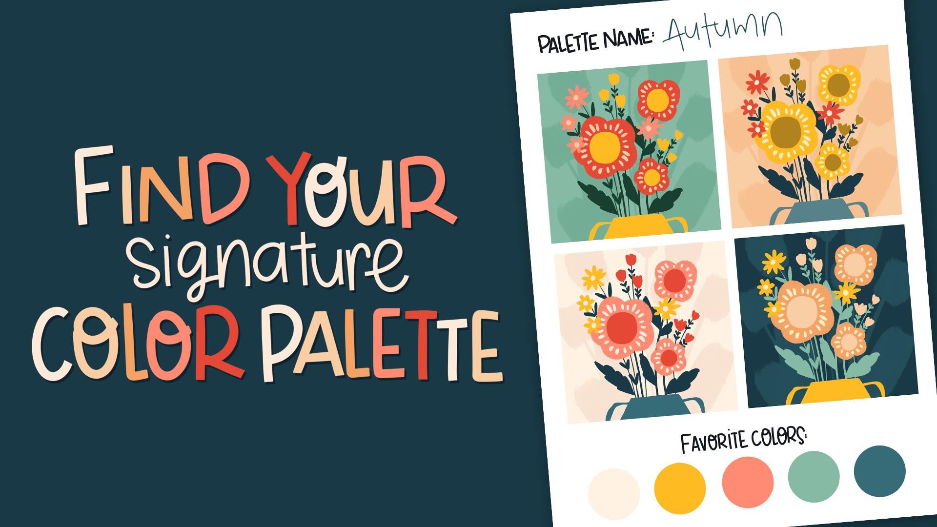
1. Intro: Which of these two art
collections looks better to you? They use the exact
same illustrations, but one feels polished, cohesive, and instantly
recognizable. The difference a
signature color palette. Do you ever look at your art and feel like something is missing? Like your portfolio doesn't quite look like it's all yours? Even if you work in
different styles, having a consistent color story can make your art feel like it belongs together and make your art more memorable
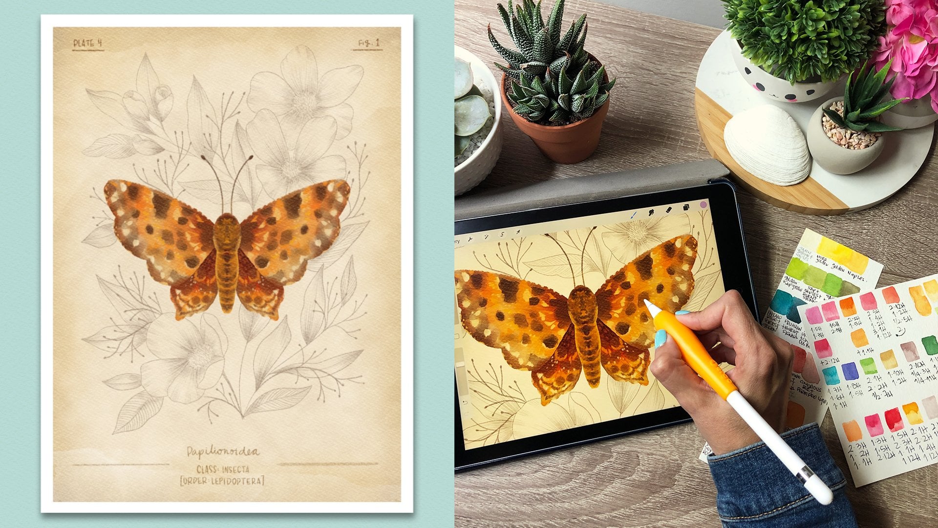
as an artist. Hi, I'm Sandra Mahia. I license my art for products
like puzzles, fabric, stationery, and I love
working in different styles. But the secret to
making my portfolio look cohesive color. I stick to my signature
color palettes. In this class, I'll
guide you to creating your own signature color
palette in Procreate. So your art looks more
unified and professional, but without boxing
in your creativity. You learn how to
choose colors that truly reflect your
voice and style, organize your palette with
light meat and dark tones, test your palette
in real artwork, not just dots on screen. Refine it until it
truly feels like you and use this palette
across your work, but not all at once for
consistency and cohesion. Think of this as your
personal color toolbox. With 30 curated colors,
including shade variations, you'll have everything
you need to bring harmony to your portfolio while
keeping each piece unique. You'll also get a template
to build your palette, two ready made palettes
and procreate swatches, a worksheet to test four
different palettes, and a final template to see
your palette in action. And I'll even show you how to share these palette so that you can share them with your friends or you can even
start selling them. By the end of this class,
you'll walk out with a fully custom ready to use procreate color
palette and a clearer, more confident
artistic identity. Join me and let's start
creating colors together.
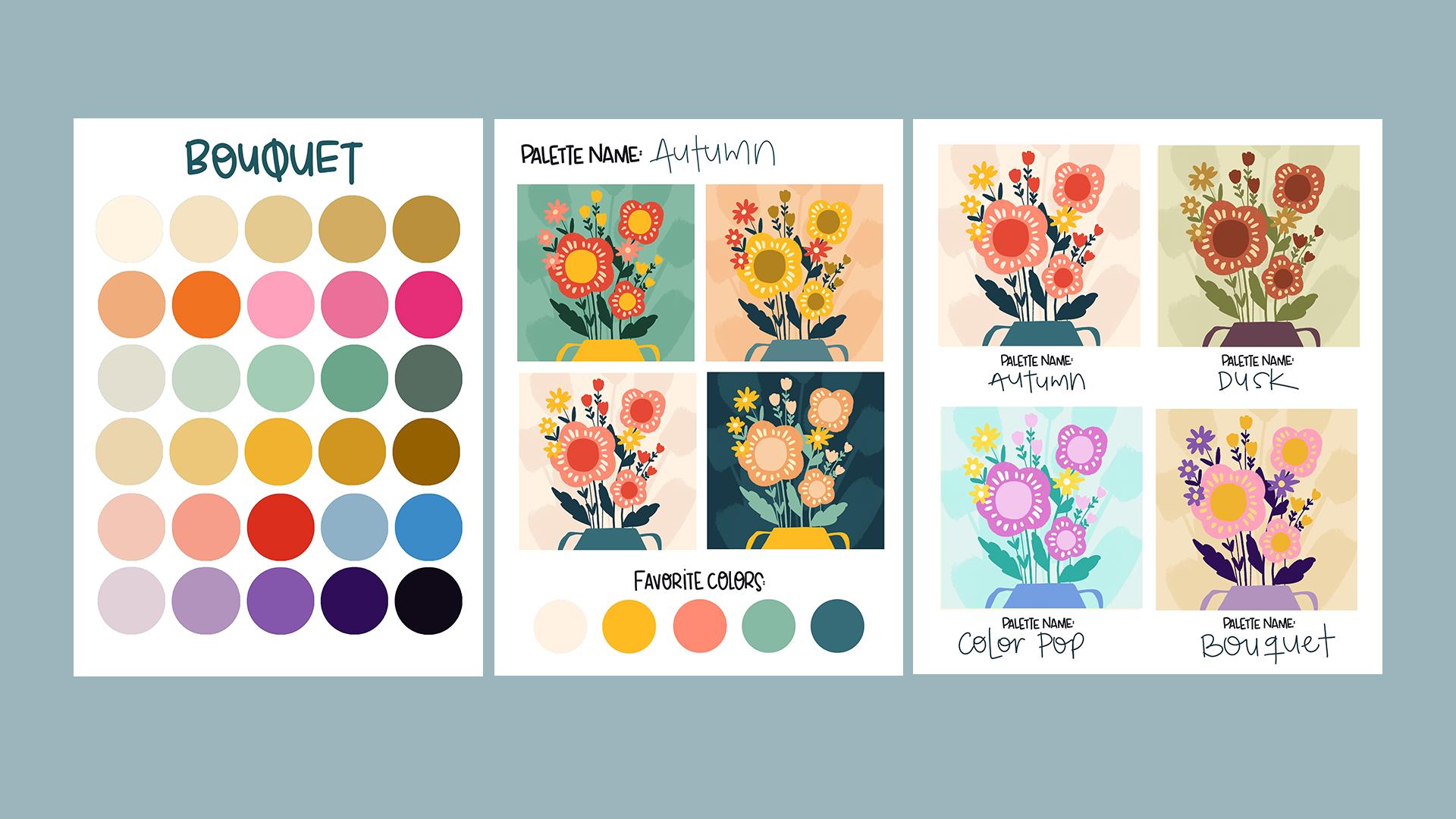
2. Class Project + Resources: In this class, you'll create four different color palettes
and then you'll choose your favorite and refine
it until you have your best final version of your own signature
color palette. This one will become your
signature color palette, the one that will
bring consistency and unity to all your art. To access all the resources, just head to the
Projects and Resources tab or the project Sab if you're on the mobile app and scroll down to find
the download link. Here's what's included a color
palette building template, two ready made color palettes
with procreate swatches, a template to test four
color palettes side by side, and a final template to see your chosen palette in action and a JPEG with my examples. You can follow along using
your own illustrations, which I highly recommend
so that you see your color palette tested
on your style of art. But if you're super excited
to start right away, I've also included a super
simple practice illustration as appropriate file, perfect for testing
your palette quickly. If you'd like to use
the exact artwork and autumn palette swatches
feature in the class, download the extra
resources PDF included in the resources and click
the button inside. You'll be added to my
newsletter and get access to these files along with
all my other freebies. These extras are
totally optional. You don't need them to
complete this class. If you're not sure how to import the files into Procreate, just go to the last
video in this class, which is a bonus video, and it will teach
you how to do it. It will also teach you how to import the color swatches into Procreate and don't forget to share your project in
the class gallery. I'd love to see what you create. Now let's jump to the
next lesson and start creating your palette. A
3. Creating the Palette: In this lesson,
we're going to start creating our own color palette. If you don't know
how to import files, go to the bonus
video where it says how to install brushes
and color palette. It will also show you
how to import the files. So once you have the file here, we're going to be using
the palette template one. And this one basically
has 30 spaces the same as procreate
color palettes. And the reason I'm working with them in big circles
is because we want to see as much
of the color as possible to see how
they interact together. So this vile has two layers. You can see them here, and here, it's the one called colors. This is the circles, and that's where we're going to
be adding our colors. And this one is a modifier, and I will show you how to
work with that one at the end. So to create a color palette, there's two ways to do this. One is to start from scratch, or the other one is to
start from an image or a color palette you found and
you really love the colors. So make sure you're standing on the modifier layer so that
we add another layer on top. I'm going to go here to
the wrench and in actions, add, I'm going to
insert a photo. And I have my photo
saved here in my iPad, and let's say that this is a color palette that
I found and I really, really like it or something that you have been using
in your artwork before. This is some of my
favorite colors. So I'm going to tap here to release so what I'm going to do here is create shades
of my favorite colors, and I'm going to
create lighter shades of those colors and darker shades because that's the way I can give contrast to
my illustrations. If everything is kind
of the same tone, then we won't have contrast, and it will lack interest. So you want to have
some light colors, some medium colors, and
some very dark colors. So let's go to our layers again
and make sure that you're standing in the colors layer so that when you drag in colors, they go into those circles. I'm going to tap
here in my colors, and I'm going to go
to the classic view. This way, I can choose my
colors here really easily. I have a very big area here. So what I'm going to do is
select the first color. If I leave my finger
tapped on it, you'll see that this appears and it will show you what
color it's selecting. So I'm going to select
that color first, and you'll see that
it's selected here. So when I tap on it and
I drag into this circle, it's obviously the same color, so you can see the difference, but it will fill the circle. Let's try that with the pink. If I drag it here
into the circle, it will fill the circle. So let's say that
you're dragging it here and you'll see
here the threshold. If the threshold is too high, it will fill every circle. So make sure that if it's
filling too many circles, you drag your pencil to the left so that the
threshold is less, and it's only
filling one circle. So let's undo that. And I'm going to drag
that color here. This one is kind of medium, the very light ones
I'm putting here, and then the medium ones here, and then the very dark
ones on this line. And then if I select
the teal green, I can drop it in here, and then I'm going
to take my yellow and then drop it in here. That's kind of a
medium tone, also. And then this very dark one, I'm going to drop it
down here because that is the darkest
of my colors. So the darkest colors go here, medium here and
very light go here. So now I can get
rid of the layer. So I'm going to sort to
the left and delete it. We don't need that anymore. And this is how you
take color palettes from the Internet
and then you make them your own because
you don't want to be copying other people's
palettes exactly. You want to make something
that's very, very you. So now I'm going to open the
colors again and make sure you're in classic because that's the best way to
see all the colors. And what we're going to do is we're going to
start with this layer. So I'm going to select this one, and you'll see that it
moves towards that color. And you'll see that it's
here around the yellows. So in every palette, we should try to get some
reds or oranges yellows, some greens, and there's
greens that are very yellow, and there's greens
that are bluish. And then there's like those
steel colors and then blues, and then there's
purples and pinks. So we want to try
to get a range of colors that all
match together so that you can use this to create your illustrations
and you'll have enough variety to create a
different variety of subjects, but also that they
all kind of go together so that your
portfolio looks cohesive. So we're starting here with
our very light colors, and I think you should
always have a row of very neutral colors because when you're creating
illustrations, all your colors
are super bright, then it's going to be too busy and it's not
going to look good. So you always need some
brighter colors and then some more muted colors
to tone things down. So I might want to have an even lighter color
than this one in my palette because almost white, I never use, like, totally, totally white, but almost
white is very useful. So I'm going to drag this
into my first circle, and here I'm going to
press continue filling. That way, color
drop is activated, and now I don't need to drag
my color into every circle. I can start moving this circle and I'm moving
it a bit to the right. And a bit to the bottom. These colors here are
the brightest ones, and these are the
less saturated ones. So here, they're
kind of gray colors, and here they're super,
super bright colors. And then here you
have the dark colors. So you want to move this a
little bit and then tap on the second circle to add
that color to your palette, and then you come
back to the colors. And if you drag this out, then you won't have to be opening that color
palette every time. You can drag this to the
right a little bit more, and then tap and then to
the right a bit more, and then tap and a tiny
bit more and then tap. And I have created a
row of neutral colors. Don't worry too much right now. Oh, do they match?
Do they not match? Do they look ugly? Does
this one go with this one? We're not worrying
about that right now. We are just creating some colors and then we'll
make sure they match. So now we have our second row, which is this pink. So I have to turn off the
color drop to select it, but I'm going to
leave it selected, and now it's here. And now I'm going to create two lighter shades of that pink. So I'm going to move it to the
left and see it's lighter. And I can drag it in there
and then continue filling so it can keep filling without
having to drag things in. And then I can move it to the left and create
an even lighter pink. And then I can go and
make darker pinks. So if I want my colors
to be super bright, I would go straight
in this line up here. Or I can go down a tiny bit to make them
a bit more muted. We are working in
a file that's RGB, which means that it is capable of having very,
very bright colors. But if for some reason, you're going to print
something in CMYK, then the super neon
colors, for example, this one, it won't
print the same way. So I try to stay
away from the super, super bright colors up here, and I just tone it down and choose colors that
are a bit lower there. And that way, I make sure that when my artwork is printed, it still looks great. Perfect. Now we have to
turn off color drop. Every time we're going to
select a color like this, we have to turn off color drop. And then I'm going to
do exactly the same. So I can drug up and to the left if I want to make
that lighter and brighter. But I really like that
kind of muted teal, so I'm just going to drag, like, to the left and a tiny bit up. And drag that there and
tap continue filling, and then drag a B to the left. And that way, I
created a more muted till than if I went up
here, let me show you. And I had created a brighter,
brighter teal color. I don't want it to
be that bright. So I'm going to go back here where this one was and start
creating darker tones. So maybe here and
even darker tone. So if I go here, it
will be very bright. But if I go to the left, it'll be more grayish. So try both and see
which one you like best. Okay, I think that
looks really good. So tap color drop again, and then I'm going to
select this yellow. And I'm going to go to the
right and drop that in, continue filling, go to the right again,
continue filling, and then I'm going to go back
here to the darker ones, and I can move a bit
to the right and a bit down and then just a bit to the right
and a bit down again. Those are two similar, so I want them to
be more different. So if I think that's good, you can even go darker. The idea is to have a range
of colors so that you can create light and shadow and contrast in
your illustration. So now we're going
to tap color drop, and what happens here we
don't have more colors. Well, we have this dark one. So what I'm looking for
when I'm creating a palette like this is that I want to
have some neutral colors, and then I want to have one
of each of the basic colors, like a red, an orange, a yellow, a green, a blue, and then a pink. If you like pink, if
you don't like pink, you don't have to
have that or like, Oh, I hate painting with purple. So obviously don't add
that to your palette. Just just colors you
actually like working with. So for example, here, I'm missing a red. So I'm going to add a red
just going to drag it there, and not every color
palette has to have five shades of the same color. For example, if you like
pink but not so much, you can decide that you prefer having an orange there
instead of so many pinks. Maybe I'll leave
these three pinks, and then here we're going
to add this orange. Oh, but you added it,
and that is too brown. You don't want it so brown, so you can move it
around and drop another color there and
see if you like that one. Oh, I want it a bit brighter. So yeah, I think that works. So now I'm going to
go even lighter. And drag that one there. And if it's too close and
you want it even lighter, just drag another one there. And then we can do that
with the red also. So I'm going to pick the red, and I'm going to drag it here. See, but that is too
earthy. I don't want that. I want it brighter,
so I'm going up. And here it's a lot of
experimentation and playing. So don't be scared
to make a mistake. There's never a mistake in here. Okay, so we have reds, we have oranges,
we have yellows. Then we need greens. We already have like
this kind of tell. So greens can be
very lime green or like middle tone green
or very teal green. So let's say that I
already have my greens. I really don't like
painting with green. I just like tells. Okay, so then I'm going
to go and add some blues. And here, again,
blues can be very till or they can be purplish. So let's say that I want
to add two types of blue. The first one will be
this kind of sky blue. Then I want to make
a lighter shade of that blue and add it here. And then I want
this to be purples. So I'm going to move
this to the right, and you'll see that
now we have purples, and I want to choose Like this middle ground
purple for the middle. And see, that is not pretty.
I don't like that purple. I want it to make more magenta, so I'm going to move
it more to the right. And let's try that. Yeah, I like that much better. So now I'm going to
create a lighter shade. I'm going to drag it in and you can tap, continue filling. And then an even
lighter shade here. Maybe brighter and tap. And then I'm going to
create a darker one. So I'm going down here because here they're too bright, see. I wanted to be so bright. I wanted to be more muted, so I'm just going to
choose from this area. And then I'm going
to go even darker. I'm going to go down, and I'm going to replace
this because it's kind. I don't know if you
can see it, but it's kind of a greenish dark that
doesn't really go with this, so I'm just going to tap there, and I even want to
make it darker. I'm going to go down here, tap and now that will match better. So we're done with this, and I'm going to
close the colors and close the color drop. So now you see this and
you might think, like, Oh, some of the colors don't go
well, they're not so pretty, and then you're not happy with
it. Let's try this first. Turn on the modifier layer, and this is a layer that
changes the colors underneath. Here, it's adding a yellow
tint to all of them. If you press here, you'll see that it's set
to linear burn. These are blending modes. So this basically tells
per create the way that this layer has to interact with the
layer underneath. So in linear burn, it's kind of mixing this layer
with the layer underneath, and that way, it makes all
the colors go together. So it's a very easy way to make all the colors in a
palette be unified. So you'll see here that
the opacity is set to 17. If I make it super, super dark, like 88%, it's going to
change the colors too much. So you want to move it
around and play with it and see how much you want it to
modify the colors underneath. So for example, here in 1%, that's basically
what we had before. And we want this to
unify the color palette. So we want it to
be a bit visible. And for example,
there, with 15%. I think that works and it's not changing the
colors too much. You can also move it up, say 50%, and you can try all these blending modes and see if you find something
that you like better. For example, divide makes
very pretty bright hues. Let me reduce your opacity and you can see without
it and with it. So maybe that is
something you like, and the difference
is very subtle, but it's just making all
the colors match more. So you can also go
to hue and again, in each one, you
can modify this. So for example, you have this palette here that's brighter. If you want it more muted, here, when you add this hue, then it creates
more earthy tones, and that might be
what you're after. Saturation, same here
with color, luminosity. So find something that you like. I usually like leaving it at linear burn and
something like 15%. And then you can just stop here, and this is your color palette. And I'm going to
quickly show you another one on how to create it starting from
scratch and not with the base color palette
that we started with. So I'm going to go
to the gallery, and I'm going to duplicate
that file, and here it is. And then I can restart again. So here, if I choose
a light color, I can tap it and fill the layer, and then I'll have a blank
canvas to start with again. So let's say that
now you don't have a favorite color palette
that you want to start with, you would do the same thing, but now we're going to
make up all the colors. So I'm going to start with
my yellows, for example. And I'm going to choose my yellow that's kind
of a mustard yellow. Maybe I want it to be brighter. And I'm going to drop that here. And when you drop it in, you can see if you
like it or not. Maybe you want it to be more orangy or maybe you want
it to be more lime green. So I think I wanted to be
a tiny bit more orange, and I'm going to replace that and then continue
filling here. And let me drag this out. When I'm starting from scratch,
I like going from, like, yellows and then oranges and
reds and pinks and purples, and then, like,
blues and greens. Okay, so then I want to
move here to the greens. And I think I want to
have some lime greens. So maybe that one. And then non neutral greens. I want some teals just because
that's my favorite color. And here choose colors that
you always like to work with. So I'm going to make it a
bit more muted because here, it's very neon green
and drop it in there. That's too green, so I'm
going to move it more to the right to make it more
blue. That's better. And then I'm going to go to
the blues and let's see. I really like that,
like, bluish purple, and then I'm going
to move further in, and I don't like that super
bright purple in my artwork. So I'm going to go more
towards the magenta colors. And I absolutely love pink. So I'm going to add that there. And I think we need a red. So let's see how
this red looks like. No, I want it to be brighter. Yeah. I like that much better. So now look at this and
use your intuition. Don't think about color theory. Just think if this looks
good for you because this might look horrible for you or this might
look so pretty. So don't follow the theories, think about what you like and fix the colors
that you don't like. So for example, let's say
you don't like this green, just turn off color drop
and select that green, and then you can modify it and
change. Oh, that's better. It's not better. But if
you think that's better, just keep it and modify them
as many times as you want. So now that I'm happy
with these colors, I'm going to select this one, and I'm going to create lighter
shades and darker shades. So if I go here
and I drag it in, and I'm going to press
continue filling. I don't like that
because I think it's like too, like, ugly, dirty yellow, but this is
just going on my taste. So I'm going to go up
a bit and try that, and I like that so much better. And then for the lighter one, I want it to be almost
white. So there I go. And then I want to
create darker yellows. So I want to go to this area up here because here it's too dark. So let's try this one. And it's very similar. So I want to go even
darker. That's good. But I can also try going darker. But if you really
don't like that, and then you think you want
something more orange, you can also move the
color a bit to the left and create a more orange tone. Now even a tiny bit
more to the left. And then here. And I think I can go a tiny bit more to the left
and a bit higher. And I like that a lot. Okay, so now we're going to deselect the color drop
and select the green. And we're going to do
exactly the same thing. So I'm going to create a
lighter shade of green, drop it in here, turn
on, continue filling. And see, this one's too muted
and this one's too bright. I want it to be brighter,
so I'm going to go up and tap there, and I really, really
like that and then create a lighter
shade of that. And then I'm going
to go and create darker shades so I
go to the right. Perfect, and then go down, and I can even go a bit darker,
and I'm happy with that. They select color drop and then continue doing the
same thing with all of the colors. Mm hmm. Okay, so I'm ready, and now I want to go
to my layers and turn on my modifier and
see if I like that. And you can play with them. You can also I'm using yellow, but you can also choose
a different color green, for example, and just make sure you're in your
modifier layer and drag that color in. And if you go here and
you turn on the opacity, you'll see that that creates
a totally different effect. So make sure to play with this, drop in different colors, go to all the options and see if there's something that you
really, really like. For me, I'm going to undo this. And keep it in either
linear burn or divide. I really like these
bright colors. I think I'm going to
keep it in divide and we're done with
the color palette. So now the only thing that
you have to do is go here. Let's close this color palette, and then here you
choose palettes and create a new palette. So I'm going to
create a new one, and it's going to be up here. So if I tap in the name, I can rename it, and let's say color pop. And then you just have
to leave this pressed here and tap in
the first square, leave it pressed, tap here, and just add each
color to your palette. And we're done. Now you
have your color palette and you can share
it with somebody, you can duplicate it,
you can delete it. And now we can add name to your palette if you want, also. So go to calligraphy and I
like using the mod line brush, and I'm just going to choose any color from here and go to my layers and make sure I am on top of the modifier layer, create a new layer, and then I can add my name. Color And then I can use this to move it
around and make it smaller. That way, I have a nice file to share my palette in case
I want to share it with my newsletter subscribers or
in case you want to sell it. This is a nice way to
showcase your palette. So in the next lesson, we're going to add
it to a piece of artwork and make sure that
it really, really works.
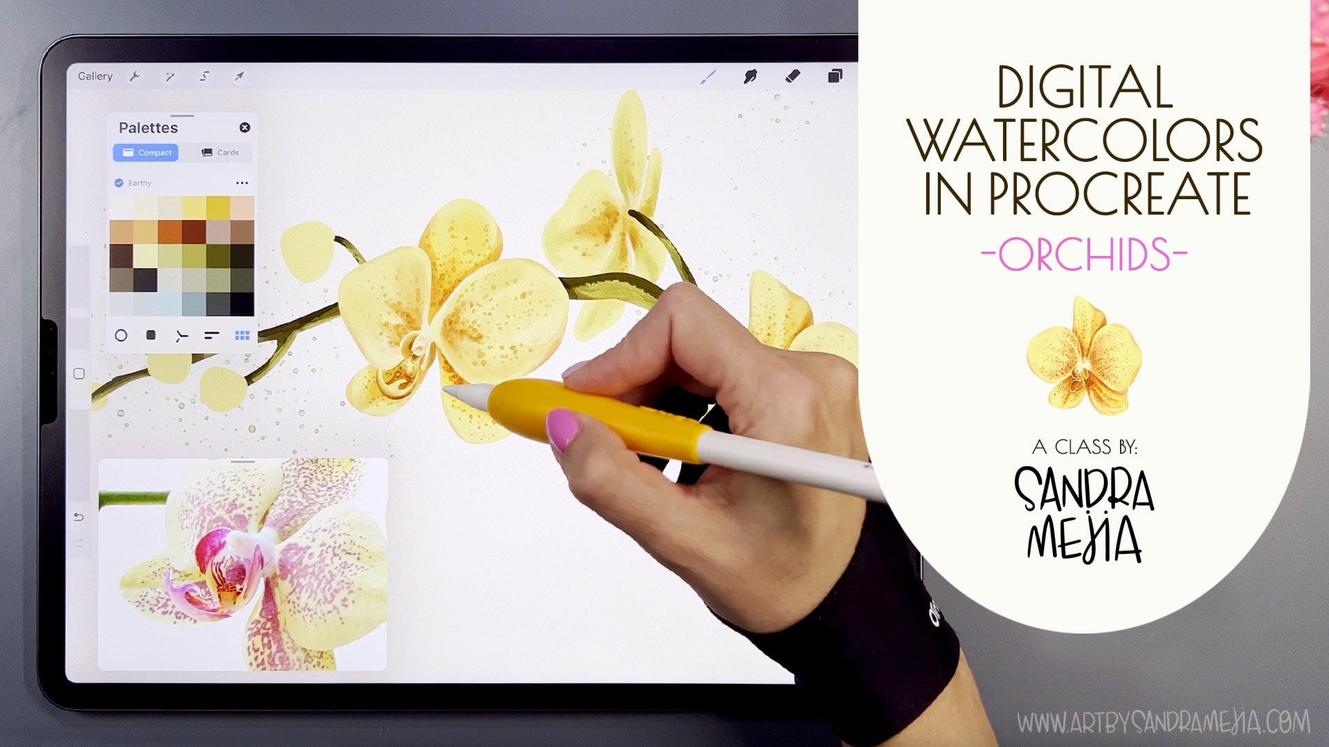
4. Testing the Palette: Great. So now that we have
our color palette set, we need to test them because sometimes we think they work,
but they don't actually. So I have a very simple
illustration here, and I have created every
color on its own layer. If you don't know
how to do that, I'm going to show
you very, very fast. I'm going to create
a new canvas, and I'm going to make
this 12 by 12 ". And you need to make sure that the color profile is
set to RGB because the CMYK Ifrocrit is so muted that your colors are going to look very,
very different. Also, my templates are made
in RGB in this color space. So if you choose
a different one, they will look very different
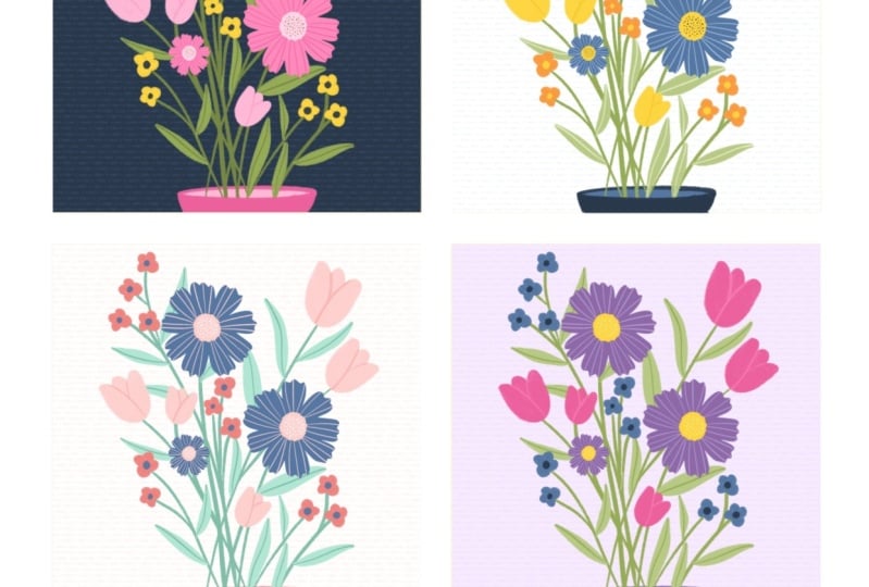
from when you created them. So let's click Create, and here you have your file. And it doesn't matter what style of illustration you create
for testing your pattern, simple shapes without
shading are the best. So I love using the Oberon brush in drawing because it creates
like solid shapes, but it has some texture. So I think that looks very
nice for illustrations. And I'm going to make
it a bit smaller. And I'm going to
drag my palette out. And what you want to do is
create one layer per color. So just try some simple shapes. So I'm just going to create something
super, super fast here. Let's say those flowers, and then in another layer, I'm going to create make
sure that color is selected. I'm going to create
these other flowers. And then a little one here. And then in another layer. I'm going to create
Otter flowers. And then in a cup layer, I'm going to add with
a lighter color, I'm going to add some
detail to these flowers. So let's say like this. And I'm going to make
it even smaller. And then I'm going to create another layer and
I'm going to drag that one underneath so I
can create some stems. So let's say this green. And you can use any
illustration you already have, or you can create a new
one for this class. And then maybe some leaves. We're not creating
a masterpiece here, but we want something that
you think it's, like, pretty enough. You
can take more time. And then I want to add one last colour on top
of that for a vase, for example, and just the
indication of the base. And then I want to
change the background. Then I can select
all the layers. And if I go here, I want
to move it to the right, so it's kind of centered, and I can even rotate it a bit. And then I'm just
being super nit picky. But this is how you can create your base illustration.
Just make it simple. Make sure you use like four
or five different colors and make sure that every
layer has just one color. And then you just
swipe to the right on each layer so that you
activate the alpha log. You'll see a checkerboard
on the back, and then we're ready to
start trying our palette. So I have my sample
artwork here, and you'll see that I created it the same way
as the other one. And right now it has, like, a totally
different color palette. I created the bouquet
and color pop with you, and then I went ahead and
created other color palettes. I suggest that you
create at least four. And the way that you're
going to know which one is the one you like the most
is by trying them out. So let's say I want to
start with autumn and I'm going to set that as a
default and drag it out. And what I'm going to
do is go to each layer, starting with the background and choose a color from my palette. So let's start with
that very light one. And then these for
those back shadows, I'm going to choose
maybe this one. And I'm going to tap fill layer. So it's going to fill
that whole layer. And then I am going
to go through all my layers and fill them with colors
from this palette. So for example, this one, and then for the
flowers, this color, and then for the
inside of the flowers, maybe this one for
this one's a yellow. Sometimes it doesn't select. So for example, here, if you see that yellow
and you're like, Oh, it's too dull, I don't like it, then you
close your palette here, and then you open
it here because you can't modify it when
it's dragged out. And here in the classic view, you can modify that a bit. So if you wanted to be a bit more towards the red
side, more orange. You can do that and then
move it a bit here. And then if you leave this pressed and you
set current color, you will replace that color. And then if you want to change the derivatives that
we created for that, you can drag this along here. Set current color,
and there you have updated that yellow.
So now we can go here. I'm going to drag this
out, select the palette. And I'm going to
choose the new yellow and go here and tap fill layer. And I like that
yellow much more. So I can continue filling these things in
with this color palette. Stry this one. Oh, I can't see these ones here because they're too white, so I'm going to try a
different color for those. And then this I want
to change to this one. And I'm going to
reduce the opacity of these shadows because
they're too strong. Oh, that's so nice. So I
really like how that looks, and now I'm going to
try my other palettes. So I'm going to the gallery
and duplicate this file. And I'm going to tap
here in the name and rename that with the
name of my palette, so I know which one I use. So that one's autumn. And now here I'm
going to use book A, so I'm going to tap it and
press book A and open it. And I'm just going to
do the same thing. So I'm going to speed this up, but I'm basically going
to just select bouquet, set as default, drag it out, and start filling in the
shapes with these colors. So here, for example, I don't like that yellow. It's very different
from this yellow, so it doesn't really go. So again, I close my
palette. I go here. I go to Classic, and
this yellow is pretty, so I'm going to select it. So I'm going to
go to the right a bit and go up a bit to make it less muddy and just sit
here and set current color. And I think that's going
to work much better. So I go to my layers again. And I'm going to fill
this layer with that, and that works so much better. So by using this palette, you're going to start finding colors that don't totally work, but then you can start
shifting them a bit. That's why we're doing
these practices right now so that when you start creating
your real illustrations, then you already know
what colors you're using. And don't be worried if you've made like three or
four illustrations, and then you realize
your palette has a color that doesn't really
work. You can modify it. It's not going to throw your
portfolio off or anything. It's going to continue evolving. The idea is that you don't use
these colors, for example, in most of your work,
and then you decide to create a neon orange
piece of artwork. That one's going to
stand out a lot. And it's okay if you create it. Don't limit yourself
so much either. Like, you have to explore and you have to get away
from your color palettes, also, but know that that's going to be super
visible in your portfolio. So maybe you can put that one in another section with others with similar color
palettes or something, just so it doesn't look
like it's clashing. Okay, so I really like this. So I went to go to the
gallery, and again, I'm going to try the
color pop palette that we created together and
another palette that I have, and I'll come back once
everything is done. Okay, so I have tested
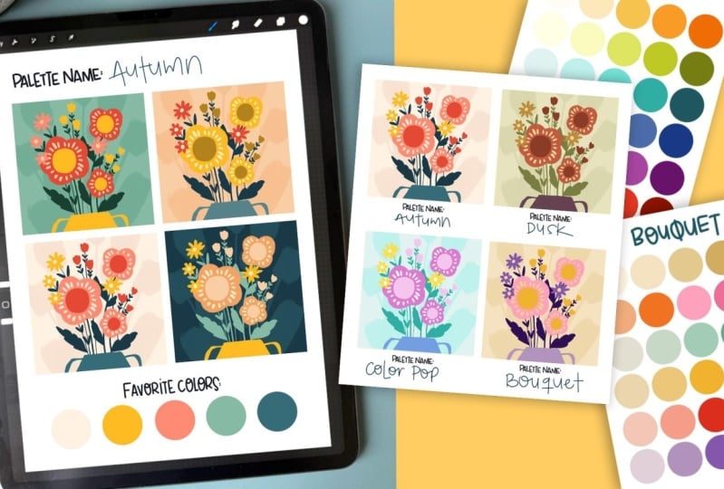
four of my patterns, and what I'm going to do now is select and select the four of my test and share and I'm
going to share as a JPEx. So I can save them
as a JPE in my iPad. And then I tap on the X, and I can use my palette
samples template. Now what I'm going to do is I'm going to import them all here. So insert a photo, and I'm going to choose the
first one and then go here, insert a photo, the second one. Insert a photo, the third, and insert a photo
and the fourth. Stop here. And once I have
the four of them there, I can select the four
of them at once, and here, I'm going
to modify them, and I'm going to make them
around the same size, just a tiny bit bigger than those background squares
and just release here, and now I can start
moving them around. So I'm going to
move this one here. And then this one here, and this one down here. And this way, I can compare because when you see the
palettes like these, you might think they look good, but once you're using them, it's something
totally different. So that's why we want
to try them out. So I want to create
a new layer on top, and you can either add text and then type the
name of your palette. D and then move it
here, release it. Or on that layer
that you created, you can use any brush you want. I love using calligraphy,
the monoloin brush, and I'm just going to
choose this dark color, and I'm going to name all my palette so I
know which one it is. So this one was this one's dusk. This one's autumn. And then this one's
color pop and bouquets. So I can see that this one's not
exactly on the squares. I'm going to lower
it a bit down. It doesn't have to be perfect. And now that I have them here, I can see which one
I like the best. And I think I'm drawn
to this one a lot. I usually like very
vibrant colors, but I'm really
liking this palette. This one I would never use. That's not my style. This one is nice. It's a bit more vintagy. And this one that has
super bright colors. I really don't like
those purples. So I have decided I'm never
using this palette again, and I am using
these two palettes. So in the next lesson, we're going to dive deeper into those palettes
that you chose. I'm going to choose autumn. And I'm going to show you
some exercises to dive deeper into it and make sure it's super refined before you start
using it or even selling it.
5. Exporting and Refining Your Palette: In this lesson, we're going
to refine our palette. We're going to be going
further into it and trying it more and making
sure that it actually works. So what I want to do is
duplicate this file four times, and in the four of them, I'm going to start using all the colors in
my autumn palette. I'm going to start
testing as many as I can. Obviously, we don't want to use all the colors in the
same illustration. I'm going to start testing all of them and seeing how
they work together. So when I started
creating this one, I realize that green
does not go at all. It looks so ugly. You
might think it's pretty. I think it's ugly, but this is all according
to your taste, my taste, they're all different. So this is why you can't
just follow somebody else. You have to feel it in
your heart that this is what you like or what you don't like. I don't
like this green. So what I have to
do then is open my palettes here and make
sure to go to classic. And I want to try
more of a lime green. Let's see how that looks. So I go to that layer and I feel it and I don't really like that. So I'm going to go
in and try more a tealish green, more bluish. Let's see. And I'm going to go to the layers and fill layer. Oh, and I like that
so much better. So now I have to go to my
palette and actually fix it. So I'm going to
leave this breast and set the current color, and now I have to change
all these greens. So I'm going to create a
lighter version of that one, set to current color, and now I'm going to
create darker versions. I don't want to be too blue because I already
have a lot of blue, so I wanted to seal
the kind of greenish. So I'm going here. And then down here. Oh, I like that so much better. So I went ahead and changed the colors in my four versions, and then I select
them all and share, and I export them as a JPEG
and I save them to my iPad. And now I'm going to go to
the palette in use template. And I have added the
four of them here. I did that by going to
Actions Insert a photo, and I added the four of them
the same way we did before. And now I can see
them all together and see if this palette
actually works. See how if these were
different drawings, but they were using the
same kind of colors, your portfolio would
look very cohesive. This would look like
a collection of cards you would see in
a store, for example. So this is very useful
because even if you have different styles by keeping to color palette
that's established, then you can create
more cohesive art and your portfolio
would look better. That doesn't mean that you
can't ever deviate from these and you can't experiment with other colors. You can. But having this in mind lets
you organize your portfolio. For example, if you
create ten pieces of art work with
this color palette, and then ten pieces with
another color palette, they would all look cohesive
amongst each other. And trust me, it will look
more organized than if you're creating this
color palette and then you're adding neon
green somewhere else, and then you're creating orange and red and very
bright blue artwork, your portfolio will
look more disorganized. So what I like to do now is go to the template layer
and I'm going to choose my favorite colors which are
definitely this muted beige, the yellow, the pink. Well, it's like a dusty pink. The red Actually, this
steel and then this blue. And now that I know
my favorite colors, I will try to add those
to most of my artwork, and that way, it
will be cohesive. For example, I love bright pink and till and enough white, and I add that to
most of my artwork. And that's one way that you can tell that the art is mine. Oh, so now the last thing
that we have to do is go to the gallery and remember
we changed those greens. We're going to go to
our color palette here and we're
going to fix this. Just in case that
you're going to sell this and you want to share this image as a
preview of your palette. So I'm going to
go to this layer, and because we have a modifier, I want to merge
those two down so that the modifier is not changing the colors
that I'm going to add. So just drag this
color palette out, and I'm going to replace
the colors that I changed. So this one and just drag
it in there and then continue filling And
there I have it. It looks so much better.
Now this color palette is the same as this one, and now I can use them for
myself. I can sell them. I can share them with my
newsletter subscribers. I can do whatever
I want with them. So now, if you want to
share your palette, you just press these three dots here, and you press share. And now you can save
it to your iPad, to your files, to your dropbox, and you can share it
with whomever you want. So now let's go to
the last lesson where we're going to recap
everything we learned. Mm hmm. Oh.
6. Wrapping Things Up: B. Yeah, you made it to the end. Amazing. I hope you
had fun creating your signature color palette
and that you're feeling excited to start using it
across your artwork to bring more cohesion and
personality into your portfolio. Remember that you
don't need to use a 30 colors at once that's
probably not recommended, but just having a
consistent set of colors to pull from will help make
your art more polished, more consistent, and more you, no matter the style
you're working in. If you enjoy the
class, please leave a review and share it with
your friends and don't forget to upload your project to the project gallery so I can see your beautiful colors and how you're using
them in your art. See you in the next class. Bye.
7. Bonus: How to install brushes in Procreate: Hello. In this video, I'm going to show you how to install brushes and
color palettes in Procreate and how to
open files in Procreate. So let's say that you
bought some assets. I'm using the assets in
my daffodils tutorial. And when you see that
a file says brush set, that is a brush file, obviously, and Swatches
is color palettes, and then procreate files are just procreate files, obviously. I am going to download all
of these into my iPad. Let's say I'm going to
download just the brush set. I asked me if I want
to download it, I'm going to say download. If I go here to my downloads, it's here and if I tap on it, it will import it
directly to Procrit. So now if I go into
one of my files, it'll be the first one imported here, see,
Sandra's watercolors. If it's not there
for some reason, you're going to
have to find where it downloaded onto your iPad. So if you go to
your files folder, it will usually be
here in your reasons, or you can find your downloads
folder and find it there. And once you're there, you
can double tap and it will import into procretT
it's there again. Or you can also
drag your screen up slowly because you just open that files folder,
it will be here. You just leave it
pressed and you drag it out here to
create a split screen. Now you can just drag your brush set and it will import it. You do exactly the same process when you're importing
color palette. The only difference is that when you import color palette, they're going to be at
the bottom of your stack, not at the top like brushes. See? Here's mine. It's also the same thing when
you have a procreate file. Say we download this one and
now we can find it here. If we tap on it, it will import
directly into Procreate. Or if you have it saved in your dropbox or any other file, you can also find it here in your files and when you find it, you can just tap on it
and it will import. That one you will find
here in your gallery. See? These are the
two I just imported. If for some reason you
have downloaded all at once and you've
downloaded a CIP file, you will see it here
in the downloads also and you can just tap on it, or you can go to your files
and if you just tap on it, it will unzip it, and then you will have access to all of the elements here, and now it's the same process
as I showed you before. I hope that's
helpful. Procrad has made it very easy
to import assets. I hope you have fun
with your assets and see you soon. Bye.
 Sandra Mejia, Illustrator + Pattern Designer