Transcripts
1. Introduction: Hi, I'm Priscilla, an illustrator, surface
pattern designer, Skillshare top teacher, and digital art educator with a passion for iPad
based digital design. Over the past few years, I've helped hundreds
of artists create digital artwork using Procreate, and I'm thrilled to introduce
my latest class creating pop art fashion illustrations
from photos with Procreate. In this class, you
will learn how to choose and prep a photo for
a digital illustration, how to use procreate brushes and layers for clean outlines
in bold color fills, how to add cartoon style shadows and highlights to clothing. Work with clipping masks, add hand drawn white
elements for extra impact, and export your final
illustration for sharing. No prior experience is needed,
whether you're a beginner, a fashion illustrator or just curious about turning
photos into fun, modern artwork, then
this class is for you. You will also get access to my custom
Procreate brush set, color palette, pinch rest board, and patent image, so you can
follow along step by step. By the end, you'll have your own unique illustrated portrait and a playful new digital art
skill to use again and again. Grab your iPad, a pressure
sensitive stylus. I will be using the Apple
Pencil and the Procreate app, and let's get started.
2. Class Project: Before starting the
lessons and class project, download the resources from the project and resource section below this video available on the web version
of Skillshare. Save them to your device and then open the file
in your downloads or file storage and choose
Procreate to export it too. For your class project, we're going to keep it super simple. Take a screenshot of your portrait before
or after applying the techniques from this class or upload a JPEG of
the before and after. You can use the class
image or one of your own. Upload the final result to
the class project section, and if you create a
custom color palette or add embellishments,
I'd love to see it. Fair warning, this process
is very addictive. You might find yourself making these illustrated
portraits non stop. But let's dive into
setting up our Canvas and selecting an image
in our next lesson.
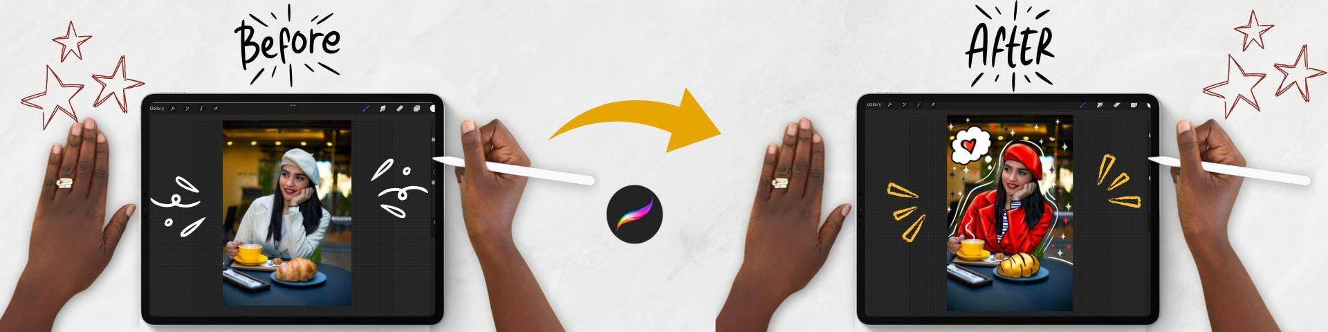
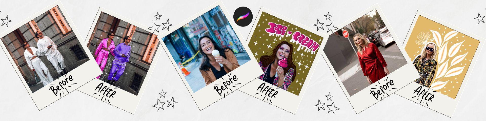
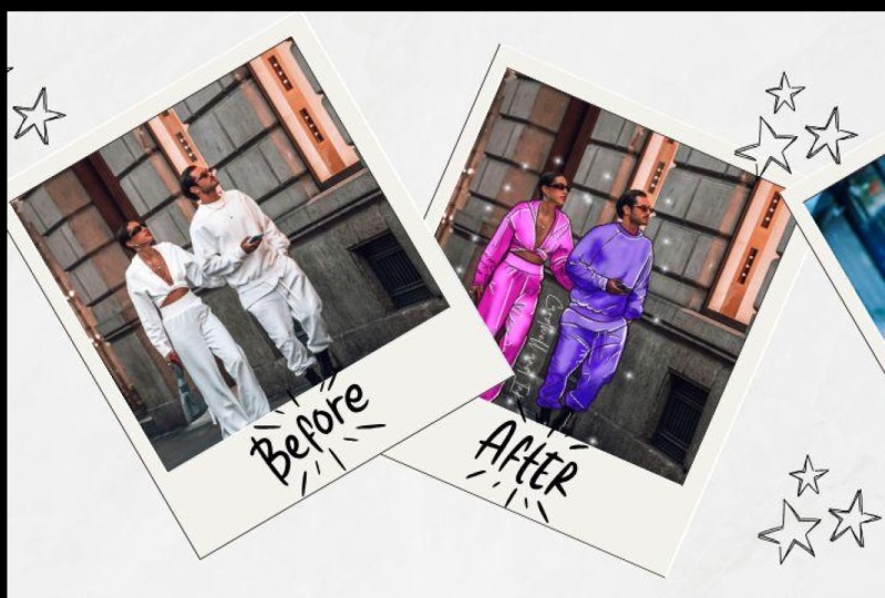
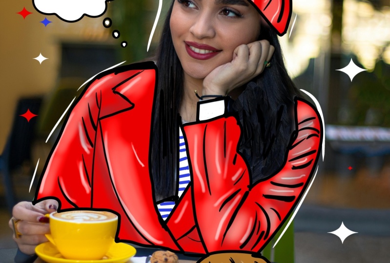
3. Inspiration and Photo Selection: In this lesson, we are going to look at
some inspiration on Pinterest for our pop art
fashion illustrations, and then we're going
to source an image to use for our
project on Unsplash. First, the Pinterest board, which is linked in the
class description section just below this video. When you tap the link,
it will open up to a board where you can see
the style of illustration. Generally, when you're looking
at these style of images, the face and the hands of the
subject are left untouched. But the clothing of the
subject has been turned into a cartoon style fashion
illustration with a lot of illustrated hand drawn
elements added around it. These are often
white colored lines, stars and embellishments. The clothing is outlined
and filled in bold colors, and we want to keep
this in mind when we create our own portraits. Next, selecting a photo. We're going to look
at the sorts of photos suited to this style, and for our project, we're going to
follow the link in the class description to select a royalty free photo
from the site Unsplash. In the album of Images I've
created for this class, you want to look for images that have clear contrasts
in the folds of the clothing so we
can see them more easily as we make our
outlines on the image. Light colored clothing works better than dark clothing as it allows you to see the highlights
and shadows more easily. For our class project, we're going to select
the image of the girl sitting at the
table in the cafe. To download the image
to your cameole, just press the arrow on the
bottom right hand side, and it will save
it to your device. Next, we can head back to
our Procreate App gallery. At the top right, you can select the text photo and then select your image
from your device, and then it will open up a new Canvas with
the photo in it. And now we're ready to begin. Join me in the next
lesson to start outlining the clothing
in our image.
4. Outlining the Image: In this lesson, we are going
to tidy up our photo with the clone tool and
outline the clothing and objects in the image that
we want to stand out. Before we begin,
I'll show you where your class resources
can be found. For your swatches palette, on the top right hand side, tap your color circle
to open the color menu, and at the bottom, tap the
text that says palettes. Scroll until you find your palette in the list
called photo and then tap the three dots on the
right hand side of the palette and tap the
text set as default. Now, when we head back to the disc view at
the bottom menu, your palette will be found at the bottom of
your color wheel. For your brush set,
if you head to the top right to the brush icon, you can open your brush menu, and you will find
your pop art brushes located at the top
of your brush set. Okay, to start with,
we're going to clean up the area
of our photo where the shirt is showing through the hair with a tool
called the Clone tool. Tap the icon at the top right, open the layers menu, and just make sure
your photo layer is selected and is blue. Then on the left
of the interface, tap the magic wand icon, which is our adjustments menu. Scroll down and select the text clone to
activate the clone tool. Use two fingers to zoom into the image and place
the circle that appeared on an area of the hair that you want to
clone on the right hand side, in our brush menu, tap to open, and we're going to our
pop art brush set and selecting our monoline brush
to use as the clone brush. Make sure the brush is
large using your slider and begin to draw a stroke
to fill in the gap. As you draw your first stroke, the circle will
move in sync with your stroke to clone
in the same direction. So reposition the circle before each stroke in an area of the hair that is
completely dense, and then draw across an area where the shirt
is peeking through. We're going to keep going until we cover all of the white areas. This will only take a moment, but it is worth it because once you've finished your image, it makes it look so much more
cohesive when we're done. Once the area is
completely filled in, we can tap that
adjustment menu icon on the top left to
deactivate the tool. Now we're ready to begin the
outlines of the clothing. So head to the top right to the layers menu and tap to open. Then use the plus icon to create a new layer and then tap on the layer to activate
the side menu. We're going to select the text at the top that says rename. And then on our keyboard, we're going to call
this layer outline. Then on the top right
in the color studio, we're going to select red
from our color palette, and this is just going
to make our strokes easier to see for now
against the photo. We will change the
color once we are done. Next, he to your brush menu, we're going to select
the monoline brush and set the size to about
6% using our slider. We're then going to create
a basic uniform outline of the jacket, the shirt underneath, the
beret, and the croissant. Starting with the jacket,
I like to zoom in to do this as I create
my lines in sections. It's better to go over
the perimeter rather than under it so that none of the white jacket will
be outside your lines. I really do like to do this in sections so that I don't
activate the quick shape tool. If this tool does activate
as you are drawing slowly, you can head to the top
left to the wrench icon, select your preferences
from the menu, and then head to your
gesture controls. In this section, find your quick shape in the list,
and then at the bottom, increase the delay time and tap done at the top right to
return to your main canvas. So I'm going to
continue going around the tea cup and then
moving up her jacket. I am going to cover a
bit of hair here as I do this so that I get
one cohesive shape. The important thing is to make sure that it's fully enclosed, which is going to
be really important as we create these shapes. Don't worry about all
the tiny little details. We will come back and
do all the folds later. Remember also that you can use your gestures
as you do this. So a two finger tap to do. If you want to redo a stroke, use a three finger tap. And you can also use a
two finger spread to zoom in to the image as
you create your outlines. Next, we're going to keep going around her jacket to
the right hand side, again moving section by section. Once the right hand side
of the jacket is done, we're going to continue
to that inner shirt and the bottom section of her jacket just above the table. At any point, you can tidy up any overhangs by tapping
and holding down the erase tool at the
top right to set it to monoline and then just
erase any slight overhangs. Finally, we're
going to finish up with the shirt
inside her jacket, where the sleeve pops
out at her wrist. Okay, so once all of
that is complete, we are going to outline the perimeter of the beret
on top of her head as one large object and including that little tip
at the top of the beret. We're going to finish
up creating an outline around the croissant in front of her on
the table as well. Alright, so this was just
the perimeter outline. Now we're going to create a new layer for our inner folds. On the top right, head to the
layers menu and tap it to open at the tops like the plus icon to
create a new layer. Tap on this layer,
and in the side menu, we're going to select rename. This time, we're going
to name the layer folds. At the top right
in the brush menu, and in our pop up brush set, we're going to select
the Baskerville brush. This brush is
pressure sensitive, so the more pressure you
give, the thicker the line. We're going to set
it at about 18%, and we're going to follow
the most prominent folds using light pressure at the thinner edges in
the lighter section, and heavy pressure for the thicker lines in the
darker parts of the folds. I really love the way that the change in
pressure gives you a tapered stroke and implies a bit more shadow with a thicker line and more weight
in those darker portions. Line weight is a really
valuable technique to learn. And understanding this really enhances the look of your art. So work your way around the arms and the
lapels of your jacket, creating tapered lines for the main folds and
sections as you go. Remembering that if
you make a mistake, you can always use
that two fingertap to undo the stroke
and try again. I'm going to fast forward
my time laps a little bit, but feel free to pause the video while you
create your lines for the shirt and start up
again when you are ready. Next, we're going to
create the main fold for the beret and any
other areas that you may see around it like a line around the tip to
define it a bit more. Finally, as we create the
lines for our croissant, just follow with
heavy pressure around the main outline and lighter pressure where
those folds end. And we're going to
outline the folds at the top and the bottom
of the croissant. Alright, that is
our folds complete. Now we're going to
change all of our line work back to a black color. So tap on one of the layers, and in the side menu,
select Alpha lock. Then tap on the next layer, and we're going to use
a different technique for turning on Alpha lock. Take two fingers
on your screen and swipe to the right on the
layer at the same time, and this will automatically alpha lock your layer as well. This function with
the honeycombs means that only the strokes
that have been placed on that layer can be changed and no other area of the canvas. At the top right, tap your color circle and select
black from your palette, and then tap on any one
of your linework layers. And in the side menu,
tap the text fill layer, and it will turn your
outline from red to black. Repeat for the other layer. And finally, we're going
to hold and drag to rearrange the layers so that
the outline is at the top, the folds are beneath, and the photo is at the bottom. And that's it for this lesson. Join me in the next
lesson to start to fill our illustration
with color.
5. Fill with Colour: In this lesson, we
are going to create the fill colors for
the main shapes we outlined in our last lesson. To do this, we're
going to head to the top right and tap
to open the layer menu. Select the original photo layer until it activates in blue, and then click the plus icon to create a layer above it,
but beneath the folds. Tap this new layer,
and in the sign menu, select rename and label
this layer jacket hat fill. This will be our
first fill layer. Then at the top of the list, select the outline layer. Tap again, and in the side menu, select the text reference. Now we can use the
enclosed shapes in this layer to fill our
jacket in that layer. So we'll select that
layer one more time, and then we can begin filling. On the top right, open the color menu and select
red from the color palette, and drag the color and drop
it to fill one of the areas. You'll notice a second
menu appear at the top, tap the text, continue filling, and now you can
use your stylus to tap all the areas
of the jacket and beret that we want to fill in red without having to
drag the color in. Once you're done, just tap the tick to disable
the color drop tool. Head back to the layers menu and use the plus icon to
create a new layer. Tap this new layer, and in the side menu,
rename the layer as shirt. In our color menu, select white from the
palette and dragon drop to fill the areas
of the inner shirt, and then use the
continued filling feature to finish and fill the sleeve. Tap the blue tick to disable
the color drop once more, and we're going to head back to the layers menu and
create one more layer. Tap and rename this
layer croisint And then head to our color menu and select a medium brown color from our palette and drag
it to fill the croissant. Now that the fills are done, we're going to add a
bit of detail by adding blue lines to the white
shirt using a clipping mask. In the layers menu,
select the shirt layer, and then use the plus icon to create a layer just above it. Tap again and in the side menu, select the text clipping mask. And now every stroke
we add on this layer will only show up on the area of white colour on
the layer below. In our brush menu, select the monoline brush and set it on a small size
using the slider. In our color menu, choose
the blue color from my palette and create some blue stripes on top of
the shirt and the sleeve. And this will just add to that Parisian theme
that we have. Once you're done, head
back to our layers menu, and we're going to select our outline layer one more time. Tap again and in the side menu, tap the text reference
to disable this feature. And that's all for this lesson. Join me in the next lesson to learn a simple way to identify our shadows and
highlights so that we can paint them on our
illustration more accurately.
6. Finding Shadows & Highlights: In this lesson, we
are going to learn a simple technique to
find our shadows and highlights on our original photo so that we can replicate
them on our illustration. In the layers menu, scroll down to the original photo layer, and we're going to long press on the tick box on the right
to isolate the layer. Because the jacket
and beret are white, it can sometimes
be tricky to see the placement of
shadows and highlights. So the first thing
that we're going to do is swipe left on the layer and
select duplicate to create another version of the
photo that we can adjust, and then we can untick the
original photo at the bottom. Next, head to the top left
to the magic wand icon, which is our adjustments
menu and tap to open. Select the text, hue
saturation and brightness, and sliders will appear at
the bottom of the screen. Head to the saturation slider and reduce it all
the way down to zero so that we can see our values more clearly
without the color. Then head back up
to the adjustments menu and double
tap to reopen it. This time, select
the text curves. At the bottom of the screen, we're going to adjust
the gamma curve by moving the bottom
node to the right a bit and bringing the line
close to it down slightly to make the shadows stand out from the highlights. Finally, we can double tap the adjustment
menu one more time. And this time, we're going to select color balance
in the list. On the bottom menu on
the right hand side, you'll see a little Sun icon. Tap to open a menu
that will allow us to color code our
shadows and highlights. Select the shadows and
use the sliders to move the shadows into
the Magenta range. Once you're happy
with the visibility, select the highlights,
and this time we're going to adjust
them to the yellow range. This just allows the
two to be clearly visible when we start placing
them in our illustration. We can now disable
the adjustment menu, and next to it, select the wrench icon, and in the tabs below,
select the share tab. Scroll down and select hPEg and save this image to
your iPad camera roll. Now head back to
the wrench icon, and this time we're going
to open the Canvas tab, scroll down and turn on
the reference function. Tap Import either on the
main screen or at the top left and select your
image from the camera roll. And now we can refer to it as we add our shadows to
our main illustration. So to finish up in our
Layers menu on the right, we can swipe to the left on our altered photo and delete it. And that's it for this lesson. Join me in the next
lesson to start painting our shadows
on our image.
7. Painting Shadows: In this lesson, we
are going to use our reference image to add shadows to our pop
art illustration. On the top right, head to the Layers menu and tap to open. Scroll down to the
fill layer for the jacket and hat and
select it in blue. At the top, use the plus icon to create
a new layer above it, tap the layer, and in the side menu, select
clipping mask. Finally, tap the
N on this layer, and it will open up a list
of blend mode options. We're going to set
the blend mode to multiply at the
top of the list, which is a great blend mode
for building up shadows. On the right in the color menu, select the dark red color from the palette to use to
create our shadows. In the brush set, select the
soft brush and set it at a fairly small size using the slider so that you have a bit of control
over the stroke. Take a look at the
reference image, and we're going to use
this brush to create shadows on the darkest
parts of the jacket. The darkest area of
magenta is where the jacket is behind
the table and teacup. And so we're going to use the semi transparent brush
because the color will build up the more
you add strokes to the same area as you
layer the shadow. You can make the brush
bigger or smaller to get a bit more precision
around the folds. But we want our
shadows to basically form anywhere that two objects layer over each other and along the inner folds of
the clothing as well. We're starting with the
area at the base of the jacket and slowly
building up the shadows. Once you're happy
with that intensity, we're going to go up the right arm and add
shadows around that sleeve, where the hair falls against the sleeve and also around
the wrist of the jacket. Then moving towards the lapel, where the hair falls against the jacket and its single fold, and then reducing the size of the brush slightly
and placing a bit of the shadow behind the lapel where it falls
against the jacket. I'm going to take the
small brush size and then start to place a
few shadows around those inner folds of
the jacket on the left and on the right hand
side for more definition. And then I'm just
going to look at my reference photo and deepen any areas that I think I may have missed
around the jacket. At any point, you can use your eraser tool and just
tidy up any of the edges. Once you feel confident
with your shadows, if you long press
on the smudge tool, set it to the soft brush, and then use it to smooth out any shadowed areas
that seem like the transition from
light to dark is too harsh around those inner folds. Next, we are going
to switch back to the brush and begin to
make shadows on the beret. I'll just increase the size a bit and create a
shadow underneath the main fold of the beret and along the lip on
the right hand side. And then we're going
to look around and see what other
areas that we have magenta in our reference picture so that we can add more shadows. I can see shadows
around the side of the beret along
those fold lines. And then I'm just
going to smudge out a bit of our shadow. I'm going to zoom in on
the beret so that we can see the shadow area
at the top a bit more clearly and then use our
smudge tool to blend out that shadow so the
transition is not too harsh. Then there's another
little dip in the beret, and then I'm going to smudge that out a
little bit as well. Once you're happy with that, we are going to create
our croissant shadows. So head back to the
layer menu and scroll to the croissant layer
and tap to activate. At the top menu,
tap plus and create a new layer and set this
as a clipping mask. On the right, we're going to select multiply for
the blend mode. In the color menu,
we're going to select the darker brown color from
the palette for the shadow. I just want to
increase the size of our image a little
bit and increase our reference photo so we
can get a clear picture of where the shadows fall around the base
of the croissant. Then using the brush, we're just going to start
layering from the bottom the shadows and then going
over it a few times, maybe increasing the size so that we can get a gradual
change in that shadow. Just keep going using
the reference photo, and then we can smudge
out any parts of the croissant that seem like
the edges are too harsh. Once that's done, we're
going to zoom out. And now we're going to create
some shadows on the shirt. If we head to the layers
menu and this time, select the line layer. We're going to use a plus
icon to create a layer above it and then use a side menu
to set us a clipping mask. Set your blend mode to multiply, and then in the color menu, choose the gray shadow color to use for our shadows
on the white shirt. We're going to set the
brush fairly small using our slider and then
start to create shadows where the hair starts to fall against that white
shirt at the base. A little smaller, and
then along the side. Then we can continue with
our shadows in the V, just leaving a bit
of a highlight where the light would hit the white shirt and
smudging out that shadow. And then we're going
to add a bit more of a shadow to the wrist and then use our smudge brush to smudge out those
harsh lines as well. We'll just add a bit
more at the base of the V where that
lapel would overlap, and then use the smudge
tool to smudge it out. And I think we've
hit all the areas that we needed to on
that inner shirt. And so that's it
for this lesson. If we head up to
the layers menu, take some time to select and rename each shadow layer
using the side menu, and then join me in
the next lesson, and we will add some highlights
to our illustration.
8. Painting the Highlights: In this lesson, we are going to add highlights to
our illustration. Head to the right to our
layers menu and tap to open, scroll down and highlight
our shadow jacket layer, and then use the plus icon at the top to create
a layer above it. Tap this layer and
on the side menu, we are going to
rename it highlights. Tap again, and we're going to set it as a clipping
mask so that the strokes on this layer act only on the area of
the jacket and hat. On the right hand
side, tap the N, and we're going to
change the blend mode of this layer to add. This is a great one
for highlights. Then in our brush
menu at the top, we're going to select
the soft brush and set the size
using our slider. In the color palette, we're going to select
the light pink color. And then looking at our
reference photo as a guide, we're going to begin adding highlights to the left
hand side of our jacket, where the highlights are
the brightest in yellow. I'm also going to add a
highlight to Hur lapel, where I can see
highlights in the image. Then we can move across
to the other sleeve and start to add highlights
on the areas that are the brightest on
the left hand side, and then next to
those inner folds. You can adjust the size of your brush as you
go just to get in between the folds without
disrupting the shadow layer. Okay. So the next thing that we are going to do
once we are happy with our highlights is we are going to start placing our
highlights on the beret. I'm going to zoom in on the image and the
reference image, and then just start to
place the highlight around the left hand side and on the perimeter of
the lip of the hat, around the areas where we have previously placed our shadows. So just take a look at
where the highlights are in the image and add as you
feel to your illustration. Once you're happy
with the placement, we can long press on the smudge tool to make it the soft brush
and set its size. And then we can just
use it to soften any edges of those highlights
that seem a bit harsh. So on the beret and
then move down to the jacket and just soften the highlights around
those folds as you feel. If you feel like the
highlights are too bright, head to the top to the
layers menu and then tap on the A on the right of the
highlight layer and use the slider to reduce the
intensity of the highlight a bit until you feel comfortable
with the brightness. Now I like to go
in and add a bit of extra to our highlight to give that pop art cartoon
element. I'll just zoom out. And then on the right
in the layers menu, we're going to create
one more layer above this highlight layer. We're going to tap and rename
this as white highlight. And then we are going to tap and set this as a clipping mask. This time in our color palette, we're going to
select a bold white. And in our brush menu, we're going to take the
Baskerville modified brush and set the brush
size with the slider, and then just create
a white stroke along the edges of the highlight
on the left hand side, following the curves
of the jacket. I'm going to use this
to accentuate where we have placed our
previous highlights, just to add a real
pop feel to it. So follow those folds, and just right in the
center where you've placed your original highlights. You may want to add
just a little line to make it stand out a bit more. I just gives our
illustration that sort of cartoony comic feel to it. Once you're done
with the jacket, you can move up to the beret. And just keep doing
the same thing, following that main
highlight and just adding a little bit of an extra
stroke to make it pop. Okay, so once we're done, we're going to head back
up to the layers panel, and this time, we're
going to create a layer above our
shadow croissant. Tap to activate the side menu, and we can rename this layer
as highlight, as well. Tap again, and then we're going to set it as a clipping mask. And then on the right hand side, scroll down and set the
blend mode as an ad mode. In the color palette, select
the light brown color. And in our brush menu, we're going to use
our soft brush again. I'm going to zoom in on our reference image on the croissant and also on our main image
to place these highlights. Adjust the size of the slider and then begin to create
a bit of a highlight in the areas that you see in your reference image
along the top. As you layer your strokes, the highlights will also
increase in intensity. Then we'll head back
to our layers panel and create one more
layer above this, tap and set this as
a clipping mask. And in our color menu, we're going to select
that bold white color, and in our brush menu, select the Baskerville brush. And we're just going
to add a couple of those white lines in the middle of the highlight
on our croissant. Okay, so that's it
for this lesson. Join me in the next lesson, and we are going to add a few embellishments
around our portrait. Mm.
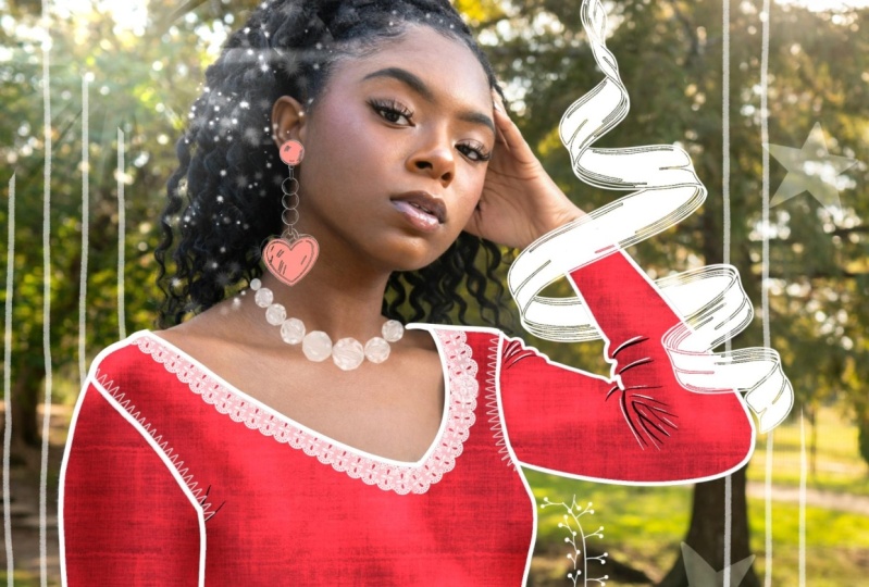
9. Embellishments: In this lesson, we
are going to add a few embellishments
to our illustration. Often in this pop art style, you see a lot of white lines and hand drawn elements framing
the central figure. So on the top right,
in the layers menu, we're going to make sure
our top layer is selected, and then we're going to create a new layer using the
plus symbol at the top. Tap it, and in the side menu, we're going to rename
it as embellishments. In your brush set,
we're going to select the Baskerville brush
and in our color menu, select white from our palette. We're going to set this brush at a fairly small size, about 8%. And the first thing we're
going to do is to just trace some dashed lines around the perimeter
of the figure. This simple outline technique
just gives a bit of motion and makes the
illustration look more dynamic. Next, we want to
fill up a bit more of the negative space
around the image. So we're going to start with a little hand drawn
think bubble. If we head to our color menu, we're going to select black
from our color palette. And then in our brush set, we're going to select
our think bubble brush. In the layers menu, create a new layer above the
embellishments layer, and then we're going to set this brush stamp at
about 45% on the slider, and we're going to
create a stamp on this shape in the
center of our canvas. Then on the top left hand side, I'm going to select
the arrow tool for our transform menu, and in the bottom menu, select the uniform setting. And then just resize this
bubble and place it into the empty space on the left
hand side of the figure. Now we can head back
to our color menu and select a white color
from our palette. We're going to zoom in
on our image and then drag and drop the color into
the think bubble to fill it, and then we're going to continue filling the three dots below. This just gives us that
black pop art outline that we have been using for
the rest of the illustration. You can pick the symbol that you want to fill in
the think bubble, but I'm going to
keep with our theme, and I'm going to add a
little red love heart to it. So in the brush menu, select the Baskerville
brush in our color palette, select black, and then
create an outline of the heart in the middle
of the think bubble. Then in our color menu, select the red that we used for our jacket and just drag
the color in to fill. Finally, in our color
menu, select the white, and we're going to add a
little highlight on the top left to keep with
that pop art theme. Now we can add the rest of the embellishments
around the figure. So in our layers menu, head back to that embellishment
layer and select it. In our brush menu,
we're going to select the diamond star brush. And we're going to
place a few of these around the figure in
white, red and blue. So starting with the white, place some stars around
the figure loosely. And when you're happy
with the placement, select the red color and
place the red stars down. Finally, select blue from our color palette and place
blue stars around the figure. This is just a great way to add a little pizzas to the
pop art illustration and tie the colors into the color of the clothing
to make it more cohesive. Now, you can choose any shapes that you want or draw
hand drawn elements, but I thought I'd start
with the stars and the Think bubble just to
give you some inspiration. The last thing I want to talk
about before I finish up is for those of you pattern
lovers like myself. You can always incorporate
patterns into your pop art, which is a fun way to
personalize your image. I'll show you how this works
with a generic pattern I've created quickly in
the eye Ornament app, which I do have a class
on here on Skillshare, and I've linked the image
in the class resources. In our Layers panel, if you head to the jacket and hat layer and select it in blue, then at the top left, head to the wrench icon, and we are going to choose
the AdTab and select Insert a photo and pick a
pattern image that I've provided or any
pattern that you choose. Once it's inserted,
you'll notice that because we have a
clipping mask above it, it comes in automatically as a clipping layer attached
to our jacket and hat. While we are here, I'm going
to tap on the on the side and change the blend mode to
luminosity at the bottom, to have it blend into the
color of the jacket more. Now, because this is still below our shadow and
highlight layers, the shadows and highlights will automatically apply
to this pattern, too. Now we can use the
transform menu at the top left to resize it to fit
the area of the jacket, and then heading back to our
layers menu on the right, duplicate the layer by sliding
to the left and then use the transform menu to move that second image
up over the beret. And that's it for this lesson. Join me in the next lesson
for how we can export our images and final
thoughts on the style.
10. Final Thoughts: Thanks so much for joining
me in this course. I hope you've enjoyed creating pop art fashion illustrations
as much as I do. They make a great
personalized birthday card or fun social media post. To export your artwork, tap the wrench icon in the top left in
your Procreate app, then select the Share
tag and export it as a JPEG or simply
take a screenshot. Then upload your image to the class project section
just below this video. Feel free to add your own twist. I can't wait to see where
your creativity takes you, and sharing your work also
helps inspire others. I've included a few of my own examples in the project section
for your inspiration. If you enjoyed this class, please consider leaving a review as it helps others
discover the course. You can also check out my
other appropriate courses on my profile and follow me to
stay updated on new classes. If you have any questions or
ideas for future lessons, drop a comment in the
discussion section or book a one on one session
with me for a deeper dive. If you're on Instagram,
tag me at Cardwell and Ink I love to see and share
projects in my stories. Have a great day guys
and happy creating.
 CardwellandInk Design, B.Sc, B.A, M.Teach