Transcripts
1. Introduction: guys, my name is Mia, and today I will be your T shirt for this class. I am originally a graphic designer, but I have a huge crecion for arts and crafts, and during my university years, I used to paint a lot with water colors, and I found myself incorporating a lot into the designs. But I make, and after a while I started to experiment with it a little bit war, and I finally decided to make it my main medium to paint with In this class, I will teach you how to make these really cute galaxy Polaroids. They're really simple and fun to make, and it can be really nice. Asked Clark are, as from decorations in the beginning, Off this class, I will make sure to go over this place that we will be needing, including substitutes are options when it's available. Then I'm going to go over a couple of exercises before we start painting. The 1st 1 is a quick exercise for values for both watercolor and wash, and the next one is small wets on what layering technique which we will be using a lot for this painting followed with a quick guide to the color palette that I'm going to be using. Then I'm going to help you prep your paper and measure out the size off the Polaroids and then masking the paper to get her ready to paint on for the painting part. Off this cost, I will divide it into three separate layers. For the first layer, we will be figuring out the composition and mapping out the colors were going to use. The second layer will be establishing the movement off the composition and building up off the colors to build on the contrast. But the final layer. We will be pushing the vibrancy for the colors and maximizing the contrast and then finishing it off with smoothing out any areas that you might not particularly like. After that will be doing the fun part, which is adding on the stars and final details to finish off painting. Then we can move on to unmasking the painting so we could cut into the shapes that we want and reveal off the final painting to close off. I will tell you about the class project which I would love to see you post in the Project Gallery on coalescence where I will be painting. I will be doing everything in real time so you can paint along with This is a hard one off a two part cost, and the second part off this class will be structure more like a paint with new video on how toe fighting galaxy paintings into animals. If you are not new to watercolors and you would like to buy your own color combinations with the techniques that I teach him in this cross, I would really encourage you to do so. I would love to see what you guys can come up with. We can also make your own custom size if you want to make more off a large edible park. But for beginners, I would recommend you to stick with the size that I give you because it's very small and easy to complete. Painting Galaxies. It's very simple and easy to do, but sometimes if you don't have the right techniques, you can come up with unwanted textures like love blooms or even muddy colors. So in this class, I will include tips and tricks on how to avoid those mistakes. The painting part off this cost will be in real time. So I hope you guys can paint along with me. So I hope you enjoy this class and let us with you.
2. Supplies and options: and this lesson, I'm going to go over the supplies that you will need for this class. The first thing I have here is paper. Here I have the cast in Excel 300 GSM. You want something that's quite sturdy so we can hold the water. I have here two pieces off a four for this class. It will be sufficient for the exercises on final paintings. Next, I have petal to watercolors. I will get into details off the colors that you need in the lessons where I will go over the color combinations. Next, I have the wash colors. Here I have the Windsor and Newton designer. Gosh, but you can also use any wash pains that you have on hand. This is the fine tech Goldwater colors. He can use any brand you have, but if you don't have any Goldwater colors, you can also substitute it with gold pins. Next, I have the white una bullpen for final touch ups for the painting. The next thing you will need us off course pallets. If you don't have any watercolor palace, you can also use a plastic plates. After you use it, the plate can still be reused because water can clean off any off the excess paint. Here are the brushes that I'm going to be using here have three sizes. The sizes vary from brand to brand, so I would just look for a medium sized brush, small brush and a small fine detail brush. The 1st 1 is Rafe, size 14 middle one and Spencer Needs and Sector gold, size zero and art media size to for the last one. And here I just have a clean jar for your water and shooted up and clean your brush. You will also need masking tape here. I have two sizes, but I will also tell you later in the lesson off how you can easily make one with smaller with from the larger muscle. Take next. I have pestle and in razor followed with my cutting tools, which is my cutting board ruler on and a knife. You can also substitute the knife or scissors if you're more comfortable with that
3. Exercise 1: Values: for this lesson. I have a small exercise for you to do, and this is just to differentiate the values and the water consistency between watercolor and wash, as I have mentioned before, the pencil watercolors is fairly opaque, but ultra marine blue is one of the more transparent colors off this set. This is why I decided to use this color just so you can see the difference between having more paint on your brush with water colors compared to quash paints. So what you're going to do in this exercise is just pick one of the colors that were going to be using and tried to go from the latticed value to the darkest value as much as he can take a look at how I'm also mixing the paint. So when you want a lighter value, just taking a tiny bit of paint and I'm putting so much water compared to it, you can almost see the color on the palate because, as white and as we progress, just add on a little bit more color at a time. And as we're also reaching the limit off the value you can go to almost like a dry brush consistency where there's barely any water compared to the paint that you have on your brush. To reach the full value. I decided to also include just freshly squeezed paint with a little bit over damp brush, and you see here that the colors will actually pop a lot more here. I'm also going to show you that if the paint is completely dry, you can layer on without worrying the pain going over anywhere Advil. And it's as if you just have plain white paper with the color painted on top. So I'm just going to stick with the same value towards all of them, and you will see once I reached the same value as the paint that will start to blend with the background color. So if you're layering lighter values, you can slowly build on this until you reach a darker value. I'm also going to show you a small trick. If you ever make a mistake that because this is a water soluble paint, you can also take off bit of paint. I'm showing you here where I have the most paint on the paper and what I'm destroying ISS cleaning my brush and I'm activating the paint on the paper again, and once it's activated, which means I'll be like, what paint again. I drive my brush, and then I tried to pull as much off the paint and the water out of the paper, now going to practice these values again. But this time I'm using wash and I'm mixing and a little bit off the rose color with the white, because the white will most likely be much more opaque than any off the glass colors. And, as you can see straight away from the first value, which has a lot of water compared to the wash paint's, that texture of this paint is fairly chalky, and it's starting to even cover up the black line. And as you progress with more paints compared to the water, you will see that it's starting to cover up even more. And the more paint you have, the more opaque the paint will become, and the same goes with the water color paint as you progress, and you reach a certain limit where your brush is actually a little bit to dump. To get even more coverage, you can use more all the dry brush technique where your brush is fairly damp, but you also try it a little bit on tissue, and you get more off the paint on your brush to reach the full capacity. I would recommend you to use freshly squeezed wash paint's because they'll be at the thickest consistency can get it to be. And I'm just going to continue on until I reached that limit. Oh no, just going to do the same thing. But this time I'm using wash, and I'm just going to show you that you can actually Lear it on and with wash, because it's opaque that if you have a darker background, you can actually layer on lighter paint like he can see. I've put just a little bit of a stripe on top off the last value, so I would say that the main difference here with wash and watercolors it's because off its opacity can layer on lighter colors instead off this darker once on top. And you can also build on the opacity with layering and because, gosh, paint this water solidly can also apply the same technique to pull off a little bit of the paint. Once the paint is dry on the paper, as we did with the previous watercolor exercise
4. Exercise 2: Wet on wet layering: in this lesson, I will be showing you how to do a little bit off tips and tricks off the wet. On what technique? This is the main technique that we're going to be using for the most part off this cost. Firstly, I'm just going to show you that when I put what paint side by side with a little bit off the paint, touching in the middle because it's wet, you will have a smoother transition within the wet area that you've painted before, rather than when you put the paint next to each other when they're painted on a dry surface . And, as you can see as we practice before on the previous Dustin with the values, If I add on the same amount off water to paint ratio like on the left side off the yellow, you will see that the layer wouldn't do too much. It wouldn't really change that much of the color, whereas on the blue side off the circle, because I added more pain than the bottom layer where it's still what. But it has more water. You can see a little bit more off the saturation from the blue now for the second circle. I'm just going to do the same thing, but this time I'm adding a lot off water. So I'm just going to let the banked mingle with each other. And as you can see, they're blooming against each other, creating a little bit off green and the middle when they're transitioning. And at this one stage, you can also pull and push around the colors into certain positions that you want them to be up like here. As you can see, I'm pushing in a little bit off the yellow towards the blue, but because the blue is still very wet, I'm also creating this green and you're mixing the colors together when they're still wet. So it's like water against water, and they will just mix into each other. If you clean your brush and dab it on tissue paper, you can also extract a little bit off color, as I have shown you in the values less than previously, and the paint is puddling on your paper. You can also move it around and see that if you move it back and forth, the water will also flow into the correction where you wanted to go to, and I'm going to show you again on the left that this is the same consistency as it was before. The um paint was still at machine consistency, which means it's a little bit wet, but it's also drying up, and at this point, this is still considered as what papers. So when you add on the paint, you either have to paint with a lot more paint on your brush compared to the water or else the color won't show. And if you put a lighter wash on it, it will end up taking a little bit off the paint off the paper instead, off putting more colors. And so here, as you can see, there's a lot of my brush, and now you can see that the color will actually pop. Now, I think that is the most problematic part that I've seen with a lot of people, because they don't wait for the paint to completely dry, and they end up not being able to layer on the paint properly. But I'm going to show you the same thing again, but this time on a letter surface, and I'm using quite a thick consistency here and because the surface is still wet, it can still travel through across to the previous layer. You can mix in different values, so if you want the lighter area on a certain side, but the paint is sort of drying up, you can just add a little bit off water so we can transition very smoothly. And for the very last one, I'm just going to show you the same thing. But this time I'm going to mix and the different techniques that we just learned previously . So for the first layer, I'm just going to add very light value, so it creates a really nice off color. And while it's still wet, because now I kind of know the position where I want the blues and the yellows to me, I added a little bit more paint, so putting stronger colors to make it a little bit more distinct. And I'm also mixing the colors together where I want the colors to be a little bit more green. Then the blue. If you accidentally added a bit too much green, anyone to go back to more of a bluish tone, you can add on a little bit off the blue on top again because one still what The paint will just mix together naturally either way. But if you don't want any mixtures off the green and you want to put something that's quite blue, you have to wait for the surface to completely drivers. I'm just going to do here, and I'm just going to speed it up until I reached that point to check. If your paper is completely dry, you can either touch it, but try to put it against the lights first and see if it still has a little bit of machine . If it does, that means is still wet. And if you put a finger on the paint, you might end up taking off the paint instead. So just be very careful about this, and you can also see it from the back off the paper. Sometimes you can feel a bit off the dampness from the back off the papers so you don't have to touch the paint. Now you can see that it only has a very slight sheen, and even now when I touch it, I ended up taking off a little bit off the paint because there's certain areas that aren't completely dry yet, So now that is dry enough. I'm just going to add a little bit more paint, and as you can see, the paint is much more visible now. And it's creating the paint as if I'm just painting on freshly dried paper, and what I do is on the first few layers. I just try to kind of map out the areas where I wanted to be more green, where I wanted to be yellow or a lighter value. And when I layer it, I tried to make it a little bit more detailed, and I just follow this mapping and I moved the paint around to where I want specific areas to be smoother or were specific areas would be a little bit more vivid and color for this one. I ended up not painting another layer on top off the middle area because I wanted the yellow to be very light at that point. So I'm just mixing in a little bit off water into the new layer that I've painted. So the middle still stays lights while the areas outside our darker in color. So that's how you roughly layer and let's get to painting the real thing
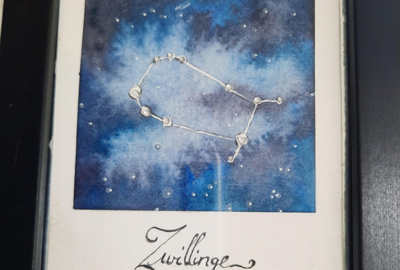
5. Colour palette: in this lesson, I will go for the color palettes that I used for these three galaxy paintings The's air, the colors that I will be using 1st 1 is cobalt blue, ultra marine, blue, red, sky, blue, lemon, yellow and black The's a rolled the pencil colors And if you want to buy it for yourself, let me just show you what the tube look like. This is ultra marine blue on the cobalt blue. If you want to buy the sense for yourself, let me to show you the packaging. This is what you can be looking out for. Here I have the 24 color set off water colors. You don't have to use this exact same set, but because the consistency is Ashley quiet thick compared to normal watercolors. And I'm looking for capacity for this particular painting. I find that this set is really good for that. Now, on the left and right side off my palate Thes air. Actually, the wash paints that I used on the left is the white and the right is the bangle rose. And that I used for this squash is the Windsor and Newton designer squash. This is actually an artist grade wash paint, and it is quite pricey, but the texture is unbelievably smooth. It glides so smoothly and the texture is very velvety. So if you can, and if you want to invest on good quash, I would suggest this brand if you don't want to invest on a whole lot off wash paints. In the beginning, I was just just trying the permanent white. Because White Wash is very useful either way for on water colors. I use it a lot just for the fine details off my paintings for the final highlights. As for the Bengal rose color, I decided to incorporate this into the painting because the pen tell, Watercolor said, does not have a NRO's or magenta color in the set is that it has red. So if you don't have Bengal rose squash, you can use the red. Or you can use a roast color from another poet that you have now. If you have a look at the palette, as you can see, we don't have any creams or purple colors. That's because we're just going to do a little bit off color, mixing with the colors that we have right here? A. So you can probably tell from looking at the three Galaxies that I painted. There's always a little bit off black white on a tiny bit off this gold paint. These are the compulsory colors, and I won't included in this watches. Instead, I want to show you the color combinations that I used to achieve the vibrancy off the colors. As you can see, the 1st 1 is made out of just blues there three tones of blues and for the darker tones I use ultra marine, the mid tone eyes, cobalt blue and for the lighter tone, I use sky blue to make the colors Pope. I also added a little bit off the black to the ultra marine blue to make a richer, darker blue tone. And for the lighter tone on the first layer, I used less paints and more water, so I made a really light blue in the middle part off the painting, and as we progress into the layers later, I also added a little bit off the white wash to make the color a bit more rich and opaque. Don't know. I will just show you the colors by itself and I'll just watch it for you. The top one is cobalt blue, the 2nd 1 that I just painted as ultra Marine, and the last one is sky Blue. As I mentioned before, if you want to make a lighter blue from the sky blue, I added more off water compared to the paint ratio, this creates a lighter blue, but as we progress on to the layers on top, I will also start adding on the like wash into the blue to create a more opaque pastel blue color. The opacity off the painting really depends on how much paint you put and compared to the water ratio. So the less water you put, the more paint you have. More pain you have, the more opaque your painting will be. So, as you can see in the area that I'm pointing right here, the ultra marine blue is quite a cake, so if you keep adding layer by layer, it will also increase in the capacity. This is also a characteristic off the pencil watercolors that I was talking about before it might not work. If you're using a full, transparent watercolor, this is why I also recommend you to use a bit off the wash paints to make it a little bit more opaque. If some off your colors are a little bit more transparent than the others, let's move on to the second painting. As you can see, the colors are mostly green, but you don't have green in the palate. So what I did was I mixed in lemon yellow with a little bit off sky blue. You can also adjust the color off, how green you want it or how aqua or blue you want the colors. If you wanted to look more like well, you can add a little bit more sky blue. Please note that I would really recommend you choose the sky blue instead of the cobalt blue and the ultra marine blue with the yellow, because in my attorney or green, a little bit more money. Where is the sky blue? Because it's very vibrant and light. It will make really bright green color their several ways he can mix the paints. As you can see here, I just place the colors on the paper, and then I mix it together on paper. You can also makes the colors on your palate, or you can't even please two colors right next to each other on paper. And while it's still what you can let the paint mingle with each other. But this really depend on the consistency over your paint. If you're paint is too thick and might not run into each other as much as in verse a little bit more running as he can see here, my paint is quite thick, so it didn't really bleed into each other. And now I'm just going to mix it all together. And as you can see, there is a little bit more blue than the yellow because the blue is applied thickly. And as you can see here, the green that we create is actually a little bit more often equal or a turquoise green. As you can see in the painting. There is also a transition between the green and the black that is not a sky blue that is actually cobalt blue, and I would like to mention that I kept this quite separate from the lemon yellow color so it doesn't create a muddy color. Make sure that the green and the yellow stands out by itself and then the cobalt blue, creating a nice transition between the green to the black this'll. Last painting has more colors than the rest off the galaxy Painting. As you can probably tell, I tried to include more colors and more color combinations as we progress. So you guys get a good practice off, mixing more colors into the galaxy without making it money. Same goes for this last painting, as you can see the dominant color in this painting as purple and we don't have purple. So what I do is I mix the magenta or the rose color between the ultra Marine or the Rose with the sky blue. This really just depends on what sort of purple you want. But first I'm just going to swatch everything down for so you get a good idea off this watches, as I mentioned before, If you don't have the rose color, you can use the red where there is also a color that is cold, red, purple in the pencil watercolor set. You can also use that, but here I'm going to just use the red because I do have the rose color to just pile it on later. So I'm just going to stick with this one. And the last color that we use is Ashley Yellow. As you can see, there's a small bit off yellow in the middle, and I think it creates a really nice complimentary color between the purple. So I decided to just include that yellow bit for just a tiny accent. Now I'm just going to show you quickly how I mix the purples. And for this one, I decided to show you how I mix it on my palette instead off on the paper straight away. And this is the color that I get for the purple when I mix it with the ultra marine blue, the more ultra marine blue you mix, and with the rose, the more deep your purple will become, and off course, it will be more off a bluish on purple instead over warmer purple. But because the ultra marine as darker than the sky blue, your purple will always look more deep than if you mix it with sky room. And as you can see when I mix it with the sky blue, the purple turns to be a little bit more awful. I like something a little bit lighter and brighter off course. This will also very depending on how much blue compared to the rose color that you put in. So just have a little bit of an experiment. And as usual, like any other paint, it really depends how much pain toe water ratio you want to put in. So the more paint you have, the thicker or the more opaque of the pain become. And if you have more water, the color will become lighter. So just have a play around with this little bit first before we start painting.
6. Measurements and set up: in this lesson, I will be showing you how to measure out the layout off the Polaroids. Here. I've got cut out watercolor paper, and it's measured 9.5 centimeters by 19 centimeters. And as for the Polaroids, I have divided this paper into three sections with five millimeters off gap and between each Polaroid and each with is six centimeters each. And you will find that six centimeters times three plus five millimeters times two will equal out to the 19 centimeters. Now that you know how I will roughly measure this out, I'm just going to show you the process off getting to that point. But a little bit sped up so it won't take too much of your time. By the way, all these measurements will be available at the downloadable section off this class. So if you don't want to measure it out yourself, you can also print out the template and you can just trace it onto your watercolor paper. So now that you have the separate pieces off the Polaroid, what we're going to do is measure out the session where it's going to be painted. So for stuff, I'm just going to measure out five millimeters from the top, and I'm going to do this on both sides so I can just run a line through it. And then from that line that you've made measure out 6.5 centimeters and that will be the height off the frame. And just like the previous step, you do this on both sides, and once you're done with the points, just run a line through it to make the base. Now we want to measure out the sights off the frame. So now we're just going to measure out from the edges on both sides, five millimeters apart. And now you can repeat the step for each one off the Polaroids way. Once he have all the lines, I'm just going to erase the ones on the edges just so you don't get confused. Now you have three Polaroids with the gap in the middle and sit in the next lesson. I will show you how to mask this
7. Masking: Now we're ready to mosque and prepare our Polaroids for painting. So the first areas where I'm going to mosque as the top and the bottom off where we're going to paint, what I'm going to do is just measure out the length of tape that I need. And here I have shirt right next to me just so I can show you. But this is what I do to make the tape not too tacky, so you can avoid ripping the page. But of course, you can do this on your own piece of clothing without having it in front of you like this. I like to feel around back off the tape to see that it's not too sticky, but it will still stick on the paper when you're trying to stick on the masking tape. I make sure to do this very slowly and make sure you have the tape right on the line where you have marked it. And now I'm just going to speed things up because I'm just going to do the exact same thing for the bottom. For the middle partition. I actually have a smaller with masking tape, and I'm going to do this for each side off the Polaroid. If you don't have a smaller with masking tape or something that will fit in between the partition, don't worry. I will show you how to make your own and sick. If you ever need a masking tape to be in a specific size, what you can do is cut the length off the musket tape that you wanted to be and then stick it on a cutting board and then measure out the with that he needed to be. Or if it's just, I'm roughly it was just smaller. You can do whatever shape here. I'm just showing you an example. Once he have it'll cut down. You can peel them off as separate pieces off tape for the purpose off. Marking these Polaroids, you can either make the exact with for the gap, or you can just make two smaller ones to create two strips off tape and then placing them like this. And now I'm just going to quickly do the next one, and for the ones on the left and the right corner. I'm just going to use the same size as the one on the top and bottom just because you don't really need it to be specific with before we start painting, just make sure that the tape is quite secure on the paper, not to a point where it will rip it apart, but make sure that no pain can run through the mosque areas.
8. 1st Layer: Composition and colour mapping: before, begins a paint. I'm just going to show you a quick progression off this painting, just so you get a rough idea off what this layer is going to look like on this first layer . I'm also using the biggest brush because I just want to cover the paper with color to map out what the composition is going to be. Okay, so let's begin. First of all, if you're using a liquid watercolor like I am, you don't have to activate your paint because the paint is already wet and it's easy to get the pigments out. But if you were using your own, um, watercolor pellets and it's a dry palate, make sure you activate your paint just by putting down water before you paint with it and leave it a while until the pain starts to activate. So it's easier for you to pick up the pigments with your brush. So for this one, I decided to start with the cobalt blue, which is the mid blue color that I'm going to put in while painting this. I'm sectioning out the area. Where is going to be the lighters, which I'm going to pay now with sky blue. At this point, I don't want to put down too much paint, so I would make sure that I have a bit more water and something a little bit more runny and basically just putting down and sectioning out colors where I think the light us and the darkest color would be. With galaxy paintings, I usually start from either mid tone or the lightest color, and then after this, while the paint is still what I start adding on the darker tone blue, which is the ultra Marine. This is because if you start putting down the darker colors and he accidentally placed a darker color where the lighter color should be, and then you try to pile on the lighter paint, it might turn to be a little bit muddy, so make sure you always leave out areas where the paint should be the lightest. I'm working quite quickly at this stage because I do want the paper to still be wet so the doctor colors and the latter colors can mingle naturally, which creates a softer transition for this 1st 1 Considering it's only basically a blue color, and each color just brings in different lighter or darker tones. I am constantly keeping in mind that every color that I put down and this 1st 1 should be the purest form off the color. This means I'm always cleaning my brush and between colors, just so I don't accidentally put down or mix a little bit off the ultra Marine and two the area where the sky blue should be. This is actually the second trick that you can do to avoid muddy colors. So as you can see, I have placed down most of the colors here, and what you want to do at this stage is dis moving the colors around. So you get a night idea off where you want the lightest color to be and what the composition off this painting will be. And once you've done that, what I'm doing here is actually adding a little bit more paint while the surface is still wet. But this time I'm adding a little bit more pigment, which means this separates out the lighter and the darker tones more, and you have a little bit more contrast now after your quiet, happy with the placement, and you don't really want to move anything around that much anymore. I start adding on a little bit off black. Be mindful, though, when you start using the black to use it very sparingly, and I'm not adding too much pigments at this point. I'm just trying to place it down to see where I want a little bit off. The darker tones don't work with too much, and don't spread it out where you don't want the black to be. After this, I'm actually going to pile on a little bit off the ultra Marine blue just to create a richer and a darker tone off the ultra Marine. By the way, if you're uncomfortable doing this, you can actually look for references. But this randomized. I also want to mention that it's a good idea to think about your composition during the beginning off the painting so you don't have too much colors down already. If you don't have any reference in mind or you can buy me that you like, you can just go ahead and reference from my finished painting to finish this painting off. I'm just going to take a little bit off the cobalt blue, and I'm just going to make a smoother transition by painting it right next to the darker colors here, and I'm just going to smooth it out by using more water towards the lighter blue in the middle. I'm also going to take a little bit off the ultra Marine and paint the transition from the top, and I'm just going to slowly pull it with clean water towards the middle to create a smoother transition. A lot of times when I see Galaxy paintings a lot off, the texture is kind of rough. That's because people stop on the first layer, whereas you can actually build it up to create something much more smoother and more magical. I'm going to stop here for the first painting and I'm going to move on with the 2nd 1 with the first layer. So the first thing I'm going to do here is take a little bit off the sky blue and I'm going to place it at the top. What I want to do here is create the movement off sort of a triangle, so with the light coming down from the sky towards the bottom and I'm adding a little bit off the lemon yellow now onto the blue to create more off greenish color. And I want to create sort of a nice transition between the blue, the green and then the yellow at the bottom. So now I'm just adding a little bit more blue on the top, and I want to sort of frame the yellow in the middle so it creates a really nice dynamic movement at this point because I'm doing the very first layer. I don't want the colors that I laid down to be too dark, so as I did in the 1st 1 I'm just going to lay down relief inconsistency paint, which means I have more water than the paint. And I'm just dabbing this lightly to map out the areas where I want the colors to be a little bit darker, which is on the outer parts and where the color should be a little bit lighter, which is towards the middle. When painting a galaxy tried to think about the movement and the direction to give the painting a little bit more dynamic, and this way you're also creating interest. Toothy eyes tried to make everything as flowy and as natural as possible, very organic lines instead off jagged, so try to avoid rough corners were rough blooming and trying to make everything blend and a nice way to give the painting a good base. Uh, here you can see roughly already what the movement is going to be. This is just a straight across and with the bottom being a bit wider than the top. So I'm going to frame this even more by creating a little bit more contrast. And I'm adding a little bit off the cobalt blue on the corners, off the top part off painting, and I'm also going to mix and a little bit off the black. For added contrast, this is just to divide up the page, so I have a clearer understanding off where the painting was going to go for the second layer. As usual, I would add the darker colors lost because I don't want the whole painting to turn out to be too muddy, and I just want a tiny bit off the black, and soon on the second layer, I will add a little bit more to it, so just keep it very light. At this point, you're only mapping out the areas where you want to build up. Later, I'm going to add a little bit more of the sky blue, so the yellow pops out a little bit more in the middle, and I'm adding a thicker consistency because the page is still a little bit What? And I want the blue to show through now going to do the final painting, and I'm going to do all the same steps. But this time I'm going to make a different movement, and I'm planning on making more of a diagonal one like the 1st 1 But facing the other way around, I'm going to start with a really like pink, and I'm just mixing in the red and a little bit off the whitewash paints. And because the white is more opaque than the water colors, try to put even more water into it so you don't create too much off the clear from the 1st 1 that you're creating. I'm also introducing a little bit off the ultra marine blue very lightly at this point, just to frame out the movement off the lighter pink, and this is actually going to be purple, so I'm just going to add on a little bit off the purple now, but I want the painting to still have dynamic colors, so I want to include a lot of different colors in this one. E found that the purple at this point is a little bit too dark. So I decided to take it off a little bit with just some tissue to lighten it up. And I'm going to add a little bit off the whites into the purple to add on to it. As you can see, mistakes can't happen, but everything can be salvaged, especially with these types off painting, where it's actually a little bit more abstract than something that is realistic. So you can even build on the colors yourself because the paint is quite opaque to create the softer purple. I'm adding on a little bit more off the white, and I'm dragging the darker purple and mixing it with more off the white and the red again , this is just to blend the colors together. I'm actually doing the technique where I mix the colors on my paper instead off on my palette. At this point, I'm still trying to figure out exact movement that I want, and this is the process that I go to. I just add on a little bit more color at a time, but still very lightly. So if mistakes happen, you can still either take it off with your brush or with tissue. And now that I see a little bit more off the colors, I start to like where this is going. So I'm just going toe, work on it a little bit more and add a little bit more off the ultra marine blue, which is the darker shade off the blue to exaggerate the shape and the movement off this one. If you're ever going to paint Galaxies without any reference, I would recommend you to full of the steps off, establishing where the movement are the direction you want, the painting to go so either straight like the one in the middle or say a diagonal line. And from there you can try to work out where other things are going to go. I would usually make the middle the lightest color and going outwards to the darkest color , and then, from there you can start building on the layers
9. 2nd Layer: Introducing contrast and movement: Now we're going to add the second layer off this painting, and the step is where we try to establish the movement even more. And we also try to introduce more contrasting colors and adding a little bit more detail. We're going to also work with a thicker consistency. Paint on this one with a little bit more opacity to hide the blooms underneath because we used a lot off water on the first layer. You also want to work with a completely dry surface, so the paint that you add on Walt disappear into the wet surface. So let's get painting on the second layer. What I'm doing here is I'm being out the same colors as what's underneath. But this time I'm taking a thicker consistency to slowly build the opacity off the painting . And at this point, I'm sort of getting rid off the watercolor look at this time, it's more off a smoother surface because when it's only the first layer than that's when you can see most off the transparency of the water colors. Whereas this one we're moving more into the wash paint's. We're just slowly building this layer by layer, so where you can see here. It's where the light tone is, and on the first layer we tried to make a lighter value by incorporating more water. That way, you're creating transparency. Worse, this time, I'm actually adding more off the white wash paint's to give it more off a finished look. The reason why I like mixing and white wash with water colors is because off the thicker consistency off this paint, it blends in with the watercolors nicely. And it creates a really nice effect where the wash paint mingle with the water colors and it spreads out nicely and creates this looming effect. But because squash is opaque, it craze more off finish look, even though it still looks very natural and loose. You can also move around the wash paint like you would with water colors so you can just pull it with your brush to certain areas where you want it to be a little bit lighten. And this also creates more detail and interest to the ice, as you can see where there's black on the paper. I feel like the black is still a little bit too washed out at this point, so I'm just going to incorporate more off the ultra marine blue, and I'm using a very thick consistency, and I'm painting it on top off the black to give really rich ultra Marine, almost like a navy blue color even. And this is to frame the lighter blue that we just painted previously. By incorporating something that's really vibrant, you're also creating contrast. And by doing this, I'm defining the lighter colors even more. At this point, I'm just going to work on this more, and I'm just going to keep going back on the darker colors and the lighter colors. And as you can see, I'm quite happy with where the darker colors are, and I also feel that the lighter colors are starting to be covered a little bit too much. So I'm going to introduce more off the whitewash again, and this time I'm creating a random, wavy line across and desist us to define the movement even more. I'm dabbing my brush just very lightly on the page so the white would travel across the Web page, and I'm just going to take advantage off the reaction between the watercolor and the wash paint's where I feel that the wash paint isn't reacting or spreading out the way I want it , Teoh. I help it move a little bit with my brush, and I'm just pulling or pushing the paint through where I want the pain to travel slowly. I think I'm quite satisfied now for the second layer off the first main thing, So I'm going on to the 2nd 1 As you can see, you can start with any color you want, because we've basically mapped out the areas off the specific colors, and now I'm just doing the same thing. I'm adding a thicker consistency off the same base color, and I'm just adding on to the previous layer ends because we're using much more on the thick consistency. This time, the colors look much more vibrant than the first layer, which looks a little bit washed out. Now I'm taking a bit off the yellow and I'm dragging it across through the greens and the blues, which I've painted before just to create a smoother surface. And I'm still leaving out the lighter yellow because I think I'm going to add a little bit off the whitewash later. So for the darker parts off this area like the one on the previous painting. It looks a little bit washed out. The black looks to dull compared to all the other colors that we've just laid out. So I'm adding more off the cobalt blue, but at a much thicker consistency to make a darker blue after the cobalt blue. Now I'm introducing a little bit off the black. This is too dark and the blue color. And this way I'm building more off a contrast around the yellow part off the painting, which I plan on being a focal point so the darker areas can frame the focal point even more . I've added a little bit off black where I didn't plan on having a darker color on the first layer, and this is because I felt like there were a bit too much green, and I still want the painting to be more blue and for the green of the yellow to be the focal point off the painting. And when you have too much of something, it stops being an accent. So I'm going to pull it back and add more off the darker colors and the blues to just break it down a little bit more, so the yellow pops out because I've changed the composition a bit. I tried to also build on the other colors, too, to make sure that everything is still cohesive as one painting. And here the yellow or the lighter part off the painting is starting to disappear. So I have decided that it's a good time to introduce the white off the wash because the opacity will break the darker colors. Nice be, And it will also create a nice texture that wash makes when it's mixed on a wet surface. I forgot to mention that I mixed in a little bit off the yellow with the whitewash, just to give it a slight yellowish tint, because it's still Ah, highlight off the yellow, and I don't want it to look too cold. If it's just completely white, I'm also going to add all the layers until I'm happy with the composition that I have. So I'm just going to keep building on this layer and smooth out areas where I feel like it needs to be smoothed out and to find areas where I feel like it needs to be defined like this light patch on the bottom. So because I've added quite a light color here, I'm just going to smooth out. So it combines with the darker colors on the left side and the right side off the white. Because the white wash is very opaque. I tried to also incorporate a little bit off the darker color, so it just blends properly and it doesn't have any hard edges at this point. I also start to feel that the white area that I just painted as a little bit too large, so I want to break it off by putting a little bit off a darker color and the middle of it, so that I don't have any large blocks off flat color anywhere my painting. The reason why I'm doing this is that if there any large areas words to flat and color, it might end up looking a little bit bulky. But instead this creates a much elegant movement, and it looks much more natural. The darker color that I'm adding isn't too dark compared to that area. Instead, I'm going to just add a little bit off the sky blue to break it off for the final touch up . I'm just adding a little bit more off the quash. As usual, I want the light area to stand out a little bit more, so I'm using the very tip off my brush to add on a little bit more color. I'm doing this on the wet surface so that the wash can spread out naturally, creating a really nice effect now that I'm satisfied with the latter area off the painting , I want to work on the darker colors again, so I'm adding a little bit more off a thick consistency. Coble Blue, because the paint underneath is a little bit more dry now, so I can add a thicker consistency. And I want the colors to about much more than the previous there, and I'm also adding and a little bit off the sky blue just to make sure that the transition between colors as nice and smooth don't worry about getting the most vibrant color. You can get that spot because we're still doing another earlier. So I'm just going to leave the second painting for now and work on 3rd 1 straight away. I want to define the lightest area off this one and I used the roast squash and the like wash together, and I'm also establishing more off the movement here because it wasn't too clear on the first layer. Now I'm adding a very thin consistency ultra marine blue, and I'm pulling a little bit off the pink that I've just previously painted to create a nice soft purple color. And this also activates the wash paint's again, which creates a softer transition between those colors. I'm also going to add a little bit off the sky blue, and I'm mixing it with the rose color off the wash. This creates such a vibrant purple, and I really like it against the pink. It's just so fluffy looking. And don't worry about the darker colors at this point. I just want to establish more off the movement at this point to make it a little bit more clear, and I'm working back and forth with the whitewash and more off the purple color until I start to get the feeling off where this painting is going to go. I'm just going to pull some pains back and forth like usual, to just randomize the shapes and at on where I feel like I need some more off the purple or pink. Now that I'm satisfied, there's a distinct light area. I'm going to start adding on the darker colors. In this case, I'm adding the ultra marine blue. I'm not incorporating the black yet because this painting is the one with the most colors, and I want to make sure the colors look as vibrant as possible. So I want to not work too much on too many colors at the same time and just keep building it up slowly so I can maximize the vibrancy and avoid muddy colors they can't sell before. The ultra marine blue is also freshly squeezed out of the tube. So I'm going to take advantage off that the consistency, making sure it's even in my brush so I can get even distribution around the painting. As with the previous paintings, after I add on the darker colors and now, since the darker colors look more dominant than the lighter once I want to make sure this painting is balance. So I'm adding a little bit more off the whitewash. This time I'm not adding pink or roast color into it. It was just pure white with a little bit off water. And as we have learnt from the previous exercises that we did with watercolor and wash. Wash paints, when mixed with water, can also be a little bit transparent, even though it won't be as transparent as water color. So that way it picks up the light pink color on previously ER. Now I want to start incorporating more off the darker tones, and I'm adding a thin consistency black. I don't want to work with the thick consistency black yet, because that is the color that can make everything look really muddy if you put too much of it. So I'm still very careful when placing really dark colors around my painting, especially if I'm still not 100% sure where I want those colors to be placed. Exactly because the previous layer has dried up a little bit, I'm just going to add a little bit off a purple and the sky blue color to make sure that the black doesn't stand out too much ended blends with the rest of the painting. Asi can probably tell the darker areas are starting to look more dominant than the lighter areas that we painted before. So now I'm going to bounce it out again by adding a little bit more off pink or more of a warmer purple to create a better transition from the lighter color to the darker blues. And I'm also adding a little bit off yellow. This is a new color, but I really like yellow against blue or purple tone because it's the opposite color and it really stands out and gives a nice pop off accent color. Now that the composition is starting to take shape and I quite like where this painting is going, I'm going to smooth out the lighter colors and the darker colors together. Also notice how I'm applying some off the paint. In certain areas like this. I use more than back off my brush because I don't want too much capacity, whereas now I'm using the tip of my brush because the tip holds the most paint and it creates a more distinct look because you're applying more paint to paper. I'm also making sure that the darker areas are vibrant enough to do this. I add more off the hue instead off the black because the hue itself need to pop out before you can out on the black, or else it might look a little bit dull or muddy, so make sure you have the right Hughes at the right places until it reaches its maximum vibrancy. And last but not least, I added right to the yellow color because I wanted to pop. And this is actually and you take make. This is a watercolor technique, which is called pulling, and I'm doing this with wash instead, where I put just a split off color and certain place and I pulled the paint. And this time I'm using a swishing movement with the tick of my brush because I want to create really soft, fine lines. This gives movement to painting and a foster dynamic, and I also like the addition off the little detail off the composition. Once you're happy with everything on this layer, make sure this layer drives before you move on to the next lesson.
10. 3rd Layer: Pushing the contrast and smoothing background: the third and final layer is where we will be working with a very high opacity, and we're pushing the contrast to its limits. So I'm going toe work with more black this time, and I'm also going to teach you how to smooth out the background if you don't like certain bloom ings that occurred when the paint is drying this time because we've established most off the composition, I'm working with smaller brush, and, as you can see from the tip of my brush, I'm picking up really take consistency paint. I'm basically doing the exact same thing as the previous layer, but I'm really trying to maximize on pushed the vividness off each color. So I'm just going to pick out the same colors as I did for the background. But this time, because I really liked the lighter area off this painting, instead, off smoothing it out with a different color. I'm just going to slowly add water so it disappears into the background off the light blue color. So this is the option that you're going to have if you like the latter areas already or the background off a certain area tried to smooth it out by just adding waters, so the paint that you previously painted flows into the background. But if you still want to incorporate a little bit off the white wash because you're not 100% with certain placements, you can also still at the whitewash. So this is a choice. But it's a possibility to just use the background as it is and just adding the more vivid colors on certain places where you want them. And as you can already see, the black really makes everything pop out. That's because we're working with such a vibrant color and really thick consistency, so make sure you maximize the value off each color as we have practice before. And if you're wondering here, the gradation that I have is black. And then I put the ultra Marine and then after that, a little bit off the cobalt blue and then more waters, so it blends with the background that I already have. If the water is pulling a little bit too much and the darker areas are starting to take over too much off the lighter colors or you made a mistake, you can add a little bit off the white wash and a very thin consistency to make sure you're blocking the darker colors from taking over the latter areas again. E think that's all I have to say for the 1st 1 because the color palette is also very simple. So just play around with that. This is the easiest one out of three, and I'm going to get back to you when we move on to the second painting. Now let's move on to the second painting. As the paint has dried completely, the colors also look quite dull. So we're just going toe work on this. And like the previous one, I'm starting with black because this gives me a good gauge on how vibrant or how live it. I need to make the rest off the colors. As he can tell, the background isn't completely black, but I'm just pushing the limit off the contrast. So I'm adding black where I think there would be the darkest colors off the painting. The next step, like the previous one that we did, is adding the transition color, which in this case is the sky blue, and I'm also going to add the cobalt blue on top off the black because I just want the black to mix in a little bit, with the cobalt blue to dark and the cobalt blue a little bit, not so much off having that certain area completely black. And I'm adding more off the cobalt around the top because that's the area where I want to be the darkest and I want to pull more off the darker colors towards the middle. And after adding the cobalt blue, I'm moving on to the next transition color, which is the sky due for the top part, and I'm taking advantage at the fact that the previous color is still wet. So I'm just going to let the paint mingle with each other. Now we're going to work with the next color, which is the green. So I mixed in a little bit off the lemon yellow with the sky blue, and this time I'm adding more of the sky blue instead of the lemon yellow because I want to have a smooth transition and I'm just going to follow the gradation that we've made from the previous colors. Now I added more lemon yellow to the previous color mixtures, so it creates more off a Richard lime green. And as usual, I'm just going to keep building it according to degradation that we've made from the previous colors. Because the second painting is so dull compared to the 1st 1 that we made. I'm going to incorporate the wash paint's again, and this time I added him some off the lemon yellow into the whitewash. And as you can see before, the consistency is quite thick and I'm just going to run it on the latter areas. I am making sure to my brush left them right of it. So I don't want to create straight lines, but really organic. Find something like the shape off the lightning bolt. I'm so much happier now with the contrast off this layer. So now I'm just going to blend in the color that we've just place, which is the really light yellow. And I'm just going to add water instead off more paint, because I just want to activate the sides off the whitewash to blend into the background, because I feel that the really like yellow sort of takes away from the vivid yellow. I'm just going to add more off the lemon yellow by itself, and I'm mixing it and roughly across all the lighter areas to give it more off a brighter tint. I'm also adding the lemon yellow on areas where I wanted to be light, but I don't want to be white with the wash, so I'm just going to add the bright yellow and two and mix it in to create a really vivid green. I'm just going to add a relief in consistency, sky blue, to break down some off the ladder areas because I started to see that the line was two distinct and it wasn't organic enough. I hope that if you're not doing a paint along with me at this point, you will see how easy this painting is. There's no exact right or wrong way off painting the galaxy. Everything is according to taste. And because the paint that were using as also very open to layering, you will be able to make mistakes and fix it along the way as long as you wait long enough for the paint to dry to finish this painting off, I'm just going to exaggerate the movement that we've painted, which is the curved movement from the bottom left to the top. And I'm just doing this by adding some cobalt blue. After that, I'm just going to finish it off with a little bit off water to make sure that they're no harsh lines with any parts off the painting. And then I'm going to run to the next one way air. Finally, up to the last painting off this background and as usual for third time, I'm adding black, and I'm putting it down very thickly so I can maximize the contrast off the painting and work around the black. By now, I'm pretty sure you know the steps, and I'm just going to let you know the colors that I'm using. So this is the ultra Marine blue that I've decided to add as the transition from the black . And then I'm going to slowly transition again into a different color, and this time I want bright purple, so I'm going to mix in the rose color and describing to create purple. As you can see, this color blends so nicely with ultra marine blue delights that I'm repeating here is very randomized. I'm just using the background as a reference color, and I'm also following the diagonal line, which I made in the first there and here. I'm still using the same purple, but it looks a little bit lighter because I added more water, which lowers the value off the paint. This is the lemon yellow. I decided to add it because I want the yellow to stand out and put out a little bit more off course. This is a little bit too vibrant, and I will tone it down later to make the lighter purple. I add a bit off the white wash and to the purple mixture that we've previously made to create a nice and smooth radiant from before. Now I'm going to add that lighter purple against the yellow two tone down the you know, a little bit. And because we've mixed in the yellow and the purple, it's creating more often orange tone, which I really like. It's a little bit PCI, and it creates a really nice contrast with the rest off the background as you can see their feet rough lines. So I'm just going to clean my brush and take clean water, and then we're up two colors together to make it blend. Now I want to make a pink color, so I'm extend the roast and the like wash, and I'm going to create more off the lighter areas off this painting. Now I'm going to break a bulky part off the pink, and I added a little bit off the purple that we've mixed before because there are a lot of froth clients. I decided to just add Clearwater, and he can see the color starting to dissolve already and mix in with each other. Here I've added a really light consistency. Ultra marine blue putting on a low value light, transparent color means that the previous layer that you've painted will show through a little bit where there's a huge blue patch. I also decided to break it down with really like purple, and I'm just going to naturally let the whitewash flow by itself. Now I'm continuing on with the whitewash on. I'm just putting down rough lines around where I think should be the lightest areas. Okay, so once you're done putting down all the colors for three paintings and if your first painting have tried completely already, you can have look at how the paints have tried, and it would created blues or textures that you didn't want the paint to create. You can smooth this out by using clean water on your brush and then just moving it around until you can smooth out all the edges. You can do this according to your taste. If you actually like the booms that it created, you can leave it there. But in certain areas where there jagged lines, I want to make sure that I smooth it out because I personally like my galaxy paintings to look really nice and blended together. Since we've been working so hard on these paintings, it's a good idea to take a step back a little bit to just see the overall painting again, because we might have missed the bigger picture off certain paintings if we've looked at it for too long. So just make sure you fixed areas where it needs to be fixed, because on the next step we're going to be painting the stars. E think I'm quite happy with the backgrounds now, so let's move on to the next lesson
11. Painting the stars: in this lesson, we will now be painting the stars, which is the most fun part. So what you wanna do is get a fresh squeeze out of the white wash paint again and just going to squeeze it where there's a large area on my ballot, so it's going to be easy to get with your toothbrush. You want a wet wash paint because if it's dry and you reactivated with water, sometimes it's not as opaque as when you get a straight out of the tube. Here. I have a slightly damp toothbrush, but you don't want too much water on your brush, or else it will thin out the paint. So what's your toothbrushes loaded? All you have to do is put your thumb over it and start pulling the bristles so it starts splattering out white paint. The pain on your toothbrush will actually run out quite quickly. So whenever you feel like the dots are getting smaller and smaller, you can just keep loading it and make sure you have a fair amount off paint, because what you want to do is look for big and small dots. You want them quite varied, so it creates a little bit of death, like the stars are a bit forward or receding back. You can also try different directions when yours flattering, and also try splattering it from different sides off the painting and see what you can get if you make any streaks like I did here and it doesn't really look nice. You can fix it later, so don't worry about it. Just have fun at this point. This is probably my favorite part off the painting because it really pulls the galaxy together as a whole and create something magical. So keep repeating the step until you are satisfied with the amount off stars you have on your galaxy. When you're happy with the placement off the stars. Now I'm going to tell you how to get rid off those fines that you don't want. So what you want to do is what your brush and because squash paint basically acts the same past watercolor and it reacts to water. You can use your wet brush and start activating the paint again on the paper, and this way you can smudge the unwanted lines that you don't want, or another way is like what I'm doing here. I'm using what brush loaded with the same color as the background, but you also still need to smudge. The wash hates underneath because watercolor paint as transparent, and if you really want to get rid off all the dots that you don't want, you actually have to smudge it so it blends into the background if you want to erase the whole area and the area becomes to what you can pilot on with watercolor later to give the color that you want. But sometimes I also like to keep the white because it creates another dimension to the painting. At this point, I'm also using a smaller brush. This is the art media size, too, but you can use any small synthetic brush that you have. This is easier because you're actually trying to focus more on the tiny details and trying to even out some of the stars, which are very small. So I would recommend you to use a smaller size brush when you're erasing the stars and you create a lot of white smudges. What you want to do is keep your brush drugs the same direction as what the background is So you still keep the dynamic off the painting This way you're actually adding more movement and you're creating depth and interest on the painting. I'm just going to repeat this step until I'm happy with all the placement. And because yours will most like, they look different to mind, considering the splatters will be quite randomized. You can do the same with yours, but just following the same techniques, just follow your gut and see what you like. Anyway, this is an abstract painting, so there's no right or wrong. I'm sure that whatever you make will look great in the now. As you can see here, I've erased quite a bit in certain areas. And if you've erased way too much, you can either get good wash paint out again. Or what I would like to do if I want to concentrate on one place is get my white pen out. This is a universal signal, and I just work it and just paint dots wherever I think I need some. The thing is, when you use this because you're adding it on one by one with your hand, just be mindful off where you put the stars because you don't want it to look on organic, make sure you jump from face to face. But you can also create a movement by following the light area of your painting and creating a swift sort of shape by piling ons the stars in certain areas. And if you've painted too much, the university no is actually water soluble too. So you can still use the same technique off erasing it if you've done too much or you've placed that in areas that you end up not liking. What I'm doing here is what I talked about before. I'm trying to create movement by piling Ah, whole heap off stars in one area. What I'm doing is actually not randomize ing a too much. But I'm following where the direction off the painting on the background is. And this way I'm accentuating the movement off the painting. Now I'm just going to keep doing this until I'm satisfied with the placement off the stars . If you're done with yours, you can go ahead and skip to the next phase off this lesson. But if not, you can just slowly paint along with me. As for the final touch, this is what I like to add on to my galaxy paintings. I used my find tech gold paint for extra fine details off sparkly accents. This'll paint acts exactly the same way as any watercolors dio. Still, what you want to do is just activate the paint as he would normally with watercolors, and wait a while until the paint softens a bit and go ahead and load your brush. Make sure you have a fair bit off Pickman to you want quite a the consistency so the gold is opaque enough to show through. I'm just going to add small dots around randomly. I'm making sure that it's quite well distributed just to add some extra sparkle to the galaxy painting. Keep repeating this to your other Galaxies and remember to not overwork this. I'd only want to put this as little accents, so you still want the White Stars to be more dominant than the gold. I also want the placement for this to be as natural as possible. So what I like to do is very the size off the dots that I'm making. I'm making really small ones on also larger wants, but make sure that you don't make it too large, so it stands out from the rest off the painting. What you're looking for is just some extra sparkle, so the gold just blends in with the background but just adds the tiny accent. If you're worried about the gold popping out too much just paid smaller ones because it's easier to control. Then if you paid to large dots, I'm just going to do this to the other painting, and I'll see you at the next stage, where we will be painting the final accent for the very final detail. I want to get out the finest brush that I have. This is my ones ran Newton Gold Scepter, and it's the smallest brush that I have. And what I want to do is just paint four lines, crossing each other to create a small star to paint the star just make over decline first, and then the horizontal line topped with two diagonal lines crossing each other. I like to add three of thes or each paintings, but if you want to paint a bit more, go ahead. I just like the balance off having three because I don't want it to take away too much from the galaxy itself. Make sure to work quite slowly for this one because you're making really fine details with just the very tip off your brush. Make sure that the paints you floated is quite thick, so your paint doesn't bleed out everywhere. If you're unsure about this part, you can also practice it on the scrap piece of paper first and put it on the galaxy. Once you're confident enough with your brush strokes, pretty sure you can use any size one or size zero brush for this one as long as you have enough control. But if you have even smaller brush like size double zeros, it might help you a whole lot on using a larger brush. And we are ready to unmask this in the next lesson and cut it out into small Polaroids.
12. The reveal: Unmasking, corrections and cuttings: now here's the part where everyone's been waiting for. This is the big reveal off unmasking the painting. At this point, it's fairly crucial to follow the technique off. I'm asking this because I'm pretty sure none of you want to ruin the painting that you've worked so hard on. So make sure when you're unmasking this to always pull away from the painting instead of going inside off the painting. So, as you can see, this is on the right hand side of the painting. I'm pulling away to the right hand side and vice versa. This is so if there are any rips or tears that we couldn't predict, it wouldn't rip apart our painting. Instead, it will just a little bit off the paper off. And, as you can see here as I'm revealing it some off. The pain actually ran into the masking tape because I probably didn't stick it on well enough. But that's okay. We can take care of it leader and tied it with either a little bit off paint or with the white pin. Now, as your unmasking your painting, I'm pretty sure that you can feel when the tape is a little bit stickier than in other places. So when it is sticky, make sure you go slowly and be very careful with it. I'll just that you guys watch the rest of this as it's quite satisfying to watch. - Okay , so before we cut this, I just want to fix the few mistakes that I have on the last painting. So to make it a bit easier for the pen to cover it up, I want to just reactivate the paint on the paper with a little bit off water. I'm using the smallest brush that I have to just pick up some off the paint that I can. So what I want to do is use a clean brush with a little bit off water to activate it. And then when the paint is activated, I want to drive my brush and pick up any excess water with the bristles off my brush. While it's also what sometimes I also use the tissue that I have to just dab it off to make the process foster. When the paint on the paper is already activated, don't try to work on it too much. Oil's you'll end up spreading out the paint to the white paper even more so. Be very careful. That is why I'm using a very small brush. What's to get most of the paint out and you can take off anymore? Then I used my pen for this one because it's not too big, so I'm just going to cover it up with my white pen. But you can also use your whitewash if you have it on hand, and it's easier for you tease. Once you finish fixing any parts that needs to be fixed, I'm just going to quickly cut this. I'm going to speed this part because I think it's quite self explanatory, just full of the lines that you've created in the previous lesson and make sure you use a really sharp knife so you don't ruin any off the paper if you don't have a knife on hand. He can also use scissors, but I find that using a knife creates much cleaner lines, and we're finally done with this one. Please let me know if this is a good pace for you, because is this lower than the glasses that I usually make? I would love to hear your feedback I hope you give this a go, and I'll see what the next lesson where I will be discussing about the class project.
13. Closing and class project: congratulations on making it this far and completing class for the class project. I would like you to give this a go and paint alone with me. If you are not needs water colors, I would encourage you to make your own color combination on make a galaxy of your own. But if you're a beginner, I would suggest for you to follow along What I painted because the size that I have made is a good size for you to start with. And it's easy to complete. Lets you finish making the cost project. I would really love it for you to post it so I can take a look and see what you guys have created. I hope this class was enjoyable for you. And don't forget, if you guys are really interested, I will also be making a part two off this class where you will be applying those galaxy techniques into animal paintings. If you would like to see more art by me, you can follow me on Instagram at I g underscoring Janjalani. And if you would like to see more videos by me, including speak, paintings and many tutorials, you can also subscribe to my YouTube channel of young and I hope you guys like something You from this cost and I will see you at part Teoh.
 Nianiani, Watercolorist and Graphic Designer