Transcripts
1. Introduction: When you're an artist and you're passionate about what you create, you'll want to share it with others. One great way to share your art, is with a calendar. Hi, I'm Anne Butera, I'm the artists behind the website and blog, my giant strawberry, and I've been creating calendars with my art for the past five years. In this class, I'll share the technique that I've owned over the past five years using PhotoShop to create calendars with my art. The calendars I create are desk calendars. Each month, you can trim away the dates, and a little bit of the sides, and end up with a four-by-six art print. Whether you're an artist selling your art or you just like to create gifts for your friends and family, this class will get you started. I'll take you step-by-step through the process of creating a template in PhotoShop that you can use to create calendars year-after-year. If you're excited to begin creating your own calendar, keep watching and I'll see you in the first lesson.
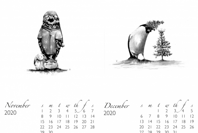
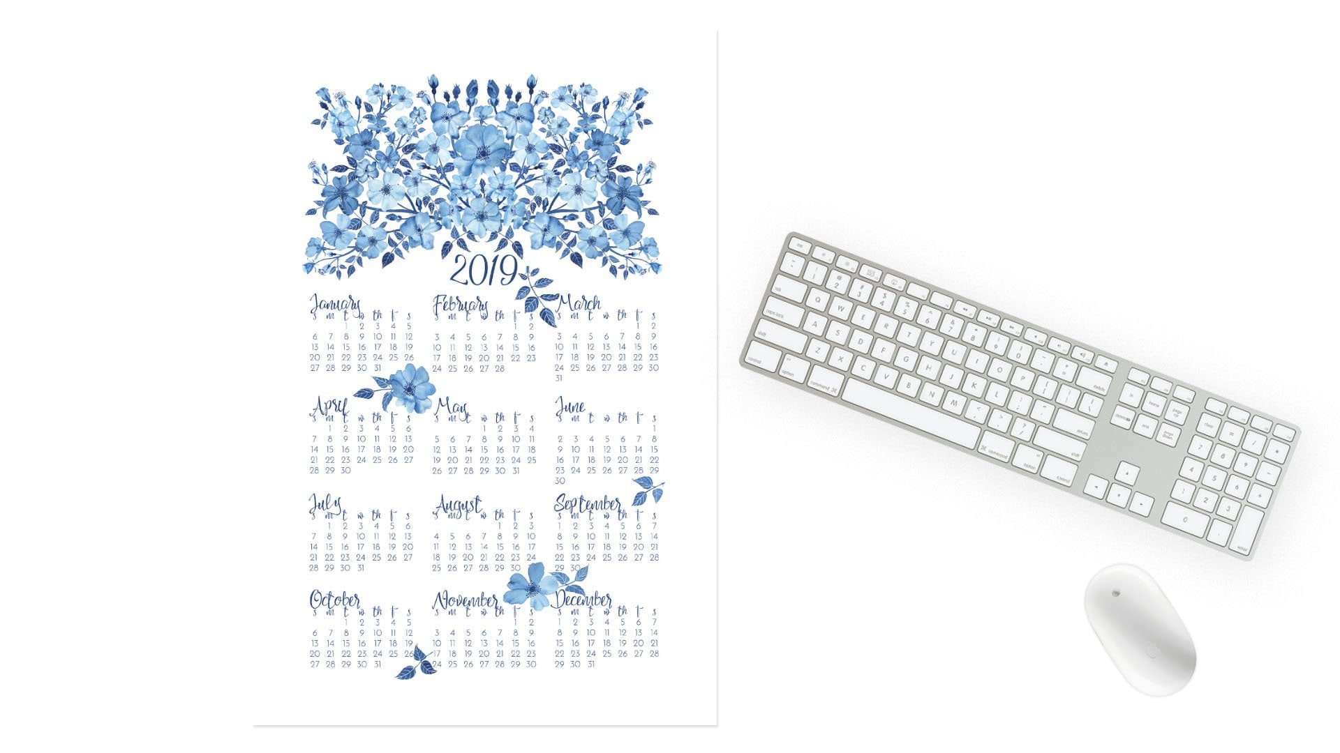
2. Overview: Here is a page from my calendar and it's actually two pages. This is an 8.5 by 11 sheet of paper that I've designed so that there will be two calendar months per page. It just makes it easier for printing. I've already created this one and I just wanted to show you. I have hidden the guides, If you're not familiar with them, they help you place things on the page. I'm going to bring them back. Command H on a Mac will either hide or bring back the guides that you have on your sheet. Here they are and there are a lot of them. They all help to place different elements on the page. These images that are on my calendar pages are sized to be four inch by six inch prints. Some of these guides help that, the one down the middle here and down the middle here of the imagery helps keep the image centered. There's also a guide down the center of the page that helps with knowing where to place each month. Then on the bottom, there are guides that help place the dates and the month and the year. We'll create all of this together. I will show you the first part we're going to do in this date template. When I was first starting out, it was hard to get everything exactly in the right place, until I created this template. It has the days of the week at the top and then it has space for all of the dates of the month. We're going to create this together. It looks a little strange like this, but it will really help you when you're designing. To create this, I know that this date box is going to fit in this space. I've created that to be three and a quarter inches wide and 2.5 inches high. When we create our new document will go up here to File and then New. Then three and a quarter inches for the width, the height, 2.5 inches, and the resolution we're going to have at 400, which is a nice printing resolution. For Color mode, use whatever works with the printer you're using. I'm going to put mine at RGB. You can use CMYK if your printer needs that. I'm just going to say okay and here is our new dates template and we'll begin to create the guides in just a moment.
3. Creating a Dates Template: Before we get started creating the guides for these dates template, I just want to talk a little bit about fonts. You can see for my calendars, I'm using a calligraphy font for the month and the days of the week, and then a plain font for the dates. You can use whatever you prefer, and you may have some fonts that you've already downloaded places or even purchased. I like to get my fonts from Creative Market. Here's Creative Market. The great thing about it, there are few few great things. One is that all of their designs are created by independent designers. They have a lot of fonts. Here, everything is coming up for fonts, there's 18,221 results right now. They give you some different possibilities. Here's calligraphy fonts, they're fairly inexpensive to purchase a font. Every Monday they have free downloads that usually includes at least one font. There's some really lovely ones, and it's great because you're helping to support independent designers. Skillshare also partners with them. So if you have an annual membership here, you can find this in your profile where it says redeem perks. If you have an annual membership, there are different discounts you get with different companies, and Creative Market is one of them. You can get 20 percent off your first purchase there. They're also often having sales and as I said, they have the discounts, the free products every Monday. So now we can start building our template, creating our guides for the month. If you look back at this, you can see that since there are seven days of the week, there will be seven columns. Then there will also be rows for the months, and sometimes the months have more rows and sometimes they have less. So I'm going to be creating a total of eight rows, one that will have the days of the week, and then the others that will have the dates. So we're going to start by doing the guides for the rows. I know that there are going to be eight rows. I'm going to use a calculator here. The height of this box is 2.5 inches. We know that there going to be eight rows. So we're going to take 2.5 divide it by 8, and we come up with 0.3125. Now, if we look back over here at our dates template, you can see that I made the top row taller than the others to fit the letters. So instead of using 0.3125 for the first guide, I'm going to go with 0.4. That makes it just a little bit larger. So new guide, 0.4 inches, and it's going to be horizontal. So there's that first one. Then to figure out the next placement, we're going to go back to 2.5 inches and then subtract 0.4. That tells us how much more space we have here, and then I know that we need seven more rows. So we'll divide this by seven, and that's 0.3. So we're going to be adding 0.3 to each guide. So we started with 0.4 and then, we're going to add 0.3. The next guide is at 0.7, so come back here, view, new guide, 0.7. Say, "Okay." Then the next one, view, new guide. I know that, 0.7 plus 0.3 will be one. It's going to be at the one inch guide. Then you're not going to need the calculator. For the next one, it'll be 1.3, and then the next one will be 1.6 and then 1.9. Then the next one will be at 2.2. Then when you add 0.3 to 2.2, you will get 2.5 and that's the bottom of our box. Now we have to do our columns. We have seven days of the week, but I'm going to do more guides than that because in order for everything to line up nicely, I'm going to create a guide in the center of each column so that we can line up each letter and each number directly in the center of the box. That means that they're going to be 14 guides. If we come back to our calculator here, and take our width, which is 3.25, and divide it by 14, we come up with this really large decimal and I'm just going to round this. Let's round this to 0.232. Let's say we take 0.232 and multiply that by 14. That gives us 3.248. So it's very close to 3.25, which is our total width and I'm okay with this working out like this, that means that there's just going to be a little more space, we could go back here, there's just going to be a little bit more space in this last column, and it'll work out fine, it won't mess up our placement. So that means for our first guide, we're going to put that at 0.232. Now remember, now we're going vertical and that's our first one. This will just take a little bit of time, adding up the decimals. So 0.232 plus 0.232 equals 0.464. We come back here, view, new guide, 0.464. The nice thing about these guides is that you can make them to whatever decimal point you want to and Photoshop will allow you to create that. Next, we're going to add 0.232 to that last number, and we have 0.696. This is a little bit tedious to put in all these guides, but it's really going to help when we are lining everything up. Then once we have the template all created with these guides, you can use that year after year and it's also nice because even if you decide you want to change your fonts, you can still use this template and it'll still work because it's all about spacing. Since Photoshop doesn't really have a Word processor and it's not really built for layout with text. You have to make this little work around, which I think works fine. Now that we have all of these columns, let's make sure we save this. I should have had you do this earlier. So go save as, and let's call this New Dates Template because I already have one called "Dates Template," you can call it whatever you want. Then hit Save. In the next lesson, we'll start adding the letters and numbers. I'll see you there.
4. Arranging Days and Dates: We have our template all set and we're ready to drop in our days of the week and all the number. We're going to go to the text tool. I know that my font that I'm going to do for the days of the week is Loft Yian. The other thing is, I know that the size for my font that works here, right now it's at 40 point. If I do an S for Sunday, the other thing I'm going to do that is a little bit big. I'm going to change this. I know what works here is 35 point. The other thing is to make this line up correctly. You can see that there's this little square on that line that the letter is on top of and that square shows how it's going to line up the text. For example, we're going to type a word like Sunday, which we're not really going to have that here, but this is just to show you. This little square means that the words are going to be justified to the left. The square is going to show up to the left of your word. If you change that to center, that little square is going to be in the center and if you change it to right that little square is going to be on the right. We're not going to have the whole word Sunday, just the S, and because I want these to line up with the center, I'm going to make the text centered. That doesn't mean that it's going to move the text, it just means that if you're typing, it's going to center from where you start. If that's not clear, you can play around with it until you understand. But for our purposes, it means that we can easily center things. Now, this will want to line up with our guides. This little square, I want to line up with the base line, this guide for our row, and then our center line. The reason why we have 14 instead of seven. This S is lining up, centered and to the bottom and it's perfectly lined up there. Now to make sure that it's going to want to line up, we're going to do something here in the view. There's this snap and also snap to. Make sure that snap to guides is checked. That means when you're moving this around, when you've got this Move Tool, your letter or a number or whatever image, whatever layer you have that's selected, it's going to want to line up and it's going to snap. It's a little feeling, it'll stop when it hits the edge or when it hits your guide. Then also will turn pink to let you know that it's hit that. There's our S lined up. That little square which we don't see now because we're not in the type tool. I'll do the next letter to show you. Go back to the Type Tool and we're going to do the M for Monday and we're going to align this one up. Wait until you get this little arrow and then also those four arrows, that means you can move it. You want that little square to line up with that center guide and the bottom guide. Now we're skipping this one because this is the edge of that first column. Here's the center of the first column, here's the edge. Here's the center of the second column, and edge of the second column. Take your M and line it up and it turned red now that it's lined up. If we look over here in our layers panel, and if you're familiar with Photoshop, these are the layers, and I just moved the arrangement of our layers. I want to keep them in order top to bottom so that you just have them organized. So Sunday, Monday, our next letter is Tuesday. I'm just clicking near to where I know that's going to want to be and then placing it by dragging. Again, I skipped this guide because that's the edge of the column. Here's the center. It's lined up. You can see that red. Let's move Tuesday beneath Monday. This is just for you so that you can easily find your layers and it's nicely organized. Your next day of the week. We've got Wednesday. Move Wednesday into place and then move your layer. Next day of the week is Thursday. Move that into place. Again, between each letter there is a guide, and then the letter, or in this case, group of letters lines up with another guide. You saw that layer turned from saying layer to th. Next letter of the week is Friday. Remember we skip and we'll line that up. When it turns red you know it's lined up. Here it's saying layer, go back to Move, and move Friday into place. Then we only have one more day left, and that is Saturday. We'll move our little s into place and you can see each of our columns has worked out. Everything's lined up. Now with calligraphy fonts, you can see that since this is a bouncing font, the letters are not all always at the same height. That's just the way the font is built. If you were using a more normal plain font you wouldn't have this change in heights. But that's perfectly fine. This is how the font is built. We've got all of our days of the week now and they're all lined up. What I'm going to do here just to keep these layers organized is that I'm going to group the letters, the days of the week together. You can do that by going up here to Layer and then Group Layers. You could also use the keyboard shortcut Command, G, if you're on a Mac. I'm going to rename this group. You just double-click, and then I'm going to put days. The next thing we have to do is add our dates, our numbers. I'm going to go back to the Text Tool and we're going to change our font. I'm going to use Josefin Sans and we're going to go with the light version. Since I'm going to start with January, I know that January starts on Monday. The first day is on Monday. If you're too close to another text layer it's going to put you into that layer. I changed my layer. Go back up to Josefin Sans and go back here, make it light, and there's our number 1. Now, this is way too big. It needs to fit right here. What I'm going to do is change this. I've already figured it out that it needs to be at 20 point. Then we can move it into place. Wait until it turns red like that. You can see the little squares in place and it's lined up. If you're figuring out what size font you want to have here, you can just eyeball it and change the size as you eyeball it. I just realize that my number 1 here is occurring in our days, which I don't want to happen. I pulled it out of that group. Here you can see it looks like a little file folder when you have a group. I'm going to move that up. You can organize things however you want. Here's our number 1. We're going to put a new number here. Don't click too close to that t or it's going to end up in there. Make sure it's in the right font, the right size. Here's our number 2. Let's drag that into place. That's under the Tuesday. It's turned red so I know that it's in line. I'm just going to reorder my layers over here as I go so that they are in place. It just helps keep me organized. Otherwise, it's going to start at the top with 31 and go down to one which is fine also but it's a little easier when you have to go back and move the numbers around. Again, just like how building our template was a little bit tedious putting all these numbers into place is a little bit tedious too. You just have to take your time. Just know that it's a process. Now you've got all of our dates arranged here. There's the 31. This is our basic template. Make sure you save it. You will use this again and again for each month. Just shift the days around within our template. The possibilities for fonts, of course, are endless. Although I used this combination of fonts for my calendar this year, I don't feel at all limited by it. Here's an alternative that I created. The days of the week I used Lucida Calligraphy at 24 point. Then for the dates I used Lucida Sans at 16 point. This just gives you another option that you can see here. But of course, use whatever fonts you prefer and whatever you have. In the next lesson, we will build our general template in which we'll drop these dates that we've just created and also be able to add the month, the year, and our art. I'll see you there.
5. Creating the Month Template: Next, I'm going to show you how I've built a template for my calendar pages. It's going to fit two months on one sheet of paper, one eight and a half by 11 sheet of paper. This is just my January and February for the 2018 calendar. You can see lots of guides here, but we'll do it bit by bit. We've got a center guide, we've got edge guides. So let's first create our new document. We know it's going to be 11 inches wide, eight and a half inches high, 400 pixels per inch, and whatever color mode works for you. Now, the two color modes should be the same. Whatever you chose for your date template should match this template as well. Say, Okay, and here is your new document. We'll start with that center guide. Since this is 11 inches wide, I know my center is going to be at five and a half. This is going to be vertical, and there's our center guide. Now, I have designed my calendars so that the art part can be used as a four by six inch print, so all these guides here help make that possible. Our next guide is going to delineate between the art part and the dates part. I'm going to put that at six inches, and that's going to be horizontal. So that separates these two halves of the calendar, which aren't actually halves, but they are two different parts. I don't want my dates to butt up exactly against that line. So I'm going to put another guide a little bit beneath it. Let's go with six and an eighth, which is 6.125. Feel free to use a calculator whenever you need to. I'm also going to put a guide on the bottom. I'm going to put that half an inch from the edge. Since it's eight and a half inches, that will be at the eight inch mark. So next we need some edge guides for each month. I'm going to put these edges at a quarter inch. So the first one for this left-hand side is going to be just at the quarter inch vertical mark, 0.25. Now we want a quarter inch in from our center line, which means it will be at five and a quarter because our center line is at five and a half, so it'll be at five and a quarter. So here, this box is taking shape. I also mean edge guides for the right hand side so I know a quarter-inch added onto five and a half is putting your guide at five and three-quarters. There's your other guide. Then you need your edge guide on the far end. Since this is an 11-inch sheet of paper, you want the guide to be at 10.75 inches. All right, so here you can see, here are our guides that we're going to use for our dates. Now we can go ahead right now and come back to our new document, and let's save it. We'll call it calendar template, and save. Now we can go ahead and drop these dates in here. I'm going to highlight the whole thing. Actually, before we do that, we can group all of the numbers together. Command G, or go to layers and group layers, and we'll call this one dates. So up in this group, there are the days, Sunday through Saturday, and here, the dates one through 31. Make sure both of these are highlighted. We're going to go up here to layer, duplicate layers, and we're going to duplicate them into our calendar templates. So here are our dates, and just put it up at the top corner. Before we do anything else, I'm going to group these two layers. I'm going to call this January dates. Here we go. Now we've got the move tool and we can take this group and line it up. Now, I'm going to want to line it up with the top edge here and the side guide. So it's not right at the center of the paper, and it's not right at that six-inch mark, but it's at our six and a quarter inch, and at our five and a quarter inch. Now, since it's snap to guides, it's just going to butt up there and stop. You're going to feel it. So that is perfectly in line. Right there, perfectly in line. Now, let's add our month and year. I figured let's change this font to Loft Yian, and I figured that it should be at 40 point. Let's just set our text tool. Now, one thing, this time I want our words to butt up against the edge line. So for that, I'm going to move this to left align. Just click around here and type January and then we can put that into place. Have it butt up against that edge. Now I'm going to hit return and then change our font to Josephine Sans. Make sure it's at light. Change the size to 24 point. Actually, let's type it first since it's not letting us save that. So Josephine Sans light, but it's funny that it's called light because it's actually darker than the other and then change that to 24 point. Now you can play around with whatever sizes you'd like and of course, if you're using different fonts, the sizes are going to look different. You may need a larger or smaller size, so here we go. This is in line with the edge and also lined up with our other text here right up to the top. So here we've got the month, the year, and the dates all figured out for January. So let's do the month and the year for February. Now that's still at the Josephine Sans. We'll do the date first and then go up here and put February. You can work however works best for you. Remember, change the font, change the size here to 40 point and now we're going to line this up. It's lined up with the edge and with our text. Yes, there we go. So the next part, we have to add the dates for February and we're going to have to change where our dates are. February starts with one on Thursday. So this is another slightly tedious part. One way that I like to do it is, move things in batches. So I know we'll have Thursday, Friday, Saturday, 1, 2, 3. I'm install the move tool here and I'm going to just grab these dates and move them over. Now, just with the nature of numbers and fonts, moving them grouped together isn't going to keep things perfectly aligned but we can go back and fine tune it. So these numbers are on top of one another. I'm just going to keep going. So we have the 4, 5, and 6 that we have to move next. Highlight all of those here using the move tool and then putting this into place. We'll go back and fine tune the spacing once we have all the numbers in place, more or less. So we have 4, 5, 6 here. We have to move 7, 8, 9 and 10 that way. So these move into place. Again, we have overlap. I hope this isn't too confusing for you. The next number that's overlapping, there's 11, 12 and 13. So we're going to move these down over here and they are going to temporarily overlap the other numbers. You know you're going to start with 14. So it's 14, 15, 16 and 17, that shift. You can also, whatever is easiest for you, if you want to go in, delete all these numbers, and just put one, two through 28 into your template, that is fine too. It may actually be quicker. I don't want to move that. It may actually be quicker to do it that way since you do have to go back and fine tune things anyway but it's entirely up to you how you work. Once you have a rhythm and once you're comfortable with working, you will find what works best for you. So what I'm going to do here, I'm just going to click the eyeballs next to the 29, 30 and 31, since we know February doesn't have those dates. We're just going to pretend they're not there. So this looks pretty good right now. You can go back into each number and make sure that one is aligned, that one is aligned. These are aligning pretty well. Sometimes they don't. That one is aligned. That one is. I think this worked. So what I'm going to do is highlight the dates but leave our group open, this little file folder open so that we can see all the numbers and only highlight up to 28 since February only goes till 28. One thing I did with my first calendar is that I accidentally printed some test calendars with, I think 31 days for February and they even took pictures and shared them on Instagram. So it was a little embarrassing. No one noticed it, or at least they didn't mention it to me but make sure you have the right number of dates. So we're going to duplicate layers. Get up here and then we're going to put that in our calendar template. So here are our dates. Again, since they're all highlighted here, I'm going to group them and these are going to be our February dates. Use the Move tool and move our February dates into place. Make sure they align. There we go. So here we have the dates for January and February. The next lesson, I'll show you how I put guides in for the top part of the calendar with the art. So I will see you there.
6. Finishing the Template and Adding Art: We're just about ready to start putting in our imagery for our calendars, but we need a few more guides just to make it easy for spacing and sizing of the images. As I said, my images are sized to be 4 by 6 inch prints, and I'm going to create some guides to help with that. Now, we're going to have to have some edge guides on the sides, and I know that it's going to be four inches wide. One calendar page is 5.5 inches wide. If you subtract four inches, which is the width of the print, that gives you an extra 1.5 inches, which is going to be divided on each side. That puts the edge at 0.75 or three-quarters of an inch on the left side, and then three-quarters of an inch in from that 5.5 mark. Let's put the first left-hand guide in, because that's easy. It's going to be at 0.75. This is vertical. That's where the edge of your 4 by 6 print is going to be. On the other side, if you have 5.5 inches, and you subtract three-quarters of an inch, that gives you 4.75, which will be right there. Here, from 0.75-1.75 is one inch, 1.75-2.75 is two inches, 2.75-3.75 is three inches, and then 3.75-4.75 is four inches, so that's four inches wide. On this side, you're going to add 0.75-5.5, and that gives you 6.25, so your guide's going to be at six and a quarter inches, 6.25. Then your guide is going to be from the edge, which is at 11 in 0.75, which would put it at 10 and a quarter or 10.25 inches. I know there's lots of numbers involved. Here are your edge lines. If you want, you can also put another guide a quarter inch from that so your art doesn't get too close to either the left or the right edge, or just keep that in mind when you're sizing your images. It's totally up to you. I am going to put a guide at the top of the page just so that we don't get too close to the edge, and I'm going to put that at point 0.25 horizontal, a quarter inch from the top, and then I'm also going to put one quarter inch from that six inch bottom line, so that would be at 5.75 inches. You don't want your art to be taller or go past those lines. You can see I even gave a little bit of a buffer. Here, you can see the edges of those two images don't quite come up to the edges. One more guide that I'm going to put on each half of this paper is at a center point. The center here of 5.5 inches would be 2.75, right there. 2.75, and this is vertical. That's the center. That way, you can make sure your image is nicely laid out within this space. You do the same over here. We're going from the center, which is at 5.5, we're going to add 2.75. That puts us at 8.25. That's the center of this side. To get our images, I'm just going to grab, here's my yellow orchid file. In this image, I'm going to just put a new layer, just make sure I'm on the right layer. I'm going to put a duplicate layer of this image, the yellow orchid, on our calendar template. Because the resolution was higher on that original image, you've got a huge flower. I'm going to resize it. We're going to free transform edit. Free transform to resize it. What I can do, I can use this size here, I know I don't want it to be more than 5.5 inches high. If I do this little lock button, it will lock the aspect ratio and make sure that it's not distorted. That would put us exactly with the edges lined up. I'm going to make it slightly smaller. If you hold the Shift button when you drag this corner point, it will help make sure that you don't distort it. Now, I can move it into place. There is your first page finished. We'll close that image, we're not going to save it, and then we're going to pull another image. Let's see, we did the orchid wreath. Here it is. I'm going to duplicate this layer onto a calendar template. We need to resize this one as well, go to free transform. This time, let's resize it from the width. We're going to change this, let's say 3.5 inches, and use that little lock button. That took us too small. I'm just going to drag to these guides. Again, if you hold the Shift button when you resize, that will keep the aspect ratio. Now, I'm lining up with these edges. This is four inches wide. I'm just going to go slightly smaller. You could see those other guides could be useful here. That looks like it's nicely lined up. Here are two pages. From here on out, it's up to you how you proceed. I would save this one, say save as. I have a January, February, and then the date. I was just going to put 18, but I could put 2018. Now, this is your month. You've got this saved. You can print out a test sheet to see how everything looks on the page. You may see things in print that you don't notice on the computer screen. Then from here, what you would do is create your other months. In the next lesson, I'll share some suggestions about finishing up your calendar on your own. I will see you there.
7. Tips and Suggestions: One nice thing is that there are some months that start on the same day. I'm going to give you a link to this timeanddate.com. This is a good place to come when you need to figure out the dates for the year. Right now it's set at 2018, but you can go to other years and use that as a reference for when you're creating calendars. You can see that January and October, both start on a Monday. So you can just copy the dates from one month to the other, and then also February, March, and November, all start on a Thursday and they all have a different number of days. So pay attention to that when you're copying the dates, but that is helpful. Again, you don't have to rearrange your dates every single month. April and July, they both start on a Sunday, and then September and December both start on a Saturday. This is a good reference and it's also heartening to know that the tedious work of rearranging those numbers isn't quite as big as it could be. When it comes to choosing your art for your calendar, I think that's one of the most fun parts of the process. I like to match things up so that they have something to do with the month they're representing. So maybe it's something blooming that time, or something that I find out in nature in the fall, may be an acorn or a leaf in the winter, a house plant, it's entirely up to you what you choose. Now taking your art and then putting it onto your calendar, you're going to first need to scan and digitize it, which I have another class that shows you how to do that. Even if you're not painting with watercolors, you can illustrate your calendar with any art that you create. Whether it's block prints or drawings, or mixed media pieces, or abstract, it's entirely up to you, and like anything else that you'd create, it should really reflect you and your style. Here is an example that I put together with different fonts and a couple of my block prints, just to give you an idea of a different look. If you're not already selling your art, then it makes a great gift, these calendars, if you are selling your art, it's a great addition to your online shop or your art fairs. I print my calendars myself and I have an Epson 2200 printer. I'm going to double check and see if they still make those. I'll include details in the handout. I use the ultra premium presentation paper matte by Epson, comes in packages of 50. They are 8.5 and 11 inches which is perfect for these calendars. Once I've trimmed them in half, I also like to trim the corners off of the pages. I have a little edge trimmer that I use and I'll include details for that and the paper in the handout as well. So now I hope you're ready to create your own calendar.
8. Your Project: Thanks so much for taking this class. I hope that now you're excited to begin creating your own calendar using your artwork and Photoshop. Don't feel limited to the size I demonstrate in class. You can use the same techniques to create your own template of any size. Maybe you want a full page 8.511 sheet for each month. It's entirely up to you. Please share your calendar under your project section of this class. Don't forget to leave a review and to follow me to stay up to date with all my new classes. I'll see you next time.
 Anne Butera, Artist. Instigating creativity and joy.