Transcripts
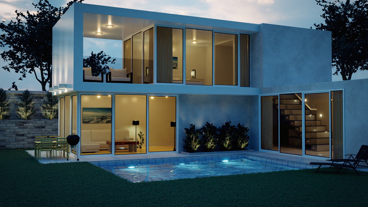
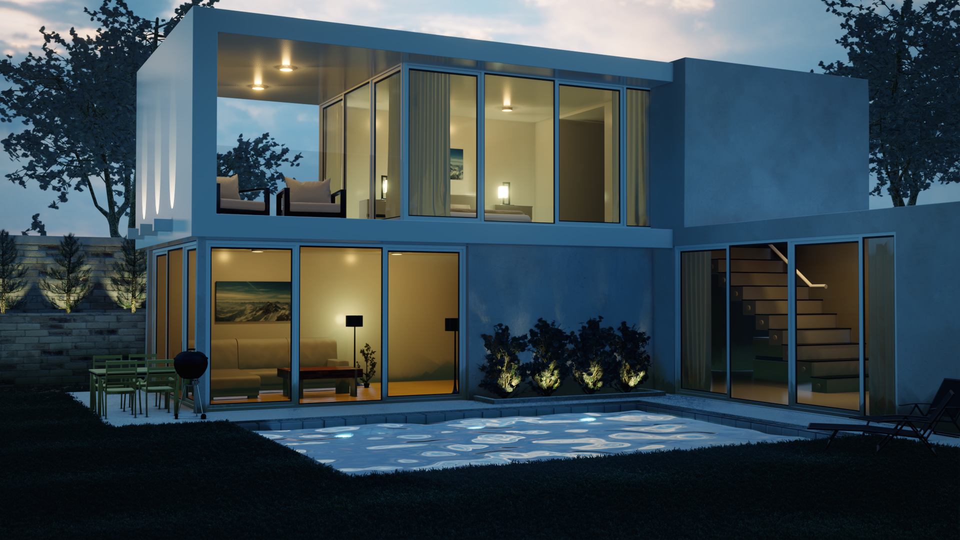
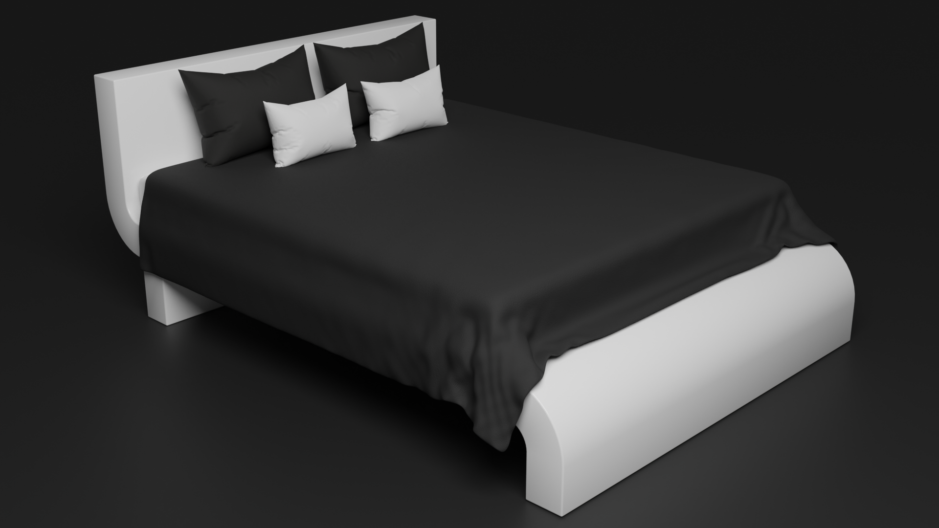
1. Introduction: Hello everyone and welcome to the course on how to create a moderate 3D house in Blender 3. Throughout this course, you will learn everything about modelling materials, texturing, and creating photorealistic renders. This is a very important skill to have, especially if you're wanting to get into architecture. The end result after this course will look something like this. We'll first start out by adding in a reference image and modelling the house to fit the exact measurements. Next comes the materials and texturing. In this section, you will learn all about applying textures to your models and making them look realistic. Now it's on to the lighting. This is one of the most important parts about creating any 3D architecture. That is why we will be using an HDR to get real-world lighting. And we will learn about creating lights on the inside and outside to help highlight the house. After that, we'll be adding in professionally made models into our scene. This will make our house look lived in. There are 15 different models than I'm giving away in this course. We'll be getting into more advanced techniques like creating graphs using a particle system. I'll be showing you step-by-step on what the settings do and exactly how to make the grass looks good. Lastly, we will add some details by creating some stairs, some blinds, and making our whole render look good. Finally, we will render out an image, and then I will show you how to post-process your image and really make it stand out. There are also tutorials on creating a clay version of this project and how to render out your scene it using the real-time render engine EB. At the end of this course, there are also three bonus tutorials. The first one is to create a realistic tree. I'll teach you exactly how to make an organic looking tree, apply textures and render it out. The second one, we'll be creating a modern bed. In this tutorial, we will learn how to use the cloth simulation to create a blanket and a couple of pillows. Then finally, we'll finish out this tutorial by adding in a easy procedural fabric material. The last tutorial of this course, we will learn how to create a modern couch from modelling to sculpt the two materials we will learn exactly step-by-step on how to create a modern couch in Blender. If you're wanting to learn how to create a realistic modern house in blender, which you can add to your portfolio. Hit that Enrollment button and let's get started. I look forward to seeing what you create.
2. Downloading Blender 3.0: Hello everyone. In this video I'm going to show you how you can download Blender version at 3 at the time of this recording blunder version 3 is not the official release, so there is a special way to download this version of Blender. Will you need to do is go to Blender.org and then click on it. Download Blender. You're going to scroll down here until you see the go experimental and then click on it. Download a blender experimental build. Again, if the Blender version 3 is the official release, you do not have to worry about this step. You're going to get to this page and then you're going to want to click on the Blender version at 3 beta. Select this version and then you're going to see it's going to start downloading a zip file. Once the download has finished, you can right-click on the zip folder and then extract it. Then we can select the folder and then you're going to want to launch the blender dot EXE. You're gonna see this blunder launcher, but you don't need this one. You need the blender dot EXE. Double-click on this and Blender will launch. At this point, I like to right-click the taskbar and pin this to the taskbar so I can easily open it up later. But there you go. That is how you download Blender version 3.
3. Blender Basics Overview: Hello everyone. In this
video we are going to go over the
basics of Blender. And so if you are
completely new, this is the video for you. I'll be going
through step-by-step on the different render engines, the shortcuts that we're
going to be using, all of that in
this video, right? When you open up Blender,
this is the default scene. You have a camera, you have a cube in the middle, and then you have a
lamp on the right side. If you ever get stuck on what button I press
throughout this course, just look on the
bottom right corner and you will see what I press. For example, if I left-click, you can see here it says
left mouse and it will also highlight the mouse button
on this sign right here. Same for the right-click, same for the middle
mouse button. All of that will be
displayed at this point. So if you ever get stuck, just look down on
the bottom right. Let's first talk about
the render engines that Blender has to offer. Over on the right side, there is a lot of
different panels. And if we select
this one right here, this is called the scene panel. We'll see that our render
engine is currently on EV. There are three
different render engines that we can pick in Blender, EV, workbench, and cycles. Ev is a real time render engine, and this allows you to actually view a scene in real time. It will calculate the
lighting, almost instantly. Display it for you in
your rendered view. Workbench, on the other hand, is basically just for modelling and
sculpting your object. You don't really use this
render engine for rendering because it doesn't really
display materials that well. And the last one is Cycles. Cycles is blenders, a
physically-based rendering engine. And this will provide
very realistic results. It will calculate the lighting all that pretty accurately. Before we get into
anything else in Blender, Let's go up to our
user preferences and change a couple
of settings there. To do this, we can go
over to the Edit menu. Down at the bottom, we can
go into our preferences. Underneath the key
map tab right here. Here is a couple of things that we're going
to want to check. First off, we have the selective
mouse button right here. You can either select with your left-click or
your right-click. In Blender version
2.79 and below, the default was set to
right-click now a 2.8 and above, it is set to left-click
as the default. I recommend staying with left-click because
that will help you with a lot of other
applications outside of Blender. The Spacebar button down here allows you to pick what
the spacebar will do. Currently it is on play and that is what I'm
going to leave it on. So what happens is if I hit
the space bar over here, it's going to play the
timeline down at the bottom. Underneath that we
have a couple of view options which I'm just going to leave at the defaults. The other thing that we're
going to want to change is extra shading pine many items, make sure that is enabled. This will allow you to actually
see the different views. So if I exit out of this
window and press Z, we can see here we have a
couple of different views. Material view is one of
the ones that's added when you select the extra
shading pie menu items. This will allow you to see what the material looks like
without having to render it. We'll go over that in
just a little bit. Next up on our list
is selecting objects. To select an object
that you can left-click on the object that
you want to select. In this case, I selected
the camera and you can see it's highlighted
in that yellow outline. If I select the cube, It's the same thing. And then the lamp up top, it also highlights it. You can select multiple
objects by holding the Shift key on your
keyboard and selecting it. You'll notice that
once we do this, the other selections have an orange outline and
not a yellow one. This means that it's
not the active object. The active object will be highlighted in the
yellow outline, as you can see here
with the camera. If you want to
deselect everything, you can hold Alt and then press
a to deselect everything. You can also select
everything back by hitting a and double tapping a will
do the exact same thing. So a to select Alt,
a to deselect, or you can press a and then
double-tap a2, de-select. Now let's learn about
moving around the 3D view. If I hit the middle mouse
button on my mouse, I can move around
and rotate the view around the object
that I have selected. As you can see here, our view is orientated around this cube. Let's say for example, I wanted to orientate
my view to the camera. I can select it and hit the
period key on my numpad, not the period key
on the keyboard, the period key on the numpad. And it will zoom in on the
object that we have selected. And now we are rotating our view around the camera
instead of the cube. If we select the cube, hit the period key
on my number pan, I can zoom in on the cube, and now our view is
back to the original. You can also zoom in by
using the scroll wheel. Zoom in and zoom out
with the scroll wheel. You can also do
like a pan or zoom. So if you hold Control
middle mouse button to pen backwards, as you can see here, holding the Shift key and middle mouse button will
pan the view to the side. If you don't have a
middle mouse button, what you can do is go
over to the preferences and emulate it by going
over to the preferences. Underneath the input tab, you can turn on emulate
three button mouse. What this will allow
you to do is hold the Alt key and then
left-click to Panda view. You can see here it's displaying I'm using my middle
mouse, but I'm not. I'm using the Alt key and the left mouse button to
actually rotate the view around. So just in case you don't have a middle mouse button,
you can turn that on. Since I do have one though, I'm going to leave that
off because I find it's much easier with
the middle mouse button. Now let's learn about scaling, rotating and moving
objects around. To scale an object up, you can press the Esc key on your keyboard to scale it up. As you can see here,
it's scaling up my cube. And if you want to see how
much you've scaled it up, look on the top left over
here on the top-left corner, you can see I've scaled
it up five times. You can also set a
manual number n. So let's say I wanted to scale
the cube up three times. I can hit three on my keyboard, and that will scale
it up by three times. And now I can't scale it
up anymore even though I'm moving my mouse because we
set in a manual number, it's locked to that scale. I can hit the Backspace twice and that will get
rid of that selection. And now I can scale
it up or down, as you can see here, to rotate an object, you can hit the R key on
your keyboard and that will rotate it around
as you can see here. And it's going to rotate it depending on the view that
you are looking at it. So let's say I move my view over to this angle and
I hit R to rotate. You can see it's
rotating at that angle. If we go into the front view by pressing one on my number pad, it will put us into this view. And now if we rotate, It's going to be rotating
it along this view. So if we rotate it like this, I can go look at the side. You can see it's perfectly
rotated along the y-axis. I'm going to press
Control Z to undo that. And now let's learn
about moving an object. If I press it G, you
can move your object around and you can place
it anywhere that you want. You can also lock the
movement to a certain axis. So let's say I hit G and then y. And you can see here it's locked to the y-axis and I can't move it outside of that if I wanted to move it up
and down along the x, which is the red line. I can't do that because it's
a locked to the y-axis. I can also backspace that and then hit the
X key and you can see it's going to move it along the x now instead of the y. Just like that. And I can also right-click
to cancel the movement. What I just did there is
I cancel the movement. So if I press R to rotate, I can right-click to cancel that action and it will snap back to its original position. This works with everything. So if I press S to scale, I can right-click and it will snap it back to that
original position. This is very useful
in case you want to look at a certain
part of your scene. I can just move my
object out of the way, view what I want to see, and then right-click
and it will snap it back to its
original position. Now let's learn about the
different views we already discussed front view by
pressing one on the number pad, it will bring us
into the front view. And if we wanted to view the
R object on the right side, which is this side over here, I can press a three on my number pad and it will
move me into the side view. Now we're looking at
our cube from the side. Let's say I wanted to
look at the top view. I can press seven on my number pad and it
will view from the top. And we can see our
camera is right there. And now we're looking at our
object from the top of it. Control 1 on the number pad will bring us to the back view. Now we're looking at the back. Control three will
look on the left side. So you can see here, this is the right side. Now this is the left side and we were looking at it
from this angle. If you don't have a number pad, what you can do is also emulated by going over to your
user preferences. Underneath the input tab, you can enable emulate a numpad. And this will allow you to use the top row of numbers
on your keyboard. So let's say I press 1 on
the top of my keyboard. I'm now looking in
the front view. Same thing for the side view, the top view and all of that. Since I have a
number pad though, I'm going to disable this just like that and then
exit out to save it. Now let's talk about edit mode. Edit mode is the mode
that you're going to be using to model
anything in Blender. To access edit mode. You can press Tab on
your keyboard or you can come up to this menu
and select Edit Mode. Once we do this, you can see our object has turned
into a orange color, and now we can select the
different points on our cube. This point that I
have selected right here is called a vertex. Every single mesh is
consisted of many vertices. As you can see here. With our cube, we have
eight different points, four on top and
four on the bottom. You can select multiple
vertices by holding the Shift key and then selecting them as you can see here. Once I've selected four of them, you can see the inside of that has turned into
an orange color. And this means we have
a face, select it. Let's talk about the
different selection types. Over in the top
left corner you can see we are on
vertex select mode, which means that I can
select the different points. If I switch it over to
the edge select mode, I can select the edges
instead of the vertices. And then finally,
the face select mode will allow you to
select an entire phase, as you can see here. You can also extrude
faces outward. If I select this top face
and press E to extrude, I can extrude it upwards. Now we have basically two
cubes on top of each other. Down on the bottom, you will see all of your scene details. And if you don't see this, you can right-click
and then enable the scene that
statistics right there. We can see here we have four
vertices out of 12 selected. And then if I press a
to select everything, we can see here we had
12 out of 12 selected. You can also see the edges, the faces, and the
objects in your scene. This is a pretty useful
setting in case you want to check how many objects that
you have in your scene. There are many different ways
to add objects or delete.
4. Student Render Highlights: Hello everyone. In this video, I wanted to thank everyone who has enrolled in this course over the past four years. I created this course back in April of 2017, and this was the end result that we created. I've gotten a lot of feedback and improve the course over the years and now it is fully updated to blended version 3. At the time of this recording, there are over 7,650 students who have enrolled. I wanted to take a minute and highlight some of those students who went above and beyond the base course, the ones who took the scene to the next level and added their own twist to it. I've gone through over 500 submissions and pick the ones that were unique or different. All of their names will be on the bottom corner of the video. And I would also like to make videos like this more often, maybe every six months or so. So if you're new and you go through the course, add your own twist to the scene and maybe you'll be featured in the next video like this. So now sit back and enjoy the rest of this video. Congrats on all of the students who made it into here. And I can't wait to see what else you guys will create. Thanks again to everyone who has enrolled and I hope you enjoy the course that is now fully updated to 3. Okay.
5. *UPDATE* Enabling the Archimesh Addon: On, this is just a
quick update video. In the following
video after this, we're going to be
modeling the first floor of our modern house. In that video, we use an add on called
the Arkomsh add on. I show how to add that
add on in, but currently, that's a little bit
outdated and that's not the method you need to use to actually enable that add on. In this video, I'm going
to show you how to do. First here in this
brand new scene, you need to go up
to the edit menu down to your user preferences, and then you need to go
over to the system tab and make sure online access
is checked right here. Come over here and check
that little box right there. That'll allow you to download add ons right directly
into Blender. Then what you need to
do is jump over to the Get extensions tab
and in the search bar, type in the word RC and you should be able to see the
RCMsh add on right there. Go ahead and install that. And then if you jump back
over to the add ons tab, you should have it
enabled right here. If it's not checked, go ahead
and check that right there. Then all you have to do
is just come down to this menu and then click
on Save user preferences. Now you'll be able to
use the RCMsh add on.
6. First Floor Modeling: Hello everyone and welcome to the first section where we're actually going to be jumping into Blender and learning how to model our modern house. This section we're going to model the entire thing starting out with the first floor. And then in the second video we will model the second floor and so on. There's a couple of things I want to mention before we started modelling. And the first thing is this bottom right corner, you're going to see what keys I pressed. So this will help if I do a shortcut that I don't explain, just look at the bottom right corner and you'll see exactly what I press. For example, if I press the S key to scale, you're going to notice the S key is right there. Same for the left-click. So if I left-click, you're going to notice the left button right here turns on. Same for the right-click and the middle mouse button. All of that will be located here. The other thing I wanted to mention is that we're going to be using cycles for the majority of this course. So coming over here to the scene panel, we're going to switch the render engine from EV over to the Cycles Render Engine. And then if you have a GPU, go ahead and select it there. Now that we've set up our settings, Let's go ahead and start modeling our house. What I want first though, is I wanted to make sure everything is centered on the grid floor. You'll notice if I look right here, the cube is halfway underneath. That's not going to really work well and it's not going to be aligned properly. So let's fix that. In edit mode. If I press Tab on my cube, I can go into edit mode and then move the cube without moving the origin point. You can see here if I scale, it's going to scale downwards. And that's based on where the origin point is. So what we're gonna do is, uh, leave the origin point right at the center of the grid, but we're going to move the cube up. So to do that, let's go into edit mode by pressing Tab or coming over to this menu and selecting Edit Mode. Then to move it, we're going to press G, then z. And if I hold the Control or the Command key, I can snap the cube to different parts of the grid. Let's snap it so it's sitting right on top, just like that. And then you can left-click. Now if we go out of edit mode by pressing tab, we can press S to scale and it's going to scale from the origin point and leave the cube right on the grid floor. And there we go. That is perfect. Next up, we're going to set the dimensions of our, of our house. And to do this, let's add an, a blueprint for reference. The blueprints and all the other textures, models and everything is linked in the resources. So make sure you go grab that. Once you've downloaded it, you can press Shift a and go over to the reference image right here underneath image, you can select reference. Once you have found where the references are located on your computer, go ahead and select the front view dot blueprint and load reference image. It's going to load the reference image based on where your view is. And so to reset the view, we're going to hit the Alt key or the Option key on a Mac Alt R to reset the rotation. Then I'm going to press our than X and type in 90 to rotate it 90 degrees and then enter. Now what we need to do is press G and Y and move it backwards so it's out of the way. And then we will also drag it up. Let's go into front view to see what this looks like. You're going to notice it's way too small. So before we scale it up, let's go into wire-frame and look at the dimensions here. You're going to notice that the height of the first floor is 2.74 meters. That is the average height of a ceiling. So let's go ahead and select our cube and then set that exact height. So with our cube selected, I'm going to press Enter to open up the Properties panel and underneath the item tab, the z dimensions. Let's set that right here. So we'll type 2.74 and Enter. Now that we have the height, we can select our reference image and scale it up. So press S to scale and drag it up. Let's also set the width right here. So we'll select the cube and you'll notice the width is 8.5 meters across. So underneath the x dimension, Let's go 8.5 and enter. And you might notice that it's a little bit hard to see the cube with the reference image. So to turn the opacity down, you can select it. Go over to the image panel right here, turn on opacity and let's just set this lower like 0.5, maybe even like 0.3. Actually, I think that's a little bit better. Now if we go back into front view and select our cube, it'll be much easier to see. So the next step is just to select the reference image and scale it up so it matches the height and the width of the cube. So you can drag it over until these edges line up. And again, it doesn't need to be perfect, just probably roughly around there, drag it up a little higher, something like that. Maybe scale it down. And it doesn't need to be perfect, just roughly the same width. And then you'll be good to go. And there we go. I've lined up r cubed right in this position on our reference image. And the next step is to add in the side reference image and line that up as well. To do this, I'm going to select my reference image. I'll go into top view by pressing Seven and then I'll press Shift D to duplicate it and then move it over here. We'll press R to rotate, rotate it all the way like this. And if you hold Control, you can snap it in five degree increments. I'm going to go negative 90 and then left-click. Then over here on the right side, we're just going to change the front view blueprint by clicking that button right there and then selecting the side view blueprint and then load reference image. And since we duplicated it, the scale is going to be exactly the same as the other one. Then what we'll do is we'll go into side view by pressing 3 on our number pad. And then we need to line this up. So I'm going to move it over here. And then we can see here the dimensions is 4.5 meters for this front bit right here. So let's select our cube and put that in for the y-dimension. So here we'll go 4.5 and enter. Then just line it up. So we'll select the reference image again, press G and Y and drag it over until it lines up right about there. So just like that. And again, it doesn't need to be perfect, just roughly the same position. And there we go. We've added in both the reference images and now everything is aligned properly. The other thing I'm going to do is I'm gonna come over to the top right corner and then turn on at this little cursor icon. Then we're going to turn it off for both of the reference images. Doing that will make it so that we can't select our reference image. This will make it easier when we're working with the viewport and we don't want to accidentally select it, so just turn it off so it's easier to work with. Next up, let's add in the windows. To add in the Windows, we're going to be using an add-on called ARC mesh to enable this add-on come over to the Edit menu, down to Preferences. Then underneath the add-ons tab type in the word arc. And you should see the arc of mesh add on right there. Make sure that is enabled and you'll be good to go. To add this in. We can press Shift a and go underneath the mesh and then ARK mesh and then select the panel window. Once we do this, the window will be added into our scene. To actually move that window around, you need to select the empty object right here. Then we can press a G and then you'll be able to move it. If you select the frame of the window, you can't move it. So make sure you select the empty object, is this object right here to actually move the window around. Let's move this into the front and then place it right on this side. So I'm gonna go into top view. And then I'll press G and Y and drag it down this way. And then G and X and drag it over here. When I first created this course, we actually cut a hole in this cube right here by going into edit mode and then adding some loop cuts. Now this is destructive modelling, meaning to that once we add that in, It's a little bit hard to move it around or change the location of our window. So instead, we're going to be using a Boolean operation. When using the ARC mesh add on, you can see it adds this cube right here. This is for actually cutting a hole in the mesh. So what I mean by this is what we need to do is select our cube right here and then go over to the Modifier tab. We'll select Add Modifier and click on a Boolean. And for the object, we're going to select the Eyedropper tool and then select that frame around the window. So now if we press Z and go into wire-frame, we can see there is a hole in our cube and it automatically does it for us. So if we select the entity, we can move it around and the hole will move with the window. And this is very useful for moving the window around. This is a much better way than adding in luke cuts and actually cutting a hole in the window. Next up, let's change the dimensions of our window and place it in the correct spot. So with the frame selected and make sure you press N to open up the Properties panel. We're gonna go over to the Create tab. We're going to split this out so we can see it a little bit better. And here are all of the settings for the window. If you want to, you can add in a new window right there. So you can have four or you can add an, a vertical one like this. Play around with these settings until you're happy with what you like. What I'm gonna do is I'm going to set the height down here. It's this value here. We're going to set this to a value of 265 and enter. And then it should line up right where the top of the ceiling is. We're also going to be changing some values over here. So this value I'm going to set to 145, 145, and 145. If it goes past the side of the house, just select the empty and move it across so it lines up right where it's supposed to write it. There looks good. And the other thing I wanted to mention is that these checkboxes right here, I'll go into wireframe so we can see it a little bit better. They allow you to add in an extra frame on the inside. This is for opening the windows. So if I turn this off, you're going to see that extra frame disappears. If I leave it on, that extra frame reappears. What this means is is that we can actually open this window if we wanted to. So what I'll do is I'll go into edit mode and I'll select the top corner right there and press Control L to select the entire thing will go inside the house so we can see it a little bit better. If I press G and X, I can actually slide open the window. This could be kinda cool if we wanted to leave the window open like that for a render, that might look pretty good for now though, I'm just going to leave it closed. Another thing that you might notice is that our Boolean operation has disappeared. So to re-enable it, select your mesh, go over to the object and then select the frame of the window once again, if for some reason and this happens, you wanna make sure that the frame is actually underneath the top of the ceiling. So to fix that, we'll select our frame, set this a little bit lower. So let's say right about there is good. And then this side, we also want to make sure this is inside. So over on this one, we'll just turn this down a little bit so it's inside, just like that. Then we will do the same thing. Select the select the entire house. I drop a tool and then select the frame of the window, and then it should work properly. Next up, let's actually duplicate this window and place it over on the left side of the house. So with the frame selected, I'm going to select the bounding box and the empty. We'll go into top view and press Shift D to duplicate it, and then we'll place it over here. Then we will select the frame, and then we have a rotation value right here. And then set this value to 270 just like that. And the reason we're not doing 90 is because that's the inside of the frame. If we set it to 90, you're going to notice the frame is on the outside. That's not what we want. So make sure this is up to 270 and Enter. Then of course you want to make sure that the frame is in the correct spots. I'm going to select the empty down here, press G ANY and move it back until it lines up right where that corner is, will go on the other side of the frame. And we can see here it's sticking out a little bit. So select it and then turn down this a little bit until it lines up inside of the house, just like that. From there, select your cube at an, another Boolean. So select the Boolean modifier. And this time we're going to go the object and it's going to be this frame. And there we go. We've now added all of the windows. This way is so much better than adding loop cuts manually because what you can do is select your empty and just move it anywhere along the cube and it will automatically cut a hole in the mesh. And there we go. We've now set up the windows. But there's one less thing that we need to fix and that is to create an actual hole in the window at the moment. If we select our frame and then press H to hide it, you're going to notice that there is not a hole. It's basically taking the outline of this border right here and just indenting at the mesh. The reason this is happening is because blunder is treating this object as a completely solid object. So what we need to do is give this mesh some thickness, so it treats it as an empty object. We can very easily achieve this by clicking Add Modifier and selecting the solidify modifier. Once we do this, we need to drag it above both of the Boolean. So make sure it's above both of the Boolean modifiers and then it'll work properly. The other thing that you're going to notice though, is that we have a weird gap in between the frame and the mesh itself. The reason that's happening is because of this frame right here is below the actual mess. So we need to take it and drag it above. Select both of the MTS just like this. And then I'm going to press the G and drag both of them above just like that until they're above the floor. As you can see there. At the top though, you're going to notice that it's too tall now, so we need to select both of the frames. I'm going to press N and bring the height of them down just slightly until it's below. Right there looks pretty good. I'm going to press Alt H to bring back my other window and then select it and do the exact same thing. The height of this, the height of this is 258. So we're going to select this window and set this to 258 and enter. Doing this makes the Boolean operations not work anymore, so we just need to refresh it by coming over here, selecting the Boolean and then selecting the bounding box of the window. We'll do the same thing for the other Boolean operation as well. Select the Eyedropper tool and then select the bounding box for the window on the left. And there we go. Now it is working properly. If we press Z and go into render view, we'll be able to see inside our mesh as you can see there. And there we go. We've now completed the first video of the modern house. In the next couple of videos, we're going to be adding in the second floor of the sidewall and all of that. I hope you're excited to continue working on this course and I will see you in the next video.
7. Second Floor Modeling: Hello everyone and welcome to another video. In the last video, we modeled the first floor of our modern house. In this video, we're going to be focused on the second floor. To get started, we first need to add in a new tube and place it right on the top of our first floor. To do this, let's switch over to the cursor tool, or you can press shift and then right-click to snap the cursor right on top. Then we can press Shift a and add in a new cube. Let's go into front view and make sure this is lined up properly. So what I'll do is I'll press 1 on the number pad. I'll zoom in and press Z and go into wireframe so we can see what we're doing. Scale the cube down just like this and then line it up with the blueprints right about there looks pretty good. You can see it's lined up. Then what we need to do is scale it so it matches this frame of the modern house. So I'm going to press S, then x N, scale it out pretty far. I'll move it over here just like that. And then we'll go into edit mode, select the left side, and then press G and X and move it over here. We can see here that it is a little bit higher than the reference. So what I'll do is I'll just box select the top half G and Z and drag it down. Just like that. Then what we'll do is we'll select the left side, press E to extrude and extruded outwards. You want to make sure that the width of this extrusion is the same as the height, which it looks like it is. So that's good to go. Then we can extrude it up. I'm going to select that height right there. And we wanna make sure that the height is exactly the same height as this one, which is 2.74 meters. So what we need to do is press E to extrude, then type 2.74 and Enter. And that's going to line up exactly where we need. Then what we can do is press E to extrude and extruded upwards. Select the left or select the right side of this extrusion. And then we're just going to extrude it all the way across here. Another thing that we can do is we can align of both of these edges perfectly with each other. To do this, you can select both of them just by dragging across. Then you can press S, X and type 0. And that's going to make sure that they are perfectly flat up against each other. And that's looks really good. Next up, we want to make sure that it is the width that we need. You can see here it's really skinny. So what I'll do is I'll go into side view by pressing the three on the number pad. And then if we zoom in here, we need to align it up with the reference image. I'm going to press S and scale it out this way, just like this. And then just see what we're doing. Let's go back into wireframe. I'll press the G and then y and then move it over SY scale it outwards just like this, and then line it up with the blueprint. And there we go. We can see here that it is now perfectly in line and we're good to go. Now let's add entity windows on top here. And to do this, let's select the Windows that we've created down here. We'll select the frame, the bounding box, and the empty all go into front view by pressing 1. And then let's press Shift D to duplicate it and place it up top. We can see here that there's an extra window on the right side. So to add that in, Let's select our frame. We'll press N to go into the Properties panel and then add in another window along the horizontal count. So we'll switch that up to four. And then we can see it added it right there. Let's go into wire-frame and select the empty and move this into place. We can see here that is currently floating, so I'll press G and Z and drag it down so the frame is slightly inside the cube. Then let's line it up with the right side. So over here I'm going to press G, Then x and line it up. So it's right in line with the frame that we've created just like that. And that should be good to go. You also want to make sure that the frame is not underneath. You can see it's slightly inside, which is perfect. You want to make sure that it's not like below like that. So make sure the height of the frame is a little bit inside the frame that we just created. Now we also want to make sure that this is lined up on the side view. So let's press three on my number pad and we'll go into wire-frame. And we can see that it's slightly to the right. So we'll select the empty price of G and Y and drag it over until it lines up with the reference, just like that. And there we go. Let's duplicate this window and place it on the other side. So with the empty selected, let's select the frame and the bounding box. We'll go into top view shifty and place it over here. And then remember we need to rotate this, so select the frame. And then underneath the rotation, Let's go to 70 and Enter. Currently it's way too long. So we're going to switch the horizontal count back down to three, just like that. And then we can select the empty and move it into place. I'm going to move it along the y-axis. I'm going to press G and Y and drag it out this way. And then G and X and drag it out this way until it's lined up properly, just like that. And I think it looks good leaving a corner bit right there. We'll go on the backside and you can see it's not perfectly in line. So what we can do is select the frame and then we'll just add in a couple of segments over here. So I'll bring that up to like 45. And then we'll select the empty and then move it back. You can see it went this way a little bit, so I'll press G and Y, drag it back. And then you can see it's a little bit more in line and I think that's pretty good. Now finally, before this video ends, let's add in that railing that we can see over here. To do this, Let's shift right-click to place our cursor right there. And then I'll press Shift a and add in a plane object. Let's rotate this 90 degrees along the x axis, so it's a standing up. Then we'll go into front view and places in the right spot. We'll drag it up, S and Z, scale it down and place it right there. Then we'll scale it along the x-axis. So press S and then Ax and line it up with the blueprint. Right about there. Looks good. And then we'll go into side view in line this up as well. You can see it's already in line. Maybe drag it back slightly just like that. And another thing that we need to do is add some thickness to this. Currently it's a plane, so it's paper-thin. That's not going to look good for the final render. So over in the Modifier tab, Let's click add a modifier and then select, solidify. Bring the thickness up until you're happy with it probably around there is good. Then let's duplicate this and place it on the other side. I'm going to press Alt D to duplicate it and then move it over here. The reason I pressed all d instead of shifty is it links these two objects together. For example, if I go into edit mode and select like the part over there and move it around. You can see it's going to do that exact same thing over on this one as well. This will just make it easier if we're trying to edit one, it will just duplicate that action and place it on the other one as well, which will just make everything a little bit easier. And finally, we'll press G and Y and drag it back so it lines up right there. Looks good. And finally, the, before this video ends, Let's go on the backside of our house and add in a wall behind this window because at the moment it's just see-through and we need a wall there. So let's go ahead and add that in. Let's select the frame, go into edit mode, and then let's add in a couple of luke cuts. The first loop cut that will add is down the middle. So press Control or Command R to add an a loop cut, left-click, and then we're going to drag it over until it lines up with the frame. Right about there, looks good. Then we need to add in two more loop cuts. One down the middle on the top. So press Control R, left-click will drag it over this way. Then on the bottom control our left-click and we'll drag it over this way. We wanna make sure that these two cuts are perfectly in line with each other. So we'll go into vertices select mode, our vertex select mode, press Z and go into wire-frame. Let's select all of them by Bach selecting s, x and 0 and enter so they're perfectly in line with each other. And then we will also want to make sure they're in line with the window. So I'm going to drag it over along the x, so it's lined up right there. At this point, we can select this face and this face. And then to merge them together, we can press Control or Command E and then select that bridge edge loops right here. And now we'll add an a face along that wall as you can see. And there we go. We now have a wall on the backside.
8. Creating the Side Wall: In the last video, we created the second floor of our house. And in this video we're going to be creating the side of our house, the right side. To do this, it's very simple. We're going to select our main cubed that we've used to create the first floor and then press Shift D and drag it over to the right side. We're not going to need the Boolean, so we'll go ahead and delete both of those modifiers. Then let's scale this along the x so it lines up with the reference image right about there. Looks good. Let's go into side view and places in the correct spot by pressing 3. And we can see if we go into wire-frame, the height of this is 6.1 meters tall. So we'll go into the Properties panel by pressing N, go over to the item tab. And underneath the dimensions of the Z, Let's type 6.1 and enter. You might notice that it's slightly below the height of the frame. So let's go ahead and fix that by going into edit mode, will select the top half and just drag it up so it lines up. I also want to make sure this is inline on the left side. So what I'll do is I'll press G and Y, line it up on the right. Then we'll go into edit mode. Let's select the left side GYN, drag it over so it's inline just like that. And then we need to add in a couple of luke cuts. The first loop cut I'll add is right here. So I'll press Control R to add in a Luca and drag it down so it's right in line with this frame. Next we'll select the bottom half, just like that e to extrude and drag it all the way across. Just like that. Let's take a look at what it looks like so far and you can see it looks pretty good. If we zoom in right on this corner, you might notice that we have some weird overlapping issues. The frame is slightly above and it's inside and it looks a little bit strange. So to fix that, let's actually go into edit mode. I'm going to go into wire-frame and box-like that the entire half of our cube that we just created and just drag it up. So it's right in line. I'm going to press G and Z and drag it up so it's right there. And I think that is just going to look a little bit better so it's lined up properly. Next, if we go into side view, you're going to notice that we have a window that we need to add over here. So to add this in, and let's select the window that we've created right here. We'll select this one empty and the bounding box, we'll go into top view shifty and place it over here. Then select the frame and underneath the Create tab, let's set the rotation to 270 once again, and then line this up properly. I'm going to press a G and Y and move it over to the middle. We'll go into side view to see what we're doing and drag it underneath everything. Move it back over to the right side. And so the windows lineup with your reference image. And I think that looks pretty good. Let's check the front. Then what we can do is select this cube, add modifier, Boolean. And then for the object, we're going to select the bounding box of the window just like that. And finally, before this video ends, we also need to apply the solidify modifier to this mesh so the window actually works properly. So with it selected, I'm going to click Add Modifier and select solidify. We're going to drag this above the Boolean, so drag above, and then it should work properly. I'm going to make sure that the bottom is also working as well. So I'm going to press H to hide it. And you can see it is working. It's not below creating a weird gap is working properly. I'm going to press Alt H to bring back our window. And there we go. We've now completed the right side of our house. And there we go, Nice and easy. We've created the right side of our modern. In the next video, we'll work on the ground.
9. Creating the Pool & Ground: Now would be a good time to save our project. So to save it, you can go over to File down to Save As, and then you can name your file whatever you want to. I've already saved it as you can see here. And then click on Save As. And then to actually save your project while you're working. The shortcut is Control or Command S, and that will just save it as you're working on it. So make sure you do that because blender does have a tendency to crash a lot. And once you've done that, we're ready to move on. The next step is to add in the ground and then add in the pool and model out where the walkways are going to be. We don't want our house to just be floating in the void. So let's add something for it to lay on. I'm going to press Shift S and then select cursor to world origin to snapper cursor right to the center of the grid. Then we can press Shift a and add in a plane object. Let's go into top view by pressing Seven and then scale this up and place it in the right spot. So we'll scale it up some more. Probably around there. Probably were on there I think is good. So we have a little bit of a gap on each side of the house, maybe slightly bigger, just like events. From there, we can add in some loop cuts and cut out where we want the pool to be, where we want the walkways and everything else. So to do this, let's go into edit mode with our plane selected. Let's add in a bunch of loop cuts and then we'll start extruding. So the first loop cut is we want to line up right where this frame of the house is. I'll press Control R to add in a loop cut, left-click, and then drag over until it lines up right where that is command R if you're using a Mac. And then we'll line it up over here as well, Control R. And it also lines up where your cursor is. So for example, you can see if I move my cursor to the top, it's going to line up horizontally. If I drag it over here, it's going to line up vertically. So move your cursor over to the right side, left-click, and then drag down. We'll do the same thing over here, control our left-click, drag over until it lines up. And then you also want to think about where your walkways are going to be. For example, I want to walk away and starting over here, coming down across and then across this way. So what I'll do is I'll add in a loop cut, move my cursor down to the bottom, left-click, and then just drag over and then place it probably, I think right about there is good. So we have a little bit of a walkway and then we'll do the same thing over here. Control our left-click drag this way, right about there. And you want to make sure that the width is roughly the same. You can see here and then here it looks good. Over on this side we'll add an another loop cut. We'll line it up with the house right about. There's good lad another loop cut right here to line it up with this side of the house. And then for this walkway well, I didn't one more. We'll drag it over here. Probably around there is good. You can see the width is roughly the same, maybe a little bit more to the left. Like that. That looks pretty good. The back of the house, we're going to add in some more luke cuts to frame it. So control are placed cursor right here and drag it down so it lines up. As for the pool, what we're gonna do is add in another loop cut control are at end loop cut here and then probably place it right about right there. So right where that end of the window is. I think that's a good width. If you want your pool to be bigger, just select that loop, G and then y, and you can drag it to wherever you want. So now that we have all of our loop cuts ready, we are ready to start extruding where the walkways are going to be. To do this, let's switch over to the face select mode by hitting three or selecting the Face Select. I'm going to come over here, select this face. Holding shift will select this face, this face, this face, this one, and this one. Let's press Z and go into wire-frame just to make sure we have everything that we want selected, which we do. Then what I'll do is I'll just zoom in, press E to extrude and just drag it up just slightly, something like that. So we have a little bit of a walkway from there. Let's add in a little bit of detail over in this corner. I kinda want there to be some plants and whatnot over here. So to add that in, we'll press Control R at an another loop, cut. Place it right about there so it lines up with the window. We'll add an another loop cut over here so we have a little bit of a gap. And then finally we'll add in one more. Probably like right about there is good. Then we'll select this face and the back. Go into face select mode. This one, and this one will press a to Extrude, extrude it up just slightly. And then I to inset and then extrude it down just like that by hitting E one more time. This is going to be a little bit of a garden or some, something that we can add in some plans and add in some lighting. And I think that will look pretty cool. I'm liking how that looks. So next up, let's add in the pool. To do this, we'll go into face select mode. Once again, we'll select this face. This face I to inset and we'll drag it in just slightly so we have a rim around. Then we'll press E to Extrude extrude it down probably about a foot or so, to add an eighth step, I to insert again. Then e one more time and extra that all the way down, probably about there, so about three or four feet. And I'm liking how that looks. If you want your pool to be bigger, all you have to do is go into edit mode, switch over to the vertices select mode, and then in wireframe selected the part where you want to move it. So for example, if I press C for circle select, I can click and drag all of these the vertices, then G and Y and extrude it however much I want. I'm just going to leave it right about there, I think is perfectly fine. Next up on our list is we're going to separate where the grass will be and where the walkways in the pool is. So to do this, let's switch over to face select mode once again, and let's select the entire outside. I'm going to press Alt a to deselect. Then press C for circle select, and then click and drag all of the faces where I want crass to be. So all of these faces just like that. We'll go on the backside. All of these faces. And then finally, all of these faces. Let's press Z and go into wire-frame just to make sure everything is selected that we want, which it is. And I'm going to press P and then click on selection. So now we have two different objects. We have an object for the pool, right here, right here, as you can see it. And then we have an object for whether grass is going to be. If we take a look at grass or any grounded in general where there's natural dirt and whatnot, there's going to be a little bit of displacement. At the moment, our plane is completely flat. That's not very realistic. So let's add in some displacement and give it some random bumps all throughout. To do this, we need to go into edit mode. You're going to notice that we have a very little geometry on all of these different parts. So what we need to do is add in more geometry and make sure everything is even. So it adds the displacement modifier correctly. To do this, there's a couple of ways we could manually do it, or we could add an, a rematch modifier. If we click Add Modifier and selects ring mesh. And then on the voxel tab we're going to turn the voxel size down quite a bit until we get the appropriate amount. We can see that we're adding in geometry and we have even bases all throughout here. There is one problem though, and that is the problem that we see here is actually curving those edges. And there's no really way to fix this if we add in adaptivity and that's just going to make it worse. So what we need to do is manually fix this afterwards. Let's just turn this down until we get the size that we want. Probably around there is good. So round 0.267. Then we can apply this modifier. So click here and select Apply, go into edit mode and then we just need to manually fix all of these. First though, we have a lot of geometry that's overlapping. So we're going to press a to select everything M and then click on by distance. And you can see all of the vertices that it removed. Then what we can do is go into edit mode B for box select and draw a box around the parts where we need to fix. So I'm going to go into top view, select this half right here, S X 0 and enter. And we basically need to do this for all the edges. So press Alt a, B for box lights and draw a box around all of those vertices, will de-select that bottom half, S, Y, 0, and enter, and then move it up a little bit. So what I'm gonna do is do that for the rest of the geometry and make sure it's lined up properly. And another trick that we can do to easily select the parts that we need to straight noun is if you select one of the vertices where we need a straight, now, go up to the top and then select the other one, which is this one. If I hold Shift and Control, I can select it and it's going to select that entire thing. From there. I can press S xx 0 and enter. Then just move it into place right about there. So that's a very easy. So I'll do the same thing one more time. Select it that vertices move over here, control shift, and that will select that, that whole thing, S, Y 0 and enter, then just move it into place. So I'm just gonna do that for all of the other ones and then we'll continue. And there we go. We've now strained out all of the vertices and now we can add in the displacement modifier. To do this, click on Add Modifier displacement and then select New. We're gonna go over to the texture panel and change the type from image or movie over two clouds. We can see the strength of this is a way too high. So let's go back over to the Modifier Tab. And underneath a string value, let's set this down to 0.01 and enter. If for some reason you get some weird issues like this where you can see underneath the floor, just drag it down, maybe just slightly. You can also go into edit mode, select the entire loop by holding Alt left clicking twice, and that will select the entire thing, as you can see here. And then press E to extrude and just drag it down just slightly so it's underneath. And there we go. We can also right-click and shade it smooth. If for some reason you get this weird shading issue and easy way to fix that is to go over to the object data panel. And then underneath the normals you can turn on auto smooth and that will smooth it out as you can see there. And there we go. We've now added in the ground and the pool and everything else, and it is looking great. In the next video, we'll create the wall on the backside.
10. Modeling the Brick Wall: In the last video, we created the ground and all of the walkways and the pool. In this video, let's add in a little bit of detail over to the backside of the house. Firstly, we don't really need the reference images anymore. So over in the outliner, select both of the empties, the empty right here and empty 000 001, and then just press X to delete that. Now we have a little bit more room in our view ports. We can actually see the house a little bit more clearly. So next up, let's add an ID back wall over here. If we were to render out our image like this, if we place the camera right here and render out our image, we're going to see the HDR in the background and it just is not going to really look that great. So whenever you're modeling a house or doing any sort of seen, you want to hide the background of little bit. So for this scene, we're going to be adding in a back wall, a backup brick wall over here. And this is very simple to model. Let's place our cursor right there by holding Shift and then right-clicking. I'm going to press Shift a and then add in a new cube. Let's drag this cube up so it's sitting right on the ground. Then press S to scale. We'll scale the entire thing down and place it right about there. We'll go into edit mode and we need to add an another loop cut. Let's add an Luca right down the middle, left-click and right-click. Switching over to face select mode. I'm going to select a deed back face and just extruded upwards, just like that. So we have a little bit of a wall. Let's select all of these faces, press G and then x and drag it out this way so it lines up, will go on the other side and do the same thing. So it goes past the view of how so we can't see it from the camera view. Then to give the whole thing some more detail, Let's selected the top face, press E to extrude, and then right-click. I'm going to press S to scale. And you can see we scaled it outwards. And you'll notice though that the right side where the house is, it's not as thick as the side right here. And that's because it's a rectangle and it's scaling proportionally. So to fix that, we need to press S, then y and scale it out manually until it's the width that we need right about there, as you can see, maybe a little bit less. Then we can press E to extrude and extrude it up just slightly. And there you can see we've added in some detail. The other detail that we're going to add is right here. Let's go into edit mode. Select this face I to inset and will instead it just slightly then extrude it down. This is also going to be where a garden is. We're going to have some trees that are upright here and some lights appointed on them, just like over here. And I think it's going to add some cool effects to the overall scene. So with that done, we're ready to move on.
11. Adding the Pool Water: In this video, let's create the pool water. At the moment, our pool is completely empty, so if you were to jump in it, you're just going to break your foot. So let's add in some water. I'm going to hold Shift and then right-click to place my cursor right at that spot. And then let's add an a plane object. Let's go into top view and scale this up to match the width of the pool. So we'll go into wire-frame S to scale and we'll place it right about here. And remember that we have a step, we're going to drag it up also. We have a step right here, so we need to line it up to this part of the pool, will go back into top view, select our plane, and then scale it up even bigger. So right about there you can see it's lined up over here, a past that step and that's what we want. And then over here it's also pass the step. Let's scale it up along the x axis. I'm going to press S then x in skill it out until it's past the step on each side, right about there is good. With that done we can add an a displacement modifier because at the moment it's completely flat and that's not very realistic. Water has some waves to it, so let's add that in. I'm going to go into edit mode. And remember we need geometry for the displacement modifier to work at the moment, we don't have any. So let's add some it. I'm going to press Control R and add in to loop cuts, left-click and then right-click. Then along this way as well, we're going to add in another loop cut, control our left-click and right-click. And one reason why I'm doing these cuts is because if we were to subdivide this manually like this, you're going to notice that we have a rectangle faces. And remember displacement modifier. It will work with rectangle faces, but it's not going to look very good. So we want to make sure the displacement is using square faces. That's why we're adding two loop cuts in the middle and then one loop cut right here. Then we have square faces. From this point we can press a right-click and sub-divide. We'll do this a couple of times. Do we get the geometry that we want? I think that's probably good right there. Let's go over to the Modifier Tab, click Add Modifier, and then select that displacement, will give it a new texture. And then go over to the texture panel and switch the type from image or movie down to clouds. That looks pretty good, but the, again, the size is way too big. So let's go back over to the displacement modifier and bring down the strength until the appropriate amount, probably right about there. So if your scene is like really windy, you might want to drag this up just a little bit more so you have bigger waves, but I think a value of about 0.08 or so is probably good. You can also right-click and shade it smooth. You might notice though that it still doesn't really look that great and that's because it doesn't have that much geometry. So to smooth it out, Let's add in a subdivision surface modifier. So with add modifier selected, let's add in a subdivision surface. Let's set the render and the VBR 2, 1. And then also we'll bring the string down just a little bit more. Let's go 0.05. There we go. Look at that. We've added in some waves to our pool and that looks much better. And then finally to add in a little bit more detail to our pool right here, let's add in some lights underneath. I'm going to go into front view by pressing one in Z and go into wire-frame. Let's add in a new object. And this object is going to be a cylinder. Select the cylinder, rotate it along the x axis by 90 degrees and enter. Let's scale it down and then place it over here. I want there to be three lights in our scene, so we'll place one right here. Then let's press Alt D will drag it across this way. And then I'll do one more time and drag it across this way. Make sure that they are in line right about there is good. Then since we press Alt D, whatever changes we do over to this one will also affect the ones over on this side as well. So for example, if I go into edit mode and I select that face, will go into face select mode, select this face and I want to zoom in on it by hitting period. I can press I to inset, then extrude it backwards. And then if we go look over here, it did the exact same thing on this one as well. I'm also going to go back into edit mode, select everything S and Y and make it a little bit thinner. From this point, we can drag them all backwards. So we'll select this one, this one, go into side view by hitting three and then line it up with this side. I'm going to press G and Y and drag it out this way. Let's duplicate them and place them on the other side of the pool as well. So press Alt D Y and drag it out this way. We'll rotate them around, so hit R, rotate them all the way around G and Y, and then place it right there. And there we go. We now have some lights inside our pool. At the moment though they're just a mesh and they're not going to actually emit light, will be adding all the lighting later in this course.
12. Beveling Everything: Hello everyone and welcome to another video. In this video we're going to be adding in a little bit of detail to our modern house. At the moment, everything is very sharp. If we look up this corner, you can see it's a perfectly 90 degree angle and it's very sharp. This does not exist in the real world. Everything has a slight amount of bevel to it. So we're going to fix that by adding in a Bevel modifier. Before we add that in, I wanted to talk about scaling and the bevel. If we select our object and press N and go over to the item tab, we're going to take a look at these scale numbers. You're going to see the scale of the x is 3.4. Now, this is important to know because if you add an a bevel modifier or a lot of other modifiers in general, it's not going to apply correctly. What I mean by this is it's going to take that scale factor and apply it to the modifier. If I go into edit mode and I'm just going to show this for demonstration purposes. You don't have to follow along. If I select this edge and press Control B to add in a Bevel manually, you're going to notice that it's scaling along the x-axis away more than it's scaling down. And that's because of the scale numbers here you can see that the Z is 0.183 and the x is much, much bigger. So it's taking that scale number and applying it to this bevel. So you can see here it's not a plane correctly. What we need to do is apply the scale, so everything resets. To do this with your objects selected in object mode, you need to press Control or Command a and then click on Scale, and that's going to reset the scale, everything back to one. Now what happens is if we go into edit mode and press Control V to bevel, It's going to bevel the object correctly as you can see here. Now, we're not going to be beveling these manually because that's pretty destructive. If we do this, we're not going to be able to go back and we're just going to have way more geometry and it's just the paint. So instead we're going to be adding in a Bevel modifier. Over in the Modifier Tab, I'm going to click Add Modifier and select bevel. You can see here that it added in a bevel to all the edges on our cube. Now if for some reason at the bevel is not working, you might have some doubles in your mesh. So detects that you can go into edit mode, select everything, and press M, and then click on by distance. Or if that doesn't work, well you can do is open up the geometry and then turn off clamp overlay. And I will also fix the bevel issue. But if it's working correctly, you don't need to do any of that. Over on the right side we have an amount and this is the amount of bevel that will be applied currently, it's way too much. So let's bring it down. Let's go with a value of 0.02 and enter. And we can see here that actually still might be a bit too much. So let's go even lower. Let's go 0.01. Enter. Now the segments that's going to add some resolution. So if I zoom in and I turn the segments up to a value of, let's say three, it's going to smooth out that corner and that looks much better. So with a segment of three and an amount of zero-point one, that is good to go. Let's do that same thing on every single one of these objects. Let's select them first though and apply the scale. So it actually does the bevel correctly. So I'm going to select the back face, the ground, this object, the first floor, the sidewall. And we don't really need to do the grass because we're not applying a bevel modifier to it. So just these objects, press Control a and apply the scale. Now we can apply the modifier to them. Now, there is a way to copy modifiers from one object to another one, but that's going to mess up the Boolean modifiers here. So instead we just need to apply it manually. So with this object selected, I'm gonna click Add Modifier Bevel, set the amount 2.01, enter, and then add in a couple of segments. We'll do the same thing down here. Add a bevel modifier, 0.013 segments. And for the sidewall, we're going to click Add Modifier and select bevel. If the bevel is not working, That's because you need to make sure it's above the Boolean modifier, but below the solidify modifier or the window will not work properly. Make sure you apply this scale as well if you haven't done that already. And then for the amount, let's go 0.01 and segments up to 3. We don't really need to apply a bevel modifier to the first floor because we can't see the corners of the ceiling. So I think I'm just going to leave it off. And finally, the other object is this object right here. One thing though is if we press Control a and apply the scale, you're going to notice we can't apply it. And that's because we have a duplicate one over here. So we're gonna go ahead and delete that one. Select this object, control a, apply the scale. And then we'll just do it one more time. So we'll go to the back of the house, Alt D, Y, and drag it backwards and then apply the modifier. So we'll click Add Modifier level, set the amount 2.03 Enter and the segments of 23 as well. And then finally, just do that one more time on this one, set the amount 2.01 and the segments up to three. And there we go. We now have bevel along every single corner of our modern house and this looks much better. It's important to do this because it's going to add some realism to your renders. If you don't do this, you're going to notice that your renders look kind of fake because the corners just don't really line up properly and they don't shine the lighting or reflections. Very good. So with the bevel modifier active, this is going to make our renders look much better.
13. Section 1 Outro: Congratulations on making it through the first section of this course. We've modeled our entire house and we've done quite a bit in the last few videos. The next coming videos, we're going to be creating the materials for our modern house. I'll be showing you how to add in concrete materials, wood textures and everything. The brick wall in the back here, we'll be covering it step-by-step. If you want to grab this blend file without any materials and just the basic model, you can do that in the resources. There's going to be a blend file for each section of this course. So if for some reason you get stuck or it's just not working properly, you can grab the blend file for the beginning of each section. I hope you're enjoying it so far and I look forward to seeing what you create at the end of this course. Let's jump into the next couple of videos and add the materials.
14. First Floor Materials: Hello everyone and welcome to a new section. In this section we're going to be creating all of the materials for our modern house. Starting out with the first floor, I'm going to be going through step-by-step on how to add in textures and normal maps, specular maps, all of those we'll cover in the next coming videos before we start creating the material, there is a couple of things that we need to do. First off, if we select our ground with the pool, this object right here and we look underneath, you're going to notice that we have some duplicate faces, meaning that there are two faces in the exact same spot. So that's not going to really look good for our materials. They're going to kind of blend together in the render. And it's just, it's just not going to look good. What we're gonna do is go into edit mode with this object selected. And we're going to delete all of the faces that are inside the house. So to do this, let's go into wire-frame by hitting Z and go into wire-frame. Then we're going to press C for circle select, End, draw all of the faces that are inside the house, all of these ones like that. Then we're going to press X and delete them. Now if we go out of edit mode, there's going to be no problems underneath. As you can see, the materials that we're going to be creating are for the first floor of our modern house. So let's go ahead and get started. I'm going to select my first floor and then go over to the Material tab. There should be already a material in place because we use the default cube and blunder. If you don't see this material, just click New and then we'll create a new one for you. So how this works is we first need to UV unwrap. This object is a blunder, knows how to apply the texture. We can do this very easily by selecting it and going into edit mode. Make sure you press a to select everything, and then click U and click on Smart UV project and hit Okay. What that is gonna do is it's going to UV unwrap this object so we can apply a texture. Now let's open up a new window and create the material. We can do this by coming over to the top right corner and clicking and dragging to split the view. The first node that we need to add is an image texture. You can press Shift a go over to texture and then add an image texture and we'll place it right here. Take the color from the image texture and plug it into the base color of the principled shader. Then we need to open this up. So click Open and then navigate to the textures. All of the textures and models are linked in the resources. So make sure you go grab them. Once you have it, you should have a folder called models and textures. Go ahead and select it and go into the texture folder. The clean concrete is the one that we're going to be creating. First, select the middle texture with the one with the color, and then click on Open Image to actually see what this texture is looking like it Let's go into the material preview. If you don't see this option here by hitting Z, well, you need to do is come over to Edit down to Preferences. And then underneath the key map, make sure the extra shading pie menu items is turned on. And, uh, while we're here, let's go over to the add-ons and let's enable the Node Wrangler add on. This will make it much easier to work in the node editor. So make sure this add on right here is enabled and we'll be good to go. So if we use them in here and press Z and go into material preview, we should be able to see our texture. At the moment though, you can see that it's kind of low quality and the texture is really big. So what we're gonna do is select the image texture node and press Control or Command T. This will automatically add in a mapping node and a texture coordinate node. And just a reminder that shortcut does not work unless you have the Node Wrangler add-on enabled. So make sure that is enabled and then press Control T. What we need to change is the scale numbers down here. If we click and drag, we can select them all. And then I'm going to set this all the way up to a value of four. Then you'll notice that the texture is a lot smaller and it's looking a lot better as you can see right there. Are texture is looking just fine right now. But there is a couple of things that we can do to make it look even better. And the first thing that we can do is to add in some more texture maps. With this texture, I'm going to press Control Shift and D, and this will keep the connection from this mapping node. And then we're going to click on that folder icon and add in the specular map right here. Then open that up. This is for the roughness of the material. If we take the color and plug it into the roughness. And another important thing is we need to change the color space from RGB over to non-color, so it doesn't use any of the color data. Now what's going to happen is it's going to add in some glossiness to random parts of the texture based on what this texture looks like. See this a little bit better. I'm going to drag this over and then press Shift a and add an a converter and a color ramp and we'll place it right here. If we drag the black value closer to the white value, it's going to add in some glossiness, as you can see over here. If I drag it in even more, it's going to add in a lot of glossiness. So what I'm gonna do is just drag this over just slightly, something like that, just to give it some nice glossiness in some random areas. And finally, the other texture that we're going to add, if we select this one, Control Shift D to duplicate it, we're going to be adding in the normal map. So select the normal map and then hit Open Image. This is for the bump of the texture. If we take this and plug it into the normal map, it's not going to really work properly. What we need to do is actually convert it into data for blender to read. We need to add in a vector and then a normal map node right here. Take the color and plug it into the color and then the normal into the normal of the principled shader. Then select the UV map that we just created. We haven't strength value right here. And this is for how strong the bump is going to be. So if you want more, you can turn it up. If you want less, you can turn it down. And also in this texture mixture, you switch the color mode over to non-color, so it actually works properly. You'll notice if I drag this up, it's going to add in a lot of bumped to our texture, but I think that's a bit too much. So I'm going to set this down to a value of about. Let's try to for example. And I think that actually might be a bit too strong as well. Let's go a little bit lower and let's go with a value of 1.6. And I think that looks pretty good. And there we go. We've now created our first texture over in the material name. Let's make sure we named this and I'm just going to call it clean concrete right there. Whenever you're working with a really large scenes, it's important to name all of your materials so you can keep everything organized. The next material that we're going to create is a very basic one. And it is for the interior of our modern house to add in another material to the object that we have selected, hit that plus sign and create a new material. This material is going to be called a white glossy. And all we have to do is take the roughness and bring it down to a value of about 0.2 or 0.3. Let's open up the preview and we can see what that looks like. I think point to is probably good. And at the moment though, if we go inside our object that you're going to notice that all of the interior is still using that concrete texture. So what we need to do is go over to the Modifier Tab, open up the words that the material panel and change the material offset from 0 to one. And now it's going to use that white glossy material, as you can see on the inside. This over here is the other object. So if we were to move it out of the way, you can see the interior is that white glossy. So there you go, you can see the solidify modifier is using that material that we just created because we set the material offset up to one. And finally, the last material that will do is for the floor. Let's go over to the Material tab and hit that plus sign and create a new material. We'll call this one wood floor, just like that. And to assign it to the floor, what we need to do is go into edit mode and make sure you go into wire-frame and selected the floor right there as you can see, and then click Assign on this wood for now at the moment it's not going to work because it's still using these solidify modifier. So what we'll do is we'll press P and separate it by selection so it's its own object. If we select the floor now we can see it's its own object. And let's go ahead and get rid of all of these materials, the concrete and the white glossy, but leave the wood floor. And then we'll jump over to the solidify modifier and change the material offset down to 0. So it's actually using the correct material. So for this, it's going to be the same process for the clean concrete one we're just going to add in a couple of different textures. Will add it here and click Open. Go over to the folder. And this time we're going to select the wood texture folder. Select the texture and open it in. We'll take the color and plug it into the base color. Let's press shift D and drop it underneath. And then this time it's going to be the specular map. Take a color, plug it into the roughness, and then for the color space, switch it over to non-color. And then finally, the last one of course is the normal map. So click that button there, select the normal map. Then we're going to press Shift a vector and then select the normal map and place it here. We'll take the color, plug it into the color than the normal into the normal of the principled shader, and then select the UV map in the drop-down menu. Also switch this over to non-color. Let's see what this texture looks like by going inside our house and pressing Z and go into two material preview. There we go. We can see the wood texture is working perfectly fine, but it's way too big. So let's select it the base color and press Control T to add an, a mapping note. Another way to connect to one node to another one is if you hold the Alt key and right-click, you can drag it just like that and it will create an, a connection for you. For the scale, Let's add all these up to a value of 3. Let's see how that looks. That looks pretty good. I think we can go even higher. Let's try 4. And there we go. I think that is looking pretty good. If you want there to be more glossiness on the floor, what we can do is add in another color ramp and place it in between the specular and the principled shader. And then for the white color, you can select that handle and drag this so it's a darker color. If we go all the way down to black, you're going to notice it's very glossy. So what we're gonna do is probably just keep it in a gray color. Something like that will look pretty good. As for the strength of the normal map, I think it's a bit too strong, so let's go down to 0.7. And there we go. We've now created all of the materials for our first floor. In the next video, we'll work on the materials on our second floor.
15. Second Floor Materials: In the last video, we created the materials for our first floor. In this video we're going to focus on the materials on our second floor and the sidewall over here. So let's go ahead and work on the second floor first, let's go ahead and select it. This big frame, this frame right here, and just give it that same white glossy material. So select the drop-down menu and select the white glossy material. As for the panels inside it, we're going to select them. And when we added in these panel windows, it automatically created a bunch of materials for us, including a glass material. So let's select that glass material and place it for this, select this drop-down menu and select the glass and material. And there we go, We can see it automatically created for us. As for these sidewalls over here, since we duplicated this main cube, it's sharing that same, a clean concrete that we applied in the first video of this section. But at the moment you can see the UV map is very stretched. So what we need to do is go into edit mode, press a to select everything and unwrap this once again. To do this, press U and click on Smart UV project and hit. Okay. And there we go. We can see it automatically unwrapped and it's looking pretty good. I think the texture is slightly too big. So how we can fix this is by switching this over to the YUV image editor. Going into edit mode, we can see all of our uv maps over on the right side. Let's press a to select everything and scale them up just slightly. This is another way to size up the texture on your models. And the reason I'm doing it over here instead of switching over to the shader editor and using this scale is because this scale is also tied to this scale for our first floor, which I don't want to change. I only want to change the scale for this object. That's why we're using the YUV image editor rather than the scale in the mapping node. So I think probably around there is good. So just kind of eyeball it and think where you want your scale to be. And I'm pretty happy with that result, so I'm just going to leave it as it is. And then of course, if we go inside our object, you're going to notice the inside is also that same concrete material which I don't want. So let's click that plus sign drop-down menu and select the white glossy material. Then over in the Modifier Tab, in the solidify modifier, Let's open up the norm. Let's open up the materials. Instead, the material offset up to a value of one. Now it's going to be using that same white glossy material for the interior of our house. And there we go. That is looking much better. Since this video is pretty short, let's go ahead and work on one more material that is going to be the ground over here, this ground object. Let's create a new material by coming up to here, switching it over to the shader editor and clicking New. And for this texture is just going to be a nice dirt texture. So let's press Shift a go to texture and then select image texture and place it here. Let's take the color, plugging into the base color and then click open. This texture is going to be this one right here, this ground ab.js JPEG selected and then click on Open image. We can see if we zoom in, it's not really UV mapped correctly. So let's go into edit mode. Press a will go into top view. And then what I'll do is I'll zoom out and hit U and then click on Project from view. That will automatically project the view that we have and that's going to be the normal map. From there, we can zoom in and switch it over to the YUV image editor and scale up this texture. So I'll press S to scale and scale it up pretty big until it's the appropriate size. Probably around there, so maybe a little bit smaller. Actually, you're really not going to see this texture anyways because grass is going to be covering the entire thing. But just in case there's a patch of grass that's not there. I like to have a texture to show the dirt underneath. So I think right there is pretty good. And then we'll go back over to the shader editor. In then I'm going to turn up the roughness because there's like no glossiness to dirt. So we're going to bring the roughness all the way up to a value of 0.95 and Enter. And there we go. We've now created the material for the ground and the second floor. In the next video, we will focus on the pool material and the brick wall in the back.
16. Brick Wall Material: Hello everyone and welcome to another video. In this one we're going to be creating a for other materials for arsine. One is going to be the pool water right here. We're also going to be creating a Tile Texture, a concrete texture, and a brick wall texture in the back. Let's go ahead and focus on the brick wall texture first, let's go ahead and select it. And of course we need to UV unwrap this. So to do that, go into edit mode. Let's press a to select everything you and then click on Smart UV project and then hit, Okay. What we can do is just select that, that concrete texture, the clean concrete texture, and then duplicate it by hitting that plus sign right there or that three, that will create its own texture. From there, we can change all of these textures so we don't have to keep adding the nodes over and over again. So for the clean concrete texture, we're going to hit that folder icon and switch it over to a brick texture. It's this folder right here, selected the brick texture and open image. We'll do the same thing down here. We'll select that folder, select the specular map, this one right here, this black looking texture, open that up. And then finally the normal map, we'll do the exact same thing. Select the brick texture, the normal map and open image. Make sure both the specular and the normal map or using the non-color data color space so it doesn't mess anything up. And there we go. At the moment you can see it's a way to glossy. So let's bring this over across and then we'll drag the white a little bit closer. And then we can also select that black handle and switch it over to a lighter color and that will dole out the reflections as well. How glossiness works is black values are going to be way more glossy and white values are going to be a lot more rough. So you can think of it as that. So if I want a more glossiness, I can drag this down. If I want less, I can just drag it up somewhere around there as probably good like that. And you might notice that we have one problem and that is that the bricks are rotated the wrong way. So how do we fix that? Well, it's very easy. All we have to do is switch over to the YUV image editor. Go into edit mode, make sure you're in face select mode. Let's select this face and this face. Press a to select everything, and then we'll rotate it like this. One thing though is we need to zoom in and you'll notice that these shadows are in the wrong position there on top. So what we need to do is actually rotate this all the way around like that. Now the shadows are underneath the bricks, so that's important, or your bricks are going to look a little strange. The other thing that we can do is we can select this face and this face. And we can line them up. So there are actually lined up with the bricks next to each other. So what I'll do is I'll just select this part right here, G to move and place it right next to the other one. Just like that, right about there. And then you can see the bricks are lined up. Let's do the same thing underneath. So we'll select this face, this face, and this face. And we can see here it is right here. We'll select it G to move and then place it right next to it, right there, looks good. And there we go. That is looking much better. To give this a little bit more detail, Let's select the top half and change it to a nice white concrete material. So to do that, we'll go into edit mode, alt a to D select, and then we'll switch over to the vertices select mode, go into wireframe and just box, select that top half, create a new material, and then select the clean concrete right there and hit Assign. Now if we go back into material preview, we can see we have a different material on top and I think that looks pretty good. While we're at it, we need to change the name from this clean concrete 0, 0, 1, we'll call it bricks, just like that. And finally, the last material that will create for this brick wall is a dirt texture that will place right here. We'll go into edit mode and select that face, give it a new material, and then select the dirt texture that we just created, which is this one. We're also going to name this, we'll call this dirt just like that, then hit Assign. At the moment you can see the texture is too big, so press a to select everything and scale it up. And there we go, That looks pretty good. It looks like the back is also messed up. So select both of those, press a and then we'll rotate them just like that. And that looks pretty good.
17. Concrete, Pool Tiles & Water Materials: Now that our brick texture is done, let's go ahead and work on it. The textures for the pool, the tile, and the water for the pool itself. Let's do the water first because that's the easiest. Select your plane right here, this plane that has the displacement. And then let's create a new material. So come over to this menu and then select the shader editor will create a new material. And remember, you're supposed to name your materials. So we'll call this water. Now to create water, it's actually very simple. What we're gonna do is select the principle that shader and press X to delete it. Then we're going to press Shift a and add an a shader and then a glass shader right here. Take them BSD f, and plug it into the surface of the material output. And there we go. Now we have a glass of looking material. One thing that we need to change is the IOR value. Ior, which stands for index of refraction, is basically how light passes through an object. And we basically need to set this to a value of 1.333. That is the IOR of water. Once you've done that, now that's all you have to do. I'm also going to change the color to a slightly blue color somewhere around there, I think will look good. To see what this looks like. We can press Z and go into rendered view. You can see that is looking pretty good. You can also go over to the Material tab and check the preview right there. The next material that we will create is the concrete over here. Refer these pathways. Let's go ahead and select that object and then select the clean concrete right here. And then of course we need to duplicate this. So click on that fourth to duplicate this material. And this time we're going to call it dirty concrete, just like that. Then over in the textures, we're going to switch them all out. So click that button right there and then selected the dirty concrete folder, which is this one right here. Select it, will go with the texture. Open image will come down here, select these specular map. This one right here, select it and go open image. And then finally, the one on the bottom that which is the normal map. We will select the folder icon. Select that folder, select the normal map and open image. Once you've opened up those images, the color space has switched over to the RGB, so switch it back over to non-color, so the textures work correctly. Let's him in and press Z and go into material preview to see what it looks like. At the moment you can see the texture is not working because the UV map is messed up. So let's unwrap everything. Once again, I'm going to go into edit mode, press a to select everything, go you, and then the smart UV project and then hit Okay. And there we go. As you can see, that texture looks so much better. There's no more stretching along this way and it's looking pretty good. If you want the texture to be smaller, just come over to the mapping node and select all of these scaled values. And maybe we'll set that up to a value of five. And I think that looks pretty good. Over here where we have the garden. Let's select that dirt texture. So we'll go into edit mode, make sure the face select mode is active. And then we'll select both of those faces over in the material tab, hit that plus sign the drop-down menu and type in the word dirt. And you should see the Dirt Texture, select it, and then hit Assign. At the moment that texture is way too small, so we need to scale it up. Let's switch it over to the YUV image editor. Press a to select everything and scale it up. Much better. As for the pool itself, we're going to be using a tile texture. So let's select it the entire pool and assign it a new material. We'll go into edit mode. And what we'll do is we'll press Alt a to de-select. We'll zoom in holding the Alt key and you can left-click to select that entire loop as you can see there. We'll zoom in a little bit more and then we'll select the corner. So holding Shift and Alt, we'll select the corner so it selects that loop. Then we'll go into wireframe so we can see what we're doing and then just select everything else. So holding Alt, I will select that ring, that ring, and then finally the ground itself, this one, and this one will come over to the Material tab, hit that plus sign, and then select just any of the textures that we've already made or any of the materials that we've already made. So we'll select the BRCA1 and 2, duplicate it. You need to make sure you go out of edit mode because you can see the two is actually grayed out. So go out of edit mode by hitting tab, then hit two, and then you can go back into edit mode and then assign that brick material. So with everything selected, we'll click Assign. We'll call this material tile, just like that, and then let's create it. So switching back over to the shader editor, we're going to switch out all of those textures. With this texture selected, we're going to hit that folder icon, will go back until we find the tile texture, which is this texture right here, selected the colormap and open image will come down here, select the specular, which one, which is this one right here, the specular map. Click Open. And then finally the normal map. We'll go back over to that folder, select the normal map, and then go open image. Let's zoom in and take a look at what this looks like. So I'll zoom in over on this corner, will press Z and go into material preview. Let's take a look at our texture by zooming in and the pool water is currently in the way. So let's hide that from the view. Let's select our object and then press H to hide it. Don't worry, it is still there and we'll bring it back in just a couple of minutes. As you can see, our texture is looking pretty good, but the, but the UV map is not really lined up properly. The texture is kind of all over the place. So let's go ahead and fix that. What I'll do first is I will select it and then I'll change the scale of the tiles. At the moment, the scale is pretty big. So with the scale value in the mapping note, let's select the entire thing and we'll go with a value of 10. And that looks much better. Now for the beam AB, Let's switch it over to the YUV image editor by switching it right here. And then we'll go into edit mode. What we need to do is start out on the bottom and then work our way up. If we started out on the top, it's not going to really line up and it's going to be a lot harder to line everything up. So starting out on the floor of the pool will switch over to the face select mode, select both of these faces, and then will position them how we want. So I'm going to zoom in and I want a black line to be on each of the corners. So we'll zoom in on our texture over here, and then we'll press G and drag it over until it lines up right there. Just like that. And that looks much better. I'm going to hold the Alt key and select that inner loop of faces right there. And I want a big tile to be on the floor right here. So what I'll do is I'll press G, then y, and we'll drag it until it lines up like that, then G and X, and then we'll move it up until we have a big tile on the floor right about there. Looks good. Now, this tile on the right is not really lined up, so we will select it, will press G and Y and drag it over until it lines up with the tiles on the floor. Just like that. That looks much better. As for the tiles on top, what we'll do is we'll go into edit mode holding the ALT key, I will select that entire loop. We'll press G and then move it in line just like that, G and Y. And we'll drag it over just slightly. And if it's a little bit hard to see, you can zoom in on the YUV image editor and get it a little bit more precise. So I'll press G and Y and we'll drag it until it lines up right there. That looks perfect. And then we'll keep going. We'll go into edit mode once again, we'll select that entire loop right there by holding the Alt key. Then we'll press G and Y and drag it over until it lines up G and X and drag it down until that black line is right in line with the corner. As you can see. You can see it's just slightly off, so I'm going to zoom in on the YUV image editor and why, and then drag it over just a very slightly until that line, it lines up just like that. You can see this one over here is totally out of whack now, so we will select it g and then just place it where we need it. So right there looks good. And then G and X and Dragon until the black line is in the corner. And there we go. And finally we will go into edit mode. Once again, we'll select that top loop by holding the Alt key, select the corner. And we'll zoom in G and then just place it exactly where we need. So I'll move it along the y until it lines up just like that. There we go. And then we will select this face. And it looks like we need to go back this way and then line it up right about. There, looks good. And there we go. I've now lined up all of the tiles and everything is looking really good. And finally, the last material that we'll do in this tutorial is these lights right here. I'm going to select them and I'll just give them that white glossy material that we've used for a lot of other things. So I'll type in white and then select the white glossy material. I'm also going to right-click and shade it smooth. Once we do this though, you're going to notice that it gives it a weird bevel issue. So to fix that, we're going to go over to this menu. This is the object data panels. Underneath the normalised we're going to turn on auto smooth. And that will fix the edges. And now it looks much better. And since we all did it, it's going to apply that exact same thing to every single one of the lights that we've added before. Now to bring back the water and you can press Alt and H to bring it back. And there we go. That concludes this section. We've created a lot of materials and learned a lot about UV unwrapping and textures. We don't really need this window on the right, so you can close it by clicking in the top right corner until your cursor turns into a plus sign and then clicking and dragging over. And there we go. That is looking really good. As for the next section, we're going to be focused on lighting, adding an HDR into our scene and making everything look really good.
18. Adding the HDR: Hello everyone and welcome to a new section. This section is going to be a very fun because it is focused on the lighting, our interior scene. We're going to be adding in an HDR to our environments, adding some lights everywhere, some pool lights, exterior and interior lights, and it will be covering all that in this video. One thing I wanted to quickly mention is that for this video in particular, we're going to be using an HDR. If you want to use this same HDR that I am using, I got it from Pali haven.com. This website is fantastic and they have so many high-quality HDR is textures and models, all for free. I highly recommend checking this website out, supporting them if you can't. Another thing I wanted to say is that this course is just a guide for you to create your own 3D house. So go explore and find an HDR that you like. If you want it to use the same one that I'm using, it is in the resources or in the article previous to this video. So go ahead and grab that link or explore this website and pick one of your own. Once you have downloaded and HDR that you like, we're going to go ahead and get started to add this in. We need to go over to the world settings. And then over in the color right here, we're going to click that little yellow dot and then select the environment texture. We're not going to be using an image texture. We're going to be using environment. Environment means it's going to add a 360 degree image all around the environment. So let's go ahead and select it and then click on Open. The HDR that we're gonna be using is this one right here. And I do recommend testing out some different HDR is because they can give you some really interesting results depending on which one you pick. So once you've found it, select it, and then click on Open Image to actually see what this HDR looks like. Let's press Z and go into a rendered view. This might take a minute to calculate, but once it does, you can see this is our HDR and we can move around the scene and see everywhere just like that. And that is looking pretty cool. Let's position this HDR the way that we want. Because at the moment, when we place our camera right about this position, I don't want there to be a tree and a field in the background. I want there to be sky. So we're going to rotate the HDR to do this, come up to the top corner and then split this window. Once again. We're going to switch this to the shader editor just like that. And then before you do anything else, click on the object and switch it over to the world. Nodes. Here is all of the nodes that we're going to be changing for our world rather than an actual material. So first off with the Node Wrangler add-on enabled, we can select the environment texture, and press Control T to add an, a mapping and a texture coordinate note, make sure you are using the generated texture and plugging it into the mapping. And then if we take the Z rotation, we can move the environment around. So you can see if I rotate it up, it's going to move it around. So let's find a position where we want our HDR to line up. Now before we actually find a position that Let's set where we want our camera to be. So what I'm gonna do is place my viewport right about this angle. And now what we can do is a shortcut that allows the camera to snap exactly to where we are looking. So I'm going to place my view right about here or so. And the shortcut is Control Alt and numpad 0 to snap the camera to view. If you don't want to press that way you can do is come down to view over 2, Align View and then click right there aligned camera to active view. You can also see the shortcut is Control Alt numpad 0. Once you've done that, you're going to need to select the camera by clicking in the bounding box, you can press the G key on your keyboard, middle mouse button, and drag it back until you find the right spot. So at this point you can play around with the position of your camera. You can also double-tap are and move the camera up like this to get more of an angle, you can drag it down, do whatever you want. You can rotate it along the z. So if you hit R and Z, you can rotate it like this. So I'm probably going to go somewhere around here and bring it back because I want to see a bigger view of the house. Rotate it this way, just slightly, something like that. And if you want a wider view, you can also go over to the camera settings and blender and you can see the focal length is currently set to 100, 50. If you go down further, it's going to zoom out the camera. So I think I'm actually going to go down just a little bit probably, let's go with a value of 40. I think that's a pretty good focal length. And then we'll zoom in slightly more, something like that and place the camera there. I want to be able to see the brick wall and I also want to be able to see this side of the house. So I think I'm happy with that result. This gives us a nice view of the grass and everywhere else. Alright, now that we have our camera in place, we can actually change the rotation until we're happy with the result. So we'll drag this back out and you can rotate the HDR. So if you want more clouds or less clouds, you can move it around. I'm probably gonna go with somewhere around here. I think I like that reflection along that wall. So I think I might do something like that. And probably around there is pretty good. We've got some nice clouds in the background and the lighting is pretty good. Next, I'm also going to change the strength of this HDR because at the moment the strength is too high. What I want is for our scene to have the look of the blue hour. The blue hour is a time of day where the sun is going down and the sky is a really vibrant blue. So if we turn the strength down of our background, let's try a value of about 0.1 or so. It is going to be pretty dark. But don't worry, once we add in some exterior lines, interior lights, it's going to look really cool. You can also, if you want to add more blue to your scene, you can press Shift a at an eight color and a hue saturation node. You can place this here. And if you bring up the saturation, you're gonna see it gives us a more blue look, which I actually like. So I might drag it up just slightly. That might be a bit too much. Somewhere around there. I like a value of 1.2. I think that's pretty good. I'm going to press Z and click on Toggle overlays to get rid of any outlines. And here is what our result looks like. I think that looks pretty neat with all of the clouds in the background and the, and it's pretty dark. So there you go. We've now added an HDR, and in the next video, let's add in some pool lights.
19. Creating the Pool Lights: Now let's add in some pool lights to make our pool look a lot better. To do this, I'm going to press Z and toggle overlays so we can see what we're doing. And then I'm also going to go into wire-frame by hitting Z and going into wireframe as well. What we're gonna do is place a lamp on every single one of these lights that we created in the first section. So I'm going to select one of them, press Shift S and go cursor to select it. That will place my cursor right on that spot. From there we can add in a new lamps. I'm going to press Shift a, go over to light and then add an 8 land. You can see the size is pretty big. So over in the light settings, we're going to bring the radius until it fits inside that light. And I also want to move it forward, so I'm going to hit G and then y and drag it forward until it's in front just like that. And then for the color, we're gonna give it a nice blue color somewhere around there. We'll look pretty cool. Let's go into the camera view and see how strong this light is. So another way to actually preview where a spot is on your render without rendering the entire thing, well, you can do is press Control or Command D on a Mac and then draw a box around where you want to preview your render. And as you can see, it added a little box like this. If we press Z and go into rendered view, it's only going to render it that spot of our Render. And also I know a lot of people struggle with this. Once you're done with this render region, to get rid of it, you need to press Control B once again and draw a box outside the camera view. So make sure you draw a box outside the camera view and that will get rid of that render region and then you continue on with your work. So I think that looks actually pretty good. I like that lining right there. I think a strength of ten is pretty good. So now what we'll do is we'll duplicate it and place it for the rest of the lights. So we'll go into top view. So then also like this one, I'll press all d and then Ax and drag it over until it lines up with that light. I'll do one more time and then x and move it over. I'm also pressing all d. So if we change though power of this light, it's going to affect all the other lights. So now let's just select everything will select that line and that line, and then we'll press Alt D, Y and drag it down until it lines up with the lights underneath. Right about there. Looks pretty good. Let's go back into camera view or press Control B and draw a box around the entire pool z and then go into rendered view. And that looks pretty cool. I really like how that looks. It's giving our pool a really nice look along the bottom and there's some reflections in the window as well. Now to get rid of it, press Control B and draw a box outside the camera view. And there we go, That is looking good. In the next video, we're going to work on the exterior lights.
20. Adding the Exterior Lights: Now let's work on the exterior lights of our modern house. We're going to be adding in a couple of spot lamps all over the place. Some over here on the brick wall, some in the front. And a couple of lights over here shining down onto the walkway. So let's first start out by moving our cursor over to this position. I'm going to hold Shift and then right-click to place my cursor right there. We're gonna be adding in some plants at this location later in this course. And I want to shine some light on them because I think that looks pretty cool. It gives us a nice shadow on the wall and I think it just looks really nice. So to add in a new lamp are going to press Shift a and instead of using a point lamp, we're going to be using a spotlight. If we look underneath, this is the size of the lamps, so it's going to cast like a spot on this location. So what we're gonna do is we're going to hit our than x and drag it up until it lines up right there. Now, another cool thing that you can do to actually see what this spot lamp looks like is you can come over to the Properties and then click on Show cone. And this will show you what these spontaneity actually looks like. So you can see here it's shining up there, which I don't really want. So I'm going to hit our than x and drag it down until it lines up, right? Like that I think is looking pretty good. Also, you can make sure that it's really close to the edge. So I'm going to hit G and then x or g and y actually and drag it back until it's right there. And I will also drag it up so it's not inside the floor. I'm going to hit our than x one more time and drag it down. And now let's duplicate this four times along this garden. So I'm going to press Alt D, then acts and drag it over L dx. And then one more time we'll move it over there. And you can just make sure that they're in line. So we'll drag those back just slightly, just like that, I think is going to look pretty cool. As for the strength of this, spot lamps aren't really very strong. So what we need to do is bring up the power. Let's try a value of 50. And then for the color, Let's give it a nice yellow color somewhere around there to see what this looks like. Let's press Z and then go into rendered view. I'm also going to turn off show cone now, so it gets rid of that. And that is the result that we have. And that does look pretty nice. Once we add in the plants, we can change the lighting later. But for now I'm going to leave it at a strength of 50. Let's do the same thing over on the brick wall because over here we're going to add in a couple of trees. And I also want some lines to be shining on that. So we'll place our cursor right there. I'm going to hold Shift and then right-click. And then I'll press Shift a and add in a new spot lamp. We're going to rotate this along the x all the way up once again. And to see what we're doing, we can click on Show cone. And I think that looks pretty good. Actually, will move it along this way until it's closer to the left side and then it also drag it up so it's above the ground. And I think that looks pretty good. For the strength of this, we're going to go up to a value of 40. And again, we will test this for later in this course once we add in the models just to see how it looks. And then for the color, we're going to go with a yellow color once again. Now, depending on how many trees that you want to add it to the exterior, you can add that many lights or you can also like shifty them. You can rotate them like this and do cool effects like that. For now though, I'm just going to move it over. And I think I'm gonna go with four lights once again. So Aldi move it over all d and then move it over, something like that. Let's take a look at this by hitting Z and going into rendered view. And then we'll also turn off the show cone. And it looks like I didn't Alt D it over here. So I'm just going to delete that one, select this one, Aldi, and then drag it back over. And that looks pretty good. Over in the spot sides, you can change the size of that swot. If you drag it down, you can see they become smaller and they become bigger if you drag it out. And I might actually drag it out just slightly so they're a little bit bigger. And the Blend option here controls how blended it is to the rest of the scene. So if you want more blend, you can turn it up if you want less. So it's a sharper spot. You can bring it down. I'm going to bring it up just a little bit, probably around a value of 0.5. And I think that looks pretty cool. And finally it, before this video ends, we're are going to create one more light and it's going to be a light over here that's going to shine down. So what I'll do is I'll hit Shift and then right-click to place my cursor right at that location. Here you can decide to model something and pretty fancy. You can have like a light coming out some chains or do it, do whatever you want for now though, I'm just going to add in a new cube. We're going to scale this cube down and then we'll zoom in on it by hitting period on my number pad. And I'll zoom in with the object that I have selected. Then I'll press S, then x and drag it out so it's a little bit longer. And then we'll press G and X and drag it outwards. S and Y make a little bit skinnier. Something like that, I think is probably good. And also since we've scaled it down, I'm going to press Control a and apply the scale to it. Then of course we're going to add in some bevel so it's not a complete sharp edge. So over any Modifier tab, we're going to click Add Modifier and then select a bevel. The amount is way too big, so we're going to hold shift and drag it down until the appropriate amount. Somewhere around there is probably good. And then we'll give it three segments. That looks pretty good to me. Then we'll go into edit mode and add in a couple of details. So first off, I'm going to select the bottom face. I'll hit I to inset and we'll add dragon and just a little bit and then press E to extrude and drag it upwards until we have a little bit of an indent, something like that looks pretty good. From there we're going to go over to the Material tab. And for this material we're going to give it that white glossy. So type in white glossy and select it, will click that plus sign, give it a new material. And this material is going to be any mission material. So instead of the principled shader, we're going to switch it over to the emission a shader right here. The emission shader adds a light to the scene. So then we'll go into edit mode and assign that material. Make sure you name this as well. And we're just going to call it lights for the color. We're gonna give it a yellowish color somewhere around here. And then the strength of this, we are going to want to do it pretty high. Let's try a value of 50. Let's press Z and go into rendered view to see what it looks like. And there we go. As you can see, that does look pretty cool. It adds a nice and glow to the ground over here. And you might want to drag it down a little bit so it's closer, something like that. And then what I'll do is I'll move it into the middle of this window and then we'll duplicate it and place it on each side. So I'm going to press all D than x or y, I mean, and drag it over to the left. And then all d y and drag it all the way to the right. So we have three just like that. And finally we'll do one more thing will go into edit mode. And then we'll select that middle face or that top face, what inset it, and then extruded down once again, just like we did for the bottom half. What I'll do next is I'll just shift right-click to place my cursor there, and then we'll add in another lamp to shine along this wall of the modern house. So I'll press Shift a to add an, a light and then we'll add in another spot land. We're going to rotate this along the y, so we'll drag it all the way up just like that. We'll drag it out this way and rotate it along the y and place it like that. To see what we're doing. We're going to click Show cone. And that looks pretty good. I might want to drag it a little bit, so it's a little bit less. Somewhere around there, I think is good. And then for the strength of this, let's try a value of 30. We'll press Z and go into rendered view. And then we'll toggle overlays. So hit Z and then toggle overlays. And yeah, I think that looks pretty good. If it's too strong, you can bring it down. The color, I might give it a yellowish color. And I think that looks pretty good. Aldi it and place it for the rest of the scene. So all d and x or y and drag it over. Then all d, y and drag it over one more time. Just like that. I'm also going to turn off show cone, so it gets rid of that. And there we go. We've now created the exterior and let's take a look at it by going into the camera view, by hitting 0 on our number pad, will hit Z and then rendered view. I'm also going to hit Z and then toggle overlays to get rid of all of those extra wires. And there we go, Look at that, that is looking pretty cool. In the next video, we're going to work on the interior of our modern house.
21. Adding the Interior Lights: Our modern house is looking really good so far, the lining is really starting to make the scene pop a bit more. The HDR is great, the materials are really looking good. Now we're going to work on the interior lights. Before we do that though, let's organize our scene. You can see here if I come over to the outliner, we have so many objects and it just kind of a mess right now. So what we're gonna do is we're going to move all of the lights into their own separate collection. So what I'll do is I'll move up here and then I'll minimize that collection by hitting that little arrow. And then we're going to right-click and create a new collection. We're going to double-tap this to name it and we'll call it lights will also double-tap the first collection and we'll call it house, just so we know, like that's the main house with all of the floors and everything. So we're going to leave that one as house, the next one as a lights. We will also create a collection for models and grass and all that later. But for now what we're gonna do is come over to this menu and we're going to turn off the visibility of all of the mesh objects. And I'm also going to go into solid view. You can see everything disappeared and now it's going to be easy for us to select all of the lights. So I'm going to select all the lines just by holding Shift and selecting them all. You can also hold Shift and then box select them just like that. And then we'll select the rest of them and make sure that you don't select the camera or any of the empty objects. Those are for the window. So only select the lamps. Once you've done that, we can press the M key to move them to a new collection, and then we're going to select that d lights collection. So now we have two different collections with objects in them. Let's bring back our house by hitting this menu and select it in the mesh to bring everything back. To move between the different collections. You can press 1 on your keyboard at the top row, not the number pad at the one on the top row. In that, we'll move to this collection. And then if you hit two, it's going to move over to the second collection. So that's a shortcut that is very useful when working with large scale scenes. So now what we'll do is we'll hold shift and then bring back the next collection, a collection 2. We're going to add in at the lights inside the house now. So make sure that you have the second collection selected. So it actually adds the lights into that collection. If you have the house one selected and you add an another object, it's going to move it into that collection. So we're going to select a collection to. And then what we'll do is we'll press Shift a and add in a new mesh and it's going to be a cylinder. So adding a new cylinder. And we're going to use this as a light inside of our house. We're going to scale it down and then place it in. We'll go into front view by hitting one on the number pad. I'll hit Z and go into wire-frame and then position it right here. We'll scale it down even more. S and Z scale it down this way, and then place it right in the ceiling. Something like that is going to look pretty good. Next, what we'll do is we'll go inside the house and then go into edit mode. We'll select the bottom face, and then we'll do this. Do the same thing that we did for these exterior lights. Inset them just like that, and then press E to extrude to give it a little bit of an indent. Just like that, we're also going to right-click and shade it smooth. And since we shaded at smooth, it's going to add in some weird bevel. So we'll go over to the object of data panel and then turn on the auto smooth right here. And that'll fix that issue. So now the corners are nice and sharp. Next, let's press Shift S and go cursor to selected to place our cursor right at that location. I'll press Shift a and add in a new land. So go over to light and then add an 8 land. And then for the radius, we need to make sure it's inside. So we'll drag the radius down just like that. And then we'll press G and then z and drag it so it's underneath. There we go. As for the strength of this, we're going to try a value of four just to see how that looks. And then for the color, we're gonna go with a nice yellow color somewhere around there. So now we'll zoom out a little bit and we'll hit Z and go into rendered view to see what it looks like. That's looking pretty good, but that might be a bit too strong. So I might go down to a value of three just in case that's a bit too strong. And then we'll go out rendered view back into solid view. We're going to play around with these strengthened just a second, but let's add in the rest of the lamps. We'll go into top view and place this in the right spot. So we'll press seven, then Z and go into wireframe so we can see what we're doing. We're going to select both the mesh that we just added and the lamp itself. And then we'll place it right about here are so like right in the middle and then Alt D Y and drag it over until it's inline. Summer around there is pretty good. Then we'll select both of them Alt D than x, and drag it over this way until it's over on the right side. Something like that is pretty good. Also just double-check that they're not like floating or anything, that they're actually inside. There you go. You can see there inside the house just a little bit, which is good. Then we'll do the same thing on the top half. So we'll go back into wire-frame. We'll press Alt D and drag it up into the second floor, will go into top view. And then I also want these to rotate. So instead of having them a vertical like this, I want them horizontal. So I'm going to press R and rotate them like that. And then place them probably around here are so looks good. And then we'll also duplicate it one more time. So press Alt D and these are for the patio lights. So we're going to move him over here, rotate them so this time there are vertical and then place them right in the middle, just like that. And then make sure that they're not floating or floating like this or too much inside the house. Make sure they're right there. And that looks pretty good. Go back into top view and then place them right in the middle, which would be right about here, I think is good. You can also line them up with the first floor if you wanted to. I think that looks pretty good. Let's go into camera view and check out the interior lights that we just added. So I'm going to hit 0 on my number pad, Z rendered view. And then to get rid of all the wires, we're going to press Z and then toggle overlays. And there we go. That is looking really nice. We can now actually see the wood floor texture inside the house. If you want to, you can add in some lights over on the right side, which I might do. And to do that, what we'll do is we'll just select the lights over here. We'll go toggle overlays so we can see what we're doing. Selected both of these will select this object and the lamp will de-select the window and then duplicate them and place them over there. I'm going to go back into top view Alt D and then place it over in this location, probably something like that. To see what that looks like, Let's go back into camera view by hitting 0. And then we'll press Control B to add in a render region will draw a box Z and then go back into rendered view. That looks pretty good. We can now see the interior and I'm liking how that looks. I might want to move them a little bit more this way so we can actually see that light. So I'll hit G and then y and drag it over this way. So we can actually see both the lights in the window. And I think that looks pretty good. Now to get rid of the render region, we're going to press Control B and draw a box outside the camera view. And there we go. We've now added the lights inside the house and it is starting to look really good. In the next video, we're going to make our house come to life by adding in some models into the interior and the exterior and making it look actually lived in.
22. Adding the First Floor Models: Hello everyone and welcome to a new section. This section is very fun because we get to start to add in our 3D models into our scene and make her house look lived in. This section is great because we really get to see what our final render is going to look like. Before we start adding in the models, I wanted to talk a little bit about adding models into your 3D scenes. A lot of people might think that it's cheating to add in 3D models or just lazy, but it's really not that at all. Professionals in this field are always adding models into a 3D scenes. The reason they do this is because it saves time. If you're going to create every single model in your scenes, every single time, That's just too much work. You're not going to meet the deadlines because you have to think about creating the house, adding lighting and all of that. And on top of that, creating models, that's just not going to work. There's too many things to add. So that is why professionals in this field are always adding models into their 3D scenes. One thing to note though, is that if you've never modeled a couch before, it might be a really good learning experience to model the catch yourself. I do think it's important to know how to do this, but if you already know how to model a 3D couch, you're not going to need to do it again because you're not learning anything from making another couch. You're just taking up time, which you could use that time to do something else in the scene. So I do think it's important to know how to model these things before you add them in. So if you want to learn how to model a 3D couch, there is a tutorial on how to model the cash that we added into this scene. So if you want to create that couch yourself, go to that section and then come back to this video. So with that out of the way, let's jump into this section and learned how to add in the rest of our models. What we're gonna do first is we're going to right-click and create a new collection. This collection we're going to call models. We're also going to right-click and create a another collection. We're going to begin and drag this into the models collection. And we're going to call this 1 first floor models. Then we'll create another one, and this is going to be for the second four. We'll drag it, so it's just like that and we'll call it second floor. We're gonna go ahead and select the first floor. And what we'll do is we'll add that model n to add in a model, it's very easy. All you have to do is come over to file and click on a pent. There is also link and what link does is it's going to link that blend file to the one that has the model in it. You won't be able to edit the model at all or change anything. It's linked to that model. So you're not going to be able to edit it. Appending will allow you to bring it into this scene and you will be able to go into edit mode, change the material and all of that. So for this scene, we're going to click Append just in case we want to edit that couch. Again, the models and textures that we've used in this course are in other resources. So make sure you go grab them. We're going to click on the models folder. And the first one that we're going to add is the modern couch. Sofa. Select that blend file and then click on the collection, and then select the modern couch collection and open into Blender. You can see it, opened it right there. And to actually move this object, you need to select the empty that is located over here. If you tried to select a part of the object and move it, it's only going to move that thing. It's only going to move that object. So make sure you select the empty and that will move the entire thing. So what we're gonna do is we're gonna go into top view by hitting seven and then place this over here on the left side of the first floor. We're going to zoom in a little bit and then press Z to go into solid view and drag it up until the little stands are on the floor. So right about there looks good. At this point, you can move it over, you can also mirror it. So if you wanted this couch over here to be on this sign, you can mirror it. You can press Control M and then click on the axis that you want to mirror it. In this case it's the x-axis. So now that is on this side rather than the other side. But for now I think I'm just going to leave it as it is. I'm going to Control Z that. And I think that is looking good. We'll place it right about there. Next up, let's add in a couple of other models. The next one that we'll add is a table that's going to be in the middle of our scene. So we're going to go up to File and then click on append. And we'll go back a couple of times until we get to the blend files. And it is this one right here, this modern at Table selected, click on collection and then click on modern table and then append into library. You can see it's right there. We're going to select the empty once again and then move it over to this side. We'll zoom in so we can see what we're doing. And drag it up and place it right there. So it's right on the floor. And I think that looks pretty good, something like that. And they should already be textured correctly. If we go into rendered view, they should already have all the textures as you can see there, which is looking really nice. And next up we're going to place our cursor right over here. We're going to hold Shift and then right-click to place our cursor there. And we're going to add an, a lamp. So we'll go over to File down to append, will go back a couple of times. And this time we're going to add in the black a glossy lamp, selected collection, black glossy lamp and append into library. You can see it's right here. And to actually move it to that location, we're going to go into wire-frame and select the empty Shift S and go selection tool cursor. And it's going to move it right to that position. And there we go. Let's go ahead and take a look at the strength of this lamp and see how it looks. You can see it's adding in some length to our scene and I'm liking how that looks. Next up, we're going to select all the objects on this collection and move it to the other side of the house. So we'll just press B for box select and draw a box around all of the objects. De-select anything that you've selected just like that. So we only have the lamp will go into top view by hitting seven. And we'll zoom out and then I'll place it on the other side. So I'm going to press Alt D and then place it somewhere around there. I don't want it to be right in the middle of the window, so I'm going to move it back over here. Just like that I think is going to look cool. We'll go into camera view and double-check that we can see it, which we can, we can see a little bit. I think leaving it right there is probably good, so we can just see the corner of it. And then finally, we will add one more model into the scene. And it's going to be a little tree plant that we can put next to the couch. So we're going to go up to File append and then go back a couple of times until we get back to the blend files, select the Busch Light collection, the potted plant, and then append into our scene. And there we go. We can see it right in our St. Select the empty and then move it into the place that you want. I'm going to have it right next to the lamp. Somewhere around there I think is probably good. Just like that. If you want to duplicate this and place it on another spot, you can. But I think for now I'm just going to leave it as it is. Let's go back into camera view and press Z and go into a rendered view and see what it looks like. As you can see, we now have some models inside our house and it is looking really cool. And finally, we will add in one more model to the first floor. We're going to go up to File, down to append and then go back a couple of times. And we're going to add the Earth glare canvas selected collection at, in the collection right here and append into the scene. There we go. We can see it in our first floor. Let's go ahead and drag it up and drag it over to the middle. And then we'll go to the back of the house, G and Y, and drag it until it's right next to the wall. And we can see there it pops out. So I'm going to go back just a little bit, right there is perfect. Let's go into front view and go into wire-frame to see if it's in the right spot. I'm going to move it right into the middle of the couch. That looks pretty good to me. Let's go into camera bean and check out what this looks like. I'm going to zoom in a little bit and press Control B and box select these first floor. Then I'll go into rendered view. And there we go. That looks really nice. So now in the next video, we're going to focus on the second floor.
23. Adding the Second Floor Models: If I press Z and go into rendered view, you're going to notice that everything is looking pretty good, but there is a lot of noise in our scene. You can see it's a very grainy right where the lights are, where the pool is, and everywhere else. To help prevent some of that noise, we can go over to the Render Settings and then turn on at de-noise in the viewport. This is going to smooth everything out as you can see here. Now we can see all of the details a lot more clearly. We're going to work on the second floor models now. So go ahead and select the second floor collection in the models collection. And then we're going to add in a couple of models. The first one that we will add is the bed up on the top. So we're gonna go to File down to append. And then we'll go back a couple of times and we're going to select the modern bed collection and then append it in. To actually move it. Make sure you grab the EMT and drag it up and place it in the middle of our room up here. Let's go ahead and select the window and press H to hide it so we can see what we're doing a bit more. Then we can grab the empty once again, right there, drag it down, and then press G and Y and drag it backwards until it's up against the wall, something like that. And then maybe move it into the middle of the scene. Next, let's add two night stands on either side. We're going to go up to File down to append. Once again, we'll go back a couple of times and then select the nightstand, which is this one right here, the bedside table collection and append it in. We're going to drag the whole thing up and then drag it back and place it right next to the bed. So G and Z drag it down, g and x, move it over and place it right about there is pretty good. We're going to press Alt D and then x and drag it to the other side. And this doesn't really look good by itself. So let's add in a lambda go on top of the nightstand. We're gonna go to File append one more time. And this time we're going to add it at the bedside lamp, select it, collection and then appended in. You can see it's down there in our scene. Let's grab the MD and drag it up and place it right on top of the nightstand. To zoom in on this object, we're going to hit period on the number pad to zoom in on it, will drag it forward and drag it down until it's right on the bed. Just like that and maybe rotate it just slightly. We're going to duplicate all of those objects and place it on the other side as I'm going to select the modern bedside lamp. And then I will right-click, select all the objects and then Alt D, X and drag it over, and then r and z and move it all the way around. Something like that is going to look pretty good. And there we go, That looks really nice. Let's take a look at it from the camera view. We'll go into rendered view and see what that looks like. And there we can see the lamp and into the looking pretty nice. Next up, let's grab the canvas that's in our first floor and move it above the, above the bed and then we'll change out the texture. So we're going to grab that texture or that Canvas right there. We'll go into front view and press shift D this time we're not all deal with pressing Shift D and move it up there. We'll scale it down just slightly and place it in the middle of our scene. And I think it's currently yet we can see it's inside the wall, so press G and Y and bring it forward. And then we will switch out the textures to switch amount. You can go over to the Material tab and open up the color. We're going to click on that folder icon and switch it over to this image right here. Or you can use whatever image you want. You can use an old render or an image of yourself, do whatever you want for these canvases. There are no rules. I'm going to be using this image right here and I'm going to click on Open Image. If we press Z and go into rendered view, it should already be mapped correctly. As you can see. There we go. That is looking really nice. Next up we're going to add in a couple of chairs over here in the deck area or the patio area. So we'll go up to File, down to append, will go back a couple of times and we're going to select, is it at it is this one right here, the modern patio chair. Go over to the collection and append it in. We're going to drag it up and move it into this patio area in this chair is pretty nice. You can see there's a nice pillow. And this is actually created using a cloth simulation. And if you want to create this, hello yourself, there is a tutorial in a later section. We're going to grab that empty right there and rotate it. Just lightly, drag it down so it's on the floor like that. And move it somewhere right there I think is pretty good. We're going to duplicate all of those objects. So will, you will select, it looks like accidentally put it in the modern bedside table collection. I don't really want that, so I'm just going to click and drag and put it into the second floor. There we go. So it's by itself. Then we will right-click, select the objects Alt D and then move it over here. Rotate them and then place them how you want. I might grab this one, move it back this way a little bit. Something like that is going to look pretty nice. Let's go into camera view and check it out. I'm going to press Alt H to bring back the window and then press Z and go into rendered view. And there we go. Look at that. It looks really good. If you want to change the strength of the lamps inside and you can grab the lamps that are inside right here and you can give it a higher power, which I might do. I might drag that up to five actually, so it's a little bit stronger. And there we go, looking good. In the next video, we're going to focus on the exterior and adding in some plants over here, over on the brick wall and a couple of chairs and whatnot on the grass.
24. Adding the Exterior Models: Now it is time to add in a couple of trees and plants over on the sides of the house to make it look a lot better. To do this, we're going to create a new collection. So I'm going to collapse the second floor, Right-click right here and create a new collection. We're going to call this collection exterior. Then to add these models in, we're going to go up to File, down to append a couple of times. And the first one that we will add is this bush dot blend. Select it and then select the collection. We're going to move this to the front area right here. So I'm going to press G, then Shift Z to move it along and place it right about there. That might be a bit too small. So let's scale the entire thing up slightly and then place it right about. There is good. We want to line it up with the spot lamps, so I think that is pretty good right there. Then what we can do is press Alt D than x and move it over. Now you don't want the same rotation and the same scale because that will look pretty repetitive. So let's rotate it to give it a different angle and then maybe scale it up just slightly. We'll press Alt D once again, rotate it around this way, scale it up even further. And then finally one more time, we'll rotate it around. And this time we'll scale it down to make it a bit smaller, just so they're slightly different. Let's go into camera view and take a look at that will Prezi and go into rendered view. And that looks pretty good. You're going to notice though that the lamps aren't really doing much anymore. So what we can do is select them and give them a higher strength. Let's try a strength of 75. Well, we can also do is select all of the MTS for the plants and then move them back just a little bit. So move them back like this. And so the light catches more of it. So now if we go into rendered view, that'll look a little bit better. All right, that looks pretty good. Let's go ahead and work on it. The brick wall over here. So what I'll do is I'll go up to File append and then add in the trees right here, which is the pine tree, select it, collection and then add in the pine tree. We're going to move it over there. So I'm going to press the G, Shift Z and move it over to this location, drag it up. And then to zoom in on it, you can press the period key. That'll zoom right in on it, will drag it backwards. Drag it down somewhere around there is probably good. Let's go into camera view to see what it looks like. And then I'll press Alt D, then acts and move it over. Then we'll do the exact same thing. So we're going to rotate it at a random rotation, maybe scale it down a little bit. I'll do one more time, move it over here, rotate it around, even more skill at up, something like that will look pretty good. Let's take a look at it by going into a rendered view. And that's not too bad. That looks pretty good to me. The next thing that we will add is a big tree in the background. This will help prevent us from seeing the clouds a little bit, but I think it's going to add in a really cool effect. So we're going to go up to reverse. We're going to select it, the collection so we don't add it to that one. Then we'll go up to File append. And this time we're going to select the big tree, which is this blend file right here, select it collection and then add in the big tree. Let's move it over to the background so we'll go out of the camera view G and Z and place it over here. At this point, you're going to want to go back into the camera view and find a good position for the street. So probably something like that will look pretty good. You can see it's right there. And I like how that looks. Let's duplicate it and place it on the other side as well. So I'll press Alt D, move it over here. We'll take a look at it, will rotate it around so it's at a different rotation and then place it right about. There is probably pretty good. Let's go back into the camera view and take a look at it by going into rendered view. And there we go, That looks much better. You can even add in a couple more trees if you wanted to. So if you want one like right here behind the patio, you can do that. Or you can move this one back a little bit, something like that. Scale it up even bigger. Do whatever you want. It is all up to you. Next up, let's add in a couple more models, like model right here in the front, we'll add in a table and a grill. Let's actually rename this collection. We'll call it plants. And then we'll add in another collection, will select the models at an, another collection. This time we're going to name it. Let's actually call this one exterior models. There we go. So instead of having this one called the exterior, this one is going to be the plants and then this one is going to be the exterior. To add, to add in these models, we're going to go up to File once again. We're gonna go back a couple of times. And let's see here, I think I want to add in this table right here. So we're going to select it collection and then add in the outside table. We're going to press G and then Shift Z and move it to the front over here. And then period to zoom in on it. We can select the big empty and move it around and place it how you want. So I might move it to the front right here. And it looks like this is actually a bit too big for this walkway. I think what I might do is I might select the walkway and extend it just slightly so we can select all of those faces by going into edit mode. And just grabbing all of those faces like that. And then we can press G and then x and drag it out just lightly so it's a little bit bigger. I think that's going to help make the whole scene a bit better. And then we can select it. The empty shift is z and then move it over right about. There is probably good. And then if you want to, what you can do is select it the MTS for the individual chairs and then maybe rotate them a bit and give them some random rotation so they're all not like completely straight and so they look a little bit more natural. I think that looks a lot better. You can also add an, a lamp or, or some plants on top of here, but for now I'm just going to leave it. Next up. Let's add in the grill and we'll place it in front of the table. So we're going to go back and grab the grill, collection, the grill and then append into library. We can see it's right there. We're going to press G and then Shift Z and move it over here. And that looks a bit too big, doesn't it? So let's scale the entire thing down. Right about there is probably good. And then we'll place it somewhere around here. Go back into camera view by hitting 0. And then you want to think about the perspective and where the models are and how it's going to look. So probably right there is good. You don't really want it like right here blocking it. Probably like there is probably fine, maybe scale it down just a tiny bit more. And then let's press Z and go into rendered view. That looks pretty good to me. Finally, the last model that we will add is a poolside chair that will place like right here or over here on the right side. So we're going to go up to File and then append will go back a couple of times. And the model that we will add is this model right here, the beach pool chair selected collection and then add this in. We can see it's right there. So what we're gonna do is move it around suppressor gene and then Shift Z, will drag it over here, rotate it around, and then place it somewhere around here. That'll probably be good. Maybe drag it up just a little bit. Let's go into the camera view. And if we can actually see it, which we can, It's right there. That looks pretty good. Then what we can do is press Alt D to duplicate it. And let's figure out where we want to place this one. This one, this might be a little bit too narrow. You can see it's like floating right there. We could rotate this around, but that might look a little bit strange. So what am I do is I'll just move it over here and then place it like right about there something. And I think that might look pretty good. So now that we have some chairs there, people can sit around and hang out at the pool. Let's go into render view and take a look at all of our models. And there we go, that is looking much better. We now have a bunch of models inside, Over on the first floor and the second floor. Over on the right side, there is a big empty area right here, but don't worry, we're gonna be working on that in a later video. We're going to add in some stairs right here, I'm going upwards and a couple of other things that we're going to add over there in a later video. But that is looking pretty good so far. And that's gonna do it for this section. We learned quite a bit about adding models to your scene and why it's important and also organizing your scene. In the next video, we're going to focus on adding some grass on the dirt floor because at the moment it's just dirt and it looks pretty bad. So in the next section, we're going to create a particle system and create the grass.
25. Using Weight Paint: Hello everyone and welcome to a new section. This one is about creating graphs for our modern house. At the moment, it's just a dirt lawn and that doesn't look very good. So let's add in some particle systems and create the grass. First. In this video, we're gonna talk about how to add in a way paints so we can actually determine where we want the grass to be. It's important to do this because all the way over here on the right side, the camera is not going to be able to see this. That means we don't need a bunch of particles over there. That's just going to slow down the render. So I'm going to show you how you can limit where the particles are using weight paint. To get started, we need to select our object and then go over to the object mode and switch it over to the weight paint mode. You can see everything is blue. That means there's gonna be no particles. If we assign this vertex group to the particle system, how weight paint works is it deals with values from 0 to 10 is the blue color. And if I start to paint, you can see red is the a value of one. The grain is probably about halfway, maybe a value of about 0.5. So that means there's going to be about 50 percent of the particle density in that area. I'm going to Control Z that well, we're actually going to do is use the gradient tool. We don't need a ton of particles in the background because you're not going to be able to see that very well. So we're going to create a gradient effect where most of the particles are going to be closer to the camera and then it slowly fades as it goes back to the brick wall over here. To do this, we're gonna go into top view. And then we're going to position our view right about here. Where you can do is select the gradient tool with a strength of one for the weight, we're going to click and drag all the way back here. Something like that. I might actually do that one more time. So I'm going to click the gradient tool, click and drag until it's right about there are so, so we get some nice blue in that area. Then what we can do is grab the brush tool, set the way all the way down to 0, and then paint out where we don't need the particles to be. We're gonna go into camera view by hitting 0. And then we're just going to go along the wall right here and paint out what we don't need. Some shortcuts that you need to keep in mind is F is to change the size of your brush. You can move it out here if you want a bigger brush and then you can just click and drag to paint away. I'm going to dry my brush a little bit lower though, and then zoom in. What we can actually do instead of painting all of this because that's going to take a long time. We can go into edit mode, then switch over to the vertices select mode. You can press Alt 8 to de-select and then click and drag where the vertices are that are outside the camera. You can also press Z to go into wire-frame. And then we'll do the same thing over here. We don't really need those vertices. And then we don't really need these vertices in the middle. So I'm going to click and drag using circle, select, something like that or so. And then also we don't need any of the vertices there air that are in the back. So we're gonna go into top view. And then I'm going to press B for box select and draw a box around all of these vertices. And then also we don't really need any of these vertices. So we'll go back into camera view, box, select all of those, and then just use circle select and grab all of these ones. Just like that. So now that we have all of the vertices that are outside the camera view, we can remove that vertex group from these vertices. We need to do this by going over to the object data panel. Then with this vertex group selected, we're going to click Remove and that's going to remove the vertex from that. So now if we go out of edit mode and back into weight paint mode, you're going to notice that everywhere is blue except for the parts that we select it. Now that that's out of the way, we can start working on the particle system.
26. Creating the Particle System: Now that we've created a vertex group for the particles, let's actually create the particle system itself. We need to do this by going over to the particle system tab and creating a new one by hitting that plus sign. We don't need to use the emitter particles. We need to use the hair particles since we are creating graphs. If for some reason this happens and the particles are going in the wrong direction, we need to flip the normals so they're actually going on top. We can do this by going into edit mode, hitting a to select everything and hitting Shift, and to recalculate the normals, then make sure inside is turned on. Now if we go out of edit mode, you're going to notice the particles are going in the right direction this time. Let's go back into camera view. And now we need to set the length of them because currently it's way too tall. The length is set here with this hair length value. We're gonna go with a value of 0.05 and Enter. You can see it's right there and that is looking pretty good. The number of particles we're going to change later so you don't need to worry about that at the moment. What we do want to do is turn on advanced, so we get a couple more options. Then in the Physics tab, we're going to change a couple of settings here. This Brownian value will allow the particles to have some randomness to them and they're not going to be so straight. So if we drive this value up, you're going to see this is the effect that we get. If we go really high, they're going to spread out like crazy. So you only want to give this a little bit, probably around a value of 0.015. Something like that is going to look pretty good. Also, we can open up the render tab and turn on and B-spline and that's going to help us smooth out the particles as well. Finally, we're going to open up the children's section and then change it over to simple. What children does is it takes one particle and then multiplies that by the number that you set here, you can see the display amount is set to 10 and the render amount is set to 100. So for every one particle, there's going to be a 100 more particles around it. That's going to be a bit too much for arsine. And so we're going to bring that down to 20. You can also set the viewport amount, which is the display amount. We can bring that up to 20 as well so we can see what it's going to look like in the rendered view. So this is looking pretty good so far. But if we take a look at grass, you can see that at the bottom it kind of clumps together. We can do this by using the Colombian value in the children's section. If we open up this value, we can bring down the clump in the negative direction, and that's going to bring them in. If you go into the positive direction at the top of the particles are going to come in. So we're going to bring the Columbia value in the negative direction, probably around a value of 0.6. As for the other values, the length controls the length of them. So if you want them to be a bit smaller, you can do that, which I might do on my drive them a bit smaller. And the radius value controls how far away they are from the parent particle. If I drag the radius down, they're going to come closer together. As you can see here, probably a value of 0.1 will be pretty good. I think that is looking pretty good so far. And the length might be a bit too much, I might drive it down even further. The roundness you can drag that up if you want to. And that's going to give it this kind of effects. I'm, I drag it up just slightly. As for the other values, you can play around with them, the roughness you can change, and this will give you an interesting effect. As you can see, the king option allows you to set certain things for the Harris. So if you want it to braid or create a wave or curl, you can do that for now though. I think just leaving it at nothing is the best option because we are creating graphs. We don't really want to change it too much. So now that we've set up all of the settings, Let's scroll up to the top. And for the number of particles that we're going to be using, we're gonna go with a value of 25 thousand. Then enter. And then you can see this is what we're getting. It's spreading across the entire plane. So remember, since we created that vertex group, we need to scroll down to the vertex groups panel. And then for the density, we need to select that group that we just created. And as you can see there, this is the effect that we have. So all of the outside there's no particles and that's going to help, and that's going to help speed up render time. And also we don't need that many particles because they're all clumped together in this small area. Now if we press Z and go into rendered view, we can see what it looks like. If we zoom in, you might notice that they are very, very big hair particles. And I think that is because the scale is too big. If we press N, yes, the scale you can see is currently at almost ten. So it's actually multiplying the size of those hair particles by 10. So we need to apply the scale to our plane. You can do this by hitting Control a and clicking on scale. Then that should fix it. And now the hair particles actually look pretty good. In the next video, we're going to create the material for all of the grass.
27. Creating the Grass Material: Our particles are using the same texture that we have for the ground floor. That means it's going to be using the dirt texture and that's not going to look good at all. It's going to look like dead grass. So let's create a new material so the grass actually is green. We're gonna do this by coming over to the top right and splitting this view and switching it over to the shader editor over in the material tab, we're going to hit that plus sign to create a new material. Then click on New. And remember, we're going to need to name our materials. So we're going to call this one grass. I'm going to press N to close up that panel because we don't really need it. So the first node that I'm going to add is a hair info. Note, if we press Shift a, we can go underneath input and then add in the hair info. Node B is intercept option is the one that we want. This, this allows us to set where the color is on the bottom and the top. We can do this with a color ramp. So press Shift a and add in a converter colorRamp and place it here. We'll take the intercept and plug it into the factor than the color into the base color of the principled shader. To see what we're doing, we can open up the preview. And instead of using the circle, we're going to use the strands right here. As you can see, this is actually working. It starts out dark on the bottom and then it becomes white. So now what we're gonna do is hit that plus sign to add in a new handle. And this handle is going to be a nicer green color. So bring it over to a green and drag it down. Then we're going to hit that plus sign one more time. And this time we're going to bring it over here. And I'm going to switch this one over to a lighter green. And I think I might drag this one actually to a darker green, something like that. And drag it this way. I'm also leaving a little bit of white at the very top because that is what actual grass looks like. There's a little bit of white at the very top of the grass. The next thing that we're going to add is a little bit of translucency. This will allow light to pass through the grass. Because if you take a look at grants one more time, you can see there is a little bit of light that can go through it. To add this in, we're going to press Shift a and add an, a shader and then a mix shader and place it here. We're then going to press Shift a and add in a translucent shader. We're gonna take the BSD f and plug it into the shader. And then you can see here in the preview that light is actually passing through it. Now, you can control how much light is by setting the factor value. We're going to set this a little bit lower, 2.25 n Enter. And then for the color, we're going to drag it down just slightly. And there we go. That is our result. To actually see this in action, we're going to drag this window out a little bit and then press Z and go into rendered view. At the moment you won't see anything. And that's because we need to actually assign those particles do have that material. And to do that, we can go over to the particle system tab, scroll down until we see the render panel. You can see them. It's current material is set to dirt and we need to set it over two graphs. So switch it over to grass. And then there is the effect that we have. I'm going to press Control B and box selected just a small portion of the grass and then zoom in on it to see what it looks like. We also have a problem over here about some of the particles are actually going through the ground right here. And the reason that's happened is because we extended the walkway. So let's go ahead and fix that by going into edit mode and just selecting that part. So I'll just click on those vertices. I'll press C for circle select and draw a box around. All of those will go along the back here, then press X and just delete them. Now if we go out of edit mode, that should fix the issue. There we go. So now if we go back into camera view Z and go into rendered view, there are no particles peeking through and that looks pretty good. Let's take a look at the entire thing by closing this window, by clicking in the top right, closing that. And then press Control B and draw box outside the camera view. And there we go, Look at that. We now have grass in our scene in and is looking pretty good. The reason you can't really see a lot of the strands is because of the de-noising. Once we do a final render is going to look a lot better because we're going to add more samples and the shadows and everything and some other render settings. We will cover all that in a later video. For now though, we've completed this section. The next section after this is the final section where we're actually going to be jumping into the Render Settings, learning how to render in cycles and making it look really good.
28. Creating the Stairs: Hello everyone and welcome to a new section. This section we're going to focus on adding some small details around the house and making our render stand out. At the moment. If we render this out, it's going to look pretty good, but there's a lot more that we can do to make it look even better. First, we're going to focus on adding some stairs on the right side. If we press Z and go into rendered view, you're going to notice that there is, there's nothing over there. It's just a blink empty room. So let's add in some stairs and some other lights to create a really nice effect. We're gonna do this by coming over to the collections and clicking on a new collection. So right-click, select New Collection, and we will call this stairs. We're gonna go to that collection by hitting a four on our keyboard. And then Shift C to snap our cursor to the center. Make sure you press Z and toggle overlays. So everything comes back. To create these stairs, you can look at reference images and find one that you like. Or you can follow along with what I'm gonna do. What I'm gonna do is add in a new cube and then scale this cube down. And I'll hit period to zoom in on it. Then I'm going to press S and then x and skill it along this way until it's the length of the stair that I want. If you want a long stairs, skinny, scared, It's up to you. Probably around there is good. Next I'm going to go into mode and I'm going to give it a little bit of a top. So I'm going to select the top phase by going into face select mode, selecting the top base e to extrude, and then right-click. Then you can scale it out just slightly. And since this is a rectangle, it's going to scale the x a lot longer than the Y. So to fix that, we're going to press S and then y in scale this out until it matches the same width as you can see there. Then we can just press E to extrude and extruded upwards. I think this stair is also a bit too tall, so I'm going to go into wire-frame and going to vertex select mode, and then just select the entire thing, not the bottom corner, and drag it down somewhere around there. So it's a little bit of a shorter stare. I think that looks a bit better maybe along the y just slightly. There we go. I think that is looking pretty good. Now to actually create the stairs, we can add an int array modifier. So jump over to the Modifiers tab, click Add Modifier and select array. The array modifier is just going to duplicate it and you can set the count here and where it's located. Since we want it to go up and backwards, we're going to set the x to 0. We're going to set the Y2 one and the z 21 as well. We're going to zoom in over here and I also don't want there to be a gap, actually kinda want it over here. So we're going to bring the wide down and the z down to probably yep, 0.9, looks pretty good. And there we go. As for the count, we're going to bring it up to around 12. I think that's pretty good. Next up, let's create the material. I'm going to go into edit mode. And the entire thing I wanted to have that white glossy material. So over in the material time we're going to click on the drop-down menu, type in white, and then select the white glossy material. As for the other material, I want the top. Do you have a black material? So we're going to click that plus sign. And in the drop-down menu we should have a black glossy material yet we actually had two of them or three of them. Let's just select one of them and then click on Assign. This is just a very basic black and material. If we open up the material, you can see it's just a glossy black color, which is pretty cool. Let's take a look at it by going into material preview, and that is looking pretty good. I think the stairs are a little bit too wide, so I'm going to scale them along the x just a little bit right about there looks good. Next up, let's create a railing because at the moment someone could easily fall off and that's not very safe at all. So let's add in a new plane, and this is going to be a railing going up here, a glass railing. We're going to rotate this along the Y by hitting our than y than 90. And Enter. Let's go into side view by hitting three, then z, and we'll go into wire-frame. What we're gonna do is place it right about here and then go into edit mode. If we select the two vertices on the right side, we can move them into place. Now, I don't want the entire thing to be one single glass railing because that's not very safe either. That can very easily break. So we're gonna go halfway up and then we'll duplicate it and place another one on top. And since the count is set to 12, we're going to go six steps up and then place the railing. So we'll count 123456. So we're going to stop it right here. I'm going to place it My that vertex right in that corner, and then left-click. I also want this part. So we're going to select that part. I want this to be extruded outwards. So you're going to press suppress e to extrude, and then we'll lock it to the y. There we go. So it's locked to the y and we'll drag it out until it matches the length of the stairs. And that looks pretty good. Next we're going to fix the rest of the stairs. So we're going to select that top half, will press Shift D and just move it up just slightly so there's a little bit of a gap. And then press E to extrude and extrude it all the way up to the top. And there we go. Let's move this into place. I'm going to go back into solid view and hit G, Then X and drag it over until it's right in line, right about there is good. We need to give this some thickness. So we're gonna go over to the Modifier tab and click Add Modifier, and then select the solidify modifier. Bring up the thickness just a little bit. So we have a little bit of thickness there. And that looks pretty good. Now we need a way to actually attach this to our stairs. We can do this by adding in a couple of circles. So what we'll do is we'll actually select this object and go into edit mode. You can select this face by hitting three, selected that face and press Shift S and go cursor to select it. So now our cursor is right there and we're doing it this way so that the circle actually duplicate on every single stair. That's going to be very useful so we don't have to do it over and over again. So what I'll do is I'll press Shift a and add in a new circle, will rotate this circle 90 degrees along the y. So hit R, Y than 90, and enter, scale it down until it's the right size, probably around there. Looks pretty good. And then I'll press F to fill in a face, then it'll extrude and then extruded outwards. There we go. And since we are in edit mode, it actually joined it with the stair and it duplicated that circle on every single part, just like that. And that is looking really nice. As for this material, we don't really need to change anything. It's going to use that white glossy material and that is perfect. We also want a handrail. So what I'll do is I'll just press Shift a and add in a new cylinder, will go into side view by hitting three and then edit this and then move it all the way up to the very top. So I'll rotate it like that. Scale it down and then place it right on the spot, scale it down even further. Place it right about. There is good. Just like that. We'll go into edit mode and then select that face, go back and decide view and just move it all the way over. Then press G and Y and drag it over to right about there. Then at this point we're going to press E to extrude and just move it up all the way to the very top. Just like this. And since this is a railing, it can just go all the way up. We don't really need to stop it right there. So probably around there is good. And look at that. We've now created stairs. I'm also going to press G and X and move it so it's right in the middle, just like that, so it's not offset. That looks great. Let's also right-click and shade that smooth. And then we'll jump over to the object data panel and then turn on auto smooth. So we have a nice sharp corner. Next up our bevel is a little bit weird, so we're going to select our stairs, go over to the Modifier Tab, add a new modifier and select the bevel. Make sure you press Control a and apply the scale so it actually scales it correctly. And currently this is way too much. So we'll bring down the bubble amount until the amount that we want, probably around a value of 0.002. And then we'll give it three segments. We'll do the same thing for the railing, the glass railing. We'll go over to the Modifier Tab, add in a Bevel modifier, and then apply the scale. As for the amount we use the same amount over here. So type in 0 to enter and then give it three segments. And there we go. As for the material for this, we're going to use the same a glass material that we use for the windows. So over in the material tab, click on the drop-down menu, type in glass and then selected the glass material, the railing, we can just use the white glossy. So we'll select the white glossy. And there we go. That looks great. Now that we've created the stairs, we're going to move it into the modern house. I'm going to select everything and then I'll hold the Shift and one to bring back my first layer. And then we're going to position this will go into top view by hitting seven and then G to move and we'll place it over on this side. We can see here it's kind of peeking through that corner. So we'll go into side view by hitting three and then move it over here. Right about there. Looks pretty good. Let's go into camera view and double-check that we can actually see the stairs which we can, you can see it's right there. That is looking really good. I also want to add in a couple of lights along the stairs. It just in case someone's walking here at night and they don't want to turn on the main line or something like that. I want to add in a couple of decorative lighting Along the stairs. To do this, we're going to hit period, to zoom in on the stairs. And then we're just going to add in probably like four along the top right here. So I'm going to hold Shift and then right-click right at that spot. Then I'll press Shift a to add in a new mesh and then add in a cube. Just like that, we're going to scale this cube down and this is going to be very similar to the exterior lights. Will place it, will drag it up and place it like right here. So drag it along the x until it's right there, and then go into edit mode. I'm going to select that face and hit G than x and drag it backwards. I to inset just like that and then extrude it back. There we go. And that's basically all I really want to do, just a simple cube lining thing like this. We're going to use a black material this time, so slightly the black lawsuit. And then we're going to create another material. And then we're going to use the lights from outside. So type in lights and then select the light material, will go into edit mode and assign it to that face. So with that face selected click Assign, I think the strength of this is a bit too high, so let's test it out by going into rendered view. And that's actually not too bad. Let's go into camera to you and check it out. You can see that's pretty good. So I'm actually going to leave it at a strength of 50. At this point, we'll go into side view and go into wireframe. And then we'll just duplicate it going all the way along the top. So I'm going to press Alt D, will maybe placed one right about here. Alt D, we'll place another one right there. And I don't really think we need to do it over here because you won't even be able to see that. But just in case will place one right there. Let's take a look at that in camera view. So I'm going to hit 0, then z and go into a rendered view. And that looks really nice. So there you go. We've now created stairs for our modern house.
29. Adding Little Details: In this video, we're going to change up the house just very slightly. I want to change up the modelling of this part of the house. And I also want to add in a wall or a door leading into the bedroom and the second floor. To do this, it's very simple. We're going to select this sidewall and then go into edit mode. We're gonna go into top view by hitting seven. And then I'm gonna do is go into wireframe and then draw a box around it, these vertices. What I want is I don't really want this to be flush up against this. I think that looks a little bit strange. So instead, all I'm gonna do is press a G than y and drag it this way just slightly. So we have a little bit of a gap there. And since we are using the Boolean modifier for this window, we don't need to even touch the windows at all. If we go out of edit mode, you can see it's working perfectly fine. And I think that looks a bit better than might be a bit too much on my drive it back just a little bit. But I don't really want it to be flush up against it. I want a little bit of a gap there. And I think that looks a lot better. Next we're gonna go into edit mode. And I want to create a hole right here for a door, for the bedroom up here. So to do that, we're going to press Control R to add in to loop cuts, left-click and then right-click. And then you can position this door wherever you want. So I might drag it like this way just slightly. Then we'll go into the face select mode. We're going to select this face. And also I'm going to add another loop cut along the top here. So hit Control R will add a loop cut here and place it right about there where you think a height of a door would be. Then we'll go into face select mode. Once again, select that face, press E to extrude and egg just extrude it backwards, something like that. So now if we go back into camera view and hit Z and go into rendered view, you'll be able to see that we now have a door leading into the bedroom or like a walkway, and that looks much better. I also notice if we press Z and go into material preview and then go inside the house, you can see we have the concrete material here and this part is very stretched. So what we're gonna do is actually add in another loop, cut down the middle, and then assign that interior, that white glossy material. So we're going to select the outside, go into edit mode. And we'll go into top view by hitting seven Z and go into wire-frame. Let's add an a Luca down the middle. So hit Control R and an Luca and then line it up with the window. Then at this point we're going to zoom in and then go inside the house like this. And then go into face select mode and then select all the faces inside. So we'll select this face, this face, this one, this one, this one, and all of these ones like this. And then assign the white glossy material. So select the white glossy and then click Assign. So now if we go out of edit mode and go back into material preview, we should have everything, the white glossy like that, but the outside is still using that concrete texture. And there we go. We've now fixed the issue. The other thing that I wanna do is I want to add some stuff underneath the stairs over here. At the moment there's nothing there and it just looks too boring. So to add in a couple of things, I'm first going to extrude a, a hole over here like another walkway is coming underneath the stairs. To do this, you can select your sidewall and go into edit mode. We already have a base right here, which is pretty useful, but we need to add in another loop cut right about this height. So press Control R, add an a loop cut and drag it upwards. Then go into the face select mode. You can select this face and then all you have to do is extrude it out this way. And I think that's going to add an, a really nice effect in the rendered view. Also, the model that I want to add underneath the stairs is this nightstand over here. You can't really see this in the rendered view, so let's use it again over here underneath the stairs. So what I'll do is I'll open up the model collection right here, the second floor, the bedside table, we can right-click and then select all of those objects. And we only need one of them. So I'm just going to de-select that object. I'll go into top view and press Alt D and place it over here. So aldi move it over here and then you can select the empty, rotate it like this, and then drag it underneath the stairs and make sure that it's not over here where the walkway is. And I'll press period to zoom in on it. And we can see it is a little bit over here, so we're going to move it along the y, so it's underneath the stairs, drag it down, and then place it right up against the wall right about there looks good. Maybe even scale the entire thing up. And that looks pretty good. Let's take a look at it in the camera view. So I'll hit 0 and then Z and go into rendered view and take a look at it. As you can see, just a little bit of something over there really helps sell the scene that this house is actually lived in. You can also add in like a canvas over here on the right side if you wanted to, or you can take this table over on the outside, move it inside. You can play around with the models and where they are located in the scene. It's all up to you. In the next video, we're going to focus on creating the blinds for all of our windows on the top and the bottom floors.
30. Creating the Blinds: Next up on our list, we're going to work on creating some blinds for our house. At the moment, you can see everywhere all of the windows are completely open. So let's add in a couple of blinds in the second floor and over here on the right side to add in a little bit of privacy to a house. To do this, we're going to use the cloth simulation. Over on the right side. We're going to right-click and create a new collection. And we'll call this collection by double-clicking. It will call it blinds, will jump to that collection by hating six on our keyboard, or actually five on our keyboard. And then we're going to add in a couple of objects. First, let's add an a ground for the clot to actually fall on. I'm going to press Shift a and add in a plane object. We'll scale it up a little bit. I'll press Shift a and add in another plane. This time we're going to rotate it along the x by 90 degrees. This is going to be the actual blinds. Will drag it up and then press S and Z and skill it out this way. Maybe make it a bit skinnier, something like that will look pretty good. Just like that. Maybe a bit taller as well, just like that. Next up for the cloth simulation to actually work, we need geometry on our object. If we go into edit mode, you're gonna notice we only have four vertices along the corners. That's not going to work at all for a cloth simulation. So let's add in a bunch of luke cuts and subdivisions and make this better. And just like the displacement modifier, you want to have square faces for the cloth simulation to look good. So for this we're going to press Control R and we're going to add in. Let's go with six loop cuts, like this, left-click and then right-click. And then we'll add in to loop, cuts down the middle. So Control R to loop cuts, left-click and then right-click. And there you go. We now have square faces. At this point we can press a to select everything, Right-click and then sub-divide. It, will do this one more time. And now to actually create the look of lines, we're going to select every other one and then move them forward. So for example, I'm going to hold Alt and select that loop holding Shift. I'll select this loop, this loop, and then every other one, just like this. And then we're going to move these forward. So press G and then y and drag them forward until we get the look of blinds somewhere around there. At this point we can press S and then x and scale it in. So it's a bit skinnier, something like that will look good. Now let's actually create the cloth simulation. So over on the right side, we're gonna go over to the Physics panel and then click on the cloth simulation. We're going to select a V ground floor and add in a collision. So this actually collides with it. Now we're going to just play it and see what it looks like. So if I hit the spacebar, we can see this is the effect and that's pretty bad. So let's go ahead and fix that. We're going to restart. And first off, we need to add in a pin group so the top vertices do not move. Jump over to the object data panel and create a new vertex group, and then go into edit mode. Holding the Alt key, Let's select the top vertices and then click Assign. I'm also going to sub-divide everything. So press a to select everything, Right-click and sub-divide it so we have more geometry to work with. Then we'll go out of edit mode and then jump over to the Physics panel once again. And to assign it that vertex group to the top where the painting is, we need to open up the shape panel right here. And then for the pin group, select the group that we just created. Now, those vertices should not move. Let's restart our animation and hit the spacebar to play it. And you can see it's working. Now what we need to do is just create a cool look for our currents. I'm going to drag this plane down. And then we'll press the space bar once again. And if we grab the plane and move this up, we can actually move the blinds around. So something like this will look pretty good. Just like that. I want them to just be like on the ground. And another thing you're going to notice is that it's colliding and going through itself. To fix that, select your cloth and we'll scroll down to the collision and then turn on self collision. So check that box right there and that will fix the issue. Let's restart and do it again. And there we go. That is looking pretty good. We now have some nice cloth, but I wanted to go in the other direction. I don't want it to go on the front. I actually want it to go in the back. Restart and we'll drag this below, will hit the spacebar once again and then just move this around, kind of bounce it a little bit until you get the shape that you want. Something like that actually might look pretty good. And there we go, Actually like that. Look, let's select our object. And before we do anything else, and let's duplicate this and place it in another layer just in case we want to go back. So with this object selected, I'm going to press Shift D and then right-click. I'm going to hit M and move it to a new collection. And we'll just call this collection backups just in case we want to use that frame another simulation later or something, we should always have a backup just in case. Then you can turn that off by clicking that little checkbox. Now that we're happy with the look of our cloth, we can select it, go over to the Modifier Tab, and then apply the cloth simulation. Now we can see if we go into edit mode, those vertices are now stuck in place. To smooth this out a bit more, we're going to add in another subdivision surface modifier, right-click and then shade it smooth. And there we go. That is looking really good. Let's scale this on the x just slightly so it's a bit skinnier like that. And then also we're going to add in a solidify modifier because at the moment you can see it's paper then. So click Add Modifier and then select solidify, press Control a and apply the scale just so it applies it correctly. And that's basically it. We might need to change the thickness and just slightly something like that. And that looks really good. Let's go ahead and delete this plane. We don't need it anymore. And then for the material, for this object, we want to create a material that line actually passes through it. It's going to be similar to the grass material. We're going to use a translucent. So we'll jump over to the Material tab and create a new one. Will come up to the top menu end split this view and then switch it over to the shader editor, then press N to close off that panel. So for this material, we're going to press Shift a and add in a new shader and then a mix shader. We'll place it right here and then shift a and we'll add an, a translucent shader and place it here. We'll take the translucent and plug it into the mix shader. And then we'll open up the preview. And this is the result that we're getting. You can see light is passing through it just a little bit. If the factor is all the way up at 100%, that means it's going to be full translucent. We don't really want that. We only want it to be about halfway. So around a value of 0.5 or so, or 0.4 will be pretty good. As for the color of this, we're going to set it over to a nice yellow somewhere around here, like a tan color. That looks pretty good. And it to create the look of a fabric material, we're going to add an a for null node. So go over to input and then select it for now, right here. We're going to take this and plug it directly into the roughness of this shader. We'll add in one more node to control this, we'll add in a converter math node and place it here, and then switch it over to the multiply mode. As for the value right here, we're going to set it all the way up to four. We'll take a look at this now if we go into rendered view, here is the result. Will be able to see this a bit better once we add it to the house and actually see how the light interacts with it. So with that done, we're gonna go ahead and close off this panel by clicking and dragging over. And make sure you're constantly saving your project just in case blender crashes. So to do that, press Control S. And now let's place this inside our house. I'm going to hit Shift 1, 2, 3, and 4. To bring back the entire scene. We'll go into front view, z, go into wire-frame, scale this down and then place it in the second floor right about there and then line it up properly, something like that. We'll go into top view and place this in the right spot. So drag it over to the front. Right about there. Looks good. Maybe rotate it a bit and place it right about there. Next I'm going to press Alt D and place it over in this location. Will rotate it around and place it right about there. Looks pretty good. And make sure that it's not peeking through the windows at all, that it's right on the edge. And then we'll go into top you once again, we'll place it on the other side. So Alt D, we'll place it over here. And then finally, I will select this one, alt D and place it on this side. Right about there is good. And also just to make it a little bit different, we're going to mirror this along the x location. So press Control M and then select x, and then it'll mirror it just so it's different from this one on the left, like that. And that looks pretty good. Let's go into camera view and take a look at it. I'll zoom in and press Z and go into rendered view just to make sure everything looks good. And then Togo overlays. And as you can see, it does look pretty good if you want there to be more transparency. So you can see the back just a little bit. You can bring up the translucency even higher. So probably around a value of 0.5 is probably good. And then double-check that the curtains aren't floating, so make sure they're on the ground just like that. And then also double-check that they're a pretty high and close to the ceiling, or it's going to look a bit weird from the camera view. So I'll go into edit mode. I'll select that top bit and just move them up just a little bit so they're right next to the ceiling. And since we all did that, that should apply to the rest of the object as you can see. So we'll grab this one will actually move it along the y so it's closer to the corner and it is a little bit further away from the window. So I'll drag it this way as well. We'll drag this one this way. There we go, that's better. And then we'll double-check this one. We can drag it actually closer to the right wall and then we'll drag it closer to the window. So gn, so G and X and drag it right about. There is good. And there we go. That is looking really nice. And before this video ends, and let's duplicate those objects and place it on the bottom floor next to the stairs. So I will select this one, go into top view. And this time I'm going to press shift D Just in case I want to edit it. So then we'll rotate it this way and place it right about there. Drag it underneath. So press G and Z and drag it underneath until its resting right on the floor. Right about there is good will go into edit mode and drag all of those vertices up just other past the window, just in case the camera can see it. And there we go. That looks pretty good to me and we'll duplicate it and place it on the other side. So we'll press Alt D Then why? And drag it over here. Let's take a look at that from the camera view will present Z and go into rendered view. And there we go. That is looking really nice. In the next video, we're going to set up the Render Settings and then render out an image.
31. Setting up the Render: Arsine is basically done. All we have to do now is set up a couple of Render Settings and then render out an image. And then we can composite it in the blender composite or over on the top here. So the render settings that we're going to set up are a couple of settings over here in the sample count, because at the moment the max at samples is set to 4 thousand, that's just way too much. We don't need that many samples. So first off, in the render settings, the sample number, Let's bring it down to a value of 500. Next, we're going to open up the color management tab down here. And before we change this, I'm going to press Z and go into rendered view. The look right here is currently set to none. That means there's not going to be a lot of contrast in our render. So let's change that by setting the look from none to medium high contrast. That'll just give the scene a bit more pop and make it look a bit better. As for the gamma, if you want it to be a bit brighter, you can drag this up and that's going to brighten up the scene, which I might do just a tiny bit. I might go with a value of 1. Let's try five. Just so it's a tiny amount, maybe 1.1, just a tiny bit more brighter in the scene. I think that's going to help. We're going to open up the de-noise and then under the denoise or if you have an optics card, you can switch it orbit to optics. I found that objects just looks a little bit better, but the open image, the noise is going to look basically the same. But if you do have an optics card, which I do, I have a RTX 2060. This is going to work pretty nicely for my card and it will render a bit faster. Finally, let's select our camera and then go over to the camera settings. We're going to add in a little bit of depth of field and not a lot, but just a little bit. So we have some focal elements in our house right here. So at this point, what do you want to focus on? Do you want to focus on the bottom floor, the second floor, the pool area. Where do you want to focus? I think I want to focus right where the house is and not like behind over here or in front. I want to focus right at this spot. So what I'll do is I'll hold the Shift key and then right-click to place my cursor right at that location. Then we're going to press Shift a. And first off, let's decide where I want to add this. I want to add it to the regular house. So select the house collection, will press Shift a and add in a empty and then a plane axes. We're going to open up the house collection and then find this. We can see it's right here. We're going to call this by double-clicking on it. We'll call it focus. And then we will select the camera and then turn on depth of field. As for the focus object, let's type in the word focus and then select that object that we just created. We're going to leave the f-stop at 2.8. And if you want there to be a more shallow depth of field, you can drink, bring this down. So you can see here if I bring it down to one, this is a very shallow depth of field. The background is very blurred, but we can still focus at this location. Since I want most of the scene to be focused, I'm going to set this to 2.8 and Enter. And that's basically all we really need to do. Actually, instead of using 500, Let's bring that up to one hundred, ten hundred. And I think that will look just a little bit better and make the image a little bit more clear. So with that done, we're ready to render, save your project once again, just in case blender crashes and then come over to render and then click on Render Image. Once this render has finished, we'll jump into the compositor and then fix our image and really make it stand out.
32. Post Processing the Render: And there we go. The render has finished. And with Blender version at 3 and cycles x, this only took a minute and a half to render at a 1000 samples. In previous versions of Blender, this would probably take 10 minutes, 15 minutes, something like that for this complex of a scene. But there's only took a minute and a half, which is fantastic. And this is such a huge improvement from previous versions of Blender. But now that this has finished, let's jump into the compositor and really make our image standout to do this exit out of this window and then jump over to the compositing workspace. Click on Use nodes, and then you can press N to close off that panel. And then we're going to click and drag down here to get rid of that. So here we have our render layers and what we're gonna do is press Control Shift and then left-click on this. And that will bring in a viewer node so we can see exactly what we're doing. The shortcut to zoom out of this window is v. So if you had via couple of times, you can also hit Alt via zoom back in. What I'm gonna do is hold Shift and then right-click. And that will bring those two connections together with this little socket. And then we'll move it over here. So here is where we decide what we want to add to our Render. Do you want the lights to glow a little bit or do you want to change the colors? This is where we get to decide that right now I want to add an angular node to make the lights glow a little bit. So to do that, we're going to press Shift a, go over to Filter and then add an a glare node and place it right here. When we do this, you're gonna see this is the effect which is not what we want. Instead of using the streaks, we're going to switch it over to fog glow. And that looks pretty good. The quality we can go up too high and that will help make the quality just a bit better. And also I think the size is a bit too much. And the threshold that we're going to bring up to a value of two. This is going to help clamp down on some of the glows. You can see here it's still a bit too much. So what we can do is actually instead of using a mix of 0, we're going to bring this in the negative devalue. What this does if we bring this all the way up to one, It's only going to show the glows if I bring it all the way to negative one, it's going to show just the raw render. So if you go in the negative values at basically an acts as a opacity slider for the glows. Let's set this down to a value of negative 0.2 and enter. We'll see what that looks like. If you want it to be less, you can drag it even further and it's going to make the glows a bit smaller. But I think a value of about 0.2 works pretty well. Next up, let's change the colors. Let's press Shift a and go over to color and then add in a color balanced node, and we'll place it right here. We have three different values here, Lift, Gamma and Gain. And these are for the shadows. The lift is for the shadows, the gamma is for the mid tones and the gain is for the highlights. As for the highlights, we're going to bring them up a lot until we get a really nice look for the interior. As you can see, that really brightens up the scene and makes it look a lot better. Might be a bit too much, so I might try that down just slightly. And then for the shadows, I'm going to give them a little bit of a blue color just like that. And I'm also going to bring it down just a very, very slightly. Be careful with this slider because if you go too much, it's going to really break your scene. So I'm going to Control Z that I'm just gonna go just the tiniest little bit. Just like that I think is pretty good. And also for the highlights, I'm going to give them a little bit of an orange color, something like that, will look pretty nice. Somewhere around there. And maybe drag it up just a tiny bit more. That is looking pretty good. And also just to brighten everything up, I'm going to add an a gamma note and place it here. And the lower you go with this value, the brighter the image is going to be. So let's try a value of 0.94 and Enter. And you can see there it just brighten it up just slightly. Also, what I'm gonna do is add a vignette. This is going to darken the edges of the corners and make these focus on the center of the house. To do this, there are a couple of nodes that we need to add. First off, we're going to add in a Distort and then add an, a lens distortion node and place it here. We're going to set the distort value to one. Then I'm also going to add in a filter and a blur node. We're going to take the image and plug it into the image and set the mode from the blur from Gausian over too fast a Gausian in. Then we're going to turn on relative these values here now control how blurry the dark and edges are going to be. To test this, we can control Shift, left-click on this, and you can see that edge is very sharp. If we bring it over to y and set the percentage of both of these to like 15. You can see there it's now quite blurred. If you want less blur, you can drag it down, something like that and it's going to be a little bit of a sharper, sharper vignettes. But I think a value of 15 percent on both of these looks pretty good. To actually plug this into our image, we need to press Shift a, go over to color and then add in a mixed node and place it right here. We're going to take the image and plug it into the bottom input of the mix. Then if we take this and plug it into the viewer, and then switch the mode from mix over 2, multiply, it's going to get rid of those y-values, but leave the dark values. And that's gonna give us the look that we want. This factor value now controls how strong the vignette is. If you want it to be smaller, just drag it down and it's going to lighten it up. Probably around a value of 0.5 is probably good. And then finally, if you want to change the contrast or the brightness, you can add an a brightness contrast node, bring up the contrast and the brightness just slightly. And that will help make the image a little bit better. So now let's take a before and after. Over here we're going to Control Shift and left-click on this. Here is the before. You can see it's pretty dull. There's not a lot of pop to it. But once we add in all of those nodes, Control Shift, left-click on this. Here's the after, and as you can see, it looks much better. To actually save this image. We can press F 11 to bring up the render results. You can save this image if you want to. But if you want to save that viewer node, what you need to do is click on this menu, type in a viewer and then select the viewer node. Over here, you can hover over this image and hit Shift Alt S. To add this in, we're going to call this render a final render. And then one just in case I want to do another render or change a couple things up. I like to name my files final render one, final render two, and so on. There's allows me to keep everything organized. So once you've named your file, you can click, you can click Save As image and it will save it.
33. *UPDATE* Adding a Vignette in Blender 4.5: Everyone, here is another
update video for this course. In the last video, we use the lens distortion and blur to create the
vignette effect. But now in Blender 4.5, this no longer works. We're not able to use these two nodes to
create the vignette. Instead, I'm going to show
you a different method. Go ahead and delete both of these nodes and
then press Shift A. We're going to be
adding in a mask and then an ellipse mask right here. Let's take a look
at this by holding Control Shift and then
left click on this. This will add in a B node so we can see what
this node is doing. Basically, what we want
to do is change the size here to match the size of
the vignette that we want. I'll drag the first value
all the way up to one and then I'll drag this value until I get the
size that I want. Maybe we'll go with 1.1
for that top value, and so we get this shape where
the corners are now black. Then at this point, now
we're going to blur it. We'll press Shift A,
go over to filter blur and then add in a normal
blur node, place that here. Switch the type over to the fast method and then for
the size, let's try 300. And there we go. Now we can see the corners are now blurred. At this point, we could bring
the size a bit lower to bring more of that black values
in, something like that. If you're happy with
the amount of blur, then just take the
image and plug it into the bottom input of
this multiply node. Now if we take a look at this, we should have those
darkened corners. Then this factor value will control how much of
an effect it has. There you can see
it's almost nothing, and then all the way up now
we have a very dark corner. Probably a value of around 0.6 will be pretty
good for this scene. But there we go. That is the
fix for the vignette and now you should have a
full composited image.
34. Final Touch Ups: Hello everyone and welcome to another video. This video, I wanted to do some final touch ups on our scene and make it look better. I wanted to also mentioned the importance of taking a break from your scene and then coming back to it with a fresh mind. A lot of the time when you're working with a large-scale scene and you're working on it for hours, you'll be blind to some of the problems that come with it. As you can see in this scene, I didn't really notice when I was working on it that the lights inside are way too dark and they're just really dull. They have this like white tend to him and it just doesn't look good, so we're going to fix that. So I wanted to mention that it is very important to take a break from your current scene and then come back with a fresh minds. You can see all of the issues with it. So here's what we're gonna do in this video. You can see the inside is too dark, so we're going to fix that. I also noticed on the right side that we have some floating lights over here, so we're also going to fix that. Another thing I wanted to change is these lights here. They are basically the same brightness as the lights on top. And it's kind of distracting if you look over here and your eyes are drawn to this area. And I don't really want those things to be the focal point. Those are just a subtle detail that I wanted to add. So we're also going to create a new material and drag the brightness down on those stair lights. Another thing is the foreground is just a bit too dark. You can't really see these chairs over here. You can see that they're like an outline up a chair, but you can't really see any details on them. So we're also going to turn up the world settings and then maybe fix the lines on these plants right here. So let's go ahead and jump into it. So let's go ahead and jump into it. I'm going to exit out of this render. And then we're going to change a couple of the settings. We'll go select one of the lines over here and remember, since we all did it, it's going to apply it to every single line inside the house, which is very useful. We're going to jump over to these lamps settings and the power of this, I'm going to drag all the way up to 15. So the inside is a lot brighter. Then for the color, we're gonna go with a nice orange color somewhere around here. I think we'll look pretty good. And as you can see already, the interior is looking much better. As for the world settings, we're going to jump over to the world settings and the strength of it. We're going to bring up to a value of 0.2. This will just make sure that the outside is a little bit brighter. We can see the chairs a lot better now and the whole thing just looks better. Let's grab the lights on the exterior, these lights right here for the plants. And we're going to change a couple of settings here. So we'll jump over to the settings. And the first thing that I'll do is I'll bring the strength up to 100. And I also want the blend to be bigger. So I'm going to drag the blend up all the way, probably let's go with a value of one. And then for the sides, I also want to drag those up so they're going to be a bigger spread. Something like that, I think will look better. Just so we can see those lights a little bit better. Then finally, we're going to fix the interior. So let's go into wire-frame. And then I will select the light over here and press Period at to zoom in on it. As you can see, this thing is just floating there. It's not on a ceiling or anything. So let's fix that. We're going to select both of those objects will go into side view by hitting three. And I'll also grab this light and the lamp and de-select the window. And I don't think I ever mentioned it, but to de-select with box alive to you can press B and then draw with the middle mouse button to de-select an object that's very useful. Then we'll click and drag and place it on the ceiling. We'll zoom in over here and then right about there looks good. Let's go into camera view and check what that looks like. So I'm going to hit 0, Z and go into rendered view. If we then press Z and toggle or village, you can see those lights are gone, which actually I think looks a bit better. There we go. And I'm also going to change the material on these things. So I'm going to select those lights on the stairs. We're going to jump over to the Material tab. You can see that this material is using the same material over here. So if I select this object, you can see it's using that light material. So I don't want to change this one. I think that one looks pretty good. So what we're gonna do is select this object. And then we're going to hit that too to create a new material. We'll call this stair lights. And as for the strength of this, so we're going to bring it down to, let's try, let's try 25. Let's just cut it down by half. And then we'll go into a rendered view to see what it looks like. That looks pretty good. I might want to go even lower. Let's try 20. And then for the color, we're also going to bring it over to a nice orange, more of an orange color, something like that. And I think that's just going to look a bit better. And there we go, That looks pretty good. So a lot of the time when you're working with big scenes like this is, I will do about like five or six renders before I'm happy with the final result. And actually I think those lines are a bit too orange, so I'm going to actually bring the saturation down. So you can do that by going over to the saturation value right here in the color and bring it down just a little bit, something like that. I think that will actually look a bit better. So now let's jump over to our render one more time and then double-check that those are the settings that we want to change. So to do that, you can press F to bring back your original render. So you can see here we change those lights are going to be a bit brighter. We change these lines and those lines are actually in the ceiling. Now, the background is going to be brighter and the interior is going to be brighter as well. So you can go over your scene and pick if there's anything else that you want to change. If you're happy with the final results, we can go ahead and render this out. I'm going to jump over to slot t2. And you can do that by hitting two on your keyboard or coming up to this menu and then selecting a slot t2. This will allow us to render it and then preview what the before and after it looks like. So now that we've selected a slot t2, we are ready to render. I'm going to press Control S to save my project. And then we'll jump over to the render and then click on Render Image. This should only take a minute or two since we're rendering at a 1000 samples with cycles x. So once this is done, we will take a look at it. The render has finished and here is our result. Now to preview the previous render to this render, we're going to press 1 on the keyboard. So this is the previous render. You can see everything is much darker and the colors are not as saturated. And then if we go to slot t2 by hitting two on our keyboard, this is the second render that we've created, and as you can see, it looks a lot better. The interior pops a lot more. There's a lot more colors. The brightness is a lot better. And I think it just looks overall much better than the first result. So we'll do that one more time. Here is the first one, and here is the second one. At this point you can exit out of this window and jump over to the compositing workspace and then change a couple of settings if you wanted to. So if you want the vignette to be darker, you can drag that this way. The corners are going to be darker just slightly, which I'm going to go with a value of 0.6. So I'm going to bring it up just a little bit because the scene is overall brighter. As for the color balance, I'm going to set the color of the shadows to be a little bit more blue. And then the midtones, I'm going to bring more over to a yellow color. So we're going to preview what that looks like. I'm going to hit M to mute that note. And this is the before, and then this is the after with the color correction. And I think it looks a lot better. It might be a bit too red, so I might go over to more of a yellow color, something like that might be pretty good. And then for the highlights, I'm also going to go over to more of a yellow color. And then maybe drag them up just a tiny bit. There we go. So this is a before. This is the after with the color correction. And that looks pretty nice if you don't really like how red the interior looks. Another thing that you can do is go over to color and then add in a RGB curves right here. If we place it between the color balance and the Gamma node, we can switch the mode over to the red channel and then just drag this down and just slightly. And that will help reduce some of the red colors, which actually I think that looks a lot better. You can also go over to the color mode and driving entire thing up just slightly and that will brighten it. And there we go. So now let's take a look at it from the before and after. We'll Control Shift left-click on the render layers. This is the before, and then this is the after width, the color correction. So now at this point we can save this project. We can press F 11 to go back into the rendered view. So here is our render with the previous compositing nodes. And you can see it's a bit too red. But if we grab the menu here and type in the word viewer, we can select the viewer node. And this is the after. And I think that looks a lot better. We can then press Shift Alt S to save this project, and then I will call it final render. And then two, since that we already rendered one image. You can see it right here. Final render one. I'm going to render this one as a final render too, so we can keep everything organized. Then you can click on Save As image. And there we go, That looks much better. So here is the before and after with our previous render and then our render now. And as you can see, the overall image pops a lot more. So again, it's very important to take a break from working on a scene as you can come back to it with a fresh mind and see what the problems are in that scene. So there you go. We've now created the modern house. And in the next video, I'm just going to talk about what is next in this course and some things that you can add to this house if you wanted to change it up.
35. Class Outro: Congratulations on making it all the way to this part of the course. I hope you learned a lot and created your own stunning render. I wanted to mention that this is not the end. There is still a couple of sections and tutorials after this, like creating a clay render, learning how to render this scene using the EB render engine and the workbench render engine. I also wanted to say that this, this doesn't have to be the end of this project. I've seen a lot of students completely change up what the house looks like. They add in a balcony on the right side and add some stuff inside and make it their own. So I encourage you to jump back into this project, create your own version of this house. You can change it up how ever you want. You can even add in a table over here because this side is a little bit plane. There's nothing over there, there's no furniture. So you could add a modern table in there. Maybe even start working on a kitchen at that location, but it's all up to you. So again, thank you so much for making it all the way to this part of the course. I hope you enjoyed it and learned something new and created your own stunning render. If you've created your own render, I encourage you to post it in the assignments or the projects. After this video, I tried to reply to a lot of the renders that are posted in this course, but there are so many, so I can't really reply to everyone, but know that I do see every assignment and project that is posted. So thank you again for enrolling in this course. I hope you learned something new and I will see you in the next one.
36. How to Create a Clay Render: Now that we've completed this course, I'm going to show you how you can turn your render into a clay render. This is the Render where others only white materials and you can just see the models themselves. This is useful if you want to show this off to a client or some other 3D artists, because a lot of people like to see that. So let's go ahead and jump into it and I'm going to show you exactly how to do it. It's actually very easy. First off, let's add in a new object. Let's just add in a new cube. And then we're going to drag it off screen and scale it down. This object is just going to be an object to create a material for. So we're going to jump over to the Material tab and create a new material. And we're just going to call this clay. We're going to leave everything at the default values. The base color is set to white and the roughness is set to 0.5. And that's exactly what we want. Next one you need to do is go over to the render layers. It's this panel right here. It looks like a couple of layers. We're going to scroll down until we see the override panel here. We're going to open up this panel. And then for the material override, we're going to select that clay material. So type in the word clay and then select the clay material. Now what happens is if we press Z and go into rendered view, you're going to see nothing but white materials, as you can see. Now you could render this out, but I also want to be able to see the interior. So what we're gonna do is actually select all of the windows like this and then go into edit mode. We're going to press Alt a to deselect everything and then jump over to the material, tap with the glass material selected, click on Select, and that will select all of the phases of width that material. We're going to move these faces out of the way so we can actually see the interior of our house. So I'm going to press a G and Z and then type in negative 10 and enter. Make sure you remember what number you press. You can move those back up once you are done. So now what happens is if we press Z and go into rendered view, we can see the interior of our house and that looks a lot better. At this point, we can render it out. So I'm gonna go out of edit mode and make sure that you remember the number that you pressed. We moved it down by 10. So once we're done, we're going to move it back up to positive 10 along the z-axis. I'm going to save my project and then press F at 12 to render this out. And there we go. Our render has now finished. And here is the result. As you can see it is using those nodes that we did in the last video. So if we jump over to the compositing space, you might want to change some of these nodes. Like for example, if you don't really like how blue it looks, you could turn down the saturation and you can do this by adding in a color and then adding a hue saturation value. Let's place it right here. If we then take the saturation down, it's going to make those blues disappear. And this is more of a clay render. Probably somewhere around a value of 0.7 is probably good. Make sure you delete this laura. You remove it when you're actually are rendering with color, or it's going to look a bit strange. So right there I think looks good. I'm going to press F11. And then underneath the menu right here we're going to type in Viewer. And then we can save this image, suppress Shift Alt and S to save it. And we're going to call this clay render and final one. And then I'm going to click on save as image. But there you go. Now we're gonna go ahead and fix our render. So I'm going to Control S to save my project. And I'm going to select this node right here, press Alt D and move it out of the way. Then we're going to jump over to the layout. And we're going to fix the windows first. So we're going to select all of the windows down here, select them all, go into edit mode. And then we'll press G, z, and we moved it down by 10. So we need to move it up by 10. We're going to type 10 and enter. There we go. Now that the windows are fixed, we can remove the clay render. So I'm going to jump over to the render layers, scroll down to the override and then just click on that little x to get rid of that material override. And now it will, everything will be back to normal with all of the regular materials. So that is how you turn your render into a clay version. This is very useful for adding it to your portfolio along with the colored version as well.
37. Rendering in Eevee Next: Over one. In this video, I'm going to show you
how you can render your modern house scene in
the EV Next render engine. Even X was introduced
in Blender 4.2, so make sure that you have the
latest version up to date, and you'll be able
to follow along. Here we are in our
finish scene in cycles, and before we do anything else, we want to make
sure that we save this blender file as a new file, just in case we ever want to go back to the cycles version. To do that, let's
press Control shift and S to save our blender file. We'll call it EV Next
tutorial and save S. Now, any changes that we
make to this blond file will not affect the
original one in cycles. That we've done
that, we can switch the render engine over to EV. In the render sen
panel right here, we're going to switch
it from cycles to EV. Let's go into the render view just to see what
everything looks like. Now, depending on your computer, this might take a second to
render or calculate just to initially bacon all of
those different textures, but just give it a minute
until it's finished. Now we can see here that
the EV render engine does not look that
great at the moment. That's because
there's no r tracing, the glass materials
all messed up, and the lighting is
a little bit off. We're going to be fixing
all of that in this video. The first thing that we'll do is we'll turn on ray tracing. What this does is
it actually allows ray tracing and bounce lighting
to happen in your scene. So you can see with it
off, this part right here, the ground and all of
the different corners, there's no bounce lighting, but with it turned on, it really makes the scene look
a lot more realistic. We're going to open
up this panel, and then I'm also going to
bring up the MAX roughness. Now, I noticed a lot of
the time when working with the EV render engine is that it tends to crash with this
scene in particular. Make sure that you're
constantly saving by hitting Control S all throughout this video just in
case it crashes. For the MAX roughness, we're going to go up to 0.9. What this will do
is it'll just help the roughness in the tracing
to look a little bit better. You can see with it off. Then with it on, I found
that it just looks a little bit better with the
roughness a lot higher. The resolution right
here is also set to 1.2. We're going to be
switching it to 1.1 once we do the final render. But for now, just so it moves a little bit faster,
we'll leave it at 1.2. In the screen tracing, we're going to bring
up the precision of the rays all
the way up to one. This will just make it
look a little bit better. And then we're also going
to bring up the thickness. You can see in the water
reflection that we're actually getting the
background right here, which is the HDR. And that's not very realistic. It's actually supposed to be showing this wall right here. So in order to fix that, we can bring up the
thickness right here. Let's go up to around 20, and that'll help
change the reflections to actually show what
it's supposed to be. For the rest of the settings, we don't really need to
change anything else. The main important thing
is this retracing panel. Next, let's work
on the materials. Let's select one of the windows, and then over in
the material tab. We'll scroll up here,
make sure that you have the glass material selected. Then in the settings, make sure retrace
transmission is turned on. This will allow the
windows to actually be transparent and you'll be
able to see through them. You might notice if I zoom in here that it looks quite blurry. The reason for that is
the resolution here. If I drag this up to 1.8, it's going to become
way blurrier. Again, we're going to be
leaving it at 1.2 for now, and when we do the final render, we'll bring it up to the maxed resolution right here, 1.1. Back in the material, the
only thing that we need to do is turn on ray
trace transmission. We need to do that
same thing for the water material as well, make sure that you have the
water material selected, and then turn on ray
trace transmission. Next, let's work on the
lighting for the scene. To do this, we're going to
be adding in a new sun lamp. Press shift A, go over to light, and then add in a sun lamp. Let's go into top
view and then move this sun lamp over to the
left side of the house. You can double tap R to point it in the
direction that you want. I want it to go
somewhere around here. We get some nice shadows along the furniture right here and then over
on the right side. For the strength of this,
this is way too high, Let's go down to 0.15 and enter. Then for the color,
just switch it over to a nice sun lamp color,
something like this. You also want to make
sure the direction is similar to the HDR
in the background. We can see that the sun is
right about here in the scene, and that's exactly where
it's supposed to be. Something like that
will look pretty good, and it's going to match the HDR. Now we can see with it on, we get those nice shadows in the furniture and then
on the house as well. And then if I turn it off, you can see those
shadows disappear, and there's no more shadows
or lighting on the house. It just adds a little
bit of a subtle effect, and I think it looks nice. Next, for the inside. What we're going to do is
select this lamp in the inside. We'll zoom in on it by hitting the period key on
our number pad. We can see by looking at this model that this
is actually creating a somewhat weird shadow
effect and you can see here, I don't really like this line. To fix that, we could
change the material, but we can also change the
properties in the lamp. If we have that lamp selected, we can turn off shadow, and now it'll really brighten
up the room around here, and I think that
looks really nice. Since this is a
link to this model, it did the exact same thing
automatically for us. With it on, and
then with it off, I think it just
brightens up the scene a little bit and makes it
look a little bit better. For the lights in the ceiling, we're going to
select one of them, and I think everything is
a bit too dark inside. So let's bring the power
of this up to around 35. We'll go into the camera view to see what that looks like. So you can see with it at 15. It's pretty dark,
and then 35 just brightens everything up
and looks a lot better. That's basically all
we really need to do. From here, we can
just render out an image and see what the
compositing looks like. Over in the render
tab, we're going to switch the resolution to 1.1, that'll help clean up all of the blurriness in the windows and make everything
look a lot better. Make sure you save your project just in case this crashes. I'm going to go into solid view, and then I'm going to
go over to render and then click on render Image. The render has finished. It took about 20
seconds to render, and this is looking
pretty good so far, but there's a couple changes I want to make in
the compositor. Go ahead and exit
out of this window and jump over to the
compositing workspace. The first thing I'll
do is just brighten up the shadows
just a little bit. I think everything is
slightly too dark, so just a little
bit up right there, will make it look better. Then for the highlights,
which is the right side, we're going to go with
more of an orange color. Something like that. It's less of that
green yellowish color and more of a warm orange. For the RGB curves, we're going to drag
this up just a little bit to brighten
up the entire image. That is looking pretty good. One thing to note in the
previous version of EV, there was a bloom option in
the render panel right here, but that is no longer available. If you wanted to add some bloom, you can add decir node and switch it from foglow
over to Bloom. Now we're getting that
bloom that would be in EV in the previous
versions of blender. But I think this bloom
is a bit too much, so I'm going to stick
with the fog glow. And there we go. Once you're happy with the render result, you can press F 11 to
bring back your scene, and then in the drop Dan here, you can type in a viewer and
then select the viewer node, and then you can save this
image by hitting Shift At N S. And there we go. That is how you render out
your modern house scene in the EV Next render engine. If you've created something
cool from this video, feel free to post it in the assignments or send
it to me in a message, or you can even tag me on
Instagram at Blender Made Easy. But that's going
to do it. I'll see you all in the next video.
38. Workbench Clay Render: Hello, everyone. And in this video I'll be showing you how to get a view. Port Clay render using workbench. Now workbench is a new render engine that is mostly used for modelling our sculpting, and I'll be showing you exactly how it works. Unfortunately, you can't really do a clay render using a B. There's no option to override all of the materials. So what we're gonna do is switch over to the work bench and get a very cool render using that. So what we first need to do is go over to the Render engine right here and switch over to workbench. And here is what our current scene looks like. If we brought Z, we are in rendered view and over in the settings weaken. Tweak this to be exactly what we want. So it's first president and go tog overlays, so we don't see any of the lamps, just the basic scene. The first thing that we have here is the runner samples, and if I zoom in a little bit, you can see that the edges not very smooth. It's a little bit jittery now. That is what the render samples does. If I bring this all the way up to 32. It will smooth out all the edges and it will look a lot better. So let's go with the render sample of 32. Underneath that we have the lighting. Here is where you can get some interesting results. We have a bunch of different presets for the studio lighting. You can enable a madcap, which I'm gonna do. And I'm going to select this one right here. I think this one looks pretty nice. And then underneath that we have the color. Here is where you can change every single object to be exactly one color. So if I select single, it'll change everything to this white color that we select right here. Or you can change this to be what you want. You can also select object will which will display the object color. Random will select random colors, vertex texture, all of this other things. I like just using single because we're going for a clay version. So let's select single and underneath that we have options for back face cooling, which will enable the the back face of an object to be transparent in this case. Since all of our meshes are usually closed. We don't really see this, So we're gonna leave it off. X ray will enable us to see through the mesh, and you won't see anything until we render it. So I'm gonna press that in little press F 12 to render out an image. And here we can see it's all transparent. I'm gonna go ahead and uncheck x ray because I don't want that in the final render and I'm gonna turn on a shadow. This will enable stab shadows in our scene. And the direction of the lighting is coming down this way so you can see a small shadow right there and then cavity. Here is where you can get some interesting results. The world space. You can change these values, so if you want more of a dark color in the corners, you can turn that up or down The valley will do the exact same thing as you can see there, up or down, you can just play run these values. Usually the default values were perfectly fine. You can enable depth of field, so whatever your camera is focused on, that will have an effect and then outline. Here is where you can get some interesting results. If I turn that on and I consult the color by changing this if you change it over to a blue color, it will give you this effect. I'm just gonna leave it as black for now because I think that looks the best and then underneath film. If you want a transparent background, you can go ahead and turn that on and you can see the background is now transparent and then finally, underneath color management. All of these options are right there if you want to. So if you wanted medium high contrast something like that, those options are there for you. And now that we've set up our settings, we can go ahead and hit F 12 to render out an image. And there we go. We now have a view port render of are seen. Now, since we are using the composite, he knows we might want to tweak those just a little bit, so we don't have that glare right in the middle. But that is basically how you render a clay version using TV or workbench. Let's go ahead and go over to slot one by hitting one on the number pad, and then we can switch over to the review Ranger engine. But switching over here to E V and all of our settings are still there. And we compress F 12 to render out an image. And there we go. So this is our render using TV, and this is a render using workbench. So there you go. That is how you render out a clay vers and using cycles and e v and workbench.
39. Bedframe Modeling: Hello everyone and welcome to a new section. In this section we're going to learn how to model the 3D bed that we imported into our scene. This is actually pretty easy to model. We're just going to extrude a couple of cubes out, bevel some of the edges and then add in a mattress. From there we're going to learn how to add in a cloth simulation for a blanket and learn how to create pillows. And finally, we'll finish it out by learning how to create a really easy fabric material. So let's go ahead and get started. I'm going to press N and we're going to set the dimensions of r cubed. For this cube, I wanted to be a little bit smaller, so I'm going to press S and Z and make it pretty skinny. This is going to be the frame of the bed, somewhere around there is probably good. Then we're going to extrude it along the x and the y. So for the x, I'm actually going to bring it down. Let's go with a value of 1.72 and enter. As for the y, we're going to go into side view by hitting three on our keyboard and we're going to extrude it out manually. So go into edit mode and then press Z and go into wireframes. We can see what we're doing. Let's go ahead and box the light to the left side. And what we're gonna do here is use the spin tool create to create this effect where it comes down like this. So to do this, It's based on where the cursor is. To line up the cursor. You can move your cursor right about here and hold Shift, and then right-click to place the 3D cursor right at that position. You want to line it up with this side. From here we can select the Spin tool in our toolbar. And then all you have to do is click right there to create a spin. Before you do anything else, make sure you open up this panel and currently it's in the wrong direction, it's going along the z-axis. That's not what we want. So set that down to 0. And then we're going to bring the xs up a little bit right about there. And then from this point you can actually adjust where this is. So what we can do is select this and then move it into place. I'm going to hold control and go 90 degrees. Just like that. You can see here the angle is set to 90. The stamps is how good it will look. Let's bring this up just a little bit. So we have more geometry. Let's go with a value of about 18. So it's nice and smooth on this corner. Then at this point we can press E to extrude and just extrude it down just a little bit. Let's go on the other side and do the same thing. I'm going to select this end and then I'll move it along the y so it's a little bit longer, right about there. And then I'll press E to extrude, extruded outwards, place it there and then this part is going to be a leg. So I'm going to select the bottom half, e to extrude and an extrude it downwards. Let's make sure that these two are in the exact same position. So let's box select them. Press S, Z, and 0, so they're completely in line with each other. There we go. It looks like this one is a little bit longer, so let's grab that end and just move it back just slightly so they're about the same width across. Then at this point we can select this end and then we can do the same thing with the spin tool. We need to hold Shift, right-click right there to place our cursor. And then we can just click that plus sign to create a new spin. Underneath the x axis, we're going to go up to a value of a Cisco one for now. And then the z, we'll bring that down to 0. So now what we can do is grab this and bring it upwards, will hold control and place it at 90 degrees. And there we go. That looks really nice. Then I'll press E to extrude one more time and drag it upwards. Let's go out of edit mode and take a look at the dimensions. If we go out this way, you can see the dimensions are a bit strange. So what we're gonna do is press S and then x and skill it out this way until it's about the size that we want, right about there looks pretty good, something like that. Then we're going to scale the whole thing down to go back to the dimensions that we have. So we will go back into side view and scale it down until the axe is a value of about 1.7. And now you can see the dimensions are back to 1.7 and that is the size that I want for the x location. So now that we've done that, we're ready to add in a Bevel modifier to this, Let's go over to the Modifier tab, click Add Modifier and select bevel, press Control a and apply the scale so everything scales correctly and then bring down the amount and you can hold Shift to go precise. We'll go right about there and then we'll bring up the segments. You can also right-click and shade it smooth. And there we go. That looks pretty good. Let's now add an a mattress. I'm going to press Shift a and an, a new cube will go into top view by hitting seven and then place this right in the middle. We'll drag it this way. Scale it down a little bit. Go into front view by hitting one and scale this along the z as well until it's the size that we want. Here you can decide if you want a really thick mattress or a skinny one. We need to also scale it along the y. And as you can see now, since we are messing around with the scale, the size of this bed is a little bit strange, so let's go ahead and fix that. And we're gonna go into side view, select the bed, and then I'll just move this part out. So I'll press G and Y and drag it out this way so it's a bit longer. Then we can select our cube and then place it back in our scene. Scale it down a little bit more. Once you're happy with the size, you can select it, click Add Modifier and add in a Bevel modifier. Once again, let's press Control a and apply the scale and then bring down the amount. And since this is a mattress, I do want a little bit more rounded edges than usual, will bring up the segments to around five. Maybe even give it the bevel a little bit more, something like that, then you can right-click and shade it smooth. You don't really need to worry about this mattress too much because it's going to be covered by a blink at anyways, we're probably around there is good.
40. Creating the Blanket: Now that we've set up the modelling for our bed, Let's add in the cloth simulation. I'm going to press Shift a and add in a new plane objects. We'll go into top view and then place this in the middle of our scene right about there. And then I'll press S and X and skill at all in the x, so it's a bit longer. And then we'll go into wireframe. I think that's a pretty good size. It's going to cover the entire bed, which is what we want. Now let's go into edit mode and sub-divide this plane. So we'll go into edit mode, and then we'll right-click and sub-divide. We can see we already have square faces, which is good. So for the number of cuts, let's go up to 100. And I think that is looking pretty good. At this point, we can go out of edit mode and select our objects. I'm going to be adding in a collision to both the mattress and the bed frame. So with the mattress selected, we'll jump over to the Physics panel and add in collision. For the friction. I don't want the blanket to slide around. I wanted to hit it and stay where it's at. So let's bring the friction all the way up to 20. The outer thickness right here. We also want to bring down or there's going to be a small gap in between where the blanket is and the mattress. So let's bring this down to a value of 0.01 and Enter. Then we'll do that exact same thing for the frame selected the object collision, set the outer thickness to 0.01. And then for the friction, I don't think we need a value of 20, but let's go up to a value of 10. Now let's work on the cloth. Select your cloth and click on a cloth just like that. To add in a cloth simulation, we can leave all the default settings, but we need to scroll down over to the collisions, open up this panel and turn on self collision. We also want to make sure the distance is not 0.15 because that is way too high. Let's go down to a value of 0.001 on both of these. So the collision zeros are one and the self collision point 0, 0, 1, and Enter. Now let's restart and then play this and we can see what it looks like. I might want there to be a little bit longer of a blanket on this side. So what we can do is restart. We can press S and Y and skill it out just a little bit, drag it back a little bit, something like that. And then we can play this one more time. So hit the spacebar to play it. And this will give us a better result. And now it's covering the entire thing. If for some reason you get this kind of effect where the collision isn't really working with itself. You can bring up the self collision distance just a little bit. Maybe a value of 0.005 will work. So let's try 0.005 and then we'll restart and play it. And I think this will work a little bit better. And there we go. We've now created a blanket for our modern bed. The next step is to press shift D on this object. Then we can press M and move it to its own collection. So select a new collection and we'll call it backup. We're about to apply the cloth modifier. So whenever you apply a modifier, you should always have a backup just in case you want to go back. Then we can uncheck it to hide it from the view. Select your cloth, go over to the cloth simulation and apply it. Next up, let's click Add Modifier and then we'll click on a subdivision surface modifier. Let's also right-click and shade it smooth. We'll go up to a view of two and that should help smooth out that angle right there. And that is looking really nice. As for the other modifiers, we need to add an a solidified to give it some thickness and let's drag it above the subdivision surface modifier. As for the thickness, Let's zoom in right here and we'll see how it looks. So right about there is good. So probably something with the default value, actually 0.01 will work pretty well for this situation.
41. Creating the Pillows: Before this video ends, let's create the pelvis. This is actually very simple to do. Let's go into top view and press Shift a and add in a plane. We'll move this plane over here and press S and X and skill it out this way to be about the size of Apollo and scale it down as well. Let's go into edit mode and add in a couple of luke cuts will add in to occur across the middle left-click and then right-click Control R. And then we'll add Latin three down the middle right here. So now we have square faces. Then what we can do is press a right-click and subdivide this. We'll do this two more times. Right-click sub-divide and right-click sub-divide. What we're going to be doing is creating the basic shape of a pillow and then using the cloth simulation to expanded outwards to create the look of a pillow as well. So what we need to do with everything selected, we're going to press E to extrude and just extruded out just slightly, just so that there's a little bit of a gap right here. Then we're going to go into face select mode, holding the Alt key. We're going to select that entire loop. Press S, z, 0, and enter. So now those vertices are in the exact same spot. We're going to press M and then click on by distance. And that's going to get rid of all of the extra geometry. And you can see here a removed a 112 vertices. So now instead of two vertices, it's just one single one right here. And there we go. So now we can create the cloth simulation. Let's go into side view by hitting three and place it above the bed right about here. That looks pretty good. We'll go into front view and then place it in the middle. And also scale the entire thing down so it's a bit smaller. Something like that will look good. Let's jump over to the Modifier Tab and then we'll create a cloth simulation. Make sure you restart to bring it back. And a couple of settings that we need to change over here. One is the vertex mass. This is how many, this is how much each vertex will weigh, and I think this is a bit too much. So let's go down to 0.1, just like that. Then we'll scroll down over to the pressure. This is the option that we want to change. If we enable this, then it's going to create kind of a balloon effect. It's going to expand the inside of this cloth simulation and it will create the look of a pillow. The amount that it will expand is for the pressure. Let's go up to a value of five. For now. Let's restart and player simulation. And you can see this is the result that we get. It is looking pretty good, but there are a couple of settings that we need to change. First off, the pressure amount, let's try a value of 10. And then the pressure scale, Let's go all the way up to four. Then if we restart and this is the result that we get. And as you can see, that is starting to look like a pillow. If we go back down to five now with the pressure scale set at four, this is the result which might look a bit better. Play around with these settings and get something that you like. You can also turn on self collision so it collides with itself. If we play this though, you might get this effect and that means that the sub collision distance is too high. So make sure you bring this down to 0.001 and Enter. And then that should fix that issue. And there you go, it's working properly. And there we go. I'm liking how that looks. So now what we're gonna do is we're going to duplicate this and then place it for the rest of the objects. Before we do that though, let's add in a collision modifier. Then we'll restart and then place it for the rest of the spots. So I'll press shift D x and move it over. Then I'll press Shift D and Y, drug forward a bit and scale the entire thing down so it's a little bit smaller. Then I'll press Shift D and place it on the other side. Now if we play our simulation here is the result that we get. Now there's a bunch of pillows that are on our bed. I think these fellows are deforming a bit too much. So we can select them, open up the cloth, and then we can bring up the pressure amount. So let's go back up to a value of 10 for the smaller ones. And now we can play or simulation. And here is the result that we get. As you can see that is looking pretty cool. At this point, we can apply the cloth simulation and adjust these pillows how we want. So what I'll do is I'll select all of the bellows and press Control a, and then click on Add Visual Geometry to mesh. And that's going to apply all of the modifiers. Now we can grab them and move them how we want. I'll place it like right about here. I'll select this one, maybe drag it this way, something like this and just adjust them how I want. I'll rotate this one up and also the origins are up here. So what I'll do is I'll select all of them once again, right-click and then set origin, origin to geometry. Then we can adjust them some more. Once you are happy with the position of the pillows, what we're gonna do is select one of them, go over to the Modifier Tab, add in a new modifier and select a subdivision surface. And we'll set both the view and the render to two. Then I'll hold Shift and select all of them. And then I'll select the one with the subdivision last, Control L and link modifiers right here. Right-click and shade it smooth. And there we go. We've now created pillows very easily using the cloth simulation and they look really nice.
42. Creating the Fabric Material: As for the material for these objects, we're going to create a nice fabric texture, selected the blanket and go over to the Material tab and give it a new material. We're going to call this material blanket. And then we're going to open up the node editor. So come up to the top menu and split this out and switch it over to the shader editor. We're going to press N to close off that panel. The first node that we're going to add is Eva Ronnie texture. So go over to texture and then add an EVA Ronnie texture. We'll place it right about here. Then I'll press Shift a and an a vector and a bump node. We're gonna take the distance, plug it into the height, and then the normal into the normal of the principled shader. Let's press it Z and go into material preview to see what it looks like. As you can see, this is the effect. What we're gonna do is invert the bumps. So the bumps are actually going on the outside. And then you can also see that the skill is a bit strange. So let's fix the scale. With this node selected. I'm going to press Control T with the Node Wrangler add on, and now we'll add an, a mapping node and a texture coordinate node. Remember if that shortcut does not work, make sure you enable the Node Wrangler add on. If we take the object and plug it into the vector, that's going to help fix the stretching. And now our bumps are applying correctly. What we're gonna do is bring the randomness down to probably around 0.2 or 0.3, somewhere in there. And then the scale, we're going to go all the way up to 100 thousand. Now if we zoom in, you can see this is the effect that we're getting. Now this kind of looks like fabric. You can control the size of these bumps with the scale value here. So if you want bigger bumps, you can bring it down like 500. That's going to give you this effect. But I think a value of about a thousand or 800 will work pretty well. As for the color, all we have to do is come over to the base color and switch it to the color that we want. I'm gonna go with a nice dark color. And then the roughness, we're going to go all the way up to 0.9 because blankets are pretty rough and there's not a lot of glossiness to it. What we'll do next is these objects over here, so selected the big pillow and we're going to select the blanket material. And then we'll duplicate it by hitting that to button right there. Since this object is a bit smaller, we don't need a value of 800 for the scale. So let's bring it down to 400. And I think that's going to look better. You might even want to go less. Let's try a value of 300. Let's apply that to this object over here. So we will select it and then click on blink at 0, 0, 1. We'll call this a black pillow. Then we will select the white ones right here. And this time we're going to select the black pillow. We're going to duplicate it one more time. And this time it's going to be a white pellet. Then all we have to do is come over to the base color and switch it all the way up to somewhere over here somewhere, a grayish whitish color, something like that. Then we will select this object here and use it for the white hello as well. Double-check that the bumps are in the correct scale. So you can see here, they look pretty good. There are matching the size right here, even though this object is a bit smaller, I think it's okay. Then we can select the frame. And we can see we already have a color right here. We will call it a bed frame. All I'm really going to do is bring the roughness down to a value of 0.1 to give this a nice at glossy look. Finally, the last material that we will do, we will select the mattress. We will grab the white pillow, and then we'll duplicate this and we'll call this mattress. And then I'm going to set the scale up to 900. I also think the bumps are bit too strong, so I'm going to bring the strength all the way down to a value of 0.2. And that looks pretty good. To see what it looks like in rendered view. Let's present Z and go into the rendered view. I think the strength of the pillows bumps are too strong. You can zoom in and bring the strength down to probably like 0.2 or 0.3, somewhere in there. And I might do that for all of the objects. So 0.2. And then we'll go to 0.5 for the blanket itself. Also double-check that your pillows are not floating above the mattress and you'll be good to go. Finally, at this point we're going to press Shift a and add an, an empty and then a plane axes. We'll press Alt G to bring it to the center of the world. And then we'll go into wire-frame. Let's drag all of the objects up, but not the MD. So de-select the empty. We'll go into front view and drag it up so everything is right on the grid floor, right about there is good. Then at this point we can select the empty and press Control P and then parents all of those objects to the empty. So now if we select the empty, we can move everything around all at once, just like that. Get rid of the light and the camera in your SR not going to need them. And then we can name this collection. So we'll double-tap here and we'll call it modern bed and Enter. And there you go. Now all you have to do is jump into a new scene and grab that collection by appending it in. And you can append this into any blend file. Make sure you save your project as well. So that is how you create a modern bed and a pelo using Blender 3.
43. Modeling the Tree: Hello, everybody. And welcome to a new section in this section. We're going to be creating a tree in Blender 2.8 will be using an add on called the sapling and on, and we will start creating the tree with some different settings and getting it looking just right, and then we'll move on to the material, the leaves, and then we'll render it out. The first thing that will do in this video, though, is enable that add on, so go up to edit down to preferences and then in the search bar underneath the add ons. You're just going to type in the word sapling, and you should see a sampling. Add on right there. Go ahead and check that box, and then you're good to go. Next, go ahead and delete this cube and then per shift a and underneath curb. You should see a sapling tree generation out on right there. If you click on this, you'll see a tree pop into your scene, then over on the left. Here, you'll notice that this loads up with a bunch of different settings and values that weaken tweet to get our tree looking just right keep in mind, though, If you do anything like for example, if you select a lamp and you try to go back to those settings, they will disappear and he won't be able to change your treat. So make sure before you do anything else in your scene is you get your tree settings correct, and then you move on. So the first settings right here are the geometry settings and this 1st 1 is the bevel. This controls if you want bevel in your scene. So if I turn that off, you can see that the entire tree just becomes lines and curves. If I turn it back on, it has a three d effect. You can change the bevel resolution if you want to. I'm actually going to go up to two right there, and I'll leave this one at four. You want to be careful with this value because if you add a lot of branches, this will really slow down your computer. Then under meet the shape, you have a couple different presets for the different shapes that you want. If you want a spherical shape, you can change that. They're the one that will be using, though, is the 10 flame. So go ahead and select that one underneath that we have this value here. And if you turn this down, the branches will go closer to the bottom. If you turn it up, the branches will go higher. And so on. The value, though at 1.5 is actually perfect. So I'll leave it as it is. The branch rings controls How many rings are on your branches? And since we don't have a ton of branches in the scene, we don't really see this doing too much the random seed. This will just give a random variation, and sometimes you can get lucky and find a cool preset. We're gonna leave it at zero, though, because I want to do it myself. The scale of this, we're gonna be setting this to a value of six to bring that up just slightly. Also underneath here you have a bunch of different presets as well, and the one that will be playing with is the small able to go ahead and select that one, and we can see those settings change. I'm gonna set this back to six. Okay, Now that we're done with the geometry, we can go ahead and move onto the next one, which is the brands radius. And this controls how thick the branches are and how big the trunk is. If I turn up the ratio here, you can see what it's doing. It's really making the branches a lot bigger. I'm gonna leave it at a 10.2 the ratio scale. You can change this if you want to. This just controls how it basically does the same thing as a ratio except in a smaller version. So you can see here it just changes of the size of the branches. You can go ahead and turn on closed tip and this will just make sure all of the branches here have a closed off tip and there's no holes in the branches. So make sure you do that if you want to, you can change the roof layer, and this will just make your trunk right here. Flare up. I'm gonna leave it at a one, though, because I don't want that to happen next. Underneath the branch splitting, we can change some of these values and this is where we get into the angle of the branches , how tall they are on big and where they're positioned on the tree. The first setting that we have is the levels in this controls. If I turn that up to three, you'll notice that the branches now have a lot more branches. So it's taking the number of levels and then just adding to it. So this trunk is the first level, and then these branches here is the second level. And then if we change it to three, the branches will also have branches. This value is for how maney splits you have in your tree. Right now we have one. I'm gonna said that 20 and we can see it closes that up the trunk height. This controls where the branches are on your tree. I'm gonna leave it as it is, a hand that's a pretty good value. And the split height controls where the split is on our tree, and I'm just gonna leave it at its default settings. Here is where you can set how many branches you want in your scene. And for this tree, I'm going to go with a value of 60 branches. Actually, let's go with 70. I think that would be a little bit better, so we'll set that to 70. The split angle here just controls where the split is on your branches. As you can see, if I zoom in right here, you'll notice if I turn this up, those branches spread further apart. If I bring him in closer, they become closer. I just like it as the default of 18. I'll just leave it right there. You can move the branches around your tree if you want to. And you might notice there's four different values here, and these are for the levels up here. So you see, if I change the third level, nothing happens. If we were going to set this to three, then those branches would be affected. So the only options that we have right now since there's only two levels are the first to you can see this one doesn't do anything. This one does. And this one does as well. Once we're done editing our tree, I'm going to set the levels 23 But for announces, we're changing the values. I wanted to move a little smoother, so I'm gonna leave it at two and will change that in just a little bit. The next one that will go to is the branch growth. And here is where you can set the size of the branches and the angle of them. And for this you can see if I drag this up, you can see the angle of the first branch and hear those will grow if I want to, I'm gonna leave him at the default settings, and the one value that I will change is the down angle right here. I'll just drag that up slightly and the curvature. I'm also going to drag this down so that the branches are angled up a little bit more. I'm liking how our tree is looking so far. I might change the length of this first value to be about a 0.9, so it's just a little shorter, and I think that looks pretty good. Now that we've done that. Let's go ahead and switch back over to the branch, splitting and change the levels 23 And as you can see there, we have a lot more branches in our scene and that is looking pretty good. You can change it to four if you want to. But keep in mind, it will slow down your rendered time, and it will slow down when you're adding the material. Next, go over to the leaves and here is where we can add in the leaves. So what we'll do is we'll click on show leaves and then you can see all of our lives pop in our scene. And the next thing that I'm gonna do is come over here changing from a hexagon over to a rectangle, And there we go. We can see what this is doing to our leaves. Now you might be wondering why we're doing this, and that is because we will be adding in a texture. And it's a lot easier to UV unwrap a rectangle than it is a hexagon. So we're gonna switch it over to rectangle and for the number of leaves, we're gonna be setting this value to 64. Once we do that, we can see that there are a lot more leaves in our scene. And you know what? What I'll do actually is go back to the branch splitting and I am going to change it up to a level of four. And there we go. We can see it looks a lot more dense, and I actually like that a little bit better. Okay, so now we're done messing with the branch settings. You can if you want to change the angle of the leaves. But I'm just gonna leave them at the default settings. I think that looks pretty good. In the next video, we will start you be unwrapping and adding the materials.
44. Adding the Materials: in this video, we're going to be applying the material to our tree. Let's first do the wood materials to go ahead and select the trunk of your tree. And if you were to go into edit mode to try to you be unwrapped this, you'll notice that this is a curve. It's not a mezzo trying to UV unwrap. This would not be good. So what we need to do is convert this to a mess. To do that, you can right click or present W. And then there's an option to convert to mess. Once you click on that, we could go into edit mode, and now we have Vergis ease. The next thing that will do is create a material, so let's go ahead and open up this shade or editor and apply a texture. So come appear and change this to shade or editor. Then press end to close off that toolbar. Hit the new button and we'll call this material bark right there. And now let's add in the texture. The texture that will be using is linked in the article of the section or in the project miles. So once you have that, we can continue. Go ahead and press shift and added a image texture note right here and take the color and plug it into the base color of the principal Chatur and then hit open. Once you found the texture, go ahead and cook on it and go open image. Then what I'll do is I'll add some bumps. Surprise shift A will go to vector and then bump take the color up it and plug into the height and the normal into the normal of the principal Chatur. I'm gonna be setting the value of this 2.8. And for the roughness of the principal Chatur, I'm gonna drive that all the way up to a value of 0.9 and I'll drive the speculator down just a little bit. Once we do that, our material is done and we can go ahead and move on to UV unwrapping this. To do that, I'm gonna go over to the U B image editor And if we go into textured view right here, go A president going to looked up. We should see our texture right here, but it's really stretched out, so we need to UV unwrap this so going to edit mode, impress a to select everything and go you and what we're gonna be using its smart UV project and then hit. Okay, now, this will probably take a couple minutes to figure out. You can see Blender is not responding already. So I'm going to be back in just a couple minutes once this has figured it out. Okay. Has finally UV unwrap that took a little bit of time. And if you don't want to wait for it to you be unwrapped. What you can do is just select one of these vortices and hit control l and that will select that whole tree trunk right there. You can hold shift. So, like this one control l and then go you and just smart UV. Unwrap those two trunks and you should be OK. You can't even really see the branches, so you'll be unwrapping everything isn't really necessary. So if your computer can't really handle that, you can go ahead and just do those trunks right there and maybe that one up their control. L and that will select it. Now that we've done that, though, we can press a once or twice to make sure everything is selected. Then I'll press s over in this window. Type in 15 and enter. Once we do that, we can zoom in and we can see our tree trunk right there. And that is looking pretty good. You can also right click and go shade smooth just to smooth out those corners. And that's it. The next material that will do is the leaf material. And to do this, I'm gonna add in an image as planes. If you don't have that add on enabled, go up to edit and then preferences right here and then just type in the word image and you should see an ad on images as planes. Once you have that enabled you compress shipped a go under image and then images as planes . I want to do that. Go over to the texture that you've downloaded and the image that will be using Is this right here before you imported in? Make sure you scroll down here and check Use Alfa with its set to straight because this is a PNG and it has some awful values, so make sure that is turned on, then hit import image as planes Let's go ahead and bring this over to the right. Suppose g X and move it over. Then we'll rotate it, suppress our then why 90 and then enter, go into taught view and then rotate this around so we can actually see it straight on. And then we'll go into edit mode. We're gonna be cutting this image in half and only using this side. So hit control are then left, click and then right click. So it snaps right to the middle, then go into face select mode, select this face right here, then hit X and then delete it. Then go over to the object data panel, which is this one right here. Then go underneath UV maps and then add in a new UV map. We're gonna be calling this UV map back, so just double click on it and type in back. Then, with this one's elected, I'll press a G, then why? And I'll drag it up till it's under the other leaf right there. We're doing this because I want one side of the leaf to have this texture and the other side to have this one. We're gonna be doing this in the Shader editor with a quick, pretty easy set up. So let's go ahead and do that real quick. Go over to the Shader editor and then with all of these notes selected box, select everything and then move it over to the left. So we have some more room. The first thing that will do is add in a trans Lucien Shader and what this will do is it will just have light be able to pass through the leaf. So to do that, I'm gonna go into Shader and then mix Shader and place that right here next to that if you shader then per shift, they will go to Shader and translucent right here. Take the output and plug it into the bottom Input of the mix Shader. And then set the factor of this to a value of 0.1 for the color. I'm gonna drag this down to be about halfway So right about there. It has a nice gray color and you can kind of see it in the Beaufort right here. But light will be able to see through that. The next thing that will do is just add in some color variation so that some parts of the tree have some different colors and this will just give it some more variation. And it won't look as uniform to do this. I'm gonna press ship day at in a converter, and Colorado will place that right here. Next will brush it day and add in a texture and a magic texture and will place that right here. Then take the color and plug it into the Colorado. And to plug this into this shader right here, I'm gonna add in a color and mixed RGB and will place that here, take the color output and plug it into the color of the mix. Shader then said this to color. Now, here is where we set up the color for our for our leaves. So for this 1st 1 I'm just going to changes to a dark green color. So right about here are so dark green, and then I'll hit. The plus sign will change this one to a kind of like a less saturated, darker green. Somewhere around there looks pretty good. Hit the blessing again. We'll bring it over here. This one will be a light green. So something like that. And finally, this woman will have, like a kind of brownish kind of dead leave looking color somewhere around here. Or so at the moment, you won't really see too much of a difference, and that's because we need to apply it to our tree. But before we do that, we need to set up the back of the material. And to do this, I'm going to box, select everything, press shift D and move it up. And over here I'm gonna press shift a go to input and then attribute. And since we created this UV map, all we need to do is take the vector, plug it into the image and set this to back and make sure you spell it correctly with the capitals. And then all we have to do to plug this in is come over here, select this mix shader and duplicate it. Place that here. Then take this, mix shader and plug it into the bottom input of this one. Then we'll brush if they go to input at an a geometry node, and then there's an option for back facing, and you're gonna want to plug that into the factor. Once you do that? If we look underneath, you can see that texture. If we look over top, you can see this texture. And that is what we want. And that looks pretty good. Now that material is done, we need to know. Apply this to all of the leaves over here. So how we're going to do this is we're going to hold shift. So, like this one, then select this one last. So this is our active object. Hit control L. And then go transfer UV maps. Once we do that, we can go ahead and go over to the material for these leaves. Add in that texture right here, and we should see all the leaves now have a leaf texture, which we can see it right there. And that is looking pretty good. I think it is rotated the wrong way, though, So let's go over into the UV map and see how that looks will go into edit mode. And the UV map did not seem to transfer. So we're going to have to do that manually now to line up the UV map properly. I'm going to come over to this window, make sure everything is selected by pressing a. Then I'm gonna hit are and I'm gonna hold control and rotate it 90 degrees. There we go and you can see the stems. Now line up with the branches right here. Let's go ahead and bring in that image. So come up here and select that leaf image, and then we'll line it up again. Then what we need to do is press G. Then why? And drag it up right about here and then press s why and scale it in words until it fits the UV map. And it's going very slow because it's trying to calculate every single one of these leaves . G. Why will drag it up now that that one is lined up correctly? Let's go ahead and add in a new UV map so that plus sign type in the word back and then enter. Make sure you spell it correctly. Then, with this UV map selected, I'm gonna hit G. Why? Negative 0.5 and enter. And there we go. So now if we look underneath, we should be able to see that other texture and I think we can see up. We can see it right there. Okay, so there we go. The materials are done. I know that was quite a bit, but hopefully you guys followed along and we can see that there are some different colors and it's looking pretty good.
45. Exporting the Tree: Okay, here is our tree. And as you can see, I just set up a quick seen within HDR and some lighting, and we can see our tree pretty well, and I think it looks pretty good. And in this video, I'll be showing you how to group your tree together and then exported and bring it into other scenes. Let's go ahead and exit out of that, and I'm gonna delete the rest of the scene. So I'm going to delete the camera and everything else. Also delete this leaf texture that we added in the previous video so I could get rid of that. And now we can bring this into one big collection. So with this selected, I'm gonna move it to this collection that we have up here and also move the leaves to there and I'll call this collection Big tree. There we go. Now, if we save our blender file and jump over to a new one to do that, go open up a fresh version of blender. I'm going to delete the queue. Then I'll go up to file Click on append. Once you have found your blender file, click on it and go to collection, and you should see the collection big tree. Once you select it, you can go a pen from library and there we go. We can see it in our scene, and we compress Z and go into rendered view, and we should see the leaves right there. Talk overlays, and we can. We can also see the wood texture. Keep in mind, though, if you were to upload this to a website or give it to a friend to download or something like that, and they don't have that texture, the leaves and the wood will show up as pink. To avoid that, we could go back to our original blend file, which is this one, and you can go up to file external data and then pack into blend. And what this will do is it will take those images, the wood texture and the leaf texture and pack it into this blender file. So once anybody opens up this the blender file, it will automatically have those textures applied, and they don't need to go download them. If I click on this, you'll see a thing down there that says packed three files and now we can save our project and then exit and give it to a friend in every single file in this scene will have that in . So there you go, guys. That is how you create a tree in blender. I hope you enjoy. If you created something cool, I would love to see it, to make sure to posted in the assignment after this video. Thanks again. And also you guys in the next section.
46. Modeling & Sculpting the Couch: Hello, everybody, and welcome to a new section in the section. We're going to be creating the modern couch that you see in our scene to do this will be using this cube right here and adding in a modifier, doing a little bit of modeling. And then also we will be sculpting to add in some of the creases on the couch and making it look pretty good to start out with. Let's go ahead and scale down this cubes and make sure you have it selected, then press s. Then why? And I'll scale it down to be about this size. This is going to be the back rest of our couch. The next thing we'll do is going to edit mode and also like both of these bottom Vergis ease. Then I'll hit G. Then why? And I'll drag amount to. It's at an angle. Something like that looks pretty good. Then I'll add in one Luke cut down the middle so control are at in a loop, cut there and then right click to snap it to the center. Then also add in one Luke cut down the middle so left, click and then right click and there we go. The next thing I'll do is I'll add in a multi resolution modifier. And what this modifier does is it will enable us to sculpt non destructively. Basically, that means if we do some sculpting, we can always go back to what the mesh originally looked like. So if we ever do too much sculpting or we don't like how it looks, we can always go back to what it originally wants. With this modifier, you can see it. It's right here. We can go ahead and subdivide this a couple times and you'll notice that it adds some geometry to our to our couch right here. Currently, though, I don't like how smooth it is. So what I'm gonna do is I'll go into edit mode and all select the edges around so all click there and just click all the way around here. Make sure you're in intellect, emote, then go on the other side and I'll just do that same thing. So to select all the edges around here. So, like this one and there we go. So we have all of the edges around our Cube. Then I'll press end and said Amy increase over here in the item, I'll set the me increase up to a value of 0.8. So now if we go out of that emote, you'll notice that our or corners are now a little bit sharper and they're not a smooth. So now, if we subbed by this again, we can see what it's looking like, and that is looking pretty good. All right, so now we're ready to do some sculpting. With a preview set to four and a sculpt mode set to four, we can go ahead and go over here and click on sculpt mode, and you might notice down at the bottom we have a object is non uniforms scale, so we need to go back into object mode, hit control A and apply the scale. Now that we've done that, let's go ahead and go back into sculpt mode, and now we can add in some some sculpting increases and wrinkles and all that stuff. You might notice that when you move around the scene, it changes back to its original form, and this does not look that good. It's really hard to sculpt and navigate at the same time, and to fix that, you need to go over to the tool panel and underneath the options, turn off fast navigation. With that turned off, we can see that if we move around the scene, it stays the way it is right now. I am using the draw brush with a strength. I'll turn that down to a value of, like, 0.1 or so. So roughly around there. And now if I just paint, you can see that it adds some geometry to our mess right here. I'm gonna controls the that, and I'm also gonna turn off cemetery. Because if we were to let me turn up the strength, you can see it a little bit better. If I paint here, you'll notice it paints it on the other side as well. I don't want that. I want it to be kind of random, So I'm gonna turn off cemetery along the X With that turned off, I'm going to set the strength of a little bit lower. Then I'm gonna hold control and click right here, and we can add in some geometry. You can see it is a little bit indented right there. You can kind of see it, and I'm gonna make this look like it's been used quite a bit that there's a little bit of an in debt right here. So control just kind of click something like that. There we go. Just making it look kind of random. Doesn't have to be perfect. That looks pretty good. And if you ever do too much, you can always go to your smooth brush, which is this one right here and then kind of smooth that out. Now that we've done that, I'm going to subdivide this one more time. So we go to five subdivisions rather than four. So hit, subdivide. And make sure the preview is set to five as well. And you might notice that the edges look a little bit weird. And to fix that, I'm gonna use the smooth brush and just kind of smooth out those edges and that wolf help make it look a little bit better somewhere around there. Looks good. Okay, All the edges are now smooth. And now what I'm going to do is selected my draw brush, and I'm going to set the strength to a value of point to and then I'll just zoom in here and you can press to size up and size down the brush. And I'm just going to zoom in on the corner right here and just give this increases of something like this. It doesn't have to be perfect is kind of something like that. Looks pretty good just to give it some creases like that. You can hold control to take away, and there we go. That looks pretty good. We'll go underneath here and do the same thing. So just add in some creases holding control you can take away and then left Click Teoh to draw. Okay, that looks pretty good. And what I'll do now is just kind of smooth it out. I mean, I selected the smooth brush and I'll just kind of smooth out, so they're not as crazy. Once you're happy with how it looks, you can go ahead and go back into object mode, and then we'll duplicate this a couple times and move it along. So going to front view and also right click and go shade smooth or press w and go shaped smooth. So once you do that, hit old d X and move it along and I'll place it right there. Hit multi again X, Move it along right there. Looks pretty good. Zoom in and just make sure there we go. And the next thing we'll do is going to side view, suppress three on your number pad and then all shifty this press are to rotate off, rotated 90 degrees and all position it right here, going to an emote and then praise E and go into wire frame. I'm going to box select these top faces right here, then press s Z zero and then enter. And then I'll press Jeezy and I'll drag it down till it's about there are so and this is going to be where they sit down, something that, like that, looks pretty good. And the next thing we'll do is go into edit mode box, select these verses than press G. Then why? And I'll drag him out until they're about here. Are so this is going to be like a longer, a longer seat. Something like that. Maybe a little bit longer. And there we go. Not too bad. And then I'll just duplicate this a couple times and place it over here. Surprise, shifty then X and move it along and I'll place it there. Then I'll go into edit mode, and I'll drag these faces back to run about their or so then all d X and move it along. Make sure you shifty this one to hear, or it will copy the object data and make this one short as well. And now we'll add in some arm rest. So going to top view and all add in a cube, so make sure you place your cursor right there and then press shift a all adding a mesh and then cute scale this cube down and then scale it along the y suppress s why it will scale it out a little bit and will place it right about there. The next thing I'll do is I'll cut out a hole in this cube. So go into top view, go into edit mode and press control are, and we'll just add in a couple who cuts right where the arm rest is right about there, then president going to wire frame, and then we'll go into Verdecia Select mode, and then we'll just selected both of these two. Vergis is back here press X and then deleted. Then we can see what this is doing. It adds a big hole in our couch. Now I'll go into edit mode and all add in some faces. So So, like, this Vergis e going to wire frame will select all of these ones here and then press F to fill in the face. We'll do this a couple more times, too. We get all of them in their F then Alz right click, and that will select that loop and then f and that will fill in the face. And you can see it kind of messed up the sculpt mode, and it makes it look really weird. So to fix that, I'm gonna go into top. You go into edit mode and I'll just box select all of these. Vergis is right here, and then I'll give them a me increase of a value of 0.8. So that should sharpen it up just a little bit. And then we need to go into a sculptor mode and just smooth it out. So make sure you have your smooth breast will smooth out this corner right here. Gol smooth out underneath along the edges here, and this cube is kind of in the way something is going to select it and then hide it by pressing H. Then I'll go back into sculpt mode and fix the rest of the issues. Once you fix that, you can go ahead and press alter option age to bring back your cube, then go into side view, progressing three. And then we'll make this cube the right side. So go into wire frame will go into face select mode, and then I'll drag this face down. I'll drag this face up about there, and then I'll add in a blue. Cards or hit control are well and in Lucca will place it here, select this face on this side and then press you to extrude and we'll extra adapt. And there we go. We can see what that is doing, and that looks pretty good. And the next thing we'll do is all. Make sure this is pretty smooth as well. So quick and modifier and then bevel hit Control A and apply the scale. And then I'll set the segment's up to about four and then will drag this down to about there, or so And then I'll right click and go shade smooth. And there we go. We have our arm rest. So now what we need to do is do that exact same thing over on this side. So going to top view, we'll select the Cube. And I think this cube is a little bit too far. So I'll go into edit mode and I'll just drag this face back till it lines up with this edge of of our seat right here. So there looks good. And then I'll press all d x and move it along until it's on the other side. Do that exact same thing that we did over here on this couch. So go ahead, emote and then just cut out a whole. And since I all did this rather than shifty is going to do the exact same thing on this middle one. I don't want that. So I'm going to delete this seat and then shifty this so we can actually change it without messing up this middle one. So now that we've done that, let's go ahead and cut out a whole. Okay, there we go. We've finished our sculpting and our modeling for this video. In the next video, we will add in the base of our couch right here and just finish out the modeling, and then we can move on to the materials.
47. Base of the Couch: in this video, we'll be adding in a base to our couch. To do this, I'm going to add in a cube suppress shift. Eight go to mesh and then cute. And then we'll position this cube underneath the couch so it has some support to go into the front view by pressing one. And then I'll press G and I'll move this cube underneath and then we'll scale this down, suppress S Z, scale it down and drag it up till it's right next to the bottom of the catch. There we go, then go into top view and will position this so press G y will dry, get forward right about there, then go into edit mode. I'm going to go into wire frames who can see it, and then I'll box select these top ver. Tee's press G Y, and we'll move him up. Next. I'll go select these side overseas and move them all the way across the couch, suppress G and then acts. Move it all the way over, and then we'll add in a loop. Cut hit control are out in the loop, cut and we'll move it over to the right, and then we'll finish out by extruding this down to about there, and that looks pretty good. Let's go ahead and move everything back just slightly and not too bad. Now we're going to be adding in a bevel modifier to this so hit control A and we'll apply the scale. Then go over to the modifier tab and go bevel. Bring this down to a value of Let's go 0.2, I think somewhere around there and then we'll turn up the segments to a value of two as well. Now let's create the feet of our couch to do this. I'm just going to be adding in a cube at the bottom of our couch. So place your cursor there, then press shift. They will add in a mesh and then cube scale acute down until it's about this size. And I'm also going to make it pretty pretty thin to press S and Z skillet down somewhere around there and then just place it right on the corner. So something like that looks pretty good. Next, we'll add in a bevel modifier, so go over to your modifiers tab and click bevel, and also make sure you apply the scale and the bevel is way too high. Still, to drag it up to about a 0.0 13 somewhere on there. And then we'll turn. The segment's up to two next. Duplicate this in place in on each of the corners. So all press all d and why drag it over this way? And then I'll press all the X over here. And you, why will move it up to this corner than all D and X and will move it to the other side and then finally will place it at the back corner. So all the why and we'll drag it all the way back to about there. Perfect. Okay, so there we go. The modeling is done, and in the next video, we can start creating the materials.
48. Materials & Exporting: Now let's create the materials for our couch. To do this, I'm going to select one of the objects and then go over to the material tab. You can name this material fabric or couch fabric, whatever you want, and then we'll open up the node editor. So drag out a window, come up to this menu, includes on a shader editor, then press and to close off that panel. The first thing will add is a mixed note to go ahead and go color and then mixed note and will place that here and for this first color, this is going to be a white color. So dragged the color up. And for the second color, weaken, drag this down to about here or so and how we're going to mix these together is using a friend. L note suppressed ship Day will go to input and for now, right here, take the factor. Hold on, take the factor and plug it into the mix shader, and then take the color and plug it into here. So basically what this is doing is it's taking the gray values and applying that to the edges of our spear right here or in this case, our couch. I might make this just a little bit darker and the roughness on the principle Chatur. I'll drag this up to a value of 0.9. Let's go ahead and go into rendered view on our couch right here to see what it looks like . And I think all of these have that fabric material. Yes, they do. Let's go ahead and apply that to this. This frame right here. So go here and click on fabric, and I'll duplicate this material and we'll just call it of base. So we know that this material is the base of the couch, and what I'll do is I'll just get rid of both of these and just change the base color to be a darker gray Somewhere around there are, so I think that would look pretty good, and I'll drag the roughness down to a value of 0.6. Now, let's go ahead and apply that material to our stands right here, so so like that. Click on this and apply it to the base, and there we go. So we have a good looking materialist to see if we want to do anything else. If you want to, you could add a little bit of bump to this. And to do that I'll be adding in a texture and noise texture. Then brush. If they will go to Vector and then bump, take the color plug into the height and the normal into the normal of the principal shader , and you can kind of see what this is doing. So this is looking pretty terrible. What we need to do is change up the scale. So probably for this couch I'll go with a scale of 1500 and we'll see how that looks. You can zoom in and that's still too big. So all go with 2500. Let's try that. And there you go. You can see that looks a little bit better and actually kind of like how that looks. I think that looks pretty interesting. Let's turn off the detail and there we go play around with the strength of you. Get something that you like. I'm probably going to go with a value of 0.3. Let's actually go point to and the distance we could go to a value of 0.5 now that we've done that. Let's go ahead and set up a quick scene and then render this out. Okay? I have set up a quick scene right here with a sun lamp with the strength of two, and I set up a plane right here with a black colors. We can see the couch pretty clearly in camera view. If we go into rendered, we can see what this is looking like. I'll go ahead and talk, go overlays to get rid of the grid. And there we go. We can see it that is looking pretty good. Let's go ahead and render this out. So come up here and click on Render Image. Our render has finished and this is our results, and I think it looks pretty good now. What we need to do to import this into different blender files is we need to group all of the objects for our couch together. So let's go ahead and crazy, go into solid view and I'll go talk over late so we can see what we're doing. And what I'll do is I'll select this plane right here also like the lamp and the camera, then a breast em and move them to a new collection. And I'll just call this collection old because that's all the old stuff. And now if we press one, we should only see our couch, which we did next. What we'll do is all had in an empty and then parent all of these objects to that empty. To do that, I'm gonna press shift a go over to empty and playing axes, going to front view by pressing one and all position. That's right in the middle of our couch right here, and I'll scale it up and then going to top view and just make sure it's right in the middle . So about their looks. Good next box. Select everything in your scene and make sure the empty is the active object. And the active object is the one that has the letter orange. Then press control P and go parent. So now if we press G on this empty right here, you'll notice it moves all of the objects together. Next. Let's go ahead and name this collection. Modern couch. Now we have to do is save this blunder file, so hit control s and I'll call it Modern House recorded and then go State blunder file. So now if we open up a new blender file, we can go ahead and import this into the scene. And once it opens, I'll go up to file hit append. Once you have found your blender file, just go ahead and click on it. Go to collections and you should see the old and the modern house collection click on the modern couch and go a pen from library. And there we go. We can see it in our scene. So there you go, guys. That is how you create a modern couch in blender. If you enjoy this section or you created something cool, I would love to see it, to make sure to post it in the assignment after this video. Also, if you are interested in learning about how to render your modern housing in E. V, go ahead and view the next section to learn about that. Thanks again for watching and also you guys in the next one
 Stephen Pearson, Founder of BlenderMadeEasy