Transcripts
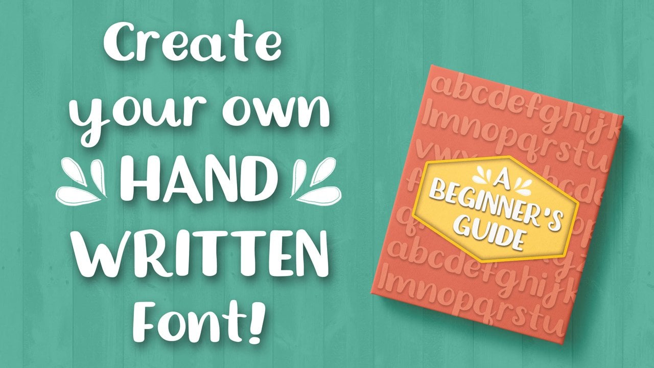
1. Create a Handwritten Font, Digitally!: Hi. My name is Gwenda Graph. I'm a freelance graphic designer from Westminster, Maryland. I just want to welcome you to this class. How to create a handwritten front digitally. So instead of creating a font with pen and paper like we did in my last class in these lessons will be learning how to use digital tools to create our own hand written style fonts. Personally, I'll be demonstrating using illustrators. CS six. It's kind of old school and a welcome tablet that I'm sure is at least 10 years old. So, um, if you don't have illustrator, you can use gimp, which is a free software online. You could use photo shop procreate on iPad. You could even use a photo editor on your smartphone. So, really, the possibilities are really endless. Once we fill out a template with all of our characters for alphabet will be uploading to a website doing some simple edits. And in the end, you'll be downloading file to install on your computer and you have your own handwritten style fun. Can't wait to see your projects on. I can't wait to get started. So here we go. You in the next class
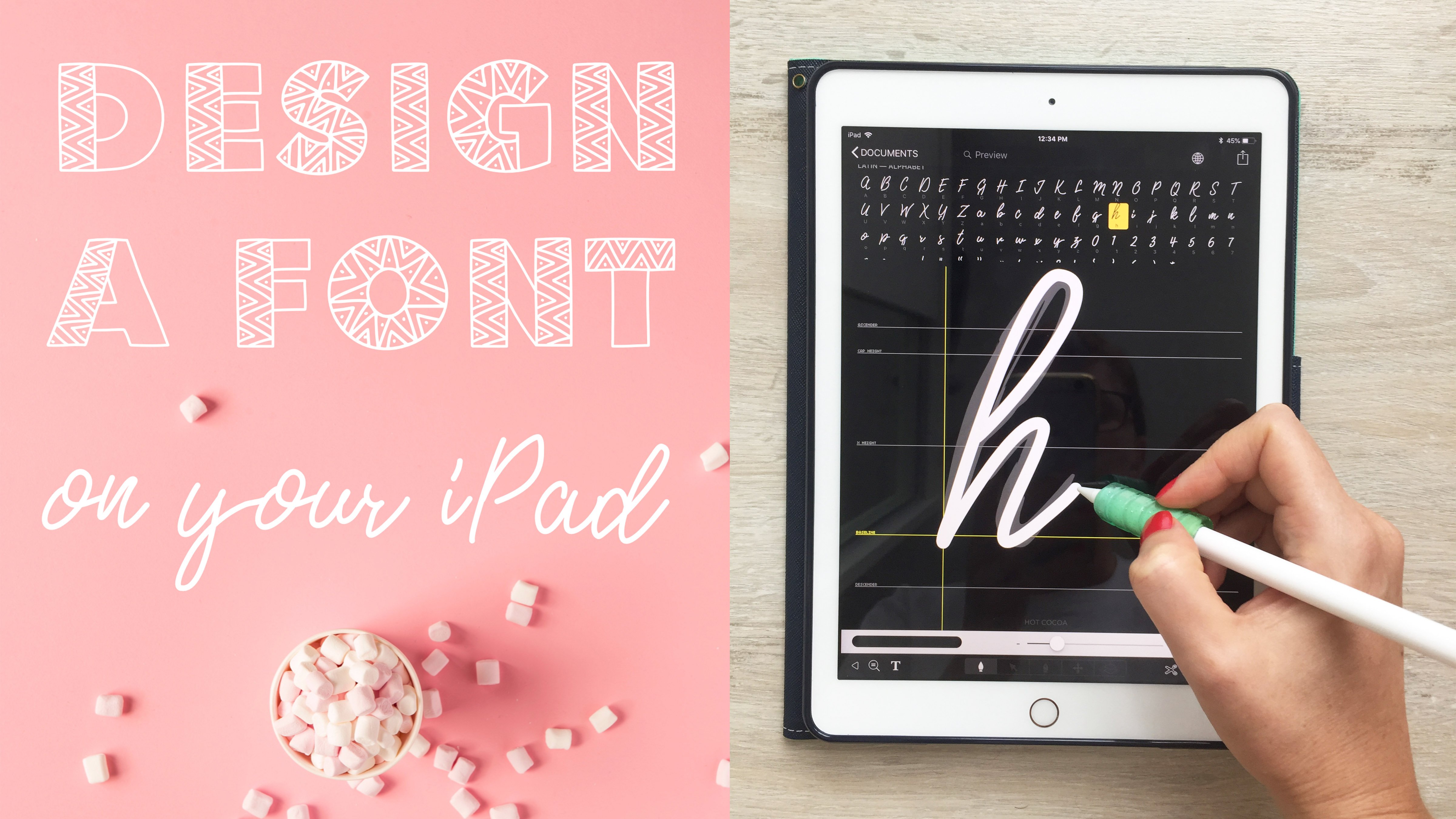
2. Materials: this lesson is all about the materials that you'll need to create your handwritten front digitally, first of all, and most importantly, is a character template that I've created. Using calligrapher dot com will be using the template to fill out all of the characters for your font, your letters, your numbers, several symbols and you can find this template in the projects and resource is section of the class. So if you want to take some time to download it before we begin, that'd be great idea, and then you can follow along as we go Next, you need some sort of photo editor. I'll be demonstrating using Illustrator CS six. But you can also use really any version of illustrator if you have that available to you. Photo Shop works Great Gimp is a free open source software that you can download online, and you could also use per creates on an iPad. Really, anything that allows you to edit a J peg will do the trick. Next, we need a drawing tool of some sort. As I said, I'll be using a welcome tablet with a pen. You might have an apple pencil, some sort of stylists or even your mouths would do the trick. If you're using this on your smartphone, you can open a J peg on your smartphone and just draw on the screen, and that would work fine, too. And finally calligrapher dot com is the last piece of this puzzle. So this is a great resource to use for creating your funds. Um, we'll be uploading our template once we've filled in all of our characters. And then we'll be doing our edits. And this is an excellent resource that I found online for creating fonts. I've been really happy with the interface. It's easy to use an intuitive. There is a pro version that you can upgrade to if you'd like to work on more fronts at the same time. Or if you'd like to add more special characters to your front for this class, the free version will cover everything that we need. So in the next lesson will be talking about what you need to think about before you begin and how to find inspiration for your fund. I'll see in the next lesson
3. Before You Begin: in this lesson will be talking about four things to keep in mind Before you begin, We'll be talking about context, consistency, clarity and creativity. Context is all about how and where will you be using your front? Who is your audience? How would you use this spot? Maybe the style of your front works great for Ah header or a large title, but wouldn't be great. Salaried in paragraph form. Something to think about As you're designing your phone, the next one is creativity. Play with your shapes in your shadows. Try different strokes and styles with your your lines. If you don't know where to start, start with your natural handwriting and then just embellish. There are a lot of ways that you can get creative. Next is consistency. Your line heights your X height, which is the height of the small letter X the size of your font. The whip Whether you sin Sarah for Sarah Stiles on the ends of your funds and even line way , all of these things come together to create a cohesive and consistent look in your front, and you want it to look like the letters belong together. So try to stay consistent. And finally, we have clarity. Is your father legible? That's a huge deal. When you're designing front, you want your characters to be recognizable. Sometimes simplicity is really key in this department. Um, you don't have to make it complicated. As with everything, practice will definitely help improve your letters. And so practice as much as you'd like before. Uploading your final template in the next lesson will be filling out our template and getting it ready to upload. I'll see there.
4. Character Template: Okay, so now the fun part we get to fill in our template, I have my temple it open and illustrator. Right now you can open in whatever program that you're using to edit it. I will be filling out the letters with my welcome tablet, an illustrator if you happen to be using it. I love to use the block brush tool. I changed my pressure, sensitivity and my roundness, and it just allowed me to get some variation in my line weights and on my down strokes. So I'll probably be playing around with that a little bit as we go through this. Also, like to start with the upper case letters about that Feel free to start with the symbols or numbers, but I will be speeding this up and then come back at the end. So I wasn't very careful going through this template. I really was going for just my handwriting and kind of my quick, messy handwriting. So, um, just looking through this quickly, I can tell my g looks a lot smaller than my other letters. So I'm just gonna race that and start over and try to make sure that my baseline is about the same as my other letters, but I kind of like it. It's fun. It's quick, it's casual. That's what I'm going for. All of my lower case letters have about the same height as well. They're gonna be half the size of the upper case. But I'm gonna go up here. I'll finish the numbers, and with that I'll save and we'll be ready. Teoh, upload this to calligrapher dot com, and I'll show you how I make my edits and we'll go on from there in the next lesson.
5. Edit and Upload: All right, So in this lesson, we are on calligrapher dot com. We will be uploading the template that you just build out. And I just want to demonstrate how to do that and how to make some quick edits. And once we've made those edits will be ready to download our font and move on to our class projects. So, um, log in, appear in the upper right corner, create an account if you don't have one yet the first step I've already done for you and have created a template for you to use. You can check this out if you'd like and make different size templates, but these are meant to be printed out and then written on with marker or pencil or pen. Since we're doing this digitally, you don't need to print anything out. So we filled it out digitally, and then now we're gonna be uploading it. So go to my funds and it says you don't have any yet. Um, appear at the top. You can click new thought you could make a name for it. I'm gonna call this my skill share from experience. I know that I like my spacing to be tighter. I'm gonna go to like, 60% and I'm gonna keep my font size the same for now. And save says I have no characters yet. So the next step is to upload my template. I'm gonna choose my file. I'm gonna find my skill share font that I saved. I have automatically clean templates selected and click upload here it ISS So it's found all 75 cliffs that I created. It's showing me a preview. I'm gonna select add characters to your funds and there it ISS I'm going to select build font and this gives me a preview of my characters in paragraph form. It's really simple. Is that so? I'm gonna raise the preview size. You can also select it and say so if you're not happy with a certain character, you can close this and you can change the details so I could change the letter spacing. So if I increase the spacing and the font size, I'm gonna save go to build Funt spilled so that increase the size nicely. But the letters air so spaced out it's hard to tell where a word starts and stops. So gonna go back to editing my font details. I really liked my tighter spacing, but I actually like the larger font size something to try this build that looks much better . I think I could go a little closer even with some of my letters. But I like that. Another way you can edit your fonds is to select a character, Gonna go here to the A. You can select a just baseline, and these arrows will toggle and move your character along the baseline. And they also the plus and minus will help you adjust the size. So if you find a letter that is go, that is just, um, looking smaller than everything else. For instance, my V I am gonna just the baseline because it was floating way too high up there. But my W's okay, because it ends on the baseline. I'm happy with that little drop. My Why? I'm gonna bring down just a titch to so you can go through your characters on. Just make these little changes. It'll help your text flow more smoothly. When you're finished, click save adjustments and it will save all of your edits. Go back to my thought now gonna edit my age just a little bit. I think I have a little too much squiggle in there. I'll click theory, sir. Get rid of those pixels. All right, that's much better. When you're ready, Teoh download, click build fonts, and this will provide you with a TTF file in an O. T. F. File. I usually download them both and just install one of them my computer. So usually you just have to locate the file and right click, and it'll give you options to install on your computer. So once you've done that, you can move on to the final lesson where we're gonna put our new Fonte use and create a project for the class, so I can't wait to tell you about it.
6. Project: he did it. You made it to the end of this class. Thank you so much for your time and attention. I thought it would be really fun for a class project to create an inspirational quote on a beautiful photo Teoh display for the rest of our classmates to see. So pick your favorite quote. I will provide a few down below in the resource is, if you are drawing a blank, I will also include a few, um, images that I've found from unspool ash dot com, which is a free stock photography site for you to use. So, um, have fun, enjoy making funds and hopefully off to you in another class sometimes.
 Gwen DeGroff, Pattern Designer + Hand letterer