Transcripts
1. Promo ok: hi and welcome to CorelDraw. 2018 for beginners scores the course that will teach you how to create your own graphic design materials. In CorelDraw. My name is rather virtue and demographic. DiSanto and trainer has created thousands of graphic design materials over the last 16 years that were part of promotional campaigns or branding gas. It's but I know how it is to be a new user, and open coral drove for the first time. It can be quite intimidating, and that's why I've designed this course for people like you who are just starting out this course want justice to the tools needed to create amazing graphics, but it will also teach you the shortcuts in some efficiency techniques. May CorelDraw fun and fast because it's more fun when you're actually doing something. The course has a lot of practice lectures to test your skills as soon as your role, you can download the exercise files, including victor files, images and more. This course is designed for new graphic designers and start up entrepreneurs. I want to learn the most user friendly graphic editor out there. Thank you so much for your interesting discourse. I hope you're as excited as I am, get this course right now and I'll see you less and want to start learning how to create graphic design in for a draw.
2. 2.1 Getting started: as soon as they open Curdled Girl, you will be prompt with this welcome window from where we can start our journey from here, you can create a new document by clicking on the new document button, create one from a template or even open on an existing document. Let's take them one by one first, when clicking the new document button to create a new document, Window will pop up to set up the properties for the new document like size, color, resolution and more. We'll dive into those later. For now, click on Cancel. Next, you can create a new document from a template that can't curl offers. And let me just say that there are some interesting ones on there. Click on the new from template bottle and from the left side you can select the category from which you want the template to be shown. Note that we're clicking on a template. You have some details down here in the temple detailed section, like the size orientation, number of pages and some more later in this course will also create our own templates, and those will be displayed here in the mind templates section. Okay for now we don't want to open on document for what then played. So click on the X in the top, right corner. Next, you can open a document that you have previously worked on or if someone sent you a CorelDraw file. This is the button you can click on toe Opal. That document. Please note that the versions in coral draw are not compatible. So this means that if someone sends you a CorelDraw files from a newer version than yours, you won't be able to open it. The reverse is accepted, meaning that if you receive a file created in a previous version, you can open it without any problems. Make sure that when you're sending the fast, we're printer. You first asked them What is the coral drove version? They using all the recent document that were previously opening Kordell draw will be displayed here in the recent section. Okay, let's let's talk about the work spaces available in quarrel drop
3. 2.2 Workspaces: worst places can come real handy when working on different types of projects. There are multiple workspaces from metric interest from Let's Explore that First, the light workspace is ideal for new users who are getting started. It features a clean look and feel that, especially designed to encourage exploration in a friendly environment. Next, we have the exists inspire war space. This one is almost identical to the default CorelDraw x six word space. It is best suited for experienced users who are looking for a seamless transition took contemporary yet familiar environment. Many elements of the workspace have been optimized for a more streamlined workflow. The default worst pace has been redesigned to provide a more intuitive placement off tools and controls. This word space is ideal for users who have experience with other vector graphics software , as well as users who are familiar with coral Drop. The touch workspace is optimized for touch enabled devices and ideal for fuel work and sketching. You can complete your test by using touch dialled or a stylus without needing a mouse or keyboard. The illustration workspace is ideal for users who are looking for an intuitive and efficient workflow to create book cover designs, magazine ads, storyboards and other types of illustrations. The page there were space is optimized for users who are focused on the arrangement off graphic and text objects to create competing layouts for business cards, branding materials, product packaging or multi page documents such as brochures and these letters. The Adobe Illustrator workspace has the look and feel off Adobe Illustrator helping Illustrator users to get started quickly with coral drop.
4. 3.1 Touring the interface: Now let's move to the interface. The first thing I want you to do if you have Donald the exercise files is to open this document right here. It's called 3.1. Curing the interface. We can open it from file open or from the welcome screen in the get started section. By clicking on the open document button in the top part of the screen, we can find the menu bar from which you can create new documents. Open existing ones, manage the view off the document from the View menu, apply effects, toe images and many more. One thing you noticed is that some options are grayed out because they don't apply to the object selected here. Foresters. We have selected this same line rectangle as you can see here in the status bar by clicking on the image. Some options become available while others are being read out from window. You can also open the Dockers. We'll talk about those in detail in the next lecture. From the help menu, you can reveal the hints docker, which will give you interesting informations about the things you can do with the selected tools. You can see that by selecting different tools. We have different hints thought that's a really nice and cozy way to learn more about a tool.
5. 3.2 Dockers: doctors are windows from where can impact the position, size and shape often object. Duckers are displayed on the right side of the screen, and they can be expanded or collapsed. The doctor can also be a floating one, but dragging it in the screen like so or it can be docked. You can close a docker by clicking the small X on the tap, and you can add a new one, either by clicking the plus icon or from the menu bar window. Duckers. Don't feel overwhelmed by the number of Tucker's. It won't be necessary for you to explore all off them just because you won't use them. We'll still see that basically will go through these ones right here, managing the position, enlightenment and shape off the objects. So hang in there and let's move forward by diving quite in.
6. 4.1 Setting up the page: I have opened the 4.1 getting started document. So if you have access to the exercise falls, please open this document from file open. Okay, Next, let's talk about the new document window from file. You can access the new document function first of all before clicking the new command. Let's have a quick tour of this menu. The beauty off working in CorelDraw is that there are multiple ways in which can create connection. You can either click the new command. Here. You can use the shortcut control and or from the welcome screen. You can create a new document again against you under right size. The shortcut for a specific fashion. Let me show. We do something interesting about this man use. You can see that some commands have this freak dots at the end. Some don't, but some do. What that means is that after a quick that command, Carell will ask you to give some additional properties for that command before being executed. You can see that new has the three dots because it will ask you about the specifications for the new document. The open command has them as well, because it will ask you what is the document that you want to be opened? The close commands doesn't have the three dots because it will just close the document. So this is from the more dip tips and tricks off CorelDraw. And in many areas you will find this useful ways of working that will only make you fall in love more with CorelDraw. Okay, now let's open the new document window from here. You can give your document a name and use a preset if you like. Next, it can't said the size for the document. If you're in Europe or in countries that use the metric system off measurement, these documents sizes will be very familiar to you, if not your country's leather or tabloid. If you're using the imperial measurement system, okay, let's move on. If you're not satisfied with the document sizes, you can end your own documents size. If you're designing a manual for a restaurant and the menu needs to be squared, this is the area where you insert those dimensions. After that, you can choose the orientation of your document in the number of pages. But this options can also be adjusted after creating the new document. Next is the color mold. Determining the current want for your document is very easy if you're going to print the document. CM white cake is the caramel you would want, because these are the colors in your printer. Cyan, magenta, yellow and black. This right K stands for black, although it's actually referring to something called Key Value but is black if you're going to publish this doc mental web. Although CorelDraw is used the most for printing, you should choose RGB, which stands for red, green and blue, the colors on your display. The resolution is also very easy to set, depending what you intend to do with the document. 300 D. P I. For print and 72 d p i. For Web. D p I stands for dots per inch, so you can either have C M I k with 300 g p I or RGB with 72 d p. I von mixed them. Nothing good will come out. Okay, that's it for now, he's okay to create a new document
7. 4.2 Rulers, grids and guidelines: every document you opening world draw will have set up to rulers that you can use on the top and on the left. On each ruler, you see some measurements by right clicking a ruler and choosing ruler set up. You can adjust some settings like the units to be displayed. If you're working on a flyer, millimeters is a good option. But if you're working on a mash, which is a large banner to be displayed on buildings may be selecting. Meters will be a better option here. Let's close this. If you don't need them, you can hide them from the menu bar view rulers. But for now, let's leave them active. Having agreed displayed is a way off. Working. More precise went aligning two or more shapes, But you also need tohave snap to document greed activated from the option bar. While moving an object, you can see that it snaps to the greed, making the alignment much easier. Let's hide them for the moment by going to the menu bar view, and I'm checking document grid, one of the most helpful function when it comes to aligning objects in coral. Draw is using the guidelines guidelines are very easy to work with and to manage. Let's say that I want to align the title off this page to the bottom off the blue rectangle . All I have to do is to drag a guideline from the top ruler by clicking on it and dragging in. Positioning it right where I want activating snap toe objects and snap to guidelines will help us a lot. So let's do that and try and just in the grid line until it snaps to the bottom of the rectangle. Great. Now select the text and drag it until it snaps with the guidelines. Not a text is aligned with the bottom off the blue rectangle. Later, we'll see another way to do this. But for now, using the guidelines this wilder, you can add multiple guidelines into a document by dragging them from the rulers. If you want a vertical guideline, just drag it from the left world. If you want to delete it, click on it and hit delete on your keyboard. If you want to position a guideline in the specific point, you will need the guideline Ducker. Let's open there from the plus icon and select guidelines first set a position for the guideline and then click on add toe. Add that guy line into the document. No, that zero and zero on the ruler are in the bottom left corner. This means that any calculations world draw will make. They will begin from the bottom left corner before going on to the next lecture. Just to make sure you've understood how to handle the guidelines, try a line in the paragraph text with the top off the red rectangle and on the left side off the title. After that, I'll see you in the next lecture. Good luck.
8. 4.3 Navigating: This is probably one of those things that makes CorelDraw super useful and productive. The ability to work with the multi page document. This means that if you're working on a 12 pages brochure, you can create multiple pages into the same document, so it would be a lot easier for you to arrange the entire layout. You can insert the new page from the menu bar layout, Insert page sido three. That's again. It means that it will ask us to give more details about the new page. Let's see what those are. How many pages to be added, where to place them based on the existing page, And what size should the page be? Click OK and the new page will be created, and you can manage them for the battle left side of the screen. From here, we can navigate left and right to the beginning to the end, or even add a new page in front or behind the one you're already on. It's super easy to work in CorelDraw. Enjoy
9. 4.4 Master Layer and Page Numbering: I know we haven't talked about layer still now, but don't worry if you're familiar with other before a shop and it's usage of layers, try not to comfort the to the layers. Act different. A master layer is just an object that appears on all pages off a document. That's it, but is that let's open the object manager Docker. I have mine open here, but if you don't open it from the menu bar window Dockers Object manager Great, right at the bottom. Off this docker, you see multiple buttons, and the 2nd 1 is called New Master Layer. Old pages. Click it to create a new layer, the master layer under the muscle page group. You don't have to give it the name. Just hit. Enter while on that layer. Let's create a rectangle with the rectangle. It was a corner from your page in, just click and drag to create a nice rectangle. You can also give it the color. Just click on the color from the right side. Now if you navigate the other pages, that re tangle will follow you because it's on a master layer, he said of the rectangle. You can add a logo, some contact information. A graphic element. Basically anything you want. It wasn't too hard, was it? Okay, Now let's talk about page numbering. If you're working on a newspaper or a product catalog or even a large pursue, keeping those pages numbered will help you a lot and your readers to Yes, I'm sure you've already guessed it to add. This feature in CorelDraw is super easy because everything is so intuitive. So go to the menu bar layout, insert page number on all pages, and that's it. From here, you can reposition the number where you want it to be. Change the font, the color, the size and the best thing about it. It's on all pages without you having to do anything else. How can you not love CorelDraw? C Isam.
10. 4.5 Understanding File Formats: before moving forward with our course. It's very important to clearly understand the difference between the two. Types of graphic elements will be juggling with rester and victor shapes. Don't get intimidated by those names were basically just images and shapes. Arrester Element is an image composed from millions of little dots called pixels. The main raster image for months. R. J. Peg Thief, Jeff BMP and PNG. The advantage of using an image in a project is that it offers more transitions between colors and the real life feelings some of the customers were creating a flyer four are looking for. The main disadvantage is that the quality is limited. If you zoom in too much, you can see the pixels that are composing this image. The same things happens when you're trying to enlarge a photo beyond its original size. The pixels will start to be visible, and that's how you get an image that you have also may be called pixelated. Victor shapes are great when working with big files, because in the absolute off shades and pixels, the size for a vector shape is much smaller than the one off on image. The main victor shape four months. Our GPS, SVG. Pdf E. I. And, of course, CDR. With victor shapes, you can zoom as much as you want, and you can enlarge the object as much as you need because it won't have that pixelated feel chance because it doesn't have any pixels. That's why Victor shapes are commonly used to create logos, because a logo needs to be resized often for a business card for a flyer, a poster or a banner. Enlarging the size is no excuse for a logo to look blurry or pixelated later in this course will explore more about Victor shapes, and we're even going to learn how to transform on image into a vector shape. See you in the next lecture.
11. 4.6 Starting with a Template: working with templates can come real handy, especially if you need to create a document with the same properties over and over again, like a business card for all the members of a company or a weekly ad or anything more you can pick off. So first, let's create a new document from file new. Of course, you can also use the keyboard shortcut control and let's create an A four size and click. OK, Do you remember how to add guidelines from our previous lectures? Simply drag from the rulers. Drag four guidelines like that. It doesn't really matter their exact position. It's just for demonstration purposes. In order to save this layout as a template goto file service template. You can see it will save it in a default folder with the Extension City, which stands for CorelDraw template. Give it the name It's safe. Close this document from the tab may clicking on the little X or from file close. Now let's try to open the template that we've just created. You can either choose from the welcome screen or from file new from template on the left side's under my template. You will find the temp. It is we've created selected in click Open. That's it.
12. 5.1 Keyboard Shortcuts: I've always enjoyed working in Quarrel draw because it's a very intuitive program. Most of the time, a tool or a function is doing what you would expect. And so the overall speed off working order draw can increase another way You can increase your speeding. CorelDraw is by using shortcuts again. Most of the shortcuts are very intuitive, but there are some functions that you will use more often than others, so accessing them with shark cuts will come really handy. Two functions that I recommend you to assign shortcuts to our wire frame and enhanced. Both commands are available under the View Menu Bar, where frame allows you to have a blueprint. View off the entire document, discarding colors so you can see how a knob checked is composed. Often times you will need to be doing this because when colors are applied, you can't see The order of the objects is if they are fully covered by each other. So this is a fast way to have a really nice section view off. Your objects are playing the colors back means you have to go back to it to the past view mode. The default view mode for CorelDraw document. Assigning a shortcut to this commence is very easy. Head to tools and then options. Here, under workspace and under customization, click on comments from the top. Select the menu in which the function is scroll to it and on the right side of the window, click on the shortcut key. Step here. You can see the new shortcut Kid dialogue, where you can enter the shortcuts now. I've been using these shortcuts for almost 16 years since I started working in CorelDraw back in 2000 and three for wire frame. I prefer using the W Key because it's easy to remember and is very close to the position of your left hand on the keyboard. Foreign hands. I'm not going to use E, although it's close to W, because he is a very important shortcut when it comes to aligning objects in Quarrel Drop. So the shortcut that I'm going to assign is cute. Click on OK to confirm those changes, and now you can see how easy it is to use those two commands right from the keyboard. So the next time you find yourself using a function more than others, this is the way to assign a shortcut to it again from the menu bar tools, options, workspace, customization and commands. See you in the next lecture.
13. 6.1 The Pick Tool: big toe is one of the main tools in coral draw. If you can call it in that way, it's the tool that you will find yourself working with the most. So having a really good understanding off how'd works is very important. Big tool is the tool that you can use to select one or more objects to transform, to duplicate, to move every size to de select or to delete on object for letting an object Is this easy, as you would expect it to be? And there are two ways in which you can do that. You can add a click on an object if they're part of a bigger object, like the case off this logo, or you can make a selection around multiple objects to select all of them. The default way of selecting multiple object with the Marquis is that the object you want to be selected must be contained by the Marquis. So if I'm selecting only half off the age that won't be selected, only the flower on the left will be. If you've worked in Adobe Illustrator before the vector editing software from Adobe, you may be familiar with the fact that selecting an object only has to be touched by selection not to be all around that object. If you want to have the same working style, and when having a market to select the object that he only touch with the selection, then you must hold all down. So having all down in creating a selection, touching another object will result in selecting that object. It's just another way of working, depending on your style. Both of the working styles are correct. It's only a matter of purposes. Okay, Elizabeth forward. How do you know? On object selected? Well, you can see the eight black squares around it. These are called handles because you can grab them and apply some editing to the object. If you want to resize an object and to maintain is ratio, just drag from the corners and the object will be skilled down or up when dragging. Don't wreck up or down. Drag diagonally in the direction you want. The object of skill If you want to distort an object just direct from the sides off course . You can only do these when you're not working with the logo or a text, because distorting a logo or a text will result in a very bad user experience. So never distort logos or funds only rectangles and ellipses or other shapes that can be distorted without changing the way they're meant to be. Use controls the multiple times to undo those changes. Let's have a look in the options bar to see the options that we have for selected object as well. First, the X and Y fields are referring to the position off the object in the page. This is not an area that should tackle around too much because it's so much easier to just dragon object where you wanted to be off course. You can use this field if you want to position the object at a specific location. Okay, next, these two fields reflect the size off the object, and these can come really handy when you want to resize an object to a specific size. And there will be a lot of times when you will want to do that, but never, ever, ever, ever before clicking on the lock icon closing the luck means that any size you ender in one of those to field will apply proportionally to the object size so it won't be distorted. Click the lock and let's resize the logo toe 100 millimeters, just under 100. And he ended. Confirm. No. You can see that the object has been resized without distorting it. Next, you can enter an angle on which the object to be rotated toe begin. Is this field throat Dayton. Object to a specific angle, like 90 degrees or even 180 degrees. But most of the times you will want rotate manually an object. For now, no handles of rotating an object are visible to make them appear. Having the object selected. Click on the little X in the center to convert those squares into double sided arrows, and now you can click on each of them, throwed it in the direction you want. Enter zero in the options bar to set the rotation back for the object. Another quick. Anything can do while being in this rotating mode is to skew the object sideways, horizontally or vertically. Okay, now I'm just hitting control Z toe. Undo those steps. Okay, so this is how you can resize, rotate or skew on object in Quarrel, drop one less thing. The shortcut for the move tool is a very easy one as well. Being on any tool in CorelDraw by hitting the space bar will take you back. Move toe. But not only that, if you tap the space bar again, it will select the tool that was selected previously. So you can see how actually Space Bar is aware of juggling between the move tool and another tour. Okay, See you in the next lecture.
14. 6.2 Zoom and Hand Tool: There will be a lot of times when you will want to have a closer look toe on object, or even to have a full view off a page or on object. So for that you will want to zoom mean, and after the tool you can use to do that, it's called Zamtel. The shortcut key is easy. There are two ways in which you can use them toe. You can either click in an area. Ankara will zoom in that specific area. Or you can make a selection within the zoom toe around an area that you want to focus your attention on. To zoom out, you can click the tool with the minus in the options bar. But of course, this is not the way that I'm recommending you toe working girl drop because it takes too long to perform such a common action. Actually, for the ways that are recommended to work with, we won't be needing zamtel, so head back to pick Tal. A very easy way to zoom in and out of a document is to use the will on your mouth. Just positioned amounts where you want to zoom and use the will to scroll back and forth is that easy? We also have a different set of shortcuts that you will find very useful in Quarrel. Draw. So let's talk about those. First. F two is a great shortcut to use if you are very passionate about using the keyboard. What FTO does is that it activates the zoo mental temporarily so with the simple active click in a location. And after that you see that the active tool is speak to her again. So this is nice. The next shortcut you can use is shift plus F toe. What this does when you have on object selected. It zooms on that object entirely to have a better look at it. If you feel the need to quickly zoom out, you can use F three, which is the shortcut for zooming out. Therefore, is the shortcut that will feel your screen with all the object Dylan document and shift plus F or is the shortcut you can use to reset the viewing mode off the entire page. So this is a shortcut that you will find very useful most of the times. This is how you can control the zooming in a coral jewel document. There will be a lot of times when you will want to move sideways, up, down, left, right. To do that, you can use the handful with the shortcut key age, and you can just click and drag toe pan into the document. But again, painting is something you will do a lot of times and clicking on the hand toe every time and then going back to pick tal takes too long. So I recommend you to use a mulch or cut for this action. First, head back to the pickle by clicking on the mouse wheel. You can activate a hand tool and pan left right up or down into the document without ever having to actually activate the handle. So this is really clever. Okay, see you in the next lecture.
15. 6.3 Basic Shapes: creating basic shapes in Quarrel. Draw is the foundation off every logo or artwork. There are a couple of tools you can use to create these basic shapes, but for during to the course you will see that we can also combine these shapes to create some new ones. But we'll explore that later. For now, let's talk about the four. Most important was that you will use Inquiry will drop first. The rectangle tool is the tool you use to create rectangles, as the name implies. To create a rectangle, just click and drag diagonally. If you want to create a square, hold down control and drank. The option bar has the same options with discussed earlier and again rotating as queuing works in the same way. Another tool you can use to create basic shapes is the Ellipse stool, which will help you create well. You've guessed it. Ellipses just click and drag to create an ellipse or hold down control and drag to create a circle. A very interesting tool is the polygon tool that will help you create polygons with different number of sites. You can adjust the number of size from the option bar and you can create from a triangle toe, a Pentagon hexagon and so on. The next tool is the startle, which allows you to create stars with different number of points and with different sharpness is play around with those for a few minutes. Try adjusting the size, the angle of rotation and the specific actions until you feel you're in control.
16. 6.4 Connector Lines: flow charts are great way to create processes. Flow charts help you understand the steps to accomplish a procedure or to develop a product . In this example, we have a PLO chart that determines the action to take when it's raining outside. After great in the States. For a flow chart, you can use the connector lines to create relations between the steps. The corrector lines are in the toolbox, and the most used ones are straight line connector and right angle connector. Let's see how those work. When selecting the tool, you can see some red points from which you can drag those connector lines. Let's start with the beginning, greater relation between start and look outside, click and drag from one point to the other. You can see it snaps to that point. Now you can add a narrow to indicate the direction off the process. Next, after looking outside, were faced with a question. Is it raining? If it's not, drag a line from right to left toe at an answer on that line, just double click the line and enter the answer. No, if it's not raining, then we drag a right angle connector line to finish finishing the flow. And that's how easy these inquiry all drawer to create flow charts for you to exercise. Connect the remaining processes to complete the flow chart. You can use the picture from the next page to drag the lines correctly. Okay, See you in the next lecture.
17. 6.5 Outlines and corner control (part1): in my own personal opinion and based on my experience off 16 years of working in Quarrel draw outlines in CorelDraw have a lot of ups and downs when it comes to being practical, mainly because the outline of an object is not viewed as an object off his own, but only attached to a victor shape. Follow along with me, and I promise I will make everything super clear for you. Let's inspect this object right here a rectangle by looking in the status bar, you can see we have some properties listed here. First of all, we considered it has no feel color, meaning that is transparent little right. We can see their properties for the outline attached to this object. We can see it's black, and it has on eight points with the option is displayed in the options bar are the same for an ordinary rectangle because this is just a rectangle in the end, Okay, going back to the outline properties to be able to apply editing to the outline, we must open the outline pen dialogue. To do that, we can either hit F 12 which is the keyboard shortcut, or we can double click the properties in the bottom right corner. Okay, great. Let's explore the most use properties available here. First, we can choose a color for the outline countries the color picker and click on a color to selected. You can adjust the sliders to get the color. You can use the color viewer or choose from the color palettes. Here you can choose from multiple color palettes, but the one that is used the most is the default C M y que color palette off the choosing of color for the outline we can adjust. The with non means that it has no outline. Headline is the with often actual hair so very thin, and then you have get you get different weights. Depending on the result that you want to achieve, I always recommend setting the waiting points. Is the default unit off measure for an outline? Next, we have the style for the outline. It can be a straight line, a dish line line composed by points and different options for the distance between the points. If you chose a dash line here, you have three options for the corners of the object. It can be set with that fault line dashes or fixed bashes. If you choose a straight line for the outline style here, you can choose the corners off that online. It can be metered, round or beveled. The other options in this dialog box don't apply to the selected object, so hit OK or cancel to confirm or ignore any changes you've made. Next, you can see here three different squares with different colors in different sizes. The only problem is that all three have the same size. How is that possible? First of all, it's all agreed that this tree had the same size by clicking on each of them and checking the options bar, you can see that it has the same size. The difference is that the outline is positioning two ways. Make sure you have the blue rectangle selected and hit F 12 to open the outline Pen dialogue. Here, you can see that the position for the outline is set for the outside of the shape, meaning that the entire with off the other side is outside the square. This way, it gives the impression that is bigger than the others. Okay, close this dialogue and select the yellow square hit after of again toe open the Outland Pen dialogue in here, you can see that the position for the outline is said to centers. This means that if the other has a 12 point with six points are inside the square and six points are outside the square, giving the false impression that this square is smaller than you want before. Okay, close this dialogue also and select the Red Square f dwells again and here you can see that all line is said to be shown inside the square, meaning that the entire 12 points with is displayed inside the square again giving the false impression that the square is smaller than the other two. So maybe you're thinking now that what is displayed is more important than the actual size of the squares. If you're thinking this would be very wrong and let me show you, why is that? If you want those three rectangles to be cut out on a cutter plotter toe brand a T shirt or to cut out the sticker, the machine will follow only the vector shapes, not how it actually looks on the screen. Do you want to see how the cutter plotters sees your shapes from the View menu bar Click on wire frame. Here, you can see that the squares indeed have the same size in the bladder with cut right on those lines. You have to understand that the outline style the with or the color is just in effect. Attitudes shape. Also, the rectangle above is just a rectangle, not a dashed line rectangle. So this is why having those shortcuts available for wire from any enhanced can really help you a lot and establishing what your design is really made up off. Okay, go back to the hands view mode. I know we took me maybe a bit too long to explain the outlines, but I really wanted you to understand that the actual sizes often object, and the properties viewed from a wire frame view are much more important than an effect. Apply tone Object is no fairy tale with rain bows and being horses flying around. In Quarrel Drel, you must confirm every object with actual stats and figures. Leave the rainbows for photo shop. Okay, we have just a few more things to explain about outlines, so we'll do that in our next lecture.
18. 6.6 Outlines and corner control (part2): Welcome back. We have just a couple more things to go through with the outlines, so hang in there. Next. We have here just a simple line on object that is not closed, that has a beginning and an end in the status bar. You can see the options for this object no feel color because it has nothing to be filled. Button online with a 0.5 points with hit of 12 toe open outline. Pen dialogue dashes in position are not available because we have a straight line style and there is no closed object to set the position for the outline. Line caps refer to the way a curve has. It ends based on the with off the line. It can have a square cap around cap or an extended square cap, not the options that you're going to tackle with a lot to occur. If we could also add arrows. If you're thinking off pointing something in your layout, you can have two arrows each for every end, and you have multiple styles from which you can choose. Note that the way this arrows are displayed have a lot to do with the with off the line, close the dollar box and select the text going back to the status bar. You can see that our text has a black feel color and no outline. If you want to quickly add another land on object, you can right click a color from the color palette if it's barely visible. That is because the with is very small. You can increase the with from the options bar. Make it are three points to have a good look at it, and you can right click again another color to change it. Of course, the with remains the same. Assuming a little on the tends to have a closer look, you can use the wheel on your mouse to scroll. Go back to the oil lamp and dialogue to explore the final two options we have there behind fuel and scaled with objects first behind fuel does exactly what it says, meaning that if you check the box, the entire with off the outline will be displayed behind the object. Let's test that, although it seems that the widow of the older has changed, check the Options Bar to see that it's exactly the same three points so again it's only an effect. Apply to the object viewed only in the enhanced view mode. In the wear friend mode, you can see the outline is not visible because it's not an object on Lee, an effect attached to a vector shape. Okay, go back to the old lamp and dialogue and uncheck this option. Skillet object is a very useful option when you're doing with logos or text, because these steps off objects need to be skilled a lot. This means that when scaling the overall look off, the object will remain the same, and the aligns with will self adjust with the size of the object. Let's test that first, make sure the lock ratio lock is locked. Now enter with for the text, let's say 30 millimeters. You can see how the look off the object change being covered by the outline color. This is not how I want an object with an outline to be skilled. Okay, it controls the toe. Under that action heavy object selected open online pen Diallo with F 12 and this time check the skill with object check box. Now resize the object again toe with off 30 millimeters and now it lose how it should be, although this means that the with off the alkaline has reduced close to one point. The last thing you need to understand that about outlines is that you can very easily get rid of them by right clicking on the X in the color palette. This way, you can have full control on what's being viewed, but also on what's being printed or cut out on a platter. Okay, see you in the next lecture.
19. 6.7 Drop Shadow: drop shadow does exactly what the name says. It applies a shadow on object having an object selected, selected drop shadow tool In the options bar, you have several presets that you can trust from, or you can simply click and drag from the center of the object. After the shadow has been ended, you can adjust it from the options bar. First, you can adjust the opacity either from this interactive field or by dragging the slider on the screen again from the options bar you can adjust. The father of the Shadow 15 is a great measure for the federal in most cases, although the shadow is most of the times black, you can even change its color from the options bar. Or if you just don't want the shadow, apply to an object. You can clear it again from the options more. Sometimes shadows are fun, but sometimes meaning most of the times they're not. They don't really have a seat in the less is more trend that the design industry has been going through for some time now, so use them. But don't make them super obvious or Vario pack, because the three D effects apply to a two dimensional object are way past their time
20. 6.8 Contour: contour is not the kind of tool that you will use very often in Quarrel Draw, but is the tool that will give you some simple and smart solutions to replace an outline toe, on object or to a text are not like dedicated, reviewed by any printer or any Qatar plotter. Let's explore that together. Having an object selected, Select the Contour tool from the toolbox. If you can see it, this means that it's behind drop shadow toe. Hold on. Let's click for half a second to reveal the other tools. Stack there from the options bar. You first have the option to say the direction for the contour he can be to center to inside or said to outside. After that, you can adjust the number of steps, so contour make sure it's said to one. After that, you can send the offset, which refers to the distance between the contours applied to an object. Set it toe to millimeters From the options bar. You can set the outline color or just right click on the X to delete it or to the color for the contour. It looks very much like an outline, but the difference between this and a natural outline is that going toe wire frame, you can see that indeed, there are two objects, and so the cutter plotter will know exactly what to cut. You can also use this method on the text and increasing the offset. You get a nice bounding object around it. Clearing the contour is also an option available in the options bar.
21. 6.9 Blend: blending to vector shapes and quarrel drawer can give you the ah ha moment or the wow feeling. But try not to be overexcited because although it looks nice in the real world off graphic design and advertising, there wouldn't be a lot of situations where you would really need this. Let's explore death having to objects created in different shapes and colors. Select the blend tool from the toolbox and just click and drag from one object to the other toe. Blend those two together. CMS with other interactive tools. The options bar is very rich when it comes to exploring different fields of the effect you can't said. The number of steps between the objects and even an angle at which to rotate the blended objects. But really now, how many times when creating a business cards or a flyer for your next promotional campaign ? You see yourself using this experiment with a tool, my blending. The other three shapes
22. 6.10 Distort: the stores can give you a lot of fun when exploring your creativity, especially when creating a logo or a graphical element for your layout. This sort has three most to work with push and pull distortion, zipper distortion and twister distortion, and each of these moments have different options to interact with. Let's briefly explore these boats and then leave the exploration with different options to you. First, the push and pull distortion distorts the objects from the edges. The amplitude adjust inflation or deflation off the object, and it can have positive or negative values. Next, the zipper distortion applies assault with effect to the edges of the object and has the amplitude and the frequency. Options for adding diversity also explored the rest of the options at the top here to see how it can affect the object, the less one the twister distortion rotates the object to apply a swirl effect. I hope that by now we are able to see some shapes that you can use your next designs or logo's later in. This course will also see that not only we can use these shapes as they are, but we can also combine them to create more incredible shapes. As part of your layout, we are only beginning to discover the true power off CorelDraw. And I can promise you that by the end of this course, you will find yourself having a new best friend. For the rest of the graphic design adventure. CorelDraw will continue to amaze you lecture by lecture.
23. 6.11 Envelope: envelope changes the shape of an object by applying and dragging notes straight. Single arc and double art are the three ways in which you can modify the shape of an object by having control of the notes and in the same time create some simple and practical objects to be used in your logo's or graphic elements. Try experimenting with this tree shapes to see how their distorted based on the number off notes set to each one.
24. 6.12 Extrude: the extra toe applies three D effects for an object to create the illusion off death as a drop shadow tool and the blend toe you won't find many situations where they struggle to will be the long awaited tool for your layout. Maybe because applying a three D effect toe a two dimensional object is never a good idea and suggesting that an object is three D when actually it's not, is close to early 2000 or late nineties, when those kind of effects would impress someone. Remember the Star Wars theme? But when you think about it, do you want to impress with your flair design or to make it easy to read and take action? Because never a three D view off a text would be easily to read in a two dimensional type. So again, keep things simple, clean and easy to understand. The less effort your audience makes to understand your offer, the higher the chances to take action
25. 6.13 Transparency: the transparency tool partially reveals image areas underneath the object. Having an object selected you can select from the options bar. What kind of transparency to be added to the object. There are five types of transparency, but you will always find yourself working on Lee with to the uniformed transparency and the founding transparency. Having an object selected and applying the uniformed transparency allows for the entire object Toby less or pack. And so, being able to see through that object from the options bar, you can adjust the level transparency from 0 to 100. Higher values make the color more transparent and lower. Values made the color more or back the found and transparency applies a Grady int off firing off Cassity from the Options bar, you can again adjust the level of transparency and the angle. Note. The transparency is considered an effect in CorelDraw as you never be sent to. Printer as an effect later in the course will have a local how to prepare a document for printing, also called DTP, which stands for the stop publishing. So the steps to take in order to make sure that watches you on screen will also be printed . Removing that transparency is done through the first icon in the options bar
26. 6.14 Eyedropper Tool: the eyedropper do is very interesting and helpful tool, allowing you to do much more than what you're already used to form. A regular eyedropper. You can find the eyedropper to in almost every design softer. I think it's even in paint. If you can call it a design software, let's explore the Amazing Eyedropper inquiry Draw first. The color eyedropper allows you to sample color and apply to other objects. Here you can see we have a square with a yellow feel and the red outline. After clicking with the eyedropper on the yellow feel, the cursor changes to a bucket, allowing you to apply the color within an object. Click on the circle to the right to apply a yellow field. If you click on the outline, you will add that color to the outline off. The object is that simple. Now the real fun begins with the attributes Eyedropper. You can copy attributes such as feel outlines, size and effects to apply them to other objects. Having the out and they feel property selected, click on an object to copy those attributes and click on another object to add those two it in volatile. So much fun Let's explore more from the options bar. Also check size from the transformation drop down menu. Now click an object toe, copy the attributes and click on another toe. Make it the same size and with the same field and our land properties and last, Let's test with an effect of light wit from the effects. Drop down menu check drop shadow, Click on the object with a drop shadow and then click on another object to make it the same size with the same feeling the online and also with the same drop shadow applied. What a great too okay seemed the next section.
27. 7.1 Color palettes: color palettes are a great way to manage the colors in your document. There are a few pallets that you can use within a document, and every palate is set for a specific type of document. There are four types of color palettes you can assign into a document. RGB seem like a Pantone in the document palette. First, let's treat a new document file new or the keyboard shortcut control and said the size for the document to be a for the primary. Cattermole will be seeing y que and the resolution is said to 300 kid Okay. Before talking about adding color palettes in coral draw, we need to make sure that you understand why we need more people. Color palettes. There are two main color Moz RGB and same way K R two B stands for red, green and blue and is the color mode used by display. This also means that is the color mode we find online. This is why it's also called the Web color mode. Every color from RGB can gain a value between zero and 256 seem like a is the current mode I use for printing if you're creating a business card, a flyer, a brochure, opposer and anything that is designed for printing. You will create and work within the document seem like a stands for science magenta, yellow and black. For more information about the current modes, please refer to the setting up the page lecture from this course. Pantone is a color mode used only in pre press in high volume printing, and is used when you want to make sure that the color you choose is the color that would be printed. And perhaps more important, to make sure that everywhere in the world in New York land along you had you get the same color. Is that even possible? It's possible because the color you choose from your logo or for your design is not chosen from a display, but from a PMS Formula guide, which means Pantone matching system formula guide, a sample brochure with colors to choose from. And that means that when you choose a color, the print house one composed that color from multiple colors as it happens with C M y que, but will order the color from Pantone. So it's a special color. It's very tempting to use basically everywhere Pantone, but no did. By using just one Pantone color in your layout, the printing coast will increase with about 30% so make sure that you check with your client before examples of Pantone use are almost everywhere around us. I'm pretty sure you've heard about the Coca Cola red or they're Ferrari Red, where they called in this way. We're not just a more intense red or darker red because these colors are unique. These colors are from a Pantone matching system and in branding. Consistency is everything. This why Pantone colors are also called brand colors because the main used off them is in logos. And finally, the document palette is a color palette created as you work in the document. Let's see how you can add multiple color palette. Sink world wrong on the right side. You see, we have the CME Winky ballot created with the document 12 an RGB color palette head after the window menu down to color palettes and choose the RGB palette. You can see it's added next to the same wakey one to expand it. Just click the double errors icon at the bottom. Of course, you're working in a document that you're about to print. RGB has no used, so let's close that click on the Black Arrow ballot. Close toe upon a Pantone palette, head back again, toe window color palettes and choose Pantone solid coated. You can see a white dot in the bottom left, an indication that this is a special color and it needs to be applied after being purchased from Pantone. Also, you can spend it to close it like the black arrow palette and close. Let's create some shapes and fill them randomly with some colors When using cars in a document. All those colors are added at the bottom of the screen in what's called a document palette to can access them quickly. If you have to save this color palette so we can use it in another document, just click the Black Arrow palette and save us for now. I'm not going to do that, but instead I'm going to show you something very close to amazing. I'm going to show you how to create a color palette from an existing image. First, let's delete all these shapes. Let me show you a trick. Double click the pick Tal to select all the elements on a page and hit. Deal it. That's it. OK, now let's open an image in CorelDraw file, and we're not going to use open because open only worth for CorelDraw documents. Instead, we're going to import an image so import and choose an image, then click on import. To add that imager document, just click and drag to set it to the size you want. Now imagine that this is an image sent to you by your client, and you want to make sure that all the other call that you'll be using in our layout will match that precious image. So you will need to create the color palette based on the colors in the image. Wouldn't that be great if it were possible? Well, I have some great news for you. It's possible to do that. Click the black arrow, then palate and then reset ballot. He's asking me if I want the colors from the document palette to be removed. Yes, please. And now I can choose how many colors to be added to the palate based on the elements that it finds in a document I can choose a number from one and up to 256. So let's truth 50 and hit. OK, well, how about that? Isn't this just amazing to have your own custom color palette created from your own image, see in the next lecture?
28. 8.1 Weld, Trim and Intersect: we have mentioned previously that not only we can adjust the way our regular shapes look like through the options bar, but we can also combine them to obtain more amazing shapes. This type of combining victor shapes is gained with three main commands. Weld dream and intersect. Let's explore that. First, let's create a new document from the menu Bar New and set it to be in a four. Great. Now we need at least two shapes to test this command. So first, create an ellipse with the Aleph stool, then with the rectangle tool Creator rectangle and make sure their positions are close to mine. Select the pickle and then select both off the shapes. In the options bar, you will see some bottles that will allow us to combine these two shapes. The 1st 3 are the most important. The others are just a combination between them. First, the welcome and wealth combines objects into a single object with the single field and outline. So you see how we now get a new shape, one that it would have been very difficult to create without the welcome and use Control Z To undo the previous step, the next comment is stream. Dream cuts out a portion often object by using the shape off another object. Just drag the re tangle in the new trim shape will be visible. His controls the multiple times to undo the last steps, and the less common here is intersect, which creates an object from the area where two or more objects overlap. Just like that, the street types of shaping multiple objects are essential when it comes to editing curves and vector shapes in CorelDraw. And are the foundation off creating a logo or any type of graphical element so well explored more with the next exercise?
29. 8.1 Weld, Trim and Intersect Exercices: for this exercise, you'll need to open this document. As you can see in the first half of the page, we have some shapes created by combining two regular shapes. Sometimes they're used to rectangles, sometimes to ellipses and in some cases, a rectangle and then ellipse. All these shapes are created using only the well command. So you will need to replicate this shapes in the second half of the page, using only the welcome, and I create the first and I lived the rest of you. First we create a rectangle, then another one. We pushing them as they are in the first object, select them both and use the welcome and and that's it. It's that simple. Now continue with the rest. After creating these head to the second page, where you will find more shapes to replicate, this time with the trim command and, on the first page, more shapes to replicate with the Intersect. Comment. Good luck
30. 8.1 Weld, Trim and Intersect Exercises Solution: way. Yeah, way, - way .
31. 8.3 Grouping and Ungrouping: grouping objects in Quarrel. Draw is very easy, and on grouping is even easier. First, what do we need to group objects? You will encounter many situations when an object is composed for multiple objects, it can be a logo character or any form of graphic element. Let's studied is happy Bet right here. Creating a selection around the entire shape will reveal us in the status bar that we actually have 39 objects that are composing this object, having to move or skill the object. Multiple times would be difficult if we would need to select all the objects every time. So we will be a lot easier to have them all group together. Having the object selected in the options bar. You can see that the group objects bottle is active. Click it to create a group from those objects or use the keyboard Shortcut Control. G. Get use with this keyboard. Shortcut is it's very common along all graphic editors having cold objects grouped. No, it's very easy to just click anywhere in the drawing to select them and to move or skill them toe on group, you can use the angry bottom for the options bar or the keyboard shortcut control. You
32. 8.4 Aligning: aligning objects in Quarrel Draw is one of those things that makes grilled draw a super smart and helpful software because you will need to align everything from objects and texts to bit maps and guides. Because when everything is a line, it's very easy for the eyes to follow a layout, making it more easy to indirect with. We also have some very nice keyboard shortcuts. But for now, let's explore the doctor that allows us to align multiple objects from the window menu, down toe Dockers and then a line and distribute. Now the first thing and one of the most important things before aligning is to set the base object, the object that stands still and all the other objects move to align with this object by selecting them with shift and click. The last object that you click on will be the base object in the docker. We have the six options to align the objects left, and it will align left to the base object. You can see a thin box around one object. This is how coral lets me know which is the base object. This is a future available only in this version of CorelDraw 2018 a line center horizontally. A line right. Stop center vertically bottom. Use multiple times Control Z to undo these changes because these are great, but I want you to get used using the keyboard shortcuts, which are a lot more fun and a lot faster. So again, the last object selected is the base object. And if you want to align to the left off that object, just hit El on the keyboard to a line to the right. Use our for the top usti and for the bottom, use be to center them horizontally you see and vertically. E. It's that easy to align objects in CorelDraw. Distributing them is also very easy. What this trip, it means, is that the space between the shapes to be the same, the order off selecting them is not important here, so you can use the selection around the objects here in the line and distribute docker. There are eight buttons that will help you have the same space between the objects, but all you need are these two bottles here. If the objects are positioned horizontally, you will use the first bottom if not like our case here we can use the second bottom. What this does is that it places equal space between the selected objects and that's it. Let's get used with these with the next exercise.
33. 8.5 Align Exercises: For this first exercise, you will need to rearrange the elements for the Condors. Logo is there in the top. Play out the objects composing the logo are the ones just beneath. So use the lining shortcuts to recreate the local. In the second exercise, you will again need to recreate the logo for the building block tech. Here you must align the text to the left, make sure it's distributed, align the three bars to the bottom off themselves and to the bottom of the tech Tex and then this. It didn't have equal space between them. Good luck.
34. 8.51 Align Exercises Solution:
35. 8.6 Setting the order: learning how to set the order for the objects in a coral jewel document is essential for your project because there will be a lot of times when you won't create the shapes used in the order that you use them. So you will need to establish which shape is above which, in this example we have multiple shapes placed one on top of the other. For this left wing, you can see we have two shapes in two different shades of brown. Let's test the order on one of the shapes. Click on the darker want to selected right click and order. Here We have multiple options to say the order for our shape. We're not going to go through all of these options because the only four in the middle will be the one that you will use the most. So toe front off layer sets the shape in front off all the objects in the page. The keyboard shortcut is very useful in the highly encourage you to use it. It's shift page up. The next one is to back off layer, and it sets the shape behind all off the objects in the page with the keyboard shortcut shift page down. Next forward. One does exactly what it says. It moves the shape in front of just one shape and then another in another. And so on the keyboard shortcut is control page up, and the last one is back one meaning that it will send the shape back one step at a time with the keyboard shortcut control age down. So now you know how to say the order for multiple objects in a world or a document, and we're going to make it stick with our next exercise.
36. 8.7 Setting the order Exercise: let's get familiar with setting the order for these objects. In this exercise, you will need to rearrange the elements on the left to be similar with the ones on the right. You will get extra points if you also match the colors with the color picker just giving no points, just more practice.
37. 8.71 Setting the order Exercise Solution:
38. 9.1 Understanding font types: type is very important in CorelDraw when it comes to creating, well, anything. Although a picture is worth 1000 words, most of the times is a good idea to also add some words to your design, so your targeted audience will get the idea faster before getting into the phone types. We must understand that type is a vector shape, just like a rectangle order May lips a star or a polygon. A type can be skilled multiple times without the loss of quality, as it should be because it's you've already used to in. After inserting a text in your text editor, you need to be able to edit it to change its fund, its size or its color and all of that without affecting its quality. There are two main types of funds serif and sans serif. Sarah Phones are basically funds that have this sharp ending and are the first type of phones ever created, used in the 18th century progresses. The most common seri phones are Latino Baskerville Castle, own Badani, Bookman, old Style Rockwell, Georgia Century Kerem won't cool gear lucida or Times New Roman. After a while, Advertising said new standards in displaying ads, and so were created funds without service. Also called sans serif, Sansa ends in French meaning without the most common sensory phones are Helvetica. Verdana a Vanguard Futura Aerial, Franklin Gothic Guilt Sands Universe, Optima Foot figure, Myriad Pro News. Got IQ or Lucy? The sense When it comes to spacing texts, there are two main ways in which can do that. Leading or tracking or both, having a text selected, head over to the shape tool or use the keyboard shortcut. If then dragging for in the bottom left corner up or town, it can set the leading for the text, basically the space between the rows. It's called leading because in the days off hands typesetting, it referred to the thin strips off lead that were inserted into the forms to create the vertical distance between the lines of type drinking from the bottom right corner, you can see the tracking for the type, referring to the distance between the letters. If you hold shift down and drag, you can set the distance between the words off text. Let us spacing should not be confused with turning letter. Spacing refers to a uniform adjustment to the spacing of a word or black off text affecting its density and texture. Turning is a spacing adjustment off one or more specific pairs off characters that, because of the relationship of their respective shapes, would appear to be badly spaced if left unadjusted. One example. My Beer Capital V next to a capital A, which need to be brought closer together for a better understanding off how the type evolved over the years. Head over to YouTube and search for the history of typography. It's a short, fun and very engaging video using stop motion animation that will carry you around the evolution of different phone types. Another fun video that I encouraged watches the power off typography by mere Cinelli uninspiring that talk. In our next lecture, we learn how to download and install fonts.
39. 9.2 Installing fonts: There are a couple of websites from American download some free phones for you to use your commercial artwork. One of the best is different. That come different is great because, first of all, you have different categories from me Chicken trees of font. So let's say I'm looking for a fund that looks like Henrietta. So I jumped to the head written category, and here you can see we have a bunch of fonts to choose from and about 255 pages to go through. That's a lot. Not only that, you see a preview of death phoned, but you can also insert your own text and see how it's being displayed before actually downloading the fund. After finding the person fund just hits, download and choose a location for the phone to download, it can be anywhere on your desktop in your project folder. It doesn't matter. After downloading distracted our hive and here against the phone downloaded, all you have to do is just right. Click on the phone and hit Install. That's it. Now let's go back to coral draw, and you can see that the phone was this told correctly. Next we'll explore one off the greatest tool kit a designer can have in his backpack
40. 9.4 Types of text: inquiry will draw. There are two types of text artistic text and paragraph text. Artistic test is mainly used for titles, and small descriptions were product or service where you won't need a lot of alignment. The difference between an artistic and paragraph text is made by the method of inserting into the document to a certain artistic text. Grabbed the type tool or use the keyboard for cut F eight and just click anywhere in the document. Now we serve some random text. A plane transformations required the text to be highlighted, so hit control A. To select it or simply drag with the timeto from the property bar, you have the option to change its funds, its size and the default editing options like bold italic or underline. If you want, you can also distort the text or apply shadow. Changing the color is as easy as left licking on a color. The paragraph text is used for main blocks off text like the body often article Ah, larger description of a product or service or anywhere you would need to make precise alignment with the text. To insert a paragraph text just click and drag to create them bounding box that will contain or text. Do you serve some random texts just right? Click inside and choose Insert placeholder texts, but that will do will add some Lauren Ipsum tax. In the midst room is a group off text that people commonly used as a filler text or dummy text. It's basically a bunch of text in Layton that people used to show what a design layout will look like when the proper text has been inserted with a paragraph selected were able to apply multiple editing, like adding bullets, a drop cap, which basically enlarges the first letter of a paragraph or even divide the text into multiple columns. See you in our next lecture, where you will create your first business card in CorelDraw.
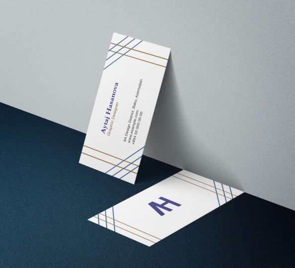
41. 9.5 Business cards Exercise: and here is the moment that I know you have been waiting for. It's time to put all of their knowledge into practice and transform it into available skills. In this exercise, you will need to create three business cars, the ones on the right for start a standard size for a move. European business card is 90 by 50 million meters, so you can just create a rectangle or use the one that I have prepared for you already. You can see I'm also giving you some elements to start with two logos and the QR code you are. It's short for quick response, and he's used to quickly access a webpage. After scanning the code with an app on your smartphone, Here's a hint. I have a surprise for you if you take out your phone and scan the code, go ahead, paused his lecture and scan the code. Now. All right, let's go into new. All I want you to do in this exercise is to recreate these business cards. If you want, you can insert your credentials, but I don't want to create another design. Follow the designs right here because these are meant to practice with the stuff we've talked about in our previous lectures. One final device before starting to work on this. Have patients with your design Don't rush into it. Try to imagine how the shapes are made and you will be on your way to some great designs. What I can promise you is that you should have no problem creating these three designs based on what I've learned from the previous lectures. So turn off your phone, close your Facebook tap, take a deep breath and dive right in. Your CorelDraw skills are starting to take shape.
42. 9.51 Business cards Exercise Solution:
43. 10.1 Importing bitmaps: Most of the promotional materials also have images, incorporated images, off products, images for creating an interesting background or even logos, although it's recommended for logos to be in vector for months. But sometimes you only have them in an image format, and if the size is pretty big, you can use them. We've already seen this in one of our previous lectures, but now we'll make it official. So at an image into your CorelDraw document, you goto file. And again, we're not going to open the image because only CorelDraw documents can be opened part. We're going to import it. So import and select this free images. In CorelDraw. You can add the images in three ways. You can either click and drag to position the image where you want it and that the size you want it. You can click anywhere, and it will import the image at the original size from the area that you clicked on. Or you can just hit enter, and it will import the image at the original size in the centre off the page. In our next lecture, we'll see how we can resize and cut some of the areas in an image
44. 10.2 Cropping and resizing images: there will be only a few situations where the image imported into a document is right at the size you want. Most of the times you will need to resize the image, reposition it and even crop it. Having an image selected just like Victor shape, it can drag the corners to scale it. If you're scaling the image up, trying not to go over 150% or your salto have some quality issues. Off course dragging from the size will distort the image, something that we should never do if you're looking to have professional artwork, if you're planning to have an image at the specific size from the property bar, you can enter size. But always make sure that the lock is closed to be able to skill the image proportionately . The moving part of the image is something that you normally do in the before the shop or coral photo paint, but CorelDraw can help you with that. Also, there are two ways in which you can crop an image first. By using the crop, it'll just drag around the image on area that you want to keep and hit. Enter CorelDraw will erase the pixels that were not in the selection. This is one way to do with Let's hit Control Z. To undo another way is to use the shape tour with the keyboard shortcut F, then with the shape tool, drag a selection around two corners. Often image and we're holding shift down, dragged the two corners to the right toe, cut that part of the image, and that's how you cropped images. Inquiry will drop. It's almost time to say goodbye, but I'll see you in the next lecture with some final thoughts.
45. 11.1 Free Hand: Okay, now we're all set that explored the drawing tools available in Quarrel Drop. There are a few, but the most important, and the ones that you're going to feel the need to work with are the 1st 3 free handle line tool and the busier toe. Let's take them one at a time. Freehand tool can quickly be selected by using the keyboard. Forgot. F five Freehand will help you draw curves and straight line segments. By selecting the tool, we can see that the property bar has some options displayed, but nothing too fancy to draw a simple curve. Just hold your left click on the mouse and dragging a different area just like that. After releasing the most bottle, we get a curve with multiple points applied in Quarrel Draw. Unlike other graphic design software's, these points are called nonce. The act, just like any other points of probably interacted with. But these are called knots, and that's how we're going to refer to them further on. Let's explore the property bar here We have some simple options we can said the with off the outline. It's currently set 2.5 points, so let's try something thicker, like four points. Next, we can set the line style. We have multiple stars here, so choose the one best suited for your needs. Also, we can apply arrows to both ends of the curve. Next, we have this moving option because it's a free movement. All these options allows you to smooth out the line or to make it more precise. Let's test so this most zero and draw a curve like mine. You can see now we have a lot of notes applied, meaning the curve is not very smooth. There won't be a lot of situations when you would want to have a line like that. So let's does this moving at 100. There you can see we have a couple of notes and the line is very small. Okay, now let's delete the lines was created. Head back to pick to create a selection around those curves and he delete on your keyboard . If you want to create a line with a free hand tool, you just click ones and release. Move your monster another location in Click again. If you want to create a straight line after releasing the first click and before the second click, hold control down to create a close shape with curves. You just need to go back to the point where you started and when you see that little arrow click to close the shape. That is an indicator that the nodes are now connected. So draw some random shapes and try to have a good group of the free handle. If you're planning to create a shape with straight edges, the same principle applies. But when releasing from the same spot, you start another one connecting the notes enclosing the first note. So it's click double click, double click, double click, double click and click. You must double click because you first end one line and then start another one from the same position. Again. Give it a try and create five different triangles. After closing the shapes, make sure you also give them different cars by clicking on a color of your choice from the right side of the screen.
46. 11.2 Line Tool: another easy to use to win. Creating shapes is the two point lentil, also known as the line tour. The line tool helps you draw a straight line from a starting point toe on endpoint. With this tool, you just click, drag and release, click drag and release for creating a straight line whole control down while dragging. When you want to create a clothes shape, start another line from the end of the previous line just like that. To close that object, make sure you reconnect with the first note. Let's try drawing a star click drag and release, click, drag and release, click, drag and release. Try it for yourself.
47. 11.3 Bezier Tool: and now the fun begins with the busier tool. The busier tool helps you create busier curves developed by the French engineer Pierre, a team members here who was an engineer at Renault, where he worked from 1933 to 1975. The bas ear tool allows us draw occurs one segment of the time. Create a curve. We must first start with a point and on the second point, click and drag greater curve. The blue lines with arrows are called anchors and are used to generate the curves created. If you want to create straight lines with the busier tool, you can do that just by clicking in another point, and you will see that the segments are connected. That means that we need to close the shape by clicking on the first note. To be able to create another shape, we'll explore more on the busier curves with help off another amazing tool shaped tool
48. 12.1 Shape Tool: when it comes to editing notes and occurs, there is one tool that does it all, and that tool is the shape tool, easily accessible with a keyboard shortcut. F 10 shaped tool is surely to become her best friend. Inquiry will drop having a curve drawn on the canvas or on the page with shape tool. You can select the notes or the anchors on that curve. You can select a note either by just clicking on it or creating a selection around that not when the not becomes active. You are now able to change its position by dragging it to another place. One way of adjusting a curve is while having a note selected. Who can drag the anchors from that note to smooth the curve or even to adjust its shape? So you're already starting to see that the first shape of a curve. It's not that important, because you can later adjusted with the shape tool. The tools can also distort regular shapes like rectangles and ellipses. Having a rectangle selected draw the corners to the center to create the rectangles with rounded corners. Different transformation applies to ellipses, having an ellipse selected and dragging from the one note, you can create a pie shape with the polygon. Things get really interesting, especially if you add a color to the shape. Try this type of distortion with other shapes, like a star or a complex star. Give me good. Just akin for the upcoming lectures. Shaped Tool is also the perfect tool for creating logos and victor shapes. By editing the notes within a curve, understanding how the anchors work is essential. To be able to create that perfect local for your clients or for your own company, we'll explore that next.
49. 12.2 Cusp, Smooth, Smmetrical: in CorelDraw, there are three type ofs nuts that will determine the way a curve is created. The first type of non is called the Cusp. This type of lord has the anchors off different lengths and off different directions, and so a curve can be displayed like this. The second type off not is called smooth. This type of not has the anchors off different life about the same direction. This means that the curve can be displayed like this in the third type of knot is called symmetrical. This type off not has the anchors at the same length and on the same direction, and the curve can look like this. When having a note selected in the property bar, you'll see these three type of smarts cost smooth and symmetrical. You can see that the smooth option is not available on Lee, because this not is already smooth. This means that when dragging an anchor at different angles, the other anchor with move also. But if you change his life, the other anchor will stay the same. If you would like for the both anchors to move in the same direction and be the same length this means that we must convert this note into a symmetrical note. And now, when dragging, you can see that both off the anchors are affected off course. If you want to move each anchor individually, that note we'll have Toby Casper. And now you can move the anchors in any direction ended any length without affecting the other one. And so you get a different look for the curve. This type of notes will be very useful when grating a curve following a path like a logo or a Nikon. We'll explore that in our next section, but until then, let's see how we can better manage their nods by adding, we're removing them from a curve. See you in the next lecture.
50. 12.3 Adding and removing nodes: If you're planning to make some final adjustments will occur. You'll need mawr knots Drive from Eddie Knows is very simple. Just place your mouth on the curve in the zone, where you want to add a new note and just double click, and that's it. Now you can drag that Noto new location or even adjust its anchors another way off. Adding a note is by clicking once on the curve, where you want to add that note right click and from the menu that pops out Jews and or just press a on the keyboard. When this menu is active, removing the non ese is room. Inspect very easy. First, why would you want to remove a nonce? Well, that's an easy question. The fewer nods and a curve this mood, er the curve gets. And when designing a logo or a Nikon, there will be a lot of times when you will want that curve to be a smooth as possible. So to remove or not just double click on it and it's gone. Or, if you're very attached your mouth, you can always y click on a note, and from that fly out menu, choose deal it or press the on your keyboard. Either way, you're not his gun, and the curve is now march smoother. This is a skill that will benefit from along the way in every vector based job you'll encounter. Inquiry draw. So I've Reaper some exercises for you. Go to the second paint off this document, and here you'll find two exercises. In the first exercise, you'll have to add more knots to shape the line right over the graph line with shape tool. Just double click on the line toe. Other point and then move it on your location. On the second exercise, you see here that this icon has curves drawn on top of the image, but the edges are very rough. That's because there too many nuns making the curse less mood. Er so with the shape tool, you have to select multiple nuts on Lee, the ones you see fit and remove them in order to make the curves much smoother.
51. 12.4 Cleaning up lines after welding: notes are a very important aspect in creating new shapes, especially when welding two or more shapes. If you've gone through my first grilled recourse, which I again strongly recommend you remember, we've talked about Weld dream and intersect the most common three ways to combine more shapes into one and especially one welding. There will be times with not all the corners aligned, how you want to or not. All the Kurds are how they should be like in the example we have here. We have the letter D and the letter R. If we will want toe well, them together, creating a logo, we must first movement closer so they can overlap after moving them closer, select them both and hit Weld. No, it's only one object, but there are some areas that I'm not very happy about, like this bloat right here in this little to watch tail shape. So I want those areas removed and you can see if we're switching tow wire frame mode again that we have talked about in the first course. There are some knows there that create those unwanted areas, so to remove them we have to approach them differently. First Let's take care of the bloat with the shape to select the knows that you think that are responsible for the curve and from the property bar, check out the curves. Wilderness option. Just regular slider to the right being cruises muteness until you see fit. This looks great now for the Chihuahua Tell. This option doesn't do any good to us, so we'll have to just select the nose and the lead them using the late on your keyboard. No, just slightly. Adjust a curve and that's it. Don't skip to the next lecture until you try this. So hit pause on this video and try it for yourself. See how that works for you.
52. 12.5 Combine and Break apart: combining objects is another function that you'll find benefit from when working with logos and icons, because there will be a lot of situations when a logo or a nightclub will be assembled from multiple objects, as they should be. But you don't want to deal with every object every time you handle a logo, so you want to combine those into a single object. Combining two or more objects creates a single object with common feel and outline attributes. Let me repeat that combining two or more objects creates a single object with common fuel and outline attributes. You can combine rectangles and ellipses, polygon stars, spirals, graphs or text so that they are converted to a single curve object. Let's take this example right here. We have a flower ship object in yellow with an orange outline. The inside of the flower is actually another abject with blue feel and purple outline. Let's move one on top of the other and feel free to use the alignment options to do that. See for vertical center and E for horizontal center. The status bar informs us that there are two separate objects selected with different color attributes like we see here to combine them into a single objects, head to the menu bar, object and combine. Or you can always use the keyboard. Shortcut. Control L What happened right now is that it created for us a single object with the same attributes like feel color, outlying color and outlying with. And also the status bar informs us that we know have a single curve object and the inside is not white how it may be displayed, but it's actually transparent. As we see moving the object into another area. Break apart is the option to separate an object that has been combined. So let's does that having the object selected, go to the menu bar object, break apart or we can use the keyboard shortcut Control K. By moving the two objects aside, we can see that we are able to apply different attributes as they are. Different objects break apart is also very useful in playing around with text. If you have an artistic text like this one right here and you want toe, handle the lines of text individually, just hit control Kato break apart and you can now move them as you want. It can also come in handy when you want to separate a single character from the other, like the register character, his control K, and position it where you want it. Okay. So, again, just to summarize the topics here, combining two or more objects creates a single object with common feel, an outline attributes. And if you need to modify the attributes often object that has been combined from separate objects, you can break apart the combined object as we've seen me, the flower shape or the text. Make sure you've played around it is to consolidate this new piece of information and I'll see you in the next lecture.
53. 12.6 Joining nodes: joining not is the last major step we're taking into having a clear understanding off how nodes and vectors working quarrel drop when working with Victor's. No, it's really control everything you see. But more important, most of the things you don't see. Let me explain how joining north and breaking them apart will help us get not only an unique logo I can or victor shape, but also a shape that is manageable across multiple printing devices like Qatar, plotters in broader re engraving or even lesser cutting. Let's have a look at the example right here. It's a shape cut in the middle with the random vector shape. And then I have another shape that is on top of the main one, creating the illusion off another cut. But it's not actually a cut yet, as we can move it to a different location. Cutting this shape into the big One is a two steps move. He was in the Dream Command. Please make sure you've gone through my first CorelDraw course, where I explained how DreamWorks. But I don't want to ustream yet because I have this corner here and this corner here that overlaps the shape on the right. So I want to edit the nose there and to rearrange the corners so they don't extend into this shape on the right. So I grabbed my shape, tool and double click in the area that I want to create a new corner for my shape. No, I can just delete and no to the right because that will live with a strange, rounded corner. And I don't want that, especially because it's still overlaps the shape to the right. So I'll break the curve at the Know that I've created and break again at the lower note. Now this is a separate note because I've just broke the links apart dilettante note and delete the curve. Now the problem is that our ship is not closed, meaning that we won't be able to use it as an object to trim. So to close this shape, we have two options. First, select the two notes. Please know that we are still using the shaped hole. We can join the notes with the joint two notes commence, but that will modify our shape. I don't want that. I only want to calling the two notes without affecting the shape, so undo that. What will use is the extent curve to close command. It will create another curve between the two notes and so closing the shape, try this type of note editing for the bottom corner and see how that works for you.
54. 12.7 Convert to curve: there is absolutely no way off. Really, assuming that you're working like a professional enquiry will draw until you've mastered this one option. Convert to curves. I can't emphasize enough how important this option is. You're going to use it for creating logos, icons, distorting text and regular shapes. And maybe the most important aspect is that convert into curves will ensure the success of your project by getting back from the printer. The layout, exactly how you sent it. I'm ready to explain all of this to you in detail. I'm working in CorelDraw since 2000 and three, and converting Tokars has always been the option that truly made me fall in love. With this softer, are you ready to do the same? Pretty fine shapes like rectangles and ellipses or even arrows are said to some pretty fine distortions. With the shape still selected, we can easily create rounded corners on a rectangle. We can create a pie shape from an ellipse and adjust the way a narrow looks like. But if you want toe manually, distort any shape in any direction. That shape must be first convert to curves. Converting an object to curves is very easy. It can be done through the menu bar object. Convert to curves. Or you can always use the keyboard shortcut Control cube. Now select the shaped will again and grab a corner. You cannot drag any corner in any direction without being constrained. In a pretty fine distortion. Select the lips, convert to curves and with the Schapelle again Dragon Note toe a new location, tried to several times to get used to manually distorting a shape and see how the notes and the anchors react to these changes. Converting the arrow to curves also allows us to create a different look for it and just play around until you get the shape that you want. You can see we have here in address. I'm specifically taking in addresses as an example, because business cards will be one of your favorite projects to create. Inquiry will drop If you haven't took my first course on CorelDraw. Make sure you checked it out to relearn how to create business cards. What happens with an address and why is it a topic for discussion in convert into curbs? Let's assume that you have selected a fund that you really like or a fund that the client has sent you is not that regular fund that anyone has on their computer. It's not the fun that you're right in a word document by default. It's a special form that you may have downloaded as a free form from a website like earphones that come, Let's say that you save your file as a city are document, which is the default CorelDraw document extension and send that file to your local printer . When the guys from the print shop will open the document, they will be met with an error message stating that in that document there is a phoned that is not installed on their computer so it won't be able to be viewed. What it can do is suggest to use another font, which will definitely ruin my project or do not open the document. So that's a bomber. What you can do as a designer is make sure that all the phones in your document before sending them to print are converted to curves. Just select the text and heat controlled que, but never, ever convert. The text occurs in your original document in the document that you're working on because And this is something that happens every time. As you are getting ready to send the document to print, your client will call you toe aided the texts or to remove a character from that text or to try another fund. And that won't be possible anymore because converting a text to curves loses its abilities toe. Act like a text, meaning that you won't be ableto further. Intervene toe, add, remove or edit the text like you're used to. So after you got all the data there and the client says it's absolutely great, use the Save s commitment to save the document under a different name. So let's say that your document is called Flyer that CDR save with the Save s Command. Another version off that file that you can rename flyer curves that city are. And in that document you convert the tanks to Kurds, save it and send it to your local printer. And now, when the document will be opened outside of your computer, there won't be any error message regarding the front used because CorelDraw won't find any text there. There will be just some curves, some shapes that look like a text another great way off. Using the convert to curve feature is when creating a logo from a text, also called a logo type. A local type is a phone based logo that focuses on the business name alone. Think Visa and Coca Cola Local types work really well when a company has a success ent and distinct name. Google's logo is a great example of this. The name itself is catchy and memorable. So when combined with strong typography, the logo helps create strong brand recognition. Here we have the word Max and let's say we want to make it memorable, so we're going to have to create something different from all of the other phones with sin . Let's say I want to extend the X on the top left and on the bottom right right now is just a fixed. I can't do much. I can only distort the whole text or scale it up or down. So let's convert occurs from the menu bar or by using the keyboard shortcut control que Now let's pick our shape tool and create a selection around the notes that I want to edit. For instance, the bottom right notes having both selected just drag one from its original position to a new position. Of course, both of them are moving because we have both of them selected. Now let's do the same thing with the two top left notes. Select them both and dragged them toe new position. Well, that looks great. No, to practice with no editing with dinner text grabbed the two lines that create the M and dragged him down Toby on the same level with the X. And after that, I'll see you in the next section.
55. 13.1 Image to Vector - Why to convert: converting to curves doesn't mean on Lee to be able to apply non linear distortions for shape, but also to transform an element from a raster based graphics on image into a vector shape . Being able to victor rise is a skill that will not only give you total freedom around graphic design, but it can also be used to apply on design. Jobs did require only that. Let's see a couple. Here are some prince screens I took earlier from up work that come If you don't know what up work is. It's a freelancing side where clients meet designers from all over the world and post design, animation and copyrighting jobs at which anyone who has a profile can apply. So that means that your graphic design skills that you're developing right now can be applied to projects all over the world, not only to our local bakery or within your group of friends. Okay, so here is a job someone posted. He needs a logo design, but he already has a design he likes, and he needs the logo Toby with a black background and with a transparent background, you can see he's providing you the file and you just have to download it. A plan for the job. And if he's okay with your profile, you give $50 for the logo through it. Let's see another one. This client has some images with calligraphy in Arabic language, and he's looking for someone toe victories those files and provide him the vector file formats. For this job, he's willing to pay $75. Let's see another one. I have a logo that I need made in high definition or vector to print in large format. So he has a logo in a very low resolution, and he wants that logo in vector format to be able to scale it up to the size to be printed in high quality. Great. He's willing to pay $10 for this job. I've seen the logo. It should take you no more than three minutes to get the job done. Easy money. Little is to say that if he is satisfied with your work, he will send you regular jobs without having to apply every time. And another one. This client has some ministrations drawn, and he wants them in Vector for month to apply them on T shirts, mugs and much more. He's being $50 for the shop. Okay, so I think you have understood by now that by having Onley disability to transformer image into a vector file can easily be a jump start in your design skills. And what if I told you that inquiry will draw? We haven't option That can create a vector shape from an image with just a click. Sounds interesting. Let's go.
56. 13.2 Convert image to Vector - The easy way: if you have done or that the exercise fouls, please open this document right here the easy way. It's called a easy way, not necessarily because off the method used to convert an image to affect her, although that is very easy as well. But more because of the quality off the image to be converted to a victor. If the image to be converted has a high and very high quality, then you can easily use this type of method to convert it to a vector. But if the image has a low quality, then this method can come around and give you more work than you've ever asked for. Let's take this Capital E right here. Although it's an image, it's a very high quality image. We can see that from the status bar where it says it's in free 100. Dp i The resolution to be set for printing. If you're not familiar with the resolutions, please see my Adobe for Shop course, where I explain in detail how resolutions work. Although it's a course on Photoshopped, the resolution applies to all graphic design software herbs being the theory. The stands behind the quality often image to be printed or to be viewed on a screen having the image selected from the property bar. We can choose trace bit map bit Map is just awake. World Rory First images Trey Spit Map has three options. Quick trace centerline Trace penned outlying trees. Quick Trace does exactly what it says. It tries to quickly convert the image into a victor shape, but without having any control on any values that can be modified as a side note. This is the reason why some options here have ellipses, and quick trace has no, because when you see the ellipses after an option, that means that it won't apply a pre defined action but will give the user permission to insert some values at which the option can relate. Toe Okay, click on Quick Trace and then move the new object created. If viewing the document in wire frame mode, we can see that this is now a vector shape and quick trace did a very good job except the shapes inside the letter, the one on the top and the one on the bottom. Go back to enhance view mode and delete that shape. Let's try another option. Let's choose ordering trays with logo. It will open another window, and we immediately see that power trace as this window is called the Amazing Jump. The white and gray pattern means that the background is transparent, which is great for a vector shape from the top left side of the window. You can choose from three types of viewing before and after to for to see the photo and then the victor shape. Large preview gives you only the vector shape in a large format, and the wire from overlay places the new vector shape on top of the image toe. Have a clear look on how the lines were traced. You can also zoom in and out on specific locations to see the quality off that shape. In contrast with the image to the right, you have different options to further improve your new vector shape like detail off the tracing, the smoothness off the lines created or the smoothness off the corners. The other types of tracing applies to different type of images. When did it with a high quality image? All of these seems to look the same, and it's probably true. Hit okay to accept the new vector and dragged the side to have a good look at it. Now you can also change its color, its size or its shape without having to deal with the loss off quality. Because Victor shapes don't have any pixels that can mess up your image. Of course, trace bit map doesn't work all the time. Here we have the same image in three different resolutions. If you zoom in on them, you can see some obvious differences between them. Let's convert them with quick praise to see how the option handles different qualities. For the 72 d P. I. One, it only tries its best for the 150 dp I want. The results are seriously improved and for the 300 c p. I. One results are really great for the 72 db I image. We could also try the power trace window, but it won't do us any good for practicing with the stool. Try converting the icons below with different options from the power trace and evaluate the different results you get based on the resolution. Each image has so to summarize this option a medium quality bit map fortress Ah, high quality beat map, quick threes, having the freedom to convert any graphic element into a vector in just two seconds. Press nous. There are some bit maps that quick Trace can convert, and for all of these, there's the busier toe. See you in the next lecture.
57. 13.3 Convert image to Vector - The hard way: Although the easy way may seem to have the right approaching converting an image into a vector, there will be only a few occasions to use it because the locals that you will receive for their clients won't be that high quality to be easy, manageable with quick trace. In fact, most of the artwork that will need to be converted into a vector will be such low quality that you will barely identify all the elements, especially if these are very small. So, of course, in that kind of situation, quick trace or powers trays will have no power. You will have to manually create every shape, every curve and every anchor, so it will be something similar to the logo or the icon litter client sent you. Creating a vector from one image has always been a guilty pleasure for me because it takes time, time that you could use for another project or working on the layout. But the end result has always amazed me. I used to vector rise anything from famous logos to calligraphy and from celebrity portrait to sports cars. After that, I would cut the victor shape on a cutter plotter and then stick it to a T shirt, a cap or a mug. I used to have dozens of teachers with Carlo Goes and movie logos like The Godfather. I admit that most of the T shirts were scraps for clients have worked with, but I wouldn't let a good T shirt got thrown away because of a small imperfection. I recycle them, and so I wasn't only working for my clients. I was also wearing the locals. There are many ways in which can create victor shapes like we've seen earlier, and more tools to do that. This is just my way that I'm using since 2000 and three, when I first opened Quarrel draw, and it's the one that I'm also ready to share with you. It's another easiest is another quickest, but pretty sure is the one that gives me full control on the artwork created. The tool that will be using is the busier toe. Here we have the famous Nike logo. If zooming in, we can see that the quality of the logo is very low. We can actually see the pixels around the logo. So Nike people, if you're out there, were not trying to replicate logo. We're just practicing busier toe in CorelDraw. Okay. Before starting to create the actual vector, we first need to complete three steps in order to make sure that we don't have any surprises while drawing over the logo. So the first thing we're going to do is make sure that the logo is in the center of the page. To do that, just make sure the logo is selected and hit. Be on your keyboard to center it on the page. Great next. I don't want while drawing on top of the image to move it by mistake from its place, because in that situation, the lines that I'm drawing want match with the edges off the logo. So to lock the image into its place wreck, click on the image and choose lock objects. Now we can move it, and we have a safe environment to work with. But not yet. The lines that I'm going to draw over the image are black, and so is the logo. So at some point I won't be able to separate them, and I won't know which is which. So I'm going Toe working were from mode resembling the colors for everything on the page and turning the images into gray scale. Okay, now we're said to start converting this restaurant pixelated, low quality image into a high quality of vector shape. First of all, we're going to create only straight lines. So with the busier to click once on the logo after that, click again in a different location. How would you know where to click? Well, if the logo is curved, the notes will need to be closer. If the logo has a straight line, the notes can be at the end off those lines. So click again, creating notes around the logo until you click on the first know creating, closing the vector shape. No, this doesn't look anything similar to the Nike logo, but this is just a friend that we will distort to create this beautiful curves. Next head to the shape again essential when it comes to Victor's with the shape tool, create a selection around the whole image to select the newly created notes. Having the notes selected from the property bar click on convert to curves. This option will allow our lines to be distorted s curves. No, it looks like nothing has changed. But if you drag one off the lines, you can see transforms into a curve. And now all I have to do is drag each curve into its place. Great. Well, almost great, because you can see that this curves right here don't have a smooth transition. We can quickly manage this by selecting that one notes and from the property bar converted to a smooth note. Remember, from our previous lectures, the smooth nodes have anchors with the same direction. That's just what we need here. Okay, now select the picture and dragged the new vector shape aside, left click on a color toe, colorize it and right click on the extreme of the outline. Whether we have now is a new shape of vector shape that is at its highest quality, being able to resize that any size we want and applying any color we want. Although at first it may seem to be a complex way of creating a vector shape, I encourage you to practice and with the new skills gained to create your own custom made T shirts, caps or marks, this is just the first level when it comes to converting an image into a vector. There aren't any more to thrown, but the shapes can get more complex. It's like in the video games, this is the rookie level. Let's head to the offense level. See you in the next lecture.
58. 13.4 Convert image to Vector - Pepsi Logo: Now let's try a plane. What we've learned in our previous lecture on the old Pepsi logo, we can see that now. The logo is made from two different shapes. You can remember to apply the 1st 3 steps before started to create the Victor Shape Center with B, I locked the object and where from old? Let's start with the top one Click wants, then click in the middle, then click on the right corner. Now you're probably wondering, How would I know where to place the second note? Why place it in the middle and why? Only three notes. Why not five or two? Perceval? A simple rule to follow is that the fewer nodes you haven't occurred. This murder, that curve gets, so you will soon see with practice that you will start naturally, answered those questions for yourself. Next, click in the middle of the curve and then close the shape by clicking on the first note again. Why did I place a note in the middle having a quick look on the curve? We can actually see that there are two Kurds there. Here's one and here's the other one. Great. Now choose the shape tour, create the selection around the notes, created covert curves and then dragged trying on the edges off the logo. Making sure that occurs are smooth. Is making sure that the nodes are settle smooth, create the two shapes by ourselves, and after that, I'll see you with the next exercise.
59. 13.5 Convert image to vector - Apple logo: Next we have the famous apple logo and again, two shapes the tail and the apple itself before jumping, creating the victor shape. Remember the three steps Center luck and where for in creating the tell you maybe tempt place on node in the corner and then another one in the middle of the curve. Although your logic is accurate, the curve is so small that you can place notes Onley in the corners. So Click wants to begin the curve wants to create the first segment and once again to close the shape. After that, choose the shape, too. Select the notes, convert to curves and dragged the lines. This looks great. Okay, now continue with the other shape and writers of that, I'll see with the next exercise where we will create a vector shape from another family struggle, sees some
60. 13.6 Convert image to vector - Carrefour logo: This is the famous car for logo here in Europe. It's a big supermarket car for is actually in French, and it means intersection. For a long time. There was a huge debate on what the logo is referring toe. Are these two arrows referring toa two directions? Is this just in abstract shape? Well, if you look at the logo in negative, you can actually see that there. Reza. See there. Can you see it? Amazing. So it's actually just a C cut out from a diamond shape. Now that's a cool logo will be using this nice logo toe practice our new vector skills. The catch on this logo is that the corners are not really corners. If you zoom in, you can actually see that there are some small curves there, and you need to add two notes on different sides of the curve. Okay, let's begin tracing this local Follow along with me. Pause the video when he needs to rewind if you like, Or just watch how it trades the local from start to finish and then try for yourself. Practicing is the key here, so make sure to dedicate your full attention to this exercises
61. 13.7 Convert image to vector - Motorola logo: the Motorola logo seems to be much easier than the ones with work with so far, and it is it's much easier. But what I want you to test in this logo is that you don't need to create every shape that you're seeing a logo with the busier toll, you can also combine different tools to create the results that you want here, for instance, we have on em cut out from a circle. Now. The first instinct would be to start placing lines on the circle to recreate it. But when creating a circle, do you know any tool that would help us created easily and faster? Do you? Of course you do. It's their lips still whole control to create a circle and just kill it and place it over the logo. Of course, before that, make sure you've gone through the magical Three steps Center lock and weir from, and that's it. You have a circle part of your logo in just a few seconds. Now pick the busier tool and start tracing the M. See you in the next exercise
62. 13.8 Convert image to vector - Batman logo: the Bettmann logo is a classic for this logo. We can use the lifts stool again, but what's different from the Motorola logo is that now we have multiple vector shapes placed one on top of the other. We first have a black ellipse, then on Yellow Ellipse and then the actual Batman logo. So go through the 1st 3 steps center lock and white friend and after that, used the Ellipse stool and the busier tool to create the Batman logo before heading on to the next section. I want to leave you with this famous Bettman code to think about. It's not who I am underneath, but what I do that defines me. Keep practicing your own the right track, - no .
63. 14.1 Linking paragraph text: when dealing with allowed. One of the most important items is the text, the paragraph text that's type of texts that holds the information, the details about your service or your product. Sometimes there will be more text to insert in the space available so you will need toe. Either flow the text in another area or to another page. Doing this manually would be a total pain, trying to figure out how much takes to fit in one frame and how much in the other. And only imagine that after that you would want to change the form size disaster we would have to start all over. Fortunately, we're working in CorelDraw, and if CorelDraw is not one of the best environments to work in, I don't know what else is. Let's take this layout. For example. It's a tree full brochure with some images and some text frames. We can see that there are five images and five friends for the text. On the second page, we have the same layout, but without it, the text frames the text for the loud. It's kept in another document, and maybe this will also be the way you received from your client or from one of your colleagues. So there are five areas in which we want to add the text we've seen earlier that trying to add individual paragraphs is not an option, at least not the professional one. First, let's create the first paragraph on the bottom left corner off a tree. For brochure, select the text tool and drag Diack family to create a text frame. Now copy the text from the other document and basic here using control V. The text has been added, but it's not all visible, and there are two visual cues that indicates us that something is wrong. First, the taste frame is red, it shouldn't be, and the other visual cue is that we have a narrow at the bottom off the text frame, indicating us that there is some text overflowing that is not visible. So we need to create multiple text frames to flow. The remaining text again picked the text tool and creates four more text frames. Great head back to pick tal quick on the first text frame and then click on the bottom arrow. The cursor changes into a small text frame and, while placing it over a text frame, we can see changes to a black arrow. That is a clear indication that we can click on that frame toe flow, the text there creature we can see now that these two frames are linked, indicated by the Blue Arrow. We can see that the friends are still red because the text is still overflowing, so we need to link them with another frame again. Click on the bottom arrow and then click into an empty text frame. Continue linking with the remaining frames, and after that, I'll see you with the next lecture.
64. 14.2 Editing individual characters: is I'm creating this course. All sort of memories start to rise to the surface memories Regarding my first years of learning, CorelDraw and I specifically remember one off. My former colleagues had incredible patience in challenging me to become better and better with CorelDraw. And I remember that one time that I was working on some flyers and there were some text to place inside those flyers. But it wasn't a big block off text, but small chunks off texts with different properties like different funds, colors, sizes and the line months. And as a beginner, I would become very quickly frustrated with the fact that I couldn't manage to keep my text organized or to prioritize my actions. So he gave me a great advice that for years off, teaching CorelDraw in warships, I offered further to my students. And now I'm giving it further to you. Here it is if confronted with some text that needs to be edited, just write down or paste the entire text just as it is. Lift the editing for after you have all the text inside your document. This way you will have an overall view off how the text can be arranged depending on your layout. That's all it is, just that simple. Let's see an example. Here we have some text on five ropes. We can see that know anything has been done either than being an artistic text and having it on five rows. But there are some areas that I would like to improve. First, while the text object is selected, you can see that every character has a small square to the bottom, left using the pick tal one her bus very much because big tool can only added objects, not characters, at least not without selecting them. So adjusting the characters with the shape tool will give you all the control needed to have the test just the way you want it. Select the shape tool and click on a character to select it. You can either just click on a small square or create a selection around one or many to select them. First, select our character while being selected from the property bar. Click on superscript toe position. The character above the baseline and toe make it smaller. Now select only draw and from the property, Bar said the characters toe all capital after that, let's make CorelDraw Boulder. So select the characters and from the property, Bar City too bold. Next, I want Graphic Street 2018 Toby Night, Alec. So select the characters and make them metallic. Another thing I want to edit is the year Let's make it green. Select the characters and left click on green from the color panel. One final thing. I want to change the font on graphic design to something more creative. So select only those characters and from the property bar, choose the front of your choice. Needless to say that the text is still creditable. As a text, you can always insert another character or delete the ones that you feel like. Now let's use this type of text for mating in a real world situation. Here we have an example of our online. Better to be displayed is an active campaign. We can see that the text has been formatted colors. Spacing position. This will be your exercise right? The text with any phone do you like right? Each line of text is a separate text. Use the shape tool to edit the characters and take your time to master this type of text editing. After that, I'll meet you in the next lecture, where we will learn how to insert images in all kind of shapes and how to really make an image stand out by framing it within a text. See you soon.
65. 14.3 Powerclip: power clip is one of the most beautiful things that can be done in coral. Draw. If you're familiar with your adobe family product is very similar to a clipping mask. CorelDraw later place vector objects and beat maps, such as photos inside other objects or frames. Her frame can be any object for example, an artistic text, a rectangle or any victor shapes, including a local. In this example, we have a photo off a beautiful beach in the text beach. Place over the image. Select the image and from the menu bar in select object power clip place inside frame. The cursor changes to a black arrow to indicate the frame in which you want to place the imaging. So just click on the text and the image will be placed inside the text in the poor clip object. The artistic text is the frame, and the bit map forms the contents. The bit map is shaped to the letters off the artistic test. While placing the cursor over the text poor clip gives us some options to edit the contents . The first option is edit power clip. This option lets us reposition the image within the frame or scale it framing Onley What we want to be visible. Finish editing park lip toe. Exit the stage off editing Another fast way of editing. The contents of a par clip is the whole control in. Click on the object to exit hole control and click on the outside. The second option is select power clip contents very similar to the first editing option, but without entering the poor clip frame, you can reposition the image and scale it to fit inside the text extract. Contents will separate the two objects, the image and the text. Now you can move the image independently. We can see the text has a large X. This is an indication that this object is considered a frame and can be later used to place an image inside it as a power clip to change it back to a plain text right click frame type and said it will not. Another way of creating a poor clip is right. Click on an image and from the fly out menu, choose power clip inside, click on the text to place the image inside the frame. Another way is to drive the image with the right mouse button over the text release and choose power clip inside. It is the contents if you need to, and that's it. Another Dubai logo is a vector object and not the text. The same principle applies to practice With this new information, I want you to download for the Internet a photo of your favorite car and important in CorelDraw. After that, right, the brand name off that car and plays the image inside the text for the fund. Try using something bold or condensed like Arial black or impact.
66. 14.4 Text in columns: in any kind of layout. The ability to place a text into multiple columns is a great asset toe. Any designers hills many times, the text provided, will need to occupy only a certain frame into a layout and also to be easily read. Columns are useful for designing text intensive projects such as newsletters, magazines and newspapers. In this example, we have an image in the second half of the layout. In the other half, we have a title for or text, which is an artistic text, and the text itself a paragraph text. Let's try to recreate this layout toe. Better understand how to work with text columns in Quarrel Drop. First, let's create a new page from the bottom left corner. After that, let's import or image by going to the menu bar file import. Select the image that you want and hit, import, click and drag to place the image at a convenient size, and you can also move it around. Document. We have the text in a separate document, so open that document. Select the Title Co. Pay it with control. See click back to your document and with the textile click anywhere toe base the text with Control V. Arrange it as you see fit and let's deal with the paragraph. Text back to the text document, Select the text and control Citicorp. It in Quarrel. Draw with a textile click and drag to create a container for the text and hit control V to paste the text. Now, in order to split this text into multiple columns, let's explore the text menu and then columns. Here we can select the number of columns. Let's set it up to below that. We can see some properties for the columns, like the with in the gutter. The gutter in a page loud, separates design elements from one another. In our case, we can use this option to set the distance between the columns. Let's leave it as it is, and here, Okay, off course. You can also set it to three or more columns. Depending on your preferences. We can also manually adjust the gutter between the columns. Just select the text, tune places over the edge of a column and drag it toward just the distance between the columns
67. 14.5 Wrapping text with an object: rapping text allows you to change the shape off the text by wrapping it around an object. In this example, we can see that the rose is integrated within the paragraph text. Although it seems that the text is rapture on the image, we will soon see that the image is actually power clipped into a vector shape. In Page two, we can see the text in the rose image. Although it's transparent, the wrapping text option doesn't work in that way. Let's see Select the Rose and from the option bar, click on wrap text. We can see now that the wrapping is settle none. The two options available Contour and Square have the same results because the image is seen as a rectangle. We can see that by moving the image the text flows around in a rectangular shape. That's not how we want it. So we will need to create the shape that follows the contour of the rose, place the image inside that shape and then try the wrapping option again to create a factor shape amusing, busier, it'll because it doesn't need to be precise. With the busy little selected kick around the image to create the new vector shape. Okay, now make sure you have the image selected. You can also use the reference from the status bar to make sure you have selected the image . Then goto object Barkley and place inside frame. Click on the frame now the images poor, clipped again. The status bar confirms that right click on the X from the color palette to remove the outline. And now let's strike in the struggle option. This looks great. We can also say that text on multiple columns from the menu bar next columns city to four curls. Now you can see that while dragging the image, the text flows around the edges of the vector shape in which, with power, clip the image off course. We need to do that only if we want the text to wrap on Image on page free. We have a vector shape. It can be a logo, a square with some different texts or anything of your choice. Wrap the text around this object, just select the object into straddle from the Contour section, and that's it. That's how all of the's great magazine articles are created with the image inside the text even Madonna has some text wrapped at some point. Now it's time to practice. And on page four, we have a similar situation. I want you to wrap the text around the image of the businesswoman by creating another shape power, clipping the image inside and wrap the text around with the straddle option. After that, I'll see you in the next lecture, where we will design a text to follow path. And so we will be able to create a stamp on logo or a seal for your business. See you soon.
68. 14.6 Text along a Path: in CorelDraw, you can add an artistic text along a path that you create or an existing one. This type of text, anything is used a lot in posters, logo's or even stamps or seals. Let's create the path with a free handle. Draw something like this. Now pick your textile and click wants to in certain artistic text. Let's in sort of the text advertising. Make it boulder and increase the size as you fit to place the text along the path. Select the text and from the text menu, Select feet. Text towpath. Moving your mouse over the path gives your preview on how the taste would fit. You can place it anywhere because we have a full control of the text. Even after placing it from the property bar, we can choose the text orientation in 1990% of the time. The first option is just what you're looking for. Next we can set the distance from the path, increase it if you want to extend the distance or decrease if you want the text to be closer to the bath or even place underneath. Next is the offset. The offset moves the text closer to the end or start off the path by specifying positive or negative values. Two options that you will find very useful are the mirror options, because flipping the text will allow us to write on the bottom side of a logo or off a stamp. We'll explore that in just a sec after the final option before going through the classical text properties is thick snapping. This option is not very visible when adjusting the text from the property bar, but you can also adjust it manually. All we have to do is find in the lower left corner of the test a very small red diamond shape with death Tiny icon. You can place the text manually wherever you want on the bath, but you can see that when moving the text it snaps. And sometimes this kind of option can come against me when trying to place a text just where you want it. So from here you can turn off sticks snapping, and now you can smoothly adjust the text and place it on the path. Let's get familiar with this type of editing, so head to toe Page two. Here we find two rebounds for this exercise. We need toe place to artistic text on them. So the first thing would be to draw the path because thes are just some images and the taste doesn't yet have anything to follow. I'll create the first bath with a two point line tool, click and drag to create the line. Then Willis, you remember from our previous lectures to great occur from this line. We must first selected with the shape tool convert to curve and direct the line. So it fits the angle off the riebel. Now, he said, the text of her choice, I'll insert congratulations because this kind of ribbon is used in, sometimes to congratulate someone. This is just a form to something more condensed, and then text fit textile bath. But just the size and the alignment is you see feet and that's about it now. We don't need that path anymore. We have only used it, so the text would have something to follow on to delete the path click ones. You can see that now the path and the text selected, so click again only on the path having only the path selected press delete on your keyboard that looks awesome. Now let's add the same text on the second ribbon. First, let's create a new path. This time I'll choose the busier toe click wants to get started again in the middle and finally onto the right. No select shaped hole. Create the selection around the notes created, convert land curve and dragged the curve to feed the re. Both angle. No, let's insert the text again. I'll insert congratulations. You can insert anything you want, which is the phone that the size and again from the text menu. Select Feet Textile Path. This was so easy to remove the path click ones. Then again, and in it, text on a path is very much used. Also in creating logos in the very famous one For using this option is the Starbucks logo. Although we're not going to use the exact phone, let's reproduce the logo to the right As we go into the wire frame Human, we can see that the logo on the right is actually a vector, so we don't need to create another path. We will use the circles around the logo, select the textile and insert Starbucks in capital letters. Have the text selected and from the text menu. Select fit text towpath. Place it inside the logo and adjusted so it fits the green circle. Now let's insert coffee. Placing it on the lower side of the circle makes the text flip over, and this is when those two mirror buttons really come in handy. Click wants on the horizontal mirror and wants on the vertical mirror. Now all you have to do is adjusted and changes color, and that's it. Make sure you practice with deception, and you can try right now to create a stamp for your company or a nice logo for your local cuff shop. Have fun. This section is done.
69. 15.1 Converting Text to Curves: If you truly want to be a great asset toe any advertising agency or to be able to take a project from zero toe being riel, I highly encourage it. Pay close attention to this section as we're going to see how to make sure that every element from a design you great can also be printed just the way you want or your client approved. By the end of this lecture, you will be able to convert any text into curbs by using a keyboard shortcut or from the menu bar. Also, you will be able to classify the elements within a document and review it from the print house point of view. We have a flight here that is ready to be sent to print, but before that we need to prepare it for print. This this action is called DTP. TTP stands for the stop publishing the elements that we need to take into consideration before sending to print our text bleed colors and pictures. In this nature, we're going to handle the text. So you see we have some text year in our document, but we need to make sure that our Texas converted to curves we've previously discussed why we need to convert a phoned to curves so we won't be edible in the print house desktop. So, first of all, let's see some information about the text, basically some properties for our document to the debt going to file and over down here to document properties, scroll down toe, take statistics. And here we see you can have we have one paragraph text and four artistic text. Let's quickly identify those. We have one to three and four artistic texts and one paragraph text a simple way toe. Select them and convert them to courses just holding shift down and clicking on each of them. And after that, going to object convert to curves. But if you have a lot of text in your document and you won't be ableto, select them selected with shift and click, there's another way to quickly select all the text in a document. So the debt going toe end it select all thanks, you know, in selected. It has selected all the text, and then you can use to convert curves Option, or you can use the keyboard shortcut control. Cute. Okay, so just hit that and that's it. That's how you convert it. Ah, text toe curves, and that's the first step in making sure that your document is ready to print.
70. 15.2 Adding bleed: next, let's talk about the bleed. If you have sent something to print before, pretty sure you've heard about bleed. Let's take a moment to explain what blade is, and after that, we'll have a look on how to manage the bleed in our document. Imprinting bleed. It's printing that goes beyond the edge off where the shit group dreamed. In other words, the bleed is the area to be trimmed off. The bleed is the part on the side of the document that gives the printer a small amount of space to account for movement off the paper and designing consistencies, artwork and background colors, often extending to the bleed area. After dreaming, the blade ensures that no one printed edges accord in the final dream document. It is very difficult to print exactly to the edge of a sheet of paper. So to achieve this, it is necessary to print a slightly larger area that is dealing and then train the paper down to the required finished size. Images. Background images and feels, which are intended to extend to the edge of the paper, must be extended beyond the dream line to give a blade. Let's take our document here, for example, what are the area and what are the elements that are right on the edge of our document? Well, we have the image here that we see has extended to the sides off the off the flyer. And we have we have here the yellow rectangle with the logo that is right on the top off our flyer. So will need to extend those right into the bleed area. But first, let's make that the bleed area visible to do that. Let's go toe tools. Options. Yeah, I'm just going to show you. Ah, A shortcut To access this window, you can see the the page has a slightly shadow, slightly gray shadow will just double click that shadow toe Open the options dialog here in the options dialog, Head down toe guidelines and in guidelines, click on presets on the court process. We have some check box that needs to be checked. The one that I'm interesting about are the first toe bleed area and one centimeter margin, while blue area is the bleed that goes to extend the flyer in which we're going to extend our images and our re tangle our yellow rectangle and one sentimental margin refers to the margin off the document. Ah, margin is the space separating the test or other elements from the edge off the paper. OK, so let's check that one also, and he's okay. And you can see now we have some guidelines applied. I'm going to zoom in with my mouth. Will the guidelines that are outside off the flyer are called the bleed. The guidelines that are inside the Flyer are cold margins. This means that any graphic element that you have needed to be inside those guidelines to make sure that are not by accident caught on the printer on the Qatar plodder. Okay, so we have here the logo, we have the title, but you can see is inside those guidelines. And here also, we have the text, which is right where the ah, the margin is situated. So now what we have to do is to extend this image into the bleed to make sure that the Treem the Qatar will cut right on this edge right here. So to do that, we have several options. We can just either increase the image like so until it snaps toe those guidelines and it snaps because I have snap to guidelines active okay or another. I'm just going to use controls the here toe, Undo another way to do that to make sure that the elements are not position off your original condom because you can see that if I increase the image also, it's moves on the top off off our flyer. So do not do that. I'm going to cut some part off portion off the off the image with my shape tool. So we've doesn't discussed earlier with ah ah about the shape tool that you can use it also cut some images. So with the ship to selected, create a selection around the nodes around the corners, on around the top, corners off our image, and now just holding shift down, click on a corner and move it slightly down. Okay, Now we have dreamed the image by you can see we have the advantage off having just a brick wall there so you won't see the difference. Now that we've trained the image, you can increase it, and it will be on the same size that it was previously. Okay, so now we've increased the image toe match our bleed and here for the rectangle. It's very easy because it's not an image that there's nothing to be distorted. You just drag it until it snaps to that girdling. So you can see we need to do another check up here you don't need. You don't need to extend that rectangle that yellow rectangle because it's not right. Ah, at the margins off the document here, the text also it's right, is within the margin. So this is how you said the bleeds toe your document. You just increase the images and increase the object, the rectangles or whatever you have there until it snaps toe. Those guidelines After having Dublin in place, Our next topic off desktop publishing is identifying the color modes that are used in our document, making sure that all of our elements are in C N y que to standard color mode imprinting season
71. 15.3 Finding and replacing colors: when it comes to colors, we already know that we have two main color modes are to be for Web and seem like a for print. So that means that all the colors in our document should be C M Y que. But what if they're not? First, let's inspect the document head over to file document properties and all the way down to colors we can see we have seen Way K. We have some elements in similar K, but we also have three objects in RGB, so that shouldn't be there. So let's see what are what those objects are there a couple of ways in which you can see whether the objects in RGB first of them, would be to just click on an object and look here on the bottom right corner to seeing the color for the object. And in case in the district angle is indeed in rjb next Leslie Kanda icon, and we can see it's in some way. K lets you can click the image, but the image has no color modes. We can see instead it's an RGB image. Will we deal with that in the in? Ah, in our next lecture. Next we have the white text. We can see it's in some way, K. Then we have the title, which we see is in our Giambi and so on. We can just click on each of the elements and see the color modes, but that is an easier way because we're in CorelDraw and as we've seen across the scores where there are a lot of easier ways to do, ah, specific action in quartile drill. So to make sure that we select on Lee the color modes that are in our Giambi and also not only select them but also converted them into CM way K, we have a very, very nice function. Human girl draws so head over to end it all the way down to find a replace, and we want to replace objects will not replace objects, but you can't. You'll see we have some options t to replace the color modes, so replace objects, and here in the window that pops up, we have some different ah, different check boxes. The 1st 1 is to replace a color, but we don't want to replace a color. Let's say that you have some some elements that are in yellow, and you want all of them to be converted into a rail. We don't want that. We only want the color modes, which is in our Giambi to be converted in seem like a so we need to check the second option . We place a color model or ballots click next and here. Let's first find a color model and is asking Is us asking us what is the color model that you want me to find for years? So it's RGB. I want you to find all the all the objects that darning RJB and what should I do with that ? Replace with a color model CM wake A. Where should I look where you should look in the fields? Let's go finish and, he concedes, already phoned one. You can see here also on the bottle, right, and you can click on replace. It goes on the next one replace and on 3rd 1 replace an hour, says CorelDraw has finished searching this. So this means that we don't have any are to be feels within our document. That's very fine. Let's check. Click on the rectangle and you know we can see it in seem like a click on the text. You can season seem like a And of course, there rectangle is also in cm way K. Let's double check that. So let's go back to file document properties all the way down to feels. And now you can see we don't have any RGB feels in a document, and that's how it should be. A document ready for printing should have elements. All the elements in Siem y que Now that we got the color mode out of the way, let's head to the final step of our process. Inspecting the image Susan.
72. 15.4 Converting an image to 300 DPI: the main piece of our flyer. The image should have the best quality possible. If it looks blurry or the cards are washed and the saturation is low, it can be pretty sure that in print those will be even more eye catching. So try to use high quality images that you can download from royalty free stock sides like picks obey dot com. Or you can even buy a photo to use in your project from drinks time that come. But whatever you do, don't just copy an image from Google and place it in your flyer is not an tickle is not a quality standards, and it's basically stealing. So keep away from Google images. Here in our Flyer, we have an image the center over a document by selecting it here on the bottom left side of screen, we can see some properties that it's an RGB and eating 330 dp eyes, converting an image to be ready for print. It's very easy. All you have to do is just making sure it's selected. Then head over Taubate mops and convert to beat up here. We must said the resolution to 300 because we know that 300 g p i is the standard resolution for printing. And of course, the government should be C N Y que That's it. Here. Okay. And now we can see the color is in some way, k. And at 300 d. P. I. Now all you have to do is save the file as a city are document, and send it over to email to your local print shop. I'll try in one of my next sections to head over to a local print shop to see how our flyer can become a reality. Okay, sees, um
 Radu Velcea, Nothing more practical than good theory.