Transcripts
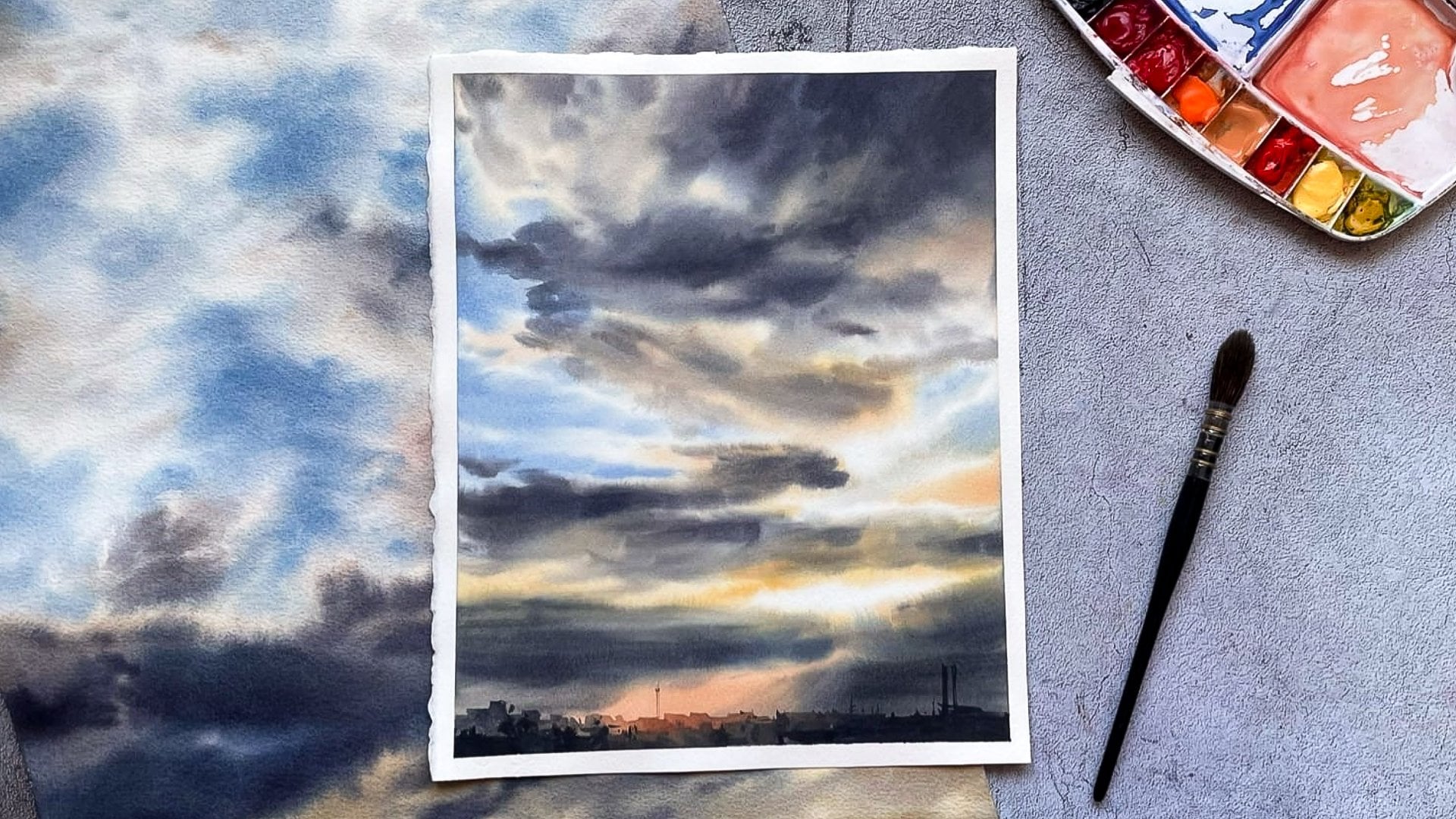
1. About the class: Hi everyone. I'm Maria, a watercolor artist
and instructor. Welcome to the class
in which I will reveal the secrets of combining
different watercolor techniques to depict the vibrant
Hughes delicate gradations and magic glow of
golden hours, guys. I love painting sunsets, and I have done
it so many times. Of course, their colors, shape of clouds and
composition can vary, but the principles of
creating the effect of a warm sunlight
remained the same. We'll talk about
them in this lesson. The tutorial will see you too, if you're already familiar with watercolor techniques
and painting skies, I see it as a follow-up
to my previous class. The basic of painting
realistic sky escapes. That's why I want to explain
the fundamentals here. Instead, step-by-step,
you will discover what types of contrast
serve to depict light, how opec things helped
to create atmosphere, and what techniques
are useful for making soft color transitions and
painting glowing sun beams. In the future, you
will be able to apply these principles to create your own sunset landscapes during the class and
enjoy watercolors
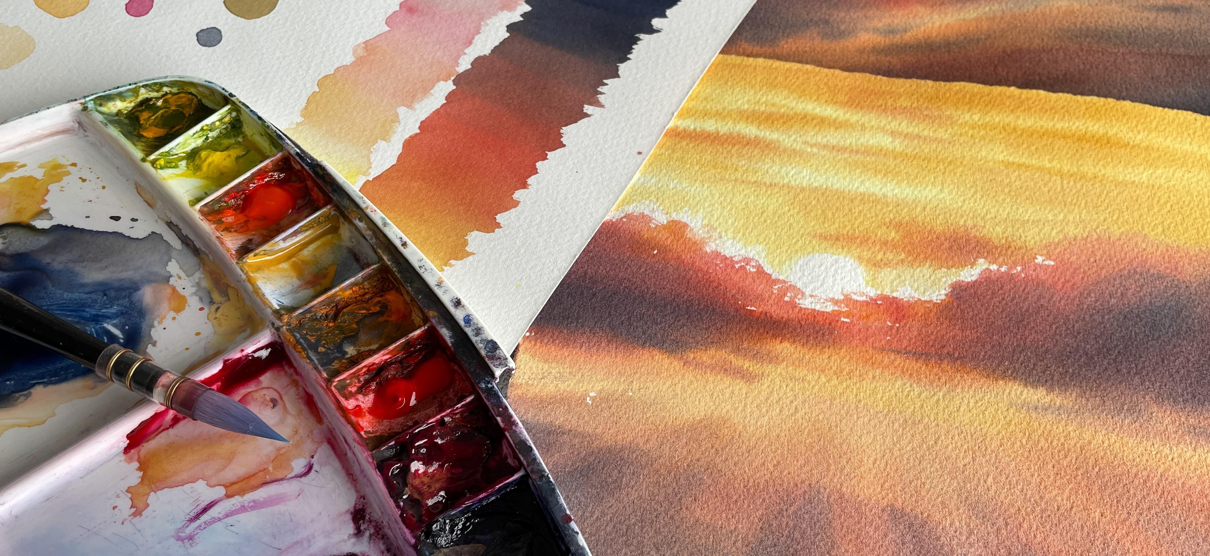
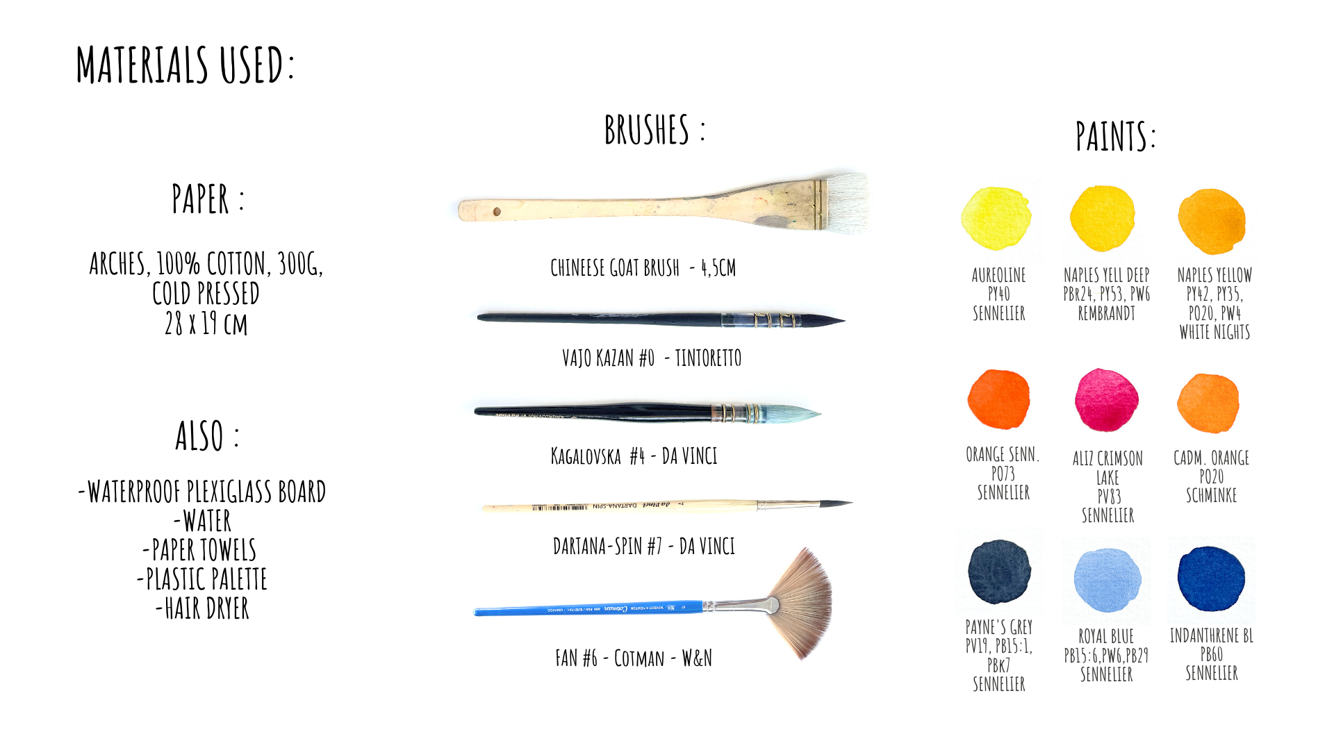
2. Materials overview: Hello everyone and
welcome to the class. Here you can see the list of the materials I'm going
to use in this tutorial. Of course, this is only a
set that I'm going to use. And you can take your
favorite colors and replace brushes or even paper
with your favorite ones. Also, I propose you to take a quiet small format
of the paper. Here you also see the colors that I prepared for the class. And to be honest, I think that
I'm going to use them all. And the idea is to try both opaque and
transparent colors. But actually of course you can use more reduced
palette if you want. Next, in the explanation
and exercise section, you will see how we can
use this contrast between transparent and
opaque colors for painting skies and
especially sunsets, guys. But if you don't
have all the colors like Naples, yellow for example, you can try to do
the same picture using only transplant colors, and I'm sure that it
will work as well. My brushes set for today first, there is the big flat brush
for moistening the paper. You will see how we'll use it. Big round synthetic brush. There is often a nice one. You can replace it with squirrel brush or
squirrel imitation. It will work as well. Next, there are two
synthetic small brushes. I'm going to use them for
painting details, clouds, and actually for better
water and pigment control. And in the end, I will
also show you how I use this type of brushes some
time for some special tricks. The paper today is Arches 300
g and it's called pressed. I'm going to paint
on a textured side. You can take of course, whatever brand you prefer, but really makes sure that you're using cotton
paper because this can be essential
for this type of technique that I
propose you today. Also, it's very important
having something like plastic or any
other waterproof board. The idea is that it
doesn't absorb any water. And of course, feel free
to change the format. You can make it more square, you can make it even
vertical if you prefer. And let's go to the exercises
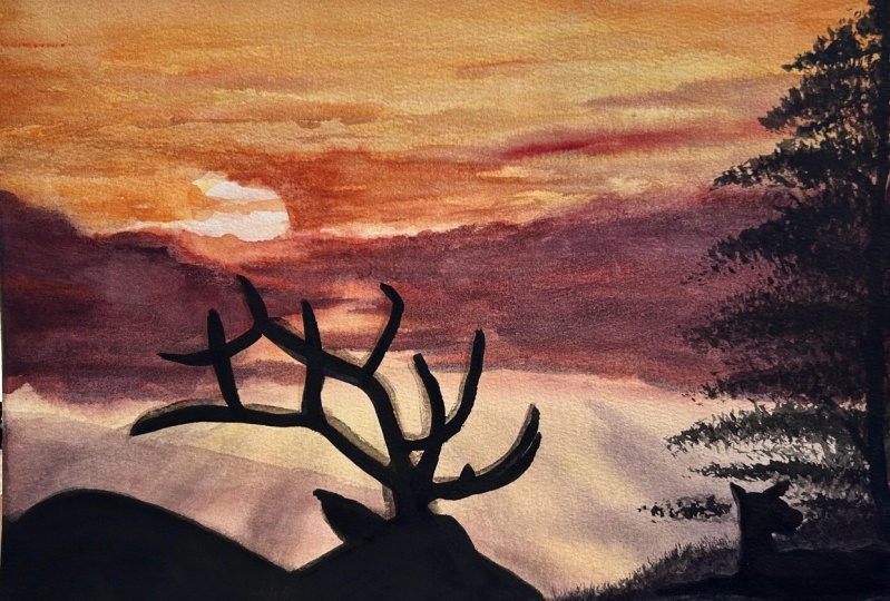
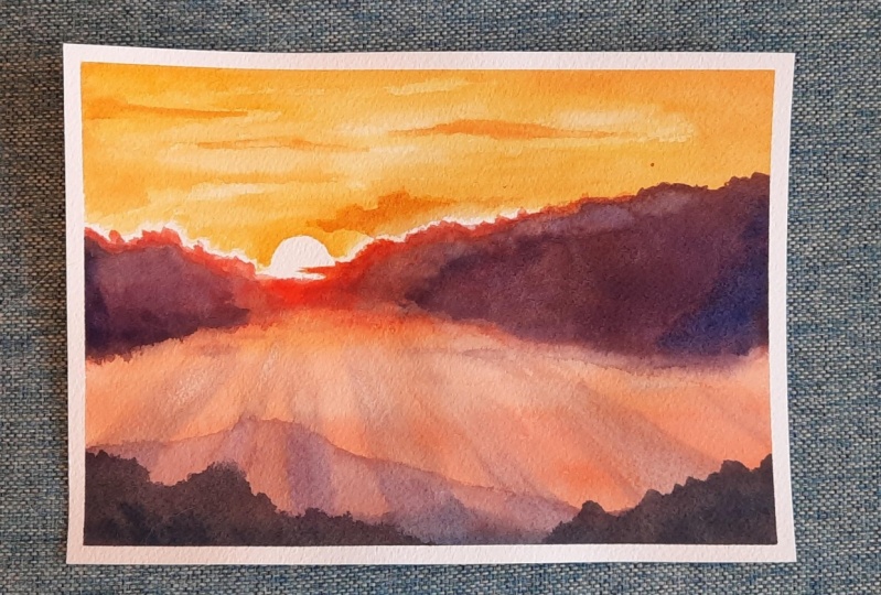
3. Let's talk about contrsats: Here in this tutorial, I'm going to show you how
to paint this picture, but be ready that in your
case, picture may vary. It can be different
in cloud shapes, in the foreground, even
in the background. So maybe you will even
choose to paint it on wet. Really be ready to create your own picture following
my instructions. But the main
principles of creating the light and different
contrast will stay the same. For this purpose, I distinguish several types of contrasts. First, that we also
discussed already in my previous basic sky course is a contrast between
light and dark, or tunnel or value contrast. It actually describes
the difference between the brightest and darkest values or tones in the image
that you create. And managing this type
of contrast helps us to create the space
to create a volume. So this is something that
we saw in a previous class that how by changing the
color value of clouds, we can create the
depth, distance, and also the volume, the, the 3D effect
of the clouds. And we're going to use
the same principle of creating shape in
this picture as well. So you see, really it
creates different plans. It creates shapes. Next, what I'd like to explain that what is interesting
in such sunset pictures, it is the light, of course. And of course, this search
of a tonal contrast works to emphasize
this light effect. So in this picture we can see the light source and it will be the wisest part of our
painting. In watercolor. The wisest thing
that we may have is the white of the paper. So the sun will be uncovered since the very
beginning, until the end. And never mind the
technique you're going to use if you paint
painted on, on wet, same, you are going to reserve
this area from any color. Next, the further we go
from this light source, the darker everything
will become. It can be the background sky, like sort of a gradient. Or even in our landscape, we see the same
from light to dark. And of course, the
more clearly we see this effect in the clouds. So for example, if you take a black and white version
of the photograph, you will see the same gradient. So if we only take this one
approach was light and dark, we already, we'll create this light effect so it
can be enough itself. So what's important here is that independent of the color, that's your choice
for painting clouds, the tone of it will change. The second type of contrasts
that will help us to create this light effect is
warm called contrast. What do you need
to notice here is that next to the light source, next to the Sun, it's
not only lighter, but also warmer as a color. What it means if we take
the classic color wheel, colors on the right, we consider as warm
colors and colors. On the left, we
take for cold ones. Here next to the sun,
everything is warmer. And the further we move
on from the sun decoder, everything becomes
somewhere in the shadow. We can even seen some like
almost clean blue dots, spots, and those axons, they create additional
color contrast here. Why it works like that? Because actually blue
and orange colors, they are the opposite colors, complimentary colors,
and such colors they create the strongest
color contrast. It will work the same
for green and red, for example, or
yellow and violet. So here we will have
this sort of effects. Of course it doesn't
work for 100% of cases. Sometimes you will have some red spots here
in the clouds. It can be really different. You really need to look
carefully at your reference. And like this, you choose what exactly you like
about it and what you want to pick up and
transfer to your painting. And the last contrast that
I wanted to talk about is the contrast between
transparent and opaque colors. What do I mean? Saying that? You probably already know
that on watercolors you can find the indicator if
the color is transparent, semitransparent or 0 back, even though in general we consider watercolor is
a transparent color, comparing to acrylics or oils, where I use such characteristics of the color is
when, for example, I want to create something
with the light color, but bringing some tonal
contrast into it. It can be quite tricky
because, you know, that's that light colors
like yellow, for example, can't go too far with the tone because they
are light colors. Here I will show you
an example of how we can play with this
opacity of color. For example, here you
see it's the same color. It's clean and
transparent, yellow. Even if I take it
very dense and thick, it still will be very light. I won't have this
impression of the shadow. Of course, I can add something
like orange into it, but it still will be either transparent or if I
will take more pigment, it will give darker color, which is not the purpose here. Here you see, for example, Naples yellow, which
is opaque color. And this color you
see allows us to have a stronger tonal contrast. And I tried the same exercise
with another Naples yellow, which was the Naples
yellow by White Nights. And we can make it even
more complex by doing the transparent background
for the sky with a transplant color and add
this opaque color over it. So knowing this, you can
choose either you work with clean transparent colors or
you can take opaque colors, or you can make a
combination of both. Like this. We will have
these small clouds colored, so they will be yellow, but still very light
and transparent. You see here those
clouds are not white, even though they
seem very light. I only have the sun being white and just some
highlights next to it. And everything that is
above is this technique. So we have a transparent
background and we have opposite color over it, which means that it
covers the paper and the light can
pass through it. So it only reflects from the places where we
have the transplant colors. So this is what creates
this light effects. And the one more contrast that I wanted to mention
here is the contrast between such sharpened details
and soft shapes that we have such edges we are going to create on dry paper surface. And this will be quite
special technique. You'll see in
step-by-step section how, how to do it if it's already seems to you that the
technique is too difficult. So please watch the video from the very beginning to vans
to understand it well. And then just try to
do it by yourself. I always recommend to watch the video first
and then to paint, because I personally think that painting alone extremely hard. And those of you who do
this, you are my heroes. And of course I remind you
that you can skip this type of the contrast and do
everything on wet surface, which also will work. I feel that it will
be a little easier. So you see this type of
a contrast here creates the additional focus on
our point of interest, which is the sun
4. Mixing opaque paints: In this short video,
I'm going to give you a few additional commentaries about transparent
and opaque colors. Here's an example. You see different
values that we may get by using Naples
yellow by White Nights. And you can see here that if I take it quite thick and dance, it may give quiet dark color. Let's compare it with
Oreo name color. I'm also taking it very dense, fresh from the tube. But you see that comparing
to this Naples yellow, it's still seem quiet light. So if I tried to make
clouds with this color, it would be less effective. We've already discussed
that yellow color is still quiet light color. So to make it darker, we generally need to
mix it with something. And when we talk
about something dark, the first thing that may come to our mind is like black color. Yeah, I don't think it's
very obvious for this guy, but let's see what we can get. And you see that even if I take something like complex
Payne's gray color, it may actually give something greenish while we mix
with yellow color. And the same thing
for black colors is actually black pigment also may give green when you
mix it with yellow. And finally, black pigments also quite often
tend to graduate. So really be careful
if you think about adding black to
your future clouds. Color mix. Next, of course, we could try and add
something pink or red, but it also can be quite tricky. Let's see. Here I'm taking this Naples yellow color
and adding a drop of pink. And you see that the
color has changed, but it hasn't become darker. So to create a darker
mix was the same thing. Color. What we should do, we should really take very
dense color as a base. I think I've also explained
it in the previous class. And then into these base, I add pink car. Here. Hopefully you can
see the difference. And you see that
this result color is much darker than
the previous one. Also bear in mind that sometimes some unexpected color
mixes can look quite nice. For example, some level yellows can give a nice mixture
with violet color. Not each one is mixed with yellow will give
you something beautiful, but sell it worth it to try. And what is nice
about such mixtures that you can really
vary the tint of such colors by adding
different amounts of pigment. For example, now I'm adding
more violet into the mix, but then you can
add, for example, blue and also more violet. The color may become colder
and where we needed. This can give us a nice
shadow color, for example. So once again, we can make our color darker by
adding more pigment. First of all, notice that
in most of the cases, opaque color will seem darker than transplant one
for light colors. Adding darker color
does not guarantee you that's the mixture
color will be darker. So to make it darker, you first of all need to create this dance base of
your base color. And here I also
added little dots of the color that I mixed with my yellow. Just not to forget. And I also recommend
you to do the same, to keep nice color
formulas for the future
5. Cold - Warm transition: The last thing I recommended
you before you will begin is to try your colors altogether and also
to test what they may give when you will change
from light to dark, from warm to cold. And for this, I propose you to do a simple gradient and I'm starting with just yellow
transparent or Aeolian color. Next I'm adding Naples yellow
to it to darken the color. Then this Naples yellow for
future clouds or something, I'm starting adding
something orange or red. This makes the color darker. And then I'm going
to add more and more red into this mix, which will make the
color also called her. It may be useful
here, for example. You see I'm always using
the same mix on my palette, but I'm slightly moving
from light to dark, from warmer to call their color. So there's no need to wash the brush between all
these manipulations, okay? And you see I still have quite a lot of
pigment all the time. Then I begin adding
blue indenter and blue. In my case. You see once again I just add the color to my previous
mix with the same brush. Here, I'm just adding
more and more blue for colder and darker mix. You see, once we
have this contrast between light and dark
and warm and cold, we have this feeling
of the light, even in this color gradient. This very schematically shows us the logic of our future work. So once again, speaking
about transplant colors, don't forget that just adding
some blue into the mix not necessarily means that the
color will become darker. If I take it a little
bit more liquid, it gives me this as a result. And of course I can
continue doing this job with such diluted colors
and it also may work. You see I'm going through
ping them to Naples yellow. So you see that the color
changes from cold to warm. But you see that
this contrast only doesn't give us a
really light effects. So we really need to create
also a tonal contrast. Just makes sure that you add
enough of the pigment to the blend to create nice
light, dark contrast. And that's it for colors
and contrast explanations. Let's dive into painting
6. Preparing paper: As promised today I'm going to show you an
interesting technique. I consider it mostly like for
intermediate watercolor is. But even if you're a beginner, maybe you could try it. And if you like it, you can keep developing your
technique in this way. This technique allows working on wet longer than
traditional technique. To begin, I moisten
the backside of the paper with some clean
water and big flat brush. This preparation stage
will take some time, but please don't skip this part. Really prepare your paper. Well, the better you
prepare the paper, the more comfortable it will be while you will be working. I just put some water to make the paper surface glistening. And now I'm going to
wait a little bit. Use this time, for example, to prepare my ballot or to find some scrap
paper for color tests. Let's put it here. I also prepared
some paper towels, but you may use cotton tissue
or whatever you prefer. They're not always will be seen, but just notice that I always have them
somewhere in my hand. We can prepare some
color right away. Let's begin with bright
transparent yellow. I'm going to use it
for the first layer. Next, let's take some
Naples Yellow by Rembrandt. I will need quite a lot of it. So let's put enough. And also White Nights, Naples yellow tube and the rest I already
have on my palate. So Alizarin, crimson here, royal blue, Payne's gray, and inventory in blue. Hope you can see it. I'm going to use this
polarizer for moistening my palette and maybe add
some water like this. All the colors will be soft
and prepared for working, especially if may
be important if you work with colors in bands. Also, I always have
a extra cup of water in case I will need
some fresh clean water. I noticed that the paper's
getting a little drier on the borders on the
edges of my paper. So I'm slightly more moistening them the same manner
I did before. I just make my paper
glistening and that's it. It should be even
the glistening. Notice that I didn't make any pencil drawing here because
I'm not going to do it. I'm going to paint right
away with my brushes. But if you're going to
use this technique for more complex picture that
demands bad pencil drawing. Make the pencil drawing before you will start
moistening the paper. But if you feel that
it will help you to make this picture better, of course, feel free to
prepare some pencil lines. Now I'm going to wait
a little bit more. I see now that the papers
started to bend a little bit, goes wavy and I
need to wait until the moment when paper
absorbs the water. And it will become, you will see it will
become flat and a heavy. At the moment, I'm
showing you a technique. One, we only moisten
the backside of the paper and the face
side will stay dry. But of course you
can do it in more traditional wet on wet
technique like kinda between traditional and this one that I posed to you
when you moisten both sides of the
paper so your paper will be completely wet. In that case, it will be just a little bit
different visual results and I feel this
technique easier. So in this lesson, I will show you
more advanced one. So here we're going
to do this sort of the technique when we have some sharpen edges
near the sun and more soft lines and forums
in the rest of the picture. And this also will give
some additional contrast between sharpening
just in soft shapes. So it will help us to get even more focused on the
point of interest on, on our app, Our son area. And as I said before, it doesn't have to be done
with this technique exactly. You can make it simply on wet and you will have
this sort of result. And you see that it also
looks beautiful and maybe you prefer this way, feel free to try it. But this second option I
feel like more easy one, but I really want to show you a more complicated approach. But if you want to make it in
this wet-on-wet technique, you actually shouldn't wait this long with this
backside of the paper. You just turn your paper
and make your face of the paper also wet right away
and you don't need to wait. In my case, the face
side will stay dry. So I'm really spending my time moistening the
backside of the paper. And if everything
was done, well, I will see that it will stuck to my board in all the corners, on all the surface
will be nicely glued to the surface
of the bird. You see there are
no bubbles, no way. So the paper looks really flat
and prepared for painting. If you see that it's
not wet enough, you can re moisten it. You just take your brush and add some water but
don't add too much. So once again, the paper
is wet on the backside. I really gave it
some time to absorb this liquid and the
vapor surface is dry. You can even hear
it that it's dry. And now we're ready to begin
7. Sky : Lights: Alright, let's begin painting. The paper is ready. And I begin by planning
where the sun going to be. I think it will be here. And I will begin with
transparent yellow color. They relied liquid
and transparent. I remind you that
it's better to check your balance before painting, to check how the colors mix with each other.
And let's begin. I will do it with such
quite large brush. And the sun is going to be here. Not too big, not too small. So why do we need all this story with moistening the paper
from the backside? Because thanks to eat all my
watercolor spots doing now, they will stay wet longer. So you see now this
yellow area is wet and it will stay
glistening for a long time. So I can do many things
inside in wet technique, I put my brush to
its sides and paint this way to create
some texture defects. And there will be
a cloud contour. Some parts of width will
become softer and future. But so far I keep it
texture this way. Now amazing, little bit
more pigment to it. And this is the sky that we see through clouds
in the upper part. This yellow light that we see. And I'm adding a little bit
more to the upper part. Can almost right away I
switched to the Naples yellow. It's very dense and opaque. It soft and fresh from the tube as the paper is wet. So you will see soft
contrast of these spots. The color is moving. So notice that your brush
shouldn't be too wet. The goal is to have really
thick and dense color. And you can even take
smaller brush for that. The further from the light, we will have colder
and darker color. Remember. And closer to the sun, it will be lighter
and warmer and in our case, also more transparent. I also could leave those
clouds are white. Why not? But in that case, that would be like the same
white and light as the sun. And in my opinion, it can break the sunlight's
effect from the sun because only the sun disc should be really wise
in our painting, It's the only light
source there. You see even in the
photograph, it is. What we will keep. Why though, is some highlights on clouds
right next to the sun. To really to highlight, to emphasize this effect. At the moment, maybe picture doesn't seem very clear for you, but now we will add more and more color and you will see how it will transform. So now I'm going to add a little bit more
contrast to the sky part. And I'm taking the
second type of mine, Naples yellow, which is a
little bit more orange, you can simply add some
orange into your Naples, yellow that you have
or some pink or red, it's really your choice. So I keep light clouds slides, and I'm adding a little bit of contrast in-between to
highlight them even more. You see we don't really change the color very drastically. And we still work
with yellow colors. And as we take now,
opaque colors, it really creates this effect
of light and dark contrast, even though we still
working with yellow cars, very light ones,
because the light doesn't go through
these opaque layers. So we have this effect of the light from the
transplant ones. And if you want, you can
even change the tint a little bit so you can add more orange or pink as you reach. And let's add a little bit
more shadow to this corner. I switch the brush to work this small area around the sun. Because here I'm going
to paint a cloud. So I'm making this area
a little bit softer. And once again, I
really recommend you to watch the entire video first, to understand the
entire process, and only then start painting because it's really
hard to paint along, especially with this technique. Let's add a little
bit of alizarin here to make this corner
just a little bit darker. But it's not only being, I really mix it first with this Naples yellow that
I have on my palette. So it brings a little
bit more contrast. And it's already time to
move to the bottom part
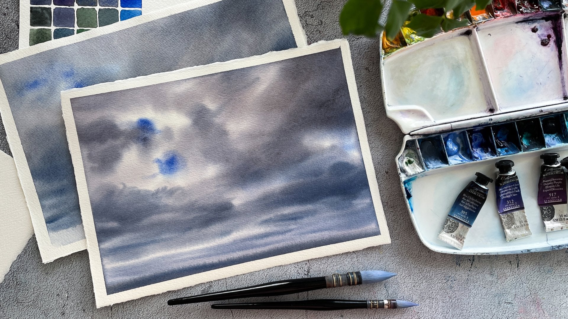
8. Clouds: Now it's time to move
to the bottom part. And before starting it, check that the backside of
the paper's still moisten. If you see that it's drying, you can bring a little
bit of water to it and really try to avoid
excess water there. In this part, I rather
bland having soft clouds, which means of course, on wet. If you still have
any questions about basic techniques
like wet on wet, wet on dry, dry and wet, etc. Please watch my sky course where I explained
all the basics. So if what I'm showing you right now seems too complicated, maybe you have a lack
of some basic knowledge so you can really
learn them there. So here in this part it
will be more soft and more sharpen and contrasted
and next to the Sun. So I'm mixing the Naples
yellow with alizarin. Now, we can even add some yellow or cadmium orange to make it more vibrant
here below the sun. Because there's very
nice highlights there. Announces that the
bottom part is generally much darker
than the upper one. And I cover everything here. If you're working on wet, you will have all this color. Just a nicely
spreading everywhere. So maybe you will need a
little bit more of a control, but still it will work. Here. There will be
my future clouds. So I actually can
cover this spot. Now I'm switching
to a darker colors. So Naples, yellow plus
more of the iser and crimson and start to
paint my future clouds. This will be their
lightest part. The central part will be more logical to do
with smaller brush. So let's do it. Cadmium orange with
some pink red. You see the paper
surface Here's dry, so it creates some
texture defects. And don't hesitate
to make colors more like saturated
and vibrant here, because once the color is dry, it will be much paler
than you see it now, It's normal for
watercolor in general. But in this technique you can
see this effect even more. Of course, depending on the
palette that you chose, it can be more or less vibrant. But normally in this
place we will have quiet, quite saturated colors
next to, next to the sun. And remember, I wanted to
paint this cloud here. I'm doing it while this
part is still wet. Now, I'm switching to more red and we continue
with the cloud. And this red mixed
with Naples yellow. It will give the base for
the clouds because I want to have some pinky highlights going through the
clouds shadows. You see I leave
this contour whites for the highlights effects. So you see in the upper
part I work more with like circular movement of my brush
and more flat in the bottom The backgrounds and
the buttons still wet, still glistening so it's okay, can keep working with McLeod's. But still I need to
make it quick way. And of course I'm also going to add some blue to
the mix and very soon just will check the sun shape first. Going back to the larger brush, because I will need quite
a lot of color again. So let's put some
more Naples, yellow. And we'll do this part
a little bit more. Pink, pink, red as you wish. And I will keep some yellow, orange highlights below the sun and the bottom part
will be darker. And what is good at this moment, I also like remote learning
this part of the paper. So it will keep the
paper wet longer, anterior in the upper part, I'm not touching anymore
because it will get drivers. For this part. You can even take flat
brush, for example, it will be very handy even
on such small format, I feel like the price
could be even bigger. Now, let's add some
blue to get color T. And remember we discussed
that further from the sun, the colder it's the color
everything will become. So for clouds it works as well. And also it should be darker, which means more
pigments in the blend. Too blue or too violet. I always can neutralize it with something
orange and yellow. Remember it's the opposite. It's complimentary color
from the color circle, so it will neutralize
this Colton's. But of course we already
have some orange and red and yellow
on our paintings, so it will be mixing
any way, please, very, very light
brush movements. I'm barely touching the surface. And you see, for example
here I begin from the right part was
blue and then I have less and less color
while I'm moving to the sun and it's
organically became warmer. Once again, I start here with blue and then I
moved to the Sun, covering now all the whites, a little spots that I had here. Now when I have big shapes, I can also add some details. I'm always watching my
photo reference to find some details that I like and to reproduce them
in the painting. Here in the clouds,
paper's still wet, but in the upper
part it's already like kind of try as
well as in this area. So I'm not going to
touch it anymore. So you see I begin with
larger objects and shapes and then go into details. Amazingly, even darker blue, you see how the
color looks like. Very thick and dance and quiet, dry, but there is some
liquid on the paper. So this is why it looks
soft in the painting. I think it's okay for clouds. Let's go to the next part.
9. Sunbeams: Now I want to bring some additional light
effects in this bottom part. First of all, there
is a shadow here. So I will take
this shadow color, but we'll, we'll take it a little bit more transparent
than it was before. So washing my brush for that. You see the color is
liquid and transparent, but I don't take a
lot to the brush. And with such
movement, I'm adding some direction lines for
the future sunbeams. The paper and the
bottom is not dry yet, so I still can do it just carefully follow the
direction to the sun. I remind you that the
brush is quite dry because the paper is
slightly getting dry. Here in this central
bright, it's almost dry. So unfortunately
I can't touch it because it may create
some unwanted effects. And now what's interesting, I'm painting this standing because I feel more
comfortable like this. I'm trying to bring a little
bit more contrast now. But we really need to keep
an eye on our paper drying. And if you like me, see that it's almost dry, you really need to stop
even if you're not really happy about this
intermediate results, it's really better
to leave it and keep it like that
here in the clouds. It's already also quite dry, so I don't really
want to touch it. Maybe just a few little
shadows here and there. And by the way, now
I'm going to show you one tip for this
stage of the work. Here. I'm going to paint
store the landscape. Remember we saw this brush
and now it's completely dry. And we see that sometimes in some places our color can be, could be more evenly pulled to have more
soft transitions. And with such brush with a very, very light touch as we can, we can actually
move the pigment on the paper surface to
create softer transitions. But just make sure
in the process that your brush keeps
trying and clean. And of course, it's only
possible to do while the paper is still wet
at least a little bit. And once again, the
idea is just to move the pigment on the
paper surface a little bit. It may work for many different
parts of the painting, but the only thing
that just don't keep it as a main tool, it's really just for some adjustments in the
end of the process. I can say that I have a lot of such places where I would
like to correct something, but I thought that it might be nice to show you that
this technique exists. Important that of
course, at the moment, you will get dirty brush
and you will have a risk to move the pigments to match
and to create some spots. So be careful is that I'm pretty happy about this
intermediate stage. So now I'll need to
wait maybe until this, this part is a little bit
dry or, or maybe not. Actually, it's the point
where we need to decide in which technique we're going
to paint our landscape. It can be either like soft hills on wet or maybe something
like this on dry. So you see it has sharpen edges. So of course for that, we need to wait until
the paper is dry. I think I'm not going
to wait too long. So I will paint. I will try to pay the
landscape right away. It still shining a little
bit in these areas. And in these places, it's already super dry. So you decide at this stage for yourself which
technique you prefer. If you're adopting, if
you can manage it on wet, on dry paper, maybe it makes sense to dry the paper first and then to do everything on dry
10. Landscape: So I decided not to wait until my paper becomes
completely dry. The paper here in the bottom
part is slightly shining. Listening here, here,
and a little bit here. And in these areas is dry. So you have two options. Either you wait until
this paper is dry or you dry it with a hairdryer and make your landscape with
sharpen edges on dry. Or you can try the
way I'm doing it, but be ready that it will be different because the
paper stage in my case, in yours will be of
course different. I will begin painting
hills there in the background with
a quiet dry brush because the paper is almost dry. And I don't want a
liquid and pigment to be spread too much for the
area under the sun. I take this light
and warm color. Here. I'm going to make
it a little bit even more complicated and trying to
follow the sun beams direction. So I'm covering with
slightly darker color. The space between
the Soundbeam is also here it works as well. This principle that
we discussed before, that the further
from the sun source, the light source, the color will become colder and a
little bit darker. So here it's the same. So I take it a little
bit more violet here. And for this part I also
can take some royal blue. For example, you will see
I'm going to make it really called color comparing to
the rest of the picture. Of course, here it will
be called and quiet. Well, not that dark
but quite called. Heal in this shallow part. Now you may be
thinking, Oh my God, she covered all the sunbeams. They were so beautiful. But well, yes, because I
think that the space is too large and I really want to
paint the landscape here. But if you really like
your bottom part with just like with some
beams as they are, we just can keep them. And really like don't lose the best part of your
picture if you prefer it. So really work depending on
what you have on the paper. Honestly, I didn't plan to
make it this complicated, but it is what it is. And here let's take some. So let's take here
yellow, orange, like warmer color for the sunbeam part here
in the foregrounds. And let's make it
maybe more simple. So let's take right away
quite dark color and mixing Payne's gray and the rest of everything I
have on my palette. And I will outline the
foreground of my landscape. My problem here is that
the paper's getting dry and if it becomes
quite complicated, so I really need to work in very delicate way to keep everything like
soft and proper. Notice that we can just
take away the color in the places where
the sun beams are because they are not white. So we really need to construct, to paint them by making
the shadows around them. This is what makes it quiets. Quite complex here. You see when I painted this
part of the landscape, I really tried to follow those. The sun, sun rays going here. If you feel that it's too much for you, just
don't do that. Just make some nice gradients in the bottom part and then paint the landscape without
any sunbeams. It also will be
beautiful and full of light if you just keep the rule of contrast that
we discussed before. And once again, the brush here at these stages really dry. I don't have, I almost
don't have liquid in it. And let's make this
very nice dark shadow. I mentioned rocks here
or something like that. But for you it can be
trees or bushes or just the field or another heal. So really do whatever
you prefer actually, or you can even try to find
a photo reference for that. And you see if I decided to make this sun area very defined
with sharpened edges, I really tried to make the foreground softer
to keep this contrast, to keep the point of
interests on the Sun. So I tried to really
to make his own wet, which gives me the soft edges of those parts of the landscape. And adding more blue in
denser and blue this time to, to make it darker and colder
to keep this contrast going. It gives a nice contrast with this orange and yellow
color in the sky. You also can use this brush to soften a little bit
this bottom part, and we have just a couple
of details left to add
11. Final touches and conclusion: There's a thing in
the landscape that I kinda don't like is
that you see the hills, they are kind of repetitive. So I'll try to, well, to do something minutes. I will just change the
shape a little bit. Here. We can paint wrongs or, or even some bushes
or trees if you want. Let's make it even darker here. Why not? I've added
Payne's gray for that. Notice that I changed the
direction of my brush strokes. Let's move it a little bit. But just pay attention
that you don't bring some pigment into the light part with
this brush because it may stay on the brush. I really like this bluish
spots in the shadow and the landscape in general here and notice
the little white spot, but I'm not going to try to
cover it because now it's 28. Here. It's not very perfect. Let's think what to do with it. Because here you see it was wet and in this parts
it was almost dry. So I'm taking
another fluffy brush and gently moving the pigment
at the edge of the spots. The idea is just to
move it a little bit. It can be very handy using
this kind of trig, but really, I always keep it as a secondary option because it's really hard
to plan such work. So really try to do your best painting and
just keep in mind that you have this kind of option as well and never use
it as a main technique. This is what I'm trying to say. Alright, I think we can
stop here because paper is almost dry in many places and I like
how contrast works. So we've got this
effect that our sun is lighter than light clouds
in the upper part, the last thing to do is
to dry the painting. And I normally recommend
when you work with such technique is to fix
the paper, for example, with the masking tape or using paperclips depending on the
size of your art board. But I myself for such
small size of painting, just do nothing and
just put them next into the carton folder
or something like that. To flatten it. Of course, colors will lose in vibrance and in tone as well. So think about making
all the colors darker and more saturated
in the beginning, especially when you work with
transplant color because opaque color wheel take
on the paper surface so we'll keep the color better and the transplant sometimes
goes into, into the paper. So this is it. I hope you enjoyed the
class and that you have found some new tips and tricks
for your Skype paintings. I really like this technique
and I hope that you will use it as well for many
different types of Skies. Don't forget to
share your paintings in the project section. And also, if you
share on Instagram, don't forget to tag me so I could see and leave
you a comment. Thank you for joining the class and see you in the next one. Bye bye.
 Maria Smirnova, Watercolor artist and author