Transcripts
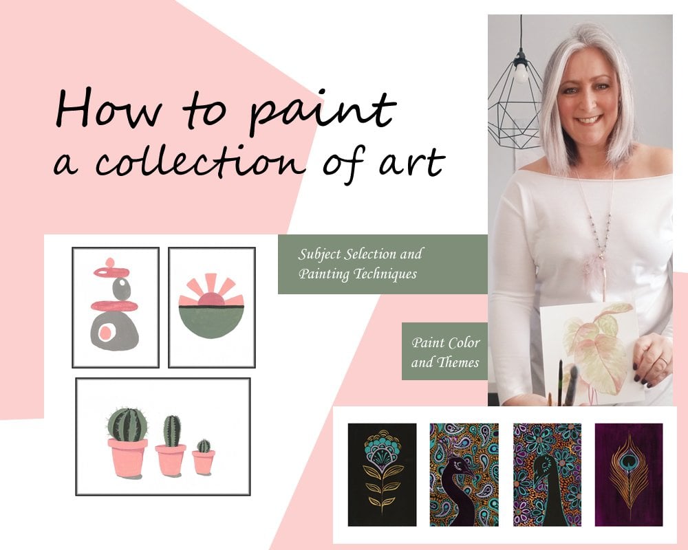
1. Introduction1: Welcome to my class on content creating for licensing your art with myself. If that say Nemo. Well, hello everybody. Event saying them all in here. Licensed and Polish artists for 18 years specializing in home decor, greeting art for wholesalers and retailers globally, for product development and design, I have had so many requests for more information on how to create collections. So I wanted to take it one step further beyond it, the other classes that I've provided for you, and I'm going to teach you how do you understand how to recreate a briefs when you get them from wholesalers if you decide to start licensing your art with. So you're going to learn creative brief, collection development. We're also going to take that step, one step further, and we're going to broaden our color palette. So I'm going to teach you how to pull colors from inspiration to develop a really cohesive color palette. But we're going to use it in a different way in the past. Classes that I've taught, I've, we've pretty much use all those colors in the same collection. So this time we're going to be using it a little bit different. So we still have a cohesive collection. So I'm diving a lot more intricately into a licensing world. And you're going to get a glimpse on what it's like in my world producing from wholesalers. So we're going to have a lot of fun. You'll benefit whether you're a beginner or seasoned artist. If you're a beginner, you're going to get the tools right away so you can kind of get yourself on track to producing, licensing or producing artwork for the licensing industry. If you're a seasoned artist, you are going to greatly benefit from this. If you want to dive into licensing world, it's going to prepare you for what you need to know and how to maybe tweak and make some changes in your existing art on how to make a cohesive collection that is really appetizing for those wholesalers out there. So I can't wait to get started and let's just dive right into it.
2. Lesson1 Interpreting A Creative Brief: This lesson is all about interpreting a creative brief in preparation for your collection. Okay, I'm going to go through and I'm going to show you how to read a creative brief. And this is one that I have right here. When you're working with wholesalers and product developers, they may or may not provide you with a creative brief. Fortunately, this one company I worked for, they provide me with these amazing creative briefs which makes my life so much easier. It saves me some time doing research on color trends and subject as they lay it all out for you. So I'm going to go through this with you. I'm going to show you how to read this. And after this lesson, I'm going to have a lesson on how you can create your own creative brief when there's no one supplied 2. So this particular theme, Miami Tropicana spring. This is a new trend, 2021. You guys are getting a sneak peek into. I'm going to share this with you. And we're going to go through, we're going to base our whole collection in this course on this trend and color scheme. So here we have it. It's beautiful allele laid out. They've given you pretty much a picture of the decor theme. So you can imagine create an art for products and wall are for this type of theme. Imagine this would be the settings. So what you create should fit into theme. Very similar to this. Now what this particular theme, um, it's very important to understand the feel of it. It is a little more opulent. It's going to be a little more high end. So we are getting a way from C0, C0, cutesy stuff, and we're gonna make things a little more sophisticated. So I'm going to move down here once they give you the theme and an image of what their products are going to kind of fit into. They're going to give you some inspiration. So they're giving you additional room with themes here. As you can see, they are very different. So you want to create a collection That's going to be versatile in this more sophisticated commercial space. And then we've got a very cozy, sophisticated kind of coastal vibe here. We've got images ranging from tropical plants. We've got flamingos, cheetahs, monkeys. They're definitely throwing in some animal vibe here and they want it to have a very BCCI feel. So as we move down, they're going to give you specification. So you've got your color scheme that you're going to work on. And then it has a key points in two elements that will work. With the artwork that you're creating. So when you're creating the artwork, you want it to fit into rooms that will have a lot of wood like dark would feel, light would feel animal prints, leaf porins. And then we've got some geometrics here. And little bit of like an opulent image could, could also be wallpaper. And then as we move down, they've given you key points. So this is your subject that you want to focus on. So for this particular theme, they want organic tropical leaf patterns, hibiscus florals. Then we've got there stressing here a soft Miami feel, BCCI feel like so this is where I kinda get the idea. It's more opulent. It's not like Kiki and bright. We're going to leave a lot of room for air and freshness in our images. Here, they've stressed animals and key features that they want such as monkeys, flamingos, cheetahs, and pineapple is a big one this year. We've also got to focus on gold animals. So they're also going to give some art inspiration. So these are a little inspiration pieces that they've pulled. These are not their artwork, but they want to you to focus on this kind of style. So here we've got our little monkey. And it's just very BCCI, as you can see. It's very light and airy and fresh with little icons of different decor as images and decor items, umbrellas, cushions and that kinda thing. So little disclaimer here. We'll cover that up so we don't know what company does this come from? Any ways. I, I'm going to go more into the color scheme in the next lesson where we're preparing for our materials. And I want to dive in to how we're going to use these color themes. But pretty much we've got a whole board of inspiration here to get us going with this Miami Tropicana spring theme. Now, what I like to do in addition to this, as do my own research. And I will use these key points here to do my own searches. Pinterest is your friend for this. And you're going to search these topics and just pin images that speak to you. You can use photographs. You can use artwork that's out there or home decor items. So let me just hop over to my Pinterest here. I've already pinned inspiration that I want to use. And I'm going to let you get into my head on how I think and create my vision board for this collection. So once I have images that I like, and as you can see, I've pinned photographs. And also There's artwork, wallpaper, all kinds of stuff in here. Once you have your images that you'd like to work with. And what I like to do is when it comes to tropical palm leaves, I'll print off a number of different plants or leaves so that I've got a different kinda collection of many different styles of tropical plants. And then as I'm painting, I will pick which one would fit best with whatever subject I'm painting at the moment. Of course, we'll get more into that when we start painting. But there's a couple of compositions that really came to me here. I mean, I liked the composition of this monkey, this little statue. I like these cheetahs the way they're looking at each other, almost creating a little heart here. I'm looking for a very sophisticated posing for my animals. This is interesting, these stacked monkeys. So I saw this stack a monkeys. And even though monkeys, one of the subjects in the theme, I actually envisioned a monkey sitting there with a stack of pineapples. So in this case, I'm using different subject to give me inspiration for a complete opposite subject. So once we start creating, you will see where I'm getting that. Once you've got the images that you like, just go ahead and you can either keep an iPad or some kind of tablet or your phone with you and just keep Pinterest up. Or if you want to create a little bit of a vision board, you can go ahead and save these images and then plop them down into a Word document like this and print it off. I will definitely get more deep into that in the next lesson where I show you how to create your own vision board. So That's pretty much the breakdown on how to read a creative brief. And now we can get started into creating our collection. Before you do that, make sure you watch the next lesson where I will teach you how to make your own creative brief. If you've got ideas on trends that maybe you want to set or there's a trend out there. You want to put your own take on it. I'm gonna give you a step-by-step breakdown on how you can create your own creative brief. Pick your own color, theme and subject for that. That will be the next lesson.
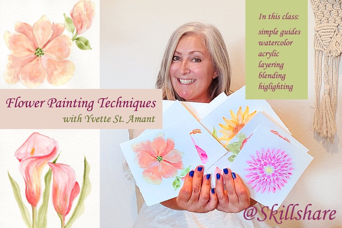
3. Lesson2 Selecting Paint Colors & Supplies: In this lesson, we'll be going over the supplies in pink colors. Okay, we're going to talk about the colors that we're going to use for this scheme. And I have my creative brief here. So this is the colors that they're requesting. I've got all my images printed out as well. But let's talk about these colors. So I want to show you how to just expand this color scheme a little bit more. Let's start with the first one. We've got a nice little kinda tangerine orange and There's a blush tone here, but it is more on the peachy side. You'll see that there's a pink one down here as well. So I've got a couple different peaches and blushes that I want to work with though this is the conch, okay? So this is probably one of my favorite oranges to work with. It's the Black brand. It's just a nice, beautiful orange tone to work with when it comes to court because it's not really rich and pick pigment. Well, it's rich and pigment, but it's not excessively bright like a tangerine or a citrus orange would be. And then I've got this beautiful cameo blush tone, which is works really well with it. There's also a public brand that's orange light, that is very similar. It's very peachy. So if you want, if you've just got an orange and you want to make some white in there to lighten up that color. That's not about idea, but what I would recommend as getting maybe a vintage white. I love using vintage, vintage white to lighten up my tones. It's not that titanium white and it won't take the pigment out. It still keeps it nice and rich, especially, especially if you want to lighten up any kinda tones with the width yellow in it, such as orange. So I would recommend having vintage white on-hand to mix your paints, but I happen to have a blush, so I'm going to work with these two. And I'm also going to use my vintage white to make things lighter, change, manipulate the color. And I also have a Yellow Oxide on him that I always have. Just in case I need to alter, the purines are brighten up. My oranges at all. I may or may not use it, but I do always have that on hand. One thing that I want to stress when you're reading the creative brief, it is requesting they want gold to animals, but they don't have the gold tone in here. So this is when you really have to pay attention to those details. I have an amazing gold tone here. Pale gold by Blick is such a fabulous color. It's nice and opaque. It may take two coats, but it's a great color to use. So I'm going to be using these colors. And then I've got this nice. This is my favorite go-to. Light pink gets called conch shell. So it has more of the blue tones here, so we're going to use that as well. So here's our peaches, orange and gold tones. So those are the ones we're going to use. Let me just I'll take a picture of these so you guys have them on hand. If you want to use the same colors. You can certainly go back into the colors that you've used in my other classes. I'm sure you've got those similar tones in there. So let's move down to the greens here because we've got this is a very, very deep TO, and then we have like a little bit of a jade color. So I've got a collection of greens and blues because I'm, might manipulate and change the colors a bit. Because we want to really make sure that the colors that we pick our mixing well with our orange tones. So let me just pull them all out here so I can show you what I've selected, what we're going to work with. So I'm getting a little more detailed into the color. Typically when you've taken my classes, I have three or five colors that I stick with. But this time I've got a little bit more. I'm working with various shades and tones within that one color. So I've selected a few greens here at gone for again, one of like there's some really nice black paints that I have a really hard time finding in the folk art. So if you wanna go onto Blick and invest in some of these beautiful tones they have. I would really suggest getting deep green and some T-cells there because it's really hard to match those colors. This is another one that green-blue deep. So this is dark green deep, and this is green-blue deep. And don't let the name fool you because it's not a dark, dark color. It will, will dry a little bit darker than this, but this tone here is very similar to this jade. So I picked dot because these are going to go really great together when I'm doing my tropical leaves. I can mix a little bit of these like blue greens with the greens. And then I've got myself a midnight garden. It's a nice grep, deep green, but there is a blue undertone. And I've also got sap green, which has a little more yellow, It's more olive, but it's really, really dark. So these are the greens that I've selected. And then I always like to have a light green on hands so that when I'm doing highlights, I can mix these with some vintage white to get really like greens or some yellow to get some nice sprites. So I'm selecting this alfalfa green. And then I've got a couple more colors here too that I may or may not use. But this is a very popular turquoise, native turquoise in the craft smart. And it, It's a little, got a little bit more blue than this one, but I want to keep it on hand in case I want to add a little, little, little tones of blue. And then the villa green, which is a really light version of this green-blue deep here. So we can use that for our highlights too. So I've just broaden my greens and blues a bedside more to work with. I may or may not use all of them. If you're limited on the paints that you have, I would suggest getting dark, deep green that you can manipulate the color. And have like a lighter blue or turquoise, you can play and mix those colors. So I would limit it to that. And then if you can stick a bright green in there, because when we're doing rich tropical leaves, we're going to want to get some beautiful greens in there, like back. Okay, so those are the pink colors. Like I mentioned, make sure you've got an antique white if you don't use white, that's fine. I was have black on hand to maybe little details. I'll use black to punch things. So those are the colors. That's, you know, you can take this to the store. You always should have an idea of your color scheme. Take this to the store with you so you can try and match the colors if you want to. Stay simple like some of my other classes and literally get the colors they've asked. You certainly can do that. But I'm just trying to give you more broad ideas of how to use colors. As I develop this class says, as far as brushes, have a collection of brushes, now, I work on watercolor paper. And I usually get the 0, 18 by 24 pads and just cut it down. So I work on nine by 11 sheets. And I've got a stack of those, so have some watercolor paper handy. And then because of the size that I'm working, these are the brushes that I tend to use. You're going to want, this one's a three-quarter inch flat brush. This is for doing my background's only. So have a nice flat brush on hand for doing backgrounds washes and that kinda stuff. And then my favorite number 6, watercolor brush. This guy has been through a lot, as you can see, but it's such a great brush. Just don't want to get rid of her. So, and then I've got a series of these little brushes here, ranging from a triple 0 to a one. So I've got a number 10, double 0 and triple 0. You don't have to have all these. Sometimes I work my brushes a lot and I do go through a lot of brushes. So if I'm doing a really fine work, I might actually use a number 1 because the point is better and it'll hold more paint so get your brushes that you feel comfortable, but they are all round brushes, so I find them the best to work with, especially when we're doing tropical stuff because leaves you want to get nice points and that kinda stuff. So these are your supplies. Also have a pencil because we are going to be doing some drawing. We're going to draw out our compositions to our artwork, and then we'll get started. So that's everything for your supplies needed for this class.
4. Lesson3 Part 1 Background Color: In this lesson, we will be doing an exercise to help us plan our collection and pick the colors for each individual painting. You're going to need your sketchbook for this. And what we're gonna do is we're going to create four different backgrounds. These are the colors that I've chosen for the background for our collection. So we're going to begin by putting a little bit of paint into our palette or pie plate, whatever you're using. And basically what we're going to do is create a four rectangles on the paper in front of you using these four colors that I selected. The first color is a blush pink. So in one of the paintings that we create within our collection, this is going to be the background color. This is just an exercise to help plan the colors for this collection. It's going to be very different than what I've done in previous classes, where we're not using the exact same colors for each piece, we're using colors that are going to complement. So in this case, an easy way of creating that effect is just by selecting for different background colors for your painting. The next color that I've chosen is this mint green. There's a little bit of a great undertone in there, but you'll see when it's onto the palette, It's just a nice pale color. So it's a pale version of the T-cells that they're requesting within this brief. So if you compare the colors on the left, you can see that we've got the, you know, the peaches and the blush tones. We've used one of those blush tones on the right. But now we're taking that teal color and we're just making it a little pastel. So we're toning down the color a bit so it's not so vibrant. So in this particular collection, we're going to have to pass tell backgrounds and then we're going to have to reach your back rounds. The next background color that we're going to use is this deep teal color. So go ahead and get your paint on the brush and you're just going to do another block with this deep teal color. Now sometimes I like to mix the perfect color because maybe the color that I buy from the store is just not the right color. So you might have to, in this case, I'm adding a little bit of a deep blue to my teal because I find the teal is just a little too green. So play around with your colors. Sometimes you just can't find that perfect colors, so you might have to mix your colors up a bit. So we've got a nice dark teal background here. That's going to be one of our other paintings. And you might have to go back and do a couple of coats on these backgrounds. Just so you've got a nice solid color. Okay, So the last background that we're doing is this kind of alfalfa paradox. Green. It's, it's nice and bright and rich. And these are one of those colors I told you that you don't seat in the brief, but we're going to add it. We're going to use it for accents. And then in this case, we're actually going to use one in the background. So it's really important to play around with colors. And even though you don't see that color in the brief that you get, it doesn't mean you can't add other little accent colors. It's just the overall feel. You want these paintings to fit in a room with all the colors that they provided on the left.
5. Lesson4 Part 2 Complimenting Color: In this lesson, we're going to be focusing on the complimentary colors of the backgrounds that we prepared in our exercise. For this part of the exercise, we're going to be using a series of just plans and lines and dots so that we can visualize what colors we're going to use for each painting. So for the first one with the mint background, these are the colors that we have chosen for this particular painting. So we're going to be incorporating the three colors that we used for the other background, which is the blush, the teal, and the alfalfa, or a paradox color. And then I'm going to be also adding the coral and the pH. So the entire painting as a whole, when we do create it, is going to contain five colors. Not all of them are dominant. We just like to use them as accents. So let's get the pain of each color on our palette. And then I'm going to show you how we're going to pull these colors together so that when we go to create the final painting for this collection, you understand what you're working with. Now you'll notice that I like to put all the three colors in the same family together here, the coral, the peach, and then that blush color. And the reason I do this as a lot of the times, I might get a little bit of both on my brush. You'll see when we do the different techniques when we're painting, like here, I don't necessarily a wash my brush off every time I use a different color because I like a little bit of a hint of that color coming through. And then here I'm showing you how I'm using that light blush tone as my white to add a highlight to these colors. So when we do the actual painting, we're going to be using the coral, but using the blush tone as our highlight will also be using the peach color with the blush as our highlight. So here I am using the green, the dark green. And I am as an example, I'm just using these leaves. And then I'm using the alfalfa or paradata as my highlight. And this will just allow us to create an image that pops off the screen so it's not one dimensional. My intention here is to show you how with a minimum amount of colors, you can get quite a variance of tones. So we're incorporating all these colors in different ways by mixing them together and then using them straight out of the bottle. Now, in this entire collection, we and I think I explained this when we were doing the Supplies is that our accent color in this entire collection is gold. So we will be incorporating gold into every painting in a different way. So this is my Blick brand, gold that I love. But I also have a gold leaf oil pen that I absolutely adore and use in a lot of my paintings. And I will be using this as well. But if you don't have anything like that, just use your girl paint. Ok, so now we're moving on to the blush background. And what I'm gonna do for this particular painting when we get to it, is we are going to be using a combination of our blues and greens. And we're just going to leave the other colors out of that. So you'll notice when we're doing this exercise, we're not using all the colors and every painting. We're using a selection of colors within the brief in different ways. So this is just another way of creating a collection with complete different color palettes for each painting. But within the same values provided. And I know it gets complicated. There's a lot of paints. But I did want this class to be a little more advanced from the other ones, just to show you many different ways that you can accomplish a collection. So I'm just using a series of eucalyptus leaves for this. Honestly, when you're creating this exercise, you can use lines, stripes, circles, whatever you'd like to use. So just play around with your pains. I've used the light, lighter teal color with a darker teal here, and each leaf is a little bit different. So I have a solid light teal at the top with the dark teal as a shadow. And then as I move down to the bottom, I'm using more of the deep teal. And then on the other side, I'm going to use the green, the deep green, and light green. So you can see how we're just incorporating the greens and the T-cells. Over top of this blush. There's no peach and there's no mint, and there's no coral in this particular painting. But in the end you will see how those gold accents are going to tie in this entire painting. And all these paintings are going to work together. So here I'm also incorporating because this was in, within our color palette, is you can always use neutrals, creams, or whites. Because there's a lot of blushes in this tone. Sorry, color palette and golds. I'm choosing to use an off white instead of a pure white, but I'm just using a little bit about off-white to make those bubbles pop. And then we're going to add some accents of gold because that is our accent color in this entire series. And I'm just putting a few stripes at the bottom here. Now remember these are in our paintings for the collection. This is just an exercise. So apply that goal to one section so that when we can reference this and more daring our paintings, you understand the colors that we're going to use for that particular painting. As we move on to the bright green background at the bottom, the paradox. We are going to be using, literally our T-cells and dark greens here. We will be incorporating that white too. So now that we're moving to that painting, you can see how we've eliminated all of the blushes, corals, and peach colors. So this particular painting within the collection is just going to be a variety of greens and blues with the accent of the white and the gold. Sudden just going to speed up the video here so you guys can watch and learn. And you can see the colors that I'm applying. I'm just using a my deep green color and the teal color to apply over the nice bright green. And then we're going to get a little bit of that off white accent and some gold and we'll be done. And as we move along this exercise, see how different each painting is. But it still gets pulled together by this beautiful color scheme. Okay, we're moving on to our last background, which is that nice deep till m. For this one, we're going to be using our peach, peach and blush with a little bit of green. And of course we're going to add some of that gold accent on to it. So again, I'm going to speed up the video a little bit. So you can just watch and observe. I'm going to create a little bit of a flower and I'm using the Peaches, the coral, the blush. And we're also going to add some of that beautiful, bright green to make everything pop. And of course, some accents of gold to tie in this entire collection to gather. The beautiful thing when you're working with all these colors is as you create your pieces in real-time, you might move along and say, hey, I want to add a little bit of one of the other colors to these pieces. That's just not enough and that's what I'm gonna do here. What this one is that at the last minute, I decide that I want to add a little bit of that mint from the first painting into this one. I haven't incorporated it into any other painting. But I just thought for this last painting, it would be nice to have a little bit of every single color within the collection. So even though we plan on using particular paint, paint colors for these paintings within the collection, don't be afraid to reassess after or evaluate and say, Hey, I think I made a little pop of this just to tie everything together. And that's it for our exercise. You guys did fantastic. I hope you can see how these all meshed together into beautiful collection.
6. Lesson5 Preparing The Backgrounds: For this lesson, we're going to be preparing the backgrounds for our collection of four using the colors that we used in the exercise. So the first one, we're going to begin with the mint color and we're simply just going to water it down. And we're going to create a nice even wash over our piece of watercolor paper. I like to just run my brush horizontal and vertical until the colors kinda blends seamlessly. Everybody's is going to look a little bit different, which is totally fine. It's okay if you see some green in there. For our next background, we're going to be using the blush tone. And I'm going to do something a little bit different here, just to show you how you can do different things in the backgrounds. They don't always have to be a flat color even when you're working with collections. So we're going to create a little bit of an ombre effect. And to begin, we're just going to start the same process as we did with the mint. So we're going to add a little bit of water and do a little bit of a wash over width, that blush color. And once we're done that and it's somewhat dry, doesn't have to be completely dry, but you don't want it sopping wet. You're going to take your cream color and water it down and just do a wash over top of it in stripes. So you're not doing a complete wash, you're just leaving some pink in between and then you can go and clean it up a bit so you can see a nice subtle stripe in this background. So for the third background, we're going to be using that teal green color and we just did a wash just like I showed you in the first one. It's the same process, so I mix a little bit of the blue with the dark green to get a little bit more of that blue teal. And then for the last one, it's again the same thing. We are just going to water down our nice bright green and do a wash over the entire surface. Again, just make sure you've got a wet surface and you're doing your strokes up and down crisscrossing so you get a nice even affect. And that's it. You've got your three backgrounds but prepared. We can now move on to the next lesson when we start designing our compositions.
7. Lesson6 Monkey Drawing: So we're now ready to begin our paintings for this collection. The first painting that we're going to work on is this monkey. We're going to begin by creating and drawing. We're going to use the inspirations that we pulled in the beginning of this course. When I showed you how to pull inspiration, print them out on a sheet. That's what we're going to use to create our composition. Keep in mind everybody is going to be at a different skill level. I don't expect you to do the same drawing as me. The whole idea of this course is to be able to use your inspiration to create a composition by pulling different images and merging them together to get your own unique composition. If you'd like to try and follow around, I'm going to do some simple guidelines here so you can learn how to draw a monkey. But feel free to do your interpretation, your drawings, or pick other subject that you've pulled if you want to tackle this alone. And we can just develop our own designs. I don't want you to feel pressured into doing this complex drawing. I just want to show you my process so you can understand how you collectively take these images and create your own unique composition. So what I'm gonna do is just allow you to watch. I'm going to speed up the video a bit. Yo have the capabilities to pause and draw along if you want to create the same composition. Or you can just watch the video to gain inspiration from what I do and create your own composition. Once we get to the painting portion of it, you can use the colors and techniques that I'm showing you with anything that you create. Okay, So let's just watch and learn. Well done. Well done, well done. It can be difficult to specifically designed for damages. So that is also present in this.
8. Lesson7 Painting The Monkey: In this lesson, we are going to be painting our monkey drying. This is the color scheme that we're going to use. This what the monkey's going to look like in the end. So whether you used my drawing or you created your own, the only thing you have to keep in mind is you will be using the same colors that I. So it's going to be the peach tones and the coral tones with a blush. And we're going to reference the exercise that we did at the beginning of the course. The first painting that we did here, those are the colors we're going to be using. So we'll add the greens after, but we're just going to begin with those peach tones. So what I'm gonna do is I'm going to speed up the video. While I'm painting. You can follow along and you can just see how I use the colors. Pretty much when I'm painting my leaves, you're going to see how I incorporate two colors in each leaf. It's going to be a dark with the contrasting color for us, some light highlights. So just follow along, enjoy the video, and incorporate these colors in your painting. Right? And so on, so forth. This is Chapter 14. Hi. Now that we're done with all the color, we're going to finish off this monkey with gold paint. If you have a gold pen, feel free like I am just to draw it in. Otherwise, you'll use your paint brush to paint in the monkey a solid gold. And just keep in mind when you're meeting joints of the monkey to leave a little bit of that green where the arm and the leg meat so that you can see the little designs within the monkey and you're not just coloring him in a whole solid piece. You get to see his arms, his legs, as you will see in the finished product here. So good luck in creating your first painting in this collection. And I can't wait to see everybody's images when they're complaint. I'm just adding a little gold detail on these pineapples to finish it off. And that's it.
9. Lesson8 Painting 2 Background Technique: In this lesson, we will be working on painting number two in the collection and will be created in an accident in the background. Before we add this beautiful foil edge, Let's get started. In the last lesson. When we were creating the monkey painting, I was using a gold leaf PIM, and this is going to become very handy in this next lesson. If you do not have a gold leaf pen, you will have to use your gold paint. Or you can just eliminate this process altogether and create your design over the ombre effect. But I just wanted to show you that there's other way to get exciting textures or patterns in the background of your artwork without just having a solid color all the time. So what I'm gonna do is I am going to measure down the page one inch along both sides. And we're just going to take that gold leaf pen and draw some stripes over the OEM brain stripes that we created with our paint. As you can see in my demonstration, I am wiping the ruler every time I use it so that you don't get that gold leaf oil paint smeared when you apply the next stripe. That's very important. You are using your paint. You don't have to use a ruler. What I would do is just free form some gold stripes connected one side to the other. And don't be afraid if your stripes aren't completely straight when you're using the paint, they are not going to be, but it's going to add, still add a nice texture and appeal to your background.
10. Lesson9 Painting 2 Striped Palms: In this lesson, we will begin painting our palm leaves over our striped background, as shown in the image. We will just be free forming this painting and the colors I will be using will be sap, green, teal at BWA. And the alfalfa or paradata that you used in the last painting that same green. We are always going to be referencing the pictures that we polled as some inspiration. And I'm going to be using the palm foil edge in the middle of the paper that I just showed you. So begin by just placing a little bit of paint in each color on your path. I'm going to speed up the video a bit here because we would be here for three hours if I didn't. So basically, what I'm going to show you is you are going to use one color. There's nothing fancy with the process of doing these leaves. And you're going to begin by doing a line from the bottom middle of the page up to the left-hand side, as shown in the demonstration video here. And you are going to add a sum froms onto the stem. Make sure that when you're doing the fronds that you give a little bit of movement with them and you're not just doing kinda straight peaks off of them. That's what makes the palms look a little more realistic. And you're just going to call it color the men as solid color. Now, I'll let you know I'm not going to show it in this video. It's going to do a quick snap to it, but do two layers so you've got a nice solid even color. Okay, So we're going to switch colors here to mere dark, sap green. And we are going to work on our second palm frond. So again, we're going to start at the bottom middle where the T01 mat. And we are going to create our next Palm. Hadn't up to the middle of the right-hand side of the page. So it's the same technique, creates some frons coming off of that middle stem. And make sure you add nice little curvature in them to make them a little more realistic. Paint all of them in solid and then go back once it's dried and do a second coat so you have a nice solid, deep green color. Before we move on to the Lastly for gonna get a little bit of detail in these back leaves. So over top of the teal leaf, just take your light aqua color and you're just going to draw a line right over top of the stem and a nice thin line on each one of those. Franz. So we're not doing any blending, nothing special. We're just adding a little dimension. Once you're done with the T01, move over to the sap green and use your nice light green color to replicate the process. Now we're ready to move on to our last palm. And I'm just going to mix a little bit of my alfalfa or paradox green, the lighter green with my sap green. So this leaf is also going to be green, but we're just going to brighten it up a little bit by mixing the two colors. And again, you are just going to repeat the same process as you did with the other two leaves. And the only difference is that this leaf is going to overlap the two leaves him behind. And again, make sure you do two coats. Wait till this first coat is fully dry and then you can go ahead and apply the second coat. On this second coat of what I want you to do is apply more of the lighter green color so it pops. And the reason why we mixed the darker green with the lighter green on this one is so that we don't have to do six coats of the light green to cover up the stripes in the background. So we just provided a really strong foundation. And then we're gonna go over top with the paradox or alfalfa to give it a lighter green color. Once you are done applying two coats of light green, you're going to go ahead and use your dark sap green to do the same thing as we did with the other leaves. So you're going to add a little bit of detail by doing a thin line up the stalk and also additionally up each leaf. And that set with painting number two in this collection.
11. Lesson10 Drawing Pineapples: In this lesson, we will be creating painting three. We're going to begin with a drawing, the composition for this painting. And we will be referencing the color palette in our exercise book, the bottom left-hand one here, with the line greens and the deep green and cream with accents of gold. So again, we will be using the dark sap green, the TL, gold, and cream. So before we get started on this painting, we're going to begin with drawing the composition. I'm going to be using the pineapples as my inspiration and we'll get some nice leafy greens in there as well. So grab the light green background that we prepared. And you can just watch as I free hand the composition. We're just going to do some pineapples. Again, if, if you wanna do your own composition, you are very welcome to do that. These are just suggestions. But you can see here if you want to follow along, I just due to large pineapples and we're not going to draw the, I'm a ferns in behind. We will just free hand that when we get to the painting. But I want to get the main components of this composition on the paper for you. And be sure to use your reference pictures. We've got the images on the left here with the pineapples. Those are reference to help you with your drawings. So use these images that's all part of creating your composition is using reference images. So this is what our drawing looks like. We have 1.5 of a pineapple and a full upside down pineapple. This is what the painting will look like in the end.
12. Lesson11 Painting Pineapples: In this lesson, we are going to paint the pineapples. This is going to be the end result. Before we paint the pineapples that we are going to get started on the palm ferns in the background. So get your paints ready. We are using the teal and the sap green, so be sure to have both those on your palette. And we are just free forming it. So at this time, just kinda forgot about those pineapple there. We are going to get some nice interest in the background. Now, I've done so many of these palm frond leaves in many different classes that I've done. So if you've taken any of my classes, especially the how to paint tropical art, then you've gotten this technique down pat. But really we are just doing some squiggly strokes right off a main branch. So we're gonna get some of these in a nice composition, just kind of filling the gaps. I'm going to speed up the video a little bit just so you can see how we accomplish this. So just keep in mind, I've got my teal and my dark sap green. I usually kind of switch back and forth, dipping my paintbrush in both colors just so I kinda get a variety of colors. You can do solid teal if you want, or the solid green. I just kinda let my paint brush and do the talking when it comes to the colors so I don't clean my brush in-between. I'm just kinda keep dipping it into the different colors. So I got a nice variety. And we're just filling the gaps with these palm ferns in the nice dive, deep, teal, dark green color. And you want to be sure to work within your composition. Maybe your pineapples weren't placed the same way that mine worse, so just fill in those large gaps. So now we're done the background, we're going to begin working on our pineapples. And you can watch my technique here. I am just, we're just going to be using the, the cream paint for now. And when I do the pineapples, I did this kinda criss-cross effect. So we end up with those little sections and the skin of the pineapple. They're almost like elongated diamonds. And what I'm doing is I'm going to leave the green of the background. And we are just going to follow those lines and fill in sections. As I move along here you will see what I mean. It's hard to kind of see when I'm doing the outline, but as I build the next section. So we're literally working from the left-hand side to the right. And you will start seeing the design of the pinup all take form. I'm going to speed up the video a little bit so you can watch and learn. So now that we're done the first planet, well, we're going to move a fin or over to the second pineapple where we have that sliced pineapple and half. So I'm going to speed up the video a little bit. You can continue watching a little bit of a technique when we're doing those nice fibers of the inside of the pineapple. But again, we are just using the one-color, the cream. So continue watching. We're back. So now that we're done with the cream, try and get some a little bit of the yellow there, sorry, the green, light, green alfalfa. And we're going to start making the top of the pinup. I'll pop here by just adding a little contrast between the leaves at the top here. So I just mix a little bit of the alfalfa or paradox green with your deep sap green just to get a variety colors. And once we're done doing the inside portion, we're going to move over to the other full pineapple and the top of the pinup girl, we are going to do in green. So I'm mixing here lighter greens in the front leaves and then I'll add darker greens in between, just so you get the depth perception. If you just did them solid, you wouldn't have that depth perception. It would be very flat. So use your lights and your darks to create that depth for that three-dimensional look. And this is where you would take the time and just go back in with your cream color and go over where you added the dark on that half pineapple. Just so that you've got a nice deep rich green and just kinda makes it pop. So you're just fixing up some details. So now we are almost done or pineapple, the last thing we're going to do is add some beautiful gold into our pineapple. And this is really going to sophisticate this painting and make that pinup I'll pop. And you'll see that when you do this, your original just looks so much better than my photocopy or my scanned image that I put up on the screen. But you can really see that nice shimmer with the gold. What you're gonna do is all the remaining light green that's left inside these pineapples, you are going to cover what gold. And the reason why we left that nice light green is because it really makes that gold shimmer. I hope you've enjoyed this painting. It was one of my favorite and we are done. And look how beautiful this painting is. Like I mentioned, your original is just going to be so much beautiful than this because you're going to see that beautiful gold I'm through.
13. Lesson12 Final Project: Congratulations, You made it to the last lesson in this course, and you will be designing your own composition using the teal background and using the color palette on the bottom right of your exercise. This is a challenge for you. I want you to use the inspiration photos that we pulled in the brief at the beginning of this course, use any of these images, combination of the images, you can use flowers and animals. If you want to just do foil, edge or fruit, you have the freedom to choose whatever you like. The only requirement is that you must use the deep teal background that we prepared and use the color palette from our exercise. And also keep in, in the theme of this collection. You want it to be cohesive and work within the collection. I want to show you what I created and maybe it'll give you a little bit of inspiration. Thanks for joining my class everyone. I hope you had a great time and you've learned a lot. Please, please share your work with me. I love seeing the work that you created and what you've learned in my classes. And I will see you again soon. Thanks guys. And good luck with your final project.
 Yvette St. Amant, Published Artist