Transcripts
1. Introduction: Illustrating scenes can be such a fun process. Imagining the worlds we want to create and thinking of the elements that will be part of our scene, can be so exciting. But it can also feel overwhelming when we don't know exactly how to build that world we have in our heads. Hi, my name is Karla Alcazar and I'm illustrator who likes narratives, florals, and creating scenes for my characters to live in. Over the past few years, I've worked doing editorial illustrations for both books and magazines, which has helped me to dwell into the ins and outs of drawing engaging scenes, and have also been a teacher here on Skillshare and it's been wonderful. Now, let me tell you a story. When I first decided to do illustration professionally and started working on my portfolio, I really wanted to create pieces showing magical worlds and wanted to draw scenes full of details and meaning, but I wasn't sure on where to start or how to start. My illustrations felt a bit off, like there was something missing. I spent quite a lot of time figuring out how to make my scenes more engaging and I would like to share my findings with you. In this class, we'll cover a bit of basic composition theory and we will learn how to apply this theory in a way that helps us to communicate our ideas in an exciting way. We will talk about what a focal point is, the role it plays in our scene and how to enhance it and we'll also talk about depth and how to achieve it. We'll also talk about move and how to convey it and we'll see examples that will show us how this theory is visually applied. Throughout the class, I will share with you some of my personal tips and tricks. I've done so many floral scenes over the years and I've always found them such a relaxing thing to draw. For our class project we'll draw a floral scene that will help us to put the theory into practice in a fun and gentle way. I'll share with you, my go-to sources to find inspiration whenever I'm drawing scenes. I will be using Procreate to draw my floral scene. But please feel free to use any medium that you feel more comfortable drawing with. This class is for intermediate students since certain basic drawing skills are required. But this class is also for you, if you're a brave beginner who would like to learn some basic composition theory. Overall, I think this class is for you, if you would like to feel more confident while illustrating a scene. I hope that by the end of this class, you would not only feel more confident in creating worlds of your own, but also feel curious and experiment creating a scene with not only flowers, but with other elements like houses, people, animals, you name it. I think we're going to have fun. Thank you so much for being here. I hope you enjoy this class. See you in a bit.
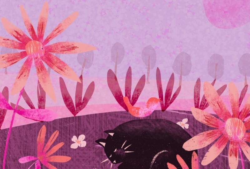
2. Class Project: Before we jump onto our first lesson, let's quickly talk about our class project. As you've seen in the class title and the intro for this class, we'll be creating a floral scene. Just so we are on the same page, let's define what a scene is. For this class, we're going to define a scene as an illustration composed of several elements. These elements may or may not have a correlation between them. A scene usually will show something that either is happening now or had happened in the past or will happen in the future. Now, if you are not a flower person, fear not, I wouldn't want you to feel that you have to draw something delegate or even elaborate if that's not your thing, I would like that your main focus goes towards creating a scene that works. Flowers are just an anchoring point. I decided to pick flowers because they can be interpreted in so many different ways, and they are relatively fun and easy to draw. Please feel free to interpret floral as you wish. You can draw your flowers as abstract or realistic as you want, as big or as small as you want, you can draw one or you can draw many, that's up to you. But I would definitely like to see a flower of some sort in your project. This is because this is the one specific thing all of our projects will have in common. This allows me not to only see a bit of your personality, but I also find it so inspiring to see the many different ways in which we interpret the same prompt. Besides your floral prompt, there's other important elements that we'll need to think about before creating our scene. Location is one of them. This element is key because without thinking about on a specific location, we don't have any context for a scene. Your location can be anything, can be inside or outside. I would only suggest for your location to be something somehow specific, like a kitchen, a bedroom, or a specific type of forest, anything that can give us a broader context that will work. The next thing that we'll need to think about is time of day. It can be daytime, sunset, dusk, whatever tickles you'll fancy. This also provides so much context for a scene and can add mood to their illustration as well. Since I really want to see your personality is shining through your project, I would also like to see something that you like, or something that you draw a lot. It could be a character, a house, your pet, your favorite mug, or something that you might think it's interesting, like a chair. The challenge is to organize these components or elements using the basic theory that we'll cover, and to create a scene that works. Try not to overthink it too much though. That would be my main tip. That was one of the issues I had at the beginning when I started to draw scenes, I used to overcomplicate it. The point in this whole thing is to have fun. If you have fun while doing your project, your project will reflect that. If you're unsure what elements to pick, feel free to use mine. For my class project, my floral element will be wildflowers. To some degree that influences the location, I picked a little patch and this will make more sense when we go through the inspiration at a lesson. I decided to pick nighttime for time of day, and my add-on will be a character because it's something that I really love to draw. You're free to use any kind of material you're comfortable with. I'll be using Procreate in this occasion mainly because it's more flexible and easy to show what I'm doing on camera, but if you prefer traditional media, that's fine too. You are welcome to draw a sketch or a finished illustration. What I would like to see in your project is the concepts that we'll cover in this class and your own personal way to interpret them. If the sketch shows your interpretation, that's great, but it is also awesome if you decide to do a finished piece. Please don't forget to upload your project here on Skillshare, and if you have Instagram, share it on there too, and please tag me or use this hashtag so I can find your project. Now with these things in mind, we can jump onto our first lesson. I recommend taking some notes as we go through the floral scene lessons. Now, see you there.
3. Focal Point: In this lesson, we'll talk about what a focal point is and why it is important for us to think about it before we even start drawing. We'll see ways in which we can enhance our focal point. Now that we have a rough idea about the elements that we may want to include in our final scene, it is important for us to talk about focal points. What's a focal point? A focal point is the element of greater importance in an image. It's the element that draws our attention to the scene into a bigger or lesser degree, dictates what's happening inside the scene because everything revolves around a set focal point. When illustrating a scene, it is important that we think about our focal point before we even start drawing because if we don't, we may risk adding too many elements in your scene and over-saturating it potentially creating an imbalance or even confuse the viewer, or we can also oversimplify the image by not adding much context around the focal point and once again, create confusion. In my character class, I've shared that one of the issues I used to have back in the day wasn't my illustrations came across as portraits rather than scenes. One of the main reasons why this used to happen was because I used to oversimplify it way too much. This is an example of oversimplification. This is one of my early illustrations and I still like it a lot. In my head, this was a scene of two girls going to the post office. Unfortunately, this illustration is not a good example of a good scene. The reason for this is the lack of context. Now, the characters are the focal point. This means that all of the attention is on the characters. But this is only happening because there's nothing else to pay attention to. The whole point of focal points is to elevate a particular element above the other elements placed in a scene. But in this example, the main focal point is all there is. If I had to draw on something else in the scene, even if it was something really minimal, like a postbox or a lamppost or if the scene was part of a comic in which we had more contexts, then it could work. But I don't think it works that well on its own. Now let's look at this illustration and let's try to guess what the main focal point is. If you're against the character, you are correct. Usually when characters are present in illustrations, we will consider them the main focal points and the rest of elements are placed in the composition or the scene in a way that enhance either the character or the activity that character is doing. A focal point can also be an object, in this case, this beautiful house surrounded by nature. Is it possible to have two focal points in one image? The answer is yes, it is possible. However, it is quite likely that one of the two focal points will be more prominent than the other. I think that the only thing that we need to consider when we may want to include two focal points is that it is important that there are certain interaction between the two. In this illustration by yours truly, we have two focal points, the big rows right here and the character that is walking towards it. If I had to pick up the main focal point, I would say that that is a flower. Why is it that in this particular example, the character is not the main focal point? There are a couple of reasons for this. The first reason is because we're playing with sense of scale, and we're going to talk about that in a little bit. The second reason is that the action happening in this illustration is revolving around the flower. This is, the presence of the flower, right there is dictating whatever it is that happening in the scene. Another way to identify the main focal point in illustration is to think about how will the illustration look like without that element in it? Now let's go back to the first illustration that we used as an example. Let's imagine for a second that the character isn't there and the chair is completely empty. What feeling would it give you? Would it be different? Would it be more or less the same? What do you think would be the main focal point if a character wasn't there? If we see the illustration as it is with a character in it, we can easily get rid of the laptop, the cardigan placed behind the chair, even the plant, the little frames behind her or plants. It wouldn't change much, but if we get rid of the character, would we get a completely different interpretation of what's going on there? We have established that characters and objects can be focal points. But I think that it is also important to mention that specific actions can also be your focal points. Usually when we're drawing characters, our specific focal point can be the character's face, but this can also be an action they're doing with their hands. In this example, our eyes go directly to the character's face. We can also say that the action the character is doing is also what catches our eye. In this other example, it is quite impossible to ignore, but it is also the action of feeding the kitten that may interest us the most. What if we accentuate a focal point even further? Well, there are a few ways to achieve this. The first one is scale. We can do this by playing with different proportions in the image. Making the object we want to showcase much bigger or much smaller can really reinforce our focal point just like the example we've previously seen, the one with a flower. But let's try to find a different example for that. Having such small characters really make us wonder quite a lot of things; are they really small or is everything else bigger? Regardless of the answer, our eyes are set on the focal point. Next one is color. Using a different color can really highlight our focal point very effortlessly. This can be a lighter or darker colored depending on the rest of the palette you want to use. This is a very good example because the use of color is really effective. Our eyes are instantly drawn to the characters, both the cat and the person, just by using a color that is not used anywhere else in the scene. Placement. This is where composition rules come into play. At this point, I think it is important to mention that we can use a sense of scale and color and composition rules to make our focal point more prominent, you don't have to pick just one. Now let's do a little exercise. I have created a Pinterest board which I will link in the resources section. I would like us to go through the illustrations in that board and start locating focal points. This exercise is completely optional and you can do it in your own time. I would suggest you trying it because I think it is important to locate focal points is laid before we talk about composition rules. Composition rules may sound a little bit daunting, but they can be quite fun to play with. They can also help us not to only enhance our focal point, but to give our scene an interesting field. We'll talk about them in our next lesson. [MUSIC].
4. Composition: In this lesson, we'll talk about some composition rules that will help us to create our scene for our final project. We will also go through a few examples that will help us understand these rules a little bit better. First off, let's start defining what a composition is. Composition is just simply the way we place elements in a work of art. In this particular case, the composition would be the way in which we will place and draw the elements in our scene for a class project. Our goal is for our scene to look nice and interesting. How do we do this? There are several rules that can help us make our composition look more interesting but before we begin to talk about these rules, it is important for us to consider the element or the elements that we want to highlight in our illustration, or in other words, we need to think about our focal point. It's okay if at this point you are still unsure on what element to pick for it to be the focal point of your scene, but just for reference, I'll tell you mine. These are going to be the elements that I would like to include in my class project and since my add-on is a character, I would like to highlight that element and for it to be my focal point. Now we're going to talk about some composition rules and we're not going to talk about every single one of them but I am going to share with you the ones that I tend to use the most, and we'll see a few examples. The first one is the rule of thirds, which I think is the most common, or the most mainstream one, let's say. To apply this rule, we're going to divide our page into a grid and we're going to have two horizontal lines and two vertical lines. Now we have to think about the places in which these lines intersect and those are going to be the places in which we may want to place our focal point. Let's see an example. This is a very lovely and balanced composition and since there's a character, we may say that the main focal point is the character's face. If we apply a grid over this image, we're going to see that two of the lines intersect right where the head is. If we use this composition rule in our illustrations, we're going to have a natural and balanced scene. Our next rule is to frame the focal point. Now let's have a look at this beautiful illustration right here. We can see that the two characters are right in the center and I think that we would consider them as our main focal point, and there's a lot of objects surrounding them. We can see here that there's frames or pictures above them and there's plants right next to them, and there's a little element right here which frames the character in a really nice and subtle way. Using this composition rule will allow us to add more context to a scene. The next rule is to center our focal point. In this example, we can tell right away that the focal point is a tiger and we can also tell right away that the focal point is placed right in the center. If we apply a grid on top of this illustration, we're going to confirm that. This composition rule will give us an impactful and direct scene. Our next rule or guideline is to place our focal point a little bit off-center. I think this rule creates very interesting compositions and makes him look a bit more dynamic, and this is the one I tend to go to the most for my illustrations. We're going to apply a grid on top of this illustration so we can see exactly how off-center our character or focal point is. We can tell that the character is not necessarily placed in any of the intersections and we can also tell that the character is not necessarily at the center, but it is occupying most of the central square in our grid. Now, does it mean that because we're using a composition rule where the focal point is mostly at the center that we forcefully need to place your focal point in the very center square? The answer is no. You can place your focal point in one or more of the central squares, and this can apply for both central compositions or for off-center compositions. Let's see an example using an off-center composition rule. We can see that the main action is taking place in the center square. The character is occupying these two squares and we're not making her tiny to fit in the central one. We can see that there's nothing being placed in any of the intersections here and if I were to use the rule of thirds, we would need to place a character a little bit more to the left so her head would be in one of the intersections. In this particular case, she's a bit off-center though. I'm a fan of this composition rule because I think that it's quite tricky. I think that our brains are expecting to locate the focal point right in the center but having it a little bit off-center really confuses us a little bit and draws our attention even more. Our brains are very well equipped to figure out when something is off and this composition rule works because the offness is very minimal. It is enough to get our attention but not enough for it to look strange. Let's go back to this example. Do you remember the other two ways to enhance a focal point besides using composition rules? Can you guess which one is being used here? If you said color, you're correct. The composition in this illustration is so nicely planned, our focal point is a character who is performing a very specific action. In this particular case, the character is cooking and all the objects in the scene are placed in a certain way that facilitate that action being performed. Also, the off-center rule is used. The focal point has been enhanced even further by using a color that has not been used anywhere else in the scene. Before we go into our next lesson, I would like us to do a little exercise that will help us to warm up, so to speak, and start thinking about how to apply the composition rules that we've seen in this lesson. All you need is a camera on your phone. I would like you to activate the grid on your phone and if you don't have it on, this is how you can activate it. If you do have an iPhone, just go to Settings, Photos and Camera, and just select, "Grid". If you have an Android phone, just go directly into the Camera, tap on the gear, and select, "Gridlines". I would like you to take as many photos as you want using this grid and maybe using different composition rules for the same focal point. Maybe try placing at the center, maybe a little bit off-center, and maybe try to figure out which one catches your eye a little bit more. If you don't have access to a camera phone, I would suggest doing very rough sketches of a focal point of your choosing and to try different ways to place the same object on your grid. Try to keep your sketches as minimal as you can so you can draw many and decide which composition rule you like best. It would be nice to see your photos too. I always love to see the full process of a project so please feel free to upload them to the predicts section if you want. Now, we're ready to go onto our next lesson. In our next lesson, we'll talk about depth and how we can achieve it in our illustrations, and we will also see a method that can help us achieve this.
5. Depth : In this lesson, we'll talk about how we can add depth to our illustrations. I'll share with you a quick method that can help us achieve this really easily. Depth is one of the things I used to struggle the most when I started drawing scenes. I wasn't too sure on where to place the elements in my scene. I think that's one of the reasons why I used to always simplify things because I used to find it so overwhelming. But it turns out that adding depth is something very easy and fun to do. Just a little friendly reminder, adding depth is not a requirement. If skipping this step is something that you stylistically prefer, that's totally fine. What is depth? Depth is the illusion of distance in an image. Depth can help us to make our scene a little bit more complex and can help us add a little bit more context to a scene. Now, let's look at some examples. In this illustration that is one of my early works, we can see a rough use of the rule of thirds. I used a shade of purple a little bit darker on her shirt, and I used scale to make her look a bit small in comparison to the tree and to her surroundings. We cannot say that there's a sense of depth here though. The reason for this is because everything in this scene is happening in the foreground. A foreground is a part of the scene that is closer to the viewer. Let's look at this example. This is a very lovely scene where all the elements are placed in the foreground as well. As I mentioned before, placing the elements like this can be a stylistic choice and can be very effective when you want your illustration to look simple and elegant and when you want your scene to be impactful too. But if we want to add a sense of depth to a scene, then it is important that besides the foreground, we think about the background, which is the opposite to the foreground. That is, what's furthest from the viewer. Background is a term that we may all be familiar with, and sometimes we tend to associate it with depth, which may not necessarily apply. In this illustration, we have a background of branches and leaves but not depth. This works beautifully as a portrait because the background frames the character, enhancing it even further. We can tell that the background, in this case, leaves are placed behind the character, which makes them the furthest object from the viewer. But they're not too far from the viewer though. The background and foreground are too close to each other. This is why there is not necessarily a sense of depth which is not a bad thing at all. As I said before, that can be a stylistic choice. In this case, the lack of depth works wonderfully. In this other example, we have trees and a bit more sense of depth. This is happening because the background is placed a bit further from the characters in the foreground. In other words, the gap from the foreground and the background is greater. This gap has a name, and this is what we call middleground, which is the distance that there is in-between the foreground and the background. Let's see a couple of examples. In this example, the object that is closer to us are the bushes. So we will consider them as our foreground. The girl and the puppy will be our middleground, and the trees are our background. In this other example with even more sense of depth, we can also see a foreground, a middleground, and a background. We can see here that the middleground is quite large, which gives the impression of greater sense of depth. The one rule that we must follow when working with depth is that the object we draw in the foreground needs to be bigger than the ones we draw in the background. Also, it is worth noticing that you can draw your focal point in any of these places. Just keep in mind the ways in which we can reinforce our focal point. There's something really cool that we can do with depth and that is playing with the mood in our scene. Usually, when we place our focal point in the foreground, we have the illusion that there is a sense of intimacy. Since we are the closest possible to the main element in that scene, that makes us feel like we're almost there. If we place our focal point in the middleground, which I think is the most common placement. We feel like expectators, but not necessarily as immersed as if we had the focal point in the foreground. If we decide to place our focal point in the background, that could give us a sense of mystery, almost as if were peaking and almost as if we shouldn't be witnessing what's happening in our scene. Now, we have all of this information, but what if we're still unsure on where to place our elements in our scene. If you're anything like me and you prefer methods out a bit more specific, I would suggest you trying the following one. Let me tell you that I felt that I helped come up with this method, but turns out that this is a very old-school method. So sadly, I cannot take credit for it. But this method is very practical and can be quite fun. Now, lets see an example. Here we can see the foreground, the middleground, and background. But if we want a more specific way to add elements into our scene, we can totally do this by layering the elements in the composition. For example, if we draw a line where the elements are drawn, we are going to slowly come up with a guideline. It doesn't have to be perfect or precise, but this can be really handy when we feel a bit overwhelmed and we don't really know where to place our elements in our scene. Our guidelines don't necessarily have to be straight lines. In this example, the plants that are closer to us are placed on a straight line. But the second layer is a curved one where little flowers are placed, framing our character or our focal point, which is placed on a straight line, as well as the other layers in the scene. In this scene all the layers are straight, but layer two is set at vertical, and if you look at it a bit closely layer three is also a bit tilted. You can draw these lines as you wish. There is no set way. It can be as close to each other as you'd like, and you can have as many layers as you wish. Experiment and see which one you like the most. Just remember that the objects in the foreground will be bigger than the ones in the background. Another thing to consider when you're drawing your guidelines is which ones will be part of your foreground, middleground, and background. Just a quick final note, this guidelines are there to give us a rough idea on where we may want to place our elements. But of course, you're free to fill in the gaps that they might be remaining in your illustration as you wish. I included a few random guidelines in the Resources tab in case you want to check them out and try them just for fun. At this point, we have covered quite a bit of theory that should give us a rough idea on how to do our final project. Now, it's time to find inspiration so we can start drawing you're scene. In our next lesson, I'll share with you my favorite sources of inspiration when I'm working on a project. See you there.
6. Shapes: In this lesson, I would like to share with you really quickly how I draw my florals in case that they're tedious, or if flowers are something that you don't tend to draw that often and would like to learn a quick technique to draw them easily. The first thing I like doing is to identify the overall shape of the flower I want to draw. I think that the most common shapes are a circle, a triangle, and a rectangle. Usually, most flowers with this front view will have a circular shape. Usually, flowers with a side view will have a triangular shape. Usually, boxy kind of flowers like tulips, are going to be really square. The next thing I like to do is to pinpoint where the center of the flower would be. This helps me to understand where the petals are going to stem from. Now, I'm going to draw a circle and I am going to place the center of the flower right here, and I'm going to draw vertical lines like this. This is going to be the skeleton, so to speak. Now, I'm going to use this to draw my petals, and these are going to have a drop shape. I am going to just draw the center of my flower and some other details. If I want to play with perspective, I will use the same technique, but instead of drawing a circle, I will draw an oval, and I will add my petals in my center of my flower in the same way that I did before. If I feel that petals are missing, I will just add them to fill in the gaps. If I want to draw a flower using a triangle, the first thing I need to do is to pinpoint where the center would be, and usually, is at the bottom right here. I'm going to draw my lines that they will become my petals, and then I'll just add some extra details. If I want my flower to look a little bit more open, I will just add a couple extra petals at the sides of my triangle, and that'll do the trick. For boxy flowers, I tend to use the same. Just pinpoint the center, which is usually at the bottom. I tend to draw the petals because I have a better idea of how the petals will fit within the rectangle. But, of course, if it's easier for you to draw the lines and then draw the petals, then that's completely fine as well. Then I just add some extra details, and that's my tulip. There's two things that I recommend paying attention to whenever we're drawing flowers. The first one is the shape of the petal, and the second one is the diameter of the center of the flower that we're drawing. I think that these two things really help us to distinguish the type of flower we're drawing. Now, in this example, I'm going to draw a flower with five petals. I am going to use petals that have ruffled edges. The center of my flower is going to be quite big. Then I'm just going to add some extra details that are going to help to differentiate the flower even more. Now, if I use a different kind of petal, I still have the same structure, but it looks like a completely different flower and the center is quite small, so it looks very different. It's the same if you decide to draw a flower with a triangular shape. Just by changing up the type of petal, we may get a completely different flower. This is mainly what I do. Whenever I need to draw a flower, especially if it's a type of flower that I don't tend to draw that often, this technique comes to the rescue. Hope that you'll find this technique useful as well. Now, let's actually get ready to draw our class project.
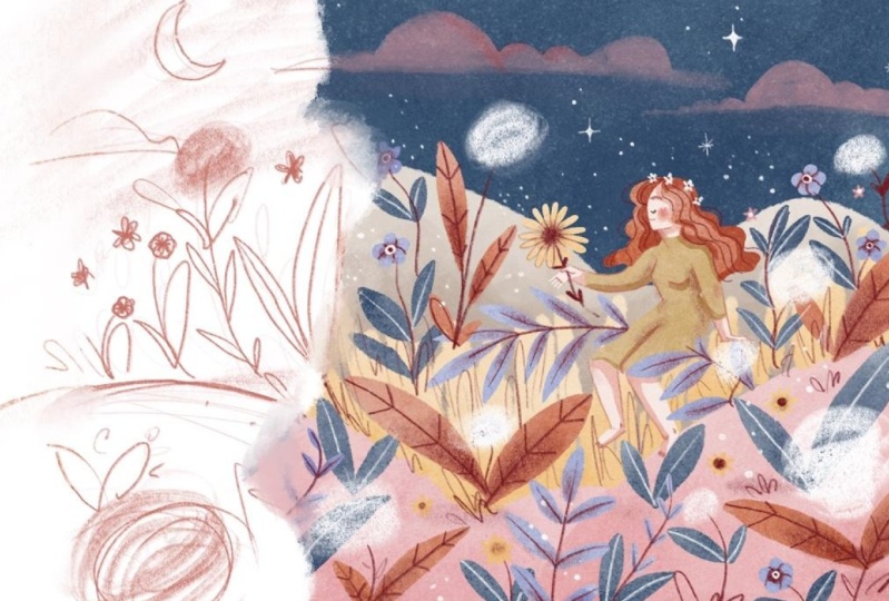
7. Sketch: In this lesson, we'll finally get to draw our scene, and in this lesson, I'll share with you how I drew mine. Just a little quick note. It took me about an hour and a half to draw my scene, so I tried my best to condense all of this footage and information into a video that is not too long to watch, so please keep that in mind as we go through this lesson. Now it's finally time to draw our scene. Just a quick reminder, you are welcome to upload a sketch or a finished piece and let's keep in mind the theory that we've seen in this class while we're drawing our scene. The first thing that we need to do before we start drawing our scene is to create a grid so we know where to place our focal point. How I like to do it is using my fingers to measure the distances, and I try to do it very roughly. Remember that these are guidelines and they don't have to be precise, but this really helps me for them to be more or less accurate let's say. I'm going to use three fingers, I think that's a good measure and I am just going to put a little mark right there, and of course you can use a ruler if you have access to one, but I think this is just really practical because you can do it anywhere anytime. Now that we have our markers, we can start drawing our two vertical lines and our two horizontal lines. For my project, I think I'm going to use the rule of thirds, so I am going to be really mindful of the intersections and I am going to place my character's head in this intersection right here. Now it's time to create our guidelines, and I honestly want to keep it really simple and having quite a bit of open space so I can draw the clouds and the moon that I wanted to draw, so I'm just going to draw this lines like this, just three layers for my illustration, and I'm just going to make my character a little bit smaller, so I have a little more room to fit the flowers that I want to draw. Right now, I'm just going to be placing several elements and several flowers using this guideline, and I am going to fill in the gaps that are in between. Like here I'm just going to keep adding and be really mindful of my guidelines. I'm pretty happy with my middle ground and I really like that we feel close to our character. Now once I have this basic sketch, I would like to sketch a better sketch if that makes sense just to polish it up a bit, because I find that when I have a lot of lines, I just get confused and I don't know exactly which ones are the ones I want to keep. Now I'm going to draw the pose of my character, and one of the things I like about poses like this besides being quite simple is that it's almost as if a character is about to turn towards us and tell us something I think, so that's always nice. Now I am going to add the flowers that I saw in my patch of wild flowers. There's going to be some dandelions, those tiny purple flowers and I really want my scene to look lush, and of course I need to draw my crescent moon and my clouds, and I'm going to carry on filling in the gaps but being really mindful of the layers that I have decided to create. Now I'm just going to check that my focal point is in the right place using my grid, and I'm also going to shade my foreground, middle ground and background, and I think that my sketch is ready. I would like to add some color to my scene, so that's what we're going to be doing next, and what I like doing is just to add color on top of my sketch and that gives me a rough idea or how the scene or the composition is going to look like. More often than not, I tend to change my mind when it comes to color placement in my illustrations, but this happens because color is so important to me and I want to make sure that my illustration is communicating what I wanted to communicate by using color, and that's why I tend to be a little bit more picky when I am deciding the placement of the colors, but honestly adding color is a part that I enjoy the most. I usually tend to pick one main color so to speak, and work the rest of my palette based on that main color. For this scene, I wanted to use this deep blue because our scene was happening at nighttime, and I wanted to make sure that that came across with the colors as well. One of the reasons why I decided to pick nighttime for my illustration is because I wanted my illustration on my scene to have some magical sense to it. I am going to keep referencing my initial color placement so I can make the right adjustments. Like right now, I think this purple little leaf looks better than the original one, and I think that it should stay this color rather than the original one and just making sure that the color actually looks good. Now I need to make sure that the details that I'm going to be adding actually go well in terms of color and in terms of composition respecting the lines that I have decided to use. By this, I mean that I don't want to add any additional elements that are not respecting the original layering guides that I drew at the beginning. Whenever I'm doing an illustration it's always so much fun to add little details to the scene like shading, like little stars right here that I like to add just to give that magical feel or just to reinforce that magical feel a little bit more, and to add little details on my leaves, on my flowers. I think that little details really lift up and enhance the illustration color. Even in simple illustrations, adding little details can make your illustration look extra nice and polished. Now I'm going to make my character wear a dress, and I'm going to use a color that I haven't used anywhere else because I really want to make her pup. I am going to add a couple elements respecting my original layering guides like this little leaf right here, and I'm also going to start shading my illustration. I really think that shades make a scene look a little bit more atmospheric. As I keep adding different elements to my scene, I need to make sure that I am referencing specifically my layering guide, and at this point I think that I have included most or all the elements that I want them to be part of my scene. We have the character that I wanted to draw, it's a nighttime scene, the location that it is a little patch of flowers, and I have my wild flowers, so I just need to make sure to keep adding little details and shading and textures in order for my scene to look the way I want it to look. Adding texture is so important to me as well because I really want my digital illustrations to look as if they were done on paper and texture really helped me with that. I'm pretty happy with my scene as it is right now and this is my original sketch and this is my final scene. I'm actually pretty happy with how it turned out. I like keeping a very short middle ground because it does give me that illusion of closeness, and I think having a very simple layering guide helped me achieve that. This is my final scene, and I'm really excited to see yours, so once again I'm going to remind you to please upload your project into the project section. I am very excited to see what you come up with, and we're almost done with this class but before we go, I will like to say a few words, so see you in the next bit.
8. A Few Words: You did it. Yeah, congratulations on finishing this class. We had fun, didn't we? We covered quite a lot. We've talked about focal points, composition rules, depth, mood, went through several sources of inspiration and we draw our scene. By the way, don't forget to upload it so we can all see your hard work. I really hope that you feel a bit more confident now when you want to draw scenes and hope that you feel inspired to experiment and draw scenes using different elements with different depths, perhaps different composition rules, and perhaps now when you see illustrations or photos or movies even, now you may want to study them for a bit and figure out why they look the way they do. Please don't forget to upload your project, and it is so great to see the many different styles and ways to interpret one class. If you'd like to share your project with me on Instagram, please tag me or use this hashtag. Well, I'm going to leave my username too, and please follow me here as well so you're notified when the next classes are up. Thank you so much again. See you soon. Take care. Bye for now.
 Karla Alcazar, Illustrator and Teller of Tiny Stories