Transcripts
1. Intro and Trailer: Hey, guys, my name
is Ramona MacLean and this class is all
about color play. We're going to use
watercolor and just do some really fun color mix in your sketchbook to get
you playing with color, mixing with color, and just have something fun to do when you're not quite sure what to paint. In this class, you'll
be using watercolor, a sketchbook of some kind
or paper of some kind. Watercolor paper is best. You'll also need a
black waterproof pen, brushes and water
for your paint, and maybe some paper towel
to wipe it all off on. Join me and let's
play with color.
2. Supplies: So here we're just going
to go over some supplies. If you have a watercolor
kit of some sort, I just have these ones from art tool kit that
are really handy. I've got a little bit
of guash in there as well as some watercolor. I need some sort of watercolor. And then some brushes, some that are maybe
a little bit larger and some that are a little bit smaller to get the nice details. And then you need a sketchbook
or paper of some sort. I have a Midori sketchbook, which I just love
for most things, but if you have
watercolor paper, that would work really nice. And then I just have
this old sock that I use to wipe my
paintbrush off on. But if you have paper towel,
that works great, too. And then, lastly,
you just need a pen with some waterproof black ink. The one I have here is a
fude nib in a fountain pen, but you can use
something that just has black ink that
is waterproof.
3. Eggs: First color activity I'm
going to start with is filling in just a
page of egg shapes. So I've just drawn these
wonky looking eggs, and then we're going
to fill them with different colors that we want to see how they
blend together. So I'm sort of thinking
about eggs here, but I'm also just
kind of thinking, what would be a
pretty combination. So in the first one, I
use a pale purple and a teal and both of those
have white mixed in. The second one was
two types of browns, like a raw sienna and
a more standard brown. Third one I'm doing has blues,
different kinds of blues. And so I just want to use enough water on there so that it can really blend together
and give a cool look. So anything that
you're curious about, anything that you
think would look really pretty as an egg, This top one I did kind of like a coral pink mixed with yellow, which makes that color a little even more cary,
which I really love. And I'm keeping
my colors not too dark because eggs to me, most of the time,
they're not that dark. They're usually pale colors. Get some speckles on it. So here I'm going with
sort of an olive green because I thought that
would look very nice and natury adding some raciena in there and getting
some nice brown mix. And then we're doing
some ultramarine, again, keeping that pretty
watery and adding in some raciena to that because I remember from past mixing that those two colors can look really cool together. Now I did pick up some
of the color there, so it was a little bit
less mixed than I hope, but it turned out
nice in the end. Some of the colors I'm using
have a bit of guh in them. If it looks thicker to
you, that would be why. Some of them are watercolor
and some of them are guash. Here I use very pale
purple color as a base with water and then
added a little bit of brown into that just
letting that color really blend out so that
it stays really pale. Then I decided to add a little
bit of teal blue because I wanted the side to look
a little bit mystical. Now we've got some
pale green with, I believe that's buff titanium. If you've never heard of
buff titanium, watercolor, it's kind of like a cream color, and it adds some really
nice mixes when you use it. And then this last one here, I'm just doing two
kinds of blue, and, yeah, just seeing
how they mix together. Adding a bit more water
so that it mixes. So eggs in general have
speckles. You can add speckles. You don't have to, but I
like to add the speckles, and some people will use
some paper on either side of their egg just to make sure that the speckle doesn't go too
far, but I don't really care. I like the look of
speckles in general. So I'm just changing up
the color of the speckles, usually using a darker mix to what I'm putting on the egg, but sometimes going with a totally different
color in general. I just adding some
splatters there. Yeah. Get some cool fun
texture going on. So try it out and
see how you like it.
4. Triads: So the next activity
we're doing is a triad. So if you haven't heard
of a triad before, basically what you're
doing is you're taking three primary colors, a red, blue, and a yellow, and seeing what mixes you get
from those specific colors. I have a stencil
that I use for this, but you can use any round
object and then sort of just sketch in where
the different areas are equidistant from each other. I used a pale coral pink, a pale teal blue, and then also a
pale lemon yellow. You can choose whatever
colors you like. They can be non
primary if you like, but if the colors aren't very far away from each
other on the color wheel, you won't get much
of a difference. Here in this mixing
area, I'm adding pink, the most pigmented on the
side closest to the pink and adding water so that gets less and less
towards the blue side. Then I'm going to add
blue on the other side, closest to the Teoblue. Then use the most pigment and then use less and less
as you go to the middle. The paper that I'm using here is not amazing for colour
mixing on the page. I probably should have just done the mixed it on a
palette and then put them in the spaces that they should have been,
but that's okay. It was fun to do, and I
do love my matori paper. So you see a bit of
that mixing there. You should get a nice
purple mix in the middle, and then the other side,
you should get a green, and then on the
bottom, you should get sort of an orange color. So up to you what
you want to use. You could use a magenta. You could use a ultramarine, you could use a yellow
ochre, something more muted. I like to do this for lots
of different combinations. I've tried it with neon colors. I've tried it with
just my basic colors, with a really red, really blue blue and yellow, and then I've tried
sort of the off colors. Cyan magenta and yellow and they'll give you some
really bright mixes. But some of them, if
you use a yellow ochre or an ultramarine or something that's a
little bit more muted, the colors you get
are really cool. And sometimes you come up with some colors that
are not so cool, and that's good to know, too. So while you're using
colors for a painting, this can be very helpful to try out because it will
give you different moods. Now, my husband wanted
to try it out as well, so I drew him up a triad. And so you can see
on this paper, it actually mixes quite a bit better because this
is watercolor paper. So he was adding in he did
a magenta cyan and yellow, and then a red ultramarine
and yellow ochre. So you can see the difference in the brightness of
these two triads.
5. Patterns: This exercise, we are going to be playing around
with colour palettes. So what I did was I
went online and I just kind of found inspiration
for different patterns. Sophie McPike has the most beautiful
pattern arrangements, so I chose most of mine based
on hers, and then a couple. I just came up with myself. So yeah, while adding the colors
here, Think of a pattern. Do you want to use
all kinds of greens? Do you want to use
complimentary colors, ones that are across from each
other on the color wheel? Do you want to go totally random and just see
if it works out? Do you want to use pale colors? So for this first pattern, I went with some
blue and green for the main hearts and then also
some sort of red and pink. So I alternated the
different colors there. You can choose
whatever you like if there's certain colors that
gravitate towards you. But try filling in those colors and waiting
a little bit so that the outside can dry before you add the color
touching the last one. I made the mistake of doing
that for the first one, and I had to be very
careful not to touch those colors as they wouldn't
blend into each other. That's why I'm doing
the three hearts together, letting them dry, and then I'm moving
on to another Now, you don't have to do this many. This took a long time because there's a lot of
sections to fill out. But for this next area, I'm switching the colors
and doing the two of the same diagonal from each other and sticking kind
of two pastel colors. So I'm adding a little bit
of white to some of my mixes so that there's a little bit
of cohesive color to them. So you can try whatever you like and see if it gives you
something you like, something you don't if you come up with
something you don't like, that's good to know
because if you're doing a painting or putting
together a palette, you know, Okay, don't do these colors together because
they do not look that nice. So I'm just going
back up here and I'm adding a lighter pink to the pink square and a darker green that's a little bit different outside
that green heart. Same with the red.
I'm just adding a pale version just
to offset that color. But green and red on the color wheel are
complimentary colors. That's why I wanted
to use those. I'm just going back
to that first one because I used two
different colors there and I wanted it all
to look pretty cohesive. I like that one.
Here it is finished. I just tried out a pink
one and different things. Then my husband, I drew
him some heart patterns, and he actually
didn't finish his, but he went with a
random color approach. In the end, he didn't
like the result because the colors
didn't really match up. To be fair, my husband
is not a painter. This was maybe the first
time he had done this, but it was a cool
exercise for him to see what he liked,
what he doesn't like, maybe what he would do
next time and what he wouldn't So try it out yourself and see what colour palettes
you can come up with.
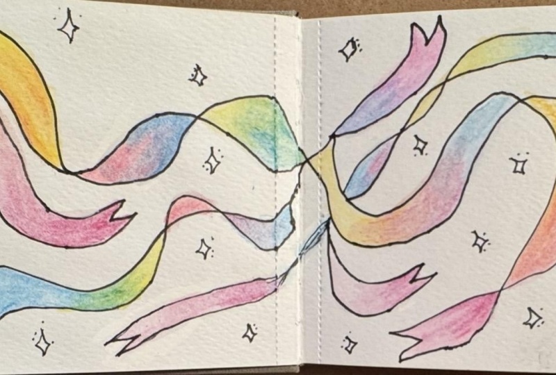
6. Rainbow Ribbon: This exercise is called
a rainbow ribbon. You can do this as a
rainbow worm, if you like, without lines and just connect
one color to the next, or you can draw this ribbon. The main thing to think
about when drawing it out is just draw a main line first and then have the line
follow parallel and then go towards
that line and touch it, and then come back out
from that line to make it look like the ribbon is
sort of bending in on itself. So here's my husband trying
his out, and I just told him, try out different colors, and you want to
make sure that in the middle of those two colors, you really mix them together. So the trick is to paint the colors long enough that you can see
the original color, the mixed color, and
then the end color. So here's mine. I'm
trying a lot of, like, pastel colors and then
some more vibrant ones. Some of the mixes I like,
some of them I don't. Another thing you can do is just circle the
colors at the end, the mixes that you made
that you really like, because that will give you
an idea of which ones to come back to when you're
looking to mix colors later. So the top one was just kind of a free for
all try, whatever. The middle one, I
used pastel colors. And then the bottom one, I think I use a little bit
more bright colors, yeah. So here we go, just adding some bright reds and I was trying to do a
little bit rainbow. So if you go in
the rainbow order, your mixes are going to
work out for the most part, depending what colors you use. But if you're using
bright colors, rainbow order is a nice way to make sure those mixes will blend really
nicely into each other. So here I'm just adding
some hot pink to the end, mixing that into that
purple and kind of starting that rainbow all over again. And when you're done,
it looks pretty fun. You get this nice
colorful ribbon. So try it out yourself.
7. Conclusion: Thanks so much for
taking this class, guys. I hope you had a
really fun time, found some color
mixes that you like, and just enjoyed playing
in your sketchbook. Please take photos of
what you've done and post a blow because I would love to see all your colour mixing. If you'd like to follow
me on Instagram, I have all that
information down below. And if you're interested
in taking other classes, I have classes on
watercolor drawing, needle-felting, you name it, and it's there. Hope
to see you again.
 Ramona MacLean, Storyboard Artist and Illustrator