Transcripts
1. Intro: Do you ever feel like you're
spinning your wheels? Pun intended, trying to put together a color palette
that just works. Well, you're not alone. Hi, I'm Tammy de Zilva, and I'm a surface
pattern designer from Sunny Brisbane Australia. I'm here to help you bring
some harmony to your hues. As a digital artist,
I create fun, playful designs for
all sorts of products, and color is a
huge part of that. I also love sharing
what I've learned in my creative journey
with other creatives. In this class, I'm going
to show you three easy to follow methods for creating color palettes that
work beautifully. I'll be using Adobe Illustrator, but the good news is these techniques work in
other programs, too, like Procreate
and Photoshop. So whatever your design
tool of choice, join me. By the end of this class, you will be able to create your own harmonious
color palettes with ease using one or more of the methods
that I'll be sharing. Alright, let's get started
and make some color magic.
2. Workspace Prep: Okay. Before we start
creating color palettes, I want to show you how
to get your workspace prepped and ready in
Illustrator for this class. Your Illustrator workspace may look a little bit different to mine depending on what
workspace you have selected. You can find workspaces
under Window. And then workspace. I've customized my own workspace based off the
painting workspace, but feel free to use whichever workspace you're
most comfortable with. Now, there are six panels that I want to make
sure you have open. Actions, color guide, layers,
swatches and transparency. We'll go back to Window and you can find
each of those there. If they're already open, they'll have a tick beside them. If not, click on it to open it. Then you can arrange them in your workspace
wherever it suits you. So you can dock
them in the side, so I can move this
out and back in. You can see when it goes blue, that's when it's
going to dock there. I can move them around, and I can also put shortcuts
on the left bar here, as I've done for actions. Now you're likely
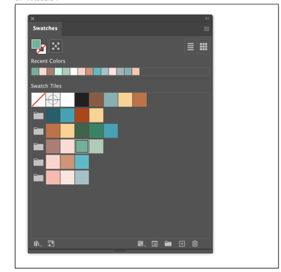
familiar with seeing all the default swatches in the Swatches panel when you
open a new Illustrator file. Personally, I find them distracting and like
to get rid of them when I open a new file so that I can start
with a clean slate. If you're not aware there's a handy action that comes with Illustrator that we can run to get rid of any unused items. Now, since it's a new
file, everything's unused. So it's a great
time to get rid of them to start with
our clean slate. So we'll go to the actions panel wherever you've got
that in your workspace. And you can see we have all of these default
actions here. We scroll down, you can see this delete unused panel items. Then at the bottom
of this panel, we can click on the Play button, which will run the actions. And now you can see our
swatches panel is clear. All right, with our workplace prepped and ready,
we're good to go.
3. Technique 1: All right. Let's dive into
our first technique for creating harmonious color
palettes, the color guide. This panel is usually found in a tab with the color panel. Now, before we go to
the color guide panel, I just want to point out in case it looks different for you, that if we double
tap on any tab, we can see it in different
views collapsed and expanded. I'm also first going to pick a random color from
the color panel first. If we then go over to the
color guide panel now, the color I just selected has been set as the base color here, and color combinations are
generated based on it. They are also based on the
selected color harmony rule. If I go over to this
drop down arrow, I can see all the
different color harmonies. If one is currently in use,
it will be highlighted. Otherwise, you can
just select one. Now, so that you can follow
along step by step with me, let's pick another
color using a hex code. I'll go back to the color panel, and I'm going to start
with a teal color. So over here, you can see
we can enter hex codes. Let's enter in 005f6b
and hit Enter. I'm also going to
add this color to my swatches panel by
dragging and dropping it in. We can see that the fill
is now set to 005f6b. If you have a CMYK
color profile set, the hex code will convert to a different hex code
for that color profile, which is fine for the purposes of what we are doing
in this class. Now let's go back
to the color guide. If the color combination didn't automatically change
for the new teal color, you'll need to click the set base color button
in the top left. This will then generate the
color combination again. You can always see if the base color has
been set as it will be the first color in
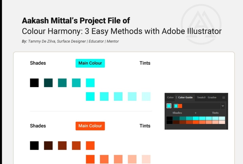
these active colors. I'm then going to go back to our color harmony and I'm
going to select Triad 2. Now, this middle column here, which has the arrow above it, this indicates that this
is the active colors, which will also appear
at the top of the panel. The columns left of it show shades and the columns
right of it show tints. Now, if you go to the Hamburger
menu at the top right, you can change from
showing tints and shades to showing warm
cool or vivid muted. I'm going to select warm
cool in this instance. Now, whilst there
is some contrast in this color combination to pick
from and some dark colors, we'd ideally like to have some neutral or
lighter colors, too. So we can grab the colors
we like here and then switch back to the shades
and tints to help with this. So to pick your colors, hold down the command key on a Mac or Control key on a PC and click the
colors that you want. Then in the bottom right here, you can click on Save Swatch
Group to Swatch panel. And it's automatically
added those swatches that you had selected
as a color group. You can switch
back to shades and tints and then drag and drop some neutral
colors in as well. So as you can see, using
the color guide is a great method when you only have one color
to start with. Let's move on to
the next technique.
4. Technique 2: The next method
is using opacity. Now to start with,
I'm going to add a white rectangle using
the rectangle tool, shortcut key M as that will
be the base of my color. So I'll set the fill to white, and I'm going to keep my stroke as black just so that I
can see it on my artboard. I'm then going to
create three squares, again using the rectangle
tool and fill each with color from the colors we selected in the last lesson. Now, if I hold the
shift key down while I'm creating
this rectangle, it will make it a
perfect square. I'm going to remove the stroke on this because I don't
want it on there, and I'll set that to teal. I'll go back to my selection
tool, shortcut key V, and as I drag across, I'll hold the option and
shift key to duplicate that. I'll hold the option key down again as I duplicate that again. I'm going to set those colors
to mustard and magenta. Right. I now want to change the opacity on those three
squares down to 75%. I can do this via
the control bar, you can see up here, opacity. Now, if you don't
have the control bar, you can get to it
by Window control. Or we can also see opacity down here in the
transparency panel. So I'm going to firstly, select the three squares. I'll change that
opacity down to 75%, and you can see that those
colors lightened and let some of the white
through because of that reduced opacity on them. I now want to make
those squares overlap. So I'm going to hold down
the Shift key while I drag this over to
keep it in alignment, and I'll just drag this one. Let me just make a rectangle a little bit smaller to frame that and I'm going to
zoom in a little bit. You can see that we have
our original colors, the teal, magenta and mustard, which are lightened
after the 75% opacity. But we also have
these four new colors here where the colors
have overlapped. I'm going to take
a copy of this, including the white background. I'll select around those. I'll drag off to the side, then hold down my option key. This time, I'm going to
select the white base, and I'm going to
make that black. Now you can see that the colors
now have come out darker. If I move this around, you can see how that black makes a difference on that color. This allows us to
create tints and shades manually using white or
black as the background. You can, of course, also use
a color black background. Let's do that with the
orange in our palette. Again, I'll select those. I'll start dragging across, hold down the option
and shift key. I'll select that
black background. Make sure it's my fill, and I'll set it to orange. And again, you can see
some slight variations between those colors with the different color
that's behind them. Now, if I was to use the eyedropper tool
to grab those colors, which is shortcut key eye, you'll see as I'm clicking on these different parts
of the mustard here, the color in my fill, if you watch that
carefully there, it's not actually changing. It's actually taking
the color as though it was still at 100%
opacity on the object. So in order to get
the new color, we need to flatten
the transparency, which will make
each color flat and back to 100% opacity
in its new form. So to show the difference, I'm just going to zoom out a
little bit, Command minus. I'll go back to
my selection tool V. I'm going to
select all of these, drag down and use the
option key to duplicate it. I'll select these bottom three and I then want to go to
object flattened transparency. I'm going to make sure vector
is at 100 and pick ok. Now, if I was to go back and
use the eyedropper tool, shortcut Key i on those
same mustards, if you watch what my fill
color is doing here, you can see it's
slightly changing. So the color is actually
picking up what is here compared to up here where I'm clicking in
those three different spots, and the fill isn't
changing at all. So we can, of course,
play around with different opacity
amounts on each of the original colors and different background colors
instead of black or white, define what colors will work for the palette
that we're after. So as we find colors we like, we can then add them to our color group in
this watches panel. So if I wanted this color
used my eyedrop art. And I can just drag and drop that into my color palette now. It's important to also think
about color proportion. Color proportion is
about how much of each color you use in a palette
to keep things balanced. A common approach and a rough guide is to
have the following. A dominant color, which is the main color that
sets the overall tone, maybe 60% of your design. Secondary colors which are supporting colors
and add variety, maybe 30% and an
accent color which is a bold or contrasting color that adds interest
for the last 10%. For example, in a design
with a muted blue palett, you might use a deep navy
as the dominant color, a soft blue as the secondary, and a pop of mustard
as the accent. If everything is used equally, the design can feel
chaotic or too busy. Okay, so that's using opacity. Experiment with
different opacities and background colors to create
a range of interesting hues. Now let's move on to our final
technique blending modes.
5. Technique 3: Blending modes. Now, first, what is a blending mode? Blending modes control how colors interact
when they overlap. Think of it like mixing
paint, but digitally, instead of just one color
sitting on top of another, blending modes allow
the colors to merge and create new often
unexpected results. So when you apply a
blending mode to an object, the effect is seen
on any objects that lie beneath that
object's layer or group. Illustrator has a whole
bunch of blending modes, each with its own unique effect. Some make the colors
lighter, some darker, some create vibrant contrasts, and others produce
more subtle shifts. You can find blending modes
under the transparency panel, and by default,
it's set to normal. Let's copy the first
set of colors and backgrounds before we flatten
them from the last lesson. I'll select those. I'm going to duplicate
those down here. I'm also going to make the opacity on all of
those back to 100%. I'll select all of those
again and now let's start cycling through
the blending modes. Darken, multiply, color burn, lighten, screen, color dodge, overlay, soft light, hard light, difference, exclusion, hue, saturation,
color, and luminosity. I quite liked difference. I created some interesting
combinations there. So as you can see, the base or the background color plays a role in how the
colors blend together, depending on the mode
that you select. Now let's talk about
temperature balance, which is mixing
warm and cool tones to add depth and interest. Blend modes can shift colors in subtle ways affecting how
warm or cool they appear. And don't forget you can
also combine blending modes with opacity adjustments for
even more creative control. Try reducing the opacity on the top object to create
softer more subtle blends. Now, blending modes also
involve transparency. So if we want the color the
blending mode has created, we again need to flatten the transparency before we create a new color
swatch from it. So go ahead, select those drag
down with the option key. And I'm now going to go to Object, flattened transparency
and vector on 100. I might add some of these
colors into my palette. I'll get the eyedropper tool and I'll add some of them in. I don't know what my final
palette will be yet, but I'm just adding these in and then I can
narrow it down. Okay. And if I want to add more or
different shades and tints, I can also select the
color group over here, so click on this little folder. And if I go back to
the color guide panel, it's now created shades and tints based on this group of
colors that I've selected. And if I just hover around the bottom of
the color guide panel, I can actually drag down, and it will show
me the shades and tints for each of the
colors that I have there. Now, I encourage
you to experiment and see what each
blending mode does. It really is the
best way to learn by playing around and seeing
how the colors interact.
6. Final Thoughts: Well, that's a wrap. We've covered three of my
favorite techniques for creating harmonious color
palettes in Adobe Illustrator. First up, we explored
the color guide panel. This handy tool
lets you generate palettes based on
color harmony rules, making it super easy to find colors that
work well together. Then we dived into
opacity overlays, where we used
opacity and layering to create new colors and
explore tints and shades. Finally, we experimented
with blending modes, discovering how different
modes can create exciting color combinations and help balance the temperature
of your palettes. The beauty of these techniques
is that they generate colors that have a clear relationship to your
starting point. This creates palettes where the colors naturally
complement each other, resulting in a harmonious and
visually appealing design. Now, it's your turn. I encourage you to create
your own color palette using one or more of the methods that we've covered
in this class. Experiment, play around
and have fun with it. Now, I've also created a
special bonus PDF for you, with a handy tip for easily
grabbing colors outside of your Adobe Illustrator window and bringing them back
into Adobe Illustrator. I hope you enjoyed this class and learn some new
techniques for creating beautiful color
palettes. Happy designing.
 Tammy De Zilva, Surface Designer | Educator | Mentor