Transcripts
1. Welcome To The Class: Did you ever find yourself
wanting to create a fully colored work
of art and thinking, you're going to
need all of these? Yeah. Me too. What if I told you we could cut these numbers down to just this? Yeah. Okay, and maybe just a couple primary still,
it's a lot less. My name's ADC Artetak a professional
YouTube artist and professional content creator
for the past decade. My goal is to teach you tips and tricks to help you on
your art journeys, but most importantly,
to teach you that it's okay to have fun
while you create. So for today's lesson, I'm going to be showing
you my methods for creating fully
colored works of art. Complete with the
shading techniques that I use to help you
reduce the amount of markers you use from around
60 plus to just under ten, saving you a little
money and a lot of mess. In this class, I'll run you through my techniques
and drop in a few extra tips in
case you wish to deviate your styles
and make it your own. I'll also be showing you
how to use my method across three different styles from
two D, Fred, and realism. So with that said, let's
begin today's lesson.
2. What You'll Need..?: With that, here are the supplies that we are going to
use for today's lesson. Firstly, the paper. Now, I opt for sketch paper, specifically this
brand because I find sketch paper to be the
most versatile paper for alcohol markers, providing the best, my
opinion, final results. Personally, I would avoid
any kind of marker paper. Sounds weird. I know. But it's often quite
smooth and shiny. And to be honest,
I've just never had a good relationship with it. Next, we have the markers. We want a selection of grays
moving up ingredient at a steady rate with just
about five markers maximum. Also, your chosen
colors for the artwork. Now, I've chosen to use just
two colors per character. The reason I'm doing this
is to show you just how convenient and how easy
this method of coloring is. So yes, two colors
plus the grays, and we will have a
completed work of art. Doesn't sound right,
does it? But it is. And for my gray tones, I'm going to be using the
Windsor and Newton warm grays from tones one to five. Specifically the warm gray. Now, I recommend
the warm gray over the other gray variants such as cool gray and neutral gray. These will give you the best
results using this method. But as for the brand, it
doesn't really matter, so choose whichever one
fits with your budget. And finally, we
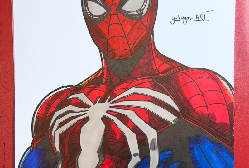
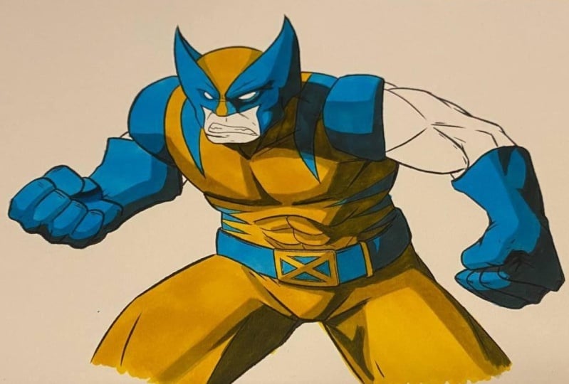
need some artwork. Now, I've taken the liberty
of creating two works of art, a Wolverine and Spider
Man to showcase you this method on two different
types of color palette, as well as different styles
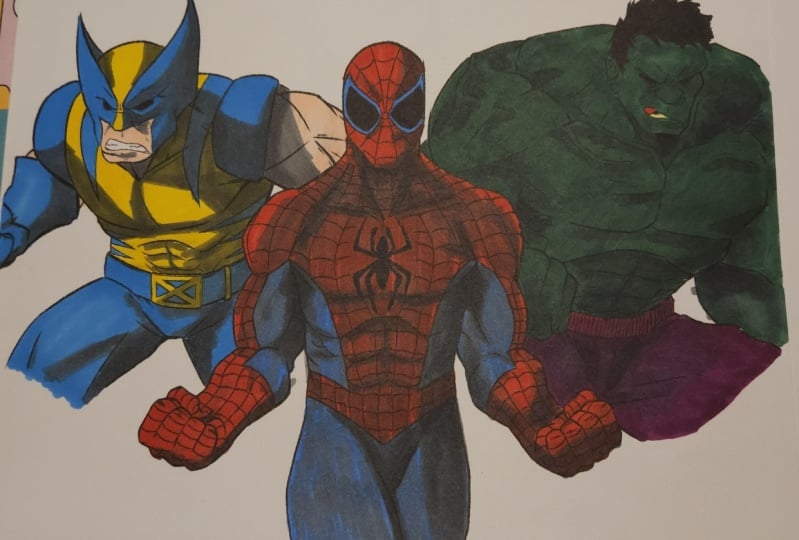
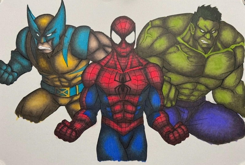
of using this method. Also be doing a mural at the end of this with
free characters, adding an extra one just to
show you the variety and versatility of this method on
yet another color variety. Choice. Selection. So,
without being said, let's get into some coloring.
3. Class Project: Now before we go into
the coloring process, I have a class
project for you and some assets to help you
during this lesson. In the Project
Gallery, you will find my artwork to download that I
will feature in this class. Feel free to download and print this artwork to practice the methods that I
teach you today. And at the end of this
lesson, I kindly encourage you to color the mural
piece of artwork and share with me your preferred
method that I teach you here today with me
in the Project Gallery. Now, let's move forward.
4. Applying Your First Layers: So in this lesson, I'm going
to be showing you how to apply the base colors and
why they're important. Starting with the
individual characters, I'm laying down the
base colors here, as these are the foundation
of the artwork going forward. I suggest using the
most neutral color for the areas of the
character you're coloring, one that's easy to
manipulate as needed. But remember, this base
is also your highlight. It's the brightest part
of the visible area. Besides that, nothing
special is added here. Simply add the color
to the correct areas. This stage is super
important for keeping the areas you color accurate and not making silly mistakes like coloring in the wrong areas
with the wrong color. Believe me, this is an
extremely common mistake, and if you don't lay the
foundations early on, you may make an error
later. I've done it. It's terrible. Don't do it. So, take your time here.
Get your base colors down. But remember, this
is the foundation. So if you need to add a double
layer or as many layers as needed until
you are happy with the coverage and the
vibrancy of your color. And I'm happy. Are you? How about we move on to some
shading using those grays?
5. Pro Tips for Shading: So before we move on
to using those grays, how about a quick pro
tip lesson on how to place shadows and where they should
go in your artwork? Well, here's four objects
for you to keep in mind, a sphere, cube, pyramid,
and a cylinder. Knowing the shading
patterns and how light interacts with
these objects is very important for every artwork going forward. And here's why. Every area of our
characters can be defined by one of these objects, such as the head as a sphere
or the neck as a cylinder, knowing how to shade these basic objects and how adding or removing other shapes to
them is extremely important. It is the foundation to every artwork and what every artist keeps in the back of their mind as they move onto
their projects. Starting with the flat tones, basic single layered shadows gradually jump equal
distance from each other, light to dark the deeper we go. This is called cell shading and is the foundation
to all shading. And by adding a blend between those layers, we get realism. Of course, this wasn't the
greatest example because, well, I left those layers to
dry for just way too long. Don't do that. You kind of
want to speed it up a bit. With these objects
following these rules, let's place the objects
on top of each other to represent both the
head and the neck. The sphere overlaps and casts
a shadow upon the cylinder, creating a new shadow
layer on our cylinder. So to keep it simple,
let's apply a shadow underneath the sphere
representing the overlay. And now we have two objects interacting and
impacting one another. This is the very basic idea. Et's step it up a bit. When we move into adding more
details to our foundations, by adding, say,
more of the face, for example, the nose, which is represented
as a pyramid when shown in the most
basic form it represents, we start adding our
foundation shadows back onto the sphere. And keep in mind, as artists, we're doing this in our heads. We leave out that pyramid
section for the nose, but we give the pyramid its own shading on
top of the sphere. From here, we question the
direction of the light and what impact that will give
the pyramid onto the sphere, casting its new shadow. And using the next tone up, we add the basic idea. And from here, we have the
foundations to continue the process of adding details until we reach
the ultimate goal, something I'll show you later
using these techniques. But now you know the basics, the foundations of
where shadows go. So let's move into those styles and show you how using gray can save you money and give you
multiple stylistic choices.
6. How To Create 2D Shading: So you want to learn how to make a Tu Di character just a
little bit better. Okay. For a Tu Di
character, we want to make large jumps
in our shadings. So that means of our selection
of grays one to five, we are going to use, depending
on the style you prefer, just one of these gray markers. When you're doing to
De keep it simple. Gray that you choose, depending
on how light or dark, totally depends on the scene in which your
character is placed. For example, you can choose
to leave it as is no shading, maintaining a perfectly
flat two dimensional object or we can add a layer of shadow using a gray to
keep that flat style while adding just a little bit of atmosphere and life
to our character. And when applying your
shadow, always start lighter. Always begin lighter than
you think you'll need. It's just easier if you make a mistake and need to go darker. If you start too dark,
there's no going back. For a flat character,
we only need to focus on the most
simplistic shading, shading that tells the story of the scene where the angle of
the light is coming from, and that's pretty much it. Try to keep your shading
as minimal as possible. Avoid too many extra
details in this style. And remember, the
secret of today is that our 1 gray marker can
cover every colored area, creating a natural shadow
that is consistent. So don't be afraid to go right
over those lines and into the next area to create one smooth brush
stroke of a shadow. This is what makes this
method so good in my opinion. Many times when I'm coloring, I find myself stopping
just short of the line before I go
over to the next color, having to find a color
and make that color match perfectly the shadow of the other colored
area just next to it. It's really not convenient. With this method, the 1
gray marker is fluid. It's consistent right across, and it applies a natural
neutral tone that just works and looks very
real and very Natural. Yeah, even when I'm
trying to do a class, I still can't be normal. But as you complete the piece, you should be left with a
vibrant work of art with just a subtle touch of detail on the scene you've
placed your character in. Wonderful. So, how about we add
some more depth?
7. How To Add MORE Depth: Now, adding more
depth sounds scary, but I can promise you it is not. While it is a much more
advanced style of artwork, I'm going to show you
just how easy it can be. We've already mastered
applying a shadow, but now, if we think back to
the three D objects from a previous lesson, well, now you already know how to take that
to the next level. So, in front of us,
we have Spider Man, and adding more depth here is just a simple matter of choosing a couple of extra gray
markers than before. For the previous
lesson, we focused on just using 1 gray marker. This time, we're going to
use an extra one or two. It's that simple. Of course, you may choose as
many as you like, but why complicate things? And that is one of
the biggest issues with using color as a shadow. A lot of people, and I'm
guilty of it myself tend to choose around six or
seven different shades and tones of the same color, it gets messy. Why?
Complicate things. Now, this style provides a
more Fredy aspect to the work, but I will maintain a
cel shaded approach, no blending in order to
effectively demonstrate where the shadows and gradient shifts are being placed, but important. This style is the
bridging gap between the simplistic two D style of art work and the
realistic style of art. So take note on where and how the shadows are being
placed in this lesson. This style, we will
be referencing the shapes we used earlier, relying on them to help us identify where those
shadows should be and what each body part
of our character is identified as
at the foundation. Starting with the head,
the easiest area. The foundation here is a sphere. However, we understand
there's a nose, cheek bones, and a mouth
underneath that mask. Keeping that in mind, I begin mentally picturing
the base shadows, adding the nose, removing the
shadows, adding new ones. All of this sounds like
a lot of information, but it's going on up here
in real time quickly. And once you learn
those basic shadows and those basic shapes
from the previous lesson, it becomes quick,
it becomes easy. And while I'm coloring
this, I wanted to take note of each of the areas
that I am coloring, starting with the shoulders, big round bulls. The biceps overall. The arm itself is a cylinder, but the bicep is a
bull on that cylinder. So what are the
steps that I take? Well, the cylinder shape comes first with all of the
cylinder shadows. The bull is placed on
top of the cylinder, creating its new shadow
on the cylinder. Any minor things
that keep getting added to this are
added on, placed on. They impact the shadow, the tones before them, the base ones keep going
lower and lower and lower. I know it sounds repetitive, but keep it in your mind. Eventually, this
becomes a habit. And eventually, you stop
seeing it as what it is, and you start seeing
it as basic shapes. And it just makes everything
that much easier. Also, look at what I'm using. This is it. There's five markers
to create a work of art. Many marker companies sell
sets of markers from 24 to a whopping 320 pens. With this method, you do
not need this many colors. Could you imagine all
of these on my desk? It's No. My desk is clean. I have five pens in front of me. I also have completed
piece of artwork. Nice. That is one of the best things about this
method is how quick it is. When you're using 1
gray marker to create multiple shadows across
multiple colors and areas, it speeds up the process
of your artwork, making things more efficient, but also creating results like
this, which are fantastic. But I think you're ready to
take it to the next level. And the next lesson we are
about to take things pretty far with my preferred
style of coloring.
8. Taking Shading To The NEXT Level: It's time for the final lesson. I've lost my voice. I don't
know how? I don't know why. My voice is gone. I mean, I still have some voice. It's just not as beautiful
as it used to be. Now, well, we've
made it this far. So in this final lesson, we're going to be
taking everything that we've learned so far in all of the previous lessons and taking them to the extreme. Realism. Now, this is my preferred
style of artwork, and I'm gonna be
giving you some of the techniques and things that
I implement into this one. This entire class has been a demonstration of how
we can take our sets of markers down from the ridiculous to just a handful of markers. Also throwing in a few tips on how to shade and where
to put those shadows, which accidentally became
more of the focus. You know, once I showed you
how to use grazer shadows, there really wasn't much
more I could teach you. So I had to add in
more. I'm sorry. So for this final
lesson, I'm going to be taking everything that
we've learned so far, but adding just one extra step. At that blending
technique that I kind of did nothing with yeah. That's it. That's all
we've got to do. Easy. So while I color this character and using our previous
versions to assist, you'll notice that I'm focusing
on one area at a time. Previously, I was raising
a head and layering my shadows per tone
across all areas at once. For this method,
we can't do that. That's a method that only works for the cell
shaded approach. For the more realistic shading
method, you need speed. We want those layers
as fresh as possible, all except the base, which is fine as it is. Actually, my base was
colored a day prior. Now it's up to you if
you want to wait a day. I chose to do so
because it was lazy. But you don't have to worry
about the base there. You can colour it at
the same time as doing the shading or you can leave it for a while and return to it. But with the shadows, now, different markers
and different hands will dictate a comfortable
pace here, but don't worry. You do have a fairly good
amount of time between drying so that you
can totally be casual in coloring and
not feel too rush. But what's important here
is to just not leave the layer that you intend
to blend for too long. And when I say too
long, don't worry. A good ten, 15, 20 minutes is totally fine. Or just have a sip of
This carpet is hot, or just have a sip of coffee in between layers.
It's totally fine. With the Wolverine, I'm using
the shading patterns that I did in the two D and
the free D versions. I might add a few extra details here if I want to make
it more realistic, giving those shadows a bit more of a rounded edge to them, maybe following the
contours of the muscle, the roundness of the shapes, a little bit more
really helps to sell that free D realism
that we're looking for. But it doesn't have
to be perfect. Remember, I'm not going
for a realistic artwork. I'm going for realism, shadows, a more realistic
style of shading. So it doesn't really
have to be too perfect. It just needs to follow
those basic fleely shapes. Now, as I move on to
the incredible hug, this is probably going to
be the greatest example of using gray because there's
really no distractions here. This is one solid
color of green. So I'm able to use
these markers as freely as possible and as
comfortably as possible. And you can see
the quality here. It is fantastic. Using
grays as a shadow. Ah. It's amazing and so convenient because green is a very difficult color
for me to work with. I don't know why, but
I can never seem to find the right greens
for my shadows. But really and truly, there's not much
more I can tell you. And while this is labeled as the more realistic
style of shading, realism involves both a
combination of blending, as well as understanding
the shapes, textures, and surfaces
that you're working on. Now, that is a much
more advanced class that I think I'll go
into in the future. This one, I'm focusing
on those shapes. I'm focusing on working on
the shapes themselves and not necessarily how different light is impacting on the muscles, different textures
of the muscles, or the clothing that I'm working on with
these characters. That's not the focus of
today's lesson, and of course, the results could be a lot
better had that been my focus. But this is just the groundwork. This is something
that can allow you to take your art further, understanding these
basics, the foundations, each one of these lessons today, it depends on how
much you've watched. Have you watched them all today? You must have learned so much. Good for you. But it
really is about how much you want to take this and
how far you want to take it. And given that I've
already colored Spider Man with the
free Die style in mind, applying those deep shadows,
for Spider Man here, it really is just a case of blending the preexisting
layers that I've already done, done, done, done, that
I've already done. And as you can see
here, that gives us an incredible basis and also shows a great
comparison of what the difference is between having a standard cell shaded approach versus the blended of the exact same style using
exact same shades of gray. Yet it yields such
different results. But that right there is my
preferred style of shading. Not quite realistic, but still falling into a more
realistic style of shading. I absolutely love it because
it is free. It is calming. It is easy once you
understand those bases, and there is really not much
for process going into it. It becomes robotic
and I'm able to watch my favorite shows or listen to my favorite music
while I create. And at the end of the
day, that, to me, is what art is all about, having fun and enjoying the process.
9. Conclusion: So there you have it every one. Apologies for falling ill
at the end of this class. It happens to the best of us, and, you know, it's fun. But I do hope you
enjoyed this class and you found it useful
and very helpful. We covered so many areas
of the same thing, how to use gray markers
as a shadow and scaling up the style in which we use to upgrade and improve our artwork. Whether you choose to go into a two dimensional
flat shaded style of artwork or a
freed sell shaded, or maybe you want to dive into a more realistic shading
pattern which Well, now you can because now
you know how to do it. This entire class
has you covered, and I hope you enjoyed it. So, congratulations. And I do hope you
found this to be an extremely useful class. I'd like to kind of remind
you to share with me your results in the project
gallery of this class. I cannot wait to see
your preferred style and your results. I hope you all have
a wonderful day, and I look forward to
seeing you all again in the next class until next time. Take care, stay
safe, and goodbye. And my coffee is actually, it's cold now. Wonderful.
 ADCArtAttack