Transcripts
1. Introduction: Ever looked at a stunning photorealistic colored
pencil drawing and thought, I could
never do that. I don't have enough
supplies. Well, think again. Hi. I'm Smitha, a
colored pencils and pastel artist with a keen
eye for details and realism. I've been teaching here
on Skillshare since 2022. As a self taught artist, I know firsthand
that you don't need an overcrowded studio to
create stunning realism. You just need the
right techniques. Welcome to your ultimate
beginner's guide to creating a realistic fruit
illustration using just a basic set of
12 colored pencils. In this class, we
are going to draw a vibrant juicy
strawberry from scratch, which will also be
a class project. This class is completely
beginner friendly. I've broken the entire process
down into real time step by step lessons covering all basic techniques
like pressure control, layering, blending,
and burnishing. By the end of this class, you won't just have
a finished piece of art you're proud of. You'll have a core set of
techniques that you can apply to any realistic drawing
you want to tackle next. Whether you're picking up color pencils for the very first time or looking to master the basics of realism
with a minimal palette, this class is for you. Sharpen your pencils, grab your sketchbook and
let's get drawing.
2. Class Project: For a class project,
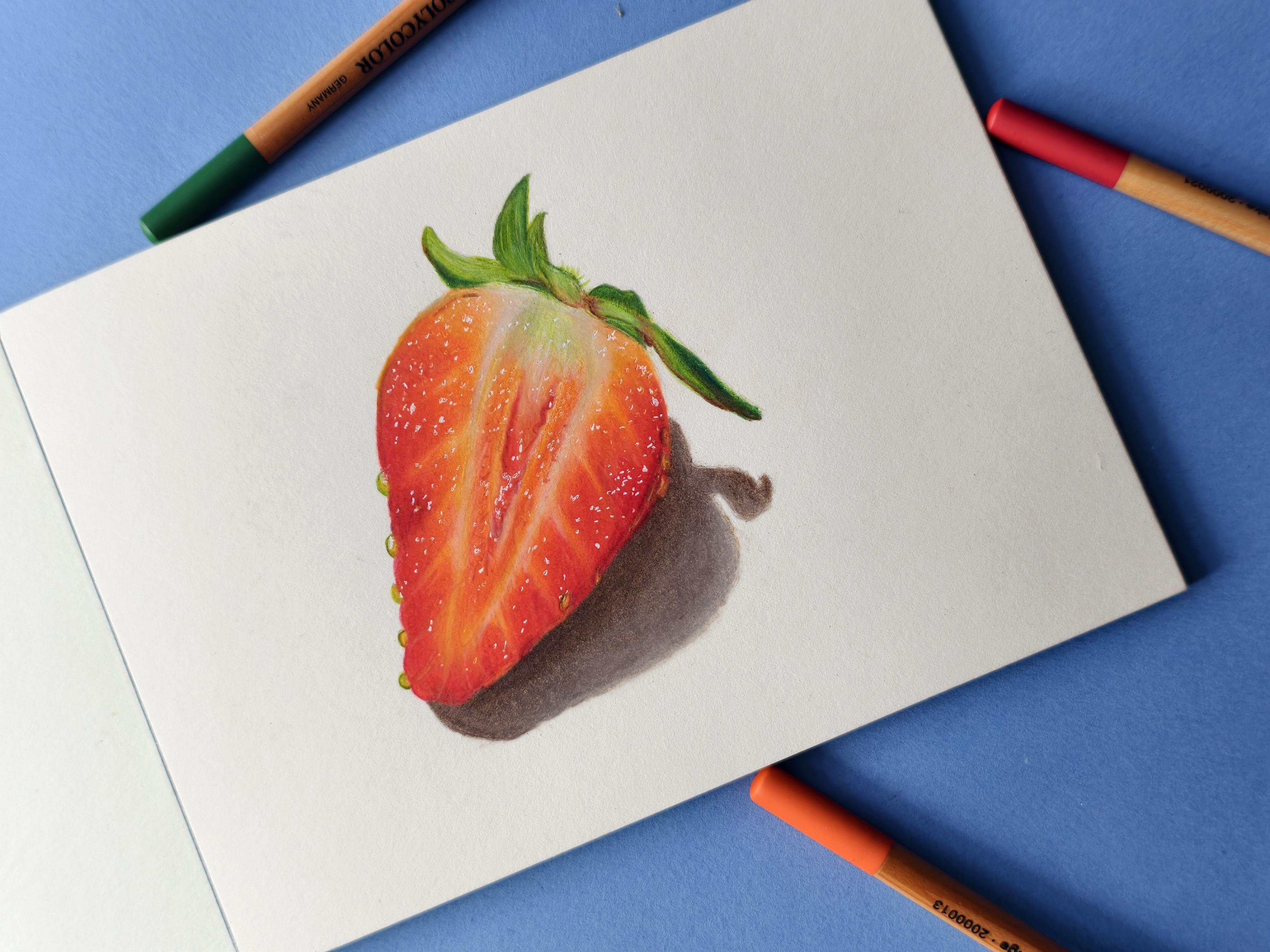
we are going to draw this
realistic strawberry. I chose this because it is a perfect subject for
beginners aiming for realism. It combines a smooth, vibrant glossy skin with
intricate textures. We'll look at exactly how to build rich depth
through slow layering, how to blend smoothly, and when to use burnishing
to get that glossy, realistic finish that makes a strawberry look real enough
to pick off the pitch. We'll also demystify
the tricky parts, how to create that distinctive
bumpy seed texture, carve out realistic highlights, and map out deep shadows. I will provide you
with all the resources essential to complete
the project. Remember to download these from the projects and resources
section of this class. If you have any questions as you progress
through this class, please post them in the
discussion section, and I will try my
best to guide you. Remember, this is a slow
meditative process. So take your time and
enjoy every layer. And upload your
final masterpiece or even an in progress
shot in the projects and resources section after
you finish this class. Let's have a look at the materials required
in the next lesson.
3. Materials Required: You will need colored pencils, set of 12 any decent brand, a paper suitable
for this medium. Sturdy enough to hold
the pencil layers, but not too textured. A small sized one is fine. A graphite pencil for the
initial sketch and eraser. I like to use this needed eraser as it does not
leave any residue. A sharpener, a white
gel pen for highlights. If you have a craft knife or
a battery operated eraser, you can use them too for highlights and texture.
This is optional. Please refer to the projects
and resources section for more information on
colored pencils and papers. Another important resource
is the reference photo. We will analyze it
in the next lesson.
4. Reference Photo Analysis & Color Chart: This is a reference photo that I chose for
our class project, and we will be drawing the strawberry slice on your right. Choosing the right
reference photo is a secret foundation of
a realistic drawing. If you start with a blurry
or poorly lit image, you'll end up guessing
where the details go, which makes achieving that
lifelike texture harder. Choose an image that stays sharp even when you zoom in on
your phone or tablet. Your subject should be well lit with distinct
highlights and shadows. This contrast is what gives the strawberry its
three dimensional form, showing you exactly
where the light hits the glossy skin and where
the deep shadows fall. Download this reference
photo from the projects and resources section and
observe it for a few minutes. Identify the light tone, mid tone, and dark tones. We will use orange, reds and a deep red
for these tones. A gray or a sepia
for the cast shadow, yellow and green for the seeds. For the leaves, we will use a
couple of greens and brown. For the glossy highlights, we will use a white gel pen. To know the exact
shades that are used, please refer to the color chart in the projects and
resources section. If you'd like to learn
more about how to pick the right colors by observing
the reference photo, I do have another class on
Skillshare on the same topic. Before we begin, let
me quickly take you through the process that we
will follow for this drawing. In fact, I generally follow this for all still
life illustrations. I start layering with
the lightest shade, orange, in this case, with very light pressure. Then I map out the mid tone and the dark tones with
a couple of reds, again with light pressure. Then I repeat the same
process for few more layers, gradually increasing
the pencil pressure. Finally, burnishing with a
lightest shade or with white, add details and highlights. Same process for the leaves. Start with light green, Mark dark tones with dark
green, details with brown. Lastly, the car shadow
with brown and white. Alright, let's start with the line drawing in
the next lesson.
5. Line Drawing: Since this is a simple
sketch, I drew it freehand. But if you wish, you
can use the grid method or the tracing method with
the help of a transfer paper. You can also use
an art projector. You can try the
DaVinci app if you want an alternative
for an art projector. It is an AR app that overlays
a digital reference photo directly onto your
physical drawing surface through your phone
or tablet screen. You will find several
demo videos on how to use it within
the app itself. Your line drawing
does not have to be super detailed or exactly
like the reference. In this case, as we are drawing a fruit and not a portrait, just get the proportions
and the basic shapes right. Draw it as lightly as possible so that it is barely
visible only to you. I drew it a bit dark so that
it gets captured on camera. I have uploaded my
line drawing in the projects and resources
section for your reference. I'm just dabbing it with my needed eraser to remove
any harsh graphite lines so that they don't
interfere with the colored pencil layers that we will start
in the next lesson.
6. Initial Layers: Start with a sharp
orange pencil. I like to roughly mark the
outline first before shading. Eave these areas blank and cover the entire strawberry
with orange shade. Use the sides of the
pencil by holding it at an angle further
away from the tip. This will let you layer uniformly with very
light pressure. Move your pencil back
and forth this way, making quick overlapping ovals. You can leave a few
tiny spots blank here at the bottom to draw
the tiny seeds later. I did not do that, so
you will see me using a battery operated eraser in the end to
remove the pigment. If you don't have
a craft knife or a pointee eraser to
scrape off the pigment, then I suggest you leave
some spaces for the seeds. Add another layer in
the same manner with very light pressure until the
paper is roughly covered. There will still be white
spaces, and that's right. For the mid tone, I used the shade called
pale geranium lake. This is like an orangish red. Please remember to absorb the reference photo
while shading. Again, with very light pressure, lay it on top of orange
where you see mid tones. That is at the outer edge of the fruit slice and also a
little bit at the center. Now that we have mapped
out all the tones, let's build up the layers. But
7. Building Up Layers: Now let's slightly increase the pressure by holding
the pencil a bit lower. Once again, shared
with orange first. Next, add a layer of the mid
tone with medium pressure. Do not add the mid tone
over the orange now, but you need to overlap it with the orange for a
smooth transition. Just refine the edges here. Follow the same process
with the duck tone, overlapping it
with the mid tone. Do not increase
the pressure yet, as we still have a lot
of white spaces showing. Add another layer with these three shades again
with medium pressure. The most common mistake
that beginners do is, in fact, It did the same
in my initial days. That is to press the pencil too hard onto the paper
very early on. This will damage the paper tooth and won't let you add
more layers on top, making the drawing look
flat and lifeless. Colored pencils is a
slow meditative medium when it comes to realism. The key to get more
depth details and realistic results is to build up layers gradually
increasing the pressure. Remember to compare your drawing
with the reference photo every now and then and adjust
the values accordingly. Sometimes you may have to add more layers with a light tone or sometimes if you feel the
values are not dark enough, you may have to add extra
layers with a dark tone. In the next lesson, let's
add the final layers.
8. Final Layers: Now you can use heavier pressure and add another layer or two. But remember, not to use
maximum pressure yet. We will use the
burnishing technique for that if needed, towards the end. When I go over the dark
tones with orange, I slightly reduce
the pressure because I don't want that section
to look too orangish. If your pencil gets
blunt, sharpen it again. You can use a simple
handheld metal sharpener. I generally use this
helical crank sharpener because I like to get such long, sharp points that stay for long. This also makes it easier
to shade from the sides. Remember, we left
few blank spaces. Let's add a very light
layer of orange there. We will also use a white
there in the next lesson. Use the sides of the pencil
with very light pressure. Now, move on to the area where you added mid
tone and dark tone. That is pale geranium
lake and carmine. Just enhance the darker tones. Use a sharp pencil
to get crisp edges. Ing Ding Ding ing B a et's add a few details and
Burnish in the next lesson.
9. Details & Burnishing: Once you have added enough
layers, you can burnish. Burnishing is a technique
where you press the pencil tip heavily
onto the paper with maximum pressure to bind
all the layers together and fill the paper tooth to
get a smooth, polished look. This is done in the
very end as it is very hard to add more layers
on top once you burnish. You need to burnish with the lightest shade in each section. In this case, I used
a white to burnish all these tiny
sections where we just added a light orange layer
in the previous lesson. Just adding a hint of red
here before adding white. You can use white all over
the strawberry to burnish. But this could dull
down the colors a bit. So you can also burnish with a light orange to maintain
the color intensity. If you feel a section
doesn't look smooth enough, observe in which direction
your strokes are visible. Then burnish in the
perpendicular direction to make it look smooth. At area of dark tones, you can also use the light tone that is orange to burnish. At the same time, add more
details here at the center. Before adding the seeds, just darken this section
with a brownish shred. In the next lesson, let's add
the seeds and highlights.
10. Seeds & Highlights: Draw the seeds with
a lemon yellow and a lighter shade of green. I used the shade
called apple green. Since I did not leave any space for the
seeds at the bottom, I'm using a craft
knife to scrape off some pigment so that I can
then add yellow there. As you can see, although I
could remove a few layers, it is still not enough. The yellow is not yet visible as there are still a couple
of layers on the paper. So I'm using a battery operated eraser to
lift the pigment. Now, let me draw the
seeds with a yellow, followed by hints
of apple green. Et's move on to the
highlights now. This is my favorite part, as it brings the drawing
to life instantly. I'm using a white jelly roll pen and adding dots all over
the strawberry slice. This pen gives bright
white highlights, but gets clogged
after a few seconds. If that happens to
you, just scribble it over a piece of
paper and use it again. Look how glossy and vibrant
the fruit looks now. Let's do the leaves
in the next lesson.
11. Drawing the Leaves: Let's finish the small section here and then move
on to the leaves. Use a light shade of
green and white here. Hints of orange at
the sides to just blend into this area for
a seamless transition. Now, cover the leaves entirely with a light
green with light pressure. We will not add too many
layers for the leaves, but we will focus on
the values and texture. Mark the darker areas
with a dark green or a shade like this sap green
with medium pressure. Use a sharp pencil. At certain areas to
get a deeper tone, you can use heavy pressure. Observe the reference photo, and you will notice that there
are browns in few spots. Use any brown that you have. To darken the shadows
on the leaves, you can use a darker shade
of brown like this one. You can also use a white
if you want to soften certain areas or you want
to get a smooth blend. But do not burnish. That's it. Let's finish this up by adding the shadow in the
next lesson. But
12. Adding Shadows: You can use a Vandyck brown or a sepia or even a
gray for the shadow. My set did not contain a gray. Hence, I used a brown. Use a sharp pencil and shade
gently using the sides. Just like we did
for the strawberry, layer with light pressure initially using
circular strokes, and then gradually increase
the pressure to medium. Uh, The cast shadow is quite dark where it
touches the subject. So use heavy pressure here. You can also burnish
with the same brown here once you have
added enough layers. A As you move away from the subject, you want the shadow to
look a bit lighter. So at that area, you can burnish with a white. Uh I think it's time to wrap up the drawing. Over the years, I've slowly learned not to
overwork any area or obss over minute details that no one will even
notice in the final piece. This is how my
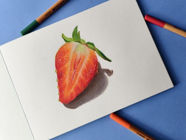
drawing turned out. Here are a few photographs of the same taken in
different angles. In the next lesson, let's do a quick recap of what we
learned in this class.
13. Key Takeways & Closing Thoughts: Thank you so much for
joining me in this class. I hope you enjoyed the slow meditative process of drawing with colored pencils. Take a moment to look at your finished piece and reflect
on how far you've come. In this short class, you've mastered some incredible
foundational skills. You prove that you can
create stunning depth using just a minimal
set of 12 pencils. You learned how to control pencil pressure through
layering and burnishing, and you tackled complex
textures, highlights, and deep shadows to bring a three dimensional
form to life. I would absolutely love
to see your progress. Please upload your final drawing or work in progress shots to the projects and resources
section so that I can give you feedback
and celebrate your art. If you enjoyed this class, please consider
leaving a review. It helps other students
find my courses and encourages me to come up
with better ideas next time. And if you share your beautiful
strawberry on Instagram, remember to tag me so that I can reshare your masterpiece
with my community. Don't forget to follow
me here on Skillshare to get notified the moment
my next class drops. Keep practicing.
Enjoy the process, and I'll see you
in the next one.
 Smitha Rao, Pencil and Pastel Artist