Transcripts
1. Intro: You've shot your project and now no matter what you do, the shots cannot be matched. You think you've ruined your project and we've all been there. In this course, I'm going to show you a solid approach of how to approach your footage, so that your shots can match much better and you can have much more consistent projects every time you shoot. I'm going to go over not only why shots don't match in the first place, but also how to view the footage as a professional colorist, how to break it down and you're going to learn some tips and tricks that I think will stick with you for a really long time. I'm Fred Trevino and I've been a colorist for over 10 years. I've created over 50 feature films and I've worked with companies like Gucci, Prada, ESPN, just to name a few. This course is for the advanced students, so you are expected to know the basics of cinematography, know the means to resolve well and have an understanding of certain tools such as keys, HSL keys, curves and how to read your scopes. Now, what we're going to do, is take some horribly shot footage, shots that really seem like they didn't match at all, and I'm going to show you how to take those shots and give them a solid look. Now, you will get much more out of this project by downloading the footage, following along and I would definitely love to see the work that you do in our project gallery. Now, this class is only a short 45 minutes long, but I think afterwards you'll walk away with some great techniques to help all your future projects. Let's get started.
2. Shooting for Easy Matching: Before we jump into the color correction, I just wanted to go over some of the top reasons why your footage doesn't match in the first place. I think having a basic understanding of these reasons will save you from a ton of headaches in the future. In a nutshell, your footage doesn't match for one of these common reasons. Different camera settings such as white balance, color profiles, which is a top reason, exposure or different gears such as shooting on different cameras, lenses, filters and lights. Also lots of uncontrollables like time of day, location, shooting in natural light, human error, and a lot more. Now, some of these are very controllable and even though some are not, by making sure that you light your footage when possible, and avoid shooting in natural light unless you control it with modifiers or lights for consistency. Shoot in log, this alone, even with many other issues, could save the day when shots don't match. Shoot with the lens kit of similar lenses versus a variety of lenses from different manufacturers, as this would definitely have different looks that get baked into the shot. Also, and I'm sure this goes without saying, do not shoot in any auto mode. To recap and simplify this, always shoot on the same camera, same lenses, same camera settings, and control the lighting when at all possible. Even when shooting on different cameras, lenses, and locations, matching the internal camera settings as much as possible will help you dramatically in post-production when you're color correcting your footage. Always keeping these things in mind can save you from re-shoots, ruined shots in time and money spent in post-production. In the next lesson, we'll learn how to analyze a shot to know what needs to happen to get that shot matching with the rest of your scene. See you there.
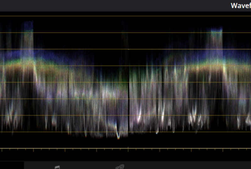
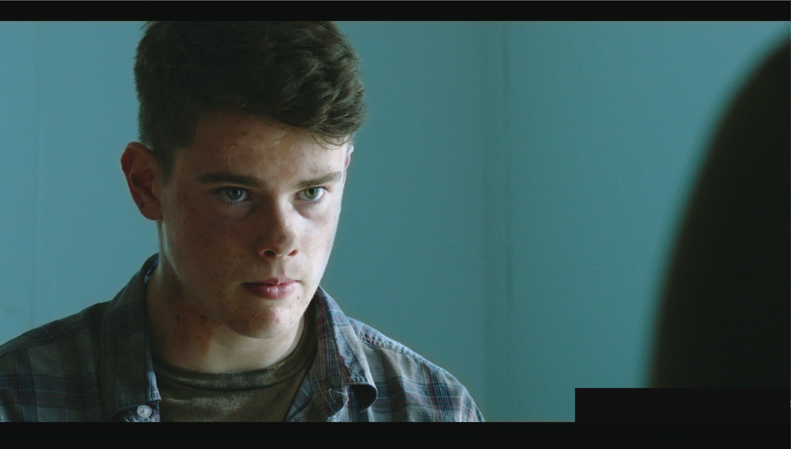
3. Breaking Down the Image: In this lesson, we are going to go over a little bit of how to look at a shot and break it down so that we know what needs to be adjusted. So a little bit about this shot right off the bat, you can see that this one here was shot in log with a wide angle lens, and then if we go here you can see this one was shot with a little bit tighter lens and it was not shot in log, and you can see that the white balance is completely messed up, very blue, they probably shot at 3,200 Kelvin, and you can see that it's completely is very different than this. So we're dealing with a clip that is log and looks to be pretty well white-balanced with something that's almost the complete opposite. Tighter lens, very blue balance in color, and it looks like it has just a regular camera profile, and then as far as this shot goes, you can see it's somehow in-between the two where it's a different angle, and also, you can see that it was not a shot in log, and if anything it seems to be maybe a little bit darker than the other shots, and so now we have to break these three shots down to see what needs to happen to make sure they all match. So the first thing we need to do, usually to be able to do that is just do a quick, rough grade to take the shots at a blog and get them looking a little bit closer together. Because right now in the state they're in, we really can't see what exactly the camera shot and what exactly it did to the colors. Then also I want to add that this camera here is a digital SLR. So to throw something further into it, we're dealing with a camera that has a H.264 compressed codec, which gives you obviously less dynamic range than if we were shooting in a format like raw or something like ProRes. So we're dealing with all the other issues, and a camera that has limited dynamic range due to the compression that the camera shoots in. First thing I'll do here is just match those two shots a little bit, and I'm basically just going to do a quick match by looking at the waveforms so I can see the shadows are here, the highlights are here. Maybe this one has a little bit clipped highlights. I'll bring this down, and you can see the shadows and lowering this. I'll bring the gain up, and there we go. I'll bring that gain up to there, and you can see that the waveforms are a little bit closer, and you can see they are generally resembling something in terms of luminance at least, not color. So this guy here, I can see that it's very blue so I'll actually take the color to put right here and just warm this shot up quite a bit. Then we can see as I warm it up, it turns green, so maybe I'll really push the tint. There we go, and there definitely no warm-up a tiny bit more, and then this one here because it was shot in log, maybe I will take this guy and just boost the saturation of touch. Let's just say something maybe right around there, and you can see that these two shots here are definitely closer. We're supposed to just doing the primaries, but then we get to this guy and this guy starts having all kinds of issues, but this is a good place to stop. There we can start seeing what exactly is wrong with this shot specifically. This is really the problem clip because this one's okay. Even though it was not shot in log, you can see that it was at least white-balanced and it's something you can work with. This one was shot in log, so you have the increased dynamic range and in really can make a lot of choices in post-production, and this one's the shot, they had it all wrong. So this is where you want to learn to look at these shot and break it down into parts. Because a lot of people, when they're doing color correction, which is what this is, specifically it's correcting that grading. What you want to do is, or what you don't want to do is look at the image as a whole, globally, as one color palette, and that's what tends to get people on the trouble. They look at this and they want to warm up the shot, cool down the shot, make the shot brighter and make the shot darker, increase the shadows, decrease the shadows. They look at everything on a more global level, rather than start looking at things at a more granular level. So if I look at this shot, I can immediately see, for example, that the sky is very yellow, and that's what you want to start doing, is breaking it down by noticing things like highlights, the sky is yellow, shadows, they look okay, but I think as we started adjusting them, you might notice that maybe it has a blue shift in the shadows or something like that. Midtones here. The trees, we can see that compared to this one, still kind of green, still has some blues in there, and then different colors as well. Like this tree here looks different than this tree here. The pedestal also looks different and that's what I'm getting at. As you want to start looking at things on a more focused level, focused adjustments versus global adjustments. Once you start looking at shots in that manner to where you can start saying, okay, what's next? I have to adjust the sky, I have to adjust this tree, I have to adjust the greens in these trees, I have to adjust the pedestal a little bit, and then go from there. That's when you can start making adjustments that will make your matching much quicker, much more efficient, and much more accurate. In the next lesson, we are going to cover what tools Da Vinci Resolve has that makes this much easier. See you then.
4. Using the Right Tools: Before we jump into the lesson where we will match these shots with everything we've learned, I want to keep showing you a few things such as the tools that DaVinci Resolve has to make matching easier. At this state now that we've done a rough grade of these three clips and we're seeing that this one's closer but it's still not a good match, we want to start using things such as the Split Screen option, which is great. What you can do is selecting two clips and then clicking up here in the Split Screen icon. Then here, we can select different types of items that we have selected, but in this situation we're going to do selected clips. You can see that doing this and then command F helps put things into full screen. We can compare two shots side-by-side and this makes it way, way easier to match on. Now that we're looking at things this way, we can see that the skies need work. The colors of the trees, as I mentioned before. The color of this specific pink tree as well. The luminance is pretty decent as well. I think something that might be throwing things off is this sky is very bright. This is one tool that's extremely effective versus say, just toggling back and forth between shots like this. Something else that's very, very useful that I can't stress enough is right now we might be looking at on the small screen but you definitely want to have an external monitor when you're grading because that makes things much easier to see, much easier to compare. Because even if we do the split screen like this, obviously this is tiny and you can't really see what you need to do with something so small, and when you're in full screen, you can't really make any adjustments unless you have a control panel. Now, I do have a control panel, but you may not have a control panel. That's why it might be more crucial to have an external monitor plugged into your system so that you can see things. You want to be able to see this on a completely different monitor, full screen, so that you can make adjustments and see exactly what you're doing; otherwise, you'll be limited to something a little bit smaller like this. The great thing about it is you can select many items like this and compare all of them. Here, we can see that these skies here are much closer but still a little different, and you can see where we're going with this. This is one tool that is extremely effective. Then another tool you can also do is if that isn't enough, is right-click, you can grab stills, so that if you're going say to something like this and then I can select this still here, then if we click here, you can turn on image wipe. Then we can do something like this to toggle back and forth between the shots, and then you can see we can do the horizontal or vertical. Here, if we're wanting to compare the colors of the pedestal, for example, or the tree, you can see that doing this image wipe, split screen up here, we can really compare what's going on. Then you also have something like this. This may or may not be as useful, so you can dissolve between the two shots, and that helps us well. But I usually find that using the vertical and horizontal wipe are extremely helpful. The keyboard shortcut to turn these on and off is Command W and then Shift W, toggles between the different modes here. You can see this one here. But you can use Shift W or Command W as well. These are great tools to match different shots and compare them, but then besides that, I would say the top color correction tools that I would use are secondary. Again, this really just goes right down to what I was saying in the previous lesson is to start looking at things that's more focused adjustments, granular adjustments versus global adjustments. That's exactly what the secondary adjustments do. Creating a secondary node, for example. Let's say I go here, make another node, which I did buy option S. Going here, keying the sky, hold Shift H here, and then I'm going to key the sky a little bit better, go, and just soften it a little bit. Here we go. We really just want to affect the top of that sky, so I will grab this window here so that we only affect the top of the sky. Shift H, turn that off. Now I can go here, compare the two shots, full screen, and I am going to use my control panel to balance these shots in the sky a little bit more. There we go. You can see already the shots look way better. That was simply by using a combination of, we have a secondary here, as well as using the Split Screen option and full screen. I have a control panel, so I managed to go into full screen and make those adjustments. That is another reason why you want to get an external monitor. But if you did not have an external monitor, then something that you could use is just reset these adjustments, then you could maybe do the wipe screen, have them right next to each other, and then go here and make your adjustments just by comparing them. Just like that. But you can see just because it's a little bit smaller, a little bit further away, it's a little bit harder. Then you can maybe go Command F, go into full screen to compare them. They are different skies, so for example, now that we're in full screen, you can see that there's more blue sky, clouds are different, so you can see that. There we go. You can wipe through like that. You can see that maybe I went a little bit too far with it. But you can see that just because we're working on a smaller screen, it makes things a little bit tougher. There we go. You can see that we can do the wipe screen or we can go into full screen like I did before and make adjustments, but you can see that things are getting a little bit closer in terms of matching. That was really with using a secondary key to make that happen. Then besides doing a key of a specific region of the image, another thing, and I toggled on and off with Command D there by the way, but besides doing specific adjustments to specific regions, another thing that you can use again is just a regular window that we can grab. Put it over something, Shift H, soften this. You can make these adjustments here a lot of different ways, but for now, for example, I might go here, and actually, I will go to this one. I already have a second node. You might do something like this. You could also key the pink in these trees to do this, but this is just as an example. I could also always just go here and increase the saturation in that tree. Command D to toggle on and off. You can see that now the trees are looking a little bit closer just like that. You can see that with these tools which we have is using the HSL qualifier to key specific items in combination with windows. For example, this one here, I keyed the sky, but then I also used the window here to block off this other stuff that I don't want to be keyed to adjust the sky. Then here, I used a window over the pink trees here to saturate them a little bit more to make that match. It's really just bouncing back and forth using the split screen, the wipe views to compare the two shots, keying specific aspects of the image, the sky, the trees, this specific tree, maybe the pedestal as well, and then also using windows to go in there and make those adjustments. Another tool that's very helpful for comparing shots and that's because usually when you shoot on different camera profiles, what's happening is camera profile A is maybe making the greens a little more yellow, and then profile B is making the greens a little bit more green or blue or whatever it might be, like in this situation, these two greens are a little bit different, is learning to use the different curves. If I go here and go to, for example, Hue vs Hue, I can say, let's see here, these are a little bit too blue for my taste. I'm going to add something here, an extra node. I'm going to click on this color blue. I'm on Hue vs Hue, which means that when I put the eyedropper over a specific hue or color, you can see that it selected that, and then I can change that hue or color to a different hue. Now I'm going to turn on the wipe. In this situation, I might do the horizontal one. Actually, I've already got them pretty close. Command D. You can see we were here. This bottom shot here is the shot that was not white balance and was very blue at the beginning. You can see with just a slight little adjustment I just did, it's matching the wider shot a little bit closer. Again, that was with the Hue vs Hue adjustment. Now I'll turn off the wipe here with Command W. Those are just some very key basic tools that are extremely powerful. When you start thinking about the fact that you can key anything, you can key any color, any luminance level, such as the sky, and change that to make it darker, brighter, more blue, more green, change the hue, shift the hue, or even use the curves and do something similar, those are the core tools that you can use in DaVinci Resolve to match shots on a more granular focused level. If you want to compare two shots, then that's when you can come in and start doing the split screens and start doing the different image wipes. On top of that, another tool that you can use to your advantage is something that I used at the beginning is simply looking at the waveform and matching the waveforms a little bit better. We started with this log-shot looking like this, and you can see how far we've come with this shot looking like this. One of the first things I did is match the shadows and the highlights of this initial first shot that was shot in log to look a little bit closer to this. In the next lesson, we're going to take all of these essential tools to make all of these shots match and seem like they're part of the same scene shot at the same time with the same camera settings, and make them one cohesive look. See you there.
5. Bringing it All Together: Now in this lesson, we are going to take all of those tools and from analyzing the image and breaking it down, which we've already done, and using those basic tools that I went over to a match these shots. I'm going to reset all of these here, delete this, delete this so you can see that I'm just basically resetting everything. There we go. Now we're just going to go through and match them all up. The first thing we want to do again is just using the wave forms, I'm going to make my first shot have similar waveform in the shadows to this. I'm going to adjust it down here and then raise the gains. Then I'm actually again going to lower this and touch. Can see these were clipped a little bit. That's a good starting point, and again this one here already looks pretty good. Then the first thing I want to do is regularly balance this shot here. Color temperature and warm it up. Right from the beginning, I'm actually going to take this and I'm actually going to just increase the contrast just to touch on this one log image, and then I'm going to saturate it. Then here we go a little color boost. Which this is a smart saturation, so I like this one. This is my key shot because it was shot in log and it looks the best and it has the most dynamic range. I really just did a little contrast, a little saturation and color boost to get this out of this flat log setting. Now I'm going to do the split screen and go into full screen. Now I am going too. I'm adjusting the colored to mature on the image on the right. Right now, I'm mainly focusing on these trees here, and then the other stuff I'll worry about that later such as the sky, is warm, or at least getting it as close as I can. Because again, we can always isolate these things later. I'd say that's probably as close as we'll get it there for now. Again, just a rough adjustment. There we go and turn that off. Then the first thing that really throws everyone off is this guy here. I'm going to go to the sky, key the sky, go repeating a few things I did in the last lesson. Soften this a little bit. Go and again, just grab this window. We're going to go up here just because we only want to affect the sky, and going back to the split screen, full screen here, and I'm going to adjust the color temperature of the sky. Again, that's a good spot there, it doesn't have to match perfectly now I think it's just working this out in different waves, in different passes. Here we go. I like the green in these trees, so I'm going to focus on this sky here. Now for the next step, I think what I will do is add an additional node. I'm here in the Hue vs Hue, and I'm going to show the selected. Go here, grab a still, go back to it, command W to turn on the still. I'm actually going to do with the vertical until it's a good spot to compare them, and then I'm going to shift the Hue so it looks a little bit more on the yellow side. I can also say that this is just a little bit darker as we're bouncing back and forth. Can see that we were here and now we shift the Hue to something a little more yellow. Maybe I'll dial this back a little bit like that, and I'm going to make another node. I think what I will do is this time I'm going to key the tree, create and soften this, and select to put them side-by-side full screen. I'm going to bring those up and luminate so they match a little bit better and saturate those trees. Then I'm also going to shift the Hue again and you can see they're starting to match. There we go just a little shift to the hue and these shots are starting to really match. I'm just going to take this time here to compare the two shots. Sky is looking pretty good, the trees are looking good, even this tree. I think what I'll do next is actually make this here just a touch more saturated. But I think we're definitely on our way there. Let's turn this off here. I'm going to go to this tree here and you can see this one, I haven't done too much sue so now I'm going to adjust the node. Go to Hue vs Saturation, which means that whatever Hue I click on`is going to saturate or desaturate going up a saturating, subtle and hard to see. It's a very subtle change here, but let's compare these two again on full screen. Now I'm looking at this pedestal. I'm going to manipulate this a little bit. It's a little too yellow for my taste, so let's turn this off. Go here. I'm now going to create an additional node. For this, I'm actually because the structure I'm going to draw a window. I'm going to soften this so it doesn't need to be something that's perfectly wrapped around. Then Shift H. It's a little bit softer there. Then you do all wipe for this one just to see the difference. It really just looks like it needs a little less yellow if I go back and forth. Now I'm going to go to temperature. I can see a little bit of the dynamic range affecting this the way it almost looks like there's some bending going on there. Actually, this one is looking to me as I'm putting them side-by-side where we have this left shadowy side because the lighting changed. I think part of that is a little bit lighting. But I feel like maybe shadows or gain need some adjustment because they're a little blue. I'm going to take this. There we go. Full screen, can see it had a bluish tint to it. too Then I think now, we're splitting here a little bit. There we go. Let's compare these two shots now. I think they're looking pretty good. Again, we've simply been isolating areas, the tree, the green, the pedestal, the sky, and you can see that by using that in conjunction with the image wipe, this specific split screen here keying certain aspects using the Hue vs. Hue, Hue vs. Saturation, which really would that comes down to is using the curves. You can see that these two shots are now very, very close. Now let's work on this guy looks a little dark, so I'm really just going to make this a little bit brighter, raise this a little bit. Maybe saturate the shot a little bit. Color boost, little saturation. This doesn't need too much. Now let's just compare all three. To me, this guy seems a little bit magenta, and this guy just needs to be a little bit brighter, so I'm going to actually again, just key the sky. We got the sky key there, soften this, go and we don't need to worry about that because again, we can just maybe let's draw a window very quickly. Then will adjust it and add little softening. Then we can do that and really we're just doing all this so we can make the sky a little bit brighter. Fullscreen, there we go. Now let's work on this magenta sky and making a new node. Now we're going to key this guy. Soften it again just so we don't affect the other part of the image, your window. See say that's good. This should be easy. It's a little magenta, so we just adjust the tint add a little green and now let's see. I still have that sky selected, so now I'm basically going to just sky a little bluer. Again, we're just dealing with different clouds right now. That's how nippy. But already I think we're in a place where most people wouldn't be nitpicking the sky. Now let's go to this guy. Really, when you can do that, once you start getting down to these small granular adjustments, then you'll start getting into the area where most people will not notice these tiny adjustments. Let me make that. I'm just adjusting this sky a little bit more. There we go, add a little bluer. That gives you an idea there. You can see all of our shots unless someone is now going to pause the video and compare every item, I think we're in a place where we are matching. Another little thing that I'm noticing here is just these guys here are maybe still a little too yellow and I'm just going to crawl this down even more. There we go. I'm going to adjust the key like that. Now if we compare these here. These guys are even closer now. There we go. You can see using all of these tools, the keys, the different curves with the Hue vs. Hue and Hue vs. Saturation. Breaking down all of these images into their different focus areas, such as the sky, the greens, the pinks, the pedestal, the white balance, the shadows, etc, rather than thinking of everything on a more global level, such as everything has to be a little cooler or a little warmer or tint is a little bit more magenta or a little bit more greener. Using these tools to be more focused adjustments will help them much more easy, much more efficient into a place where really even if the shots aren't perfect. Because one thing to remember is if a shot is messed up enough and it's completely off, similar to how this very blue shot that was a very extreme case where that shot was completely off, completely wrong in almost every way. Sometimes shots won't be perfect, but you'll be able to get them at least to a position to where no one would ever notice unless they pause the video and compare every little thing and nobody watches movies or any sort that way. Using that in conjunction with the split screens, the grabbing multiple clips to grabbing the image wipes to constantly compare specific areas of a shot, will make your grades much better, will make your grades much stronger because all the different aspects of a shot will match. With practice, you'll get to the point where you'll be able to look at an image and immediately know, I need to adjust the sky, the tree, the flowers, this pedestal or for in another shot, for example, you'll go say, "Okay, the skin tone don't match into key the skins, adjust the skin tones, adjust the sweaters, the different backgrounds, the different areas of the image to make everything look much better and matching at a much higher level.
6. Final Thoughts: That's it. You've reached the end. Congrats. Hopefully, by this point, you feel much stronger when it comes to matching. We've covered how to approach your footage for easier matching, we've covered some basic tools that are really powerful intervention resolve and also to most importantly break down your image. Don't think of it as global adjustments, break down the blues in the skies the greens in the trees, for example, and use those tools to make your shots much more consistent across the board. This is definitely one of the top skills to have as a colorist or if you're color correcting your own footage. Remember the shots I used in here were pretty extreme cases. I doubt you will ever have shots that are completely blue like I had. If you can take these tools on your footage and shoot them following some of the guidelines that I gave you, I think your footage will look beautiful for all your future projects. I'd love to see what you've done so definitely post your work to the project gallery. I'd love to check it out and give you feedback. Thanks again and I'll see you in the next class.
 Fred Trevino, DP/Colorist & Top Teacher