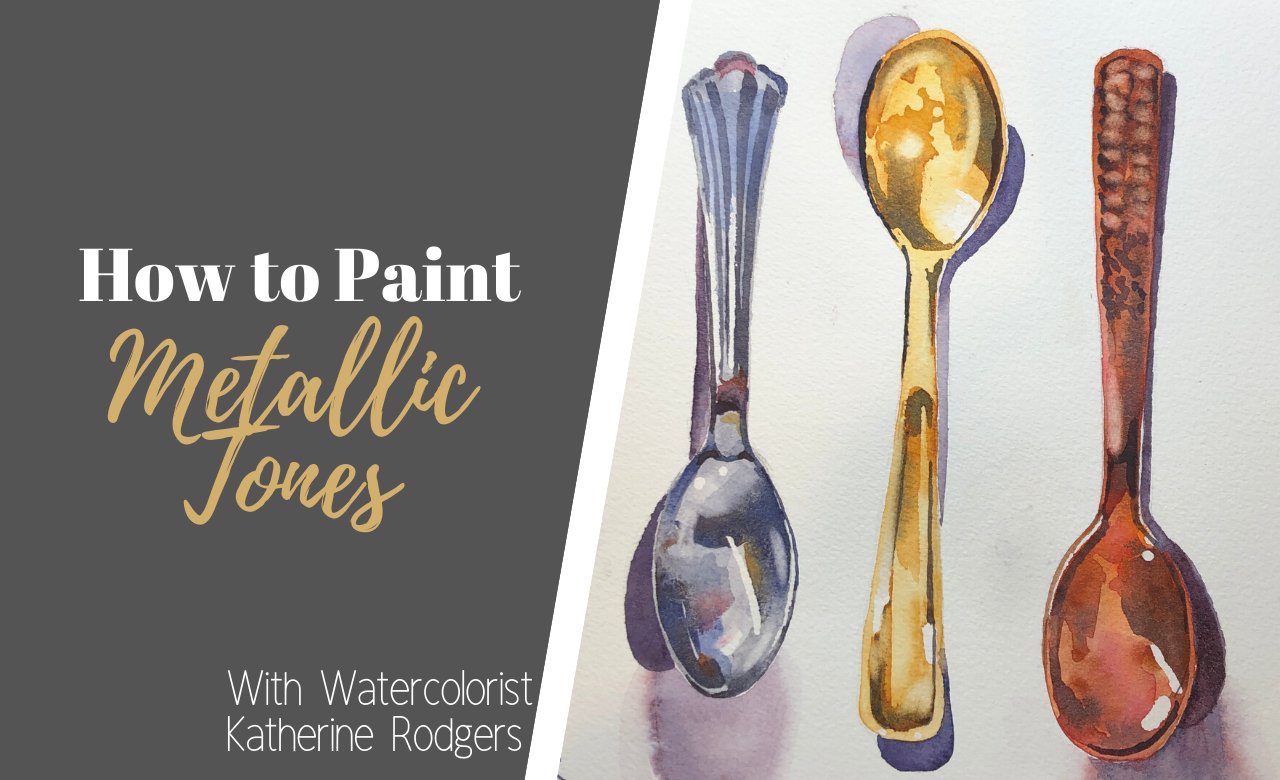
Transcripts
1. Intro: Hi, I'm Katharine Rogers. Welcome to my studio. I'm so glad you joined me today. I'm gonna do a great video on how to incorporate ink and watercolor washes into some of your projects. I think this is a fun way to create very loose illustrations. You can use the reference photos that I've provided, or you can use some of your own and just walk through this project with me. And I would love to see how they turn out a little bit about me. I'm a military spouse coming from you, obviously from the United States, but more specifically from Virginia. I live here with my three kids and two dogs, and I'll be here for a little while longer until the military moves us to someplace a little more tropical. So I'm a watercolorist, and I also work in oil and in ink. And if you look at my portfolio online or on my instagram account, you'll see that I'm a very tight painter. But I am trying to become a looser Vater. So if you're a loose painter, you're really going to enjoy this exercise. If you're type painter, you're also going to enjoy this exercise because it does loosen you up and it allows you to be a little bit more free with the details and interpretive of the pictures. So I guess that's about it. Grab a pallet of water colors. Any water colors will do. And if you want to scrounge around the house for a few moments and see what sort of ink pens you confined, that'd be ideal. I'll go through what I found in the house. I found five or six you don't need that many to would work great course a pencil simply in water. And then I think if you just get a a little snack and a cozy beverage, we'll get started. Please follow me as a teacher on skill share, so you keep up to date with all of my upcoming classes. I have a lot of new stuff coming down the pipeline, and I would love it if you would share this class with your friends and family again. Thanks for tuning in and for watching
2. Supplies, Ink Choices, and Photos: in this video all reviews, supplies and choices and the easy way to get reference photos for all different types of subjects. First, we're going to need our palates. Any kind of water color palette will do. This is minus a Queller Pala that I've had for quite a while, and I have most of my wells pretty well loaded up with pains. But you can use just about any kind of water color palette for this also have a variety of pens. Some of these I've found around the house and others I have in my art supplies, such as the Micron and also the Prisma color pen that's on the far left. Our review each of these with you and we'll see which ones are waterproof and which ones are best to use. After we put down our washes, you probably only need to brush is maybe a size 10. Maybe a size four round tip is what I would prefer for small details. And then there are a few optional supplies, such as a white pen. There's a brush that I have found in a local supply store that will make small hairs for when you're working with for and then also just so if you want to go back in and add some of the whites. Lastly, ever commend using £90 paper to play with and experiment with and then go to £140 paper as you start to get more comfortable with the process. Depending on which pens you're using around the house, I suggest that everybody goes through and doesn't experiment such as this. I'm going to go ahead and use each pen on this piece of watercolor paper. It's a piece of £140 paper will start with a micron. It has a point. Oh, a tip says rather thin, and I'm going to go ahead and start off, which is writing the name of each pen down. So let's start with micron. Well, fast forward through this a little bit. Next up, I'm going to do the Sharpie pen and then the Prisma color. The Prisma color pen is a nice art pen. It's acid free, and it's light fast as well. Next up, I have these two pens that I found around the house. One is just a black pilot pen, and we're gonna see which of these are going to be water fast, and the next one is a unit ball and on the unit ball pen. It actually says it's waterproof, so we'll test that theory here in a second, See if it holds true. Next, I'm going to get clean water on my brush, and I'm gonna go ahead and paint over each of the names of the pence and let's find out if each one is in fact, waterproof or not. Start the micron it is. Assume the Sharpie is, and it is next, the Prisma color. Quite a bit of bleeding in there. Let's like ever to that pin yet, though let's hang on to that, and we use it a little later. We have the pilot that really blood, so that one definitely is not waterproof, and the unit ball it is true. It's waterproof, so that will be a good pen to use. So just to show you don't need the expensive pens to do this. Ah, assignment. You can use just a unit ball pen that you have around the house or even a Sharpie. Hang on to that prisma color pen if you have one I'll show you what we can do it that later on. Next, let's talk about how to find a good reference photo. One of my favorite websites to use is paint my photo dot com PMP Dutch art dot com. You will have to set up a profile, and then once you click onto the page, go into references. Type in what you're looking for rabbits and it'll pull up different pictures. Read over the rules for using photos from this page. The tag line for the site says copyright free photos for artists were artists and photographers. Meat is a great place to find pictures that you may not have in your own albums. I don't have rabbits living around me, so this is a great place for me to find pictures of rabbits for us to paint. Feel free to use your own photos for the project and please share in the project section of the video below.
3. Chicken #1: Ink First: All right, let's get started on our first chicken on this one. We're going to do our sketch, and they were going to do an outline using one of our waterproof pens so you may have your Sharpie handy. Or you may have a unit, ball, pen or even one of the micron pens. Or from the experiment, you may have found another pen from your house that it's waterproof. I'm using one of the reference photos of a chicken that is actually ah, friends chicken here in Virginia, getting the body in place, and I'm putting in some of the small details. I'm using a to B pencil, and I'm just doing a very light a sketch of the chicken. This may take some of you longer than others. I'm gonna go ahead and fast forward through some of this. You may want to pause the video at this point and get your chicken sketched out, or any other bird that you'd like to use for this project. Add in some feet and do a little bit more detail and added in a horizon line. Go ahead at this point and grab your waterproof pen and start to make a rough sketch around your pencil line. I like to use different shapes of lines summer, straight summer curves. I put in maybe some zigzag lines. I'll even cross over a couple of lines, induce along straight lines. I do this to add texture and interest into the illustration. I go in and add in enough detail to where, when I put my washes down on the paper, I have some guidelines for where I want each individual color toe lie. As you can see, I do this fairly quickly, even retracing over some of the lines again. I do it a lot of different patterns with the lines. I don't do any sort of tracing exactly over the pencil lines that I've laid out in the sketch. Those sketch was really just a guideline if you want to. After you put the ink down, you can go back over and erase your pencil lines. I leave them in place, but keep in mind. Once you're watercolor goes over your pencil lines, you will no longer be able to erase them. So we'll finish up our outlining that we have of our pencil drawing and then we're gonna move right into laying out our first washes, just adding in these last final details with the pen, and I have a nice, clean bucket of water off to the side and my palate. I'll be using two brushes for this painting, and I have some neat techniques to show you on how to get that speckled background behind the chicken that you see in the very beginning slide. So, working with the wet on what technique I'm using clean water, and I'm just going over the paper. It is 100 and £40 paper. I can go rather wet and and not get too much buckling on the paper. If you want to use ah, paper, that's on a block to prevent it from wrinkling you can, or you can also tape your painting down. Ah, you could also use a hair dryer when you're working this wet and bending the paper, a little bit back and forth will keep it from getting too many buckles. So I added a little bit of raw sienna first, and now I have a little bit of this surreal Ian that I'm putting on the underside of the chicken. Teoh illustrate that the underside is in a shadow. I'm going to add a little bit more dark raw number onto the chicken. Now it's still wet. You could see the pain begin to bleed. I love using the wet on wet technique because it provides so many's soft edges. And when you're painting something like a bird that's fluffy and furry and feathers, then you want to really have it be soft. I think it also allows for you to really get a nice shape and form on the bird. Let's keep on adding some more details across the top of the chicken, the reference photos down in the notes on the bottom. I've got two photos for the chickens and then from the first video on the supplies, I showed you how to find a couple of reference photos for the rabbits. If you want to go on to the paint, my for photo Web page, you'll find a lot of rabbits there to choose from. You don't have to use the same rabbits that I use in this picture. You can use one of your own rainy animal, for that matter. I love painting blue legs on chickens, especially when the legs appear grey and the photo. I think that by using the civilian and keeping the palate rather limited, it really promotes a very cohesive painting at a little bit of red on the top. That, of course, escaped me. So let's use it thirsty brush and picked that back up again. Let that dry and a little bit more legwork, and then we're gonna come back, and I'm going to show you how to do the background on the chicken. So looking at the chicken itself, it's much lighter. And I think if we go darker at the top and then slowly go lighter to the feet, the chickens really gonna pop off the page. I decided to use in data known blue and some of the burnt number across the top of the page to really make a nice, dark, subtle background. See how you have that value change with a dark color, that dark, rich color right up against the body of the chicken, which is nearly white in the reference photo. Once you have that dark background around something white, the object or subject will really start to come off the page, and a lot of interest there. I'm gonna add a pop of color off to the side of using a quinacrine own magenta over on this side of the page. This is going to provide an additional amount of interest and color variants, especially with that warm red on the top of the chicken. And as the paper starts to soak in the paint, that's where I'm going to come back with just some splashes of water and give that soft background those little spots that you see in the in the first slide. That's how that's accomplished, and I'll show you exactly how I do that at a little bit more of the quinacrine magenta Allowing that painted mix itself on the page, I think, really is very beautiful versus mixing those colors. I'm gonna go and keep pulling the dark blue and the burn number all the way down the page. I've added more water to my brush here. You can see that my my wash is is much lighter than it was at the top when I first started laying in the color. - Now the end Afternoon Blue and the burn number have really mixed on the page, so I'm gonna pick some of that up with my brush and move that around the subject. This is gonna make a nice color for the ground. For the chicken to be standing on. Let's go ahead and pull this all the way up to the quinacrine are magenta. It's still very wet across the top. You can kind of see that there is still some shine on the paper and in the background. So this is going to give us enough time to go ahead and add those little twinkles lights in the background. Once I finished the the foreground that I'm working on here, having that dark value change right up against that, Lightfoot will make that foot come off the page. Really? Start looking at where your value changes are in your paintings. Those lightest lights right next to those darkest Starks Really important to make a good composition. I think that's about it. He's so next see where this is. Still got some shine to the top. I'm gonna flick it with some water. I take my fingers and I just dipped them right into my water bowl. They're going. You can start to see how when you splash it with that water. How it starts to push the paint pigments out. It's my help what my fingers are, and I just pull my hand back and then spritz again. You can do this with a water bottle, Mr. If it's a very fine mist, you won't get the effect so much because the water droplets are too small. So that's why I prefer to just use my hands. And then after this drives, you'll see how much of that affect you get across the top. It's important, though, that the paper not be saturated went. Otherwise the water won't have the effect that is having You wanted to just be almost a nice light shine, so everything's dry now I'm gonna go in and add a few more sharp details. With my paintbrush. You can see that everything did dry a little bit lighter than it was when it was what. So I'm gonna go back in, make the top of the chicken's head a little bit darker, with some more of the Eliza in crimson red. Let's also put the beacon I'm gonna in pain it Ah, lice. A nice soft yellow. It's a cadmium yellow, nice and light. Of course, the chicken also needs a few more feathers, and it's I fat in those small details. And then I think I would add some more texture to the bottom of the painting. I'm going to get a bristle brush to splatter some pain along the bottom of the chicken. It's It's a little short haired brush that I have on hand. I'm going to use paint that is wet but doesn't have a whole lot of water in it. So I get a pretty good saturated pigment to make thes speckle Look across the bottom and I'm using the same colors that I used in the background. This is Ian Dathan on blue French Ultramarine blue would be great for this. A swell something dark Teoh give a nice texture and I'm gonna ask. So add in some of the burn number as well splatter some of this on right over top of the blue, and I think that really gives a nice interest point, really draws the viewer into the illustration. The last little bit of detail. I'm going to go back up into the chicken at a few more feathers and a few more dark spots to continue to add interest to the form I'm using raw sienna. And I'm just gonna go ahead and outline a little bit of the where the wing is on the bird and also give a few little feathers along the wing as well. I love painting this way because it really allows me to be loose. And if you look at my portfolio online, you see that I am actually a very, very, very tight painter. So this is this is different for me, but it is very relaxing, and I feel very accomplished when I'm able to produce a nice painting in a short amount of time. I cannot wait to see how your chicken turned out in the project section below, so please share when you have time.
4. Rabbit #1: Ink First: Welcome back. We're gonna do this rabbit the same way that we did the last chicken. We're going to a light sketch first, and then we'll be using our waterproof ink before we put down our washes. I'm just getting the basic structure of the rabbits face down, getting the ears, and first, and then I'll go down into the head. And this getting the eyes of the right placement e. I love this rabbit. He has such a great look about him. He's going right at the camera, and so his eyes really are on this side of the head and there, just staring straight at the photographer. I think it's a great reference photo to use. If using a different reference photo, you can skip across this part of the video and then come back on when I get ready to start laying down the washes and I'll talk about different colors I use for the rabbits for and for the pinks of the inside of the ears. I'm going to draw a line across the head of the rabbits so that the eyes are equal, distant, apart as well. Aziz proportionate to the side of the head I don't want one lower than the other. I'd like them to be equal. Otherwise, the bunny's gonna look a little off. If one is larger or if one is lower than the other, I will go back and erase those lines before I start putting my washes down. So I'm just going to keep working on the face of the bunny placement of the nose as well as the mouth. I think getting his eyes, nose and mouth are key, and then you can make him thinner or fatter. When you put in the belly, you could just do the head of the bunny. If that's the most interesting part for you, let's go ahead and speed this up and we'll go ahead and get to the part where we add in our Inc. So now that my sketches complete, I have the unit ball pen again that I used in the chicken video, and I'm just going over tracing the lines again. I want to reiterate using different shapes of lines when you're doing these sorts of illustrations you can trace right over your pencil line if you need to, or you can even use your pen and make some corrections to your drawing. You can also add in a little bit more details using the pen emphasize some different areas . The bunny has almost this furrowed brow look to him as he's staring back at the photographer. So I do want to add a little extra line in there and then I have these large ears that I'm gonna add some lines in to accentuate the for on the inside of the ears as well. I don't know if you can see it in your photo, but the there are some very light little eyelashes on the rabbit as well. So the pen is a great tool to use to add those details in and go back and put the eyelashes on with the pen. You can even do this after your painting is complete if you like. Ah, use that. Maybe the thicker Prisma color marker. If you wanted to have a little bit more look to it. But I'm gonna go ahead at in these eyelashes. Now, before I start my washes, I'm just gonna continue to trace over the lines that I've put in place and give this bunny a nice illustrated look to it. I love the little mouth. And chin is ready to eat the lettuce. It's I have growing in my garden outside him. I'm sure of that. Okay. I'm gonna add in the whiskers as well with the black pen. Some of the whiskers in the photo look like they are dark. And then as a crossover, the for they look, they appear white says we will use a fine tip paintbrush later in the video to add some of the whiskers back over top of the for washes that we put down. So a few more little details around on the bunny. I'm going to do some real wispy lines across the back. Give it a soft edge. Nice little for markings, maybe across the back and through a little bit of a rough sketch along the bottom, I leave the background white on the rabbits. I think that it looks very crisp and clean that way. All right, I think we're ready for the washes. Now. I'm going to start with the eyes and the darker values. Put that down and I want to try to leave a little bit of the white of the eye so that It definitely has AH globe shape and some life to it, having that little highlight on the eyes. What's going to give the bunny some life to him? I'm using a mix here of French, ultra Marine and and the burnt Sienna. It's a Payne's gray. Using your browns and your blues together will make a nice black. I don't have black on my palette. I prefer to mix my own. You can make a lot of beautiful blacks just mixing the complementary colors on your palate . Now I'm going to go up into the ears and put in the pink. Next, I've mixed a little bit of brown, some of the red and just a touch of orange to make this pink. It went on very dark, but then, as you can see, it dried quite light. My cameras stopped recording for a second, and so I have a little head here on the video, but I've gone ahead and put in some of the brown in the face. It's again. I've mixed some of blue and brown to make that greyish brown for the bunny, and I've done a second glaze over the ears as well. The other painted you see on the body of the bunny is some of the same color from the years that I've used and I've placed set down into the body. If you look on the photo, you can see some real light reflections of pink. I'm using a wet on wet technique again. I've wet the entire paper, and I'm just dropping in some of the gray color that I used in the head onto the body. This gives me very soft edges across the rabbit, and it really gives the illusion of for in my opinion, I'm just going to keep working that pain all the way down, especially across the back. And then I'll go back up into the face and do some more. Details across the face of the bunny have switched over to a little bit more brown. Some of the raw sienna. I'm just kind of touching and moving the pain around, and you'll notice on the photo as well that there's white around the eyes. And then there's also white around the mouth to, and I want to try to maintain that white and keep that white of the paper to shine through a few more spots, and then I think we'll be finished with the first layer. We'll go back in and we're gonna add in some for with the brush that I have in the supply list. That's kinda has almost looks like fingers on it. If you don't have that brush, you can use a fine point round brush, maybe a size four or two to do a little bit of the hairs. Let's go ahead and mix up a little bit more pink and add some pink around the eyes and also on the mouth while we wait for the rest of the rabbits body to dry before we go back and add any more additional hairs onto the body with the white Jess. Oh, pain. Just go ahead and add a little bit more to the mouth and just a touch more in the corners of the eyes. I'm also gonna take that same pink and draw all the veins in the ears. I put them in with a very thin line, and I apologize if that's a little bit off your screen and then I take a wash of water and I go right over top of that line while it's still wet and let it bleed out to soften the line and also lightened the line. Now let's get ready to add. A little bit of dark values in the paper is still quite wet from my last wash so I can go ahead and add in all of these dark values. Keep in mind, they go on very dark, but they're going to spread out, and they're also going toe. Lighten as they dry. Definitely add some dark across the back of the Bunning. Give it a nice round shape. Help it with the form. Pause now and let your painting dry. If you're painting along with me now, let's add in some of our for. I'm back to that funny brush with the fingers again. If you don't have this brush, you can use a little bristle brush or a fine point round tip. Brush Number four. Number two Something small She could add in all those little fine details. Adding the white back onto the rabbit will really give it some softness and also some detail. When you put just a few spots around the eyes, get the whites back into the eyes and give the direction of the for and of course, some along that years so anywhere that it looks a little bit flat. I'm adding in a few white hairs, feel highlights, especially around the neck and around the front of the body. If you have a fan brush in your tool kit, you can use this a swell. I suggest Onley, adding the Jess 0 to 1 corner of the brush and not the entire brush. But this will also give you some nice little, very soft lines to add the highlights onto the for and I keep the brush dry. I don't wet the brush first. I just go right into the white Jess. Oh, pain, right. And just to the corner of the brush. That way the bristles remain very dry, and I just add in those little bits of highlights. I'm gonna use my prisma color brush that I have and go over some of the places where he wanted to darken up some of my lines. You can use your waterproof unit ball pen or your Sharpie pen as well. Now that that painting is dry, we're not gonna add any more washes onto this. If I add a wash or what paint as we saw in the supply video, the Prisma color pen will bleed. So this is going to be one of the final steps in using the Prisma color pen at the very end of the picture. Lastly, I'll sign my name at the bottom and call this done. I can't wait to see your final project, so please share them below.
5. Chicken #2: WASH First: Welcome back in this video. We're going to put our wash down first, and then we're going to do our outline around our painting to create an illustrated look to it. Let's first start by sketching out our chicken. There is a reference photo in the show notes at the bottom. It's a chicken that it lives in. Virginia from Virginia lives on my friend's property, and I think it has a really nice look to it. It's got real dark brown feathers, and I you actually use a little bit of red pain when I paint these feathers in to give it some interest. Once you get a good shape for the body, then you can start putting in the legs and also the details of the head. This chicken, if you look at the reference photo, has a great amount of feathers down around the feet. So I do add those, and I think they're kind of fun to paint very loosely. It's just going up to the top, and we'll go ahead at in some of the details of the head. Look at the placement of the beak and then also the little same feathers at around the feet . There's also some feathers underneath the beak as well. I like to kind of think of this chicken as a hipster chicken with its beard underneath its chin. There, I think it's caused by some sort of, ah, genetic mutation or something, but it's It's kind of neat because it's a different color than the body, but it also has the same color as the hair on the feet, too. So once you have your chicken well sketched out, go ahead and get your watercolor ready and a nice bucket of clean water and a brush. Now for the fun part. Let's start putting down the washes on our paper. I'm going to start with just wedding the entire area of my paper, and then I'll start dropping in some of the color I start off with using some burnt number across the chest of the bird and also a little bit along the top of the head as well. It appears lighter in this angle, but when we look at the overhead, you'll see that it's much darker and later on I drop in the currency and across the back of the bird. I think this is so fun to be so loose and interpretive of what the colors are on the chicken and not holding to any sort of a color palette. Here, my paper is still very wet, so good and drop in. Some of the burnt sienna. Now start putting in a few little lines, too. Give the illusion of some feathers. I love how the water carries the pain around the page, a little dryer down in this area. So when I put the pain in, it's gonna be wet paint on dry paper so you will have some finer lines in the photo. The reference photo. The feathers along the bottom are so light and fluffy, so I go with a very, very light color. So I just continue to add a little bit more pain along the chest and down the legs. I'm trying to stay within my pencil lines of my sketch across this back area. We'll add a little bit more water to the back to soften that line up. The beauty of doing this method is that you can go back with your pan after your washes or dry, and you can add in some more of those details. I'm using a Payne's gray here. It's French, ultra Marine and burnt Sienna as my dark value, and I'm adding in some of the details across the top of the head, as well as some of the darker, shaded areas on the chest and some of those feathers on the back of the chicken back there using that same color along that back foot. Since that's also in shadow. Go ahead and paint and some of the details of the foot. I'll continue to use this color on the foot that's towards the front of the picture as well . But I use a lighter color on those feathers that air across the back of the foot. So next we're gonna get our red ready and we'll go ahead and put in some of the details in red, across the top of the head of the chicken, the I, for one as well as the comb. So let's start with the comb first. I'm using a lizard credits in. Put this in. I'm holding my brush rather straight up to use just the tip of the brush to get some fine details in. That's what one of the things I love about this particular brush in my toolkit is that it has a really nice, fine point on it. I don't get the I N. Okay. Next, let's go ahead and get in his for her hipster beard along the bottom. Here, I'm going to use kind of, ah, light gray color, the same color I used in the back, but I'm gonna add a little bit more water to it. So it's a little lighter than what I initially put down in the back, and the chicken has the same color feathers also around the eye, so I'll put a few little lines across the back of the eye. I just blot it off with my paper towel, left a little bit of that wet paint toe, lighten it and let's go ahead and add in our beak as well. I'm using a light yellow color. I think it's a lemon yellow that I picked up off the pallet. Just gonna go ahead and put this in, trying not to hit the red that I just put down. Otherwise, it'll bleed onto the be and let's add a little bit of a neutral tone on the underside of the beak as well. Now that the washes air finished, we're just about finished. We want to go ahead and blow dry over painting or step away and let it dry, and then we'll come back and we'll decide which pen to use. I'm gonna start with E prisma color pen. This one we found in our experiment in the supply video that it is not going to be waterproof. But since by painting is dry and my washes air complete, I can go ahead and use it to outline and create an illustration. We're heading around the beak here. I started off with the I cause I did not put a dark value into the center of the eye. You could use the unit, ball pen or even your Sharpie. If you have those handy and you don't have prisma color pen were even a very fine tip. Black marker will will dio just be sure that your painting is absolutely dry. I'm going to use the marker to add in some of the details of the of the beard here and some of those little feathers that are around the eye. This is a fun part of using the pen after instead of before. You don't have to stay within the lines that pencil and you get to be very loose. And then you could go back in with the pen and define where those shapes are. And you can even use the pen to dark and everything up. If you if you have dark areas, maybe down around by this foot. I want to make the foot a little bit darker. Make sure you can tell that it's back in shadow now that the painting is dry to those little self feathers I talked about across the back of the chicken. They they did move quite a bit. I may be added way too much water. So when I put in the background that the chicken is going to be standing on, I may go ahead and paint over some of that to give it a little bit more definition, give the chicken back a little bit of of its shape, get a little bit across the back here. I love those feathers that are popping up the back. It's got a nice little blue tone to it. Go ahead at and we're I think those lines should be same way. I dio the ink first drawing where I kind of criss crossed some of my lines. I have some straight lines that have some curvy lines. So this is a Windsor Newton. It's actually a paint blender or a white pen. It's got to tips on it. One of them is a fine point. And then the other you just saw was has a little bit of a thicker edge. I'm gonna add the highlight to the chickens I and it's a blending pen. So if I want to put in a few of those little tiny feathers and highlights, I can go ahead in and highlight a few things. So lastly, I'm going to look at putting in, Ah, foreground for the chicken to be standing on. I really like this color that's at the top of the chicken, so I think I'm gonna pull some of that color down that dark value, and I'll put that down as thief foreground. So let's start with that. It's a mix of blue and brown. I'm just gonna slowly kind of go around where I've painted in. I do want a little bit of a value change between the foot, that back foot and the ground. So I'm going to make the ground darker than the foot. That way the foot still has a presence and it doesn't disappear completely. You can see where across the back of the chicken, the wash really blood out quite far. So I'm gonna go ahead and paint over a little bit of that and give a little bit of more of a defined edge across the back of the chicken. Just kind of go right up to my incline that I use with the pen. My horizon lines a little higher on the left, then on the right side, so I'll even that out here in a second. So this is just really I think that's just a mix of the end after known blue and also some of the birth number as well. And I think to add a little bit of interest across the front, similar to what I did in the last chicken painting with e still Starburst center in the back with the blooms. And I like to call them with the water, sprinkling, thinking, going to do this same thing, maybe across the bottom as well those same sort of little spots. So I'm gonna go and Sprinkle the water from my fingers right onto the paper before it dries and get a little bit of that effect there. I think that back is going to be too wet to get that effect, but I think a nice effect across the fun already starting to starting to develop. Give it a little shot, See what happens. We're a little bit there. Look at the final painting here and see how it dried. I think that's it. There you have it. Chicken number two, post below. Next up, we have another bunny and we're gonna do it the same way we did this chicken with a wash first.
6. Rabbit #2: WASH First: Welcome back. It's time for our last rabbit that we're going to do in our final project. I'm going to start by sketching out the rabbit. I have included the reference photo down in the show notes, and I'm going to start with just getting the placement of the head down on the paper so that engage how far over when I need to put the ears and the rest of the body. Now that I have kind of an egg shape for the head, I'm gonna go ahead and add the ears, and the 1st 1 kind of turns out like it's hearing something coming from behind. And I love this photo because you can see both of the ears in place. I'm going to speed up the drawing portion and you guys may wanna pause now and go ahead and do all your rabbits out and then just pick back up when you're done. Let's get the I in place little nose. Give a little bit of a mouth this when you can clearly see the mouth on it. I'm just gonna rough sketch in the body and put in kind of some lines for the for leaving almost equal spacing on the front side of the paper, as I am on the back side of the paper, as I also am towards the top. The paper. I think it sets up for a nice composition now that are drawing is finished. Let's go ahead and lay in our color. I'm going to start with the pink of the ears first. That's a nice, soft pink. I usually makes a little bit of the lizard crimson and some of the burnt sienna to make the color of the inside of the year. I also touched some of that same color around the eye, and now I'm gonna get ready to put in some of the darker values at the mouth and also at the knows I have a little bit of the Paynes grey that I love to use. It's a French ultra Marine and burnt sienna. I remember that by French Ultramar, a nephew and then burnt sienna bs. Think that's easy? Way to remember it. I'm also gonna go ahead and let the body at this point and start dropping in some of the washes. Just like in the previous videos, I'm using clean water for my first wash that I put down and then I start dropping in the color. I'm using a little bit of raw sienna, a little bit of burnt sienna. So I continue to look at the reference photo and drop in the colors that I'm that I see in the rabbit. I'm gonna add a little bit of civilian across the front of the chest to put it into shadow and then also across the back. I love the way that the raw sienna and the cerulean blue mix on the paper in the water think it has a really nice effect. Drop in. A little bit of burnt sienna will darker value there and across the bottom as well. While this is nice and what I'm going to go ahead and put in a dark value and let that flow down the front continue to put that into shadow, and I'm going to use that same color across the back. This is just a Payne's gray going right up to my pencil line, but I'll add in some of those textures that I had with my pencil line back when I used the Prisma color marker at the end Let's go ahead and paint a light wash over the tail just to give it a little bit of definition. Now will start to finding some of the ears. I'll start with the dark color. It's the same color I used in the front of the chest as well as across the back of the bunny. I just have less water on my brush, so there's a lot more pigment of paint going down. Go ahead and do a little bit of definition on that back. URAS Well, and now I'm just using a little bit of water to pull the color down on to the ear, not adding any more pain. I'm just using the color that's already on the paper, and I'm just using the brush. I'm pulling that down. I like how the here is kind of bleeding back into the inside of the years, bleeding back into the outside of the year, there start giving a little definition to the head. I'm going to use that same gray that was on the back across the top of the head and then some of the brown across the nose, a little bit of water, and I'll pull that paint clean water will pull that paint right out and around the face. Nice soft edges kind of let everything mixed together on the paper. Now let's use a little bit more of the burnt Sienna and painting the ear, and we go right up to the edge of the year That's in the front. But I leave a very, very thin white line there so you can tell that there separate pieces a little bit more brown around the head. And I think I'm gonna go ahead while this is still wet, uh, across the back of the bunny, the same technique that I used in the chickens, where I slaughtered a little bit of water to give those little bloom and speckled effects. I'm doing the same thing here across the back, and you can see the pigment start to spread out a little bit, and it gives the rabbits for a little bit of texture. I'm gonna do some across the front. I think the front might be a little too wet, so let's go ahead and add a few darker values instead, maybe a little bit darker brown. We'll just keep layering and kind of put in that back leg a little bit. Add some dark value there to get the leg in a few spots across the front. All of that will soften up and bleed as it dries. Just using the very tip of my brush to add some little wispy hairs across the back of the bunny. Really make it look furry and fluffy. Now I want to go back in and do some of the detail on the I. Everything is nice and dry at this point. I'm going in with a rather dark value. I just kind of speckle it in at first, and then I'm going to go back and lift it back out with the thirsty brush, you can see that I used a blue color. When you look at the reference photo, you can tell that the bunny really has a very round. I. I use both of the pens in this illustration, but I begin with the Prisma color marker, and I also begin at the I. The blue at the I is dry at this point, and so I'm just going to go in, and I had some of those darker values around with the marker. You could do this with pain as well. I just find it easier in a little bit more controlled to use the marker. So just finish this up and give it nice. Look to it, go very conservatively, because once this goes down, you can't lift it back off. And then I go into the year and I start adding in some of those details in the air. I do go and use lines that are straight and some that are curvy. I do little wispy lines as well. I like the variation in the lines. I think it really adds interest versus just going around the picture and outlining exactly where the water color washes. Go ahead and I'm a little bit more interpretive, I think at a few whiskies across the top of the head, I'm not quite finished with the head. Even though I'm adding in the marker, I am going to go back in and put a little bit more value across the head and give it a little bit more shape. Much is sketch and where some of those little for lines are. I am going to use the finer point pen across this little area to add in some little wispy lines and, of course, the whiskers as well. So having both pens handy is helpful. Have a thick marker and a thin marker and have those little variations. I'm gonna go thicker lines across the back of the bunny to add in those little wisp. Ease those little for lines. There's a little tail, few little spots here across the front, back to the thin marker. I'll do a few more details. This is a dinner pin. This is the unit ball pen. Remember, from the first video, this one is waterproof. So when I go to add a little bit more color and contrast on the head, this ink will not move. This will stay put would add a little bit more detail and color onto the head. I think it looks very flat. So I think if I touch a little bit more of the Browns around by the eyes and across the top , I think that's gonna really give it a little bit more of a shape. I could go right over those Univ. All lines that I put down with that one pen that I know is waterproof and they're not gonna move dark in the end of the nose. Even though this is dry right under here, I'm going to just do a little bit of brush marks. Okay, let's put a little bit of Jess. Oh, on a scrap paper. Ronaldo palette. And we're going to use just a tiny spit of this onto the for to give it a little bit more texture. I add a little bit up around the ear. I'm not using the funny little finger brush here. Instead, I'm using the two point I think just round tip paintbrush gonna lighten up underneath the mouth, give it a little bit of a highlight, lost the mouth, so I'm gonna have to go back in. And at that, maybe give a highlight to the I and the bunny is dry completely so I can go ahead and add all of these little lines right on top for the for, and they're gonna sit right on top. They're not gonna bleed or blend in, too. The washes that I initially used on the for see if I can get the mouth back in place, soften that up just a little bit with some water. Okay, now his mouth is back in place, and I'm gonna go ahead and get a little bit more of the white paint. And I think that looking at the reference photo, there are some whiskers that cross over the body, and I'm gonna go ahead and add those in very thin. I'm holding my brush straight up and down perpendicular to the paper. And that really allows me to use just the tip of the brush to make very, very thin lines. I think one last highlight across the top of the nose. And I think he's finished. I look forward to seeing what you guys create. Please posted along the bottom of this class as well as follow me as an instructor on skill share and keep me posted on your progress. There he is. Thanks so much for watching take care.
7. Outro :) : Congratulations on finishing the class. I really hope you all enjoy this. I cannot wait to see what you created. Please follow me on Instagram. I'm also on Facebook. Catherine Rogers. Fine art. And if you follow me as a teacher here, I would really appreciate it. I've got a lot of new classes coming down the pipeline, but I really want you to see and keep learning from me again. Thank you so much. And don't forget to put your class projects below. Take care.
 Katherine Rodgers Fine Art, Fine Artist & Watercolor Instructor