Transcripts
1. WELCOME!: Hi everyone, welcome
to this class. My name is the vestry and I am an artist best out in India. In this class, I am
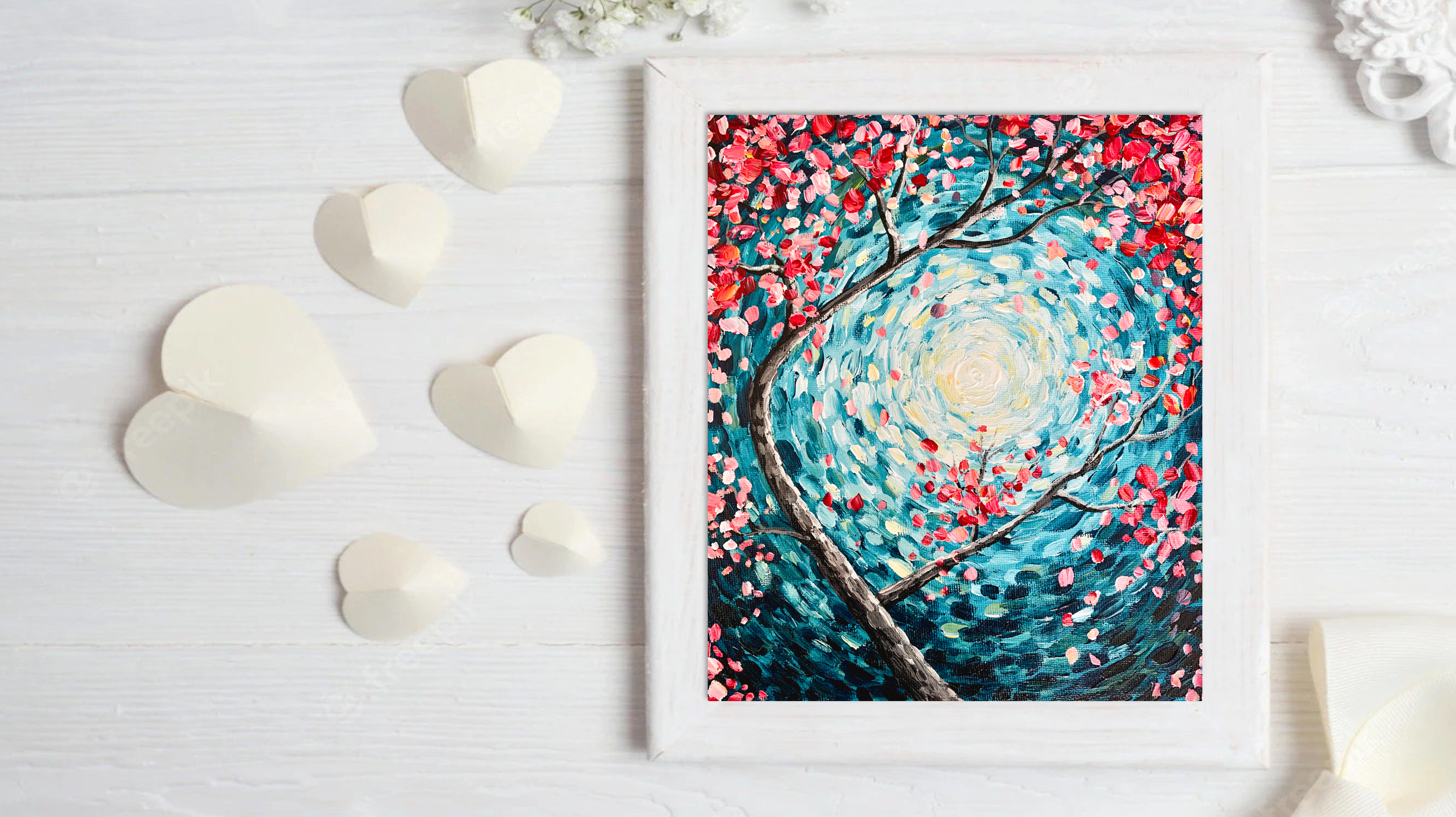
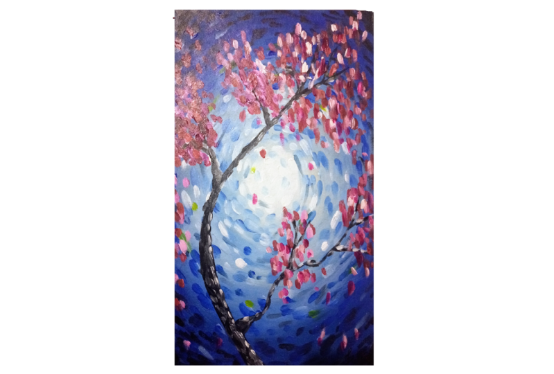
going to teach you a very easy cherry
blossom painting in a loose impressionist way
that will give you a lot of confidence in handling
acrylic paints on Canvas. Actually paints
are so versatile. I fell in love with
this medium tearing the early 2013 when I
was working in IT. As a beginner, I bought
so many I really got supplies and
started experimenting. There was no proper guidance of classes to teach techniques. I practiced and created some 2000 plus paintings and learned a lot
through trial and error. But I don't want
you to go through all that pain and wanted to teach you acrylics in the
absolutely easiest way. So I will start this
class by telling you the basic acrylic
and supplies and then teach you the
basics of color theory. You will know that you don't
have to buy all the colors. And just by buying the
three primary colors, you can create so many colors. The first step of the painting, you will learn the basics
of acrylic blending, which is a very important
part of acrylic painting. And then finally, I will show
you my process of painting abstract strokes to create a beautiful Impressionist
cherry blossoms. So I hope you are excited by now and I will see
you inside the class.
2. Art Supplies: Okay, So if, if you are absolute newbie to
acrylic paintings and if you don't have a art
supplies and if you want to buy supplies for
the very first time, I would recommend buying Canvas. This is a canvas board. This is how it looks like. And you get stretched
canvases as well. But if you want to practice, you can buy Canvas clothes also. The material would be Canvas. I didn't really paint a
lot on actually papers. But if you're new to painting, I don't recommend using papers. Because on paper of living
can be a little difficult. And you might feel painting
in acrylics is so difficult. But if you start off
with Canvas votes, then you'll understand
that blending on Canvas Claude is
actually so easy. You can buy anything that suits your budget if
you're using Canvas. So it can Canvas pose, stretch canvas, or just
simple Canvas clubs. For brushes. I'm going to use three types
of brushes in this class. One flat brush,
which is this white, and one kind of like peanut flat brush
and one round brush. So if you want to buy, you can buy biased set of flat brushes where you
get different sizes of brushes and a state
of round brushes also where you get different
sizes of round brushes. These two sets, good enough for your plate to mix paint on. I really like this
ceramic plate because the colors can kind of get off. Very easy to wash and
a glass of water. The colors I'll be using
just three primary colors, blue, red, and yellow, along with black and white. So three colors, three
brushes, canvas, board Plate, and Glass, that's all you need, and a couple of tissue papers. In the next video in
the color theory class, you will get to
know more about how these colors can give you so many different
types of colors. Balance sheets. Alright, so let's get started.
3. Color Theory: Data I have just
three primary colors, yellow, blue, and red, as you might already know. But there are different types
of yellows, blues and read. Write like in any
a look at memory. Lemon, yellow, cadmium yellow, medium, cobalt blue,
ultramarine blue, yellow blue, turquoise blue
there very early on you, Crimson, Lake, quinacridone red, and this is cadmium red. There are so many different
types of primary colors. Why are the primary colors? Because all the
other colors can be created by mixing
just three colors, yellow, blue, and red. Now, you can mix and match
and try different types of yellows and blues and
reds and see what kind of colors you get the
bug for this class, I am going to select cadmium, yellow, tough is blue
and crimson red. So I'm going to show you
how many different types of colors that you can create just by mixing these three colors. Of course, by mixing it
with white and black. So here on my white
and black, okay, so it's tapped by taking
out all the colors. I'm using a flat brush
for this demonstration. Alright, so I'll start
with the lightest colors. So this is the yellow. So I will just mark out the
three primary colors first, and then I'll show you all the different types of colors that you can
create with this. This is the turquoise, blue. So you can see just by mixing white to these primary
colors already, you are creating a
different shade of color. Okay, Now, let's start by
mixing these two colors. Now we're varying the intensity of the proportion of one of the colors you can create
different shades of green. So if this is the lighter green, you can mix little
bit more blue to this and you can
create a darker green. So you can create
two shades of green. I'm not just to you. If you vary the intensity of
the yellow and the blue, you can create even
more multiple colors. Now, let's mix. Truck is blue and red, crimson, red, and this
is the color you get. Now, if you mix it with white,
you get a different color. Now, if I mix more
of red to this, this is the color I get. And if I mix more of blue to this color I get. So this is more violet ish color and this is more of
the purple sheet. So you see how many
different types of colors you can create. Now let's mix yellow and red, and let's see the
palette that we create. Beautiful orange color. Now, if I mix more
of yellow to this, you create a lighter
shade of orange. And if I use more
of red to this, I will create kind
of dark orange. Okay? There are so
many varieties of shades that you
can create just by mixing these three
colors. As you can see. Let's say, I'll take
little bit of yellow and just a tiny bit of black. And I loved this color. So you'll create another
shade of green just by mixing a little bit
of black with yellow. Look at that. And you can mix all the colors together
and see the color you get. You can actually
mix a red and black and create this beautiful maroon each color that we mixed a little bit of white so that you can
understand the color. Black. Okay, now to this color, if I add a little bit of blue, little yellow, tiny bit tomato leg, you create kind of like a
pistol shade of brownish color. See how beautiful this color is. So you can chi0 and make
some trial and error. You can just come up
with so many colors. So let me think of some other
color that I can create. Some red, some yellow. So we created the
orange already. Let me add a lot
of white to this. And look at this pretty color. So if I add just a tiny
bit more red to this, it becomes this
pinkish, still shed. And if I add just a bit
more of yellow to this, as much Next, let me try
some white with the green. And the nice pastel
shade that you get, you can create a different
kind of green also. This is more of
like a bluish green That's such a pretty color. And if I mix more
yellow to this, you get two different shade. What else? What else, what else colors can we create just by mixing
these three colors. Okay, so this is just a
lighter version of the blue. So by mixing, so this
is where I've added a little bit of white to
the red, to the blue. But if you add more white to get to even lighter
color like this, I absolutely like light blue. Okay. Same thing. Let me make some white with anybody to read and you create this
beautiful baby pink color. And if I mix these
three colors together, absolutely just the
primary colors. So you get a color
very close to black. So this is the
color that you get, which is almost like
jot dark brown to me. It mimics little bit
of white to this. And of course, how
can I forget if you just mix black and white, you get a beautiful gray shade. So more white, you add
lighter, your tree becomes. So. Just look at the
different types of color shades that we created
just by mixing three colors. Isn't that so beautiful? So just try this out. Any other different forms
of blue, yellow, and red. And you will see that there are so many
different types of colors you are able to
create just by mixing three colors along
with white and black.
4. Step 1 - Background Blending: Okay, let's start by taking
out the three primary colors. Talk with blue, cadmium yellow, and crimson, red alone
with black and white. Now I will start painting
the background with the flat brush that I have. Now since I'm using
Pig body acrylics, I'm using just a
little bit of water. But if you're using
fluid acrylics, you don't have to use water. So the first step in covering the background is I am going to mix blue and white and going to cover up
the entire background. Now here I have started
with blue first and then I'm going to start
mixing it with white. But if you want, you can
start with a white in the center and then
gradually add on blue to it. Either way is fine. We're just going to go in round direction and cover
up the whole Canvas. This is the very basic step of acrylic painting to
be able to blend into colors and having a gradation of the color flowing
from dark to light. And that is exactly what
I'm trying to do here. I am a moving from dark blue to absolutely light blue to
almost white in the center. And I'm moving my brush in circular direction
to give it the shape. Now here, you can do this same thing in
horizontal direction, vertical direction,
diagonal direction, whichever direction you
prefer, you can do it. You can still give it a
very beautiful blend. So the technique of blending is important short,
not that direction. So I am just for the sake
of this demonstration, I'm going in round direction, but you can go in whichever
direction you like to go. When you are first-time starting to paint
an actual leaks. The blending can seem a
little difficult in terms of, you might feel that a lot of dark is coming
in the center are a lot of white is coming on
the background, on the sides. And you are going multiple
times up and down. It happens. It's totally fine. Don't freak out. It's happened to me many times. But with more and more practice, you will see that you are
able to keep the amount of intensity of the blue that you want to
keep at one place. But for that purpose, if
you have to go multiple times inside and
outside, it's okay. You're just going
to use more paint. That's all about
with more practice, you will get it very easily. Now if you see, I have added a little bit too much
of blue inside. So I'm going to go to
the inside pickup, pickup little bit of
white from inside and put it outside. So that is the way I do it. It's really fun to do it. But for that purpose, you have to have a lot
of white in the center. Otherwise, this might look, this might feel difficult to do. So have fun in the process
and happy blending.
5. Step 2 - Background strokes: Okay, Now I will wash off my flat brush and
I'm done with it. I don't I'm not going to
need this anymore and I'm switching to the
tina fled brush. And using this brush, I am going to create all the beautiful strokes
in the background. This time, I'm starting off
with white in the center. So the way you want to do this tape is take a small brush. So I have to kinda flat brush. But if you don't have
such a thin flat brush, you can do this step with
a round brush as well. Okay? So all I'm
going to do is take a lot of paint and create
small strokes after strokes. As you can see, I'm
moving the strokes. I'm painting with just white. Now I'm mixing it up
with little bit of blue and starting to go
on the underside. The most important part of this tape is to
make sure that you are picking quite a bit of paint and all your
strokes are visible. And the way we're gonna
do this tape is go over each other with multiple
colors, with two colors. Basically, anytime you are
doing this kind of strokes, more, at least you
need two colors. So sure, since I'm doing
the entire background, which is blue and white. So I am using blue and
white alternately, if you just keep
moving one color, the beauty is not going
to be that much visible. So I am using little blue at one time and then I'm going
to go over with white, Alternating the two colors. You're just going to go in
round and round direction. So I hope by now
you're getting an idea of how I am adding
stroke by stroke. Sometimes I'm adding white, sometimes I'm moving to blue. So it's going to be a
little lengthy process. So I am going to make it a little move a little faster
for you to watch it. But this tape is just the same. As you can see. The more I am approaching the
side of the canvas, more I'm migrating
out from the center more and starting to
pick up the dark blue. So the concept of
the blending still remains the same as we
did in the previous step, which is basically going
from light in the center, too dark on the
outside here also, we are doing the
same thing just in the stroke by stroke fashion. As we're moving out,
we are changing the shape intensity
of the shade of the blue to a little darker
one and mixing less of white. Okay, Now just for fun, I'm going to mix a little
bit of yellow with the blue to give it a
little greenish shade. Not going to make
it a lot of green, but just a tiny touch of yellow to the blue
to give it little, little tiny touch of green
all around the canvas. Now, I see how beautiful it is
starting to develop. I can, I love all
the strokes that are forming here just by
mixing these three colors, very less of yellow here, and just by alternating
the colors. So right now, I feel that just the dark parts of the blue is becoming too
much on the outside. So I'm going to add a
little bit more of white to it to spread the
white little bit, little bit towards the outside. It's your painting as
whatever you like, feel free to do that
if you'd like more of dark on the outside,
keep it that way. If you want to add
more white on the, to have more of the light
color in the center. So just keep adding
on top of this. The best part of this
impressionistic strokes is that it's not a smooth blend like we
did in the previous step. Sure. If you even if you
don't like something, you can just go over it and
cover up the previous color, which is very easy to do. Okay, now the, almost the
entire canvas is done. Now I'm adding little
bit of black along with the dark blue
on the corners, just only on the four
corners of the canvas just to make it absolutely
dark on the edges. Again, I'm adding it
stroke by stroke, but mixing little
black with the blue. I am adding a little bit of white along with
yellow in the center. Always remember the
more paint you add, more thick body acrylic strokes you add to a painting like this, the better your painting
is going to look. So have fun in the process, and just keep going
one stroke at a time. Okay, here you go. The
tape has been done. And now look up close to all the beautiful
strokes that we created. Isn't that so gorgeous? I hope. You also painted
along with me and created this beautiful strokes and had fun in the process
of creating it.
6. Step 3 - Tree Branches: Now in this step, we're going to create
a tree branch. So for that, I'm mixing
a little bit of water with the black because
it's thick body acrylics. So I just want to
dilute it a little bit. And I am using the flat
brush for this step. Just tweet the one stroke. I am going to create the
basic trees structure first. Then I'm going to
go a little bit more over it and make
the line a bit dark. Now, if you feel
you're not comfortable doing this with the flat brush, feel free to switch to a round brush if that makes
it more comfortable for you. Just go slowly with your brush. With a, you are using
a flat brush or a round brush and just
make the branches nicely. Okay, So being taken
with the plaid brush was a little difficult. So I switched to
the liner brush, which is a fan of
like a round brush. And with this brush, I will be able to do
much better branches. Okay, Now it's time to create
a little bit of brown. So as you learned in
the color theory, I am going to mix all the colors and come up with kind of like a dark brown color and
use it on the tree trunk. So I'm mixing all
three primary colors along with white and black. And now rather than adding it just the way we added the black, we're going to add it stroke by stroke on the entire tree trunk. So added all the broad parts of the tree with the flat brush. And it was difficult to
do the same thing on the, on the piano part
of the branches. So I switched to the liner
brush and I'm going to use this brown shade to
color a calorie top. And always remember to add
highlights and shadow. So since the light source is
in the center of the canvas, so the side of the
branch which is closer to the light source
of the moon here, make that side lighter and
the other side darker. So here I'm adding the lightest shade of
brown that we just created on one side of the
branch and the other side, I'll let it stay dark. So that's all I'm going to do in the remaining of this step. Now, already a lighter layer
of brown has been added. Now all I'm doing is adding one more lighter
layer of the brown. So I'm adding just more
of white to it and making it even lighter because the more highlights you give, the better dimension
your painting looks.
7. Step 4 - Cherry Blossom: Okay, Now we are at the most interesting
step of this painting. We are going to paint
the cherry blossoms. I'm using my small
flat brush and I'm using crimson red mixed
with little bit of white. And I'm giving small, small strokes on top of the branches to
create the flowers. So this is just like how we painted the background strokes. But just instead of a
rectangular stroke this time, I am sure I will try
to create some of the roundish strokes so that
it looks more like flowers. But feel free to give whatever
strokes you like you can, it can be just a
rectangular squarish stroke or it can be little oval stroke. You can even use a
small round brush and create round strokes. So whichever stroke you'd like, feel free to create
that kind of stroke. Like I said, just like we do
in impressionist paintings, I am going to vary the color
between red and white. So sometimes it's
going to be dark, sometimes it's going
to be lighter shade. So different shades of colors that I can create my
mixing these two colors, I am going to create all
sorts of colors and do this. And I am also going to
use a little bit of yellow and create some
beautiful oranges. And not a lot of, it's not going to look like
a lot of orange flowers. It's gonna be more
of a pink flowers, but little touch of
orange in-between. Just like how we did, a little touch of green
in the background with just blue rather than
keeping it just blew. So similarly here also, rather than keeping
it just pink and red, we're going to have little
bit of orange strokes also. So that's it for today's class. I hope you enjoyed painting with me and you created
an amazing outcome. I'm so excited for you to create this painting and
hang it on your wall. So once you do that, please feel free to take a
picture and shared it with me. If you like this class, I would appreciate
you leaving a review. If you have any questions, feel free to ask me. I also invite you to explore all the different classes
that have created for you. If you want to up level your painting skills and create
some amazing landscapes, you can get the complete
list on my website. Make sure to check
out my art blogs. I share helpful step-by-step
instructions for beginners on how to create
easy acrylic paintings. Along with a lot
of valuable time. I appreciate all the
love and kindness from you guys in terms of
review and reading. Thank you so much
for being here. Thank you once again
for joining me in this class and happy painting.
 Debasree Dey, Acrylic Artist & Educator