Transcripts
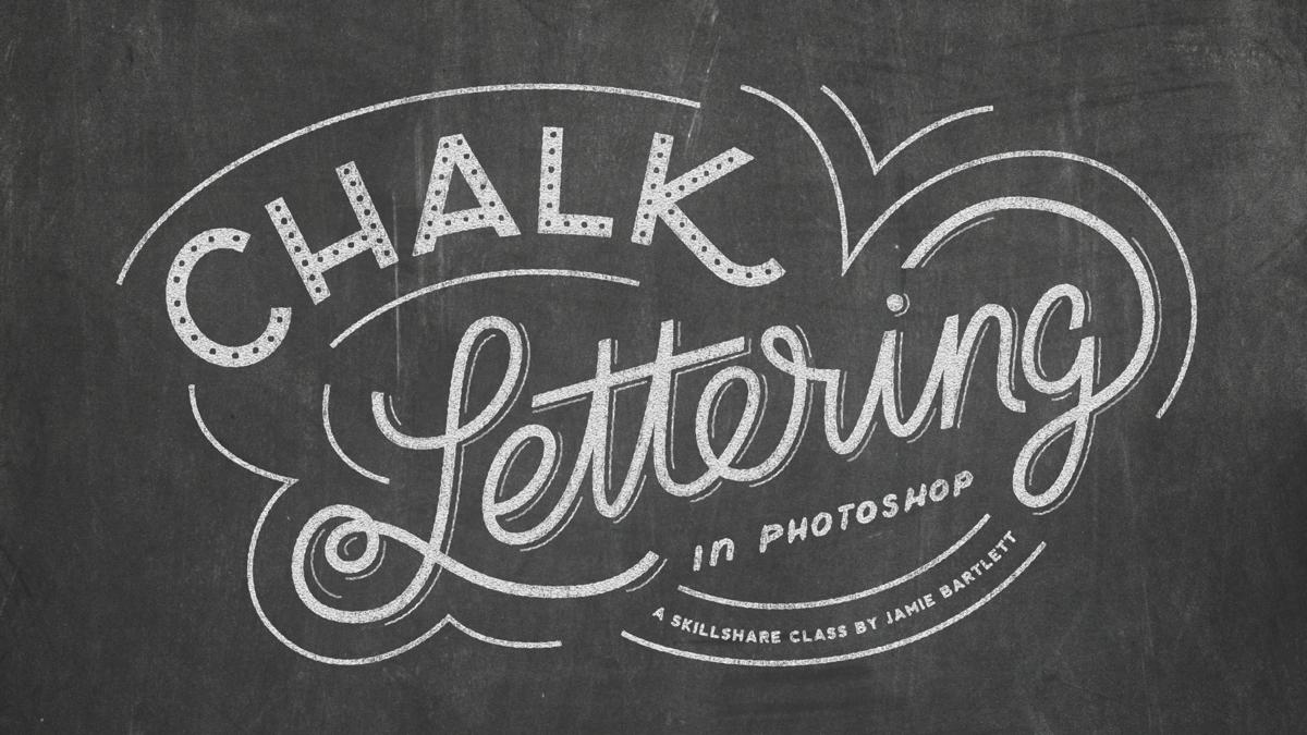
1. Getting Started: Hey guys, I'm Jamie Bartlett. In this class, I'm going to show you how to turn your lettering into chalk art. This effect is really easy to create and you can use it over and over again by just swapping out your artwork, and it even works with multiple colors. For the class project, you just need some lettering. It can be something you've created in the past, or you can create something you need for this class. Let's jump right in. To start off, we need to make a new document. In order for our texture to look right, we need to work at a certain resolution. For my document, I know I want it to be 2,000 by 2,500 pixels. You can work out whatever ratio you want, just make sure that the short edge is at least 2,000 pixels. Set your resolution to 72, and make sure your color mode is RGB, and then you can press Okay. Now I'm going to go ahead and put my chalkboard background in. Go up to File, and then we're going to do Place Embedded. Then go ahead and find your texture. I've provided some resources so you can download your own chalk texture, or you can feel free to just Google it and find your own. Once you find your texture, press Place, and then make sure it fills the screen. Now we need to place our artwork in there too. So go to Place Embedded, find your artwork, and press Place. I'm using some lettering that I created a while ago. Feel free to create something new or use something old and give it a new look. Press Enter.
2. Seting Up Your Smart Effect: So since we placed our artwork inside the document, it automatically made it a smart object. But it's not the type of smart object we want, this is still referencing our original file. So in order for us to add filters and effects, we need to make this a smart object again. So go ahead and right-click on it and say, "Convert to Smart Object". Now we're good to go and we can double-click on our smart object and start adding effects. Double-click on the layer, and we're going to start by adding a color overlay. Make sure that it's set to white. Next, we're going to add an inner glow. So go up to the blend mode, set it to normal, change the opacity to 20 percent and then change the color to black, then go down to size and set it to 20 pixels and then you can go down to range to adjust your shadow. I know I want mine to be 35 percent. So if you look on our art work, you can see how the inner glow is effecting it. For your artwork, depending on the size of your lettering, you might need to adjust the size and the range. Try to get yours to look similar to mine. We can always go back and ingest it once you start seeing the effect happen. Press "Okay" and now we want to make sure to save our smart object so that it updates it in our original document. Once it's saved, you can close it and go back to our document. You can see that it's updated, our lettering is white, and there's a little bit of a glow. So now's a good time to save your artwork if you haven't already.
3. Building The Chalk Effect: The next step is to set our layer to screen, so change a blending mode. Now we're going to group this layer by itself, press "command G" on your keyboard, and it put just this layer in its own group. The reason why we group it is so that we can put a solid color fill on top of the group. If we did it straight on this layer, it's not going to adjust some of the effects that we're going to be building on this layer. Make sure you have your group one selected, go down here in your layers palette, and select "Solid Color", and then choose a white press "Okay". We need to make sure that this is outside of our group. Once it's on top of our group, pull down option on your keyboard until you get this little downward pointing arrow and then click in between the two layers. Now it's a clipping mask of your group, so the color is just affecting your lettering and not the entire document. Next, go ahead and set your color fill layer to multiply, and now we can start building the texture. The first thing we're going to add is different clouds, make sure that your lettering layer is selected, go up to Filter, Render and Difference Clouds. Now we need to change the opacity of this effect, so if you double-click on these two arrows, it opens up some options. We're going to change the opacity to 50 percent, click "Okay" when you got that done. Now we're going to add a filter gallery, just go back up to filter. Go to filter gallery, and we're going to choose "Graphic Pen". For mine I know I want the stroke length to be 15 and the dark and light bands set to 20, and then I'm going to change my direction to be vertical. Set your numbers to the same as mine, we can always go back and adjust them afterwards, click "Okay". Now we're going to add another filter gallery, so do the same thing, go to filter gallery. But this time we're going to add texturizer. Pick sandstone from the drop-down menu, set the scaling to 50 and 42 for the relief, and pick top for the light. Click "Okay", so let me just zoom in here to a 100 percent, and you can see what's going on. We're starting to get some texture in here, you can see there's the lines, all kinds of different stuff. But it's a little too crisp, so we're going to soften it with a Gaussian Blur. Go to "Filter", " Blur", "Gaussian Blur", and I'm going to set mine to point six. Press "Okay", and you can see how that really soften it up. Now we're going to roughen up the edges by adding a ripple. So again, go up to filter, distort and ripple. We're going to set it to 50 percent, and the size to small. Click "Okay", and you can see how that roughened up everything and made it not so perfect. Now I need to go back up to filter, noise add noise and set it to 20 percent uniform and monochromatic. Click, "Okay" and this just adds a little bit of grit to the texture.
4. Finishing Touches: That's all the filter effects that we're going to be using and now we need to add some layer styles. So double-click on your layer to open up the Layer Styles. We're going to do an outer glow. Set the blend mode to normal. The opacity to 100 percent. Noise about 25 percent. Make sure it's set to the solid color and not the gradient and the color should be white. Then go down to size and decrease it all the way to one pixel. If you look here at the preview, you can see what it's adding to our text. It's brightening up the edges and making it look dusty, like chalk. If you increase the size, you can really see how it's affecting it. Again, this is a number you can play around with to get it to look how you want it to look, but I like mine set to one. Now we're going to add a drop shadow. If you're zoomed in like me, press Command and the negative sign to zoom out so we can see our artwork as a whole. Instead of actually putting a shadow on our artwork, we're going to use the drop shadow effect to add more of a glow to it that makes it look dusty like it would if you were drawing on a chalkboard. So set you blend mode to screen and change your color to white, opacity to 15 percent, distance to zero, and then size to 170. If you check that on and off, you can see how it changes the background and makes it a little more dusty looking. If you're happy with that press "Okay". That is others to our chalk effect. To make it even more realistic, I like to make sure my color isn't set to 100 percent white. So I'll just bring it down to be a very light gray color right about there, click "Okay" and I think that solves the effect a bit more. If you double-click on different clouds, that adjusts the texture and it regenerates the clouds. If you're not liking where something is dark in a spot, you can always double-click on it and adjust it and if you want to adjust any of these effects, all you need to do is double-click on them and it opens it up and you can mess around with the numbers here. Now that this effect is built, you can always swap out the artwork. To do that, all you need to do is go into your smart object by double-clicking and put the new artwork here. Then just make sure you have these effects on it as well.
5. Using Multiple Colors: So say you wanted to have multiple colors in your design, all you need to do is duplicate the color and the artwork of your design. To do that, you press Command J on the keyboard and that will duplicate that. Then you'll go into your smart object and you'll want to replace this with the artwork that you want to be a different color. But before you do that, you need to make this a unique smart object. Because if you just double-click on this and went into the smart object, it's still linked to this other one down here. So you'd be adjusting all of that. So right-click on it and say New Smart Object via Copy, and it made another smart object inside that group. So make sure you delete the one below. Now you have one smart object in that group. Then you can just double-click to open this up, put the artwork you want to be a different color. Then you can change the color to whatever you want. That's it guys. I hope you had fun turning your lettering into chalk art. Make sure to post your project to the project page, and if you share it on Instagram, feel free to tag me @jamiebartlettdesign. If you have any questions, don't hesitate to ask. I'm always here to help. As always, I'd love it if you left me a review. Thanks again guys, and I'll see you next time.
 Jamie Bartlett, Graphic designer and left-handed letterer