Transcripts
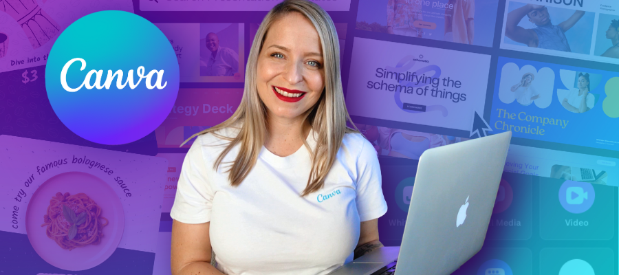
1. Welcome!: Of Canva and design
in general can feel really overwhelming
for a complete beginner. You might come across
a video online that's telling you how to
design something really cool like this when you haven't actually
even signed up for a Canva account yet or figured out how to
navigate your way around. And that is where
this course comes in. My name is Maggie Stara
and I have been using Cava for my marketing
clients since 2016, and I've now taught more than 100,000 people how
to use it, too. And the course you're about
to take has been made specifically for you if you're
brand new to using Canva, and maybe you're
feeling a little bit overwhelmed and you just need somebody to help just
simplify this process, but dare I say, actually
make it a little bit fun because if we're not
having fun with our creations, then really what's the point? So here's what you can expect. If you decide to not only watch my screen but actually
practice alongside me, then by the end of the course, you can expect to feel really confident navigating
your Canva dashboard and seamlessly switch between all the various tools that are found within this amazing tool. You will also know how to
take any Canva template and customize it to your needs. And if you're feeling
extra adventurous, you will also know how to start your own design from scratch. The world of Cava holds
infinite possibilities. You can, of course, create captivating
content for social media, which is likely why you're here. But you can do so
much more within it. You can create
functional websites. You can create amazing
presentations. You can create print materials, and you can work with
advanced AI tools all within this
one awesome tool. And this course might just
be the very first step that you take on your
journey to Mastering CAVA. Now, as you're learning,
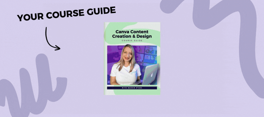
you're also going to have access to my
handy course guide. That'll summarize
everything you learn within this course and link
you to some handy tips, tools and resources
and provide you with some additional materials to continue your learning
past this course. Now, if you're ready, let's
get straight into it.
2. What to Expect: Your beautiful brain
learns by actually doing, not just seeing other
people do things. So safe to say, you
will get out of this course what you
decide to put into it. And I say that because I understand that
carving time out of your busy day to learn a new skill is not an easy
thing to do as an adult. I'm a m, I'm a business owner. I'm a whole bunch
of other things, so I totally, totally get it. The other day, I finally
managed to take a course on how to rescue my dying plants after months and months of
putting it on the back burner, and so many of my plants died waiting for me
to take this course. So I get it. I have
lived through it, and I get that it's not easy. So you're already doing the hard thing just
by being here, and I really appreciate it. But if you can put in a lot more actionable effort and actually follow along
with the exercises, rather than just
watching me do stuff, you will get a lot more out of the time that
you spent here. But now let's talk about what you can actually
expect of the course. I do want to reiterate
that this is a course designed for
the complete beginner, which means that I've
done my best to cater to this level of knowledge
with the content here. But of course, it's not ever
going to suit everybody. I've also tried to keep it
as fluff free as possible, so we're not going to talk
about every little niche Canva feature that you could
ever possibly know that's potentially going to just
overwhelm you and hurt you in your content creation journey rather than help
you at this stage. But I am aware that you
know yourself best. You need to kind of customize this learning experience to
a way that works for you. You can utilize the
controls on this video to help slow me down or
speed me up or rewind, fast forward, take notes along the way, whatever
works for you. But also keep in mind that you have your handy course guide that's designed to help you
learn way more about Canva, pass this course if you decide that you're
ready for that step. As I've already said,
just starting this and starting to learn a new skill is the hardest part
of all of this. So you've already kind of done the hard bit, which
is the good news. When I first started
designing in Canva, my designs looked like
this and this and this. And now years later, I'm using that same tool in a
completely different way to design fully functional
websites and professional animated
ads, and so much more. But actually, just starting, knowing that it's probably
going to be weeks, months, maybe years before
I actually get good at this thing
that I'm trying to do. Was really intimidating. It was very overwhelming. But now years later, I'm so, so glad that I took
that first step and just started
kind of sucking, honestly, like, I was not great. But it's so nice to just
be like, You know what? I'm not great at this,
but I'm giving it a go. And everybody has
to start somewhere. And hopefully, much
like me, one day, you're going to look
at your first designs and think of them really fondly because you're
gonna be like, I'm way better than that now. So it's really, really nice to just have some place to start. I know that it's not
gonna be perfect. So thank you so much for wanting to spend time
with me in this course, and let's get into everything in the next lesson, and
I'll see you there.
3. Get to Know Your Canva Space: Let's go ahead and
get you signed in or signed up to Cava if you
haven't used it before. So you can either
head to canva.com and sign up for a free account, or you can use the
link that I've provided in your
course guide to get a 30 day free access to Canvas Pro features,
totally up to you. Either way, you go
in and you sign up, and I would recommend
going in with your email address and
a strong password, and then you're going to be able to just sign straight up, Canva is going to walk
you through the steps, and you're going to end up at a screen that looks like
this where you're going to potentially see nothing
because obviously I have thousands of my own designs and my students designs here. So it is a little
bit more robust. You may not see all of but the functionality that you're going to see is going
to be the same. So if you ever get stuck, you've got this ask
Canva question mark in the bottom right
hand corner that can be a handy place for
you to go if you ever not sure where to find something or how to do
something within Canva, and any kind of more account based features can be found in the bottom
left hand corner, probably in the settings tab. So things like the
accessibility features. So if you'd prefer
your Canva dashboard in dark mode as opposed to mode, or you need a bit of an additional help with the color contrast,
things like that. This is where you
also set your billing all those sorts of details
can be done there. Then let's talk
about the features you've got on the
left hand side bar, starting with your
project section. So this is where you get
really nice and organized. This is where you
create folders. This is where you
can also upload any images and videos
and get them nice and organized so that it's not all just sitting in
your uploads folder, which we talk about when
we're in the editor. I utilize this space
a heck of a lot. So this is where you
can go to Ad new, create a folder,
and you can create folders within folders
within folders. Folders. It's fun
to say folders. So this is where you're
going to use a heck of a lot and definitely try and get yourself really nice and
organized from the start. Templates, we're going to talk
about in the next section, so I'm not going to
touch that for now. Brand is something that's really handy for Cava pro users, but probably not
something you're going to utilize a lot as you
can for free user. As a free user, you can only
have one brand kit with three brand colors and
pretty much nothing else. So it's not something
you're going to utilize a lot unless you're on the Pro plan where
you can upload your logos, as many color
palettes as you want. You can upload fonts,
change your fonts, add in things like
your brand voice, which is an AI feature, add in your images, all
those sorts of things. So I've included some
resources around this in your course guide
if you're interested. Canvas AI feature
is something that I would definitely explore if I were you and definitely
try to get to know, but just know that it's not
perfect at this stage in terms of creating things like social media
designs for you. It can also do things like
code. It can create images. I can do lots of
different things, and you'll be able to see here in terms of what it can do
for you and some examples. So definitely play
around with it. In terms of the
design functionality, you can definitely
just use it as a starting point and then continue editing it within
the actual Canva editor. So if you're like, This
isn't quite right, it's okay because you will have the control
over it yourself. So Canva might design something
that you're like, Okay, this is an right starting point, but let's continue playing
around with it ourselves. So that's generally how
I found it to work, and maybe it'll continue
to evolve over time, but for now, it's not
perfect. Let's just say that. And then in terms of apps, this is something
we're going to talk about once we're in the editor itself because it's the
same within the editor. So let's just go ahead
and actually jump into templates and talk about
a few different features there that might be
important for you.
4. Choose Your Canva Template: So let's not talk
about templates. So you can either
find a template from the home search bar here
within the template section. You can also go to
the create option in the left hand side
bar where you can either browse through
existing templates or create a custom
size template, which can be really handy
if you're trying to do something custom
like a business card or a flyer in
costume dimensions, especially for print, so you can make sure
it's definitely in inches or centimeters
and not in pixels, which is something
that's reserved largely for digital files. So that's where you can create your own custom dimensions, or you can just head on over to the template section in
the left hand side bar. This is probably the
most user friendly in terms of what you can do
with the filtering function. Let's say we're
looking for a template within the restaurant category. At this stage, it's going
to give us presentations. It's going to give
us Instagram posts, it's going to give us
sort of everything. And then we can go either
by the category here or we can go to all filters where we can search for a
category like LinkedIn, for example, which is not
actually listed here, but it would pop up if we
were to search for it. Or we can just
select, let's say, in this case, an Instagram post, and let's say we only want
those nice vertical posts, portrait posts, not
square ones because that's most optimal for
the Instagram platform. We're going to leave
the style as is. And then we can also decide
whether we want to look at animated or video posts
or just static ones. And then we can also
filter this down by color. So let's say we want to look at something within
the red theme. That's for restaurants
within these dimensions. And it's going to pop up
with a lot less template, so it's going to give us
a lot less to work with, but that's not
necessarily a bad thing. And at this stage,
there are a couple of things that you
want to look out for. One is in the bottom
left hand corner, you might see a
little play icon, which means this is
an animated template. It either has a video component, an animated text, or some
sort of other moving element. And then the other thing
that you want to look for is the bottom
right hand corner. It'll have a little crown
if this is a pro template. So it means it's not going to be available to you if
you're a Canva free user. If you're a Canva free user, you want to look for templates that don't have
this little crown, which means it's
free for you to use. But you will know pretty
quickly because if you on Canvas free plan and you
try to use a pro template, it's going to ask
you to upgrade. Then the other thing that I wanted to point
out is it's really nice for you to kind of be able to categorize this
for later use. If you don't
necessarily remember how you got to a particular template or what you search for, you can utilize
the star function. So for example, I can star this so that I
remember for later, this is a template I
might want to use. And then at any point, I can go to the stared content section, and that template is going
to appear there for me. So that's really, really handy, especially if you're
doing this for clients. It just makes it nice for you to keep really nice and organized. But in this case,
we already have a template that we
want to go with, which is this one here. I selected it specifically
because it is a template that's available for Canva Pro and
Canva free users. And because it's actually
in the wrong dimensions, so that seems counterintuitive, but it is 1080 by 1080 pixels, which is not really the optimal sizing for Instagram anymore. So that means that we can
select this template, knowing that it's actually not really ideal for what
we want to design, and then we can have
a look at how we tweak it, how we resize it, and also what happens if you choose the
wrong template and then you're in the
editor and how you can kind of customize
things there. So we're going to go
ahead and customize this template and have a look at what we can do
within the editor.
5. Get to Know the Canva Editor: So the first thing
we want to do is rename our design so that it makes sense for us when we
actually go to search for it. I'm just going to make it an Instagram post, but obviously, you'd want to be more
specific than that, so that it's easy for you
to search for it later. And then as you're
changing things, you also notice that Canva auto saves things unless
you're offline, and in which case,
it'll tell you panic. Time to panic. You're offline. Get back online so we
can autosave things. But basically, what it
means is that you don't have to manually save things,
which is really nice. And then at any point, if you feel like you've
made a mistake, you've got the undo and
redo functions as well. So it's going to change things back or move things forward. And at any point, you'll also start to notice that instead of doing
things manually, Canvas going to start prompting you with the keyboard shortcuts. So if you prefer to
use these just like you would inside of Google
Docs or anything else, you can always see
what they are. And I've also provided you
with some shortcuts to your shortcuts in your course
guide for ease of use. Now, we did talk about
the fact that this is not the ideal dimensions
for this particular post, so we could either use the
resize functionality up here, which is a Canva Pro feature. It's largely used
for designs with 50 plus pages or lots of
pages within them where you want to resize all of your pages within
that one document, all at the same time, it makes it really nice
and easy for you to go, Alright, make all
of the pages in this document 1080 by 13 50, so it makes it
that nice portrait format instead of
a square format, and then you can copy
and resize and have a whole separate document
with these new dimensions. If you just want to
resize one page, though, an easier way to do
that is to click the three dots in the upper right hand
corner of your page, and then you can just resize that particular page all
within one document, which is really nice and handy, but again, a Canva Pro feature. So if you're a Canva free user, a bit of a workaround to this is instead of
adding a new page here, you can use this little
drop down and say, actually, I want to add a
page in different dimensions. So I could either search
for it here or just say, in this case, I know it's
already here and say, I want this particular post, in these dimensions and
it's going to give me a new page with these
amazing new dimensions, and then I can just highlight everything that's
on this first page, and then I can right click
and copy this across, come into my second page, right click and paste this in. Even if I'm a Canva free user, I can still do this a little
bit more manually and then just size all of this down
as I'm sizing this down, you'll start to
notice that Canvas giving me these grid lines, these pink grid lines that are telling me that at this stage, I'm in the center and the
middle of my graphic, which is really handy,
and then I can let go. And it's going to tell
me exactly where I need to be in order to be in
the center of this post. And if I click away, it's
going to be perfectly aligned. At any stage, you can also click on any
individual element in your design and right click and go to align to page and say, I want this in the center.
I want it in the middle. I want it at the top, bottom,
et cetera, et cetera, and it's going to make
it really nice and easy for you to
align to your page. We already talked about
projects previously, but you can also access your other designs directly from within your
editor if you want to bring in a particular page of a particular design
and you don't want to continuously have to
copy and paste across. So I can just head on over
to the left hand side by here to projects, and I can either
search for it here or manually find the design
that I'm looking for. So in this case, I just want
to bring in, let's say, one page of this recent
project that I've been working and I'm just going to go ahead and add a new page here, and I'm just going to
click on one page of the design document and bring this into my
current design. So it's going to
automatically adjust it to the dimensions of the page
that I'm working with here, but it's not going
to be perfect. So you might need to tweak
things a little bit, but it means that
you're not constantly copying and pasting across. So it's just a nice
little workaround. And we are going to
talk a lot more about other functionalities
within Canva. If at any point, you're getting a bit stuck, and you're like, What does she say? How do I get to that
place? Where do I go? You can always click on the little sparkly icon in the bottom left
hand corner here, which is the quick actions icon, and essentially just search for exactly what it is
that you're looking for. So in this case, let's say,
I'm trying to find a circle. I can't remember where
to find a circle. It's going to tell
me, Alright, well, here's your circle, and it's going to bring it
into my design. So that's a nice
little hack there. Alright, and next, we're going
to talk about how to add additional elements
to your design and really start
bringing it to life.
6. Add Elements to Your Design: So we're going to go
back and just work with our initial design in the
slightly tweaked dimensions, and I'm just going
to go ahead and delete these things by
using the delete function on my keyboard
because we don't need a lot of these extra
fancy things here. So I'm just going to
leave a few things like our text boxes. If I didn't already have
text in this template, I would just head
on over to text in the left hand sidebar and then just bring in a bit of a
textbook and work with that. But I actually quite like the font that this template had. And so I'm just going to
work with that as it is, but it's going to be for
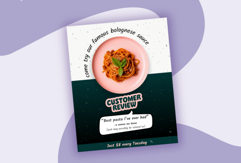
Maggie's pasta place instead of a soba noodle salad. This is going to
be a pasta dish. So I'm going to say
something like come try our famous bolone sauce. And now I have this text
box I can move around, so I can use these circles in the corners here to make
this larger or smaller. And as I'm doing this, you'll notice this number go
up and down as well, so I can either use
this manually or I can actually utilize this to make it smaller and
larger instead. And same goes for actually making the text
box different dimensions. So at the moment, this
is on three lines. Let's say I actually only
want it to be on one line. I can use these little things in the left and right side that will allow me to change the shape of the
check box itself. So it's not necessarily
changing the font size, but it's changing the actual
font style, I suppose. And now I can continue
tweaking this by utilizing a few of the sort of similar functionality
that you would have within something
like Google Docs. So you've got the option
to bold, to italicize, to underline, strike through, have all caps, those
sorts of things. The thing is not every
single font within Canva or just in general will have the option for all
of these options. So sometimes you'll see
something's grade out. Like, for example, this font is already kind of
leaning to the side, so it doesn't have the
option to be italicized. Some fonts will not have
the option to be bolded. So if it's grade out, it just means that
that particular font doesn't have the
capability to do that, and you may need to
select a different one if that's something
that's important to you. One thing that is
specific to Canva, though, is this effects panel. So I can go and apply all
these different effects like shadows and lifts and
these glitches and neons. They are much more visible
on thicker, bolder fonts. So if that's important to you, I would just change the
actual font up here. But in this case, I'm actually not going to be utilizing these. I'm just going to be
using the curve function to sort of curve this
around the bowl here. So I'm just going
to play around with the curvature until it's kind of neatly wrapped around my dish maybe
a little bit wider. And then I can play around with the
placement to make sure it's perfectly
where my bowl sits. So somewhere around there,
maybe a little bit higher up. And I'm going to use
these little arrows here to twist this off to
the side so that it's not perfectly kind of
on the.in the center, I kind of want it to be a
little bit off to the side, so it's a little bit
more interesting. I think that works pretty well. And then I can always
use the arrow keys on my keyboard to just move this off to the
side a little bit. So I'm just moving
it a little bit to the left or a little
bit to the right. So if you don't just
want to be using your mouse to be kind of
hectically moving things around, but you just want it
to move by, like, a couple of pixels, using your arrow keys is a really
easy way to do that. So now I'm going to go
ahead and resize things and also add in our pasta
dish so that we know we're doing this for
Maggie's pasta place and not a soba noodle salad. So I'm just going to
go ahead and highlight and resize things a little bit, and then make sure I get that nice pink line in
the center there to tell me that's exactly
where I want to be positioned. And now we can go
ahead and go to Elements and search for pasta. So I would want to be going
over to the photo section. And, of course, if I'm
a Canva free user, I want to avoid anything
with the little crown icon. But in this case, I am happy
to use the crown icon. The irony of all of this is that in the
filter section here, if you're a Canva P user, you can actually only select
free elements if you'd like, or only pro ones. But if you're a free user, you don't actually have this
functionality because obviously they want you seeing P elements because they
want you to upgrade. So that's a little
bit frustrating. But it's not all that dramatic. You can still use the other
filter functionality, so you can go, Okay, I only want to look at
horizontal or vertical images, and then we're
going to talk about static and animated images or graphics in a second. But in this case,
because I'm a pro user, I'm happy to just go
with what it's got here and find something that
will work for my purposes. Now, if I am a Cava pro user, this is a pro element anyway,
so let's assume I am. I can just use the
background remover function, and it's going to get rid of everything except for my plight, which is going to make
it really nice and easy for me to use
this in my design. So that's the easiest
way to do it. However, let's assume I
am not a Canva pro user, and I only have this image. Let's say it's a free image, and I want to be able to
still use it in my design, I can use something
called a frame. So in elements over here, I can just remove
the pasta search and look at frames
only down here. So I've got a frame
section here, and I can try and find
just a circle frame here. So all of these are essentially placeholders until you put an
image or video inside them, and then that image and
video is just going to snap into place into the
shape of that frame. So that makes it really nice and easy because I can just go, All right, let's bring this
image into this frame, and I'm just going to actually delete the one underneath here, and we're going to go ahead
and replace it with this one. Obviously, this is not the
actual frame that we want. We're going to adjust
it. So the way to adjust this is to
double click into it. And now I can use
the same circles on the sides to kind
of bring this in line and try and find the perfect spot where it's going to give me that
nice plate cut out. Without giving me the
background there. And this is something
that's going to be available to
you even if you're a Canva free user and give
you the same sort of look. So it might take a little bit of tweaking to make sure that you don't have any of those
background elements also showing, but then it gives you
that nice little cutout. I really like using
that functionality, especially because there are
so many called frame shapes, not just circles,
squares, et cetera. So it's a really nice way to get the same sort of look
without using a P feature. And while we're in
the elements tab, I'm going to go ahead and
search for customer review. And go to graphics here, and I'm going to basically put this in as a little
bit of a sticker. And I'm going to just
basically put in a fake customer review that
we can feature in our post. And same goes for
speech bubbles. So if you just search
for speech bubble, it'll just give you the generic
speech bubbles which have this little dip kind
of on the bottom. I wanted it on the top, and the best way
to do that is to basically search for
speech bubble top down. What a weird search
term that is. But when I search for it, I did actually find a couple of options that have
this at the top. And then when I click into it, you'll also see Cava giving
me some magic recommendations that show me shapes that are similar to the one
that I just searched for. So I think this one isn't quite right for what I'm looking for, but something like
this, I think would actually work really
well in this design. So I can go ahead and add
that to my design and then resize it and make sure it's
just behind my text there. And I'll just sort
of adjust things accordingly as I'm
adding in my review. But I think that'll
look really nice. So my review is going to be
best pasta. I've ever had. And that review's gonna be
from. And no, no, we know. Because I'm hilarious and may possibly be related
to. I don't know. I just think it's fun
to have fun, you know? So I'm just gonna use the arrow keys on my keyboard
to move this up a tiny bit. And now I think, you know, in terms of content hierarchy, which is not
something we're going to get into hugely here, but I want to make sure that the things that I want to stand out are really standing out. So the review is the
most important bit, so I would just highlight
that and then increase the font size for that and
then maybe make that bolder. Maybe decrease it a little bit so it fits into
my speech bubble, and I might actually bold
this bit underneath. So that kind of stands out, and then the rest is just kind of there for comedic relief, but it's not crucial
information. And then I can use my arrow keys again just to move
things down a couple of pixels across so that
it's nice and aligned. Now, I think that this is kind of shaping up to be quite nice, but it's really hectic in
terms of actual colors. I would actually also
remove the boldness here just so it's
a bit more subtle, but I think we need
to add a bit of depth to this with some
additional colors. So I'm going to go ahead and add in just a basic shape here
in the shape section. And I'm going to
add in a square. So at the moment, it's probably going to pull in, it's going to pull
in the color of the template, which was yellow, which is not quite right for what I want to do
with my design. So we're going to adjust that, but I would just make sure that this covers
this entire space, and then I can right
click on this and instead of aligning it to the page
like we have previously, I would actually use the layers function and send this all the
way to the back. So all of those beautiful
elements that we've just placed there are going
to be directly on top. Now, in terms of
colors, I thought it might be fun to kind of mimic the green in the basil on
the actual image there. So I'm going to use
my brand color, which is this brand kind
of foresty green color. And then we're going
to use this customer review function to match that. So not every single
graphic element in Canva is going to allow
you to edit the colors. But if you can see some
color options up here, it means that those
colors are editable. So what that means is I
can go and go, Alright, well, this pink can
change to my brand color. And then this green on the outside, we're
going to change. I think this pink is
actually quite nice, but I'm going to
make that slightly more purple, slightly brighter. I think that works
pretty well like that. So that's a way in which you
can customize one template. But as I said, remember, you can always head
on over to design and templates and select a
totally different template or a bunch of different
templates within your one project document so that you can use them
all for inspiration. So you are definitely not stuck with the one that
you chose to begin with. You can go and browse through all the different
templates in here, just like you did
in your dashboard, and you can keep on adding new pages and bringing
these into your design. Just make sure that you're
always customizing them to your own brand colors and
making them your own. But in this case, I think
we're just going to stick with the design
that we've got. And next we're going
to look at how we can add even more
dimension to this.
7. Add Extra Flair to Your Design: Let's now talk about some
additional ways that you can add flare to even static
graphics like this one. So at this stage, we've got this lovely texture
in the background, but we don't have
much going on in the bottom half of this graphic in terms of depth or texture. So I thought it might be
nice for us to maybe move these speckles down and stretch them all the way to
the sides of the graphic, and then essentially try
to replicate this effect, but in a light mode on the
dark background down here. So the first thing I think we should do is actually change this color to our
green color here. And you'll notice it hasn't really made a huge difference. So if we use this bar
down here to zoom in, we can sort of see probably doesn't actually look
like it's that green. But that's probably because this transparency function here, this is something that is
switched to not being at 100%. So if this was set to 100%, this would look
really nice and dark, but it's a bit distracting. So they set it to
20 on the template. I think we could go around 40 in a way that it gives us
a little bit more pop, but again, isn't
too distracting. So that's the first
thing I would do. Then I would right, click
on this and click on Copy and right click again and click on PC or
use the keyboard shortcuts. And now these two
speck wood images are exactly the same
on top of each other, and now we can line them up
and Cavas pretty good at snapping these into
place because they're the exact same dimensions,
so it'll help you out. It's not like it's super
fiddly to line these up. But now we want to essentially
reverse that effect so that it pops on that
dark background. So we're going to set this
as the white speckle here. So that already
looks pretty good, but it's still kind of on
top of our pasa plate. There are a few
little bits that I think are a little
bit distracting. So we could right
click on this and go to layer and then kind
of fiddle around with it. But this can be a
little bit difficult once you have this many
elements on your page. So the easiest way to do that, instead of going to layer is
actually to go to position. So in position, you'll
also find things like alignment and also the same functionality
in terms of layers, but you also have this
layers function here. And this allows you to select anything that's on the page, even if it's kind of hidden under a whole bunch
of other things. So it makes it really nice and
easy for you to work with. So you'll see that at the
moment, this looks transparent, but it's essentially
the white speckle that we have is at the very, very front or the very, very top of our graphic. And that means everything else is basically underneath it. So this doesn't quite work. We kind of want to just on
top of our dark rectangle, but not on top of the dark speckled element because it's kind of dimming that color now because
it's sitting on top of it. So this one also
looks transparent, so it's hard to know
that that's what it is. You sometimes have to kind
of move things around. Obviously, some of these are very obvious as
to what they are, but those speckled
ones are probably so large that it's not actually showing a bit of
a preview there. But we basically can
just click and drag this on top of our
dark rectangle. But now this speckle here
is sitting on top of it, which means that it's much more prominent than it would be
if it was underneath it. Doesn't make a huge difference, but it does make a little bit of a difference if
you notice there's a little slight color
change as you move those two elements on top
or behind each other. I think that works
pretty well already, but there are a few
other cool things that I want to show
you in terms of adding some depth or something a little bit more
interesting to this graphic. So we don't have a whole lot of room to play
with at this site, so I might have to shift
things around a little bit. I'm going to hold down Shift and click on just a couple of the elements that I
want to select here. And make them slightly smaller. So instead of clicking
and dragging, I can hold Shift and do it a little bit more
manually and then maybe use the keyboard short or the arrow keys on my keyboard to kind
of move this around. So now I can do the same thing. I've selected this
element. If I hold down Shift and select the
element behind it, it's going to only select the elements that
I want to select, and I can move that
up a little bit. So that gives me a little bit
more real estate down here. Yeah I think what
I would do with this is essentially maybe put like a call to
action at the bottom there using the same font that
we're already using here. So I can either go
to text and add a text box or I can hit T on my keyboard to bring in
a little bit of text. So that's going to go at
the very bottom here. And obviously, we want
this to be a much, much lighter color so
that it's visible. And I might bold that, as well. And I might say something like, just $8 every Tuesday. Cool. But obviously, that's sort of floating in the
middle of nowhere. So I do want to make sure
that this area pops up, like pops out of
the graphic when people see this because it's
a bit of a call to action. So we're going to create
one more layer of dimension to this by bringing
in a bit of a rectangle. So we're going to go to
elements and shapes, and we'll bring in a rectangle. And instead of a solid
color rectangle, we can do something
really cool within Cava. So I'm just going
to line this up. So it sits just on top
of our green rectangle here and just above that
little bar at the bottom. So now instead of a
solid color rectangle, you can still go to
your color panel. And instead of selecting all
of these different colors, you can go to add a new color, and instead of a solid color, we would choose gradient. So this is where the
magic of Canva really happens because you can do gradients and then
you can choose the direction of the gradient. But one cool thing that
you can do is you can actually set part of this
gradient to be transparent. So I'm going to set
both of these colors to black, but the top one, I'm actually going to adjust this transparency slider so that it makes it completely
transparent at the top there. And that will add another layer a little bit of depth to this. So obviously, it's sitting in the wrong spot at this stage, so we would have to go
back to position and then bring this all the way pretty much just on top of the dark rectangle and probably
just behind our speckle, so that speckle still
pops really nicely. But it gives us just a
little bit more interest. It gives it something a
little bit extra special, but I really love using the gradient function for
so many different things, and this is just one of
those really cool features. Now one additional
thing that we haven't discussed yet is
the tools function, which you may not
utilize a whole lot, but it essentially allows you to draw on top of your graphic. And that can be really handy for things like whiteboards or presentations where
you might just need to draw something
really quickly. So in the left hand
side bar here, if you look under uploads, you've got your tools function. So you can go ahead
and click on that, and then you can add
in shapes, lines, sticky notes, texts, even table but largely what
you would probably use it for is the
drawing function. So, in this case,
let's use a marker. It's set to red, and
then you can set the actual weight of it and
transparency here as well. And then you can
essentially just draw. And as you draw, as soon as you let go of
that particular area, it will count it as its
own separate elements. So now if I keep drawing
and keep drawing, because I'm letting
go of my mouse in between those strokes, it will, if I close this, count this as three
separate elements. So this will allow me to move
it and change the color. And change the size, just like I would to any
other element within Canva. But as soon as you
let go of your mouse, it will treat that as
a separate element. So that's just
something to consider. Then if you need to
group these elements, you want them to be treated
as one big element. That sometimes happens, especially when you're
drawing an arrow, you probably wouldn't draw it the way that I drew it there. You would draw the
first line there, and then you would
let go of your mouse, and you would draw the
actual arrow a bit, and that would account as
two separate elements, and that can get to be messy. So what you can do instead is you can group these
elements together, so it then treats
it as one element. The way to do that
is either, yes, you can click and
drag and highlight. But as we talked about,
that then selects other elements on
the page that you may not want to be
part of that grouping. So instead, if you hold
down Shift and you just click on the elements that you want to be
grouped together, you'll notice that Cava is already telling you to
group these if you like. And now it's kind of
counted as one big element, and then that allows you
to size and resize and do whatever you want with it
as if it was one element. And at any stage,
you can then ungroup that and move those
elements separately. So that's a really
cool function. I don't utilize it a whole lot, but just so you know
that it is there, and for now, we're just
going to delete it. But I just wanted you to
know that that is an option. And lastly, I did also
want to point out the fact that we talked about
apps in your dashboard, and I did want to bring apps in general to your
attention here. So there are thousands
and thousands of apps that are integrated
within Canva, so I'm not going to go
through all of them. But if you're ever looking for something
within Canva or you saw something online and they're talking about using
a particular app, this is the area that you
would go to to search for it. And then as soon as you
start using an app, it will get added to
your left hand side bar. So, for example, I've got all of these different apps and
integrations that are in here, you're probably not
going to see any of this if you're
brand new to Canva. It's just because I probably went to apps, and then
I searched for it, and as soon as you
open that app, it will automatically
get added into your left hand sidebar
unless you get rid of it. So you can use this
little icon and say, I don't actually
need this in my menu anymore, and then
it'll remove it. But if, let's say, for example, now we're going to look at
magic Media because I did want to talk about how you can utilize AI a bit more
within your designs. So we're going to say we
want to look at magic Media. You know, Notice
Magic media has been now added to my left hand panel, and this is where
we can basically generate images that
might be more appropriate to our design if we can't
find it in the elements tab or in some of the free image websites that
I've provided you with. For example, let's
say, in this case, our color scheme
is pink and green, and I actually really want
a pink plate of pasta. That's a really specific thing
to try and find for free. So you might be able to
use AI to generate this. And you'll notice at the moment, I've got a whole lot of credits
because I'm on Canva Pro. If you are a Canva free user, you can still utilize the image generation within Magic Media, but you'll just have
limited amount of credits. So in this case, I might say
something like make me a own pink blat of spaghetti,
bolognese, Shop. Is taken from the top down so that it fits within this frame. Because, as we talked
about, this frame only works if you find the perfect
photo to fit that frame. Let's say you didn't
find a plate of spaghetti that was taken
from the right angle, that's where you can
use a little bit of AI magic to be like, Okay, I really need this to
be taken from the top down. Let's just give it a go. And we're going to go to styles, and I'm going to make
sure that this is just set to photo, so it
looks realistic. And then you could change
the actual sizing, whether you want it to be
landscape or portrait. In this case, I'm
happy with square, and we're going to go
ahead and generate that. And while we're waiting
for that, I just want to say that if this was
for a real restaurant, we'd obviously want to make
sure that we're taking photos of their actual food
and not AI generating it. But since this is
my fake restaurant, I feel okay about it. Okay, so it has generated
some pretty cool options. I'm just going to go
to the three dots here in my page and just make sure that I'm
setting this to duplicate so that we're not messing with the
original design here. And actually quite
like this one. I think it does look
a lot more like polonaise than my
initial image anyway. I like that it's pink. I
think that works really well. And then we can just click
and drag this into place, and I think that actually
already looks pretty good. But I'm going to
double click into this and stretch
it all the way to the edges so that
it does look like a nice little plate cutout
like we had previously. So I think that's pretty close. Maybe might need to
adjust a tiny bit. The edges are a
little bit too close. Yeah, I think that
works pretty well. I actually really like that pink compared to the pink
that I chose initially. So I think what I
might do is go into my customer review here
and select this pink. Now, instead of actually just
trying to pick this color, an eyeball it, which you can do. You can use this
color picker option here and select a color from this image to replicate
this so that it matches. Obviously, if this
was my brand color, I wouldn't be doing that,
but because, again, I'm making this up as I go, I can just change my brand colors on a
whim, which is fun. So I would just change the bottom here to
reflect that, as well. So that's a really cool
little workaround. If you can't find
the right images, you can always just
AI generate them. And now let's talk
about how to add some more life to your
design with some animations.
8. Animate Your Design: So while I just set
up this design using all of the same functionality that we've already
talked through, I did just want to mention that animated posts are just not
right for every design. If you are going to be creating
a resume, for example, or any materials for print, you of course
wouldn't be animating anything because it wouldn't
show up in the right way. But for social media designs, this can be so, so powerful. And it's not just limited to
platforms like Instagram. It can even work for something like
LinkedIn for Facebook, for so many other platforms. This can be such a cool
functionality for you to explore. So I just want to cover it, and we're going to talk
about a few nuances of how to leverage Canvas
powerful animated features. So now that we've
set up our design, let's go ahead and actually look at where to find
animated elements. So we're going to head on
over to the elements tab, and I'm going to be
searching for Italy. And I am going to be filtering this by animated elements only. So this is not going to work
for things like photos, but it will work for graphics,
which is all we want. Now, these are all
Canva free elements, and they are something
called loties. So you don't necessarily need to know the terminology
around this. But essentially,
what odys are are animated elements
that allow you to change the colors of these
to your own brand colors. So for example, I'm
going to be using this little espresso
pouring animation here, and I know that it is one of these special kind of animated elements because I can see this color panel up here, which means that I can
change these colors. If this color panel
was not appearing, that means that it's just
an animated element, and I have to use it as is. So, for example, this one here, I'm just going to double check, but, so this color
panel doesn't appear. So that means I
can still use it, but it's basically a take it
as it is kind of graphic, so I can only use it in
the colors that it's in. So that can be a little bit
limiting if you're looking to create something
really nice and custom like I am here, and it might just mean that you have to search a little bit extra hard to find graphics that allow you
to change the colors. Alright, so I think these are the animated elements that
I want to be working with, and now I'm going to
go ahead and change these to my brand colors. So this kind of khaki green
is going to become our pink. And the coffee color I would
maybe even leave as is, but in this case, maybe I would bring
it in line with the actual theme of the post, maybe use this kind of darker green that I have
at the bottom here. And then same with this one. So I think we'll leave we'll put the color as this
darker color as well. And then we're going to use
the peachy color for the cup. And then the yellow is
just a little bit much. So we're going to use
our brand color here, but I'm going to adjust
it to be a little bit lighter so that it's
just nice and branded. Now, it is kind of
diving behind the text, and I think it'll be cool
for this to be on top. So I'm just going to
right click on this. You can go to layer
and bring this to the front so that
it actually kind of works with this dive
into the weekend with a $3 espresso or $5 for people
who pronounce it espresso, because it's my cafe, and I can make up the rules. I think that's
hilarious. I think more restaurants should
be funny on social media, I think that works really well. No, I think that's already
looking quite good, and I think this
would work really well for something
like Facebook for something like Instagram this would automatically get
converted into a reel, so we would want to
make sure that it's in that nice real format, which is something we're
going to talk about next. But in this case, I'm quite happy with it, as is. But I would just try and add a bit of texture to that background because
I love doing that. So let's go ahead and actually find a pattern that
would work with this. So I'm just going
to go ahead and look for the search
term is coffee, and then you would add
in the keyword pattern. So patterns will allow you
within the graphic section to find these patterns that are seamlessly they're designed to seamlessly integrate
into each other, which means if you put two of these side by side or four
of these side by side, they're going to create one
big seamless pattern and you don't necessarily need
to stretch them out as such. So, for example, this
coffee bean one, I don't need to
just go and, like, make it the entire size
of the graphic because that would be humongous in terms of the size
of the coffee beans. Instead, what I can do is I can just make it the
size of this here. I'm going to adjust the
color to be my green. And I'd probably adjust
the transparency down to be just really, really slot in the
background there. And now I can just go ahead and right click
and copy and right click and paste and just bring
them next to each other, and you'll see that they kind of seamlessly flow into each other. So if we zoom in, you can see it just looks like
it's one big graphic, which is really quite cool. So obviously, at the
moment, these are sitting on top of my
animated element. I don't want that, so
I would Wop I would just highlight them
and right click, and I would just put
the layer ascent back. And now we can
duplicate these and make them lighter for
our bottom panel here. So I'm just going to right
click again and copy and right click and paste and
just bring these down. And again, they're going to seamlessly integrate
with the pattern, so I don't have to do a
whole lot of extra work, which is fun, and the color, in this case, would
be quite light. So I think that
looks pretty good. Now, in terms of layers, it's going to be a
little bit trickier. So I think I would actually group these elements together, so it's easier for me
to move these around. And now I'm just going
to head on over to position and make
sure that these are sitting just on top
of my green rectangle there so that it's just
nice and seamless. Now, I might need to adjust
things a little bit. So this bottom rectangle might have to be slightly taller
than I would have liked, but I think it still
works with the design. And yeah, I think that looks
really quite nice, actually. I think the colors work
really well together. I think that patterns
in the background, and makes it a bit
more interesting, but it's not too
distracting, which is nice. You don't always have to
use pattern backgrounds. I think that is
entirely up to you, and I certainly don't always
use pattern backgrounds. I think it's just a
fun thing for us to explore and using patterns
within the elements tab. But this is a really nice
way to just add a bit of animations to your designs to make them a little
bit more interesting. And again, this does work
for so many other platforms, not just for something
like Instagram. And next, we're going to
talk about how to add some video elements
so that you can bring this one step further with utilizing things
like stories and rails.
9. Create Your Video Post: So let's go ahead and
get started by creating a video post in the dimensions of an Instagram
reel or Instagram story. Essentially, those nice
long vertical dimensions. So instead of adding a new page, we're actually going to just
add a new page type to this. So you could either go by video or by social
media or custom. But essentially, the
dimensions we're looking for are the 1080 by 1920 pixel dimensions,
which is this. So if we zoom out,
we can see it, it's not super visible
because we're on light mode, but you can see it's these nice long vertical
dimensions here. And now I'm going to go ahead and make
that our brand color, so we're going to go with
our dark green for this sum. Before we jump into
actual video components, I did want to mention one thing that we haven't
spoken about yet, which is that you can
also play around with editing any images because we're about to go and
edit some videos, and I just wanted to make sure that you also know that you can adjust things like photos in
Canva in a really nice way. The photos that you
find within Canva are largely already
quite good images. They are already edited. But if you're uploading
any of your own photos, especially iPhone
photos, sometimes it's really nice to be able to actually just
tweak a few things. So within the edit panel here, you can do a few things. You can use filters. So these are kind of I
think back to, like, the early days of Instagram, the XX Pro and Valencia. I don't know. That makes
me sound really old. But anyway, when we had just really basic,
they still exist. No no one uses them anymore.
They're still there. Anyways, this is
essentially what it is. I mean, you're never going
to use half of these, but some of them are
really, really handy. This kind of fade vintage
one is really nice. I really utilize the black
and white ones a fair bit. So you can just use a filter, and then you can also
adjust the intensity, so it doesn't necessarily
need to be at four blast. And in this case, I'm just going to go
ahead and click on None. But just so you
know that filters are there as an option if you're not feeling super confident
in editing things yourself, or you can go into
the adjust panel and just adjust things
like brightness. Contrast, desaturation,
for example, you can completely
desaturate things or you can adjust the
vibrance on something. So, you know, this is a bit
of a flat image of pasta. Maybe I want it to pop
a little bit more. There's so much there for
you to play around with, and that also goes along with
all of the other sort of effects and things
that are found within the edit function
that I'm not going to go into too much
at this stage. I just wanted you
to know that you can edit images, the same way, as you're going to
edit videos, which is what we're going
to do in a second. And also cropping. I mean, it's not a function
you're going to probably utilize a massive amount,
but just, you know, your images will naturally
come in with these kind of guidelines on the sides and at the top and bottom
that will allow you to crop, or you can always use the
actual crop function and that'll allow you to kind of crop into a shape
that works for you, or you can utilize any of
the functionality in here. So that's just a little bit about images that I
wanted to go into because now we're going to go in and actually
bring in a video. So we're going to bring
in a video of pasta. And I'm going to use the
filters here so that we only look at vertical videos that will match
this template here. So I'm looking for something
that's quite neutral. Nothing too distracting
because I'm gonna be putting a bit
of text on top of this. So if I was gonna put text on top of a video like this one, it's gonna be really, really
hectic and hard to read. Whereas these are nice, gentle, slow moving videos. So I think these would work really well for
something like this. But it's a bit saturated.
It's quite yellowy. So my goal is to bring that background color
to the foreground so that it looks
nice and branded when it's coming across
somebody's feed. And if I just adjust the
transparency of this, it's going to do
that a little bit, but it's going to kind of adjust the tone of my background color in a way that I
don't really want. So the way around this is
to use the edit function the same way as we just did with images and use it with videos. So I can go into adjust here. And at the very bottom, I can desaturate this. And that means that the
video is essentially a blank canvas and it's only going to be bringing the
color from the background. It's not going to
be adding any of its own colors into the project. So that's really nice. And now I can either I could
size this up or down, or I can right click
and right click here. Hang on, right click
and replace background. And that's going to
make it essentially the entire canvas here,
which is really nice. So I might adjust the
transparency down just a tiny bit more so that background color
really pops through. And then if this was a
video that had sound in it, which this is great out, which means it
doesn't have sound. But if it did, I would
definitely remove that. The reason for that is
you're likely going to be adding in the music from
within the app itself, especially for something
like Instagram. You're going to
be probably using viral or popular music
tracks from within the app. It's much easier to do
that. It also makes it much more discoverable
for your content. You can use audio from within Canva to add
to your project, but it is largely a
Canva Pro feature, and it's much harder to actually try and find
the right tracks. So, for example, this
is a pasta video. But, you know, what
would I search for? Would I search for
Italian music? Would I search for? It's
not going to obviously have any really popular tracks because those would
be copyrighted. So I'm not going to find Taylor Swift in here, for example. And then, maybe
the Italian music is going to be a bit cheesy. So it can be quite hard to find the audio tracks
from within Canva, but just, you know,
over next to videos, you've got the audio tab here. At this stage, it's going to need me to clear the filters. And I don't know if
I'm looking for pasta, there's actually
a fair few tracks that have the word pasta in
it, which is quite funny. I might actually go
and listen to these. But anyways, you
can see a lot of them are Canva Pro features, and they may just not be
right for the project. So I generally try to
add my music directly from Cam within Instagram
or another app, but it's up to you definitely
go and browse through this, especially if you're
a Canva Pro user. There are some cool
tracks in here, and I have provided some
resources around how to add some additional audio tracks from other websites into Canva, as well, into your course guide. So let's leave that for now. I will probably just
cut down this video. It's 35 seconds long. So I would just go
and hit on Trim. And I think for Instagram, it would just make
this maybe 10 seconds. Unless there was a
particular audio track that I want to be
using that's longer. But I think for this being quite a basic post
that we're making, 10 seconds is
pretty much enough. And then I could either go to text and bring in
a text box or I can hit T on my keyboard and
bring in some text here. So we're going to write R $8 Tuscan Tuesday is coming. R ready. So quite simple. It's just a post that would
be coming across the feed of probably our regular followers who understand what that is. And I would probably
explain it a bit more in the caption if people
don't know what it is. And I just bold that. So it really stands out
against the background. But let's say we have this $8 deal that we
already mentioned. Where did we mention
it? Mentioned it here every $8 $8 every Tuesday. So now I'd say
it's an $8 task on Tuesday because that's
on brand, I guess. And that's another way of announcing that in a way
that's nice and branded. And then we can just bring in our color into
part of this text. Now we could also add some
additional elements to this because it's
looking a little bit bland up here and down here. I know it's got the video
there in the background, so it probably would look relatively nice on
a small screen. But just because
we're over achievers, let's go back to our Elements tab and find some
graphics of pasta. So I could also search for pasta outline instead of just
pasta. That's an option. Maybe let's have a
look at pasta outline. So it's just nice
subtle pasta bits. I don't want really
thick images. I think things like this
would look really nice. Obviously, I want
to make sure that the color appears up here, which means I can change it. If there is no color there, then it means it's a graphic that doesn't have a
changeable color, so that can be a
little bit tricky. And I also want to be looking for elements that have
a similar design style. So that's a little bit
tricky because obviously, these are all designed
by different people, but you want the elements to kind of be nice and cohesive, so I wouldn't necessarily
be choosing this one and then this one because that would look really
quite weird, right? Like, that doesn't go together. So because they're just in
a different graphic style. So we want to make sure
that we're choosing one for down here that looks like it could belong to the
same collection. So for example,
this one, I think, has a similar thickness and
just a similar general style. Whereas this one's
way too thick, it would look really,
really weird. I think this one is kind of a
perfect complement to this. It's got same sort of weight
to the actual outlines, and it's editable, so I can
go ahead and adjust that. So this is something that's really hard to nail
as a beginner. And honestly, even as an
established designer, like, it doesn't really
get all that much easier, but you will over
time sort of start to realize when two things have really similar
design patterns. And that isn't necessarily
just down to color. Obviously, color
helps, but it is just, you know, the thickness
of the lines, the general style
of the drawing. Eventually, as you
design more and more, you will learn to pick
up those patterns and start to really understand how they
all come together. No, one thing I want
to say is because this project file was actually opened up as
a static template, we can only see these as pages. So we can either
see them as pages down here or if
we click on this, it's going to allow
me to look at it as pages in a scrolling fashion. But neither is all that
helpful, to be honest, in terms of looking at video content because we
want to be able to look at it on almost a
timeline that we can play the video and see all the elements
interacting together. So if you're ever
creating video content, I would suggest toggling
on the duration timeline, which is going to give you
a visual representation of how long a video is. So we can see that
this one's 10 seconds. This is just a static graphic, so it's got it
there's 5 seconds. But really, we would
be downloading that as an image, so it
doesn't really matter. The duration doesn't really
matter there as much. But this one's 10 seconds here, and now we can basically
click over here and hit Play, so we can see how that plays together and see if there's anything else
that we want to add. So in this case, I
might want to add some more animation to
this to make it a little bit more interesting
when it's coming across somebody's feed. I could either animate this
top and bottom element, so you can always head on over to animation
and add that in. Or, in this case, I
think we're going to animate the text instead. So we're going to go
on over to animate. And now I've got some options in terms of how to
animate this text. We want to look for a
nice gentle animation, so nothing too hectic because the background video is
quite nice and slow, and we want to match that vibe. So I think this burst option is a really nice gentle option. And then you can decide
whether you want it to animate when the videos first playing and
when it finishes. So we would say, booth, we
want it to animate in and out. Or, in this case,
I would just say, Let's just animate in and
bring the intensity down. So animations can
get quite complex, and I don't want
to go into it too too much, but just so you know, if you ever want
to add something a little bit more interesting
to your videos, this can be a nice, gentle
introduction into that, even if you're a
beginner within Canvas. So you've got just a little
bit of a moving element in the background and then
that slot animation on top. So now, because we've got
our video timeline here, we can go to the
very beginning and essentially preview
what it's going to look like when this
gets downloaded. So we're just going to
go ahead and hit Play. Our $8 tusk on
Tuesday is coming. You could speed up
the text a tiny bit, I think, but I think
for our purposes, because this is
generally designed as a post for our existing
followers to say, Hey, this thing that
you're already pretty familiar with is coming, come on by, I think it's alright for it to
be a little bit slower. So that's a nice and
easy way to have some branded videos added to your social media
content creation process in a way that's not too
overwhelming or too advanced. So hopefully you
enjoyed that one. And next, we're going to
have a look at how to actually share and
download your designs.
10. Download & Share Your Design: So let's now talk about how to share and download your designs. So you would go to
the share option in the upper right hand corner, and then you've got the
option to download over here. Now, this is much more
straightforward with static images like we have
on page three over here. It's just going to be an
image that we download, nothing super fancy to it. You can just go
over to File Type, and you would be choosing PNG because that's the best
file type for graphing. Graphics that are going to be shared digitally,
digital graphics. That's the words I was looking
for on digital graphics, and the rest of these features
are for Canva Pro users, but you're not going to really hugely miss out
if you don't have the capability to resize
things directly within Canva. Then I would just say, I only want to be downloading
the current page in this case and go ahead and download that.
That's really straightforward. If you do have a document
that has a lot of pages in it and you don't necessarily you want to have a bit more transparency over what's on every single image, and you just wanted to sort of say page one, two,
three, four, five. You can also rename each page by clicking
the three dots in the upper right hand corner of your page and then adding
a bit of a page title. So let's say I'll just
say past to post. On this one. And now, if I go over to
share and download, instead of using the
current page option, I can scroll down and I can see that page three
is my pasta post. So I know that's the one
that I want to download, and I would just
tick that instead. I also did want to mention that this is a bit of a
limitation of Canva, which is that when you go to download multiple
files at a time, it does download as a zip file. So I'm going to go
ahead and just download the first three pages as PNGs. And we're going to go
ahead and download that, so I can show you that when you download multiple
pages at a time, it will just require you to open that zip file in order
to access those files. And then things get
a little bit more complicated with certain
types of graphics. So this is really
straightforward. It's just an image. This is also relatively straightforward
because it's clearly going to be a video, something that we would use for Instagram stories or reels. This is a little bit of a blurry kind of definition because it would
work as a video file, but it would also
work as a gift file. But there are only
certain platforms that accept GIF files. So, for example, Facebook
and LinkedIn will accept Gift files and will allow you to
upload Gift files, but platforms like Pintris
and Instagram won't. So if in doubt, I would just download
it as an MP four, which is a video file time. Yeah, that's just the
easiest way to do it because all platforms
will accept that. It's not an issue if you're
ever concerned about that. But if you do specifically
want to download it as a gift, which is this kind of
looping animated file, then you would go to
share and download. And instead of a PNG, you've also got the
option for GIF there, which just says short
clip, no sound. And it's just this
kind of looping GIF that can go on
certain platforms. Otherwise, I would just
download as an MP four, and it's just much
easier that way. Now, at the moment, I have
those three pages selected, so I would just say select
A and D select these, and I would only be
looking to download page four as a video and
page six as a video. Now I don't want them to
be combined as a video. So I would say download
these as separate files. This is a av a pro feature. It's not really a huge hindrance if you're on Camas free plan. Basically, all you
would do is you would just download page
four as a video, and then you would go back
and download page six as a video instead of
doing it this way. This is just a bit of
a short workaround. When you are
downloading maybe six, seven videos at a time,
you can just say, Alright, download pages 4 through 14 and download them
all separate files, and it's just a
little bit easier. But not a huge hindrance if
you're on Canvas Free plan. So that's all about how
to download your videos, and we're just going
to have a look at how that appears in our
Downloads folder. So let's open up downloads
and have a look. So this one just downloaded
as an image. Looks good. This downloaded as a zip file, and this downloaded
as zip file as well. So I need to actually
double click onto that and unzip
it in order to get access to all of the images within that file within
that folder, rather. And same with this one
because as a Canva Pro user, I was able to download these
as separate video files. I can now see that all within the folder
now that I've unzipped it. But it's just a little bit of an extra step that you need to take in order to actually
access those files. So that's something
about downloading. Now, one thing I did
want to mention is sometimes you will have a design document
like this one here, which is my course guide
for my signature Canva course that has a lot
of pages within it. It might even have
100 plus pages in it. And sometimes you
just need a bit of a bird's eye view to figure out what's going on
in your document. So that's where you can
use this grid function to see exactly what's within
your actual document. So that makes it much
easier for you to go, Okay, well, I want to download
pages 1 through four, and then also 11 through 14 and make note of that
before you go to download. This is also your option to shuffle things
around a little bit, which can especially handy for things like PDFs
because obviously, everything is in succession. They're not individual files. So that's where you can
go, Okay, well, actually, page four is supposed to
come before page three, and I can just drag and
manually move these around. So and actually, it
is supposed to go. No, no, it was right. I
was like, is that right? Okay, so that makes it really nice and easy
in the grade view. I utilize that a fair bit, so just so you know that
that is an option there. And now, if we switch back
into our Instagram post, I did also just want to
talk about how to share a link to your project without giving people
the right to edit it. If you go over to share, you've got this access
level option here. So you can just say, Okay, anyone with the link can, and I would say probably
most likely you would set this to Can View
or can comment. So that makes it really nice
and easy for people to just look at your design and
maybe provide some feedback, but not necessarily have
the right to edit it. So you know nothing's
going to get touched. They don't have the
permission to touch anything, but they can still
have a look at it without you having to
go and download it. You would just copy this link across and send that
to somebody to view. Now, lastly, you do also have the option to print with Canva. It's very specific on
which country you're based in because not every
country has this function, and also not every country
has the ability to print a wide catalog of print materials because some
countries will just have more capabilities to print
lot more things than others. So it's not something
that you're at a huge disadvantage of if you can't print directly
from within Canva. But I've had a really positive experience here
in Australia with printing things
like business cards and flyers and
invitations with them. So if you're ever interested
in exploring that, you would just go to share
and print with Canva there or you would go
to CO. And down here, you've got the print with
Canva options there as well. And you can explore
that just by Googling, What are the print with Canva options in my country, as well. But it is something that's limited to only
specific file types. So not necessarily file types, more project types, I would say. So that's just something for you to maybe play around with if
it's something of interest. And in terms of sharing
directly through social, it is something that's available within Canva for you
to basically go, Okay, share this
directly to Instagram. It's not something I
enjoy as a person, as a teacher, as a marketer. It just doesn't quite
work for me within Cava for various reasons that I'm not going to
get into right now. But my preference
is always going to be to download your
design and then upload it to the social
media platform of your choice so that
you know everything looks beautiful and it's scheduled to go out
exactly as it should, and everything's going to
look exactly how you want it. So I wouldn't
necessarily schedule things or share things
from directly within Cava, but just know that they do
have the capability for it. And I have also
included the link to the designs that we've created
here in your course guide, so you can always refer back to it if you're not
quite sure how we did something or
you just want to play around with the
designs that we created, you always have the option to do that from within your guide. And next, let's just
quickly talk about some additional
pros of Canva Pro, so I'll see you in the next one.
11. Canva Pro & Canva Free: So up to this point,
we've already discussed some Canva Pro features and the benefits of being
on a Canva Pro plan. But I just want
to reiterate that it's not a be all and end all. You can definitely utilize
Canvas free features. If you're only planning on using Canva once or twice a
month or maybe even less, you can absolutely get away with not using their
pro functionality. It's still a very user friendly
tool on their free plan. But largely it does come down to kind of little shortcuts and
having the tools integrated directly within Canva rather
than you having to kind of hunt around the Internet for a few different
ways to do something, you can just do it
all within Canva. I just want to cover one
more Canva Pro feature that I utilize a fair bit that saves me a fair bit
of time in terms of customizing Canvas templates
to your own needs. So let's cover that, and then let's discuss some additional next
steps afterwards. So in here, I'll just
search for the word modern and I'm in the
presentation category, and we're just going to go
ahead and select one of these to customize so I can show you what I mean once
we're on the inside. So you'll remember
within my brand kit, I had a few versions
of my color palette, and this is just a
really neat little hack that you can do when you have
your color palette set up. So within my brand kit, I've got all these various
versions of my color palettes that are essentially just this
is my main color palette. Then I've got one
with black in it. I have one without
my neon color in it so that I have a few different variations
to pick from. So I could apply this to this
template from within here. Or in the presentation section, I can also go into design
and go into styles, and then I've got
my brand kit here, and I can just go, Alright, let's apply my color
palette from here, and then I can keep
on clicking on it to find a color
combination that I like. Once I find it, I can say, all right, apply that
to all the pages. And you'll see down here it's applied to all the pages
within this template. So all 12 pages have now been branded with
my brand colors, and I can do the same thing
with my brand fonts here. So it's not always going
to be perfect because I would probably go back
and capitalize these, but I can just go
ahead and go, Alright, apply that to all the pages, and now all of the pages
within this template have my brand colors
and my brand fonts, and it's just a nice way to kind of shortcut my way to success. The other thing that is quite
handy that you may not be utilizing which would be to share your design
as a template. So if you go over to share and not necessarily
brand template, I would go to C O, and you've got this
template link option. So this is something
that you might utilize if you are
looking to sell your templates or
give your templates away as a free lead magnet
or something like that, where people will
basically be able to take your design and
make it their own, but your original design
remains untouched. So the only way you
can do that is if you're a Canva Pro user. Those are just some
handy functionalities. There are lots and lots of other benefits to being
a Canva pro user. Largely, though, it does
have to do with workflow. So, for example, even
just having access to all of the pro elements
in the photos and the videos and the
graphics within Canva saves you potentially
hours of having to hunt for those elements outside of Canva and also making
sure that those elements are free for you to use because they're licensed for you to
freely use in your design. It can all just take a lot of time if you're
designing frequently, but you have to decide what's right for your unique situation, and you may decide
that this just isn't quite necessary for
you, and that's totally fine. But just know there are
some really cool features and functionalities to
being on the pro version. So definitely feel
free to test them out. Also, just remember
to look out for the little crown
icon whenever you're navigating around
your Cava dashboard, which will tell you whether
this is a pro feature or not. Alright, and next
we'll talk about some next steps on
your Canva journey.
12. Project: To practice your
newfound skills, you can either make
up your own brand, use an existing brand, or you can utilize the
prompt I'm going to give you on screen and also in your guide within Canvas AI to help sort of guide you
on a design exercise. So I'm going to show
you what I mean. You're going to navigate to Canva AI over here or you
can do it over here as well. Then I'm already in the
Drafted Doc section, but you want to go
to Draft a Doc, and I'm just going to
give you this prompt. So it's going to say, I need a prompt for a design exercise, give me the name of
a fake business, specify the industry they're in, and any other
relevant information that'll help me design
for this brand. Provide a color
scheme, two fonts, and the directions
for an exercise for me to practice my
Canva design skills. Tell me the platform
I'm designing for, the dimensions I'm designing in, and anything specific
about the event, product or style
I'm designing for. So then we're going to go
ahead and submit this, and it's going to give us a Canva document that's going
to have the brief in it. And it is always going
to be very different. So, potentially, you
might have to do this a couple of times if you
don't like the first one, but it could be a really
interesting exercise because, yeah, you really know
what you're going to get. And it means that it gets you a little bit outside
of your comfort zone rather than you sitting
there and going, Oh, I don't really know what to design or what to do
and how to practice. This is just a really easy way to kind of get
some instructions. So my answer here
is the daily grind, which is a fictional specialty
coffee shop. Okay, cool. Specialty coffee. These are my brand values. These
are my target audience. I didn't even ask it to
provide me with that, but that's actually quite hopeful because then
you're like, Okay, I'm designing for students and young professionals
and remote workers, which is a very
different audience than if I was designing for, like, the corporate crowd. Brand guidelines. Now, in
terms of the color scheme, it's not actually going
to provide you with the exact hex code colors. So it's just going to
give you a sort of guide, and you can also choose to
ignore this if you want, but, you know, it's dark brown, beige, and dusty Lavender. So then I would have to go and actually select those shades, which I think is better than actually having it provide
you with the identical colors because it tests your muscle of actually picking some colors and figuring out what
goes well together. And then in terms of fonts, so you could specify if
you're a Canva free user, you could specify in the prompt, say, only include
Canva free fonts. So don't include any profons. So if you definitely want to take on board what
it's asking you to do, then I would probably specify, I'm a Canva free user. I don't have access to Pfons, so only use the free ones. These happen to be free anyways, actually, so that's handy, but if you don't
want any kind of fancy pro fons, you could
actually mention that. And then it's going to tell you you're designing
for Instagram. We're designing
these dimensions. Again, square posts are not
ideal for Instagram anymore, so you could choose to
go with 1080 by 13 50, which is a nice portrait post, but you can also just go,
This is a design exercise. It's not really going anywhere, so it doesn't really matter what dimensions
we're designing in. And then it's going to have
a little bit of a brief. So yeah, okay, so it's just telling us
a bit of a headline, fall in love with our
lavender honey latte. A delicious blend of espresso, lavender syrup, and local
honey. Try it today. Cool. So you could specify, I want this to be within the pet industry or I
want this to be within the travel industry if you are just kind of keen to design
for a specific industry. But otherwise, you could just let it go and see what it does. And then in order to
actually save this, I would just use
the Canva editor so it'll open it up as
its own project. So you can always refer back
to it as you're designing. So that's it, and I can't
wait to see what you create.
13. What's Next?: Congratulations on
getting to this point. I hope you're feeling
really proud of yourself, and hopefully
you're feeling very energized about the creative
possibilities of Canva, and you're filled
with new skills that you didn't have
at the beginning. Hopefully. And if
you'd like to expand your skill set past the point of the material
that you've learned here, I've also provided some
other free resources for you to check
out in your guide. Mach, then if you want to challenge yourself even further, I would definitely recommend checking out my
signature Canva course, where we take everything
that you know up to this point and elevate it so much more by exploring so many more amazing topics
within the Canva world, like how to choose the fonts and brand colors
for your content creation, how to create
powerful animations for infographics, apparel. Skin care, and
even how to create disappearing gifts and
advanced product ads, how to create professional
business cards, a custom animated
email signature, amazing posters for print, and even how you can
use Canva to create a website that you can
use to conduct surveys, collect emails,
book appointments, and how you can create
professional polls and quizzes, and so much more. So if that's something
that interests you, I've added a link to this in your guide, and I hope
to see you there. I really hope that you
enjoyed hanging out with me and learning a bit
more about Canva. But just remember, as
cheesy as it sounds, and I don't love the saying, but practice does
really make perfect. Learning is just such a
small part of the journey. The doing, the scary bit is
the most important part. That's how you turn
knowledge into skills. So without actually practicing the skills that you've learned, they're not going
to become skills. It's just going to be
information gathering, which is something we
do a lot as adults. We gather information
from every avenue, but we forget to take the time to do the actual scary thing, which is the practice thing. And it's the vulnerable thing because we're not used to
having to suck at things. That sounds so brutal, but it's something that
we do a lot as kids. We have to constantly be bad at a new skill because we're
acquiring so many new skills. And then we become
adults and we just forget how to be bad at stuff. So, the more that you can put yourself into
that vulnerable state, it doesn't necessarily
mean you have to share your designs
with anyone out there. You don't have to post
them on Instagram. You don't have to
share them with your newsletter or your
friends or family. You just have to actually
practice a little bit. And the best way that
I found to do that in the early days was
actually to just pay attention to the designs
around me and take screenshots or take photos when I saw a cool
billboard and go, I wonder if I can
make that in Canva, but maybe with a different
business in mind. And just challenging yourself to do that because that's
how you're also going to get super familiar with additional tools in Canva because you're going to be like, Oh, well, I don't
know how to do this. I wonder if you can do this, then you're going to Google it, and Google's going to say, Yes, you can do this in Canva,
and here's how you do it. And suddenly you've discovered a brand new app or a new tool
that you didn't know about. So just customizing
Canva templates or making your own templates from scratch is a really
good place to start, but actually just
going, Oh, this thing, this flyer that popped
up in my mailbox, I wonder if you can
recreate that in Canva. I know it might seem really weird because we're so used to doing things with a purpose. And technically,
this is almost like a purpose less exercise. You're like, I'm creating a
fire for a fake business, and what's the point? But the point really is just to get that muscle moving and those skills get you to acquire those skills
through practice. So if you can set
aside 20 minutes, half hour, every week
or every two weeks, whatever your
unique schedule and your unique situation allows
to do the practice bit, which is the scary bit, then you're going to shortcut that learning
curve so much more, and you're going to get to be an amazing designer
so much faster than I ever did because I didn't also have anyone
teaching me this stuff. So hopefully I've
been able to help put you on the right path to success
with your Canva journey. And I've really enjoyed
having you here. So hopefully you really
enjoyed it, as well, and I hope to see you in another one of my
courses again Sin.