Transcripts
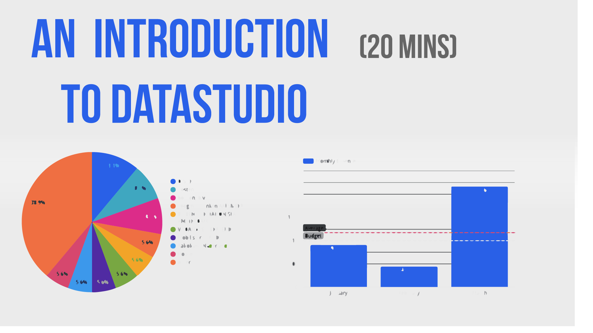
1. Introduction: Data Studio is a tool by Google that is specifically designed for the creation of dashboards. And it does so in a very clever way because it allows you to import data from different sources, manipulate the data, and then create the dashboards themselves. And that can also be shared and they can be interactive and so on. So during this class I'm going to show you the basics of Data Studio, and I'm going to focus on three fundamental parts. The first one is how to import a dataset. So how can you use data from, let's say a spreadsheet? The second one is how to manipulate some of these elements so that you can obtain the KPIs or the, or the numbers that you want. And the third one is how to create the visual representations of the dashboard themselves. So let's get started and I'll walk you through the process.
2. Adding a DATA SOURCE: Data Studio is a tool by Google that is specifically designed for the creation of dashboards. And it does so in a very clever way because it allows you to import data from different sources, manipulate the data, and then create the dashboards themselves that can also be shared and they can be interactive and so on. So during this class I'm going to show you the basics of Data Studio, and I'm going to focus on three fundamental parts. The first one is how to import a dataset. So how can you use data from, let's say a spreadsheet? The second one is how to manipulate some of these elements so that you can obtain the KPIs or the, or the numbers that you want. And the third one is how to create the visual representations of the dashboard themselves. So let's get started and I'll walk you through the process. So in this class, I'm going to focus on creating a dashboard dies going to be personal finances, right? So I want to see where my money is being spent and how it's basically spent. So for these, you are going to be needing a Google account. And then within Google, you'd need to configure or to include the data's to the product, but that's rather straightforward. The first step is actually to create the datasource. And what I've done is I've created a Google Sheets file. I've imported and export of wine buttons, bank statement. And this contains only three columns, right? So i, it contains the date in which the money spent, the amount that has been spent, and also who am I sending mnemonic. And with these three columns, I'm going to visualize my personal finances in a fairly, sort of pretty weight. The second step is to actually to create the template for the dashboard itself. So in order to do that, you need to go to Data Studio dot google.com. And again, if you have an ad, if you didn't add this product to your Google account, that's the first thing that will happen. Once you have done that, then you will get into a place or into a screen where you can select a template. In our case, we're going to click Send to create a blank report. So you go ahead and click on the blank report. And this is going to open the dashboard editor. And the first thing that Data Studio's going to do is going to ask us to add data. So you will see that there will be a window popping up from the bottom that says, okay, you need to add some data to your report because otherwise we can't print anything. But before I do that, I'm going to give this report name. So I'm going to click at the top. I'm going to call it personal finances that you go. Now, once I have a name, the next step is to add the data, so you will have a button here. Now, Google Data Studio allows you to pull data from multiple sources. And this is one of his biggest powers, right? It's not just creating graphics in Xcel, it's being able to pull data from multiple sources so that you can actually aggregate everything together. So go ahead and click on the Add Data button, and then you will see that the same screen pops out as before. Now, the way Google Data Studio connects two data sources it by means of what is called connectors. So the idea is that you have the studio and it uses a tool that is called a connector to connect to multiple data sources. And if you are a bit of a nerd or you like technology, this is usually done by means of an API connection. Now, you have their standard Google connectors that allows you to pull data from Google Analytics or YouTube Analytics or these type of things. But you also have, if you scroll down, you will also have external or third-party connectors that allow you to pull data from external sources. Now because we're using Google Sheets to put the data in, then we only need to click on the Google Sheet connector, which is usually at the first row. So once you click on that, then what you will see is that your files in Google Drive our array displayed for you. So in this case, I'm going to go ahead and select my file, which is the spreadsheet called expenses. And you will see that the first row will be used as header. So this means that it's going to label your database on that first row. So it's very important that when you create the data, the first row contains the name of the data that column contains. And I'm also going to include all the hidden filter cells. So in this case there are no, there are no heat themselves. But if you would put filters and so on, this will allow you to pull the raw data and not just the one that you're visualizing. Once you have that, then you can add the datasource. And then from that moment onwards, Data Studio is going to allow you to use these data to create a dashboard.
3. Expenses with a TIME SERIES: So I'm going to add this to my report. If you go. And you will see that Google is going to try to plot something for me by default, right? It's going to tell me, okay, I have your data. This is what I can do with it, but I'm not interesting, right? I'm going to create my own graphics. Now. I'm mostly interested in four different KPIs for my personal finances. So one of them is I want to see how my expenses go through the month, right? Or through the year. I want to see if I have a yearly budget, whether I'm going to meet it or not, and also how my expenses are distributed. So which months of the year I'm spending more. I'm also interested to see how my monthly expenses much to my budget. So if I set up a budget, they want to see I am above or below my budget and also whether my average is above or below. So this will allow me to see, you know, if I'm going to make my budget at the end of the year. I'm also interested to see the distribution of where my expenses are going. So I want to see if I'm spending money in entertainment or going out on dinner or my house expenses wherever I want to see what that looks like. Um, I and I also want to identify the highest expenses so that if I would need to cut, then I know where to find those expenses. So let's go ahead and start with the first graphics. So the way you add graphics or charts into Data Studio is you have a little button here, it says add a chart. So I'm going to go ahead and click on that. And I'm going to start by adding what is called a time series. Now a time series is based fundamentally on time. So this means that he's going to pull data and trying to find a date to associate that number to it. And it's going to plot it for you. So what you can see here is that at the bottom you have the date and then you have some sort of value going up. And in this case, this is by default, don't with the record count. Now, what this means is that it's telling me that on a specific day that there is a number of expenses on that date. Now, I don't really care about how many expenses I have per day. I want to know the amount. Now. All the graphics are all the charts can be edited in the same way. So once you click on one, you will see that on the right-hand side you will have two buttons, one for data and 14 style data allows you to manipulate and modify the database going to be plotted. And style allows you to basically make it pretty. So. Let's go ahead and explore the data tab. The first thing I notice is the dimension is based on the date, and this is great. This is what I want. I want to be civilized, visualize my expenses through the year based on the date. The second one is that what it's counting is basically it's just a record count. And I don't really care for these, right. I want to add the amount that I'm spending. So I'm going to go ahead and change these. And you can simply click on Add metric and then select from the fields that are on your data source. I'm going to select amount, so go amount. And now you can delete the record, council. I'm just going to delete that. Now. What I notice are two things. The first one is that my because they are expenses, my amounts are going down right. So this is understandable, but it's a bit weird, right? I just don't like I don't like seeing the amount being negative, so I need to change that. And the second one is that these basically sum up the expenses on a daily basis, but they don't add up over time. So I also want to change that because I want to see my total expenditure to that particular date. Now, you can do this by creating a metric that instead of selecting one that is by default, you can create your own field, which is what I'm going to do. And once you have your own field, you can give it a name. So this is going to call it. Total expenses. And you can create the formula the same way you would create a formula in, for instance, Excellent, right? And in this case the formula is rather straight forward. I want to zoom up over the amount, right? So I'm going to do some amount, but I want to make it positive. So I'm going to multiply this times minus 1. Once I have this, I'm going to click on the Apply button. And I'm going to remove the amount that I had before. Now, this is fine. So this has basically put my expenses all the way to the top. But I also want this to zoom up over time, right? So the way I'm going to do that is by simply clicking again on my expenses, the one that I just created. There you go. And in the running calculation section, I'm going to create a to click on running sum. And what this is going to do is basically instead of only displaying the values at one particular date, is going to sum up all the values all the way to adopt. Now this seems fine. So this basically it's adding are my expenses. But you can see there are some weird gaps here, right? Like basically on the days that I have no expenses is showing me a 0. Now that's not what I want. I want to interpolate. They want to go, I wonder classical expenditure line because my expenses are not suddenly going to 0, they keep on the same level. Now this is something that you can do on the Style section. So if you click on this tile button on the right-hand side for that particular plot. And then you scroll down to the general section here, you see that the amazing, the missing data is going to be interpolated by creating a line to 0, putting the value to 0. Now, I don't want these, right? I want a linear interpolation. I want the data to be smooth from 1 to the next, even if there are no expenses in between. And then if you wanted, you can also make it small. So it looks a bit more like a curve, but this is not really relevant in my case. So that's fine. So that's my first plot. That's exactly what I want. I want to see how my expenses go through the year. Okay? Now, there's one more thing that I can do here, which is I can set up, let's say, a yearly targets. So let's say that your budget, these Tylenol, say 12 thousand per year right? Now, I want to see how my current running expenses much up to my, to my target. So the way you do this is in the style section. Again. You can go ahead and display what it's called. What It's called reference line. Which should be here, a reference line. So you can click on the reference line and then you can decide if you want, for instance, a constant value of parameter, a calculated value for my case is a constant value. I know that my yearly budget is going to be 12000 and this is what I want. And I'm going to give it a name here, which is yearly budget, right? Yearly, let's call it target budget. Okay? So that's my target expenses for the year. And then you can see how your current expenses much up to that amount. So that's my first KPI.
4. Monthly Expenses with BARS: So now I have three more KPIs to go. The next one is rather sort of similar to this one. So instead of creating a full graph from scratch, I'm just going to take this one. I'm going to copy it with Control C. Control V, right? Is going to copy my graph. Go. I'm going to drag it in place. And I'm going to modify this one. Now before I do that, I think I'm going to start placing these elements a bit more where they want to be and also on the size that I want them to be. So I want this to be half of the screen. You can see that when you drag the size, there will be a point in which it will be red Go, and that basically identifies a middle of the screen. All right, so once I have it in the middle of the screen, I'm going to be doing that. And I'm going to be doing the same for this one. I'm just going to drag it all the way to the middle of the screen Right there. Perfect. And I think I need to make this a bit smaller so that it matches the height of the graph. Okay? That's it. Now, we mentioned that the second KPI that I want this I want to see how my overall or total monthly expenses skull. And this is a very nice extension to this particular graph, right? So basically I need to break this down instead of on a daily basis, on a monthly basis. Now there are two things or two ways in which you can do that. The first one, I'm going to, I'm going to eliminate my yearly target, which is not going to be necessarily on this particular graph. So again, I go to Style, I go to my reference line. I'm just going to delete this reference line right there. The second theme that I'm going to do is I'm going to set up the granularity the right way. So this means that when I'm talking about the dimension, I'm no longer interested in the date itself. I want to I want to go I want to go a bit in more detail. So if you look at the calendar on the left-hand side of the dimension, you see you can, you get the little pencil so you click on that. And now it allows you to refine these, these dimensions. So I'm going to create, to click on the type date, so date and time. And now you can see you have a lot more choice here, right? So I could choose to visualize this per year, per quarter. So an interested only in month, right? So if you click on the month, what this is going to do is it's going to aggregate per month. So he's going to zoom up all your numbers per month. So now I have these here in a way that makes more sense for me. So in January spend a bit, a bit less than 1000 and it grew up to this amount and this amount. But this is now zooming up. And I don't want to sum up, right. I don't want the running sum. I want the individual per month expenses. So if you remember, we can go back to your metrics section and then we're going to configure it by making sure that this is not the running sum, right? So this is not the running sum. This is just the sum of the expenses on a monthly basis. So this makes more sense. So now I have my expenses in January or a bit below 101 in February are a little bit below 500. And then March shoot up all the way to 2.5 thousand or almost 2.5 thousand. Now this is fine, but for these type of graph, a more common representation would be a bar graph. The way you change your graph is by simply going to the top where you see chart or time series. You click on the arrow below, and then you can select the right type of graph. So in this case, I'm going to go from column chart. Now, once you do that, then you will see that your graph is now converted to a column chart, which I think it makes more sense, more sense for these type of graphical representation. Now, one thing that you will notice here is that these seem to be backwards, right? So I can see that, you know, I remember that the expense in March was the biggest one. Now I sort of change. So that's a bit strange. Now, this is something that you can easily fixed by changing the order in which the data is displayed. And if you go to your graph and then data, you will see that at the bottom you have a section called short. And then you can decide if you want to sort by date. And I want to sort it in this case by us sending. So I want to start in January and move all the way to do March. One of the things that you're noticing is that there are no labels on the x and y axes, right? And this is a bit strange. And what happens is that if you copy a graph from one model to another one, it could, it could change the style of the default chart. The way you can do this, this, or the way you can fix this is you go to style. And then you will see that at the bottom, you will see a little link here that says research to report theme. So when you click on that, you're going to keep all your data parameters, but it's going to reset the default representation to do that of that graph. So in this case, this is exactly what I wanted. I see now the months, January, February, March, also the amounts, and also I included the label of the date of the data. So I actually, I can actually see the amount that has been spurred spent per month. Now. I'm also going to be adding a couple of lines here. And I'm going to be adding this case to reference lines, right? So if you go to the reference line, I'm going to start by adding monthly target budget, right? So I wanted to have a monthly target budget of one hundred, ten hundred. And I'm going to give it, let's say a nice color, something like green, right? So this is basically my target and I'm going to give it a name also, which is my budget. So this is my monthly budget. But I also want to add one more, which is the actual average, right? So I wanna see how I monthly average much up to my budget to see if I'm below, above or I'm sort of in that range. So again, I go to style. You go to the reference lines. I'm going to add a reference line. And the difference is that I'm not going to be using a constant value, I'm going to be using a calculated value. And this is a metric. And I'm going to select here. And then it's going to give me some options, which in this case is the average. You can see it right there. The new field is called average, right? And in this case is the monthly average. So I'm gonna keep it like that. Only I'm going to give it a different color, let's say red. So I get a bit more of a warning of one, my budget is going outside of control. Okay? So this is my second graph, right? And these two already gave me a lot of a lot of information about how my budget is going through the month.
5. Where the money goes with a PIE CHART: So I'm going, I'm going to add one more, which is the distribution of the expenses through the different topics. So the way you are going to be doing this, again, you go to our chart. And in this case I'm going to be adding a pie chart. So if you select this pie chart over here, you're going to paste it right there. I'm going to adjust the size so it matches all the way to the center of my screen. Go to it. And you can see that It's basically telling me something that is not what I want, is basically showing me the distribution of expenses through the duct, but that's not what I want, right. In this case, my main dimension is not is not the date itself that they mentioned is the beneficiary so where the money is being spent. So I'm going to go ahead and change that and select beneficiary. And then you will see that this is immediately changing to something that tells me where my money is being spent. So I see that, okay, I have my Disney account that is 11% of my budget. Around 40% is in orders and so on and so forth. So this already tells me where my money is being spent. So this is exactly what I want.
6. A TABLE to visualise the expenses: So I'm going now there is one final representational, one final KPI that I want to add, which is, I want to see where my biggest expenditure is going, right? So I want to see which items are taking the most of my money. And for these we are going to be using a different type of graph. So again, this, I go to our chart and I'm going to be selecting a table. So you see at the bottom you have, at the top you have a few tables. I'm going to look the last one which is a table with a heatmap. And what this is going to do is it's going to show me We're my expenses aren't going. And also it's going to highlight with color which which are the items that take and most of my budget. So I'm going to go ahead and add the default table. You see? And I need to modify this because this is not showing me what I want, so okay. It's showing me the beneficiary. That's okay. But then it's showing me a record count. So how many expenses how many times they've paid to these particular beneficiary. I'm not interested in these. So again, I go to my metric which is record, record count, and this is wrong. And I'm going to add another metric, which is basically the amount. So I can click on the amount. And this is going to show me the amount that is right there. Now this is all negative. So again, I could change that. If you want, you could change, educate, create a formula, multiply by one. So let's just go ahead and do that. So I'm going to create a new metric fill pens. I'm going to call it expense. And I'm going to do this is the sum amount multiplied times minus 1. All right? And now I can get rid of the amount of the previous amount. So I can go ahead and remove the amount itself. So you can see how now these are positive numbers, which is basically, you know, it's a bit more of a natural way to look at this, but I also want to order these in a different way, so I wanted to see them the items that caused me the most. I want to see them on the top right. So if you go, if you go to the source section, you can see that it's sorted by beneficiaries, so it's sorted in alphabetical order, but I'm not interested in these. Again, I'm interested in sorting these by expense. So you can see that I've created these value here, this expense value. So if you click on that, and then it's going to order these, you know, in a descending order. So the highest expenses then would be at the top and then they scroll down. Now, you also see that there's one more column here which basically gives me the item number. Well, I'm a grown up, I know how to count, so I don't need this. So you go to style. And then in this style section, I'm going to be removing the wrong numbers in the table body section. So if this, then that one basically disappears. So that's, that's basically it, right? So I have created four KPIs and now I can focus on making these look a bit neater. Now the good thing about Data Studio is that it comes with a ton of sort of predefined, beautiful sort of colors or styles. So if you unclick all graphs and you will get to the default theme on layout. And you have by default, or you have a list of default layouts right here that you can choose from. So I'm gonna go ahead and choose one that I sort of like, let's say, I like these Darwin over here. So I'm going to select that style. And you'll see that it's going to convert all the graphics for me into that particular style. The second thing that I want to do is I want to align these nicely because you know, I like things to be neat and aligned. So I'm gonna go ahead and align all these graphs in the right place. The good thing is that it's going to show me guide or you know, of where to put these elements to make sure that they are aligned. Thank you. Go, that's a nine at the bottom. I want I want this to be aligned on the top. Okay. I'm going to go ahead and move this one as well. And I'm gonna make it as big as the one at the top. They are nicely lined. Okay? And I'm going to do exactly the same with this one. So I'm going to use more there. And I'm going to make it as big as the one on the top. So they all look sort of nice and aligned. So that's it. Those are more for KPIs. And if I want to add a nice title to eat, you can just go ahead and add texts so you can see the little icon here with the square, our texts. So if you click on it, this will allow you to create a text, which I'm just going to make it as why does my graph. And I'm going to call it final says. And I'm going to go ahead and change the font so make it a bit bigger. Say 30 points, 30 pixels, yeah. And you can also change the font to something that you like more. Let's say something like, let's say this impact fund, right? So the styles, this is a very personal matters that you can choose, whatever, whichever style you want. Now, it has only taken about 15 minutes or so, but we have created that complete dashboard that allows us to see a very simple three column data in very different ways and it allows us to highlight how this data is represented. So I've shown you how to create four different graphs. So 2 times series with different data granularity, one pie chart on one table with different sorts of ordering, reference lines and so on and so forth. This is a fairly straightforward Introduction to Data Studio that is a lot more than you can do with these. But I think that for the first time or the first approach latest studio, this is, this already will bring you to a fairly nice level. I hope you enjoy it. And if you have comments or feedback or questions, so be sure to let me know. And I look forward to seeing you in the next time. More advanced class, Cheers.
 Isaac Esteban, Science and Technology