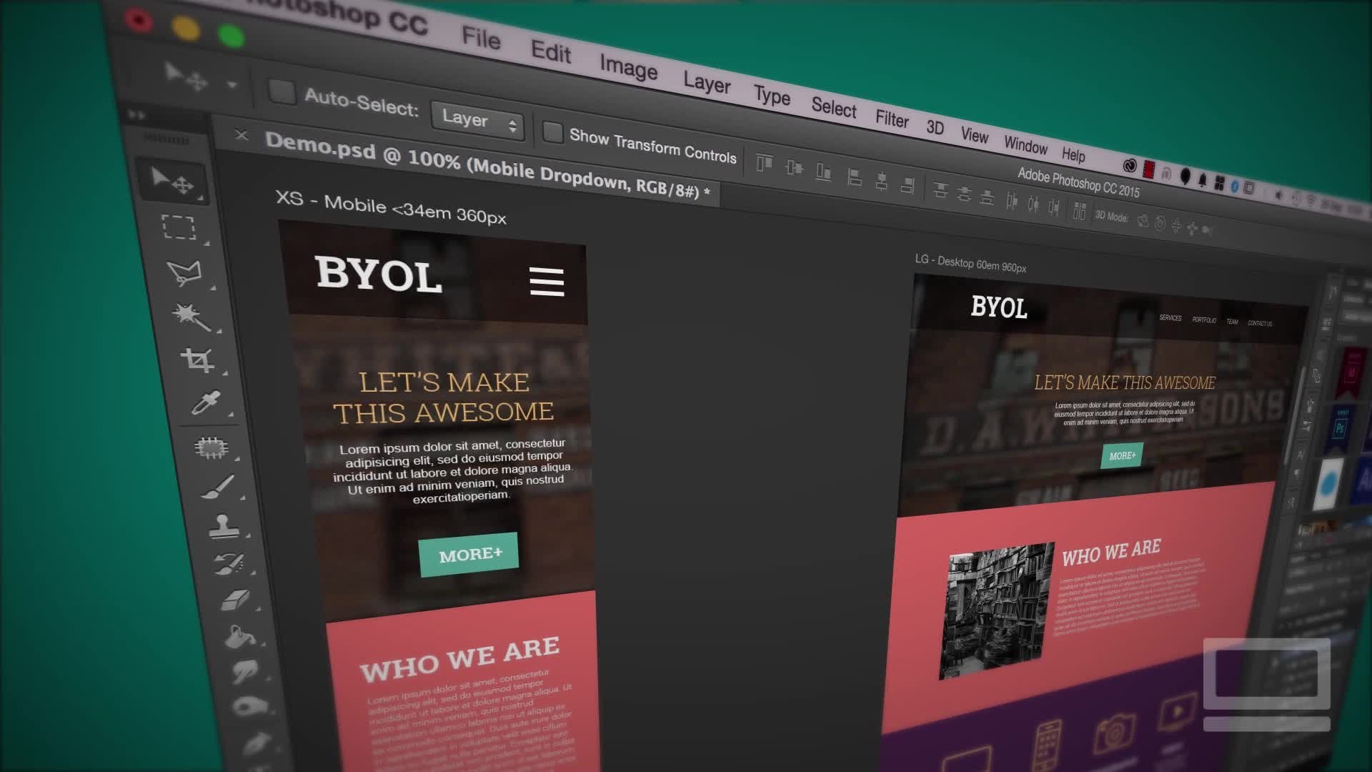
Transcripts
1. Introduction: Hi. My name is Isbel and I've been running my small
creative business for well over 15 years now and I absolutely love making
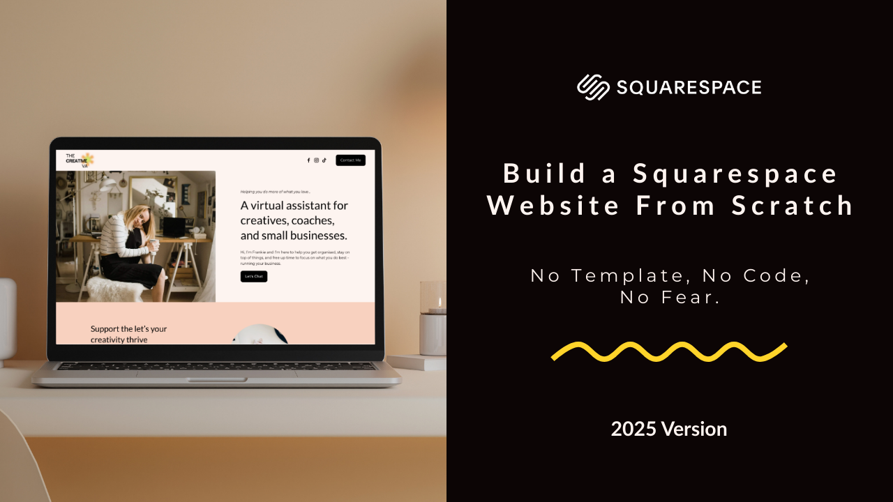
squarespace websites. In this class, I'm
going to take you step by step through the
process of building a website on Squarespace 7.1 using their dragon
drop fluid engine editor. This is their most
recent version, and we're going to do it
completely from scratch. That means no
templates, no coding. We're going to get over
the fear of a blank page. This class is perfect for solo business owners, creatives, freelancers, side hustlers, DI wires who are overwhelmed
by the template choice. It's also a really
great option for you if you have an existing Squarespace 7.1 website and you want to add some
additional pages to it, but you're just not
really sure how to go about doing that without
using a template. This is going to be perfect
for you. Class project, we are going to build
a one page website. You can then either use this as a standalone website to launch your business
and get online fast, or it could be used as the homepage for a
multi page website. My website example
is going to be for a creative virtual assistant and all of the
resources, the branding, the colors, the fonts, and the text are going
to be available in the class resources if you want to download and
then follow along. Alternatively, you can create your own or if you're ready, you can start launching
your business. It just depends on your
goals for taking this class. I'm going to explain
everything to you in a no nonsense straight to
the point kind of way. By the end of the
class, you will have a beautiful website ready
to launch into the world. You'll also have an
excellent understanding of how SquareSpace seven point
one's fluidendron works, empowering you then
to go ahead and build more websites and
more pages in the future.
2. Blank vs Squarespace Template: Before we jump into
building out our website, I just want to quickly
talk about why I prefer using a blank template rather than one of
Squarespace's templates. Because when you look through
the square space templates, they're beautiful,
in a lot of ways, why wouldn't you use one?
But here's the thing. One of the things
that I think makes the square space template so incredibly beautiful
is the photography, and often when you swap that
out for your own photos, you can find your
website just looks a little bit flat and
underwhelming and it doesn't quite have that
same visual impact that you thought it was going to when you first chose the template. This leads me on to strategy. When you're trying to
cram your information into somebody else's
strategy and their template, you're not really thinking
about what it is that you actually want to say and what
you want from your website. Finally, there's the fear
of breaking a template. Quite often with templates, you'll find the sections
that aren't really relevant for you and then you're
wondering, can I delete it? If I delete it, am I going
to break it, da da da da. It just leads into this
overwhelming spiral of indecision and it
makes you second guess yourself heads up. You will not break your
template if you delete things. That is how they're
designed. I get it though. Blank pages can be
really daunting. But my hope is that by
the end of this class, you are going to
see that building your rose from scratch isn't that scary, it's really doable. Actually it's easier than shoehorning yourself into one of the square space templates.
3. Creating a Blank Template: In this video, I'm going
to take you through creating a blank template and setting up a
Squarespace account. If you do already
know how to do this, then you can go ahead and
skip on to the next video. If not, stick around. I'm going to take you through
it step by step. Okay. I want you to go to squarespace.com and then click
over here on GetStarted. It's going to try and
ask you some questions. It's because it wants to
set you up with a template, but we're not using
one, just click over here on I'm just browsing. However, there is no option
to select a blank template. What you need to do
is select any of these templates and
then delete the pages. If we click over
here on one page, I'm going to go ahead
and select this one here and start with this design. If you have an
account, you can login over here on the
top right corner. If not, continue with email. I'm going to fill my details in here and you can go
ahead and do the same. When that loads up, you'll have a page that looks
something like this. You can see at the
bottom here, you have a 14 day free trial
with Squarespace. There is a way to extend
this and I'm going to show you how to do that
later on in the class, but just know for now that
you don't need to pay for your Squarespace account
until you're ready to launch it and make it
go live into the world. Now, let's click on
website and then pages. The first thing we want to
do is delete the homepage. But if you try and delete it, you'll see that you can't and that's because you
do need to have at least one active
page on your website. Let's go ahead and
add a blank page. Click the plus, add blank, and we're going to
call it home two. Next, we just need
to assign this as the main homepage.
Click here on the COG. Scroll down here, Setters
homepage, confirm, and close, and now you can go ahead and delete the
original homepage. Last thing I want us to do,
just click on the COG here, and we're just
going to rename it back to home in the page title, the navigation title, and
also in the URL slog. Click here on Save.
And there we go. That's you with a completely blank template ready
to get started. In the next video, I'm
going to show you how to set up your header
and your footer. Okay, see you there.
4. Setting Up the Header + Footer: In this video, we
are going to set up the header and the
footer of our website. I just gives you a
really nice structure to the site quite early on. It's a little bit like
when you're doing a jigsaw puzzle
and you're always going to start with the
outside frame first. Unless you're a crazy person who starts in the
middle of a jigsaw, no judgment, but wow.
Okay, let's jump in. The first thing I want you to do is click over here on Edit, and now you are officially in
edit mode on your website. Hover over the top here
to Edit site header. The first thing
we're going to do is just pop in our logo. So if we click here, you want to hit the pencil icon and
pop in your site title, which is going to be the
name of your business. So ours is the creative VA.
Then let's add our logo. Upload File and
select your logo. There you go. Easy as that. It is a little bit small, we can adjust the size of the logo here with
the sliding bar, or if you know exactly how
big you want it to be, you can pop it in here instead. Basically with your logo,
you want it to be as small as it can possibly be but not so small that
it's not legible. Next thing I want to do
is delete this login. If you click that
and hit Delete, that's just in case
you want to have a website where customers
can log in, which we don't. I do want to keep our
social media icons though, let's click on that
and we're going to add a few more links. Click
here on the pencil. You can go ahead and just add
your link here, add link. There you go. You
can see that it's automatically created
the icons for us. You can tweak those in
the design so you could have them with a
circle or a square, either outlined or solid. I want to just keep
mine plain like that, and you can scale up the
size just here as well. Okay, click out of
there. The next thing I want to do is add a button. We're going to jump
over here to add elements and just toggle this
option here for a button. And there we go, let's just
change the text, click it, click the pencil icon, and I want to say contact me. We will attach a link to it. At the moment, there's
nowhere to link it to. We're going to create
a context section within this one page website. Later on, I'll show
you how to pop the link in that'll jump
down to that section. Last thing, just want to show you this hit
blue arrow here. This is where you can scale
the height of your header. That's the smallest it can be. That's butted right up against the top and the
bottom of the section. You want to give everything a little bit of breathing room, drag it down so it's
got a bit of space. There you go. Looks good. Next, let's jump down to the
footer, click Add section. You do have lots of
in built footers here that Squarespace gives you, so you are welcome
to use one of those. But for this lesson,
I'm going to show you how to do it
from a blank section, click over here, and
then if you hover up, you can see this
option to add block. Click that. These are all the blocks that you can add into any of the
sections on your website. First thing we're
going to do is add a newsletter signup form. This is the default signup form that Squarespace gives us. We can customize it here if
you click on the pencil icon. You can change the
text so we could have change text
could say sign up. I'm also going to change the
text here and there we go. We can also change the
alignment of the newsletter. At the moment it's
lining up in the center. I'm going to have
it on the left, which sits nicely in
the footer there. If you want to top up a
background or a stroke on it, you could do that just here. However, I'm going to go
ahead and just leave it as it is. There we go. And you can scale the
size just a little bit so that it's just
a little bit shorter. Now, I just want
to really quickly talk about email
marketing for a second, because even if you are right at the beginning of your
business journey and you're not quite ready to start sending out emails
on a regular basis, it's still a great idea
to pop an email sign up form onto your website and start collecting
those email addresses. It's never too early and it's a really great way to start
building your audience. When you add one of
the squares email sign up forms to your
website, by default, all of the subscribers
are going to be saved into your Squarespace
contacts and you could then email them using Squarespace's own in built
email marketing platform. The alternative is to connect a third party
platform instead, and how to connect a third
party email marketing platform is going to vary depending on which one it is that you use. It's not really
possible for me to cover that within this class. However, if you need any advice
at all on how to do this, please reach out to
me in the comments, and I'm more than happy to help. Let's get back to
building our footer. Next thing we want to do
is add a image block. Again, add block. It's
time select image, and we're going to pop
our logo in again. When you click the plus icon, you can now select from library because we've
already uploaded it. Click your logo and add let's just go ahead and drag it over to the
other side of the screen. I'm just going to scale it down because it is
a little bit big, drag these anchor
points and scale down. Next thing I want is a text
block to sit underneath this. Add block. It's time to select text and just drag that over
to sit underneath your logo. I'm just going to go
ahead and copy and paste our tag line into here. Now, I'm also going to put
an email into the footer. I don't know about
you, but I find it really frustrating
when I'm on a website and I can't find an email address and I just want to get in
touch with them. I think that a footer
is a great place to pop your contact
details. There we go. I just want to
centrally align this, highlight the text and click here to centrally
align. And there we go. Let's just drag this logo
over a bit so that it sits directly in the
middle of the text. Final thing I want
to do with my footer is just add some social links, click again on Add Block. Instead of scrolling
through, you can actually just type things. There we go, social links. You can see already
it's remembered, so it's saved the same
links that we put in the head let's just drag it down so it's not
too close to that text. Okay, it's looking good. We
can just click out of there. I'm going to close
that window down. It's asking us to
check our mobile view. We'll do that later
on in the class. Also, don't forget to save.
And yeah, looking good. We now have blank website with a nice header
and a nice footer, so it just needs to
fill out the middle. But before we do that,
we are going to set up the styling for our website. That's our fonts and our
colors and our buttons, and that's what we're
going to go ahead and do in the next video.
See you there.
5. Styling: In this video, we
are going to set up the styling for our website
that is our colors, our fonts, and our buttons. Let's look at how to do this. When I'm working on the styling, I like to have my style guide
open, my branding document. You could do the
same if you want to follow along or of course, you can create your
own if you prefer. To access the styling, you either want to click here
on styles over on the left. Alternatively, you
could click on this little paintbrush
icon in the right corner. Both will take you
to the same place, which is this section here
on the right of the screen. Let's look at our fonts first. I'm going to first set
up my heading font. Click into Headings and you can select the font that you want
to use in this drop down. You can have a scroll through
all the font options. Squarespace has
literally hundreds and hundreds and hundreds of fonts for you to use. They pull a lot of them from Google fonts and Adobe fonts. They'll be most of the
fonts you recognize in there and you should be able to find
something that you like. I know that I want to
use to for my headers, so I'm just going to go
ahead and search that. And select it. There you go. It's changed the font already in my email sign up over here. There's a few other settings
that you can tweak as well. You can change the
weight of the font. If you wanted it really heavy
or really light, you could. I'm going to go for a weight
of 400 middle ground. You could also play around
with the line height so how far each line
is from each other. I'm going to set that to 1.4
and your letter spacing, which is how far your
letters are from each other. Just be careful
with this one you don't want to do anything crazy, have massive gaps
between your letter. It just makes texts
become quite unreadable. I'm going to keep this one at zero and text transform here. If you have a play
with that, that's if you wanted to have all of your headings in
uppercase or lowercase. I'm just going to
keep it as none, which means I can decide
as I'm typing my fonts. The final thing is
your font sizes. We've got four different
heading sizes, starting with heading
one is always the biggest down to heading four,
which will be the smallest, you can adjust the size
of them here using this slidey bar or you can go ahead and type in the sizes if you know exactly
what you want them to be, which is
what I'm going to do. That's looking good
for our headings. Let's nip over to our
paragraphs and do the same. I'm going to select for my font. I want it to be monserat a few more settings that you
can amend on your paragraph. Again, you could change
the weight of the font, I'm going to make this
400 and you could tweak the line height in
the letter spacing as well. I'm going to keep this at 1.6. You don't want too much
space between your lines, but equally, you
don't want them to be all bunched up together. You just want to make sure your text is nice and readable. Again, with your letter spacing, be careful because if you drag it out, you give
it too much space, it's going to make
the text really quite unreadable and a
lot of people will struggle with that
and it'll have a negative impact on the
usability of your website. I'm just going to
keep this one down at zero and you can change the
sizes of your fonts here. I'm actually really happy
with the sizes that we've got the default ones.
They work for me. Now let's just back out and look at our fonts
on our buttons. So you get three button
options here and you can change the font details
for each one individually. I would advise keeping
your fonts the same for all your buttons just for consistency
throughout the site. I'm going to go ahead and change that to the paragraph
font as well. There we go. I'm quite happy
to keep these settings. The weights slightly
heavier than our paragraph font at
500, but that's okay. It gives a bit more
impact on the button. So just click out of here. The final thing you
want to set up on your fonts is this
Miscellaneous font, which I'm going to
go ahead and select as the same as our paragraph. Your miscellaneous
just covers anything that your heading and your
paragraph fonts miss. I'll be things like
your blog category, titles, I think
are miscellaneous. We're not using any in this
website example today, but it's just good
practice to make sure to change that to the
same as your paragraphs. Final thing I want to
do in this section is over here in assigned styles. What I'm particularly interested in is this header button. Let's go ahead and
click on that, that relates to this button
over here, which we've got. You may have noticed
the font didn't change on this button as we
were updating the other ones, and that's because it's
got its own styling. At the moment, it's
set to custom. I'm going to click
this drop down. I want to make my buttons the same font as all
my other buttons. I'm just going to
change it to paragraph. There you go, you can
see that straightaway changed to the same styling
setup to our paragraphs. I want to make it a
little bit bigger though. Let's go for 1.1, just so it's got slightly more impact in the head of there. You can back out of the fonts and we're now going to
look at our colors. Click here on colors.
Edit palette. You can see you've got
five color options. Squarespace always sets them up from light color
to a dark color. That's a really good
practice to follow. It just means you've got a good variety of
different color options. Change the colors,
you could freestyle. You could just drag this
little color picker all over and find your
color this way. However, I know
exactly what colors I want this website to be. I'm going to copy and paste those over using the hex codes. Just change this drop down here to hex if it's not already, and then go over to your
branding guide and I'm going to copy and paste all
of the codes here. Let's pop that in. You
can see that's now changed to this pale pinky
peachy color that I want. I'm going to go ahead
and change the rest of these colors over and you
can do the same with yours. There we go, we've
got all our colors in now so we can
jump out of here. The final thing
we're going to look at is our button setup. Let's just click over here
and into button packs. Now you can see when you
hover over all the options, you get three different buttons. It's quite a nice idea to
have one solid, one outline. At least, if you scroll down
some of these other ones, they're just all outline. I think you want to mix it up, but you do want to keep
the shape the same, have all your buttons the same shape throughout your website. It just creates a nice
consistent feel to your site. I'm going to go ahead
and select this one here you can see that has now in real
time changed my button. If you want to change
any of the settings for the individual buttons,
this is where you can do it. Our fonts are already set up. We did that in the font section. You can also tweak them here, but I want to keep
them the same. As I say, I want to keep the
buttons looking consistent. I don't want to touch the fonts. I don't want to touch
the shape because I'm happy for them to
all be the same shape. The one thing you could
look at is the padding. If you click on your padding, you can see that has now created more space around the words. For me, I like to
keep my buttons quite tight and not have
too much padding on them. I'm going to go ahead
and stick with small. There we go. We can back
out of this section. Close down our site styles, and the final thing to do
is just click over here on Save and that will
save all of your redits. Throughout the build
of your website, you can always nip
back into the styling. If something doesn't
feel quite right, maybe one of your fonts
is a bit bigger or smaller than you thought
you wanted it to be. So you can always go over there and change
things as you go. But for now, our
websites looking great. We've got our header,
we've got our footer, we've got all our
branding in place. The only thing left to do is build out the middle
of the website, which we are going
to start doing in the next video. See you there.
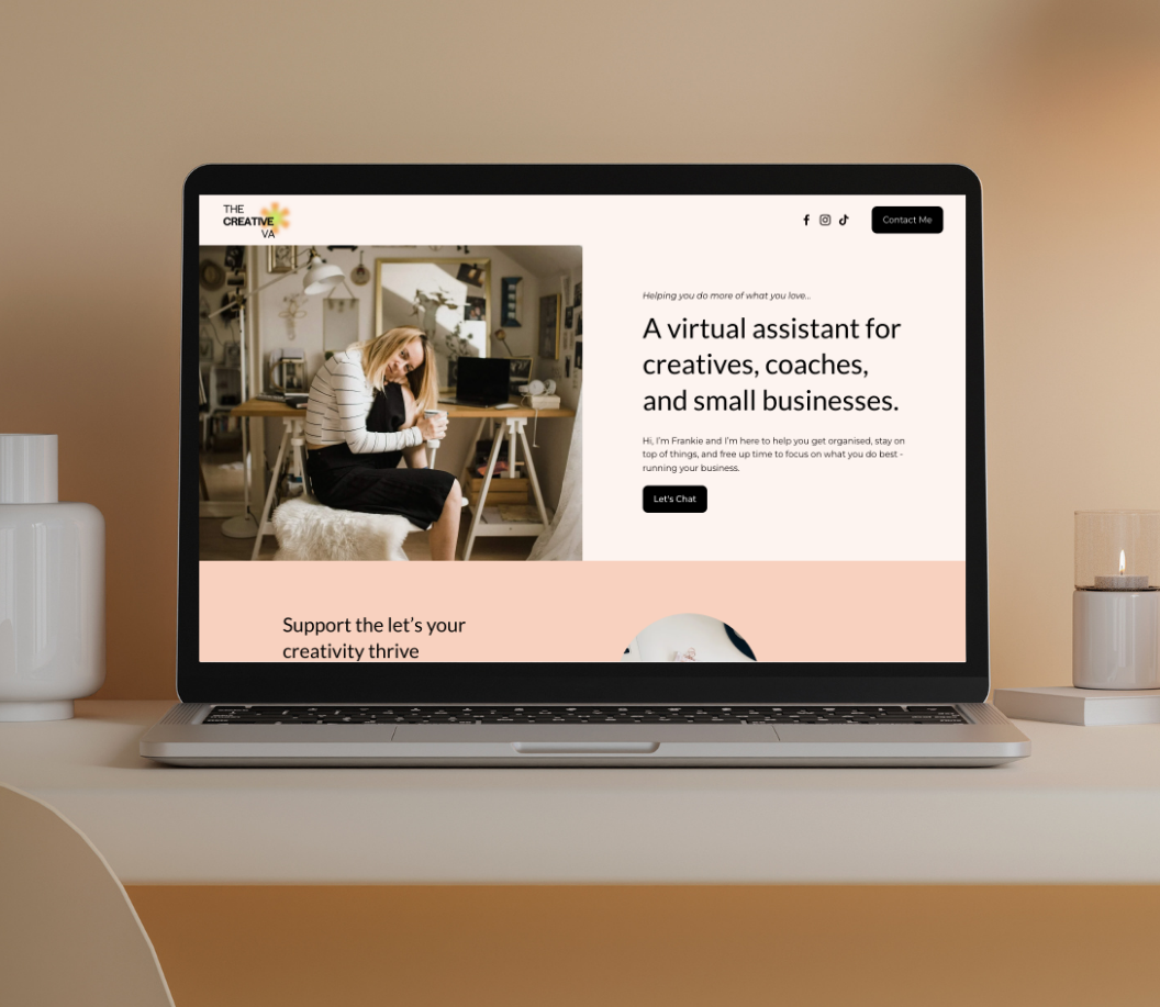
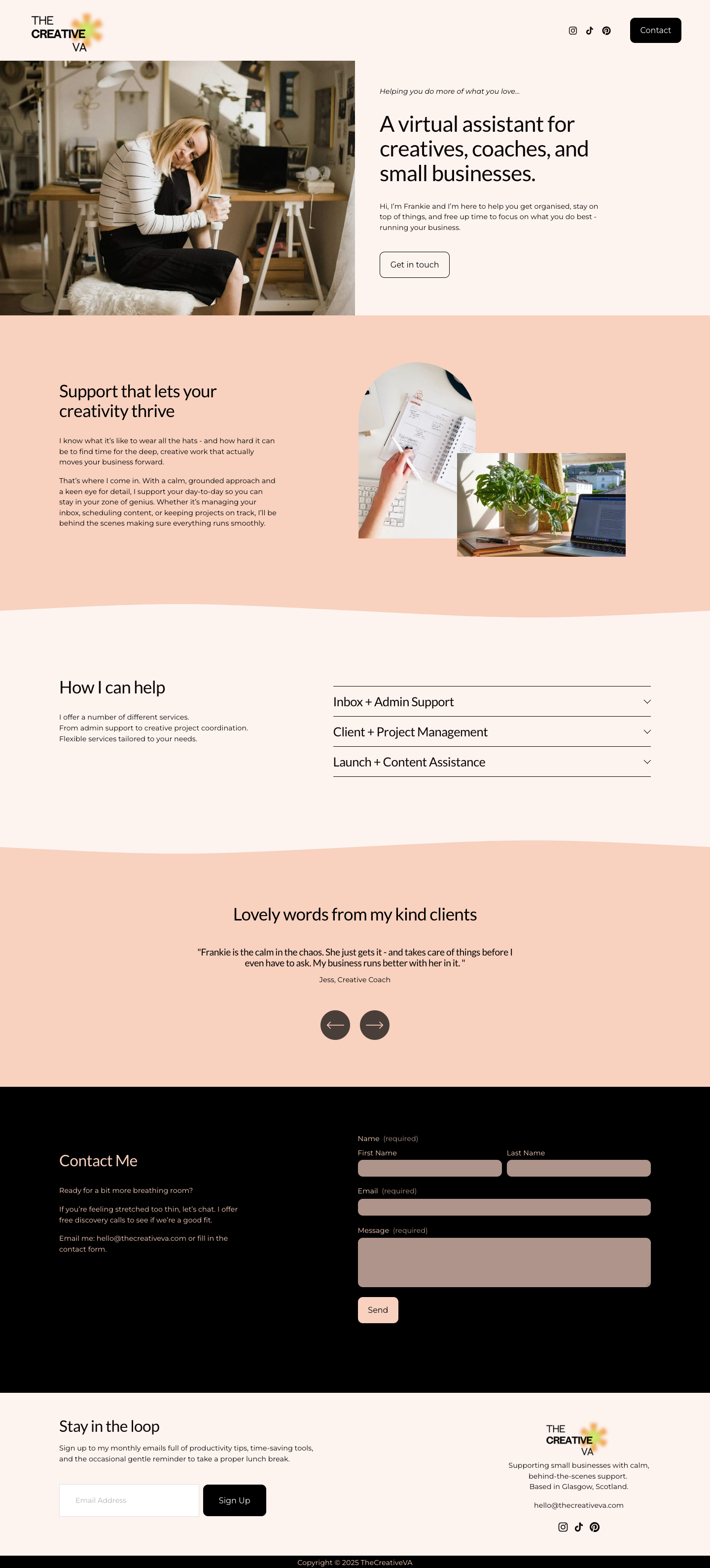
6. Hero Section: In this video, we're
going to start building out the
body of our website, starting with the hero section. This is the first section that somebody is going to see
when they land on your site, so it's a really important one. It wants to state
really clearly who you are and what your business does and how you
can help someone. So if we look here
at our example, we've got a big photo, half screen photo on the left. Then we've got a
little bit of text, big bit of text, body of
text, and then a button. Let's look at how to do that. You want to navigate
to pages and then edit and we're back in
edit mode on our website. Click here on AdSection and we're going to
add a blank section. You do get lots of pre built
square space sections here. If you ever want to
choose one, that's absolutely a great option. But for this class, we're going to do it
from a blank section. The first thing I want
to do is add the image. So go ahead and
click on Ad Block. Image, and then the
plus icon upload file and select your photo. Then we go. Now,
when you try and scale it with these
blue anchor points, you can see it is
making it bigger, but it's staying in the
same aspect ratio as the original what we want is for this image to actually
fill this blue textbox. If you go ahead and click on the pencil icon and into design, at the moment, it's set to fit, which means it's always going to stay the shape that it is. If you click here on fill, you can see that now we'll
fill up the blue box. Let's drag the anchor
points right to the edge and I'm going to
pull them down as well. However, if you see
as you pull it down, that's where that
darker section is. That's the end of our section. But we've got this
big gap underneath. If you see as you pull it down, the grid keeps growing, but that blank section
remains the same, and that's because
there's automatically padding that's set in a new
section when you add it. We just want to get rid
of that. I automatically gives you this space at
the top and the bottom. That's what I mean by padding.
Let's get rid of that. Click here, Edit section
where it says, fill screen, just toggle that off
and now our image is butting right up against the top and the bottom of the section,
which is what we want. One small thing, it's not quite sitting directly in the center. This blue dotted line is the center point
of your website. I want this image to sit
right there in the middle. But at the moment, it won't because squarespace works with a grid system and every
element will snap to the grid. You can see as I drag that, it's going to snap
automatically, even if I let go there
in the middle of a grid, it'll always snap to
the edge of the closest one rather than
right in the middle. Hit the letter G
on your keyboard, that will bring the grid up
so you can always see it. What we need to do is remove this gap between
these little blocks. If you click back onto Edit
section and go into Gap, you can then scale the width and the height of
that gap up and down. If you take it right to zero, you can now see that image is sitting directly in the
middle, which is what we want. Okay. Next thing I
want to do is add a text block, add block text. I'm just going to drag this
over to where I want it. I want it to sit here so
that it's about two of these grids worth of space from the image and from the
top of the header. Now I can just go ahead
and type in my text. Now, when you copy or paste or type text in it automatically defaults to this
paragraph two size, but I want this bit
to be a heading one, so it's going to be a
larger bit of text. If you place your cursor just right at the beginning
of that sentence, click on the drop down and
let's select Heading one. That's now made that nice and big and kept this text small. I'm just going to
drag it out a little bit so that it spreads over
the three lines there. I'm going to scale that textbox up as short as I can have it, so it's sitting right up
against this text here. Now we just need to
add another text box so we can add that
little subheading. I'm going to go ahead,
add block text. Drag this one over so it sits on top and just go and copy
my little tag line in. I'm just going to
drag all of this down just to keep that
space at the top, the two grids worth of space at the top, that's looking good. The next thing I want to add. The last thing is a button, click over here on Add Block, select your button,
and let's drag this over so that it's
sitting underneath our text. I'm just going to change the
text to say, let's chat. We'll attach the link later. This is going to link
to our contact section, but we can't link that
until we've created it. You'll notice on the screen, as I typed that text in, the box has now
shrunk a little bit, and that's because this
is also set to a fill. I say, for example, you were to drag
the button down, you can see the button
is fully filling this blue box and the text is always going to
stay there in the middle. I prefer to set my
buttons to a fit. I'll show you how that looks just to keep them consistent
throughout the site. Click over to Design
and then fit. There you go, you can
see that button is now set up to have
the padding that we selected when we set up our styling rather than
filling the blue box, that's my preference
for buttons. I just make sure they all stay nice and consistent
throughout your website. Now I want it to sit so it's lined up with
this text on the left, so you can just click
over here on after Line. There we go. That's
looking good. I'm going to hit G again on my keyboard to get
rid of that grid. The grid is really good to
help you line things up. However, sometimes it can be a bit distracting when you want to see how the websites looking. I quite often will flick
between G grid on and G Grid off just to see how things are sitting and check that I'm
happy with the spacing. I can see this image needs
to be pulled down a little. It's right at the
bottom. Maybe there's a bit of a big gap between this bit of text
and this bit of text. However, I can't drag that down any further because
it snaps to the grid. What I can do instead
is see if you click on the Text Box and it's
this little one here which will align the
text either to the top, the middle or the bottom
of the text block. If we just take it to the
center or the bottom, I think the center
probably looks the best. That's just another way you
can help line your text up. That looks good to me. Let's
go ahead and click on Save. The next thing I want to do
before we finish up with this video is just see how
this is now looking on mobile. Currently, we are
in desktop view. If you hover over here on
the right of the screen, you can see we're
in desktop view. But let's have a look
at how we look on mobile view. Click that option. There we go. You
can see overall, it doesn't look terrible, but there's a few
spacing issues with this text and at the bottom, and also our image, we've got
a bit of a gap at the side. To fix that, you can just drag
your handles of the image. Actually, I want the
image to be a little bit bigger on the height as
well, just drag that down. I'm going to select
all of my text and my button together and just
pull all of that down. O. Let's align this to the
bottom of the text block. I'm going to drag it up a
little bit, so it sits there. Let's pull this text up
like that. I button. Let's just reduce the size
of the text block there. The button block, and pop it up. I generally like about
one grids worth of space between my
text and my button. Let's just pop it
there. That looks good. I'm just going to
drag another grids worth of space underneath. Yeah, I'm happy with
how that looks. We could also just have a quick look at the footer as we're here and see how that's been
affected in the mobile view. I want the logo and
the text to sit above the email sign up form. I'm just going to
select my signup form these arrows here, you can just click on
those to move it down. It's going to move down each of the elements until it's right
there at the bottom. And this logo feels
a bit too big. I'm just going to shrink it
down with the arrows there. Move this text up a little bit so that everything's
sitting nicely. Let's go ahead and
drag this up to Now, we can just shorten the height
of the footer there too. That's looking good
for now. There is still a lot of space here, but that will change as we
add more content to the page. For now, I think the
mobile is looking good. We're going to flip between our desktop view and our mobile view throughout the course of
the lesson of the class. It is a good idea to keep
checking your mobile as you're building out your website rather than leaving
it to the end. It's a bit of a more efficient
way of doing things. But for now, let's go ahead
and click here on Save. We're gonna nip back
to desktop view, which is where I'm
gonna meet you in the next video where
we're gonna look at building out the next section of our website. Okay,
see you there.
7. About + Services: In this video, we are going
to go ahead and build the next two sections
of our website. That's our About section
and the services section. If we take a look
here at the mockup, you can see we've
got body of text, two images in this
fun arch shape, and then we've got wavy
line at the bottom. Our next section, we've
got a bit of text, and we've got this
drop down section for our services and again, a wavy line at the bottom of it. You went to click back into Edit Mode and below this here
section, click Add section. You want to go ahead and
select blank section. The first thing I want to do is actually change the color. Click here on Edit section, colors, and you've got all
of these different options. Squarespace makes
different color palettes based on the five colors
that you selected, which is a really nice feature. You can see you could
have it with the gray background,
dark background. We want to go ahead
for this one here, which is bright peachy color. Then I want to add my text. Click over here on Ad Block text and then we're going
to type our text in so you can type in just
like any other word editor. You? And it automatically
goes to this paragraph two. I want to make this
one paragraph, sorry, a heading two, or maybe actually
let's try heading three. I don't want to do
another heading one because I've already got
a heading one up here. I'm going to make this
text a little bit smaller. Now I'm going to copy and paste my paragraph text,
which you can see, as I entered down there, it automatically jumped from a heading three to
a paragraph two. Then you can go ahead and
copy your text in for the F. Then we go. I'm going to drag
it over slightly. I I'm keeping this
two grid spacing, two grids worth and you can
see as you click and drag, your grid will pop up and then when I let
go, it disappears. Again, if you want to see
the grid permanently, just hit G on the keyboard and that will keep it
up no matter what you do and G again,
switch it off. Let's go ahead and
add our images. Add Block image. I drag this over to the
other side of the screen. Click my plus icon Upload File. And it looks like this
one here about one. Then to add our second image,
you could do the same. Add block or you can just copy and paste an existing image. If you do Command C
and then Command V, it'll make a duplicate of the
block you've just created. Let's go ahead and change
the image in this one. Click it pencil icon, and replace this time and
upload file and we can select our image. Oh. As before, the images
always default to a fit rather than a fill. It's taking on the aspect
ratio that it was uploaded. But this image here,
I actually want it to be that nice arch shape. What I'm going to do is click the pencil icon,
go over to design. Instead of fill, we're
going to click shape. It's now put the
image into a circle. I want to change that shape
to this arch shape here, but you've got lots of shape
options you can play with. There we go, that's
us now in an arch. I want to drag it over to
this side of the screen. And let's make it a little
bit bigger as well. There we go. This other image, now, you can see we've got a
little bit of a problem because it's sitting
behind this image, but we actually want
it to be on top. If you click on the image and hover over here, move forward, you can bring that
image to the front and I also want this one to be
a fill rather than a fit, design, fill and that's
filled that textbox for us. I'm just going to move both of the images over
slightly to the left. Let's keep that two grid
distance and I want to just drag this blue
handle up just like that. We've got a nice amount
of padding underneath. The last thing to do on
this section is just create that wavy line that we had in
the mockup and to do this, you click here on
Edit section and you want to add a
divider. Toggle this on. This is the default divider
that always pops up. It's a curve with
a stroke on it. You could keep the stroke if you wanted it or just
take it off there. Then if you click into shape, you can change the
shape of your divider. You could have more
angular style I'm going to keep this
soft wave and you can vary the height and
width of the wave. Depending on which
settings you pick, I'm going to go for a
nice soft gentle wave. Okay, click out of there. Let's go ahead and
add our next section. Add section, add blank section. I'm going to keep it
this color and I want to first add our textbook. I'm going to pull that
text block out again, it's the same position as
the one in this section, so they sit up neatly and then copy and paste
my text into here. Again, I want to make this how I can help a heading three, so that it matches
the section above. Now I want to add
this drop down block. Add block and it's
this one here, accordion. And there we go. We just drag that over
to the other side of the screen and we can start
filling in our details. The way we add the text for an accordion block is a
little bit different. I want to click here on Edit and you can see all
of your items here. You can add more if you've
got more, you want to add. I'm just going to
do the three for this example, click into it, and then you pop
your title here, which is Inbox and admin. Then you want to type
your description in here. There you go. You
can see that has now populated in the dropdown. I'm just going to
go ahead and fill this in for the next two
and you can do the same. Once you've got all your
content in the accordion, I just want to jump over
and show you how this looks in the live
preview of the website. Go ahead and click on
Save and you want to exit and see this arrow
in the top corner. If you click that,
it's going to give you a preview of your website,
show you how it's looking. So let's scroll down to the Accordion block and you can see how it
works in action. If you click the plus icon, it gives you this drop
down of the text, and then when you
click the next one, that one closes and this
one opens, and so on. A couple of things just to point out is length, the
width of the text. For me, that's a
little bit short. I'd prefer it if
the text came out over here and that's
something we can do. Let's just go and have a
look at how we do that. Click the arrow again
and go back into Edit. Click your accordion
block and it's the pencil icon and this time you want to click
here on Design. This is where you can
make lots of edits. You could change the size of the title and
the description. At the moment it's set to a heading four in a paragraph two, which works great for me. If you click here into
the text paragraph, you can see here width at the
moment it's a medium width. Let's go ahead and
change that to long. If you jump out of here,
you've got a couple of other options you
can customize here. You could have it so that
it expands the first item. That would mean that
this one is always open when someone
scrolls down to it. You could also change
it so that people can have all of these options
open at the same time. I'm going to go ahead
and keep that toggled off and you could change your icon to be an arrow
rather than the plus sign. Also change the size of the icon and the
thickness if you want to, as well as the placement,
so you could have it at the beginning of the
row rather than the end. If you scroll down
a bit further, you could also choose to
have a background and a stroke on your block if
that's something you want. I'm going to go ahead
and just leave it blank. Okay, that's looking good.
There's quite a lot of space between our text
and our accordion block. I'm just going to drag this
along a little bit so it takes up more of the screen and I want to shorten the height, click my blue arrows and
just let's scroll that up. The final thing to do is
just to add our divider on. We've got the wavy line, which is on this section here. I want to put a wavy line
on this section here, click Edit section and
then Toggle on divider. You can't see it at
the moment because this section is the same
color as the footer, but you will see it in the
next section that we add, which is what we're going
to do in the next video. Click over here on Save and I'll see you
in the next video.
8. Testimonials: In this video, we're going
to look at how to add this nice sliding
testimonial feature. We are going to do a little
bit differently with this one and use one of the inbuilt
square space sections. I know, I know. I
said we were doing everything from blank
and we pretty much are, but this is just the most
efficient way to add this sliding feature. Let's
look at how to do it. You want to click back into Edit mode and then scroll down to the bottom of the screen
and add a new section. This time, we're going to select one of the inbuilt sections. If you click here
on testimonials, what you're looking for is any of them that have
this little eye, this little information option. Any of the ones with the I, you can edit in the same way. You can create any
of these layouts from any of the ones with the I. I'm going to go ahead
and select this one. It does look quite
different to what we want, but I want to show
you how you can edit them because they're
really useful for lots of different things
on websites, these blocks. These blocks work
slightly differently. You'll notice when you hover, you don't have the option to add different blocks into it. Instead, you want to click
over here on Edit Content. I'm just going to toggle all of these options on so you
can see what they do. You've got your title, which is this here at the beginning. We've also got a section
button, which is this one here. Then each individual
block here has an image, a title, a body, and a button. But you can choose to have
whatever you want on and off. We don't need any buttons. We do want to keep our title, but we don't want the image. Then we do want the title
and the body for the blocks. Next, you just want to
jump over to content. Let's change our
title first of all. This one's to say word. Now you can go
ahead and just edit the individual content blocks. You just want to copy and paste your testimonial
into the title here, and then you can pop the
name of the person here. There you go. You can see that's now populated into this one. So I'm just now going
to go ahead and fill in the other two
and you can do the same. You can just go ahead and
delete any that you don't need. Likewise, if you want to add any more, you can
add them there. Let's just have a little look at the design and the
layout of this now. Click here on the design bottom. The first thing is we only want one testimonial on
a page at a time. Let's just scroll
this down to one. I'm going to keep
infinite scroll on. That just means that
people can keep scrolling and scrolling
and scrolling through so there's no endpoint and it'll just rotate each of
the testimonials. Now, click over here onto style the first thing I want to
do is get rid of the card, toggle the card box off and you can also
change the text size here. Let's make it a little
bit smaller or you could change it manually here. I'm going to keep the
name the same size. Then a couple of other
settings you could tweak here. You could change the position of the arrows so you
could have them at the sides there
or at the bottom. You can also change the space
above the navigation here. See how those buttons move. That's that space between the
navigation and the content. If you just back out,
we're next going to look at this size
and space option. The first thing I want to
do is change the width, that's the width of this text. At the moment, it's
quite long and I want to bring that
text in a little bit. You can make it small
or medium, or again, you could freestyle the width just here if you wanted to
go somewhere in between. Couple of other settings
just to look at here, we could look at the space
between the elements. If you change that, you can see that's the gap
between each element. I'm going to keep that small. You can also look
at your padding. That's the padding
of the section, the height from the top and the bottom of the actual
section as a whole. Again, you could
restyle it if you wanted to set it different
at the top and the bottom. But I'm going to go ahead and
keep that as small as well. That's looking
good. You can just go ahead and click out of here. The next thing I
want to do is just change the color
of this section. Click here on Edit
section, colors, and then I'm going to
make it this bright peachy color again.
There you go. You can see now that lovely wave that we put in the last video, that's now showing up there. Okay, so I just want to save
my changes and then let's just duck over to mobile view and see how
everything's looking in there. Now, testimonial
section looks good. You can see how it's
swiping through there. Let's check the other
sections because we didn't do those in
the last video. So this is all looking
good with the text. The only thing here
with the images, they're now sitting on top of each other rather
than overlapped. We can just make a
few tweaks there. Let's go ahead and
pull this one down first of all, make it
a little bit bigger. It looks good, and we want it to sit behind the other image. So just click here on move
backwards and maybe I'll pull this one down a little bit just to show a bit
more of that photo. And this section
here looks okay. Maybe we want a bit
more space between this text block and
this accordion block, so I'm just going to pull
the accordion block down. There we go. That looks good. Okay, I'm going to
save those changes. In the next video,
we're going to add the contact section
to our website, and we're also going to
create the links for the buttons that we
created earlier on. See you there.
9. Contact: In this video, we
are going to build the final section
of our website, which is our contact section. We're then going to set
up the buttons so that they link to the
contact section. We're just going to
do some final checks. Check that we are happy with how the website looks
on the desktop, also on mobile, and
just see if there's any final tweaks we want to make before we finish
up with the site. Okay, let's do it. So
jump back into edit mode. Scroll right the way down
to the bottom and you want to add section underneath
your testimonial block, add blank section,
and we're going to change the color of this one to make it the dark background. Click on colors, and let's
go for this one here. Next thing you want to do
is add our text block, add text and then just
copy and paste in your contact info. There we go. Again, we want to change the contact me bit
to a heading three. I'm just going to drag this over again so it lines up with
the rest of the website, so we've got that two grids
worth of space at the side. We are about to add
a contact form, but I'm also going to
add an email address. I always put both
the contact form and an email address on because
people have preferences. Some people will find it easier to just
fill out the form. So people prefer to
email you directly. Ultimately, you want to give
people the best opportunity, best chance to email you. You don't want anything
to put them off. I always go email
and contact form, but it's totally
personal preference. So to add our contact form,
let's click over here, Add Block and this time
you want to select form. There we go. Strag this over and you can see this is the default form that it's given us
with these sections. You can make it
bigger if you want. Let's just go ahead
and drag this down so it's lining up with the form. Actually, let's drag
them both up to the top and then we've got the right
amount of padding above. Going to scale up the bottom of the form so it's nice and short. That's us. If you want to add any other fields
to the form, you can. You click here on
the pencil icon. And you can see at the moment, we've got here edit form fields. You've got name, email,
subject message. That's nice and simple. It's how I would keep most of my contact
forms, to be honest. But you can add extra fields if there's
things that you want. If you wanted them
to send you a link, for example, sorry, a file, you could ask them
to upload a file, and yeah, it just depends on what you want from people when
they get in touch. For me, I like to keep
it simple because again, I don't want to give people
reasons not to contact me. I think the simpler the form, the less if they've got to
answer loads of questions, it might put some people
off getting in touch. You can change the way
what your button says, if you want to change
that to message me, for example, you can also change what the message says
once they've signed up. Right now the default
is always thank you, but you could change
that to something else or whatever
you want to say. That's us done with
our contact form. Just going to drag
these arrows up so that we've got a nice bit
of the right padding. And the next thing I want to do is we want to link to
this contact form. The buttons that we set up in our header and the hero section, this is where we want
them to link to. And what we need to do is add what's called an anchor point. Click over here on Edit section. If you scroll down
to the bottom, you'll see here anchor link, and let's just
call that contact. Now if we jump up to our buttons, let's
do this one first. Click on your button
and pencil icon, and here you can
attach Link what you want to type is hashtag contact. Okay. And that is the link
that we've just created. Now when someone
clicks this button, it's going to jump down
to the contact section, and we want to go ahead and do the same in the header button. Edit site header. Click on your button to
edit and then attach link and it's the same
thing hash tag contact. Let's just go ahead and
check that that's working. Click here on Save exit and click the arrow here to get a preview mode
of your website, and let's see what happens
when we click the button. There you go. That jumps down to our contact section,
which is what we want. Whilst we're in preview mode, let's just check
through our website and see if there's anything
that we want to tweak. Just check that the
spacing looks right. If there's anything
that's out of place, this is the time to road test it and just check
that everything works. I think everything's
looking good. The only thing I might
want to tweak is we've got quite a lot of
padding on our footer. Let's just go ahead and go back to edit mode
and tweak that. So I'm going to edit site
footer, edit section, and then either you could
take the padding away completely and add
it manually or you could just change the height of this section from
medium to small. That looks good. The very last thing
I want to do in my footer is add a little
copyright section. You could add that just in the main footer and pop a little text block
here at the bottom. I'm going to do it
in another section because I want it to be
in a different color. Click here, add section,
add blank section, I'm going to change the
color of this section to dark, this bright one. Let's make it as
small as possible. I'm actually going to
get rid of the padding, fill screen so that it's now
just one grids worth high. Then let's go ahead and
click here on Add Block and add textblock can go ahead and type our copyright
in here. Copyright. Then it's Alt g if you're on a Mac for
your copyright symbol. 2025 the creative VA. I want to centrally align this
text and I'm going to drag this text block so it sits right in the middle
of my footer. I want it to align at the bottom of this
textblock so it's got a bit of space from
the pinky one above. There we go. Finally, let's check how
we're looking on mobile, starting with the footer, we've just added that copywriting. Let's centrally align this text. Rest of the photo looks good. Contact page, let's just add a little bit of space between the text
and the block there. And everything else, I think
we have already checked. The only thing I
maybe would tweak here is this logo is
a little bit small, click here on Edit site header. Click your site logo and
the pencil icon and you can now change the height
of your mobile logo. This won't affect
the desktop view. This is just for your mobile. So go ahead and make that 60. There we go. Looks good. Go, click here on Save
to save your Edits, go back to desktop view and pop back out
into preview mode. Just so we can have one
last final check of our website and how it's
looking. Well done. You just built a website from a blank template.
How does that feel? Does it feel good? I hope so. Couple more things I'm
going to show you. In the next video, I'm going to show you how to add a favicon. That is the little icon that
sits in the browser bar, and then we're ready to launch our website into the world. Okay. I'll see you
in the next video.
10. Let's Add a Favicon (a Favi-what?!!): Before we finish up with our website and release
it into the world, we're going to first
add a favicon. Now, what the heck is a favicon and why is it so important?
Let me show you. Favicon is basically
just this little icon here that you see in the
tabs of your website. It sits in the web
browser and it also sits alongside your website when it shows up in search results. It's a small thing, but it makes a big difference to how people are going to perceive
your business. It helps to create brand
recognition and also signifies to users of your
website that you're a trustworthy,
legitimate business. Plus, if you're thing
like me and have 1 million tabs open at
once on your browser, it helps you a website be found again on busy
cluttered browsers. I favicon is teeny tiny, simplicity is key here. It wants to be recognizable
on a really small scale, so I think Instagram's camera, Nike swsh or Apple's Apple. If you don't have a logo
mark though, don't worry. Just look to your
brand in, see if there's any recurring symbols or significant shapes and just pull from that to try
and design something. A great fail safe option though, is to just use an initial, take the first initial of your business name and place
it on a colored background. That's a really great
option for a favicon. If you're listening
to this and have absolutely no idea how to
create a favicon, don't worry. I'm going to show you a super simple way to do it just now. We're going to use a free bit
of software called Canva, let's just jump on over to that. You want to go
ahead to canva.com. If you have an account,
you can login. If not, you can click on
this sign up button in the top right corner
and it will just prompt you through the process
of creating an account. Now, there's a free version
of Canva. It's free. It will always be free.
There's no catches there. There's just certain
features that you can't use, but you can absolutely use the free version to
create your favagon. I'm going to be
working in the pro version in this tutorial, which is the paid for version. I think it's around about
ten or $12 a month. You will be given the option when you create
your account to get a free 30 day trial of P.
So if you want to do that, go for it, cancel
it straight away and then you won't be
charged after the 30 days. I will talk you through
the differences of the Pro and the free as we
go throughout this tutorial. Okay, so once you've logged in, you'll have a screen that
looks a bit like this. You want to click over here
on the Create plus icon, and we want to create a custom
size of 100 by 100 pixels. This is quite small, but our
favicon is absolutely tiny, so we don't need it
to be any bigger. This here is our
artboard and we can go ahead and add
some elements to it. I want to click here on
the left at element. And the fabricon I want to
create is this flower shape. I'm just going to
search for what I want, which is 60s flower. You've got all these
different elements here. If you click under C
all for graphics, now, any with this crown icon, these are pro elements, so you can only
use them if you've got the paid for
version of Canva. But you'll see there's
lots here that you could use for
the free version. So there is still lots you can do with
the free version of Canva if you didn't want
to go for the paid one. Now, I'm going to
select this one here. The first thing I
want to do is just scale it using these anchor points at the corners and
place it in the middle. Now you can see as I drag it, those guides pop up,
the center guides. That's showing me the
middle of the page, which is where I
want to place it. I just want to change the color. I'm going to keep this
orange as that matches the flower in the
creative VA logo. But let's just change
this center color to this bright lime green. There you go, just
like that. Super easy. This is the fabricon that I'm going to use for our website. But I just want to show you
another option which is to use an initial first initial
of your business name. Click here on ad page, then the first thing
I want to do is change this background color. If you click up here in the color and then
search for the hex code, I'm going to use
the peachy color that we've been using
for our website, build that's now changed
this background color. Next thing I want to do is
just click a Text block. Click on Text, add a Text block, and I'm going to have a
V for virtual assistant. Ahead and make this bigger. Let's make it 42, maybe bigger than
that, maybe 72. There we go. I'm just going to drag it up to the
center of the page. I'm going to change it
to make it the same font as our heading
font for our website. There you go. You now have two favicon
options that you could use. This is just a really
quick demo of how you can create Fabacons in Canva. But yeah, go ahead, have a play around and see what works
best for your website. Now, we want to download them. We're going to click here
on Share and download. I want to download
them as a PNG, and then I want to select
transparent background. That's the reason I would
suggest getting the Pro account because you can only do this
with the paid for version. Now for our flour, it means that this is
going to be cut out. This shape will be cut out and there'll be no
white background. However, if you want to
go for the free version, this one here works really
well as the option for that because there is no
background to be cut out, so it'll just be a
square shape rather than a cut out shape. But here on download. There you go. It's as simple as that. Now that we've got our
favicons downloaded, let's jump over
into square space, and I'm going to show you
how to upload the favicon. So click into Squarespace
and you want to scroll down this time to
settings, this cog here. Here we go. It's this
option here, favicon. Add a FabaconUload, file. Select the PNG that
we've just created, or you can use the one
from the course downloads. There you go as simple
as that, hit Save, close this down, and let's
just check it's working. We're going to have a
look into preview mode. At the moment,
it's still showing the square space black box. Let's just refresh the
page. And there you go. How easy was that? We've got
our website all finished. We've got our favicon in place. And in the next video, we are gonna launch our
website into the world. Okay. See you there.
11. Go Live!!!: Okay, we're almost there. Our
website is looking great. We are ready to share
it with the world. In this video, we're going
to look at how to add a squares based subscription
and connect our domain. Now, you can't connect
your domain until you have the subscription in place, so you need
to do that first. However, I wouldn't
do this until you're 100% ready to
launch your website. There's no point in paying for the subscription if you're not ready to connect
to the domain. You get a 14 day free trial with square space as standard. Once that's over, they'll email you and ask if you want
to extend the trial, just click and extend the
trial for another seven days. If that's still not long enough, there is a way that
you can actually keep extending your
trial indefinitely. I'm going to pop
that as a little bonus video after this one. So for now, let's look at the subscription
and domain options. Okay, so you first want to click here down on the COG
into the settings. And then you want to jump into site availability where you
can see that your site is currently private
and you need to upgrade to publish before you
can connect to the domain. You can see here all
the different plans. Now the prices do always
change with square space. This is current as of August 2025, which is
when I'm filming this. Your prices will depend
on the country you're in, so you can see them in the different currencies over here. I'm going to stick with pounds
for the sake of this demo. And which subscription you want will very much depend on
what features you want. If you're just
starting out, you'll probably be looking
at these two, the basic and the core plans. But if you need more features, you might have to
start looking at the plus and the advanced if you want to do things with
ecommerce in particular. Scroll down, you can have
a look and see what's included and not included
with the different plans. The difference between
these two here, you can see you
wouldn't get your announcement bar and you won't be able to use any code
at all on the basic plan. I think there's also a bit
of a difference between the email integration
further down here, there's a difference between some of the email
setups that you can do. Have a look through
and choose one. It depends if you want a more advanced website or
a more basic one. Also, remember, you can
always upgrade in the future. So if you're not sure, just go ahead and select
the basic one and then if there's
anything you can't do that you want to
later down the line, you can just upgrade to one
of the more expensive plans. The price will change
depending on if you want to pay
monthly or annually. It's always cheaper
to pay annually, click on the plan that you
want. And choose your options. You could be 24 pounds a month, but it would work
out at 17 pounds a month if you were to
pay as a one off fee. Confirm your selection
and you can see the price plus the V
that you want to pay, it'll prompt you to fill
out all of your details. I'm just going to go ahead and close this down at this stage. I already have a squarespace
account with a subscription. This is just a demo account
that I'm showing you this in. You would just go ahead,
fill in all your details, and then that's you got a square space subscription. I'm going to close this down. This will then show that
you have a subscription and you want to
jump over here to domains and email and this is where you're going
to set up your domain. Click here on Domains. You can see this is
domain you have. Each Squarespace website will be given a different
made up domain, but we want to have a more
professional sounding one. You can choose here
to get a domain. And you can actually
buy your domain through Squarespace if you want. It automatically
gives you lots of options based on your business
name and your site title, that is, and I'll show you which ones are available
and which ones aren't. But if you know
exactly what you want, you can go ahead and search
for it in this bar here. Let's see the
creative VA Glasgow, maybe that'll be available. There we go. We could
go ahead and get the dot code at UK or the.com. You can get that down here and it shows you how much it is. Find your domain, pop it into the cart and
then click Checkout. You get your first year free if you get your domain
with Squarespace. This is the price here,
that's the total price for three years. You
can change that here. You could have it for ten years, one year depending
on what you want. But yeah, super easy if you do the domain
through Squarespace, once you click Save, continue and pay, it will
automatically be connected. You don't need to
do anything else, it is a really easy option. Again, I'm going to go ahead
and close this down because I don't want to
connect a domain. Now the other option is that you might already
have a domain. So maybe you've bought your
domain with somebody else. In which case, you would instead
of clicking on this one, you would click on
use a Domain own, pop your domain in there
and click the arrow, and then it would just lead you through the process of
connecting that domain. Which option you choose
just very much depends on where you're at
with the domain, if you've already owned one
or if you need to buy one. If you're struggling at all with how to connect
your domain because sometimes it can be a little bit tricky or if you're
not very tech minded, it can feel a little
bit overwhelming. Just get in touch, pop me a message in the comments,
and I'm happy to help. If you are ready to launch
and that's all works, your website will now
be alive in the world. However, if you're not ready
to launch your website, but you still want
to share it with friends or maybe you're still building it and
you want a bit of feedback from one of your pals, there is a way
that you can share this website that
you've built without connecting a domain and also without connecting
a subscription. I'm going to show you
how to do that just now. You want to jump back into
website and site availability. It's currently set to private. And if you click here
on Password Protected, you can pop a password in and then hit Save.
Close that down. I don't want to update
my password in Google because this is for
my account password, which is different from
the website password. Once you've done that,
you can copy this domain, at this URL, sorry. Highlight it and then
Command C or Control C. I'm going to open it
up in another tab because I just want to
check that it's working. Click an Incognito tab. Paste the domain in and you'll see it's asking
for a password. Enter the password
you just created. Again, not your
account password. This is the password
you just created for the website,
and there you go. That's now a live preview
of your website and you can go ahead and share this with friends if you want
to get their feedback, or maybe you just
did this class for fun and you just wanted to see
what the process was like. Either way, this is a
great way of sharing your website and it also
allows you to check it. If you want to check
the website on a mobile phone or on an
iPad or different devices, this is a brilliant
way to do it. Who? You just launched
a website. How cool is? I can't wait to see
what you've done. Please share your
class projects with me and any questions at
all? Just get in touch. Yeah, look forward
to seeing what you've created. Okay. Bye.
12. One Last Thing...: Well done. You have just built a Squarespace website
from scratch. How cool is that? We've
covered loads in this class. You've learned how to
create a blank template, how to add your logo and a favicon and set up
your head room footer. You've learned how to
set up the styling for your website and also
how to build out each individual section of the page using the Squarespace
fluid engine editor. Finally, you've learnt how to share your
website with people, connect a domain, and
launch it into the world. There is a lot that
we've covered, and I really hope
that it's been fun. Please share your
projects with me in the class project Upload bit. I can't wait to see
what you've done. And if you can, I would love
it if you left me a review. It means so much and it's
also super helpful for other people to see whether this class is the
right fit for them. Now, there was only
so much I was able to show you in this 1 hour class, and I've already got
plans in the pipeline to make more classes and teach
you more website stuff. If there's anything in
particular you'd love to learn or anything that
you're struggling with, pop me a comment
in the comments, or you can also
drop me an email. But now though, I think
you should go celebrate. You've just done
an amazing thing, and I'm pretty sure that
means you deserve some cake. Okay, I'll see you soon.
13. Bonus: Extend your Squarespace trial indefinitely: Hi, as promised, a
little bonus video showing you how to indefinitely extend your Squarespace trial. Just to emphasize again, don't pay for Squarespace until you're ready to
launch your website. There's no need pay once
you're ready to launch. By default, you'll
get two weeks trial when you sign up to Squarespace. Once that two weeks is over, Squarespace will email you
asking if you need more time. Just click on the button and that'll give you
automatically one more week. If you still need
more time after that, you've got a couple of options. Option one is just
email Squarespace. I used to do it this
way. Every single time they've always said yes, they'll always extend
the trial for you. Ultimately, they want you
to finish your website so that you then start
paying for a subscription. Option one, drop them an email. But the way I do it now and
the way I would recommend is this little URL trick
that I'm about to show you. It's super simple, takes
about a minute to do. Let's go to do it. Here
we are on our website. You can see at the bottom
here, the trial has expired. It's prompting you to subscribe. Which we don't want to do yet. You'll also notice
this pad lock here, so it wouldn't allow you to edit the website anymore because
the trial has extended. You want to go up
to the address bar. It doesn't matter
which page you're on, so any page at all. You just want to see you've
got your domain here, and then it'll say config, delete anything after that
so that you've just got config slash then you just
want to type extend trial. Click Enter. And there you go. Your trial has been
successfully extended. There you go. It is
literally as simple as that. You can do this process as
many times as you need. If you need an extra
four or five weeks, you just have to do this
four or five times. Each time you click on Extend Trial, you'll
get an extra week. If you need more
time, just do it again and again and again until you're ready to launch your website and pay
for the subscription. So, yeah, that's it for
me for real this time. If you found this useful, please do follow along with
me here on Skillshare. And you can also sign up to
my email list if you'd like. I share kind of similar sort of useful actionable
tips on running a Squarespace website
and also the sort of realities of running a
small creative business. But for now, thank you so
much. I'll see you guess
 Ishbel Watson, Jeweller - Website Designer - Small Business Owner