Transcripts
1. Welcome to the Figma SaaS Dashboard Masterclass!: Welcome to Figma Project
SAS Dashboard course. If you've already learned some Figma basics
and want to see how professional UI designers approach real world project, then this is the course for you. Hi. My name is Ahmal Hasan, and I'm a UIUX designer with
more than four years of experience designing digital
experiences and products, web applications,
and dashboards. And in this class,
I'll walk you through the exact same
process of creating a modern SAS dashboard
from the ground up. Like theory based courses, this class is entirely
project based. We'll take a design brief
and transform it into a completely professionally
made user interface of ASAS dashboard using a
very professional workflow. We'll begin by
planning the project, understanding the user needs, creating some basic
layouts and sketches, as well as establishing
a design direction. Then we'll go on to design the dashboard piece
by piece from the navigation and headers to the cards and activity panels, as well as different buttons
and data visualization. Along the way, you'll learn how to create reusable components, establish visual consistency, as well as organize
your work efficiently. We'll also explore prototyping, micro interactions
and animations. Things that really bring
your design into life, make them more realistic, as well as interactive. By the end of this class, you will have
designed a complete SAS dashboard interface
that can become a valuable part of your
portfolio while also giving you hands on experience on
a common design project. So let's get to building. Oh
2. Understanding the SaaS Dashboard Brief : Hello, and welcome to one of the first lessons of this
course where we will be designing an SaaS dashboard or software as a
service dashboard. So in this first
introductory lesson, we're going to discuss
what we're going to build within this project course. And that's exactly what it is. We're having a
course where we're building a project together, and I'm showing you step by
step how we can go about it. It's quite important
to understand what we're building or
what we're designing. We're designing it for and what their required
functionalities are. Let's go through
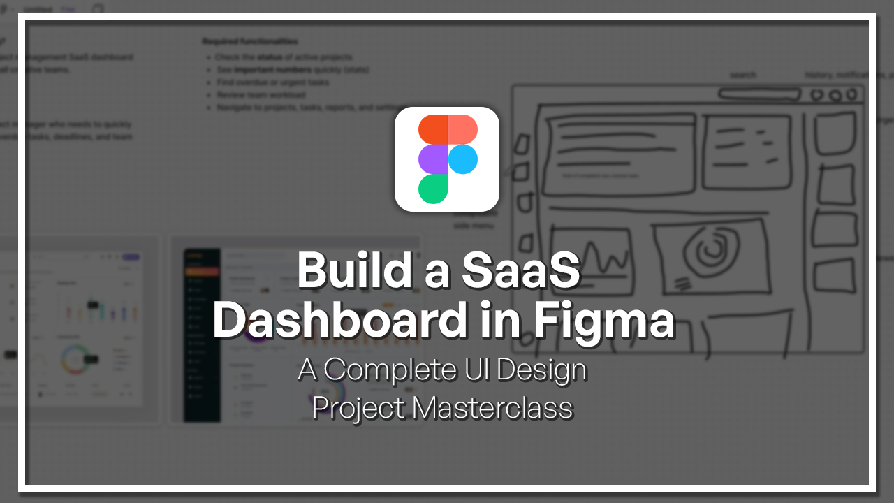
them very quickly. This is basically
our project brief. This is something that could
be a lot more expansive, but I'm keeping it very minimal for the purposes of this course. A very simple question is, what are we designing? This is a fictional project, but we are basically designing a project management software as a service dashboard called flow desk for small
creative teams. It is a dashboard that we're offering to people
to different teams and companies where the
project managers can access them and they can manage their projects, their
teams, and so on. That takes us to the
next question is, who is it for exactly? Who is our target audience
and who is our user base? The answer is the main user
is a project manager who needs to quickly see project
progress, overdue tickets. Deadlines and team activity. So they need to keep
everything in check. This is not for
specific team members. This is not for upper
management, your boss's boss. This is strictly for
the project manager. So they need to have
specific data in mind, and now we come to the
required functionalities. What needs to be included within this prototype
to be sufficient. This is according
to our thinking and it doesn't have
to be everything, but just some things,
functionalities that may be needed. So the project manager
should be able to check the status
of active projects. So not past projects, but the ones that are
currently active. And then see important
numbers quickly or stats, they need to understand, how long is each team member
taking per ticket? How long is each project
taking until it's closed? How many projects are
open, how many are closed? What is the efficiency? They need to understand
these things. Then they should be able to find overdue and urgent tasks. They should be
highlighted. What is due today or tomorrow? They should be able to review teamwork and so that
they can reorganize team workload so that
not one team member has too much to
do or too little. Then, of course,
navigate to projects, tasks, reports, and settings. This is just some basic building blocks that they
should be able to have. Just to give you a very quick
idea of what I'm getting at really is something similar to these. These are
the dashboards. They're very complex setups. They're not really easy, this
is going to be a challenge, and they're made up
of a lot of elements. There's a lot of stats,
including graphs, it's telling you the project is stuck in progress
and review done, and then it's giving you
the weekly task workload showing you how many
ongoing tasks there are, and then there are
some numbers as well, total completed task, total
task by client, and so on. But on top of that, you have some extra buttons
like activity. You have notifications,
chats, history, and you have this
side menu where you have a lot of different
options and pages. It shows you here, I guess, the growth stats, but this
could also be a dashboard. Then you have
projects, timesheets, automation, integration. Going to have to prototype all of these different options. It doesn't have to be
as complicated as this. But the main point is
that it should give a very good overview
of what's going on, and we're not going
to do each page. We're just going to do
the dashboard itself. Here's another example
with better quality. But it's the same principle.
You have this side menu. You have your settings, logout
tasks, projects and so on. Then here you have a
little simpler overview. This dashboard tells you, Okay, here are the tasks
that you have right now or the main tasks. Here's the monthly target. Here's the project statistics. You can see for 12
months, 30 days, so on and some project
summary, project overview. It really depends on what you think is important
for the user to see. This is something
that we're going to be doing in the next
lessons where we're going to be sketching and
prototyping and ideating. That means understanding and
determining what the problem is and how our solution
should be in the best way. What data should we show
our users, basically? That's something that we're going to discuss at
the next lesson. Thank you for listening. I'll
see you in the next lesson.
3. Sketching the Dashboard Layout : So now we have a broad idea
of what we want to build, and now we have
to narrow it down a little bit by sketching. Now, I'm going to use Fig Jam, which I've been using
right now for this brief, and it's very much
straightforward. We can either use the Pen tool and try to create
something with it, or we can use some of
these shapes as well. I'm going to use some shapes
here and there just to make it easier and then play
a little with the pens. Here we have our frame. This is going to be
our first screen. And, to be honest with you, I don't think we
can go so far to create something
completely different from the normal dashboard. It's completely normal and okay to go ahead and
copy the general layout. With that said, I think
we can very safely basically create an area
here for our login. We can have some circles here, so you can have your account
or something like that. You can have your notifications and history, some
setting like that. I would also put a
search maybe here. I would put a search
function here and so then here we would have our side menu, but it
would be collapsed. I want to create a version
where it's collapsed, and when you hover on it,
it would go to the right. Here we have some icons. So I'm just going to
draw some squares here. This is your side menu and maybe you have your
settings here. And yeah just by hovering
on it, it would expand. Then we would have
our dashboard. This would allow
us to have a lot more space here
in the dashboard. I was thinking, to be honest, what would be cool and I'm
thinking maybe of Spotify. Spotify has a very nice
window design, it's window. There's different
sections and stuff. I'm trying to create
something similar. I'm thinking what we could be doing is we could have a section here and this section would basically have multiple tickets. So it would basically show you the most urgent
or the latest, the newest tickets or
something like that. By the way, we can
annotate this, it would be great if we can just going to be saying
urgent tickets, and then maybe below it, it would say newest tickets. So just so that they can have a very clear overview
of what's coming, what's urgent, what
needs to be done today. And then as we mentioned here, we would have profile or let's write it like this
history notifications, profile, and first, we have
the search right search here. And then here, collapsible side. So now we have the
general layout, and these are like the
side peripheral things, but now we need to talk
about the actual butter and bread of this
whole operation, which is these little tickets,
these little sections. And they almost always
have the same setup. You know, you have
these sections that are outlined or they're colored in, filled in, and then you
have some information. And there's always a use of icons of colors to
indicate, you know, here you have urgency or maybe
updated, you know, time, and here you have
signs of, like, going down, going up,
decreasing, increasing, so on. So we're not going to
get to that just yet, but I'm thinking what
we could have we could have a very big
window or a section, and this section would give us an understanding with
graphs of certain things. So to show you the completed
tasks and whatever tasks. Here I'm going to
annotate this and say stats of completed, do overdue tasks and so on. And then I'm thinking here we could either
have some numbers, so we could have a number Oops, and then some
explanation, number, some explanation,
similar to this here. But instead of doing
six different things, I want to do three
or we could do a circle a circle graph, you know, a pie chart or something to show
what's going on. But that's the first section, and then I'd basically
like to make a cut or differentiate this. Then I'd like to have
multiple section that show things more in detail. Then we could add a graph,
something like this, possibly and Okay,
so we have a graph, and we'd like to have more information on
maybe the team members. I think that would
be really good. And maybe something
like this bar graph is pretty nice as well because it gives you more
of an overview. So it could show you
different people and what they're
doing and so on. And yeah, let's see. So this is just an idea, but I think I'd like to have
a couple more sections. So I'm not sure
what they would be, but they're going to be
cut off here. And yeah. I'm still not sure what type of grid I want to
be working with, but I think I'd like to keep it flexible with these bento boxes. So as you can see here,
it's very straight. Like, you have this grid
like this and like that. But here it's different. It's cut up in different ways. So here you have
this one card taking up two spaces and here each
one is taking up one space, and here you have
four different cards. It's a different thing,
but we're going to play around with it and
see what comes out of it. But as I said, as I mentioned, we're not reinventing anything. We're not reinventing the wheel. This is pretty much the same, but we're just trying
to get an understanding of how we want to
make it different. Little details sometimes are important, where you
want to put the search, where you want to
put the profile, or the fact that we urgent
ticket window thing. Maybe I'd like to
even put something in the bottom that gives you
a focus task or maybe, actually, let me just
see what I can do here. Try to delete these. So maybe
here just like Spotify, I'm going off of that. We could have a focus
thing here and maybe we'd have kind of a Pomodoro
type situation, counter Pomodoro or focus task. So you would basically say, Okay, I'm project manager. I'm managing everything at the
same time, and it's a lot, but I want to have something to keep on to focus on
one task at a time. Because it's very easy to
get lost in the sauce, especially when you have so many different
things going on. So keeping something here below maybe might keep you,
you know, focused. So yeah, this is our sketch. It's very basic and primitive, but that's exactly what we want. We're not inventing
anything yet. We're just trying to
get a feel for it. So I'll see you in
the next lesson.
4. Setting Up Frames, Grids, and Design Direction : So in this lesson, we're
going to very quickly try to determine the direction of our design and create
the first frame, as well as maybe set
up some guidelines, some grids, anything
to really help us set up a foundation
for the layout. So first things first,
I've already gone ahead and made little
things preparations. One of them is just
a very simplistic, not very polished logo showing an F and the
D. It's very simple, but it's basically
like flow desk. And yeah, it's written
basically like that. So this is going to be
our locum more or less. We can touch it up, no issue. And then we have
our colors here. So we have our primary,
which is this kind of dark blue mixed in with
this dark gray. Then we have these other colors, accents what we can use. We have this orangish yellow
as well as this pink. These are just some basic colors that I'd like to use for now, but we can work
on them as we go, but just to have a little
bit of a foundation. As you can see, I'd just
like to let you know, because this is a fictional
project that we're going to more or less speed run
within the next 2 hours, the setup here is very basic. But if you were to be
actually designing such a website or
program or dashboard, you would need a
lot more than this. This is very basic, only doing
it like this because we're going to go ahead
and expand it and it's going to be a very
small project for now. For typography, as
in for the font, we have Geist as a font, a very simple font that
can be used very flexibly. This is our design direction
very generally put, so this is a very
simplistic style sheet for us to use along the way. Now, let's go ahead
and create our frames. You're going to go
ahead to your frame tool and we're going to choose desktop and we're going
to choose Mac Pro 16 inch. So just like that, we
have this frame created, and this is the frame
that we're going to be working on mainly. So now let's go ahead
and set up some grids. Now, personally, I'm
not a huge fan of them, but they can be very helpful in the beginning to have
a nice little guide. So here we go to the layout
guide and we add columns. I like to have some columns. And what we're going
to do is we're going to say, let's have four. I don't want any more
than four cards, and I'm going to add
a margin for now, and then the gutter
is okay right now. This is our very general layout. Now, just keep in mind that
on the left right here, we're going to have, I'm
just going to color it in. We're going to have our
sidebar somewhere here. Okay. And at the same time, we're going to have left on the right, we're going to have, you know, tickets, so urgent
tickets and whatnot. So keep that in mind. But to be honest,
I want to create our design like this and then go ahead and add the add this comment section a
little bit later on. So yeah, this way, we can focus on the content
on the middle stuff, and then we can add
our little comment or task feature on the right
a little bit later on. Okay? So I'm just going
to delete them for now. So this is how general
setup looks like now, and we're going to go ahead and start building on it
in the next lessons. I'll see you in
the next lessons.
5. Creating the Sidebar Navigation : Now, let's go ahead and create our header area right here, all the items that we
had in our sketch, which consist of the search history notifications
and profile. So we're not going to
complicate this too much, but we're just going to
create it very simply. Now, in order to create
the history notifications, I'm going to go ahead
and start with these. And in order to do that, I
want to create some buttons. So I'm going to create
just one component, and I'm going to write A here. I'm going to make
this an awesome font. Okay font awesome seven. You don't know this is a
font that creates icons. For example, here we have notifications icons.
That's a bell. We just type in bell and
then we have it right there. We're going to make
this maybe 20 size, and we're going to hold Shift and A to make
this an auto layout, and we're going to
make sure the width and height are the same, and then we're just going
to lock the aspect ratio. So here we have it.
This is the font. I'm going to center it, and I'm going to call this a button. Or icon button. Then we're going to basically
make it into a component. There we go, and we're
going to give it a fill. Let's give this a color. We'll make it regular like that. And we'll give it
some browned corners. So maybe eight is enough. So here we have our icon button. So I'm going to add
it paste it here, and here we have this bell. Okay? And then we can copy this, and then we can create
the history buttons see if we can get history or
repeat or something like that. So we go on the
website, Font Awesome, and we can find the
specific one we want, which is clock rotate left. So we're just going
to paste it here. And we see it's not
available on solid. So we can make
let's just go back. We'll make all of
these, a solid. Now we have these two and
we can increase the size, we can change some things,
we can make it 24 instead. Now we have these
buttons over here, and then what we
need is a search. I'm going to create a frame
here and going to give it some radius and
create it like that. Then I'm just going to
put some text inside of it and say search. I'm going to have actually
an icon here pretty handy and then
actually ads text. I'm going to choose
both of these. And there we go. I'm just going to make sure it's dark enough to be readable. Then I can make this
whole thing into an auto layout and
extend it a little bit, of course, in the end,
we have the picture. For the picture, we
can just go ahead and search on pexels
for any picture of man. Boy, woman doesn't
really matter. Let's go ahead and just
choose any person here. I just need a nice
shot of their face. Copy it, paste it, and I'm going to create a circle and I'm just
going to copy the fill, paste it here, then
I'm going to crop it so that I can center his
face here a little bit. I think this is good enough. We can give it some
borders if you'd like, just to make sure that it's going to be noticed or
something like that. Now what we're going to
do is we're going to hold all of these and put
them in an auto layout. Let's see how this
looks like right now. I think the size is okay. We can go ahead and even
make it a little smaller. Let me see how that would
look like on a MacBook. Okay. Now looking at it
actually on a MacBook, it isn't that big at
all. It's pretty okay. So yeah, we can go
ahead with that. Now what we also need to
include is our logos. I'm just going to copy this. I'm going to paste it here. I'm just going to go back. Make sure everything
here is included. Copy it, paste it here. And then with K, I'm
going to resize it. K resizes everything
in a nice way so nothing gets out of proportion.
So this is pretty good. And then I'm going
to add it here. And what I'm going
to do is I'm going to include all of
these in one frame. So an auto layout, again, using shift and A, and
now it's all over. What I'm going to
do is I'm going to extend this to the ends, and I'm going to give
it 36 or maybe 24. I'm going to give
it a fill as well just to be able to
tell where it's going. And I'm going to give it some padding from the right and left. Here's what's nice.
I'm going to choose these again. I'm going
to highlight them. I'm going to create an auto
layout within an auto layout, but I'm going to give it
maybe a maximum if we'd like. If you want, you can give
it a maximum and center it. And this way, it would
stay here in the middle. So even if the screen
is really wide, then it's still going
to stay until here. It's not going to
go any much beyond. But we don't actually need
that per se, in my opinion. So let's just keep it like that, and we'll take the fill
and make it white. And yeah, just like that, we have a nice little header. Of course, we can expand it. We can add more things to it. But for now, it
seems pretty okay. We can, of course, edit the little things like the
spacing instead of 22, it could be 24, and
that's pretty much it. The next lesson, we'll
be trying to create the side bar or the side menu.
6. Designing the Header and Search Area : So since the last lesson, I added this little thing from a UI kit just to give it
a more realistic look. So just so that, you know,
especially with this notch. So now, it looks like we're
actually on a website. And this way, we can tell better where our headers going to be and how much space
it's going to take. Instead of this being right
up here, you can tell, oh don't have a lot
of space left now. So either you resize
the header or you keep it the same and live
with it, it's up to you. But this way, we have
a better understanding of the sizing of things or
design elements that we have. But I think for
now it looks okay. In this lesson, we're going
to design the side menu, which is not going
to be an easy task. Okay, so just keep
that in mind, please. In order to do this, I'd like to create another component. So we're going to
start by creating these specific buttons. Of course, we can build
on this component itself, but I think it would
be good if we can make completely
different components. I just copied this, I pasted it here and I'm going
to detach the instance. Instead of being icon button, I'm going to say menu button, and we're going to make this
into its own component. Now, essentially
what we want to have is we want to have a
button that has an icon, but also has some text. This text, let me
just add it here. I copied it or cut it, paste it. We're going to make
it horizontal. And we're not going to
lock the aspect ratio. We're going to make
it hug. Then we're going to click eye to
eye drop this color. So now we have an item. This item could be
I mean, right now, it says SFP, which is the font of Apple, but
that's not what we want. We want to say this
is, for example, dashboard, this is
our dashboard button. So one thing we
could do is, I mean, let's see how it
looks like here, looks pretty nice, but maybe we could make it even
bigger, to be honest. We could make the icon
a little bit bigger. That's a little too big. And
we make the font bigger. It could be 20 at least. Or let's make this
let's take this back to 24 and this 24 as well. And then we'll give this 616. And yeah, let's see how
this would look like here. I'm just going to
paste it over here and I'm going to create
different versions. I'm going to put them
all in an auto layout, let's go back to our website and see what we can
add for the dashboard. You can filter it and
make it only free, and we can see what
suits us best. For example, this might be
better for the dashboard, to be honest, right? And then we have some other
points that are over here projects we have tasks calendar, and then we have team
reports and settings. Team reports. Now we're going to have to
make this left aligned, and we're going to do the
same thing here. There we go. So now it's left aligned
for all of them. And we're just going
to have to figure out the icons for each one. But let's see how it
looks like right now. I mean, to be honest, it
doesn't look too bad. Maybe we need some more
spacing between them. But other than that, I feel like this is a good way to list them. So we can check, of course, the other designs that
we're basing this off of, so we can come here and
see how they made it. Maybe theirs is a little bit
smaller. I would say so. So that's something
we can try to do, but the thing is we don't have
that many items over here. So let's just go back,
check how it looks. So maybe we can make the font a little smaller, maybe, no. So let's make it a 20 so we can make the spacing
then a little less. All right. So let's see if we can
make this regular. The issue with regular is that the fonts don't always have the regular option
when you're on the free plan with this icon. So with this icon solution, we're just going to
keep it like this. I think it looks okay, and we just need to
fill up the icons. And one important thing
is when you have this, you need to create
another variant. This variant has to
have the text hidden, just make it invisible, hide it, and then you have two
different versions, you can hold all of them. And then you can
have the version with or without icons, okay? As we mentioned, we want to create two different versions, one that is normal and
one that gets collapsed. So that's very
essential to get done. Okay? So the way to
do this is to go ahead and create two different
versions from this menu. I haven't set it up fully yet. We still need a button here, so let's just add
a settings button. But with the settings button, we want it to be
pretty much way down, I'm just going to write
gear, and then settings. So we want it to be way
down here. Just separate. So we're going to
make it an auto layout and the distance
should be auto. So now we have it
right around like this and make sure that
it's spread all the way. And then what we're going to do is we're going to make sure
the spacing is proper, so we have maybe 24
from here and there, and then padding from up and down and left
and right should be 24, and now it looks more normal. Now we're going to take this out and give it maybe a background, and then make it into a component and we're going
to say side menu or sidebar. What's called a sidebar. This
sidebar is going to have two versions that only
has icons, no text. We're going to do this by
choosing all the elements here. Now we just need to choose
each of these items here and we're going
to put variant two. We can change the name of this. Then what we're going to do
is we're going to come here and just collapse
this whole thing. We're going to collapse it. And this way, with our icons, it's going to be set
up in a way where it takes up a lot less space. So let's see and test it out. I'm just going to paste this here and I'm going to place
it where it should be. Let's see how it looks
like now. Bam. You see? Now, it takes up
a lot less space. We could go a step further and
even decrease the padding, to be honest, from the right
and left, just like that. But we just need to make sure
here everything is right. Just make it hug
and there we go. This is how our sidebar
looks like right now. Of course, I have to fill out the icons and
change some things, but this is how it works, and we're going to be building
on it a little bit later. We're going to
create the mechanism where you click on the button. We haven't done that just yet, but we're going to
create it later on. All right. See you
in the next lesson.
7. Building Dashboard Cards and Stats Blocks : The cards section. This is the section
where we're going to be seeing the cards and
the actual dashboard. So the real content. As we go ahead and
start designing this, I'd like to kind of
take a look at Spotify. I told you before that this is what I'm kind of
trying to go for right now within this design because I really like how
they get it done. You know, Spotify is
a company that has gotten a lot of critique
to their layout, maybe because it's too complex
or something like that. But I really actually like it. You have your header
here, your search with with your profile
and other things. And it's very similar, you know. And then on the left, you
have here your playlist. You have different things
like quick access. And this is their dashboard. You have multiple different
options to choose from. You have sliders and so on. And down here, you have your player that
always goes with you. And on the right, you have a
section here that shows you more the song that you're listening to the artist
credits, and so on. So what's pretty cool
about this, though, is that if you take a look, this is not a different section. It shows as if this
is a window, right? Like, this is a
window and you're peeking through the dashboard. What companies normally
do is they make the header look as
if it's on top. Then you have this menu
and it's also on top. It's a lot of things
on top of each other. But instead, what they do
here is they make it seem as if the header is
connected to this part, which is also connected to the player and you
have only two windows. What's cool is you can
resize these windows. You can take them
to the right or left. And the same thing here. You can resize it,
and then you can see the full names or you can
take it back and so on. That's exactly what
I'm going for here. I want to look that looks
so simple and clean and modern that it doesn't look like these are all elements
on top of each other, but rather that
there's here a window, and this window shows
you the options, o? I'm going to go ahead and hide the layout guide for now just
so we can see more clearly. I'm actually going to
take the layout here, the layout guide, and I'm
going to add it to this frame. I'm going to fix it
up a little bit. So just to kind of give you an idea of what we
want to go for. So the reason to do this is because I want the
guide, you know, to be here because
we want to make the bento layout
over here, okay? But let's hide it again for now. So now, as you can see, that's exactly what
I'm talking about. So we basically have this window here that shows us the cards, this area, and everything else
here looks pretty normal. It looks connected, you know,
which is really smooth. And then later on, we
will basically also be adding the comment section or
the task section over here. So similarly to the layout
with Spotify, okay? And then here we'd
have the controller or the current task that
we are currently doing, and we're going to
get to that later. But for now, let's focus. So now we have pretty neat
layout going on over here. Let's go ahead and see what we can do here in
terms of the cards. So as I mentioned, we're going to have different layouts for different cards. But what we can do, however, is try to create a
very basic layout. So play around with
the sizes and so on. So right now, this is
how it looks like. We can mess around with it. I think that's too much spacing. Maybe we can 24 and we can
also make the gutter 24. We can also add some rows. So now, as you can
see, it looks more clear where the cards can come. So let's bring this over here. So when we bring
this element here, you can see that this
could be one card, right? But we could also add another card that could
take up a lot more space. I can take up the
space of two cards, or maybe both of these can
take up this whole space. So it's very much flexible to our needs and what
we need to show. That's totally up to us, and this whole thing with
these get trippy. This is how it would
look like, make sure that you turn
this off so often, every so often just so that it doesn't mess around with how you see things and you
see how it looks like, and it's like, Okay,
this is not too bad. But one thing, of
course, that I would recommend is to also play
around with shadows. That's something
that they often do. It could be very simplistic
shadows in a way, like this or it
could be even less. As you can see, it's
just like very simple close by shadows that makes
them look like tickets. Or we could work with
something a little stronger, so it could be we could decrease the opacity and make
it more blurry and then we'd get something a little more softer on the eyes, right? So that's one thing
to keep in mind. I think I want to go
with this style for now, but we can change
it up later on. It's totally up to us.
Okay, so let's go. I'm just going to take
one of these cards, the smallest version here, and I'm going to
go ahead and play around so here we
have the layout. Now, we can do this in
many different ways, but one way that I'd
like to do it is I'd like to add a title. So this title could be
up or it could be down. It's totally up to
us. Let's see how others have done it.
They usually do it up. It's black, very big and readable
and the same thing here, it says ongoing tasks. Then you can see a graph. You can see an option
to filter it weekly, daily, whatever it is. So yeah, this is kind
what we're going for. Here, you have it as
buttons or drop down. So that's something
we can go for. So we can add this on
top and we can say we can go back here and
see what we put. So stats. So this is our text right here, and we don't have to
call a task over you. You can just say title. Make sure that it's
aligned to the left. It has the proper
font, the right font, and here it says it's
aligned to the left and top, which is good enough for us. Okay? And then we can
add some other options. It could be an image,
it could be whatever. But this is a nice
general layout. Let's see what other
info we could be adding. I mean, to be honest, we don't have one simple layout. We have a lot of different
layouts over here. It's hard to say,
we're going to do this exact same layout because each time you have a
different type of graph. I think this is good enough to have a very simplistic layout. Then you can add your graph, you can add your
numbers, whatever it is. And yeah, Okay, so what else can we do here? Well, we can add
an options area. So you can have a
button that says, here are your options. We're just going to create a few circles here
next to each other. We're going to make them
into an auto layout. We're going to make
it also 13 high. And we're going to
change the color, make it a little bit darker. And we're going
to align it here. But for this one,
we're going to align it to the right. Okay? So when we resize
this, as you can see, the title is going
to stay on top left, and this thing is going
to stay on the top right. Okay? So here are your
extra options button, and then here's your title, and here you would have your
graph, whatever it may be. I'm going to keep this as a main little thing kind
of as the original, and then I'm going to play
around with some other ones. Now, we talked about having this task overview to show completed due
overdue task and so on. Let's do that very quickly. We're going to say
task overview. Then we're going to create these rectangles and
we're going to make them round cornered and we're going
to give them some colors. Okay? So we're going to
write here the numbers. We're going to add
this text and then we're going to add
these rectangles and then we're going to
add some text to them, and we're going
to make it small. 12 is the smallest we can go usually when it
comes to web apps, and so I'm going to make it
regular and I'm going to say 42 or something like that. Then I'm going to make this into a frame or we can make
this into an auto layout. Okay. Then I'll copy this. Then as you can see, I can
resize it and change things. I can do this and I can say 24. But 24, what 42, what? I'm going to add some more text. I'm going to say completed.
Same thing here. We can add text here, to do, and so on and so forth. Then once we have a couple, we can put them into
an auto layout, and of course, it makes a lot of sense to change the colors. One of the colors that
we picked is this pink and then one of them
is this orange. Now it makes more
sense to also sort them which color says urgent? It's more towards red. Then you have this
color that says, yeah, pending or we can just say
urgent and then we could say, yeah, we could say to do here, and then here it's completed. Or we could say I mean, for completed or we can
say stuck for one of them. So this could be to do.
This could be stuck. And then this would
be completed, but we'd need a
green color for it. Yeah, so it's already written. This is a nice way to demonstrate, but then
you might have a question. Okay, well, the numbers, we haven't fixed them up yet, but you're saying there's
24 urgent and 42 to do. So these urgent, are they also counted in
the to do or not? That's a good
question. We have to ask ourselves logical questions. Are we going to include
there's 42 tasks and 24 of them are urgent and
24 of them are stuck. Or is this a completely
different category? Or is this 42 to do
non urgent? You know? So these are like we
have 42 tasks that are non urgent and then
24 tasks that are urgent. So in total, we have
this many tasks. That would be a good
question. Right? So we have to kind of figure
such things out. Otherwise, it wouldn't
make sense to show them as different
things, okay? Let's try to mess around with it and see where it gets us. Now, of course, another
thing we could do is we can take all of these and
switch them to the right. This way, or maybe not
that way, exactly, or we can switch
them to the right and figure out a way to make them all start from
the same place because right now,
all starting here. The way to do this
is we could make a specific length or width. So we have width of 65 and
I'll give all of these a width of 65 and then they could all start
from the same place. This is a little bit nicer, I would say, to the eye because it's a
little more organized. Of course, you could also
change these numbers, it makes more sense to put
them here, there we go. Now it looks a lot nicer. We have stuff on the
left, stuff on the right, and it's more understandable. Now, one thing I like
to do whenever I'm creating any type of
dashboard, if possible, if this is something is
able to be programmed is in a certain way to
add status symbol, so to say, this is good, this is bad because
a lot of the times it's really difficult to
analyze and understand. We have this many urgent tasks, and we have this many stuck, and let's change the numbers. Then what does that tell
me? That's the question. What does this tell
me in the long run? What am I benefiting
from this graph? I'd like to add text that says, you're on the right track. This is good, this is positive
or there's an increase, there's a decrease.
This is good workload. This is one thing
that we could do and we could add it as a badge. We can create this
as a component, but we just have to understand what's the best way to add it. I just say here
category or status, and I'm going to make
it an auto layout, give it some color, some green. The green 10% and going to make it four by four
maybe or eight by eight. Now this is a component
and it says status. We can add it over
here somewhere. For the text, I'm going to
make it some dark green. And maybe we could add some sort of symbol
or like an object. So I would add this circle here, and I would also
make it dark green. Maybe give it some, like a shadow or a
shine, if possible. Does not look that great. It's not looking
super duper great, but I think we can try to
figure it out somehow. Basically, we want to say
there's different types of stati and here it says on track. You can say on track
as an example. We can decrease the spacing
here and then we could add another one where it
says falling back. Like that. We can make that
one more yellowish. I can take care of that
and then we can make a third one that says you
need to get your work done. Yeah, basically just add some
different types of status. But the wording
and the colors and these things are something that we can take care of later. But this is just as a beginning a really nice card for
the task overview. We can turn some things into
auto layout like these ones, for example, and then make sure that this facing is equal. Then I'm just going to go
ahead and copy this onto here. Let's put back our
rows and columns. Just going to delete these, and I'm going to add
it right over here. Okay. So if we feel like
it needs a lot more space, we can give it more
or we can resize it. It's totally up to us. I feel like this is an important card. So this is something that we can give a lot more space
to. So let's see. We just have to
resize this really. So we can just resize
this into this one here or we can expand
it totally up to you. But yeah, let's try to
expand it a little bit. This looks nicer. It
shows you the length, the drastic differences
a lot more. And this is more or less
how it would look like. Now that I'm looking
at it from here, I feel like this might
be a little too small, but these are the
things that we have to keep on doing
again and again, checking again and seeing, ho, the text here is too small. We need to make it bigger, make the whole card maybe bigger. But as I said, this is more, part of the perfecting
your design along the way, and this is something
we're going to do. All right. Seeing
the next lesson.
8. Creating a Filter Dropdown : Welcome back. So since
the last lesson, I added a few things on my own
just to fill in some gaps, fill in some details, some garden work that would
be too boring for you. But basically, just filled
in these cards, right? So you get the concept. You just make a
couple of graphs, write down the months, and, you know, I just filled
in a few gaps as I said. So now we have task
overview, team KPIs, performance overtime you know, over months or years
or whatever it is. And then we have workload. So what's really interesting
though, Sorry, delete that. One thing I've also done is I've actually resized
things elements. You probably noticed it
to make the text more readable because we have a lot of space, so why not use it. At the same time,
we don't want to overwhelm people with too much information, too much text. So why not just make the
text a little bit bigger. So as you can see now, also, some of the things are gray while others are black
to catch more attention. Here you want to know how many
tasks you have then here, it's still visible, but it's given a little less importance. But at the end of the day, when someone is
going to read 24, they're going to read urgent
after that and understand, Okay, 24 urgent
tasks, and so on. But overusing black can
lead to people having so much information to
take in psychologically that messes up with their
perception, try not to do that. But in this lesson,
what we're going to do as an addition is
we're going to add a button or maybe
multiple buttons that help us filter
according to time. Because right now it's unclear. Is it this month, this week? This year, I mean,
what are we talking about the task overview? What are we talking about
in terms of team KPIs? We have to have a frame of reference to be able to compare. Are we comparing this to
last month or last year? That's going to be
a lot different. The answer is going to
be something completely different based on what
question we're asking. Let's go ahead and create a very simple button that
allows us to filter the time. What we're going to create
is essentially a drop down. So just like
creating any button, we're going to start by
adding text element, and we're going to write here
week or weekly or maybe, let's say, this week. Okay? Now we're going
to hold shift in A, and that's going to
allow us to make it A. It's going to make
it an auto layout, and then we're going to choose here the same color
of text here. We're going to give
it the same color. And what we're going to
do is we're going to get the Pen tool and we're going
to create this little arrow. We're going to give it zero
round as a corner radius, and going to give it the
same color. There we go. Now let's give the whole
button a bit of corn radius. What's the corn
radius we have here. That's 24, so this 16. Let's see it doesn't have
to be the same thing. Could be eight as well. So now we have a
decision to make. Let's paste it
here, first of all. I'm going to paste it
here. So right now, it's just white, and as you can see, it doesn't
look that white. It looks a little
gray. And the reason is because it doesn't
have the same shadow. So now we have multiple options. We will either add
this shadow here, and then you can
see now it kind of has a three D dimension to it, and then it has the same look, but then we have a risk here. And the risk is namely that
we don't really know if this because these cards are not clickable in
and of themselves. You can't click on
the card itself, but you have to
click on these three dots or something else. If there's a button inside,
you can click on it. But this should be clickable and that should
be a little clearer. I would say, personally, it's always best to go with
a bit of a different style. This could be giving
a stronger shadow. Right? But then you kind
of miss up the look. What I would personally
say is maybe adding a bit of an
outline like this, a stroke, maybe even
completely removing the fill, that's totally up to you. This allows us to kind of
give it a different look, and this different look can
help us make it identifiable. So let's see what we
can do with the button. We don't want the stroke
to be way too thick, and we don't want it to be way too much in the
background, either. So the way it is now, I think this is good
enough, I would say. But right now what's
happening, though, is we're having like
a very empty area here. It's very empty. And I feel like we
should fill it up. So the way to do this is
maybe perhaps to add a title. I mean, it is a question
of what page are we on? Okay, we're on flodesk.com. Which of these items, dashboard projects,
which page are we on? So that's why it's
important to copy and paste this title and add a title
here and tell people, hey, right now, we're on this page, and it's important to make it a bigger title than
the other ones. We have to have some hierarchy. So here I would say
dashboard, right? So just simple right now, we're just keeping it very
simple and we're putting that. Now, we have this
button right now. It's saying this
week, this is great. I would go on to say
it would be even better if we added
more filter options. So we're filtering the time. What could we also be filtering? Maybe a specific design team? Maybe. Maybe I'm not sure we could be
filtering because I mean, maybe you have multiple teams or multiple sections
within your team. So you have the design team
or the design section, the programming
section, and whatnot. All of that could be integrated, but that's something I'm
leaving for later on. Now my question is, Okay, so we have this button
that filters things according to weeks or
months and whatnot. Should we be doing one
specifically for each card? Because this is something
that other people have done. Here you have weekly.
So ongoing task, you can filter them weekly. And here you have this
project statistics. You can filter it on its own, or you can filter daily
tasks on its own. And what I'm noticing
is a lot of them they rely on doing things
separately for each card. But to be honest,
I think the way that we did it makes
more sense because then you have one button that changes everything instead of you having to switch
each and every one. Like, what if I want to see
our stats for the whole year? Do I have to switch each and every one of them? That
doesn't make sense. But I'm going to go
ahead and switch it now and say this year, okay? I'm going to align
it to the right. The reason is because
we have this one over here and it shows you multiple months from
the beginning of the year. I would say this year makes a lot more sense
in this context. So let's keep it at that. If we want, we can
even a bit bigger, see if that works out. To be honest, I don't prefer it. All right. Now, of course, we got to make sure that our
cards are also in alignment. I see one of them here
was moved somehow, and it happens very often that as you're
currently designing, you move things around
without paying attention, so make sure you don't mess that up or in the best case scenario, maybe just use auto layout. It really makes your
life a lot easier. So there you have it, we just created a button kind
of like a filter, and it helped us make the design more easily understandable and
also adjustable. All right, so now we've
created this button, but we need the drop down
functionality to actually work, to be able to see and understand
what this is all about. And the way to do this
is we're going to go ahead and put these in
an auto layout for now, and then we're going to
create another variant. And this variant should
include different options. I'm going to hide
this right now. I'm going to hide, I'm going to hide this
error now and then I'm going to bring this
copy and paste it, but I'm going to make
the direction vertical, copy paste, copy paste. Now we have this week and then it's going
to be this month. Oops. We're going to make
sure that everything is aligned to the top left and then we're
going to say this here. And this, I don't
know, or last year. Okay, so we're going to
have all of these options. And what we're going to
do is we're going to prototype it so that
when you click on it, it's going to change
to the other one using smart animate. And when you click
on anything here, it's going to go back. Now, normally, it
should pick one, right? It should pick this week, this month, and it would change. But right now, we're
just keeping it simple, so it should not change. So let's see how this
looks like right now. You see? I extends. But the issue is,
it's see through. So what we're going to do
is we're going to make it colorful once you click on it
and see how it looks like. Okay, that's not bad at all. You click on it
and it shows you, this year, this month, yeah. Okay, now we have
this drop down menu. You can edit it a little bit. I made the font a
little bit bigger so it can be more easily read, and I'm going to come
here and also give them a little more spacing between each other and see
how that looks like. Yeah, this is a
little bit better. And you can work with
something like this. This is how you basically create a dropdown filter button. Thank you for watching.
In the next lesson, we'll be creating the task cards and working on this
panel right here.
9. Designing the Task Cards : So let's go ahead and
create some task cards. Okay? So it's going to be
in this section mainly. We can go ahead, copy this text, bring it to this
frame, and tasks. So now we have the tasks here. I'm thinking it
would be pretty nice basically if we made
different categories. So we can say urgent tasks
or something like that. And then we could
have newest tasks, something of that sort. Either that or we could have tasks and you could
sort through them. Actually, that might
be a nicer idea. I don't know. We'll
decide that in a bit. But right now,
let's go ahead and create the general cards. So we're going to
create some cards and let's try to make sure that these cards are more
or less compact. We want to add some information to them but not overdo it. So I'm copying the
styling from here to there and you know, let's just try to
figure it out somehow, to create a very nice layout
without overdoing it, okay? So now, the whole idea is
that we should have a title, and, you know, the title is
what the task actually is. And in this case, the task might be something very simple. It could be design roll ups. The interesting thing is, you know, the task could say it all. I could say design roll ups
for Chicago Fair, right? We're going to have
a fair in Chicago. It's called the Chicago
Fair or maybe there's a fair in Chicago and we're going to design
the roll ups for it. But instead of doing
a title like this, we could allow for
them to basically, I'm going to just
remove this frame. I'm going to say
design roll ups. And then as kind of a comment, it's going to say an
extra information it's going to say Chicago Fair. Okay. And then
it's going to also give a date. That's what's nice. We're breaking it
down instead of just having one piece
of information, just divide it into multiple
different layers, let's say. I'm going to copy
this and I'm going to add I'm going to add an icon here and it's
going to be clock. So we're going to
put these together, and then we're
going to copy this. This is going to be
the time or the date. And we could say April 21,
that's actually too late. Let's say July 21 and then we're going to have
extra information here. What this information
is, I don't know. It could be attachments
so we could chain link. I'm not sure. Let's see. Yeah, Link should work. Yeah. There we go. We're going to make
this also solid. We're going to say there's two attachments or
something like that, and this is the task. Let's try to break it
down a little bit. Then we could also show
who is added to this task. We could do this as follows. And just to remind you, this is also based on what
I've seen other platforms do. This is not us reinventing the wheel. So keep that in mind. We're not doing everything
completely new from scratch, but rather making use of the experiences that
other people have made. I think this is a very nice
setup that we have here. We could switch it
up a little bit, but I think this is very nice. We could try to make
maybe the cards have a little less of a corner radius because
it feels overdone. But it's also important for the consistency,
so I'm not sure. Let's go back a little
bit, see how it looks. Because the more corner
radius you have, the less information you
can fit on these things. But I think that is okay. Now we have this
setup like that, and I think this
is really great. I'm going to make
this into a component and I'm going to say ticket. This is our ticket or our task, and I'm going to add it here
and I'm going to copy it and Then I'm going to put
these in auto layout. We could either do
it this way where we have these urgent tasks
and they're organized like this and then we could have other tasks here.
Organized like that. Then we could add
some more tasks or we could do it as a filter. There's a filter option,
but I think this is nicer and let's bring this
a little closer. There we go. It's very
filled. I'm not going to lie. I do have that feeling
that it's very much filled and maybe
it's not centered. Yeah, that's true.
It's not centered. But it's still important. It gives you a nice overview
of what's going on. What's quite important
is that we should be also able to collapse this menu. That's something to
also keep in mind. Now what we should
be able to do as well is to fill in the details, and that's something that
I'm going to do just so that you don't have to watch
me do this menial labor. But this is right now our ticket system. It
looks really nice. It's clean, and it gives enough information about
what you're doing the task, where it's going to
be or what project, let's say, for which
project exactly, maybe we can even underline it to show what project it is, and then you can click on it. Or we could switch these. That's actually
maybe let's do that. Then we have a little bit
better hierarchy here. You see? So yeah, you have like Chicago Fair, design roll ups and so on. And then it's clear for what project is this,
what is the actual task? When is it due and
how many attachments, do you have information about
this, comments, whatever? And then who is actually
assigned to this task? So I would say this is a really good summarized
version of a ticket, and we should definitely have a more expanded version of it. But for now, this is enough. In the next lessons,
we'll also be working on how to collapse this menu or this side section
panel as well as this one. This is definitely
something that we're going to be doing in the next lessons, as well as adding some
more prototyping, adding a little bit
of interaction and micro interactions
to this design. Thank you very
much for watching, and I'll see you in
the next lesson.
10. Creating Tables, Charts, Graphs : All right, so we have a really
nice layout going so far, but I'd like to take a moment
to show you guys how I've created these graphs and
how you can recreate them. So in this lesson,
we'll have kind of like an exercise of recreating these graphs. Let's get started. Now, the first one
we did together, so you already have an
idea how we did that. Now, the other ones we're
going to take to the side and we're going to try to
recreate them one by one. So here we have some KVIs. I'm just going to
copy it and paste it and then I'm going
to delete this part. How this works is
very, very easy, and you should try to think of it in the terms that I'm
going to tell you now, right? There's many different ways in which you could
recreate these. But the way that I do it or the way that I'm going
to show you how to do is, in my opinion, the cleanest because a lot
of people design things, especially when it comes
to graphic design, especially with other
applications that are not Figma, in which there's tiny pixels
that are going wrong. The icon is going a little
to the right to the left, the spacing is a little off. All of that are things
that we're going to avoid, we're going to try to avoid all of these by
doing it this way. So first thing that
you're going to do, I like to start with
the icons, okay? So I'm just going to put a text element here.
I'm going to copy it. This is going to be
our text, the minutes, and this is going
to be our icon. I'm going to type
in here, awesome. Awesome, font
awesome seven free. Then I'm going to
write the name of this icon, which is stopwatch. We're going to make it
solid because some of the icons are only available in solid form on
the free version. So we're going to do
that, and just like that, we get that immediately, right? So instead of putting
a circle behind it, what we're going to do is we're going to make an autolayout. By now, you should
have guessed that I really love auto layouts because they make
things a lot easier. Instead of worrying
about two elements, you just have one frame, right? A frame and includes
the thing, you know, it includes the icon right
in the middle of it, okay? Now let's give it a fill. Now, the fill right
now doesn't matter. It just needs to be a color
that we can see and identify. We're going to give it 50
or 100 round corner radius, just so that we can make
sure it's fully round. Another thing is make sure that the width and
height are the same. Here, you can see it's
not a proper circle, so let's make them
both 36. All right. And so now it's
perfect and make sure that this icon is also
centered, not to the left. Now it's perfectly centered, and now you can determine
how much padding you want. So right now, you can do it with the padding or you can
just do it on your own, make sure to lock
the aspect ratio. So here, instead of
working with the padding, you can just write in 40 and
then you have more space. We can check how big
the font here is. It's 24, so we'll do 24 here, and we can make this 45
and looks close enough. I'll click I to take
the color from here. I'll choose the icon and I'll take the color
from this icon. Now I have the text. Here I'm just going to write 50 minutes, and then we have
this element here. Now, it's going to be
the same principle. I'm copying this and
I'm writing 25%. I'm going to make the font 12. I'm guessing that's
how big it is. Then I'm going to
make it an auto layout and we're
doing the same thing. Give it a fill, doesn't matter. Make it 50, 100 and
make the padding, change it, switch it up to
whatever works for you. Then you have this as an icon. I'm going to copy
this. I'm going to duplicate it, awesome. Then you're going to write arrow up and again, make it solid. Now we have this here. I'm
going to make it smaller, ten, and then I'm going to make
the spacing between them smaller and the padding as
well from right and left. Then it looks more like it. Now I'll drop the color. I'll choose these two, and I'll take from here or I can just copy it from here
because it's so small. All right. So now it
looks very similar. Now we just have
this title left, so we're going to copy it. I'm holding Alt, by the
way, while moving it, hold it and move it while holding Alt and you
just duplicate it, then I'm going to write
average time per task. Make this 16, and then
steal the color from here. Bam. Now, this is a
very important step. Now we have an auto layout
here, auto layout here. We're going to choose all of these in the same row and make them an auto layout for
themselves, for their own. Now this whole row is together. Now we can make the spacing four or eight or
whatever we want. You can also choose to make
these closer to each other. Just as an option
because, you know, the idea here is
closer. This is text. So the 52 minutes is
having 25% increase, and this is all relating
to the stopwatch, which is relating to
the average time. So you logically
connect it together. It doesn't make a huge
difference because the spacing is not super
visible for the naked eye, but for a designer,
it's pretty visible. Then we're going to make
these an auto layout, right? So then at seven, I don't like these uneven, you know, numbers, so make
it an eight. Why not? So now we have it and
all you need to do is simply duplicate
it, duplicate it. Change the icon here,
clipboard list. There we go. Then with
this icon, it's star, and then you just
take the information, copy paste it, copy paste it. What's nice is you don't
need to move things around that much because
there's an auto layout, so you don't need to move
things around for it, and we're going to do this. We have to take this
color from here, press I, take this color, and then change this to that. Bam, there we go. And make sure here we have this text. We
can extend it a bit. We can we'll just click here
and then it's extended. Then now we'll
choose all of these and put them in an auto layout. Instead of 19, I'm
going to make it 16. You notice here there's
a bit of a difference. So you can do is you can double click and then it's
going to be Hug, now you have a lot more space. I'm going to make it 24, make it 36, see what works for you, and then you can place it
in the middle and bam, we just copied that very
quickly, very easily. It's all about understanding
where to get started from. Instead of doing all the icons at once and then
all the numbers, just create one solid look. When you're satisfied
with it, just keep on duplicating it
and changing it up. Now moving on to the second one. I'm going to copy, paste
it just like before, and I'm going to delete this so the way to do
this is pretty easy. You're going to press O or
choose the oval tool and holding shift to make sure that it's straight and it has
the same aspect ratio. It's not like extended
or anything like that. Then we're going to
take this color. Now, copy paste, we
copied and pasted it. Now I'm going to
hold from this dot, and I'm going to take
a piece of the pie. Then I'm going to
click I pick this one. Now, rinse and
repeat copy paste. I'm going to do this. Doesn't
have to be that exact. Then the same thing, copy paste. I'm going to give
him more space. Then press the O
oval tool again, make it straight, holding
shift, and then you have this. Then you get this
picture from somewhere, you can just copy the fill,
copy the picture here, copy the picture
there, and then take the fills and here you have
a circle with a.in it. What we're going to
do is we're just going to give it a white fill and we're just going to
add a question mark. Now you might have noticed this is not perfectly the same. I'm just doing this
really quickly. It doesn't have to be
the exact same size, just the same idea. Now we have these texts, and as you can see here, we're working with auto layouts again. The way to do this is
to write John 20%, and then you get a very tiny
oval and you get the color, you hold them both
holding Shift, and then hold Shift and A and now they're in an auto layout,
and the spacing is four. Now hold Alt as you're copying. Now put them all
in an auto layout and give them also four or maybe eight and then switch
the values. Just copy paste. We have two Johns, it seems. We have, I'm not sure. John, Mary, and Lawrence and then we'll put Lawrence
there and assign there, and we'll take the colors. Laurence is here
and Mary is here. Bam. Just like
that, we copied it. And that's how you can
create a very quick chart. Now, of course, you can use
charts from other programs, other places you can import it. It's totally up to you, but
this is how you can create it with Figma
quickly, very easily. I find it easier to do it
Figma itself, to be honest. Now coming to the last one, this one can be a
little tricky or it might seem overwhelming,
but it's actually not. So now I'm copying it
and I'm putting it down here and as always,
just deleting it. The way that I do this
personally is I get the pen tool and I hold
Shift to make it straight. I bring it down. To where I want right around here,
and then I extend it. I try to make sure
that the spacing here is similar to here. I can't always be perfect. Make sure the stroke
is very light because this piece
of information is not that important,
these axes. Then we have this cool line. This can be a little tricky. You're going to click on here and then you're
going to hold shift Just to get a really
nice tilted angle and then you're going
to hold and make sure you get a nice curve. Then you can go to
wherever you want. For example, here, you
don't have to hold shift and then extend until you
get a nice equal curve, go up wherever you want. You bring it here. And then
again, get that curve. It's basically the same idea, double click outside of it just to make sure that this
is saved like that. You can go back to this
first one and then give it also a nice little
curve from the beginning. And now you have a
nice little color. Now, I'll try to make this with a different color just to
show you what I did here. Now I'm making this green right? Now, how do I get this
nice little gradient? That's a good question. This is a very common design style, by the way, this is why I do it. The way to do this is
you're going to copy and paste this this line. Okay? So just to let you know, this is
not a perfect line. The curves can be made
better, but it totally fine. You're going to leave
one of them as it is, and for the second
one, you're going to double click it and then you're
going to see the points. Then you're going to
go back to the penol. You're going to connect here. Hold shift to go straight down. It seems like we
missed the mark. Then you're going to close it. You're going to
bring it here, close it, and there we have it. So now it's closed.
Now you're going to remove the stroke and
you're going to add a fill. But instead of a normal filler, you're going to
choose gradient and this gradient is
going to be linear. And it should have more
or less the same color. But from down, you're
going to give it 0% opacity and you're going to give this
whole thing maybe 50%. Then just like that now, you have this nice little gradient. Now you can adjust it. You can make it 25%. I find that lighter is better. You can make it even 10%, it's up to you, or you can
even make the line itself. The above line, you can make it brighter or darker or
it's totally up to you. But I think something in
the middle is always nice. I'm going to give this 25% here and it doesn't
look too bad. Now, the most important
thing is that this part is at the peak and
this part is at the bottom. You can of course adjust it but what's the point of
making it look like that? It's supposed to portray the actual increase or the
closeness to the peak. You can see how close it is. Here it's not that close
because it's not that green. Here it does get close to the
peak, but not that close. Here it gets the
closest, for example. Then we have this line, this line shows you where
the peak is or the maximum. You're just going to
get the line tool, press on L or choose the
line tool from here, and you're going to hold
Shift and go straight. Now, bring it down a notch to get close to it or get to it, and you're going to
get to these options. Go to the stroke options and instead of solid, you're
going to have dash. Then you can tweak
here the dashes, so you can make them
ten, for example, and then you have these
nice little dashes and then make them grayish so that they're not that clear because they're
not the main attraction. Then we can add the months now. We first start with January and what you're going to
do is you are going to bring it here and hold Alt and organize it doesn't
have to be perfect. Just know how many
months you need. So you have one,
two, three, four, five, six, seven, one, two, three, four,
five, six, seven. Then I'm going to
choose all of them and put them in an auto
layout holding Shift and A, and then I'm going to
extend it up until the end. Then I'm going to choose Auto. Auto makes sure that the spacing Auto is automatic so that all of these reach the end of the frame and the
spacing is automatic. I extends up until here. I'm just going to extend
this gray little line. Sorry about that. I'm just going to extend it a
little bit up until here. Sure. All right. Now we're going to
switch it up and we can write fb and then we're
going to January, February, March, April,
May, June, July. Don't judge me, but
sometimes I need to sing the song to
actually remember the order of the month is just a bad habit that I
have or not a bad habit, just something that I picked
up and hard to let go of. Now, we're making sure
that it's readable, so it's below this line. So this the accessibility line, making sure there's enough
contrast there you have it. Just like that, we
copied the style and now we can portray
different analyses, different reports,
and graphs and charts on Figma without needing
a different applications. Is it hard little bit. Is it quick and is it useful? Yeah, definitely
because remember this. I mean, you can get
another design, you can get another look. But if you are actually
designing a dashboard, it's quite important
to lay out the design. You're making the
design. Don't take something from
PowerPoint or Excel or whatever other program
that is maybe outdated. Make your own design, and that
should be the foundation. So put in the work, put in the time to actually
create something beautiful and that
fits to your style and to the style of the design
that you're working on. Thank you very much
for listening. I'll see you in the
next lesson. Oh
11. Final UI Polish and Cleanup : Welcome back. In this lesson, we're going to
take a better look at the design that
we've made so far, even though we're
really proud of it, but we're going to try to
polish it a little bit. One thing that jumps right
at me is that in some way, there's not that many colors, which I see to be
a positive thing. We don't want to overwhelm
people with too many colors. We have a lot of white, grays, shadows, and so on. We make really great
use of these elements. However, at the same time, we are using a lot of very
bright colors like purple, blue, yellow and green. And even though they're
helpful in some ways, for example, you have the green here indicating an increase, you have the red
indicating a decrease, and then we have this
color system as well with on track falling
back and caution. These labels are all helpful. However, in other places
like here, for example, they only help us
in the sense that they show us that these
are different values, for example, urgent is
different from to do, stuck, completed, and so on. However, there is a question, do they have to be that bright? Do they have to take up
that much cognitive load? Because right now, you know, they're catching
my attention and I'm looking directly
here and here. These are just some
of the things that I'd like to improve
in our design. So let's start with
that actually. It looks great, but what
can we do about it? There are different possibilities
of what we could do. Now, one thing that we could
do about it is we could try to use a more logical
system, let's say. So instead of just using the random colors or
not really random, but they're the colors
of the branding. Instead of that, we could try to use them in a lighter sense. So using this purple, we could maybe use a
lighter version of it. So in some way, not completely remove it, but just to make it lighter. Something more like this
is what I'm talking about. You can still
differentiate them, but they're not that bright. They're not in your
face type of bright. I find that to be much nicer. It might not be as
cool design wise, but it takes up less of
the cognitive workload, in your brain, you're not
looking at it directly. So the cognitive load is lesser. It's not straining your
eyes as well because you're going from white to
very bright purple, bright blue, and
green and yellow, but now it's a little more
soft on the eye, I would say. This is one way that
we could do this. Another way is to use a logical system because we have urgent to do
stuck completed. Now, completed makes
sense because it's green, but we also have urgent
that's more towards purple. We can make it go to red. That's a little more logical. It makes more sense
that urgent is red because we use that all
over here, for example. When it comes to to do,
stuck and completed, these colors, they don't
really always have a meaning. It could be this or it could
just be gray, to be honest, using gray, we are letting go of a color
that we have here, but it does help
us a little bit, and then now we're left with the traffic lights system that we've used before
with these labels, which makes a lot more sense
because you have urgent, which is red, to do is
more or less neutral. I mean, it's something
you need to do, but it doesn't have
an indication. You're not falling back on it, and you're not doing
really great on it, it's just to do.
Then you have stuck. This is yellow, which is saying you're halfway there, you
need to get somewhere. You haven't completed
it and you haven't failed and it's also
not just to do, it's somewhere in the
middle, left in the middle. So you can try to figure
it out from there. Yellow makes sense because
yellow is always uh, you know, indecisive in
the middle somewhere. You know, just like
with traffic lights, yellow is saying, Hey, it's
almost going to be red. But it's not yet. So
maybe take your chance, maybe drive fast,
maybe slow down. So here you need to kind of it's basically saying, I
need your attention. You need to do
something about me. And then completed is
just saying green. This is green, it's positive. No need to think about it,
no need to second guess it. Now, another idea is to make completed also some
neutral color. But since we already have gray, that would be a little confusing since there wouldn't
be much difference, or we could make it more towards blue because this is more or less the color
that we have here. But I think green is very good. Depending on the purposes, you might even think of removing completed
instead of having it. The idea behind
that is you know, you don't need to know how
much there is completed. You need to know how much
there is to be done. But that really goes
deeper into the UX. I personally, I
don't believe that. I think it's good to know
what you've completed, what you've done a great job at, and what you've cleared up. Whether it should
be a bright green, that's up to debate because I think that's taking some
energy from you right now. And it's not exactly what
you want to be doing. But I think for now, we optimize this and it looks
a lot better. All right. So what else can we do here? So I think the colors
and the fonts are okay. They're not bad.
They're not anything. But when it comes to here,
I feel like the scheme of grays is just too
neutral for me. I'm thinking maybe there
is a way to change it up. I'm not sure. Let's
try things out. So I'm just trying to pck colors here and give it a
little more identity. I don't know if we
can get that done because we also don't want to mess things up at the same time, I also think there's
not much contrast here. Let's try to get a
little more contrast. The circle here is
not that important, but the icon would
be great if we could make it out if it's
more understandable. I think this is nicer. I think this gives it a
little more identity. And yeah, it's a very minor
change, nothing too big. So yeah, I think this is good
and we have good spacing. Things are working
out in this area. Now, coming to here, this is a mess that needs
to be figured out. Instead of going ahead and
clicking into each element, I'm just going to go film
the selection colors here and I'm going to switch things up or try to at least. Going on the same principle, one thing that we could
do very easily is to simply choose lighter
colors, more pastel colors. So we have this blue
here, very light. I would elect to
make this now gray, and then we're going to use this here as the light blue,
maybe. All right. Now I'm going to make
this a little lighter. And when it comes to the yellow, let's see
what we can do. Let's go back to
selection colors. I think I told you
guys I'm going to do that and then I messed it up
and I did not do it right, so I'm just going to
fix it right now. Okay. Now go back. With this purple, we're going to choose something lighter
but not too light. And then we have the yellow. It seems we have two
different yellows. So this looks I mean, it's softer on the eyes, but to be honest, I'm
not that happy with it. It doesn't look that great. Let's see what we
can do about it. So maybe instead
of having a fill, maybe we can have a sort of stroke when it comes
to this empty area. Could do the same thing here
and just give it a stroke. And when it comes to
these colors back? Should we bring it
back? Should we not? We can make them I made
the mistake again. You have to do it
from the selection colors so you can change the corresponding
circle with the slice, instead of having
to do it two times. I'm trying to make sure
that these colors are also recognizable here and they're also different from each other. Now, they were too
close. So let's see. Now, ideally, you know, what we're doing right now is
we're kind of guestimating, and we're seeing
what works best, but ideally you
shouldn't just be doing this just like that randomly, but rather doing it by
actually having set up a nice design system with a style guide and
defined colors. But we don't have that,
so we're doing things, you know, quick and
dirty and, you know, trying to get things figured
out on the alternatively, what I like to do
sometimes is I like to add similar colors so you would
have something like this. I think it's nice because even though we have two colors now, but it gives it more
identity or more character. But what you notice is
it could be problematic because then John and Mary
have very similar colors. So can be complicated. What we could possibly do is
we can switch John and Mary. So the way to do this is, I'm just going to copy this and I'm going to paste it here, and then I'm going
to choose this and I'm going to
open my clipboard. So now there's kind of like
in the middle of them, there's kind of a buffer. This pink is in the middle. So now you can tell them
apart a little bit. They're not that
clearly different. But I feel like it's a more
harmonious palette here. I don't know. I feel
like I like it more. It's not using the yellows, it's not using other colors, but I think that's alright. We don't have to
use them all over. And keep in mind, I'm
only having three, but ideally you would have
a fourth one, a fifth one, a sixth one depending on
how big your team is, and then you'd use more yellow. Maybe you'd introduce
orange, red, whatever. Just make sure that you
have a few colors in the beginning and then
you're going to keep on expanding them to
other different colors. But I think we can
live with it or maybe we can do something like this. Let's see. I think
this is nicer. Now we're using this
grayish or bluish gray, which is working out or
purplish gray, you could say. Now this is working out, there's a connection
between this area, this area and this color, and now a little bit more here. This is more on the darker side. Now when it comes to
this, I really like this, but there are some minor
adjustments we could do. I could see this
line is coming here, so we could throw
it to the back. See. Just throw it back here
and it's still transparent, so we can just lift
it up. There we go. This is a lot nicer and we
could see the same thing here. There's a bit of an overlap, we'll remove that and let's see. We'll also bring it down.
Another thing we could do is we could also's
open up this frame. We could also add a circle to just indicate the high point. Circles are always nice with graphs to indicate certain
important points or time periods or maybe you could go with the mouse
and it would show you different points and
whatever and their values. Here we have the highest point. Maybe we should highlight the lowest point,
something like that. Even though it would be good to indicate that this
is the lowest point. I'm not sure if we could
do this the color. Okay, so I think we
should put these lines on top of this and then okay. Or we could make sure
this isn't transparent, was the strens There's
a stroke here. Okay? We'll remove this fill and make sure this is at 100%, and we'll just have
to figure out, we're just going
to pick the color of itself and make it 100%. There we go. Now we have
no transparency issue, and it's the same color
that we have. All right. Now this is looking
a little nicer, even though I feel
like the red is too much, let's redefine this. Okay. I think I'll just
bring this back here. Instead of gray, I think I'll opt to use the same color to pick
the color from here. Now we have the lowest point
and the highest point. You could indicate
what this number is. I'm not sure what
the performance here is supposed to indicate or
how it would be measured, but let's say we have 89% here. This is a high, 89%, and this is a low 74 74%. Just like throwing some
numbers out there. But now you can see
things are coming more together because now
you have some numbers, some indications,
you understand that this is the lowest point,
this is the highest point, this is how much it was and
some indications here and there to let us know that these graphs are actually
making some sense. I would say it would also be great here if we added a Y axis. So we would basically do that
by adding a few numbers. So let's take the
color from here. So align this to the right, and we'll say this is 90%. I'll take this whole
graph to the right. We'll choose all of
these. We'll put them in auto layout and then
they'll spread themselves. Then we're going to
see this is 74%, this must be somewhere 80%. Maybe we overdid it
with the numbers. Let's see what we
can do about this. Stretch this over here. Now we can see if this was 70%, maybe we delete this as well. This would be around 74%. And then this would
basically be 79. So now we have the Y axis, and it tells us we
should also preferably, they should also be labeled. So this should say, this is the performance,
this is the time. But here, in this
case, it makes sense, these are the months, so it's clear and here you
have the percentage. But we should when you click
on it, it should tell you, okay, this is how we
measure the percentage. But here we're not
mathematicians, we're not statisticians. Our job is not to figure
out what's the best way to measure performance over time or whatever it may
be or productivity, but we're just
trying to graph it. Usually you should have a
proper number somewhere. I just realized these are
not within this group, so I'm just going
to insert them in the group, place them properly. Okay. There we go. I think this is good enough. All right, so now we
just switch this up. Now, moving to other aspects. So we have these buttons here, we have the notifications. I don't want to change too much. I don't want to polish too much because that
can also backfire. Other things that we
could do, we could play around with the spacing
here with the padding. I feel like maybe we
put too much padding. But that's of course, it
depends on your design. So I think we can maybe we
can just make these smaller. Hold control, and then
you can kind of crop it. Okay, so now we have more space. We saved a couple of pixels, which saves a lot
more space for us. And when it comes to this here, one thing that's bothering
me about it is that you can't tell where it ends.
You know, it's just white. So I'm thinking maybe we
could give it some shadow. So let's see how we can do this because this can be
a little tricky. So if we give it 24 blur and
then let's check it out. And the main issue
that happens Whoops. Okay. Is that you can see
the shadow from above, which is something you
definitely don't want. So to counteract that,
I'm going to give it, I'm going to make the Y 24 and then make this
whole thing maybe 15%. So let's see how it
looks like right now. Okay, this is really great. You can see now because the shadow is going
down a lot, it mixed, so it doesn't look like
it's separated from here, but there is enough shadow to show you that
this is a side menu, and it differentiates this menu from the contents on the right. So this is really great. But one thing that
still bothers me about this is the
spacing, maybe. Let me just hold Control Alt
A to edit all instances, different versions of it. I'm editing both here and
there at the same time. I'm going to decrease this
and see how it looks like. What bothers me is that
when you highlight, there's a lot of
difference here. Maybe what we can do
is I'm going to again, control Alt A, so I
choose all of these. Maybe I can basically
add more padding. C. Before I go, I'm
going to go back. I'm going to make sure, this
is going to be difficult. All right. I recognize it
is going to be difficult. I'm going to make it 16 by 16. Now I'm going to write
53 and I'm going to make it locked aspect ratio. Okay, or actually, I'm going to remove the log and I'm going to do
the same thing here, I'm going to make it.
How much was that? 53. All right. So now let's see
how they look like. Now, they should be
a lot more chunky, but I see they
haven't changed here. That means we messed up with the instances
a little too much. Sometimes that happens if you manually change
the instances. So now I'm just going to
manually change them here. 53. Now let's see. So the buttons are a lot bigger, which allows us to
choose them a lot easier especially because
we don't have a lot of items, it works out well. Now we can go back and make the spacing maybe even
less four, right? So now they're closer
to each other. And so when you hover
on one of them, there's very little
space between them, which I think this is
how it should be most This is my own taste or
the design principles, the style that I've
been trained on. This is how it
looks like mostly. So yeah, this looks really nice. You know, it's a
tiny little detail, but it makes the whole
difference for me. It might be the case is the dashboard is a
little too short, so we can just extend
this a little bit. Especially, you have
to keep in mind that when you localize
for different languages, that means when you
have a product, you have a design, and
then you're going to have different
languages on here. Especially when it comes to specific languages like German, they have very, very long text. So instead of dashboard, you'd have a really long word. Then you have two options. You will either make enough
space so that people can go ahead and write down their
localized language version, whatever, or you're going
to have to crop the word, not really crop it, but cut it. It's going to be B,
point point point. The idea is that yeah, the word is too long, so you
have to guess what it is. But that's really bad for users. You should try to avoid
doing that because then instead of
showing dashboard, let's say these are
much longer words like dashboard control. But instead of saying
dashboard control, you just say dashboard,
con, dot dot dot. Then it's not understandable
dashboard con, what? What is exactly being
described here? That's what happens
to be honest with languages like German because
they have long words. Translating dashboard to German might get you a
really long word, and then if the menu
is not long enough, if it's not wide enough,
it's going to be cut down and then users are not going to
understand what it is. That's all I'm trying
to explain to you. The whole idea is make sure
you have enough space. Even if you think, hey, my words are short enough. They
are going to fit here. But think in a way
that's sustainable, that's long term, that's thinking about the future
and what's going to come. And when you do
that, then things will make sense. All right. So now that we have this, I think this is good
enough polishing. There's a lot more that
we could do to be honest, but we do not have
the time for it. I think we should
call it a break. Now that we focused on the most important
elements that could be hindering the
experiences of users, I think that's
enough and we can go ahead and move on to
more important things. Thank you very much
for listening, and I'll see you in
the next lesson.
12. Creating Interactions: Hover and Pressed States : An essential part
of any design are the micro interactions that users have throughout
interacting with your design. They need to feel that it's
alive, that it's responsive, that it's responding
to their clicks, to their hovers, and so on. This is why we use the
interaction feature on Figma. I hope you're familiar with it. We've used it a little
bit until this point, but we're going to use it a
little more intensively now. We're going to start
doing it very simply. We're not going to go overboard, but we just made these tickets. What we're going
to do now is we're going to create
another instance. Okay, that's how
we're going to do it. I've made all of
the texts grayish, and what we're going to do
now is we're going to turn at least this text to be darker. That's as simple as it
gets. Nothing too crazy. What we might also
do possibly is to make the shadows
stronger, optional. Now I'm going to prototype this. I'm going to go to
the prototype panel, get this arrow, put it here, instead of onclick,
I'm going to say while hovering, smart animate. The animation smart animate and we're going to see
how it looks like. Okay. I really like it with
the text and all, but I feel like the
shadow is going way too much. It's
way overboard. What you can do is
we can make it ten and maybe we can
increase the position, make the Y and eight. Now the shadow is
going under it. I think this is not bad at all. What we could possibly also do, we can adjust this so that
this happens a lot faster. Instead of 300
milliseconds, 100, so that's less than a third. What's nice is it feels
like the website is faster. It gives that impression
because it's responding to your hovers a lot faster than before. That's one
thing that we can do. We can go ahead to
the other elements right now one by one. We created this filter. I'm
just going to write filter. The way to do this is we're
just going to copy and paste this one here and we're going to try to
make it more interactive. The way to do this maybe is to make it a little bit darker. Make the text a
little darker, maybe. Let's see. So we have
to prototype it now. So while not pressing but
hovering, there we go. It's not very easy to
see, to be honest. I just have to remove this mode a little bit.
Okay. There we go. Sometimes with a stroke,
it's hard to see on figma because the stroke is
a little too thin for it, but this looks also nice. Maybe we went a little too dark. And we can also make it in a way where it's taking
a little more time, 200, 200 milliseconds, I think it looks pretty
nice, pretty great. And we can make these also a little darker, the text here. There we go. You hover
on it, you press on it. Perfect. There we go. Okay. Now, next, we have these
menu buttons as well, and we have these icon buttons. These icon buttons
are right here. Even though they're
all icon buttons, technically, this is different. We could call it header buttons
or something like that. All right, so how
does this work? What we're basically going
to do is we're going to click on it just the same way, create a new instance,
and we're going to make the fill a bit darker,
like a tiny bit. And the same thing
with the icon itself. Now let's see how it looks like. So while hovering, there we go. Simple as that. You see that? Potentially we could also
increase the size of it, to be honest, we can
make it 50 by 50. Then we have a lot more space
between them around them, and this way, we
have more space to click on the button
actually, right? So that is done. What we could also
potentially do is, this is pro level. We could add a version of it that is clicked
or being pressed. When we hold both of these, we'll click on the plus, drag it here, and we're
going to say while pressing. So you see these?
We press on them, and then they turn to discolor. This is while pressing.
Um, right now, I think it's getting buggy. But yeah, it should happen while pressing only or we could
say once you click on them. So once you click on it,
this is the chosen state. But that's not what we want, But actually actually we could
remove it maybe from here. There we go. And we could turn
it back to while pressing. When you hover on
it, and then you press, it should turn to that. But remember here
there's a hover. That's what's messing it up. The hover is taking it back to the state and then going
back here and so on. Let's test it out now again. Now while pressing, I finish
my press and it's done. It's gone. Of course, the purpose is not that someone clicks
for a long time, but rather they click once
and then that's how it looks like, and
then it pops out. But it also doesn't have
to be like this color. This is just a very strong color related to the identity,
but it doesn't have to be. But this is just to demonstrate for you how
it could look like. Now let's get to the
menu buttons. All right. So when I have multiples, what I like to do is I like to copy them and paste
them right here, both of them, and then
I start prototyping. Then we do while
hovering and I can do the same thing here,
while hovering. Then we could adjust these with the same values
that we have here. This color, take it here, paste it, and this
color as well. Now for these, I'm not going
to create a pressed version. Let me just adjust it. I'm not going to create a
pressed version, but rather, I'd like to create a version that is chosen,
that is selected. When you're on a
specific page and then it's selected,
it should show that. I'm going to just
choose the same thing here maybe or actually,
let me do this. I'm going to choose these and I'm going
to make them colored. Yep. I'm going to get this and
make it super duper light. Of course, it's always good to then give names
to your variants. Here I'm going to say type, and this is default, and I'm going to
say here on hover, and then on press. Same thing here, I'm just
going to write type. I'm going to choose these
default on hover on press. We can also add something
here and say, collapse, no. These are, as we said,
they are default. But these are collapse, you collapse yes and
here collapse, no. This makes it easier to
understand what you have because now when we get to this part or I'm going
to edit it here, I'm going to choose these ones and I'm going to say on press. We said we don't want this on
press, but rather selected. Exactly. Now when we
go to our design, it shows us which page we're on, which is really cool and
look at the hover effect. It's really nice.
It's really cool. So now we have one thing left, which is to prototype
this panel coming out, as well as this one
also being collapsible. We can do the same
thing for both of them. We just have to figure out how. And that's not too hard, so let's get it done
in the next lesson. Thank you very much
for listening. I'll see you in the next one.
13. Creating Collapsing Feature of Panel : I believe I've teased
you enough about doing this neat little interaction
of collapsing these panels, the one on the right, and
expanding the one on the left. Now, this is going to
be a not so easy trick, so you have to pay
attention because I myself don't know exactly
how I'm going to go about it. There are many different ways to go about it to get it done, and we're just going
to try one of them out and see what
comes out of it. I'd like to first focus on creating an interaction
for this one, just to collapse it and
put it up back again. And the way to do this is, I mean, there's different
ways to do it, right? But one way to do it is there's kind of like an icon that
a lot of people create. I'm just going to show
you how it looks like, just going to create
it really quickly. It usually has a line
like that in the middle, not right in the middle,
but on the side. And it has an arrow. Okay. So it looks a
little bit like this. I'm thinking we could
make use of that. But it's not exactly going
where we want it to go. It's a little hard to control. But I think we're going
to figure it out. This is good enough. I'm just going to take this right here. Oops. I'm going to
put this one in it. I'm going to turn this Oops. Okay. I'm going to cut
it and add it here. Okay. Then I'm going
to change the colors. I'm going to make it
really dark, not too dark. Let's see how it looks like
if it's visible. Okay. It's not that visible,
to be honest. And we want it to be seen
to be understood by people. So maybe let's make it
a little bit bigger. The idea is it shows
a side panel here. We can also try making
it a bit thicker. That did not work very well. So let's just get back to how it was and try to make it work. Now we have this and
what we're going to do is we're
going to take this, we're going to paste it here
and we're going to make this whole thing a
component and we're going to call it a task panel. Then we're going to add
this instance of it. In this instance, we're going to basically close it
down just like that. Okay and by doing that, what we're basically doing is we're shutting this
whole thing down, and then we're going to
take all the content that we have other than the
icon we just created. We're going to take
all the content up until here and
we're going to take it to the right so that it's going to be
disappearing basically. Then possibly we could
even make this smaller. Now let's see how
that looks like. Maybe we'll take it up. And then we'll make it a
neat little button. We're going to turn
this into that, but not by clicking
on the panel, but by clicking on this button, it's going to turn into this and it's going to take 300
milliseconds maybe. Then when we click on this
button, it's going to go back. Yeah. Then maybe we should
reverse this button. It refers this rosary so that it's understood that when you click on, it's
going to reverse. Now we're going to take this
out, keep it on the side, and we're going to
add this panel. We're going to align it here and see how it would work now. Well, this is very neat. You can see it worked
out very nicely, has a nice little animation.
But there's an issue. We don't want it
to collapse here, we want it to go
to the right and we want this whole
thing to expand. Which is also going
to be a bit tricky. The way to do this is
we're going to hold all of these three and we're going to make
them an auto layout. And then what we're going to
do is we're going to take them to the side here and we're going to come
to this little dashboard. And when we extend
this dashboard, you're going to realize
things go out of hand. We don't want that. We
want it so that when we move things around,
it stays the same. I'm going to choose all of the elements and I'm
going to frame them, and then I'm going to make them centered from up and down. Now when we move this, they're
going to stay centered. Okay. So now, what we're
going to do is we're going to come to this auto layout
and we're going to tell it that for this frame, it's going to fill
the container as much as it can except we're going to add a little bit of padding
on the right because we don't want the space on the right
to be choked out like this. You see? So we're going
to tell it on the right. We're going to click here
and say on the right, we want, 24, now
it looks healthy. Now let's go back and
see something's wrong. Let's refresh this. All right, so this is how it looks like. And when we click on
the collapse button, it's going to collapse
it, as you can see, and it's just going to keep
this button right over here. Now, this space is
still a bit wasted, to be honest, which
I'm not happy about. But the goal here is to give more focus on
what you have here. So keep that in mind, don't be distracted by other things. This is a really cool
feature that you can build, but we want to build something
similar for the left, but not necessarily
with this button, but rather with something else. And just to do this
until the end, I want to make sure that we
also have a version of this. We're going to
copy and paste it. I want a version of this
that is highlighted. This one has this color, but it should actually be white. When you highlight it, it's
going to get a little darker. So we're going to add a
hovering interaction. It 200 and see how it looks. There we go. But it's
a little too dark. Let me cheat from here, take this color. All right. It's right here, and we can make the color here itself a
little bit darker, maybe. Okay. I can't see it very
well because it's too thin. But yeah, there you have it. Now you have some interaction going on here, which
I really love. It's a really cool feature. Alright, so now we
learned how to create a collapsible side panel menu or whatever you
want to call it. And in the next lesson, we're going to learn how to
create a hover function here. Now, as I mentioned,
we're going to do this a little differently. Instead of having this
button over here, which a lot of people do, I want it to work with
a hover function. So when you hover on it, it's going to show you the items. When you don't hover on
it, then it's going to stay collapse like that because
you just don't need it. Okay, so I'll see you
in the next lesson.
14. Creating Hover Interaction for Side Bar : Now, as for my next magic trick, I'm going to add a hover
function here that shows you the uncollapsed
version of the side menu, completely open with all the
titles and text and so on. Okay? So we're almost there actually because we've already
have these two instances, so we really made
this thing a little easier on ourselves.
We can name it here. We could say, you
know, collapse. And then we could say here, no, and here we can say yes,
partially collapsed. All right, how do we do this? Well, it's not that difficult. You're just going to go
to the prototype page here and you're
going to come here and you're going to
click while hovering. The trigger is while
you're hovering on it, it's going to change to
the non collapsed version, and that's going to happen
with animation Smart Anim Ease out 500. Now let's go ahead and
see how it looks like. There you go. Looks really neat. It's very nice, but
maybe you can make it a little faster. So 300 maybe. And you can go through each
and every item on the list, and that is pretty much it. But it's not that easy because right now
we're having an issue. When it uncollapses,
when it expands, it covers a part of the dashboard in a very
non complimenting way. And the way to get rid of
this is possibly to go ahead and come to this whole frame and make
it hug the contents. So when that happens,
when we do this, the dashboard is going to go to the right along with the tasks. But let's ensure
that this didn't mess up our effect here. And it did, unfortunately. The reason is because
when you do this, you tell the frame,
hug the contents, don't expand, don't go further. If this content gets smaller, then you should get
smaller with the content. If it gets bigger, then
you get bigger with it. But these two effects are now
going against each other. Now we have to figure out a way to make them go along
with each other. I'm going to do this by making
this frame fill container. But the issue is, as
soon as you do that, this width of the whole frame turns from hug
contents to fixed. When you do the opposite, it's going to turn this
from fill to fixed. As you can see, they're
total opposites. They're switching
each other off. There is a work around. It's not going to be
exactly what we want to do. But the way to do this is
you're going to put this in an auto layout in itself but
instead of making it hug, you're going to make
it fixed width. That means when
the menu expands, the frame that is holding it is not going
to expand with it. The resulting effect is
what you see right now. So it expands, but not with the frame,
nothing else moves. But essentially what we want, we want this whole menu to be on top of the dashboard,
not behind it. Here's how to resolve it. You're going to
click on the frame and you're going to go onto these adjustments when it
comes to canvas stacking, instead of last on top, you're
going to say first on top. The first layer here is
going to be on top of the other one and there you have it. Of course, it doesn't maintain
the effect that we wish to have where it basically
shows as if these are windows. But I think that's all right. We can live with that and we can go back here and set this up to fill container so
that this trick works. So now look how it works. So from this side, it
works out and from this side is expandable
and looks pretty neat. We have our projects,
tasks, calendar, team, everything that we
need, and it has this cool little
effect about it. Now, one thing
that to be honest, annoys me a little bit
is that sometimes, you know, this is not it. There is a further layer,
an extra layer to it. Because what if I want
to click on the icon, but then as soon
as I come to it, you're just moving
things around. And there is a solution to this. So instead of working with hover while
hovering as a trigger, you should work with mouse enter because mouse Enter, it says, When the mouse
enters this object, it's going to expand or it's
going to do this action, but you are allowed
to add a delay. So for example,
500 milliseconds. So what happens
then when you hover on doesn't immediately expand. You have to hover and then 500 milliseconds later,
it will open up. I'm going to make
it 1,500 actually. However, there is an issue. Once you hover on it,
it doesn't go back. In order to solve this,
you have to go back to this frame and give
it an interaction, and the trigger should
be mouse leave. Once the mouse leaves, after 1,500 milliseconds,
you have an option as well. You have a delay,
and then it's going to collapse. Let's see
how it looks like. You hover on it, and then a
little bit later it opens up. You remove it. And
then it closes. What's really cool about this, it might seem like
a small difference, but this is exactly
what UX is about. It's about these little
micro interactions. What's cool is that it gives
the user, first of all, an option to switch very quickly because there
are power users, they want to switch very quickly between tabs. They want
to click here and there. So you expanding it
doesn't help the person. It comes in the way of
them doing stuff, right? And it's like an extra animation that doesn't need to happen. If they already
click on the page they want to go to, then
you didn't really need it. So that's why this
is cool because it adds a delay in case someone isn't really familiar or someone is a new
user and they're like, Hey, what was this page? And then it takes these
three extra seconds and then it opens
it up for them. And tells them, okay, here's an explanation
of everything. You seem like you don't
know your way around, so here's everything explained. Then once you move
around and then you still want to come back,
you still have the time. That's why there is a delay
also on the collapsing. But once you say, Hey, I'm done, I need to check these things
and then it goes down. But I'm going to make it
instead of it being 1,500, I might make it
1,000 milliseconds. Delay, I think that's
more than enough. Now let's look and see
how this looks like, and then I choose where I
want, and then I'm done. Bam. It's as easy as that. Doesn't get any easier. And yeah, I think
this is really cool. Now we have a really nice, interactive layout, and
it feels alive, right? It feels like it's customizable. You can say, Hey, I
want to see the tasks. I don't want to see the task. I want to see if I want
to filter the year. No, actually, I want to open the menu here and check
other things out. Totally okay, totally doable. This is just really awesome. And it just goes on to
enhance the user experience. So now that we have that done, the next lessons, we're going to do a couple of other things. One of them is we're
going to polish our interface a little bit. We started very enthusiastically and we did a lot of things. But maybe it's time for us to go back and rethink
some of them. Just looking at
this very quickly, I might say, Hey, the colors
are a little too bright. I'm not talking about
changing the colors, all the colors immediately, but maybe playing
around with them, making them a
little bit lighter, expanding on them because we want to make sure
that the attention of the user is directed to the things that they're
actually should be focusing on. Okay. And on top of that, we're going to add some
other functionalities. So one of these functionalities
is the notifications. We might also do something
with history, profile, search. All of these are possibilities
of what we could be doing. On top of that, I
would like to also create the possibility for
us to go to another page. Now, just to warn you, I don't think we have
time to go ahead and fill these pages with
meaningful content, but I think we should prototype the process of moving
from one page to another. All right. Thank you
very much for watching, and I'll see the next lesson.
15. Scrolling : All right, so now we have a
really nice layout going on. But there is one
thing that is still missing or maybe it could
be a nice little add on, and that is actually
this part here. We have the tasks, but you can see one of
them is cut off, and this is not by mistake.
If you know, you know. This is basically a
nice little feature, a nice little trick that designers and
engineers use a lot and it's basically done to show that there is more content. It's called a teaser kind
or at least I call it that. I teases the content and
it shows you that there is the possibility of scrolling down and seeing more
and more content. See if we had shaped
this whole thing, if we sized it in a way where
the last card comes here, then you would have no idea
that there's more cards. Now, let's go and look at
our design right here. We have these cool features. We built them. But now
I want to scroll down, but I can would be really cool if I could scroll
down in this panel. How can we do that?
Instead of editing here, make sure that you go to
the component itself. You don't want to be
editing using an instance. You want to make sure
that your changes are saved on the main component, come here and here's
what you're going to do. You're going to go and head over to prototype panel
right over here, and you're switching
to the prototype tab. And you're going to
come to overflow. Overflow means that
everything that is flowing over the frame and
instead of no scrolling, you're going to set
it up to vertical. Now, of course, it depends. Is it vertical
scrolling or is it right and left as in horizontal? Or is it both directions? Well, for us, it's vertical. Now let's check
it. There you go. So you can scroll up and
down and you can see things. I mean, it gets a
little bit cut up. It gets a little bit
cropped from down here. It's not perfect,
but it works out. So this is really good and we've got
something nice going on. Now, one way to fix it up would be to make this whole
thing in an auto layout. But right now, it's a
little too late to do that because it's going to
mess up a lot of things. But I mean, we can
try. So let's see. Well, so we're just
going to do this. Okay. And we're going
to bring this bad boy. We're going to bring it here. And then we're going
to set up the values. Okay. All right. And so we want to make sure the size though is exactly as we had it
before, which was 839. Instead of it being
hug, it should be 839, and then we can
change the spacing. I would recommend
that you put these together and these together
in an auto layout. This way, they're
closer to each other. They have, for
example, 16 spacing, and then you can give
everything else 24. Now let's check it out.
I'm just going to refresh. Now when you scroll
down, let's see. All right. There's
one more thing to do, which is to put everything
in an auto layout and then go to the main frame
and remove the scrolling. Make it no scrolling.
Now we have a layout like a frame
within a frame, and we're going to add
some spacing here. Just a little bit more. We're
just trying to make sure that the dashboard and the
tasks here are aligned. I'll just give it four. Now let's check
how it looks like. Well, there's one
more thing to do. Now you see this,
it is overflowing. What you're going to do is
you're going to bring it down. You're going to bring
it here. Or what you're going to do is you're
going to make it fill container and then just
like that, we fix it. You can scroll up, so you
have enough space up, and when you scroll down,
you're going to see here, it has enough space. It goes down, and yeah
that's pretty much it. The reason that we did this
whole thing is it's cleaner. It works better because
now you have auto layouts. The spacing is perfect
between them, and this way, we are able to have really
nice spacing over consistent. It's good and makes
sense, and it works. So yeah, this is basically
how you can create scrolling. And just to bring
the point home, I'm just going to copy one of these cards multiple times to show you how far
down we can scroll. So if you had a lot of tasks, this is how it would look like. You just scroll up and down and you can view
a lot of things. Now, I wouldn't recommend this. I would recommend that you at some point say
view all tasks. That would make a
lot more sense. But yeah, that was
the whole purpose of this lesson is
to learn how to do scrolling and you learn how to do that, congratulations. I'll see you in the next lesson.
16. Creating a Pop-up Notification Panel : All right. So one thing that is missing in
this design right now after everything that we've done is maybe some
interactivity in this area. Now, we've already built
in some hover effects, which is pretty
cool, I got to say. But maybe we can have
them be clicked, right? What if we click on them? We also have these press
states, which is also cool. But what about seeing an actual panel that shows
you the notifications? Let's go ahead and design
that really quickly. So there are different ways
in which you could do this. You could create a whole
screen for notifications. Some websites, you know, when
you click on notifications, it takes you to a
completely different page, but I really don't like that. What I personally
like is when you have a panel that is not
taking up the whole screen, it's taking up a
part of the screen, and it's showing you the
notifications one by one, and then you can if you want
to see all notifications, then you can go to another page because that's just faster. You don't have to switch pages and you can just
check very quickly. So let's go ahead
and design that. So first thing that we're going to do is we're
going to create a frame, get the frame tool
and create something and I'm eyeballing it right
now, but we can switch it up. I'm going to make it a
little bit wider and then give it some corner radius, make sure this is the same. Then we can also give it
a similar drop shadow. Now we have this. First thing that we're going
to do is we're going to give it a title, inside of it, we're going to write something
and let's make this an auto layout and give it 24. And I know what
you're thinking, Oh, we just eyeball
the size and then, you know, completely ruined it. Well, you're right.
So we're going to call this notification center. All right. And or let's just say notifications.
Just keep it simple. And then we're going to create
these notification cards. So they're going to be
similar to the ticket cards. It's not going to be something
completely different. So let's just take
that as a basis, paste it, right click,
detach Instance, and then let's go
ahead and yeah, check it out and see how
we can switch it up. One thing that we might find
useful is to have time, a date and time, not
attachments, not people. Yeah, having a time
for it is pretty cool, and we don't necessarily have to have an icon
with it, to be honest, so we can just remove that and then we'll
remove this frame, and we can maybe put
the date up there. Okay. And now we have these two. And then what I'd
like to do on top of that is create a circle here. I'm going to make it
a frame actually, give it a color and give
it 50 corner radius. Now this is a place where
we can add an icon into it. Let's just create an icon, put the letter A
and write awesome. And then we're just going
to write exclamation. Oops, exclamation. Mark or point, exclamation point.
That didn't work. Let's just do
question mark or you can just actually put a
question mark maybe, hopefully. We don't have a solid. So let's just see
exclamation. That's it. That's all that we needed.
We're going to put it inside here and then
we're going to make this an auto layout and
we're going to make sure that it has a
lock aspect ratio, and we're going to steal
the color from here, put it there, and Okay. That's very light colored. Okay, it's very light, but we can switch it up and make it a little bit
darker. No worries. All right, so now we have
it looking like this. Still not very happy with it. You can just delete this
completely and just have one title for
the notifications. It's always good
to try to think, what type of notifications
could I be getting? So I'm going to add these
into an auto layout, and let's put these into
an auto layout as well. We're going to make
it eight and then put these in an auto layout. And then we're going to make this whole thing an auto layout. Yeah, this works. This works out somehow.
Okay. Maybe we can decrease the corner radius here and
same thing with the padding. All right. Now we're going to make this into a
component and test it out. We're going to say notification. Now we have this
as a notification, let's copy it, paste it here, and then we're going
to make it vertical, and we're going
to give it 36 and then we're going to
copy paste, copy paste. Put all of these
together in auto layout. 16 or eight, and then we have these together, close together. Then what we're going
to do is we're going to give this a fill container. We're going to make it
fill the container, and then we're going
to make all of these fill the
container as well. Here we already notice an issue. This is completely
part of the process. You realize that you have a
specific spacing value here. But in reality, it
should be on auto. This allows these three dots to be thrown to the very end. Here it doesn't look different, but now you can see
it just got fixed. Now we have these notifications
and they just got thrown, then we can have multiple
and just like before, we can also add
more notifications so the person has to scroll. There's completely
no issue with that. We just have to now
go back and make these a little bit neutral, so we're just going to say date, and we're going to say
notification title. Now we're noticing another
issue is there's no fill here. So maybe we'd want to make
it fill the container. Same thing with this one,
so fill the container. You can do it by holding
Alt and double clicking. Same thing here,
it's already done, here's well, here's well Bam. Okay, so notification title,
and then you can see, you can say here, description, very quick description
or summary. So here you might say urgent
task requires attention. You've missed the deadline on a task that was
marked urgent. Please take care please
take care of da da da, and then the message continues. All right. So we can do the same
thing for the other ones, but the main idea is we can also switch up the icon so we
can write here question. Okay. And now I'm
noticing another problem. The text is aligned to the left. We go back here, make it align to the center.
Now it's centered. Perfect. And if you notice, I mean, this is an urgent task, but it doesn't look
like an urgent task. It just mixes with
the other ones. Well, that's because
of the colors. Now when we go and pick a more urgent color
scheme like this one, I'll steal this color here. Then it looks a lot more urgent. That's what I like about having these circles or pictures or icons or whatever you might use is that they give
an idea using colors, using shapes, and they tell you, Hey, something's going on. Here you can see the
question mark and you can tell, there's some issue. Here you might say suspicious
activity detected. Did you log your account
from another device. Please check abla. Okay. And then we can give January 14, January 7 16 and or should
we say July July? All right. And then you can have a
lot more other icons. The icons can also be very
I don't know, interesting. I mean, we can go
back to this one and just make it clock. Clock, something like
that, and then we can have other types
of notifications. But most importantly,
let's see how we can link this notification s panel here with this button. So
how are we going to link it? We're going to go to prototype, and now we already see we have a hover effect, no
issue, no problem. We're going to drag this
all the way over here. Now that we have this,
we're going to say, Okay, you are going to do click
when you click on it, correct? So that's the trigger. The action is going
to be open overlay. Overlay is frame 67.
We can give it a name. We can say notifications, pop up or window or whatever
you want to call it. And then you check it,
right? That's the right one. Instead of it being centered, you're going to choose manual
and then you're going to place it wherever it feels
right, to be honest. So here's very nicely placed. You can also make the
background a little darker. Realistically, most
apps don't do that, and yeah, you don't need
an animation, really. Now, let's check
how it looks like. Now we're going to click
on it. There it is. There is one issue is that it mixes to the
background too much. You can resolve
this in two ways. Either you're going
to do background, so you're going to give
the background a color. This is a trick to do it. It's really nice
because it gives you all the focus on this. It removes the focus
from everything else, feel free to use that
if it works for you. But aside from that, another thing that you
can do is you can simply try to make this panel
look more interesting. This could be with color. It could be with
shadows. We have 5%. We can do it 50%. And it looks really
horrendous right now, but that's just an idea of
what you could be doing. Let's put the color
back. Maybe let's try to work with
the shadows only. But yeah, with the shadows, it's a lot better now with this. But I would still say, you know, maybe try to do a mix. So let's try to do that now. So we're going to
give a background, but it's only going to be 10%. And yeah, it looks much nicer. All right, so
repeating, opening it. There you go. These
are notifications. Just make sure
remember to have a way out because when users if
they're going to press on this, they're going to get
the notifications. They need to click out of it. So either click outside of it, which is a setting that I
subconsciously put right here. If this wasn't on, you would click here and
there and whatever, and you wouldn't be
able to get out. So if that were the case, you need to have
an X button here. Just for people to be able
to cancel the pop up, close it, and move on
to something else. Just make sure you
have that ticked on and it makes sense.
A lot of apps do that. It feels like a window. Once you click outside of it, it's gone. I just wanted to get back here
and tell you, by the way, you don't need to take
this exact setup. For example, if we
remove the shadows here. Now, you see the notifications, they still work without
shadows, completely fine. Alternatively, what you
could do is you could take a line I'm going
to paste the line here and I'm going to
fill the container, and I'm going to make
it a little bit great. There you go. A line
just like that. I'm going to make it lighter
and then copy paste it, copy paste it, copy paste it, and then you have these dividers between every notification, and then you have an idea of what notifications you've got. I'm going to take that
back. On my style. I dig it without the shadow, so I'm just going to
keep that because sometimes if you want to make sure that every element and
every corner is visible, you put too much weight, too much pressure on the user
to perceive all of that. These cards make sense
because you need to know that each one is a separate card
that you can move around, that you can switch
around, whatever. But here, that's not the case. Now, one thing that we can do
is we can add hover effect. We've done that before.
We can do it again. I can just add this 10% shadow, and then I could make
this a little bit darker. And this is even darker. Then I'm just going to make
this into a Haber effect. Let's see how it looks.
It's very quick. So we're going to
do Smart animate 200 and we're going to
calm down with this. We're going to give it 5%.
Now look how it looks like. With this color changing,
it's a little too much, so I'm going to put that back to where it was or try to at least. Well, it's not visible
anymore. Teeny bit darker. Okay, this looks more natural, and now it's nicer. It feels more interactive now that we can
choose these things, hover on them, at least,
and then another thing. Okay? Another thing that
we can do is scrolling. I've been trying to
scroll for a long time. I don't know if you
noticed, but that would be a great feature
to add on. Okay? So the way to do this is
just like we learned before, we're going to make this
fill the container. So just like it's
going to be cut off and you can see
there's more content. Go to prototype and click
Vertical this time. I mean, last time we
did vertical as well, and then you are
able to scroll down. All right, it's as
simple as that. There's just one thing
that's bugging me. Visually speaking,
you can see that the notifications is not
aligned with the cards. When you hover on
them, it makes sense, but maybe we'd want
to switch that up. If you wanted to
do such a thing, what you do is you
decrease this maybe to 12 and you'd give
only notifications. You'd put it in its own frame and you'd
give it 12 padding. This way, they would be aligned. Now, I'm not sure
different people have different preferences, so you have to check. But this is I don't
know, this works for me. I like how it looks. I'm just going to decrease
the spacing here. And now it looks a lot nicer, I would say, I'm not sure. It definitely needs some work,
but yeah, this is great. We're on our way to
get something done. Now, of course, as
I mentioned before, you can also make
it much smaller, but then you'd have to
adjust the placement. Yeah, I feel like this
looks more natural. This looks more like an app and you can see all
your notifications, click on them, choose them, whatever it is that
you want to do. And this is how basically you can use a pop up or an overlay. That's what we call apigma
and how you can create it, use it, link it with the
prototyping feature. Thank you very much
for listening, and I'll see you
the next lesson.
17. Connecting Dashboard Screens : All right. So in this lesson, we'd like to go ahead and try something a
little different. We're going to create a
completely different screen. So a second screen,
and in other cases, maybe third, fourth, fifth. But for this lesson, we're just going to
do a second screen. I want to show you very quickly
how it's going to happen, how we're going to
make it happen, and how we can link them together in a way that's
really nice and smooth. Alright, so first
thing that we're going to do is we're going
to clear up this area. We're going to take
it to the side. Just so that we can have
a proper flow here. I like to go from left to
right and from up to down, then we have that space free. Now I'm going to copy
this and paste it. Now we have a second screen. We can call the first
one a dashboard, and the second one, we
could call it tasks. This is going to be
a screen where we expand just the dashboard into seeing all the
different tasks. So the first thing that
I'm going to do is I'm going to delete the
dashboard in the second one. There's no dashboard,
but there are tasks. However, it's going to be
a different type of task. It's not going to have
this panel that makes that animation where it
gets hidden or minimized. We're going to
detach the instance, click, Detach instance, and then we're going to
take this little piece, take it out, and yeah, we're going to work with this. Instead of having urgent
tasks and then newest tasks, I'm thinking of shaping this
differently because we have a team and different team
members have different tasks. We're going to create
something similar to other programs and an example of task management or project management
programs is Trello, if you know about it, there's many other types of solutions. We're going to again, we're not going to
reinvent the wheel, we're going to create
something similar. I'm admitting that to
you just so that you have that in mind instead
of thinking, wow. He's going to create something
completely different. No, I'm not going to
do that. I'm going to stick to what's proven and tried and
proven and all. All right. So now I'm going to remove these titles because I think they're not
really helping us here. However, I'm thinking
of including all of these
together in a frame, so I'm going to put
an auto layout. I'm going to add
some color to it. I'm thinking maybe we
could add some more color. Maybe it could be very
vibrant this time. Maybe not that vibrant. But let's see what we could do. Okay, that doesn't look right.
Let's just remove that. See what we can come up with. So we want a color that
is not way too much. So maybe I'm thinking of this. Maybe why not? Something
to be in the background. And the reason to do this, I'm just thinking of changing it up. We could also choose
the same color here or choose a darker color, so it could be gray
instead a little darker. But I'm thinking we could
include some more color here because we want to
make the tasks pop out. We want them to look very clear. And so because the
tasks are white, so we want to have the background be in a
different color, not everything be
so light colored. Yeah. So let's see what if we
term these transparent ish? That's something
we can do as well. And in this way, we have a lot more focus
on the tasks themselves. So coming to this text, I'm thinking, can
we color it white? Maybe. Then we'd have to
make this a little darker for the readability. But now we have to go back to this color and work
back from there because I want to still be clear that it's
a similar color. Okay, this is not too bad. It's something you can work
with. It's right. Okay. It's not working perfectly with this blue, but it's right. So now we have tasks, but we're gonna give
them different names. So who are the team
members that we had? So I'm going to consider that
I am the project manager, so I have a different name, which is maybe Alan. And then we're gonna
have John and Mary. And then we have another
John, apparently. No, we changed that.
What was that? Laurence. So we have Laurence. All right, so copying
that pasting here. So we have Alan
John, Mary Lawrence. So we can switch things up. We can make this
all fill container, so then we have a lot
that takes up the space. But to be honest, it
doesn't look that great. So let's take that back. We
can also make it centered, but it doesn't look great, so I'm just going to
keep it here and it gives you the possibility
of adding something else. Maybe we can show that actually by creating something like this and then putting
a plus sign in it. So cut this and paste it
here, and there we go. We have this right over here. We can make it a little smaller. Alright. Let me put it here.
Perfect. So we have this. It looks really great.
What we might do is we have to change
up the items here. We don't want everything
to be the same. And another thing that
I just noticed is that these are two different frames, which we do not want. And so I'm going to delete
some of these actually. They don't have to have that
many tasks to be honest. So that's something
to keep in mind. So I'm going to copy paste base. And then as we said, Mary has a lot more
tasks than the others, and John doesn't have
that much going on. Right? And one thing to pay attention to is to
also see, like, which names here, which faces or which
pictures we have here. So Mary should have the cards
with her name and so on. But this is something that
we can take care of later. I mean, there's no
need right now to focus too much on these things. But yeah, so now we have this nice little
setup going Remember, this lesson isn't about creating the second screen but
about how to connect it. To connect it to
the main menu or whatever elements
you have here so you can transition from this
screen to that one. Now that we have
it set up, first thing that you want to do is
you want to go to prototype. The first screen has flow one. Now, just for ease of use, you can make this
flow two by going to prototype and make it
a flow starting point. What this allows you
to do essentially is to visit both pages. Okay, both screen. You can
see this one and that one, and you can judge,
Okay, it looks great, doesn't look that
great, whatever. And then you can come here and do your thing without
being interrupted. So you can check both
of them without having to click on the menu because that's what
we're doing right now. So in order to do this,
we're going to go to tasks and hold Control Alt and A to choose both icons or the
same element cross instances, and then you're going
to hold the plus sign and take it all the way there. So now we have onclick. It's going to navigate to tasks. I would recommend
that you do instant because when you're creating
especially websites, it's really hard to do really cool animations
and transitions. So depending on what your
team is willing to do, most of the time, you click on a page and it's
just going to load. It's not going to have
a really cool animation unless you're working
on a web app, that's a different story. But usually it's
just going to be dissolve or instant,
to be honest. It's just going
to load the page. So now let's test
it. We come here. We go to task, we're
going to click it. Bam we're on there,
okay? Just like that. It says easily that,
but don't forget, go back to where you were. Let's do that right now.
We're going to hold dashboard in both instances and we're going to take it here, same thing, now let's check it. Just like that, we're able
to move between pages. But wait a minute,
there is an issue, there's a tiny little detail.
It's about the highlight. Here, we still have
dashboard highlighted and that's not something we want. I'm going to come back here. I'm going to choose both of them by holding Control Al to A, and I'm going to
make it default. Now they're all default and
I'm going to come here to this instance on this page and I'm going to
make it selected, I'm going to come
here and I'm going to choose this one tasks, and I'm going to make
it selected as well. Now let's test it. Okay.
Now we have an issue. Wait, let's reload this. We have dashboard, dashboard
is chosen, selected, great. Now we go to task, task is
selected, we open it up. Wait a minute, it
says dashboard. Okay. Now we have
an issue because the selected version of
it just says dashboard, which is clearly not what
you want to be seeing. Here we have an issue, it seems. This issue usually arises from naming or from how you
set up these versions. You have to check
it. Now let's check. This is default and
no, no collapse. This is unhover no collapse, and this is selected
no collapse. Now, coming back
to this, default, hover, yes, selected, yes. Okay, so there's no issue here. Now let's check here.
What might be the issue? Let's see. Okay? This is normal. It says default, no
collapse, default, no collapse, default,
no collapse. Okay. So what I'm thinking might be the issue is the
fact of the naming. So sometimes the names
here have an issue. So just to be safe, I'm going
to call this tasks button. Okay? And then you have
to name every instance. So coming back to this instance, I'm going to call
it tasks button. It has to be the exact
same writing, okay? So now let's check
it. Okay. It's still giving me the same issue. All right, so I just reloaded the page and we
no longer have the bug. So when you open this, it doesn't show you
anything highlighted, okay? So you see this page,
we're on this page, and then when you
open it, you see all the options
that you can open. Just like that, you
can go to dashboard. There's no issues
with the icons. Okay? Now this is how
you can basically very easily link two
different screens together. And this way is also realistic. We're not doing anything crazy. There are some things
that you can fix up like this corner radius,
for example, horrible. This is a lot better, not
perfect, but a lot better. But yeah, this is basically
how you can go ahead and connect two different
screens using a menu. It's just all about prototyping, different types of triggers, different types of
actions, but in the end, we get there and we get it done, and
that's what's important. Thank you very
much for listening and I'll see you in
the next lesson.
18. Previewing and Testing the Prototype : All right, so now it comes to the most important part,
which is sharing your work. After all, you've
put in a lot of hard work and now you need
to share it with the world, share it with your colleagues,
with your clients, whoever it is, you need to
get your work out there. There are different
ways to get that done. One way which is
very simple is to click on the big blue button. I know it's pretty obvious, so it's easy, but I just
have to make a note. There are two different
types of sharing. You can share the file
as in this design file, or you can share the prototype and it says you share prototype. They look very similar, but they're actually
different things. Pay attention when
you're doing that. The way to do this in
both cases is to go ahead and click on Copyink
like that, you have a link. You can also invite
someone by writing their email, but
most importantly, before you do any of this,
go ahead and click on Only Invited People and
switch that to anyone. When you do that, you can
also add a password required. But when you do you need a professional account for
that just to let you know. But when you do that,
you will be able to share it with anyone
just using the link. If you have multiple
people within a project, especially if you share
the file, the design file, you can also decide
who's the owner, who's an editor, commenter, and so on, you have a couple of different sharing options. You can copy the DevMde link
to give it to a developer. You can copy the prototype link, which is what we were
doing here and you can publish it to the community
or get an embed code. All right. And there is one more way to share
your prototype, which is by exporting it. You can do that by
directly clicking on any frame or multiple frames, going to export and
adding an export. You can decide if you
want to be a PNG, JPEG, SVG, or a PDF. And there are more settings
for you to explore, or you can go ahead and just
export it right from here, which is by going
to the file, tab, the file option and
then going either to export or export
frames to PDF. It's as simple as that.
It's not that complicated, but you just have
to ask yourself, what is the best way to share
the file with your clients or with your colleagues or whatever people
you're sharing it with? You got to ask
yourself that question and get a good answer. Thank you very much
for listening, and I'll see you
in the next one.
19. Class Project: Design your own SaaS dashboard: And now it's your turn to
create your own dashboard. For this class project, you're going to design
your own variation of a SAS dashboard using the techniques and workflows that we've covered
throughout this course. You can choose either to build on the dashboard that
we've already created, to go ahead, optimize it
and make it even better, or you can go ahead
and choose to make your very own dashboard with a completely different industry or completely
different use cases. For example, you can create a dashboard for project
management finance, for a fitness app or any other SAS dashboard
that you'd like to create. Start by defining the purpose
of your dashboard and then identifying the
different types of information that
users need to see. After that, go ahead and make a general layout of how
the design will be. Start creating your
reusable components, different sections,
and understanding how the information
will be shown. And of course, don't forget to apply a consistent
style to your design. Now, once your
dashboard is complete, go ahead and add
some interactions, possibly some animation
to demonstrate how users would go about
using your dashboard. And of course, make sure to make it an enjoyable experience, something that people would be delighted to see
and interact with, from the big animations and functions to even the
smallest micro interactions. Once you're finished, upload a screenshot of your
dashboard or share a Figma prototype link and just place it in the
project gallery section. Of course, feel free to
include a short explanation of your design decisions
or any comments explaining what type of dashboard you were
trying to create. This project is
your opportunity to go ahead and take everything
that we've learned, to practice it and
apply it in a way that shows your own unique
ideas and creativity. So let's get designing.
20. Congratulations! What’s Next?: Congratulations on
finishing the course. You've now completed an
entire SAS dashboard project from concept to prototype. Throughout the class,
you've practiced planning, layout design, component
creation, visual hierarchy, interface design, and a lot
of other skills that directly translate and transfer to
real IX projects and skills. As you continue to learn,
I highly encourage go ahead and create more
dashboard concepts, redesign existing products, and explore different
industries and use cases. Every project that
you practice right now will not only add
to your portfolio, but it will also strengthen
your design skills. If you haven't already, please make sure that you've uploaded your project as a screenshot or as a link to the
project gallery. I'd really love to see
what you guys came up with and how you
personalize your own projects. As always, if you've
enjoyed this class, please consider
leaving a review. It really helps us improve future classes and also helps other students
discover this course. Thank you very much
for joining me, and I'll see you in
the next project.
 Skillademia Academy, Creative Skills for the Future