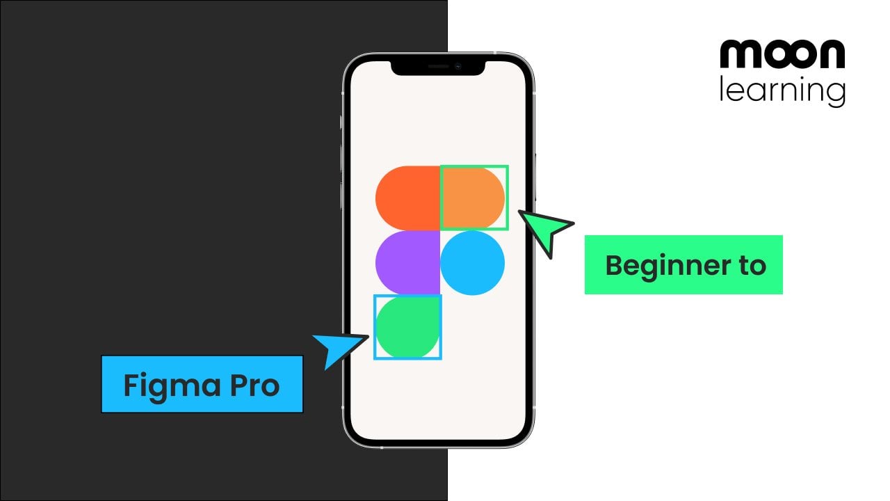
Transcripts
1. Course intro: If you ever wanted to break out from your
design file and see your creation come alive on
the web, this is for you. During this course, I'll
show you how to turn a simple Figma design into a live website with
the help of Cursor, a free AI powered
coding assistant. The great thing about
Cursor is that you're basically having a conversation
with your code editor. You can ask anything,
and cursor will not only help you but also explain
you how to build it. It's like having a
super patient developer sitting right by your side. We'll build our
first website using HGML CSS and a little
bit of JavaScript, learning fundamentals,
editing your design, and finally publishing a
real website with Netlify. We'll take your
design from a file to a live site in
less than an hour. This course is for you
if you're UI designer, looking to break the
barrier to coding and begin building
your own ideas. No coding experience needs, just a willingness to
try something new. This is a course by
moonlearning dot IO.
2. What is cursor: Cursor is a AI powered
coding assistant that helps you quickly
build incredible projects, almost like having a conversation
with your code editor. Whether you're a
beginner or experience, cursor makes coding faster
and more intuitive, allowing you to create
amazing things in no time. So why is cursor so great for you I designers
to get started? It allows you to go
beyond just designing and building complete products.
How does it work? You can describe what you
want in everyday language, and the curse I will
create the code for you and suggest
where to place it. You can ask it anything literally from how do
I get started building a website to let's add a sign and form section or just adjusting design
during the project. Like, let's adjust
the button color from blue to our variable black. But Cursor also goes
beyond the code editor. So you can ask it, for example, how can I turn this
into database? Or how do I even get started with databases? What is there? What do I have to look? And how can I connect these things? It will guide you step by step. As Cursor rather explains
than taking over, you remain in control, and the learning
curve is incredible. Once you're ready to
write your own code, Cursor AI can help
you to find and fix mistakes or tidy up your
files using best practices. Cursor isn't just
another AI tool. It's one of the most useful and empowering tools on
the market right now, allowing you to move
beyond design files and truly build your
products as a designer.
3. What we will be building: During this course,
we're going to set up a fully responsive
one pager website from scratch with code. As a base, I am using a Figma design which
I set up previously. But please note in
order to use Kersey, you don't need any
Figma knowledge. You don't need a Figma file. You could also just work from a sketch or from an
idea in your head. I personally just
really like setting up my design in a UI design
software beforehand. I can move things freely. I can think through
components and hierarchy, and then jump to the coding. However, this is
completely up to you.
4. Working material: Jump to downloads and here you find files for each of
the Mu learning courses, and you'll also find a
download for this course. Make sure that you download
the course material. Inside, you're going to find different cursor files for the different steps that
we're going to be working on. During the course, I want to
show you how to open them, and you also find
the design here. If you click on the design, you're going to get a PDF
overview of our design, and this just gives you an idea of the hex code of the colors. You can copy out
the text and just follow along and see what
we're going to build. If you don't have
Figma, then this is absolutely fine
as a reference. If you do have a
Figma account and prefer having the
original FGMa file, then just copy this link and paste it in your
browser and it's going to create a copy of the original
Figma file for you. Please don't click it
really copy and paste.
5. Basic html and css: A super quick and easy guide for total beginners to the basics of HTML and CSS and how they work together
to build a website. A website is mostly
made up of HTML. If you right click on a web page in your browser, for example, in Chrome and select Inspect, you'll open the
developer's tools. This lets you see
the HTML structure of the page you're
currently viewing, and you can even
temporarily change it to experiment. Don't worry. These changes are only in your browser and they'll
disappear once you refresh. HTML code consists of characters enclosed
with angle brackets, known as the HTML elements. Most elements are
made up of two tags, one opening tag
and a closing tag. The closing tag is similar
to the opening tag, but includes an
additional forward slash before the element name. The tag defines a
type of content. For example, the P tag tells the browser to display the enclosed content
as a paragraph. The tags themselves
are not displayed. The H one to H six
tag, for example, offer different headings
in different levels of importance with age one being the highest and
H six the lowest. We can also add attributes
to a tech which provide additional information
like using a class attribute
to apply styles. I'll tell you more
about that in a minute. There are also self closing
elements like the image tag, which pulls in the
content, in our case, the image through the
attribute called source. But how can we set up an entire
page with these elements? Well, the most
basic structure of an HMR page consists
of an HML element, which contains the head
and the body section. The head contains
information for the browser, which are not visible,
like the page title. So that is the little name that you see in
your browser tab, some meta description
for search engines, and you can also link style
sheets and fonts and so on. The body section holds everything that
appears on the page. So your text, your images, buttons, everything you design. Here's a list of the
most common tags that you might find useful. You can take a screenshot. Usually a website's homepage is named Index HTML by convention. You can also create sub pages like an About page or projects. To link to those sub pages, you can use the anchor tag, A. This creates a clickable link that you can place
anywhere on your page. You can also link to
external websites outside of your page. However, if you open
a pure HTML page, you'll notice that while
the content is there, it doesn't look very nice. That is where CSS comes in. While HGML controls the
content of your page, CSS controls the appearance of your HTML elements like colors, fonts, spacing and layout. To connect your CSS
file to your HTML file, you add a link to it
in the head section. Now, imagine your HTML
elements as invisible boxes. CSS allows you to create
rules that control how each box and its
content look and behave. A CSS rule consists of two
main parts, a selector, which targets one or
more elements in HML, and a declaration which defines how these elements
should be styled. The declaration itself is
composed of a property such as color and a
corresponding value like a hx code for the color. You can add multiple
declarations within the curly brackets, and you can also combine multiple selectors to apply the same style to
several elements. In CSS, selectors can
target plain tags, but you'll often see
classes used instead. Classes are assigned inside
the HTML tag and then referenced in CSS simply by
adding a dot before the name. Classes are more flexible
and reusable as they can be applied to different elements
for consistent styling. There are more ways
to use lets in CSS. Worth knowing are the
universal selector, which is a star sign and
targets the entire page. We also have IDs, and they are assigned pretty
much like classes in HML, and then called in CSS by putting a hash tag
before the name. However, IDs should
only be used for styling one specific
element, not multiple. While you can use them in CSS, they're typically used in JavaScript for dynamic behavior. You might also see
selectors that target elements nested inside
other elements. For example, this
one only targets a paragraph element inside
the class called sale. One important thing
to know about CSS is that it's cascading. This means if you apply multiple styles to the same element, the last one will take priority. For example, if you set the color to blue and
then later to red, the text will show red because the last
rule takes priority. Here's a list of the most
common CSS selectors. You might want to screenshot it.
6. Setting up a file structure: To get started, just jump to cursor.com and then sign in for a free account and
make sure that you download the desktop
version of Cursor. When you open Cursor
for the first time, you're probably going to
see something like this, or you're going to be asked if you want to use a terminal. We're going to stay
away from the terminal. We're going to keep it super, super simple for
absolute beginners, and we're just going
to work with folders. So just open a folder
as you always would. In my case, I'm
going to create one, and I'm going to
call it cliche Cafe. Click on Create, and
now simply click Open. You'll then see the workspace, and this is where all our
code will later live. So on the left hand side, you see the folder
we just created. In case you see something else, just click around
a little bit here. You can also try to open
a folder from the menu. You can toggle this menu by Command and B in case
you don't see it. And we also want another
menu very important because we want our chatbot
here on the right hand side. So I'm going to do
this with the menu. I go to view. And then up here, I
can see appearance, and here you see this is
your primary side bar, the left hand one, and then
I want the right hand one, so the secondary one, we can also use the shortcut
that we're given here. So you can also toggle this
with Option Command and B, in my case, on a Mac. If you want to
shortcut four Windows, just click on here and
it's going to show you. You can pretty much just get
going now and you could just tell the AI what you want to build and it will
set it up for you. But I prefer setting up my
own file structure first, and then I'm going
to talk to the AI and add all my content
and all my design. So I'm going to click on my
folder and then here you can see I can add a file
or can add a new folder. I'm going to add three files. The first one is
called index HTML, and that is really
important that you name it exactly like this. Then the second one I'm
going to call Styles CSS, and then I'm going to have a
third one for later maybe, which I'm going to
call script JS. For your understanding,
the HTML file, this is where the
page content goes, and it provides
structure and meaning. Also, one HTML file
would respond to one page that you see when
you open a browser window. The CSS file, this is where the page design
is controlled. CSS handles all the
styling and arrangement. In the JavaScript file, this is where the
page behavior is set, making it respond to
whatever users do. So things like a
click or an input. Which is going to
keep it very simple. Have one HTML, one CSS, and one JavaScript, but you can obviously have multiple
of these files. The only thing that you
need to consider is that the HGML you should always
start with an index HTML, and then you can have sub
pages named differently. The great thing is, if
you don't know anything, you're just going to
ask your little friend over here, our AI chatbot. So for example, let's say, what does the index HTML do? And so really see this like your assistant that you're
constantly talking to. It's like a super
friendly developer that's going to sit next to you, and any question you
have, you can ask it. And by the way, if
you don't understand anything, just let it know. So, for example, I
don't understand. I'm a total beginner,
and it will then give you an appropriate
version for you to understand. And it's the same
if things break or there's an error or
something doesn't work. Talk to it, like you would talk to a person, like
there's an error. I didn't know why it happened. I'm going to add one last thing. So in my main folder, I'm going to add
another subfolder, so we don't want to file. We want a new folder and I'm going to call
this one images. And this is currently empty.
7. Use existing folders and theme: You can either just work
alongside me and just set up all your own structure
and all your own code, or you can also, especially
if you ever get lost, open some preset
folders I made for you. So make sure that you
download the course material, and then in the course material, you're going to find
some ready made folders. By the way, the name and the amount of folders
here might change. But let's just say
that you want to jump to the file
structure that I made, then take the first
one here, open it up. And you will then see
my previous work here. Once we're going to start
adding code in a minute, you will see mine looking
more or less like this. So you can see there's
some really nice color happening in here. You might initially
see a different setup, and this is the color
theme of your editor. If you want to change that, just click on cursor up
here in the menu, then click on setting
and find theme. And right in here in theme, you can choose any theme. I'm using Monochai which is quite a popular way
to look at this, but any other you can also use, it really just
changes the color. So let me just give
you an example what it would look
like otherwise. So click on cursor settings, theme and just choose the one that you feel
comfortable with. A little side note
before we jump in. We're working with AI,
so we're talking to it, and even if we say the
same or similar things, we're probably not going to get exactly the same code and
exactly the same wording. That is absolutely fine. The important part is that you
start understanding how to work with cursor and how to
build your own products. It's not about mimicking 100% what I am doing
on the screen. And very important, things
are going to be breaking, things will go wrong. Trust me. It's not about
getting it perfect. It's about understanding
how to fix it and also how to use cursor
to help you fix it.
8. Setting up our content with HTML and cursor: So let's add some content. Let's first make sure that
we have our chat over here. So remember, we go
to view appearance, and then secondary sidebar
or use a shortcut. Now the thing that
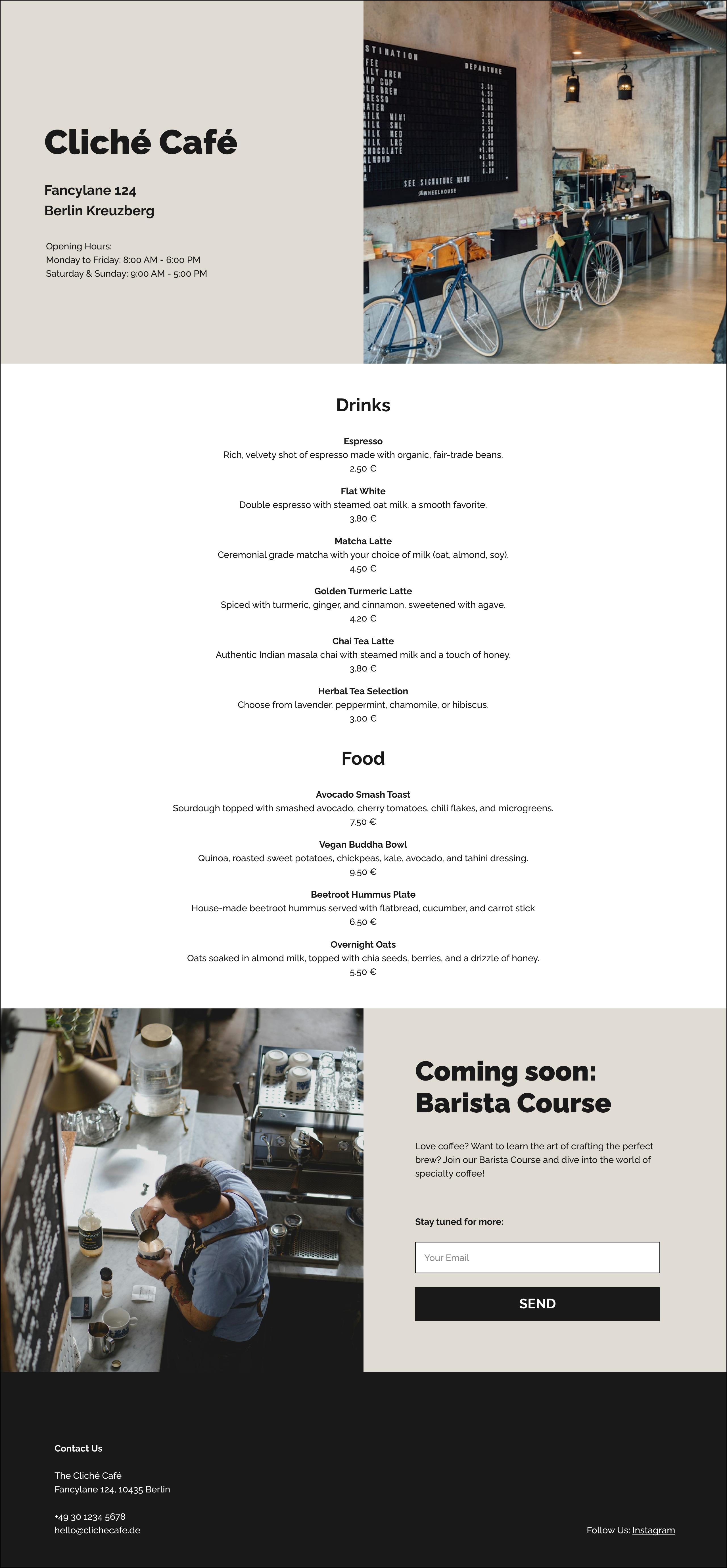
we want to build is a one pager cafe page. So I created a really
quick layout here, quite rough with Figma. And very important, you
don't need to use Figma. You could just talk to Cursor and build this
out of your head. You could have a little
scribble on a paper, basically, or use
any other software. So I'm really just using
this as an example. You don't need to set
it up like this at all. Let's have a look because we're
going to go step by step. So here we have different
sections like a hero, a menu, down here, the Futa. And you can see
that what I did is, I have a bit of a
hierarchy here. Again, you don't really need it. I just already edited it. So you can see that in the
hero, we have an H one. This is an HGML tag. If you're not familiar
with it, don't worry. In real life, this
would probably also be using more semantic
naming like this, but we want to keep
it really simple. And then I have different
hierarchy, g one, g four, and some copy text for the hero and an
image and the menu. Let's get started with this. What we're basically going
to do is we're going to tell Cursor exactly what we want to build and
the way we see it. By the way, sometimes
you might find a little file attached
here by default. For now take this off because what we want
cursor to do is we want it to use the
structure that we already set up and
I'm going to tell it. I'm going to say use my file structure within
Next HGML and style CSS. I want to build a
one page website for a cafe called cliche Cafe. So I'm just going to give you
an example of what I typed. I'm going to speed this
up and read it to you, so don't expect that
you can type along. What you can do is just
stop the video and then just type the same or just
make up your own text. Doesn't mean that
mine is better, and we're not going to get the same output
probably anyways. I'm going to read you the text, and by the way, it doesn't care if you
have typos fantastic. So make a first
section called hero. This is half text on the left and half
image on the right. The text is as H one, cliche Cafe, then
below the street name. The city in age four and
below that in copy text, use P. That's a tag for copy
text, the opening times. Make a second
section called menu, and here I want to add the menu, which is four drinks and four food options all
containing a name, which is copy text in bold, then below description
of the food in copy, and just normal P, and
below that the price. At the end, add a footer
with the contact details. Let's hit Enter. Okay, great, Let's have a look what we got. Again, this will probably
be very different for your generation than the
one that I got here. So you can see, here's a simple structure
of your warm pager. And first of all, we
have the index HTML, and then further down here
it's giving us some CSS. So if you want to
add the index HTML, make sure that you're
in the index HML file. And then if you hover over it, you see a little apply button, click on Continue, and it's now going to generate all
this code for you. For now, we're just
going to click Accept. You can see here
there is a head. This is not going to display. This is just a general info
about this page and it's here already pulling
in our style CSS. It's referencing this
CSS file over here. Here's the body, everything
that's in the body tech, you can see this is what we're later going to see displayed. Now make sure that
you save this. If you see this little bubble
here and it's not saved, just press Command and S, and as soon as you see the
cross again, it's saved. Now let's jump to the styles, and let's also add our styles. So apply, continue, and it's now going to add
the styles in here for us. Let's accept this. And
you can see here we have some styles for the hero for the different sections
and for the Putter. Okay, so now we want to
see what that looks like. So the way to look at this is that you need to find
your index HTML file. You can use it
right from cursor, or you can jump to your actual
file where you saved it, and then just open
it with the browser. The easiest way is to just
drop it onto your browser. Icon or just right click to
open it. And here we go. Here's our little website, obviously not looking
too pretty yet, but we have all the content that we told cursor about on it. Okay, let's refine
it a little bit. And first of all, let's
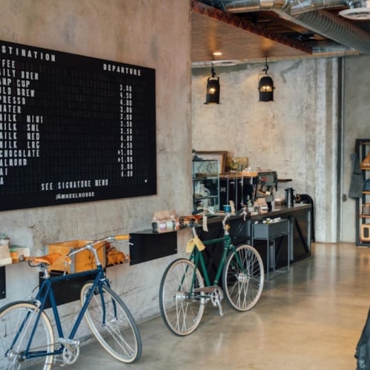
start with the image. So we want to use
this image here. So you either have this
image in your Figma file, then you can just
export it and save it into your cursor files. So let's remind ourselves
where we want this. We have our file set up
here and remember we made a little folder
called images. So we want it to
be right in here. If you don't use Figma, just use any image and drag
it into that file. Again, remember this
is the same file on your computer then you
see mirrored in cursor. What I'm going to do in my case, I'm going to export it here, and then you can
see on my machine, I see those files, and now
here I'm going to just call it hero Image and save it. Now let's jump over and you can see now if I open the image folder,
it's right in here. What I'm going to
do now is I'm going to talk to cursor again and I'm going to tell cursor
for the hero image, at the file her image dot
JPEG in the Images folder. Hit Enter to generate
additional code. Now let's have a
look what it does. It tells us to jump
into the index file. We're already in here and notice how nice it explains
everything for you. If we now click
Apply and continue, it's going to show us exactly where it's
going to add this. This is a really great way of you also learning and
understanding this. You can see here before
it said image and the image was just a cafe image, and now it's saying
images forward slash. That means go into that folder
and get the hero image. Then we just click Accept. Make sure you don't
forget to save it. And now let's have a
look at our website. We need to refresh.
You can either do that right here
in the browser or just press Command and and you can see we now
have our image over here. Okay, so let's just add
some last little details. So I'm going to copy
over the address here. And now I'm just going to
jump back to my cursor file, and we can add this by hand. I could just add
this here as well, or I can tell cursor
so I can say, for the address, use this. And then I just copy
the text that I copied over from my design
file and hit Enter. I'm just also going to tell
it to place it below each other and then just hit Enter and you can
now see the code. So apply, continue. Fantastic. Again, it
explains it to you nicely. Let's just get our
opening times as well. So I'm just going
to copy those over, let's paste them in here and
tell cursor to add them. And again, let's go to Index, apply, and we can see
nicely where it edited. And it also has two lines now. Let's save it, and
let's jump over here and refresh. That
looks really nice. And again, this probably here, I'm going to later tidy up
when I work with my design. Now, let's have a look at the menu and at the
menu, what I did here. This is like components
to work with. But down here, I have
just loose texts. I'm going to tell it to use
this text for the menu. Also, I could just use
what it generated here. So I'm just going to tell it
to use this for the menu, and then I'm going to add the text that I just
copied from my design. So let's apply this, continue. And that looks a little weird. It's like, like,
one big bunch now, but let's go ahead and just see what that would look like. So it lost the bold and
it's not that structured. But what we can do is let's just jump back and tell
Cursor about that. So what I'm going
to do is I'm going to tell it in the menu. Each drink and food
is an item with the name in bold and then below the description
and the price. And I'm just going to ask it
if it can set this up with good semantics for me because I don't know what
tags I would use. Now let's click Apply on that one already
looks much better. It's using an article here. Let's apply this. Continue.
Fantastic except. Let's jump over and refresh our page and then
that looks better. The distances are right, but the general setup is fine. I'm just going to do
one last little thing. I'm going to tell
it to clean up. I'm just going to
tell it tidy up the HTML and anything
that follows for the CSS file for a super nice semantic
and perfect setup, and it's then going to
give me those changes.
9. Adding styling with cursor and CSS: So this is a design
that we have now, and then you can see
here in our Figma file, we want to change
your typography, add some color,
spacing, and so on. So let's go bit by bit. And by the way, this is really the moment where
you have to start playing with this because
you're going to get really different results.
Things are going to get wrong. You have to fix
this, really take it as a playground to
explore this tool. I'm going to start by
grabbing this color. This is a variable in Figma. I'm just going to
grab the hex code for now. That's
going to work fine. Then for the typography
for all the text, I'm using railway and
that is a Google font. Let's trim back and let's tell
Cursor about all of that. So let's have a look. So here we have our header that
we're starting with. So you can see this
heads a class of hero, class text, class image. And so if we jump into this CSS, you can find the class of hero. Dot always means
class and then hero. And so here you
can see here text, hero image, all the
different things. And you can really also just jump in there and
play with that. So what we want to do, I'm
going to do this by hand. I'm just going to copy the hex code with
the background color because this is quite obvious. So let's have a look
at that picked up. Refresh. Perfect. And now what we want to do is I
want to add the text. So for the text, I'm going to talk to Cursor, and
I'm going to tell it. So I say, I want to use
Google font Railway for all text on the entire page. It's first telling me
to go into the HTML, apply, continue, and
then see what it does. So it's going to
add to the head. So again, the head is
what you don't see. It's going to add a
link to that font, so it's going to pull in
that Google font for me. That sounds great. Let's accept
this and save this file. And now in styles Apply, continue, and it's generating, and it's using railways. So let's also save this, and let's jump back and let's refresh and see
if that's picking up. Fantastic. That all looks fine. Now I also don't like
this padding here. Let's just jump back,
so all of this padding. By the way, very handy
if you're in Chrome, right click, click on Inspect, and then you get something
called the inspect mode. So you can see the
HML here and then you can see all the style applied. And you can play
with it right here. And so this has no
influence on your code. This is really just happening
right here in the browser. This is very useful to getting to know and
understand the structure. So you can see that
there's a general padding on our class hero, but then there is more padding. If we jump to the image, we also have actually
some margin we have here. So we want to take all of that
off, so let's have a look. You can either talk to cursor or we can just take this off. So we can just take off
the entire padding, or another way to do that
is to take off the top, right, and bottom padding. So let's talk to it, actually. I tell you, Take
off the top, right, and bottom padding of
50 from the hero class. Then another thing we
want to do so hero image, there was also some
sort of margin around the image,
but I can't find it. So I'm just going
to tell Kursa that we want no padding or
margin around the image. Let's generate this,
and let's apply it, accept it, and then let's just jump back and have
a look what it did. And we can see that this
is still in the hero, so they're still padding 20. So this is left and right. So Cursor didn't understand us. Let's jump back. So if
you have this it's top, then it's top and bottom
and left and right. So what we want to do is
top is zero, right is zero. Bottom is zero, and then we just want it on the
last little bit. So we're going to do yes. If you don't understand this, then you can also talk to Cursor and just tell it
what you want it to do. So let's jump back, update this, and that looks exactly
like what we're after. Great. Now let's style
this text a little bit. I actually set this
up already in Figma. Again, you can just do this
by hand as you go along, but as I have it,
I'm going to use it. What I'm going to do is I'm just going to copy all of this. Let me copy this over and
then I'm going to tell it. I actually go into the CSS. I know it's going to be in CSS. I tell it where I
want it. In my case, H one, and I'm just
going to paste it. Let me see what happens. I could also just paste that in myself. That sounds great. By the way, I don't
think I even need the font family
because I already put this I'm just going to
leave it like this for now, I can always tidy this up. Okay, except. And I'm going to do the same
for the others. So my age two. And so I do that for
all my type scale here. I just copy it over from Figma's deep mode where
you get all the settings. You don't have to do
that. You can also just ask cursor to make
this up for you. You can just write in
whatever values you want or use some
default settings. So if you work with Figma, however, this is quite handy. Let's save this, and then let's just see if we
get a difference. So that looks
already quite nice. Actually does make
this a little larger. So that looks great. And now I'm just going
to tell it to clean up. I tell it to clean up the CSS, take out repetition
and make variables for color and font family.
Let's apply this. So this is super nice.
It really tidies up your entire file
with one click. Save it, and that already
looks much cleaner. You can see here, this
is all tidied up, and then the variables
in here, fantastic. So let's have a look.
Let's make sure there are no errors, and that
looks the same. But let's have a
look because there's this weird padding happening. Let's go to inspect and have a look where
that comes from. We have these this margin
of 16 and then here we have a margin and I can't really see it here
where it's coming from. Let's jump back and
let's ask Cursor. I'm asking in inspect mode, there is a margin applied
to the hero H one, H four, and P, but I cannot see it.
Where does it come from? Show me in CSS. So here's telling us
that the margin is coming from the default
browser setting. So an explanation
here, we get this. So add margin zero
to all of this. Okay. I'm just going to ask it, can you do this for me? Let's click Apply and
then you see here margin zero except let's save it, and let's trim back and
see if that did the trick. Perfect. Okay, now we can just add the margins that
we actually want. So I tell it, Okay, great. Now just add some space
between the H one name and the address of
the opening times. Give me a CSS update. Okay, so it's adding
some classes in the HTML first. Let's do that. It's pen. Adding some classes. Yeah, not sure that's
what I want, actually. And then it's adding some here. Let's reject this and talk to it again. So I'm
going to tell it. So the H one is one unit. Then the street and the city
should be one unit, H four. But below each other with a distance of around 32
pixel to the next unit, which is the opening times. Can you add the dips or however you would lay out
this in the best way? Okay, that looks nice. Let's have a look what it does. That looks great. So create
a little cluster here, little cluster here.
That looks very lovely. Always ask it to lay
out this the best way, and then it's going to give
you quite a nice setup. Then jump to CSS. A Can't quite see it. I edit it down here. Tomorrow, we can later
ask it to clean up. Let's jump back. That
looks quite nice. Now, let's just sort out our menu here, so
let's jump back. So if we have a look here, then we can see that
the menu that was actually messed up a little
bit when we tidied up. So what I'm going to do
is sometimes it's easier. We just remove that and then we're going to tell
it to add a new one. So let's jump over
to our Figma file. And here I actually
remember this is the setup. So this is all in component, but here I just have
a loose text to copy, so I'm just going to grab that, jump over, let's
tell it what to do. So I'm going to tell it
below the header hero, add a new section
called drinks menu. This is the content
and then I just copy in all my content. The drinks and the food
headline is age three, and the rest is
just copy text P, whereby the food
name is bold and then below the description,
and then the price. Edit and update
the HTML and CSS. That looks again like a
little bit what it gave me, so let's just tell it to have
that a little more tidy. Say, looks good, but make
sure each food and drink item is like an own item and best
semantic setup in HTML. That usually always does the trick if you don't
know what to say. That looks much better. It's using an H four, though, so I'm just
going to tell it. That looks great. Just
do not use an H four. Just put the P in
strong for the name. So look if we now
get the right one. Okay, that looks
finally much better. So let's say apply. Continue. And it's
actually not adding it. So let's just copy it. And then we're just gonna
paste it right here below. Great. Let's see the section. It's called drinks menu. That sounds fine.
It gave us an ID. Again, I prefer having
this as a class, but feel free to do
this however you wish. And I also need the CSS. I tell it I also
need the CSS and note that I changed
the ID to a class. If this is again too advanced,
just ask it what to do. Have a look and
then tell it what works or doesn't work, and
it's going to help you. So let's jump into the CSS. Apply, continue, and accept. Okay, let's just see
if that did the trick. That looks fantastic.
I just want to center it now and
have some space in here. But I tell it. Looks great. Just center all the texts and have wrong spelling
doesn't matter. So space above the H three
headline in this section. And by the way,
it now knows that I'm referring to the
last thing I updated. Sometimes you need
to tell it which class you're referring to. Okay, let's apply this. Continue. You can see it
centered all the text, and it added a little bit of
margin. Let's accept this. Jump over here, refresh. And that looks like a pretty
nice website already. I'm just going to tell it
to tidy up everything. So I say tidy up HML and CSS
using the best practices. So that might take a moment. You can then apply this
to the HGML first of all, and then you can apply the
other one to the CSS file. And there's one little thing I personally don't want to
background color here, so I'm just going to
take that out by hand. Okay, great. Let's have a
look. That still works. Fantastic. So as I
already mentioned, don't take this as a tutorial with Step one, two, and three. It's really just showing you how I went about in this scenario. If you type the
same, you might get a different result. You
have a different project. So it's really
just about playing with this and understanding
and finding solutions. A little side note
after recording, I noticed that this
headline here is actually much more bold
than the one in my output. So if I have a look
here, then this is a font weight of 900. If I have a look in my CSS, then that's also set at 900. However, I ask cursor while
this is happening and it pointed out that when I'm
pulling in the Google font, you can see here
that all is pulling in per default is 407 hundred. I'm just going to
select this here, and then I can just tell it
to pull in the rest as well. As we refresh, you can see that now I have the correct
weight applied.
10. Making our website responsive with cursor: So this is our page now, and you can see we
have our intro, we have our menu, and I
added another section about Brisa course and
cleaned up the puta. So what we want to
do, however, now, is that if we resize that, we want this to behave properly. So we want, for example, this
image to stack right below. So let's have a look
how we can do that. Let's just ask cursor. When you tell it how you want
all the sections to behave, it's a good idea to have a look what the
sections are called. One is called hero drinks menu, and down here, our section, so the class for it is
called Barista Course. It will also pick up most of the time if
you just describe it, but sometimes there is a bit of confusion with the
wording as you go deeper, it's a good idea to do so. Let's tell it how we want
all of them to behave. Again, I'm speeding
this up a little bit, so you might want to go
to the end, stop it, and either write what I wrote or just write your own text. So make the page responsive. So it looks good from
mobile to desktop. Hero on large screens, keep AIs. On small screens, stack
the image below the text. Make sure you add space between text and image on small screens. Then the drinks menu.
Let's keep that as it is. Brisa course and note how
I use the class name. Stack or no, on large screens, keep AIS on small screens, stack the text below the image. Make sure to add some
space below the image on the small screens and
also below the buttons. Hit Enser. So let's have a look. It's telling us to
use media queries. So for responsiveness,
we use media queries, and that means that it's
going to tell us from a width of that width
onward, use these rules. And here, for example,
below this width, use the rules that
IDs play here. Then we use Flexbox,
the SS grid. So if you know about this and just jump in and play with it, if you don't, make sure
you let Cursor know. So let's just apply this
and see what happens. And you can see that it just added the media
queries for the hero, for the hero text, for
the Barris de course, Bars de course image. Actually, I'm not sure
it's all called like this. Let's have a look.
Bars to course image, text, sign up, button. So sometimes it gets a bit
confused with the class names. So you might just want to, like, clean this up later on. Let's just see what happens, and then we can still touch
this up. So that's refresh. And that stacks nicely.
Need that space. Here I wanted that's
not picking up and we might need some space
above the H one, and then down here
that also stacks nicely the spacing
is not picking up probably because of
what we saw that the naming gets a little
confused with that. So let's maybe just ask Cursor. So really have a
conversation as you would with your
colleagues. I'm asking it. The spacing below the hero text and the Britta button is not picking up might you be using class names
that do not exist? Okay, so now I went in there and it's having a look again. So now, what does it tell us? Here are updated changes. Let's see if it actually
found them out by itself. I have no idea if
it's that smart. Let's refresh, and let's resize. And that looks much better. Great. So the only
thing we want now is that we want a little bit
of padding in the age one. Let's just tell it.
So in the hero, add some padding
above the age one on small screens and also take off the padding
around the image. Let's supply this except, save, refresh, and by the way, a good way to do that is
also to jump on inspect, because what you get on inspect, you have this
little button here, and then you can jump to
different mobile sizes. So now we have a nice space up here that looks all really
good. We still have this one. So we could have a look
where this is coming from. I think it comes from a padding from a padding
here and the hero. So we have to take this one off. And then here we have our menu, and then here we have this one, which is all working
really nicely. So let's just find this padding and we can actually
try to do that by hand. So this is really to
here the hero padding. And what we can do
is we can just copy that because now we
start understanding CSS, and then let's place it in here and we can set
all of this to zero. And let's see what happens. We might just have
to give this text now a little bit more padding. So let's have a look, and let's add the padding here. And then remember this is top, right, bottom and left. So let's have a look if we
already understand enough CSS to do this. Perfect. And this is how you can
really get into learning. And by the way, little tip here. If you click on here, then
you have the smallest one, which is 320 pixel. The smallest mobile on the market so you
can make sure that everything is still
readable on this one. And just like this, you have
a lovely responsive website. So as you keep on working, you're going to learn little
bits and bobs about CSS. It's really important that
you try to understand. If you don't understand, then you can always ask cursor. So ask it. So, for example, ask it, What is flex? Like, what do you use it for? And it's going to tell you
how these things work. So this is really,
really fantastic, and you can really
take it from there. Anything that goes wrong, same thing. Ask it. The only thing you need to be a little conscious about
is the naming because sometimes it just doesn't pick up on the right
naming convention. So this is something you
can just have a look what all of these different
things are called. Now the only thing
we want to do is we obviously want this
to be all nice and tidy. I'm just going to tell it to
tidy up using best practice.
11. Launch your page online with Netlify: So the way to locally
view our design is that we take the index and we
just open it in our browser. And this gives us
a realistic idea of what our page will look like, but it's only visible to
us on our local machine. So how do we get this online? How do we deploy this page? And a great thing, you
can just ask cursor. So what's the easiest
way to deploy my page? So you can see here it's
giving us several options. You can use Github, Netlify,
and there are some more. The one I'm going to
go with that I like most for beginners is Netlify. And you can just go further right in here in cursor and just ask it to give you clear
instructions on how to do that. But I'm just going to show you because it's pretty
straightforward. Go to netlify.com and sign
up for a free account. Going to see something
like this and then make sure that
you're on sites. And here you're going
to see how to add your sites to Netlify.
So we have Github. You can browse templates
and build it here. But the easiest part which
we're going to use for now is to deploy manually.
So this is down here. You can now just browse to upload and then find your file. So the file that
you're working in on cursor you can see that it needs to
contain all the things, your images, your index, your CSS, all of it. Select the entire
file and then click Upload. And that's
pretty much it. So what you see here,
this is your URL for now. If we click on open production, so let's just make this a little smaller so we
can see it better. And we now get our
page which is live. And you can see it's exactly
the same that we saw before. So this is our URL. We want to clean this
up a little bit. So click on site configuration, and then down here you
see change site name, and we can now simply
take this off and call it cliche Cafe.
Let's save it. And you can see now our URL is cliche cafe dot
netlify dot app. So if we open that up again, you can share this, and this is where you will
find your page. If you want to update your page, then just jump back
to Deploy and you can just browse a new version. It will also save
all the old versions for you so you could
always go back and forth. Now you probably want
to use your own URL. In that case, just
click on site Overview, and then you can see here. So you deployed your site. Now you can click on
setup your custom domain. Depends on where you
got your domain from. You can get it
directly with Netlify, which probably the
easiest, but you can also add any domain that you
bought anywhere else, and Netlify is going to
guide you through it, and you're also going to
get your site secured, meaning that it's HTTPS, which is very important. Or you can also carry on using your new Netlify URL for free.
12. Connecting to third party apps: So here I have my page, and you can see down here with the Brisa
course coming soon, if you click on Sign Up, right now, nothing happens. So I want people to
be able to sign up to a mailing list to get
more information later. Now, there are plenty of different providers
for mailing list. I'm just going to use Mailchim which is quite a popular one. But you can also go
into Cursor and just ask it which one it
recommends for your needs. To get started, I'm going to
do something super simple. On my website, if you
click on Sign Up, you're just going to be sent
to a separate signup page. In Mailchimp, I'm going to go to audience and
then signup forms. And then here you can
see different ways. Pop ups, embed, and I'm going to go for one that's a
separate landing page. So I'm going to click on
Create a new landing page. And here just build
a landing page. And I'm going to call this
cliche Cafe landing page. Let's begin. And then you can see there's
really nice template, so you can make this
look really good. But I'm just going
to go for this super simple one here for the demo. Get rid of this one here, and let's just call
this one cliche cafe. Or let's call it barista course. Save that and let's
save and close it. And then I'm going
to click Publish. Again, you can edit things and you can just make it a little bit
more of your own. But for now, I'm just
going to go and publish. And now if I click
here, share your page, you can see that I created just this little
sign and form here. So this is the URL
I'm going to copy, and I'm going to tell
cursor about this. A little tip, what
you can do is you can just highlight the
button because you know it's this
button that you want clicked and then
click Add to hat, and then it already knows
what you're referring to. If clicked, open this
page in a new window, and then I just paste the link
that I got from Mail Jump. And so it's telling
us what it's doing. It's adding some JavaScript. We can do that later,
but let's just tell it to use only HTML for now. So we just turned
it into a link. Let's apply it and you can
see now if we click it, target blank means
open a new window, sign up button, and
then it signs up. Let's accept that, save it. Let's jump over
here and refresh. Need to tidy up the styling
later a little bit. And then it's opening that
new page, and we can sign up. So let's just try this. I'm just going to call
this landing page. Okay. So if we jump in here
and we go to our audience, and have a look at the context, then we can see that
this was now added. You can really start
playing with this. For example, we could add an input field
right on our page, and you can then talk to
cursor asking it how you can set it up that if there
is an input in this field, that's passed right
away to Mailchimp. Because the great
thing about cursor is that it is using
the so called LLMs. Don't worry too much
about which one you pick. They're all going to
work for what we do. And this is something
like Che hiphi or Claude. That means in this case, they see our code and
they understand our code, but they're also connected with the Internet
as such and they're just a AI chatbd
that you can ask also about things outside
of and your code editor. Another great thing that you
could do is, for example, have a look add a
pop up for Mail him, embed the forms or
also use other tools. One I really like
is buy me a coffee. So this has these little
support buttons here, and you can add
them on your page. So if they're
clicked and someone can just give you a euro or five euros or a few dollars
and support your project. So it's really nice stuff, and you can simply chat to Kerse about how to
integrate this. It will tell you exactly where
to go on those pages and what information it needs to help you connect all of that. One last little thing I
want to point out, though, a lot of these things
will require Java script. So we have a JavaScript
file in our setup. However, it is currently
not connected to our index. So you would always
need to tell Cursor, super simple. Let's
just tell it. So I want to use the Script
JS file, how to connect it. And it's going to tell you
to add this to your HTML, and note how it adds it to
the bottom of your HTML. So in the head, we
have the style CSS connected and then JavaScript
right before the body tag. So the world really
is your oyster, so just start playing
and talking to cursor about the things you want to do and connect
with your page. It will warn you about security
issues most of the time. However, it's still an AI. So as a beginner, be sensible and don't use any
sensitive data.
13. Thank You: Well done for
finishing this course, feel free to reach out
to me at MolearningO. I'm always interested in
hearing your feedback. You'd also do me a great favor in leaving a review right here. Ava enjoyed this
course and also make sure that you have a look
at moonlearning dot IO, where you can find plenty of additional material,
as well as courses. With M membership, you can
access all of my videos, so anything from UX UI basics, plenty on FINMA,
plenty of deep dives, as well, and also a section
about CSSNUIFundamentals. So we're going to discuss
what happens when UI design meets code
concerning layout, typography, color, and any
other relevant subjects. On Moon Learning,
you can also find a payroll free link to all
of my recent articles, as well as a resource page
where I try to keep you up to date to the latest cool stuff happening in the world
of UX UI Design. If you prefer a real life event, have a look at the
workshop and talk section. I'm frequently speaking
at conferences as well as giving online workshops all
around the subjects of UX, UI Design, and solopreneurship. Make sure to subscribe to my newsletter to
stay up to date. So see you soon on
moonlaring dot IO.
 Christine Vallaure, UI designer, speaker & educator