Transcripts
1. Welcome: I have to admit, even though I create educational
animations for a living, I've never liked animated
movies or TV shows. I see what I do as a completely different
thing than cartoons. So when I stumbled upon Disney's 12 Principles
of Animation, I thought that they
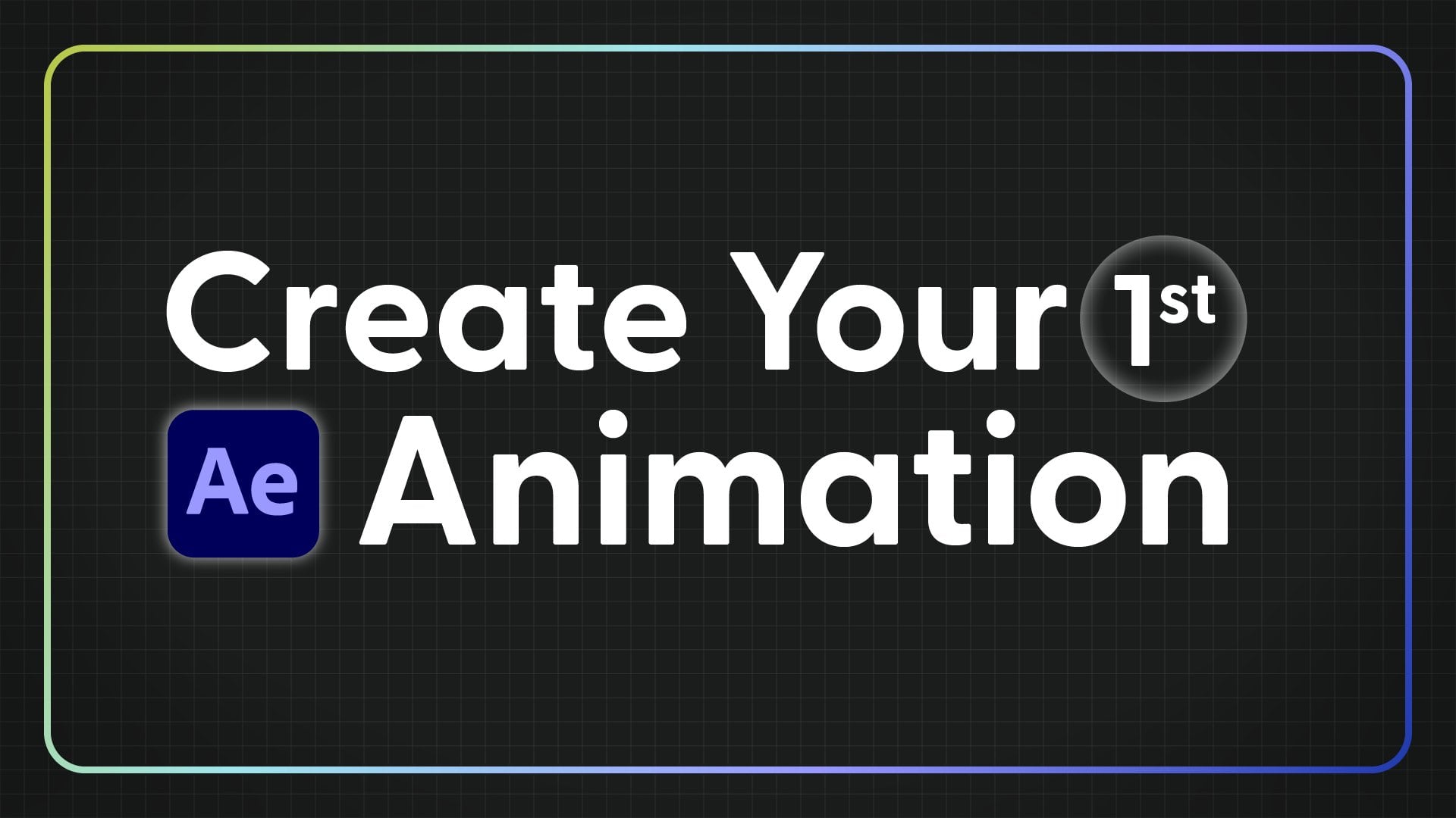
didn't apply to my work, but I was wrong. Hi, I'm Meghan Frias and welcome to an essential and
foundational class. Bring a logo to life Principles of animation for
motion designers. The whole point of
the principles of animation is to create
the illusion of life. No matter what
style of animation, 2d3d stop motion or
motion graphics, the goal is to take something static and add motion
to make it come alive. The principles of animation
are key to doing so. A logo animation is the perfect project to
practice these principles. Since a logo has less
layers and is shorter than what you might encounter in other animation projects, you can focus on perfecting each principle and
polishing every frame. Throughout this
class, I'll break down numerous logo examples and guide you through exercises to practice applying each
animation principle. You'll learn how to
use the principle of staging to create rhythm. How to apply anticipation to capture the
audience's attention. And how to add follow through
and overlapping action to make animations more
realistic and much more. Before taking this class, you should have some animation and after effects experience. Find more details on the
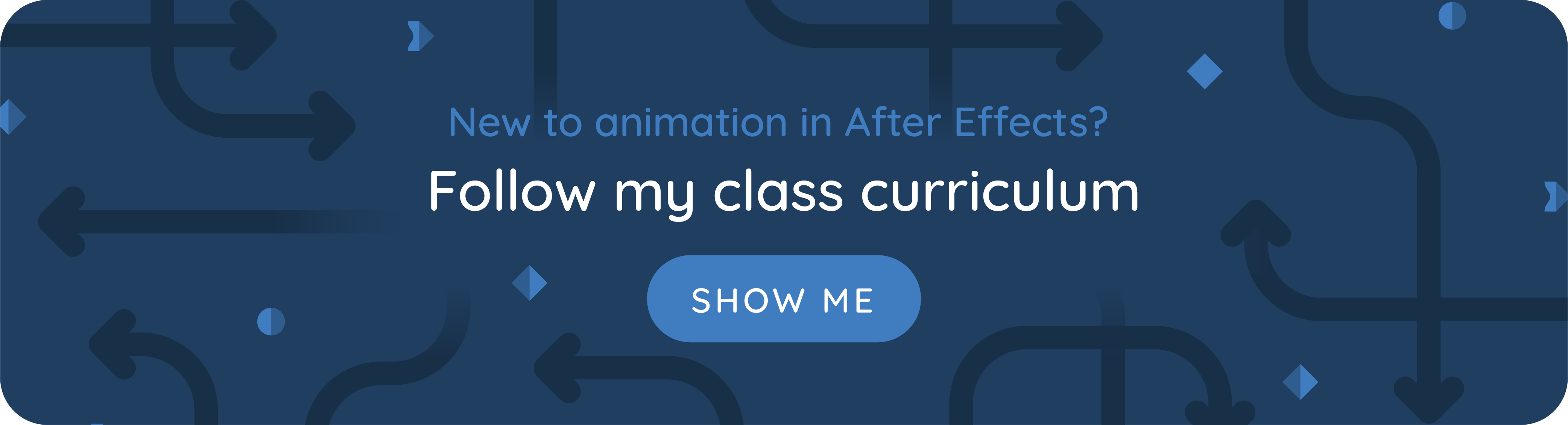
class description page including how to follow
my class curriculum. I'd highly recommend my
class smooth moves as a prerequisite so
you're comfortable adjusting motion curves
in the graph editor. The demos and downloadable
practice exercises will take place
in after effects, but the concepts we'll cover
are applicable to all types of animation and can be
translated to any software. Not only will you come away from the class with a
custom animated logo, but you'll have a
deeper understanding of how to utilize
animation principles to communicate ideas and emotions through movement in any
motion design project. If you're ready to
bring a logo to life, then let's get started.
2. Class Project: This class is a fusion of logo animation and
animation principles. The class project is
to animate a logo, but along the way you'll learn animation principles that can be applied to any motion
design project. The goal of this class
is to help you design a custom professional
looking logo animation. But equally, if not
more importantly, you should come
away from the class with a solid understanding of the principles of
animation and how you can apply them to your future
motion design work. I can't tell you how to
animate every possible logo, and if a tutorial is
claiming to do that, there's probably
some kind of catch. They're probably
only teaching you one simple generic technique. A high quality logo animation is unique to that specific logo. So there's an infinite number of techniques that you may need
to learn or come up with. With that in mind,
expect for this class to provide guidelines on
how to animate a logo. Well, using a modern
modified list of the principles of animation, you may need to find other
resources to figure out the technical side of a look that you're
trying to achieve. I'll point you towards resources that I think will come in handy. But also feel free
to ask questions in the discussions
tab for your logo. You could animate an
existing brands logo or a logo that you
create yourself. It could even be for
an imaginary brand. If you're stuck on
what to animate, you could create a
logo for yourself, for your personal brand. This could be an icon
that represents you, your name, written
in a custom way. Or you could do
something cool with your initials and animate that. We'll start by going over
some of the basics of logo animation and the
principles of animation. Then we'll dive into
each principle. Throughout these
videos, I'll show you different logo animations
so you can see how the principles can
be applied and get inspiration for your
own logo animation. As you watch, sketch
out ideas for your logo animation in
whatever form you like best. At the end of most videos, there's a prompt to help you in the logo animation
planning process as we go through the
principles of animation. I'll show you how to
actually apply them to these simple animations
and after effects. You can practice alongside me by downloading
this project file. Each principle of animation
has its own comp that's all set up and ready for you to practice applying
that principle. All of these comps
are compiled into this comp so that at
the end of the class, you'll have this handy
guide to help you remember all the
principles of animation. I've also provided you with a completed version in case
that helps you to learn, but it's definitely not as meaningful as completing
the guide yourself. If you feel a burst of
inspiration to start animating your logo midway through the class,
then go for it. Otherwise, by the
time you finish watching each principle
of animation video, you should have a solid plan to start animating your logo. And you can get to work
and at the end of class, there's a bonus video on common logo animation
techniques. So that may be helpful for the technical side of
bringing your logo to life.
3. Logo Animation 101: Because our eyes are naturally
drawn to moving things. Animating a logo even in a simple way can make it
more attention grabbing. But a custom logo animation
can make the brand stand out even more and
make it more memorable. If the goal of a logo is to communicate a
brand's essence, then animating the logo
should assist in that goal and even communicate additional information about the brand. The way that the
logo is animated should give insight
about the brand. This dual lingo logo
is bouncy and playful, which aligns with how
dual lingo gave Pi. Learning a language with their
fun animated characters. Uber logo animation,
on the other hand, has a much more serious feel. It's simple yet effective. And the parallel lines
that look like lines on a road hint at what Uber does when planning
your logo animation. Consider how it will be used. You can see here how
the logo animation also works as a launch
animation for the Uber app. A logo animation can help
explain what a brand does and it could even tell
a mini story about the brand. Here
are some examples. At first, these look
like abstract circles, but then they form the shape of grapes and then
swirl into a liquid, all of which is hinting at what the vineyard does in this logo. When this line twirls around, it suggests the
shape of a cocoon. This Google logo
animation was designed to transition between different
core brands within Google. It's a unique use case, but maybe it can provide inspiration for your
logo animation. It's important to have a deep understanding of the brand so your logo animation
will align with their other visuals,
messaging, and values. Depending on whether you're
actually contracted to animate the logo or just
doing it for practice. Here are some ideas for
how you can research the brand before you start
planning your logo animation. Hopefully this
process will help you come up with
animation ideas too. There are a few different
types of logo animations. The first is a logo reveal. The logo appears from nothing, pauses, and then disappears. We'll mostly focus on logo
reveals in this class, but know that that's
not your only option. In some cases, you may want to animate between two
versions of a logo, like for example, the logo
mark and the logo type. You could also consider making
your logo animation loop. It could just be a
subtle looping animation if that makes sense for what you plan to use the logo for. Maybe like for a
digital sign where the logo stays visible
for a while but isn't the main focal point
any of these types of logo animations is perfectly
fine for the class project. Do whatever makes the
most sense for your logo. If you're working on a logo
animation for a client, be sure to communicate what part of the logo
you'll be animating. Whether that's the logo mark, the logo type or both. And if the tag line or
slogan should be included. And consider how
the logo animation is planned to be used. In order to animate different
elements of the logo, you'll need an Illustrator file. You'll want to separate the different
elements of the logo out into their own layers
so you can animate them. You may need to
recreate parts of the logo depending on how
you want to animate it. Just be really careful that your recreation is as
pixel perfect as possible. I'm going to assume
you're comfortable with Adobe Illustrator
so you can prepare your logo animation
and you know how to import the Illustrator
file into after effix. If you need help
with any of that, check out this tutorial
or this class.
4. Intro to the Principles of Animation: Disney's 12 Principles of
Animation were coined by Ollie Johnson and
Frank Thomas in their 1981 book, The
Illusion of Life. As the title of
the book suggests, the goal of the principles
of animation is to take static illustrations
and make them believable to give them
the illusion of life. Even though technology has changed since the
book came out in the principles were
originally intended for hand drawn two D
cartoon animation. Most of these principles
are still very much relevant to
modern motion design. But with that in mind, we'll be working off a modified list of principles of animation as you work on your logo animation. Keep in mind that not
all principles of animation will be
fitting for every logo. For any type of animation, it's important to
use the principles of animation intentionally. Now let's get into
each principle of animation and start planning
out your logo animation.
5. Slow In & Out: Hopefully you're
familiar with the terms timing and spacing in animation. I'll briefly review, but
if these are new to you, I'd highly recommend watching
my class Smooth moves to learn all the concepts
you need to know and how to apply them
to your animations. Then meet me back in this class. Timing refers to
the time between key frames when looking
at the timeline. Timing is the distance
between keyframes. So as you're
probably well aware, key frames that are closer
together will produce faster animation
or quicker timing than key frames that
are further apart. When you're working on a super short animation, like a logo, you can expect to spend
some time on the timing of your animation by just nudging
keyframes a few frames. When an animation
is not very long, it's extra important for the
timing to be just right. Spacing is what happens in
the space between keyframes. Remember that a video is just
a series of still images switched before our eyes so quickly that we see
a moving picture. When Disney animators first came up with the
principles of animation, every frame had to
be drawn by hand. If an animator
wanted a character to look like it was
moving more slowly, frames would be drawn
closer together. Whereas if a character was supposed to look like
they were moving quickly, frames would be
drawn further apart. That's where the term
spacing comes from. When using after effects, the computer interpolates
all the frames between your key frames. It figures it out for you. But as the animator, you
can control how after effects interpolates between
the key frames in two ways. First in time or
temporal interpolation, which is done by adjusting
the easing on the key frames. This is similar to
how an animator would draw frames closer together or further apart
for slower or faster motion. As you hopefully know to add easing to key frames and after effects select them right click, choose
keyframe assistant, then easy ease or use
the keyboard shortcut nine linear key
frames are diamond shaped and key frames with any easing are hourglass shaped. Once you've applied easy ease, you can further customize this motion in the graph editor. And that's going to be key to emphasizing fast
and slow movements within your logo animation to make it more realistic
or expressive. If you're not familiar
with the graph editor, my class smooth moves covers
everything you need to know. Adjusting the temporal
interpolation of an animation can dramatically change what the motion conveys. It can indicate an object's
weight and what it's made of, whether it's light and
bouncy, or heavy and stiff. When you adjust the
timing of an animation, it can make it feel
like it's coming alive. But as you'll see in
the rest of class, incorporating
principles of animation can make it feel
even more alive. The second way to control
spacing is in space, as in left, right, up
and down in the frame. This is called spatial
interpolation. And it's often accomplished by adjusting the motion
path of a layer. We'll talk more about
this in a later video. The first principle
of animation is directly related to
temporal interpolation. And it's called slow in and out. Motion designers usually
call this easing motion. That starts slow, speeds up, and then slows down
before coming to a stop can be more
pleasing to the eye than linear animation
because it's more realistic to how a lot of
things move in real life. In the after effects
project file that comes with this class, find the exercises folder and the first comp called
slow, In and out. For the first exercise, just apply easy ease to the key frames on
the bottom square. I know this might feel
insultingly easy, but this comp goes into the master comp where you'll have all the
principles of animation. Every exercise has to be
done to complete this. Not every logo animation uses multiple principles
of animation. Sometimes the only one you
need is slow in and out. These examples look super
smooth and professional, but the only principle of animation they use
is slow in and out. Notice how there are
multiple parts to the animation and each
part uses slow in and out. This is something we'll
talk more about later. If all your logo animation needs is some really smooth easing, don't just stop watching. Now remember that the
principles of animation are essential to leveling up
any motion design project. When you're animating a logo, you'll want to adjust
the easing of all of the different elements
within the logo. This example, I haven't
used any of the principles of animation and all the
key frames are linear. Now compare that to
this version where I've added easy ease
to all the key frames, but I haven't used any of the other principles
of animation. The second version already
looks a lot better. It's less mechanical
and more smooth. Now look at the
difference. When I customize the easing
of each element. It's a lot more
interesting because I've exaggerated another
principle of animation, the slow and fast movements, to make it more dramatic
and feel more lively. This is the final version that incorporates other
principles of animation to. We'll come back to this later. Another thing to think
about when animating a logo is the overall
flow of the animation. It's not enough just
to make sure that each element's motion
is fine tuned. You'll also want to consider
the order and speed in which elements appear and
the rhythm that they create. In this example,
each letter starts and finishes animating
at the same time. Even though the animation
on each letter start slow, speeds up, then slows
down as it finishes. All the letters do
this at the same time. It's predictable, not
very interesting. You also wouldn't want to animate each letter
one at a time because that's also
predictable and going to draw out the
animation too long. Instead, it's best to stagger and overlap when the
letters come in. This is better, but
the letters are staggered the same
amount for each letter. The overall animation is linear
to make this even better. Now I've staggered the letters. The animation as a whole starts off slower with
fewer moving pieces. Speeds up in the middle with
many things moving at once, then slows down with
fewer things moving. This has a nice
overall flow to it. This goes for logos that
aren't just text to. Here are a few more
examples of animations that apply slow in and out to the overall flow
of the animation. The takeaway is that the
principle of animation, known as slow in
and out or easing, can be applied on
a key frame level or across the entire animation.
6. Staging: Staging means directing the
audience's attention to the most important
element or elements in a scene to effectively
communicate a message. Staging and animation is similar to composition
and artwork. There are multiple ways to lead a viewer's eye to the most important aspect
of your animation. Doing a good job of staging can help make complicated
scenes easy to follow. There's a lot to
effective staging. Let's focus on logo animation. As you think about how you
want to animate your logo, try to come up with
two to five phases or scenes in this logo. Everything animates in at
basically the same time. It's a bit chaotic and doesn't flow very well to
make this better. The idea here is
similar to what we talked about in the
last video about staggering when elements
come in and using the principle of slow in and out on the animation as a whole. When you apply the
principle of staging, you can break the
animation into chunks, which I'll call
scenes for this logo. Since we have different kinds of elements that have different
kinds of animation, I broke up the
different main actions into scenes that take turns. Notice how the scenes create
a rhythm with each scene. Using slow in and slow
out between each scene. Elements pause
just for a moment, then once the logo is
in its final state, it pauses for longer so the viewer can get
a good look at it. Then it animates out. This version has a much
better flow to it. The viewer knows where to look. So it's a more satisfying
animation to watch. It often works out well to have the animation of the
logo disappearing, be simpler, and have less scenes than the animation of
the logo appearing. The animation on the logo disappearing could
be just one scene. You'll want to
consider the context for where your
logo will be used. But usually once the
logo animates in, the viewer is ready
to see what's next. So you don't want to drag
out the animation too long. In this animation, there are three clear scenes to
animate in and it pauses. Then two scenes to
animate out scene 123, then 12 to animate out. This example has five shorter
scenes to animate in 12345. Effective staging
can also involve using different tools to
direct the viewer's eye. We tend to look at the biggest, brightest, or fastest
moving element in a scene. You can use color, size, or speed to direct
the viewer's eye where you want them to look. In this animation, the spoon
leads the viewer's eye around into the center of the frame where the
letters animate out from. Then a little square
drops from the end, which catches the viewer's eye. Since everything
else has stopped moving this square loops around, directing our eye to
the tag line here. The needle and thread
direct our eye all throughout the
frame and the animation of the elements in
the final logo design always follow the
needle and thread. This is especially
helpful for this logo since there are two lines
of text and our eyes need to be directed
from the right back to the left when the
second word animates in. There's no practice exercise for this principle of animation, but now it's your
turn to plan out two to five scenes that will
make up your logo animation. You can sketch out your ideas in any way that works for you. Be sure to consider the flow
or rhythm of your animation, keeping the principle of
slow in and out in mind.
7. Arcs: The principle of animation, known as Arc, has to do
with spatial interpolation. In real life, things
often move in the shape of an arc because of
physics or anatomy. For example, a ball
being thrown or bouncing moves in
the shape of an arc. Usually, the faster
something moves, the more straight
its trajectory is. Think of a friendly
game of catch versus a major league
baseball player, throwing the ball as
hard as they can. In this example, I made
the humming birds movement look more realistic by
animating it in an arc. Hummingbirds are known
to be fast, though. If I was animating
it lining across the screen and wanted to
show how fast it was moving, I would animate it
in a straight line. In some cases, things move in the shape of an arc because
of their structure. When layers are
parented together, animating an arc happens
practically automatically. Another example of this
is when a person walks their arm swing in an arc shape because of the way they're
connected to the body. The feet move in an arc shape for the part whether
off the ground. And the hips move in
a series of arcs. A lot of times
animating something in the shape of an arc
is as simple as adjusting the motion
path if you have your layer selected
and it has key frames, but you don't see a
motion path like this. First, make sure that this
button is toggled blue. Also that under view Show
layer controls is checked. If you don't have handles to
adjust on your motion path, go up to the pen tool, click and hold, and then select
the convert vertex tool. When you hover over a point or a keyframe on
the motion path, you should have this
upside down V shape, and you can click to add
these little handles. Then make sure that
you go back to your regular selection tool by going up here
and selecting it, or using the keyboard
shortcut of V. Now you can drag these handles
to create an arc shape. Let's look at how to
animate something that's tossed in the air
and moves in an arc. First, I'm going
to set key frames to just move this
across the screen. Then I'm going to go in between those two key frames
and just move it up. And that will automatically
create this arc shape. It'll automatically
adjust your motion path. You can go in and
adjust this further. I don't really want it
to curve right here. I'll just bring these
handles up next. I'm going to add easy's to
my keyframes by doing nine. That way I can adjust
them in the graph editor. If we play this back right now, it doesn't look very realistic. Let's select these keyframes and go into the graph editor. I'm going to look
at the speed graph. The first thing that I can
tell from the speed graph is that this slows down
as it comes to a stop, as it lands on the ground. We don't want that to
happen because gravity would accelerate things towards
the ground as they fall. I'm just going to select
this key frame, Hold down, shift and drag it up so that the speed does not slow down
as it reaches the ground. Now it looks a
little bit better, but it's odd how
this it comes to a complete stop at the
very top of the arc, because that wouldn't
happen in real life. We need the speed to not be
zero at this center point. We need to do, if we just try to bring these
key frames up, they're going to be
separate like this. Instead we need to select them. Right click, go to
keyframe velocity. Then check this box that says continuous lock
outgoing to incoming. Now if I drag these key frames
up, they move together. I'm going to do
something like that. Because I want the
top of the arc right here to be the
slowest point of movement. Now let's see what
this looks like. That looks already a
lot more realistic. If you wanted to convey what
this shape was made out of, you could further adjust the graph editor to make
it look heavier, or lighter, or
anything like that. For the exercise
for this principle, you'll need to take these
linear key frames on the bottom circle
and adjust them to make this animation
look more realistic. The first thing that
I'm going to do is have this last keyframe on
the X position ease in. That way, it's going
to look like it's rolling and then slowing
down as it comes to a stop. I'm going to right
click on this. Go to keyframe assistant, and then it should be a half hour glass
shape on the left. Next I'm going to select all of the y position key frames
and just apply easy, they're ready to adjust
in the graph editor. Then I can open up
the graph editor. Let's go into the value graph. Now what I want to do is adjust this graph to make it
look more realistic. Remember that the slope
of the value graph at any point is the
speed right here. Because the slope of the
graph is leveling off, the speed is slowing down. This is when the circle comes to the first time
it hits the ground. That means that it's slowing down as it reaches the ground. Which of course we don't want because gravity pulls
things towards the ground. It accelerates them
towards the ground. I'm going to take this handle
and drag it down so that this graph looks more like
this, it doesn't level off. Then I'm going to do the same thing for all
of these other points, right when it hits the ground. Also, when the circle is
lifting off the ground, it wouldn't curve
and go slow here. I'm also going to take
these handles and drag them down at points like this. When it's bouncing on the
ground and coming back up. I'm going to make the
first handle a little bit longer than the second
one because as it bounces, it's going to lose momentum. This way the graph
is reflecting that. All right, so something like
that looks pretty good. But let's play this
back and make sure we could maybe
adjust this to be a little bit more slow at the top. Maybe have this jump up, like it has some kind
of springs to it or some kind of power that's
coming from the ball. Another thing to keep
in mind if you are animating this from
complete scratch, is that these points where the ball bounces should
decay over time. If you were to draw a
line from here to here, these bounces should
not touch the line, they should be just under it. They're decaying a little
bit more every time as the circle loses
momentum as it bounces. The final result should
look something like this. Here are some examples of
logos that incorporate arcs when animating anything,
including a logo. Keep this principle of
animation in mind and consider if what you're animating should move
in the shape of an arc.
8. Anticipation: Anticipation is a
movement just before the main action that's in the opposite direction
of the main action. You can think of it as the
wind up or the pre action. Anticipation serves as a visual cue to what's
about to happen. It directs the viewer's
attention towards that object so they look at it and don't miss
the main action. Examples of anticipation in
real life include bending your knees before jumping or pulling your arm back
before throwing a ball. Anticipation can be used to make animations look more realistic. In this cooking
veggies animation, the hand moves down in anticipation of
flipping the veggies. Or anticipation can make an
animation look more cartoony. This evocado character bends his knees in
anticipation of doing something as simple
as a wave that doesn't actually
require bending knees. Anticipation can add
interest and direct the viewer's eye when animating more abstract things like logos. But before we look
at logo examples, let's practice applying
anticipation in the exercise file for
the middle square. I'm going to animate the
position moving a little bit towards the left
before the main action, where it moves
towards the right. I'm going to bring
my playhead to about ten frames and then
set another position, key frame with the same value. Then I'll go over to
the second key frame and move this position
back towards the left. Let's just go at 200. Let's add easy to these key frames if you want, you can adjust these key frames in the graph editor
to give this more of a custom look for
the bottom square. Instead of animating
the position property to create anticipation, let's animate the
rotation property. If we toggle open this
layer underneath transform. If we were to rotate
this rotation property, it's going to rotate from
the center of the square, it's going to go
through the ground. We could just move
this anchor point into the bottom corner right here so that it would rotate
from the bottom corner. But there's already
keyframes set up and that would mess
up those keyframes. Plus, when we get into more
complicated animations, having the anchor point
not be in the center and at the bottom corner
can be a pan. I'm going to show you
a trick that can help alleviate those pins
underneath contents, there's going to be rectangle one and then transform
rectangle one. Under here we have a
whole another set of transform properties
that we can animate. And these transform properties will only affect this rectangle. If there were multiple different shapes in
this shape layer, then these transform properties
just affect this shape. Each shape in the layer would have their own set of
transform properties. Then these transform properties would affect everything
on the entire layer. This is a way that you can have essentially two
different anchor points for the main shape layer. We'll just keep this
anchor point as is to not affect these key frames
that are already set up. But for this anchor point, you can see when you
select the shape, it's going to be
this right here. We want to move
this anchor point, that's the anchor point
for just this shape, to the bottom corner here, This rectangle is
just 200 by 200. This point is going to
be negative 100, 100. I'm going to type that
in to the anchor point. You can see that
that moved my shape. But a quick fix for
this is just to take the position property and use this pick whip to parent the position property
to the anchor point. Now it moved the
shape back in place. This just means that the
position property for this rectangle will always be the same as the anchor point. I could move this anchor point, You can see it moving
along the bottom. Now up, the position
doesn't move. I'm just going to undo that. The anchor point is now here. If we rotate this, it's
going to rotate from this corner at the very
beginning of the time line. I'm just going to set
rotation property. For this rotation to be zero, then let's go forward in time. Probably just a little bit before this first
position key frame. Let's rotate this back,
maybe something like that. Then I'll go five frames
equal distance after the first key frame and set this rotation
back down to zero. Let's add easy to
these key frames. This is looking slow. It doesn't really
look realistic. I'm going to adjust these key
frames in the graph editor. I'm looking at the
value graph here. Since I just applied easy
ease to these key frames, it's slowing down as it reaches the ground,
which isn't realistic. Gravity would be pulling
it towards the ground. This keyframe should
not be slowing down. As it comes into the key frame, I'm going to drag
this handle down. It accelerates into this
keyframe that looks better. But we could maybe even
make this more extreme. Make it hold a second
at the top here. Let's see what that looks
like. Yeah, that looks better. But obviously,
spend as much time customizing this to get it looking exactly
how you want it. Here are some examples of
logos that use anticipation. Here the O has a
pretty obvious wind up. That's anticipation. Keep in mind that
anticipation doesn't just have to be at the very
beginning of an animation. In this example, the
circles move up before dipping down and then the
main logo reveal happens. In this example, dots go
up in anticipation before becoming the microphone and also before making the
letters for Google. The dots are moving slightly
in between different scenes, which you could argue is a
subtle form of anticipation. In this example, the
moves down slightly in anticipation of moving up
as the other shapes appear. It also moves down in anticipation before
smashing the other shapes. Keep in mind that
anticipation can be used to make an animation look
more playful or cartoony. Especially if that
anticipation is exaggerated. We'll talk more about
exaggeration later.
9. Follow Through: Follow through is like the
opposite of anticipation. It's an action after
the main action that overshoots or goes past
the end state or pose. Follow through is a post action or a recovery from
the main action. In real life, it can
be hard to stop. Suddenly, when you land a jump, your knees bend a little. Or when you throw a ball, your hand continues
to move even after the ball has left your hand
Follow through is natural. So adding it to your animations can make them look
more realistic, or it can make objects
look more floppy, and therefore cartooning for
the follow through exercise. Let's start with
the middle square and animate the
position property. I'm just going to drag
this last keyframe over about ten frames to 25 frames. And then where it
was at 15 frames, I'm going to copy
this keyframe at 25 frames and paste it. And then just drag this a little bit more
towards the right. Let's do 800 pixels. Then I'll select these
keyframes and easy ease them. I'm going to go into
the graph editor and make this look a
little bit better. I'm going to look
at the speed graph. Let's make it so that it
takes longer to slow down. As it comes to a
stop, like there's friction with the ground
that's slowing it down. But let's justify the overshoot
by making it a little bit faster towards the end of the animation of
the main action. I mean, it's like
slimming to a stop, and then that's
why it overshoots. Let's see what this looks like. That looks pretty
good. Feel free to adjust this to
however you think looks best for the animation on
the bottom square. Let's animate the
rotation property, similar to what we did with
the anticipation exercise. I'm going to toggle
down go under contents rectangle one and then
transform rectangle one. I'm going to move
the anchor point for transform rectangle one to
the bottom right corner. This time again, this is similar to the
anticipation lesson. If you miss the explanation
for why I'm doing this, make sure to go back
and watch that lesson. This anchor point
needs to be 100, 100. Then I need to parent the position property to the Anchor point property
so that it doesn't move. This is all set up and
now I can rotate it from this bottom right corner just before the final
position property. I'm going to have the
square start rotating. Let's set a rotation
property for here. At about 01:10 I'm just
going to hit you on the keyboard so I can easily
see both sets of key frames. Then let's go forward
to maybe about here. Let's rotate this,
let's do 15 degrees, then go forward a few more frames and set
this back to zero. Then let's add easy ease to
all of these key frames. I'm going to go right into the graph editor and adjust this. The red is the position property and the yellow is the rotation, and I'm looking at
the speed graph. I'm going to adjust the position similar to how I did
on the middle square. Let's have it be a little bit faster towards the end
of the main action. Then for the rotation, I want it to rotate up really quickly, like it's being shot
up into that rotation. Let's adjust the graph so that happens right away,
it shoots up. Then I want it to rotate as if gravity is pulling
it towards the ground. But it like hovers in midair. It's like teetering when it's rotated something like this. It's going to land had, but stay rotated back like it's teetering for this part where
the graph is really slow. Let's see what this looks like. All right, so that's our
follow through exercise. You could also
combine rotation and position to have both of
those act as follow through. Whatever you're animating,
you want to be able to justify why it moves in
the way that it does. Here are some examples of
logos that use follow through. In this example, the curved
line underneath the R, I'm going to call
it a smiley face, rotates back and forth as a follow through
when it animates in the three dots as they come up overshot
and bounce a little bit, which can be counted
as follow through. When the white dot shoots through the other
two green lines, it extends past
its final position when it becomes glasses, and then it bounces back into
its final resting position. That's another example of follow through in this example that we've already seen as a good example of anticipation. There's also a lot of
follow through in how the letters rotate
once they come in. Also, when the letters fall in, there's some overshoot
and that they fall lower and then come back up
to their final position. Similar to anticipation, follow through can make your
animations look more realistic, or if you exaggerate it, it can make your animation
look more playful.
10. Overlapping Action: Overlapping action is the
movement of things that flop, flow, flap or fall behind the
central mass of an object. It's usually something
that the character or object that you're animating
is doing involuntarily. But that doesn't mean that
it happens automatically. You still have to animate it. Overlapping action is due to the way things
are structured. The momentum from
the primary action and the laws of physics. Think of it as a chain
reaction and consider this for how things are
parented in after effects. Examples include an arm
swinging while walking, waving how the hand
lags behind the arm, or things blowing in the wind. In this animation of
seaweed moving underwater, notice how the stem
of the vine bends, which is the main action. And the leaves rotate, which is the overlapping action. The rotation of the leaves lags slightly behind
the bend of the stem. This animation of a girl biking has a bunch of
overlapping actions. There's the motion of her head, hair, earrings, and shirt
blowing in the wind. And the bouncing
basket and dogs, ears waving in the wind. Keep in mind that
things will move at different speeds depending
on their weight, size, and how
they're structured. Overlapping action can
happen during any or all phases of an animation
anticipation, main action, and follow through to
animate overlapping action. In our practice exercise, we're going to add a
bend to the square. To do that, you want to
go up to effects and presets and just search for CC, bend it and then drag that onto the layer that's probably going to cut off
part of your square. And that's because of
where these controllers are for the start
and end of the bend. We need to position
these closer to the square so that it's
not cutting anything off. But as the square moves
across the screen, those controllers are
staying in place. They're not moving
with the square. Here's what we can
do to fix that. I'm going to toggle down into E, X, and then into the bend. I also need to just open this layer so I can see
both the X and Y position. You'll see Y in a second. The start of the
bend is going to be at the bottom of the square. I'm going to option click on this stopwatch to start
writing expressions. If you've never written an expression
before, don't worry. I'll walk you through
everything we need. To enter two different values, x and a y value because that's
what the start entails. I'm just going to type in
a bracket because that's the way that you write
two numbers like that. Then I'm going to
use this pick whip to grab the location
of the x position. Now the position of the start
of the bend controller is always going to be the same as the position of the square, which is exactly what
I'm going to want. Then I'm going to write a comma, and now we need to
define the y position. I'm going to do the same thing. Take the pick whip and
drag it to the Y position. Then I'm going to do plus
100 because I want this to not be in the center of the
square but 100 pixels down, which will land right at
the bottom of the square, because I know that this
square is 200 by 200 pixels. Then remember to type an end bracket and then
click out of this. Then if you click
back on CC, bend it, you should be able to see that controller is attached
to the bottom here. Now we need to do the same
thing with the end controller. If you're worried about how this is getting cropped on the sides, we need to just make sure that the end controller is further
up and that'll fix that. I'm going to again, option click on the stopwatch for
the end of the bend. First type of bracket. Then the same thing
for the X position. We'll take the pick Whip down
to the X position and then a comma then pick
whip the Y position. We want this controller to
be higher than the square. I'm going to do like negative 300 and then the end bracket. Let's click out of
that. That looks good. Let's see if we bend
this, that looks good. It's not getting cut off. If yours is getting cut
off for some reason, just make this a bigger number. Now let's animate
the bend property. I'm going to go to
the first key frame and just set the bend
amount to be zero. Then also, we'll set the bend amount to be zero
on the last key frame. Then in the middle of
those two key frames, let's have it bend backwards. Let's just add easy ease to all these key frames and
see what this looks like. You could go into
the graph editor to further adjust
your key frames, but already this is giving the square a little
bit more personality. In this case, making
the box bendy gives it more of
a cartoony look. But overlapping action can also be used to make things
look more realistic. Like you saw in the
biking example, the principles of
animation can be combined for an enhanced effect. Here's a simple animation to help explain the
difference between follow through and overlapping action and how they
can be combined. Follow through means there's an overshoe after
the main action. Overlapping action
means the pieces of an object are staggered
and how they move, they slightly lag behind
whatever is driving the action. Finally, follow through and overlapping action
can be combined. For the most dynamic look in the exercise animation, you can add follow through
on the bend animation, which will act as an
overlapping action. The way that this
bends back and forth as it comes to rest
is called damping. Oscillations is another way to make an animation
look more realistic. For this one, I've already
added the bend effect for you. Just speed things
up a little bit. I'm going to go to the first
key frame on the position, set the bend to zero. Then in the middle
of these key frames, let's set this back
to negative 30. Then a little bit after
this first key frame, let's set this to positive. And a little less than 30, let's do positive 20. It's going to bend back
in the other direction, then go forward a little bit. Let's bend this back.
Let's do negative five. I'm just guessing on these numbers and we
can always adjust them and then go forward again
and set this back to zero. Let's just hit, you, just
see those key frames. And then easy ease them. Let's just see what
it looks like. All right, it's looking a
little bit slow, right in here. Maybe if I bring
this key frame back, then maybe I can bring
this keyframe this way. Bring these to this way. I'm just going to adjust the
timing so that it bends. And then it, as it
has less to bend, it's going to go a
little bit faster. So let's see what
this looks like. That's a pretty subtle little
follow through animation. But if you wanted
to communicate that the square was made of
something more Jellowy, you could add more oscillations back and forth,
make it bend more, or do whatever adjustments
in the graph editor to convey what the square is
made of in your imagination. Let's move into
the next exercise, comp number six, putting it all together for this animation. The idea is to combine multiple principles of animation that we've talked about so far. I'll leave this up
to you to animate since I've covered
everything you need to know. But here's what you should
include for the main action. You slow in and out. There are technically a few ways you could incorporate
anticipation. But I was planning on having the square rotate back
before the main action. To incorporate
overlapping action, the square bends backwards. As it rotates in anticipation
of the main action. Then there should be follow through and
overlapping action as it rotates and bends to the
right after the main action. Finally, there's follow through on the follow through as it bends back and forth before
coming to a complete stop. There's one little trick
that you'll have to do with the anchor point in order to make the rotation work properly. If you look at my
completed version, you'll notice that
I've key framed the anchor point and
there's two hold keyframes. For the first part
of this animation, I need the square to be able to rotate backwards like this. The anchor point needs to be
at the bottom left corner. I've set a hold keyframe on the anchor point for the anchor point to
be at negative 100, 100 for the beginning
of the animation. And then once it
gets to this point, which is just before it starts
rotating the other way, at the end of the animation, I've set another hold keyframe
so that the anchor point just moves all at once to
the bottom right corner, which is 100, 100. The reason that this doesn't actually do anything
to the shape itself, it doesn't move the
position is because what I set up in that first
lesson with anticipation, that's this part where I parented the position
to the anchor point. Here are some examples of logos that use
overlapping action. Well, if you look closely, some of the letters have
pieces that lag behind. On the first D, the
circle part lags behind the stem of the letter during the follow through
bounce animation. Another example is how the
second D rotates and bounces. You could also
argue that there's overlapping action
across the whole logo during the part where
the letters move up in anticipation
of animating out. Since the letters are staggered, this creates an
overlapping action effect. Notice how the green square
bounces the letters, and they act as a unit. The way that the letters
all bounce but are slightly staggered is an
example of overlapping action.
11. Secondary Action: Secondary animations
are animated details that support
the main action. Think of it like
layering animations. These smaller secondary
animations embellish or enhance the main action to
make the animation look more realistic or
give it more personality. In this animation, the primary
action is lifting weights and the secondary animation is the character's
facial expressions. Here the main action is the turtle flapping
its fins to swim. The way the fins bend would be considered
overlapping action. Secondary animations here
are blinking and breathing, which can be seen
as the bubbles. Secondary animations should add additional meaning that doesn't distract from the
primary action. For example, it can convey what mood character
is in their emotions, intentions,
reactions, et cetera. While you may hear the
terms overlapping action and secondary animation
used interchangeably, they are two different things. They're both ways to add
detail and enhance animation. Overlapping action is
usually involuntary. Think of things that
swing flap, flop, or lag behind, often because of the anatomy of the
character or object. Overlapping action needs
some other action to overlap with it's a result or
reaction to another action. And it may not be possible
without that other action. Secondary action is more
likely to be voluntary. Think of characters that are doing multiple things at once. For example, if the
main action is walking, the character could
turn her head and look around and that would
be a secondary action. It's not necessary
because it's not a physical reaction or
result of another motion. It's an additional motion that could occur without
the main action. Secondary animation is
not always voluntary. For example, things
like blinking would be a secondary animation rather
than an overlapping action. Because it's overlapping
with another animation, it's not a reaction or
result of another animation. You already saw
how the motion of the girl's head, hair, earrings, and shirt blowing
in the wind and the bouncing basket
and dog's ears are all examples of
overlapping action. They all happen because of
the fact that she's biking. The animation of the dog's
tongue, like he's panting, isn't a reaction to
the other motions, that would be considered
a secondary animation. The dog doesn't have to be
panting in this situation. If the dog wasn't riding
in a bike basket, he could still be panting. But since it would
be realistic for a dog to pant in this situation, adding secondary animations like this can help make
the scene come alive. An animation could be a secondary animation and
have overlapping action. For example, in this animation, the primary action is eating the tail is a
secondary animation. The cat could be eating
without wagging its tail. The way that the tip of it lags behind is an overlapping action. The takeaway here is not
that you need to pick apart an animation to figure out what constitutes what principle. What's important here is
that you're able to layer principles of animation to
create the illusion of life. For the practice exercise, I'm just going to add a
rotation animation at the same time as the main action of the square moving
across the screen. This rotation animation is
layered over the main action, but doesn't actually
have anything to do with the main action. I'll just set a key frame, maybe like starting a little bit after the first
position key frame, for the rotation to be zero. Then at the last keyframe, let's just animate
this, 180 degrees. Let's add eases
to both of these. The term secondary
action was originally intended for character
animation for logos. We can use the term a little
more loosely to just mean additional animations that
enhance the main animation. In this example, the
burst that comes from the speech bubble could be
called a secondary animation. Or in this example,
the accent dots are an additional animated detail that enhances the
overall animation. In this animation, there
are multiple accents and bursts that could be counted
as secondary animations.
12. Squash & Stretch: Squash and stretch is when an object is animated to expand and compress to give it the illusion of weight
or flexibility. You can use squash
and stretch to indicate what an
object is made out of, whether it's hard as a rock
or squashy like rubber. When animating
squash and stretch, consider the material
that the object is made out of and how that
would behave in real life. You can exaggerate this to give it more of a cartoony look. Squash and stretch
can be used for anticipation and
or follow through. And when combined with
other animated properties, it can make up
overlapping action. In this example,
instead of having the cake bound up off the
ground when it falls, squash and stretch is used
as a form of follow through. Since the cake also bends side to side as it squashes
and stretches, this could be considered
overlapping action. There are also other times that the cake and cherry
squash and stretch, like here, in anticipation of
the cherry being tossed up. And also when the cherry falls. The use of squash and stretch makes the piece more expressive, interesting and gives
it more personality. When animating
squash and stretch, you want to make
sure to maintain the object's volume to
make it look believable. In other words, if you
stretch an object's height, you should equally
squash its width. A lot of times you can get
away with scaling an object, so the numbers seem
equal and opposite. For example, if you
scale the x value to 120% then you scale the y
value to 80% Technically, this isn't totally accurate, though All it takes to be
accurate is some simple math. The area of a rectangle
is its width times its height after effects uses x and y. Let's
go with that. With this equation, you
can figure out the area if you're using
the scale property to animate squash and stretch, you can just use the
scale percentages. 100 times 100 equals 10,000
Now that you know the area, you can rearrange this equation. If you know you want to squash
the object so that x is 120% You can figure out what the y value needs to be to
maintain a consistent area. 10000/120 equals 83.3 Not much difference in
the first example, but the math is easy.
Why not be accurate? You can make this even easier by setting up an expression to automate the math for you if
you're working with circles. Technically the area is pi
times the radius squared. But when you're just trying to animate squash and stretch, you can get away with
using the same equation, x times y equals area. This is good enough
because it's not super important that you calculate the area of the
shape accurately. It's just important that you squash and stretch the
shape proportionately. The area of the shape
doesn't change. If you want to be super accurate when working with
different types of shapes, then by all means go
ahead and do the math. But otherwise you can just
use this simple equation. And the expression that I'll show you later on will work too. In the practice exercise, I've set up two
different circles. For one, you'll animate the size property to
animate squash and stretch. For the other, you'll
animate the scale property. Let's start with
the scale property. Make sure that this one is visible and the
other one is not. I've already set
the anchor point to be at the bottom of
this circle for you. Because when you
squash and stretch it, you want it to squash and
stretch from the ground. It makes sense for the
anchor point to be here. You'll see that I've set
up y position key frames. But if you play
through this, nothing is actually happening yet. If yours is like this, that's
how it's supposed to be. And we're going to go in
and make this actually bounce using these
existing key frames. The first thing we need
to do is add as to these key frames and then
go into the graph editor. Now we have handles, since we added as that, we can adjust this curve and this will actually
give it a bounce. But if you're adjusting this curve and you don't
see anything happening, like if you look really
carefully, it's slightly moving. But also look at the scale here, this is barely moving one pixel, like not even a pixel. We could just keep dragging
these handles and make this really big until
the scale gets bigger. But what I found it is easier is just to
go in the middle of these key frames and
just move this and then look at how the scale of the graph has already changed. Now I can adjust these
handles much more easily. Then I can even delete
this key frame, and the scale of the graph
stays relatively the same. This just makes it easier
to go in and adjust all of the different handles so you can make those bounces. I'm just adjusting these
handles that the first one on the left side is a little bit longer than the
one on the right side, but they're making
an upside down. The reason for this is because
as the circle bounces, it's going to be losing
momentum due to gravity. This curve should be decreasing, but decreasing,
not just linearly. These bumps should get
smaller each time. I'm just going to adjust my graph to make sure
that it reflects this. You can adjust these handles to however you want it to look, depending on how high
you want it to bounce, You can set that
with these handles. Once your animation looks good, then you can go in and
add squash and stretch. I'm going to go out of
the graph editor and then let's toggle open
the scale property. On the scale property,
I'm going to set up that expression
to automate the squashing and
stretching so that I don't have to do the math for
every single key frame, set an expression you
want to option or Alt. Click the stopwatch and
then you can start typing. We need to define two
different variables. Variables are just like
names or placeholders for things that we're going to use later on in the expression. I'm going to set the
first variable by typing VAR and then you can guess
what this one's going to be. For the x value of the scale, I'm going to take this
pick whip and just grab this x value basically. I'm just saying x value is going to be whatever I set here.
That's all this is saying. Then for the end of every line, like how you end a
sentence with a period, you need to end this
with a semicolon. Then for the next line, I'm
going to set the y variable. Then this one I want
to be the area over x. If you remember back
to that equation, that's what the Y
value is going to be. I'm going to set the x by just adjusting this value and
key framing this value. And then it's automatically
going to figure out what y needs to be to maintain
the same area. I know that 100 times 100
is the area of this circle. I'm going to just
type that in as 10,000 and then divided by x. You can see I'm now using
that variable that I set in the first line and then
semicolon to end the line, and then brackets because we're defining two
different numbers. Because the scale wants
two different numbers, it's just going to
be x and then y because I've already told it what those are going to be here. There's definitely multiple
ways that you could set up an expression to automate
squash and stretch, but I think this is
the simplest way. That's why I'm showing
it to you here. Now, if I were to
adjust the X scale, I can use the slider
to adjust it. Let's just do like 150. You can see that the Y value was automatically
calculated for me to be 66.7% If I go the other way, 71% in the x value is going
to be 140.8 in the y value. I don't have to worry
about the y value, I just have to set the x value. You can go in and
type in a number, and that works too. Or
you can use the slider. Also note that like it looks like you can
adjust the y value, but when you let
go, it's actually just having you
adjust the x value. That can be a little confusing. But just remember
that you get to set the x value and it will automatically
calculate the y value. When you set this back to 100, it should look normal, not scaled in any weird way. I'm just going to close this up and now we can
keyframe this value. I'm going to go over to where the circle is about to land. And this is going to be
about 20 frames where it's going to be moving at its fastest as it falls
to the ground. And I'm going to set the
first scale keyframe here. Then right before
it hits the ground, it's going to be
its most stretch. It's going to be elongated, that it's like maybe
80% in the x value. Then right when it
reaches the ground, when it hits the
ground, it's going to squash in the
opposite direction. Let's just do 120
for the squash. And then as it lifts
off the ground, you could have it stretched like it's sticking
to the ground. Or you could just have it go
back to its normal shape. Let's look at what that first squash and stretch looks like. All right, now let's do the
same thing on the next bound. Maybe just a couple of key
frames before it lands. I'll set the first key frame, then right before it lands, let's make this a little bit
less because it's going to be not bouncing as high so it wouldn't squash
and stretch quite as much. Let's do like 85. Then once it hits the
ground, let's do 115. Then the next frame, I'll
set this back to 100. Then for the next bounce, set the first key frame for 100% Then it's going to stretch. Let's do 92 even less then when it hits
the ground, it'll squash. Let's do one oh eight and back to 100 for the
very last bounce. I'm not even going to
make it stretch at all, I'm just going to do a
small little squash. All right? There's not really a huge point in easing
any of these key frames, because key frames that
are just one frame apart don't have any
interpolation to them. So I'm just going to
leave this as is. And let's see what
it looks like. Now let's look at how we
can animate squash and stretch on the size property instead of the scale property. Why would you want to
animate the size property? I'm going to show you
the completed example when you animate the
size property like this. When it lands on the
ground and squashes, it's going to be flat
against the ground, which looks more realistic. The trick to this is that this
is not actually a circle, It's actually a rectangle
with rounded corners. There's something that I've
already set up for you, but it's really important
to making sure that the squash and stretch
works correctly. Underneath transform
rectangle one, I've set up an
expression so that the anchor point is always going to be at the
bottom of the circle. It's going to be
centered x equals zero and then y divided by two. Half of this will put the anchor point
right here at the bottom. That way when we set up
the squash and stretch, it will squash and stretch
from the bottom of the circle. In order to animate
the size property and automate the math
with an expression, it's going to work a little bit different than the
scale property. Let's look at how
to do that now. First, I'm going to
toggle down underneath rectangle and rectangle path so we can see the size property. Before I set an expression
on the size property, I'm going to need an
expression controller. If you've never
used one of these, they're actually pretty
straightforward. All you need to do is
right click on the layer, go to effect
expression controls, and then slider control, that's going to
add effects here. And then here's the slider. I'm just going to select
where it says slider control, hit enter and rename it. This value is actually
what we're going to keyframe for our squash
and stretch value. That way we can control
the squash and stretch with something that's not
the actual size property. If you wanted to go in and
change the size, you can. And this will still work. It'll still have that
automation already set up. I'm going to set the expression on the size property option, or I'll click the stopwatch. Then we first need to
define a few variables. X is going to be x value here. I just use the pickwip to
copy that address basically. And then a semicolon then
variable for Y, same thing. Grab this y value with
the pickwip semicolon. Then the next variable
is going to be for the area are area, that's just going to be
x times y and semicolon. Then the last variable is
going to be for the slider. You can call this
whatever you want, but I'm just going to
call it slider And take the pickwip and
grab the slider. There's one more
thing that I want to do on the slider variable. I want this slider
value to be 100. When the squash and stretch is not squash
or stretch at all, it's acting like a percent
I'm going to add divided by 100 so that this slider
value acts like a percent. Then semicon. Then
I'm just going to go down and let's redefine x. So we're using the variable x, but setting it a new value. X equals x, whatever is set here then times the slider using the slider variable,
and then semicolon. That means that we're affecting whatever
the slider value is. Say the slider value is 200, then it's going to
do 200/100 times X. Then in that way, we're affecting the X value, just like we were with the
scale property when we animated the scale property
in the last example. Then I'm going to redefine
y to be the area over X. Again, we're just rearranging that equation to figure
out what y needs to be. If we know what x is, then we'll define x and y. When I click out of this,
I get an error because the slider value
is set to zero and it doesn't like dividing
zero by a number. I'm going to set the
slider value to 100 because I want 100 to be normal, not squashed or stretched. Now we can keyframe this slider just like we
did for the scale value. And it will work
just like the scale, except for it'll have that
flat bottom when it squashes. I'm just going to
hit you to just bring up these Y
position key frames. Now I need to adjust these
Y position key frames like I did on the scales
Y position keyframes. Actually, instead of doing
that all over again, I can just copy these ones that already have that nice easing that I did in the graph editor. I'm just going to
paste them onto here now because my anchor point for the scale
property was at the bottom and for the
size, it's in the middle. This is going to offset the
circle a little bit with all the keyframes selected and my playhead over one
of the key frames. I'm just going to drag this up to line it up with that line. Again, technically they
should all be at 900. If you want to be
really accurate, you can go in and type in 900. All right, now we're good
to add squash and stretch. I'm just going to toggle down. Let's find that slider. This is what we're
going to keyframe again. Right about here. We'll set the slider to be 100, right before it hits the ground. We'll have this be stretched. I'll set this to like 80. Then as it hits the ground, we'll have it be squashed maybe 120 and then set it back to 100. Then here, 1805115. And I'm just making
up these numbers, do whatever you
think looks good. All right, so now that we have
all those key frames set, you can play it back and
see what it looks like. Here are some examples of logos that use squash
and stretch here, the litter squash and stretch
as they bounce into place. In this example, the O and the dot on the
squash and stretch. Notice how in this example, the first white circle
squashes and stretches. But the ball inside the B, that's a pool ball, doesn't
squash and stretch. This was a good
design choice that effectively communicates
that this is a pool ball, because pool balls wouldn't squash and stretch in real life. One more thing to note is that when the white
circle dips around, it has a smear effect. Which is similar to a
squash and stretch, but a different principle and the topic of the next video.
13. Smears: Smears were not
actually on the list of Disney's original 12
principles of animation, but they were invented by animators at the time
who drew every frame. These animators needed
a way to indicate that something was moving
quickly between frames. They didn't have
after effects with a motion blur switch that could
just simply be turned on. Instead, they came up with this idea to draw
an elongated frame, a smear to indicate a
really fast movement. Although the techniques to
create smears have changed, this is a look that stuck
around in modern motion design. An easy way to animate
smears on a circle is to create a line that
has a stroke but no fill. Then make sure that the
stroke has round caps. I've already set that up for you in the practice exercise. To animate this, we're
going to use trim paths. Go to the Ad button
and choose trim Paths. I'm going to go to
about 15 frames and set a key frame on
the start and values. Now you can see the
full line here. What I'm going to do is
bring down the value to 0.1 That way it'll just
look like a circle. Then I'm going to
go forward to about 01:15 Let's bring the start
value all the way to 100, and the end all the way to 100. But actually we need
the start to be 99.9 That 0.1 value
makes it a circle. Now if we play this, it's just going to be a circle moving across the screen in
order to add smears. First, let's add easy to these key frames and then
go into the graph editor. I'm looking at the speed graph. What I want to do is make this
animation go really fast. In the middle, it's going
to start really slow, go really fast, and then
go really slow again. It's the fastest. That's when I want it to have the smear. I'm going to adjust
these graphs so that the end value graph is going
to be steep like this. Then the start graph is going to be really
steep, just like this. But a little bit lagging behind, that's what's going to
create the smear effect. Since these graphs are
on top of each other, it can be hard to select
the right handle. But if you select
the curve first, then it will bring
up those handles so you can grab the
correct handle. I'm just going to
make this really tall, it's really fast. And then let's also adjust the end one a
little bit faster. However far apart
your graphs are, the points of them, that is where the smear
is going to be. If your graphs are
closer together, then smear is going
to be smaller. Whereas if your graphs
are further apart, your smear is going
to be bigger. Once you get this
looking how you want it, like it's much smear
as you want it, see what it looks like
when it's played. This technique can
be a bit limited, especially if you have a unique shape or illustrator layer that you want to apply a smear to the echo effect and adjust and keyframe the parameters to
animate a smear look. But to make this even easier, I'd recommend checking out
Battle X's free smear tool. This logo animation uses smears. Let me show you how I
achieved this effect. When each letter moves at its
fastest point of movement, it's smearing in the
direction that it's moving. If you look at this
L, you can see that I've key framed the
path property as it moves down the top of the L. These keyframes here
are moving this way. I've just dragged them like
this to make this taller. Then when it moves
the other way, I've just drag these key frames this way to make that smear. I've done that for every letter. The O is going to be a
little bit different because there's two different
paths that make up the O. But it's basically
the same idea. At the fastest part
of the movement, I'm dragging the key frames
to create a smear offset. Some of these keyframes for the inside and outside of the O, just to make it look a
little bit more interesting. So you can see how it makes
that smear look like that. Here are some examples of
logos that use smears. This example uses
smears as well as bouncy anticipations and follow throughs to give the
logo a playful look. The Google logo isn't
as bouncy and playful, but it uses smears
effectively to add interest. In this example, as the O, or the olive drops down, there's a big smear
in this example. As the white ball loops
under and up and then becomes the center ball in
the B, there's a smear.
14. Exaggeration: All of the principles we've
covered so far can be applied to make your animation
more lively and realistic. By pushing the boundaries
of what's realistic, you can add personality
and expressiveness to your animation and give it
more of our cartoony feel. Think of it like a
spectrum on one end. An animation doesn't use
any of the principles of animation and only uses
linear key frames. It looks dull and
practically lifeless. As more care is put
into perfecting the timing and
spacing of keyframes, principles of
animation are used. The animation becomes more
realistic and lifelike. If you push the
boundaries of physics and exaggerate the motion or
principles of animation, the animation becomes more
playful and cartoony. Don't fall into
the thinking that this is a spectrum
from bad to good. Both realistic and cartooning animations can be considered great work when
deciding where on the spectrum you want
your animation to fall. Consider your
audience. For example, through my job creating educational animations
at a healthcare company, we found that our
audience of patients finds cartooning animations
to be condescending. They feel like they're being
talked down to like they're a little kid because they
associate cartoons with kids. For this reason, I hardly
ever exaggerate principles of animation and I steer away from ones like squash and
stretch or smears. Before we can do the
exaggeration exercise, we need to do the Putting it all Together exercise that
combines a bunch of different principles
of animation in the putting it all
together exercise. First, let me walk you through what's already set up for you. If you want the extra practice, feel free to delete this
and start from scratch with a fresh square first underneath the rectangle
path and then size. I've used that same expression
that I showed you in the squash and stretch lesson to set up squash and stretch. You'll also notice
that underneath Effects there's a squash
and stretch slider. You'll key frame this to
animate squash and stretch. I've also already set
up the bend effect. I've parented the start and end values so that they remain
in the right places. Also notice that the
anchor point for this layer is at the bottom
of the square right here. If you toggle down
rectangle one and then toggle down
transform rectangle one, there's also an expression
on this anchor point. Let's start animating.
I'm going to go roughly in the
order of this list. First, let's animate
the x and y position. I'm just going to hit P on the keyboard to bring those up. Let's start at 15 frames. That way we give ourselves a bit of time for
the anticipation. I'll set X position and
Y position key frame, and then we'll go to 1 second. Let's move this over to 770. Then for the Y position, I want that to be on
the ground at 600. I'll just set a key frame. Then in the middle of these, let's just go and set this Y position
up to maybe like 440. Let's add *** to these
Y position key frames, that'll make it more arced. But I'm going to go
into the graph editor, because I don't want
it to curve like this. That's not very natural. I'll go in and let's
look at the value graph, then let's take these handles
and drag them like this. I feel like I've
said it 100 times, but remember that this
needs to be straight, so that it's acting as if gravity is pulling it
towards the ground. It's not going to slow down when it's going
towards the ground, it's going to hit
the ground hard. That's looking
pretty good for now. Let's move on to
anticipation first. I'm going to set the anticipation using
squash and stretch. Let's just toggle down
and grab the effects. And then go into
squash and stretch. Starting at the beginning
of the timeline, we'll just set the squash and stretch slider to be at 100. And then let's go
forward in time. Maybe about eight frames, halfway between these key
frames we already have. Let's squash this down to 17 then lined up with the first
X and position key frame. Let's have it stretch up like it's launching
off the ground. It's like jumping
off, we'll do 93. Then right after that,
once it's in the air, I'm going to un squash
and stretch it. I'll just set it back to 100. Let's just add easy to
these keyframes so far. It's going to squash,
stretch a little, to jump up and then. It'll jump in its arc. Now let's animate the bend for another form
of anticipation. I'm going to go into
the bend effect at the beginning
of the timeline. We'll just set the bend to zero. Then lined up with this
squash and stretch keyframe, I'll just set this to 25. It's bending in anticipation of the main action where
it jumps up and across. Then let's move over to here and set this
bend back to zero. Let's easy ease
these key frames. I'm just going to select
the layer and hit you on the keyboard
just to condense. I only see properties
with key frames. All right, let's
looking good so far. Now let's go to follow through a couple of
frames before it lands. I'm going to set the
squash and stretch to just be squash or stretch the
right before it lands. Let's stretch it
out a little bit. How about like 92
then as it lands, let's squash it down like
it's getting impacted. Let's give it a little bit
of time to recuperate. I'm going to move over to like 110 and then set
this back to 100. We can easy ease these
last two key frames. Now let's add the bend
property as it's landing. Let's have it be bent back. Let's do negative 25. Then let's add some
damping oscillation. Let's have it move
back and forth. Jello like as it comes to rest. Let's go about here and
have it move forward. Maybe even positive 25, just so it moves back
in the other direction, giving it a little bit of time. Let's move it back in
the other direction. Then maybe forward, and
then finally to zero. I'm going to leave these
keyframes for now, but if yours aren't
looking quite right then definitely
feel free to adjust the timing of them or go into the graph editor last
for follow through. Let's add a slide. It's going to land and
then slide a little bit past its landing position. Let's just bring this
x position over. Let's go like 820. Then I'm going to right click, go to keyframe assistant
and easy ease in that way. This will slow down. As it comes to a
stop, it's as if there's friction between
the ground and the square, that's what eventually
causes it to stop sliding. Here's what we have so far. One thing that I'm
not liking is at the beginning when it's
doing the anticipation. The square is sliding because of the way that it's
squashing and stretching. But I feel like it
should be moving back in anticipation and not
sliding slightly forward. Like you can see right here. It's sliding slightly forward. I'm going to fix this by just setting a couple of
position key frames. If you don't see your rulers, you can hit command R command
or control R to see them. Then I'm going to move over to the first X position key frame. And just drag out a guide from the ruler and position it right at the
start of the square. You can zoom in to get
it really precise. Now if I move backwards to this squash and stretch and bend keyframe
here at eight frames, you can see that it's moving
forward from the start line. What I'm going to do is just
bring this x position back. That way it's not going
to pass this guideline. Then I'll do the same thing
at the start of the timeline. I just eased all of
these key frames. Let's easy ease these
so they line up. But when I do that,
notice how it actually changes the
arc of the line. Because it's adjusting the
values of the x position. I'm going to actually
set this one back to a regular
linear key frame. Here's what it's
looking like. Now I think this looks a lot cleaner. Because it doesn't
slide at the beginning. It only slides when it
lands, which makes sense. Next in our list is overlapping action by animating
the bend effect. But we've already accomplished
this by animating the bend during anticipation
and follow through. But when it's in the
air, it's pretty static. It doesn't bend much. I think we can make that a
little bit better. Maybe this key
frame where it goes back to zero, let's
just delete that. Maybe somewhere around here, let's actually bend it
back to negative 25. Maybe like the air is
providing some resistance. And that's why
it's bending back. Next. And actually last
is secondary animation. Let's add a rotation
to the square. So it's going to jump up,
rotate, and then land. If we were to just animate the regular old
rotation property underneath transform like this, then I'm going to have
to do a full revolution. If you scrub through this, you'll notice a
problem right away. This is happening, this cutting off because of the bend effect. If you remember back when we
first use the bend effect, we had to set up
these expressions where we parent
the start and end values of the bend to stick with the square as it moves
across the screen. Now that we're
rotating the square, it's messed up again
because the start and end bend values are
still staying in place. They're not rotating
with the square. Instead of trying to
update that expression, which could get
really complicated. Instead of animating
this rotation, I have a different trick that's going to make this a lot easier. I'm just going to take
those key frames off. Then I'm going to go
up to effects and presets and search
for transform. Underneath the store there's this effect called transform. And I'm going to apply it to this layer that's
going to give me this whole new set of
transform properties that's going to be applied
to the entire layer. So this is like
another way to get anchor points and
position properties and all this stuff that you can use to layer different
transform properties on top of each other to get crazy different effects or to do things like what
we're trying to do now, just simply rotate
this square without breaking everything
underneath transform. I'm going to first need to
set up the anchor point in position so that there's
expressions to lock them down. Because right now notice
this controller right here, that is the anchor point for this square from this transform
effect that I've applied. Then the other one
is going to be for the position
there's actually two, they were on top of each other. I need to get these positioned
on top of the square. And also to move with the
square as the square moves. This should sound
a little familiar, similar to the bend effect. I'm just going to undo that on the transform effects
position property. I'm going to option click the stopwatch to start
writing an expression. Then I'm just going
to be defining two numbers. I need brackets. Then I'm going to
take the pick whip and drag it down
to the position. The position for this
transform property is always going to be the same as the position for the layer. That's all we need
to do here then. And then let's define
the y position. I'm going to do the same thing. Take the pick whip and drag
it down to the Y position. Now remember how the
anchor point for this square was down here at
the bottom of the square. That's what I'm
telling it so far. But when the square rotates, I want it to rotate
from the center, instead of it being
at the bottom. I need to move it up. This
square is 200 by 200 pixels. To move it up halfway,
that's going to be -100 And then I'll set a
bracket to close those off. Now when I click out of this, the square has disappeared, but don't worry because
the next step will fix that On the anchor point, we just need to parent
the anchor point to the position and it's back. Once you've got all
of that set up, we can animate this
rotation property underneath the transform effect. I'll set the rotation to
be zero here at 15 frames. Then at the end, when it lands, I'm just going to
set this to be one. Let's easy ease
these key frames. Now if we play this back, it should be working fine. If yours is having a
problem underneath effects, make sure that you have CC bend it above transform
in the layer stack. This way the transform
will be applied to the whole layer and you won't
get stuff getting cut off. If bend is applied
after transform, the layer order is
really important here. Make sure it's just like this. The last thing to do
here is to fine tune the motion of all
of these different key frames in the graph editor. I'm going to hit you just to bring up all the key frames and then we can go in
and make sure that everything is looking
really polished. I don't always save
this step for like, I've already adjusted the key
frames on the Y position, but for a lot of these
other key frames, I haven't actually touched
them in the graph editor. First, let's start out with
the bend effect right here. It's just doing a simple ease, but I think we can make that
movement more dramatic. Let's go into the
graph editor and just drag these handles that. It starts out slower, goes even faster in the middle, and then ends up a
little bit slower. It's really going to pop. Then here for these
oscillations, I'm just going to
actually go in and re, add the because you can see how the shape
was messed up before. I think this will automatically
make it look better. But right here, when it lands, I think the landing impact should make it go a little bit
faster. Right around here. Let's just adjust this graph. It bends back the other
direction faster. Let's see what this looks like. All right, that
looks pretty good. Now let's check the
squash and stretch slider here at the beginning. It should probably match the bend graph for
these two key frames. Let's do that just a little bit faster
in the middle and slower on both ends. Keep in mind that
anything where there's like two key frames back to back the graph doesn't
really mean much because there's no
interpolation going on. Even though it looks weird
in a couple of places, you can just ignore that. Then here at the end, between these last
two key frames, maybe it should start unsquashing quickly and
then just slow down. I think that would make sense for whatever material this is. I'll just drag these
handles like this. And then one more
thing on the rotation. Let's just make this
even more dramatic. So it's going to be slower at the beginning and end and
faster in the middle. All right, so this
is the final result of the Putting it all
together exercise. For the exaggeration exercise, I've already set up two
squares for you that have the putting it all together
exercise key frames on them. The top one is meant to
just be a reference. This is the putting it
all together as is. And then the exaggeration is going to be the putting
it all together. Then you should go in and adjust these keyframes to make the
animations exaggerated. There's a bunch of different
things that you can do. I won't go through
every single step because you can see how I chose to do it by going in and looking at the
completed exercise. But some of the ways
that you can exaggerate this would be to
make the squash and stretch amounts more instead
of just one oh seven, Maybe this squash
is to like 125. Then here, instead of just 93, maybe it goes to like 70, Then so on for the rest
of these key frames. Then for the bend,
instead of going to 25, maybe it goes all the way
to 40, you get the point. You can also go in to the graph editor and
adjust the motion curve. Maybe save the rotation. Maybe you make
this even steeper. It's even more, extremely
fast in the middle. Just go through and make
changes to exaggerate any of the animations on
these existing key frames. This is where your knowledge
of the brand comes in handy. Think about the style of animation that fits the
essence of the brand. Where on the spectrum should
your logo animation fall? Then think about how you can exaggerate the principles
of animation you plan to use or tone them down to
fit this style of animation.
15. What's Next: Hopefully you now have a solid understanding
of the principles of animation and some plan for how you're going
to animate your logo. Now it's time to
put your knowledge to work and animate your logo. Like I mentioned at the
beginning of class, I can't show you every
possible technique that you may need to
animate your custom logo. But I have put together
a bonus lesson of common logo animation techniques and the right direction
for where to learn more. I'd love to see what
you come up with, so please post your logo
animation as a class project. There are instructions in the projects and
resources section. If you need help
rendering your logo as a video or gift file and
uploading it as a class project. If there's anything in
particular you want feedback on, please include a
note to let me know. You can also tag
me at Animation. Explained, if you post
your project on Instagram, if you found this class helpful, I'd really appreciate
if you wrote it a few. This helps me create
more valuable content for you. Thank you. To keep learning, click
on my name next to this video to check out the other classes
that I'm teaching. You might be
interested in some of my classes on animating text. Make sure you're following
me on Skillshare. And sign up to my newsletter to hear when I have
a new class for you. Thanks so much for watching and until next time,
happy. Animating.
16. BONUS: Logo Animation Techniques: In this video, I'll show you some common logo
animation techniques. And I'll point you in
the right direction for where to learn more about
any of these techniques. And stick around until the end because I have
a bonus tip to help you figure out how to animate
your logo animation idea. A quick disclaimer,
I'm going to be showing you examples that
I didn't actually create. So while I can make
an educated guess for how they were animated, I don't know for 100% sure. One of the fun things about
after effects is that there's usually multiple ways to
achieve similar results. The first technique
is trimpaths. Trimpaths allow you
to animate lines. And while it's a
super simple concept, the possibilities are endless. Trim paths can be
used to animate texts like it's being
drawn in the works. Great for both sand seraph
and script lettering. Trim paths are also great
for animating accent lines. There are so many examples of logos that are animated
with trim paths. Once you know what to look for, you'll be able to spot them. Anytime there's a
line drawing in, there's a good chance it
was animated using Trimpas. You can also animate dots
or lines moving along a custom path using trim
paths, like in this example. To animate with trim paths, you'll need an after
effect shape layer that has a stroke but no fill. You may need to recreate parts of your logo
to achieve this. You can do this
in after effects, but I find it's
often easier to do. An illustrator, this is
super important to getting the drawing in look and although it can be tedious,
it can't be skipped. Make sure each path or shape
has a stroke and no fill. The lines also need to have
the same width throughout. And you can't use brushes. If that's an issue, I have a tip for you in
the next technique. Also, it's best to have
each path or shape that you want to animate in
its own labeled layer. If you used Illustrator, you'll need to import
your logo into after effects under Import As. Make sure to choose composition, retain layer sizes. Then write. Click the vector layers
and create shapes from vector layer or use overload
to streamline this process. Then toggle open
one of the layers, That's a path with
only a stroke. Click the Ad button
and choose Trim Paths. Now you can animate the
trim path properties to make the line draw in. If you want to
reverse the direction of the path, click this button. You can animate dots
moving across the screen and even give them a smear
effect by using trim pass. To do this, you'll want
the path for the dots to travel to be a shape
layer with only a stroke. The stroke weight should
be the size of the dot. Set the caps to round
caps, add trimpass, and set the trim pass value
to be a very small number, like 0.1 to make a dot. Now you can animate
the offset value to move the dot along the line. You can also animate
the star and values and then offset their motion in the graph editor to create a smear effect. I know that was fast, but I cover it in more
detail in this class. In this example, these
dots are actually created using trim
paths on a circle. That way, it was really easy to animate them spinning
around in a perfect circle. These dots are actually
a circle layer that has a stroke but no fill. There's actually two circles that are right on top of each other and one is just
flipped 180 degrees. That's why there's two dots. First, to animate them, coming out from the center, I animated the size
of the circle. Then to have these
dots spin around, I animated the offset. Then here to give
them a smear effect, I animated the start
and the end values. Then if you're curious here, when they become o's with a circle cut out
from the middle, I actually use separate layers and use mats to cut
out that circle. These cut out this inner circle. Obviously a lot of logos have text trim paths can be a
great way to animate texts. But there are other options too. Check out this video and guide to learn more about
animating texts. The next technique
is to use mats. Mats allow you to control which parts of a
layer are visible. They allow you to
crop, intersect, and exclude animated
and overlapping shapes. Here's the basics on mats. First, choose which
layer you want to crop. I want to crop this
full screen design, so it's only visible within the text layer that says mats. On the design layer, I'll choose the text
layer as the mat. There are a couple
different kinds of mats, so check out this
tutorial to learn more. Here are some examples
of logos that likely use some kind
of mat or mask. In this example, there's
likely a circle that acts as a matt to crop out
the ends of these lines. Here it looks like
yellow circles followed by green circles
fill in each letter. The letters act as a mat. For the colored circles. There's probably a hidden
mat making the letters EVO not stick out to the left of the V as
they move into place. You can also combine
trim, pets and mats. This way you can reveal
shapes that aren't just a simple stroke with a consistent
thickness throughout. This can be helpful if you want to animate text drawing in, but the width of the text isn't quite the same all
the way around. You can also use
this technique to reveal lines that have a
brush effect or texture. This example is from my
class animated lettering. Another technique that
can come in handy is to animate the path
property of a shape layer. This way, you have
complete freedom to transform the shape. In order to animate
the path property, you'll need an after
effect shape layer. If you're working
with vector artwork from Illustrator, you can write, click the layer and choose create shapes from vector layer. Or if you want to animate
the path of text, you could right click
a text layer and choose create shapes from text. If you have a parametric
after effect shape, like a circle rectangle
polygon or star, and you see something like rectangle path but
not simply path, you can convert the
shape to a bezier shape. To get the path
property to do this, right click where it says rectangle or
whatever shape path. Then choose convert
to bezier path. Now you have a path property
that you can key frame. Here are some examples
of logos that likely have the path
property animated. I converted these letters
into shapes and animated the path property to create the smear effect in
this logo animation. The way the cub head
elongates could be done by animating
the path of the shape. The way that this
shape expands could be created by animating the
path property of the shape. When doing something like this, it can be easier to
animate backwards. So you start with the final
state of the shape and move to the left on the timeline to set earlier key frames. The way that the letters
expand could also be done by converting the text to shapes and animating the
path properties. Check out this
guide to learn more about working with shapes
and after effects. Again, you can combine
different techniques. For example, you could animate
the path of lines that draw in with trimpass to give
them a more dynamic look. Morphing shapes or icons can be a unique way to
animate a logo. Here are some examples of
logos that use morphing. In this example, the Barry
builds in by morphing shapes. This example hints at
what the brand does by animating morphing icons
before revealing the logo. This example follows
a similar idea to explain what the
brand is all about. To learn more about creating
morphing animations, check out my class animating morphing icons and
after effects. Keep in mind that a lot
of logos are animated by simply animating the standard
transform properties. You might not need to do
anything super fancy in order to effectively communicate
what the brand stands for through
their logo animation. Just make sure to use any principles of animation
that makes sense for the logo animation and get into the graph editor to fine
tune those motion curves. Now for the bonus tip, if you find a cool
logo animation, but you have no idea
how it was created, here's a simple
but effective tip. Either download the video so you can scrub through
it in slow motion, or take a video of the video on your screen and put your
phone in slow motion mode. Well, you should never
copy anyone else's work. You can watch it
in slow motion to try to get a better idea
of what's going on. This can help you figure out how they may have achieved
a certain effect, so you can create your
own unique version of it. Again, do not copy
other people's work. Use this tip just to learn for more logo animation inspiration. Check out my Pintrest board and be sure to follow me as I'll keep pinning more as I create or find new
logo animations. Hopefully these
techniques have helped you to figure out how
to go about animating your logo links to all the resources I mentioned will be in the class
resources section.
17. BONUS: Common Logo Animation Mistakes: Here are six common
mistakes when animating logos and
what to do instead. Let's start with the worst
mistake, butchering the logo. What I mean is that once
the logo animates in, it should be pixel perfect
compared to the original logo, down to every color
curve, corner, et cetera. When animating a logo, you may need to recreate parts of it in order
to animate it. Or you may use masks to
animate the logo revealing. If you're not careful, a corner could be clipped
or a layer could be bumped to check to make sure everything
is looking correct. Make sure to save a fresh, undisturbed version of the logo. Then import that
and overlay it on the finished state of
your animated logo to use as a reference. To make sure everything
is lined up, you can set the blending mode on the original logo to difference to highlight any
inconsistencies. The next mistake
is making the logo animation too slow
and or too long. A logo animation should last
about three to 10 seconds. If it just animates in, it should be shorter,
closer to 3 seconds. Versus if it animates in and
out, it should be longer, closer to 10 seconds, to allow time to pause in the middle so viewers
can see the full logo. The goal of a logo
animation is to catch the viewer's attention
and convey what the logo stands for in the shortest amount
of time possible. The logo animation
should be snappy. The last thing you
want to do is annoy or frustrate your
customers by making them watch a slow or
predictable animation before they can get on with
what they're trying to do. Mistake number three is
using the whole frame. It might be tempting to
animate a logo reveal by having elements of the logo
fly in from offscreen. But before you do
this, consider all of the use cases for
the logo animation. If the screen size changes
or the aspect ratio, you'll have to figure out
a way to account for this. Making a bunch of different versions
could be a real pain. It definitely looks
unprofessional to have raw edges shown where artwork is cut off
in an awkward way, even if it's just
for a split second. You'll also run into similar
problems if you have the whole screen changed
colors like this example. I'm not saying it's bad to
animate a logo like this, I'm just saying
that before you do, you should consider all of the different use cases
for your logo animation. If you need to make
different versions for different screen sizes
or aspect ratios, that could be a real headache. Instead, I'd recommend having your entire logo animation contained within a relatively
small area, like this. Mistake number four is using mismatching elements in
your logo animation. When animating a logo, you may want to incorporate new elements that are not
in the actual logo design. These could be simple
things like shapes, lines, or smears, or they could be completely new icons
or illustrations. Either way, anything in your logo animation
should be on brand. Be sure all colors are within
the brand's color palette. The level of detail
is consistent, including things
like line thickness and that the overall
style is consistent. If you didn't design the logo, but choose to make
your own icons to incorporate into
the animation, be extra careful that they
match the style of the logo. If you can consult with
the logo designer, either to have them
design the icons or to make sure that the
ones that you designed fit. Mistake number five is not
obeying the laws of physics. When things fall, gravity accelerates them
towards the ground. So don't just easy
ease those key frames. The object will slow
down before landing, which will look
wrong because it is. Instead, you'll need to go into the graph editor to
adjust the motion curve. When an object is
tossed in the air, it usually moves in
the shape of an arc. The motion should start off fast because of whatever force
launched into the air. Even if that thing is imaginary, then at the highest point, the object should slow
down but not stop. So the speed should
never reach zero. As the object falls, gravity accelerates it
towards the ground. Again, you'll need to go into the graph editor to
create this motion curve. Bouncing will also require
obeying the laws of physics. If the graph editor scares you, check out my class smooth
moves to learn everything you need to know about creating realistic motion
and after effects. The last mistake is
lacking rhythm or flow. A logo animation can be a
simple reveal that starts slow, speeds up, and ends slow. Or it could have a few segments or scenes that create a rhythm. Look at the difference
between these two animations. The one on the left uses all linear key frames and
everything animates in. At the same time for
the one on the right, the key frames are not linear. They've been adjusted
in the graph editor to give each element a
custom motion curve, and the timing of when each element comes
in is staggered. This logo is a lot more interesting and
satisfying to watch. As you've learned
throughout the class, incorporating a
few principles of animation can level up
this animation even more. Now look at the
difference between the boring linear first version, the second improved
flow version, and the final version that uses principles
of animation two.
18. BONUS: How I Animated This Logo: This bonus video, I'll
walk you through step by step how I created
this logo animation. Let's take a look at the project files for the finished version, and then I'll recreate
it step by step. This is the main
composition where I have three different versions of
the same logo animation. So if I go into this, this is where all of the
animation happens. And then if I go back
into the main comp, these two additional comps
are for the accent layers. I'll show you how to
do that at the end. Let's start by recreating
this animation. I'm going to create
a new composition. I'm making this 1,500
by 1,500 pixels, 30 frames per second
and 5 seconds long. The next step is to just use text layers to
recreate the logo. So I'm going to do each letter
on its own layer of text. You can see all my
settings for my font here, but feel free to use your own. And then I'm just going
to be lazy and duplicate this and then change the letter. And then I'll repeat that
for the other letters. It might be helpful to
zoom in and turn on the grid to make sure that you have
everything lined up nicely. Because I'm going to animate
the letters changing shape, like kind of creating
these smears, what I need to do is convert
these into shape layers. To do that, right click on
one of the text layers, go to create and then
create shapes from text. For some reason, it doesn't
let you do them all at once. If you select multiple,
the option is great out. I'm going to delete the
original text layers. The way I'm going to tackle
this animation is to animate the position and scale
properties of each letter, and then at the end, I'll go back and animate
the path property. So let's start with the L. And the first thing that
I want to do is move the anchor
point so that when it scales, it scales
from the top. And it's also going to be
animated in from the top, so I think having it scale
from the top will look better than having it scale from where the anchor
point currently is. To move the anchor point, you can use the pan behind tool. And then if you hold command,
it'll snap into place. Next, I'm going to open up
the position property and go to 25 frames and
set a keyframe. Then let's go back to ten frames and have this move
over to the left. Then at the start of the
timeline, let's have it move up. We're just animating in reverse.
So something like that. I'm also going to add a
little bit of follow through. So instead of just having it
come to a stop right here, it's going to overshoot its final position and
then come back to it. So to do that, I'm going
to move to 1 second, copy and paste this keyframe, so this is the final position, and then I'll move back
to this keyframe at 25 frames and just move the L over a little
bit to the right. So now it looks like this. These are all linear keyframes, which makes the animation look really boring and mechanical. So what I'm going
to do is select them and do F nine to Ess. You can also right click Go to Keyframe Assistant
and then EZ Es. And then I'm going to open up the graph editor
with those keyframes still selected to adjust this graph to make
it look even better. So right now, it looks
a little bit better, but I can make this
look even more snappy. First, I'm going to click on one of the keyframes
to bring up the handles, and then let's just drag this holding shift to
make sure that I don't go like that and
adjust the keyframe. I'm going to drag this so that it's going faster
at the beginning. I'm looking up the speed graph. This is showing a graph
of speed over time. It's going to start
off pretty fast. The peak of the
speed is right here, and then it's going
to slow down as it reaches this first keyframe. Then let's exaggerate
this motion, it's going to be slower and
then faster and then slower. And then also for this
little anticipation peak, I'll do the same. So let's see what that
looks like. Much better. You can finest this as much as you want, but let's
just keep going. Next, I'm going to animate
the scale property. So with this L layer selected, I'm going to hit Shift S to
bring up the scale property. I'm going to go to ten frames and set the scale
value to be 100%, and at the start
of the timeline, I'll set the scale to be zero. So now it's going
to scale up as it's moving down, and then
it'll move over. Let's add follow through
to this animation two. So I'm going to move
this keyframe over to 15 frames for it to be 100%, and then I'll set
the scale value to be a little bit
bigger than 100%. Let's do 15 here, so it's going to
scale up a little bit too big and then
shrink back down. Let's add EZ Es to
these keyframes. And then go into the
graph editor and just make these a little
bit more dramatic. So I'll kind of try to match the position graph so that
the peak speed is right here. And let's see what
that looks like. Now we just need to
do similar position and scale animations on
all of the other letters. If we go into the final version, you can see that the top O is going just straight down and
the G is going straight up, and then the last O is
going up and then left. Also, notice that I've positioned each of the anchor
points so that it's on either the top if the
letters on the top or the bottom if the
letters on the bottom. I'm going to speed this part up since it's pretty repetitive. You can adjust the easing
on sets of keyframes across layers by selecting them
all at once, adding eases, and then going into
the graph editor, and then just clicking and dragging to select the keyframe, and then you can grab both
of those handles at once. I have the position
animations for the O, G, and O, and I already adjusted the graph editor
for the O and the G, but for this last O, it has the same kind
of motion as the L. So I want to copy this exact easing
onto these keyframes. There's a handy tool
that's free or pay what you want called Es Copy, where you can easily do that. So if you select the
keyframes, then you hit Copy, then you select the
keyframes that you want to paste those easing values onto. I don't want to actually
paste the keyframes because then the O would be
over here where the L is. I just want to paste
those easing values. So I'm just going to
hit Es over an Es copy, and now it'll have
the same easing. For the scale property, you can actually copy and paste the exact keyframes onto each
of the other letters. Here's what it
looks like so far. Now let's animate
the path property each letter to give
it that smear effect. This is another
principle of animation. I'm going to start
with the L and toggle open to find
the path property. I'm going to move to 25 frames
and set a path keyframe, and then I'm going
to move to where the starts moving to the right. Right now, the entire path and all of the
points are selected, so I can't pick up and
move individual points. So what I'm going to do is click off and then click back on right where it says L. Now you can see that the
path is visible, but none of the points on
the path are selected. So I'm going to zoom in and then just click and drag over all of these points on the
left to select them, and I'm going to drag
them out to the left. Then I'm going to move
back to ten frames, and then I'm going
to copy and paste this keyframe so the L is
back to its normal shape. Then at the start
of the timeline, the L is scaled all the way to zero, so I
can't see anything. I'm going to open up the
scale property and just take these keyframes and move them over and then set
the scale to 100. Now I can actually see
what I'm working with, and I'm going to select
where it says L again, select these top points
on the path and then drag them up to make the L tall. Let's add es Es to these
keyframes and then go into the graph
editor and make this graph just a little
bit more interesting. It's maybe something like that. And then I need to delete this scale keyframe
and move these ones back into place. Here's
what this looks like. In order for smears
to look good, it's important that the thing
that's creating this mir doesn't look like it's
backtracking because of the smear. So let me explain
more what I mean. So if we kind of scrub
through this and just focus on the L, right here, the L isn't moving forward fast enough for it to look
like it's a smear coming out from behind the
L. That thick part of the L is kind of scaling from
both sides, left and right. So to fix this, we need to find the fastest part of the
position animation. So if I go into the graph editor and I'm looking at
the speed graph, that's going to be
this peak right here. And that's where
I want the smear to be at its widest part. So the widest part is
going to be this keyframe. So if I just drag this keyframe over, that's going to help. And then if I also go into the graph editor and
adjust this graph so that it's fastest right
as it's getting smeared. So like this. Now let's play that back. That
looks a lot better. So right here, it's
only moving forward, and the smear is coming
out from behind the L. It doesn't look
like it's scaling. It looks more like a smear. Now let's move on to the O. So for the O, if you go
into the path property, there's actually two
different path properties because there's an inner
path and an outer path. So I'm going to
move my playhead to 25 frames and set a path
keyframe for both of these. Then I'm going to go back to 15 frames and let's
zoom in on the O. Right now, if I were just to animate this point right here, the O is not going to stretch in a way that I
think looks good. So I'm going to undo
that and go up to the Pen tool and then click and hold and find
the Add Vertex tool. I'm going to go really close to these existing points
and add another point. So it probably helps
to zoom in even more. So I'm adding a
point right next to the existing point
on both sides. And I'm also going to need to do this on the center circle. And then I can carefully select just the top points and then drag them up to
create this smear. Then at the start
of the timeline, I'm going to copy and paste these keyframes so that the O will start
as a normal shape. So here's what that looks like. Let's make this
miror look more like this and also make sure that it's not back tracking
so that the smear is happening during the fastest
part of the O's motion. I'm going to open up
the position property. Let's just look at where the fastest part
of the motion is. It's happening right
here, which might make the smear hard because
it's also scaling in then. Let's actually just adjust
this position property. So maybe if the fastest part of the motion is
right around here, I'm going to move
these two keyframes over so that when the
o is the most smeared, it lines up with the fastest part of the position of the o. And then I want the inner
circle to be a little bit smaller so it makes the top thicker to give it more
of a smeared look. I'm going to go into the
inner circle and let's zoom in and then just grab all of these points and
bring them down. And let's add Ess
to these keyframes. You could go into the
graph editor and adjust these keyframes even more,
but let's keep going. Hopefully it's
relatively easy to figure out how to
animate the G and the O based on how I animated the path property
of the L and the first O. So for the sake of
time, I'm going to skip ahead, but here's
what I have so far. One thing that I want
to adjust is that you can see the letters
when they're teeny, tiny like this, and I
want to avoid that. So I'm going to go to
three frames and just trim the start of the letters so they start right
at three frames. That way, the
letters will pop in and you won't have to see
when they're really small. The next thing I want to
do is stagger the layers so that the letters don't all
come in at the same time. So let's have the
L come in first. And I'm not staggering
these evenly because I want the animation to follow the principle of ease
in and ease out, which you can apply
to keyframes, but you can also apply to a
logo animation as a whole. So how this works is that the L is going to start the animation, and there's relatively
few things happening. And then there's going
to be more things happening in the middle
of the animation. And then this last O is going to finish off the animation more staggered than the rest so that it finishes with
less things happening. So it's kind of tapering
the amount of animation. So it starts off with a
little bit less animation, less speed in the middle, there's more animation,
more things going on. Things are moving faster. And then at the end, there's less animation and
things are slowing down. So here's what I have so far. To animate this logo out, I'm going to have
each letter scaling. But right now, each of
the anchor points are in different positions and I want all the letters to
scale from the center. So what I'm going to do is I'm going to go to where I want
them to start scaling out, and let's just go into the L. If you go under contents
and then the L, there's another set of
transform properties, which is just for this shape. These transform properties
here are for the entire layer, so you can have multiple shapes
within this shape layer. But in these
transform properties, if I toggle this open,
there's another anchor point. Right now, it's right here. Usually these anchor points
are already in the center, but because this was originally a text layer, the
anchor point is here. So what I need to do is move this anchor point to the center. So I'm going to
use the pan behind tool because unfortunately, this tool doesn't work for
this kind of anchor point, and also snapping
doesn't work either. So I'm just going to carefully
move that to the center. And let's just do that
for all the layers. Now it's animate
the letter scaling. I just want to find that scale
property that's underneath contents and then
the letter name and then transform
and the letter. And I'm going to animate
this scale property. So I'll set a keyframe at 3 seconds for the
scale to be 100. And then let's go to 310
and set this to 110, and then go to 4 seconds
and set this to zero. So by animating the scale
increasing a little bit before it scales down
and completely disappears, I'm adding a principle of
animation called anticipation. Let's add easing
to these keyframes and then go onto the
graph editor and just make this look a
little bit more exciting. Now let's copy and paste this scale animation onto all
the other scale properties. So I'm going to search for scale to quickly bring up
those properties and then make sure that
I'm pasting it under transform and
then the letter name. So now they're all
going to scale out, but I also want to stagger
the scale key frames. So let's find that
scale property again. And let's start with
the L going first and then scale these
ones a couple of frames after. So
here's what I have. Let's also cut the ends of
the layers so that they kind of pop out and so you don't
see these little tiny layers. So I'm just gonna hit you to
bring up all the key frames. And let's cut the layer when the size of the letter
is about like this. Now that this
animation is finished, the last thing to
do is to bring it into another comp to
add those accents. I'm going to go into
the project panel, take this comp that I've been
working in and drag it onto the new comp button to create a new composition
with this inside. Let's create a shape
for the background, so I'm just going
to double click on the Rectangle tool and
move this to the bottom. Next, I'm going to duplicate
this logo animation by hitting Command D. Then on
the bottom copy of this comp, I'm going to add some effects. I'm going to go to effects and presets and search
for the fill effect. Drag that on, and then
also find the echo effect. And then I'll add this
echo effect to the comp. The echo effect creates additional copies to
create a trail or a smear. Let's increase the
number of copies. You can see what the
echo effect is doing, but I don't like the look of the gaps in between the letters. I want this to be a solid smear. So I'm going to set the echo time to something really low. And then let's also
change the fill color. Even though I change
the fill color to this teal greenish, the echo is still
showing in white, so I need to change the
echo operator to maximum. I don't want the top copy
of the logo to be black, so I'm going to copy this
fill effect and paste it onto the top comp and then just
change this color to white. If I put this back right now, you can see that the smear for the green part is
actually coming in before the smear on the white, which
doesn't look quite right. I want it to be the
other way around. So if I go to the
second comp, right now, the echo time is set
to a positive number, which means that it's echoing before the thing
that it's echoing. So I need to set this
to a negative number, so I'll just add a negative
sign in front of this. And now that green smear is
going to be after the white. Let's duplicate the second comp to create another
set of accents. On this third bottom
version of the comp, I'm going to delete
the echo effect, and then I'm going to
change the fill color to the same color
as the background. And then let's just offset
this by a couple of frames. You're not going to
be able to see this because it's the same
color as the background. But what I'm going to do
is add a stroke to this. So to do that, I'm
going to right click, go to Layer Styles
and then stroke. Toggle open the stroke, and let's set this
to the green color. And let's make it on the inside. That way, it won't be sticking
out behind the letter. And here's the final animation. One last quick thing.
If anyone's paying really close attention to
detail, in this tutorial, I move the anchor point for each individual
letter to the center of the letter so that
when they animate out, they animate towards the
center of the letter. But in my original
logo animation, I did it slightly differently, so the letters go more towards the center
of the composition. So if you want to
do it that way, all you need to do is just go
into each individual letter and move this anchor
point towards the center of the comp instead of
the center of the letter.
 Megan Friesth, Motion Designer