Transcripts
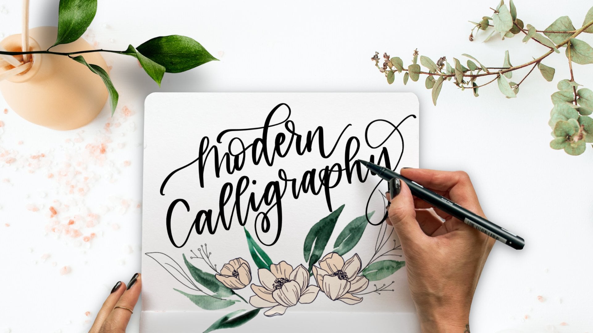
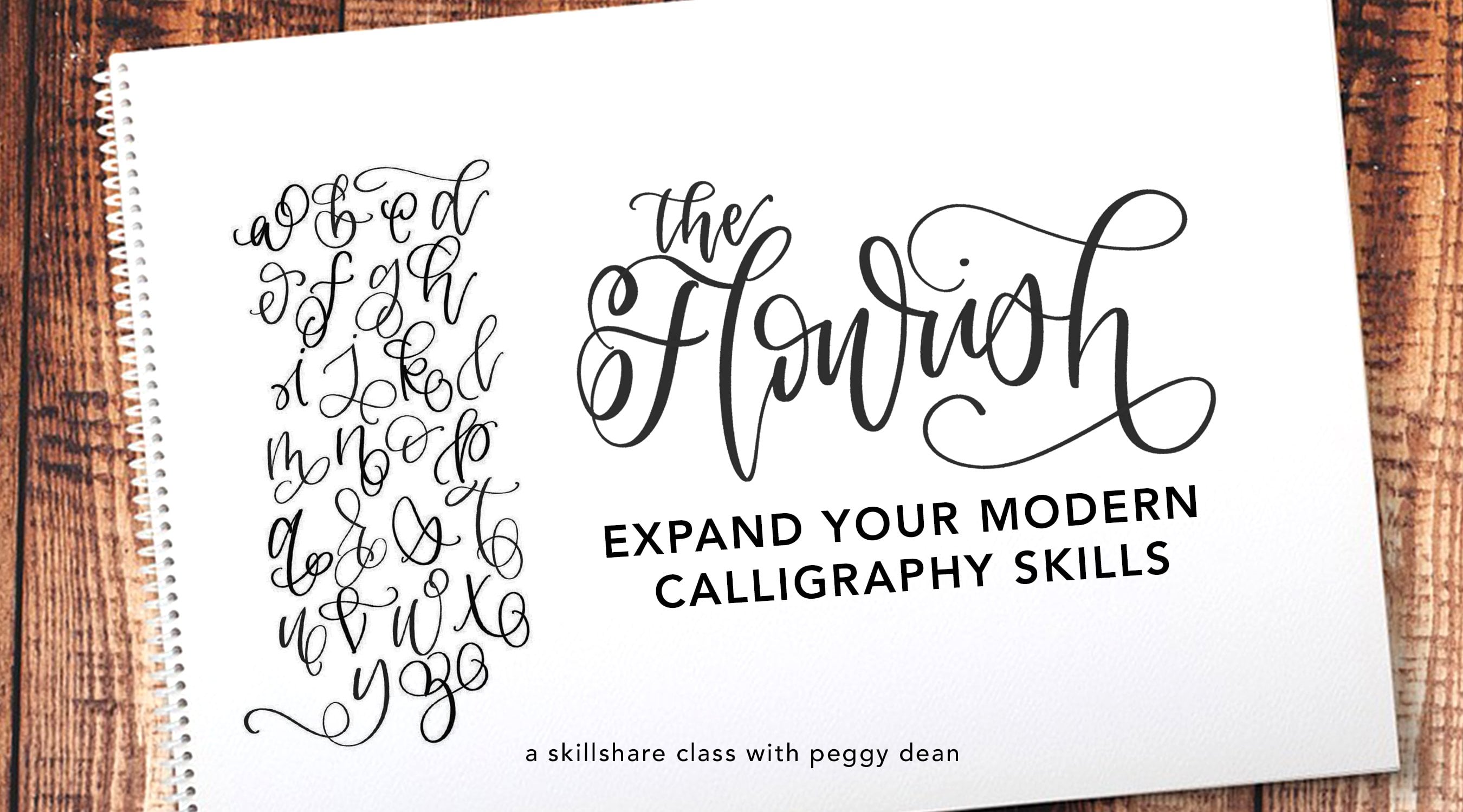
1. Introduction: Hi everyone. Today we're going to be diving into the art of breaking new rules. Bounce lettering is a fun way to spin what we know of calligraphy into a playful, even whimsical vibe. It produces gorgeous results, leaving the eye wanting more. I'm Peggy Dean. I am the author of the bestselling book, The Ultimate Brush Lettering Guide. I began my journey in lettering, and I'm so happy to bring you this class on the art of enhancing your lettering. This class covers the best materials for quality results, guidelines that are necessary to learn in order to properly break out of them, to create your bounce effect, different stylistic approaches, and advanced tricks that are actually much easier than you think. This class includes a downloadable guide with practice words and additional resources to assist you even further in your lettering. The guides can be printed or they can be imported into Procreate, for digital lettering. This class is for you if you've established a solid understanding of letter forms, and you know how to create a consistent alphabet that you feel comfortable with, and you're ready to take your skills to the next level. If you need some guidance with fundamentals, check out my other lettering classes, they are arranged in order of recommended watching. I can't wait to dive into bounce lettering with you guys. Let's get started.
2. Class Materials: The materials in this class are pretty straightforward, because I know a lot of you probably haven't used all the brush pens on the market, and I'm asked all the time what my favorites are, but this might overwhelm you. These are determined basically on the width of the actual brush tip, so it's going to determine the size. The pen flex brush, this is a super tiny stroke. The Fudenosuke by Tombow, this is a small stroke, this is one of my go-to, is along with the Pentel Fude Touch. These two brushes have a small tip. From there I usually skip right over into either the Karin marker, which is a larger tip or the Tombow dual brush pen, which has a fine bullet point on one side and then a large brush tip on the other side. I'm going to sample these for you. First I want to talk about paper just in case you don't want to see all the sampling and then you can skip over that part. But papers really times a lot important when it comes to your brush tips. A lot of times I hear my brush pens lose ink really fast or their tip just phrase, and nine times out of 10 that's because of the paper being used. It's not of the right quality and the thing about paper is that a lot of your standard inkjet printer paper is going to have all those tiny little fibers in it, and what's happening is as you run your brush tip along that paper, it's snagging every single time, and it's essentially just shredding the tip overtime. You want to use good quality paper, and the first one I'm going to tell you is a no-brainer, and what I would recommend across the board is the HP LaserJet paper. LaserJet paper is not created like inkjet and it is nice and smooth and cheap. Within that, I love the Rhodia paper pads, they have them in four different styles, you can get them in blank, grid, aligned, and then dotted. Dotted is great to practice your base shapes and whatnot. There are also basically any type of marker paper. If you can find something that's labeled marker paper, it will be in line with what you want to use with any of these brush pens. That said, I am using the HP LaserJet because it's easy, and then in addition, you guys have this as a free download in the project resources tab, and at the moment you can access that on a PC or a mac. It has to be a desktop or laptop. By the time you watch this, they may have changed that on skill share, but at the moment you do want to do that from a desktop. Free download, what this is going to do and we're going to talk about this in further lessons is, this going to show you your complete guide with all the different guidelines that you'll need to know what the rules are to break the rules. This is going to be really excellent to get started in practicing. Another thing is, while you can, of course, decrease the opacity before you print it, I have them this dark so that if you want to use them as a guideline underneath a blank sheet of paper, you can do that while still maintaining a guideline within your final piece is not on the actual guidelines. That's a handy sheet. We will be using mono tips in this class, and what I'm going to be using is an 05 size Monoline Studio Pen. These are archival, so you can use water media over them, and they won't bleed, etc, is just a nice fine tip. That's going to give you some control as you are learning your shapes and whatnots. Whenever you're learning a new technique with lettering, I don't recommend just jumping into the brush pen unless you're very comfortable with the brush pen. Just because you're using two techniques, and one says sometimes it's harder to learn a new one when you're trying to merge, remembering to press down on your down strokes, to lift up on your up strokes, but then also get these new shapes. Using a basic pen in the meantime will help you with that. All these pens, by the way, are referenced in the project resources, as well as the about section in this class. If you want to know any of these, you want quick links, I've got those for you. The next video I'm going to show you what these brush pens look like in their strokes.
3. Get to Know Your Brush Pens: As you probably gathered, alone from my rambling, all brush pens are not created equally. They are varied based off of their tip flexibility and their tip size. So I am going to show you what I am using. If you see a different color, it's because I can't find my black version of it right now, so bear with me on that. But this one is Le Pen Flex and it's got a very fine point but it is flexible so you can get really nice, thin strokes out of this guy. The next one we will go into is the Tombow Fudenosoke. This one comes in both hard and soft tip. They;re the same size tip. One of them is just more flexible than the other one. So this is the soft tip. It's black on the outside and the hard tip is a really dark blue like this one but looks exactly the same and it does have black ink. These guys actually now come in lots of different colors. So you can get a little bit of a larger stroke but it's still nice and small. Then we've got the Pentel Touch. This one I'm a huge fan of. Its basically the same size as the Tombow Fudenosoke. The reason why I like this one so much is because the ink flow is really generous. It's nice and juicy. It doesn't have any stops. I'm a pretty quick letterer for the most part, especially on my upstrokes, and I do that because flicking my wrist versus dragging my hand helps me reduce any shaking in my letters. That's just a trick that I learned as I went with my own muscle memory. The more and more you letter, you're going to find your own tricks that work for you. That's why I like these pens so much. A quick note, when you're finding the Pentel Touch Pens, they have different names. You can find them as Pentel Sign, Pentel Touch, Pentel Flexible Tip. The main characteristic that I have discovered to make sure that I'm getting the right one and not a bullet tip is it's very hard to see, but there's a very slight shimmer to the sides, to the actual packaging of the pen body, and that has helped me differentiate them because there was a time I bought a pack of bullet tips and they look exactly the same. That was a little frustrating, so just know that. The stroke is real similar but it's nice and juicy. One thing that I do notice though, is that as far as the blacks on these, the Tombow Fudenosoke versus the Pentel Touch, the Tombow has a blacker black and the Pentel has a almost faded black look. So for that particular reason, I like the Tombows better. So it's just personal preference and what works for you. As far as these pens go, I grab different ones for different reasons but you do find your favorites as you experiment with them. Now we're getting into more of a medium size brush tip. This is the Sakura Pigma brush. You're probably used to seeing these pens with this color as a Micron but this is a brush tip by them. It's very flexible, so you have to be careful with getting nice fine tips. So you can see it's a little more difficult to get the hairline stroke on this guy but if you think about it in ratio, you don't really need to because your stroke is so much larger. So the balance and the contrast is there. As long as you're upstrokes are thinner than your downstrokes, you're good. But you might want them nice hairline strokes and that's when you would want more of a stiff flexibility to the tip. As you can see, you can get much larger lettering out of this guy. That moves us into the Sakura Kois. This is also made by Sakura. I find that these brush tips are a little more reliable. They are Koi line, fatter tip, as you can see. Then we'll move onto Karin. I can't find my black. There's a lot of these pens you guys. They have a ton of colors and they're so juicy. I am a big fan of these. These are relatively new in my world in the last year and so I've been really impressed with them. They call it liquid ink technology. If I'm going to be honest, I don't really know what that means but I know that their ink is very vibrant and they have a real big thick tip too. But what I like about them is that even though their tips are really big, their hair lines are much easier to achieve because they're little bit stiffer, so that you don't lose control as much or as easily as you would with the Pigma, even the Koi. So if I was going with a larger tip, I would go with this guy. I'll tell you my favorites when I'm all done here. Just the ease of lettering with these ones is just night and day in-between the other ones, in my opinion. You're going to be different maybe. But in my opinion, I love this. Then we have our staple, the Tombow Dual Brush Pen. So one side, one of the biggest brush pens that I have used and on the other side is a little fine bullet point. The nice thing about that is that with their giant selection of colors, if you do want to accompany your lettering with the same color but have it be bullet point, you can have an exact match. So that's nice. It can get pretty large. Also a pretty easy one to letter with. The last one of course, right when I run out of room, is the Ecoline. This one has a nice thick tip on it also. My favorites in these categories, I'm going to do this so you can see better, my favorite favorites, I recommend 100 percent if you're going for super thin, these ones, while they are great, they are so thin. You have to know your brush pens relatively well to move into something like this to control it better. I would go with either the Pentel or the Tombow. So either of these are sure winners. It's really up to you. They're both fantastic. I wish I could give you an answer but I would say, try one brand, stick to it. When I started, I started with the Tombows and I used those forever and then finally, I moved over to Pentel and I like them both. Then for your medium, I would go with Karin and then for larger, I would go with again, the Tombow Dual Brush Pen. That is my take on brush pens. I hope that's helpful. Let's move into the fun part of this. Shall we?
4. Guidelines: Learn 'em to Break the Rules: This practice guide is what we are so used to seeing from our school days. When you break it down and you just look at the guide itself, which is right here, you have your line that solid on top, you have your dashed line in the middle, and you've got your solid line on the bottom. I'm just going to give you a quick recap in case it lost, left your mind remember you would come down and do your A cross here and then you would do your a right here. Remember penmanship. We're taking this idea and we're increasing the capabilities because we're getting into a calligraphy style versus your typical penmanship or cursive. We're adding lines to that. Basically, I'm going to go over these lines first. This dashed line right here is called your x-height. Your x-height is where the top of your lowercase letters meet. This goes for calligraphy, it goes for cursive, so it's this line. It's where the top touches. Your baseline as the bottom line here, and that is where all of your letters live. That is this line here, so all of your letters meet, they sit on that line, they don't usually move, and that goes for capitals and lowercase. Then you've got your cap height, which is right here. Now your cap height from school, this is where your capital letters touch at the top, but it's also in school, back in elementary school, it's also the line where the ascending line on the b, on the d, it's where those touch at the top. We're going to end up doing is adding two more lines. The lines that we're adding are the ascending line and the descending line. The ascending line is allowing us in our calligraphy to raise the top here of our ascending lines, and these could also be ascending stem loops. Because if it's a loop like this before it goes into a b, then that's an ascending stem loop. I also have a cheat sheet with all of this information, the project resources. So you guys, while you can take notes, of course, and it's just a quick reference so that this is easier to understand. It's going to allow this to raise above, so this right here, we're adding an ascending line. It can come up like this, and if that's connected to, let's say, a capital letter like this, and then it comes up, it just adds a little more character to our alphabet. The second line that we're adding is a descending line. You see that this is our baseline well, I'll go right here. This our baseline, it's essentially about where the next or the next line is here, which is the cap height of the next section, but it's essentially that low, and what that's doing is let's say you have a G, obviously that's not cursive G, but it's going to let your g come down a little further. Not the best example, but that's where the new worksheets come into play, so I'm going to move this over and bring this new on in. You'll see that there are two dark lines here, two dark lines here, but then this bigger area here. This area that has the largest gap represents the x-height and the baseline. This allows for the most room with our lowercase letters and then our cap height is just raised slightly above that. Now, these are going to bunch together, and the reason I did that was because I want you guys to experiment with how far you want to raise your ascenders or a dip below with your descenders, but they also provide guides. You could use either of these as your ascending lines and either of these as your descending lines. As an example of a word with both, you're ascending and descending, let's go with the word great. You can create the bowl of your letter in here and then come all the way down here, so that's an example of a descending line, and then your r hits your baseline, your e hits your baseline, your a hits your baseline but then your t can come all the way up here or just straight here. You have that freedom to figure out exactly how you want to use that guide. But for the most part, you just know that this is your main area to focus on and then you can create a cohesive alphabet as you go. But getting into bounce lettering, this is where we learn these rules so that we can break these rules. That's why these guidelines are unique because they're going to help you in figuring out how much you want to bounce and where. In the next segment we're going to go into exactly how to bounce your letters, what to look for, how to know that you're bouncing or bringing something lower or higher with intention instead of just guesswork.
5. Ascenders & Descenders: The first thing that we will cover before we jump into balancing our letters is to learn the terms of our letters themselves so that we know how to manipulate them to our benefit. I know that I mentioned all of the lines and the baseline cap height, x-height, ascender and descender. Now we need to talk about the examples of the ascending letters and the descending letters. What that means is when we're doing a b, I mentioned that that is an ascending line. Now, you can also have an ascending stem loop. That's what this looks like. I'm not going to get too technical here because I know some people's minds just don't think that way, but I also know that some people's minds do. This will be helpful for you for that. Another letter that has the ascending line is the d, right here. Then your f. It can either come up like this or it can look like that, h, your k, your l, and your t, these are just some examples of, and you can always cross hire, your ascenders. These are all. Anything in here, any line that raises above the x-height in a lowercase letter, these are ascending lines. Now our descenders are probably what you're thinking at this point. Anything that goes and reaches below the baseline. That is our g, our j, our p, our q, and our y. When we get into balance lettering, the concept is simple. Once you know these simple rules of the line heights and the letters, especially how these ascenders and descenders work. Now we will take these rules that we have briefly covered and then we are going to go ahead and break them and letter outside the lines a bit.
6. Bounce Your Letters: We're going to go through the alphabet now and we're going to talk about what the restraints are of your typical cohesive alphabet by following the rules, and then we're also going to talk about how we can break them. I will go through this letter by letter. The first letter that I will show you is the A. As we work through this, I have created an entire alphabet set that gives you two different ways that you can break the letter forms to make your practice a little more simple so that you can see a little bit of variety, but also exactly where to break these rules, which will be helpful, and I've linked to those below as well. Your A, you've got your bowl, you got your down-stroke, and then you've got your exit stroke here. How can we break this? Well, I'm going to tell you something that will blow your mind. This is something that as I was learning bounce lettering, I did not comprehend until one day I just experimented with it and figured it out, and I've seen it. I've seen it around, but I didn't realize what I was looking at, and that is, here's your tip. Vowels, create your vowels smaller for instant bounce lettering. I'm not kidding you. Even if all of your letters are on their baseline and doing what they're supposed to do, if you create smaller vowels, you've got bounced lettering, it's incredible. With that said, what I like to do is just raise the bottom of this lowercase level off the baseline, like so, and that's what makes it smaller. If I were to do this in the word happy, so let's say I just make it smaller, it just adds a little bit more interests. Might be a bad example because it's the only vowel here, but so just raise it above. That's it. You can also raise it above and break through the x-height, sure, but I really think that you guys should challenge yourselves just to create smaller vowels, just trust me on this. Let's move into B here. I've got my ascending stem loop. This is what my normal B would look like. Because I've got this nice ascending stem loop, I can raise it higher. What that would look like in a word, let's go with, I want a B that's in-between. When I practice my bounce, when I want to see what this letter is going to look like in a word, I want to pick a word where it sits somewhere inside of it, not where it starts with that letter. For me, it just helps visually, so let's just go with carbon. This is an example of where I can make my A smaller, my B raises up higher. That's an example here. Let me actually show you the C when the I is smaller. Boom, look at that. Telling you it's the best trick, you can see that the base is the same on both the vowels. Anyway, we'll get to it. Then my C, typically your C doesn't bounce a whole lot, but here's where your normal C, you can bring that lower and then arch it upward to make more of a shape that is flowing and setup so structured. Then your D, here's my normal D. I'm hitting my guidelines like I should, but then I can also raise this a lot higher. Another trick that you can do with the ascending stem loops is don't think that they have to be so uniform, you can come way out and do something fun like this. For example, let's go with the word bridge, and bring that up higher. Regular arm, my letter here, so here is my D. I just made that and then I'll do my G like that too. I just made it so much more interesting because it stretches, it gets more playful, a little less structured. My E, remember my normal E, but I'm going to raise that up higher like this. Just above the baseline and then going into my F, I would normally come up to the normal ascending line, and then bring this down, but I can raise that quite higher, or with this F, I can bring that much lower than what its base would normally be at. Then G, I've got that nice structure here, but I can do the same thing here where it comes out like so, and it's a lot larger. Something to keep in mind as you're doing lettering with bounces while it doesn't have to, I want to point this out and I did this within tanks, because I wanted you to see what it would look like. Notice how the width and the height in-between the shape of this ascending stem loop and the G. For the most part, they're the same, but this B is a lot skinnier for cohesive purposes as we're doing bounce lettering. If I'm going to do G this large, I'm going to want my other ascending stem loops to match that vibe. I'm going to want my D to be also pretty large and that's just part of that cohesivity. I really don't think it's a word, but I use it all the time. Anyway, so that's what I would do there. Since I came into my guide here, I'm just going to scoot over and do my H here. It's the same thing, I'm going to really raise it a lot higher, or I'm going to raise it, go out a little bit, and this is great if you do a lot of angles instead of straight up and down. Same thing, I'm going to just raise it higher off the baseline. Then my J, normal J, but I can bring that out more like so. Then with my K, my normal K is going to look something like this. I can bring that up higher and that creates a lot more interest. My L, I can bring that up much higher. The other thing about the L is that while that can be higher, it can also drop below the baseline. If you're doing, I meant to put my L right here. Anyway, you get the idea. Let's say I'm writing hello, I know it's not writing, I know it's lettering, but I hate saying lettering is a verb. If I'm doing hello, I've got my E that raises above the baseline. I've got my H, the ascending stem-loop is higher, but I can do my ascending stem loop that's higher and then I can do it just a little lower to create that balance. My L's are not perfectly matching. That is my balance, but I'm still within the constraints, but I am just lifting above and then dipping below. But notice that my baseline is still being met. The more you can return to your baseline as you break the rules, the more it's going to look like it makes sense instead of doing something where you have your edge and then your in L and L are off somewhere and then your O somehow dips lower, and it just doesn't have a rhyme or reason. This is going to give you a rhyme and a reason. My L's, pretend they're here, but I'm going to go into my ends. Ends are fine because you're used to doing your ends like so. I hate this. This is so boring. But let's go. What we can do here is do our normal overturn, which is this right here. It's basically an upside down U. Then, just with the next stroke, just bring it down, bring it all the way up to the x-height, and then you're on the baseline the entire time. But it's just that the second overturn doesn't reach the x-height. Another way to do this though, to make it more interesting, is you can do your overturn that meets the x-height. The next one won't, but also bring that down below, what this would look like more, whoops, that's too high. But this could look like more extremely, would be like this. You can see that I've got my x-height is being mapped for the most part, but then I'm dipping below, and then I'm dipping below the baseline on my downstroke. It just brings more character there. If you're having repeating ends, edges go with the same thing. I think that it looks nice together. That's up to you how you want to do that. But that's just a good rule to keep to. Then my N would normally be like this. I just bring my downstroke below the baseline. My O, normally like this, I'm going to bring that and make it smaller. I can also do it like this. When you make your Os a lot smaller, I actually have a lot of fun seeing what that looks like. Let's do a real extreme example where my O is really a small. My E is raised above the baseline, my V and my L are bouncing. It just creates a totally different vibe than if I were to do my typical rows. See what I mean. Then, onto my P, like so, but I can bring this a lot lower than the baseline to balance it. Then I've got my Q. I can bring this out more and drop it much lower. My R. There's so many different ways to do Rs. This one's really fun. This would be like your typical R, but I can come up with a huge loop that raises much higher than it should, but then still meet on the baseline. I can also come in and do a regular R. None of you've seen this kind where it comes up, so your downstroke will come up and you do a dip. If you raise that a little bit higher and then come lower, then the x-height, it just creates some interests. It's really simple, but in a word, it totally changes things up. If I go back to that word, great. It just makes it a little more playful. Then I've got S, another letter that can be done so many different ways, but let's just go with your typical cursive S. I can come up and do something like this. Where this stroke is totally not the one that you would think would come above the x-height, but that's what makes it interesting. You can also create an S that dips below and reaches your normal descending line. You can also raise that above, but that starts looking more capital. I would stick with one of these two. Then your T, this is just like the L. If I do my normal T, It's going to look like this. But I can bring that way higher. Then I can also, let's say if they are repeating one after another, I can also come down lower. Let's say I have a word like mitten. I can do my bounce and then my I, and then I can do one T that's higher and one T that's lower and then my smaller N or my smaller E and then enter my N that also bounces. Then put the two T's together with a crossbar. You can see, here's my baseline. I've got my N, one of my Ts and my N meeting it. I'm still there, I've got that consistency. My I and my E are floating, and then my T and my N meet at this lower descender. Then I've got this fun floating T that raises higher, but everything still meets somewhere and that's what makes this consistent. This is just a rule that's going to take practice. You doesn't just happen. But that's why I want to walk you through all of this, and then your U, typical U, I love to bounce my Us on there second downstroke like this. You can also do the same thing when you make them smaller since it's a vowel like this. There are exit stroke is. Let's say the word is button. Bounce it there. Have my two Ts like so. These really are fine, You can do a sharp V, like a balance where you have it come down and then raise a lot higher on the exit stroke before you connect to next letter. You can also do a soft V that dips below to the descender line instead of sitting on the baseline. Like so. W, similar to the M. This would be your normal W, but you can start small and then get larger. You can sit on the baseline and then dip below in-between, in a more of a descender. It's where you just shift the size or the length of the undertone. Your X, you can have it dipped below to the descender before you cross. You can have irregular across but then have, or irregular downstroke and then your upstroke could be from the descender to the ascender. Your Y, pretty straightforward, just like the J or the G. One thing I do like to do though with my Y is start it below the x-height so that it has this nice reach. See how these two shapes are similar, but starting a little bit lower and then rising the upstroke a little higher. You can do this more extremely like that. It just adds some interest. Then your Z, couple of different ways to do this one. Typical Z, you can bring this way below. You can bring it out more, but then you have this Z. A fun way if you'd like to do your Zs like this. To break that up is rather than start at the x-height , come below, and then meet at the x-height and then follow through. You can also do this dipping below, actually, I wouldn't do it like that, I would do it more up like this. Don't pay attention to that. But if you dip below to the descender and then meet again at the baseline, that gives you that fun balance. That will help you as you start to bounce your letters. Again, I've got a full entire practice pack that you guys can grab on my websites, I also have a free download with this class with words that you can practice, I've linked all of that below. In the next segment, I want to talk about connecting bounce lettering.
7. Bounce Your Words: This isn't going to cover connecting our letters like you would with our basic lettering that is gone over in my previous classes. I do recommend looking into those before you start building words with me here, since I won't be covering that exactly. But I want to keep the rule of them about spacing and how spacing can really influence our overall vibe. Let's say you want to do something more whimsical with your bounce lettering. Let's say you're invited to the wedding of I want to write wedding. I'm going to bouncy it and I explaining this just yet. See how it's stretched more versus being. I mean, even though it's bouncing, It's just a different feel to have stretched more and that just has to do with our spacing. What we do want to make sure though, is that our spacing is consistent. This one is not, but It'll give you the idea. Spacing is just in between, like it's just your access stroke. So my other classes cover that, but I wanted to refresher. So that's something to keep in mind as we're connecting words. But I just want to go over some common words that we use in lettering, especially with quotes and whatnot. Let's say the word love. I can drop l below here, go into my smaller o, into my larger drop-down v and then my smaller e. When we're composing our words and figuring out our spacing, it will be beneficial to us to think about the letter that's coming after, before we letter the letter, we're on. So let's do something that's longer, like adventure. So with adventure, I want to start my a small, I liked to do my, very small. I start with that and then I'm going to do my d and then what comes next is a v. I like to dip my v is pretty low, so that's going to determine how large I want my d to be signed might just do something pretty simple that doesn't really dip super far below, then I can draw my v pretty large. I know that my small e is coming next. I've got my n, the next letter is t. Those don't really conflict, but because I'm going to drop my t, this is where I'm like, okay, do I want to do my down-stroke significant or do I want to let my t do that? They both can, it's just up to whatever I think I know that the u coming after that, which is also something I can do with the down-stroke. So let's say I just want to keep my n where its that here and then let my t and u do that fun down-stroke situation. My r may come up much higher and return here. So see now I have this bounce word that this d should be sitting on the baseline. But it's consistent, it's dropping below, it's raising above. It's got a good amount of variety in it. If I had done this just with the basic rule of how you can drop the down-stroke, it's going to look a little bit different. Also works just fine. This one just has a little more movement to it. So let's do another longer word. Let's go with wildflower. So wildflower, I am going to do my w, I'm going to drop it below. I know my i is going to be small. Then I have an l d. So l I can raise above and then my d I can drop or I can drop my l and then raise my d above. Then I've got f. I think that because I know that my f can dip, so these three letters can either raise above or go below. Let's just bury them. So my l will reach, my d, will drop below, my f will drop below and then my l that's next will reach again. Small o, do the same w, small e and then my r will raise and drop. Now, if you're ready, you can jump into doing a brush pen and see what that looks like with a brush. See how you have that bounce lettering in there. This is going to look less like it's on a guideline when it's not on an actual guideline. So now we can come in with our blank sheet of paper, place it over our guide and try it through the paper. So let's just do the word "Garden". So I see my guidelines and I've got my bounce. So practice doing this with different words, use your guidelines and then in the next segment we are going to talk about your project for your bounce lettering.
8. Class Project: It's time to create some beautiful lettering based off of your new skills. This class project is simple. You just want to create your name or a friend's name or a family member's name. All of the above would be ideal. Remember that as you execute a bounce technique in your letters,
 Peggy Dean, Top Teacher | The Pigeon Letters