Transcripts
1. Hello and Welcome!: Hi and welcome to a beginner's guide to
wedding invitation design. This class is going to be your all encompassing class on how to create
wedding invitations. We are starting
very brass tacks, so we are going to
cover all the basics. In this class. I will show you how to
create a wedding invitation from the very start of
your client inquiring or your potential client
inquiring with you all the way through to printing the
wedding invitations. I want to congratulate you for choosing to invest in yourself. I think a lot of times we don't realize how valuable it is
to take a class like this. But if you're somebody
who has been wanting to get into wedding
invitation design, or maybe you're brand new to it, but you're really struggling. This is the class for you. I will walk you
through everything. We're going to start with
the inquiry process. Then we're going to talk
about deposits and contracts, questions to ask your clients
and the discovery phase. Then we're going to cover
doing the mood board, choosing colors, as well as providing a
sketch for your client. And we're going to go
into the design phase, and we're going all the
way through the designs. For the design phase. I'm going to show you
how to do everything. So don't worry. Then we're gonna go
talk about revisions. And then we're even
going to go to printing. And I'm going to show you how
to print envelopes as well. If that's something
you're interested in, I share with you my recommended printing
vendors as well as some other awesome resources. And then lastly, I am doing
a rapid-fire Q&A at the end. Questions that I get
asked on social media, as well as questions
that I get asked on Skillshare regarding
wedding invitation design, I do want to mention a
couple of things that we will not be covering
in this course. Because I want this course to be really accessible and
beginner friendly. We're not going to
be talking about stuff such as wax seals, envelope liners, like vellum, Rob's gatefold,
trifled invitations, letterpress, or
gold foil printing. We are going to be focusing on digital colored flat
printing personally, since I'm a wedding stationary and I do a lot of
watercolor artwork. This is my printing method for almost every invitation
that I create. But I wanted to keep
this really simple. I, I really firmly believe that if you
have a good foundation, that is the best place
to grow your business. So I wanna give you the
fundamentals here in this beginner course for
wedding invitation design. And I know your time is valuable and I
totally respect that. That's why I had spent
so much time making this class and pouring my
heart and soul into it. And remembering all
the things I've learned over my five years of wedding invitation
design and I want to share that with you
guys in this class. All right, you guys,
let's get started.
2. Class Project & Resources: For this class, we're going
to be doing a class project. In your class project
is to follow along with me and design an
invitation suite. Please post your projects. I'd love to see what you
guys create and it's really encouraging
for other people who maybe wanted to take this
class to see that you are able to create an invitation
during this class. All the resources for this project are located
in your resources folder. It's typically on
the right-hand side. You do need to be on a desktop computer to
be able to see it. Skillshare doesn't allow
you to be able to see the resources section if you're on something
like a tablet. So just keep that in mind. We have a couple of things. We have one larger document that has everything I talk
about in this class. So any links, any vendors
that I recommend, all of that is going to be
located in that PDF document. And then I also shared with you some watercolor
artwork that I created that we're gonna be using on the
invitations as well.
3. Software Needed: For this class, you are
going to be needing a very specific software tool, and that is Adobe Illustrator. If you have the whole
Adobe Creative Suite, that's even better. But one thing that
is required for this class is Adobe Illustrator, because we are going to
be designing in that. Now I will tell you, I had Adobe Illustrator for over five years
and I love it, it, I have to have
it for my business. So if you are someone
who's thinking about starting to offer wedding
invitation design or if you already are, I highly recommend
Adobe Illustrator guys, the only design program
that we will be using. I do not design, might invitations and Photoshop. I use Photoshop for
something else. But for this class we only
need Adobe Illustrator. Also, optional, you
Adobe InDesign. I'm going to show you how to do a mail merge with your
guests envelopes there. So if that's something
that interests you, you might want to
have InDesign to. But for this class, the one thing that you will absolutely need is
Adobe Illustrator.
4. Inquiry Process: The first thing I
want to talk about is when you have a client come in. So we're just assuming that the client is
on your website. I do want to mention if you
guys don't use Pinterest, I highly recommend
using Pinterest. I used it when I first started and I got a lot of
inquiries from Pinterest, so it's just one avenue, but Pinterests social media, I'm probably the best connection I have is wedding planners, especially high-end
wedding planners. They really bring
me amazing clients. So we're gonna come over here. Let's just assume we are the potential client on my website and they go
to my wedding section. And then I have a
template shop too, but we're focusing
on custom here. And they're going
to enquire with me. When they go to my inquire form, I want to make it really clear what the budget is that
they need to have. I this might sound harsh, but I don't want
to waste my time with people who don't
have the budget. And you get two. Our budget you want my has incrementally gone
up over the years. I started out at $1,800
for my invitation sweets, and now they start at $7,000. The reason they start at
$7,000 is because I typically do a ton of watercolor artwork and my
suites are really involved. E.g. I'm working on
one right now and it's a gatefold and it
has an envelope liner. We have a fully custom map. Everything has
been hand painted. It's a really big custom
exciting process, but it costs more money. So I just recently raise my
prices to start at $7,000. I like to put that right
up front because I do not like to tip toe around
what the price will be. And to be honest, it weeds out a lot of
people that don't have that budget and it
saves me a lot of time. So I like to put it up there. You don't have to if
you don't want to, but I'm just going to show you my intake form really quick. This is for anybody
inquiring with me and I highly recommend doing
something like this. Obviously, we want their
first and last name, their email address. I like to know where
they heard about me. You don't have to do that
if you don't want to. I also like to hear about
their proposal story just because I do really care about my clients and I like
to get to know them. I mean, everybody loves
to talk about themselves, especially if you are married. I know when I first got married, I was so excited about the whole wedding planning
process and I wanted to tell everybody how I got
engaged and all that stuff. So that's why I have
that question here, but it's optional
so they don't need to respond if they
don't want to. Of course, we need
their wedding day, how many guests
They're expecting? So these two questions, how many guests are
you expecting versus how many invitations will
you need to send out? Typically, people
get these confused. If you're inviting 150, guess, most likely they're
only going to need about 75 invitations because usually it's
like one per households, but I like to put
that just because people get a little bit confused and it will affect the price. I like them to tell me
about their wedding style, what they want for
their invitations. Some people have a
very specific vision. Other people do not. To be completely candid. I find that the people that
just know generally what they want are a little bit easier
to work with when somebody has a specific vision about
exactly what they want, just no more than likely you're
going to be art directed. So make sure that
you're okay with that. Before you take on
a client like this, I have worked with both
ends of the spectrum. I'm currently working
with a client that they wanted
to work with me. They loved my artwork, but they were very specific
about what they wanted. And when I received the
first round of revisions. So they're sweet, it was
six pages of revisions. Just be mindful of that. And it actually was a really good learning
experience for me because it taught me We're actually a Tommie,
something I already knew, but apparently I didn't learn
the lesson that you will, when somebody does have
a very specific vision, they are going to be art directing you and you need
to be okay with that. Now they're paying
a high price and I'm okay with that
and I accepted it. We also after those six
pages of revisions, the invitation suite was perfect and we're
ready to go to print. So it's not always a bad thing, but I just want to mention
that because I think sometimes we can
get a stationers, we get a little bit
disheartened when we see that. We have that many revisions. Okay? Another thing that I really
love when people don't. Do is they don't send me wedding invitations
from other stationers. I encourage them not to do that. And you, if you're asking
for their Pinterest board, sometimes you are gonna get pictures of other
wedding invitations. But for the most part, I just want to know
what are the colors, what are the pictures that are make you what's
the feel of your wedding? Those are the kinds of
things I want to know, not the exact
wedding invitation. And we'll talk about
that later about copying invitations, which is wrong. We'd never want to copy
anybody else's designs. But what to do if your client does send you
wedding invitations? Try to understand what
they're looking for, but we'll talk about
that in a later lesson. But for right now, I love it when they
just send me pictures. Maybe they're florals, the
dress, that kind of stuff, the environment,
the wedding venue, all those things helped me to dream up the perfect
sweet for them. Then I always have this. What is your budget for
custom invitations, sweets? I have it at the top where my
invitation suite start at. But I really recommend
that you guys have something like this because it's going to save
you a lot of time if you have people coming to you with a 500-dollar budget and your invitation
start at 3,000. You don't want to go down
that big rabbit hole of quoting them because it takes time to get a quote and to get printing quotes
and all that stuff. This just saves you time. So I highly recommend
having some tears on here wherever you guys want to start your custom wedding invitations. I will say I am in California and it's more
expensive to live in California. But I see a lot of stationers doing custom
invitations suites for really, really inexpensive. And at the end of the
day, you're losing money. And you need to know like
how much you value yourself. And you know, charging $500 for custom
wedding invitations, more than likely,
you're not going to be making hardly any money on that. So really assess how much. Personally. I know most stationers
around here and I know they start custom
invitations at $3,000. It's a lot of work. And when I first started, I didn't realize
that that's why I started at 1800s dollars. And then after I
realized how much time I was spending on
these invitations, I up my prices. So that's my little
$0.02 about that. The other questions I have is, what pieces do you
need for your sweet? This helps me quote
them a price. Basically, you guys, this question here is to
save me time in the end. So I'm not going
back-and-forth at time with a potential client. And I can just
send them a quote. Just have what kind
of options they want. Sometimes people will
check all of these and their budget is low. And I just say, you know what? You want, all these things, but they don't necessarily
fit in the budget. So here, here is what you can have and then this is
what will cost extra. And of course, you
want to know what kind of printing they're
interested in. Sometimes the potential client
needs education in these, they don't know what
letterpress printing is or foil printing. Flat printing is mostly what I do because I do a lot
of watercolor art. So I do digital printing. But things like
foil printing and letterpress cost a lot more if you're not
familiar with those, they have to create a plate that is pressed into
the paper with ink to be able to create
that style of printing. So it's a lot more expensive. Then of course it's anything else they're looking for here. And then they
submitted this form. I use a company or software
platform called Dub sotto. I loved up sotto. It's how I manage
all my clients. I I could not recommend
it enough for you guys. I have 20% off of your first year if you're
interested in that, it's available in the resources
section for this class. But this helps me
keep everything straight before I
have to have sotto. It, I'll be honest,
it was a hot mess. I was using Google spreadsheets to keep track of everything. Does autos great because I
can have forums like this that live on my website and
they connect to the sada. So when somebody fills this out, it's automatically going
to go into Deb sotto. And if they do become a client, I can just push them into the client section
or client folder. It also helps me send
all my design mock-ups, my invoicing, my contracts. It's amazing if you have
any questions about it, feel free to reach out. I'm gonna go, I'll talk
to you a little bit more about this because
we're going to use it throughout
the whole process. The Imitation sweet. But this is just how
we start off, right? Okay, so we have our potential
clients fill this out. We're going to assume that they, they're ready to go. And in the next lesson, I am going to talk to you about
gathering information for the client from the client to be able to start designing
their invitation suite.
5. Deposits & Contracts: Something I wanted
to talk about really quick is protecting yourself. I don't wanna get
too dramatic here, but let's say you gave the proposal on invitation suite to your potential client. They said, yes, we
want to go with you. Now. A couple of things that
I want to mention. The first thing is I never start any design work until
I have a 50% deposit. The reason I do this is because
unfortunately there are people who will take
advantage of you and you need to protect
yourself and your business. The first thing that
comes to mind when I think about this is
sometimes people say, well, I don't know
if I can hire you or not because I haven't seen
what you're going to create. I'm not going to
get into that here. I'm going to do a
speed kind of like a Q&A at the end of this class. And I'm going to answer some of the questions that I get on social media about
wedding invitations. And that is one of them. But for the most part, I just want to say don't worry about that people coming to you should be able to look at your website and your portfolio, your social media, and get a general idea of the work that you do and want to hire you. You 100% deserved to have a deposit down before
you start work. Think about it. Any other circumstance
like if somebody comes to your house to let's say they're going to
renovate your house. Would you say, Well, I'm going to pay you when you're done renovating my house. No way. They're going to take a
deposit because they're going to be working and everybody deserves to
be paid for their work. So take a deposit, I do a 50% deposit. You can do whatever you'd like, but please just make sure you
are getting some money in. I also make that
deposit non-refundable. The reason I do that is the
people who hired me are taking up a time in my schedule. Even if they cancel their
order down the road, they have still stopped me from from bringing
on another client, and therefore, they're
going to pay for that timeframe that
they reserved me for. We have a deposit and then
something else I want to mention is a contract. So the contract and the
deposit go hand in hand. These both go out before
I start any work. Now, granted,
sometimes I do have a phone call with a
couple beforehand. That's just part
of your business. I'm pitching to
them essentially. Now, if they want to have two or three or four phone
calls before they hire me, know, That's not gonna happen. I will do one phone call so they can get to know me, I
can get to know them. But for the most part, large phone calls come
after they have made a deposit and sign the contract. So we have our deposit. And now what I want to
recommend is your contract. Now I'm on the best
birthday bash website. They are a couple of
stationers who started to offer contracts
and helpful things for other wedding stationers. And they have a custom
stationery contract template, super, super important. They also have a
mailing agreement. If you choose to mail stuff
out for your clients, 100% get this mailing agreement. It will save you a
lot of headache. I'll get into this later, but I don't mail out invitations. I just mailed them
to the couple. But the stationery contract, I know you might
see $300 and think, Oh my gosh, that's
a lot of money, but this will save you so
much heartache and the end. My contract I have put together over years
of learning lessons. And to be quite frank, I wish I would've known about this stationary contract and just bought this
a long time ago, but I didn't wasn't available. So there's this option. There are other stationers who do offer contracts as well, so you can look around for that, but I know for sure, but his birthday bash, a lot of people have bought
this one and really enjoy it. You want it to be custom
stationary because they're going to understand things that other people aren't. If you are looking for
a cheaper version. Braden Drake, and I'll have all this information
available for you guys in the
downloadable PDFs. So don't worry about you can
write it down right now, but you don't have to
worry about it too much. Braden is great. His key phrases, you're
gay, best friend. He's amazing. He has
the contract club and it's $30 if it isn't
specific to stationers. But there are things
in there that are super helpful for anybody, especially the wedding industry, because he does
deal with a lot of people in the wedding industry. If you'd like to cut and
paste your own contract, you might want to go this route. However, if you really want
to protect yourself and have a stationary that's
specific to stationers. I highly recommend his
birthday bash one. A couple of things I want
to mention that I have in my contract that are that
have been lifesavers for me. The first one we
already talked about is a 50% non-refundable deposit. That just protects me
to make sure I'm making money and I'm not losing
money essentially. The other one that is so
important for me is if they the non-refundable deposit, if they cancel for any reason, I still get to keep that. That's also important. But revisions, you need to have a contract that tells them how many
revisions they have. For me I offer to revisions
within the original price. Anything over that
is $75 an hour. You really need to
protect yourself here because it can get
out of control. I know some stationers that
will do unlimited revisions. I think you really
need to think about your own business and
what makes sense for you. As a watercolor artist who does a lot of my amp calligrapher, who does a lot of handmade stuff inside of my invitations. I don't want to give
somebody unlimited revisions because I'm going
to end up painting like 500 h. And it just doesn't make
sense for my business. I have the two revision rounds. I really only had a couple
of people go over that. I will say that
you need to be as specific as possible
in your contract. And when it comes to
revisions, be specific. E.g. mine says revisions include small tweaks
to the design. Changes, to artwork that
can be done in Photoshop, like easily done in Photoshop. Changes of fonts, font
color, moving things around. What it does not revision does not include a total redesign. Anything that was hand
painted or hand calligraphy. Hand calligraphy. Those items. I'm charging them more if they want things
to be repainted. The reason is because they get a sketch beforehand
that lays it all out. So they have an opportunity to change it in the
sketching phase. But once we get to the design
and the painting phase, they're going to be
charged more if they want new elements that weren't
previously discussed. Alright, Those are just
the important things that I wanted to mention. Heavier deposit before you start any work and have
them sign a contract. This is going to
protect you in the end. And I just wanted to make
sure to mention this.
6. Gathering Information: Now that we have our clients deposit in and we have had
them sign the contract. It's now time to get
into the fun part. Not that other stuff wasn't fun, but this is a time where you get to start getting creative. So we're going to talk about
gathering information. More than likely you've already seen their
Pinterest board. But if you haven't, I recommend asking if they
have a Pinterest board. If you are also working
with their wedding planner, asked the wedding
planner if they have a design deck that
they've put together, Many times they do, and that's a great reference. E.g. I'm working on
a sweet rate now. They're getting married and
Napa Valley in California. And they are having multiple
events and their planner has a 27 page design book. It shows me everything from what their plates
are going to look like and their napkins and the furniture that's
gonna be out up there. The welcome dinner, and also the landscape and different
photos of the venue. I really enjoy working with
this planner because she did not send me
pictures of stationary, which I really appreciate
because it allows me to not feel boxed in and we'll talk a little bit about
that in a second. But any design elements
you want to gather, those you want to know what
their color palette is. And then you want to ask
questions to your couple. One thing that you
can do is personally, this is the way I like to do it. I get on the phone
with my clients either a Zoom call or just on
like the regular telephone. And I just want to ask
them a lot of questions about their vision for
their invitation suite. I asked them questions
about themselves. So how did you guys meet? What do you do for jobs? Sometimes people's careers
are really important to them. I know personally, I absolutely
love what I do for work. And it's it's part of who I am. Not. Everybody feels like that, but I do feel like that. So I wanna be sure to ask are
couples that I also want to ask if they have any hobbies that they share or any
interests that they share. It's really important to know these things
about your clients. And it might seem just, Oh, why do you need to
know that you're just designing their invitation, but when you're doing
a custom invitation, you really want
their story to shine through and just
gathering information. You never know what tiny bit
of something you'll pick up. E.g. my couple,
Anthony and Dina. They were so cute. They met at a dog park. And it was really
important that we incorporated their
dogs into their sweet. And I needed to know that information
because it really just made their suite
come together so well and their dogs are
actually out there wedding, which is just
absolutely adorable. And it helped me design their crest because
she was a nurse, so we did the stethoscope and he really enjoyed
beach cruising. Will they enjoyed beach cruising together and playing
tennis together, and we incorporated
that into their crest. So it's important
to ask questions. Other questions are important
to ask are things such as, what do you not like? Sometimes people
hate polka dots or stripes or the color neon green. Asking them what
their dislikes are, are important and the more
specific you can get, the better if you just say, what do you, what
do you not like? I mean, they they
could think of, well, I don't like this style car, but what does that matter
for my invitation? Be specific. Are there design elements that you don't like
and all say e.g. stripes or polka dots
or paisley design. Although I don't think I
would ever use that design. Things like that also. Or is there a color or
colors that you do not like? Are there colors that
you do really like? Are there design
elements that you want? Incorporate it into your suite? All these questions
are important and I really highly
recommend it. Pretend like you are in
your researcher and you're just trying to gather
as much information as possible about your couple. You can do this through
a questionnaire, something I told you
guys I use double sotto, you could send it
through dubs Soto. But I really recommend if you can meet with your clients
either on the phone, if you can meet them in person. I think that's great too. I had a couple we met for
tacos and Margarita is and that was really fun and it was a great way to really
connect with them, whatever makes sense for you. But I will say you do
want to be smart with your time if your client wants to meet up like every week? No. That is just taking up way
too much of your time. This is our information
gathering phase. So a phone call or a
questionnaire gather all that information and
then once you have it, you are ready to start
the sketching phase.
7. Gathering Inspiration: Real quick, I want us to talk
about getting inspiration. Now. I did mention earlier that
I was going to talk about how it's not okay to copy
other stationers work. And during the
inspiration phase, it's really important
that you stay away from copying
anybody else's designs. And I know in the
beginning of your career, it's tempting to see a really beautiful
invitation suite and think, Oh, I want to do that,
I'm going to make that. But first of all, it's, you're never going to discover your style if you're copying
somebody else's style. And then secondly,
it's actually illegal because it's intellectual
property and it's copyrighted. So make sure that you're not copying another
stationers designs. When you get started, I know it can be really overwhelming and I
don't want to say, don't ever look at invitations because there are some things that you can glean from that. E.g. I've just typed in wedding
invitations to Pinterest. And actually these, this is my sweet and
that's my sweet too. What you can do when
you first start if you just feel really lost, I recommend looking at small
things that you like, e.g. maybe this invitation
caught your eye. You're not going to copy it, but maybe you really
like how they used a italic font and a serif font. Or you like how the this language right
here is a lot smaller and the
names are larger. Small things like that. Or e.g. having this oval shape on
the sweet looks really cool. Of course, you're
not going to make this exact same invitation or something that looks similar. But noticing small things like that can help you when
you start designing. I just want to make it
clear that it's not bad to look at other wedding
invitations lot at all. You just want to make sure
that you're not copying it and you're bringing
in your own style. And that's just going
to come with practice. Something that I really
struggled with in the beginning was getting the layout of the
suite, correct? I was really
struggling with that, especially because I do my
own calligraphy as well. And that took me some
time to figure out. But when I first
started, of course, I saw other invitations
and I looked at them and I didn't
try to copy them, but I did think, okay, I really liked the way
that they use that font, or I liked the way that they incorporated the artwork here. Okay, so we got that
out of the way. I just want to make it clear. It's not okay to copy
another stationers designs, but it is okay to look and see. Oh, I really liked this
element or I like how they left aligned that art, that tax. One other thing. I will talk about
this more in depth in the Q&A section at the
end of this class. But one thing I want to mention, if your client sends you
wedding invitations, that they really love. The question that I
like to ask them, what do you love about this? If they say that they want it
to look exactly like that, I actually don't work with them. I tell them to go
to that artist. Otherwise, if they're open to my design and answering the questions what
they like about it. So sometimes people just
really like the loose style of painting or they really
like a font that was used. It's not copying if
you use the same font. Now if you use all
the same fonts, that maybe it would be
a little bit copying, but maybe it's the font that they like because it's
kinda 70 style or whatever. So you can definitely
get inspiration from, from it, but don't
copy it. Inspiration. What I like to do sometimes
is if it's a coastal letting, I'll do like BCCI patterns. Sometimes you can
get inspiration from the weirdest things, e.g. this would be something that
might give me inspiration. I don't want to click on
it because if you see right over here, it has that. It looks almost like a
walkway with the wood. I like the texture in
that Would I might bring that into the suite in
some way or overhear. I really like these
yellow curtains, how they're kind of
Blache, yellow curtains. That might be a cool
element to bring in. Obviously, this is all art work, so you want to be very careful about getting
inspiration from them. But e.g. something like
this piece right here, the wavy texture to it. You could create something
that has a wavy texture. I think because
I've said patterns, it's bringing up all art work. What I'm gonna do is say,
Southern California beaches. And sometimes it's
really trial and error here until you
get what you want. But this is great. I can see a lot of things. These beautiful palm trees, even a beach cruiser could
be cool to bring in to it. I think this is
called a C lavender. That purple flower
is really beautiful. I just encourage you to search around for inspiration
in different areas. But our invitation suite
today that we're creating, that you guys are going to
create with me is very simple. We are just using florals. We're not doing a
huge by deep dive into inspiration because We're just doing something simple. Because I want to give
you guys something that's accessible to everybody. But now I do want you to
have the tools when you do, do an invitation suite
or it's a lot more involved that you have
the tools to do that. And also your style might be
loose watercolor florals. There are plenty of
stationers who make great money and have a
very thriving business, just creating invitations with
loose watercolor florals. It all feel like you have to
go get crazy with things, but I do want you
to have the tools. I want to show you a couple
of sweets that I did really quick just to let you know where I got the
inspiration from, I wanted to show you
a few examples of some sweets that I've
created or the whole suite, but the different
pieces where I gathered inspiration and where I
got the inspiration from. This was a watercolor map. It had the client's halt, a parent's home on it, the lodging area
and their ceremony. And we really wanted to bring
in the coastal element. So I was very inspired by
Newport Beach, California. We have the one right here. And I actually went there because it's close by
to get inspiration. So that was one client and
this is the same client. They actually did a watercolor map, what
they're save the date. But as you can see here, we incorporated a lot of the elements with the
oysters and the shell, as well as lots of florals and some kind of tropical
palm fronds here. And the inspiration
was the coast. Then for Bridget
and Kyle's wedding. I actually went to there where
they are getting married. And I looked at the florals that were
around and these were all the florals that I saw
and I thought it would be really nice to incorporate
them into their sweet. They also had a watercolor map, but I'm not quite sure
where that one's at. But that one also incorporated their love of the
coast as well as her, her future husband at
the time loved golf, so we incorporated golf onto
the watercolor map as well. Then here is another example. This was a wedding that I
could go to the wedding venue and I would not have
known that this existed from the pictures
on their website. So if you are able to go
to the wedding venue, sometimes it can really bring a lot of uniqueness to
the invitation suite. But they had this ceremony
was going to be in this area. But there is this
beautiful gate with all these flowers around it that the guests needed to walk through to be able to
get Senator ceremony. So we decided to well, I decided and then
they agreed to make this vellum gatefold that
went along their invitation. Then again, I guess I have a lot of weddings
by the coast. Again, there was a coastal
element to their wedding. There's actually a harbor. And I took a picture
of these rocks with the water and then I
decided to paint them. There was also this
beautiful fountain and similar florals by
their wedding venue. I incorporated that. And then this was the
couple where their dogs were really important because
they met at a dog park. And of course we had
to incorporate them. Same thing with their
watercolor crest. They enjoyed bike
riding in tennis, and she was a Dr. and
that whole thing. So those are just a couple
of examples of how I incorporate the venue
into the sweet today. Or in this class, we
are going to be doing a really simple invitation
because I want this to be really accessible
to everyone. But when you want to
start getting fancy, I really if you can visit the venue or if
you're not local, lookup as many
photos as possible. Because it really
can make the sweet very unique when you
pull out those elements, especially for a customer
invitation suite.
8. Sketching The Design: We are going to talk about the sketching phase
of your design. I wanted to tell
you guys, I want to start off with a little story because I want you to understand
how important this is. When I first started offering invitations about
five years ago, the first couple
of clients that I had were so easy-going. They barely had any changes. They weren't super
particular about things. And it didn't cause me to
think about my process. Then in 2020, at the beginning, before everything went crazy, I had a client and her mother wanted to
be heavily involved, and I let us save myself so much trouble if I would have given them a sketch first. I had a phone call with
them, several of them. I thought I knew exactly
what they wanted. I just started painting. It was a really
heavily painted suite and the mom was not happy. We went through I wanted to say five or six rounds
of revisions because I did not provide a sketch with a
clear cut structure of what the suite was
going to work with, look like to begin with. Now, granted, this mother
was very challenging, but it would have saved me a lot of time if I
had that sketch. Now, this is a big thing that I tell everybody who wants
to be a stationery designer, make sure you share
a sketch with your client before you
start the painting process, or before you start
the process of gathering artwork
for their design. It's really actually fun. And in the end, it saves you a lot of time because you basically
have your map of what you're going to
create when you start painting or when you
start designing? I say painting just because
I paint all my own artwork, but you guys do not have
to pay your own artwork. You can get it from
Creative Market or Etsy, or maybe you just use like fonts treatments and
that's how you design. So don't worry about
that part of it. I want to show you
my look books. They're basically a
first look that has a sketch in it as well as the design board for my clients. I highly, highly
recommend doing this. It will really save
you a lot of time. I also incorporate
this into my contract, meaning that they get two
rounds of revisions to the sketch to get everything
they want on that sketch because that is what their invitation is essentially
going to look like. I'm going to walk
you through three separate clients that I've had so you can see the process. And what it looks like. This is Bridget and
Kyle and they had a autumn wedding and they wanted to incorporate
these colors. Sometimes the client will be very specific
about their colors. If they're not that specific, they usually have
general colors. And then I pick the
specific colors from there. E.g. Bridget and Kyle, This was their engagement shoot and it's by their wedding venue. And I pulled out some of
these colors because I thought they would look really
beautiful on their sweet. Then I just grab pictures. That makes sense. This was where the reception
was going to be. They really loved oranges. I wanted to incorporate that. This was going to be
their table setting. I went and visited revenue, and this was the design on
the side of the building. And I thought that would
be needed to incorporate. And then I think their
planner had this piece and then the kyle like to golf. So we had this, I do that basic. And I'm doing all this
through dub sotto and they're able to comment on here. It's really, really helpful. I love it, It's so streamlined. Then for this sketch, I lay everything out. As you can see, it does
not have to be super, super fancy of the sketch, but you do want to have
the basic layout, e.g. you can see that
the main invitation is the largest piece. The RSVP is going to be smaller. I'm thinking florals
on the corners. This is their envelope liner. This was going to be the Torrey Pines Golf Course
overlooking the ocean. I drew that right here. As you can see, the drawing
is not super fancy. It's just getting the point across if that's what's
going to be there. The details card has these
little orange elements as well as some florals in the
corner and then their map. Honestly, I would probably
make this a little more detailed because
it's kind of messy. But we're also kinda
far away from it. Let me zoom in a little
bit and see if that helps. And I ended up having to
redo that map anyways, but then I do the alternate envelope
liner and then we wanted to do a die cut
for the brunch card. Super simple. But it is, I do want
to reiterate that this should be the design
layout for the most part. You don't want to stray
too far away from this, but you don't have to show
every single small piece. And then I like to go, Oops, I like to go into
detail over here. I let them know that I'm incorporating their
floral selection that they're using for
their wedding florals because I talked
to their florist. The details card is a nod nod to the main invitation or
ACP, pretty simple. The map letting them know what locations are
gonna be on the map, envelope liner brunch card. Very simple. Then I'll show you
guys another one. This was the look book. You guys half of my clients, I'm not joking, are named Kyle. It's so funny. This is Amanda and Kyle and I actually am working on
their seat right now. I am just they love bright colors and it
was right up my alley. So this is what I incorporated
for their mood board. They also love Ru
Paul's Drag Race. And that's why I
have this rainbow over here with these
little bubbles. This was their venue
or is there a venue? They're getting married in Napa. They wanted to
incorporate goats. I use those same florals, the garden roses because
they're super popular. Then this is a suite
that I created. And I put that in here because
it was one of my most fun, bright colored sweets and
I thought it went well, plus the color is really
matched down here. Then I draw it all out. This one was really important. A lot more involved
for me to really sketch out what is going where, because they have a gatefold. So it opens up to 14 ", then showing it
when it's closed, showing it to when it's open. They also had a
pocket back here. Don't worry, we're not covering this stuff in this course. Like I said before, this
is a beginner level. I don't want to
overwhelm you guys. It's great when
you're starting to just start with
the bare minimum. However, in the future, I most likely will
have a class on these more advanced sweets just in case people
are interested. They have a wax seal we
wanted to incorporate that. They also had an envelope liner where they had goats here. Now, I want to
mention really quick, I know I told you guys
when we were talking about contracts that in this phase they
have two rounds of revisions and then after
they approve this, this is what the
stuff that I paint. I'm just so you guys know, they approve these goats. I painted them. They were adorable by the way, but they wanted to switch the goats because there'll
be goats at their wedding. And they wanted the
black and white goats, and these goats were
white and brown. And I had to repaint the
goats so they had to pay extra money just so
you know how that works. Also. This was their map.
We went through several different iterations
of the map right? Before I started painting. And then same thing. All this information down here for them go into a
little more detail. So it's really clear for them. I wanted to let them
know that I was going to use a serif font and a script font because
they were very specific that they don't
like San Serif fonts. So it'll be whatever your
client's preferences are, you can just change it to that. Then lastly, Adyen Matt, This was the save the dates that were kinda like Bushi
save the dates. They wanted a crest done. The inside of the
envelope liner. So this right here is actually
this suite right here, come to life, which is
really cool to see that. But as you can see, I put everything I did
more detailed right here for the for these because
when I paint something, I have to sketch it out anyways. I just went ahead
and sketch these. And then this was
their color palette was pretty extensive. I just did the notes down
here and then she was very particular about the
fonts that she wanted. She wanted a script font
that didn't feel too formal. And I made sure that I
gave her several options before purchasing the fonts
because fonts can get pricey. And then I just wanted to
mention that you don't have to do these on my iPad. These sketches in Procreate, which is really amazing
because in Procreate, you can use your
pencil to make them bigger or smaller or
move things around, which is so helpful. But if you need to do
analogue, that's totally fine. Analog meaning paper
and pencil and just scan it in or
take a photo of it. Like I said, this doesn't
have to be super fancy, but it does need to communicate the basic layout of their suite, which in the end will
really save you time. So make sure you do
the sketch phase. Don't forget it. You can thank me later.
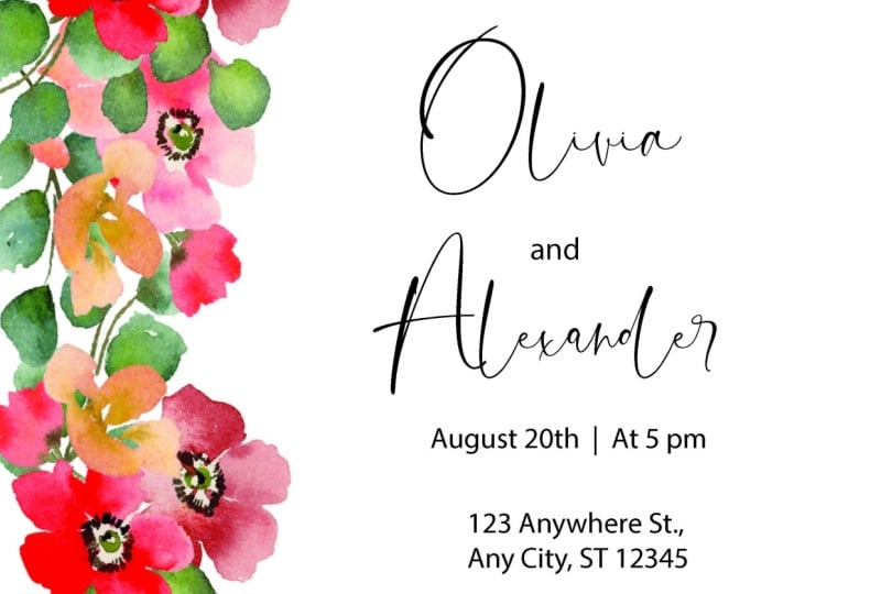
9. Designing The Suite: All right, We have
done our sketching, we've done all the
work beforehand. We're going to assume
that our client has approved our
design sketch and now we're ready
to actually start designing for this design. I provided you guys with some watercolor
florals on a painted. It's in the resources section. Makes sure you're accessing
this on a desktop. Otherwise you're not gonna
be able to see it if you're on an iPad or your
phone for Skillshare, hopefully, you are
already on desktop because I want you to
design with me if you can. And you're just going
to double-click, it's a zip file and
just open it up and you're going to see
all of these PNGs. And these are all elements
that I've painted. And I also put together some little corner pieces
and bunches that we can use. Feel free to use
these for this class as well as for any
personal project. Like if you are,
you're getting married and you want to
use these on your sweet, That's totally fine. However, if you want to use
this for your own clients, if you want to use my artwork, please be sure to actually
purchase the artwork. As you can see, I have a
shop on Creative Market. You can purchase those
florals right here, and that's going to give
you a commercial license and you can use them in
your designs that you sell. Just a quick note
about if you are not an artist who wants to do your own
watercolor artwork are line drawings or
anything like that. You can purchase PNGs,
background lists, ones are elements or people even call them clip art on
places like Creative Market. As you can see here, there's several
different licenses. The license that you
need if you are making wedding invitations is
this commercial license. So make sure whenever you're purchasing artwork that you
get the commercial license. Extended commercial license is for if you were going to sell something on
a larger scale, maybe to like a big
company or something. That's where that
pricing comes in, but skills are Creative Market will tell you what
each license means. So like I said, these, I have these included
in the class for personal use and for you
to use in this class. But if you are going to be selling the artwork
that you use for me, please make sure that you
buy the commercial license. Okay. Now, let's move on. I went ahead and
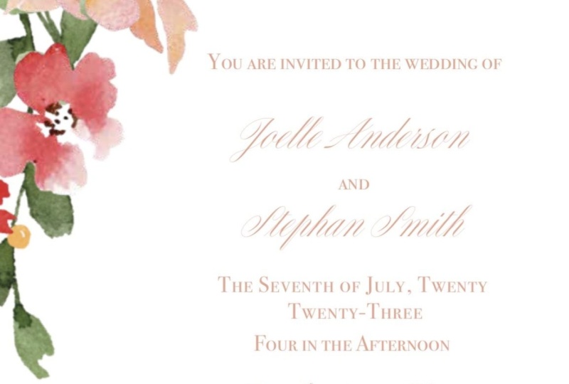
created a sketch for us of just like very basic what we're gonna
be creating today. But I thought since
I just told you about making sure
you do a sketch, I want to make sure
that I did one here. And I incorporated just
as simple color palette. Obviously I've already
painted these florals. I just grabbed the
color palette from there and then
we're just going to make a fake wedding date for our couple, Jalal and Stefan. And we're gonna get started. Like I said earlier in the
supplies and tools section, we are going to be using the Adobe suite,
specifically Illustrator. I love Illustrator and the whole Adobe Suite
is just fantastic. And I'm not going to go super, super in-depth with that today, but I am going to show you
how to do something simple or design a simple wedding
invitation with Illustrator. Now, this is my preferred
software that I like to use. There are other
stationers who prefer to design in Photoshop or InDesign. Personally, for me, I have found illustrator to be the simplest, but just know that people vary and people have
different preferences. This is only mine, so feel free to explore the
other ones if you want to. But to me, Illustrator is king. Just opened illustrator up
and I'm gonna go to new file. It might take a second. Okay, here we go. We wanted to set up our file
and the first thing you wanna do is please
name your files. I'm going to name
this J, S sweet, just for short, and I
like to put the date, especially if you have a lot of clients, that's
really important. Inches I like to start off with, we're going to need
several art boards, but I start off with
the main invitation. And the standard in the US is a five by seven invitation
link for the main invitation, you don't have to. There are other ones. There's an A9 which
is I think at A9 is almost 6 " by 9 ". You could also do a
square invitation, but just know that when
you change the shape up, it usually changes the amount
of postage that you need. But for now we're
just gonna go with our standard five by seven. Now, for the bleed, We're actually I don't know. If you guys if you're not
familiar with the bleed, I'm going to explain to you what a bleed is really
quick because when I used to work in advertising
and it confuses the heck out of me
about what a bleed is. So let me pull up
an invitation that has a clear bleed
on it right now. Okay. This is something
with a clear bleed on it. The bleed is any
artwork that goes over the edge of your piece. This is a watercolor map, and as you can see, if I, I have an entire
watercolor background back here, but also other things
are going off. This olive branches going off. And the reason you have this is because when your printer
prints something, they have to cut it, right? And if your artwork only goes
rate to this little edge, sometimes what can happen is you can have a white
line that's coming through because there wasn't enough of the
artwork going over. So make sure whenever you
have artwork that goes over the actual like art board, you need to make sure you have a bleed and the standard
bleed is 0.125. So an eighth of an inch. But always check with
your printing vendor before because sometimes
those can vary. I know that my printing
vendor print swap well, I use different ones, but one of them that I use, they have a half of an inch
or a quarter of an inch. So just be mindful of that. So this is something that
obviously we needed a bleed, everything on this invitation. So he actually has a bleed. But for us, we're
going to be creating a suite that doesn't have any artwork going over the edge. So technically we
don't need a bleed, but all vendors require it. So we're going to
put it on there. Okay. I hope I explained that okay. For you guys. We're gonna go ahead and
I'm going to close out this file because
it is gigantic. We're gonna go ahead and
we're going to create a new Illustrator file. Go back to where we started. And again, Jolie and stuff Fonz sweet and
put the date in there. And the inches. We're just doing
standard five by seven and we want it to be the, the width is going to be five
and the height is seven. So it's portrait
style for the bleed. Just hit this little arrow
right here and it will self populate all to that
eighth of an inch. Advanced settings. Let's do a 300 PPI and
then color mode, RGB. I used to be the standard, used to be CMYK color whenever you were doing
something for print. But recently, my my printer told me
it doesn't even matter because their printers automatically move
everything anyways. So it's going to
move it into CMYK or if you send to RGB anyways, so it doesn't matter. So personally I
just do RGB color now because it's
a screen colors. It used to be. Unless your printer
specifically request CMYK, it's fine if it's an RGB. If you guys don't
know what that is. So RGB is red, green, blue, and those are
the colors of screens. And CMYK is printing colors. So cayenne, magenta, yellow, and K is black. I don't know why they say k, but there's also pan tone makes a whole CMYK color book
that you can look up. Cmyk color is super important if you're doing printing
styles such as letterpress. Because letterpress is they
use the Pantone color books, but we're not doing letterpress, we're doing digital printing. Or sometimes if you have a super particular client and they're crazy about the color, you do need to use CMYK color and you need to
use a Pantone swatch book. But we are not, we're not
getting that complicated today. We're sticking with just simple digital
printing. So hit Create. And it's going to create
a your art board. So this white part right
here is your art board. This red line is your bleed. If we had artwork that was
going to go off the page, we would want to make sure
that artwork crossed over this red line all the way around or wherever
the artwork is. That way, when they
cut the piece, it'll cut really nicely
and the artwork kinda just falls off the side of the invitation instead of having a gap where, where it got cut. What I like to do
when I'm starting my designing is I like to
set up all of my art boards. So we have our main one
and then I'm gonna come over here and this
is your art board. Just click it. And as you can see, my mouse turned into
this little symbol. And I'm just going to, I'm holding down my mouse
and dragging and then releasing and coming up
here to the properties. I'm going to change this to
the dimensions that we want. Now for the RSVP, a standard RSVP is a four-bar
card and that's 5 " by 3.5? Yes. And as you can see, since we already said that
we wanted bleed on this, it's going to put
bleed on this one too, which is fantastic. Another way that you
can add bleed is when you go to export
it for printing. But I really recommend having it here because you're able to see how far your
artwork goes over. And that's not necessarily true. When you just added at the end, we're gonna do one more
and it's going to be our details card
and a details card. I like to use an A2. Again, these are US sizes. So modify if you're in
a different country. But the A2, I want it to be a width of 5.5 or that
is the width of an A2, A2, and then 4.25. Perfect. Okay, so we have our
little art boards setup. And then I'm just
going to bring over, this is our mood board
with our general design. And I'm gonna keep it on here as long as I can without
getting in the way. Ceo, it's not gonna do it. Okay. I'm just going to take
a peek at that really quick. So alright. Okay, we have our
art boards laid out and now it's time to
bring in the artwork. And what I like to do for my artwork is I
place my artwork. And what you're gonna
do is just hit Place. And you're going to
go into that folder. And I'm going to try to pick
out I made these bunches. So I'm going to try who
I really liked this one. And I'm going to place it. So as you can see, it's on my mouse. I'm not clicking right now. When I click, it's going
to start to make a square. Make sure you're
holding down shift. Because otherwise it's going
to distort your artwork. And I'm just going to turn it. And I want it to be bigger. So again, I'm
holding down Shift, I'm grabbing this
corner and just pulling until it's
as big as I want. Okay. I think that looks good. I think I might let it go
over the edge a little bit because I think that
will look kinda cool. So I'm just going to do that
and place that right there. I want you to know that
when this goes to print, they're going to cut off this. So just make sure everything you want is the placed inside here. You can just rotate it. If you want to rotate
it a little bit. I'm thinking I might add
some more florals to it, or actually, you know what, I'm going to make it
a little bit bigger. I kinda like it really big. And it looks pretty okay. Then maybe you just turn
it a bit and pull it down. I think that frames
that really nice. Since we place this artwork, you want to make sure
that that fight, that folder that we just used
stays in the same place. If you move this folder into another location
on your computer, what's going to happen
is that it's not going to register
with Illustrator and it's not going to
know where it's at. So make sure that you keep it in the same place if you're going
to do the placed linked. Otherwise what you
can do is come over here to your Layers panel and you can embed the artwork. Okay, if we wanna go ahead and
embed this image, you can. So we're not working with too much watercolor
artwork here. So embedding it, it's not
going to be an issue. But sometimes her
my artwork because there's so much of it
and the files are huge. Embedding the artwork
makes the file is ridiculously large and
I don't want that. And that's why I do
mostly just placed them. But if you want to
embed them because you're nervous that you're
going to misplace a folder, come up to Windows, hit links, then come over here and
click on the artwork. So that's this
artwork right here. Come up to these
three little lines. And oh, I'm sorry. Come up to these three
little lines, yes. And embed image. Now this image is going to be
embedded into your artwork. So if you move that folder, you don't have to
worry about it. I recommend doing that if you're working with smaller
stuff just so you don't, you don't lose your artwork. We have this here and I
think this looks great. And then we want to add, let's see what our
little sketch has here. It has just a small
little design element right here of florals. And then again on the
details that we are using a corner element as well. And I had there envelope
have the artwork on it too, which we'll cover a
little bit later. I'm gonna go back to my my artwork and decide
what do I want to bring in. I kinda like this flower. And this is really
trial and error. I know some people asked me, how do you know what elements to place and what's
going to look good? And honestly, you just have to keep doing it until
until it looks good. It's just I mean,
it's like anything. You're never going to be great
at it when you first try. But the more practice
you get, the better. One thing that's super-helpful that I'm going to show
you guys right now. Is this flower, I want it to be in front of this leaf or I want
this leaf to be behind. How I'm gonna do that
is I'm right-clicking. I'm on a Mac. I know I should have
mentioned this before, but I'm not on a PC, so it might be a little
bit different on a PC. So I'm working on a Mac. You want to arrange and you have all these options
you can bring to the front, bring forward, send backwards. If you bring to front, it's going to bring a piece
all the way to the front. Now, like I said, a bunch of times, I worked with a ton of
watercolor artwork. So sometimes I have to hit, I have to do this command like 100 times because
there's so much artwork. But lucky for us,
this is more simple. And all we really need
to do is send backwards, and it's already
behind this artwork. That's a cool way to
edit your artwork. Another cool tool is
the transform tool. If you click on your artwork, come up to Object Transform, you can change the
direction sin. So if I reflect it, it changes it that way. Could also do it horizontally. I actually liked the way it
is, so I'm going to leave it. And I think we
need just a couple other little elements here. So I'm gonna go
through this artwork and I really like those berries, but I feel like we need
something a little bit red. Just because we have red and
the other one's pretty tool. Let's see. I like this guy will
bring in this one. And again, make
sure you're holding shift when you make it larger, otherwise you can
distort the artwork. I'm going to turn it and
I think I'm going to turn him him and put it
back here like this. But I wanted to be behind
this orange flower. So I'm going to go to I'm right-clicking, arrange,
Send Backwards. Perfect. I'm okay with that
green showing through there. Okay? We need just a couple
little more elements. And I want you guys to
have fun with this. So don't feel like you have
to do exactly what I'm doing. Experiment. I mean, you have all this artwork to work
with, which is pretty cool. I also made a couple
of reason here. If you wanted to
incorporate a wreath. That's a cool thing too, about. If you buy art work, you're going to get all of these elements and you
don't have to worry about. Or sometimes they'd piece
them together for you. Or usually there's
some piece together. And I know a lot of
stationers really like that because then
they don't have to figure out what goes with what. They just grab it like we did for that last piece
and put it together. I want these leaves. Again. I'm going to hit command
copy and command, or command C for copy
and Command V for paste. And I'm going to just
move them down like this. And I'm going to
send them backwards. Perfect. I'm pretty happy with that. I
don't want these to go off. I don't want these to
go off of the page. Are RSVP looks great. And now we want to move
on to the details card. And I'm looking at
our details card and realizing this is not the orientation that
I wanted it to be. Super easy way to change that. I come over here
to your panel on the left-hand side and
grab your art board tool. And then come up
here to properties. If you guys are not
seeing this tab, go to Window and make sure properties is selected
and it should show up. I'm coming over
here to properties and the width and the height. I'm just going to switch them. So 4.25 is going to be the width and 5.5 is
going to be the height. And that is an A2 size. Perfect. Now you can go ahead and grab whatever artwork
you want to use. I just grabbed this artwork, so I'm going to place it here. But feel free to grab
whatever you'd like. And now we're going to
move on to adding texts. The best way to get
texts from your client is I recommend sending a form. Like I said before,
I used to have Soto and it's super easy. I already have the form,
it's already made. It's an easy template. I send it to my
clients through email, they fill it out and I
have all the information. Make sure you have
something like that to gather all the
information you need. Think of the who,
what, where, how, like all that kind of
information as well as specific things that
are optional, e.g. some people like to put that X amount of seats
have been reserved so that the person who's
getting the invitation knows and they don't bring 7,000
people to their wedding. So there's those
types of things too. I also like to ask
whether they want formal phrasing or more
informal phrasing. Some people are super, super
particular about etiquette. Personally, I think these are
your wedding invitations. Have them be however
you want them to be. Of course, don't be
trashy about things. But definitely you can let your personalities shine
through through them. I wanted to save us a
little bit of time, so I actually went ahead and entered all the
information over here. I don't know if you guys can
see that it's pretty dark. But I want to show you just
real quick how to lay out texts on your art board because I know if you're
just starting out, you might have no idea. You're going to
come over here to the panel and you see
this t right here. This is a text box. So click on it. I'm going to zoom in. So you guys can see I have
not clicked my mouse yet, but when I click it and hold, I can drag out that textbox
to any size I want. And then in here you could say, your, oops, cannot spell today. You're invited to the wedding of or however they want that
introduction sentence to be. And you're just going to do
that for all of the texts. Now, I really recommend doing separate text boxes
for every line. As you can see over here, these are all separate. And the reason I do that
is because that allows me to get the exact spacing that I want between
all of these things. And I don't, and also I can
play with fonts that way. Whereas if you just did one text box and typed
in all the information, it's not going to give
you as much freedom. Since I have this text here. I am going to bring it on
over to our invitation suite. And I'm just clicking
all of these. And I made a little guide here. These guidelines are going
to be so helpful for you. If you want to get rid of them, go to View and you
can hide your guides. Or you can go back to View
and you can show your guides. And how you grabbed these is if you don't see this, right, if you don't see the rulers
hit Command R. Again, I'm on a Mac, so that's the, make sure you're doing the
correct one if you're on a PC. And I'm just going to
over in this ruler click, I'm holding down my mouse
and I'm dragging this line. And I can put it
wherever I want. Super easy. And it's a great way to make sure
that everything is lined up. Another tool that's
really helpful. I'll show you here
on the details card. If you click on your art board, the Artboard Tool, and then click on the
actual art board. You can come over to
your Properties panel and hit artboard options. And you can show center marks. You can also show crosshairs,
which are helpful, but I usually typically just
do the show Center Mark. And that'll show me exactly
where the center is. And as you can see,
I already have a ruler mark here to show me that very helpful tools to
keep everything straight. And even. Now we're coming back to our
texts on our main invite. And I wanted to talk
about font selection. So with fonts, I'm sorry, my dog is chewing up
something in the background. So I'm going to pause this
for a second. I'm back. Let's talk about the fonts. So Adobe, if you obviously are working
in the Adobe Creative Suite, because that's what I'm
teaching you guys on a comes with a lot of
fonts that you can use. You can also download fonts from the Adobe website as
well that are available. There are some good ones here, but I have found that I definitely like to
buy fonts sometimes. And a great place to buy
fonts is Creative Market. You can literally
search anything. Let's do a calligraphy font. And there are tons
and tons of fonts. I really recommend
doing buying fonts. But I recommend, like I showed
you in the sketch phase, if your client is
kinda particular, show them some fonts before
you purchase them and you're able to do that easily
on Creative Market it, so I clicked on this one. If you come down here, you can put in whatever
name you want. This was a recent client's name. So that's why it's in here. But you can go ahead and basically I would
just screenshot this to show them the
fonts before purchasing. And then something else I want
to mention is you want to make sure you buy
the correct license. A desktop license
is usually okay if you're using a font on
invitations that you're selling. But e.g. if they had a
personal use license, that would not be okay
because that's a lot lower and it doesn't account for you using
the font and selling, selling the font
in your designs. And there's all sorts of
like if you use this a nap, you need to pay
$170 or web font. So just be mindful of the
license that you purchase. But Creative Market is a
great place to buy fonts. I buy all my fonts
from Creative Market because I feel like I can trust Creative
Market a little bit more. There's a lot of fonts
also available on Etsy, but you really
have to be careful because if you see
a font for $3, more than likely
it's been stolen and I purchased a
really beautiful font. Actually, let's see if
I can find it on here. It was called bright and there's price,
so many called Got, it was called bright
font and it was kind of a 1970s
style here it is, this font right here. I purchased it on Etsy and I couldn't believe how
inexpensive it was. It was only $3. And I
wrote a review that, oh, this is a great
font, I love it. And the person who
actually owns this font contacted me because
they've been watching their font be stolen. And they said, Hey, that's
actually a stolen font on our true font is on Creative
Market and it costs $30. I went ahead and came
over here and of course bought the license from
the actual creator. But I just wanted to say be
really careful about that if you're on Etsy because sure
you can get a cheap font, but it might have totally
been stolen, which is so sad. I like to use Creative Market, tons of options here. And then you, just,
once you purchase, you download into adobe, your Adobe Suite and
super easy to use. Now, I'm going to come in here and just play with some fonts, guys, this is all
about trial and error. I really don't have a ton of
guidance when it comes to, well, I guess I do have some rules when it comes
to choosing your fonts. But I've discovered over my five-years of making
invitations that you really just have to play
with different fonts and there's no hard
and fast rules. The only couple of
rules I will say R1, never use more than three
fonts in your designs. What I tried to do is
stay in font families. E.g. Mrs. eaves is one of
my very favorite fonts. And you can see over
here that there's lots of options
within that font. I like to use those. And then maybe I'll pair
it with a script font. But you don't want to use more than three fonts or it
just gets way too crazy. So less is more when it comes
to selecting your fonts. And personally, I like to mix a script font
and a serif font. I wouldn't choose
all Cera fonts for, for fonts because you want
to mix it up a little bit, but play with it and
see what you like. I'm gonna go ahead and
I'm going to switch this. You're going to click
what is going on here. You're going to click on your I don't know
what's happening there. Okay. Click on and then highlight
and come over here. And I have a really pretty, a really pretty font that I think would look beautiful here. And again, you're just
going to play with the sizing and something that you can do
to save you time. So you really loved this. And obviously you want
both of the names to be in that font
and the same size, come over to your
Eyedropper tool. And all you have to do is
click on that and it will make it exactly the same
color, font and size. It saves you a lot of time, especially once you
start choosing your Your fonts that I want
this to be the MRS. Eve's font because
I love that font. I'm going to select this one. And a couple of things. You guys can change
this font even more. You can increase the
spacing between the lines. Over here. You can also increase the spacing
between each letter. Sometimes I'll do that for the date because it
makes more sense. But just make sure when
you do change these, if you have anywhere else
that is the same font, you need to make sure that it's consistent because it'll
start to look really funky when you're using different line spacing and different kerning
between letters. Then one other thing I want to mention is your font color. I, when I first started out, I always use black font. I always use black. And I feel that I really up to my game
when I started using colored fonts are coloured
texts because black can be, there is a time and
place, of course, for the black fonts
or the black text. But it really can
make your designs look beautiful when
you change the color. And I want to show you guys, I'm just obviously I need to edit all all of this and
I'm going to do that, but I just want to
show you how to change the color really quick. I think that a green would look really
beautiful with this sweet. And I'm going to use my eyedropper tool and
pick up some of the green that's in this leaf until I find something
that looks good. I think I like that color. And what I do is I
come over here to my fill and go to
your little palette. And this is the hex
code or your RGB code. I copy this and make
sure I have it. I put it in my
notes on my phone. Or you can put it in a note anywhere in the folder
for the client. So I know that this is the font color and
I use it across the board because
you want to make sure it's all consistent. Those are my tips when
you're laying out your design with your texts. And I'm gonna go ahead and just add in all the texts here. Just like clean it up a little bit because it's a
bit messy right now. One thing I want to
mention stylistically, make sure that the names are
the biggest thing on here. Because those dots, what the
gas is going to look at, they're like, Oh,
who's getting married? You want to make sure that e.g. the venue isn't as
large as the names. That's that's what I like to do. And you'll see if you look at imitations most
stationers do do that. Then just play with your design until you
get it how you want. Over here you can left align, center, align, right align. I'm going to keep
it in the center. And we made these guidelines
so we wanna make sure it's exactly centered here because this is kind of off to the side. The designs a little bit
different and just line everything up until
it looks nice. And this is an area
where you could look at other invitations to
see how the spacing is. When you're looking
at it. Do you like how the spacing is? And then just play with it
for awhile to get it right. I think this looks
a little too small, so I'm going to increase
the size a bit. There we go. And then just kinda space
it out a little bit more. Lots of trial and error here. Whoops. I'm pretty good with that. That looks good. Now we're going to
come over to the RSVP. And I have the text laid
out for the most part. And then I'll talk
about what texts you need on the reply card. You can always say, don't feel like you have to say things exactly how
you see them so you can put please reply
instead of just reply. Oh, I guess we have
that down there. So I'm going to
put just replied, You don't have to put RSVP. A lot of people get fun and
playful here and they say, are you in or stuff like that. So there's a lot of fun
ways you can say that. You want to make sure
to put the RSVP date. I recommend at least
a month in advance. That's usually going to be
determined by your couples cater because they need to
have a final guests count. But I like for my own wedding, I did a month-and-a-half in
advance because I'm crazy. Then you want them. So typically on
invitations you'll see an M and then a line. I find that a lot of people
don't know what that m is. So essentially they're
supposed to fill in Mr. or Mrs. John Smith, but I like to put
names so people know, Oh, I need to put the names of the people
that are coming. Then. Of course, please circle one or you can put a little
checkbox or a circle so they know a lot of times
you'll need meal choices. I'm not going to. Focusing on keeping this simple, but you could put meal
choices down here as well. We want to use the same font and the same sizing as much as possible from
our main and byte. For the reply, I am going to use that beautiful script font. Easy-peasy. I'm going to left align. Probably going to
increase this side. I'm going to increase the size
just because it needs it. Then for this guy, I'm going to use that Sarah
beautiful serif font. I'm going to left
align that as well. Names. I'm going to use
the script font. I want to show you
how to make a line. I'm gonna come over here
to this paintbrush tool. And I'm going to click, I'm holding down, oops, hold down, shift and click, and it'll draw a
perfect straight line. Now, obviously this
line is way too thick. Come over here to
your stroke and just decrease until you're
happy with it, you can even
decrease it further. I'm going to come in
here and type 0.15. And we have our line and all I'm gonna do
is copy and paste. So I'm hitting Command C and then Command V
and pulling it out. So it's the same. Let's look a little more space. And those are our two lines. You can also use your guidelines here to make sure that
they're perfectly lined up. And we again want that
left alignment over here. And the same thing down here. We are going to grab
the eyedropper tool. And change was happening. Sometimes you gotta zoom in, oh, it's bigger
than the textbox. That's why. Okay. I'm going to
decrease the size of that just a little bit and left align and move it down a bit. We want these to be
on the same line. I'm, I'm grabbing one
of my ruler lines. And we can push this
down a little bit. Have them here. Now, when I changed the font, it's going to definitely
move these around. Yeah, okay. So we want to go
back because it's picking up that this is
center aligned and we, but we want these left aligned. Just moving these down. Perfect. As a whole. I think just giving this a
little more breathing room would be nice. It's not going to run
into our artwork. Maybe. Actually, let's put
this up a little bit. So if you want to select a bunch of things
at the same time, just hold down shift. That's what I'm doing and just clicking all of these items and then releasing shift and I can move them to where
I want them to be. I'm pretty happy with that, so we're gonna leave it. I'm trying not to get too
crazy here because I want this to be accessible
and easy for you guys. Now lastly, we have
our details card. And for the details card, a lot of information
can be here. Sometimes people have
a welcome dinner that they want
everybody to come to, or sometimes they have
a goodbye branch. That kind of information
can live here. Also, a big one that I see is that children aren't
allowed at the wedding. That's another thing that you
can put here in a nice way. The one thing I do want to
mention is it's kind of taboo now to mention your
registry on your details card. Most people know that if they
go to your wedding website, that they'll get the
registry information there. So I really don't recommend
saying for all details about our registry go
to Julie Mary's Stefan. Instead put things
like regarding lodging and activity
is in directions. It just is better
etiquette to do it. But of course, if it's your wedding or your client
wants a specific way, just go ahead and
do what they say. So we're just gonna do
the same thing here. We are going to use
the same fonts. We want to keep it consistent, for the most part, same
font, same font size. Since I want these to match, I'm going to grab
this size though. Perfect. And then center align. And I'm just going to
speed it up and go ahead and do the same thing
for all of this. Alright? I do want to mention that you
do not want this happening. I forget what the current the
correct term is for this. But you don't want a
word to be cut in half. And the way, just
open your text box. I'm clicking on this little
edge and increasing it. I don't really like another rule around tax is you don't want
to have one word on a line. So I'm going to move it down, but now this looks uneven. So this is where you really have to spend
time playing with things. I'm going to increase
the line height here because we don't really have any paragraphs of
texts anywhere else. So I'm okay with increasing
the line-height here, but I want to make sure that this line height
matches this one. This needs to be
increased to 16. Perfect. Alright, that looks good. Now we have our imitation
totally designed. And if you are working
with a client, what you would do now
is you want to mock this up and send it to
the client for approval. I'm going to show you
really quick one of my all-time favorite
mockup templates, as well as other places
that you can get templates. But it's really, if you really
want to show your client, give them a really
good experience, mocking up your designs is key, so we're going to
cover that next.
10. Mock Ups: Next on our list of things to do for our client is to
mock up their design. Mock-up designs look
super professional and personally I think it really ups the
game as a stationary. Plus your client
can literally see exactly what it's gonna look
like when it's printed. Mocking up your
design is a must. I'm going to show you
some mockups that I have. The first one I have is
the stationers mock-up. This is from plume calligraphy. I will say this is basically the gold standard when you're looking for a mock-up template. However, I believe she
charges $75 for it and I know for everybody
that might not be a price point that's
assessable at this point. But I do wanna go over this
really quick to show you. If you think that stationary is something that you want to make your career and you're
gonna be doing this a lot. I highly recommend
this mock-up template. As you can see down here, where my layers are. There are so many options here. First of all, you can
add ribbon and you can change the color
out of these ribbons. Secondly, there's
different printing styles. She, she has the digital
printing effect, foil printing,
embossed printing. That's where it's pushed
through the paper. Letterpress printing is when
it's pushed into the paper. So you can show all
of that on here. It's really hard to find a
mock-up that has all of this. There's also wax seals
that you can add. You can also add vellum
paper, handmade paper. I mean, this is really just an absolutely
incredible template. Then she also has styling
tools on here as well. Let me just take this off
so you guys can see she has all so you can kinda
style it if you want. But it's just incredible. I know I've said that a lot, but I really, really love this. You can also, there's
three options for the styling board if you want to switch out to
different things. But this is what I
use for my clients. And when I bought it, it was amazing because it
helped me so much. I'll just show you really quick. This is a different method, how you laid the
designs on here. The first thing, the
cool thing about this. I mean, there's many
cool things to it, but you can link your designs to your illustrate
Illustrator file in here. I'm gonna come over
here to this A7 card, and I'm going to change the
color of this to white. That's another neat
thing is that you can change the color of
your paper easily. Then what I'm gonna do is
come up to File Place Linked. And I'm going to go into, let's see that AI file. I'm going to go ahead
and switch this to trim. Just show you guys so
you can take it and then and it'll automatically
put it on there. And doesn't that look great? Obviously, that's not
the envelope liner, but it's super easy to
use and you can link, link your Illustrator file. So if I needed to
come in here and change something in
the Illustrator file, it would be super easy because I would change it here in the
Illustrator file, save it. And it would
automatically populate on this Photoshop file for
the stationers mockup. So that's one option
that you guys can have when it comes to
mocking up your designs. The other option and the
less expensive option is to purchase an invitation mock-up from
somewhere like Etsy. I think this cost me $8. Granted, I find it really
difficult to find a mock-up that has differing sizes for
the details in RSVP card. And I like to do different
sizes when I do a sweet, but a lot of these use
only the 4-bar size, so that 3.5 by five, just be mindful of that. But if you want to use
something like this, I will show you really
quick how to do it. You're going to go back
to your Illustrator file. And you are going
to export these as. Jpegs. Come up to File Export As, and you're going to have to
export each one individually. Another thing I want to mention is makes sure that you have a really good filing system in your folders and keep
everything super organized. This is just a folder that I made when I am
updating this class. But what I would do is say
invitation jpegs for mockup. You don't want to confuse
these with something else, although we won't be
using the invitation, we won't be using jpegs
when we submit for print. Make sure you're on JPEG. And I'm going to use art boards. And I am going to
download my first one, and that's the main invite. Groups having hard
time spelling today. I'm going to export that. Wait what the heck. Okay. Export. That's fine. We want a good quality because we don't want it to
be blurry at all. And then I'm just
going to go ahead and do the same thing for
all of these art boards. And if you guys ever wonder
which artboard is wedged, just come over here. Click the art board button and you will see this
is art board one, art board to art board three. Speed this up and export them. Alright, I have
those all exported. And the cool thing
about mockups, I don't know if you guys can see this little icon right here. This means that it's
a smart object. And smart object.
Objects are amazing. Let me show you
what they can do. Typically when you purchase
something like a mock-up, makes sure that it's a smart
file or smart object file. For Photoshop, it
makes it way easier. You don't want a flat JPEG because it won't
do the same thing. So make sure it's a
smart object file. Usually they'll give
you a smart object file and a jpeg as well. But I highly recommend
getting a smart object file. It will save you so
much time and it's totally worth it if it's
a couple of more dollars. And there's usually
instructions with every mockup. So don't worry, I'm
showing you the basic how most of them work. But if for some reason you purchase one that
doesn't work like this, you should have the instructions
with your purchase. And I like to purchase
mine on Etsy, but Creative Market
has them as well. I'm going to double-click this. And it's going to lead me here. And it says your design here. I'm going to come up to File. I'm going to place linked. I'm going into those
invitation for mock-ups. I'm gonna do my main invite. Hit Enter. Then I can either
come up here and save or just hit Command Save. I can see actually that you see this gap up
here. We don't want that. So I'm going to push
it up just a bit. I'm actually going to
expand it. Okay, perfect. Then make sure you save. Then you go back into your mock-up and it's
already been placed. How? I just think it's so amazing
that we can do this. And it's simple because
the person who sold this, they took a photo of
it and then they just upload it and made
these smart objects. But it just really
looks so beautiful. And we can put the RSVP here. Oops. You could do Place Embedded, I guess it doesn't
really matter. So plays, hit Enter and
save and turn save. And then we have over here. But like I said, this is a four-bar size and we made our details
card and an A2 size. So it's not going to work here. I wanted to show you
guys what this looks like for the mock-up. And it's super easy
and it just really is going to up your
client experience. So make sure you get mockups. You don't have to go with the stationers
mock-up if you think that you're not going to be offering a lot of
bells and whistles. And you just want to
start with something simple checkout what Etsy, or Creative Market
has for mockups.
11. Revisions & Final Approval: Let's talk about revisions. You've mocked up. You've
designed the whole suite. You've sent a mock-up
to your client. You can send your mockup
however you want. Like I mentioned multiple times, I use Deb sotto
because I like it. It's really easy and clean cut. I also think it makes you
look really professional. This is an example of a mockup
that I send to a client. I make sure that I
give lots of details. A major one because
it's sweet was in 2021, the paper world was experiencing so much shortage in card stock. So I made sure to
have a note here. But as you can see, I have that beautiful mockup. And then I usually give
a couple of notes. And then I like to focus
in if there's anything particular that
needs to be focused on and then they
provide feedback here. Really easy and straightforward. I do want to talk about real quick just dealing
with revisions. So sometimes when you get
revisions back from a client, it can be hard. And for the most part, most of my clients have been
wonderful like you just saw, there was two revisions
at that client wanted but I have had a couple of
clients that really difficult. I mentioned one before, but I just had a
client recently. They're actually
wonderful clients, but they sent me six pages of revisions and I
spiraled a little bit. When I got that, I realized, I don't wanna get too wu
on you guys right now. But so much of our business
has to do with wounds that we might have around other things and we
have to check those. That's why it's so I'm such
a big advocate for self-care and for healing from the
overused word is trauma, but healing so that you can be the most authentic
version of yourself. Aspects of your life
and even business, like my business,
I love it so much. But it has basically brought things to the forefront
that needs to be healed. And one of those I
realized was when I got that those six
pages of revisions, the way I was talking to myself. First of all, I was scared of having to defend my contract, which I shouldn't be. Then secondly, I because I was going
to have to charge them more for all the revisions
that they were asking for and because they were asking
for me to repaint things, There was this thought that I was having that I didn't
deserve to be paid more. And I really had
to dive deep and understand why do
I feel that way? Because at the end of the day, I want 100% deserve to be paid
more for doing more work. I would never ask the woman who cleans who
comes over to clean my home. I would never say like, oh, can you do all this extra
stuff that they don't normally do and I'm not going
to pay you. Of course not. Just think of it that way. Like you don't need to
think about this too much. You deserve to be paid,
of course you do, and maybe you will
have pushback, but at the end of the
day, you deserve it. So I just wanted to take a collective deep breath and know that you deserve
to be paid for your work. And when you get a client who gives you a
lot of revisions, do not take it personally. We never know where that
person is coming from. They might be in a career where they're super detail oriented. They might be having a bad day. They might feel like their
whole life is out of control and this is something that they
can have control over. So don't worry about it. I just wanted to
mention this really quick because I think
it's really important. So let's get back to, I'll show you another design. So I sent this suite or
it wasn't saved the day, review all the information here, and they have the mockup. And I gave them a
couple of options. I gave them four
options for the crest. But they were able to
give their feedback here. This is pretty easy client. And because doves
autos so great, they can either select
schedule a call. This is stuff that
I've implemented or make changes as I requested
and send me the update, it just makes it more
streamlined and easy. So those are the revisions. Once you get all your
clients revisions done, then what I like to do is
send them a final sign-off. And the final
sign-off ensures that everything is correct
before it goes to print. I'll show you guys
one real quick. This was for Anthony and Dina. And again, I have
the mockup photo, but I like to because Dove sotto a lot
allows me to do this. I show them each piece separately at a close-up so they know exactly
what they're getting. And I put like, what size it will be the
card stock that I'm using, what color the card stock
is, and the quantity. We go through this for every
single piece of their suite. And you must do this. Please, please, please do
not forget to do this. You don't have to
use those auto. But again, Deb sada is really
nice and simple for me. But you want them to approve everything because if they don't approve the return address
and you accidentally got a number wrong and then you print all of these they go to, they don't show up
at the guest houses. It's gonna be a nightmare. So have them sign off. And I do the production details. Usually I use flat
digital printing because I do a lot of
watercolor artwork. They're just signing
off on all this stuff. They're also when they
do the final approval, they know that if they approve something and it's incorrect, say their names are spelled wrong or the wedding
date was wrong. They're responsible
for the reprint cost. So very important
to include back and it will save you a lot
of time and stress later.
12. Prepping and Submitting Print Files: Now we are ready to send
off our designs to print. And I'm going to show you to
printing vendors that I use. The first one that I use, I think is going to be
the best option for you, especially if you're a beginner, which if you're watching this
class most likely you are, is print 12th fulfillment. They're fantastic. Their prices, their prices are the lowest that I found for the quality that they offer. I really recommend them. I've included a link
for you guys to sign up if you are interested because you have
to have a wholesale account, but it's really simple. They just want to know
that you're in business. Essentially. You're not just
a couple of getting married. But all you have
to do is fill out this form and then they'll most likely they'll
accept you and then you can start
ordering from them. Then the second vendor
that I use is mango. Mango is fantastic. Their customer
services wonderful. I will say though they're there, I only use them when I'm have a project that's more involved. E.g. I'm doing a trifle
or a gatefold right now that has a pocket in
it and I'm using them, but my order was $1,300. So just keep that in mind. It was $1,300 is only
for 90 invitations. They're absolutely fantastic. They've had an email chain, 55 emails long with them
because they're so helpful. But just know that if you're doing something
that's more involved, you can use lingo press, but if you're just
doing digital printing, I highly recommend print swell principle also
offers foil printing, but I'm not showing you
how to do foil printing. I'm only showing you
how to do digital. That's not really applicable, but if you ever
decide to do that, that option is available. Okay? So depending, one major
thing that you need to consider is what are if you guys don't want to go with these two vendors
that I'm using. You need to know what your vendors printing
requirements are. So if you have somebody that
you want to print with, reach out to them if it's
not already listed on their website and ask them what they're printing
requirements are. Everybody that I worked with, they are very similar, but e.g. print swell, they want you
to submit in a high-res PDF. Standard bleed is an
eighth of an inch, so that's for print,
swell and flamingo. But always make sure that you check with your vendor
just to be sure. So just keep that in mind. I'm going to show
you how to submit your files through print swell only because I think that
they're the best option, especially if you're
just getting started. Now I'm going to come over to my invitation suite and
there's a couple of things that we need to do before this is ready
to go to print. We need to outline our fonts. The reason we
outline our fonts is because when another vendors, so you're printing vendor
opens up this file, they might not have the
same fonts that you do. These, it will go to the
next font available, and it will not be the same. So make sure you
outline your fonts. It's super simple. All you're going to do is
select all of your texts. I'm holding down Shift. Selecting all my text. I'm just going to select
it on this piece first. Then I'm with all
my text selected, I'm gonna go up to
type, create outlines. And you guys can see
what happened here. So now they're all
outlined in blue. One thing I always
say one thing, something that I
want to mention, you cannot change this text now. It is irreversible. So a way to get around this is before you outline your texts, save a copy of your file, and make sure you title
this one outlined. So you know, because if for some reason you have to come
back and change something, you're not gonna be able to if you change the original file, so make sure you save
a separate file. All these texts, it has been
outlined and we're gonna do the same thing for all of this. I'm just hitting Shift. Type, create
outlines, wonderful. And same thing here. Create outlines. Now that all of our fonts
have been outlined, we are ready to send
this off to print. Alright, we have
outlined our texts. And now what we need to do is we need to export these files. Actually, we're going to save a copy because
Illustrator doesn't allow you to export
a file as a PDF. So save a copy and we're in, make sure you have a new folder inside that is print or the files so you know
exactly where they're at. Move this down to Adobe PDF. Adobe PDF. And I'm going to
say JS means sweet. Perfect, hit Save. Now you want to make
sure that preserve illustrator editing
capabilities is not clicked. Then for compression, makes sure compressed texts and
line art is not clicked. Then we're going to use our
document bleed settings. So we have that eighth
of an inch bleed, which is what principal
wants, which is perfect. Hit Save. And we're going to do
that for all of them. Again, we're in our
current Ready Files. I'm going to label j as RSVP. Be specific. With your file
naming just in case, for some reason, you are submitting multiple
things at one time, it just helps a lot. Same thing, we're making
sure those aren't clicked. No, we're using our
document bleed settings, which is an eighth of an inch. Then we are going to do
our final details card. Js details, tales,
these PDF. Three. Perfect. Okay. These are ready to go. Now, we are going to go
let me go back to print. So we're going to principal
print swell website, and we're going to
start our order. Guys. I'm just keeping it high up here because this is all my personal
information down here, like my credit card and
stuff and my address. I don't want to share it
all over the internet. But this does go further down. What type of product
do you want to order? We want so there's
lots of options here, but we want to
choose flat cards. Then we're going to
choose the size of the main invite
because we're going to submit that one first. It's an A7, five by seven. You could also enter
size manually if you have a specific custom size. But if you're just starting out, I don't recommend doing custom
sizes because they can be difficult to male
and get postage for. And I just don't want to
just start with the basics. When you first start,
you don't want to overwhelm yourself too much, then you get to choose what
kind of paper you want. I like the one-twenty pound
eggshell, ultra white. You guys never want to
use these texts weights. This is really thin paper. It's not the quality card
stock you want for imitate the best paper is definitely,
I think one-twenty. You can also do double thick too if you're doing
something really fancy. But for what we're doing, one-twenty pound
eggshell, ultra white, my artwork looks great on it because I like to
use a ultra white because it doesn't
affect your artwork and all the colors come
through really vibrant. And it's Mohawk papers, so it's very high-quality. So that's why I choose. And then you can choose to
print on just the front. On just the front in black or full-color on
the front and back, we're just doing
the front today. Then you can see what their pricing is based
on the quantity. Obviously, the higher
you go in quantity, the cheaper per piece
it's going to be. Actually, it looks like they
kinda top out at $0.43. But this is really inexpensive. You guys, if you go
to other printers, you're going to realize
that this cost is the best, and I think it's
really high-quality. I'm going to just say 100. And then we don't need
variable printing. Variable printing is if you're printing different
things per page, e.g. when I do guest addresses, I export it as a PDF for them
to print on 100 envelopes. And every page of that PDF is different because
it's a different address. That is what this is for. Then we're gonna
go ahead and we're going to upload our image here, or upload our PDF or invitation. There we have it. We use. So another cool thing, they do die cut here,
which is fantastic. So that's an option, but you need to
design your piece with dicot and mind and
we don't need to die cut. We're just doing
the straight edges. We don't need holes, we don't need angled corners. So hit next. And you can actually select envelopes from them if you want, and they will do your
printing as well. If that's something
you're interested in. These ones, cheapest envelopes
with the square flop. But they also have
envelopes that match the paper that you use. If you're going to go with white paper and white envelopes, you want to make sure
you use the same paper. I can't stand when I see two
different whites for paper. So make sure you choose if
you are going with that. They have a couple of
colored options as well. But this is the paper, the eggshell, ultra white. We're not going to
do envelopes today. Okay. Then you're just
going to add that to your cart because
it's ready to go. And you'll do the same thing for all the pieces
of your sweet, I'll do one more with you guys. Flat cards. And let's do the details card. So the details card is an A2, which is 44 and a
quarter inch by 5.5 ". You want to use the
exact same paper unless you're doing
something different. Printing on the front. Only. I always something I want to mention is I
always order a little extra just in case
something happens. You always want to have a
couple of extra suites. Plus I really like to put a sweet together for
the photographer. And you always want to have
an extra one for that. Alright, that looks good. Don't need any of that. No, we do not need envelopes. We're going to add to cart. So we have these going to print and you can
add the RSVP card, but I just wanted
to show you guys. And then under here, you're going to put in all
your personal information like your address and
your credit card and they'll send it to you. It's really a simple
process and pretty easy. Also one thing I
want to mention, if you guys are
struggling at all, they have templates as well to set up your files
so you can do that. Flat cards here if you
are struggling with that. But I pretty much showed you
how to set up your files. Okay, so that's our, the printer that I
really like using. And I think they're really affordable and they're
great quality. Now, our imitation
is off to print. And the things that
we need to do now, I'm going to show
you guys how to do the envelopes if you're
getting the envelopes printed. Otherwise. Another option is you can do calligraphy if
you're a calligrapher, but no matter what you're
going to need to put addresses on unless your
client wants to do it. But if you're a customer
invitation designer, this should be something
that you include because it's part
of the assembly. So we're going to cover
that in the next section.
13. Guest Address Envelope Printing: We're going to load up our files for printing
guest addresses. So I basically lied in the
last video, I'm sorry. We are going to be submitting
envelopes to print swell, which is awesome because they'll print your envelopes for you. What I like to do with
my clients is I asked them to fill out this
Google spreadsheet. I like to use Google
because it's easy for both parties to access the file. It just makes things easier. So what I want or what I do is I just have very
simple columns here. Names, address, city,
state, zip code. And then I also do if
It's outside of the US, I have that here, but her wedding lists
didn't have any of that. So that's why it's
not listed here. And they just fill this out
and I tell them to write everything exactly how they want it to appear on
their invitations. A lot. Sometimes couples want to have California or the
state spelled out. They did not. So that's
why it's like this. They wanted Mr. and Mrs.
for everybody's name. That's why we have these here. What I'm what I'm going to do is we're going to be
working in InDesign. So you have, hopefully you
have the Adobe Creative Suite is now we're going
to be opening up another program in that
which is InDesign. But first, I'm going
to export this file. I'm gonna go to File Download
and you want to download as a CSV file that's
comma separated values. Once that's downloaded,
I just either drag it into that client's
folder or my desktop. And now I'm going to open
up InDesign new file. We want this file to be in inches and we want it to be
the size of our envelope. Now the size of a A7
envelope is 5.25. Oh sorry. It would be
7.25 would be the width. Then it would be
5.25 is the height. That's an A7 envelope. And here it is. Now what we want to
do is populate this. I'm going to come up to
Window, utilities, data merge. And what I wanna do is I want to grab the data from the CSV file. So come up to the
little hamburger right here and
select data source. And we're going to grab that
CSV file and click Open. And now it has populated all of those columns and we can order them how we
want them to be. Grab a text box, same thing. You're holding it down and dragging the box to
where you want it to be. Then I'm going to click and
I'm going to have the names. Then I'm going to hit Enter. So it goes to the next
line because I want to address their Enter. I want city. And then let's say I'm going
to separate it by that line. And then state. And then I want the zip code
at the bottom. You are going to edit this, however you want your
addresses to look. This is very important so
you can change the color, the film stroke if you
want to change that. I would recommend since we use
a green font on the sweet, I would do that same
green font here. I'm going to center it. But you could do left
aligned if you wanted to, but I'm going to center it. I'm going to increase the
size of that font a bit. And I'm going to change
the font to that Mrs. Eve's font that
we used before. And you know what? I want the names to be, that pretty script
font that we had. I'm going to increase
the names of it so they're a
little bit larger. Take some trial and error. I'm going to bring it
down just a little bit. And then I forgot to save
that hex code that we had. It didn't take my own advice. So I'm just going to choose
just a similar green. But you guys use the hex
code because we want to be very specific
about the color. Okay? So we have this and I
think we're ready to go. It's going to populate all
of those addresses for us. We're going to come up here. We're going to say
create merged document. And we want to look
at these, okay? We want all records. We want to alert when
images are missing. That doesn't really matter
because we're not using images but generate
overset texts. Report with document creation, you want this on here. Overset texts is e.g. if an address goes
outside of the text box, it's going to warn us, otherwise it's just
going to get cut off and then the correct address
isn't going to be on there. Multiple records. We don't
really need anything here. Options. I really like to hit Remove
blank lines for empty fields. This is important
if you have people getting their guests
outside of the US. Because it would be blank
for some of them, right? Because most of these
people are in the US. You want it to remove that
blank line if that's the case. Okay. Hit Okay. And it's automatically going to populate this entire document. We can see that there
was no overset, overset text generated,
which is fantastic. And all of our
addresses are here. And they look how we want
them to look is not so easy. Now, I will say I go through all of these and
I make sure that they're correct against
the spreadsheet just to be extra careful. But for the most part, this, this program is, is gonna
do it perfectly for you, which is really nice. There we have it. So these are all of our addresses and we need to one thing I want to say, okay, let's go back a second. You want to make sure that this is totally even
and in the middle, we're gonna do the
same thing we did before with those
little ruler marks. I'm coming over here
and I'm just dragging a ruler mark out to
the one-inch mark. See this up here. I'm going to do this
same thing over here, but remember it's 0.25, so make sure you
accommodate for that. I can see this is just
slightly not in the middle. Okay. Now it's in the middle. And I think I want to
make the zip codes spread across the bottom
a little bit more. And the way to do that
is to come over here to the spacing between your
numbers and just increase that. I usually I know that it
looks super wide right now, but since the numbers are small, I usually like to
do about 1,000. Okay. Like that. And maybe I want to increase the size just a tad since we didn't have any
overset texts. Alright, and I think
that looks good. It's right in the middle, like we want it to be. Something else you want to
think about is postage. If you're doing vintage postage, make sure you have
enough room up here, but most postage will fit within an inch and
a half up here. Now, it's not going to automatically update this
document that we're already in. So I just X out of that because I don't want
to confuse them. And you have to go back to
data merge and you have to go back to create
merged document. Same things are selected. It's going to create that
merged document for us. There is no overset text,
which is fantastic. And I really liked the way
that the zip code is now. Okay, so we're already, this is all of our addresses. And basically when we
submit this to print swell, they're going to know
this is one page, so one envelope, this
is the second envelope. Save a copy. So InDesign, you have to export as a
PDF. I'm pretty sure. Yes. You do. Pdf for print. Make sure you're in your file
that is print ready files. You guys might see this folder I have right here
called your awesome. I highly recommend doing
this whenever I get good reviews or somebody says something great
about my work, I put them in here. And if you're feeling down, it's a great place to
get encouragement. So these are just the
guests addresses. I'm just going to save
it as guest address. You don't have to worry
about any of this stuff. We don't need bleeds on
this because there's nothing that's getting cut because it's printed
on envelopes. And we're good to go now we
need to do one more thing, and that is our return address. So we're gonna do a new document and it's going to
be the same size. And we want to do
the return address. So grab. The return
address is going to be the same on every single envelope. But you do want to make sure
that we're in the middle. Just coming down here again. There we go. Grab that text box. And then you're
just going to type in your return address,
123 Sesame Street. And I recommend obviously you want to make
the fonts match. So whatever those fonts were, use the same ones. That definitely was
not the same one. Uses the same font and the same color because
you want them to match. That would make the most sense. And what we have green. So green. And I like to usually use the euro envelope so that it has a triangle. This is actually really small. I would increase the size
of this quite a bit. But you just want to put
it like right here so it gets printed on
that back flap. And same thing, you're
going to export it as a PDF because we're
going to submit this. So this is the return address. Perfect, perfect. Now we're going to come
back to print swell. And we are going to select
envelopes as our product. The size is A7, just so you guys know, there's an A7, 0.5, which an A7 will
fit inside of that. Sometimes, actually a lot
of times I do that if I'm doing an envelope liner
because the envelope liner, I don't want it to
just get ripped open. So I have put it in the
secondary envelope. Then you are going to choose
the envelopes you want. We're gonna do eggshell, ultra white euro flap. And we're going to
select this product. How many envelopes
would you like? We're going to say 100. We want to print. I don't know why sing in print. That's kinda confusing, but we want to print on
these envelopes. And we want to do yes, the front and back side. Front of envelope printing. We're gonna click, click Variable fronts because we
have that whole PDF, right? And that's our guest addresses that we're
going to submit there. Okay. So this is important. Obviously, Bridget and Kyle had 135 guests and I only
ordered 100 envelopes, so it's warning me that
that's not going to work out. So you guys are going to think of this but makes
sure that you have the correct quantity envelope you submit because it's going to see how many pages there are. And then for the back, we are going to use
the return address. And there is no variable
printing because we're doing the same return
address on every page. And add to cart easy-peasy. So that's how you obviously
we have to fix that file, but that's how you get
your envelopes printed. I highly recommend doing it. It's really easy and
looks really great.
14. Envelope Vendors: Next, we are going to
talk about envelopes. These are obviously
super important for you because when you are
developing your sweet, you want to choose an envelope
color that looks best. You can. You can choose
white if you want, but getting different colors of envelopes can really make
the sweet, beautiful place. It just looks better in photos. I'm going to show you a couple
of my favorite vendors. The first one is
Cards and pockets. You, they saw a
wholesale pricing. You'll get a better deal. I used to when I first started, I would buy my envelopes
at Paper Source and I wasted so much money because they're
ridiculous, expensive. So definitely use somebody
that's wholesale. As you can see, cards and pockets has all of these colors. There's tons and
tons of options. I recommend getting their
colors sample book. They'll send you a
little sample pack with all the envelope colors in
card stock that they have. You really want to
see it in person. You can look at this, but the colors are always
different in real life. So that's Carson pocket. I also order a card stock
there if I need it. Another place that is fantastic. Announcement converters. It's all my orders right here. But sometimes what I'll do is I'll send from
announcement converters, I'll send the envelopes
to my vendor to print if I'm doing
a color that they don't have in stock, e.g. I. Showed you guys how to
print with print swell. But print swell is not
going to have all of the envelope colors
that these vendors do. So sometimes what you'll need to do is purchased them through here and then send
them to the printer. Or another option is you
can print from home. In our document that I
provide for you guys. I'll share with you the the
printer like physical printer that I have in my office and it works great
for envelopes. The reason that I
don't really do the envelopes is
for me I rather pay $150 and have somebody else do it and save
myself the time. For me, that's a good exchange, but for you it might not be. So a printer might be an
option that you were like. Plus printer ink is expensive. It just adds up after awhile. But you can have the
option of printing at home and my
printer can do that. And when I'm in a pinch, I definitely use it. Lots of different colors
here for your envelopes. I really like
Announcement converters. One thing to mention, if you're doing an
envelope liners, make sure that you're using not all envelopes
are created equally. So an A7 envelope that you get
at announcement converters might be different than an A7 envelope that you
get at cars in pockets. Not so much in the size, but the way that the
envelope liner would fit. So definitely keep that in mind. You'll become familiar after awhile with all the
different papers, stocks, I recommend purchasing
a stock book from them. They have various ones,
Let's see, swatches. So if you come up
here to swatches, also announcing converters, you have to have a
wholesale account so they need to know that
you have a business. If you have a website, you, you'll be fine. But you can order
their swatch colors here to see what
colors are available. Super, super, highly recommend
this so that you can have, look at it in person. Then the last vendor that
I recommend is LCI paper. They have envelopes as well. I always liked the
euro flap ones and they have a lot of colors. Again, you can order
a swatch book from them so you know what
colors they use. And also one thing I
want to mention about LCI also does printing of envelopes and so does
cards and pocket. I'm not sure about
announcement converters, but if you need to print
on these envelopes, you can do it here as well. But I like whenever possible I like to go through
one vendor if I can, but sometimes that's
not possible. Alright, so those are your
options for envelopes. There's different
sizes of envelopes. But the most common one, like we mentioned before, is an A7 envelope. But you can also do
an A7 and then an ace 7.5 if you're doing
two envelopes. And then of course you want
to have an envelope if your RSVP's are needing to be sent back to the person who's
hosting the event, like the couple getting married. Then you're also going to
need the RSVP envelope. So just keep that in mind.
15. Q & A: In this section, I'm going to go through some rapid-fire Q&A, just some questions that
I get on social media. And as I've also gotten on Skillshare, regarding
invitation design, the first one is
do you need trim marks on your invitations
when you send them to print? Typically, no, you do not. The vendors that I show you
do not need trim marks. However, you always
want to confirm with your printing vendor
if you're using one, not the one that I recommended, makes sure you
confirm with them. There are some vendors
I know I printed with my local printer before and
they wanted the trim marks, so you'll have to confirm
with your printer. A second question is, what do you do when your client sends you inspiration photos? And it's a lot of invitations. For this. What I would do is
I would ask them what they like about
the invitations. Is it the font? Is it the way that
it's left aligned? Is it the printing method? Is it the style of
artwork that's on it that will really help you
to determine what they like. And then a question that's kind of a follow-up
question to this is, what do you do when
somebody sends you an invitation suite
by another artist, ask you to copy it? The big answer is no. I would say I will not copy
another artist's work. If you're interested
in that artist's work, I would definitely reach out to them if they come
back to you and say, well, that artist is busy
or here's a huge red flag. If they say to you, well the artist is to, or that stationers too
expensive and I wanted to get it for cheaper
run for the hills, do not work with this client. Believe me, it will
be a nightmare. If you perhaps get a client
that is very particular. I had a client who sent
me a lot of artwork from a certain artist who
does invitations, but they have a very
specific style and they get super booked out because
they're super popular. And I wanted to say no
to her because it seemed like she just wanted this artist because she sent me so many
different pieces from them. But I decided to try to deal
with it in another way. So I asked her what she liked
about it and then I said, please go to my
website and and tell me what of my work do you like? Because I wanted to make
sure that she wasn't thinking that I would copy the style of this other artists. This other artists and I've had similar like colorful
whimsical style. So I was thinking maybe
she's just like that. It turned out that she did and she showed me work of
mine that she liked. I know that sounds narcissistic and in a way, but believe me, it will save you heart ache
in the end because you never want to try to
emulate another artist. You want them to
like you for you. Just like dating. And anyways, she sent me
the work that she liked. It was a great fit. We made a fantastic, beautiful, sweet, so it all
worked out in the end. But if anybody comes
to you wanting you to copy another artist's
work, just say no, and you can literally tell them that it's illegal because it is you could be in financial
trouble for it. Another question I get asked is, what do you do if someone
doesn't want to put a deposit down before
you start the work. This is another
hard pass for me. If somebody says that to me, I'm just I'm never going to
work with them because you deserve to be paid
if they wanted to see something before
you even start. That's usually not a good sign. Another thing too, is I know
you guys are just starting. But I'll get into this
more in the next question. But you should have
some samples of work like create
suites that you like. They don't have to actually
be suites for clients. But you should be able to show them some of your
past work and they should know from
that what kind of work that you're
going to produce. I never start work. I never showed them a design
until I have a deposit. A question that kind of
piggybacks off of that is, well, what do I do if I'm brand new to stationery design and I have
nothing to show people. Make suites in your
own time for fun. I really highly
recommend doing this. It's how I started. I just started making
stuff for myself. And that was the stuff that
I got photographed and I showed clients because I
actually created those suites. So it didn't matter that
it wasn't a real client that but I had examples of my work that
I could show people. And then from there they knew what I was
going to produce. How fun and create
mockups suites. Maybe create these fake
couples in your mind. Maybe your dream couple, like what is your dream
couple of look like, create that in your mind and then create a
suite for them. It's a fantastic way to practice your skills and also to
have work for your website, for social media to
show other people. I know some people
feel achy about that. You don't have to lie. You don't have to
just be like, Oh, this client was so
great to work with. You can just say,
I really enjoyed making this sweet
because of XYZ. The next question I get asked
are about styled shoots. If they're worth it, should people do them? There's a lot of varying
opinions about styled shoots. I did a lot. I've probably done
over 30 styled shoots. And I have a lot of
experience in them. And I will say, when
you first start out, styled shoots are a
great way to one, practice your skill and to get great photographs of your work. This is a lot of my work
in the beginning was for these styled shoots and I it
wasn't for a real couple. Oh, sorry if you guys don't
know what a styled shoot is. In America, styled shoots are these basically fake weddings that they put a bunch
of vendors put on. So there'll be a florist and event planner, a photographer. Sometimes a catering
company shows up. There'll be models. And of course,
stationery design, a stationary,
stationary designer. And these are super great. One to network
with other vendors and your area into
to get practice, and then three to
get photographs. So I do recommend joining
some styled shoots. Here are a couple of
red flags to look out for if you are going to
join a styled shoot, one, make sure you like
the photographers style. Ask who usually the
wedding planner will reach out to you. Asked who the photographer is and look at their Instagram, look at their website, make sure you life, their style and their
aesthetic matches you. I did a styled shoot. I think it was the
first one I ever did. And there were two
photographers and I had no idea to look up the
photographers beforehand. I didn't. I went in
this totally blind. And one of the
photographers was great. The other one had a really, really dark, moody style. I'm not kidding. My beautiful white and green, sweet looked gray and black
the way she edited it. So make sure you like this style because I couldn't
use those photos. That wasn't the
vibe of my brand. It's still not the
vibe of my brand. And I didn't want to
put that out there. So one makes sure that you liked the photographers style to consider how much money
it's going to cost you. What's the investment
gonna be on your part? I would not recommend
if the investment is super high to do the shoe. Typically, I would print
things at home or I would make them by hand and they wouldn't
take me that much time. So I wouldn't mind doing it. But you have to be
really careful because sometimes planners can take advantage of stationers and have them buy all this stuff
for the styled shoot. And it just isn't
worth it in the end. So make sure you know what the investment is
going to be upfront. Otherwise, I think
styled shoots are a great way to get
photos of your work. Alright, I hope you guys
loved this Q&A section. If you have any questions, please post them in the
discussion part of this class. I'm always happy to answer them. I tried to answer
everything within 24 to 72 h. So you'll get a
response from me quickly.
16. Congratulations!: Congratulations, you
have made it to the end. Give yourself a big
round of applause. That's a big deal. I know that this was
not a short class. And I hope that this class
really inspired you. And I cannot wait to
see what you guys create if you follow it along
into the class project, please post that in the class projects
section of this class. Also, I love to see your
work on social media. If you're on Instagram, tag me at lavender and see
if you have any questions. Feel free to reach out to
me as well on Instagram, I'm always happy to answer them. If you have any questions, feel free to post them in the discussion section
of this class. I'm always happy to answer them. And I hope that you just create the most beautiful
wedding invitations and that this has been a really
helpful class for you. Thanks for watching.
17. BONUS: Digitizing Watercolor Artwork: Another bonus tutorial, and I am showing you how to digitize your watercolor artwork. So if you are a watercolour artists as well, also, if you just do illustrations or you could use color pencils, any medium that you scan into the computer and you want to digitize. I'm gonna show you how I do that. Water color is going to be just slightly different because you're gonna deal with a couple different things because you get a lot of really light spots. But for the most part, B method of digitizing will be the same. We're going to digitize this Wild Rose scan, and I'm just going to pull it into Photoshop. This is just a random image that I painted it. It doesn't have anything to do with our actual imitation sweet. Ok, so I brought it in. This is actually way too bright. I want it to be muted more. So I'm going to adjust, stay and pick the hue saturation adjustment. And I'm just going to bring down the saturation of bit. And then I'm going to use the lightness. There we go. I'm happy with that. I'm going to select Enter. I'm going to merge all my visible layers. And now what I need to do is I need to remove this white background. You can also see where the paper was when I scanned it. So I wanna make sure to remove all of this. What I like to do is I use the Magic Eraser tool, but you're going to see that the Magic Eraser tool is actually going to take away some of our painting. Siri Here. It took away parts of this. The reason it does that is because they are almost, they're very similar to the white that I'm trying to erase. And what happens when you hit the Magic Eraser tool when you click on it, it takes away. What it thinks is most similar to this all over paper. It works great if you have very high contrast things like if this was a dark blue against the white, you're gonna be able to remove it really easily. But with watercolor, you get a lot of light areas because that is the nature of watercolor. So I'm gonna Command Z and go backwards. And something that you can do is you can adjust the tolerance. So if i, a tolerance is off 40 right now, if I adjust it to 25, I might be able to remove some of these white spots without removing this really light pink care, let's give it a try. Ok, so it works there. And it works there. It's working everywhere. Now if for some reason that doesn't work, I do want to let you know to the further down you get on your tolerance. So if I'm down to a five tolerance, I might be able to remove this white area, but if this was really, really light, I would get this kind of blurry, almost like tiny little pixels that got stuck in there because it couldn't tell the difference between this and this. If you run into the issue were the tolerance is doing that or it's just it doesn't matter if you put it down to ten. It's still taking away part of your painting. Go to your Magnetic Lasso tool and I just bring it in here. So let's say this was super, super light and every time we use a magic eraser, it deleted part of this. So I would with a Magic Eraser tool or sorry, with the magnetic tool, you just click and you see how it follows its following the pixels of color. But what happens sometimes is a can't really see them. So in that instance, what you need to do is tell it where to go and you click, click, click. If you accidentally click over here and it was the wrong, you didn't want it to do that. Just select Delete, and it'll go back to your original point. So you just click in here along your painting. Now again, this is if the Magic Eraser tool is erasing some of your painting. And it should be able to detect these pixels. So I'm not clicking at all, I'm just dragging it. Then you have to go back to the original point that you created and you click. And you should see these marching ants. Then all you do is hit delete and it's removed. I do this in all the areas that might be really light and my magic eraser might remove. Otherwise for this painting, we can totally use the magic eraser the whole time we're tolerance of 25. I'm just gonna go in here and click, click, click, Remove All the weight background. That's part of my painting. Okay, now we have these lines and these are leftover from the scanner. And what I do is I just take a regular eraser tool. It's very tiny right now if you do your right bracket, just press it down, it'll expand it. Otherwise, you can expand up here. But shortcuts are lifesavers, so I highly recommend learning them. And then we have the shadow on the outside. We wanna get rid of how I test to make sure that I have removed all of the background is I add a layer and I grabbed my paint bucket and make sure I'm on black. And I paint that layer black. Then I take my flowers, my flower artwork. I move it to the above, the black. And that way I can see if there's any thing that needs to be cleaned up in here. You want to make sure that your artwork is really clean, especially if you are printing on something colored. If you're printing on white paper, you don't have to worry about it so much because it's going to blend in because you've painted on weight paper. But if you are ever going to sell your clip art, your graphics, or you end up printing this on, say, a blue piece of paper. You're gonna see all these tiny white dots. And that is, I'm going to look professional. So at this point and what I do is make sure you are on your floral water. I'm gonna change the name of this floral watercolor layer. I have done this on the black layer before and this is what happens. You end up erasing just the black layer. So make sure you're on the floral watercolor layer. And then I'm just going to come in and erase these random spot. I'm going to grab my magic eraser because it looks like that didn't get taken care of. I'm gonna go back to my regular reads or anything. That's kinda hanging out, little speckles that shouldn't be linearise those on the outside. Then I need to come in here and there's some cleaning up that needs to happen. I think these tiny little lines right here are from the pencil marks. Another thing is this is the nature, this jagged edge right here is really the nature of watercolour papers. So it is normal to have this. But if it really, really bothers you, you can smooth it out with your eraser tool. Now I recommend your eraser tool. You don't want it to be a 100% hard because look what's going to happen. That's not really watercolor array, it should never, you don't get lines like that with watercolor, you need it to be kind of soft and feathered. So when you are doing this kind of intricate work, I recommend moving down the hardness to about 70. So you get more of a, a feathered edge. You can move it down even more if you want. But just coming in here and cleaning up all of this. Because we want it to look super, super clean in case we are printing on a different colour or if you are selling your graphics, you don't know how the stationers going to use it. So you wanna make sure it's really clean. I'm not gonna make you stick around to watch this entire process, but you're just going to clean up your artwork like this. It is a little time consuming, but that is why this stuff isn't cheap to buy. A lot of work. Once you're happy with how your artwork looks, go ahead and unclick the eyeball. So you're not seeing the black layer. And then you're just gonna save as a PNG. You can either export as a PNG or you can just do save as PNG. You want to use a PNG because the background is transparent and it's just so much easier to work with. This is probably going to take a little bit. So as you can see, the format is PNG, its transparency. And we're gonna go ahead and export.
 Nikki Hess, Artist & Corgi Mama