Transcripts
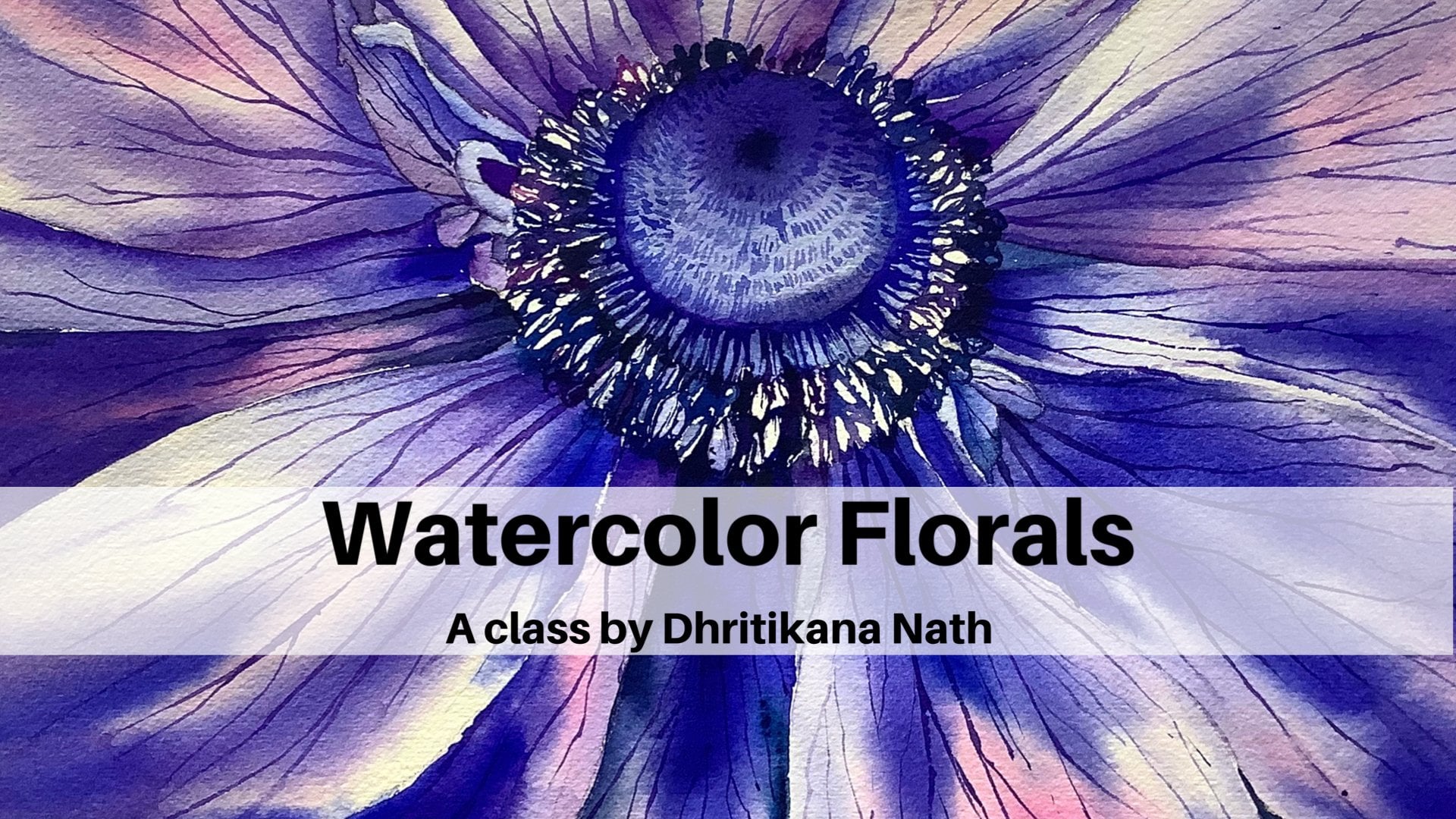
1. Introduction: Oh, hello, guys. I am critical. Not an artist instructor Still share a teacher on art educator from Delhi, India. Many off you might already know me onto the people who are joining me for the first time. I go by the name watercolor dot illustration dot later on Instagram. You can find most off my artworks there. I have read working with water colors for a few years on. This course has bean on my mind for quite some time now, as I always wanted to bring one course, which can help to enhance the skill set for the big nurse. Working through different exercises, we start by having a look at all the materials required understanding the quality off the paper. Why, on good quality paper is important for the heavy washes, then artist great big mons on brushes. Throughout this class, people embark on a journey about painting only Polaroids. As I know many off you are working on have really less time during the day. But there is an orange to reflect your inner self, all right, so there's always a great idea to work small, reducing paper or pains re stage, which is a huge concern for a big nor as they have very limited resources. The structure on the course will help you toe work on 21 different ideas, starting with landscape Seascape undersea are been sketching forest Sunset sunrise at much more we will learn different techniques like wet on wet, wet on dry, variegated wash, radiant wash on concepts like Invisible Point reflections. Headset class gives you flexibility to drop it at any point in time and pick it up from where you have left it last. However, I have an earnest request to take the class in a structured manner because it has been designed in help introducing level off difficulty. So without any further delay, let's jump on to our first lesson.
2. Before we go any further: before we start, I want to discuss five major important points for the scarce. The first be the people use 100% Corton 300 GSM more made acid free paper that would help you to do heavy washes. The second be the kind of pigments which you use. They're basically two kind of pigments that's available in the market. The first is the artist rate pigment on the second nous, or student rate pigment artist. Great pigment is made up off, usually two important things, which is your pigment hospitals. Mindulle, whereas a student rate pigment is made up off three different things that iss a pigment binder as well as a fellow. Therefore, when you apply your weapons on the paper you might find after drawing, they are more bill if possible. Please do watch this last on a bigger screen because that would help you to understand all the demonstration and techniques in a better way. Practice is the key. If I do not practice for one day, I get to know if I do not practice for two days. My audience also gets to know. Still, I would not ask you to take the class together do spread it over the time that you have set and there is no rush to finish it. Lastly, I did work or 21 different ideas for these Polaroids because I do not like to work on a Saturday or a Sunday. Let's move on to our next lesson, where we will discuss everything about our supplies.
3. Materials required: that's so force to go through the list of materials which we don't need. The first is my masking tape. It is one inch that I have taken their own majorly for brushes that I would be using the force years, my size force of a black velvet. The second is my escort, a size six brush. It has caught a very nice tip. When you dip it in water, you will be able to see that the step is so sharp that we do not need any other tin brush. But in case you do not have this kind of a brush, it's perfectly fine wolf or any other size off size one or cites to brush by which you can make Tinordi deals. This is size eights of a black velvet brush act, and there is ah ha Orphanage Princeton Brush. You can have any other wash brush off your choice. I have kept a real, small, flat brush because it is small size of people that we would be painting on on. You can keep a scale handy because that would help you to draw horizon lines or any other rules off. Roberto feels that central, pretty easily. I have a monograph pencil with me. You can have any pencil off your choice on Doesn't need a bullet? A. So this notably razor is really soft on. It helps to remove any graphite marks from the paper. This is a pen touch white Marco. You can go for any other, like Jerry Open or Posca Marker or any other white men that is available with you. Only thing is, it should be opaque in nature. I have hope in Sudan. Newton design milk wash you do not need. The score should go ahead and use any GOP quite watercolor or post two colors. Then there are two jars off water, one for the first supply and another for washing my brushes. I have a ceramic pilot to mix my colors. I have specifically chosen or 15 in tow toting centimeter people, but actual ball right paintings are smaller than these. Since it is a bit easier for me to explain on a pickle paper. Compared Toa really small one like 10.7 into 8.7 centimeter people. So I did choose the size, but you can go for any other size off your choice that is all the show, which you can always keep handy. It's a simple kitchen double, which I have taken on, and you can take off all your extra pains from the brushes on it. I have taken an arch is 300 years someone 40 LP, 100% Kortan people on it is a four size. You can have a look at the picture off the people, as it is called pressed, but you might have a preference for of green, so you can even use drop green people individually before we start a painting. I have included the list off colors which mean me. Therefore, we are not discussing any colors in this particular section.
4. Lets Tape down our paper: taping down our paper. This is a very crucial and important step for any painting. If you can, Deep down your people, well, then you will get beautiful, clean edges. Once we finish our painting, there are a few important points even after taping down your people, which I want to cover. The tape should be very old or else the aggressive in it sticks to each other within the tape player. This might leave you with very less opportunity tohave perfect stretched people the second this, Why don't we need to even use a tape? One important point ISS. It helps me to prevent the buckling off people. It is very annoying to see people buckling up during heavy washes, which is my preferred method. I usually go for a bit larger sized tape down the people you are taping down as it helps to prevent any leaking off water into the edges. Once you have the tape, always try to seal it from all the ends. In case you forget the step, there is a very high probability off water leakage
5. Project 1 Light & Glow: so the colors are crimson, like Winston orange are permanent care OD. You can use any one of them prominent ballot or bright violet and indigo. As you all know, this is our 13 and 2 15 centimetre paper on it is bit larger than the Polaroid size, which is 10.7 to 8.8 centimeters. The reason for choosing a bit bigger size is that it helps me to explain the whole process better. But I leave it up to you to choose your size. Smaller size would be better us. It would take lesser time to complete, and the whole intent off this class is to practice one small painting regularly or at regular intervals on getting into the space off. Becoming more comfortable with the media watercolors, we will start by sketchy to lavender stem. Nothing complicated. Hit all. Just go ahead and make two lines fill up a few spaces with being like shapes. It would become more clear when we get into our actual painting I'm using and half a niche Princeton flat brush toe wet. My entire people. You will see that I will do across watch toe with the people. It is an even coat off wash that I'm applying on. The people try toe haven't even got off wash because that would help your colors to blend smoothly onto your paper. Just load your brush with some crimson Plea on and start applying it on your Web paper. Now each and everybody will have a different name for the Crimson. You might not find the same color or two same pigment mix for each of these plants. Do not go by what is given. Just see color that is closer toe. What you happen to see in this painting on? Go ahead, use it. Do not go by the absolute name. Okay, if the instructor has told about from Sunday, we need toe own Batticaloa Crimson Lake toe. Get this finish painting. That's never the idea. Go ahead with the colors that is always available with you. First, I did apply the Crimson Lake on few off areas. It was very, very light wash that I did apply the second nous that I'm mixing some off my bright wallet with my crimson leg on hunting. In a few areas, I have deliberately left some white spaces because you will see how beautifully it will show off on the people once we complete the painting. Once done, you have to load your brush with some mincer orange. Now, this winter, orange can also be permanently Elodie in PwC Windsor Oranges by Winsor and Newton. So you know that these colors are pretty similar to each other, but the names do vary across brands. Therefore, go ahead. What whatever is available and start applying it. It's on or very, very few places. You will see that I'm applying this yellow on rest of the spaces. I will apply some more off my permanent violet. Now, when I have solved the painting, I see the colors are still lighter in values and we can go ahead and apply some more deeper values because once this layer dries, it would be one shed light, often watered up yours right now. Now, this case is when you are using artistry pains. If you're using student rate pains, it might vary to a large extent. As I always say, student rate pains have a lot of fillers in it, due to which it is cheaper compared to an artist. Great pains, which are mostly made up off pigments and only binder. Once you are done applying the darker values off though permanent violet, then you add some indie. Go into it about 5 to 10%. Not much at Do not go overboard with the color that you have to apply. So apply a bit off it on some random strokes with your brushes that you see me also adding towards the bottom of the painting. It's always a good idea toe. Have a small pool off colors ready while you paint, but sometimes I do end up mixing it on the go as we start our painting or when your big nurse, I always feel we should have a small pool so that the colors don't very much, though this is not much required for this painting, but as inhabit when you paint on our largest size people, it is good to now It's time to make some small street lines for the Bagram floors, which are blower and are not defined much. This is just adding a small line with help off my thinnest brush that a size four. I am not thinking much while I add these lines just go very random and wherever you're not happy, you can always pick up the colors with the help off your damp brush. That is my take brush, which I'm using right now I have another brush. That is my size six s gotta brush. It has a very, very fine tip, which is one of the reasons I have been using it for these kind of paintings on you will see that the colors will not spread much When I had very 10 lines with this brush. Finally, I think we are close to done with the background stems and flowers. We will go ahead and splatter some permanent violet on the bottom 80 off the painting. This is just a cool effect which makes the Bagram look a bit more impressive. After you feel that you are happy and satisfied, just let your painting dry completely. And then people start adding the levitt off flowers while I apply my colors which is a mixed off permanent violet and indigo. You will see that I will bury my values to a large extent. I will apply some deeper values in a few places and some light of values off the same mix in a few places. The brush strokes are Randall on the middle. A DEA is the stem around it. You need to apply some thoughts and shorter strokes to make it look like 11. The floor. We are not trying to aim any kind off realistic painting. It's just to imitate a beautiful, bright lavender field. Use the same technique to paint the other 2 11 or flowers and then let it dry completely. Protests so painting. We're tryingto work on two basic techniques, which is wet on wet, on wet on dry. Both of them are really important as a bigger intermediate as well. US. If you Warren advanced level artist, these aren't of base for you Watercolor Foundation. As we progress to our complete 21 different ideas off all right paintings, I will give you more insights into many more techniques, which I have been using for a while. There will be many tips n tricks, which I have bean using in the past paintings to make it more realistic, but in a very simple way. Let's first come back now and focus on this one. I have, ah reason to always say keep two jars off water handy by aside, like once I finish off painting thes florals, you will see that I want to add some more permanent, valid onto my painting on. That is not possible. If I do not have any kind off fresh water supply, you will absolve me, adding some random clean water onto the bottom area with the help off my size. Eight. Brush silver black velvet. Now, since this is an addition off some Pullman and pilot again and it has to be again in or random way, we are not following any particle apartment toe, and it as well as it is only towards the bottom of the painting has I did feel the bottom area was too light in value after the painting dried off completely. If you are already happy with your final outcome, no need to walk through the step, but this one will help you to understand that we do fix her a few parts even when we are finishing up copies. Let this KGO completely dry once you are done, adding thes those platters as I did right now. Finally, once it is absolutely dry, go ahead on removed the tape while you remove the date. Keep in mind that we have to do it at an angle. I assure you in one off the pieces where I did not actually take it off at an angle in one of the future exercises and you will see that how it actually can damage your painting. But yes, there were we or few ways by which you can even fix it. Let's have a final look, and I am very happy as well as satisfied with it.
6. Project 2 Under Sea: There are only three main colors which we will be using the Questi plateau from similiar, composed blue from middle omission, gold and indigo you can use from Winsor and Newton. I did already, deep down my people, and you will start applying or clear coat off wash as you see that my brush has some amount of red, which is not a good thing to have on your brush when you're starting with a new painting. If something like this happens, always go ahead and change your brush with another one like I have done. I have taken all size aids off a black pervert brush and started a blind some water with it . Then I am tilting the border bed so that whatever red that was coming up in my oh, do you wash? It just goes away and I can actually add some more water so that the top layer drips on. I can clean it with my our tissue. Just go ahead and clean all the edges because we somehow don't want that water seeps in or there's a background on and just move around the water a bit so that you know that the complete people is wet because we're going to apply a wet on wet technique on. I will start with composed blue. If you see this painting, it has a light on the left middle side. On on the sides. It is Darko values. This is a very small painting, so be very, very where you want toe. Leave the light. Start with light of values first and then evil. Go ahead and apply the darker values. You will see that I keep applying some amount off. Compose blue on. I start from the right inside Connell and then move towards the middle on. Similarly, when you are applying toe Questi plateau, see, there will be different names in different brands. But it is a kind of turquoise plateau sometimes that you can also use toe course if you don't have this particular Kahlo and this is from sinning good that I have used Color should never stop you from creating a painting. Therefore, if you don't have thes colors, which is composed blue Antal questi plateau, go ahead and use French ultramarine and Prussian. Go to replace them. If you do not have even in the go go with any darker shade of blue that is available with you might be even Paynes Creek can help you out. In this case, I will keep applying in the go from the right side on Take it inwards towards the left inside. Now the light is on the left on the darker values would be on the right. That's how I am placing this under sea water painting. The effect that I want to get is best achieved. If you have all flat brush on, you will see that I would be soon replacing my current round brush which is size eight with my flat brush. Oh, I'm working with only a few brushes because as big nose, I do believe that we will have only limited resources available with us. But if you have flood brush, move ahead and use only that brush while you apply this in Nikko it would be way more easier for you to achieve the results. I will also show you how you need toe actually achieve this result with the help off your flat brush. As I am doing right now, you have toe. Go ahead, apply the skin. Dig Okelo with help off your flat brush on it would give the smooth, perfect lending which you are so right now on the people. While I applied the colors, I don't keep in mind that my colors will try one shade lighter compared to what it appears right now on the people. Therefore, you need to also think from that perspective, in case you have more brighter colors. Stop there on just leave your people to dry off. Now my people is completely dry and I will start by sketching the sea lion. Now I am sketching a C line, but if you want on you think that somehow Tosi animal will be more preferable. Go ahead and you can sketch that only you have to keep in mind that if you are painting supposedly or dolphin rather than a sea lion, the deed will be towards the light or side on. Though face off the dolphin would be the words thrown doctor site because we want to show the transition off the light, whereas if you go ahead and paint the sea lion, then you can again do the same. Make the deal towards the lighter side on, then the face towards the darker side I would recommend you to download the painting from their source section before you start trying this on your own. That would be a good guide for you to understand how the sketch should be done, preferably used on HP pencil or any pencil, which leaves light terrified months because that just helps a lot while we keep completing our sketching area. If we have darker refight months than it would be difficult to erase it from the paper as we do not want any colors from below toe come off that are the result I will use composed blue and our mix off for Tokyo s T plateau more off composed blue unless off the coast a plateau and start painting the date off the sea lion. In case you don't have these colors, you already know what other colors that you can use since there's a transition off light. Therefore, I will just go ahead and apply the light of values first and then only apply my indigo to show the transition off light in this sea line. This is all wet on dry technique that I am a blind right now. My paper is dry and I'm applying or wet Kahlo on top. Perfect. Just load your brush with some amount off indigo in case you see that the colors are really dark. Go ahead, wash your brush and again load your brush with a mix off composed through until questi plateau, hoping for though I have this love for showing the transition off light on. And that's why I have included this as one off the 21 ideas that we would be exploring through this class, keeping in mind that it should be simple and easy. But you can always go ahead and complicate the subject more. In case you are an intermediate level artist, then you can on some more water bubbles. You can have ripples and more do these basic techniques that we did loan in this current project. Guys, I feel it's time toe work with the darkest value often to go. So go ahead, load your brush with some darko value off indigo on, start painting the face eight year off the sea lion because that is towards though darker Egidio off so ocean that we have painted. I didn't know on you will also that I am taking it really slow because I do not want toe sport this part of the painting anyhow, and it's always important to paint these kind off subjects store as well as steady. Oh, now it's time toe Acto final details on complete with the sea lion and then let the people dry completely. Once the people has tried completely, you can remove the tape at an angle. I have been stressing a lot about how you should remove the tape because I have Pasta Lee saying that it is very difficult in case the people gets ripped off the whole off the effort that we have given till now to complete this painting will go for waste on. You might have to go ahead and paint it again. You can even blow dry on the edges on, then start removing goody. Once you remove the tape and then figure out that there is some of the other leakage on the sites. After removing the tape, do not worry, because every time it's not prim and proper, just go ahead and have a final look at the painting
7. Project 3 The Sun: Let's go through the colors. They are Kamin yellow. Or you can even use lemon yellow cadmium, Oren's college Red Bon Sienna. And when I came around, I will keep suggesting you the coordinative colors has be progress through the painting. Yes, we're starting without thought painting. Now I will show you a quick trick which I always used to paint my sunsets kind to master 80 off the sun on the bull. I usually go with a coin that is available with me. You can take any going off your own country on. Just do a pencil mark off the round SoCal and then start cutting along the edges. You will get all absolute round sun and then you can master area. I am currently using a very small one. Andi, I did market with help off my ₹5 coin, which I have in India. But you can go for any other size off your choice. We will be doing over arrogated wash hand. It would be between the colors can be mellow or lemon yellow, whichever is available with you can be marriage or permanent yellow deep again. Whichever is available with you, you can use any that that is their currently I'm using the scholar tread bond Sienna. And when I came from these other colors that we will use for painting this sunset variegated washes many common as a watercolor technique where we will use multiple colors like we're doing now to get a smooth and even blending. Do keep in mind that barricaded Bosch a few try twice might not give you the same results. Has this lot of water, which we apply, and water has its own course. We will not be in a position to control that it all, rather than we should always allow it to create the magic on its own. Use a flat brush like half an inch brush, as I am doing now, so that you get the even good without any hard edges. I have always dressed a lot about the people, which should be 100% cotton asset remold made for landscape paintings as we do heavy washes on. You might do all the steps correctly, but your people might end up giving you a hard time to achieve the final results. Another rule off Tom, which is good for all art enthusiast and big noses to go for light of values to docker values like you would have seen me applying the can me and me alone Then get me more in scholar trip burnt sienna and went I k brown in an order. We are going from the top off the paper toe the bottom The top area would be the lightest on the bottom area would be the darkest, the consistency off the colors on the amount of water that you're pressured hold would be 60% pigments on your brush on dress can be water. It is kind of difficult to always show the exact consistency And how much more porter you will need. Do you have in your brush but always know that we're trying to achieve the effect off son in one wash. So if you apply very light colors, we might have to go for two washes. Got it on only one wash. They're thing, though borders. Good. So that the colors flow on its own on. We do not need to do much work. I will work with the darkest value at the end so that there is no chance of spoiling the painting. Make something I k brown with buoyancy and our 1st 60% burnt sienna and 40% and I keep from on then apply it on the people. Once we had done, go ahead with 100% and I keep around while we are at the bottom of the painting. Do keep in mind to clean the edges off thes side off the tape because they might be back from where your water might come back onto the people giving a cauliflower effect, which we completely want to avoid as we go step by step through each off these paintings, you might see that there is some of the autumn a thought which we keep exploring. That's actually the basic idea off doing small, poor right paintings to learn one or new technique through each of the projects. Deep cleaning. They're just rolling along the tip on. Then let people drive because once my people dry, I would like to be lost the tape where I wanted to mask my son on. Then start adding some small plants in tow. This painting user graphite pencil to mark three lines which will show the plants plants which are very close to the sun, will be lighter in values. Compared toa the plants at a distance at the light makes any object look lighter in dollar values. I know we have been talking a lot about Don't know values and it might confuse you had good stage. But do not worry. We have some future projects where you will understand how changing the values can had. Ah, lot of depth to any painting. Why are we being the first plant on top of the sun? It would be the lightest value status, my bone See enough. You can even use a bit off cadmium orange in the mix in case your box, you know, is starkly to be precise. All France use different pigments for a particular shade on. The one you see here might not be an exact match with the one you already have. Therefore, just try toe have something similar on. I don't do it. Once you are done adding the colors. Just go ahead and add some more when I keep around. Can few. What the years off the plant, which is on top of the sun when we being the next plant, you will solve comparatively darko as it is at a distance from the one we hardly painted the left side, which has a bit off light of value status bonds, enough and most of the other parts of and I came round on me. There are a few loose strokes, which I am leaving on the edge off the plant. I would ask you to paint the auto plant, which is left in the similar way as we are repeating the process. Only thing is the color, which I am applying that you need to keep in mind. Rest all with fallen place again might request to each and every one off you. Watching the class would be toe help. A small pool of colors by your side on the palate as you absolve me, painted the colors from the pool only if you do not have this kind of 10 brush, go ahead and use any small size brush off your choice to complete the plant atrium. We will also paint the stem in the darkest value, which is mine bend I k prone on. Then start adding off you leaves here and there. But simple brush strokes. The plant part might look a bit challenging for Now, as we are introducing new subjects with each and every painting, I am not asking you to achieve any kind of perfection through each one off the Polaroids bar. Just try to understand the techniques on better, which might only value a bit across each of these projects. But still it would make each one of them stand out from each other while you being the leaves, make sure that you off them should be taken. Few of them should be checked. That would help to depict nature in a better way, as situs nature and nothing is perfect. I have never seen plants off same size and shape if they are not maintained, man willing. I always off soft plants on moon trees mountains as I love to paint landscape. Similarly, if you like toe paying any other subject, absolving it closely is so very important. It would help you to achieve better results while you actually apply your brush on your people. We are so close to finishing this painting now, and watching this beautiful blend of colors is your place as watercolor excites me the most . When we are doing wet on wet, we hardly have any control during that stage. It is one off. The stage is where you cannot have much off an idea off how your complete painting would don't out. And once you have the final results, it just looks so beautiful. Now go ahead and remove the tape at an anger again. I am repeating at an angle because it could help you toe not rip off the people. Andi, then have a final look at the painting.
8. Project 4 Lavender Fields: we will be using the foreign colors to complete this painting. It is all a cream when I keep hearing permanent. Followed French ultramarine on crimson public. Okay, we are on to our fourth project now and we did understand a lot of concepts like wet on wet , wet on dry variegated washes light effect in any object on more through the earlier projects. This painting will particularly help you to understand the concept called us Vanishing Point Doe. I did cover this concept in my olio classes like summer afternoon for four easy watercolor landscapes in 15 minutes on exploring clouds and skies with watercolor. Nevertheless, it is very important concept for painting fields or doing any kind of for been sketching. The first step is to draw the horizon line. Yeah, the line will help you distinguish the land and sky or water, body and sky. Most of the paintings thus include this horizon line on the best way to place it is not under center, but slightly above or below the center. The lavender fields will be in draws that will emerge toe vanishing point in the sky. Managing point is always imaginary point from which the rules Oprah vendor feels originate . It can be in the sky area or might be even outside the painting. There is no specific or best way to denote the vanishing point. The levin of fields at the middle of the painting will be broader compared to the ones on the side, because on the sites they all need too much toe, one single point hands given not our hand. Far of a look. Another important part which I didn't known as a big nor is to simplify the subject and too few shapes and sizes like here. We're only looking at the 11 0 feels, hence working online student or the rose stuck with some French part remaining for the sky and make it lighter in value. As we come toe words still horizon line off the painting. We will be only feeding out the color by increasing the issue off the water. In our brush, you can use leader off flat brush or a round brush to execute the step. Because your paper is really small. On blending will not be an issue. Let your people dry and move on to a concept called us setting golds. If US a big ner. Your only intent is to paint a masterpiece. At the end of the session, you might get disheartened. You will completely overlook the beauty off painting with watercolors. The pains when they spread on the damp paper on the beauty off, be deals your interaction as an artist with your pains, people and water will completely be denied as off. When I started, I just had one plan every day, like today, I will work on my bloody technique, or I will understand my composition better. Or I might only learn how much should be the ratio off my pains in the brush compared toa water, so setting smaller goals is very, very important, wetting the complete or ground area with the help off my flat brush. Then I will use the color showing the 11 0 fields. We want to keep it loose, yet expressive and remember that's the only intent simplifying the subject by non detailing it much. Load your brush with some olive cream. Now again, the amount of pigments that your brush should hold. As for my experiences, one part off pigment on one part off water, you can clearly draw a value chart for understanding one single color or monochrome color. Better keep on applying the colors on most of the fee Todavia I just love to blooms off the olive green on the white paper. Do remember only 30% of the people were going toe touch with our brush dressed work will be done by water at some permanent Valid on then crimson blick many off You might wonder while we go far of a we see more of prison and less off green tax because off the rule of perspective, get hold off the subject better as this is bit more complex compared Toa Waldo. Other paintings we did till now I have to start it. This photo from her copyright free website on Splash. First of all, we are not trying to replicate this photo. We're treating this as offering work tojust understand our subject better has always the rules off lavender fields go far away. You will see the all margin toe one single point which might not be marked clearly But in case you try to draw lines, it would converge to a punishing point. Then comes the color off lemon off you it's more yellow ocher and drink while it is near us , where us? It is completely permanent ballot. While it because of the from us, I did change the color to Crimson Wake, and some are trauma ring to show a bit more impact. Oh, go ahead and apply some ultra brain along the lines which read a drawer. Leo. Now you're ultra marine. Should have a bit of permanent ballot into it. Once you are done, you will go ahead and add some more tech Sure onto the ground. Since our feets are still wet, can we can work more on door while I hacked her troubling? I do make sure that there is more our trauma team that I have parted while the things are new to me, whereas I have added less support Romanian while they go far away from me. So they are just seeing a single street lights he already happily out. Now it's time to know, think and then apply colors. I would ask you toe, go for some more permanent violet on, then had a bit off colors or fuel new strokes here and there with your brush. It should not be too detailed just to show that there are 11 of flowers on the pills. Step back and think again. That's one off the important steps. When you are a big no, we are not going toe. Just add for the Lou Strokes here and there because we do not want to overdo this painting . We want our green are crimson, are blue as well as the permanent followed that we have added to be seen on the crown on 4000. It is important to take it slow. - You don't absolve that my paper is wet for quite some good amount of time, though I have been painting and still there is more scope. One way to increase the time toe work wet on wet is to have good paper. But there are other condition which also Ansan like if you stay in a very human climate, even 1 80 GSM 100% Corton people might be good enough to complete the whole process. But if you watch staying in dry, please like I do not inside of India, I need to be aware of my people more either or 300 years and four or higher rate off paper will only work and it needs to be 100% cotton. In case you think off working and open on its hot, your people will try off immediately, so these factors can't be ignored while you work with the medium water colors. If you want to know the north the horizon line in a better way, there is always the best option to go with some trees on. I will also add some trees with help off my when Nike green. Now you can use any other dark green off your choice if you do not happen. Dyke. Agreeing with you even Hooker's green or any darker shade of green is good to go, so I'm just adding some lose kind of trees over here. Use your size four silver black covered brush or any other brush that is available with you . Those I should be smaller, so go for a smaller brush as my trees are very far away and we will just observe a few of them on the right as well. Also, the left two other some borough diversity in tow, the tree area, or you can say toe had some more texture onto the tree area. You can even take some more, all a prion and add on a few Opto areas towards the right, as well as two words left. - Had some new strokes with help off your with Nike cream on and it should be just a loose doors , basically very, very small dots here and there. So show door trees in a better way. And then I never show you how many mistakes we, even as experience daughter store, you can say is experienced art and pulls years artist who have been practicing for so long Still do. The one is while I have bean building off the tape, I have told you, tow bill it at an angle, but I myself who make the mistake off, tearing it off and you can see it over here completely. Now there's no way that I can go back. Tell her two ways, either I can get this hard earned than think that Oh God, I need to do the painting again. Orel Cyber. Do a quick fix, which might come handy even for your future paintings. If you have any off these problems that you face as a watercolor artist, okay, so let's go with some ultra Marine blue on. Start applying it along the edges. I will take one shade deeper than what I have already applied. I won't do my painting. Hind. I will just start applying it along the edges off the deep, which I did remove anterior off some of the parts off my paper. Then the similar process off Harding some water on diluting the colors. Why we go towards the bottom of the painting you're painting is completely dry. That's one off The reason if you apply even very light colors on top off it, none off the colors from the below will show off. But do remember you have to pay till though abortion above the horizon line. I would like to retreat again that this is just a quick fix. Sand, I do not really want you guys to do these kind of mistakes ever while you paint, because it becomes very difficult to handle these kind of situations on. This is just one off that I could show you how you can actually change it toe on extent. But I don't know whether in every painting you will get this kind of a chance or not. Anyway, we do learn from our mistakes. So just toe complete this on. Then go ahead and let the scary a drive completely and then have a final look at your painting. I hope that you will still be equally happy.
9. Project 5 The Lightening: we could use only a few colors for this painting. Permanent ello Permanent Crimson Winsor Orange wins a wallet Indigo Titanium Wife on. If you don't have hope, a tightening invite. You can go for either white Wash or wipe post two colors. There are many alternative colors, which you can use on. Each of these brands have different names, so do not worry. Whatever is closest in the color choice that is available on your palate, go ahead and use it. I'm tryingto take you through the entire process off. Respecting has the topic like lightning are not very simple, but still they're very impactful when you paint. I could have even master area off the lightning, but being a big nor we might not have access to a lot of materials on. That's one off the reason I did not included and kept it simple so that anyone can attempt it. If you have a peek. Watercolors. Let's start by wedding. The whole paper. We are not going to explore any new technique, Toby Frank, but use all the learnings from our previous four Polaroids to finish it. As you know, the colors are from men. Surround Newton this time I'm using colors from all plants so that you all get to know it is never important. Toe own just one single brunt. Whatever is available in your budget by that start by using some permanent yellow on, then go ahead and apply some wins and orange on top off it. Once you have applied some concern orange go with Carmine. You will see that the water will do its gold work. We have to just touch our brushes onto the paper again. I would say the first wash would be really like that. You do with the yellow, so be very off the water content when you apply your brush on the people as well as you always have to keep in mind that the color would go one shade lighter when you let the people dry off completely. Can't be doing my mixing the colors on the single, which I could use for forced adding the yellow dental pincer, orange carmine and now the violet. These colors are not reacting with each other, but if you have yellow blue, they will give you green, so it's always a good habit toe. Have more wells in your palate always a go from lighter to darker values, as we didn't know until now. Finally, when I think it's good toe are the deepest shade off violet. Use a saturated mix on touch on a few areas off the people as you have solved me doing it when I had the last layer off. While it I am adding a bit off into go into it because it makes it really dark on. A subject like lightning does require dark clouds. It's time to let the people dry. After this or ALS. The violet will not allow the other colors to be seen on the people as it is very, very saturated. - Applying even got off water on the people. We have to do this with very light hand as this is the second there. And beneath there I said, existing leery of watercolors already, as you all know, what colors to get activated. But water saw the step is really critical. Take of any saturated mix off violet, one shade darker than what me off solve on the people on. Start applying it randomly as you off solved the middle part off. The painting needs to be darker compared toa the site areas because that's where the exact lightning would strike. Now, when I need to apply the strokes, I will go up. It's slow and apply it only after I give a thought. Do it on. It would be very slowly I would apply on the sites because I do not want to overpower the wild completely on the paper and only towards the right. You can go a bit on, apply the violet. The water will do its work. So we just need to apply these goddamn brush strokes as my people is completely wet. I would ask you to let your people drive. We have already done two layers for our painting on and now I will go ahead and stop applying some more saturated shade off pilot which you have on added on top off. Though bottom media it ihsaa really small area which people do not as well us. It needs to be on even completely take an absolute saturated makes a pipe for the light, and either it needs to be a big white color or it needs to be wide wash. Or it needs to be y post akala, opaque white water color and gore should be freshly squeezed from the tubes because that will allow you to pick up more colors on your brush compared to water as we are painting on top off a very dark cloud. So capacity off white will only work it. Ihsaa really small land area, which we will do no passable as that needs to be uneven, completely taken, absolutely saturated. Makes off white for the lightning. Either it needs to be opaque white water color like titanium. Bite wide, wash or wipe post. Two column Open Whitewater color and war should be freshly squeezed from the tubes because that will allow you to pick up more colors on your brush. Compared toa water as we are painting on top off very dark color, so capacity of the white will only work. Now is the time to understand how we will go ahead and paint part lightning effort. For this. The angle of the brush on the tip off the brush is very important. If you hold the brush at 90 degrees, you will get very, very 10 lines in case you are holding the brush a bit. At 70 or 60 degrees, you will get some more tickling while you come from the top. The lines needs to be tickle, whereas when you go towards the bottom, the line will become 10 0 The life me will have one strong line which will be even way more ticker than other lines that will strike directly on the crown. - It's ah, time toe go for some more branching off the lightning area. Now the branching has to be again random and from different places. You will see that make crooked lines or called lines while I am branching out, You do not meet the branch a lot, Only a few here and there The branches will be to know compared toe the main lightning which will strike the ground though there so very less to explain over yours till I would say that this step is very important because that would actually create the whole impact off the painting. If you are not very confident with how you want to branch out the lightning always feel free to use your pencil on, draw the lines first, then go over it with help off your brush. While I know I have explained you most of the things in this painting, there is an important aspect about picking up your color palette, which I would like to give more details. I mostly go for animal August colors. What do you exactly mean by the longest colors? So I usually choose one primary color. Suppose it is red. Then I chose my other colors, which will work around it like the orange, red, crimson and violet. This does help me to convey the mood of the painting. Will. You can even use color wheel and check this one for yourself. And believe me, it might look a bit cumbersome, but it ISS work all the time and effort when you are a big no. Lastly, I will go head on, make some small electric lines now these heart at our far of a distance. So space, minimal details that I'm going toe. Are Toronto the painting on? Then I would like the painting dry off completely. Trying off your people is very important or als. You will always stand a chance to tear off your people. Be very affair that when you have done so much off hard work on any painting, we are not going toe take any kind of risk while the painting here's drying off. Finally, we're done and no need toe over work any further on this one. It's a very, very small piece, and I am not going toe had anything on top off it. I'm removing the day Pando. Then we are going to see the painting, how it has stoned out.
10. Project 6 Overhead Branches: scholar trait or any read off your choice when Seccuro, Deep Carmine all queen and went hiking, there are only a few colors that we will be using into stuff off. Bon Sienna. Hand your van, Dyke. Abram. Hey, guys, we're starting with our six project. Now. I know you might have already completed all the five projects. This is going to be a big tough compared toa The last five projects that you have done on their rubio different set off learning. We will stand by painting the sky I load my brush with the open sea yellow Deep on There are other options lights and a little yellow prominent Hello, deep Impede a policy which might be the colors close to this one. So there are many options and totally if you want to select a color range that is available in the market or ALS, if you do not want to go for that, makes 5% rate basically or touch off red in the yellow shade that is available with you and get a color closer to this one. I am a firm believer that the colors should never stop you from creating Has many off us do get troubled by the colors or brushes, which we should be using on blues. The mean focus. Let's know, understand how we want to paint the sky, going from like the value to a darker value, having about 80% water on your brush and 20% big men, because in what the colors it is always difficult to get back. So we start with lighter values off all shades. I will use my flat brush to paint a screaming, surely on we are going to do. And in one movements from the site, which will help toe give a beautiful Grady int. There will be overhead brunch in tow. Those onset sky therefore, on a small bowl, right? Peace. We do not need to complicate the sky much towards the bottom left side. I have kept the light on on the top, right? Gone. Oh, it's the flu, the colors which you right now. So when the people is really light on, I always keep this in mind. Once the Leo drives off, the colors will get one shape for the light off. How do we paint light in this one? Okay, I usually try to keep the white off the people by either masking it or applying only water so that the effect is soft as you off solved. In this one, there are no hard edges, but still we see the natural white off the people. Now I think it's time to let people dry and start with part Next part, which is painting the branches. There is a basic happened, which you should always have on status about sketching. Whenever you are doing a subject like branches to sketch very simple branch like structures on, they are going to be a V shape armed, branching out in a few areas. The line should be group heard because we are not going to help a perfect straight brunch. So just that one thing you need to keep in mind and then you're good to go once you are her . Done drawing these branches to school head and apply some water, and this water needs to be fresh. Absolutely. And that's one of the reasons I always say. Keep one fresh supply of water and apply it on a few 80 years, just as you absorb in the painting. Then I will go ahead on use my scholar. Tread that you see and apply it to words though, and off those wet party areas which redid apply with the fresh supply off water didn't go ahead and add some more Carmine. Now again, the carmine has to be absolutely Magnum. So if you see, I'm just touching only off you 80 years on, then leaving it touching with a few areas and leaving it. That's how you need to progress. The one thing that you need to keep in mind is this whole technique that trivia learning is about harmonious colors. You might be thinking, What do you mean by even harmonious colors? I will tell you in a bit lettuce first, complete this technique and apply some fresh water. Only a few patches here and there, just like we did all you. And not this time we will even hard. Some hint off yellow window. It makers hyphen nordo, lighter areas off the sky. I would love to add some yellow hospital as some red flora blooms and the branches as you at the colors. Ever talk about the harmonious palette. Thes are the colors, which can sit next to each other on the color wheel. Those Collett red and carmine might not exactly be sitting next to each other, but the value off scholar tread iss light due to which the carmine is really suitable. Toby place near the scarlet and similarly, the yellow which we are adding toe the scarlet. Over time I have learned that values matter more in harmonious colors compared toa the longest dollars. So I have already discussed about other unluckiest colors. And according to it, if you use lighter values, often longest color, they might give you the impression off being harmonious. Right now, I might not be in a position to explain you all the concepts through the color we which use okay, has been not in a class where we discuss about the color palette and how to select all the colors in detail. But this is there on my mind for a while on I will try to throw some light on the spot very soon and one of my other classes I mean, we have moved on toe green right now. The green that we have on my brush is the wind. I get green. You can even makes a bit off all of the van Dyke. A green that really looks nice. And if you don't have this particular green in your palate, do not worry. Go for any dog green that is available with you. Catch up on a few Avia switch card. Dry on. Do touch upon a few areas which are even break now. The wet part, which you touch upon its like one or tow Where's you mostly touch upon the dry areas. These other lose leaves on the florals, which we are painting, so do not get confused much. Or do not think much where you keep painting them. They need to be loosed and free flowing. No, it's timeto being the branches. We will start with some boots, you know, on add some more when I keep running into it on, stop playing the color on top off the sketch that we did audio. I don't know that the leered that you did apply for the loosely his son your florals is still were. Therefore, don't try to go over it or rolls your branch. Kahlo will absolutely get into word, and they will also become blooms. No, you have toe. Take these things into consideration while you paint. I am not saying that you should not go randomly off course. The whole painting is about randomness on going by, your wit and your God. But there are few if said parts between him to follow. While we even paint these of branches in a few of the areas. I don't even paint over the blooms about to make sure those areas are dry before you go ahead with it while we are at the bottom. That corner there is more of boats, you know, while I go toe what's the door? The mix is off the Nike broom and bone sienna in my branches. Now this is just the same concept as we did learn during the undersea painting at the stage , you can very well see that are painting has already taken a shape and only the last part off adding a few details here and there is left. I would love to slow down right now and see what details I cannot for the because if at this stage I overworked and the whole effort will go for a waste. So now I will just use the tip off my brush on make some smaller branches here and there. There absolutely lose on dragged. Um, I do not have any particular sketch or any particular painting or photo in my mind on I. Then add the's kind of brunches. It's just going with the randomness on the floor what you think will sort you while I need toe paint my branches, which are very 10. You will see that I will hold my brush at 90 degrees. Order to the BET Max Wonder 80 to 70 degrees. Whereas when I arm making these loose leaves, which are bigger and science, I tilt it more so. Holding the brush is also very important, and how you ordered actually gives you the exact strokes that you can make with your brushes. I think I have actually explained everything in detail till now. Andi from pure you can do it or take it up on your old. There is nothing much that I'm adding any folder. Just don't make sure that you let this people completely dry off before you take off your tape. We have already seen earlier how much disaster, or they can do so very sure while you start feeling off your tape and Now you have finished the painting on its in your hand. Feel proud off it. One thing that I must tell each and every one off you is do not be worried off failing and gets stuck. Every painting is a loaning. You are only bound to learn from your mistakes as I see what the colors cannot be controlled. So don't even try that on beat yourself. It will take a bit off time, but for sure, With each painting you will see the progress. To a large extent, the next painting is about the cliff on. It's going to be simpler than this one.
11. Project 7 The Cliff: colors are yellow. Coco Bonds. You know, when I keep pushing, look in the goal on some white Gosh, If you do not have, my gosh, go for your by post to color for any 100 opaque watercolor. Okay, let's stop with the Seven Project and we are close to 33% closer to our finishing mark. Anyways, this is all about painting Mountain Cliff, easy and simple in terms of Pinckney's drawing and painting. I know you all have learned a lot in the past six projects on it's time to have an easy and relaxing project. Compared to the early Opens, we start by drawing two lines off course. They're not straight as it is nature, and it would move from top right to the bottom left. The mean wash for the sky is a Flatbush. I know we tend to usually overlook very simple things, which we take for granted. But these are the aspects which we need to look in tow. Having an even wash in the whole 80 off the sky is not simple, so use a flat brush makes a bit off into go 5 to 10% in the Prussian blue and applied evenly. This is a clear evening sky. When we can see the moon on it is not very dark. I have done across much because the area is small, but usually you are should go from the top to the bottom. Then you do the same technique on any other signs, like a four etcetera. So keep that in mind. There is no hard and fast rule regarding the brushes that you should use. Go for any brush, either be flat or round on more brush for the spot. Let your paper dry. Know before we start with the month and media timeto apply some ghetto oko into our Pennington. Make a small pool off yellow Yoko on your palate and then does your size six all size a brush with yellow oko. You can even use bond number if you do not have yellow arco. These two collars are really close to each other in terms of shakes, so you can choose the closest color that is available with you. We will apply only a few areas rather than covering the whole off the cliff completely. Mix it with some bone sienna. Next. These are majorly art colors which I'm using for this painting on, though, mixing off the colors will be absolutely random. I am not going with any kind of thought process, only the bone CNN that I am a blindness towards the bottoms rather than it being the top. There's When I applied my yellow ago, I started from the top off the cliff. Time to add some when Nike brown. So again, the same method people follow makes some pool off the soap, and I keep around and start applying it randomly. Now this is wet on wet again because the colors are still wet, which you did apply polio on the cliff. I can feel going forward it with our been like a pro announcing it, though you will observe that I have done the mix in the same pool where I had my bones, you know, because it doesn't matter much as thes two colors are not going to react. Only I start going with all lighter. Mix off this, spend Ike a problem, and then I go ahead with some doctor mix so you can see more saturated mix by now. You know the time rule for watercolors. It's always good toe go with, like a values and then darker values. I have changed my brush. Now I have taken my size six brush, which is though esque orders I six. It has got a nice tip on the top. If you are not having this kind of a brush, go for a small a brush size either four or either three or two. Something like that, because we will need are sharp tip for our pine trees How to being the pine trees. So now this is I know it takes a while to get a hang off, how to being trees on trees, car or ways. So make or break in any kind of a painting. But do not worry, you will be covered in this one. I will just give you some small tips n tricks by which you can. I actually have a nice pine tree or a gala for random. Clearly that you get pain for pine tree the shapers like a bone. Do not worry. We had We do not need to always make it like a gun. Just start randomly applying the colors. You should only keep in mind that the top has to be tenor compared to the base. The base needs to be taken. Why? I did make it more ticker towards the base or the bottom. You can say because while the pine trees go under talk, the lips become smaller and smaller. Ask the on new. Where s thought leaves better the bottom. They have aged on the A No go. There are only two small pine trees that I'm painting on the top on. And even in the middle there, that two miniature by trees, I would say Just go ahead with your gut feeling and not our thing. What you can do us if you are not very comfortable, try thes trees on all rough people and then finalize it on your painting. Finally, I have toe last few five pine trees to paint down. Then we will be done here. I want to make a small cluster which is basically about 3 to 4 point trees. But it's not that I have. The language would ensure. It is just that I will make it on to send to each other, overlapping with each other because they're at a distance and we will not be able to distinguish it from each other completely. - I will take any round object like a bottle cap, coin or anything else to draw the outline of the moon. I usually never use a compass or unspecific instrumental. Draw circles once. None with the outline. Just take out some white wash on your ballot on Load Your brush with the white wash. Go for a size for brush because that would be easier to handle. Has the space which we have for the moon is really less on. I will half or better control with my insides. For brush, give a light wash in some of the spaces, and in some of the areas we will go for darko values. Now again, the values pile. I'm referent toes because the white wash has to be also very saturated in few years on in few off the areas, it would be more bordry mix. We are not going to cover the entire moon. Some parts, as I have told, will be more off watery. Mix on more dilute. This is just an easy way to paint the moon, but in case you want to do landscapes in moon, I will suggest you watercolor moonlike class where there are many projects to help you understand the structure. Complex city color choices on different kinds of wounds which you can paint while I paint the Move me on the edges. You will absolve that I use the tip off my brush because I do not want by Griff, I'd marks to show off now if you have Dhaka graphite marks, Go ahead. Use your it is our first raise it and then only go over it with the white quash. If you do not have the white wash, I would ask you to use your postal Kahlo or some white or pink watercolor. We are done over here with the moon. Let's start with those second year off the cliff, which we have again. The process is saying we will start with our yellow local on then at the Bon Sienna. You see that? My bod Xena has a bit of red in it. In case you do not have the same kind off color, I would ask. You don't have a bit of red into your board. Cno on that, that's all. You will get a similar kind off column because all brands uses different kind of pigments to prepare their particular shade. That's something I keep down on us. If you do not have the stock a sheet off brown, I would ask you to you something wrong number and some indigo in it. You will get a color closer to the one that you off solved on the people right now. Oh, I will load my size six. His quarter brush with some dark brown or you can say wrong number plus indigo column mix on. Then I will start adding some bushes onto mine. First Mountain cliff. Now this is the Bushes, which I do like toe paint because every mountain will have some uneven textures on the's. Textures can only be shown if you add some rough brush marks. No, on the gold. There are a lot of things that I might like about a painting or my might not like about the painting on. I will actually show you in future paintings like how I develop on few of the 80 years, which I might have screwed hope. But here what I want to do is I want to make it won't bushy like structures and because of which I have taken an absolute dry brush on. I have just done an upward movement from the wet grass is which we did paint olio. This will give a better texture on. That's all I wanted, I observed. Now that my moon looks more bail after the colors have dried off, so I will add some wide wash into my moon on only in a few areas. Some of the areas will appear in the blue that we already have from the sky. Panto slow down again and have a final look at your painting. We do not want to overdose and hence I will like this paper try and then peel off the day pattern angle building offers the best and the most satisfying process, and along with it, I always try to be very sure how I beat off the tape so that there are no beaming off paper along with the tape as we know how difficult it gets when we have to really fix these edges . Because off the paper view hand, that's all
12. Project 8 A Birch Tree: that has discussed the colors. First it is Kamiya, the wallet brain Bon Sienna when, like a green when that came round. Bright quality are a bit off oppression. Many off, you might think. Why did I even include a lesson on painting off both stree? It might look easy always to paint the trees, but believe me, it's usually not. And there are important concepts, like what you want to keep focus on what you want to show how to focus. This painting will surely help you understand a lot more about which part should be simplified. On which part should be detailed. Toe. Get the best outcome in a watercolor painting. There is no new technique, but learning more on the concept part. I will start by applying my anger if I'd months on the people now, this replied Mark is toe showed one single bra boards tree, and I will even brunch it out on a few off the areas. I'm not perfect while I draw these lines. So you do not also need to people fight while you learn how to draw these trees. Just that you have toe make the bark off a tree and then go on. Even with the branches on, it has to be somewhere longer and somewhere shorter. There is no fixed rule. As I always say, It's nature and nature has no rules. They are not perfect at all. On Therefore, Roget out at any of the places off your choice. But try toe, make it more organic Hotta Dan and be like too much of branches or too little of branches. So we have to be a pair off those packs while we draw the board street. I would just finish off my drawing now, and I will go ahead on and start applying. Even Goto Wash for the sky idea to make sure that you're both stree is white in the bark. Therefore, you do need to preserve that area. Either you can do or masking or als. I have not used masking at all. I will not be applying any water on that area and dressed up the years I would be hiding some more water. Just people careful while you aren't the water because we do not want any colors to see pinto birch tree bark, I would say there's a very simple rule by which you can always charge whether your complete area has an even coat off war should not. I usually take my people under the light on. And if all the areas are shining, then I know that I have applied and even gold off washed on. If all the areas are not shining on, there are a few areas which are so white those areas I need to apply some more water. Do start with the lightest, but have you again, I I am referring back to the value because that is a very, very important concept on. I will take some gunmen gallo on my brush and start applying it. You will find many other colors similar to the campaign yellow, so you do not need to stick toe this particular yellow. Just see whatever is available on your palate. Go ahead and apply that now take some more olive green and apply on the sides. I will go ahead and even applied the wall a print and few are the areas about those yellow which guided apply polio the yellow which I did apply waas more darker. It dumps off the values or you can say in terms of the saturation that I applied, whereas the all of green waas a bit lighter than that, I would go ahead and add some more when dyke agree now on the paper. If you do not have been Dichio cream, do not worry. You can go for other color choices like Hooker's Green. Or you can even go for any under dark green that is available. And sometimes that it's possible that you can even makes a bit off India. Go into your bowl of cream and get our color. But it's a lot of this one. Take a very saturated makes off, Ventak agree now, and start applying it on few off areas. Just a touch off it. I am not going toe actually make a lot off strokes over here. It is just here and there. A few touches makers the people is still wet on. It would automatically become Ah bloom. Again. You have sold me using the tip off my brush, whereas if you do not have this kind of a brush, go ahead and use a smaller brush off size too on you will get a similar effect. I will add some more board CNO into my background, these colors to go really well with each other you will off So But once we finished the painting how beautifully they blend with each other again on my plein this bod cno only in a few areas. After that you will take a very, very light makes off your while it. Now this wallet does contain a bit off pollution. Ruin it. Don't make sure that you have this kind off. Oh, valid because we do not want our bright Voller toe show off past the since the sky area which I want to show in the background Keeper Blending an addict The colors only on to the area which doesn't have the yellow Ordell's might turn into a muddy mix door were using very, very light over you off this bright ballot plus pollution boo. But still be very sure toe add are really, really like with suffered. Now Here I want you tohave foster for two brushes on prepare or small pool off. When I cake ring on your palate, though, one off the brush will act us your blending brush, whereas one off the brush will be used to heart the colors. If you see, I'm using my size six escort a brush optimal for adding these loose strokes on. Then I'm using myself a black belt, but brush to blend it with the background. I'm only adding the van dyke, a green on top off the loose. What a color. 80 year Where I did apply Insure Edo more or less under Van Dyke a dream. So make sure that you are applying only on those areas and one or two no strokes here and there on top off the yellow orto branzino, which is there People be painting these nose leaves on both sides of the tree, whether it be left and whether it be right. So feel free to go ahead and add these flu strokes. But to remember these are the strokes which aren't in focus. So these are the areas where we will be focusing more, Whereas if you see the other parts of the painting, they would remain lose on easy. So I'm happy to give you all the freedom to paint as many loosely says you want. But make sure you are only going over the darker areas. We're not going to go over the lighter parts now come so the branches. So if you see or off soft or boards tree, you will see the data off you brown party areas as lines on the bark off a tree. That's how I am going to denote these bush trees. I'm not going toe. Complicate us much because the whole off the painting will fall apart. They go dry national or a damp brush, but remove the water completely on, then applied on top off the weapons, which is there on the people on. You will see these kind of small, patchy lines appearing. Then load your size six brushwork, does some more off your Wendy Gay brown and start applying it on. These gave years and meet these horizontal kind of lines. Now these horizontal lines needs to be broken. Has been less People start painting the branches along with it. You will go head on, had the branches only on top off the eight years where V half added the gratified marks. I don't know want you to go absolutely random because that would or that might lead to a bit of difficulty, as we are just starting out to pink these branches and we don't might not have great control over how we painted again. There's a small trick. While I paint these punches, you will see that I will goto a particulary small area, then branch it over there again. I will go toe a small area than branch it from that area. So it's like that is a point from which my branches that exact point is important even in your painting on the drawing that you have done. If you cannot locate that point from where you want to branch, it would become really easy for you to this painting. You can truly understand that if your subject even does not have over ice in line or any kind of other shapes and sizes. Still, you can actually do complete a painting. So do not worry when these kind of subjects to come across. I think itself has a very good challenge for us to understand how we want. Toe showed the focus and how we want toe show the subject that is out of focus and finally giving a very, very expressive outcome. - We hope you did enjoy painting the simple get challenging subject along with me. I don't think this is a good way. You can see any scene and just focused on a few couple aspects drug than trying to replicate the entire photo or seen off your choice. And the state has come where we will be taking it slow and you will go by your gut feeling all off this branches that I'm painting now off course, I did not sketch. It's a good happen to sketch it before you add all of these branches on. They're going to be very loose and simple as always. Nothing exceptionally difficult that I'm going to add. Use the tip off your brush when you're using the brush. See that I'm working at almost at a 90 degree angle That would help, you know, get fine lines finally like your people dry and then have a final look at your painting. It's one of the best moments I would say every time when you finish your painting, it's like a proud moment. You have achieved one off the very difficult subjects you have completed it well, and now it's time to either you can sign your painting or ALS. Keep it like this. I would give us more brief about the next painting that we would be doing. It's the storm on it. This on a dry day, though stormy clouds we will be painting. I hope you are excited. He even for the next one, the way I am.
13. Project 9 The Storm: We will be using contrasting colors for this painting that is bright. Found him tickle yellow local. Bonzi, You know when I keep around, huh? Why General? Open Through this painting, we will learn how to paint the stormy clouds. This is one of my favorite subjects to pain. Let's start with the horizon line on and I will hard it towards the bottom Major deal area that I'm keeping is for my sky on and then go ahead and had some fence. This is from the left. Don't made a lot the painting. We are taking it in all slanting way onto our horizon life on As it moves far away, it will become closer to each other as well, a smaller in size Just to be more precise. With the perspective ideal, I would go ahead and check that my fences are becoming shorter and closer to each other. This is an important concept which you can apply even when you are working on any off your under paintings. Lee and even got off wash once you are done for the sky area again. Those simple rulers take this so piece off people under the light on and if the whole of the area is shining, then you have covered the entire area with water. Do across much. That's so good habit for anyone who wants to work with water. Colors went on with it. I will take a mix off bright violet as well as indigo. There is less off bright ballot at more off into going this mix. It is a bit saturated dough. I go ask you toe, even take a watering makes in case you want. But since it's a wet on wet on, once the slayer dries, it would automatically be more so paid in culo. I will load my silver black velvet size four brush. Why? I'm going for a smaller brush because that gives me better control in case you want to go for even one size small. Oh, go ahead and use it because, or ALS, there are chances that these lines might become bloom. No, Keep in mind that while you go towards the border, the color of the sky will become lighter in value, and secondly, you have to also leave some white spaces why you're paying these clouds towards the top off the painting. I don't better for yellow ocher towards your bottom off the Claudio. It is a very, very light mix which I have taken or you can say really watery mix, Which might it take? An added I will keep adding the droughts on if you see they are moving from all the sides towards the middle. Therefore, the clouds are coming from all the ends and they are getting towards the middle. The middle part is white, whereas the other sides will be in your indigo as well. US a bright planet. I have taken off further saturated mix just for a few off the areas where I want to highlight the clouds in a better way. Do not go over the entire area with the saturated makes because that would actually overdue the cloud area. You should be very sure how much you want toe add in terms off the saturated mix Toby find for the cloud area. I'm quite happy and satisfied because I have practically added the clouds from all the sites on it is coming towards or motion towards the middle. So I do not have much off any addition that I want to do just a bit here and there. And then I think we can start with our ground area on few off the years where you feel that you do not want the darker there, then always go ahead. Wash your brush, clean your brush on a damp tissue on, pick up the colors from those areas. Similarly, if you are not happy with the lighter values and furious, you can go ahead and add some more. People are saturated mix in tow. Those eight years I will just take some jello cocoa and start painting my grounds. The grounds are in no yellow oko butts, you know. So these are the major two colors, which I will be using. And if you see I am using more of contrast in colors, the sky handle grounds. Then I will go ahead and under some more, and I came around. How do you answer and I keep around us. You will go ahead and use are very, very light or makes off this when I k column. When Blackie Brown color, because I do not want her toe, make it very saturated or dark on only in a few areas to what's the bottom and towards the left side. If you see that, sometimes we also do some mistakes. But I on the go, always try to fix it. So if I have applied some darker values on a few eight years, I will eat a pick it up with a damp brush. Charles. I will go ahead and at some more yellow ocher on those eight years since my layer that I did paint my clouds is still wet. Therefore, I will go ahead and at some bushes which will appear at a distance, and I am using those in culo which I have taken for the clouds. There is a bit off colors which are there on the grounds. Even so, go ahead and use your damp brush toe again. Clean it off. Now you can go ahead and count some more depth into your bushes by picking up off for the saturated makes and adding it. Contador cloud area where awaited all European arm bushes. Okay, if I want to make my brown or any other color supposedly clean to our darker makes, I can go ahead and add some indigo in it, which I am using right now. I will take my men die Cape Town and make it for the Darko with my chemical, which is already existing on my palette, because I didn't paint with it in the cloud idea. And the grasses are simple. Just go ahead and make some happened. Movement. Now this Katie away you are making the glasses is called a bit because off which there are chances that you will get ticker line. So go with a very, very light hand while you paint these grasses. I'm really happy with how it is looking right now. I need to have some more whites into it. How you cannot the white either you can use a wide wash to do it or else what you can do. You can even go with white poster color or any other white. A big what colors that is available with you. I know Titanium White, which is from Vincent Newton, is all opaque white, which can be used four painting, thes and classes. Many off us do this layering technique, but we are never sure off why we're doing this kind off layering techniques like for me If I go over the bushes, which I did already pained with another live. It is a media lee to shoot the depth in the distance, but we are not pretty much aware off how we are doing or what we're doing. Or exactly how those livers will result in tow. I will take the same mix off. This brown and poor pullback is there on my palette along with Dana. Go understand it on a few 80 years with off the bush is that you see, Right now it has already dried up because off which it is not actually becoming a blue. It is simply you are giving me small, small, much more dots. Andi, that's all you need. Toe add into your job background 80 years. Then start painting the fence. It is the same mix. I'm just start at the on top off the verified month which you did I during the drawing section I will start, are adding no some crosses as a highlight hospitalised. I will even highlight my friends what you can use. You can use it originally weapon, white collar worlds of Posca marker or ALS. Some pain touch fine point Bend like this which can help you draw these lines. Our hells, whatever is available. But you like her Postecoglou. Order white wash or painting on the topic. What color? Just make sure that you are using very, very 10 brush 200. Once you are done, let it dry. If you are using the watercolor for the crosses, if you're not using the watercolors, water grasses and go ahead and start beating off the tip again. The building off the Dave has to be at an angle. I know I have been repeating it throughout all my poor right sessions still now. But seriously, it is one off the most important aspects. After we have finished a painting, I'm how will find the look at more painting?
14. Project 10 Gradient Sky: I have used quite a number of colors to complete this project. But do not go by the colors. Just see whatever is available. Bill you that it's closer to the colors which I'm using can work 1,000,000,000 pink inside orange carmine bright violet all of green, yellow green went Iike a cream Friends and family had indigo I am really happy to see you joining along with me in this tent project on it is goingto be simple. We will be learning basically, Grady in skies on how to paint lose bushes and grasses etcetera We will start by using a brilliant think that hided already have on my palette on If you do not have this think do not body Go ahead and use a bit of carmine about You can say 20 to 30% and then had some white into it. The white needs to be a bit opaque so that the Kahlo can be light or this kind off brilliant think and appeared on and then you have to go ahead with So insert orange. No, I always loved this color a lot. But if you don't have the scholar in your palate, go ahead and use a bit of Fred into your yellow and something similar. You can call this kit, then had some carmine find some more bright wallet on the top off the painting, we need to get an absolute smooth blend hand. That's one of the reasons that I'm using my flat brush. And while I go towards the top, I love toe. Add some off my ultra Marine into my bright violet, because that gives a beautiful mix off this right, valid on. Keep painting it. I'm bringing it towards the bottom while you go from your papo or your bright smile, it makes and ultimate inmates towards the bottom. Do wash your brush and then only start with the carmine part because I do not want you to mix up the yellow with the died valid so that it gives off very, very dark mix. If you are using a low like I'm using Vincent Orange, but still it's are kind off yellow and orange mix, and while you go again on the top, go for a dark, makes off your bright palette on ultra 1,000,000 on and then let it try. It's a very, very simple process that we have followed till now for our Grady in Sky. This is a perfect and beautiful Grady int which type of soft. I hope you get the same value paint, and if I guess you're not getting and do not be toward it, it's OK to not get it in the first go. Try it once more you'll for sure get it. It's just a very, very simple pending kind. If you are not very confident to try it in the first go and then start with it. Go for small people. Try this greedy int on that paper. It the greedy and keep yours perfectly fine. Then you can replicate it on your final board. Roy Painting. I will start painting the grounds. The grounds are very simple. Go with Major league three colors, which is your yellow, green, olive green and and Eichengreen. I did apply yellow green first. Then I completed it with my all agree on some amount of anti Qing Green lost. I did take a very, very watering makes court obey light makes cough. When I k cream more off water, you can say about 60 to 70% water was there and very less pigment compared to what I'm handing right now. Oneto my painting. I will not complicate the grounds. Any photo on start adding Go my tree towards store, Right. I will just change my brush post to escort us I six because it has a nice tip, as you have called, racing me, using it for my other being. Things on the step helps me to get these nice loose strokes. I start with a darker green color. Now I just want to show different colors, you know, in the trees. But since it's not like a bright sunny day where I will get lighter colors towards the top and darker colors towards the bottom, which is usually how we see trees, I can go with any color off my choice for the tree and then had their deeper tones either onto the bottom towards the talk, depending on how you want to show it. While you had opened like a green, now you need to be really sure because the mix, which is existing on the tree, is off color green on the yellow green. If you have all very, very watery, mix off your like a green on your brush, you will see that they will become blooms. Hand this Grady, in which you are getting even on the tree orto different colors which is appearing on the tree will not happen. I did already being my foreground tree. Now I need toe. Actually add some more background. Crease. Want to my horizon? No. Having the background tree would help you to show more perspective into your painting. And these are very small, small lines, which I am adding on top and towards my left with an absolute saturated makes, often like a tree, Onda. Then I'm just extending the tree off my foreground towards the bottom so that it looks more organic rather than it stopping from anywhere, though I have help you toe paint a radiant sky for this particular painting. But this is not a class seriously for those guys and clouds, in case you want to have in depth knowledge of how to paint for, though details into your skies the clouds, I can suggest you to off my other classes, which is easy and simple. Way to paint clouds off seven different types hand exploring skies and clouds with water column. They have at least seven toe a different or more than that kind off excises along with the projects which you can actually use for your own paintings later on, Let us are pink abouts. Now, if they are very simple and easy, do not worry. Just use or very dark mix like off indigo or pains. Great, whichever is available with you. I'm using my indigo toe being thes sports. Make sure that your few off the birds are facing downwards and few of the birds are facing upwards. There will be a body off the board on. Then there will be wings off the boat. This is how you need toe. Break your subject on, then apply it while you painted them. - I have included on this spot border into this painting because I wanted to show you a few things as each one of us does commit mistake. But we can always fix a few mistakes. Even what colors on the go on. That's one of the reasons off, including this part. Your grounds are still really bad, and in case you have a lot off water on your brush while you paint the classes, these kind of blooming glasses can always happen. Uh, but be very calm and cool at this point in time on, pick up the colors, which you did apply by using a ramp on clean brush just the way I have done on, but then start blending it with the bathroom. See, you keep might not have these grasses altogether and still have a beautiful painting. So people blend the colors with background and make it look more organic. People cleaning up brushes because we do not want toe doctor. The background looks a bit different than what we had earlier on. Start having a very small, small crosses to what you're right now. The right area is where they dried off. As you can see there, for my glasses are not becoming blooms. Any Ford er I will had even some more grasses toe words, though bought up off my tree on then I'm kind off done right now with my painting, I will slow down here again. I always see while you in your painting you need to slow down on let yourself come down because so we are going to step back and think that better. We need toe on anything for the or this is good to go. According to me, this is a small, poor right size and I do not want to complicate it any further. Therefore, I will let the people completely dry off on Then remove the tape. You can see after I removed the tape I get such beautiful sharp at this hospital as the greedy int off the sky looks so organic. It's like the colors are washing into each other flawlessly. Cannot say that this part off the sky is different than the other part. Meet you in the next lesson. Very will be pain. Take the beautiful northern lights.
15. Project 11 Northern Lights: Let's check out the colors, which we need to complete this painting. Khobar Cream French Ultra Marine In the go when I came round White wash or titanium bite, which is opaque or ALS, you can also have your wife post to color. Okay, so we are onto our 11 project, where you'll be painting beautiful northern lights on. It is going to be very simple and easy. But though your technique is based on wet on wet for the sky hand four door under 80 years of the mountains, we will be doing a weight on trying. Let's so forcefully and even goto wash on the people on. Then we will start with our cobalt green. This color is from Mitchell Omission Gold. If you do not have this similar kind off a color, you can go for other colors, like turquoise or other kind of brain that is available with you. There's no hard and fast rule about using colors. It's only the application which matters the most load your brush with some beautiful French are promoting. This is one of my favorite colors, which I have been using in many off my heart of paintings. It is really warm on gives for very nice outcome. Once your painting tries off, you will absolve that most of the brushstrokes are from the top moving towards the bottom because the top area is darker compared to your bottom area. Why do you start applying your indigo? Start from the top left corner and it would be towards the edges that you start and then you move towards the middle. Now, when you observe my brush strokes, I have first applied some indigo 10 some more ultramarine on top off it. But the colors that I'm using are pretty light right now. I would always go ahead and add the saturated mix towards the last just the way I am doing them. This brings me back to the concept off values. Yes, we have discussed a lot. I know even in the past about having different kind of values or using values in your painting and how you can go from lighter values to your darko values. There is an absolute project which is dedicated on one single monochrome color hand values off that one single monochrome color for doing a particular painting. I will add some more art, remain while I go to a word. So the bottom because that area I really need, like a values wash your brush or change your brush to size, pore and pick up some white wash. Or why post to color or a big Whitewater Kahlo on your brush and apply it from the bottom towards the top. Just away. I have applied right now on then on the edges blended with the Khobar Green. Many off you have. All these asked me how I don't get thes perfect blending for getting a perfect planning. I would always ask you toe work went on with wet on wet. When you apply some colors, they automatically blend with the background. No, the one single catch in wet on Wet er's. If your people have started drawing out and you start applying pains on that, it would give you hard edges because off those hard edges you might not get that particular beautiful blend off colors. So be very sure while you are applying your colors in Britain, but I am close to being done on IBO. Allow this people so dry before I add my stars. Now I have really picked up very less amount of Boyd on my brush. It is more off water colors or the wash or the post, a color that is available with you on very, very less amount of water. If you pick up a lot of water, you will get very take stars, which we are not particularly intended toe include understanding and therefore stop adding a few more biggest us wherever you want, Keeping in mind that the whole painting should come together to look as organic, you saw tip off your brush for adding the bigger stars on. Then go ahead and add Aga ified line for your mountains. Here I would beat you exactly how to be spontaneous and how. Actually, sometimes you can even not get the exact result when you start painting your videos areas in the painting. Right now, I am going with very, very light makes cough my Khobar Greek on the indigo that is available on my palette. Use more off water and less off the colors on your brush. This is the reflection off the sky onto the snow. The reflection off the sky onto the snow is very simple. While you are towards the top off the mountain order hilly area, which discovered. But there's no it would be the light of values that is Yoko barred green on while you go towards the bottom off the painting, you will find more off in nickel. The colors, which I'm using are very, very light mix on. I will like toe valued it more compared Toa adding it in a saturated version. - Pick up something like a brown on your brush, size four and start applying it on a few areas just the way I am doing right now. This is the place where you will understand how spontaneity works now. I wanted to exactly apply only on a few years and little other eight years empty, but somehow the plan did not go well, and I ended up applying on hold off the mountain area. No, is it the best idea to Doe? No might not be, but the final outcome matters the most. And then you look at the final outcome. It looks perfectly organic, and there is no problem in terms off blending or mountains. Not looking exactly similar, they both look perfectly fine. Apply some like a values right now, Ordell's what you can do is you can wash your brush since you have already applied some saturated makes. Whatever color remains on your brush will be good enough to apply on these areas. Go with saturated mix, often Nike brown, and start applying it on a few areas off toe old mountain. Now the whole mountain means the mountain, which isn't a background rather than mountain, which is in the foreground. Even while you paint the edges off the background mountain. Just apply it towards the bottom so that it looks listing compared to the one which we have in the full Bram, you keep watching me and you will see that how I have actually filled up the entire savior off the background mountain, keeping in mind that I did not need to do it. But it just happens. So when you are painting, you just don't know how spontaneous your paintings were. Don't out. I'm the most important partners not to get worried at that point in time. Just goto the end off any painting now. Since the sky was so beautiful and pretty, I did not want to lose any kind of hope right away. I just waited for the final outcome. Starting point. Some darko values off your bent. I keep around or to the foreground mountain, and then use a damp brush toe just blended with the park ground off the foreground mountain . I'm using a flat, damp brush for my blending, but you can go ahead with any kind off other damp brush that is available with you now. This March brush always helps me to blend very smoothly and quickly. But if you have a round brush just washing on, take off all the extra water on the shoe and then apply it for the blending part. By the way, I think that I'm finally at that stage. But I am going to mess up my mountains more. Do not worry. Never worry about the mess that you create in a painting because everything is good on in watercolors. There is no way to get back when you are working with Darko values like open like a brown. So what I decided at this point in time is to just use the colors completely on, then half one exact deep brown for my background mountain that than having any left out spaces. Okay, so now is the time where we need to step back and understand how kiss my big thing shaping up now the only thing which I have followed to our this painting is not give up. Whatever be the conditions. In case I have darker values, I will work with the white wash toe. Add this No, just the way I am doing right now. So not giving up ist a major idea at going with the spontaneity, your gut feeling, how you can't don't your painting into something which is really pleasing to the eyes off The spectator is important to understand. I do get it that every time we might not be in a position to fix some mistakes. But you have seen how we have actually walked around with the white wash toe. Add the snow on toe her background mountains rather than leaving it there and not getting the best outcome. After you are done with the whole off the painting let it dry completely and then removed the tape very, very slowly again. You will see that while I removed the day there will be a small part which gets ripped off . Yes, it happens quite often happens to me, Onda. And that's one of the reasons I have actually shown you while you were painting the Levin. The things How toe Fix it Well, with help off your brush again, people use a darker value off indigo and paint on the edges. Use the tip off your brush to fix this part. This just a plain flat wash that he would be applying on blending it with car sky rest. I think I am pretty happy with the final outcome, though there were quite a number off difficulties that we went through on this was solely the idea to show you that how even after being experienced, we do common mistakes on it is important not to give up kind. Wait till the end and finally the painting is ready and this is stoned, are beautiful.
16. Project 12 Summer Time: Let's check out the colors, which is Carmine, French or German. Ian composed blue wins that orange yellow Coco Toco esti plateau when dyke agreeing when Thai Cape Town in the go white wash. Or you can even have why, to post a color worlds, you can have your typing invite opaque water call. We are onto our 12 painting, and we have 40 cross 50% whole floor. Mark and I will start with the horizon line for my we'll see I'm for the sky. It is a bit below 50% off the paper, and then I will start painting my sky. The sky will be basically with the three different colors that is your carmine, then your Winsor orange on French, our primary in the Meanwhile, before you stop painting the sky, just make or drop sketch for your coconut tree, which we will be painting later on. It's always good to Scatchard initially and keep it because then you will not see much of graphite lines coming up along with. Then there would be or C sure, because below the horizon line, it's the sea and above the horizon line. It's the sky, the whole of the painting might seem to be open long, but do not worry. It is just a blending off the sky, the sea lying, the coconut tree and so many elements which we are adding together in this painting, which makes it ah, bit more longer. So my favorite method of going over the sky is with the flat brush, because the blending is very smooth with a flat brush on. I will start with the lighter shades off ultra Marine on, then at the Carmine as well as though Windsor Orange. Okay, so are your this time I haven't gone, but though value as I always proposed, like starting from your lighter value toe the doctor five you because I was not sure myself at exactly how I want to add the colors onto my sky. So I went ahead very randomly, adding the colors. Now that's another way to spontaneity, as I have in the last painting. So are you will go ahead on at the colors as and when you think that it looks fine. So I am going absolutely random and spontaneous while I'm adding the scholars on. Then I will allow it to dry. Now, I would be adding two layers. So when you see the final peace, once it dries up, you will have to. Lear's under it. You can go ahead and add two layers in the similar way. I have shown it now because it would have bean an iteration off. What I have all the shown you write of it. Therefore, I just keep the step off, adding one more clear toe the sky. Do check the sky area before you start painting, though. See, because I do not want that the colors from those guy area motion toe the colors off your CEO. We will start with the composed blue, and it is from the general Mission Gold that I'm using me and the horizon. It is completely earlier, off composed blue that I would be earning now. What should be the consistency you might be thinking? I would ask you to take lighter values, forced that IHS take more watery mix off composed blue and then start adding more saturated values. One. So you add this composed Louisville, start adding some more toe Questi plateau into the area on the other shore line the values . Which car near the horizon movie Lytle. Compared to the values which would be and on the shoreline, I have even added some more are taameri toe my mix off toe Questi plateau and that's how I am addict are getting this particular color while I keep extending the sea towards the bottom off the paper. This part is really important. While you're painting the shore or the waves, I will go with some more deeper values. You can either and ultra marine or some in Nikko Ondo just get a Kahlo, which is our darker than the colors, which we have already applied like the compost flew on the turquoise de Plateau on. Then start painting the shore. Leave a few white areas. Now, if you by mistake, cover the whole of the area, there is no problem. Evil. Why quash or any kind of white post to color toe had the required number of waves for our short line. Along with it, you have to keep in mind that my horizon is stupid and I will act some more deeper values in tow. The horizon eighties or mix off your again. The Artemis on some amount off Questi plateau I want right now ask you to take a small break once you were done with this sea area because it's already being 5 to 7 minutes We're working on along with it. They didn't mean the sky as well as to see only the shore on some more amount off details for my cocoa Notorious left. So take us more break and get back. That would actually help you to concentrate better. I am taking a very, very watery mix off. My men die cape around. You will see that there is only 20 to 30% off the pains that is there on the brush undressed amount is completely water With that while you go towards the bottom Just had a bit of boats in. Now my branzino again has some amount of red in it and you do not need to Very portable. But seeing is available with you. Go ahead with that. I'm happy even had some textures toe are sure about. This texture is very, very important because that would give more off a realistic kind of feeling. Toe this painting. - Okay , so I'm again going forward, though area well, that is below the horizon because somewhere or the other. I feel the blending is not exactly the way I want us hunting before I am just going ahead with a bit off, composed through ongoing over the entire sea area. You do not need toe touch it. If you were happy with the outcome that you had not since I was not very happy with the way it works. Therefore, I just thought, Oh, go over it once more and again the rule remains. See you will go ahead and add some more darker values while working finger shoreline more bearable. You have the waves because you will always absorbed that New York so short there will be off you waves which are approaching. I don't think that I have covered a lot off white which I had for my ocean. But it's okay anyways, we can use an opaque water Kahlo and just again and it on to our painting. So it should not be a problem. So never get worried you do. These small small changes are due to the small, small problems which ocurred in your painting. It is Fontane ity again. You cannot rule everything or try to actually have everything perfect as such I would start with my deepest body, which is my van dyk e brown on and add the trunk off the coconut tree. You will see that Mike open a tree is a bit dated because I wanted it like that. You can even, like, make a cook a tribute to straight. I do not have any problems with that. Go ahead and make it straight if you wanted a word that way on while you come towards the bottom where the coconut tree is touching the ground, just make a few strokes and blended with the background. Octo Seashore life. Okay, for my leaves, I would take some off my yellow walker or you can even take some amount of Rossi and Yoko is a bit Oh, peak in nature. I will not say it's cool, you pick, but it's very likely open camp. It would walk on top off the are remain that I did or d paint. It's a very random draw tree branches that I have making. There's no exact or the best way to make any tree branches. Justo, go over the straight line on 10 some mortar deadlines on people having all these kind off lines and the similar pay some going downwards. Some going on the tops are going on the right. Ondo. There's a cool piece which is going from left towards the right. So most off my leaves will be towards my right side. Okay for the greens that you want to pay him toe the coconut scraper, I would ask you to mix up. It opened. I keep creating or who cursed going into the yellow oko that you already have on your palate on then heart thes lines on. They are not straight lines there slanting lines for making a bit of slanting lines. You cannot hold your brush Pope and Niccolo. So while his hold your brush and ankle, Onda then had these lines on both the sides off those single main bunch off each coconut. Let's start with the pink polio. Keep painting the lease as I'm showing you right now, along with the brush strokes there, lose and simple. So do not want much. Just go head on and watch how I a painting and just try to replicate the same on your people. The whole class that you see is about reflecting your inner self why we are doing such a kind of class where we are taking up so many varieties off projects and trying to understand how the strokes are, how the water floor or how the consistency off the paint. Everything works hand in hand. Now this is one of the major on the most important reason for so many variations in the subject because we do not know exactly right now what subject we might like on love to take it forward. Compared toa when we are more experience than exactly know the style off a painting on how we want toe even de with the kind of subjects like either a B or C escape or integrity or landscape. Paul, some said. Sunrise shadows light reflection what exactly we want toe work. On the next comes the style of painting. Now my style of painting. It's more to do with the vibrant colors. But it's not that I haven't included subjects where you are not actually dealing with a very vibrant colors. You are dealing with more on longest colors or you are dealing with monochrome or you are dealing with two or three colors like a limited palate. Therefore, in the whole sum. You should exactly understand what colors subject painting style techniques that you should build on to have a voice which you create for yourself as an artist. Oh, now again, I have touched upon one important aspect about the artist ways. You do not need to worry. I will actually help you understand what is an artist, Royals and all in our future lessons and how you can actually work on their plopping your own voice. Right now, the only criteria is to build up on our skill set, which is sort of critic things that we are learning on. Then add a few boats on the sky as you also Yes, some jump Ignat topic now. Well, we have to get back to our painting and draw a few birds only here and there towards the left. On the then we will add some more highlights with the white wash, I have actually taken some white course. You can even take y post a color or why toe pick watercolor. Oh, do not worry. It will work similarly. Onda, stop beating off you off the waves. There it is simple, short and small lines that I'm minding Hospital for Delinda, painting people even on some more highlights on the tree at it is very simple one or tow small white lines that I am having. It's not that I'm going to cover the entire space. It's just one or two dots for the tree area and one or two short lines for old branches area, because I feel that my branches do look a bit darker. Embargo, you compare toe the at a mosque there and I do want oh, just brighten it up a bit. With the highlights, I know that this might have been a bit more longer. Session compared toa although all your ones we did till now it is only because there are a lot of elements which we have included on made it a bit more complex compared to the only off you which we did. But believe me, we are going to paint more off water. Reflections on they are the subjects which which actually demands more time and effort, compared toa the landscape which we attempted. Let's peel off the paper and jump on to our next lesson, which would be a part painting reflections
17. Project 13 Dream Destination: the colors are wincing Orange Carmine Brilliant! Think Brilliant Violet on indigo Hospitalists wide wash for titanium. White opaque. What color? Okay, now we have come toe are putting painting on. It is going to be really special because we would be painting some beautiful bay still skies Along with that, there would be reflection in the water hospitals. You will find me strongly to even paint over isil line. Now this is not painting the rights of man but making the rise at night. And how do you usually make it? All these measures like here I am taking about one the half inch on, then trying toe join it from Putin's. This is the best way you can make the horizon line without making it tilted because my horizon line really became a better day, Onda Then what I usually do is pick up any extra graphite months which I have applied. I have been using this beautiful, brilliant drink from my middle mission. Good again. If you do not have the Spink, just go ahead with 20 to 30% off Carmine and then add some OPEC watercolors into it. That is your white water color on I hope you get a color which is similar to this one. I need to tell you one thing. See, all the pigments from every plant is not seem. Therefore, do not try to match the exact colors. Just try to see if you can get something similar to this one and that would once I am done with my brain and I think I will take a very, very light wash off my bright pilot. If you see there is a bit off Berlin pink in my bride pilot, which are added initially and now I have started adding, Are more saturated makes off my bright violet over the right violet because there is a brilliant pink fellow I would love to add some more. Carmine Rule of thumb, as we have orderly lawn is going from like a values which gives my when Sir Orange Andi, you can even have been so yellow deep. If you do not have the Spencer Horan's, I have taken very, very light wash off Unser orange, which pretty much looks like yellow. If you do not have this particular shape, go for Cinelli yellow on any other yellow that is available with you because yellow will anyways not react with your brilliant thing. And it would give you a beautiful outcome. I will keep blending the sky on the top on try to make it more organic because I do not want that my sky looks patchy or there are different colors that are absorbed which are not blended well and there are a few hard edges. That's what exactly I do not want. But when you observe right now, after I'm applying or darker shade off my MENSA orange, you will absolve that I am or I waas getting a bit off Maginness. So what I did was I applied the colored till the bottom area where I felt that I need to blend it with and then in the bottom area I'm applying my right valid after the bright violet, you will see that I am changing my brush on taking off our silver Blackwell, but size cape brush along with it. I'm picking up some more dawn that brushed on blending it with the Vincent orange that I already have on the paper. And then I will keep blending the colors till I reached global in pink area on then carry on, adding some more. Deeper she It's two words the bottom with Tom up off my civil Blackwell, but size eight brush and you do not need to overthrow the painting wherever you are not very comfortable with this wet on dry mitad. What you can do is you can whoa, wait, Don't let method because many off you are more comfortable with that mattered on. I can tell you that can also work in this case since this is a very, very small paper. Therefore, I did not want to actually dress much on don't wet on wet. I thought I would love the sky to dry off before I start applying my lighter shades towards the bottom. My skies always in people compared to my water now the water area. What I want to do is I want to have a like a value because there will be repulsed that I would be added on top of this water, while there is more off deeper colors towards the top while I come toe what's the bottom? The color range will change into my brilliant pink as well as some amount off my bright valid most of you might be wondering why I'm stressing so much on the water. A Tia and why are the last four projects topic with the 11 12 13 14 as well as the 15 project? It's mostly about painting waters. And how do we show the reflections? Yeah, I feel that this is very, very important topic, which I haven't touched much till now, and I would love to throw some more light into it. While we do that, we will just pick up some white wash and then had a bit off yellow into it order Windsor Orange, which we have used for our skies and start making the sun. Now the sun is very small because the paper Israeli swan So we do not want the setting Sun Toby looking out of the blue. And that's one of the reasons I'm just making it really small and adding up it off yellow into it because it is a second son, the next deciding some kind of birds onto my sky area. But before you add these birds, make sure that the complete sky area is try for painting the birds. You have to take either indigo quarrels. You have to go for Main Street or else the third color would be black. For painting your boats correctly force you need toe. Actually place your hand on the board on, then start painting your puts. Now boards are important aspect in terms off your painting, which we are putting together right now. But do not worry. Just go with the feeling that we have to paint very small birds and they are moving in one single room, some of it up and some a bit below. You will see how I will. How did I will paint a very, very small body, hold the boat and then extended on both sides. Some off The birds are moving downwards like their brings are facing downwards and some off the bird wings are facing upwards. Some of the bird's wings are facing on the sites. Why all of these movements I've included because it is nature on in nature. You will not find birds moving in a particular direction or together, Dave movement all the directions possible right now, you also that there are two boats which were lapping in chado. These kind off overlaps are very important to show four for showing that in Ginsu Pink Nature you will not find much off perfection. There will be less off perfection on more off natural occurance on for showing that natural occurance Beautifully. Few off my boards are up and down, and now you, if you see some of them have longer wings, one off them there is The other thing is a bit smaller because you're absolving it from a particular angle. Everything that you resolved on artist painting has a reason behind it. It's the way off the perspective or the angle at which the artist off solve it as you guys are also walking that part. So it becomes my responsibility to reason out most of the suspects in a painting. I hope after all these board right cities, you can actually work better with your own projects. We are now on the part, which might look very tough because it is about painting ripples. But believe me, it is not with a few tips n tricks, you will be in a position toe, understand and nail it with that. I want to tell you this last might not give you an in depth knowledge, which you need for painting waters are reflection. You can take up my other classes. Like what color? What escapes will be learned how to paint, moving water in two different ways and another oneness. What color? The ocean waves. It would help you to understand more on how we create the whole energy in the water area. Why you are towards the bottom. You need longer lines to shoulder reports and while you go toe towards the horizon, your lines will become shorter, smaller and very few in number. That's the simple rule of perspective. I'm taking some indigo on my brush on using my size six s quarter optimal brush Got a very nice stepper which I have been using no toe paint video suspects in each and every poor Roy painting. Similarly, I will even use it for painting that interlocking ripples. In case you do not have any brush off this kind, just pick up a smaller brush off size two and start painting these ripples. It would help you to get better control. If you have never attempted water, just take it slow, make one line and then attach it to another. Just the way you off so bit over here again. Repeat the same process. The interlocking part is very well seen while we are towards the bottom. Where is while we go towards the horizon, Ripples will not be completely visible. Therefore, it would become small dots on very, very short lines. This part is the longer and we motoring down the complete painting we didn't And now But I can tell you once it is done, there is life which we can bring toe this painting with that now is the time to stay focused and not lose your patients tedious. But then painting waters has never been simple either. Or do you see keep of solving my brush movements on. Then we are close to being done. You will see that while I go towards the edges, I will just make longer lines. Whereas while I come towards the middle, I will make it a bit more shorter Now why? I try toe start from the right or from the left because that would give me a better control over my brush while painting thes reports some off the reports I am dark, turning it with help off my saturated indigo mix and all the others. I'm leaving just like that, as thinner lines. - I'm pretty much not now, so go ahead and just leave it here. No need to overwork any further on, then let it dry. Once it is dry, remove the tape at an angle and then have a final look at the stream. Destination. Yes, guys, it's actually like a dream. The pistol skies, the water, the reflection, the setting sun. Everything just works perfect. See the final outcome and then feel proud of yourself because this painting was not simple . I know because I have created this painting and you could actually manage a That's great Onda. We are going to raise up our photo with the next painting, so hold on to get a bit more challenged.
18. Project 14 Reflection: Let's discuss the colors. It is captain yellow or been so yellow. Deep hollow cream Windsor orange friend Eichengreen when I came round. If you do not have these colors, go for the colors which are closer to it. Like for cadmium yellow, you can go for lemon yellow or similar regular. Okay, so in our previous excites, we have long toe a lot about the skies, then our beach on shore. This time, people practice everything about reflection. Now reflection is always a very, very important topic. When it comes to painting water, he will. We will do a very simple reflection on a bit off a moving water. It's not completely calm, but it doesn't have a lot of movement in it. Whatever do I will just draw are very simple. Horizon lime. It is a non straight it. It's mostly crooked on, and then I will go ahead and make some lines for my trees You have already painted or some tree like one of them was the bush tree. Here we are painting no trees together, about five or six maximum. We will start with either open, say Elodie, or, if you have cadmium yellow. Worrell's If you even have sending, you'd get low. You can go with that. There is no hard and fast rule off using any particular shade. You can go with whatever is available for new palette. The next test open, said Orange. No bins and oranges are very beautiful when it comes to the greens that we are trying to paint on the once you have already applied the winds Iran and just blended with some olive green. This is all wet on dry method, which we are right now attempting. So as a best practice, have a small pool ready for you. Either be all of green or either be Van Dyke, a green, yellow or been said orange, which you are riding on. As I always say. Keep that in mind. The colors, which you aren't right now will become one shade lighter once you are done with the whole off the painting and it dries off completely. I'm quite happy without the spot has stoned out. Now it's time to act. Someone people green many off. You have been asking me what is the color that you can use in case you do not happen, even die, Katrin I have bean regularly using the spend I kicking. You can go for hookers. Screen oil's what you can do a stick, a lingering off your choice at some pollution. Look all something. We go in it and then start painting with it. That will actually give you a Kahlo, which is really the hard it would give the similar kind of perfect, which you like. No. So on the people. I'm going ahead with some more saturated makes off my when Nike green on. Then I am just adding on top of the wet area. Now when you add any color on top off red area table form blooms, they're not trying toe, actually leading much off the trees because he or the main focus is how do we create the reflection on trees? Is not our main focus does We will be adding the branches as well as the bark off different kinds of trees, but still the major work will remain off the water. It's going to add some deep of our use of bring towards the top of the paper as well as I will show you how I show my green, which you are so right now on the people. These are very small tips n tricks which can actually help you in many off the other paintings. What I did I took the same brush which hot those saturated mixed green ham been I did splatter the greens towards the top off the people. Next What I did was I went ahead and added someone splatter off clean water on those where the booms which you did also. What's this paper is a bit semi dry. You can again apply this method off, adding this being water splatter on you will actually get beautiful textures. Because off this ad, I have been loving the Stickney for a while now on just thought to save it for this particular Polaroid altogether because that brings the whole painting together. And now it's time to add the water. The water, I would add in a similar way start adding the yellow first what I did for the spotters. I added more off yellow throughout the water area. Hampton, I added my orange towards the top as well us along with it. I will go ahead and add some more all of cream, and then die catering. I will use my flat brush for the blending because, although that shows what you see on the top will not be similar to the textures that you will absorb at the bottom, as my water is not completely calm and I assure you how toe ad for the details onto the water to make it a bit more moving at some talk of values towards the bottom, where my horizon line is touching the water area, and this is just to show the reflection off the top. Fully age onto the water area. Change a brush. Now the smallest brush riches size four and then at some more lines with the grains. It is just to show that movement, which I was told you're telling you about, and this would really have to show those small small lines and depict odes, reports that a pure on the water whenever you see there's even a slightest off the movement . - Another important technique that I want to show you is about cleaning up a few areas with hair, pop your brush or removing the pains from a few areas with help off your brush. Now this, you can either do with the flash crash quarrels. You can even do it with a round brush. What I would do us. I would take any clean brush off my choice on then take off all the extra water from that brush with help off a tissue. Then try toe. Lift off the pains which are there on my paper for this, either your paper needs to be semi dry or rose. Your paper needs to be more wet. Oros, This doesn't work exactly the way you observe on the people. I'm right now happy with the reflection that I have and I will go ahead and let my people dry First, once your people is trying, check it thoroughly that most off the areas where you had to paint your branches as well as the tree trunk off your trees is completely dried off, or als. Whenever you apply this brown, it would become a bloom. And we really do not want to have the room because these trees needs to be completely detailed. As the reflection off these trees will won't be a pure in the water, many off you might not have the steep and I cape around which I have been using for many off my paintings in this poor droid series. What you can do is go ahead and take some brown or bones. You know what you have on your palate? I had some black in it because black is readily available in any ballot. If you do not have black, try to add some indigo in case you even don't have the indigo, try to go ahead and and some pains. Great. So these are the other options which you can actually explore to get a deeper shade off brown. But it might not be an exact match off what you see on the people, and we are really not even aiming for the same. They are trying toe only understand the techniques and how we can imitate the ripples or the moving water through this particular Polaroid for many off, you know, trees part very difficult subject toe pain. On. I have a few tips which I have been observing for all my paintings. Oneness. If you use your brush just perpendicular, you will get very 10 lines as you absorb right now on the people. Whereas if you just try to apply some more pressure for particularly, you will get ticker lights, but the best way to get take alliances just to use your brush at an angle, supposedly 60 degree or 70 degree, where you can get broader strokes to imitate Autry. Keep painting at least about 5 to 6. Often some of them will be overlapping, but each other some off the tree trunks will be arising from the same place where the auto tree trunk is arising just the way I am doing right now. So it is actually branching out from the area beyond the horizon. On a file, you go towards the top. There were before the branching off the trees on you will see that the number of branches will become smaller. As for US people, they will be remote 10. Or find these some more details on. Then I will actually show you how you can add the reflection off TheStreet branches onto the water area. This is a very, very important concept, and I can tell you that it would come toe used at any point in time in your other paintings , which you will do later on. - Now let's start adding, though reflection off these long branches as well as the crease, which we did paint above the horizon life. It is very simple. They could ambush again on just add some clean water. That's one of the reasons I have always told you to keep something water by your side. It is necessary at any point in time, in your painting on its A very, very good habit tohave what we were doing. We will apply from the top towards the bottom in all vertical manner. On this will be the application for the entire area wherever we want to make the shadows off the tree. One thing is you should not have a lot off pains as well as water on your brush. Your brush should be damp enoughto apply the pains, but it should not be so dumb that once your brush touches the paper, it becomes bloom. We have to be a bit more careful about that. Once this is done, just go ahead and again, take or damp brush, which is flat brush right now, because that would help me to create those small, small lines as it has a sharp edge and just don't use it horizontally to create these effects. It's a simple and really easy. Do not get worried about how we will pain this reflection and all of it. It's very, very simple and easy. Project on. Do not worry much. Just go ahead. Follow the instruction one after another. And, seriously, you would be able to need this project. Finally, just had a bit more details onto the water with your branches as well as above the horizon line. If you want on, then let the people completely dry off. Drying off the people is very important because there's a chance that you might report the paper if it is not completely dry. Take off the tape now at an angle off course at an angle, because you're for leasing how much disaster it can create. If we do not feel off the tape at an angle and then finally have a look at the painting, it might look simple right now, but we had a lot off learning during the entire process
19. Project 15 The Mountains: We will use very few colors for this painting on This is a limited politics size where we have Prussian blue and indigo. This is going tobe a bit off a challenging project, but I'm here toe kind you throughout they aim of this project is to understand two aspects . One is to use a limited palette which essentially means to restrict the colors to two or three. In this case, we are restaurant thing. It don't know colors, which is pollution blue time sindical. This actually helps to achieve the color harmony. The second is how doping the mountains reflection everything put together, adding a previous learning about water movements and reflection toe complete this Polaroid . So I hope you are ready. But guys, I would request you toe first attempt 12 13 and 14 poor right before attempting this one or ALS. It might get difficult, and you may not get the required result, which you have sold on the people. With each painting we have done, we are building onto our techniques, textures, colors, perspective on much more. Let's start by drawing the horizon line and then had the overlapping mountains exactly the way you see on the paper. First, apply an even coat off water on the people have parked the horizon line with help off your flag brush and then take Oh very what we make soft a pollution toe Because it's the beer sky. The reflection off the clear sky will be on the water. And we've also pain that part in similar way. We painted this guy simple and easy to begin with. Mountains might look a bit tricky, but believe me, it is very simple because we are paintings, knowledge and mountains and only on a few areas we need to apply the blue. Don't bring in your own learning from the Northern Lights. Polaroid here. That was more about spontaneity. You let us here we will work more controlled, I think our brush off size four because that is the smallest brush which I have kept with myself for Becker control on, pick up a very watery mix cough again Prussian blue. Before you start painting this area to make sure that your mountain is completely dried out here, we will spend more time painting with water done with pigments, which is to say that they would be we more water on my brush compared to pigments, you might wonder, why am I saying this us? In what colors? It's really difficult to go back to like a values. Therefore it becomes important. Yes, guys knew all north to work first with the lighter values compared toa the doctor values and you will see all the strokes that I'm applying is a shorter and smaller and I'm applying only the blue towards the top of the mountain peak. While I am in the top, I would like to hide a bit off Darko values which has start from the edge off the big and then blended why I come towards the bottom. It is always important. Toe had a bit of saturated values even on the mountains. Because every Kahlo which you off so off the mound and or in a painting cannot be seen, there will be different values with which we have to paint any subject on. That is what I'm ordering right now on this main big which is in the background. The Bagram Mountains are lighter and values and sport my observation from this painting and the four Grandma London's ropey darker and values I will use the same color, which is Prussian blue, looping both off them Mostly use the tip off your brush at many places to get the tenor strokes, which you are observing right now, and you need to actually leave a lot of white spaces to show this. No, because we are not using any mosque include or any white wash toe. Are those white spaces for this? No bash controllers on important aspect off any painting, And if you can actually handle your brush, well, then practically you can paint anything over here. I am hiding some small notes with help off my size four brush, and then I'm blending it with my background. Now how do you keep a blending brush ready just half any size, which is a global with you either a size eight or size six country. I'm taking a size eight brush, and I am are dipping it in clean water on, then applying it to blend a few areas for my foreground mountains. Add some more strokes for the mountain area or towards the right because we have to complete the whole off the stadium. Some of the areas will be basically the shadows and some of the areas will be those know that you also Oh, you might have seen that I am jumping over toe being my trees. But do not know that just a group or darker value off your indigo and start applying it on a few off the years off the mountains because we want to have different shades. Hezbollah's shapes being their top off a mountain media. They don't want to lose strokes, which I'm leaving on purpose because I do not want that amount and looks just like okay, it has the snow hand bees on the stones. That's it. There is no place for trees or anything like that. Therefore, it's just one auto dots here and there, which you should leave so that it looks like there is some flora and fauna even at the distance. Now, when you reach towards the horizon, start making these fines. Now. These points are really small, simple and easy. You don't not need toe. You just have to do one thing, which is just painting some straight lines first apply or even good cough one single year like I am doing right now, it's a street line that I am making for the spot on it is nothing but up your saturated value off in decode that I'm applying and then adding some trees on top off it. One important aspect of painting this trees is that their at a distance, so you will not find them. Toby. Very detailed. It would be simple, short and small lines that we need to paint, but along with it do keep in mind. I do not want any hard edges towards the bottom because there's a league that is existing below my horizon line. And I want a very, very small drums or should on that. So one of the reason I would ask you to just get your size eight Silva back over brush and it should be clean company just blended with so background. Then the whole blending should be very smooth and there should not be any patches. Once you have already applied the wet court. Just go over it once more with a clean brush so that we can see that the transition is completely organic in nature and it doesn't have any hard edges. I will again start painting my trees now on. It is very simple. If you see these are very short and small lines that are marching and some something sack straight straight lines just to cross them and show them that these are the trees. One best part about painting a Paula Reuters We are not trying toe actually detail a lot off things in this particular painting. It's just a kind of a practice session that we go on. Then we are kind of done with how the whole painting comes together in case you are working on a bigger paper. Yes, there are a lot more requirements which we need to follow. And then we need tohave more detail into each and every subject that we select or we are painting and putting up on our sketchbooks or any people which were using on a regular basis. Ah, here it is so more easy, simple and just feel free and do not take any kind of pressure. Now is the time to relax and just go with the flow and I streets because this is a really easy part, which we are doing. The tough part was the mountains on the shadows, which we need to paint inside the league right now. It's not the time to worry. It are okay. Oh, now is the time to stay focused because we will start with the water area again just at her clean cut off water just below the trees so that when I start painting the trees, they blend nicely with the background off the leg. Astral us gives me a clean and beautiful reflection. So my water is not completely calm. Therefore, the reflection off the crease will increase a bit as there are ripples. Now, this is a sport, the rules or perspective. Let me explain you this cool concept a bit better. So what happens is each other waves acts like a tiny mirror which reflects the objects like trees or mountains or boats or anything that you see about the horizon line over greater area off the water. This makes it looks more elongated. Now this is again not a very easy concept on when you off solve many objects like all house on a lake or some other boat in a river or any other area. This whole concept will become more and more clear to you people completing our creator just the way you did impact the horizon line high level dive a bit more deep into which objects look more elongated, like weather and object is still get over to you or away from you. If the object is tilted towards you, the reflection would be longer as well, us wider. And if because gilded off from you the reflection would be shorter as for last novel, but right now the trees are at a distance and they are particle in position. So we do not need to buddy about the shadows. March changes toe Keep painting. These are straight lines. Seriously, Toby Frank. We are very close to our finishing line off this painting. Accept the fact that we have toe paint or the reflection off the mountain into our water on active ripples to for that extra effect on the movement, which we want to create rest. Most of the things are put together already. What I would ask you is to just take a damp brush on start blending orbit off eight years off this tree so that they do not look reflection or no calm water, and then you have to take your flat brush again, apply clean coat off fresh water. That's why I always say, to keep the jars off water very handy on it is always important. Whenever you are painting your skies, clouds, water or any extra effect that you want to add on to your painting, just still start hunting with help off. Your pollution blew off you off the strokes. Urine there again go with the tennis crush that is available and have very, very less quantity off paint on your brush because it's called the red hand. Whenever you apply your pains, it would become blue. So be very sure off having less paint on your brush rather than just having a very wort remix. I know through the whole painting you might have felt really challenged on, I promise that makes what would be very more simple. Just hold on for a few more minutes when we paint the ripples. Quite simple, on where people just applying some short and small straight lines with your size for brush . But before you do that, make sure that the area is a bit damp again, not going toe. Have a flowing water, but we will have application off damp brush on the people so that our colors do blend. And it is like when you apply these small, small lines, they are not giving any hard edges, and it is more like a blue. Add some more saturated makes ripples onto your water. So TECO darker value. You can even take Trump Ocean blue. I am okay with that or ALS. You can use your indigo for drawing these lines on 10. I guess so. We are done while he want towards the bottom. The lines will be longer, whereas when you go towards the talk, the lines will be shorter. Let the paper dry and then remove the paper. The people always helps to not allow any buckling off the paper on, I already told us in the beginning, But to everyone who have been always wondering why I apply a tip, it helps to keep my people absolutely straight on. That is, uh, no buckling, which I observed throughout the entire painting. It's not that I am not working with heavy washes. We are mostly walking with heavy washes and still, when you remove the tape, your complete paper would be straight in the next painting. I've ever teach you how to do some off the Harbin sketching on a few of the rules from our been sketching
20. Project 16 Vibrant Sky: All the colors are from Mitchell machine goal, which I will be using for this painting. But whatever is available on your ballot and go ahead and use. The colors are permanent yellow, deep orange, car mine, light red or red brown, depending on the shape or the particular pigment that you are using. Burnt sienna, Payne's gray arrows, you can even use indigo or black. And this is a ROM, bright and vibrant sunset in the evening. By now you all know sunsets are my favorite. This is one of the fundamental which I did observe in my last trip. Don't anytime a small health station and withdrawal can then via the beautiful skies where close to breathtaking. Any real, let's get back to the painting. We will first tape down on paper and then start with the lightest value, which is permanent yellow deep, moving on to orange car mine like drag. This is also called less red brown in many other brands. Buoyancy and we will apply, we are done dry. I know that blending is a problem for many of us for wet and dry. So you can even use WAIR don't read in case you do not have not. So good-quality prefer hung facing an issue of your Bieber drying off before the ladling even happens. See, I have stressed for waves on good quality paper above anything else. Because the major important thing for watercolor painting, and it's like a make or break, which is low beeper. From top to bottom, we are moving from lighter values to darker values. This saturation of all the pigments is pretty high, which means that at least 50% pigments and 50% water. If you have student grade pigments, they might be requirement of second layer on top of this one. Do assess your painting once the paper dries off, if it requires a second wash or is it fine? Will live in the forest. Walsh. I'm applying some more buoyancy and out towards the top left corner of my paper. And then I will alone my paper to completely dry off before I start with my sketching. By the way, guys, this painting is just like giving a small break from all the duff paintings you did in past about reflections, water, mountains. And so much you have done, done now. And seriously, you all should feel proud of all the bonds which you did bank in the last 15 Polaroid's. One thing. I always say this to everyone during the workshop or in-person interaction. How important is taking or break or attempting easy paintings too. Though, we might be at any level or for our journey, it does have to rejuvenate. Let's do a small sketch now about the electric line on which data a few birds sitting below that there is a bit of foliage. We've obtained with the screen, black or indigo, whichever color is giving your book with you. I always use scale whenever I feel it is necessary because as beginners, we might not have the best estimate how to get the straight line or this line thing line. Below the electric line, there will be beautiful foliage which we made to paint, but do not money, you might not even sketch it right now. We can do and ongoing scatch. While we complete that area, we are making four to five small, small, cute birds on this electric line. It is very simple. The birds will have ahead, they will have a body and they will have a deal. We will try to just show this. But, and that's it, Abbey, and not going to complicate the subject much because the whole of the painting is small and these boats are at a distance. Again, I would love to tell you only one single thing that this is nature. And nature will have its own natural process. That is to say a few of the words will be facing the back view of the birds will be on the side, and few of the birds will be facing the front. So we have to make a mix and match. Though. I know it doesn't matter much because the big thing is really small. And we are not aiming for any perfection. But just to let you know that how you should actually progress in any kind of painting, DO show nature. The Payne's gray color, which I'm using right now might look like black, but it is not actually black. What I've done is I have just taken hotbed of Payne's gray and makes template of grounding it Anthem. I'm painting it because saturation of my bane screen is really high. So you see most of the ideas look black, but black is an ordinate of color which you can go ahead and use it. And I have also suggested a few other ordinate of colors in the beginning which can be used. We are almost halfway done through the painting now it's time to being the foliage. For the foliage, I would ask you to first do a rough sketch as instructed, and then only go head and paint over it, all the branches and the leaves, et cetera. Because that does help you with a control over your brush. Now, if you see how I hold my brush when I need tenor strokes, I will hold it at a 90-degree angle. Readdress, if I need to go strokes, triangle, Hold it up. Oh, 60 or 70 degree angle software depends how you want your stroke. Toby. Who do I know by now? You know everything about wet and dry, but I would still like to stress a bit more. I have usually seen many methods for applying paint on people, but one of the most common methods is wet on Drive, which is simple. Applying wet paint to dry Paypal, the same VR doing now to paint the foliage of the leaves of the trees. It is this washer which will give you clean, sharp edges that is use full to show any object like trees or buildings or anything including what 3-dimensional object. We use the dip of the brush to dab of some things on the people. Some places the dots are bigger, whereas other areas they are smaller. I would ask you to maintain the same consistency of color and do have a small pool so that you can pick up the pain screen from there itself. Though, at this place, we have used dabs, but toward the painting which is wet or dry. You have seen me marketing brush strokes because that does a wipe the Monod me in a painting. Secondly, if we are only using wet or dry with a lot of hard edges, aspect data might get confused and be not know exactly what we are trying to depict. So the right balance of brush strokes is equally important. Now again, this is the time to slow down, though, say that you are left with very few further details that we need to add to the painting. Therefore, some more branches and some of the other leaves that we are going to pink. And these are just the finer details. So wait, absorb your painting and then only IDs don't try to overdo at this point in time because we already have a beautiful outcome. And if you observe very closely, I'm waiting and I'm thinking where I want to add a few off my other brush strokes and ten on Liang going ahead and adding it. And right now, everything that I'm adding is very small and detailed. Finally, I think that we have reached a stage where though painting looks absolutely complete and it has come together so well. At this point in time, you're well, just wait, absorbed the painting before I being anything else. And finally, just let your people completely try. I have been stressing on this point always that your people has to be completely dry before you go ahead and remove your tape. Or else your paper might rip off on the edges. And now it's time to just take it off and check that we have these green edges on the sides and then have a final look at your painting. I would say that this one was easy compared to the others material till now. And the outcome is so beautiful that I wanted to include it as one of the projects. And it's a nice and quick break that we could have from all the duff learning suite did have them. Now. Wow, we are finally done and I will meet you in the next lesson, where we will go head and understand a bit about Arpan sketching and paint beautiful floral European window.
21. Project 17 Floral Window: Let's have a look at the colors. They are permanent yellow, deep core cancer, orange, bright violet, Sap Green. When Nike Green franchise from marine car mine like Fred von CML have been screened in case you need it. We are onto our 70 painting and by now you all have already learned so much about techniques. Washes, skies, reflection, Watteau, headset drop. This is the time to explore a new subject like I've been sketching, where we will be demonstrating our beautiful floral window. Nothing very difficult. You have to first just measure from both the sides stack, you have four centimeter and then join though in-between them. And it's just the same way you will be even drawing the window. Now this is, I'm not taking any particular measure. It's just seven centimeter, which I have taken from both the sides and on the left, as well as on the right. I have left about four centimeters. So that's how I'm making this window. And it has blinds which is a very blind on it with some flow rules are the bottom area. It is like a French window or a utopian window which you usually absorbed whenever you are on a trip to Europe. They cannot panels on all the sides of token go except the bottom, because the bottom means to hold the floor roads or the flowers or the bots that we keep over there. And hence, it is thicker in size. I will add some more flour like objects in the bottom. It's just to give you a rough idea and I would exactly know. Okay. From where am I starting my floor Rhodes. I will start though with my Vincent orange. Now, this correlates. You can even take permanent yellow deep and start adding a few places. You have to be very careful that we will not go over the white banding of the window or the borders of the window, you can see if you even do a mistake that is no problem. You might have to go work with whitewash or by poster gallo, whatever is available with you. This I have added the wind sun, orange, and we'll go ahead and add some are traumatizing. Now, this is a wall which has weathered and that's one of the reasons I'm modeling these colors. And then further go ahead and add some warming syringe to complete your wall, as well as either you can use around brash or you can use a flag brush for this spot of the painting. There is no hard and fast rule about using a flood pressure itself. It's just that I get a better control but the flat brush. But I am open to whatever you have available with due for painting the spot. Just go ahead and fill all the white areas which is left right now for the wall, and then add some more blue towards the border PyCon garnered. Because I just feel that the weathering looks a bit. I'm not should also, i would love to add some more blue towards the bottom right-hand corner, just the way I am doing right now. And then you let this dry of before you start adding your window panes, as well as the colors for your window. Right? So one thing that I wanted to tell you, which I love to do wherever I am painting. Any part of urban sketching is using two or three colors in most of the objects, like whether it be o window or whether it be awhile because they are all existing for some good amount of time. And there is we are ideal and Dore show that we're until I love adding these two colors. So the first one would be that vague, and then I would go ahead and add some more water to make it more dilute and spread it over. With that, I will also use my Wizard of orange in some of the places, as well as carmine, so that the colors look a bit different in few of the places. Of course, the harmony is there and it is a read window. But there will be a bit of a difference. Now, you can even go for a flat wash up to you. The choice is yours. If you are more comfortable with the flight was just go ahead and add this black wash. So my window, let's complete that. I will go ahead and use my flag crash. That happens. What will that extra pins on my tissue and start again, or dry brush technique towards the bottom of my window. Now this dry brush technique is very common, which you might have used or where other paintings to do keep a tissue really handy. And this is good to do with a flat brush. But if you do not have this flat brush forehead and even tried with all round brush, it's just that New York dash needs to be done but enough to get the strokes and the rest will happen on its own. Now it's time to let your people completely dry off and you can add some more dry brush technique on the walls to but don't overdo it. So go with a very, very light wash. And then they will start adding the panels for our windows. And it is just to scrape battling lines which you need to keep adding one after another. Yes. You can even draw it at first with your pencil and then go over it with the brush. So I just directly went with a brush because I wanted to go with the flow and keep it very simple. And this whole of the urban sketching part which I have kept for you guys, is a boat and it is a starting point for you guys. If you even like do, do open sketching, usually are urban or blaming scheduling is done in open. But if you want not very comfortable, you can take four goes at a particular place, come back home, and then start painting. That's another we don't know what beamed public and bank because I'm not very happy with the beam thing in public or people around me. So I usually take photographs, come home, and then start painting. But the process is completely an open and you have to be dead on the spot. Doping and data are urban sketching gates, or you can say plein air kits which you want can make for yourself and then go ahead and use it for painting these windows or doors, or you can go for any kind of a street scene. This is up to you how you want to take it forward from your this painting. We'll actually just give you a small bag round about how to approach any simple subject like this window. And there is one more building where we will be doing aborted blind and how the shadows, et cetera, work, where the sunlight comes from, etc.. So those are the areas which I am concentrating on, rather than building up the diode admins catching class altogether, the ideal for painting the floor roads, which is an open that I have taken, but you can take any other color of your choice. Like there can be orange bars or they can be read flows, or there can be real flow roles. Anything of your choice that is no hard and fast rule that you have to go ahead with this particular shade or this particular color in few of the ideas. So my brush strokes are being more concentrated with the colors. And in view of the other areas you will observe that I just work with what DOM. Similarly, even for the greens, I would take some sap green mixed with some rent. I get green and then I will go ahead and add some more water, make it more dilute. So that in few of the ideas, the unlikely in value, I would ask you to extend the gains towards the bottom. And still, you have to make sure that all of these colors Doty put, add darker in values, either people or they should be distinctly seen. We cannot just go ahead and make it like the boat have mixed together completely, so just be sure of that part and then I think that you weren't good while you make the shadows are now though, sunlight does on the left and the shadow will be towards the right. Therefore, it would be more elongated also, as we have already discussed earlier. Now this elongated shadow will be slanting and it would go and extend towards that, right? I'm using a bit of poeple and some of my art chromatin do make the shadow just go with a lighter value for stem. If you find that I am not be happy with the way it is coming out, then go with a darker value. Always check the values of your color on a rough people before you finalize it on the painting. And then you can, again go ahead and add some more deeper dorms. But if you make a mistake like supposedly, I'm not being happy with the deeper value. You can always go ahead and pick it up with our dab brush. Just either some more borders or towards the top with the help of the same mix of ultramarine or purple. And then we are close to being done with the painting. Finding the IRA. Oh, a few more minutes in this being Jeonghye and I would ask you to do right now slow down and check only if you want to add any further details to this painting. As always, be sure where you want to add these details. Like I'm adding a few lines here and there. And then I will add 01 or two cracks onto the walls because it has weathered as I've gone and there will be read and gear for a particular world wall that you see. Once you are done, but these cracks just go head and hat. Some royal dry brush technique onto your walls. And how you do it is either some bond CNR on dodo are trauma ring and you will get a very dark kind of a mix that does like a bond Tambour are a bit of a dirty makes that you'll see. You have to just dab off the extra pins from your flat brush on their tissue. Just the way I'm doing right now. And then just keep adding these strokes from the top, towards the bottom, and from the bottom towards the top. That's how we will go towards the right as the last two words they left off this painting. Finally, I feel that I am done. I do not want to add anything else. And just let your people try and then remove the tape at an angle so that you do not be love. Any part of this paper has already seen how my disaster it can be. And you feed off the paper because it's fake, difficult to fix off the places from mature people that be loved. How will finally look like your painting?
22. Project 18 Expressive Clouds: This is kind of a limited palette exercise where we will be using only four colors from linked loci, Oprah, brand pilot, tamping screen. We haven't done much on painting the clouds except one auto paintings where we did attempt some simple cloud. So I just talked to include or one of my easy and simple paintings in this bowl, right? Cvs. We will start with permanent yellow deep and there is more of water on my brush compared to pigments. Only 10% of pigments and rest, everything is water. So go ahead and add some permanent yellow deep and then on top of it and add some operand. On the left side, you will just keep adding some more bright valid towards the top left hand corner. And slowly, steadily we will march all the colors while we come towards the bottom of the painting. So this is going to be a very small, easy and groups kind of painting where we will be building the clouds along with some electric lines. So electric lines is basically not the subject of clouds is the subject for this painting. And just to add a bit more depth into our painting, I have added these electric lines. Again, guys, if you want not very comfortable with though radon dry method for the painting, I would ask you to go ahead and do where Don Read method. I'm using my flat brush for blending the galleries because that's the easiest way my colors git merge with each other. But you can also go for a round brush or whatever branch that is available. But still there is no hard and fast rule about using this kind of a particular branch. And now we will go with all our darker shade of operand applied towards the middle of the top KDE. And then kind of Britpop, bright violet, wouldn't that operand to make some deeper clouds towards the bottom left-hand corner. I love to show you another interesting phenomenon by which you can add clouds. Either it be whipped around pressure, either it be with a flat brush. Now and there are areas where you have seen that I did pick up some of my bright wireless mics with Oprah and did some waterless clouds towards the right. But you have to be sure that your people are swayed when you were doing this kind of a work. Now, I have switched on to my flat rush, handling some of the clouds with my light corpora at Windsor, orange mix. On top of it, I would go ahead and again, had some more operand mix with the help of my round brush. So you can actually order between though kind of brush, corporate kind of strokes you want to apply for having the perfect clouds of your choice. Now this is the way I love to do it, but you might like to experiment it a bit more and understand what is the best way that is suited for you. I actually pick up some more bright violet on my brush, size six. Now this six Russia, you only know has a nice tip. If you want more control group for a smaller brush like size three or size four, or you can even go for size to kind of brush. That would actually help you to get a better control over your clouds. On the right, while I go, I see that some of the areas wherever getting dried up, so I added some more Windsor orange or permanent yellow deep whichever gallo You have considered. Now, these are the colors which I have mentioned where from Magellan mission goal, they had actually similar to a few of the galleries from other companies like go Windsor and Newton, or you can say PWC, or you can even go for other colored sheets like your students, three colors that you have available with you. And so more bright violet guard clouds towards dot-dot-dot, left-hand corner of the paper has was decadal 1 third of the paper towards the left. But do remember that these clouds can be lonely. Added, tell your people is wet enough where your colors are spreading. In case, suppose while you being disclosure people dries up, let it dry completely. And once your people is completely dry, then applying even God of wash. And again, start painting your plants. Use your scale to the fullest while you have to paint your electric lines or electric tower. Do not worry, you do not need to write now go with the flow. And are these lines take help of any kind that you have available with you? Like I'm drawing these simple lines with my hand itself, but you can always use your scale to draw these lines. Two. And then we will gesture joined the electric lines from the top towards the bottom right-hand corner. You will see how I do work on. There'll be two parallel lines from the top and there will be multiple parallel lines even at the bottom. So you have to just keep on drawing first all of them. And then we will go ahead and paint them with beans grey. Now Payne's gray against the colour which I really love are to use for this darker sheets. But if you are not so happy with Payne's gray or you do not have it available with you, then go ahead and use Indigo. Indigo was also very dark color and it will give you something close to a black kind of a look. And if you don't have indigo more for even Daka follows like black or add a bit of brown enjoying the course so that it can give to absolutely dark black kind of column. Vr, frankly done with the most difficult part of the painting. Now when you come to the spot, it is basically going over the pencil mounts that you have already added to your painting, auto graphic marks. And I have just taken all pane screen on my brush. I have just loaded it. And it is a very concentrated on saturate that makes show which I have taken. Now you can also go for black indigo, as I have already told you. And this brush again has a very nice dip because of which it is easy to make this tunnel lines. I would ask you to go for a tunnel brush like size or size one, or any miniature brush which is held for doping these ten lines. Mostly you will observe that I hold my brush act or 80 degrees or 100 or 75 degree angle. I never make it at a 60 degree or a 50 degree angle. Now, this is still the same because if I hold it lot worst lumping, then I will get ticket lines. Whereas what the requirement of the current painting is Tim outlines. And you should be very aware of these things wiring you have at the beginning of your watercolor journey because that would really help you do actually improve upon any future projects which you take up. You'll be fine guys here, there is nothing much that I can teach you about the big thing, these lines and how you will meet these electric tower and everything. It's just not what I didn't daily with having patience. Patience is the key to any watercolor painting that you are doing. If you do not have patients and lose it In-between, there might be or gaze that can end up actually spoiling up. You're finding painting. I always say that wait though they hang before you decide, okay, this painting has not gone about exactly the way I wanted. So therefore, I would say the most important ingredient YOU, being a watercolor painting is only the patients that do hold. If you have lots of patients, you are bound to have a good output and never get dissatisfied with one single painting or one trial of a particular painting because we all as hottest, always have multiple failed attempts, which you might not be seen on any kind of social media or you might not conserve and be given glass. But there have been many failed attempts before we come up with the final painting. Why are you being the lines on the top? You will see that there could be a lot more space between these lines and they will converge to one single point outside. This painting has bothered Rudolf perspective. Now, that's how I have always absorbed it. And if you haven't absorbed these kinds of electric lines till now or did not get to John's, why don't you go ahead and check out some of the photos. Either it being on Google or you get even soldiered on these free websites like on splash, Pixabay, it's at drops that would really help you to get up practical knowledge about how these lines really a pure. Finally, I fear now it's time to slow down and understand that. Do we need to add anything extra and domes up elements? Or just leave the painting here itself. For me, I would love tidings of your birds. Four or five towards the right of the painting. You can do this or else evenly Hubert did with the electric lines on the final class that you debate earlier. That's perfectly fine. There is nothing wrong in it. And go ahead and erase any extra graphite monks from the painting, which you did do apply for adding these electric lines. So that would go really helped to bring this painting together. And once done, the final step is to remove their deep and see how your painting has turned out. I hope you did enjoy this one because it's a simple yet vey expressive painting. It would help you to understand a bit more about adding clouds, which are soft in nature, rather than adding any hard kind of clouds. It's easy, but yeah, might take one or two practice. So just roll with the flow and here you are. Have a final look.
23. Project 19 Potted Plant: Let's discuss the colors. It is carmine, red, orange, burnt sienna, red, Nike Brown, some green, rent IK clean French ultramarine blue screen. Oh, this is the painting where we will be doing a rough sketch and it is very simple. We will go for the border floral plant. And in the background that is one boy. And even this planters kept around our pillars. So I'm just drawing a simple pillar. Seat perspective and architecture in this case is very simple. But when you actually go for all plein air or an urban sketching, it is not so simple and you might have to know many other principles like waters or roof line called waters or cross walk or how do you actually, and the perspective in a painting like the horizon line or the vanishing point. Or if you have a single point perspective, what are due point perspective? There is so much to know in this particular space that this ten minutes or 15 minutes or painting will not be enough to actually give you the complete idea. Therefore, I have just taught all keep it really simple with the sketch. And then we will go ahead and add the do watercolors on this painting to give it a beautiful look. I've been sketching or planar calls follow separate gloss or together. But as a beginner, you do have this orange to paint anything that we see. So I have just got a very simple example. And here we will work on some basic elements like shadows and how we think background. Even I will explain you how we add some simple details like glands, Lehi, weathered walls and so on. We will start with all very light wash off into that orange or permanent yellow deep, whichever is available with you. And sleep the ADL where the Board case, except that all the ideas you need to add this follower and then go read some bonds Sienna and added on the walls. As I'm doing right now. It could be on the background wall uncivilized or look for ground ball. Now I will go ahead with some deeper value of Brown riches. Either of anti Kay Brown or you can go for bond under my hair, the color of your choice, it has to be a darker shade of brown. That's it. And then load your brush with some orange or red that is available with you. And then these brushstrokes over the paper. Now since your people is weight, these brush strokes which are loose will become blooms. And I continue hiding some deeper values of my Carmine or go blind radio. And you will observe that I am continuously keeping some of their ideas. Md, I'm not filling up the entire area with these plurals because I have to even have the leaves and the greens on to my plot. I start with a subring kind of vocals and then I keeping it towards the bottom of the floral. And then even added towards the top. Basically I would signal two colors. One would be my Sap Green, and another would be my vendor. I get green. You can also go for your job. Other sheets like hookers green or any other dark green that is available on your palate? Many of you do not have this Sap Green available. So what do you usually do is take a lighter shade of green, just mix a bit of yellow in it and then add it. Let this whole paper dried after this and then start hiding some smaller strokes. You have to do this with sites for brush. Now since my size four branches from the brand servo blackbird, but you do not need to do that or you do not need to own this all together. I understand that you might not have the best suppliers right now with you. So go ahead with whatever supplies that is available. And these loose strokes, though, I did go in between and switch to my portrait of the plant. The board would be in two colors. One would be born CNR, and another would be more of art from marine. Now, I have added a bit of Bruce Reynolds went to this ultra marine wildlife paint. But you can also get the same kind of an effect with only ultramarine and the brown. The sunlight is from door, right? Because of which you will observe that may shy loss has to be on my left. And you have to be very, very sure about this part. If the shadows go wrong, then the whole of the big things will fall apart. And I think some more darker values onto my full EGD or of the Bland. Just take some vent IK clean and start adding these loose leaves. The paper is completely dry because of which I'd get these hard edges. Do make sure you also get these kinds of hard edges rather than getting the soft edges, which we did in those four Sudoku because we have already painted those areas. It's just the highlight of the leaves which we want right now on to what plots. After we are done with the ADR, which is a potted plant, we have to get back on our walls. And for awards you have duty to dark shades with bonds CNR at some blue, you will really get this dark shade of brown that disappearing or alerts you can even date men die gave Brown. As I have already told you. If you are not very comfortable, what mixing colors. But then again, as you progress in your watercolors journey, it's one of the important aspects that you have to start mixing your colors and start making your own colors. Then go head and had some more are chromatin, as you see on the paper, because the wall is always great DOD and because of which they will be differentiates that appears on the world's heat is not added. So fresh flipping, good Boyle and budget priorities that you see. I don't need to go ahead and add those colors, which are dark green values on the billboard. And it is just on one of the world's not this wall is not facing your son and it is away from them because of which it is appearing dark gray. And this, again will be done in two major colors, would be are brown and one would be your ultramarine. Many people also loved to use so cobalt blue instead of ultra Marine, you can also use that as an option and cry how though galleries work out for you. But in case you're trying something new, always do or don't know, fresh paper and fresh laughed people and then apply it on your painting. That would be easier for you. I have gone down to the shadow, so go create potted plant. Now, either you can do it with lidar value R4 for only ultramarine, or you can mix and match in few of the places you May 8 more watery makes and minted light doping values. Whereas few of the places your main guard Gherkin values as I am or during the sheets. I'm making it lighter. I just pick up the colors from that space with the help of my damn trash can better what I want to make Docker ideals, I just had a brittle saturated mix as well as you will see me are just taking off my bins. And then you think my brush rigors, that really helps me to work with a lot more with water. And similar thing I am doing even for my portrait bland. I have applied or light Bosch of water after adding desaturated makes off blue. There will be some of the flowers which are on my floor and they have come off from the flue up potted plant. And similarly, you have to add those on the left as well as on the right. Some more darker values. In blue. Onto your dialing area and just extended a bit. The way I am doing right now. It doesn't need to be really dark. It has to be just complete darker, shade. And that's it. We will add further details on our beam thing gets almost time. And foreign Dad, I would love to use my size six escort brush because that has a nice tip. You can move for any insights. Do brush. And I have taken some big screen on my brush and have started adding a few small, small and Tim lines. You can even do it with a black pen if you are not very comfortable doing it with your brush. Now this is the final detailing part, so I won't ask you to go slow Rotterdam ticket very fast. Just absorbed, correct. Wherever you want to add these lines, how did they do not try to add it everywhere on the painting. And it will be only a few areas which I am highlighting with the darker color has you absorbed right now, even on the bark port on the walls, as well as on the dialing area of the world readable, you see it? It's only a few places, by the way, guys. So whenever I did clean this floor room, it was modal for warm summer day, which I mentioned. And then I use some warm colors dropping my flowers. But you can go ahead and use a new color, whether it be hello bride, pilot, or any other shapes of your choice to being this floral status? No. Hard and fast rule that you have to be cool with the sheets, which I did recommend to you. It's time to hide some water leaves which are falling from the area off the board and they are coming down. And then there will be some branches. Now, many of you might even think the scanty or Bougainville lined up. Do you, what do you want to just to showcase? I am adding a bit of pain screening into my bone CNO and then adding few would lose branches. This is just our detailing and this is the final detailing which we are doing. Again, my only and only request would be the worst law. We will not have these details on oil-based areas. Only on a few years these details will be added. Guys, you have always heard me talk a lot about using different values and all for a particular painting. The next painting that we will be doing would be more about mono-crop and it would be more of overhead branches that we will be obtaining an indifferent values, how you desktop values, how you can change your values to make an expressive bending a pretend I will be teaching you in the next door Polaroid. Now, go ahead and remove 30 at an angle. The angle is very, very important. As you always know why I have been stressing, spacing and stressing on this point a lot. And you guys, I know completely have needed it now how do they go for deep? But still, it's important to always go ahead and let you know how it should be done.
24. Project 20 Monochrome: So by this name, you already know that we are doing a monochrome painting and we even need beings craving or indigo forward to S1. Wow guys, so we are on to our second last fainting. And I'm really excited to teach you this one because we have talked a lot about values, about how you guarantee one monochrome painting with the single gallo. But we did not experiment with it. Don't know. So it's a pleasure to actually go ahead and dive a bit deeper Hindu hopping thing, which only works on one single color to foster that I am trying out is with Payne's gray. You can actually try this with any other sheet-like indigo, oral skinny, other darker value that is available with you. For me, I have always taken over like wash or like what really makes of the beans great color. I will add some more water in it and then just dry it on my people before I apply it on the final painting. Now this is the Gulf people which I have kept for myself. It is always a good habit to check these colors and know exactly how it would appear or doping thing. Because I have to cover a larger area. I always preferable to go ahead and use my flight brush for covering this bads. And you can even use round brush. If you do not have a flat brush directly available with you, there is no hard and fast rule that you have to only go head and use of lard brush to complete this painting. The next step is again to add some more pain scraped onto one of your wells where you can add some more water and check if the color is one shade darker than what we have already applied. And this is the people on which I am checking. And you can see how gradually I am increasing the saturation of my Carlo. And then I'm going ahead and handing it to my people. The movement of the brush is from the outside of the paper to words the inside, because it's an overhead branch which you will see and it is opening up towards the sky. The middle of this guy is lighter in value because the other sides are all dense forest and it is covered with the trees because of the stance Marist, hence, the values are darker. This process might look a bit repetitive and you might think that why haven't I applied the darker value forced? Because it's always important to go with the lighter value. And then once you have more confidence, it's important Bu actor darker values because there's no way in what colors you can come back. And that's one of the reasons you should call reason. Always go with dead lighter values. Values are so very, very important concept from the beginning of watercolor painting. And it's not only for what the colors you would find that really helpful venue while doing other mediums like relics, core group eggs or anything else. Because that would see you say give you a hang of how you need to actually add colors to your painting and where your colors should be lighter and bear your color should go darker. I'm taking my size four. So vote black velvet brush kinda I'm loading it with some more beans, great, and trying it on my people, how the colors appear, and then adding small, small dots on though people which you absorb right now. These thoughts make sure you have a ball of Payne's gray color ready with you. If you don't have that ready, like I always do not make it. Once together. I feel the color is over. Whenever in the well. Go ahead and add more water or more saturation and then check the color on the people. Again, you might have to go ahead and jump straight as further requirement like adding more water or more saturation of the color. So this is our regular process that you will also solve while you keep on printing these 48 areas. 48 has to be throughout the people and it is from the top and towards the bottom. It would be higher compared to the top. I don't have a lot to explain over your, except our values part, which I have told you already. So keep adding these colors for the foliage and you will see wildlife gum from the center towards the outer radius, though, dots are larger and they would be moved foliage that you absorb over there. So make that 1 on the shore and then I think you can go ahead and keep adding it. Okay. We will go ahead and add this flattering method i variable. Remember that while we were being tamed reflections, you have more D added these kind of special effects onto the paper. So we will do to see him Tim right now. But in two stages, in the four stage, when your paper is quite wet, we have to do with it. And then you have to get your paper drive for one or two minutes or three minutes depending upon your paypal. When people is 50% dry and 50% human, at that point in time, you have to add one more round of splattered. And you will see this beautiful effect. That comes up and once we're done, we will go ahead and use our Penseur to that tree branches. For me, I always feel that whenever we are a big nor we should use as many sources as it is available with us. And pencil being one of the most important resources are top ten. Rather than trying to do with one hand committing any mistakes, I would always preferable. Go ahead, use your pencil. Try to draw it, and then go over it with the help of your brush and make the proper lines. So this is how I am adding these lines. Again, the brushstrokes are really important. If you use your brush perpendicular, you will get thinner lines. If you use your brush at an angle supposedly 60 degree, you will get tickle lines. So that has to be managed. And how you manage it is all up to you because already you have done quite a lot of big gates and you are aware of like how we have used our brush strokes to get the perfect shapes and structures. Either it B-trees or water parse, creating ripples. As we have covered quite a number of subjects so far. I hope you have been enjoying these small yet expressive Polaroid's and stay vague less time in your entire Shu Du. You can painted while you are having coffee or before you want to go to bed, or whenever you want to relax and meditate with watercolors. Painting with watercolors can actually help you do the stress and relax to another level. And recently, I have also so many people turning to art for having a healthy life. After a heavy degree with all the stress and modern urban life where most of us are working round the clock, it's important to stimulate creativity, which can act as a self expression. And that's the whole idea of this glass reflecting your inner self. I do believe art or painting can be picked up over time. Seriously, you do not need artistic abilities to discover our true self. Watercolors can act as a great medium to communicate and has an immense healing capability in itself. Why are you keeping thing, your trees and branches with different values? I would like to dive a bit deeper into the area or value as it does quite was. So let's cover a bit more and understand it. When you see a big star, you know, it is pink in color, but when you sit to pick the same plan, you will not apply or flat wash of big. Because then if you apply a flat wash, the whole of the painting will lose the expression to a spectator who looks at a stoplight wash of bean flour, it would be like nothing exceptional. Whereas when you start understanding the values which has been used in the flower, like lighter or darker, it makes a huge impact. Similarly, while you paint your trees and different values, you have to also remember the ortho, their sizes and shapes. It cannot be that they are all of same size and shapes. At some places they would be longer and at some places they would be shorter. While they had the words the corner of the painting, you will see them approaching towards the middle and they are in a slanting line, has well, as you will see them longer compared to the ones which are on the middle of the paper, which will be shorter while they approach towards submitting locked the painting. Now it's one most time VIP are hanging our branches and the trees that we read painting. Along with that, we have to make sure that we have some of the loose leaves on to these branches. It is absolutely fine to be frank if you want to show it as a dry summer day where you might not have much of the cylinder trees. But again, these leaves will be absolutely lose and you have to actually vary the values of 35's while you apply it in few of the areas, they will be more concentrated and they will be more leaves. Whereas in view of the behaviors, they would be less concentrated and there will be more mean fewer leaves. This is basically again, the rule of nature. Somewhere it would be more dense and somewhere it would be more lighter. This painting will actually act as a base for your next painting that we would be doing. Heat would be with more colors. Or you can say it can be more wetter, limited palette you can assume. But it is a forest of the birch trees. And there will be different values of colors we will be using, along with yellow somewhere, orange bonds, CNI, etc. So be ready if you can actually try out this painting, it would be really easy for you to go ahead and hit them, the next one as these loose leaves then these branches, et cetera, all of this will remain the same. The values which we have learned will again have the same kind of an impact on the next painting. Why? If you now apply your colors, you have to be really sure how much confidence you are doing, because we do not want that dough. All of the branches do get covered with the leaves that we are making right now. We want, although branches, the trees as well as the leaves, the individually we read as well as they should individually appear on the paper. Because the whole of the subject then will come together to act. And we put together, rather than if he have supposedly lot more leaves, then it would become too chaotic. Whereas if we have a lot more, only branches or only trees, he might look on even all these RV minute and small smart details which you will get to know once you practice more and more. And this is one of the paintings which can help you to practice and understand this kind of a concept better. I think that somewhere I have also added a lot more leaves, but still it is coming together and I am quite happy. So let your people dry right now and then just take off the tape at an angle? Yes. There is a bit of leakage which I see, but that's absolutely fine. C, We have done about 21 for Roy paintings out of there may fica towards 3D fuses its perfectly okay. And we have to always go with the fact that we can't, we can never be for affected watercolors. There will be some other, other mistake or some other, other happy accidents which we want.
25. Polaroid 21 Forest: In this painting, we will be working with the dating technique and data are open idea of colors. So we will use starting with cadmium yellow, permanently LOD, Sap Green, cadmium red, yellow, ocher, burnt sienna event I came from. Whitewash. Portals can write opaque watercolor arrows. You can even use whiteboards, two colors. Okay, and finally, be around do-while last painting, it's been a tremendous journey. Then. Now, this one is going to be a bit long as we were. Actually learn a few more web-centric exhaustible as Weaver event lawn, more quantitative techniques side. And here we will be building a birch tree forest. The burst sheep or florist is very easy to being how you exactly the word, I will let you know in a while. But first let's cut our masking do PR. It's an interesting technique which I have been using for awhile. So what I do normally for the birch trees since it's white with the bark. So I just go head and take some uneven div like this and then they sit on my before you have to please this kind of a birch tree but the masking tape along like five to six of them for do forest area. Just the way you saw right now on the people time, then make sure that they have all the edges sealed girls so that there is no war don't which gets him do it. Once done, go head, load your brush with some water, clean water, and apply it on the complete the bone has we will be doing oh, wait on with technique. Now, I think it's already time to apply the colors. The first color that I'm going ahead and applying is my cadmium yellow corn. If you have lemon, your logo head and hand that lemon yellow, then you will have some permanent yellow deep. Now, in few of the ideas I am hiding some Dhaka values of lemon yellow, whereas when I am coming down towards the bottom, gets lighter values of lemon ghetto. We have already discussed. These values, read more in detail in our last maintain sort. If you haven't tried all the more right, 19 where we are working with monochrome, I would just ask you to go ahead and check that out for us. The next step is supplying the lighter value was of the Windsor orange or you can have permanent yellow deep, or you can even have seemingly a year load. It should have a bit of resonator or you can say it should have built a bit orange-ish. And that's what I do expect for this background wash. Once you're done with that part, go ahead and add some more Sap Green onto your background. Either you can use again of light brush are around brush c, there is no hard and fast rule about using particular brush, or you have to use a particular company brush, whatever is available width, you can be used as a big nod. I would never advise you to go for extravagant. Russia's all colors just go for good-quality people. And you will get a very similar output. Like your people, partially dry and now most of the areas should be tried. And then start applying these colors. Again. They would be leaders that we would be applying for these forests. So you must be aware of how you apply those layers. Do I know you might be feeling that why are we actually going ahead and using so many layers, water particular painting, but that's how real watercolor painting works. We have to work with different kinds of layers. And it would be first would be withdrawn wet, and then it might be red dawn dry or wet on semi Dry kind of a surface just the way we are adding right now. And there is no best way that you can use that cookie. I have thought that I would be particularly using only wait on wet. For most of my paintings. It might not work that way. Therefore, it is important to understand each and every technique to the depth. While you come towards the bottom of the painting, just make sure that you are having some of the cadmium or the lemon yellow, whichever you have used for the sprint. You will see that many of the videos in this painting, his triangle pie and does not gala problem because we are just trying to create some of the loose trees for the background and grasses for the foreground. That's the only idea in this complete process of painting. Go Forest. Ok. Once your people is completely dry and you are moving on to her? Toward her. Yes, guys, this is basically our toward layer, which I am again. And you will solve that. I will just do this simple dabs of yellow ochre color. If you do not have yellow HOCl, what you can do is mix some of you burnt sienna with yellow and you can get a column which is similar to what you observe right now on the people. Along with that, Lou makes sure that look people is completely dry because we do want these rough and loose strokes do a pure form painting. This, I have taken my size for silver black velvet brush, but you can go for any underbrush. God is available with you. You can even try with the smaller brushes, which has a nice tip. And that would again give some kind of smaller dabs hand. It would be small, small leaves that would appear, so that is also perfectly fine. How you want to go about this? It's time to add some cadmium red. Now you might have the scholar or it might not have this color. That's perfectly fine, but you will have some auto Huldah read on your palate. Jews that red, which is available with you, and then start or painting along the, the reheat areas where you have already added the yellow or goes. So the way it causes that from the DOM, it's yellow or go. And then we start blending it with the colors of cadmium red. We will even have few or do other dots appearing towards the top of the binding with the cadmium red button, we will occupy more of the ideas towards the middle of the painting. Just Cavafy are sap green now Cairo, which you have applied and keep completing these circuit yet still you are satisfied. But do make sure that all the colours which we have applied is reducible because we do not want that the colors are not capturing hand. Some other color is overpowering the colour which is applied below. So that's my only concern and that's all that I would request you to follow. You might do the step of a blinder yellow or you might be even avoided. At this point in time, it's good to move on to the next colour, which is your sap green. Here, they will be of few longer grass kind of structures that I wrote apply because that's what I want to show. That there are some long, long process and the background and it is simple strokes that you'll see some of those troops are thin. Some of this drops or take guy as I go head and apply them. Many of you might have taught earlier that why reductase to ClO, or you can say the Windsor orange are the permanent yellow deep just by my cadmium red. Because I want to show you how I mix my colors, suggests the way I'm doing right now. And then I will keep making these long grasses in my foreground area. You will observe that. I keep ordering the shades of berg. It's not that I am working with a yellow or when there is an alteration of colors. And you can also do the same or rows if you want to make a bowl and go head and only being with that VAB is also perfectly fine. Get sine quite happy with this drill down. I'm not going to hide any further colors. On dawn, my bank crown. Now I hold only just go ahead and apply some colors on my crease. But for that, the first step is slowly going ahead and removing your masking tape. Many of the papers which I have seen is not very masking. Our friendly kind of for people. Even if you are using a full 40 GSM quadrant people. Therefore, the first and foremost important thing before you apply your masking tape on this kind of for people is to check on a rough part that a widow, the, any of the parts of the paper is spinning off or not. And again, you have to actually take off the masking deep at an angle because that would be the best way you can help avoid any peeling off the Paypal and justice. He don't you get us about CNR or light brown or red brown, whatever is available with you and start the painting these ADRs on your trees. This is a very, very light washes of burnt sienna which I am applying. And similarly, I would apply the slide wash on most of the bark off my tree. What I usually do is I will go ahead and just apply a bit of paint and then I will just click my blush and add some water or rules. And other best way is to create all like boom. So wash. And then go head and added on all the trees are usually do not prefer to go for all Boolean scales because we will not end up using the complete bowl, and therefore, it is a possible data. There is a wastage of colors which I really love to avoid. With this. One, Sina and some water. And I gave Brown and start adding these kind of small, small dots in few of the areas of football coach tree. Right? Do I have actually had slowly to the speed of my video to 1.5 x. They'll wiki painting these branches with our vendor, Kay Brown, because it is an iterative process. And there is nothing much that I have to explain over here except the few of the important parts which I do consider should be given some more lighted to. Therefore, we'll just add these kind of branches. You have already done this kind of a birch tree. And it was just one single birch tree earlier which we printed. And right now it's the forest of the birch tree. Everything remains the same. We will keep painting some of the Branches here and there. And do our tree is completely covered by our leaves when it goes towards the top. I have nothing much more left to explain you while you paint these branches sums we have partly done and attempted and adopt painting with the birch tree. And this is simply adding branches on your left as well as on the right. Tried to balance each doctor tree hand or do not only hard branches on one side of the tree or use your van night game. Morals, any other dark shade of brown that is available with you. You can even add some black on your sienna and then use it for turn darker shade of brown. It's just an option which can be exercised. Along with that, I want to tell you that it's been a great journey for me painting all these 21 for droids. I hope you have equally enjoyed being thickness for roads because they are small and it takes less time to paint. Or you can do it over coffee. You can do it before you go to bed Oreos anytime better for you feel stressed and one to relax. Those are the times that he scan actually come hazard rescue for you? I do hope or from the bottom of my heart doctor, whatever you did learn in these 21 for Freud's can be helpful for your future watercolor journey. It's not going to be important to paint something very difficult. You will flap up on your watercolors over time. It does take time and it does take a lot of learning. So do not try to beat yourself up. Try to relax with watercolors. Tried to understand this medium vector. Tried to understand when you apply your beans on the people, how it reacts, when you paint with a particular brush, how he walks. Whereas if you paint another kind of brush, how the strokes are. So all these strokes, etcetera, will become one of the major important aspect when you start with your own journey and being cured goons subjects. Again, now if I don't really have come to a point where we need to slow down. Has a harping Dick has come together and they do not need to add a lot more details in this case. Therefore, go ahead and use your white quash columns or rows. If you have, can you huddle opaque watercolor, CTO, white jelly drop, then you can use that and start learning some of dog white highlights on do your painting. Exactly the way I am doing. These can be small, small branches. These can be even a few grasses and leaves, urine there. Those are the details that I was talking about earlier. I know this thing might have looked a bit long, but del now we haven't used much of layering technique. And this was one of the techniques which I did not want to miss out or at least during the whole of this Baldrige journey. So I just waited and put it together for the last painting. Let us now step back and wait for a while before the go-ahead and remove today, your paper needs to be completely dry and then only you will start removing your deep at an angle. I have stress, so, so much about removing the deep, about telling you why we actually use a deep and why you should test your deep on a rough paper before you applied on your main painting are the people that you will be using for your main fainting. So these are the important aspects which you should always keep in mind rather than focusing on Huangdi, the painting part. Finally, it's done and half or final look at all the great. Ron Paul writes that you did paint and feel proud of yourself.
 Dhritikana Nath, Watercolor Artist and Instructor