Transcripts
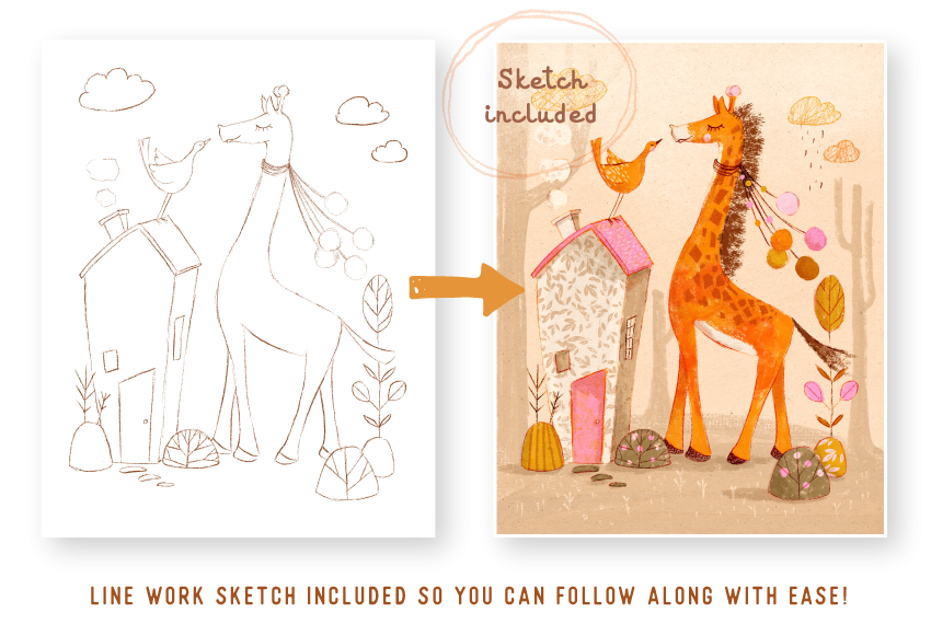
1. Join Me for a Fun Texture Class!: Okay. Hi. I'm Lisa. I'm a full time illustrator and creator of
digital resources. In this class,
we'll be exploring all the fun ways we can
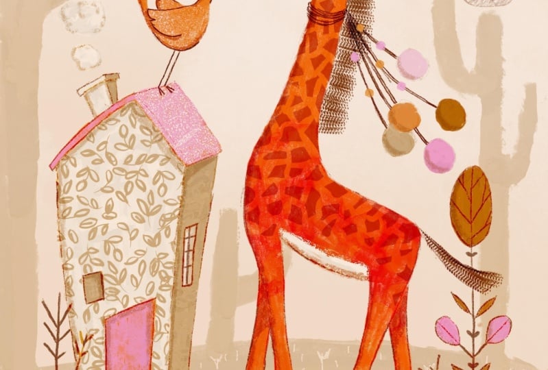
add texture in Procreate. We'll be using a cute little
giraffe as our guinea pig and play with some of the
features available in Procreate to achieve some
yummy texture results. You're welcome to follow on using your own
drawing, of course, but I've made life easier by including the giraffe sketch, some texture brushes,
and color palette, so you can follow
along with these. All sound good. Let's draw.
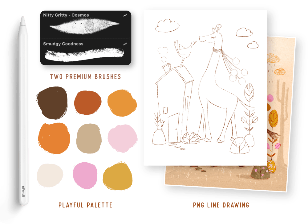
2. Using Brushes to Add Texture: I've gone ahead and imported the swatches that come with
the class and the brush set. If you still need to do that, I recommend just pausing the video and getting that
into Procreate before you carry on if you want to follow along with the same
swatches that I'm using. Okay, so I'm going to go ahead
and create a new document. And I like to work in a fairly sort of medium
to large size canvas. You can go a bit
smaller if your iPad is smaller and you tend to run
out of layers quite quickly. But the size I'm using today
is 3,900 pixels by 4,950, and I'm just going to open that. And now I'm just going
to go ahead and import our line drawing that
comes with the class, and I'm just going to come
over to my actions menu. And I'm going to insert a file. So I saved it on my dropbox. If you saved it to
your camera upload, then you're going to
hit Insert Photo. So I'm going to go ahead and
insert file and select that. And if you'd like to adjust
it at this stage, go ahead. But I'm going to
leave it that size because it works
perfectly for me. And I'm going to rename
this and just call it sketch and then create a new layer and drag that
underneath my sketch layer. And then I want to set the
sketch layer to color burn. And the background color, I'm going to choose
this sort of pale, pinky, sort of neutral color. Okay, so that obviously
now means that we can see our drawing so coming
back to my sketch layer, I'm just going to bring
the opacity down too. So, let's say, about 60%. And on that new layer, we're going to start
using some brushes to fill in the areas of the giraffe and the
bird and the house. So with texture brushes, whether you actually buy texture brushes or you use the default ones that
come with procreate, what I recommend is
actually experimenting with the texture and seeing the best results you can get
from that texture brush. So I'm going to show
exactly what I mean. So just choosing one
of the orange colors. And coming over to
the class brush that you got with the class, I'm just going to choose cosmos. So this comes from my
nitty gritty brush pack, and the other one isn't a part
of any of my brush packs. I made that just for this class. So using cosmos, I'm just going to apply color
with some even strokes. And with this brush, the more pressure you
apply to your pencil, the more texture comes through. So that's what I mean about
experimenting with a brush. You may want to get an idea of how much texture you need to apply for the particular
type of sorry, how much pressure you
need to apply for the particular type of
texture you want to achieve. And, of course, each
brush is different. So that's why it's important
to get to know them. And if you found
one that you really like or you found several
that you really like, you can really get
a good idea of the results you get with
the amount of texture, amount of pressure
that you apply. So I really like that look.
I'm going to leave that. I want the texture
coming through. And just with some
quick brush strokes, I'm applying some colour. And I'm not being too particular about being too neat because that's the
kind of look I'm going for, but you might have
a different style entirely and want
more nature edges. H Okay, so I'm pretty happy
with giraffe. I just want to
clean up that area. So coming over to my razor tool, I just want to make sure I have the right I want to choose the same brush I'm
using, which is cosmos. And I'm just going to
clean up that area. And again, using the same
brush on the same layer, I'm going to apply color
to our little bird. So I'm happy with
that layer now. I just want to zoom in
and show you you'll see all that lovely texture we've achieved with just using the brush and
different pressure, and the background is basically shining through,
and that's what we want. Okay, so I'm going to
create a new layer and add some color to our house. So choosing the
darker neutral color, I'm going to use the other brush that comes with the class, which is the smudgy goodness. And you'll see how
different this brush reacts and how we're going to
get different results. So if you can remember, we use kind of even
strokes for the giraffe. So with this one, we want
to have bitty strokes. Because with each brush stroke, you're getting let me
just zoom in there. You're getting
different texture. And that's why it's important to understand the brushes
that you have and see the best results
you can get from them because your linework action, how you apply the color, will influence the kind of texture that you achieve
from that brush. And I'm just using the very
light color to to add, you know, sort of a white area to the front of the building. So the front of the
building is basically going to have more of the light onto it and the
side has a bit of a shadow. What I want to do is just
use cosmos just to to finish off this
building a little bit for some smoother areas. And I just want to add a bit
of color to this window. Oh, actually, I missed a
spot. I missed that spot. Our building is done now. What I want to do is create
a new layer that just has a little bit more
defined linework over the features
of the animals. So above our sketch layer, I'm going to create a
new layer and set that to linear burn because
I'd like it to be quite dark and kind of burn into the rest
of the painting. And just choosing our kind of, like, quite darkish brown color. Just gonna use a pencil. I'm using Lisa's pencil, but you can literally use any pencil. Doesn't
really matter. Whichever pencil
you enjoy using. And I'm just going to essentially define those
important features. So just here and there, not
everywhere. Here and there. I'm just going to
add some linework. We want to show
off's little nose. Well, actually, her little
nose, which looks like a her. And you can decide how much
detail you want to add. I just want to ensure that
once the piece is finished, that all those
important features of the animal are not lost. And again, you can decide if you want a smoother brush,
a smoother pencil. I really like that gritty kind of textured brush
in my pencil work. And that's also another
great way of adding texture. So I'm just going to define these these sort
of stringy lines. I don't really know what
this is if it's a scarf. But it's cute. Okay, so this is sitting
essentially above. It will be sitting
above everything. I just want to make sure
the eye is very clear.
3. Layering Colour to Add Texture: Now we're going to
move on to using color to add some texture, how you can layer colors to give more of an interesting
texture result in your work. So I'm going to create
a new layer above my house and choosing that same orange we
originally used. I'm just going to grab a
brush from nitty gritty set, but you are more than welcome to use any one of
these that came along with this
class or any one of your other texture brushes
that you have in Procreate. So I'm just using
my canvas grunge, and I quite like the messy
sort of edge that it gives. So I'm very quickly
applying color, and I'm intentionally
not being too worried about staying within the lines because I like the as I said, I like the sort of messy edges. So on that same lab, I'm now going to use pink, and I'm coming over to Cosmos. And what I want
to ensure is that have enough texture kind
of shining through. So the orange comes
through onto the pink. And this is a great
way to actually tie in your colours or your palette across
your entire piece. So even though the orange is going to be
underneath the pink, there's going to be areas
that it peeps through, and that's a great
way to, you know, kind of make your
whole piece more uniform in terms of the palette. So I'm ensuring that I'm getting some nice texture and
pushing down on my pencil. So that's giving us a really nice result where they're mashing
the two colors together. So although your door is pink, we can still see
orange coming through. So I encourage you to experiment with layering different colours. The orange, you know, could have easily have
been the dark brown, and that would have given
us a much stronger result. So in this case, it
was more subtle, but I think it
works really well.
4. Create Your Own Stamp Brush: Okay, so now we're
going to move on to creating our own texture
brush, which is really fun. So coming out of this document, I'm going to create
a new document, and it's going to
be really large. We're going to use at least
7,000 pixels by 7,000. And the reason why we
want that is we want a really high resolution image that we're going to create
a stamp brush out of. And I'm going to use black. So I've just double
tapped on my color, and it will
automatically give you the darkest color
in that circle. Using one of the
texture brushes, you can use either one of
these that come with the set. I'm just going to use one of the standard
brushes that come with procreate in the
drawing sort of tab. And we're going to
create a leaf pattern. Well, it's not really a pattern. It's going to be a leaf stamp. But essentially, we're going to be using it like a pattern. So I'm aiming to keep my
leaf design in a circle. Just a rough circle doesn't
have to be too specific. Okay, that size is
a little large. So the brush I'm
using is Blackburn, and that comes, as I
said, with procreate. And I'm just roughly creating
sort of a leafy design. And I'm making sure that my leaves are going in
all sorts of directions. So again, as I mentioned, we're aiming for kind of
like a circle design. And this makes it much
easier when you use your stamp for it to be a little bit more uniform
and not so blocky. I think we're happy with that. Now we need to copy that
coming over to our actions, make sure that you select JPEG. And I'm just going to hit Copy. And then opening up
our brush library. I'm still in the
class brush set, which is important, but you can, you know, add your brush
anywhere you like. I just find it's
going to be easier keeping it all in
the same place. I'm going to hit that
plus. The first thing I want to do is
change the spacing. I'm going to move that
all the way to 100. And then coming
down to our shape, I'm going to hit Edit, and
then import and paste. We need to invert that, so I'm just going to use
two fingers and tap on the screen once. Hit done. Then coming down
to Apple pencil, we're going to move that
all the way down to zero, the opacity because
we don't want any opacity variation
as we stamping. And I'm going to make
sure that my shape, coming back to our shape
is scat on scatter. Every time I stamp out, it's going to change
the direction of the actual stamp,
which is what we want. We wanted to look organic. And then the last
thing I want to do is just increase the size, probably three t
is fine percent. And then if you want to
just name your brush, leaf stamp and you
can decide to, you know, sign it and name
it, all that kind of stuff, which we're not going
to do right now, and we're going to hit
done and done again. And there's your stamp brush. Just now, we're going to
test it, but for now, I want to create
another stamp brush. So creating a new layer, turning the other one off. We're still using black.
So I'm going to be using sticks which come
standard with Procreate. It's under the
drawing brush set. And the idea, again, is to keep the design in
kind of like a circle shape, but we are just going to
be using Random strokes. Hm. That last one makes it
look a little too square. Let's see if we leave
it there what happens. Okay, so we're going
to do the same thing coming over to action, share, JPEG, and copy. In our same brush set that
we created the other one, we're going to hit the plus
and our spacing all the way. This time, again,
import and paste. We're going to invert it like we did previously with two fingers. But this time, I'm not going
to change the scatter. I'm going to leave
it exactly like it is coming over to Apple Pencil, and we're going to bring that
opacity all the way down. And I'm just going to increase the size like we did
with the other one. And this time, I just
want to add a dash of grain to the brush. So hitting our edit, I'm going to hit Import and
then source library. So that comes with Procreate. And I'm looking for
something grungy. So let's try. Let's
try that guy. So I just want to up
the grain of that, or should I say the
contrast and the scale. So the movements on rolling. You can experiment
with this and see, you know, kind of texture
you want to achieve. But essentially, we want
sort of a roughsh texture to our linework. I think that's about it. And I'm just going to name the brush. Let's call it lines
stamp. Done and done. Okay, so now we're going
to put out brushes to work and use them on our
drawing to add some texture.
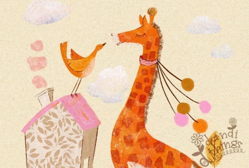
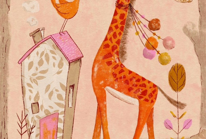
5. Using Clipping Masks to Add Texture: Coming back to our giraffe, I'm going to apply a lovely little
botanical pattern over the house using the stamp
brush we just created. Coming to the layer where we
create, the actual house. I'm going to hit Plus. I'm going to set that
to clipping mask. So what that's going
to do is it's going to clip to everything that's
underneath that layer. So we could paint really outside the lines. It doesn't matter. It's basically going to only keep whatever is
underneath that layer. It's going to retain it
to that specific area, which is really handy if you're using something
like a stamp brush. So I'm going to use the same
color we use for the shadow. And using our leaf stamp, I think the size is about right. We are just going to randomly stamp out a cute
little leafy pattern. I think that looks pretty good. And then on our roof, we're going to using
a much lighter color, we're going to use
the other stamp. I just want to bring
that size down a dash. And we're going to set that
to a clipping mask because, again, I want to clip
it just the roof. And while we're
using clipping mask, I'm going to add sort of a
whiter area on the giraffe. So making sure I'm above my giraffe. I'm
adding a new layer. I've still got my light color, and I'll use cosmos. We're going to clip
it in a minute. And I'm just going to create a cute little area
underneath his tummy. And then make sure we clip that to the
body of the giraffe. And what I want to do
here, I just want a couple of roughish edges
along that part. So using my eraser tool, I'm going to use one of the standard brushes that come with procreate
called sticks, and just going to lightly
take away some of that, giving the edges a bit of a more organic rough look to
it that matches the rest of the giraffe and a dash over
here. I think that's it. And then finally, using
a clipping mask again, we're going to use a stamp
from another one of my sets, but you can use any
stamp you like. The idea is to create sort of variation in the
color tones of the giraffe. So I'm going to use a
stamp from my aquaril set, and I'm going to use
the random blooms. Using, you know,
the darker sort of must not mustard orangy
colour, like a burnt orange. I'm just going to create a
new layer and stamp once, see if I'm happy
with the placement. I'm going to set
that to color burn, which I'll adjust in a minute. And now I'm going to set
that to clipping masks. So what's going to happen,
as we've said previously, it's going to clip to everything
underneath that layer. So where people get a little
bit confused sometimes, you'll see if we didn't clip it. The results are quite different. And it's still retaining
its original shape, what the stamp
originally looked like. But the minute we
clip the stamp, it's going to take
on the properties of the original
underneath layer, and it'll take on all the imperfections
and even the opacity. So sometimes people get confused and they can't understand why their stamp or
their clipping mask doesn't look as strong
as they wanted it to. It's because it's taken on all the properties that
your original layer had, and that includes the
opacity of that layer. So in this case,
I'm just going to bring the opacity down of my colour bone because
the red was a bit harsh. But that's a nice way to add
just a bit of variation in your colour application
without having to paint again.
6. Using Alpha Lock to Add Texture: Okay, so we're going
to move on and use Alpha lock to apply
some texture. Again, creating a new layer. I'm going to use the mustard, and coming back to those
brushes that come with a class, I'll just use the
smudgy goodness, and we're going to
apply some color to our little mounds or hills, whatever you want
to call them. Oops. Now we need to Alpha
lock that layer. And what that means is you are essentially locking
the pixels and not allowing if you're going
to apply paint onto that same layer and not
allowing that paint to go beyond what
you've already painted. And I'm going to show
exactly what I mean by that. So selecting that same layer that we've just
added the mustard to I'm going to
select Alpha lock, and you'll see the
transparency has come up. So what it's indicating to you, you can essentially
only really paint on those areas that you've
already applied color to. It's a great way
to quickly apply color just to specific
areas that you've already applied paint to so that you don't essentially go beyond
the lines, so to speak. So I'm going to choose
this pinky color and our stamp that we created, bring it down a dash, and I think I'm going to
go bigger, actually. So you'll see it
automatically clipped just to that mustard area. It's essentially
doing the same thing that a clipping mask does, but it's applying it to
the actual original layer, which sometimes is a good thing, sometimes you don't want. But in this instance, I know I want that pattern on
the mustard heel, so I'm perfectly happy applying it straight
to the mustard. And the same thing
goes for here, I'm going to choose Oops. Kind of like a mustard color, and just apply some lines. So that's really
handy if you're doing pattern work yourself and you wanted to clip it
to a specific area.
7. Using Masks to Add Texture: Now we're going to have
some fun using masks. And the best way to understand that it's almost like a stencil, like you are applying stencil areas to a
particular layer. So I want to use a mask for creating spots on the giraffe. And just coming above that
clipping mask we created, I'm going to use sort of
that darky brown color. And let me just use I'll
use Blackbne for now. And I'm just randomly painting. And then I'm going to
turn that into a mask. So automatically, it's going to add a layer mask above that. And now, essentially, what we're going to do is we're
going to create a stencil like effect
on that mask layer. So it's important that
you use black to do that. And I'm just going
to use in fact, I'm going to use the
same brush that we just used for the actual
colour laying. And what you're doing is it's similar to if you
were using an eraser, which you can, you can
use the same effect, you know, with an eraser tool. But what I like about using a mask is that you
can move it around. It's not damaging
the original layer. So if that was quite an
important layer to you, for example, it was, you know, special texture that you added or even a photograph
or an image, this is a nice way
to create your area that you don't want without actually damaging
the original layer. And I think taking away
sometimes gives you really interesting
results as opposed to painting, you
know, adding to it. What I mean is I'm
essentially removing color, which gives us kind of
a different end result. And the beauty of it is
if we don't like it, we just delete the layer, delete the actual
mask, and start again. If you made a mistake and you wanted to add
some color back, you would just simply make
sure that you are using white, so we're coming all the way, and we're essentially
adding that area back. But in this case,
we don't want to. So it gives you, you know, especially for mark making,
like I'm doing now, it gives you a nice interesting
sort of cut out effect, which all adds to the overall
interest of the piece. And finally, if you wanted
to have more impact, you could always
set that to linear bone and just bring the
opacity down or even multiply. Maybe multiply is a bit better.
8. Create Your Own Texture Brush: Now we're going to create
our own texture brush, and I'm going to
use the same shape that we used for our stamp, and you'll see how easy it is to create different texture
brushes of your own. Coming over to our brush that
we created, the line stamp, I'm just going to duplicate
that and select that. This time, we're going to
bring the spacing down. Probably something like 10%. And I want to make
sure that my shape is I want that line work because this is going to be for
the main of the giraffe. So I'm not gonna use
the scatter at all, because that'll obviously just
change the shape entirely. I'm going to keep
all those lines, and coming over to our grain, this is where you
can have some fun and create some
interesting results. So I'm bringing the
brightness down quite a bit, and I'm going to change
that to linear bone because I find that
often gives it quite an interesting
grungy effect. And I'm just playing with a
scale and even the movement, sort of figuring out the look I'm going for Yeah, I would say that that's
quite a good result. And we just want to rename that, and we could call it
something like, hey. So on a new layer, I'm using
one of the darker browns. And we're gonna start
adding some main texture. Of course, you can decide how
intense you want it. Using our eraser tool. I just want to clean that up. I think our giraffe
is taking shape. I just want to move the stamp
that I use on his body to underneath the
white layer because it's creating kind of a yellowy
glow, which I don't want. So I'm just going
to move that one clipping mask underneath
the other one.
9. Using the Selection Tool to Add Texture: Another great way
to add texture to your work is using
the selection tool. So I'm going to
be doing that for this little hill or bush,
whatever you want to call it, and even the hooves of the giraffe coming
over to our layers, creating a new layer. And I just created it
above the mustard. I'm going to use
this khaki color and using our free
selection tool, I've made sure that
I've got it on and because what
I want to do is I want to make a selection and then add another
selection to that. So I'm just free drawing as I go and then hitting
that little dot and using the same selection as the one we just
created because I'm going to apply the same
technique for both of those. Okay, so to apply color, I'm going to be using a stamp
from the nitty gritty set. Again, you can use
any stamp you prefer. And I'm just simply going
to stamp until I'm happy. I think that looks pretty good. And then on our
linear bone layer, I want to create a
selection for the hooves. So again, coming over
to my selection tool, I'm just going to
select free draw, should I say, the hoof area. And using the same color that
we used for the features, I'm coming back to
one of the stamps we created this linework stamp, and I'm just going to stamp
and stamp until I'm happy. And then last but not least, I just want to use that
same stamp on our bird. And I just need to create
a new layer above that. And I want to use
a lighter pink. And what I want to do
is actually change the direction of those
lines to be the other way. So just for variation so it doesn't look exactly
the same as the roof. Coming over to that
stamp that we created, we're going to select
shape and then edit. And then taking two fingers, I'm just simply going to
rotate and drop and then hit done and test the size. I think that looks pretty good, but I just want to make sure. What I'm going to do is not
make it a clipping mask. So I've dragged it out of
the clipping mask area, and I'm turning off
the clipping mask, and I'm just going
to stamp once.
10. Drawing Your Own Texture: Another fun thing that I love to do is to draw my own texture. And what I mean by
that is I love using a pencil tool and just making
scrubby marks or line work. Sometimes I use the eraser tool to create texture as well. So what I'm going to do is I'm going to create a background, and then we're going to
use the eraser tool to add some interesting mark making
on the background layer. So right at the bottom, I'm
going to create a new layer, I'm going to drag it
below Al giraffe. And choosing the same color
as a shadow of the house. I'll just use cosmos. And I'm just simply kind
of drawing like a hell. I'm varying my pressure
every now and then, picking up my pencil
every now and then just for some variation. And then I'm going to
use the other brush, the smudgy goodness
to create some trees. So if you can imagine a great big tree sort of coming up here. And a little branch
that comes out. Maybe the branch does that. So I'm just going to
bring the opacity down a dash of that layer. I'm just going to see
what multiply looks like. Yeah, I think that
looks pretty good. So what we want to do now, I prefer to have more
rougher edges to that piece, so I'm going to use the
eraser. You can use sticks. You can use any one of these texture brushes
that'll work just as well. But I'm going to
use something from my nitty gritty collection. And it's the canvas,
actually the dirty grain. And I'm just here and there. Going to take away the edges. As I said, I'm doing this
because I really like that sort of rough
textured edge look. You might prefer a cleaner line. And still using our rays, are we going to now take
away some of this area, but it's going to be more
controlled and more precise, and I'll tell you what I mean. I'm going to use the grimy
shy pencil, but again, you can use any type of pencil that has a
nice, good texture to it. So what we want to do now is we want to create sort of
more deliberate markings, and I'm going to throw
in the odd little plant. And this is a really fun way to essentially draw
your own texture. And you can decide how
much you want to add. So one of my other
favorite things to do is add some scribbly
linework as texture. So I'm going to use
it on the same layer as our original sketch. So selecting that layer and
selecting a similar color, which is one of these browns.
That one should be fine. I'm going to use my pencil. You can use any pencil you like. So what I want to do first
is create a selection. So using our selection tool And for the fun part, I'm just simply going to scribble away.
11. Finishing Touches: We're just going to quickly
finish off the drawing by finishing this sort
of tree area here, adding some color to the
pompoms and things like that. And then we're going to move
on to adding some shadow. So using the same layer
as our little actually, let's do the hells first. So I'm just going to
make sure I'm off Alpha and on that same el layer. I'm using darker mustard and coming back to
our smudgy goodness. And the pinky color. Feel free to experiment which
colors you want to use. I just want to add some
stepping stones there. So on the same
layer as the house, I'm just gonna use
the darker color. And let's add some color to the pompoms. Some clouds.
12. Use Basic Lighting to Add Texture: Now, we're going
to have some fun with very basic lighting, and you can decide how much you want to add to this and how detailed you want to become with your shadow work
and your lighting. But I'm just going to show you
a very simple quick way of adding just that
additional thing that adds some
dimension to your work. So if our light source was
coming in this direction, very roughly, the shadow will basically fall this
side of everything. So creating a new layer, and we can work below the
sketch layer, no problem. I'm going to turn
that to multiply, and I'm going to first, I'm going to work
on the giraffe. So we're going to be using
kind of like a warmer color. And I'm going to use
that one for now, one of the orange colors. And you can use any
brush you prefer, but I particularly like a
grungy brush on my shadow work. So I'm going to use one of
the nitty gritty brushes and using the dirty
grain for this. And I'm just at first going to see just bringing
that opacity down. If I'm happy with the
tone of this shadow on my giraffe, so far,
it looks good. As mentioned, we are just being rough with our estimation where the shadow is gonna fall. And I'm going to do
the same on our bird. I'm going to increase
that opacity just to make it a little
bit more pronounced. And using that khaki color, we're going to add some Okay, so that is too dark if I
want to use the same layer. So I'm going to use the lighter
version. I looks better. And I'm imagining
this little roof casting quite a biggish shadow
that does something like that. Same with the door. I'm visualizing all of these, casting shadow on the
ground. And the giraffe. That is definitely
definitely not correct because that
should have been lighter and that
should have been darker, but it doesn't matter. We are not going for
scientific correctness. So Shadow is another
fantastic way just to add that extra bit of texture
and finish off your drawing. And you can do the same
with some lighting, which is what I'm
going to do and using the lighter color. I'm going to use one
of the stamps from my it's my instant
artist collection. So this is one of those build up stamps that basically
it's very soft, and as you apply this stamp, it kind of builds
up the texture. So applying this is a nice
way to apply texture, but you can apply the
same kind of effect using any brush that has
a soft texture. You can use something
that you've got from one maybe
you've got pastel, a pastel brush collection or
charcoal brush collection. You can get the same results and just apply it
in certain areas. So coming over to
our Layers panel, I'm going to create
a layer just above our background trees
that we created. And starting in this corner, it's a very subtle texture, but it's giving us helping
us lighten that area, but still giving us a
lovely soft texture, which is what I'm going for. I think that's about it. Oh, what I wanted to do is just create some shadow
work for our clouds. I forgot to do that. So using the same color, and we are coming back
to our nitty gritty. So this is just helping the
clouds with some definition. And finally, just some detail on the window and some
of the little trees. So on our very top sketch layer, using the same
colors that layer, just go to use a pencil and finish off these trees just to kind of
define them better. And I just want to add a couple of baubles above everything. I think it needs it. Just
using smudgy goodness again. And then finally, we're going
to add some paper texture, which is a really fun quick way to add interest to your work. Coming to our actions,
we're going to add. And again, I have
mine on Dropbox, so I'm going to insert
file, not photo. So I'm using a paper from
my paper box collection. You're welcome to
use any texture that you like, any
paper texture. I'm just going to change
that to free form. And then set that layer. I'm going to just experiment and see which one looks best. I think linear bone
looks quite interesting. And then just bring that opacity down. Let's have a squize. Yeah, so what's really
fun about that, it's kept, you know, the lovely texture of the paper and also all those
little grungy bits. And you can experiment with whatever layer
works best for you. But I think Linear bone works
best for me in this case. So I hope this
class has given you a good idea of how you can use all the different
functions within Procreate to apply some
interesting texture to your work. Hope you enjoyed that
and happy creating.
 Lisa Glanz, Illustrator & surface pattern designer